maths level 2 - pearson qualifications | edexcel, btec, …€¢ compare proportions in a pie chart...
TRANSCRIPT

EDEXCEL FUNCTIONAL SKILLS PILOT
Maths Level 2
Chapter 6
Working with data and averages
SECTION I Working with data
1 Types of data 84
2 Extracting and interpreting information from tables 85
3 Extracting and interpreting information from bar charts 86
4 Extracting and interpreting information from charts and graphs 87
5 Collecting data 89
6 Representing data in bar charts, pie charts, line graphs and scatter graphs 90
7 Using spreadsheets to draw statistical diagrams 97
8 Remember what you have learned 99
SECTION J Working with averages
1 Mean 101
2 Median and mode 103
3 Using averages and the range 105
4 Remember what you have learned 107
Draft for Pilot Functional Maths Level 2 • Chapter 6 © Pearson Education 2008
Pilot material only – see introduction before use

Working with shape and space 5EDEXCEL FUNCTIONAL SKILLS: INTErIm SUppOrT mATErIAL
maths Level 2Su Nicholson
Chapter 6: Working with data and averages
Coverage and Range Exemplification Learner Unit
Collect and represent discrete and continuous data, using ICT where appropriate
• Collecting data• Tally charts• Frequency tables•Pie charts•Bar charts• Line graphs•Grouped frequency tables• Scatter graphs
I1 Types of dataI2 Extracting and interpreting information from tablesI3 Extracting and interpreting information from bar chartsI4 Extracting and interpreting information from charts and graphsI5 Collecting dataI6 Representing data in bar charts, pie charts, line graphs and scatter graphsI7 Using spreadsheets to draw statistical diagramsGrouped frequency tables are covered in our new publishing (see below)
I8 Remember what you have learned
Use and interpret statistical measures, tables and diagrams, for discrete and continuous data, using ICT where appropriate
•Mean, median, mode and range for discrete data
•Modal class for grouped data
J1 MeanJ2 Median and modeJ3 Using average and the range
•Positive and negative correlation and line of best fit
I6 Representing data in bar charts, pie charts, line graphs and scatter graphs
Use statistical methods to investigate situations
• Comparison of two groups using measures of average and range
J3 Using averages and the range
•Use line of best fit I6 Representing data in bar charts, pie charts, line graphs and scatter graphs
• Compare proportions in a pie chart
I4 Extracting and interpreting information from charts and graphs
I6 Representing data in bar charts, pie charts, line graphs and scatter graphs
J4 Remember what you have learned
Published by Pearson Education, Edinburgh Gate, Harlow CM20 2JE. First published 2008. © Pearson Education 2008. Typeset by Oxford Designers and Illustrators, Oxford
This material was developed for use with Edexcel pilot and development centres and is available for continued use with development centres. To become a development centre you need to offer Edexcel Functional Skills. The material may be used only within the Edexcel development centre that has retrieved it. It may be desk printed and/or photocopied for use by learners within that institution.
All rights are otherwise reserved and no part of this publication may be reproduced, stored in a retrieval system, or transmitted in any form or by any means, electronic, mechanic, photocopying, recording or otherwise without either the prior written permission of the Publishers or a licence permitting restricted copying in the United Kingdom issued by the Copyright Licensing Agency Ltd, Saffron House, 6–10 Kirby Street, London EC1N 8TS.
Where to find the final specification, assessment and resource materialVisit our website www.edexcel.com/fs then:• for the specification and assessments: under Subjects, click on Mathematics (Levels 1–2)• for information about resources: under Support, click on Published resources.
Use these free pilot resources to help build your learners’ skill baseWe are delighted to continue to make available our free pilot learner resources and teacher notes, to help teach the skills learners need to pass Edexcel FS Mathematics, Level 2. But use the accredited exam material and other resources to prepare them for the real assessmentWe developed these materials for the pilot assessment and standards and have now matched them to the final specification in the table below. They’ll be a useful interim measure to get you started but the assessment guidance should no longer be used and you should make sure you use the accredited assessments to prepare your learners for the actual assessment. New resources available for further supportWe’re also making available new learner and teacher resources that are completely matched to the final specification and assessment – and also providing access to banks of the actual live papers as these become available. We recommend that you switch to using these as they become available.Coverage of accredited specification and standardsThe table below shows the match of the accredited specification to the unit of pilot resources. This table supersedes the pilot table within the teacher notes.
Draft for Pilot FunctionalMathsLevel2 • Chapter6 © Pearson Education 2008Pilot material only – see introduction before use

Draft for Pilot Functional Maths Level 2 • Chapter 6 • page 84 © Pearson Education 2008
1 Types of data
You should already know how to:
✓ extract and interpret information, for example, in tables, diagrams, charts and line graphs
✓ collect, organise and represent discrete data in tables, charts, diagrams and line graphs.
By the end of this section you will know how to:
extract discrete and continuous data from tables, charts and line graphs
interpret information given by data in tables, charts and line graphs
collect and represent discrete and continuous data, using ICT where appropriate.
I Working with data
TipEach item of discrete data has an exact value.
TipContinuous data cannot be measured exactly. The accuracy depends on the measuring device.
Learn the skill
There are two general types of data:
qualitative data - non-numerical data such as colours of hair, makes of car
quantitative data - numerical data such as marks in a test, waiting time in a doctor’s surgery.
Quantitative data may be either discrete or continuous.
Discrete data can only take particular values.
Shoe sizes, such as 5, 512, 6, 61
2 are discrete data. There are no values in between. The shoe size 51
4 does not exist!
Continuous data can take any value.
Weight does not suddenly jump from 66 kg to 67 kg. It goes through all the values in between such as 66.723 145... kg.
Try the skill
Decide whether each of the following types of data is quantitative or qualitative. If it is quantitative data, identify whether it is also discrete or continuous.
1 height of a tree
2 favourite tv programme
3 your weight
4 time to wait for a bus
■
■
5 type of tree
6 temperature of an oven
7 number of goals scored in a football match
8 distance between two townsPilot material only – see introduction before use

Working with handling data 6Working with handling data 6
© Pearson Education 2008 Functional Maths Level 2 • Chapter 6 • page 85 Draft for Pilot
2 Extracting and interpreting information from tables
Learn the skill
You need to be able to extract information from tables.
Example 1: A woman wants to buy a new computer. She chooses from the models in this table. She wants a computer with at least 2 GB of memory and more than 350 GB hard drive capacity. She wants to pay less than £600. Which model should she buy?
Look at the amounts of memory for each model.
T9608 does not have enough.
Look at the hard drive capacity. A6332 is too small.
P2613 costs more than £600. So only B3413 satisfi es all the requirements.
Answer: B3413
Try the skill
1. Here is an extract from a holiday brochure giving prices per person for a holiday in Palma, Majorca.
a Work out the cost for one person to stay for two weeks in Sunny Chalets, arriving on 1 July.
b Work out the cost for two people to stay for one week in Bay View Hotel, arriving on 17 June.
2. The table gives the results of a survey into the way some students travel to college.
Bus Train Car TotalMales 20 15 8Females 22 13 5Total
a how many students travel to college by train?
b how many male students were surveyed?
c how many more female students travel to college by bus than by train?
d how many students were surveyed altogether?
TipWork through the requirements systematically.
TipWork through the requirements systematically.
Model Memory Hard drive capacity
Price
T9608 1 GB 250 GB £399.99B3413 2 GB 360 GB £599.99A6332 3 GB 320 GB £589.99P2613 3 GB 500 GB £699.99
Arrival dateCo
st p
er
pers
on
at S
unny
Ch
alet
s
Cost
per
pe
rson
at
Bay
View
H
otel
7 da
ys
addi
tion
al
7 da
ys
7 da
ys
addi
tion
al
7 da
ys1.6 to 16.6 £240 £80 £380 £140
17.6 to 30.6 £270 £80 £420 £150
1.7 to 16.7 £300 £100 £450 £150
17.7 to 31.7 £280 £100 £435 £135
Pilot material only – see introduction before use

Draft for Pilot Functional Maths Level 2 • Chapter 6 • page 86 © Pearson Education 2008
Learn the skill
Bar charts use bars to show patterns in data.
The bars may be horizontal or vertical.
Both axes should have labels and the chart should have a title.
This bar chart shows some students’ marks in a maths test.
The bar chart shows how many students achieved each score.
This is called the frequency.
You use a dual bar chart to compare two sets of data.
Try the skill
1. This bar chart was produced by Freshco to compare the cost of a certain brand of cat food.
a Why is the bar chart misleading?
b What is the difference between the highest and lowest cost of the cat food?
2. This chart shows a shop’s sales in May and June this year.
a What is the difference between the total sales in May and the total sales in June?
b Which item has the biggest difference between the sales in May and the sales in June?
3 Extracting and interpreting information from bar charts
TipFor continuous data there are no gaps between the bars.
TipThe vertical scale should start at 0 otherwise the differences between amounts appear larger than they are. This can be misleading.
TipThe key shows what the different coloured bars mean.
Pilot material only – see introduction before use

Working with handling data 6Working with handling data 6
© Pearson Education 2008 Functional Maths Level 2 • Chapter 6 • page 87 Draft for Pilot
4 Extracting and interpreting information from charts and graphs
Pie charts Learn the skill
Pie charts show the proportion of the data that is in each category. A pie chart is split into ‘slices’ called sectors.
There are 360o in a circle. To extract information from a pie chart you need to fi nd the connection between the angles and the data.
Example 1: A tour operator conducted a survey of its customers’ favourite holiday destinations. The pie chart displays the results of the survey.Spain was chosen by 150 people, which was 1
3 of the customers surveyed.a How many customers were surveyed?b How many customers chose Greece?
a 13 of the customers surveyed is 150 people The total number surveyed is 3
3 So the total number of customers surveyed = 3 × 150 = 450
Answer: 450 customers
b You need to use a protractor to measure the angle of the sector representing Greece. The angle is 88o
360o represents 450 customers
1o represents 450360 customers
So 88o represents 88 × 450360 = 110 customers
Answer: 110 customers
Line graphs Line graphs are used to display continuous data.
Points plotted on the graph are joined up with straight lines.
Example 2: This line graph shows the temperatures in Manchester for the fi rst fi ve days in July. What is the difference between the highest and lowest temperatures?
First identify the scale. Five small squares represent 5°C, so one small square is 1°C.
From the graph, the highest temperature is 22°C and the lowest temperature is 15°C.
The difference is 22 – 15 = 7.Answer: 7°C
RememberA pie chart does not give data values.
Tip450360 = 1.25, but you can’t have 1.25 customers. Work out the whole calculation 88 × 450
360 in one go on your calculator.
Pilot material only – see introduction before use
Draft for Pilot Functional Maths Level 2 • Chapter 6 • page 88 © Pearson Education 2008
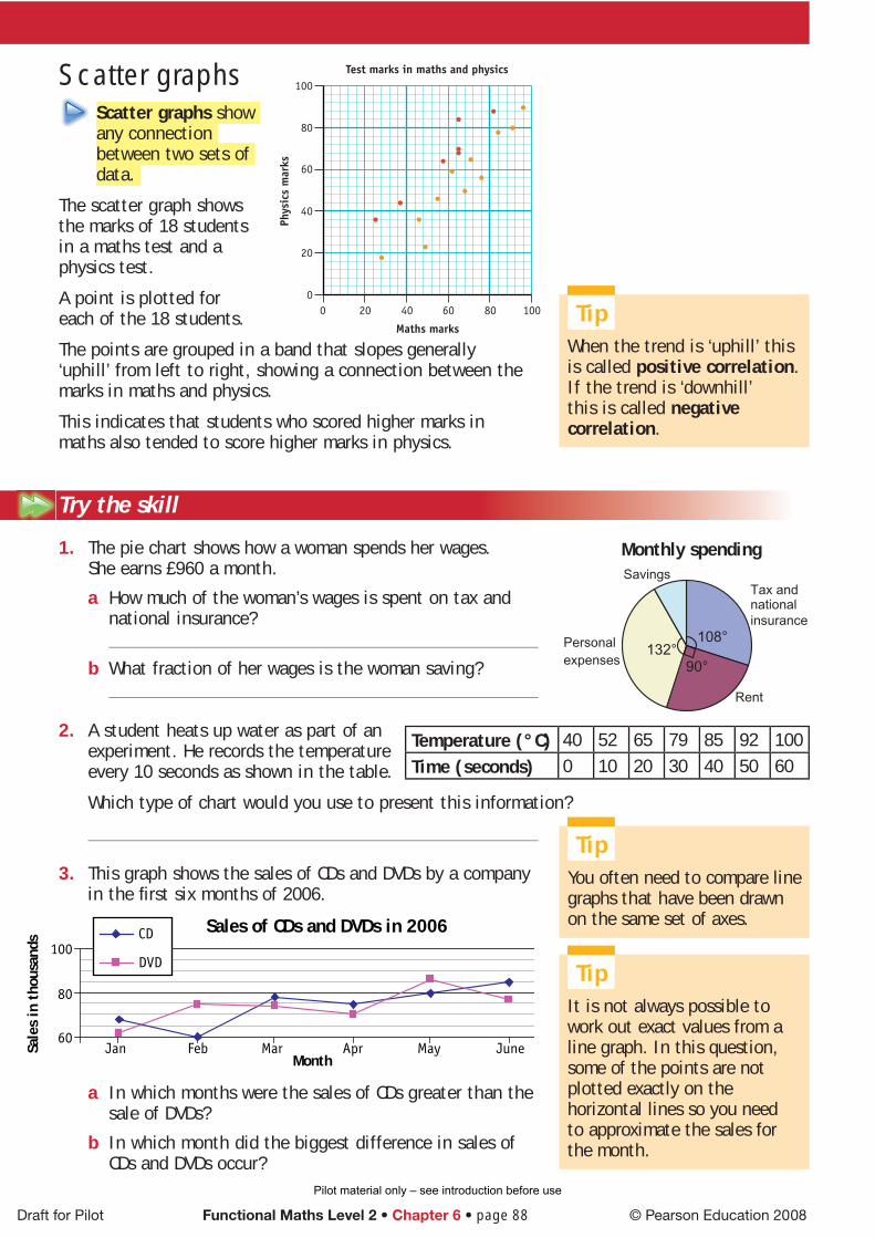
Scatter graphs Scatter graphs show any connection between two sets of data.
The scatter graph shows the marks of 18 students in a maths test and a physics test.
A point is plotted for each of the 18 students.
The points are grouped in a band that slopes generally ‘uphill’ from left to right, showing a connection between the marks in maths and physics.
This indicates that students who scored higher marks in maths also tended to score higher marks in physics.
Try the skill
1. The pie chart shows how a woman spends her wages. She earns £960 a month.
a How much of the woman’s wages is spent on tax and national insurance?
b What fraction of her wages is the woman saving?
2. A student heats up water as part of an experiment. He records the temperature every 10 seconds as shown in the table.
Which type of chart would you use to present this information?
3. This graph shows the sales of CDs and DVDs by a company in the fi rst six months of 2006.
a In which months were the sales of CDs greater than the sale of DVDs?
b In which month did the biggest difference in sales of CDs and DVDs occur?
Monthly spending
Tax and national
insurance
Rent
108°
90°132°
Personal
expenses
Savings
Sales of CDs and DVDs in 2006
60
80
100
Jan Feb Mar Apr May JuneMonth
Sale
s in
tho
usan
ds
CD
DVD
Temperature (°C) 40 52 65 79 85 92 100Time (seconds) 0 10 20 30 40 50 60
TipWhen the trend is ‘uphill’ this is called positive correlation. If the trend is ‘downhill’ this is called negative correlation.
TipIt is not always possible to work out exact values from a line graph. In this question, some of the points are notplotted exactly on the horizontal lines so you need to approximate the sales for the month.
TipYou often need to compare line graphs that have been drawn on the same set of axes.
Pilot material only – see introduction before use

Working with handling data 6Working with handling data 6
© Pearson Education 2008 Functional Maths Level 2 • Chapter 6 • page 89 Draft for Pilot
5 Collecting data
Learn the skill
You may need to collect data as part of an investigation or a survey.
Data which is collected by observation can be recorded on a data collection sheet using a tally. For example, the data collection sheet on the right might be used by a restaurant manager to fi nd public opinion on their favourite nationality of food in a local area.
Data can also be collected in a survey by using a questionnaire. In a questionnaire each question should have a set of response boxes which cover all possible answers to the questions with no overlap. The questions should be clear and unbiased.
The sample of people you choose to take part in a survey must also be unbiased. For example, a suitable question to survey a random selection of students on the number of hours they spend on homework would be:
How many hours do you spend each week on homework?
Less than 5 hours 5 but less than 10 hours 10 but less than 15 hours
15 but less than 20 hours more than 20 hours
Data may also be collected by experiment. For example, a factory may be interested in the lifetime of their lightbulbs and could carry out an experiment to fi nd the number of days each of a sample of lightbulbs produce light before they burn out.
Data which is collected by observation or by experiment is called primary data.
Other research may require using data which has been collected and recorded by someone else. This is called secondary data. For example, an insurance company would be interested in National statistics recording the number of accidents for different occupations when working out insurance policy payments.
Try the skill
1. A travel agent wants to survey customers’ favourite holiday destinations. What would he use to collect the data? Is this primary or secondary data?
2. Design a suitable question for a restaurant manager to survey how much local people are prepared to pay for a meal out.
3. The manager of a new supermarket wants to survey customer opinion of the restaurant facilities. He asks customers who visit the supermarket one Monday morning to fi ll in a questionnaire.
a Why will the survey be biased?
b Describe how he could change the way he carries out his survey to make it less biased.
Nationality of Food Tally Frequency
Indian
Italian
etc
TipAn Actuary assesses fi nancial risk and calculates insurance premiums.
Pilot material only – see introduction before use
Bar charts Learn the skill
When drawing bar charts, make sure you:
use a ruler and a sharp pencil, and draw the bar chart on squared or graph paper
choose a scale which is easy to use e.g. 1 small square as 1, 2, 5, 10, 20, 50, 100, 200, 500, 1000 etc
give the bar chart a title and label both axes, with units if appropriate
draw bars with an equal width
for discrete or qualitative data leave a fi xed gap in-between the bars.
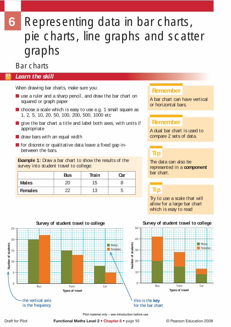
Example 1: Draw a bar chart to show the results of the survey into student travel to college:
Bus Train Car
Males 20 15 8
Females 22 13 5
■
■
■
■
■
6 Representing data in bar charts, pie charts, line graphs and scatter graphs
RememberA bar chart can have vertical or horizontal bars.
RememberA dual bar chart is used to compare 2 sets of data.
TipThe data can also be represented in a component bar chart.
Draft for Pilot Functional Maths Level 2 • Chapter 6 • page 90 © Pearson Education 2008
Bus
Num
ber
of s
tude
nts
Train Types of travel
Survey of student travel to college
Car
15
10
25
5
20
0
Males Females
Bus
Num
ber
of s
tude
nts
Train
MalesFemales
Types of travel
Survey of student travel to college
Car
30
20
50
10
40
0
TipTry to use a scale that will allow for a large bar chart which is esay to read
the vertical axis is the frequency
this is the key for the bar chart
Pilot material only – see introduction before use

Working with handling data 6Working with handling data 6
© Pearson Education 2008 Functional Maths Level 2 • Chapter 6 • page 91 Draft for Pilot
Pie chartsTo draw a pie chart:
fi nd the total frequency for the categories
divide 360° by the total frequency
multiply the result by the individual frequencies for each category
check the sum of the angles for each category is 360°
give the pie chart a title
use a compass and protractor to draw the circle and measure the angles
label each sector of the pie chart or use a key for each category.
Example 2: The table shows the results of a survey into people’s favourite television soap.
Soap Number of people
Coronation Street 55
Emmerdale 24
Eastenders 48
Neighbours 34
Hollyoaks 19
Total 180
Draw a pie chart to illustrate this information.
■
■
■
■
■
■
■
TipIn assessment questions the circle will usually be drawn for you.
TipA key can also be used to indicate what each sector represents in a pie chart.
TipIf the sum of the frequencies does not divide exactly into 360°, you need to write each angle correct to one decimal place. If the sum of the angles then works out to be more than 360°, subtract 1° from the largest angle.
Total frequency = 180 = 360180 = 2° per person
Soap Number of people No. of degrees
Coronation Street 55 55 × 2 = 110
Emmerdale 24 24 × 2 = 48
Eastenders 48 48 × 2 = 96
Neighbours 34 34 × 2 = 68
Hollyoaks 19 19 × 2 = 38
Total = 360
C
E
Survey into favourite television soap
Hollyoaks
Neighbours
Eastenders
Emmerdale
Coronation Street
Pilot material only – see introduction before use

Draft for Pilot Functional Maths Level 2 • Chapter 6 • page 92 © Pearson Education 2008
Line graphsTo draw a line graph:
use a ruler and a sharp pencil, and draw the line graph on squared or graph paper
choose a scale which is easy to use e.g. 1 small square as 1, 2, 5, 10, 20, 50, 100, 200, 500, 1000 etc
give the line graph a title and label both axes, with units if appropriate
if the line graph has more than one line, label each line or use a key to distinguish between them.
Example 3: The table shows the average rainfall in England and Wales in 2007 in millimetres.
Jan Feb Mar Apr May Jun Jul Aug Sep Oct Nov Dec
England 119 161 84 19 179 241 212 76 62 58 86 102
Wales 135 139 91 29 149 202 246 69 75 42 64 118
Source: www.met-offi ce.gov.uk
Draw a line graph to compare the rainfall in England and Wales in 2007.
■
■
■
■
TipThe key identifi es the difference between the two line graphs.
Pilot material only – see introduction before use

Working with handling data 6Working with handling data 6
© Pearson Education 2008 Functional Maths Level 2 • Chapter 6 • page 93 Draft for Pilot
Scatter graphsTo draw a scatter graph:
use a ruler and a sharp pencil, and draw the scatter graph on graph paper
choose a scale which is easy to use e.g. 1 small square as 1, 2, 5, 10, 20, 50, 100, 200, 500, 1000 etc
give the scatter graph a title and label both axes, with units if appropriate
plot each pair of points and look to see if there is a general pattern or trend.
Example 4: The table shows the number of millimetres of rainfall and the number of hours of sunshine in England in 2007.
Jan Feb Mar Apr May Jun Jul Aug Sep Oct Nov Dec
Rainfall in mm 119 161 84 19 179 241 212 76 62 58 86 102
Sunshine in hours 126 107 148 151 88 81 99 116 113 112 116 117
Source: www.met-offi ce.gov.uk
Draw a scatter graph to see if there is any correlation between the number of millimetres of rainfall and the number of hours of sunshine in England in 2007.
■
■
■
■
TipWatch out for false correlation. For example a scatter graph plotting car accidents against people eating porridge indicates a correlation, but this is not ‘causal’. That is, it would not be correct to say that eating porridge causes car accidents. Cold weather causes both eating porridge and car accidents!
RememberThe scales do not need to be the same on the two axes.
The scatter graph shows negative correlation. This means that the more mm of rainfall the less hours of sunshine.
80
160
120
140
60
100
40
20
0
Suns
hine
in h
ours
Rainfall and sunshine in England in 2007
0 50 100
Rainfall in mm
150 200 250 300
Pilot material only – see introduction before use

Draft for Pilot Functional Maths Level 2 • Chapter 6 • page 94 © Pearson Education 2008
Scatter graphs and lines of best fi tIf there is correlation between two sets of data, then it is possible to draw a line of best fi t.
A line of best fi t represents the trend or slope of the points that are plotted. It should pass near most of the points on the scatter graph, although there may be anomalies, sometimes called ‘rogue values’. The line of best fi t need not necessarily pass through any of the points plotted on the scatter graph, but it should have roughly equal numbers of points on either side of the line.
A line of best fi t can be drawn on the scatter graph showing correlation between millimetres of rainfall and the number of hours of sunshine in England in 2007. The line of best fi t can then be used to make predictions.
Example 5: Draw a line of best fi t on the scatter graph for rainfall and sunshine and use it to predict:a the number of hours of sunshine you would expect in a
month when there is 130 mm of rainfall b the number of mm of rainfall you would expect in a
month when there are 92 hours of sunshine.
TipThere may be positive correlation, negative correlation or no correlation, between two sets of data.
TipIf the points are close to the line of best fi t the correlation is high or strong. If the points are not close to the line of best fi t the correlation is low or weak.
a draw a line up from 130 mm to the line of best fi t and across to the hours of sunshine axis. The blue line shows 112 hours of sunshine
Answer: 112 hours
b draw a line across from 92 hours to the line of best fi t and down to the rainfall axis. The red line shows 210 mm of rainfall.
Answer: 210 mm
80
160
120
140
60
100
40
20
0
Suns
hine
in h
ours
Rainfall and sunshine in England in 2007
0 50 100
Rainfall in mm
150 200 250 300
Note this line of best fi t only passes through one of the plotted points.First check the scale on each axis:Vertical axis5 small squares = 20 hours1 small square = 20
5 = 4 hoursHorizontal axis5 small squares = 50 mm1 small square = 50
5 = 10 mm
Pilot material only – see introduction before use

Working with handling data 6Working with handling data 6
© Pearson Education 2008 Functional Maths Level 2 • Chapter 6 • page 95 Draft for Pilot
60%
40%
100%
20%
80%
50%
30%
90%
10%
70%
0Monday
Perc
enta
ge
Tuesday
Weekday
People attending the cinema
Adults
Children
Concessions
Try the skill
1. The table gives the life expectancy of males and females in six different countries.
a Draw a dual bar chart to illustrate the data.
b Which country has the highest female life expectancy?
c Which country has the lowest male life expectancy?
d Which country has the greatest difference between male and female life expectancy?
2. The table shows the percentage of Adult, Children, and Concession tickets sold at a cinema in the afternoon during half-term. This information can be shown on a component bar chart. Complete the bar chart below. The the fi rst two bars have been done for you.
Mon Tue Wed Thur Fri
Adults 42 38 40 43 33
Children 46 48 42 41 45
Concessions 12 14 18 16 22
Country Males FemalesAfghanistan 41.7 42.3
Australia 79.0 83.7
China 70.8 74.1
India 61.8 64.2
Russia 58.7 72.4
UK 76.6 81.1
Source: World Health Organisation
Country Males FemalesAfghanistan 41.7 42.3
Australia 79.0 83.7
China 70.8 74.1
India 61.8 64.2
Russia 58.7 72.4
UK 76.6 81.1
Source: World Health Organisation
Pilot material only – see introduction before use

3. A student records how he spends his time in one 24-hour weekday period.
Activity Number of hours Number of degrees
sleeping 8
eating 2
travelling 2
working 9
relaxing 3
Total
Complete the table to fi nd the number of degrees to use in a pie chart to represent each activity. Draw a pie chart to illustrate this information.
4. The table shows the number of overseas visitors to the UK in thousands in 2006 and 2007.
Month Jan Feb Mar Apr May Jun Jul Aug Sep Oct Nov Dec
2006 2260 1790 2300 2920 2840 2720 3530 3710 3060 2510 2570 2510
2007 2350 2050 2470 2930 3000 2760 3360 3360 2870 2740 2520 2480
Source: National Statistics Online
a Draw a line graph to compare the number of overseas visitors to the UK in 2006 and 2007.
b In which month was the difference between the number of visitors (i) greatest (ii) least?
5 The table shows the percentage of households in the United Kingdom that owned mobile phones and computers from 1996 to 2005.
Percentage of UK householdsYear Mobile phone Home computer1996 17 27
1997 21 29
1998 27 33
1999 44 38
2000 47 44
2001 65 50
2002 70 55
2003 76 58
2004 78 62
Source: National Statistics Online
a Draw a scatter graph to illustrate this information.
b Draw a line of best fi t and use it to predict the percentage of households that:
i owned a computer in 2005 if 79% of households owned mobile phones
ii owned a mobile phone when 20% of households owned a computer.
Draft for Pilot Functional Maths Level 2 • Chapter 6 • page 96 © Pearson Education 2008
TipYou usually plot the values in the fi rst column on the horizontal axis.
Pilot material only – see introduction before use
Working with handling data 6Working with handling data 6Working with handling data 6Working with handling data 6
Learn the skill
Although you do need to be able to draw statistical diagrams by hand, a spreadsheet is a useful way to draw statistical diagrams and can be used to confi rm that the results of your calculations are correct.
When producing work electronically, you should always make use of the header/footer facility to demonstrate ownership of your work.
Graphs should be made to look as if they have been drawn on graph paper. Graph paper usually has a white background. Excel graphs have a grey background which is called the ‘Plot Area’. Step 6 shows how to change the background from grey to white.
Graph paper has darker lines which are the ‘major’ gridlines and lighter lines which are the ‘minor’ gridlines. In Excel, the major gridlines are the ones with numbers at the end of them. Step 7 below shows how to select a lighter shade for the minor gridlines.
It is also very important that when using spreadsheets you follow the main rules for drawing charts and graphs:
give the chart or graph a title saying what it is about
label the axes stating the units used if relevant.
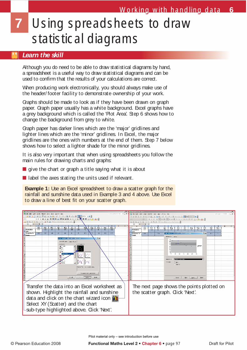
Example 1: Use an Excel spreadsheet to draw a scatter graph for the rainfall and sunshine data used in Example 3 and 4 above. Use Excel to draw a line of best fi t on your scatter graph.
■
■
7 Using spreadsheets to draw statistical diagrams
© Pearson Education 2008 Functional Maths Level 2 • Chapter 6 • page 97 Draft for Pilot
Transfer the data into an Excel worksheet as shown. Highlight the rainfall and sunshine data and click on the chart wizard icon Select XY (Scatter) and the chart sub-type highlighted above. Click ‘Next’.
The next page shows the points plotted on the scatter graph. Click ‘Next’.
Pilot material only – see introduction before use

Type in a suitable title and labels for the x and y axes, remembering to include the units. Click on the ‘Gridlines’ tab.
Tick ‘Major gridlines’, ‘Minor gridlines’ for both the x and y axes. Click on the ‘Legend’ tab and untick ‘Show legend’. Click on ‘Next’.
On the fi nal page click on Place chart ‘As new sheet’ and click ‘Finish’.
As you move your cursor around the screen you will see it pick up different statements. When you see ‘Plot Area’, right click and choose the ‘Clear’ option.
Try the skill
Use Excel and the chart wizard for questions 1, 3, 4 and 5 in the last Try the skill exercise. Remember to make use of the header/footer facility and look at the print preview before printing out your charts and graphs.
When the cursor picks up ‘Value (Y) Axis Minor Gridlines’ right click, select ‘Format gridlines’ and choose ‘Gray-50%’ for the colour. Click OK. Then do the same for ‘Value (X) Axis Minor Gridlines’. Then click ‘OK’.
Right click on one of the plotted points, select ‘Add Trendline’. Linear will be highlighted, click ‘OK’ and the line of best fi t will be added to the scatter graph.
Draft for Pilot Functional Maths Level 2 • Chapter 6 • page 98 © Pearson Education 2008
Pilot material only – see introduction before use

Working with handling data 6Working with handling data 6
© Pearson Education 2008 Functional Maths Level 2 • Chapter 6 • page 99 Draft for Pilot
8 Remember what you have learned
First complete this …
data can only take particular values.
data can take any value.
use bars to show patterns in data.
You use double bar charts to two sets of data.
Pie charts show the of different types of data in a set of results.
Line graphs are used to display data.
show any connection between two sets of data.
Use the skill
1. Here are the results of a survey on the number of TVs per house.
How many houses had more than three TVs?
2. A travel company compares the number of visitors to major capital cities in June 2005 and June 2006.
What is the difference between the numbers visiting Paris and Rome in 2006, to the nearest thousand?
A 36
B 60
C 84
D 120
A 22 500
B 25 000
C 63 000
D 61 000
Number of TVs in the house
Number of houses
0 11 212 383 844 295 66 1
Pilot material only – see introduction before use

Draft for Pilot Functional Maths Level 2 • Chapter 6 • page 100 © Pearson Education 2008
3. Which city showed the highest increase in visitors from 2005 to 2006?
4. The graph shows the sales for a shop in one year.
Which of these statements about the graph is correct?
5. The heights of 30 sunfl owers were recorded. The results are shown in this table.
Height (cm) 13–15 16–18 19–21 22–24 25–27 28–30
Frequency 1 2 11 10 5 1
Which of these is the best way to present this information?
6. A company’s profi ts for the fi rst four months in 2006 are shown in the table.
Month Jan Feb March April
Profi t (£) 1 790 1 840 1 735 1 720
The information is presented in a bar chart.
Why is this bar chart misleading?
A the value of photocopying sales is lower than computer sales every month
B the value of the stationery sales is higher than photocopying sales every month
C the value of all sales fell and rose again in April and August
D the value of all sales increased in June and November
A Rome
B Berlin
C Madrid
D Dublin
A line graph
B bar chart
C scatter graph
D pie chart
A The title is incorrect.
B The axis labels are incorrect.
C The vertical scale does not start at zero.
D Some of the bars are incorrect.
Monthly sales
0
200
400
600
800
0001
2001
Jan Feb Mar Apr May Jun Jul Aug Sep Oct Nov DecMonth
Sale
s in
£
Computer
Stationery
Photocopying
Company profit per month
640660680700720740760780800820840860
111111111111
Prof
it in
£
Jan Feb March AprilMonth
Pilot material only – see introduction before use

Learn the skill
An average is a value that is used to represent a set of data.
The mean of a set of data is the most widely used average.
Mean = sum of valuesnumber of values
Example 1: A student scores the following marks in her maths tests:75% 77% 75% 48% 73% 80% 76%Her friend has a mean mark of 75%. What is the difference between their mean marks?
Student’s mean mark
= 75 + 77 + 75 + 48 + 73 + 80 + 767 = 504
7 = 72%
Difference between the student’s mean and her friend’s mean
= 75 – 72 = 3%
Answer: 3%
You can also work out the mean of the data in a frequency distribution table.
Example 2: The table shows the number of pets owned by the occupiers of 25 houses in a street.
What is the mean number of pets per house?
mean = total number of petstotal number of houses
To work out the total number of pets, look at each category.
4 houses had 0 pets, this is 4 × 0 = 0 pets in total.
1 Mean
You should already know how to:
✓ fi nd the mean and range for a set of data.
By the end of this section you will know how to:
fi nd the mean, median and mode and use them to compare two sets of data
fi nd the range and use it to describe the spread within sets of data.
J Working with averages
TipAn average gives a ‘typical value’ for the data.
TipThe mean may not work out to be one of the actual data values. Here, 72% is not one of the student’s test scores.
x fNumber of pets
Number of houses
0 41 72 93 34 25 0
TipCreate an fx column by multiplying each of the x values by the corresponding f value. Then mean = Σfx
ΣfΣ means ‘sum of’.
© Pearson Education 2008 Functional Maths Level 2 • Chapter 6 • page 101 Draft for Pilot
Pilot material only – see introduction before use

7 houses had 1 pet, this is 7 × 1 = 7 pets in total …
The total number of pets
= 4 × 0 + 7 × 1 + 9 × 2 + 3 × 3 + 2 × 4 + 0 × 5
= 0 + 7 + 18 + 9 + 8 + 0 = 42
The total number of houses is the sum of the frequencies = 25
Mean = 4225 = 168
100 = 1.68
Answer: 1.68
Try the skill
1. The heights of four boys are 151 cm, 154 cm, 162 cm and 153 cm. What is the mean height of the boys?
2. A man’s journey times to work one week were 14 minutes, 18 minutes, 21 minutes, 13 minutes and 19 minutes. What was his mean journey time for the week?
3. Five friends save £12, £10, £15, £11 and £16 respectively in a month. The following month, the mean amount the friends save is £13.40. What is the difference in the mean amounts of money saved for the two months?
4. A student has a mean test result of 65% for her fi rst fi ve tests. She scores 71% in the next test. What is her mean test result for all six tests?
5. The table gives the ages of students on a Diploma course.
Age in years Number of students
16 4
17 8
18 12
19 10
20 2
What is the mean age of the students on the course?
× 4
× 4
TipAlways check that your answer makes sense. The value lies within the possible numbers of pets, which is 0 to 5, and most of the houses have either 1 or 2 pets.
TipΣfxΣf = 42
25 = 1.68
Draft for Pilot Functional Maths Level 2 • Chapter 6 • page 102 © Pearson Education 2008
Pilot material only – see introduction before use

Working with handling data 6Working with handling data 6
Learn the skill
The mode of a set of data is the value that occurs most often.
The median of a set of data is the middle value when the data values are placed in order.
To fi nd the position of the median value in a set of data add 1 to the number of values and divide by 2.If the number of values is n, then median = (n + 1)
2th value
Example 1: A student sits seven maths tests. Her marks for the tests are 75%, 77%, 75%, 48%, 73%, 80% and 76%. The student sits another test and scores 78%. a What is her modal mark? b What is her median mark for the eight tests?
a The modal mark, or mode = 75%Answer: 75%
b The test marks for the eight tests, in order, are: ↓
48%, 73%, 75%, 75%, 76%, 77%, 78%, 80%
As there are eight test marks the median is in the 8 + 1
2 = 4.5th position.
So the median test mark is the mean of the 4th and 5th marks, 75% and 76%.
Median mark = 75 + 762 = 75.5%
Answer: 75.5%
You can also work out the median and mode of data in a frequency table.
Example 2: The table shows a group of students’ marks scored out of 6 in a test. a What is the modal mark?b What is the median?
a The modal mark is the mark with the highest frequency.
The highest frequency is 5 so the modal mark is 3.
Answer: The modal mark is 3.
b There are 19 values.
The median is the (19 + 1)2
th value = 10th value.
This is in the category where the mark is 4.
Answer: The median is 4.
2 Median and mode
Tipmode = most often median = middle
TipRemember to place the data in order to fi nd the median.
TipIf there is an even number of values, the median will not be one of the actual data values.The mode will always be one of the data values.
Mark Number of students0 01 22 13 54 35 46 4
© Pearson Education 2008 Functional Maths Level 2 • Chapter 6 • page 103 Draft for Pilot
Pilot material only – see introduction before use

Draft for Pilot Functional Maths Level 2 • Chapter 6 • page 104 © Pearson Education 2008
Try the skill
1. The number of chocolates in 7 tubes of Smarties was counted: 45, 46, 46, 45, 47, 48, 45.
a What is the median number of Smarties in a tube?
b What is the modal number of Smarties?
2. A survey of petrol prices recorded the following prices in pence per litre for unleaded petrol:
103.9 107.9 106.9 107.9 107.9 104.9 103.9
107.9 103.9 109 107.9 107.9 105.9 106.9
a What is the median price of petrol in pence per litre?
b What is the modal price of petrol in pence per litre?
3. The table shows the number of letters received by 40 households in one particular day.
a What is the median number of letters received?
b What is the modal number of letters received?
4. The table shows the results of a survey into the number of parking tickets people had received in a city centre.
a What is the median number of parking tickets for:
i men
ii women?
b What is the modal number of parking tickets received for:
i men
ii women?
c Use your answers to compare parking in the city centre by men and women.
Number of letters
Number of households
0 11 52 93 154 85 2
Number of tickets
Men Women
0 2 31 3 112 10 53 4 14 1 0
TipRemember that the mode is one of the values, either 0, 1, 2, 3 or 4, not the frequency.
TipIn a grouped frequency table, the interval with the highest frequency is called the ‘modal class’. For example:
Mark Frequency
1 – 10 2
11 – 20 8
21 – 30 12
31 – 40 10
41 – 50 5
Modal class is 21 – 30 marks as this has highest frequency of 12.
Pilot material only – see introduction before use

Working with handling data 6Working with handling data 6
© Pearson Education 2008 Functional Maths Level 2 • Chapter 6 • page 105 Draft for Pilot
Learn the skill
You should choose the best average to use to represent data.
The table gives the pros and cons of each average:
Average Advantages DisadvantagesMean Takes all the data values into account Is affected by extreme valuesMedian Is not affected by extreme values Does not take all the data values into
accountMode Is not affected by extreme values Does not take all the data values into
account
Here are some common ways each average is used:
To fi nd the typical number of goods produced per month in a factory, the mean is often the best average to use.
To fi nd the most typical salary in an offi ce, the median is often the best average to use, as it will not be affected by a few high wages.
For a clothes shop wanting to reorder stock, the mode is often the most useful average, as it will identify the items that are most likely to sell.
■
■
■
The range is a measure of the spread of the data. The range of a set of data is the difference between the highest value and the lowest value.
Range = highest value – lowest value
Example 1: What is the range for this student’s test marks?75% 77% 75% 48% 73% 80% 76%
The highest mark is 80% and the lowest mark is 48%.
Range = 80 – 48 = 32%
Answer: 32%
Try the skill
1. The numbers of cars per hour driving through a village during daylight hours in a two-week period were:12, 11, 12, 13, 15, 10, 14, 17, 16, 7, 9, 15, 12, 11.
Find:a the median
b the mode
c the range
3 Using averages and the range
Test tipYou may be asked to compare sets of data using average values.
TipThe bigger the range, the more spread out the data values are.The smaller the range, the more consistent the results.
Pilot material only – see introduction before use
Draft for Pilot Functional Maths Level 2 • Chapter 6 • page 106 © Pearson Education 2008
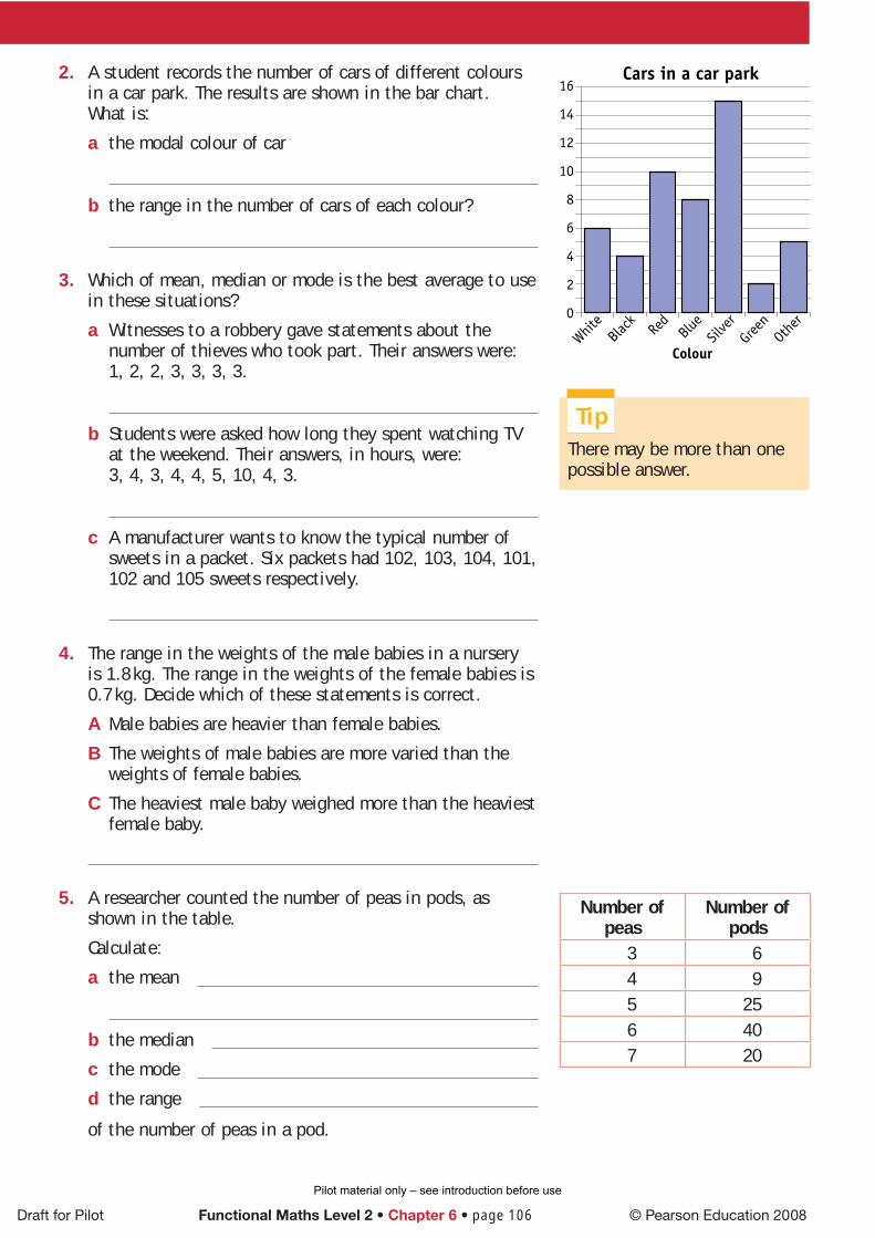
2. A student records the number of cars of different colours in a car park. The results are shown in the bar chart. What is:
a the modal colour of car
b the range in the number of cars of each colour?
3. Which of mean, median or mode is the best average to use in these situations?
a Witnesses to a robbery gave statements about the number of thieves who took part. Their answers were: 1, 2, 2, 3, 3, 3, 3.
b Students were asked how long they spent watching TV at the weekend. Their answers, in hours, were:3, 4, 3, 4, 4, 5, 10, 4, 3.
c A manufacturer wants to know the typical number of sweets in a packet. Six packets had 102, 103, 104, 101, 102 and 105 sweets respectively.
4. The range in the weights of the male babies in a nursery is 1.8 kg. The range in the weights of the female babies is 0.7 kg. Decide which of these statements is correct.
A Male babies are heavier than female babies.
B The weights of male babies are more varied than the weights of female babies.
C The heaviest male baby weighed more than the heaviest female baby.
5. A researcher counted the number of peas in pods, as shown in the table.
Calculate:
a the mean
b the median
c the mode
d the range
of the number of peas in a pod.
Number of peas
Number of pods
3 64 95 256 407 20
TipThere may be more than one possible answer.
Pilot material only – see introduction before use

Working with handling data 6Working with handling data 6
© Pearson Education 2008 Functional Maths Level 2 • Chapter 6 • page 107 Draft for Pilot
First complete this …
An is a value that is used to represent a set of data.
= sum of valuesnumber of values
The of a set of data is the middle value when the data are placed in order.
The of a set of data is the value that occurs most often.
= highest value – lowest value.
Use the skill
1. A baby’s birth weight was 3.4 kg. In the tenth week, the baby weighed 5.3 kg.
What was the baby’s mean weight gain per week?
2. The table shows the mean monthly temperatures in England and Wales, in 2004 and 2005, in degrees Celsius.
Year Jan Feb Mar Apr May Jun Jul Aug Sep Oct Nov Dec
2004 4.9 5.1 6.2 9.2 11.7 15.1 15.5 17.1 14.4 10.4 7.5 5.3
2005 5.7 4.0 6.8 8.6 11.0 15.1 16.3 15.9 14.8 12.7 6.0 4.3
What was the mean temperature for the year in 2004, to one decimal place?
3. What is the difference in the range of temperature in England and Wales for 2004 and 2005?
4 Remember what you have learned
A 0.19 kg
B 0.53 kg
C 0.87 kg
D 1.9 kg
A 9.8°C
B 15.3°C
C 10.2°C
D 12.3°C
A 0.1 degrees
B 0.2 degrees
C 0.3 degrees
D 0.5 degrees
Pilot material only – see introduction before use

Draft for Pilot Functional Maths Level 2 • Chapter 6 • page 108 © Pearson Education 2008
4. A café manager recorded the number of different fl avour packets of crisps sold in one particular week. The results are recorded in the table below:
Ready Salted
Cheese & Onion
Salt & Vinegar
Smoky Bacon
Total
Monday 11 16 12 5 44Tuesday 8 6 5 3 22Wednesday 12 18 11 4 45Thursday 9 17 8 2 36Friday 20 8 6 1 35Total 60 65 42 15 182
What is the mean number of sales of cheese and onion crisps per weekday?
5. Using the data from question 4, what is the range in the number of different fl avour packets of crisps sold on Wednesday?
6. The marks out of 25 for twenty students in a test are as follows: 19, 6, 20, 21, 18, 22, 12, 15, 19, 13, 15, 11, 10, 8, 14, 21, 20, 5, 16, 12.
What is the median mark?
7. Fifty people were surveyed about the maximum amount they would be prepared to spend on a holiday.
The table shows the results.
What is the mean amount the people surveyed would be prepared to spend on a holiday?
8. Sixty people were surveyed about the number of pieces of fruit or vegetables they had eaten the previous day. The results are recorded in the table below:
Number of pieces of fruit or vegetables
0 1 2 3 4 5 6
Number of people 2 4 6 10 8 22 8
What is the modal number of pieces of fruit or vegetables eaten by the people surveyed?
A 3
B 8
C 12
D 13
A 11
B 14
C 15
D 19
A £2420
B £2500
C £2750
D £3000
A 14
B 15
C 15.5
D 16
A 3
B 5
C 8
D 22
Amount of money Number of people
£5 000 2
£4 000 4
£3 000 6
£2 500 12
£2 000 16
£1500 10
Pilot material only – see introduction before use