media ppt website
TRANSCRIPT

E06
The Official Band Home Page

Any good band needs to have a homesite where fans can find them or labels can find contact details.
In building any kind of first impression as a band, the music is the first measurement and, the second, is the website.
IT MUST BE
GREAT.
To understand what makes a good website for a band or artist, we must examine other successful ones.

The first websites to look at are ones from the biggest bands and artists around today, ones that are known on a global scale.
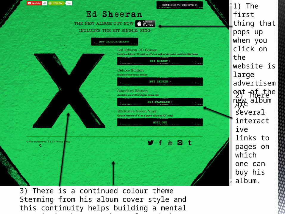
1) The first thing that pops up when you click on the website is large advertisement of the new album ‘X’.
2) There are several interactive links to pages on which one can buy his album.
3) There is a continued colour theme Stemming from his album cover style and this continuity helps building a mental association between the style and the artist.

MenuThe Artist’s name remains a large presence.
There are links to social media websites to gain more access to info about the Artist.
A helpful directory to the several different parts of the site.
Constantly updated ‘Latest News’ feed.

A strong point of the Ed Sheeran website is it is filled out with useful information and in no places does it look empty or bare, lacking substance. There are helpful links to suitable content and strong branding is maintained to gauge the interest of the visitor to the site.
Strengths
Obviously this is down to taste and I appreciate that the Site suits Ed Sheeran’s style but I feel that the website looks too messy and isn’t very visually pleasing.
Weaknesses

http://www.foofighters.com/
Have a butcher’s…
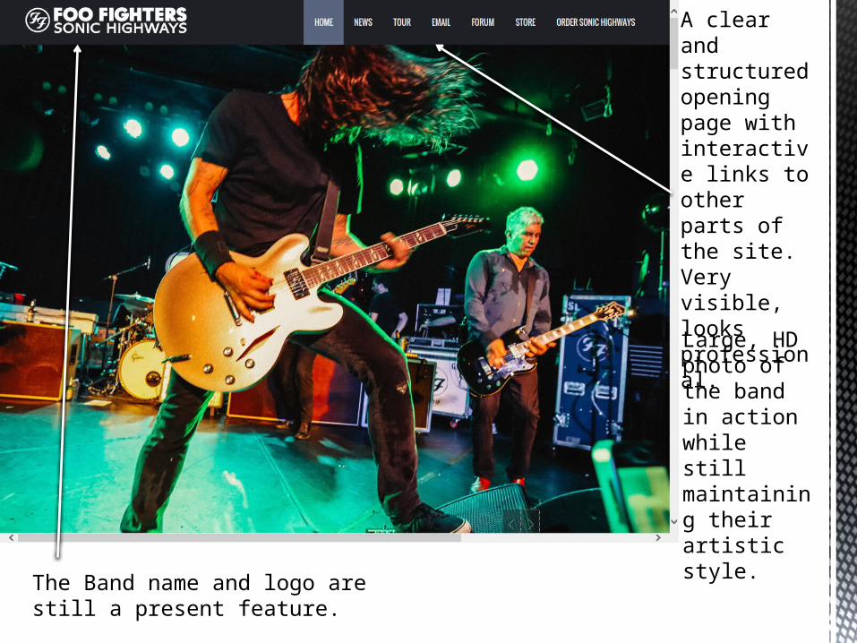
A clear and structured opening page with interactive links to other parts of the site. Very visible, looks professional.
Large, HD photo of the band in action while still maintaining their artistic style.
The Band name and logo are still a present feature.

Link to buy ‘Sonic Highways’, their new album and ‘Store’ for the previous albums and merchandise.
The Image changes automatically, cycling through three different images. This is a cool and impressive idea.

As one scrolls down the page, we travel along the directory at the top as will become apparent in the later slides.
Faint images in the background help to create illusion of a packed out page.

Scrolling down follows the directory along.

Positive – The website is very clean, well organised and very user friendly and this is a key aspect of a good website. It is not over complicated and all the links are easy to use with relevant information easily found.
Negative – The website seems so well organised that it could appear cold and not involving the fan base and no direct links to social media but an Email fan update system is in place.
Positives and negatives?

http://kingsofleon.com/#!/ You know the drill…

The page opens up to a celebration of the most recently released album.
Links to sections of the website are unclear and do not look like inviting links to click.
Links to social media are clear and present.

As one scrolls down, the directory links and social media links linger at the top.
Band News and tour dates are the priority.
Similar to Foo Fighters, News updates are done via email sign up.
Website is packed with photos of band playing throughout.

What have I learnt?
Websites are designed to match the style of the artist and it determines largely the way a band or group is perceived.
Common features are links to social media sites, some form of helpful directory, a link to where to buy the music and merchandise and a news sign up system.
My website will adopt many of the conventions of a band website. My aims are for the site to have:
So my website…
1) Links to social media2) Directory with News, Tour dates, Lyrics
page, Email sign-up, Photos, Videos and merchandise.
3) The background will be relevant pictures of the band or band related content.