mediu q locuri si lucruri
TRANSCRIPT
Brenda Hoddinott
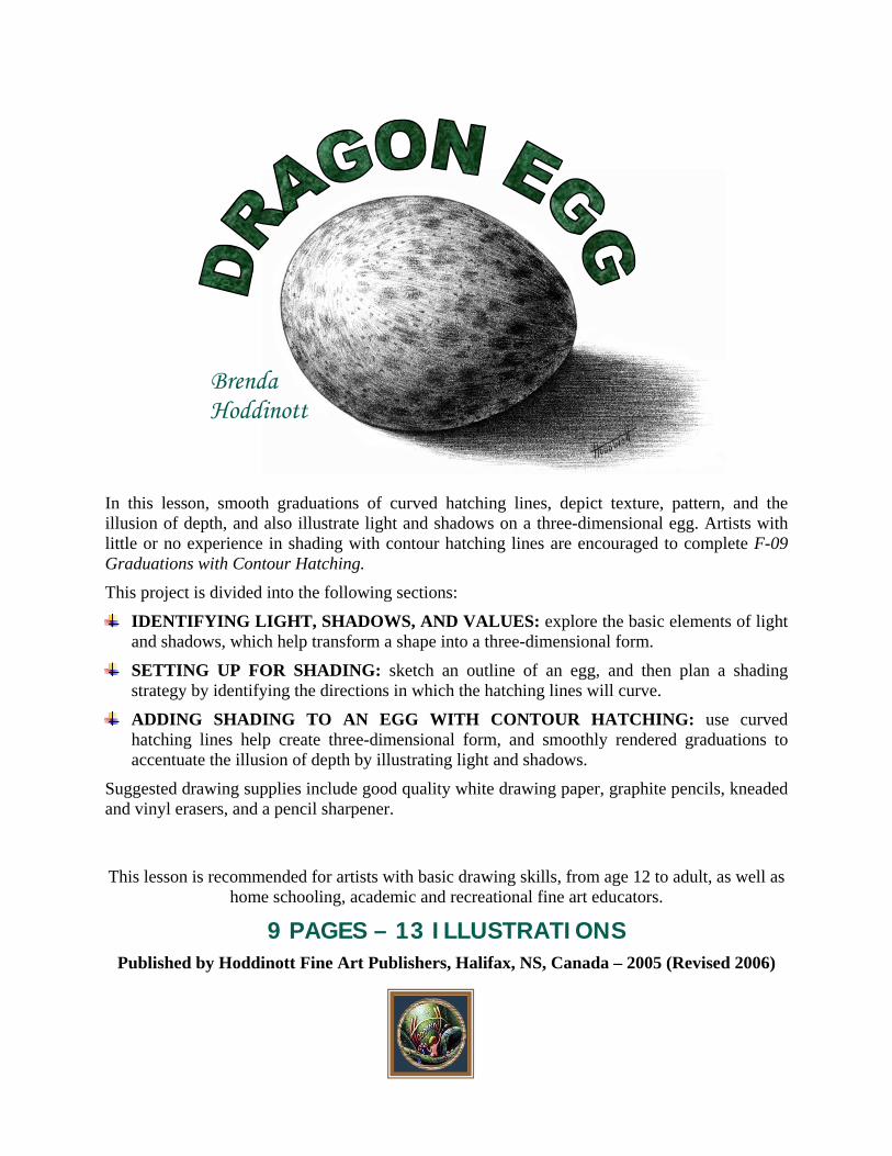
In this lesson, smooth graduations of curved hatching lines, depict texture, pattern, and the illusion of depth, and also illustrate light and shadows on a three-dimensional egg. Artists with little or no experience in shading with contour hatching lines are encouraged to complete F-09 Graduations with Contour Hatching. This project is divided into the following sections:
IDENTIFYING LIGHT, SHADOWS, AND VALUES: explore the basic elements of light and shadows, which help transform a shape into a three-dimensional form.
SETTING UP FOR SHADING: sketch an outline of an egg, and then plan a shading strategy by identifying the directions in which the hatching lines will curve.
ADDING SHADING TO AN EGG WITH CONTOUR HATCHING: use curved hatching lines help create three-dimensional form, and smoothly rendered graduations to accentuate the illusion of depth by illustrating light and shadows.
Suggested drawing supplies include good quality white drawing paper, graphite pencils, kneaded and vinyl erasers, and a pencil sharpener.
This lesson is recommended for artists with basic drawing skills, from age 12 to adult, as well as
home schooling, academic and recreational fine art educators.
9 PAGES – 13 ILLUSTRATIONS Published by Hoddinott Fine Art Publishers, Halifax, NS, Canada – 2005 (Revised 2006)

Copyright to all articles, images, text, projects, lessons and exercises within this drawing class belong to Brenda Hoddinott and may not be reproduced or used for any commercial purposes whatsoever without the written permission of Brenda Hoddinott.
E-mail [email protected] Web sites http://www.finearteducation.com and http://www.drawspace.com
- 2 -
IDENTIFYING LIGHT, SHADOWS, AND VALUES In the interest of simplicity, this project focuses on the following four components of light and shadows:
1. Highlight: The center of a highlight is left white and the values around it are very light. Highlight refers to the brightest area of a form where light bounces off its surface and is usually the section closest to the light source.
2. Shadows: The sections on the surface of the egg that receive little or no light, are shaded with dark values. A shadow generally appears darker in value closer to the object and farther away from the light source.
3. Reflected light: The rim of light along the underside of the egg is lighter in value than the shadow areas but darker than the sections close to the light source. Reflected light is a faint light reflected or bounced back on an object from the surfaces close to and around it.
4. Cast shadow: The values are very dark next to the egg, and graduate lighter outward. A cast shadow is a dark section created on a surface adjacent to an object when the light is blocked. Cast shadows are generally shaded with very dark values closest to the object, which graduate lighter toward the outer perimeter.
ILLUSTRATION 01-01
The basic elements of light and shadows help transform an egg-shape into a three-dimensional egg (check out the next two drawings). Shape refers to the outward outline of a form or section of a pattern. Basic shapes include circles, squares and triangles. In addition to creating the illusions of light, shadows, and form, smooth graduations of curved hatching lines, also depict the egg’s smooth texture and spotted pattern.
Copyright to all articles, images, text, projects, lessons and exercises within this drawing class belong to Brenda Hoddinott and may not be reproduced or used for any commercial purposes whatsoever without the written permission of Brenda Hoddinott.
E-mail [email protected] Web sites http://www.finearteducation.com and http://www.drawspace.com
- 3 -
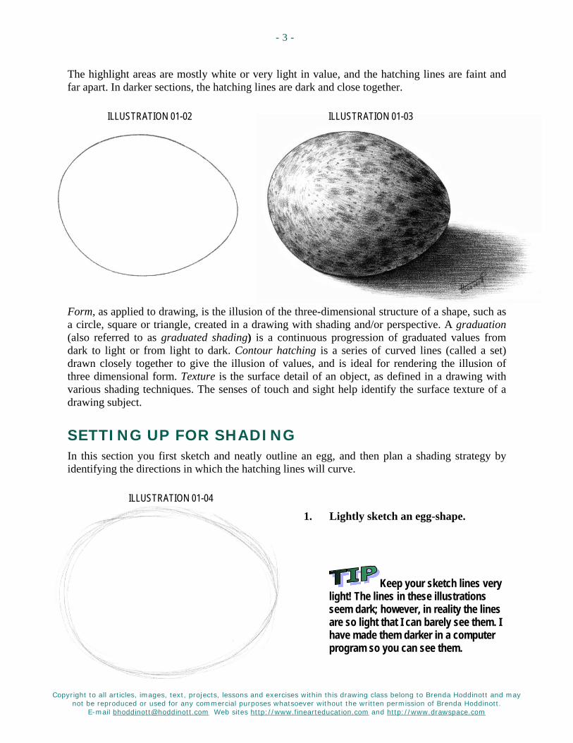
The highlight areas are mostly white or very light in value, and the hatching lines are faint and far apart. In darker sections, the hatching lines are dark and close together.
ILLUSTRATION 01-02 ILLUSTRATION 01-03
Form, as applied to drawing, is the illusion of the three-dimensional structure of a shape, such as a circle, square or triangle, created in a drawing with shading and/or perspective. A graduation (also referred to as graduated shading) is a continuous progression of graduated values from dark to light or from light to dark. Contour hatching is a series of curved lines (called a set) drawn closely together to give the illusion of values, and is ideal for rendering the illusion of three dimensional form. Texture is the surface detail of an object, as defined in a drawing with various shading techniques. The senses of touch and sight help identify the surface texture of a drawing subject.
SETTING UP FOR SHADING In this section you first sketch and neatly outline an egg, and then plan a shading strategy by identifying the directions in which the hatching lines will curve.
ILLUSTRATION 01-04
1. Lightly sketch an egg-shape.
Keep your sketch lines very light! The lines in these illustrations seem dark; however, in reality the lines are so light that I can barely see them. I have made them darker in a computer program so you can see them.

Copyright to all articles, images, text, projects, lessons and exercises within this drawing class belong to Brenda Hoddinott and may not be reproduced or used for any commercial purposes whatsoever without the written permission of Brenda Hoddinott.
E-mail [email protected] Web sites http://www.finearteducation.com and http://www.drawspace.com
- 4 -
ILLUSTRATION 01-05
2. Use a freshly sharpened HB pencil to neatly outline the shape of the egg.
Don’t forget that you can turn your drawing paper (or sketchbook) around as you draw.
ILLUSTRATION 01-06
3. Use your kneaded eraser to erase the rough sketch lines.
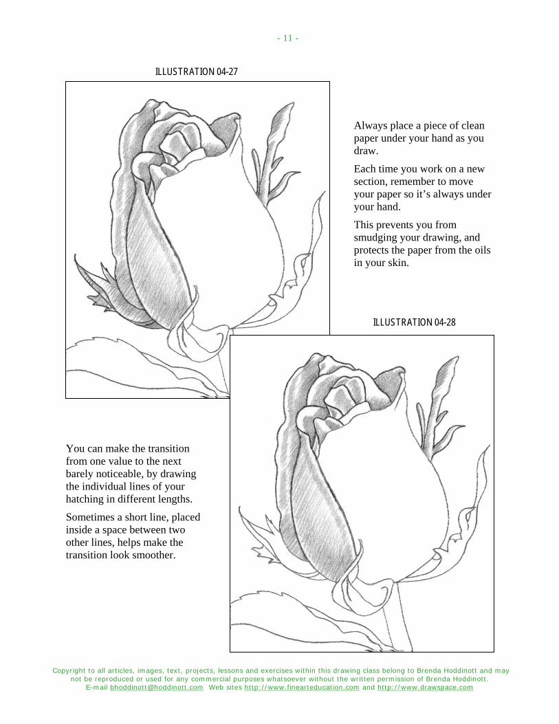
Always place a piece of clean paper under your hand as you draw. Each time you work on a new section, remember to move your paper so it’s always under your hand. This prevents you from smudging your drawing, and protects the paper from the oils in your skin.
ILLUSTRATION 01-07 4. Add a few curved lines to map the
directions in which the hatching lines will curve. These mapping lines follow the perceived contours of the three-dimensional forms of an egg.
If you have little or no experience with shading with contour hatching lines, try F-09 Graduations with Contour Hatching.

Copyright to all articles, images, text, projects, lessons and exercises within this drawing class belong to Brenda Hoddinott and may not be reproduced or used for any commercial purposes whatsoever without the written permission of Brenda Hoddinott.
E-mail [email protected] Web sites http://www.finearteducation.com and http://www.drawspace.com
- 5 -
ADDING SHADING TO AN EGG WITH CONTOUR HATCHING When your goal is to create a smooth texture, you need to keep the transitions between different values flowing into one another as smoothly as possible. In this drawing of an egg, the light source is from the left. Light source refers to the direction from which a dominant light originates. The placement of this light source affects every aspect of a drawing. The light source tells you where to draw all the various values and shadows.
Curved hatching lines help create the three-dimensional form, and smoothly rendered graduations accentuate the illusion of depth by illustrating light and shadows.
To prevent your eyes from becoming overly tired as you draw, always make sure you have adequate lighting.
5. Add light and medium values to the egg. The center of the highlight is left white and represents the section closest to the light source. The shading begins very light around the edge of the highlight (use a 2H) and becomes gradually darker farther away from the light (try an HB). The reflected light is also shaded with light values.
ILLUSTRATION 01-08

Copyright to all articles, images, text, projects, lessons and exercises within this drawing class belong to Brenda Hoddinott and may not be reproduced or used for any commercial purposes whatsoever without the written permission of Brenda Hoddinott.
E-mail [email protected] Web sites http://www.finearteducation.com and http://www.drawspace.com
- 6 -
ILLUSTRATION 01-09 6. Use horizontal hatching lines to shade in
the light values of the cast shadow.
7. Add medium and dark values to the shadow sections of the egg.
Refer to illustration 01-10. The values are darker because very little light reaches these shadow areas. The curved hatching lines in the darkest shadow sections are very close together with hardly any of the white paper showing through.
Contrast makes drawings appear more three-dimensional by accentuating the light and shadows. Contrast refers to the comparison of different values when put beside one another. By using extremes in values (more light and dark values than middle values) you create a high contrast drawing. Drawings can appear flat, rather than three-dimensional when too little contrast is used.
ILLUSTRATION 01-10
8. Add a few tiny spots all over the egg.
Note that these spots are light in the sections close to the light source and darker in the shadow sections.

Copyright to all articles, images, text, projects, lessons and exercises within this drawing class belong to Brenda Hoddinott and may not be reproduced or used for any commercial purposes whatsoever without the written permission of Brenda Hoddinott.
E-mail [email protected] Web sites http://www.finearteducation.com and http://www.drawspace.com
- 7 -
9. Add medium and dark values to the cast shadow. The values of the cast shadow are darkest next to the egg’s lower edge and become gradually lighter farther away from the edge of the egg. As you add the dark shading, constantly check the transition between the different values and adjust the hatching lines as needed. 6B will create the very darkest values.
Generally speaking, when you draw cast shadows, keep in mind that they usually take on the shapes of the forms that are blocking the light. However, their shapes can also be affected by the surface on which the shadow is cast. For example, if the cast shadow of a tall man is on uneven land, his shadow is shaped along its contours.
ILLUSTRATION 01-11
10. Add darker values to the shadow sections of the egg.
11. If you wish you can add larger spots to the egg. Refer to illustrations 01-12 and 01-13. Observe that the spots are various shapes and sizes and unevenly spaced. They are shaded with light values around the highlight section. In the shadow sections the spots are very dark in value.
Copyright to all articles, images, text, projects, lessons and exercises within this drawing class belong to Brenda Hoddinott and may not be reproduced or used for any commercial purposes whatsoever without the written permission of Brenda Hoddinott.
E-mail [email protected] Web sites http://www.finearteducation.com and http://www.drawspace.com
- 8 -
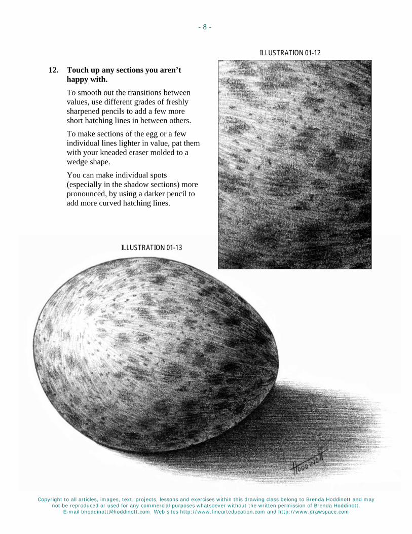
ILLUSTRATION 01-12
12. Touch up any sections you aren’t happy with. To smooth out the transitions between values, use different grades of freshly sharpened pencils to add a few more short hatching lines in between others.
To make sections of the egg or a few individual lines lighter in value, pat them with your kneaded eraser molded to a wedge shape.
You can make individual spots (especially in the shadow sections) more pronounced, by using a darker pencil to add more curved hatching lines.
ILLUSTRATION 01-13

Copyright to all articles, images, text, projects, lessons and exercises within this drawing class belong to Brenda Hoddinott and may not be reproduced or used for any commercial purposes whatsoever without the written permission of Brenda Hoddinott.
E-mail [email protected] Web sites http://www.finearteducation.com and http://www.drawspace.com
- 9 -
BRENDA HODDINOTT - BIOGRAPHY As a self-educated teacher, visual artist, portraitist, forensic artist, and illustrator, Brenda Hoddinott utilizes diverse art media including graphite, technical pen, colored pencil, chalk pastel, charcoal, conté crayon, and oil paints.
My philosophy on teaching art is to focus primarily on the enjoyment aspects while gently introducing the technical and academic. Hence, in creating a passion for the subject matter,
the quest for knowledge also becomes enjoyable. >Brenda Hoddinott<
Born in St. John’s, Newfoundland, Brenda grew up in the small town of Corner Brook. She developed strong technical competencies with a personal commitment to self directed learning, and the aid of assorted “Learn to Draw” books. During Brenda’s twenty-five year career as a self-educated civilian forensic artist, numerous criminal investigation departments have employed Brenda’s skills, including Royal Canadian Mounted Police and municipal police departments. In 1992, Brenda was honored with a commendation from the Royal Canadian Mounted Police, and in 1994, she was awarded a Certificate of Membership from “Forensic Artists International”.
Her home-based art career included graphic design, and teaching recreational drawing and painting classes. As supervisor of her community’s recreational art department, Brenda hired and trained teachers, and designed curriculum for several children’s art programs. In 1998, Brenda chose to end her eighteen-year career as an art educator in order to devote more time to writing, drawing, painting, and developing her websites.
Drawspace http://www.drawspace.com incorporates her unique style and innovative approach to curriculum development. This site offers downloadable and printable drawing classes for students of all abilities from the age of eight through adult. Students of all ages, levels and abilities have praised the simple step-by-step instructional approach. This site is respected as a resource for fine art educators, home schooling programs, and educational facilities throughout the world.
LEARN-TO-DRAW BOOKS BY BRENDA HODDINOTT Drawing for Dummies: Wiley Publishing, Inc., New, York, NY, this 336 page book is
available on various websites and in major bookstores internationally.
The Complete Idiot’s Guide to Drawing People: Winner of the Alpha-Penguin Book of the Year Award 0204, Alpha - Pearson Education – Macmillan, Indianapolis, IN, this 360 page book is available on various websites and in major bookstores internationally.
Brenda Hoddinott
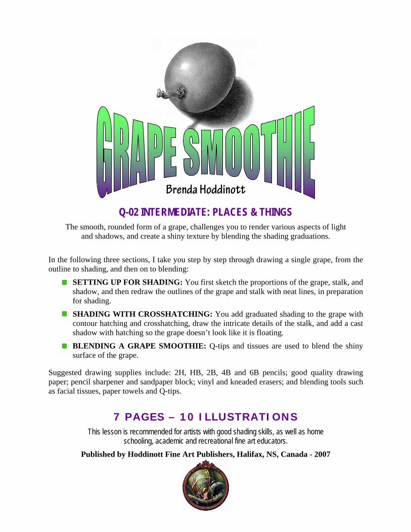
Q-02 INTERMEDIATE: PLACES & THINGS The smooth, rounded form of a grape, challenges you to render various aspects of light
and shadows, and create a shiny texture by blending the shading graduations.
In the following three sections, I take you step by step through drawing a single grape, from the outline to shading, and then on to blending:
SETTING UP FOR SHADING: You first sketch the proportions of the grape, stalk, and shadow, and then redraw the outlines of the grape and stalk with neat lines, in preparation for shading.
SHADING WITH CROSSHATCHING: You add graduated shading to the grape with contour hatching and crosshatching, draw the intricate details of the stalk, and add a cast shadow with hatching so the grape doesn’t look like it is floating.
BLENDING A GRAPE SMOOTHIE: Q-tips and tissues are used to blend the shiny surface of the grape.
Suggested drawing supplies include: 2H, HB, 2B, 4B and 6B pencils; good quality drawing paper; pencil sharpener and sandpaper block; vinyl and kneaded erasers; and blending tools such as facial tissues, paper towels and Q-tips.
7 PAGES – 10 ILLUSTRATIONS This lesson is recommended for artists with good shading skills, as well as home
schooling, academic and recreational fine art educators. Published by Hoddinott Fine Art Publishers, Halifax, NS, Canada - 2007
Copyright to al l art icles, images, text, projects, lessons and exercises within this drawing class belong to Brenda Hoddinott and may not be reproduced or used for any commercial purposes whatsoever without the wri t ten permission of Brenda Hoddinott .
E-mail bhoddinott@hoddinott .com Web si tes http:/ /www.f inearteducat ion.com and ht tp:/ /www.drawspace.com
- 2 -
Outline drawings (also called contour drawings or line drawings) are comprised of lines which follow the contours of the various components of a drawing subject and define the outlines of its forms. Contour lines are created when the shared edges of spaces and/or objects meet. Contour lines can define complete objects or small sections or details within drawing subjects. Form, as applied to drawing, is the illusion of the three-dimensional structure of a shape, created in a drawing with shading and/or perspective. Shading refers to the various values that help make drawings look three-dimensional. Values are the different shades of gray created when you draw by varying both the density of the shading lines, and the pressure used in holding various pencils. Shape refers to the outward outline of a form. Cast shadow is a dark area on a surface, adjacent to where the light is blocked by an object.
SSEETTTTIINNGG UUPP FFOORR SSHHAADDIINNGG In this section, you first sketch the proportions of the grape, stalk, and shadow, and then redraw the outlines of the grape and stalk with neat lines, in preparation for shading.
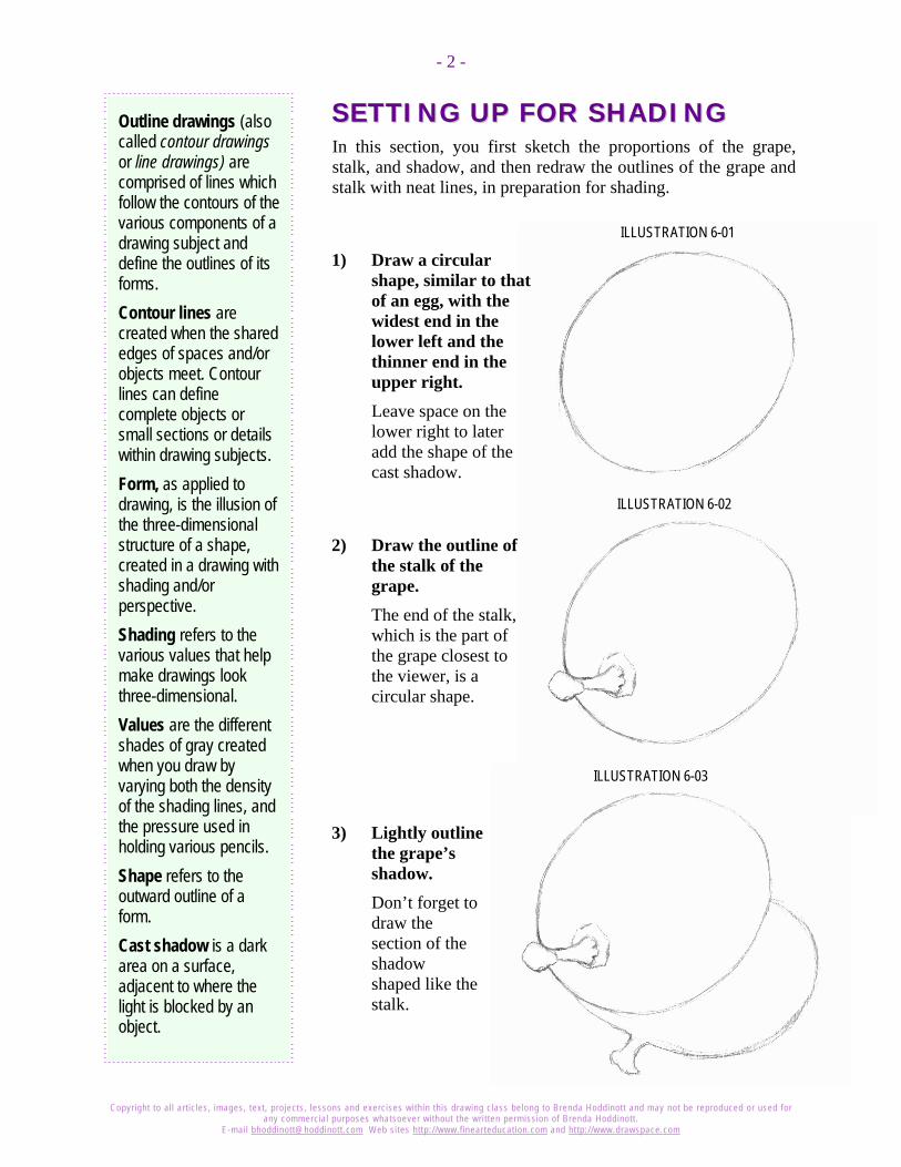
ILLUSTRATION 6-01
1) Draw a circular shape, similar to that of an egg, with the widest end in the lower left and the thinner end in the upper right. Leave space on the lower right to later add the shape of the cast shadow.
ILLUSTRATION 6-02
2) Draw the outline of the stalk of the grape. The end of the stalk, which is the part of the grape closest to the viewer, is a circular shape.
ILLUSTRATION 6-03
3) Lightly outline the grape’s shadow. Don’t forget to draw the section of the shadow shaped like the stalk.
Copyright to al l art icles, images, text, projects, lessons and exercises within this drawing class belong to Brenda Hoddinott and may not be reproduced or used for any commercial purposes whatsoever without the wri t ten permission of Brenda Hoddinott .
E-mail bhoddinott@hoddinott .com Web si tes http:/ /www.f inearteducat ion.com and ht tp:/ /www.drawspace.com
- 3 -
Light source refers to the direction from which a dominant light originates. The placement of this light source affects every aspect of a drawing. The light source tells you where to draw all the light values and shadows. Graduated shading is a continuous progression of graduated values from dark to light or from light to dark. Hatching is a series of lines (called a set) drawn closely together to give the illusion of values. Crosshatching is a technique for rendering an infinite range of values within shading, in which one set of lines crosses over (overlaps) another set.
ILLUSTRATION 6-04
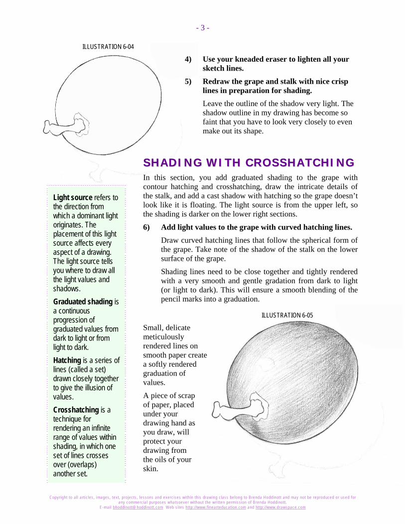
4) Use your kneaded eraser to lighten all your sketch lines.
5) Redraw the grape and stalk with nice crisp lines in preparation for shading. Leave the outline of the shadow very light. The shadow outline in my drawing has become so faint that you have to look very closely to even make out its shape.
SSHHAADDIINNGG WWIITTHH CCRROOSSSSHHAATTCCHHIINNGG In this section, you add graduated shading to the grape with contour hatching and crosshatching, draw the intricate details of the stalk, and add a cast shadow with hatching so the grape doesn’t look like it is floating. The light source is from the upper left, so the shading is darker on the lower right sections.
6) Add light values to the grape with curved hatching lines. Draw curved hatching lines that follow the spherical form of the grape. Take note of the shadow of the stalk on the lower surface of the grape.
Shading lines need to be close together and tightly rendered with a very smooth and gentle gradation from dark to light (or light to dark). This will ensure a smooth blending of the pencil marks into a graduation.
ILLUSTRATION 6-05
Small, delicate meticulously rendered lines on smooth paper create a softly rendered graduation of values.
A piece of scrap of paper, placed under your drawing hand as you draw, will protect your drawing from the oils of your skin.

Copyright to al l art icles, images, text, projects, lessons and exercises within this drawing class belong to Brenda Hoddinott and may not be reproduced or used for any commercial purposes whatsoever without the wri t ten permission of Brenda Hoddinott .
E-mail bhoddinott@hoddinott .com Web si tes http:/ /www.f inearteducat ion.com and ht tp:/ /www.drawspace.com
- 4 -
ILLUSTRATION 6-07
ILLUSTRATION 6-06
7) Add more shading lines across the first sets to create a graduation with crosshatching lines. Take note of how the light shading around the highlight slowly graduates darker toward the lower right.
Highlight refers to a bright spot(s) that defines where light bounces off the surface of an object.
A crescent shape of dark shading identifies the dark shadow area on the surface of the grape. The shading then graduates light again to create a thin rim of light along the lower right edge of the grape, known as reflected light.
8) Add shading to the stalk and its base on the surface of the grape. Contour crosshatching lines follow the forms of the grape to help create the illusion of a three-dimensional reality.
9) Draw some parallel lines in the space where the cast shadow is indicated to serve as guides for shading.

Copyright to al l art icles, images, text, projects, lessons and exercises within this drawing class belong to Brenda Hoddinott and may not be reproduced or used for any commercial purposes whatsoever without the wri t ten permission of Brenda Hoddinott .
E-mail bhoddinott@hoddinott .com Web si tes http:/ /www.f inearteducat ion.com and ht tp:/ /www.drawspace.com
- 5 -
ILLUSTRATION 6-08
10) Use hatching lines that follow the parallel guidelines, to add shading to the outside edges of the cast shadow. The shading graduates darker as it gets closer to the grape.
ILLUSTRATION 6-09
11) Complete the shading of the cast shadow. The graduations become darker and darker the closer they are to the grape.
The section of the shadow next to the edge of the grape is the darkest of all.

Copyright to al l art icles, images, text, projects, lessons and exercises within this drawing class belong to Brenda Hoddinott and may not be reproduced or used for any commercial purposes whatsoever without the wri t ten permission of Brenda Hoddinott .
E-mail bhoddinott@hoddinott .com Web si tes http:/ /www.f inearteducat ion.com and ht tp:/ /www.drawspace.com
- 6 -
When blending NEVER use your fingers! As a matter of fact, try not to ever touch your drawing paper with your fingers or hands in sections you plan to blend. The powder component in graphite works like fingerprinting powder used by criminal investigative sections of police departments. Your skin can transfer oil to the paper. This oil becomes visible after blending, especially in the lighter values. Then, it becomes darn near impossible to create a smooth, even tone with graphite in those areas with finger or hand prints.
Don’t blend the stalk of the grape. A rough texture will look much more realistic and provides a nice contrast to the shiny surface of the grape.
BBLLEENNDDIINNGG AA GGRRAAPPEE SSMMOOOOTTHHIIEE Blending definitely does not work well for some drawing subjects. However, the shiny surface of a grape lends itself well to blending.
Even though I recommend a couple of blending tools in this section, please don’t limit yourself to my suggestions! Try out other blending tools, such as a blending stump or a tortillon. Experiment with some creative ideas of your own! Just make sure whatever you choose is clean and that colored items (such as fabrics) don’t leave their dyes on your drawing!
12) Slowly and methodically, blend the shading of the grape.
Shading with crosshatching lines is much easier to control than blending values. Expect to not be happy with your first few tries to blend graphite. However, with time, patience, and practice you do get better!
Remember the light source is from the upper left, so the shading is darker on the lower right sections.
1. Using a Q-tip to blend the lightest values around the highlight of the grape.
2. Wrap a facial tissue or a small piece of fabric or paper towel around the end of one of your fingers.
3. Working progressively from light to dark, use circular movements to blend the values.
4. If the shading became too light in the dark shadowed areas, add more graphite and blend again.
5. Continue applying graphite to certain sections and repeating the blending process with facial tissues until you are happy with the results.
6. Blend the shadow very slightly from light to dark, so some of the hatching lines are still noticeable.
7. Use a kneaded eraser shaped to a point to erase any smudges on the highlight.
Copyright to al l art icles, images, text, projects, lessons and exercises within this drawing class belong to Brenda Hoddinott and may not be reproduced or used for any commercial purposes whatsoever without the wri t ten permission of Brenda Hoddinott .
E-mail bhoddinott@hoddinott .com Web si tes http:/ /www.f inearteducat ion.com and ht tp:/ /www.drawspace.com
- 7 -
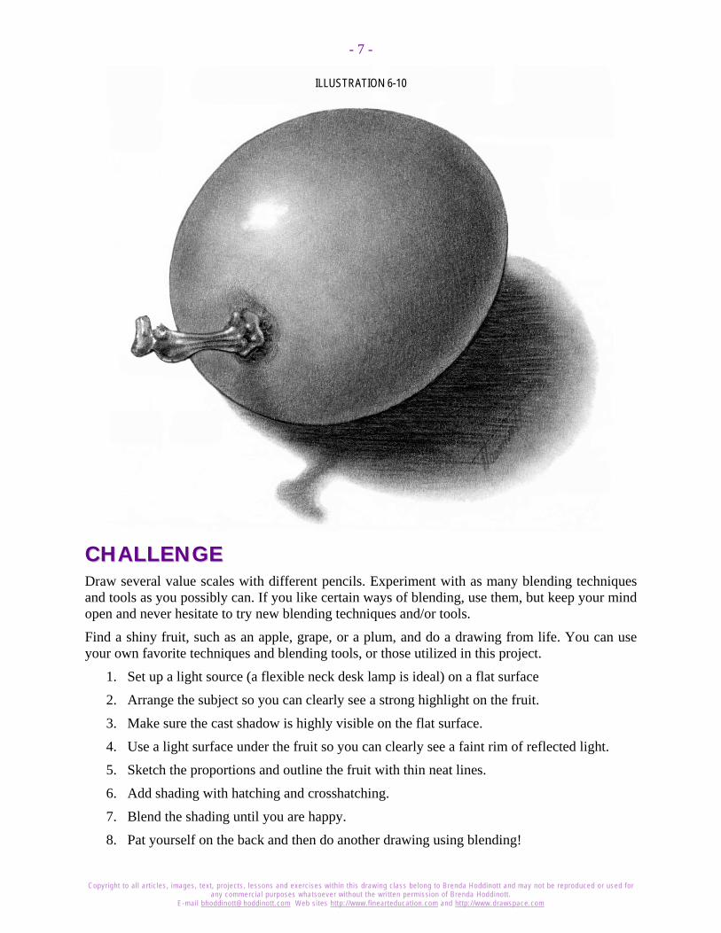
ILLUSTRATION 6-10
CCHHAALLLLEENNGGEE Draw several value scales with different pencils. Experiment with as many blending techniques and tools as you possibly can. If you like certain ways of blending, use them, but keep your mind open and never hesitate to try new blending techniques and/or tools.
Find a shiny fruit, such as an apple, grape, or a plum, and do a drawing from life. You can use your own favorite techniques and blending tools, or those utilized in this project.
1. Set up a light source (a flexible neck desk lamp is ideal) on a flat surface
2. Arrange the subject so you can clearly see a strong highlight on the fruit.
3. Make sure the cast shadow is highly visible on the flat surface.
4. Use a light surface under the fruit so you can clearly see a faint rim of reflected light.
5. Sketch the proportions and outline the fruit with thin neat lines.
6. Add shading with hatching and crosshatching.
7. Blend the shading until you are happy.
8. Pat yourself on the back and then do another drawing using blending!
Copyright to al l art icles, images, text, projects, lessons and exercises within this drawing class belong to Brenda Hoddinott and may not be reproduced or used for any commercial purposes whatsoever without the wri t ten permission of Brenda Hoddinott .
E-mail bhoddinott@hoddinott .com Web si tes http:/ /www.f inearteducat ion.com and ht tp:/ /www.drawspace.com
- 8 -
BBrreennddaa HHooddddiinnootttt As a self-educated teacher, visual artist, portraitist, forensic artist, and illustrator, Brenda utilizes diverse art media including graphite, technical pen, colored pencil, chalk pastel, charcoal, conté crayon, and oil paints.
My philosophy on teaching art is to focus primarily on the enjoyment aspects while gently introducing the technical and
academic. Hence, in creating a passion for the subject matter, the quest for knowledge also becomes enjoyable.
>Brenda Hoddinott<
BIOGRAPHY Born in St. John’s, Newfoundland, Brenda grew up in the small town of Corner Brook. She developed strong technical competencies with a personal commitment to self directed learning, and the aid of assorted “Learn to Draw” books. During Brenda’s twenty-five year career as a self-educated civilian forensic artist, numerous criminal investigation departments have employed Brenda’s skills, including Royal Canadian Mounted Police and municipal police departments. In 1992, Brenda was honored with a commendation from the Royal Canadian Mounted Police, and in 1994, she was awarded a Certificate of Membership from “Forensic Artists International”.
Her home-based art career included graphic design, and teaching recreational drawing and painting classes. As supervisor of her community’s recreational art department, Brenda hired and trained teachers, and designed curriculum for several children’s art programs. In 1998, Brenda chose to end her eighteen-year career as an art educator in order to devote more time to writing, drawing, painting, and developing her websites.
Drawspace http://www.drawspace.com incorporates her unique style and innovative approach to curriculum development. This site offers downloadable and printable drawing classes for students of all abilities from the age of eight through adult. Students of all ages, levels and abilities have praised the simple step-by-step instructional approach. This site is respected as a resource for fine art educators, home schooling programs, and educational facilities throughout the world.
LEARN-TO-DRAW BOOKS Drawing for Dummies: Wiley Publishing, Inc., New, York, NY, this 336 page book is
available on various websites and in major bookstores internationally.
The Complete Idiot’s Guide to Drawing People: Winner of the Alpha-Penguin Book of the Year Award 2004, Alpha - Pearson Education – Macmillan, Indianapolis, IN, this 360 page book is available on various websites and in major bookstores internationally.

Brenda Hoddinott
Q-03 INTERMEDIATE: PLACES & THINGS In this lesson, I show you how to draw the edge of a tiny section of hemmed denim fabric that is gently folding. Drawing believable fabrics is integral to accurately rendering a drawing of a clothed person. The folds and bends of clothing can reveal the forms of the unseen figure underneath.
Denim has survived several decades of fashion designers and seems to be here to stay. Its most endearing quality is that it takes on a distinctive personality as it fades, especially on the hems of jeans. In this exercise, I show you how blending creates softly textured denim fabric.
This lesson is divided into three parts:
SKETCHING SHAPES: The first step is to outline the various shapes to identify the edge of the fabric and the sections that will be in shadow.
SKETCHING STITCHES AND ADDING SHADING: You add light values to the fabric, and add dark shadows to identify the sizes and locations of the stitches. You then complete the stitches, and add additional shading to the denim fabric. Finally, you add darker values to enhance the texture and forms.
BLENDING SHADING: If you would like a softer-looking fabric, you have the option of adding a little blending.
Suggested supplies include good quality white drawing paper, various grades of graphite pencils, kneaded and vinyl erasers, a pencil sharpener, and blending tools (optional) to add final touches.
6 PAGES – 12 ILLUSTRATIONS This article is recommended for artists of all ages with good drawing skills. The curriculum is easily
implemented into instructional programs for home schooling, academic and recreational learning environments.
Published by Hoddinott Publishing, Halifax, NS, Canada, 2004 (Revised 2007)

Copyright to al l art icles, images, text, projects, lessons and exercises within this drawing class belong to Brenda Hoddinott and may not be reproduced or used for any commercial purposes whatsoever without the written permission of Brenda Hoddinott.
E-mail [email protected] Web sites http://www.f inearteducation.com and http://www.drawspace.com
2
Figure 301
Figure 302 Figure 303
SKETCHING SHAPES The first step is to outline the various shapes to identify the edge of the fabric and the sections that will be in shadow.
Remember to place a piece of scrap paper under your hand as you draw, to protect your drawing from the oils of your skin.
1) Draw a rectangular shape as your drawing format. Mine is approximately 4 by 3 inches. If you'd like a larger drawing, try 6 by 4.5 inches.
2) Draw a slightly wavy line to indicate the edge of the fabric. This line begins about one third of the way across the bottom of your drawing space. It ends slightly above the lower-right corner.
3) Lightly sketch a shading map of the pattern on the edge of the hem. Figures 302 and 303 show the various shapes of different sizes that create a map for shading the hem. These little mapping shapes are almost parallel to the edge of the fabric and follow the same curve. Keep your mapping lines very light because you will need to erase them later.
A shading map (also called a value map) is a plan (or blueprint) for adding shading to a drawing. The locations and sizes of the shapes of various values are identified and lightly outlined. Values are the different shades of gray created in a drawing by various means.
Before you begin shading in the next section, use your kneaded eraser to lighten your mapping lines until you can barely see them.
Copyright to al l art icles, images, text, projects, lessons and exercises within this drawing class belong to Brenda Hoddinott and may not be reproduced or used for any commercial purposes whatsoever without the written permission of Brenda Hoddinott.
E-mail [email protected] Web sites http://www.f inearteducation.com and http://www.drawspace.com
3
Figure 306
Figure 304
Figure 305
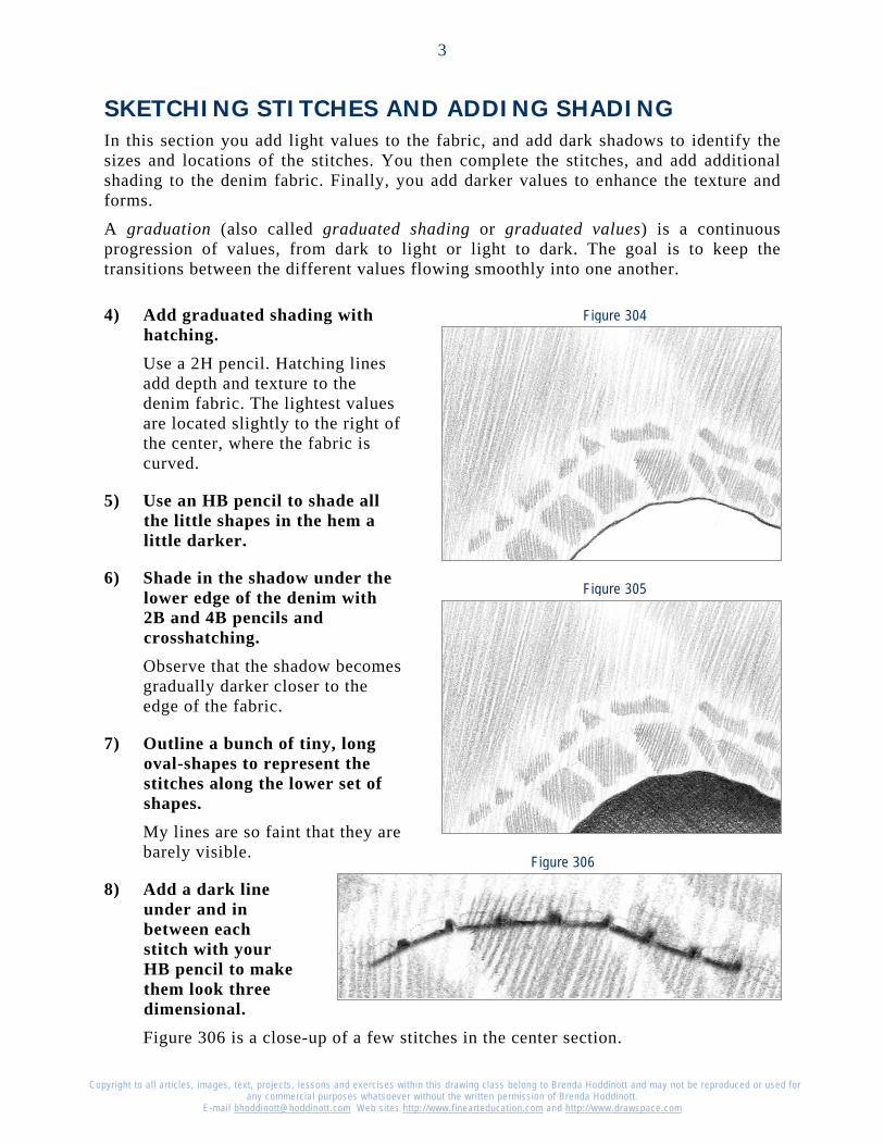
SKETCHING STITCHES AND ADDING SHADING In this section you add light values to the fabric, and add dark shadows to identify the sizes and locations of the stitches. You then complete the stitches, and add additional shading to the denim fabric. Finally, you add darker values to enhance the texture and forms.
A graduation (also called graduated shading or graduated values) is a continuous progression of values, from dark to light or light to dark. The goal is to keep the transitions between the different values flowing smoothly into one another.
4) Add graduated shading with hatching. Use a 2H pencil. Hatching lines add depth and texture to the denim fabric. The lightest values are located slightly to the right of the center, where the fabric is curved.
5) Use an HB pencil to shade all the little shapes in the hem a little darker.
6) Shade in the shadow under the lower edge of the denim with 2B and 4B pencils and crosshatching. Observe that the shadow becomes gradually darker closer to the edge of the fabric.
7) Outline a bunch of tiny, long oval-shapes to represent the stitches along the lower set of shapes. My lines are so faint that they are barely visible.
8) Add a dark line under and in between each stitch with your HB pencil to make them look three dimensional. Figure 306 is a close-up of a few stitches in the center section.

Copyright to al l art icles, images, text, projects, lessons and exercises within this drawing class belong to Brenda Hoddinott and may not be reproduced or used for any commercial purposes whatsoever without the written permission of Brenda Hoddinott.
E-mail [email protected] Web sites http://www.f inearteducation.com and http://www.drawspace.com
4
Figure 309
Figure 307
Figure 308
Figure 310
9) Use your kneaded eraser to pull out a very light section along the top edge of each stitch. Refer to Figures 307 and 308.
10) Add darker shading to the sections of the hem between the stitches and the edge of the fabric (Figure 309).
11) Use hatching lines and 2B and 4B pencils to shade the rest of the denim. Refer to Figure 310.
The values graduate from dark on the left, to light in the middle, and then dark again on the right.
Make the values a little darker inside each of the little shapes.
Use a 4B pencil to add the darkest shading on the left section of denim.
The denim fabric looks realistic with the addition of darker shading and stitching details.
BLENDING SHADING If you would like a softer-looking fabric, you have the option of adding a little blending. You need blending tools, as well as a kneaded eraser to add final touches.
Copyright to al l art icles, images, text, projects, lessons and exercises within this drawing class belong to Brenda Hoddinott and may not be reproduced or used for any commercial purposes whatsoever without the written permission of Brenda Hoddinott.
E-mail [email protected] Web sites http://www.f inearteducation.com and http://www.drawspace.com
5
Figure 311
Figure 312
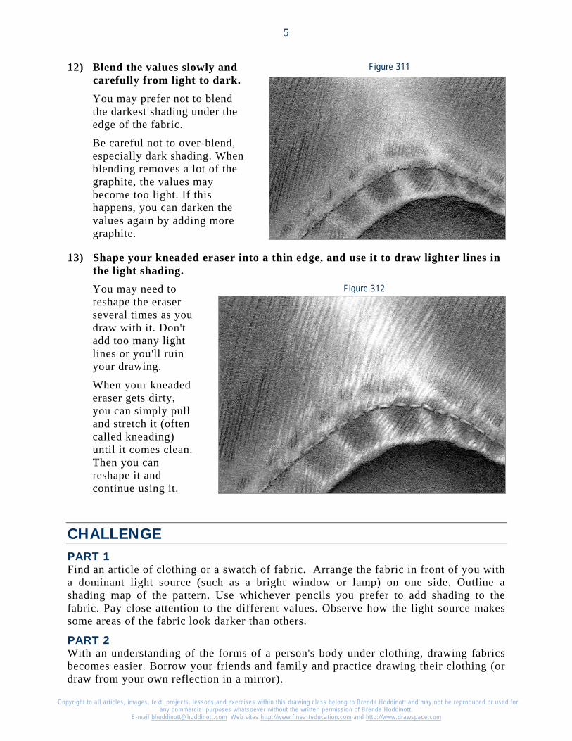
12) Blend the values slowly and carefully from light to dark. You may prefer not to blend the darkest shading under the edge of the fabric.
Be careful not to over-blend, especially dark shading. When blending removes a lot of the graphite, the values may become too light. If this happens, you can darken the values again by adding more graphite.
13) Shape your kneaded eraser into a thin edge, and use it to draw lighter lines in the light shading. You may need to reshape the eraser several times as you draw with it. Don't add too many light lines or you'll ruin your drawing.
When your kneaded eraser gets dirty, you can simply pull and stretch it (often called kneading) until it comes clean. Then you can reshape it and continue using it.
CHALLENGE PART 1 Find an article of clothing or a swatch of fabric. Arrange the fabric in front of you with a dominant light source (such as a bright window or lamp) on one side. Outline a shading map of the pattern. Use whichever pencils you prefer to add shading to the fabric. Pay close attention to the different values. Observe how the light source makes some areas of the fabric look darker than others.
PART 2 With an understanding of the forms of a person's body under clothing, drawing fabrics becomes easier. Borrow your friends and family and practice drawing their clothing (or draw from your own reflection in a mirror).

Copyright to al l art icles, images, text, projects, lessons and exercises within this drawing class belong to Brenda Hoddinott and may not be reproduced or used for any commercial purposes whatsoever without the written permission of Brenda Hoddinott.
E-mail [email protected] Web sites http://www.f inearteducation.com and http://www.drawspace.com
6
Brenda Hoddinott As a self-educated teacher, visual artist, portraitist, forensic artist, and illustrator, Brenda utilizes diverse art media including graphite, technical pen, colored pencil, chalk pastel, charcoal, conté crayon, and oil paints.
My philosophy on teaching art is to focus primarily on the enjoyment aspects while gently introducing the technical and academic. Hence, in creating a passion for the subject matter, the quest for knowledge also becomes enjoyable.
Brenda Hoddinott
Biography
Born in St. John’s, Newfoundland, Brenda grew up in the small town of Corner Brook. She developed strong technical competencies with a personal commitment to self directed learning, and the aid of assorted “Learn to Draw” books. During Brenda’s twenty-five year career as a self-educated civilian forensic artist, numerous criminal investigation departments have employed Brenda’s skills, including Royal Canadian Mounted Police and municipal police departments. In 1992, Brenda was honored with a commendation from the Royal Canadian Mounted Police, and in 1994, she was awarded a Certificate of Membership from “Forensic Artists International”.
Her home-based art career included graphic design, and teaching recreational drawing and painting classes. As supervisor of her community’s recreational art department, Brenda hired and trained teachers, and designed curriculum for several children’s art programs. In 1998, Brenda chose to end her eighteen-year career as an art educator in order to devote more time to writing, drawing, painting, and developing her websites.
Drawspace http://www.drawspace.com incorporates her unique style and innovative approach to curriculum development. This site offers downloadable and printable drawing classes for students of all abilities from the age of eight through adult. Students of all ages, levels and abilities have praised the simple step-by-step instructional approach. This site is respected as a resource for fine art educators, home schooling programs, and educational facilities throughout the world.
Learn-to-draw books
Drawing for Dummies: Wiley Publishing, Inc., New, York, NY, this 336 page book is available on various websites and in major bookstores internationally.
The Complete Idiot’s Guide to Drawing People: Winner of the Alpha-Penguin Book of the Year Award 2004, Alpha - Pearson Education – Macmillan, Indianapolis, IN, this 360 page book is available on various websites and in major bookstores internationally.
Brenda Hoddinott
Q-04 INTERMEDIATE: PLACES & THINGS This heavily illustrated lesson takes you step-by-step, through the entire process of drawing a realistic rosebud.
Text is kept to a minimum to challenge you to rely on your visual skills to render accurate proportions and add shading, using hatching and crosshatching graduations.
This project is divided into the following four sections:
SEEING AND SKETCHING PROPORTIONS: lightly sketch the proportions of a rosebud, by outlining the shapes of the various parts.
OUTLINING ADDITIONAL DETAILS: redraw the basic parts of the rosebud with thin neat lines and add additional details.
ADDING VALUES WITH HATCHING: add light and medium values with hatching. A dominant light source from the right front, determines where the various values are located.
CROSSHATCHING FORM: use crosshatching and freshly sharpened HB, 2B, and 4B pencils to add final details and darker values.
Suggested drawing supplies include: Arches 140-lb hot-pressed watercolor paper; 2H, HB, 2B, and 4B pencils; kneaded and vinyl erasers; a pencil sharpener; and a sandpaper block.
This lesson is recommended for intermediate level artists from age 12 to adult,
who have good drawing skills. The curriculum is also appropriate for home schooling, academic, and recreational fine art educators.
17 PAGES – 38 ILLUSTRATIONS Published by Hoddinott Fine Art Publishers, Halifax, NS, Canada – 2005 (Revised 2006)

Copyright to all articles, images, text, projects, lessons and exercises within this drawing class belong to Brenda Hoddinott and may not be reproduced or used for any commercial purposes whatsoever without the written permission of Brenda Hoddinott.
E-mail [email protected] Web sites http://www.finearteducation.com and http://www.drawspace.com
- 2 -
SEEING AND SKETCHING PROPORTIONS In this section, you lightly sketch the proportions of the rosebud, by outlining the shapes of its various parts, in their correct places.
ILLUSTRATION 04-01 A sketch is a quick, rough representation or outline of a planned drawing subject. Proportion is the relationship in size of one component of a drawing to another or others. Shape refers to the outward outline of a form. For example, the shape of a sphere is a circle.
1. Lightly sketch the shape of the rosebud with an HB pencil. The rosebud is somewhere between an egg-shape and a kidney-shape. Use an HB pencil, and keep your lines very light so they can be easily erased.
2. Use straight lines to sketch the stem below the rosebud.
ILLUSTRATION 04-02 ILLUSTRATION 04-03
3. Sketch the large petal on the left with a curved line. This petal is a teardrop-shape.
Copyright to all articles, images, text, projects, lessons and exercises within this drawing class belong to Brenda Hoddinott and may not be reproduced or used for any commercial purposes whatsoever without the written permission of Brenda Hoddinott.
E-mail [email protected] Web sites http://www.finearteducation.com and http://www.drawspace.com
- 3 -
ILLUSTRATION 04-04
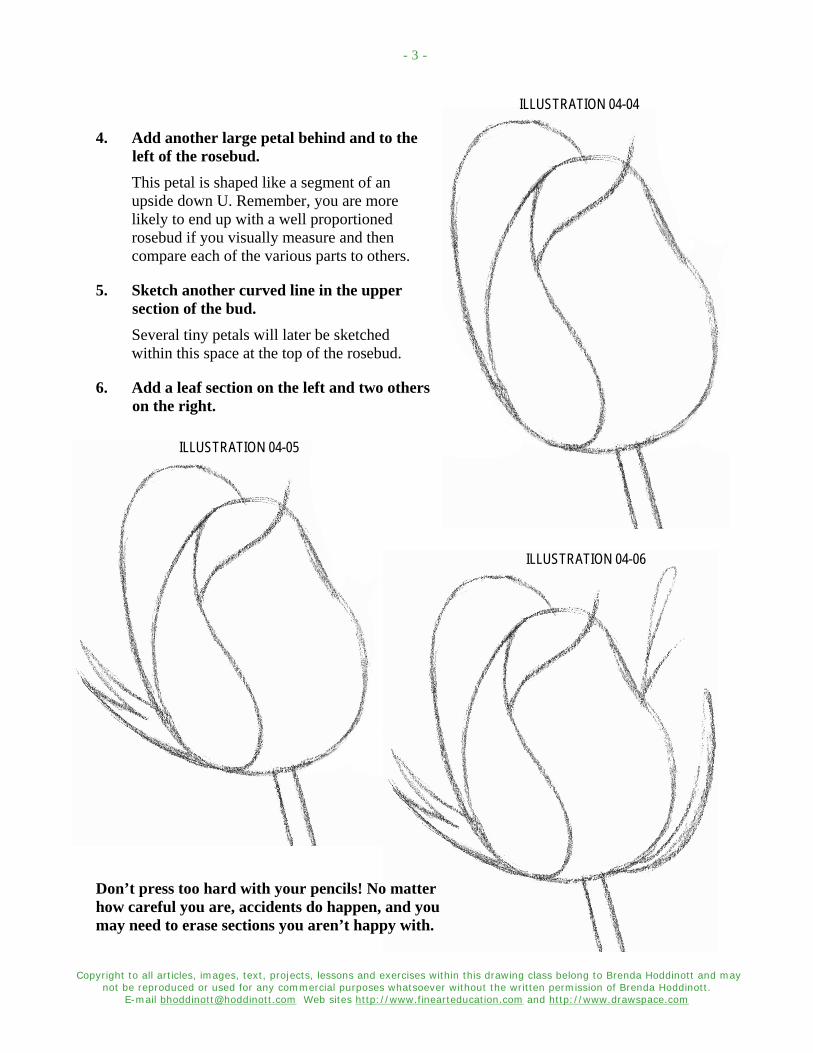
4. Add another large petal behind and to the left of the rosebud. This petal is shaped like a segment of an upside down U. Remember, you are more likely to end up with a well proportioned rosebud if you visually measure and then compare each of the various parts to others.
5. Sketch another curved line in the upper section of the bud. Several tiny petals will later be sketched within this space at the top of the rosebud.
6. Add a leaf section on the left and two others on the right.
ILLUSTRATION 04-05
ILLUSTRATION 04-06
Don’t press too hard with your pencils! No matter how careful you are, accidents do happen, and you may need to erase sections you aren’t happy with.

Copyright to all articles, images, text, projects, lessons and exercises within this drawing class belong to Brenda Hoddinott and may not be reproduced or used for any commercial purposes whatsoever without the written permission of Brenda Hoddinott.
E-mail [email protected] Web sites http://www.finearteducation.com and http://www.drawspace.com
- 4 -
OUTLINING ADDITIONAL DETAILS In this section, you redraw the basic parts of the rosebud with thin neat lines and add additional details. As you complete this contour drawing, continuously check whether the size and proportions of each section are correct, and adjust as needed.
A Contour drawing is a drawing comprised of lines that follow the contours of the edges of various components of a drawing subject and define the outlines of its forms. Form is the illusion of the three-dimensional structure of a shape, and is created in a drawing with shading and/or perspective.
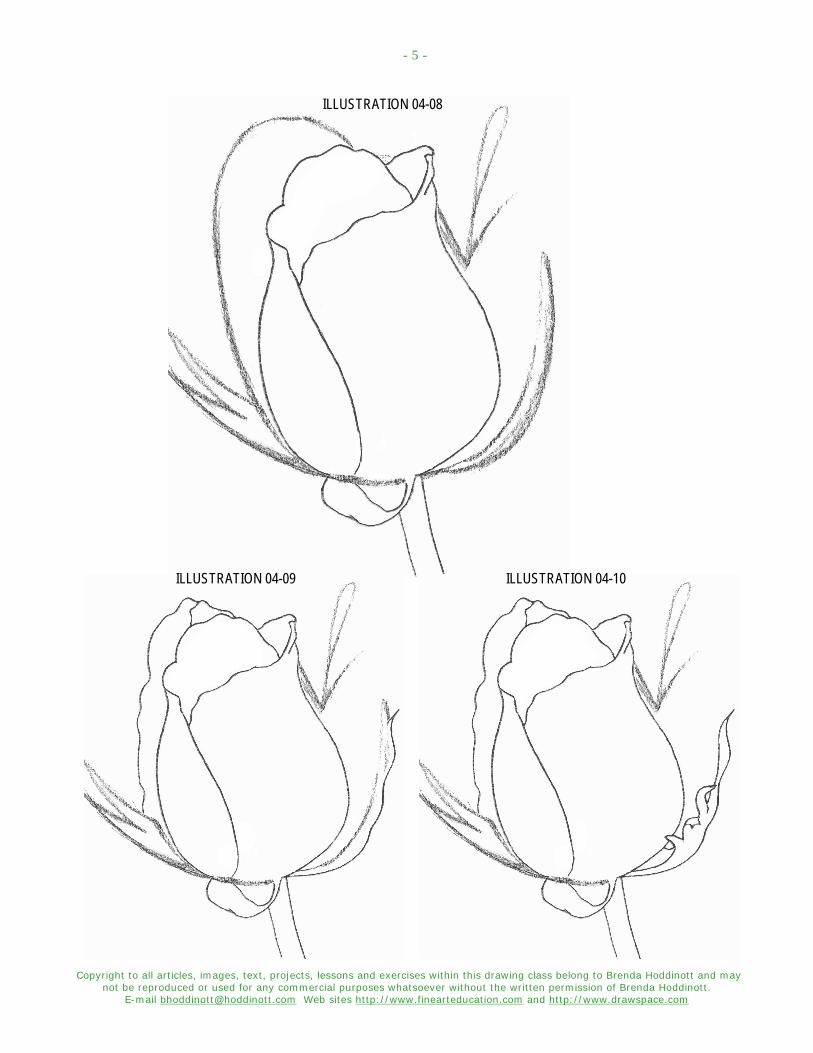
7. Refer to the following thirteen illustrations, and replace your rough sketch lines with thin, neat lines. Examine each illustration closely to find the parts of the rosebud that have been modified and/or added. Before you begin outlining each section, use your kneaded eraser to lighten the sketch lines until you can barely see them.
ILLUSTRATION 04-07
As you draw, constantly compare your drawing to mine and keep the following in mind:
Pay close attention to the lengths of the various lines and the directions in which they curve.
Draw slowly! Accuracy is more important than speed. Your speed will automatically improve the more you practice.
Keep your pencils sharpened so your lines stay neat and thin. Try using a piece of fine sandpaper or a sandpaper block to keep your pencil points nice and sharp. Pencil sharpeners tend to wear down pencils very quickly.
Keep in mind that you can turn your sketchbook around as you are drawing, especially when drawing a curved line or circular shape. Rotate your paper and look at your drawing from different perspectives to find problem areas.
Copyright to all articles, images, text, projects, lessons and exercises within this drawing class belong to Brenda Hoddinott and may not be reproduced or used for any commercial purposes whatsoever without the written permission of Brenda Hoddinott.
E-mail [email protected] Web sites http://www.finearteducation.com and http://www.drawspace.com
- 5 -
ILLUSTRATION 04-08
ILLUSTRATION 04-09 ILLUSTRATION 04-10

Copyright to all articles, images, text, projects, lessons and exercises within this drawing class belong to Brenda Hoddinott and may not be reproduced or used for any commercial purposes whatsoever without the written permission of Brenda Hoddinott.
E-mail [email protected] Web sites http://www.finearteducation.com and http://www.drawspace.com
- 6 -
ILLUSTRATION 04-11 ILLUSTRATION 04-12
ILLUSTRATION 04-13 ILLUSTRATION 04-14

Copyright to all articles, images, text, projects, lessons and exercises within this drawing class belong to Brenda Hoddinott and may not be reproduced or used for any commercial purposes whatsoever without the written permission of Brenda Hoddinott.
E-mail [email protected] Web sites http://www.finearteducation.com and http://www.drawspace.com
- 7 -
ILLUSTRATION 04-15
ILLUSTRATION 04-16
ILLUSTRATION 04-17
ILLUSTRATION 04-18
Copyright to all articles, images, text, projects, lessons and exercises within this drawing class belong to Brenda Hoddinott and may not be reproduced or used for any commercial purposes whatsoever without the written permission of Brenda Hoddinott.
E-mail [email protected] Web sites http://www.finearteducation.com and http://www.drawspace.com
- 8 -
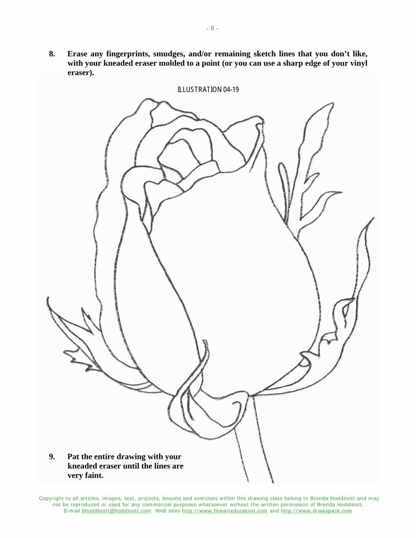
8. Erase any fingerprints, smudges, and/or remaining sketch lines that you don’t like, with your kneaded eraser molded to a point (or you can use a sharp edge of your vinyl eraser).
ILLUSTRATION 04-19
9. Pat the entire drawing with your kneaded eraser until the lines are very faint.
Copyright to all articles, images, text, projects, lessons and exercises within this drawing class belong to Brenda Hoddinott and may not be reproduced or used for any commercial purposes whatsoever without the written permission of Brenda Hoddinott.
E-mail [email protected] Web sites http://www.finearteducation.com and http://www.drawspace.com
- 9 -
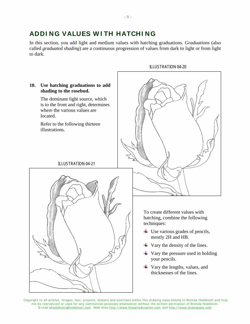
ADDING VALUES WITH HATCHING In this section, you add light and medium values with hatching graduations. Graduations (also called graduated shading) are a continuous progression of values from dark to light or from light to dark.
ILLUSTRATION 04-20
10. Use hatching graduations to add shading to the rosebud. The dominant light source, which is to the front and right, determines where the various values are located.
Refer to the following thirteen illustrations.
ILLUSTRATION 04-21
To create different values with hatching, combine the following techniques:
Use various grades of pencils, mostly 2H and HB.
Vary the density of the lines.
Vary the pressure used in holding your pencils.
Vary the lengths, values, and thicknesses of the lines.
Copyright to all articles, images, text, projects, lessons and exercises within this drawing class belong to Brenda Hoddinott and may not be reproduced or used for any commercial purposes whatsoever without the written permission of Brenda Hoddinott.
E-mail [email protected] Web sites http://www.finearteducation.com and http://www.drawspace.com
- 10 -
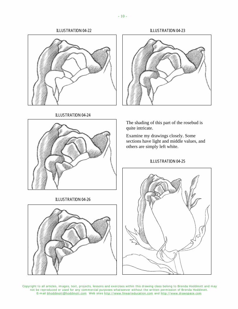
ILLUSTRATION 04-22 ILLUSTRATION 04-23
ILLUSTRATION 04-24
The shading of this part of the rosebud is quite intricate.
Examine my drawings closely. Some sections have light and middle values, and others are simply left white.
ILLUSTRATION 04-25
ILLUSTRATION 04-26
Copyright to all articles, images, text, projects, lessons and exercises within this drawing class belong to Brenda Hoddinott and may not be reproduced or used for any commercial purposes whatsoever without the written permission of Brenda Hoddinott.
E-mail [email protected] Web sites http://www.finearteducation.com and http://www.drawspace.com
- 11 -
ILLUSTRATION 04-27
Always place a piece of clean paper under your hand as you draw.
Each time you work on a new section, remember to move your paper so it’s always under your hand.
This prevents you from smudging your drawing, and protects the paper from the oils in your skin.
ILLUSTRATION 04-28
You can make the transition from one value to the next barely noticeable, by drawing the individual lines of your hatching in different lengths.
Sometimes a short line, placed inside a space between two other lines, helps make the transition look smoother.

Copyright to all articles, images, text, projects, lessons and exercises within this drawing class belong to Brenda Hoddinott and may not be reproduced or used for any commercial purposes whatsoever without the written permission of Brenda Hoddinott.
E-mail [email protected] Web sites http://www.finearteducation.com and http://www.drawspace.com
- 12 -
ILLUSTRATION 04-29
Most artists prefer to work from light to dark.
By drawing light values first, you can then layer medium shading on top of some sections of light shading, to create a smoothly graduated range of values.
ILLUSTRATION 04-30
Layering creates a nice smooth transition between different values.
The darkest values are then built in layers on top of the medium values.
Copyright to all articles, images, text, projects, lessons and exercises within this drawing class belong to Brenda Hoddinott and may not be reproduced or used for any commercial purposes whatsoever without the written permission of Brenda Hoddinott.
E-mail [email protected] Web sites http://www.finearteducation.com and http://www.drawspace.com
- 13 -
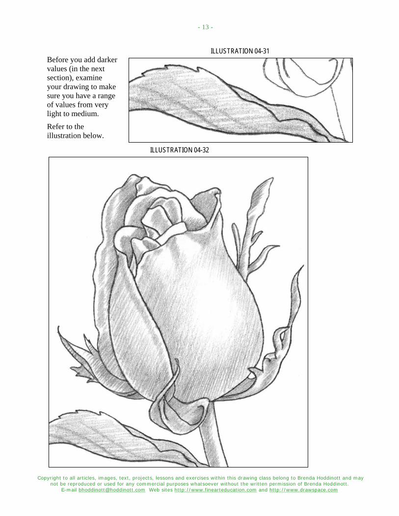
ILLUSTRATION 04-31 Before you add darker values (in the next section), examine your drawing to make sure you have a range of values from very light to medium.
Refer to the illustration below.
ILLUSTRATION 04-32

Copyright to all articles, images, text, projects, lessons and exercises within this drawing class belong to Brenda Hoddinott and may not be reproduced or used for any commercial purposes whatsoever without the written permission of Brenda Hoddinott.
E-mail [email protected] Web sites http://www.finearteducation.com and http://www.drawspace.com
- 14 -
CROSSHATCHING FORM In this section, you use crosshatching and freshly sharpened HB, 2B, and 4B pencils to add final details and darker values. Crosshatching is a technique for rendering an infinite range of values within shading, in which one set of lines crosses over (overlaps) another set.
11. Refer to the following six illustrations, as you use crosshatching graduations to add a strong contrast in values, hence creating the illusion of form.
ILLUSTRATION 04-33
By crossing over the existing hatching lines with another set of lines, you create crosshatching.
Be careful to not add too much dark shading.
ILLUSTRATION 04-34 Note the many different values used to complete this detailed area of shading. A strong contrast in values is created when some values are almost black and some sections are left completely white. Contrast measures the degree of difference between the light and dark values within shading, and creates the illusion of three-dimensional forms in a drawing.
ILLUSTRATION 04-35
Copyright to all articles, images, text, projects, lessons and exercises within this drawing class belong to Brenda Hoddinott and may not be reproduced or used for any commercial purposes whatsoever without the written permission of Brenda Hoddinott.
E-mail [email protected] Web sites http://www.finearteducation.com and http://www.drawspace.com
- 15 -
ILLUSTRATION 04-36
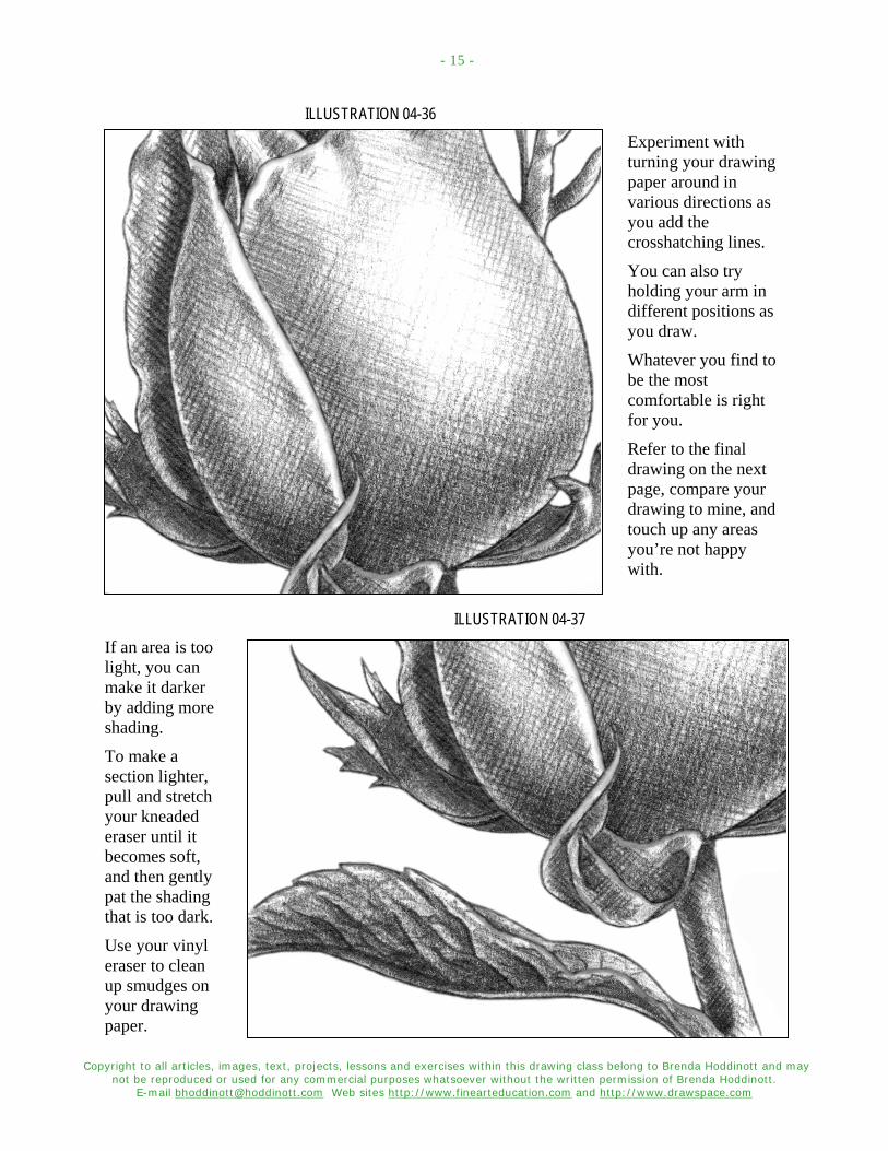
Experiment with turning your drawing paper around in various directions as you add the crosshatching lines.
You can also try holding your arm in different positions as you draw.
Whatever you find to be the most comfortable is right for you.
Refer to the final drawing on the next page, compare your drawing to mine, and touch up any areas you’re not happy with.
ILLUSTRATION 04-37
If an area is too light, you can make it darker by adding more shading.
To make a section lighter, pull and stretch your kneaded eraser until it becomes soft, and then gently pat the shading that is too dark.
Use your vinyl eraser to clean up smudges on your drawing paper.
Copyright to all articles, images, text, projects, lessons and exercises within this drawing class belong to Brenda Hoddinott and may not be reproduced or used for any commercial purposes whatsoever without the written permission of Brenda Hoddinott.
E-mail [email protected] Web sites http://www.finearteducation.com and http://www.drawspace.com
- 16 -
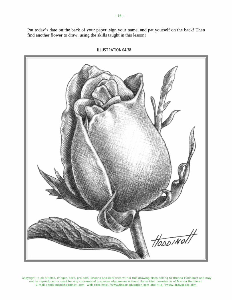
Put today’s date on the back of your paper, sign your name, and pat yourself on the back! Then find another flower to draw, using the skills taught in this lesson!
ILLUSTRATION 04-38
Copyright to all articles, images, text, projects, lessons and exercises within this drawing class belong to Brenda Hoddinott and may not be reproduced or used for any commercial purposes whatsoever without the written permission of Brenda Hoddinott.
E-mail [email protected] Web sites http://www.finearteducation.com and http://www.drawspace.com
- 17 -
BRENDA HODDINOTT - BIO As a self-educated teacher, visual artist, portraitist, forensic artist, and illustrator, Brenda Hoddinott utilizes diverse art media including graphite, technical pen, colored pencil, chalk pastel, charcoal, conté crayon, and oil paints.
My philosophy on teaching art is to focus primarily on the enjoyment aspects while gently introducing the technical and academic. Hence, in creating a passion for the subject matter,
the quest for knowledge also becomes enjoyable. >Brenda Hoddinott<
Born in St. John’s, Newfoundland, Brenda grew up in the small town of Corner Brook. She developed strong technical competencies with a personal commitment to self directed learning, and the aid of assorted “Learn to Draw” books.
During Brenda’s twenty-five year career as a self-educated civilian forensic artist, numerous criminal investigation departments have employed Brenda’s skills, including Royal Canadian Mounted Police and municipal police departments. In 1992, Brenda was honored with a commendation from the Royal Canadian Mounted Police, and in 1994, she was awarded a Certificate of Membership from “Forensic Artists International”.
Her home-based art career included graphic design, and teaching recreational drawing and painting classes. As supervisor of her community’s recreational art department, Brenda hired and trained teachers, and designed curriculum for several children’s art programs. In 1998, Brenda chose to end her eighteen-year career as an art educator in order to devote more time to writing, drawing, painting, and developing her websites.
Drawspace http://www.drawspace.com incorporates her unique style and innovative approach to curriculum development. These sites offer downloadable and printable drawing classes for students of all abilities from the age of eight through adult. Students of all ages, levels and abilities have praised the simple step-by-step instructional approach. This site is respected as a resource for fine art educators, home schooling programs, and educational facilities throughout the world.
LEARN-TO-DRAW BOOKS BY BRENDA HODDINOTT Drawing for Dummies (March 4, 2003): Published by Wiley Publishing, Inc., New, York,
NY, this 336 page book is available on various websites and in major bookstores internationally.
The Complete Idiot’s Guide to Drawing People (August 2004): Published by Alpha - Pearson Education – Macmillan, Indianapolis, IN, this 360 page book is available on various websites and in major bookstores internationally.

DDRRAAWWIINNGG SSQQUUIIRRKKLLEESS AARROOUUNNDD AA
Brenda Hoddinott
Q-05 INTERMEDIATE: PLACES & THINGS Even if you’re an expert in botany, you’ll have a hard time figuring out what kind of tree this is. The tree in this lesson doesn’t exist; rather it’s a figment of my
imagination. If you prefer, you can base your drawing on a more realistic tree (from life or a photo).
Most beginners to drawing tend to draw only the branches that grow from the sides of the tree, without indicating those that are behind and in front of the trunk. The primary goal of this lesson is to provide learners with a strong sense of the three dimensional qualities of a tree.
This lesson is divided into four parts:
SETTING UP YOUR DRAWING: You sketch the outlines of the trunk of the tree (without branches) and the edge of the cliff.
ADDING BRANCHES AROUND A TREE TRUNK: You outline the placement of the tree’s branches, beginning with the branches behind the tree trunk, then the side branches, and finally the branches in front.
SQUIRKLING BRANCHES: You add shading to the branches to bring out their overlapping forms.
ADDING FINAL TOUCHES: You add shading to the rocks and shrubs on the cliff, and add more details to the branches in front of the trunk.
Suggested drawing supplies include good quality white drawing paper, graphite pencils, kneaded and vinyl erasers, and a pencil sharpener.
Recommended for artists with strong skills in shading with squirkles, as well as students of home schooling, academic and recreational fine art educators
12 PAGES – 17 ILLUSTRATIONS Published by Hoddinott Fine Art Publishers, Halifax, NS, Canada (2008)

Copyright to all articles, images, text, projects, lessons and exercises within this document belong to Brenda Hoddinott and may not be reproduced or used for any commercial purposes whatsoever without the written permission of Brenda Hoddinott. E-mail [email protected] Web site http://www.drawspace.com
- 2 -
Figure 501: Drawing of a short wide tree.
Figure 502: A medium size tree (this is the size of the tree in my drawing).
Figure 504
Art Speak Texture is the surface detail of an object, as defined in a drawing with various shading techniques. The senses of touch and sight help identify the surface texture of drawing subject. Shading refers to the various shades of gray (values) in a drawing that make drawings look three-dimensional. Sketching is drawing a quick, rough representation or outline of a planned drawing subject. A sketch can also be a completed work of art. Proportion is the relationship in size of one component of a drawing to another or others.
Figure 503: A tall thin tree.
SETTING UP YOUR DRAWING Before you draw the various textures of a rocky cliff and the branches and trunk of a tree, you need to plan a place for everything on your drawing paper, sort of like a blueprint. In this section, you sketch the outlines of the trunk of the tree (without branches) and the edge of the cliff.
When you draw a portrait of a person, if your proportions are wrong, your drawing just won’t look correct. Not so with a tree, if the proportions are off a little, it really doesn’t matter. In Figures 501 to 503 I show you three trees. Even though the proportions are different, they still look like trees.
1. Outline a tree trunk and the edge of the cliff. Refer to Figure 504. If you want your tree to be a little less curved, draw the outlines of the trunk straighter.
ADDING BRANCHES AROUND A TREE TRUNK In this section, you outline the placement of the tree’s branches. You begin with the branches behind the tree trunk, then outline side branches, and finally add branches in the front.

Copyright to all articles, images, text, projects, lessons and exercises within this document belong to Brenda Hoddinott and may not be reproduced or used for any commercial purposes whatsoever without the written permission of Brenda Hoddinott. E-mail [email protected] Web site http://www.drawspace.com
- 3 -
Figure 505
Figure 506
You may want to draw fewer branches on your tree. You can gain a strong understanding of the process of drawing a three dimensional tree with a much less intricate drawing than mine.
My drawing is not based on a specific type of tree; rather it is simply a figment of my imagination. Hence, drawing the shapes of the outlines exactly like mine is not important at all. However, you should try to draw smaller branches at the top of the tree and larger branches toward the bottom.
Various straight, wiggly, and curved lines, and shapes of different sizes, make up the perimeters of the branches of the tree.
2. Draw squiggly shapes that appear to be behind the trunk of the tree (to represent branches). Keep your lines very light. Sections of these branches can’t be seen because the trunk is blocking the view.
3. Lighten the drawing slightly with a kneaded eraser. You need to be able to tell the difference between the branches behind the tree and those growing from the sides.
4. Take your time and draw a few branches that appear to grow from the sides of the trunk. Remember, you do not need to draw this many branches!
Figures 506 to 508 show close-up views so you can follow along with the process of adding side branches.
As I add more branches, I draw the outlines of the trunk more rugged (rather than smooth).

Copyright to all articles, images, text, projects, lessons and exercises within this document belong to Brenda Hoddinott and may not be reproduced or used for any commercial purposes whatsoever without the written permission of Brenda Hoddinott. E-mail [email protected] Web site http://www.drawspace.com
- 4 -
Figure 508
Figure 507
Figure 509
The more you vary the shapes of your branches, the more believable your tree will appear!
5. Draw some foliage, grass and a small shrub on the top section of the cliff. Refer to Figure 509.
6. Outline a few sections of a rocky cliff below the top edge of the cliff.
Copyright to all articles, images, text, projects, lessons and exercises within this document belong to Brenda Hoddinott and may not be reproduced or used for any commercial purposes whatsoever without the written permission of Brenda Hoddinott. E-mail [email protected] Web site http://www.drawspace.com
- 5 -
Figure 510
Figure 512
Art Speak Squirkling is a method of shading incorporating randomly drawn curved lines to create textured values. Values are the different shades of gray created in a drawing by various means. Light source is the direction from which a dominant light originates. A light source identifies the light and shadow areas of a drawing subject, so artists know where to add different values. Overlapping refers to a technique for creating the illusion of depth in a drawing by drawing a subject so it visually appears to be in front of another (or others).
7. Pat your drawing with a kneaded eraser to lighten the lines again.
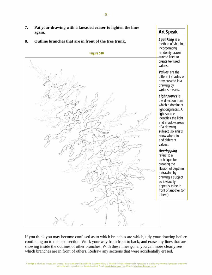
8. Outline branches that are in front of the tree trunk.
If you think you may become confused as to which branches are which, tidy your drawing before continuing on to the next section. Work your way from front to back, and erase any lines that are showing inside the outlines of other branches. With these lines gone, you can more clearly see which branches are in front of others. Redraw any sections that were accidentally erased.

Copyright to all articles, images, text, projects, lessons and exercises within this document belong to Brenda Hoddinott and may not be reproduced or used for any commercial purposes whatsoever without the written permission of Brenda Hoddinott. E-mail [email protected] Web site http://www.drawspace.com
- 6 -
Figure 511
Figure 512
SQUIRKLING BRANCHES In this section, you add shading to the branches to bring out their overlapping forms.
9. Use an HB pencil and squirkles to add shading to the branches behind the tree.
Figure 511 shows a close up view of branches rendered with squirkling.
Copyright to all articles, images, text, projects, lessons and exercises within this document belong to Brenda Hoddinott and may not be reproduced or used for any commercial purposes whatsoever without the written permission of Brenda Hoddinott. E-mail [email protected] Web site http://www.drawspace.com
- 7 -
Art Speak Forms are created in drawings by adding shading to transform a shape into three-dimensional structures, such as a circle becoming a sphere. Hatching is a series of lines (called a set) drawn closely together to give the illusion of values. The individual lines in hatching sets can be either far apart or close together.
Figure 513
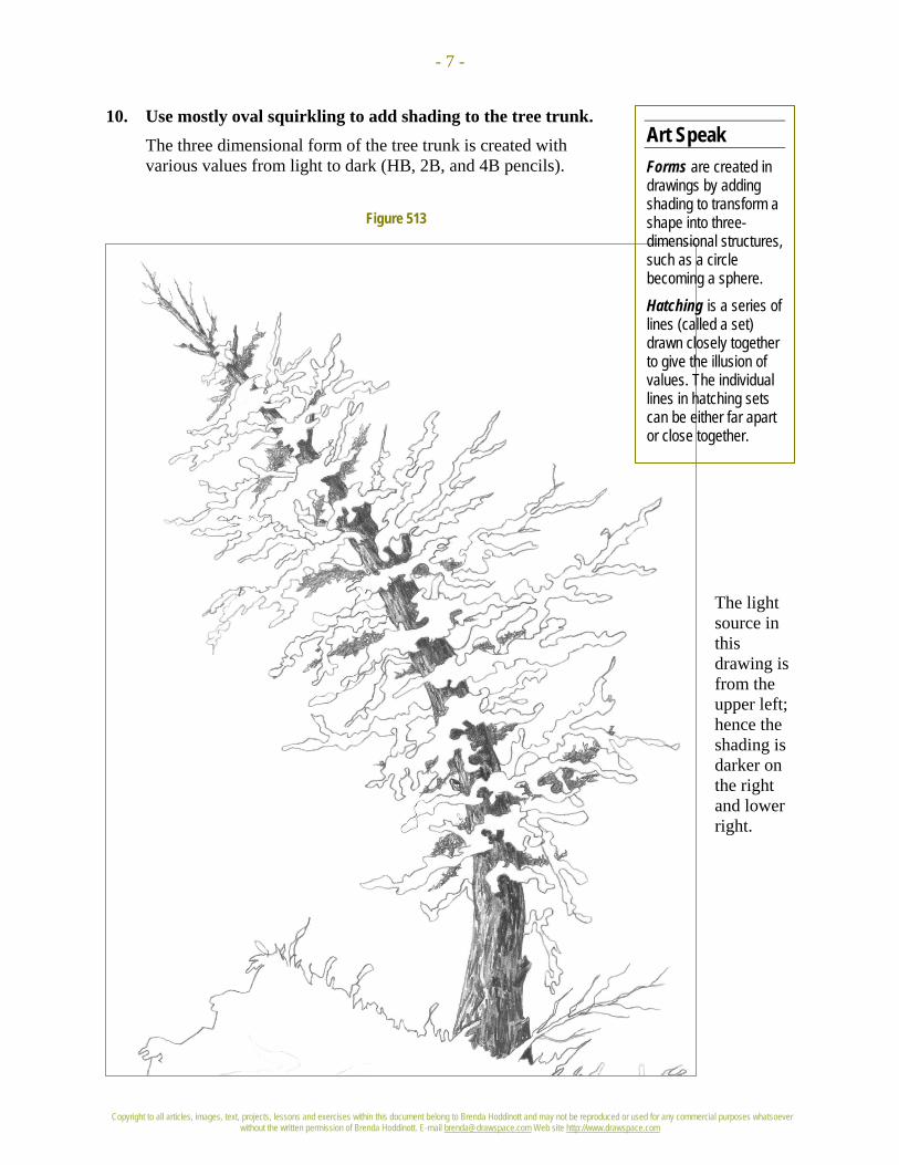
10. Use mostly oval squirkling to add shading to the tree trunk. The three dimensional form of the tree trunk is created with various values from light to dark (HB, 2B, and 4B pencils).
The light source in this drawing is from the upper left; hence the shading is darker on the right and lower right.

Copyright to all articles, images, text, projects, lessons and exercises within this document belong to Brenda Hoddinott and may not be reproduced or used for any commercial purposes whatsoever without the written permission of Brenda Hoddinott. E-mail [email protected] Web site http://www.drawspace.com
- 8 -
Figure 514
11. Use an HB pencil to add medium values to the branches that grow from the sides of the tree trunk. Only the branches in the very front are left white.
Closely examine the branches in Figure 514.
The squirkling lines extend outside the original outline of each branch to help make the tree look more natural.
You can barely see the outlines of the branches anymore.
Copyright to all articles, images, text, projects, lessons and exercises within this document belong to Brenda Hoddinott and may not be reproduced or used for any commercial purposes whatsoever without the written permission of Brenda Hoddinott. E-mail [email protected] Web site http://www.drawspace.com
- 9 -
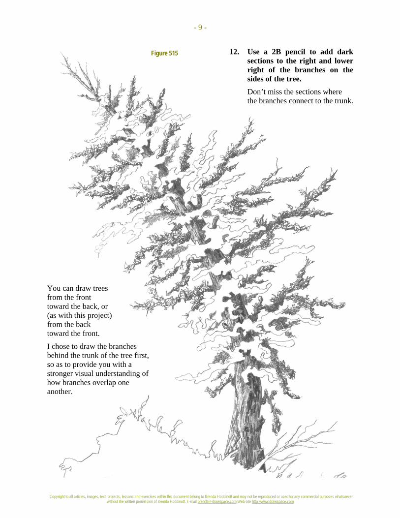
Figure 515 12. Use a 2B pencil to add dark sections to the right and lower right of the branches on the sides of the tree. Don’t miss the sections where the branches connect to the trunk.
You can draw trees from the front toward the back, or (as with this project) from the back toward the front.
I chose to draw the branches behind the trunk of the tree first, so as to provide you with a stronger visual understanding of how branches overlap one another.

Copyright to all articles, images, text, projects, lessons and exercises within this document belong to Brenda Hoddinott and may not be reproduced or used for any commercial purposes whatsoever without the written permission of Brenda Hoddinott. E-mail [email protected] Web site http://www.drawspace.com
- 10 -
Figure 516
13. Use a 2B to add dark shading on the lower and lower right sections of the branches in the front.
ADDING FINAL TOUCHES In this section, you add shading to the rocks and shrubs on the cliff, and add more details to the branches in front of the trunk.
14. Use an HB pencil to add a few squirkles to the front branches, mostly around the edges. Refer to Figure 517.
15. Use squirkles and an HB pencil to draw a few sections of grass at the base of the tree.
16. Use hatching and 2B and 4B pencils, to add shading to a few rocky sections of the lower part of the cliff.

Copyright to all articles, images, text, projects, lessons and exercises within this document belong to Brenda Hoddinott and may not be reproduced or used for any commercial purposes whatsoever without the written permission of Brenda Hoddinott. E-mail [email protected] Web site http://www.drawspace.com
- 11 -
Figure 517 Have one last look at your drawing and change any sections you aren’t
completely happy with.
You can make some areas lighter by patting them with
your kneaded eraser. You can make sections of the branches
darker by simply drawing more squirkle lines where
you need them.
Sign your name, write today’s date on the back of your drawing, and then go outside and hug a tree!

Copyright to all articles, images, text, projects, lessons and exercises within this document belong to Brenda Hoddinott and may not be reproduced or used for any commercial purposes whatsoever without the written permission of Brenda Hoddinott. E-mail [email protected] Web site http://www.drawspace.com
- 12 -
BRENDA HODDINOTT - BIOGRAPHY As a self-educated teacher, visual artist, portraitist, forensic artist, and illustrator, Brenda Hoddinott utilizes diverse art media including graphite, technical pen, colored pencil, chalk pastel, charcoal, conté crayon, and oil paints.
My philosophy on teaching art is to focus primarily on the enjoyment aspects while gently introducing the technical and academic. Hence, in creating a passion for the subject matter, the quest for knowledge also
becomes enjoyable. >Brenda Hoddinott<
Born in St. John’s, Newfoundland, Brenda grew up in the small town of Corner Brook. She developed strong technical competencies with a personal commitment to self directed learning, and the aid of assorted “Learn to Draw” books. During Brenda’s twenty-five year career as a self-educated civilian forensic artist, numerous criminal investigation departments have employed Brenda’s skills, including Royal Canadian Mounted Police and municipal police departments. In 1992, Brenda was honored with a commendation from the Royal Canadian Mounted Police, and in 1994, she was awarded a Certificate of Membership from “Forensic Artists International”.
Her home-based art career included graphic design, and teaching recreational drawing and painting classes. As supervisor of her community’s recreational art department, Brenda hired and trained teachers, and designed curriculum for several children’s art programs. In 1998, Brenda chose to end her eighteen-year career as an art educator in order to devote more time to writing, drawing, painting, and developing her websites.
Drawspace http://www.drawspace.com incorporates her unique style and innovative approach to curriculum development. This site offers downloadable and printable drawing classes for students of all abilities from the age of eight through adult. Students of all ages, levels and abilities have praised the simple step-by-step instructional approach. This site is respected as a resource for fine art educators, home schooling programs, and educational facilities throughout the world.
LEARN-TO-DRAW BOOKS BY BRENDA HODDINOTT Drawing for Dummies: Wiley Publishing, Inc., New, York, NY, this 336 page book is
available on various websites and in major bookstores internationally.
The Complete Idiot’s Guide to Drawing People: Winner of the Alpha-Penguin Book of the Year Award 2004, Alpha - Pearson Education – Macmillan, Indianapolis, IN, this 360 page book is available on various websites and in major bookstores internationally.
By Cindy Wider Art educator, art curricula designer, award-winning gallery-
represented artist, and author of Paint in Your Pyjamas
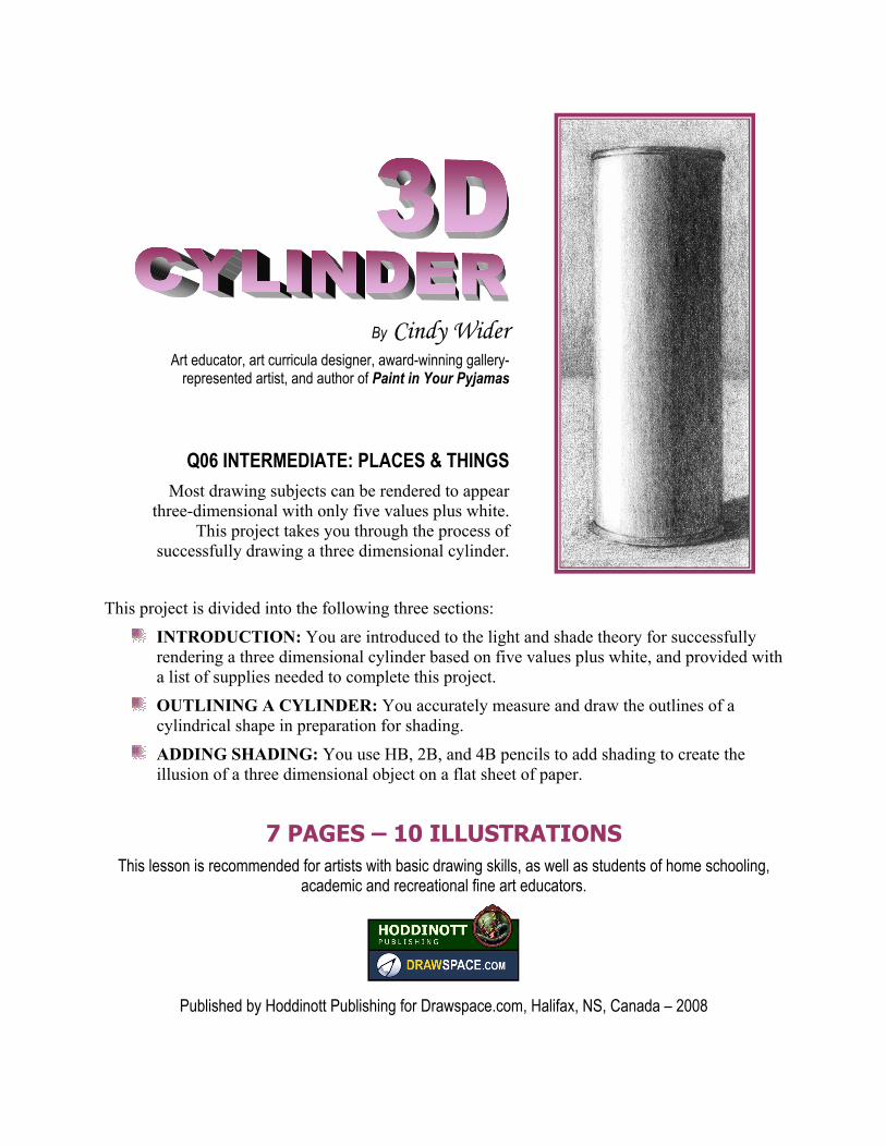
Q06 INTERMEDIATE: PLACES & THINGS Most drawing subjects can be rendered to appear
three-dimensional with only five values plus white. This project takes you through the process of
successfully drawing a three dimensional cylinder.
This project is divided into the following three sections:
INTRODUCTION: You are introduced to the light and shade theory for successfully rendering a three dimensional cylinder based on five values plus white, and provided with a list of supplies needed to complete this project.
OUTLINING A CYLINDER: You accurately measure and draw the outlines of a cylindrical shape in preparation for shading.
ADDING SHADING: You use HB, 2B, and 4B pencils to add shading to create the illusion of a three dimensional object on a flat sheet of paper.
7 PAGES – 10 ILLUSTRATIONS This lesson is recommended for artists with basic drawing skills, as well as students of home schooling,
academic and recreational fine art educators.
Published by Hoddinott Publishing for Drawspace.com, Halifax, NS, Canada – 2008
Copyright to all intellectual property, articles, images, text, projects, lessons and exercises within this document belong to Cindy Wider and may not be reproduced or used for any commercial purposes whatsoever without the written permission of Cindy Wider. Copyright to this lesson in its current format belongs to Hoddinott Publishing, and may not be reproduced or used for any commercial purposes
whatsoever without the written permission of Cindy Wider (E-mail [email protected]) and Brenda Hoddinott (E-mail [email protected]) Web site http://www.drawspace.com
- 2 -
TTIIPP!! Refer to Lesson G06 Beginner: Creating a
Value Scale before you begin this lesson.
Figure 601
Figure 602
ARTSPEAK Shading (noun) refers to the various values within a drawing that make images appear three-dimensional; (verb) the process of adding values to a drawing so as to create the illusion of texture, form and/or three-dimensional space.
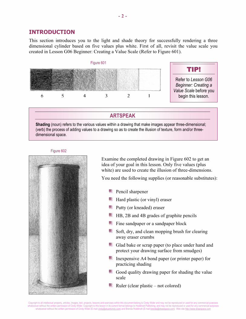
INTRODUCTION This section introduces you to the light and shade theory for successfully rendering a three dimensional cylinder based on five values plus white. First of all, revisit the value scale you created in Lesson G06 Beginner: Creating a Value Scale (Refer to Figure 601).
Examine the completed drawing in Figure 602 to get an idea of your goal in this lesson. Only five values (plus white) are used to create the illusion of three-dimensions.
You need the following supplies (or reasonable substitutes):
Pencil sharpener
Hard plastic (or vinyl) eraser
Putty (or kneaded) eraser
HB, 2B and 4B grades of graphite pencils
Fine sandpaper or a sandpaper block
Soft, dry, and clean mopping brush for clearing away eraser crumbs
Glad bake or scrap paper (to place under hand and protect your drawing surface from smudges)
Inexpensive A4 bond paper (or printer paper) for practicing shading
Good quality drawing paper for shading the value scale
Ruler (clear plastic – not colored)
Copyright to all intellectual property, articles, images, text, projects, lessons and exercises within this document belong to Cindy Wider and may not be reproduced or used for any commercial purposes whatsoever without the written permission of Cindy Wider. Copyright to this lesson in its current format belongs to Hoddinott Publishing, and may not be reproduced or used for any commercial purposes
whatsoever without the written permission of Cindy Wider (E-mail [email protected]) and Brenda Hoddinott (E-mail [email protected]) Web site http://www.drawspace.com
- 3 -
ARTSPEAK Graphite is a soft black form of opaque carbon found in nature, often mixed with clay in the manufacture of graphite pencils. Tones (also called values) are the different shades of gray created when you draw by varying the pressure used in holding various grades of pencils. Grade refers to the softness or hardness of the mixture used in the manufacture of graphite and other drawing media. Symmetry is a balanced arrangement (sometimes referred to as a mirror image) of lines and shapes on opposite sides of an often-imaginary centerline.
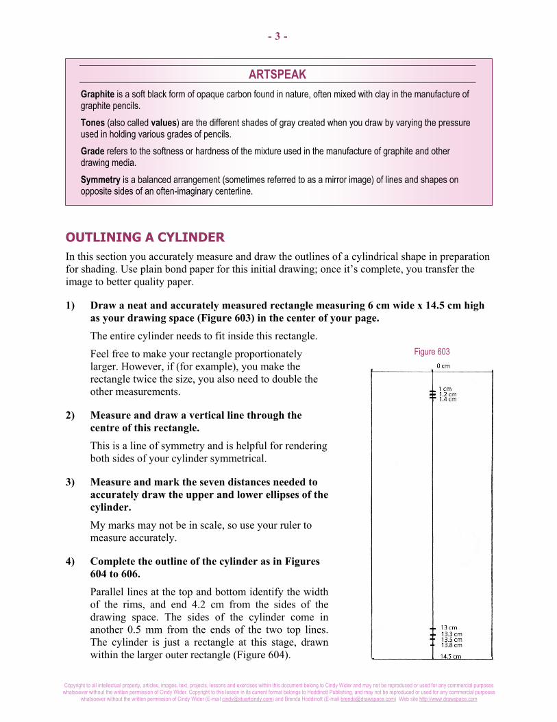
Figure 603
OUTLINING A CYLINDER In this section you accurately measure and draw the outlines of a cylindrical shape in preparation for shading. Use plain bond paper for this initial drawing; once it’s complete, you transfer the image to better quality paper.
1) Draw a neat and accurately measured rectangle measuring 6 cm wide x 14.5 cm high as your drawing space (Figure 603) in the center of your page. The entire cylinder needs to fit inside this rectangle.
Feel free to make your rectangle proportionately larger. However, if (for example), you make the rectangle twice the size, you also need to double the other measurements.
2) Measure and draw a vertical line through the centre of this rectangle. This is a line of symmetry and is helpful for rendering both sides of your cylinder symmetrical.
3) Measure and mark the seven distances needed to accurately draw the upper and lower ellipses of the cylinder. My marks may not be in scale, so use your ruler to measure accurately.
4) Complete the outline of the cylinder as in Figures 604 to 606. Parallel lines at the top and bottom identify the width of the rims, and end 4.2 cm from the sides of the drawing space. The sides of the cylinder come in another 0.5 mm from the ends of the two top lines. The cylinder is just a rectangle at this stage, drawn within the larger outer rectangle (Figure 604).

Copyright to all intellectual property, articles, images, text, projects, lessons and exercises within this document belong to Cindy Wider and may not be reproduced or used for any commercial purposes whatsoever without the written permission of Cindy Wider. Copyright to this lesson in its current format belongs to Hoddinott Publishing, and may not be reproduced or used for any commercial purposes
whatsoever without the written permission of Cindy Wider (E-mail [email protected]) and Brenda Hoddinott (E-mail [email protected]) Web site http://www.drawspace.com
- 4 -
Figure 604
Figure 605
TTIIPP!! To transfer an image to new paper refer to Lesson J04
Intermediate: Transferring an Image
Look very carefully to see where the ellipses are placed (Figure 605). Notice that the top ellipses curve upward and are less curved than the bottom ones which are wider and curve down.
This is the correct perspective for a viewpoint where a person is standing looking at the object nearer to the top of the cylinder than the bottom.
5) Transfer your outline to a sheet of good quality paper. Using the graphite transfer technique, make sure you only rub the back of your drawing with a HB pencil so that your outline is very light.
In Figure 606, you can see the outline of the cylinder created by the transfer. My illustrations appear darker so you can clearly see the lines. Only the cylinder itself is transferred, so no guide lines are visible to spoil the shading.

Copyright to all intellectual property, articles, images, text, projects, lessons and exercises within this document belong to Cindy Wider and may not be reproduced or used for any commercial purposes whatsoever without the written permission of Cindy Wider. Copyright to this lesson in its current format belongs to Hoddinott Publishing, and may not be reproduced or used for any commercial purposes
whatsoever without the written permission of Cindy Wider (E-mail [email protected]) and Brenda Hoddinott (E-mail [email protected]) Web site http://www.drawspace.com
- 5 -
Figure 607
Figure 606
Figure 608
ADDING SHADING In this section, you use HB, 2B, and 4B pencils to add shading to create the illusion of a three dimensional object on a flat sheet of paper.
6) Using your HB pencil, shade the area shown in Figure 607, to a level two only. Continuously refer back to the completed cylinder in Figure 602.
7) Use various pencils to complete the shading of the cylinder, cast shadow, and background.
Refer to Figures 608 to 610. Remember, level one is to be left as the white of your page.
Have the value scale you created earlier alongside you as a guide to what levels of tones to use.
Concentrate on achieving the different levels of light and shade making sure that you place them correctly. Use a delicate shading technique and swap your pencils when necessary to avoid your page becoming too glossy. Use small circular motions, to help you achieve a smooth look.

Copyright to all intellectual property, articles, images, text, projects, lessons and exercises within this document belong to Cindy Wider and may not be reproduced or used for any commercial purposes whatsoever without the written permission of Cindy Wider. Copyright to this lesson in its current format belongs to Hoddinott Publishing, and may not be reproduced or used for any commercial purposes
whatsoever without the written permission of Cindy Wider (E-mail [email protected]) and Brenda Hoddinott (E-mail [email protected]) Web site http://www.drawspace.com
- 6 -
Figure 609
Figure 610
8) Touch up any sections of shading with which you are not completely happy. Use the drawings in Figure 609 and 610 as reminders of where to darken or lighten your drawing as needed.
Use your 2B and 4B pencils to build up the level 3, 4 and 5 areas. Use your 4B pencil and press quite firmly to build up all the level 6 areas.
Figure 609 shows your shading goals and the notes tell you where and why each tone is used.

Copyright to all intellectual property, articles, images, text, projects, lessons and exercises within this document belong to Cindy Wider and may not be reproduced or used for any commercial purposes whatsoever without the written permission of Cindy Wider. Copyright to this lesson in its current format belongs to Hoddinott Publishing, and may not be reproduced or used for any commercial purposes
whatsoever without the written permission of Cindy Wider (E-mail [email protected]) and Brenda Hoddinott (E-mail [email protected]) Web site http://www.drawspace.com
- 7 -
Drawspace.com is proud to introduce
Cindy Wider Art educator, art curricula designer, award-winning gallery-represented artist, and author of Paint in Your Pyjamas
Cindy Wider currently resides in Noosa on the Sunshine Coast of Queensland, Australia with her husband Stuart, and daughters Isha and Sumaya.
Art philosophy I believe that almost everyone has the natural gifts needed for learning to draw and paint, and that art has the ability to heal and help us to reach our full human potential. Art is the missing language that can bridge the gap in communication when words are not enough. It is my life purpose to share my love of art, through inspiring and motivating others to realize their natural gifts for drawing and painting.
My passion for helping others to learn to draw and paint comes from the joy and excitement I experience through the process of creating art and my desire to share that feeling! I stumbled upon my natural gifts for art at the age of 23years and wished I had known about it sooner.
Professional accomplishments After ten years of serious art study Cindy went on to become one of her community’s leading artists with her artworks gracing the walls of many of the major hotels, corporate boardrooms and private homes as well as selling overseas. She began tutoring at the local Technical and Further Education College in 1988 and then went on to establish the largest on-going private art tuition school in Port Lincoln, then several years later in Noosa Queensland.
For many years Cindy worked as a part time freelance illustrator for the internationally renowned rubber stamp company, ‘Annaleey crafts.’ In 2005, along with her husband Stuart she was commissioned by the Microsoft Corporation to produce an original artwork for their Sydney headquarters, and limited edition prints for the annual corporate gift to their business associates.
You can view Cindy’s paintings at: http://www.thecoopergallery.com.au/wider/wider.htm
Paint in Your Pyjamas Have you been asking yourself, "Who am I and what do I really want out of life?” Perhaps you've been selflessly dedicating all your energy to your children or partner to help them fulfill their dreams and goals. Maybe you're working hard just to earn a living.
But now you feel the time has come to do something for yourself. If so, this book is just for you...
You can buy Cindy’s book, ‘Paint in Your Pyjamas – every Woman’s guide to finding your life purpose through art’ at:
http://www.paintinyourpyjamas.com/