megan sanders evaluation question 1
TRANSCRIPT
Megan SandersEvaluation
Question 1:In what way does your media product use, develop, or challenge forms and conventions of real media products?
• My country music magazine uses many different forms and conventions of music magazines throughout all the four pages I have created, being the front page, article’s double page spread, and contents page.
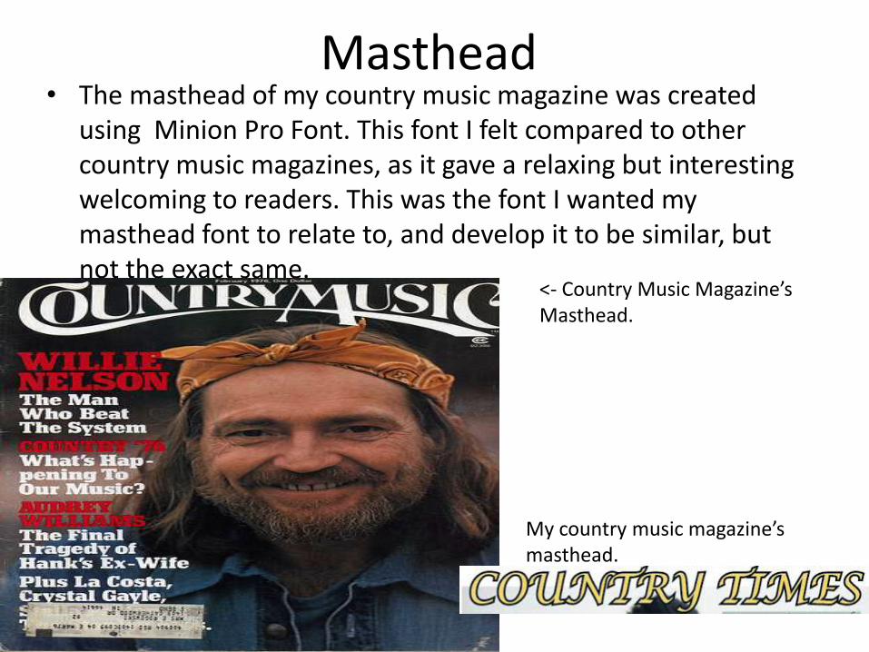
Masthead• The masthead of my country music magazine was created
using Minion Pro Font. This font I felt compared to other country music magazines, as it gave a relaxing but interesting welcoming to readers. This was the font I wanted my masthead font to relate to, and develop it to be similar, but not the exact same.
<- Country Music Magazine’s Masthead.
My country music magazine’s masthead.
Masthead continued...
• I also wanted to keep my Country music magazine title (COUNTRY TIMES) simple and straight to the point, like other country music magazines are (Country Music, Country Weekly, Country Style, Country America)
• The title of the magazine meant it let readers know exactly what type of music magazine they would be looking at, and what they would find throughout the magazine.
Mis-En-Scene of Images Continued...
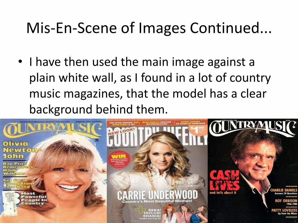
• I have then used the main image against a plain white wall, as I found in a lot of country music magazines, that the model has a clear background behind them.
Costumes
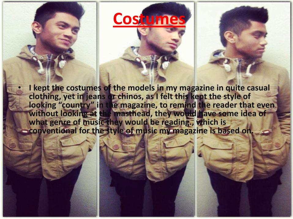
• I kept the costumes of the models in my magazine in quite casual clothing, yet in jeans or chinos, as I felt this kept the style of looking “country” in the magazine, to remind the reader that even without looking at the masthead, they would have some idea of what genre of music they would be reading., which is conventional for the style of music my magazine is based on.
Models
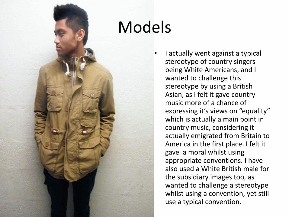
• I actually went against a typical stereotype of country singers being White Americans, and I wanted to challenge this stereotype by using a British Asian, as I felt it gave country music more of a chance of expressing it’s views on “equality” which is actually a main point in country music, considering it actually emigrated from Britain to America in the first place. I felt it gave a moral whilst using appropriate conventions. I have also used a White British male for the subsidiary images too, as I wanted to challenge a stereotype whilst using a convention, yet still use a typical convention.
Article/Written Content
• The written content of my article follows the codes and conventions of a real country music magazine as it uses a typical “Question and Answer” structure. This was to follow and use the codes and conventions and I felt it fit the article and the magazine in a positive way. The interview follows the same style as any other music magazine, and questions the artist and lets the readers know about his inspirations, future plans, and country role models.
Music Genre
• The music genre of my music magazine is country music. I felt this was presented clearly throughout the magazine as the artists used are clearly country artists, the costumes and written content is based purely on country music, which is also reminding the reader what the genre of the music is. I have only used bands/artists of the same genre of my magazine in the front page, contents, and double page spread when asked about the artist’s role models. The colours used on my front page are purple, light blue, peach, and black, which I felt the light colours contrasted with the country music genre as they are calming colours, but then the black makes the colours stand out and makes the magazine look more bold.
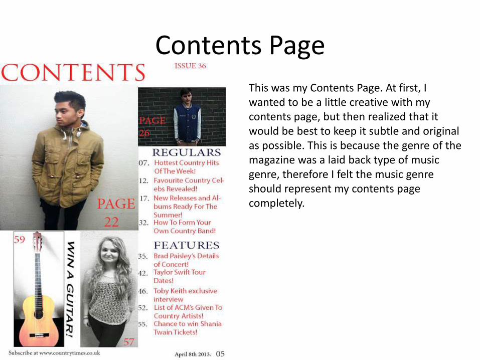
Contents Page
This was my Contents Page. At first, I wanted to be a little creative with my contents page, but then realized that it would be best to keep it subtle and original as possible. This is because the genre of the magazine was a laid back type of music genre, therefore I felt the music genre should represent my contents page completely.
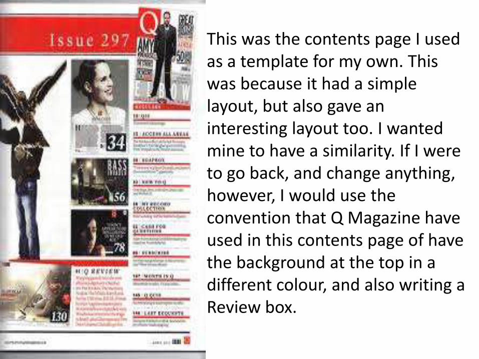
This was the contents page I used as a template for my own. This was because it had a simple layout, but also gave an interesting layout too. I wanted mine to have a similarity. If I were to go back, and change anything, however, I would use the convention that Q Magazine have used in this contents page of have the background at the top in a different colour, and also writing a Review box.
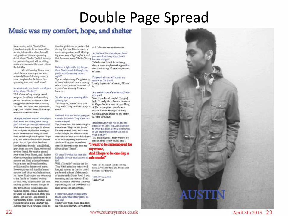
Double Page Spread
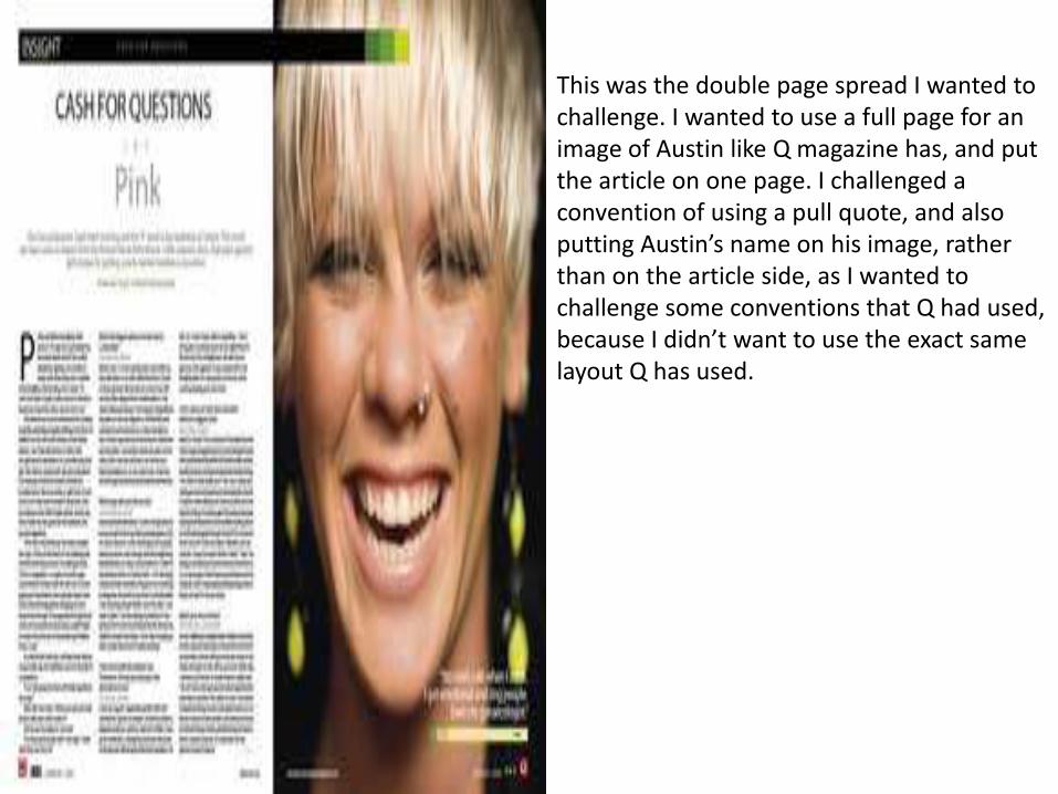
This was the double page spread I wanted to challenge. I wanted to use a full page for an image of Austin like Q magazine has, and put the article on one page. I challenged a convention of using a pull quote, and also putting Austin’s name on his image, rather than on the article side, as I wanted to challenge some conventions that Q had used, because I didn’t want to use the exact same layout Q has used.
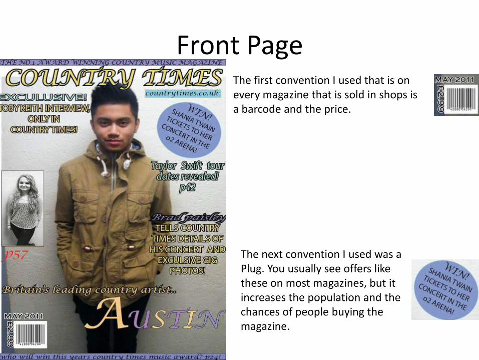
Front PageThe first convention I used that is on every magazine that is sold in shops is a barcode and the price.
The next convention I used was a Plug. You usually see offers like these on most magazines, but it increases the population and the chances of people buying the magazine.
• I have used also neutral colours in each and every page of the magazine, such as light purples, reds, light blues, peach. I used these colours to attract the audience who would be a neutral audience, and attract them with light colours that would appeal to them. I also used black to stand out in the colours and it is a convention magazines use as one of the main colours, which I also wanted to use.