mi 291 chapter 6 (aethetics in engineering design)(1)
TRANSCRIPT
Chapter VI Aesthetics in Engineering
Design
Introduction
Many considerations go into any new design, including function, cost, material, how it will be fabricated, safety, environmental aspects, etc. From automobiles to airplanes to appliances, engineers create many of the physical forms that surround us. Therefore, it is their responsibility to make them as visually appealing as possible, so that these designs are pleasing now and in the future.
Beauty can be broadly interpreted to have two different aspects: emotional and intellectual. An emotional appreciation of beauty depends on the personality of the perceiver and is therefore variable. In addition, it varies with time.
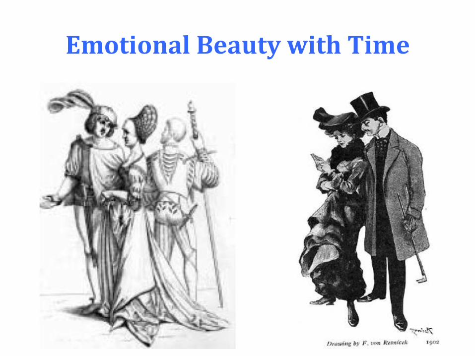
Emotional Beauty with Time
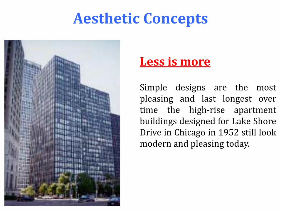
Aesthetic Concepts
Less is more Simple designs are the most pleasing and last longest over time the high-rise apartment buildings designed for Lake Shore Drive in Chicago in 1952 still look modern and pleasing today.
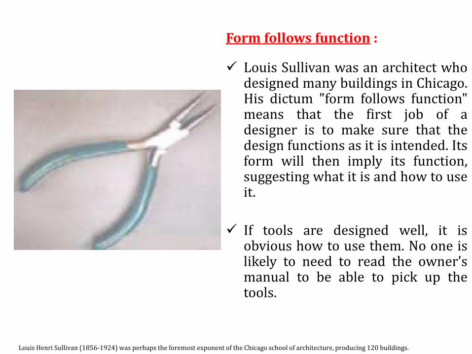
Form follows function : Louis Sullivan was an architect who
designed many buildings in Chicago. His dictum "form follows function" means that the first job of a designer is to make sure that the design functions as it is intended. Its form will then imply its function, suggesting what it is and how to use it.
If tools are designed well, it is obvious how to use them. No one is likely to need to read the owner’s manual to be able to pick up the tools.
Louis Henri Sullivan (1856-1924) was perhaps the foremost exponent of the Chicago school of architecture, producing 120 buildings.
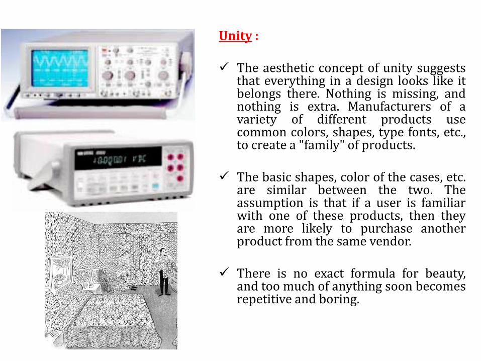
Unity : The aesthetic concept of unity suggests
that everything in a design looks like it belongs there. Nothing is missing, and nothing is extra. Manufacturers of a variety of different products use common colors, shapes, type fonts, etc., to create a "family" of products.
The basic shapes, color of the cases, etc. are similar between the two. The assumption is that if a user is familiar with one of these products, then they are more likely to purchase another product from the same vendor.
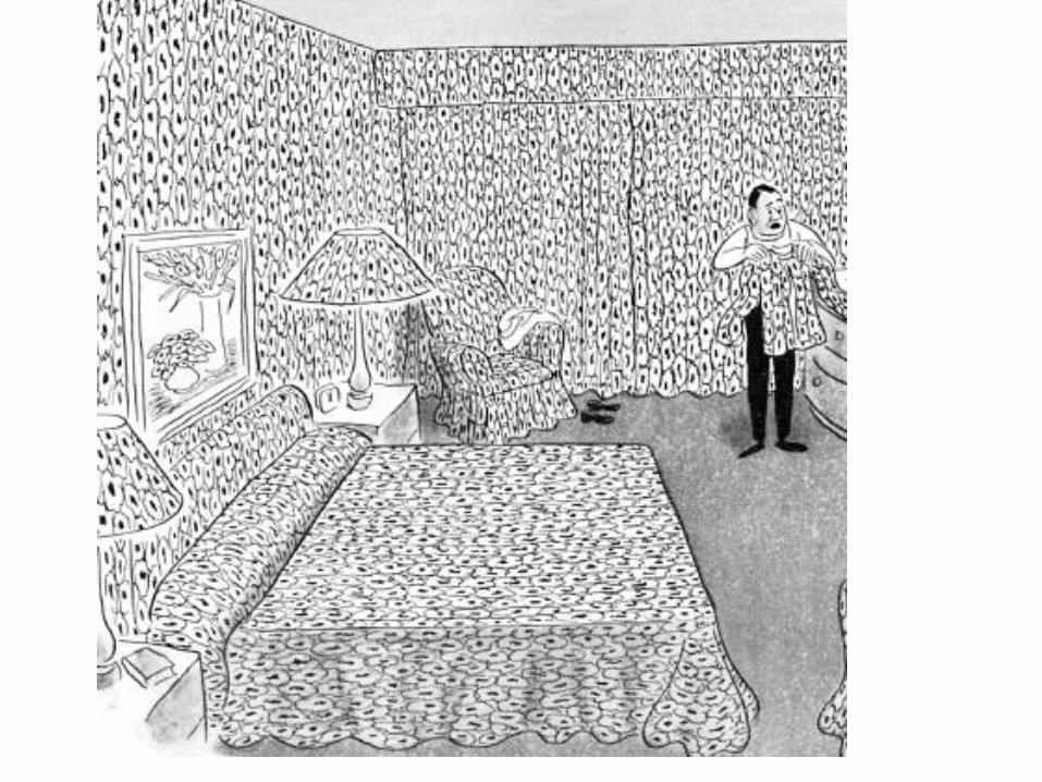
There is no exact formula for beauty,
and too much of anything soon becomes repetitive and boring.

Styling :
Styling refers to ornamentation that is added to a product for sales appeal, but has no function rationale. Styling is the opposite of form follows function; it appeals to the emotional aspect of beauty and usually tarnishes with time.
Aesthetic Elements Lines :
Both artists and engineers use lines as the basic building block to create shapes. However, there are many different styles of lines, and the style of line in a design can convey subtle messages about its function.
bold lines suggest strength and ruggedness and, therefore, would be good choices for depicting earthmoving equipment. Thin, fine lines, on the other hand, suggest precision and would be good to delineate parts of electronic instruments. Jagged lines convey danger and could be used in high voltage products

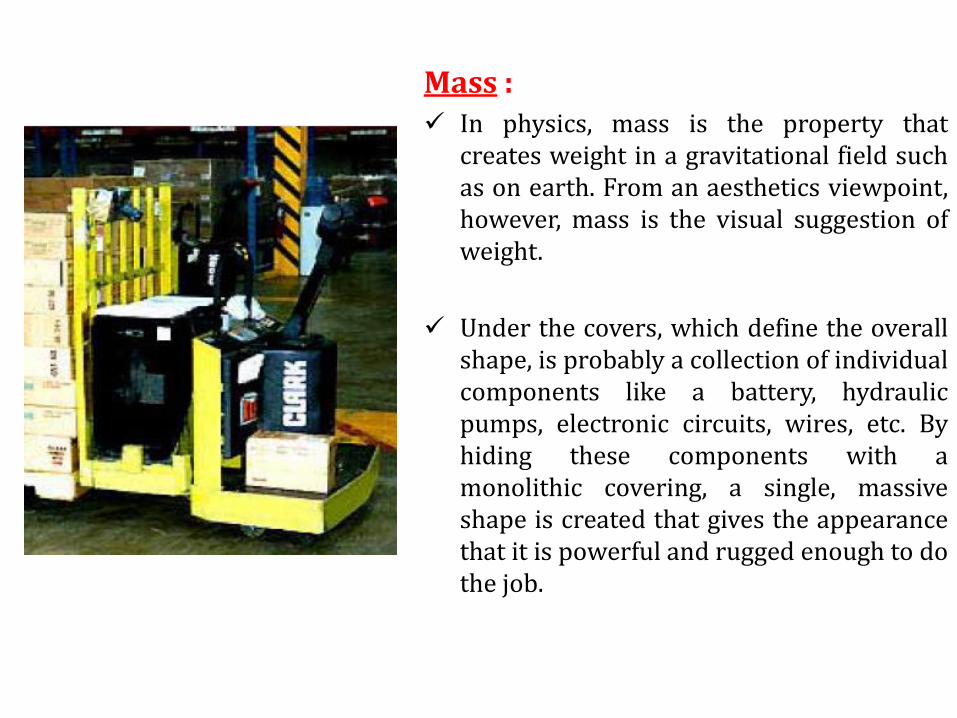
Mass : In physics, mass is the property that
creates weight in a gravitational field such as on earth. From an aesthetics viewpoint, however, mass is the visual suggestion of weight.
Under the covers, which define the overall shape, is probably a collection of individual components like a battery, hydraulic pumps, electronic circuits, wires, etc. By hiding these components with a monolithic covering, a single, massive shape is created that gives the appearance that it is powerful and rugged enough to do the job.

Space :
When considering aesthetics, the opposite of mass is space, and designers can use space to their advantage to create light, airy designs that are visually interesting.
Balance :
From the study of physics, we know that there are several ways to balance a weight on a lever. From an aesthetics viewpoint, objects may also be either symmetrically or asymmetrically in balance.
In general, designs that are symmetrically balanced suggest stability, precision, and simplicity; they can also be boring. Designs that exhibit asymmetric balance are more dynamic and interesting to the eye.
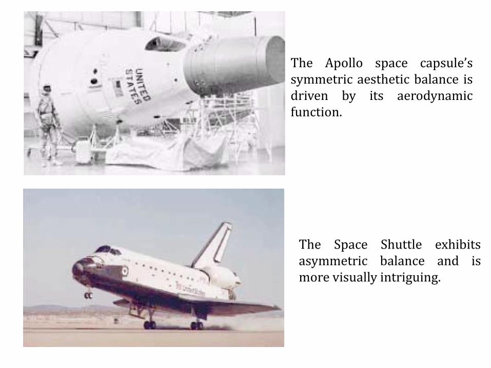
The Apollo space capsule’s symmetric aesthetic balance is driven by its aerodynamic function.
The Space Shuttle exhibits asymmetric balance and is more visually intriguing.
Poster Presentation
Introduction
The primary purpose of a display poster is to report information. This can be done effectively by: Catching the viewer’s interest and attention. Making the poster easy to read and understand. Telling a story. Always keep in mind that if a viewer has to work hard to
understand the message, s/he will not invest the energy to do so, and the poster will not be effective nor entice the audience.
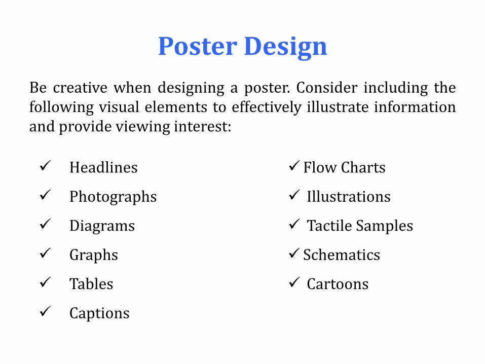
Poster Design
Be creative when designing a poster. Consider including the following visual elements to effectively illustrate information and provide viewing interest:
Headlines
Photographs
Diagrams
Graphs
Tables
Captions
Flow Charts
Illustrations
Tactile Samples
Schematics
Cartoons

Poster size :
A recommended poster size is a freestanding, tri-fold poster with the central frame dimensions of 24 in. x 36 in. Standard poster board works well if the poster will be mounted to a wall or bulletin board.
Proofread text :
Read the written text out loud to assure it makes sense. Edit and choose words carefully for clarity. Assume that the opportunity to further explain or clarify does
not exist. Remember to label graph axes with descriptions and units of
measure.
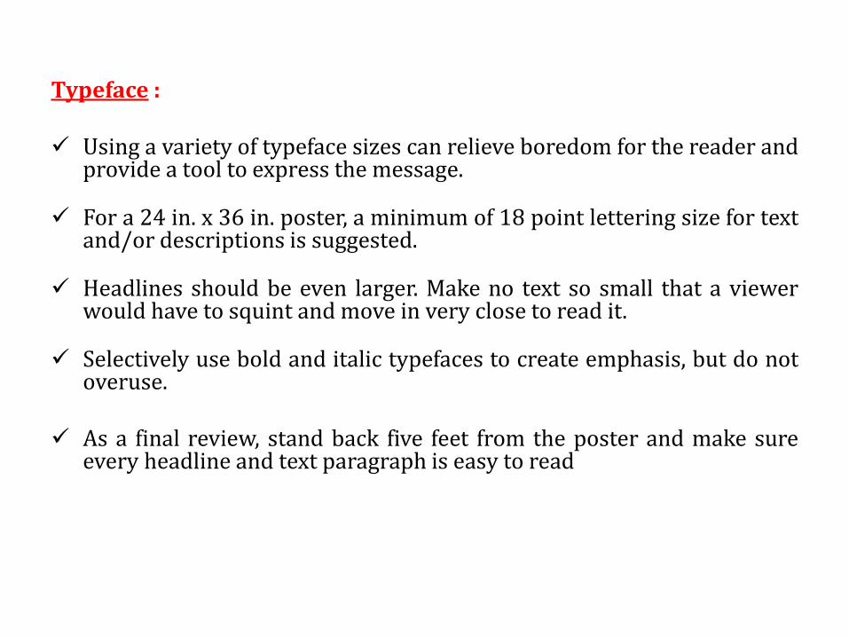
Typeface : Using a variety of typeface sizes can relieve boredom for the reader and
provide a tool to express the message. For a 24 in. x 36 in. poster, a minimum of 18 point lettering size for text
and/or descriptions is suggested. Headlines should be even larger. Make no text so small that a viewer
would have to squint and move in very close to read it. Selectively use bold and italic typefaces to create emphasis, but do not
overuse. As a final review, stand back five feet from the poster and make sure
every headline and text paragraph is easy to read
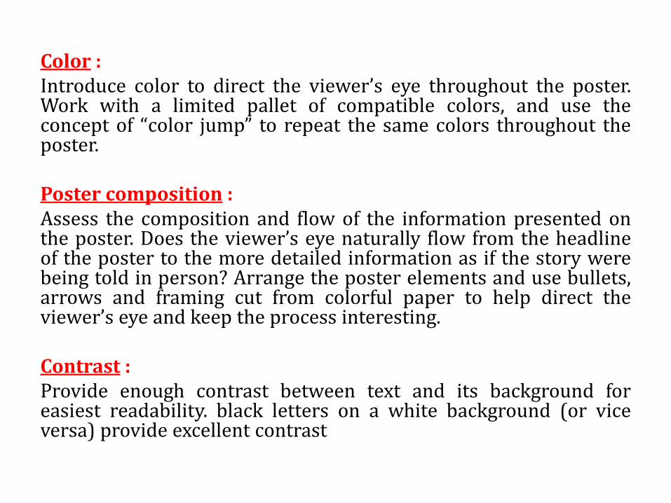
Color : Introduce color to direct the viewer’s eye throughout the poster. Work with a limited pallet of compatible colors, and use the concept of “color jump” to repeat the same colors throughout the poster. Poster composition : Assess the composition and flow of the information presented on the poster. Does the viewer’s eye naturally flow from the headline of the poster to the more detailed information as if the story were being told in person? Arrange the poster elements and use bullets, arrows and framing cut from colorful paper to help direct the viewer’s eye and keep the process interesting. Contrast : Provide enough contrast between text and its background for easiest readability. black letters on a white background (or vice versa) provide excellent contrast

Oral Presentation
Introduction
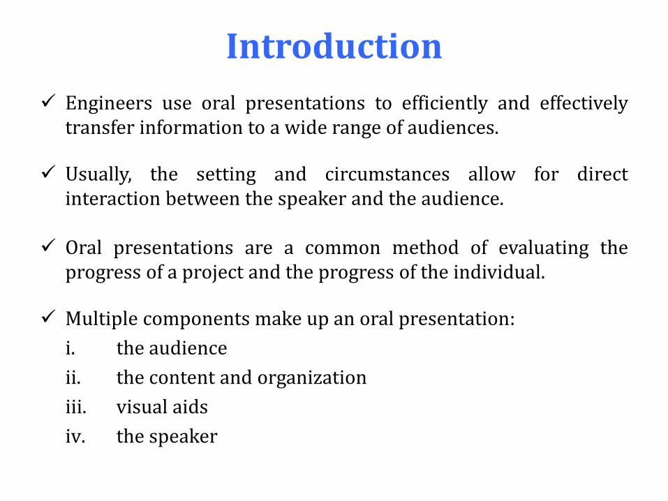
Engineers use oral presentations to efficiently and effectively transfer information to a wide range of audiences.
Usually, the setting and circumstances allow for direct interaction between the speaker and the audience.
Oral presentations are a common method of evaluating the progress of a project and the progress of the individual.
Multiple components make up an oral presentation:
i. the audience
ii. the content and organization
iii. visual aids
iv. the speaker
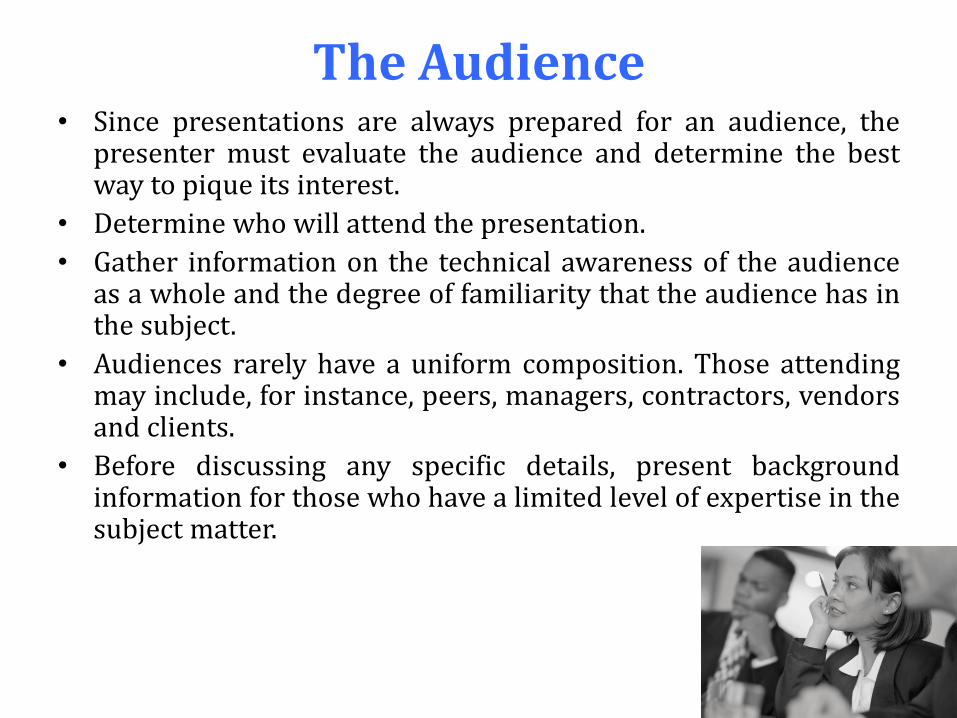
The Audience • Since presentations are always prepared for an audience, the
presenter must evaluate the audience and determine the best way to pique its interest.
• Determine who will attend the presentation.
• Gather information on the technical awareness of the audience as a whole and the degree of familiarity that the audience has in the subject.
• Audiences rarely have a uniform composition. Those attending may include, for instance, peers, managers, contractors, vendors and clients.
• Before discussing any specific details, present background information for those who have a limited level of expertise in the subject matter.
The Content & Organization
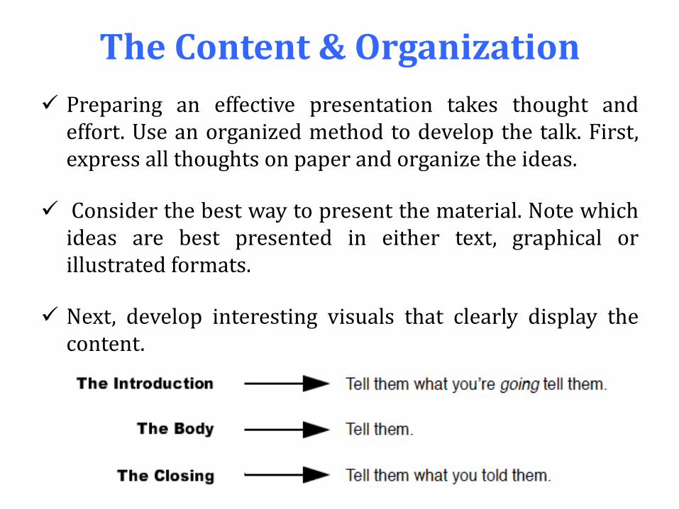
Preparing an effective presentation takes thought and effort. Use an organized method to develop the talk. First, express all thoughts on paper and organize the ideas.
Consider the best way to present the material. Note which ideas are best presented in either text, graphical or illustrated formats.
Next, develop interesting visuals that clearly display the content.
The Introduction
The second slide (or overhead transparency) presents a brief outline of the information to be discussed.
The presenter briefly (10-15 seconds) overviews what is going to be discussed.
Usually, the title of the slide for this section is “Overview,” “Outline” or “Introduction.” This becomes the first time the speaker “Tells them,” providing the audience with a map of the signposts of the presentation.
The Body
The slides between the second and last form the body of the
presentation and contain the important details of the
presentation content.
i. Present the background or theory.
ii. Discuss the design or research methods.
iii. Discuss the results.
iv. Tell the interesting parts of the story.
The Closing
The last one or two slides present a summary of the key points of the talk.
For example, the talk might end with something like, “Now you’ve heard about how our design of a toy manipulative takes the abilities of 2-5 year olds into account, which led to our choice of polyethylene for the construction of the prototype. Our tests went well, but showed that the base needs to be reinforced. Currently, our revised design is in fabrication and will be ready in time for the Design Expo.”
Visual Aids
All presentations should use visual aids, and some engineers regard them as their most important product.
Visual aids, the objective of which is to convey enough information for the audience.
Should be carefully developed to transmit only pertinent information.
The most common form of visual aid in professional settings is the overhead transparency, variously called overheads, slides or viewgraphs.
How Many Slides ?
Plan on one slide per minute of talk, which ensures the right amount of information on each slide.
If a slide takes more than two minutes to discuss, then there is too much information; the audience may become confused. Conversely, if it takes only ten seconds to cover the information, it may be better to include that information on the previous or next slide.
Never talk without having a slide that emphasizes important points. If it is not worth putting on a slide, it is not worth discussing at all.
The Speaker
Some engineers dislike giving oral presentations. However, such a negative approach can inhibit the development of an effective presentation style. Keep two things in mind when preparing a presentation:
i. The speaker (and the student team) have more knowledge about the topic compared to that of the audience, and
i. The audience has an interest in what is being said. In other words, the speaker and the material are informative and interesting.
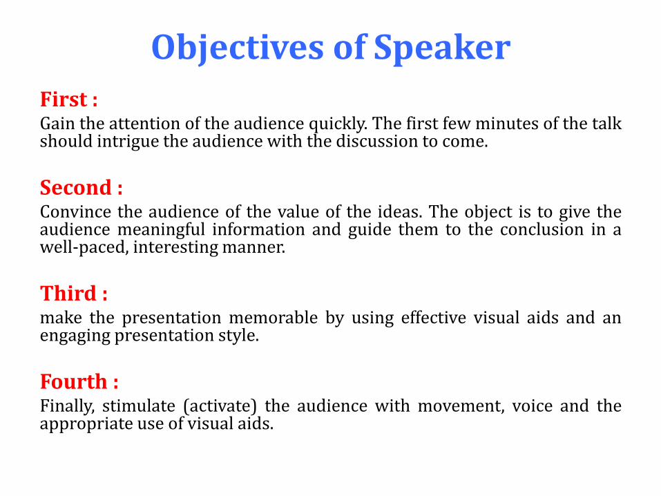
Objectives of Speaker
First : Gain the attention of the audience quickly. The first few minutes of the talk should intrigue the audience with the discussion to come.
Second : Convince the audience of the value of the ideas. The object is to give the audience meaningful information and guide them to the conclusion in a well-paced, interesting manner.
Third : make the presentation memorable by using effective visual aids and an engaging presentation style.
Fourth : Finally, stimulate (activate) the audience with movement, voice and the appropriate use of visual aids.
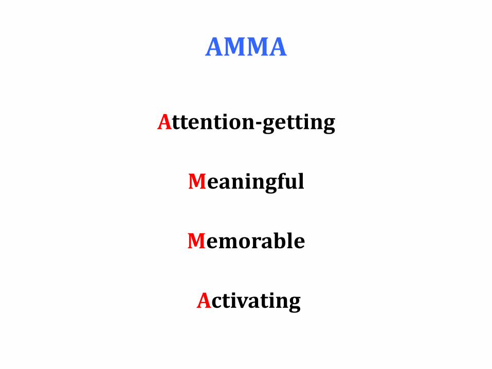
AMMA
Attention-getting
Meaningful
Memorable
Activating
Example and further tips
Making PowerPoint Slides
Avoiding the Pitfalls
of Bad Slides
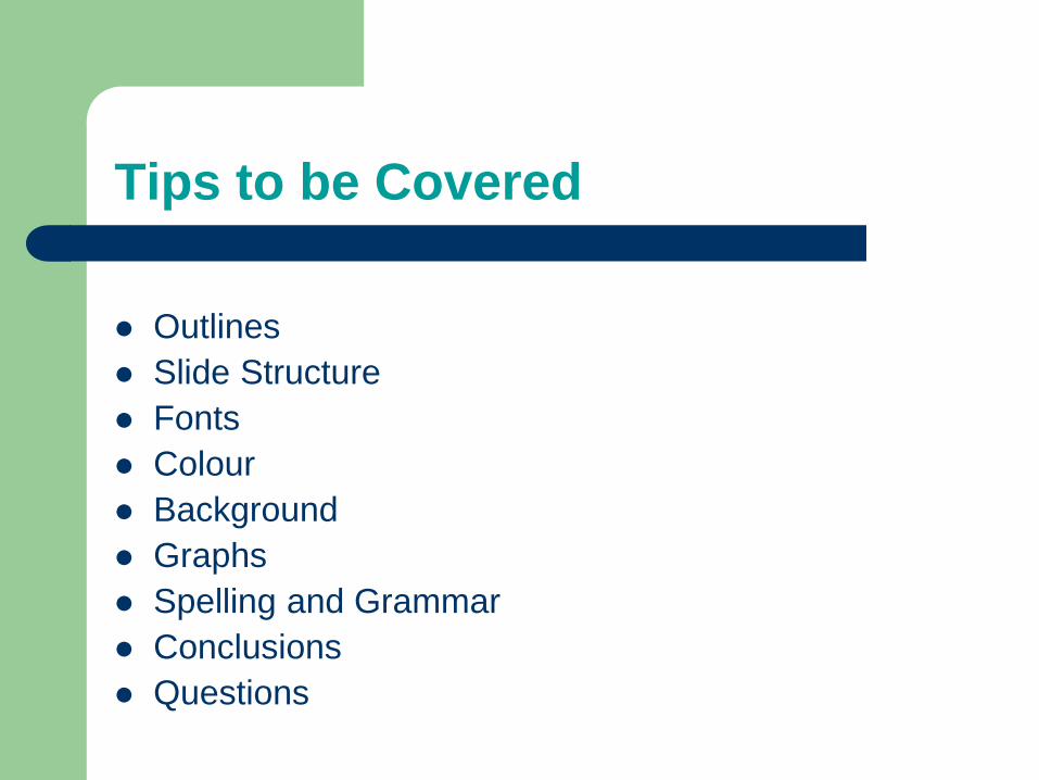
Tips to be Covered
Outlines
Slide Structure
Fonts
Colour
Background
Graphs
Spelling and Grammar
Conclusions
Questions
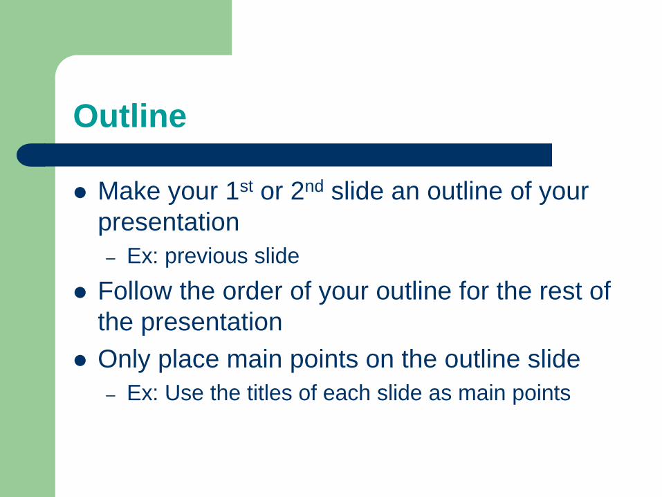
Outline
Make your 1st or 2nd slide an outline of your
presentation
– Ex: previous slide
Follow the order of your outline for the rest of
the presentation
Only place main points on the outline slide
– Ex: Use the titles of each slide as main points
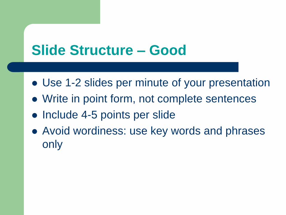
Slide Structure – Good
Use 1-2 slides per minute of your presentation
Write in point form, not complete sentences
Include 4-5 points per slide
Avoid wordiness: use key words and phrases
only
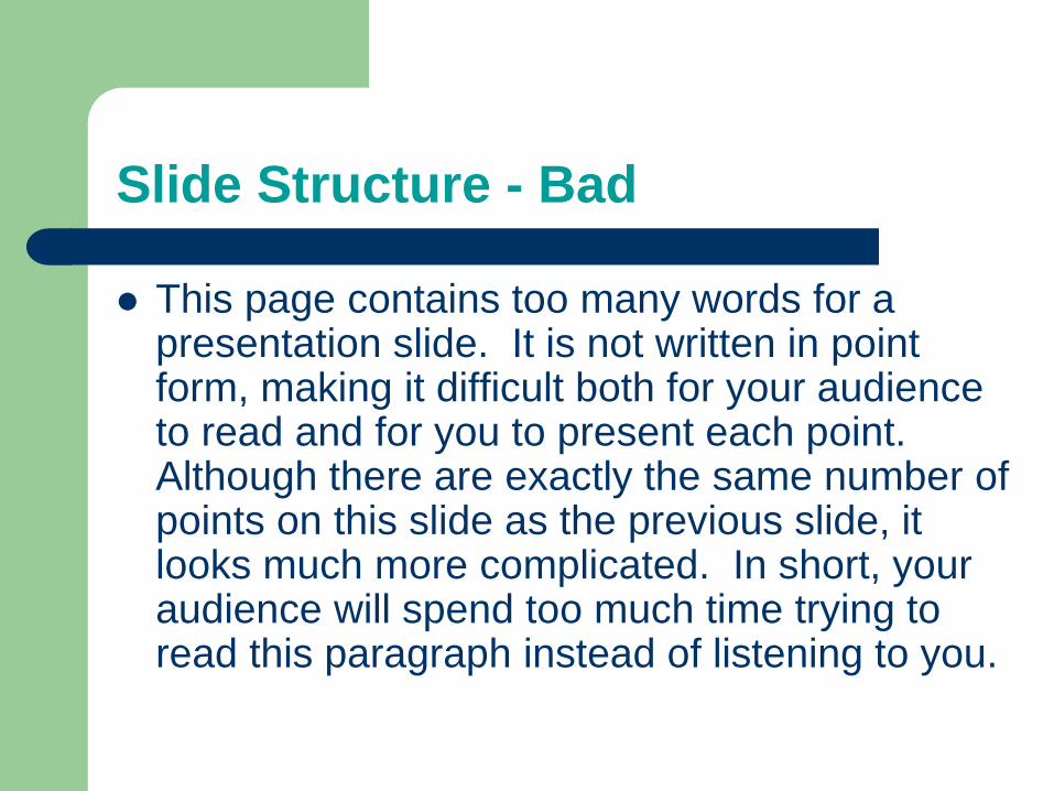
Slide Structure - Bad
This page contains too many words for a presentation slide. It is not written in point form, making it difficult both for your audience to read and for you to present each point. Although there are exactly the same number of points on this slide as the previous slide, it looks much more complicated. In short, your audience will spend too much time trying to read this paragraph instead of listening to you.

Slide Structure – Good
Show one point at a time:
– Will help audience concentrate on what you are
saying
– Will prevent audience from reading ahead
– Will help you keep your presentation focused

Slide Structure - Bad
Do not use distracting animation
Do not go overboard with the animation
Be consistent with the animation that you use
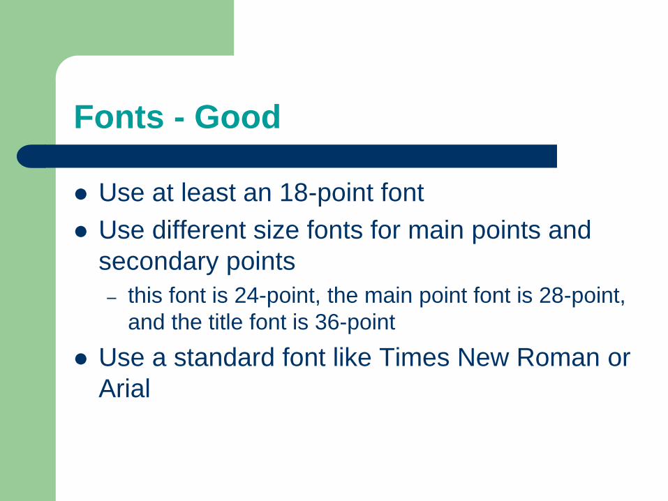
Fonts - Good
Use at least an 18-point font
Use different size fonts for main points and
secondary points
– this font is 24-point, the main point font is 28-point,
and the title font is 36-point
Use a standard font like Times New Roman or
Arial
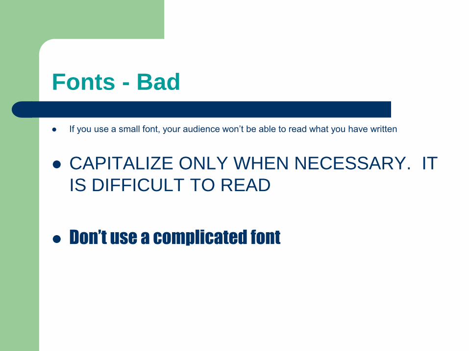
Fonts - Bad
If you use a small font, your audience won’t be able to read what you have written
CAPITALIZE ONLY WHEN NECESSARY. IT
IS DIFFICULT TO READ
Don’t use a complicated font
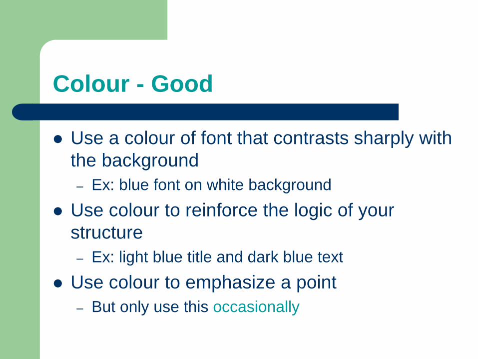
Colour - Good
Use a colour of font that contrasts sharply with
the background
– Ex: blue font on white background
Use colour to reinforce the logic of your
structure
– Ex: light blue title and dark blue text
Use colour to emphasize a point
– But only use this occasionally

Colour - Bad
Using a font colour that does not contrast with the background colour is hard to read
Using colour for decoration is distracting and annoying.
Using a different colour for each point is unnecessary – Using a different colour for secondary points is also
unnecessary
Trying to be creative can also be bad
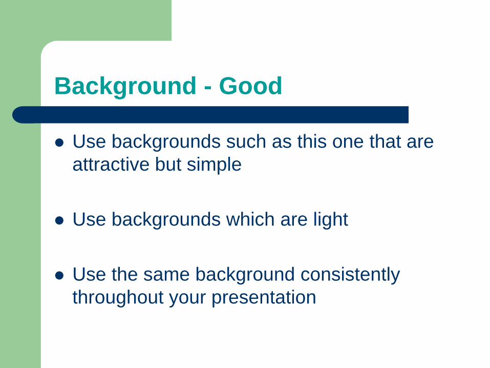
Background - Good
Use backgrounds such as this one that are
attractive but simple
Use backgrounds which are light
Use the same background consistently
throughout your presentation
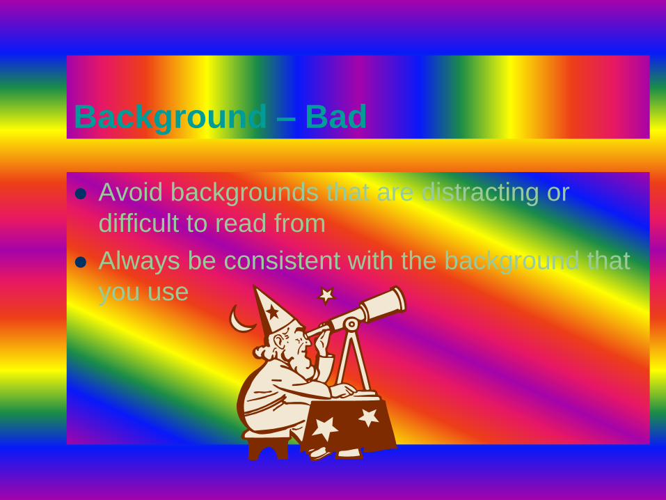
Background – Bad
Avoid backgrounds that are distracting or
difficult to read from
Always be consistent with the background that
you use
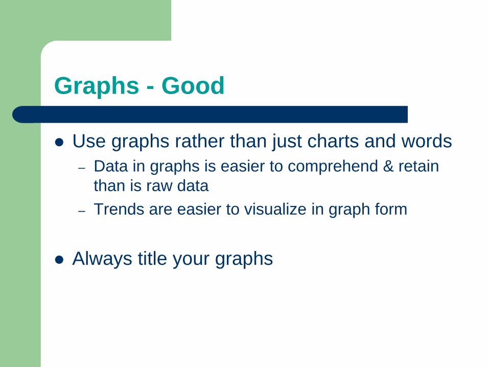
Graphs - Good
Use graphs rather than just charts and words
– Data in graphs is easier to comprehend & retain
than is raw data
– Trends are easier to visualize in graph form
Always title your graphs
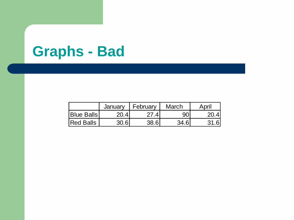
Graphs - Bad
January February March April
Blue Balls 20.4 27.4 90 20.4
Red Balls 30.6 38.6 34.6 31.6
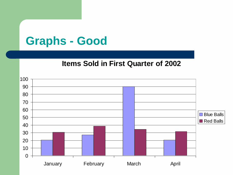
Graphs - Good
Items Sold in First Quarter of 2002
0
10
20
30
40
50
60
70
80
90
100
January February March April
Blue Balls
Red Balls
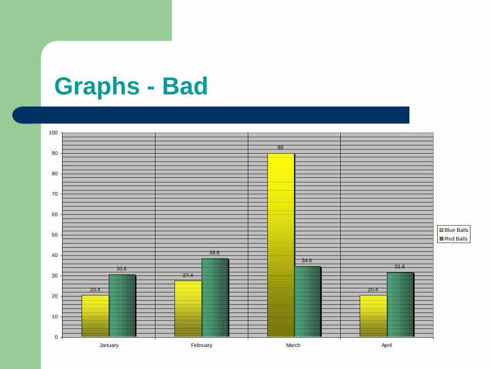
Graphs - Bad
20.4
27.4
90
20.4
30.6
38.6
34.631.6
0
10
20
30
40
50
60
70
80
90
100
January February March April
Blue Balls
Red Balls
Graphs - Bad
Minor gridlines are unnecessary
Font is too small
Colours are illogical
Title is missing
Shading is distracting
Spelling and Grammar
Proof your slides for:
– speling mistakes
– the use of of repeated words
– grammatical errors you might have make
If English is not your first language, please
have someone else check your presentation!
Conclusion
Use an effective and strong closing
– Your audience is likely to remember your last words
Use a conclusion slide to:
– Summarize the main points of your presentation
– Suggest future avenues of research
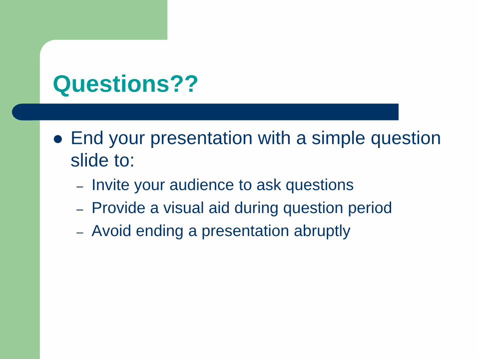
Questions??
End your presentation with a simple question
slide to:
– Invite your audience to ask questions
– Provide a visual aid during question period
– Avoid ending a presentation abruptly
Art of Writing
Introduction
Writing well, a basic requirement for most engineering jobs, is an important component of communicating well.
Most engineers leave the university prepared to perform tests, simulations, analyses and calculations; they do not expect to write reports, documentation, memorandums and executive summaries.
Concise, factual and complete are the desirable attributes of good technical writing for introductory engineering projects courses.
To write clearly and factually requires practice and iteration.

The Writing Process