microsoft press - smarthing.tn · lesson 4: using tool strips and menus overview of the toolstrip...
TRANSCRIPT

IntroductionHardware RequirementsSoftware RequirementsUsing the Companion MediaHow to Install the Practice TestsHow to Use the Practice TestsHow to Uninstall the Practice TestsMicrosoft Certified Professional ProgramErrata and Book SupportWe Want to Hear from YouStay in TouchPreparing for the ExamCHAPTER 1Building a User InterfaceBefore You BeginLesson 1: Using WPF ControlsWPF Controls OverviewContent ControlsOther ControlsSetting the Tab Order for ControlsItem ControlsListBox Control ComboBox Control TreeView Control and TreeViewItem Control MenusToolBar Control StatusBar Control Layout ControlsControl Layout PropertiesUsing Attached PropertiesLayout PanelsAccessing Child Elements ProgrammaticallyAligning ContentLesson SummaryLesson ReviewLesson 2: Using ResourcesUsing Binary ResourcesContent FilesUsing Logical ResourcesCreating a Resource DictionaryRetrieving Resources in CodeLesson SummaryLesson ReviewLesson 3: Using Styles and TriggersUsing StylesTriggersUnderstanding Property Value PrecedenceLesson SummaryLesson ReviewCase ScenariosCase Scenario 1: Streaming Stock QuotesCase Scenario 2: Cup FeverSuggested PracticesOn Your OwnTake a Practice TestCHAPTER 2Working with Events and CommandsBefore You BeginLesson 1: Configuring Events and Event HandlingTypes of Routed EventsRoutedEventArgsAttaching an Event HandlerThe EventManager ClassDefining a New Routed EventCreating a Class-Level Event HandlerApplication-Level EventsLesson SummaryLesson ReviewLesson 2: Configuring CommandsA High-Level Procedure for Implementing a CommandInvoking CommandsCommand Handlers and Command BindingsCreating Custom CommandsLesson SummaryLesson ReviewLesson 3: Implementing AnimationUsing AnimationsLesson SummaryLesson ReviewCase ScenariosCase Scenario 1: Validating User InputCase Scenario 2: Humongous Insurance User InterfaceSuggested PracticesTake a Practice TestCHAPTER 3Adding and Managing ContentBefore You BeginLesson 1: Managing the Visual InterfaceBrushesShapesTransformationsThe Visual TreeAdding to and Removing Controls from the Visual Interface at Run TimeLesson SummaryLesson ReviewLesson 2: Adding Multimedia ContentUsing SoundPlayerMediaPlayer and MediaElementHandling Media-Specific EventsLesson SummaryLesson ReviewCase ScenarioCase Scenario: The Company with Questionable TasteSuggested PracticesOn Your OwnTake a Practice TestCHAPTER 4Windows Forms and Windows Forms ControlsBefore You BeginLesson 1: Working with Windows Forms and Container ControlsOverview of Windows FormsAdding Forms to Your Project
Properties of Windows FormsModifying the Appearance and Behavior of the FormOverview of Container ControlsThe GroupBox ControlThe Panel ControlThe FlowLayoutPanel ControlThe TableLayoutPanel ControlThe TabControl ControlThe SplitContainer ControlLesson SummaryLesson ReviewLesson 2: Configuring Controls in Windows FormsOverview of ControlsConfiguring Controls at Design TimeModifying Control Properties at Design TimeThe Button ControlThe Label ControlCreating Access Keys for Controls without Using Label ControlsThe TextBox ControlThe MaskedTextBox ControlLesson SummaryLesson ReviewLesson 3: Using List-Display and Specialized ControlsOverview of List-Based ControlsListBox ControlComboBox ControlCheckedListBox ControlAdding Items to and Removing Items from a List-Based ControlThe ListView ControlTreeView ControlNumericUpDown ControlDomainUpDown ControlValue-Setting ControlsThe CheckBox ControlThe RadioButton ControlThe TrackBar ControlChoosing Dates and TimesDateTimePicker ControlMonthCalendar ControlWorking with ImagesPictureBox ControlImageList ComponentLesson SummaryLesson ReviewLesson 4: Using Tool Strips and MenusOverview of the ToolStrip ControlTool Strip ItemsDisplaying Images on Tool Strip ItemsThe ToolStripContainer ClassMerging Tool StripsOverview of the MenuStrip ControlCreating Menu Strips and Tool Strip Menu ItemsAdding Enhancements to MenusMoving Items between MenusDisabling, Hiding, and Deleting Menu ItemsMerging MenusSwitching between MenuStrip Controls ProgrammaticallyContext Menus and the ContextMenuStrip ControlLesson SummaryLesson ReviewCase ScenariosCase Scenario 1: Designing a Simple User Interface Case Scenario 2: Designing a User Interface Suggested PracticesTake a Practice TestCHAPTER 5Working with User-Defined ControlsBefore You BeginLesson 1: Creating Controls in Windows FormsIntroduction to Composite ControlsCreating Extended ControlsLesson SummaryLesson ReviewLesson 2: Using Control TemplatesCreating Control TemplatesInserting a Trigger Object in a TemplateRespecting the Templated Parent’s PropertiesApplying Templates with StyleViewing the Source Code for an Existing TemplateUsing Predefined Part Names in a TemplateLesson SummaryLesson ReviewLesson 3: Creating Custom Controls in WPFControl Creation in WPFChoosing among User Controls, Custom Controls, and TemplatesImplementing and Registering Dependency PropertiesCreating User ControlsCreating Custom ControlsConsuming User Controls and Custom ControlsRendering a Theme-Based AppearanceLesson SummaryLesson ReviewCase ScenariosCase Scenario 1: Full Support for StylesCase Scenario 2: The Pizza Progress BarSuggested PracticesTake a Practice TestCHAPTER 6Working with Data BindingBefore You BeginLesson 1: Configuring Data BindingThe Binding ClassBinding to a WPF ElementBinding to an ObjectSetting the Binding ModeBinding to a Nullable ValueSetting the UpdateSourceTrigger PropertyLesson SummaryLesson ReviewLesson 2: Converting DataImplementing IValueConverterUsing Converters to Return Objects
Localizing Data with ConvertersUsing Multi-value ConvertersLesson SummaryLesson ReviewLesson 3: Validating Data and Configuring Change NotificationValidating DataConfiguring Data Change NotificationLesson SummaryLesson ReviewCase ScenariosCase Scenario 1: The Currency Trading Review ConsoleCase Scenario 2: Currency Trading ConsoleSuggested PracticesTake a Practice TestCHAPTER 7Configuring Data BindingBefore You BeginLesson 1: Binding to Data SourcesBinding to a ListBinding to ADO.NET ObjectsBinding to Hierarchical DataBinding to an Object with ObjectDataProviderBinding to XML Using XmlDataProviderLesson SummaryLesson ReviewLesson 2: Manipulating and Displaying DataData TemplatesSorting DataGroupingFiltering DataLesson SummaryLesson ReviewCase ScenariosCase Scenario 1: Getting Information from the FieldCase Scenario 2: Viewing Customer DataSuggested PracticesTake a Practice TestCHAPTER 8Working with Data Grids and Validating User InputBefore You BeginLesson 1: Implementing Data-bound Controls in Windows FormsBinding Controls to DataConfiguring DataGridView ColumnsAdding Tables and Columns to DataGridViewDeleting Columns in DataGridViewDetermining the Clicked Cell in DataGridViewValidating Input in the DataGridView ControlFormat a DataGridView Control by Using Custom PaintingUsing DataGrid in WPF ApplicationsUsing DataGrid ColumnsLesson SummaryLesson ReviewLesson 2: Validating User InputField-Level ValidationUsing Events in Field-Level Validation Handling the Focus Form-Level Validation Providing User Feedback Implementing IDataErrorInfo in WPF ApplicationsLesson SummaryLesson ReviewCase ScenarioCase Scenario: The Writer Completeness ChartSuggested PracticesTake a Practice TestCHAPTER 9Enhancing UsabilityBefore You BeginLesson 1: Implementing Asynchronous ProcessingRunning a Background ProcessUsing DelegatesCreating Process ThreadsUsing Dispatcher to Access Controls Safely on Another Thread in WPFLesson SummaryLesson ReviewLesson 2: Implementing Globalization and Localization Globalization and LocalizationLocalizing a WPF applicationLocalizing an ApplicationUsing Culture Settings in Validators and ConvertersLesson SummaryLesson ReviewLesson 3: Integrating Windows Forms Controls and WPF ControlsUsing Windows Forms Controls in WPF ApplicationsUsing Dialog Boxes in WPF ApplicationsWindowsFormsHostAdding a WPF User Control to Your Windows Form ProjectLesson SummaryLesson ReviewCase ScenariosCase Scenario 1: The Publishing ApplicationCase Scenario 2: Creating a Simple GameSuggested PracticesTake a Practice TestCHAPTER 10Advanced TopicsBefore You BeginLesson 1: Working with SecurityWorking with Code Access Security PoliciesRequesting User Account Control PermissionsSoftware Restriction PoliciesLesson SummaryLesson ReviewLesson 2: Managing SettingsCreating Settings at Design TimeLoading Settings at Run TimeSaving User Settings at Run TimeLesson SummaryLesson Review
Lesson 3: Implementing Drag and DropImplementing Drag and Drop Functionality Lesson SummaryLesson ReviewCase ScenarioCase Scenario: The Configurable ApplicationSuggested PracticesTake a Practice TestCHAPTER 11Testing and Debugging WPF ApplicationsBefore You BeginLesson 1: Testing the User InterfaceUsing Automation Peers to Automate the User InterfaceUsing the WPF Tree Visualizer to Inspect the User InterfaceLesson SummaryLesson ReviewLesson 2: Debugging with Intellitrace and PresentationTraceSourcesUsing IntellitraceUsing PresentationTraceSourcesLesson SummaryLesson ReviewCase ScenarioCase Scenario: Debug DramaSuggested PracticesTake a Practice TestCHAPTER 12DeploymentBefore You BeginLesson 1: Creating a Windows Setup ProjectSetup ProjectsLesson SummaryLesson ReviewLesson 2: Deploying Applications with ClickOnceDeploying with ClickOnceConfiguring ClickOnce Update OptionsDeploying an XBAP with ClickOnceConfiguring the Application ManifestAssociating a Certificate with the ApplicationLesson SummaryLesson ReviewCase ScenariosCase Scenario 1: Distributing the Application a Little EarlyCase Scenario 2: Installing the Server CoreSuggested PracticesTake a Practice TestAnswers Chapter 1: Lesson Review AnswersLesson 1Lesson 2Lesson 3Chapter 1 Case Scenario AnswersCase Scenario 1: Streaming Stock QuotesCase Scenario 2: Cup FeverChapter 2: Lesson Review AnswersLesson 1Lesson 2Lesson 3Chapter 2: Case Scenario AnswersCase Scenario 1: Validating User InputCase Scenario 2: Humongous Insurance User InterfaceChapter 3: Lesson Review AnswersLesson 1Lesson 2Chapter 3: Case Scenario AnswersCase Scenario: The Company with Questionable TasteChapter 4: Lesson Review AnswersLesson 1Lesson 2Lesson 3Lesson 4Chapter 4: Case Scenario AnswersCase Scenario 1: Designing a Simple User Interface Case Scenario 2: Designing a User Interface Chapter 5: Lesson Review AnswersLesson 1Lesson 2Lesson 3Chapter 5: Case Scenario AnswersCase Scenario 1: Full Support for StylesCase Scenario 2: The Pizza Progress BarChapter 6: Lesson Review AnswersLesson 1Lesson 2Lesson 3Chapter 6: Case Scenario Answers Case Scenario 1: The Currency Trading Review ConsoleCase Scenario 2: Currency Trading ConsoleChapter 7: Lesson Review AnswersLesson 1Lesson 2Chapter 7: Case Scenario AnswersCase Scenario 1: Getting Information from the FieldCase Scenario 2: Viewing Customer DataChapter 8: Lesson Review AnswersLesson 1Lesson 2Chapter 8: Case Scenario AnswersCase Scenario: The Writer Completeness ChartChapter 9: Lesson Review AnswersLesson 1Lesson 2Lesson 3Chapter 9: Case Scenario AnswersCase Scenario 1: The Publishing ApplicationCase Scenario 2: Creating a Simple GameChapter 10: Lesson Review AnswersLesson 1Lesson 2Lesson 3Chapter 10: Case Scenario Answers
Case Scenario: The Configurable ApplicationChapter 11: Lesson Review AnswersLesson 1Lesson 2Chapter 11: Case Scenario AnswersCase Scenario: Debug DramaChapter 12: Lesson Review AnswersLesson 1Lesson 2Chapter 12: Case Scenario AnswersCase Scenario 1: Distributing the Application a Little EarlyCase Scenario 2: Installing the Server CoreAbout the AuthorSystems RequirementsHardware RequirementsSoftware Requirements

PUBLISHED BYMicrosoft PressA Division of Microsoft CorporationOne Microsoft WayRedmond, Washington 98052-6399
Copyright © 2011 by Matthew Stoecker
All rights reserved. No part of the contents of this book may be reproduced or transmitted in any form or by any means without the written permission of the publisher.
Library of Congress Control Number: 2010942625ISBN: 978-0-7356-2742-0
Printed and bound in the United States of America.
Microsoft Press books are available through booksellers and distributors worldwide. For further infor mation about international editions, contact your local Microsoft Corporation office or contact Microsoft Press International directly at fax (425) 936-7329. Visit our Web site at www.microsoft.com/mspress. Send comments to tkinput @microsoft.com.
Microsoft and the trademarks listed at http://www.microsoft.com/about/legal/en/us/IntellectualProperty/Trademarks/EN-US.aspx are trademarks of the Microsoft group of companies. All other marks are property of their respective owners.
The example companies, organizations, products, domain names, e-mail addresses, logos, people, places, and events depicted herein are fictitious. No association with any real company, organization, product, domain name, e-mail address, logo, person, place, or event is intended or should be inferred.
This book expresses the author’s views and opinions. The information contained in this book is provided without any express, statutory, or implied warranties. Neither the authors, Microsoft Corporation, nor its resellers, or distributors will be held liable for any damages caused or alleged to be caused either directly or indirectly by this book.
Acquisitions Editor: Martin DelReDevelopmental Editor: Karen SzallProject Editor: Iram NawazEditorial Production: nSight, Inc.Technical Reviewer: Kurt MeyerCover: Tom Draper Design
Body Part No. X17-40175

Exam 70-511: TS: Microsoft Windows Applications Development with Microsoft .NET Framework 4
0BJECTIVE CHAPTER LESSON1. BUILDING A USER INTERFACE BY USING BASIC TECHNIQUES (23%)1.1 Choose the most appropriate control class 1
41 1, 2, 3, 4
1.2 Implement screen layout by using nested control hierarchies. 1 11.3 Create and apply styles and theming. 1
53 3
1.4 Manage reusable resources. 1 21.5 Implement an animation in WPF. 2 32. ENHANCING A USER INTERFACE BY USING ADVANCED TECHNIQUES (21%)2.1 Manage routed events in WPF. 2 12.2 Configure WPF commanding. 2 22.3 Modify the visual interface at run time. 3 1, 22.4 Implement user-defined controls. 5 1, 32.5 Create and display graphics. 3 12.6 Add multimedia content to an application in WPF. 3 22.7 Create and apply control templates in WPF. 5 22.8 Create data, event, and property triggers in WPF. 1 33. MANAGING DATA AT THE USER INTERFACE LAYER (23%) 3.1 Implement data binding. 6
71 1
3.2 Implement value converters in WPF. 6 23.3 Implement data validation. 6
83 2
3.4 Implement and consume change notification interfaces. 6 33.5 Prepare collections of data for display. 7 23.6 Bind to hierarchical data. 7 13.7 Implement data-bound controls. 8 13.8 Create a data template in WPF. 7 24. ENHANCING THE FUNCTIONALITY AND USABILITY OF A SOLUTION (17%)4.1 Integrate WinForms and WPF within an application. 9 34.2 Implement asynchronous processes and threading. 9 14.3 Incorporate globalization and localization features. 9 24.4 Implement drag and drop operations within and across applications. 10 34.5 Implement security features of an application. 10 14.6 Manage user and application settings. 10 24.7 Implement dependency properties. 5 35. STABILIZING AND RELEASING A SOLUTION (17%)5.1 Implement a WPF test strategy. 11 1, 25.2 Debug XAML by using the WPF Visualizer. 11 15.3 Debug WPF issues by using PresentationTraceSources. 11 25.4 Configure a ClickOnce deployment. 12 25.5 Create and configure a Windows Installer project. 12 15.6 Configure deployment security settings. 12 2
Exam Objectives The exam objectives listed here are current as of this book’s publication date. Exam objectives are subject to change at any time without prior notice and at Microsoft’s sole discretion. Please visit the Microsoft Learning Web site for the most current listing of exam objectives: http://www.microsoft.com/learning/en/us/exams /70-237.mspx.


Contents at a Glance
Introduction xv
CHAPTER 1 Building a User Interface 1
CHAPTER 2 Working with Events and Commands 75
CHAPTER 3 Adding and Managing Content 119
CHAPTER 4 Windows Forms and Windows Forms Controls 157
CHAPTER 5 Working with User-Defined Controls 273
CHAPTER 6 Working with Data Binding 315
CHAPTER 7 Configuring Data Binding 367
CHAPTER 8 Working with Data Grids and Validating User Input 407
CHAPTER 9 Enhancing Usability 447
CHAPTER 10 Advanced Topics 493
CHAPTER 11 Testing and Debugging WPF Applications 521
CHAPTER 12 Deployment 545
Index 607


vii
Contents
Introduction xvHardware Requirements . . . . . . . . . . . . . . . . . . . . . . . . . . . . . . . . . . . . . . . . . .xvi
Software Requirements . . . . . . . . . . . . . . . . . . . . . . . . . . . . . . . . . . . . . . . . . . xvii
Using the Companion Media . . . . . . . . . . . . . . . . . . . . . . . . . . . . . . . . . . . . . xvii
Microsoft Certified Professional Program . . . . . . . . . . . . . . . . . . . . . . . . . . .xix
Support for This Book . . . . . . . . . . . . . . . . . . . . . . . . . . . . . . . . . . . . . . . . . . . . xx
We Want to Hear from You . . . . . . . . . . . . . . . . . . . . . . . . . . . . . . . . . . . . . . . . xx
Chapter 1 Building a User Interface 1Lesson 1: Using WPF Controls . . . . . . . . . . . . . . . . . . . . . . . . . . . . . . . . . . . . . . . 3
WPF Controls Overview 3
Content Controls 4
Other Controls 7
Setting the Tab Order for Controls 12
Item Controls 12
ListBox Control 12
ComboBox Control 13
TreeView Control and TreeViewItem Control 14
Menus 15
ToolBar Control 17
StatusBar Control 19
Layout Controls 19
Control Layout Properties 19
Using Attached Properties 21
What do you think of this book? We want to hear from you! Microsoft is interested in hearing your feedback so we can continually improve our books and learning resources for you. To participate in a brief online survey, please visit:
www.microsoft.com/learning/booksurvey/
viii Contents
Layout Panels 22
Accessing Child Elements Programmatically 31
Aligning Content 32
Lesson 2: Using Resources . . . . . . . . . . . . . . . . . . . . . . . . . . . . . . . . . . . . . . . . . 41
Using Binary Resources 41
Content Files 43
Using Logical Resources 46
Creating a Resource Dictionary 50
Retrieving Resources in Code 51
Lesson 3: Using Styles and Triggers . . . . . . . . . . . . . . . . . . . . . . . . . . . . . . . . . 57
Using Styles 57
Triggers 63
Understanding Property Value Precedence 66
Chapter 2 Working with Events and Commands 75Lesson 1: Configuring Events and Event Handling . . . . . . . . . . . . . . . . . . . . 77
Types of Routed Events 78
RoutedEventArgs 79
Attaching an Event Handler 80
The EventManager Class 81
Defining a New Routed Event 81
Creating a Class-Level Event Handler 83
Application-Level Events 83
Lesson 2: Configuring Commands . . . . . . . . . . . . . . . . . . . . . . . . . . . . . . . . . . 89
A High-Level Procedure for Implementing a Command 90
Invoking Commands 90
Command Handlers and Command Bindings 92
Creating Custom Commands 95
Lesson 3: Implementing Animation . . . . . . . . . . . . . . . . . . . . . . . . . . . . . . . . 102
Using Animations 102
Chapter 3 Adding and Managing Content 119Lesson 1: Managing the Visual Interface . . . . . . . . . . . . . . . . . . . . . . . . . . . 121
Brushes 121
ixContents
Shapes 128
Transformations 133
The Visual Tree 136
Adding to and Removing Controls from the Visual Interface at Run Time 139
Lesson 2: Adding Multimedia Content . . . . . . . . . . . . . . . . . . . . . . . . . . . . . 144
Using SoundPlayer 144
MediaPlayer and MediaElement 147
Handling Media-Specific Events 150
Chapter 4 Windows Forms and Windows Forms Controls 157Lesson 1: Working with Windows Forms and Container Controls . . . . . . 159
Overview of Windows Forms 159
Adding Forms to Your Project 160
Properties of Windows Forms 161
Modifying the Appearance and Behavior of the Form 163
Overview of Container Controls 170
The GroupBox Control 173
The Panel Control 173
The FlowLayoutPanel Control 174
The TableLayoutPanel Control 176
The TabControl Control 179
The SplitContainer Control 181
Lesson 2: Configuring Controls in Windows Forms . . . . . . . . . . . . . . . . . . 191
Overview of Controls 191
Configuring Controls at Design Time 193
Modifying Control Properties at Design Time 196
The Button Control 197
The Label Control 201
Creating Access Keys for Controls without Using Label Controls 202
The TextBox Control 203
The MaskedTextBox Control 204
Lesson 3: Using List-Display and Specialized Controls . . . . . . . . . . . . . . . . 212
Overview of List-Based Controls 212
x Contents
ListBox Control 213
ComboBox Control 214
CheckedListBox Control 214
Adding Items to and Removing Items from a List-Based Control 216
The ListView Control 223
TreeView Control 225
NumericUpDown Control 228
DomainUpDown Control 228
Value-Setting Controls 229
The CheckBox Control 229
The RadioButton Control 231
The TrackBar Control 232
Choosing Dates and Times 233
DateTimePicker Control 233
MonthCalendar Control 233
Working with Images 235
PictureBox Control 235
ImageList Component 236
Lesson 4: Using Tool Strips and Menus . . . . . . . . . . . . . . . . . . . . . . . . . . . . . 244
Overview of the ToolStrip Control 244
Tool Strip Items 246
Displaying Images on Tool Strip Items 248
The ToolStripContainer Class 249
Merging Tool Strips 249
Overview of the MenuStrip Control 251
Creating Menu Strips and Tool Strip Menu Items 253
Adding Enhancements to Menus 256
Moving Items between Menus 258
Disabling, Hiding, and Deleting Menu Items 259
Merging Menus 260
Switching between MenuStrip Controls Programmatically 261
Context Menus and the ContextMenuStrip Control 261

xiContents
Chapter 5 Working with User-Defined Controls 273Lesson 1: Creating Controls in Windows Forms. . . . . . . . . . . . . . . . . . . . . . 275
Introduction to Composite Controls 275
Creating Extended Controls 282
Lesson 2: Using Control Templates . . . . . . . . . . . . . . . . . . . . . . . . . . . . . . . . 288
Creating Control Templates 288
Inserting a Trigger Object in a Template 291
Respecting the Templated Parent’s Properties 292
Applying Templates with Style 294
Viewing the Source Code for an Existing Template 294
Using Predefined Part Names in a Template 295
Lesson 3: Creating Custom Controls in WPF . . . . . . . . . . . . . . . . . . . . . . . .300
Control Creation in WPF 300
Choosing among User Controls, Custom Controls, and Templates 300
Implementing and Registering Dependency Properties 301
Creating User Controls 303
Creating Custom Controls 304
Consuming User Controls and Custom Controls 304
Rendering a Theme-Based Appearance 305
Chapter 6 Working with Data Binding 315Lesson 1: Configuring Data Binding . . . . . . . . . . . . . . . . . . . . . . . . . . . . . . . 317
The Binding Class 317
Binding to a WPF Element 318
Binding to an Object 320
Setting the Binding Mode 323
Binding to a Nullable Value 323
Setting the UpdateSourceTrigger Property 324
Lesson 2: Converting Data . . . . . . . . . . . . . . . . . . . . . . . . . . . . . . . . . . . . . . . . 328
Implementing IValueConverter 328
Using Converters to Return Objects 335
Localizing Data with Converters 336
xii Contents
Using Multi-value Converters 338
Lesson 3: Validating Data and Configuring Change Notification . . . . . . . 346
Validating Data 346
Configuring Data Change Notification 350
Chapter 7 Configuring Data Binding 367Lesson 1: Binding to Data Sources . . . . . . . . . . . . . . . . . . . . . . . . . . . . . . . . . 369
Binding to a List 369
Binding to ADO.NET Objects 373
Binding to Hierarchical Data 376
Binding to an Object with ObjectDataProvider 378
Binding to XML Using XmlDataProvider 379
Lesson 2: Manipulating and Displaying Data . . . . . . . . . . . . . . . . . . . . . . . . 385
Data Templates 385
Sorting Data 394
Grouping 396
Filtering Data 399
Chapter 8 Working with Data Grids and Validating User Input 407Lesson 1: Implementing Data-bound Controls in Windows Forms . . . . . 409
Binding Controls to Data 409
Configuring DataGridView Columns 412
Adding Tables and Columns to DataGridView 413
Deleting Columns in DataGridView 413
Determining the Clicked Cell in DataGridView 414
Validating Input in the DataGridView Control 414
Format a DataGridView Control by Using Custom Painting 416
Using DataGrid in WPF Applications 417
Using DataGrid Columns 418
Lesson 2: Validating User Input . . . . . . . . . . . . . . . . . . . . . . . . . . . . . . . . . . . 427
Field-Level Validation 427
Using Events in Field-Level Validation 429
Handling the Focus 431
xiiiContents
Form-Level Validation 433
Providing User Feedback 434
Implementing IDataErrorInfo in WPF Applications 436
Chapter 9 Enhancing Usability 447Lesson 1: Implementing Asynchronous Processing . . . . . . . . . . . . . . . . . . 449
Running a Background Process 450
Using Delegates 456
Creating Process Threads 460
Using Dispatcher to Access Controls Safely on Another Thread in WPF 464
Lesson 2: Implementing Globalization and Localization . . . . . . . . . . . . . 468
Globalization and Localization 468
Localizing a WPF application 472
Localizing an Application 472
Using Culture Settings in Validators and Converters 476
Lesson 3: Integrating Windows Forms Controls and WPF Controls . . . . . 483
Using Windows Forms Controls in WPF Applications 483
Using Dialog Boxes in WPF Applications 483
WindowsFormsHost 485
Adding a WPF User Control to Your Windows Form Project 487
Chapter 10 Advanced Topics 493Lesson 1: Working with Security . . . . . . . . . . . . . . . . . . . . . . . . . . . . . . . . . . 495
Working with Code Access Security Policies 497
Requesting User Account Control Permissions 498
Software Restriction Policies 499
Lesson 2: Managing Settings . . . . . . . . . . . . . . . . . . . . . . . . . . . . . . . . . . . . . 503
Creating Settings at Design Time 504
Loading Settings at Run Time 504
Saving User Settings at Run Time 505
Lesson 3: Implementing Drag and Drop . . . . . . . . . . . . . . . . . . . . . . . . . . . . 510
Implementing Drag and Drop Functionality 510
xiv Contents
Chapter 11 Testing and Debugging WPF Applications 521Lesson 1: Testing the User Interface . . . . . . . . . . . . . . . . . . . . . . . . . . . . . . . 523
Using Automation Peers to Automate the User Interface 523
Using the WPF Tree Visualizer to Inspect the User Interface 527
Lesson 2: Debugging with Intellitrace and PresentationTraceSources . . 533
Using Intellitrace 533
Using PresentationTraceSources 535
Chapter 12 Deployment 545Lesson 1: Creating a Windows Setup Project . . . . . . . . . . . . . . . . . . . . . . . . 547
Setup Projects 547
Lesson 2: Deploying Applications with ClickOnce. . . . . . . . . . . . . . . . . . . . 559
Deploying with ClickOnce 559
Configuring ClickOnce Update Options 562
Deploying an XBAP with ClickOnce 565
Configuring the Application Manifest 566
Associating a Certificate with the Application 567
Index 607
xv
IntroductionThis training kit is designed for developers who plan to take Microsoft Certified
Technology Specialist (MCTS) exam 70-511 as well as for developers who need to know how to develop applications by using Microsoft .NET Framework 4. Before you begin us-ing this kit, you must have a working knowledge of Windows and Microsoft Visual Basic or Microsoft Visual C#. The topics in this training kit cover what you need to know for the exam as described on the Skills Measured tab for the exam, which is available at http://www.microsoft.com/learning/en/us/exam.aspx?ID=70-511&locale=en-us#tab2.
By using this training kit, you’ll learn how to do the following:
■ Choose the most appropriate control class
■ Implement screen layout using nested control hierarchies
■ Create and apply styles and theming
■ Manage reusable resources
■ Implement an animation in Windows Presentation Foundation (WPF)
■ Manage routed events in WPF
■ Configure WPF commanding
■ Modify the visual interface at run time
■ Implement user-defined controls
■ Create and display graphics
■ Add multimedia content to an application in WPF
■ Create and apply control templates in WPF
■ Create data, event, and property triggers in WPF
■ Implement data binding
■ Implement value converters in WPF
■ Implement data validation
■ Implement and consume change notification interfaces
■ Prepare collections of data for display
■ Bind to hierarchical data
■ Implement data-bound controls
■ Create a data template in WPF
■ Integrate WinForms and WPF within an application
■ Implement asynchronous processes and threading

xvi Introduction
■ Incorporate globalization and localization features
■ Implement drag and drop operations across applications
■ Implement security features of an application
■ Manage user and application settings
■ Implement dependency properties
■ Implement a WPF test strategy
■ Debug XAML by using WPF Visualizer
■ Debug WPF issues by using PresentationTraceSources
■ Configure a ClickOnce deployment
■ Create and configure a Windows Installer project
■ Configure deployment security settings
Refer to the objective mapping page in the front of this book to see where in the book each exam objective is covered.
Hardware RequirementsYou should use a computer that is not your primary workstation to do the practice exer-cises in this book because you will make changes to the operating system and application configuration.
To use the companion CD, you need a computer running Microsoft Windows XP with Service Pack 3 (SP3), Windows Vista with SP2, Windows 7, Windows Server 2003 with SP2, Windows Server 2003 R2, Windows Server 2008 with SP2, or Windows Server 2008 R2. The computer must meet the following minimum requirements:
■ Personal computer with at least a 1-GHz 32-bit (x86) or 64-bit (x64) processor
■ At least 1 GB of RAM (x86 systems) or 2 GB of RAM (x64 systems)
■ At least a 40-GB hard disk
■ DVD-ROM drive
■ Super VGA (800 x 600) or higher resolution video adapter and monitor
■ Keyboard and Microsoft mouse or compatible pointing device
For chapter 10 you will need a computer running Windows 7 Professional, Ultimate, or Enterprise Edition.

xviiIntroduction
Software RequirementsThe computer used with the companion CD-ROM should also have the following software:
■ A Web browser such as Windows Internet Explorer
■ An application that can display PDF files such as Adobe Acrobat Reader, which can be downloaded at www.adobe.com/reader
■ Microsoft Visual Studio 2010 Professional, a trial version of which can be downloaded at http://www.microsoft.com/visualstudio/en-us/products/2010-editions/professional
These requirements will support use of the companion CD-ROM.
Using the Companion MediaThe companion media (CD) included with this training kit contains the following:
■ Practice tests You can reinforce your understanding of programming with Microsoft .NET Framework 4 by using electronic practice tests that you customize to meet your needs from the pool of lesson review questions in this book, or you can practice for the 70-511 certification exam by using tests created from a pool of 200 realistic exam questions, which give you many practice exams to ensure that you are prepared.
■ An eBook An electronic version (eBook) of this book is included for when you do not want to carry the printed book with you.
NOTE DIGITAL CONTENT FOR DIGITAL BOOK READERS
If you bought a digital-only edition of this book, you can enjoy select content from the print edition’s companion media. Go to http://go.microsoft.com/fwlink/?LinkId=207838 to get your downloadable content. This content is always up to date and available to all readers.
How to Install the Practice TestsTo install the practice test software from the companion CD to your hard disk, perform the following steps:
1. Insert the companion CD into your CD drive and accept the license agreement. A CD menu appears.

xviii Introduction
NOTE IF THE CD MENU DOES NOT APPEAR
If the CD menu or the license agreement does not appear, AutoRun might be disabled on your computer. Refer to the Readme.txt file on the CD for alternate installation instructions.
2. Click Practice Tests and follow the instructions on the screen.
How to Use the Practice TestsTo start the practice test software, follow these steps:
1. Click Start, click All Programs, and then select Microsoft Press Training Kit Exam Prep. A window appears that shows all the Microsoft Press training kit exam prep suites installed on your computer.
2. Double-click the lesson review or practice test you want to use.
NOTE LESSON REVIEWS VS. PRACTICE TESTS
Select the (70-511) Windows Applications Development with Microsoft .NET Framework 4 lesson review to use the questions from the “Lesson Review” sections of this book. Select the (70-511) Windows Applications Development with Microsoft .NET Framework 4 practice test to use a pool of 200 questions similar to those that appear on the 70-511 certification exam.
Lesson Review OptionsWhen you start a lesson review, the Custom Mode dialog box appears so that you can con-figure your test. You can click OK to accept the defaults, or you can customize the number of questions you want, how the practice-test software works, the exam objectives to which you want the questions to relate, and whether you want your lesson review to be timed. If you are retaking a test, you can select whether you want to see all the questions again or only the questions you missed or did not answer.
After you click OK, your lesson review starts.
■ Article I To take the test, answer the questions and use the Next and Previous but-tons to move from question to question.
■ Article II After you answer an individual question, if you want to see which answers are correct—along with an explanation of each correct answer—click Explanation.
xixIntroduction
■ Article III If you prefer to wait until the end of the test to see how you did, answer all the questions and then click Score Test. You will see a summary of the exam objectives you chose and the percentage of questions you got right, both overall and per objec-tive. You can print a copy of your test, review your answers, or retake the test.
Practice Test OptionsWhen you start a practice test, you choose whether to take the test in Certification Mode, Study Mode, or Custom Mode.
■ Certification Mode Closely resembles the experience of taking a certification exam. The test has a set number of questions. It is timed, and you cannot pause and restart the timer.
■ Study Mode Creates an untimed test during which you can review the correct an-swers and the explanations after you answer each question.
■ Custom Mode Gives you full control over the test options so that you can custom-ize them as you like. In all modes, the test user interface is basically the same but with different options enabled or disabled, depending on the mode. The main options are discussed in the previous section, “Lesson Review Options.”
When you review your answer to an individual practice test question, you see a “ References” section that lists where in the training kit you can find the information that relates to that question and provides links to other sources of information. After you click Test Results to score your entire practice test, you can click the Learning Plan tab to see a list of references for every objective.
How to Uninstall the Practice TestsTo uninstall the practice test software for a training kit, use the Uninstall A Program option in Windows Control Panel.
Microsoft Certified Professional ProgramMicrosoft certifications provide the best method for proving your command of current Microsoft products and technologies. The exams and corresponding certifications are developed to validate your mastery of critical competencies as you design and develop, or implement and support, solutions with Microsoft products and technologies. Computer professionals who become Microsoft certified are recognized as experts and are sought after industry-wide. Certification brings a variety of benefits to the individual and to employers and organizations.

xx Introduction
MORE INFO ALL THE MICROSOFT CERTIFICATIONS
For a full list of Microsoft certifications, go to www.microsoft.com/learning/mcp/default.asp.
Errata and Book SupportWe’ve made every effort to ensure the accuracy of this book and its companion content. If you do find an error, please report it on our Microsoft Press site at Oreilly.com:
1. Go to http://microsoftpress.oreilly.com.
2. In the Search box, enter the book’s ISBN or title.
3. Select your book from the search results.
4. On your book’s catalog page, under the cover image, you’ll see a list of links. Click View/Submit Errata.
You’ll find additional information and services for your book on its catalog page. If you need additional support, please email Microsoft Press Book Support at [email protected].
Please note that product support for Microsoft software is not offered through the addresses above.
We Want to Hear from YouAt Microsoft Press, your satisfaction is our top priority, and your feedback our most valuable asset. Please tell us what you think of this book at:
http://www.microsoft.com/learning/booksurvey
The survey is short, and we read every one of your comments and ideas. Thanks in advance for your input!
Stay in TouchLet’s keep the conversation going! We’re on Twitter: http://twitter.com/MicrosoftPress

xxiIntroduction
Preparing for the ExamMicrosoft certification exams are a great way to build your résumé and let the world know
about your level of expertise. Certification exams validate your on-the-job experience and product knowledge. Although there is no substitution for on-the-job experience, prepa-ration through study and hands-on practice can help you prepare for the exam. We recom-mend that you round out your exam preparation plan by using a combination of available study materials and courses. For example, you might use this Training Kit and another study guide for your at-home preparation and take a Microsoft Official Curriculum course for the classroom experience. Choose the combination you think works best for you.


CHAPTER 1 1
C H A P T E R 1
Building a User Interface
The user interface is the visual representation of your ap-plication. Users of your application use the user inter-
face to interact with the application through the manipula-tion of controls, which are hosted in windows. Currently, you can use two Microsoft technologies in Visual Studio to build Microsoft Windows applications: Windows Forms and Windows Presentation Foundation (WPF).
Windows Forms historically has been the basis for most Microsoft Windows applications and can be configured to pro-vide a variety of user interface (UI) options. The developer can create forms of various sizes and shapes and customize them to the user’s needs. Forms are hosts for controls, which provide the main functionality of the UI.
WPF is the successor to Windows Forms for desktop application development. WPF applications differ from traditional Windows Forms applications in several ways, the most notable of which is that the code for the user interface is separate from the code for ap-plication functionality. Although the code for the functionality of a project can be defined using familiar languages such as Microsoft Visual Basic .NET or Microsoft Visual C#, the user interface of a WPF project is typically defined using a relatively new declarative syntax called Extensible Application Markup Language (XAML).
Although this training kit does cover some elements of Windows Forms program-ming, the primary focus for this training kit and the exam for which it prepares you is WPF technology.
This chapter introduces you to the fundamentals of creating a Windows application. Lesson 1 describes the kinds of WPF controls and how to use them. Lesson 2 explains using resources, and Lesson 3 describes how to incorporate styles into your WPF application.
Exam objectives in this chapter:■ Choose the most appropriate control class.■ Implement screen layout by using nested control hierarchies.■ Manage reusable resources.■ Create and apply styles and theming.■ Create data, event, and property triggers in WPF.
i m p o r t a n t
Have you read page xxi?It contains valuable information regarding the skills you need to pass the exam.

2 CHAPTER 1 Building a User Interface
Lessons in this chapter:■ Lesson 1: Using WPF Controls 3■ Lesson 2: Using Resources 41■ Lesson 3: Using Styles and Triggers 57
Before You Begin
To complete the lessons in this chapter, you must have:
■ A computer that meets or exceeds the minimum hardware requirements listed in the “Introduction” section at the beginning of the book.
■ Microsoft Visual Studio 2010 Professional edition installed on your computer.
■ An understanding of Visual Basic or C# syntax and familiarity with Microsoft .NET Framework 4.
■ An understanding of XAML.
REAL WORLD
Matt Stoecker
When I develop a Windows application, I pay special attention to the design of the UI. A well thought out UI that flows logically can help provide a
consistent user experience from application to application and make learning new applications easy for users. Familiarity and common themes translate into increased productivity. With both Windows Forms and WPF available to create applications, an unprecedented number of options are now available for your programming tasks.

Lesson 1: Using WPF Controls CHAPTER 1 3
Lesson 1: Using WPF Controls
In this lesson, you learn to use WPF controls for WPF application development and how to use individual controls, item controls, and layout controls, each of which is necessary for creating WPF applications.
After this lesson, you will be able to: ■ Explain what a content control is.■ Describe and use several common WPF controls.■ Use a dependency property.■ Create and use an item control in your user interface.■ Create a menu.■ Create a toolbar.■ Create a status bar.■ Explain the properties of a control that manage layout.■ Explain how to use the Grid control.■ Explain how to use the UniformGrid control.■ Explain how to use the StackPanel control.■ Explain how to use the WrapPanel control.■ Explain how to use the DockPanel control.■ Explain how to use the Canvas control.■ Configure control sizing.■ Align content at design time.■ Use the GridSplitter control.
Estimated lesson time: 2 hours
WPF Controls OverviewThere are three basic types of controls in WPF. First, there are individual controls, which cor-respond with many of the familiar controls from Windows Forms programming. Controls such as Button, Label, and TextBox are familiar to developers and users alike. These controls generally have a single purpose in an application; for example, buttons are clicked, text boxes receive and display text, and so on. A subset of these controls comprises content controls, which are designed to display a variety of kinds of content. Content controls, discussed later in this lesson, typically contain a single nested element.
A second kind of WPF control is the item control, which is designed to contain groups of related items. Examples of these include ListBox controls, Menu controls, and TreeView controls. These controls typically enable the user to select an item from a list and perform an
4 CHAPTER 1 Building a User Interface
action with that item. Item controls can contain multiple nested elements. These controls are discussed later in this lesson.
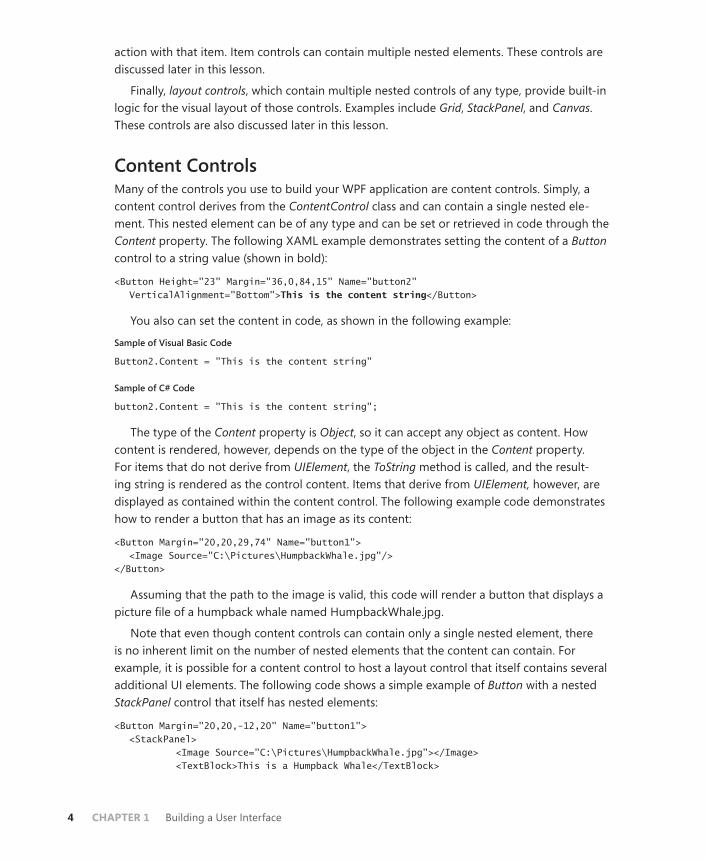
Finally, layout controls, which contain multiple nested controls of any type, provide built-in logic for the visual layout of those controls. Examples include Grid, StackPanel, and Canvas. These controls are also discussed later in this lesson.
Content ControlsMany of the controls you use to build your WPF application are content controls. Simply, a content control derives from the ContentControl class and can contain a single nested ele-ment. This nested element can be of any type and can be set or retrieved in code through the Content property. The following XAML example demonstrates setting the content of a Button control to a string value (shown in bold):
<Button Height="23" Margin="36,0,84,15" Name="button2" VerticalAlignment="Bottom">This is the content string</Button>
You also can set the content in code, as shown in the following example:
Sample of Visual Basic Code
Button2.Content = "This is the content string"
Sample of C# Code
button2.Content = "This is the content string";
The type of the Content property is Object, so it can accept any object as content. How content is rendered, however, depends on the type of the object in the Content property. For items that do not derive from UIElement, the ToString method is called, and the result-ing string is rendered as the control content. Items that derive from UIElement, however, are displayed as contained within the content control. The following example code demonstrates how to render a button that has an image as its content:
<Button Margin="20,20,29,74" Name="button1"> <Image Source="C:\Pictures\HumpbackWhale.jpg"/> </Button>
Assuming that the path to the image is valid, this code will render a button that displays a picture file of a humpback whale named HumpbackWhale.jpg.
Note that even though content controls can contain only a single nested element, there is no inherent limit on the number of nested elements that the content can contain. For example, it is possible for a content control to host a layout control that itself contains several additional UI elements. The following code shows a simple example of Button with a nested StackPanel control that itself has nested elements:
<Button Margin="20,20,-12,20" Name="button1"> <StackPanel> <Image Source="C:\Pictures\HumpbackWhale.jpg"></Image> <TextBlock>This is a Humpback Whale</TextBlock>

Lesson 1: Using WPF Controls CHAPTER 1 5
</StackPanel> </Button>
At run time, this will be rendered as an image of a humpback whale with text beneath it.
Label Control and Mnemonic KeysThe Label control is one of the simplest WPF controls. It is mostly just a container for content. Typical usage for a Label control is as follows:
<Label Name="label1">This is a Label</Label>
Labels contain built-in support for mnemonic keys, which move the focus to a designated control when the Alt key is pressed with the mnemonic key. For example, if R were the mne-monic key for a particular control, the focus would shift to that control when Alt+R is pressed.
Typical usage for mnemonic keys in labels occurs when the label designates a control that can receive the focus, such as TextBox. The mnemonic key is specified by preceding the desired key with the underscore (_) symbol and appears underlined at run time when the Alt key is pressed. For example, the following code appears as Press Alt+A at run time when you press the Alt key:
<Label>Press Alt+_A</Label>
Although this code designates the mnemonic key for the label, it has no effect unless you designate a target control as well. You can designate a target control by setting the Target property of the Label control. The following example demonstrates how to create a mnemon-ic key with a target control named TextBox1:
<Label Target="{Binding ElementName=TextBox1}" Height="27" HorizontalAlignment="Left" VerticalAlignment="Top" Width="51">_Name </Label> <TextBox Name="TextBox1" Margin="53,1,94,0" Height="26" VerticalAlignment="Top"> </TextBox>
The syntax exemplified by {Binding ElementName=TextBox1} will be discussed further in Chapter 6, “Working with Data Binding.”
Button ControlThe Button control should be familiar to most developers. This control is designed to be clicked to enable the user to make a choice, to close a dialog box, or to perform another ac-tion. You can execute code by clicking the button to handle the Click event. (For information about handling events, see Chapter 2, “Working with Events and Commands.”)
The Button control exposes two important properties useful when building user interfaces: the IsDefault property and the IsCancel property.
The IsDefault property determines whether a particular button is considered the default button for the user interface. When IsDefault is set to True, the button’s Click event is raised when you press Enter. Similarly, the IsCancel property determines whether the button should
6 CHAPTER 1 Building a User Interface
be considered a Cancel button. When IsCancel is set to True, the button’s Click event is raised when Esc is pressed.
ACCESS KEYSButtons provide support for access keys, which are similar to the mnemonic keys supported by labels. When a letter in a button’s content is preceded by an underscore symbol (_), that letter will appear underlined when the Alt key is pressed, and the button will be clicked when the user presses Alt and that key together. For example, assume you have a button defined as follows:
<Button>_Click Me!</Button>
The text in the button appears as “Click Me” when Alt is pressed, and the button is clicked when Alt+C is pressed. If more than one button defines the same access key, neither is acti-vated when the access key combination is pressed, but focus alternates between the buttons that define that key.
CHECKBOX CONTROLThe Checkbox control actually inherits from the ButtonBase class and typically enables the user to select whether an option is on or off. You can determine whether a check box is selected by accessing the IsChecked property. The IsChecked property is a Boolean? (bool? in C#) data type similar to the Boolean type but allows an indeterminate state as well. A check box will be in the indeterminate state when a window first opens.
Because Checkbox inherits from ButtonBase, it raises a Click event whenever the user selects or clears the check box. The best way to react to the user selecting or clearing a check box is to handle the Click event.
RADIOBUTTON CONTROLLike Checkbox, RadioButton inherits from the ButtonBase class. RadioButton controls are typi-cally used in groups to enable the user to select one option from a group. Clicking a radio button causes the Click event to be raised to react to user choices.
A fundamental feature of RadioButton controls is that they can be grouped. In a group of RadioButton controls, selecting one automatically clears all the others. Thus, it is not possible for more than one radio button in a group to be selected at one time.
Usually, all RadioButton controls in a single container are automatically in the same group. If you want to have a single group of three RadioButton controls in a window, all you need to do is add them to your window; they are automatically grouped. You can have multiple groups in a single container by setting the GroupName property. The following example demonstrates two groups of two radio buttons each.
<RadioButton GroupName="Group1" Name="RadioButton1" Height="22" VerticalAlignment="Top" Margin="15,10,0,0" HorizontalAlignment="Left" Width="76">Button 1</RadioButton> <RadioButton GroupName="Group1" Name="RadioButton2" Margin="15,34,0,0" Height="22" VerticalAlignment="Top"
Lesson 1: Using WPF Controls CHAPTER 1 7
HorizontalAlignment="Left" Width="76">Button 2</RadioButton> <RadioButton GroupName="Group2" Name="RadioButton3" Margin="15,58,0,0" Height="21" HorizontalAlignment="Left" VerticalAlignment="Top" Width="76">Button 3</RadioButton> <RadioButton GroupName="Group2" Name="RadioButton4" Margin="15,85,0,0" Height="22" HorizontalAlignment="Left" VerticalAlignment="Top" Width="76">Button 4</RadioButton>
You also can create groups of radio buttons by wrapping them in containers, such as in the code shown here:
<StackPanel Height="29" VerticalAlignment="Top"> <RadioButton Name="RadioButton1">Button 1</RadioButton> <RadioButton Name="RadioButton2">Button 2</RadioButton> </StackPanel> <StackPanel Height="34" Margin="0,34,0,0" VerticalAlignment="Top"> <RadioButton Name="RadioButton3">Button 3</RadioButton> <RadioButton Name="RadioButton4">Button 4</RadioButton> </StackPanel>
EXAM TIP
It is important to realize that even though a content control can host only a single element, the element that it hosts can itself host child elements. Thus, a content control might host a grid, which in turn might host a number of objects.
Other ControlsThere are other controls in the WPF suite that are not content controls. They do not have a Content property and typically are more limited in how they display or more specialized in terms of the content they display. For example, the TextBlock control displays text, and the Image control represents an image.
TextBlock Control TextBlock is one of the simplest WPF elements. It just represents an area of text that appears in a window. The following example demonstrates a TextBlock control:
<TextBlock>Here is some text</TextBlock>
If you want to change the text in a TextBlock control in code, you must set the Name prop-erty of the TextBlock control so that you can refer to it in code, as shown here:
<TextBlock Name="TextBlock1">Here is some text</TextBlock>
Then you can change the text or any other property by referring to it in the code, as shown here:
Sample of Visual Basic Code
TextBlock1.Text = "Here is the changed text"

8 CHAPTER 1 Building a User Interface
Sample of C# Code
TextBlock1.Text = "Here is the changed text";
By default, the font of the text in the TextBlock element will be the same as the font of the window. If you want different font settings for the TextBlock, you can set font-related proper-ties, as shown here:
<TextBlock FontFamily="Batang" FontSize="12" FontStyle="Italic" FontWeight="Bold" FontStretch="Normal">Here is some text</TextBlock>
Image Control The Image control represents an image. The chief property of the Image control is the Source property, which takes a System.Windows.Media.ImageSource class in code, but, when set in XAML, it can be set as the Uniform Resource Identifier (URI) from which the image is loaded. For example, look at the following code.
<Image Source="C:\Pictures\Humpbackwhale.jpg"/>
The URI can be either a local disk resource or a Web resource.
The Image.Stretch property determines how an image is displayed, whether it is shown at actual size and cropped (if necessary) to fit the image bounds, or whether it is shrunk or stretched to fit the bounds of the Image control. Table 1-1 describes the possible values for the Stretch property.
TABLE 1-1 Values for the Stretch Property
VALUE DESCRIPTION
None The image content is presented at its original size. If necessary, it is cropped to fit the available space.
Fill The image content is resized (stretched or shrunk as needed) to fit the Image control size.
Uniform The image content is resized to fit the destination dimensions while preserving its native aspect ratio. No cropping will occur, but unfilled space on the Image control edges might result.
UniformToFill The image content is resized to fit the destination dimensions while preserving its native aspect ratio. If the aspect ratio of the Image con-trol differs from the image content, the content is cropped to fit the Image control.
Lesson 1: Using WPF Controls CHAPTER 1 9
TextBox Control The TextBox control is designed for the editing and display of text. The Textbox control enables the user to type text into the user interface. That text is accessible later by the ap-plication in the TextBox.Text property. You can use a TextBox control solely for text display by setting the IsReadOnly property to True, as shown in bold here:
<TextBox IsReadOnly="True" Height="93" Margin="16,14,97,0" Name="TextBox1" VerticalAlignment="Top"/>
The preceding code disables user input for the TextBox1 control.
Although the TextBox control can be created as a rectangle of any size, it is single-line by default. To enable text wrapping in a TextBox, set the TextWrapping property to Wrap, as shown in bold here:
<TextBox TextWrapping="Wrap" Height="93" Margin="16,14,97,0" Name="TextBox1" VerticalAlignment="Top"/>
You can also set the TextWrapping property to WrapWithOverflow, which allows some words to overflow the edges of the text box if the wrapping algorithm is unable to break the text in an appropriate location.
The TextBox control includes automatic support for scroll bars. You can enable vertical scroll bars by setting the VerticalScrollBarVisibility property to Auto or Visible, as shown in bold here:
<TextBox VerticalScrollBarVisibility="Visible" Height="93" Margin="16,14,97,0" Name="TextBox1" VerticalAlignment="Top"/>
Setting VerticalScrollBarVisibility to Visible makes the vertical scroll bar visible at all times, whereas setting it to Auto makes the vertical scroll bar appear only when scrollable content is present. You also can enable a horizontal scroll bar by setting the HorizontalScrollBar prop-erty, but this setting is less useful.
ProgressBar Control The ProgressBar control is designed to allow the application to provide visual feedback to the user regarding the progress of a time-consuming task. For example, you might use a progress bar to display progress for a file download. The progress bar appears as an empty box that gradually fills in to display progress. Table 1-2 shows important properties of the ProgressBar control.
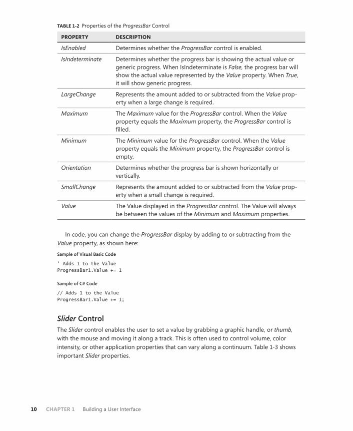
10 CHAPTER 1 Building a User Interface
TABLE 1-2 Properties of the ProgressBar Control
PROPERTY DESCRIPTION
IsEnabled Determines whether the ProgressBar control is enabled.
IsIndeterminate Determines whether the progress bar is showing the actual value or generic progress. When IsIndeterminate is False, the progress bar will show the actual value represented by the Value property. When True, it will show generic progress.
LargeChange Represents the amount added to or subtracted from the Value prop-erty when a large change is required.
Maximum The Maximum value for the ProgressBar control. When the Value property equals the Maximum property, the ProgressBar control is filled.
Minimum The Minimum value for the ProgressBar control. When the Value property equals the Minimum property, the ProgressBar control is empty.
Orientation Determines whether the progress bar is shown horizontally or vertically.
SmallChange Represents the amount added to or subtracted from the Value prop-erty when a small change is required.
Value The Value displayed in the ProgressBar control. The Value will always be between the values of the Minimum and Maximum properties.
In code, you can change the ProgressBar display by adding to or subtracting from the Value property, as shown here:
Sample of Visual Basic Code
' Adds 1 to the Value ProgressBar1.Value += 1
Sample of C# Code
// Adds 1 to the Value ProgressBar1.Value += 1;
Slider Control The Slider control enables the user to set a value by grabbing a graphic handle, or thumb, with the mouse and moving it along a track. This is often used to control volume, color intensity, or other application properties that can vary along a continuum. Table 1-3 shows important Slider properties.

Lesson 1: Using WPF Controls CHAPTER 1 11
TABLE 1-3 Properties of the Slider Control
PROPERTY DESCRIPTION
IsDirectionReversed Determines whether the direction is reversed. When set to False (the default), the minimum value is on the left and the maximum value is on the right. When set to True, the minimum is on the right and the maximum is on the left.
IsEnabled Determines whether the slider is enabled.
LargeChange Represents the amount added to or subtracted from the Value property when a large change is required. This amount is added or subtracted from the slider when the user clicks it on either side of the thumb or uses the PageUp or PageDown key.
Maximum The maximum value for the Slider control. When the Value property equals the Maximum value, the thumb is completely on the right side of the slider (assuming the default direction and orientation of the control).
Minimum The minimum value for the Slider control. When the Value prop-erty equals the Minimum value, the thumb is completely on the left side of the slider (assuming the default direction and orienta-tion of the control).
Orientation Determines whether the slider is shown horizontally or vertically.
SmallChange Represents the amount added to or subtracted from the Value property when a small change is required. This amount is added to or subtracted from the slider when you use the arrow keys.
TickFrequency Sets the interval between ticks that are displayed in the Slider control.
TickPlacement Determines the location of ticks in the Slider control. The default setting is None, meaning that no tick marks appear.
Ticks Used in advanced applications. You can determine the exact number and placement of tick marks by setting the Ticks collec-tion directly.
Value The value displayed in the Slider control. The Value property always is between the Minimum and Maximum values.
The Slider control raises the ValueChanged event whenever its Value property changes. You can handle this event to hook up the slider with whatever aspect of the application the slider controls.
12 CHAPTER 1 Building a User Interface
Setting the Tab Order for ControlsA common mode of user interaction with the user interface is to cycle the focus through the controls by pressing the Tab key. By default, controls in the user interface will receive the fo-cus from Tab key presses in the order in which they are defined in the XAML. You can set the tab order manually by setting the attached TabIndex property to an integer, as shown here:
<Button TabIndex="2" Name="button1"/>
See “Using Attached Properties” later in this chapter for more information about attached properties.
When the user presses the Tab key, the focus cycles through the controls in the order determined by the TabIndex value. Lower values receive focus first, followed by higher val-ues. Controls whose TabIndex property is not explicitly set receive the focus after controls for which the property has been set, in the order that they are defined in the XAML. If two controls have the same TabIndex value, they receive the focus in the order the controls are defined in the XAML.
You can keep a control from receiving focus when the user presses the Tab key by setting the KeyboardNavigation.IsTabStop attached property to False, as shown in bold here:
<Button KeyboardNavigation.IsTabStop="False" Name="button1"/>
Item ControlsItem controls, also known as list-based controls, are designed to contain multiple child ele-ments. Item controls are a familiar part of any user interface. Data is displayed frequently in item controls, and lists are used to allow the user to choose from a series of options. Item controls in WPF take the idea of lists one step further. Like content controls, item controls do not have restrictions on the kind of content they can present. Thus, an item control could present a list of strings or something more complex, such as a list of check box controls, or even a list that included various kinds of controls.
ListBox Control The simplest form of item control is ListBox. As the name implies, ListBox is a simple control designed to display a list of items. A ListBox control typically displays a list of ListBoxItem con-trols, which are content controls, each of which hosts a single nested element. The simplest way to populate a ListBox control is by adding items directly in XAML, as shown here:
<ListBox Margin="19,0,0,36" Name="listBox1"> <ListBoxItem>This</ListBoxItem> <ListBoxItem>Is</ListBoxItem> <ListBoxItem>A</ListBoxItem> <ListBoxItem>List</ListBoxItem> </ListBox>
Lesson 1: Using WPF Controls CHAPTER 1 13
The ListBox control automatically lays out its content in a stack and adds a vertical scroll bar if the list is longer than the available space in the control.
By default, the ListBox control enables you to select a single item. You can retrieve the index of the selected item from the ListBox.SelectedIndex property, or you can retrieve the selected item itself through the ListBox.SelectedItem property. The ListBoxItem control also exposes an IsSelected property that is positive when the item is selected.
You can set the SelectionMode property to enable the user to select multiple items. Table 1-4 shows the possible values for the SelectionMode property.
TABLE 1-4 Values for the SelectionMode Property
VALUE DESCRIPTION
Single The user can select only one item at a time.
Multiple The user can select multiple items without holding down a modifier key. Modifier keys have no effect.
Extended The user can select multiple consecutive items while holding down the Shift key or nonconsecutive items by holding down the Ctrl key and clicking the items.
You can set the SelectionMode property in XAML as shown here:
<ListBox SelectionMode="Extended"> </ListBox>
When multiple items are selected, you can retrieve the selected items through the ListBox.SelectedItems property.
Although the ListBox control is used most commonly with ListBoxItem controls, it can display a list of any item types. For example, you might want to create a list of CheckBox controls. You can accomplish this by simply adding CheckBox controls to the ListBox control, as shown here:
<ListBox Name="listbox1" VerticalAlignment="Top"> <CheckBox Name="Chk1">Option 1</CheckBox> <CheckBox Name="Chk2">Option 2</CheckBox> <CheckBox Name="Chk3">Option 3</CheckBox> <CheckBox Name="Chk4">Option 4</CheckBox> </ListBox>
ComboBox Control The ComboBox control works very similarly to the ListBox control. It can contain a list of items, each of which can be an object of any type, as in the ListBox control. Thus, the ComboBox control can host a list of strings, a list of controls such as for check boxes, or any other kind of list. The difference between the ComboBox control and the ListBox control is how the control is presented. The ComboBox control appears as a drop-down list. Like the ListBox control,

14 CHAPTER 1 Building a User Interface
you can get a reference to the selected item through the SelectedItem property, and you can retrieve the index of the selected item through the SelectedIndex property.
When an item is selected, the string representation of the content of that item is displayed in the ComboBox control. Thus, if the ComboBox control hosts a list of strings, the selected string is displayed. If the ComboBox control hosts a list of CheckBox controls, the string repre-sentation of the ComboBox.Content property is displayed. Then the selected value is available through the ComboBox.Text property.
Users also can edit the text displayed in the ComboBox control. They can even type in their own text, like in a text box. To make the ComboBox control editable, you must set the IsReadOnly property to False and set the IsEditable property to True.
You can open and close the ComboBox control programmatically by setting the IsDropDownOpen property to True (to open it) and False (to close it).
TreeView Control and TreeViewItem Control TreeView is a simple item control that is very similar to ListBox in its implementation, but in practice, it is quite different. The primary purpose of the TreeView control is to host TreeViewItem controls, which enable the construction of trees of content.
The TreeViewItem control is the primary control used to construct trees. It exposes a Header property that enables you to set the text displayed in the tree. The TreeViewItem control itself also hosts a list of items. The list of items hosted in a TreeViewItem can be expanded or collapsed by clicking the icon to the left of the header. The following XAML demonstrates a TreeView control populated by a tree of items.
<TreeView> <TreeViewItem Header="Boy's Names"> <TreeViewItem Header="Jack"/> <TreeViewItem Header="Jim"/> <TreeViewItem Header="Mark"/> <TreeViewItem Header="Ray"/> </TreeViewItem> <TreeViewItem Header="Girl's Names"> <TreeViewItem Header="Betty"/> <TreeViewItem Header="Libby"/> <TreeViewItem Header="Janet"/> <TreeViewItem Header="Sandra"/> </TreeViewItem> </TreeView>
You can create TreeView controls that have controls as the terminal nodes just as easily, as shown in this example:
<TreeView> <TreeViewItem Header="Pizza Toppings"> <CheckBox Content="Pepperoni"/> <CheckBox Content="Sausage"/> <CheckBox Content="Mushroom"/> <CheckBox Content="Tomato"/>

Lesson 1: Using WPF Controls CHAPTER 1 15
</TreeViewItem> <TreeViewItem Header="Sandwich Items"> <CheckBox Content="Lettuce"/> <CheckBox Content="Tomato"/> <CheckBox Content="Mustard"/> <CheckBox Content="Hot Peppers"/> </TreeViewItem> </TreeView>
You can obtain a reference to the selected item in the TreeView control with the TreeView.SelectedItem property.
MenusMenus enable you to present the user with a list of controls that are typically associated with commands. Menus are displayed in hierarchical lists of items, usually grouped into related areas. WPF provides two types of menu controls: Menu, which is designed to be visible in the user interface, and ContextMenu, which is designed to function as a pop-up menu in certain situations.
Whereas the Menu control can be put anywhere in the user interface, it typically is docked to the top of the window. Menus expose an IsMainMenu property. When this property is True, pressing Alt or F10 causes the menu to receive focus, thereby enabling common Windows application behavior.
Although a Menu control can contain controls of any kind, the Toolbar control is better suited for presenting controls to the user. The Menu control is designed for presenting lists of MenuItem controls.
MenuItem Control The MenuItem control is the main unit used to build menus. A MenuItem control represents a clickable section of the menu and has associated text. MenuItem controls are themselves item controls and can contain their own list of controls, which typically are also MenuItem controls. The following XAML example demonstrates a simple menu:
<Menu Height="22" Name="menu1" VerticalAlignment="Top" HorizontalAlignment="Left" Width="278"> <MenuItem Header="_File"> <MenuItem Header="Open"/> <MenuItem Header="Close"/> <MenuItem Header="Save" Command="ApplicationCommands.Save"/> </MenuItem> </Menu>
The Command property indicates the command associated with that menu item. When the user clicks the menu item, the command specified by the Command property is invoked. If a shortcut key is associated with the command, it is displayed to the right of the MenuItem header. Commands are discussed in detail in Chapter 2 of this text.
Table 1-5 describes the important properties of the MenuItem control.

16 CHAPTER 1 Building a User Interface
TABLE 1-5 Properties of the MenuItem Control
PROPERTY DESCRIPTION
Command The command associated with the menu item. This command is invoked when the menu item is clicked. If a keyboard shortcut is associated with the command, it is displayed to the right of the menu item.
Header The text displayed in the menu.
Icon The icon displayed to the left of the menu item. If IsChecked is set to True, the icon is not displayed even if it is set.
IsChecked When this property is set to True, a check is displayed to the left of the menu item. If the Icon property is set, the icon is not displayed while IsChecked is set to True.
IsEnabled Determines whether the menu item is enabled. When set to False, the item appears dimmed and does not invoke the command when clicked.
Items The list of items contained by the MenuItem control. The list typically contains more MenuItem controls.
As with many other WPF controls, you can create an access key for a menu item by pre-ceding the letter in the Header property with an underscore symbol (_), as shown here:
<MenuItem Header="_File">
The underscore symbol will not appear at run time, but when the Alt key is held down, it appears under the key it precedes. Pressing that key with the Alt key held down has the same effect as clicking the menu item.
Each MenuItem control can contain its own set of items, which are also typically MenuItem controls. These can be created in XAML by nesting MenuItem elements inside the parent MenuItem control. When a menu item that has sub-items is clicked, those items are shown in a new menu.
BEST PRACTICES MENUITEM CONTROLS WITH SUB-ITEMS
It is best practice not to assign a command to MenuItem controls that contain sub-items. Otherwise, the command is executed every time the user wants to view the list of sub-items.
You can add a separator bar between menu items by using the Separator control, as shown here:
<MenuItem Header="Close"/> <Separator/> <MenuItem Header="Save" Command="ApplicationCommands.Save"/>
The separator bar appears as a horizontal line between menu items.
Lesson 1: Using WPF Controls CHAPTER 1 17
ContextMenu Control Unlike Menu controls, the ContextMenu control does not have a fixed location in the user interface. Rather, it is associated with other controls. To create a ContextMenu control for a control, define it in the XAML code for the Control.ContextMenu property, as shown in the following example with a ListBox control:
<ListBox Margin="77,123,81,39" Name="listBox1"> <ListBox.ContextMenu> <ContextMenu> <MenuItem Header="Cut" Command="ApplicationCommands.Cut"/> <MenuItem Header="Copy" Command="ApplicationCommands.Copy"/> <MenuItem Header="Paste" Command="ApplicationCommands.Paste"/> </ContextMenu> </ListBox.ContextMenu> </ListBox>
After a ContextMenu control has been set for a control, it is displayed whenever the user right-clicks the control or presses Shift+F10 while the control has the focus.
Another common scenario for adding ContextMenu controls to a control is to add them as a resource in the Window.Resources collection. Resources are discussed in Lesson 2 of this chapter, “Using Resources.”
ToolBar Control Like menus, the ToolBar control is designed to present controls to the user. The ToolBar control is ideally suited to host controls such as Button, ComboBox, TextBox, CheckBox, and RadioButton. The ToolBar control also can use the Separator control described in the previous section.
Toolbars automatically override the style of some of the controls they host. Buttons, for example, appear flat when shown in a toolbar and are highlighted in blue when the mouse is over the control. This gives controls in a toolbar a consistent appearance by default.
You add items to the ToolBar control in the same manner as any other item control. An example is shown here:
<ToolBar Height="26" Margin="43,23,35,0" Name="toolBar1" VerticalAlignment="Top"> <Button>Back</Button> <Button>Forward</Button> <TextBox Name="textbox1" Width="100"/> </ToolBar>
ToolBar.OverflowMode PropertyWhen more controls are added to a ToolBar control than can fit, controls are removed until the controls fit in the space. Controls removed from the ToolBar control are placed automati-cally in the Overflow menu. The Overflow menu appears as a drop-down list on the right side of the toolbar when the toolbar is in the horizontal configuration. You can manage how
18 CHAPTER 1 Building a User Interface
controls are placed in the Overflow menu by setting the attached ToolBar.OverflowMode property. (See “Using Attached Properties” later in this chapter for more information.) Table 1-6 shows the possible values for this property.
Table 1-6 Values for the ToolBar.OverflowMode Property
VALUE DESCRIPTION
OverflowMode.Always The control always appears in the Overflow menu, even if there is space available in the toolbar.
OverflowMode.AsNeeded The control is moved to the Overflow menu as needed. This is the default setting for this property.
OverflowMode.Never Controls with this value are never placed in the Overflow menu. If there are more controls with the Toolbar. OverflowMode property set to Never than can be displayed in the space allotted to the toolbar, some con-trols will be cut off and unavailable to the user.
The following example demonstrates how to set the Toolbar.OverflowMode property:
<ToolBar Height="26" Margin="43,23,35,0" Name="toolBar1" VerticalAlignment="Top"> <Button ToolBar.OverflowMode="Always">Back</Button> </ToolBar>
ToolBarTray Class WPF provides a special container class for ToolBar controls, called ToolBarTray. ToolBarTray enables the user to resize or move ToolBar controls that are contained in the tray at run time. When ToolBar controls are hosted in a ToolBarTray control, the user can move the ToolBar controls by grabbing the handle on the left side of the toolbar. The following example dem-onstrates the ToolBarTray control.
<ToolBarTray Name="toolBarTray1" Height="65" VerticalAlignment="Top"> <ToolBar Name="toolBar1" Height="26" VerticalAlignment="Top"> <Button>Back</Button> <Button>Forward</Button> <Button>Stop</Button> </ToolBar> <ToolBar> <TextBox Width="100"/> <Button>Go</Button> </ToolBar> </ToolBarTray>

Lesson 1: Using WPF Controls CHAPTER 1 19
StatusBar Control The StatusBar control is quite similar to the ToolBar control. The primary difference is in us-age. StatusBar is used most commonly to host controls that convey information, such as Label and ProgressBar controls. Like the toolbar, the status bar overrides the visual style of many of the controls it hosts, but it provides a different appearance and behavior than the toolbar. The following example demonstrates a simple StatusBar control with hosted controls.
<StatusBar Height="32" Name="statusBar1" VerticalAlignment="Bottom"> <Label>Application is Loading</Label> <Separator/> <ProgressBar Height="20" Width="100" IsIndeterminate="True"/> </StatusBar>
Quick Check■ Describe the difference between a Menu control and a ContextMenu control.
Quick Check Answer■ Both Menu elements and ContextMenu elements are list controls that host
MenuItem elements. The primary difference between them is that Menu ele-ments are visible elements that are part of the visual tree and can be hosted by content controls. ContextMenu elements, however, have no direct visual representation and are added to another individual control by setting the other control’s ContextMenu property.
Layout ControlsWPF offers unprecedented support for a variety of layout styles. The addition of several spe-cialized controls enables you to create a variety of layout models, and panels can be nested inside each other to create user interfaces that exhibit complex layout behavior. In this lesson, you learn how to use these specialized controls.
Control Layout PropertiesControls in WPF manage a great deal of their own layout and positioning and further interact with their container to determine their final positioning. Table 1-7 describes common control properties that influence layout and positioning.

20 CHAPTER 1 Building a User Interface
TABLE 1-7 Properties That Control Layout
PROPERTY DESCRIPTION
FlowDirection Gets or sets the direction in which text and other UI elements flow within any parent element that controls their layout.
Height Gets or sets the height of the control. When set to Auto, other layout properties determine the height.
HorizontalAlignment Gets or sets the horizontal alignment characteristics applied to this element when it is composed within a parent element such as a panel or item control.
HorizonalContentAlignment Gets or sets the horizontal alignment of the control’s content.
Margin Gets or sets the distance between each of the control’s edges and the edge of the container or the adjacent controls, depending on the layout control hosting the child control.
MaxHeight Gets or sets the maximum height for a control.
MaxWidth Gets or sets the maximum width for a control.
MinHeight Gets or sets the minimum height for a control.
MinWidth Gets or sets the minimum width for a control.
Padding Gets or sets the amount of space between a control and its child element.
VerticalAlignment Gets or sets the vertical alignment characteristics ap-plied to this element when it is composed within a par-ent element such as a layout or item control.
VerticalContentAlignment Gets or sets the vertical alignment of the control’s content.
Width Gets or sets the width of the control. When set to Auto, other layout properties determine the width.
A few of these properties are worth a closer look.
Margin Property The Margin property returns an instance of the Thickness structure that describes the space between the edges of the control and other elements that are adjacent. Depending on which layout panel is used, the adjacent element might be the edge of the container, such as a panel or Grid cell, or it might be a peer control, as would be the case in the vertical margins in a StackPanel control.
Lesson 1: Using WPF Controls CHAPTER 1 21
The Margin property can be set asymmetrically to allow different amounts of margin on each side. Consider the following example:
<Button Margin="0,48,96,1" Name="button1">Button</Button>
In this example, a different margin distance is set for each control edge. The order of edges in the Margin property is Left, Top, Right, Bottom, so in this example, the left margin is 0, the top margin is 48, the right margin is 96, and the bottom margin is 1.
Margins are additive. For example, if you have two adjacent controls in a StackPanel control and the topmost one has a bottom margin of 20 and the bottommost one has a top margin of 10, the total distance between the two control edges will be 30.
HorizontalAlignment and VerticalAlignment PropertiesThe HorizontalAlignment and VerticalAlignment properties determine how a control is aligned inside its parent when there is extra horizontal or vertical space. The values for these proper-ties are mostly self-explanatory. The HorizontalAlignment property has possible values of Left, Right, Center, and Stretch. The VerticalAlignment property has possible values of Top, Bottom, Center, and Stretch. As you might expect, setting the HorizontalAlignment property to Left, Right, or Center aligns the control in its container to the left, right, or center, respectively. Similar results are seen with the VerticalAlignment property. The setting that is worth noting is the Stretch value. When set to Stretch, the control will stretch in the horizontal or vertical directions (depending on the property) until the control is the size of the available space after taking the value of the Margin property into account.
NOTE WHEN THERE IS NO EFFECT
In some containers, setting these properties might have no effect. For example, in StackPanel, the vertical layout is handled by the container, so setting the VerticalAlignment property has no effect, although setting the HorizontalAlignment property still does.
Using Attached PropertiesWPF introduces a new concept in properties: attached properties. Because WPF controls con-tain the information required for their own layout and orientation in the user interface, it is sometimes necessary for controls to define information about the control that contains them. For example, a Button control contained by a Grid control will define in which grid column and row it appears. This is accomplished through attached properties. The Grid control at-taches a number of properties to every control it contains, such as properties that determine the row and column in which the control exists. In XAML, you set an attached property with code like the following:
<Button Grid.Row="1" Grid.Column="1"></Button>
Refer to the class name (that is, Grid) rather than to the instance name (for example, grid1) when setting an attached property because attached properties are attached by the class and
22 CHAPTER 1 Building a User Interface
not by the instance of the class. In some cases, such as with the TabIndex property (shown in the next section), the class name is assumed and can be omitted in XAML.
Here’s a full example of a Grid control that defines two rows and two columns and contains a single button that uses attached properties to orient itself in the grid:
<Grid> <Grid.ColumnDefinitions> <ColumnDefinition Width="139*"/> <ColumnDefinition Width="139*"/> </Grid.ColumnDefinitions> <Grid.RowDefinitions> <RowDefinition Height="126*"/> <RowDefinition Height="126*"/> </Grid.RowDefinitions> <Button Grid.Row="1" Grid.Column="1"></Button> </Grid>
Layout PanelsWPF includes a variety of layout panels with which to design your user interface. This section explores these panels and explains when to use them.
Grid Panel Grid is the most commonly used panel for creating user interfaces in WPF. The Grid panel enables you to create layouts that depend on the Margin, HorizontalAlignment, and VerticalAlignment properties of the child controls it contains. Controls hosted in a Grid control are drawn in the order in which they appear in markup or code, thereby enabling you to cre-ate layered user interfaces. In the case of overlapping controls, the last control to be drawn will be on top.
With the Grid control, you can define columns and rows in the grid. Then you can assign child controls to designated rows and columns to create a more structured layout. When assigned to a column or row, a control’s Margin, HorizontalAlignment, and VerticalAlignment properties operate with respect to the edge of the row or column, not to the edge of the Grid container itself. Columns and rows are defined by creating ColumnDefinition and RowDefinition properties, as seen here:
<Grid> <Grid.RowDefinitions> <RowDefinition Height="125*"/> <RowDefinition Height="125*"/> </Grid.RowDefinitions> <Grid.ColumnDefinitions> <ColumnDefinition Width="80*"/> <ColumnDefinition Width="120*"/> </Grid.ColumnDefinitions> </Grid>
Lesson 1: Using WPF Controls CHAPTER 1 23
Rows and columns can be either fixed or variable in their width and height. To designate a fixed width or height, simply set the Width or Height property to the size you would like, as shown here:
<RowDefinition Height="125"/>
In contrast, you can make a variable-sized row or column by appending an asterisk (*) to the end of the Width or Height setting, as shown here:
<RowDefinition Height="125*"/>
When the asterisk is added, the row or column grows or shrinks proportionally to fit the available space. Look at the following example:
<RowDefinition Height="10*"/> <RowDefinition Height="20*"/>
Both the rows created by this code grow and shrink to fit the available space, but one row is always twice the height of the other. These numbers are proportional only among them-selves. Thus, using 1* and 2* will have the same effect as using 100* and 200*.
You can have a Grid control that contains both fixed and variable rows or columns, as seen here:
<RowDefinition Height="125"/> <RowDefinition Height="125*"/>
In this example, the first row always maintains a height of 125, and the second grows or shrinks as the window is resized.
GRID ATTACHED PROPERTIESThe Grid control provides attached properties to its child controls. You can position controls into specific Grid rows or columns by setting the attached properties Grid.Column and Grid.Row, as shown in bold here:
<Grid> <Grid.RowDefinitions> <RowDefinition Height="10*"/> <RowDefinition Height="5*"/> </Grid.RowDefinitions> <Grid.ColumnDefinitions> <ColumnDefinition Width="117"/> <ColumnDefinition Width="161"/> </Grid.ColumnDefinitions> <Button Name="button2" Grid.Row="0" Grid.Column="1">Button</Button> </Grid>
Occasionally, you might have a control that spans more than one column or row. To indi-cate this, you can set the Grid.ColumnSpan or Grid.RowSpan property as shown here:
<Button Name="button2" Grid.ColumnSpan="2">Button</Button>

24 CHAPTER 1 Building a User Interface
USING THE GRIDSPLITTER CONTROLThe GridSplitter control enables the user to resize grid rows or columns at run time and ap-pears at run time as a vertical or horizontal bar between two rows or columns that the user can grab with the mouse and move to adjust the size of those columns or rows. Table 1-8 shows the important properties of the GridSplitter control.
TABLE 1-8 Properties of the GridSplitter Control
PROPERTY DESCRIPTION
Grid.Column This attached property from the Grid control determines the column in which the grid splitter exists.
Grid.ColumnSpan This attached property from the Grid control determines the number of columns the grid splitter spans. For horizontal grid splitters, this property should equal the number of columns in the grid.
Grid.Row This attached property from the Grid control determines the row in which the grid splitter exists.
Grid.RowSpan This attached property from the Grid control determines the number of rows the grid splitter spans. For vertical grid splitters, this property should equal the number of rows in the grid.
Height Determines the height of the grid splitter. For vertical grid split-ters, this property should be set to Auto.
HorizontalAlignment Determines the horizontal alignment of the grid splitter. For horizontal grid splitters, this property should be set to Stretch. For vertical grid splitters, this property should be set to Top or Bottom.
Margin Determines the margin around the grid splitter. Typically, your margin will be set to 0 to make the grid splitter flush with grid columns and rows.
ResizeBehavior Gets or sets which columns or rows are resized relative to the column or row for which the GridSplitter control is defined. The default value is BasedOnAlignment, which sets the resize behav-ior based on the alignment of the GridSplitter control relative to the row(s) or column(s) to which the grid splitter is adjacent.
ResizeDirection Gets or sets a value that indicates whether the GridSplitter control resizes rows or columns. The default value is Auto, which automatically sets the resize direction based on the positioning of the GridSplitter control.
ShowsPreview Gets or sets a value that indicates whether the GridSplitter con-trol updates the column or row size as the user drags the control.
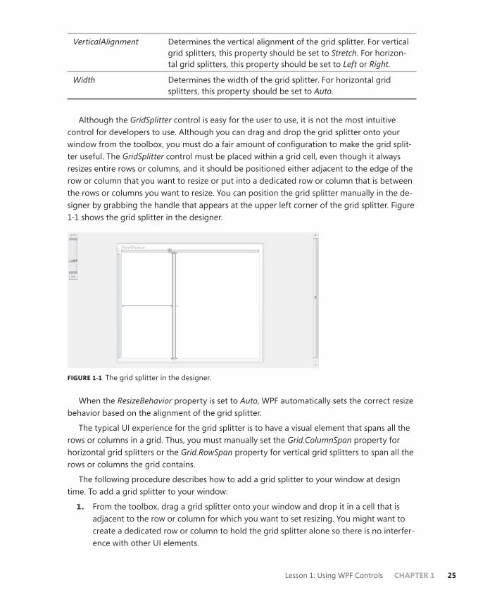
Lesson 1: Using WPF Controls CHAPTER 1 25
VerticalAlignment Determines the vertical alignment of the grid splitter. For vertical grid splitters, this property should be set to Stretch. For horizon-tal grid splitters, this property should be set to Left or Right.
Width Determines the width of the grid splitter. For horizontal grid splitters, this property should be set to Auto.
Although the GridSplitter control is easy for the user to use, it is not the most intuitive control for developers to use. Although you can drag and drop the grid splitter onto your window from the toolbox, you must do a fair amount of configuration to make the grid split-ter useful. The GridSplitter control must be placed within a grid cell, even though it always resizes entire rows or columns, and it should be positioned either adjacent to the edge of the row or column that you want to resize or put into a dedicated row or column that is between the rows or columns you want to resize. You can position the grid splitter manually in the de-signer by grabbing the handle that appears at the upper left corner of the grid splitter. Figure 1-1 shows the grid splitter in the designer.
FIGURE 1-1 The grid splitter in the designer.
When the ResizeBehavior property is set to Auto, WPF automatically sets the correct resize behavior based on the alignment of the grid splitter.
The typical UI experience for the grid splitter is to have a visual element that spans all the rows or columns in a grid. Thus, you must manually set the Grid.ColumnSpan property for horizontal grid splitters or the Grid.RowSpan property for vertical grid splitters to span all the rows or columns the grid contains.
The following procedure describes how to add a grid splitter to your window at design time. To add a grid splitter to your window:
1. From the toolbox, drag a grid splitter onto your window and drop it in a cell that is adjacent to the row or column for which you want to set resizing. You might want to create a dedicated row or column to hold the grid splitter alone so there is no interfer-ence with other UI elements.

26 CHAPTER 1 Building a User Interface
2. Set the Margin property of the grid splitter to 0.
3. For vertical grid splitters, set the VerticalAlignment property to Stretch. For horizontal grid splitters, set the HorizontalAlignment property to Stretch. Set the remaining align-ment property to the appropriate setting to position the GridSplitter control adjacent to the column(s) or row(s) for which you want to enable resizing.
4. For horizontal grid splitters, set the Width property to Auto and set the Height prop-erty to the appropriate height. For vertical grid splitters, set the Height property to Auto and set the Width property to the appropriate width.
5. For vertical grid splitters, set the Grid.RowSpan property to the number of rows in the grid. For horizontal grid splitters, set the Grid.ColumnSpan property to the number of columns in the grid.
Note that you can perform this configuration in the Properties window, in XAML, or (in most but not all cases) by manipulating the GridSplitter control in the designer with the mouse.
UniformGrid Control Although similar in name, the UniformGrid control has very different behavior from the Grid control. In fact, the UniformGrid control is very limited. It automatically lays out controls in a grid of uniform size, adjusting the size and number of rows and columns as more controls are added. Grid cells are always the same size. The UniformGrid control typically is not used for designing entire user interfaces, but it can be useful for quickly creating layouts that require a grid of uniform size, such as a checkerboard or the buttons on a calculator.
You can set the number of rows and columns in the UniformGrid control by setting the Rows and Columns properties, as shown here:
<UniformGrid Rows="2" Columns="2"> </UniformGrid>
If you set the number of rows and columns in this manner, you fix the number of cells (and thus the controls that can be displayed) in a single uniform grid. If you add more controls than a uniform grid has cells, the controls will not be displayed. Cells defined first in XAML are the cells displayed in such a case.
If you set only the number of rows, additional columns will be added to accommodate new controls. Likewise, if you set only the number of columns, additional rows will be added.
StackPanel Control The StackPanel control provides a simple layout model. It stacks the controls it contains one on top of the other in the order that they are defined. Typically, StackPanel containers stack controls vertically. You can also create a horizontal stack by setting the Orientation property to Horizontal, as shown here:
<StackPanel Orientation="Horizontal"> </StackPanel>
Lesson 1: Using WPF Controls CHAPTER 1 27
This creates a stack of controls from left to right. If you want to create a right-to-left stack of controls, you can set the FlowDirection property to RightToLeft, as shown here:
<StackPanel Orientation="Horizontal" FlowDirection="RightToLeft"> </StackPanel>
No combination of property settings in the stack panel creates a bottom-to-top stack.
Note that the layout properties of the controls contained in the StackPanel control also influence how the stack appears. For example, controls appear in the center of the StackPanel by default, but if the HorizontalAlignment property of a specific control is set at Left, that control appears on the left side of the StackPanel.
WrapPanel Control The WrapPanel control provides another simple layout experience that typically is not used for creating entire user interfaces. Simply, the WrapPanel control lays out controls in a hori-zontal row side by side until the horizontal space available in the WrapPanel is used up. Then it creates additional rows until all its contained controls are positioned. Thus, controls are wrapped in the user interface like text is wrapped in a text editor like Notepad. A typical use for this layout panel is to provide automatic layout for a related set of controls that might be resized frequently, such as those in a toolbar.
You can wrap controls from right to left by setting the FlowDirection property to RightToLeft, as shown here:
<WrapPanel FlowDirection="RightToLeft"> </WrapPanel>
DockPanel Control The DockPanel control provides a container that enables you to dock contained controls to the edges of the dock panel. In Windows Forms development, docking was accomplished by setting the Dock property on each individual dockable control. In WPF development, how-ever, you use the DockPanel control to create interfaces with docked controls. Docking typi-cally is useful for attaching controls such as toolbars or menus to edges of the user interface. The position of docked controls remains constant regardless of how the user resizes the user interface.
The DockPanel control provides docking for contained controls by providing an attached property called Dock. The following example demonstrates how to set the DockPanel.Dock property in a contained control:
<Button DockPanel.Dock="Top">Button</Button>
The DockPanel.Dock property has four possible values: Top, Bottom, Left, and Right, which indicate docking to the top, bottom, left, and right edges of the DockPanel control, respectively.
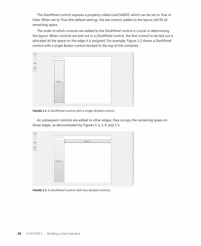
28 CHAPTER 1 Building a User Interface
The DockPanel control exposes a property called LastChildFill, which can be set to True or False. When set to True (the default setting), the last control added to the layout will fill all remaining space.
The order in which controls are added to the DockPanel control is crucial in determining the layout. When controls are laid out in a DockPanel control, the first control to be laid out is allocated all the space on the edge it is assigned. For example, Figure 1-2 shows a DockPanel control with a single Button control docked to the top of the container.
FIGURE 1-2 A DockPanel control with a single docked control.
As subsequent controls are added to other edges, they occupy the remaining space on those edges, as demonstrated by Figures 1-3, 1-4, and 1-5.
FIGURE 1-3 A DockPanel control with two docked controls.

Lesson 1: Using WPF Controls CHAPTER 1 29
FIGURE 1-4 A DockPanel control with three docked controls.
FIGURE 1-5 A DockPanel control with four docked controls.
In this sequence of figures, the second control is docked to the left edge. It occupies all the edge that is not occupied by the first control. The next control is docked again to the top edge, where it is docked adjacent to the first control that already is docked to the top, and it occupies the remaining space on the top edge that was not taken by the button docked on the left edge. The fourth figure shows a similar progression, with another control docked to the left edge.
DockPanel controls are typically not used as the sole basis for user interfaces, but rather are used to dock key components to invariant positions. Usually, the LastChildFill property in a DockPanel control is set to True, and the last child added is a Grid or other container control that can be used for the layout of the rest of the user interface. Figure 1-6 shows a sample user interface that has a menu docked to the top edge, a list box docked to the left edge, and a grid that fills the remaining space.
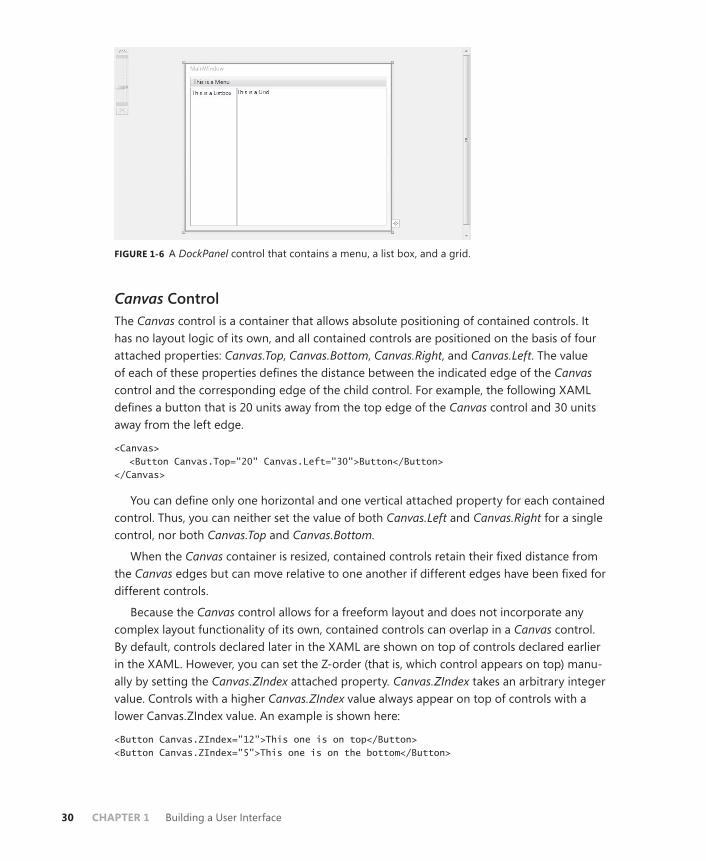
30 CHAPTER 1 Building a User Interface
FIGURE 1-6 A DockPanel control that contains a menu, a list box, and a grid.
Canvas Control The Canvas control is a container that allows absolute positioning of contained controls. It has no layout logic of its own, and all contained controls are positioned on the basis of four attached properties: Canvas.Top, Canvas.Bottom, Canvas.Right, and Canvas.Left. The value of each of these properties defines the distance between the indicated edge of the Canvas control and the corresponding edge of the child control. For example, the following XAML defines a button that is 20 units away from the top edge of the Canvas control and 30 units away from the left edge.
<Canvas> <Button Canvas.Top="20" Canvas.Left="30">Button</Button> </Canvas>
You can define only one horizontal and one vertical attached property for each contained control. Thus, you can neither set the value of both Canvas.Left and Canvas.Right for a single control, nor both Canvas.Top and Canvas.Bottom.
When the Canvas container is resized, contained controls retain their fixed distance from the Canvas edges but can move relative to one another if different edges have been fixed for different controls.
Because the Canvas control allows for a freeform layout and does not incorporate any complex layout functionality of its own, contained controls can overlap in a Canvas control. By default, controls declared later in the XAML are shown on top of controls declared earlier in the XAML. However, you can set the Z-order (that is, which control appears on top) manu-ally by setting the Canvas.ZIndex attached property. Canvas.ZIndex takes an arbitrary integer value. Controls with a higher Canvas.ZIndex value always appear on top of controls with a lower Canvas.ZIndex value. An example is shown here:
<Button Canvas.ZIndex="12">This one is on top</Button> <Button Canvas.ZIndex="5">This one is on the bottom</Button>
Lesson 1: Using WPF Controls CHAPTER 1 31
Quick Check■ Describe what attached properties are and how they work.
Quick Check Answer■ Attached properties are properties that a containing element, such as a
layout control, attaches to a contained element such as a content control. Properties are set by the contained element but typically affect how that element is rendered or laid out in the containing element. An example is the Grid.Row attached property, which is attached to all elements contained by a Grid element. By setting the Grid.Row property on a contained element, you set what row of the grid that element is rendered in.
Accessing Child Elements ProgrammaticallyLayout controls expose a Children collection that enables you to access the child controls pro-grammatically. You can obtain a reference to a child element by the index, as shown here:
Sample of Visual Basic Code
Dim aButton As Button aButton = CType(grid1.Children(3), Button)
Sample of C# Code
Button aButton; aButton = (Button)grid1.Children[3];
You can add a control programmatically by using the Children.Add method, as shown here:
Sample of Visual Basic Code
Dim aButton As New Button() grid1.Children.Add(aButton)
Sample of C# Code
Button aButton = new Button(); grid1.Children.Add(aButton);
Similarly, you can remove a control programmatically with the Children.Remove method:
Sample of Visual Basic Code’
grid1.Children.Remove(aButton)
Sample of C# Code
grid1.Children.Remove(aButton);
And you can remove a control at a specified index by using the RemoveAt method, as shown here:
Sample of Visual Basic Code
grid1.Children.RemoveAt(3)

32 CHAPTER 1 Building a User Interface
Sample of C# Code
grid1.Children.RemoveAt(3);
Aligning ContentFrequently, you want to align the content contained in different controls as well as the edges of the controls themselves. You can align control edges and content at design time by using snaplines.
Snaplines are visual aids in the Visual Studio Integrated Development Environment (IDE) that provide feedback to the developer when control edges are aligned or when control content is aligned. When you position controls manually with the mouse in the designer, snaplines appear when the horizontal or vertical edges of the control are in alignment, as shown in Figures 1-7 and 1-8.
FIGURE 1-7 Horizontal snaplines.
FIGURE 1-8 Vertical snaplines.

Lesson 1: Using WPF Controls CHAPTER 1 33
Snaplines also indicate when content is aligned, enabling you to align content across mul-tiple controls. Figure 1-9 shows an example of content snaplines.
FIGURE 1-9 Content snaplines.
PRACTICE Creating a Simple Application
In this practice, you create a simple application to change the font of text in a RichTextBox control by using controls in a toolbar.
EXERCISE Using Layout Controls
1. In Visual Studio, create a new WPF application.
2. In XAML view, change the Grid opening and closing tags to be DockPanel tags, as shown here:
<DockPanel> </DockPanel>
3. From the toolbox, drag a ToolBar control onto the window. Add a full-length closing tag and set the DockPanel.Dock property to Top, as shown here:
<ToolBar DockPanel.Dock="Top" Height="26" Name="toolBar1" Width="276"> </ToolBar>
Even though you have set the DockPanel.Dock property to Top, the toolbar remains in the center of the window because the DockPanel.LastChildFill property is set to True by default, and this setting overrides the DockPanel.Dock property.
4. In XAML view, use the following XAML to add a Grid container to the DockPanel control:
<Grid Name="grid1"> </Grid>
The toolbar now is at the top of the DockPanel control.

34 CHAPTER 1 Building a User Interface
5. In XAML view, add the following ColumnDefinition elements to the Grid control:
<Grid.ColumnDefinitions> <ColumnDefinition Width="100"/> <ColumnDefinition Width="5"/> <ColumnDefinition Width="*"/> </Grid.ColumnDefinitions>
6. In XAML view, use the following XAML to add a ListBox control to the first column:
<ListBox Grid.Column="0" Name="listBox1"></ListBox>
7. In XAML view, use the following XAML to add a GridSplitter control to the second column:
<GridSplitter Name="gridSplitter1" Margin="0" Width="5" Grid.Column="1" HorizontalAlignment="Left"/>
In this practice, the GridSplitter control is given a dedicated column.
8. In XAML view, use the following XAML to add a RichTextBox control to the third column:
<RichTextBox Grid.Column="2" Name="richTextBox1"/>
9. In the XAML for the ToolBar control, use the following XAML to add three controls to the ToolBar control:
<Button>Bold</Button> <Button>Italic</Button> <Slider Name="Slider1" Minimum="2" Maximum="72" Width="100"/>
10. Double-click the button labeled Bold to open the Click event handler. Add the follow-ing code:
Sample of Visual Basic Code
richTextBox1.Selection.ApplyPropertyValue(FontWeightProperty, _ FontWeights.Bold)
Sample of C# Code
richTextBox1.Selection.ApplyPropertyValue(FontWeightProperty, FontWeights.Bold);
11. In the designer, double-click the button labeled Italic to open the Click event handler. Add the following code:
Sample of Visual Basic Code
richTextBox1.Selection.ApplyPropertyValue(FontStyleProperty, _ FontStyles.Italic)
Sample of C# Code
richTextBox1.Selection.ApplyPropertyValue(FontStyleProperty, FontStyles.Italic);
Lesson 1: Using WPF Controls CHAPTER 1 35
12. In the designer, double-click the slider to open the ValueChanged event handler. Add the following code:
Sample of Visual Basic Code
Try richTextBox1.Selection.ApplyPropertyValue(FontSizeProperty, _ Slider1.Value.ToString()) Catch End Try
Sample of C# Code
try { richTextBox1.Selection.ApplyPropertyValue(FontSizeProperty, Slider1.Value.ToString()); } catch { }
13. In the Window1 constructor, add the following code after InitializeComponent. (In Visual Basic, you will have to add the entire constructor.)
Sample of Visual Basic Code
Public Sub New() InitializeComponent() For Each F As FontFamily In Fonts.SystemFontFamilies Dim l As ListBoxItem = New ListBoxItem() l.Content = F.ToString() l.FontFamily = F listBox1.Items.Add(l) Next End Sub
Sample of C# Code
foreach (FontFamily F in Fonts.SystemFontFamilies) { ListBoxItem l = new ListBoxItem(); l.Content = F.ToString(); l.FontFamily = F; listBox1.Items.Add(l); }
14. In the designer, double-click the ListBox control to open the SelectionChanged event handler. Add the following code:
Sample of Visual Basic Code
richTextBox1.Selection.ApplyPropertyValue(FontFamilyProperty, _ CType(listBox1.SelectedItem, ListBoxItem).FontFamily)
Sample of C# Code
richTextBox1.Selection.ApplyPropertyValue(FontFamilyProperty, ((ListBoxItem)listBox1.SelectedItem).FontFamily);

36 CHAPTER 1 Building a User Interface
15. Press F5 to build and run your application. Note that you can resize the columns containing the RichTextBox and the ListBox by manipulating the grid splitter with the mouse.
Lesson Summary■ Controls in WPF are primarily divided into three types: content controls, which can
contain a single nested element; item controls, which can contain a list of nested ele-ments; and layout controls, which are designed to host multiple controls and provide layout logic for those controls. Certain specialized controls, such as the TextBox, Image, and ProgressBar controls, are individual controls and can be considered part of the content control category. Virtually any type of object can be assigned to the Content property of a content control. If the object inherits from UIElement, the control is rendered in the containing control. Other types are rendered as a string: the string returned by their content’s ToString method.
■ Item controls are designed to present multiple child items. Examples of item controls include ListBox, ComboBox, and TreeView as well as Menu, ToolBar, and StatusBar con-trols.
■ Menu controls are designed to display hierarchical lists of MenuItem controls in the familiar menu format. Each MenuItem control can contain its own list of MenuItem controls and can have a command associated with it that is invoked when the MenuItem control is clicked, although typically not both at once.
■ The ContextMenu control appears near an associated control when the user right-clicks the associated control. You can define a ContextMenu control in XAML for the associ-ated control’s Control.ContextMenu property.
■ ToolBar controls are designed for displaying groups of associated controls, usually with related functionality. Controls displayed in a toolbar by default conform to the appearance and behavior of the toolbar itself. StatusBar controls are similar to ToolBar controls but typically are used more often for presenting information than for present-ing controls that are an active part of the user interface.
■ Layout controls are containers that provide layout logic for contained controls. A layout control is typically the child element in a window. How controls are arranged in a layout panel depends largely on the layout properties of the contained controls. The HorizontalAlignment and VerticalAlignment properties of child controls determine how a control is aligned in the horizontal and vertical directions, and the Margin property defines an area of space that surrounds the control. The impact of a control’s layout properties can differ, depending on the control in which they are hosted.
■ Attached properties are properties provided to a control by its container or by another class. Controls have these properties only when they are in the correct context to express them. Examples of attached properties include the Grid.Row, Grid.Column, and KeyboardNavigation.TabIndex properties.

Lesson 1: Using WPF Controls CHAPTER 1 37
■ The Grid control is the most commonly used layout panel for the development of user interfaces. The Grid control enables you to define grid rows and columns and to host multiple elements in each cell. The Grid control provides attached properties to child controls that determine the grid column and row in which they are hosted.
■ The GridSplitter control enables the user to resize grid columns and rows at run time.
■ Layout panels such as UniformGrid, StackPanel, WrapPanel, DockPanel, and Canvas controls are commonly used to create specialized parts of the user interface and are usually not the highest-level panel in the user interface.
Lesson ReviewYou can use the following questions to test your knowledge of the information in Lesson 1, “Using WPF Controls.” The questions are also available on the companion CD if you prefer to review them in electronic form.
NOTE ANSWERS
Answers to these questions and explanations of why each answer choice is correct or incor-rect are located in the “Answers” section at the end of the book.
1. How many child controls can a content control contain?
A. 0
B. 1
C. No limit
D. Depends on the control
2. Which of the following XAML samples correctly shows a button in a cell created by the intersection of the second column and the second row of a grid with four cells?
A.
<Grid> <Grid.ColumnDefinitions> <ColumnDefinition/> <ColumnDefinition/> </Grid.ColumnDefinitions> <Grid.RowDefinitions> <RowDefinition/> <RowDefinition/> </Grid.RowDefinitions> <Button Grid.Cell="1,1"></Button> </Grid>
B.
<Grid> <Grid.ColumnDefinitions> <ColumnDefinition/>

38 CHAPTER 1 Building a User Interface
<ColumnDefinition/> </Grid.ColumnDefinitions> <Grid.RowDefinitions> <RowDefinition/> <RowDefinition/> </Grid.RowDefinitions> <Button Grid.Column="1" Grid.Row="1"></Button> </Grid>
C.
<Grid> <Grid.ColumnDefinitions> <ColumnDefinition/> <ColumnDefinition/> </Grid.ColumnDefinitions> <Grid.RowDefinitions> <RowDefinition/> <RowDefinition/> </Grid.RowDefinitions> <Button></Button> </Grid>
D.
<Grid> <Grid.ColumnDefinitions> <ColumnDefinition/> <ColumnDefinition/> </Grid.ColumnDefinitions> <Grid.RowDefinitions> <RowDefinition/> <RowDefinition/> </Grid.RowDefinitions> <Button Grid.Cell="2,2"></Button> </Grid>
3. Which XAML sample correctly defines a context menu for Button1?
A.
<Grid> <ContextMenu name="mymenu"> <MenuItem>MenuItem</MenuItem> </ContextMenu> <Button ContextMenu="mymenu" Height="23" HorizontalAlignment="Left" Margin="54,57,0,0" Name="button1" VerticalAlignment="Top" Width="75">Button</Button> </Grid>
B.
<ContextMenu Name="mymenu"> <MenuItem>MenuItem</MenuItem> </ContextMenu> <Grid> <Button ContextMenu="mymenu" Height="23" HorizontalAlignment="Left"

Lesson 1: Using WPF Controls CHAPTER 1 39
Margin="54,57,0,0" Name="button1" VerticalAlignment="Top" Width="75">Button</Button> </Grid>
C.
<Menu Name="mymenu" ContextMenu="True"> <MenuItem>MenuItem</MenuItem> </Menu> <Grid> <Button ContextMenu="mymenu" Height="23" HorizontalAlignment="Left" Margin="54,57,0,0" Name="button1" VerticalAlignment="Top" Width="75">Button</Button> </Grid>
D.
<Grid> <Button Height="23" HorizontalAlignment="Left" Margin="54,57,0,0" Name="button1" VerticalAlignment="Top" Width="75"> <Button.ContextMenu> <ContextMenu> <MenuItem>MenuItem</MenuItem> </ContextMenu> </Button.ContextMenu> Button </Button> </Grid>
4. What is the maximum number of child elements that an item control can contain?
A. 0
B. 1
C. No limit
D. Depends on the control
5. Which layout panel would be the best choice for a user interface that requires evenly spaced controls laid out in a regular pattern?
A. Grid
B. Canvas
C. UniformGrid
D. WrapPanel
6. You are working with a Button control contained in a Canvas control. Which XAML sample will position the button edges 20 units from the bottom edge of the canvas and 20 units from the right edge of the canvas as well as maintain that positioning when the canvas is resized? (Each correct answer presents a complete solution. Choose all that apply.)
40 CHAPTER 1 Building a User Interface
A.
<Button Margin="20" Canvas.Bottom="0" Canvas.Right="0"></Button>
B.
<Button Margin="20"></Button>
C.
<Button Canvas.Bottom="20" Canvas.Right="20"></Button>
D.
<Button Margin="20" Canvas.Bottom="20" Canvas.Right="20"></Button>

Lesson 2: Using Resources CHAPTER 1 41
Lesson 2: Using Resources
Resources are files or objects an application uses but are not created in the actual executable code. Windows Forms uses binary resources to allow programs access to large files such as images or large text files. Although WPF technology uses binary resources, it also introduces the idea of logical resources, which define objects for use in your application and allow you to share objects among elements. In this lesson, you learn how to access encoded and binary resources in both Windows Forms and WPF applications. You learn how to create resource-only dynamic-link libraries (DLLs) and load resource-only assemblies. You also learn how to create logical resources and resource dictionaries and to access resources in code for your WPF applications. Last, you learn the difference between static and dynamic resources and when to use each.
After this lesson, you will be able to: ■ Embed a binary resource in an application.■ Retrieve a binary resource by using code.■ Retrieve a binary resource by using pack URI syntax.■ Access a resource in another assembly by using pack URI syntax.■ Add a content file to an application.■ Create a resource-only DLL.■ Load and access a resource-only DLL.■ Create a logical resource.■ Create an application resource.■ Access a resource in XAML.■ Explain the difference between a static resource and a dynamic resource.■ Create a resource dictionary.■ Merge resource dictionaries.■ Decide where to store a resource.■ Access a resource object in code.
Estimated lesson time: 1 hour
Using Binary ResourcesBinary resources enable you to compile large binary files in your application assemblies and retrieve them for use in your application. Binary resources are different from logical resourc-es, which can be defined and accessed in XAML files. Logical resources are discussed later in this lesson.
42 CHAPTER 1 Building a User Interface
Embedding ResourcesEmbedding resources in your application is fairly easy. All you need to do is add the file to your project and set the file’s Build Action property to Resource. When the application is compiled, the resource is compiled automatically as a resource and embedded in your ap-plication. You can use this procedure to embed resources in both Windows Forms and WPF applications.
To embed a resource in your application,
1. From the Project menu, choose Add Existing Item. The Add Existing Item dialog box opens.
2. Browse to the file you want to add. Click Add to add it to your project.
3. In the Properties window, set the Build Action property for this file to Resource.
NOTE THE BUILD ACTION PROPERTY
Do not set the Build Action property to Embedded Resource, which embeds the re-source using a different resource management scheme that is less accessible from WPF applications.
You can update a resource that has been previously added to an application by following the previous procedure and recompiling your application.
Loading ResourcesThe WPF Image class is capable of interacting directly with embedded resources. To specify an image resource, all you have to do is refer to the embedded file path, as shown in bold here:
<Image Source="myPic.bmp" Margin="17,90,61,22" Name="Image1" Stretch="Fill"/>
This example refers to a resource that has been added directly to your project. In most cases, you want to organize your resources in folders in your application. Naturally, you must include the folder name in your path, as shown in bold here:
<Image Source="myFolder/myPic.bmp" Margin="17,90,61,22" Name="Image1" Stretch="Fill"/>
When accessing embedded resources, the forward slash (/) is used in the URI by conven-tion, but either the forward slash or the back slash (\) will work.
Pack URIsThe syntax previously shown to access embedded resources is actually a shorthand syntax that represents the longer syntax for pack URIs, which is a way WPF accesses embedded resources directly by specifying a URI to that resource. The full syntax for using pack URIs to locate an embedded resource is as follows:
pack://<Authority>/<Folder>/<FileName>

Lesson 2: Using Resources CHAPTER 1 43
The <Authority> specified in the pack URI syntax is one of two possible values. It can be either application:,,, which designates that the URI should look to the assembly the current application is in for resource or content files, or siteOfOrigin:,,, which indicates that the ap-plication should look to the site of the application’s origin for the indicated resource files. The siteOfOrigin syntax is discussed further in the “Retrieving Loose Files with siteOfOrigin Pack URIs” section later in this chapter. If a relative URI is used, application:,,, is assumed to be the <Authority>.
Thus, the previous example of an Image element could be rewritten to use the full pack URI syntax, as shown in bold here:
<Image Source="pack://application:,,,/myFolder/myPic.bmp" Margin="17,90,61,22" Name="Image1" Stretch="Fill"/>
The full pack URI syntax comes in handy when you need to retrieve an embedded resource in code, as shown here:
Sample of Visual Basic Code
Dim myImage As Image myImage.Source = New BitmapImage(New _ Uri("pack://application:,,,/myFolder/myPic.bmp"))
Sample of C# Code
Image myImage; myImage.Source = new BitmapImage(new Uri("pack://application:,,,/myFolder/myPic.bmp"));
Using Resources in Other AssembliesYou can also use the pack URI syntax to access resources embedded in other assemblies. The following example demonstrates the basic pack URI syntax for accessing embedded resources in other assemblies:
pack://application:,,,/<AssemblyName>;component/<Folder>/<FileName>
Thus, if you wanted to locate a file named myPic.bmp in the folder myFolder in another assembly named myAssembly, you would use the following pack URI:
Pack://application:,,,/myAssembly;component/myFolder/myPic.bmp
As with other pack URIs, if the embedded file does not exist within a folder, the folder is omitted in the URI.
Content FilesYou do not want to embed all the files your application uses as resources. For example, files that need to be updated frequently should not be embedded, because embedding such files would require the application to be recompiled whenever a file is updated. Other examples of files that you do not want to embed are sound and media files. Because MediaPlayer and
44 CHAPTER 1 Building a User Interface
MediaElement controls do not support the pack URI syntax, the only way to provide sound files is as content files. Fortunately, it is easy to add content files as unembedded resources.
To add a content file,
1. From the Project menu, choose Add Existing Item. The Add Existing Item dialog box opens.
2. Browse to the file you want to add. Click Add to add it to your project.
3. In the Properties window, set the Build Action property for this file to Content.
4. In the Properties window, set the Copy To Output Directory property to Copy Always. This ensures that this file is copied to your application directory when your application is built.
After a file has been added as a content file, you can refer to it using the relative URI, as shown in bold here:
<MediaElement Margin="52,107,66,35" Source="crash.mp3" Name="mediaElement1"/>
Retrieving Loose Files with siteOfOrigin Pack URIsIn some cases, you want to deploy an application that requires regular updating of resources. Because compiled XAML cannot reference a binary resource in its current directory un-less that file has been added to the project, this requires any files referenced in XAML to be included as part of the application. That, in turn, requires users to install updated versions of a desktop application every time content files have changed.
You can solve this problem by using siteOfOrigin pack URIs to refer to the site from which the application was deployed.
The siteOfOrigin:,,, syntax means different things depending on the location from which the application was originally installed. If the application is a full-trust desktop application that was installed using Windows Installer, the siteOfOrigin:,,, syntax in a pack URI refers to the root directory of the application.
If the application is a full-trust application that was installed using ClickOnce, the siteOfOrigin:,,, syntax refers to the Uniform Resource Locator (URL) or the Universal Naming Convention (UNC) path from which the application was originally deployed.
For a partial-trust application deployed with ClickOnce or an XAML Browser Application (XBAP), siteOfOrigin:,,, refers to the URL or UNC path that hosts the application.
Pack URIs that use the siteOfOrigin:,,, syntax always point to loose files (that is, files that are copied to the output directory but are not compiled); they never point to embedded resources. Thus, the files they reference should always exist in the directory specified by the siteOfOrigin:,,, syntax in a loose, uncompiled state.
The following example demonstrates use of the siteOfOrigin:,,, syntax:
<Image Source="pack://siteOfOrigin:,,,/OfficeFrontDoor.jpg"/>
Lesson 2: Using Resources CHAPTER 1 45
Retrieving Resources ManuallyYou might need to use resource files with objects that do not support the pack URI syntax. In these cases, you must retrieve the resources manually using the Application. GetResourceStream method. This method returns a System.Windows.Resources. StreamResourceInfo object that exposes two properties: the ContentType property, which describes the type of content contained in the resource, and the Stream property, which con-tains an UnmanagedMemoryStream object that exposes the raw data of the resource. Then you can manipulate that data programmatically. The following example demonstrates how to retrieve the text contained in an embedded resource text file:
Sample of Visual Basic Code
Dim myInfo As System.Windows.Resources.StreamResourceInfo Dim myString As String myInfo = Application.GetResourceStream( _ New Uri("myTextFile.txt", UriKind.Relative)) Dim myReader As New System.IO.StreamReader(myInfo.Stream) ' myString is set to the text contained in myTextFile.txt myString = myReader.ReadToEnd()
Sample of C# Code
System.Windows.Resources.StreamResourceInfo myInfo; string myString; myInfo = Application.GetResourceStream( new Uri("myTextFile.txt", UriKind.Relative)); System.IO.StreamReader myReader = new System.IO.StreamReader(myInfo.Stream); // myString is set to the text contained in myTextFile.txt myString = myReader.ReadToEnd();
Creating Resource-Only DLLsYou can create DLLs that contain only compiled resources. This can be useful in situations when resource files need to change frequently but recompiling the application is not an op-tion. You can update and recompile the resources and then swap the old resource DLL for the new one.
Creating a resource-only DLL is fairly straightforward. To create a resource-only DLL, simply create an empty project in Visual Studio and add resource files to it. You can access resources in a resource-only DLL through the assembly resource stream.
To create a resource-only DLL:
1. In Visual Studio, create a new project with the Empty Project template.
2. In Solution Explorer, right-click the project name and choose Properties to open the Project Properties page. In the Application tab, set the Application Type to Class Library.
3. From the Project menu, choose Add Existing Item to add resource files to your project.

46 CHAPTER 1 Building a User Interface
4. In Solution Explorer, select a resource file. In the Properties window, set the Build Action property to Embedded Resource. Repeat this step for each resource file.
5. From the Build menu, choose Build <application>, where <application> is the name of your application, to compile your resource-only DLL.
To access resources programmatically using the assembly resource stream:
1. Get the AssemblyName object that represents the resource-only assembly, as shown here:
Sample of Visual Basic Code
Dim aName As System.Reflection.AssemblyNameaName = System.Reflection.AssemblyName.GetAssemblyName("C:\myAssembly.dll"))
Sample of C# Code
System.Reflection.AssemblyName aName;aName = System.Reflection.AssemblyName.GetAssemblyName("C:\\myAssembly.dll"));
2. Use the AssemblyName object to load the assembly, as shown here:
Sample of Visual Basic Code
Dim asm As System.Reflection.Assembly asm = System.Reflection.Assembly.Load(aName)
Sample of C# Code
System.Reflection.Assembly asm;asm = System.Reflection.Assembly.Load(aName);
3. After the assembly has been loaded, you can access the names of the resources through the Assembly.GetManifestResourceNames method and the resource streams through the Assembly.GetManifestResourceStream method. The following example demonstrates how to retrieve the names of the resources in an assembly and then load an image from the resource stream into a Windows Forms PictureBox control:
Sample of Visual Basic Code
Dim res() As String = asm.GetManifestResourceNamesPictureBox1.Image = New _ System.Drawing.Bitmap(asm.GetManifestResourceStream(res(0)))
Sample of C# Code
String res[] = asm.GetManifestResourceNames();pictureBox1.Image = new System.Drawing.Bitmap(asm.GetManifestResourceStream(res[0]));
Using Logical ResourcesLogical resources enable you to define objects in XAML that are not part of the visual tree but are available for use by WPF elements in your user interface. Elements in your user interface can access the resource as needed. An example of an object that you might define as a re-source is Brush, used to provide a common color scheme for the application.

Lesson 2: Using Resources CHAPTER 1 47
By defining objects that several elements use in a Resources section, you gain a few ad-vantages over defining an object each time you use it. First, you gain reusability because you define your object only once rather than multiple times. You also gain flexibility: By separat-ing the objects used by your user interface from the user interface itself, you can refactor parts of the user interface without having to redesign it completely. For example, you might use different collections of resources for different cultures in localization or for different ap-plication conditions.
Any type of object can be defined as a resource. Every WPF element defines a Resources collection, which you can use to define objects available to that element and the elements in its visual tree. Although it is most common to define resources in the Resources collection of the window, you can define a resource in any element’s Resources collection and access it so long as the accessing element is part of the defining element’s visual tree.
Declaring a Logical ResourceYou declare a logical resource by adding it to a Resources collection, as shown here:
<Window.Resources> <RadialGradientBrush x:Key="myBrush"> <GradientStop Color="CornflowerBlue" Offset="0" /> <GradientStop Color="Crimson" Offset="1" /> </RadialGradientBrush> </Window.Resources>
If you don’t intend a resource to be available to the entire window, you can define it in the Resources collection of an element in the window, as shown in this example:
<Grid> <Grid.Resources> <RadialGradientBrush x:Key="myBrush"> <GradientStop Color="CornflowerBlue" Offset="0" /> <GradientStop Color="Crimson" Offset="1" /> </RadialGradientBrush> </Grid.Resources> </Grid>
The usefulness of this is somewhat limited, and the most common scenario is to define re-sources in the Window.Resources collection. One point to remember is that when using static resources, you must define the resource in the XAML code before you refer to it. Static and dynamic resources are explained later in this lesson.
Every object declared as a Resource must set the x:Key property. This is the name other WPF elements will use to access the resource. There is one exception to this rule: Style objects that set the TargetType property do not need to set the x:Key property explicitly because it is set implicitly behind the scenes. In the previous two examples, the key is set to myBrush.
The x:Key property does not have to be unique in the application, but it must be unique in the Resources collection in which it is defined. Thus, you could define one resource in the Grid.Resources collection with a key of myBrush and another in the Window.Resources col-lection with the same key. Objects within the visual tree of the grid that reference a resource
48 CHAPTER 1 Building a User Interface
with the key myBrush reference the object defined in the Grid.Resources collection, and objects that are not in the visual tree of the grid but are within the visual tree of the Window reference the object defined in the Window.Resources collection.
Application ResourcesIn addition to defining resources at the level of the element or Window, you can define resources that are accessible by all objects in a particular application. You can create an ap-plication resource by opening the App.xaml file (for C# projects) or the Application.xaml file (for Visual Basic projects) and adding the resource to the Application.Resources collection, as shown in bold here:
<Application x:Class="WpfApplication2.App" xmlns="http://schemas.microsoft.com/winfx/2006/xaml/presentation" xmlns:x="http://schemas.microsoft.com/winfx/2006/xaml" StartupUri="Window1.xaml"> <Application.Resources> <SolidColorBrush x:Key="appBrush" Color="PapayaWhip" /> </Application.Resources></Application>
Accessing a Resource in XAMLYou can access a resource in XAML by using the following syntax:
{StaticResource myBrush}
In this example, the markup declares that a static resource with the myBrush key is ac-cessed. Because this resource is a Brush object, you can plug that markup into any place that expects a Brush object. This example demonstrates how to use a resource in the context of a WPF element:
<Grid Background="{StaticResource myBrush}"></Grid>
When a resource is referenced in XAML, the Resources collection of the declaring object is first searched for a resource with a matching key. If one is not found, the Resources collection of that element’s parent is searched, and so on, up to the window that hosts the element and to the application Resources collection.
Static and Dynamic ResourcesIn addition to the syntax described previously, you can reference a resource with the follow-ing syntax:
{DynamicResource myBrush}
The difference between the DynamicResource and StaticResource syntax lies in how the referencing elements retrieve the resources. Resources referenced by the StaticResource syn-tax are retrieved once by the referencing element and used for the lifetime of the resource.
Lesson 2: Using Resources CHAPTER 1 49
Resources referenced with the DynamicResource syntax are acquired every time the refer-enced object is used.
It might seem intuitive to think that, if you use StaticResource syntax, the referencing object does not reflect changes to the underlying resource, but this is not necessarily the case. WPF objects that implement dependency properties automatically incorporate change notification, and changes made to the properties of the resource are picked up by any objects using that resource. Take the following example:
<Window x:Class="WpfApplication2.Window1" xmlns="http://schemas.microsoft.com/winfx/2006/xaml/presentation" xmlns:x="http://schemas.microsoft.com/winfx/2006/xaml" Title="Window1" Height="300" Width="300"> <Window.Resources> <SolidColorBrush x:Key="BlueBrush" Color="Blue" /> </Window.Resources> <Grid Background="{StaticResource BlueBrush}"> </Grid> </Window>
This example renders the grid in the window with a blue background. If the Color property of the SolidColorBrush defined in the Window.Resources collection was changed in code to red, for instance, the background of the grid would render as red because change notification would notify all objects using that resource that the property had changed.
The difference between static and dynamic resources comes when the underlying object changes. If Brush defined in the Windows.Resources collection were accessed in code and set to a different object instance, the grid in the previous example would not detect this change. However, if the grid used the following markup, the change of the object would be detected, and the grid would render the background with the new brush:
<Grid Background="{DynamicResource BlueBrush}"></Grid>
Accessing resources in code is discussed in the “Retrieving Resources in Code” section later in this chapter.
The downside of using dynamic resources is that they tend to decrease application perfor-mance because they are retrieved every time they are used, thus reducing the efficiency of an application. The best practice is to use static resources unless there is a specific reason for using a dynamic resource. Examples of instances in which you would want to use a dynamic resource include when you use the SystemBrushes, SystemFonts, and SystemParameters classes as resources (see Chapter 5, “Working With User Defined Controls,” Lesson 3, for more information about these classes) or any other time when you expect the underlying object of the resource to change.
50 CHAPTER 1 Building a User Interface
Creating a Resource DictionaryA resource dictionary is a collection of resources that reside in a separate XAML file and can be imported into your application. They can be useful for organizing your resources in a single place or for sharing resources between multiple projects in a single solution. The fol-lowing procedure describes how to create a new resource dictionary in your application.
To create a resource dictionary:
1. From the Project menu, choose Add Resource Dictionary. The Add New Item dialog box opens. Choose the name for the resource dictionary and click Add. The new re-source dictionary is opened in XAML view.
2. Add resources to the new resource dictionary in XAML view. You can add resources to the file in XAML view, as shown in bold here:
<ResourceDictionary xmlns="http://schemas.microsoft.com/winfx/2006/xaml/presentation" xmlns:x="http://schemas.microsoft.com/winfx/2006/xaml"> <SolidColorBrush x:Key="appBrush" Color="DarkSalmon" /> </ResourceDictionary>
Merging Resource DictionariesFor objects in your application to access resources in a resource dictionary, you must merge the resource dictionary file with a Resources collection that is accessible in your application, such as the Window.Resources or Application.Resources collection. You merge resource dic-tionaries by adding a reference to your resource dictionary file in the ResourceDictionary.MergedDictionaries collection. The following example demonstrates how to merge the resources in a Window.Resources collection with the resources in resource dictionary files named Dictionary1.xaml and Dictionary2.xaml:
<Window.Resources> <ResourceDictionary> <ResourceDictionary.MergedDictionaries> <ResourceDictionary Source="Dictionary1.xaml" /> <ResourceDictionary Source="Dictionary2.xaml" /> </ResourceDictionary.MergedDictionaries> <SolidColorBrush x:Key="BlueBrush" Color="Blue" /> </ResourceDictionary> </Window.Resources>
If you define additional resources in your Resources collection, they must be defined within the bounds of the ResourceDictionary tags.
Choosing Where to Store a ResourceYou have seen several options regarding where resources should be stored. The factors that should be weighed when deciding where to store a resource include ease of accessibility by referencing elements, readability and maintainability of the code, and reusability.
Lesson 2: Using Resources CHAPTER 1 51
For resources to be accessed by all elements in an application, store resources in the Application.Resources collection. The Window.Resources collection makes resources available only to elements in that window, but that is typically sufficient for most purposes. If you need to share individual resources over multiple projects in a solution, your best choice is to store your resources in a resource dictionary that can be shared among different projects.
Readability is important for enabling maintenance of your code by other developers. The best choice for readability is to store resources in the Window.Resources collection because developers can then read your code in a single file rather than having to refer to other code files.
If making your resources reusable is important the ideal method for storing them is to use a resource dictionary. This allows you to reuse resources among different projects and extract those resources easily for use in other solutions as well.
Retrieving Resources in CodeYou can access resources in code. The FindResource method enables you to obtain a reference to a resource by using the Key value. To use the FindResource method, you must call it from an element reference that has access to that resource. The following code example demon-strates how to obtain a reference to a resource with a Key value of myBrush through a Button element that has access to that resource:
Sample of Visual Basic Code
Dim aBrush As SolidColorBrushaBrush = CType(Button1.FindResource("myBrush"), SolidColorBrush)
Sample of C# Code
SolidColorBrush aBrush; aBrush = (SolidColorBrush)Button1.FindResource("myBrush");
The FindResource method throws an exception if the named resource cannot be found. To avoid possible exceptions, you can use the TryFindResource method instead.
You also can access resources directly through the Resources collection on the element that contains it. The caveat here is that you must know in which collection the resource is defined and use the correct Resources collection. The following example demonstrates how to access a resource with the Key value of myBrush through the Resources collection of the window:
Sample of Visual Basic Code
Dim aBrush As SolidColorBrushaBrush = CType(Me.Resources("myBrush"), SolidColorBrush)
Sample of C# Code
SolidColorBrush aBrush; aBrush = (SolidColorBrush)this.Resources["myBrush"];
52 CHAPTER 1 Building a User Interface
When used in code, resources are read-write. Thus, you actually can change the object to which a resource refers. This example demonstrates how you can create a new object in code and set an existing resource to it:
Sample of Visual Basic Code
Dim aBrush As New SolidColorBrush(Colors.Red)Me.Resources("myBrush") = aBrush
Sample of C# Code
SolidColorBrush aBrush = new SolidColorBrush(Colors.Red); this.Resources["myBrush"] = aBrush;
If the object a resource refers to is changed in code, objects that use that resource behave differently, depending on how the resource is referenced. Resources referenced with the DynamicResource markup use the new object when the resource is changed in code. Objects that reference resources with the StaticResource markup continue to use the object they ini-tially retrieved from the Resources collection and are unaware of the change.
PRACTICE Practice with Logical Resources
In this practice, you create two resource dictionaries and merge them with the resources in your window.
EXERCISE Creating Resource Dictionaries
1. Open the partial solution for this practice.
2. From the Project menu, choose Add Resource Dictionary. Name the file GridResources.xaml and click Add.
3. Add another resource dictionary and name it ButtonResources.xaml.
4. In Solution Explorer, double-click GridResources.xaml to open the GridResources re-source dictionary. Add the following LinearGradientBrush object to the GridResources.xaml file:
<LinearGradientBrush x:Key="GridBackgroundBrush"> <GradientStop Color="AliceBlue" Offset="0" /> <GradientStop Color="Blue" Offset=".5" /> <GradientStop Color="Black" Offset="1" /> </LinearGradientBrush>
5. Double-click ButtonResources.xaml to open the ButtonResources resource dictionary. Add the following resources to this file:
<LinearGradientBrush x:Key="ButtonBackgroundBrush"> <GradientStop Color="Yellow" Offset="0" /> <GradientStop Color="Red" Offset="1" /> </LinearGradientBrush> <SolidColorBrush Color="Purple" x:Key="ButtonForegroundBrush" /> <SolidColorBrush Color="LimeGreen" x:Key="ButtonBorderBrush" /> <Style TargetType="Button">
Lesson 2: Using Resources CHAPTER 1 53
<Setter Property="Background" Value="{StaticResource ButtonBackgroundBrush}" /> <Setter Property="Foreground" Value="{StaticResource ButtonForegroundBrush}" /> <Setter Property="BorderBrush" Value="{StaticResource ButtonBorderBrush}" /> </Style>
These resources include brushes for the background, foreground, and border as well as a style that automatically applies these brushes to Button elements.
6. Double-click Window1 to open the designer for the window. Above the definition for the Grid element, add the following Resources section to the XAML code for the win-dow:
<Window.Resources> <ResourceDictionary> <ResourceDictionary.MergedDictionaries> <ResourceDictionary Source="ButtonResources.xaml" /> <ResourceDictionary Source="GridResources.xaml" /> </ResourceDictionary.MergedDictionaries> </ResourceDictionary> </Window.Resources>
7. Modify the Grid definition to reference the resource that defines the brush to be used for the background of the grid, as shown here:
<Grid Background="{StaticResource GridBackgroundBrush}">
8. Press F5 to build and run your application. The Brush objects defined in the resource dictionaries are applied to your window.
Lesson Summary■ You can add binary resources to an application by using the Add Existing Item menu in
Visual Studio and setting the Build Action property of the added file to Resource.
■ For resource-aware classes such as the Image element, you can retrieve embedded resources by using pack URI syntax. The pack URI syntax also provides for accessing resources in other assemblies.
■ If you are working with classes that are not resource-aware, you must retrieve re-sources manually by using the Application.GetResourceStream method to retrieve the UnmanagedMemoryStream that encodes the resource. Then you can use the File IO classes to read the stream.
■ Content files can be added as loose files, which are files that are copied to the output directory but are not compiled. You must use content files to add sound or media files to an application because MediaPlayer and MediaElement are incapable of reading embedded resources.
54 CHAPTER 1 Building a User Interface
■ You can create resource-only DLLs and retrieve the resources stored within by using the Assembly.GetManifestResourceStream method.
■ Logical resources are objects defined in XAML and can be used by elements in your application.
■ You can define a resource in several locations: in the Resources collection for Element, in the Resources collection for the window, in the Resources collection for Application, or in a resource dictionary. Where you define a resource depends largely on reusabil-ity, maintainability of code, and how available the resource object needs to be to the rest of the application.
■ Static resources retrieve an object from a Resources collection once, whereas dynamic resources retrieve the object each time it is accessed. Although changes made to an object are detected by static resources, a change within the actual underlying object is not.
■ Resource dictionaries are separate XAML files that define resources. Resource diction-aries can be merged with an existing Resources collection for an element.
■ Resources can be retrieved in code, either by accessing the Resources collection di-rectly or by using the FindResource or TryFindResource method.
Lesson ReviewYou can use the following questions to test your knowledge of the information in Lesson 2, “Using Resources.” The questions are also available on the companion CD if you prefer to review them in electronic form.
NOTE ANSWERS
Answers to these questions and explanations of why each answer choice is correct or incor-rect are located in the “Answers” section at the end of the book.
1. Which of the following examples of the pack URI syntax accesses a file named myImage.jpg in a folder named MyFolder in another assembly named myAssembly?
A.
Pack://application:,,,/myAssembly;component/MyFolder/myImage.jpg
B.
Pack://application:,,,/myAssembly;MyFolder/component/myImage.jpg
C.
Pack://application:,,,;component/myAssemby/MyFolder/myImage.jpg
D.
Pack://application:,,,/myAssembly;component/myImage.jpg
Lesson 2: Using Resources CHAPTER 1 55
2. You are adding an image to your application for use in an Image element. What is the best setting for the Build Action property in Visual Studio?
A. Embedded Resource
B. Resource
C. None
D. Content
3. You are adding a media file to your application for use in a MediaElement element. What is the best setting for the Build Action property in Visual Studio?
A. Embedded Resource
B. Resource
C. None
D. Content
4. You have created a series of customized Brush objects to create a common color scheme for every window in each of several applications in your company. The Brush objects have been implemented as resources. What is the best place to define these resources?
A. In the Resources collection of each control that needs them
B. In the Resources collection of each window that needs them
C. In the Application.Resources collection
D. In a separate resource dictionary
5. Look at the following XAML:
<Window x:Class="Window1" xmlns="http://schemas.microsoft.com/winfx/2006/xaml/presentation" xmlns:x="http://schemas.microsoft.com/winfx/2006/xaml" Title="Window1" Height="300" Width="300"> <Window.Resources> <SolidColorBrush Color="Red" x:Key="ForegroundBrush" /> <SolidColorBrush Color="Blue" x:Key="BackgroundBrush" /> </Window.Resources> <Grid> <Button Background="{StaticResource BackgroundBrush}" Foreground="{DynamicResource ForegroundBrush}" Height="23" Margin="111,104,92,0" Name="Button1" VerticalAlignment="Top">Button</Button> </Grid> </Window>
What happens to the colors of the button when the following code is executed?
Sample of Visual Basic Code
Dim aBrush As New SolidColorBrush(Colors.Green)Me.Resources("ForegroundBrush") = aBrush Dim bBrush As SolidColorBrush bBrush = CType(Me.Resources("BackgroundBrush"), SolidColorBrush) bBrush.Color = Colors.Black
56 CHAPTER 1 Building a User Interface
Sample of C# Code
SolidColorBrush aBrush = new SolidColorBrush(Colors.Green);this.Resources["ForegroundBrush"] = aBrush; SolidColorBrush bBrush; bBrush = (SolidColorBrush)this.Resources["BackgroundBrush"]; bBrush.Color = Colors.Black;
A. Nothing happens.
B. The background turns black.
C. The foreground turns green.
D. Both B and C.
Lesson 3: Using Styles and Triggers CHAPTER 1 57
Lesson 3: Using Styles and Triggers
Styles enable you to create a cohesive appearance and behavior for your application. You can use styles to define a standard color and sizing scheme for your application and use triggers to provide dynamic interaction with your UI elements. In this lesson, you learn to create and implement styles, apply a style to all instances of a single type, and to implement style inheri-tance. You learn to use setters to set properties and event handlers and triggers to change property values dynamically. Finally, you learn about the order of property precedence.
After this lesson, you will be able to: ■ Create and implement a style.■ Apply a style to all instances of a type.■ Implement style inheritance.■ Use property and event setters.■ Explain the order of property value precedence.■ Use and implement triggers, including property triggers, data triggers, event
triggers, and multiple triggers.
Estimated lesson time: 30 minutes
Using StylesStyles can be thought of as analogous to cascading style sheets as used in Hypertext Markup Language (HTML) pages. Styles basically tell the presentation layer to substitute a new visual appearance for the standard one. They enable you to make changes to the user interface as a whole easily and to provide a consistent appearance and behavior for your application in a variety of situations. Styles enable you to set properties and hook up events on UI elements through the application of those styles. Further, you can create visual elements that respond dynamically to property changes through the application of triggers, which listen for a prop-erty change and then apply style changes in response.
Properties of StylesThe primary class in the application of styles is, unsurprisingly, the Style class, which contains information about styling a group of properties. A style can be created to apply to a single instance of an element, to all instances of an element type, or across multiple types. Table 1-9 shows the important properties of the Style class.

58 CHAPTER 1 Building a User Interface
TABLE 1-9 Important Properties of the Style Class
PROPERTY DESCRIPTION
BasedOn Indicates another style that this style is based on. This property is useful for creating inherited styles.
Resources Contains a collection of local resources the style uses. The Resources property is discussed in detail in Lesson 2 of this chapter.
Setters Contains a collection of Setter or EventSetter objects. These are used to set properties or events on an element as part of a style.
TargetType Identifies the intended element type for the style.
Triggers Contains a collection of Trigger objects and related objects that en-able you to designate a change in the user interface in response to changes in properties.
The basic skeleton of a <Style> element in XAML markup looks like the following:
<Style> <!-- A collection of setters is enumerated here --> <Style.Triggers> <!-- A collection of Trigger and related objects is enumerated here --> </Style.Triggers> <Style.Resources> <!-- A collection of local resources for use in the style --> </Style.Resources> </Style>
SettersThe most common class you will use in the construction of styles is the Setter. As their name implies, setters are responsible for setting some aspect of an element. Setters come in two types: property setters (or just setters, as they are called in markup), which set values for properties, and event setters, which set handlers for events.
PROPERTY SETTERSProperty setters, represented by the <Setter> tag in XAML, enable you to set properties of elements to specific values. A property setter has two important properties: Property, which designates the property to be set by the setter, and Value, which indicates the value to which the property is to be set. The following example demonstrates a setter that sets the Background property of a Button element to red:
<Setter Property="Button.Background" Value="Red" />
The value for the Property property must take the following form:
Element.PropertyName

Lesson 3: Using Styles and Triggers CHAPTER 1 59
If you want to create a style that sets a property on multiple types of elements, you can set the style on a common class that the elements inherit, as shown here:
<Style> <Setter Property="Control.Background" Value="Red" /> </Style>
This style sets the Background property of all elements that inherit from the control to which it is applied.
EVENT SETTERSEvent setters (represented by the <EventSetter> tag) are similar to property setters, but they set event handlers rather than property values. The two important properties for EventSetter are the Event property, which specifies the event for which the handler is being set, and the Handler property, which specifies the event handler to attach to that event. An example is shown here:
<EventSetter Event="Button.MouseEnter" Handler="Button_MouseEnter" />
The value of the Handler property must specify an extant event handler with the correct signature for the type of event with which it is connected. Similar to property setters, the format for the Event property is
Element.EventName
where the element type is specified, followed by the event name.
Creating a StyleYou’ve seen the simplest possible implementation of a style—a single setter between two Style tags—but you haven’t yet seen how to apply a style to an element. There are several ways to do this. This section examines the various ways to apply a style to elements in your user interface.
SETTING THE STYLE PROPERTY DIRECTLYThe most straightforward way to apply a style to an element is to set the Style property directly in XAML. The following example demonstrates directly setting the Style property of a Button element:
<Button Height="25" Name="Button1" Width="100"> <Button.Style> <Style> <Setter Property="Button.Content" Value="Style set directly" /> <Setter Property="Button.Background" Value="Red" /> </Style> </Button.Style> </Button>
Although setting the style directly in an element might be the most straightforward, it is seldom the best method. When setting the style directly, you must set it for each element you

60 CHAPTER 1 Building a User Interface
want to be affected. In most cases, it is simpler to set the properties of the element directly at design time.
One scenario in which you might want to set the style directly in an element is to pro-vide a set of triggers for that element. Because triggers must be set in a style (except for EventTrigger, as you will see in the next section), you could conceivably set the style directly to set triggers for an element.
SETTING A STYLE IN A RESOURCES COLLECTIONThe most common method for setting styles is to create the style as a member of a Resources collection and then apply the style to elements in your user interface by referencing the re-source. The following example demonstrates creating a style as part of the Windows. Resources collection:
<Window.Resources> <Style x:Key="StyleOne"> <Setter Property="Button.Content" Value="Style defined in resources" /> <Setter Property="Button.Background" Value="Red" /> </Style> </Window.Resources>
Under most circumstances, you must supply a key value for a style that you define in the Resources collection. Then you can apply that style to an element by referencing the resource, as shown in bold here:
<Button Name="Button1" Style="{StaticResource StyleOne}" Height="30" Width="200" />
The advantage of defining a style in the resources section is that you can then apply that style to multiple elements by simply referencing the resource.
APPLYING STYLES TO ALL CONTROLS OF A SPECIFIC TYPEYou can use the TargetType property to specify a type of element to be associated with the style. When you set the TargetType property on a style, that style is applied to all elements of that type automatically. Furthermore, you do not need to specify the qualifying type name in the Property property of any setters you use; you can just refer to the property name. When you specify TargetType for a style you have defined in a Resources collection, you do not need to provide a key value for that style. The following example demonstrates the use of the TargetType property:
<Window.Resources> <Style TargetType="Button"> <Setter Property=" Content" Value="Style set for all buttons" /> <Setter Property="Background" Value="Red" /> </Style> </Window.Resources>
When you apply the TargetType property, you do not need to add any additional markup to the elements of that type to apply the style.
Lesson 3: Using Styles and Triggers CHAPTER 1 61
If you want an individual element to opt out of the style, you can set the style on that ele-ment explicitly, as seen here:
<Button Style="{x:Null}" Margin="10">No Style</Button>
This example explicitly sets the style to Null, which causes the button to revert to its de-fault look. You also can set the style to another style directly, as seen earlier in this lesson.
SETTING A STYLE PROGRAMMATICALLYYou can create and define a style programmatically. Although defining styles in XAML is usually the best choice, creating a style programmatically might be useful when you want to create and apply a new style dynamically, possibly based on user preferences. The typical method for creating a style programmatically is to create the Style object in code; create set-ters (and triggers if appropriate); add them to the appropriate collection on the Style object; and then, when finished, set the Style property on the target elements. The following example demonstrates creating and applying a simple style in code:
Sample of Visual Basic Code
Dim aStyle As New StyleDim aSetter As New Setter aSetter.Property = Button.BackgroundProperty aSetter.Value = Brushes.Red aStyle.Setters.Add(aSetter) Dim bSetter As New Setter bSetter.Property = Button.ContentProperty bSetter.Value = "Style set programmatically" aStyle.Setters.Add(bSetter) Button1.Style = aStyle
Sample of C# Code
Style aStyle = new Style();Setter aSetter = new Setter(); aSetter.Property = Button.BackgroundProperty; aSetter.Value = Brushes.Red; aStyle.Setters.Add(aSetter); Setter bSetter = new Setter(); bSetter.Property = Button.ContentProperty; bSetter.Value = "Style set programmatically"; aStyle.Setters.Add(bSetter); Button1.Style = aStyle;
You can also define a style in a Resources collection and apply that style in code, as shown here:
Sample of XAML Code
<!-- XAML --><Window.Resources> <Style x:Key="StyleOne"> <Setter Property="Button.Content" Value="Style applied in code" /> <Setter Property="Button.Background" Value="Red" /> </Style> </Window.Resources>
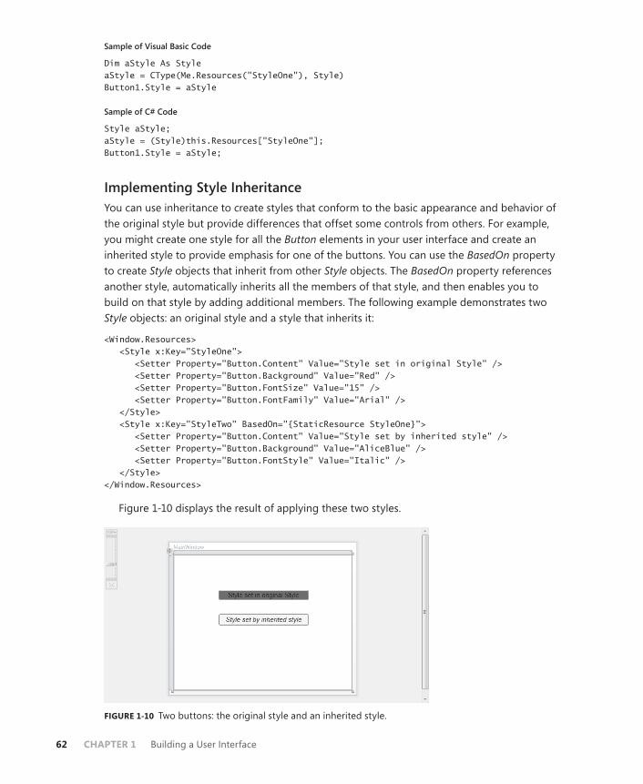
62 CHAPTER 1 Building a User Interface
Sample of Visual Basic Code
Dim aStyle As StyleaStyle = CType(Me.Resources("StyleOne"), Style) Button1.Style = aStyle
Sample of C# Code
Style aStyle;aStyle = (Style)this.Resources["StyleOne"]; Button1.Style = aStyle;
Implementing Style InheritanceYou can use inheritance to create styles that conform to the basic appearance and behavior of the original style but provide differences that offset some controls from others. For example, you might create one style for all the Button elements in your user interface and create an inherited style to provide emphasis for one of the buttons. You can use the BasedOn property to create Style objects that inherit from other Style objects. The BasedOn property references another style, automatically inherits all the members of that style, and then enables you to build on that style by adding additional members. The following example demonstrates two Style objects: an original style and a style that inherits it:
<Window.Resources> <Style x:Key="StyleOne"> <Setter Property="Button.Content" Value="Style set in original Style" /> <Setter Property="Button.Background" Value="Red" /> <Setter Property="Button.FontSize" Value="15" /> <Setter Property="Button.FontFamily" Value="Arial" /> </Style> <Style x:Key="StyleTwo" BasedOn="{StaticResource StyleOne}"> <Setter Property="Button.Content" Value="Style set by inherited style" /> <Setter Property="Button.Background" Value="AliceBlue" /> <Setter Property="Button.FontStyle" Value="Italic" /> </Style> </Window.Resources>
Figure 1-10 displays the result of applying these two styles.
FIGURE 1-10 Two buttons: the original style and an inherited style.

Lesson 3: Using Styles and Triggers CHAPTER 1 63
When a property is set in both the original style and the inherited style, the property value set by the inherited style always takes precedence. But when a property is set by the original style and not set by the inherited style, the original property setting is retained.
Quick Check■ Under what circumstances is a style automatically applied to an element?
How else can a style be applied to an element?
Quick Check Answer■ A style is applied to an element automatically when it is declared as a
resource in the page and the TargetType property of the style is set. If the TargetType property is not set, you can apply a style to an element by setting that element’s Style property, either in XAML or in code.
TriggersAlong with setters, triggers make up the bulk of objects you use in creating styles. Trig-gers enable you to implement property changes declaratively in response to other property changes that would have required event-handling code in Windows Forms programming. There are five kinds of Trigger objects, as listed in Table 1-10.
TABLE 1-10 Types of Trigger Objects
TYPE CLASS NAME DESCRIPTION
Property trigger Trigger Monitors a property and activates when the value of that property matches the Value property
Multi-trigger MultiTrigger Monitors multiple properties and activates only when all the monitored property values match their corresponding Value properties
Data trigger DataTrigger Monitors a bound property and activates when the value of the bound property matches the Value property
Multi-data trigger MultDataTrigger Monitors multiple bound properties and activates only when all the monitored bound properties match their corresponding Value properties
Event trigger EventTrigger Initiates a series of actions when a specified event is raised
A trigger is active only when it is part of a Style.Triggers collection, with one exception. EventTrigger objects can be created within a Control.Triggers collection outside a style. The
64 CHAPTER 1 Building a User Interface
Control.Triggers collection can accommodate only EventTrigger, and any other trigger placed in this collection causes an error. EventTrigger is used primarily with animation and is dis-cussed further in Chapter 2, Lesson 3.
Property TriggersThe most commonly used type of trigger is the property trigger, which monitors the value of a property specified by the Property property. When the value of the specified property equals the Value property, the trigger is activated. Table 1-11 shows the important properties of property triggers.
TABLE 1-11 Important Properties of Property Triggers
PROPERTY DESCRIPTION
EnterActions Contains a collection of Action objects that are applied when the trigger becomes active. Actions are discussed in greater detail in Lesson 2 of this chapter.
ExitActions Contains a collection of Action objects that are applied when the trigger becomes inactive. Actions are discussed in greater detail in Lesson 2 of this chapter.
Property Indicates the property that is monitored for changes.
Setters Contains a collection of Setter objects that are applied when the trigger becomes active.
Value Indicates the value that is compared to the property referenced by the Property property.
Triggers listen to the property indicated by the Property property and compare that prop-erty to the Value property. When the referenced property and the Value property are equal, the trigger is activated. Any Setter objects in the Setters collection of the trigger are applied to the style, and any actions in the EnterActions collections are initiated. When the referenced property no longer matches the Value property, the trigger is inactivated. All Setter objects in the Setters collection of the trigger are inactivated, and any actions in the ExitActions collec-tion are initiated.
NOTE ACTIONS IN ANIMATIONS
Actions are used primarily in animations, and they are discussed in greater detail in Lesson 2 of this chapter.
The following example demonstrates a simple Trigger object that changes the FontWeight value of a Button element to Bold when the mouse enters the button:
<Style.Triggers> <Trigger Property="Button.IsMouseOver" Value="True">
Lesson 3: Using Styles and Triggers CHAPTER 1 65
<Setter Property="Button.FontWeight" Value="Bold" /> </Trigger> </Style.Triggers>
In this example, the trigger defines one setter in its Setters collection. When the trigger is activated, that setter is applied.
Multi-triggersMulti-triggers are similar to property triggers in that they monitor the value of properties and activate when those properties meet a specified value. The difference is that multi-triggers are capable of monitoring several properties at a time, and they activate only when all monitored properties equal their corresponding Value properties. The properties that are monitored, and their corresponding Value properties, are defined by a collection of Condition objects. The following example demonstrates a MultiTrigger property that sets the Button.FontWeight property to Bold only when the button is focused and the mouse has entered the control:
<Style.Triggers> <MultiTrigger> <MultiTrigger.Conditions> <Condition Property="Button.IsMouseOver" Value="True" /> <Condition Property="Button.IsFocused" Value="True" /> </MultiTrigger.Conditions> <MultiTrigger.Setters> <Setter Property="Button.FontWeight" Value="Bold" /> </MultiTrigger.Setters> </MultiTrigger> </Style.Triggers>
Data Triggers and Multi-data TriggersData triggers are similar to property triggers in that they monitor a property and activate when the property meets a specified value, but they differ in that the property they monitor is a bound property. Instead of a Property property, data triggers expose a Binding prop-erty that indicates the bound property to listen to. The following shows a data trigger that changes the Background property of a label to red when the bound property CustomerName equals “Fabrikam”:
<Style.Triggers> <DataTrigger Binding="{Binding Path=CustomerName}" Value="Fabrikam"> <Setter Property="Label.Background" Value="Red" /> </DataTrigger> </Style.Triggers>
Multi-data triggers are to data triggers as multi-triggers are to property triggers. They contain a collection of Condition objects, each of which specifies a bound property through its Binding property, and a value to compare to that bound property. When all the condi-tions are satisfied, the multi-data trigger activates. The following example demonstrates

66 CHAPTER 1 Building a User Interface
a multi-data trigger that sets the Label.Background property to red when CustomerName equals “Fabrikam” and OrderSize equals 500:
<Style.Triggers> <MultiDataTrigger> <MultiDataTrigger.Conditions> <Condition Binding="{Binding Path=CustomerName}" Value="Fabrikam" /> <Condition Binding="{Binding Path=OrderSize}" Value="500" /> </MultiDataTrigger.Conditions> <MultiDataTrigger.Setters> <Setter Property="Label.Background" Value="Red" /> </MultiDataTrigger.Setters> </MultiDataTrigger> </Style.Triggers>
Event TriggersEvent triggers are different from the other trigger types. Whereas other trigger types moni-tor the value of a property and compare it to an indicated value, event triggers specify an event and activate when that event is raised. In addition, event triggers do not have a Setters collection; rather, they have an Actions collection. Most actions deal with animations, which are discussed in detail in Lesson 3 of Chapter 2. The following two examples demonstrate the EventTrigger class. The first example uses SoundPlayerAction to play a sound when a button is clicked:
<EventTrigger RoutedEvent="Button.Click"> <SoundPlayerAction Source="C:\myFile.wav" /> </EventTrigger>
The second example demonstrates a simple animation that causes the button to grow in height by 200 units when clicked:
<EventTrigger RoutedEvent="Button.Click"> <EventTrigger.Actions> <BeginStoryboard> <Storyboard> <DoubleAnimation Duration="0:0:5" Storyboard.TargetProperty="Height" To="200" /> </Storyboard> </BeginStoryboard> </EventTrigger.Actions> </EventTrigger>
Understanding Property Value PrecedenceBy now, you have probably noticed that properties can be set in many ways. They can be set in code, they can be set by styles, they can have default values, and so on. It might seem logical at first to believe that a property will have the value to which it was last set, but this is actually incorrect. A defined and strict order of precedence determines a property’s value
Lesson 3: Using Styles and Triggers CHAPTER 1 67
based on how it was set, not when. The precedence order is summarized here, with highest precedence listed first:
1. Set by coercion by the property system.
2. Set by active animations or held animations. (See Chapter 2 for a detailed discussion of animations.)
3. Set locally by code, by direct setting in XAML, or through data binding.
4. Set by TemplatedParent. Within this category is a sub-order of precedence, again listed in descending order:
a. Set by triggers from the templated parent
b. Set by the templated parent through property sets
5. Implicit style; this applies only to the Style property.
6. Set by Style triggers.
7. Set by Template triggers.
8. Set by Style setters.
9. Set by the default Style. There is a sub-order within this category, again listed in de-scending order:
a. Set by triggers in the default style
b. Set by setters in the default style
10. Set by inheritance.
11. Set by metadata.
EXAM TIP
The order of property precedence seems complicated, but actually it is fairly logical. Be sure you understand the concept behind the property order in addition to knowing the order itself.
This may seem like a complicated and arbitrary order of precedence, but upon closer ex-amination it is actually very logical and based upon the needs of the application and the user. The highest precedence is property coercion. This takes place in some elements if an attempt is made to set a property beyond its allowed values. For example, if an attempt is made to set the Value property of a Slider control to a value higher than the Maximum property, Value is coerced to equal the Maximum property. Next in precedence come animations. For anima-tions to have any meaningful use, they must be able to override preset property values. The next highest level of precedence is properties that have been set explicitly through developer or user action.
Properties set by TemplatedParent are next in the order of precedence. These are proper-ties set on objects that come into being through a template, discussed further in Chapter 4. Next in the order is a special precedence item that applies only to the Style property of an element. Provided the Style property has not been set by any item with a higher-level

68 CHAPTER 1 Building a User Interface
precedence, it is set to a style whose TargetType property matches the type of element in question. Then come properties set by triggers, first those set by Style, then those set by Template. This is logical because for triggers to have any meaningful effect, they must over-ride properties set by styles.
Properties set by styles come next, first properties set by user-defined styles and then properties set by the default style (also called the theme, which typically is set by the operat-ing system). Finally come properties that are set through inheritance and the application of metadata.
For developers, there are a few important implications that are not intuitively obvious. The most important is that if you set a property explicitly—whether in XAML or in code—the ex-plicitly set property blocks any changes dictated by a style or trigger. WPF assumes that you want that property value to be there for a reason and does not allow it to be set by a style or trigger, although it still can be overridden by an active animation.
A second, less obvious, implication is that when using the Visual Studio designer to drag and drop items onto the design surface from the toolbox, the designer explicitly sets several properties, especially layout properties. These property settings have the same precedence as they would if you had set them yourself. So if you are designing a style-oriented user inter-face, you should either enter XAML code directly in XAML view to create controls and set as few properties explicitly as possible, or you should review the XAML Visual Studio generates and delete settings as appropriate.
You can clear a property value that has been set in XAML or code manually by calling the DependencyObject.ClearValue method. The following code example demonstrates how to clear the value of the Width property on a button named Button1:
Sample of Visual Basic Code
Button1.ClearValue(WidthProperty)
Sample of C# Code
Button1.ClearValue(WidthProperty);
After the value has been cleared, it can be reset automatically by the property system.
PRACTICE Creating High-Contrast Styles
In this practice, you create a rudimentary, high-contrast style for Button, TextBox, and Label elements.
EXERCISE1 Using Styles to Create High-Contrast Elements
1. Create a new WPF application in Visual Studio.
2. In XAML view, just above the <Grid> declaration, create a Window.Resources section, as shown here:
<Window.Resources> </Window.Resources>

Lesson 3: Using Styles and Triggers CHAPTER 1 69
3. In the Window.Resources section, create a high-contrast style for TextBox controls that sets the background color to Black and the foreground to White. The TextBox controls also should be slightly larger by default. An example is shown here:
<Style TargetType="TextBox"> <Setter Property="Background" Value="Black" /> <Setter Property="Foreground" Value="White" /> <Setter Property="BorderBrush" Value="White" /> <Setter Property="Width" Value="135" /> <Setter Property="Height" Value="30" /> </Style>
4. Create similar styles for Button and Label, as shown here:
<Style TargetType="Label"> <Setter Property="Background" Value="Black" /> <Setter Property="Foreground" Value="White" /> <Setter Property="Width" Value="135" /> <Setter Property="Height" Value="33" /> </Style> <Style TargetType="Button"> <Setter Property="Background" Value="Black" /> <Setter Property="Foreground" Value="White" /> <Setter Property="Width" Value="135" /> <Setter Property="Height" Value="30" /> </Style>
5. Type the following in XAML view. Note that you should not add controls from the toolbox because that automatically sets some properties in the designer at a higher property precedence than styles:
<Label Margin="26,62,126,0" VerticalAlignment="Top"> High-Contrast Label</Label> <TextBox Margin="26,117,126,115">High-Contrast TextBox </TextBox> <Button Margin="26,0,126,62" VerticalAlignment="Bottom"> High-Contrast Button</Button>
6. Press F5 to build and run your application. Note that while the behavior of these con-trols is unaltered, their appearance has changed.
EXERCISE2 Using Triggers to Enhance Visibility
1. In XAML view for the solution you completed in Exercise 1, add a Style.Triggers section to the TextBox style, as shown here:
<Style.Triggers> </Style.Triggers>
2. In the Style.Triggers section, add triggers that detect when the mouse is over the con-trol and enlarge FontSize in the control, as shown here:
<Trigger Property="IsMouseOver" Value="True"> <Setter Property="FontSize" Value="20" /> </Trigger>

70 CHAPTER 1 Building a User Interface
3. Add similar Style.Triggers collections to your other two styles.
4. Press F5 to build and run your application. The font size of a control now increases when you move the mouse over it.
Lesson Summary■ Styles enable you to define consistent visual styles for your application. Styles use a
collection of setters to apply style changes. The most commonly used setter type is the property setter, which enables you to set a property. Event setters enable you to hook up event handlers as part of an applied style.
■ Styles can be set inline, but more frequently, they are defined in a Resources collec-tion and are set by referring to the resource. You can apply a style to all instances of a control by setting the TargetType property to the appropriate type.
■ Styles are most commonly applied declaratively, but they can be applied in code by creating a new style dynamically or by obtaining a reference to a preexisting style resource.
■ You can create styles that inherit from other styles by using the BasedOn property.
■ Property triggers monitor the value of a dependency property and can apply setters from their Setters collection when the monitored property equals a predetermined value. Multi-triggers monitor multiple properties and apply their setters when all mon-itored properties match corresponding specified values. Data triggers and multi-data triggers are analogous but monitor bound values instead of dependency properties.
■ Event triggers perform a set of actions when a particular event is raised. They are used most commonly to control animations.
■ Property values follow a strict order of precedence, depending on how they are set.
Lesson ReviewYou can use the following questions to test your knowledge of the information in Lesson 3, “Using Styles and Triggers.” The questions are also available on the companion CD if you prefer to review them in electronic form.
NOTE ANSWERS
Answers to these questions and explanations of why each answer choice is correct or incor-rect are located in the “Answers” section at the end of the book.
1. Look at the following XAML sample:
<Window.Resources> <Style x:Key="Style1"> <Setter Property="Label.Background" Value="Blue" /> <Setter Property="Button.Foreground" Value="Red" /> <Setter Property="Button.Background" Value="LimeGreen" />
Lesson 3: Using Styles and Triggers CHAPTER 1 71
</Style> </Window.Resources> <Grid> <Button Height="23" Margin="81,0,122,58" Name="Button1" VerticalAlignment="Bottom">Button</Button> </Grid>
Assuming that the developer hasn’t set any properties any other way, what is the back-ground color of Button1?
A. Blue
B. Red
C. LimeGreen
D. System Default
2. Look at the following XAML sample:
<Window.Resources> <Style x:Key="Style1"> <Style.Triggers> <MultiTrigger> <MultiTrigger.Conditions> <Condition Property="TextBox.IsMouseOver" Value="True" /> <Condition Property="TextBox.IsFocused" Value="True" /> </MultiTrigger.Conditions> <Setter Property="TextBox.Background" Value="Red" /> </MultiTrigger> </Style.Triggers> </Style> </Window.Resources> <Grid> <TextBox Style="{StaticResource Style1}" Height="21" Margin="75,0,83,108" Name="TextBox1" VerticalAlignment="Bottom" /> </Grid>
When will TextBox1 appear with a red background?
A. When the mouse is over TextBox1
B. When TextBox1 is focused
C. When TextBox1 is focused and the mouse is over TextBox1
D. All of the above
E. Never
3. Look at the following XAML sample:
<Window.Resources> <Style TargetType="Button"> <Setter Property="Content" Value="Hello" /> <Style.Triggers>

72 CHAPTER 1 Building a User Interface
<Trigger Property="IsMouseOver" Value="True"> <Setter Property="Content" Value="World" /> </Trigger> <Trigger Property="IsMouseOver" Value="False"> <Setter Property="Content" Value="How are you?" /> </Trigger> </Style.Triggers> </Style> </Window.Resources> <Grid> <Button Height="23" Margin="81,0,122,58" Name="Button1" VerticalAlignment="Bottom">Button</Button> </Grid>
What does Button1 display when the mouse is NOT over the button?
A. Hello
B. World
C. Button
D. How are you?

Case Scenarios CHAPTER 1 73
Case Scenarios
In the following case scenario, you apply what you’ve learned about how to use controls to design user interfaces. You can find answers to these questions in the “Answers” section at the end of this book.
Case Scenario 1: Streaming Stock QuotesYou’re creating an application for a client that he can use to view streaming stock quotes. The geniuses in the Control Development department already have created a control that connects to the stock quote server and displays real-time streaming stock quotes, as well as a Chart control that displays live information about stocks in chart form. Your job is to create a simple application that hosts these controls along with a few controls (a text box and a pair of buttons) that the client can use to select the stock or stocks in which he is interested.
The technical requirements are:
■ Users always must be able to access the controls that enable them to select the stock quote.
■ The Chart control requires a fair amount of two-dimensional room and cannot be hosted in a toolbar.
■ The Stock Quote control behaves like a stock ticker and requires linear space but mini-mal height.
Answer the following questions for your manager:
1. What kinds of item controls can be used to organize the controls that need to go into this application?
2. What kind of layout controls enable the design of an easy-to-use user interface?
Case Scenario 2: Cup FeverYou’ve had a little free time around the office, and you’ve decided to write a simple but snazzy application to organize and display results from World Cup soccer matches. The technical details are all complete: You’ve located a Web service that feeds up-to-date scores, and you’ve created a database that automatically applies updates from this service for match results and keeps track of upcoming matches. The database is exposed through a custom data object built on ObservableCollection lists. All that remains are the finishing touches. Specifically, when users choose an upcoming match from a drop-down list at the top of the window, you want the window’s color scheme to match the colors of the teams in the selected matchup.
You’ve also identified the technical requirements. The user interface is divided into two sections, each of which is built on a Grid container. Each section represents a team in the cur-rent or upcoming match. The user interface for each section must apply the appropriate team colors automatically when the user chooses a new match.

74 CHAPTER 1 Building a User Interface
Answer the following question for all your office mates, who are eagerly awaiting the ap-plication’s completion.
■ How can you implement these color changes to the user interface?
Suggested Practices
To help you successfully master the exam objectives presented in this chapter, complete the following tasks.
On Your OwnComplete these suggested practices on your own to reinforce the topics presented in this chapter.
■ Practice 1 Build a calculator program that uses the UniformGrid control for the num-ber button layout and a toolbar for the function key layout. Host both in a single Grid control. Then modify your solution to create a version that hosts both in a DockPanel control.
■ Practice 2 Practice creating resources by creating resource dictionaries that contain a variety of Brush and Style objects. Incorporate these resource dictionaries into existing applications or build new applications around them.
Take a Practice Test
The practice tests on this book’s companion CD offer many options. For example, you can test yourself on just one exam objective, or you can test yourself on all the 70-511 certifica-tion exam content. You can set up the test so that it closely simulates the experience of taking a certification exam, or you can set it up in study mode so that you can look at the correct answers and explanations after you answer each question.
MORE INFO PRACTICE TESTS
For details about all the practice test options available, see the “How to Use the Practice Tests” section in this book’s Introduction.
CHAPTER 2 75
C H A P T E R 2
Working with Events and Commands
Events and commands form the basis of the architecture for intra-application communi-cation in Windows Presentation Foundation (WPF) applications. Routed events can be
raised by multiple controls and enable a fine level of control over user input. Commands are a welcome addition to the Microsoft .NET Framework and provide a central architecture for enabling and disabling high-level tasks. Animation takes the concept of events a step further and enables you to design interactivity into your application by taking advantage of the WPF event infrastructure.
Exam objectives in this chapter: ■ Manage routed events in WPF.■ Configure WPF commanding.■ Implement an animation in WPF.
Lessons in this chapter:■ Lesson 1: Configuring Events and Event Handling 77■ Lesson 2: Configuring Commands 89■ Lesson 3: Implementing Animation 102
76 CHAPTER 2 Working with Events and Commands
Before You Begin
To complete the lessons in this chapter, you must have:
■ A computer that meets or exceeds the minimum hardware requirements listed in the “About This Book” section at the beginning of the book.
■ Microsoft Visual Studio 2010 Professional Edition installed on your computer.
■ An understanding of Microsoft Visual Basic or C# syntax and familiarity with the .NET Framework.
REAL WORLD
Matthew Stoecker
By using WPF routed events and commands, I find I have much finer control over how my user interfaces respond compared to how they behave in a Windows
Forms application. The routed event architecture enables me to implement complex event handling strategies, and the command architecture provides a way to ap-proach programming common tasks in my user interfaces.

Lesson 1: Configuring Events and Event Handling CHAPTER 2 77
Lesson 1: Configuring Events and Event Handling
Events in WPF programming are considerably different from those in traditional Windows Forms programming. WPF introduces routed events, which can be raised by mul-tiple controls and handled by multiple handlers. Routed events enable you to add multiple levels of complexity and sophistication to your user interface and the way it responds to user input. In this lesson, you learn about routed events, including how to handle a routed event, define and register a new routed event, handle an application lifetime event, and use the EventManager class.
After this lesson, you will be able to:■ Explain the difference between a direct event, a bubbling event, and a tunneling
event.■ Define and register a new routed event.■ Define static class event handlers.■ Handle an event in a WPF application.■ Handle an attached event in a WPF application.■ Handle application lifetime events.■ Use the EventManager class.
Estimated lesson time: 30 minutes
Events have been a familiar part of Microsoft Windows programming for years. An event is a message sent by an object, such as a control or another part of the user interface, that the program responds to (or handles) by executing code. Although the traditional .NET event architecture is still present in WPF programming, WPF builds upon the event concept by introducing routed events.
A key concept to remember in event routing is the control containment hierarchy. In WPF user interfaces, controls frequently contain other controls. For example, a typical user inter-face might consist of a top-level Window object, which contains a Grid object, which itself might contain several controls, one of which could be a ToolBar control, which in turn con-tains several Button controls. The routed event architecture allows for an event that originates in one control to be raised by another control in the containment hierarchy. Thus, if the user clicks one of the Button controls on the toolbar, that event can be raised by the button, the toolbar, the grid, or the window.
Why is it useful to route events? Suppose, for example, that you are designing a user interface for a calculator program. As part of this application, you might have several Button controls enclosed within a Grid control. Suppose you wanted all button clicks in this grid to be handled by a single event handler. WPF raises the click event from Button, Grid, and any other control in the control containment hierarchy. As the developer, you can decide where and how the event is handled. Thus, you can provide a single event handler for all Button Click

78 CHAPTER 2 Working with Events and Commands
events originating from Button controls in the grid, thereby simplifying code-writing tasks and ensuring consistency in event handling.
Types of Routed EventsThere are three types of routed events: direct, bubbling, and tunneling.
Direct EventsDirect events are most similar to standard .NET events. Like a standard .NET event, a direct event is raised only by the control in which it originates. Because other controls in the control containment hierarchy do not raise these events, there is no opportunity for any other control to provide handlers for these events. An example of a direct event is the MouseLeave event.
Bubbling EventsBubbling events are raised first in the control where they originate and then by each control in that control’s control containment hierarchy, also known as a visual tree. The MouseDown event is an example of a bubbling event. Suppose you have a Label control contained inside a FlowPanel control contained inside a window. When the mouse button is pressed over the label, the first control to raise the MouseDown event would be Label. Then FlowPanel would raise the MouseDown event and then, finally, the window itself. You could provide an event handler at any or all stages of the event process.
Tunneling EventsTunneling events are the opposite of bubbling events. A tunneling event is raised first by the topmost container in the visual tree and then down through each successive container until it is finally raised by the element in which it originates. An example of a tunneling event is the PreviewMouseDown event. In the previous example, although the event originates with the Label control, the first control to raise the PreviewMouseDown event is Window, then FlowPanel, and then, finally, Label. Tunneling events enable you to intercept and handle events in the window or container before the event is raised by the specific control so you can filter input, such as keystrokes, at varying levels.
In the .NET Framework, all tunneling events begin with the word Preview, such as PreviewKeyDown, PreviewMouseDown, and so on, and are typically defined in pairs with a complementary bubbling event. For example, the tunneling event PreviewKeyDown is paired with the KeyDown bubbling event. The tunneling event always is raised before its correspond-ing bubbling event, thus allowing higher-level controls in the visual tree to handle the event. Each tunneling event shares its instance of event arguments with its paired bubbling event. This fact is important to remember when handling events, and it will be discussed in greater detail later in this chapter.

Lesson 1: Configuring Events and Event Handling CHAPTER 2 79
RoutedEventArgsAll routed events include an instance of RoutedEventArgs (or a class that inherits RoutedEventArgs) in their signatures. The RoutedEventArgs class contains a wealth of in-formation about the event and its source control. Table 2-1 describes the properties of the RoutedEventArgs class.
TABLE 2-1 RoutedEventArgs Properties
PROPERTY DESCRIPTION
Handled Indicates whether this event has been handled. By setting this property to True, you can halt further event bubbling or tunneling.
OriginalSource Gets the object that originally raised the event. For most WPF controls, this will be the same as the object returned by the Source property. However, for some controls, such as composite controls, this property will return a different object.
RoutedEvent Returns the RoutedEvent object for the event that was raised. When handling more than one event with the same event handler, you might need to refer to this property to identify which event has been raised.
Source Returns the object that raised the event.
All EventArgs for routed events inherit the RoutedEventArgs class, but many of them provide additional information. For example, KeyboardEventArgs is used in keyboard events and provides information about keystrokes. Likewise, MouseEventArgs, used in mouse events, provides information about the state of the mouse when the event took place.
Quick Check■ What are the three kinds of routed events in WPF and how do they differ?
Quick Check Answer■ Routed events in WPF come in three types: direct, tunneling, and bubbling.
A direct event can be raised only by the element in which it originated. A bubbling event is raised first by the element in which it originated and then by each successive container in the visual tree. A tunneling event is raised first by the topmost container in the visual tree and then down through each suc-cessive container until it is finally raised by the element in which it originated. Tunneling and bubbling events enable elements of the user interface to respond to events raised by their contained elements.
80 CHAPTER 2 Working with Events and Commands
Attaching an Event HandlerThe preferred way to attach an event handler is directly in the Extensible Application Markup Language (XAML) code. You set the event to the name of a method with the appropriate signature for that event. The following example demonstrates setting the event handler for a Button control’s Click event, as shown in bold:
<Button Height="23" Margin="132,80,70,0" Name="button1" VerticalAlignment="Top" Click="button1_Click">Button</Button>
Just like setting a property, you must supply a string value that indicates the name of the method.
Attached EventsIt is possible for a control to define a handler for an event that the control cannot itself raise. These incidents are called attached events. For example, consider Button controls in a grid. The Button class defines a Click event, but the Grid class does not. However, you can still define a handler for buttons in the grid by attaching the Click event of the Button control in the XAML code. The following example demonstrates attaching an event handler for a button contained in a grid:
<Grid Button.Click="button_Click"> <Button Height="23" Margin="132,80,70,0" Name="button1" VerticalAlignment="Top" >Button</Button> </Grid>
Now every time a button contained in the grid shown here is clicked, the button_Click event handler will handle that event.
Handling a Tunneling or Bubbling EventAt times, you might want to halt the further handling of tunneling or bubbling events. For example, you might want to suppress keystroke handling at a particular level in the control hierarchy. You can handle an event and halt any further tunneling or bubbling by setting the Handled property of the RoutedEventArgs instance to True, as shown here:
Sample of Visual Basic Code
Private Sub TextBox1_KeyDown(ByVal sender As System.Object, _ ByVal e As System.Windows.Input.KeyEventArgs) e.Handled = True End Sub
Sample of C# Code
private void textBox1_KeyDown(object sender, KeyEventArgs e) { e.Handled = true; }

Lesson 1: Configuring Events and Event Handling CHAPTER 2 81
Note that tunneling events and their paired bubbling events (such as PreviewKeyDown and KeyDown) share the same instance of RoutedEventArgs. Thus, if you set the Handled property to True on a tunneling event, its corresponding bubbling event also is considered handled and is suppressed.
The EventManager ClassEventManager is a static class that manages the registration of all WPF routed events. Table 2-2 describes the methods of the EventManager class.
TABLE 2-2 EventManager Methods
METHOD DESCRIPTION
GetRoutedEvents Returns an array that contains all the routed events that have been registered in this application
GetRoutedEventsForOwner Returns an array of all the routed events that have been registered for a specified element in this application
RegisterClassHandler Registers a class-level event handler, as discussed in the “Creating a Class-Level Event Handler” section later in this chapter
RegisterRoutedEvent Registers an instance-level event handler, as discussed in the next section
Defining a New Routed EventYou can use the EventManager class to define a new routed event for your WPF controls. The following procedure describes how to define a new routed event.
To define a new routed event:
1. Create a static, read-only definition for the event, as shown in this example:
Sample of Visual Basic Code
Public Shared ReadOnly SuperClickEvent As RoutedEvent
Sample of C# Code
public static readonly RoutedEvent SuperClickEvent;
2. Create a wrapper for the routed event that exposes it as a traditional .NET Framework event, as shown in this example:
Sample of Visual Basic Code
Public Custom Event SuperClick As RoutedEventHandler AddHandler(ByVal value As RoutedEventHandler) Me.AddHandler(SuperClickEvent, value) End AddHandler
82 CHAPTER 2 Working with Events and Commands
RemoveHandler(ByVal value As RoutedEventHandler) Me.RemoveHandler(SuperClickEvent, value) End RemoveHandler RaiseEvent(ByVal sender As Object, _ ByVal e As System.Windows.RoutedEventArgs) Me.RaiseEvent(e) End RaiseEvent End Event
Sample of C# Code
public event RoutedEventHandler SuperClick { add { this.AddHandler(SuperClickEvent, value); } remove { this.RemoveHandler(SuperClickEvent, value); } }
Use a different EventArgs class from RoutedEventArgs. You must derive a new class from RoutedEventArgs and create a new delegate that uses those event arguments.
3. Use EventManager to register the new event in the constructor of the class that owns this event. You must provide the name of the event, the routing strategy (direct, tun-neling, or bubbling), the type of delegate that handles the event, and the type of the class that owns it. An example is shown here:
Sample of Visual Basic Code
EventManager.RegisterRoutedEvent("SuperClick", _ RoutingStrategy.Bubble, GetType(RoutedEventArgs), GetType(Window1))
Sample of C# Code
EventManager.RegisterRoutedEvent("SuperClick", RoutingStrategy.Bubble, typeof(RoutedEventHandler), typeof(Window1));
Raising an EventAfter an event is defined, you can raise it in code by creating a new instance of RoutedEventArgs and using the RaiseEvent method, as shown here:
Sample of Visual Basic Code
Dim myEventArgs As New RoutedEventArgs(myControl.myNewEvent) MyBase.RaiseEvent(myEventArgs)
Sample of C# Code
RoutedEventArgs myEventArgs = new RoutedEventArgs(myControl.myNewEvent); RaiseEvent(myEventArgs);

Lesson 1: Configuring Events and Event Handling CHAPTER 2 83
Creating a Class-Level Event HandlerYou can use the EventManager class to register a class-level event handler. A class-level event handler handles a particular event for all instances of a class and is always invoked before instance handlers. Thus, you can screen and suppress events before they reach instance han-dlers. The following procedure describes how to implement a class-level event handler.
To create a class-level event handler:
1. Create a static method to handle the event. This method must have the same signature as the event. An example is shown here:
Sample of Visual Basic Code
Private Shared Sub SuperClickHandlerMethod(ByVal sender As Object, _ ByVal e As RoutedEventArgs) ' Handle the event here End Sub
Sample of C# Code
private static void SuperClickHandlerMethod(object sender, RoutedEventArgs e) { // Handle the event here }
2. In the static constructor for the class for which you are creating the class-level event handler, create a delegate to this method, as shown here:
Sample of Visual Basic Code
Dim SuperClickHandler As New RoutedEventHandler( _ AddressOf SuperClickHandlerMethod)
Sample of C# Code
RoutedEventHandler SuperClickHandler = new RoutedEventHandler(SuperClickHandlerMethod);
3. Also in the static constructor, call EventManager.RegisterClassHandler to register the class-level event handler, as shown here:
Sample of Visual Basic Code
EventManager.RegisterClassHandler(GetType(Window1), _ SuperClickEvent, SuperClickHandler)
Sample of C# Code
EventManager.RegisterClassHandler(typeof(Window1), SuperClickEvent,SuperClickHandler);
Application-Level EventsEvery WPF application is wrapped by an Application object, which provides a set of events that relate to the application’s lifetime. You can handle these events to execute code in re-sponse to application startup or closure. The Application object also provides a set of events
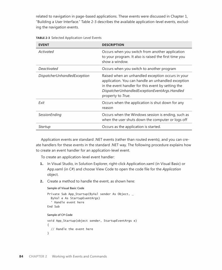
84 CHAPTER 2 Working with Events and Commands
related to navigation in page-based applications. These events were discussed in Chapter 1, “Building a User Interface.” Table 2-3 describes the available application-level events, exclud-ing the navigation events.
TABLE 2-3 Selected Application-Level Events
EVENT DESCRIPTION
Activated Occurs when you switch from another application to your program. It also is raised the first time you show a window.
Deactivated Occurs when you switch to another program
DispatcherUnhandledException Raised when an unhandled exception occurs in your application. You can handle an unhandled exception in the event handler for this event by setting the DispatcherUnhandledExceptionEventArgs.Handled property to True.
Exit Occurs when the application is shut down for any reason
SessionEnding Occurs when the Windows session is ending, such as when the user shuts down the computer or logs off
Startup Occurs as the application is started.
Application events are standard .NET events (rather than routed events), and you can cre-ate handlers for these events in the standard .NET way. The following procedure explains how to create an event handler for an application-level event.
To create an application-level event handler:
1. In Visual Studio, in Solution Explorer, right-click Application.xaml (in Visual Basic) or App.xaml (in C#) and choose View Code to open the code file for the Application object.
2. Create a method to handle the event, as shown here:
Sample of Visual Basic Code
Private Sub App_Startup(ByVal sender As Object, _ ByVal e As StartupEventArgs) ' Handle event here End Sub
Sample of C# Code
void App_Startup(object sender, StartupEventArgs e) { // Handle the event here }
Lesson 1: Configuring Events and Event Handling CHAPTER 2 85
3. In XAML view for the Application object, add the event handler to the Application declaration, as shown in bold here:
<Application x:Class="Application" xmlns="http://schemas.microsoft.com/winfx/2006/xaml/presentation" xmlns:x="http://schemas.microsoft.com/winfx/2006/xaml" StartupUri="Window1.xaml" Startup="App_Startup">
PRACTICE Working with Routed Events
In this practice, you use routed events. You create event handlers for the TextBox.TextChanged event in three controls in the visual tree and observe how the event is raised and handled by each one.
EXERCISE Creating an Event Handler
1. In Visual Studio, create a new WPF application.
2. From the toolbox, drag a TextBox and three RadioButton controls onto the design surface. Note that at this point, these controls are contained by a Grid control that is in itself contained in the top-level Window control. Thus, any bubbling events raised by the TextBox control will bubble up first to the Grid control and then to the Window control.
3. In XAML view, set the display contents of the RadioButton controls as follows:
RADIOBUTTON CONTENT
RadioButton1 Handle Textbox.TextChanged in TextBox
RadioButton2 Handle Textbox.TextChanged in Grid
RadioButton3 Handle Textbox.TextChanged in Window
4. In the XAML for the TextBox control, just before the />, type TextChanged and then press the Tab key twice. An entry for an event handler is created and a corresponding method is created in the code. The event-handler entry should look like the following:
TextChanged="TextBox1_TextChanged"
5. In the XAML for the Grid control, type TextBoxBase.TextChanged and then press the Tab key twice to generate an event handler. The added XAML should look like this:
TextBoxBase.TextChanged="Grid_TextChanged"
6. In the XAML for the Window control, type TextBoxBase.TextChanged and then press the Tab key twice to generate an event handler. The added XAML should look like this:
TextBoxBase.TextChanged="Window_TextChanged"
86 CHAPTER 2 Working with Events and Commands
7. In Code view, add the following code to the Textbox1_TextChanged method:
Sample of Visual Basic Code
MessageBox.Show("Event raised by Textbox") e.Handled = RadioButton1.IsChecked
Sample of C# Code
MessageBox.Show("Event raised by Textbox"); e.Handled = (bool)radioButton1.IsChecked;
8. Add the following code to the Grid_TextChanged method:
Sample of Visual Basic Code
MessageBox.Show("Event raised by Grid") e.Handled = RadioButton2.IsChecked
Sample of C# Code
MessageBox.Show("Event raised by Grid"); e.Handled = (bool)radioButton2.IsChecked;
9. Add the following code to the Window_TextChanged method:
Sample of Visual Basic Code
MessageBox.Show("Event raised by Window") e.Handled = RadioButton3.IsChecked
Sample of C# Code
MessageBox.Show("Event raised by Window"); e.Handled = (bool)radioButton3.IsChecked;
10. Press F5 to build and run your application. Without first selecting any of the options, type a letter in the text box. Three message boxes are displayed, each one indicating the control that raised the event. You can handle the event by choosing one of the button options to halt event bubbling in the event handlers.
Lesson Summary■ WPF applications introduce a new kind of event called routed events, which are raised
by WPF controls.
■ There are three kinds of routed events: direct, bubbling, and tunneling. Direct events are raised only by the control in which they originate. Bubbling and tunneling events are raised by the control in which they originate and all controls that are higher in the visual tree.
■ A tunneling event is raised first by the top-level control in the visual tree and tunnels down through the tree until it is finally raised by the control in which it originates. A bubbling event is raised first by the control in which the event originates and then bubbles up through the visual tree until it is finally raised by the top-level control in the visual tree.

Lesson 1: Configuring Events and Event Handling CHAPTER 2 87
■ You can attach events that exist in contained controls to controls that are higher in the visual tree.
■ The EventManager class exposes methods so you can manage events in your application. You can register a new routed event by using the EventManager. RegisterRoutedEvent class. You can create a class-level event handler by using EventManager.RegisterClassHandler.
■ The Application object raises several events that can be handled to execute code at various points in the application’s lifetime. You can handle application-level events in the code for the Application object.
Lesson ReviewYou can use the following questions to test your knowledge of the information in Lesson 1, “Configuring Events and Event Handling.” The questions are also available on the companion CD of this book if you prefer to review them in electronic form.
NOTE ANSWERS
Answers to these questions and explanations of why each answer choice is correct or incor-rect are located in the “Answers” section at the end of the book.
1. Suppose you have the following XAML code:
<Window x:Class="WpfApplication1.Window1" xmlns="http://schemas.microsoft.com/winfx/2006/xaml/presentation" xmlns:x="http://schemas.microsoft.com/winfx/2006/xaml" Title="Window1" Height="300" Width="300" ButtonBase.Click="Window_Click"> <Grid ButtonBase.Click="Grid_Click"> <StackPanel Margin="47,54,31,108" Name="stackPanel1" ButtonBase.Click="stackPanel1_Click"> <Button Height="23" Name="button1" Width="75">Button</Button> </StackPanel> </Grid> </Window>
Which method is executed first when button1 is clicked?
A. Button1_Click
B. StackPanel1_Click
C. Grid_Click
D. Window_Click
2. Suppose you have the following XAML code:
<Window x:Class="WpfApplication1.Window1" xmlns="http://schemas.microsoft.com/winfx/2006/xaml/presentation" xmlns:x="http://schemas.microsoft.com/winfx/2006/xaml" Title="Window1" Height="300" Width="300" MouseDown="Window_MouseDown">
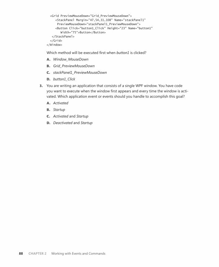
88 CHAPTER 2 Working with Events and Commands
<Grid PreviewMouseDown="Grid_PreviewMouseDown"> <StackPanel Margin="47,54,31,108" Name="stackPanel1" PreviewMouseDown="stackPanel1_PreviewMouseDown"> <Button Click="button1_Click" Height="23" Name="button1" Width="75">Button</Button> </StackPanel> </Grid> </Window>
Which method will be executed first when button1 is clicked?
A. Window_MouseDown
B. Grid_PreviewMouseDown
C. stackPanel1_PreviewMouseDown
D. button1_Click
3. You are writing an application that consists of a single WPF window. You have code you want to execute when the window first appears and every time the window is acti-vated. Which application event or events should you handle to accomplish this goal?
A. Activated
B. Startup
C. Activated and Startup
D. Deactivated and Startup

Lesson 2: Configuring Commands CHAPTER 2 89
Lesson 2: Configuring Commands
WPF introduces new objects called commands. Commands represent high-level tasks that are performed in the application. Paste is an example of a command; it represents the task of copying an object from the clipboard into a container. WPF provides a cohesive architecture for creating commands, associating them with application tasks, and hooking those com-mands up to user interface (UI) elements. In this lesson, you will learn to use the built-in com-mand library, associate these commands with UI elements, define command handlers, add a gesture to a command, and define custom commands.
After this lesson, you will be able to:■ Explain the different parts of a command.■ Associate a command with a UI element.■ Add a gesture to a command.■ Execute a command.■ Associate a command with a command handler.■ Disable a command.■ Create a custom command.
Estimated lesson time: 30 minutes
Commands, such as Cut, Copy, and Paste, represent tasks. In past versions of the .NET Framework, there was no complete architecture for associating code with tasks. For ex-ample, suppose you wanted to implement a Paste task in your application. You would create the code to execute the task and then associate your UI element with that code via events. You might have a MenuItem element that triggers the code when selected. You also might have context menu items and perhaps even a Button control. In past versions of the .NET Framework, you would have had to create event handlers for each control with which you wanted to associate the task. In addition, you would have had to implement code to inacti-vate each of these controls if the task was unavailable. Although not an impossible task, doing this requires tedious coding that can be fraught with errors.
Commands enable you to use a centralized architecture for tasks. You can associate any number of UI controls or input gestures with a command and bind that command to a han-dler that is executed when controls are activated or gestures are performed. Commands also keep track of whether they are available. If a command is disabled, UI elements associated with that command are disabled, too.
Command architecture consists of four principal parts. The Command object represents the task. There are also command sources. A command source is a control or gesture that triggers the command when invoked. The command handler is a method executed when the command is invoked, and CommandBinding is an object the .NET Framework uses to track which commands are associated with which sources and handlers.
90 CHAPTER 2 Working with Events and Commands
The .NET Framework provides several predefined commands developers can use. These built-in commands are static objects that are properties of five static classes, which are the following:
■ ApplicationCommands
■ ComponentCommands
■ EditingCommands
■ MediaCommands
■ NavigationCommands
Each of these classes exposes a variety of static command objects that you can use in your applications. Although some of these commands have default input bindings (for example, the ApplicationCommands.Open command has a default binding to the Ctrl+O key combina-tion), none of these commands has any inherent functionality; you must create bindings and handlers for these commands to use them in your application.
A High-Level Procedure for Implementing a CommandThe following section describes a high-level procedure for implementing command function-ality. The steps of this procedure are discussed in greater detail in the subsequent sections.
To implement a command:
1. Decide on the command to use, whether it is one of the static commands exposed by the .NET Framework or a custom command.
2. Associate the command with any controls in the user interface and add any desired input gestures to the command.
3. Create a method to handle the command.
4. Create a CommandBinding control that binds the Command object to the command handler and, optionally, to a method that handles Command.CanExecute.
5. Add the command binding to the Commands collection of the control or Window control where the command is invoked.
Invoking CommandsAfter a command has been implemented, you can invoke it by associating it with a control, using a gesture, or invoking it directly from code.
Associating Commands with ControlsMany WPF controls implement the ICommandSource interface, which enables them to be associated with a command that is fired automatically when that control is invoked. For exam-ple, Button and MenuItem controls implement ICommandSource and thus expose a Command

Lesson 2: Configuring Commands CHAPTER 2 91
property. When this property is set to a command, that command is executed automatically when the control is clicked. You can set a command for a control in XAML, as shown here:
<Button Command="ApplicationCommands.Find" Height="23" HorizontalAlignment="Right" Margin="0,0,38,80" Name="Button3" VerticalAlignment="Bottom" Width="75">Button</Button>
Invoking Commands with GesturesYou also can register mouse and keyboard gestures with Command objects that invoke the command when those gestures occur. The following example code shows how to add a mouse gesture and a keyboard gesture to the InputGestures collection of the Application.Find command:
Sample of Visual Basic Code
ApplicationCommands.Find.InputGestures.Add(New _ MouseGesture(MouseAction.LeftClick, ModifierKeys.Control)) ApplicationCommands.Find.InputGestures.Add(New _ KeyGesture(Key.Q, ModifierKeys.Control))
Sample of C# Code
ApplicationCommands.Find.InputGestures.Add(new MouseGesture(MouseAction.LeftClick, ModifierKeys.Control)); ApplicationCommands.Find.InputGestures.Add(new KeyGesture(Key.Q, ModifierKeys.Control));
After the code in the previous example is executed, the Find command executes either when the Ctrl key is held down and the left mouse button is clicked or when the Ctrl key and the Q key are held down at the same time (Ctrl+Q).
Invoking Commands from CodeYou might want to invoke a command directly from code, such as in response to an event in a control that does not expose a Command property. To invoke a command directly, simply call the Command.Execute method, as shown here:
Sample of Visual Basic Code
ApplicationCommands.Find.Execute(aParameter, TargetControl)
Sample of C# Code
ApplicationCommands.Find.Execute(aParameter, TargetControl);
In this example, aParameter represents an object that contains any required parameter data for the command. If no parameter is needed, you can use null (Nothing in Visual Basic). TargetControl is a control where the command originates. The run time will start looking for CommandBindings in this control and then bubble up through the visual tree until it finds an appropriate CommandBinding.
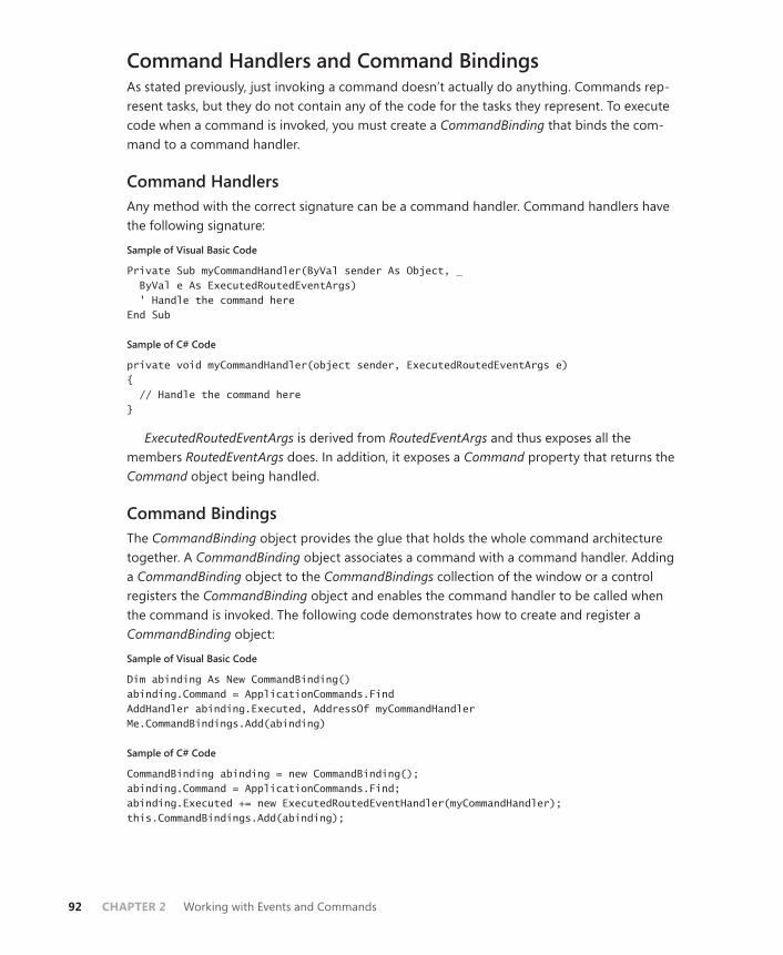
92 CHAPTER 2 Working with Events and Commands
Command Handlers and Command BindingsAs stated previously, just invoking a command doesn’t actually do anything. Commands rep-resent tasks, but they do not contain any of the code for the tasks they represent. To execute code when a command is invoked, you must create a CommandBinding that binds the com-mand to a command handler.
Command HandlersAny method with the correct signature can be a command handler. Command handlers have the following signature:
Sample of Visual Basic Code
Private Sub myCommandHandler(ByVal sender As Object, _ ByVal e As ExecutedRoutedEventArgs) ' Handle the command here End Sub
Sample of C# Code
private void myCommandHandler(object sender, ExecutedRoutedEventArgs e) { // Handle the command here }
ExecutedRoutedEventArgs is derived from RoutedEventArgs and thus exposes all the members RoutedEventArgs does. In addition, it exposes a Command property that returns the Command object being handled.
Command BindingsThe CommandBinding object provides the glue that holds the whole command architecture together. A CommandBinding object associates a command with a command handler. Adding a CommandBinding object to the CommandBindings collection of the window or a control registers the CommandBinding object and enables the command handler to be called when the command is invoked. The following code demonstrates how to create and register a CommandBinding object:
Sample of Visual Basic Code
Dim abinding As New CommandBinding() abinding.Command = ApplicationCommands.Find AddHandler abinding.Executed, AddressOf myCommandHandler Me.CommandBindings.Add(abinding)
Sample of C# Code
CommandBinding abinding = new CommandBinding(); abinding.Command = ApplicationCommands.Find; abinding.Executed += new ExecutedRoutedEventHandler(myCommandHandler); this.CommandBindings.Add(abinding);

Lesson 2: Configuring Commands CHAPTER 2 93
In the preceding example, you first create a new CommandBinding object. You then associate that CommandBinding object with a Command object. Next, you specify the command handler to be executed when the command is invoked, and finally, you add the CommandBinding object to the CommandBindings collection of the window. Thus, if an object in the window invokes the command, the corresponding command handler will be executed.
You also can define command bindings directly in the XAML. You can create a new bind-ing and declaratively set the command with which it is associated along with the associ-ated handlers. The following example demonstrates a new CommandBinding object in the CommandBindings collection of the window that associates the Application.Find command with a handler:
<Window.CommandBindings> <CommandBinding Command="ApplicationCommands.Find" Executed="myCommandHandler" /> </Window.CommandBindings>
Command BubblingAll controls have their own CommandBindings collection in addition to the window’s CommandBindings collection. This is because commands, like routed events, bubble up through the visual tree when they are invoked. Commands look for a binding first in the CommandBindings collection of the control in which they originate and then in the CommandBindings collections of controls higher on the visual tree. Like RoutedEvent, you can stop further processing of the command by setting the Handled property of the ExecutedRoutedEventArgs parameter to True, as shown here:
Sample of Visual Basic Code
Private Sub myCommandHandler(ByVal sender As Object, _ ByVal e As ExecutedRoutedEventArgs) ' Stops further Command bubbling e.Handled = True End Sub
Sample of C# Code
private void myCommandHandler(object sender, ExecutedRoutedEventArgs e) { // Handle the command here e.Handled = true; }
EXAM TIP
Bubbling and tunneling are new concepts to WPF and play important roles both in com-mands and how WPF handles routed events. Be certain that you understand the concepts of bubbling and tunneling events and bubbling commands for the exam. Remember that a command or event doesn’t need to be handled by the same element in which it originates.
94 CHAPTER 2 Working with Events and Commands
Disabling CommandsAny command that is not associated with a command binding is automatically disabled. No action is taken when that command is invoked, and any control whose Command property is set to that command appears as disabled. However, there might be times when you want to disable a command that is in place and associated with controls and command bindings. For example, you might want the Print command to be disabled until the focus is on a document. The command architecture enables you to designate a method to handle the Command.CanExecute event. The CanExecute event is raised at various points in the course of applica-tion execution to determine whether a command is in a state that will allow execution.
Methods that handle the CanExecute event include an instance of CanExecuteRoutedEventArgs as a parameter. This class exposes a property called CanExecute that is a Boolean value. If CanExecute is true, the command can be invoked. If it is false, the command is disabled. You can create a method that handles the CanExecute event, deter-mines whether the application is in an appropriate state to allow command execution, and sets e.CanExecute to the appropriate value.
To handle the CanExecute event:
1. Create a method to handle the CanExecute event. This method should query the ap-plication to determine whether the application’s state is appropriate to enable the command. An example is shown here:
Sample of Visual Basic Code
Private canExecute As Boolean Private Sub abinding_CanExecute(ByVal sender As Object, _ ByVal e As CanExecuteRoutedEventArgs) e.CanExecute = canExecute End Sub
Sample of C# Code
bool canExecute; void abinding_CanExecute(object sender, CanExecuteRoutedEventArgs e) { e.CanExecute = canExecute; }
In this example, the method returns the value represented by a private variable called canExecute. Presumably, the application sets this to False whenever it requires the com-mand to be disabled.
2. Set the CanExecute handler on CommandBinding to point to this method, as shown here:
Sample of Visual Basic Code
' Assumes that you have already created a CommandBinding called abinding AddHandler abinding.CanExecute, AddressOf abinding_CanExecute
Sample of C# Code
// Assumes that you have already created a CommandBinding called abinding abinding.CanExecute += new CanExecuteRoutedEventHandler(abinding_CanExecute);

Lesson 2: Configuring Commands CHAPTER 2 95
Alternatively, create a new binding in XAML and specify the handler there, as shown here in bold:
<Window.CommandBindings> <CommandBinding Command="ApplicationCommands.Find" Executed="CommandBinding_Executed" CanExecute="abinding_CanExecute" /> </Window.CommandBindings>
Creating Custom CommandsAlthough a wide variety of preexisting commands is at your disposal, you might want to cre-ate your own custom commands. The best practice for custom commands is to follow the ex-ample set in the .NET Framework and create static classes (in C#) or modules (in Visual Basic) that expose static instances of the custom command. This prevents the creations of multiple instances of the command. You also can provide any custom configuration for the command in the static constructor of the class—for example, if you want to map any input gestures to the command. The following example shows how to create a static class that exposes a cus-tom command called Launch:
Sample of Visual Basic Code
Public Module MyCommands Private launch_command As RoutedUICommand Sub New() Dim myInputGestures As New InputGestureCollection myInputGestures.Add(New KeyGesture(Key.L, ModifierKeys.Control)) launch_command = New RoutedUICommand("Launch", "Launch", _ GetType(MyCommands), myInputGestures) End Sub Public ReadOnly Property Launch() As RoutedUICommand Get Return launch_command End Get End Property End Module
Sample of C# Code
public class MyCommands { private static RoutedUICommand launch_command; static MyCommands() { InputGestureCollection myInputGestures = new InputGestureCollection(); myInputGestures.Add(new KeyGesture(Key.L, ModifierKeys.Control)); launch_command = new RoutedUICommand("Launch", "Launch", typeof(MyCommands), myInputGestures); } public RoutedUICommand Launch { get {

96 CHAPTER 2 Working with Events and Commands
return launch_command; } } }
In this example, a static class or module is created to contain the custom com-mand, which is exposed through a read-only property. In the static constructor, a new InputGestureCollection collection is created and a key gesture is added to the collection. This collection is then used to initialize the instance of RoutedUICommand that is returned through the read-only property.
Using Custom Commands in XAMLAfter you have created a custom command, you are ready to use it in code. If you want to use it in XAML, however, you also must map the namespace that contains the custom command to an XAML namespace. The following procedure describes how to use a custom command in XAML.
To use a custom command in XAML:
1. Create your custom command as described previously.
2. Add a namespace mapping to your Window XAML. The following example demon-strates how to map a namespace called WpfApplication13.CustomCommands. Note that, in this example, that would mean your custom commands are kept in a separate namespace:
<Window x:Class="Window1" xmlns="http://schemas.microsoft.com/winfx/2006/xaml/presentation" xmlns:x="http://schemas.microsoft.com/winfx/2006/xaml" xmlns:CustomCommands="clr-namespace:WpfApplication13.CustomCommands" Title="Window1" Height="300" Width="300"> <!—The rest of the XAML is omitted--> </Window>
3. Use the newly mapped XAML namespace in your XAML code, as shown here:
<Button Command="CustomCommands:MyCommands.Launch" Height="23" HorizontalAlignment="Left" Margin="60,91,0,0" Name="Button1" VerticalAlignment="Top" Width="75">Button</Button>
PRACTICE Creating a Custom Command
In this practice, you create a custom command and then connect your command to UI ele-ments by using a command binding.
EXERCISE1 Creating a Custom Command
1. From the CD, open the partial solution for this exercise.
Lesson 2: Configuring Commands CHAPTER 2 97
2. From the Project menu, choose Add Class (in C#) or Add Module (in Visual Basic). Name the new item CustomCommands and click OK. Set the access modifier of this class or module to public.
3. If you are working in C#, add the following using statement to your class:
using System.Windows.Input;
Otherwise, go on to Step 4.
4. Add a read-only property named Launch and a corresponding member variable that returns an instance of a RoutedUICommand, as shown here. (Note that these should be static members in C#.)
Sample of Visual Basic Code
Private launch_command As RoutedUICommand Public ReadOnly Property Launch() As RoutedUICommand Get Return launch_command End Get End Property
Sample of C# Code
private static RoutedUICommand launch_command; public static RoutedUICommand Launch { get { return launch_command; } }
5. Add a constructor to your module (in Visual Basic) or a static constructor to your class (in C#) that creates a new InputGestureCollection collection, adds an appropriate input gesture to be associated with this new command, and then initializes the member vari-able that returns the custom command, as shown here:
Sample of Visual Basic Code
Sub New() Dim myInputGestures As New InputGestureCollection myInputGestures.Add(New KeyGesture(Key.L, ModifierKeys.Control)) launch_command = New RoutedUICommand("Launch", "Launch", _ GetType(CustomCommands), myInputGestures) End Sub
Sample of C# Code
static CustomCommands() { InputGestureCollection myInputGestures = new InputGestureCollection(); myInputGestures.Add(new KeyGesture(Key.L, ModifierKeys.Control)); launch_command = new RoutedUICommand("Launch", "Launch", typeof(CustomCommands), myInputGestures); }

98 CHAPTER 2 Working with Events and Commands
6. From the Build menu, choose Build Solution to build your solution.
EXERCISE2 Using Your Custom Command
1. In XAML view, add the following code to your Window markup to create a reference to the class that contains your custom command:
xmlns:Local="clr-namespace:YourProjectNamespaceGoesHere"
The previous code in bold should be replaced with the namespace name of your project.
2. In XAML view, add the following attribute to both your Button control and your Launch MenuItem:
Command="Local:CustomCommands.Launch"
3. In the Window1 code view, add the following method:
Sample of Visual Basic Code
Private Sub Launch_Handler(ByVal sender As Object, _ ByVal e As ExecutedRoutedEventArgs) MessageBox.Show("Launch invoked") End Sub
Sample of C# Code
private void Launch_Handler(object sender, ExecutedRoutedEventArgs e) { MessageBox.Show("Launch invoked"); }
4. From the toolbox, drag a CheckBox control onto the form. Set the content of the con-trol to Enable Launch Command.
5. In the code view for Window1, add the following method:
Sample of Visual Basic Code
Private Sub LaunchEnabled_Handler(ByVal sender As Object, _ ByVal e As CanExecuteRoutedEventArgs) e.CanExecute = CheckBox1.IsChecked End Sub
Sample of C# Code
private void LaunchEnabled_Handler(object sender, CanExecuteRoutedEventArgs e) { e.CanExecute = (bool)checkBox1.IsChecked; }
6. Create or replace the constructor for Window1 that creates and registers a command binding for the Launch command. This command binding should bind the Launch.Executed event to the Launch_Handler method and bind the Launch.CanExecute event to the LaunchEnabled_Handler method. An example is shown here:

Lesson 2: Configuring Commands CHAPTER 2 99
Sample of Visual Basic Code
Public Sub New() InitializeComponent() Dim abinding As New CommandBinding() abinding.Command = CustomCommands.Launch AddHandler abinding.Executed, AddressOf Launch_Handler AddHandler abinding.CanExecute, AddressOf LaunchEnabled_Handler Me.CommandBindings.Add(abinding) End Sub
Sample of C# Code
public Window1() { InitializeComponent(); CommandBinding abinding = new CommandBinding(); abinding.Command = CustomCommands.Launch; abinding.Executed += new ExecutedRoutedEventHandler(Launch_Handler); abinding.CanExecute += new CanExecuteRoutedEventHandler(LaunchEnabled_Handler); this.CommandBindings.Add(abinding); }
7. Press F5 to build and run your application. When the application starts, the Button and Launch menu items are disabled. Select the check box to enable the command. Now you can invoke the command from the button, from the menu, or by using the Ctrl+L input gesture.
Lesson Summary■ Commands provide a central architecture for managing high-level tasks. The .NET
Framework provides a library of built-in commands that map to common tasks that can be used in your applications.
■ Commands can be invoked directly, by an input gesture such as MouseGesture or KeyGesture, or by activating a custom control. A single command can be associated with any number of gestures or controls.
■ Command bindings associate commands with command handlers. You can specify a method to handle the Executed event of a command and another method to handle the CanExecute event of a command.
■ Methods handling the CanExecute event of a command should set the CanExecute property of CanExecuteRoutedEventArgs to False when the command should be disabled.
■ Commands can be bound by any number of command bindings. Commands exhibit bubbling behavior. When invoked, commands first look for a binding in the collection of the element in which the command was invoked and then look in each higher ele-ment in the visual tree.
100 CHAPTER 2 Working with Events and Commands
■ You can create custom commands. When you have created a custom command, you must map the namespace in which it exists to an XAML namespace in your XAML view.
Lesson ReviewYou can use the following questions to test your knowledge of the information in Lesson 2, “Configuring Commands.” The questions are also available on the companion CD if you prefer to review them in electronic form.
NOTE ANSWERS
Answers to these questions and explanations of why each answer choice is correct or incor-rect are located in the “Answers” section at the end of the book.
1. Which of the following is required to bind a command to a command handler? (Choose all that apply.)
A. Instantiate a new instance of CommandBinding.
B. Set the CommandBinding.Command property to a command.
C. Add one or more input gestures to your command.
D. Add a handler for the CommandBinding.Executed event.
E. Add a handler for the CommandBinding.CanExecute event.
F. Add CommandBinding to the CommandBindings collection of the Window or other control associated with the command.
2. You are working with an application that exposes a command named Launch. This command is registered in the CommandBindings collection of a control called Window11 and requires a −String parameter. Which of the following code samples invokes the command from code correctly?
A.
Sample of Visual Basic Code
Launch.CanExecute = True Launch.Execute("Boom", Window11)
Sample of C# Code
Launch.CanExecute = true; Launch.Execute("Boom", Window11);
B.
Sample of Visual Basic Code
Launch.Execute("Boom")
Sample of C# Code
Launch.Execute("Boom");

Lesson 2: Configuring Commands CHAPTER 2 101
C.
Sample of Visual Basic Code
Launch.Execute("Boom", Window11)
Sample of C# Code
Launch.Execute("Boom", Window11);
D.
Sample of Visual Basic Code
Window11.CanExecute(Launch, True) Launch.Execute("Boom", Window11)
Sample of C# Code
Window11.CanExecute(Launch, true); Launch.Execute("Boom", Window11);

102 CHAPTER 2 Working with Events and Commands
Lesson 3: Implementing Animation
Animations are another feature of WPF. They enable you to change the value of a property over the course of a set period of time. Using this technique, you can create a variety of visual effects, including causing controls to grow or move about the user interface, to change color gradually, or to change other properties over time. In this lesson, you learn how to create animations that animate a variety of property types and use Storyboard objects to control the playback of those animations.
After this lesson, you will be able to: ■ Create and use animations.■ Control animations with the Storyboard class.■ Control timelines and playback of animations.■ Implement simultaneous animations.■ Use Action controls to control animation playback.■ Implement animations that use key frames.■ Create and start animations in code.
Estimated lesson time: 30 minutes
Using AnimationsThe term animation brings to mind hand-drawn anthropomorphic animals performing amus-ing antics in video media, but in WPF, animation has a far simpler meaning. Generally speak-ing, an animation in WPF refers to an automated property change over a set period of time. You can animate an element’s size, location, color, or virtually any other property associated with an element. You can use the Animation classes to implement these changes.
The Animation classes are a large group of classes designed to implement these automat-ed property changes. There are 42 Animation classes in the System.Windows.Media.Animation namespace, and each one has a specific data type it is designed to animate. Animation classes fall into three basic groups: Linear animations, key frame–based animations, and path-based animations.
Linear animations, which automate a property change in a linear way, are named in the <TypeName>Animation format, in which <TypeName> is the name of the type being animat-ed. DoubleAnimation is an example of a linear animation class, and is the animation class you are likely to use the most.
Key frame–based animations perform their animation on the basis of several way-points called key frames. The flow of a key-frame animation starts at the beginning and progresses to each of the key frames before ending. The progression is usually linear.

Lesson 3: Implementing Animation CHAPTER 2 103
Key-frame animations are named in the <TypeName> AnimationUsingKeyFrames for-mat, in which <TypeName> is the name of the type being animated. An example is StringAnimationUsingKeyFrames.
Path-based animations use a Path object to guide the animation. They are used most often to animate properties that relate to the movement of visual objects along a complex course. Path-based animations are named in the <TypeName>AnimationUsingPath format, in which <TypeName> is the name of the type being animated. There are currently only three path-based Animation classes: PointAnimationUsingPath, DoubleAnimationUsingPath, and MatrixAnimationUsingPath.
Important Properties of AnimationsAlthough there are many Animation classes, they all work in the same fundamental way: They change the value of a designated property over a period of time. As such, they share common properties. Many of these properties are also shared with the Storyboard class, which organiz-es Animation objects, as you will see later in this lesson. Table 2-4 shows important common properties of the Animation and Storyboard classes.
TABLE 2-4 Important Properties of the Animation and Storyboard Classes
PROPERTY DESCRIPTION
AccelerationRatio Gets or sets a value specifying the percentage of the Duration property of the animation that is spent accelerating the passage of time from zero to its maximum rate
AutoReverse Gets or sets a value that indicates whether the animation plays in reverse after it completes a forward iteration
BeginTime Gets or sets the time at which the animation should begin, rela-tive to the time it is executed. For example, an animation with BeginTime set to 0:0:5 exhibits a 5-second delay before beginning.
DecelerationRatio Gets or sets a value specifying the percentage of the duration of the animation spent decelerating the passage of time from its maximum rate to zero
Duration Gets or sets the length of time for which the animation plays
FillBehavior Gets or sets a value that indicates how the animation behaves after it has completed
RepeatBehavior Gets or sets a value that indicates how the animation repeats
SpeedRatio Gets or sets the rate at which the animation progresses relative to its parent
In addition, the linear animation classes typically implement a few more important proper-ties, which Table 2-5 describes.

104 CHAPTER 2 Working with Events and Commands
TABLE 2-5 Important Properties of Linear Animation Classes
PROPERTY DESCRIPTION
From Gets or sets the starting value of the animation. If omitted, the animation uses the current property value.
To Gets or sets the ending value of the animation
By Gets or sets the amount by which to increase the value of the target prop-erty over the course of the animation. If both the To and By properties are set, the value of the By property is ignored.
The following example demonstrates a very simple animation that changes the value of a property that has a Double data type representation from 1 to 200 over the course of 10 seconds:
<DoubleAnimation Duration="0:0:10" From="1" To="200" />
In this example, the Duration property specifies a duration of 10 seconds for the anima-tion, and the From and To properties indicate a starting value of 1 and an ending value of 200.
You might notice that something seems to be missing from this example. What property is this animation animating? The answer is that it is not animating any property; the Animation object carries no intrinsic information about the property being animated, but rather is ap-plied to a property by means of Storyboard.
Storyboard ObjectsStoryboard is the object that controls and organizes animations in your user interface. The Storyboard class contains a Children collection, which organizes a collection of Timeline objects, which include Animation objects. When created declaratively in XAML, all Animation objects must be enclosed within a Storyboard object, as shown here:
<Storyboard> <DoubleAnimation Duration="0:0:10" From="1" To="200" /> </Storyboard>
USING A STORYBOARD TO CONTROL ANIMATIONSIn XAML, Storyboard objects organize your Animation objects. The most important feature of the Storyboard object is that it contains properties for specifying the target element and target property of the child Animation objects, as shown in bold in this example:
<Storyboard TargetName="Button1" TargetProperty="Height"> <DoubleAnimation Duration="0:0:10" From="1" To="200" /> </Storyboard>
This example is now usable. It defines a timeline during which, over the course of 10 sec-onds, the Height property of Button1 goes from a value of 1 to a value of 200.

Lesson 3: Implementing Animation CHAPTER 2 105
The TargetName and TargetProperty properties are attached properties, so instead of defining them in the storyboard itself, you can define them in the child Animation objects, as shown in bold here:
<Storyboard> <DoubleAnimation Duration="0:0:10" From="1" To="200" Storyboard.TargetName="Button1" Storyboard.TargetProperty="Height" /></Storyboard>
Because a storyboard can hold more than one animation at a time, this configuration en-ables you to set separate target elements and properties for each animation. Thus, it is more common to use the attached properties.
SIMULTANEOUS ANIMATIONSThe storyboard can contain multiple child Animation objects. When the storyboard is acti-vated, all child animations are started at the same time and run simultaneously. The following example demonstrates two simultaneous animations that cause both the height and width of a Button element to grow over 10 seconds:
<Storyboard> <DoubleAnimation Duration="0:0:10" From="1" To="200" Storyboard.TargetName="Button1" Storyboard.TargetProperty="Height" /> <DoubleAnimation Duration="0:0:10" From="1" To="100" Storyboard.TargetName="Button1" Storyboard.TargetProperty="Widtht" /></Storyboard>
Using Animations with TriggersYou now have learned most of the story about using Animation objects. The Animation object defines a property change over time, and the Storyboard object contains Animation objects and determines which element and property the Animation objects affect. But one piece is still missing: How do you start and stop an animation?
All declaratively created Animation objects must be housed within a Trigger object. This can be either as part of a style or in the Triggers collection of an element, which accepts only EventTrigger objects.
Trigger objects define collections of Action objects, which control when an animation is started and stopped. The following example demonstrates an EventTrigger object with an inline animation:
<EventTrigger RoutedEvent="Button.Click"> <EventTrigger.Actions> <BeginStoryboard> <Storyboard> <DoubleAnimation Duration="0:0:5" Storyboard.TargetProperty="Height" To="200" /> </Storyboard>
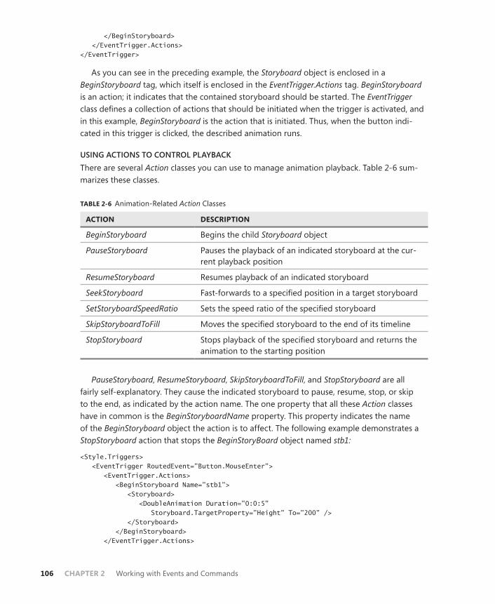
106 CHAPTER 2 Working with Events and Commands
</BeginStoryboard> </EventTrigger.Actions> </EventTrigger>
As you can see in the preceding example, the Storyboard object is enclosed in a BeginStoryboard tag, which itself is enclosed in the EventTrigger.Actions tag. BeginStoryboard is an action; it indicates that the contained storyboard should be started. The EventTrigger class defines a collection of actions that should be initiated when the trigger is activated, and in this example, BeginStoryboard is the action that is initiated. Thus, when the button indi-cated in this trigger is clicked, the described animation runs.
USING ACTIONS TO CONTROL PLAYBACKThere are several Action classes you can use to manage animation playback. Table 2-6 sum-marizes these classes.
TABLE 2-6 Animation-Related Action Classes
ACTION DESCRIPTION
BeginStoryboard Begins the child Storyboard object
PauseStoryboard Pauses the playback of an indicated storyboard at the cur-rent playback position
ResumeStoryboard Resumes playback of an indicated storyboard
SeekStoryboard Fast-forwards to a specified position in a target storyboard
SetStoryboardSpeedRatio Sets the speed ratio of the specified storyboard
SkipStoryboardToFill Moves the specified storyboard to the end of its timeline
StopStoryboard Stops playback of the specified storyboard and returns the animation to the starting position
PauseStoryboard, ResumeStoryboard, SkipStoryboardToFill, and StopStoryboard are all fairly self-explanatory. They cause the indicated storyboard to pause, resume, stop, or skip to the end, as indicated by the action name. The one property that all these Action classes have in common is the BeginStoryboardName property. This property indicates the name of the BeginStoryboard object the action is to affect. The following example demonstrates a StopStoryboard action that stops the BeginStoryBoard object named stb1:
<Style.Triggers> <EventTrigger RoutedEvent="Button.MouseEnter"> <EventTrigger.Actions> <BeginStoryboard Name="stb1"> <Storyboard> <DoubleAnimation Duration="0:0:5" Storyboard.TargetProperty="Height" To="200" /> </Storyboard> </BeginStoryboard> </EventTrigger.Actions>

Lesson 3: Implementing Animation CHAPTER 2 107
</EventTrigger> <EventTrigger RoutedEvent="Button.MouseLeave"> <EventTrigger.Actions> <StopStoryboard BeginStoryboardName="stb1" /> </EventTrigger.Actions> </EventTrigger> </Style.Triggers>
All actions that affect a particular Storyboard object must be defined in the same Triggers collection. The previous example shows both of these triggers being defined in the Button.Triggers collection. If you were to define these triggers in separate Triggers collections, story-board actions would not function.
The SetStoryboardSpeedRatio action sets the speed ratio for the entire storyboard and all Animation objects in that storyboard. In addition to BeginStoryboardName, you must set the SpeedRatio property of this action as well. The following example demonstrates a SetStoryboardSpeedRatio action that speeds the referenced storyboard by a factor of 2:
<Style.Triggers> <EventTrigger RoutedEvent="Button.MouseEnter"> <EventTrigger.Actions> <BeginStoryboard Name="stb1"> <Storyboard> <DoubleAnimation Duration="0:0:5" Storyboard.TargetProperty="Height" To="200" /> </Storyboard> </BeginStoryboard> </EventTrigger.Actions> </EventTrigger> <EventTrigger RoutedEvent="Button.MouseLeave"> <EventTrigger.Actions> <SetStoryboardSpeedRatio BeginStoryboardName="stb1" SpeedRatio="2" /> </EventTrigger.Actions> </EventTrigger> </Style.Triggers>
The SeekStoryboard action requires that two additional properties be set. The Origin prop-erty can be a value of either BeginTime or Duration and specifies how the Offset property is applied. An Origin value of BeginTime specifies that the Offset is relative to the beginning of the storyboard. An Origin value of Duration specifies that the offset is relative to the Duration property of the storyboard. The Offset property determines the amount of the offset to jump to in the animation. The following example shows a SeekStoryboard action that skips the ref-erenced timeline to 5 seconds ahead from its current point in the timeline.
<Style.Triggers> <EventTrigger RoutedEvent="Button.MouseEnter"> <EventTrigger.Actions> <BeginStoryboard Name="stb1"> <Storyboard> <DoubleAnimation Duration="0:0:10" Storyboard.TargetProperty="Height" To="200" /> </Storyboard> </BeginStoryboard>

108 CHAPTER 2 Working with Events and Commands
</EventTrigger.Actions> </EventTrigger> <EventTrigger RoutedEvent="Button.MouseLeave"> <EventTrigger.Actions> <SeekStoryboard BeginStoryboardName="stb1" Origin="BeginTime" Offset="0:0:5" /> </EventTrigger.Actions> </EventTrigger> </Style.Triggers>
USING PROPERTY TRIGGERS WITH ANIMATIONSIn the examples shown in this section, you have seen actions being hosted primarily in EventTrigger objects. You can also host Action objects in other kinds of triggers. Trigger, MultiTrigger, DataTrigger, and MultiDataTrigger objects host two Action collections: EnterActions and ExitActions collections.
The EnterActions collection hosts a set of actions that are executed when the trigger is acti-vated. Conversely, the ExitActions collection hosts a set of actions that are executed when the trigger is deactivated. The following demonstrates a trigger that begins a storyboard when activated and stops that storyboard when deactivated:
<Trigger Property="IsMouseOver" Value="True"> <Trigger.EnterActions> <BeginStoryboard Name="stb1"> <Storyboard> <DoubleAnimation Storyboard.TargetProperty="FontSize" To="20" Duration="0:0:.5" /> </Storyboard> </BeginStoryboard> </Trigger.EnterActions> <Trigger.ExitActions> <StopStoryboard BeginStoryboardName="stb1" /> </Trigger.ExitActions> </Trigger>
Managing the Playback Time LineBoth the Animation class and the Storyboard class contain several properties by which to manage the playback timeline with a fine level of control. Each of these properties is dis-cussed in this section. When a property is set on an animation, the setting affects only that animation. Setting a property on a storyboard, however, affects all the Animation objects it contains.
ACCELERATIONRATIO AND DECELERATIONRATIOThe AccelerationRatio and DecelerationRatio properties enable you to designate part of the timeline for acceleration and deceleration of the animation speed rather than starting and playing at a constant speed. This is sometimes used to give an animation a more natural ap-pearance. These properties are expressed in fractions of 1 and represent a percentage value
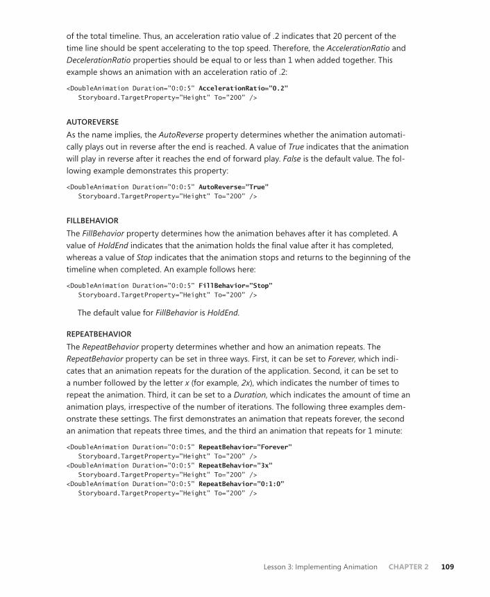
Lesson 3: Implementing Animation CHAPTER 2 109
of the total timeline. Thus, an acceleration ratio value of .2 indicates that 20 percent of the time line should be spent accelerating to the top speed. Therefore, the AccelerationRatio and DecelerationRatio properties should be equal to or less than 1 when added together. This example shows an animation with an acceleration ratio of .2:
<DoubleAnimation Duration="0:0:5" AccelerationRatio="0.2" Storyboard.TargetProperty="Height" To="200" />
AUTOREVERSEAs the name implies, the AutoReverse property determines whether the animation automati-cally plays out in reverse after the end is reached. A value of True indicates that the animation will play in reverse after it reaches the end of forward play. False is the default value. The fol-lowing example demonstrates this property:
<DoubleAnimation Duration="0:0:5" AutoReverse="True" Storyboard.TargetProperty="Height" To="200" />
FILLBEHAVIORThe FillBehavior property determines how the animation behaves after it has completed. A value of HoldEnd indicates that the animation holds the final value after it has completed, whereas a value of Stop indicates that the animation stops and returns to the beginning of the timeline when completed. An example follows here:
<DoubleAnimation Duration="0:0:5" FillBehavior="Stop" Storyboard.TargetProperty="Height" To="200" />
The default value for FillBehavior is HoldEnd.
REPEATBEHAVIORThe RepeatBehavior property determines whether and how an animation repeats. The RepeatBehavior property can be set in three ways. First, it can be set to Forever, which indi-cates that an animation repeats for the duration of the application. Second, it can be set to a number followed by the letter x (for example, 2x), which indicates the number of times to repeat the animation. Third, it can be set to a Duration, which indicates the amount of time an animation plays, irrespective of the number of iterations. The following three examples dem-onstrate these settings. The first demonstrates an animation that repeats forever, the second an animation that repeats three times, and the third an animation that repeats for 1 minute:
<DoubleAnimation Duration="0:0:5" RepeatBehavior="Forever" Storyboard.TargetProperty="Height" To="200" /> <DoubleAnimation Duration="0:0:5" RepeatBehavior="3x" Storyboard.TargetProperty="Height" To="200" /> <DoubleAnimation Duration="0:0:5" RepeatBehavior="0:1:0" Storyboard.TargetProperty="Height" To="200" />

110 CHAPTER 2 Working with Events and Commands
SPEEDRATIOThe SpeedRatio property enables you to speed up or slow down the base timeline. The SpeedRatio value represents the coefficient for the speed of the animation. Thus, an anima-tion with a SpeedRatio value of 0.5 takes twice the standard time to complete, whereas a value of 2 causes the animation to complete twice as fast. An example is shown here:
<DoubleAnimation Duration="0:0:5" SpeedRatio="0.5" Storyboard.TargetProperty="Height" To="200" />
Animating Non-Double TypesMost of the examples you have seen in this lesson have dealt with the DoubleAnimation class, but in fact, a class exists for every data type that can be animated. For example, the ColorAnimation class enables you to animate a color change, as shown here:
<Button Height="23" Width="100" Name="Button1"> <Button.Background> <SolidColorBrush x:Name="myBrush" /> </Button.Background> <Button.Triggers> <EventTrigger RoutedEvent="Button.Click"> <BeginStoryboard> <Storyboard> <ColorAnimation Storyboard.TargetName="myBrush" Storyboard.TargetProperty="Color" From="Red" To="LimeGreen" Duration="0:0:5" /> </Storyboard> </BeginStoryboard> </EventTrigger> </Button.Triggers> </Button>
In this example, when the button is clicked, the background color of the button gradually changes from red to lime green over the course of 5 seconds.
NOTE ANIMATIONS AND THE DEFAULT TEMPLATE
In the standard Windows theme, this animation can conflict with other animations in the button’s default template, so you might need to move the mouse out of the button and defocus it to see the full effect.
ANIMATION WITH KEY FRAMESUntil now, all the animations you have seen have used linear interpolation; that is, the ani-mated property changes take place over a linear time line at a linear rate. You can create nonlinear animations also, by using key frames.
Key frames are waypoints in an animation. Instead of allowing the animation to progress linearly from beginning to end, key frames divide the animation into short segments. The animation progresses from the beginning to the first key frame, then to the next, and through

Lesson 3: Implementing Animation CHAPTER 2 111
the KeyFrames collection until the end of the animation is reached. Each key frame defines its own Value and KeyTime properties, which indicate the value the animation will represent when it reaches the key frame and the time in the animation at which that key frame will be reached.
Every data type that supports a linear animation type also supports a key-frame anima-tion type, and some types that do not have linear animation types have key-frame animation types. The key-frame animation types are named <TargetType>AnimationUsingKeyFrames, in which <TargetType> represents the name of the type animated by the animation. Key-frame animation types do not support the From, To, and By properties; rather, the course of the animation is defined by the collection of key frames.
There are three kinds of key frames. The first is linear key frames, which are named Linear<TargetType>KeyFrame. These key frames provide points in an animation that are in-terpolated between in a linear fashion. The following example demonstrates the use of linear key frames:
<DoubleAnimationUsingKeyFrames Storyboard.TargetProperty="Height"> <LinearDoubleKeyFrame Value="10" KeyTime="0:0:1" /> <LinearDoubleKeyFrame Value="100" KeyTime="0:0:2" /> <LinearDoubleKeyFrame Value="30" KeyTime="0:0:4"/> </DoubleAnimationUsingKeyFrames>
In the preceding example, the Height property goes from its starting value to a value of 10 in the first second, then to a value of 100 in the next second, and finally returns to a value of 30 in the last two seconds. The progression between each segment is interpolated linearly. In this example, it is similar to having several successive linear Animation objects.
DISCRETE KEY FRAMESSome animatable data types do not support gradual transitions under any circumstances. For example, the String type can accept only discrete changes. You can use discrete key frame objects to make discrete changes in the value of an animated property. Discrete key frame classes are named Discrete<TargetType>KeyFrame, in which <TargetType> is the type being animated. Like linear key frames, discrete key frames use a Value and a KeyTime property to set the parameters of the key frame. The following example demonstrates an animation of a string by using discrete key frames:
<StringAnimationUsingKeyFrames Storyboard.TargetProperty="Content"> <DiscreteStringKeyFrame Value="Soup" KeyTime="0:0:0" /> <DiscreteStringKeyFrame Value="Sous" KeyTime="0:0:1" /> <DiscreteStringKeyFrame Value="Sots" KeyTime="0:0:2" /> <DiscreteStringKeyFrame Value="Nots" KeyTime="0:0:3" /> <DiscreteStringKeyFrame Value="Nuts" KeyTime="0:0:4" /> </StringAnimationUsingKeyFrames>

112 CHAPTER 2 Working with Events and Commands
SPLINE KEY FRAMESSpline key frames enable you to define a Bézier curve that expresses the relationship between animation speed and animation time so you can create animations that accelerate and decel-erate in complex ways. Although the mathematics of Bézier curves is beyond the scope of this lesson, a Bézier curve is simply a curve between two points, the shape of which is influenced by two control points. Using spline key frames, the start and end points of the curve are always (0,0) and (1,1), respectively, so you must define the two control points. The KeySpline property accepts two points to define the Bézier curve, as seen here:
<SplineDoubleKeyFrame Value="300" KeyTime="0:0:6" KeySpline="0.1,0.8 0.6,0.6" />
Spline key frames are difficult to create with the intended effect without complex design tools and are most commonly used when specialized animation design tools are available.
USING MULTIPLE TYPES OF KEY FRAMES IN AN ANIMATIONYou can use multiple types of key frames in a single animation; you can freely mix LinearKeyFrame, DiscreteKeyFrame, and SplineKeyFrame objects in the KeyFrames collection. The only restriction is that all key frames you use must be appropriate to the type being ani-mated. String animations, for example, can use only DiscreteStringKeyFrame objects.
Quick Check■ What are the types of key frame objects? When would you use each one?
Quick Check Answer■ There are LinearKeyFrame, DiscreteKeyFrame, and SplineKeyFrame objects.
LinearKeyFrame objects indicate a linear transition from the preceding property value to the value represented in the key frame. DiscreteKeyFrame objects represent a sudden transition from the preceding property value to the value represented in the key frame. SplineKeyFrame objects represent a transition whose rate is defined by the sum of an associated Bézier curve. You would use each of these types when the kind of transition represented was the kind you wanted to incorporate into your user interface. In addition, some animation types can use only DiscreteKeyFrame objects.
CREATING AND STARTING ANIMATIONS IN CODEAll the Animation objects you have seen so far in this lesson were created declaratively in XAML. However, you can also create and execute Animation objects just as easily in code.
The process of creating an animation should seem familiar to you; as with other .NET objects, you create a new instance of your animation and set the relevant properties, as seen in this example:
Sample of Visual Basic Code
Dim aAnimation As New System.Windows.Media.Animation.DoubleAnimation()aAnimation.From = 20

Lesson 3: Implementing Animation CHAPTER 2 113
aAnimation.To = 300 aAnimation.Duration = New Duration(New TimeSpan(0, 0, 5)) aAnimation.FillBehavior = Animation.FillBehavior.Stop
Sample of C# Code
System.Windows.Media.Animation.DoubleAnimation aAnimation = new System.Windows.Media.Animation.DoubleAnimation(); aAnimation.From = 20; aAnimation.To = 300; aAnimation.Duration = new Duration(new TimeSpan(0, 0, 5)); aAnimation.FillBehavior = Animation.FillBehavior.Stop;
After the animation has been created, however, the obvious question is: How do you start it? When creating Animation objects declaratively, you must use a storyboard to organize your animation and an action to start it. In code, however, you can use a simple method call. All WPF controls expose a method called BeginAnimation by which you can specify a depen-dency property on that control and an Animation object to act on that dependency property. The following code shows an example:
Sample of Visual Basic Code
Button1.BeginAnimation(Button.HeightProperty, aAnimation)
Sample of C# Code
button1.BeginAnimation(Button.HeightProperty, aAnimation);
PRACTICE Improving Readability with Animations
In this practice, you improve upon your solution to the practice in Lesson 1 of this chapter. You remove the triggers that cause the font size to expand and instead use an animation to make it look more natural. In addition, you create Animation objects to increase the size of the control when the mouse is over it.
EXERCISE Animating High-Contrast Styles
1. Open the completed solution from the practice in Lesson 3 of Chapter 1.
2. In each of the styles, remove the font size setter that is defined in the trigger and replace it with Trigger.EnterActions and Trigger.ExitActions sections, as shown here:
<Trigger.EnterActions> </Trigger.EnterActions> <Trigger.ExitActions> </Trigger.ExitActions>
3. In each Trigger.EnterActions section, add a BeginStoryboard action, as shown here:
<BeginStoryboard Name="Storyboard1"> </BeginStoryboard>

114 CHAPTER 2 Working with Events and Commands
4. Add the following Storyboard and Animation objects to the BeginStoryboard object in the style for the text box. Note that the values for the ThicknessAnimation object are crafted specifically for the completed version of the Lesson 1 practice on the CD. If you created your own solution, you must recalculate these values:
<Storyboard Duration="0:0:1"> <DoubleAnimation Storyboard.TargetProperty="FontSize" To="20" /> <ThicknessAnimation Storyboard.TargetProperty="Margin" To="26,118,45,104" /> <DoubleAnimation Storyboard.TargetProperty="Width" To="210"/> <DoubleAnimation Storyboard.TargetProperty="Height" To="40"/> </Storyboard>
5. Add a similar storyboard to the style for the label, as shown here:
<Storyboard Duration="0:0:1"> <DoubleAnimation Storyboard.TargetProperty="FontSize" To="20" /> <ThicknessAnimation Storyboard.TargetProperty="Margin" To="26,62,46,-10" /> <DoubleAnimation Storyboard.TargetProperty="Width" To="210"/> <DoubleAnimation Storyboard.TargetProperty="Height" To="40"/> </Storyboard>
6. Add a similar storyboard to the style for the button, as shown here:
<Storyboard Duration="0:0:1"> <DoubleAnimation Storyboard.TargetProperty="FontSize" To="20" /> <ThicknessAnimation Storyboard.TargetProperty="Margin" To="26,0,46,52" /> <DoubleAnimation Storyboard.TargetProperty="Width" To="210"/> <DoubleAnimation Storyboard.TargetProperty="Height" To="40"/> </Storyboard>
7. Add the following line to the Trigger.ExitActions section of each style:
<StopStoryboard BeginStoryboardName="Storyboard1" />
8. Press F5 to build and run your application. Now the font size expansion is animated and the control expands as well.
Lesson Summary■ Animation objects drive automated property changes over time. There are three types
of Animation objects: linear animations, key frame-based animations, and path-based animations. Every animatable type has at least one animation type associated with it, and some types have more than one type of animation that can be applied.
■ Storyboard objects organize one or more Animation objects. Storyboard objects deter-mine which objects and properties their contained Animation objects are applied to.
■ Both Animation and Storyboard objects contain a variety of properties that control animation playback behavior.

Lesson 3: Implementing Animation CHAPTER 2 115
■ Storyboard objects created declaratively are activated by a BeginStoryboard action in the Actions collection of a trigger. Triggers also can define actions that pause, stop, and resume Storyboard objects, as well as performing other storyboard-related functions.
■ Key frame animations define a series of waypoints through which the animation passes. There are three kinds of key frames: linear key frames, discrete key frames, and spline key frames. Some animatable types, such as String, support only discrete key frames.
■ You can create and apply Animation objects in code. When doing this, you do not need to define a Storyboard object; rather, you call the BeginAnimation method on the element with which you want to associate the animation.
Lesson ReviewYou can use the following questions to test your knowledge of the information in Lesson 3, “Implementing Animation.” The questions are also available on the companion CD if you prefer to review them in electronic form.
NOTE ANSWERS
Answers to these questions and explanations of why each answer choice is correct or incor-rect are located in the “Answers” section at the end of the book.
1. How many times does the animation shown here repeat (not counting the first iteration)?
<DoubleAnimation Duration="0:0:15" RepeatBehavior="0:1:0" Storyboard.TargetProperty="Height" To="200" />
A. 0
B. 1
C. 2
D. 3
2. Look at this animation:
<DoubleAnimation Duration="0:0:5" From="30" By="80" To="200" Storyboard.TargetProperty="Height" />
Assuming that the element whose Height property it animates begins with a height of 50, what is the value of the element after the animation has completed?
A. 50
B. 110
C. 130
D. 200

116 CHAPTER 2 Working with Events and Commands
Case Scenarios
In the following case scenarios, you will apply what you’ve learned about how to use com-mands, events, and settings to design user interfaces. You can find answers to these questions in the “Answers” section at the end of this book.
Case Scenario 1: Validating User InputYou’re creating a form that Humongous Insurance data entry personnel will use to input data. The form consists of several TextBox controls that receive input. Data entry is expected to proceed quickly and without errors, but to help ensure this, you will be designing valida-tion for this form. This validation is somewhat complex; there is a set of characters that is not allowed in any text box on the form, and each text box has additional limitations that differ from control to control. You would like to implement this validation scheme with a minimum of code to make troubleshooting and maintenance simple.
Answer the following question for your manager:
■ What strategies can we use to implement these requirements?
Case Scenario 2: Humongous Insurance User InterfaceThe front end for this database is just as complex as the validation requirements. You are faced with a front end that exposes many menu options. Furthermore, for expert users, some of the more commonly used menu items can be triggered by holding down the Ctrl key while performing various gestures with the mouse. Functionality invoked by the menu items will sometimes be unavailable. Finally, you must enable the operator to edit data in this window quickly and easily.
The technical requirements are that:
■ All main menu items must have access keys, and some must have mouse shortcuts.
■ Availability of menu items must be communicated to the user in a way that is easy to understand but does not disrupt program flow.
■ You must ensure that when a menu item is unavailable, corresponding shortcut keys and mouse gestures are also inactivated.
■ Certain TextBox controls on the form must fill in automatically when appropriate key-strokes are entered.
The question is:
■ How can this functionality be implemented?

Take a Practice Test CHAPTER 2 117
Suggested Practices
To help you successfully master the exam objectives presented in this chapter, complete the following tasks.
■ Practice 1 Create a rudimentary text editor with buttons that implement the Cut, Copy, and Paste commands.
■ Practice 2 Build an application that consists of a window with a single button the user can chase around the window with the mouse but can never actually click.
■ Practice 3 Create an animation that moves elements across the user interface. Alternatively, use linear animations and key-frame animations to explore a variety of animation styles. Animate other properties of UI elements as well, such as their color, size, and content.
■ Practice 4 Use animations to create a slideshow application that reads all the image files in a given directory and displays each image for 10 seconds before automatically switching to the next one. Note that you have to create and apply the animation in code.
Take a Practice Test
The practice tests on this book’s companion CD offer many options. For example, you can test yourself on just the content covered in this chapter, or you can test yourself on all the 70-511 certification exam content. You can set up the test so that it closely simulates the experience of taking a certification exam, or you can set it up in study mode so that you can look at the correct answers and explanations after you answer each question.
MORE INFO PRACTICE TESTS
For details about all the practice test options available, see the “How to Use the Practice Tests” section in this book’s Introduction.


CHAPTER 3 119
C H A P T E R 3
Adding and Managing ContentWindows Presentation Foundation (WPF) provides unprecedented support for the construc-tion and display of graphics, images, and media files. In this chapter, you learn to use WPF technology to create and display graphics, modify the visual interface, and add sound and video content.
Exam objectives in this chapter:■ Modify the visual interface at run time.■ Add multimedia content to an application in WPF.■ Create and display graphics.
Lessons in this chapter:■ Lesson 1: Managing the Visual Interface 121■ Lesson 2: Adding Multimedia Content 144
120 CHAPTER 3 Adding and Managing Content
Before You Begin
To complete the lessons in this chapter, you must have
■ A computer that meets or exceeds the minimum hardware requirements listed in the “About This Book” section at the beginning of the book.
■ Microsoft Visual Studio 2010 Professional edition installed on your computer.
■ An understanding of Microsoft Visual Basic or C# syntax and familiarity with the Microsoft .NET Framework.
REAL WORLD
Matthew Stoecker
WPF makes it downright easy to add sound and video to my applications. Combined with the improved support for graphics, I find it easier than ever
before to create content-rich applications.

Lesson 1: Managing the Visual Interface CHAPTER 3 121
Lesson 1: Managing the Visual Interface
WPF provides a previously unseen level of support for creating and displaying graphics. In this lesson, you learn to take advantage of this new support by creating your own graphics effects. You learn about using different brushes to create effects, creating a variety of shapes and transforming those shapes, and determining when the mouse is interacting with those shapes.
After this lesson, you will be able to:■ Create brushes that cause different effects and describe how brushes differ from
each other.■ Apply a brush to various properties that affect the visual appearance of controls.■ Create different lines and shapes.■ Apply transformations to different lines and shapes.■ Determine when the mouse is over a shape.
Estimated lesson time: 30 minutes
BrushesBrushes are the primary object WPF uses to paint the user interface, and every control has properties that accept a Brush object. You can affect the appearance of a control by assigning a different brush to each property. These properties represent several controls, but no control includes all the properties. Table 3-1 describes some of the properties.
TABLE 3-1 Element Properties That Accept a Brush Object
PROPERTY DESCRIPTION
Background The brush assigned to this property paints the background of the control.
BorderBrush The brush assigned to this property paints the border of the control.
Fill The brush assigned to this property paints the interior of a shape.
Foreground The brush assigned to this property paints the foreground of the con-trol, including the content of the control if the content is a string.
OpacityMask This property accepts a Brush object, but only the opacity compo-nent is considered, which is determined by the opacity of the brush assigned. For example, if you assign a transparent brush to this prop-erty, the entire control appears transparent. You can use exotic brushes to create unusual transparency effects with this property.
Stroke The brush assigned to this property paints the edge of a shape.
122 CHAPTER 3 Adding and Managing Content
Brushes are freezable objects. Thus, you can make changes to Brush objects so long as the Freeze method has not been called. After the Brush.Freeze method is called, the brush becomes read-only and no further changes can be made.
SolidColorBrushSolidColorBrush is the simplest of the Brush classes. As the name implies, it paints a single solid color without any patterns or gradients. Several solid-color brushes are available, and they are named by color in the Brushes class. You can access these brushes as shown here:
Sample of Visual Basic Code
Dim aBrush As Brush aBrush = Brushes.AliceBlue
Sample of C# Code
Brush aBrush; aBrush = Brushes.AliceBlue;
In Extensible Application Markup Language (XAML), you can assign a named brush to a property simply by referring to the name, as shown here:
<Button Background="Tomato"></Button>
You also can use hexadecimal notation to set the brush in XAML and specify an eight-digit number that defines the color. The first pair of digits denotes the value (from 00 to FF) of the opacity, the second pair of digits indicates the strength of the red channel, the third set indi-cates the strength of the green channel, and the final pair indicates the strength of the blue channel. The hexadecimal number is preceded by a number sign (#). The following example sets the background of a button to a pure red SolidColorBrush object:
<Button Background="#FFFF0000"></Button>
You also can create a new SolidColorBrush object by setting the value of each channel directly, as shown here:
<Button> <Button.Background> <SolidColorBrush> <SolidColorBrush.Color> <Color A="255" R="0" G="0" B="255"/> </SolidColorBrush.Color> </SolidColorBrush> </Button.Background> </Button>
In code, you can use the Color.FromArgb method to define the individual channels, as shown here:
Sample of Visual Basic Code
Dim aBrush As SolidColorBrush aBrush = New SolidColorBrush(Color.FromArgb(255, 0, 255, 0))

Lesson 1: Managing the Visual Interface CHAPTER 3 123
Sample of C# Code
SolidColorBrush aBrush; aBrush = new SolidColorBrush(Color.FromArgb(255, 0, 255, 0));
LinearGradientBrushLinearGradientBrush enables you to create a brush that blends two or more colors along a gradient, allowing a variety of effects. Figure 3-1 shows the effect of a LinearGradientBrush object painting the background of a window.
FIGURE 3-1 A window background painted by a LinearGradientBrush.
The code that creates this effect is shown here:
<Grid> <Grid.Background> <LinearGradientBrush> <GradientStop Color="Black" Offset="0"/> <GradientStop Color="White" Offset="1"/> </LinearGradientBrush> </Grid.Background> </Grid>
The LinearGradientBrush object uses a system of coordinates to determine how the gradi-ent is composed. The coordinate system is based on a rectangle that encloses the area to be painted. The upper left corner of this rectangle is coordinate (0,0), and the lower right corner is coordinate (1,1). Thus, coordinates are relative to the size of the drawn area and are not related to actual pixels.
Each LinearGradientBrush object contains a collection of GradientStop objects, each of which exposes two important properties: Color and Offset. The Color property determines the color to be blended, and the Offset is a number that specifies the point in the coordinate system where the indicated color is pure and not blended with other colors. In Figure 3-1, the
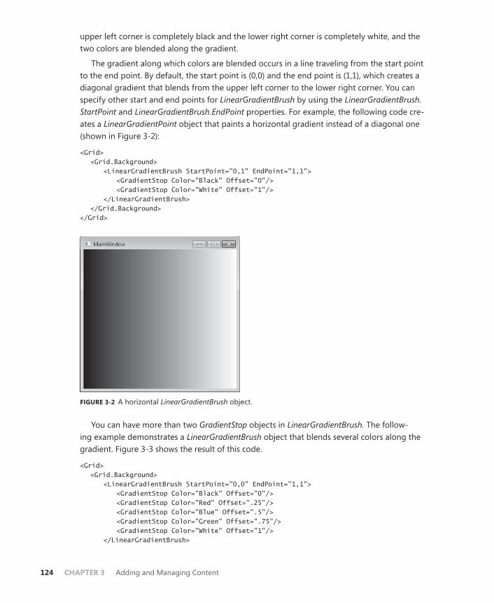
124 CHAPTER 3 Adding and Managing Content
upper left corner is completely black and the lower right corner is completely white, and the two colors are blended along the gradient.
The gradient along which colors are blended occurs in a line traveling from the start point to the end point. By default, the start point is (0,0) and the end point is (1,1), which creates a diagonal gradient that blends from the upper left corner to the lower right corner. You can specify other start and end points for LinearGradientBrush by using the LinearGradientBrush.StartPoint and LinearGradientBrush.EndPoint properties. For example, the following code cre-ates a LinearGradientPoint object that paints a horizontal gradient instead of a diagonal one (shown in Figure 3-2):
<Grid> <Grid.Background> <LinearGradientBrush StartPoint="0,1" EndPoint="1,1"> <GradientStop Color="Black" Offset="0"/> <GradientStop Color="White" Offset="1"/> </LinearGradientBrush> </Grid.Background> </Grid>
FIGURE 3-2 A horizontal LinearGradientBrush object.
You can have more than two GradientStop objects in LinearGradientBrush. The follow-ing example demonstrates a LinearGradientBrush object that blends several colors along the gradient. Figure 3-3 shows the result of this code.
<Grid> <Grid.Background> <LinearGradientBrush StartPoint="0,0" EndPoint="1,1"> <GradientStop Color="Black" Offset="0"/> <GradientStop Color="Red" Offset=".25"/> <GradientStop Color="Blue" Offset=".5"/> <GradientStop Color="Green" Offset=".75"/> <GradientStop Color="White" Offset="1"/> </LinearGradientBrush>

Lesson 1: Managing the Visual Interface CHAPTER 3 125
</Grid.Background> </Grid>
FIGURE 3-3 A multicolored LinearGradientBrush object.
The line defining the gradient need not start at a corner of the coordinate system. You could, for example, create a LinearGradientBrush object with StartPoint of (.3,.3) and EndPoint of (.7,.7) or any other pair of coordinates with values between 0 and 1. When the line defining the gradient does not stretch from one end of the coordinate system to the other, the value of the LinearGradientBrush.Spread property determines how the rest of the area is painted. Table 3-2 describes the possible values and effects of this property.
TABLE 3-2 Values of the LinearGradientBrush.Spread Property
VALUE DESCRIPTION
Pad This is the default value for the Spread property. It uses solid color on either side of the starting point of the gradient.
Reflect When SpreadMethod is set to Reflect, the gradient is extended in the op-posite orientation, like a mirror image.
Repeat When SpreadMethod is set to Repeat, the gradient is repeated in the same orientation.
RadialGradientBrushThe RadialGradientBrush object is very similar to the LinearGradientBrush object; it blends a series of colors along a gradient and contains a collection of GradientStop objects that determine how the gradient is constructed. The key difference is that the gradient radiates out in concentric circles from a point in the coordinate system. The center of the gradient is defined by the RadialGradientBrush.GradientOrigin property (.5,.5 by default). The outer-

126 CHAPTER 3 Adding and Managing Content
most circles of the RadialGradientBrush are defined by the RadiusX and RadiusY properties. RadiusX determines the distance of the outermost circle in the vertical dimension and RadiusY determines it in the horizontal dimension. The GradientStop objects function like they do in the LinearGradientBrush, indicating points where the colors are blended. Here’s an example of code that defines RadialGradientBrush:
<Grid> <Grid.Background> <RadialGradientBrush Center=".5, .5" RadiusX=".5" RadiusY=".25"> <GradientStop Color="Black" Offset="0"/> <GradientStop Color="White" Offset="1"/> </RadialGradientBrush> </Grid.Background> </Grid>
Figure 3-4 displays the result of that code.
FIGURE 3-4 The RadialGradientBrush.
Quick Check■ How is the gradient of RadialGradientBrush or LinearGradientBrush
determined?
Quick Check Answer■ The gradient in these brushes is formed by a collection of GradientStop
objects. Each GradientStop object defines a Color property and an Offset property, which indicate what color is to be blended and at what point in the gradient the color reaches maximum saturation.

Lesson 1: Managing the Visual Interface CHAPTER 3 127
ImageBrushThe ImageBrush object enables you to paint objects by using an image as the source for the brush. You can specify the source image for ImageBrush by setting the ImageSource property, as shown here:
<Grid.Background> <ImageBrush ImageSource="C:\Users\Public\Pictures\Sample Pictures\Forest.jpg"> </ImageBrush> </Grid.Background>
ImageBrush uses the designated image to paint the visual objects that are associated with it. If the designated image is smaller than the visual object to which the brush is assigned, the Stretch property controls how the brush paints the object. Table 3-3 shows the possible values of the Stretch property.
TABLE 3-3 Values of the Stretch Property
VALUE DESCRIPTION
Fill The image is stretched in both dimensions to fill available space. The aspect ratio of the image is not preserved.
None The image is painted at original size. Any area outside the original image size is not painted.
Uniform The image is stretched to fill the dimensions of the available space, but the aspect ratio of the image is preserved. Any area outside the stretched size is not painted.
UniformToFill The image is expanded to fill all the available painting space. The aspect ratio is preserved, but content can be clipped if the aspect ratio of the image is different from the aspect ratio of the container.
You can select a portion of the source image to be used for painting by setting the ViewBox property, which defines a rectangle (usually relative to the imaginary box that sur-rounds the image) that is clipped to use for painting. The following example demonstrates cropping the upper left quarter of an image and using it for the ImageBrush object:
<Grid.Background> <ImageBrush Viewbox="0,0,.5,.5" ImageSource="C:\Users\Public\Pictures\Sample Pictures\Forest.jpg"> </ImageBrush> </Grid.Background>
If the Stretch property is set to None, you can also change the behavior of ImageBrush by setting the TileMode property. Table 3-4 displays the possible values for the TileMode prop-erty.
You can set the Viewport property to select a portion of the original source image to use as the tile source. An example is shown here:

128 CHAPTER 3 Adding and Managing Content
<Grid.Background> <ImageBrush TileMode="FlipXY" Viewport="0,0,.5,.5" ImageSource="C:\Users\Public\Pictures\Sample Pictures\Forest.jpg"> </ImageBrush> </Grid.Background>
TABLE 3-4 Values of the TileMode Property
VALUE DESCRIPTION
FlipX The image is tiled in the original orientation in the vertical dimension and alternates original orientation and mirror-image orientation in the horizontal dimension.
FlipXY The image is tiled in alternating original and mirror-image ori-entations in both the horizontal and vertical dimensions. Note that tiles to the lower right of an original orientation tile appear as though they have been rotated 180 degrees relative to the original orientation.
FlipY The image is tiled in the original orientation in the horizontal dimension and alternates original orientation and mirror-image orientation in the vertical dimension.
None No tiling takes place.
Tile The image is tiled in the original orientation.
VisualBrushThe VisualBrush object is very similar to the ImageBrush object, but instead of using an image as the source for painting, it uses a Visual element, such as a WPF control or any other ele-ment that inherits the Visual class. The following demonstrates a VisualBrush object that uses a Button control as the source for the visual:
<VisualBrush Visual="{Binding ElementName=Button1}"> </VisualBrush>
You can use VisualBrush just as you would use ImageBrush, applying Stretch or TileMode properties.
ShapesShapes are drawing primitives. They represent individual drawn elements such as rectangles, ellipses, polygons, and lines. Although shapes appear as simple drawn elements, they support all the user interaction events that other WPF elements support and thus are used easily in the creation of new controls.
Lesson 1: Managing the Visual Interface CHAPTER 3 129
All shapes in WPF derive from the abstract Shape class, which itself ultimately derives from the Visual class. This class provides several properties to all the WPF shapes. Table 3-5 describes some of these properties.
TABLE 3-5 Properties of the Shape Class
PROPERTY DESCRIPTION
Fill The Brush object that paints the interior of the shape
Stroke The Brush object that paints the edge of the shape
StrokeThickness Sets the thickness of the border in device-independent units
Stretch Determines how a shape fills the space it occupies
Like other controls, the Shape class provides Width, Height, Margin, and other properties that control the sizing and spacing of the visual element. If the Width and Height values are not explicitly set, the Stretch property describes how a shape will be stretched to fill the avail-able space. Table 3-6 describes the possible values for the Stretch property.
TABLE 3-6 Values for the Stretch Property
VALUE DESCRIPTION
None The shape is rendered at full size.
Uniform The shape is stretched to fill the dimensions of the available space, but the aspect ratio of the shape is preserved.
Fill The shape is stretched in both dimensions to fill the available space. The aspect ratio of the shape is not preserved.
UniformToFill The shape is expanded to fill all the available painting space. The aspect ratio is preserved. The shape can be clipped to fit the space.
Rectangle and Ellipse ClassesThe Rectangle class represents a rendered rectangle and the Ellipse class represents a ren-dered ellipse. Both shapes are very simple. The visual depiction is defined primarily by the Height and Width properties. The following examples represent a rectangle and an ellipse that are each 100 units high and 200 units wide:
<Rectangle Height="100" Width="200" Fill="Blue"/> <Ellipse Height="100" Width="200" Fill="Blue"/>
If the Height and Width properties are not explicitly set, you can use the Stretch property to describe how the shape in question fills the available space.

130 CHAPTER 3 Adding and Managing Content
You can create a rectangle with rounded edges by setting the RadiusX and RadiusY properties. These properties represent the x and y radii of an ellipse, which are used to round the corners of the rectangle. The following XAML demonstrates drawing a rectangle with rounded edges:
<Rectangle RadiusX="20" RadiusY="10" Fill="blue" Height="50" Width="100"/>
Line and Polyline ClassesThe Line class represents a line that connects two coordinate points. The coordinate system used for drawing Line objects is relative to the upper left corner of whatever contains the line. For example, if the line is contained in a grid cell, the (0,0) point represents the upper left corner of the grid cell. You create a Line object by setting the X1, Y1, X2, and Y2 properties, as shown here:
<Line Stroke="Red" X1="0" Y1="50" X2="100" Y2="440"/>
The Polyline class is a somewhat more complex shape, essentially a set of collected points. The Polyline class exposes a Points collection that defines the points in the shape. The shape begins at the first point in the collection and then connects straight lines among the rest of the points in the collection before finishing with the last point. The following example dem-onstrates a Polyline class with a sawtooth shape:
<Polyline Stroke="Green" Points="300, 300 400, 400 400, 300 500, 400 500, 300"/>
The commas between the x and y coordinates of each point are not required but are al-lowed and facilitate readability of your code.
Polygon ClassThe Polygon class is quite similar to the Polyline class. Like the Polyline class, it exposes a Points collection that defines the points of the shape and connects those points. The chief dif-ference, however, is that the Polygon class also connects the first point with the last point and paints the interior of the shape with the Brush object defined in the Fill property. The follow-ing example demonstrates a Polygon class similar to the previous Polyline example:
<Polygon Fill="Green" Points="300, 300 400, 400 400, 300 500, 400 500, 300"/>
When lines in a Polyline or Polygon class cross one another, they create closed areas that can be filled by the shape’s Fill brush. How enclosed areas are filled is determined by the value of the FillRule property. Table 3-7 shows the possible values for the FillRule property.
Lesson 1: Managing the Visual Interface CHAPTER 3 131
TABLE 3-7 Values for the FillRule Property
VALUE DESCRIPTION
EvenOdd WPF counts the number of lines it must cross to get to the bounded region. If a closed region can be reached by cross-ing an odd number of lines, it is filled. If it can be reached by crossing an even number of lines, it is not filled.
NonZero WPF counts the number of lines that must be crossed to reach a bounded area and takes into account the direction in which they are drawn. If the number of lines that must be crossed that travel in one direction equals the number of lines that must be crossed that travel in the opposite direc-tion, the area is filled. Otherwise, the area is not filled.
PathPath is the most complex shape in WPF. A Path object describes a complex shape that can be built from one or more Geometry objects. A Geometry object can be thought of as a blueprint for a shape. It contains all the data regarding the physical appearance of a shape, such as coordinates and size, but it incorporates none of the event-handling or control-based functionality of a Shape class.
Table 3-8 describes the types of Geometry objects that can be used to create a Path object.
TABLE 3-8 Geometry Objects That Can Create a Path Object
VALUE DESCRIPTION
CombinedGeometry Combines two Geometry objects into a single object and enables you to apply different effects by setting the CombineMode property
EllipseGeometry Contains data that represent the shape of an ellipse
GeometryGroup Represents a group of Geometry objects that is added to the Path object
LineGeometry Represents a straight line
PathGeometry Represents a complex shape or figure that is composed of lines, arcs, and curves
RectangleGeometry Represents a rectangle
StreamGeometry A lightweight equivalent of PathGeometry; StreamGeometry differs from PathGeometry in that it is read-only after being created.

132 CHAPTER 3 Adding and Managing Content
The simplest way to create a Path object is to add a single Geometry object to the Path.Data property, as shown here:
<Path Fill="Aqua"> <Path.Data> <EllipseGeometry RadiusX="40" RadiusY="50"/> </Path.Data> </Path>
You can create paths that consist of multiple shapes by using the GeometryGroup class. The following example adds a rectangle and an ellipse:
<Path Fill="Aqua" Margin="100"> <Path.Data> <GeometryGroup FillRule="Nonzero"> <EllipseGeometry RadiusX="40" RadiusY="50"/> <RectangleGeometry Rect="0,0,10,100"/> </GeometryGroup> </Path.Data> </Path>
When a GeometryGroup contains overlapping Geometry objects, the FillRule property determines how the overlapping areas are filled, like with Polygon and Polyline shapes (see Table 3-7, cited previously).
The CombinedGeometry class enables you to create Geometry objects that represent combinations of two Geometry objects. The type of combination is determined by the GeometryCombineMode property. Table 3-9 shows values for the GeometryCombineMode property.
TABLE 3-9 Values of the GeometryCombineMode Property
VALUE DESCRIPTION
Exclude The resulting Geometry object represents the area that results when the second Geometry object is subtracted from the first Geometry object.
Intersect The resulting Geometry object represents the intersection of the two input Geometry objects.
Xor The resulting Geometry object represents the area that is not shared between the two input Geometry objects. This is the reverse of the Intersect value.
Union The resulting Geometry object represents the union of the two input Geometry objects.
The following example demonstrates a Path object created by using a CombinedGeometry object:
<Path Fill="Aqua" Margin="100"> <Path.Data>

Lesson 1: Managing the Visual Interface CHAPTER 3 133
<CombinedGeometry GeometryCombineMode="Exclude"> <CombinedGeometry.Geometry1> <EllipseGeometry RadiusX="40" RadiusY="50"/> </CombinedGeometry.Geometry1> <CombinedGeometry.Geometry2> <RectangleGeometry Rect="0,0,10,100"/> </CombinedGeometry.Geometry2> </CombinedGeometry> </Path.Data> </Path>
Making extremely complex shapes is possible using the PathGeometry class. A full explora-tion of the capabilities of the PathGeometry class is beyond the scope of this lesson, but fur-ther reading is recommended for those interested in creating complicated graphical shapes.
TransformationsTransformations (also referred to as transforms) are objects that enable you to alter the shape of an element by altering the coordinate system used to draw it. You can use transforms to apply a variety of effects to shapes and elements, such as rotation, displacement, skewing, and more complicated effects.
Types of TransformsTable 3-10 shows the kinds of Transform objects you can use to alter the appearance of a shape or element.
You can apply a Transform object to a shape by setting the RenderTransform property, as shown in this example that transforms a rectangle into a parallelogram:
<Rectangle Height="20" Width="50" Fill="blue"> <Rectangle.RenderTransform> <SkewTransform AngleX="-30"></SkewTransform> </Rectangle.RenderTransform> </Rectangle>
TABLE 3-10 Kinds of Transform Objects
CLASS DESCRIPTION
MatrixTransform Modifies the coordinate system of the object to which it is applied by applying a 3 x 3 affine transformation matrix to the underlying coordinate system. The matrix is defined by the Matrix property.
RotateTransform Rotates the coordinate system around the point represented by the CenterX and CenterY properties. The Angle property determines the angle of rotation.

134 CHAPTER 3 Adding and Managing Content
ScaleTransform Transforms the coordinate system by increasing or reducing the scale of the transformation. The ScaleX property deter-mines horizontal scaling, and the ScaleY property determines vertical scaling. The CenterX and CenterY properties deter-mine the center point of the transformation.
SkewTransform Skews the coordinate system of your object. The AngleX and AngleY properties determine the angle of skewing in the horizontal and vertical directions, respectively, and the CenterX and CenterY properties determine the center of the transformation.
TranslateTransform Shifts the coordinate system of your object by the horizontal and vertical amounts indicated by the X and Y properties, respectively.
TransformGroup Groups a series of Transform objects and applies each to the underlying coordinate system.
Typically, a transformation initiates at the upper left corner of the transformed element. You can specify a different origin for the transformation by setting the RenderTransformOrigin property. The coordinate system used by transformations sets (0,0) as the upper left corner of the rectangle bounding the element and (1,1) as the lower right corner. The code shown in bold in the following example sets the origin of the Transform to the center of the element:
<Rectangle Height="20" Width="50" Fill="blue" RenderTransformOrigin=".5, .5"> <Rectangle.RenderTransform> <SkewTransform AngleX="-30"></SkewTransform> </Rectangle.RenderTransform> </Rectangle>
Transforming ElementsIn the same way you can transform shapes, you can apply Transform objects to elements to alter their appearance. Because all WPF elements are drawn by WPF, you can apply a Transform to any WPF element. A Transform object affects only the appearance of a control. A control’s functionality remains unaffected, although applying dramatic Transform objects to user interface (UI) elements might affect how well a user can comprehend and use the UI.
You can apply Transform to an element in the same way as you would to a shape: by set-ting the RenderTransform property. The following example demonstrates a Button object with SkewTransform applied:
<Button Height="20" Width="50"> <Button.RenderTransform> <SkewTransform AngleX="-30"></SkewTransform> </Button.RenderTransform> </Button>
Lesson 1: Managing the Visual Interface CHAPTER 3 135
FlippingA common requirement for visual transformations is to flip an element, either horizon-tally across the y-axis or vertically across the x-axis. You can flip an element by using ScaleTransform. To flip an element horizontally but maintain its size and shape, you use ScaleTransform with a ScaleX property of –1. To flip vertically, you use ScaleTransform with a ScaleY property of –1. Setting both ScaleX and ScaleY to –1 results in an element that is flipped across both axes. The following example demonstrates flipping a button horizontally:
<Button Height="50" Width="100" VerticalAlignment="Bottom"> <Button.RenderTransform> <ScaleTransform ScaleX="-1"></ScaleTransform> </Button.RenderTransform>Flipped Button </Button>
Using this transform displaces your element across the axis as though it were a mir-ror image. To flip an element but maintain its original position, set the element’s RenderTransformOrigin property to .5,.5, as shown here in bold:
<Button RenderTransformOrigin=".5, .5" Height="50" Width="100" VerticalAlignment="Bottom"> <Button.RenderTransform> <ScaleTransform ScaleX="-1"></ScaleTransform> </Button.RenderTransform>Flipped Button </Button>
EXAM TIP
Be sure you understand the difference between each of the kinds of geometric transforms and know when each one is used. In particular, note that you use ScaleTransform rather than RotateTransform to flip an element,, which might not seem intuitive at first.
ClippingIn the “Path” section earlier in this chapter, you saw how you can use Geometry objects to create complex shapes. You can also use Geometry objects to clip the shape of elements by setting the Clip property, which is exposed by all WPF elements. Setting the Clip prop-erty constrains the visual appearance of the affected control to the shape described by the Geometry object to which the Clip property is set. This does not transform the element in any way; it merely clips the visible bounds of the control to conform to the Geometry object. Figure 3-5 shows two identically sized Button elements. The Button element on the left does not have the Clip property set, whereas the Button element on the right has the Clip property set to an EllipseGeometry object.

136 CHAPTER 3 Adding and Managing Content
FIGURE 3-5 Two Button elements, one clipped, one not.
The following example demonstrates how to apply clipping to an element:
<Button Height="100" Width="100" Name="Button1"> <Button.Clip> <!--Since the Button is 100 by 100 pixels, an EllipseGeometry with a Center of 50,50 and a RadiusX and RadiusY of 50 will clip the button so that it appears circular--> <EllipseGeometry Center="50,50" RadiusX="50" RadiusY="50"/> </Button.Clip>Button </Button>
The Visual TreeIn WPF programming, the visual interface is defined by the visual tree, a hierarchical orga-nization of the visual elements in your application. All WPF elements with an inherent visual representation inherit the Visual class. This includes controls and shapes as well as more specialized decorator classes that enhance the appearance of controls, but it does not include elements that do not have an inherent visual representation. An example of an element that does not have an inherent visual representation would be the ListBoxItem control, which can contain content but has no actual appearance itself.
The Visual class provides much of the background support for the visual elements of the user interface. The Visual class provides functionality for transformations, clipping, hit testing, and bounding box calculations for visual elements as well as persisting the serialized draw-ing information for the element. It is through the persistence of this drawing data that WPF is able to optimize graphics display by using retained mode graphics.
Retained mode graphics is one of the primary differences between rendering the user interfaces in WPF applications and rendering the user interfaces in Windows Forms applica-tions. In Windows Forms, the application is responsible for invalidating regions of the user interface and sending commands to the system to redraw those regions. This is referred to

Lesson 1: Managing the Visual Interface CHAPTER 3 137
as immediate mode graphics. When the application gets busy, this can cause repainting to be delayed or the user interface to become unresponsive.
In contrast, WPF retained mode graphics transmit the serialized drawing data to the system when a visual element is created, and the system is thereafter responsible for repaint-ing the element. Thus, even if the application is busy, the system can still respond to paint requests and maintain a responsive user interface.
VisualTreeHelperFor navigating the tree of Visual elements in a WPF application, WPF provides a static helper class called VisualTreeHelper, which provides static methods that enable navigation among and interaction with elements in the visual tree. Table 3-11 describes the methods of VisualTreeHelper.
TABLE 3-11 Methods of the VisualTreeHelper Class
METHOD DESCRIPTION
GetBitmapEffect Returns the BitmapEffect value for the specified Visual object
GetBitmapEffectInput Returns the BitmapEffectInput value for the specified Visual object
GetCacheMode Retrieves the cached representation of the specified Visual object
GetChild Returns the child visual object from the speci-fied collection index within a specified parent
GetChildrenCount Returns the number of children the specified Visual object contains
GetClip Returns the clip region of the specified Visual object as a Geometry value
GetContentBounds(Visual) Returns the cached bounding box rectangle for the specified Visual object
GetContentBounds(Visual3D) Returns the cached bounding box rectangle for the specified Visual3D object
GetDescendantBounds(Visual) Returns the union of all the content bounding boxes for all the descendants of the Visual ob-ject, which includes the content bounding box of the Visual object
GetDescendantBounds(Visual3D) Returns the union of all the content bounding boxes for all the descendants of the specified Visual3D object, which includes the content bounding box of the Visual3D object
138 CHAPTER 3 Adding and Managing Content
GetDrawing Returns the drawing content of the specified Visual object
GetEdgeMode Returns the edge mode of the specified Visual object as an EdgeMode value
GetEffect Gets the bitmap effect for the specified Visual object
GetOffset Returns the offset of the Visual object
GetOpacity Returns the opacity of the Visual object
GetOpacityMask Returns a Brush value that represents the opac-ity mask of the Visual object
GetParent Returns a DependencyObject value that repre-sents the parent of the Visual object
GetTransform Returns a Transform value for the Visual object
GetXSnappingGuidelines Returns an x-coordinate (vertical) guideline collection
GetYSnappingGuidelines Returns a y-coordinate (horizontal) guideline collection
HitTest(Visual, Point) Returns the topmost Visual object of a hit test by specifying a Point
HitTest(Visual, HitTestFilterCallback, HitTestResultCallback, HitTestParameters)
Initiates a hit test on the specified Visual object, with caller-defined HitTestFilterCallback and HitTestResultCallback methods
HitTest(Visual3D, HitTestFilterCallback, HitTestResultCallback, HitTestParameters3D)
Initiates a hit test on the specified Visual3D object, with caller-defined HitTestFilterCallback and HitTestResultCallback methods
The following example demonstrates the use of VisualTreeHelper. This example demon-strates how to use the VisualTreeHelper class to loop through all objects in the visual tree.
Sample of Visual Basic Code
Public Sub LoopVisuals(ByVal aVisual As Visual) For i As Integer = 0 To VisualTreeHelper.GetChildrenCount(aVisual) – 1 ' Gets the child visual at specified index value. Dim bVisual As Visual = CType(VisualTreeHelper.GetChild(aVisual, i), Visual) ' Do whatever needs to be done to the Visual object. ' Call this method recursively to loop though all of the visuals of the child ' visual LoopVisuals(bVisual) Next i End Sub

Lesson 1: Managing the Visual Interface CHAPTER 3 139
Sample of C# Code
public void LoopVisuals(Visual aVisual){ for (int i = 0; i < VisualTreeHelper.GetChildrenCount(aVisual); i++) { // Gets the child visual at specified index value. Visual bVisual = (Visual)VisualTreeHelper.GetChild(aVisual, i); // Do whatever needs to be done to the Visual object. // Call this method recursively to loop though all of the visuals of the child // visual LoopVisuals(bVisual); } }
Adding to and Removing Controls from the Visual Interface at Run TimeBoth Windows Forms and WPF applications enable you to add and remove controls at run time. In Windows Forms, you add a control to a form or other container control by accessing that control’s Controls collection. The following example demonstrates how to add a button to the current form at run time:
Sample of Visual Basic Code
Dim aButton As New Button()Me.Controls.Add(aButton)
Sample of C# Code
Button aButton = new Button();this.Controls.Add(aButton);
Removing a control at run time is also accomplished through the Controls collection. You can either remove a control directly, based on a reference to that control, or, if you do not have a reference, you can remove a control based on its index in the collection. Both exam-ples are shown here:
Sample of Visual Basic Code
' Removes the control referred to by the variable aButton.Me.Controls.Remove(aButton) ' Removes the control at index 0 of the controls collection Me.Controls.RemoveAt(0)
Sample of C# Code
// Removes the control referred to by the variable aButton.this.Controls.Remove(aButton); // Removes the control at index 0 of the controls collection this.Controls.RemoveAt(0);
In WPF applications, the procedure is similar but somewhat complicated because controls can be hosted in any WPF container, list, or content control. For container controls, you can access child controls through the Children property. For list controls, such as ListBox, you can
140 CHAPTER 3 Adding and Managing Content
access list items through the Items property. Both the Children property of container controls and the Items property of list controls have Add, Remove, and RemoveAt methods that func-tion similarly to their Windows Forms counterparts, as shown here:
Sample of Visual Basic Code
Dim aButton As New Button()Dim bButton As New Button() Grid1.Children.Add(aButton) ListBox1.Items.Add(bButton) ' Removes the control referred to by the variables aButton and bButton. Grid1.Children.Remove(aButton) ListBox1.Items.Remove(bButton) ' Removes the control at index 0 of the controls collection Grid1.Children.RemoveAt(0) ListBox1.Items.RemoveAt(0)
Sample of C# Code
Button aButton = new Button();Button bButton = new Button(); Grid1.Children.Add(aButton); ListBox1.Items.Add(bButton); // Removes the control referred to by the variables aButton and bButton. Grid1.Children.Remove(aButton); ListBox1.Items.Remove(bButton); // Removes the control at index 0 of the controls collection Grid1.Children.RemoveAt(0); ListBox1.Items.RemoveAt(0);
For content items, however, adding or removing a control is as simple as setting the Content property, as shown here:
Sample of Visual Basic Code
' Creates and adds a Button control to another Button control named Button1Dim aButton As New Button() Button1.Content = aButton ' Removes aButton from Button1 Button1.Content = Nothing
Sample of C# Code
// Creates and adds a Button control to another Button control named Button1Button aButton = new Button(); Button1.Content = aButton; // Removes aButton from Button1 Button1.Content = null;
When a control is removed from its host collection, it will be garbage collected if no other active references to that control exist.
Lesson 1: Managing the Visual Interface CHAPTER 3 141
PRACTICE Working with Graphics
In this practice, you add a variety of effects to a previously created application. Although the result might not be useful in a business setting, it demonstrates some of the techniques you have learned in this lesson. Please note that this exercise, which creates a file in the root of your C: drive, requires appropriate file system access.
EXERCISE Practice with Graphics
1. From the CD, load the partial solution for Chapter 3, Lesson 1.
2. In XAML view, modify the XAML for Button1 so that it defines a new SolidColorBrush for the Background property, as shown in bold here (note that the XAML for the C# practice files differs slightly):
<Button Height="23" Margin="30,76,0,0" Name="Button1" VerticalAlignment="Top" HorizontalAlignment="Left" Width="74"> <Button.Background> <SolidColorBrush Color="Red"></SolidColorBrush> </Button.Background>Set Name </Button>
3. Do the same with Button2, setting the background to a SolidColorBrush of a different color.
4. Modify the XAML for TextBox to add a ScaleTransform section, which flips the text box across the y-axis but maintains the same position, as shown in bold here:
<TextBox RenderTransformOrigin=".5,.5" Height="21" Margin="30,29,81,0" Name="textBox1" VerticalAlignment="Top"> <TextBox.RenderTransform> <ScaleTransform ScaleX="-1"/> </TextBox.RenderTransform> </TextBox>
5. Add a SkewTransform section to Label1 to skew the rendering of the control, as shown in bold here:
<Label Margin="30,124,81,115" Name="label1"> <Label.RenderTransform> <SkewTransform AngleX="30" AngleY="20"></SkewTransform> </Label.RenderTransform> </Label>
6. Just before the <Grid> declaration, add the following code to set the window back-ground to a LinearGradientBrush object:
<Window.Background> <LinearGradientBrush> <GradientStop Color="Red" Offset="0"/> <GradientStop Color="Yellow" Offset=".5"/> <GradientStop Color="Lime" Offset="1"/> </LinearGradientBrush> </Window.Background>
142 CHAPTER 3 Adding and Managing Content
7. Press F5 to build and run your application. Note that although the functionality re-mains the same, the user interface has a completely different appearance.
Lesson Summary■ Brush is the primary object that WPF uses to paint the user interface, and all Brush
objects inherit the Brush abstract class. SolidColorBrush objects paint with a solid color, and LinearGradientBrush and RadialGradientBrush objects paint color gradients. ImageBrush and VisualBrush objects can be used to paint with images or other visual elements.
■ WPF has built-in support for the creation of drawing primitive shapes. Shapes support all the user interaction events common to UI elements. Shapes range from the simple, such as Rectangle and Ellipse, to the complex, such as Polygon and Path.
■ Transforms enable you to apply mathematical transformations to shapes and elements. You can apply Transform to a shape or element by setting the RenderTransform prop-erty of the object you want to transform.
■ You can set the Clip property of an element to a specified Geometry object to clip the visual representation of that object. An element with the Clip property set will be painted only in the area represented by the intersection of the element’s natural shape and the specified Geometry object.
■ You can use the VisualTreeHelper.HitTest method to retrieve the object hit by a speci-fied point. The point specified is relative to the upper left corner of the specified visual element.
Lesson ReviewYou can use the following questions to test your knowledge of the information in Lesson 1, “Managing the Visual Interface.” The questions are also available on the companion CD of this book if you prefer to review them in electronic form.
NOTE ANSWERS
Answers to these questions and explanations of why each answer choice is correct or incor-rect are located in the “Answers” section at the end of the book.
1. Which of the following XAML snippets renders the Button control flipped across the y-axis but renders it in the original coordinates?
A.
<Button Height="23" Margin="75,64,128,0" Name="Button1" VerticalAlignment="Top"> <Button.RenderTransform> <ScaleTransform ScaleY="-1"/> </Button.RenderTransform>Button </Button>

Lesson 1: Managing the Visual Interface CHAPTER 3 143
B.
<Button Height="23" Margin="75,64,128,0" Name="Button1" VerticalAlignment="Top" RenderTransformOrigin=".5,.5"> <Button.RenderTransform> <ScaleTransform ScaleY="-1"/> </Button.RenderTransform>Button </Button>
C.
<Button Height="23" Margin="75,64,128,0" Name="Button1" VerticalAlignment="Top"> <Button.RenderTransform> <ScaleTransform ScaleX="-1"/> </Button.RenderTransform>Button </Button>
D.
<Button Height="23" Margin="75,64,128,0" Name="Button1" VerticalAlignment="Top" RenderTransformOrigin=".5,.5"> <Button.RenderTransform> <ScaleTransform ScaleX="-1"/> </Button.RenderTransform>Button </Button>
2. Which of the following XAML samples correctly demonstrates how to create a LinearGradient brush by which the color is blended from red to yellow vertically?
A.
<LinearGradientBrush> <GradientStop Color="Red" Offset="0"/> <GradientStop Color="Yellow" Offset="1"/> </LinearGradientBrush>
B.
<LinearGradientBrush StartPoint="0,1" EndPoint="1,1"> <GradientStop Color="Red" Offset="0"/> <GradientStop Color="Yellow" Offset="1"/> </LinearGradientBrush>
C.
<LinearGradientBrush StartPoint="0,1" EndPoint="1,1"> <GradientStop Color="Yellow" Offset="0"/> <GradientStop Color="Red" Offset="1"/> </LinearGradientBrush>
D.
<LinearGradientBrush StartPoint="1,0" EndPoint="1,1"> <GradientStop Color="Red" Offset="0"/> <GradientStop Color="Yellow" Offset="1"/> </LinearGradientBrush>

144 CHAPTER 3 Adding and Managing Content
Lesson 2: Adding Multimedia Content
WPF enables you to integrate multimedia content into your applications. SoundPlayer, MediaPlayer, and MediaElement classes enable the seamless integration of sound and video into multiple facets of your application. In this lesson, you learn to use these three classes to incorporate sound and video content into your user interface.
After this lesson, you will be able to:■ Use the SoundPlayer class to play uncompressed .wav files.■ Describe the SoundPlayerAction class and explain how to use it in a trigger.■ Use the MediaPlayer class to play sound in a WPF application.■ Use the MediaElement to display video in a WPF application.■ Control aspects of media playback with MediaPlayer and MediaElement.■ Handle media-specific events.
Estimated lesson time: 20 minutes
Using SoundPlayerThe SoundPlayer class was introduced in .NET Framework 2.0 as a managed class to enable audio in Microsoft Windows applications. It is lightweight and easy to use, but it has signifi-cant limitations.
The SoundPlayer class can play only uncompressed .wav files. It cannot read compressed .wav files or files in other audio formats. Furthermore, the developer has no control over vol-ume, balance, speed, or any other aspects of sound playback.
In spite of its limitations, SoundPlayer can be a useful and lightweight way to incorporate sound into your applications. It provides a basic set of members to load and play uncom-pressed .wav files easily. Table 3-12 shows important members of the SoundPlayer class.
TABLE 3-12 Important Members of the SoundPlayer Class
MEMBER TYPE DESCRIPTION
IsLoadCompleted Property Returns a Boolean value indicating whether the .wav file for the SoundPlayer class has com-pleted loading.
Load Method Loads the .wav file from the indicated Stream or SoundLocation property synchronously.
LoadAsync Method Loads the .wav file from the indicated Stream or SoundLocation property asynchronously.
Lesson 2: Adding Multimedia Content CHAPTER 3 145
LoadComplete Event Is raised when the .wav file has completed loading.
LoadTimeout Property Gets or sets the time in milliseconds in which the .wav file must load.
Play Method Plays the indicated .wav file asynchronously.
PlayLooping Method Plays the indicated .wav file asynchronously. When the end of the file is reached, the file is started again at the beginning until it is stopped.
PlaySync Method Plays the indicated .wav file synchronously.
SoundLocation Property Gets or sets the file location of the .wav file.
SoundLocationChanged Event Is raised when the SoundLocation property changes.
Stop Method Stops playback by the SoundPlayer class.
Stream Property Gets or sets the Stream object that contains the .wav file.
StreamChanged Event Is raised when the Stream property changes.
To play a .wav file with the SoundPlayer class:
1. Declare a new instance of the SoundPlayer class, as shown here:
Sample of Visual Basic Code
Dim aPlayer As System.Media.SoundPlayer = New System.Media.SoundPlayer()
Sample of C# Code
System.Media.SoundPlayer aPlayer = new System.Media.SoundPlayer();
2. Specify the location of the .wav file either by setting the SoundLocation property to the file address for the .wav file or by setting the Stream property to a Stream object that contains the .wav file. See the following examples:
Sample of Visual Basic Code
aPlayer.SoundLocation = "C:\myFile.wav" ' OR aPlayer.Stream = myStream
Sample of C# Code
aPlayer.SoundLocation = "C:\\myFile.wav"; // OR aPlayer.Stream = myStream;

146 CHAPTER 3 Adding and Managing Content
3. Preload the .wav file. Although doing this is optional, it conserves system resources when the file is played more than once. If you do not preload the file, it is loaded auto-matically each time you play the file.
Sample of Visual Basic Code
aPlayer.Load() ' OR aPlayer.LoadAsync()
Sample of C# Code
aPlayer.Load(); // OR aPlayer.LoadAsync();
4. Use the Play or PlaySync method to play the .wav file, as shown here:
Sample of Visual Basic Code
aPlayer.Play() ' OR aPlayer.PlaySync()
Sample of C# Code
aPlayer.Play(); // OR aPlayer.PlaySync();
SoundPlayerActionWPF provides a class named SoundPlayerAction for use in XAML that wraps a standard SoundPlayer object. The SoundPlayerAction class enables you to create a SoundPlayer object declaratively and play a .wav file in response to a trigger.
The only important property of the SoundPlayerAction class is the Source property, which should provide a path to the .wav file to be played. The line of code shown in bold in the fol-lowing example demonstrates how to use the SoundPlayerAction class to play a sound when the mouse passes over a button:
<Button Height="23" Margin="93,57,110,0" Name="button1" VerticalAlignment="Top"> <Button.Content>Button</Button.Content> <Button.Style> <Style> <Style.Triggers> <EventTrigger RoutedEvent="Button.MouseEnter"> <SoundPlayerAction Source="C:\myFile.wav"/> </EventTrigger> </Style.Triggers> </Style> </Button.Style> </Button>
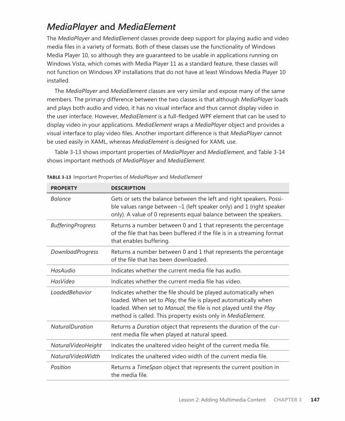
Lesson 2: Adding Multimedia Content CHAPTER 3 147
MediaPlayer and MediaElementThe MediaPlayer and MediaElement classes provide deep support for playing audio and video media files in a variety of formats. Both of these classes use the functionality of Windows Media Player 10, so although they are guaranteed to be usable in applications running on Windows Vista, which comes with Media Player 11 as a standard feature, these classes will not function on Windows XP installations that do not have at least Windows Media Player 10 installed.
The MediaPlayer and MediaElement classes are very similar and expose many of the same members. The primary difference between the two classes is that although MediaPlayer loads and plays both audio and video, it has no visual interface and thus cannot display video in the user interface. However, MediaElement is a full-fledged WPF element that can be used to display video in your applications. MediaElement wraps a MediaPlayer object and provides a visual interface to play video files. Another important difference is that MediaPlayer cannot be used easily in XAML, whereas MediaElement is designed for XAML use.
Table 3-13 shows important properties of MediaPlayer and MediaElement, and Table 3-14 shows important methods of MediaPlayer and MediaElement.
TABLE 3-13 Important Properties of MediaPlayer and MediaElement
PROPERTY DESCRIPTION
Balance Gets or sets the balance between the left and right speakers. Possi-ble values range between –1 (left speaker only) and 1 (right speaker only). A value of 0 represents equal balance between the speakers.
BufferingProgress Returns a number between 0 and 1 that represents the percentage of the file that has been buffered if the file is in a streaming format that enables buffering.
DownloadProgress Returns a number between 0 and 1 that represents the percentage of the file that has been downloaded.
HasAudio Indicates whether the current media file has audio.
HasVideo Indicates whether the current media file has video.
LoadedBehavior Indicates whether the file should be played automatically when loaded. When set to Play, the file is played automatically when loaded. When set to Manual, the file is not played until the Play method is called. This property exists only in MediaElement.
NaturalDuration Returns a Duration object that represents the duration of the cur-rent media file when played at natural speed.
NaturalVideoHeight Indicates the unaltered video height of the current media file.
NaturalVideoWidth Indicates the unaltered video width of the current media file.
Position Returns a TimeSpan object that represents the current position in the media file.
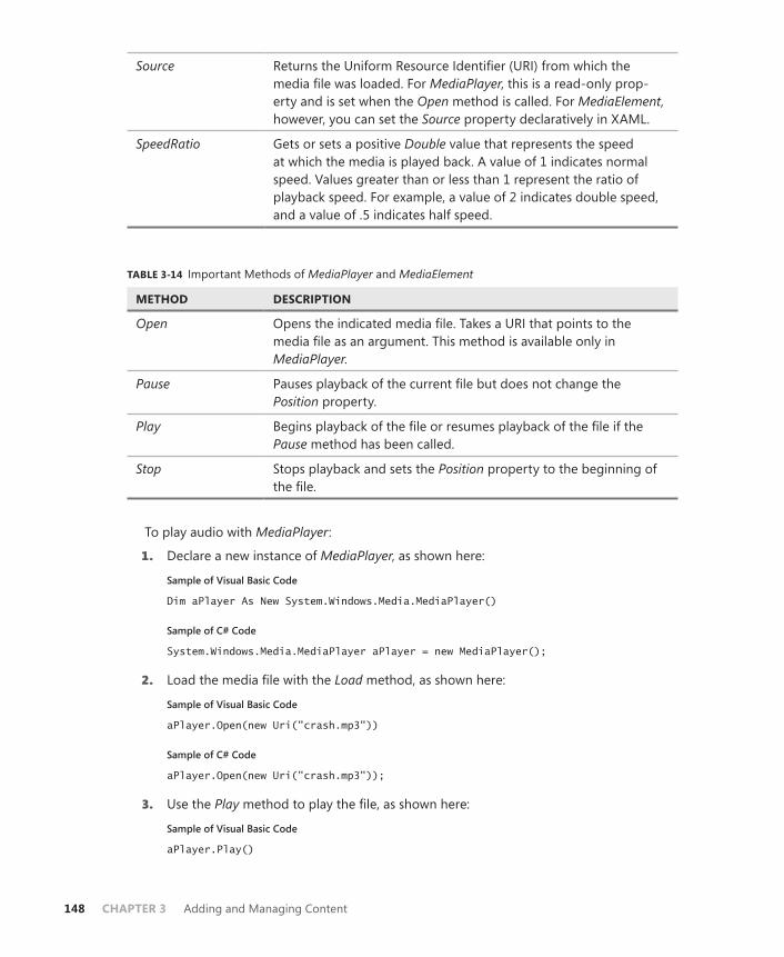
148 CHAPTER 3 Adding and Managing Content
Source Returns the Uniform Resource Identifier (URI) from which the media file was loaded. For MediaPlayer, this is a read-only prop-erty and is set when the Open method is called. For MediaElement, however, you can set the Source property declaratively in XAML.
SpeedRatio Gets or sets a positive Double value that represents the speed at which the media is played back. A value of 1 indicates normal speed. Values greater than or less than 1 represent the ratio of playback speed. For example, a value of 2 indicates double speed, and a value of .5 indicates half speed.
TABLE 3-14 Important Methods of MediaPlayer and MediaElement
METHOD DESCRIPTION
Open Opens the indicated media file. Takes a URI that points to the media file as an argument. This method is available only in MediaPlayer.
Pause Pauses playback of the current file but does not change the Position property.
Play Begins playback of the file or resumes playback of the file if the Pause method has been called.
Stop Stops playback and sets the Position property to the beginning of the file.
To play audio with MediaPlayer:
1. Declare a new instance of MediaPlayer, as shown here:
Sample of Visual Basic Code
Dim aPlayer As New System.Windows.Media.MediaPlayer()
Sample of C# Code
System.Windows.Media.MediaPlayer aPlayer = new MediaPlayer();
2. Load the media file with the Load method, as shown here:
Sample of Visual Basic Code
aPlayer.Open(new Uri("crash.mp3"))
Sample of C# Code
aPlayer.Open(new Uri("crash.mp3"));
3. Use the Play method to play the file, as shown here:
Sample of Visual Basic Code
aPlayer.Play()
Lesson 2: Adding Multimedia Content CHAPTER 3 149
Sample of C# Code
aPlayer.Play();
To play audio or video automatically with MediaElement:
1. In XAML, declare a new MediaElement, as shown here:
<MediaElement Margin="52,107,66,35" Name="mediaElement1"/>
2. Set the Source property declaratively, as shown in bold here:
<MediaElement Margin="52,107,66,35" Source="crash.mp3" Name="mediaElement1"/>
3. The media will be played as soon as it is loaded, which will be soon after the window loads. To have manual control over when the media plays, see the next procedure.
To play audio or video manually with MediaElement:
1. In XAML, declare a new MediaElement, as shown here:
<MediaElement Margin="52,107,66,35" Name="mediaElement1"/>
2. Set the Source property declaratively, as shown in bold here:
<MediaElement Margin="52,107,66,35" Source="crash.mp3" Name="mediaElement1"/>
3. Set the LoadedBehavior property to Manual, as shown in bold here:
<MediaElement Margin="52,107,66,35" Source="crash.mp3" LoadedBehavior="Manual" Name="mediaElement1"/>
4. In code, call the Play method to play the media, as shown here:
Sample of Visual Basic Code
mediaElement1.Play()
Sample of C# Code
mediaElement1.Play();
Quick Check■ What is the difference between MediaPlayer and MediaElement?
Quick Check Answer■ Although both MediaPlayer and MediaElement encapsulate the same func-
tionality, MediaElement has a visual representation, whereas MediaPlayer is a component without a visual interface. Thus, MediaElement should be used to play video in your applications.
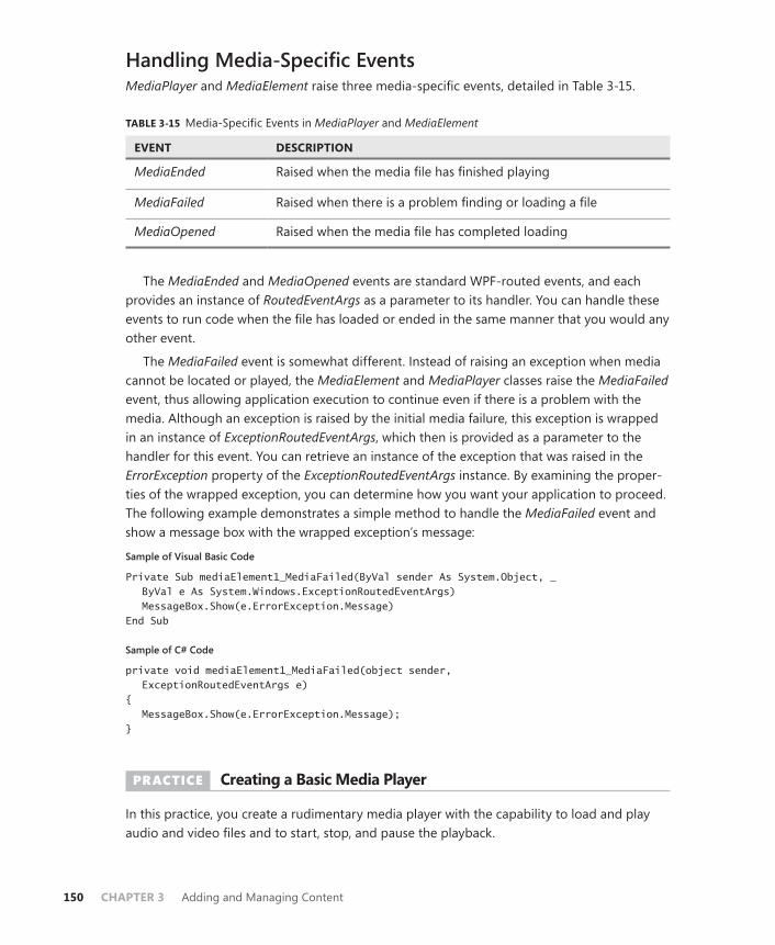
150 CHAPTER 3 Adding and Managing Content
Handling Media-Specific EventsMediaPlayer and MediaElement raise three media-specific events, detailed in Table 3-15.
TABLE 3-15 Media-Specific Events in MediaPlayer and MediaElement
EVENT DESCRIPTION
MediaEnded Raised when the media file has finished playing
MediaFailed Raised when there is a problem finding or loading a file
MediaOpened Raised when the media file has completed loading
The MediaEnded and MediaOpened events are standard WPF-routed events, and each provides an instance of RoutedEventArgs as a parameter to its handler. You can handle these events to run code when the file has loaded or ended in the same manner that you would any other event.
The MediaFailed event is somewhat different. Instead of raising an exception when media cannot be located or played, the MediaElement and MediaPlayer classes raise the MediaFailed event, thus allowing application execution to continue even if there is a problem with the media. Although an exception is raised by the initial media failure, this exception is wrapped in an instance of ExceptionRoutedEventArgs, which then is provided as a parameter to the handler for this event. You can retrieve an instance of the exception that was raised in the ErrorException property of the ExceptionRoutedEventArgs instance. By examining the proper-ties of the wrapped exception, you can determine how you want your application to proceed. The following example demonstrates a simple method to handle the MediaFailed event and show a message box with the wrapped exception’s message:
Sample of Visual Basic Code
Private Sub mediaElement1_MediaFailed(ByVal sender As System.Object, _ ByVal e As System.Windows.ExceptionRoutedEventArgs) MessageBox.Show(e.ErrorException.Message) End Sub
Sample of C# Code
private void mediaElement1_MediaFailed(object sender, ExceptionRoutedEventArgs e) { MessageBox.Show(e.ErrorException.Message); }
PRACTICE Creating a Basic Media Player
In this practice, you create a rudimentary media player with the capability to load and play audio and video files and to start, stop, and pause the playback.
Lesson 2: Adding Multimedia Content CHAPTER 3 151
EXERCISE Creating a Basic Media Player
1. From the CD, open the partial solution for Chapter 3, Lesson 2. The partial solu-tion includes a reference to the System.Windows.Forms namespace. You use the OpenFileDialog class from this namespace to browse the file system.
2. In the XAML, add a MediaElement to the top row of the Grid control and set the LoadedBehavior property to Manual, as shown here:
<MediaElement LoadedBehavior="Manual" Margin="0" Name="MediaElement1"/>
3. In XAML, add four buttons to the toolbar with the Open, Play, Pause, and Stop display text and define Click event handlers for each, as shown here:
<ToolBar Grid.Row="1" Margin="0" Name="ToolBar1"> <Button Click="Button_Click">Open</Button> <Button Click="Button_Click_1">Play</Button> <Button Click="Button_Click_2">Pause</Button> <Button Click="Button_Click_3">Stop</Button> </ToolBar>
4. In the designer, double-click the Open button to open the Click event hander. Add the following code:
Sample of Visual Basic Code
aDialog.ShowDialog() MediaElement1.Source = New Uri(aDialog.FileName) MediaElement1.Play()
Sample of C# Code
aDialog.ShowDialog(); MediaElement1.Source = new Uri(aDialog.FileName); MediaElement1.Play();
5. In the designer, double-click the Play button to open the Click event handler. Add the following code:
Sample of Visual Basic Code
MediaElement1.Play()
Sample of C# Code
MediaElement1.Play();
6. In the designer, double-click the Pause button to open the Click event handler. Add the following code:
Sample of Visual Basic Code
MediaElement1.Pause()
Sample of C# Code
MediaElement1.Pause();

152 CHAPTER 3 Adding and Managing Content
7. In the designer, double-click the Stop button to open the Click event handler. Add the following code:
Sample of Visual Basic Code
MediaElement1.Stop()
Sample of C# Code
MediaElement1.Stop();
8. In the designer, add a definition for the MediaElement1.MediaFailed event, as shown in bold here:
<MediaElement MediaFailed="MediaElement1_MediaFailed" LoadedBehavior="Manual" Margin="0" Name="MediaElement1"/>
9. In the code editor, add the following code to the MediaElement1_MediaFailed method:
Sample of Visual Basic Code
MessageBox.Show("Media loading unsuccessful. " & e.ErrorException.Message)
Sample of C# Code
MessageBox.Show("Media loading unsuccessful. " + e.ErrorException.Message);
10. Press F5 to build and run your application. Click the Open button, browse to a media file, then test the functionality of each button. Now click Open and browse to a non-media file to ensure that the error-handling code works correctly.
Lesson Summary■ The SoundPlayer object provides lightweight support for playing uncompressed .wav
files. It cannot play compressed .wav files or any other type of sound file. You can cre-ate a SoundPlayer object declaratively by creating a SoundPlayerAction object.
■ MediaPlayer provides sophisticated support for playing media files. MediaPlayer can play a variety of audio and video file types, although it lacks a visual interface. MediaElement wraps a media player and provides a visual interface for playing video. Both elements provide support for influencing volume, balance, and playback of media.
■ MediaPlayer and MediaElement do not throw exceptions when there is a problem with a media file. Instead, you must handle the MediaFailed event, which contains a wrapped exception that indicates the problem and enables you to take appropriate action.
Lesson ReviewYou can use the following questions to test your knowledge of the information in Lesson 2, “Adding Multimedia Content.” The questions are also available on the companion CD of this book if you prefer to review them in electronic form.

Lesson 2: Adding Multimedia Content CHAPTER 3 153
NOTE ANSWERS
Answers to these questions and explanations of why each answer choice is correct or incor-rect are located in the “Answers” section at the end of the book.
1. Which is the correct strategy for handling errors caused by media failing to load in a MediaElement?
A. Trap the error in a Try...Catch block and provide code to enable the application to recover from the failure.
B. Ignore media errors because they do not cause the application to crash.
C. Handle the MediaElement.MediaFailed event.
D. Verify that the correct type of file has been opened in the MediaElement.MediaOpened event.
2. Which is the best choice for playing uncompressed .wav files in an application?
A. SoundPlayer
B. MediaPlayer
C. MediaElement
D. Either A or B, depending on the application requirements
154 CHAPTER 3 Adding and Managing Content
Case Scenario
In the following case scenario, you apply what you’ve learned about how to use controls to design user interfaces. You can find answers to these questions in the “Answers” section at the end of this book.
Case Scenario: The Company with Questionable TasteYou’re creating an application for a company that has a strange sense of style; it seems to have been influenced by concerts that the founders attended in the early 1970s. They would like the main application to be stark black and white, but they want all user input to show up in tie-dyed colors. In addition, in the upper left corner of the application, they would like a media file containing concert video to run continuously—and the video must be in the shape of a dancing bear. The art department has supplied you with a Path object in the shape of a dancing bear, but the rest is up to you.
Answer the following questions for your manager:
1. How can you create tie-dyed user input?
2. How will you ever make video in the shape of a dancing bear?
Suggested Practices
To help you successfully master the exam objectives presented in this chapter, complete the following tasks.
On Your OwnComplete these suggested practices on your own to reinforce the topics presented in this chapter.
■ Practice 1 Improve the media player application from Lesson 2 to allow the user to control volume, balance, and playback speed.
■ Practice 2 Explore the VisualBrush and ImageBrush classes and create an application that uses these brushes to paint the background with a variety of effects.
■ Practice 3 Create a media player application that can access media files embedded as binary resources. (Hint: You will need to use the File IO system more than once.)
Take a Practice Test
The practice tests on this book’s companion CD offer many options. For example, you can test yourself on just the content covered in this chapter, or you can test yourself on all the 70-511 certification exam content. You can set up the test so that it closely simulates the experience

Take a Practice Test CHAPTER 3 155
of taking a certification exam, or you can set it up in study mode so that you can look at the correct answers and explanations after you answer each question.
MORE INFO PRACTICE TESTS
For details about all the practice test options available, see the “How to Use the Practice Tests” section in this book’s Introduction.

CHAPTER 4 157
C H A P T E R 4
Windows Forms and Windows Forms Controls
Windows Forms is the basis for most Microsoft Windows applications, and you can con-figure it to provide a variety of user interface (UI) options. The developer can create
forms of various sizes and shapes and customize them to the user’s needs. Forms are hosts for controls, which provide the main functionality of the UI. You can use special controls called container controls to control the layout of the UI and individual controls to imple-ment application-specific functionality. Menus and toolbars allow your users quick access to standard applicaton functionality. In this chapter, you learn about the building blocks of Windows Forms applications.
Exam objectives in this chapter:■ Choose the most appropriate control class.
Lessons in this chapter:■ Lesson 1: Working with Windows Forms and Container Controls 159■ Lesson 2: Configuring Controls in Windows Forms 191■ Lesson 3: Using List-Display and Specialized Controls 212■ Lesson 4: Using Tool Strips and Menus 244
158 CHAPTER 4 Windows Forms and Windows Forms Controls
Before You Begin
To complete the lessons in this chapter, you must be familiar with Microsoft Visual Basic or Microsoft Visual C# and comfortable with the following tasks:
■ Opening Visual Studio and creating a Windows Forms project
■ Dragging controls from the Toolbox to the designer
■ Setting properties in the Properties window
REAL WORLD
Matt Stoecker
A lthough Windows Presentation Foundation (WPF) is definitely the future of Windows application development, Windows Forms represents its rich and col-
orful past. With many years of successful adoption behind it, many companies are still fully entrenched in Windows Forms development and are likely to remain that way for some time. It is essential for a Windows developer in today’s world to have a grasp of both WPF and Windows Forms technology.

Lesson 1: Working with Windows Forms and Container Controls CHAPTER 4 159
Lesson 1: Working with Windows Forms and Container Controls
This lesson describes how to create and configure Windows Forms and container controls. You learn how to create forms and refer to them in code, alter the visual properties of the forms, and control the behavior of the forms at run time. You learn how to add controls to a form or to a container control, and to configure various kinds of container controls to create dynamic and varied layouts for controls in your form.
After this lesson, you will be able to:■ Add a Windows form to a project at design time.■ Add a new Windows form at run time.■ Resize a window at design time or run time.■ Identify and set the properties that determine a form’s appearance and behavior
at run time.■ Refer to the default instance of a form in code.■ Add a control to a form or container control at design time.■ Add a control to a form or container at run time.■ Group and arrange controls with the Panel control.■ Group and arrange controls with the GroupBox control.■ Group and arrange controls with the TabControl control.■ Group and arrange controls with the FlowLayoutPanel control.■ Group and arrange controls with the TableLayoutPanel control.■ Create dynamic container areas with the SplitContainer control.
Estimated lesson time: 1 hour
Overview of Windows FormsWindows Forms is the basic building block of the UI. It provides a container that hosts controls and menus and enables you to present an application in a familiar and consistent fashion. Forms can receive user input in the form of keystrokes or mouse interactions and can display data to the user through hosted controls. Although it is possible to create applica-tions that do not contain forms, such as console applications or services, most applications that require sustained user interaction will include at least one Windows form, and complex applications frequently require several forms to enable the program to execute in a consistent and logical fashion.
When you create a new Windows Forms project, a form named Form1 is added to your project by default. You can edit your form by adding controls and other visual elements in

160 CHAPTER 4 Windows Forms and Windows Forms Controls
the designer, which is a graphic representation of a designable, visual element (such as a form) that appears in the Visual Studio Integrated Development Environment (IDE). Figure 4-1 shows the Visual Studio IDE.
FIGURE 4-1 A Windows form in the Visual Studio IDE.
Adding Forms to Your ProjectMost projects will require more than one form. You can add and configure additional forms at design time, or you can create instances of predesigned forms in code at run time.
To add a new form to your project at design time, first, from the Project menu, select Add Windows Form. The Add New Item dialog box opens. Then, select Windows Form and type a name for the new form in the Name box. Click Add to add the form to the development environment.
You can add and configure as many forms as your application needs at design time. You can also create new instances of forms in your code. This method is most often employed when you want to display a form that has already been designed. In Visual Basic, you can ac-cess default instances of a form by referring to that form by name. For example, if you have a form named Form1 in your application, you can refer to it directly by its name, Form1. To ac-cess the default instance of a form at run time (Visual Basic only), refer to the form by its class name. You can call methods or access properties from this default instance. For example:
Sample of Visual Basic Code
Form1.Text = "This is my form" Form1.Show()
Lesson 1: Working with Windows Forms and Container Controls CHAPTER 4 161
Note that if you are referring to a form from within that form’s code, you cannot use the default instance. To access a form’s methods and properties from inside its code, use the keyword Me (Visual Basic) or this (C#). For example:
Sample of Visual Basic Code
Me.Text = "Coho Winery – Main Page"
Sample of C# Code
this.Text = "Coho Winery – Main Page";
You can also create new instances of forms at run time by declaring a variable that rep-resents a type of form and creating an instance of that form. To add a form to your applica-tion at run time, declare and instantiate a variable that represents your form. This example assumes that you have already designed a form named Form1 in your project:
Sample of Visual Basic Code
Dim myForm As Form1 myForm = New Form1() ' Displays the new form myForm.Show()
Sample of C# Code
Form1 myForm; myForm = new Form1(); // Displays the new form myForm.Show();
Properties of Windows FormsThe visual appearance of your UI is an important part of your application. A UI that is poorly designed is difficult to learn and will increase training time and expense. You can modify the appearance of your UI by using Windows Forms properties.
Windows Forms contains a variety of properties to customize the appearance and behav-ior of the form. You can view and change these properties in the Properties window of the designer, as shown in Figure 4-2.

162 CHAPTER 4 Windows Forms and Windows Forms Controls
FIGURE 4-2 The Properties window.
Table 4-1 summarizes some of the Windows Forms properties that are important in the ap-pearance and behavior of the application. This is not an exhaustive list of all Windows Forms properties, but rather a selected subset.
TABLE 4-1 Some Properties of the Form Class
PROPERTY DESCRIPTION
(Name) Sets the name of the Form class shown in the designer. This property can be set only at design time.
Backcolor Indicates the background color of the form.
BackgroundImage Indicates the background image of the form.
BackgroundImageLayout Determines how the image indicated by the BackgroundImage property will be laid out on the form. If no background image is selected, this property has no effect.
ControlBox Determines whether the form has a Control/System menu box.
Cursor Indicates the cursor that appears when the cursor is moved over the form.
Enabled Determines whether the form is able to receive user input. If Enabled is set to False, all controls contained by the form are likewise disabled.

Lesson 1: Working with Windows Forms and Container Controls CHAPTER 4 163
Font Sets the default font for the form. All controls contained by the form will also adopt this font unless their Font property is set separately.
ForeColor Indicates the forecolor of the form, which is the color used to display text. All controls contained by the form will also adopt this forecolor unless their ForeColor property is set separately.
FormBorderStyle Indicates the appearance and behavior of the form border and title bar.
HelpButton Indicates whether the form has a Help button.
Icon Indicates the icon used to represent this form.
Location When the StartPosition property is set to Manual, this prop-erty indicates the starting location of the form relative to the upper left corner of the screen.
MaximizeBox Indicates whether the form has a maximize box.
MaximumSize Determines the maximum size for the form. If this property is set to a size of (0,0), the form has no upper size limit.
MinimizeBox Indicates whether the form has a minimize box.
MinimumSize Determines the minimum size to which the user can resize the form.
Opacity Represents the opacity or, conversely, the transparency of the form from 0% to 100%. A form with 100% opacity is com-pletely opaque, and a form with 0% opacity is completely transparent.
Size Gets and sets the initial size of the form.
StartPosition Indicates the position of the form when the form is first displayed.
Text Determines the text caption of the form.
TopMost Indicates whether the form always appears above all other forms that do not have this property set to True.
Visible Determines whether the form is visible when running.
Windowstate Determines whether the form is minimized, maximized, or set to the size indicated by the Size property when first shown.
Modifying the Appearance and Behavior of the FormYou can use the property grid to set properties of the form at design time. Properties set in this manner will retain their values until the application starts, at which time they can be set in code.

164 CHAPTER 4 Windows Forms and Windows Forms Controls
You can set most properties of a form at run time. The generalized scheme for setting a simple property is to use the assignment operator (=) to assign a value to a property. The fol-lowing example demonstrates how to set the Text property of a form:
Sample of Visual Basic Code
Form1.Text = "This is Form 1"
Sample of C# Code
Form1.Text = "This is Form 1";
Some properties, such as the Font or Size properties, are more complex. Their value is represented by an instance of a class or structure. For these properties, you can either set the property to an existing instance of the class or create a new instance that specifies any subvalues of the property and assign it to the property, as shown in the following pseudocode example:
Sample of Visual Basic Code
PropertyY = New Class(value,value)
Sample of C# Code
PropertyY = new Class(value,value);
The (Name) property, which represents the name of the Form class, is an exception. This property is used within the namespace to identify the class of which the Form is a unique instance and, in the case of Visual Basic, accesses the default instance of the form.
Setting the Title of the FormThe name of the form is the name that refers to the Form class or the default instance of a form (Visual Basic only) in code, but it is also useful for the form to have a title that is visible to users. This title might be the same as the name of the form, but is more often a description of the form itself, such as Data Entry. The title can also convey information to the user, such as “Processing Entries—My Application” or “Customer Entry—My Application.” The title appears in the title bar and on the taskbar.
You can change the title of a form by changing the Text property. To change the title of a form at design time, set the Text property of the form in the Property grid. To change the title of a form at run time, set the Text property of the form in code, as shown in the following code:
Sample of Visual Basic Code
Form1.Text = "Please enter your address"
Sample of C# Code
Form1.Text = "Please enter your address";

Lesson 1: Working with Windows Forms and Container Controls CHAPTER 4 165
Setting the Border Style of the FormThe border style of a form determines how the border of the form looks and, to a certain ex-tent, how a form behaves at run time. Depending on the setting, the FormBorderStyle prop-erty can control how the border appears, whether a form is resizable by the user at run time, and whether various control boxes appear (although these are also determined by other form properties). The FormBorderStyle property has seven possible values, explained in Table 4-2.
TABLE 4-2 Values for the FormBorderStyle Property
VALUE DESCRIPTION
None The form has no border and has no minimize, maximize, help, or control boxes.
FixedSingle The form has a single border and the user cannot resize it. It can have a minimize, maximize, help, or control box as determined by other properties.
Fixed3D The form’s border has a three-dimensional appearance and the user cannot resize it. It can have a minimize, maximize, help, or control box as determined by other properties.
FixedDialog The form has a single border and the user cannot resize it. Ad-ditionally, it has no control box. It can have a minimize, maximize, or help box as determined by other properties.
Sizable This is the default setting for a form. The user can resize it, and it can contain a minimize, maximize, or help box as determined by other properties.
FixedToolWindow The form has a single border and the user cannot resize it. The window contains no boxes except the close box.
SizableToolWindow The form has a single border and the user can resize it. The win-dow contains no boxes except the close box.
You can set the FormBorderStyle property at either design time or run time. To change the border style of a form at design time, set the FormBorderStyle property in the Property grid. To change the border style of a form at run time, set the FormBorderStyle property in code, as shown in the following example:
Sample of Visual Basic Code
aForm.FormBorderStyle = FormBorderStyle.Fixed3D
Sample of C# Code
aForm.FormBorderStyle = FormBorderStyle.Fixed3D;
166 CHAPTER 4 Windows Forms and Windows Forms Controls
Setting the Startup State of the FormThe Windowstate property determines what state the form is in when it first opens. This property has three possible values: Normal, Minimized, and Maximized. The default setting is Normal. When Windowstate is set to Normal, the form will start at the size determined by the Size property. When it is set to Minimized, the form will start up minimized in the task-bar. When it is set to Maximized, the form will start up maximized. Although you can set this property at run time, doing so will have no effect on the state of the form. Thus, it is useful to set this property in the Property grid at design time only.
Resizing the FormWhen the Windowstate property is set to Normal, it will start at the size determined by the Size property—actually an instance of the Size structure, which has two members, Width and Height. You can resize the form by setting the Size property in the Property grid, or you can set Width and Height separately by expanding the Size property and setting the values for the individual fields.
You can also resize the form by grabbing and dragging the lower right corner, the lower edge, or the right-side edge of the form in the designer. As the form is visibly resized in the designer, the Size property is automatically set to the new size.
You can resize the form at run time by setting the Size property in code. The Width and Height fields of the Size property are also exposed as properties of the form itself. You can set either the individual Width and Height properties or the Size property to a new instance of the Size structure, as shown in the following example:
Sample of Visual Basic Code
' Set the Width and Height separately aForm.Width = 300 aForm.Height = 200 ' Set the Size property to a new instance of the Size structure aForm.Size = New Size(300,200)
Sample of C# Code
// Set the Width and Height separately aForm.Width = 300; aForm.Height = 200; // Set the Size property to a new instance of the Size structure aForm.Size = new Size(300,200);
Note that if the form’s StartPosition property is set to WindowsDefaultBounds, the size will be set to the window’s default rather than to the size indicated by the Size property.
Specifying the Startup Location of the FormThe startup location of the form is determined by a combination of two properties. The first property is the StartPosition property, which determines where in the screen the form will be when first started. The StartPosition property can be set to any of the values contained within the FormStartPosition enumeration. Table 4-3 lists the FormStartPosition enumeration values.

Lesson 1: Working with Windows Forms and Container Controls CHAPTER 4 167
TABLE 4-3 StartPosition Property Settings
VALUE DESCRIPTION
Manual The starting location of the form is set by the form’s Location property. (See the following options.)
CenterScreen The form starts up in the center of the screen.
WindowsDefaultLocation The form is positioned at the Windows default location and is set to the size determined by the Size property.
WindowsDefaultBounds The form is positioned at the Windows default location and the size is determined by the Windows default size.
CenterParent The form’s starting position is set to the center of the parent form.
If the StartPosition property is set to Manual, the form’s starting position is set to the loca-tion specified by the form’s Location property, which is dictated by the location of the form’s upper left corner. For example, to start the form in the upper left corner of the screen, set the StartLocation property to Manual and the Location property to (0,0). To start the form 400 pixels to the right and 200 pixels below the upper left corner of the screen, set the Location property to (400,200).
Keeping a Form on Top of the User InterfaceAt times, you might want to designate a form to stay on top of other forms in the UI. For example, you might design a form that presents important information about the program’s execution that you always want the user to be able to see. You can set a form to always be on top of the UI by setting the TopMost property to True. When the TopMost property is True, the form will always appear in front of any forms that have the TopMost property set to False, which is the default setting. Note that if you have more than one form with the TopMost property set to True, they can cover each other.
Opacity and Transparency in FormsYou can use the Opacity property to create striking visual effects in your form. The Opacity property sets the transparency of the form. When set in the Property grid, the opacity value can range from 0 percent to 100 percent, indicating the degree of opacity. An opacity of 100 percent indicates a form that is completely opaque (solid and visible), and a value of 0 percent indicates a form that is completely transparent. Values between 0 percent and 100 percent result in a partially transparent form.
You can also set the Opacity property in code. When the Opacity property is set in code, it is set to a value between 0 and 1, with 0 representing complete transparency and 1 repre-senting complete opacity. The following example demonstrates how to set a form’s opacity to 50 percent:
Sample of Visual Basic Code
aForm.Opacity = 0.5
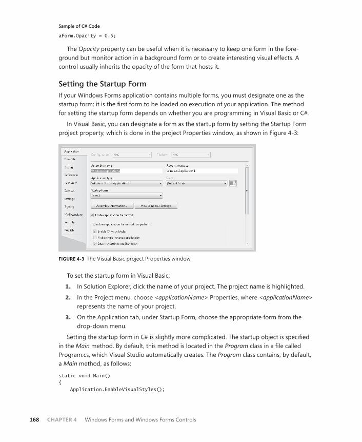
168 CHAPTER 4 Windows Forms and Windows Forms Controls
Sample of C# Code
aForm.Opacity = 0.5;
The Opacity property can be useful when it is necessary to keep one form in the fore-ground but monitor action in a background form or to create interesting visual effects. A control usually inherits the opacity of the form that hosts it.
Setting the Startup FormIf your Windows Forms application contains multiple forms, you must designate one as the startup form; it is the first form to be loaded on execution of your application. The method for setting the startup form depends on whether you are programming in Visual Basic or C#.
In Visual Basic, you can designate a form as the startup form by setting the Startup Form project property, which is done in the project Properties window, as shown in Figure 4-3:
FIGURE 4-3 The Visual Basic project Properties window.
To set the startup form in Visual Basic:
1. In Solution Explorer, click the name of your project. The project name is highlighted.
2. In the Project menu, choose <applicationName> Properties, where <applicationName> represents the name of your project.
3. On the Application tab, under Startup Form, choose the appropriate form from the drop-down menu.
Setting the startup form in C# is slightly more complicated. The startup object is specified in the Main method. By default, this method is located in the Program class in a file called Program.cs, which Visual Studio automatically creates. The Program class contains, by default, a Main method, as follows:
static void Main() { Application.EnableVisualStyles();
Lesson 1: Working with Windows Forms and Container Controls CHAPTER 4 169
Application.SetCompatibleTextRenderingDefault(false); Application.Run(new Form1()); }
The startup object is indicated by the line
Application.Run(new Form1());
You can set the startup form for the project by changing this line in the Program class to the form that you want to start the application. For example, if you wanted a form called myForm to be the startup form, you would change this line to read as follows:
Application.Run(new myForm());
To set the startup form in C#:
1. In Solution Explorer, double-click Program.cs to view the code. The code window opens.
2. Locate the Main method and then locate the line that reads:
Application.Run(new Form());
where Form represents the name of the form that is currently the startup form.
3. Change Form to the name of the form you want to set as the startup form.
Making the Startup Form InvisibleAt times, you might want the startup form to be invisible at run time. For example, you might want a form to execute a time-consuming process when starting and not appear until that process is complete. The Visible property determines whether a form is visible at run time. You can set the Visible property either in the Property grid or in code. If you set Visible to False in the property window, the form will be invisible at startup.
To make a form invisible during execution, set the Visible property to False in code, as shown in the following example:
Sample of Visual Basic Code
aForm.Visible = False
Sample of C# Code
aForm.Visible = false;
Quick Check 1. How can you specify the startup location of a form?
2. How do you set the startup form?

170 CHAPTER 4 Windows Forms and Windows Forms Controls
Quick Check Answers 1. Use the Form.StartPosition property to indicate the starting position of a form.
2. In Visual Basic, you can set the startup form by setting the value on the Application tab of the project properties. In C#, you must locate the call to the Application.Run method in the Main method and change the startup form there.
Overview of Container ControlsContainer controls are specialized controls that serve as customizable containers for other controls. Examples of container controls include the Panel, FlowLayoutPanel, and SplitContainer controls. Container controls give the form logical and physical subdivisions that can group other controls into consistent UI subunits. For example, you might contain a set of related RadioButton controls in a GroupBox control. The use of container controls helps create a sense of style or information flow in your UI and enables you to manipulate contained controls in a consistent fashion.
When a container control holds other controls, changes to the properties of the container control can affect the contained controls. For example, if the Enabled property of a panel is set to False, all the controls contained in the panel are disabled. Likewise, changes to proper-ties related to the UI, such as BackColor, Visible, or Font, are also applied to the contained controls. Note that you can still manually change any property inside a contained control, but if the container is disabled, all controls inside that container will be inaccessible, regardless of their individual property settings.
The Controls CollectionEach form and container control has a property called Controls, which represents the col-lection of controls contained by that form or control. When a control is added to a form or container control at design time, the designer automatically adds it to the controls collection of that form or container control and sets the location property as appropriate. You can also add a new control at run time dynamically by manually creating a new control and adding the control to the controls collection.
Adding a Control to a Form or Container Control in the DesignerThere are four ways to add a control to a form or container control in the designer:
■ Drag the control from the Toolbox to the surface of the form or container control.
■ Select a control in the Toolbox and then draw it on the form with the mouse.
■ Select a control in the Toolbox and double-click the form.
■ Double-click the control in the Toolbox.
Lesson 1: Working with Windows Forms and Container Controls CHAPTER 4 171
Adding a Control to a Form or Container Control at Run TimeTo add a control to a form or container control at run time, manually instantiate a new control and add it to the Controls collection of the form, as shown in the following example. You must set any properties of the control, such as the Location or Text properties, before adding it to the Controls collection. The following sample code assumes that you have added a Panel container named Panel1 (panels are discussed later in this chapter in the section “The Panel Control”):
Sample of Visual Basic Code
Dim aButton As New Button() ' Sets the relative location in the containing control or form aButton.Location = New Point(20,20) aButton.Text = "Test Button" ' Adds the button to a panel called Panel1 Panel1.Controls.Add(aButton) ' Adds the button to the current form Me.Controls.Add(aButton)
Sample of C# Code
Button aButton = new Button(); // Sets the relative location in the containing control or form aButton.Location = new Point(20,20); aButton.Text = "Test Button"; // Adds the button to a panel called Panel1 Panel1.Controls.Add(aButton); // Adds the button to the current form this.Controls.Add(aButton);
The Anchor PropertyThe Anchor and Dock properties of a control dictate how it behaves inside its form or parent control. The Anchor property enables you to define a constant distance between one or more edges of a control and one or more edges of a form or other container. Thus, if a user resizes a form at run time, the control edges will always maintain a specific distance from the edges. The default setting for the Anchor property is Top, Left, meaning that the top and left edges of the control always maintain a constant distance from the top and left edges of the form. If the Anchor property was set to Bottom, Right, for example, the control would “float” when the form was resized to maintain the constant distance between the bottom and right edges of the form. If opposite properties are set for the Anchor property, such as Top and Bottom, the control will stretch to maintain the constant distance of the control edges to the form edges.
You can set the Anchor property to any combination of Top, Bottom, Left, Right, or none of these. The Properties window presents a visual interface, shown in Figure 4-4, that aids in choosing the value for the Anchor property.
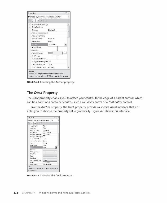
172 CHAPTER 4 Windows Forms and Windows Forms Controls
FIGURE 4-4 Choosing the Anchor property.
The Dock PropertyThe Dock property enables you to attach your control to the edge of a parent control, which can be a form or a container control, such as a Panel control or a TabControl control.
Like the Anchor property, the Dock property provides a special visual interface that en-ables you to choose the property value graphically. Figure 4-5 shows this interface.
FIGURE 4-5 Choosing the Dock property.

Lesson 1: Working with Windows Forms and Container Controls CHAPTER 4 173
To set the Dock property, click the section of the interface that corresponds to where you want your control to dock. For example, to dock your control to the right side of the form, click the bar on the right of the interface. To release docking, choose None. Clicking the cen-ter of the Dock property interface sets the Dock property to a value of Fill, which means the control will dock to all four sides of the form and fill the control in which it resides.
The GroupBox ControlThe GroupBox control is a container control that appears as a subdivision of the form sur-rounded by a border. It does not provide scrollbars, like the Panel control, nor does it provide any kind of specialized layout capabilities. GroupBox can have a caption, which is set by the Text property, or it can appear without a caption when the Text property is set to an empty string.
The most common use for GroupBox controls is for grouping RadioButton controls. RadioButton controls placed within a single GroupBox are mutually exclusive, but are not exclusive of RadioButtons elsewhere in the form or in other GroupBox controls. RadioButton controls are discussed in greater detail later in this chapter. Table 4-4 describes Text, the most important unique property of the GroupBox control.
TABLE 4-4 The Text Property of the GroupBox Control
PROPERTY DESCRIPTION
Text Represents the caption of the GroupBox enclosure. If no caption is desired, this property should be set to an empty string.
The Panel ControlThe Panel control creates a subsection of a form that can host other controls. Panel can be indistinguishable from the rest of the surrounding form, or it can be surrounded by a border as determined by the BorderStyle property. Panel can have a BorderStyle property of None, which indicates no border; FixedSingle, which indicates a single edge around the Panel; or Fixed3D, which represents a border with a three-dimensional appearance.
The Panel control is a scrollable control, which means that it supports horizontal and verti-cal scroll bars. Controls can be hosted in Panel outside its visible bounds. When the AutoScroll property is set to True, scroll bars will automatically be available if any controls are placed outside the visible bounds of the control. If the AutoScroll property is set to False, controls outside the visible bounds of the Panel control are inaccessible. Table 4-5 shows the impor-tant properties of the Panel control.

174 CHAPTER 4 Windows Forms and Windows Forms Controls
TABLE 4-5 Important Properties of the Panel Control
PROPERTY DESCRIPTION
AutoScroll Determines whether Panel will display scroll bars when controls are hosted outside the visible bounds of the Panel. Scroll bars are displayed when this property is set to True and are not displayed when it is set to False.
BorderStyle Represents the visual appearance of the Panel border. This property can be set to None, which indicates no border; FixedSingle, which cre-ates a single-line border; or Fixed3D, which creates a border with a three-dimensional appearance.
The FlowLayoutPanel ControlThe FlowLayoutPanel control is a subclass of the Panel control. Like the Panel control, it is most commonly used to create a distinct subsection of the form that hosts related controls. Unlike the Panel control, however, the FlowLayoutPanel dynamically repositions the controls it hosts when it is resized at either design time or run time. This provides a great aid to UI design, because control positions are automatically adjusted as the size and dimensions of the FlowLayoutPanel are adjusted, and it provides dynamic realignment of the UI (much like an HTML page) if the FlowLayoutPanel is resized at run time.
Like the Panel control, the FlowLayoutPanel control is scrollable. Scroll bars are enabled when AutoScroll is set to True and are disabled when AutoScroll is set to False.
The default flow direction of the FlowLayoutPanel is from left to right, meaning that con-trols placed in the FlowLayoutPanel will locate in the upper left corner and then flow to the right until they reach the edge of the panel. The FlowDirection property controls this behav-ior. You can set the FlowDirection property to four possible values: LeftToRight, which is the default; RightToLeft, which provides flow from right to left; TopDown, in which the controls flow from the top of the control to the bottom; and BottomUp, in which controls flow from the bottom of the FlowLayoutPanel to the top.
After the end of a row (in the case of LeftToRight and RightToLeft FlowDirection set-tings) or column (in the case of TopDown and BottomUp FlowDirection settings) is reached, the flow will wrap or not wrap to the next row or column as determined by the value of the WrapContents property. If WrapContents is set to True (which is the default), controls will au-tomatically wrap to the next column or row. If it is set to False, controls will not automatically form new rows or columns.
You can manually create breaks in the flow of the controls that are analogous to line breaks in text. When the WrapContents property of a FlowLayoutPanel control is set to False, you must manually set flow breaks to manage the flow, but you can also set flow breaks when WrapContents is set to True if you desire individual breaks. You can set a flow break on a con-trol by calling the SetFlowBreak method of the FlowLayoutPanel.

Lesson 1: Working with Windows Forms and Container Controls CHAPTER 4 175
To set a flow break on a control hosted in FlowLayoutPanel, set the flow break by us-ing the SetFlowBreak method as shown in the following example (which assumes that a FlowLayoutPanel control named Flp and a Button control named aButton have already been created):
Sample of Visual Basic Code
Flp.SetFlowBreak(aButton, True)
Sample of C# Code
Flp.SetFlowBreak(aButton, true);
Regardless of whether there is room in the FlowLayoutPanel control to continue the flow of controls, a control that has had a flow break set by this method will start a new row (or column, depending on the value of the FlowDirection property) in FlowLayoutPanel.
You can query a particular control to determine whether it has had a flow break set for it by calling the GetFlowBreak method, as shown in the following example:
Sample of Visual Basic Code
If Flp.GetFlowBreak(aButton) Then ' Continue processing End If
Sample of C# Code
if (Flp.GetFlowBreak(aButton)) { // Continue processing }
Table 4-6 lists important properties and methods of the FlowLayoutPanel control.
TABLE 4-6 Important Members of the FlowLayoutPanel Control
PROPERTY/METHOD DESCRIPTION
AutoScroll Property. Determines whether the FlowLayoutPanel will display scroll bars when controls are hosted outside the visible bounds of the Panel. Scroll bars are displayed when set to True and are not displayed when set to False.
BorderStyle Property. Represents the visual appearance of the Panel border. It can be set to None, which indicates no border; FixedSingle, which creates a single-line border; or Fixed3D, which creates a border with a three-dimensional appearance.
FlowDirection Property. Determines the direction of flow in FlowLayoutPanel. Can be set to LeftToRight, RightToLeft, TopDown, or BottomUp.
WrapContents Property. Determines whether controls will automatically wrap to the next column or row when the FlowLayoutPanel is resized.
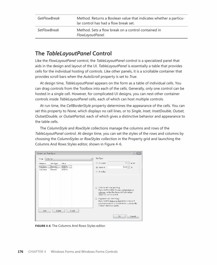
176 CHAPTER 4 Windows Forms and Windows Forms Controls
GetFlowBreak Method. Returns a Boolean value that indicates whether a particu-lar control has had a flow break set.
SetFlowBreak Method. Sets a flow break on a control contained in FlowLayoutPanel.
The TableLayoutPanel ControlLike the FlowLayoutPanel control, the TableLayoutPanel control is a specialized panel that aids in the design and layout of the UI. TableLayoutPanel is essentially a table that provides cells for the individual hosting of controls. Like other panels, it is a scrollable container that provides scroll bars when the AutoScroll property is set to True.
At design time, TableLayoutPanel appears on the form as a table of individual cells. You can drag controls from the Toolbox into each of the cells. Generally, only one control can be hosted in a single cell. However, for complicated UI designs, you can nest other container controls inside TableLayoutPanel cells, each of which can host multiple controls.
At run time, the CellBorderStyle property determines the appearance of the cells. You can set this property to None, which displays no cell lines, or to Single, Inset, InsetDouble, Outset, OutsetDouble, or OutsetPartial, each of which gives a distinctive behavior and appearance to the table cells.
The ColumnStyle and RowStyle collections manage the columns and rows of the TableLayoutPanel control. At design time, you can set the styles of the rows and columns by choosing the ColumnStyles or RowStyles collection in the Property grid and launching the Columns And Rows Styles editor, shown in Figure 4-6.
FIGURE 4-6 The Columns And Rows Styles editor.
Lesson 1: Working with Windows Forms and Container Controls CHAPTER 4 177
You can alter column and row size styles with this editor. Column and row size styles can be set to Absolute, which indicates a fixed size in pixels, or they can be set to Relative, which indicates a percentage of the size of all columns or rows whose style is set to Relative. Col-umns and rows can also be set to AutoSize. When set to this value, the columns and rows will automatically adjust to the correct size.
Column and row styles can also be set manually in code by accessing the ColumnStyles and RowStyles collections in code. You can access the style for a particular column or row by the index of that column or row. Styles can be set as shown in the following example:
Sample of Visual Basic Code
TableLayoutPanel1.ColumnStyles(0).SizeType = SizeType.Absolute TableLayoutPanel1.ColumnStyles(0).Width = 20 TableLayoutPanel1.RowStyles(0).SizeType = SizeType.Percent TableLayoutPanel1.RowStyles(0).Height = 50
Sample of C# Code
TableLayoutPanel1.ColumnStyles[0].SizeType = SizeType.Absolute; TableLayoutPanel1.ColumnStyles[0].Width = 20; TableLayoutPanel1.RowStyles[0].SizeType = SizeType.Percent; TableLayoutPanel1.RowStyles[0].Height = 50;
If you set a row or column style to a size type of anything other than SizeType.Absolute, you can also set Width (for columns) or Height (for rows). These values are set in either pixels or percentages, whichever is appropriate for the SizeType setting of ColumnStyle.
When adding new controls to TableLayoutPanel at run time, you can use either of two overloads of the TableLayoutPanel.Controls.Add method. The first is the standard Add method, as follows:
Sample of Visual Basic Code
TableLayoutPanel1.Controls.Add(aButton)
Sample of C# Code
TableLayoutPanel1.Controls.Add(aButton);
This method simply adds the control to the controls collection of TableLayoutPanel, and the control is inserted into the next open cell in the table. If there are no more open cells, the behavior of TableLayoutPanel is determined by the value of the GrowStyle property. If the GrowStyle property is set to AddRows, additional rows will be added to accommodate new controls. If the GrowStyle property is set to AddColumns, new columns will be added when needed. If the GrowStyle property is set to FixedSize, no new cells may be added. If you at-tempt to add a control to TableLayoutPanel with a GrowStyle value of FixedSize, an exception will be thrown.
You can also add a control to a specific cell by using the Controls.Add method, as follows:
Sample of Visual Basic Code
TableLayoutPanel1.Controls.Add(aButton,3,3)
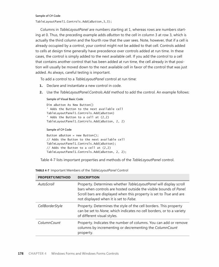
178 CHAPTER 4 Windows Forms and Windows Forms Controls
Sample of C# Code
TableLayoutPanel1.Controls.Add(aButton,3,3);
Columns in TableLayoutPanel are numbers starting at 1, whereas rows are numbers start-ing at 0. Thus, the preceding example adds aButton to the cell in column 3 at row 3, which is actually the third column and the fourth row that the user sees. Note, however, that if a cell is already occupied by a control, your control might not be added to that cell. Controls added to cells at design time generally have precedence over controls added at run time. In these cases, the control is simply added to the next available cell. If you add the control to a cell that contains another control that has been added at run time, the cell already in that posi-tion will usually be moved down to the next available cell in favor of the control that was just added. As always, careful testing is important.
To add a control to a TableLayoutPanel control at run time:
1. Declare and instantiate a new control in code.
2. Use the TableLayoutPanel.Controls.Add method to add the control. An example follows:
Sample of Visual Basic Code
Dim aButton As New Button() ' Adds the Button to the next available cell TableLayoutPanel1.Controls.Add(aButton) ' Adds the Button to a cell at (2,2) TableLayoutPanel1.Controls.Add(aButton, 2, 2)
Sample of C# Code
Button aButton = new Button(); // Adds the Button to the next available cell TableLayoutPanel1.Controls.Add(aButton); // Adds the Button to a cell at (2,2) TableLayoutPanel1.Controls.Add(aButton, 2, 2);
Table 4-7 lists important properties and methods of the TableLayoutPanel control.
TABLE 4-7 Important Members of the TableLayoutPanel Control
PROPERTY/METHOD DESCRIPTION
AutoScroll Property. Determines whether TableLayoutPanel will display scroll bars when controls are hosted outside the visible bounds of Panel. Scroll bars are displayed when this property is set to True and are not displayed when it is set to False.
CellBorderStyle Property. Determines the style of the cell borders. This property can be set to None, which indicates no cell borders, or to a variety of different visual styles.
ColumnCount Property. Indicates the number of columns. You can add or remove columns by incrementing or decrementing the ColumnCount property.

Lesson 1: Working with Windows Forms and Container Controls CHAPTER 4 179
Columns Property. Represents the collection of columns. Available only at design time; accessing this property launches the Columns And Rows Styles editor.
ColumnStyles Property. Represents the collection of column styles. Available only at run time.
GrowStyle Property. Represents how TableLayoutPanel grows when new controls are added to it. This property can be set to AddColumns, AddRows, or FixedSize.
RowCount Property. Indicates the number of rows. You can add or remove rows by incrementing or decrementing the RowCount property.
Rows Property. Represents the collection of rows. Available only at de-sign time; accessing this property launches the Columns And Rows Styles editor.
RowStyles Property. Represents the collection of row styles. Available only at run time.
Controls.Add Method of the Controls collection. Can be used to add a control either to the next available cell or to a specific cell identified by its column and row coordinates.
The TabControl ControlThe TabControl control enables you to group sets of controls in tabs, rather like files in a fil-ing cabinet or dividers in a notebook. For example, you might create property pages for an application in which each page represents the properties of a specific component. TabControl serves as a host for one or more TabPage controls, which themselves contain controls. The user can switch between tab pages (and the controls contained therein) by clicking the tabs on TabControl.
The most important property of TabControl is the TabPages property. TabPage controls are specialized container controls that are hosted only inside TabControl controls. Each TabPage has its own set of properties, and you can access these properties by editing the TabPages property at design time. This launches the TabPage Collection Editor, as shown in Figure 4-7.
Individual TabPage controls are a lot like Panel controls. They are scrollable controls and will generate scroll bars as needed if the AutoScroll property is set to True. Individual TabPage controls also have a Text property, which represents the text shown in the tab that represents this page in the TabControl. Also, like Panel controls, TabPage controls have a BorderStyle property that can be set to None, FixedSingle, or Fixed3D, with results similar to those in the Panel control.

180 CHAPTER 4 Windows Forms and Windows Forms Controls
FIGURE 4-7 TabPage Collection Editor.
TabControl has several properties you can use to customize the behavior and appearance of the control. The Appearance property controls how the tabs look. This property can be set to Normal, Buttons, or FlatButtons, each of which generates a different visual style. The Alignment property determines whether the tabs appear on the top, bottom, left, or right of the tab control. TabControl also has a property called Multiline, which indicates whether more than one row of tabs is allowed. When it is set to True, multiple rows of tabs are supported. When it is set to False, only a single row of tabs is allowed. Important properties of the TabControl control and TabPage control are shown in Table 4-8 and Table 4-9, respectively.
TABLE 4-8 Important Properties of the TabControl Control
PROPERTY DESCRIPTION
Appearance Determines the visual style of TabControl
Alignment Determines whether the tabs appear on the top, bottom, left, or right of the tab control
Multiline Determines whether more than one row of tabs is allowed on the tab control
TabPages Represents the collection of TabPage controls hosted by TabControl
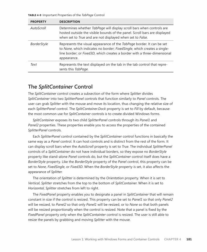
Lesson 1: Working with Windows Forms and Container Controls CHAPTER 4 181
TABLE 4-9 Important Properties of the TabPage Control
PROPERTY DESCRIPTION
AutoScroll Determines whether TabPage will display scroll bars when controls are hosted outside the visible bounds of the panel. Scroll bars are displayed when set to True and are not displayed when set to False.
BorderStyle Represents the visual appearance of the TabPage border. It can be set to None, which indicates no border; FixedSingle, which creates a single-line border; or Fixed3D, which creates a border with a three-dimensional appearance.
Text Represents the text displayed on the tab in the tab control that repre-sents this TabPage.
The SplitContainer ControlThe SplitContainer control creates a subsection of the form where Splitter divides SplitContainer into two SplitterPanel controls that function similarly to Panel controls. The user can grab Splitter with the mouse and move its location, thus changing the relative size of each SplitterPanel control. The SplitContainer.Dock property is set to Fill by default, because the most common use for SplitContainer controls is to create divided Windows forms.
SplitContainer exposes its two child SplitterPanel controls through its Panel1 and Panel2 properties. These properties enable you to access the properties of the contained SplitterPanel controls.
Each SplitterPanel control contained by the SplitContainer control functions in basically the same way as a Panel control. It can host controls and is distinct from the rest of the form. It can display scroll bars when the AutoScroll property is set to True. The individual SplitterPanel controls of a SplitContainer do not have individual borders, so they expose no BorderStyle property like stand-alone Panel controls do, but the SplitContainer control itself does have a BorderStyle property. Like the BorderStyle property of the Panel control, this property can be set to None, FixedSingle, or Fixed3D. When the BorderStyle property is set, it also affects the appearance of Splitter.
The orientation of Splitter is determined by the Orientation property. When it is set to Vertical, Splitter stretches from the top to the bottom of SplitContainer. When it is set to Horizontal, Splitter stretches from left to right.
The FixedPanel property enables you to designate a panel in SplitContainer that will remain constant in size if the control is resized. This property can be set to Panel1 so that only Panel2 will be resized, to Panel2 so that only Panel1 will be resized, or to None so that both panels will be resized proportionally when the control is resized. Note that a panel is fixed by the FixedPanel property only when the SplitContainter control is resized. The user is still able to resize the panels by grabbing and moving Splitter with the mouse.

182 CHAPTER 4 Windows Forms and Windows Forms Controls
You can disable the ability of the user to move Splitter by setting the IsSplitterFixed prop-erty. When it is set to True, Splitter is fixed in its location and the user cannot move it. You can manually move Splitter in code by changing the SplitterDistance property in code. This property represents the distance, in pixels, of Splitter from the left edge (when Orientation is Horizontal) or the top edge (when Orientation is Vertical). You can change the thickness of Splitter by setting the SplitterWidth property, which is also represented in pixels.
You can hide one of the panels in SplitContainer by setting either the Panel1Collapsed or Panel2Collapsed property to True. When one of these properties is set to True, the corre-sponding panel is collapsed, and the other panel expands to fill SplitContainer. Note that you cannot set both of these properties to True. For example, if you set Panel1Collapsed to True when Panel2Collapsed is already set to True, Panel2Collapsed will be set to False.
You can set a minimum size for individual panels by setting the Panel1MinSize and Panel2MinSize properties. These properties represent the minimum number of pixels to which a panel can be sized. Table 4-10 shows the important properties of the SplitContainer control.
TABLE 4-10 Important Properties of the SplitContainer Control
PROPERTY DESCRIPTION
BorderStyle Represents the visual appearance of the TabPage border. It can be set to None, which indicates no border; FixedSingle, which creates a single-line border; or Fixed3D, which creates a border with a three-dimensional appearance.
FixedPanel Represents the panel of SplitContainer that is fixed in size. This property can be set to Panel1, Panel2, or None (in which case no panel has a fixed size).
IsSplitterFixed Determines whether the location of Splitter is fixed and cannot be moved by the user.
Orientation Determines whether Splitter is oriented horizontally or vertically in SplitContainer. It can be set to Horizontal or Vertical.
Panel1 Exposes the properties of the SplitContainer control’s Panel1.
Panel1Collapsed Determines whether Panel1 is collapsed or regular size. The panel is collapsed when this property is set to True.
Panel1MinSize Gets or sets the minimum size for Panel1.
Panel2 Exposes the properties of the SplitContainer control’s Panel2.
Panel2Collapsed Determines whether Panel2 is collapsed or regular size. The panel is collapsed when this property is set to True.
Panel2MinSize Gets or sets the minimum size for Panel2.
SplitterDistance Represents the distance of Splitter from either the top or left edge of the form, depending on the value of the Orientation property.
SplitterWidth Gets or sets the width of Splitter in pixels.

Lesson 1: Working with Windows Forms and Container Controls CHAPTER 4 183
Quick Check 1. What is the purpose of the Dock property?
2. What are containers, and what are they used for?
Quick Check Answers 1. The Dock property enables you to attach a control to one of the sides of the
form or to fill all available space in the form.
2. Containers are specialized controls that can host other controls. They can pro-vide a variety of control-display layouts.
PRACTICE Using Container Controls
In this practice, you practice using container controls by creating a Windows form with a variety of container controls.
EXERCISE Practice with Container Controls
1. Open Visual Studio and create a new Windows Forms project.
2. From the Toolbox, drag a tab control to the surface of the form. In the Property grid, set the Dock property to Fill.
3. In the Property grid, choose the TabPages property to open the TabPages Collection Editor. Add tab pages until there is a total of four pages. Set the Text properties of these four TabPage controls to GroupBox, FlowLayoutPanel, TableLayoutPanel, and SplitContainer, respectively. Click OK.
4. In the form, select the tab labeled GroupBox. From the Toolbox, drag a GroupBox con-trol onto the surface of the TabPage control.
5. Drag two RadioButton controls into the GroupBox control.
6. In the form, select the tab labeled FlowLayoutPanel. From the Toolbox, drag a FlowLayoutPanel control onto the surface of the TabPage control. Set the Dock prop-erty of the FlowLayoutPanel to Fill.
7. From the Toolbox, add four Button controls to FlowLayoutPanel.
8. Double-click Button1 and add the following code to the Click event handler:
Sample of Visual Basic Code
FlowLayoutPanel1.SetFlowBreak(Button3, True)
Sample of C# Code
flowLayoutPanel1.SetFlowBreak(button3, true);
9. Select the designer for the form. In the form, select the tab labeled TableLayoutPanel. From the toolbox, add a TableLayoutPanel control to the TabPage control. Set the CellBorderStyle property to Inset and AutoScroll to True.

184 CHAPTER 4 Windows Forms and Windows Forms Controls
10. From the Toolbox, add a Button control to the upper left cell of TableLayoutPanel.
11. Double-click the button and add the following code to the Click event handler:
Sample of Visual Basic Code
Dim aButton As New Button TableLayoutPanel1.Controls.Add(aButton, 1, 1)
Sample of C# Code
Button aButton = new Button(); tableLayoutPanel1.Controls.Add(aButton, 1, 1);
12. In the designer, choose the SplitContainer tab. From the Toolbox, add a SplitContainer control to this tab page. Set the BorderStyle property to Fixed3D.
13. From the Toolbox, add two Button controls to Panel1 of the SplitContainer. Set the Text properties of these buttons to Fix/Unfix Panel1 and Fix/Unfix Splitter. Resize the form, Panel1, and the buttons as necessary to display the text.
14. Add a Button to Panel2 and set the Text property to Collapse/Uncollapse Panel1. Resize the button as necessary to display the text.
15. Double-click the button labeled Fix/Unfix Panel1 and add the following code to the Click event handler:
Sample of Visual Basic Code
If SplitContainer1.FixedPanel = FixedPanel.Panel1 Then SplitContainer1.FixedPanel = FixedPanel.None Else SplitContainer1.FixedPanel = FixedPanel.Panel1 End If
Sample of C# Code
if (splitContainer1.FixedPanel == FixedPanel.Panel1) { splitContainer1.FixedPanel = FixedPanel.None; } else { splitContainer1.FixedPanel = FixedPanel.Panel1;}
16. Double-click the button labeled Fix/Unfix Splitter and add the following code to the Click event handler:
Sample of Visual Basic Code
SplitContainer1.IsSplitterFixed = Not SplitContainer1.IsSplitterFixed
Sample of C# Code
splitContainer1.IsSplitterFixed = !(splitContainer1.IsSplitterFixed);
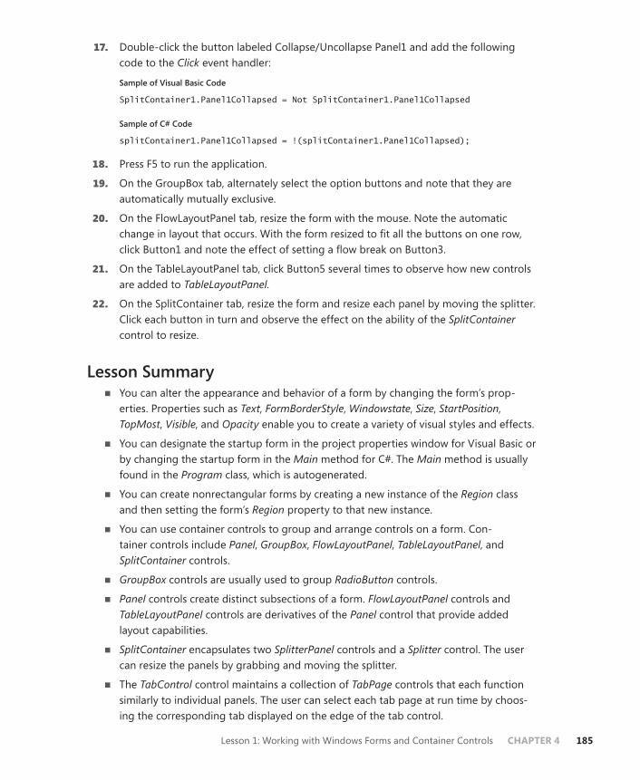
Lesson 1: Working with Windows Forms and Container Controls CHAPTER 4 185
17. Double-click the button labeled Collapse/Uncollapse Panel1 and add the following code to the Click event handler:
Sample of Visual Basic Code
SplitContainer1.Panel1Collapsed = Not SplitContainer1.Panel1Collapsed
Sample of C# Code
splitContainer1.Panel1Collapsed = !(splitContainer1.Panel1Collapsed);
18. Press F5 to run the application.
19. On the GroupBox tab, alternately select the option buttons and note that they are automatically mutually exclusive.
20. On the FlowLayoutPanel tab, resize the form with the mouse. Note the automatic change in layout that occurs. With the form resized to fit all the buttons on one row, click Button1 and note the effect of setting a flow break on Button3.
21. On the TableLayoutPanel tab, click Button5 several times to observe how new controls are added to TableLayoutPanel.
22. On the SplitContainer tab, resize the form and resize each panel by moving the splitter. Click each button in turn and observe the effect on the ability of the SplitContainer control to resize.
Lesson Summary■ You can alter the appearance and behavior of a form by changing the form’s prop-
erties. Properties such as Text, FormBorderStyle, Windowstate, Size, StartPosition, TopMost, Visible, and Opacity enable you to create a variety of visual styles and effects.
■ You can designate the startup form in the project properties window for Visual Basic or by changing the startup form in the Main method for C#. The Main method is usually found in the Program class, which is autogenerated.
■ You can create nonrectangular forms by creating a new instance of the Region class and then setting the form’s Region property to that new instance.
■ You can use container controls to group and arrange controls on a form. Con-tainer controls include Panel, GroupBox, FlowLayoutPanel, TableLayoutPanel, and SplitContainer controls.
■ GroupBox controls are usually used to group RadioButton controls.
■ Panel controls create distinct subsections of a form. FlowLayoutPanel controls and TableLayoutPanel controls are derivatives of the Panel control that provide added layout capabilities.
■ SplitContainer encapsulates two SplitterPanel controls and a Splitter control. The user can resize the panels by grabbing and moving the splitter.
■ The TabControl control maintains a collection of TabPage controls that each function similarly to individual panels. The user can select each tab page at run time by choos-ing the corresponding tab displayed on the edge of the tab control.
186 CHAPTER 4 Windows Forms and Windows Forms Controls
Lesson ReviewYou can use the following questions to test your knowledge of the information in Lesson 1, “Working with Windows Forms and Container Controls.” The questions are also available on the companion CD if you prefer to review them in electronic form.
NOTE ANSWERS
Answers to these questions and explanations of why each answer choice is correct or incor-rect are located in the “Answers” section at the end of the book.
1. Which of the following code samples demonstrates how to add a new instance of a Windows form named Form1 at run time?
A.
Sample of Visual Basic Code
Dim myForm As Form1 myForm = Form1.CreateForm()
Sample of C# Code
Form1 myForm; myForm = Form1.CreateForm();
B.
Sample of Visual Basic Code
Dim myForm As Form1 myForm.Show()
Sample of C# Code
Form1 myForm; myForm.Show();
C.
Sample of Visual Basic Code
myForm = Form1 myForm.Show()
Sample of C# Code
myForm = Form1; myForm.Show();
D.
Sample of Visual Basic Code
Dim myForm As Form1 myForm = New Form1()

Lesson 1: Working with Windows Forms and Container Controls CHAPTER 4 187
Sample of C# Code
Form1 myForm; myForm = new Form1();
2. Which of the following code samples correctly sets the title, border style, size, and opacity of a form?
A.
Sample of Visual Basic Code
Me.Text = "My Form" Me.FormBorderStyle = FormBorderStyle.Fixed3D Me.Size = New Size(300, 300) Me.Opacity = 0.5
Sample of C# Code
this.Text = "My Form"; this.FormBorderStyle = FormBorderStyle.Fixed3D; this.Size = new Size(300, 300); this.Opacity = 0.5;
B.
Sample of Visual Basic Code
Me.Text = "My Form" Me.BorderStyle = "Fixed3D" Me.Size = New Size(300, 300) Me.Opacity = 0.5
Sample of C# Code
this.Text = "My Form"; this.BorderStyle = "Fixed3D"; this.Size = new Size(300, 300); this.Opacity = 0.5;
C.
Sample of Visual Basic Code
Me.Text = "My Form" Me.FormBorderStyle = FormBorderStyle.Fixed3D Me.Size = (300,300) Me.Opacity = "100%"
Sample of C# Code
this.Text = "My Form"; this.FormBorderStyle = FormBorderStyle.Fixed3D; this.Size = (300,300); this.Opacity = "100%";
D.
Sample of Visual Basic Code
Me.Title = "My Form" Me.FormBorderStyle = FormBorderStyle.Fixed3D

188 CHAPTER 4 Windows Forms and Windows Forms Controls
Me.Size = New Size(300,300) Me.Opacity = "100%"
Sample of C# Code
this.Title = "My Form"; this.FormBorderStyle = FormBorderStyle.Fixed3D; this.Size = new Size(300,300); this.Opacity = "100%";
3. Which of the following code samples demonstrates how to set a flow break on a con-trol named aButton in a FlowLayoutPanel control named FLPanel1?
A.
Sample of Visual Basic Code
aButton.SetFlowBreak()
Sample of C# Code
aButton.SetFlowBreak();
B.
Sample of Visual Basic Code
aButton.SetFlowBreak(FLPanel1)
Sample of C# Code
aButton.SetFlowBreak(FLPanel1);
C.
Sample of Visual Basic Code
FLPanel1.SetFlowBreak(aButton, True)
Sample of C# Code
FLPanel1.SetFlowBreak(aButton, true);
D.
Sample of Visual Basic Code
FLPanel1.aButton.SetFlowBreak
Sample of C# Code
FLPanel1.aButton.SetFlowBreak();
4. You are designing an application that includes a property page that enables the user to set properties of the application. These properties are divided into three categories: Appearance, Execution, and Memory Management. Which container control repre-sents the best starting point for the user interface?
A. TableLayoutPanel
B. FlowLayoutPanel

Lesson 1: Working with Windows Forms and Container Controls CHAPTER 4 189
C. GroupBox
D. TabControl
5. Which of the following is the correct way to add a control to a form at design time? (Choose all that apply.)
A. Select a control in the Toolbox and double-click the form.
B. Select a control in the Toolbox and draw on the form with the mouse.
C. Double-click the control in the Toolbox.
D. Select the control in the Toolbox and drag it to the form.
6. Which of the following code samples demonstrates the correct way to add a Button control to a form named Form1 at run time?
A.
Sample of Visual Basic Code
Form1.Controls.Add(Button)
Sample of C# Code
Form1.Controls.Add(Button);
B.
Sample of Visual Basic Code
Dim aButton As New Button Form1.Controls.Add(aButton)
Sample of C# Code
Button aButton = new Button(); Form1.Controls.Add(aButton);
C.
Sample of Visual Basic Code
Dim aButton As New Button Form1.Add(aButton)
Sample of C# Code
Button aButton = new Button(); Form1.Add(aButton);
D.
Sample of Visual Basic Code
Form1.Add(New Button)
Sample of C# Code
Form1.Add(new Button);

190 CHAPTER 4 Windows Forms and Windows Forms Controls
7. Which code sample correctly demonstrates how to add a new panel to a SplitContainer control named SpC1?
A.
Sample of Visual Basic Code
SpC1.Controls.Add(New Panel)
Sample of C# Code
SpC1.Controls.Add(new Panel());
B.
Sample of Visual Basic Code
SpC1.Controls.Add(New SplitterPanel)
Sample of C# Code
SpC1.Controls.Add(new SplitterPanel());
C.
Sample of Visual Basic Code
SpC1.Add(New SplitterPanel)
Sample of C# Code
SpC1.Add(new SplitterPanel());
D.
Sample of Visual Basic Code
None of the above
Sample of C# Code
None of the above
Lesson 2: Configuring Controls in Windows Forms CHAPTER 4 191
Lesson 2: Configuring Controls in Windows Forms
This lesson describes general principles of creating and configuring controls and explores how to configure controls and create the UI in depth. Controls are graphical components that pro-vide reproducible functionality you can use to create a consistent user interface experience over several applications. Microsoft Visual Studio provides controls for information display, data input, user interaction, and other specialized tasks.
After this lesson, you will be able to:■ Describe common properties of controls. ■ Change the properties of controls at design time or at run time.■ Control the layout of your controls. ■ Use the various mechanisms the IDE exposes to modify controls quickly.■ Design your UI in accordance with best practices.
Estimated lesson time: 1 hour
Overview of ControlsControls are components that combine a graphical interface with predesigned functionality—reusable units of code designed to fulfill particular tasks. For example, the TextBox control is designed to display text and receive textual input from the user, and it provides properties, methods, and events that facilitate these tasks.
All controls inherit from the base class Control and, as such, share a variety of properties relating to size, location, and other general aspects of controls. Table 4-11 describes some of the common properties of controls.
TABLE 4-11 Common Properties of Controls
PROPERTY DESCRIPTION
Anchor Determines how the control is anchored in its parent form or container control.
BackColor Gets or sets the BackColor of the control.
BackgroundImage Represents the image painted as the background image of the control.
CausesValidation Represents whether a control causes validation; validation enables you to verify that user input meets specific formatting and value requirements.
ContainsFocus Indicates whether this control or one of its child controls has the focus.
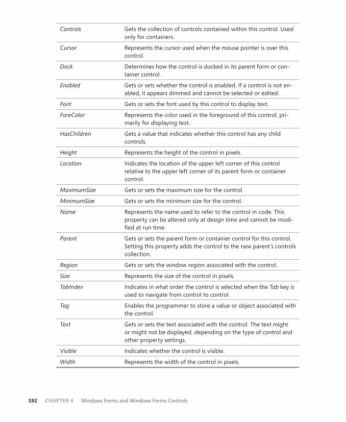
192 CHAPTER 4 Windows Forms and Windows Forms Controls
Controls Gets the collection of controls contained within this control. Used only for containers.
Cursor Represents the cursor used when the mouse pointer is over this control.
Dock Determines how the control is docked in its parent form or con-tainer control.
Enabled Gets or sets whether the control is enabled. If a control is not en-abled, it appears dimmed and cannot be selected or edited.
Font Gets or sets the font used by this control to display text.
ForeColor Represents the color used in the foreground of this control, pri-marily for displaying text.
HasChildren Gets a value that indicates whether this control has any child controls.
Height Represents the height of the control in pixels.
Location Indicates the location of the upper left corner of this control relative to the upper left corner of its parent form or container control.
MaximumSize Gets or sets the maximum size for the control.
MinimumSize Gets or sets the minimum size for the control.
Name Represents the name used to refer to the control in code. This property can be altered only at design time and cannot be modi-fied at run time.
Parent Gets or sets the parent form or container control for this control. Setting this property adds the control to the new parent’s controls collection.
Region Gets or sets the window region associated with the control.
Size Represents the size of the control in pixels.
TabIndex Indicates in what order the control is selected when the Tab key is used to navigate from control to control.
Tag Enables the programmer to store a value or object associated with the control.
Text Gets or sets the text associated with the control. The text might or might not be displayed, depending on the type of control and other property settings.
Visible Indicates whether the control is visible.
Width Represents the width of the control in pixels.
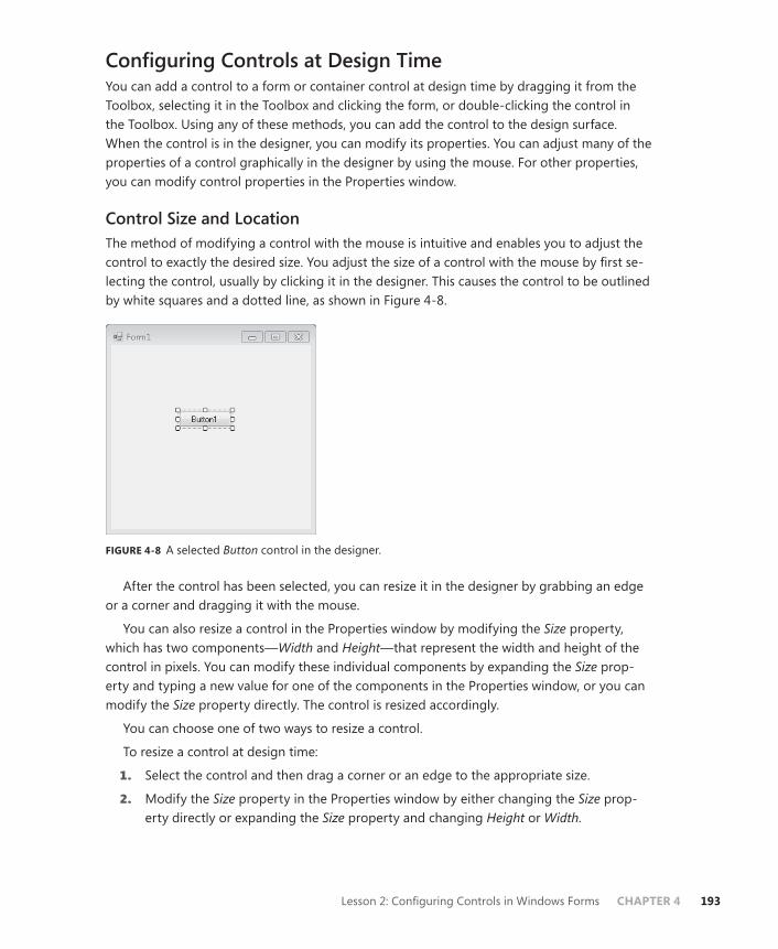
Lesson 2: Configuring Controls in Windows Forms CHAPTER 4 193
Configuring Controls at Design TimeYou can add a control to a form or container control at design time by dragging it from the Toolbox, selecting it in the Toolbox and clicking the form, or double-clicking the control in the Toolbox. Using any of these methods, you can add the control to the design surface. When the control is in the designer, you can modify its properties. You can adjust many of the properties of a control graphically in the designer by using the mouse. For other properties, you can modify control properties in the Properties window.
Control Size and LocationThe method of modifying a control with the mouse is intuitive and enables you to adjust the control to exactly the desired size. You adjust the size of a control with the mouse by first se-lecting the control, usually by clicking it in the designer. This causes the control to be outlined by white squares and a dotted line, as shown in Figure 4-8.
FIGURE 4-8 A selected Button control in the designer.
After the control has been selected, you can resize it in the designer by grabbing an edge or a corner and dragging it with the mouse.
You can also resize a control in the Properties window by modifying the Size property, which has two components—Width and Height—that represent the width and height of the control in pixels. You can modify these individual components by expanding the Size prop-erty and typing a new value for one of the components in the Properties window, or you can modify the Size property directly. The control is resized accordingly.
You can choose one of two ways to resize a control.
To resize a control at design time:
1. Select the control and then drag a corner or an edge to the appropriate size.
2. Modify the Size property in the Properties window by either changing the Size prop-erty directly or expanding the Size property and changing Height or Width.

194 CHAPTER 4 Windows Forms and Windows Forms Controls
The designer also provides an easy way to set the location of a control on a form or con-tainer control. You can change the location of a control graphically by grabbing the middle of the control with the mouse and dragging it to the new location.
You can also set the location of a control by modifying the Location property in the Properties window. The Location property represents the coordinates of the upper left corner of the control relative to the upper left corner of the parent form or container control. The Location property has two components, X and Y. You can modify the Location property di-rectly in the Properties window, or you can expand the Location property and individually set the X and Y values. The property will relocate to the new location.
You can choose one of two ways to change the location of a control.
To change the location of a control at design time:
1. Grab the middle of the control with the mouse and drag it to the appropriate location.
2. Set the Location property of the control in the Properties window, either by setting the Location property directly or by expanding the Location property and modifying the values of X and Y as appropriate.
You can also reposition a group of controls graphically with the mouse. You must first select all the controls you want to move, either by outlining the appropriate controls with the mouse or by holding down the Ctrl key and clicking each control in turn. Figure 4-9 depicts a group of selected controls.
FIGURE 4-9 A group of selected controls in the designer.
After the group of controls is selected, you can move the group by grabbing the middle of one of the controls and moving it with the mouse. You can also set property values for multiple controls simultaneously by selecting multiple controls and setting a property in the Properties window.
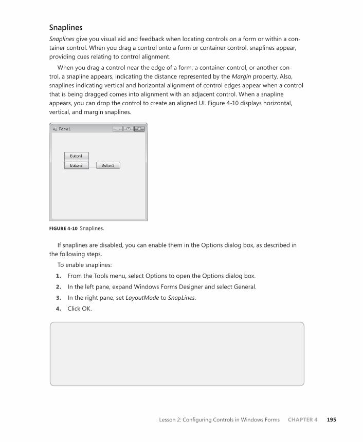
Lesson 2: Configuring Controls in Windows Forms CHAPTER 4 195
SnaplinesSnaplines give you visual aid and feedback when locating controls on a form or within a con-tainer control. When you drag a control onto a form or container control, snaplines appear, providing cues relating to control alignment.
When you drag a control near the edge of a form, a container control, or another con-trol, a snapline appears, indicating the distance represented by the Margin property. Also, snaplines indicating vertical and horizontal alignment of control edges appear when a control that is being dragged comes into alignment with an adjacent control. When a snapline appears, you can drop the control to create an aligned UI. Figure 4-10 displays horizontal, vertical, and margin snaplines.
FIGURE 4-10 Snaplines.
If snaplines are disabled, you can enable them in the Options dialog box, as described in the following steps.
To enable snaplines:
1. From the Tools menu, select Options to open the Options dialog box.
2. In the left pane, expand Windows Forms Designer and select General.
3. In the right pane, set LayoutMode to SnapLines.
4. Click OK.
Quick Check ■ What is the purpose of snaplines?
Quick Check Answers■ Snaplines appear at design time and help you align controls to the form or to
each other.
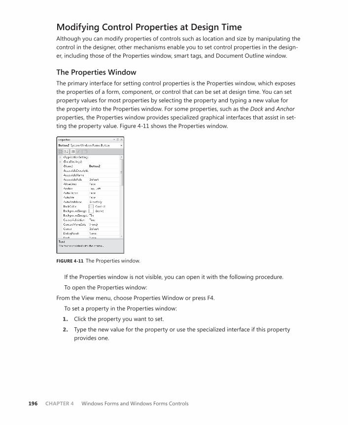
196 CHAPTER 4 Windows Forms and Windows Forms Controls
Modifying Control Properties at Design TimeAlthough you can modify properties of controls such as location and size by manipulating the control in the designer, other mechanisms enable you to set control properties in the design-er, including those of the Properties window, smart tags, and Document Outline window.
The Properties WindowThe primary interface for setting control properties is the Properties window, which exposes the properties of a form, component, or control that can be set at design time. You can set property values for most properties by selecting the property and typing a new value for the property into the Properties window. For some properties, such as the Dock and Anchor properties, the Properties window provides specialized graphical interfaces that assist in set-ting the property value. Figure 4-11 shows the Properties window.
FIGURE 4-11 The Properties window.
If the Properties window is not visible, you can open it with the following procedure.
To open the Properties window:
From the View menu, choose Properties Window or press F4.
To set a property in the Properties window:
1. Click the property you want to set.
2. Type the new value for the property or use the specialized interface if this property provides one.

Lesson 2: Configuring Controls in Windows Forms CHAPTER 4 197
The Button ControlOne of the most familiar controls in the toolbox is the Button control, the primary control that enables command interaction between the user and the UI. The button can display a short string on its face and can respond to user clicks. The Button control gives a visual cue when clicked and exposes an event handler that enables the developer to write code that executes when the button is clicked.
The Button control exposes several properties that enable you to customize its appearance and behavior. Table 4-12 shows important properties of the Button control.
TABLE 4-12 Important Properties of the Button Control
PROPERTY DESCRIPTION
AutoEllipsis Enables the automatic handling of text that extends beyond the width of the button
DialogResult Sets a DialogResult value that you can associate with the but-ton, such as DialogResult.OK or DialogResult.Cancel
FlatAppearance Defines styles that govern how the button appears and be-haves when the FlatStyle property is set to Flat
FlatStyle Sets the visual style of the button when a user moves the mouse over the button and clicks
Text Sets the text that appears on the button
TextAlign Indicates how the text displayed on the button is aligned
Responding to ClicksThe primary function of a Button control in the UI is to respond to user mouse clicks. When a user clicks a button, it typically causes code to be executed. For example, you might have an OK button that causes the application execution to continue after the user has provided necessary information, or you might have a Cancel button that returns execution to a previ-ous step.
You can write code to be executed when the button is clicked by using the Button.Click event handler, a method activated when the button is clicked that then executes appropriate code.
To write code for the Button.Click event handler:
1. In the designer, double-click the button for which you want to write code.
Visual Studio automatically generates a method declaration named Button_Click and adds code behind the scenes to configure the method to handle the Button.Click event. Visual Studio displays the new Button_Click method that runs when the user clicks the button.
198 CHAPTER 4 Windows Forms and Windows Forms Controls
2. Write the appropriate code in this method.
At run time, this code is executed when the button is clicked. The following code shows an example of a complete Button_Click method:
Sample of Visual Basic Code
Private Sub Button1_Click(ByVal sender As System.Object, ByVal e As _ System.EventArgs)_ Handles Button1.Click MsgBox("The Button has been clicked!") End Sub
Sample of C# Code
private void button1_Click(object sender, EventArgs e) { MessageBox.Show("The Button has been clicked!"); }
Responding to Other ClicksAlthough the Button.Click event handler is useful for responding to simple clicks, you can also configure a button or other control to respond to other mouse clicks as well, such as right-clicks. You can respond to these clicks by using the MouseDown event.
One of the arguments for the Button.MouseDown event handler is an instance of MouseEventArgs. This argument contains detailed information about the location and click-state of the mouse and can be used to differentiate between left-clicks, right-clicks, double-clicks, and other mouse interactions. Table 4-13 describes the properties of the MouseEventArgs class.
TABLE 4-13 Properties of MouseEventArgs
PROPERTY DESCRIPTION
Button Indicates the mouse button that was pressed. Possible values are Left, Right, Middle, None, XButton1, or XButton2.
Clicks Gets the number of times the button was pressed and released.
Delta Gets a count of how many notches the mouse wheel has rotated.
Location Gets the current location of the mouse pointer.
X Gets the X coordinate of the mouse pointer.
Y Gets the Y coordinate of the mouse pointer.
Using the values exposed by the MouseEventArgs instance, you can determine the button that was clicked and the position of the mouse wheel. Note that if any button other than the left button clicks a control, the control will not give the visual feedback (the “click” in the UI) that is customary for a button.
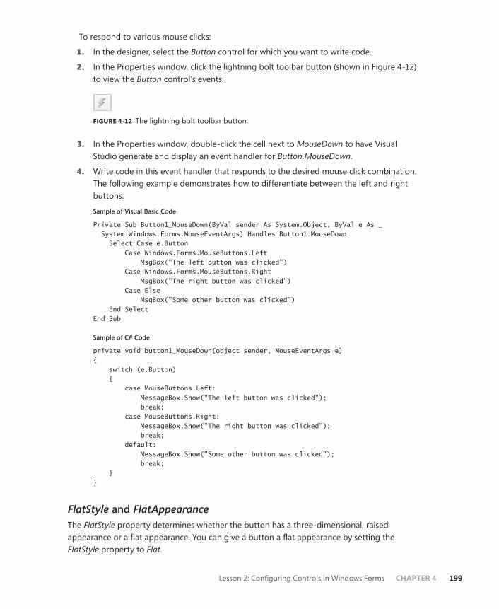
Lesson 2: Configuring Controls in Windows Forms CHAPTER 4 199
To respond to various mouse clicks:
1. In the designer, select the Button control for which you want to write code.
2. In the Properties window, click the lightning bolt toolbar button (shown in Figure 4-12) to view the Button control’s events.
FIGURE 4-12 The lightning bolt toolbar button.
3. In the Properties window, double-click the cell next to MouseDown to have Visual Studio generate and display an event handler for Button.MouseDown.
4. Write code in this event handler that responds to the desired mouse click combination. The following example demonstrates how to differentiate between the left and right buttons:
Sample of Visual Basic Code
Private Sub Button1_MouseDown(ByVal sender As System.Object, ByVal e As _ System.Windows.Forms.MouseEventArgs) Handles Button1.MouseDown Select Case e.Button Case Windows.Forms.MouseButtons.Left MsgBox("The left button was clicked") Case Windows.Forms.MouseButtons.Right MsgBox("The right button was clicked") Case Else MsgBox("Some other button was clicked") End Select End Sub
Sample of C# Code
private void button1_MouseDown(object sender, MouseEventArgs e) { switch (e.Button) { case MouseButtons.Left: MessageBox.Show("The left button was clicked"); break; case MouseButtons.Right: MessageBox.Show("The right button was clicked"); break; default: MessageBox.Show("Some other button was clicked"); break; } }
FlatStyle and FlatAppearanceThe FlatStyle property determines whether the button has a three-dimensional, raised appearance or a flat appearance. You can give a button a flat appearance by setting the FlatStyle property to Flat.
200 CHAPTER 4 Windows Forms and Windows Forms Controls
When the FlatStyle property is set to Flat, the FlatAppearance property determines how the button looks and behaves in the UI. The FlatAppearance property is an instance of a structure that contains properties described in Table 4-14.
TABLE 4-14 Properties of FlatAppearance
PROPERTY DESCRIPTION
BorderColor Sets the color of the button border
BorderSize Sets the size of the button border
MouseDownBackColor Sets the color of the button when the left mouse button clicks this button
MouseOverBackColor Sets the color of the button when the mouse pointer is over the button
When the FlatStyle is set to Flat, there are fewer built-in visual cues that allow the user to interact with the button. You can provide additional cues by setting appropriate values in the FlatAppearance property. The following procedure describes how to set the back color of the button when it is under the mouse.
To change the back color of a button when it is under the mouse:
1. In the Properties window, set the FlatStyle property to Flat.
2. Expand the FlatAppearance property.
3. In the FlatAppearance property, set the MouseOverBackColor property to the color you want the button to have when it is under the mouse.
Accept and Cancel ButtonsA common scenario when creating dialog forms is to create an Accept or Cancel button on the form that provides an appropriate DialogResult value to the form when clicked. You can use the DialogResult property of Button to create Accept or Cancel buttons.
To create an Accept or Cancel button:
1. From the Toolbox, drag a button onto the form and set the Text property to an appro-priate value (for example, Accept for an Accept button).
2. In the Properties window, set the DialogResult property to OK for an Accept button or Cancel for a Cancel button.
3. In the designer, double-click the button to open the code window.
4. In the Button_Click event handler, close the form as shown here:
Sample of Visual Basic Code
Me.Close()
Sample of C# Code
this.Close();

Lesson 2: Configuring Controls in Windows Forms CHAPTER 4 201
When a form is shown with the ShowDialog method, it automatically returns the dialog result associated with the button that was clicked. The following example demonstrates how this form might be used. The hypothetical form is named DialogForm.
Sample of Visual Basic Code
Dim aForm As New DialogForm Dim aResult As System.Windows.Forms.DialogResult aResult = aForm.ShowDialog If aResult = DialogResult.Ok Then ' Do something Else ' Do something else End If
Sample of C# Code
Dialog aForm = new DialogForm(); System.Window.Forms.DialogResult aResult; aResult = aForm.ShowDialog(); if (aResult == DialogResult.Ok) { // Do something } else { // Do something else }
The Label ControlThe Label control is primarily used to display read-only textual information to the user. For example, labels are frequently used to display an informative string beside a control, such as “First Name” beside a TextBox control meant to collect the user’s first name. Labels can also be used to define shortcut keys for other controls.
The text displayed in a label is set in the label’s Text property. You can set the label to resize itself automatically to the size of the text by setting the label’s AutoSize property to True. If the AutoSize property is set to False, you can set the size of the label by grabbing and dragging the control edges in the designer.
You can use Label controls to define access keys for other controls. Access keys are keys that, when pressed in combination with the Alt key, move the focus to the desired control. The following procedure describes how to use a Label control to define an access key for another control.
To define an access key:
1. From the Toolbox, drag a Label control onto the form, near the control for which you want to define the access key (for example, a TextBox control).
2. In the Properties window, set the Text property to a descriptive name for the con-trol. Precede the letter that you want to use for the access key with an ampersand
202 CHAPTER 4 Windows Forms and Windows Forms Controls
(&) character. For example, to use F as the access key, set the label’s Text property to &First Name.
3. In the Properties window, set the UseMnemonic property to True (the default).
4. In the Properties window, set the TabIndex property to one less than the TabIndex property of the control for which you are defining an access key. Verify that no two controls have the same TabIndex value.
Creating Access Keys for Controls without Using Label ControlsAccess keys enable the user to move the focus to a particular control by pressing the Alt key and the access key you have defined for a particular control. The following procedure de-scribes how to create access keys for individual controls.
NOTE CREATING AN ACCESS KEY FOR A CONTROL
To create an access key for a control with this procedure, the control must be capable of receiving the focus, it must have a Text property, and it must have a UseMnemonic prop-erty. If the control for which you want to create an access key can receive the focus but does not have a UseMnemonic property, use the first procedure that uses a Label control to make the access key. If the control cannot receive the focus, you cannot create an access key for it by any procedure.
To create an access key for a control:
1. Set the Text property to the text you want the control to display.
2. In the Text property, prepend the letter you want to make the access key with the am-persand (&) symbol.
3. In the Properties window, set the UseMnemonic property to True. The letter preceded by the ampersand symbol appears underlined, and at run time the user is able to shift the focus to the control by pressing the Alt key along with the underlined key.
Quick Check 1. What events of the Button control can be used to respond to mouse clicks?
2. What is the purpose of access keys?
Quick Check Answers 1. The Click event responds to the left-button click, and the MouseDown event can
be used to respond to other button clicks.
2. Access keys enable you to provide keyboard shortcuts that move the focus to the control with which the access key is associated.
Lesson 2: Configuring Controls in Windows Forms CHAPTER 4 203
The TextBox ControlThe TextBox control is the primary control used to receive textual input from the user; it en-ables you to receive text from and display text to the user. You can create text boxes that can display multiline text, and you can create text boxes that display a password character instead of the actual text.
The TextBox control exposes several properties that enable you to configure its behavior. Table 4-15 shows the important properties of the TextBox control.
TABLE 4-15 Important Properties of the TextBox Control
PROPERTY DESCRIPTION
AutoCompleteCustomSource Holds a string collection that contains autocomplete data when the AutoCompleteMode is set to a value other than None and the AutoCompleteSource is set to Custom.
AutoCompleteMode Sets the AutoComplete mode of the control. Possible values are None, Append, Suggest, and SuggestAppend.
AutoCompleteSource Sets the source for autocomplete data. Can be set to any of a variety of system sources or to a custom source provided by the AutoCompleteCustomSource property.
CharacterCasing Indicates the casing of the characters in the TextBox control. Possible values are Normal, Upper, and Lower.
Lines Returns a string array representing the individual lines of the text box. This property is most useful when MultiLine is set to True. Note that a line is defined as a string that is terminated by a carriage return character and does not refer to visible lines in the UI (as might be seen when the WordWrap property is set to True).
MaxLength Specifies the maximum number of characters that can be entered into the text box.
MultiLine Indicates whether the text box can contain only a single line of text or multiple lines.
PasswordChar Sets the password character to be displayed in the text box instead of the actual text.
ReadOnly Indicates whether the text in the text box can be edited.
ScrollBars Indicates whether scroll bars are displayed in the text box when the MultiLine property is set to True.
Text Gets or sets the text contained in the text box.

204 CHAPTER 4 Windows Forms and Windows Forms Controls
UseSystemPasswordChar Indicates whether to display the system password instead of the actual text in the text box.
WordWrap Indicates whether words automatically wrap from one line to the next when the MultiLine property is set to True.
The main purpose of the TextBox control is to provide a container for editable text. Users can input text into text boxes or edit textual data that the application displays. The text held by the TextBox property is accessible through the Text property. The text in TextBox is editable if the ReadOnly property is set to False, which is the default. If the ReadOnly property is set to True, the user cannot edit the text displayed.
Creating a Multiline TextBox ControlTextBox controls are single-line by default, but you can create a multiline TextBox control by setting the MultiLine property to True. This enables you to resize TextBox vertically as well as horizontally.
When the MultiLine property is set to True, several other properties become impor-tant. The Lines property exposes a string array that contains the individual lines of TextBox. The ScrollBars property indicates whether scroll bars are displayed for the text box and, if so, whether Horizontal, Vertical, or both are displayed. The WordWrap property indicates whether words automatically wrap from one line to the next. Note that if the WordWrap property is set to True, horizontal scroll bars never appear, even if the ScrollBars property is set to Horizontal.
Creating a Password TextBox ControlYou can use the PasswordChar or UseSystemPasswordChar properties to create a text box that can receive text input but displays a masking character instead of the actual text, render-ing the user input unreadable to observers. This is most commonly used to create a text box for entering a password. If the PasswordChar property is set to a character (for example, an asterisk [“*”]), that character is displayed whenever the user types a character into the text box. Note that the actual characters the user types are stored in the Text property; only the rendering of these characters in the UI changes. You can also set the UseSystemPasswordChar property to True, which will display the password character defined by the system for each character typed in the text box. If UseSystemPasswordChar is set to True and PasswordChar is set to a character, the system password character is used.
The MaskedTextBox ControlThe MaskedTextBox control is a modified TextBox control that enables you to define a preset pattern for accepting or rejecting user input. The Mask property enables you to specify required or optional characters, specify whether input characters are letters or numbers,
Lesson 2: Configuring Controls in Windows Forms CHAPTER 4 205
and apply formatting for the display of strings. Table 4-16 shows important properties of the MaskedTextBox control.
TABLE 4-16 Important Properties of the MaskedTextBox Control
PROPERTY DESCRIPTION
AllowPromptAsInput Indicates whether the prompt character is valid as input.
AsciiOnly Indicates whether only ASCII characters are valid as input. When set to True, only A–Z and a–z are accepted as input.
BeepOnError Indicates whether MaskedTextBox sends a system beep for every input character it rejects.
CutCopyMaskFormat Determines whether literals and prompt characters are included when the text is cut or copied.
HidePromptOnLeave Indicates whether prompt characters are hidden when MaskedTextBox loses the focus.
InsertKeyMode Gets or sets the text insertion mode for MaskedTextBox.
Mask Defines the input mask for MaskedTextBox (explained in detail in the following text).
PromptChar Gets or sets the character used for the prompt.
RejectInputOnFirstFailure Gets or sets a value indicating whether parsing of user input stops after the first invalid character is reached.
ResetOnPrompt Indicates how an input character that matches the prompt character should be handled.
ResetOnSpace Determines how a space input character should be handled.
SkipLiterals Indicates whether literals in the mask should be reentered or skipped.
TextMaskFormat Indicates whether prompt characters and literal characters are included in the text returned by the Text property.
The Mask PropertyThe most important property of the MaskedTextBox control is the Mask property, which enables you to define a string that represents the required format of an input string in MaskedTextBox. The MaskedTextProvider control associated with MaskedTextBox provides the parsing engine that parses the Mask format. Table 4-17 shows the code characters the default MaskedTextProvider uses.

206 CHAPTER 4 Windows Forms and Windows Forms Controls
TABLE 4-17 Elements of the Default MaskedTextProvider Control
MASKING ELEMENT DESCRIPTION
0 Represents a required digit between 0 and 9.
9 Represents an optional digit between 0 and 9.
# Represents an optional digit between 0 and 9 or a space. Plus (+) and minus (–) signs are also accepted.
L Represents a required letter, either uppercase or lowercase (A–Z, a–z).
? Represents an optional letter, either uppercase or lowercase (A–Z, a–z).
& Represents a required character. If AsciiOnly is set to True, this element behaves like the L element.
C Represents an optional character. If AsciiOnly is set to True, this element behaves like the [?] element.
A, a Represents an optional alphanumeric character. If AsciiOnly is set to True, it accepts only A–Z and a–z.
. Decimal placeholder. Represents a decimal character. The actual character used will be the decimal character set by the control’s FormatProvider.
, Thousands placeholder. Represents a thousands separator. The actual character used will be the thousands separator set by the control’s FormatProvider.
: Time separator. Represents a time separator. The actual character used will be the time separator character set by the control’s FormatProvider.
/ Date separator. Represents a date separator. The actual character used will be the date separator set by the control’s FormatProvider.
$ Currency symbol. Represents a currency symbol. The actual character used will be the currency symbol set by the control’s FormatProvider.
< Shift down. Converts all following characters to lowercase.
> Shift up. Converts all following characters to uppercase.
| Disables a previous shift up or shift down.
\ Escapes a mask character, turning it into a literal character. The double slash (\\) is the escape sequence for a backslash.
All other characters
All other characters appear as themselves in MaskedTextBox, and the user cannot move or delete them.
You can design a mask for the masked text box by creating a string made of characters described in Table 4-17. Setting the Mask property of MaskedEditBox restricts the input al-lowed to the format determined by the mask string. Table 4-18 shows some examples of mask strings, together with input strings and the output string displayed in the control.
Lesson 2: Configuring Controls in Windows Forms CHAPTER 4 207
TABLE 4-18 Examples of Mask Strings
MASK STRING INPUT TEXT DISPLAYED TEXT
(999)-000-0000 1234567890 (123)-456-7890
00/00/0000 07141969 07/14/1969 – Note that the actual date separator displayed is determined by the control’s FormatProvider.
$99,999.00 1234567 $12,345.67 – Note that the actual currency symbol, thousands separator, and decimal separator are determined by the control’s FormatProvider.
LL>L|LLL<LL abcdABCD abCdABcd
Configuring the MaskedTextBox Control for User InputIn addition to the Mask property, the MaskedTextBox control has several properties that af-fect how the control behaves when receiving user input. The AsciiOnly property determines whether only ASCII characters are allowed as input; when set to True, it restricts input to A–Z and a–z. Other inputs are rejected. You can set the control to notify users when an error has been committed by setting the BeepOnError property to True. The SkipLiterals property de-termines whether literal characters should be reentered by the user (if set to False) or skipped over in the masked text box (when set to True).
The RejectInputOnFirstFailure property governs how text pasted into MaskedTextBox is handled. If a string that does not match the Mask format is pasted into MaskedTextBox, MaskedTextBox rejects the entire string if the RejectInputOnFirstFailure is set to True. If set to False, MaskedTextBox accepts all the characters that match the Mask format.
The Prompt property sets the character displayed in MaskedTextBox when there is no input for a given position. The default value for the Prompt character is the underscore character (_). The AllowPromptAsInput and ResetOnPrompt properties govern how the prompt char-acter is treated when entered as input. If the ResetOnPrompt property is set to True, prompt characters are accepted, Mask is reset for that character position, and the cursor advances to the next position. If the ResetOnPrompt property is set to False and the AllowPromptAsInput property is set to True, the prompt character is processed as regular input. If both properties are set to False, the prompt character is rejected. The ResetOnSpace property governs the treatment of spaces in the same way that ResetOnPrompt governs the treatment of prompt characters.
Manipulating Text in MaskedTextBoxThe text shown in MaskedTextBox is not necessarily the text that is available to the user when cutting and pasting or to the application when text is manipulated programmati-cally. CutCopyMaskFormat determines how the text in MaskedTextBox is treated when the
208 CHAPTER 4 Windows Forms and Windows Forms Controls
user cuts or copies it. The default value for this property is IncludeLiterals, in which case literals from the Mask are included when text is cut or copied, but prompt characters are not. You can also set this property to ExcludePromptAndLiterals, which excludes both liter-als and prompts; IncludePrompt, which includes prompt characters but excludes literals; and IncludePromptAndLiterals, which includes both prompts and literals. The TextMaskFormat property has the same possible values, and functions in the same way with respect to the text returned by the Text property.
Quick Check 1. How can you create a TextBox control with more than one line?
2. What is the purpose of the MaskedTextBox control?
Quick Check Answers 1. You can create a multiline TextBox control by setting the MultiLine property to
True.
2. The MaskedTextBox control is used to display a format to the user for data entry or display and to validate that data is input in the correct format.
PRACTICE Using Text Display Controls
In this lab, you add controls to a partial project. You add a multiline text box to prompt the user for an address, and you add a MaskedTextBox control to collect a phone number.
EXERCISE Adding Text Display Controls
1. In Visual Studio, load the partial solution for this lesson.
2. In Solution Explorer, double-click Form2 to open the designer for Form2.
3. From the Toolbox, drag a TextBox control onto the form. Drag a Label control onto the form next to the TextBox control.
4. Set the Text property of Label to Address.
5. Set the Multiline property of TextBox to True and set the WordWrap property to False. Set the ScrollBars property to Both. Resize TextBox to make it large enough to hold an address.
6. From the Toolbox, drag a MaskedTextBox control and a Label control onto the form.
7. Set the Text property of Label to Phone Number.
8. Set the Mask property of MaskedTextBox to (999)-000-0000.
9. C# only: Set the Modifiers property of TextBox and MaskedTextBox to Internal.
10. In Solution Explorer, right-click Form1 and choose View Code.
11. In the LinkLabel1_LinkClicked event handler, add the following code at the end of the If block:
Lesson 2: Configuring Controls in Windows Forms CHAPTER 4 209
Sample of Visual Basic Code
MsgBox("Your address is " & Form2.TextBox3.Text) MsgBox("Your phone number is " & Form2.MaskedTextBox1.Text)
Sample of C# Code
MessageBox.Show("Your address is " + aForm.textBox3.Text); MessageBox.Show("Your phone number is " + aForm.maskedTextBox1.Text);
12. Press F5 to run and test your application.
Lesson Summary■ You can modify individual properties of controls in the Properties window. Some prop-
erties provide specialized graphical interfaces to help you set the property value.
■ The Anchor and Dock properties enable you to set specialized behaviors for controls on your form.
■ The Button control is the primary command control for the UI. The Button_Click event handler is the method executed when the button is clicked. The button can respond to other mouse button clicks by means of the MouseDown event.
■ The FlatAppearance property governs how a button looks and behaves when the FlatStyle property is set to Flat.
■ By setting the DialogResult value of a Button control, you can create a Cancel or Accept button. You can then examine the result of the form as you would a standard dialog box.
■ The Label control conveys read-only information to the user. You can use Label to define an access key by setting the Text, TabOrder, and UseMnemonic properties.
■ The TextBox control enables the user to enter text. The text that is entered can be ac-cessed through the Text property.
■ TextBox controls can be single-line or multiline, depending on the value of the MultiLine property.
■ The MaskedTextBox control can be configured for formatted text display and entry.
■ The Mask property determines the formatting for text in MaskedTextBox controls.
Lesson ReviewThe following questions are intended to reinforce key information presented in Lesson 2, “Configuring Controls in Windows Forms.” The questions are also available on the companion CD if you prefer to review them in electronic form.
NOTE ANSWERS
Answers to these questions and explanations of why each answer choice is correct or incor-rect are located in the “Answers” section at the end of the book.

210 CHAPTER 4 Windows Forms and Windows Forms Controls
1. Which of the following can be used to modify the size of a control in a form at design time? (Choose all that apply.)
A. Grabbing and dragging the edges of the control
B. Setting the control size in the View menu
C. Clicking the smart tag and entering a new size for the control
D. Editing the Size property in the Properties window
2. Which of the following methods can be used to modify the location of controls in a form at design time? (Choose all that apply.)
A. Changing the Location property in the Properties window
B. Grabbing the control and moving it with the mouse
C. Using the Layout toolbar to adjust control spacing
D. Using the Location window to position controls graphically
3. Which setting of the Anchor property allows controls to float freely when the form is resized?
A. Top
B. Top, Bottom
C. None
D. Right, Left
4. Which setting of the Dock property causes the control to fill its form or container control?
A. Top
B. Fill
C. Top, Left, Right, Bottom
D. None; use the Anchor property
5. Which Button events can be used to respond to mouse clicks? (Choose all that apply.)
A. Button.Click
B. Button.LinkClicked
C. Button.MouseDown
D. Button.MouseOver
6. Which property does NOT control how a button looks or behaves when the FlatStyle property is set to Flat?
A. FlatAppearance.MouseOverBackColor
B. FlatAppearance.MouseDownBackColor
C. FlatAppearance.BorderSize
D. FlatAppearance.Text
Lesson 2: Configuring Controls in Windows Forms CHAPTER 4 211
7. Which is necessary to define an access key using a Label control? (Choose all that apply.)
A. Set the TabOrder property so that the control for the access key is immediately after the Label control.
B. Set the UseMnemonic property to True.
C. Set the Text property with an ampersand to indicate the access key.
D. Set the CausesValidation property to True.
8. Which of the following properties of the TextBox control should be set to the value indicated to ensure that the text box can accommodate a string 10,000 characters long?
A. MultiLine = True
B. WordWrap = True
C. ScrollBars = True
D. MaxLength = 10000
9. Which of the following Mask property settings will configure MaskedTextBox for the entry of a social security number, which is displayed as three digits followed by a hy-phen, then two digits followed by another hyphen, and then finally four digits?
A. 999-99-9999
B. 999/00/0000
C. 000-00-0000
D. 000/00/0000
10. You have a MaskedTextBox control with the Mask property set to 000-0000 to indicate a seven-digit phone number. You want users to be able to cut and paste the entire string, including the “-” character, but when the program accesses MaskedTextBox, you want to exclude the “-” character. Which of the following will configure MaskedTextBox to provide this functionality?
A. Set the CutCopyMaskFormat property to ExcludePromptAndLiterals and TextMaskFormat to IncludeLiterals.
B. Set the CutCopyMaskFormat property to IncludeLiterals and TextMaskFormat to ExcludePromptAndLiterals.
C. Set the CutCopyMaskFormat property to ExcludePromptAndLiterals and TextMaskFormat to IncludePrompt.
D. Set the CutCopyMaskFormat property to IncludeLiterals and TextMaskFormat to IncludeLiterals.

212 CHAPTER 4 Windows Forms and Windows Forms Controls
Lesson 3: Using List-Display and Specialized Controls
This lesson continues where the previous lesson left off, with an in-depth examination of Windows Forms controls. In this lesson, you learn how to create and configure controls for displaying lists, setting values and dates, and displaying images.
After this lesson, you will be able to: ■ Programmatically determine which item in a list appears in a given position.■ Add or remove items from a list of items in a list-based control.■ Bind a list-based control to a data source.■ Sort list data.■ Display data in a drop-down combo box.■ Select one or more items from a predefined list.■ Use the ListView control to display a list of items with icons.■ Use the TreeView control to display a list of items in a hierarchical view.■ Configure the DomainUpDown control to display a list of strings.■ Configure the NumericUpDown control to display a list of numbers.■ Set two or more mutually exclusive options in the user interface using a
RadioButton.■ Use the CheckBox control to indicate whether a condition is on or off.■ Allow navigation through a large amount of information or visually adjust a
numeric setting using a TrackBar.■ Enable the user to select a single item from a list of dates or times by using the
DateTimePicker control.■ Present an intuitive graphical interface for users to view and set date information
using the MonthCalendar.■ Add images to or remove images from the ImageList component.■ Display graphics by using the PictureBox control.
Estimated lesson time: 60 minutes
Overview of List-Based ControlsThe basic list-based controls are ListBox, ComboBox, and CheckedListBox. Although differing somewhat in appearance and functionality, each of these controls organizes and presents lists of data in the same way, and each contains an Items collection that organizes the items contained in one of these controls.

Lesson 3: Using List-Display and Specialized Controls CHAPTER 4 213
The Items collection is basically a collection of objects. Although these objects are often strings, they do not have to be. If a collection does contain a string, however, the string repre-sentation of the object is displayed in the control.
ListBox ControlThe ListBox control is the simplest of the list-based controls and serves primarily to display a simple list of items in an easy-to-navigate user interface from which users can select one or more items. Table 4-19 describes the important properties of the ListBox control.
TABLE 4-19 Important Properties of the ListBox Control
PROPERTY DESCRIPTION
DataSource Sets the source for data binding in this control.
DisplayMember Represents the data member displayed in this control.
FormatString Specifies a formatting string that will be used to format the en-tries in the control if FormattingEnabled is set to True.
FormattingEnabled Determines whether the entries in the control are formatted using FormatString.
Items Returns the collection of items contained in this control.
MultiColumn Indicates whether this item shows multiple columns of items or only a single item.
SelectedIndex Gets the index of the selected item or, if the SelectionMode prop-erty is set to MultiSimple or MutilExtended, returns the index to any selected item.
SelectedIndices Returns a collection of all selected indexes.
SelectedItem Returns the selected item or, if the SelectionMode property is set to MultiSimple or MultiExtended, returns the index to any selected item.
SelectedItems Returns a collection of all selected items.
SelectedValue In a data-bound control, returns the value associated with the selected item. If the control is not data-bound, or if ValueMember is not set, this property returns the ToString value of the selected item.
SelectionMode Determines how many items can be selected in a list box. Can be set to None, One, MultiSimple, or MultiExtended. MultiSimple allows the selection of multiple objects, and MultiExtended allows the use of the Shift and Ctrl keys when making multiple selections.
ValueMember Indicates the data member that will provide the values for the list box.

214 CHAPTER 4 Windows Forms and Windows Forms Controls
ComboBox ControlThe ComboBox control is similar to the ListBox control, but, in addition to allowing the user to select items from a list, it provides a space for a user to type an entry. Additionally, you can configure the ComboBox to either display a list of options or to provide a drop-down list of options. Table 4-20 describes the important properties of the ComboBox control.
TABLE 4-20 Important Properties of the ComboBox Control
PROPERTY DESCRIPTION
DataSource Sets the source for data binding in this control.
DisplayMember Represents the data member displayed in this control.
DropDownHeight Sets the maximum height for the drop-down box.
DropDownStyle Determines the style of the combo box. Can be set to Simple, which is similar to a ListBox; DropDown, which is the default; or DropDownList, which is similar to DropDown but does not allow the user to type a new value.
DropDownWidth Sets the width of the drop-down section of the combo box.
FormatString Specifies a formatting string that will be used to format the en-tries in the control if FormattingEnabled is set to True.
FormattingEnabled Determines whether the entries in the control are formatted us-ing FormatString.
Items Returns the collection of items contained in this control.
SelectedIndex Gets the index of the selected item.
SelectedItem Returns the selected item.
SelectedValue In a data-bound control, returns the value associated with the selected item. If the control is not data-bound, or if the ValueMember is not set, this property returns the ToString value of the selected item.
ValueMember Indicates the data member that will provide the values for the ComboBox.
CheckedListBox ControlCheckedListBox displays a list of items to users and allows them to select multiple items by checking boxes that are displayed next to the items. Any number of items can be checked, but only one item can be selected at a time. You can retrieve a collection that represents the checked items by accessing the CheckedItems collection, and you can get a collection of the

Lesson 3: Using List-Display and Specialized Controls CHAPTER 4 215
checked indexes by accessing the CheckedIndices collection. Table 4-21 describes the impor-tant properties of the CheckedListBox control.
TABLE 4-21 Important Properties of the CheckedListBox Control
PROPERTY DESCRIPTION
CheckedIndices Returns a collection that represents all the checked indexes
CheckedItems Returns a collection that exposes all the checked items in the control
FormatString Specifies a formatting string that will be used to format the en-tries in the control if FormattingEnabled is set to True
FormattingEnabled Determines whether the entries in the control are formatted us-ing FormatString
Items Returns the collection of items contained in this control
MultiColumn Indicates whether this control shows multiple columns of items or only a single item
SelectedIndex Gets the index of the selected item, or, if the SelectionMode property is set to MultiSimple or MultiExtended, it can return any selected index
SelectedItem Returns the selected item, or, if the SelectionMode property is set to MultiSimple or MultiExtended, it can return any selected item
You can set an item to be checked or unchecked by calling the SetItemChecked method, as shown here:
Sample of Visual Basic Code
CheckedListBox.SetItemChecked(0, True)
Sample of C# Code
checkedListBox.SetItemChecked(0, true);
Likewise, you can use the SetItemCheckState method to set the CheckState of an item:
Sample of Visual Basic Code
CheckedListBox.SetItemCheckState(0, CheckState.Indeterminate)
Sample of C# Code
checkedListBox.SetItemCheckState(0, CheckState.Indeterminate);
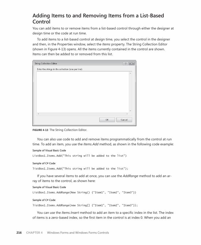
216 CHAPTER 4 Windows Forms and Windows Forms Controls
Adding Items to and Removing Items from a List-Based ControlYou can add items to or remove items from a list-based control through either the designer at design time or the code at run time.
To add items to a list-based control at design time, you select the control in the designer and then, in the Properties window, select the Items property. The String Collection Editor (shown in Figure 4-13) opens. All the items currently contained in the control are shown. Items can then be added to or removed from this list.
FIGURE 4-13 The String Collection Editor.
You can also use code to add and remove items programmatically from the control at run time. To add an item, you use the Items.Add method, as shown in the following code example:
Sample of Visual Basic Code
ListBox1.Items.Add("This string will be added to the list")
Sample of C# Code
listBox1.Items.Add("This string will be added to the list");
If you have several items to add at once, you can use the AddRange method to add an ar-ray of items to the control, as shown here:
Sample of Visual Basic Code
ListBox1.Items.AddRange(New String() {"Item1", "Item2", "Item3"})
Sample of C# Code
listBox1.Items.AddRange(new String[] {"Item1", "Item2", "Item3"});
You can use the Items.Insert method to add an item to a specific index in the list. The index of items is a zero-based index, so the first item in the control is at index 0. When you add an

Lesson 3: Using List-Display and Specialized Controls CHAPTER 4 217
item to an index already occupied by an item, that item and any items beneath it are shifted down one index. The following code shows how to insert an item to be third in the displayed list, assuming that the ListBox1 control is already populated with several items:
Sample of Visual Basic Code
ListBox1.Items.Insert(2, "This item will be third")
Sample of C# Code
listBox1.Items.Insert(2, "This item will be third");
You can use the Items.Remove method to remove an item from the list. This method requires a reference to the object you want to remove from the items collection. Note that if your control contains a collection of objects that are not strings, you will need to pass a refer-ence to the object itself—not just to the string representation that appears in the control—to remove it. The following example demonstrates the Items.Remove method:
Sample of Visual Basic Code
ListBox1.Items.Remove("This string will be removed")
Sample of C# Code
listbox1.Items.Remove("This string will be removed");
If you do not know the actual item you want to remove at run time but have the index of the item you want to remove, you can use the Items.RemoveAt method to remove the item at a given index and adjust the indexes of the other items accordingly. The Items.RemoveAt method is demonstrated in the following code example:
Sample of Visual Basic Code
' Removes the third item in the listListBox1.Items.RemoveAt(2)
Sample of C# Code
// Removes the third item in the list listBox1.Items.RemoveAt(2);
To remove all items from a list-based control, you can use the Items.Clear method, as shown here:
Sample of Visual Basic Code
ListBox1.Items.Clear()
Sample of C# Code
listBox1.Items.Clear();
Determining Where an Item Appears in a ListIf you want to determine where an item appears in a list programmatically, you can do so by using the Items.IndexOf method. This method takes the item you want to find as an argu-ment and returns an integer that represents the index of that item. If the item is not found

218 CHAPTER 4 Windows Forms and Windows Forms Controls
in the Items collection, the IndexOf method returns -1. An example of the IndexOf method is shown here:
Sample of Visual Basic Code
Dim anIndex As Integer anIndex = ListBox1.Items.IndexOf("A String")
Sample of C# Code
int anIndex; anIndex = listBox1.Items.IndexOf("A String");
You can also programmatically determine the index of an item that has been selected by the user by using the SelectedIndex property. The SelectedIndex property returns the item that has been selected in the user interface at run time. If more than one item has been selected, the SelectedIndex property can return any of the selected items. The SelectedIndex property is demonstrated here:
Sample of Visual Basic Code
Dim anIndex As Integer anIndex = ListBox1.SelectedIndex
Sample of C# Code
int anIndex; anIndex = listBox1.SelectedIndex;
In controls in which the SelectionMode property is set to MultiSimple or MultiExtended, you can return all the selected indexes by using the SelectedIndices property, as shown in the following example:
Sample of Visual Basic Code
For Each i As Integer In ListBox1.SelectedIndices Console.WriteLine(ListBox1.Items(i).ToString) Next
Sample of C# Code
foreach (int i in listBox1.SelectedIndices) { Console.WriteLine(listBox1.Items[i].ToString()); }
Binding List-Based Controls to Data SourcesYou will frequently want to expose data to the user in list-based controls. You can bind ListBox controls and ComboBox controls (but not CheckedListBox controls) to a data source by using the DataSource, DisplayMember, and ValueMember properties to bind a list-based control to a column of data in a data table.
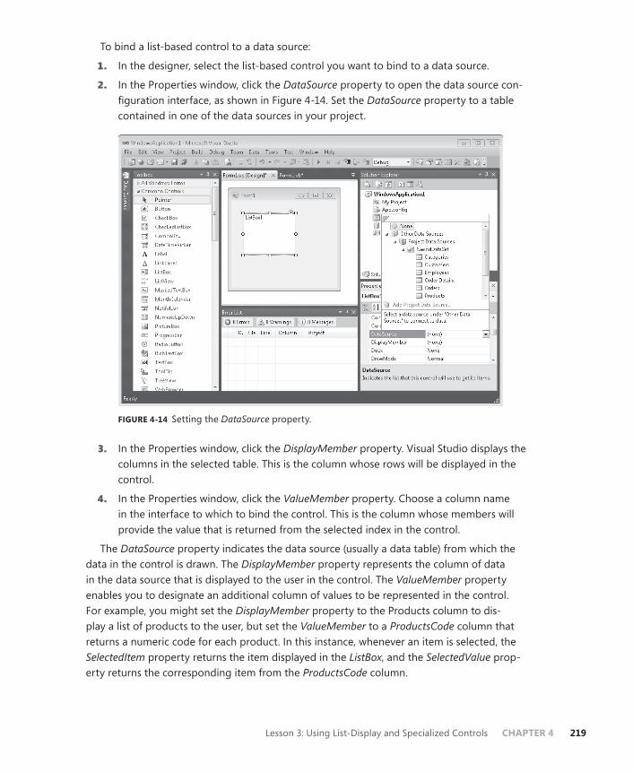
Lesson 3: Using List-Display and Specialized Controls CHAPTER 4 219
To bind a list-based control to a data source:
1. In the designer, select the list-based control you want to bind to a data source.
2. In the Properties window, click the DataSource property to open the data source con-figuration interface, as shown in Figure 4-14. Set the DataSource property to a table contained in one of the data sources in your project.
FIGURE 4-14 Setting the DataSource property.
3. In the Properties window, click the DisplayMember property. Visual Studio displays the columns in the selected table. This is the column whose rows will be displayed in the control.
4. In the Properties window, click the ValueMember property. Choose a column name in the interface to which to bind the control. This is the column whose members will provide the value that is returned from the selected index in the control.
The DataSource property indicates the data source (usually a data table) from which the data in the control is drawn. The DisplayMember property represents the column of data in the data source that is displayed to the user in the control. The ValueMember property enables you to designate an additional column of values to be represented in the control. For example, you might set the DisplayMember property to the Products column to dis-play a list of products to the user, but set the ValueMember to a ProductsCode column that returns a numeric code for each product. In this instance, whenever an item is selected, the SelectedItem property returns the item displayed in the ListBox, and the SelectedValue prop-erty returns the corresponding item from the ProductsCode column.
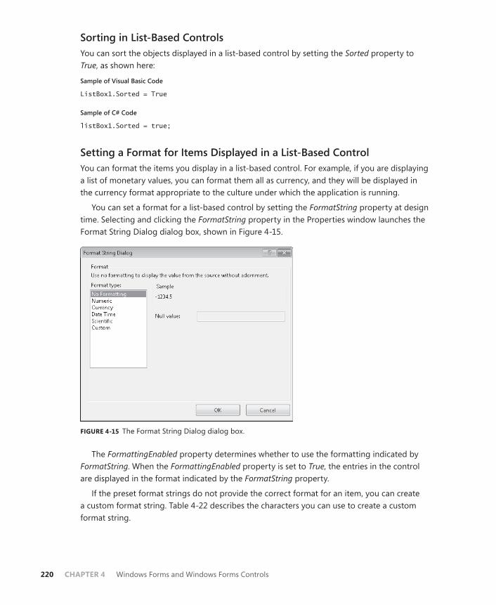
220 CHAPTER 4 Windows Forms and Windows Forms Controls
Sorting in List-Based ControlsYou can sort the objects displayed in a list-based control by setting the Sorted property to True, as shown here:
Sample of Visual Basic Code
ListBox1.Sorted = True
Sample of C# Code
listBox1.Sorted = true;
Setting a Format for Items Displayed in a List-Based ControlYou can format the items you display in a list-based control. For example, if you are displaying a list of monetary values, you can format them all as currency, and they will be displayed in the currency format appropriate to the culture under which the application is running.
You can set a format for a list-based control by setting the FormatString property at design time. Selecting and clicking the FormatString property in the Properties window launches the Format String Dialog dialog box, shown in Figure 4-15.
FIGURE 4-15 The Format String Dialog dialog box.
The FormattingEnabled property determines whether to use the formatting indicated by FormatString. When the FormattingEnabled property is set to True, the entries in the control are displayed in the format indicated by the FormatString property.
If the preset format strings do not provide the correct format for an item, you can create a custom format string. Table 4-22 describes the characters you can use to create a custom format string.
Lesson 3: Using List-Display and Specialized Controls CHAPTER 4 221
TABLE 4-22 Custom Format String Characters
CHARACTER DESCRIPTION
0 Zero placeholder. If the value being formatted has a digit in the position where the “0” appears in the format string, that digit is copied to the result string. The position of the left-most “0” before the decimal point and the right-most “0” after the decimal point determine the range of digits that are always present in the result string. Note that the “00” specifier causes the value to be rounded to the nearest digit preceding the decimal, where rounding away from zero is always used. For example, formatting 34.5 with “00” would result in the value 35.
# Digit placeholder. If the value being formatted has a digit in the position where the “#” appears in the format string, that digit is copied to the result string. Otherwise, nothing is stored in that position in the result string. Note that this specifier never displays the “0” character if it is not a signifi-cant digit, even if “0” is the only digit in the string. It will display the “0” character if it is a significant digit in the number being displayed. The “##” format string causes the value to be rounded to the nearest digit preceding the decimal, where rounding away from zero is always used. For example, formatting 34.5 with “##” would result in the value 35.
. Decimal separator. The first “.” character determines the location of the first decimal separator in the formatted value. Additional “.” characters are ignored. Note that the actual character used will be the decimal separator determined by the current locale.
, Thousands separator and scaling. First, if the format string contains a “,” character between two digit placeholders (0 or #) and to the left of the decimal point (if one is present), the output will have thousand separa-tors inserted between each group of three digits to the left of the decimal separator. The actual character used as the decimal separator in the result string is determined by the NumberGroupSeparator property of the current NumberFormatInfo property that controls formatting.
If the format string contains one or more “,” characters immediately to the left of the decimal point, the number will be divided by the number of “,” characters multiplied by 1000 before it is formatted. For example, the format string “0,” will represent 100 million simply as 100.
% Percentage placeholder. The presence of the % symbol causes the number represented to be multiplied by 100 before formatting. The % symbol ap-pears in the place in which it occurs in the format string.

222 CHAPTER 4 Windows Forms and Windows Forms Controls
E0, E+0, E-0, e0, e+0, e-0
Scientific notation. If any of the strings “E”, “E+”, “E-”, “e”, “e+”, or “e-” are present in the format string and are followed immediately by at least one “0” character, the number is formatted using scientific notation with an “E” or “e” inserted between the number and the exponent. The number of “0” characters following the scientific notation indicator determines the minimum number of digits to output for the exponent. The “E+” and “e+” formats indicate that a sign character (plus or minus) should always precede the exponent. The “E”, “E-”, “e”, or “e-” formats indicate that a sign character should precede only negative exponents.
\ Escape character. In C#, this character indicates that the character immedi-ately following the “\” is to be interpreted as an escape sequence. In Visual Basic, this character has no effect.
“ABC”, ‘ABC’ Literal strings. Characters enclosed in “” or ‘’ are displayed as literal strings in the formatted string.
; Section separator. The “;” character separates sections for positive, nega-tive, and zero numbers in the format string. You can provide up to three sections in a format string, each containing its own format. These sections should be separated by “;” characters and will be applied to positive, nega-tive, and zero numbers, respectively.
Other Characters
Other characters in the format string are represented as literal strings.
Selecting Items in a List-Based ControlYou can select items programmatically in a list-based control by using the SelectedItem or SelectedIndex property, as shown in the following example:
Sample of Visual Basic Code
ListBox1.SelectedItem = "This item will be selected"
Sample of C# Code
listBox1.SelectedItem = "This item will be selected";
If the SelectedItem property is set to an item that is not contained in the control, there is no effect, and no item is selected.
If the control allows multiple selections, you can select multiple items by setting the SelectedItem property multiple times if the SelectionMode property is set to MultiSimple or MultiExtended (which is supported by only the ListBox control). When selected, an item re-mains selected until cleared by the user. An example is shown here:
Sample of Visual Basic Code
ListBox1.SelectedItem = "This item will be selected" ListBox1.SelectedItem = "This item will be selected too"
Lesson 3: Using List-Display and Specialized Controls CHAPTER 4 223
Sample of C# Code
listBox1.SelectedItem = "This item will be selected"; listBox1.SelectedItem = "This item will be selected too";
The SelectedIndex property functions in a way similar to the SelectedItem property except that it is an Integer type that corresponds to the sequential item in the list. You can select an item in the control by setting the SelectedIndex property to the corresponding index, and you can select multiple items by setting the property multiple times in succession. The main difference between the behavior of the SelectedItem property and the SelectedIndex property is that the SelectedIndex property throws an exception if an attempt is made to set it to a nonexistent index.
The ListView ControlThe ListView control enables you to view lists of items with optional associated icons in the manner of Windows Explorer. Using the ListView control, you can display items with large associated icons, small associated icons, or additional details about the item. Table 4-23 shows important properties of the ListView control.
TABLE 4-23 Important Properties of the ListView Control
PROPERTY DESCRIPTION
Columns Contains the collection of columns to be displayed when the View property is set to Details.
Groups Contains an optional collection of groups that can be used to catego-rize the items contained in the Items collection.
Items A collection of ListViewItems displayed in the ListView control.
LargeImageList The ImageList component from which images for ListViewItems are drawn when the View property is set to LargeIcon.
ShowGroups Determines whether the groups contained in the Groups collection are shown.
SmallImageList The ImageList component from which images for ListViewItems are drawn when the View property is set to SmallIcon.
View Indicates the manner in which ListView items are displayed.
The most important property in the ListView control is the Items property. This property contains a collection of ListViewItem objects. Unlike the list-based controls examined earlier, ListView items are specific objects that contain additional information about the item being displayed, such as icons that are shown in the control. Table 4-24 shows important properties of the ListViewItem class.
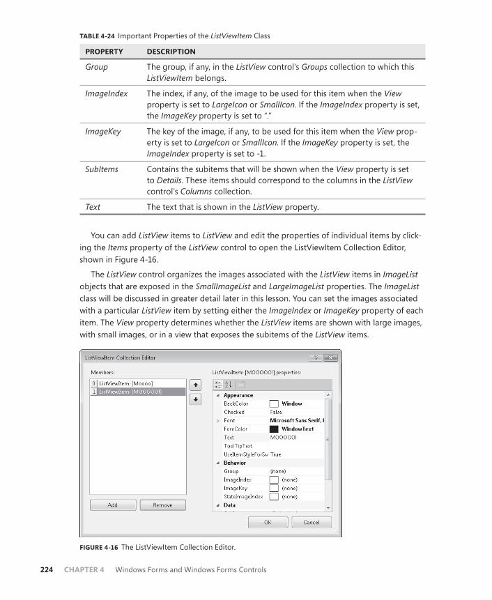
224 CHAPTER 4 Windows Forms and Windows Forms Controls
TABLE 4-24 Important Properties of the ListViewItem Class
PROPERTY DESCRIPTION
Group The group, if any, in the ListView control’s Groups collection to which this ListViewItem belongs.
ImageIndex The index, if any, of the image to be used for this item when the View property is set to LargeIcon or SmallIcon. If the ImageIndex property is set, the ImageKey property is set to “.”
ImageKey The key of the image, if any, to be used for this item when the View prop-erty is set to LargeIcon or SmallIcon. If the ImageKey property is set, the ImageIndex property is set to -1.
SubItems Contains the subitems that will be shown when the View property is set to Details. These items should correspond to the columns in the ListView control’s Columns collection.
Text The text that is shown in the ListView property.
You can add ListView items to ListView and edit the properties of individual items by click-ing the Items property of the ListView control to open the ListViewItem Collection Editor, shown in Figure 4-16.
The ListView control organizes the images associated with the ListView items in ImageList objects that are exposed in the SmallImageList and LargeImageList properties. The ImageList class will be discussed in greater detail later in this lesson. You can set the images associated with a particular ListView item by setting either the ImageIndex or ImageKey property of each item. The View property determines whether the ListView items are shown with large images, with small images, or in a view that exposes the subitems of the ListView items.
FIGURE 4-16 The ListViewItem Collection Editor.
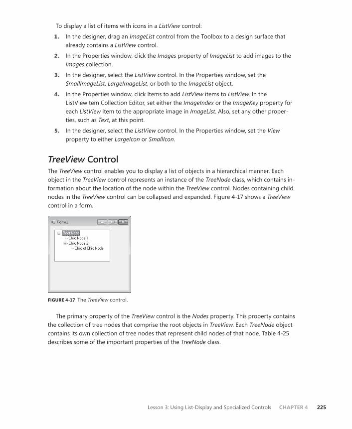
Lesson 3: Using List-Display and Specialized Controls CHAPTER 4 225
To display a list of items with icons in a ListView control:
1. In the designer, drag an ImageList control from the Toolbox to a design surface that already contains a ListView control.
2. In the Properties window, click the Images property of ImageList to add images to the Images collection.
3. In the designer, select the ListView control. In the Properties window, set the SmallImageList, LargeImageList, or both to the ImageList object.
4. In the Properties window, click Items to add ListView items to ListView. In the ListViewItem Collection Editor, set either the ImageIndex or the ImageKey property for each ListView item to the appropriate image in ImageList. Also, set any other proper-ties, such as Text, at this point.
5. In the designer, select the ListView control. In the Properties window, set the View property to either LargeIcon or SmallIcon.
TreeView ControlThe TreeView control enables you to display a list of objects in a hierarchical manner. Each object in the TreeView control represents an instance of the TreeNode class, which contains in-formation about the location of the node within the TreeView control. Nodes containing child nodes in the TreeView control can be collapsed and expanded. Figure 4-17 shows a TreeView control in a form.
FIGURE 4-17 The TreeView control.
The primary property of the TreeView control is the Nodes property. This property contains the collection of tree nodes that comprise the root objects in TreeView. Each TreeNode object contains its own collection of tree nodes that represent child nodes of that node. Table 4-25 describes some of the important properties of the TreeNode class.

226 CHAPTER 4 Windows Forms and Windows Forms Controls
TABLE 4-25 Important Properties of the TreeNode Class
PROPERTY DESCRIPTION
FirstNode Returns the first node in the current group of child nodes.
LastNode Returns the last node in the current group of child nodes.
NextNode Returns the next sibling tree node.
NextVisibleNode Returns the next visible node.
Nodes Returns the collection of child nodes belonging to this node.
Parent Returns the parent node of the current node. If the current node is a root node in TreeView, accessing this property will return null.
PrevNode Returns the previous sibling tree node.
PrevVisibleNode Returns the previous visible node.
TreeView Returns a reference to the TreeView control in which the TreeNode is contained.
Adding and Removing Nodes from the TreeView ControlsAt design time, you can add nodes to a TreeView control by clicking the Nodes property in the Properties window to display the TreeNode Editor (shown in Figure 4-18). You can add new root nodes or new child nodes and set the properties of each tree node.
FIGURE 4-18 The TreeNode Editor.
At run time, you can create new TreeNode objects and add them to the TreeView control as root nodes, or add them to another TreeNode object as child nodes. For both of these proce-dures, you use the Nodes.Add method, as shown here:

Lesson 3: Using List-Display and Specialized Controls CHAPTER 4 227
Sample of Visual Basic Code
Dim aNode As New TreeNode("New Node") ' Add a child node to the new node aNode.Nodes.Add(New TreeNode("New Child")) ' Adds aNode and its child As a new root node in a TreeView control named TreeView1 TreeView1.Nodes.Add(aNode) ' Adds a second child node to the first node in TreeView1 TreeView1.Nodes(0).Nodes.Add(New TreeNode("Second Child"))
Sample of C# Code
TreeNode aNode = new TreeNode("New Node"); // Add a child node to the new node aNode.Nodes.Add(new TreeNode("New Child")); // Adds aNode and its child as a new root node in a TreeView control named TreeView1 treeView1.Nodes.Add(aNode); // Adds a second child node to the first node in TreeView1 treeView1.Nodes[0].Nodes.Add(new TreeNode("Second Child"));
You can remove nodes from the Nodes collection by using the Remove and RemoveAt methods. The Remove method takes a reference to a particular node as a parameter and removes it from the collection if it exists in the collection. If the specified node does not exist in the collection, this method call is ignored. The RemoveAt method removes the node at a specified index. If the specified index is not present in the nodes collection, an ArgumentOutOfRange exception is thrown. The following example demonstrates the Remove and RemoveAt methods:
Sample of Visual Basic Code
' Removes the node named aNode from the collection TreeView1.Nodes.Remove(aNode) ' Removes the node at index 3 from the collection. TreeView1.Nodes.RemoveAt(3)
Sample of C# Code
// Removes the node named aNode from the collection treeView1.Nodes.Remove(aNode); // Removes the node at index 3 from the collection. treeView1.Nodes.RemoveAt(3);
Expanding and Collapsing Nodes The TreeView control presents a hierarchical view of nodes that can be expanded or collapsed to reveal or hide the child nodes as appropriate. You can expand or collapse child nodes programmatically at run time by using the Expand and Collapse methods, as shown in the following example:
Sample of Visual Basic Code
' Expands the child nodes of a TreeNode named aNode aNode.Expand() ' Collapses the child nodes of a TreeNode named aNode aNode.Collapse()
228 CHAPTER 4 Windows Forms and Windows Forms Controls
Sample of C# Code
// Expands the child nodes of a TreeNode named aNode aNode.Expand(); // Collapses the child nodes of a TreeNode named aNode aNode.Collapse();
NumericUpDown ControlThe NumericUpDown control enables you to set a range of numbers a user can browse and select. A range of numbers is presented in the control, and the user can click the up and down arrows to increase or decrease the number. Table 4-26 shows important properties of the NumericUpDown control.
TABLE 4-26 Important Properties of the NumericUpDown Control
PROPERTY DESCRIPTION
Hexadecimal Indicates whether the numeric value will be shown in hexadecimal.
Increment Gets or sets the amount to increment or decrement with each button click.
Maximum Indicates the maximum value for the control.
Minimum Indicates the minimum value for the control.
ThousandsSeparator Indicates whether the culture-appropriate thousands separator will be used when displaying values greater than 1000.
Value Gets or sets the current value of the control.
To configure the NumericUpDown control:
1. Set the Minimum property to the minimum numeric value for the control.
2. Set the Maximum property to the maximum numeric value for the control.
3. Set the Increment property to the amount you want to increment and decrement with each arrow button click.
4. If desired, set the Value property to a default value.
DomainUpDown ControlThe DomainUpDown control is similar to the NumericUpDown control in that it enables users to browse a specified series of data and set a value for the control. Instead of browsing nu-meric values, however, the DomainUpDown control enables the user to browse a collection of preset strings. Table 4-27 describes the important properties of the DomainUpDown control.

Lesson 3: Using List-Display and Specialized Controls CHAPTER 4 229
TABLE 4-27 Important Properties of the DomainUpDown Control
PROPERTY DESCRIPTION
Items Contains the collection of strings displayed in the DomainUpDown control.
ReadOnly Indicates whether the user can alter the Text property of the control.
Text Gets or sets the text of the control.
The Items collection contains the strings displayed in the DomainUpDown control. You can add strings by clicking the Items property in the Properties window to display the String Collection Editor. When ReadOnly is set to False, the user can choose to type a string in the DomainUpDown control instead of choosing one of the strings. Note that strings typed by the user are not added to the Items collection. Also note that the Text property defines the default value for the control, not for the Items collection.
Quick Check 1. What is the purpose of the TreeView control?
2. What is the purpose of a ListView control, and when would you use one?
Quick Check Answers 1. The TreeView control enables you to display a list of data in a hierarchically re-
lated manner.
2. The ListView control provides a highly configurable control that enables you to display lists of data in a variety of ways. You can use a ListView control when you want to provide different options to the user for the display of list data, such as providing icons or details about the data.
Value-Setting ControlsValue-setting controls enable the user to set values or pick options from a preset list in the user interface. The CheckBox control enables a user to select or clear particular options in a nonexclusive manner, and the RadioButton control enables you to present a range of options to the user, only one of which can be selected. The TrackBar control enables the user to set a value rapidly in a graphical interface.
The CheckBox ControlThe CheckBox control is a very familiar control to users. It enables the user to mark a check box next to a label to indicate acceptance or rejection of the option presented. CheckBox controls function in a nonexclusive manner; you can have multiple CheckBox controls on a single form, and any combination of them can be selected or cleared at a single time. Table 4-28 shows important properties of the CheckBox control.

230 CHAPTER 4 Windows Forms and Windows Forms Controls
TABLE 4-28 Important Properties of the CheckBox Control
PROPERTY DESCRIPTION
AutoCheck Determines whether the CheckBox is automatically checked when the text is clicked.
Checked Gets or sets whether the CheckBox is checked.
CheckState Returns the CheckState of the control. Possible values for this property are Checked, Unchecked, and Indeterminate.
Text The text displayed next to the check box.
ThreeState Determines whether the CheckBox control allows two or three check states.
The most common use for the CheckBox control is to enable the user to make a binary de-cision about an option by either selecting the box or not selecting it. Typically, the check box is used for nonexclusive options; that is, selecting a particular check box usually does not af-fect the state of other text boxes. Figure 4-19 shows an example of a hypothetical pizza order form. Option buttons are used to choose between the exclusive options of Pizza or Calzone, and CheckBox controls are used to select toppings for the pizza or calzone selected.
FIGURE 4-19 Example of CheckBox and RadioButton controls.
You can determine programmatically whether a CheckBox control is selected by access-ing the Checked property. This property returns True if the control is selected and False if the control is cleared or indeterminate.
A less common use for CheckBox is to enable the user to choose among three settings: Checked, Unchecked, or Indeterminate. This can be useful to indicate to the user that a con-scious decision must be made for each option rather than simply setting a default option. You enable three-state CheckBox controls by setting the ThreeState property to True to enable the user to cycle through the three states, rather than just the two, for the check box. You can determine the state of the check box by accessing the CheckState property.
Note that you can set the CheckState property to Indeterminate at design time even if you set the ThreeState property to False. This causes the CheckBox controls to start in the
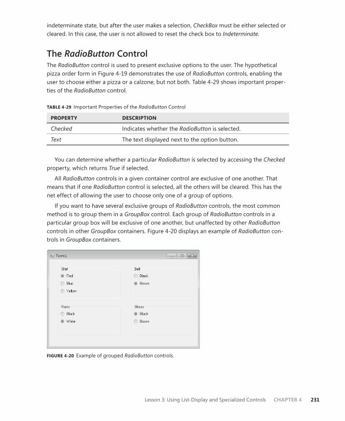
Lesson 3: Using List-Display and Specialized Controls CHAPTER 4 231
indeterminate state, but after the user makes a selection, CheckBox must be either selected or cleared. In this case, the user is not allowed to reset the check box to Indeterminate.
The RadioButton ControlThe RadioButton control is used to present exclusive options to the user. The hypothetical pizza order form in Figure 4-19 demonstrates the use of RadioButton controls, enabling the user to choose either a pizza or a calzone, but not both. Table 4-29 shows important proper-ties of the RadioButton control.
TABLE 4-29 Important Properties of the RadioButton Control
PROPERTY DESCRIPTION
Checked Indicates whether the RadioButton is selected.
Text The text displayed next to the option button.
You can determine whether a particular RadioButton is selected by accessing the Checked property, which returns True if selected.
All RadioButton controls in a given container control are exclusive of one another. That means that if one RadioButton control is selected, all the others will be cleared. This has the net effect of allowing the user to choose only one of a group of options.
If you want to have several exclusive groups of RadioButton controls, the most common method is to group them in a GroupBox control. Each group of RadioButton controls in a particular group box will be exclusive of one another, but unaffected by other RadioButton controls in other GroupBox containers. Figure 4-20 displays an example of RadioButton con-trols in GroupBox containers.
FIGURE 4-20 Example of grouped RadioButton controls.

232 CHAPTER 4 Windows Forms and Windows Forms Controls
The TrackBar ControlThe TrackBar control provides a simple interface that enables the user to set a value from a predetermined range of values by graphically manipulating a slider with the mouse or keyboard commands. This enables the user to rapidly set a value from a potentially very large range. Table 4-30 shows important properties of the TrackBar control.
TABLE 4-30 Important Properties of the TrackBar Control
PROPERTY DESCRIPTION
LargeChange The number of positions the slider moves in response to mouse clicks or the Page Up and Page Down keys.
Maximum The maximum value for TrackBar.
Minimum The minimum value for TrackBar.
SmallChange The number of positions the slider moves in response to arrow key keystrokes.
TickFrequency The number of positions between tick marks on TrackBar.
TickStyle Indicates where ticks appear on TrackBar.
Value The value returned by TrackBar.
Figure 4.21 shows the TrackBar control.
FIGURE 4-21 The TrackBar control.
The TrackBar control can return an integer value in any range between the values of the Minimum and Maximum properties. The user can set this value by manipulating the graphical slider on the track bar. Clicking the control or using the Page Up and Page Down keys while the control is selected causes the value to change by the increment set in the LargeChange property. Using the arrow keys while the control is selected causes the value to change by the increment set in the SmallChange property. The user can also grab the slider with the mouse and adjust it to whatever value is needed. The Value property indicates the current value of the track bar.
Lesson 3: Using List-Display and Specialized Controls CHAPTER 4 233
Choosing Dates and TimesUser interfaces frequently require the user to be allowed to set a date or time. For example, an application that enables a user to make a reservation would require a date for the reserva-tion to be entered. Visual Studio provides two controls that enable date and time choosing: DateTimePicker and MonthCalendar.
DateTimePicker ControlThe DateTimePicker control enables the user to set a date, a time, or both in an easy-to-understand graphical interface similar to a ComboBox control. The user can click the drop-down box to display a calendar interface to choose a day from a calendar or type a time into the text area in DateTimePicker. The chosen day or time is then displayed in the text area of DateTimePicker, and the Value property is set to the chosen date and time. Table 4-31 shows important properties of the DateTimePicker control.
TABLE 4-31 Important Properties of the DateTimePicker Control
PROPERTY DESCRIPTION
CustomFormat The custom DateTime format to be used when the Format property is set to Custom.
Format Sets the format for the DateTime format displayed in DateTimePicker. Can be set to Long, which displays the value in long date format; Short, which displays the value in short date format; Time, which displays the time only; or Custom, which uses the custom DateTime format indi-cated by the CustomFormat property.
MaxDate The maximum DateTime value the DateTimePicker will accept.
MinDate The minimum DateTime value the DateTimePicker will accept.
Value The DateTime value to which DateTimePicker is currently set.
When the Format property is set to Long or Short, only the date is displayed, and the date can only be set through the graphical interface. When the Format property is set to Time, the user can type a new time value into the text area of DateTimePicker. The user can still choose a day through the drop-down interface. Although this day is reflected in the Value property, it is not displayed when the Format property is set to Time.
MonthCalendar ControlThe MonthCalendar control is a highly configurable control that enables the user to select a range of dates in a highly intuitive interface. Table 4-32 shows the important properties of the MonthCalendar control.

234 CHAPTER 4 Windows Forms and Windows Forms Controls
TABLE 4-32 Important Properties of the MonthCalendar Control
PROPERTY DESCRIPTION
AnnuallyBoldedDates Contains an array of dates and times that will appear bold every year.
BoldedDates Contains an array of dates and times that will appear bold.
FirstDayOfWeek Determines which day of the week is set as the first day of the week in the MonthCalendar control.
MaxDate Sets the maximum date that can be chosen in MonthCalendar.
MinDate Sets the minimum date that can be chosen in MonthCalendar.
MaxSelectionCount Sets the maximum number of days that can be selected in MonthCalendar.
MonthlyBoldedDates Contains an array of dates and times that will appear bold every month in MonthCalendar.
SelectionEnd Indicates the ending date and time of the SelectionRange property.
SelectionRange Contains the range of dates selected by the user.
SelectionStart Indicates the starting date and time of the SelectionRange property.
The user can select a single date by clicking a date in MonthCalendar or a continu-ous range of dates by holding down the Shift key while clicking the starting date and the ending date. The range of dates selected cannot be a greater number of days than the MaxSelectionCount property indicates.
At run time, you can retrieve the selected dates by accessing the SelectionStart and SelectionEnd properties, which expose the Start and End properties of the SelectionRange property. The following example demonstrates how to access the SelectionStart and SelectionEnd properties:
Sample of Visual Basic Code
MsgBox("Your vacation starts on " & _ MonthCalendar1.SelectionStart.ToLongDateString & _ " and ends on " & MonthCalendar1.SelectionEnd.ToLongDateString)
Sample of C# Code
MessageBox.Show("Your vacation starts on " + monthCalendar1.SelectionStart.ToLongDateString() + " and ends on " + monthCalendar1.SelectionEnd.ToLongDateString());
Lesson 3: Using List-Display and Specialized Controls CHAPTER 4 235
Working with ImagesImages enable you to liven up your user interface as well as provide important information to the user. Visual Studio contains several components and controls that facilitate the display of images. The PictureBox control is an all-around control that displays pictures in different formats. The ImageList component manages and organizes a collection of images and can be used to display images in ListView or to organize images for other controls.
PictureBox ControlThe PictureBox control is the basic control used for displaying images in the user interface, and it can display pictures in a variety of formats, including .bmp, .jpg, .gif, metafiles, and icons. You can display images that are present in application resource files or compiled into the application, or you can load images from a Web or disk address. Table 4-33 describes important properties of the PictureBox control.
TABLE 4-33 Important Properties of the PictureBox Control
PROPERTY DESCRIPTION
ErrorImage The image that will be displayed if the selected image fails to load.
Image The image to be loaded in PictureBox.
ImageLocation A Web or disk address from which to load the image.
InitialImage The image to be displayed in PictureBox while the image is loading.
SizeMode Determines how the control handles image placement and sizing.
You can set the Image property at design time by clicking it in the Properties window, which opens the Select Resource dialog box, shown in Figure 4-22.
You can select an image resource already present in a project resource file by selecting the Project Resource File option button and selecting the .resx file that contains the image. You can also import a new image into a resource file by clicking the Import button and navigating to the image you want to import. The selected image is added to the selected .resx file. You can also import the image as a local resource by selecting the Local Resource option button and clicking the Import button to browse to the image you want to import. Importing an image as a local resource only makes it available to the PictureBox control and unavailable to the rest of the application.
Instead of loading an image from a resource, you can specify a URL from which to load an image by setting the ImageLocation property. When the ImageLocation property is set, the image is loaded from the specified address, and the Image property is set to that image.

236 CHAPTER 4 Windows Forms and Windows Forms Controls
FIGURE 4-22 The Select Resource dialog box.
At run time, you can set the Image property to an instance of an image, as shown in the following example:
Sample of Visual Basic Code
Dim anImage As New System.Drawing.Bitmap("C:\anImage.bmp") PictureBox1.Image = anImage
Sample of C# Code
System.Drawing.Bitmap anImage = new System.Drawing.Bitmap(@"C:\anImage.bmp"); pictureBox1.Image = anImage;
ImageList ComponentThe ImageList component is not a control as such, but it enables you to organize groups of images. Although it has no visual representation itself, it can supply images to other controls, such as ListView, or serve as a repository for images to be loaded into a picture box. You can set the size and color depth for the images and iterate through them as you would a collec-tion. Table 4-34 shows important properties of the ImageList component.
TABLE 4-34 Important Properties of the ImageList Component
PROPERTY DESCRIPTION
ColorDepth Sets the color depth for the images contained in the ImageList component.
Images The collection of images organized by the ImageList component.
ImageSize Sets the size for the images contained in the ImageList component.
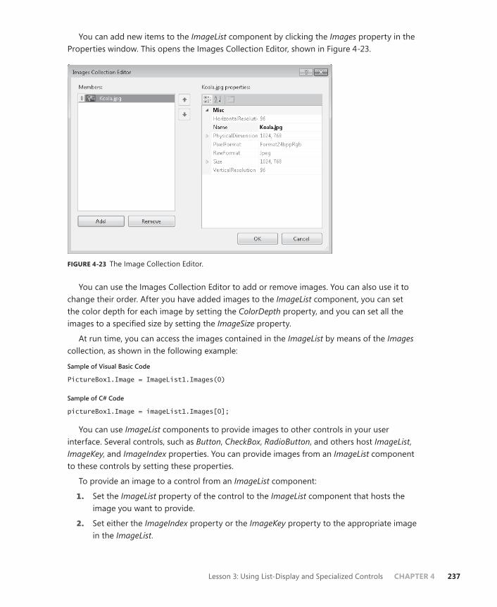
Lesson 3: Using List-Display and Specialized Controls CHAPTER 4 237
You can add new items to the ImageList component by clicking the Images property in the Properties window. This opens the Images Collection Editor, shown in Figure 4-23.
FIGURE 4-23 The Image Collection Editor.
You can use the Images Collection Editor to add or remove images. You can also use it to change their order. After you have added images to the ImageList component, you can set the color depth for each image by setting the ColorDepth property, and you can set all the images to a specified size by setting the ImageSize property.
At run time, you can access the images contained in the ImageList by means of the Images collection, as shown in the following example:
Sample of Visual Basic Code
PictureBox1.Image = ImageList1.Images(0)
Sample of C# Code
pictureBox1.Image = imageList1.Images[0];
You can use ImageList components to provide images to other controls in your user interface. Several controls, such as Button, CheckBox, RadioButton, and others host ImageList, ImageKey, and ImageIndex properties. You can provide images from an ImageList component to these controls by setting these properties.
To provide an image to a control from an ImageList component:
1. Set the ImageList property of the control to the ImageList component that hosts the image you want to provide.
2. Set either the ImageIndex property or the ImageKey property to the appropriate image in the ImageList.
238 CHAPTER 4 Windows Forms and Windows Forms Controls
Quick Check 1. What is the difference between how a RadioButton control and a CheckBox con-
trol are used?
2. What is the purpose of an ImageList control, and how is it used?
Quick Check Answers 1. Option buttons enable the user to choose a single option from a set of mutually
exclusive options. CheckBox controls enable the user to select multiple options, usually regardless of whether any other options in the group are selected.
2. An ImageList control is used to organize a set of related images, generally to provide images to the controls on a form. You can set the ImageList property of the controls on a form to an instance of ImageList and then set either the ImageIndex or the ImageKey property to specify the image.
PRACTICE Adventure Works Ski Instructor Reservation Form
In this lab, you use what you have learned in this lesson to add functionality to a simple appli-cation designed to reserve ski instructors. You add a ComboBox that enables the user to select the mountain on which he or she wants to ski, a ListView control to select a ski instructor, and a NumericUpDown control to select the length of the lesson. You add a group of CheckBox controls to enable the user to indicate required ski rental equipment, a group of RadioButton controls to enable the user to indicate his or her ski skill level, and an ImageList component to integrate with the ListView control so the user can see faces to go with the names.
EXERCISE The Ski Instructor Reservation Form
1. In Visual Studio, load the partial solution for this lesson.
2. In Form1, beneath the Name text box, add a Label control and a ComboBox control. Set the Text property of the Label control to Choose Ski Run.
3. Set the DropDownStyle property of ComboBox to DropDownList.
4. Add the following items to the ComboBox Items property: Camelback, Powder Point, and The Plunge.
5. Add a Label control and a NumericUpDown control to the form. Set the Text property of Label to Lesson Length.
6. Set the Minimum property of the NumericUpDown control to 1 and the Maximum property to 3.
7. Add a Label control and a ListView control to the form. Set the Text property of the Label control to Choose Instructor.
Lesson 3: Using List-Display and Specialized Controls CHAPTER 4 239
8. In the Properties window, set the View property of the ListView control to SmallIcon. Later in this practice, you will associate the items in this list with images.
9. In the Properties window, click the Items property to add four ListView items to ListView. In the ListViewItem Collection Editor, set their Text properties to Sandy, Jack, Libby, and Christa.
10. Add a Button control to the form and set the Text property to Make Reservation.
11. In the designer, double-click the button and add the following code to the Button_ Click event handler:
Sample of Visual Basic Code
If ListView1.SelectedItems.Count > 0 Then MsgBox("Your reservation with " & listView1.SelectedItems(0).Text & _ " is confirmed.") End If
Sample of C# Code
if (listView1.SelectedItems.Count > 0) { MessageBox.Show("Your reservation with " + listView1.SelectedItems[0].Text + " is confirmed."); }
12. Drag a GroupBox container onto the form. Set the Text property of GroupBox to Rental Equipment.
13. Drag three CheckBox controls into GroupBox. Set the Text properties of the CheckBox controls to Skis, Poles, and Boots.
14. Drag a GroupBox container onto the form. Set the Text property of GroupBox to Skill Level.
15. Drag three RadioButton controls into GroupBox. Set the Text properties of the RadioButton controls to Beginner, Intermediate, and Advanced.
16. Drag a Label control and a DateTimePicker control onto the form. Set the Text property of Label to Select Lesson Time.
17. Set the Format property of DateTimePicker to Time.
18. Drag an ImageList component from the Toolbox onto the form.
19. In the Properties window, set the ImageSize property of the ImageList component to 32,32 and set the ColorDepth property to Depth16Bit.
20. In the Properties window, click Images to add four images to the ImageList component. You will find sample images on the Companion CD in the Images subfolder of the Code folder.
21. In the designer, select the ListView control. In the Properties window, set the SmallImageList property to ImageList1.

240 CHAPTER 4 Windows Forms and Windows Forms Controls
22. In the Properties window, click Items to open the ListViewItem Collection Editor. In the ListViewItem Collection Editor, set the ImageIndex property for ListView items 0, 1, 2, and 3 to 0, 1, 2, and 3, respectively. Images should now display next to the icons in the ListView control.
23. Press F5 to build and test your application.
Lesson Summary■ List-based controls are used to organize and present lists of information to the user.
The ListBox, ComboBox, and CheckedListBox controls organize items through the Items property and share many common methods and properties.
■ The ListBox control enables you to display a selection of items to the user and enables the user to select one or more items from that list.
■ The ComboBox control can appear similar to a ListBox control or as a drop-down list. You can require users to select from a list or choose to enable them to type an entry that is not present in the list.
■ The CheckedListBox control enables you to display a list of items with a check box be-side each one, enabling the user to select as many items as desired. Although multiple items can be selected, only one item can be selected in the CheckedListBox at any time.
■ The ListView control allows specialized displays of lists of items. Items can be displayed in association with icons provided by an ImageList component or with additional col-umns of subitems.
■ The TreeView control enables you to display lists of items in a hierarchical format. Each node contains a collection of child nodes, which can themselves have child nodes. Nodes can be expanded or collapsed.
■ The NumericUpDown control enables the user to click up or down arrows to select a numeric value. The DomainUpDown control enables the user to click up or down ar-rows to select from a preselected set of options.
■ The CheckBox control enables users to select options nonexclusively. You can use groups of CheckBox controls to enable the user to select multiple options.
■ The RadioButton control enables you to present a group of exclusive options to the user. You can use groups of RadioButton controls to present a list of options, only one of which can be chosen.
■ The TrackBar control enables the user to set a numeric value rapidly and graphically by adjusting a slider with mouse or keyboard commands.
■ The DateTimePicker control enables the user to set a date or time. When set to Time format, times can be typed into DateTimePicker. Days can be chosen from the drop-down calendar interface.
Lesson 3: Using List-Display and Specialized Controls CHAPTER 4 241
■ The MonthCalendar control is a highly configurable control that enables the user to select a range of dates from an intuitive user interface. You can configure bold dates and set the maximum length of the date range to be selected by the user.
■ The PictureBox control is an all-purpose control for displaying images in the user inter-face. It can display images in a variety of formats. The ImageList component organizes a collection of images and can set images to a common size and color depth.
Lesson ReviewThe following questions are intended to reinforce key information presented in Lesson 3, “ Using List-Display and Specialized Controls.” The questions are also available on the compan-ion CD if you prefer to review them in electronic form.
NOTE ANSWERS
Answers to these questions and explanations of why each answer choice is correct or incor-rect are located in the “Answers” section at the end of the book.
1. Which of the following properties and methods can be used to find the index of a selected item in a ListBox control? (Choose all that apply.)
A. ListBox.IndexOf
B. ListBox.SelectedIndex
C. ListBox.SelectedIndices
D. ListBox.Select
2. Which of the following methods CANNOT be used to add an item to the Items collec-tion of a ComboBox, ListBox, or CheckedListBox control?
A. Items.Add
B. Items.Insert
C. Items.AddRange
D. Items.Contains
3. Which of the following is NOT a valid setting for the View property of the ListView control?
A. LargeIcon
B. Details
C. Tree
D. SmallIcon

242 CHAPTER 4 Windows Forms and Windows Forms Controls
4. Which of the following are possible values for the Checked property of a CheckBox control? (Choose all that apply.)
A. Checked
B. False
C. Indeterminate
D. Unchecked
E. True
F. NotChecked
5. You are designing an application that asks the user to select a period ranging from one day to seven days in a given month. Which of the following configurations for a MonthCalendar control are best choices to facilitate this functionality? (Choose all that apply.)
A. Set the MaxSelectionCount property to 7.
B. Set the SelectionRange property to the first and last days of the month in question.
C. Set the MaxDate property to the last day of the month in question.
D. Set the MinDate property to the first day of the month in question.
6. Which of the following code examples correctly associates an image from an ImageList component with a Button control? Assume an ImageList component named ImageList1 and a Button control named Button1. (Choose all that apply.)
A.
Sample of Visual Basic Code
Button1.Image = ImageList1
Sample of C# Code
button1.Image = imageList1;
B.
Sample of Visual Basic Code
Button1.ImageList = ImageList1 Button1.ImageKey = ImageList1.Images(0)
Sample of C# Code
button1.ImageList1 = imageList1; button1.ImageKey = imageList1.Images(0);
C.
Sample of Visual Basic Code
Button1.ImageList = ImageList1 Button1.ImageIndex = 0
Lesson 3: Using List-Display and Specialized Controls CHAPTER 4 243
Sample of C# Code
button1.ImageList = imageList1; button1.ImageIndex = 0;
D.
Sample of Visual Basic Code
Button1.ImageList = ImageList1 Button1.ImageKey = "myImage"
Sample of C# Code
button1.ImageList = imageList1; button1.ImageKey = "myImage";

244 CHAPTER 4 Windows Forms and Windows Forms Controls
Lesson 4: Using Tool Strips and Menus
The ToolStrip control is designed to facilitate the creation of custom toolbars that behave and look like Office and Microsoft Internet Explorer toolbars. Using the ToolStrip control, you can rapidly develop highly configurable, professional-looking toolbars that expose your custom functionality. Menus have always been part of Windows Forms applications. They give the user quick and easy access to important application commands in an easy-to-understand, easy-to-browse interface. The .NET Framework version 2.0 introduced MenuStrips, which enable the rapid creation of Forms menus as well as context menus (also known as shortcut menus, which appear when the user right-clicks an object).
After this lesson, you will be able to:■ Create toolstrips, menus, and context menus.■ Configure them for use in your application.
Estimated lesson time: 60 minutes
Overview of the ToolStrip ControlThe ToolStrip control enables you to create toolbars that have professional and consistent be-havior and appearance. ToolStrip controls are containers for ToolStripItem controls designed to be hosted inside a tool strip. You can use ToolStripItem controls to give the user a wide variety of options and functionality.
ToolStrip controls encapsulate much of the functionality required for managing a toolbar. They manage the layout and positioning of their contained tool strip controls, enable the user to reorder the tool strip items, manage rendering, and create overflow buttons when a tool strip hosts more tool strip items than it can display. Table 4-35 shows some of the important properties of the ToolStrip control.
TABLE 4-35 Important Properties of the ToolStrip Control
PROPERTY DESCRIPTION
AllowItemReorder Indicates whether the user can reorder items. When set to True, con-tained tool strip items can be reordered when the user holds down the Alt key and grabs the item with the mouse.
AllowMerge Indicates whether this tool strip can be merged with another tool strip.
CanOverflow Indicates whether tool strip items can be automatically moved to the overflow button when needed.
Dock Indicates how the tool strip is docked. Although ToolStrip controls can be free in the form, they are usually docked to one of the form edges.
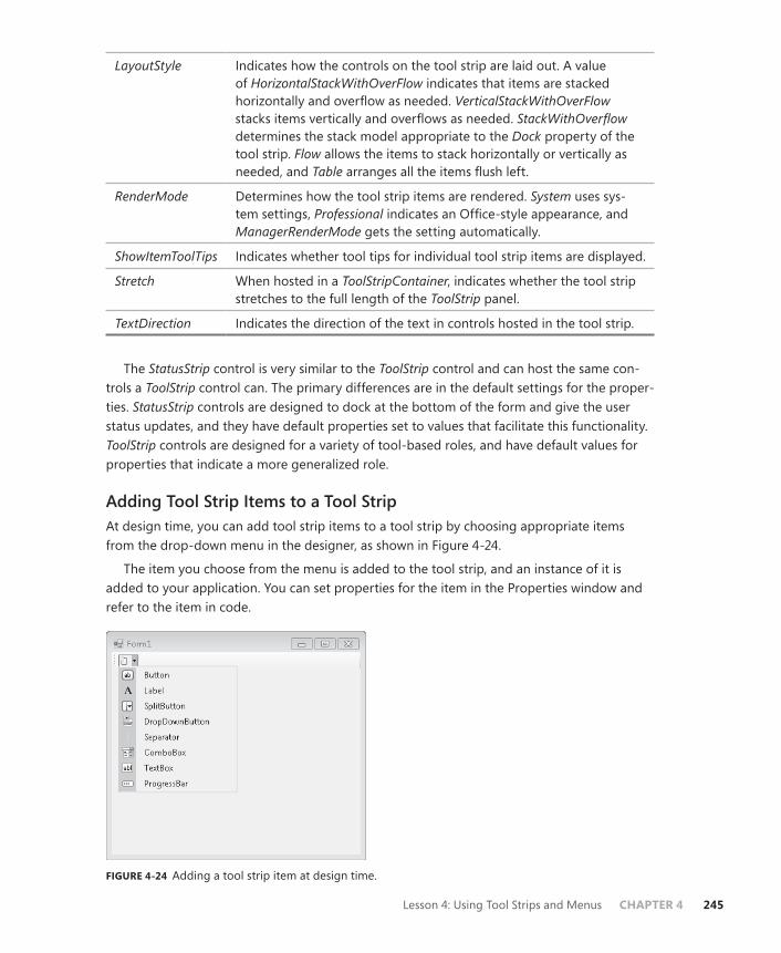
Lesson 4: Using Tool Strips and Menus CHAPTER 4 245
LayoutStyle Indicates how the controls on the tool strip are laid out. A value of HorizontalStackWithOverFlow indicates that items are stacked horizontally and overflow as needed. VerticalStackWithOverFlow stacks items vertically and overflows as needed. StackWithOverflow determines the stack model appropriate to the Dock property of the tool strip. Flow allows the items to stack horizontally or vertically as needed, and Table arranges all the items flush left.
RenderMode Determines how the tool strip items are rendered. System uses sys-tem settings, Professional indicates an Office-style appearance, and ManagerRenderMode gets the setting automatically.
ShowItemToolTips Indicates whether tool tips for individual tool strip items are displayed.
Stretch When hosted in a ToolStripContainer, indicates whether the tool strip stretches to the full length of the ToolStrip panel.
TextDirection Indicates the direction of the text in controls hosted in the tool strip.
The StatusStrip control is very similar to the ToolStrip control and can host the same con-trols a ToolStrip control can. The primary differences are in the default settings for the proper-ties. StatusStrip controls are designed to dock at the bottom of the form and give the user status updates, and they have default properties set to values that facilitate this functionality. ToolStrip controls are designed for a variety of tool-based roles, and have default values for properties that indicate a more generalized role.
Adding Tool Strip Items to a Tool StripAt design time, you can add tool strip items to a tool strip by choosing appropriate items from the drop-down menu in the designer, as shown in Figure 4-24.
The item you choose from the menu is added to the tool strip, and an instance of it is added to your application. You can set properties for the item in the Properties window and refer to the item in code.
FIGURE 4-24 Adding a tool strip item at design time.

246 CHAPTER 4 Windows Forms and Windows Forms Controls
At run time, you can add items dynamically to a tool strip by using the ToolStrip.Items.Add method. This method enables you to specify a reference to an existing tool strip item and add it to the toolbar, or it will create and add a new tool strip item when you specify text or an image. An example is shown here:
Sample of Visual Basic Code
Dim aToolStripItem As ToolStripItem Dim bToolStripItem As ToolStripItem aToolStripItem = myToolStrip.Items.Add("New Item") bToolStripItem = myToolStrip.Items.Add(anImage)
Sample of C# Code
ToolStripItem aToolStripItem; ToolStripItem bToolStripItem; aToolStripItem = myToolStrip.Items.Add("New Item"); bToolStripItem = myToolStrip.Items.Add(anImage);
In this example, a new tool strip item is added when text or an image is specified in the call to the Add method. When items are added in this way, the resulting item is always a ToolStripButton object. The ToolStrip.Items.Add method returns a reference to the new item so you can set properties and events for it at run time.
You can also create a new tool strip item and then add it directly, as shown here:
Sample of Visual Basic Code
Dim aComboBox As New ToolStripComboBox() myToolStrip.Items.Add(aComboBox)
Sample of C# Code
ToolStripComboBox aComboBox = new ToolStripComboBox(); myToolStrip.Items.Add(aComboBox);
By following this example, you can create a tool strip item of any kind and add it to a tool strip at run time.
Tool Strip ItemsThe .NET Framework provides several items designed to be hosted in tool strips. Items such as the ToolStripLabel, ToolStripButton, ToolStripTextBox, ToolStripComboBox, and ToolStripProgressBar controls are similar to the Label, Button, TextBox, ComboBox, and ProgressBar controls, but they are designed to be hosted in tool strips. ToolStripSplitButton, ToolStripDropDownButton, and ToolStripSeparator are designed to provide functionality spe-cific to tool strips.
Common Properties of Tool Strip ItemsTool strip items have several common properties that govern their behavior in the tool strip. Table 4-36 describes the most important properties that all tool strip items share.
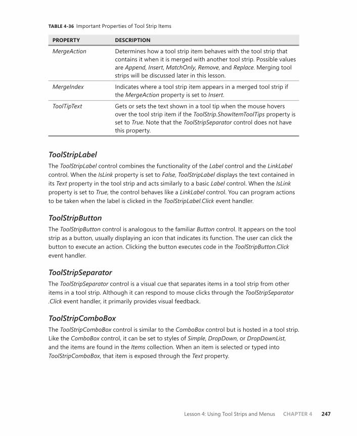
Lesson 4: Using Tool Strips and Menus CHAPTER 4 247
TABLE 4-36 Important Properties of Tool Strip Items
PROPERTY DESCRIPTION
MergeAction Determines how a tool strip item behaves with the tool strip that contains it when it is merged with another tool strip. Possible values are Append, Insert, MatchOnly, Remove, and Replace. Merging tool strips will be discussed later in this lesson.
MergeIndex Indicates where a tool strip item appears in a merged tool strip if the MergeAction property is set to Insert.
ToolTipText Gets or sets the text shown in a tool tip when the mouse hovers over the tool strip item if the ToolStrip.ShowItemToolTips property is set to True. Note that the ToolStripSeparator control does not have this property.
ToolStripLabelThe ToolStripLabel control combines the functionality of the Label control and the LinkLabel control. When the IsLink property is set to False, ToolStripLabel displays the text contained in its Text property in the tool strip and acts similarly to a basic Label control. When the IsLink property is set to True, the control behaves like a LinkLabel control. You can program actions to be taken when the label is clicked in the ToolStripLabel.Click event handler.
ToolStripButtonThe ToolStripButton control is analogous to the familiar Button control. It appears on the tool strip as a button, usually displaying an icon that indicates its function. The user can click the button to execute an action. Clicking the button executes code in the ToolStripButton.Click event handler.
ToolStripSeparatorThe ToolStripSeparator control is a visual cue that separates items in a tool strip from other items in a tool strip. Although it can respond to mouse clicks through the ToolStripSeparator.Click event handler, it primarily provides visual feedback.
ToolStripComboBoxThe ToolStripComboBox control is similar to the ComboBox control but is hosted in a tool strip. Like the ComboBox control, it can be set to styles of Simple, DropDown, or DropDownList, and the items are found in the Items collection. When an item is selected or typed into ToolStripComboBox, that item is exposed through the Text property.
248 CHAPTER 4 Windows Forms and Windows Forms Controls
ToolStripTextBoxToolStripTextBox is very similar to the basic TextBox control. The user can type a string into the text box, and this string will be accessible programmatically through the ToolStripTextBox.Text property. The main difference in functionality is that ToolStripTextBox does not have a MultiLine property and, thus, can have only one line.
ToolStripProgressBarToolStripProgressBar is a control designed to provide feedback to the user when progress is made on a time-consuming task, and it functions very similarly to the standard ProgressBar control. The Minimum and Maximum properties set the minimum and maximum values for ToolStripProgressBar, and the Value property determines the current setting. The visual ap-pearance is set by the Style property, and when Style is set to Blocks or Continuous, the Value property is reflected in the visual interface as a percentage of the maximum that is filled in the progress bar. When it is set to Marquee, blocks continuously move across the progress bar at the rate specified by the MarqueeAnimationSpeed property. At run time, you can advance the value of ToolStripProgressBar either by setting the Value property directly or by using the Increment and PerformStep methods.
ToolStripDropDownButtonToolStripDropDownButton enables you to create a drop-down menu that appears when the button is clicked. At design time, you can create the menu by typing text for menu items in the menu designer.
Each menu item has its own ToolStripMenuItem.Click event to which you can respond.
ToolStripSplitButtonThe ToolStripSplitButton control combines the functionality of the ToolStripButton and ToolStripDropDownButton controls. It exposes a button a user can click to execute code, but it also exposes a drop-down menu in the style of the ToolStripDropDownButton control. You can handle the ToolStripSplitButton.Click event to write code for the button clicks, or you can write code that is executed for each ToolStripMenuItem.Click event.
Displaying Images on Tool Strip ItemsThe ToolStripButton, ToolStripDropDownButton, and ToolStripSplitButton controls can display text, images, or a combination of both. Table 4-37 shows how the properties of these controls govern how images are displayed.

Lesson 4: Using Tool Strips and Menus CHAPTER 4 249
TABLE 4-37 Image Display Properties of ToolStripButton Controls
PROPERTY DESCRIPTION
DisplayStyle Determines whether the control is displayed with text, image, or both.
Image Gets or sets the image associated with this control.
ImageAlign Indicates how the image is aligned in the control.
ImageScaling Specifies whether the image will be resized to fit the control.
ImageTransparentColor Indicates the color in the image that will appear as trans-parent when rendered in the UI.
To display an image on a tool strip:
1. Select the control. In the Properties window, ensure that the DisplayStyle property is set to Image or ImageAndText.
2. In the Properties window, select the image for the control by clicking the Image property and selecting or browsing to the appropriate image in the Select Resource dialog box.
The ToolStripContainer ClassThe ToolStripContainer class is a specialized container control designed specifically for con-taining tool strips and enabling rafting, the process by which a user can grab a tool strip and move it from one edge of the container to another.
The ToolStripContainer contains five panels: four ToolStrip panels (one on each edge of the form) and one Content panel. The most common scenario for ToolStripContainer is to add it to a form and set the Dock property to Fill. This results in the ToolStripContainer filling the entire form and having tool strip panels available on all sides.
At design time, you can add a tool strip to a tool strip container by dragging it from the toolbox onto one of the tool strip panels. You can control which tool strip panels are available to the user by setting the TopToolStripPanelVisible, BottomToolStripPanelVisible, LeftToolStripPanelVisible, and RightToolStripPanelVisible properties. When these properties are set to True, the corresponding panel is available for tool strip rafting at run time. When they are set to False, the panel is not available.
Merging Tool StripsYou can merge ToolStrip controls at run time and incorporate their items into a single tool strip. You merge tool strips by invoking the ToolStripManager.Merge method, as shown here:
Sample of Visual Basic Code
ToolStripManager.Merge(sourceToolStrip, targetToolStrip)

250 CHAPTER 4 Windows Forms and Windows Forms Controls
Sample of C# Code
ToolStripManager.Merge(sourceToolStrip, targetToolStrip);
The ToolStripManager is a static class that manages the display and layout of the tool strips on a form. Because it is a static class, there is no need to instantiate it; you can invoke the methods directly.
The preceding example merges the first tool strip, sourceToolStrip, with the second tool strip, targetToolStrip. The tool strip items on sourceToolStrip are then merged with the items on targetToolStrip, as is determined by their MergeAction property value. Table 4-38 summa-rizes the merge action taken by the MergeAction property value.
TABLE 4-38 ToolStripItem MergeAction Property Values and Merge Actions
MERGEACTION VALUE ACTION TAKEN
Append Appends the item at the end of the list of items.
Insert Inserts the item at the location specified by the MergeIndex property.
MatchOnly Looks for a match but takes no action.
Remove If a matching tool strip item is found, it is removed from the resulting tool strip.
Replace If a matching tool strip item is found, it is replaced with this tool strip.
When tool strips are merged, each tool strip item in the source tool strip is compared to each tool strip item in the target tool strip. The comparison is based on the Text property of each tool strip item. Thus, if any two tool strip items have the same Text property, they are considered a match, even if they are different types. (For example, a ToolStripLabel item and a ToolStripButton item that both have a Text property set to Execute are considered a match.) If a match is found and the source tool strip item has the MergeAction property set to MatchOnly, Remove, or Replace, the appropriate action is taken. Otherwise, the tool strip item is appended or inserted, as determined by the MergeAction property.
For tool strips to be merged successfully, they must have their AllowMerge property set to True.
Quick Check 1. What is the purpose of the ToolStrip control?
2. What kinds of ToolStripItem controls can be hosted in a ToolStrip control?

Lesson 4: Using Tool Strips and Menus CHAPTER 4 251
Quick Check Answers 1. The ToolStrip control hosts ToolStripItem controls that can be used to expose
commonly used commands or provide frequently used functionality in an envi-ronment that is highly configurable at run time.
2. ToolStrip can host any kind of ToolStrip item, including ToolStripMenuItem controls.
Overview of the MenuStrip ControlThe MenuStrip control is essentially a ToolStrip control optimized for the display of ToolStripMenu items. The MenuStrip control derives from ToolStrip and can host all the tool strip items described in the previous lesson. Its primary function, however, is to host ToolStripMenu items.
ToolStripMenuItem controls are the controls that provide the visual representation for items on a menu. They can appear as text, an image, or both and can execute code found in their ToolStripMenuItem.Click event handlers when clicked. Each ToolStripMenuItem control can contain its own set of menu items, allowing for the creation of nested menus.
The menu strip exposes many properties that affect the behavior of its hosted ToolStripMenu items. Table 4-39 describes important properties of the MenuStrip control.
TABLE 4-39 Important Properties of the MenuStrip Control
PROPERTY DESCRIPTION
AllowItemReorder Indicates whether the user can reorder items. When set to True, contained items can be reordered when the user holds down the Alt key and grabs the item with the mouse.
AllowMerge Indicates whether this menu strip can be merged with another tool strip.
Dock Indicates how the menu strip is docked. Although MenuStrip con-trols can be free in the form, they are usually docked to one of the form edges.
LayoutStyle Indicates how the controls on the tool strip are laid out. A value of HorizontalStackWithOverflow indicates that items are stacked hori-zontally and overflow as needed. VerticalStackWithOverflow stacks items vertically and overflows as needed. StackWithOverflow de-termines the stack model appropriate to the Dock property of the tool strip. Flow allows the items to stack horizontally or vertically as needed, and Table arranges all the items flush left.
RenderMode Determines how the tool strip items are rendered. System uses system settings, Professional indicates an Office-style appearance, and ManagerRenderMode gets the setting automatically.
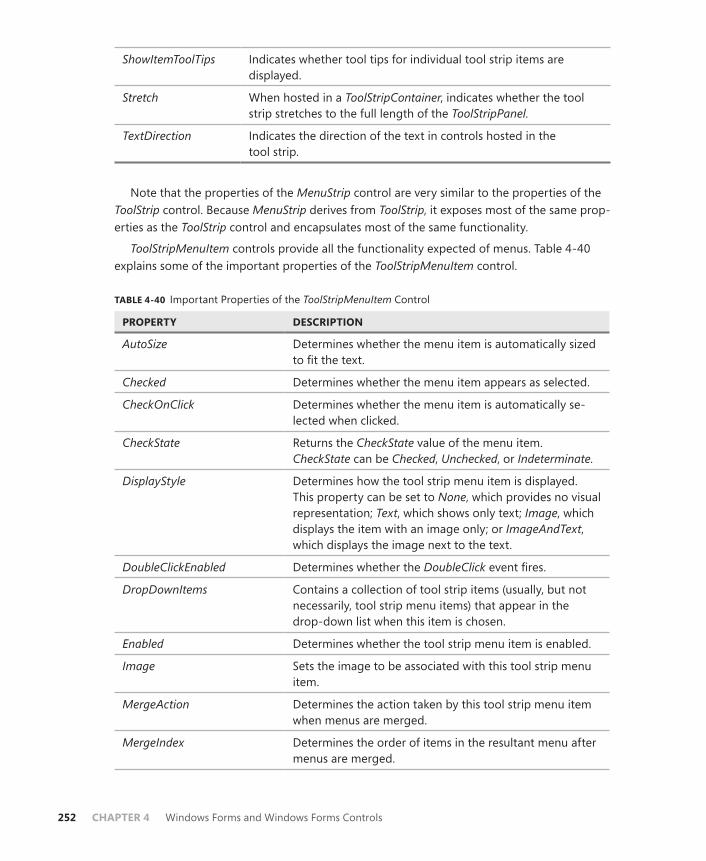
252 CHAPTER 4 Windows Forms and Windows Forms Controls
ShowItemToolTips Indicates whether tool tips for individual tool strip items are displayed.
Stretch When hosted in a ToolStripContainer, indicates whether the tool strip stretches to the full length of the ToolStripPanel.
TextDirection Indicates the direction of the text in controls hosted in the tool strip.
Note that the properties of the MenuStrip control are very similar to the properties of the ToolStrip control. Because MenuStrip derives from ToolStrip, it exposes most of the same prop-erties as the ToolStrip control and encapsulates most of the same functionality.
ToolStripMenuItem controls provide all the functionality expected of menus. Table 4-40 explains some of the important properties of the ToolStripMenuItem control.
TABLE 4-40 Important Properties of the ToolStripMenuItem Control
PROPERTY DESCRIPTION
AutoSize Determines whether the menu item is automatically sized to fit the text.
Checked Determines whether the menu item appears as selected.
CheckOnClick Determines whether the menu item is automatically se-lected when clicked.
CheckState Returns the CheckState value of the menu item. CheckState can be Checked, Unchecked, or Indeterminate.
DisplayStyle Determines how the tool strip menu item is displayed. This property can be set to None, which provides no visual representation; Text, which shows only text; Image, which displays the item with an image only; or ImageAndText, which displays the image next to the text.
DoubleClickEnabled Determines whether the DoubleClick event fires.
DropDownItems Contains a collection of tool strip items (usually, but not necessarily, tool strip menu items) that appear in the drop-down list when this item is chosen.
Enabled Determines whether the tool strip menu item is enabled.
Image Sets the image to be associated with this tool strip menu item.
MergeAction Determines the action taken by this tool strip menu item when menus are merged.
MergeIndex Determines the order of items in the resultant menu after menus are merged.
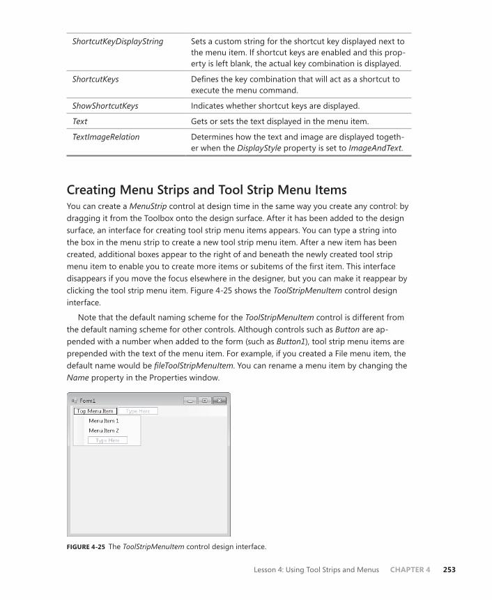
Lesson 4: Using Tool Strips and Menus CHAPTER 4 253
ShortcutKeyDisplayString Sets a custom string for the shortcut key displayed next to the menu item. If shortcut keys are enabled and this prop-erty is left blank, the actual key combination is displayed.
ShortcutKeys Defines the key combination that will act as a shortcut to execute the menu command.
ShowShortcutKeys Indicates whether shortcut keys are displayed.
Text Gets or sets the text displayed in the menu item.
TextImageRelation Determines how the text and image are displayed togeth-er when the DisplayStyle property is set to ImageAndText.
Creating Menu Strips and Tool Strip Menu ItemsYou can create a MenuStrip control at design time in the same way you create any control: by dragging it from the Toolbox onto the design surface. After it has been added to the design surface, an interface for creating tool strip menu items appears. You can type a string into the box in the menu strip to create a new tool strip menu item. After a new item has been created, additional boxes appear to the right of and beneath the newly created tool strip menu item to enable you to create more items or subitems of the first item. This interface disappears if you move the focus elsewhere in the designer, but you can make it reappear by clicking the tool strip menu item. Figure 4-25 shows the ToolStripMenuItem control design interface.
Note that the default naming scheme for the ToolStripMenuItem control is different from the default naming scheme for other controls. Although controls such as Button are ap-pended with a number when added to the form (such as Button1), tool strip menu items are prepended with the text of the menu item. For example, if you created a File menu item, the default name would be fileToolStripMenuItem. You can rename a menu item by changing the Name property in the Properties window.
FIGURE 4-25 The ToolStripMenuItem control design interface.
254 CHAPTER 4 Windows Forms and Windows Forms Controls
Changing Properties for Multiple Tool Strip Menu Items at OnceAt times, you might want to edit properties for several menu items (or any control) at the same time. You would usually do this to ensure that all controls have the same setting for a particular property. If you edit properties for a selection of types of controls, the Properties window displays only those properties and events that all controls have in common.
To change multiple menu item properties at once:
1. While holding down the Ctrl key, click each menu item you want to edit to select it.
2. Make the appropriate changes in the Properties window. Changes you make will apply to all selected menu items.
You can also add tool strip menu items to menu strips programmatically at run time. You can either add a preexisting menu item (for example, an item on another menu strip) or create a brand new menu item and add it to the menu strip. The following code example demonstrates each of these techniques:
Sample of Visual Basic Code
' Adds an existing ToolStripMenuItem to the MenuStrip MenuStrip1.Items.Add(OpenToolStripMenuItem) ' Creates a new ToolStripMenuItem and adds it to the MenuStrip Dim HelpToolStripMenuItem As New ToolStripMenuItem("Help") MenuStrip1.Items.Add(HelpToolStripMenuItem)
Sample of C# Code
// Adds an existing ToolStripMenuItem to the MenuStrip menuStrip1.Items.Add(OpenToolStripMenuItem); // Creates a new ToolStripMenuItem and adds it to the MenuStrip ToolStripMenuItem HelpToolStripMenuItem = new ToolStripMenuItem("Help"); menuStrip1.Items.Add(HelpToolStripMenuItem);
You can also use the MenuStrip.Items.Add method to add new tool strip menu items, even if you don’t have a reference to an existing tool strip menu item. The following example shows how you can specify text or an image to create a tool strip menu item and get a refer-ence to it:
Sample of Visual Basic Code
Dim newMenuItem1 As ToolStripMenuItem Dim newMenuItem2 As ToolStripMenuItem ' Adds a new menu item by specifying text newMenuItem1 = MenuStrip1.Items.Add("File") ' Adds a new menu item by specifying an image newMenuItem2 = MenuStrip1.Items.Add(anImage)
Sample of C# Code
ToolStripMenuItem newMenuItem1; ToolStripMenuItem newMenuItem2; // Adds a new menu item by specifying text newMenuItem1 = MenuStrip1.Items.Add("File");
Lesson 4: Using Tool Strips and Menus CHAPTER 4 255
// Adds a new menu item by specifying an image newMenuItem2 = MenuStrip1.Items.Add(anImage);
You can use similar techniques to add new or existing tool strip menu items to the drop-down items of an existing tool strip menu item. This has the effect of creating new items in a submenu. The following example demonstrates programmatically adding a tool strip menu item to the DropDownItems collection of an existing tool strip menu item:
Sample of Visual Basic Code
Dim newMenuItem1 As ToolStripMenuItem Dim newMenuItem2 As ToolStripMenuItem ' Adds an existing ToolStripMenuItem to another existing ToolStripMenuItem FileToolStripMenuItem.DropDownItems.Add(OpenToolStripMenuItem) ' Creates a new ToolStripMenuItem and adds it to the MenuStrip Dim HelpToolStripMenuItem As New ToolStripMenuItem("Help") FileToolStripMenuItem.DropDownItems.Add(HelpToolStripMenuItem) ' Adds a new menu item by specifying text newMenuItem1 = FileToolStripMenuItem.DropDownItems.Add("Open") ' Adds a new menu item by specifying an image newMenuItem2 = FileToolStripMenuItem.DropDownItems.Add(anImage)
Sample of C# Code
ToolStripMenuItem newMenuItem1; ToolStripMenuItem newMenuItem2; // Adds an existing ToolStripMenuItem to another existing ToolStripMenuItem FileToolStripMenuItem.DropDownItems.Add(OpenToolStripMenuItem); // Creates a new ToolStripMenuItem and adds it to the MenuStrip ToolStripMenuItem HelpToolStripMenuItem = new ToolStripMenuItem("Help"); FileToolStripMenuItem.DropDownItems.Add(HelpToolStripMenuItem); // Adds a new menu item by specifying text newMenuItem1 = (ToolStripMenuItem)FileToolStripMenuItem.DropDownItems.Add("Open"); // Adds a new menu item by specifying an image newMenuItem2 = (ToolStripMenuItem)FileToolStripMenuItem.DropDownItems.Add(anImage);
Copying Menu Items at Design TimeAt times, you might want to copy menu items from one location to another. For example, if you are creating different menus but you want to have a common set of options among them, you can easily copy menu items by copying and pasting in the designer.
To copy menu items at design time:
1. In the designer, right-click the menu item you want to copy and choose Copy from the context menu.
2. In the designer, right-click the menu item that is the intended location of the copied menu and choose Paste from the context menu. The menu item is copied into the new location.
Note that with this procedure, you can copy top-level items to sublevel items, sublevel items to top-level items, top-level items to top-level items, or sublevel items to sublevel items.

256 CHAPTER 4 Windows Forms and Windows Forms Controls
Adding Enhancements to MenusMenus can display a variety of enhancements that streamline the user experience and en-hance usability. This section covers how to create check marks, access keys, separator bars, and shortcut keys on menu items.
Adding Check Marks to Menu ItemsYou can display check marks next to any menu items except top-level menu items. This is use-ful when you want to indicate to the user that a menu option is selected or enabled. You can display a check mark beside a menu item by setting the Checked property to True, as shown here:
Sample of Visual Basic Code
OptionToolStripMenuItem.Checked = True
Sample of C# Code
optionToolStripMenuItem.Checked = true;
Alternatively, you can define whether the menu item is selected by setting the CheckState property to Checked, as shown here:
Sample of Visual Basic Code
OptionToolStripMenuItem.CheckState = CheckState.Checked
Sample of C# Code
optionToolStripMenuItem.CheckState = CheckState.Checked;
The Checked property is a Boolean property that returns whether an item is select-ed. If the item is selected, the Checked property returns True. If the item is in any other state, the Checked property returns False. The CheckState, however, indicates the ac-tual state of the menu item and returns CheckState.Checked, CheckState.Unchecked, or Checkstate. Indeterminate.
If you want a menu item to appear selected when the user clicks the item, you can set the CheckOnClick property to True. This causes the check mark on the menu item to toggle between selected and cleared each time the user clicks the menu item. You can programmati-cally change the check state or determine whether the menu item is selected by using the ToolStripMenuItem.CheckState property or the ToolStripMenuItem.Checked property.
Adding Separator Bars to MenusIt can be useful to add separator bars to menus to set groups of menu options apart from one another. You can add a separator to any submenu at design time by choosing Separator from the drop-down box in the menu item design interface.
Lesson 4: Using Tool Strips and Menus CHAPTER 4 257
Note that if you want to add a separator to a top-level menu, you must do so program-matically by creating a new instance of the ToolStripSeparator control and inserting it into the correct location in the MenuStrip.Items collection, as shown here:
Sample of Visual Basic Code
Dim aSeparator As New ToolStripSeparator MenuStrip1.Items.Insert(1, aSeparator)
Sample of C# Code
ToolStripSeparator aSeparator = new ToolStripSeparator(); menuStrip1.Items.Insert(1, aSeparator);
Creating Access KeysAccess keys enable you to access menu items by defining keys that, when pressed in combi-nation with the Alt key, will execute the menu command. For example, if a File menu defines the F key as an access key, when Alt+F is pressed, the File menu opens. Menus that contain submenus open when the access key combination is pressed, and menus that invoke com-mands will invoke those commands. Note that the menu item must be visible for the access key to function. Thus, if you define an access key for an Open menu item that exists in the File submenu, the File menu must be opened first for the access key combination to function.
You can create an access key for a menu by preceding the letter for which you want to define the access key with an ampersand (&) symbol. For example, to create an Alt+F access key combination for the File menu, you would set the Text property of FileToolStripMenuItem to &File.
Creating Shortcut KeysUnlike access keys, shortcut keys are a combination of keystrokes that enable direct invoca-tion of a menu item, whether the menu item is visible or not. For example, you might define the Ctrl+E key combination to be a shortcut key for the Exit menu command in the File menu. Even if the File menu is not open, Ctrl+E causes the Exit menu command to be executed. Also, unlike access keys, you cannot create shortcut keys for top-level menus; you can create them only for items in submenus.
You can create a shortcut key at design time by setting the ShortcutKeys property in the Properties window. Clicking the ShortcutKeys property launches a visual interface that enables you to define a key combination. Figure 4-26 displays this interface.

258 CHAPTER 4 Windows Forms and Windows Forms Controls
FIGURE 4-26 The ShortcutKeys property user interface.
If you want to display the shortcut key combination next to the menu item, you can set the ShowShortcutKeys property of the ToolStripMenuItem control to True. You can also define custom text to be shown instead of the key combination. If you want to define custom text, you can set it in the ShortcutKeyDisplayString property.
Moving Items between MenusYou can move items from one menu to another at run time. This enables you to customize menus dynamically for special purposes. You can move a menu item to a new menu strip by using the MenuStrip.Items.Add method to add it to the new menu strip. It is removed from the previous menu strip automatically. If you want to add the menu item to a particular location in the new menu strip, you can use the Insert method to add it at a particular index. Examples are shown here:
Sample of Visual Basic Code
' Adds the FileToolStripMenuItem MenuStrip2.Items.Add(FileToolStripMenuItem) ' Inserts FileToolStripMenuItem to the location corresponding to index 1 MenuStrip2.Items.Insert(1, FileToolStripMenuItem)
Sample of C# Code
// Adds the FileToolStripMenuItem menuStrip2.Items.Add(FileToolStripMenuItem); // Inserts FileToolStripMenuItem to the location corresponding to index 1 menuStrip2.Items.Insert(1, FileToolStripMenuItem);

Lesson 4: Using Tool Strips and Menus CHAPTER 4 259
You can also use the analogous methods of the ToolStripMenuItem.DropDownItems prop-erty to move items from one menu to another. Examples are shown here:
Sample of Visual Basic Code
' Adds the FileToolStripMenuItem AppToolStripMenuItem.DropDownItems.Add(FileToolStripMenuItem) ' Inserts FileToolStripMenuItem to the location corresponding to index 1 AppToolStripMenuItem.DropDownItems.Insert(1, FileToolStripMenuItem)
Sample of C# Code
// Adds the FileToolStripMenuItem AppToolStripMenuItem.DropDownItems.Add(FileToolStripMenuItem); // Inserts FileToolStripMenuItem to the location corresponding to index 1 AppToolStripMenuItem.DropDownItems.Insert(1, FileToolStripMenuItem);
Disabling, Hiding, and Deleting Menu ItemsAt times, it makes sense to remove certain options from a menu. You might want a menu item to be disabled when conditions aren’t appropriate for it to be invoked, or you might want to hide a menu item that shouldn’t be displayed. In some cases, you might want to delete a menu item completely.
You can disable a menu item by setting the Enabled property to False. This causes the menu item to appear dimmed. It is still visible to the user, but it cannot be invoked by mouse clicks or keystrokes.
You can hide a menu item by setting the Visible property to False. This keeps the menu item from appearing in the menu. Note, however, that it does not disable the menu item, and if the Enabled property is set to True, the menu item can still be invoked through short-cut keys if they have been defined for this menu item. Hide menu items sparingly; if a user is looking for a specific menu item, it is typically better for the user to see it dimmed because the Enabled property has been set to False. Otherwise, the user might continue looking for the hidden menu item on other menus.
If you need to delete a menu item from a menu entirely, you can do so by using the MenuStrip.Items.Remove and MenuStrip.Items.RemoveAt methods to remove an item from a top-level menu. Alternately, you can use the ToolStripMenuItem.DropDownItems.Remove and ToolStripMenuItem.DropDownItems.RemoveAt methods to remove an item from a submenu, as shown in the following examples:
Sample of Visual Basic Code
'Removes FileToolStripMenuItem from MenuStrip1 MenuStrip1.Items.Remove(FileToolStripMenuItem) ' Removes FileToolStripMenuItem from AppToolStripMenuItem AppToolStripMenuItem.DropDownItems.Remove(FileToolStripMenuItem) ' Removes the ToolStripMenuItem at index 4 from MenuStrip1 MenuStrip1.Items.RemoveAt(4) ' Removes the ToolStripMenuItem at index 4 from AppToolStripMenuItem AppToolStripMenuItem.DropDownItems.RemoveAt(4)
260 CHAPTER 4 Windows Forms and Windows Forms Controls
Sample of C# Code
// Removes FileToolStripMenuItem from menuStrip1 menuStrip1.Items.Remove(FileToolStripMenuItem); // Removes FileToolStripMenuItem from AppToolStripMenuItem AppToolStripMenuItem.DropDownItems.Remove(FileToolStripMenuItem); // Removes the ToolStripMenuItem at index 4 from menuStrip1 menuStrip1.Items.RemoveAt(4); // Removes the ToolStripMenuItem at index 4 from AppToolStripMenuItem AppToolStripMenuItem.DropDownItems.RemoveAt(4);
Merging MenusMenus can be merged and their items incorporated into a single menu at run time. You can merge MenuStrip or ContextMenuStrip controls (which are covered in greater detail later in this lesson), or both. In fact, you can even merge MenuStrip controls with ToolStrip controls. Like tool strips, you merge menu strips by invoking the ToolStripManager.Merge method on the static ToolStripManager class, as shown here:
Sample of Visual Basic Code
ToolStripManager.Merge(sourceMenuStrip, targetMenuStrip)
Sample of C# Code
ToolStripManager.Merge(sourceMenuStrip, targetMenuStrip);
The preceding example merges the first menu strip, sourceMenuStrip, with the second menu strip, targetMenuStrip. The tool strip menu items on sourceMenuStrip are then merged with the items on targetMenuStrip as determined by their MergeAction property value. Table 4-41 summarizes the merge action taken by the MergeAction property value.
TABLE 4-41 ToolStripItem MergeAction Property Values and Merge Actions
MERGEACTION VALUE ACTION TAKEN
Append Appends the item at the end of the list of items.
Insert Inserts the item at the location specified by the MergeIndex property.
MatchOnly Looks for a match but takes no action.
Remove If a matching tool strip item is found, it is removed from the resulting tool strip.
Replace If a matching tool strip item is found, it is replaced with this tool strip.
When menu strips are merged, each tool strip menu item in the source menu strip is compared to each menu item in the target menu strip. The comparison is based on the Text property of each menu item. Thus, if any two tool strip menu items have the same Text prop-erty, they are considered a match. If a match is found, and the source tool strip menu item

Lesson 4: Using Tool Strips and Menus CHAPTER 4 261
has the MergeAction property set to MatchOnly, Remove, or Replace, the appropriate action will be taken. Otherwise, the tool strip menu item is appended or inserted, as determined by the MergeAction property.
For menu strips to be merged successfully, they must have their AllowMerge property set to True.
Switching between MenuStrip Controls ProgrammaticallyAs application conditions change, adding and removing menu items might not be sufficient to meet the needs of your application, and you might opt to completely replace a menu strip with another menu strip. You can remove a MenuStrip control from the form entirely by removing it from the form’s Controls collection, and you can likewise add a new MenuStrip control by adding it to the form’s Controls collection. The following example demonstrates how to remove MenuStrip1 from the form and replace it with MenuStrip2 at run time:
Sample of Visual Basic Code
Me.Controls.Remove(MenuStrip1) Me.Controls.Add(MenuStrip2)
Sample of C# Code
this.Controls.Remove(MenuStrip1); this.Controls.Add(MenuStrip2);
Note that the menu strip you add should not already be a member of the form’s Controls collection.
Context Menus and the ContextMenuStrip ControlContext menus are familiar to all users of Windows Forms applications. These shortcut menus are displayed when the user right-clicks an object. The ContextMenuStrip control enables you to create context menus and associate them with a selected object.
The ContextMenuStrip control is similar to the MenuStrip control. Both controls have an intuitive design interface that enables you to create tool strip menu items quickly, and both expose a collection of tool strip menu items in the Items property. The main difference be-tween the ContextMenuStrip and the MenuStrip controls is that the ContextMenuStrip control does not have a top-level menu and is not visible at run time unless invoked by right-clicking the control with which it is associated.
Adding and Removing Context Menu ItemsYou can easily add and remove items from a context menu strip by using the ContextMenuStrip.Items.Add and ContextMenuStrip.Items.Remove methods, as shown in the following example:
Sample of Visual Basic Code
' Adds an item to the ContextMenuStrip ContextMenuStrip1.Items.Add(ExitToolStripMenuItem)
262 CHAPTER 4 Windows Forms and Windows Forms Controls
' Removes an item from the ContextMenuStrip ContextMenuStrip1.Items.Remove(ExitToolStripMenuItem)
Sample of C# Code
// Adds an item to the ContextMenuStrip contextMenuStrip1.Items.Add(ExitToolStripMenuItem); // Removes an item from the ContextMenuStrip contextMenuStrip1.Items.Remove(ExitToolStripMenuItem);
Associating a ContextMenuStrip Property with a ControlAll controls that can display a context menu expose a ContextMenuStrip property that rep-resents the context menu associated with that control. When this property is set to a valid ContextMenuStrip control, the context menu appears when the user right-clicks the control at run time. You can set this property at design time in the Properties window.
You can also set the ContextMenuStrip property for a control at run time. The following ex-ample demonstrates how to create a context menu dynamically from preexisting menu items and then associate it with a control:
Sample of Visual Basic Code
ContextMenuStrip1.Items.Add(ExitToolStripMenuItem) ContextMenuStrip1.Items.Add(OpenToolStripMenuItem) Button1.ContextMenuStrip = ContextMenuStrip1
Sample of C# Code
contextMenuStrip1.Items.Add(ExitToolStripMenuItem); contextMenuStrip1.Items.Add(OpenToolStripMenuItem); button1.ContextMenuStrip = contextMenuStrip1;
Copying Menu Items from Existing Menu Strips at Run TimeYou will frequently want to create context menus that also expose the same menu items as items in regular menus. Although a single tool strip menu item can belong to only one menu strip at a time, it is easy to create an exact copy of a menu item at run time. The ToolStripMenuItem constructor has several overloads that enable you to specify the text, im-age, and click-event handler. The following example demonstrates how to make a copy of an existing tool strip menu item named ExitToolStripMenuItem and add it to a ContextMenuStrip control named ContextMenuStrip1. This example assumes the existence of a method named ExitToolStripMenuItem_Click, which is the event handler for the ExitToolStripMenuItem.Click event.
Sample of Visual Basic Code
Dim anItem As ToolStripMenuItem anItem = New ToolStripMenuItem(ExitToolStripMenuItem.Text, _ ExitToolStripMenuItem.Image, New EventHandler(addressof _ ExitToolStripMenuItem_Click)) ContextMenuStrip1.Items.Add(anItem)
Lesson 4: Using Tool Strips and Menus CHAPTER 4 263
Sample of C# Code
ToolStripMenuItem anItem; anItem = new ToolStripMenuItem(ExitToolStripMenuItem.Text, ExitToolStripMenuItem.Image, new EventHandler(ExitToolStripMenuItem_Click)); ContextMenuStrip1.Items.Add(anItem);
Quick Check 1. What is the difference between a MenuStrip control and a ContextMenuStrip
control?
2. How do you associate a ContextMenuStrip property with a control?
Quick Check Answers 1. A ContextMenuStrip control is designed to be shown when the user right-clicks
a control. Thus, it contains no top-level elements and has no visual presence on the form until a control is right-clicked.
2. You can associate a ContextMenuStrip property with a control by setting that control’s ContextMenuStrip property.
PRACTICE Creating a ToolStrip–Based Web Browser
In this practice, you explore the functionality of ToolStrip and ToolStripItem controls by creat-ing a simple Web browser that uses ToolStripItem controls to enable its functionality. In the first exercise, you add a tool strip that implements basic Web browser functionality. In the second exercise, you add a tool strip that enables the user to search the Web. In the third exercise, you extend the capabilities of the Web browser by adding a menu with menu items that enable you to browse, print, or save a file.
EXERCISE1 Creating a Web Browser
1. Start a new Windows Forms Project.
2. From the Toolbox, drag a ToolStripContainer control onto the form. Set the Dock prop-erty to Fill.
3. Enlarge the form to a comfortable size for a Web browser.
4. From the Toolbox, drag a WebBrowser control into the center panel of ToolStripContainer.
5. From the Toolbox, drag a ToolStrip control to the top panel of ToolStripContainer.
6. Using the drop-down menu in the tool strip, add the following controls to the tool strip in this order: two ToolStripButton controls, a ToolStripComboBox control, and two more ToolStripButton controls.

264 CHAPTER 4 Windows Forms and Windows Forms Controls
7. In the Properties window, set the Name, Image, and ToolTipText properties of the ToolStripButton controls, as shown in the following table. You can find the image files in the completed solutions installed from the CD.
DEFAULT NAME NEW NAME IMAGE TOOLTIPTEXT
ToolStripButton1 BackButton Back.bmp Navigate Back
ToolStripButton2 ForwardButton Forward.bmp Navigate Forward
ToolStripButton3 GoButton Go.bmp Navigate
ToolStripButton4 StopButton Stop.bmp Stop Navigation
8. Double-click the BackButton button and add the following code to the BackButton_ Click event handler:
Sample of Visual Basic Code
WebBrowser1.GoBack()
Sample of C# Code
webBrowser1.GoBack();
9. Double-click the ForwardButton button and add the following code to the ForwardButton_Click event handler:
Sample of Visual Basic Code
WebBrowser1.GoForward()
Sample of C# Code
webBrowser1.GoForward();
10. Double-click the GoButton button and add the following code to the GoButton.Click event handler:
Sample of Visual Basic Code
If Not ToolStripComboBox1.Text = "" Then WebBrowser1.Navigate(ToolStripComboBox1.Text) ToolStripComboBox1.Items.Add(ToolStripComboBox1.Text) If ToolStripComboBox1.Items.Count = 11 Then ToolStripComboBox1.Items.RemoveAt(0) End If End If
Sample of C# Code
if (!(toolStripComboBox1.Text == "")) { webBrowser1.Navigate(toolStripComboBox1.Text); toolStripComboBox1.Items.Add(toolStripComboBox1.Text); if (toolStripComboBox1.Items.Count == 11) { toolStripComboBox1.Items.RemoveAt(0); } }

Lesson 4: Using Tool Strips and Menus CHAPTER 4 265
11. Double-click the StopButton button and add the following code to the StopButton_ Click event handler:
Sample of Visual Basic Code
WebBrowser1.Stop()
Sample of C# Code
webBrowser1.Stop();
12. Press F5 to test your application.
EXERCISE2 Adding a Search Tool Strip
1. From the Toolbox, drag a second ToolStrip control onto the Top panel of the ToolStripContainer control.
2. In the ToolStrip designer, add a ToolStripTextBox control and a ToolStripButton control to the new tool strip.
3. In the Properties window, set the Text property of ToolStripButton to Search Bing and the DisplayStyle property to Text.
4. Double-click the tool strip button and add the following code to its event handler:
Sample of Visual Basic Code
WebBrowser1.Navigate("http://search.msn.com/results.aspx?q=" & _ ToolStripTextBox1.Text)
Sample of C# Code
webBrowser1.Navigate(@"http://search.msn.com/results.aspx?q=" + toolStripTextBox1.Text);
5. Press F5 to test your application. Note that the two tool strips can be individually posi-tioned and moved to other panels in ToolStripContainer.
EXERCISE3 Adding a Menu
1. Open the partial solution for this exercise on the companion CD.
2. Open Form1. In the designer, drag a MenuStrip control from the Toolbox to the top panel of ToolStripContainer.
3. Add a top-level tool strip menu item named &File to the menu strip.
4. Add the following submenu items to the File tool strip menu item: &Open, &Print, P&rint Preview, &Save, and &Exit.
5. From the Toolbox, drag an OpenFileDialog component onto the form.
6. In the designer, double-click OpenToolStripMenuItem to open the code window to the OpenToolStripMenuItem_Click event handler. Add the following code to this method:
Sample of Visual Basic Code
Dim result As DialogResult result = OpenFileDialog1.ShowDialog()

266 CHAPTER 4 Windows Forms and Windows Forms Controls
If result = System.Windows.Forms.DialogResult.OK Then WebBrowser1.Navigate(OpenFileDialog1.FileName) End If
Sample of C# Code
DialogResult result; result = openFileDialog1.ShowDialog(); if (result == System.Windows.Forms.DialogResult.OK) webBrowser1.Navigate(openFileDialog1.FileName);
7. Double-click PrintToolStripMenuItem to open its Click event handler and add the fol-lowing code:
Sample of Visual Basic Code
WebBrowser1.ShowPrintDialog()
Sample of C# Code
webBrowser1.ShowPrintDialog();
8. Double-click PrintPreviewToolStripMenuItem and add the following line to its Click event handler:
Sample of Visual Basic Code
WebBrowser1.ShowPrintPreviewDialog()
Sample of C# Code
webBrowser1.ShowPrintPreviewDialog();
9. Double-click SaveToolStripMenuItem and add the following line to its Click event handler:
Sample of Visual Basic Code
WebBrowser1.ShowSaveAsDialog()
Sample of C# Code
webBrowser1.ShowSaveAsDialog();
10. Double-click ExitToolStripMenuItem and add the following line to its Click event handler:
Sample of Visual Basic Code
Application.Exit()
Sample of C# Code
Application.Exit();
11. In the Properties window, set the ShortCutKeys property of ExitToolStripMenuItem to Ctrl+E.
12. Navigate to a page and test your application by pressing F5.

Lesson 4: Using Tool Strips and Menus CHAPTER 4 267
Lesson Summary■ The ToolStrip control is a host for ToolStripMenuItem controls you can use to create
toolbar-style functionality for your forms. Toolbars provide support for item reorder-ing, rafting, and overflow of items onto the overflow button.
■ Many tool strip items duplicate functionality of full-size Windows Forms controls such as ToolStripLabel, ToolStripButton, ToolStripTextBox, ToolStripComboBox, and ToolStripProgressBar. Tool strip controls that do not have analogous Windows Forms controls include ToolStripSeparator, ToolStripDropDownButton, and ToolStripSplitButton.
■ You can display images on the ToolStripItems control with the Image property.
■ The ToolStripContainer control enables you to create forms that include support for rafting toolbars.
■ The ToolStripManager class is a static class that exposes methods for tool strip manage-ment. You can use the ToolStripManager.Merge method to merge tool strips.
■ The MenuStrip control is the host for ToolStripMenuItem properties, which represent individual menu items. The top-level menu items in a menu strip are contained in the Items collection.
■ Individual tool strip menu items can host their own submenus, which are contained in the DropDownItems collection.
■ Individual menu items can be displayed with check marks next to the menu items and can have access keys and shortcut keys to enable keyboard-based navigation.
■ Menus can be merged by using the ToolStripManager.Merge method. The con-figuration of the menu resulting from a merge is determined by the individual ToolStripMenuItem, MergeAction, and MergeIndex properties.
■ ContextMenuStrip enables you to create context menus for your application. Menus created with the ContextMenuStrip control are not visible at run time and do not host a top-level menu, but otherwise they behave like MenuStrip controls. You can associate ContextMenuStrip with a control by setting the control’s ContextMenuStrip property.
Lesson ReviewYou can use the following questions to test your knowledge of the information in Lesson 4, “Using Tool Strips and Menus.” The questions are also available on the companion CD if you prefer to review them in electronic form.
NOTE ANSWERS
Answers to these questions and explanations of why each answer choice is correct or incor-rect are located in the “Answers” section at the end of the book.

268 CHAPTER 4 Windows Forms and Windows Forms Controls
1. Which of the following is required to create an access key for a menu item?
A. The UseMnemonic property for the ToolStripMenuItem must be set to True.
B. The AccessKeys property must be set to the correct key.
C. The letter for the access key in the Text property must be preceded by an amper-sand (&) symbol.
D. The ShortCutKeys property must be set to Ctrl plus the letter for the access key.
2. Which of the following code samples will add a new menu named Menu1 to a form at run time?
A.
Sample of Visual Basic Code
ToolStripManager.Menus.Add(Menu1)
Sample of C# Code
ToolStripManager.Menus.Add(Menu1);
B.
Sample of Visual Basic Code
ToolStripManager.Merge(Form1, Menu1)
Sample of C# Code
ToolStripManager.Merge(Form1, Menu1);
C.
Sample of Visual Basic Code
ToolStripManager.Controls.Add(Menu1)
Sample of C# Code
ToolStripManager.Controls.Add(Menu1);
D.
Sample of Visual Basic Code
Me.Controls.Add(Menu1)
Sample of C# Code
this.Controls.Add(Menu1);
3. Which of the following is required to associate and enable a context menu strip named ContextMenu1 with a button named Button1?
A. The ContextMenuStrip property for Button1 must be set to ContextMenu1.
B. The ShowPopUp property for Button1 must be set to True.
C. Button1 must call the ContextMenu1.ShowPopUp method in its RightClick event handler.
D. The ContextMenu1.Control property must be set to Button1.

Lesson 4: Using Tool Strips and Menus CHAPTER 4 269
4. Which of the following code samples will correctly merge two tool strips named aToolStrip and bToolStrip?
A.
Sample of Visual Basic Code
aToolStrip.Merge(bToolStrip)
Sample of C# Code
aToolStrip.Merge(bToolStrip);
B.
Sample of Visual Basic Code
ToolStripManager.Merge(aToolStrip, bToolStrip)
Sample of C# Code
ToolStripManager.Merge(aToolStrip, bToolStrip);
C.
Sample of Visual Basic Code
Dim aManager As New ToolStripManager() aManager.Merge(aToolStrip, bToolStrip)
Sample of C# Code
ToolStripManager aManager = new ToolStripManager(); aManager.Merge(aToolStrip, bToolStrip);
D.
Sample of Visual Basic Code
ToolStrip.Merge(aToolStrip, bToolStrip)
Sample of C# Code
ToolStrip.Merge(aToolStrip, bToolStrip);
5. Which of the following code samples will add a new ToolStripButton property to a tool strip named aToolStrip?
A.
Sample of Visual Basic Code
aToolStrip.Items.Add(New ToolStripButton("Click me"))
Sample of C# Code
aToolStrip1.Items.Add(new ToolStripButton("Click me"));
B.
Sample of Visual Basic Code
ToolStripManager.Add(aToolStrip, New ToolStripButton("Click me"))

270 CHAPTER 4 Windows Forms and Windows Forms Controls
Sample of C# Code
ToolStripManager.Add(aToolStrip, new ToolStripButton("Click me"));
C.
Sample of Visual Basic Code
aToolStrip.Buttons.Add(New ToolStripButton("Click me"))
Sample of C# Code
aToolStrip.Buttons.Add(new ToolStripButton("Click me"));
D.
Sample of Visual Basic Code
aToolStrip.Items.NewItem(Items.ToolStripButton("Click me"))
Sample of C# Code
aToolStrip.Items.NewItem(Items.ToolStripButton("Click me"));

Case Scenarios CHAPTER 4 271
Case Scenarios
In the following case scenarios, you apply what you’ve learned about how to use controls to design UIs. You can find answers to these questions in the “Answers” section at the end of this book.
Case Scenario 1: Designing a Simple User Interface Your organization, Humongous Insurance, is creating an application to help customers calcu-late the future value of bonds and other investments that will be held for a number of years. As a new employee, you are assigned a simple task: create the front-end interface and pre-pare the user input to be processed by the calculation engine that will be supplied by another development team. You begin by reviewing the following technical requirements.
Create a UI that accepts the following information from users in a simple, straightfor-ward way:
■ Current investment value
■ Assumed interest rate
■ Time span in years
Answer the following questions for your manager:
1. How can you provide an easy-to-understand interface that provides visual cues to the user, clearly indicates currency when appropriate, and accepts user input for all three of the aforementioned factors?
2. How can you provide a keyboard-based system of navigation as an alternative to mouse use?
Case Scenario 2: Designing a User Interface Your company has been contracted to design and implement a reservation system for a ski resort and chalet. You have been handed the job of creating a page to enter and display cli-ent data. You begin by reviewing the following technical requirements.
Create a UI that accepts the following information from users in a simple, straightfor-ward way:
■ First and last name
■ Address
■ City, state, and postal code
■ Credit card number
■ A general area for comments about the client
At the bottom of the technical requirements section is a note from the head of security that reads, “We need to be extra careful about our customers’ credit card information. Make sure it isn’t displayed with the rest of the data.”

272 CHAPTER 4 Windows Forms and Windows Forms Controls
Answer the following questions for your manager:
1. Which controls are most appropriate for the design of the UI?
2. How can you keep customer credit card data from being displayed but still enable its entry?
Suggested Practices
To help you successfully master the exam objective presented in this chapter, complete the following tasks.
■ Practice 1 Build an application that duplicates the functionality of Windows Explorer. You should be able to display a directory tree in one pane and files in a particular directory in another pane.
■ Practice 2 Build an application that acts like an appointment book. It should allow the user to choose a date and time, add information about the appointment, track and display details about the appointment, and visually display what days have appoint-ments set to the user on a MonthCalendar control.
■ Practice 3 Create toolbars with similar members and practice merging them togeth-er, changing the MergeIndex and MergeAction properties of each tool strip item.
Take a Practice Test
The practice tests on this book’s companion CD offer many options. For example, you can test yourself on just one exam objective, or you can test yourself on all the 70-511 certifica-tion exam content. You can set up the test so that it closely simulates the experience of taking a certification exam, or you can set it up in study mode so that you can look at the correct answers and explanations after you answer each question.
MORE INFO PRACTICE TESTS
For details about all the practice test options available, see the “How to Use the Practice Tests” section in this book’s introduction.

CHAPTER 5 273
C H A P T E R 5
Working with User-Defined Controls
Windows Presentation Foundation (WPF) and Windows Forms both provide support for creating your own controls when the pre-built controls do not provide the required
functionality for your application. In this chapter, you learn how to create custom controls in both Windows Forms and WPF and user controls in Windows Forms and how to extend pre-existing controls through inheritance. You also learn to extend the appearance of standard WPF elements by providing new control templates that alter their appearance and behavior while retaining their inherent functionality. Finally, you learn how to create custom WPF controls completely from the beginning.
Exam objectives in this chapter: ■ Implement user-defined controls.■ Create and apply control templates in WPF.■ Create and apply styles and theming (themes only in this chapter).■ Implement dependency properties.
Lessons in this chapter:■ Lesson 1: Creating Controls in Windows Forms 275■ Lesson 2: Using Control Templates 288■ Lesson 3: Creating Custom Controls in WPF 300
274 CHAPTER 5 Working with User-Defined Controls
Before You Begin
To complete the lessons in this chapter, you must have:
■ A computer that meets or exceeds the minimum hardware requirements listed in the “About This Book” section at the beginning of the book.
■ Microsoft Visual Studio 2010 Professional installed on your computer.
■ An understanding of Microsoft Visual Basic or C# syntax and familiarity with Microsoft .NET Framework 4.0.
■ An understanding of Extensible Application Markup Language (XAML).
REAL WORLD
Matthew Stoecker
I find that WPF provides most of the controls I need to create my applications, but there are a few notable exceptions, particularly concerning the file dialog boxes
and some of the more specialized Windows Forms controls. Fortunately, it is easy to integrate that functionality into my applications, so I don’t have to spend hours reinventing Windows Forms controls or creating complex workarounds.
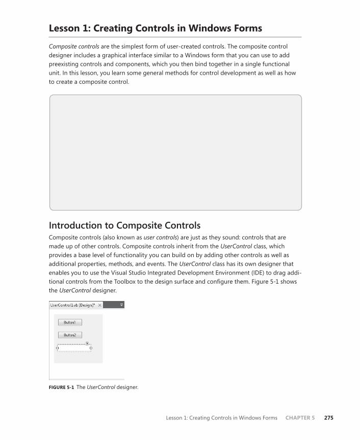
Lesson 1: Creating Controls in Windows Forms CHAPTER 5 275
Lesson 1: Creating Controls in Windows Forms
Composite controls are the simplest form of user-created controls. The composite control designer includes a graphical interface similar to a Windows form that you can use to add preexisting controls and components, which you then bind together in a single functional unit. In this lesson, you learn some general methods for control development as well as how to create a composite control.
After this lesson, you will be able to:■ Develop a user (composite) Windows Forms control.■ Create properties, methods, and events for Windows Forms controls.■ Expose properties of constituent controls.■ Configure a control to be invisible at run time.■ Configure a control to have a transparent background.■ Provide a Toolbox bitmap for a control.■ Develop an extended control (inherited from an existing Windows Forms
control).
Estimated lesson time: 45 minutes
Introduction to Composite ControlsComposite controls (also known as user controls) are just as they sound: controls that are made up of other controls. Composite controls inherit from the UserControl class, which provides a base level of functionality you can build on by adding other controls as well as additional properties, methods, and events. The UserControl class has its own designer that enables you to use the Visual Studio Integrated Development Environment (IDE) to drag addi-tional controls from the Toolbox to the design surface and configure them. Figure 5-1 shows the UserControl designer.
FIGURE 5-1 The UserControl designer.

276 CHAPTER 5 Working with User-Defined Controls
To add a composite control to a solution at design time:
1. From the Project menu, choose Add User Control. The Add New Item dialog box opens.
2. Name your control and click Add. The new control is added to the project and opened for editing in the designer.
You can create a composite control in code by inheriting from the UserControl class, as shown here:
Sample of Visual Basic Code
Public Class myControl Inherits UserControl ' Add implementation here End Class
Sample of C# Code
public class myControl : UserControl { // Add implementation here }
The subordinate controls that make up the composite control are called constituent controls. You can add constituent controls to your composite control in the same way you would add a control to a form: by dragging it onto the design surface from the Toolbox. Then you can configure these constituent controls in the same way you would configure them in a form: by setting properties, altering the appearance, and creating methods that handle control events. When the composite control is built, the functionality you have coded will be built into it.
Adding Methods, Properties, and Events to ControlsIn addition to adding constituent controls, you can also add functionality to your control in the form of methods, properties, and events.
NOTE CLASSES, CONTROLS, AND COMPOSITE CONTROLS
The information in this section can be applied to classes and controls of all types, not just to composite controls.
ADDING METHODS TO A CONTROLYou can add a method to a control in the same way that you would add a method to a form or to any other class. Within the bounds of the class declaration in the Code window, add the method declaration and the method body. For a method that does not return a value, create a Sub (Visual Basic) or a void (C#) method, as shown here:
Sample of Visual Basic Code
Public Sub DisplayString(ByVal aString As String) Msgbox(aString) End Sub

Lesson 1: Creating Controls in Windows Forms CHAPTER 5 277
Sample of C# Code
public void DisplayString(string aString) { MessageBox.Show(aString); }
For methods that return a value, create a Function (Visual Basic) or specify a return type (C#), as shown in this example:
Sample of Visual Basic Code
Public Function DisplayString(ByVal aString As String, ByVal bString As String) As String Return aString & bString End Function
Sample of C# Code
public string DisplayString(string aString, string bString) { return aString + bString; }
ADDING PROPERTIES TO A CONTROLAdding a property is similar to adding a method. You create a property definition and then implement the functionality required to return and set the value represented by the property. Usually, the underlying value for the property is stored in a private member variable. In Visual Basic, you use the Property keyword to create a property. In C#, you simply implement the getter and setter for the property. The following example demonstrates how to implement a property, including a member variable to contain the value:
Sample of Visual Basic Code
Private mUnitsOnHand Public Property UnitsOnHand() As Integer Get Return mUnitsOnHand End Get Set(ByVal value As Integer) mUnitsOnHand = value End Set End Property
Sample of C# Code
private int mUnitsOnHand; public int UnitsOnHand { get { return mUnitsOnHand; } set { mUnitsOnHand = value; } }
278 CHAPTER 5 Working with User-Defined Controls
You can create a read-only property by using the ReadOnly keyword in Visual Basic or by omitting the setter in C#. An example is shown here:
Sample of Visual Basic Code
Private mUnitsOnHand Public ReadOnly Property UnitsOnHand() As Integer Get Return mUnitsOnHand End Get End Property
Sample of C# Code
private int mUnitsOnHand; public int UnitsOnHand { get { return mUnitsOnHand; } }
If you are creating a read-only property, you must set the member variable that represents the property’s value in code.
ADDING EVENTS TO A CONTROLYou can add to a control events that can be raised to notify the rest of the application that something interesting has happened. Once an event has been added to a class or control, it can be raised in code to send a notification to the rest of the application.
In Visual Basic, you can create an event by using the Event keyword and specifying the name and signature of the event, as shown here:
Sample of Visual Basic Code
Public Event Bang(ByVal decibels As Integer)
C#, however, requires an explicit delegate to be present to specify the signature before the Event keyword can be used to create a new event. The following example demonstrates how to create an event in C#:
Sample of C# Code
public delegate void Sound(int decibels); public event Sound Bang;
Note that you specify the delegate itself, not an instance of the delegate.
You can raise an event in code by using the RaiseEvent keyword in Visual Basic or by calling the event like you would a method in C#. An example is shown here:
Sample of Visual Basic Code
RaiseEvent Bang(100)
Sample of C# Code
this.Bang(100);
Lesson 1: Creating Controls in Windows Forms CHAPTER 5 279
Exposing the Properties of Constituent ControlsWhen constituent controls are added to a composite control, they are given an access level of Friend by default in Visual Basic and private by default in C#. In both cases, the constituent controls will be inaccessible to classes in other assemblies. If you want to enable other as-semblies to configure parts of the constituent controls, you must expose the properties of the constituent controls by wrapping them in a property declaration and then writing code in the property of the composite control to get and set the value of the property of the constituent control. For example, suppose you wanted to expose the BackColor property of a constitu-ent button. You might create a property in the composite control called ButtonBackColor, in which you return the BackColor property of the constituent button in the getter and set the constituent BackColor property of the button in the setter. An example of how you might implement this is shown here:
Sample of Visual Basic Code
Public Property ButtonBackColor() As System.Drawing.Color Get Return Button1.BackColor End Get Set(ByVal value As System.Drawing.Color) Button1.BackColor = value End Set End Property
Sample of C# Code
public System.Drawing.Color ButtonBackColor { get { return Button1.BackColor; } set { Button1.BackColor = value; } }
Configuring a Control to Be Invisible at Run TimeAt times, you might want your control to be invisible at run time. You can create an invisible control by setting the Visible property to False. Controls that are invisible cannot interact with the user through the UI, but they can still interact with the application and other controls. The following example demonstrates how to set the Visible property to False:
Sample of Visual Basic Code
myUserControl.Visible = False
Sample of C# Code
myUserControl.Visible = false;
Note that you can set the Visible property only at run time. To ensure that a control is invisible at startup, set the Visible property to False in the control’s Load event handler.

280 CHAPTER 5 Working with User-Defined Controls
Configuring a Control to Have a Transparent BackgroundWhen configuring your control to have a transparent background, you have two types of transparencies to consider. A control can be transparent so that the appearance of the form underneath the control is seen through the background of the control. A control can also appear as a transparent window through the form, displaying whatever is on the desktop beneath the form.
To create a control with a transparent background color, all you need to do is set the BackColor property to Color.Transparent. Whatever is displayed on the form beneath the control will show through the background of the control. You can set the BackColor to Transparent in the Properties window at design time, or you can set the BackColor to Transparent in code, as shown here:
Sample of Visual Basic Code
Me.BackColor = Color.Transparent
Sample of C# Code
this.BackColor = Color.Transparent;
Creating a transparent control that acts as a window through the form is a little more complex. Each form has a property called TransparencyKey, which represents a color that ap-pears as transparent when represented on the form. By setting the BackColor property of the control to the same color as the form’s TransparencyKey property, you can create a window of transparency through the form. You can set the form’s TransparencyKey property and the control’s BackColor property in the designer at design time or in code, as shown here:
Sample of Visual Basic Code
Form1.TransparencyKey = Color.Red myUserControl.BackColor = Color.Red
Sample of C# Code
Form1.TransparencyKey = Color.Red; myUserControl.BackColor = Color.Red;
Providing a Toolbox Bitmap for Your ControlAfter you have built a control, it automatically appears in the Toolbox if you are using it in the same solution that contains the control, or, if it was created in a different project, you can add it to the Toolbox. When you add the control to the Toolbox, it appears in the Toolbox as the name of the control next to an icon. If no icon is specified, a generic icon is supplied. You can specify the icon displayed next to the name of your control by using ToolboxBitmapAttribute. You can attach instances of the ToolboxBitmapAttribute class to your control declaration and use it to specify a 16-by-16 pixel bitmap that will represent your control in the Toolbox.

Lesson 1: Creating Controls in Windows Forms CHAPTER 5 281
You can specify the Toolbox bitmap in three ways. The most straightforward way is to specify the path to the bitmap you want to use. Here is an example of how to do this:
Sample of Visual Basic Code
<ToolboxBitmap("C:\myToolboxBitmap.bmp")> Class myControl Inherits UserControl ' Implementation omitted End Class
Sample of C# Code
[ToolboxBitmap(@"C:\myToolboxBitmap.bmp")] class myControl : UserControl {}
You can also use ToolboxBitmap from an existing type. For example, you could specify the same Toolbox bitmap that the Button control uses with the following code:
Sample of Visual Basic Code
<ToolBoxBitmap(GetType(System.Windows.Forms.Button))> Class myControl Inherits UserControl ' Implementation omitted End Class
Sample of C# Code
[ToolBoxBitmap(GetType(System.Windows.Forms.Button))] class myControl : UserControl {}
Finally, you can specify an assembly by specifying a type defined in that assembly and then load an icon resource that is specified by a string name, as shown here:
Sample of Visual Basic Code
<ToolBoxBitmap(GetType(myControl), "myControl.bmp")> Class myControl Inherits UserControl ' Implementation omitted End Class
Sample of C# Code
[ToolBoxBitmap(GetType(myControl), "myControl.bmp")] class myControl : UserControl {}
Quick Check 1. Briefly define a composite control.
2. How can you expose properties of constituent controls to developers?
282 CHAPTER 5 Working with User-Defined Controls
Quick Check Answers 1. A composite control, also called a user control, is made up of preexisting con-
trols (called constituent controls) bound together in a single interface. Com-posite controls can incorporate custom functionality to enable the constituent controls to work together.
2. You expose properties of constituent controls to developers by wrapping them in user control properties.
Creating Extended ControlsExtended controls are user-created controls that extend a preexisting .NET Framework control. By extending existing controls, you can retain all the functionality of the control while adding properties and methods and, in some cases, altering the rendered appearance of the control.
Extending a ControlYou can create an extended control by creating a class that inherits the control in question. The following example demonstrates how to create a control that inherits the Button class:
Sample of Visual Basic Code
Public Class ExtendedButton Inherits System.Windows.Forms.Button End Class
Sample of C# Code
public class ExtendedButton : System.Windows.Forms.Button {}
The ExtendedButton class created in the previous example has the same appearance, be-havior, and properties as the Button class, but you can now extend this functionality by add-ing custom properties or methods. For example, the following example demonstrates adding a property called ButtonValue that returns an integer:
Sample of Visual Basic Code
Public Class ExtendedButton Inherits System.Windows.Forms.Button Private mValue As Integer Public Property ButtonValue() As Integer Get Return mValue End Get Set(ByVal Value As Integer) mValue = Value End Set End Property End Class

Lesson 1: Creating Controls in Windows Forms CHAPTER 5 283
Sample of C# Code
public class ExtendedButton : System.Windows.Forms.Button { int mValue; public int ButtonValue { get { return mValue; } set { mValue = value; } } }
Overriding MethodsIn addition to adding new methods and properties to your control, you can also provide a new implementation for existing methods by overriding them. Overriding enables you to sub-stitute your own implementation for the base implementation of a method or to add to the functionality already there. The following demonstrates how to override the OnClick method in a class that inherits from Button. The new implementation increments a variable called Clicks and then calls the base implementation of OnClick.
Sample of Visual Basic Code
Protected Overrides Sub OnClick(ByVal e As System.EventArgs) Clicks += 1 MyBase.OnClick(e) End Sub
Sample of C# Code
protected override void OnClick(System.EventArgs e) { Clicks++; base.OnClick(e); }
Altering the Appearance of an Inherited ControlYou can change the visual appearance of some controls by overriding the OnPaint method. This enables you to either add to or replace the rendering logic of the control. To add to the default rendering of the control, call the MyBase.OnPaint (Visual Basic) or base.OnPaint (C#) method to call the base class’s rendering code in addition to your own. To provide a com-pletely custom appearance for the control, you can omit the call to the base class’s OnPaint method. The following example demonstrates how to create a simple elliptical button. Note, however, that it changes only the shape of the control and does not address subtler rendering tasks such as outlining.

284 CHAPTER 5 Working with User-Defined Controls
Sample of Visual Basic Code
Protected Overrides Sub OnPaint(ByVal pevent As System.Windows.Forms.PaintEventArgs) Dim x As New System.Drawing.Drawing2D.GraphicsPath x.AddEllipse(0, 0, Me.Width, Me.Height) Me.Region = New Region(x) MyBase.OnPaint(pevent) End Sub
Sample of C# Code
protected override void OnPaint(System.Windows.Forms.PaintEventArgs pevent) { System.Drawing.Drawing2D.GraphicsPath x = new System.Drawing.Drawing2D. GraphicsPath(); x.AddEllipse(0, 0, this.Width, this.Height); this.Region = new Region(x); base.OnPaint(pevent); }
PRACTICE Create a Composite Control
In this practice, you create a simple composite control that acts as a digital clock. You add a Label control to your composite control that displays the correct time and a Timer component that updates the Label every second. Finally, you expose the Enabled property of the Timer control through your composite control so users can enable and disable the clock.
EXERCISE Create a Digital Clock
1. Create a new Windows Forms application in Visual Studio.
2. From the Project menu, choose Add User Control and click Add in the Add New Item dialog box. A new user control is added to your project and opens in the designer.
3. From the Toolbox, drag a Label control onto the user control. Resize the user control so that it is approximately the size of the Label control.
4. From the Toolbox, drag a Timer component onto the user control.
5. In the Properties window, set the Interval property for the Timer component to 1000 and the Enabled property to True.
6. Double-click the Timer component to open the Code window to the default event han-dler for the Timer.Tick event and add the following line of code:
Sample of Visual Basic Code
Label1.Text = Now.ToLongTimeString
Sample of C# Code
label1.Text = DateTime.Now.ToLongTimeString();
Lesson 1: Creating Controls in Windows Forms CHAPTER 5 285
7. In the Code window, add the following Property declaration:
Sample of Visual Basic Code
Public Property TimeEnabled() As Boolean Get Return Timer1.Enabled End Get Set(ByVal value As Boolean) Timer1.Enabled = value End Set End Property
Sample of C# Code
public bool TimeEnabled { get { return timer1.Enabled; } set { timer1.Enabled = value; } }
8. From the File menu, choose Save All to save your solution.
9. From the Build menu, build your solution.
10. In Solution Explorer, open Form1. From the Toolbox in the designer, drag UserControl1 onto the form. An instance of your user control is added to the form and begins to keep time every second. Note that you can pause it by setting the TimeEnabled prop-erty to False in the Properties window.
11. Press F5 to build and run your application. Note that the user control functions the same way at run time as it does in the designer.
Lesson Summary■ Composite controls, also called user controls, consist of preexisting Windows Forms
controls and components bound together by common functionality in a common UI. Controls that are contained in a composite control are called constituent controls. You can add methods, properties, and events to a composite control to create custom functionality.
■ Properties of constituent controls are not generally accessible to developers. You can expose properties of constituent controls by wrapping them in new properties of the composite control.
■ You can configure a control to be invisible at run time by setting the Visible prop-erty to False. You can create a control with a transparent background by setting the BackColor property to Color.Transparent. You can create a window through the control and its owning form by setting the control’s BackColor property to the same color as the form’s TransparencyKey property.
■ You can provide a Toolbox bitmap for a control by configuring the ToolboxBitmap attribute.

286 CHAPTER 5 Working with User-Defined Controls
■ Dialog boxes are special forms that are designed to collect information from the user. Dialog boxes can be displayed either modally or modelessly. Modal dialog boxes halt program execution until the dialog box is closed, whereas modeless dialog boxes allow program execution to continue while they are displayed.
■ You can use the ShowDialog method to set the parent form of a dialog box. You can then retrieve information from the parent form by casting a reference to the parent form to the appropriate type.
■ You can create an extended control by creating a class that inherits a preexisting control. Extended controls encapsulate all the functionality of the inherited control. In addition, you can create new properties, methods, and events for an inherited control or override existing methods to replace preexisting functionality.
■ You can alter the appearance of an extended control by overriding the OnPaint method. You should call the base class’s OnPaint method to provide rendering for the base class or omit the call to the base class’s OnPaint method to provide completely different rendering for the control.
Lesson ReviewThe following questions are intended to reinforce key information presented in Lesson 1, “Creating Controls in Windows Forms.” The questions are also available on the companion CD if you prefer to review them in electronic form.
NOTE ANSWERS
Answers to these questions and explanations of why each answer choice is correct or incor-rect are located in the “Answers” section at the end of the book.
1. Which of the following are characteristics of a composite control? (Choose all that apply.)
A. Composite controls are made up of preexisting Windows Forms controls.
B. Composite controls can have custom functionality in the form of new methods, properties, or events.
C. Composite controls must provide their own rendering code.
D. Composite controls automatically expose the properties of their constituent con-trols as their own properties.
2. Which of the following are required to provide a Toolbox bitmap for a control? (Choose all that apply.)
A. You must provide a 16-by-16 pixel bitmap to act as the Toolbox bitmap.
B. You must provide a bitmap to act as the Toolbox bitmap, but size is unimportant because the .NET Framework will automatically resize it.

Lesson 1: Creating Controls in Windows Forms CHAPTER 5 287
C. You must set the Image property of the control to the appropriate bitmap for the Toolbox bitmap.
D. You must configure the ToolboxBitmap attribute to specify a path, a type, or a type and a resource name.
3. Which of the following are required to create an extended control?
A. You must override the OnPaint method to provide custom rendering.
B. You must provide a Toolbox bitmap for the new control.
C. You must inherit from a preexisting control.
D. You must expose any necessary properties of the inherited control by wrapping them in new properties.

288 CHAPTER 5 Working with User-Defined Controls
Lesson 2: Using Control Templates
WPF controls are designed to be lookless, which means that an element’s functionality is completely separate from the element’s appearance. Consequently, it is easy to provide a new UI appearance for a WPF element by creating a new control template. In this lesson, you learn how to create a new control template for a preexisting control.
After this lesson, you will be able to: ■ Create and apply a new control template.■ Insert a Trigger object in a control template.■ Apply properties of the template parent in the template.■ Apply a template within a Style.■ View the source code for a preexisting template.■ Use predefined part names in a new control template.
Estimated lesson time: 30 minutes
Creating Control TemplatesA control template is an XAML document that describes how a control will appear in the presentation layer. The template represents the visual tree of the control; it defines any of the parts that make up a control as well as the appearance and behavior of those parts.
Because WPF elements are designed to be lookless, the visual layer is distinct from the logical layer, and you can change the appearance of any WPF element radically by creating a new template for that element.
Control templates are defined within a <ControlTemplate> element (as you might expect). The following example shows a very simple control template:
<Button Height="23" Width="100" Name="Button3"> <Button.Template> <ControlTemplate> <Rectangle Fill="RoyalBlue" /> </ControlTemplate> </Button.Template> </Button>
When this control template is applied, the regular appearance of the Button is replaced with a RoyalBlue rectangle. Although it is not particularly exciting, it maintains all the func-tionality of the Button control. You can click it to raise the Button.Click event, and it maintains all the positioning and layout functionality of any other WPF element.
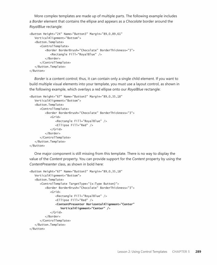
Lesson 2: Using Control Templates CHAPTER 5 289
More complex templates are made up of multiple parts. The following example includes a Border element that contains the ellipse and appears as a Chocolate border around the RoyalBlue rectangle:
<Button Height="24" Name="Button3" Margin="89,0,89,61" VerticalAlignment="Bottom"> <Button.Template> <ControlTemplate> <Border BorderBrush="Chocolate" BorderThickness="3"> <Rectangle Fill="RoyalBlue" /> </Border> </ControlTemplate> </Button.Template> </Button>
Border is a content control; thus, it can contain only a single child element. If you want to build multiple visual elements into your template, you must use a layout control, as shown in the following example, which overlays a red ellipse onto our RoyalBlue rectangle:
<Button Height="67" Name="Button3" Margin="89,0,35,18" VerticalAlignment="Bottom"> <Button.Template> <ControlTemplate> <Border BorderBrush="Chocolate" BorderThickness="3"> <Grid> <Rectangle Fill="RoyalBlue" /> <Ellipse Fill="Red" /> </Grid> </Border> </ControlTemplate> </Button.Template> </Button>
One major component is still missing from this template. There is no way to display the value of the Content property. You can provide support for the Content property by using the ContentPresenter class, as shown in bold here:
<Button Height="67" Name="Button3" Margin="89,0,35,18" VerticalAlignment="Bottom"> <Button.Template> <ControlTemplate TargetType="{x:Type Button}"> <Border BorderBrush="Chocolate" BorderThickness="3"> <Grid> <Rectangle Fill="RoyalBlue" /> <Ellipse Fill="Red" /> <ContentPresenter HorizontalAlignment="Center" VerticalAlignment="Center" /> </Grid> </Border> </ControlTemplate> </Button.Template> </Button>

290 CHAPTER 5 Working with User-Defined Controls
The ContentPresenter is essentially a placeholder for the Content property of the element. Whatever the value of the Content property, it is inserted into the space occupied by the ContentPresenter. For List controls, a similar class—ItemsPresenter—presents the objects in the Items property.
Note also in the previous example the addition of the TargetType={x:Type Button} prop-erty in the ControlTemplate tag. This is required for ContentPresenter to work because the ContentPresenter control contains an implicit TemplateBinding markup that requires the target type to be defined. Template bindings will be discussed later in this lesson. Note that unlike with styles, setting the TargetType property does not automatically set the template on ele-ments of that type. You must set the element’s Template property, either in XAML or by using styles, as you will see later in this lesson.
The previous template takes a Button control and completely redefines its visual appear-ance while retaining all its inherent functionality. The final product still requires some work, however; there is no visual cue when the user moves the mouse over the Button control or clicks it, as you would see in a Button control with the standard appearance. Later in this les-son you will see how to implement that functionality as well.
Creating a Template as a ResourceIn the previous section, you saw how to define a control template inline in a control. Although this is technically possible, it is really useful only for demonstration purposes. Templates are generally created to provide a common appearance for multiple controls, and, therefore, they are defined as resources to facilitate their reuse. To define a template as a resource, you must define it in a Resource section and apply a Key property, as shown in the following example:
<Window.Resources > <ControlTemplate TargetType="{x:Type Button}" x:Key="ButtonTemplate"> <Border BorderBrush="Chocolate" BorderThickness="3"> <Grid> <Rectangle Fill="RoyalBlue" /> <Ellipse Fill="Red" /> <ContentPresenter HorizontalAlignment="Center" VerticalAlignment="Center" /> </Grid> </Border> </ControlTemplate> </Window.Resources>
Applying a Template to a ControlAfter you have defined a template as a resource, you can apply it to a control by setting the Template property to that resource, as shown here:
<Button Template="{StaticResource ButtonTemplate}" Margin="112,123,91,116" Name="Button1">Button</Button>

Lesson 2: Using Control Templates CHAPTER 5 291
Inserting a Trigger Object in a TemplateSo far in this lesson, you have seen how to create a template that provides a different visual representation for a WPF element, but this is only part of creating new and exciting visual ele-ments for your application. A large part of the interface of an element is interactivity with the user. For example, a button with the standard template is highlighted when the mouse rolls over it and gives a visual cue when it is clicked. You can replicate this functionality by incorpo-rating triggers into your template.
The ControlTemplate object contains a collection of Trigger objects in the ControlTemplate.Triggers collection. You can add triggers here to provide visual interactivity just as you would in a style. The following example demonstrates a Trigger object in a Button template that highlights the button when the mouse moves over it. The relevant portions are shown in bold:
<ControlTemplate TargetType="{x:Type Button}" x:Key="ButtonTemplate"> <Border Name="Bord1" BorderBrush="Chocolate" BorderThickness="3"> <Grid> <Rectangle Name="Rect1" Fill="RoyalBlue" /> <Ellipse Name="Elli1" Fill="Red" /> <ContentPresenter HorizontalAlignment="Center" VerticalAlignment="Center" /> </Grid> </Border> <ControlTemplate.Triggers> <Trigger Property="IsMouseOver" Value="True"> <Setter TargetName="Rect1" Property="Fill" Value="AliceBlue" /> <Setter TargetName="Bord1" Property="BorderBrush" Value="Red" /> <Setter TargetName="Elli1" Property="Fill" Value="Yellow" /> </Trigger> </ControlTemplate.Triggers> </ControlTemplate>
There are a few important things to notice about this example. First, each element affected by the Trigger object has had the Name property set so that the Setter objects in the Trigger object can refer to the correct object. Second, the Trigger object is defined in the XAML after the constituent elements of the template. This is required by the template engine. It is, there-fore, a good idea to define triggers at the end of your template.
You also can define animations in your template triggers. This example provides an Animation object, shown in bold, that is executed when the button is clicked:
<ControlTemplate TargetType="{x:Type Button}" x:Key="ButtonTemplate"> <Border Name="Bord1" BorderBrush="Chocolate" BorderThickness="3"> <Grid> <Rectangle Name="Rect1" Fill="RoyalBlue" /> <Ellipse Name="Elli1" Fill="Red" /> <ContentPresenter HorizontalAlignment="Center" VerticalAlignment="Center" /> </Grid> </Border> <ControlTemplate.Triggers> <Trigger Property="IsMouseOver" Value="True"> <Setter TargetName="Rect1" Property="Fill" Value="AliceBlue" />
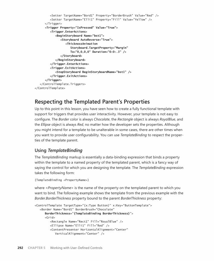
292 CHAPTER 5 Working with User-Defined Controls
<Setter TargetName="Bord1" Property="BorderBrush" Value="Red" /> <Setter TargetName="Elli1" Property="Fill" Value="Yellow" /> </Trigger> <Trigger Property="IsPressed" Value="True"> <Trigger.EnterActions> <BeginStoryboard Name="bst1"> <Storyboard AutoReverse="True"> <ThicknessAnimation Storyboard.TargetProperty="Margin" To="0,0,0,0" Duration="0:0:.3" /> </Storyboard> </BeginStoryboard> </Trigger.EnterActions> <Trigger.ExitActions> <StopStoryboard BeginStoryboardName="bst1" /> </Trigger.ExitActions> </Trigger> </ControlTemplate.Triggers> </ControlTemplate>
Respecting the Templated Parent’s PropertiesUp to this point in this lesson, you have seen how to create a fully functional template with support for triggers that provides user interactivity. However, your template is not easy to configure. The Border color is always Chocolate, the Rectangle object is always RoyalBlue, and the Ellipse object is always Red, no matter how the developer sets the properties. Although you might intend for a template to be unalterable in some cases, there are other times when you want to provide user configurability. You can use TemplateBinding to respect the proper-ties of the template parent.
Using TemplateBindingThe TemplateBinding markup is essentially a data-binding expression that binds a property within the template to a named property of the templated parent, which is a fancy way of saying the control for which you are designing the template. The TemplateBinding expression takes the following form:
{TemplateBinding <PropertyName>}
where <PropertyName> is the name of the property on the templated parent to which you want to bind. The following example shows the template from the previous example with the Border.BorderThickness property bound to the parent BorderThickness property:
<ControlTemplate TargetType="{x:Type Button}" x:Key="ButtonTemplate"> <Border Name="Bord1" BorderBrush="Chocolate" BorderThickness="{TemplateBinding BorderThickness}"> <Grid> <Rectangle Name="Rect1" Fill="RoyalBlue" /> <Ellipse Name="Elli1" Fill="Red" /> <ContentPresenter HorizontalAlignment="Center" VerticalAlignment="Center" />
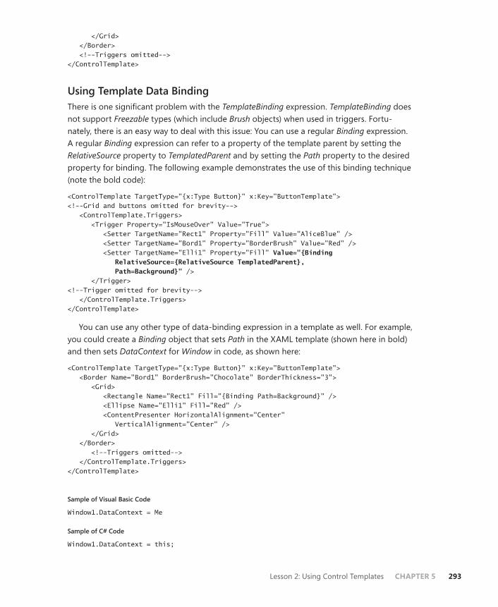
Lesson 2: Using Control Templates CHAPTER 5 293
</Grid> </Border> <!--Triggers omitted--> </ControlTemplate>
Using Template Data BindingThere is one significant problem with the TemplateBinding expression. TemplateBinding does not support Freezable types (which include Brush objects) when used in triggers. Fortu-nately, there is an easy way to deal with this issue: You can use a regular Binding expression. A regular Binding expression can refer to a property of the template parent by setting the RelativeSource property to TemplatedParent and by setting the Path property to the desired property for binding. The following example demonstrates the use of this binding technique (note the bold code):
<ControlTemplate TargetType="{x:Type Button}" x:Key="ButtonTemplate"><!--Grid and buttons omitted for brevity--> <ControlTemplate.Triggers> <Trigger Property="IsMouseOver" Value="True"> <Setter TargetName="Rect1" Property="Fill" Value="AliceBlue" /> <Setter TargetName="Bord1" Property="BorderBrush" Value="Red" /> <Setter TargetName="Elli1" Property="Fill" Value="{Binding RelativeSource={RelativeSource TemplatedParent}, Path=Background}" /> </Trigger> <!--Trigger omitted for brevity--> </ControlTemplate.Triggers> </ControlTemplate>
You can use any other type of data-binding expression in a template as well. For example, you could create a Binding object that sets Path in the XAML template (shown here in bold) and then sets DataContext for Window in code, as shown here:
<ControlTemplate TargetType="{x:Type Button}" x:Key="ButtonTemplate"> <Border Name="Bord1" BorderBrush="Chocolate" BorderThickness="3"> <Grid> <Rectangle Name="Rect1" Fill="{Binding Path=Background}" /> <Ellipse Name="Elli1" Fill="Red" /> <ContentPresenter HorizontalAlignment="Center" VerticalAlignment="Center" /> </Grid> </Border> <!--Triggers omitted--> </ControlTemplate.Triggers> </ControlTemplate>
Sample of Visual Basic Code
Window1.DataContext = Me
Sample of C# Code
Window1.DataContext = this;
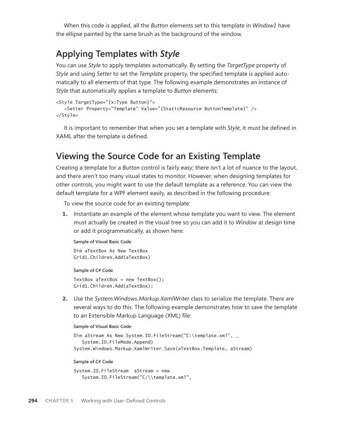
294 CHAPTER 5 Working with User-Defined Controls
When this code is applied, all the Button elements set to this template in Window1 have the ellipse painted by the same brush as the background of the window.
Applying Templates with StyleYou can use Style to apply templates automatically. By setting the TargetType property of Style and using Setter to set the Template property, the specified template is applied auto-matically to all elements of that type. The following example demonstrates an instance of Style that automatically applies a template to Button elements:
<Style TargetType="{x:Type Button}"> <Setter Property="Template" Value="{StaticResource ButtonTemplate}" /> </Style>
It is important to remember that when you set a template with Style, it must be defined in XAML after the template is defined.
Viewing the Source Code for an Existing TemplateCreating a template for a Button control is fairly easy; there isn’t a lot of nuance to the layout, and there aren’t too many visual states to monitor. However, when designing templates for other controls, you might want to use the default template as a reference. You can view the default template for a WPF element easily, as described in the following procedure:
To view the source code for an existing template:
1. Instantiate an example of the element whose template you want to view. The element must actually be created in the visual tree so you can add it to Window at design time or add it programmatically, as shown here:
Sample of Visual Basic Code
Dim aTextBox As New TextBoxGrid1.Children.Add(aTextBox)
Sample of C# Code
TextBox aTextBox = new TextBox();Grid1.Children.Add(aTextBox);
2. Use the System.Windows.Markup.XamlWriter class to serialize the template. There are several ways to do this. The following example demonstrates how to save the template to an Extensible Markup Language (XML) file:
Sample of Visual Basic Code
Dim aStream As New System.IO.FileStream("C:\template.xml", _ System.IO.FileMode.Append) System.Windows.Markup.XamlWriter.Save(aTextBox.Template, aStream)
Sample of C# Code
System.IO.FileStream aStream = new System.IO.FileStream("C:\\template.xml",

Lesson 2: Using Control Templates CHAPTER 5 295
System.IO.FileMode.Append); System.Windows.Markup.XamlWriter.Save(aTextBox.Template, aStream);
Using Predefined Part Names in a TemplateAlthough WPF elements are designed to be lookless, this is not always completely the case. When inspecting the template of the TextBox control in the previous section, you might have noticed the following line:
<ScrollViewer Name="PART_ContentHost" SnapsToDevicePixels="{TemplateBinding UIElement.SnapsToDevicePixels}" />
The part of this line that deserves particular notice is “Name=“PART_ContentHost”. Despite the goal of lookless controls, some WPF elements interact with their code through named elements in their templates. By convention, all these elements that interact with the element code are named PART_<name>, where <name> is a description of the role of that part. In the TextBox example, Part_ContentHost interacts with the element code to provide the editable surface of TextBox. If you are providing a new template for any control with named parts, you should give the corresponding elements the same name to keep the functionality of the control consistent.
PRACTICE Creating a Control Template
In this practice, you create a new template for the Button control. You provide a custom ap-pearance for the button and implement the functionality to change that appearance when the button is disabled, when the mouse moves over the button, and when the button is clicked.
EXERCISE Creating a New Control Template
1. Create a new WPF application.
2. In XAML view, create a Window.Resources section just before the Grid section, as shown here:
<Window.Resources> </Window.Resources>
3. Add the following ControlTemplate template to the Window.Resources section. This template defines an Ellipse object and a ContentPresenter object that make up the visual appearance of Button. Ellipse is filled by a custom RadialGradientBrush property that gives it a colorful appearance:
<ControlTemplate x:Key="ButtonTemplate" TargetType="Button"> <Grid> <Ellipse Name="Ellipse1" Stroke="{TemplateBinding BorderBrush}" StrokeThickness="{TemplateBinding BorderThickness}"> <Ellipse.Fill>
296 CHAPTER 5 Working with User-Defined Controls
<RadialGradientBrush GradientOrigin=".5, .5"> <GradientStop Color="Red" Offset="0" /> <GradientStop Color="Orange" Offset=".25" /> <GradientStop Color="Blue" Offset=".5" /> <GradientStop Color="Yellow" Offset=".75" /> <GradientStop Color="Green" Offset="1" /> </RadialGradientBrush> </Ellipse.Fill> </Ellipse> <ContentPresenter HorizontalAlignment="Center" VerticalAlignment="Center"/> </Grid> </ControlTemplate>
4. Add a ControlTemplate.Triggers section and add the following trigger to highlight the button when the mouse is over it:
<ControlTemplate.Triggers> <Trigger Property="IsMouseOver" Value="True"> <Setter TargetName="Ellipse1" Property="Fill"> <Setter.Value> <RadialGradientBrush GradientOrigin=".5, .5"> <GradientStop Color="LightCoral" Offset="0" /> <GradientStop Color="LightSalmon" Offset=".25" /> <GradientStop Color="LightBlue" Offset=".5" /> <GradientStop Color="LightYellow" Offset=".75" /> <GradientStop Color="LightGreen" Offset="1" /> </RadialGradientBrush> </Setter.Value> </Setter> </Trigger> </ControlTemplate.Triggers>
5. Add another trigger to disable Button when the IsEnabled property is set to False, as shown here:
<Trigger Property="IsEnabled" Value="False"> <Setter TargetName="Ellipse1" Property="Fill"> <Setter.Value> <RadialGradientBrush GradientOrigin=".5,.5"> <GradientStop Color="Gray" Offset="0" /> <GradientStop Color="LightGray" Offset=".25" /> <GradientStop Color="Black" Offset=".5" /> <GradientStop Color="White" Offset=".75" /> <GradientStop Color="DarkGray" Offset="1" /> </RadialGradientBrush> </Setter.Value> </Setter> </Trigger>
6. Add EventTrigger that plays an animation when the button is clicked to the Triggers section. The following example causes the button to shrink to a point and re-expand:
<EventTrigger RoutedEvent="Button.Click"> <BeginStoryboard>

Lesson 2: Using Control Templates CHAPTER 5 297
<Storyboard AutoReverse="True"> <DoubleAnimation To="0" Duration="0:0:0.1" Storyboard.TargetProperty="Width" /> <DoubleAnimation To="0" Duration="0:0:0.1" Storyboard.TargetProperty="Height" /> </Storyboard> </BeginStoryboard> </EventTrigger>
7. In the Window.Resources section, after the end of ControlTemplate, add the following Style element to set the template for Button elements in this application automatically:
<Style TargetType="{x:Type Button}"> <Setter Property="Template" Value="{StaticResource ButtonTemplate}" /> </Style>
8. Add the following Button tags as children to the Grid control in the XAML for this win-dow:
<Button Height="80" Width="90" Name="Button1">Button</Button><Button Height="60" HorizontalAlignment="Left" Name="Button2" VerticalAlignment="Top" Width="75">Button</Button>
Do not set the Margin property because this interferes with the Animation property you defined in Step 6.
9. Set the IsEnabled property of the second Button object to False, as shown here.
<Button IsEnabled="False" Height="60" HorizontalAlignment="Left" Name="Button2" VerticalAlignment="Top" Width="75">Button</Button>
10. Press F5 to run your application. Note that your Button object is highlighted when the mouse moves over it and that the animation runs when the button is clicked.
Lesson Summary■ Control templates define the visual interface for a control but do not affect the inher-
ent functionality of a control directly. By setting the Template property of a WPF element, you can provide a new visual interface for that control while leaving its core functionality intact.
■ Control templates are typically defined as resources and are set on a target element by setting the element’s Template property to reference the appropriate resource. Alternatively, templates can be applied automatically to all elements of a given type by using a Style element that has the TargetType property set to the appropriate ele-ment type.
■ Control templates can contain Trigger objects as part of the template. Trigger objects typically provide visual cues to the user when conditions change for the element.
■ You can use the TemplateBinding markup to bind a property inside a template to a property of the templated parent. This markup does not function with Freezable

298 CHAPTER 5 Working with User-Defined Controls
objects in Trigger objects; in that case, you should use a regular Binding control with the RelativeSource property set to TemplatedParent.
■ Some templates contain elements that are acted on directly by the source code of the element. These elements are named PART_<partname>. When you are creating a template for an element with named parts, you should keep the same name for cor-responding parts of the template to avoid having to re-implement the functionality.
Lesson ReviewYou can use the following questions to test your knowledge of the information in Lesson 2, “Using Control Templates.” The questions are also available on the companion CD if you pre-fer to review them in electronic form.
NOTE ANSWERS
Answers to these questions and explanations of why each answer choice is correct or incor-rect are located in the “Answers” section at the end of the book.
1. Which of the following XAML samples correctly binds the Background property of the Label control in the template to the Background property of its templated parent? (Choose all that apply.)
A.
<ControlTemplate x:Key="TestTemplate"> <Label Background="Background" /> </ControlTemplate>
B.
<ControlTemplate x:Key="TestTemplate"> <Label Background="{Binding Background}" /> </ControlTemplate>
C.
<ControlTemplate x:Key="TestTemplate"> <Label Background="{TemplateBinding Background}" /> </ControlTemplate>
D.
<ControlTemplate x:Key="TestTemplate"> <Label Background="{Binding RelativeSource={RelativeSource TemplatedParent}, Path=Background}" /> </ControlTemplate>

Lesson 2: Using Control Templates CHAPTER 5 299
2. Which of the following XAML samples correctly applies the control template to all instances of Label in Window?
A.
<Window.Resources> <ControlTemplate x:Key="TestTemplate" TargetType="Label"> <Label Background="{Binding RelativeSource={RelativeSource TemplatedParent}, Path=Background}" /> </ControlTemplate> <Style TargetType="Label"> <Setter Property="Template" Value="{StaticResource TestTemplate}" /> </Style> </Window.Resources>
B.
<Window.Resources> <Style TargetType="Label"> <Setter Property="Template" Value="{StaticResource TestTemplate}" /> </Style> <ControlTemplate x:Key="TestTemplate" TargetType="Label"> <Label Background="{Binding RelativeSource={RelativeSource TemplatedParent}, Path=Background}" /> </ControlTemplate> </Window.Resources>
C.
<Window.Resources> <Style TargetType="Label"> </Style> <ControlTemplate x:Key="TestTemplate" TargetType="Label"> <Label Background="{Binding RelativeSource={RelativeSource TemplatedParent}, Path=Background}" /> </ControlTemplate> </Window.Resources>
D.
<Window.Resources> <ControlTemplate x:Key="TestTemplate" TargetType="Label"> <Label Background="{Binding RelativeSource={RelativeSource TemplatedParent}, Path=Background}" /> </ControlTemplate> </Window.Resources>

300 CHAPTER 5 Working with User-Defined Controls
Lesson 3: Creating Custom Controls in WPF
Although the array of element possibilities that WPF exposes through control templates is vast, there are times when the functionality you want to create in your applications is not matched by any preexisting WPF or Windows Forms control. In these cases, you can create custom controls that incorporate the functionality you need. In this lesson, you learn how to create a dependency property and how to create user and custom controls.
After this lesson, you will be able to: ■ Choose among using a control template, a user control, or a custom control.■ Implement a dependency property.■ Create a new user control.■ Create a new custom control.■ Consume a custom or user control.■ Render theme-based appearances for your custom controls.
Estimated lesson time: 30 minutes
Control Creation in WPFWith the enormous amount of customization available for WPF elements, the number of scenarios in which you have to build a control from the beginning is fairly small. Nonetheless, occasionally you might want to create your own custom controls. Custom controls in WPF fall into two categories: user controls, which inherit the UserControl class and are made up of constituent controls bound together by a common functionality in a shared user interface; and custom controls, which inherit the Control or ContentControl class and define their own visual appearance and functionality. Because of the template-based mechanism of creating user interfaces, the line between user controls and custom controls is somewhat blurred. The important distinction from a developer’s standpoint is that user controls provide a designable surface at design time and custom controls do not.
Whether creating a user control or a custom control, you likely want to provide new prop-erties for your control. To take advantage of built-in data binding and change notification features in WPF, you should implement dependency properties.
Choosing among User Controls, Custom Controls, and TemplatesUser controls, custom controls, and templates all enable you to create custom elements with custom appearances. Because each of these methods is so powerful, you might be confused about which technique to use when creating a custom element for your application. The key
Lesson 3: Creating Custom Controls in WPF CHAPTER 5 301
to making the right decision isn’t based on the appearance you want to create but, rather, on the functionality you want to incorporate into your application.
The standard WPF controls provide a great deal of built-in functionality. If the functionality of one of the preset controls, such as a progress bar or a slider, matches the functionality that you want to incorporate, then you should create a new template for that preexisting control to achieve the appearance you want. Creating a new template is the simplest solution to cre-ating a custom element, so you should consider that option first.
If the functionality you want to incorporate into your application can be achieved through a combination of preexisting controls and code, consider creating a user control. User con-trols enable you to bind together multiple preexisting controls in a single interface and add code that determines how they behave.
If no preexisting control or combination of controls can achieve the functionality you want, create a custom control. Custom controls enable you to create a completely new template that defines the visual representation of the control and to add custom code that determines the control’s functionality.
Implementing and Registering Dependency PropertiesDependency properties are the standard form that properties in WPF take. They support change notification, animation, property value inheritance, and data binding, and they sup-port multiple property value providers.
Dependency properties can be implemented only on objects that derive from the DependencyObject class. All WPF elements derive from DependencyObject. If you want to implement dependency properties on a custom class, the class must inherit from DependencyObject.
Dependency properties are implemented as normal .NET properties with some extra WPF infrastructure. The dependency property must be registered with the run time in a static con-structor, and then it can be set using a standard .NET property wrapper.
To implement and register a dependency property:
1. In a class that inherits from DependencyObject, declare a public, static, read-only vari-able of the type DependencyProperty. By convention, the name of this variable should be your desired name for the property with the suffix “Property” added to it. Look at the following example:
Sample of Visual Basic Code
Public Shared ReadOnly FlavorProperty As DependencyProperty
Sample of C# Code
public static readonly DependencyProperty FlavorProperty;

302 CHAPTER 5 Working with User-Defined Controls
2. Create a static constructor for the class that registers the dependency property. The DependencyProperty.Register method requires you to provide the name of the .NET property wrapper, the type of the property, the type that owns that property, and an instance of FrameworkPropertyMetadata, which can be used to add optional features to your dependency property. The following example shows a static constructor that registers the dependency property and assumes that your class is named PieClass:
Sample of Visual Basic Code
Shared Sub New() Dim md As New FrameworkPropertyMetadata() PieClass.FlavorProperty = DependencyProperty.Register("Flavor", _ GetType(String), GetType(PieClass), md) End Sub
Sample of C# Code
static PieClass(){ FrameworkPropertyMetadata md = new FrameworkPropertyMetadata(); PieClass.FlavorProperty = DependencyProperty.Register("Flavor", typeof(string), typeof(PieClass), md); }
3. Finally, create a .NET property wrapper to allow the dependency property to be ac-cessed in code, as shown here:
Sample of Visual Basic Code
Public Property Flavor() As String Get Return CType(GetValue(PieClass.FlavorProperty), String) End Get Set SetValue(PieClass.FlavorProperty, value) End Set End Property
Sample of C# Code
public string Flavor{ get { return (string)GetValue(PieClass.FlavorProperty); } set { SetValue(PieClass.FlavorProperty, value); } }
It is important to note that when dependency properties are set by the run time, they are set directly through the GetValue and SetValue methods, not through the .NET prop-erty wrapper. Thus, you should not put any additional code in the wrapper because it does not run unless the property is set directly in code. You can provide a static callback

Lesson 3: Creating Custom Controls in WPF CHAPTER 5 303
method that executes when the property value is changed by specifying a delegate in FrameworkPropertyMetadata, as shown here:
Sample of Visual Basic Code
Shared Sub New() Dim md As New FrameworkPropertyMetadata(New _ PropertyChangedCallback(AddressOf FlavorPropertyChanged)) PieClass.FlavorProperty = DependencyProperty.Register("Flavor", _ GetType(String), GetType(PieClass), md) End Sub Private Shared Sub FlavorPropertyChanged(ByVal o As DependencyObject, _ ByVal e As DependencyPropertyChangedEventArgs) ' Implementation omitted End Sub
Sample of C# Code
static PieClass(){ FrameworkPropertyMetadata md = new FrameworkPropertyMetadata(new PropertyChangedCallback(FlavorPropertyChanged)); PieClass.FlavorProperty = DependencyProperty.Register("Flavor", typeof(string), typeof(PieClass), md); } private static void FlavorPropertyChanged(DependencyObject o, DependencyPropertyChangedEventArgs e) { // Implementation omitted }
Creating User ControlsYou can create a user control to combine the functionality of multiple preexisting controls with code that makes them work together in a specific way. When creating user controls, you are typically not attempting to create a lookless control but, rather, a reusable amalgam of preconfigured controls.
Creating a user control is easy. Visual Studio provides a designable surface for user control creation that enables drag-and-drop functionality from the Toolbox. Thus, you can design a user control in exactly the same way as you would design an application interface. After the interface of the control is created, you can implement the functionality your control requires.
To create a user control:
1. In Visual Studio, create a new WPF User Control Library project, using the template in the Windows project type. The designer opens to a new designable user control.
2. Create the user interface for your control. You can drag constituent controls from the Toolbox, or you can create them in XAML.
304 CHAPTER 5 Working with User-Defined Controls
3. Add any functionality your control requires. If you need to implement any proper-ties, implement dependency properties, as described earlier in this lesson. For events, implement routed events, as described in Chapter 2, “Working with Events and Commands.”
4. Press F5 to build your control.
Consuming user controls is discussed in the “Consuming User Controls and Custom Controls” section later in this lesson.
Creating Custom ControlsCustom controls are different from user controls in that they are designed to be lookless. Visual Studio provides no designable surface for a custom control; rather, you must create the template for the custom control in the XAML designer. When you create a new cus-tom control project in Visual Studio, it creates a Themes folder that contains a file named Generic. xaml. This file contains the default template for your custom control, which you can alter to create the template for your control.
To create a custom control:
1. In Visual Studio, create a new WPF Custom Control Library project using the template in the Windows project type. The designer opens to the Code window.
2. In Solution Explorer, open the Themes folder and double-click Generic.xaml to open the default template for your custom control.
3. In XAML view, create the template for your control.
4. Add any functionality your control requires. If you need to implement any properties, implement dependency properties as described earlier in this lesson. For events, imple-ment routed events as described in Chapter 2, “Working with Events and Commands.”
5. Press F5 to build your control.
In the practice for this lesson, you create a custom control from the beginning.
Custom controls typically inherit the Control class, which provides all the infrastructure a control needs but contains no control-specific implementation. In some cases, however, you want to inherit another class. For example, if you wanted to create a WPF implementation of MaskedTextBox, you might start by inheriting the TextBox class. If you want to inherit a class other than Control, you must manually change the class your control inherits in the code file.
Consuming User Controls and Custom ControlsTo test or otherwise consume a user control or a custom control, you must add it to another project. This involves creating a reference to the assembly and then instantiating the control.
To consume a user control or a custom control:
1. In Solution Explorer, right-click the project and choose Add Reference. The Add Reference dialog box opens.
Lesson 3: Creating Custom Controls in WPF CHAPTER 5 305
2. Click the Browse tab and browse to the .dll file that contains the control you want to use. Select it and click OK.
3. In XAML view, add an XAML reference to the newly added assembly, as shown in this example:
xmlns:cc="clr-namespace:WpfCustomControlLibrary1; assembly=WpfCustomControlLibrary1"
4. In XAML, add your custom control, as shown in this example:
<cc:CustomControl1 />
5. Press F5 to build your application.
If you are testing a control, be sure you reference the dynamic-link library (DLL) in the Debug folder. When you make changes to the control and rebuild it, your test application detects any changes and prompts you to rebuild the application.
Quick Check■ What is the difference between a user control and a custom control?
Quick Check Answer■ A user control is a composite control composed of preexisting WPF controls
bound together by a common functionality. A custom control is a user-defined control composed of a new control template and a new associated functionality.
Rendering a Theme-Based AppearanceThe Windows Vista operating system enables the user to select themes for the desktop environment. When a theme is selected, applications that render a theme-based appearance automatically change to render an appearance and behavior consistent with that theme. Although in some cases you might want your custom controls to have a distinct appearance, rendering a theme-based appearance enables your controls to integrate seamlessly with other user interfaces.
The keys to rendering a theme-based appearance are the SystemColors, SystemFonts, and SystemParameters classes. These classes provide user-accessible instances of the brushes, fonts, and miscellaneous parameters that the current theme uses. When the user changes the theme, the System colors, fonts, and parameters are updated automatically to reflect the new theme.
You can access these settings as resources. Because they are system objects, they are al-ready declared and don’t need to be declared as resources in your Resources section. You can bind a property to one of these system objects, as shown in bold in this example:
<Label Background ="{DynamicResource {x:Static SystemColors.ControlBrushKey}}" Content="Hello World" />
306 CHAPTER 5 Working with User-Defined Controls
Because System resources often are changed by the user, you should use the DynamicResource markup instead of the more familiar StaticResource markup. The difference between static and dynamic resources is explained in Lesson 2 of Chapter 1, “Building a User Interface.”
Note that you refer to the resource key in this example. If you want to use this object in code, you would omit the key suffix, as shown here:
Sample of Visual Basic Code
Label1.Background = SystemColors.ControlBrush
Sample of C# Code
label1.Background = SystemColors.ControlBrush;
Providing Theme-Specific Templates for Custom ControlsIn some cases, you might want to provide a completely different appearance for a control when it is rendered in one theme as opposed to another. You can create templates that are specific to individual themes and designate them for use with ThemeInfoAttribute.
The template defined in the Generic.xaml file is the template used for every theme that does not have a specific template defined for it. You create templates for specific themes by creating an XAML file named <ThemeName>.<ThemeColor>.xaml, except for the Windows Classic theme, which is named simply Classic.xaml. Table 5-1 shows several examples of Windows themes and their corresponding XAML filenames.
TABLE 5-1 Selected Windows Themes and Matching XAML Filenames
WINDOWS THEME XAML FILENAME
Windows Vista theme Aero.NormalColor.xaml
Default Windows XP theme Luna.NormalColor.xaml
Silver Windows XP theme Luna.Metallic.xaml
Windows Classic theme Classic.xaml
No matter which themes you provide specific support for, you must create a fallback tem-plate in the Generic.xaml file.
In addition to creating alternate templates in theme-specific files, you must apply ThemeInfoAttribute. This is an Assembly attribute, and it is applied in the AssemblyInfo.vb or AssemblyInfo.cs file. ThemeInfoAttribute takes two arguments. The first argument designates where to look for theme-specific templates and resources, and the second argument indicates where to look for generic templates. Possible values for these arguments are as follows:
■ ResourceDictionaryLocation.None: This value indicates not to look for theme-specific templates.
Lesson 3: Creating Custom Controls in WPF CHAPTER 5 307
■ ResourceDictionaryLocation.SourceAssembly: This value indicates to look in the source assembly.
■ ResourceDictionaryLocation.ExternalAssembly: This value indicates to look in an ex-ternal assembly, which must be named <AssemblyName>.<ThemeName>.dll, where <AssemblyName> is the current assembly name and <ThemeName> is the name of the appropriate theme.
The following example demonstrates ThemeInfoAttribute:
Sample of Visual Basic Code
<Assembly: _ ThemeInfo(ResourceDictionaryLocation.SourceAssembly, _ ResourceDictionaryLocation.SourceAssembly)>
Sample of C# Code
[assembly: ThemeInfo(ResourceDictionaryLocation.SourceAssembly, ResourceDictionaryLocation.SourceAssembly)]
You can use this technique to provide theme-specific resource dictionaries as well. (Re-source dictionaries are discussed in Chapter 1, “Building a User Interface.”) The only adjust-ment you have to make is to create a Themes folder if it does not exist. You must also create a Generic.xaml file that includes a resource set for any themes that are unsupported.
EXAM TIP
Although it is important to understand the differences between Windows Forms custom controls and WPF custom controls when taking the exam, the exam is more likely to focus on WPF control creation, so be sure you understand all aspects of this process, especially control templates and using themes.
PRACTICE Creating a Custom Control
In this practice, you create a custom control that takes the form of a digital clock that is updated every second. You create a dependency property that represents the current time and implement the functionality to update this property every second. You then create the default template for your control and bind TextBlock in that template to the Time property. Finally, you create a test project to test your new control.
EXERCISE Creating a Custom Control
1. Create a new WPF Custom Control Library project, using the template in the Windows project type.
2. In code view, create variables that represent a System.Timers.Timer class and a dependency property named TimeProperty. Also, declare a new delegate called SetterDelegate that takes no arguments, as shown here:

308 CHAPTER 5 Working with User-Defined Controls
Sample of Visual Basic Code
Public Shared ReadOnly TimeProperty As DependencyPropertyPrivate myTimer As New System.Timers.Timer Delegate Sub SetterDelegate()
Sample of C# Code
public static readonly DependencyProperty TimeProperty;System.Timers.Timer myTimer = new System.Timers.Timer(); delegate void SetterDelegate();
3. In the shared (static) constructor, add the following code to register a new dependency property. No arguments are necessary for the metadata for this property:
Sample of Visual Basic Code
Dim metadata As New FrameworkPropertyMetadata()TimeProperty = DependencyProperty.Register("Time", GetType(String), _ GetType(CustomControl1), metadata)
Sample of C# Code
FrameworkPropertyMetadata metadata = new FrameworkPropertyMetadata();TimeProperty = DependencyProperty.Register("Time", typeof(string), typeof(CustomControl1), metadata);
4. Create an instance constructor that initializes Timer and sets the DataContext property. In addition, add a handler for the Timer.Elapsed event. (You will create the method that handles this event in a subsequent step.)
Sample of Visual Basic Code
Public Sub New() AddHandler myTimer.Elapsed, AddressOf timer_elapsed myTimer.Interval = 1000 myTimer.Start() Me.DataContext = Me End Sub
Sample of C# Code
public CustomControl1(){ myTimer.Elapsed += timer_elapsed; myTimer.Interval = 1000; myTimer.Start(); this.DataContext = this; }
5. Create a method that sets the Time property to a string that represents the current time in the long time format. This method is called by Dispatcher in the Timer. Elapsed event handler. Note that you are setting the Time property directly through the SetValue method in WPF. Because this property is not meant to be set by other controls, you do not need to provide a .NET property wrapper for this dependency property.

Lesson 3: Creating Custom Controls in WPF CHAPTER 5 309
Sample of Visual Basic Code
Private Sub TimeSetter() SetValue(TimeProperty, Now.ToLongTimeString) End Sub
Sample of C# Code
void TimeSetter(){ SetValue(TimeProperty, DateTime.Now.ToLongTimeString()); }
6. Create the timer_elapsed method to handle the Timer.Elapsed event. Because Timer code is executed on a different thread from the user interface, this method should use Dispatcher to invoke the TimeSetter method safely. An example is shown here:
Sample of Visual Basic Code
Private Sub timer_elapsed(ByVal sender As Object, ByVal e As _ System.Timers.ElapsedEventArgs) Dispatcher.Invoke(Windows.Threading.DispatcherPriority.Normal, _ New SetterDelegate(AddressOf TimeSetter)) End Sub
Sample of C# Code
void timer_elapsed(object sender, System.Timers.ElapsedEventArgs e){ Dispatcher.Invoke(System.Windows.Threading.DispatcherPriority.Normal, new SetterDelegate(TimeSetter)); }
7. In Solution Explorer, expand the Themes folder and double-click Generic.xaml to open the Generic.xaml file in XAML view. Within the Border declaration, add the following XAML code to create the visual template for your control:
<TextBlock Foreground="{TemplateBinding Foreground}" VerticalAlignment="Center" HorizontalAlignment="Center" Text="{Binding Path=Time}" />
8. Press F6 to build your control.
9. Now you will add a project to test your control. From the File menu, choose Add and then choose New Project. The Add New Project dialog box opens. Choose WPF Application and click OK.
10. In Solution Explorer, right-click the new project and choose Add Reference to open the Add Reference dialog box. Choose the Projects tab and then select the custom control library you created in the previous steps. Click OK.
11. In the namespaces section of your XAML code for the test project, add the following line to import the custom control namespace into your project. Note that if your proj-ect and namespace are called something other than Lesson3, you have to modify this line accordingly:
xmlns:MyNamespace="clr-namespace:Lesson3;assembly=Lesson3"

310 CHAPTER 5 Working with User-Defined Controls
12. Add the following XAML within the Grid declaration in the XAML code for your test project:
<MyNamespace:CustomControl1/>
An instance of your control is added to your test project.
13. In Solution Explorer, right-click your test project and select Set As Startup Project. Press F5 to build and run your project.
Lesson Summary■ The choice among templates, custom controls, and user controls should be based on
functionality. If an existing WPF control contains the functionality you need, create a template to provide a new appearance for it. If multiple existing WPF controls can be bound together with code to create your needed functionality, create a user control. If you need completely new functionality, create a custom control.
■ Dependency properties have built-in change notification and support animation, property value inheritance, and data binding. When creating new properties for user controls or custom controls, create dependency properties.
■ User controls are created in a designer and consist of one or more WPF controls bound together in a single interface and incorporating custom code.
■ Custom controls are WPF elements that incorporate custom functionality. The appear-ance of custom controls is defined by a new template. They typically inherit from the Control class.
■ You can provide theme-based rendering for your custom controls by using the SystemColors, SystemFonts, and SystemParameters classes. To provide completely dif-ferent appearances for your control based on theme, you can create multiple tem-plates and use ThemeInfoAttribute to designate where to look for the alternate theme templates.
Lesson ReviewYou can use the following questions to test your knowledge of the information in Lesson 3, “Creating Custom Controls in WPF.” The questions are also available on the companion CD if you prefer to review them in electronic form.
NOTE ANSWERS
Answers to these questions and explanations of why each answer choice is correct or incor-rect are located in the “Answers” section at the end of the book.
Lesson 3: Creating Custom Controls in WPF CHAPTER 5 311
1. You are designing a control that retrieves current stock prices and displays them in a ListBox object that is updated regularly. Which of the following is the best strategy for creating your custom element?
A. Use a preexisting Windows Forms control.
B. Use a preexisting WPF element with a custom template.
C. Create a user control.
D. Create a custom control.
2. You are designing a control that downloads stock market quotes and displays them in a rolling stock-ticker format that moves constantly across the top of the window. Which of the following is the best strategy for creating your custom element?
A. Use a preexisting Windows Forms control.
B. Use a preexisting WPF element with a custom template.
C. Create a user control.
D. Create a custom control.
3. Which of the following is required to implement theme-specific templates for a custom control? (Choose all that apply.)
A. Create separate templates for each theme.
B. Create separate folders for each theme.
C. Set ThemeInfoAttribute.
D. Provide a generic template for themes that are not supported.

312 CHAPTER 5 Working with User-Defined Controls
Case Scenarios
In the following case scenarios, you apply what you’ve learned about how to use controls to design user interfaces. You can find answers to these questions in the “Answers” section at the end of this book.
Case Scenario 1: Full Support for StylesYou’ve just been hired to create an application for one of your most important clients. There is nothing too technically difficult about this application; it basically takes customer informa-tion as input and stores it in a database. The problem is that the design of the application requires the use of a MaskedTextBox-style control, but the client insists that the application must be fully visually extensible like other WPF applications, including support for Style ele-ments and templates.
The technical requirements are that:
■ The user interface must incorporate several text boxes that have full masking ability.
■ Every control in the user interface must be visually extensible through Style and Template.
Answer the following question for all your office mates, who are eagerly awaiting the ap-plication’s completion:
■ What possible approaches can we use to solve these problems?
Case Scenario 2: The Pizza Progress BarYou’re designing an internal application for a well-known pizza company, and the stakehold-ers have requested a few fun details to personalize the application for their company. Specifi-cally, they’d like a custom progress bar. Instead of showing a bar that gradually fills as the task nears completion, they’d like to show an image of a pizza that gradually disappears as the task nears completion.
Answer the following questions for your manager:
1. What approach should you use to implement this control?
2. How can you implement the disappearing-pizza visual effect?
Suggested Practices
To help you successfully master the exam objectives presented in this chapter, complete the following tasks.
■ Practice 1 Implement the custom ProgressBar control described in Case Scenario 2.
■ Practice 2 Re-create the custom control you created in the practice accompanying Lesson 3 as a user control.

Take a Practice Test CHAPTER 5 313
■ Practice 3 Create templates that create Button controls that appear as triangles, pen-tagons, or other complex geometric shapes.
■ Practice 4 Practice creating Mask properties for the MaskedTextBox control that accept a variety of standard formats, such as Lastname-Firstname, ZIP codes, phone numbers, and other input formats.
■ Practice 5 Create a custom controller that displays an image, automatically extracts the image name from the metadata, and displays the image name below the image.
Take a Practice Test
The practice tests on this book’s companion CD offer many options. For example, you can test yourself on just the content covered in this chapter, or you can test yourself on all the 70-511 certification exam content. You can set up the test so that it closely simulates the experience of taking a certification exam, or you can set it up in study mode so that you can look at the correct answers and explanations after you answer each question.
MORE INFO PRACTICE TESTS
For details about all the practice test options available, see the “How to Use the Practice Tests” section in this book’s Introduction.


CHAPTER 6 315
C H A P T E R 6
Working with Data Binding
Data binding is the mechanism by which information contained in an object is associated with elements in your user interface. The most common scenario is seen when bind-
ing a control in the user interface to a record in a database. When a field in the database is bound to a control, that field’s value is displayed in the control. Changes made to the value in the control can then be reflected back to the original record in the database if the programmer so desires. This kind of data binding has been a staple of Windows Forms programming for years.
Data binding in Windows Presentation Foundation (WPF) takes this paradigm to a whole new level. Using WPF data-binding technology, any property can be bound to any other object or source. You can create richly data-bound interfaces that eliminate much of the back-end coding required by Windows Forms. In this chapter, you learn about the Binding class and how to configure it. In addition, you learn how to configure data binding for WPF, apply custom conversions to your data to format strings, return objects, or apply condition-al formatting to your presentation layer. You also learn how to validate data and configure custom data objects for data change notification.
Exam objectives in this chapter:■ Implement data binding.■ Implement value converters in WPF.■ Implement data validation.■ Implement and consume change notification interfaces.
Lessons in this chapter:■ Lesson 1: Configuring Data Binding 317■ Lesson 2: Converting Data 328■ Lesson 3: Validating Data and Configuring Change Notification 346
316 CHAPTER 6 Working with Data Binding
Before You Begin
To complete the lessons in this chapter, you must have:
■ A computer that meets or exceeds the minimum hardware requirements listed in the “About This Book” section at the beginning of the book.
■ Microsoft Visual Studio 2010 Professional installed on your computer.
■ An understanding of Microsoft Visual Basic or C# syntax and familiarity with Microsoft .NET Framework 4.0.
■ An understanding of Extensible Application Markup Language (XAML).
REAL WORLD
Matthew Stoecker
WPF takes data binding to a level that was unheard of in the Windows Forms world. Now I can create rich user interfaces that have properties bound to
just about anything imaginable. Creating the user interface (UI) functionality by which manipulating one control changes the value of another is now simple; no more complicated event-handling code. Just set the binding and you’re ready to go!
Lesson 1: Configuring Data Binding CHAPTER 6 317
Lesson 1: Configuring Data Binding
WPF makes it easy to bind almost any property on any element to any other object, property, collection, or data source. In this lesson, you learn about Binding, the central class that defines data binding in WPF. You learn how to create a binding between two properties and how to configure the binding mode and the update mode.
After this lesson, you will be able to: ■ Describe the important members of the Binding class.■ Create a binding between an element property and an object or object property.■ Configure the BindingMode property of the Binding object.■ Configure the UpdateMode property of the Binding object.■ Bind to a nullable value.
Estimated lesson time: 30 minutes
The term data binding describes the process of creating a dependence for the value of one property, called the target property, on the value of another property, called the source property. The target property takes on the value of the source property. Many variations on the style of binding are possible. In some cases, changes to the source property are trans-mitted to the target immediately, but in other cases, they are not. In some cases, changes the user makes to the target property also are transmitted back to the value of the source property, although in other cases, they are not. The class that makes all this possible is the Binding class.
The Binding ClassThe Binding class is the glue that makes data binding possible. Simply put, the Binding class establishes and describes a relationship between the target and source properties. You can use a Binding object to create a relationship between a target property and another object, a list, an ADO.NET data object, or any other object. Table 6-1 shows important properties of the Binding class discussed in this chapter.
TABLE 6-1 Important Properties of the Binding Class
PROPERTY DESCRIPTION
ElementName Gets or sets the name of the element to use as the binding source object. When binding to a WPF element, this property is used instead of the Source property.
FallbackValue Gets or sets the value to use when the binding is unable to return a value.
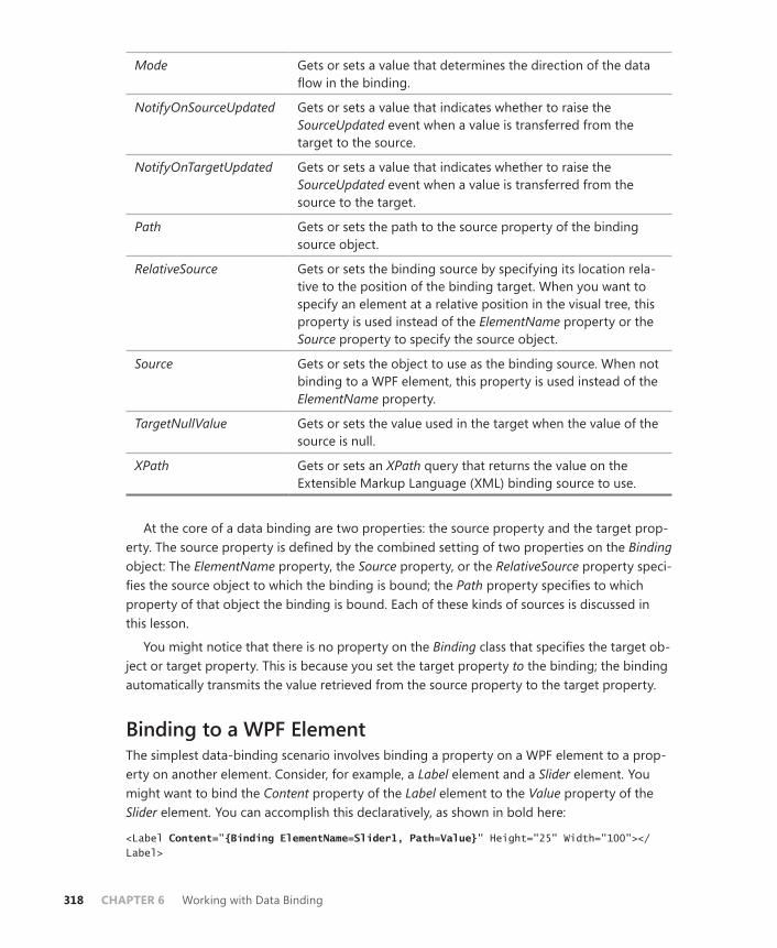
318 CHAPTER 6 Working with Data Binding
Mode Gets or sets a value that determines the direction of the data flow in the binding.
NotifyOnSourceUpdated Gets or sets a value that indicates whether to raise the SourceUpdated event when a value is transferred from the target to the source.
NotifyOnTargetUpdated Gets or sets a value that indicates whether to raise the SourceUpdated event when a value is transferred from the source to the target.
Path Gets or sets the path to the source property of the binding source object.
RelativeSource Gets or sets the binding source by specifying its location rela-tive to the position of the binding target. When you want to specify an element at a relative position in the visual tree, this property is used instead of the ElementName property or the Source property to specify the source object.
Source Gets or sets the object to use as the binding source. When not binding to a WPF element, this property is used instead of the ElementName property.
TargetNullValue Gets or sets the value used in the target when the value of the source is null.
XPath Gets or sets an XPath query that returns the value on the Extensible Markup Language (XML) binding source to use.
At the core of a data binding are two properties: the source property and the target prop-erty. The source property is defined by the combined setting of two properties on the Binding object: The ElementName property, the Source property, or the RelativeSource property speci-fies the source object to which the binding is bound; the Path property specifies to which property of that object the binding is bound. Each of these kinds of sources is discussed in this lesson.
You might notice that there is no property on the Binding class that specifies the target ob-ject or target property. This is because you set the target property to the binding; the binding automatically transmits the value retrieved from the source property to the target property.
Binding to a WPF ElementThe simplest data-binding scenario involves binding a property on a WPF element to a prop-erty on another element. Consider, for example, a Label element and a Slider element. You might want to bind the Content property of the Label element to the Value property of the Slider element. You can accomplish this declaratively, as shown in bold here:
<Label Content="{Binding ElementName=Slider1, Path=Value}" Height="25" Width="100"></Label>
Lesson 1: Configuring Data Binding CHAPTER 6 319
In this example, the binding is created declaratively. The object to which the Content prop-erty is bound is specified by the ElementName property, and the property on that object that actually supplies the value is indicated by the Path property. When the Slider.Value property changes, that change is now reflected immediately in the Label.Content property.
In some cases, you might need to define more complex bindings declaratively, and you might find it more useful to use more formal syntax. The following example uses nested dec-larations instead of the curly braces shown previously. The binding created is the same as the previous one:
<Label Height="25" Width="100"> <Label.Content> <Binding ElementName="Slider1" Path="Value" /> </Label.Content> </Label>
Although this syntax is more cumbersome, it is occasionally useful, as will be demonstrated later in this lesson.
Creating a Binding in CodeAlthough it is easiest to create bindings declaratively, you might find it useful to create a binding in code if you want to set or remove a binding dynamically. A binding can be cre-ated in code like any other object. To set the binding, however, you must use the SetBinding method on the WPF element and specify the dependency property to which the binding will be bound. The following code demonstrates how to create in code the binding shown in the previous two examples:
Sample of Visual Basic Code
Dim aBinding As New Binding()aBinding.ElementName = "Slider1" aBinding.Path = New System.Windows.PropertyPath("Value") ' In the previous two examples, the Name property of the Label was not set. ' In this example, a name is required so it is assumed to be Label1. Label1.SetBinding(ContentProperty, aBinding)
Sample of C# Code
Binding aBinding = new Binding();aBinding.ElementName = "Slider1"; aBinding.Path = new System.Windows.PropertyPath("Value"); // In the previous two examples, the Name property of the Label was not set. // In this example, a name is required so it is assumed to be Label1. Label1.SetBinding(ContentProperty, aBinding);
To remove a binding dynamically, you call the BindingOperations.ClearBinding method, as shown here:
Sample of Visual Basic Code
BindingOperations.ClearBinding(Me.Label1, ContentProperty)
320 CHAPTER 6 Working with Data Binding
Sample of C# Code
BindingOperations.ClearBinding(this.Label1, ContentProperty);
Binding to an ObjectWhen binding to an object that is not a WPF element, you use the Source property to specify the Source object. This can be any object you are able to access from the XAML view. When binding to a non-WPF object, a common scenario is to bind to static objects such as system colors and fonts. The following example demonstrates how to use the Source property to bind the Background property of a button to the SystemColors.WindowColor static object:
<Button Background="{Binding Source={x:Static SystemColors.WindowColor}}" Height="23" Width="75">Button</Button>
In this example, because the Background property is bound to the brush exposed by SystemColors.WindowColor, you can omit the Path property.
Another common scenario is to bind to a logical resource. (Logical resources are discussed in detail in Chapter 1, “Building a User Interface.”) The following code (shown in bold) dem-onstrates binding to a logical resource. It shows importing a namespace from the application, creating an instance of a class from that namespace in the Window.Resources tag, and then binding to a property of that instance:
<Window x:Class="WpfApplication1.Window1" xmlns="http://schemas.microsoft.com/winfx/2006/xaml/presentation" xmlns:x="http://schemas.microsoft.com/winfx/2006/xaml" xmlns:local="clr-namespace:WpfApplication1" Title="Window1" Height="300" Width="300"> <Window.Resources> <local:aClass x:Key="theObject" /> </Window.Resources> <Grid> <Button Content="{Binding Source={StaticResource theObject}, Path=myProperty}" /> </Grid> </Window>
Using the DataContext PropertyIt is not actually necessary to set the Source property at all to create a data binding. You can instead set the DataContext property for an element or a container in the visual tree. If the Source, RelativeSource, or Element property of a Binding class is not set, WPF looks for a DataContext setting, starting with the element that is bound by the binding and then moving up the visual tree until an element is found for which the DataContext property is not null. The object specified by the DataContext property then serves as the source object for all bindings in that element’s visual tree that do not already have the Source, Element, or RelativeSource property set. This is useful for binding multiple elements in a single container
Lesson 1: Configuring Data Binding CHAPTER 6 321
to the same data source. The lines of code shown in bold in the following example demon-strate the DataContext property. The DataContext property of the grid is set to a resource object called aDataObject, and then the Content property of the contained Label element is bound to a member of myDataObject named myTitle.
<Window x:Class="WpfApplication1.Window1" xmlns="http://schemas.microsoft.com/winfx/2006/xaml/presentation" xmlns:x="http://schemas.microsoft.com/winfx/2006/xaml" xmlns:local="clr-namespace:WpfApplication1" Title="Window1" Height="300" Width="300"> <Window.Resources> <local:myDataObject x:Key="aDataObject" /> </Window.Resources> <Grid DataContext="{StaticResource aDataObject}"> <Label Content="{Binding Path=myTitle}" /> </Grid> </Window>
A common scenario when using DataContext is to set it in code. For example, this is required frequently when using ADO.NET objects that must be initialized in code and cannot be filled declaratively. In this case, you still can create the bindings declaratively, omitting the Source property, as shown in bold here:
<Grid Name="Grid1"> <Label Content="{Binding Path=myTitle}" /></Grid>
Then set the DataContext property in code, as shown here:
Sample of Visual Basic Code
Dim aDataObject As New myDataObject()Grid1.DataContext = aDataObject
Sample of C# Code
myDataObject aDataObject = new myDataObject();Grid1.DataContext = aDataObject;
When the DataContext property is set in code, the bound controls affected by it will not display any bound data until the code setting the property is executed.
Binding to Ancestor Properties with the RelativeSource PropertyThe RelativeSource property enables you to create bindings that specify a source element in a position in the visual tree relative to the target element. The type of RelativeSource binding is determined by the RelativeSource.Mode property. Table 6-2 shows the possible values for the RelativeSource.Mode property.
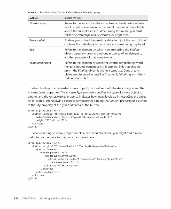
322 CHAPTER 6 Working with Data Binding
TABLE 6-2 Possible Values for the RelativeSource.Mode Property
VALUE DESCRIPTION
FindAncestor Refers to the ancestor in the visual tree of the data-bound ele-ment, which is an element in the visual tree one or more levels above the current element. When using this mode, you must set the AncestorType and AncestorLevel properties.
PreviousData Enables you to bind the previous data item (not the control that contains the data item) in the list of data items being displayed.
Self Refers to the element on which you are setting the Binding object; generally used to bind one property of an element to another property of that same element.
TemplatedParent Refers to the element to which the control template (in which the data-bound element exists) is applied. This is applicable only if the Binding object is within a template. Control tem-plates are discussed in detail in Chapter 5, “Working with User-Defined Controls.”
When binding to an ancestor source object, you must set both the AncestorType and the AncestorLevel properties. The AncestorType property specifies the type of source object to bind to, and the AncestorLevel property indicates how many levels up in VisualTree the ances-tor is located. The following example demonstrates binding the Content property of a button to the Tag property of the grid that contains the button:
<Grid Tag="Button Text"> <Button Content="{Binding Path=Tag, RelativeSource={RelativeSource Mode=FindAncestor, AncestorType=Grid, AncestorLevel=1}}" Height="23" Width="75"> </Button> </Grid>
Because setting so many properties inline can be cumbersome, you might find it more useful to use the more formal syntax, as shown here:
<Grid Tag="Button Text"> <Button Height="23" Name="Button1" VerticalAlignment="Bottom"> <Button.Content> <Binding Path="Tag"> <Binding.RelativeSource> <RelativeSource Mode="FindAncestor" AncestorType="Grid" AncestorLevel="1" /> </Binding.RelativeSource> </Binding> </Button.Content> </Button> </Grid>

Lesson 1: Configuring Data Binding CHAPTER 6 323
Setting the Binding ModeThe Binding.Mode property determines how bound controls behave in response to chang-es in either the source or the target value. Table 6-3 shows the possible values for the Binding. Mode property.
TABLE 6-3 Possible Values for the Binding.Mode Property
VALUE DESCRIPTION
Default Specifies that the Binding object should use the default mode for the target property.
OneTime Specifies that the Binding object should update the target when the application starts or when the data context changes, but that the Binding object should not update the target upon subsequent source value changes.
OneWay Specifies that the Binding object should update the target property when the source property changes. Changes in the target property value have no effect on the source property value.
OneWayToSource Specifies that the Binding object should update the source property when the target property changes. Changes in the source property have no effect on the target property value.
TwoWay Specifies that changes to either the source property or the target property update the other automatically.
The most commonly used values for the Binding.Mode property are OneWay and TwoWay. A value of OneWay is typically used in applications that display data but do not allow data to be edited. A value of TwoWay is more commonly used in data-editing applications, where the data in the source is displayed but the user has the option of editing that data and saving it to the source object.
Binding to a Nullable ValueAt times you might want to bind to a value of a data type that can be null. To provide a default value, you can set TargetNullValue to a value if the target value is null. The following example demonstrates binding the Text property of a text box to the IsChecked property of a check box, which can be True, False, or null. If the value of the CheckBox.IsChecked value is null, the string ”Value Not Selected” is displayed in the text box.
<Grid>
<CheckBox Content="CheckBox" Name="CheckBox1" IsChecked="{x:Null}" />

324 CHAPTER 6 Working with Data Binding
<TextBox Text="{Binding ElementName=CheckBox1, Path=IsChecked, TargetNullValue='Value Not Selected'}" HorizontalAlignment="Left" Margin="0,29,0,0" Name="TextBox1" VerticalAlignment="Top" Width="120" />
</Grid>
Setting the UpdateSourceTrigger PropertyThe UpdateSourceTrigger property controls how the source property in a data-binding relationship is updated. Bindings with a Binding.Mode property setting of TwoWay or OneWayToSource listen for changes in the target property and transfer the changes back to the source. The UpdateSourceTrigger property controls how frequently these transfers are made. Table 6-4 describes the possible values for the UpdateSourceTrigger property.
TABLE 6-4 Possible Values for the UpdateSourceTrigger Property
VALUE DESCRIPTION
Default A setting of Default indicates that the source property is up-dated according to the default value for the target property. Most properties have a default value of PropertyChanged, which updates the source property whenever the property changes. However, properties that are likely to be edited by a user at run time, such as text properties, often have a default UpdateSourceTrigger value of LostFocus.
Explicit The source property is updated only when Binding. UpdateSource() is called.
LostFocus The source property is updated when the element containing the target property loses focus. This is usually used for proper-ties that are likely to be edited by the user.
PropertyChanged The source property is updated whenever the target property changes.
In most cases, you want to leave the UpdateSourceTrigger property on the default value. Most properties have a default value of PropertyChanged, so the source is updated when-ever the property changes. Some properties, though, such as Text, have a default value of LostFocus because the Text property is found in elements that are designed to be user- editable, such as the TextBox element. For most scenarios involving a TextBox element, you will want to update the source only when TextBox loses focus (that is, when the user has fin-ished entering data). If you want to have changes that are being made reflected somewhere else in the user interface immediately, for example, you would set the UpdateSourceTrigger property to PropertyChanged.
Lesson 1: Configuring Data Binding CHAPTER 6 325
Quick Check■ When creating a Binding object, when would you use the Source property?
When would you use the ElementName property? When would you use the RelativeSource property? When would you explicitly use none of these prop-erties at all?
Quick Check Answer■ When creating a Binding object, you use the ElementName property to
identify the source object when that object is another WPF element. You use the Source property to specify an object that is not a WPF element, such as a resource. The RelativeSource property specifies a source object that exists in the visual tree in a location relative to the target object. You do not need to specify any of these if the DataContext property has been set for the element or for a visual parent in code.
PRACTICE Using Bindings
In this practice, you bind properties of one element to properties of another element. You re-create the application you created earlier in this book, but you use data binding instead of code to implement the functionality.
EXERCISE Using Bindings
1. Load the partial solution for Chapter 6, Lesson 1 from the CD. This solution shows a user interface with a RichTextBox control in which you can type text and observe the effect of changing FontFamily and FontSize. ListBox, on the left of the user interface, is populated by FontFamily names automatically when the application opens. You imple-ment the bindings that make the application work.
2. In XAML view, add to the RichTextBox declaration a Binding object that binds the FontFamily property to the SelectedItem.Content property of ListBox1. When finished, your code should resemble this, with the added binding shown in bold:
<RichTextBox FontFamily="{Binding ElementName=listBox1, Path=SelectedItem.Content}" Grid.Column="2" Name="richTextBox1" />
3. Add a binding to the longer of the two TextBox controls in the toolbar to bind Text to the selected item in ListBox. Your code should look like the following when finished:
<TextBox Text="{Binding ElementName=listBox1, Path=SelectedItem.Content}" BorderBrush="Black" Width="100"></TextBox>
4. Add a binding to bind the Slider value to the FontSize property of RichTextBox. Your code should resemble the following when finished:
<RichTextBox FontSize="{Binding ElementName=Slider1, Path=Value}" FontFamily="{Binding ElementName=listBox1, Path=SelectedItem.Content}" Grid.Column="2" Name="richTextBox1" />

326 CHAPTER 6 Working with Data Binding
5. Add a binding to bind the Text property of the smaller of the two TextBox controls in the toolbar. Make it a TwoWay binding so that changes in TextBox are propa-gated automatically back to Slider, and set the UpdateSourceTrigger property to PropertyChanged so that changes are propagated as soon as a new value is entered. The following example demonstrates the code:
<TextBox Text="{Binding ElementName=Slider1, Path=Value, Mode=TwoWay, UpdateSourceTrigger=PropertyChanged}" BorderBrush="Black" Width="25"></TextBox>
6. Press F5 to run and test your application.
Lesson Summary■ The Binding class defines a binding between a source and a target. The ElementName
property indicates the source when the source is a WPF element. The RelativeSource property indicates the source when the source object is located in the visual tree at a location relative to the target, and the Source property identifies a source that is not a WPF element.
■ The DataContext property of elements is useful for creating the general data environ-ment for a control or container control. You frequently set DataContext in code when the binding source must be initialized in code. You can then create Binding objects in XAML that do not set the source and instead find the nearest set DataContext property in the visual tree.
■ The Mode property enables you to set the binding mode of a Binding object. Modes are typically OneWay, which updates the target property whenever the source chang-es, or TwoWay, which updates either the target property or the source property when-ever the other changes. Other possible binding modes include OneTime, which binds the target property only when the application starts, and OneWayToSource, which updates the source property when the target changes, but not vice versa.
■ The UpdateSourceTrigger property enables you to set when the data transmitted to the source by a binding is updated. The most commonly used types of update triggers are PropertyChanged, which transmits a bound value whenever the property value changes, and LostFocus, which transmits the new value when the element loses focus.
Lesson ReviewYou can use the following questions to test your knowledge of the information in Lesson 1, “Configuring Data Binding.” The questions are also available on the companion CD if you prefer to review them in electronic form.
NOTE ANSWERS
Answers to these questions and explanations of why each answer choice is correct or incor-rect are located in the “Answers” section at the end of the book.

Lesson 1: Configuring Data Binding CHAPTER 6 327
1. Which of the following is sufficient to establish a binding between a source and a target, assuming that a target property is already being set to the Binding object in question? (Choose all that apply.)
A. Setting the ElementName property and the Path property
B. Setting the DataContext property on the target element
C. Setting the Source property
D. Setting the Path property and the RelativeSource property
2. You are creating an application that enables the user to review data in a database and save local changes to a separate file, but not to save changes to the database. What is the appropriate value for the Mode property of your Binding objects?
A. OneTime
B. OneWay
C. TwoWay
D. Default
3. You are creating an application that enables the user to load a complex object in a data-bound state, make multiple changes that are interdependent, and then accept or reject those changes before updating the database. Assuming that the relationship between the user interface and the database is expressed through a binding, which is the best value for the UpdateSourceTrigger property?
A. Default
B. PropertyChanged
C. LostFocus
D. Explicit

328 CHAPTER 6 Working with Data Binding
Lesson 2: Converting Data
WPF incorporates rich functionality for converting data displayed in the presentation layer. Using value converters, you can format data for display, localize data, create objects based on underlying data, and even create objects and values that derive from multiple bound elements. In this lesson, you learn how to implement IValueConverter to create custom value converters for your data presentation layer.
After this lesson, you will be able to: ■ Implement IValueConverter.
■ Use a converter to format data.
■ Use a converter to return an object.
■ Format data conditionally using a converter.
■ Localize data using a converter.
■ Implement IMultiValueConverter.
Estimated lesson time: 30 minutes
Implementing IValueConverterAt the center of conversion is the IValueConverter interface, which has two member methods: Convert, which converts an input type to an output type; and ConvertBack, which reverses the conversion. By implementing IValueConverter, you can create specialized classes for a variety of conversion and formatting duties. An empty implementation of IValueConverter is shown here:
Sample of Visual Basic Code
Public Class myConverter Implements IValueConverter Public Function Convert(ByVal value As Object, ByVal targetType As _ System.Type, ByVal parameter As Object, ByVal culture As _ System.Globalization.CultureInfo) As Object Implements _ System.Windows.Data.IValueConverter.Convert Throw New NotImplementedException() End Function Public Function ConvertBack(ByVal value As Object, ByVal targetType As _ System.Type, ByVal parameter As Object, ByVal culture As _ System.Globalization.CultureInfo) As Object Implements _ System.Windows.Data.IValueConverter.ConvertBack Throw New NotImplementedException() End Function End Class

Lesson 2: Converting Data CHAPTER 6 329
Sample of C# Code
public class myConverter : IValueConverter{ public object Convert(object value, Type targetType, object parameter, System.Globalization.CultureInfo culture) { throw new NotImplementedException(); } public object ConvertBack(object value, Type targetType, object parameter, System.Globalization.CultureInfo culture) { throw new NotImplementedException(); } }
The Convert method converts the object represented by the value parameter into the output object, and the ConvertBack method reverses the conversion performed by the Convert method. In some cases, a reverse conversion is not possible, and in other cases you never call the ConvertBack method, so it is common practice not to provide an explicit imple-mentation for the ConvertBack method if it will never be called. Note, however, that for cases in which two-way binding will be implemented, you must implement both the Convert and ConvertBack methods. Unless you are certain that ConvertBack will never be called, provide an implementation.
In addition to implementing IValueConverter, you must decorate the class with the ValueConversion attribute, which specifies the source type and the target type for the con-verter. An example that specifies a source type of Integer and a target type of String is shown here:
Sample of Visual Basic Code
<ValueConversion(GetType(Integer), GetType(String))> _
Sample of C# Code
[ValueConversion(typeof(int), typeof(string))]
The next example shows a simple converter that converts a numeric code representing a job title into a string containing that job title, and vice versa:
Sample of Visual Basic Code
<ValueConversion(GetType(Integer), GetType(String))> _Public Class myConverter Implements IValueConverter Public Function Convert(ByVal value As Object, ByVal targetType As _ System.Type, ByVal parameter As Object, ByVal culture As _ System.Globalization.CultureInfo) As Object Implements _ System.Windows.Data.IValueConverter.Convert Dim a As Integer = CInt(value) Select Case a Case 1
330 CHAPTER 6 Working with Data Binding
Return "Group Manager" Case 2 Return "Manager" Case 3 Return "Programmer" Case Else Return "Title not defined" End Select End Function Public Function ConvertBack(ByVal value As Object, ByVal targetType As _ System.Type, ByVal parameter As Object, ByVal culture As _ System.Globalization.CultureInfo) As Object Implements _ System.Windows.Data.IValueConverter.ConvertBack Dim aString As String = value.ToString() Select Case aString Case "Group Manager" Return 1 Case "Manager" Return 2 Case "Programmer" Return 3 Case Else Return 4 End Select End Function End Class
Sample of C# Code
[ValueConversion(typeof(int), typeof(string))]public class myConverter : IValueConverter { public object Convert(object value, Type targetType, object parameter, System.Globalization.CultureInfo culture) { int a = int.Parse(value.ToString()); switch (a) { case 1: return "Group Manager"; case 2: return "Manager"; case 3: return "Programmer"; default: return "Title not defined"; } } public object ConvertBack(object value, Type targetType, object parameter, System.Globalization.CultureInfo culture) { string a = value.ToString(); switch (a) {
Lesson 2: Converting Data CHAPTER 6 331
case "Group Manager": return 1; case "Manager": return 2; case "Programmer": return 3; default: return 4; } } }
To use a converter in your XAML code, you first must create a reference to the namespace that contains it in the XAML, as shown in bold here:
<Window x:Class="WpfApplication5.Window1" xmlns="http://schemas.microsoft.com/winfx/2006/xaml/presentation" xmlns:x="http://schemas.microsoft.com/winfx/2006/xaml" xmlns:local="clr-namespace:WpfApplication5" Title="Window1" Height="300" Width="300">
You then must create an object instance, typically by adding it to one of the element Resource collections, and assign a key value. Resources are discussed in depth in Chapter 1, “Building a User Interface.” An example is shown here:
<Window.Resources> <local:myConverter x:Key="EmployeeConverter"></local:myConverter> </Window.Resources>
After an object instance is created, you can set the Converter property of your binding to it by referring to the resource, as shown here:
<Label Content="{Binding Path=EmployeeCode, Converter={StaticResource EmployeeConverter}}" />
Most of the cases discussed in this chapter require only one-way conversion of data for display purposes. It is unnecessary to provide a real implementation for ConvertBack in these cases.
Using Converters to Format StringsOne of the most convenient uses for converters is to format strings. Because data is usually stored in a database without formatting, formatting is generally up to the data presentation layer to accomplish. Phone numbers, dates, currency, and Social Security numbers are all examples of data that might benefit from string formatting.
Formatting as CurrencyCurrency is a prime example of the need for string formatting. Monetary values are typically stored in numeric data types, but most data presentation designs would want to present this data as a currency-formatted string. The ToString method of numeric data types allows you
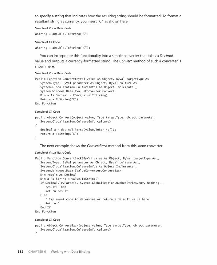
332 CHAPTER 6 Working with Data Binding
to specify a string that indicates how the resulting string should be formatted. To format a resultant string as currency, you insert “C”, as shown here:
Sample of Visual Basic Code
aString = aDouble.ToString("C")
Sample of C# Code
aString = aDouble.ToString("C");
You can incorporate this functionality into a simple converter that takes a Decimal value and outputs a currency-formatted string. The Convert method of such a converter is shown here:
Sample of Visual Basic Code
Public Function Convert(ByVal value As Object, ByVal targetType As _ System.Type, ByVal parameter As Object, ByVal culture As _ System.Globalization.CultureInfo) As Object Implements _ System.Windows.Data.IValueConverter.Convert Dim a As Decimal = CDec(value.ToString) Return a.ToString("C") End Function
Sample of C# Code
public object Convert(object value, Type targetType, object parameter, System.Globalization.CultureInfo culture) { decimal a = decimal.Parse(value.ToString()); return a.ToString("C"); }
The next example shows the ConvertBack method from this same converter:
Sample of Visual Basic Code
Public Function ConvertBack(ByVal value As Object, ByVal targetType As _ System.Type, ByVal parameter As Object, ByVal culture As _ System.Globalization.CultureInfo) As Object Implements _ System.Windows.Data.IValueConverter.ConvertBack Dim result As Decimal Dim a As String = value.ToString() If Decimal.TryParse(a, System.Globalization.NumberStyles.Any, Nothing, _ result) Then Return result Else ' Implement code to determine or return a default value here Return 0 End If End Function
Sample of C# Code
public object ConvertBack(object value, Type targetType, object parameter, System.Globalization.CultureInfo culture) {

Lesson 2: Converting Data CHAPTER 6 333
decimal result; string a = value.ToString(); if (decimal.TryParse(a, System.Globalization.NumberStyles.Any, null, out result)) return result; else // Implement code to determine or return a default value here return 0; }
Currency formatting takes the current culture setting into account. The currency symbol shown in the formatted string varies depending on the culture setting.
Formatting DatesYou can use the same general scheme for formatting dates. The DateTime.ToString method accepts the format strings shown in Table 6-5.
TABLE 6-5 Format Strings for the DateTime Structure
FORMAT STRING FORMAT NAME EXAMPLE USAGE EXAMPLE
d Short Date 07/14/1969 ToString("d")
D Long Date Monday, July 14, 1969 ToString("D")
f Long Date and Short Time Monday, July 14, 1969 11:07 PM
ToString("f")
F Long Date and Long Time Monday, July 14, 1969 11:07:17 PM
ToString("F")
G General 07/14/1969 11:07:17 PM ToString("G")
M Month and Day July 14 ToString("M")
s ISO Sortable Standard 1969-07-14 11:07:17 ToString("s")
The format returned by General formatting (“G”) varies according to the local culture set-ting.
In addition to format strings, the DateTime structure contains several built-in methods for returning date and time strings in a variety of formats.
Other String FormattingThe ToString method of numeric data types provides a variety of additional format strings, a complete list of which can be found in the Visual Studio documentation. However, you might need to create a converter to convert to a custom string format. In that case, you have to write code to perform the conversion explicitly. The following example demonstrates a
334 CHAPTER 6 Working with Data Binding
converter that accepts a nine-digit integer and returns a string representation of that integer formatted as a Social Security number:
Sample of Visual Basic Code
<ValueConversion(GetType(Integer), GetType(String))> _Public Class SSConverter Implements IValueConverter Public Function Convert(ByVal value As Object, ByVal targetType As _ System.Type, ByVal parameter As Object, ByVal culture As _ System.Globalization.CultureInfo) As Object Implements _ System.Windows.Data.IValueConverter.Convert Dim a As String = value.ToString() If Not a.Length = 9 Then Throw New ArgumentException("Number is in the wrong format") End If a = a.Insert(5, "-") a = a.Insert(3, "-") Return a End Function Public Function ConvertBack(ByVal value As Object, ByVal targetType As _ System.Type, ByVal parameter As Object, ByVal culture As _ System.Globalization.CultureInfo) As Object Implements _ System.Windows.Data.IValueConverter.ConvertBack Dim a As String = value.ToString() a = a.Remove(6, 1) a = a.Remove(3, 1) Return CInt(a) End Function End Class
Sample of C# Code
[ValueConversion(typeof(int), typeof(string))]public class SSConverter : IValueConverter { public object Convert(object value, Type targetType, object parameter, System.Globalization.CultureInfo culture) { string a = value.ToString(); if (!(a.Length==9)) throw new ArgumentException("Number is in the wrong format"); a = a.Insert(5, "-"); a = a.Insert(3, "-"); return a; } public object ConvertBack(object value, Type targetType, object parameter, System.Globalization.CultureInfo culture) { string a = value.ToString(); a = a.Remove(6, 1); a = a.Remove(3, 1);

Lesson 2: Converting Data CHAPTER 6 335
return int.Parse(a); } }
Using Converters to Return ObjectsIn addition to formatting, you can return objects using converters. For example, you might store references to images as string paths in your database but want to load and display the images when viewing data. Returning an object is as simple as creating the object in code and returning it as shown in previous examples. The following example takes a string formatted as a path and returns a BitmapImage object that represents the image stored at that path:
Sample of Visual Basic Code
<ValueConversion(GetType(String), GetType(BitmapImage))> _Public Class ImageConverter Implements IValueConverter Public Function Convert(ByVal value As Object, ByVal targetType As _ System.Type, ByVal parameter As Object, ByVal culture As _ System.Globalization.CultureInfo) As Object Implements _ System.Windows.Data.IValueConverter.Convert Try Dim myPath As String = CType(value, String) Dim myUri As New Uri(myPath) Dim anImage As New BitmapImage(myUri) Return anImage Catch ex As Exception Return New BitmapImage(New Uri("C:\ImageNotAvailable.jpg")) End Try End Function Public Function ConvertBack(ByVal value As Object, ByVal targetType _ As System.Type, ByVal parameter As Object, ByVal culture As _ System.Globalization.CultureInfo) As Object Implements _ System.Windows.Data.IValueConverter.ConvertBack Throw New NotImplementedException() End Function End Class Sample of C# Code
[ValueConversion(typeof(string), typeof(BitmapImage))]public class ImageConverter : IValueConverter { public object Convert(object value, Type targetType, object parameter, System.Globalization.CultureInfo culture) { try { string myPath = (string)value; Uri myUri = new Uri(myPath); BitmapImage anImage = new BitmapImage(myUri);

336 CHAPTER 6 Working with Data Binding
return anImage; } catch { return new BitmapImage(new Uri("C:\\ImageNotAvailable.jpg")); } } public object ConvertBack(object value, Type targetType, object parameter, System.Globalization.CultureInfo culture) { throw new NotImplementedException(); } }
In this example, a string is converted to a Universal Resource Identifier (URI), and then that URI generates the BitmapImage that is returned. In the event of an error, a default image is returned. Note that because it would be problematic to convert an image back to a path, the ConvertBack method is not implemented. Nevertheless, it is a best practice to implement ConvertBack whenever possible.
Localizing Data with ConvertersConverters can be useful for localizing data. Although some built-in conversions (such as the string currency conversion) take the current culture into account, there are several cases in which you need to provide your own localization code.
The parameters for the Convert and ConvertBack methods contain a reference to the Culture object to be used for the conversion. You can examine the value of this parameter and use that information to return localized data. The following example demonstrates a converter that reads the Culture object provided and invokes a method on a translation class that returns the appropriate string for the culture. This example assumes that this applica-tion might be run in the United States, France, or Germany and provides methods to convert English strings to German and French strings, and vice versa:
Sample of Visual Basic Code
<ValueConversion(GetType(String), GetType(String))> _Public Class DateBrushConverter Implements IValueConverter ' Note: the Translator class is assumed to be a class that contains a ' dictionary used to translate the provided strings. Dim myTranslator As New Translator Public Function Convert(ByVal value As Object, ByVal targetType As _ System.Type, ByVal parameter As Object, ByVal culture As _ System.Globalization.CultureInfo) As Object Implements _ System.Windows.Data.IValueConverter.Convert Dim astring As String = CType(value, String) Select Case culture.ToString Case "fr-FR" Return myTranslator.EnglishToFrench(astring) Case "de-DE"
Lesson 2: Converting Data CHAPTER 6 337
Return myTranslator.FrenchToEnglish(astring) Case Else Return astring End Select End Function Public Function ConvertBack(ByVal value As Object, ByVal targetType _ As System.Type, ByVal parameter As Object, ByVal culture As _ System.Globalization.CultureInfo) As Object Implements _ System.Windows.Data.IValueConverter.ConvertBack Dim astring As String = CType(value, String) Select Case culture.ToString Case "fr-FR" Return myTranslator.FrenchToEnglish(astring) Case "de-DE" Return myTranslator.GermanToEnglish(astring) Case Else Return astring End Select End Function End Class
Sample of C# Code
[ValueConversion(typeof(string), typeof(string))]public class LanguageConverter : IValueConverter { // Note: the Translator class is assumed to be a class that contains a // dictionary used to translate the provided strings. Translator myTranslator = new Translator(); public object Convert(object value, Type targetType, object parameter, System.Globalization.CultureInfo culture) { string aString = (string)value; switch(culture.ToString()) { case "de-DE": return myTranslator.EnglishToGerman(aString); case "fr-FR": return myTranslator.EnglishToFrench(aString); default: return aString; } } public object ConvertBack(object value, Type targetType, object parameter, System.Globalization.CultureInfo culture) { string aString = (string)value; switch(culture.ToString()) { case "de-DE": return myTranslator.GermanToEnglish(aString); case "fr-FR": return myTranslator.FrenchToEnglish(aString); default:

338 CHAPTER 6 Working with Data Binding
return aString; } } }
Quick Check■ Describe the general process for using a converter to apply conditional for-
matting for bound data.
Quick Check Answer■ First, you must implement a converter that performs the appropriate conver-
sion. For example, if you wanted to highlight records with a Date property value older than 30 days, you would implement a converter that changed a DateTime value into a Color value based on the value of the DateTime prop-erty. After the converter has been implemented, you should bind the appro-priate value in the data template to the property that is converted and supply a reference to the converter in the Binding object. In this example, you would bind the Background property of the control in the data template, which is used to present the data, to the Date property and reference an instance of the converter in that binding.
Using Multi-value ConvertersMulti-value converters enable you to return a converted value that results from multiple fields. For example, you might perform a calculation, such as multiplying a UnitsPurchased field by a UnitPrice field, to return a value representing total cost. You can also use a multi-value converter to provide complicated conditional formatting that takes multiple fields into account.
To create a multi-value converter, you must implement the IMultiValueConverter interface. This interface is very similar to the IValueConverter interface. The only differences are that the Convert method takes an Object array instead of a single Object as the first parameter, and the ConvertBack method returns an Object array and takes a Type array as one of the param-eters. An unimplemented example is shown here:
Sample of Visual Basic Code
Public Class myMultiConverter Implements IMultiValueConverter Public Function Convert(ByVal values As Object(), ByVal targetType As _ System.Type, ByVal parameter As Object, ByVal culture As _ System.Globalization.CultureInfo) As Object Implements _ System.Windows.Data.IMultiValueConverter.Convert Throw New NotImplementedException() End Function

Lesson 2: Converting Data CHAPTER 6 339
Public Function ConvertBack(ByVal value As Object, ByVal targetTypes() _ As System.Type, ByVal parameter As Object, ByVal culture As _ System.Globalization.CultureInfo) As Object() Implements _ System.Windows.Data.IMultiValueConverter.ConvertBack Throw New NotImplementedException() End Function End Class
Sample of C# Code
public class myMultiConverter : IMultiValueConverter{ public object Convert(object[] values, Type targetType, object parameter, System.Globalization.CultureInfo culture) { throw new NotImplementedException(); } public object[] ConvertBack(object value, Type[] targetTypes, object parameter, System.Globalization.CultureInfo culture) { throw new NotImplementedException(); } }
The following example demonstrates how to implement IMultiValueConverter. This exam-ple takes an Integer object and a Decimal object that represent units ordered and unit price, respectively, and returns a currency-formatted string that represents the total price:
Sample of Visual Basic Code
Public Class TotalCostConverter Implements IMultiValueConverter Public Function Convert(ByVal values() As Object, ByVal targetType As _ System.Type, ByVal parameter As Object, ByVal culture As _ System.Globalization.CultureInfo) As Object Implements _ System.Windows.Data.IMultiValueConverter.Convert Dim UnitsOrdered As Integer = CType(values(0), Integer) Dim UnitCost As Decimal = CType(values(1), Decimal) Dim TotalCost As Decimal = UnitsOrdered * UnitCost Return TotalCost.ToString("C") End Function Public Function ConvertBack(ByVal value As Object, ByVal targetTypes() _ As System.Type, ByVal parameter As Object, ByVal culture As _ System.Globalization.CultureInfo) As Object() Implements _ System.Windows.Data.IMultiValueConverter.ConvertBack Throw New NotImplementedException() End Function End Class
Sample of C# Code
public class TotalCostConverter : IMultiValueConverter{ public object Convert(object[] values, Type targetType, object
340 CHAPTER 6 Working with Data Binding
parameter, System.Globalization.CultureInfo culture) { int UnitsOrdered = (int)values[0]; decimal UnitCost = (decimal)values[1]; decimal TotalCost = UnitsOrdered * UnitCost; return TotalCost.ToString("C"); } public object[] ConvertBack(object value, Type[] targetTypes, object parameter, System.Globalization.CultureInfo culture) { throw new NotImplementedException(); } }
To bind a property to a value returned by a multi-value converter, you must create a refer-ence to the assembly that contains the multi-value converter and then add an instance to an available resource collection, as you saw earlier in this lesson. To actually create the bind-ing, however, you must use a class called MultiBinding. The MultiBinding class is essentially a collection of bindings that specifies a converter that takes the value of those bindings into account. You can set a property to a MultiBinding object in the same manner that you would set it to a Binding object. The following example demonstrates setting the Content property of a Label element to the value returned by an instance of the TotalCostConverter class used in the previous example. This example assumes that you have created an instance of this converter in the Window.Resources collection with a key value of myTotalCostConverter and that the DataContext property of Window has been set to an object with properties named Units-Ordered and UnitCost:
<Label> <Label.Content> <MultiBinding Converter="{StaticResource myTotalCostConverter}"> <Binding Path=UnitsOrdered /> <Binding Path=UnitCost /> </MultiBinding> </Label.Content> </Label>
PRACTICE Applying String Formatting and Conditional Formatting
In this practice, you use custom converters to provide string formatting and conditional for-matting in your application.
EXERCISE1 Using a Converter to Apply String Formatting
1. Open the partial solution for this lesson. Press F5 to compile and run the application.
Note that customer records are displayed in the upper-left Contact Name list box, and when you click a customer record, dates indicating order dates are displayed in the upper-right list box. In this lesson, you will add color coding to these dates based

Lesson 2: Converting Data CHAPTER 6 341
on the year. In the next chapter, you will drill deeper into the functionality behind this application.
2. In the code window, beneath the CountryGrouper class, add the following class to convert a Decimal value to a currency-formatted string:
Sample of Visual Basic Code
<ValueConversion(GetType(Decimal), GetType(String))> _Public Class CurrencyConverter Implements IValueConverter Public Function Convert(ByVal value As Object, ByVal targetType As _ System.Type, ByVal parameter As Object, ByVal culture As _ System.Globalization.CultureInfo) As Object Implements _ System.Windows.Data.IValueConverter.Convert Dim aDec As Decimal aDec = CDec(value) Return aDec.ToString("C") End Function Public Function ConvertBack(ByVal value As Object, ByVal targetType As _ System.Type, ByVal parameter As Object, ByVal culture As _ System.Globalization.CultureInfo) As Object Implements _ System.Windows.Data.IValueConverter.ConvertBack Throw (New NotImplementedException) End Function End Class
Sample of C# Code
[ValueConversion(typeof(Decimal), typeof(String))]public class CurrencyConverter : IValueConverter { public object Convert(object value, Type targetType, object parameter, System.Globalization.CultureInfo culture) { decimal aDec; aDec = (decimal)value; return aDec.ToString("C"); } public object ConvertBack(object value, Type targetType, object parameter, System.Globalization.CultureInfo culture) { throw new NotImplementedException(); } }
3. In the Namespaces section of XAML view, add the following line to import the lo-cal namespace into XAML view, where <local namespace name> represents the namespace of your local project, for example, Lesson_2:
xmlns:local="clr-namespace:<local namespace name>”

342 CHAPTER 6 Working with Data Binding
4. Just before the Grid declaration in XAML view, add the following Windows.Resources section to create an instance of CurrencyConverter:
<Window.Resources> <local:CurrencyConverter x:Key="myCurrencyConverter" /> </Window.Resources>
5. From the Build menu, choose Build Solution.
6. In the XAML view, in DataTemplate for listBox3, change the last Label declaration to read as shown in bold here:
<Label Background="Red" Content="{Binding Path=ExtendedPrice, Converter={StaticResource myCurrencyConverter}}" Width="60" />
7. Press F5 to build and run your application. Note that the field representing total price for orders now is formatted as currency.
EXERCISE2 Using a Converter to Apply Conditional Formatting
1. In code view, beneath the code for CurrencyConverter, add the following class:
Sample of Visual Basic Code
<ValueConversion(GetType(DateTime), GetType(Brush))> _Public Class YearConverter Implements IValueConverter Public Function Convert(ByVal value As Object, ByVal targetType As _ System.Type, ByVal parameter As Object, ByVal culture As _ System.Globalization.CultureInfo) As Object Implements _ System.Windows.Data.IValueConverter.Convert Dim aDate As DateTime aDate = CDate(value) Select Case aDate.Year.ToString Case "1994" Return New SolidColorBrush(Colors.Purple) Case "1995" Return New SolidColorBrush(Colors.Green) Case "1996" Return New SolidColorBrush(Colors.Red) Case Else Return New SolidColorBrush(Colors.Yellow) End Select End Function Public Function ConvertBack(ByVal value As Object, ByVal targetType As _ System.Type, ByVal parameter As Object, ByVal culture As _ System.Globalization.CultureInfo) As Object Implements _ System.Windows.Data.IValueConverter.ConvertBack Throw New NotImplementedException End Function End Class
Sample of C# Code
[ValueConversion(typeof(DateTime), typeof(Brush))]

Lesson 2: Converting Data CHAPTER 6 343
public class YearConverter : IValueConverter { public object Convert(object value, Type targetType, object parameter, System.Globalization.CultureInfo culture) { DateTime aDate; aDate = (DateTime)value; switch (aDate.Year.ToString()) { case "1994": return new SolidColorBrush(Colors.Purple); case "1995": return new SolidColorBrush(Colors.Green); case "1996": return new SolidColorBrush(Colors.Red); default: return new SolidColorBrush(Colors.Yellow); } } public object ConvertBack(object value, Type targetType, object parameter, System.Globalization.CultureInfo culture) { throw new NotImplementedException(); } }
2. In XAML view, add the following line to the Windows.Resources section:
<local:YearConverter x:Key="myYearConverter" />
3. In the XAML declaration for listBox2, delete the following:
DisplayMemberPath="OrderDate"
Then add the following data template:
<ListBox.ItemTemplate> <DataTemplate> <Label Content="{Binding OrderDate}" Background="{Binding Path=OrderDate, Converter={StaticResource myYearConverter}}" /> </DataTemplate> </ListBox.ItemTemplate>
4. Press F5 to build and run your application. Note that the order dates now are color coded by year.
Lesson Summary■ IValueConverter is the interface you must implement in your converters. You can use
custom converters to provide string formatting, apply conditional formatting in data templates, return objects, or localize data.
344 CHAPTER 6 Working with Data Binding
■ IValueConverter contains two members you must implement: Convert and ConvertBack. The Convert method accepts a value and converts it to the return value. ConvertBack performs this operation in reverse. In many cases, the reverse operation will be impossible, in which case ConvertBack typically is not implemented.
■ You can convert multiple values into a single value by implementing IMultiValueConverter. IMultiValueConverter is similar to IValueConverter, but it is de-signed to operate on an array of values and return a single value.
■ To bind to a multi-value converter, you must use the MultiBinding class, which contains a collection of Binding objects and specifies a multi-value converter that returns a value based on those bindings.
Lesson ReviewYou can use the following questions to test your knowledge of the information in Lesson 2, “Converting Data.” The questions are also available on the companion CD if you prefer to review them in electronic form.
NOTE ANSWERS
Answers to these questions and explanations of why each answer choice is correct or incor-rect are located in the “Answers” section at the end of the book.
1. You have implemented a converter called DateBrushConverter that returns a different colored Brush object for each month of the year. Assuming that you have added an instance of this converter as a static resource in the Windows.Resources collection with the myConverter key, and that you are binding to a field called Date, which of the fol-lowing XAML snippets shows the correct way to bind a Label control so that it displays the date with a background color returned by the converter?
A.
<Label Content="{Binding Path=Date}" Background="{Binding Path=Date, Converter={StaticResource myConverter}} />
B.
<Label Content="{Binding Path=Date}" Background="{Binding Path=Date}" />
C.
<Label Content="{Binding Path=Date}" Background="{Binding Path=Date}" > <Label.Resources> <local:DateBrushConverter x:Key="myConverter" /> </Label.Resources> </Label>
D.
<Label Content="{Binding Path=Date}" Background="{Binding Path=Date, Converter=myConverter} />
Lesson 2: Converting Data CHAPTER 6 345
2. You have implemented a multi-value converter named ShapeConverter that takes a string and an integer as arguments and outputs a Shape object. You have added an instance of ShapeConverter as a resource to the Windows.Resources collection with the myConverter key. Assuming that you are binding to properties called ShapeName and ShapeSize (string and integer data types, respectively), which of the following XAML samples renders the returned shape correctly as the content of a label control?
A.
<Label Content={Binding Source=ShapeName Path=ShapeSize, Converter={StaticResource myConverter}}">
B.
<Label Content={Binding Path=ShapeName/ShapeSize, Converter={StaticResource myConverter}}">
C.
<Label> <Label.Content> <MultiBinding Converter="{StaticResource myConverter}"> <Binding Path=ShapeName /> <Binding Path=ShapeSize /> </MultiBinding> </Label> </Label>
D.
<Label> <Label.Content> <MultiBinding Converter="{StaticResource myConverter}"> <Binding Path=ShapeSize /> <Binding Path=ShapeName /> </MultiBinding> </Label> </Label>
346 CHAPTER 6 Working with Data Binding
Lesson 3: Validating Data and Configuring Change Notification
This lesson deals with validating data and configuring change notification for custom data objects. Although seemingly unrelated, both of these topics are essential for ensuring that the data presented by your applications is always accurate, current, and uncorrupted. In this les-son, you learn how to validate your data by using validation rules, to create custom validation rules, and to configure data change notification by implementing INotifyPropertyChanged and inheriting from ObservableCollection.
After this lesson, you will be able to: ■ Apply ExceptionValidationRule.
■ Create custom validation rules.
■ Handle and respond to validation errors.
■ Implement INotifyPropertyChanged.
■ Use ObservableCollection to create bindable collections.
Estimated lesson time: 30 minutes
Validating DataTo be useful, data must be valid. The act of validating data involves ensuring that data conforms to the standards of its type. For example, a data field that represents an item price never should contain a negative number. WPF enables you to create validation rules and ap-ply them to your Binding objects so that data added is always valid.
Binding Validation RulesWPF enables you to set validation rules that define how your application validates its data. Each Binding object exposes a ValidationRules collection. You can add new rules to ValidationCollection, as shown in bold in this example:
<TextBox> <TextBox.Text> <Binding Path="CandyBars"> <Binding.ValidationRules> <local:CandyBarValidationRule /> <local:SweetTreatsValidationRule /> </Binding.ValidationRules> </Binding> </TextBox.Text> </TextBox>
Lesson 3: Validating Data and Configuring Change Notification CHAPTER 6 347
In this example, the CandyBarValidationRule and SweetTreatsValidationRule declarations represent two custom validation rules that have been defined in your application. When a new value is bound, each of the validation rules is evaluated in the order in which the rules are declared. In this example, CandyBarValidationRule is evaluated first, followed by SweetTreatsValidationRule. If there are no validation problems, the application proceeds nor-mally. If a problem violates a validation rule, however, the following things happen:
■ The element with the validation error is outlined in red.
■ The attached property Validation.HasError is set to True.
■ A new ValidationError object is created and added to the attached Validation.Errors collection.
■ If the Binding.NotifyOnValidationError property is set to True, the Validation.Error at-tached event is raised.
■ The data-binding source is not updated with the invalid value and instead remains unchanged.
Setting ExceptionValidationRuleYou might have noticed when working with data that exceptions are not thrown from data binding. This is primarily to preserve application flow and prevent application crashes that re-sult from data errors. However, you can report data errors by setting ExceptionValidationRule, which causes all exceptions thrown in the data-binding process to be reported as validation errors. Note that this still does not halt application execution as an unhandled exception would. Rather, it creates a validation error as described previously. The following example demonstrates how to set ExceptionValidationRule:
<Binding Path="CandyBars"> <Binding.ValidationRules> <ExceptionValidationRule /> </Binding.ValidationRules> </Binding>
Implementing Custom Validation RulesYou can create specific validation rules by creating classes that inherit the abstract ValidationRule class, which has one virtual method that must be overridden: the Validate method. The Validate method receives an object parameter, which represents the value be-ing evaluated, and returns a ValidationResult object, which contains an IsValid property and an ErrorCondition property. The IsValid property represents a Boolean value that indicates whether the value is valid, and the ErrorCondition property is text that can be set to pro-vide a descriptive error condition. If a ValidationResult object with an IsValid value of True is returned, the value is considered to be valid and application execution proceeds normally. If a ValidationResult object with an IsValid result of False is returned, a ValidationError object is created as described previously.

348 CHAPTER 6 Working with Data Binding
The following example demonstrates a simple implementation of the abstract ValidationRule class:
Sample of Visual Basic Code
Public Class NoNullStringsValidator Inherits ValidationRule Public Overrides Function Validate(ByVal value As Object, ByVal _ cultureInfo As System.Globalization.CultureInfo) As _ System.Windows.Controls.ValidationResult Dim astring As String = value.ToString If astring = "" Then Return New ValidationResult(False, "String cannot be empty") Else Return New ValidationResult(True, Nothing) End If End Function End Class
Sample of C# Code
public class NoNullStringsValidator : ValidationRule{ public override ValidationResult Validate(object value, System.Globalization.CultureInfo cultureinfo) { string aString = value.ToString(); if (aString == "") return new ValidationResult(false, "String cannot be empty"); return new ValidationResult(true, null); } }
In this example, the string contained in the value object is evaluated. If it is a zero-length string, the validation fails; otherwise, the validation succeeds.
Handling Validation ErrorsWhen validation errors are raised, you must decide how to respond to them. In some cases, the visual cues provided by the validation error are enough; the user can see that the element is surrounded by a red outline and can detect and fix the problem. In other cases, however, you might need to provide feedback to the user regarding the nature of the validation prob-lem.
When validation is enabled for a binding, the Validation.Error event is attached to the bound element. Validation.Error includes an instance of ValidationErrorEventArgs, which con-tains two important properties, as described in Table 6-6.

Lesson 3: Validating Data and Configuring Change Notification CHAPTER 6 349
TABLE 6-6 Important Properties of ValidationErrorEventArgs
PROPERTY DESCRIPTION
Action Describes whether the error in question is a new error or an old error that is being cleared
Error Contains information about the error that occurred, the details of which are described in further detail in Table 6-7
The Error object of ValidationErrorEventArgs contains a host of useful information re-garding the error that occurred. Important properties of the Error object are described in Table 6-7.
TABLE 6-7 Important Properties of the Error Object
PROPERTY DESCRIPTION
BindingInError Contains a reference to the Binding object that caused the validation error
ErrorContent Contains the string set by the ValidationRule object that returned the validation error
Exception Contains a reference to the exception, if any, that caused the validation error
RuleInError Contains a reference to the ValidationRule exception that caused the validation error
The Validation.Error event is not fired unless the NotifyOnValidationError property of the Binding object is specifically set to True, as shown in bold here:
<Binding NotifyOnValidationError="True" Mode="TwoWay" Source="{StaticResource StringCollection}" Path="name"> <Binding.ValidationRules> <local:NoNullStringsValidator/> </Binding.ValidationRules> </Binding>
When this property is set to True, the Validation.Error event is raised anytime any ValidationRule in the ValidationRules collection of the Binding object detects a validation er-ror. The Validation.Error event is a bubbling event. It is raised first in the element where the validation error occurs and then in each higher-level element in the visual tree. Thus, you can create a local error-handling method that specifically handles validation errors from a single element, as shown in bold here:
<TextBox Validation.Error="TextBox1_Error" Height="21" Width="100" Name="TextBox1" >

350 CHAPTER 6 Working with Data Binding
Alternatively, you can create an error-handling routine that is executed higher in the visual tree to create a more generalized validation error handler, as shown in bold here:
<Grid Validation.Error="Grid_Error">
The Validation.Error event is fired both when a new validation error is detected and when an old validation error is cleared. Thus, it is important to check the e.Action property to de-termine whether the error is being cleared or is a new error. The following example demon-strates a sample validation error handler that displays the error message to the user when a new error occurs and writes information to Trace when a validation error is cleared:
Sample of Visual Basic Code
Private Sub Grid_Error(ByVal _sender As System.Object, ByVal e As _ System.Windows.Controls.ValidationErrorEventArgs) If e.Action = ValidationErrorEventAction.Added Then MessageBox.Show(e.Error.ErrorContent.ToString) Else Trace.WriteLine("Validation error cleared") End If End Sub
Sample of C# Code
private void Grid_Error(object sender, ValidationErrorEventArgs e){ if (e.Action == ValidationErrorEventAction.Added) MessageBox.Show(e.Error.ErrorContent.ToString()); else System.Diagnostics.Trace.WriteLine("Validation error cleared"); }
EXAM TIP
Data validation is an important feature that is considerably different in WPF than it is in Windows Forms. It promises to figure prominently on the exam, so be certain you get lots of practice with validating data. In particular, note that the Validation.Error event is raised both when an error is detected and when an error is cleared. Code that handles this event should test to determine whether an error has been added or cleared.
Configuring Data Change NotificationYou saw earlier in this chapter how data binding in WPF is virtually unlimited. Nearly any object can act as a data source, any collection can be bound as a list, and nearly any property can be bound. However, there are some limits. Your own custom data objects can be bound in the same manner as any other object, but if changes occur to properties of your data ob-jects, or if more members are added to your data collections, these changes are not detected by WPF data binding unless you implement data change notification.

Lesson 3: Validating Data and Configuring Change Notification CHAPTER 6 351
Fortunately, data change notification is fairly easy to implement in custom classes. For custom data objects, you can implement the INotifyPropertyChanged interface, which pro-vides notification for changed properties in your data objects. For custom collections, you can derive from ObservableCollection, which has change notification built in.
Implementing INotifyPropertyChangedThe INotifyPropertyChanged interface has one member: the PropertyChanged event. This event contains an instance of PropertyChangedEventArgs, which indicates the property that is changing. When you implement INotifyPropertyChanged, raise the PropertyChanged event from every property for which you want to provide data change notification. On a practi-cal level, this is essentially every public property that might change. The only properties for which you might not raise this event are properties that never change, such as unique identifiers. The following example shows a simple class with one property that implements INotifyPropertyChanged:
Sample of Visual Basic Code
Public Class LastName Implements System.ComponentModel.INotifyPropertyChanged Public Event PropertyChanged(ByVal sender As Object, ByVal e As _ System.ComponentModel.PropertyChangedEventArgs) Implements _ System.ComponentModel.INotifyPropertyChanged.PropertyChanged Dim mLastName As String Public Property Name() Get Return mLastName End Get Set (ByVal value) mLastName = value RaiseEvent PropertyChanged(Me, _ New System.ComponentModel.PropertyChangedEventArgs("LastName")) End Set End Property End Class
Sample of C# Code
public class LastName : System.ComponentModel.INotifyPropertyChanged{ public event System.ComponentModel.PropertyChangedEventHandler PropertyChanged; string mLastName; public string Name { get { return mLastName; } set { mLastName = value; PropertyChanged(this,

352 CHAPTER 6 Working with Data Binding
new System.ComponentModel.PropertyChangedEventArgs("LastName")); } } }
Using ObservableCollectionJust as properties must provide change notification in order for that change to be detected by WPF data binding, collections must provide notification whenever a member is added or removed. Just for this purpose, .NET Framework 3.5 provides the ObservableCollection class.
ObservableCollection is a generic collection with built-in collection change notification. Thus, when items are added to or removed from ObservableCollection, the changes are de-tected automatically by WPF data binding. As with other generic classes, you must specify the type with which the collection works. You can create a new instance of ObservableCollection, as shown here:
Sample of Visual Basic Code
Dim LastNames As New _ System.Collections.ObjectModel.ObservableCollection(Of LastName)
Sample of C# Code
System.Collections.ObjectModel.ObservableCollection<LastName> LastNames = new System.Collections.ObjectModel.ObservableCollection<LastName>();
In most cases, however, this is insufficient for your purposes. You likely want to pro-vide initialization code for your collection or add other code to facilitate your data object. ObservableCollection implements INotifyCollectionChanged, the collection-based version of INotifyPropertyChanged. Although it is possible to create your own observable collection class by implementing INotifyCollectionChanged, inheriting from ObservableCollection to build your own class is almost always the best choice. In this case, you should inherit from the appropriately typed ObservableCollection and add code as your business needs require. An example is shown here:
Sample of Visual Basic Code
Public Class LastNames Inherits System.Collections.ObjectModel.ObservableCollection(Of _ LastName) Public Sub New() ' Initialization code omitted End Sub End Class
Sample of C# Code
public class LastNames : System.Collections.ObjectModel.ObservableCollection<LastName> { public LastNames() { // Initialization code omitted

Lesson 3: Validating Data and Configuring Change Notification CHAPTER 6 353
} }
PRACTICE Configuring Change Notification and Data Validation
In this practice, you configure change notification and validating data. You build a simple data object, create a simple collection of objects of that type, create a simple user interface for viewing and adding data objects, and implement a simple validation scheme for your user interface.
EXERCISE1 Creating Simple Data Objects
1. In Visual Studio, create a new WPF application.
2. In code view, add the following class, which implements INotifyPropertyChanged:
Sample of Visual Basic Code
Public Class Name Implements System.ComponentModel.INotifyPropertyChanged Public Event PropertyChanged(ByVal sender As Object, ByVal e As _ System.ComponentModel.PropertyChangedEventArgs) Implements _ System.ComponentModel.INotifyPropertyChanged.PropertyChanged Public Sub New(ByVal fName As String, ByVal lName As String) mFirstName = fName mLastName = lName End Sub
Private mFirstName As String Private mLastName As String Public Property FirstName() Get Return mFirstName End Get Set (ByVal value) mFirstName = value RaiseEvent PropertyChanged(Me, _ New System.ComponentModel.PropertyChangedEventArgs("FirstName")) End Set End Property Public Property LastName() Get Return mLastName End Get Set (ByVal value) mLastName = value RaiseEvent PropertyChanged(Me, _ New System.ComponentModel.PropertyChangedEventArgs("LastName")) End Set End Property End Class

354 CHAPTER 6 Working with Data Binding
Sample of C# Code
public class Name : System.ComponentModel.INotifyPropertyChanged{ public event System.ComponentModel.PropertyChangedEventHandler PropertyChanged; public Name(string fName, string lName) { mFirstName=fName; mLastName = lName; } string mFirstName; string mLastName; public string FirstName { get { return mFirstName; } set { mFirstName = value; PropertyChanged(this, new System.ComponentModel.PropertyChangedEventArgs("FirstName")); } } public string LastName { get { return mLastName; } set { mLastName = value; PropertyChanged(this, new System.ComponentModel.PropertyChangedEventArgs("LastName")); } } }
3. Beneath this class, add the following class to create a collection of Name objects that inherits ObservableCollection:
Sample of Visual Basic Code
Public Class Names Inherits System.Collections.ObjectModel.ObservableCollection(Of Name) Public Sub New() Dim aName As New Name("FirstName " & (Me.Count+1).ToString(), _ "LastName " & (Me.Count+1).ToString()) Me.Add(aName) End Sub End Class

Lesson 3: Validating Data and Configuring Change Notification CHAPTER 6 355
Sample of C# Code
public class Names : System.Collections.ObjectModel.ObservableCollection<Name> { public Names() { Name aName = new Name("FirstName " + (this.Count+1).ToString(), "LastName " + (this.Count+1).ToString()); this.Add(aName); } }
4. Add a line similar to the line shown here to import the local namespace into your XAML:
xmlns:local="clr-namespace:Lesson_3"
5. Add the following Windows.Resources section to your XAML to create an instance of the Names collection:
<Window.Resources> <local:Names x:Key="myNames"></local:Names> </Window.Resources>
6. Replace the Grid declaration with the following:
<Grid> <TextBox Height="21" Margin="12,62,0,0" Name="TextBox1" VerticalAlignment="Top" HorizontalAlignment="Left" Width="120" > <TextBox.Text> <Binding Source="{StaticResource myNames}" Path="FirstName" NotifyOnValidationError="True"> <Binding.ValidationRules> </Binding.ValidationRules> </Binding> </TextBox.Text> </TextBox> <TextBox Height="21" HorizontalAlignment="Right" Margin="0,62,12,0" Name="TextBox2" VerticalAlignment="Top" Width="120" > <TextBox.Text> <Binding Source="{StaticResource myNames}" Path="LastName" NotifyOnValidationError="True"> <Binding.ValidationRules> </Binding.ValidationRules> </Binding> </TextBox.Text> </TextBox> <Button HorizontalAlignment="Left" Margin="35,122,0,116" Name="Button1" Width="75">Back</Button> <Button HorizontalAlignment="Right" Margin="0,122,34,117" Name="Button2" Width="75">Forward</Button>

356 CHAPTER 6 Working with Data Binding
<Button Height="22" Margin="101,0,101,56" Name="Button3" VerticalAlignment="Bottom">Add</Button> </Grid>
7. In code view, add the following code to create two class-level variables and to add (or replace) the constructor:
Sample of Visual Basic Code
Dim aView As System.ComponentModel.ICollectionViewDim myNames As Names Public Sub New() ' This call is required by the Windows Form Designer. InitializeComponent() ' Add any initialization after the InitializeComponent() call. myNames = CType(Me.Resources("myNames"), Names) aView = CollectionViewSource.GetDefaultView(myNames) End Sub
Sample of C# Code
Names myNames;System.ComponentModel.ICollectionView aView; public MainWindow1() { InitializeComponent(); myNames=(Names)(this.Resources["myNames"]); aView = CollectionViewSource.GetDefaultView(myNames); }
8. In the designer, double-click Button1 to open the default Click event handler. Add the following code:
Sample of Visual Basic Code
If Not aView.CurrentPosition = 0 Then aView.MoveCurrentToPrevious() End If
Sample of C# Code
if (!(aView.CurrentPosition == 0)) aView.MoveCurrentToPrevious();
9. In the designer, double-click Button2 to open the default Click event handler. Add the following code:
Sample of Visual Basic Code
If Not aView.CurrentPosition = myNames.Count - 1 Then aView.MoveCurrentToNext() End If
Sample of C# Code
if (!(aView.CurrentPosition == myNames.Count - 1)) aView.MoveCurrentToNext();

Lesson 3: Validating Data and Configuring Change Notification CHAPTER 6 357
10. In the designer, double-click Button3 to open the default Click event handler. Add the following code:
Sample of Visual Basic Code
Dim aName As New Name("", "")myNames.Add(aName) aView.MoveCurrentToNext()
Sample of C# Code
Name aName = new Name("", "");myNames.Add(aName); aView.MoveCurrentToNext();
11. Press F5 to build and run your application. Click Add to add a new record to your collection. Navigate back to the first record and change the entries in the text boxes. Navigate forward and then back again. Note that changes are persisted to both the property values and the collection.
EXERCISE2 Implementing Simple Validation
1. In code view, add the following class to perform validation:
Sample of Visual Basic Code
Public Class StringValidator Inherits ValidationRule Public Overrides Function Validate(ByVal value As Object, ByVal _ cultureInfo As System.Globalization.CultureInfo) As _ System.Windows.Controls.ValidationResult Dim astring As String = value.ToString If astring = "" Then Return New ValidationResult(False, "String cannot be empty") Else Return New ValidationResult(True, Nothing) End If End Function End Class
Sample of C# Code
public class StringValidator : ValidationRule{ public override ValidationResult Validate(object value, System.Globalization.CultureInfo cultureinfo) { string aString = value.ToString(); if (aString == "") return new ValidationResult(false, "String cannot be empty"); return new ValidationResult(true, null); } }
358 CHAPTER 6 Working with Data Binding
2. In XAML view, add the following line to both of the <Binding.ValidationRules> tags to set StringValidator as the validation rule for these bindings:
<local:StringValidator />
3. Press F6 to build your application.
4. Modify the Grid declaration, as shown here in bold, to create an error handler for the grid.
<Grid Validation.Error="Grid_Error">
5. In code view, add the following code to the Grid.Error event handler:
Sample of Visual Basic Code
If e.Action = ValidationErrorEventAction.Added Then MessageBox.Show(e.Error.ErrorContent.ToString) End If
Sample of C# Code
if (e.Action == ValidationErrorEventAction.Added) MessageBox.Show(e.Error.ErrorContent.ToString());
6. Press F5 to build and run your application. Delete all text in the first text box and then press Tab to move away from that box. Note that a message box informing you of a validation error appears and that the text box is outlined in red.
Lesson Summary■ Data binding does not surface exceptions; they all are handled internally. You can use
validation rules to validate data in your application. Validation rules are placed in the ValidationRules collection of the binding and are evaluated in the order in which they are set.
■ When a validation error occurs, the element causing the validation rule is out-lined in red; the Validation.HasError property is set to True; a ValidationError object is created and added to the Validation.Errors collection; and, if the Binding. NotifyOnValidationError property is set to True, the Validation.Error event is raised.
■ The ExceptionValidationRule causes a validation error to occur whenever an unhandled exception occurs in your data-binding code, but it does not surface the exception.
■ You can create custom validation rules by implementing the IValidationRule class.
■ To configure data change notification, you should implement the INotifyPropertyChanged interface and raise the PropertyChanged event in all proper-ties that might be bound. For notification-enabled collections, you should inherit from ObservableCollection.
Lesson 3: Validating Data and Configuring Change Notification CHAPTER 6 359
Lesson ReviewYou can use the following questions to test your knowledge of the information in Lesson 3, “Validating Data and Configuring Change Notification.” The questions are also available on the companion CD if you prefer to review them in electronic form.
NOTE ANSWERS
Answers to these questions and explanations of why each answer choice is correct or incor-rect are located in the “Answers” section at the end of the book.
1. Look at the following XAML sample:
<TextBox> <TextBox.Text> <Binding Path="CandyBars"> <Binding.ValidationRules> <local: CandyBarValidationRule /> <local: SweetTreatsValidationRule /> </Binding.ValidationRules> </Binding> </TextBox.Text> </TextBox>
Assuming that SweetTreatsValidationRule detects a validation error, which of the fol-lowing does NOT occur? (Choose all that apply.)
A. An exception is raised and surfaced to the user.
B. The Validation.HasError property on the text box is set to True.
C. A new ValidationError object is added to the Validation.Errors collection of TextBox.
D. The Validation.Error event is raised.
2. You are implementing INotifyPropertyChanged in a custom data class. Which of the following code samples demonstrates a property with correct change notification? You can assume that the rest of the interface has been implemented correctly.
A.
Sample of Visual Basic Code
Dim maProp As StringPublic Property aProp() As String Get Return maProp End Get Set (ByVal Value As String) maProp = Value End Set End Property
Sample of C# Code
string maProp;public string aProp
360 CHAPTER 6 Working with Data Binding
{ get { return maProp; } set { maProp = value; } }
B.
Sample of Visual Basic Code
Dim maProp As StringPublic Property aProp() As String Get Return maProp End Get Set (ByVal Value As String) RaiseEvent PropertyChanged(Me, _ New System.ComponentModel.PropertyChangedEventArgs("aProp")) maProp = Value End Set End Property
Sample of C# Code
string maProp;public string aProp { get { return maProp; } set { PropertyChanged(this, new System.ComponentModel.PropertyChangedEventArgs("aProp")); maProp = value; } }
C.
Sample of Visual Basic Code
Dim maProp As StringPublic Property aProp() As String Get Return maProp End Get Set (ByVal Value As String) maProp = Value RaiseEvent PropertyChanged(Me, _ New System.ComponentModel.PropertyChangedEventArgs("aProp"))
Lesson 3: Validating Data and Configuring Change Notification CHAPTER 6 361
End Set End Property
Sample of C# Code
string maProp;public string aProp { get { return maProp; } set { maProp = value; PropertyChanged(this, new System.ComponentModel.PropertyChangedEventArgs("aProp")); } }
D.
Sample of Visual Basic Code
Dim maProp As StringPublic Property aProp() As String Get Return maProp RaiseEvent PropertyChanged(Me, _ New System.ComponentModel.PropertyChangedEventArgs("aProp")) End Get Set (ByVal Value As String) maProp = Value RaiseEvent PropertyChanged(Me, _ New System.ComponentModel.PropertyChangedEventArgs("aProp")) End Set End Property
Sample of C# Code
string maProp;public string aProp { get { return maProp; PropertyChanged(this, new System.ComponentModel.PropertyChangedEventArgs("aProp")); } set { maProp = value; PropertyChanged(this, new System.ComponentModel.PropertyChangedEventArgs("aProp")); } }

362 CHAPTER 6 Working with Data Binding
3. Which of the following samples demonstrates the best way to use ObservableCollection to create a collection of Employee objects?
A.
Sample of Visual Basic Code
Public Class Employees Inherits ObservableCollection(Of Object) ' Implementation omitted End Class
Sample of C# Code
public class Employees : ObservableCollection<object>{ // Implementation omitted }
B.
Sample of Visual Basic Code
Public Class Employees Inherits ObservableCollection(Of Employee) ' Implementation omitted End Class
Sample of C# Code
public class Employees : ObservableCollection<Employee>{ // Implementation omitted }
C.
Sample of Visual Basic Code
Public Class Employees Dim mEmployees As New ObservableCollection(Of Object) ' Implementation omitted End Class
Sample of C# Code
public class Employees{ ObservableCollection<object> mEmployees = new ObservableCollection<object>(); // Implementation omitted }
Lesson 3: Validating Data and Configuring Change Notification CHAPTER 6 363
D.
Sample of Visual Basic Code
Public Class Employees Dim mEmployees As New ObservableCollection(Of Employee) ' Implementation omitted End Class
Sample of C# Code
public class Employees{ ObservableCollection<object> mEmployees = new ObservableCollection<Employee>(); // Implementation omitted }
364 CHAPTER 6 Working with Data Binding
Case Scenarios
In the following case scenarios, you apply what you’ve learned about how to use controls to design user interfaces. You can find answers to these questions in the “Answers” section at the end of this book.
Case Scenario 1: The Currency Trading Review ConsoleYou have been commissioned to create a review console for currency trades transacted by Humongous Insurance Co. This application will enable managers to view currency transac-tions that traders have made over the past week. All the data is stored in the company’s cen-tral currency exchange database. In addition to the values of the transactions in dollars and in the purchased currency, the managers want to view the value of each transaction in eight other standard currencies. A Web service is available to provide up-to-date exchange rates.
In addition, the managers want to be alerted to transactions that exceed the trading limit of individual traders.
The technical requirements are that:
■ You must display transaction data in eight currencies that are not stored in the data-base, with correct values and correct currency formatting.
■ You must enable the managers to easily spot transactions that exceed an individual trader’s authority. Each trader has a different transaction limit, and this value is avail-able in the database as well.
Answer the following questions for your manager:
1. What is the easiest way to provide the currency transaction data?
2. How can you alert the managers to transactions that exceed an individual trader’s limits?
Case Scenario 2: Currency Trading ConsoleBased on the good results from the currency trading review console, you have been asked to implement updates in their currency trading console. Traders use this application to create orders they then submit to a central orders database. Because there were some problems with individual traders going over their trading limits, Humongous Insurance would like you to improve its console to prevent any trades that exceed an individual’s trading limit from being submitted.
Answer the following question for your manager:
■ What strategy can you use to implement this requirement?

Take a Practice Test CHAPTER 6 365
Suggested Practices
To help you successfully master the exam objectives presented in this chapter, complete the following tasks.
■ Practice 1 Implement IMultiValveConverter to create a converter that accepts inte-gers signifying the day, month, and year, and that returns a DateTime object. Be sure to implement the ConvertBack method as well.
■ Practice 2 Implement validation rules that validate the data used by the IMultiValueConverter object just described. Be sure to implement rules so that it is impossible to set dates that don’t exist, such as April 31. For a particularly difficult chal-lenge, implement a validation rule that validates February 29 only when the year is a leap year.
■ Practice 3 Use ObservableCollection to create two custom data collections of Employee objects and Division objects, in which Division has a one-to-many relation-ship with Employee. Implement INotifyPropertyChanged in each object. Create a user interface that displays Employee objects grouped by the division they are in.
Take a Practice Test
The practice tests on this book’s companion CD offer many options. For example, you can test yourself on just the content covered in this chapter, or you can test yourself on all the 70-511 certification exam content. You can set up the test so that it closely simulates the experience of taking a certification exam, or you can set it up in study mode so that you can look at the correct answers and explanations after you answer each question.
MORE INFO PRACTICE TESTS
For details about all the practice test options available, see the “How to Use the Practice Tests” section in this book’s Introduction.

CHAPTER 7 367
C H A P T E R 7
Configuring Data Binding
Most applications that access data do not simply deal with individual fields, but rather deal with lists and tables of data. Today, the relevant data for an application can come
in the form of a traditional database, or it can be in a list contained in memory, data from an XML file, or any number of other formats. Binding your application to a variety of data sources is a crucial skill in the development of applications for today’s world.
Once you have bound your data, manipulation of that data allows you to present it in a variety of ways to your application users. In this chapter, you will learn to bind to a variety of data sources, and then in your second lesson use data templates to format the display of your data, as well as sorting grouping and filtering data.
Exam objectives in this chapter: ■ Implement data binding.■ Prepare collections of data for display.■ Bind to hierarchical data.■ Create a data template in WPF.
Lessons in this chapter: ■ Lesson 1: Binding to Data Sources 369■ Lesson 2: Manipulating and Displaying Data 385

368 CHAPTER 7 Configuring Data Binding
Before You Begin
To complete the lessons in this chapter, you must have:
■ A computer that meets or exceeds the minimum hardware requirements listed in the “About This Book” section at the beginning of the book.
■ Microsoft Visual Studio 2010 Professional Edition installed on your computer.
■ An understanding of Microsoft Visual Basic or C# syntax and familiarity with Microsoft .NET Framework 3.5.
■ An understanding of Extensible Application Markup Language (XAML).
REAL WORLD
Matthew Stoecker
WPF takes data binding to a level that was unheard of in the Windows Forms world. Now I can create rich user interfaces that have properties bound to
just about anything imaginable. Creating the user interface (UI) functionality by which manipulating one control changes the value of another is now simple—no more complicated event handling code. Just set the binding and you’re ready to go!

Lesson 1: Binding to Data Sources CHAPTER 7 369
Lesson 1: Binding to Data Sources
In the previous chapter, you saw how to bind a property to another property of an element or object. In this lesson, you learn how to bind properties to a variety of data sources: how to bind to and navigate a list, how to bind to ADO.NET data sources, and how to create a master-detail binding with hierarchical data. Then you learn how to use the XMLDataSource and ObjectDataSource classes to bind to XML and specialized data.
After this lesson, you will be able to: ■ Bind an item control to a list of data.■ Bind a property to a list.■ Navigate a list.■ Bind to an ADO.NET object.■ Bind to hierarchical data.■ Use the ObjectDataProvider class to bind to objects and methods.■ Use the XmlDataProvider class to bind to XML.
Estimated lesson time: 30 minutes
Binding to a ListFrequently, you want to bind an element to a list of objects rather than just to a single object. There are two scenarios in this case: binding a single element to a list and enabling navigation of that list, and binding a collection (such as the items in ListBox) to a list so that the list’s ele-ments are all displayed at one time.
Binding an Item Control to a ListOne common scenario in binding to a list of data or a collection is to display all items in that collection in a list-based element such as ListBox. Item controls have built-in properties that enable data binding. These are described in Table 7-1.
TABLE 7-1 Data-Related Properties of Item Controls
PROPERTY DESCRIPTION
DisplayMemberPath Indicates the property of the bound collection that will be used to create the display text for each item.
IsSynchronizedWithCurrentItem Determines whether the selected item is kept synchro-nized with the CurrentItem property in the Items collec-tion. Not strictly a data-related property, but useful for building master-detail views.

370 CHAPTER 7 Configuring Data Binding
ItemsSource Represents the collection that contains the items that make up the source of the list. You set this property to a Binding object that is bound to the appropriate collection.
ItemTemplate The data template used to create the visual appearance of each item. Data templates will be discussed in Lesson 2 of this chapter, “Manipulating and Displaying Data.”
For simple displaying of bound members, you must set the ItemsSource property to the collection to which you are binding and set the DisplayMemberPath property to the col-lection member that is to be displayed. More complex displays using data templates are discussed in Lesson 2. The following example demonstrates how to bind a ListBox collection to a static resource named myList and a display member called FirstName:
<ListBox Width="200" ItemsSource="{Binding Source={StaticResource myList}}" DisplayMemberPath="FirstName" />
A more common scenario when working with bound lists, however, is to bind to an object that is defined and filled with data in code. In this case, the best way to bind to the list is to set DisplayMemberPath in XAML and then set the DataContext property of the element or its container in code. The following example demonstrates how to bind a ListBox control to an object called myCustomers that is created at run time. The ListBox control displays the entries from the CustomerName property:
Sample of Visual Basic Code
' Code to initialize and fill myCustomers has been omittedgrid1.DataContext = myCustomers;
Sample of C# Code
// Code to initialize and fill myCustomers has been omittedgrid1.DataContext = myCustomers; Sample of XAML Code
<!-- XAML --> <Grid Name="grid1"> <ListBox ItemsSource="{Binding}" DisplayMemberPath="CustomerName" Margin="92,109,66,53" Name="ListBox1" /> </Grid>
Note that in the XAML for this example, the ItemsSource property is set to a Binding object that has no properties initialized. The Binding object binds the ItemsSource property of ListBox, but because the Source property of the Binding object is not set, WPF searches upward through the visual tree until it finds a DataContext object that has been set. Because DataContext for grid1 has been set in code to myCustomers, this then becomes the source for the binding.

Lesson 1: Binding to Data Sources CHAPTER 7 371
Binding a Single Property to a ListYou can also bind a single property to a list or collection. The process is much the same as binding an item control to a list except that, initially, only the first item in the list is displayed. You can navigate through the list to display subsequent items in the list. Navigation of lists is discussed in the next section. The following example demonstrates creating the data source object in code and setting the data context for a grid and then, in XAML, binding a Label object to the FirstName property of the items contained in the data source object:
Sample of Visual Basic Code
' Code to initialize and fill myCustomers omittedgrid1.DataContext = myCustomers;
Sample of C# Code
Code to initialize and fill myCustomers omittedgrid1.DataContext = myCustomers;
Sample of XAML Code
<!-- XAML --><Grid Name="grid1"> <Label Content="{Binding Path=FirstName}" Height="23" Width="100"></Label> </Grid>
Navigating a Collection or ListWhen individual properties, such as the Content property of Label, are bound to a collec-tion, they are capable of displaying only a single member of that collection at a time. This is a common pattern seen in data access applications: A window might be designed to display one record at a time and have individual controls display each data column. Because only one record is displayed at a time, it becomes necessary to have a mechanism that enables the user to navigate through the records.
WPF has a built-in navigation mechanism for data and collections. When a collection is bound to a WPF binding, an ICollectionView interface is created behind the scenes. The ICollectionView interface contains members that manage data currency as well as views, grouping, and sorting, all of which are discussed in Lesson 2 of this chapter. Table 7-2 de-scribes members involved in navigation.
TABLE 7-2 ICollectionView Members Involved in Navigation
MEMBER DESCRIPTION
CurrentItem This property returns the current item.
CurrentPosition This property returns the numeric position of the current item.
IsCurrentAfterLast This property indicates whether the current item is after the last item in the collection.

372 CHAPTER 7 Configuring Data Binding
IsCurrentBeforeFirst This property indicates whether the current item is before the first item in the collection.
MoveCurrentTo This method sets the current item to the indicated item.
MoveCurrentToFirst This method sets the current item to the first item in the collection.
MoveCurrentToLast This method sets the current item to the last item in the collection.
MoveCurrentToNext This method sets the current item to the next item in the collection.
MoveCurrentToPosition This method sets the current item to the item at the desig-nated position.
MoveCurrentToPrevious This method sets the current item to the previous item.
You can get a reference to ICollectionView by calling the CollectionViewSource. GetDefaultView method, as shown here:
Sample of Visual Basic Code
' This example assumes a collection named myCollectionDim myView As System.ComponentModel.ICollectionView myView = CollectionViewSource.GetDefaultView (myCollection)
Sample of C# Code
// This example assumes a collection named myCollectionSystem.ComponentModel.ICollectionView myView; myView = CollectionViewSource.GetDefaultView (myCollection);
When calling this method, you must specify the collection or list for which to retrieve the view (which is myCollection in the previous example). CollectionViewSource.Get-DefaultView returns an ICollectionView object that is actually one of three classes, depending on the class of the source collection.
If the source collection implements IBindingList, the view returned is a BindingList- CollectionView object. If the source collection implements IList but not IBindingList, the view returned is a ListCollectionView object. If the source collection imple-ments IEnumerable but not IList or IBindingList, the view returned is a CollectionView object.
For navigational purposes, working with the ICollectionView should be sufficient. If you need to access members of the other classes, you must cast the ICollectionView object to the correct class.
When an item control or content control is bound to a data source, the default collection view handles currency and navigation by default. The current item in the view is returned by the CurrentItem property. This is the item currently displayed in all content controls bound
Lesson 1: Binding to Data Sources CHAPTER 7 373
to this view. Navigation backward and forward through the list is accomplished using the MoveCurrentToNext and MoveCurrentToPrevious methods, as shown here:
Sample of Visual Basic Code
Dim myView As System.ComponentModel.ICollectionViewmyView = CollectionViewSource.GetDefaultView (myCollection) ' Sets the CurrentItem to the next item in the list myView.MoveCurrentToNext() ' Sets the CurrentItem to the previous item in the list myView.MoveCurrentToPrevious()
Sample of C# Code
System.ComponentModel.ICollectionView myView;myView = CollectionViewSource.GetDefaultView (myCollection); // Sets the CurrentItem to the next item in the list myView.MoveCurrentToNext(); // Sets the CurrentItem to the previous item in the list myView.MoveCurrentToPrevious();
Because item controls typically are bound to all the items in a list, navigation through the list is not usually essential. However, you can use an item control to enable the user to navi-gate records by setting IsSynchronizedWithCurrentItem to True, as shown in bold here:
<ListBox ItemsSource="{Binding}" DisplayMemberPath="City" Margin="92,109,66,53" Name="ListBox1" IsSynchronizedWithCurrentItem="True" />
When the IsSynchronizedWithCurrentItem property is set to True, the SelectedItem prop-erty of the item control always is synchronized with the CurrentItem property of the view. Thus, if the user selects an item in an item control, the CurrentItem property of the view is set to that item. This change then is reflected in all other controls bound to the same data source. This concept is illustrated in the lab for this lesson.
Binding to ADO.NET ObjectsBinding to ADO.NET objects is basically the same as binding to any other collection or list. Because ADO.NET objects usually are initialized in code, the general pattern is to initialize the ADO.NET objects in code and set the data context for the user interface. Bindings in XAML should point to the appropriate ADO.NET object.
Setting DataContext to an ADO.NET DataTable ObjectWhen setting DataContext to an ADO.NET DataTable object that contains the data to which you want to bind, set the ItemsSource property of any item controls you are bind-ing to that table to an empty Binding object and specify the column to be displayed in the DisplayMemberPath property. For content controls or other single properties, you should set the appropriate property to a Binding object that specifies the appropriate column in the Path property. The following example demonstrates the code to initialize an ADO.NET data
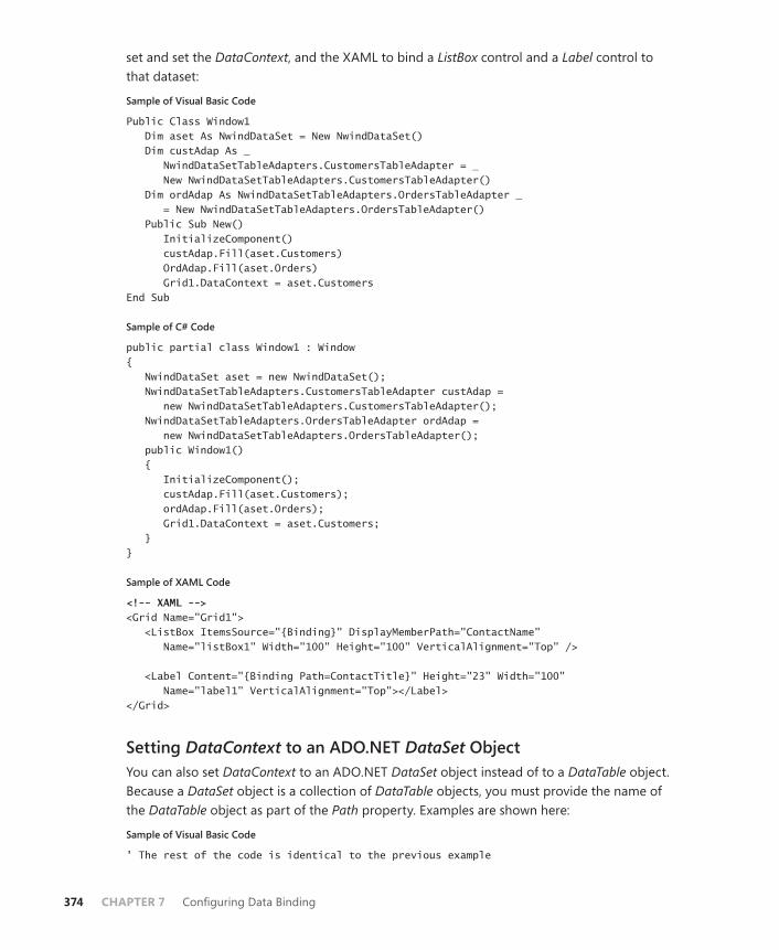
374 CHAPTER 7 Configuring Data Binding
set and set the DataContext, and the XAML to bind a ListBox control and a Label control to that dataset:
Sample of Visual Basic Code
Public Class Window1 Dim aset As NwindDataSet = New NwindDataSet() Dim custAdap As _ NwindDataSetTableAdapters.CustomersTableAdapter = _ New NwindDataSetTableAdapters.CustomersTableAdapter() Dim ordAdap As NwindDataSetTableAdapters.OrdersTableAdapter _ = New NwindDataSetTableAdapters.OrdersTableAdapter() Public Sub New() InitializeComponent() custAdap.Fill(aset.Customers) OrdAdap.Fill(aset.Orders) Grid1.DataContext = aset.Customers End Sub
Sample of C# Code
public partial class Window1 : Window{ NwindDataSet aset = new NwindDataSet(); NwindDataSetTableAdapters.CustomersTableAdapter custAdap = new NwindDataSetTableAdapters.CustomersTableAdapter(); NwindDataSetTableAdapters.OrdersTableAdapter ordAdap = new NwindDataSetTableAdapters.OrdersTableAdapter(); public Window1() { InitializeComponent(); custAdap.Fill(aset.Customers); ordAdap.Fill(aset.Orders); Grid1.DataContext = aset.Customers; } }
Sample of XAML Code
<!-- XAML --><Grid Name="Grid1"> <ListBox ItemsSource="{Binding}" DisplayMemberPath="ContactName" Name="listBox1" Width="100" Height="100" VerticalAlignment="Top" /> <Label Content="{Binding Path=ContactTitle}" Height="23" Width="100" Name="label1" VerticalAlignment="Top"></Label> </Grid>
Setting DataContext to an ADO.NET DataSet ObjectYou can also set DataContext to an ADO.NET DataSet object instead of to a DataTable object. Because a DataSet object is a collection of DataTable objects, you must provide the name of the DataTable object as part of the Path property. Examples are shown here:
Sample of Visual Basic Code
' The rest of the code is identical to the previous example

Lesson 1: Binding to Data Sources CHAPTER 7 375
' and has been omitted. Grid1.DataContext = aset
Sample of C# Code
// The rest of the code is identical to the previous example// and has been omitted. Grid1.DataContext = aset; <!--XAML--> <Grid Name="Grid1"> <ListBox ItemsSource="{Binding Path=Customers}" DisplayMemberPath="ContactName" Name="listBox1" Width="100" Height="100" VerticalAlignment="Top" /> <Label Content="{Binding Path=Customers/ContactTitle}" Height="23" Width="100" Name="label1" VerticalAlignment="Top"></Label> </Grid>
Using the Visual Studio Designer Tools for ADO.NETIn Visual Studio 2010, substantial design time support has been added for working with ADO.NET in WPF applications. After you have added an ADO.NET data source to your application, you can navigate the available data fields in that data source in the Data Sources window, shown here in Figure 7-1.
FIGURE 7-1 The Data Sources window.
The Data Sources window enables you to drag fields from your data source and drop them onto the design surface. When a data field is dropped onto the design surface, a bound con-trol is automatically generated along with any required XAML code to create required data resources, such as CollectionViewSource objects. You can change the type of bound control that is created by clicking the field in the Data Sources window and selecting the control from
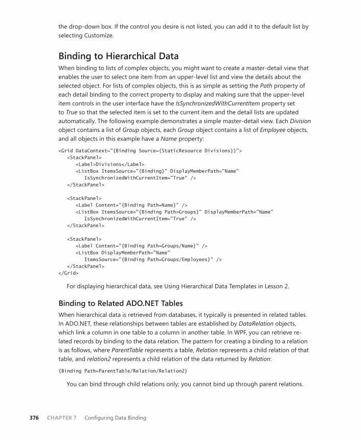
376 CHAPTER 7 Configuring Data Binding
the drop-down box. If the control you desire is not listed, you can add it to the default list by selecting Customize.
Binding to Hierarchical DataWhen binding to lists of complex objects, you might want to create a master-detail view that enables the user to select one item from an upper-level list and view the details about the selected object. For lists of complex objects, this is as simple as setting the Path property of each detail binding to the correct property to display and making sure that the upper-level item controls in the user interface have the IsSynchronizedWithCurrentItem property set to True so that the selected item is set to the current item and the detail lists are updated automatically. The following example demonstrates a simple master-detail view. Each Division object contains a list of Group objects, each Group object contains a list of Employee objects, and all objects in this example have a Name property:
<Grid DataContext="{Binding Source={StaticResource Divisions}}"> <StackPanel> <Label>Divisions</Label> <ListBox ItemsSource="{Binding}" DisplayMemberPath="Name" IsSynchronizedWithCurrentItem="True" /> </StackPanel> <StackPanel> <Label Content="{Binding Path=Name}" /> <ListBox ItemsSource="{Binding Path=Groups}" DisplayMemberPath="Name" IsSynchronizedWithCurrentItem="True" /> </StackPanel> <StackPanel> <Label Content="{Binding Path=Groups/Name}" /> <ListBox DisplayMemberPath="Name" ItemsSource="{Binding Path=Groups/Employees}" /> </StackPanel> </Grid>
For displaying hierarchical data, see Using Hierarchical Data Templates in Lesson 2.
Binding to Related ADO.NET TablesWhen hierarchical data is retrieved from databases, it typically is presented in related tables. In ADO.NET, these relationships between tables are established by DataRelation objects, which link a column in one table to a column in another table. In WPF, you can retrieve re-lated records by binding to the data relation. The pattern for creating a binding to a relation is as follows, where ParentTable represents a table, Relation represents a child relation of that table, and relation2 represents a child relation of the data returned by Relation:
{Binding Path=ParentTable/Relation/Relation2}
You can bind through child relations only; you cannot bind up through parent relations.
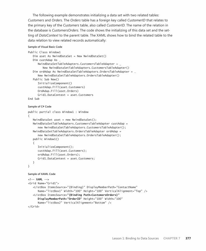
Lesson 1: Binding to Data Sources CHAPTER 7 377
The following example demonstrates initializing a data set with two related tables: Customers and Orders. The Orders table has a foreign key called CustomerID that relates to the primary key of the Customers table, also called CustomerID. The name of the relation in the database is CustomersOrders. The code shows the initializing of this data set and the set-ting of DataContext to the parent table. The XAML shows how to bind the related table to the data relation to view related records automatically:
Sample of Visual Basic Code
Public Class Window1 Dim aset As NwindDataSet = New NwindDataSet() Dim custAdap As _ NwindDataSetTableAdapters.CustomersTableAdapter = _ New NwindDataSetTableAdapters.CustomersTableAdapter() Dim ordAdap As NwindDataSetTableAdapters.OrdersTableAdapter = _ New NwindDataSetTableAdapters.OrdersTableAdapter() Public Sub New() InitializeComponent() custAdap.Fill(aset.Customers) OrdAdap.Fill(aset.Orders) Grid1.DataContext = aset.Customers End Sub
Sample of C# Code
public partial class Window1 : Window{ NwindDataSet aset = new NwindDataSet(); NwindDataSetTableAdapters.CustomersTableAdapter custAdap = new NwindDataSetTableAdapters.CustomersTableAdapter(); NwindDataSetTableAdapters.OrdersTableAdapter ordAdap = new NwindDataSetTableAdapters.OrdersTableAdapter(); public Window1() { InitializeComponent(); custAdap.Fill(aset.Customers); ordAdap.Fill(aset.Orders); Grid1.DataContext = aset.Customers; } }
Sample of XAML Code
<!-- XAML --><Grid Name="Grid1"> <ListBox ItemsSource="{Binding}" DisplayMemberPath="ContactName" Name="listBox1" Width="100" Height="100" VerticalAlignment="Top" /> <ListBox ItemsSource="{Binding Path=CustomersOrders}" DisplayMemberPath="OrderID" Height="100" Width="100" Name="listBox2" VerticalAlignment="Bottom" /> </Grid>
378 CHAPTER 7 Configuring Data Binding
Binding to an Object with ObjectDataProviderThe ObjectDataProvider class enables you to bind a WPF element or property to a method called on an object. You can specify an object type and a method on that type, then bind to the results of that method call. Table 7-3 lists the important properties of ObjectDataProvider.
TABLE 7-3 Important Properties of ObjectDataProvider
PROPERTY DESCRIPTION
ConstructorParameters Represents the list of parameters to pass to the constructor.
IsAsynchronous Indicates whether object creation and method calls are performed on the foreground thread or on a background thread.
MethodName Represents the name of the method of the source object to call.
MethodParameters Represents the list of parameters to pass to the method specified by the MethodName property.
ObjectInstance Gets or sets the object used as the binding source.
ObjectType Gets or sets the type of object of which to create an instance.
The following example demonstrates how to create a simple ObjectDataProvider object for an object with a method that takes no parameters:
<Window.Resources> <ObjectDataProvider x:Key="myObjectProvider" ObjectType="{x:Type local:myObject}" MethodName="GetCollection" /> </Window.Resources>
You can also bind to this ObjectDataProvider object, using a Binding object, as shown here:
<ListBox Name="ListBox1" DisplayMemberPath="ItemID" ItemsSource="{Binding Source={StaticResource myObjectProvider}}" />
If the method requires parameters, you can provide them in the MethodParameters property. Likewise, if the constructor requires parameters, they are provided in the ConstructorParameters property. Examples are shown here:
<Window.Resources> <ObjectDataProvider x:Key="myObjectProvider" ObjectType="{x:Type local:myObject}" MethodName="GetCollection"> <ObjectDataProvider.ConstructorParameters> <system:Double>12</system:Double> </ObjectDataProvider.ConstructorParameters> <ObjectDataProvider.MethodParameters> <system:String>Items</system:String> </ObjectDataProvider.MethodParameters> </ObjectDataProvider> </Window.Resources>

Lesson 1: Binding to Data Sources CHAPTER 7 379
Although you can bind to data presented by ObjectDataProvider, you cannot update data; that is, the binding is always going to be read-only.
Binding to XML Using XmlDataProviderThe XmlDataProvider class enables you to bind WPF elements to data in the XML format. Important properties of the XmlDataProvider class are shown in Table 7-4.
TABLE 7-4 Important Properties of XmlDataProvider
PROPERTY DESCRIPTION
Document Gets or sets the XmlDocument object to be used as the binding source.
Source Gets or sets the Uniform Resource Indicator (URI) of the XML file to be used as the binding source.
XPath Gets or sets the XPath query used to generate the XML data.
The following example demonstrates an XmlDataProvider object providing data from a source file called Items.xml:
<Window.Resources> <XmlDataProvider x:Key="Items" Source="Items.xml" /> </Window.Resources>
You can also provide the XML data inline as an XML data island. In this case, you wrap the XML data in XData tags, as shown here:
<Window.Resources> <XmlDataProvider x:Key="Items"> <x:XData> <!--XML Data omitted--> </x:XData> </XmlDataProvider> </Window.Resources>
You can bind elements to the data provided by XmlDataProvider in the same way you would bind to any other data source: namely, using a Binding object and specifying the XmlDataProvider object in the Source property, as shown here:
<ListBox ItemsSource="{Binding Source={StaticResource Items}}" DisplayMemberPath="ItemName" Name="listBox1" Width="100" Height="100" VerticalAlignment="Top" />
Using XPath with XmlDataProviderYou can use XPath expressions to filter the results exposed by XmlDataProvider or to filter the records displayed in the bound controls. By setting the XPath property of XmlDataProvider to an XPath expression, you can filter the data provided by the source. The following example
380 CHAPTER 7 Configuring Data Binding
filters the results exposed by an XmlDataProvider object to include only those nodes called <ExpensiveItems> in the <Items> top-level node:
<Window.Resources> <XmlDataProvider x:Key="Items" Source="Items.xml" XPath="Items/ExpensiveItems" /> </Window.Resources>
You can also apply XPath expressions in the bound controls. The following example sets the XPath property to Diamond (shown in bold), which indicates that only data contained in <Diamond> tags will be bound:
<ListBox ItemsSource="{Binding Source={StaticResource Items} XPath=Diamond}" DisplayMemberPath="ItemName" Name="listBox1" Width="100" Height="100" VerticalAlignment="Top" />
EXAM TIP
There are different methods for binding to different data sources. Be sure you understand how to bind not only to lists of data but also to ADO.NET objects, ObjectDataProvider ob-jects, and XmlDataProvider objects because each one has its own individual subtleties.
PRACTICE Accessing a Database
In this lab, you create an application to view related data in a database. You use the Northwind sample database and create an application that enables you to choose a contact name, view a list of dates on which orders were placed, and see the details about shipping and which products were ordered. In Lesson 2, you will build on this application.
EXERCISE1 Adding a Data Source
1. From the top-level folder of the companion CD, copy the Nwind database to a conve-nient location.
2. In Visual Studio, open a new WPF Application project.
3. In Visual Studio, from the Data menu choose Add New Data Source. The Data Source Configuration Wizard opens, with Database selected in the first page. Click Next to continue.
4. On the Choose A Database Model page, select Dataset and click Next.
5. On the Choose Your Data Connection page, click New Connection to open the Add Connection dialog box. Change Data Source to Microsoft Access Database File, click Continue, and then click Browse to browse to the location where you copied your Nwind database file. After selecting your database file, click Open. In the Add Connection dialog box, click Test Connection to test the connection. If the test is suc-cessful, click OK, click OK in the Add Connection dialog box, click Next in the Choose
Lesson 1: Binding to Data Sources CHAPTER 7 381
Your Data Connection dialog box, and then click Yes in the pop-up window. Click Next again.
6. On the Choose Your DataBase Objects page, expand the Tables node and select the Customers table and the Orders table. Expand the Views node, select Order Details Extended, and click Finish. A new class called NwindDataSet is added to your solution, and table adapters are created.
7. In Solution Explorer, double-click NwindDataSet.xsd to open the Dataset Designer. Right-click the Dataset Designer; choose Add and then choose Relation to open the Relation window.
8. In the Relation window, set Parent Table to Orders and set Child Table to Order Details Extended. Verify that Key Columns and Foreign Key Columns are set to OrderID. Click OK to create the new data relation.
9. From the Build menu, choose Build Solution to build and save your solution.
EXERCISE2 Binding to Relational Data
1. In the designer, add the namespace attribute (shown bolded in the following code) to the Window element to import your project. Please note that, depending on the name of your project, you will have to update the namespace of this project.
<Window x:Class="Window1" xmlns="http://schemas.microsoft.com/winfx/2006/xaml/presentation" xmlns:x="http://schemas.microsoft.com/winfx/2006/xaml" Title="Window1" Height="350" Width="523" xmlns:my=”clr-namespace:Lesson_1"></Window.Resources>
2. From the Data menu, choose Show Data Sources to open the Data Sources window. Expand the Customers node.
3. Click one of the fields—for example, CompanyName—under the Customers node. Open the drop-down box and select Customize. The Customize Control Binding win-dow opens.
4. In the Customize Control Binding window, set the Data Type drop-down box to String and ensure that the box next to ListBox is selected. Repeat this procedure with the Data Type drop-down box set to DateTime. Click OK.
5. In the Data Sources window, under the Customers node, open the drop-down box for ContactName and then select ListBox.
6. From the Data Sources window, drag the ContactName node to the design surface. A bound list box with an appropriate label is created.
7. In the Data Sources window, within the Customers node, expand the Orders node and open the drop-down box for OrderDate and select ListBox.
8. From the Data Sources Window, drag the OrderDate node to the Design surface to create a bound list box.
382 CHAPTER 7 Configuring Data Binding
9. In the Data Sources window, within the Customers node and within the Orders node, open the Order Details Extended node. Open the drop-down box for ProductName and select ListBox.
10. From the Data Sources window, drag the ProductName node to the design surface to create a bound list box.
11. In the Data Sources window, within the Customers node, under the Orders node, drag the ShipName, ShipAddress, ShipCity, and ShipCountry nodes to the design surface to create bound text boxes.
12. Press F5 to run your application. Note that when a Contact Name is selected in the first list box, the other bound controls automatically sync to the selected item. Similarly, if an order date is selected in the second list box, the items in the third list (for product name) box are synchronized with the selected item.
Lesson Summary■ When binding an item control to a list of data, you must set the ItemsSource property
to a Binding class that specifies the source of the list. DisplayMemberPath indicates which property of the list should be displayed in the item control.
■ Individual properties can be bound to lists of data. Initially, the first member of any such bound list is displayed, but the list can be navigated through the default ICollectionView property retrieved through the CollectionViewSource object.
■ When binding to hierarchical data, set the IsSynchronizedWithCurrentItem property on each item control to True to enable automatic UI updates of hierarchical data. You can set a Binding class to detail lists by specifying the detail list through the Path property.
■ You can bind to the value returned by a method through ObjectDataProvider.
■ You can bind to XML with XmlDataProvider. XmlDataProvider requires XML as a file, an XmlDocument object, or a data island.
Lesson ReviewYou can use the following questions to test your knowledge of the information in Lesson 1, “Binding to Data Sources.” The questions are also available on the companion CD if you prefer to review them in electronic form.
NOTE ANSWERS
Answers to these questions and explanations of why each answer choice is correct or incor-rect are located in the “Answers” section at the end of the book.
1. Which of the following code samples shows a ListBox object correctly bound to the CustomerAddress field of a data table? The data table is named Customers in an ADO.

Lesson 1: Binding to Data Sources CHAPTER 7 383
NET data set named mySet. Take both XAML and code into account in the possible answers.
A.
Sample of Visual Basic Code
Grid1.DataContext=mySet
Sample of C# Code
Grid1.DataContext=mySet;
Sample of XAML Code
<!-- XAML --><Grid Name="Grid1"> <ListBox ItemsSource="{Binding}" DisplayMemberPath="CustomerAddress" Name="listBox1" Width="100" Height="100" VerticalAlignment="Top" /> </Grid>
B.
Sample of Visual Basic Code
Grid1.DataContext=mySet
Sample of C# Code
Grid1.DataContext=mySet;
Sample of XAML Code
<!-- XAML --><Grid Name="Grid1"> <ListBox ItemsSource="{Binding Path=mySet.Customers}" DisplayMemberPath="CustomerAddress" Name="listBox1" Width="100" Height="100" VerticalAlignment="Top" /> </Grid>
C.
Sample of Visual Basic Code
Grid1.DataContext=mySet.Customers
Sample of C# Code
Grid1.DataContext=mySet.Customers;
Sample of XAML Code
<!-- XAML --><Grid Name="Grid1"> <ListBox ItemsSource="{Binding}" DisplayMemberPath="CustomerAddress" Name="listBox1" Width="100" Height="100" VerticalAlignment="Top" /> </Grid>
384 CHAPTER 7 Configuring Data Binding
D.
Sample of Visual Basic Code
Grid1.DataContext=mySet.Customers
Sample of C# Code
Grid1.DataContext=mySet.Customers;
Sample of XAML Code
<!-- XAML --><Grid Name="Grid1"> <ListBox ItemsSource="{Binding}" DisplayMemberPath="Customers/CustomerAddress" Name="listBox1" Width="100" Height="100" VerticalAlignment="Top" /> </Grid>
2. You’re binding a ListBox object to the Price field in an ADO.NET data table called Details. This table is related to the Orders table through a parent relation called OrdersDetails. The Orders table is related to a table called Customers through a parent relation called CustomersOrders. The DataContext property for your list box has been set to the Customers table, which is the parent table of the CustomersOrders relation. Which of the following correctly binds ListBox to the Price field?
A.
<ListBox ItemsSource="{Binding}" DisplayMemberPath="Price" Name="listBox1" Width="100" Height="100" VerticalAlignment="Top" />
B.
<ListBox ItemsSource="{Binding Path=OrdersDetails}" DisplayMemberPath="Price" Name="listBox1" Width="100" Height="100" VerticalAlignment="Top" />
C.
<ListBox ItemsSource="{Binding Path=CustomersOrders/OrdersDetails}" DisplayMemberPath="Price" Name="listBox1" Width="100" Height="100" VerticalAlignment="Top" />
D.
<ListBox ItemsSource="{Binding Path=Customers/CustomersOrders/OrdersDetails}" DisplayMemberPath="Price" Name="listBox1" Width="100" Height="100" VerticalAlignment="Top" />
Lesson 2: Manipulating and Displaying Data CHAPTER 7 385
Lesson 2: Manipulating and Displaying Data
WPF has built-in functionality for sorting, grouping, and filtering data. In addition, it provides unprecedented support for customizing data display through data template technology. In this lesson, you learn to apply sorting and grouping through the ICollectionView interface. You learn to create and implement custom filters for data displayed in WPF, and you learn to use data templates to customize the appearance of data in your user interface.
After this lesson, you will be able to: ■ Create and implement a data template.■ Sort data through ICollectionView.■ Apply grouping to data with ICollectionView.■ Use an IComparer to create a custom sorting scheme.■ Apply a custom filter to bound data.■ Apply a filter to a bound ADO.NET object.■ Implement and use a DataTemplateSelector class.■ Create and use HierarchicalDataTemplate.
Estimated lesson time: 30 minutes
Data TemplatesSo far, you have seen how to bind content controls and item controls to data to display bound data in the user interface. The results, however, have been underwhelming. You have seen how to present data fields as simple text in content controls and lists of text in item controls. You can create a rich data presentation experience, however, by incorporating data templates into your UI design.
A data template is a bit of XAML that describes how bound data is displayed. A data template can contain elements that are each bound to a data property, along with addi-tional markup that describes layout, color, and other aspects of appearance. The following example demonstrates a simple data template that describes a Label element bound to the ContactName property. The Foreground, Background, BorderBrush, and BorderThickness prop-erties are also set:
<DataTemplate> <Label Content="{Binding Path=ContactName}" BorderBrush="Black" Background="Yellow" BorderThickness="3" Foreground="Blue" /> </DataTemplate>
Figure 7-2 shows a list box displaying a list of bound data. Figure 7-3 shows the same list box displaying the same bound data with the previously cited data template set to the ListBox.ItemsTemplate property.
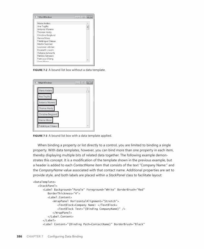
386 CHAPTER 7 Configuring Data Binding
FIGURE 7-2 A bound list box without a data template.
FIGURE 7-3 A bound list box with a data template applied.
When binding a property or list directly to a control, you are limited to binding a single property. With data templates, however, you can bind more than one property in each item, thereby displaying multiple bits of related data together. The following example demon-strates this concept. It is a modification of the template shown in the previous example, but a header is added to each ContactName item that consists of the text “Company Name:” and the CompanyName value associated with that contact name. Additional properties are set to provide style, and both labels are placed within a StackPanel class to facilitate layout:
<DataTemplate> <StackPanel> <Label Background="Purple" Foreground="White" BorderBrush="Red" BorderThickness="4"> <Label.Content> <WrapPanel HorizontalAlignment="Stretch"> <TextBlock>Company Name: </TextBlock> <TextBlock Text="{Binding CompanyName}" /> </WrapPanel> </Label.Content> </Label> <Label Content="{Binding Path=ContactName}" BorderBrush="Black"

Lesson 2: Manipulating and Displaying Data CHAPTER 7 387
HorizontalAlignment="Stretch" Background="Yellow" BorderThickness="3" Foreground="Blue" /> </StackPanel> </DataTemplate>
Figure 7-4 shows the results of applying this data template.
FIGURE 7-4 A bound list box with a data template that includes a header with related data.
You can apply data templates to content controls as well. Although a content control can display only a single record at a time, it can use all the formatting features of the data tem-plate technology.
Setting the Data TemplateYou set the data template on a control by setting one of two properties. For content controls, you set the ContentTemplate property, as shown in bold here:
<Label Height="23" HorizontalAlignment="Left" Margin="56,0,0,91" Name="label1" VerticalAlignment="Bottom" Width="120"> <Label.ContentTemplate> <DataTemplate> <!--Actual data template omitted--> </DataTemplate> </Label.ContentTemplate></Label>
For item controls, you set the ItemsTemplate property, as shown in bold here:
<ListBox ItemsSource="{Binding}" IsSynchronizedWithCurrentItem="True" Margin="18,19,205,148" Name="listBox1"> <ListBox.ItemTemplate> <DataTemplate> <!--Actual data template omitted--> </DataTemplate> </ListBox.ItemTemplate></ListBox>
Note that for item controls, the DisplayMemberPath and ItemTemplate properties are mu-tually exclusive; you can set one but not the other.

388 CHAPTER 7 Configuring Data Binding
A frequent pattern with data templates is to define them in a resource collection and reference them in your element rather than defining them inline as shown in the previous examples. All that is required to reuse a data template in this manner is to define the template in a resource collection and set a Key property for the template, as shown here:
<Window.Resources> <DataTemplate x:Key="myTemplate"> <Label Content="{Binding Path=ContactName}" BorderBrush="Black" Background="Yellow" BorderThickness="3" Foreground="Blue" /> </DataTemplate> </Window.Resources>
Then you can set the template by referring to the resource, as shown in bold here:
<ListBox ItemTemplate="{StaticResource myTemplate}" Name="ListBox1" />
EXAM TIP
Although data templates appear to be rather simple, be sure that you have lots of practice implementing and using them. Data templates are an extremely powerful feature of WPF and promise to figure prominently on the exam.
Using Converters to Apply Conditional Formatting in Data TemplatesOne of the most useful things you can do with converters is to apply conditional formatting to displayed data. For example, suppose you are writing an application that binds to a list of dates on which orders were placed. You might want orders that were placed in the current month to have a different foreground color than the other orders. You can accomplish this by binding the Foreground property of the control used to bind the date to the Date field and providing a converter that evaluates the date and returns a brush of the appropriate color. The following examples show such a converter, an instance of that converter added to the Window.Resources collection, and, finally, the Foreground property bound to the Date prop-erty using the converter to return a Brush object. First, here’s the converter:
Sample of Visual Basic Code
<ValueConversion(GetType(DateTime), GetType(Brush))> _Public Class DateBrushConverter Implements IValueConverter Public Function Convert(ByVal value As Object, ByVal targetType As _ System.Type, ByVal parameter As Object, ByVal culture As _ System.Globalization.CultureInfo) As Object Implements _ System.Windows.Data.IValueConverter.Convert Dim aDate As DateTime aDate = CType(value, DateTime) If aDate.Month = Now.Month Then Return New SolidColorBrush(Colors.Red) Else Return New SolidColorBrush(Colors.Black) End If

Lesson 2: Manipulating and Displaying Data CHAPTER 7 389
End Function Public Function ConvertBack(ByVal value As Object, ByVal targetType _ As System.Type, ByVal parameter As Object, ByVal culture As _ System.Globalization.CultureInfo) As Object Implements _ System.Windows.Data.IValueConverter.ConvertBack Throw New NotImplementedException() End Function End Class
Sample of C# Code
[ValueConversion(typeof(DateTime), typeof(Brush))]public class DateBrushConverter : IValueConverter { public object Convert(object value, Type targetType, object parameter, System.Globalization.CultureInfo culture) { DateTime aDate = (DateTime)value; if (aDate.Month == DateTime.Now.Month) return new SolidColorBrush(Colors.Red); else return new SolidColorBrush(Colors.Black); } public object ConvertBack(object value, Type targetType, object parameter, System.Globalization.CultureInfo culture) { throw new NotImplementedException(); } }
An instance is then added to the Window.Resources collection, as shown in bold here:
<Window x:Class="WpfApplication5.Window1" xmlns="http://schemas.microsoft.com/winfx/2006/xaml/presentation" xmlns:x="http://schemas.microsoft.com/winfx/2006/xaml" xmlns:local="clr-namespace:WpfApplication5" Title="Window1" Height="300" Width="300"> <Window.Resources> <local:DateBrushConverter x:Key="myDateConverter"></local:DateBrushConverter> </Window.Resources> <!--- the rest of the window is omitted --!> </Window>
Finally, you can bind the Foreground property to a date by using the converter, as shown in bold here:
<ListBox Margin="60,58,98,104" Name="ListBox1"> <ListBox.ItemTemplate> <DataTemplate> <Label Content="{Binding Path=OrderDate}" Foreground="{Binding Path=OrderDate, Converter={StaticResource myDateConverter}}" /> </DataTemplate> </ListBox.ItemTemplate> </ListBox>
390 CHAPTER 7 Configuring Data Binding
Using DataTemplateSelectorThe DataTemplateSelector class enables you to assign data templates dynamically to collec-tion objects based on the content of the data. For example, consider that you have two data templates, shown in XAML here:
<Window.Resources> <DataTemplate x:Key="BasicTemplate"> <TextBlock Text="{Binding Path=RequiredDate}"/> </DataTemplate> <DataTemplate x:Key="PriorityTemplate"> <TextBlock Text="{Binding Path=RequiredDate}" Background="Red"/> </DataTemplate> </Window.Resources>
Both templates in this example are quite simple. They each define a text block that displays a field called RequiredDate—in this example, the date an order is required by the customer. However, in the template called PriorityTemplate, the background of the text block is red. Suppose you want your application to examine the value of the RequiredDate field and use PriorityTemplate for orders that are due this month and BasicTemplate for all others. You can implement this logic by using the DataTemplateSelector class.
DataTemplateSelector is an abstract class that exposes a single method (which can be overridden) called SelectTemplate. SelectTemplate returns a DataTemplate object and, when overridden, should incorporate the logic required to determine the correct template based on the data. The SelectTemplate method accepts two parameters: an Object parameter that represents the object bound by the data template, and a DependencyObject parameter that represents the container for the bound object. The following example shows a simple imple-mentation of DataTemplateSelector that examines a field in a data row and returns a data template based on the value of that field.
Sample of Visual Basic Code
Public Class DateDataTemplateSelector Inherits DataTemplateSelector Public Overrides Function SelectTemplate(ByVal item As Object, ByVal container As DependencyObject) _ As DataTemplate Dim element As FrameworkElement element = TryCast(container, FrameworkElement) ' Tests to ensure that both the item and the container are not null, and that ' the item is of the expected data type. If element IsNot Nothing AndAlso item IsNot Nothing AndAlso TypeOf item Is System.Data.DataRowView Then ' Casts the item as the expected type, in this case a System.Data.DataRowView Dim dateitem As System.Data.DataRowView = CType(item, System.Data.DataRowView) ' Compares the value of the expected field with the current month If CType(dateitem("RequiredDate"), Date).Month = DateTime.Now.Month Then ' Returns the PriorityTemplate in the case of a match Return TryCast(element.FindResource("PriorityTemplate"), DataTemplate)

Lesson 2: Manipulating and Displaying Data CHAPTER 7 391
Else ' Returns the BasicTemplate for other cases Return TryCast(element.FindResource("BasicTemplate"), DataTemplate) End If End If Return Nothing End Function End Class
Sample of C# Code
public class DateDataTemplateSelector : DataTemplateSelector{ public override DataTemplate SelectTemplate(object item, DependencyObject container) { FrameworkElement element; System.Data.DataRowView dateitem; element = container as FrameworkElement; // Tests to ensure that both the item and the container are not null, and that the // item is of the expected data type. if (element != null && item != null && item is System.Data.DataRowView) { // Casts the item as the expected type, in this case a System.Data.DataRowView dateitem = (System.Data.DataRowView)item; // Compares the value of the expected field with the current month if (((DateTime)dateitem["RequiredDate"]).Month == DateTime.Now.Month) // Returns the PriorityTemplate in the case of a match return element.FindResource("PriorityTemplate") as DataTemplate; else // Returns the BasicTemplate for other cases return element.FindResource("BasicTemplate") as DataTemplate; } return null; } }
After you have created your inherited DataTemplateSelector class, you can create an in-stance of it in your Resources section, as shown here:
<Window x:Class="MainWindow" xmlns="http://schemas.microsoft.com/winfx/2006/xaml/presentation" xmlns:x="http://schemas.microsoft.com/winfx/2006/xaml" xmlns:my="clr-namespace:WpfApplication4" Title="MainWindow" Height="350" Width="525" > <Window.Resources> <my:DateDataTemplateSelector x:Key="myTemplateSelector" /> </Window.Resources> <!-- Implementation omitted --> </Window>
After you have defined a DataTemplateSelector resource, you can assign the resource to the ItemTemplateSelector property of an item control, as shown here:
<ListBox ItemTemplateSelector="{StaticResource myTemplateSelector}" />

392 CHAPTER 7 Configuring Data Binding
When an item is added to the list box in this example, the SelectTemplate method of DataTemplateSelector is executed on that item, and the appropriate template is returned and applied to the display of that item.
Using Hierarchical Data TemplatesWhen displaying hierarchical data, such as in a TreeView or a Menu control, you can use HierarchicalDataTemplate to provide formatting and layout for both items in a list and related sub-items. The HierarchicalDataTemplate class incorporates all the proper-ties of the DataTemplate class and serves as the standard data template for list items. HierarchicalDataTemplate also incorporates a number of properties that apply to sub-items, which Table 7-5 summarizes.
TABLE 7-5 Item-Related Properties of HierarchicalDataTemplate
PROPERTY DESCRIPTION
ItemBindingGroup Gets or sets the BindingGroup property that is copied to each child item
ItemContainerStyle Gets or sets the Style property that is applied to the item container for each child item
ItemContainerStyleSelector Gets or sets custom style-selection logic for a style that can be applied to each item container
ItemsSource Gets or sets the binding for this data template, which indicates where to find the collection that represents the next level in the data hierarchy
ItemStringFormat Gets or sets a composite string that specifies how to format the items in the next level in the data hierarchy if they are displayed as strings
ItemTemplate Gets or sets the data template to apply to the ItemTemplate property on a generated HeaderedItemsControl control (such as MenuItem or TreeViewItem) to indicate how to display items from the next level in the data hierarchy
ItemTemplateSelector Gets or sets DataTemplateSelector to apply to the ItemTemplateSelector property on a generated HeaderedItemsControl control (such as MenuItem or TreeViewItem) to indicate how to select a template to display items from the next level in the data hierarchy
The ItemsSource property is a binding that points to the sub-items to be displayed in the hierarchical display. The ItemTemplate property represents the data template for the sub-items. Normally, this is a regular data template, but note that sub-items can have sub-items of their own, in which case you can set this property to another HierarchicalDataTemplate class.

Lesson 2: Manipulating and Displaying Data CHAPTER 7 393
If you want to examine the sub-items programmatically and provide different data tem-plates based on the data values, you can set the ItemTemplateSelector property to an instance of a class deriving from DataTemplateSelector, as described in the previous section.
The following XAML code demonstrates an example of HierarchicalDatatemplate. In this example, a window defines two CollectionViewResource objects, which represent an ADO.NET DataTable object and a DataRelation object that defines the relationship between it and a related table. The user interface of the window contains a TreeView control that will display a list of items, each of which will have sub-items. HierarchicalDataTemplate, in this example, is applied to the items that are displayed in ListView, and the ItemTemplate property of HierarchicalDataView refers to the DataTemplate class applied to sub-items in ListView.
<Window x:Class="MainWindow" xmlns="http://schemas.microsoft.com/winfx/2006/xaml/presentation" xmlns:x="http://schemas.microsoft.com/winfx/2006/xaml" xmlns:my="clr-namespace:WpfApplication4" Title="MainWindow" Height="350" Width="525" > <Window.Resources> <!-- Creates a resource that refers to a DataSet defined in code --> <my:NwindDataSet x:Key="NwindDataSet" /> <!-- Creates a resource that refers to the Customers table of the DataSet --> <CollectionViewSource x:Key="CustomersViewSource" Source="{Binding Path=Customers, Source={StaticResource NwindDataSet}}" /> <!-- Creates a resource that refers to a DataRelation defined by the Customers table --> <CollectionViewSource x:Key="CustomersOrdersViewSource" Source="{Binding Path=CustomersOrders, Source={StaticResource CustomersViewSource}}" /> <!-- The DataTemplate that is applied to sub-items in the list view --> <DataTemplate x:Key="BasicTemplate"> <TextBlock Text="{Binding Path=RequiredDate}"/> </DataTemplate> <!-- The HierarchicalDataTemplate that is applied to Listview items --> <HierarchicalDataTemplate x:Key="HierarchTemplate" ItemsSource="{Binding Path=CustomersOrders}" ItemTemplate="BasicTemplate" > <TextBlock Foreground="Red" Text="{Binding Path=CompanyName}" /> </HierarchicalDataTemplate> </Window.Resources> <Grid DataContext="{StaticResource CustomersViewSource}"> <TreeView Height="248" HorizontalAlignment="Left" Margin="46,39,0,0" Name="TreeView1" VerticalAlignment="Top" Width="394" ItemsSource="{Binding}" ItemTemplate="{StaticResource HierarchTemplate}" /> </Grid> </Window>
394 CHAPTER 7 Configuring Data Binding
Sorting DataWhen presenting data in the user interface, you want to sort it in various ways. Bound data can be sorted through the default ICollectionView element for the data list. You saw previous-ly how to obtain a reference to the default collection view through the CollectionViewSource object, as shown again here:
Sample of Visual Basic Code
Dim myView As System.ComponentModel.ICollectionViewmyView = CollectionViewSource.GetDefaultView(myCollection)
Sample of C# Code
System.ComponentModel.ICollectionView myView;myView = CollectionViewSource.GetDefaultView(myCollection);
ICollectionView exposes a property called SortDescriptions, which contains a collection of SortDescription objects. SortDescription objects describe the column name to sort by and a direction that specifies either an ascending or a descending sort order. The following example demonstrates sorting by a column named LastName in ascending order:
Sample of Visual Basic Code
myView.SortDescriptions.Add(New _ System.ComponentModel.SortDescription("LastName", _ System.ComponentModel.ListSortDirection.Ascending)
Sample of C# Code
myView.SortDescriptions.Add(new System.ComponentModel.SortDescription("LastName", System.ComponentModel.ListSortDirection.Ascending);
SortDescription objects are applied to a collection in the order in which they are added to the collection view. Thus, if you wanted to sort first by the LastName column and then by the FirstName column, you first would add a SortDescription object that specified sorting by LastName and then add a SortDescription object that specified sorting by FirstName, as shown here:
Sample of Visual Basic Code
myView.SortDescriptions.Add(New _ System.ComponentModel.SortDescription("LastName", _ System.ComponentModel.ListSortDirection.Ascending) myView.SortDescriptions.Add(New _ System.ComponentModel.SortDescription("FirstName", _ System.ComponentModel.ListSortDirection.Ascending)
Sample of C# Code
myView.SortDescriptions.Add(new System.ComponentModel.SortDescription("LastName", System.ComponentModel.ListSortDirection.Ascending); myView.SortDescriptions.Add(new System.ComponentModel.SortDescription("FirstName", System.ComponentModel.ListSortDirection.Ascending);

Lesson 2: Manipulating and Displaying Data CHAPTER 7 395
Applying Custom SortingIf you are binding to a class whose default view is ListCollectionView (that is, it implements IList but not IBindingList), such as ObservableCollection, you can implement custom sort orders by setting the ListCollectionView.CustomSort property. The CustomSort property takes an object that implements the IComparer interface. The IComparer interface requires a single method called Compare that takes two arguments and returns an integer that represents the result of the comparison of those two objects. The following example demonstrates an imple-mentation of the IComparer interface that takes two Employee objects and sorts by the length of the LastName property:
Sample of Visual Basic Code
Public Class myComparer Implements IComparer Public Function Compare(ByVal x As Object, ByVal y As Object) As _ Integer Implements System.Collections.IComparer.Compare Dim empX As Employee = CType(x, Employee) Dim empY As Employee = CType(y, Employee) Return empX.LastName.Length.CompareTo(empY.LastName.Length) End Function End Class
Sample of C# Code
public class myComparer : System.Collections.IComparer{ public int Compare(object x, object y) { Employee empX = (Employee)x; Employee empY = (Employee)y; return empX.LastName.Length.CompareTo(empY.LastName.Length); } }
Then you can create an instance of this class to set to the CustomSort property of your ICollectionView element, as shown here:
Sample of Visual Basic Code
Dim myView As ListCollectionViewmyView = CType(CollectionViewSource.GetDefaultView(myCollection), _ ListCollectionView) myView.CustomSort = New myComparer()
Sample of C# Code
System.ComponentModel.ICollectionView myView;myView = (ListCollectionView)CollectionViewSource.GetDefaultView(myCollection); myView.CustomSort = new myComparer();
396 CHAPTER 7 Configuring Data Binding
GroupingICollectionView also supports grouping data. Grouping data is similar to sorting but takes advantage of the built-in functionality of item controls to provide formatting for different groups, thus enabling the user to distinguish groups visually at run time. You can create a group by adding a PropertyGroupDescription object to the ICollectionView.GroupDescriptions collection. The following example demonstrates creating groups based on the value of the EmployeeTitle property:
Sample of Visual Basic Code
Dim myView As System.ComponentModel.ICollectionViewmyView = CollectionViewSource.GetDefaultView(myCollection) myView.GroupDescriptions.Add( _ New PropertyGroupDescription("EmployeeTitle"))
Sample of C# Code
System.ComponentModel.ICollectionView myView;myView = CollectionViewSource.GetDefaultView(myCollection); myView.GroupDescriptions.Add( new PropertyGroupDescription("EmployeeTitle"));
At first glance, applying this grouping seems to have the same effect as sorting by EmployeeTitle. The difference becomes evident when this data is displayed in an item control with the GroupStyle property set. The GroupStyle property provides formatting informa-tion for grouped items and enables you to set how they are displayed. Table 7-6 explains the properties of the GroupStyle object.
TABLE 7-6 Properties of GroupStyle
PROPERTY DESCRIPTION
ContainerStyle Gets or sets the style applied to the GroupItem object gen-erated for each item
ContainerStyleSelector Represents an instance of StyleSelector that determines the appropriate style to use for the container
HeaderTemplate Gets or sets the template used to display the group header
HeaderTemplateSelector Represents an instance of StyleSelector that determines the appropriate style to use for the header
Panel Gets or sets a template that creates the panel used to lay out the items
The following example demonstrates setting the GroupHeader and Panel properties. In this example, the Panel property is replaced by a WrapPanel element that causes the groups to wrap horizontally, and the HeaderTemplate is set to display the header in purple text on a red background:
<ListBox ItemsSource="{Binding}" IsSynchronizedWithCurrentItem="True" DisplayMemberPath="ContactName" Margin="18,19,25,0" Name="listBox1"

Lesson 2: Manipulating and Displaying Data CHAPTER 7 397
Height="100" VerticalAlignment="Top"> <ListBox.GroupStyle> <GroupStyle> <GroupStyle.HeaderTemplate> <DataTemplate> <Label Content="{Binding Path=Name}" Foreground="Purple" Background="Red" Padding="4" /> </DataTemplate> </GroupStyle.HeaderTemplate> <GroupStyle.Panel> <ItemsPanelTemplate> <WrapPanel/> </ItemsPanelTemplate> </GroupStyle.Panel> </GroupStyle> </ListBox.GroupStyle> </ListBox>
Note that in the data template for the GroupStyle.HeaderTemplate property, the Content property is bound to the Name property. This is not the Name property of the objects bound in the ListBox control, but, actually, the Name property of the PropertyGroupDescription ele-ment. Thus, when you want the header to reflect the name of the category, you always bind to the Name property rather than to the name of the property you are using to group your data.
Creating Custom GroupingIn addition to creating groupings based on the values of object properties, you can cre-ate custom groups to arrange your items in an item control. To create a custom group, you must create a class that implements the IValueConverter interface, which exposes two meth-ods: Convert and ConvertBack. For the purposes of creating custom grouping, you need to provide only a “real” implementation for the Convert method; the ConvertBack method will never be called. The Convert method takes an object as a parameter, which will be the object represented by the property named in PropertyGroupDescription. In the Convert method, ex-amine the value of the object, determine which custom group it belongs to, and then return a value that represents that custom group. The following example is a simple demonstra-tion of this concept. It is designed to examine a value from a Region property and determine whether that region is the Isle of Wight. If it is, it returns Isle Of Wight as the group header; otherwise, it returns Everyplace Else.
Sample of Visual Basic Code
Public Class RegionConverter Implements IValueConverter Public Function Convert(ByVal value As Object, ByVal targetType As _ System.Type, ByVal parameter As Object, ByVal culture As _ System.Globalization.CultureInfo) As Object Implements _ System.Windows.Data.IValueConverter.Convert If Not value.ToString = "" Then Dim region As String = value.ToString
398 CHAPTER 7 Configuring Data Binding
If region = "Isle of Wight" Then Return "Isle of Wight" End If End If Return "Everyplace else" End Function Public Function ConvertBack(ByVal value As Object, ByVal targetType _ As System.Type, ByVal parameter As Object, ByVal culture As _ System.Globalization.CultureInfo) As Object Implements _ System.Windows.Data.IValueConverter.ConvertBack Throw New NotImplementedException() End Function End Class
Sample of C# Code
public class RegionGrouper : IValueConverter{ public object Convert(object value, Type targetType, object parameter, System.Globalization.CultureInfo culture) { if (!(value.ToString() == "")) { string Region = (string)value; if (Region == "Isle of Wight") return "Isle of Wight"; } return "Everyplace else"; } public object ConvertBack(object value, Type targetType, object parameter, System.Globalization.CultureInfo culture) { throw new NotImplementedException(); } }
Then you can add your custom PropertyGroupDescription parameter by specifying the Region property and a new instance of the RegionGrouper property, as shown here:
Sample of Visual Basic Code
Dim myView As System.ComponentModel.ICollectionViewmyView = CollectionViewSource.GetDefaultView(myCollection) myView.GroupDescriptions.Add(New PropertyGroupDescription("Region", _ New RegionGrouper()))
Sample of C# Code
System.ComponentModel.ICollectionView myView;myView = CollectionViewSource.GetDefaultView(myCollection); myView.GroupDescriptions.Add(new PropertyGroupDescription("Region", new RegionGrouper()));
Lesson 2: Manipulating and Displaying Data CHAPTER 7 399
Filtering DataICollectionView has built-in functionality that enables you to designate a method to filter the data in your collection view. The ICollectionView property accepts a Predicate delegate that specifies a Boolean method, which takes the object from the collection as an argument, ex-amines it, and returns True if the object is included in the filtered view and False if the object is excluded. The following two examples demonstrate setting a simple filter. The first example demonstrates setting the filter on an ICollectionView object, and the second example demon-strates the method that implements that filter. These examples involve a collection of items named myItems:
Sample of Visual Basic Code
Dim myView As System.ComponentModel.ICollectionViewmyView = CollectionViewSource.GetDefaultView(myItems) myView.Filter = New Predicate(Of Object)(AddressOf myFilter)
Sample of C# Code
System.ComponentModel.ICollectionView myView;myView = CollectionViewSource.GetDefaultView(myItems); myView.Filter = new Predicate<object>(myFilter);
The next example shows myFilter, a simple method that excludes all objects whose ToString method returns a string length of eight characters or fewer:
Sample of Visual Basic Code
Public Function myFilter(ByVal param As Object) As Boolean Return (param.ToString.Length > 8) End Function
Sample of C# Code
public bool myFilter(object param){ return (param.ToString().Length > 8); }
Note that the Predicate delegate to which the Filter property is set must be Predicate<object> [Predicate(Of Object) in Visual Basic] rather than a strongly typed Predicate delegate such as Predicate<Item>. You must perform any necessary casting in the method that implements the filter.
Filtering ADO.NET ObjectsThe filtering method described in the previous section does not work when bind-ing to ADO.NET objects or anytime the underlying ICollectionView object is actually a BindingListCollectionView object. This is because the data collection bound to in this view actually is connected through an ADO.NET DataView layer, which implements its own filtering scheme. However, you can take advantage of the filtering capabilities of DataView by setting the BindingListCollectionView.CustomFilter property. This property applies a string-based
400 CHAPTER 7 Configuring Data Binding
expression directly to the underlying DataView layer. The filter expression is a string expres-sion in the following format:
<ColumnName> <Operator> <Value>
For example, the following filter limits the rows returned to rows whose Sandwich property has a value of ‘Muffaletta’:
Sandwich = 'Muffaletta'
To set the filter, you would create the following code:
Sample of Visual Basic Code
Dim myView As BindingListCollectionViewmyView = CType(CollectionViewSource.GetDefaultView(myItems), _ BindingListCollectionView; myView.CustomFilter = "Sandwich = 'Muffaletta'"
Sample of C# Code
BindingListCollectionView myView;myView = (BindingListCollectionView)CollectionViewSource.GetDefaultView(myItems); myView.CustomFilter = "Sandwich = 'Muffaletta'";
String literals for the filter expression must be enclosed in single quotes, as shown in the preceding code. Although the complete rules for filter expressions are beyond the scope of this lesson, they follow the same syntax as comparison expressions for the DataColumn. Expression property, and you can view a complete reference in the Microsoft reference topic of that name at http://msdn2.microsoft.com/en-us/library/system.data.datacolumn.expression(VS.71).aspx.
Quick Check■ What is the difference between sorting by a particular property and creating
a group based on that property?
Quick Check Answer■ When you create a group, you have access to the GroupStyle object created
for that group. You can set individual templates for the header and container and supply a different layout panel.
PRACTICE Practice with Data Templates
In this lab, you expand on the application you completed in the previous lab. You add data templates to display greater detail and visual appeal to the ContactNames and ProductNames lists.
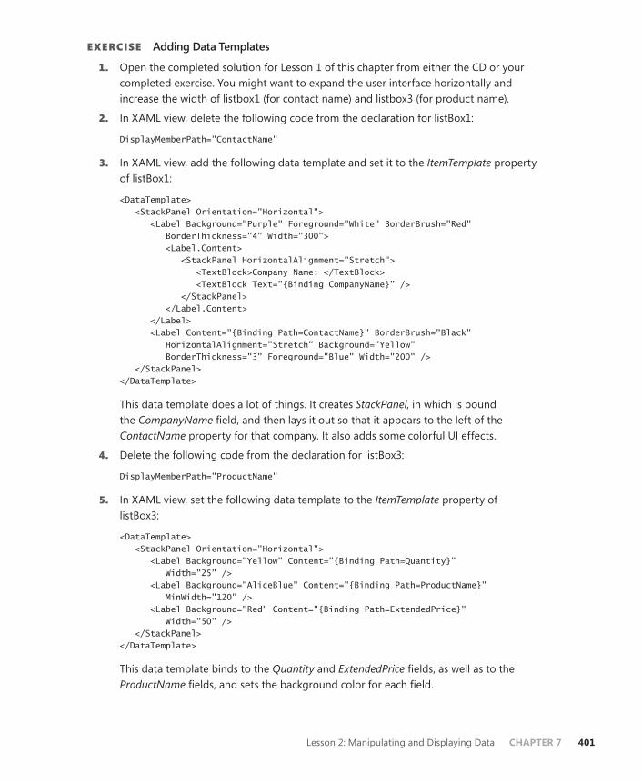
Lesson 2: Manipulating and Displaying Data CHAPTER 7 401
EXERCISE Adding Data Templates
1. Open the completed solution for Lesson 1 of this chapter from either the CD or your completed exercise. You might want to expand the user interface horizontally and increase the width of listbox1 (for contact name) and listbox3 (for product name).
2. In XAML view, delete the following code from the declaration for listBox1:
DisplayMemberPath="ContactName"
3. In XAML view, add the following data template and set it to the ItemTemplate property of listBox1:
<DataTemplate> <StackPanel Orientation="Horizontal"> <Label Background="Purple" Foreground="White" BorderBrush="Red" BorderThickness="4" Width="300"> <Label.Content> <StackPanel HorizontalAlignment="Stretch"> <TextBlock>Company Name: </TextBlock> <TextBlock Text="{Binding CompanyName}" /> </StackPanel> </Label.Content> </Label> <Label Content="{Binding Path=ContactName}" BorderBrush="Black" HorizontalAlignment="Stretch" Background="Yellow" BorderThickness="3" Foreground="Blue" Width="200" /> </StackPanel> </DataTemplate>
This data template does a lot of things. It creates StackPanel, in which is bound the CompanyName field, and then lays it out so that it appears to the left of the ContactName property for that company. It also adds some colorful UI effects.
4. Delete the following code from the declaration for listBox3:
DisplayMemberPath="ProductName"
5. In XAML view, set the following data template to the ItemTemplate property of listBox3:
<DataTemplate> <StackPanel Orientation="Horizontal"> <Label Background="Yellow" Content="{Binding Path=Quantity}" Width="25" /> <Label Background="AliceBlue" Content="{Binding Path=ProductName}" MinWidth="120" /> <Label Background="Red" Content="{Binding Path=ExtendedPrice}" Width="50" /> </StackPanel> </DataTemplate>
This data template binds to the Quantity and ExtendedPrice fields, as well as to the ProductName fields, and sets the background color for each field.
402 CHAPTER 7 Configuring Data Binding
6. Press F5 to build and run your application. Note that the display is now more color-ful and that additional fields are bound in the ListBox elements. Note that although a Label object in the data template for listBox3 is bound to the ExtendedPrice field, it appears as a regular number instead of being formatted as currency.
Lesson Summary■ Data templates are pieces of XAML markup that specify how bound data should be
displayed. They enable you to set the appearance and behavior of bound data as well as specify related fields to be displayed. You can set a data template for an item control by setting the ItemTemplate property, and you can set the data template for a content control by setting the ContentTemplate property.
■ You can apply sorting to data by accessing the default collection view and adding a new sort description to the SortDescriptions property. Standard sorting enables you to sort based on a data field value in either ascending or descending mode. You can create custom sorts by creating a class that implements IComparer and setting it to the CustomSort property.
■ You can create groups of data by adding a new PropertyGroupDescription param-eter to the GroupDescriptions property of the default collection view. You can set the header and other formatting for groups by setting the GroupStyle property of the item control that binds the data.
■ You can specify a delegate to perform filtering by creating a Boolean method that performs the filtering and specifying a Predicate<object> delegate that points to that method. This does not work with ADO.NET objects, however, and you must set the CustomFilter property to a filter expression to filter ADO.NET records.
Lesson ReviewYou can use the following questions to test your knowledge of the information in Lesson 2, “Manipulating and Displaying Data.” The questions are also available on the companion CD if you prefer to review them in electronic form.
NOTE ANSWERS
Answers to these questions and explanations of why each answer choice is correct or incor-rect are located in the “Answers” section at the end of the book.
1. Which of the following code samples correctly demonstrates a data template that binds the ContactName field set in ListBox? Assume that DataContext is set correctly.
A.
<ListBox ItemsSource="{Binding}" name="ListBox1"> <DataTemplate> <Label Content="{Binding Path=ContactName}" BorderBrush="Black"
Lesson 2: Manipulating and Displaying Data CHAPTER 7 403
Background="Yellow" BorderThickness="3" Foreground="Blue" /> </DataTemplate> </ListBox>
B.
<ListBox name="ListBox1"> <ListBox.ItemsSource> <DataTemplate> <Label Content="{Binding Path=ContactName}" BorderBrush="Black" Background="Yellow" BorderThickness="3" Foreground="Blue" /> </DataTemplate> </ListBox.ItemsSource> </ListBox>
C.
<ListBox ItemsSource="{Binding}" name="ListBox1"> <ListBox.ItemTemplate> <Label Content="{Binding Path=ContactName}" BorderBrush="Black" Background="Yellow" BorderThickness="3" Foreground="Blue" /> </ListBox.ItemTemplate> </ListBox>
D.
<ListBox ItemsSource="{Binding}" name="ListBox1"> <ListBox.ItemTemplate> <DataTemplate> <Label Content="{Binding Path=ContactName}" BorderBrush="Black" Background="Yellow" BorderThickness="3" Foreground="Blue" /> </DataTemplate> </ListBox.ItemTemplate> </ListBox>
2. Which of the following code samples correctly sets the filter on the CollectionView object myView?
A.
Sample of Visual Basic Code
myView.Filter = New Predicate(Of Object)(AddressOf myFilter) Public Function myFilter(ByVal param As Object) As Boolean Return (param.ToString.Length > 8) End Function
Sample of C# Code
myView.Filter = new Predicate<object>(myFilter); public bool myFilter(object param) { return (param.ToString().Length > 8); }

404 CHAPTER 7 Configuring Data Binding
B.
Sample of Visual Basic Code
myView.Filter = New Predicate(Of Object)(AddressOf myFilter)Public Function myFilter(ByVal param As Object) As Object Return (param.ToString.Length > 8) End Function
Sample of C# Code
myView.Filter = new Predicate<object>(myFilter); public object myFilter(object param) { return (param.ToString().Length > 8); }
C.
Sample of Visual Basic Code
myView.CustomFilter = New Predicate(Of Object)(AddressOf myFilter) Public Function myFilter(ByVal param As Object) As Boolean Return (param.ToString.Length > 8) End Function
Sample of C# Code
myView.CustomFilter = new Predicate<object>(myFilter); public bool myFilter(object param) { return (param.ToString().Length > 8); }
D.
Sample of Visual Basic Code
myView.CustomFilter = New Predicate(Of Object)(AddressOf myFilter)Public Function myFilter(ByVal param As Object) As Object Return (param.ToString.Length > 8) End Function
Sample of C# Code
myView.CustomFilter = new Predicate<object>(myFilter); public object myFilter(object param) { return (param.ToString().Length > 8); }
Case Scenarios CHAPTER 7 405
Case Scenarios
In the following case scenarios, you apply what you’ve learned about how to use controls to design user interfaces. You can find answers to these questions in the “Answers” section at the end of this book.
Case Scenario 1: Getting Information from the FieldField agents are diligently scouring the world trying to locate new supplies of “stuff” for your company’s ongoing research efforts. They need to relay regular reports to us in a specific format, which will be logged into our central database. Each of the agents is equipped with a laptop and a satellite Internet connection, but direct connections to the company database are impossible. They also have a report generator that outputs XML files and e-mails them to the mail-handling program, which stores them as raw XML in a queue where they can be vetted by support staff before being saved in the database. You are in charge of creating an application to help these support staff handle the data processing.
Technical Requirements■ XML files can be read, but they must not be altered in any way.
■ The user must be able to edit the information before saving it into the central database.
Answer the following question for your manager:
■ What is the ideal data access strategy for our application?
Case Scenario 2: Viewing Customer DataOne of your company’s clients has contracted with you to create an application to help maximize his business potential. He wants to view customer records that meet any of several specific sets of criteria: customers who buy big-ticket items, customers who buy a lot of small items, customers who buy only in April, and so on. And he wants to view them all at once, but he wants them to be arranged in groups by these criteria. He does not want to see any records that do not match any of the criteria groups. All the information required by the ap-plication is available in the database he is supplying.
Technical Requirements■ The application should display only records that fall into one of the criteria groups.
■ The records should be arranged by criteria group.
Answer the following question for your manager:
■ How can you design the application to achieve the grouping the client wants, with minimal development time?
406 CHAPTER 7 Configuring Data Binding
Suggested Practices
To help you successfully master the exam objectives presented in this chapter, complete the following tasks.
■ Practice 1 Create a Really Simple Syndication (RSS) reader that downloads and for-mats RSS data by using XmlDataProvider.
■ Practice 2 Create an application that accesses the Northwind database and enables the user to filter on the CompanyName element.
Take a Practice Test
The practice tests on this book’s companion CD offer many options. For example, you can test yourself on just the content covered in this chapter, or you can test yourself on all the 70-511 certification exam content. You can set up the test so that it closely simulates the experience of taking a certification exam, or you can set it up in study mode so that you can look at the correct answers and explanations after you answer each question.
MORE INFO PRACTICE TESTS
For details about all the practice test options available, see the “How to Use the Practice Tests” section in this book’s Introduction.
CHAPTER 8 407
C H A P T E R 8
Working with Data Grids and Validating User Input
The display of data in a grid form has been a constant meme in data display ever since the introduction of spreadsheets and, to this day, remains one of the most popular
formats for presenting data to the user. In Lesson 1, “Implementing Data-bound Controls in Windows Forms,” you learn to use the DataGridView control for viewing data in Windows Forms applications and the DataGrid control for viewing data in Windows Presentation Foundation (WPF) applications. In Lesson 2, “Validating User Input,” you learn how to vali-date user input at the field level in both Windows Forms and WPF and implement IDataEr-rorInfo for WPF applications.
Exam objectives in this chapter:■ Implement data validation.■ Implement data-bound controls.
Lessons in this chapter:■ Lesson 1: Implementing Data-bound Controls in Windows Forms 409■ Lesson 2: Validating User Input 427

408 CHAPTER 8 Working with Data Grids and Validating User Input
Before You Begin
To complete the lessons in this chapter, you must have:
■ A computer that meets or exceeds the minimum hardware requirements listed in the “About This Book” section at the beginning of the book.
■ Microsoft Visual Studio 2010 Professional installed on your computer.
■ An understanding of Microsoft Visual Basic or C# syntax and familiarity with Microsoft .NET Framework 4.0.
■ An understanding of Extensible Application Markup Language (XAML).
REAL WORLD
Matthew Stoecker
For simple display of data tables, nothing beats DataGrid. A glaring hole in previ-ous versions of WPF development technology was the lack of a DataGrid control,
but with the release of Visual Studio 2010, this highly flexible and useful control is now available for use in your applications.

Lesson 1: Implementing Data-bound Controls in Windows Forms CHAPTER 8 409
Lesson 1: Implementing Data-bound Controls in Windows Forms
Binding data is one of the fundamental tasks in developing a user interface. In this lesson, you learn how to bind Windows Forms controls to data and navigate a bound data source. You can bind simple controls, such as TextBox or Label, to a single element of data, or you can bind complex controls, such as DataGridView and ComboBox, to multiple elements of data. You also learn how to use a BindingSource component and a DataNavigator component to navigate data in your user interface. Additionally, you learn to use the DataGridView control for viewing complex data in Windows Forms applications and the DataGrid control for WPF applications.
After this lesson, you will be able to:■ Use a simple data-bound control to display a single data element on a Windows
Form.■ Implement complex data binding to integrate data from multiple sources.■ Navigate forward and backward through records in a data set in Windows
Forms.■ Enhance navigation through a data set by using the DataNavigator component.■ Define a data source by using a DataConnector component.
Estimated lesson time: 45 minutes
Binding Controls to DataBinding controls to data is the process of displaying data in Windows Forms controls and creating a connection between the control and the underlying data source.
Simple data binding describes the process of displaying a single element of data in a con-trol—for example, a TextBox control displaying the value from a single column in a table, such as a company name.
Complex data binding describes the process of binding a control to more than one source of data. For example, consider a combo box that displays a list of category names. What if the table you are displaying has only a category ID, such as the Products and Categories tables in the Northwind sample database? You can use complex data binding to display the value from a column in one DataTable source based on a foreign key value in another DataTable source.

410 CHAPTER 8 Working with Data Grids and Validating User Input
Simple Data BindingSimple data binding is the process of binding a single element of data to a single control property, such as a TextBox control displaying the ProductName column from a table (in its Text property).
The following code shows how to bind the ProductName column from a data table to a text box named TextBox1:
Sample of Visual Basic Code
TextBox1.DataBindings.Add("Text", productsBindingSource, "ProductName")
Sample of C# Code
TextBox1.DataBindings.Add("Text", productsBindingSource, "ProductName");
Complex Data Binding Complex data binding is binding more than one element of data to more than one property of a control—for example, a DataGridView control that displays an entire table, or a List con-trol that displays multiple columns of data.
Controls that enable complex data binding typically contain a DataSource property and a DataMember property. The DataSource property is usually a BindingSource or DataSet object. The DataMember property is typically the table or collection to actually display.
The following code shows how to bind DataGridView to the Northwind Customers table, using a BindingSource component:
Sample of Visual Basic Code
Dim customersBindingSource As New BindingSource(NorthwindDataSet1, "Customers") DataGridView1.DataSource = customersBindingSource
Sample of C# Code
BindingSource customersBindingSource = new BindingSource(northwindDataSet1, "Customers"); DataGridView1.DataSource = customersBindingSource;
The following code shows how to bind DataGridView to the Northwind Customers table, using a data set:
Sample of Visual Basic Code
DataGridView1.DataSource = NorthwindDataSet1 DataGridView1.DataMember = "Customers"
Sample of C# Code
DataGridView1.DataSource = northwindDataSet1; DataGridView1.DataMember = "Customers";

Lesson 1: Implementing Data-bound Controls in Windows Forms CHAPTER 8 411
Navigating Records in a Data Set You can use a BindingNavigator component to navigate the records in a data source. Assign the BindingNavigator.BindingSource property a valid BindingSource component, and you can use BindingNavigator to move back and forth through the records in that data source.
BindingNavigator uses the navigational methods available on the BindingSource compo-nent to navigate records. For example, MoveNext and MovePrevious methods are available on the BindingSource component.
Defining a Data Source Using a BindingSource ComponentThe BindingSource component contains the information that a control needs to bind to a binding source by passing it a reference to a DataTable component in DataSet. By binding to BindingSource instead of to DataSet, you can easily redirect your application to another source of data without having to redirect all the data-binding code to point to the new data source.
The following code shows how to create a BindingSource component and assign it a refer-ence to the Northwind Customers table:
Sample of Visual Basic Code
customersBindingSource = New BindingSource(NorthwindDataSet1, "Customers")
Sample of C# Code
customersBindingSource = new BindingSource(northwindDataSet1, "Customers");
Quick Check 1. What is the difference between simple and complex binding?
2. How do you navigate back and forth through the records in a data table?
Quick Check Answers 1. Simple binding binds an individual bit of data (such as a field or column) to a
single property of the control to bind to, whereas complex binding binds mul-tiple bits of data to multiple properties of a control.
2. Navigate by calling the Move methods of a BindingSource component or by displaying a data set in the DataGridView control.
Displaying Data in DataGridViewTo display a data set in a DataGridView control or, more specifically, to display a data table in DataGridView, set the DataSource property of DataGridView to DataSet and set the DataMember property of DataGridView to the name of the data table. For example, the fol-lowing code displays the Northwind Customers table in DataGridView:
Sample of Visual Basic Code
DataGridView1.DataSource = NorthwindDataSet1 DataGridView1.DataMember = "Customers"
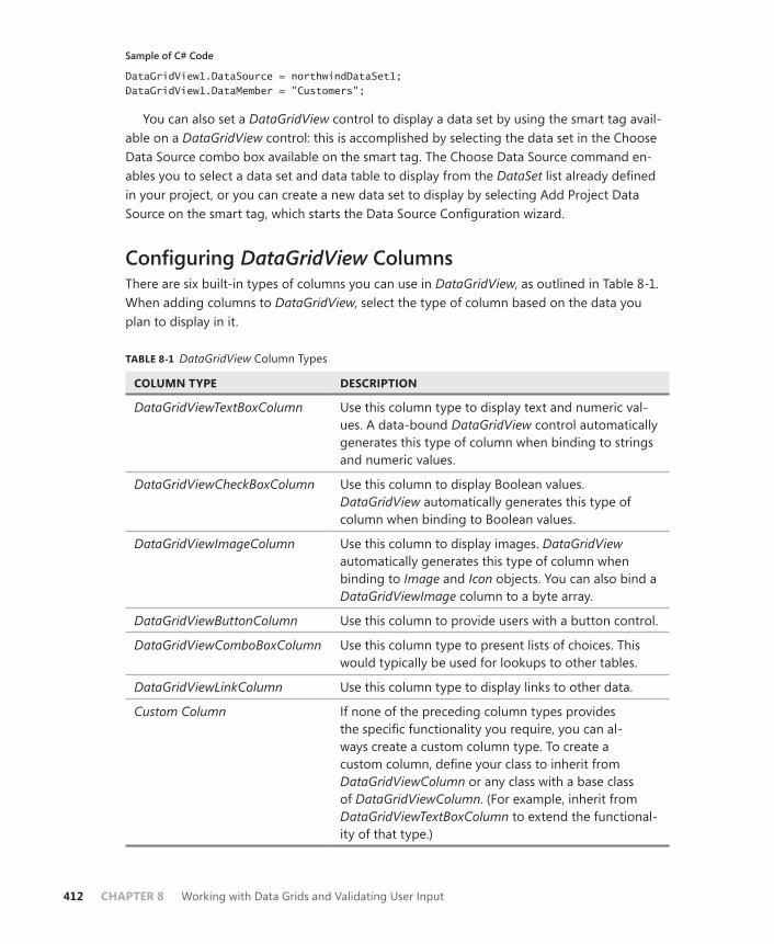
412 CHAPTER 8 Working with Data Grids and Validating User Input
Sample of C# Code
DataGridView1.DataSource = northwindDataSet1; DataGridView1.DataMember = "Customers";
You can also set a DataGridView control to display a data set by using the smart tag avail-able on a DataGridView control: this is accomplished by selecting the data set in the Choose Data Source combo box available on the smart tag. The Choose Data Source command en-ables you to select a data set and data table to display from the DataSet list already defined in your project, or you can create a new data set to display by selecting Add Project Data Source on the smart tag, which starts the Data Source Configuration wizard.
Configuring DataGridView ColumnsThere are six built-in types of columns you can use in DataGridView, as outlined in Table 8-1. When adding columns to DataGridView, select the type of column based on the data you plan to display in it.
TABLE 8-1 DataGridView Column Types
COLUMN TYPE DESCRIPTION
DataGridViewTextBoxColumn Use this column type to display text and numeric val-ues. A data-bound DataGridView control automatically generates this type of column when binding to strings and numeric values.
DataGridViewCheckBoxColumn Use this column to display Boolean values. DataGridView automatically generates this type of column when binding to Boolean values.
DataGridViewImageColumn Use this column to display images. DataGridView automatically generates this type of column when binding to Image and Icon objects. You can also bind a DataGridViewImage column to a byte array.
DataGridViewButtonColumn Use this column to provide users with a button control.
DataGridViewComboBoxColumn Use this column type to present lists of choices. This would typically be used for lookups to other tables.
DataGridViewLinkColumn Use this column type to display links to other data.
Custom Column If none of the preceding column types provides the specific functionality you require, you can al-ways create a custom column type. To create a custom column, define your class to inherit from DataGridViewColumn or any class with a base class of DataGridViewColumn. (For example, inherit from DataGridViewTextBoxColumn to extend the functional-ity of that type.)

Lesson 1: Implementing Data-bound Controls in Windows Forms CHAPTER 8 413
Adding Tables and Columns to DataGridViewTo display a table in DataGridView, define the columns that make up the schema of the table and add them to DataGridView. You can add columns to DataGridView with designers using the Add Column dialog box or programmatically in code.
First, decide which type of column to use (refer to Table 8-1) and then use one of the fol-lowing procedures to add the column to your DataGridView control.
Adding Columns to DataGridView Using the DesignerTo add columns to DataGridView in the designer, follow these steps:
1. Select DataGridView on your form.
2. Open the smart tag of DataGridView.
3. Select Add Column.
4. In the Add Column dialog box, define the column by setting the appropriate values in the dialog box.
Adding Columns to DataGridView ProgrammaticallyTo add columns to DataGridView in code, create an instance of the appropriate type of col-umn, define the column by setting the appropriate properties, and then add the column to the DataGridView.Columns collection.
For example, the following code sample creates a new text box column named ProductName:
Sample of Visual Basic Code
Dim ProductNameColumn As New DataGridViewTextBoxColumn ProductNameColumn.Name = "ProductName" ProductNameColumn.HeaderText = "Product Name" ProductNameColumn.ValueType = System.Type.GetType("System.String") DataGridView1.Columns.Add(ProductNameColumn)
Sample of C# Code
DataGridViewTextBoxColumn ProductNameColumn = new DataGridViewTextBoxColumn(); ProductNameColumn.Name = "ProductName"; ProductNameColumn.HeaderText = "Product Name"; ProductNameColumn.ValueType = System.Type.GetType("System.String"); DataGridView1.Columns.Add(ProductNameColumn); .
Deleting Columns in DataGridViewYou can delete columns in DataGridView by using the designer in Visual Studio or program-matically in code.
414 CHAPTER 8 Working with Data Grids and Validating User Input
Deleting Columns in DataGridView Using the DesignerTo delete columns in a DataGridView using the designer, complete the following steps:
1. Select the DataGridView on your form.
2. Open the smart tag for the DataGridView.
3. Select Edit Columns.
4. In the Edit Columns dialog box, select the column you want to remove from the DataGridView.
5. Click the Remove button.
Deleting Columns in a DataGridView ProgrammaticallyTo delete columns in DataGridView in code, call the Remove method and provide the name of the column you want to delete. For example, the following code example deletes a column named ProductName from DataGridView1:
Sample of Visual Basic Code
DataGridView1.Columns.Remove("ProductName")
Sample of C# Code
DataGridView1.Columns.Remove["ProductName"];
Determining the Clicked Cell in DataGridViewTo determine the clicked cell, use the DataGridView.CurrentCell property. CurrentCell pro-vides a reference to the currently selected cell and provides properties to access the value of the data in the cell, as well as the row and column index of the cell’s current location in DataGridView. For example:
Sample of Visual Basic Code
Dim CurrentCellValue As String CurrentCellValue = CustomersDataGridView.CurrentCell.Value.ToString
Sample of C# Code
String CurrentCellValue; CurrentCellValue = CustomersDataGridView.CurrentCell.Value.ToString();
Validating Input in the DataGridView ControlTo validate input in an individual cell in a DataGridView control, handle the DataGridView.CellValidating event and cancel the edit if the value fails validation. The CellValidating event is raised when a cell loses focus. Add code to the event handler for the CellValidating event to verify that the values in specific columns conform to your business rules and application logic. The event arguments contain the proposed value in the cell, as well as the row and column index of the cell being edited.

Lesson 1: Implementing Data-bound Controls in Windows Forms CHAPTER 8 415
For example, the following code validates that the ProductName column does not contain an empty string (use this sample for a DataGridView control that is not bound to data):
Sample of Visual Basic Code
If DataGridView1.Columns(e.ColumnIndex).Name = "ProductName" Then If e.FormattedValue.ToString = "" Then dataGridView1.Rows(e.RowIndex).ErrorText = "Product Name is a required field" e.Cancel = True Else dataGridView1.Rows(e.RowIndex).ErrorText = "" End If End If
Sample of C# Code
if (DataGridView1.Columns[e.ColumnIndex].Name == "ProductName") { if (e.FormattedValue.ToString() == "") { DataGridView1.Rows[e.RowIndex].ErrorText = "Product Name is a required field"; e.Cancel = true; } else { DataGridView1.Rows[e.RowIndex].ErrorText = ""; } }
The following code also validates that the ProductName column does not contain an empty string. Use this example for a DataGridView control that is bound to data. The differ-ence from the preceding example is shown in bold.
Sample of Visual Basic Code
If DataGridView1.Columns(e.ColumnIndex).DataPropertyName = "ProductName" Then If e.FormattedValue.ToString = "" Then dataGridView1.Rows(e.RowIndex).ErrorText = "Product Name is a required field" e.Cancel = True Else dataGridView1.Rows(e.RowIndex).ErrorText = "" End If End If
Sample of C# Code
if (DataGridView1.Columns[e.ColumnIndex].DataPropertyName == "ProductName") { if (e.FormattedValue.ToString() == "") { DataGridView1.Rows[e.RowIndex].ErrorText = "Product Name is a required field"; e.Cancel = true; } else { DataGridView1.Rows[e.RowIndex].ErrorText = ""; } }
416 CHAPTER 8 Working with Data Grids and Validating User Input
Format a DataGridView Control by Using Custom PaintingTo format a DataGridView control by using custom painting, you can handle the CellPainting event and insert your own custom painting code. When you handle the CellPainting event, DataGridViewCellPaintingEventArgs provides access to many properties that simplify custom painting. When you handle the CellPainting event, be sure to set e.Handled to True so the grid does not call its own cell painting routine.
To paint all cells LightSkyBlue, place the following code in the CellPainting event handler:
Sample of Visual Basic Code
' Paint the cell background color LightSkyBlue e.Graphics.FillRectangle(Brushes.LightSkyBlue, e.CellBounds) ' Draw the contents of the cell If Not (e.Value Is Nothing) Then e.Graphics.DrawString(e.Value.ToString, e.CellStyle.Font, _ Brushes.Black, e.CellBounds.X, e.CellBounds.Y) End If e.Handled = True
Sample of C# Code
// Paint the cell background color LightSkyBlue e.Graphics.FillRectangle(Brushes.LightSkyBlue, e.CellBounds); // Draw the contents of the cell if (e.Value != null) { e.Graphics.DrawString(e.Value.ToString(), e.CellStyle.Font, Brushes.Black, e.CellBounds.X, e.CellBounds.Y); } e.Handled = true;
Quick Check 1. What properties do you set on a DataGridView control to display a specific data
table?
2. How do you determine what cell is clicked in a DataGridView control?
Quick Check Answers 1. Set the DataSource property to the DataSet and the DataMember properties to
the name of the data table.
2. Inspect the DataGridView.CurrentCell property.
Lesson 1: Implementing Data-bound Controls in Windows Forms CHAPTER 8 417
Using DataGrid in WPF ApplicationsThe WPF DataGrid control is analogous to the Windows Forms DataGridView control in that it is designed to display tables of data in a cohesive format. You can add columns manually to your DataGrid control, or it will automatically create appropriate columns for your data based on the schema of the data source.
Binding Data Sources to a DataGrid ControlA DataGrid control can be bound to a data source that implements the IEnumerable interface. By default, it will automatically create columns for the properties of the bound object and will create rows that display the values of those properties for each object in the data source. You can set the data source for a DataGrid control by setting the ItemsSource property in code, as shown here:
Sample of Visual Basic Code
' Refers to a Binding already present in codeDataGrid1.ItemsSource = myCustomersBinding
Sample of C# Code
// Refers to a DataTableView already present in codedataGrid1.ItemsSource = myCustomersBinding;
Or, more commonly, you will set the data source in XAML by setting the ItemsSource prop-erty, as shown here:
<Window.Resources> <my:NwindDataSet x:Key="NwindDataSet" /> <CollectionViewSource x:Key="CustomersViewSource" Source="{Binding Path=Customers, Source={StaticResource NwindDataSet}}" /> </Window.Resources> <Grid DataContext="{StaticResource CustomersViewSource}"> <DataGrid ItemsSource="{Binding}" <!-- Additional implementation omitted --> </DataGrid> </Grid>
For changes in the collection to be updated automatically in the DataGrid control, the collection to which the DataGrid control is bound must implement INotifyCollectionChanged, such as ObservableCollection. For changes to property values to be reflected in real time, the bound properties must implement INotifyPropertyChanged.
Binding a DataGrid Control to a Data Source in Your ProjectIf you have already added a data source, such as an ADO.NET database, to your project, you can easily create a bound DataGrid control in your application through the Data Sources window.

418 CHAPTER 8 Working with Data Grids and Validating User Input
To create a bound data grid through the Data Sources window:
1. If the Data Sources window is not already visible, choose Show Data Sources from the Data menu. The Data Sources window opens.
2. In the Data Sources window, each available data table should have a grid symbol next to it. If a grid symbol is not shown, highlight the data table, click the drop-down menu, and choose DataGrid.
3. With the grid symbol showing next to the data table, drag the data table from the Data Sources window to the design surface of the form. A DataGrid control represent-ing the data table is added to your project.
Using DataGrid ColumnsThe columns displayed in the DataGrid control are very configurable and can be manipulated at design time through the Columns Collection editor in Visual Studio, shown in Figure 8-1. To make the Columns Collection editor appear, click the ellipses (…) to the right of the Columns property in the Property grid.
FIGURE 8-1 The Collection Editor.
Using the Collection editor, you can add and remove DataGrid columns, as well as change the properties of individual columns.
When a DataGrid control is bound to a data source, appropriate columns are automati-cally generated for the data set. Depending on the data type of the bound property, types of columns are generated as shown in Table 8-2.
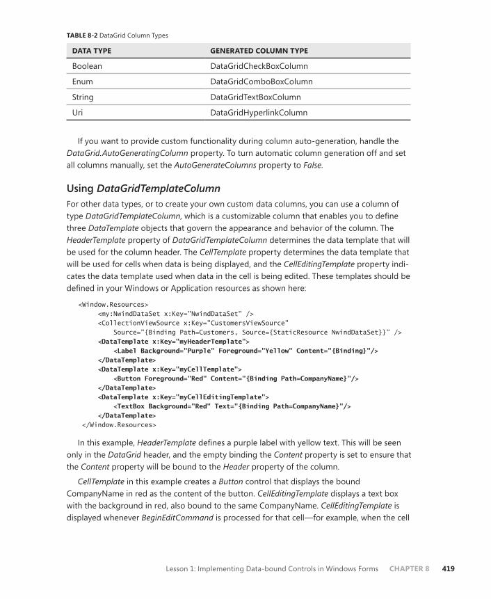
Lesson 1: Implementing Data-bound Controls in Windows Forms CHAPTER 8 419
TABLE 8-2 DataGrid Column Types
DATA TYPE GENERATED COLUMN TYPE
Boolean DataGridCheckBoxColumn
Enum DataGridComboBoxColumn
String DataGridTextBoxColumn
Uri DataGridHyperlinkColumn
If you want to provide custom functionality during column auto-generation, handle the DataGrid.AutoGeneratingColumn property. To turn automatic column generation off and set all columns manually, set the AutoGenerateColumns property to False.
Using DataGridTemplateColumnFor other data types, or to create your own custom data columns, you can use a column of type DataGridTemplateColumn, which is a customizable column that enables you to define three DataTemplate objects that govern the appearance and behavior of the column. The HeaderTemplate property of DataGridTemplateColumn determines the data template that will be used for the column header. The CellTemplate property determines the data template that will be used for cells when data is being displayed, and the CellEditingTemplate property indi-cates the data template used when data in the cell is being edited. These templates should be defined in your Windows or Application resources as shown here:
<Window.Resources> <my:NwindDataSet x:Key="NwindDataSet" /> <CollectionViewSource x:Key="CustomersViewSource" Source="{Binding Path=Customers, Source={StaticResource NwindDataSet}}" /> <DataTemplate x:Key="myHeaderTemplate"> <Label Background="Purple" Foreground="Yellow" Content="{Binding}"/> </DataTemplate> <DataTemplate x:Key="myCellTemplate"> <Button Foreground="Red" Content="{Binding Path=CompanyName}"/> </DataTemplate> <DataTemplate x:Key="myCellEditingTemplate"> <TextBox Background="Red" Text="{Binding Path=CompanyName}"/> </DataTemplate> </Window.Resources>
In this example, HeaderTemplate defines a purple label with yellow text. This will be seen only in the DataGrid header, and the empty binding the Content property is set to ensure that the Content property will be bound to the Header property of the column.
CellTemplate in this example creates a Button control that displays the bound CompanyName in red as the content of the button. CellEditingTemplate displays a text box with the background in red, also bound to the same CompanyName. CellEditingTemplate is displayed whenever BeginEditCommand is processed for that cell—for example, when the cell

420 CHAPTER 8 Working with Data Grids and Validating User Input
is selected and the F2 button is pressed, and CellTemplate will be displayed when editing is committed or cancelled.
In addition to providing templates, you can instead set TemplateSelector controls to provide dynamic selection of the template to use for the header, cell, and cell editing. You can provide these through the HeaderTemplateSelector, CellTemplateSelector, and CellEditingTemplateSelector properties, respectively. See Chapter 7, “Configuring Data Binding,” for further information about using TemplateSelector controls.
Using Row DetailsIn some cases, you might want to display some data about a row only when that row is se-lected. For example, if a data table has several columns, you might want to display only a sub-set in the grid itself, and then display other columns in a specialized format only when a row of data is being inspected. You can access this functionality through the RowDetailsTemplate property, which enables you to create a data template that will display additional data be-neath a row in the data grid when that row is selected. Consider the following example:
<DataTemplate x:Key="myRowDetailsTemplate"> <StackPanel DataContext="{StaticResource OrdersViewSource}" Orientation="Horizontal"> <Label Content="Order Date" Background="Red" /> <DatePicker Text="{Binding Path=OrderDate}" /> <Label Content="Required Date" Background="Red" /> <DatePicker Text="{Binding Path=RequiredDate}" /> </StackPanel> </DataTemplate>
This example demonstrates a data template to be used for a RowDetailsTemplate control. It defines a StackPanel control that contains four other controls: two labels and two DatePicker controls that are bound to the OrderDate and RequiredDate fields. At run time, the values of these bound fields will be displayed next to the labels underneath the selected row. By de-fault, row details are visible only for the selected row. You can make them visible for all rows by setting the RowDetailsVisibilityMode property to Visible, or you can always hide them by setting the RowDetailsVisibilityMode to Collapsed.
You can also define a template selector to use for row details by setting the RowDetailsTemplateSelector property.
PRACTICE Working with DataGridView
In this practice, you work with data in a DataGridView control.
EXERCISE Working with DataGridView
First, you create a Windows Forms application and see how to manipulate the definition as well as the columns and data in a DataGridView control.
1. Create a Windows Forms application and name it DataGridViewExample.

Lesson 1: Implementing Data-bound Controls in Windows Forms CHAPTER 8 421
2. Open the Data Sources window (on the Data menu, select Show Data Sources).
3. Click Add New Data Source to start the Data Source Configuration Wizard.
4. Leave the default of Database and click Next twice.
5. Select (or create) a connection to the Northwind sample database by browsing to the database file and selecting it; click Next. When prompted, click Yes and then Next again.
6. Expand the Tables node. Select the Customers table and then click Finish.
7. Drag the Customers node from the Data Sources window onto the form.
At this point, you can actually run the application, and the form appears with the Customers table loaded into a DataGridView control.
8. Drag two Button controls onto the form below DataGridView and set the following properties:
■ Button1:
• Name = AddColumnButton
• Text = Add Column
■ Button2:
• Name = DeleteColumnButton
• Text = Delete Column
9. Double-click the Add Column button to create the button-click event handler and to open the form in code view.
10. Add the following code to Form1. The additional code in the Form1_Load event creates a new column on the data table, and the code in the AddColumnButton_Click event handler adds a new column to DataGridView:
Sample of Visual Basic Code
Private Sub Form1_Load(ByVal sender As System.Object, _ ByVal e As System.EventArgs) _ Handles MyBase.Load 'TODO: This line of code loads data into the 'NwindDataSet.Customers table. You can move, or remove 'it, As needed. Me.CustomersTableAdapter.Fill(Me.NwindDataSet.Customers) ' Add a new column to the Customers DataTable ' to be used to demonstrate adding and removing ' columns in a DataGridView in the methods below Dim Location As New DataColumn("Location") Location.Expression = "City + ', ' + Country" NwindDataSet.Customers.Columns.Add(Location) End Sub Private Sub AddColumnButton_Click(ByVal sender As System.Object, _ ByVal e As System.EventArgs) _ Handles AddColumnButton.Click

422 CHAPTER 8 Working with Data Grids and Validating User Input
Dim LocationColumn As New DataGridViewTextBoxColumn LocationColumn.Name = "LocationColumn" LocationColumn.HeaderText = "Location" LocationColumn.DataPropertyName = "Location" CustomersDataGridView.Columns.Add(LocationColumn) End Sub
Sample of C# Code
private void Form1_Load(object sender, EventArgs e) { // TODO: This line of code loads data into the // nwindDataSet.Customers table. You can move, or // remove it, as needed. this.customersTableAdapter.Fill(this.nwindDataSet.Customers); // Add a new column to the Customers DataTable // to be used to demonstrate adding and removing // columns in a DataGridView in the methods below DataColumn Location = new DataColumn("Location"); Location.Expression = "City + ', ' + Country"; nwindDataSet.Customers.Columns.Add(Location); } private void AddColumnButton_Click(object sender, EventArgs e) { DataGridViewTextBoxColumn LocationColumn = new DataGridViewTextBoxColumn(); LocationColumn.Name = "LocationColumn"; LocationColumn.HeaderText = "Location"; LocationColumn.DataPropertyName = "Location"; customersDataGridView.Columns.Add(LocationColumn); }
11. In the designer, double-click the Delete Column button to create the DeleteColumnButton_Click event handler. Add the following code to the DeleteColumnButton_Click event handler:
Sample of Visual Basic Code
Try CustomersDataGridView.Columns.Remove("LocationColumn") Catch ex As Exception MessageBox.Show(ex.Message) End Try
Sample of C# Code
try { customersDataGridView.Columns.Remove("LocationColumn"); } catch (Exception ex) { MessageBox.Show(ex.Message); }

Lesson 1: Implementing Data-bound Controls in Windows Forms CHAPTER 8 423
12. Drag another Button control onto the form and set the following properties:
■ Name = GetClickedCellButton
■ Text = Get Clicked Cell
13. Drag a Label control onto the form and place it next to the Get Clicked Cell button.
14. Double-click the Get Clicked Cell button and add the following code to the GetClickedCellButton_Click event handler:
Sample of Visual Basic Code
Dim CurrentCellInfo As String CurrentCellInfo = _ CustomersDataGridView.CurrentCell.Value.ToString & _ Environment.NewLine CurrentCellInfo += "Column: " & _ CustomersDataGridView.CurrentCell.OwningColumn.DataPropertyName & _ Environment.NewLine CurrentCellInfo += "Column Index: " & CustomersDataGridView.CurrentCell.ColumnIndex.ToString & _ Environment.NewLine CurrentCellInfo += "Row Index: " & _ CustomersDataGridView.CurrentCell.RowIndex.ToString Label1.Text = CurrentCellInfo
Sample of C# Code
string CurrentCellInfo; CurrentCellInfo = customersDataGridView.CurrentCell.Value.ToString() + Environment.NewLine; CurrentCellInfo += "Column: " + customersDataGridView.CurrentCell.OwningColumn.DataPropertyName + Environment.NewLine; CurrentCellInfo += "Column Index: " + customersDataGridView.CurrentCell.ColumnIndex.ToString() + Environment.NewLine; CurrentCellInfo += "Row Index: " + customersDataGridView.CurrentCell.RowIndex.ToString(); label1.Text = CurrentCellInfo;
15. Create an event handler for the CustomersDataGridView.CellValidating event. (Select the CustomersDataGridView control on the form, click the Events icon in the Properties window, and double-click the CellValidating event.)
16. Add the following code to the CellValidating event handler:
Sample of Visual Basic Code
If CustomersDataGridView.Columns(e.ColumnIndex).DataPropertyName = _ "ContactName" Then If e.FormattedValue.ToString = "" Then CustomersDataGridView.Rows(e.RowIndex).ErrorText = _ "ContactName is a required field" e.Cancel = True Else

424 CHAPTER 8 Working with Data Grids and Validating User Input
CustomersDataGridView.Rows(e.RowIndex).ErrorText = "" End If End If
Sample of C# Code
if (customersDataGridView.Columns[e.ColumnIndex].DataPropertyName == "ContactName") { if (e.FormattedValue.ToString() == "") { customersDataGridView.Rows[e.RowIndex].ErrorText = "ContactName is a required field"; e.Cancel = true; } else { customersDataGridView.Rows[e.RowIndex].ErrorText = ""; } }
17. Drag another Button control onto the form and set the following properties:
■ Name = ApplyStyleButton
■ Text = Apply Style
18. Double-click the Apply Style button and add the following code to the ApplyStyleButton_Click event handler:
Sample of Visual Basic Code
CustomersDataGridView.AlternatingRowsDefaultCellStyle.BackColor = _ Color.LightGray
Sample of C# Code
customersDataGridView.AlternatingRowsDefaultCellStyle.BackColor = Color.LightGray;
19. Run the application.
20. Click the Add Column button and then scroll to the end of the columns to verify that the new Location column is there.
21. Click the Delete Column button and verify that the Location column is deleted from DataGridView.
22. Select any cell in the grid and then click the Get Clicked Cell button. The Label control displays the contents of the cell, the name of the column the cell is in, and the column and row index of the cell.
23. Finally, click the Apply Style button. The AlternatingRowsDefaultCellStyle style is set up to display alternating rows with a light gray background.
Lesson 1: Implementing Data-bound Controls in Windows Forms CHAPTER 8 425
Lesson Summary■ DataGridView is the preferred control for displaying tabular data such as a data table
in a Windows Forms application. In a WPF application, the DataGrid control is used.
■ You can add columns to and remove columns from a DataGridView control in the designer by using the Add Column and Edit Column dialog boxes available from the smart tag of DataGridView.
■ The DataGridView.CurrentCell property provides access to the currently selected cell in a DataGridView control.
■ DataGridView raises a CellValidating event through which you can add code that veri-fies that the value in a column conforms to your business rules and application logic.
■ You can format the look of DataGridView by using styles and custom painting.
■ You can create custom columns in a data grid by setting the HeaderTemplate, CellTemplate, and CellEditingTemplate properties of DataGridTemplateColumn.
■ You can provide customized row details by setting the RowDetailsTemplate property of DataGrid.
Lesson ReviewYou can use the following questions to test your knowledge of the information in Lesson 1, “Implementing Data-bound Controls in Windows Forms.” The questions are also available on the companion CD if you prefer to review them in electronic form.
NOTE ANSWERS
Answers to these questions and explanations of why each answer choice is correct or incor-rect are located in the “Answers” section at the end of the book.
1. What is the best way to determine which cell a user clicks in DataGridView?
A. Use the column and row index of the selected cell.
B. Use the DataGridView.CurrentCell property.
C. Use the cursor position’s x and y coordinates.
D. Use the currently selected column and row in the bound DataTable control to determine the clicked cell.
2. What is the preferred method of validating input in DataGridView?
A. By adding validation code to the CellPainting event handler
B By adding validation code to the DataGridView.CellClick event handler
C. By adding validation code to the DataGridView.CellValidating event handler
D. By adding code to the DataGridView partial class file
426 CHAPTER 8 Working with Data Grids and Validating User Input
3. What is the best way to display a Boolean value in DataGridView?
A. Configure DataGridViewTextBoxColumn and display True or False.
B. Configure DataGridViewCheckBoxColumn to display a check box that is selected or cleared.
C. Configure DataGridViewButtonColumn to display a button that indicates pressed or not pressed.
D. Configure a custom column to display Yes or No.

Lesson 2: Validating User Input CHAPTER 8 427
Lesson 2: Validating User Input
In most applications, the user enters information for the application through the user inter-face. Data validation ensures that all data entered by a user falls within acceptable parameters before proceeding with program execution. For example, you might have a field in which a user enters a ZIP code as part of an address. Using validation, you could verify that the field contained five and only five characters, all of which were numeric, before proceeding. Validat-ing user input reduces the chance of an input error and makes your application more robust.
In this lesson, you learn how to use events to validate user input and direct the focus on your forms. You learn how to use field-level validation, which validates entries as they are made, and form-level validation, which validates all the entries on a form at once. You learn how to use control properties to help restrict input and use the ErrorProvider component to provide informative error messages to your users.
After this lesson, you will be able to:■ Explain the difference between form-level and field-level validation.■ Direct the focus using control methods and events.■ Implement form-level validation for your form.■ Implement field-level validation for your form.
Estimated lesson time: 30 minutes
You can choose between two types of validation for user input: form-level validation and field-level validation. Form-level validation verifies data after the user has filled all the fields. For example, a user might be directed to fill in a name, address, and phone number on a form and then click OK. With form-level validation, all the fields on the form would be validated when the user clicked OK.
Field-level validation, alternatively, verifies the data in each field as the field is filled in. For example, if a user fills in a field that holds a phone number, field-level validation could verify that the number contains a valid area code before moving to the next field. As each digit is entered, you could also use control events to verify that only numbers are entered.
Field-Level ValidationYou might want to validate data as it is entered into each field. Field-level validation gives the developer control over user input as it occurs. In this section, you learn how to use control events to validate user input and how to use some properties of the TextBox control to help restrict input to appropriate parameters.
428 CHAPTER 8 Working with Data Grids and Validating User Input
Using TextBox Properties The most commonly used control for user input is TextBox. Several properties of the TextBox control enable you to restrict the values of user input that those properties will accept. Some of these properties include:
■ MaxLength
■ PasswordChar
■ ReadOnly
■ MultiLine
Setting the MaxLength Property The MaxLength property limits the number of characters that can be entered into a text box. If the user attempts to exceed the number returned by MaxLength, the text box will accept no further input, and the system beeps to alert the user. This property is useful for text boxes that always contain data of the same length, such as a ZIP code field.
Using the PasswordChar Property The PasswordChar property enables you to hide user input at run time. For example, if you set the PasswordChar property to an asterisk (*), the text box will display an asterisk for each character, regardless of user input. This type of behavior is commonly seen in password logon boxes.
Although the password character is most commonly an asterisk, you can set it to any valid character. Thus, you could display all semicolons or ampersands, for example. The value of the Text property will always be set to the value the user enters, regardless of the password character.
Setting the ReadOnly Property The ReadOnly property determines whether a user can edit the value displayed in a text box. If ReadOnly is set to True, the text cannot be changed by user input. If ReadOnly is set to False, the user can edit the value normally.
Using the MultiLine Property The MultiLine property determines whether a text box can accept multiple lines. When set to True, the user can enter multiple lines in the text box, each separated by a carriage return. The individual lines are stored as an array of strings in the TextBox.Lines collection and can be accessed by their index.

Lesson 2: Validating User Input CHAPTER 8 429
Using Events in Field-Level Validation Field-level keyboard events enable you to validate user input immediately. Controls that can receive keyboard input raise three keyboard events. They are:
■ KeyDown
■ KeyPress
■ KeyUp
KeyDown and KeyUp The KeyDown and KeyUp events are raised when a key is pressed and when a key is released, respectively. The control that has the focus raises the event. When these events are raised, they package information about which key or combination of keys has been pressed or released in an instance of KeyEventArgs, a class that describes the key combination pressed. A method that handles the KeyDown or KeyUp event must include a KeyEventArgs parameter in its signature.
The KeyUp and KeyDown events are most commonly used for determining whether the Alt, Ctrl, or Shift key has been pressed. This information is exposed through properties in the KeyEventArgs reference that is passed to the handler. The KeyEventArgs properties—Alt, Control, and Shift—are properties that return a Boolean value, which indicates whether those keys are down. A value of True is returned if the corresponding key is down, and False is returned if the key is up. The following example demonstrates a KeyUp event handler that checks whether the Alt key is pressed.
Sample of Visual Basic Code
Private Sub TextBox1_KeyUp(ByVal sender As Object, ByVal e As _ System.Windows.Forms.KeyEventArgs) Handles TextBox1.KeyUp If e.Alt = True Then MessageBox.Show("The ALT key still is down") End If End Sub
Sample of Visual C# Code
private void textBox1_KeyUp(object sender, System.Windows.Forms.KeyEventArgs e) { if (e.Alt == true) MessageBox.Show("The ALT key is still down"); }
You can also use the KeyEventArgs.KeyCode property to examine the actual key that trig-gered the event. This property returns a Key value that represents the key that was pressed (in the case of a KeyDown event) or released (in the case of a KeyUp event). The following example shows a simple event handler that displays a message box containing a string repre-sentation of the key that was pressed.

430 CHAPTER 8 Working with Data Grids and Validating User Input
Sample of Visual Basic Code
Private Sub TextBox1_KeyDown(ByVal sender As Object, ByVal e As _ System.Windows.Forms.KeyEventArgs) Handles TextBox1.KeyDown MessageBox.Show(e.KeyCode.ToString()) End Sub
Sample of Visual C# Code
private void textBox1_KeyDown(object sender, System.Windows.Forms.KeyEventArgs e) { MessageBox.Show(e.KeyCode.ToString()); }
KeyPress When a user presses a key that has a corresponding ASCII value, the KeyPress event is raised. These keys include any alphabetic and numeric characters (alphanumeric a–z, A–Z, and 0–9), as well as some special keyboard characters such as the Enter and Backspace keys. If a key or key combination does not produce an ASCII value, it will not raise the KeyPress event. Ex-amples of keys that do not raise this event include Ctrl, Alt, and the function keys.
This event is most useful for intercepting keystrokes and evaluating them. When this event is raised, an instance of KeyPressEventArgs is passed as a parameter to the event handler. The KeyPressEventArgs.KeyChar property contains the ASCII character represented by the keystroke that raised the event. If you want to make sure the key pressed is a numeric key, for example, you can evaluate the KeyChar property in your KeyPress event handler.
Validating Characters The Char data type contains several Shared (static) methods that are useful for validating characters trapped by the KeyPress event. These methods include:
■ Char.IsDigit
■ Char.IsLetter
■ Char.IsLetterOrDigit
■ Char.IsPunctuation
■ Char.IsLower
■ Char.IsUpper
Each of these methods evaluates a character and returns a Boolean value; they are fairly self-explanatory. The Char.IsDigit function returns True if a character is a numeric digit, False if it is not. The Char.IsLower function returns True if a character is a lowercase letter, other-wise it returns False. The other methods behave similarly. The following example uses the Char. IsNumber method to test whether the key pressed is a numeric key:
Sample of Visual Basic Code
Private Sub TextBox1_KeyPress (ByVal sender as Object, ByVal e As _ System.Windows.Forms.KeyPressEventArgs) Handles TextBox1.KeyPress
Lesson 2: Validating User Input CHAPTER 8 431
If Char.IsDigit(e.KeyChar) = True Then MessageBox.Show("You pressed a number key") End If End Sub
Sample of Visual C# Code
private void textBox1_KeyPress (object sender, System.Windows.Forms.KeyPressEventArgs e) { if (Char.IsDigit(e.KeyChar) == true) MessageBox.Show("You pressed a number key"); }
Handling the Focus Focus is the ability of an object to receive user input through the mouse or keyboard. Al-though you can have several controls on your form, only one can have the focus at any given time. The control that has the focus is always on the active form of the application.
Every control implements the Focus method. This method sets the focus to the control that called it. The Focus method returns a Boolean value that indicates whether the control was successful in setting the focus. Controls that are disabled or invisible cannot receive the focus. You can determine whether a control can receive the focus by checking the CanFocus prop-erty, which returns True if the control can receive the focus and False if the control cannot.
Sample of Visual Basic Code
' This example checks to see if TextBox1 can receive the focus and' sets the focus to it if it can. If TextBox1.CanFocus = True Then TextBox1.Focus() End If
Sample of Visual C# Code
// This example checks to see if textBox1 can receive the focus and// sets the focus to it if it can. if (textBox1.CanFocus == true) textBox1.Focus();
Focus events occur in the following order:
1. Enter
2. GotFocus
3. Leave
4. Validating
5. Validated
6. LostFocus
The Enter and Leave events are raised when the focus arrives at a control and when the focus leaves a control, respectively. GotFocus and LostFocus are raised when a control first
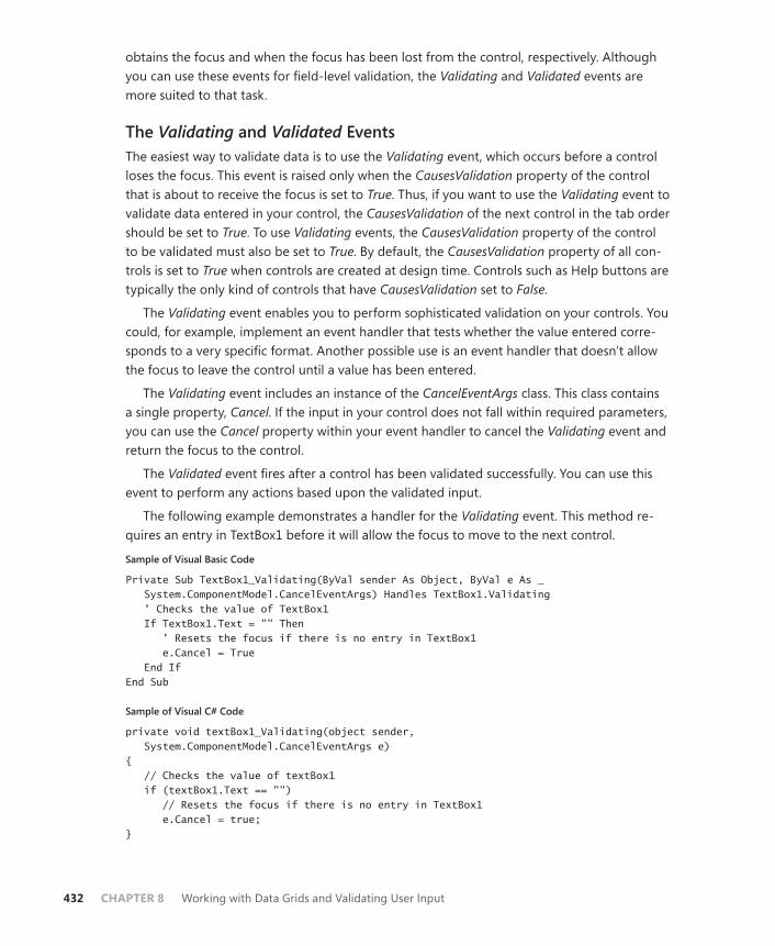
432 CHAPTER 8 Working with Data Grids and Validating User Input
obtains the focus and when the focus has been lost from the control, respectively. Although you can use these events for field-level validation, the Validating and Validated events are more suited to that task.
The Validating and Validated Events The easiest way to validate data is to use the Validating event, which occurs before a control loses the focus. This event is raised only when the CausesValidation property of the control that is about to receive the focus is set to True. Thus, if you want to use the Validating event to validate data entered in your control, the CausesValidation of the next control in the tab order should be set to True. To use Validating events, the CausesValidation property of the control to be validated must also be set to True. By default, the CausesValidation property of all con-trols is set to True when controls are created at design time. Controls such as Help buttons are typically the only kind of controls that have CausesValidation set to False.
The Validating event enables you to perform sophisticated validation on your controls. You could, for example, implement an event handler that tests whether the value entered corre-sponds to a very specific format. Another possible use is an event handler that doesn’t allow the focus to leave the control until a value has been entered.
The Validating event includes an instance of the CancelEventArgs class. This class contains a single property, Cancel. If the input in your control does not fall within required parameters, you can use the Cancel property within your event handler to cancel the Validating event and return the focus to the control.
The Validated event fires after a control has been validated successfully. You can use this event to perform any actions based upon the validated input.
The following example demonstrates a handler for the Validating event. This method re-quires an entry in TextBox1 before it will allow the focus to move to the next control.
Sample of Visual Basic Code
Private Sub TextBox1_Validating(ByVal sender As Object, ByVal e As _ System.ComponentModel.CancelEventArgs) Handles TextBox1.Validating ' Checks the value of TextBox1 If TextBox1.Text = "" Then ' Resets the focus if there is no entry in TextBox1 e.Cancel = True End If End Sub
Sample of Visual C# Code
private void textBox1_Validating(object sender, System.ComponentModel.CancelEventArgs e) { // Checks the value of textBox1 if (textBox1.Text == "") // Resets the focus if there is no entry in TextBox1 e.Cancel = true; }
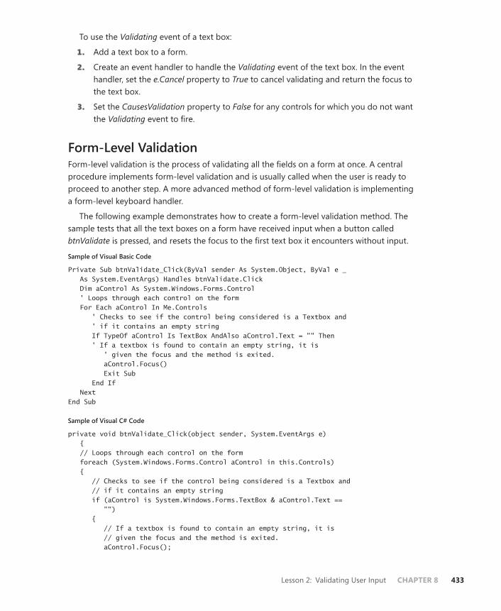
Lesson 2: Validating User Input CHAPTER 8 433
To use the Validating event of a text box:
1. Add a text box to a form.
2. Create an event handler to handle the Validating event of the text box. In the event handler, set the e.Cancel property to True to cancel validating and return the focus to the text box.
3. Set the CausesValidation property to False for any controls for which you do not want the Validating event to fire.
Form-Level Validation Form-level validation is the process of validating all the fields on a form at once. A central procedure implements form-level validation and is usually called when the user is ready to proceed to another step. A more advanced method of form-level validation is implementing a form-level keyboard handler.
The following example demonstrates how to create a form-level validation method. The sample tests that all the text boxes on a form have received input when a button called btnValidate is pressed, and resets the focus to the first text box it encounters without input.
Sample of Visual Basic Code
Private Sub btnValidate_Click(ByVal sender As System.Object, ByVal e _ As System.EventArgs) Handles btnValidate.Click Dim aControl As System.Windows.Forms.Control ' Loops through each control on the form For Each aControl In Me.Controls ' Checks to see if the control being considered is a Textbox and ' if it contains an empty string If TypeOf aControl Is TextBox AndAlso aControl.Text = "" Then ' If a textbox is found to contain an empty string, it is ' given the focus and the method is exited. aControl.Focus() Exit Sub End If Next End Sub
Sample of Visual C# Code
private void btnValidate_Click(object sender, System.EventArgs e) { // Loops through each control on the form foreach (System.Windows.Forms.Control aControl in this.Controls) { // Checks to see if the control being considered is a Textbox and // if it contains an empty string if (aControl is System.Windows.Forms.TextBox & aControl.Text == "") { // If a textbox is found to contain an empty string, it is // given the focus and the method is exited. aControl.Focus();

434 CHAPTER 8 Working with Data Grids and Validating User Input
return; } } }
Form-Level Keyboard Handler A keyboard handler is a somewhat more sophisticated technique for form-level validation. A centralized keyboard handler enables you to manage data input for all fields on a form. For example, you could create a method that enables command buttons only after appropriate input has been entered into each field and that performs specific actions with each keystroke.
The KeyPress, KeyDown, and KeyUp events implement a form-level keyboard handler. If a form has no visible and enabled controls, it will automatically raise keyboard events. If there are any controls on the form, however, the form will not automatically raise these events. For the form to raise these events, the KeyPreview property of the form must be set to True. When set to True, the form will raise keystroke events before the control that has the focus. For example, assume there is a KeyPress handler for the form and a KeyPress handler for a text box on that form, and that the KeyPreview property of the form is set to True. When a key is pressed, the form will raise the KeyPress event first, and the form’s KeyPress event handler will execute first. When execution has completed, the text box’s KeyPress event handler will execute.
Providing User Feedback When invalid input is entered in a field, the user should be alerted and given an opportunity to correct the error. There are many ways to inform the user of an input error. If the error is obvious and self-explanatory, an audio cue can alert the user to the problem. You can use the Beep method to produce an attention-getting sound.
Sample of Visual Basic Code
' This line causes an audible beepBeep()
Sample of C# Code
// This line causes an audible beepSystem.Console.Beep();
Other ways to draw a user’s attention to an error include changing the BackColor or ForeColor property of a control. For example, a text box with invalid input might have its BackColor changed to red.
If more detailed messages are required, you can use the MessageBox.Show method. This method displays a small, modal dialog box that contains an informative message. Because it is displayed modally, it halts program execution and is impossible for the user to ignore. The following shows how to call the MessageBox.Show method, which includes an informative message:

Lesson 2: Validating User Input CHAPTER 8 435
Sample of Visual Basic Code
MessageBox.Show("That value is not valid for this control")
Sample of Visual C# Code
MessageBox.Show("That value is not valid for this control");
The ErrorProvider Component The ErrorProvider component provides an easy way to communicate validation errors to your users. It enables you to set an error message for each control on your form when the input is not valid. When an error message is set, an icon indicating the error will appear next to the control, and the error message text will be shown as a tool tip when the mouse hovers over the affected control. The ErrorProvider component can be found in the Windows Forms tab of the Toolbox.
Displaying an Error To cause an error condition to be displayed next to a control, use the SetError method of the ErrorProvider component. The SetError method requires the name of the control to be set and the text to be provided. It is invoked as shown here:
Sample of Visual Basic Code
' This example assumes the existence of a control named nameTextBox and' an ErrorProvider named myErrorProvider myErrorProvider.SetError(nameTextBox, "Name cannot be left blank!")
Sample of Visual C# Code
// This example assumes the existence of a control named nameTextBox and// an ErrorProvider named myErrorProvider myErrorProvider.SetError(nameTextBox, "Name cannot be left blank!");
When this line of code is executed, an icon will be displayed next to the nameTextBox control, and the specified text will appear in a tool tip box when the mouse hovers over the control.
You can also set an error at design time. In the Properties window, you will find that when you add an ErrorProvider control to your form, each control has a new property called Error on x where x is the name of the ErrorProvider component. You can set this property to a value at design time in the Properties window. If a value is set for the error, the control will immedi-ately show an error at run time.
Different properties of the ErrorProvider component affect how the information is dis-played to the user. The Icon property controls which icon is displayed next to the control. You might want to have multiple error providers on a single form: one that reports errors and one that reports warnings. You could use different icons for each to provide visual cues to the user. Another property is the BlinkStyle property. This property determines whether the error icon blinks when displayed. The BlinkRate property determines how rapidly the icon blinks.
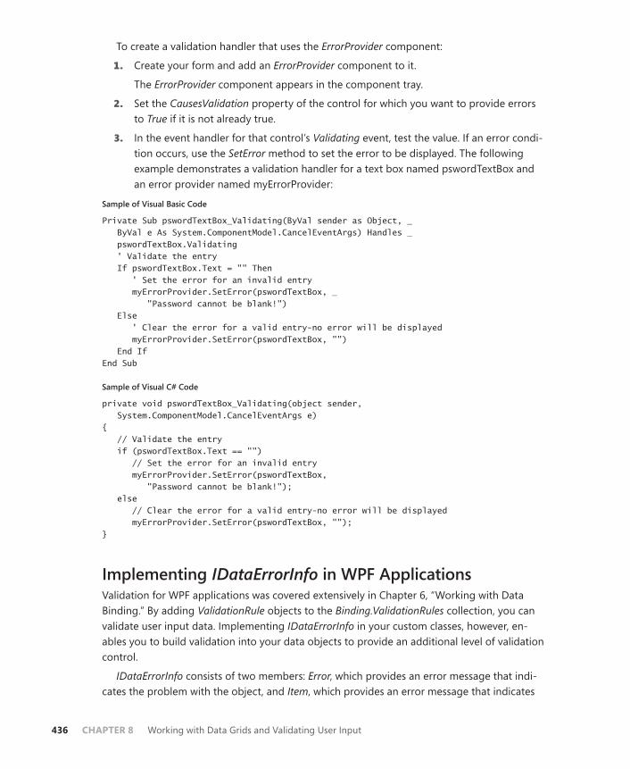
436 CHAPTER 8 Working with Data Grids and Validating User Input
To create a validation handler that uses the ErrorProvider component:
1. Create your form and add an ErrorProvider component to it.
The ErrorProvider component appears in the component tray.
2. Set the CausesValidation property of the control for which you want to provide errors to True if it is not already true.
3. In the event handler for that control’s Validating event, test the value. If an error condi-tion occurs, use the SetError method to set the error to be displayed. The following example demonstrates a validation handler for a text box named pswordTextBox and an error provider named myErrorProvider:
Sample of Visual Basic Code
Private Sub pswordTextBox_Validating(ByVal sender as Object, _ ByVal e As System.ComponentModel.CancelEventArgs) Handles _ pswordTextBox.Validating ' Validate the entry If pswordTextBox.Text = "" Then ' Set the error for an invalid entry myErrorProvider.SetError(pswordTextBox, _ "Password cannot be blank!") Else ' Clear the error for a valid entry-no error will be displayed myErrorProvider.SetError(pswordTextBox, "") End If End Sub
Sample of Visual C# Code
private void pswordTextBox_Validating(object sender, System.ComponentModel.CancelEventArgs e) { // Validate the entry if (pswordTextBox.Text == "") // Set the error for an invalid entry myErrorProvider.SetError(pswordTextBox, "Password cannot be blank!"); else // Clear the error for a valid entry-no error will be displayed myErrorProvider.SetError(pswordTextBox, ""); }
Implementing IDataErrorInfo in WPF ApplicationsValidation for WPF applications was covered extensively in Chapter 6, “Working with Data Binding.” By adding ValidationRule objects to the Binding.ValidationRules collection, you can validate user input data. Implementing IDataErrorInfo in your custom classes, however, en-ables you to build validation into your data objects to provide an additional level of validation control.
IDataErrorInfo consists of two members: Error, which provides an error message that indi-cates the problem with the object, and Item, which provides an error message that indicates

Lesson 2: Validating User Input CHAPTER 8 437
what the problem is with a property of the object. The value of the Error property can be accessed only by directly querying the property value and is frequently not implemented. However, the Item property provides information to the Validation.Errors collection in WPF and can be used by built-in validation mechanisms.
Implementing IDataErrorInfoTypically, the bulk of implementation of IDataErrorInfo is found in the Item property. Imple-mentation of the Item property requires you to provide validation for each property that requires validation. Consider the following example:
Sample of Visual Basic Code
Default Public ReadOnly Property Item(ByVal columnName As String) _ As String Implements System.ComponentModel.IDataErrorInfo.Item Get Dim result As String = Nothing If columnName = "FirstName" Then If Not FirstName = "John" Then result = "First name must equal John" End If End If If columnName = "LastName" Then If Not LastName = "Smith" Then result = "Last name must equal Smith" End If End If Return result End Get End Property
Sample of C# Code
public string this[string columnName] { get { string result = null; if (columnName == "FirstName") { if (!(FirstName == "John")) result = "First Name must be John"; } if (columnName == "LastName") { if (!(LastName == "Smith")) result = "Last Name must be Smith"; } return result; } }

438 CHAPTER 8 Working with Data Grids and Validating User Input
In this rather useless example, the Item property provides validation for two properties: FirstName and LastName, in which the FirstName property must be set to “John” and the LastName property must be set to “Smith”. The name of the column being validated by the method is passed to the method in the columnName parameter, and you can test which column is being validated. You can then validate the value of the property in question. In this example, if the property being tested is not set to an appropriate value, an error string is returned. Otherwise, a null string is returned.
After IDataErrorInfo is implemented, the WPF Validation apparatus can be used to validate values for the object’s properties. A control bound to an object implementing IDataErrorInfo should set ValidatesonDataErrors to True, as shown here:
<TextBox.Text> <Binding Source="{StaticResource TheCollection}" Path="LastName" UpdateSourceTrigger="LostFocus" ValidatesOnDataErrors="True"/></TextBox.Text>
Also note in this example that the UpdateSourceTrigger property is set to LostFocus. This also determines when the bound content in the control is validated. When the control loses focus, the Item method of IDataErrorInfo is executed. You can validate the bound content every time it changes by setting this property to PropertyChanged, but that tends to be processor-intensive.
If a validation error is found and an error string is returned by the Item method, it is added to the Validation.Errors collection and can be accessed at run time. You can use a Style ele-ment to set the tool tip on the error string at run time, as shown here:
<Style TargetType="{x:Type TextBox}"> <Style.Triggers> <Trigger Property="Validation.HasError" Value="true"> <Setter Property="ToolTip" Value="{Binding RelativeSource={RelativeSource Self}, Path=(Validation.Errors)[0].ErrorContent}"/> </Trigger> </Style.Triggers> </Style>
In this example, Style is applied to controls of type TextBox, and it invokes a trigger when the Validation.HasError property that sets the ToolTip property to the error string for this con-trol is true. That string will be visible when the mouse hovers over the control and will remain until the error is cleared.
You can set the Validation.ErrorTemplate attached property to provide a different tem-plate for the control when a validation error is present. The Validation.ErrorTemplate attached property takes a ControlTemplate value. This lesson’s practice demonstrates creating an ErrorTemplate attached property.

Lesson 2: Validating User Input CHAPTER 8 439
PRACTICE Implementing IDataErrorInfo
In this practice, you implement IDataErrorInfo in a simple class and then bind it to controls in the user interface. You create a style that automatically sets ToolTip to an error string and creates an ErrorTemplate attached property that alters the appearance of the control when an error is present.
EXERCISE Implementing IDataErrorInfo
1. In Visual Studio, create a new WPF application named Lesson 2.
2. In the Code editor for the MainWindow class, add the following class.
Note that it contains an empty implementation for IDataErrorInfo; this is the imple-mentation that is automatically generated by Visual Studio.
Sample of Visual Basic Code
Public Class Customer Implements System.ComponentModel.IDataErrorInfo Private mFirstName As String = "" Public Property FirstName As String Get Return mFirstName End Get Set(ByVal value As String) mFirstName = value End Set End Property Private mLastName As String = "" Public Property LastName As String Get Return mLastName End Get Set(ByVal value As String) mLastName = value End Set End Property Public ReadOnly Property [Error] As String _ Implements System.ComponentModel.IDataErrorInfo.Error Get End Get End Property Default Public ReadOnly Property Item(ByVal columnName As String) As String _ Implements System.ComponentModel.IDataErrorInfo.Item Get End Get End Property End Class

440 CHAPTER 8 Working with Data Grids and Validating User Input
Sample of C# Code
public class Customer : System.ComponentModel.IDataErrorInfo { string mFirstName = ""; public string FirstName { get { return mFirstName; } set { mFirstName = value; } } string mLastName = ""; public string LastName { get { return mLastName; } set { mLastName = value; } } public string Error { get { } } public string this[string columnName] { get { } } }
3. In the Error property, add the following line to the getter.
Sample of Visual Basic Code
Throw New NotImplementedException
Sample of C# Code
throw new NotImplementedException();
4. In the Item property, add the following implementation:
Get Dim Result As String = Nothing Select Case columnName Case "FirstName" If Not FirstName.Length > 1 Then Result = "First Name must be at least 2 characters long"

Lesson 2: Validating User Input CHAPTER 8 441
ElseIf FirstName.Length > 10 Then Result = "First Name cannot be longer than 10 characters" End If Case "LastName" If Not LastName.Length > 1 Then Result = "Last Name must be at least 2 characters long" End If End Select Return Result End Get
Sample of C# Code
get{ string result = null; switch (columnName) { case "FirstName": if (!(FirstName.Length > 1)) result = "First Name must be at least 2 characters long"; else if (FirstName.Length > 10) result = "First Name cannot be longer than 10 characters"; break; case "LastName": if (!(LastName.Length > 1)) result = "Last Name must be at least 2 characters long"; break; } return result; }
5. In the XAML designer, add the following line to the Window declaration to import the project namespace.
Note that if your project is named anything other than Lesson 2, you will have to modify this line accordingly.
xmlns:my="clr-namespace:Lesson_2"
6. In the XAML designer, add a Windows.Resources section as follows to create an in-stance of the Customer class as a resource for your application.
<Window.Resources> <my:Customer x:Key="myCustomer" /> </Window.Resources>
7. In the XAML designer, add the following XAML code to the Grid declaration.
Note that the Text property of each text box is bound to a property of the myCustomer resource and that the UpdateSourceTrigger and the ValidatesOnDataErrors properties of the binding are set to LostFocus and True, respectively.
<TextBox Height="23" HorizontalAlignment="Left" Margin="61,32,0,0" Name="TextBox1" VerticalAlignment="Top" Width="120"
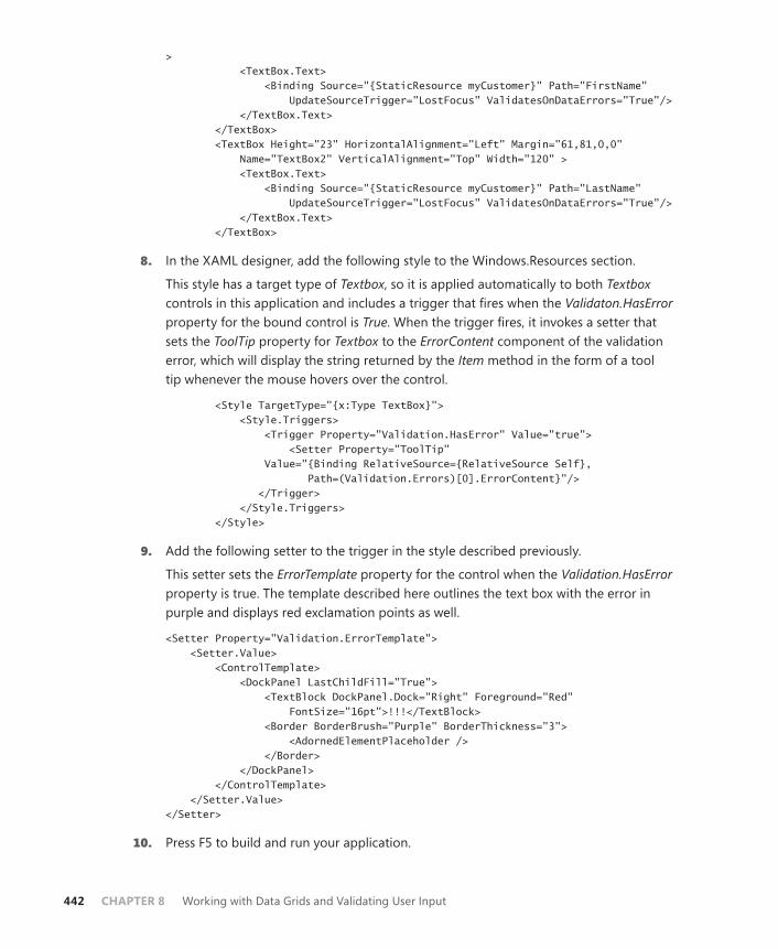
442 CHAPTER 8 Working with Data Grids and Validating User Input
> <TextBox.Text> <Binding Source="{StaticResource myCustomer}" Path="FirstName" UpdateSourceTrigger="LostFocus" ValidatesOnDataErrors="True"/> </TextBox.Text> </TextBox> <TextBox Height="23" HorizontalAlignment="Left" Margin="61,81,0,0" Name="TextBox2" VerticalAlignment="Top" Width="120" > <TextBox.Text> <Binding Source="{StaticResource myCustomer}" Path="LastName" UpdateSourceTrigger="LostFocus" ValidatesOnDataErrors="True"/> </TextBox.Text> </TextBox>
8. In the XAML designer, add the following style to the Windows.Resources section.
This style has a target type of Textbox, so it is applied automatically to both Textbox controls in this application and includes a trigger that fires when the Validaton. HasError property for the bound control is True. When the trigger fires, it invokes a setter that sets the ToolTip property for Textbox to the ErrorContent component of the validation error, which will display the string returned by the Item method in the form of a tool tip whenever the mouse hovers over the control.
<Style TargetType="{x:Type TextBox}"> <Style.Triggers> <Trigger Property="Validation.HasError" Value="true"> <Setter Property="ToolTip" Value="{Binding RelativeSource={RelativeSource Self}, Path=(Validation.Errors)[0].ErrorContent}"/> </Trigger> </Style.Triggers> </Style>
9. Add the following setter to the trigger in the style described previously.
This setter sets the ErrorTemplate property for the control when the Validation.HasError property is true. The template described here outlines the text box with the error in purple and displays red exclamation points as well.
<Setter Property="Validation.ErrorTemplate"> <Setter.Value> <ControlTemplate> <DockPanel LastChildFill="True"> <TextBlock DockPanel.Dock="Right" Foreground="Red" FontSize="16pt">!!!</TextBlock> <Border BorderBrush="Purple" BorderThickness="3"> <AdornedElementPlaceholder /> </Border> </DockPanel> </ControlTemplate> </Setter.Value> </Setter>
10. Press F5 to build and run your application.

Lesson 2: Validating User Input CHAPTER 8 443
Lesson Summary■ Form-level validation validates all fields on a form simultaneously. Field-level valida-
tion validates each field as data is entered and provides a finer level of control over validation.
■ The TextBox control contains several design-time properties that restrict the values us-ers can enter.
■ Keyboard events enable you to validate keystrokes; they are raised by the control that has the focus and is receiving input. The form will also raise these events if the KeyPreview property is set to True.
■ The Char structure contains several static methods that are useful for validating char-acter input.
■ The Validating event occurs before the control loses focus and should be used to vali-date user input. This event occurs only when the CausesValidation property of the con-trol that is about to receive the focus is true. To keep the focus from moving away from the control in the Validating event handler, set the CancelEventArgs.Cancel property to True in the event handler.
■ The ErrorProvider component enables you to set an error for a control at run time that displays a visual cue and an informative message to the user. To display an error at run time, use the ErrorProvider.SetError method.
■ IDataErrorInfo is an interface in the System.ComponentModel namespace that can be implemented in classes to provide validation in WPF applications. Error strings re-turned by the Item property are automatically set to the ErrorContent property of the first Validation.Errors item for the binding in question.
■ You can provide a different template for a control to be displayed when there is a vali-dation error by setting the ErrorTemplate attached property of that control.
Lesson ReviewYou can use the following questions to test your knowledge of the information in Lesson 2, “Validating User Input.” The questions are also available on the companion CD if you prefer to review them in electronic form.
NOTE ANSWERS
Answers to these questions and explanations of why each answer choice is correct or incor-rect are located in the “Answers” section at the end of the book.

444 CHAPTER 8 Working with Data Grids and Validating User Input
1. How can you set the ErrorContent string of a Validation.Errors object for a specific con-trol from a class that implements IDataErrorInfo?
A. Return the error string as the return value of the Error property. It will automati-cally be set to the ErrorContent string of the correct Validation.Errors object when an error occurs in a control bound to this object.
B. Return the error string as the return value of the Item property. It will automatically be set to the ErrorContent string of the correct Validation.Errors object when an error occurs in a control bound to this object.
C. Set the ErrorContent string directly in the Error property.
D. Set the ErrorContent string directly in the Item property.
2. Which of the following represents the correct order in which focus events are raised?
A. Enter, GotFocus, Validating, Validated, Leave, LostFocus
B. Enter, GotFocus, Validating, Validated, LostFocus, Leave
C. Enter, GotFocus, Leave, Validating, Validated, LostFocus
D. Enter, GotFocus, LostFocus, Leave, Validating, Validated
Suggested Practices CHAPTER 8 445
Case Scenario
In the following case scenarios, you apply what you’ve learned about how to use controls to design user interfaces. You can find answers to these questions in the “Answers” section at the end of this book.
Case Scenario: The Writer Completeness ChartYou have been contracted by a firm that manages a large group of technical writers, each one working on a different book. The firm has asked you to develop an application to help man-age the status and schedule of its writers. You are building a database and associated applica-tion for this purpose. Your task is to build the user interface for an overview screen.
The technical requirements are as follows:
■ The application should be built using WPF.
■ The database will provide a data row about each writer with the following information: Name, Project Title, Projected Number of Chapters, Completed Number of Chapters.
■ The application should display the percentage of the project done, expressed as the completed number of chapters divided by the projected number of chapters, and it should be displayed graphically as a pie chart.
■ Information for all writers should be visible at once in the application so that it can be browsed easily.
Answer the following question for your manager:
■ What is the best strategy for meeting these requirements?
Suggested Practices
To help you successfully master the exam objectives presented in this chapter, complete the following tasks.
■ Practice 1 Implement the project described in the case scenario.
■ Practice 2 Create a DataGridTemplateColumn property that accepts a date as data type and displays the date as a text box when not editing and as a date picker when editing.
■ Practice 3 Create a Windows Forms application to enter data for the Northwind Customers table with appropriate field-level validation on each control.
446 CHAPTER 8 Working with Data Grids and Validating User Input
Take a Practice Test
The practice tests on this book’s companion CD offer many options. For example, you can test yourself on just the content covered in this chapter, or you can test yourself on all the 70-511 certification exam content. You can set up the test so that it closely simulates the experience of taking a certification exam, or you can set it up in study mode so that you can look at the correct answers and explanations after you answer each question.
MORE INFO PRACTICE TESTS
For details about all the practice test options available, see the “How to Use the Practice Tests” section in this book’s Introduction.

CHAPTER 9 447
C H A P T E R 9
Enhancing Usability
Developers of both Windows Presentation Foundation (WPF) and Windows Forms ap-plications can access the built-in functionality of the Microsoft .NET Framework to
enhance the usability of the applications they develop. In this chapter, you learn to use this built-in functionality to create applications that are responsive, global, and interoperational. In Lesson 1, “Implementing Asynchronous Processing,” you learn how to implement asyn-chronous processing and programming for your applications; in Lesson 2, “Incorporating Globalization and Localization,” you learn how to globalize and localize your applications; and in Lesson 3, “Integrating Windows Forms and WPF,” you learn how to use WPF controls in Windows Forms applications, and vice versa.
Exam objectives in this chapter: ■ Implement asynchronous processes and threading.■ Incorporate globalization and localization features.■ Integrate WinForms and WPF within an application.
Lessons in this chapter:■ Lesson 1: Implementing Asynchronous Processing 449■ Lesson 2: Implementing Globalization and Localization 468■ Lesson 3: Integrating Windows Forms Controls and WPF 483

448 CHAPTER 9 Enhancing Usability
Before You Begin
To complete the lessons in this chapter, you must have:
■ A computer that meets or exceeds the minimum hardware requirements listed in the “About This Book” section at the beginning of the book.
■ Microsoft Visual Studio 2010 Professional installed on your computer.
■ An understanding of Microsoft Visual Basic or C# syntax and familiarity with .NET Framework 4.0.
■ An understanding of Extensible Application Markup Language (XAML).
REAL WORLD
Matthew Stoecker
Even with ever-increasing processor speeds, time-consuming tasks are still a cen-tral part of many of the applications I write. The BackgroundWorker component
enables the creation of simple, asynchronous operations and is easily accessible to programmers of all levels. For more advanced operations, delegates and threads provide the needed level of functionality.
Lesson 1: Implementing Asynchronous Processing CHAPTER 9 449
Lesson 1: Implementing Asynchronous Processing
You are frequently required to perform tasks that consume fairly large amounts of time, such as file downloads. The BackgroundWorker component provides an easy way to run time- consuming processes in the background, thereby leaving the user interface (UI) responsive and available for user input.
After this lesson, you will be able to:■ Run a background process by using the BackgroundWorker component.■ Announce the completion of a background process by using the
BackgroundWorker component.■ Cancel a background process by using the BackgroundWorker component.■ Report the progress of a background process by using the BackgroundWorker
component.■ Request the status of a background process by using the BackgroundWorker
component.
Estimated lesson time: 45 minutes
The BackgroundWorker component is designed to enable you to execute time-consuming operations on a separate, dedicated thread so you can run operations that take a lot of time, such as file downloads and database transactions, asynchronously while the UI remains re-sponsive.
The key method of the BackgroundWorker component is the RunWorkerAsync method. When this method is called, the BackgroundWorker component raises the DoWork event. The code in the DoWork event handler is executed on a separate, dedicated thread so that the UI remains responsive. Table 9-1 shows the important members of the BackgroundWorker component.
TABLE 9-1 Important Members of the BackgroundWorker Component
MEMBER DESCRIPTION
CancellationPending Property. Indicates whether the application has re-quested cancellation of a background operation.
IsBusy Property. Indicates whether the BackgroundWorker is currently running an asynchronous operation.
WorkerReportsProgress Property. Indicates whether the BackgroundWorker component can report progress updates.
WorkerSupportsCancellation Property. Indicates whether the BackgroundWorker component supports asynchronous cancellation.
450 CHAPTER 9 Enhancing Usability
CancelAsync Method. Requests cancellation of a pending back-ground operation.
ReportProgress Method. Raises the ProgressChanged event.
RunWorkerAsync Method. Starts the execution of a background opera-tion by raising the DoWork event.
DoWork Event. Occurs when the RunWorkerAsync method is called. Code in the DoWork event handler is run on a separate and dedicated thread.
ProgressChanged Event. Occurs when ReportProgress is called.
RunWorkerCompleted Event. Occurs when the background operation has been completed or cancelled or has raised an exception.
Running a Background ProcessThe RunWorkerAsync method of the BackgroundWorker component starts the execution of the background process by raising the DoWork event. The code in the DoWork event handler is executed on a separate thread. The following procedure explains how to create a back-ground process.
To create a background process with the BackgroundWorker component:
1. From the Toolbox, drag a BackgroundWorker component onto the form.
2. In the component tray, double-click the BackgroundWorker component to create the default event handler for the DoWork event. Add the code that you want to run on the separate thread. An example is shown here.
Sample of Visual Basic Code
Private Sub BackgroundWorker1_DoWork(ByVal sender As System.Object, _ ByVal e As System.ComponentModel.DoWorkEventArgs) _ Handles BackgroundWorker1.DoWork ' Insert time-consuming operation here End Sub
Sample of C# Code
private void backgroundWorker1_DoWork(object sender, DoWorkEventArgs e) { // Insert time-consuming operation here }
3. Elsewhere in your code, start the time-consuming operation on a separate thread by calling the RunWorkerAsync method, as shown:
Sample of Visual Basic Code
BackgroundWorker1.RunWorkerAsync()

Lesson 1: Implementing Asynchronous Processing CHAPTER 9 451
Sample of C# Code
backgroundWorker1.RunWorkerAsync();
Providing Parameters to the Background ProcessSometimes you will want to run a background process that requires a parameter. For example, you might want to provide the address of a file for download. You can provide a parameter in the RunWorkerAsync method. This parameter will be available as the Argument property of the instance of DoWorkEventArgs in the DoWork event handler.
To provide a parameter to a background process:
1. Include the parameter in the RunWorkerAsync call, as shown here:
Sample of Visual Basic Code
BackgroundWorker1.RunWorkerAsync("C:\myfile.txt")
Sample of C# Code
backgroundWorker1.RunWorkerAsync("C:\\myfile.txt");
2. Retrieve the parameter from the DoWorkEventArgs.Argument property and cast it ap-propriately to use it in the background process. An example is shown here:
Sample of Visual Basic Code
Private Sub BackgroundWorker1_DoWork(ByVal sender As System.Object, _ ByVal e As System.ComponentModel.DoWorkEventArgs) _ Handles BackgroundWorker1.DoWork Dim myPath As String myPath = CType(e.Argument, String) ' Use the argument in the process RunTimeConsumingProcess() End Sub
Sample of C# Code
private void backgroundWorker1_DoWork(object sender, DoWorkEventArgs e) { string myPath; myPath = (string)e.Argument; // Use the argument in the process RunTimeConsumingProcess(); }
Announcing the Completion of a Background ProcessWhen the background process terminates, whether because the process is completed or can-celled, the RunWorkerCompleted event is raised. You can alert the user to the completion of a background process by handling the RunWorkerCompleted event. Here is an example:
Sample of Visual Basic Code
Private Sub BackgroundWorker1_RunWorkerCompleted( _ ByVal sender As System.Object, _
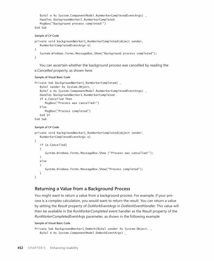
452 CHAPTER 9 Enhancing Usability
ByVal e As System.ComponentModel.RunWorkerCompletedEventArgs) _ Handles BackgroundWorker1.RunWorkerCompleted MsgBox("Background process completed!") End Sub
Sample of C# Code
private void backgroundWorker1_RunWorkerCompleted(object sender, RunWorkerCompletedEventArgs e) { System.Windows.Forms.MessageBox.Show("Background process completed"); }
You can ascertain whether the background process was cancelled by reading the e.Cancelled property, as shown here:
Sample of Visual Basic Code
Private Sub BackgroundWorker1_RunWorkerCompleted( _ ByVal sender As System.Object, _ ByVal e As System.ComponentModel.RunWorkerCompletedEventArgs) _ Handles BackgroundWorker1.RunWorkerCompleted If e.Cancelled Then MsgBox("Process was cancelled!") Else MsgBox("Process completed") End If End Sub
Sample of C# Code
private void backgroundWorker1_RunWorkerCompleted(object sender, RunWorkerCompletedEventArgs e) { if (e.Cancelled) { System.Windows.Forms.MessageBox.Show ("Process was cancelled!"); } else { System.Windows.Forms.MessageBox.Show("Process completed"); } }
Returning a Value from a Background ProcessYou might want to return a value from a background process. For example, if your pro-cess is a complex calculation, you would want to return the result. You can return a value by setting the Result property of DoWorkEventArgs in DoWorkEventHandler. This value will then be available in the RunWorkerCompleted event handler as the Result property of the RunWorkerCompletedEventArgs parameter, as shown in the following example:
Sample of Visual Basic Code
Private Sub BackgroundWorker1_DoWork(ByVal sender As System.Object, _ ByVal e As System.ComponentModel.DoWorkEventArgs) _

Lesson 1: Implementing Asynchronous Processing CHAPTER 9 453
Handles BackgroundWorker1.DoWork ' Assigns the return value of a method named ComplexCalculation to ' e.Result e.Result = ComplexCalculation() End Sub Private Sub BackgroundWorker1_RunWorkerCompleted( _ ByVal sender As System.Object, _ ByVal e As System.ComponentModel.RunWorkerCompletedEventArgs) _ Handles BackgroundWorker1.RunWorkerCompleted MsgBox("The result is " & e.Result.ToString) End Sub
Sample of C# Code
private void backgroundWorker1_DoWork(object sender, DoWorkEventArgs e) { // Assigns the return value of a method named ComplexCalculation to // e.Result e.Result = ComplexCalculation(); } private void backgroundWorker1_RunWorkerCompleted(object sender, RunWorkerCompletedEventArgs e) { System.Windows.Forms.MessageBox.Show("The result is " + e.Result.ToString()); }
Cancelling a Background ProcessYou might want to implement the ability to cancel a background process. BackgroundWorker supports this ability, but you must implement most of the cancellation code yourself. The WorkerSupportsCancellation property of the BackgroundWorker component indicates whether the component supports cancellation. You can call the CancelAsync method to attempt to cancel the operation; doing so sets the CancellationPending property of the BackgroundWorker component to True. By polling the CancellationPending property of the BackgroundWorker component, you can determine whether to cancel the operation.
To implement cancellation for a background process:
1. In the Properties window, set the WorkerSupportsCancellation property to True to en-able the BackgroundWorker component to support cancellation.
2. Create a method that is called to cancel the background operation. The following example demonstrates how to cancel a background operation in a Button.Click event handler:
Sample of Visual Basic Code
Private Sub btnCancel_Click(ByVal sender As System.Object, _ ByVal e As System.EventArgs) Handles btnCancel.Click BackgroundWorker1.CancelAsync() End Sub

454 CHAPTER 9 Enhancing Usability
Sample of C# Code
private void btnCancel_Click(object sender, EventArgs e) { backgroundWorker1.CancelAsync(); }
3. In the BackgroundWorker.DoWork event handler, poll the BackgroundWorker.CancellationPending property and implement code to cancel the operation if it is True. You should also set the e.Cancel property to True, as shown in the following example:
Sample of Visual Basic Code
Private Sub BackgroundWorker1_DoWork(ByVal sender As System.Object, _ ByVal e As System.ComponentModel.DoWorkEventArgs) _ Handles BackgroundWorker1.DoWork For i As Integer = 1 to 1000000 TimeConsumingMethod() If BackgroundWorker1.CancellationPending Then e.Cancel = True Exit Sub End If Next End Sub
Sample of C# Code
private void backgroundWorker1_DoWork(object sender, DoWorkEventArgs e) { for (int i = 0; i < 1000000; i++) { TimeConsumingMethod(); if (backgroundWorker1.CancellationPending) { e.Cancel = true; return; } } }
Reporting Progress of a Background Process with BackgroundWorkerFor particularly time-consuming operations, you might want to report progress back to the primary thread. You can report progress of the background process by calling the ReportProgress method. This method raises the BackgroundWorker.ProgressChanged event and enables you to pass a parameter that indicates the percentage of progress that has been completed to the methods that handle that event. The following example demonstrates how to call the ReportProgress method from within the BackgroundWorker.DoWork event handler and then how to update a ProgressBar control in the BackgroundWorker.ProgressChanged event handler:
Sample of Visual Basic Code
Private Sub BackgroundWorker1_DoWork(ByVal sender As System.Object, _ ByVal e As System.ComponentModel.DoWorkEventArgs) _
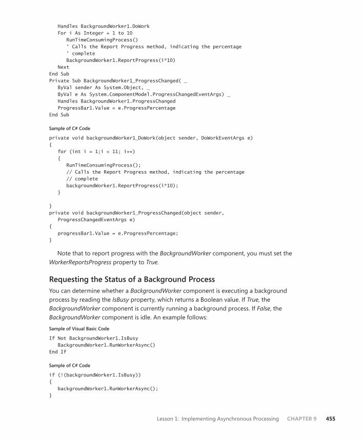
Lesson 1: Implementing Asynchronous Processing CHAPTER 9 455
Handles BackgroundWorker1.DoWork For i As Integer = 1 to 10 RunTimeConsumingProcess() ' Calls the Report Progress method, indicating the percentage ' complete BackgroundWorker1.ReportProgress(i*10) Next End Sub Private Sub BackgroundWorker1_ProgressChanged( _ ByVal sender As System.Object, _ ByVal e As System.ComponentModel.ProgressChangedEventArgs) _ Handles BackgroundWorker1.ProgressChanged ProgressBar1.Value = e.ProgressPercentage End Sub
Sample of C# Code
private void backgroundWorker1_DoWork(object sender, DoWorkEventArgs e) { for (int i = 1;i < 11; i++) { RunTimeConsumingProcess(); // Calls the Report Progress method, indicating the percentage // complete backgroundWorker1.ReportProgress(i*10); } } private void backgroundWorker1_ProgressChanged(object sender, ProgressChangedEventArgs e) { progressBar1.Value = e.ProgressPercentage; }
Note that to report progress with the BackgroundWorker component, you must set the WorkerReportsProgress property to True.
Requesting the Status of a Background ProcessYou can determine whether a BackgroundWorker component is executing a background process by reading the IsBusy property, which returns a Boolean value. If True, the BackgroundWorker component is currently running a background process. If False, the BackgroundWorker component is idle. An example follows:
Sample of Visual Basic Code
If Not BackgroundWorker1.IsBusy BackgroundWorker1.RunWorkerAsync() End If
Sample of C# Code
if (!(backgroundWorker1.IsBusy)) { backgroundWorker1.RunWorkerAsync(); }

456 CHAPTER 9 Enhancing Usability
Quick Check 1. What is the purpose of the BackgroundWorker component?
2. Briefly describe how to implement cancellation for a background process with BackgroundWorker.
Quick Check Answers 1. The BackgroundWorker component enables you to run operations on a separate
thread while allowing the UI to remain responsive without complicated imple-mentation or coding patterns.
2. First, you set the WorkerSupportsCancellation property of the BackgroundWorker component to True. Then you create a method that calls the BackgroundWorker.CancelAsync method to cancel the operation. Finally, in the background process, you poll the BackgroundWorker.CancellationPending property and set e.Cancel to True if CancellationPending is True, and take appropriate action to halt the process.
Using DelegatesSpecial classes called delegates enable you to call methods in a variety of ways. A delegate is essentially a type-safe function pointer that enables you to pass a reference to an entry point for a method and invoke that method in a variety of ways without making an explicit func-tion call. You use the Delegate keyword (delegate in C#) to declare a delegate, and you must specify the same method signature as the method that you want to call with the delegate. The following example demonstrates a sample method and the declaration of a delegate that can be used to call that method:
Sample of Visual Basic Code
Public Function TestMethod(ByVal I As Integer) As String ' Insert method implementation here End Function Public Delegate Function myDelegate(ByVal I As Integer) As String
Sample of C# Code
public string TestMethod(int I) { // Insert method implementation here } public delegate string myDelegate(int i);
After a delegate has been declared, you can create an instance of it that specifies a method that has the same signature. In C#, you can specify the method by simply naming the method. In Visual Basic, you must use the AddressOf operator to specify the method. The following example demonstrates how to create an instance of the delegate that specifies the method shown in the previous example.
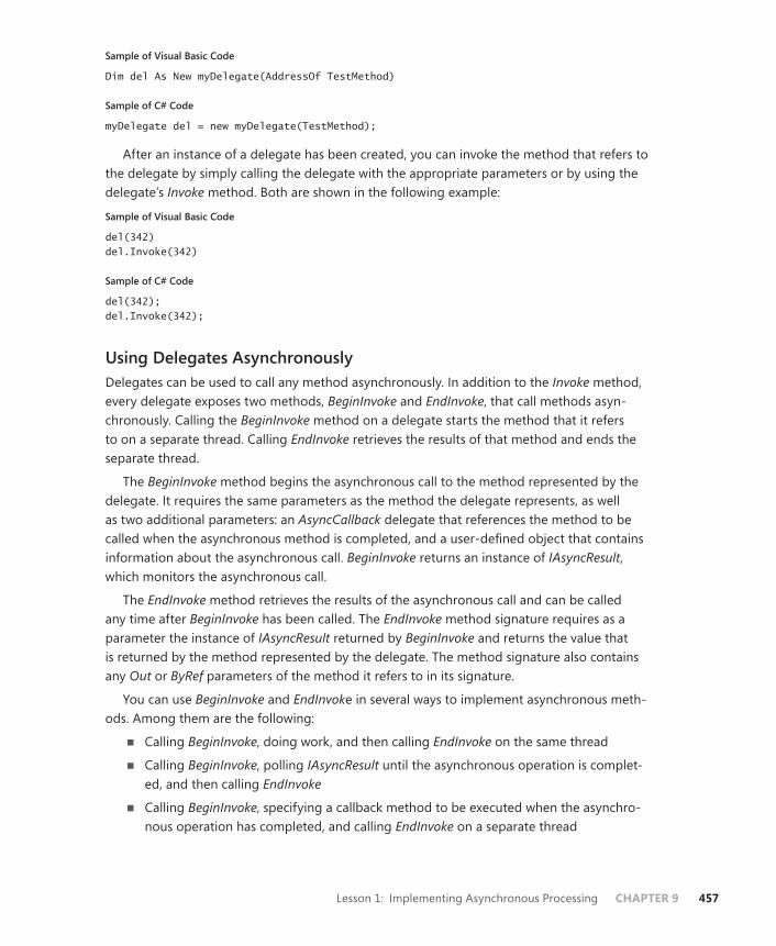
Lesson 1: Implementing Asynchronous Processing CHAPTER 9 457
Sample of Visual Basic Code
Dim del As New myDelegate(AddressOf TestMethod)
Sample of C# Code
myDelegate del = new myDelegate(TestMethod);
After an instance of a delegate has been created, you can invoke the method that refers to the delegate by simply calling the delegate with the appropriate parameters or by using the delegate’s Invoke method. Both are shown in the following example:
Sample of Visual Basic Code
del(342) del.Invoke(342)
Sample of C# Code
del(342); del.Invoke(342);
Using Delegates AsynchronouslyDelegates can be used to call any method asynchronously. In addition to the Invoke method, every delegate exposes two methods, BeginInvoke and EndInvoke, that call methods asyn-chronously. Calling the BeginInvoke method on a delegate starts the method that it refers to on a separate thread. Calling EndInvoke retrieves the results of that method and ends the separate thread.
The BeginInvoke method begins the asynchronous call to the method represented by the delegate. It requires the same parameters as the method the delegate represents, as well as two additional parameters: an AsyncCallback delegate that references the method to be called when the asynchronous method is completed, and a user-defined object that contains information about the asynchronous call. BeginInvoke returns an instance of IAsyncResult, which monitors the asynchronous call.
The EndInvoke method retrieves the results of the asynchronous call and can be called any time after BeginInvoke has been called. The EndInvoke method signature requires as a parameter the instance of IAsyncResult returned by BeginInvoke and returns the value that is returned by the method represented by the delegate. The method signature also contains any Out or ByRef parameters of the method it refers to in its signature.
You can use BeginInvoke and EndInvoke in several ways to implement asynchronous meth-ods. Among them are the following:
■ Calling BeginInvoke, doing work, and then calling EndInvoke on the same thread
■ Calling BeginInvoke, polling IAsyncResult until the asynchronous operation is complet-ed, and then calling EndInvoke
■ Calling BeginInvoke, specifying a callback method to be executed when the asynchro-nous operation has completed, and calling EndInvoke on a separate thread

458 CHAPTER 9 Enhancing Usability
Waiting for an Asynchronous Call to Return with EndInvokeThe simplest way to implement an asynchronous method call is to call BeginInvoke, do some work, and then call EndInvoke on the same thread that BeginInvoke was called on. Although this approach is simplest, a potential disadvantage is that the EndInvoke call blocks execu-tion of the thread until the asynchronous operation is completed if it has not completed yet. Thus, your main thread might still be unresponsive if the asynchronous operation is particu-larly time-consuming. The −DelegateCallback and −AsyncState parameters are not required for this operation, so Nothing (null in C#) can be supplied for these parameters. The follow-ing example demonstrates how to implement an asynchronous call in this way, using the TestMethod and myDelegate methods that were defined in the preceding examples:
Sample of Visual Basic Code
Dim del As New myDelegate(AddressOf TestMethod) Dim result As IAsyncResult result = del.BeginInvoke(342, Nothing, Nothing) ' Do some work while the asynchronous operation runs Dim ResultString As String ResultString = del.EndInvoke(result)
Sample of C# Code
myDelegate del = new myDelegate(TestMethod); IAsyncResult result; result = del.BeginInvoke(342, null, null); // Do some work while the asynchronous operation runs string ResultString; ResultString = del.EndInvoke(result);
Polling IAsyncResult until CompletionAnother way of executing an asynchronous operation is to call BeginInvoke and then poll the IsCompleted property of IAsyncResult to determine whether the operation has finished. When the operation has finished, you can then call EndInvoke. An advantage of this approach is that you do not need to call EndInvoke until the operation is complete. Thus, you do not lose any time by blocking your main thread. The following example demonstrates how to poll the IsCompleted property:
Sample of Visual Basic Code
Dim del As New myDelegate(AddressOf TestMethod) Dim result As IAsyncResult result = del.BeginInvoke(342, Nothing, Nothing) While Not result.IsCompleted ' Do some work End While Dim ResultString As String ResultString = del.EndInvoke(result)
Sample of C# Code
myDelegate del = new myDelegate(TestMethod); IAsyncResult result;
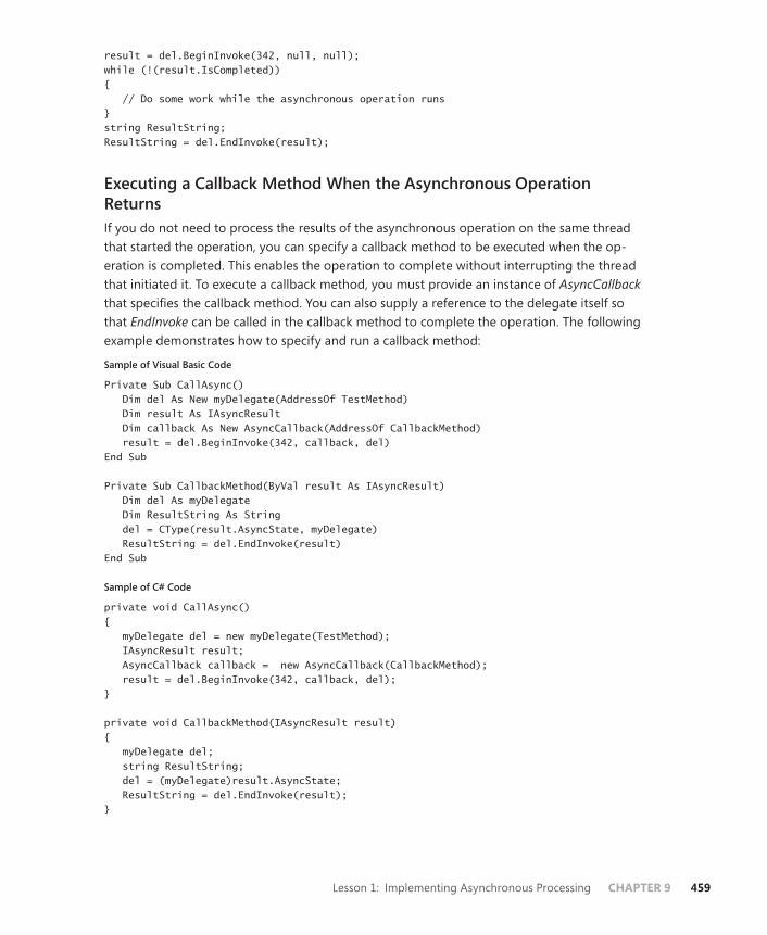
Lesson 1: Implementing Asynchronous Processing CHAPTER 9 459
result = del.BeginInvoke(342, null, null); while (!(result.IsCompleted)) { // Do some work while the asynchronous operation runs } string ResultString; ResultString = del.EndInvoke(result);
Executing a Callback Method When the Asynchronous Operation ReturnsIf you do not need to process the results of the asynchronous operation on the same thread that started the operation, you can specify a callback method to be executed when the op-eration is completed. This enables the operation to complete without interrupting the thread that initiated it. To execute a callback method, you must provide an instance of AsyncCallback that specifies the callback method. You can also supply a reference to the delegate itself so that EndInvoke can be called in the callback method to complete the operation. The following example demonstrates how to specify and run a callback method:
Sample of Visual Basic Code
Private Sub CallAsync() Dim del As New myDelegate(AddressOf TestMethod) Dim result As IAsyncResult Dim callback As New AsyncCallback(AddressOf CallbackMethod) result = del.BeginInvoke(342, callback, del) End Sub Private Sub CallbackMethod(ByVal result As IAsyncResult) Dim del As myDelegate Dim ResultString As String del = CType(result.AsyncState, myDelegate) ResultString = del.EndInvoke(result) End Sub
Sample of C# Code
private void CallAsync() { myDelegate del = new myDelegate(TestMethod); IAsyncResult result; AsyncCallback callback = new AsyncCallback(CallbackMethod); result = del.BeginInvoke(342, callback, del); } private void CallbackMethod(IAsyncResult result) { myDelegate del; string ResultString; del = (myDelegate)result.AsyncState; ResultString = del.EndInvoke(result); }
460 CHAPTER 9 Enhancing Usability
Creating Process ThreadsFor applications that require more precise control over multiple threads, you can create new threads with the Thread object, which represents a separate thread of execution that runs concurrently with other threads. You can create as many Thread objects as you like, but the more threads there are, the greater the impact on performance and the greater the possibility of adverse threading conditions, such as deadlocks.
MORE INFO THREADING
Multithreading and use of the Thread object is an extremely complex and detailed subject. The information in this section should not be considered comprehensive. For more infor-mation, see Managed Threading at http://msdn.Microsoft.com/en-us/library/3e8s7xdd.aspx.
Creating and Starting a New ThreadThe Thread object requires a delegate to the method that will serve as the starting point for the thread. This method must be a Sub (void in C#) method and must either have no param-eters or take a single −Object parameter. In the latter case, the −Object parameter passes any required parameters to the method that starts the thread. After a thread is created, you can start it by calling the Thread.Start method. The following example demonstrates how to cre-ate and start a new thread:
Sample of Visual Basic Code
Dim aThread As New System.Threading.Thread(Addressof aMethod) aThread.Start()
Sample of C# Code
System.Threading.Thread aThread = new System.Threading.Thread(aMethod); aThread.Start();
For threads that accept a parameter, the procedure is similar except that the starting method can take a single Object as a parameter, and that object must be specified as the parameter in the Thread.Start method. Here is an example:
Sample of Visual Basic Code
Dim aThread As New System.Threading.Thread(Addressof aMethod) aThread.Start(anObject)
Sample of C# Code
System.Threading.Thread aThread = new System.Threading.Thread(aMethod); aThread.Start(anObject);
Lesson 1: Implementing Asynchronous Processing CHAPTER 9 461
Destroying ThreadsYou can destroy a Thread object by calling the Thread.Abort method. This method causes the thread on which it is called to cease its current operation and to raise a ThreadAbortException exception. If a Catch block is capable of handling the exception, it will execute along with any Finally blocks. The thread is then destroyed and cannot be restarted.
Sample of Visual Basic Code
aThread.Abort()
Sample of C# Code
aThread.Abort();
Synchronizing ThreadsTwo of the most common difficulties involved in multithread programming are deadlocks and race conditions. A deadlock occurs when one thread has exclusive access to a particular variable and then attempts to gain exclusive access to a second variable at the same time that a second thread has exclusive access to the second variable and attempts to gain exclusive ac-cess to the variable locked by the first thread. The result is that both threads wait indefinitely for the other to release the variables, and they cease operating.
A race condition occurs when two threads attempt to access the same variable at the same time. For example, consider two threads that access the same collection. The first thread might add an object to the collection. The second thread might then remove an object from the collection based on the index of the object. The first thread might then attempt to access the object in the collection to find that it had been removed. Race conditions can lead to unpredictable effects that can destabilize your application.
The best way to avoid race conditions and deadlocks is by careful programming and judi-cious use of thread synchronization. You can use the SyncLock keyword in Visual Basic and the lock keyword in C# to obtain an exclusive lock on an object. This enables the thread that has the lock on the object to perform operations on that object without allowing any other threads to access it. Note that if any other threads attempt to access a locked object, those threads will pause until the lock is released. The following example demonstrates how to obtain a lock on an object:
Sample of Visual Basic Code
SyncLock anObject ' Perform some operation End SyncLock
Sample of C# Code
lock (anObject) { // Perform some operation }
462 CHAPTER 9 Enhancing Usability
Some objects, such as collections, implement a synchronization object that should be used to synchronize access to the greater object. The following example demonstrates how to obtain a lock on the SyncRoot object of an ArrayList object:
Sample of Visual Basic Code
Dim anArrayList As New System.Collections.ArrayList SyncLock anArrayList.SyncRoot ' Perform some operation on the ArrayList End SyncLock
Sample of C# Code
System.Collections.Arraylist anArrayList = new System.Collections.ArrayList();lock (anArrayList.SyncRoot) { // Perform some operation on the ArrayList }
It is generally good practice when creating classes that will be accessed by multiple threads to include a synchronization object for synchronized access by threads. This enables the system to lock only the synchronization object, thus conserving resources by not having to lock every single object contained in the class. A synchronization object is simply an instance of Object, and does not need to have any functionality except to be available for locking. The following example demonstrates a class that exposes a synchronization object:
Sample of Visual Basic Code
Public Class aClass Public SynchronizationObject As New Object() ' Insert additional functionality here End Class
Sample of C# Code
public class aClass { public object SynchronizationObject = new Object(); // Insert additional functionality here }
Special Considerations when Working with ControlsBecause controls are always owned by the UI thread, it is generally unsafe to make calls to controls from a different thread. In WPF applications, you can use the Dispatcher object, discussed later in this lesson, to make safe function calls to the UI thread. In Windows Forms applications, you can use the Control.InvokeRequired property to determine whether it is safe to make a call to a control from another thread. If InvokeRequired returns False, it is safe to make the call to the control. If InvokeRequired returns True, however, you should use the Control. Invoke method on the owning form to supply a delegate to a method to access the control. Using Control.Invoke enables the control to be accessed in a thread-safe manner. The following example demonstrates setting the Text property of a TextBox control named Text1:
Lesson 1: Implementing Asynchronous Processing CHAPTER 9 463
Sample of Visual Basic Code
Public Delegate Sub SetTextDelegate(ByVal t As String) Public Sub SetText(ByVal t As String) If TextBox1.InvokeRequired = True Then Dim del As New SetTextDelegate(AddressOf SetText) Me.Invoke(del, New Object() {t}) Else TextBox1.Text = t End If End Sub
Sample of C# Code
public delegate void SetTextDelegate(string t); public void SetText(string t) { if (textBox1.InvokeRequired) { SetTextDelegate del = new SetTextDelegate(SetText); this.Invoke(del, new object[]{t}); } else { textBox1.Text = t; } }
In the preceding example, the method tests InvokeRequired to determine whether it is dangerous to access the control directly. In general, this will return True if the control is being accessed from a separate thread. If InvokeRequired does return True, the method creates a new instance of a delegate that refers to itself and calls Control.Invoke to set the Text prop-erty in a thread-safe manner.
Quick Check 1. What is a delegate? How is a delegate used?
2. What is thread synchronization, and why is it important?
Quick Check Answers 1. A delegate is a type-safe function pointer. It contains a reference to the entry
point of a method and can be used to invoke that method. A delegate can be used to invoke a method synchronously on the same thread or asynchronously on a separate thread.
2. When you are working with multiple threads of execution, problems can occur if multiple threads attempt to access the same resources. Thread synchronization is the process of ensuring that threads do not attempt to access the same resource at the same time. One way to synchronize threads is to obtain exclusive locks on the objects you want to access, thereby prohibiting other threads from affecting them at the same time.
464 CHAPTER 9 Enhancing Usability
Using Dispatcher to Access Controls Safely on Another Thread in WPFAt times, you might want to change the user interface from a worker thread. For example, you might want to enable or disable buttons based on the status of the worker thread, or to provide more detailed progress reporting than is allowed by the ReportProgess method. The WPF threading model provides the Dispatcher class for cross-thread calls. Using Dispatcher, you can update your user interface safely from worker threads.
You can retrieve a reference to the Dispatcher object for a UI element from its Dispatcher property, as shown here:
Sample of Visual Basic Code
Dim aDisp As System.Windows.Threading.Dispatcher aDisp = Button1.Dispatcher
Sample of C# Code
System.Windows.Threading.Dispatcher aDisp; aDisp = button1.Dispatcher;
Dispatcher provides two principal methods you will use: BeginInvoke and Invoke. Both methods enable you to call a method safely on the UI thread. The BeginInvoke method enables you to call a method asynchronously, and the Invoke method enables you to call a method synchronously. Thus, a call to Dispatcher.Invoke will block execution on the thread on which it is called until the method returns, whereas a call to Dispatcher.BeginInvoke will not block execution.
Both the BeginInvoke and Invoke methods require you to specify a delegate that points to a method to be executed. You can also supply a single parameter or an array of parameters for the delegate, depending on the requirements of the delegate. You also are required to set the DispatcherPriority property, which determines the priority with which the delegate is ex-ecuted. In addition, the Dispatcher.Invoke method enables you to set a period of time for the Dispatcher to wait before abandoning the invocation. The following example demonstrates how to invoke a delegate named MyMethod, using BeginInvoke and Invoke:
Sample of Visual Basic Code
Dim aDisp As System.Windows.Threading.Dispatcher = Button1.Dispatcher ' Invokes the delegate synchronously aDisp.Invoke(System.Windows.Threading.DispatcherPriority.Normal, MyMethod) ' Invokes the delegate asynchronously aDisp.BeginInvoke(System.Windows.Threading.DispatcherPriority.Normal, MyMethod)
Sample of C# Code
System.Windows.Threading.Dispatcher aDisp = button1.Dispatcher; // Invokes the delegate synchronously aDisp.Invoke(System.Windows.Threading.DispatcherPriority.Normal, MyMethod); // Invokes the delegate asynchronously aDisp.BeginInvoke(System.Windows.Threading.DispatcherPriority.Normal, MyMethod);

Lesson 1: Implementing Asynchronous Processing CHAPTER 9 465
PRACTICE Working with BackgroundWorker
In this practice, you use the BackgroundWorker component. You write a time-consuming method to be executed on a separate thread. You implement cancellation functionality, and you use Dispatcher to update the user interface from the worker thread.
EXERCISE Practice with BackgroundWorker
1. Open the partial solution for this exercise from its location on the companion CD. The partial solution already has a user interface built and has code for a BackgroundWorker component and stubs for methods. Note that the WorkerSupportsCancellation prop-erty of BackgroundWorker is set to True in the constructor in the partial solution.
2. In Code view, add the following code to the Window1 class for a delegate to the UpdateLabel method:
Sample of Visual Basic Code
Private Delegate Sub UpdateDelegate(ByVal i As Integer) Private Sub UpdateLabel(ByVal i As Integer) Label1.Content = "Cycles: " & i.ToString End Sub
Sample of C# Code
private delegate void UpdateDelegate(int i);private void UpdateLabel(int i) { Label1.Content = "Cycles: " + i.ToString(); }
3. In the DoWork event handler, add the following code:
Sample of Visual Basic Code
For i As Integer = 0 To 500 For j As Integer = 1 To 10000000 Next If aWorker.CancellationPending Then e.Cancel = True Exit For End If Dim update As New UpdateDelegate(AddressOf UpdateLabel) Label1.Dispatcher.BeginInvoke(Windows.Threading. _ DispatcherPriority.Normal, update, i) Next
Sample of C# Code
for (int i = 0; i <= 500; i++) { for (int j = 1; j <= 10000000; j++) { } if (aWorker.CancellationPending)
466 CHAPTER 9 Enhancing Usability
{ e.Cancel = true; return; } UpdateDelegate update = new UpdateDelegate(UpdateLabel); Label1.Dispatcher.BeginInvoke( System.Windows.Threading.DispatcherPriority.Normal, update, i); }
4. In Code view, add the following code to the RunWorkerCompleted event handler:
Sample of Visual Basic Code
If Not e.Cancelled Then Label2.Content = "Run Completed" Else Label2.Content = "Run Cancelled" End If
Sample of C# Code
if (!(e.Cancelled)) Label2.Content = "Run Completed"; else Label2.Content = "Run Cancelled";
5. In the designer, double-click the button marked Start to open the Button1_Click event handler and add the following code:
Sample of Visual Basic Code
Label2.Content = ""aWorker.RunWorkerAsync()
Sample of C# Code
label2.Content = "";aWorker.RunWorkerAsync();
6. In the designer, double-click the Cancel button to open the Button2_Click event handler and add the following code:
Sample of Visual Basic Code
aWorker.CancelAsync()
Sample of C# Code
aWorker.CancelAsync();
7. Press F5 to run your application and test the functionality.
Lesson Summary■ The BackgroundWorker component enables you to execute operations on a separate
thread of execution. You call the RunWorkerAsync method of the BackgroundWorker component to begin the background process. The event handler for the DoWork method contains the code that will execute on a separate thread.

Lesson 1: Implementing Asynchronous Processing CHAPTER 9 467
■ The BackgroundWorker.RunCompleted event is fired when the background process is completed.
■ You can enable cancellation of a background process by setting the BackgroundWorker.WorkerSupportsCancellation property to True. You then signal BackgroundWorker to cancel the process by calling the CancelAsync method, which sets the CancellationPending method to True. You must poll the CancellationPending property and implement cancellation code if the CancellationPending property registers as True.
■ You can report progress from the background operation. First you must set the WorkerReportsProgress property to True. You can then call the ReportProgress method from within the background process to report progress. This raises the ProgressChanged event, which you can handle to take any action.
■ A control’s Dispatcher object can be used to execute code safely in the user interface from a worker thread. Dispatcher.BeginInvoke is used to execute code asynchronously, and Dispatcher.Invoke is used to execute code synchronously.
■ Delegates are type-safe function pointers that enable you to call methods with the same signature. You can call methods synchronously by using the delegate’s Invoke method, or asynchronously by using BeginInvoke and EndInvoke.
■ When BeginInvoke is called, an operation specified by the delegate is started on a separate thread. You can retrieve the result of the operation by calling EndInvoke, which will block the calling thread until the background process is completed. You can also specify a callback method to complete the operation on the background thread if the main thread does not need the result.
■ Thread objects represent separate threads of operation and provide a high degree of control of background processes. You can create a new thread by specifying a method that serves as an entry point for the thread.
■ You can use the SyncLock (Visual Basic) and lock (C#) keywords to restrict access to a resource to a single thread of execution.
■ You must not make calls to controls from background threads. Use the Control.InvokeRequired property to determine whether it is safe to make a direct call to a con-trol. If it is not safe to make a direct call to the control, use the Control.Invoke method to make a safe call to the control.
Lesson ReviewYou can use the following questions to test your knowledge of the information in Lesson 1, “Implementing Asynchronous Processing.” The questions are also available on the companion CD if you prefer to review them in electronic form.
NOTE ANSWERS
Answers to these questions and explanations of why each answer choice is correct or incor-rect are located in the “Answers” section at the end of the book.

468 CHAPTER 9 Enhancing Usability
1. Which of the following are required to start a background process with the BackgroundWorker component? (Choose all that apply.)
A. Calling the RunWorkerAsync method
B. Handling the DoWork event
C. Handling the ProgressChanged event
D. Setting the WorkerSupportsCancellation property to True
2. Which of the following are good strategies for updating the user interface from the worker thread? (Choose all that apply.)
A. Use Dispatcher.BeginInvoke to execute a delegate to a method that updates the user interface.
B. Invoke a delegate to a method that updates the user interface.
C. Set the WorkerReportsProgress property to True, call the ReportProgress method in the background thread, and handle the ProgressChanged event in the main thread.
D. Call a method that updates the user interface from the background thread.
Lesson 2: Implementing Globalization and Localization
Applications that display data in formats appropriate to a particular culture and that display locale-appropriate strings in the user interface (UI) are considered globally ready applications. You can create globally ready applications with Visual Studio by taking advantage of the built-in support for globalization and localization. In this lesson, you learn how to implement localization and globalization in a Windows Forms application and a WPF application.
After this lesson, you will be able to:■ Implement globalization and localization within a Windows Form.■ Implement globalization and localization within a WPF application.
Estimated lesson time: 30 minutes
Globalization and LocalizationGlobalization and localization are different processes of internationalization. Globalization refers to formatting existing data in formats appropriate for the current culture setting. Lo-calization, however, refers to retrieving appropriate data based on the culture. The following examples illustrate the difference between globalization and localization:
■ Globalization In some countries, currency is formatted using a period (.) as a thou-sand separator and a comma (,) as a decimal separator, whereas other countries use
Lesson 2: Implementing Globalization and Localization CHAPTER 9 469
the opposite convention. A globalized application formats currency data with the appropriate thousand separator and decimal separator based on the current culture settings.
■ Localization The title of a form is displayed in a given language based on the locale in which it is deployed. A localized application retrieves the appropriate string and displays it based on the current culture settings.
CultureCulture refers to cultural information about the country or region in which the application is deployed. In the .NET Framework, cultures are represented by a culture code that indicates the current language. For example, the following culture codes represent the following lan-guages:
■ en Specifies the English language
■ eu Specifies the Basque language
■ tr Specifies the Turkish language
Culture codes can specify only the language, like the ones shown here, or they can specify both the language and the region. Culture codes that specify only the language are called neutral culture codes, whereas culture codes that specify both the language and the region are called specific culture codes. Examples of specific culture codes are shown in the follow-ing list:
■ en-CA Specifies the English language and Canada as the region
■ af-ZA Specifies the Afrikaans language and South Africa as the region
■ kn-IN Specifies the Kannada language and India as the region
You can find a complete list of culture codes in the CultureInfo class reference topic (http://msdn.Microsoft.com/en-us/library/system.globalization.cultureinfo.aspx) in the .NET Framework reference documentation.
Most culture codes follow the format just described, but some culture codes are excep-tions. The following culture codes are examples that specify the character sets in addition to other information:
■ uz-UZ-Cyrl Specifies the Uzbek language, the Uzbekistan region, and the Cyrillic alphabet
■ uz-UZ-Latn Specifies the Uzbek language, the Uzbekistan region, and the Latin alphabet
■ zh-CHT Specifies the traditional Chinese language, no region
■ zh-CHS Specifies the simplified Chinese language, no region
470 CHAPTER 9 Enhancing Usability
Changing the Current CultureYour application automatically reads the culture settings of the system and implements them. Thus, in most circumstances, you do not have to change the culture settings manually. You can, however, change the current culture of your application in code by setting the current culture to a new instance of the CultureInfo class. The CultureInfo class contains information about a particular culture and how it interacts with the application and system. For example, the CultureInfo class contains information about the type of calendar, date formatting, cur-rency formatting, and so on for a specific culture. You set the current culture of an application programmatically by setting the CurrentThread.CurrentCulture property to a new instance of the CultureInfo class. The CultureInfo constructor requires a string that represents the appro-priate culture code as a parameter. The following code example demonstrates how to set the current culture to French Canadian:
Sample of Visual Basic Code
System.Threading.Thread.CurrentThread.CurrentCulture = New _ System.Globalization.CultureInfo("fr-CA")
Sample of C# Code
System.Threading.Thread.CurrentThread.CurrentCulture = new System.Globalization.CultureInfo("fr-CA");
Implementing GlobalizationThe CurrentThread.CurrentCulture property controls the culture used to format data. When CurrentCulture is set to a new instance of CultureInfo, any data formatted by the application is updated to the new format. Data that is not formatted by the application is not affected by a change in the current culture. Consider the following examples:
Sample of Visual Basic Code
Label1.Text = "$500.00" Label2.Text = Format(500, "Currency")
Sample of C# Code
label1.Text = "$500.00"; label2.Text = (500).ToString("C");
When the culture is set to en-US, which represents the English language and the United States as the region (which is the default culture setting for computers in the United States), both labels display the same string—that is, “$500.00”. When the current culture is set to fr-FR, which represents the French language and France as the region, the text in the two labels differs. The text in Label1 always reads “$500.00” because it is not formatted by the application. The text in Label2, however, reads “500,00 €”. Note that the currency symbol is changed to the appropriate symbol for the locale—in this case, the euro symbol—and the decimal separator is changed to the separator that is appropriate for the locale (in this case, the comma).

Lesson 2: Implementing Globalization and Localization CHAPTER 9 471
Implementing LocalizationYou can implement localization—that is, provide a user interface (UI) specific to the current locale—by using the built-in localization features of Visual Studio, which enable you to create alternative versions of forms that are culture-specific and automatically manages retrieval of resources appropriate for the culture.
Changing the Current User Interface CultureThe UI culture is represented by an instance of CultureInfo and is distinct from the CultureInfo.CurrentCulture property. The CurrentCulture setting determines the formatting that will be applied to system-formatted data, whereas the CurrentUICulture setting determines the resources that will be loaded into localized forms at run time. You can set the UI culture by setting the CurrentThread.CurrentUICulture property, as shown in the following example:
Sample of Visual Basic Code
' Sets the current UI culture to Thailand System.Threading.Thread.CurrentThread.CurrentUICulture = New _ System.Globalization.CultureInfo("th-TH")
Sample of C# Code
// Sets the current UI culture to Thailand System.Threading.Thread.CurrentThread.CurrentUICulture = new System.Globalization.CultureInfo("th-TH");
When the current UI culture is set, the application loads resources specific to that culture if they are available. If culture-specific resources are unavailable, the UI displays resources for the default culture.
Note that the UI culture must be set before a form that displays any localized resources is loaded. If you want to set the UI culture programmatically, you must set it before the form has been created, either in the form’s constructor or in the application’s Main method.
Creating Localized FormsEvery form exposes a Localizable property that determines whether the form is localized. Setting this property to True enables localization for the form.
When the Localizable property of a form is set to True, Visual Studio .NET automatically handles the creation of appropriate resource files and manages their retrieval according to the CurrentUICulture setting.
At design time, you can create localized copies of a form by using the Language property. It is available only at design time and assists in the creation of localized forms. When the Language property is set to (Default), you can edit any of the form’s UI properties or controls to provide a representation for the default UI culture. To create a localized version of the form, you can set the Language property to any value other than (Default). Visual Studio will create a resource file for the new language and store any values you set for the UI in that file.

472 CHAPTER 9 Enhancing Usability
To create localized forms:
1. Set the Localizable property of your form to True.
2. Design the UI of your form and translate any UI elements into the localized languages.
3. Add UI elements for the default culture. This is the culture that will be used if no other culture is specified.
4. Set the Language property of your form to the culture for which you want to create a localized form.
5. Add the localized UI content to your form.
6. Repeat steps 4 and 5 for each localized language.
7. Build your application.
When CurrentUICulture is set to a localized culture, your application loads the appropriate version of the form by reading the corresponding resource files. If no resource files exist for a specified culture, the default culture UI is displayed.
Localizing a WPF applicationLocalization in WPF is enabled through satellite assemblies. Localizable elements of your ap-plication are segregated into resource assemblies that are loaded automatically, depending on the current UI culture. When a localized application is started, the application first looks for resource assemblies targeted to the specific culture and region (fr-CA in the previous example). If those assemblies are not found, it looks for assemblies targeted to the language only (fr in the previous example). If neither is found, the application looks for a neutral re-source set. If this is not found either, an exception is raised. You should localize your applica-tion for every language in which you expect it to be used.
You can avoid localization-based exceptions by setting the NeutralResourcesLanguage at-tribute. This attribute designates the resource set to be used if a specific set of resources can-not be found. The following example demonstrates how to use the NeutralResourcesLanguage attribute:
Sample of Visual Basic Code
<Assembly: NeutralResourcesLanguage("en-US", _UltimateResourceFallbackLocation.Satellite)>
Sample of C# Code
[assembly: NeutralResourcesLanguage("en-US",UltimateResourceFallbackLocation.Satellite)]
Localizing an ApplicationLocalization in WPF is a multi-step process. The following procedure is a high-level protocol for localizing a WPF application. Each of the steps is discussed in greater detail later in this lesson.

Lesson 2: Implementing Globalization and Localization CHAPTER 9 473
To localize an application:
1. Add a UICulture attribute to the project file and build the application to generate culture-specific subdirectories.
2. Mark localizable properties with the Uid attribute to identify them uniquely. You must perform this step for each XAML file in your application.
NOTE LOCALIZABLE PROPERTIES
Localizable properties include more than just text strings; they might include colors, layout properties, or any other UI property that has cultural significance.
3. Extract the localizable content from your application using a specialized tool (as dis-cussed later in this chapter).
4. Translate the localizable content.
5. Create subdirectories to hold satellite assemblies for the new cultures.
6. Generate satellite assemblies using a specialized tool.
Adding the UICulture Attribute to the Project FileBy default, a WPF application is not culture-aware. You can make your application culture-aware by adding the UICulture attribute to the project file and building the application. The UICulture attribute indicates the default culture for the application (usually en-US for applica-tions created and run in the United States). After adding this attribute, building the applica-tion generates a subdirectory for the culture in the application directory with localizable content in a satellite assembly.
To add the UICulture attribute to the project file:
1. Open the project file for your project (<ProjectName>.csproj for C# applications and <ProjectName>.vbproj for Visual Basic applications) with Notepad or a similar text editor.
2. Locate the first <PropertyGroup> tag. Within that tag, add the following set of XAML tags:
<UICulture>en-US</UICulture>
If you are creating your application in a location other than the United States, or are using a language other than English, adjust the culture code in this tag accordingly.
3. Save the project file and build your application.
Marking Localizable ElementsThe first step in actually localizing your application is to mark elements that are localizable; this includes all strings displayed in the user interface, but many other properties are localiz-able as well. For example, languages that use different alphabets might require the FontWidth

474 CHAPTER 9 Enhancing Usability
property of visual elements to be localized, and languages that are read from right to left (rather than from left to right, as English is) require localization of the FlowDirection property of visual elements. Images are typically localized; thus, ImageSource properties have to be adjusted to point to the appropriate images. Different languages require the localization of font or other UI element sizes to account for differences in string lengths. Even color combi-nations can be culturally sensitive and require you to localize the Foreground and Background brushes. Deciding what to localize in an application is often the most difficult part of the entire process, but it is also the most important and should be given a great deal of thought. The point to keep in mind is that localization involves much more than simple translation; it is a complex process that requires sufficient research and planning.
You can mark elements for localization by adding the Uid attribute to the element in XAML. This is an attribute that uniquely identifies an element for the purpose of localization. You can add the Uid attribute as shown here in bold:
<Button x:Uid="Button_1" Margin="112,116,91,122" Name="Button1">Button</Button>
Alternatively, you can use the Msbuild.exe tool to mark every element in your applica-tion with the Uid attribute by using the updateuid flag and pointing it to your project file, as shown here:
msbuild /t:updateuid myApplication.vbproj
This tool should be run from the command prompt in Visual Studio, which is available in the Visual Studio Tools subdirectory of your Visual Studio folder on the Start menu.
When localizable resources are extracted from your application, every localizable property of every element marked with the Uid attribute is extracted.
Note that you must mark every element in your application that is in an XAML file and that you want to localize. This includes resources and resources in resource dictionaries.
Extracting Localizable ContentExtraction of localizable content from your application requires a specialized tool. You can download a command-line tool named LocBaml that can extract localizable content, and third-party solutions are also available. To acquire LocBaml, navigate to http://msdn.microsoft.com/en-us/library/ms771568.aspx and download the source files from the link in the LocBaml Tool Sample topic.
The LocBaml tool is not a compiled application. You must compile it before you can use it, and then you must run it as a command-line application from the directory that contains your compiled application and use the /parse switch to provide the path to the resources dynamic link library (DLL). An example is shown here:
locbaml /parse en-US\myApplication.resources.dll
LocBaml outputs a .csv file that contains all localizable properties from all the elements that have been marked with the Uid attribute.

Lesson 2: Implementing Globalization and Localization CHAPTER 9 475
Translating Localizable ContentContent typically is not translated by the developer. Rather, localization specialists are em-ployed to provide translated strings and values for other translatable properties. The .csv file generated by LocBaml provides a row of data pertaining to each localizable property extracted from the application. Each row contains the following information:
■ The name of the localizable resource
■ The Uid of the element and the name of the localizable property
■ The localization category, such as Title or Text
■ Whether the property is readable (that is, whether it is visible as text in the user inter-face)
■ Whether the property value can be modified by the translator (always true unless you indicate otherwise)
■ Any additional comments you provide for the translator
■ The value of the property
The final entry in each row, the value of the property, is the property that must be trans-lated by the translator. When translation is complete, the .csv file is returned to you with the translated values in the final column.
Creating SubdirectoriesBefore satellite assemblies can be created, you must create a subdirectory named for the appropriate culture code to house them. This subdirectory should be created in the direc-tory where your compiled application exists, and it should be named for the culture code for which you are creating satellite assemblies. For example, if you were creating satellite assem-blies for French as spoken in Canada, you would name your directory fr-CA.
Generating Satellite AssembliesAfter the resources have been translated and the subdirectories have been created, you are ready to generate your satellite assemblies, which hold culture-specific resources for a local-ized application. If you are using LocBaml, you can generate satellite assemblies by running LocBaml again from the directory in which your compiled application resides and using the /generate switch to generate a satellite assembly. The following example demonstrates a command-line use of LocBaml to generate a satellite assembly:
locbaml /generate en-US\myApplication.resources.dll /trans:myApplication.resources.FrenchCan.csv /cul:fr-CA /out:fr-CA
Let’s break down what this command does. The /generate switch tells LocBaml to generate a satellite assembly based on the indicated assembly, which, in this example, is en-US\ myApplication.resources.dll. The /trans switch specifies the .csv file used to generate the satellite assembly (myApplication.resources.FrenchCan.csv in this example). The /cul switch

476 CHAPTER 9 Enhancing Usability
associates the indicated culture with the satellite assembly, and the /out switch specifies the name of the folder, which must match the specified culture exactly.
Loading Resources by LocaleAfter satellite assemblies have been created, your application automatically loads the ap-propriate resources for the culture. As described previously, you can change the current UI culture by setting the CurrentThread.CurrentUICulture property to a new instance of System. Globalization.CultureInfo, or you can change culture settings through the system. If the culture changes while an application is running, you must restart the application to load culture-specific resources. If you use code to change the UI culture, you must set UICulture to a new instance of CultureInfo before any of the user interface is rendered. Typically, the best place to do this is in the Application.Startup event handler.
EXAM TIP
Localization is a complex process that typically involves localization specialists in addition to the developer. Focus on learning the aspects of localization that involve the developer directly, such as preparing the application for localization and marking localizable ele-ments. Processes that probably will be performed by a different person, such as extracting content and translation, are likely to be emphasized less on the exam.
Using Culture Settings in Validators and ConvertersAlthough localizing UI elements is an invaluable part of localization, you must also format data appropriately for the current culture setting. In some cases, this happens automatically. For example, the String.Format method uses the correct decimal and time separators based on the current UI culture. But when you provide formatting for data presented in your user interface or provide validation, your code must take the current culture into account.
The Convert and ConvertBack methods of the IValueConverter interface and the Validate method of the ValidationRule class provide a parameter that indicates the culture. In the case of IValueConverter, the parameter is named culture, and in the Validate method, the parameter is called cultureInfo. In both cases, the parameter represents an instance of System. Globalization.CultureInfo. Whenever you create a validation rule or converter in a lo-calized application, you always should test the culture value and provide culture-appropriate formatting for your data. The following shows an example:
Sample of Visual Basic Code
<ValueConversion(GetType(String), GetType(String))> _Public Class DateBrushConverter Implements IValueConverter ' Note: the Translator class is assumed to be a class that contains a ' dictionary used to translate the provided strings. Dim myTranslator As New Translator

Lesson 2: Implementing Globalization and Localization CHAPTER 9 477
Public Function Convert(ByVal value As Object, ByVal targetType As _ System.Type, ByVal parameter As Object, ByVal culture As _ System.Globalization.CultureInfo) As Object Implements _ System.Windows.Data.IValueConverter.Convert Dim astring As String = CType(value, String) Select Case culture.ToString Case "fr-FR" Return myTranslator.EnglishToFrench(astring) Case "de-DE" Return myTranslator.EnglishToGerman(astring) Case Else Return astring End Select End Function Public Function ConvertBack(ByVal value As Object, ByVal targetType _ As System.Type, ByVal parameter As Object, ByVal culture As _ System.Globalization.CultureInfo) As Object Implements _ System.Windows.Data.IValueConverter.ConvertBack Dim astring As String = CType(value, String) Select Case culture.ToString Case "fr-FR" Return myTranslator.FrenchToEnglish(astring) Case "de-DE" Return myTranslator.GermanToEnglish(astring) Case Else Return astring End Select End Function End Class
Sample of C# Code
[ValueConversion(typeof(string), typeof(string))]public class LanguageConverter : IValueConverter { // Note: the Translator class is assumed to be a class that contains a // dictionary used to translate the provided strings. Translator myTranslator = new Translator(); public object Convert(object value, Type targetType, object parameter, System.Globalization.CultureInfo culture) { string aString = (string)value; switch(culture.ToString()) { case "fr-FR": return myTranslator.EnglishToFrench(aString); case "de-DE": return myTranslator.EnglishToGerman(aString); default: return aString; } } public object ConvertBack(object value, Type targetType, object
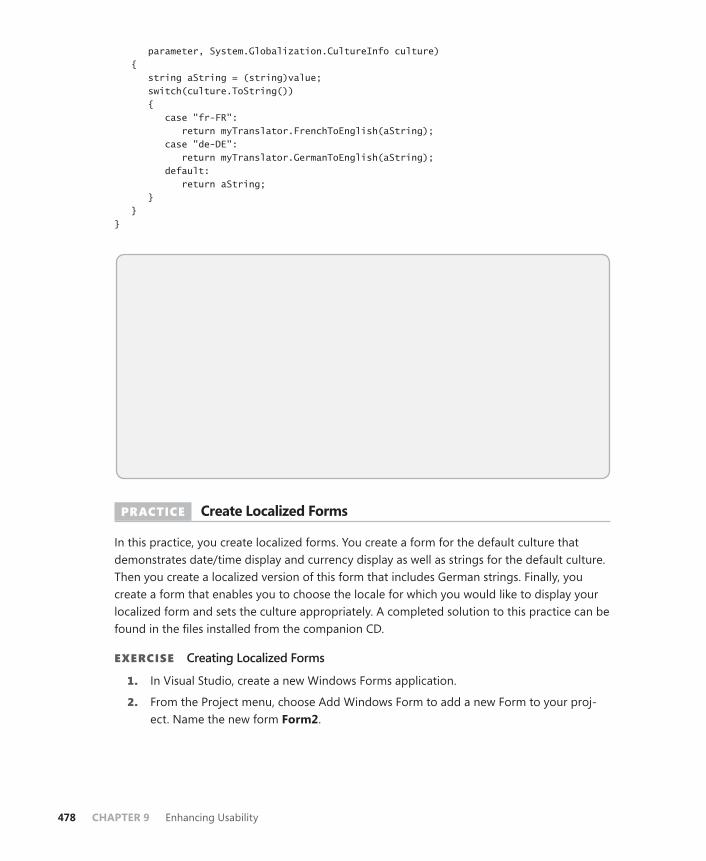
478 CHAPTER 9 Enhancing Usability
parameter, System.Globalization.CultureInfo culture) { string aString = (string)value; switch(culture.ToString()) { case "fr-FR": return myTranslator.FrenchToEnglish(aString); case "de-DE": return myTranslator.GermanToEnglish(aString); default: return aString; } } }
Quick Check 1. What is the difference between globalization and localization?
2. What is the difference between CurrentCulture and CurrentUICulture?
Quick Check Answers 1. Globalization refers to formatting data in formats appropriate for the current
culture setting. Localization refers to retrieving and displaying appropriately localized data based on the culture.
2. The CurrentCulture determines how data is formatted as appropriate for the current culture setting. The CurrentUICulture determines what set of resource strings should be loaded for display in the UI.
PRACTICE Create Localized Forms
In this practice, you create localized forms. You create a form for the default culture that demonstrates date/time display and currency display as well as strings for the default culture. Then you create a localized version of this form that includes German strings. Finally, you create a form that enables you to choose the locale for which you would like to display your localized form and sets the culture appropriately. A completed solution to this practice can be found in the files installed from the companion CD.
EXERCISE Creating Localized Forms
1. In Visual Studio, create a new Windows Forms application.
2. From the Project menu, choose Add Windows Form to add a new Form to your proj-ect. Name the new form Form2.
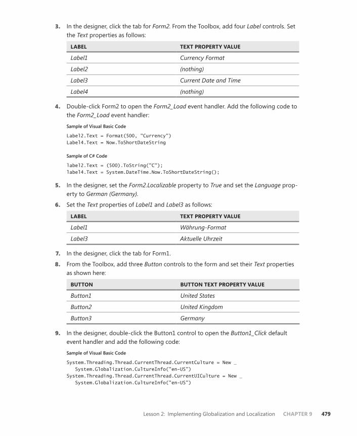
Lesson 2: Implementing Globalization and Localization CHAPTER 9 479
3. In the designer, click the tab for Form2. From the Toolbox, add four Label controls. Set the Text properties as follows:
LABEL TEXT PROPERTY VALUE
Label1 Currency Format
Label2 (nothing)
Label3 Current Date and Time
Label4 (nothing)
4. Double-click Form2 to open the Form2_Load event handler. Add the following code to the Form2_Load event handler:
Sample of Visual Basic Code
Label2.Text = Format(500, "Currency") Label4.Text = Now.ToShortDateString
Sample of C# Code
label2.Text = (500).ToString("C"); label4.Text = System.DateTime.Now.ToShortDateString();
5. In the designer, set the Form2.Localizable property to True and set the Language prop-erty to German (Germany).
6. Set the Text properties of Label1 and Label3 as follows:
LABEL TEXT PROPERTY VALUE
Label1 Währung-Format
Label3 Aktuelle Uhrzeit
7. In the designer, click the tab for Form1.
8. From the Toolbox, add three Button controls to the form and set their Text properties as shown here:
BUTTON BUTTON TEXT PROPERTY VALUE
Button1 United States
Button2 United Kingdom
Button3 Germany
9. In the designer, double-click the Button1 control to open the Button1_Click default event handler and add the following code:
Sample of Visual Basic Code
System.Threading.Thread.CurrentThread.CurrentCulture = New _ System.Globalization.CultureInfo("en-US") System.Threading.Thread.CurrentThread.CurrentUICulture = New _ System.Globalization.CultureInfo("en-US")
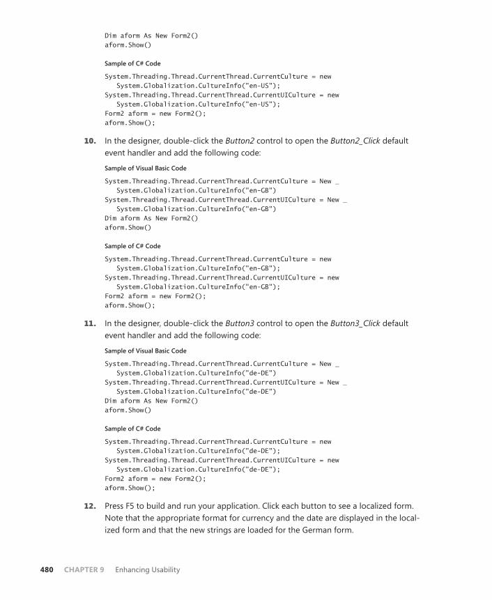
480 CHAPTER 9 Enhancing Usability
Dim aform As New Form2() aform.Show()
Sample of C# Code
System.Threading.Thread.CurrentThread.CurrentCulture = new System.Globalization.CultureInfo("en-US"); System.Threading.Thread.CurrentThread.CurrentUICulture = new System.Globalization.CultureInfo("en-US"); Form2 aform = new Form2(); aform.Show();
10. In the designer, double-click the Button2 control to open the Button2_Click default event handler and add the following code:
Sample of Visual Basic Code
System.Threading.Thread.CurrentThread.CurrentCulture = New _ System.Globalization.CultureInfo("en-GB") System.Threading.Thread.CurrentThread.CurrentUICulture = New _ System.Globalization.CultureInfo("en-GB") Dim aform As New Form2() aform.Show()
Sample of C# Code
System.Threading.Thread.CurrentThread.CurrentCulture = new System.Globalization.CultureInfo("en-GB"); System.Threading.Thread.CurrentThread.CurrentUICulture = new System.Globalization.CultureInfo("en-GB"); Form2 aform = new Form2(); aform.Show();
11. In the designer, double-click the Button3 control to open the Button3_Click default event handler and add the following code:
Sample of Visual Basic Code
System.Threading.Thread.CurrentThread.CurrentCulture = New _ System.Globalization.CultureInfo("de-DE") System.Threading.Thread.CurrentThread.CurrentUICulture = New _ System.Globalization.CultureInfo("de-DE") Dim aform As New Form2() aform.Show()
Sample of C# Code
System.Threading.Thread.CurrentThread.CurrentCulture = new System.Globalization.CultureInfo("de-DE"); System.Threading.Thread.CurrentThread.CurrentUICulture = new System.Globalization.CultureInfo("de-DE"); Form2 aform = new Form2(); aform.Show();
12. Press F5 to build and run your application. Click each button to see a localized form. Note that the appropriate format for currency and the date are displayed in the local-ized form and that the new strings are loaded for the German form.
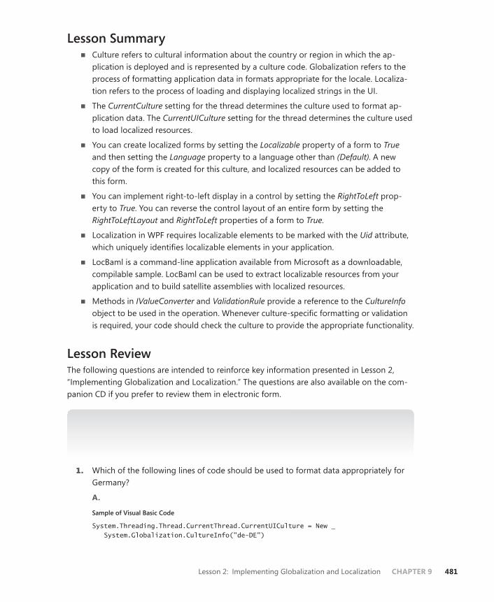
Lesson 2: Implementing Globalization and Localization CHAPTER 9 481
Lesson Summary■ Culture refers to cultural information about the country or region in which the ap-
plication is deployed and is represented by a culture code. Globalization refers to the process of formatting application data in formats appropriate for the locale. Localiza-tion refers to the process of loading and displaying localized strings in the UI.
■ The CurrentCulture setting for the thread determines the culture used to format ap-plication data. The CurrentUICulture setting for the thread determines the culture used to load localized resources.
■ You can create localized forms by setting the Localizable property of a form to True and then setting the Language property to a language other than (Default). A new copy of the form is created for this culture, and localized resources can be added to this form.
■ You can implement right-to-left display in a control by setting the RightToLeft prop-erty to True. You can reverse the control layout of an entire form by setting the RightToLeftLayout and RightToLeft properties of a form to True.
■ Localization in WPF requires localizable elements to be marked with the Uid attribute, which uniquely identifies localizable elements in your application.
■ LocBaml is a command-line application available from Microsoft as a downloadable, compilable sample. LocBaml can be used to extract localizable resources from your application and to build satellite assemblies with localized resources.
■ Methods in IValueConverter and ValidationRule provide a reference to the CultureInfo object to be used in the operation. Whenever culture-specific formatting or validation is required, your code should check the culture to provide the appropriate functionality.
Lesson ReviewThe following questions are intended to reinforce key information presented in Lesson 2, “Implementing Globalization and Localization.” The questions are also available on the com-panion CD if you prefer to review them in electronic form.
NOTE ANSWERS
Answers to these questions and explanations of why each answer choice is correct or incor-rect are located in the “Answers” section at the end of the book.
1. Which of the following lines of code should be used to format data appropriately for Germany?
A.
Sample of Visual Basic Code
System.Threading.Thread.CurrentThread.CurrentUICulture = New _ System.Globalization.CultureInfo("de-DE")

482 CHAPTER 9 Enhancing Usability
Sample of C# Code
System.Threading.Thread.CurrentThread.CurrentUICulture = New System.Globalization.CultureInfo("de-DE");
B.
Sample of Visual Basic Code
Me.CurrentUICulture = New System.Globalization.CultureInfo("de-DE")
Sample of C# Code
this.CurrentUICulture = New System.Globalization.CultureInfo("de-DE");
C.
Sample of Visual Basic Code
System.Threading.Thread.CurrentThread.CurrentCulture = New _ System.Globalization.CultureInfo("de-DE")
Sample of C# Code
System.Threading.Thread.CurrentThread.CurrentCulture = New System.Globalization.CultureInfo("de-DE");
D.
Sample of Visual Basic Code
Me.CurrentCulture = New System.Globalization.CultureInfo("de-DE")
Sample of C# Code
this.CurrentCulture = New System.Globalization.CultureInfo("de-DE");
2. Given a form that contains a Label control named Label1 and a Button control named Button1, all with default settings, which of the following must you do to display the entire form and all controls in a right-to-left layout with right-to-left text display? (Choose all that apply.)
A. Set the Label1.RightToLeft property to True.
B. Set the Button1.RightToLeft property to True.
C. Set the Form1.RightToLeft property to True.
D. Set the Form1.RightToLeftLayout property to True.
Lesson 3: Integrating Windows Forms Controls and WPF Controls CHAPTER 9 483
Lesson 3: Integrating Windows Forms Controls and WPF Controls
The WPF suite of controls is very full, and, together with the WPF control customization abilities, you can create a very wide array of control functionality for your applications. Some types of functionality, however, are absent from the WPF elements and can be difficult to implement on your own. Fortunately, WPF provides a method for using Windows Forms controls in your application. Likewise, you can incorporate WPF controls into your Windows Forms applications. In this lesson, you learn how to use Windows Forms controls in WPF ap-plications, and vice versa.
After this lesson, you will be able to: ■ Describe how to use a Windows Forms control in a WPF application.■ Integrate Windows Forms dialog boxes into WPF applications.■ Integrate WPF controls into Windows Forms applications.
Estimated lesson time: 30 minutes
Using Windows Forms Controls in WPF ApplicationsAlthough WPF provides a wide variety of useful controls and features, you might find that some familiar functionality you used in Windows Forms programming is not available. No-tably absent are controls such as MaskedTextBox and PropertyGrid, as well as simple dialog boxes. Fortunately, you can still use many Windows Forms controls in your WPF applications.
Using Dialog Boxes in WPF ApplicationsDialog boxes are one of the most notable things missing from the WPF menagerie of controls and elements. Because dialog boxes are separate user interfaces, however, they are relatively easy to incorporate into your WPF applications.
File Dialog BoxesThe file dialog boxes OpenFileDialog and SaveFileDialog are components that you want to use frequently in your applications. They enable you to browse the file system and return the path to the selected file. The OpenFileDialog and SaveFileDialog classes are very similar and share most important members. Table 9-2 shows important properties of the file dialog boxes, and Table 9-3 shows important methods.

484 CHAPTER 9 Enhancing Usability
TABLE 9-2 Important Properties of the File Dialog Boxes
PROPERTY DESCRIPTION
AddExtension Gets or sets a value indicating whether the dialog box automatically adds an extension to a file name if the user omits the extension.
CheckFileExists Gets or sets a value indicating whether the dialog box displays a warn-ing if the user specifies a file name that does not exist.
CheckPathExists Gets or sets a value indicating whether the dialog box displays a warn-ing if the user specifies a path that does not exist.
CreatePrompt Gets or sets a value indicating whether the dialog box prompts the user for permission to create a file if the user specifies a file that does not exist. Available only in SaveFileDialog.
FileName Gets or sets a string containing the file name selected in the file dialog box.
FileNames Gets the file names of all selected files in the dialog box. Although this member exists for both the SaveFileDialog and the OpenFileDialog classes, it is relevant only to the OpenFileDialog class because it is only possible to select more than one file in OpenFileDialog.
Filter Gets or sets the current file name filter string, which determines the choices that appear in the Save As File Type or Files Of Type box in the dialog box.
InitialDirectory Gets or sets the initial directory displayed by the file dialog box.
Multiselect Gets or sets a value indicating whether the dialog box allows multiple files to be selected. Available only in OpenFileDialog.
OverwritePrompt Gets or sets a value indicating whether the Save As dialog box displays a warning if the user specifies a file name that already exists. Available only in SaveFileDialog.
ValidateNames Gets or sets a value indicating whether the dialog box accepts only valid Win32 file names.
TABLE 9-3 Important Methods of the File Dialog Boxes
METHOD DESCRIPTION
OpenFile Opens the selected file as a System.IO.Stream object. For OpenFileDialog objects, it opens a read-only stream. For SaveFileDialog objects, it saves a new copy of the indicated file and then opens it as a read-write stream. You need to be careful when using the SaveFileDialog.OpenFile method to keep from overwriting preexisting files of the same name.
ShowDialog Shows the dialog box modally, thereby halting application execution until the dialog box has been closed. Returns a DialogResult result.
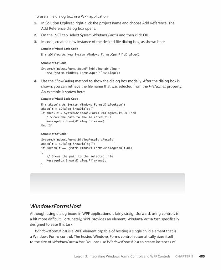
Lesson 3: Integrating Windows Forms Controls and WPF Controls CHAPTER 9 485
To use a file dialog box in a WPF application:
1. In Solution Explorer, right-click the project name and choose Add Reference. The Add Reference dialog box opens.
2. On the .NET tab, select System.Windows.Forms and then click OK.
3. In code, create a new instance of the desired file dialog box, as shown here:
Sample of Visual Basic Code
Dim aDialog As New System.Windows.Forms.OpenFileDialog()
Sample of C# Code
System.Windows.Forms.OpenFileDialog aDialog = new System.Windows.Forms.OpenFileDialog();
4. Use the ShowDialog method to show the dialog box modally. After the dialog box is shown, you can retrieve the file name that was selected from the FileNames property. An example is shown here:
Sample of Visual Basic Code
Dim aResult As System.Windows.Forms.DialogResultaResult = aDialog.ShowDialog() If aResult = System.Windows.Forms.DialogResult.OK Then ' Shows the path to the selected file MessageBox.Show(aDialog.FileName) End If
Sample of C# Code
System.Windows.Forms.DialogResult aResult;aResult = aDialog.ShowDialog(); if (aResult == System.Windows.Forms.DialogResult.OK) { // Shows the path to the selected file MessageBox.Show(aDialog.FileName); }
NOTE AVOIDING NAMING CONFLICTS
It is not advisable to import the System.Windows.Forms namespace because this leads to naming conflicts with several WPF classes.
WindowsFormsHostAlthough using dialog boxes in WPF applications is fairly straightforward, using controls is a bit more difficult. Fortunately, WPF provides an element, WindowsFormsHost, specifically designed to ease this task.
WindowsFormsHost is a WPF element capable of hosting a single child element that is a Windows Forms control. The hosted Windows Forms control automatically sizes itself to the size of WindowsFormsHost. You can use WindowsFormsHost to create instances of
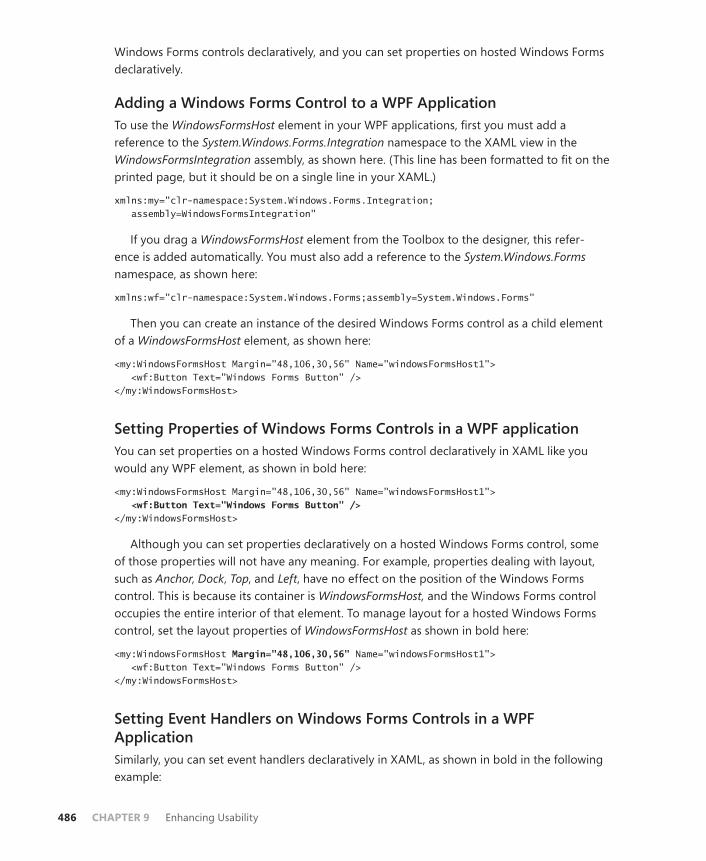
486 CHAPTER 9 Enhancing Usability
Windows Forms controls declaratively, and you can set properties on hosted Windows Forms declaratively.
Adding a Windows Forms Control to a WPF ApplicationTo use the WindowsFormsHost element in your WPF applications, first you must add a reference to the System.Windows.Forms.Integration namespace to the XAML view in the WindowsFormsIntegration assembly, as shown here. (This line has been formatted to fit on the printed page, but it should be on a single line in your XAML.)
xmlns:my="clr-namespace:System.Windows.Forms.Integration; assembly=WindowsFormsIntegration"
If you drag a WindowsFormsHost element from the Toolbox to the designer, this refer-ence is added automatically. You must also add a reference to the System.Windows.Forms namespace, as shown here:
xmlns:wf="clr-namespace:System.Windows.Forms;assembly=System.Windows.Forms"
Then you can create an instance of the desired Windows Forms control as a child element of a WindowsFormsHost element, as shown here:
<my:WindowsFormsHost Margin="48,106,30,56" Name="windowsFormsHost1"> <wf:Button Text="Windows Forms Button" /> </my:WindowsFormsHost>
Setting Properties of Windows Forms Controls in a WPF applicationYou can set properties on a hosted Windows Forms control declaratively in XAML like you would any WPF element, as shown in bold here:
<my:WindowsFormsHost Margin="48,106,30,56" Name="windowsFormsHost1"> <wf:Button Text="Windows Forms Button" /></my:WindowsFormsHost>
Although you can set properties declaratively on a hosted Windows Forms control, some of those properties will not have any meaning. For example, properties dealing with layout, such as Anchor, Dock, Top, and Left, have no effect on the position of the Windows Forms control. This is because its container is WindowsFormsHost, and the Windows Forms control occupies the entire interior of that element. To manage layout for a hosted Windows Forms control, set the layout properties of WindowsFormsHost as shown in bold here:
<my:WindowsFormsHost Margin="48,106,30,56" Name="windowsFormsHost1"> <wf:Button Text="Windows Forms Button" /> </my:WindowsFormsHost>
Setting Event Handlers on Windows Forms Controls in a WPF ApplicationSimilarly, you can set event handlers declaratively in XAML, as shown in bold in the following example:
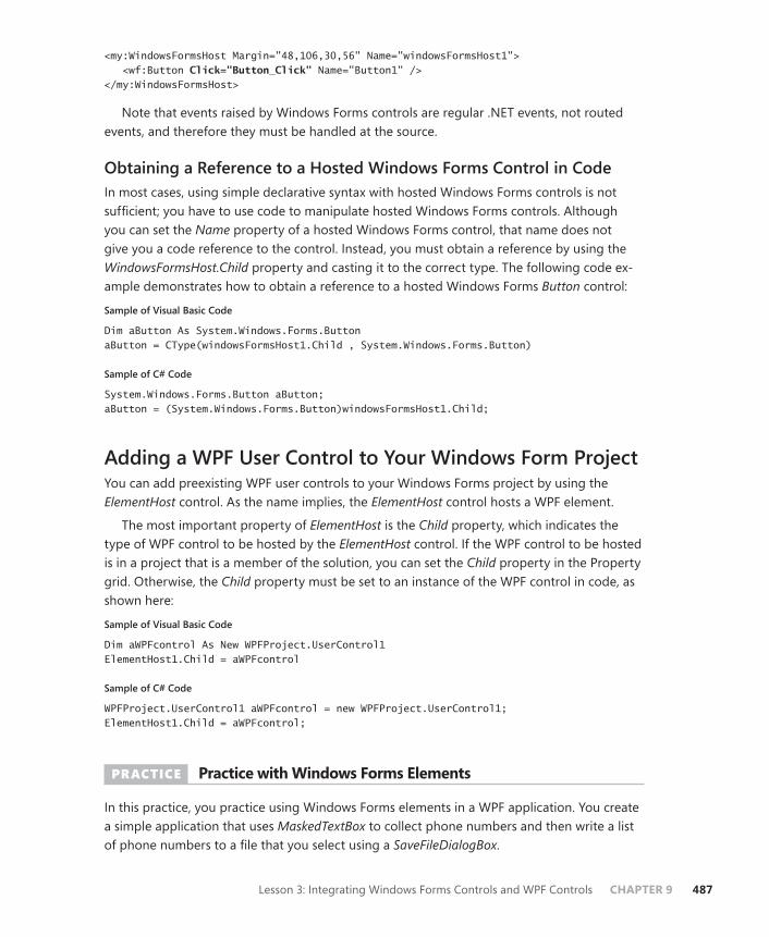
Lesson 3: Integrating Windows Forms Controls and WPF Controls CHAPTER 9 487
<my:WindowsFormsHost Margin="48,106,30,56" Name="windowsFormsHost1"> <wf:Button Click="Button_Click" Name="Button1" /></my:WindowsFormsHost>
Note that events raised by Windows Forms controls are regular .NET events, not routed events, and therefore they must be handled at the source.
Obtaining a Reference to a Hosted Windows Forms Control in CodeIn most cases, using simple declarative syntax with hosted Windows Forms controls is not sufficient; you have to use code to manipulate hosted Windows Forms controls. Although you can set the Name property of a hosted Windows Forms control, that name does not give you a code reference to the control. Instead, you must obtain a reference by using the WindowsFormsHost.Child property and casting it to the correct type. The following code ex-ample demonstrates how to obtain a reference to a hosted Windows Forms Button control:
Sample of Visual Basic Code
Dim aButton As System.Windows.Forms.ButtonaButton = CType(windowsFormsHost1.Child , System.Windows.Forms.Button)
Sample of C# Code
System.Windows.Forms.Button aButton;aButton = (System.Windows.Forms.Button)windowsFormsHost1.Child;
Adding a WPF User Control to Your Windows Form ProjectYou can add preexisting WPF user controls to your Windows Forms project by using the ElementHost control. As the name implies, the ElementHost control hosts a WPF element.
The most important property of ElementHost is the Child property, which indicates the type of WPF control to be hosted by the ElementHost control. If the WPF control to be hosted is in a project that is a member of the solution, you can set the Child property in the Property grid. Otherwise, the Child property must be set to an instance of the WPF control in code, as shown here:
Sample of Visual Basic Code
Dim aWPFcontrol As New WPFProject.UserControl1ElementHost1.Child = aWPFcontrol
Sample of C# Code
WPFProject.UserControl1 aWPFcontrol = new WPFProject.UserControl1;ElementHost1.Child = aWPFcontrol;
PRACTICE Practice with Windows Forms Elements
In this practice, you practice using Windows Forms elements in a WPF application. You create a simple application that uses MaskedTextBox to collect phone numbers and then write a list of phone numbers to a file that you select using a SaveFileDialogBox.

488 CHAPTER 9 Enhancing Usability
EXERCISE Using Windows Forms Elements
1. Create a new WPF application.
2. From the Toolbox, drag a WindowsFormsHost element onto the design surface and size it to the approximate size of an average text box.
3. In XAML view, add the following line to the Window tag to import the System. Windows.Forms namespace:
xmlns:wf="clr-namespace:System.Windows.Forms;assembly=System.Windows.Forms"
4. Modify WindowsFormsHost in XAML so that it encloses a child MaskedTextBox. When finished, your code should look like this:
<indowsFormsHost Margin="26,30,125,0" Name="windowsFormsHost1" Height="27" VerticalAlignment="Top"> <wf:MaskedTextBox /> <WindowsFormsHost>
5. Set the name of MaskedTextBox to MaskedTextBox1 and set the Mask property to (000)-000-0000, as shown here:
<wf:MaskedTextBox Name="MaskedTextBox1" Mask="(000)-000-0000" />
6. In XAML, add the following two buttons as additional children of the Grid:
<Button Height="23" Margin="21,76,125,0" Name="Button1" VerticalAlignment="Top">Add to collection</Button> <Button Margin="21,0,125,118" Name="Button2" Height="22" VerticalAlignment="Bottom">Save collection to file</Button>
7. In the code window, add variables that represent a generic List of string objects and a Windows Forms SaveFileDialog element, as shown here:
Sample of Visual Basic Code
Dim PhoneNumbers As New List(Of String)Dim aDialog As System.Windows.Forms.SaveFileDialog
Sample of C# Code
List<string> PhoneNumbers = new List<String>();System.Windows.Forms.SaveFileDialog aDialog;
8. In the designer, double-click the button labeled Add To Collection to open the default Click event handler. Add the following code:
Sample of Visual Basic Code
Dim aBox As System.Windows.Forms.MaskedTextBoxaBox = CType(windowsFormsHost1.Child, System.Windows.Forms.MaskedTextBox) PhoneNumbers.Add(aBox.Text) aBox.Clear()
Sample of C# Code
System.Windows.Forms.MaskedTextBox aBox;aBox = (System.Windows.Forms.MaskedTextBox)windowsFormsHost1.Child;

Lesson 3: Integrating Windows Forms Controls and WPF Controls CHAPTER 9 489
PhoneNumbers.Add(aBox.Text); aBox.Clear();
9. In the designer, double-click the button labeled Save Collection To File to open the default Click event handler. Add the following code:
Sample of Visual Basic Code
aDialog = New System.Windows.Forms.SaveFileDialogaDialog.Filter = "Text Files | *.txt" aDialog.ShowDialog() Dim myWriter As New System.IO.StreamWriter(aDialog.FileName, True) For Each s As String In PhoneNumbers myWriter.WriteLine(s) Next myWriter.Close()
Sample of C# Code
aDialog = new System.Windows.Forms.SaveFileDialog();aDialog.Filter = "Text Files | *.txt"; aDialog.ShowDialog(); System.IO.StreamWriter myWriter = new System.IO.StreamWriter(aDialog.FileName, true); foreach(string s in PhoneNumbers) myWriter.WriteLine(s); myWriter.Close();
10. Press F5 to build and run your application. Add a few phone numbers to the collection by filling in MaskedTextBox and pressing the Add To Collection button. Then press the Save Collection To File button to open SaveFileDialogBox, and then select a file and save the list.
Lesson Summary■ Windows Forms dialog boxes can be used in WPF applications as they are. Dialog
boxes can be shown modally by calling the ShowDialog method. Although they can be used without problems in WPF applications, Windows Forms dialog boxes typically use Windows Forms types. Therefore, conversion might be necessary in some cases.
■ WPF provides the WindowsFormsHost element to host Windows Forms controls in the user interface. You can obtain a reference to the hosted Windows Forms control in code by casting the WindowsFormsHost.Child property to the appropriate type.
■ Windows Forms provides the ElementHost control to host a WPF element.
Lesson ReviewYou can use the following questions to test your knowledge of the information in Lesson 3, “Integrating Windows Forms Controls and WPF.” The questions are also available on the com-panion CD if you prefer to review them in electronic form.
490 CHAPTER 9 Enhancing Usability
NOTE ANSWERS
Answers to these questions and explanations of why each answer choice is correct or incor-rect are located in the “Answers” section at the end of the book.
1. Look at the following XAML sample:
<my:WindowsFormsHost Margin="31,51,118,0" Name="windowsFormsHost1" Height="39" VerticalAlignment="Top"> <wf:MaskedTextBox Name="MaskedTextBox1" /> </my:WindowsFormsHost>
Assuming that the namespaces for both of these objects are referenced and imported properly, which of the following code samples set(s) the background of MaskedTextBox to black? (Choose all that apply.)
A.
<my:WindowsFormsHost Background="Black" Margin="31,51,118,0" Name="windowsFormsHost1" Height="39" VerticalAlignment="Top"> <wf:MaskedTextBox Name="MaskedTextBox1" /> </my:WindowsFormsHost>
B.
<my:WindowsFormsHost Margin="31,51,118,0" Name="windowsFormsHost1" Height="39" VerticalAlignment="Top"> <wf:MaskedTextBox Name="MaskedTextBox1" BackColor="Black" /> </my:WindowsFormsHost>
C.
Sample of Visual Basic Code
MaskedTextBox1.BackColor = System.Drawing.Color.Black
Sample of C# Code
MaskedTextBox1.BackColor = System.Drawing.Color.Black;
D.
Sample of Visual Basic Code
Dim aMask as System.Windows.Forms.MaskedTextBoxaMask = CType(windowsFormsHost1.Child, System.Windows.Forms.MaskedTextBox) aMask.Backcolor = System.Drawing.Color.Black
Sample of C# Code
System.Windows.Forms.MaskedTextBox aMask;aMask = (System.Windows.Forms.MaskedTextBox)windowsFormsHost1.Child; aMask.BackColor = System.Drawing.Color.Black;
Suggested Practices CHAPTER 9 491
Case Scenarios
In the following case scenarios, you apply what you’ve learned about how to use controls to design user interfaces. You can find answers to these questions in the “Answers” section at the end of this book.
Case Scenario 1: The Publishing ApplicationNow that the great document management application for Fabrikam, Inc., is complete, you have been asked to help design an application for distribution to its clients. This application should enable clients to download large, book-length documents from an online library while enabling clients to continue browsing the library and selecting other documents for down-load. When download of a single document is complete, download of the next document should begin if more are selected. When download of a document is complete, the UI should be updated to reflect that.
■ What strategies can you use to coordinate document download with the UI interac-tion and how can the UI be constantly updated without fear of deadlocks or other problems?
Case Scenario 2: Creating a Simple GameYou finally have a day off from your job, so you decide to spend some time writing a nice, relaxing solitaire program. You have the actual gameplay pretty well done, and you are now just adding the bells and whistles. You would like to implement functionality that plays sounds in the background based on user interactions. These sounds are in a specialized for-mat, and you must use a proprietary player that does not intrinsically support asynchronous play. You have a list of five sound files you can play, and you would like to save time and make the coding easy on yourself.
■ What is a strategy for implementing the required functionality with a minimum of complexity in your program?
Suggested Practices
To help you successfully master the exam objectives presented in this chapter, complete the following tasks.
■ Practice 1 Create an application that computes the value of pi on a separate thread and continually updates the UI with the value in a thread-safe manner.
■ Practice 2 Create a localized form using a language that reads right to left. The local-ized version of the form should include appropriate strings and the layout should be reversed.
492 CHAPTER 9 Enhancing Usability
Take a Practice Test
The practice tests on this book’s companion CD offer many options. For example, you can test yourself on just the content covered in this chapter, or you can test yourself on all the 70-511 certification exam content. You can set up the test so that it closely simulates the experience of taking a certification exam, or you can set it up in study mode so that you can look at the correct answers and explanations after you answer each question.
MORE INFO PRACTICE TESTS
For details about all the practice test options available, see the “How to Use the Practice Tests” section in this book’s Introduction.
CHAPTER 10 493
C H A P T E R 1 0
Advanced Topics
In this chapter, you learn about three topics that are important features for application development: how to configure your application to request permissions from code access
security and user account controls, as well as how to configure software restriction policies; how to manage user and application settings for your application; and how to implement drag and drop operations in your application.
Exam objectives in this chapter: ■ Implement security features of an application.■ Manage user and application settings.■ Implement drag and drop operations within and across applications.
Lessons in this chapter:■ Lesson 1: Working with Security 495■ Lesson 2: Managing Settings 503■ Lesson 3: Implementing Drag and Drop 510

494 CHAPTER 10 Advanced Topics
Before You Begin
To complete the lessons in this chapter, you must have:
■ A computer that meets or exceeds the minimum hardware requirements listed in the “About This Book” section at the beginning of the book.
■ Microsoft Visual Studio 2010 Professional installed on your computer.
■ An understanding of Microsoft Visual Basic or C# syntax and familiarity with Microsoft .NET Framework 4.0.
■ An understanding of Extensible Application Markup Language (XAML).
■ Windows 7 Professional, Ultimate, or Enterprise (for Lesson 1).
REAL WORLD
Matthew Stoecker
In the early days of computing, security wasn’t given a second thought. But as soon as networks connected computers together, malicious users sought to disrupt
work or steal valuable data. Windows 7 Professional provides great new tools for managing the security of your computer so that you can ensure that only appli-cations from trusted sources are executed, thus safeguarding your data and the integrity of your system.
Lesson 1: Working with Security CHAPTER 10 495
Lesson 1: Working with Security
Your applications will be run in a variety of computer environments. The target computer for your application might be secured by the most current software restriction policy technology, or it might rely on User Account Control or code access security technology. In this chapter, you learn to configure your application to request permissions for the target computer and to create a software restriction policy on a computer running Windows 7.
After this lesson, you will be able to:■ Configure code access security for your application.■ Configure User Account Control requests for your application.■ Create a software restriction policy.
Estimated lesson time: 30 minutes
When deploying an application, security for that application and the host system is always a concern. Although applications deployed with setup projects are deployed under full-trust conditions, you can configure applications deployed with ClickOnce to request a variety of permission classes. This section demonstrates how to configure your application to request permissions under code access security policy and User Account Control. You also learn how to create a software restriction policy.
Table 10-1 lists general operations that are not safe in partial-trust environments.
TABLE 10-1 Features That Are Unsafe for Use in Partial-Trust Environments
FEATURE AREA FEATURES
General ■ Window (application-defined windows and dialog boxes)
■ SaveFile dialog box
■ File system
■ RegistryAccess
■ Drag and drop
■ XAML serialization (through XamlWriter.Save)
■ UIAutomation clients
■ Source window access (HwndHost)
■ Full speech support
■ Windows Forms interoperability

496 CHAPTER 10 Advanced Topics
Web Integration ■ Web Services (using Windows Communication Foundation)
■ Scripting
■ Document object model
Visuals ■ Bitmap effects
Editing ■ Rich text format clipboard
■ Full XAML support
When writing applications that might be deployed in partial-trust environments, try to avoid using the features listed in Table 10-1 as much as possible. For applications that might be run in both partial trust and full trust, you can use code access security (CAS) to check at run time whether a specific operation is permitted and, if not, to recover gracefully from that attempt rather than cause the application to crash. The following example demonstrates creating a demand for FileIOPermission to determine whether it is safe to write to a file. If the application does not have permission to write to the specified file, an exception is thrown.
Sample of Visual Basic Code
Try Dim perm As New System.Security.Permissions.FileIOPermission( _ System.Security.Permissions.FileIOPermissionAccess.AllAccess, _ "C:\myFile") perm.Demand() ' proceed with writing the file Catch ex As Exception ' recover from being unable to write the file End Try
Sample of C# Code
try { System.Security.Permissions.FileIOPermission perm = new System.Security.Permissions.FileIOPermission( System.Security.Permissions.FileIOPermissionAccess.AllAccess, "C:\\myFile"); perm.Demand(); // proceed with writing the file } catch { // recover from being unable to write the file }
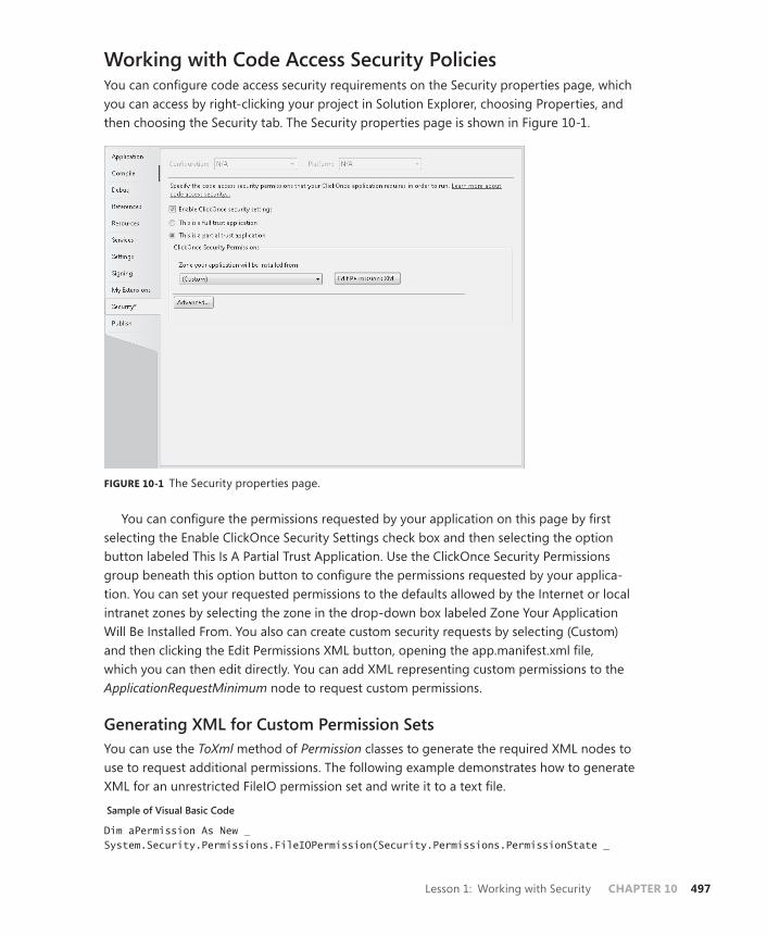
Lesson 1: Working with Security CHAPTER 10 497
Working with Code Access Security PoliciesYou can configure code access security requirements on the Security properties page, which you can access by right-clicking your project in Solution Explorer, choosing Properties, and then choosing the Security tab. The Security properties page is shown in Figure 10-1.
FIGURE 10-1 The Security properties page.
You can configure the permissions requested by your application on this page by first selecting the Enable ClickOnce Security Settings check box and then selecting the option button labeled This Is A Partial Trust Application. Use the ClickOnce Security Permissions group beneath this option button to configure the permissions requested by your applica-tion. You can set your requested permissions to the defaults allowed by the Internet or local intranet zones by selecting the zone in the drop-down box labeled Zone Your Application Will Be Installed From. You also can create custom security requests by selecting (Custom) and then clicking the Edit Permissions XML button, opening the app.manifest.xml file, which you can then edit directly. You can add XML representing custom permissions to the ApplicationRequestMinimum node to request custom permissions.
Generating XML for Custom Permission SetsYou can use the ToXml method of Permission classes to generate the required XML nodes to use to request additional permissions. The following example demonstrates how to generate XML for an unrestricted FileIO permission set and write it to a text file.
Sample of Visual Basic Code
Dim aPermission As New _System.Security.Permissions.FileIOPermission(Security.Permissions.PermissionState _
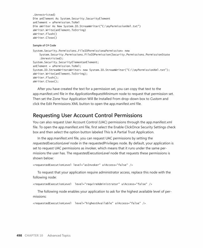
498 CHAPTER 10 Advanced Topics
.Unrestricted) Dim anElement As System.Security.SecurityElement anElement = aPermission.ToXml Dim aWriter As New System.IO.StreamWriter("C:\myPermissionXml.txt") aWriter.Write(anElement.ToString) aWriter.Flush() aWriter.Close()
Sample of C# Code
System.Security.Permissions.FileIOPermissionaPermission= new System.Security.Permissions.FileIOPermission(Security.Permissions.PermissionState .Unrestricted); System.Security.SecurityElementanElement; anElement = aPermission.ToXml; System.IO.StreamWriteraWriter= new System.IO.StreamWriter("C:\\myPermissionXml.txt"); aWriter.Write(anElement.ToString); aWriter.Flush(); aWriter.Close();
After you have created the text for a permission set, you can copy that text to the app. manifest.xml file in the ApplicationRequestMinimum node to request that permission set. Then set the Zone Your Application Will Be Installed From drop-down box to Custom and click the Edit Permissions XML button to open the app.manifest.xml file.
Requesting User Account Control PermissionsYou can also request User Account Control (UAC) permissions through the app.manifest.xml file. To open the app.manifest.xml file, first select the Enable ClickOnce Security Settings check box and then select the option button labeled This Is A Partial Trust Application.
In the app.manifest.xml file, you can request UAC permissions by setting the requestedExecutionLevel node in the requestedPrivileges node. By default, your application is set to request UAC permissions as invoker, which means that it runs under the same per-missions the user has. The requestedExecutionLevel node that requests these permissions is shown below:
<requestedExecutionLevel level="asInvoker" uiAccess="false" />
To request that your application require administrator access, replace this node with the following node:
<requestedExecutionLevel level="requireAdministrator" uiAccess="false" />
The following node enables your application to ask for the highest available level of per-missions:
<requestedExecutionLevel level="highestAvailable" uiAccess="false" />
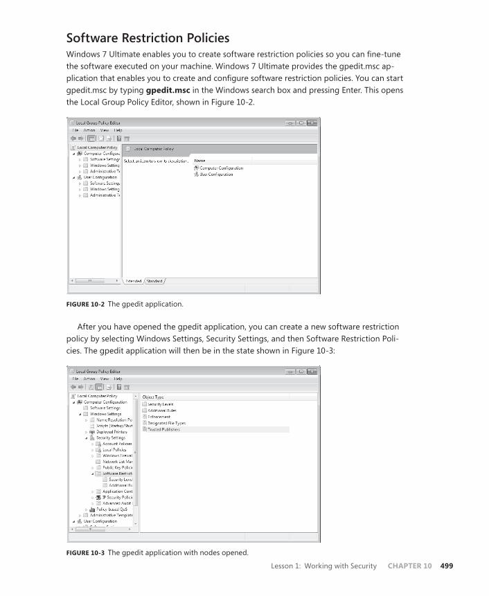
Lesson 1: Working with Security CHAPTER 10 499
Software Restriction PoliciesWindows 7 Ultimate enables you to create software restriction policies so you can fine-tune the software executed on your machine. Windows 7 Ultimate provides the gpedit.msc ap-plication that enables you to create and configure software restriction policies. You can start gpedit.msc by typing gpedit.msc in the Windows search box and pressing Enter. This opens the Local Group Policy Editor, shown in Figure 10-2.
FIGURE 10-2 The gpedit application.
After you have opened the gpedit application, you can create a new software restriction policy by selecting Windows Settings, Security Settings, and then Software Restriction Poli-cies. The gpedit application will then be in the state shown in Figure 10-3:
FIGURE 10-3 The gpedit application with nodes opened.
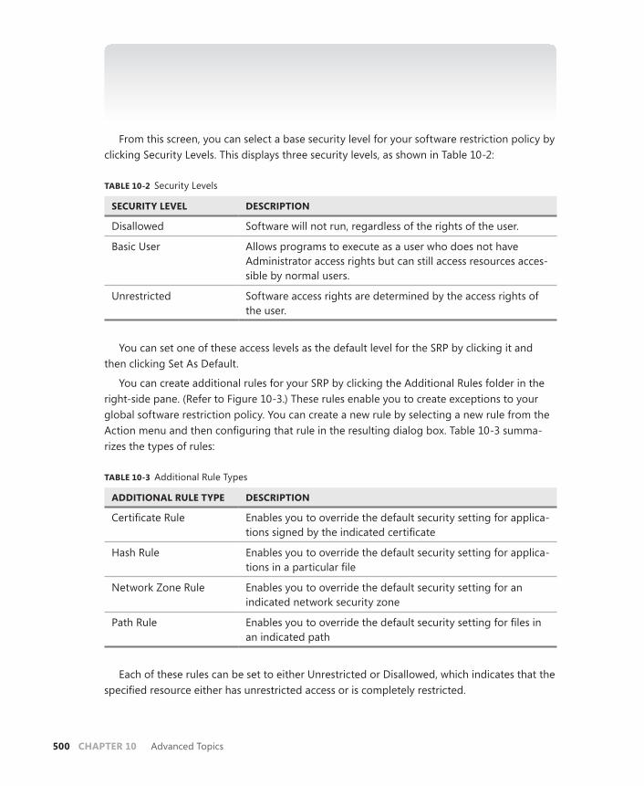
500 CHAPTER 10 Advanced Topics
NOTE IF NO SOFTWARE RESTRICTION POLICIES ARE DEFINED
If the screen indicates that no software restriction policies have been defined, you can create a new default software restriction policy by choosing Action and then New Software Restriction Policies.
From this screen, you can select a base security level for your software restriction policy by clicking Security Levels. This displays three security levels, as shown in Table 10-2:
TABLE 10-2 Security Levels
SECURITY LEVEL DESCRIPTION
Disallowed Software will not run, regardless of the rights of the user.
Basic User Allows programs to execute as a user who does not have Administrator access rights but can still access resources acces-sible by normal users.
Unrestricted Software access rights are determined by the access rights of the user.
You can set one of these access levels as the default level for the SRP by clicking it and then clicking Set As Default.
You can create additional rules for your SRP by clicking the Additional Rules folder in the right-side pane. (Refer to Figure 10-3.) These rules enable you to create exceptions to your global software restriction policy. You can create a new rule by selecting a new rule from the Action menu and then configuring that rule in the resulting dialog box. Table 10-3 summa-rizes the types of rules:
TABLE 10-3 Additional Rule Types
ADDITIONAL RULE TYPE DESCRIPTION
Certificate Rule Enables you to override the default security setting for applica-tions signed by the indicated certificate
Hash Rule Enables you to override the default security setting for applica-tions in a particular file
Network Zone Rule Enables you to override the default security setting for an indicated network security zone
Path Rule Enables you to override the default security setting for files in an indicated path
Each of these rules can be set to either Unrestricted or Disallowed, which indicates that the specified resource either has unrestricted access or is completely restricted.
Lesson 1: Working with Security CHAPTER 10 501
You can also configure your software restriction policy for Enforcement, Designated File Types, and Trusted Publishers. Clicking each of these brings up a dialog box that enables you to configure each of these policies.
Clicking Enforcement enables you to designate whether this policy should apply to all software files or libraries such as .DLLs will be excluded, whether the policy applies to all users or all users except administrators, and whether to apply certificate rules or enforce them.
Clicking Designated File Types enables you to designate file types affected by the policy. You can add or remove file types in this dialog box.
Clicking Trusted Publishers enables you to designate which users can manage the Trusted Publishers files.
PRACTICE Creating a Software Restriction Policy
In this practice, you create a software restriction policy for your computer that restricts soft-ware execution to allow only software installed to the Users folder to execute and disallows all other software.
EXERCISE Creating a Software Restriction Policy
1. In Windows 7, type gpedit.msc into the Search box and press Enter to open the gpedit application. Note that this functionality is available only in Windows 7 Professional, Ultimate, or Enterprise.
2. In gpedit, expand Windows Settings and Security Settings and then select Software Restriction Policies.
3. From the Action menu, select New Software Restriction Policies to create a new default Software Restriction Policy.
4. In the right-side pane, double-click Enforcement to open the Enforcement Properties dialog box. Apply enforcement to all software files and apply enforcement to all users except local administrators. Click OK.
5. In the right-side pane, double-click Designated File Types to open the Designated File Types Properties dialog box. Under Designated File Types, select LNK, click Remove, and then click Yes to enable shortcuts to continue functioning.
6. Click Additional Rules and inspect both additional rules already in place.
Note that these are path rules that exempt system files and files in the Program Files folder from this rule by default.
7. Double-click Security Levels, double-click Set As Default, and click Yes.
Your new software restriction policy is now in place.
8. Double-click Additional Rules. From the Action menu, choose New Path Rule to open the New Path Rule dialog box.
502 CHAPTER 10 Advanced Topics
9. In the New Path Rule dialog box, click Browse and browse to your user folder. Under Security Level, select Unrestricted and click OK. Your rule now allows unrestricted ac-cess for applications installed to your user directory. If you do not want to retain this Software Restriction Policy on your computer, you can delete it by selecting Software Restriction Policies and selecting Delete Software Restriction Policies from the Action menu.
Lesson Summary■ You can configure options for requesting code access security and User Account con-
trols by editing the app.manifest.xml file.
■ You can create software restriction policies using gpedit.msc that enable you to fine-tune security policies on your local machine.
Lesson ReviewYou can use the following questions to test your knowledge of the information in Lesson 1, “Working with Security.” The questions are also available on the companion CD if you prefer to review them in electronic form.
NOTE ANSWERS
Answers to these questions and explanations of why each answer choice is correct or incor-rect are located in the “Answers” section at the end of the book.
1. Which of the following is required to request custom code access permissions for your application? (Choose all that apply.)
A. Select (Custom) in the Security Properties page.
B. Modify the applicationRequestMinimum node in the app.manifest.xml file.
C. Modify the requestedPrivileges node in the app.manifest.xml file.
D. Create a software restriction policy that grants unrestricted access to your application.
2. Which of the following are safe features to use when you are deploying your applica-tion to a partial-trust environment? (Choose all that apply.)
A. File IO
B. Isolated Storage
C. Registry Access
D. Using Images in content controls (WPF)

Lesson 2: Managing Settings CHAPTER 10 503
Lesson 2: Managing Settings
The .NET Framework enables you to create and access values called settings that persist from application session to application session. Settings can represent any kind of information an application might need from session to session, such as user preferences, the address of a Web server, or any other kind of necessary information. In this lesson, you learn how to create and access settings. You learn the difference between a user setting and an application set-ting and how to load and save settings at run time.
After this lesson, you will be able to:■ Explain the difference between a user setting and an application setting.■ Create a new setting at design time.■ Load settings at run time.■ Save user settings at run time.
Estimated lesson time: 15 minutes
Settings can store information that is valuable to the application but might change from time to time. For example, you can use settings to store user preferences such as the color scheme of an application or the address of a Web server the application uses.
Settings have four properties:
■ Name, which indicates the name of the setting. This is used to access the setting at run time.
■ Type, which represents the data type of the setting.
■ Value, which is the value returned by the setting.
■ Scope, which can be either User or Application.
The Name, Type, and Value properties should be fairly self-explanatory. The Scope prop-erty, however, bears a little closer examination. The Scope property can be set to either Application or User. A setting with Application scope represents a value that is used by the entire application regardless of the user, whereas an application with User scope is more likely to be user-specific and less crucial to the application.
An important distinction between user settings and application settings is that user set-tings are read/write. They can be read and written to at run time, and newly written values can be saved by the application. In contrast, Application settings are read-only and the values can be changed only at design time or by editing the Settings file between application sessions.
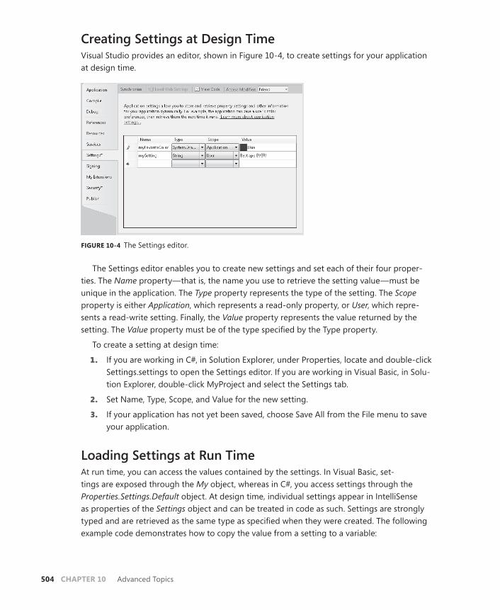
504 CHAPTER 10 Advanced Topics
Creating Settings at Design TimeVisual Studio provides an editor, shown in Figure 10-4, to create settings for your application at design time.
FIGURE 10-4 The Settings editor.
The Settings editor enables you to create new settings and set each of their four proper-ties. The Name property—that is, the name you use to retrieve the setting value—must be unique in the application. The Type property represents the type of the setting. The Scope property is either Application, which represents a read-only property, or User, which repre-sents a read-write setting. Finally, the Value property represents the value returned by the setting. The Value property must be of the type specified by the Type property.
To create a setting at design time:
1. If you are working in C#, in Solution Explorer, under Properties, locate and double-click Settings.settings to open the Settings editor. If you are working in Visual Basic, in Solu-tion Explorer, double-click MyProject and select the Settings tab.
2. Set Name, Type, Scope, and Value for the new setting.
3. If your application has not yet been saved, choose Save All from the File menu to save your application.
Loading Settings at Run TimeAt run time, you can access the values contained by the settings. In Visual Basic, set-tings are exposed through the My object, whereas in C#, you access settings through the Properties. Settings.Default object. At design time, individual settings appear in IntelliSense as properties of the Settings object and can be treated in code as such. Settings are strongly typed and are retrieved as the same type as specified when they were created. The following example code demonstrates how to copy the value from a setting to a variable:
Lesson 2: Managing Settings CHAPTER 10 505
Sample of Visual Basic Code
Dim aString As String aString = My.Settings.MyStringSetting
Sample of C# Code
String aString; aString = Properties.Settings.Default.MyStringSetting;
Saving User Settings at Run TimeYou can save the value of user settings at run time. To change the value of a user setting, sim-ply assign it a new value, just as you would any property or field. Then you must call the Save method to save the new value. An example is shown here:
Sample of Visual Basic Code
My.Settings.Headline = "This is tomorrow's headline" My.Settings.Save
Sample of C# Code
Properties.Settings.Default.Headline = "This is tomorrow's headline"; Properties.Settings.Default.Save();
Quick Check■ What is the difference between a user setting and an application setting?
Quick Check Answer■ A user setting is designed to be user-specific, such as a background color.
User settings can be written at run time and can vary from user to user. An application setting is designed to be constant for all users of an application, such as a database connection string. Application settings are read-only at run time.
PRACTICE Practice with Settings
In this practice, you create an application that uses settings. You define settings while build-ing the application, read the settings, apply them in your application, and enable the user to change one of the settings.
EXERCISE Using Settings
1. In Visual Studio, create a new WPF application.
2. In Solution Explorer, expand Properties and double-click Settings.settings (in C#) or double-click My Project and choose the Settings tab (in Visual Basic) to open the Settings editor.

506 CHAPTER 10 Advanced Topics
3. Add two settings, as described in this table. For the second setting, you must browse to find and expand the PresentationCore node, then expand the System.Windows.Media type to find the System.Windows.Media.Color type:
NAME TYPE SCOPE VALUE
ApplicationName String Application Settings App
BackgroundColor System.Windows.Media .Color
User #ff0000ff
4. In XAML view, add the following XAML to the Grid element to add a ListBox control with four items and a Button control to your user interface:
<ListBox Margin="15,15,0,0" Name="listBox1" Height="78" HorizontalAlignment="Left" VerticalAlignment="Top" Width="107"> <ListBoxItem>Red</ListBoxItem> <ListBoxItem>Blue</ListBoxItem> <ListBoxItem>Green</ListBoxItem> <ListBoxItem>Tomato</ListBoxItem> </ListBox> <Button Margin="15,106,110,130" Name="button1">Change Background Color</Button>
5. In the designer, double-click button1 to open the code view to the default handler for the Click event. Add the following code:
Sample of Visual Basic Code
If Not listBox1.SelectedItem Is Nothing Then Dim astring As String = CType(listBox1.SelectedItem, _ ListBoxItem).Content.ToString Select Case astring Case "Red" My.Settings.BackgroundColor = Colors.Red Case "Blue" My.Settings.BackgroundColor = Colors.Blue Case "Green" My.Settings.BackgroundColor = Colors.Green Case "Tomato" My.Settings.BackgroundColor = Colors.Tomato End Select Me.Background = New _ System.Windows.Media.SolidColorBrush(My.Settings.BackgroundColor) My.Settings.Save() End If
Sample of C# Code
if (!(listBox1.SelectedItem == null)) { String astring = ((ListBoxItem)listBox1.SelectedItem).Content.ToString(); switch (astring)

Lesson 2: Managing Settings CHAPTER 10 507
{ case "Red": Properties.Settings.Default.BackgroundColor = Colors.Red; break; case "Blue": Properties.Settings.Default.BackgroundColor = Colors.Blue; break; case "Green": Properties.Settings.Default.BackgroundColor = Colors.Green; break; case "Tomato": Properties.Settings.Default.BackgroundColor = Colors.Tomato; break; } this.Background = new System.Windows.Media.SolidColorBrush( Properties.Settings.Default.BackgroundColor); Properties.Settings.Default.Save(); }
6. Create or replace the constructor for this class with the following code to read and ap-ply the settings:
Sample of Visual Basic Code
Public Sub New() InitializeComponent() Me.Title = My.Settings.ApplicationName Me.Background = New _ System.Windows.Media.SolidColorBrush(My.Settings.BackgroundColor) End Sub
Sample of C# Code
public MainWindow () { InitializeComponent(); this.Title = Properties.Settings.Default.ApplicationName; this.Background = new System.Windows.Media.SolidColorBrush( Properties.Settings.Default.BackgroundColor); }
7. Press F5 to build and run your application. Note that the title of the window is the value of your ApplicationName setting and the background color of your window is the value indicated by the BackgroundColor setting. You can change the background color by selecting an item in the list box and clicking the button. After changing the background color, close the application and restart it. Note that the background color of the application at startup is the same as it was when the previous application session ended.
508 CHAPTER 10 Advanced Topics
Lesson Summary■ Settings enable you to persist values between application sessions. You can add new
settings at design time by using the Settings editor.
■ Settings can be one of two scopes. Settings with Application scope are read-only at run time and can be changed only by altering the Settings file between application sessions. Settings with User scope are read-write at run time.
■ You can access settings in code through My.Settings in Visual Basic or Properties. Settings.Default in C#.
Lesson ReviewYou can use the following questions to test your knowledge of the information in Lesson 2, “Managing Settings.” The questions are also available on the companion CD if you prefer to review them in electronic form.
NOTE ANSWERS
Answers to these questions and explanations of why each answer choice is correct or incor-rect are located in the “Answers” section at the end of the book.
1. Which of the following code samples correctly sets the value of a setting called Title and persists it?
A.
Sample of Visual Basic Code
My.Settings("Title") = "New Title" My.Settings.Save
Sample of C# Code
Properties.Settings.Default["Title"] = "New Title"; Properties.Settings.Default.Save();
B.
Sample of Visual Basic Code
My.Settings("Title") = "New Title"
Sample of C# Code
Properties.Settings.Default["Title"] = "New Title";
C.
Sample of Visual Basic Code
My.Settings.Title = "New Title" My.Settings.Save()

Lesson 2: Managing Settings CHAPTER 10 509
Sample of C# Code
Properties.Settings.Default.Title = "New Title"; Properties.Settings.Default.Save();
D.
Sample of Visual Basic Code
My.Settings.Title = "New Title"
Sample of C# Code
Properties.Settings.Default.Title = "New Title";
2. Which of the following code samples reads a setting of type System.Windows.Media.Color named MyColor correctly?
A.
Sample of Visual Basic Code
Dim aColor As System.Windows.Media.ColoraColor = CType(My.Settings.MyColor, System.Windows.Media.Color)
Sample of C# Code
System.Windows.Media.ColoraColor; aColor = (System.Windows.Media.Color)Properties.Settings.Default.MyColor;
B.
Sample of Visual Basic Code
Dim aColor As System.Windows.Media.ColoraColor = My.Settings.MyColor.ToColor()
Sample of C# Code
System.Windows.Media.ColoraColor; aColor = Properties.Settings.Default.MyColor.ToColor();
C.
Sample of Visual Basic Code
Dim aColor As Object aColor = My.Settings.MyColor
Sample of C# Code
Object aColor; aColor = Properties.Settings.Default.MyColor;
D.
Sample of Visual Basic Code
Dim aColor As System.Windows.Media.ColoraColor = My.Settings.MyColor
Sample of C# Code
System.Windows.Media.ColoraColor; aColor = Properties.Settings.Default.MyColor;

510 CHAPTER 10 Advanced Topics
Lesson 3: Implementing Drag and Drop
Drag and drop functionality refers to being able to grab data—such as a string or an object—by pressing and holding down the left mouse button, moving the mouse with the left button held down over another control that is able to accept the data, and then releasing the mouse button to transfer the data. Drag and drop functionality is implemented primarily by handling events. In this lesson, you learn how to implement basic drag and drop functionality and how to implement drag and drop functionality between applications.
After this lesson, you will be able to:■ Perform drag and drop operations within a Windows Forms application.■ Perform drag and drop operations within a WPF application.■ Perform drag and drop operations between applications.
Estimated lesson time: 45 minutes
Implementing Drag and Drop Functionality Drag and drop functionality is ubiquitous in Windows programming. It refers to enabling the user to grab data—such as text, an image, or another object—with the mouse and drag it to another control. When the mouse button is released over the other control, the data being dragged is dropped onto the control, and a variety of effects can then occur.
Dragging and dropping is similar to cutting and pasting. The mouse pointer is positioned over a control and the mouse button is pressed. Data is copied from a source control; when the mouse button is released, the drop action is completed. All code for copying the data from the source control and any actions taken on the target control must be explicitly coded.
Drag and drop operations are very similar in WPF and Windows Forms applications. The primary difference is that in Windows Forms, drag and drop methods and events are exposed on individual controls, and in WPF, the methods are exposed on a static class called DragDrop, which also provides attached events to WPF controls to facilitate drag and drop operations.
The drag and drop process is primarily an event-driven process. There are events that oc-cur on the source control and events that occur on the target control. Table 10-4 describes the drag and drop events for the source control. The drag and drop events for the target control are described in Table 10-5.
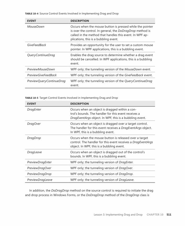
Lesson 3: Implementing Drag and Drop CHAPTER 10 511
TABLE 10-4 Source Control Events Involved in Implementing Drag and Drop
EVENT DESCRIPTION
MouseDown Occurs when the mouse button is pressed while the pointer is over the control. In general, the DoDragDrop method is called in the method that handles this event. In WPF ap-plications, this is a bubbling event.
GiveFeedBack Provides an opportunity for the user to set a custom mouse pointer. In WPF applications, this is a bubbling event.
QueryContinueDrag Enables the drag source to determine whether a drag event should be cancelled. In WPF applications, this is a bubbling event.
PreviewMouseDown WPF only; the tunneling version of the MouseDown event.
PreviewGiveFeedBack WPF only; the tunneling version of the GiveFeedback event.
PreviewQueryContinueDrag WPF only; the tunneling version of the QueryContinueDrag event.
TABLE 10-5 Target Control Events Involved in Implementing Drag and Drop
EVENT DESCRIPTION
DragEnter Occurs when an object is dragged within a con-trol’s bounds. The handler for this event receives a DragEventArgs object. In WPF, this is a bubbling event.
DragOver Occurs when an object is dragged over a target control. The handler for this event receives a DragEventArgs object. In WPF, this is a bubbling event.
DragDrop Occurs when the mouse button is released over a target control. The handler for this event receives a DragEventArgs object. In WPF, this is a bubbling event.
DragLeave Occurs when an object is dragged out of the control’s bounds. In WPF, this is a bubbling event.
PreviewDragEnter WPF only; the tunneling version of DragEnter.
PreviewDragOver WPF only; the tunneling version of DragOver.
PreviewDragDrop WPF only; the tunneling version of DragDrop.
PreviewDragLeave WPF only; the tunneling version of DragLeave.
In addition, the DoDragDrop method on the source control is required to initiate the drag and drop process in Windows Forms, or the DoDragDrop method of the DragDrop class is
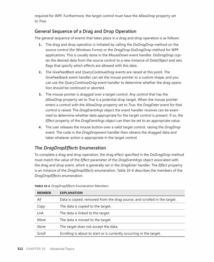
512 CHAPTER 10 Advanced Topics
required for WPF. Furthermore, the target control must have the AllowDrop property set to True.
General Sequence of a Drag and Drop OperationThe general sequence of events that takes place in a drag and drop operation is as follows:
1. The drag and drop operation is initiated by calling the DoDragDrop method on the source control (for Windows Forms) or the DragDrop.DoDragDrop method for WPF applications. This is usually done in the MouseDown event handler. DoDragDrop cop-ies the desired data from the source control to a new instance of DataObject and sets flags that specify which effects are allowed with this data.
2. The GiveFeedBack and QueryContinueDrag events are raised at this point. The GiveFeedback event handler can set the mouse pointer to a custom shape, and you can use the QueryContinueDrag event handler to determine whether the drag opera-tion should be continued or aborted.
3. The mouse pointer is dragged over a target control. Any control that has the AllowDrop property set to True is a potential drop target. When the mouse pointer enters a control with the AllowDrop property set to True, the DragEnter event for that control is raised. The DragEventArgs object the event handler receives can be exam-ined to determine whether data appropriate for the target control is present. If so, the Effect property of the DragEventArgs object can then be set to an appropriate value.
4. The user releases the mouse button over a valid target control, raising the DragDrop event. The code in the DragDropevent handler then obtains the dragged data and takes whatever action is appropriate in the target control.
The DragDropEffects EnumerationTo complete a drag and drop operation, the drag effect specified in the DoDragDrop method must match the value of the Effect parameter of the DragEventArgs object associated with the drag and drop event, which is generally set in the DragEnter handler. The Effect property is an instance of the DragDropEffects enumeration. Table 10-6 describes the members of the DragDropEffects enumeration.
TABLE 10-6 DragDropEffects Enumeration Members
MEMBER EXPLANATION
All Data is copied, removed from the drag source, and scrolled in the target.
Copy The data is copied to the target.
Link The data is linked to the target.
Move The data is moved to the target.
None The target does not accept the data.
Scroll Scrolling is about to start or is currently occurring in the target.

Lesson 3: Implementing Drag and Drop CHAPTER 10 513
Note that the main function of the Effect parameter is to change the mouse cursor when it is over the target control. The value of the Effect parameter has no actual effect on the action that is executed except that when the Effect parameter is set to None, no drop can take place on that control because the DragDrop event will not be raised.
Initiating the Drag and Drop Operation in Windows Forms ApplicationsThe drag and drop operation is initiated by calling the DoDragDrop method on the source control. The DoDragDrop method takes two parameters: Object, which represents the data to be copied to DataObject, and an instance of DragDropEffects, which specifies which drag ef-fects will be allowed with this data. The following example demonstrates how to copy the text from a text box and set the allowed effects to Copy or Move:
Sample of Visual Basic Code
Private Sub TextBox1_MouseDown(ByVal sender As System.Object, _ ByVal e As System.Windows.Forms.MouseEventArgs) _ Handles TextBox1.MouseDown TextBox1.DoDragDrop(TextBox1.Text, DragDropEffects.Copy Or DragDropEffects.Move) End Sub
Sample of C# Code
private void textBox1_MouseDown(object sender, MouseEventArgs e) { textBox1.DoDragDrop(textBox1.Text, DragDropEffects.Copy | DragDropEffects.Move); }
Note that you can use the Or operator (Visual Basic) or the | operator (C#) to combine members of the DragDropEffects enumeration to indicate multiple effects.
Initiating the Drag and Drop Operation in WPF ApplicationsIn WPF applications, you initiate the drag and drop operation by calling DragDrop. DoDragDrop. This method takes three parameters: DependencyObject, which repre-sents the source control for the drag operation; Object, which represents the data that will be copied to DataObject; and an instance of DragDropEffects, which specifies which drag effects will be allowed with this data. The following example demonstrates how to copy the text from a text box and set the allowed effects to Copy or Move:
Sample of Visual Basic Code
Private Sub TextBox1_MouseDown(ByVal sender As System.Object, _ ByVal e As System.Windows.Input.MouseButtonEventArgs) _ Handles TextBox1.MouseDown DragDrop.DoDragDrop(TextBox1, TextBox1.Text, DragDropEffects.Copy Or DragDropEffects.Move) End Sub
Sample of C# Code
private void textBox1_MouseDown(object sender, MouseButtonEventArgs e) {
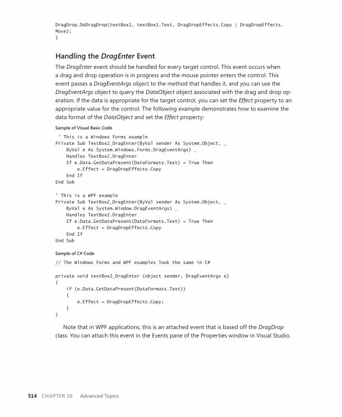
514 CHAPTER 10 Advanced Topics
DragDrop.DoDragDrop(textBox1, textBox1.Text, DragDropEffects.Copy | DragDropEffects.Move); }
Handling the DragEnter EventThe DragEnter event should be handled for every target control. This event occurs when a drag and drop operation is in progress and the mouse pointer enters the control. This event passes a DragEventArgs object to the method that handles it, and you can use the DragEventArgs object to query the DataObject object associated with the drag and drop op-eration. If the data is appropriate for the target control, you can set the Effect property to an appropriate value for the control. The following example demonstrates how to examine the data format of the DataObject and set the Effect property:
Sample of Visual Basic Code
' This is a Windows Forms examplePrivate Sub TextBox2_DragEnter(ByVal sender As System.Object, _ ByVal e As System.Windows.Forms.DragEventArgs) _ Handles TextBox2.DragEnter If e.Data.GetDataPresent(DataFormats.Text) = True Then e.Effect = DragDropEffects.Copy End If End Sub
' This is a WPF examplePrivate Sub TextBox2_DragEnter(ByVal sender As System.Object, _ ByVal e As System.Window.DragEventArgs) _ Handles TextBox2.DragEnter If e.Data.GetDataPresent(DataFormats.Text) = True Then e.Effect = DragDropEffects.Copy End If End Sub
Sample of C# Code
// The Windows Forms and WPF examples look the same in C#
private void textBox2_DragEnter (object sender, DragEventArgs e) { if (e.Data.GetDataPresent(DataFormats.Text)) { e.Effect = DragDropEffects.Copy; } }
Note that in WPF applications, this is an attached event that is based off the DragDrop class. You can attach this event in the Events pane of the Properties window in Visual Studio.

Lesson 3: Implementing Drag and Drop CHAPTER 10 515
Handling the DragDrop EventWhen the mouse button is released over a target control during a drag and drop operation, the DragDrop event is raised. In the method that handles the DragDrop event, you can use the GetData method of DataObject to retrieve the copied data from DataObject and take whatever action is appropriate for the control. The following example demonstrates how to drop a string into a text box:
Sample of Visual Basic Code
' This is a Windows Forms example
Private Sub TextBox2_DragDrop(ByVal sender As System.Object, ByVal e As _ System.Windows.Forms.DragEventArgs) Handles TextBox2.DragDrop TextBox2.Text = TryCast(e.Data.GetData(DataFormats.Text), String) End Sub
' This is a WPF example
Private Sub TextBox2_DragDrop(ByVal sender As System.Object, ByVal e As _ System.Windows.DragEventArgs) Handles TextBox2.DragDrop TextBox2.Text = TryCast(e.Data.GetData(DataFormats.Text), String) End Sub
Sample of C# Code
// The Windows Forms and WPF examples look the same in C#
private void textBox2_DragDrop(object sender, DragEventArgs e) { textBox2.Text = (string)e.Data.GetData(DataFormats.Text); }
Note that in WPF applications, this is an attached event that is based off the DragDrop class. You can attach this event in the Events pane of the Properties window in Visual Studio.
Implementing Drag and Drop between ApplicationsThe system intrinsically supports drag and drop operations between .NET Framework applica-tions. You don’t need to take any additional steps to enable drag and drop operations that take place between applications. The only conditions that must be satisfied to enable a drag and drop operation between applications are:
■ The target control must allow one of the drag effects specified in the DoDragDrop method call.
■ The target control must accept data in the format that was set in the DoDragDrop method call.
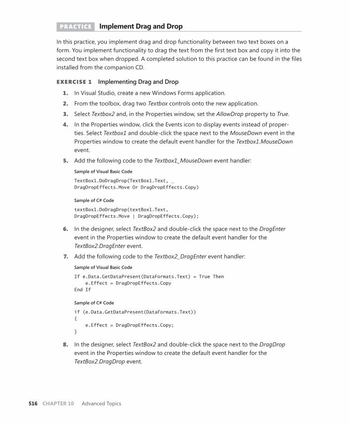
516 CHAPTER 10 Advanced Topics
PRACTICE Implement Drag and Drop
In this practice, you implement drag and drop functionality between two text boxes on a form. You implement functionality to drag the text from the first text box and copy it into the second text box when dropped. A completed solution to this practice can be found in the files installed from the companion CD.
EXERCISE1 Implementing Drag and Drop
1. In Visual Studio, create a new Windows Forms application.
2. From the toolbox, drag two Textbox controls onto the new application.
3. Select Textbox2 and, in the Properties window, set the AllowDrop property to True.
4. In the Properties window, click the Events icon to display events instead of proper-ties. Select Textbox1 and double-click the space next to the MouseDown event in the Properties window to create the default event handler for the Textbox1.MouseDown event.
5. Add the following code to the Textbox1_MouseDown event handler:
Sample of Visual Basic Code
TextBox1.DoDragDrop(TextBox1.Text, _DragDropEffects.Move Or DragDropEffects.Copy)
Sample of C# Code
textBox1.DoDragDrop(textBox1.Text, DragDropEffects.Move | DragDropEffects.Copy);
6. In the designer, select TextBox2 and double-click the space next to the DragEnter event in the Properties window to create the default event handler for the TextBox2. DragEnter event.
7. Add the following code to the Textbox2_DragEnter event handler:
Sample of Visual Basic Code
If e.Data.GetDataPresent(DataFormats.Text) = True Then e.Effect = DragDropEffects.Copy End If
Sample of C# Code
if (e.Data.GetDataPresent(DataFormats.Text)) { e.Effect = DragDropEffects.Copy; }
8. In the designer, select TextBox2 and double-click the space next to the DragDrop event in the Properties window to create the default event handler for the TextBox2. DragDrop event.
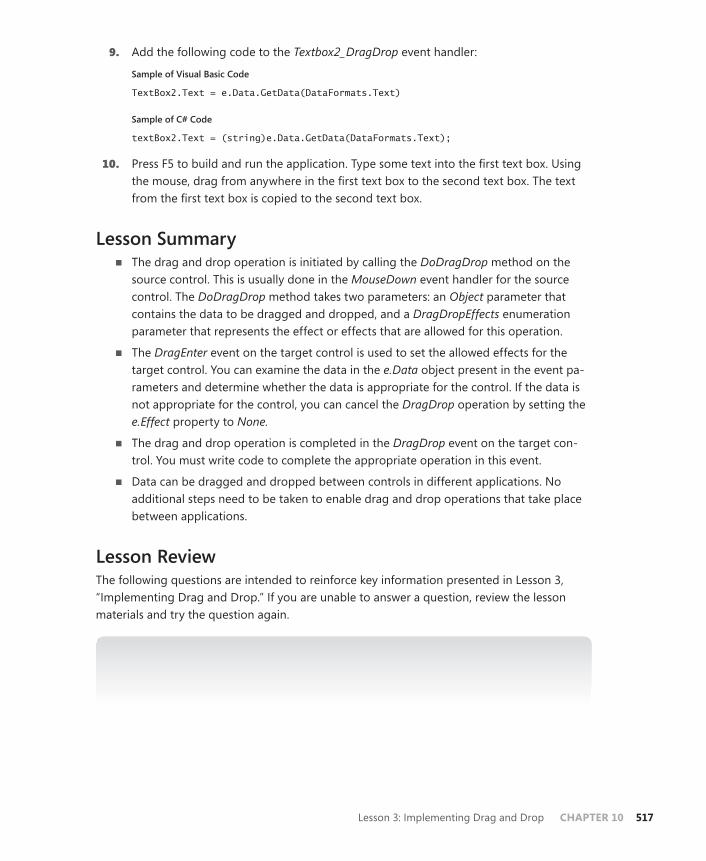
Lesson 3: Implementing Drag and Drop CHAPTER 10 517
9. Add the following code to the Textbox2_DragDrop event handler:
Sample of Visual Basic Code
TextBox2.Text = e.Data.GetData(DataFormats.Text)
Sample of C# Code
textBox2.Text = (string)e.Data.GetData(DataFormats.Text);
10. Press F5 to build and run the application. Type some text into the first text box. Using the mouse, drag from anywhere in the first text box to the second text box. The text from the first text box is copied to the second text box.
Lesson Summary■ The drag and drop operation is initiated by calling the DoDragDrop method on the
source control. This is usually done in the MouseDown event handler for the source control. The DoDragDrop method takes two parameters: an Object parameter that contains the data to be dragged and dropped, and a DragDropEffects enumeration parameter that represents the effect or effects that are allowed for this operation.
■ The DragEnter event on the target control is used to set the allowed effects for the target control. You can examine the data in the e.Data object present in the event pa-rameters and determine whether the data is appropriate for the control. If the data is not appropriate for the control, you can cancel the DragDrop operation by setting the e.Effect property to None.
■ The drag and drop operation is completed in the DragDrop event on the target con-trol. You must write code to complete the appropriate operation in this event.
■ Data can be dragged and dropped between controls in different applications. No additional steps need to be taken to enable drag and drop operations that take place between applications.
Lesson ReviewThe following questions are intended to reinforce key information presented in Lesson 3, “Implementing Drag and Drop.” If you are unable to answer a question, review the lesson materials and try the question again.
NOTE ANSWERS
Answers to these questions and explanations of why each answer choice is correct or incor-rect are located in the “Answers” section at the end of the book.

518 CHAPTER 10 Advanced Topics
1. Which of the following events must be handled to execute a drag and drop operation?
A. MouseDown
B. MouseUp
C. DragLeave
D. DragDrop
2. Which of the following is necessary to implement a drag and drop operation between two applications? (Choose all that apply.)
A. You must call the DoDragDrop method.
B. The target control must allow one of the drag effects specified in the DoDragDrop method call.
C. The target control must accept data in the format that was set in the DoDragDrop method call.
D. The target control must have the AllowDrop property set to True.
Take a Practice Test CHAPTER 10 519
Case Scenario
In the following case scenario, you apply what you’ve learned about how to use controls to design user interfaces. You can find answers to these questions in the “Answers” section at the end of this book.
Case Scenario: The Configurable ApplicationYou are about to deploy an application to the entire company. This application must serve the needs of all the employees, including some who require high-contrast color schemes. In ad-dition, you want to enable all employees to personalize this application by creating their own custom color schemes.
How can you implement this functionality with limited development time?
Suggested Practices
To help you successfully master the exam objectives presented in this chapter, complete the following tasks.
■ Practice 1 Create an application that stores a color scheme for each user and auto-matically loads the correct color scheme when the user opens the application.
■ Practice 2 Create an application that enables users to rearrange the nodes in a TreeView control but gives them the option of placing moved nodes before, after, or as a child of the target node.
Take a Practice Test
The practice tests on this book’s companion CD offer many options. For example, you can test yourself on just the content covered in this chapter, or you can test yourself on all the 70-511 certification exam content. You can set up the test so that it closely simulates the experience of taking a certification exam, or you can set it up in study mode so that you can look at the correct answers and explanations after you answer each question.
MORE INFO PRACTICE TESTS
For details about all the practice test options available, see the “How to Use the Practice Tests” section in this book’s Introduction.


CHAPTER 11 521
C H A P T E R 1 1
Testing and Debugging WPF Applications
Testing and debugging your application is a vital part of any development cycle. Because all but the very smallest of development projects is nearly certain to have mistakes in
the first draft, finding and correcting those issues is important for the overall integrity of your work. In this chapter, you learn about techniques and technologies for debugging WPF applications. You learn how to use user interface (UI) automation to test the user interface and the WPF Tree Visualizer to explore the properties of the WPF visual tree. You learn how to use PresentationTraceSources to view trace information associated with WPF applications and to use Intellitrace to view highly selected trace data.
Exam objectives in this chapter: ■ Implement a WPF test strategy.■ Debug XAML by using the WPF Visualizer.■ Debug WPF issues by using PresentationTraceSources.
Lessons in this chapter:■ Lesson 1: Testing the User Interface 523■ Lesson 2: Debugging with Intellitrace and
PresentationTraceSources 533

522 CHAPTER 11 Testing and Debugging WPF Applications
Before You Begin
To complete the lessons in this chapter, you must have:
■ A computer that meets or exceeds the minimum hardware requirements listed in the “About This Book” section at the beginning of the book.
■ Microsoft Visual Studio 2010 Professional installed on your computer. Microsoft Visual Studio 2010 Ultimate is required for Intellitrace.
■ An understanding of Microsoft Visual Basic or C# syntax and familiarity with Microsoft .NET Framework 4.0.
■ An understanding of Extensible Application Markup Language (XAML).
REAL WORLD
Matthew Stoecker
Debugging WPF user interfaces is often an exercise in frustration. Because many failed WPF operations (such as failed bindings) do not raise errors, it can
be difficult to pinpoint the source of these logical errors in code. However, using debugging tools such as Intellitrace, PresentationTraceSources, and the WPF Tree Visualizer provides greater insight into exactly what is going on in your application and greatly speeds locating and resolving these errors.
Lesson 1: Testing the User Interface CHAPTER 11 523
Lesson 1: Testing the User Interface
After you have created your application, you must test it for proper functionality. In WPF, cre-ating tests for and getting information about the user interface can be challenging due to the tree-based nature of the WPF user interface. However, you can create tests for individual user interface elements by using UI Automation and the AutomationPeer classes, and the WPF Tree Visualizer helps you explore the user interface at debug time to learn debugging information. In this lesson, you learn how to use UI automation and the WPF Tree Visualizer.
After this lesson, you will be able to:■ Use UI Automation to automate the WPF user interface.■ Use the WPF Tree Visualizer to inspect the WPF tree.
Estimated lesson time: 30 minutes
Using Automation Peers to Automate the User InterfaceUI Automation enables you to run a user interface programmatically as though you were actually running the application through keyboard and mouse inputs. For example, UI Automation enables you to programmatically click a button, scroll a scrollable container, toggle a check box, or perform any action that can be executed through the user interface programmatically.
The base class that enables all this functionality is the System.Windows.Automation.Peers.AutomationPeer class. An automation peer represents an automation representation of an actual user interface control and encapsulates all the base functionality required to interact with the automation system. Individual WPF control types all have their own correspond-ing AutomationPeer class, named <control>AutomationPeer, in which <control> represents the name of the control. For example, the corresponding class for a WPF Button control is ButtonAutomationPeer. These classes implement functionality specific to the automation of their corresponding controls.
Useful Methods of AutomationPeer ClassesAll classes that inherit AutomationPeer share a core group of methods. Table 11-1 describes some important methods for automation.

524 CHAPTER 11 Testing and Debugging WPF Applications
TABLE 11-1 Some Important Methods of AutomationPeer Classes
METHOD DESCRIPTION
GetChildren Gets the collection of GetChildren elements that are represented in the UI Automation tree as immediate child elements of the automation peer. This method returns a list of AutomationPeer objects.
GetName Gets text that describes the element associated with this automation peer.
GetParent Gets the AutomationPeer class that is the parent of this AutomationPeer object.
GetPattern When overridden in a derived class, gets the control pattern associated with the specified PatternInterface object.
The GetName method returns the name of the control associated with the current AutomationPeer class. The GetParent and GetChildren methods enable navigation through the control tree. The GetPattern method enables you to retrieve implementations of the various pattern interfaces that provide the actual automation functionality, as described in the sec-tion titled “Pattern Interfaces,” which follows shortly.
Creating an AutomationPeer ClassYou can create an AutomationPeer class from any WPF control that has a corresponding class that derives from AutomationPeer. The following example demonstrates how to create an instance of a ButtonAutomationPeer class based on an existing WPF Button control named Button1.
Sample of Visual Basic Code
Dim ButtonPeer As System.Automation.Peers.ButtonAutomationPeerButtonPeer = New System.Automation.Peers.ButtonAutomationPeer(Button1)
Sample of C# Code
System.Automation.Peers.ButtonAutomationPeer ButtonPeer;ButtonPeer = new System.Automation.Peers.ButtonAutomationPeer(Button1);
Pattern InterfacesEach non-abstract AutomationPeer class implements one or more pattern interfaces, which contain the required methods to invoke the functionality of their associated control. Table 11-2 summarizes these pattern interfaces.

Lesson 1: Testing the User Interface CHAPTER 11 525
TABLE 11-2 Pattern Interfaces
INTERFACE DESCRIPTION
IDockProvider Exposes methods and properties to support UI Automation client access to controls that expose their dock properties within a docking container.
IExpandCollapseProvider Exposes methods and properties to support UI Automation client access to controls that visually expand to display content and collapse to hide content.
IGridItemProvider Exposes methods and properties to support UI Automation client access to individual child controls of containers that implement IGridProvider.
IGridProvider Exposes methods and properties to support UI Automation client access to controls that act as containers for a col-lection of child elements. The children of this element must implement IGridItemProvider and be organized in a two-dimensional logical coordinate system that can be tra-versed (that is, a UI Automation client can move to adjacent controls) by using the keyboard.
IInvokeProvider Exposes methods and properties to support UI Automation client access to controls that initiate or perform a single, unambiguous action and do not maintain state when activated.
IItemContainerProvider Exposes a method to enable applications to find an ele-ment in a container, such as a virtualized list.
IMultipleViewProvider Exposes methods and properties to support UI Automation client access to controls that provide, and are able to switch among, multiple representations of the same set of infor-mation or child controls.
IRangeValueProvider Exposes methods and properties to support UI Automation client access to controls that can be set to a value within a range.
IScrollItemProvider Exposes methods and properties to support UI Automation client access to individual child controls of containers that implement IScrollProvider.
IScrollProvider Exposes methods and properties to support UI Automation client access to a control that acts as a scrollable container for a collection of child objects. The children of this control must implement IScrollItemProvider.
ISelectionItemProvider Exposes methods and properties to support UI Automation client access to individual, selectable child controls of con-tainers that implement ISelectionProvider.
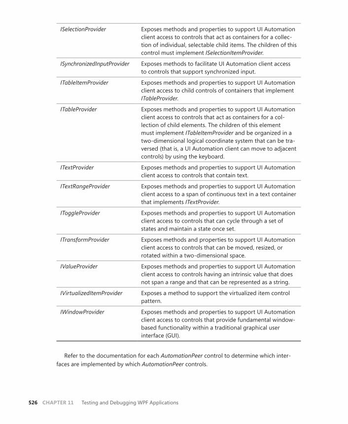
526 CHAPTER 11 Testing and Debugging WPF Applications
ISelectionProvider Exposes methods and properties to support UI Automation client access to controls that act as containers for a collec-tion of individual, selectable child items. The children of this control must implement ISelectionItemProvider.
ISynchronizedInputProvider Exposes methods to facilitate UI Automation client access to controls that support synchronized input.
ITableItemProvider Exposes methods and properties to support UI Automation client access to child controls of containers that implement ITableProvider.
ITableProvider Exposes methods and properties to support UI Automation client access to controls that act as containers for a col-lection of child elements. The children of this element must implement ITableItemProvider and be organized in a two-dimensional logical coordinate system that can be tra-versed (that is, a UI Automation client can move to adjacent controls) by using the keyboard.
ITextProvider Exposes methods and properties to support UI Automation client access to controls that contain text.
ITextRangeProvider Exposes methods and properties to support UI Automation client access to a span of continuous text in a text container that implements ITextProvider.
IToggleProvider Exposes methods and properties to support UI Automation client access to controls that can cycle through a set of states and maintain a state once set.
ITransformProvider Exposes methods and properties to support UI Automation client access to controls that can be moved, resized, or rotated within a two-dimensional space.
IValueProvider Exposes methods and properties to support UI Automation client access to controls having an intrinsic value that does not span a range and that can be represented as a string.
IVirtualizedItemProvider Exposes a method to support the virtualized item control pattern.
IWindowProvider Exposes methods and properties to support UI Automation client access to controls that provide fundamental window-based functionality within a traditional graphical user interface (GUI).
Refer to the documentation for each AutomationPeer control to determine which inter-faces are implemented by which AutomationPeer controls.
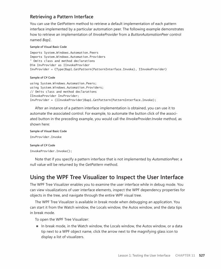
Lesson 1: Testing the User Interface CHAPTER 11 527
Retrieving a Pattern InterfaceYou can use the GetPattern method to retrieve a default implementation of each pattern interface implemented by a particular automation peer. The following example demonstrates how to retrieve an implementation of IInvokeProvider from a ButtonAutomationPeer control named Bap1.
Sample of Visual Basic Code
Imports System.Windows.Automation.PeersImports System.Windows.Automation.Providers ' Omits class and method declarations Dim InvProvider as IInvokeProvider InvProvider = CType(Bap1.GetPattern(PatternInterface.Invoke), IInvokeProvider)
Sample of C# Code
using System.Windows.Automation.Peers;using System.Windows.Automation.Providers; // Omits class and method declarations IInvokeProvider InvProvider; InvProvider = (IInvokeProvider)Bap1.GetPattern(PatternInterface.Invoke);
After an instance of a pattern interface implementation is obtained, you can use it to automate the associated control. For example, to automate the button click of the associ-ated button in the preceding example, you would call the IInvokeProvider.Invoke method, as shown here:
Sample of Visual Basic Code
InvProvider.Invoke
Sample of C# Code
InvokeProvider.Invoke();
Note that if you specify a pattern interface that is not implemented by AutomationPeer, a null value will be returned by the GetPattern method.
Using the WPF Tree Visualizer to Inspect the User InterfaceThe WPF Tree Visualizer enables you to examine the user interface while in debug mode. You can view visualizations of user interface elements, inspect the WPF dependency properties for objects in the tree, and navigate through the entire WPF visual tree.
The WPF Tree Visualizer is available in break mode when debugging an application. You can start it from the Watch window, the Locals window, the Autos window, and the data tips in break mode.
To open the WPF Tree Visualizer:
■ In break mode, in the Watch window, the Locals window, the Autos window, or a data tip next to a WPF object name, click the arrow next to the magnifying glass icon to display a list of visualizers.
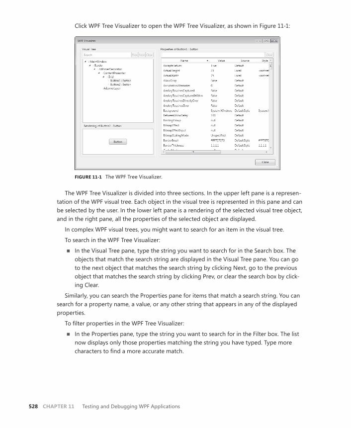
528 CHAPTER 11 Testing and Debugging WPF Applications
Click WPF Tree Visualizer to open the WPF Tree Visualizer, as shown in Figure 11-1:
FIGURE 11-1 The WPF Tree Visualizer.
The WPF Tree Visualizer is divided into three sections. In the upper left pane is a represen-tation of the WPF visual tree. Each object in the visual tree is represented in this pane and can be selected by the user. In the lower left pane is a rendering of the selected visual tree object, and in the right pane, all the properties of the selected object are displayed.
In complex WPF visual trees, you might want to search for an item in the visual tree.
To search in the WPF Tree Visualizer:
■ In the Visual Tree pane, type the string you want to search for in the Search box. The objects that match the search string are displayed in the Visual Tree pane. You can go to the next object that matches the search string by clicking Next, go to the previous object that matches the search string by clicking Prev, or clear the search box by click-ing Clear.
Similarly, you can search the Properties pane for items that match a search string. You can search for a property name, a value, or any other string that appears in any of the displayed properties.
To filter properties in the WPF Tree Visualizer:
■ In the Properties pane, type the string you want to search for in the Filter box. The list now displays only those properties matching the string you have typed. Type more characters to find a more accurate match.

Lesson 1: Testing the User Interface CHAPTER 11 529
PRACTICE Working with Automation Peers
In this practice, you create an application that automates a preexisting application represent-ing a pizza order form. You automate RadioButton, CheckBox, ListView, ListViewItem, and Button controls.
EXERCISE Automate a Preexisting Application
1. In Visual Studio, open the partial solution for this application.
This solution contains a UI for a pizza-ordering application as well as an unimple-mented form that you will use to automate the main window. Note that references to UIAutomationProvider and UIAutomationTypes have already been added, and the System.Automation.Peers, System.Automation.Providers, and System.Automation namespaces have been imported.
2. In the designer, open the designer view for AutomationWindow.xaml. You will see four buttons, each of which indicates functionality to be automated.
3. In the designer, double-click the button marked Automate Select Calzone to open the code window to the Button1_Click event handler. In this event handler, add the follow-ing code to automate selecting the second radio button:
Sample of Visual Basic Code
Dim RBAutomationPeer As New RadioButtonAutomationPeer(aWindow.RadioButton2)Dim SelectProvider As ISelectionItemProvider SelectProvider = RBAutomationPeer.GetPattern(PatternInterface.SelectionItem) SelectProvider.Select()
Sample of C# Code
RadioButtonAutomationPeer RBAutomationPeer = new RadioButtonAutomationPeer(aWindow.RadioButton2); ISelectionItemProvider SelectProvider; SelectProvider = (ISelectionItemProvider) RBAutomationPeer.GetPattern(PatternInterface.SelectionItem); SelectProvider.Select();
4. In the designer for AutomationWindow, double-click the button labeled Automate Select Pepperoni And Sausage to open the Button2_Click event handler. In this event handler, add the following code to automate selecting the first two Checkbox controls.
Sample of Visual Basic Code
Dim CBAutomationPeer1 As New CheckBoxAutomationPeer(aWindow.CheckBox1)Dim CBAutomationPeer2 As New CheckBoxAutomationPeer(aWindow.CheckBox2) Dim ToggProvider1 As IToggleProvider Dim ToggProvider2 As IToggleProvider ToggProvider1 = CBAutomationPeer1.GetPattern(PatternInterface.Toggle) ToggProvider2 = CBAutomationPeer2.GetPattern(PatternInterface.Toggle) ToggProvider1.Toggle() ToggProvider2.Toggle()

530 CHAPTER 11 Testing and Debugging WPF Applications
Sample of C# Code
CheckBoxAutomationPeer CBAutomationPeer1 = new CheckBoxAutomationPeer(aWindow.CheckBox1); CheckBoxAutomationPeer CBAutomationPeer2 = new CheckBoxAutomationPeer(aWindow.CheckBox2); IToggleProvider ToggProvider1; IToggleProvider ToggProvider2; ToggProvider1 = (IToggleProvider) CBAutomationPeer1.GetPattern(PatternInterface.Toggle); ToggProvider2 = (IToggleProvider) CBAutomationPeer2.GetPattern(PatternInterface.Toggle); ToggProvider1.Toggle(); ToggProvider2.Toggle();
5. In the designer for AutomationWindow, double-click the button labeled Automate Select Bellevue Location to open the Button3_Click event handler. In this event handler, add the following code to automate scrolling of the ListBox control and selection of the last ListBoxItem object:
Sample of Visual Basic Code
Dim LBAutomationPeer As New ListBoxAutomationPeer(aWindow.ListBox1)Dim ScrProvider As IScrollProvider ScrProvider = LBAutomationPeer.GetPattern(PatternInterface.Scroll) ScrProvider.Scroll(ScrollAmount.NoAmount, ScrollAmount.LargeIncrement) ScrProvider.Scroll(ScrollAmount.NoAmount, ScrollAmount.LargeIncrement) Dim LBIAutomationPeer As + New ListBoxItemAutomationPeer(aWindow.ListBox1.Items(3)LBAutomationPeer) Dim SelItemProvider As ISelectionItemProvider SelItemProvider = LBIAutomationPeer.GetPattern(PatternInterface.SelectionItem) SelItemProvider.Select()
Sample of C# Code
ListBoxAutomationPeer LBAutomationPeer = new ListBoxAutomationPeer(aWindow.ListBox1); IScrollProvider ScrProvider; ScrProvider = (IScrollProvider)LBAutomationPeer.GetPattern(PatternInterface .Scroll); ScrProvider.Scroll(System.Windows.Automation.ScrollAmount.NoAmount, System.Windows.Automation.ScrollAmount.LargeIncrement); ScrProvider.Scroll(System.Windows.Automation.ScrollAmount.NoAmount, System.Windows.Automation.ScrollAmount.LargeIncrement); ListBoxItemAutomationPeer LBIAutomationPeer = new ListBoxItemAutomationPeer(aWindow.ListBox1.Items[3], LBAutomationPeer); ISelectionItemProvider SelItemProvider; SelItemProvider =(ISelectionItemProvider) LBIAutomationPeer.GetPattern(PatternInterface.SelectionItem); SelItemProvider.Select();

Lesson 1: Testing the User Interface CHAPTER 11 531
6. In the designer for AutomationWindow, double-click the button labeled Automate Click Order Button to open the Button4_Click event handler. In this event handler, add the following code to automate clicking the Place Order button.
Sample of Visual Basic Code
Dim BAutomationPeer As New Automation.Peers.ButtonAutomationPeer(aWindow.Button1)Dim InvProvider As IInvokeProvider InvProvider = BAutomationPeer.GetPattern(PatternInterface.Invoke) InvProvider.Invoke()
Sample of C# Code
ButtonAutomationPeer BAutomationPeer = new ButtonAutomationPeer(aWindow.Button1);IInvokeProvider InvProvider; InvProvider = (IInvokeProvider) BAutomationPeer.GetPattern(PatternInterface.Invoke); InvProvider.Invoke();
7. Press F5 to run your application. Two windows appear, MainWindow and AutomationWindow. In AutomationWindow, click each button in turn and notice that the controls in MainWindow are automated as expected.
Lesson Summary■ UI Automation enables you to control a user interface programmatically. The
System. Windows.Automation.Peers namespace contains automation peers that cor-respond to existing WPF controls and can be used to automate those controls.
■ Each implemented automation peer implements one or more pattern interfaces that provide the functionality required to automate WPF controls. You can retrieve a default implementation of these interfaces by calling the GetPattern method from the automation peer you are using.
■ The WPF Tree Visualizer enables you to inspect the WPF visual tree at debug time. You can visualize the rendering of a selected WPF control and explore its dependency properties.
Lesson ReviewYou can use the following questions to test your knowledge of the information in Lesson 1, “Testing the User Interface.” The questions are also available on the companion CD if you prefer to review them in electronic form.
NOTE ANSWERS
Answers to these questions and explanations of why each answer choice is correct or incor-rect are located in the “Answers” section at the end of the book.
532 CHAPTER 11 Testing and Debugging WPF Applications
1. Which of the following is NOT required to automate a WPF control? (Choose all that apply.)
A. Create an instance of AutomationPeer that corresponds to the control you want to automate.
B. Cast your instance of automation peer as the required pattern interface for the functionality you want to invoke.
C. Obtain a reference to an implementation of the pattern interface that encapsulates the functionality you want to automate.
D. Call methods on an instance of the correct pattern interface to automate the de-sired functionality.
2. From which of the following are you able to open the WPF Tree Visualizer at debug time? (Choose all that apply.)
A. The Watch window
B. The Auto window
C. The Locals window
D. The Output window
Lesson 2: Debugging with Intellitrace and PresentationTraceSources CHAPTER 11 533
Lesson 2: Debugging with Intellitrace and PresentationTraceSources
Trace was introduced in .NET Framework 1.0 and represents a technology that enables the user to emit information to the console window or other attached logs. Tracing technology has improved over the years, and in this lesson, two of the most recent innovations in Trace will be discussed: Intellitrace, which enables you to selectively examine and filter Trace mes-sages emitted by your application, and PresentationTraceSources, which are specialized trace sources for debugging WPF applications.
After this lesson, you will be able to:■ Enable Intellitrace.■ Select and filter Intellitrace data.■ Configure PresentationTraceSources through the app.config file.■ Configure PresentationTraceSources in code.■ Emit trace messages with PresentationTraceSources.
Estimated lesson time: 30 minutes
Using IntellitraceIntellitrace is a new tracing technology available only to users of Visual Studio 2010 Ultimate. With Intellitrace, messages about Intellitrace events are automatically emitted by Visual Studio in the background to an .iTrace file, where they can be retrieved and examined for debugging purposes. Intellitrace is highly configurable with regard to the type and amount of information you want to record and, with the default settings, has very little impact on ap-plication execution and performance.
Enabling IntellitraceIntellitrace is enabled by default, and Intellitrace events are recorded automatically. These events represent application events, and recording this data has a very small, usually un-noticeable, impact on application performance. You can also configure Intellitrace to record events, function calls, and parameter information. Recording this information is more pro-cessor-intensive and can degrade application performance, but it can also provide valuable information for deep debugging.
To enable Intellitrace:
1. In Visual Studio 2010 Ultimate, from the Tools menu, select Options and then click Intellitrace and Enable Intellitrace to open the Enable Intellitrace pane.
2. To enable Intellitrace, ensure that Enable Intellitrace Checkbox is selected. To disable Intellitrace, clear this box.

534 CHAPTER 11 Testing and Debugging WPF Applications
3. To enable collection of call and parameter information, select the option button la-beled Intellitrace Events And Call Information.
Setting the Location for Intellitrace RecordingsIntellitrace files are recorded to disk for later viewing. You can select a disk location for your Intellitrace files.
To set the location for Intellitrace recordings:
1. In Visual Studio 2010 Ultimate, from the Tools menu, select Options and then click Intellitrace and Advanced to open the Advanced pane.
2. Click the Browse button and browse to the directory location for Intellitrace files.
3. You can also set the maximum size for Intellitrace files by selecting the maximum amount of disk space to be used from the drop-down box in this pane.
Note that if you enable collection of call and parameter information, you will likely need more disk space for your Intellitrace file and should adjust this amount accordingly.
Selecting Intellitrace Events to RecordThe types of events you want Intellitrace to record are highly configurable. You can record all available events or limit Intellitrace recording to only the events in which you are interested.
To configure Intellitrace events to record:
1. In Visual Studio 2010 Ultimate, from the Tools menu, select Options and then click Intellitrace and Intellitrace Events to open the Intellitrace Events Pane.
2. In the Intellitrace Events pane, you will see a list of types of events to record. To select an event type, ensure that the check box next to the event type is selected. Note that you can also collect subsets of these events. By expanding the arrow to the left of the event type, you are presented with a list of event subtypes that can also be selected or cleared.
3. To restore the default settings, click the Restore button.
Viewing Intellitrace Events in Debug ModeYou can view Intellitrace events and calls that pertain to your application through the Intelli-trace window. Although the Intellitrace window can be open at any point in Debug mode, you can view Intellitrace events only in Break mode.
To view Intellitrace events:
1. While the application is executing, from the Debug menu, choose Intellitrace and then Intellitrace Events. Note that if you are collecting call and parameter information, you can open this window by selecting Intellitrace Calls.
Lesson 2: Debugging with Intellitrace and PresentationTraceSources CHAPTER 11 535
2. In the Intellitrace window, click Break All to break application execution. Intellitrace events are now displayed in the Intellitrace window. Clicking an Intellitrace event will cause the code window to highlight the code that is the source of this event.
Filtering Intellitrace EventsWhen viewing Intellitrace events, you can filter the event types you want to view.
To filter Intellitrace events:
1. In the Intellitrace window, filter by event type by selecting the appropriate type from the left drop-down list.
2. You can also filter by originating thread by selecting the appropriate thread from the right drop-down list.
3. To search for an event that matches a given string, simply type that string in the search box, and matching events will be displayed automatically.
Opening an Intellitrace FileIn addition to viewing Intellitrace data while in Break mode, you can examine the Intellitrace information for past application runs by viewing the recorded Intellitrace file. To do so, navi-gate to the Intellitrace file location and double-click the .iTrace file. The Intellitrace informa-tion opens in the Intellitrace window. You can view and filter this information just as if the application were in Break mode.
Using PresentationTraceSourcesPresentationTraceSources is a static class that exposes a set of preestablished trace sources which can emit information about an application’s execution. Trace sources can be config-ured to emit information at various levels and can be turned on and off by associated trace switches. You can attach trace listeners to record trace information in a variety of formats. PresentationTraceSources can be configured either in code or in the app.config file.
WPF PresentationTraceSourcesPresentationTraceSources incorporates eleven trace sources that each emits informa-tion about its area of functionality. For example, AnimationTraceSource emits information about animations being executed in your application. Table 11-3 summarizes the available PresentationTraceSources trace sources.
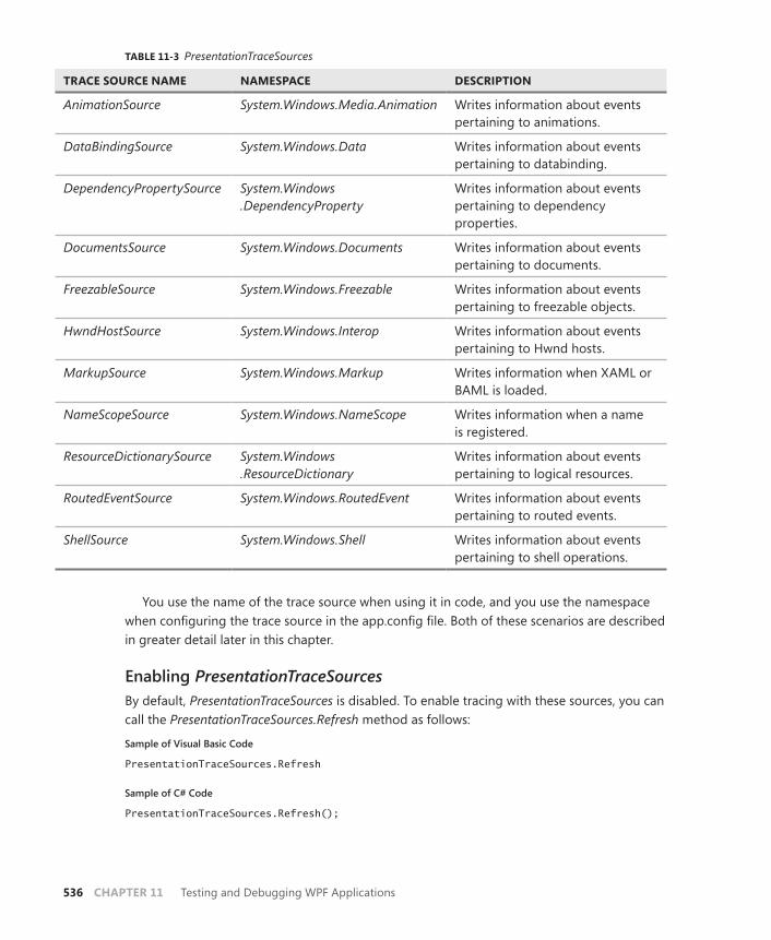
536 CHAPTER 11 Testing and Debugging WPF Applications
TABLE 11-3 PresentationTraceSources
TRACE SOURCE NAME NAMESPACE DESCRIPTION
AnimationSource System.Windows.Media.Animation Writes information about events pertaining to animations.
DataBindingSource System.Windows.Data Writes information about events pertaining to databinding.
DependencyPropertySource System.Windows .DependencyProperty
Writes information about events pertaining to dependency properties.
DocumentsSource System.Windows.Documents Writes information about events pertaining to documents.
FreezableSource System.Windows.Freezable Writes information about events pertaining to freezable objects.
HwndHostSource System.Windows.Interop Writes information about events pertaining to Hwnd hosts.
MarkupSource System.Windows.Markup Writes information when XAML or BAML is loaded.
NameScopeSource System.Windows.NameScope Writes information when a name is registered.
ResourceDictionarySource System.Windows .ResourceDictionary
Writes information about events pertaining to logical resources.
RoutedEventSource System.Windows.RoutedEvent Writes information about events pertaining to routed events.
ShellSource System.Windows.Shell Writes information about events pertaining to shell operations.
You use the name of the trace source when using it in code, and you use the namespace when configuring the trace source in the app.config file. Both of these scenarios are described in greater detail later in this chapter.
Enabling PresentationTraceSourcesBy default, PresentationTraceSources is disabled. To enable tracing with these sources, you can call the PresentationTraceSources.Refresh method as follows:
Sample of Visual Basic Code
PresentationTraceSources.Refresh
Sample of C# Code
PresentationTraceSources.Refresh();
Lesson 2: Debugging with Intellitrace and PresentationTraceSources CHAPTER 11 537
Configuring PresentationTraceSources with the App.Config FileThe most common way to configure PresentationTraceSources is through the app . config file, an XML file that contains a node called <System.Diagnostics>, which is where PresentationTraceSources trace sources are configured. The <System.Diagnostics> node has three important subnodes, <sources>, <switches>, and <sharedListeners>, where PresentationTraceSources, trace switches, and trace listeners are configured, respectively.
The first step in configuring PresentationTraceSources through the app.config file is actually to add an app.config file to your application.
To add an app.config file:
1. From the Project menu, choose Add New Item. The Add New Item window opens.
2. In the Add New Item window, select General in the left pane. In the center pane, choose the Application Configuration file and click Add. A new app.config file is added to your project.
You can configure PresentationTraceSources in the <sources> node of the app.config file. You can add a new source by adding a <source> node, which requires two attributes: the Name attribute, which specifies the namespace for the PresentationTraceSources trace source to be added (see Table 11-2 for a list of namespaces); and the switchName attribute, which specifies the name of the switch that controls this trace source. (See the following text for information on configuring a trace switch.) Each <source> node also contains a subnode called <listeners> where you can add trace listeners, which receive the output from the trace sources.
To activate a presentation trace source, create an entry in the <sources> node of the app . config file that specifies the Name and switchName attributes. The following example demonstrates how to add the System.Windows.Media.Animation trace source with a switch name of mySwitch.
<source name="System.Windows.Media.Animation" switchName="mySwitch" > </source>
In the preceding example, a new trace source has been added to the configuration file, but you will not see any difference in tracing for your application at this point. You still need to add a switch to control the level of trace information you receive and one or more listeners to record the trace output.
To add a trace switch, create an entry in the <switches> node that specifies the switch name and the level, as shown here:
<switches> <add name="mySwitch" value="All" /> </switches>
By specifying a new switch with the name that matches the switch name specified in the <source> node, you automatically associate that trace switch with the source. Possible values for the Value attribute are Off, which disables trace activity; Warning, which emits only
538 CHAPTER 11 Testing and Debugging WPF Applications
warnings and errors; Activity, which emits information about activity; Verbose, which emits verbose information; and All, which emits all trace information produced by this source.
Even when a trace source has been added to the app.config file and associated with an active trace switch, you still will not receive any output from this trace source until you cre-ate and associate a listener to receive and process the output. There are three kinds of trace listeners: console listeners that direct trace output to the Output window, text listeners that write trace output to a text file, and XML listeners that write trace output to an XML file.
You can add a trace listener by creating a new <add> node in the sharedListeners node of the app.config file. In this node, you must specify the Name attribute, which indicates the name of the listener; the Type attribute, which specifies the .NET Framework type to instanti-ate for the listener; and the initializeData attribute, which provides the initial file name for text and XML listeners and receives a value of False for console listeners.
After a new listener has been specified, you must associate that listener with one or more sources before it will receive any output. You can associate a listener with a trace source by creating an <add> node in the <listeners> node of the source node. The <add> node must specify the name of the listener in the Name attribute.
To add a trace listener:
1. Add a node specifying the new listener to the <sharedListeners> node. The follow-ing example demonstrates how to add a console listener, a text listener, and an XML listener:
<sharedListeners> <!-- This listener sends output to the console --> <add name="console" type="System.Diagnostics.ConsoleTraceListener" initializeData="false"/> <!-- This listener sends output to an Xml file named xmlTrace.xml --> <add name="xmlListener" type="System.Diagnostics.XmlWriterTraceListener" traceOutputOptions="None" initializeData="xmlTrace.xml" /> <!-- This listener sends output to a file named textTrace.txt --> <add name="textListener" type="System.Diagnostics.TextWriterTraceListener" initializeData="textTrace.txt" /> </sharedListeners>
2. Set AutoFlush to True to flush the trace listener output automatically by adding a <trace> node to the <system.diagnostics> node that sets the Autoflush attribute to True, as shown here:
<trace autoflush="true" ></trace>
3. Add a <listeners> node that specifies the trace listener to the source node you want to associate with the listener. The following example demonstrates associating the System.Windows.Media.Animation trace source with the text listener defined in step 1:
<source name="System.Windows.Media.Animation" switchName="mySwitch" >

Lesson 2: Debugging with Intellitrace and PresentationTraceSources CHAPTER 11 539
<listeners> <add name="textListener" /> </listeners> </source>
Configuring PresentationTraceSources ProgrammaticallyIf you prefer, you can configure PresentationTraceSources programmatically rather than through the app.config file. PresentationTraceSources classes are initialized with a trace switch, but you must still set the trace level on that switch and add a trace listener to receive output.
To set the trace level, set the Level property of the Switch property on the presentation trace source you want to configure, as shown in the following example.
Sample of Visual Basic Code
PresentationTraceSources.AnimationSource.Switch.Level = SourceLevels.All
Sample of C# Code
PresentationTraceSources.AnimationSource.Switch.Level = SourceLevels.All;
To add a trace listener:
1. Initialize the trace listener in code, as shown in the following example:
Sample of Visual Basic Code
Dim listener as TextWriterTraceListenerDim myFile As System.IO.Stream = System.IO.File.Create("trace.txt") listener = New TextWriterTraceListener(myFile)
Sample of C# Code
TextWriterTraceListener listener;System.IO.Stream myFile = System.IO.File.Create("trace.txt"); listener = new TextWriterTraceListener(myFile);
2. Add the listener to the Listeners collection of the trace source, as shown here:
Sample of Visual Basic Code
PresentationTraceSources.AnimationSource.Listeners.Add(listener)
Sample of C# Code
PresentationTraceSources.AnimationSource.Listeners.Add(listener);
PRACTICE Practice with PresentationTraceSources
In this practice, you work with PresentationTraceSources in code to set the trace level on a trace source, create a new text listener for it, associate the two, and, finally, examine the trace output.
540 CHAPTER 11 Testing and Debugging WPF Applications
EXERCISE Working with PresentationTraceSources
1. Open the partial solution for this lesson.
This is, in fact, the completed solution from the previous lesson. You will trace the routed events in this application.
2. In Visual Studio, open the code window for AutomationWindow.
3. In the constructor for AutomationWindow (C#) or the AutomationWindow_Loaded event handler (Visual Basic), call the PresentationTraceSources.Refresh method as fol-lows. For C#, this call should be added after the call to InitializeComponent().
Sample of Visual Basic Code
PresentationTraceSources.Refresh()
Sample of C# Code
PresentationTraceSources.Refresh();
4. Beneath the code you added in step 3, add the following code to create a new TextWriter trace listener:
Sample of Visual Basic Code
Dim listener As TextWriterTraceListenerDim myFile As System.IO.Stream = System.IO.File.Create("trace.txt") listener = New TextWriterTraceListener(myFile)
Sample of C# Code
TextWriterTraceListener listener;System.IO.Stream myFile = System.IO.File.Create("trace.txt"); listener = new TextWriterTraceListener(myFile);
5. Beneath the code you added in step 4, add the following code to set the trace level to All, thus emitting output for all events associated with that trace source.
Sample of Visual Basic Code
PresentationTraceSources.RoutedEventSource.Switch.Level = SourceLevels.All
Sample of C# Code
PresentationTraceSources.RoutedEventSource.Switch.Level = SourceLevels.All;
6. Finally, beneath the line of code added in step 5, add the following line of code to add the text listener to the Listeners collection of RoutedEventSource:
Sample of Visual Basic Code
PresentationTraceSources.RoutedEventSource.Listeners.Add(listener)
Sample of C# Code
PresentationTraceSources.RoutedEventSource.Listeners.Add(listener);
Lesson 2: Debugging with Intellitrace and PresentationTraceSources CHAPTER 11 541
7. Press F5 to build and run the application. Click each of the buttons in AutomationWindow and then close the application. Note that you will have to close both windows to end the application.
8. In Visual Studio, in Solution Explorer, click the icon for Show All Files. Expand the bin and then the Debug nodes and double-click trace.txt. Your new trace file opens. Note that every routed event that occurred in the short application run was recorded, including many you might not even have been aware of. By choosing different values for the Switch.Level property, you can filter the amount of information a trace source emits.
Lesson Summary■ Intellitrace enables you to view trace information that is automatically emitted by your
application. Intellitrace data can be filtered to narrow down specific tracing events and can be stored in .iTrace files for future examination.
■ PresentationTraceSources is a static class that exposes several preconfigured trace sources that emit information about WPF applications.
■ You can view information emitted by PresentationTraceSources by associating one or more listeners with the trace source and by enabling its associated trace switch by set-ting the trace level to any value other than Off.
■ You can configure PresentationTraceSources either in the app.config file or directly in code.
Lesson ReviewYou can use the following questions to test your knowledge of the information in Lesson 2, “Debugging with Intellitrace and PresentationTraceSources.” The questions are also available on the companion CD if you prefer to review them in electronic form.
NOTE ANSWERS
Answers to these questions and explanations of why each answer choice is correct or incor-rect are located in the “Answers” section at the end of the book.
1. Which of the following is required to view Intellitrace data?
A. You must enable Intellitrace data collection through Visual Studio.
B. You must set the file size and location.
C. You must open the Intellitrace window.
D. You must be running Visual Studio 2010 Ultimate.

542 CHAPTER 11 Testing and Debugging WPF Applications
2. Which two of the following XML samples, when added to the correct nodes of the app.config file, correctly configure AnimationTraceSource to write data to TextWriterTraceListener? Assume that any trace switches have been appropriately set. (Choose all that apply.)
A.
<source name="System.Windows.Media.Animation" switchName="mySwitch" > <listeners> <add name="myListener" /> </listeners> </source>
B.
<sharedListeners> <add name="myListener" type="System.Diagnostics.XmlWriterTraceListener" initializeData="myTrace.xml" /> </sharedListeners>
C.
<sharedListeners> <add name="myListener" type="System.Diagnostics.TextWriterTraceListener" initializeData="myTrace.txt" /> </sharedListeners>
D.
<source name="System.Windows.Media.Animation" switchName="mySwitch" > <listeners> <add name="textListener" /> </listeners> </source>

Take a Practice Test CHAPTER 11 543
Case Scenario
In the following case scenario, you apply what you’ve learned about how to use controls to design user interfaces. You can find answers to these questions in the “Answers” section at the end of this book.
Case Scenario: Debug DramaBoy, we’re in it now! Customer demand for your new WPF application has pushed the ship calendar up a couple of months and now you’re dealing with a beta that is full of bugs. Most of the straightforward ones have been resolved, leaving a lot of tricky ones, including several that are hard to reproduce. In addition, many of your junior testers are Windows Forms users with little exposure to WPF, and they are finding debugging data binding to be particularly frustrating.
Answer these questions for your manager:
1. What general strategies can you use to speed up resolution of the remaining tricky bugs?
2. Are there any tools that can be used to help locate and resolve the data-binding errors?
Suggested Practices
To help you successfully master the exam objectives presented in this chapter, complete the following tasks.
■ Practice 1 Modify the solution to Lesson 2, “Debugging with Intellitrace and PresentationTraceSources,” so that it receives trace output from several trace listeners but writes only warnings and errors. Then modify the application so that errors are produced and examine the trace output.
■ Practice 2 Test the user interface for solutions to previous chapters by creating an ap-plication that accesses all the controls in the completed solution through automation.
Take a Practice Test
The practice tests on this book’s companion CD offer many options. For example, you can test yourself on just the content covered in this chapter, or you can test yourself on all the 70-511 certification exam content. You can set up the test so that it closely simulates the experience of taking a certification exam, or you can set it up in study mode so that you can look at the correct answers and explanations after you answer each question.

544 CHAPTER 11 Testing and Debugging WPF Applications
MORE INFO PRACTICE TESTS
For details about all the practice test options available, see the “How to Use the Practice Tests” section in this book’s Introduction.

CHAPTER 12 545
C H A P T E R 1 2
Deployment
After you have developed your application, it must reach its intended audience. Microsoft Visual Studio provides several methods for deploying your application.
ClickOnce technology enables you to deploy your application quickly and easily and pro-vide for automatic updates. For more detailed deployments, Windows Installer technology provides a highly configurable deployment environment. In this chapter, you learn how to deploy your applications by using ClickOnce and Windows Installer technology.
Exam objectives in this chapter:■ Configure a ClickOnce deployment.■ Create and configure a Windows Installer project.■ Configure deployment security settings.
Lessons in this chapter:■ Lesson 1: Creating a Windows Setup Project 547■ Lesson 2: Deploying Applications with ClickOnce 559

546 CHAPTER 12 Deployment
Before You Begin
To complete the lessons in this chapter, you must have:
■ A computer that meets or exceeds the minimum hardware requirements listed in the “About This Book” section at the beginning of the book.
■ Microsoft Visual Studio 2010 Professional installed on your computer.
■ An understanding of Microsoft Visual Basic or C# syntax and familiarity with Microsoft .NET Framework 4.0.
■ An understanding of Extensible Application Markup Language (XAML).
REAL WORLD
Matthew Stoecker
Deployment can pose some difficult challenges to the developer. I find it espe-cially difficult to deploy applications that require frequent updates. ClickOnce
addresses this problem and enables me to deploy applications that are updated regularly. And for complex deployments, I still like to use Windows Installer tech-nology, which provides the greatest degree of control and customization.
Lesson 1: Creating a Windows Setup Project CHAPTER 12 547
Lesson 1: Creating a Windows Setup Project
Although ClickOnce provides simple and easy deployment for a variety of applications, you might need a more configurable environment for complex programs. Setup projects enable you to create highly configurable deployment plans. In this lesson, you learn how to create a setup project.
After this lesson, you will able to:■ Create a Windows Forms Application setup project.■ Set deployment project properties.■ Configure Setup to add icons during setup.■ Configure conditional installation based on operating system versions.■ Configure a setup project to deploy the .NET Framework.■ Add a custom action to a setup project.■ Add error-handling code for custom actions to a setup project.
Estimated lesson time: 45 minutes
Setup ProjectsYou can add a setup project to a solution to create a Windows Installer application for your solution. Setup projects are highly configurable and enable you to create directories on the target computer, copy files, modify the registry, and execute custom actions during installa-tion. When compiled, a setup project produces an .msi file, which incorporates a setup wizard for the application. The .msi file can be distributed by disk, download, or file share. When it is clicked, the .msi file launches the application setup wizard and installs the application.
To add a setup project to your solution:
1. From the File menu, choose Add and then click New Project to open the Add New Project dialog box.
2. In the Project Types pane, expand Other Project Types and then click Setup And Deployment.
3. In the Templates pane, expand Visual Studio Installer, click Setup Project, and then click OK.
Setup Project EditorsEach setup project includes six editors with which to configure the contents and the behavior of the setup project. These editors are:
■ File System Editor Enables you to configure the installation of your application to the file system of the target computer.
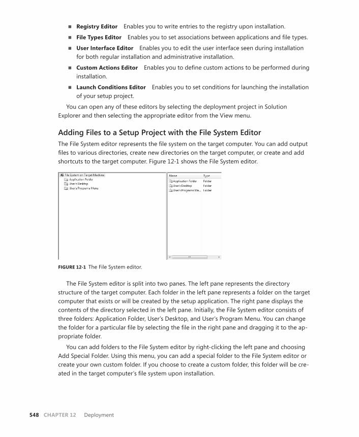
548 CHAPTER 12 Deployment
■ Registry Editor Enables you to write entries to the registry upon installation.
■ File Types Editor Enables you to set associations between applications and file types.
■ User Interface Editor Enables you to edit the user interface seen during installation for both regular installation and administrative installation.
■ Custom Actions Editor Enables you to define custom actions to be performed during installation.
■ Launch Conditions Editor Enables you to set conditions for launching the installation of your setup project.
You can open any of these editors by selecting the deployment project in Solution Explorer and then selecting the appropriate editor from the View menu.
Adding Files to a Setup Project with the File System EditorThe File System editor represents the file system on the target computer. You can add output files to various directories, create new directories on the target computer, or create and add shortcuts to the target computer. Figure 12-1 shows the File System editor.
FIGURE 12-1 The File System editor.
The File System editor is split into two panes. The left pane represents the directory structure of the target computer. Each folder in the left pane represents a folder on the target computer that exists or will be created by the setup application. The right pane displays the contents of the directory selected in the left pane. Initially, the File System editor consists of three folders: Application Folder, User’s Desktop, and User’s Program Menu. You can change the folder for a particular file by selecting the file in the right pane and dragging it to the ap-propriate folder.
You can add folders to the File System editor by right-clicking the left pane and choosing Add Special Folder. Using this menu, you can add a special folder to the File System editor or create your own custom folder. If you choose to create a custom folder, this folder will be cre-ated in the target computer’s file system upon installation.

Lesson 1: Creating a Windows Setup Project CHAPTER 12 549
To add output from a project to a deployment project:
1. Right-click Application Folder in the left pane of the File System editor, choose Add, and then choose Project Output. The Add Project Output Group dialog box (pictured in Figure 12-2) opens.
FIGURE 12-2 The Add Project Output Group dialog box.
2. Choose the project outputs you want to add to your setup project. All .exe and .dll files created by the project are contained in Primary Output. You can also add other project files to your setup project—such as localized resources, content files, or documentation files—or, less frequently, debug symbols, source files, or Extensible Markup Language (XML) serialization assemblies. After you have selected the output to be added to the folder, click OK.
To create a shortcut and add it to the target computer:
1. In the right pane of the File System editor, right-click the file for which you want to cre-ate a shortcut and choose Create Shortcut. A shortcut to the file is created and added to the pane.
2. Drag the shortcut from the right-side pane to the appropriate folder in the left-side pane.
Configuring the Setup Project to Add an Icon during SetupYou can use the File System editor to associate an icon with your application at installation. Shortcuts to your application will be displayed with the icon you specify.
550 CHAPTER 12 Deployment
To associate an icon with an application at setup:
1. In the File System editor, right-click a folder, choose Add, and then select File. The Add Files dialog box opens.
2. Browse to the .ico file you want to associate with a shortcut and click Add to add it to your setup project.
3. Create a shortcut to your application as previously described.
4. In the File System editor, select the shortcut.
5. In the Properties window, select the Icon property and then choose (Browse…) from the drop-down list. Browse to the icon you want to associate with your application.
6. Select the icon and click OK.
Configuring Conditional Installation Based on the Operating System VersionYou can use the VersionNT system property to determine the operating system at installa-tion time and to create installation conditions that allow the installation to continue or abort based on the operating system.
The VersionNT property is an integer that is calculated by the following formula: MajorVersion * 100 + MinorVersion. Thus, Microsoft Windows 2000 would report a VersionNT value of 500 or greater, depending on the minor version.
To configure conditional installation based on the operating system version:
1. In the File System editor, select the file that contains the primary output for the application.
2. In the Properties window, select the Condition property and type a condition that evaluates the operating system based on the formula previously described. For ex-ample, if you want to restrict installation to Windows 2000 or later, you would type the condition VersionNT>=500.
Setting Setup Project PropertiesThe setup project properties provide information about your project and set actions relating to versions of your project. You set setup project properties in the Properties window. Many setup project properties can provide descriptive information about your application. These properties include:
■ AddRemoveProgramsIcon Specifies an icon for the Add/Remove Programs dialog box on the client computer.
■ Author Contains information about the author of the program.
■ Description Contains a description of the application.
■ Keywords Contains keywords to be associated with the application.

Lesson 1: Creating a Windows Setup Project CHAPTER 12 551
■ Localization Provides the locale information for the application.
■ Manufacturer Contains information about the manufacturer of the application. It is commonly used to define the default install folder within the Program Files folder.
■ ManufacturerURL Contains the URL of the manufacturer’s Web site.
■ ProductName Contains the name of the product.
■ Subject Contains information about the subject of the application.
■ SupportPhone Provides a phone number for support for the application.
■ SupportURL Contains a URL for support for the application.
■ TargetPlatform Specifies the target platform of the installer: x86, x64, or Itanium.
■ Title Contains the title of the application.
Other properties of the setup project determine the behavior of the setup project at instal-lation time. These properties include:
■ DetectNewerInstalledVersion Looks for a more recent version of the application on the target computer and aborts the installation if one is found.
■ InstallAllUsers Specifies whether the package is installed for all users or only for the installing user.
■ PostBuildEvent Specifies a command line that is executed after the build ends.
■ PreBuildEvent Specifies a command line that is executed before the build begins.
■ RemovePreviousVersion Looks for earlier versions of the application and, if any are found, uninstalls them in favor of the new version.
■ RunPostBuildEvent Specifies the condition under which the post-build event runs. The value is either On Successful Build or Always.
■ SearchPath Specifies the path used to search for assemblies, files, or merge modules on the development computer.
■ Version Holds the information used by the previous two properties to determine versioning.
There are two additional properties: ProductCode and UpgradeCode. These are used by the setup program and should never be altered manually.
You can change these properties at design time by selecting the project in Solution Explorer and altering the appropriate property in the Properties window.
Configuring a Deployment Project to Deploy the .NET FrameworkAll applications created with Visual Studio 2008 require .NET Framework 3.5 to run. If you are uncertain of the deployment environment for your applications, you can configure your setup project to install prerequisites, such as the .NET Framework, as part of the installation. The .NET Framework is configured to be installed by default, but you can verify that this configu-ration is still valid by the following procedure.
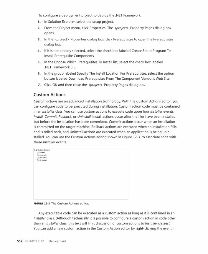
552 CHAPTER 12 Deployment
To configure a deployment project to deploy the .NET Framework:
1. In Solution Explorer, select the setup project.
2. From the Project menu, click Properties. The <project> Property Pages dialog box opens.
3. In the <project> Properties dialog box, click Prerequisites to open the Prerequisites dialog box.
4. If it is not already selected, select the check box labeled Create Setup Program To Install Prerequisite Components.
5. In the Choose Which Prerequisites To Install list, select the check box labeled .NET Framework 3.5.
6. In the group labeled Specify The Install Location For Prerequisites, select the option button labeled Download Prerequisites From The Component Vendor’s Web Site.
7. Click OK and then close the <project> Property Pages dialog box.
Custom ActionsCustom actions are an advanced installation technology. With the Custom Actions editor, you can configure code to be executed during installation. Custom action code must be contained in an Installer class. You can use custom actions to execute code upon four Installer events: Install, Commit, Rollback, or Uninstall. Install actions occur after the files have been installed but before the installation has been committed. Commit actions occur when an installation is committed on the target machine. Rollback actions are executed when an installation fails and is rolled back, and Uninstall actions are executed when an application is being unin-stalled. You can use the Custom Actions editor, shown in Figure 12-3, to associate code with these Installer events.
FIGURE 12-3 The Custom Actions editor.
Any executable code can be executed as a custom action as long as it is contained in an Installer class. (Although technically it is possible to configure a custom action in code other than an Installer class, this text will limit discussion of custom actions to Installer classes.) You can add a new custom action in the Custom Action editor by right-clicking the event in
Lesson 1: Creating a Windows Setup Project CHAPTER 12 553
which you want your custom action to run and choosing Add Custom Action from the context menu. This opens the Select Item In Project dialog box, from which you can select an item in your project to set as a custom action. A new custom action representing the item you selected is added to your setup project.
For the item you select to function as a custom action, it must contain an Installer class. Installer classes expose methods—such as Install, Rollback, Uninstall, and Commit—that the setup project uses to execute custom actions. These methods are present in the base Installer class and must be overridden in the Installer class you create in order to contain a custom action. For example, the following code example demonstrates how to override the Install method of an Installer class:
Sample of Visual Basic Code
Public Overrides Sub Install(ByVal stateSaver As System.Collections.IDictionary) MyBase.Install(stateSaver) ' Insert code for the custom action here End Sub
Sample of C# Code
public override void Install(System.Collections.IDictionary stateSaver) { base.Install(stateSaver); // Insert code for your custom action here }
You can write code for any or all these methods, but code written in an Installer class will not be executed unless the project that contains it has been designated as a custom action. Note that the Installer class must be added to the project you want to deploy, not to the setup project.
To add an Installer class to your project:
1. In Solution Explorer, select the project to which you want to add the Installer class. Note that this should be the project you want to deploy, not the setup project.
2. From the Project menu, select Add New Item. Choose Installer Class in the Add New Item dialog box and click Add.
When you are in the Custom Actions editor, you can configure a custom action by select-ing the custom action and then setting the properties in the Properties window. Custom action properties are shown in Table 12-1.
TABLE 12-1 Properties of Custom Actions
PROPERTY DESCRIPTION
(Name) This is the name of the selected custom action.
Arguments Supplies any required command-line arguments to the application represented by the custom action. This property is applicable only when the custom action is implemented as an executable (.exe).

554 CHAPTER 12 Deployment
Condition Provides a Boolean statement that will be evaluated before the cus-tom action is executed. If the statement is True, the custom action will execute. If the statement is False, the action will not execute. You can use the Condition property to evaluate properties chosen in custom dialog boxes.
CustomActionData Passes any additional required data to the custom action.
EntryPoint Specifies the name of the method to execute for the custom action. If left blank, the custom action will attempt to execute a method with the same name as the event with which the custom action is associated (for example, Install). This property applies only to custom actions implemented in dynamic-link libraries (DLLs) and is ignored when the InstallerClass property is set to True.
InstallerClass A Boolean value that represents whether your custom action is implemented in an Installer class. This property must be True if the custom action is implemented in an Installer and False if it is not.
SourcePath Contains the actual path on the developer’s computer to the file that implements the custom action. This property is read-only.
To create a custom action:
1. Write, test, and debug the code for the custom action you want to add to your setup project.
2. Add an Installer class to the solution you want to deploy.
3. Add the code written in step 1 to the appropriate overridden method (for example, Install, Rollback, Commit, or Uninstall) of the Installer class.
4. In Solution Explorer, select the setup project. From the View menu, choose Editors and then choose Custom Actions Editor.
5. Right-click the installation event you want to associate with your custom action and choose Add Custom Action. The Select Item In Project dialog box opens.
6. Browse to the file that implements your custom action, select it, and then click OK.
7. Select the new custom action in the Custom Actions window. In the Properties window, configure the properties of the custom action.
Handling Errors in Custom ActionsAlthough Windows Installer handles most errors in deployment, you must write error- handling code to trap errors in custom actions. Because custom actions are executed code, errors that occur and are not handled can cause unexpected results on installation. Use Try/ Catch blocks to catch and correct any errors that can be corrected. If an error occurs that cannot be corrected, such as a missing file, throw a new InstallException exception. Throw-ing an InstallException exception causes the installation to be rolled back without leaving any
Lesson 1: Creating a Windows Setup Project CHAPTER 12 555
lasting effect on the system. The following example demonstrates how to test for the exis-tence of a file and throw a new InstallException exception if the file is not found:
Sample of Visual Basic Code
Dim myInfo As New System.IO.FileInfo("aFile.txt") If Not myInfo.Exists Then Throw New System.Configuration.Install.InstallException("File not found") End If
Sample of C# Code
System.IO.FileInfo myInfo = new System.IO.FileInfo("aFile.txt"); if(!(myInfo.Exists)) throw new System.Configuration.Install.InstallException("File not found");
Quick Check 1. How can you associate an icon with an application?
2. How can you roll back installation of a setup project in a custom action?
Quick Check Answers 1. You can associate an icon with your application by creating a shortcut in the
File System editor and then setting the shortcut’s Icon property to the icon you want to associate with your application. The icon is automatically added as the shortcut.
2. You can throw an InstallException exception. Custom actions that encounter unrecoverable errors should throw an InstallException exception to roll back the installation and prevent harm to the system.
PRACTICE Create a Setup Project
In this practice, you create a setup project for the same application that you installed in Lesson 1, “Creating a Windows Setup Project.” You use the File System editor to install files to different directories and create a custom action that displays a message box at installa-tion time.
EXERCISE Use the File System Editor and Create a Custom Action
1. From the samples installed from the companion CD, open the partial solution for this exercise.
2. From the File menu, choose Add and then choose New Project. The Add New Project dialog box opens.
3. Expand Other Project Types, select Setup And Deployment, and then expand Visual Studio Installer. Select the Setup Project template and click OK. The Setup Project opens to the File System editor.

556 CHAPTER 12 Deployment
4. In the File System editor, right-click Application Folder, choose Add, and then choose Project Output.
5. In the Add Project Output Group dialog box, select your project in the Project drop-down list and select Primary Output in the list of output categories. Click OK.
6. In the File System editor, right-click the left pane, choose Add Special Folder, and then choose Custom Folder to add a custom folder.
7. In the File System editor, select Custom Folder #1. In the Properties window, set the DefaultLocation property to C:\.
8. In the File System editor, right-click Custom Folder #1, choose Add, and then choose File. Browse to the Lesson 1 subfolder in the folder that contains your partial solution and select myFile.txt. Click Open.
9. In Solution Explorer, select your application project (the Lesson 1 project).
10. From the Project menu, choose Add New Item. In the Add New Item dialog box, select General from the Installed Templates pane and then choose Installer Class. Click Add.
11. In Solution Explorer, right-click the Installer1 file and select View Code to open the code editor.
12. In the code editor, add the following code to override the Install method of the Installer class:
Sample of Visual Basic Code
Public Overrides Sub Install(ByVal stateSaver As System.Collections.IDictionary) MyBase.Install(stateSaver) MsgBox("Install custom action executed") End Sub
Sample of C# Code
public override void Install(System.Collections.IDictionary stateSaver) { base.Install(stateSaver); System.Windows.Forms.MessageBox.Show("Install custom action executed"); }
13. In Solution Explorer, right-click the Setup1 project, choose View, and then choose Custom Actions.
14. In the Custom Actions editor, right-click Install and choose Add Custom Action to open the Select Item In Project dialog box.
15. In the Select Item In Project dialog box, double-click Application Folder and select Primary Output From [application], where [application] is the project that contains your Installer class. Click OK.
16. From the Build menu, choose Configuration Manager. Make certain that check boxes for both projects are selected in the Build column, and click Close.
17. From the Build menu, choose Build Solution to build your solution.
18. Close Visual Studio. In Windows Explorer, navigate to your solution folder.
Lesson 1: Creating a Windows Setup Project CHAPTER 12 557
19. Open the Setup1\Debug folder and double-click Setup1.msi to install your application. Follow the instructions in the wizard and respond to any security prompts. Note that a message box appears when the custom action is executed. You might have to move the Setup1 progress dialog box to see the message box.
20. Navigate to the folder in which you installed your application and double-click your application. It opens and runs.
Lesson Summary■ Setup projects enable you to create Windows Installer applications you can use to
install your solutions. Windows Installer projects are highly configurable and provide a great deal of control over the configuration of the installation process.
■ Setup projects provide several editors by which you can edit aspects of the installation process. They are the File System editor, the Registry editor, the File Types editor, the User Interface editor, the Custom Actions editor, and the Launch Conditions editor.
■ Use the File System editor to add output from your projects and other files to your setup project. The File System editor can create directories on the target system and install files to those directories. You can also use the File System editor to install short-cuts and associate icons with your application and install files conditionally, based on the operating system.
■ The setup project has several properties that expose descriptive information about the application and affect the behavior of the setup project at installation time. You can change these properties by selecting the setup project and changing them in the Properties window.
■ Custom actions are code executed at installation time or uninstallation time. You can create a custom action by writing custom code in an Installer class, adding the Installer class to the project for which you want to create a setup application, and, finally, desig-nating the project that exposes the custom action in the Custom Actions editor.
■ When errors that are unrecoverable occur in a custom action, you should throw an InstallException exception to roll back installation without damaging the target system.
Lesson ReviewThe following questions are intended to reinforce key information presented in Lesson 1, “Creating a Windows Setup Project.” The questions are also available on the companion CD if you prefer to review them in electronic form.
NOTE ANSWERS
Answers to these questions and explanations of why each answer choice is correct or incor-rect are located in the “Answers” section at the end of the book.

558 CHAPTER 12 Deployment
1. Which setup project editor is used to add project outputs to a setup project?
A. File System editor
B. File Types editor
C. Custom Actions editor
D. User Interface editor
2. Which of the following is an appropriate installation condition if you want to restrict installation to Windows 2000 or later?
A. VersionNT=500
B. VersionNT>=500
C. VersionNT<=500
D. VersionNT<>500
3. Which of the following are required to execute a custom action upon installation of your setup project? (Choose all that apply.)
A. You must add an Installer class to your setup project.
B. You must add an Installer class to the project you want to deploy as a custom action.
C. You must write your custom action in the Install method of an Installer class.
D. You must specify the project that contains the custom action in the Custom Actions editor.

Lesson 2: Deploying Applications with ClickOnce CHAPTER 12 559
Lesson 2: Deploying Applications with ClickOnce
Although not as complex as Windows Installer, ClickOnce provides you with a wide range of control over the installation of your application. You can configure applications for stand-alone deployment or require the user to run the application from a server. This lesson de-scribes the various options presented by ClickOnce deployment.
After this lesson, you will be able to: ■ Deploy a WPF application with ClickOnce for stand-alone access.■ Deploy an XBAP with ClickOnce.■ Configure a deployed application for a partial-trust environment.
Estimated lesson time: 30 minutes
Deploying with ClickOnceClickOnce is a deployment technology by which you can create self-updating applications that can be installed from a variety of media and that require minimal user interaction. Any WPF application can be published as a ClickOnce application, including Windows applications, Navigation applications, and XAML browser applications (XBAPs). You can use ClickOnce to create applications that are deployed from a Web site, a file share, or a CD-ROM. You can configure ClickOnce applications to be run only while the user is online or while the user is offline as well.
ClickOnce applications are isolated from the rest of the system. Because they are com-pletely self-contained, they share no components with any other applications installed on the computer and run no risk of breaking other applications’ installations. Windows and Navigation applications require full trust to be installed on a local computer via ClickOnce, but XBAPs and applications that run online execute in the Internet security zone by default (or in the local intranet security zone if they are run from a file share on the local intranet).
EXAM TIP
Although WPF applications can be deployed with either Setup projects or ClickOnce, ClickOnce is usually considered the preferred technology for WPF deployment. Have a good general knowledge of Setup projects for the exam, but focus on learning the intrica-cies of ClickOnce.

560 CHAPTER 12 Deployment
Deploying an Application by Using ClickOnceYou can deploy an application directly in Visual Studio from the Publish tab of the project properties dialog box. To open the Publish tab, right-click the project in Solution Explorer, choose Properties, and then select the Publish tab. This displays the Publish properties page, as shown in Figure 12-4.
FIGURE 12-4 The Publish properties page.
You can publish your application, using ClickOnce, by setting the Publish properties in this page and then clicking Publish Now. The process of configuring Publish properties is de-scribed in the following sections. The information contained in these sections applies to both stand-alone applications and XBAPs, unless noted.
Selecting the Publishing LocationYou can specify the publishing location in the Publishing Folder Location combo box in the Publish properties page. The publishing folder location can be a file path, a network share, a local Microsoft Internet Information Services (IIS) folder, a Hypertext Transfer Protocol (HTTP) address, or a File Transfer Protocol (FTP) address. This is generally the address to which users go to install the application.
Clicking the button to the right of the Publishing Folder Location combo box opens the Open Web Site dialog box, shown in Figure 12-5. The Open Web Site dialog box enables you to select the type of site to which to deploy your application (file address, HTTP address, FTP address, or local IIS installation) and to browse to and configure each location option.
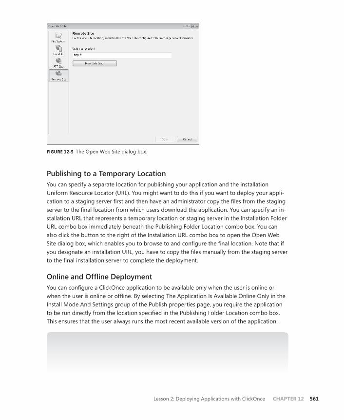
Lesson 2: Deploying Applications with ClickOnce CHAPTER 12 561
FIGURE 12-5 The Open Web Site dialog box.
Publishing to a Temporary LocationYou can specify a separate location for publishing your application and the installation Uniform Resource Locator (URL). You might want to do this if you want to deploy your appli-cation to a staging server first and then have an administrator copy the files from the staging server to the final location from which users download the application. You can specify an in-stallation URL that represents a temporary location or staging server in the Installation Folder URL combo box immediately beneath the Publishing Folder Location combo box. You can also click the button to the right of the Installation URL combo box to open the Open Web Site dialog box, which enables you to browse to and configure the final location. Note that if you designate an installation URL, you have to copy the files manually from the staging server to the final installation server to complete the deployment.
Online and Offline DeploymentYou can configure a ClickOnce application to be available only when the user is online or when the user is online or offline. By selecting The Application Is Available Online Only in the Install Mode And Settings group of the Publish properties page, you require the application to be run directly from the location specified in the Publishing Folder Location combo box. This ensures that the user always runs the most recent available version of the application.
NOTE ONLINE ONLY MODE
When an application is available in Online Only mode, the application still runs on the cli-ent machine as opposed to the server. However, it is not installed to the client machine and must be retrieved from the server each time it is run.
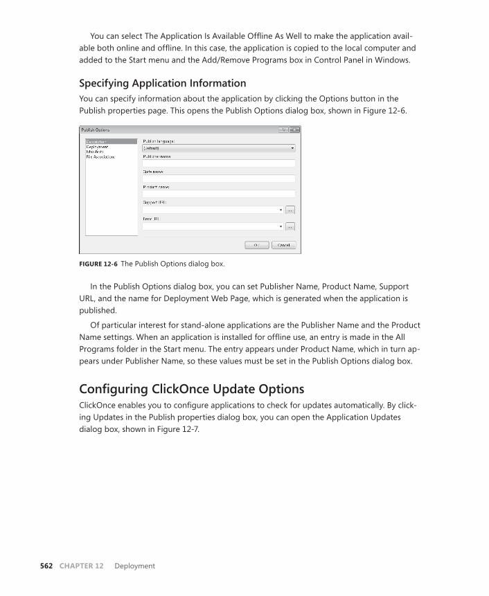
562 CHAPTER 12 Deployment
You can select The Application Is Available Offline As Well to make the application avail-able both online and offline. In this case, the application is copied to the local computer and added to the Start menu and the Add/Remove Programs box in Control Panel in Windows.
Specifying Application InformationYou can specify information about the application by clicking the Options button in the Publish properties page. This opens the Publish Options dialog box, shown in Figure 12-6.
FIGURE 12-6 The Publish Options dialog box.
In the Publish Options dialog box, you can set Publisher Name, Product Name, Support URL, and the name for Deployment Web Page, which is generated when the application is published.
Of particular interest for stand-alone applications are the Publisher Name and the Product Name settings. When an application is installed for offline use, an entry is made in the All Programs folder in the Start menu. The entry appears under Product Name, which in turn ap-pears under Publisher Name, so these values must be set in the Publish Options dialog box.
Configuring ClickOnce Update OptionsClickOnce enables you to configure applications to check for updates automatically. By click-ing Updates in the Publish properties dialog box, you can open the Application Updates dialog box, shown in Figure 12-7.

Lesson 2: Deploying Applications with ClickOnce CHAPTER 12 563
FIGURE 12-7 The Application Updates dialog box.
Configuring Update Settings with Visual StudioTo enable the application to check for updates, select the check box labeled The Application Should Check For Updates. Doing so enables the other options in the dialog box.
You can specify when the application checks for updates by selecting either After The Application Starts or Before The Application Starts. If you select Before The Application Starts, the application checks for new updates every time the application starts. This ensures that the user always runs the most recent version of the application, but it also slows the application’s performance at startup.
If you select After The Application Starts, you can specify that the application should check for updates every time it is run, or at a designated time interval, by choosing the appropriate option under Specify How Frequently The Application Should Check For Updates. You also can specify a minimum required version for the application, and you can specify a different location for updates if your updates are hosted in a location other than the install location.
Loading Updates ProgrammaticallyRather than scheduling updates, you might want to give the user the option to check for updates. Although there is not a way to do this built into the Properties page, you can add functionality to your application to check for and install updates manually. For example, you might provide a menu option entitled Check For Updates.
You can check for updates in code by using the ApplicationDeployment class. This class represents a ClickOnce deployment. To use this class in code, you first must add a reference to System.Deployment. After this reference has been added, you can retrieve an instance

564 CHAPTER 12 Deployment
that represents the current deployment from the static CurrentDeployment property, as shown here:
Sample of Visual Basic Code
Dim aDep As System.Deployment.Application.ApplicationDeployment aDep = _ System.Deployment.Application.ApplicationDeployment.CurrentDeployment
Sample of C# Code
System.Deployment.Application.ApplicationDeployment aDep; aDep = System.Deployment.Application.ApplicationDeployment.CurrentDeployment;
After you have obtained a reference to the current deployment, you can check for updates by using the CheckForUpdate method, and, if updates are available, you can update the ap-plication by using the Update method, as seen here:
Sample of Visual Basic Code
If aDep.CheckForUpdate Then aDep.Update() End If
Sample of C# Code
if (aDep.CheckForUpdate()) { aDep.Update(); }
The CheckForUpdate and Update methods also have asynchronous counterparts, called CheckForUpdateAsync and UpdateAsync, respectively, which can perform updates asynchro-nously. When CheckForUpdateAsync returns, it raises the CheckForUpdateCompleted event. By handling this event, you can query the CheckForUpdateCompletedEventArgs argument in the event handler to determine whether an update is available. If an update is available, you can call UpdateAsync to download and install the update asynchronously. If the application is running, updates are applied after the application ends, so the updates are not seen until the application is restarted.
These techniques are demonstrated in the following example:
Sample of Visual Basic Code
Dim aDep As System.Deployment.Application.ApplicationDeployment Public Sub New() ' This call is required by the Windows Form Designer. InitializeComponent() ' Add any initialization after the InitializeComponent() call. aDep = _ System.Deployment.Application.ApplicationDeployment.CurrentDeployment AddHandler aDep.CheckForUpdateCompleted, AddressOf UpdateCheckCompleted End Sub Public Sub UpdateApp() aDep.CheckForUpdateAsync() End Sub
Lesson 2: Deploying Applications with ClickOnce CHAPTER 12 565
Private Sub UpdateCheckCompleted(ByVal sender As Object, ByVal e As _ System.Deployment.Application.CheckForUpdateCompletedEventArgs) If e.UpdateAvailable Then aDep.UpdateAsync() End If End Sub
Sample of C# Code
System.Deployment.Application.ApplicationDeployment aDep; public myApplication { InitializeComponent(); aDep = System.Deployment.Application.ApplicationDeployment.CurrentDeployment; aDep.CheckForUpdateCompleted += UpdateCheckCompleted; } public void UpdateApp() { aDep.CheckForUpdateAsync(); } private void UpdateCheckCompleted(object sender, System.Deployment.Application.CheckForUpdateCompletedEventArgs e) { if (e.UpdateAvailable) { aDep.UpdateAsync(); } }
Migrating Settings and User DataApplication settings and default user settings are stored in the application’s .config file. These are typically updated with each new application update. However, user settings that have been modified by the user are stored in a local file that is separate from the .config file. Thus, no additional effort is required to migrate user settings when an application is updated. Simi-larly, you should take steps to avoid overwriting any custom files that store user data.
Deploying an XBAP with ClickOnceWith ClickOnce, XBAPs can be deployed in much the same way as a Windows or Navigation application. All the ClickOnce publishing properties also apply to XBAPs, but there are a few XBAP-specific concerns as well.
XBAPs run in the browser and are typically run from a Web site. Thus, they are almost always run under partial trust. You must design your XBAP applications for execution in a partial-trust environment and test them in the same trust environment in which you plan for users to execute them.
566 CHAPTER 12 Deployment
Considerations for Deploying in Partial-Trust EnvironmentsWhen designing an application for execution in a partial-trust environment, you should avoid coding features that require access to protected system resources. For example, you should not attempt to access the file system or registry in an XBAP.
Choosing a Local Persistence MechanismBecause XBAPs generally do not have access to the local file system, you must use a different mechanism to save user information. User-specific data can be written to the isolated storage file store, a specialized technology that allows isolated access to the file system under partial-trust conditions.
Configuring the Application ManifestApplication Manifest is a file created by Visual Studio during ClickOnce deployment that describes the files and dependencies required by an application, the identity and trust in-formation of an assembly, the entry point for the application, and any associations between file types and the application. All these aspects, except for file associations, are configurable through the Visual Studio user interface, as has been described earlier in this chapter. To cre-ate a file association, you must edit the Application Manifest file manually.
Adding a File AssociationA file association is described in the Application Manifest by the <fileAssociation> element. The attributes of this element are listed in Table 12-2. All four attributes are required.
TABLE 12-2 Attributes of the <fileAssociation> Element
ATTRIBUTE DESCRIPTION
extension The file extension to be associated with the application.
description A description of the file type for use by the shell.
progid A name uniquely identifying the file type.
defaultIcon Specifies the icon to use for files with this extension. The .icon file must be described in the application manifest and, thus, must have been added to the application with the Build Action property set to Content.
You can add a <fileAssociation> element to your application manifest by adding it to the App.Manifest file in Visual Studio. This file is added to your project when you select Enable ClickOnce Security Settings on the Security tab of your project’s property pages. The content in the App.Manifest file is folded into the application manifest at publish time. The following procedure describes how to create a file association for an application.

Lesson 2: Deploying Applications with ClickOnce CHAPTER 12 567
To create a file association:
1. Select or create an icon for your file type.
2. From the Project menu, choose Add Existing Item. The Add Existing Item dialog box opens. Set the filter to All Files and navigate to your icon, select it, and click Add.
3. With the icon selected in Solution Explorer, in the Properties window, set the Build Action property to Content and the Copy To Output Directory property to Copy Always.
4. In Solution Explorer, right-click your project and select Properties. Select the Security tab.
5. In the Security properties window, select the Enable ClickOnce Security Settings check box. The App.manifest file is added to your solution.
6. In Visual Basic only, in Solution Explorer, select View All Files and expand My Project.
7. Double-click App.manifest to open the App.manifest file.
8. Just before the final closing tag, add a <fileAssociation> element that includes values for all four required attributes. An example is shown here:
<fileAssociation xmlns="urn:schemas-microsoft-com:clickonce.v1" extension=".fnord" description="Fnord file" progid="SecretsMWNMTK.fnord" defaultIcon="fnord.ico" />
Note that you can only create file associations for applications that are installed as stand-alone applications, and you can create no more than eight file associations per application.
Associating a Certificate with the ApplicationCertificates are digital signatures issued by certificate authorities (CAs) that guarantee the identity of the application’s publisher. You can use Visual Studio to associate a certificate with your application.
To associate a certificate with your application, right-click your project in Solution Explorer, choose Properties, and then choose the Signing tab to open the Signing properties page, as shown in Figure 12-8.
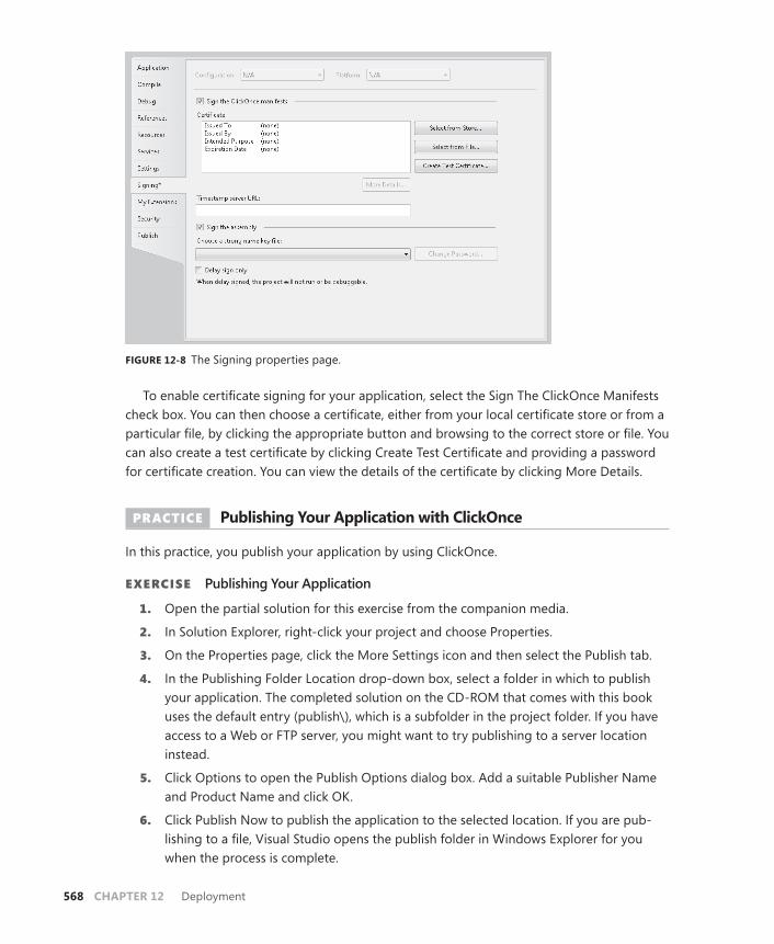
568 CHAPTER 12 Deployment
FIGURE 12-8 The Signing properties page.
To enable certificate signing for your application, select the Sign The ClickOnce Manifests check box. You can then choose a certificate, either from your local certificate store or from a particular file, by clicking the appropriate button and browsing to the correct store or file. You can also create a test certificate by clicking Create Test Certificate and providing a password for certificate creation. You can view the details of the certificate by clicking More Details.
PRACTICE Publishing Your Application with ClickOnce
In this practice, you publish your application by using ClickOnce.
EXERCISE Publishing Your Application
1. Open the partial solution for this exercise from the companion media.
2. In Solution Explorer, right-click your project and choose Properties.
3. On the Properties page, click the More Settings icon and then select the Publish tab.
4. In the Publishing Folder Location drop-down box, select a folder in which to publish your application. The completed solution on the CD-ROM that comes with this book uses the default entry (publish\), which is a subfolder in the project folder. If you have access to a Web or FTP server, you might want to try publishing to a server location instead.
5. Click Options to open the Publish Options dialog box. Add a suitable Publisher Name and Product Name and click OK.
6. Click Publish Now to publish the application to the selected location. If you are pub-lishing to a file, Visual Studio opens the publish folder in Windows Explorer for you when the process is complete.

Lesson 2: Deploying Applications with ClickOnce CHAPTER 12 569
7. In Windows Explorer (for the file system) or Windows Internet Explorer (for HTTP or FTP sites), browse to the publish location for your application if the publish location is not already open. Double-click Lesson 2.application to launch the application installa-tion. The Application Install dialog box opens.
8. In the Application Install dialog box, click Install. The installation process installs and starts the application. Close the application.
9. In Windows, click Start, select All Programs, and look for the Publisher Name you added. Then confirm that the Product Name is present in the Start menu hierarchy.
10. Open Control Panel and then click Uninstall A Program. If you are using Classic View, open Programs And Features instead. Right-click the name you designated for your product (Lesson 2 in the partial solution) and choose Uninstall/Change to open the Maintenance dialog box. Alternatively, you can select Lesson 2 and then click Uninstall/ Change.
11. Select Remove The Application From This Computer and click OK to uninstall the application.
Lesson Summary■ ClickOnce is a versatile and flexible deployment technology. It enables you to publish
an application to a disk location, a file share, an FTP site, or an HTTP address. ClickOnce application installations are segregated from the rest of the system and do not use shared components. Thus, installing a ClickOnce application runs no risk of breaking other application installations.
■ You can install a ClickOnce application so that it is available online or offline. If an ap-plication is available online only, it runs from its server rather than from a location on the local machine. If an application is available online only, a shortcut to it is not added to the Start menu.
■ ClickOnce applications can be configured to be self-updating. You can designate an application to check for updates every time it starts or on a set schedule, such as every week. You can also implement code to check for updates manually.
■ Stand-alone ClickOnce applications must be installed to a local computer under full-trust conditions. Applications that are run online are executed in the Internet security zone (if run from a Web site) or the local intranet security zone (if run from a file server on the local intranet).
■ XBAPs are designed to run in partial-trust conditions, and, as such, they should not at-tempt to access system resources that are not allowed by the default Internet security zone settings. Because they cannot use the file system, XBAPs should persist user data through isolated storage or user settings.
■ You can create file associations for ClickOnce applications by editing the App.manifest file. Visual Studio also provides tools for adding certificates to your application.
570 CHAPTER 12 Deployment
Lesson ReviewYou can use the following questions to test your knowledge of the information in Lesson 2, “Deploying Applications with ClickOnce.” The questions are also available on the companion CD if you prefer to review them in electronic form.
NOTE ANSWERS
Answers to these questions and explanations of why each answer choice is correct or incor-rect are located in the “Answers” section at the end of the book.
1. For an XBAP that is installed with ClickOnce to run from an Internet Web page, what is the default security mode under which the XBAP executes?
A. Full trust
B. Intranet zone
C. Internet zone
D. Custom zone
2. You are converting a WPF application that formerly executed under full trust to ex-ecute under partial trust. This application previously stored user data in a small local file, but now it cannot because it lacks FileIO permissions. What is the appropriate way to store user data in a partial-trust environment? (Choose all that apply.)
A. Use isolated storage to store user data.
B. Create a Web service that saves data back to the deployment server.
C. Save user data as user settings.
D. Call FileIOPermission.Demand to gain temporary access to the file system.
3. Which of the following code samples manually checks for updates and installs updates if any are available? For examples C and D, assume that the UpdateApp method has been called after execution of the constructor. (Choose all that apply.)
A.
Sample of Visual Basic Code
Dim aDep As System.Deployment.Application.ApplicationDeployment aDep = _ System.Deployment.Application.ApplicationDeployment.CurrentDeployment If aDep.CheckForUpdate Then aDep.Update() End If
Sample of C# Code
System.Deployment.Application.ApplicationDeployment aDep; aDep = System.Deployment.Application.ApplicationDeployment.CurrentDeployment; if (aDep.CheckForUpdate()) {
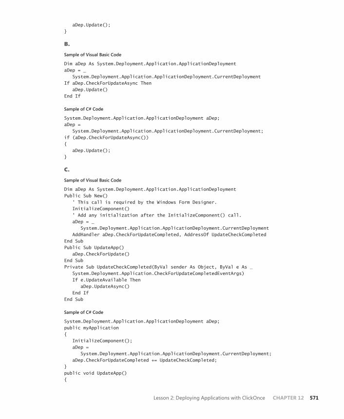
Lesson 2: Deploying Applications with ClickOnce CHAPTER 12 571
aDep.Update(); }
B.
Sample of Visual Basic Code
Dim aDep As System.Deployment.Application.ApplicationDeployment aDep = _ System.Deployment.Application.ApplicationDeployment.CurrentDeployment If aDep.CheckForUpdateAsync Then aDep.Update() End If
Sample of C# Code
System.Deployment.Application.ApplicationDeployment aDep; aDep = System.Deployment.Application.ApplicationDeployment.CurrentDeployment; if (aDep.CheckForUpdateAsync()) { aDep.Update(); }
C.
Sample of Visual Basic Code
Dim aDep As System.Deployment.Application.ApplicationDeployment Public Sub New() ' This call is required by the Windows Form Designer. InitializeComponent() ' Add any initialization after the InitializeComponent() call. aDep = _ System.Deployment.Application.ApplicationDeployment.CurrentDeployment AddHandler aDep.CheckForUpdateCompleted, AddressOf UpdateCheckCompleted End Sub Public Sub UpdateApp() aDep.CheckForUpdate() End Sub Private Sub UpdateCheckCompleted(ByVal sender As Object, ByVal e As _ System.Deployment.Application.CheckForUpdateCompletedEventArgs) If e.UpdateAvailable Then aDep.UpdateAsync() End If End Sub
Sample of C# Code
System.Deployment.Application.ApplicationDeployment aDep; public myApplication { InitializeComponent(); aDep = System.Deployment.Application.ApplicationDeployment.CurrentDeployment; aDep.CheckForUpdateCompleted += UpdateCheckCompleted; } public void UpdateApp() {
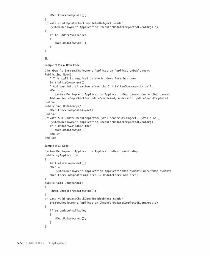
572 CHAPTER 12 Deployment
aDep.CheckForUpdate(); } private void UpdateCheckCompleted(object sender, System.Deployment.Application.CheckForUpdateCompletedEventArgs e) { if (e.UpdateAvailable) { aDep.UpdateAsync(); } }
D.
Sample of Visual Basic Code
Dim aDep As System.Deployment.Application.ApplicationDeployment Public Sub New() ' This call is required by the Windows Form Designer. InitializeComponent() ' Add any initialization after the InitializeComponent() call. aDep = _ System.Deployment.Application.ApplicationDeployment.CurrentDeployment AddHandler aDep.CheckForUpdateCompleted, AddressOf UpdateCheckCompleted End Sub Public Sub UpdateApp() aDep.CheckForUpdateAsync() End Sub Private Sub UpdateCheckCompleted(ByVal sender As Object, ByVal e As _ System.Deployment.Application.CheckForUpdateCompletedEventArgs) If e.UpdateAvailable Then aDep.UpdateAsync() End If End Sub
Sample of C# Code
System.Deployment.Application.ApplicationDeployment aDep; public myApplication { InitializeComponent(); aDep = System.Deployment.Application.ApplicationDeployment.CurrentDeployment; aDep.CheckForUpdateCompleted += UpdateCheckCompleted; } public void UpdateApp() { aDep.CheckForUpdateAsync(); } private void UpdateCheckCompleted(object sender, System.Deployment.Application.CheckForUpdateCompletedEventArgs e) { if (e.UpdateAvailable) { aDep.UpdateAsync(); } }

Suggested Practices CHAPTER 12 573
Case Scenarios
In the following case scenarios, you apply what you’ve learned about how to use controls to design user interfaces. You can find answers to these questions in the “Answers” section at the end of this book.
Case Scenario 1: Distributing the Application a Little EarlyWell, here it is! All your work for Fabrikam, Inc. on its big widget has come to fruition, and the application is ready to distribute to clients! The clients are very excited because this ap-plication is just what they’ve been waiting for. Unfortunately, the picture is not so rosy. The application is full of bugs, and Fabrikam’s clients cannot wait any longer. You have to release the buggy version, even though you have a team working around the clock to fix these bugs. Your requirements are that:
■ You must release the buggy version now.
■ You must provide updates that incorporate bug fixes as quickly as possible.
■ This application must be installable by the end user, who does not have administrative privileges.
What is a deployment strategy that will accomplish all the key requirements?
Case Scenario 2: Installing the Server CoreFabrikam has decided to make its server application and core database available for sale to some of its high-end clients. You have been directed to determine a distribution strategy. You will need to install the server application, create a new directory structure and registry keys, and check for prerequisite files in the installation phase.
Which deployment strategy can accomplish all these goals?
Suggested Practices
To help you successfully master the exam objectives presented in this chapter, complete the following tasks.
■ Practice 1 Publish your favorite application to a Web site and a file share using ClickOnce. Experiment with expanded permission requirements and update schedules.
■ Practice 2 Expand on the practice in Lesson 1, “Creating a Windows Setup Project,” to include an icon for your application and a custom action that tests for a condition and aborts if the condition is not found.

574 CHAPTER 12 Deployment
Take a Practice Test
The practice tests on this book’s companion CD offer many options. For example, you can test yourself on just the content covered in this chapter, or you can test yourself on all the 70-511 certification exam content. You can set up the test so that it closely simulates the experience of taking a certification exam, or you can set it up in study mode so that you can look at the correct answers and explanations after you answer each question.
MORE INFO PRACTICE TESTS
For details about all the practice test options available, see the “How to Use the Practice Tests” section in this book’s Introduction.
Answers 575
Answers
Chapter 1: Lesson Review Answers
Lesson 1 1. Correct Answer: B
A. Incorrect: A content control can host a single nested control.
B. Correct: A content control can host a single nested control.
C. Incorrect: Although a content control can host a list control, which can host an unlimited number of nested members, the content control itself can host only a single control.
D. Incorrect: All content controls can host only a single nested control.
2. Correct Answer: B
A. Incorrect: You must use the Grid.Column and Grid.Row attached properties to designate the cell for controls.
B. Correct: This example shows the correct use of the attached Grid.Column and Grid.Row properties.
C. Incorrect: No Grid.Column or Grid.Row values are set for this button.
D. Incorrect: You must use the Grid.Column and Grid.Row attached properties to designate the cell for controls.
3. Correct Answer: D
A. Incorrect: Context menus cannot be part of a visual tree.
B. Incorrect: This structure would require the context menu to be a visual child of a higher-level element, and context menus cannot be part of a visual tree.
C. Incorrect: Context menus must be an instance of the ContextMenu class, not the Menu class.
D. Correct: The context menu must be defined as a property of the control it is associ-ated with.
4. Correct Answer: C
A. Incorrect: Item controls can contain a list of items, the number of which has no de-fined limit.
B. Incorrect: Item controls can contain a list of items, the number of which has no de-fined limit.

576 Answers
C. Correct: Item controls can contain a list of items, the number of which has no de-fined limit.
D. Incorrect: All item controls can contain a list of items, the number of which has no defined limit.
5. Correct Answer: C
A. Incorrect: Although you can use a Grid control to create an evenly spaced control layout, UniformGrid requires much less work to implement this kind of layout.
B. Incorrect: Although you can use a Canvas control to create an evenly spaced control layout, UniformGrid requires much less work to implement this kind of layout.
C. Correct: The UniformGrid control automatically lays out controls in an equidistant man-ner irrespective of control Margin properties.
D. Incorrect: WrapPanel lays out controls in a horizontal wrapping layout and does not guarantee equidistance.
6. Correct Answer: A, C
A. Correct: With the Canvas.Right and Canvas.Bottom properties set to 0 and the Margin property set to 20, the Button control maintains 20 units between the button edges and the right and bottom canvas edges.
B. Incorrect: Because the Canvas.Right and Canvas.Bottom properties are not set, the but-ton location will default to the upper left corner.
C. Correct: Using absolute positioning with the Canvas.Top, Canvas.Left, Canvas.Right, and Canvas.Bottom attached properties is the preferred way to handle control position when using the Canvas control.
D. Incorrect: Because the margin is set to 20 and the Canvas.Right and Canvas.Bottom properties are also set to 20, the control edges actually are 40 units from the edges of the canvas.
Lesson 2 1. Correct Answer: A
A. Correct: This is a correctly formatted pack URI.
B. Incorrect: In this URI, component and MyFolder are transposed from their correct locations.
C. Incorrect: The assembly name must come before the semicolon.
D. Incorrect: In this URI, the folder name is not specified.
2. Correct Answer: B
A. Incorrect: The Embedded Resource setting embeds the image by using a different resource-handling technology, making it more difficult to access.
B. Correct: The Resource setting makes this image accessible to the Image control through pack URI syntax.
Chapter 1: Lesson Review Answers Answers 577
C. Incorrect: With the None setting, the file is neither embedded nor copied into the output directory.
D. Incorrect: The Content setting does not embed the file; rather, it copies it as a loose file.
3. Correct Answer: D
A. Incorrect: MediaElement cannot access resources of any kind.
B. Incorrect: MediaElement cannot access resources of any kind.
C. Incorrect: With the None setting, the file is neither embedded nor copied into the output directory.
D. Correct: The Content setting allows MediaElement to access the files. You also should set the Copy To Output Directory property to Copy Always.
4. Correct Answer: D
A. Incorrect: Because these Brush objects need to be used in many elements, defining them at the individual element level would require a great deal of redundancy.
B. Incorrect: Because these Brush objects need to be used in each window, defining them at the window level would be redundant.
C. Incorrect: Although defining these resources at the application level would enable use across the entire application, it would not facilitate reuse across multiple applications.
D. Correct: By defining your resources in a resource dictionary, you can share the file be-tween applications as well as import the resources contained therein at the window or application level as needed.
5. Correct Answer: D
A. Incorrect: Because the foreground is bound to the resource as a dynamic resource, it detects when the resource changes and turns green. Also, because the background is bound as a static resource, and a property on the brush that paints the background is changed, the resource detects that change through change notification, and the back-ground turns black.
B. Incorrect: Because the foreground is bound to the resource as a dynamic resource, it detects when the resource changes, and the foreground turns green in addition to the background turning black.
C. Incorrect: Because the background is bound as a static resource and a property on the brush that paints the background is changed, the resource detects that change through change notification, and the background turns black in addition to the foreground turn-ing green.
D. Correct: Because the foreground is bound to the resource as a dynamic resource, it detects when the resource changes, and the foreground turns green. Also, because the background is bound as a static resource and a property on the brush that paints the background is changed, the resource detects that change through change notification, and the background turns black.

578 Answers
Lesson 3 1. Correct Answer: D
A. Incorrect: Button1 does not reference or explicitly set a style; thus, the background is not affected by the style defined in Window.Resources.
B. Incorrect: Button1 does not reference or explicitly set a style; thus, the background is not affected by the style defined in Window.Resources.
C. Incorrect: Button1 does not reference or explicitly set a style; thus, the background is not affected by the style defined in Window.Resources.
D. Correct: Button1 does not reference or explicitly set a style; thus, the background is not affected by the style defined in Window.Resources. Therefore, the background remains the default.
2. Correct Answer: C
A. Incorrect: A multi-trigger requires all conditions to be met before activating its setters.
B. Incorrect: A multi-trigger requires all conditions to be met before activating its setters.
C. Correct: A multi-trigger is active when all conditions defined in it are met.
D. Incorrect: A multi-trigger requires all conditions to be met before activating its setters.
E. Incorrect: A multi-trigger is active only when all conditions are met.
3. Correct Answer: C
A. Incorrect: An explicitly set property always takes precedence over a property set by set-ters or triggers. Because the Content property is set explicitly, it displays Button.
B. Incorrect: An explicitly set property always takes precedence over a property set by set-ters or triggers. Because the Content property is set explicitly, it displays Button.
C. Correct: An explicitly set property always takes precedence over a property set by setters or triggers. Because the Content property is set explicitly, it displays Button.
D. Incorrect: An explicitly set property always takes precedence over a property set by set-ters or triggers. Because the Content property is set explicitly, it displays Button.
Chapter 1 Case Scenario Answers
Case Scenario 1: Streaming Stock Quotes 1. Because the Stock Quote control needs linear space but not two-dimensional space, a Sta-
tusBar control is a natural choice to display this information. Controls used to configure the application could be hosted in a ToolBar control.
2. A couple of layout controls could be used to create the layout. A grid is an obvious choice; by creating multiple grid rows, you can control where and how each control is positioned. A pos-sibly better choice would be DockPanel. By setting DockPanel.LastChildFill to True and adding

Chapter 2: Lesson Review Answers Answers 579
the chart control last, you can dock the ToolBar and StatusBar controls to the edges, fill the remaining space with the chart, and even allow the application layout to be reconfigured to dock ToolBar to different edges at run time.
Case Scenario 2: Cup FeverThere are several possible approaches to this problem, but the one that seems to make the most sense is to create a style for the elements in your user interface that defines the appropriate color scheme. The style should incorporate setters to set the color scheme of the object, and the value of the Setter objects should be bound to the value of the drop-down list. Using a custom converter, you can return the appropriate Brush objects for the style based on the content in the drop-down list.
Chapter 2: Lesson Review Answers
Lesson 1 1. Correct Answer: B
A. Incorrect: No Button1_Click method is defined as a handler for the button1 click event in this example.
B. Correct: Click is a bubbling event, so stackPanel1_Click will execute first.
C. Incorrect: Click is a bubbling event, so stackPanel1_Click will execute first.
D. Incorrect: Click is a bubbling event, so stackPanel1_Click will execute first.
2. Correct Answer: B
A. Incorrect: MouseDown is a bubbling event and thus is raised after corresponding tunnel-ing events, which are prepended with “Preview,” are raised.
B. Correct: PreviewMouseDown is a tunneling event and thus is raised by controls from the top down in the visual tree.
C. Incorrect: Because the StackPanel is contained in Grid, PreviewMouseDown will be raised by the grid first.
D. Incorrect: Click is a bubbling event and thus occurs after all preview events are raised.
3. Correct Answer: A
A. Correct: Because the Activated event is raised the first time the window is shown and every other time it is activated, this is the correct event to handle.
B. Incorrect: This event will execute code only when the application begins.
C. Incorrect: Because the Activated event is raised the first time the window is shown and every other time it is activated, you do not need to handle the Startup event as well.
D. Incorrect: This event would execute code when the application is started and every time the window loses focus.
580 Answers
Lesson 2 1. Correct Answers: A, B, D, and F
A. Correct: You must create a new instance of CommandBinding for each command you register.
B. Correct: The CommandBinding.Command property specifies which command is to be bound.
C. Incorrect: A command does not required any input gestures to be registered.
D. Correct: If the CommandBinding.Executed event is not handled, no code will be executed when the command is invoked.
E. Incorrect: Although handling the CanExecute event enables you to determine when the command is unavailable, it is not required to register a command.
F. Correct: You must add CommandBinding to one of the CommandBindings collections for it to be registered.
2. Correct Answer: C
A. Incorrect: CanExecute is a method, not a property, and cannot be set to a value.
B. Incorrect: The Execute method requires a target element where the run time begins look-ing for CommandBinding.
C. Correct: You call the command’s Execute method to execute the command, specifying the parameter and the owning control.
D. Incorrect: There is no CanExecute method on the Window class.
Lesson 3 1. Correct Answer: D
A. Incorrect: Because the RepeatBehavior property is set to a time span, it repeats for the duration of that time span. Because the span is 1 minute and the duration of the anima-tion is 15 seconds, it repeats three additional times after the first iteration.
B. Incorrect: Because the RepeatBehavior property is set to a time span, it repeats for the duration of that time span. Because the span is 1 minute and the duration of the anima-tion is 15 seconds, it repeats three additional times after the first iteration.
C. Incorrect: Because the RepeatBehavior property is set to a time span, it repeats for the duration of that time span. Because the span is 1 minute and the duration of the anima-tion is 15 seconds, it repeats three additional times after the first iteration.
D. Correct: Because the RepeatBehavior property is set to a time span, it repeats for the du-ration of that time span. Because the span is 1 minute and the duration of the animation is 15 seconds, it repeats three additional times after the first iteration.
Chapter 2: Case Scenario Answers Answers 581
2. Correct Answer: D
A. Incorrect: Because the default value for FillBehavior is HoldEnd, the final value of the ani-mation holds after this animation has completed. Because both the To property and the By property are set, the value of the By property is ignored.
B. Incorrect: Because the default value for FillBehavior is HoldEnd, the final value of the ani-mation holds after this animation has completed. Because both the To property and the By property are set, the value of the By property is ignored.
C. Incorrect: Because the default value for FillBehavior is HoldEnd, the final value of the ani-mation holds after this animation has completed. Because both the To property and the By property are set, the value of the By property is ignored.
D. Correct: Because the default value for FillBehavior is HoldEnd, the final value of the ani-mation holds after this animation has completed. Because both the To property and the By property are set, the value of the By property is ignored.
Chapter 2: Case Scenario Answers
Case Scenario 1: Validating User InputThe key to implementing these requirements is routed events. Because all the TextBox controls in this form will be contained in a Grid or other layout control, you can implement the validation rules by handling the PreviewKeyDown event. Because PreviewKeyDown is a tunneling event, it will be raised by the layout control before other events are raised by the TextBox controls, and you have an opportunity to cancel invalid keystrokes before they are entered into the user interface. The global validation rules can be applied directly and then individual validation rules can be applied based on the e.Source property, which will indicate in what control the event originates.
Case Scenario 2: Humongous Insurance User InterfaceCommands enable you to implement much of this functionality. By using commands, you can assign a command to the Command property of each menu item. When that command is unavailable, as determined by the handler for its binding’s CanExecute event, the corresponding menu item will be disabled. Shortcut keys and mouse gestures can be added to the InputGestures collection of the command, and these will be inactivated as well when the command is unavailable.
To implement auto-fill functionality in your TextBox controls, you can handle the TextBox.Key-Down event. In this event, you can test whether appropriate keystrokes have been entered and then complete the entry automatically as necessary.

582 Answers
Chapter 3: Lesson Review Answers
Lesson 1 1. Correct Answer: B
A. Incorrect: To keep the coordinates of the rendered control the same, you must set the RenderTransformOrigin property to .5,.5.
B. Correct: You must set the ScaleY property to –1 and the RenderTransformOrigin property to .5,.5 to achieve the specified effect.
C. Incorrect: You must set the ScaleY property, not the ScaleX property, to –1. In ad-dition, to keep the coordinates of the rendered control the same, you must set the RenderTransformOrigin property to .5,.5.
D. Incorrect: You must set the ScaleY property, not the ScaleX property, to –1.
2. Correct Answer: D
A. Incorrect: When the StartPoint and EndPoint properties are not set, they default to (0,0) and (1,1), respectively, which creates a diagonal gradient.
B. Incorrect: This example creates a horizontal gradient.
C. Incorrect: This example creates a horizontal gradient. In addition, it fades from yellow to red, not from red to yellow.
D. Correct: With StartPoint of (1,0) and EndPoint of (1,1), the gradient is vertical.
Lesson 2 1. Correct Answer: C
A. Incorrect: Because MediaElement elements do not throw exceptions, a Try…Catch block never detects them.
B. Incorrect: Although MediaElement elements do not throw exceptions, ignoring a failure of media to load would create a confusing and frustrating user experience at best.
C. Correct: Even though MediaElement does not throw exceptions, you can access the origi-nal exception that is thrown from the media failure through the event arguments. Then you can notify the user or take any other appropriate action.
D. Incorrect: The MediaOpened event is raised only after media has been opened; thus it will be raised only when there is no problem.
2. Correct Answer: D
A. Incorrect: SoundPlayer can be a good choice, but if your application needs to control volume or balance, these elements are inaccessible.
B. Incorrect: MediaPlayer can be a good choice, but if you need to play sound as an action or want a lightweight sound element, SoundPlayer is a better option.

Chapter 4: Lesson Review Answers Answers 583
C. Incorrect: Although MediaElement plays sound files, either MediaPlayer or SoundPlayer is a better choice because neither has a visual representation.
D. Correct: Depending on application requirements, either SoundPlayer or MediaPlayer can be a good choice.
Chapter 3: Case Scenario Answers
Case Scenario: The Company with Questionable Taste 1. Obviously, the stark black and white of the background is not a problem; it is simply a
matter of setting the correct properties. The tie-dyed user input is somewhat more chal-lenging, but that should not be a problem either. To create this effect, you should develop a RadialGradientBrush object that achieves the right mix of colors and set the Foreground property of all user input controls to this brush.
2. You can produce the video in the shape of a dancing bear by adding a MediaElement element to the application and setting the Clip property to the Path object supplied by the art depart-ment. Because the client wants continuous footage, you should handle the MediaElement.MediaEnded event and supply code to restart the media file when the end is reached.
Chapter 4: Lesson Review Answers
Lesson 1 1. Correct Answer: D
A. Incorrect: There is no CreateForm method on a Form class. You create a new instance by using the New keyword.
B. Incorrect: You must create a new instance of Form1 with the New keyword before calling methods on that instance.
C. Incorrect: myForm is not declared, and you cannot assign an instance variable to a class, although in Microsoft Visual Basic, “Form1” would return the default instance of Form1.
D. Correct: myForm is correctly declared and instantiated.
2. Correct Answer: A
A. Correct: All properties are set to appropriate values.
B. Incorrect: The FormBorderStyle property should be set to a member of the FormBorderStyle enumeration, not to a string.
C. Incorrect: The Opacity property should be set to a value between 0 and 1, not to a string value, and the form’s Size property should be set to a new instance of the Size structure.
D. Incorrect: The Opacity property should be set to a value between 0 and 1, not to a string value.
584 Answers
3. Correct Answer: C
A. Incorrect: The Button class does not expose a SetFlowBreak method.
B. Incorrect: Flow breaks are set by FlowLayoutPanel, not by the hosted control.
C. Correct: Use the SetFlowBreak method to set a flow break.
D. Incorrect: You cannot access contained controls as members of a container control.
4. Correct Answer: D
A. Incorrect: The TableLayoutPanel control is best for organizing controls in a tabular style. Although it might be a good choice for a single set of properties, it is not a good choice for separating groups.
B. Incorrect: The FlowLayoutPanel control is best for organizing controls that reorient them-selves in response to resizing of the control, but it is not a good choice for presenting multiple groups of controls.
C. Incorrect: The GroupBox control is best used for presenting option buttons that provide the user with exclusive choices between two or more options.
D. Correct: The TabControl control is best used for organizing related controls into individu-al related groups.
5. Correct Answers: A, B, C, and D
A. Correct: Each of these methods is valid. You can select a control in the Toolbox and double-click the form.
B. Correct: Each of these methods is valid. You can select a control in the Toolbox and draw on the form with the mouse.
C. Correct: Each of these methods is valid. You can double-click the control in the Toolbox.
D. Correct: Each of these methods is valid. You can select the control in the Toolbox and drag it to the form.
6. Correct Answer: B
A. Incorrect: You cannot add a type to the controls collection. You must create an instance of the control first.
B. Correct: You must first instantiate the control and then add it to the form’s controls col-lection.
C. Incorrect: The Add method is a member of the Form.Controls collection, not a member of Form itself.
D. Incorrect: The Add method is a member of the Form.Controls collection, not a member of Form itself.
7. Correct Answer: D
A. Incorrect: You cannot add panels to the SplitContainer control, so you cannot use the Controls.Add method to add a new panel.
B. Incorrect: You cannot add panels to the SplitContainer control, so you cannot use the Controls.Add method to add a new SplitterPanel.

Chapter 4: Lesson Review Answers Answers 585
C. Incorrect: You cannot add panels to the SplitContainer control, so you cannot use the Add method to add a new SplitterPanel.
D. Correct: You cannot add additional panels to the SplitContainer control, although you can add new panels to the individual SplitterPanel controls.
Lesson 2 1. Correct Answers: A and D
A. Correct: You can resize controls by grabbing and dragging the edges.
B. Incorrect: You cannot alter individual controls from the View menu.
C. Incorrect: Smart tags do not appear on all controls and, when they are present, generally do not allow you to resize controls.
D. Correct: You can modify the Size property directly in the Properties window.
2. Correct Answers: A, B, and C
A. Correct: You can set the Location property in the Properties window.
B. Correct: Grabbing the control and repositioning it with the mouse is the most natural way to relocate a control.
C. Correct: The Layout toolbar enables you to adjust the spacing and alignment of controls on your form.
D. Incorrect: There is no Location window.
3. Correct Answer: C
A. Incorrect: The control will maintain a constant distance from the top edge.
B. Incorrect: The control will maintain a constant distance from the top and bottom edges.
C. Correct: The control is not anchored to any edge and will float when the form is resized.
D. Incorrect: The control will maintain a constant distance from the right and left edges.
4. Correct Answer: B
A. Incorrect: This setting will dock the control to the top edge of the control.
B. Correct: A value of Fill will cause the control to fill the form or container control.
C. Incorrect: The Dock property can be set to only a single value. A value of Top, Left, Right, Bottom is invalid.
D. Incorrect: The Anchor property does not allow you to fill a form or container control.
5. Correct Answers: A and C
A. Correct: The Click event responds to the left click of the mouse, as well as to some key-board events, if the button has the focus.
B. Incorrect: The LinkClicked event exists in the LinkLabel control but not in the Button control.
C. Correct: The MouseDown event can respond to any button a mouse has.
D. Incorrect: The MouseOver event does not respond to clicks.
586 Answers
6. Correct Answer: D
A. Incorrect: The FlatAppearance.MouseOverBackColor property controls the BackColor property of the button when the mouse pointer is on the button.
B. Incorrect: The FlatAppearance.MouseDownBackColor property controls the BackColor property of the button when the mouse clicks the button.
C. Incorrect: The FlatAppearance.BorderSize property controls the width of the border when FlatStyle is set to Flat.
D. Correct: The appearance of the text does not change when the FlatStyle property is set to Flat.
7. Correct Answers: A, B, and C
A. Correct: You must set the TabOrder property to an appropriate value.
B. Correct: You must set the UseMnemonic property to True.
C. Correct: You must set the Text property with an ampersand to indicate the access key.
D. Incorrect: The CausesValidation property is not required to create an access key.
8. Correct Answer: D
A. Incorrect: The MultiLine property enables you to enter and display multiple lines, but it has no effect on the actual length of text entry.
B. Incorrect: The WordWrap property affects how text is displayed in a multiline text box, but it has no impact on the maximum length of the string.
C. Incorrect: The ScrollBars property influences whether scroll bars are displayed, but it does not affect the maximum length of the text.
D. Correct: The MaxLength property is the only property that affects the maximum length of the Text property.
9. Correct Answer: C
A. Incorrect: The 9 character indicates an optional numeric character in MaskedTextBox. All entries for a social security number should be required.
B. Incorrect: The 9 character indicates an optional numeric character in MaskedTextBox. All entries for a social security number should be required. Additionally, the slash (/) charac-ter represents a date separator and is inappropriate in this context.
C. Correct: The zero (0) character indicates a required numeric character. Additionally, the hyphen (-) is a literal character that is traditionally used for formatting social security numbers.
D. Incorrect: The slash (/) character represents a date separator and is inappropriate in this context. The hyphen (-) character literal is more appropriate.
10. Correct Answer: B
A. Incorrect: If the CutCopyMaskFormat property is set to ExcludePromptAndLiterals, the hyphen (-) literal character will be excluded. If the TextMaskFormat property is set to IncludeLiterals, the hyphen (-) literal character will not be excluded from the Text property.
Chapter 4: Lesson Review Answers Answers 587
B. Correct: The CutCopyMaskFormat property should be set to IncludeLiterals to in-clude the literal characters, and the TextMaskFormat property should be set to ExcludePromptAndLiterals to exclude all but the user input.
C. Incorrect: If the CutCopyMaskFormat property is set to ExcludePromptAndLiterals, the hyphen (-) literal character will be excluded. If the TextMaskFormat property is set to IncludePrompt, the hyphen (-) literal character will be excluded from the Text property, but any prompt characters that remain in MaskedTextBox will be incorporated into the Text property as well.
D. Incorrect: If the TextMaskFormat property is set to IncludeLiterals, the hyphen (-) literal character will not be excluded from the Text property.
Lesson 3 1. Correct Answers: B and C
A. Incorrect: The IndexOf method returns the index of an object to which you have a refer-ence, but it does not detect selected objects.
B. Correct: The SelectedIndex property will return the selected index. Note that if more than one item is selected, this property might return any of them.
C. Correct: The SelectedIndices property will return all selected indexes.
D. Incorrect: The Select method will select an object programmatically in ListBox, but it does not detect which index is selected.
2. Correct Answer: D
A. Incorrect: The Items.Add method adds a specified item to the Items collection.
B. Incorrect: The Items.Insert method adds a specified item to the Items collection at a spec-ified index.
C. Incorrect: The Items.AddRange method can be used to add an array of objects to the Items collection.
D. Correct: The Items.Contains method determines whether a collection contains a specified item, not whether to add items to a collection.
3. Correct Answer: C
A. Incorrect: Setting the View property to LargeIcon displays the ListView items with their associated large icons.
B. Incorrect: Setting the View property to Details will display the ListView items with their associated SubItems.
C. Correct: The ListView property cannot be used for displaying hierarchical data. For items with a tree structure, use the TreeView control.
D. Incorrect: Setting the View property to SmallIcon displays the ListView items with their associated small icons.
588 Answers
4. Correct Answers: B and E
A. Incorrect: The Checked property is a Boolean value and can be only True or False. The CheckState property can be set to Checked, however.
B. Correct: The Checked property is a Boolean value and can be only True or False.
C. Incorrect: The Checked property is a Boolean value and can be only True or False. The CheckState property can be set to Indeterminate, however.
D. Incorrect: The Checked property is a Boolean value and can be only True or False. The CheckState property can be set to Unchecked, however.
E. Correct: The Checked property is a Boolean value and can be set only to True or False.
F. Incorrect: The Checked property is a Boolean value and can be only True or False. No property of the CheckBox control can be set to NotChecked.
5. Correct Answers: A, C, and D
A. Correct: The MaxSelectionCount property determines the number of days that can be chosen in the SelectionRange property.
B. Incorrect: The SelectionRange property is set to a new value when the user chooses dates, so setting it at design time will not facilitate this scenario.
C. Correct: The MaxDate property determines the latest date that can be chosen, so setting it to the last day of the month in question will prevent the user from choosing any date after this day.
D. Correct: The MinDate property determines the earliest date that can be chosen, so set-ting it to the first day of the month in question will prevent the user from choosing any date before this day.
6. Correct Answers: C and D
A. Incorrect: The Image property directly sets an image for the control and cannot be set to an ImageList component.
B. Incorrect: The ImageKey property takes a string and indicates the key for the image in the associated ImageList component. You cannot set the ImageKey property to a value of Image.
C. Correct: You can set the ImageList property of the control to the ImageList component in question and set the ImageIndex property to the index of the image in the ImageList.Items collection.
D. Correct: You can set the ImageList property of the control to the ImageList component in question and set the ImageKey property to the key of the image in the ImageList.Items collection.
Lesson 4 1. Correct Answer: C
A. Incorrect: ToolStripMenuItem controls have no UseMnemonic property, and create access keys automatically when a letter is preceded by an ampersand.
Chapter 4: Lesson Review Answers Answers 589
B. Incorrect: ToolStripMenuItem controls have no AccessKeys property, and create access keys automatically when a letter is preceded by an ampersand.
C. Correct: ToolStripMenuItem controls create access keys automatically when a letter is preceded by an ampersand.
D. Incorrect: The ShortcutKeys property creates shortcut keys, which provide direct access to the command. Access keys are defined by preceding a letter in the Text property with an ampersand.
2. Correct Answer: D
A. Incorrect: ToolStripManager does not contain a Menus collection.
B. Incorrect: The ToolStripManager.Merge method is used for merging two tool strips or menus, not for adding a menu to a form.
C. Incorrect: ToolStripManager does not contain a Controls collection.
D. Correct: To add a menu to a form at run time, you add it through the form’s Controls col-lection.
3. Correct Answer: A
A. Correct: All that is required to enable a context menu for a control is to set that control’s ContextMenuStrip property.
B. Incorrect: Controls do not have a ShowPopUp property.
C. Incorrect: ContextMenuStrip controls do not have a ShowPopUp method.
D. Incorrect: ContextMenuStrip controls do not have a Control property.
4. Correct Answer: B
A. Incorrect: The ToolStrip class does not have a Merge method. You must use the ToolStrip-Manager class.
B. Correct: Use the static ToolStripManager class to merge tool strips.
C. Incorrect: The ToolStripManager class is static, so it cannot be instantiated.
D. Incorrect: The ToolStrip class does not have a Merge method. You must use the ToolStrip-Manager class.
5. Correct Answer: A
A. Correct: Use the Add method of the Items collection to add a new item at run time.
B. Incorrect: The ToolStripManager class is used to manage the tool strips themselves, not the items they contain.
C. Incorrect: The ToolStrip class contains a single collection, Items, for all the tool strip items. It does not contain a separate collection for each type of tool strip item.
D. Incorrect: Use the Items.Add method to add a new item. There is no Items.NewItem method.

590 Answers
Chapter 4: Case Scenario Answers
Case Scenario 1: Designing a Simple User Interface 1. You can use TextBox controls to receive input for the interest rate and time span parameters
and a MaskedTextBox control that uses the currency symbol for the current investment value parameter. You should use labels to clearly identify each input control.
2. You can set the TabOrder property for each control to provide an ordered means of navigat-ing with the Tab key. In addition, you can use the Label controls to create access keys for the TextBox and MaskedTextBox controls in your UI.
Case Scenario 2: Designing a User Interface 1. For the name and address fields, TextBox controls are most appropriate. For fields that have a
defined format, such as postal code and credit card number, use MaskedTextBox controls. A multiline text box will make general comments easier to enter and read. You should use labels to clearly name each control.
2. By setting the PasswordChar property of MaskedTextBox, you can keep the credit card infor-mation from displaying inappropriately. Although this might make it more difficult to ensure that the correct data was entered, you can overcome the problem by requiring this data to be entered twice and for both entries to match.
Chapter 5: Lesson Review Answers
Lesson 1 1. Correct Answers: A and B
A. Correct: Composite controls consist of preexisting Windows Forms controls bound to-gether by common functionality.
B. Correct: You can add new properties, methods, and events to a composite control.
C. Incorrect: Composite controls provide their own rendering code.
D. Incorrect: Properties of constituent controls are not generally available to the developer. You can wrap the properties of constituent controls in new properties to make them available to the developer, but this is not available by default.
2. Correct Answers: A and D
A. Correct: A Toolbox bitmap must be a 16-by-16 pixel bitmap.
B. Incorrect: Size is important because a Toolbox bitmap must be a 16-by-16 pixel bitmap.
C. Incorrect: The Image property determines what image is displayed in the control at run time, not what image is displayed next to the control in the Toolbox.

Chapter 5: Lesson Review Answers Answers 591
D. Correct: The ToolboxBitmap attribute enables you to specify a path, a type, or a type and a resource name to specify the Toolbox bitmap.
3. Correct Answer: C
A. Incorrect: Although you must override the OnPaint method to provide a new appearance for an extended control, you are not required to provide a new appearance.
B. Incorrect: If a Toolbox bitmap is not provided, the control will use the same bitmap that is used by the inherited control.
C. Correct: All that is required to create an extended control is to inherit a base control. All other steps are optional.
D. Incorrect: The extended control will expose all of the same properties and methods as the control it inherits.
Lesson 2 1. Correct Answers: C and D
A. Incorrect: You must use either TemplateBinding or Binding to bind a property.
B. Incorrect: When using Binding, you must set the Path property to the appropriate prop-erty name and somehow specify the source object.
C. Correct: TemplateBinding enables you to bind directly to a property on the templated parent.
D. Correct: You can specify the templated parent as RelativeSource and set the Path prop-erty to the appropriate value.
2. Correct Answer: A
A. Correct: The Style element sets the target type to Label and includes a setter that sets the Template property to the referenced template. The Style element is defined after Template in XAML so it can be parsed.
B. Incorrect: A Style element that sets the Template property, but which has that Template element defined either inline or before Style, is defined in the XAML code.
C. Incorrect: The Style element contains no Setter to set the template property.
D. Incorrect: Templates are not applied automatically to elements without the aid of a Style element.
Lesson 3 1. Correct Answer: C
A. Incorrect: No preexisting Windows Forms controls have this functionality.
B. Incorrect: Because no current WPF elements incorporate this functionality, a new tem-plate would not achieve the desired effect.

592 Answers
C. Correct: Because the visual interface can be achieved with existing WPF elements, the best choice is to create a user control that binds the preexisting WPF elements with cus-tom functionality.
D. Incorrect: Although you could achieve your goals with a custom control, creating a com-pletely new template is unnecessary; thus, creating a user control is a better choice.
2. Correct Answer: D
A. Incorrect: No preexisting Windows Forms controls have this functionality.
B. Incorrect: Because no current WPF controls incorporate this functionality, a new template would not achieve the desired effect.
C. Incorrect: Because the visual interface cannot be achieved with existing WPF elements, a user control is not the best choice.
D. Correct: Because this element requires both custom visual effects and custom functional-ity, you should create a custom control.
3. Correct Answers: A, C, and D
A. Correct: Each theme needs to have a separate template in an appropriately named file.
B. Incorrect: All templates should exist in the Themes folder or in the appropriate external folder.
C. Correct: ThemeInfoAttribute must be set to point to the correct folders.
D. Correct: You always must have a fallback template that is used if the chosen theme is not supported.
Chapter 5: Case Scenario Answers
Case Scenario 1: Full Support for StylesThe most common approach in this situation would be to use the Windows Forms MaskedTextBox control hosted in WindowsFormsHost. Unfortunately, because of the specific requirement for all elements to be visually extensible, this is not an option because Windows Forms controls cannot have Style or Template applied to them. The only other possible solution is to spend the developer hours implementing a WPF-based MaskedTextBox control by creating a custom control that inherits TextBox. We have already implemented the presentation logic, and we can focus on developing the mask engine and incorporating it into the new control.
Case Scenario 2: The Pizza Progress Bar 1. Because the control the client is requesting is essentially a ProgressBar control with an alter-
native appearance, the best approach is to build a new control template.
Chapter 6: Lesson Review Answers Answers 593
2. You can create the disappearing-pizza effect by starting with an image of a pizza in the back-ground and then, as the Value property goes from the minimum to the maximum, gradually overlaying a partially filled ellipse. You can implement this functionality by creating a custom converter that converts the current value of the progress bar to a fraction of 360 degrees and by painting the appropriate filled arc over the pizza image, making it seem to disappear.
Chapter 6: Lesson Review Answers
Lesson 1 1. Correct Answers: A and D
A. Correct: The ElementName property establishes the source object, and the Path property establishes the source property for that object.
B. Incorrect: Although setting the DataContext property establishes the source object, you still must define the path to the source property for that object by setting the Path prop-erty (or by other means, as discussed in Lesson 2, “Converting Data,” of this chapter).
C. Incorrect: Although setting the Source property establishes the source object, you still must define the path to the source property for that object by setting the Path property (or by other means, as discussed in Lesson 2 of this chapter).
D. Correct: The RelativeSource property identifies the source object, and the Path property indicates the path to the source property.
2. Correct Answer: B
A. Incorrect: A binding mode of OneTime does not update the user interface with any changes made to the database while the application is running.
B. Correct: This mode enables the user to view the data but not to change it.
C. Incorrect: This mode enables the user to update the data source.
D. Incorrect: When the need is explicit, it is best to declare the binding mode explicitly rather than relying on defaults.
3. Correct Answer: D
A. Incorrect: Because this application requires a specialized update procedure, using the default setting is not the best practice.
B. Incorrect: This setting would update the source whenever it changed, rendering it unac-ceptable for the scenario described.
C. Incorrect: This setting updates the data source whenever the control loses focus, which is unacceptable for the scenario described.
D. Correct: This setting updates the source only when explicitly called.

594 Answers
Lesson 2 1. Correct Answer: A
A. Correct: The Content property is bound to the Date path, and the Background property also is bound to the Date path, while setting the Converter property of that binding to the myConverter predefined static resource.
B. Incorrect: Although the properties are bound correctly, you must designate the convert-er that returns a Brush object for the Background property.
C. Incorrect: Although it is possible to define a resource in an element’s resource collec-tion, you still must designate the converter that returns a Brush object for the Background property. In addition, the question assumes that the converter has already been defined as a resource in the Windows.Resources collection.
D. Incorrect: Because the converter is a resource, you must refer to it using the { StaticResource} syntax.
2. Correct Answer: C
A. Incorrect: To bind to a multi-value converter, you must use a MultiBinding object. This example shows a source called ShapeName and a path called ShapeSize that would result in binding to a single field rather than binding to both of them.
B. Incorrect: To bind to a multi-value converter, you must use a MultiBinding object. This example shows a path called ShapeName/ShapeSize that would result in binding to a single field rather than binding to both of them.
C. Correct: This example correctly uses a MultiBinding object, and the arguments are bound in the correct order.
D. Incorrect: Although this example correctly uses a MultiBinding object, the arguments are bound in the incorrect order. Thus, the first member of the object array will be an integer instead of a string, as the converter expects.
Lesson 3 1. Correct Answers: A and D
A. Correct: Exceptions are never surfaced to the user in data binding.
B. Incorrect: The Validation.HasError property is set to True.
C. Incorrect: A new ValidationError object is added to the Validation.Errors collection.
D. Correct: Because the Binding.NotifyOnValidationError property is not set to True, the Validation.Error event is not raised.
2. Correct Answer: C
A. Incorrect: The PropertyChanged event must be raised to implement data change notifi-cation.
B. Incorrect: The PropertyChanged event is raised before the property actually changes, which can lead to unpredictable results.
Chapter 6: Case Scenario Answers Answers 595
C. Correct: The PropertyChanged event should be raised after the property is changed.
D. Incorrect: Because the property does not change in the getter, it is incorrect to raise the PropertyChanged event there.
3. Correct Answer: B
A. Incorrect: Although it is possible to implement a data object by inheriting from an ObservableCollection collection of Object types, this would require a lot of casting code and would make coding the application more prone to error. It is better to use an ObservableCollection collection of Employee objects.
B. Correct: Using an ObservableCollection collection of Employee objects is the best choice.
C. Incorrect: Although it is possible to implement a data object by declaring an observ-able collection of objects, this would require creating wrappers to access the collection’s members. The better choice is to inherit ObservableCollection.
D. Incorrect: Although it is possible to implement a data object by declaring a member collection, this would require creating wrappers to access the collection’s members. The better choice is to inherit ObservableCollection.
Chapter 6: Case Scenario Answers
Case Scenario 1: The Currency Trading Review Console 1. You can provide the currency conversion data by using a value converter. By creating an
instance of the Web service in your value converter, you can access up-to-date exchange rates and convert the transaction from dollars to yen, pounds, euros, won, bhat, or any other currency desired. Because you are not changing the culture of the thread, however, you are unable to use built-in string formatting to get culture-specific currency formatting. Thus, you have to implement your own currency formatting code.
2. You can alert the users to trades that exceed the individual trader’s limits by creating a multi-value converter, which would evaluate the trader’s trade limit and the total value of the trade. If the value exceeded the limit, you could return a SolidColorBrush element of an alert color, such as red, and bind the background of your display control to that color, thus easily alerting the manager to the issue.
Case Scenario 2: Currency Trading ConsoleYou can implement this requirement through a validation rule that would evaluate the identity of the individual trader logged on to the console and the total value of the attempted trade. If the value of the trade exceeded the trader’s limit, a validation error would be raised, and the trade would not be submitted to the database.

596 Answers
Chapter 7: Lesson Review Answers
Lesson 1 1. Correct Answer: C
A. Incorrect: The DataContext property is set, incorrectly, to the data set, not to the data table.
B. Incorrect: The Path property does not recognize the data set named mySet.
C. Correct: The DataContext is set correctly to the Customers table, and the Display MemberPath property is set to the correct property.
D. Incorrect: The DisplayMemberPath property is set incorrectly.
2. Correct Answer: C
A. Incorrect: The Path property must be set to the CustomersOrders/OrdersDetails relation. In this answer choice, it is not set.
B. Incorrect: The Path property must be set to the CustomersOrders/OrdersDetails relation. In this answer choice. it is incorrectly set to just OrdersDetails.
C. Correct: The Path is set correctly to the CustomersOrders/OrdersDetails relation.
D. Incorrect: The Path property incorrectly includes the Customers table. Because DataContext is set to the Customers table already, the Path property incorrectly looks for a Customers table within the Customers table.
Lesson 2 1. Correct Answer: D
A. Incorrect: The <DataTemplate> tags must be enclosed in <ListBox.ItemTemplate> tags to set the data template to the ItemTemplate property.
B. Incorrect: The data template must be set to the ItemTemplate property, not to the ItemsSource property.
C. Incorrect: The data template must be enclosed in <DataTemplate> tags.
D. Correct: The data template is correctly set.
2. Correct Answer: A
A. Correct: You set the Filter object to a Predicate<object> parameter that specifies a filter-ing method that returns a Boolean value.
B. Incorrect: The specified method must return a Boolean value.
C. Incorrect: You must set the Filter property, not the CustomFilter property.
D. Incorrect: You must set the Filter property, not the CustomFilter property. In addition, the specified method must return a Boolean value.

Chapter 8: Lesson Review Answers Answers 597
Chapter 7: Case Scenario Answers
Case Scenario 1: Getting Information from the FieldBecause the application needs to read XML flies in a queue, harnessing the power of XmlDataPro-vider seems like a logical choice. By specifying the file name, you can bind your controls to the XML files and view the data that way. Because the original XML files cannot be altered, you should use a binding mode of OneWay to keep any changes from being propagated back to the XML file. When the data has been edited, it can be added to the central database manually by using ADO.NET data access.
Case Scenario 2: Viewing Customer DataThe first step is to separate the records that meet the criteria from the records that do not. To achieve this, you should create a complex filtering subroutine that examines each record and de-termines whether it is a member of any of the groups you are looking for. You should then create a custom grouping by implementing IValueConverter and group the records based on criterion group.
Chapter 8: Lesson Review Answers
Lesson 1 1. Correct Answer: B
A. Incorrect: Using the column and row index of the selected cell is not the best way to determine the currently selected cell because it requires more coding than using the DataGridView.CurrentCell property.
B. Correct: Using the DataGridView.CurrentCell property is the best way to determine the currently selected cell.
C. Incorrect: Using the cursor position’s x and y coordinates is not the best way to deter-mine the currently selected cell because it would require complicated coding to deter-mine this information.
D. Incorrect: Using the currently selected column and row in the bound DataTable control to determine the clicked cell is incorrect because it requires more coding than using the DataGridView.CurrentCell property.
2. Correct Answer: C
A. Incorrect: Adding validation code to the CellPainting event handler is not the preferred method of validating data in DataGridView.
B. Incorrect: Adding validation code to the DataGridView.CellClick event handler is not the preferred method of validating data in DataGridView.

598 Answers
C. Correct: Adding your validation code to the DataGridView.CellValidating event handler is the correct way to validate value changes in cells in DataGridView.
D. Incorrect: Adding code to the DataGridView partial class file is not the preferred method of validating data in DataGridView.
3. Correct Answer: B
A. Incorrect: Configuring DataGridViewTextBoxColumn to display True or False is one way to display a Boolean value, but it is not the preferred way.
B. Correct: Configuring DataGridViewCheckBoxColumn to display a check box that is se-lected or cleared is the preferred way to display Boolean values in DataGridView.
C. Incorrect: Configuring a DataGridViewButtonColumn class to display a button that indi-cates pressed or not pressed is not correct.
D. Incorrect: Configuring a custom column to display Yes or No is also one way to present a Boolean value, but it is not the preferred method.
Lesson 2 1. Correct Answer: B
A. Incorrect: The Error property is not used directly by WPF and is frequently not imple-mented in implementations of IDataErrorInfo.
B. Correct: This information is passed automatically to the ErrorContent string.
C. Incorrect: The Validation.Errors collection is read-only and cannot be set directly. Also, the Error property is not used directly by WPF and will never be called in this scenario.
D. Incorrect: The Validation.Errors collection is read-only and cannot be set directly.
2. Correct Answer: C
A. Incorrect: The Leave event is raised before the Validating event is raised.
B. Incorrect: The Leave event is raised before the Validating event is raised, and the LostFocus event is the last focus event raised.
C. Correct: This is the correct order in which focus events are raised.
D. Incorrect: The Validating and Validated events are raised after the Leave event, which fol-lows the GotFocus event, and are then followed by the LostFocus event.
Chapter 9: Lesson Review Answers Answers 599
Chapter 8: Case Scenario Answers
Case Scenario: The Writer Completeness ChartThe best way to address this issue is to use a data grid, which will display information for all the writers in one easily browsable control. For the percentage of the project done, you can develop a custom WPF control that displays this information, and then display it in the data grid by creating a DataGridTemplateColumn property that binds this control to the ratio of the two relevant fields by using a custom data converter class.
Chapter 9: Lesson Review Answers
Lesson 1 1. Correct Answers: A and B
A. Correct: RunWorkerAsync raises the DoWork event, which must be handled to run code on the background thread.
B. Correct: The DoWork event handler contains the code that will be run on the background thread.
C. Incorrect: Handling the ProgressChanged event is not required.
D. Incorrect: Setting WorkerSupportsCancellation to True is not required.
2. Correct Answers: A and C
A. Correct: The Dispatcher.BeginInvoke method will execute a method asynchronously and safely on the main thread.
B. Incorrect: Invoking a delegate in this manner attempts direct access of the user interface from a background thread, which is not allowed.
C. Correct: Using the built-in mechanism of BackgroundWorker for reporting is the pre-ferred way to report progress that can be expressed numerically.
D. Incorrect: Calling a method that directly accesses the user interface from a background thread is not allowed.
Lesson 2 1. Correct Answer: C
A. Incorrect: The CurrentUICulture determines the localized version of the form that is loaded, but it does not control data formatting.
B. Incorrect: Culture is set by the thread, not by the form. In this example, you attempt to set CurrentUICulture with the form.

600 Answers
C. Correct: The CurrentCulture setting determines the formatting methods used for applica-tion data.
D. Incorrect: Culture is set by the thread, not by the form. In this example, you attempt to set CurrentCulture with the form.
2. Correct Answers: C and D
A. Incorrect: Because the default value for the RightToLeft property is Inherit, you need to set only the Form.RightToLeft property to True for the control text to be displayed right to left. Thus, you do not need to set the Label.RightToLeft property.
B. Incorrect: Because the default value for the RightToLeft property is Inherit, you need to set only the Form.RightToLeft property to True for the control text to be displayed right to left. Thus, you do not need to set the Button.RightToLeft property.
C. Correct: Setting the Form.RightToLeft property to True will cause all controls with a RightToLeft property value of Inherit to display text right to left.
D. Correct: Setting the Form.RightToLeftLayout property and the Form.RightToLeft property to True will cause the entire form to display in a right-to-left manner.
Lesson 3 1. Correct Answers: B and D
A. Incorrect: The background of WindowsFormsHost is never visible, and setting this prop-erty has no effect on the user interface.
B. Correct: You can set properties for a hosted control in XAML just as you would for a WPF element.
C. Incorrect: Even though it is named in XAML, the child of WindowsFormsHost cannot be accessed directly in code.
D. Correct: The correct way to gain a reference to a child of WindowsFormsHost is to cast Child to the appropriate type.
Chapter 9: Case Scenario Answers
Case Scenario 1: The Publishing ApplicationThe central issue in this application design is the list of documents for download. Both the UI thread and the background downloading thread must access this list. You should protect access to this list by using SyncLock or lock blocks where appropriate to allow access to the list by only one thread at a time. A background thread should be used to download the documents. When download of a particular document is complete, the UI should be updated through the thread-safe Control.Invoke method.

Chapter 10: Lesson Review Answers Answers 601
Case Scenario 2: Creating a Simple GameThe BackgroundWorker component enables you to implement separate process threads with relative ease. In the preceding example, you can create a single BackgroundWorker component that takes the path to the file to play as a parameter and then plays the sound on a background thread. When it is finished, the BackgroundWorker component can be used again without reinitializing.
Chapter 10: Lesson Review Answers
Lesson 1 1. Correct Answers: A and B
A. Correct: Selecting (Custom) enables you to edit the app.manifest.xml file.
B. Correct: The applicationRequestMinimum node governs requested code acess security permissions.
C. Incorrect: The requestedPrivileges node governs requested user account control permis-sions.
D. Incorrect: Software restriction policies function independently of code access security.
2. Correct Answers: B and D
A. Incorrect: File IO is considered an unsafe operation in most partial-trust environments and will usually be denied in these environments.
B. Correct: Isolated Storage is a safe way for applications to have limited File IO access in a limited-trust environment.
C. Incorrect: Most security policies will restrict untrusted applications from modifying the registry because this can cause serious damage to the integrity of the system installation.
D. Correct: Although specific bitmap effects can be considered unsafe, simply loading an image into a content control is a safe operation for partial-trust environments.
Lesson 2 1. Correct Answer: C
A. Incorrect: Individual settings are exposed as properties on the Settings object, not as members of a collection.
B. Incorrect: Individual settings are exposed as properties on the Settings object, not as members of a collection. In addition, you must call the Settings.Save method to persist changes to the settings.
C. Correct: You first set the named setting and then call the Save method.
D. Incorrect: You must call the Settings.Save method to persist changes to the settings.

602 Answers
2. Correct Answer: D
A. Incorrect: Settings are strongly typed and therefore do not need to be cast.
B. Incorrect: Settings are strongly typed and therefore have no conversion methods.
C. Incorrect: Assigning a strongly typed setting to an object will require the object to be cast as a System.Window.Media.Color type.
D. Correct: Because settings are strongly typed, you can assign a setting directly to a vari-able of the correct type.
Lesson 3 1. Correct Answer: D
A. Incorrect: Although most drag and drop operations begin in the MouseDown event on the source control, they are not required to begin there.
B. Incorrect: Although it is recommended that the DragEnter event handler be used to examine the data object and set the Effect property as appropriate, it is not required.
C. Incorrect: The DragLeave event is used to execute code when data is dragged out of a control, but it is not necessary for the drag and drop operation.
D. Correct: The DragDrop event is the only event that must be handled to complete a drag and drop operation.
2. Correct Answers: A, B, C, and D
A. Correct: The DoDragDrop method begins the drag and drop operation.
B. Correct: If the target control does not allow one of the specified effects, the operation will not be completed.
C. Correct: If the data format is not correct, the operation cannot be completed.
D. Correct: If AllowDrop is set to False, no drag and drop operation can occur.
Chapter 10: Case Scenario Answers
Case Scenario: The Configurable ApplicationYou can implement this functionality through user settings. By storing these preferences in settings, you can provide a storage mechanism that is configurable by the user without having to implement any additional infrastructure.

Chapter 11: Lesson Review Answers Answers 603
Chapter 11: Lesson Review Answers
Lesson 1 1. Correct Answers: A, C, and D
A. Correct: You must create an instance of the appropriate automation peer to automate your control.
B. Incorrect: Although you must obtain a reference to an implementation of the appropri-ate pattern interface, the preferred way to do so is to call the GetPattern method.
C. Correct: You must obtain a reference to an implementation of the pattern interface that encapsulates the functionality you want to automate.
D. Correct: After a reference to an implemented pattern interface is obtained, you can call the methods that pattern interface exposes to automate your control.
2. Correct Answers: A, B, and C
A. Correct: You can open the WPF Tree Visualizer from the Watch window. Additionally, you can select it from the drop-down list next to the magnifying glass in a tool tip.
B. Correct: You can open the WPF Tree Visualizer from the Auto window. Additionally, you can select it from the drop-down list next to the magnifying glass in a tool tip.
C. Correct: You can open the WPF Tree Visualizer from the Locals window. Additionally, you can select it from the drop-down list next to the magnifying glass in a tool tip.
D. Incorrect: The Output window displays console output from the application and cannot open the WPF Tree Visualizer.
Lesson 2 1. Correct Answers: C, D
A. Incorrect: Intellitrace data collection is enabled by default.
B. Incorrect: The file size and location can be modified, but they function with default val-ues and do not need to be set.
C. Correct: You view Intellitrace data in the Intellitrace window.
D. Correct: Intellitrace is enabled in only Visual Studio 2010 Ultimate.
2. Correct Answers: A, C
A. Correct: This sample correctly initializes the trace source and adds a listener named myListener.
B. Incorrect: This sample initializes XmlWriterTraceListener, not TextWriterTraceListener.
C. Correct: This sample correctly initializes TextWriterTraceListener.
D. Incorrect: No listener named textListener is defined in any of the other samples.

604 Answers
Chapter 11: Case Scenario Answers
Case Scenario: Debug Drama 1. For the difficult bugs, Intellitrace can be a valuable tool. By configuring Intellitrace to collect
only the data in which you are interested, you can collect target information that will assist in the resolution of these bugs.
2. Since data-binding errors in the WPF user interface do not raise exceptions, it can be difficult to locate the exact cause of the error, making these errors frustrating to debug. By enabling the data-binding PresentationTraceSource class, you can examine data binding in minute detail. By setting the trace level to Warning, you can filter out all but the most important messages.
Chapter 12: Lesson Review Answers
Lesson 1 1. Correct Answer: A
A. Correct: The File System editor is used to determine which files will be distributed by a setup project.
B. Incorrect: The File Types editor is used to set associations between file types and applications.
C. Incorrect: The Custom Actions editor is used to add custom actions to your application.
D. Incorrect: The User Interface editor is used to edit the user interface of the setup wizard.
2. Correct Answer: B
A. Incorrect: This specifies a particular value for the operating system version that might not exist. You should use >= to specify that the operating system should be greater than a specified version.
B. Correct: You should use >= to specify that the operating system should be greater than a specified version.
C. Incorrect: This requires the operating system to be less than Windows 2000. You should use >= to specify that the operating system should be greater than a specified version.
D. Incorrect: This enables installation for any operating system except a particular version of Windows 2000. You should use >= to specify that the operating system should be greater than a specified version.
Chapter 12: Lesson Review Answers Answers 605
3. Correct Answers: B, C, and D
A. Incorrect: The Installer class should be added to the project you want to deploy, not to the setup project itself.
B. Correct: You must add an Installer class to the project you want to deploy as a custom action.
C. Correct: You must write your custom action in the Install method of an Installer class.
D. Correct: You must specify the project that contains the custom action in the Custom Actions editor.
Lesson 2 1. Correct Answer: C
A. Incorrect: Applications and XBAPs that run from a Web page execute under the Internet security zone by default and not under full trust.
B. Incorrect: Applications and XBAPs that run from a Web page execute under the Internet security zone by default and not under the intranet zone.
C. Correct: Applications and XBAPs that run from a Web page execute under the Internet security zone by default.
D. Incorrect: Applications and XBAPs that run from a Web page execute under the Internet security zone by default and not under the custom zone.
2. Correct Answers: A and C
A. Correct: Isolated storage provides a safe way to persist data to the file system in a partial-trust environment.
B. Incorrect: Web service access is typically curtailed in a partial-trust environment, so this strategy cannot be relied on to give acceptable results.
C. Correct: Because user settings are persisted safely in a partial-trust environment, this strategy can be used if the data to be persisted is of an appropriate size and format for settings.
D. Incorrect: A permission demand is used to check for permission, not to temporarily gain permission.
3. Correct Answers: A and D
A. Correct: This example demonstrates correct usage of the synchronous methods CheckForUpdate and Update.
B. Incorrect: CheckForUpdateAsync does not return a value; rather, it uses a callback. Thus, in this example, the call to aDep.CheckForUpdateAsync produces an error because it can-not be evaluated as a value.
C. Incorrect: In this example, CheckForUpdate is called and returned, but the expression is never evaluated and no subsequent code path leads to the installation of updates.
D. Correct: This example correctly demonstrates the use of the asynchronous methods CheckForUpdateAsync and Update Async.
606 Answers
Chapter 12: Case Scenario Answers
Case Scenario 1: Distributing the Application a Little EarlyUsing ClickOnce technology, you can provide the version that is available now through a Web site that is accessible by your clients. By setting the application to check for updates every time the application is run, you can ensure that your clients receive the most up-to-date version every time they run the application. Additionally, with a ClickOnce application, your clients do not have to be administrative users to install the application.
Case Scenario 2: Installing the Server CoreBy creating a setup project to install the document core, you can create a setup environment that accomplishes all these goals. You can define directory structures in the File System editor, and you can create registry keys by means of the Registry editor. You can check for prerequisites in a custom action and, if they are not found, use the custom action to either install the prerequisites, if possible, or throw an InstallException exception to abort installation if it is not possible to install them.
607
Index
Symbols and Numbers& (ampersand), 257* (asterisk), 23/ (forward slash), 42\ (back slash), 42_ (underscore)
access keys and, 6, 16mnemonic keys and, 5Prompt character and, 207
= (assignment operator), 164
AAccept buttons, 200–201access keys
about, 6Button controls and, 6creating for controls, 202creating for menu items, 16, 257defining, 201–202Label controls and, 201
Action class(es)BeginStoryboardName property, 106managing animation playback, 106SpeedRatio property, 107
Actions collection, 66Activated event, 84ADO.NET objects
binding to, 373–375filtering, 399–400Visual Studio designer tools, 375
aligning content, 32–33Alt key, 5–6, 16ampersand (&), 257Animation class(es)
AccelerationRatio property, 103, 108AutoReverse property, 103, 109BeginTime property, 103By property, 104controlling animations, 104creating and starting in code, 112DecelerationRatio property, 103, 108Duration property, 103–104FillBehavior property, 103, 109From property, 104managing playback timeline, 108–110RepeatBehavior property, 103, 109SpeedRatio property, 103, 110template triggers and, 291To property, 104triggers and, 105–108
animationsabout, 102–103creating and starting in code, 112default template and, 110EventTrigger class and, 63key-frame, 102, 110–112linear, 102–103non-double types, 110–113path-based, 103properties of, 103–104simultaneous, 105Storyboard class and, 104–105template triggers and, 291triggers and, 105–108
app.config fileconfiguring trace sources, 536PresentationTraceSources class and, 537–538
app.manifest.xml filecopying permission set text into, 498create custom security requests, 497requesting UAC permissions, 498
608
Bback slash (\\), 42background processes
announcing completion of, 451BackgroundWorker component and, 450cancelling, 453–454providing parameters to, 451reporting progress of, 454–455requesting status of, 455returning values from, 452
BackgroundWorker componentabout, 449CancelAsync method, 450, 453CancellationPending property, 449, 453–454DoWork event, 449–450, 454IsBusy property, 449, 455ProgressChanged event, 450, 454ReportProgress method, 450RunWorkerAsync method, 449–451RunWorkerCompleted event, 450WorkerReportsProgress property, 449WorkerSupportsCancellation property, 449, 453
BeginStoryboard action, 106Bezier curve, 112binary resources
about, 41accessing in other assemblies, 43embedding, 42loading, 42logical resources and, 41pack URIs, 42using in other assemblies, 43Windows Forms support, 41
binding (data)ADO.NET objects, 373–375complex, 410configuring, 317–324control templates, 293–294controls, 409–412creating in code, 319data sources and controls, 417–418defined, 315, 409hierarchical data, 376–377list-based controls, 218–219, 369–373ObjectDataProvider class and, 378–379objects, 320–322properties, 317, 371, 386
Application classapplication-level events, 83–86Find command, 91, 93GetResourceStream method, 45Startup event handler, 476
Application Manifest, 566–567application pack URIs, 43application resources, 48application settings, 503, 505ApplicationCommands class
about, 90Open command, 90
ApplicationDeployment classabout, 563CheckForUpdate method, 564CurrentDeployment property, 563Update method, 564
application-level events, 83–86ArrayList object, 462assemblies
accessing resources in other, 43satellite, 475
Assembly classGetManifestResourceNames method, 46GetManifestResourceStream method, 46ThemeInfoAttribute, 306
assignment operator (=), 164asterisk (*), 23asynchronous processing
BackgroundWorker component, 449–450creating process threads, 460–463delegates and, 456–459Dispatcher class support, 464–465running background processes, 450–455
attached events, 80attached properties
defined, 21–22, 31Grid controls, 23Storyboard class and, 105
AutomationPeer class(es)about, 523creating, 524GetChildren method, 524GetName method, 524GetParent method, 524GetPattern method, 524, 527pattern interfaces, 524–526
Application class
609
AutoEllipsis property, 197Click event and, 5, 80, 197–198, 202code examples, 4creating high-contrast styles, 68–69DialogResult property, 197, 200event handlers and, 197FlatAppearance property, 197, 199–200FlatStyle property, 197, 199–200FontWeight property, 65ImageIndex property, 237ImageKey property, 237ImageList property, 237IsCancel property, 5IsDefault property, 5MouseDown event and, 198Style property, 59Text property, 197TextAlign property, 197ToolBar controls and, 17
ButtonBase class, 6
Ccallback methods, 459Cancel buttons, 5, 200–201CancelEventArgs class, 432Canvas controls
about, 4, 30Bottom property, 30code examples, 30Left property, 30Right property, 30Top property, 30Zindex property, 30
CAS (code access security), 496CellValidating event, 414certificates, associating with applications, 567–568change notification, 350–352Char data type, 430CheckBox controls
about, 6, 229–230AutoCheck property, 230Checked property, 230CheckState property, 230Click event and, 6ImageIndex property, 237ImageKey property, 237
relational databases, 381–382removing dynamically, 319simple, 410WPF elements, 318–319
Binding classabout, 317Element property, 320ElementName property, 317FallbackValue property, 317Mode property, 318, 323NotifyOnSourceUpdated property, 318NotifyOnTargetUpdated property, 318Path property, 318, 374, 376RelativeSource property, 318, 320–322Source property, 318, 320, 370TargetNullValue property, 318, 323UpdateSourceTrigger property, 324ValidationRules collection and, 346XPath property, 318
BindingListCollectionView.CustomFilter property, 399BindingNavigator component, 411BindingOperations.ClearBinding method, 319BindingSource component
defining data sources, 411MoveNext method, 411MovePrevious method, 411
bordersBorderThickness property, 292setting style for forms, 165
Brush classabout, 122–128Background property, 121, 473BorderBrush property, 121controls and, 121–122Fill property, 121Foreground property, 121, 388, 473Freeze method, 122OpacityMask property, 121Stroke property, 121
brushes, visual interface and, 121–128bubbling events
about, 78–79handling, 80
Button controlsabout, 3, 5–7, 197access keys and, 6animations and, 110attached properties and, 21
CheckBox controls

610
navigating, 371–373synchronization objects and, 462
CollectionViewSource.GetDefaultView method, 372Color.FromArgb method, 122ColorAnimation class, 110ColumnStyles collection, 176CombinedGeometry class
about, 131–132GeometryCombineMode property, 132
ComboBox controlsabout, 13, 214Content property, 14DataSource property, 214, 218DisplayMember property, 214, 218DropDownHeight property, 214DropDownStyle property, 214DropDownWidth property, 214FormatString property, 214FormattingEnabled property, 214IsDropDownOpen property, 14IsEditable property, 14IsReadOnly property, 14Items property, 214SelectedIndex property, 214SelectedItem property, 214SelectedValue property, 214Text property, 14ToolBar controls and, 17ValueMember property, 214, 218
command bubbling, 93command handlers, 89, 92Command object
about, 89CanExecute method, 90, 94
command source, 89CommandBinding object, 89, 92CommandBindings collection, 93commands
about, 89architectural overview, 89associating with controls, 90creating, 95–96disabling, 94–95implementing, 90invoking from code, 91invoking with gestures, 91predefined, 90
Commit actions, 552
ImageList property, 237IsChecked property, 6, 323ListBox controls and, 13RadioButton controls and, 238Text property, 230ThreeState property, 230ToolBar controls and, 17
CheckedListBox controlsabout, 214CheckedItems property, 215CheckIndices property, 215FormatString property, 215FormattingEnabled property, 215Items property, 215MultiColumn property, 215SelectedIndex property, 215SelectedItem property, 215SetItemChecked method, 215SetItemCheckState method, 215
CheckForUpdateCompleted event, 564child controls
accessing programmatically, 31Grid panel support, 22
Children collectionaccessing child elements, 31Add method, 31Remove method, 31RemoveAt method, 31
class-level event handlers, 83Click event
Button controls and, 5, 80, 197–198, 202Checkbox controls and, 6ToolStrip controls and, 247–248
ClickOnceabout, 559associating certificates with applications, 567–568configuring Application Manifest, 566–567configuring update options, 562–565deploying with, 559–562deploying XBAPs, 565–566siteOfOrigin pack URIs and, 44
clipping elements, 135–136code access security (CAS)
defined, 496working with policies, 497–498
collectionsbinding item controls to, 369–370binding properties to, 371
CheckedListBox controls
611
ContextMenuStrip controlsabout, 261, 263associating properties with controls, 262merging, 260
control containment hierarchy, 77control templates
applying, 290applying with Style class, 294choosing, 300creating, 288–290defined, 288inserting Trigger objects, 291predefined part names, 295theme-specific, 306–307viewing source code, 294
controls. See also specific types of controlsabout, 191adding to forms, 170adding/removing at runtime, 139–140, 171altering appearance of, 283Anchor property, 191, 196associating commands with, 90BackColor property, 191, 280BackgroundImage property, 191binding to data, 409–412Brush objects and, 121–122CanFocus property, 431CausesValidation property, 191, 432, 436Command property, 94composite, 275–281configuring at design time, 193–195ContainsFocus property, 191Controls property, 192creating access keys for, 202Cursor property, 192DataMember property, 410DataSource property, 410Dock property, 192, 196Enabled property, 192flipping, 135Focus method, 431–433Font property, 192ForeColor property, 192HasChildren property, 192Height property, 192–193Invoke property, 462InvokeRequired property, 462Location property, 192, 194
ComponentCommands class, 90composite controls
about, 275–276adding events, 278adding methods, 276adding properties, 277BackColor property, 280creating in WPF, 300–307exposing properties, 279invisible at run time, 279ToolboxBitmapAttritute class and, 280transparent backgrounds, 280Visible property, 279
conditional formatting, 388–389container controls. See also specific types of container controls
about, 157, 170adding controls to, 170–171, 193–195Anchor property, 171BackColor property, 170Controls collection and, 170Controls property, 170Dock property, 172, 183Enabled property, 170Font property, 170ToolStripContainer class and, 249Visible property, 170
content alignment, 32–33content controls
about, 4–7Content property, 4ContentTemplate property, 387defined, 3layout controls and, 4
content filesadding to resources, 43–44Build Action property, 42, 44creating resource-only DLLs, 45–46retrieving resources manually, 45siteOfOrigin pack URIs and, 44
ContentControl class, 4context menus
about, 261adding/removing items, 261
ContextMenu controlsabout, 15, 17adding/removing items, 261Menu controls and, 19
controls
612
EntryPoint property, 554handling errors, 554InstallerClass property, 554SourcePath property, 554
Custom Actions editor, 548, 552–553custom controls
choosing, 300creating, 304defined, 300implementing/registering dependency properties, 300–302testing, 304–305theme-based appearance, 305–307
Cut command, 89
Ddata binding
ADO.NET objects, 373–375complex, 410configuring, 317–324control templates, 293–294controls, 409–412creating in code, 319data sources and controls, 417–418defined, 315, 409hierarchical data, 376–377list-based controls, 218–219, 369–373ObjectDataProvider class and, 378–379objects, 320–322properties, 317, 371, 386relational databases, 381–382removing dynamically, 319simple, 410WPF elements, 318–319
data conversionconditional formatting with, 388–389culture settings and, 476formatting as currency, 331–333formatting dates, 333–346formatting strings, 331IValueConverter interface, 328–333localizing data, 336multi-value converters, 338–340returning objects, 335–336
data sets, navigating records in, 411data sources
Margin property, 195MaximumSize property, 192MinimumSize property, 192modifying properties, 196Name property, 192OnPaint method, 283Parent property, 192process threads and, 462–464Region property, 192RenderTransformOrigin property, 135repositioning, 194resizing, 193setting location of, 194Size property, 192–193snaplines and, 195TabIndex property, 192Tag property, 192testing, 304–305Text property, 192, 202transforming, 134UseMnemonic property, 202Visible property, 192, 279Width property, 192–193working with images, 235–237
Controls collectionabout, 170Add method, 177, 179removing MenuStrip controls, 261
converting dataconditional formatting with, 388–389culture settings and, 476formatting as currency, 331–333formatting dates, 333–346formatting strings, 331IValueConverter interface, 328–333localizing data, 336multi-value converters, 338–340returning objects, 335–336
Copy command, 89CultureInfo class, 470–471CurrentThread.CurrentCulture property, 470–471CurrentThread.CurrentUICulture property, 476custom actions
about, 552–553Arguments property, 553Condition property, 554creating, 554CustomActionData property, 554
Controls collection

613
MaxDate property, 233MinDate property, 233Value property, 233
Deactivated event, 84deadlocks, 461debugging
Intellitrace support, 533–535PresentationTraceSource class and, 535–539Tree Visualizer support, 527–528
delegatesabout, 456–457, 463BeginInvoke method, 457–458calling asynchronously, 457EndInvoke method, 457–458IAsyncResult interface and, 458Invoke method, 457
dependency propertiesdata binding and, 319implementing/registering, 300–302
DependencyObject classabout, 301ClearValue method, 68
deploying with ClickOnceabout, 559–560associating certificates with applications, 567–568configuring Application Manifest, 566–567configuring update options, 562–565deploying XBAPs, 565–566migrating settings, 565migrating user data, 565online/offline considerations, 561publishing to temporary location, 561selecting publishing location, 560specifying application information, 562
deployment projects, configuring, 551–552dialog boxes, 483–485digital clock, creating, 284–285direct events, 78–79discrete key frames, 111–112Dispatcher class
accessing controls, 464BeginInvoke method, 464Dispatcher property, 464DispatcherPriority property, 464Invoke method, 464UI thread and, 462
DispatcherUnhandledException event, 84DLLs, resource-only, 45–46
adding, 380–381binding DataGrid controls, 417–418binding list-based controls, 218–219, 369–373defining with BindingSource component, 411
data templatesDataTemplateSelector class and, 390–392defined, 385hierarchical, 392–393setting, 387–388
databases, binding to, 381–382DataColumn.Expression property, 400DataGrid controls
about, 417binding data sources, 417–418column types, 418–420ItemsSource property, 417RowDetailsTemplate property, 420
DataGridView controlsadding tables and columns, 413binding examples, 410CellValidating event, 414configuring columns, 412CurrentCell property, 414DataMember property, 411DataSource property, 411deleting columns, 413–414determining clicked cell, 414displaying data, 411formatting, 416validating input, 414–415
DataGridViewCellPaintingEventArgs class, 416DataRelation class, 376DataSet.DataContext property, 374DataTable.DataContext property, 373DataTemplateSelector class, 390–392DataTrigger class
about, 63, 65Background property, 65Binding property, 65hosting Action objects, 108Property property, 65
dates/timeschoosing, 233formatting, 333–346
DateTimePicker controlsabout, 233CustomFormat property, 233Format property, 233
DLLs, resource-only

614
RadiusY property, 130Stretch property, 129Width property, 129
EllipseGeometry class, 131embedded resources
about, 42retrieving loose files, 45
Enter event, 431EnterActions collection, 108ErrorProvider component
about, 435BlinkRate property, 435BlinkStyle property, 435displaying errors, 435–436Icon property, 435SetError method, 435–436
event handlersattaching, 80–81Button controls and, 197class-level, 83Windows Forms controls, 486
EventManager classabout, 81class-level event handlers, 83defining routed events, 81–82GetRoutedEvents method, 81GetRoutedEventsForOwner method, 81RegisterClassHandler method, 81, 83RegisterRoutedEvent method, 81
events. See also specific types of eventsadding to controls, 278application-level, 83–86attached, 80drag and drop functionality and, 510–511field-level validation and, 429–430filtering in Intellitrace, 535focus, 431media-specific, 150–187raising, 82selecting to record with Intellitrace, 534viewing in Intellitrace, 534
EventSetter classabout, 59Event property, 59Handler property, 59
EventTrigger classabout, 63, 66animations and, 105–106
DockPanel controlsabout, 27–29Dock property, 27LastChildFill property, 28–29
DomainUpDown controlsabout, 228Items property, 229ReadOnly property, 229Text property, 229
DoubleAnimation class, 102DoubleAnimationUsingPath class, 103DoWork event, 449–450, 454DoWorkEventArgs class
Argument property, 451Result property, 452
drag and drop processabout, 510DragDrop event, 515DragDropEffects enumeration, 512–513DragEnter event, 514general sequence, 512implementing between applications, 515Windows Forms and, 513WPF applications and, 513
DragDrop classabout, 510AllowDrop property, 511–512DoDragDrop method, 511–513
DragDrop event, 511–512, 515DragDropEffects enumeration, 512–513DragEnter event, 511–512, 514DragEventArgs object
about, 512Effect property, 512
DragLeave event, 511DragOver event, 511dynamic resources
about, 48–49retrieving in code, 52
EEditingCommands class, 90ElementHost controls, 487Ellipse class
Height property, 129RadiusX property, 130
DockPanel controls
615
FlowLayoutPanel controlsabout, 170, 174–175AutoScroll property, 174–175BorderStyle property, 175FlowDirection property, 174–175GetFlowBreak method, 175–176SetFlowBreak method, 175–176WrapContents property, 174–175
Form classBackcolor property, 162BackgroundImage property, 162BackgroundImageLayout property, 162ControlBox property, 162Cursor property, 162Enabled property, 162Font property, 163–164ForeColor property, 163FormBorderStyle property, 163, 165HelpButton property, 163Icon property, 163KeyPreview property, 434Language property, 471Localizable property, 471Location property, 163MaximizeBox property, 163MaximizeSize property, 163MinimizeBox property, 163MinimizeSize property, 163Opacity property, 163, 167Size property, 163–164, 166StartLocation property, 167StartPosition property, 163, 166–167, 170Text property, 163–164TopMost property, 163, 167TransparencyKey property, 280Visible property, 163, 169Windowstate property, 163, 166
formattingconditional, 388–389DataGridView controls, 416dates, 333–346display items in list-based controls, 220–222strings, 331, 333strings as currency, 331–333
form-level validation, 433–434forms. See also Windows Forms
adding controls to, 170–171Controls property, 170
code examples, 66setting Style property, 60
ExceptionValidationRule, setting, 347ExecutedRoutedEventArgs class, 92Exit event, 84ExitActions collection, 108extended controls
about, 282overriding methods, 283
Extensible Application Markup Language (XAML)about, 1accessing resources in, 48attaching event handlers, 80
Ffield-level validation
keyboard events, 429–430TextBox controls and, 428
file associations, 566–567file dialog boxes
AddExtension property, 484CheckFileExists property, 484CheckPathExists property, 484CreatePrompt property, 484FileName property, 484FileNames property, 484Filter property, 484InitialDirectory property, 484Multiselect property, 484OpenFile method, 484OverwritePrompt property, 484ShowDialog method, 484ValidateNames property, 484
File System editorabout, 547adding files to setup projects, 548–549adding icons during setup, 549–550VersionNT system property, 550
File Transfer Protocol (FTP), 560File Types editor, 548FileIO permission set, 497filtering
data, 399–400events in Intellitrace, 535properties in Tree Visualizer, 528
flipping elements, 135
forms
616
keeping forms on top of, 167shapes and, 128–133testing, 523–528transformations and, 133–136visual tree and, 136–138working with images, 235–237
Grid controlsabout, 4attached properties, 23attached properties and, 21Column property, 23–24ColumnDefinition property, 22ColumnSpan property, 23–26Height property, 23HorizontalAlignment property, 22layout panels, 22–26Margin property, 22Row property, 23–24RowDefinition property, 22RowSpan property, 23–26VerticalAlignment property, 22Width property, 23
Grid panel, 22–26GridSplitter controls
about, 24–26Grid.Column property, 24Grid.ColumnSpan property, 24–26Grid.Row property, 24Grid.RowSpan property, 24–26Height property, 24, 26HorizontalAlignment property, 24, 26Margin property, 24, 26ResizeBehavior property, 24–25ResizeDirection property, 24ShowsPreview property, 24VerticalAlignment property, 25–26Width property, 25–26
GroupBox controlsabout, 173Text property, 173
groupingcontrols, 6data, 396–398
GroupStyle object, 396
keeping on top of user interface, 167localized, 471–472modifying appearance/behavior, 163opacity in, 167resizing, 166setting border style, 165setting properties, 486setting startup state, 166setting title, 164specifying startup location, 166–167startup, 168–169transparency in, 167
forward slash (/), 42FTP (File Transfer Protocol), 560
GGeometry class
Clip property, 135–136clipping elements, 135–136CombineMode property, 131Path class and, 131
GeometryGroup classabout, 131–132Fillrule property, 132
gestures, invoking commands with, 91GiveFeedBack event, 511–512globalization
current culture and, 470defined, 468implementing, 470
GotFocus event, 431gpedit.msc application
about, 499creating additional rules, 500–501selecting security levels, 500
GradientStop classabout, 126Color property, 123, 126Offset property, 123, 126
graphic handles (thumbs), 10graphics (user interfaces)
about, 1brushes and, 121–128choosing dates/times, 233inspecting with Tree Visualizer, 527–528
forward slash (/)

617
IIS (Internet Information Services), 560IItemContainerProvider interface, 525IList interface, 372Image class, 42Image controls
about, 8Source property, 8Stretch property, 8
ImageBrush classImageSource property, 127Stretch property, 127TileMode property, 127–128ViewBox property, 127Viewport property, 127
ImageList classabout, 224, 235–238ColorDepth property, 236–237Images property, 236–237ImageSize property, 236–237
Images Collection editor, 237ImageSource class, 8, 473immediate mode graphics, 136IMultipleViewProvider interface, 525individual controls, 3INotifyCollectionChanged interface, 417INotifyPropertyChanged interface, 351, 417Install actions, 552Installer class, 552–553InstallException exception, 554IntelliSense, 504Intellitrace
about, 533enabling, 533–534filtering events, 535opening files, 535selecting events to record, 534setting location for recordings, 534viewing events in Debug mode, 534
Internet Information Services (IIS), 560IRangeValueProvider interface, 525IScrollItemProvider interface, 525IScrollProvider interface, 525ISelectionItemProvider interface, 525ISelectionProvider interface, 526ISynchronizedInputProvider interface, 526ITableItemProvider interface, 526ITableProvider interface, 526item controls. See also specific controls
Hhierarchical data
binding to, 376–377control containment hierarchy, 77data templates and, 392–393
HierarchicalDataTemplate classabout, 392ItemBindingGroup property, 392ItemContainerStyle property, 392ItemContainerStyleSelector property, 392ItemsSource property, 392ItemStringFormat property, 392ItemTemplate property, 392ItemTemplateSelector property, 392
HTTP (Hypertext Transfer Protocol), 560Hypertext Transfer Protocol (HTTP), 560
IIAsyncResult interface, 457–458IBindingList interface, 372ICollectionView interface
about, 371CurrentItem property, 371–372CurrentPosition property, 371filtering data, 399–400grouping data, 396–398IsCurrentAfterLast property, 371IsCurrentBeforeFirst property, 372MoveCurrentTo method, 372MoveCurrentToFirst method, 372MoveCurrentToLast method, 372MoveCurrentToNext method, 372MoveCurrentToPosition method, 372MoveCurrentToPrevious method, 372SortDescriptions property, 394sorting data and, 394
ICommandSource interface, 90IComparer interface, 395IDataErrorInfo interface, 436–438IDockProvider interface, 525IEnumerable interface, 372, 417IExpandCollapseProvider interface, 525IGridItemProvider interface, 525IGridProvider interface, 525IInvokeProvider interface, 525
item controls
618
about, 78field-level validation and, 429form-level validation and, 434
KeyEventArgs class, 429key-frame animations
about, 102, 110–111discrete, 111–112Height property, 111KeySpline property, 112KeyTime property, 110–111linear, 111–112spline, 112types of, 111–112Value property, 110
KeyFrames collection, 110, 112KeyPress event
about, 430form-level validation and, 434validating characters, 430
KeyPressEventArgs.KeyChar property, 430KeyUp event
field-level validation and, 429form-level validation and, 434
LLabel controls
about, 3, 5, 201access keys and, 201AutoSize property, 201Background property, 65binding example, 373code examples, 5Content property, 318, 371creating high-contrast styles, 68–69mnemonic keys, 5StatusBar controls and, 19Target property, 5Text property, 201
Launch Conditions editor, 548layout controls
about, 19–21accessing child elements, 31Anchor property, 486content controls and, 4defined, 4Dock property, 486
about, 3, 12, 212adding/removing items, 216–217binding to data sources, 218–219binding to lists, 369–373, 386determining item location, 217–218DisplayMemberPath property, 369, 373, 387formatting display items, 220–222IsSynchronizedWithCurrentItem property, 369, 373, 376Items property, 216ItemsSource property, 370, 373ItemTemplate property, 370, 387menus and, 15selecting items, 222–223sorting, 220
Items collectionabout, 213Add method, 216, 254, 258, 261AddRange method, 216Clear method, 217IndexOf method, 217Insert method, 216Remove method, 217, 259, 261RemoveAt method, 217, 259
ITextProvider interface, 526ITextRangeProvider interface, 526IToggleProvider interface, 526ITransformProvider interface, 526IValueConverter interface
Convert method, 328–329, 397, 476ConvertBack method, 328–329, 397, 476creating custom grouping, 397formatting as currency, 331–333formatting dates, 333–346formatting strings, 331implementing, 328–331localizing data, 336
IValueProvider interface, 526IVirtualizedItemProvider interface, 526IWindowProvider interface, 526
Kkeyboard handlers, 434KeyboardEventArgs class, 79KeyboardNavigation.IsTabStop property, 12KeyDown event
Items collection

619
code examples, 12DataSource property, 213, 218DisplayMember property, 213, 218DisplayMemberPath property, 369FormatString property, 213, 220FormattingEnabled property, 213, 220IsSelected property, 13IsSynchronizedWithCurrentItem property, 369Items property, 213ItemsSource property, 370ItemTemplate property, 370, 385ListBoxItem controls and, 13MultiColumn property, 213SelectedIndex property, 13, 213, 218, 222SelectedIndices property, 213, 218SelectedItem property, 13, 213, 222SelectedItems property, 13, 213SelectedValue property, 213SelectionMode property, 13, 213, 218Sorted property, 220ValueMember property, 213, 218
ListBoxItem controls, 13ListCollectionView class, 395lists
binding item controls to, 369–370, 386binding properties to, 371navigating, 371–373
ListView controlsabout, 223, 225, 229Columns property, 223Groups property, 223Items property, 223LargeImageList property, 223ShowGroups property, 223SmallImageList property, 223View property, 223
ListViewItem classGroup property, 224ImageIndex property, 224ImageKey property, 224SubItems property, 224Text property, 224
Load event handler, 279localization
adding UICulture attribute, 473creating subdirectories, 475current culture and, 470data converters and, 336
FlowDirection property, 20, 473Height property, 20HorizontalAlignment property, 20–21HorizontalContentAlignment property, 20Left property, 486Margin property, 20–21MaxHeight property, 20MaxWidth property, 20MinHeight property, 20MinWidth property, 20Padding property, 20Top property, 486VerticalAlignment property, 20–21VerticalContentAlignment property, 20Width property, 20
layout panels, 22–26Leave event, 431Line class, 130linear animations, 102–103linear key frames, 111–112LinearGradientBrush class
about, 123coordinate system, 123EndPoint property, 124–125GradientStop class and, 123Spread property, 125StartPoint property, 124–125
LineGeometry class, 131list-based controls. See also specific controls
about, 3, 12, 212adding/removing items, 216–217binding to data sources, 218–219binding to lists, 369–373, 386determining item location, 217–218DisplayMemberPath property, 369, 373, 387formatting display items, 220–222IsSynchronizedWithCurrentItem property, 369, 373, 376Items property, 216ItemsSource property, 370, 373ItemTemplate property, 370, 387menus and, 15selecting items, 222–223sorting, 220
ListBox controlsabout, 3, 12–13, 213binding example, 373CheckBox controls and, 13
localization

620
HasAudio property, 147HasVideo property, 147LoadedBehavior property, 147MediaEnded event, 150MediaFailed event, 150MediaOpened event, 150NaturalDuration property, 147NaturalVideoHeight property, 147NaturalVideoWidth property, 147Open method, 148pack URI limitations, 43Pause method, 148Play method, 148Position property, 147Source property, 148SpeedRatio property, 148Stop method, 148
MediaEnded event, 150MediaFailed event, 150MediaOpened event, 150MediaPlayer class
about, 147–148Balance property, 147BufferingProgress property, 147DownloadProgress property, 147HasAudio property, 147HasVideo property, 147LoadedBehavior property, 147MediaEnded event, 150MediaFailed event, 150MediaOpened event, 150NaturalDuration property, 147NaturalVideoHeight property, 147NaturalVideoWidth property, 147Open method, 148pack URI limitations, 43Pause method, 148Play method, 148Position property, 147Source property, 148SpeedRatio property, 148Stop method, 148
Menu controlsabout, 3, 15ContextMenu controls and, 19IsMainMenu property, 15
menu strips
defined, 469extracting content, 474implementing, 471loading resources, 476marking elements, 473translating content, 475WPF support, 472–476
lock keyword, 461logical resources
accessing in XAML, 48application resources, 48binary resources and, 41declaring, 47defined, 41, 46dynamic resources, 48–49static resources, 48–49
LostFocus event, 431
MMaskedTextBox controls
about, 204AllowPromptAsInput property, 205AsciiOnly property, 205, 207BeepOnError property, 205, 207configuring for user input, 207CutCopyMaskFormat property, 205, 207HidePromptOnLeave property, 205InsertKeyMode property, 205Mask property, 204–207PromptChar property, 205, 207RejectInputOnFirstFailure property, 205, 207ResetOnPrompt property, 205, 207ResetOnSpace property, 205, 207SkipLiterals property, 205, 207TextMaskFormat property, 205, 207
MaskedTextProvider controls, 205MatrixAnimationUsingPath class, 103MatrixTransform class, 133media players, creating, 150–152MediaCommands class, 90MediaElement class
about, 147, 149Balance property, 147BufferingProgress property, 147DownloadProgress property, 147
lock keyword
621
callback, 459overriding, 283
mnemonic keys, 5MonthCalendar controls
about, 233AnnuallyBoldedDates property, 234BoldedDates property, 234FirstDayOfWeek property, 234MaxDate property, 234MaxSelectionCount property, 234MinDate property, 234MonthlyBoldedDates property, 234SelectionEnd property, 234SelectionRange property, 234SelectionStart property, 234
MouseDown eventabout, 78Button controls and, 198drag and drop process and, 511–512
MouseEventArgs classabout, 79Button property, 198Clicks property, 198Delta property, 198Location property, 198X property, 198Y property, 198
MouseLeave event, 78Msbuild.exe tool, 474MultiDataTrigger class
about, 63, 65Binding property, 65hosting Action objects, 108
multimedia content, 144–152MultiTrigger class
about, 63, 65hosting Action objects, 108Value property, 65
Nnavigating
lists/collections, 371–373records in data sets, 411
NavigationCommands class, 90NeutralResourcesLanguage attribute, 472
copying menu items at run time, 262creating, 253–255
MenuItem controlsabout, 15code examples, 15–16Command property, 15–16Enabled property, 259Header property, 16Icon property, 16IsChecked property, 16IsEnabled property, 16Items property, 16Separator controls and, 16Visible property, 259
menus/menu itemsabout, 15–17adding enhancements to, 256–258adding separator bars, 256copying at run time, 262creating access keys, 16, 257creating shortcut keys, 257deleting, 259disabling, 259hiding, 259merging, 260moving items between, 258
MenuStrip controlsabout, 251AllowItemReorder property, 251AllowMerge property, 251creating, 253Dock property, 251LayoutStyle property, 251MergeAction property, 260merging, 260RenderMode property, 251ShowItemToolTips property, 252Stretch property, 252switching programmatically, 261TextDirection property, 252
mergingmenus, 260resource dictionaries, 50tool strips, 249–250
MessageBox.Show method, 434methods
adding to controls, 276
NeutralResourcesLanguage attribute

622
Ppack URIs
about, 42–43accessing resources in other assemblies, 43application syntax, 43content file limitations, 43siteOfOrigin syntax, 44
Panel controlsabout, 170, 173AutoScroll property, 174BorderStyle property, 174, 181TabPage controls and, 179
partial-trust environments, 495–496, 566Paste command, 89Path class
Data property, 132Geometry class and, 131
path-based animations, 103PathGeometry class, 131pattern interfaces
AutomationPeer classes and, 524–526retrieving, 527
PauseStoryboard action, 106Permission class(es), 497permissions sets, 497–498PictureBox controls
about, 235ErrorImage property, 235Image property, 235–236ImageLocation property, 235InitialImage property, 235SizeMode property, 235
PointAnimationUsingPath class, 103Points collection, 130Polygon class
about, 130Fill property, 130FillRule property, 130–131
Polyline class, 130Predicate delegate, 399PresentationTraceSources class
about, 535available trace sources, 535–536configuring programmatically, 539configuring with app.config file, 537–538enabling, 536
PreviewDragDrop event, 511
nodes. See also TreeView controlsadding/removing, 226–227collapsing/expanding, 225, 227
Nodes collectionAdd method, 226Collapse method, 227Expand method, 227Remove method, 227RemoveAt method, 227
NumericUpDown controlsabout, 228Hexadecimal property, 228Increment property, 228Maximum property, 228Minimum property, 228ThousandsSeparator property, 228Value property, 228
OObjectDataProvider class
about, 378ConstructorParameters property, 378IsAsynchronous property, 378MethodName property, 378MethodParameters property, 378ObjectInstance property, 378ObjectType property, 378
ObservableCollection collection, 352opacity in forms, 167OpenFileDialog class
about, 483AddExtension property, 484CheckFileExists property, 484CheckPathExists property, 484CreatePrompt property, 484FileName property, 484FileNames property, 484Filter property, 484InitialDirectory property, 484Multiselect property, 484OpenFile method, 484OverwritePrompt property, 484ShowDialog method, 484ValidateNames property, 484
nodes

623
control templates and, 291EnterActions property, 64ExitActions property, 64hosting Action objects, 108Property property, 64Setter class and, 64, 291Style class and, 58Value property, 64
property value precedence, 66–68PropertyChanged event, 351PropertyChangedEventArgs class, 351publishing applications
selecting location, 560to temporary locations, 561
QQueryContinueDrag event, 511–512
Rrace conditions, 461RadialGradientBrush class
about, 125GradientOrigin property, 125RadiusX property, 125RadiusY property, 125
RadioButton controlsabout, 6, 229, 231CheckBox controls and, 238Checked property, 231code examples, 6GroupBox controls and, 173GroupName property, 6ImageIndex property, 237ImageKey property, 237ImageList property, 237Text property, 231ToolBar controls and, 17
Rectangle classHeight property, 129RadiusX property, 130RadiusY property, 130Stretch property, 129Width property, 129
RectangleGeometry class, 131
PreviewDragEnter event, 511PreviewDragLeave event, 511PreviewDragOver event, 511PreviewGiveFeedback event, 511PreviewKeyDown event, 78PreviewMouseDown event
about, 78drag and drop process and, 511
PreviewQueryContinueDrag event, 511process threads
about, 460controls and, 462–463creating/starting, 460destroying, 461Dispatcher class and, 464synchronizing, 461–462
ProgressBar controlsabout, 9IsEnabled property, 10IsIndeterminate property, 10LargeChange property, 10Maximum property, 10Minimum property, 10Orientation property, 10SmallChange property, 10StatusBar controls and, 19Value property, 10
ProgressChanged event, 450, 454properties
adding to controls, 277binding, 317, 371, 386dependency, 300–302, 319exposing, 279filtering in Tree Visualizer, 528setting, 503setting for setup projects, 550–551Windows Forms controls, 486
Properties window, 196property setters
about, 58Background property, 58Property property, 58Style class and, 58, 294Trigger class and, 64, 291
property triggersabout, 63–64animations and, 105–108code examples, 64
RectangleGeometry class

624
OriginalSource property, 79RaiseEvent method, 82RoutedEvent property, 79Source property, 79
RowStyles collection, 176RunWorkerCompleted event, 450–452
Ssatellite assemblies, 475SaveFileDialog class
about, 483AddExtension property, 484CheckFileExists property, 484CheckPathExists property, 484CreatePrompt property, 484FileName property, 484FileNames property, 484Filter property, 484InitialDirectory property, 484Multiselect property, 484OpenFile method, 484OverwritePrompt property, 484ShowDialog method, 484ValidateNames property, 484
ScaleTransform classabout, 134ScaleX property, 135ScaleY property, 135
scroll barsFlowLayoutPanel controls and, 174Panel controls and, 174TabPage controls and, 179TextBox controls and, 9
searching in Tree Visualizer, 528security
CAS policies, 497–498ClickOnce applications and, 559partial-trust environments, 495–496software restriction policies, 499–501
Security properties page, 497SeekStoryboard action
about, 106–107Offset property, 107Origin property, 107
separator bars, adding to menus, 256Separator controls
Registry editor, 548relational databases, binding to, 381–382resizing
controls, 193forms, 166
resource dictionariescreating, 50defined, 50merging, 50
resource-only DLLs, creating, 45–46resources. See also specific types of resources
accessing in other assemblies, 43accessing in XAML, 48adding content files, 43–46ContextMenu controls and, 17data templates and, 388defined, 41embedding in applications, 42FindResource method, 51loading, 42loading by locale, 476retrieving in code, 51–52retrieving manually, 45storage considerations, 50Template property, 290TryFindResource method, 51
Resources collectionabout, 47accessing resources, 48, 51converters and, 388declaring logical resources, 47merging resource dictionaries, 50setting styles, 60–61storage considerations, 51x:Key property, 47
ResumeStoryboard action, 106retained mode graphics, 136Rollback actions, 552RotateTransform class, 133routed events
control containment hierarchy, 77defining, 81–82types of, 78–79
RoutedEventArgs classabout, 79Command property, 92defining routed events, 82Handled property, 79–81
Registry editor

625
SupportURL property, 551TargetPlatform property, 551Title property, 551UpgradeCode property, 551Version property, 551VersionNT system property, 550
Shape classabout, 128Fill property, 129Height property, 129Margin property, 129Stretch property, 129Stroke property, 129StrokeThickness property, 129Width property, 129
shapes, visual interface and, 128–133shortcut keys, creating, 257simultaneous animations, 105siteOfOrigin pack URIs
about, 43retrieving loose files, 44
SkewTransform class, 134SkipStoryboardToFill action, 106Slider controls
about, 10IsDirectionReversed property, 11IsEnabled property, 11LargeChange property, 11Maximum property, 11Minimum property, 11Orientation property, 11SmallChange property, 11TickFrequency property, 11TickPlacement property, 11Ticks property, 11Value property, 11, 319ValueChanged event and, 11
snaplines, 32, 195software restriction policies, 499–501SolidColorBrush class, 122SortDescription objects, 394sorting
data, 394–395list-based controls, 220
SoundPlayer classabout, 144–146IsLoadCompleted property, 144Load method, 144
MenuItem controls and, 16ToolBar controls and, 17
SessionEnding event, 84SetStoryboardSpeedRatio action, 106–107Setter class
about, 58Background property, 58Property property, 58Style class and, 58, 294Trigger class and, 64, 291
settingsapplication, 503, 505creating at design time, 504loading at run time, 504Name property, 503–504properties of, 503saving at run time, 505Scope property, 503–504Type property, 503–504user, 503, 505Value property, 503–504
setup projectsadding, 547adding files to, 548–549adding icons during setup, 549–550AddRemoveProgramsIcon property, 550Author property, 550configuring deployment projects, 551–552custom actions, 552–554defined, 547Description property, 550DetectNewerInstalledVersion property, 551editors supported, 547InstallAllUsers property, 551Keywork property, 550Localization property, 551Manufacturer property, 551ManufacturerURL property, 551PostBuildEvent property, 551PreBuildEvent property, 551ProductCode property, 551ProductName property, 551RemovePreviousVersion property, 551RunPostBuildEvent property, 551SearchPath property, 551setting properties, 550–551Subject property, 551SupportPhone property, 551
SoundPlayer class

626
storing resources, 50Storyboard class
about, 104–105AccelerationRatio property, 103, 108AutoReverse property, 103, 109BeginTime property, 103DecelerationRatio property, 103, 108Duration property, 103FillBehavior property, 103, 109managing animation playback, 106managing playback time line, 108–110RepeatBehavior property, 103, 109SpeedRatio property, 103, 110
StreamGeometry class, 131String Collection editor, 216StringAnimationUsingKeyFrames class, 102strings, formatting, 331, 333Style class
about, 57applying control templates, 294BasedOn property, 58, 62code examples, 58Resources property, 58Setter class and, 58, 294TargetType property, 47, 58, 60, 63, 294Trigger class and, 58
style inheritance, 62–63styles
applying to elements, 60–61, 63creating, 59–61defined, 57high-contrast, 68–69properties of, 57–58property value precedence and, 68setting programmatically, 61setting Style property, 59toolbars overriding, 17
synchronization objects, 462synchronizing threads, 461–462SyncLock keyword, 461System.Deployment namespace, 563System.Windows.Data namespace, 536System.Windows.DependencyProperty namespace, 536System.Windows.Documents namespace, 536System.Windows.Forms namespace, 485–486System.Windows.Freezable namespace, 536System.Windows.Interop namespace, 536System.Windows.Markup namespace
LoadAsync method, 144LoadComplete event, 145LoadTimeout property, 145Play method, 145PlayLooping method, 145PlaySync method, 145SoundLocation property, 145SoundLocationChanged event, 145Stop method, 145Stream property, 145StreamChanged event, 145
SoundPlayerAction classabout, 146Source property, 146
spline key frames, 112SplitContainer controls
about, 170, 181–182BorderStyle property, 181–182FixedPanel property, 181–182IsSplitterFixed property, 182Orientation property, 181–182Panel1 property, 181–182Panel1Collapsed property, 182Panel1MinSize property, 182Panel2 property, 181–182Panel2Collapsed property, 182Panel2MinSize property, 182SplitterDistance property, 182SplitterWidth property, 182
SplitterPanel controls, 181StackPanel controls
about, 4, 26binding examples, 386code examples, 4FlowDirection property, 26HorizontalAlignment property, 21, 27VerticalAlignment property, 21
Startup event, 84Startup event handler, 476startup forms, setting up, 168–169static resources
about, 48–49retrieving in code, 52
StatusBar controlsabout, 19code examples, 19
StatusStrip controls, 245StopStoryboard action, 106
SoundPlayerAction class

627
TemplateBinding class, 292–294TemplatedParent class, 67, 292–294templates. See control templates; data templatestesting
controls, 304–305user interfaces, 523–528
TextBox controlsabout, 3, 7, 9, 203AutoCompleteCustomSource property, 203AutoCompleteMode property, 203AutoCompleteSource property, 203CharacterCasing property, 203code examples, 5, 7, 9creating high-contrast styles, 68–69data binding example, 410field-level validation, 428HorizontalScrollBar property, 9IsReadOnly property, 9Lines property, 203MaxLength property, 203, 428mnemonic keys, 5MultiLine property, 203–204, 428Name property, 7PasswordChar property, 203–204, 428ReadOnly property, 203, 428scroll bar support, 9ScrollBars property, 203Text property, 9, 203–204TextWrapping property, 9ToolBar controls and, 17UseSystemPasswordChar property, 204VerticalScrollBarVisibility property, 9WordWrap property, 204
Thread objectAbort method, 461about, 460Start method, 460
ThreadAbortException exception, 461threads (process)
about, 460controls and, 462–463creating/starting, 460destroying, 461Dispatcher class and, 464synchronizing, 461–462
thumbs (graphic handles), 10tool strips
adding items to, 245–246
trace sources and, 536XamlWriter class, 294
System.Windows.Media.Animation namespace, 102, 536System.Windows.NameScope namespace, 536System.Windows.ResourceDictionary namespace, 536System.Windows.RoutedEvent namespace, 536System.Windows.Shell namespace, 536SystemBrushes class, 49SystemColors class
theme-based appearance and, 305WindowColor object and, 320
SystemFonts classdynamic resources and, 49theme-based appearance and, 305
SystemParameters classdynamic resources and, 49theme-based appearance and, 305
TTab key, 12TabControl controls
about, 179Alignment property, 180Appearance property, 180Multiline property, 180TabPages property, 179–180
TabIndex property, 12TableLayoutPanel controls
about, 176–178AutoScroll property, 176, 178CellBorderStyle property, 176, 178ColumnCount property, 178Columns property, 179ColumnStyles property, 179Controls.Add method, 179GrowStyle property, 177, 179RowCount property, 179Rows property, 179RowStyles property, 179
tables, adding with DataGridView, 413TabPage Collection editor, 179TabPage controls
about, 179AutoScroll property, 181BorderStyle property, 179, 181Text property, 179, 181
tool strips
628
default naming scheme, 253DisplayState property, 252DoubleClickEnabled property, 252DropDownItems property, 252, 259Enabled property, 252Image property, 252MergeAction property, 252, 260MergeIndex property, 252ShortcutKeyDisplayString property, 253, 258ShortcutKeys property, 253, 257ShowShortcutKeys property, 253, 257Text property, 253TextImageRelation property, 253
ToolStripProgressBar controls, 248ToolStripSeparator controls, 247ToolStripSplitButton controls, 248ToolStripTextBox controls, 248ToString method, 4, 333trace listeners, 538trace sources, 535–536TrackBar controls
about, 229, 232LargeChange property, 232Maximum property, 232Minimum property, 232SmallChange property, 232TickFrequency property, 232TickStyle property, 232Value property, 232
Transform classflipping elements, 135RenderTransform property, 133–134RenderTransformOrigin property, 135transforming elements, 134types of objects, 133–134
transformations, visual interface and, 133–136TranslateGroup class, 134TranslateTransform class, 134translating localizable content, 475transparency
in composite controls, 280in forms, 167
Tree Visualizer (WPF)about, 527filtering properties in, 528opening, 527searching in, 528sections depicted, 528
common properties, 246–247creating menu items, 253–255displaying images on items, 248–249MergeAction property, 247, 260MergeIndex property, 247merging, 249–250tool strip items overview, 246–248ToolTipText property, 247
ToolBar controlsabout, 15, 17code examples, 17OverflowMode property, 17–18ToolBarTray class, 18
ToolBarTray class, 18ToolboxBitmapAttritute class, 280ToolStrip controls
about, 244–249AllowItemReorder property, 244AllowMerge property, 244CanOverflow property, 244Dock property, 244LayoutStyle property, 245merging, 249–250RenderMode property, 245ShowItemToolTips property, 245Stretch property, 245TextDirection property, 245
ToolStripButton controlsabout, 246–247DisplayStyle property, 249Image property, 249ImageAlign property, 249ImageScaling property, 249ImageTransparentColor property, 249
ToolStripComboBox controls, 247ToolStripContainer class, 249ToolStripDropDownButton controls, 248ToolStripLabel controls, 247ToolStripManager class
about, 250Merge method, 249, 260
ToolStripMenuItem controlsabout, 251AutoSize property, 252changing properties, 254–255Checked property, 252, 256CheckOnClick property, 252, 256CheckState property, 252, 256
ToolBar controls
629
mnemonic keys and, 5Prompt character and, 207
Uniform Resource Identifier (URI)control limitations, 43Image controls and, 8pack URIs and, 42–44
UniformGrid controlsabout, 26Columns property, 26Rows property, 26
Uninstall actions, 552Universal Naming Convention (UNC), 44URI (Uniform Resource Identifier)
control limitations, 43Image controls and, 8pack URIs and, 42–44
usabilityimplementing asynchronous processing, 449–464implementing globalization, 468–476implementing localization, 468–476integrating controls, 483–487
User Account Control (UAC) permissions, 498user controls
choosing, 300creating, 303–304defined, 300implementing/registering dependency properties, 300–302testing, 304–305
user feedback, 434–436User Interface editor, 548user interfaces
about, 1brushes and, 121–128choosing dates/times, 233inspecting with Tree Visualizer, 527–528keeping forms on top of, 167shapes and, 128–133testing, 523–528transformations and, 133–136visual tree and, 136–138working with images, 235–237
user settings, 503, 505UserControl class, 275
TreeNode class, 225TreeNode editor, 226TreeView controls
about, 3, 14, 225, 229adding/removing nodes, 226–227code examples, 14FirstNode property, 226LastNode property, 226NextNode property, 226NextVisibleNode property, 226Nodes property, 225–226Parent property, 226PrevNode property, 226PrevVisibleNode property, 226SelectedItem property, 15TreeView property, 226
TreeViewItem controlsabout, 14code examples, 14Header property, 14
Trigger classabout, 63–64animations and, 105–108code examples, 64control templates and, 291EnterActions property, 64ExitActions property, 64hosting Action objects, 108Property property, 64Setter class and, 64, 291Style class and, 58Value property, 64
tunneling eventsabout, 78–79handling, 80
UUAC (User Account Control) permissions, 498UI Automation, 523UI thread, 462UICulture attribute, 473Uid attribute, 473–474UIElement class, 4UNC (Universal Naming Convention), 44underscore (_)
access keys and, 6, 16
UserControl class

630
GetDrawing method, 138GetEdgeMode method, 138GetEffect method, 138GetOffset method, 138GetOpacity method, 138GetOpacityMask method, 138GetParent method, 138GetTransform method, 138GetXSnappingGuidelines method, 138GetYSnappingGuidelines method, 138HitTest method, 138HitTestFilterCallback method, 138HitTestParameters method, 138HitTestResultCallback method, 138
WWindows Forms
about, 1, 157, 159adding forms to projects, 160–161adding/removing controls at runtime, 139–140binary resources support, 41creating controls in, 275–283drag and drop process and, 513properties of, 161–163UI thread and, 462WPF applications and, 483–487
Windows Presentation Foundation (WPF)about, 1, 7–11localization support, 472–476logical resources support, 41Windows Forms and, 483–487
WindowsFormsHost elementabout, 485adding to WPF applications, 486Child property, 487setting event handlers, 486setting properties, 486
WindowsFormsIntegration assembly, 486WPF (Windows Presentation Foundation)
about, 1, 7–11localization support, 472–476logical resources support, 41Windows Forms and, 483–487
WPF controlsabout, 3access keys, 6, 16
VValidated event, 431–433validating data/input
Char data type and, 430culture settings and, 476DataGridView controls and, 414–415field-level validation, 428–430form-level validation, 433–434handling validation errors, 348–350implementing custom rules, 347–348providing user feedback, 434–436setting ExceptionValidationRule, 347ValidationRules collection, 346–347
Validating eventabout, 431–433displaying errors, 436
ValidationErrorEventArgs classabout, 348Action property, 349Error property, 349
ValidationResult class, 347ValidationRule class, 347, 436, 476ValidationRules collection, 346ValueChanged event, 11value-setting controls, 229–232VersionNT system property, 550Visual class
about, 136Shape class and, 129
Visual StudioColumns Collection editor, 418configuring update settings, 563designer tools, 375Msbuild.exe tool, 474Settings editor, 504
visual tree, 136–138VisualTreeHelper class
about, 137code examples, 138GetBitmapEffect method, 137GetBitmapEffectInput method, 137GetCacheMode method, 137GetChild method, 137GetChildrenCount method, 137GetClip method, 137GetContentBounds method, 137GetDescendantBounds method, 137
Validated event

631
adding to projects, 487applying styles, 60–61attached properties, 21–23, 31binding, 318–319, 379–380ContextMenu property, 17creating, 300–307creating AutomationPeer classes, 524DataContext property, 320drag and drop process and, 513layout panels, 22–30SetBinding method, 319setting tab order, 12TabIndex property, 12Windows Forms and, 483–487
WPF Tree Visualizerabout, 527filtering properties in, 528opening, 527searching in, 528sections depicted, 528
WrapPanel controlsabout, 27FlowDirection property, 27
XXAML (Extensible Application Markup Language)
about, 1accessing resources in, 48attaching event handlers, 80
XBAP (XAML Browser Application)ClickOnce support, 559, 565–566siteOfOrigin pack URIs and, 44
XMLbinding WPF elements, 379–380generating for permission sets, 497
XmlDataProvider classabout, 379code example, 379Document property, 379Source property, 379XPath property, 379
XPath expressions, 379
XPath expressions

633
About the Author
MATTHEW A. STOECKER started programming in BASIC on a TRS-80 at the age of nine. In 2001, he joined Microsoft Corporation as a writer and programmer writing about Microsoft Visual Basic .NET. He has authored numerous technical articles about Visual Basic .NET and Microsoft Visual C# and has written or contributed to multiple books about these languages. He holds a PhD in microbiology (which he hopes he will never have to use again) and lives in Bellevue, Washington.