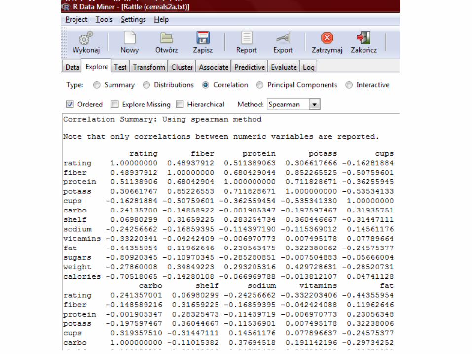
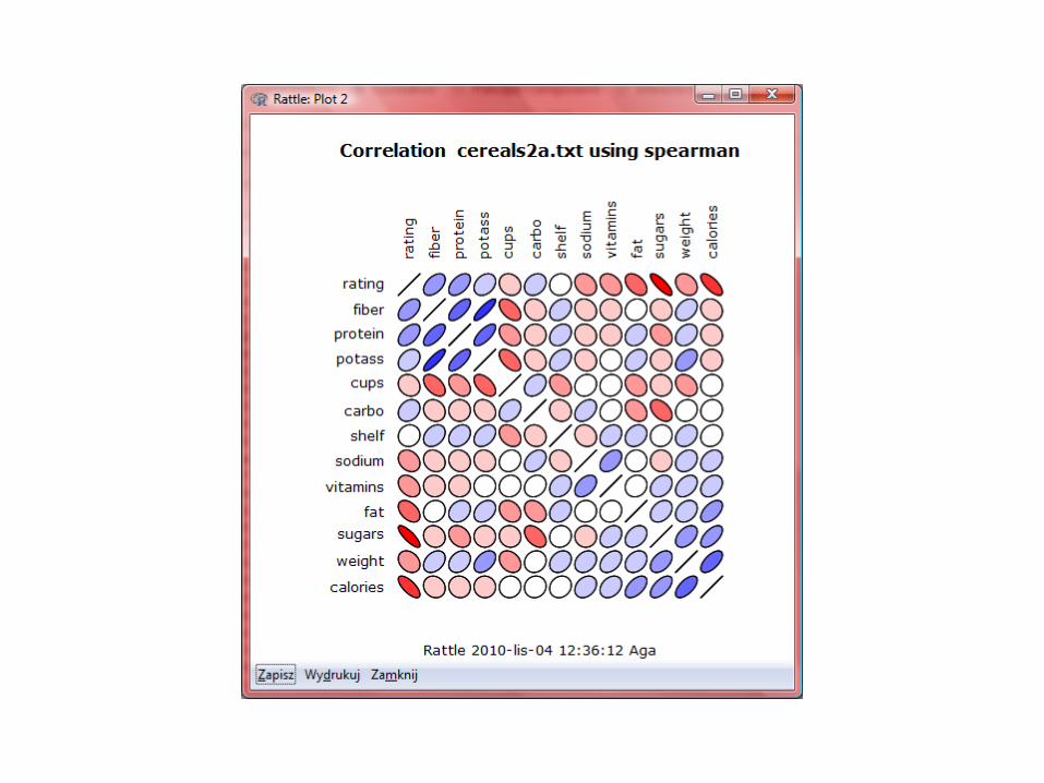
moda - uniwersytet Śląskizsi.tech.us.edu.pl/~nowak/bien/moda2.pdf · correlation type scatterplot...
TRANSCRIPT

MODA
Lecture nr 2

Data exploration process
1. Data cleaning (to remove noise and inconsistent data) 2. Data integration (where multiple data sources may be combined) 3. Data selection (where data relevant to the analysis task are
retrieved fromthe database) 4. Data transformation (where data are transformed or consolidated
into forms appropriate for mining by performing summary or aggregation operations, for instance)
5. Data mining (an essential process where intelligent methods are applied in order to extract data patterns)
6. Pattern evaluation (to identify the truly interesting patterns representing knowledge based on some interestingness measures)
7. Knowledge presentation (where visualization and knowledge representation techniques are used to present the mined knowledge to the user)

Data mining

Low-quality data will lead to low-quality mining results.

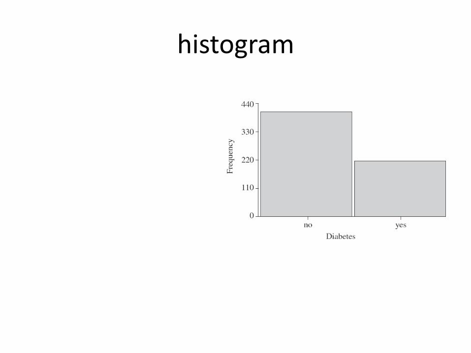
histogram

Histogram and data type

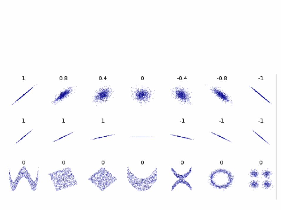
Scatter plot

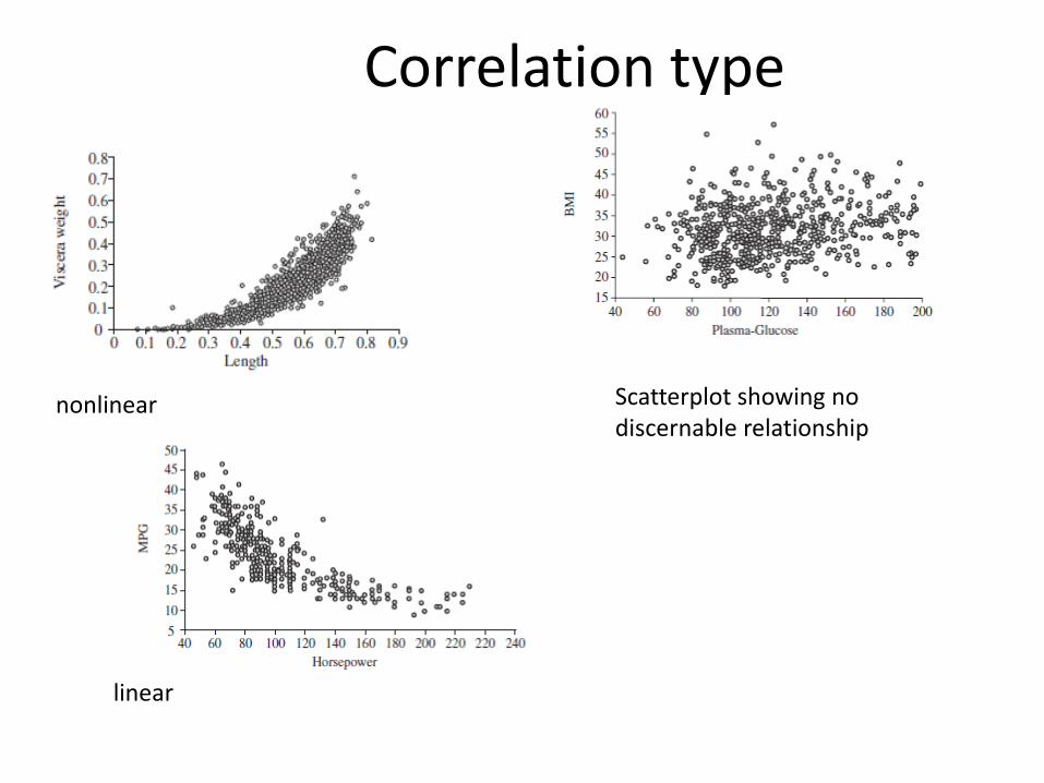
Correlation type
Scatterplot showing no discernable relationship
nonlinear
linear

boxplot
• In descriptive statistics, a box plot or boxplot is a convenient way of graphically depicting groups of numerical data through their quartiles.
• Box plots may also have lines extending vertically from the boxes (whiskers) indicating variability outside the upper and lower quartiles, hence the terms box-and-whisker plot and box-and-whisker diagram.
• Outliers may be plotted as individual points. •

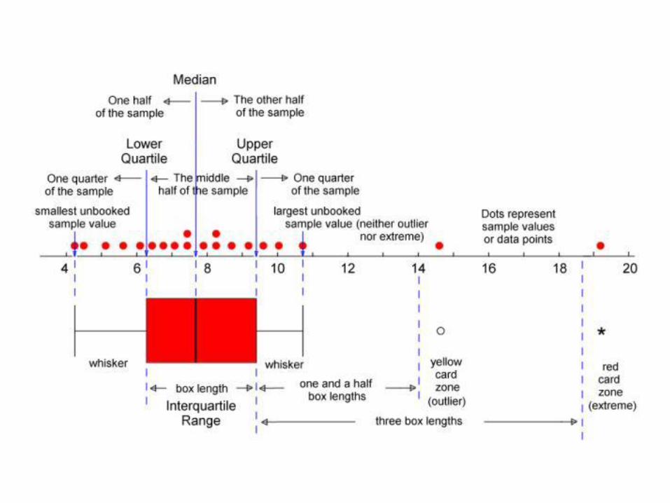

What we may read from plots?
Boxplot Histogram
quantile tak nie
Median tak nie
min tak tak
max tak tak
value tak tak
quantity nie tak
frequency nie tak
correlation nie tak

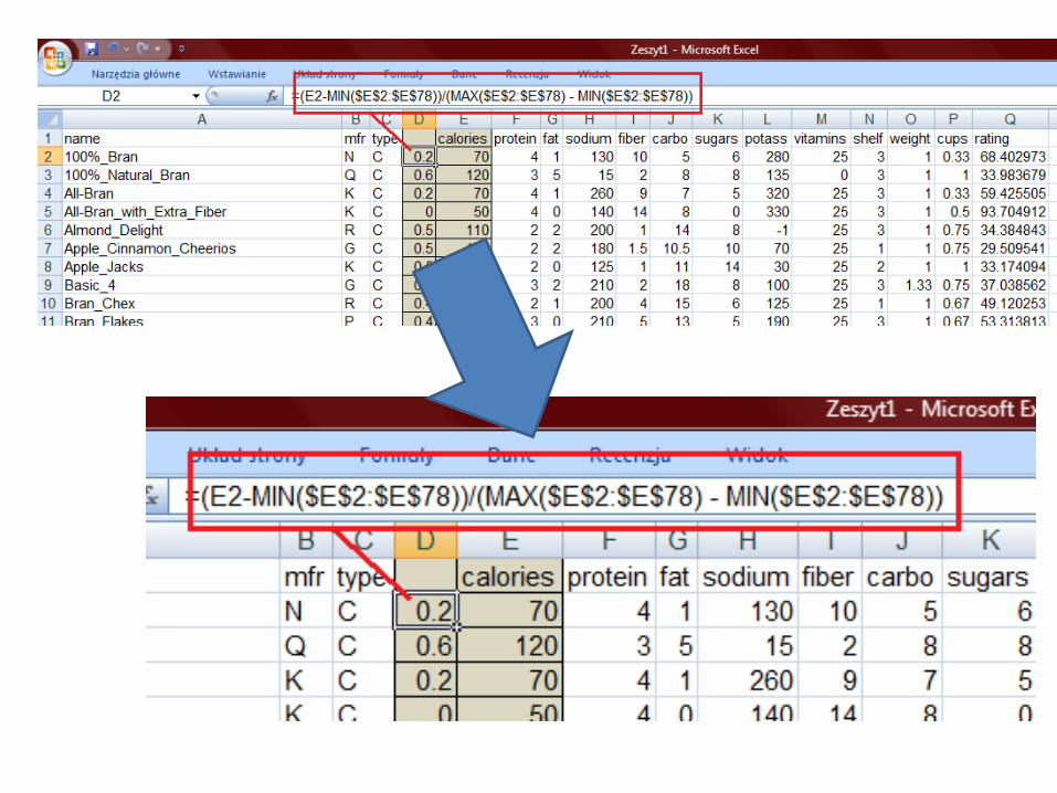
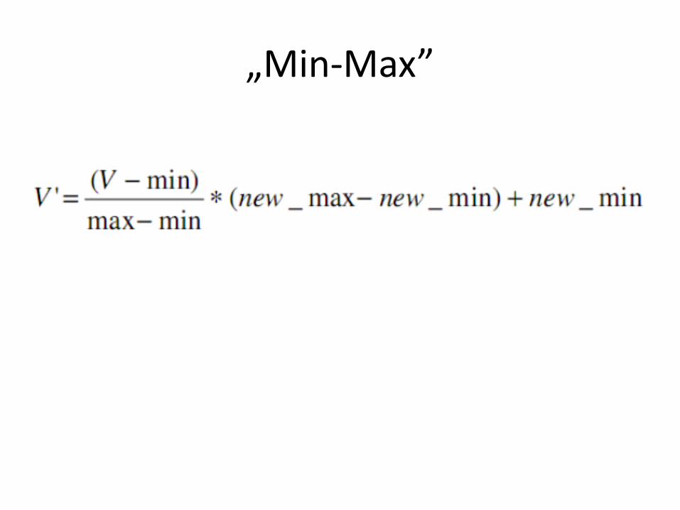
1. Min- Max
2. Z-score
normalization
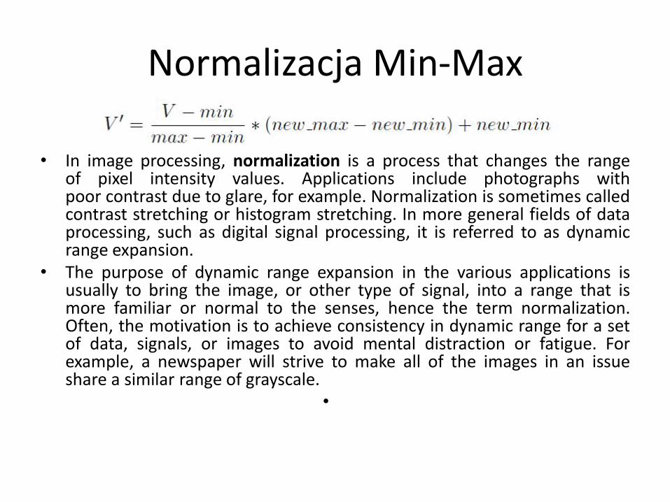
Normalizacja Min-Max
• In image processing, normalization is a process that changes the range of pixel intensity values. Applications include photographs with poor contrast due to glare, for example. Normalization is sometimes called contrast stretching or histogram stretching. In more general fields of data processing, such as digital signal processing, it is referred to as dynamic range expansion.
• The purpose of dynamic range expansion in the various applications is usually to bring the image, or other type of signal, into a range that is more familiar or normal to the senses, hence the term normalization. Often, the motivation is to achieve consistency in dynamic range for a set of data, signals, or images to avoid mental distraction or fatigue. For example, a newspaper will strive to make all of the images in an issue share a similar range of grayscale.
•
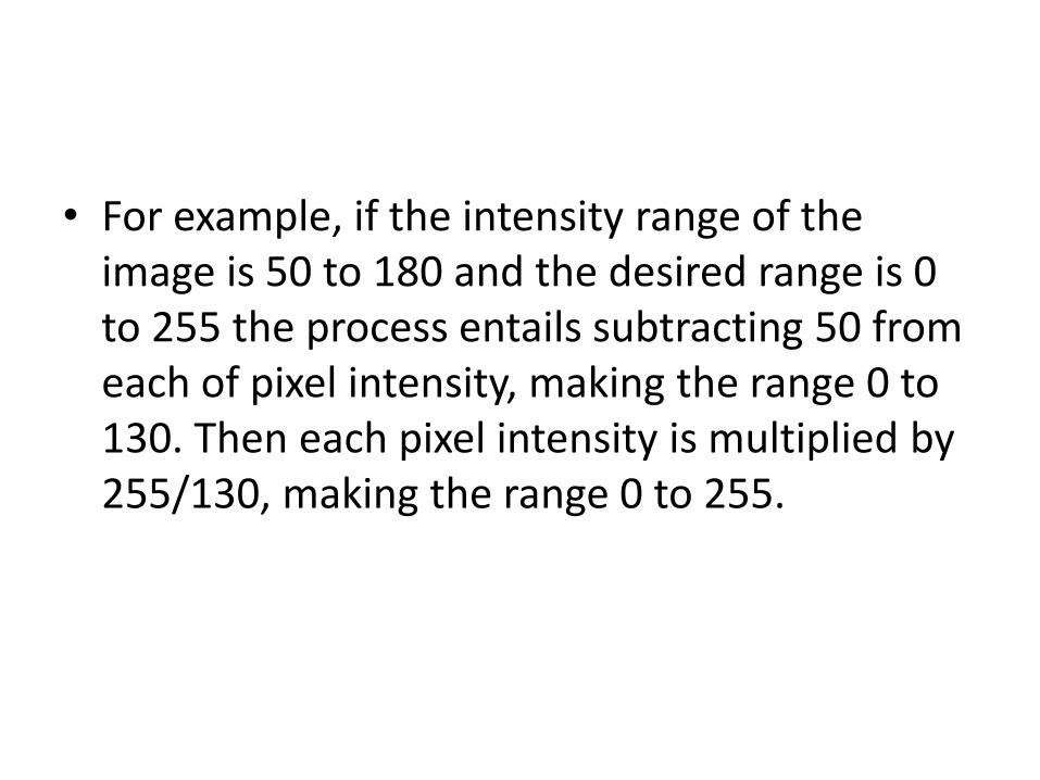
• For example, if the intensity range of the image is 50 to 180 and the desired range is 0 to 255 the process entails subtracting 50 from each of pixel intensity, making the range 0 to 130. Then each pixel intensity is multiplied by 255/130, making the range 0 to 255.
„Min-Max”

• Min = 50
• Max = 130
• New_min = 0
• New_max = 1

1..10

0..5

Normalizacja Z-score
• The standard score of a raw score x is • where: • μ is the mean of the population;σ is the standard
deviation of the population. • The absolute value of z represents the distance
between the raw score and the population mean in units of the standard deviation. z is negative when the raw score is below the mean, positive when above.
•
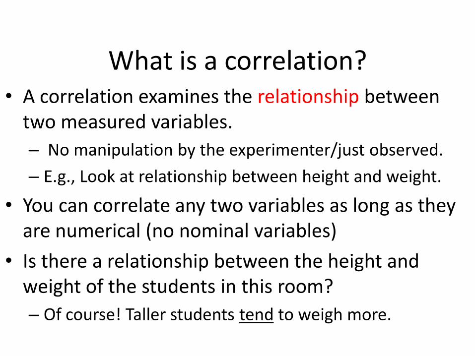
What is a correlation? • A correlation examines the relationship between
two measured variables.
– No manipulation by the experimenter/just observed.
– E.g., Look at relationship between height and weight.
• You can correlate any two variables as long as they are numerical (no nominal variables)
• Is there a relationship between the height and weight of the students in this room?
– Of course! Taller students tend to weigh more.


1) Strength of Relationships
• 2 aspects of the relationship: Strength and Direction.
• The relationship between any 2 variables is rarely a perfect correlation.
• Perfect correlation: +1.00 OR –1.00
– strongest possible relationship
– Tough to find.
• No correlation: 0.00 (no relationship).
– E.g, height and social security #.
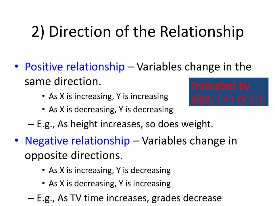
2) Direction of the Relationship
• Positive relationship – Variables change in the same direction.
• As X is increasing, Y is increasing
• As X is decreasing, Y is decreasing
– E.g., As height increases, so does weight.
• Negative relationship – Variables change in opposite directions.
• As X is increasing, Y is decreasing
• As X is decreasing, Y is increasing
– E.g., As TV time increases, grades decrease
Indicated by sign; (+) or (-).

Positive Correlation–as x increases, y increases
x = SAT score
y = GPA
GPA
Scatter Plots and Types of Correlation
4.00 3.75 3.50
3.00 2.75 2.50 2.25 2.00
1.50 1.75
3.25
300 350 400 450 500 550 600 650 700 750 800
Math SAT

Negative Correlation–as x increases, y decreases
x = hours of training
y = number of accidents
Scatter Plots and Types of Correlation
60
50
40
30
20
10
0
0 2 4 6 8 10 12 14 16 18 20
Hours of Training
Acc
iden
ts
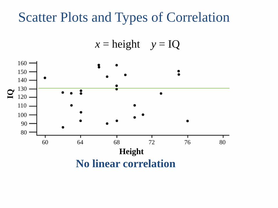
No linear correlation
x = height y = IQ
Scatter Plots and Types of Correlation
160
150
140
130
120
110
100
90
80
60 64 68 72 76 80
Height
IQ

Correlation Coefficient Interpretation
Coefficient
Range
Strength of
Relationship
0.00 - 0.20 Very Low
0.20 - 0.40 Low
0.40 - 0.60 Moderate
0.60 - 0.80 High Moderate
0.80 - 1.00 Very High
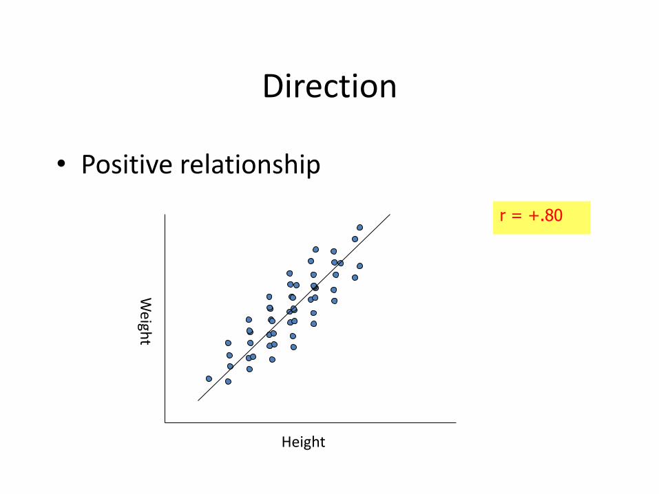
Direction
• Positive relationship
Height
r = +.80

Direction
• Negative relationship
Exam score
r = -.80

Interpreting correlations - Summary
• Absolute size shows strength of relationship
• The higher the absolute number, the stronger the relationship
– A correlation of -.80 is reflects as powerful a relationship as one of +.80
• A correlation of 0.00 means no relationship
– E.g., Can’t predict GPA from ID number
• All correlations range from -1.00 to +1.00
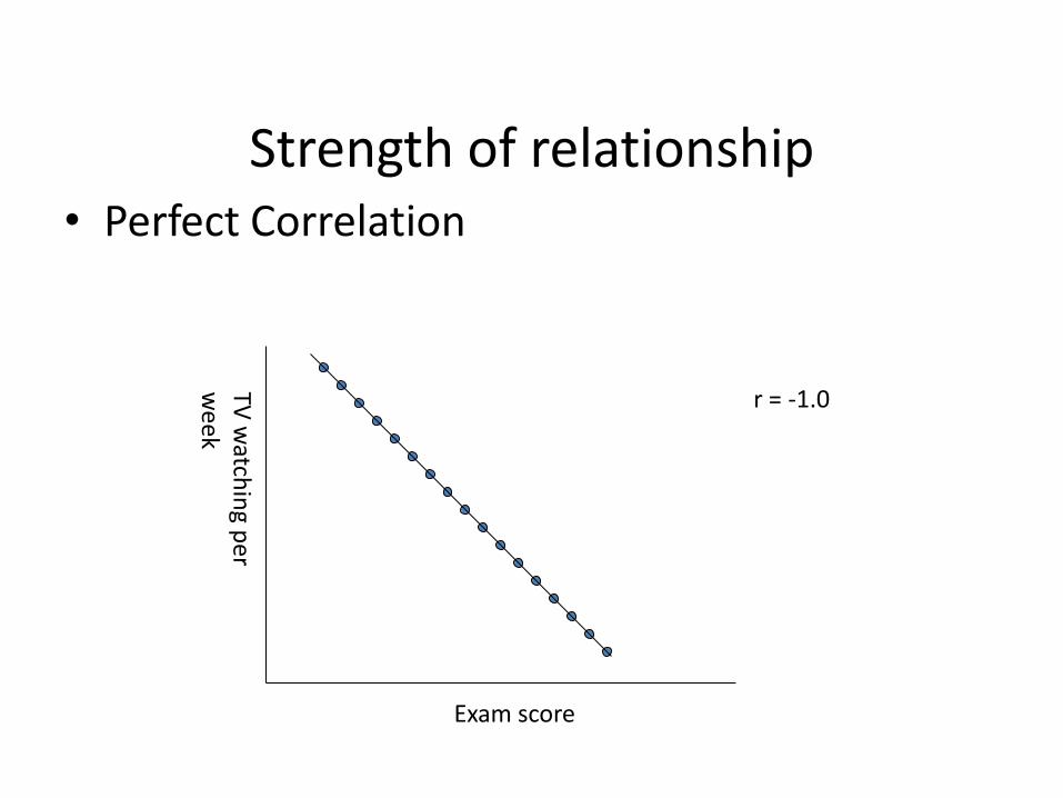
Strength of relationship • Perfect Correlation
Exam score
r = -1.0

Strength of relationship • Strong Correlation
Exam score
r = + 0.8

Strength of relationship • Moderate Correlation
Weight
r = + 0.4
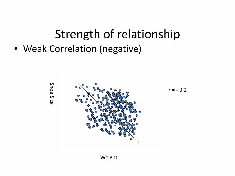
Strength of relationship • Weak Correlation (negative)
Weight
r = - 0.2

Strength of relationship • No Correlation (horizontal line)
Height
r = 0.0
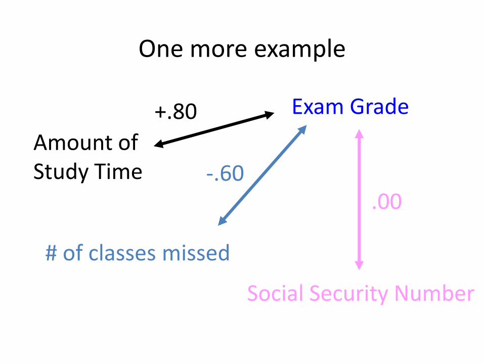
One more example
Amount of Study Time
Exam Grade
Social Security Number
# of classes missed
+.80
-.60 .00

More examples
• Positive relationships:
– water consumption and temperature.
– study time and grades.
– time spent in jail to severity of offense.
– What else??
• Negative relationships:
– alcohol consumption and driving ability.
– # of hateful remarks and # of friends.
– What else??
Why used: 1) Prediction; 2) Validity (does something measure what it’s suppose to measure; 3) Reliability (does something produce a consistent score). *** Easier to do than experiments ***

Pearson correlation coefficient
• r = the Pearson coefficient
• r measures the amount that the two variables (X and Y) vary together (i.e., covary) taking into account how much they vary apart
• Pearson’s r is the most common correlation coefficient; there are others.

Computing the Pearson correlation coefficient
• To put it another way:
• Or
separately vary Y and X which todegree
ther vary togeY and X which todegreer
separately Y and X ofy variabilit
Y and X ofity covariabilr

Sum of Products of Deviations
• Measuring X and Y individually (the denominator): – compute the sums of squares for each variable
• Measuring X and Y together: Sum of Products – Definitional formula
– Computational formula
• n is the number of (X, Y) pairs
))(( YYXXSP
n
YXXYSP
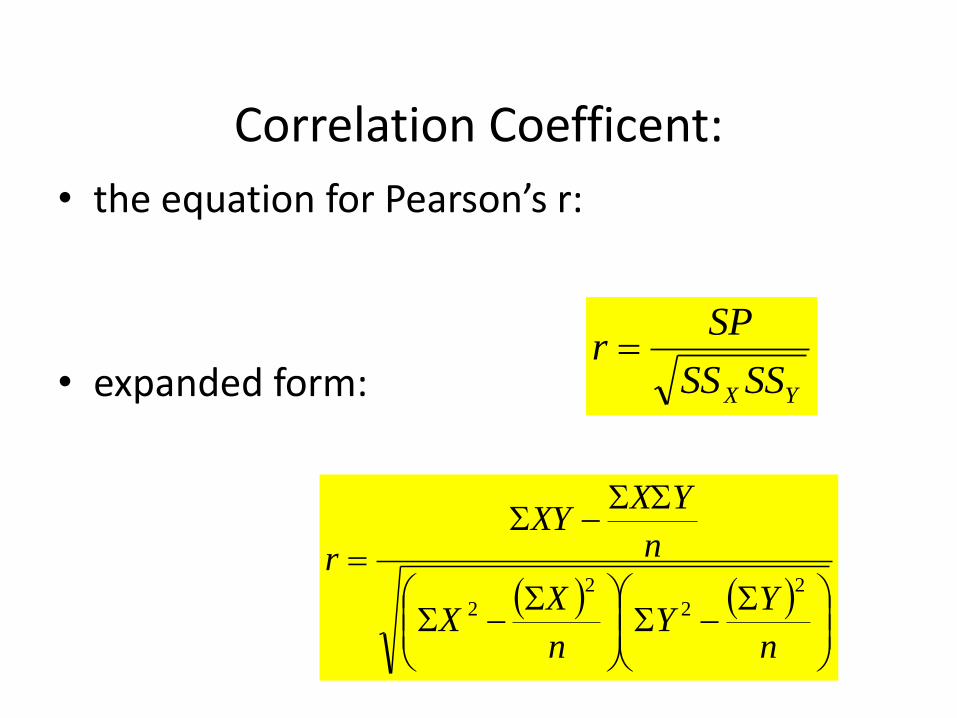
Correlation Coefficent:
• the equation for Pearson’s r:
• expanded form: YX SSSS
SPr
n
YY
n
XX
n
YXXY
r2
2
2
2

Example
• What is the correlation between study time and test score: X
(hours)
Y
(score)
0 30
10 90
4 30
8 60
8 90

Calculating values to find the SS and SP:
X X2 Y Y
2 XY
0 0 30 900 0
10 100 90 8100 900
4 16 30 900 120
8 64 60 3600 480
8 64 90 8100 720
sum 30 244 300 21600 2220
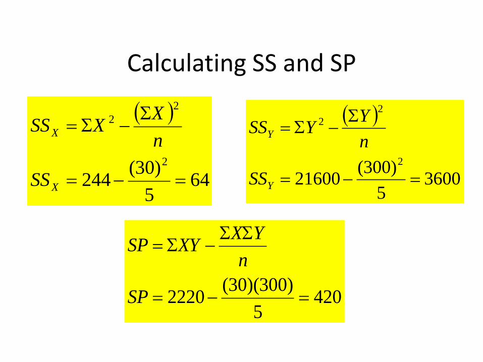
Calculating SS and SP
4205
)300)(30(2220
SP
n
YXXYSP
645
)30(244
2
2
2
X
X
SS
n
XXSS
36005
)300(21600
2
2
2
Y
Y
SS
n
YYSS

Calculating r
875.0
360064
420
r
SSSS
SPr
YX
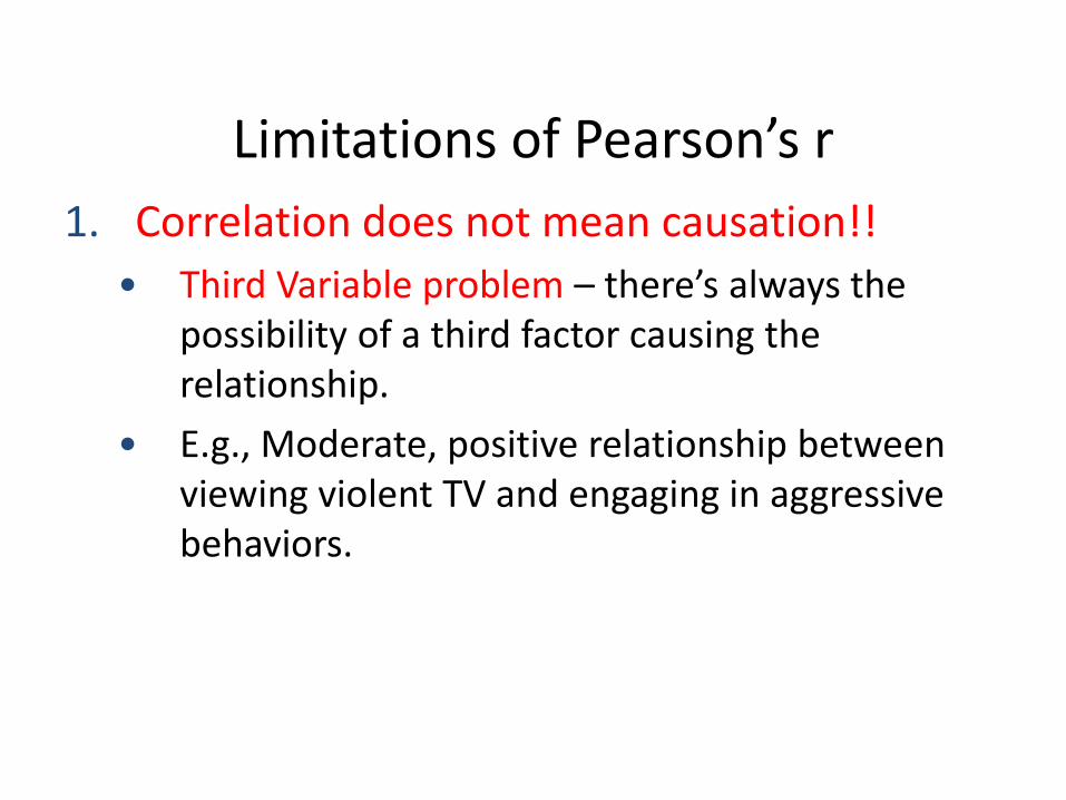
Limitations of Pearson’s r
1. Correlation does not mean causation!!
• Third Variable problem – there’s always the possibility of a third factor causing the relationship.
• E.g., Moderate, positive relationship between viewing violent TV and engaging in aggressive behaviors.

Possibilities
Viewing violent television
Tendency to engage in aggressive behaviors
Viewing violent television
Tendency to engage in aggressive behaviors
A third factor; EX. genetic tendency to like violence
Viewing violent television
Tendency to engage in aggressive behaviors

Limitations of Pearson’s r
1. Correlation does not mean causation
2. Restriction of range
– Restricted range of measured values can lead to inaccurate conclusions about the data

Limitations of Pearson’s r
3. Outliers (extreme scores)
Scores with extreme X and/or Y value can drastically effect Pearson’s r
4. Ambiguity of the strength of the relationship
Pearson r does not give a directly interpretable strength of the relationship between X and Y
5. Interval or ratio data.

Coefficient of Determination
• r2 = percentage of variance in Y accounted for by X
• Calculated by squaring r (Pearson correlational coefficient)
• Ranges from 0 to 1 (positive only)
• This number is a meaningful proportion (unlike the Pearson’s r).

Coefficient of Determination: An example
• Example:
– What percentage of variance is accounted for in Y by X with a Pearson r = 0.50?
– The r2 = (0.50)2 = 0.25 = 25%
• The number is always positive

Dependent vs. Independent Variable
DEPENDENT VARIABLE The variable that is being predicted or estimated. It is scaled on the Y-axis.
INDEPENDENT VARIABLE The variable that provides the basis for estimation. It is the predictor variable. It is scaled on the X-axis.
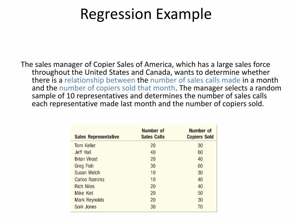
Regression Example
The sales manager of Copier Sales of America, which has a large sales force throughout the United States and Canada, wants to determine whether there is a relationship between the number of sales calls made in a month and the number of copiers sold that month. The manager selects a random sample of 10 representatives and determines the number of sales calls each representative made last month and the number of copiers sold.

Scatter Diagram

The Coefficient of Correlation, r
The Coefficient of Correlation (r) is a measure of the strength of the relationship between two variables. It requires interval or ratio-scaled data.
• It can range from -1.00 to 1.00.
• Values of -1.00 or 1.00 indicate perfect and strong correlation.
• Values close to 0.0 indicate weak correlation.
• Negative values indicate an inverse relationship and positive values indicate a direct relationship.

Perfect Correlation
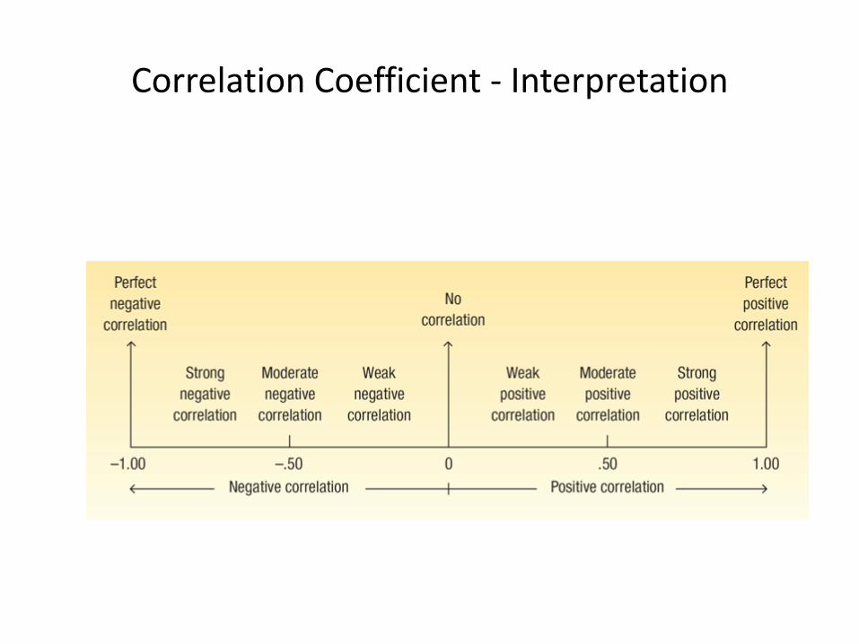
Correlation Coefficient - Interpretation

Correlation Coefficient - Formula

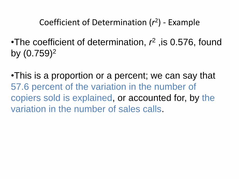
Coefficient of Determination The coefficient of determination (r2) is the
proportion of the total variation in the dependent variable (Y) that is explained or accounted for by the variation in the independent variable (X).
• It is the square of the coefficient of correlation.
• It ranges from 0 to 1.
• It does not give any information on the direction of the relationship between the variables.

Using the Copier Sales of America data which a scatter plot was developed earlier, compute the correlation coefficient and coefficient of determination.
Correlation Coefficient - Example

13-71
Correlation Coefficient - Example

13-72
How do we interpret a correlation of 0.759?
•First, it is positive, so we see there is a direct relationship between
the number of sales calls and the number of copiers sold.
•The value of 0.759 is fairly close to 1.00, so we conclude that the
association is strong.
However, does this mean that more sales calls cause more sales?
No, we have not demonstrated cause and effect here, only that the
two variables—sales calls and copiers sold—are related.
Correlation Coefficient - Example
Coefficient of Determination (r2) - Example
•The coefficient of determination, r2 ,is 0.576, found
by (0.759)2
•This is a proportion or a percent; we can say that
57.6 percent of the variation in the number of
copiers sold is explained, or accounted for, by the
variation in the number of sales calls.

Testing the Significance of the Correlation Coefficient
H0: = 0 (the correlation in the population is 0)
H1: ≠ 0 (the correlation in the population is not 0)
Reject H0 if:
(in SPSS)
P-value <.05

Correlation and Cause
• High correlation does not mean cause and effect • For example, it can be shown that the consumption of Georgia
peanuts and the consumption of aspirin have a strong correlation. However, this does not indicate that an increase in the consumption of peanuts caused the consumption of aspirin to increase.
• Likewise, the incomes of professors and the number of inmates in mental institutions have increased proportionately. Further, as the population of donkeys has decreased, there has been an increase in the number of doctoral degrees granted.
• Relationships such as these are called spurious correlations.


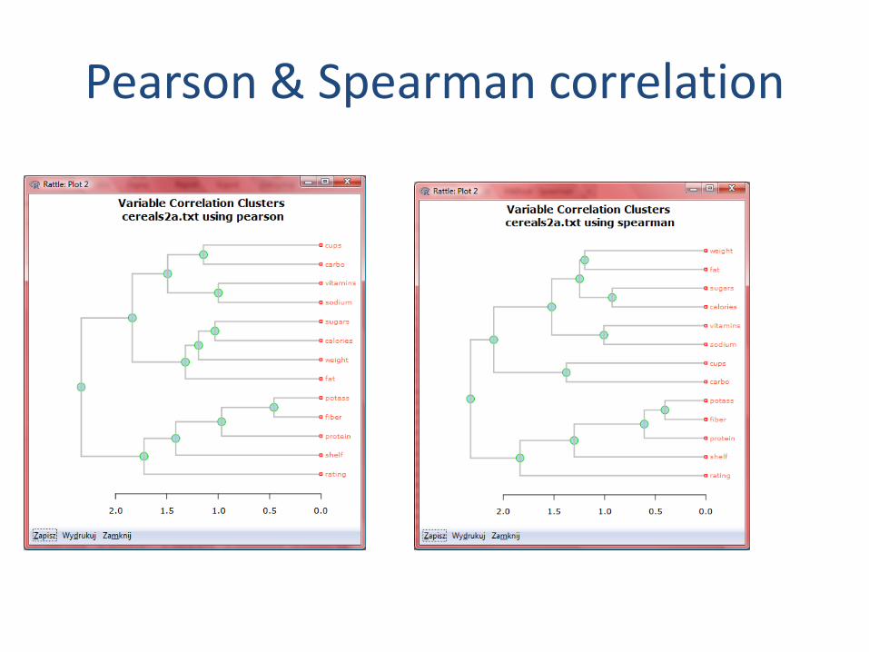
Pearson & Spearman correlation


summary
• Data preparation and preprocessing is a big issue for both warehousing and mining
• •Data preprocessing includes
• –Data cleaning and data integration
• –Data reduction and atributes selection
• –Discretization
• •A lot a methods have been developed but still an active area of research