module 05 graphs pie charts component band charts…biostatcourse.fiu.edu/pdfslides/module5.pdf ·...
TRANSCRIPT

5 - 1
Module 4: Pie Charts andComponent Band Charts
This module discusses the circumstances for which graphs may be preferred to tables and provides some general information about graphs. It then discusses pie charts and component band charts
Reviewed 15 April 05 /MODULE 4
5 - 2
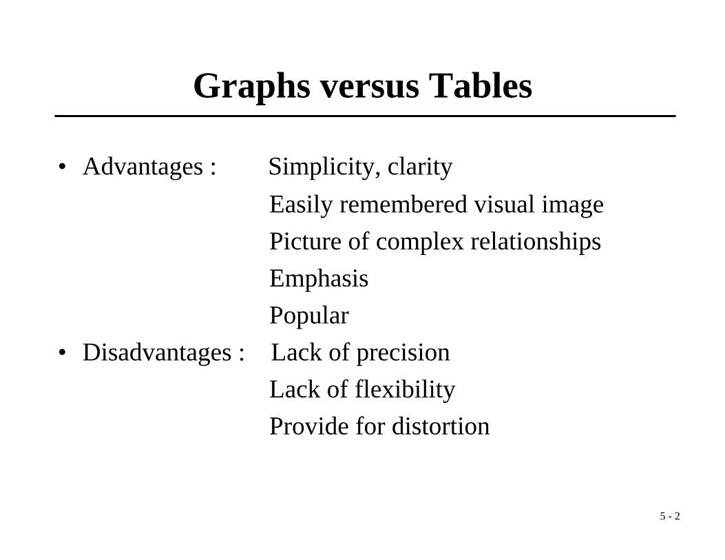
Graphs versus Tables
• Advantages : Simplicity, clarityEasily remembered visual imagePicture of complex relationshipsEmphasisPopular
• Disadvantages : Lack of precisionLack of flexibilityProvide for distortion
5 - 3
Axes of Reference
• Rectangular (cartesian)• Circular (polar, angular)• Geographical
5 - 4
Types of Graphs
• Pie Chart• Component Band Chart• Bar Chart• Spot Map• Rate Map• Arithmetic Scale Line Graph• Semi-Logarithmic Scale Line Graph• Histogram• Frequency Polygon
5 - 5
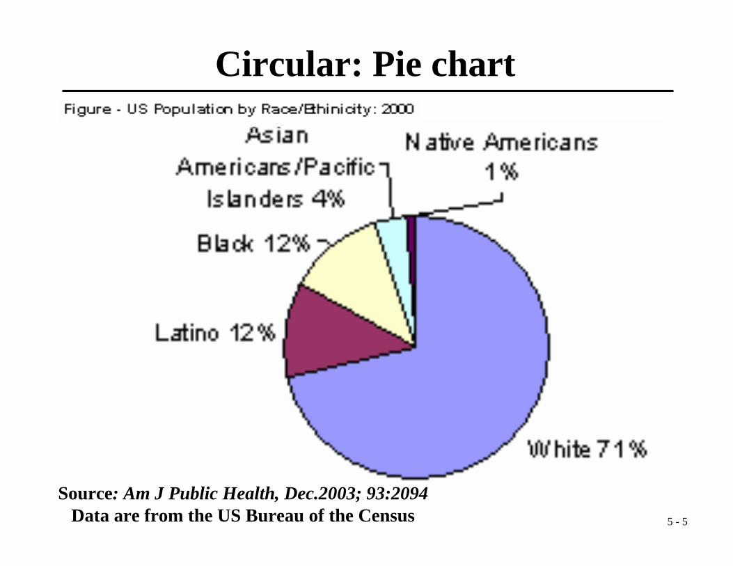
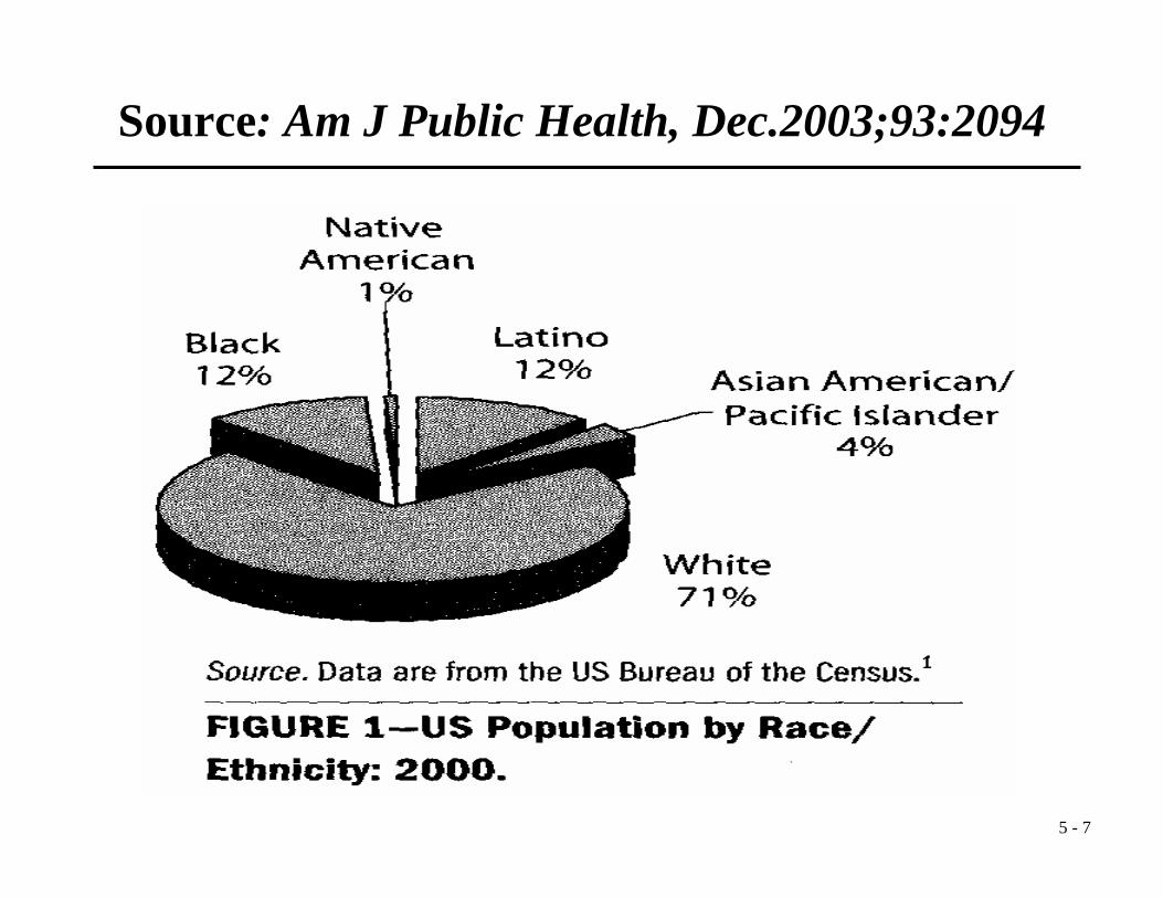
Source: Am J Public Health, Dec.2003; 93:2094Data are from the US Bureau of the Census
Circular: Pie chart
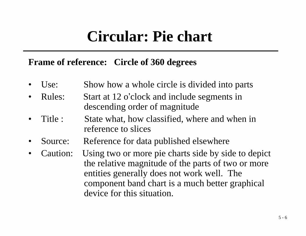
5 - 6
Frame of reference: Circle of 360 degrees
• Use: Show how a whole circle is divided into parts • Rules: Start at 12 o’clock and include segments in
descending order of magnitude• Title : State what, how classified, where and when in
reference to slices• Source: Reference for data published elsewhere• Caution: Using two or more pie charts side by side to depict
the relative magnitude of the parts of two or more entities generally does not work well. The component band chart is a much better graphical device for this situation.
Circular: Pie chart
5 - 7
Source: Am J Public Health, Dec.2003;93:2094
5 - 8
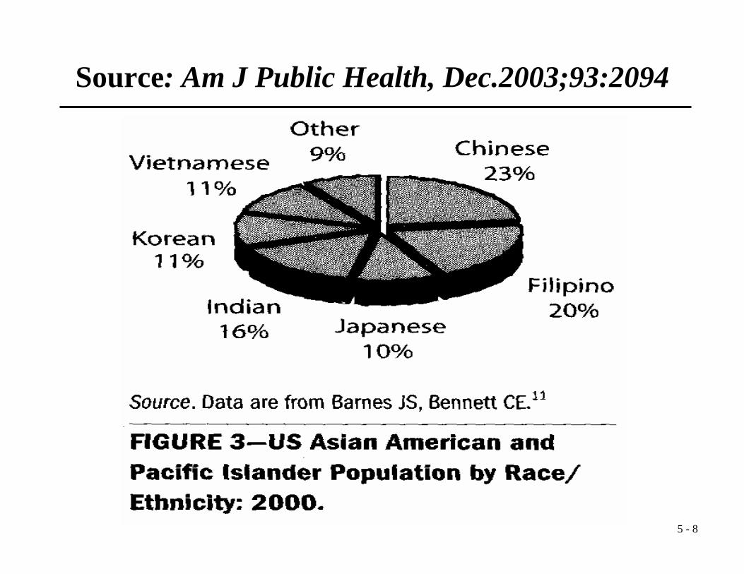
Source: Am J Public Health, Dec.2003;93:2094

5 - 9
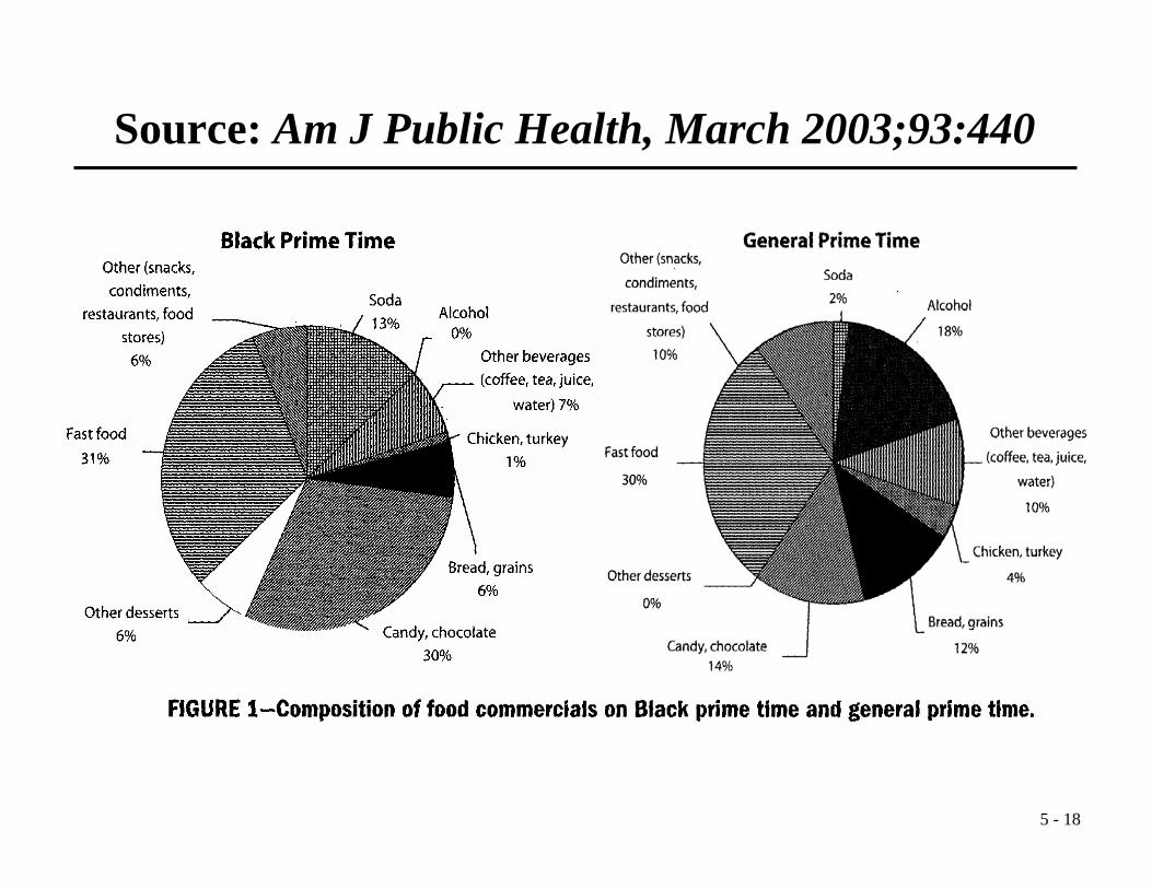
Source: Am J Public Health, March 2003;93:440
5 - 10
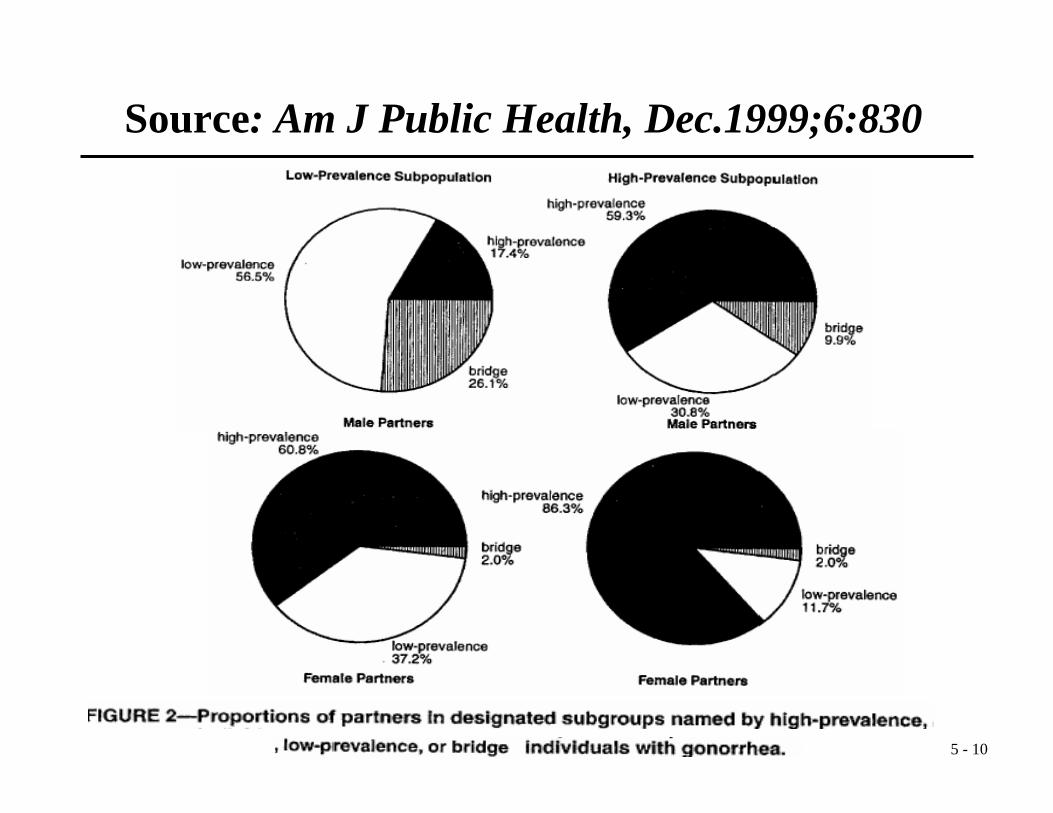
Source: Am J Public Health, Dec.1999;6:830
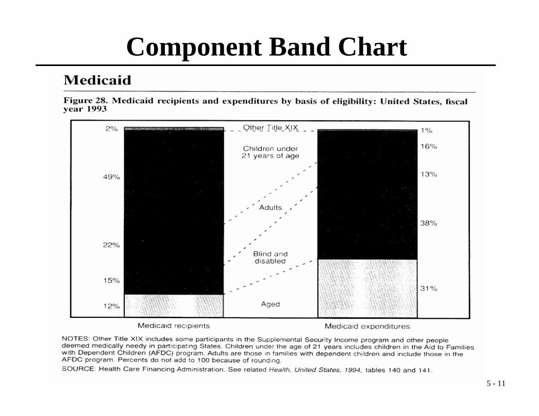
5 - 11
Component Band Chart

5 - 12
• A type of bar chart• Ideal for comparing two or more sets of
percentages• A pie chart is generally better for one set of
percentages
Component Band Chart

5 - 13
Source: Am J Public Health, Jan. 2004;94:56

5 - 14
Source: Am J Public Health, May 2004;94:838
5 - 15
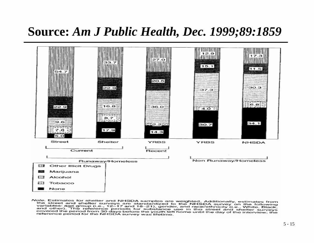
Source: Am J Public Health, Dec. 1999;89:1859

5 - 16
Source: Am J Public Health, April 2004;94:534
5 - 17
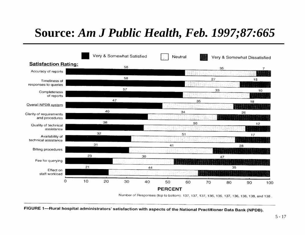
Source: Am J Public Health, Feb. 1997;87:665
5 - 18
Source: Am J Public Health, March 2003;93:440

5 - 19
Composition of food commercials on Black prime time and general prime time
0%
10%
20%
30%
40%
50%
60%
70%
80%
90%
100%
Black Prime Time General Prime Time
Perc
enta
ge o
f Pop
ulat
ion
Alcohol
Chicken, Turkey
Other (snacks,restaurants, etc)
Bread, Grains
Other Deserts
Other Beverages(coffee, water etc)
Soda
Candy, Chocolate
Fast Food
Source: Am J Public Health, March 2003;93:440

5 - 20
Source: Am J Public Health, Sept. 2001;91:1393