more inside the classes - github pages · landing page •html/css taught so far •bootstrap 4...
TRANSCRIPT
Bootstrap
Shan-Hung Wu
CS, NTHU

Landing Page
• HTML/CSS taught so far• Bootstrap 4 (alpha 6) for the
responsive grid layout and components
• Font Awesome for vector icons• Balsamiq Mockups for UI
mockups• Google Forms for user survey• Google Analytics for page visit
tracking
2

Outline
• Bootstrap Overview
• Layout
– Flexbox
– Media Queries
– Containers and Grid System
• Components
3

Outline
• Bootstrap Overview
• Layout
– Flexbox
– Media Queries
– Containers and Grid System
• Components
4

Bootstrap
• One of the most popular web frameworks
• Helps fast prototype a responsive website
• You learn how to reuse predefined CSS classes in HTML
• Rather than write CSS/JS of your own
5
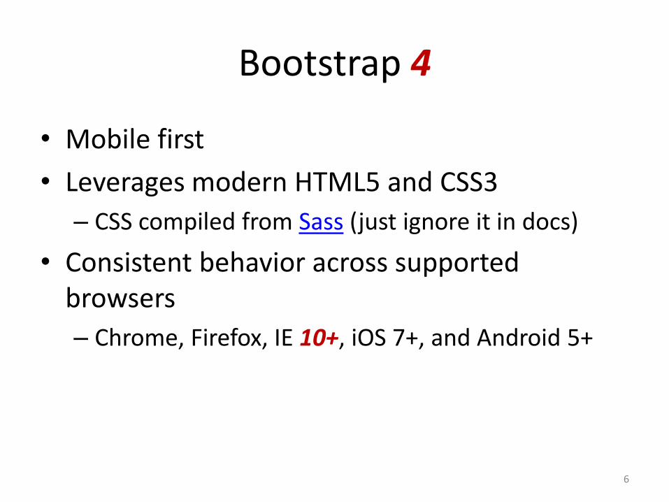
Bootstrap 4
• Mobile first
• Leverages modern HTML5 and CSS3
– CSS compiled from Sass (just ignore it in docs)
• Consistent behavior across supported browsers
– Chrome, Firefox, IE 10+, iOS 7+, and Android 5+
6

Using Bootstrap
• Load CSS and Javascript files using CDN
• Include the responsive meta tag:<meta name="viewport" content="width=device-
width, initial-scale=1, shrink-to-fit=no">
7


Responsive Images
<img scr="..." class="img-fluid">
• See more examples
9

Buttons and Colors
<button class="btn btn-primary">Primary</button>
<a href="..." class="btn btn-primary">Primary</a>
btn-secondary
btn-success
btn-info
btn-warning
btn-danger
• See more examples
10

Fundamentals
• Uses border-box in box-sizing
– Width & height include borders and paddings
• Uses rem as default metrics
– Root font size: 16px
• Native font stack
11

Outline
• Bootstrap Overview
• Layout
– Flexbox
– Media queries
– Containers and grid system
• Components
12

Sizing
<div class="w-25">
w-50, w-75, w-100
h-25, h-50, h-75, h-100
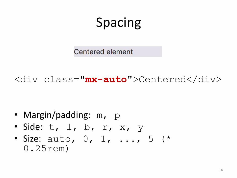
Spacing
<div class="mx-auto">Centered</div>
• Margin/padding: m, p
• Side: t, l, b, r, x, y
• Size: auto, 0, 1, ..., 5 (* 0.25rem)
14

Outline
• Bootstrap Overview
• Layout
– Flexbox
– Media queries
– Containers and grid system
• Components
15

Flexboxes
• A new layout mode in CSS3– Not box model
• Flex container (a block):
• Direct children are called flex items
• Everything outside container and inside flex items is rendered as usual
16
div {
display: flex;
}

Flexboxes in Bootstrap
<div class="d-flex flex-row">
flex-row-reverse
flex-column, flex-column-reverse
17

Justification
<div class="d-flex justify-content-center">
justify-content-between
justify-content-around
18
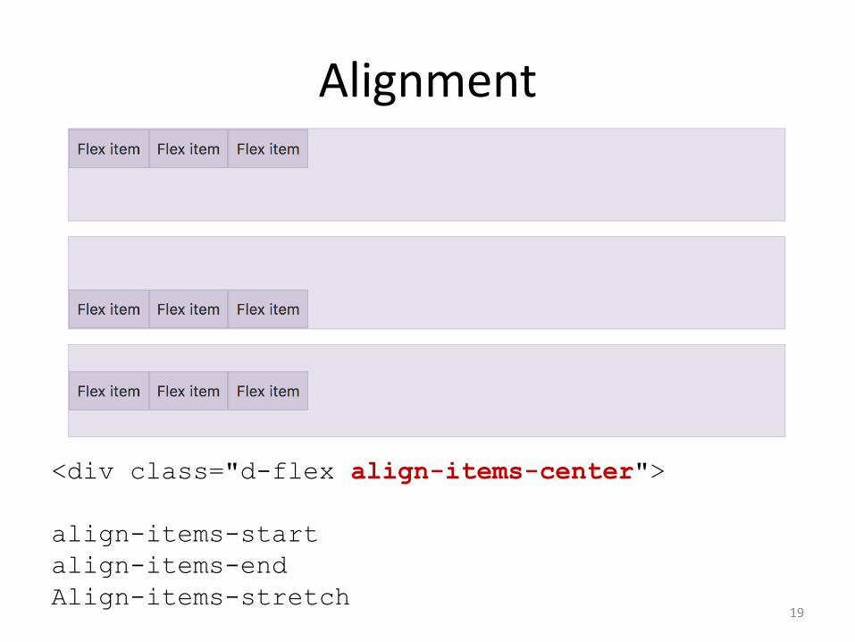
Alignment
<div class="d-flex align-items-center">
align-items-start
align-items-end
Align-items-stretch19

Align Self
<div class="d-flex align-items-stretch">
<div>
<div class="align-self-center">
<div>
20

Outline
• Bootstrap Overview
• Layout
– Flexbox
– Media queries
– Containers and grid system
• Components
21
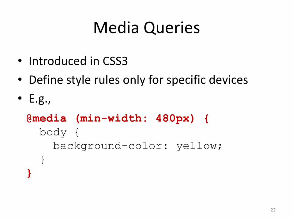
Media Queries
• Introduced in CSS3
• Define style rules only for specific devices
• E.g.,
22
@media (min-width: 480px) {
body {
background-color: yellow;
}
}
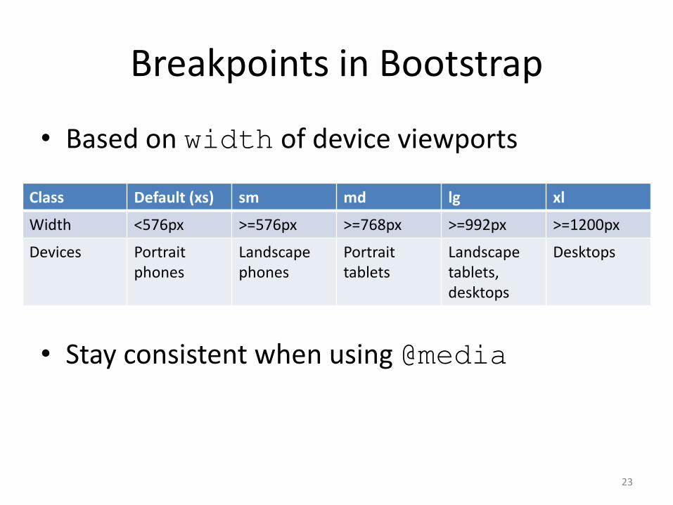
Breakpoints in Bootstrap
• Based on width of device viewports
• Stay consistent when using @media
23
Class Default (xs) sm md lg xl
Width <576px >=576px >=768px >=992px >=1200px
Devices Portrait phones
Landscape phones
Portrait tablets
Landscapetablets, desktops
Desktops

Responsive Utilities
• Many layout classes have responsive variants• E.g., <div class="mx-auto">...</div>
mx-sm-auto /* sm and up */
mx-md-auto /* md and up */
mx-lg-auto /* lg and up */
mx-xl-auto /* xl */
• More responsive utilities
24

Outline
• Bootstrap Overview
• Layout
– Flexbox
– Media queries
– Containers and grid system
• Components
25

Containers
• The most basic layout element in Bootstrap– Fixed-width in each breakpoint: container
– Always 100%: container-fluid
26
<div class="container">...</div>

Grid System
• 12 columns in a container• By default, each column occupies as much space
as possible
27
<div class="container">
<div class="row">
<div class="col">
<div class="col">
<div class="col">
</div>
</div>

Setting Column Width
• Set col-{breakpoint}-{width} in a column
28
<div class="container">
<div class="row">
<div class="col-12 col-sm-8">
<div class="col-12 col-sm-4">

Content-Based Column Width
29
<div class="row">
<div class="col">
<div class="col-auto">
<div class="col-2">

Justification
• Based on Flexbox
30
<div class="row justify-content-md-center">
<div class="col-md-2">
<div class="col-md-auto">
<div class="col-md-2">

Alignment
31
<div class="row align-items-center">
<div class="col align-self-start ">
<div class="col">
<div class="col align-self-end">
• Read more about grid system
Outline
• Bootstrap Overview
• Layout
– Flexbox
– Media Queries
– Containers and Grid System
• Components
32

Jumbotrom
33

Navbar and Scrollspy
34
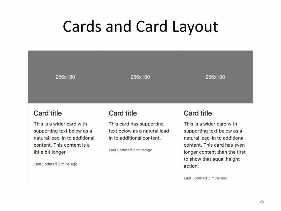
Cards and Card Layout
35

Modal
36

To Learn More...
• Documentation
• Use Chrome Inspector!
• Start Bootstrap
– Themes & Templates
– Version 3 only (currently)
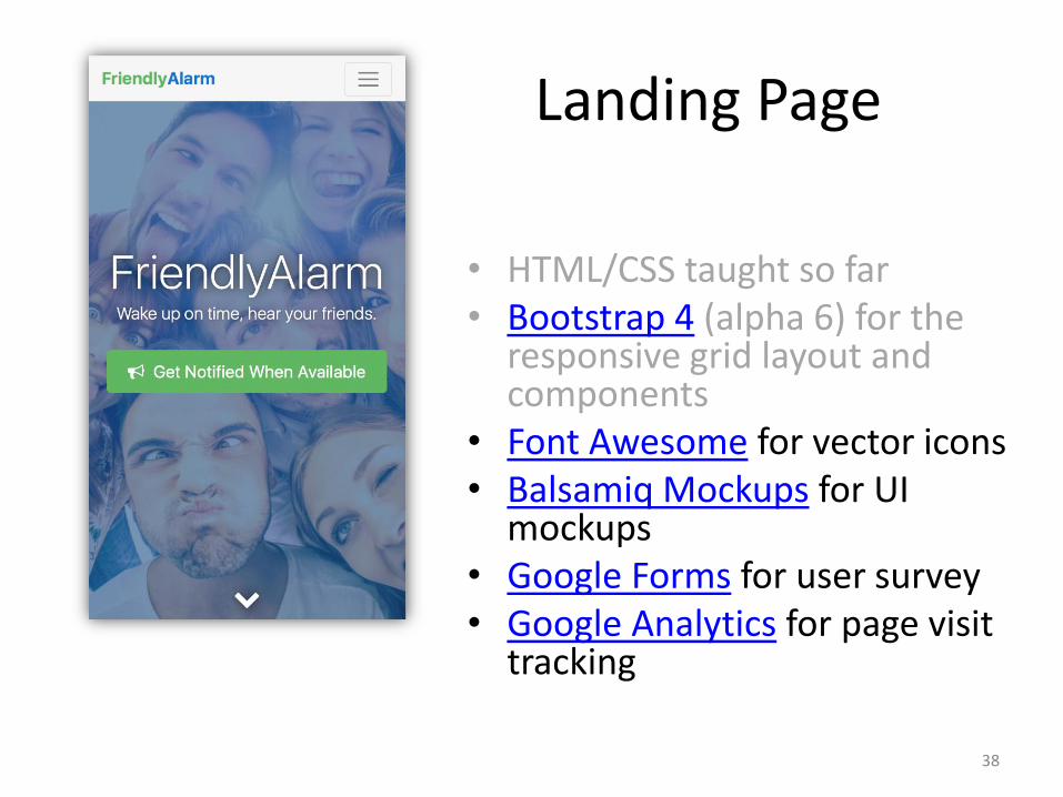
Landing Page
• HTML/CSS taught so far• Bootstrap 4 (alpha 6) for the
responsive grid layout and components
• Font Awesome for vector icons• Balsamiq Mockups for UI
mockups• Google Forms for user survey• Google Analytics for page visit
tracking
38
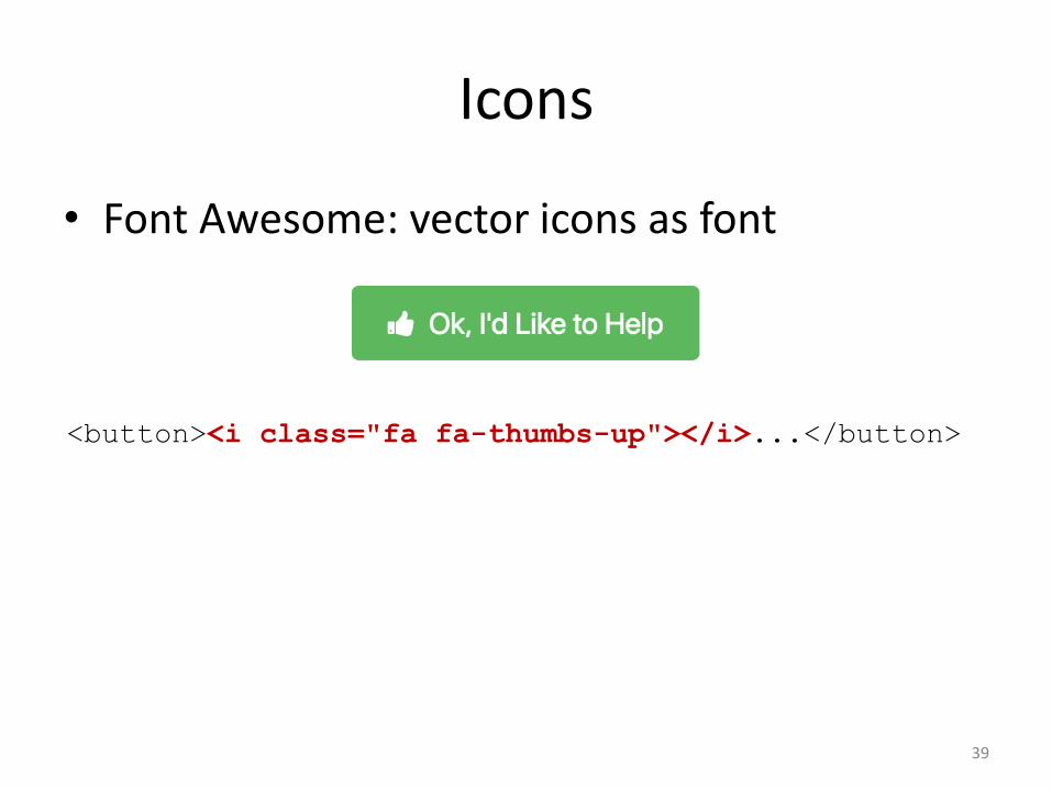
Icons
• Font Awesome: vector icons as font
39
<button><i class="fa fa-thumbs-up"></i>...</button>

Mockup Tools
• Alternatives: Sketch, Adobe XD, etc.
40

Google Forms
41

Google Analytics
42

You Can Do Better!
• Animations
• “Chat with Founders” button via Facebook Page's Messenger
43