ms office 2010 excel charts - excelexplained.co.uk - charts.pdf · ms office 2010 excel charts ......
TRANSCRIPT


- i -
Table of Contents
INTRODUCTION TO CHARTING ...................................................................................... 1
TERMINOLOGY ........................................................................................................ 1
CREATING CHARTS ................................................................................................... 2
SEPARATE CHART PAGES ........................................................................................... 3
MOVING AND RESIZING EMBEDDED CHARTS ................................................................. 4
DATA LAYOUT ........................................................................................................ 5
SHORTCUT MENU (RIGHT CLICK) ................................................................................ 7
CHART TYPES .......................................................................................................... 7
AVAILABLE TYPES OF CHART ...................................................................................... 7
CHANGING THE CHART TYPE ...................................................................................... 9
DEFAULT CHART TYPE ............................................................................................ 10
FORMATTING CHARTS ............................................................................................ 10
DESIGN RIBBON .................................................................................................... 10
DATA SOURCE ...................................................................................................... 11
SWITCH ROWS AND COLUMNS ................................................................................. 12
ADD A SERIES MANUALLY ....................................................................................... 13
THE SERIES FUNCTION ............................................................................................ 13
CHARTING WITH BLOCKS OF DATA ........................................................................... 13
CHANGING THE CHART LAYOUT ................................................................................ 14
CHART STYLES ...................................................................................................... 14
MOVING CHART LOCATION ..................................................................................... 15
LAYOUT RIBBON .................................................................................................... 16
FORMATTING CHART ELEMENTS ............................................................................... 16
RESETTING CUSTOM FORMATS ................................................................................ 17
ADDING, REMOVING AND FORMATTING LABELS .......................................................... 17
AXES ................................................................................................................... 18
GRIDLINES ........................................................................................................... 20
UNATTACHED TEXT ................................................................................................ 20
FORMAT DIALOG ................................................................................................... 20
SPARKLINES .................................................................................................................. 23
CREATE SPARKLINES ............................................................................................... 24
AXIS OPTIONS ....................................................................................................... 25


Excel - Charts.docx Introduction to Charting
Page 1
Introduction to Charting One of the most impressive aspects of Excel is its charting ability. There are endless variations available, allowing you to produce a chart, edit and format it, include notes, arrows, titles and various other extras as desired. This manual will look at many of the issues involved in producing and formatting Excel charts.
Charts are based on data contained in Excel Worksheets. It is necessary to understand how Excel picks up the data to be used in a chart because the way in which the data is laid out will influence how the chart is presented.
Excel offers a wide range of types and formats from which you can choose when producing charts. However, the charts themselves can exist in different forms and it is important to understand the difference between them. The first form is an embedded chart, the second is a separate chart page.
Terminology
As a starting point, there are some terms used in charting which should be understood by you. The terms defined below relate to the example car sales worksheet and column chart which appear beneath the table:
Data Point An individual figure on the spreadsheet which is reflected in the chart e.g. Fred's Orion sales figure
Data Series A collection of related data points, e.g. all of Fred's figures, which will appear on a chart as markers (bars, for example) of the same colour
Legend The "key" to the chart, identifying which patterns/colours relate to which data series
Marker A bar, column, or slice of pie for example, representing a data point
Category The category axis appears across the bottom of a graph (pie charts excepted) and the categories are listed here. Points within the different data series are grouped by category

Introduction to Charting Excel - Charts.docx
Page 2
Creating Charts
Embedded Charts
An embedded chart appears on the worksheet where it was created. It is an embedded object, which does not normally appear in its own window, and has no separate existence apart from the worksheet. The chart is saved only when the worksheet file itself is saved, and will be printed with the worksheet in which it is embedded. You may choose to have an embedded or separate chart at any time. All charts whether embedded or separate are created from the Charts group on the Insert Ribbon.

Excel - Charts.docx Introduction to Charting
Page 3
Separate Chart Pages
A chart sheet, although linked to the worksheet whose figures it represents, exists as a separate page in a workbook. The F11 key is very useful for creating a default chart from selected data as a new sheet within the workbook
Some chart elements to be aware of:
Chart Element Description
Titles This is the area where you can specify the titles to have on the chart (i.e. X-axis “1998”, Z-axis “GBP”
Axes Here you specify whether you want a Y/Z axis and whether you are using timescales to plot your data
Gridlines The gridline ribbon allows you to switch on and off horizontal and vertical gridlines
Legend Use this ribbon to switch the legend on and off or reposition it
Data Labels The Data Labels ribbon allows you to display the amount each point represents or display the label (i.e. in the example above, each cylinder would have Qtr1, Qtr2 displayed as appropriate at the top of each data marker)
Data Table The Data Table ribbon will display a grid underneath the chart that will show the information that is being plotted.
There are three different methods to creating a chart each of which is described below:
To create a chart
Select data for chart.
Go to the Charts group on the Insert Ribbon. Select a chart type and click
The Gallery on the right appears:
Hovering your mouse over a chart type will bring up an explanation of that chart type
When you have chosen click once to select a chart type
The chart is now created based on the selected data as an embedded chart.
Or
Select Data for chart
Press the F11 Key
Default chart will created as chart on a separate sheet

Introduction to Charting Excel - Charts.docx
Page 4
Or
Select data for chart
Click on the Dialog Box Launcher in the Charts group on the Insert Ribbon
The following dialog box will appear
Select a type from the left hand section and a sub type from the right hand section.
Click OK to create the chart.
This will be created as an embedded chart
Moving and Resizing Embedded Charts
Once the chart object has been created and stored as an embedded object, you can move and resize it.

Excel - Charts.docx Introduction to Charting
Page 5
To move an embedded chart:
Move mouse over the chart frame border your mouse cursor should have a four pointed black arrow
Click on the chart frame border and hold the mouse button down as you drag. Release the mouse when the chart is in the desired location.
To resize an embedded chart:
Move your mouse over the dotted handles on the Chart frame border.
The mouse cursor should change to a double arrow.
Click and Drag up, down, left or right.
Hold down the [ALT] key if you wish the chart to resize by snapping to the cell gridlines
Data Layout
Depending on the "shape" of the selected data, Excel will assign categories and data series to either the rows or columns of information. Usually it will be assumed that there are more categories than data series, therefore, if there are more rows than columns of selected information, the data series will be based on columns, with the legend labels being picked up from the row across the top of the selected area and the category labels being picked up from the leftmost column:

Introduction to Charting Excel - Charts.docx
Page 6
If there are more columns than rows in the selected area, the data series will be based on rows, with the legend labels being picked up from the leftmost column and the category labels taken from the top row of the selected area:
If the number of rows and columns is the same, Excel will opt for data series in rows. It is possible to override the choice made by Excel in how the data series and categories are decided. Details of this procedure will be found under the section on manipulating data.

Excel - Charts.docx Introduction to Charting
Page 7
Shortcut Menu (Right Click)
You may be familiar with the Shortcut menus associated with the selected cell(s) on the Excel worksheet. When working on a chart - embedded either on a worksheet or in its own window, clicking on the chart with the secondary mouse button will call up a Charting Shortcut menu.
The Shortcut menu will contain a selection of choices from some of the Standard Menu bar options mostly relating to the chart as an embedded object - almost like a graphic on the worksheet.
Chart Types
There are several different types of chart available within Excel. The type to choose will vary depending on the data involved and what information the chart is intended to convey or highlight. Practice will improve your instinct on which type of chart to use in each instance. Initially it may be useful to try different types until the result is reasonably close to your requirements, and then add custom formats and elements as desired. Some chart types are very specialised and may only be of use to particular business sectors.
Available Types of Chart
Type Description
Area
Area charts can be 2 or 3-dimensional. They are used to compare the change in volume of a data series over time, emphasising the amount of change rather than the rate of change. Area charts show clearly how individual data series contribute to make up the whole volume of information represented in the graph.
Bar Bar charts can be 2 or 3-Dimensional. They are used to show individual figures at a specific time or to compare different items. Categories are listed vertically, so that bars appear on the horizontal, thus there is less emphasis on time flow. Bars extending to the right represent positive values while those extending left represent negative values.
Column Column charts can be 2 or 3-Dimensional. They are frequently used to show variation of different items over a period of time. Categories (often days or months for example, representing a progression of time) are listed horizontally and columns are displayed side by side, making for easy comparisons. Two variations on the theme of Column charts are represented by further tools on the Chart toolbar. The Stacked Column chart can be used to show variations over a period of time, but also

Introduction to Charting Excel - Charts.docx
Page 8
shows how each data series contributes to the whole. A further variation on the 3-D column chart produces 3-D columns in a 3-D plot area, receding away from the viewer.
Line Line charts can be 2 or 3-Dimensional. Line charts are used to compare trends over time. There are similarities with Area charts, but line charts tend to emphasise the rate of change rather than volume of change over time. 3D lines appear as "ribbons" which can be easier to see on the chart.
Pie Pie charts can be 2 or 3-Dimensional. They are used to compare the size of the parts with the whole. Only one data series can be plotted, making up 100%. Pie charts within their own window can be made to "explode" by dragging one or more pieces of pie away from the centre.
Radar Each category in a radar chart has its own axis radiating from the centre point. Data points are plotted along each spoke, and data points belonging to the same series are connected by lines.
XY Scatter Chart
XY charts are used to compare two different numeric data series, and can be useful in determining whether one set of figures might be dependent on the other. They are also useful if the data on the X axis represents uneven intervals of time or increments of measurement.
3D Surface 3-D Surface charts present information in an almost topographical layout. They can be used to pinpoint the high and low points resulting from two changing variables. It can be helpful to think of a 3-D surface chart as a 3-D Column chart which has had a rubber sheet stretched over the tops of the columns.
Combination A combination chart allows you to overlay one 2-Dimensional chart type on top of another. This can be useful for comparing different types of data, or for charting data requiring two different axis scales. Once the combination chart has been set up, the actual type of the main or overlay chart can be changed by you.

Excel - Charts.docx Introduction to Charting
Page 9
Changing the Chart type
To change the chart type:
Click on chart to be changed.
Go to the Charts group on the Insert ribbon. Select a chart type and click
Hovering your mouse over a chart type in the menu will bring up an explanation of that chart type
When you have chosen click once to select a chart type
Your chart will have changed
Or
Click on the Dialog Box Launcher on the Charts group on the Insert ribbon. The insert Chart dialog will appear
Select a type from the left hand section and a sub type from the right
hand section. Click OK to change the chart type
Or
Right click on the chart to call up the shortcut menu - click on change chart type
The Insert Chart dialog will appear Select a type from the left hand
section and a sub type from the right hand section. Click OK to
change the chart type
Or
Click on Change Chart Type on the Type group on the Design ribbon. The Change Chart Type Dialog box will appear
Select a new chart type
Click OK

Introduction to Charting Excel - Charts.docx
Page 10
Default Chart Type
The default graph setting in Excel is set to a simple 2 dimensional column chart; however you can change the default to any of the types offered within the chart type dialog.
To set the default chart type:
Click on the Dialog Box Launcher on the Charts group on the Insert ribbon. The following dialog will appear:
Select a type from the left hand section and click on the specific format that you want the chart to have from the gallery of charts on the right.
Click the Set as Default Chart button
New charts created from now on will use the default format as defined by you when pressing F11
Formatting Charts
There are several different ways of formatting the various elements in a chart. Some formats, such as adding a legend can be applied to a chart using the following sections.
Calling up the Shortcut menu on a Chart will also allow you to access the dialog boxes which can be used to change formatting on the entire chart.
Design Ribbon
The Design ribbon is to change some very basic aspects of your chart globally for the chart we have already looked at changing the chart type.

Excel - Charts.docx Introduction to Charting
Page 11
Data Source
The data source is the selected data used to generate your chart you may wish to add, remove or completely change the data range your chart is based on it is easier than deleting and rebuilding and reformatting your chart.
To change data source
Click on the Chart the contextual ribbons will appear.
Click on Select Data Source in the Data Group the following dialog will appear:
In the Chart data range box a highlighted range will be seen.
If you need a completely new range then delete the values in this box and select a different range for your chart.
Use the collapse / expand buttons to the right of the box to help you do this
Click on OK
Be sure to include the row and column labels in this range. If you wish you may select more than one range by holding down the [CTRL] key down after you have selected your first range and then select another range.
Series and Categories
Series and categories are the row and column headings that make up your chart you may wish to add or remove them as the data may not be adjacent to each other or even on different sheets. You may wish to reorder them or delete some entirely.
To add or remove a series or category:
Click on Chart
Click on Select Data Source in the Data Group the Select Data Source dialog will appear
In the Legend entries (series) box click on add the Edit series dialog will appear:

Introduction to Charting Excel - Charts.docx
Page 12
In the series name box select the cell that holds the series Label
In the series values box select the range of cells that will make up the data for that series
For non-adjacent labels use the ctrl key to select
Click OK
In the Horizontal (Category) axis labels box click on Edit
The axis labels dialog will appear
Reselect the range that will include any new category labels.
For non-adjacent labels use the ctrl key to select
Click OK and OK again to apply the new data to your chart.
To delete a series
Click on Chart.
Click on Select Data in the Data Group the Select Data source dialog will appear
Select the series you wish to delete.
Click on delete the series will be removed.
To delete a category
Click on Chart.
Click on Select Data in the Data Group the Select Data source dialog will appear
Click on the switch row/column button. What was a category has now become a series
Now delete series as previously explained.
Click on the switch row/column button on the dialog box. What were series have now become categories with the category you wished, removed.
Switch Rows and Columns
To switch between rows and columns
Click on Chart.
Click on Select Data in the Data Group the Select Data source dialog will appear
Click on the switch row/column button. What was a category has now become a series
Or
Click on Chart.
On the Design ribbon Click on Switch Row/Column in the Data Group
Your data has now switched rows to columns

Excel - Charts.docx Introduction to Charting
Page 13
This facility may not be available if multiple data ranges have been selected for your chart especially if they are different sizes and from different locations.
Add a Series Manually
Other methods to add a new data series to a chart:
Select the worksheet cells containing the relevant data (including the label to be used if labels were included in the original data).
Copy this data to the clipboard in the usual way.
Activate the chart by clicking on it and choose Edit, Paste. The data series will appear in the chart.
Or
Select the worksheet cells containing the relevant data
If Chart is an embedded chart on current sheet. Drag and drop selected data onto chart.
The added series will invariably come in as the final data series, but the order can be changed by you as outlined later in this document.
The Series Function
If a data series on a chart is selected, the reference area will display the underlying formula. It can be useful to know what elements go to make up the Series function, as you may edit it manually if desired. The Series function includes four arguments:
=SERIES(Series_Name,Categories_Ref,Values_Ref,Plot_Order)
The Series Name can be a reference (Worksheet!Cell) to the cell where the name of this particular data series is being held, or it may consist of text typed in by you and enclosed in quotation marks. The Series Name will be picked up in the legend to describe the data series. The Categories Reference refers to the worksheet name and range of cells where the Category (or x-axis) labels are to be found. If the data series are in rows, the category references will refer to the labels at the top of each column and vice versa. The Values Reference refers to the worksheet name and the range of cells containing the actual values for this data series which are to be plotted on the y-axis (or z-axis on a 3-D chart). The Plot Order number dictates the order in which the selected data series is plotted on the chart and listed on the legend. Often, instead of amending the Series function manually, you may find it easier to edit a data series using the dialog option covered in the earlier section.
Charting With Blocks of Data
As it is possible to select separate ranges in Excel, it is possible to produce charts based on non-contiguous data. This is vital if some of the information on the worksheet is to be omitted. There are some guidelines to be aware of however. The layout of data is important as was demonstrated at the beginning of this document. The selected ranges must amount to a regular block with consistent height and width measurements so that

Introduction to Charting Excel - Charts.docx
Page 14
Excel can interpret it correctly, with categories and data series matching up. Once the data has been successfully selected, choose File, New and click on Chart before clicking on OK, or tap [F11]. An extension of this idea leads to the fact that ranges from separate worksheet files can be included in a single chart. Simply select the worksheet data to be included (subject to the layout provisos above), copy to the clipboard then paste them into the chart.
Changing the Chart Layout
As discussed earlier a chart is made up from many elements that can be turned on or off depending on the type of chart or arranged in different places on the chart. To change the layout swiftly instead of laboriously changing each element the change layout tool allows some quick global options.
To change the chart layout
Click on the drop down arrow in the Chart Layouts group
Select a Chart Layout
The layout is applied
Chart Styles
A chart style is mainly a theme of formatting for your chart using the existing elements of your chart.
To apply a chart style
Select chart
Click on the drop down arrow to the right of the chart styles group.
Select a chart style
Your chart should now adopt the style chosen
If the chart style is not to your liking apply another style following the same method until you have a style close to what you wish. We will look at formatting the various elements in a later chapter to achieve exactly what you want

Excel - Charts.docx Introduction to Charting
Page 15
Moving Chart Location
If you usually use one method to create a chart you will regularly get either a separate sheet chart or an embedded one and you may wish to switch between the two types. Or move your embedded chart to a different sheet within your workbook.
To move embedded chart between sheets
Click on Move Chart on the Location group. A dialog will appear:
Click on drop down arrow to the right of Object in select the sheet you wish to move it to
Click OK
To switch between embedded and separate sheet
Click on Move Chart on the Location group. A dialog will appear:
Click on New sheet
Name the sheet in the text box
Click OK
Embedded chart will now be on a separate sheet with the given name.
To create an embedded chart from a separate sheet chart select CHOOSE AS OBJECT in the dialog box.
Select a sheet to place it as an embedded object.
Click OK

Introduction to Charting Excel - Charts.docx
Page 16
Layout Ribbon
The Layout ribbon allows us to format, add or remove various elements of a chart. Some tools are only available, however for certain types of chart, e.g. you cannot apply 3D rotation to a 2D chart.
Formatting Chart Elements
To select and format a chart element:
Go to the Layout ribbon.
To select an element of your chart, click on the drop down arrow to the right of top box in the Current Selection group
Click on a chart element. That element will be selected
Click on Format Selection in the Current Selection group, the following dialog will appear:
The left hand section of the dialog will give the various categories of how you may format your selection (These options may vary depending on the selection.)

Excel - Charts.docx Introduction to Charting
Page 17
The right hand section contains the available formats for that category.
Clicking on each category and setting your format choices will immediately affect you chart.
When you are satisfied with your formatting choices, click close.
Many of the options displayed in the category options section may involve other drop down boxes to make a selection. (see previous picture) if you move your mouse over these possible selections a help tip should appear to give you a description of that choice BEFORE actually making a selection. Any choice already applied will already be selected and have a different colour.
Resetting Custom Formats
When experimenting with various formats you may find it difficult to remember exactly what settings were applied to a specific element and therefore you would find it difficult to make it appear as it once was. Resetting the format of specific chart elements can be very useful.
To reset an element
Make a selection of element to be reset
Click on Reset to Match Style button on
the current selection group.
The selected element will revert back to the original format settings of the applied chart style.
Adding, Removing and Formatting Labels Information labels on your chart are very
important on your chart especially if it is on a separate sheet. The Labels group offers a selection of labels you may wish to show or hide on your chart. The chart layout choices previously explained uses a mixture of labels in different locations on your chart but you may wish to put specific labels on your chart and format them yourself and place them where you wish.
To add or remove labels.
Select chart if embedded
Click on drop down arrow of type of label you wish to add or remove from the Labels group.
Make a selection from choices present.
Label will appear or disappear dependent on choice

Introduction to Charting Excel - Charts.docx
Page 18
Use the Data Labels button on the Labels to write the values or the labels on the data markers.
Use the Data Table button on the Labels to add the plot data so that it is visible on the chart itself
To format labels
Select label element from drop down box in the Current Selection group as mentioned previously
Click on Format Selection in the Current Selection group as mentioned previously
To edit label text
Select label as previously discussed
Click within the label and delete and retype with the text you require
Click off label
To move or resize chart elements
Make a selection of a chart element. (e.g. a label)
Handles will appear at each corner to show selection
Moving mouse over label border should show a 4 pointed Black arrow. This appears to indicate that you are in the right position to click and drag to move the selected element
Clicking within the label to edit the text the label will automatically resize to the size of the text entered
Selecting an element like the plot area will allow a double black arrow when moving over a handle. Clicking and dragging will resize that element.
Axes
For various types of charts you may not wish to see both axes on the chart you are able to hide or show these axes dependant on your needs
To add or remove axes from chart
Select chart if embedded
Click on drop down button on axes button on axes group
Select primary horizontal or primary vertical axis
Make a selection from choices shown
Selecting more primary horizontal or vertical options opens the formatting dialog which would appear if you selected the axis and formatted it. Using the axes menu is best for turning it off or on.

Excel - Charts.docx Introduction to Charting
Page 19
To format the Category (X) Axis:
Select category axis
Click Format Selection
Under Major/Minor Tick Mark Type, you may click on the appropriate option button to specify that tick marks on the axis will appear on the inside or outside of the axis line, cross the axis line, or not appear at all. Minor tick marks can also be included (click on the Scale... button to set the intervals for major and minor tick marks)
The Axis labels section allows you to dictate where the Labels associated with the selected axis will display. This can be at the High Values end of the axis, the low values end of the axis, next to the axis, or completely suppressed
Use the vertical axis crosses to specify at where the category axis will appear, use automatic positioning. The default setting is to have this box checked
Putting a value in the specify interval unit box will result in labels having more space between them
Categories may be displayed in reverse order if desired,
Use the Alignment category to specify the orientation of the category labels.
To format the Value (Y) axis:
Select value axis
Click format selection
Axis options will have some different options relating to the values on the axis
You may specify the Minimum and Maximum values to appear on the axis
The intervals to be used as Major and Minor units on the axis may also be set
You may dictate the point at which the value and category axes cross
Whether or not the axes are plotted on a Logarithmic Scale
Whether to have the values plotted in Reverse order

Introduction to Charting Excel - Charts.docx
Page 20
Gridlines
Gridlines are the indicator lines that run across your chart to either divide up your categories or give visual help when deciding on a value for a data point more distant from the value axis. You may need more, or less of these, dependent upon your needs for accuracy or visual impact.
To change gridline options
Select chart if it is embedded
Click on drop down arrow on Gridlines on the Axes group
Choose Primary Horizontal or Primary Vertical Gridlines and make a selection from the choices given
Unattached Text
Floating text may be typed directly onto the Chart, then dragged to the desired position.
To add floating text to a chart:
Go to the Insert ribbon and select the text box button click on your chart and a text box will appear. Type required text, resize and format text box and drag to required location
Format Dialog
Element options
This category is shown on the left hand side of the dialog box vary, dependent on what chart element is selected it may show axis, category or series options. For series options it allows you to change the width of the column or gap between the series. axis options allows you to specify widths and separation options where the axis begins and ends (if available). The format dialog may show 3D options if you have selected chart elements that support this.
Fill
Use the fill category to specify background colours or designs.
Shape
Use this category to set the shape for a selected element (series or data point if available)

Excel - Charts.docx Introduction to Charting
Page 21
Borders
Select the border colour to change the border colour and set a border
Set the Border styles category to add a border around the outside of the selected element
Shadow
This option allows you to set the shadow depth , colour and direction for the selected element.
3-D Format
If you have a chart that has a 3-D format this category will allow you to change many aspects of the 3-D appearance such as the material, lighting, contour, depth and bevel.
Depending on the data being displayed, some data markers on a 3-D chart may be obscured. It is possible to adjust the view so that your data may be seen to its best advantage. You may influence the degree of elevation, perspective or rotation of your chart. A sample chart within the 3-D view dialog box reflects the new views as you change these factors.
Elevation and Rotation can be adjusted either by typing values into the appropriate sections within the dialog box, or by clicking on the arrow buttons displayed around the sample chart. The latter technique is obviously easier.
Elevation dictates the height from which you view the data. Ranging from 90°(above the plot area) to -90°(below the plot area), where 0° represents a view level with the centre of the plot area. With 3-D Pie Charts, the range varies from 10°, almost level with the edge of the pie, to 80°, looking down on the surface of the pie.
3-D Rotation
Selecting the plot or chart area will allow you to rotate your chart in any direction or change the perspective of your chart.
Rotation
Rotation allows you to turn the graph on its vertical axis. The range goes from 0°to 360°, where zero views the chart from the front, 90° would view it from the side, and 180° would allow you to see it from the back - effectively reversing the order of the data series for the chart display.
Perspective
Perspective can be changed to make the data at the back of a 3-D chart appear more

Introduction to Charting Excel - Charts.docx
Page 22
distant. A perspective of zero means that the farthest edge of the chart will appear as equal in width to the nearest edge. Increasing perspective (up to a maximum of 100) will make the farthest edge appear proportionally smaller.
You may also affect the height of the graph in relation to its width and whether or not you want the axes to remain at right angles. This latter setting would preclude the use of perspective in 3-D charts. Auto-scaling allows Excel to scale a 3-D chart so that, where possible, it is similar in size to its 2-D equivalent.
Font
The font for any selected textual element can be set on the home ribbon from the font group or right clicking on the highlighted text and using the mini toolbar.
Formatting the Legend
The Legend can be selected and formatting like the other chart elements The legend can be positioned manually simply by pointing and dragging it to a new position on the chart, but there are some preset positions which can be selected from legend button in the Label group
Note that the legend cannot actually be resized. Changing the font size will cause the size of the overall legend to adjust, but it cannot be resized by dragging on the selection handles. No chart element which shows white selection handles (rather than the usual white) can be resized by dragging. Dragging the legend to a new position on the chart will sometimes affect the shape of the legend and the size of the chart. The legend may be placed overlapping the chart. Note that the text appearing in the Legend box is picked up from the worksheet data. Edit the text on the worksheet in order to change the legend text (The legend may be deleted(hidden) by selecting it and pressing the Delete key on the keyboard.

Excel - Charts.docx Sparklines
Page 23
Sparklines
What are Sparklines?
Unlike charts on an Excel worksheet, Sparklines are not objects — a Sparkline is actually a tiny chart in the background of a cell. Because a Sparkline is a tiny chart embedded in a cell, you can enter text in a cell and use a Sparkline as its background
You can apply a colour scheme to your Sparklines by choosing a built-in format from the Style gallery (Design tab, which becomes available when you select a cell that contains a Sparkline). You can use the Sparkline Colour or Marker Colour commands to choose a colour for the high, low, first, and last values (such as green for high, and orange for low).
When one or more Sparklines are selected, the Sparkline Tools appear, displaying the Design tab.
Data presented in a row or column is useful, but patterns can be hard to spot at a glance. The context for these numbers can be provided by inserting Sparklines next to the data. Taking up a small amount of room, a Sparkline can display a trend based on adjacent data in a clear and compact graphical representation. Although you don’t have to have a Sparkline cell directly next to its underlying data, it is a useful.
You can quickly see the relationship between a Sparkline and its underlying data, and when your data changes you can see the change in the Sparkline immediately. In addition to creating a single Sparkline for a row or column of data, you can create several Sparklines at the same time by selecting multiple cells that correspond to underlying data.

Sparklines Excel - Charts.docx
Page 24
Create Sparklines You can also create Sparklines for rows of data that you add later by using the fill
handle on an adjacent cell that contains a Sparkline.
One advantage of using Sparklines is that, unlike charts, Sparklines are printed when you print a worksheet that contains them.
To Create a Sparkline:
Select an empty cell or group of empty cells in which you want to insert one or more Sparklines.
On the Insert tab, in the Sparklines group, click the type of Sparkline that you want to create: Line, Column, or Win/Loss.
In the Data box, type or select the range of the cells that contain the data on which you want to base the Sparklines.
In the location range box select where you wish your Sparklines placed
Click on OK
You do not select data labels as in normal charts merely the actual data for your Sparklines
You can click to temporarily collapse the dialog box, select the range of cells that you want on the worksheet, and then click to restore the dialog box to its normal size.
After you create Sparklines, you can control which value points are shown (such as the high, low, first, last, or any negative values), change the type of the Sparkline (Line, Column, or Win/Loss), apply styles from a gallery or set individual formatting options, set options on the vertical axis, and control how empty or zero values are shown in the Sparkline.
To remove a Sparkline:
Select a Sparkline or multiple Sparklines
Use the dropdown arrow on the Clear button
Make a selection of what you wish to clear
Selected Sparklines are deleted
Excel - Charts.docx Sparklines
Page 25
Customize Sparklines
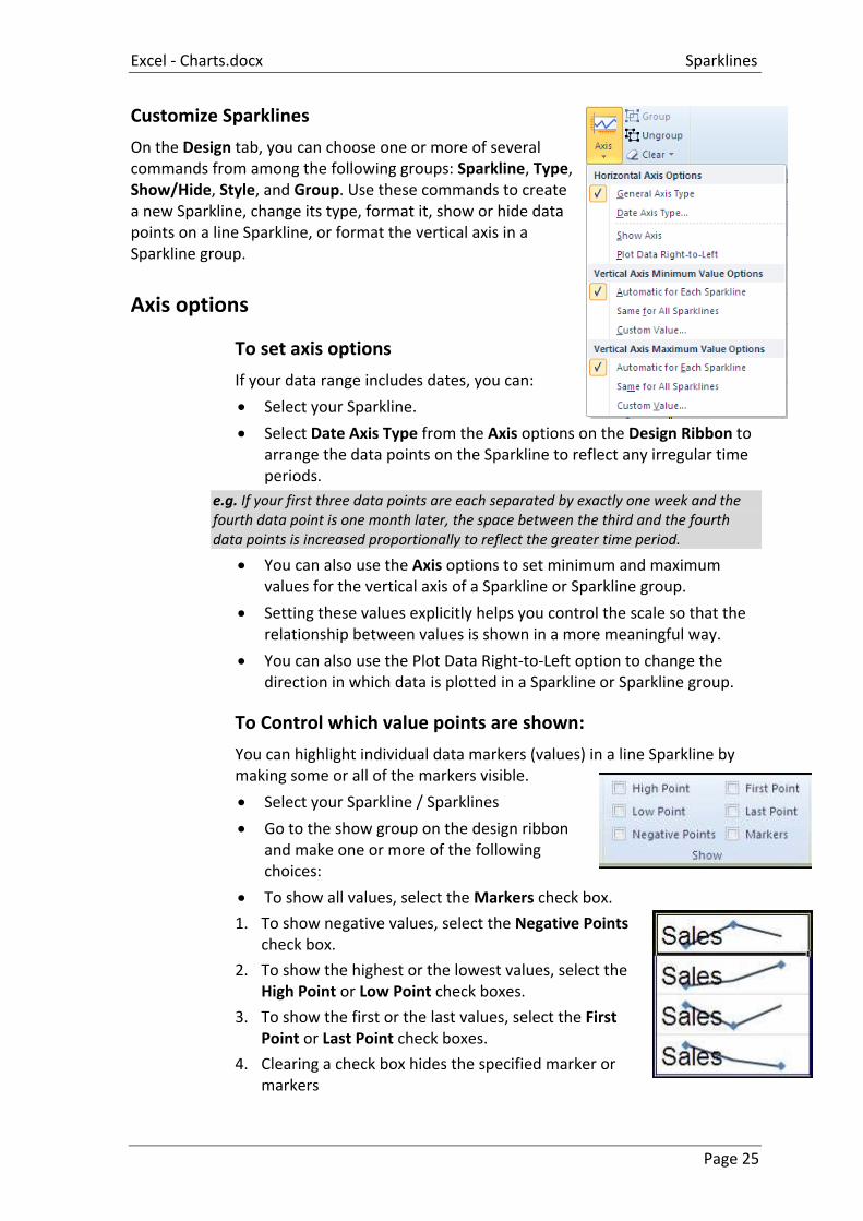
On the Design tab, you can choose one or more of several commands from among the following groups: Sparkline, Type, Show/Hide, Style, and Group. Use these commands to create a new Sparkline, change its type, format it, show or hide data points on a line Sparkline, or format the vertical axis in a Sparkline group.
Axis options
To set axis options
If your data range includes dates, you can:
Select your Sparkline.
Select Date Axis Type from the Axis options on the Design Ribbon to arrange the data points on the Sparkline to reflect any irregular time periods.
e.g. If your first three data points are each separated by exactly one week and the fourth data point is one month later, the space between the third and the fourth data points is increased proportionally to reflect the greater time period.
You can also use the Axis options to set minimum and maximum values for the vertical axis of a Sparkline or Sparkline group.
Setting these values explicitly helps you control the scale so that the relationship between values is shown in a more meaningful way.
You can also use the Plot Data Right-to-Left option to change the direction in which data is plotted in a Sparkline or Sparkline group.
To Control which value points are shown:
You can highlight individual data markers (values) in a line Sparkline by making some or all of the markers visible.
Select your Sparkline / Sparklines
Go to the show group on the design ribbon and make one or more of the following choices:
To show all values, select the Markers check box.
1. To show negative values, select the Negative Points check box.
2. To show the highest or the lowest values, select the High Point or Low Point check boxes.
3. To show the first or the last values, select the First Point or Last Point check boxes.
4. Clearing a check box hides the specified marker or markers

Sparklines Excel - Charts.docx
Page 26
To Change the style of or format Sparklines
Use the Style gallery on Design tab, which becomes available when you select a cell that contains a Sparkline.
Select a single Sparkline or a Sparkline group.
To apply a predefined style, on the Design tab, in the Style group, click a style or click the arrow at the lower right corner of the box to see additional styles.
Make a selection.
To manually apply formatting to a Sparkline, use the Sparkline Colour or the Marker Colour commands.
To enter Sparkline titles
Click on a cell that contains a Sparkline type in the title you wish for it
Press return.
Format title as you would for text in a cell so as not to obscure your Sparkline.
To Handle empty cells or zero values
You can control how a Sparkline handles empty cells in a range by using the Hidden and Empty Cell Settings dialog box.
Mouse
Click on the edit data drop down arrow in the Sparkline group on the design ribbon.
From the menu select Hidden & Empty Cells a dialog appears.
Select from the options how you want your empty data cells to appear within your Sparkline
Click on OK