mspress books developer - xamarin.azureedge.net · requested size because there might not be enough...
TRANSCRIPT
Chapter 26
Custom layouts
Customization is a crucial aspect of any graphical programming environment. Has the system been de-
signed for flexibility? Can you create new types of user-interface elements? How well do these new ele-
ments integrate into the system?
Xamarin.Forms has several features that facilitate customization. You’ve already seen the depend-
ency service (first discussed in Chapter 9, “Platform-specific API calls”), which allows your application to
execute platform-specific code from the common Portable Class Library.
In the next chapter, you’ll see how to create specialized user-interface elements in the form of new
View derivatives. You create these new elements by coding custom renderers that implement the ele-
ment in the individual platforms.
This chapter focuses instead on those powerful classes that typically inhabit the visual tree between
the page and the individual user-interface objects. These classes are known as layouts because they
derive from Layout<View>. Xamarin.Forms defines four such classes—StackLayout, AbsoluteLay-
out, RelativeLayout, and Grid—each of which arranges its children in a different way. As you’ve
seen throughout this book, these Layout<View> derivatives are vital for defining the visual organiza-
tion of your page.
The classes that derive from Layout<View> are somewhat unusual in Xamarin.Forms in that they
make use of no platform-specific code. They are instead implemented entirely within Xamarin.Forms.
This chapter describes how to derive a class from Layout<View> to write your own custom layouts.
This is a very useful skill that comes to the rescue whenever you need to organize your page in a man-
ner that’s not handled by the standard layout classes. For example, suppose you want to present data
by using a card-file metaphor with overlapping cards, or as items that wrap in both columns and
scrollable rows, or that pan from side to side with finger swipes. This chapter will show you how to
write such classes.
Writing custom layouts also provides you with the best insights into how the layout system in
Xamarin.Forms works. This knowledge will help you design your own pages even if you restrict yourself
to the standard layout classes.
An overview of layout
In Xamarin.Forms, there is no centralized system that handles layout. Instead, the process is very decen-
tralized. Layout is handled by the elements themselves, or within the classes they derive from. For ex-
ample, every visual element is responsible for determining its own preferred size. This is known as a
requested size because there might not be enough room to fit the whole element, or there might be
more than enough room for the element.
The elements that get most involved in layout have a single child or multiple children. These are the
Page derivatives, Layout derivatives (ContentView, Frame, and ScrollView), and Layout<View>
derivatives. These elements are responsible for determining the location and size of their child or chil-
dren relative to themselves. The child location and size is usually based on the child’s requested size, so
layout often involves a give-and-take relationship between parents and children. Children have re-
quests, but parents lay down the law.
Let’s look at a few simple examples.
Parents and children Consider the following markup:
<ContentPage … >
<Frame OutlineColor="Accent" >
<Label Text="Sample text" />
</Frame>
</ContentPage>
It’s a Label in a Frame in a ContentPage. Like most View derivatives, the Frame has default Hori-
zontalOptions and VerticalOptions property settings of LayoutOptions.Fill, which means
that the Frame fills the page except for a possible Padding setting on the page. The size of the Frame
is based on the size of the page and not on the size of the text displayed by the Label.
Now set the HorizontalOptions and VerticalOptions properties on the Frame:
<ContentPage … >
<Frame OutlineColor="Accent"
VerticalOptions="Center"
HorizontalOptions="Center">
<Label Text="Sample text" />
</Frame>
</ContentPage>
The Frame now hugs the rendered text of the Label, which means that the size of the Frame is based
on the size of the Label rather than on the size of the page.
But not entirely! If you add more and more text to the Label, the Frame will grow, but it won’t ever
get larger than the page. Instead, the text will be truncated. With more text than can fit on the page,
the Label becomes limited by the maximum size of the Frame, which is limited by the size of the Con-
tentPage.
But now put the Frame in a ScrollView:
<ContentPage … >
<ScrollView>
<Frame OutlineColor="Accent">
<Label Text="Very long text ... " />
</Frame>
</ScrollView>
</ContentPage>
Now the ScrollView is the size of the page, but the Frame can grow larger than the ScrollView.
The ScrollView allows the user to scroll the bottom of the Frame into view.
The Frame can also extend past the bottom of the page if it’s in a StackLayout:
<ContentPage … >
<StackLayout>
<Frame OutlineColor="Accent">
<Label Text="Very long text ... " />
</Frame>
</StackLayout>
</ContentPage>
Ultimately, it is the parent that determines what the size of its children should be, and imposes that
size on its children, but often the parent will base that size on the requested size of the child.
Sizing and positioning The process of layout begins at the top of the visual tree with the page, and it then proceeds through
all the branches of the visual tree to encompass every visual element on the page. Elements that are
parents to other elements are responsible for sizing and positioning their children relative to them-
selves. This requires that parent elements call certain public methods in the child elements. These pub-
lic methods often result in calls to other methods within each element, for properties to be set, and for
events to be fired.
Perhaps the most important public method involved in layout is named (quite appropriately) Lay-
out. This method is defined by VisualElement and inherited by every class that derives from Visu-
alElement:
public void Layout(Rectangle bounds)
The Layout method specifies two characteristics of the element:
the rectangular area in which the element is rendered (indicated by the Width and Height
properties of the Rectangle value); and
the position of the element’s upper-left corner relative to its parent’s upper-left corner (the X
and Y properties).
When an application starts up and the first page needs to be displayed, the first Layout call is to a
Page object, and the Width and Height properties indicate the size of the screen, or the area of the
screen that the page occupies. Beginning with that first Layout call, the Layout calls are effectively
propagated through the visual tree: Every element that is a parent to other elements—Page, Layout,
and Layout<View> derivatives—is responsible for calling the Layout method on its children, resulting
in every visual element on the page getting a call to its Layout method. (You’ll see how this works
shortly.)
This whole process is known as a layout cycle, and if you turn the phone sideways, the layout cycle
starts again from the beginning at the top of the visual tree with the Page object. Layout cycles can
also occur on a subset of the visual tree if something changes to affect the layout. These changes in-
clude items being added or removed from a collection such as that in a ListView or a StackLayout
or another Layout class, a change in the IsVisible property of an element, or a change in the size of
an element (for one reason or another).
Internal to VisualElement, the Layout method causes five properties of the element to be set.
These properties are all defined by VisualElement:
Bounds of type Rectangle
X of type double
Y of type double
Width of type double
Height of type double
These properties are all synchronized. The X, Y, Width, and Height properties of VisualElement are
always the same values as the X, Y, Width, and Height properties of the Bounds rectangle. These
properties indicate the element’s actual rendered size and its position relative to the upper-left corner
of its parent.
None of these five properties have public set accessors. To external code, these properties are get-
only.
Prior to an element’s first Layout call, the X and Y properties have values of 0, but the Width and
Height properties have “mock” values of –1, which indicates that the properties have not yet been set.
Valid values of these properties are available only after a layout cycle has occurred. Valid values are not
available during execution of the constructors of the elements that make up the visual tree.
The X, Y, Width, and Height properties are all backed by bindable properties, so they can be
sources of data bindings. The Bounds property is not backed by a bindable property and does not fire
a PropertyChanged event. Do not use Bounds as a data-binding source.
A call to Layout also triggers a call to the SizeAllocated method, which is defined by Visual-
Element like so:
protected void SizeAllocated(double width, double height)
The two arguments are the same as the Width and Height properties of the Bounds rectangle. The
SizeAllocated method calls a protected virtual method name OnSizeAllocated:
protected virtual void OnSizeAllocated(double width, double height)
After the OnSizeAllocated method returns, and the size has changed from its previous value, Visu-
alElement fires a SizeChanged event, defined like so:
public event EventHandler SizeChanged;
This indicates that the element’s size has been set or has subsequently changed. As you’ve seen in pre-
vious chapters, when you need to implement some size-specific handling, the SizeChanged event is
an excellent opportunity to access the Bounds property or the Width and Height properties to obtain
a valid size of the page or any element on the page. The call to the Layout method is completed with
the firing of the SizeChanged event.
As an alternative to the SizeChanged event, it is possible for an application to override OnSizeAl-
located in a ContentPage derivative to obtain the new size of the page. (If you do so, be sure to call
the base class implementation of OnSizeAllocated.) You’ll find that OnSizeAllocated is sometimes
called when the element’s size doesn’t actually change. The SizeChanged event is fired only when the
size changes, and it’s better for size-specific handling on the application level.
The OnSizeAllocated method is not defined as virtual so that applications can override it, but to
allow classes within Xamarin.Forms to override it. Only two classes override OnSizeAllocated to per-
form their own specialized processing, but they are exceptionally important classes:
Page
Layout
These are the base classes for all the Xamarin.Forms elements that serve as parents to other elements
within a Xamarin.Forms visual tree. (Although ListView and TableView seem to have children as
well, the layout of those children are handled within the platform implementations of these views.)
Some of the classes that derive from Page and Layout have a Content property of type View.
These classes are ContentPage, ContentView, Frame, and ScrollView. The Content property is a
single child. The other classes that derive from Page (MasterDetailPage, TabbedPage, and Carou-
selPage) have multiple children. The classes that derive from Layout<View> have a Children prop-
erty of type IList<View>; these classes are StackLayout, AbsoluteLayout, RelativeLayout, and
Grid.
The Page and Layout classes have a parallel structure beginning with an override of the On-
SizeAllocated method. Both classes define the following method that is called from the OnSize-
Allocated override:
protected void UpdateChildrenLayout()
Both versions of UpdateChildrenLayout call a method named LayoutChildren. This method is de-
fined just a little differently in Page and Layout. In Page, the LayoutChildren method is defined as
virtual:
protected virtual void LayoutChildren(double x, double y, double width, double height)
In Layout it’s defined as abstract:
protected abstract void LayoutChildren(double x, double y, double width, double height);
Every Xamarin.Forms class that has a Content or a Children property also has an overridable
LayoutChildren method. When you write your own class that derives from Layout<View> (which is
the primary objective of this chapter), you’ll override LayoutChildren to provide a custom organiza-
tion of the layout’s children.
The responsibility of a LayoutChildren override is to call the Layout method on all the element’s
children, which is usually the View object set to the element’s Content property or the View objects in
the element’s Children collection. This is the most important part of layout.
As you’ll recall, a call to the Layout method results in the Bounds, X, Y, Width, and Height proper-
ties being set and in calls to SizeAllocated and OnSizeAllocated. If the element is a Layout de-
rivative, then OnSizeAllocated calls UpdateChildrenLayout and LayoutChildren. Layout-
Children then calls Layout on its children. This is how the Layout calls propagate from the top of
the visual tree through all the branches and every element on the page.
Both Page and Layout also define a LayoutChanged event:
public event EventHandler LayoutChanged;
The UpdateChildrenLayout method concludes by firing this event, but only if at least one child has
a new Bounds property.
You’ve seen that the Page and Layout classes both override the OnSizeAllocated method, and
both define UpdateChildrenLayout and LayoutChildren methods and a LayoutChanged event.
The Page and Layout classes have yet another similarity: They both define a Padding property. This
padding is automatically reflected in the arguments to LayoutChildren.
For example, consider the following page definition:
<ContentPage … Padding="20">
<ContentView Padding="15">
<Label Text="Sample text" />
</ContentView>
</ContentPage>
Suppose the screen in portrait mode measures 360 by 640. The ContentPage gets a call to its Layout
method with a bounds rectangle equal to (0, 0, 360, 640). This kicks off the layout cycle.
Although the Layout method in ContentPage has an argument of (0, 0, 360, 640), the Layout-
Children call in that page is adjusted for the Padding property of 20. Both the width and height
are decreased by 40 (20 on each side) and the x and y arguments are increased by 20, so the Lay-
outChildren arguments are (20, 20, 320, 600). This is the rectangle relative to the page in which Con-
tentPage can position its child.
The LayoutChildren method in ContentPage calls the Layout method in its child (the Con-
tentView) to give the ContentView the entire space available to the page minus the padding on the
page. The bounds rectangle argument to this Layout call is (20, 20, 320, 600), which positions the up-
per-left corner of the ContentView 20 units to the right and below the upper-left corner of the Con-
tentPage.
The call to the LayoutChildren override in ContentView reflects that layout area, but decreased
by the Padding setting of 15, so the arguments to the LayoutChildren override in ContentView are
(15, 15, 290, 570). This LayoutChildren method calls the Layout method in Label with that value.
Now let’s make a little change:
<ContentPage … Padding="20">
<ContentView Padding="15"
VerticalOptions="Center">
<Label Text="Sample text" />
</ContentView>
</ContentPage>
The LayoutChildren override in ContentPage now needs to do things a little differently. It can’t
simply call Layout on the ContentView with its own size minus the padding. It must call the Layout
method in ContentView to vertically center the ContentView within the space it has available.
But how? To vertically center the ContentView relative to itself, the ContentPage must know the
height of the ContentView. But the height of the ContentView depends on the height of the Label,
and that height depends on the text and perhaps on various font properties that might be set on the
Label. Moreover, the Label is capable of wrapping text to multiple rows, and the Label can’t figure
how many rows it requires without also knowing the horizontal space that’s available to it.
This problem implies that more steps are involved.
Constraints and size requests You just saw how, in some cases, a LayoutChildren override can call Layout on its child or children
based solely on the LayoutChildren arguments. But in the more general case, LayoutChildren
needs to know the size of its children before calling those children’s Layout methods. For this reason,
a LayoutChildren override generally calls two public methods in this order on each of its children:
GetSizeRequest
Layout
Why does a parent need to call GetSizeRequest on its child? Why can’t the parent simply obtain
the child’s size by accessing the child’s Bounds property or its Width and Height properties?
Because, in the general case, those properties have not been set yet! Recall that these properties are
set by a call to Layout, and the Layout call hasn’t yet occurred. In the general case, the Layout call
can’t occur until the parent knows the child’s requested size. In the general case, the GetSizeRequest
call is a prerequisite for the Layout call.
The information that GetSizeRequest returns is entirely independent of any information that
might be set by Layout. Instead, the argument to Layout usually depends on the information re-
turned from GetSizeRequest.
The GetSizeRequest call obtains what is sometimes called a desired size of an element. This is of-
ten related to the element’s native size, and that generally depends on the particular platform. In con-
trast, the Layout call imposes a particular size on the element. Sometimes these two sizes are the same
and sometimes not. These two sizes are usually not the same if the element’s HorizontalOptions
and VerticalOptions settings are LayoutOptions.Fill. In that case, the size that the element oc-
cupies is usually based on the area available to the element’s parent rather than the size that the ele-
ment needs.
The native size of some elements is fixed and inflexible. For example, in any particular platform, a
Switch is always a fixed size determined by its implementation in that platform. But that’s not always
the case for other types of elements. Sometimes one dimension of the size is fixed but the other di-
mension is more flexible. The height of a horizontal Slider is fixed by the platform implementation,
but the width of the Slider can be as wide as its parent.
Sometimes the size of an element depends on its property settings. The size of a Button or Label
is dependent on the text displayed by the element and the font size. Because the text displayed by a
Label can wrap to multiple lines, the height of a Label depends on how many rows are displayed,
and that’s governed by the width available for the Label. Sometimes the height or width of an ele-
ment depends on the height or width of its children. Such is the case with StackLayout.
These complications require that an element determine its size based on constraints, which gener-
ally indicate how much space is available within the element’s parent for that element.
Like Layout, the GetSizeRequest method is defined by VisualElement. This is a public method
that a parent element calls to obtain the size of each of its children:
public virtual SizeRequest GetSizeRequest(double widthConstraint, double heightConstraint)
The widthConstraint and heightConstraint arguments generally indicate the size that the parent
has available for the child; the child is responsible for implementing this method to determine an ap-
propriate size for itself based on those constraints. For example, a Label determines how many lines it
needs for its text based on a particular width.
VisualElement also defines a very similar protected method named OnSizeRequest:
protected virtual SizeRequest OnSizeRequest(double widthConstraint, double heightConstraint)
Obviously these two methods are related and easily confused. Both methods are defined as vir-
tual, but throughout all of Xamarin.Forms, only one class overrides the GetSizeRequest method,
and that’s the Layout class, which marks the method as sealed.
On the other hand, every class that derives from Layout or Layout<View> overrides OnSize-
Request. This is where a layout class determines the size that it needs to be by making calls to the
GetSizeRequest methods of its children.
For View derivatives (but not Layout derivatives), the public GetSizeRequest method calls the
protected OnSizeRequest method which is responsible for obtaining the native size of the element
from the platform-specific implementation.
The SizeRequest structure returned from GetSizeRequest and OnSizeRequest has two proper-
ties:
Request of type Size
Minimum of type Size
It’s tempting to try to call GetSizeRequest on newly created objects, such as Label and BoxView
and Slider, and examine what sizes are returned. However, the GetSizeRequest call will not work
unless the element is part of an actual visual tree because only then is the Xamarin.Forms element im-
plemented with an underlying platform object.
Most elements return SizeRequest values with identical Request and Minimum sizes. The only el-
ements for which they’re uniformly different is ListView and TableView, where the Minimum size is
(40, 40), perhaps to allow some portion of the ListView or TableView to be displayed even if there
isn’t enough room for the whole thing.
In general, however, the Minimum size does not seem to play much of a role in the Xamarin.Forms
layout system, and you don’t need to go to extraordinary lengths to accommodate it. The Size-
Request structure has a constructor that lets you set both properties to the same Size value.
You might recall that VisualElement defines four properties that have the word Request as part
of their names:
WidthRequest of type double
HeightRequest of type double
MinimumWidthRequest of type double
MinimumHeightRequest of type double
Unlike the Width and Height properties, these four properties have public set accessors. Your appli-
cation can set the WidthRequest and HeightRequest properties of an element to override its cus-
tomary size. This is particularly useful for a BoxView, which initializes its WidthRequest and Height-
Request values to 40. You can set these properties to different values to make a BoxView whatever
size you want.
By default, these four properties have “mock” values of –1. If they are set to actual values, here’s
how GetSizeRequest and OnSizeRequest interact with them:
First, GetSizeRequest finds the minimum of its widthConstraint argument and the element’s
WidthRequest property and the minimum of heightConstraint and HeightRequest. These are
the values passed to OnSizeRequest. In essence, the element is being offered only as much size as the
WidthRequest and HeightRequest properties indicate.
Based on those constraints, OnSizeRequest returns a SizeRequest value back to GetSize-
Request. That SizeRequest value has Request and Minimum properties. GetSizeRequest then
finds the minimum of the Width and Height properties of the Request property and the WidthRe-
quest and HeightRequest properties set on the element. It also finds the minimum of the Width
and Height properties of the Minimum property, and the MinimumWidthRequest and Mini-
mumHeightRequest properties set on the element. GetSizeRequest then returns a new
SizeRequest value based on these minimums.
Here’s some simple markup:
<ContentPage … Padding="20">
<Label Text="Sample text"
HorizontalOptions="Center"
VerticalOptions="Center" />
</ContentPage>
Suppose the screen in portrait mode is 360 by 640. The layout cycle begins with a call to the Lay-
out method of ContentPage with a bounds rectangle of (0, 0, 360, 640). The arguments to the Lay-
outChildren override in ContentPage are adjusted for the padding, so the arguments are (20, 20,
320, 600).
Because Label has its HorizontalOptions and VerticalOptions properties not set to Lay-
outOptions.Fill, the page must determine the size of the Label by calling GetSizeRequest with
constraints of (320, 600). The information that Label returns depends on the platform, but let’s as-
sume the Label returns a size of (100, 24). The ContentPage must then position that Label in the
center of the (320, 600) area available for its child. From the width of 320, it subtracts the Label width
of 100 and divides by 2. That’s 110, but that’s relative to the area available for the child, and not rela-
tive to the upper-left corner of the page, which includes the margin of 20. So the horizontal offset of
the Label from the ContentPage is actually 130.
The ContentPage performs a similar calculation for the height: 600 minus 24, divided by 2, plus 20,
or 308. The ContentPage then calls the Layout method of the Label with the bounds rectangle (130,
308, 100, 24) to position and size the Label relative to itself.
How do WidthRequest and HeightRequest settings on the Label affect this? Here’s a WidthRe-
quest that is more than what the Label needs but a HeightRequest that is less:
<Label Text="Sample text"
WidthRequest="200"
HeightRequest="12"
HorizontalOptions="Center"
VerticalOptions="Center" />
The ContentPage still calls the GetSizeRequest method of the Label with constraints of (320, 600),
but the GetSizeRequest modifies those constraints to be (200, 12), and that’s what is passed to the
OnSizeRequest override. The Label still returns a requested size of (100, 24), but GetSizeRequest
again adjusts those for the Width and Height request and returns (200, 12) back to the ContentPage.
The ContentPage then calls the Layout method of Label based on Label dimensions of (200, 12)
rather than (100, 24). The Layout call on the Label now has a bounds rectangle of (80, 314, 200, 12).
The Label is displayed with twice as much width as is necessary for the text, but with half as much
height. The text is cropped off at the bottom.
If instead the WidthRequest setting on the Label is set to be less than 100—for example, 50—
then the OnSizeRequest method is called with a widthConstraint argument of 50, and the Label
calculates a height for the text that results in wrapping the text into multiple lines.
Infinite constraints Now here’s some markup that at first seems very similar to the earlier example but with quite a pro-
found difference:
<ContentPage … Padding="20">
<StackLayout>
<Label Text="Sample text" />
…
</StackLayout>
</ContentPage>
The ContentPage still gets an initial Layout call with the arguments (0, 0, 360, 640), and the argu-
ments to the LayoutChildren override are (20, 20, 320, 600). It has one child, the StackLayout. The
StackLayout has default settings of HorizontalOptions and VerticalOptions of LayoutOp-
tions.Fill, which means that the StackLayout can be positioned relative to ContentPage with a
Layout call of (20, 20, 320, 600).
This results in StackLayout getting a LayoutChildren call with arguments of (0, 0, 320, 600).
How does StackLayout size and position its children?
As we know from working with StackLayout since Chapter 4, a vertical StackLayout gives its
children the same horizontal size as itself, but a vertical size based on what the child needs. This means
that StackLayout must call GetSizeRequest on all its children prior to calling Layout. But what
constraints should it specify with those GetSizeRequest calls?
The initial impulse might be that StackLayout calls GetSizeRequest on its children with con-
straints that reflect its own size of (320, 600). But that’s not right. The StackLayout doesn’t limit its
children to its own height. It allows its children to be any height they need to be. This implies that the
height constraint should actually be infinite.
And this is true. StackLayout calls GetSizeRequest on its children with a height of (320, ∞), or,
in terms of .NET, (320, Double.PositiveInfinity).
This is important: Constraints passed to GetSizeRequest and OnSizeRequest can range from 0
through Double.PositiveInfinity. However, GetSizeRequest and OnSizeRequest can never
themselves request an infinite dimension by returning a SizeRequest value with a property set to
Double.PositiveInfinity.
Let’s try another common layout pattern:
<ContentPage … Padding="20">
<ScrollView>
<StackLayout>
<Label Text="Sample text" />
…
</StackLayout>
</ScrollView>
</ContentPage>
As usual, ContentPage gets a call to Layout with a bounds rectangle of (0, 0, 360, 640) and a call
to its LayoutChildren method with arguments of (20, 20, 320, 600). The ScrollView has default
HorizontalOptions and VerticalOptions settings of LayoutOptions.Fill, so the page doesn’t
need to know what size the ScrollView is. The page simply calls the Layout method of ScrollView
with a bounds rectangle of (20, 20, 320, 600).
ScrollView then gets a call to its LayoutChildren method with arguments of (0, 0, 320, 600). It
needs to determine the size of its child (the StackLayout), so it calls the GetSizeRequest method of
StackLayout. What should the constraints be?
In the general case, the StackLayout will have a height greater than the height of ScrollView.
That’s why you’re including a ScrollView in the visual tree! ScrollView needs to know that height if
it is to successfully scroll its child. Therefore, ScrollView calls the GetSizeRequest method of
StackLayout with constraints of (320, Double.PositiveInfinity). This translates into a call to On-
SizeRequest with the same constraint arguments, which StackLayout overrides and handles.
You can also think of an infinite constraint as an autosize indication. A vertical StackLayout re-
quests a child size with an infinite height constraint to obtain the child’s requested height. Similarly, a
child of a Grid cell whose row height or column width is GridLength.Auto will see an infinite
heightConstraint or widthConstraint, or both. A child of an AbsoluteLayout with a Layout-
Bounds height or width of Auto will also see an infinite heightConstraint or widthConstraint.
Sometimes the words constrained and unconstrained are used to refer to these differences. An ele-
ment is constrained when it receives a call to its GetSizeRequest method with noninfinite arguments.
The element is constrained to a particular size. An element is unconstrained when it gets a call to Get-
SizeRequest with one or both arguments equal to Double.PositiveInfinity. Sometimes the
term partially constrained is used to refer to a GetSizeRequest call with one Double.PositiveIn-
finity argument, and the term fully constrained makes it clear that neither argument is infinite.
When you write your own custom layout classes by deriving from Layout<View>, you must over-
ride both the OnSizeRequest and LayoutChildren methods, and you must be aware that under
certain circumstances, one or both of the constraints arguments to OnSizeRequest will be Dou-
ble.PositiveInfinity. However, OnSizeRequest must never request an infinite size.
Peeking inside the process Much of the information presented so far in this chapter has been assembled from test programs that
contain classes that derive from various elements (such as StackLayout, ScrollView, and Label),
override virtual methods (such as GetSizeRequest, OnSizeRequest, OnSizeAllocated, and Lay-
outChildren), and simply display information in the Output window of Visual Studio or Xamarin Stu-
dio by using the Debug.WriteLine method from the System.Diagnostics namespace.
A little bit of that exploratory process—but using the phone itself to display this information—is
shown in the ExploreChildSizes sample.
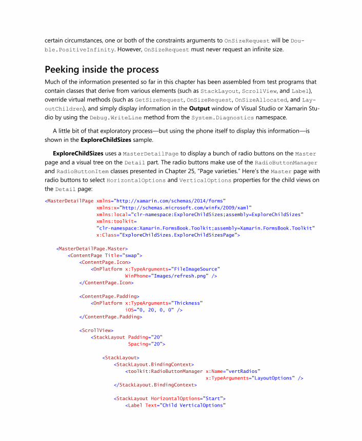
ExploreChildSizes uses a MasterDetailPage to display a bunch of radio buttons on the Master
page and a visual tree on the Detail part. The radio buttons make use of the RadioButtonManager
and RadioButtonItem classes presented in Chapter 25, “Page varieties.” Here’s the Master page with
radio buttons to select HorizontalOptions and VerticalOptions properties for the child views on
the Detail page:
<MasterDetailPage xmlns="http://xamarin.com/schemas/2014/forms"
xmlns:x="http://schemas.microsoft.com/winfx/2009/xaml"
xmlns:local="clr-namespace:ExploreChildSizes;assembly=ExploreChildSizes"
xmlns:toolkit=
"clr-namespace:Xamarin.FormsBook.Toolkit;assembly=Xamarin.FormsBook.Toolkit"
x:Class="ExploreChildSizes.ExploreChildSizesPage">
<MasterDetailPage.Master>
<ContentPage Title="swap">
<ContentPage.Icon>
<OnPlatform x:TypeArguments="FileImageSource"
WinPhone="Images/refresh.png" />
</ContentPage.Icon>
<ContentPage.Padding>
<OnPlatform x:TypeArguments="Thickness"
iOS="0, 20, 0, 0" />
</ContentPage.Padding>
<ScrollView>
<StackLayout Padding="20"
Spacing="20">
<StackLayout>
<StackLayout.BindingContext>
<toolkit:RadioButtonManager x:Name="vertRadios"
x:TypeArguments="LayoutOptions" />
</StackLayout.BindingContext>
<StackLayout HorizontalOptions="Start">
<Label Text="Child VerticalOptions"
FontSize="Medium" />
<BoxView Color="Accent"
HeightRequest="3" />
</StackLayout>
<local:RadioButton BindingContext="{Binding Items[0]}" />
<local:RadioButton BindingContext="{Binding Items[1]}" />
<local:RadioButton BindingContext="{Binding Items[2]}" />
<local:RadioButton BindingContext="{Binding Items[3]}" />
<local:RadioButton BindingContext="{Binding Items[4]}" />
<local:RadioButton BindingContext="{Binding Items[5]}" />
<local:RadioButton BindingContext="{Binding Items[6]}" />
<local:RadioButton BindingContext="{Binding Items[7]}" />
</StackLayout>
<StackLayout>
<StackLayout.BindingContext>
<toolkit:RadioButtonManager x:Name="horzRadios"
x:TypeArguments="LayoutOptions" />
</StackLayout.BindingContext>
<StackLayout HorizontalOptions="Start">
<Label Text="Child HorizontalOptions"
FontSize="Medium" />
<BoxView Color="Accent"
HeightRequest="3" />
</StackLayout>
<local:RadioButton BindingContext="{Binding Items[0]}" />
<local:RadioButton BindingContext="{Binding Items[1]}" />
<local:RadioButton BindingContext="{Binding Items[2]}" />
<local:RadioButton BindingContext="{Binding Items[3]}" />
<local:RadioButton BindingContext="{Binding Items[4]}" />
<local:RadioButton BindingContext="{Binding Items[5]}" />
<local:RadioButton BindingContext="{Binding Items[6]}" />
<local:RadioButton BindingContext="{Binding Items[7]}" />
</StackLayout>
</StackLayout>
</ScrollView>
</ContentPage>
</MasterDetailPage.Master>
…
</MasterDetailPage>
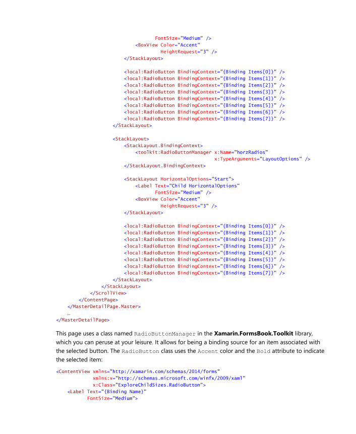
This page uses a class named RadioButtonManager in the Xamarin.FormsBook.Toolkit library,
which you can peruse at your leisure. It allows for being a binding source for an item associated with
the selected button. The RadioButton class uses the Accent color and the Bold attribute to indicate
the selected item:
<ContentView xmlns="http://xamarin.com/schemas/2014/forms"
xmlns:x="http://schemas.microsoft.com/winfx/2009/xaml"
x:Class="ExploreChildSizes.RadioButton">
<Label Text="{Binding Name}"
FontSize="Medium">
<Label.GestureRecognizers>
<TapGestureRecognizer Command="{Binding Command}"
CommandParameter="{Binding Value}"/>
</Label.GestureRecognizers>
<Label.Triggers>
<DataTrigger TargetType="Label"
Binding="{Binding IsSelected}"
Value="True">
<Setter Property="TextColor" Value="Accent" />
<Setter Property="FontAttributes" Value="Bold" />
</DataTrigger>
</Label.Triggers>
</Label>
</ContentView>
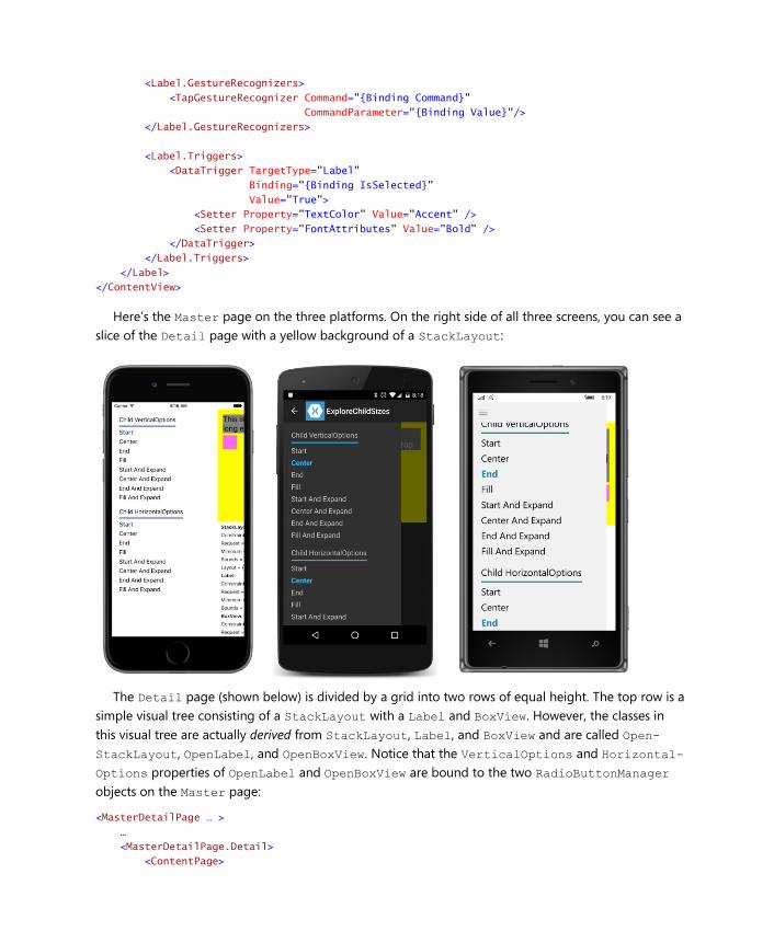
Here’s the Master page on the three platforms. On the right side of all three screens, you can see a
slice of the Detail page with a yellow background of a StackLayout:
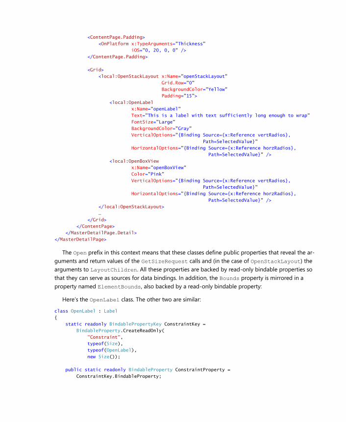
The Detail page (shown below) is divided by a grid into two rows of equal height. The top row is a
simple visual tree consisting of a StackLayout with a Label and BoxView. However, the classes in
this visual tree are actually derived from StackLayout, Label, and BoxView and are called Open-
StackLayout, OpenLabel, and OpenBoxView. Notice that the VerticalOptions and Horizontal-
Options properties of OpenLabel and OpenBoxView are bound to the two RadioButtonManager
objects on the Master page:
<MasterDetailPage … >
…
<MasterDetailPage.Detail>
<ContentPage>
<ContentPage.Padding>
<OnPlatform x:TypeArguments="Thickness"
iOS="0, 20, 0, 0" />
</ContentPage.Padding>
<Grid>
<local:OpenStackLayout x:Name="openStackLayout"
Grid.Row="0"
BackgroundColor="Yellow"
Padding="15">
<local:OpenLabel
x:Name="openLabel"
Text="This is a label with text sufficiently long enough to wrap"
FontSize="Large"
BackgroundColor="Gray"
VerticalOptions="{Binding Source={x:Reference vertRadios},
Path=SelectedValue}"
HorizontalOptions="{Binding Source={x:Reference horzRadios},
Path=SelectedValue}" />
<local:OpenBoxView
x:Name="openBoxView"
Color="Pink"
VerticalOptions="{Binding Source={x:Reference vertRadios},
Path=SelectedValue}"
HorizontalOptions="{Binding Source={x:Reference horzRadios},
Path=SelectedValue}" />
</local:OpenStackLayout>
…
</Grid>
</ContentPage>
</MasterDetailPage.Detail>
</MasterDetailPage>
The Open prefix in this context means that these classes define public properties that reveal the ar-
guments and return values of the GetSizeRequest calls and (in the case of OpenStackLayout) the
arguments to LayoutChildren. All these properties are backed by read-only bindable properties so
that they can serve as sources for data bindings. In addition, the Bounds property is mirrored in a
property named ElementBounds, also backed by a read-only bindable property:
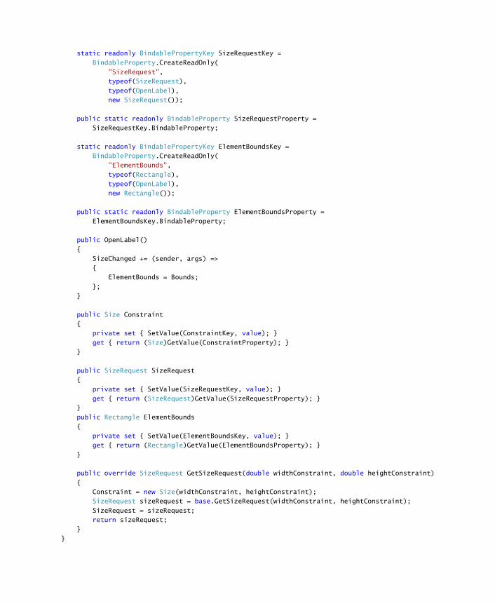
Here’s the OpenLabel class. The other two are similar:
class OpenLabel : Label
{
static readonly BindablePropertyKey ConstraintKey =
BindableProperty.CreateReadOnly(
"Constraint",
typeof(Size),
typeof(OpenLabel),
new Size());
public static readonly BindableProperty ConstraintProperty =
ConstraintKey.BindableProperty;
static readonly BindablePropertyKey SizeRequestKey =
BindableProperty.CreateReadOnly(
"SizeRequest",
typeof(SizeRequest),
typeof(OpenLabel),
new SizeRequest());
public static readonly BindableProperty SizeRequestProperty =
SizeRequestKey.BindableProperty;
static readonly BindablePropertyKey ElementBoundsKey =
BindableProperty.CreateReadOnly(
"ElementBounds",
typeof(Rectangle),
typeof(OpenLabel),
new Rectangle());
public static readonly BindableProperty ElementBoundsProperty =
ElementBoundsKey.BindableProperty;
public OpenLabel()
{
SizeChanged += (sender, args) =>
{
ElementBounds = Bounds;
};
}
public Size Constraint
{
private set { SetValue(ConstraintKey, value); }
get { return (Size)GetValue(ConstraintProperty); }
}
public SizeRequest SizeRequest
{
private set { SetValue(SizeRequestKey, value); }
get { return (SizeRequest)GetValue(SizeRequestProperty); }
}
public Rectangle ElementBounds
{
private set { SetValue(ElementBoundsKey, value); }
get { return (Rectangle)GetValue(ElementBoundsProperty); }
}
public override SizeRequest GetSizeRequest(double widthConstraint, double heightConstraint)
{
Constraint = new Size(widthConstraint, heightConstraint);
SizeRequest sizeRequest = base.GetSizeRequest(widthConstraint, heightConstraint);
SizeRequest = sizeRequest;
return sizeRequest;
}
}
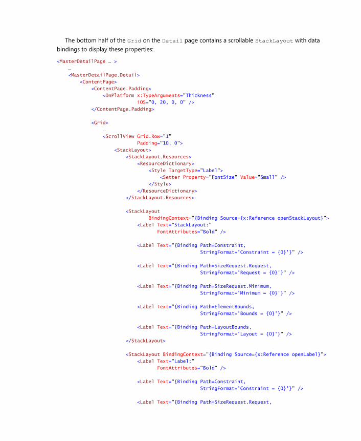
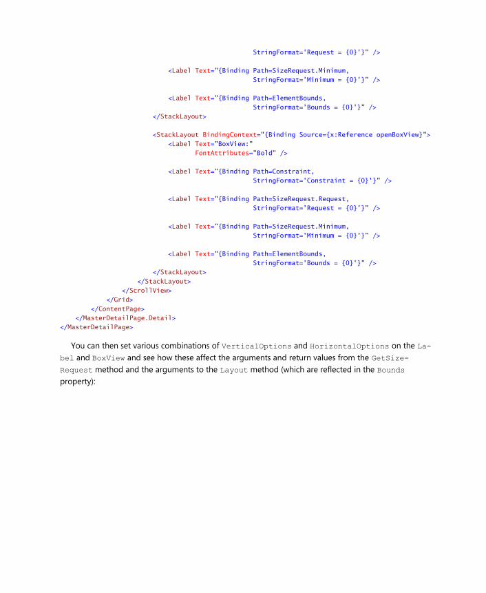
The bottom half of the Grid on the Detail page contains a scrollable StackLayout with data
bindings to display these properties:
<MasterDetailPage … >
…
<MasterDetailPage.Detail>
<ContentPage>
<ContentPage.Padding>
<OnPlatform x:TypeArguments="Thickness"
iOS="0, 20, 0, 0" />
</ContentPage.Padding>
<Grid>
…
<ScrollView Grid.Row="1"
Padding="10, 0">
<StackLayout>
<StackLayout.Resources>
<ResourceDictionary>
<Style TargetType="Label">
<Setter Property="FontSize" Value="Small" />
</Style>
</ResourceDictionary>
</StackLayout.Resources>
<StackLayout
BindingContext="{Binding Source={x:Reference openStackLayout}">
<Label Text="StackLayout:"
FontAttributes="Bold" />
<Label Text="{Binding Path=Constraint,
StringFormat='Constraint = {0}'}" />
<Label Text="{Binding Path=SizeRequest.Request,
StringFormat='Request = {0}'}" />
<Label Text="{Binding Path=SizeRequest.Minimum,
StringFormat='Minimum = {0}'}" />
<Label Text="{Binding Path=ElementBounds,
StringFormat='Bounds = {0}'}" />
<Label Text="{Binding Path=LayoutBounds,
StringFormat='Layout = {0}'}" />
</StackLayout>
<StackLayout BindingContext="{Binding Source={x:Reference openLabel}">
<Label Text="Label:"
FontAttributes="Bold" />
<Label Text="{Binding Path=Constraint,
StringFormat='Constraint = {0}'}" />
<Label Text="{Binding Path=SizeRequest.Request,
StringFormat='Request = {0}'}" />
<Label Text="{Binding Path=SizeRequest.Minimum,
StringFormat='Minimum = {0}'}" />
<Label Text="{Binding Path=ElementBounds,
StringFormat='Bounds = {0}'}" />
</StackLayout>
<StackLayout BindingContext="{Binding Source={x:Reference openBoxView}">
<Label Text="BoxView:"
FontAttributes="Bold" />
<Label Text="{Binding Path=Constraint,
StringFormat='Constraint = {0}'}" />
<Label Text="{Binding Path=SizeRequest.Request,
StringFormat='Request = {0}'}" />
<Label Text="{Binding Path=SizeRequest.Minimum,
StringFormat='Minimum = {0}'}" />
<Label Text="{Binding Path=ElementBounds,
StringFormat='Bounds = {0}'}" />
</StackLayout>
</StackLayout>
</ScrollView>
</Grid>
</ContentPage>
</MasterDetailPage.Detail>
</MasterDetailPage>
You can then set various combinations of VerticalOptions and HorizontalOptions on the La-
bel and BoxView and see how these affect the arguments and return values from the GetSize-
Request method and the arguments to the Layout method (which are reflected in the Bounds
property):
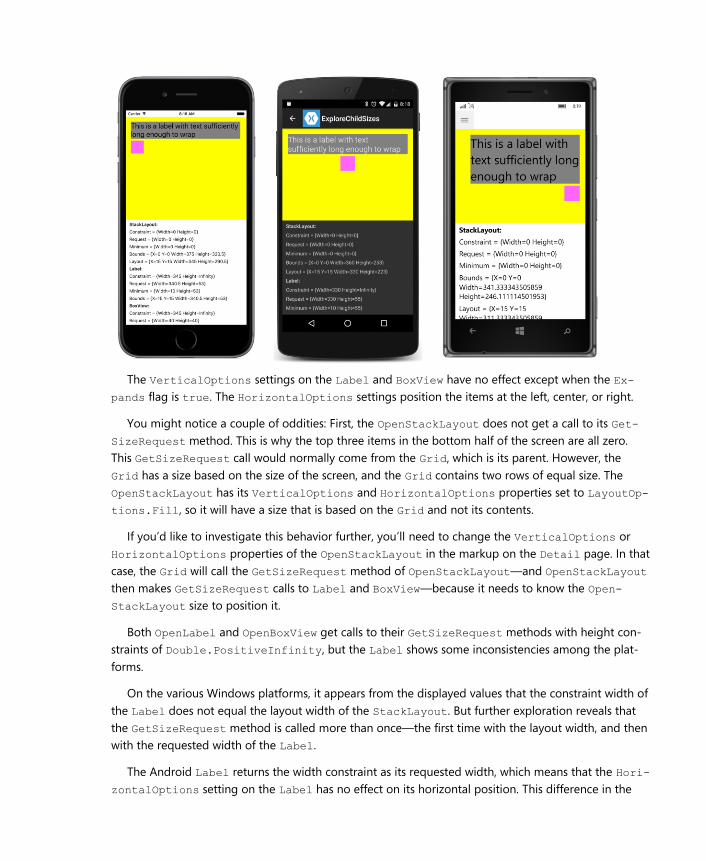
The VerticalOptions settings on the Label and BoxView have no effect except when the Ex-
pands flag is true. The HorizontalOptions settings position the items at the left, center, or right.
You might notice a couple of oddities: First, the OpenStackLayout does not get a call to its Get-
SizeRequest method. This is why the top three items in the bottom half of the screen are all zero.
This GetSizeRequest call would normally come from the Grid, which is its parent. However, the
Grid has a size based on the size of the screen, and the Grid contains two rows of equal size. The
OpenStackLayout has its VerticalOptions and HorizontalOptions properties set to LayoutOp-
tions.Fill, so it will have a size that is based on the Grid and not its contents.
If you’d like to investigate this behavior further, you’ll need to change the VerticalOptions or
HorizontalOptions properties of the OpenStackLayout in the markup on the Detail page. In that
case, the Grid will call the GetSizeRequest method of OpenStackLayout—and OpenStackLayout
then makes GetSizeRequest calls to Label and BoxView—because it needs to know the Open-
StackLayout size to position it.
Both OpenLabel and OpenBoxView get calls to their GetSizeRequest methods with height con-
straints of Double.PositiveInfinity, but the Label shows some inconsistencies among the plat-
forms.
On the various Windows platforms, it appears from the displayed values that the constraint width of
the Label does not equal the layout width of the StackLayout. But further exploration reveals that
the GetSizeRequest method is called more than once—the first time with the layout width, and then
with the requested width of the Label.
The Android Label returns the width constraint as its requested width, which means that the Hori-
zontalOptions setting on the Label has no effect on its horizontal position. This difference in the
Android implementation disappears when the text occupies just one line.
Deriving from Layout<View>
We are now armed with sufficient knowledge to create our own layout classes.
Most of the public and protected methods involved in layout are defined by the nongeneric Lay-
out class. The Layout<T> class derives from Layout and constrains the generic type to View and its
derivatives. Layout<T> defines a single public property named Children of type IList<T> and a
couple of protected methods described shortly.
A custom layout class almost always derives from Layout<View>. If you want to restrict the chil-
dren to certain types, you can derive from Layout<Label> or Layout<BoxView>, but that is not
common. (You’ll see an example toward the end of this chapter.)
A custom layout class has just two responsibilities:
Override OnSizeRequest to call GetSizeRequest on all the layout’s children. Return a re-
quested size for the layout itself.
Override LayoutChildren to call Layout on all the layout’s children.
Both methods typically use foreach or for to enumerate through all the children in the custom lay-
out’s Children collection.
It is particularly important for your layout class to call Layout on each child. Otherwise, the child
never gets a proper size or position and will not be visible.
However, the enumeration of children in the OnSizeRequest and LayoutChildren overrides
should skip any child whose IsVisible property is set to false. Such children will not be visible any-
way, but if you don’t deliberately skip those children, it’s likely that your layout class will leave room for
these invisible children, and that’s not correct behavior.
As you’ve seen, it is not guaranteed that the OnSizeRequest override will be called. The method
doesn’t need to be called if the size of the layout is governed by its parent rather than its children. The
method definitely will be called if one or both of the constraints are infinite, or if the layout class has
nondefault settings of VerticalOptions or HorizontalOptions. Otherwise, a call to OnSize-
Request is not guaranteed and you shouldn’t rely on it.
You’ve also seen that the OnSizeRequest call might have constraint arguments set to Dou-
ble.PositiveInfinity. However, OnSizeRequest cannot return a requested size with infinite di-
mensions. There is sometimes a temptation to implement OnSizeRequest in a very simple manner
like this:
// This is very bad code!
protected override SizeRequest OnSizeRequest(double widthConstraint, double heightConstraint)
{
return new SizeRequest(new Size(widthConstraint, heightConstraint));
}
Don’t do it! If your Layout<View> derivative can’t deal with infinite constraints for some reason—and
you’ll see an example later in this chapter—then raise an exception indicating that.
Very often, the LayoutChildren override will also require knowing the size of the children. The
LayoutChildren method can also call GetSizeRequest on all the children before calling Layout. It
is possible to cache the size of the children obtained in the OnSizeRequest override to avoid later
GetSizeRequest calls in the LayoutChildren override, but the layout class will need to know when
the sizes need to be obtained again. You’ll see some guidelines shortly.
An easy example A good technique for learning how to write custom layouts is to duplicate the functionality of an exist-
ing layout but simplify it somewhat.
The VerticalStack class described below is intended to mimic a StackLayout with an Orienta-
tion setting of Vertical. The VerticalStack class therefore does not have an Orientation prop-
erty, and to keep things simple, VerticalStack doesn’t have a Spacing property either. Moreover,
VerticalStack does not recognize the Expands flag on the HorizontalOptions and Vertical-
Options settings of its children. Ignoring the Expands flag simplifies the stacking logic enormously.
VerticalStack therefore defines just two members: overrides of the OnSizeRequest and Lay-
outChildren methods. Typically, both methods enumerate through the Children property defined
by Layout<T>, and generally both methods make calls to the GetSizeRequest of the children. Any
child with an IsVisible property set to false should be skipped.
The OnSizeRequest override in VerticalStack calls GetSizeRequest on each child with a con-
straint width equal to the widthConstraint argument to the override and a constraint height equal
to Double.PositiveInfinity. This constrains the width of the child to the width of the Vertical-
Stack, but allows each child to be as tall as it wants. That’s the fundamental characteristic of a vertical
stack:
public class VerticalStack : Layout<View>
{
protected override SizeRequest OnSizeRequest(double widthConstraint,
double heightConstraint)
{
Size reqSize = new Size();
Size minSize = new Size();
// Enumerate through all the children.
foreach (View child in Children)
{
// Skip the invisible children.
if (!child.IsVisible)
continue;
// Get the child's requested size.
SizeRequest childSizeRequest = child.GetSizeRequest(widthConstraint,
Double.PositiveInfinity);
// Find the maximum width and accumulate the height.
reqSize.Width = Math.Max(reqSize.Width, childSizeRequest.Request.Width);
reqSize.Height += childSizeRequest.Request.Height;
// Do the same for the minimum size request.
minSize.Width = Math.Max(minSize.Width, childSizeRequest.Minimum.Width);
minSize.Height += childSizeRequest.Minimum.Height;
}
return new SizeRequest(reqSize, minSize);
}
…
}
The foreach loop over the Children collection accumulates the size of the children separately for
the Request and Minimum properties of the SizeRequest object returned from the child. These accu-
mulations involve two Size values, named reqSize and minSize. Because this is a vertical stack, the
reqSize.Width and minSize.Width values are set to the maximum of the child widths, while the
reqSize.Height and minSize.Height values are set to the sum of the child heights.
It is possible that the widthConstraint argument to OnSizeRequest is Double.PositiveIn-
finity, in which case the arguments to the GetSizeRequest call of the child are both infinite. (For
example, the VerticalStack could be a child of a StackLayout with a horizontal orientation.) Gen-
erally, the body of the OnSizeRequest doesn’t need to worry about situations like that because the
SizeRequest value returned from GetSizeRequest never contains infinite values.
The second method in a custom layout—an override of LayoutChildren—is shown below. This is
generally called as a consequence of a call to the parent’s Layout method.
The width and height arguments to LayoutChildren indicate the size of the layout’s area availa-
ble for its children. Both values are finite. If an argument to OnSizeRequest was infinite, the corre-
sponding argument to LayoutChildren will be the width or height returned from the OnSize-
Request override. Otherwise, it depends on the HorizontalOptions and VerticalOptions set-
tings. For Fill, the argument to LayoutChildren is the same as the corresponding argument to On-
SizeRequest. Otherwise, it’s the requested width or height returned from the OnSizeRequest.
LayoutChildren also has x and y arguments that reflect the Padding property set on the layout.
For example, if the left padding is 20 and the top padding is 50, then x is 20 and y is 50. These gener-
ally indicate a starting position for the children of the layout:
public class VerticalStack : Layout<View>
{
…
protected override void LayoutChildren(double x, double y, double width, double height)
{
// Enumerate through all the children.
foreach (View child in Children)
{
// Skip the invisible children.
if (!child.IsVisible)
continue;
// Get the child's requested size.
SizeRequest childSizeRequest = child.GetSizeRequest(width, Double.PositiveInfinity);
// Initialize child position and size.
double xChild = x;
double yChild = y;
double childWidth = childSizeRequest.Request.Width;
double childHeight = childSizeRequest.Request.Height;
// Adjust position and size based on HorizontalOptions.
switch (child.HorizontalOptions.Alignment)
{
case LayoutAlignment.Start:
break;
case LayoutAlignment.Center:
xChild += (width - childWidth) / 2;
break;
case LayoutAlignment.End:
xChild += (width - childWidth);
break;
case LayoutAlignment.Fill:
childWidth = width;
break;
}
// Layout the child.
child.Layout(new Rectangle(xChild, yChild, childWidth, childHeight));
// Get the next child’s vertical position.
y += childHeight;
}
}
}
This is a vertical stack, so LayoutChildren needs to vertically position each child based on the child’s
requested height. If the child has a HorizontalOptions setting of Fill, then the width of each child
is the same as the width of the VerticalStack (minus the padding). Otherwise, the child’s width is its
requested width, and the stack must position that child within its own width.
To perform these calculations, LayoutChildren calls GetSizeRequest on its children again, but
this time with the actual width and height arguments to LayoutChildren rather than the constraint
arguments used in OnSizeRequest. Then it calls Layout on each child. The height argument to the
Rectangle constructor is always the height of the child. The width argument could be either the
width of the child or the width of the VerticalStack passed to the LayoutChildren override, de-
pending on the HorizontalOptions setting on the child. Notice that each child is positioned x units
from the left of the VerticalStack, and the first child is positioned y units from the top of the Ver-
ticalStack. That y variable is then increased at the bottom of the loop based on the child’s height.
That creates the stack.
The VerticalStack class is part of the VerticalStackDemo program, which contains a home page
that navigates to two pages to test it out. Of course, you can add more test pages (which is something
you should do for any Layout<View> classes that you develop).
The two test pages are instantiated in the home page:
<ContentPage xmlns="http://xamarin.com/schemas/2014/forms"
xmlns:x="http://schemas.microsoft.com/winfx/2009/xaml"
xmlns:sys="clr-namespace:System;assembly=mscorlib"
xmlns:local="clr-namespace:VerticalStackDemo;assembly=VerticalStackDemo"
x:Class="VerticalStackDemo.VerticalStackDemoHomePage"
Title="VerticalStack Demo">
<ListView ItemSelected="OnListViewItemSelected">
<ListView.ItemsSource>
<x:Array Type="{x:Type Page}">
<local:LayoutOptionsTestPage />
<local:ScrollTestPage />
</x:Array>
</ListView.ItemsSource>
<ListView.ItemTemplate>
<DataTemplate>
<TextCell Text="{Binding Title}" />
</DataTemplate>
</ListView.ItemTemplate>
</ListView>
</ContentPage>
The code-behind file navigates to the selected page:
public partial class VerticalStackDemoHomePage : ContentPage
{
public VerticalStackDemoHomePage()
{
InitializeComponent();
}
async void OnListViewItemSelected(object sender, SelectedItemChangedEventArgs args)
{
((ListView)sender).SelectedItem = null;
if (args.SelectedItem != null)
{
Page page = (Page)args.SelectedItem;
await Navigation.PushAsync(page);
}
}
}
The first of the test pages uses VerticalStack to display five Button elements with different
HorizontalOptions settings. The VerticalStack itself is given a VerticalOptions setting that
should position it in the middle of the page:
<ContentPage xmlns="http://xamarin.com/schemas/2014/forms"
xmlns:x="http://schemas.microsoft.com/winfx/2009/xaml"
xmlns:local="clr-namespace:VerticalStackDemo;assembly=VerticalStackDemo"
x:Class="VerticalStackDemo.LayoutOptionsTestPage"
Title="Test Layout Options">
<local:VerticalStack Padding="50, 0"
VerticalOptions="Center">
<Button Text="Default" />
<Button Text="Start"
HorizontalOptions="Start" />
<Button Text="Center"
HorizontalOptions="Center" />
<Button Text="End"
HorizontalOptions="End" />
<Button Text="Fill"
HorizontalOptions="Fill" />
</local:VerticalStack>
</ContentPage>
Sure enough, the logic for the various HorizontalOptions settings on the children of Verti-
calStack seems to work:
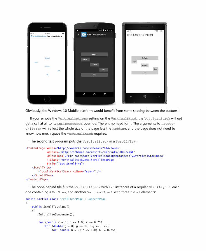
Obviously, the Windows 10 Mobile platform would benefit from some spacing between the buttons!
If you remove the VerticalOptions setting on the VerticalStack, the VerticalStack will not
get a call at all to its OnSizeRequest override. There is no need for it. The arguments to Layout-
Children will reflect the whole size of the page less the Padding, and the page does not need to
know how much space the VerticalStack requires.
The second test program puts the VerticalStack in a ScrollView:
<ContentPage xmlns="http://xamarin.com/schemas/2014/forms"
xmlns:x="http://schemas.microsoft.com/winfx/2009/xaml"
xmlns:local="clr-namespace:VerticalStackDemo;assembly=VerticalStackDemo"
x:Class="VerticalStackDemo.ScrollTestPage"
Title="Test Scrolling">
<ScrollView>
<local:VerticalStack x:Name="stack" />
</ScrollView>
</ContentPage>
The code-behind file fills the VerticalStack with 125 instances of a regular StackLayout, each
one containing a BoxView, and another VerticalStack with three Label elements:
public partial class ScrollTestPage : ContentPage
{
public ScrollTestPage()
{
InitializeComponent();
for (double r = 0; r <= 1.0; r += 0.25)
for (double g = 0; g <= 1.0; g += 0.25)
for (double b = 0; b <= 1.0; b += 0.25)
{
stack.Children.Add(new StackLayout
{
Orientation = StackOrientation.Horizontal,
Padding = 6,
Children =
{
new BoxView
{
Color = Color.FromRgb(r, g, b),
WidthRequest = 100,
HeightRequest = 100
},
new VerticalStack
{
VerticalOptions = LayoutOptions.Center,
Children =
{
new Label { Text = "Red = " + r.ToString("F2") },
new Label { Text = "Green = " + g.ToString("F2") },
new Label { Text = "Blue = " + b.ToString("F2") }
}
}
}
});
}
}
}
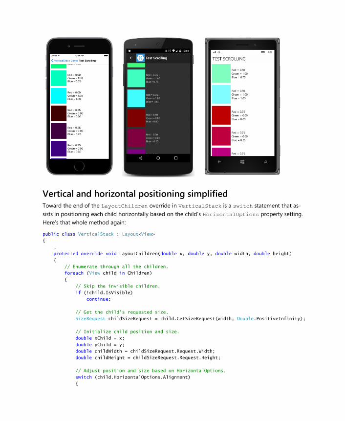
The VerticalStack is a child of a ScrollView with a vertical scrolling orientation, so it receives
an OnSizeRequest call with a height of Double.PositiveInfinity. The VerticalStack responds
with a height that encompasses all its children. The ScrollView uses that height together with its own
height (which is based on the size of the screen) to scroll its contents:
Vertical and horizontal positioning simplified Toward the end of the LayoutChildren override in VerticalStack is a switch statement that as-
sists in positioning each child horizontally based on the child’s HorizontalOptions property setting.
Here’s that whole method again:
public class VerticalStack : Layout<View>
{
…
protected override void LayoutChildren(double x, double y, double width, double height)
{
// Enumerate through all the children.
foreach (View child in Children)
{
// Skip the invisible children.
if (!child.IsVisible)
continue;
// Get the child's requested size.
SizeRequest childSizeRequest = child.GetSizeRequest(width, Double.PositiveInfinity);
// Initialize child position and size.
double xChild = x;
double yChild = y;
double childWidth = childSizeRequest.Request.Width;
double childHeight = childSizeRequest.Request.Height;
// Adjust position and size based on HorizontalOptions.
switch (child.HorizontalOptions.Alignment)
{
case LayoutAlignment.Start:
break;
case LayoutAlignment.Center:
xChild += (width - childWidth) / 2;
break;
case LayoutAlignment.End:
xChild += (width - childWidth);
break;
case LayoutAlignment.Fill:
childWidth = width;
break;
}
// Layout the child.
child.Layout(new Rectangle(xChild, yChild, childWidth, childHeight));
// Get the next child’s vertical position.
y += childHeight;
}
}
}
Positioning a child within a rectangle based on its HorizontalOptions and VerticalOptions
settings is something that comes up fairly frequently when writing layouts. For that reason, the Lay-
out<T> class includes a public static method that does it for you:
public static void LayoutChildIntoBoundingRegion(VisualElement child, Rectangle region)
You can rewrite the LayoutChildren method to use this helper method like so:
protected override void LayoutChildren(double x, double y, double width, double height)
{
// Enumerate through all the children.
foreach (View child in Children)
{
// Skip the invisible children.
if (!child.IsVisible)
continue;
// Get the child's requested size.
SizeRequest childSizeRequest = child.GetSizeRequest(width, Double.PositiveInfinity);
double childHeight = childSizeRequest.Request.Height;
// Layout the child.
LayoutChildIntoBoundingRegion(child, new Rectangle(x, y, width, childHeight));
// Calculate the next child vertical position.
y += childHeight;
}
}
That’s a considerable simplification! But as this call is used in other layout classes in this chapter, keep
in mind that it is equivalent to making a call to the child’s Layout method.
Notice that the rectangle you pass to LayoutChildIntoBoundingRegion encompasses the whole
area in which the child can reside. In this case, the width argument to the Rectangle constructor is
the width argument passed to LayoutChildren, which is the width of the VerticalLayout itself.
But the height argument to the Rectangle constructor is the height the specific child requires, which
is available from GetSizeRequest.
Unless the child has default HorizontalOptions and VerticalOptions settings of Fill, the
LayoutChildIntoBoundingRegion method itself needs to call GetSizeRequest on the child using
the Width and Height properties of that Rectangle value. That’s the only way it knows how to posi-
tion the child within the area provided in that Rectangle passed to the method call.
That means that when using the LayoutChildIntoBoundingRegion method, the VerticalLay-
out class could very well call GetSizeRequest three times on every child in each layout cycle.
Moreover, just as VerticalLayout calls GetSizeRequest on its children multiple times, and
sometimes with different arguments, the parent of VerticalLayout might call GetSizeRequest on
the VerticalLayout more than once with different arguments, which then results in more OnSize-
Request calls.
Calls to GetSizeRequest should not have any side effects. The calls don’t result in any other prop-
erties being set, and should merely retrieve information based on particular width and height con-
straints. GetSizeRequest may therefore be called more freely than Layout, which actually affects
how the element is sized and positioned.
But don’t call GetSizeRequest if you don’t need to. A call to GetSizeRequest is not required for
an element to be displayed on the screen. Only Layout is required.
In your own layout classes, it’s best to handle OnSizeRequest calls “blindly” without trying to fig-
ure out where the call is coming from, or why the arguments are what they are, or what it means to get
several calls with different arguments.
However, it is possible for your layout class to cache the result of the OnSizeRequest call so that
you can streamline subsequent calls. But doing this properly requires knowing about the process of
invalidation.
Invalidation Suppose you’ve assembled some layouts and views on a page, and for some reason the code-behind
file (or perhaps a trigger or behavior) changes the text of a Button, or maybe just a font size or attrib-
ute. That change might affect the size of the button, which might potentially have a ripple effect of
changes in layout through the rest of the page.
The process by which a change in an element on the page triggers a new layout is referred to as in-
validation. When something on the page is invalid, it’s means that it no longer has a correct size or po-
sition. A new layout cycle is required.
The process of invalidation begins with a protected virtual method defined by VisualElement:
protected virtual void InvalidateMeasure()
This method is protected. You can’t invalidate an element from external code. Elements must invalidate
themselves, generally when a property of the element changes. This commonly happens in the imple-
mentations of bindable properties. Whenever there’s a change in one of the element’s bindable prop-
erties that might result in a new size of the element, the property-changed handler usually calls In-
validateMeasure.
The InvalidateMeasure method fires an event so that any object external to the element might
be informed when the element no longer has a correct size:
public event EventHandler MeasureInvalidated;
The element’s parent generally handles this MeasureInvalidated event. However, the element
doesn’t do anything beyond firing this event. It doesn’t change its own layout size. That’s the responsi-
bility of the element’s parent. But any future call to GetSizeRequest will reflect the new size.
VisualElement itself defines 28 public properties, but only a few of them trigger calls to Invali-
dateMeasure and a subsequent firing of the MeasureInvalidated event. These properties are:
IsVisible
WidthRequest and MinimumWidthRequest
HeightRequest and MinimumHeightRequest
These are the only properties that VisualElement defines that cause a change to the layout size of
the element.
VisualElement defines some properties that might cause a change in the appearance of the ele-
ment but not a change to the layout size. These are BackgroundColor, IsEnabled, IsFocused, and
Opacity. Changes to these properties do not cause calls to InvalidateMeasure.
In addition, VisualElement defines eight transform properties that change the size of a rendered
element but do not change the size of the element as perceived in layout. These are AnchorX, An-
chorY, Rotation, RotationX, RotationY, Scale, TranslationX, and TranslationY.
The Behaviors, Style, and Triggers properties might indirectly affect layout size, but changes to
these properties (or the collections that these properties maintain) do not themselves cause Invali-
dateMeasure to be called. In addition, changes to the InputTransparent, Navigation, and Re-
sources properties do not affect layout size.
And then there are the five properties that are set by a call to Layout. These are Bounds, X, Y,
Width, and Height. These properties definitely should not—and do not—cause a call to Invali-
dateMeasure.
The View class adds three more properties to those defined by VisualElement. The GestureRec-
ognizers property doesn’t affect layout size, but changes to the following two properties cause a call
to InvalidateMeasure:
HorizontalOptions
VerticalOptions
The classes that derive from View also make calls to InvalidateMeasure whenever a property
changes that might cause a change in the element’s size. For example, Label calls InvalidateMeas-
ure whenever any of the following properties change:
Text and FormattedText
FontFamily, FontSize, and FontAttributes
LineBreakMode
Label does not call InvalidateMeasure when the TextColor property changes. That affects the
appearance of the text but not its size. Label also does not call InvalidateMeasure when the Hori-
zontalTextAlignment and VerticalTextAlignment properties change. These properties govern
the alignment of the text within the total size of the Label, but they do not affect the size of the La-
bel itself.
The Layout class builds on the invalidation infrastructure in several crucial ways. First, Layout de-
fines a method similar to InvalidateMeasure called InvalidateLayout:
protected virtual void InvalidateLayout()
A Layout derivative class should call InvalidateLayout whenever a change is made that affects how
the layout class positions and sizes its children.
The Layout class itself calls InvalidateLayout whenever a child is added or removed from its
Content property (in the case of ContentView, Frame, and ScrollView) or its Children collection
(in the case of Layout<View> derivatives).
If you do not want your layout class to call InvalidateLayout when a child is added or removed,
you can override the ShouldInvalidateOnChildAdded and ShouldInvalidateOnChildRemoved
methods and simply return false instead of true. Your class can then implement a custom process
when children are added or removed. The Layout<T> class overrides the virtual methods named
OnChildAdded and OnChildRemoved defined by the Element class, but your class should instead
override the OnAdded and OnRemoved methods for custom processing.
In addition, the Layout class sets a handler for the MeasureInvalidated event on every child
added to its Content property or Children collection, and detaches the handler when the child is re-
moved. The Page class does something similar. Both the Page and Layout classes expose overridable
OnChildMeasureInvalidated methods if you want to be notified when these events are fired.
These MeasureInvalidated event handlers are really the crucial part of the process because every
element in the visual tree that has children is alerted whenever one of its children changes size. This is
how a change in the size of an element very deep in the visual tree can cause changes that ripple up
the tree.
The Layout class, however, attempts to restrict the impact of a change in a child’s size on the total
layout of the page. If the particular layout is constrained in size, then a change in the size of a child
need not affect anything higher than this layout in the visual tree.
In most cases, a change in the size of a layout affects how the layout arranges its children. For this
reason, any change in a layout’s size will precipitate a layout cycle for the layout. The layout will get
calls to its OnSizeRequested and LayoutChildren methods.
However, the opposite is not always true. The way in which a layout arranges its children might af-
fect the layout’s size, or it might not. Most obviously, the layout’s size will not be affected by how the
layout arranges its children if the layout’s size is fully constrained.
This difference becomes important when the layout defines its own properties such as the Spacing
and Orientation properties defined by StackLayout. When such a property changes value, the lay-
out must invalidate itself to cause a new layout cycle to occur. Should the layout call Invalidate-
Measure or InvalidateLayout?
In most cases, the layout should call InvalidateLayout. This guarantees that the layout gets a call
to its LayoutChildren method even if the layout is fully constrained in size. If the layout calls Inval-
idateMeasure, then a new layout pass will be generated only if the layout is not fully constrained in
size. If the layout is constrained in size, then a call to InvalidateMeasure will do nothing.
Some rules for coding layouts From the discussion above, you can formulate several rules for your own Layout<View> derivatives:
Rule 1: If your layout class defines properties such as Spacing or Orientation, these properties
should be backed by bindable properties. In most cases, the property-changed handlers of these bind-
able properties should call InvalidateLayout. Calling InvalidateMeasure should be restricted to
cases where a property change affects the size of the layout only and not how it arranges its children,
but a real-life example is hard to imagine.
Rule 2: Your layout class might define attached bindable properties for its children similar to the
Row, Column, RowSpan, and ColumnSpan properties defined by Grid. As you know, these properties
are defined by the layout class, but they are intended to be set on the children of the layout. In this
case, your layout class should override the OnAdded method to add a PropertyChanged handler to
each child of the layout, and override OnRemoved to remove that handler. The PropertyChanged
handler should check whether the property being changed on the child is one of the attached bindable
properties that your class has defined, and if so, your layout should usually respond by calling Invali-
dateLayout.
Rule 3: If you want to implement a cache (or retain other information) to minimize repetitive pro-
cessing of calls to the GetSizeRequest methods of the layout’s children, then you should also over-
ride the InvalidateLayout method to be notified when children are added to or removed from the
layout, and the OnChildMeasureInvalidated method to be notified when one of the layout’s chil-
dren changes size. In both cases, your layout class should respond by clearing that cache or discarding
the retained information.
It’s possible for the layout to also clear the cache or discard retained information when the layout
gets a call to its InvalidateMeasure method. However, generally the cache is a dictionary based on
sizes passed to the OnSizeRequest and LayoutChildren override, so those sizes will be different
anyway.
All these techniques will be demonstrated in the pages ahead.
A layout with properties The StackLayout is certainly handy, but it’s only a single row or column of children. If you want mul-
tiple rows and columns, you can use the Grid, but the application must explicitly set the number of
rows and columns, and that requires having a good idea of the size of the children.
A more useful layout to accommodate an indefinite number of children would begin positioning
children in a row much like a horizontal StackLayout, but then go to a second row if necessary, and
to a third, continuing for however many rows are necessary. If the number of rows is expected to ex-
ceed the height of the screen, then the layout could be made a child of a ScrollView.
This is the idea behind WrapLayout. It arranges its children in columns horizontally across the
screen until it gets to the edge, at which point it wraps the display of subsequent children to the next
row, and so forth.
But let’s make it a little more versatile: Let’s give it an Orientation property like StackLayout.
This allows a program using WrapLayout to specify that it begin by arranging its children in rows
down the screen, and should then go to a second column if necessary. With this alternative orientation,
the WrapLayout could be horizontally scrolled.
Let’s also give WrapLayout two properties, named ColumnSpacing and RowSpacing, just like
Grid.
The WrapLayout has the potential of being algorithmically rather complex if it really allows for chil-
dren of a variety of different sizes. The first row might have four children, then three children in the
second row, and so forth.
Let’s instead make a simple assumption that all the children have the same size—or more precisely,
that the same amount of space is allocated for each child based on the maximum size of the children.
This is sometimes called a cell size, and WrapLayout will calculate a cell size that is large enough for
every child. Children smaller than the cell size can be positioned within that cell based on their Hori-
zontalOptions and VerticalOptions settings.
WrapLayout is useful enough to justify its inclusion in the Xamarin.FormsBook.Toolkit library.
The following enumeration contains the two orientation options with wordy but unambiguous
descriptions:
namespace Xamarin.FormsBook.Toolkit
{
public enum WrapOrientation
{
HorizontalThenVertical,
VerticalThenHorizontal
}
}
WrapLayout defines three properties backed by bindable properties. The property-changed han-
dler of each bindable property simply calls InvalidateLayout to trigger a new layout pass on the
layout:
namespace Xamarin.FormsBook.Toolkit
{
public class WrapLayout : Layout<View>
{
…
public static readonly BindableProperty OrientationProperty =
BindableProperty.Create(
"Orientation",
typeof(WrapOrientation),
typeof(WrapLayout),
WrapOrientation.HorizontalThenVertical,
propertyChanged: (bindable, oldValue, newValue) =>
{
((WrapLayout)bindable).InvalidateLayout();
});
public static readonly BindableProperty ColumnSpacingProperty =
BindableProperty.Create(
"ColumnSpacing",
typeof(double),
typeof(WrapLayout),
6.0,
propertyChanged: (bindable, oldvalue, newvalue) =>
{
((WrapLayout)bindable).InvalidateLayout();
});
public static readonly BindableProperty RowSpacingProperty =
BindableProperty.Create(
"RowSpacing",
typeof(double),
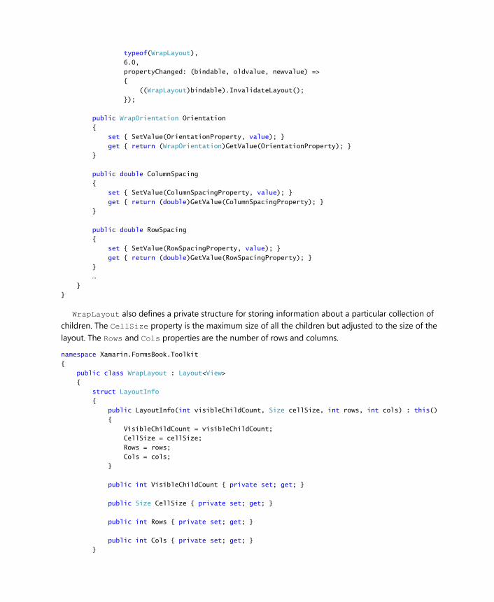
typeof(WrapLayout),
6.0,
propertyChanged: (bindable, oldvalue, newvalue) =>
{
((WrapLayout)bindable).InvalidateLayout();
});
public WrapOrientation Orientation
{
set { SetValue(OrientationProperty, value); }
get { return (WrapOrientation)GetValue(OrientationProperty); }
}
public double ColumnSpacing
{
set { SetValue(ColumnSpacingProperty, value); }
get { return (double)GetValue(ColumnSpacingProperty); }
}
public double RowSpacing
{
set { SetValue(RowSpacingProperty, value); }
get { return (double)GetValue(RowSpacingProperty); }
}
…
}
}
WrapLayout also defines a private structure for storing information about a particular collection of
children. The CellSize property is the maximum size of all the children but adjusted to the size of the
layout. The Rows and Cols properties are the number of rows and columns.
namespace Xamarin.FormsBook.Toolkit
{
public class WrapLayout : Layout<View>
{
struct LayoutInfo
{
public LayoutInfo(int visibleChildCount, Size cellSize, int rows, int cols) : this()
{
VisibleChildCount = visibleChildCount;
CellSize = cellSize;
Rows = rows;
Cols = cols;
}
public int VisibleChildCount { private set; get; }
public Size CellSize { private set; get; }
public int Rows { private set; get; }
public int Cols { private set; get; }
}
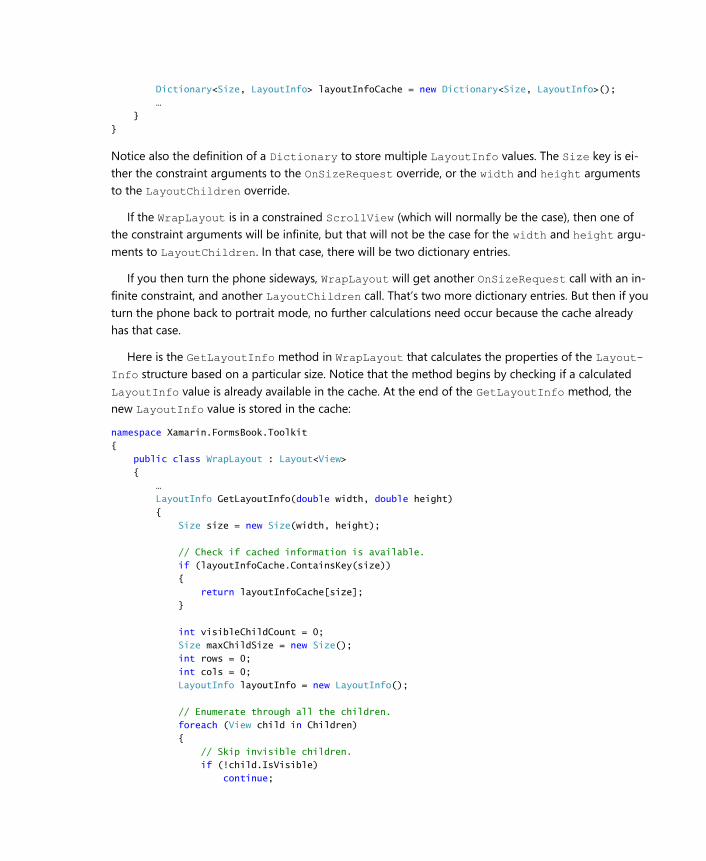
Dictionary<Size, LayoutInfo> layoutInfoCache = new Dictionary<Size, LayoutInfo>();
…
}
}
Notice also the definition of a Dictionary to store multiple LayoutInfo values. The Size key is ei-
ther the constraint arguments to the OnSizeRequest override, or the width and height arguments
to the LayoutChildren override.
If the WrapLayout is in a constrained ScrollView (which will normally be the case), then one of
the constraint arguments will be infinite, but that will not be the case for the width and height argu-
ments to LayoutChildren. In that case, there will be two dictionary entries.
If you then turn the phone sideways, WrapLayout will get another OnSizeRequest call with an in-
finite constraint, and another LayoutChildren call. That’s two more dictionary entries. But then if you
turn the phone back to portrait mode, no further calculations need occur because the cache already
has that case.
Here is the GetLayoutInfo method in WrapLayout that calculates the properties of the Layout-
Info structure based on a particular size. Notice that the method begins by checking if a calculated
LayoutInfo value is already available in the cache. At the end of the GetLayoutInfo method, the
new LayoutInfo value is stored in the cache:
namespace Xamarin.FormsBook.Toolkit
{
public class WrapLayout : Layout<View>
{
…
LayoutInfo GetLayoutInfo(double width, double height)
{
Size size = new Size(width, height);
// Check if cached information is available.
if (layoutInfoCache.ContainsKey(size))
{
return layoutInfoCache[size];
}
int visibleChildCount = 0;
Size maxChildSize = new Size();
int rows = 0;
int cols = 0;
LayoutInfo layoutInfo = new LayoutInfo();
// Enumerate through all the children.
foreach (View child in Children)
{
// Skip invisible children.
if (!child.IsVisible)
continue;
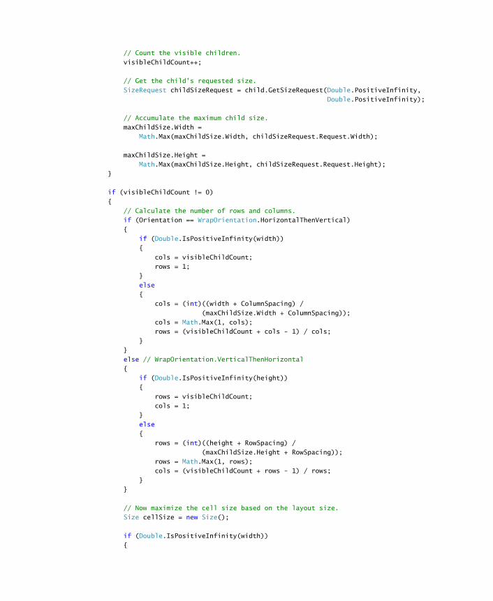
// Count the visible children.
visibleChildCount++;
// Get the child's requested size.
SizeRequest childSizeRequest = child.GetSizeRequest(Double.PositiveInfinity,
Double.PositiveInfinity);
// Accumulate the maximum child size.
maxChildSize.Width =
Math.Max(maxChildSize.Width, childSizeRequest.Request.Width);
maxChildSize.Height =
Math.Max(maxChildSize.Height, childSizeRequest.Request.Height);
}
if (visibleChildCount != 0)
{
// Calculate the number of rows and columns.
if (Orientation == WrapOrientation.HorizontalThenVertical)
{
if (Double.IsPositiveInfinity(width))
{
cols = visibleChildCount;
rows = 1;
}
else
{
cols = (int)((width + ColumnSpacing) /
(maxChildSize.Width + ColumnSpacing));
cols = Math.Max(1, cols);
rows = (visibleChildCount + cols - 1) / cols;
}
}
else // WrapOrientation.VerticalThenHorizontal
{
if (Double.IsPositiveInfinity(height))
{
rows = visibleChildCount;
cols = 1;
}
else
{
rows = (int)((height + RowSpacing) /
(maxChildSize.Height + RowSpacing));
rows = Math.Max(1, rows);
cols = (visibleChildCount + rows - 1) / rows;
}
}
// Now maximize the cell size based on the layout size.
Size cellSize = new Size();
if (Double.IsPositiveInfinity(width))
{
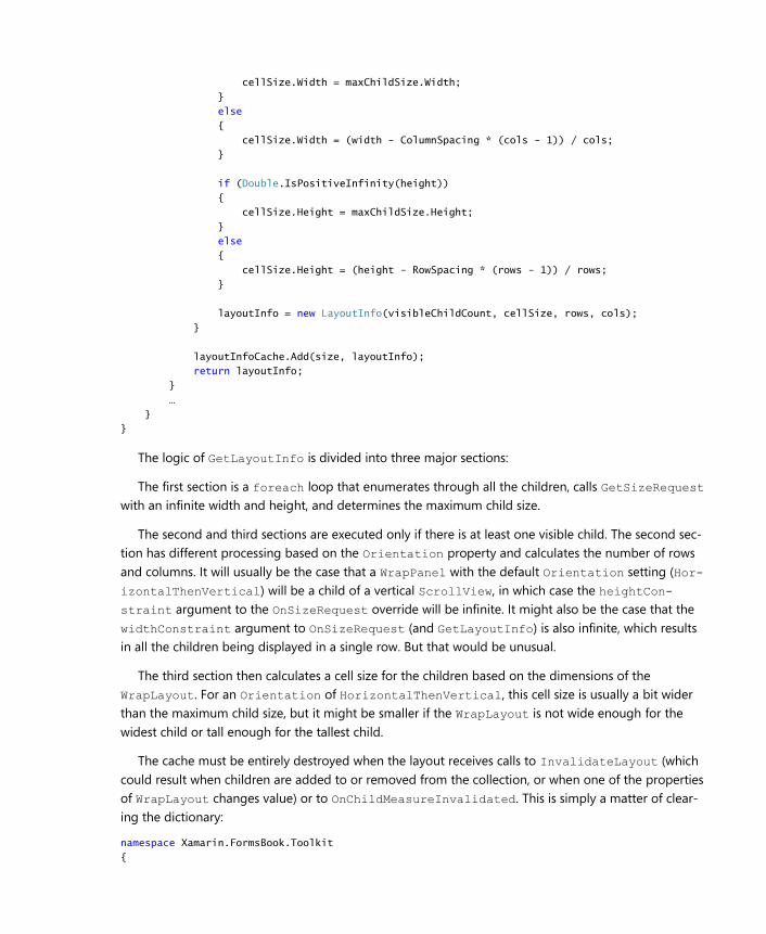
cellSize.Width = maxChildSize.Width;
}
else
{
cellSize.Width = (width - ColumnSpacing * (cols - 1)) / cols;
}
if (Double.IsPositiveInfinity(height))
{
cellSize.Height = maxChildSize.Height;
}
else
{
cellSize.Height = (height - RowSpacing * (rows - 1)) / rows;
}
layoutInfo = new LayoutInfo(visibleChildCount, cellSize, rows, cols);
}
layoutInfoCache.Add(size, layoutInfo);
return layoutInfo;
}
…
}
}
The logic of GetLayoutInfo is divided into three major sections:
The first section is a foreach loop that enumerates through all the children, calls GetSizeRequest
with an infinite width and height, and determines the maximum child size.
The second and third sections are executed only if there is at least one visible child. The second sec-
tion has different processing based on the Orientation property and calculates the number of rows
and columns. It will usually be the case that a WrapPanel with the default Orientation setting (Hor-
izontalThenVertical) will be a child of a vertical ScrollView, in which case the heightCon-
straint argument to the OnSizeRequest override will be infinite. It might also be the case that the
widthConstraint argument to OnSizeRequest (and GetLayoutInfo) is also infinite, which results
in all the children being displayed in a single row. But that would be unusual.
The third section then calculates a cell size for the children based on the dimensions of the
WrapLayout. For an Orientation of HorizontalThenVertical, this cell size is usually a bit wider
than the maximum child size, but it might be smaller if the WrapLayout is not wide enough for the
widest child or tall enough for the tallest child.
The cache must be entirely destroyed when the layout receives calls to InvalidateLayout (which
could result when children are added to or removed from the collection, or when one of the properties
of WrapLayout changes value) or to OnChildMeasureInvalidated. This is simply a matter of clear-
ing the dictionary:
namespace Xamarin.FormsBook.Toolkit
{
public class WrapLayout : Layout<View>
{
…
protected override void InvalidateLayout()
{
base.InvalidateLayout();
// Discard all layout information for children added or removed.
layoutInfoCache.Clear();
}
protected override void OnChildMeasureInvalidated()
{
base.OnChildMeasureInvalidated();
// Discard all layout information for child size changed.
layoutInfoCache.Clear();
}
}
}
Finally, we’re ready to look at the two required methods. The OnSizeRequest override simply calls
GetLayoutInfo and constructs a SizeRequest value from the returned information together with
the RowSpacing and ColumnSpacing properties:
namespace Xamarin.FormsBook.Toolkit
{
public class WrapLayout : Layout<View>
{
…
protected override SizeRequest OnSizeRequest(double widthConstraint,
double heightConstraint)
{
LayoutInfo layoutInfo = GetLayoutInfo(widthConstraint, heightConstraint);
if (layoutInfo.VisibleChildCount == 0)
{
return new SizeRequest();
}
Size totalSize = new Size(layoutInfo.CellSize.Width * layoutInfo.Cols +
ColumnSpacing * (layoutInfo.Cols - 1),
layoutInfo.CellSize.Height * layoutInfo.Rows +
RowSpacing * (layoutInfo.Rows - 1));
return new SizeRequest(totalSize);
}
…
}
}
The LayoutChildren override begins with a call to GetLayoutInfo and then enumerates all the
children to size and position them within each child’s cell. This logic also requires separate processing
based on the Orientation property:
namespace Xamarin.FormsBook.Toolkit
{
public class WrapLayout : Layout<View>
{
…
protected override void LayoutChildren(double x, double y, double width, double height)
{
LayoutInfo layoutInfo = GetLayoutInfo(width, height);
if (layoutInfo.VisibleChildCount == 0)
return;
double xChild = x;
double yChild = y;
int row = 0;
int col = 0;
foreach (View child in Children)
{
if (!child.IsVisible)
continue;
LayoutChildIntoBoundingRegion(child,
new Rectangle(new Point(xChild, yChild), layoutInfo.CellSize));
if (Orientation == WrapOrientation.HorizontalThenVertical)
{
if (++col == layoutInfo.Cols)
{
col = 0;
row++;
xChild = x;
yChild += RowSpacing + layoutInfo.CellSize.Height;
}
else
{
xChild += ColumnSpacing + layoutInfo.CellSize.Width;
}
}
else // Orientation == WrapOrientation.VerticalThenHorizontal
{
if (++row == layoutInfo.Rows)
{
col++;
row = 0;
xChild += ColumnSpacing + layoutInfo.CellSize.Width;
yChild = y;
}
else
{
yChild += RowSpacing + layoutInfo.CellSize.Height;
}
}
}
}
…
}
}
Let’s try it out! The XAML file of the PhotoWrap program simply contains a WrapPanel with de-
fault property settings in a ScrollView:
<ContentPage xmlns="http://xamarin.com/schemas/2014/forms"
xmlns:x="http://schemas.microsoft.com/winfx/2009/xaml"
xmlns:toolkit=
"clr-namespace:Xamarin.FormsBook.Toolkit;assembly=Xamarin.FormsBook.Toolkit"
x:Class="PhotoWrap.PhotoWrapPage">
<ContentPage.Padding>
<OnPlatform x:TypeArguments="Thickness"
iOS="0, 20, 0, 0" />
</ContentPage.Padding>
<ScrollView>
<toolkit:WrapLayout x:Name="wrapLayout" />
</ScrollView>
</ContentPage>
The code-behind file accesses the JSON file containing the list of stock photos previously used in
several sample programs in this book. The constructor creates an Image element for each bitmap in
the list and adds it to the WrapLayout:
public partial class PhotoWrapPage : ContentPage
{
[DataContract]
class ImageList
{
[DataMember(Name = "photos")]
public List<string> Photos = null;
}
WebRequest request;
static readonly int imageDimension = Device.OnPlatform(240, 240, 120);
static readonly string urlSuffix =
String.Format("?width={0}&height={0}&mode=max", imageDimension);
public PhotoWrapPage()
{
InitializeComponent();
// Get list of stock photos.
Uri uri = new Uri("http://docs.xamarin.com/demo/stock.json");
request = WebRequest.Create(uri);
request.BeginGetResponse(WebRequestCallback, null);
}
void WebRequestCallback(IAsyncResult result)
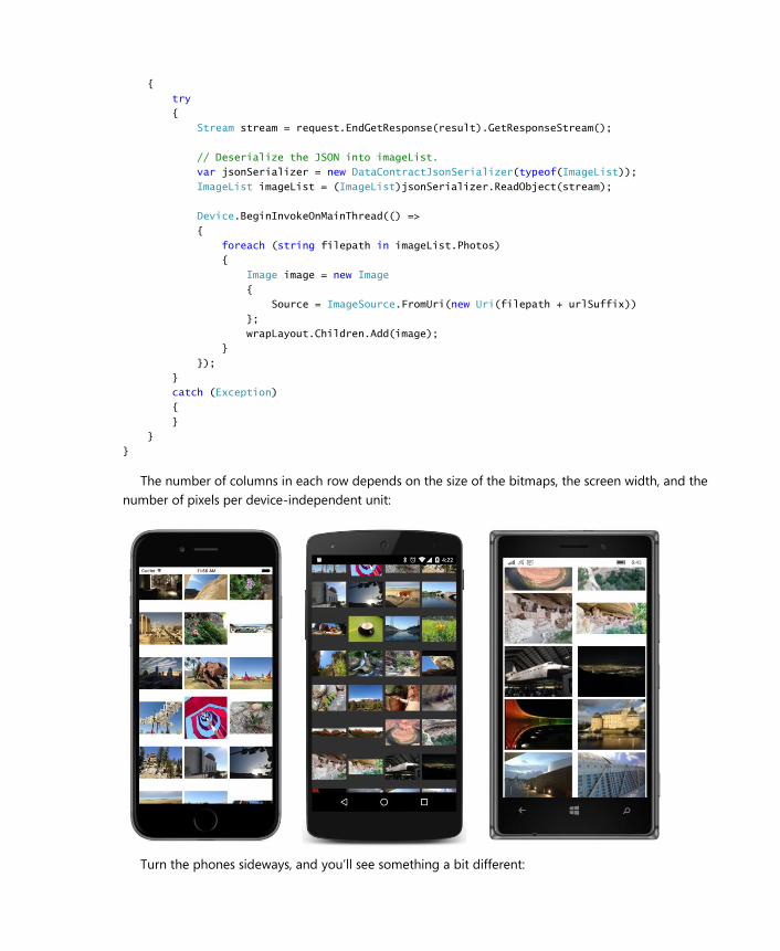
{
try
{
Stream stream = request.EndGetResponse(result).GetResponseStream();
// Deserialize the JSON into imageList.
var jsonSerializer = new DataContractJsonSerializer(typeof(ImageList));
ImageList imageList = (ImageList)jsonSerializer.ReadObject(stream);
Device.BeginInvokeOnMainThread(() =>
{
foreach (string filepath in imageList.Photos)
{
Image image = new Image
{
Source = ImageSource.FromUri(new Uri(filepath + urlSuffix))
};
wrapLayout.Children.Add(image);
}
});
}
catch (Exception)
{
}
}
}
The number of columns in each row depends on the size of the bitmaps, the screen width, and the
number of pixels per device-independent unit:
Turn the phones sideways, and you’ll see something a bit different:
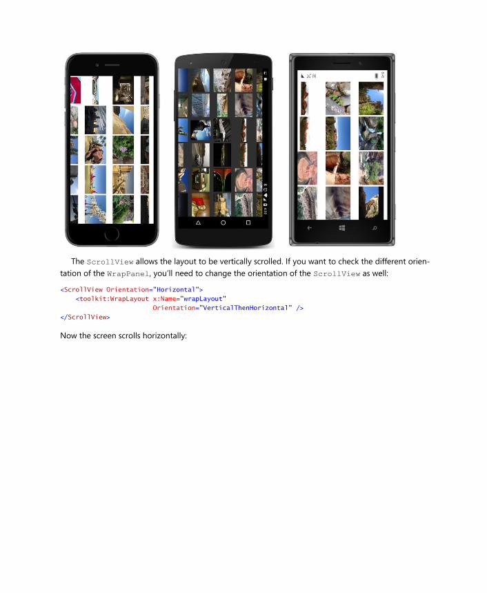
The ScrollView allows the layout to be vertically scrolled. If you want to check the different orien-
tation of the WrapPanel, you’ll need to change the orientation of the ScrollView as well:
<ScrollView Orientation="Horizontal">
<toolkit:WrapLayout x:Name="wrapLayout"
Orientation="VerticalThenHorizontal" />
</ScrollView>
Now the screen scrolls horizontally:
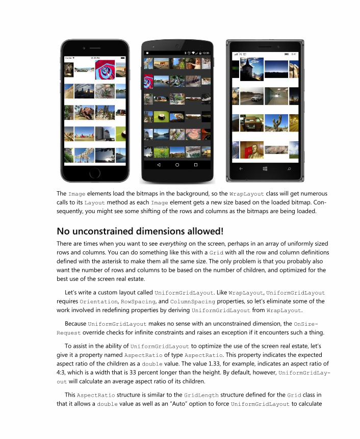
The Image elements load the bitmaps in the background, so the WrapLayout class will get numerous
calls to its Layout method as each Image element gets a new size based on the loaded bitmap. Con-
sequently, you might see some shifting of the rows and columns as the bitmaps are being loaded.
No unconstrained dimensions allowed! There are times when you want to see everything on the screen, perhaps in an array of uniformly sized
rows and columns. You can do something like this with a Grid with all the row and column definitions
defined with the asterisk to make them all the same size. The only problem is that you probably also
want the number of rows and columns to be based on the number of children, and optimized for the
best use of the screen real estate.
Let’s write a custom layout called UniformGridLayout. Like WrapLayout, UniformGridLayout
requires Orientation, RowSpacing, and ColumnSpacing properties, so let’s eliminate some of the
work involved in redefining properties by deriving UniformGridLayout from WrapLayout.
Because UniformGridLayout makes no sense with an unconstrained dimension, the OnSize-
Request override checks for infinite constraints and raises an exception if it encounters such a thing.
To assist in the ability of UniformGridLayout to optimize the use of the screen real estate, let’s
give it a property named AspectRatio of type AspectRatio. This property indicates the expected
aspect ratio of the children as a double value. The value 1.33, for example, indicates an aspect ratio of
4:3, which is a width that is 33 percent longer than the height. By default, however, UniformGridLay-
out will calculate an average aspect ratio of its children.
This AspectRatio structure is similar to the GridLength structure defined for the Grid class in
that it allows a double value as well as an “Auto” option to force UniformGridLayout to calculate
that average aspect ratio:
namespace Xamarin.FormsBook.Toolkit
{
[TypeConverter(typeof(AspectRatioTypeConverter))]
public struct AspectRatio
{
public AspectRatio(double value)
{
if (value < 0)
throw new FormatException("AspectRatio value must be greater than 0, " +
"or set to 0 to indicate Auto");
Value = value;
}
public static AspectRatio Auto
{
get
{
return new AspectRatio();
}
}
public double Value { private set; get; }
public bool IsAuto { get { return Value == 0; } }
public override string ToString()
{
return Value == 0 ? "Auto" : Value.ToString();
}
}
}
The “Auto” option is indicated by a Value property of 0. An application using UniformGridLayout
can create such an AspectRatio value with the parameterless constructor, or by passing a 0 to the
defined constructor, or by using the static Auto property.
I’m sure you’d like to be able to set an AspectRatio property in XAML, so the structure is flagged
with a TypeConverter attribute. The AspectRatioTypeConverter class can handle a string with the
word “Auto” or a double:
namespace Xamarin.FormsBook.Toolkit
{
public class AspectRatioTypeConverter : TypeConverter
{
public override bool CanConvertFrom(Type sourceType)
{
return sourceType == typeof(string);
}
public override object ConvertFrom(CultureInfo culture, object value)
{
string str = value as string;
if (String.IsNullOrWhiteSpace(str))
return null;
str = str.Trim();
double aspectValue;
if (String.Compare(str, "auto", StringComparison.OrdinalIgnoreCase) == 0)
return AspectRatio.Auto;
if (Double.TryParse(str, NumberStyles.Number,
CultureInfo.InvariantCulture, out aspectValue))
return new AspectRatio(aspectValue);
throw new FormatException("AspectRatio must be Auto or numeric");
}
}
}
The UniformGridLayout class derives from WrapLayout solely for inheriting the three bindable
properties that WrapLayout defines. To those properties, UniformGridLayout adds the AspectRa-
tio property:
namespace Xamarin.FormsBook.Toolkit
{
public class UniformGridLayout : WrapLayout
{
public static readonly BindableProperty AspectRatioProperty =
BindableProperty.Create(
"AspectRatio",
typeof(AspectRatio),
typeof(UniformGridLayout),
AspectRatio.Auto,
propertyChanged: (bindable, oldvalue, newvalue) =>
{
((UniformGridLayout)bindable).InvalidateLayout();
});
public AspectRatio AspectRatio
{
set { SetValue(AspectRatioProperty, value); }
get { return (AspectRatio)GetValue(AspectRatioProperty); }
}
…
}
}
The OnSizeRequest override begins by checking if the constraints are infinite and raising an ex-
ception if that is the case. Otherwise, it requests the entire area unless it has no visible children:
namespace Xamarin.FormsBook.Toolkit
{
public class UniformGridLayout : WrapLayout
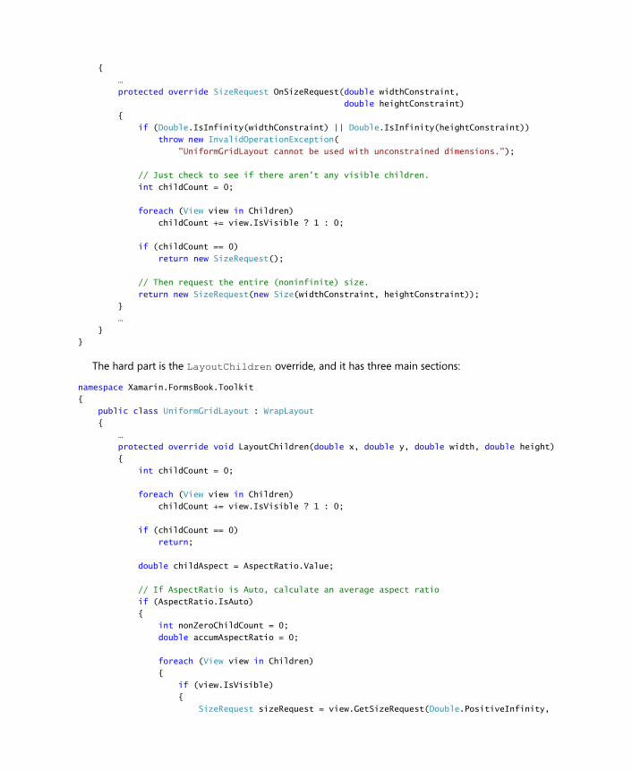
{
…
protected override SizeRequest OnSizeRequest(double widthConstraint,
double heightConstraint)
{
if (Double.IsInfinity(widthConstraint) || Double.IsInfinity(heightConstraint))
throw new InvalidOperationException(
"UniformGridLayout cannot be used with unconstrained dimensions.");
// Just check to see if there aren't any visible children.
int childCount = 0;
foreach (View view in Children)
childCount += view.IsVisible ? 1 : 0;
if (childCount == 0)
return new SizeRequest();
// Then request the entire (noninfinite) size.
return new SizeRequest(new Size(widthConstraint, heightConstraint));
}
…
}
}
The hard part is the LayoutChildren override, and it has three main sections:
namespace Xamarin.FormsBook.Toolkit
{
public class UniformGridLayout : WrapLayout
{
…
protected override void LayoutChildren(double x, double y, double width, double height)
{
int childCount = 0;
foreach (View view in Children)
childCount += view.IsVisible ? 1 : 0;
if (childCount == 0)
return;
double childAspect = AspectRatio.Value;
// If AspectRatio is Auto, calculate an average aspect ratio
if (AspectRatio.IsAuto)
{
int nonZeroChildCount = 0;
double accumAspectRatio = 0;
foreach (View view in Children)
{
if (view.IsVisible)
{
SizeRequest sizeRequest = view.GetSizeRequest(Double.PositiveInfinity,
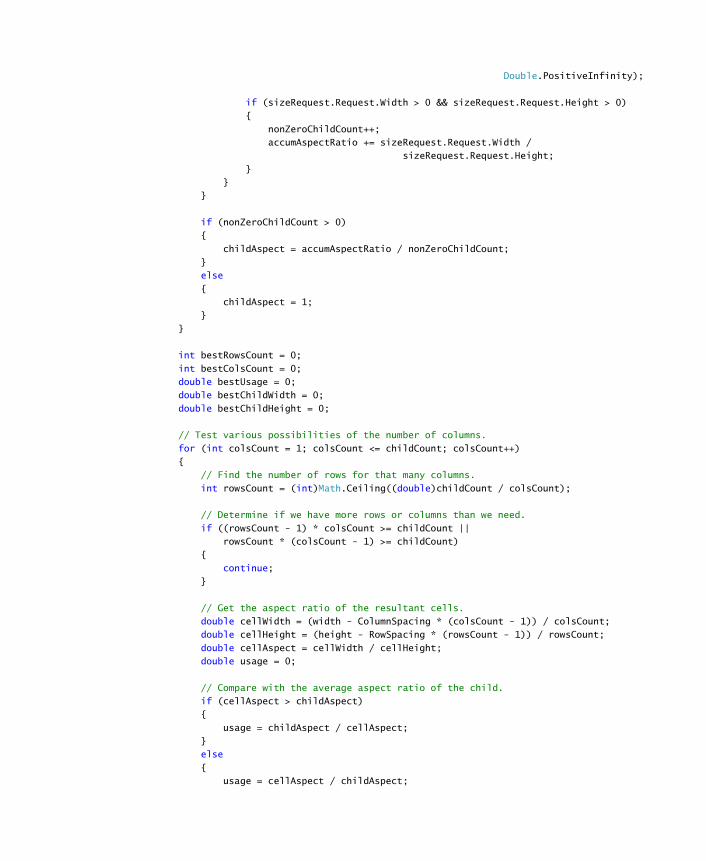
Double.PositiveInfinity);
if (sizeRequest.Request.Width > 0 && sizeRequest.Request.Height > 0)
{
nonZeroChildCount++;
accumAspectRatio += sizeRequest.Request.Width /
sizeRequest.Request.Height;
}
}
}
if (nonZeroChildCount > 0)
{
childAspect = accumAspectRatio / nonZeroChildCount;
}
else
{
childAspect = 1;
}
}
int bestRowsCount = 0;
int bestColsCount = 0;
double bestUsage = 0;
double bestChildWidth = 0;
double bestChildHeight = 0;
// Test various possibilities of the number of columns.
for (int colsCount = 1; colsCount <= childCount; colsCount++)
{
// Find the number of rows for that many columns.
int rowsCount = (int)Math.Ceiling((double)childCount / colsCount);
// Determine if we have more rows or columns than we need.
if ((rowsCount - 1) * colsCount >= childCount ||
rowsCount * (colsCount - 1) >= childCount)
{
continue;
}
// Get the aspect ratio of the resultant cells.
double cellWidth = (width - ColumnSpacing * (colsCount - 1)) / colsCount;
double cellHeight = (height - RowSpacing * (rowsCount - 1)) / rowsCount;
double cellAspect = cellWidth / cellHeight;
double usage = 0;
// Compare with the average aspect ratio of the child.
if (cellAspect > childAspect)
{
usage = childAspect / cellAspect;
}
else
{
usage = cellAspect / childAspect;
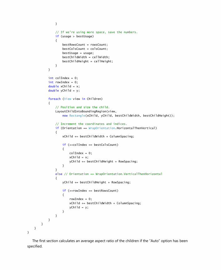
}
// If we're using more space, save the numbers.
if (usage > bestUsage)
{
bestRowsCount = rowsCount;
bestColsCount = colsCount;
bestUsage = usage;
bestChildWidth = cellWidth;
bestChildHeight = cellHeight;
}
}
int colIndex = 0;
int rowIndex = 0;
double xChild = x;
double yChild = y;
foreach (View view in Children)
{
// Position and size the child.
LayoutChildIntoBoundingRegion(view,
new Rectangle(xChild, yChild, bestChildWidth, bestChildHeight));
// Increment the coordinates and indices.
if (Orientation == WrapOrientation.HorizontalThenVertical)
{
xChild += bestChildWidth + ColumnSpacing;
if (++colIndex == bestColsCount)
{
colIndex = 0;
xChild = x;
yChild += bestChildHeight + RowSpacing;
}
}
else // Orientation == WrapOrientation.VerticalThenHorizontal
{
yChild += bestChildHeight + RowSpacing;
if (++rowIndex == bestRowsCount)
{
rowIndex = 0;
xChild += bestChildWidth + ColumnSpacing;
yChild = y;
}
}
}
}
}
}
The first section calculates an average aspect ratio of the children if the “Auto” option has been
specified.
The second section loops through different combinations of rows and columns and determines
which combination results in the best use of the available space. The crucial calculation is this:
if (cellAspect > childAspect)
{
usage = childAspect / cellAspect;
}
else
{
usage = cellAspect / childAspect;
}
For example, suppose that the childAspect that is calculated based on the average of all the children
is 1.5, and for a particular combination of rows and columns the cellAspect value is 2. A child with
an aspect ratio of 1.5 will occupy only 75 percent of a cell with an aspect ratio of 2. If the cellAspect
is instead 0.75, then the child will occupy only 50 percent of that cell.
The third section then gives each child a size and position within the grid. This requires different
processing based on the Orientation property.
Let’s try it out. The PhotoGrid XAML file fills the page (except for the top padding on the iPhone)
with a UniformGridLayout with two properties set:
<ContentPage xmlns="http://xamarin.com/schemas/2014/forms"
xmlns:x="http://schemas.microsoft.com/winfx/2009/xaml"
xmlns:toolkit=
"clr-namespace:Xamarin.FormsBook.Toolkit;assembly=Xamarin.FormsBook.Toolkit"
x:Class="PhotoGrid.PhotoGridPage">
<ContentPage.Padding>
<OnPlatform x:TypeArguments="Thickness"
iOS="0, 20, 0, 0" />
</ContentPage.Padding>
<toolkit:UniformGridLayout x:Name="uniformGridLayout"
Orientation="VerticalThenHorizontal"
AspectRatio="Auto" />
</ContentPage>
The code-behind file is virtually identical to the one in PhotoWrap, and here’s the result:
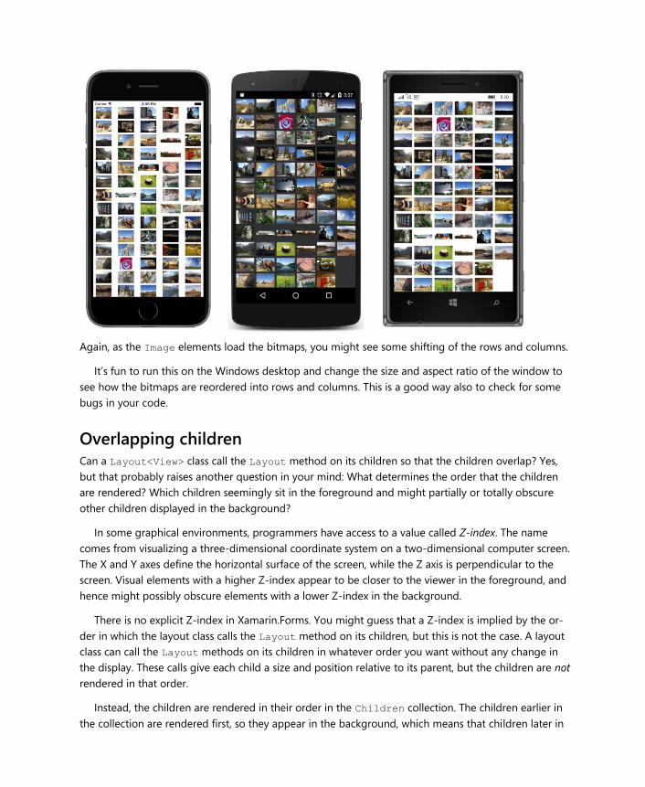
Again, as the Image elements load the bitmaps, you might see some shifting of the rows and columns.
It’s fun to run this on the Windows desktop and change the size and aspect ratio of the window to
see how the bitmaps are reordered into rows and columns. This is a good way also to check for some
bugs in your code.
Overlapping children Can a Layout<View> class call the Layout method on its children so that the children overlap? Yes,
but that probably raises another question in your mind: What determines the order that the children
are rendered? Which children seemingly sit in the foreground and might partially or totally obscure
other children displayed in the background?
In some graphical environments, programmers have access to a value called Z-index. The name
comes from visualizing a three-dimensional coordinate system on a two-dimensional computer screen.
The X and Y axes define the horizontal surface of the screen, while the Z axis is perpendicular to the
screen. Visual elements with a higher Z-index appear to be closer to the viewer in the foreground, and
hence might possibly obscure elements with a lower Z-index in the background.
There is no explicit Z-index in Xamarin.Forms. You might guess that a Z-index is implied by the or-
der in which the layout class calls the Layout method on its children, but this is not the case. A layout
class can call the Layout methods on its children in whatever order you want without any change in
the display. These calls give each child a size and position relative to its parent, but the children are not
rendered in that order.
Instead, the children are rendered in their order in the Children collection. The children earlier in
the collection are rendered first, so they appear in the background, which means that children later in
the collection appear to be in the foreground and can obscure those earlier children.
The Layout class defines two methods that allow you to move a child to the beginning or end of
the Children collection. These methods are:
LowerChild — moves a child to the beginning of the Children collection, and visually to the
background.
RaiseChild — moves a child to the end of the Children collection, and visually to the fore-
ground.
The child must already be a part of the Children collection for these methods to work. These calls re-
sult in a call to the protected OnChildrenReordered method defined by VisualElement and a fir-
ing of the ChildrenReordered event.
At the time this chapter was written, the LowerChild and RaiseChild methods do not work on
the various Windows platforms. However, the Children property defined by Layout<T> is of type
IList<T>, so you can also move children in and out of the collection with calls to Add, Insert, Re-
move, and RemoveAt. Regardless of how you do it, any change to the contents of the Children col-
lection results in a call to LayoutInvalidated and a new layout cycle.
These issues arise when you want to write a layout class that overlaps its children, but you also want
the option to bring a partially obscured child out of hiding, perhaps with a tap. To move a child to the
visual foreground, you’ll need to manipulate the Children collection, but you’ll also need to make
sure that these manipulations don’t interfere with the rendering of the children.
You’ll see one possible solution in the OverlapLayout class. This layout class displays its children in
a vertical or horizontal stack but overlapped. Each child is positioned slightly lower (or to the right of)
the previous child, specified by a property that OverlapLayout defines called Offset.
Here is program called StudentCardFile that uses OverlapLayout in a ScrollView to display the
students of the School of Fine Art by using a card-file metaphor:
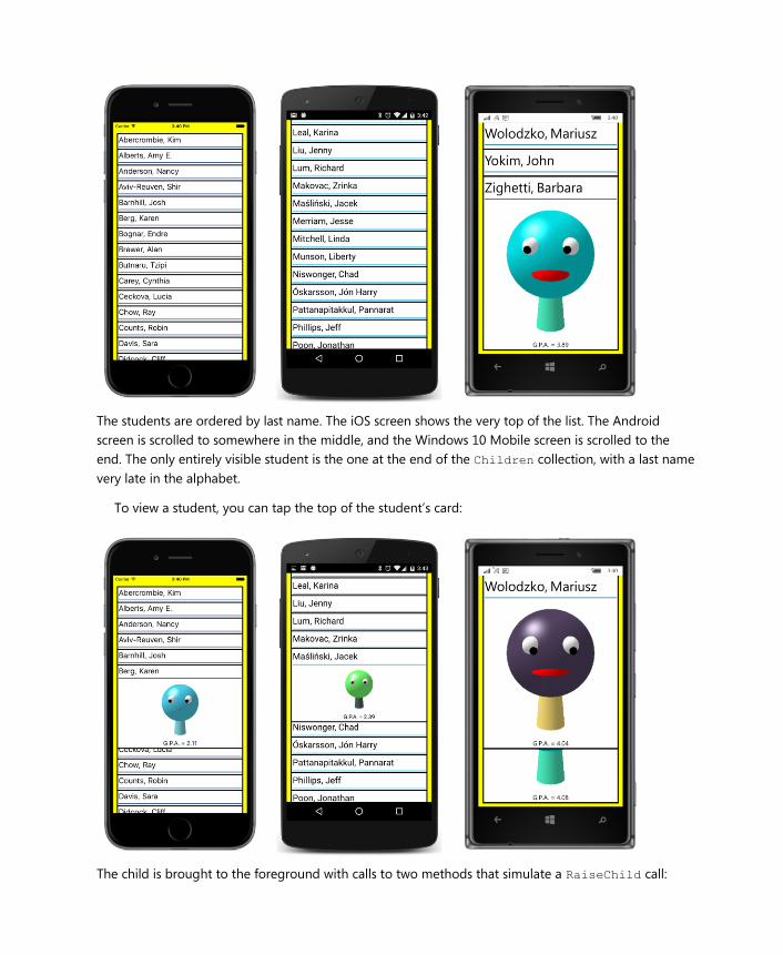
The students are ordered by last name. The iOS screen shows the very top of the list. The Android
screen is scrolled to somewhere in the middle, and the Windows 10 Mobile screen is scrolled to the
end. The only entirely visible student is the one at the end of the Children collection, with a last name
very late in the alphabet.
To view a student, you can tap the top of the student’s card:
The child is brought to the foreground with calls to two methods that simulate a RaiseChild call:
overlapLayout.Children.Remove(tappedChild);
overlapLayout.Children.Add(tappedChild);
You can now scroll the list like normal. All the children are in the same order from top to bottom. You
can cause that child to be restored to its initial position in the Children collection with another tap on
that child or by tapping another child.
If you think about the logic of VerticalStack earlier in this chapter, you can imagine that there
might be a bit of a problem if you simply call RaiseChild without doing anything else. RaiseChild
sends the child to the end of the Children collection, so it would normally be rendered last and ap-
pear at the bottom of the list. We need some way to reorder the Children collection while keeping
the rendering order constant.
The solution that OverlapLayout uses is an attached bindable property that can be set on each
child by the application. This property is called RenderOrder, and you’ll see how it works shortly.
Here’s how to define an attached bindable property in a layout class. It’s a little different from a reg-
ular bindable property:
namespace Xamarin.FormsBook.Toolkit
{
public class OverlapLayout : Layout<View>
{
…
// Attached bindable property.
public static readonly BindableProperty RenderOrderProperty =
BindableProperty.CreateAttached("RenderOrder",
typeof(int),
typeof(OverlapLayout),
0);
// Helper methods for attached bindable property.
public static void SetRenderOrder(BindableObject bindable, int order)
{
bindable.SetValue(RenderOrderProperty, order);
}
public static int GetRenderOrder(BindableObject bindable)
{
return (int)bindable.GetValue(RenderOrderProperty);
}
…
}
}
The definition of the public static read-only field is similar to defining a regular bindable property ex-
cept that you use the static Bindable.CreateAttached method, defining at least the text name of
the property, the type of the property, the type of the class defining the property, and a default value.
However, unlike with a regular bindable property, you do not define a C# property. Instead, you de-
fine two static methods for setting and getting the property. These two static helper methods—called
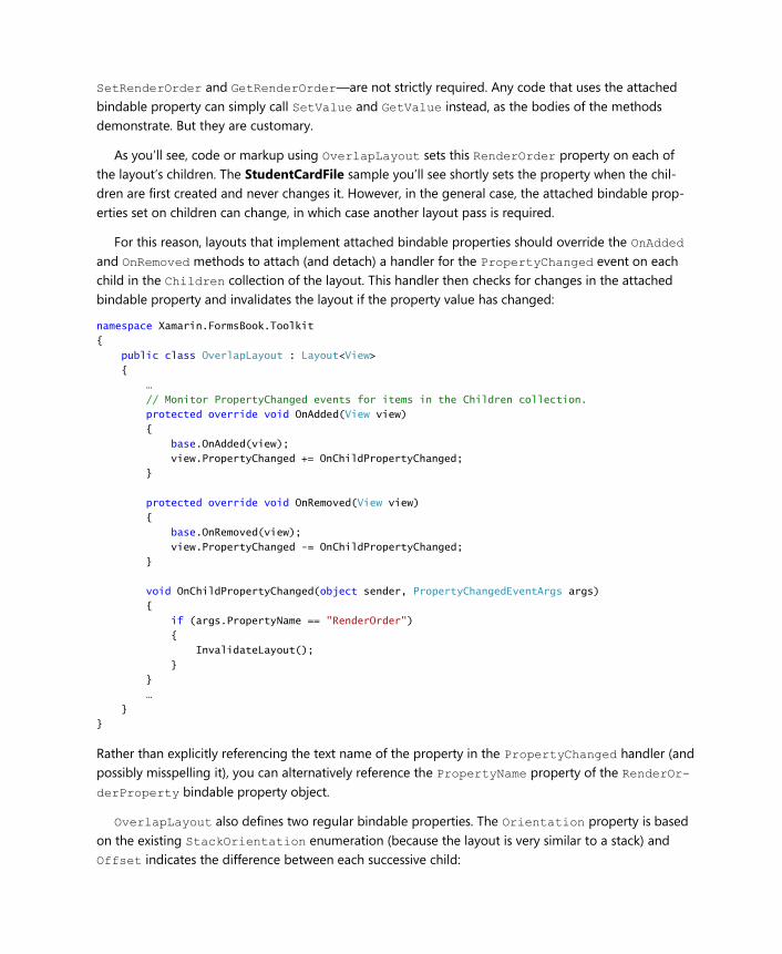
SetRenderOrder and GetRenderOrder—are not strictly required. Any code that uses the attached
bindable property can simply call SetValue and GetValue instead, as the bodies of the methods
demonstrate. But they are customary.
As you’ll see, code or markup using OverlapLayout sets this RenderOrder property on each of
the layout’s children. The StudentCardFile sample you’ll see shortly sets the property when the chil-
dren are first created and never changes it. However, in the general case, the attached bindable prop-
erties set on children can change, in which case another layout pass is required.
For this reason, layouts that implement attached bindable properties should override the OnAdded
and OnRemoved methods to attach (and detach) a handler for the PropertyChanged event on each
child in the Children collection of the layout. This handler then checks for changes in the attached
bindable property and invalidates the layout if the property value has changed:
namespace Xamarin.FormsBook.Toolkit
{
public class OverlapLayout : Layout<View>
{
…
// Monitor PropertyChanged events for items in the Children collection.
protected override void OnAdded(View view)
{
base.OnAdded(view);
view.PropertyChanged += OnChildPropertyChanged;
}
protected override void OnRemoved(View view)
{
base.OnRemoved(view);
view.PropertyChanged -= OnChildPropertyChanged;
}
void OnChildPropertyChanged(object sender, PropertyChangedEventArgs args)
{
if (args.PropertyName == "RenderOrder")
{
InvalidateLayout();
}
}
…
}
}
Rather than explicitly referencing the text name of the property in the PropertyChanged handler (and
possibly misspelling it), you can alternatively reference the PropertyName property of the RenderOr-
derProperty bindable property object.
OverlapLayout also defines two regular bindable properties. The Orientation property is based
on the existing StackOrientation enumeration (because the layout is very similar to a stack) and
Offset indicates the difference between each successive child:
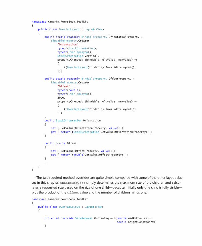
namespace Xamarin.FormsBook.Toolkit
{
public class OverlapLayout : Layout<View>
{
public static readonly BindableProperty OrientationProperty =
BindableProperty.Create(
"Orientation",
typeof(StackOrientation),
typeof(OverlapLayout),
StackOrientation.Vertical,
propertyChanged: (bindable, oldValue, newValue) =>
{
((OverlapLayout)bindable).InvalidateLayout();
});
public static readonly BindableProperty OffsetProperty =
BindableProperty.Create(
"Offset",
typeof(double),
typeof(OverlapLayout),
20.0,
propertyChanged: (bindable, oldvalue, newvalue) =>
{
((OverlapLayout)bindable).InvalidateLayout();
});
…
public StackOrientation Orientation
{
set { SetValue(OrientationProperty, value); }
get { return (StackOrientation)GetValue(OrientationProperty); }
}
public double Offset
{
set { SetValue(OffsetProperty, value); }
get { return (double)GetValue(OffsetProperty); }
}
…
}
}
The two required method overrides are quite simple compared with some of the other layout clas-
ses in this chapter. OnSizeRequest simply determines the maximum size of the children and calcu-
lates a requested size based on the size of one child—because initially only one child is fully visible—
plus the product of the Offset value and the number of children minus one:
namespace Xamarin.FormsBook.Toolkit
{
public class OverlapLayout : Layout<View>
{
…
protected override SizeRequest OnSizeRequest(double widthConstraint,
double heightConstraint)
{
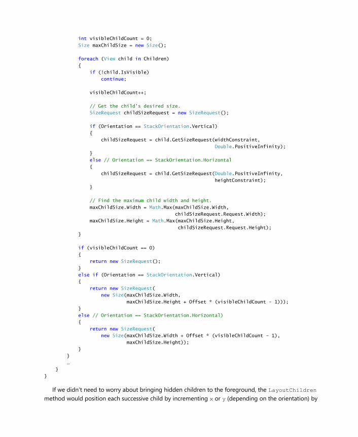
int visibleChildCount = 0;
Size maxChildSize = new Size();
foreach (View child in Children)
{
if (!child.IsVisible)
continue;
visibleChildCount++;
// Get the child's desired size.
SizeRequest childSizeRequest = new SizeRequest();
if (Orientation == StackOrientation.Vertical)
{
childSizeRequest = child.GetSizeRequest(widthConstraint,
Double.PositiveInfinity);
}
else // Orientation == StackOrientation.Horizontal
{
childSizeRequest = child.GetSizeRequest(Double.PositiveInfinity,
heightConstraint);
}
// Find the maximum child width and height.
maxChildSize.Width = Math.Max(maxChildSize.Width,
childSizeRequest.Request.Width);
maxChildSize.Height = Math.Max(maxChildSize.Height,
childSizeRequest.Request.Height);
}
if (visibleChildCount == 0)
{
return new SizeRequest();
}
else if (Orientation == StackOrientation.Vertical)
{
return new SizeRequest(
new Size(maxChildSize.Width,
maxChildSize.Height + Offset * (visibleChildCount - 1)));
}
else // Orientation == StackOrientation.Horizontal)
{
return new SizeRequest(
new Size(maxChildSize.Width + Offset * (visibleChildCount - 1),
maxChildSize.Height));
}
}
…
}
}
If we didn’t need to worry about bringing hidden children to the foreground, the LayoutChildren
method would position each successive child by incrementing x or y (depending on the orientation) by
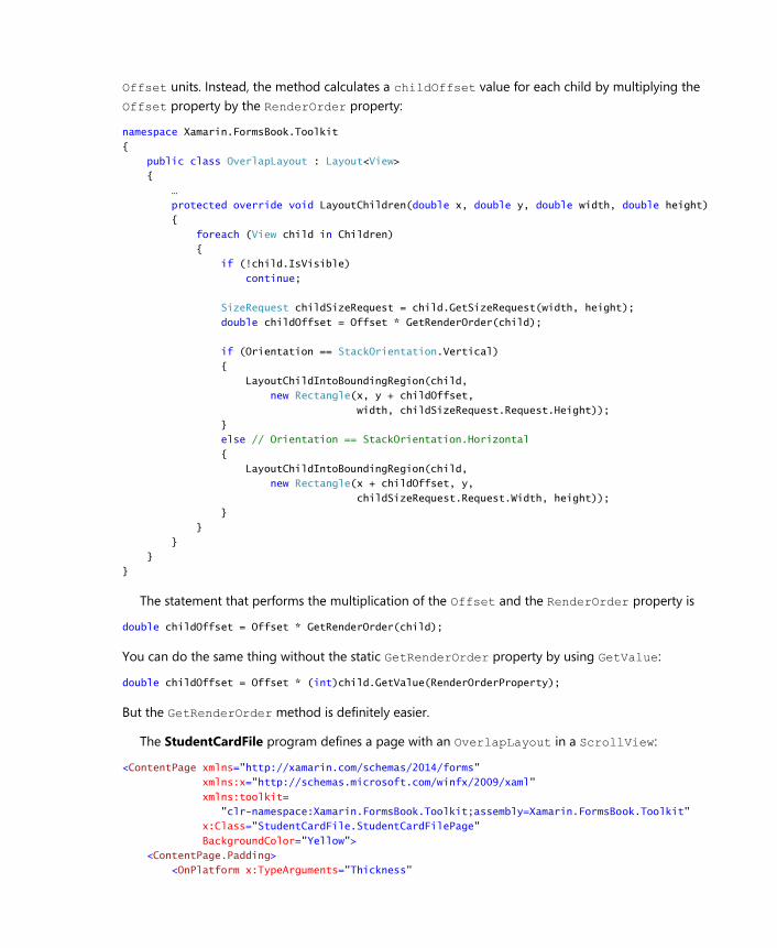
Offset units. Instead, the method calculates a childOffset value for each child by multiplying the
Offset property by the RenderOrder property:
namespace Xamarin.FormsBook.Toolkit
{
public class OverlapLayout : Layout<View>
{
…
protected override void LayoutChildren(double x, double y, double width, double height)
{
foreach (View child in Children)
{
if (!child.IsVisible)
continue;
SizeRequest childSizeRequest = child.GetSizeRequest(width, height);
double childOffset = Offset * GetRenderOrder(child);
if (Orientation == StackOrientation.Vertical)
{
LayoutChildIntoBoundingRegion(child,
new Rectangle(x, y + childOffset,
width, childSizeRequest.Request.Height));
}
else // Orientation == StackOrientation.Horizontal
{
LayoutChildIntoBoundingRegion(child,
new Rectangle(x + childOffset, y,
childSizeRequest.Request.Width, height));
}
}
}
}
}
The statement that performs the multiplication of the Offset and the RenderOrder property is
double childOffset = Offset * GetRenderOrder(child);
You can do the same thing without the static GetRenderOrder property by using GetValue:
double childOffset = Offset * (int)child.GetValue(RenderOrderProperty);
But the GetRenderOrder method is definitely easier.
The StudentCardFile program defines a page with an OverlapLayout in a ScrollView:
<ContentPage xmlns="http://xamarin.com/schemas/2014/forms"
xmlns:x="http://schemas.microsoft.com/winfx/2009/xaml"
xmlns:toolkit=
"clr-namespace:Xamarin.FormsBook.Toolkit;assembly=Xamarin.FormsBook.Toolkit"
x:Class="StudentCardFile.StudentCardFilePage"
BackgroundColor="Yellow">
<ContentPage.Padding>
<OnPlatform x:TypeArguments="Thickness"
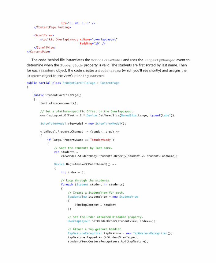
iOS="0, 20, 0, 0" />
</ContentPage.Padding>
<ScrollView>
<toolkit:OverlapLayout x:Name="overlapLayout"
Padding="10" />
</ScrollView>
</ContentPage>
The code-behind file instantiates the SchoolViewModel and uses the PropertyChanged event to
determine when the StudentBody property is valid. The students are first sorted by last name. Then,
for each Student object, the code creates a StudentView (which you’ll see shortly) and assigns the
Student object to the view’s BindingContext:
public partial class StudentCardFilePage : ContentPage
{
…
public StudentCardFilePage()
{
InitializeComponent();
// Set a platform-specific Offset on the OverlapLayout.
overlapLayout.Offset = 2 * Device.GetNamedSize(NamedSize.Large, typeof(Label));
SchoolViewModel viewModel = new SchoolViewModel();
viewModel.PropertyChanged += (sender, args) =>
{
if (args.PropertyName == "StudentBody")
{
// Sort the students by last name.
var students =
viewModel.StudentBody.Students.OrderBy(student => student.LastName);
Device.BeginInvokeOnMainThread(() =>
{
int index = 0;
// Loop through the students.
foreach (Student student in students)
{
// Create a StudentView for each.
StudentView studentView = new StudentView
{
BindingContext = student
};
// Set the Order attached bindable property.
OverlapLayout.SetRenderOrder(studentView, index++);
// Attach a Tap gesture handler.
TapGestureRecognizer tapGesture = new TapGestureRecognizer();
tapGesture.Tapped += OnStudentViewTapped;
studentView.GestureRecognizers.Add(tapGesture);
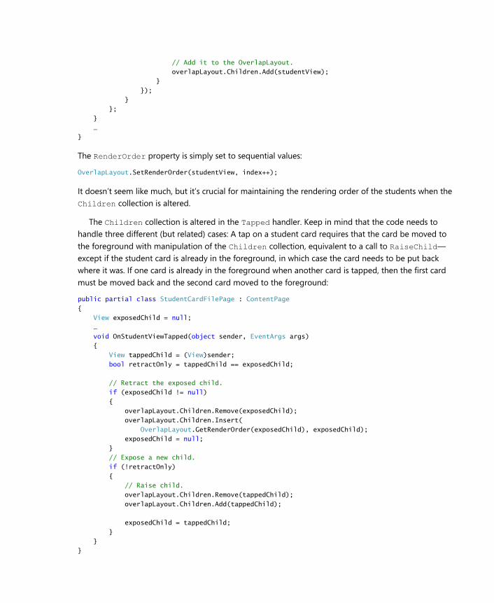
// Add it to the OverlapLayout.
overlapLayout.Children.Add(studentView);
}
});
}
};
}
…
}
The RenderOrder property is simply set to sequential values:
OverlapLayout.SetRenderOrder(studentView, index++);
It doesn’t seem like much, but it’s crucial for maintaining the rendering order of the students when the
Children collection is altered.
The Children collection is altered in the Tapped handler. Keep in mind that the code needs to
handle three different (but related) cases: A tap on a student card requires that the card be moved to
the foreground with manipulation of the Children collection, equivalent to a call to RaiseChild—
except if the student card is already in the foreground, in which case the card needs to be put back
where it was. If one card is already in the foreground when another card is tapped, then the first card
must be moved back and the second card moved to the foreground:
public partial class StudentCardFilePage : ContentPage
{
View exposedChild = null;
…
void OnStudentViewTapped(object sender, EventArgs args)
{
View tappedChild = (View)sender;
bool retractOnly = tappedChild == exposedChild;
// Retract the exposed child.
if (exposedChild != null)
{
overlapLayout.Children.Remove(exposedChild);
overlapLayout.Children.Insert(
OverlapLayout.GetRenderOrder(exposedChild), exposedChild);
exposedChild = null;
}
// Expose a new child.
if (!retractOnly)
{
// Raise child.
overlapLayout.Children.Remove(tappedChild);
overlapLayout.Children.Add(tappedChild);
exposedChild = tappedChild;
}
}
}
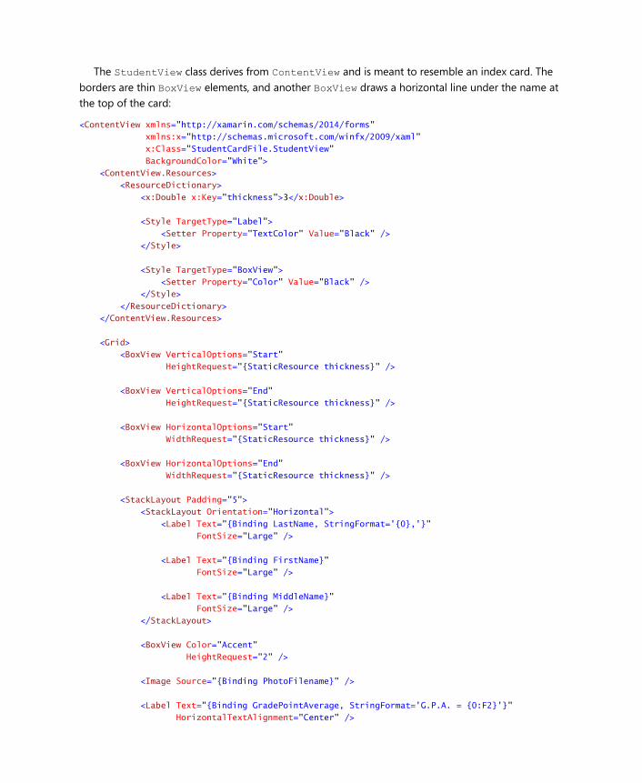
The StudentView class derives from ContentView and is meant to resemble an index card. The
borders are thin BoxView elements, and another BoxView draws a horizontal line under the name at
the top of the card:
<ContentView xmlns="http://xamarin.com/schemas/2014/forms"
xmlns:x="http://schemas.microsoft.com/winfx/2009/xaml"
x:Class="StudentCardFile.StudentView"
BackgroundColor="White">
<ContentView.Resources>
<ResourceDictionary>
<x:Double x:Key="thickness">3</x:Double>
<Style TargetType="Label">
<Setter Property="TextColor" Value="Black" />
</Style>
<Style TargetType="BoxView">
<Setter Property="Color" Value="Black" />
</Style>
</ResourceDictionary>
</ContentView.Resources>
<Grid>
<BoxView VerticalOptions="Start"
HeightRequest="{StaticResource thickness}" />
<BoxView VerticalOptions="End"
HeightRequest="{StaticResource thickness}" />
<BoxView HorizontalOptions="Start"
WidthRequest="{StaticResource thickness}" />
<BoxView HorizontalOptions="End"
WidthRequest="{StaticResource thickness}" />
<StackLayout Padding="5">
<StackLayout Orientation="Horizontal">
<Label Text="{Binding LastName, StringFormat='{0},'}"
FontSize="Large" />
<Label Text="{Binding FirstName}"
FontSize="Large" />
<Label Text="{Binding MiddleName}"
FontSize="Large" />
</StackLayout>
<BoxView Color="Accent"
HeightRequest="2" />
<Image Source="{Binding PhotoFilename}" />
<Label Text="{Binding GradePointAverage, StringFormat='G.P.A. = {0:F2}'}"
HorizontalTextAlignment="Center" />
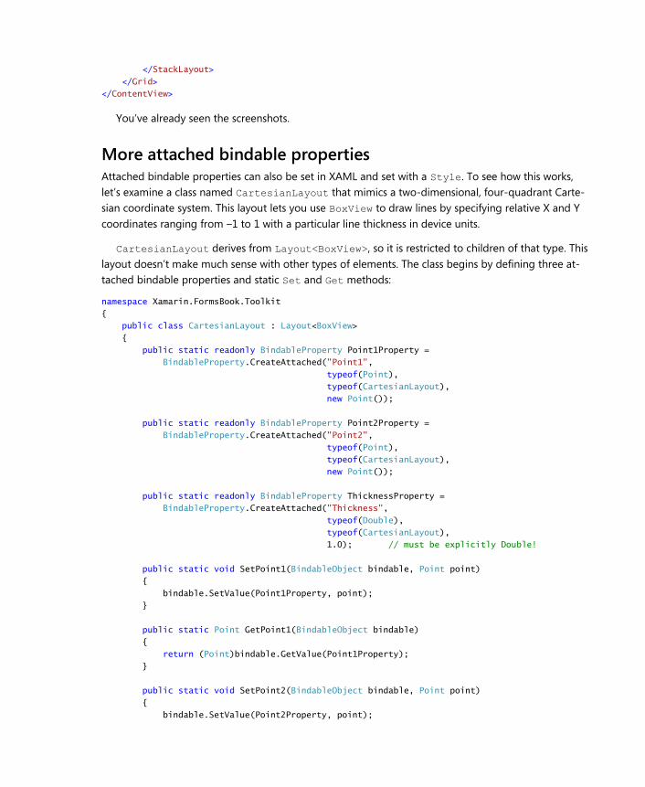
</StackLayout>
</Grid>
</ContentView>
You’ve already seen the screenshots.
More attached bindable properties Attached bindable properties can also be set in XAML and set with a Style. To see how this works,
let’s examine a class named CartesianLayout that mimics a two-dimensional, four-quadrant Carte-
sian coordinate system. This layout lets you use BoxView to draw lines by specifying relative X and Y
coordinates ranging from –1 to 1 with a particular line thickness in device units.
CartesianLayout derives from Layout<BoxView>, so it is restricted to children of that type. This
layout doesn’t make much sense with other types of elements. The class begins by defining three at-
tached bindable properties and static Set and Get methods:
namespace Xamarin.FormsBook.Toolkit
{
public class CartesianLayout : Layout<BoxView>
{
public static readonly BindableProperty Point1Property =
BindableProperty.CreateAttached("Point1",
typeof(Point),
typeof(CartesianLayout),
new Point());
public static readonly BindableProperty Point2Property =
BindableProperty.CreateAttached("Point2",
typeof(Point),
typeof(CartesianLayout),
new Point());
public static readonly BindableProperty ThicknessProperty =
BindableProperty.CreateAttached("Thickness",
typeof(Double),
typeof(CartesianLayout),
1.0); // must be explicitly Double!
public static void SetPoint1(BindableObject bindable, Point point)
{
bindable.SetValue(Point1Property, point);
}
public static Point GetPoint1(BindableObject bindable)
{
return (Point)bindable.GetValue(Point1Property);
}
public static void SetPoint2(BindableObject bindable, Point point)
{
bindable.SetValue(Point2Property, point);
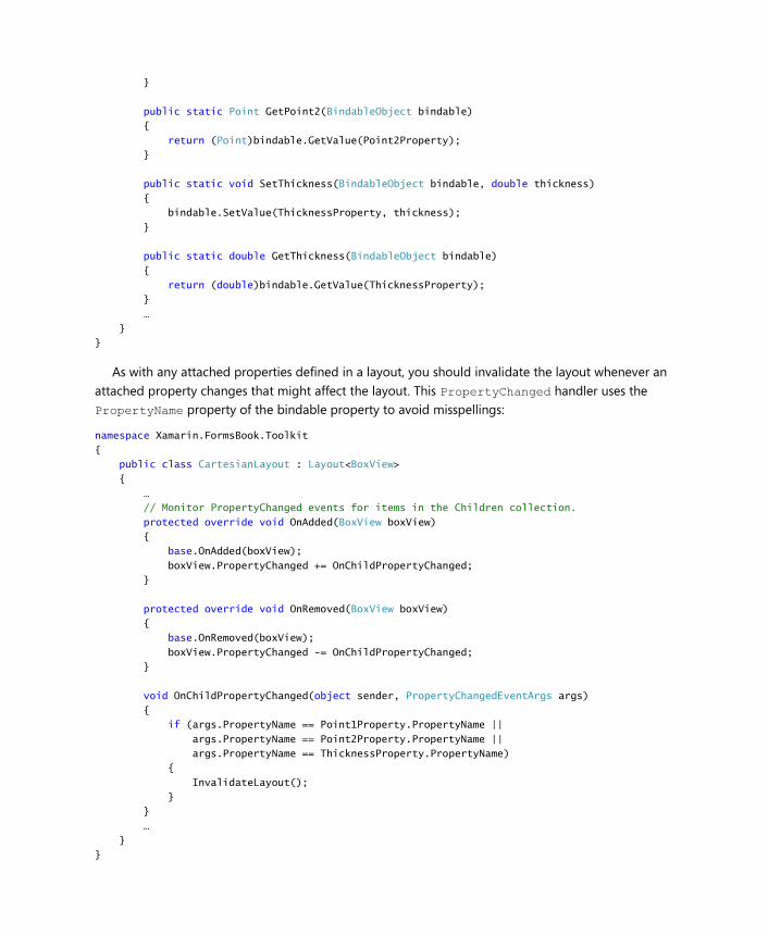
}
public static Point GetPoint2(BindableObject bindable)
{
return (Point)bindable.GetValue(Point2Property);
}
public static void SetThickness(BindableObject bindable, double thickness)
{
bindable.SetValue(ThicknessProperty, thickness);
}
public static double GetThickness(BindableObject bindable)
{
return (double)bindable.GetValue(ThicknessProperty);
}
…
}
}
As with any attached properties defined in a layout, you should invalidate the layout whenever an
attached property changes that might affect the layout. This PropertyChanged handler uses the
PropertyName property of the bindable property to avoid misspellings:
namespace Xamarin.FormsBook.Toolkit
{
public class CartesianLayout : Layout<BoxView>
{
…
// Monitor PropertyChanged events for items in the Children collection.
protected override void OnAdded(BoxView boxView)
{
base.OnAdded(boxView);
boxView.PropertyChanged += OnChildPropertyChanged;
}
protected override void OnRemoved(BoxView boxView)
{
base.OnRemoved(boxView);
boxView.PropertyChanged -= OnChildPropertyChanged;
}
void OnChildPropertyChanged(object sender, PropertyChangedEventArgs args)
{
if (args.PropertyName == Point1Property.PropertyName ||
args.PropertyName == Point2Property.PropertyName ||
args.PropertyName == ThicknessProperty.PropertyName)
{
InvalidateLayout();
}
}
…
}
}
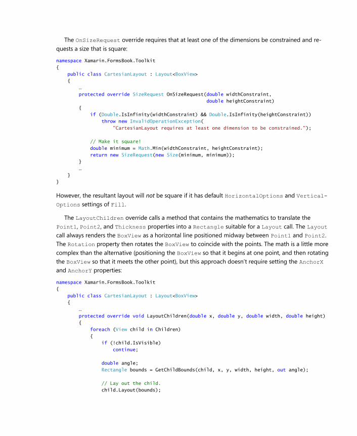
The OnSizeRequest override requires that at least one of the dimensions be constrained and re-
quests a size that is square:
namespace Xamarin.FormsBook.Toolkit
{
public class CartesianLayout : Layout<BoxView>
{
…
protected override SizeRequest OnSizeRequest(double widthConstraint,
double heightConstraint)
{
if (Double.IsInfinity(widthConstraint) && Double.IsInfinity(heightConstraint))
throw new InvalidOperationException(
"CartesianLayout requires at least one dimension to be constrained.");
// Make it square!
double minimum = Math.Min(widthConstraint, heightConstraint);
return new SizeRequest(new Size(minimum, minimum));
}
…
}
}
However, the resultant layout will not be square if it has default HorizontalOptions and Vertical-
Options settings of Fill.
The LayoutChildren override calls a method that contains the mathematics to translate the
Point1, Point2, and Thickness properties into a Rectangle suitable for a Layout call. The Layout
call always renders the BoxView as a horizontal line positioned midway between Point1 and Point2.
The Rotation property then rotates the BoxView to coincide with the points. The math is a little more
complex than the alternative (positioning the BoxView so that it begins at one point, and then rotating
the BoxView so that it meets the other point), but this approach doesn’t require setting the AnchorX
and AnchorY properties:
namespace Xamarin.FormsBook.Toolkit
{
public class CartesianLayout : Layout<BoxView>
{
…
protected override void LayoutChildren(double x, double y, double width, double height)
{
foreach (View child in Children)
{
if (!child.IsVisible)
continue;
double angle;
Rectangle bounds = GetChildBounds(child, x, y, width, height, out angle);
// Lay out the child.
child.Layout(bounds);
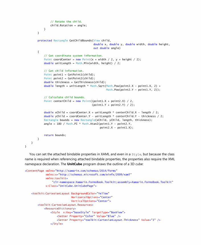
// Rotate the child.
child.Rotation = angle;
}
}
protected Rectangle GetChildBounds(View child,
double x, double y, double width, double height,
out double angle)
{
// Get coordinate system information.
Point coordCenter = new Point(x + width / 2, y + height / 2);
double unitLength = Math.Min(width, height) / 2;
// Get child information.
Point point1 = GetPoint1(child);
Point point2 = GetPoint2(child);
double thickness = GetThickness(child);
double length = unitLength * Math.Sqrt(Math.Pow(point2.X - point1.X, 2) +
Math.Pow(point2.Y - point1.Y, 2));
// Calculate child bounds.
Point centerChild = new Point((point1.X + point2.X) / 2,
(point1.Y + point2.Y) / 2);
double xChild = coordCenter.X + unitLength * centerChild.X - length / 2;
double yChild = coordCenter.Y - unitLength * centerChild.Y - thickness / 2;
Rectangle bounds = new Rectangle(xChild, yChild, length, thickness);
angle = 180 / Math.PI * Math.Atan2(point1.Y - point2.Y,
point2.X - point1.X);
return bounds;
}
}
}
You can set the attached bindable properties in XAML and even in a Style, but because the class
name is required when referencing attached bindable properties, the properties also require the XML
namespace declaration. The UnitCube program draws the outline of a 3D cube:
<ContentPage xmlns="http://xamarin.com/schemas/2014/forms"
xmlns:x="http://schemas.microsoft.com/winfx/2009/xaml"
xmlns:toolkit=
"clr-namespace:Xamarin.FormsBook.Toolkit;assembly=Xamarin.FormsBook.Toolkit"
x:Class="UnitCube.UnitCubePage">
<toolkit:CartesianLayout BackgroundColor="Yellow"
HorizontalOptions="Center"
VerticalOptions="Center">
<toolkit:CartesianLayout.Resources>
<ResourceDictionary>
<Style x:Key="baseStyle" TargetType="BoxView">
<Setter Property="Color" Value="Blue" />
<Setter Property="toolkit:CartesianLayout.Thickness" Value="3" />
</Style>
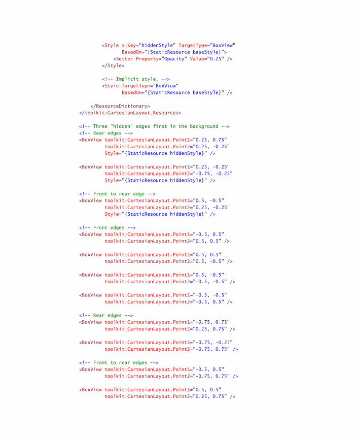
<Style x:Key="hiddenStyle" TargetType="BoxView"
BasedOn="{StaticResource baseStyle}">
<Setter Property="Opacity" Value="0.25" />
</Style>
<!-- Implicit style. -->
<Style TargetType="BoxView"
BasedOn="{StaticResource baseStyle}" />
</ResourceDictionary>
</toolkit:CartesianLayout.Resources>
<!-- Three "hidden" edges first in the background -->
<!-- Rear edges -->
<BoxView toolkit:CartesianLayout.Point1="0.25, 0.75"
toolkit:CartesianLayout.Point2="0.25, -0.25"
Style="{StaticResource hiddenStyle}" />
<BoxView toolkit:CartesianLayout.Point1="0.25, -0.25"
toolkit:CartesianLayout.Point2="-0.75, -0.25"
Style="{StaticResource hiddenStyle}" />
<!-- Front to rear edge -->
<BoxView toolkit:CartesianLayout.Point1="0.5, -0.5"
toolkit:CartesianLayout.Point2="0.25, -0.25"
Style="{StaticResource hiddenStyle}" />
<!-- Front edges -->
<BoxView toolkit:CartesianLayout.Point1="-0.5, 0.5"
toolkit:CartesianLayout.Point2="0.5, 0.5" />
<BoxView toolkit:CartesianLayout.Point1="0.5, 0.5"
toolkit:CartesianLayout.Point2="0.5, -0.5" />
<BoxView toolkit:CartesianLayout.Point1="0.5, -0.5"
toolkit:CartesianLayout.Point2="-0.5, -0.5" />
<BoxView toolkit:CartesianLayout.Point1="-0.5, -0.5"
toolkit:CartesianLayout.Point2="-0.5, 0.5" />
<!-- Rear edges -->
<BoxView toolkit:CartesianLayout.Point1="-0.75, 0.75"
toolkit:CartesianLayout.Point2="0.25, 0.75" />
<BoxView toolkit:CartesianLayout.Point1="-0.75, -0.25"
toolkit:CartesianLayout.Point2="-0.75, 0.75" />
<!-- Front to rear edges -->
<BoxView toolkit:CartesianLayout.Point1="-0.5, 0.5"
toolkit:CartesianLayout.Point2="-0.75, 0.75" />
<BoxView toolkit:CartesianLayout.Point1="0.5, 0.5"
toolkit:CartesianLayout.Point2="0.25, 0.75" />
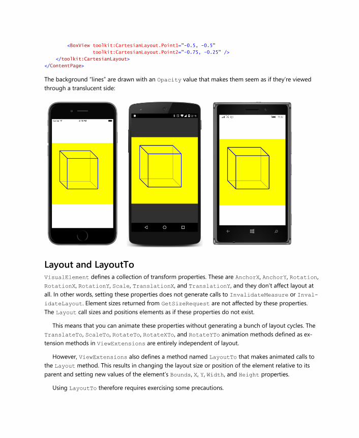
<BoxView toolkit:CartesianLayout.Point1="-0.5, -0.5"
toolkit:CartesianLayout.Point2="-0.75, -0.25" />
</toolkit:CartesianLayout>
</ContentPage>
The background “lines” are drawn with an Opacity value that makes them seem as if they’re viewed
through a translucent side:
Layout and LayoutTo VisualElement defines a collection of transform properties. These are AnchorX, AnchorY, Rotation,
RotationX, RotationY, Scale, TranslationX, and TranslationY, and they don’t affect layout at
all. In other words, setting these properties does not generate calls to InvalidateMeasure or Inval-
idateLayout. Element sizes returned from GetSizeRequest are not affected by these properties.
The Layout call sizes and positions elements as if these properties do not exist.
This means that you can animate these properties without generating a bunch of layout cycles. The
TranslateTo, ScaleTo, RotateTo, RotateXTo, and RotateYTo animation methods defined as ex-
tension methods in ViewExtensions are entirely independent of layout.
However, ViewExtensions also defines a method named LayoutTo that makes animated calls to
the Layout method. This results in changing the layout size or position of the element relative to its
parent and setting new values of the element’s Bounds, X, Y, Width, and Height properties.
Using LayoutTo therefore requires exercising some precautions.
For example, suppose an element is a child of a StackLayout. When StackLayout gets a Lay-
outChildren call, it will call Layout on that element to size and position it at a particular location rel-
ative to itself. Suppose your program then calls LayoutTo on that element to give it a new size and
position. The StackLayout doesn’t know about that, so if the StackLayout undergoes another lay-
out cycle, it will move the element back to where it thinks it should be. If you still need the element to
be somewhere other than where the StackLayout thinks it should be, you might want to attach a
handler to the LayoutChanged event of the StackLayout and call Layout or run the LayoutTo ani-
mation on that element again.
Another problem is running a LayoutTo animation on a layout with many children. It’s allowed, of
course, but keep in mind that the layout will get numerous calls to its Layout method, and hence also
its LayoutChildren method while the animation is in progress. For each of these calls to its Layout-
Children override, the layout class will try to lay out all its children (and, of course, some of those
children could be other layouts with children), and the animation might become quite choppy.
But you can use the relationship between the LayoutTo animation and the Layout method to im-
plement some interesting effects. An element must have its Layout method called to be visible on the
screen, but calling LayoutTo satisfies that requirement.
Here’s a class that derives from CartesianLayout, called AnimatedCartesianLayout. It defines
two bindable properties (not attached bindable properties) to govern the animation, and instead of
calling Layout and setting the Rotation property, it calls LayoutTo and (optionally) RotateTo:
namespace Xamarin.FormsBook.Toolkit
{
public class AnimatedCartesianLayout : CartesianLayout
{
public static readonly BindableProperty AnimationDurationProperty =
BindableProperty.Create(
"AnimatedDuration",
typeof(int),
typeof(AnimatedCartesianLayout),
1000);
public int AnimationDuration
{
set { SetValue(AnimationDurationProperty, value); }
get { return (int)GetValue(AnimationDurationProperty); }
}
public static readonly BindableProperty AnimateRotationProperty =
BindableProperty.Create(
"AnimateRotation",
typeof(bool),
typeof(AnimatedCartesianLayout),
true);
public bool AnimateRotation
{
set { SetValue(AnimateRotationProperty, value); }
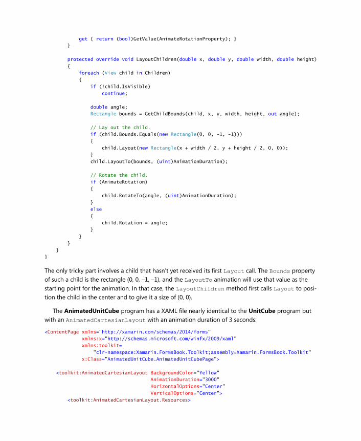
get { return (bool)GetValue(AnimateRotationProperty); }
}
protected override void LayoutChildren(double x, double y, double width, double height)
{
foreach (View child in Children)
{
if (!child.IsVisible)
continue;
double angle;
Rectangle bounds = GetChildBounds(child, x, y, width, height, out angle);
// Lay out the child.
if (child.Bounds.Equals(new Rectangle(0, 0, -1, -1)))
{
child.Layout(new Rectangle(x + width / 2, y + height / 2, 0, 0));
}
child.LayoutTo(bounds, (uint)AnimationDuration);
// Rotate the child.
if (AnimateRotation)
{
child.RotateTo(angle, (uint)AnimationDuration);
}
else
{
child.Rotation = angle;
}
}
}
}
}
The only tricky part involves a child that hasn’t yet received its first Layout call. The Bounds property
of such a child is the rectangle (0, 0, –1, –1), and the LayoutTo animation will use that value as the
starting point for the animation. In that case, the LayoutChildren method first calls Layout to posi-
tion the child in the center and to give it a size of (0, 0).
The AnimatedUnitCube program has a XAML file nearly identical to the UnitCube program but
with an AnimatedCartesianLayout with an animation duration of 3 seconds:
<ContentPage xmlns="http://xamarin.com/schemas/2014/forms"
xmlns:x="http://schemas.microsoft.com/winfx/2009/xaml"
xmlns:toolkit=
"clr-namespace:Xamarin.FormsBook.Toolkit;assembly=Xamarin.FormsBook.Toolkit"
x:Class="AnimatedUnitCube.AnimatedUnitCubePage">
<toolkit:AnimatedCartesianLayout BackgroundColor="Yellow"
AnimationDuration="3000"
HorizontalOptions="Center"
VerticalOptions="Center">
<toolkit:AnimatedCartesianLayout.Resources>
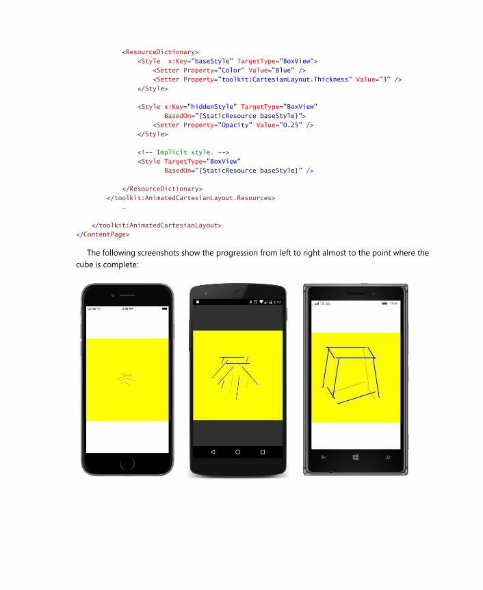
<ResourceDictionary>
<Style x:Key="baseStyle" TargetType="BoxView">
<Setter Property="Color" Value="Blue" />
<Setter Property="toolkit:CartesianLayout.Thickness" Value="3" />
</Style>
<Style x:Key="hiddenStyle" TargetType="BoxView"
BasedOn="{StaticResource baseStyle}">
<Setter Property="Opacity" Value="0.25" />
</Style>
<!-- Implicit style. -->
<Style TargetType="BoxView"
BasedOn="{StaticResource baseStyle}" />
</ResourceDictionary>
</toolkit:AnimatedCartesianLayout.Resources>
…
</toolkit:AnimatedCartesianLayout>
</ContentPage>
The following screenshots show the progression from left to right almost to the point where the
cube is complete:
Depending on how they’re defined, some of the horizontal lines aren’t rotated at all, while others (the
ones on the bottom, for example) must be rotated 180 degrees.
As you know, user interfaces have become more animated and dynamic in recent years, so explor-
ing various techniques that are possible by using LayoutTo rather than Layout can become a whole
new area for adventurous programmers to pursue.