my - esridownloads2.esri.com/mappingcenter2007/resources/presentations/uc10...• craig will show...
TRANSCRIPT

AILEEN – 2 MINUTES
Welcome to our Lightening Talks session! My name is Aileen Buckley, and I’m here with many of my colleagues from the Mapping Center Team.
In this session, we’ll be presenting in lightening talk format, which means that each talk will last about 10 minutes and several topics will be presented, each one by a different speaker.
ABSTRACTABSTRACT
In this session, we present a number of case studies that illustrate cartographic best practices. Offered in “lightning talk” format – five presenters will each talk in 10 minute segments about data‐driven pages, spatio‐temporal mapping, 3D mapping, ArcGIS Online and map templates, map packages. These case studies were undertaken to develop best practices to help you make great maps that let your data tell their story. Stop in for succinct demonstrations of how ArcGIS can be used to create a larger variety of maps better and faster than ever before.
1
Introduction – Aileen – 2 min Data‐driven pages – Wes – 9 min
Timed‐enabled GIS – Aileen – 12 min 3D Mapping – Craig – 12 min
HTML Popups – Kenny – 8 minArcGIS.com – Jim – 12 min
Map Packages – Caitlin – 12 min Conclusion – Aileen – 2 min
Total – 69 min
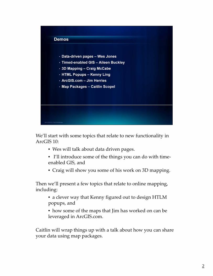
We’ll start with some topics that relate to new functionality in p yArcGIS 10:
• Wes will talk about data driven pages.
• I’ll introduce some of the things you can do with time‐enabled GIS, and
• Craig will show you some of his work on 3D mappingCraig will show you some of his work on 3D mapping.
Then we’ll present a few topics that relate to online mapping, including:
• a clever way that Kenny figured out to design HTLM popups andpopups, and
• how some of the maps that Jim has worked on can be leveraged in ArcGIS.com.
Caitlin will wrap things up with a talk about how you can share your data using map packagesyour data using map packages.
2

Before we get started, I want to point out that you don’t need to g , p ytake lots of notes because we’ll be posting this presentation with the bottom notes on Mapping Center.
So, you can just sit back and relax ‐ focus on the content, demos and techniques we show you, and think of any questions you q y y q ymight want to ask us at the end.
You’ll be able to find this presentation on the Other Resources page of our Mapping Center web site. We’ll post it there in the next two weeks – that will give us time to make any changes we g y gthink will help you after we give our talks.
We’ll show these URLs again at the end of this presentation.
Fo o let’ et ta ted
33
For now – let’s get started.

First, we have Wes, who’ll be showing you some of the new , , g ythings you can do in ArcGIS 10 using data‐driven pages.
4
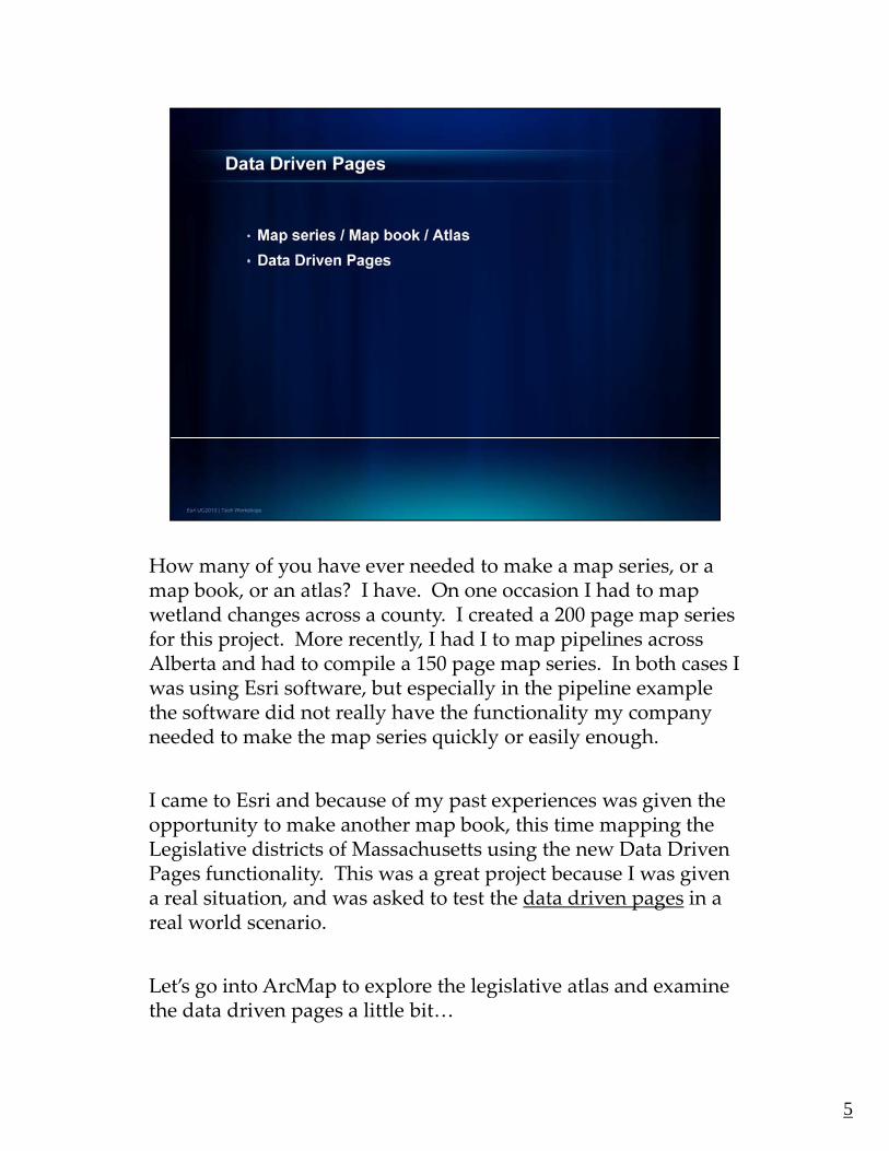
How many of you have ever needed to make a map series, or a y y p ,map book, or an atlas? I have. On one occasion I had to map wetland changes across a county. I created a 200 page map series for this project. More recently, I had I to map pipelines across Alberta and had to compile a 150 page map series. In both cases I was using Esri software, but especially in the pipeline example the software did not really have the functionality my companythe software did not really have the functionality my company needed to make the map series quickly or easily enough.
I came to Esri and because of my past experiences was given the opportunity to make another map book, this time mapping the Legislative districts of Massachusetts using the new Data DrivenLegislative districts of Massachusetts using the new Data Driven Pages functionality. This was a great project because I was given a real situation, and was asked to test the data driven pages in a real world scenario.
Let’s go into ArcMap to explore the legislative atlas and examineLet s go into ArcMap to explore the legislative atlas and examine the data driven pages a little bit…
5

Here is the ArcMap document I used to create the legislative atlas p gfor Massachusetts. This particular .mxd shows the data for the Senate portion of the atlas. All the data has been processed, and the layout and cartography are nearly the way I want them.
6

Let’s explore the Data Driven Pages toolbar. p g
The first button is the Setup utility for the Data Driven Pages. Here one accesses the heart of the data driven pages. Bring your attention to the Layer and the Name field.
The layer determines what feature is being used to drive the data driven pages, and the name field determines within that feature what field is being used as the index for the data driven pages. Because this .mxd contains Senate information, the layer driving the data driven pages is the Massachusetts’ Senate Districts feature class. The name field is the SENDIST number field. I want you to remember this field ybecause it is important and comes into play later.
On the next tab we can change the extents of the maps. Right now we have the map set to BEST FIT – which centres the map on each page and we have given the map a 5% margin. We have also rounded the
l t th t 100 L t’ l t f thiscale to the nearest 100. Let’s close out of this.
The next button on the toolbar refreshes the data driven pages.
7

The display shows what data driven page is currently being p y p g y gviewed. In our case it is District 3. You can choose to show by page name or by page number. We are showing by page name.
8

The navigation controls (the arrows) allow you to pop back and g ( ) y p pforth between the pages. Let’s go to page 1 and zoom to the bottom portion of the map to look at the page text option on the toolbar.
9

The page text option allows you to input data driven text (or p g p y p (what we call dynamic text) in the document. This text will update when the data driven page changes. We have some dynamic text in the corner reading Senate District 1. If we go to district 4 the text updates.
Let’s explore the properties of the text a little bit.
The first portion of the text string is static text that I typed, and reads Senate District. This will be written on every page. The second portion between the brackets is a text tag and is the p gdynamic text. The text tag starts with DYN.
10

In this specific example the dynamic text tag references the page p p y g p gname or the SENDIST NUM field I mentioned earlier.
Let’s change this to show how the dynamic text can reference any field in the Data Driven feature class. I know there is a field containing Senate District names. If we click Apply, look how the g pp ydynamic text updates in the corner.
11
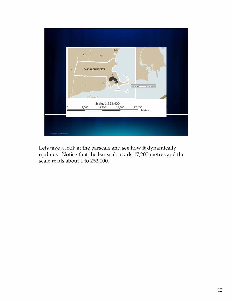
Lets take a look at the barscale and see how it dynamically y yupdates. Notice that the bar scale reads 17,200 metres and the scale reads about 1 to 252,000.
12

If we advance to page 40 notice that the scale and bar scale p gchange.
What is extremely nice is that the bar scale updates but respects the space it is placed it in – the only downside is that the bar scale sometimes does not round to numbers that you normally see as y ydivisions, but in a design like this where the space is limited this is acceptable, but at least it is rounded to the nearest 100 like I established earlier.
Now bring your attention to the keymap. Notice how it shows g y y pdistrict 40. I am going to change to page 31.
13
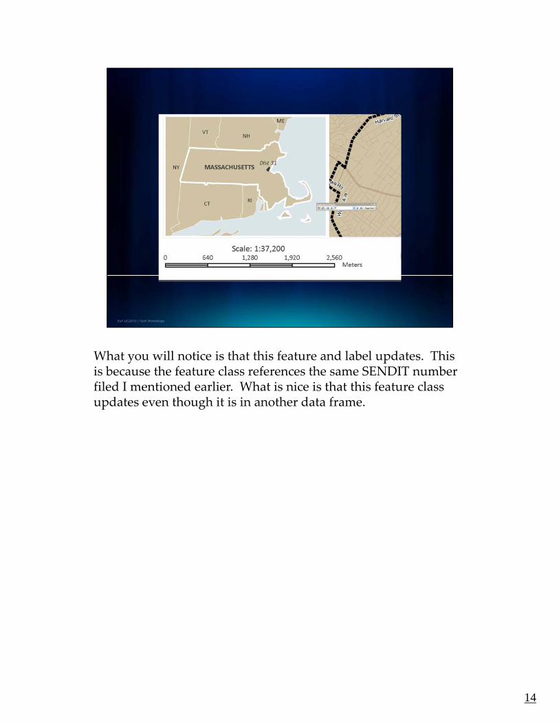
What you will notice is that this feature and label updates. This y pis because the feature class references the same SENDIT number filed I mentioned earlier. What is nice is that this feature class updates even though it is in another data frame.
14

In a legislative atlas only the roads that bound the districts are g yimportant for labeling purposes.
Currently, this map is setup incorrectly. It shows road labels around all the districts but we want them only around the district in white.
15

Let’s fix this. In the properties of the Roads under the definition p pquery tab there is a new button that will appear if the Data Driven Pages are enabled. It is the Page Definition Button.
What this dialogue box is asking is, is there a field within the Roads feature class that matches the field driving the data driven gpages. Do the roads have a field identifying what district number they are in.
Let’s enable. What you will notice is that the roads have that same SENDIST number field that drives the data driven pages. p gWe can use a query here to show features that match the current data driven page. Essentially showing only the road labels around senate district 31.
16

Let’s apply this. Notice the roads around the white district are pp ythe only ones labeling now.
17

Let’s go to page 35 and look at one last thing. This map was g p g g pdesigned with the keymap on top of the main map. The bottom left corner was chosen as the default position. Occasionally, the keymap overlaps the main district as you can see here. The Data Driven Pages grants you access to python scripting to help solve this overlap issue when printing to PDF. With a script, you can move the keymap around the page to avoid the highlightedmove the keymap around the page to avoid the highlighted district.
18

Here is a PDF example using such a script that moves the p g pkeymap.
The first page shows the keymap in the default position.
19

Here is position 2. p
20

Here is 3.
21
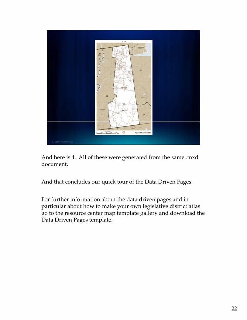
And here is 4. All of these were generated from the same .mxdgdocument.
And that concludes our quick tour of the Data Driven Pages.
F f th i f ti b t th d t d i d iFor further information about the data driven pages and in particular about how to make your own legislative district atlas go to the resource center map template gallery and download the Data Driven Pages template.
22
AILEEN – 12 MINUTES
In ArcGIS 10, there is some new functionality that allows you to create maps that show time. We call this “time‐enabled GIS”. Let me show you a map that my colleague, Mark Smithgall, and I recently made to try this out. y y
23

HAVE TIME SLIDER ON THE YEAR 2000. OPEN THE ATTRIBUTE TABLE FOR THE MEAN CENTER FEATURE CLASS AND POSITION AND RESIZE IT CLOSE ITFEATURE CLASS AND POSITION AND RESIZE IT. CLOSE IT.
In ArcGIS 10, there is some new functionality that allows you to create maps that show time. We call this “time‐enabled GIS”. Let me show you a map that my colleague, Mark Smithgall, and I recently made to try this out.
This is a map of the 100 most populated cities in the United States from 1790 to 2000, although we’re only looking at the data for the year 2000 right now. The gray spheres represent the cities, and the size of the sphere is proportional to the number of people.
Let’s take a look at how this distribution changes over time. To do that, we’ll use the Time Slider toolbar that is new in ArcGIS 10. We’ll move the slider back to the first time step, and click the Play button to advance through the whole time extentthe whole time extent.
On this map you’re seeing the largest cities for each time period. You’ll see a predictable pattern of growth in the northeastern states at the outset. By the second time step, New York has become the largest city in the U.S. and will remain so through the rest of the time range, although we will see it decrease in size towards the end of the visualization. In the mid‐1800’s the population begins to shift towards the west.
To help you see this shift, we’ll add the mean center of population to the map. This is symbolized with a red push pin. Let’s replay the visualization so you can see better how this shift occurs over time.
WHEN DONE, TURN OFF THE TIME SLIDER TOOLBAR!
The red push pin helps you follow the shift in mean center much better, but it also demonstrates that you can show multiple layers with time on the map!
Let’s take a look at the attribute table for the mean center so you can see how to set up your data to take advantage of the new functionality fir time in ArcGIS 10.
You’ll see that the locations of the mean center are all in this one feature class, and that each feature has a unique value in the field that has the time stamp. You can now see that we need to have all the features for all time periods in the same feature class. But we can distinguish them with a time attribute – like the field in our data set called “Year”.
Now that you know what the data look like, let me show you how to visualize them using the new tools in ArcGIS 10.
24
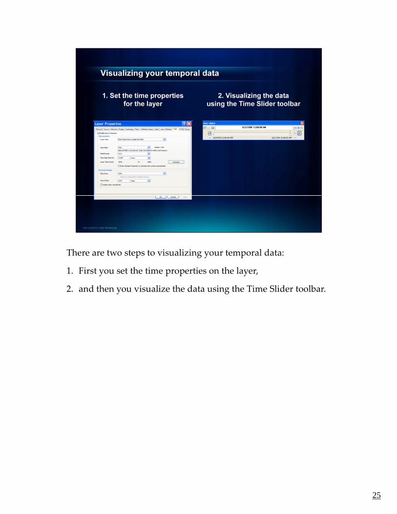
There are two steps to visualizing your temporal data:p g y p
1. First you set the time properties on the layer,
2. and then you visualize the data using the Time Slider toolbar.
25
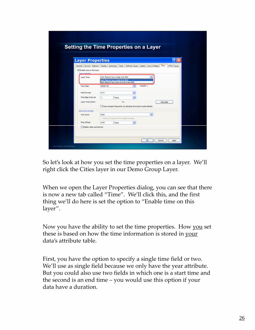
So let’s look at how you set the time properties on a layer. We’ll y p p yright click the Cities layer in our Demo Group Layer.
When we open the Layer Properties dialog, you can see that there is now a new tab called “Time”. We’ll click this, and the first thing we’ll do here is set the option to “Enable time on this g player”.
Now you have the ability to set the time properties. How you set these is based on how the time information is stored in yourdata’s attribute table.
First, you have the option to specify a single time field or two. We’ll use as single field because we only have the year attribute. But you could also use two fields in which one is a start time and the second is an end time – you would use this option if your y p ydata have a duration.
26
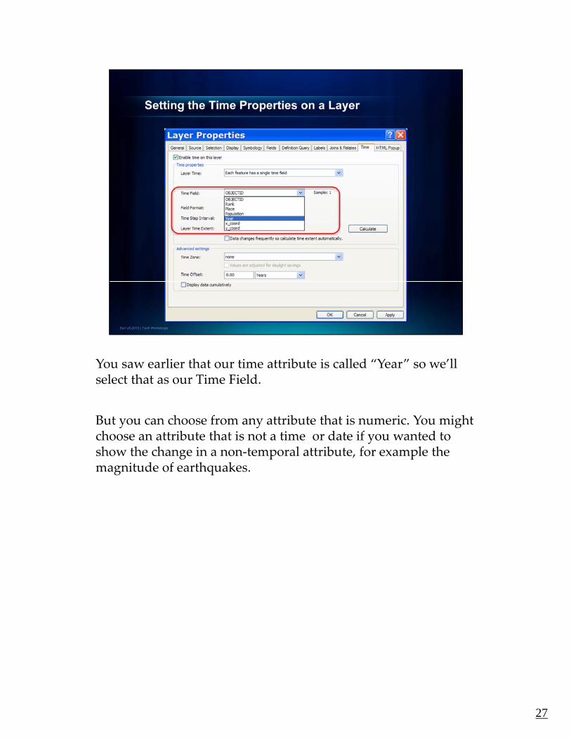
You saw earlier that our time attribute is called “Year” so we’ll select that as our Time Field.
But you can choose from any attribute that is numeric. You might choose an attribute that is not a time or date if you wanted to show the change in a non‐temporal attribute, for example the g p pmagnitude of earthquakes.
27
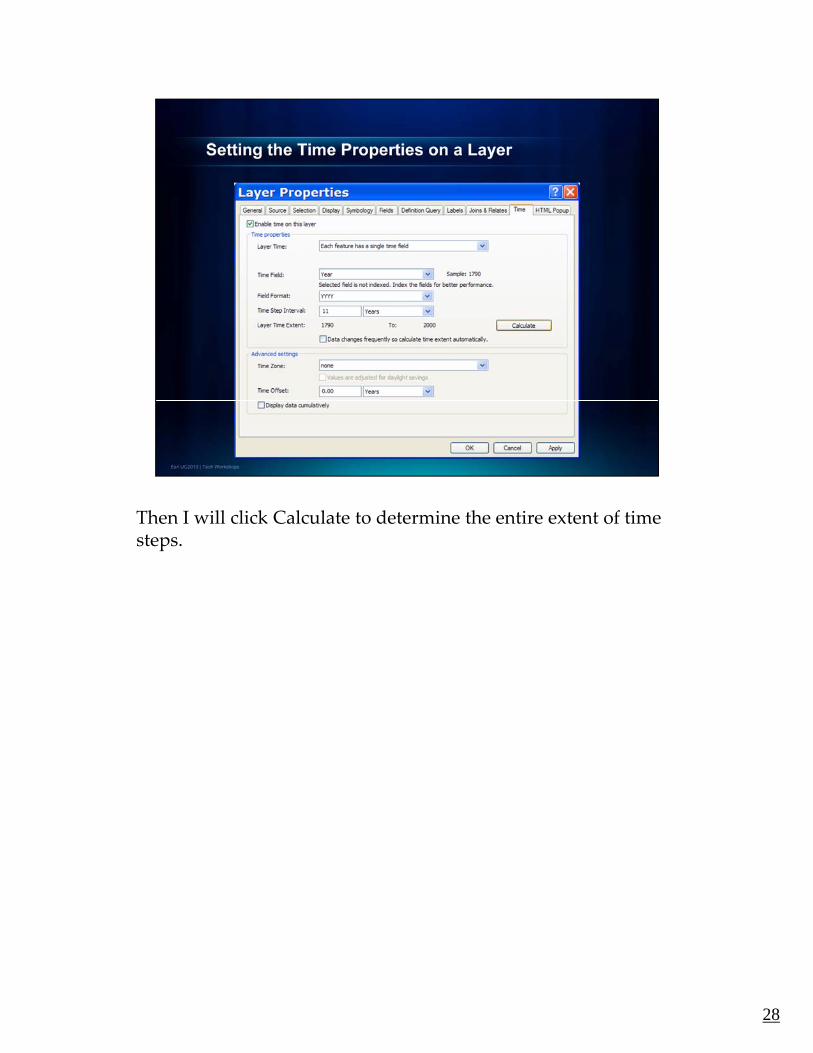
Then I will click Calculate to determine the entire extent of time steps.
28

Since we have data for each decade, we’ll set the Time Step , pInterval to 10 years.
29
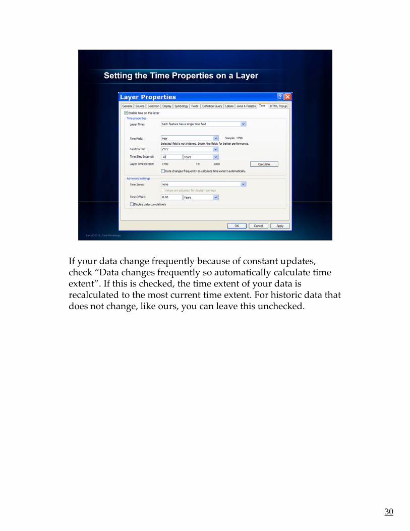
If your data change frequently because of constant updates, y g q y p ,check “Data changes frequently so automatically calculate time extent”. If this is checked, the time extent of your data is recalculated to the most current time extent. For historic data that does not change, like ours, you can leave this unchecked.
30

There are some advanced settings that allow you to set the time g yzone, adjust for daylight savings, use time offsets, and display data cumulatively. We don’t need any of these, so we’ll click OK to finish setting the time properties for the Cities layer.
31

Now that we’ve set the time properties, we can visualize them. p p ,To do that, we’ll use the Time Slider Window. In ArcGIS 10.0, this is a new tool on the Tools toolbar that provides controls to visualize your temporal data in the ArcMap, ArcGlobe, and ArcScene.
You can open the Time Slider window by clicking the Open Time Slide Window button on the Tools toolbar. This button is not available if you don’t have any time‐enabled datasets in your map, globe, or scene document.
You click the Play button to step through each time step sequentially. You can pause by clicking the Pause button. You can click the Next or Previous time step buttons to step back and forth between subsequent time steps. You can also click and drag the Time Slider Control to the right or left to step through your temporal data interactivelytemporal data interactively.
32

In the upper left of the window there are three buttons. The first ppone let’s you enable and disable time for all layers in the map document.
The second button gives you some options. Let’s click this to see what they are. On the Time Display tab, we see many of the y p y ysame options as on the Layer Properties – Time tab. The Display date format is not there, so let’s set it here to years as that is how are data are set up.
The other tabs give you options for setting a different time extent, g y p gplayback speeds and more.
Let’s click OK to take a look at how we can use the display date format we set for our map.
33
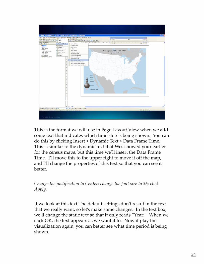
This is the format we will use in Page Layout View when we add g ysome text that indicates which time step is being shown. You can do this by clicking Insert > Dynamic Text > Data Frame Time. This is similar to the dynamic text that Wes showed your earlier for the census maps, but this time we’ll insert the Data Frame Time. I’ll move this to the upper right to move it off the map, and I’ll change the properties of this text so that you can see itand I ll change the properties of this text so that you can see it better.
Change the justification to Center; change the font size to 36; click Apply.
If we look at this text The default settings don’t result in the textthat we really want, so let’s make some changes. In the text box, we’ll change the static text so that it only reads “Year:” When we click OK, the text appears as we want it to. Now if play the visualization again you can better see what time period is beingvisualization again, you can better see what time period is being shown.
34

However, cartographic research has shown that readers are not , g preally able to use just text to determine where they are in the time extent while the visualization is playing.
To address this, we tried something else on our map. I’ll turn on the viewing for the Timeline group layer. This includes two g g p ylayers – one of them is time enabled.
The gray text is not, but the black text is – we also used a point
L t’ l th i li ti h t thi dLet’s play the visualization so you can see what this does.
It’s a dynamic legend that we created by digitizing point locations for the dates. At each time step, the time enabled layer draws the red ball and the darker text.
35

This brings me to the last thing I want to show you in this demo. g g ySome of you may have noticed that the current U.S. states were being shown even though we know that these, too, have changed over time. So let’s turn on the states in our Maps layers in the Table of Contents to show this changing data as well. Then, we’ll turn off the States in our Basemap Layer.
Now when we play the visualization, you can see the states changing, too.
But notice how slowly each time step is drawing. Remember that y p gwe used to be displaying the States in a Basemap Layer – this is something new in ArcGIS 10. Basemap layers provide high‐quality display while maintaining good performance because their display is computed once and reused many times. But the basemap layer does not support time‐enabled layers.
36

So what can we do is we want to view this visualization more or share it with others?
One solution is to export it to a video. To do that, you will use the third button on the Time Slider Window. The Export to Video button is used to create a QuickTime movie or .avi file.
So let’s end with a look at the video Mark created.
And now I’ll turn it over to Craig who will introduce some more f ti lit i A GIS hi t ti ill f 3Dnew functionality in ArcGIS – his presentation will focus on 3D
data! Craig?
37

CRAIG – 12 MINUTES
38
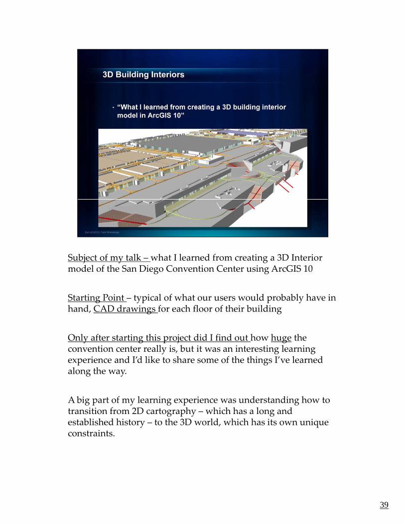
Subject of my talk – what I learned from creating a 3D Interior j y gmodel of the San Diego Convention Center using ArcGIS 10
Starting Point – typical of what our users would probably have in hand, CAD drawings for each floor of their building
Only after starting this project did I find out how huge the convention center really is, but it was an interesting learning experience and I’d like to share some of the things I’ve learned along the way.
A big part of my learning experience was understanding how to transition from 2D cartography – which has a long and established history – to the 3D world, which has its own unique constraints.
39

So, why make a 3D interior model in the first place? Two common goals: Visualization & AnalysisVisualization & Analysis
• Visualization: use of 3D represents space in a manner that’s closer to how we experience it firsthand. Video tours – more effective in representing the structure of an interior space than a 2D map. These are clearly stairs– and you can immediately recognize which was is up and which way down. 3D representations allow us to rely less on abstract symbologycommon in 2D maps. A result is that they have the ability to speak to a co o i aps A esu is a ey a e e a i i y o spea o abroader audience.
• Analysis: a 3D model provides a means for managing your data & Conducting analysis in 3 dimensions. This might include:
•Manage emergency assets – for example, the locations of fire extinguishers in and building and their service areas
•3D routing – calculate the shortest paths between locations in a•3D routing – calculate the shortest paths between locations in a structure, taking into account stairs, escalators, or other limits to accessibility. The pathways you see in this image
•As the 3D analyst team is demonstrating this week – can also analyze different visual sensitivity parameters – such as where sunlight or shadows fall over the course of a day.
But my focus for the rest of my talk will be on the visualization side – theBut my focus for the rest of my talk will be on the visualization side the build process of going from CAD data to a 3D model.
40

As I said, starting point was CAD files – and as you can see here, , g p y ,CAD files provide a lot of detail – that we don’t need for our model.
So I selected out just the important features… those that define or partition the building’s interior spaces.p g p
Here we have the original CAD data for the ground floor of the convention center
41

And here is the CAD after we remove all of the unnecessary data. yWhat we’re left with are:
1. Walls (Interior & Exterior)
2. Doors (Glass, Solid)
3 Wi d3. Windows
4. Stairs (transitions between floors)
5. Columns (another part of the structure – also obstacles to navigation)
6. Space usage (exhibit halls, conference rooms, bathrooms, offices)
I selected these features for each floor, then build polygons from these lines so that when we extrude them, they have thickness.
42

Bookmark 1
TOC > Each floor is its own group layer; build up each element of the ground floor
• Spaces – ground polygons – Open Symbologyp g p yg p y gy
• Solid Walls & Doors – Open Symbology, Base Height, Extrusion
• Glass walls & Doors – Open Display
• Door Swings – Show which direction doors open
• Columns – exhibit hall columns extruded based on height values available on the SDCC websiteavailable on the SDCC website
• Point symbols – converted our polygons to point centroids, then I created some simple 3D symbols
Add Mezzanine, upper floors
43

Bookmark 2 – Terrace
Even more intricate building features like stairs, use the same process. Each stair polygon has its own base height and extrusion value.
All the features I’ve shown so far have been extruded from a flat polygon surface, but you can also extrude inclined features – let’s go over to one of the banks of escalators between the ground and upper floor.
44

Bookmark 3 – Escalators
Here we have the same stairs we’ve seen on the terrace, and because we’re starting with a polygon layer that’s z‐enabled, I’ve given the bottom and top vertices of each of these handrails a different Z‐value –in this case, 1 meter above the base elevation for the lower and upper floorsfloors.
Open Extrusion properties
So from this inclined polygon features, the glass portion is extruded d 1 t i ti ldown 1 meter using a negative value…
Point out the option to add to each base height
…and the black handrail on top is extruded up 5 centimeters.
45

Bookmark 4 – Wall Heightsg
Now I’d like to show you some of the top floor, with a focus on the choice of wall heights. When I first started this project, I assumed that I’d be using realistic wall heights… but once I started to navigate the interior, it became very confining – and obscured any thematic information such as floor colors or 3D symbology So what I’ve doneinformation, such as floor colors or 3D symbology. So what I ve done instead is create a few different wall heights – and relate the height to the size of the room it contains. Exterior walls are higher, as are the walls that define larger interior spaces, while smaller rooms in the convention center use the shorter 1m wall.
So those are the basics of my 3D interior. From this basic structure, you might drop in a transportation network and run analysis – here I have the 3D network that was used in the routing web application for finding the shortest route between sessions.
O if t d t d th t i bit i ht t
46
Or, if you wanted to dress up the exterior a bit, you might create a realistic roof surface using LiDAR data. This data I downloaded from the USGS website, then clipped using the building footprint polygon. You can then convert this to a TIN for editing, then convert it to a multi‐patch feature and apply colors, texture, or imagery.

So we’re still learning a lot about how to manage data in a 3D g ginteriors context. The convention center, while vast, is only 3 floors and relatively straightforward. But how would you deal with a 50‐story high‐rise? How would you navigate it effectively – and how would you organize your table of contents?
3D Cartography is also a relatively new concept, so we don’t yet have the established practices that exist in the 2D world. For example, our use of differing wall heights based on the size of the interior spaces.
So we’re still in the process of creating some use‐based guidelines for representing 3D interiors spaces, but it has been an interesting exercise, and hopefully I’ve given you some ideas about how you can create your own 3D building interiors in ArcGIS.
47

KENNY – 8 MINUTES
48

Okay, for my presentation I’m going to talk about a few ways to y, y p g g yuse the HTML Popup tool in ArcMap, and introduce a new way to use it with online map services.
In browser
This U.S. Census Demonstration Map is a JavaScript application which leverages the demographic map services on ArcGIS Online, that allows the user to explore the datasets via the generation of carefully designed reports such as these [click map].
Notice that this doesn’t just contain a whole list of attributes like what you would get if you used the Identify tool in ArcMap. It has been tailored to fit the selected theme of “Unemployment”.
49

If we select another theme, say “Diversity”, and clicked on the , y y ,same location, we get another preformatted report. Only this time, the attributes and charts shown are relevant to the theme of “Diversity”. This is the same for all the themes in this application. They all have their own customized reports, with information that have been formatted to be more easily understood.
50

In ArcMapp
And now, let me move over to ArcMap to show you the default ways that you can create popups there, and then I’ll demonstrate how to create in ArcMap, a report like the one you just saw in the Census app.pp
Here, we have the feature class used to create the Unemployment map service from ArcGIS Online that was used in the Census application you just saw. We also have the reference and terrain layer as the base map, but I’m going to switch them off so that y p g gyou can see this demo more clearly.
Now first, let’s take a look at the default options for HTML popups. Note that the layer properties I will be bringing up now are just from copies of the same layer that I’ve preconfigured j p y p gwith their respective settings in advance to save time.
51

Now let’s open up the Layer Properties for Default Option 1 and p p y p pgo to the HTML Popup tab. Here we enable this ‘show content using the HTML Popup tool’ option. And here, we have three types of popups that we can use.
The first one just shows the popup as a table of the visible fields. j p p pSo if I select this option and click Verify, we get a table for Alaska by default because it is the first record in the feature class. Now you can modify how this looks in the Layer Properties by configuring which fields are visible, editing the aliases and setting the number format. But using this option, there is little else you can do to change how this table lookselse you can do to change how this table looks.
52

Now let’s close this and look at Default Option 2. The second poption is different in the sense that it only uses an attribute in the feature class to specify the URL of a website to be shown in the popup. Again, I’ve already done this in advance to save time, but if you select ”As a URL” and type this in as the prefix, set the field to ‘Name’, and click Verify, you will get the actual Wikipedia entry for Alaska This is actually very useful becauseWikipedia entry for Alaska. This is actually very useful because you can popup a URL using your state name or any other unique field.
53

Finally, let’s close this and look at the third option. This option is y, p pa little bit like the first one in that it shows a table of the fields in the popup. However, this allows you to format the table by creating your own or loading an XSL template. Let’s try this. We select this option, go to “Load XSL template”, try this green one, and click Verify. All this template does is it formats the table to be green in color You could probably do a lot more but yoube green in color. You could probably do a lot more, but you would need to know how to do it using XSL, which many people are not familiar with.
Close dialog
Note that these popups all pull information that exists in your attribute table, so you are limited to reporting only data you have in your map. But what if you wanted to report data from online map services that you just don’t have on your machine? And what if you wanted the report to look more like something you saw in the Census application earlier? We might need to take a slight detour from these methods that you’ve just seen, but we can actually do both, and I’m going to show you how.
54

So, say we have the map and data for Unemployment, but we , y p p y ,also want to report data on Diversity. Problem is, we don’t have that data. However, there is a map service for that on ArcGIS Online that we can use.
Switch to browser
Here, we have a large collection of demographic maps available for you to use. Let’s look for the USA Diversity Index map, click on Details, scroll down, and click on the link to the REST endpoint here. p
55

Now there are a few things to note here for the next few steps. g pThe map we have is at the state scale level, so let’s click on States, and we need to make a note of the layer ID here which is 4, and the Display Field which is ID.
56

The next thing that you would need is the HTML file for g ygenerating your report but you don’t have to worry about it because we will be posting templates that you can just download and use along with instructions, on Mapping Center. So let’s proceed to setting up the popups in ArcMap.
57

In ArcMapp
Now, let’s go to the Layer Properties for our Diversity layer. Again, this is a copy of the same map with the properties already set so that you don’t have to watch me slowly type it in.
Here, we need the ”As a URL” option selected, and for the Prefix, we have the path to our HTML file.
At the end of this path, we will need to add in a query string that l k lik thi [th t f th t i ft “?”] Thi b hlooks like this [the part of the string after “?”]. This number here should be the layer ID that we saw in the REST endpoint earlier. This query string is here so that the application knows to fetch the parameters that begin after the question mark symbol and that it should get data from layer ID 4, which corresponds to the State level of the map service.p
Next, we need to select the Field that corresponds to the Display Field of the map service that we will be querying, which in this case is the ID.
58

Now when we test it out,…,
Close menu, click map
…this is how the report looks like.
Note that this is the map for Unemployment, but the report is not showing data contained in the map. It is pulling everything from an online map service.
59

This is really useful because we can show reports for different map services from this same map. So for example if we wanted to show a report from the Unemployment map service on ArcGIS Online, I just have to enable this Unemployment Popup layer which I had setup in advance, click on the map, and here it is.
Now why should we bother to create HTML popups such as these when we can just use the default ones in ArcMap? Well, the main reason really, is flexibility.just use the default ones in ArcMap? Well, the main reason really, is flexibility. You can easily control what is shown and how they are shown. You can customize it using HTML, CSS, Javascript or Flex and use charting engines such as Google Charts. Unlike the default options, you can generate your popups using online map service. And finally, because the data behind these reports are from online services, you can create prepackaged reports, send the HTML file to someone else, and as long as that person has a map which shares a similar Display Field, he or she would see the same report you see. What is really nice about this is it blurs the p y ylines between web, desktop and server. Not everyone has ArcGIS Server and the ability to publish their own services. And sometimes we just don’t have the expertise or time to create fancy web mapping applications to present or analyze our data. But most of you have ArcMap I hope, and there is a whole lot of content on ArcGIS Online that you can use to enhance the reporting of your data. Okay, I know this is a lot to take in for a short presentation, but we will be posting a blog entry with instructions and downloads on how to do after this conference, so please remember to look out for it on the Mapping Center website.
And now, we have Jim Herries who is going to talk about sharing your maps on ArcGIS Online.
60

JIM – 12 MINUTESJ
61

62

63

64

65

66
67

68

69

70
CAITLIN – 12 MINUTES
Jim just told you how you can share your content on ArcGIS.com.
Now I will show you some new functionality in ArcGIS 10 that k it f t h d l i Mmakes it easy for you to share your maps and layers using Map
Packages.
71
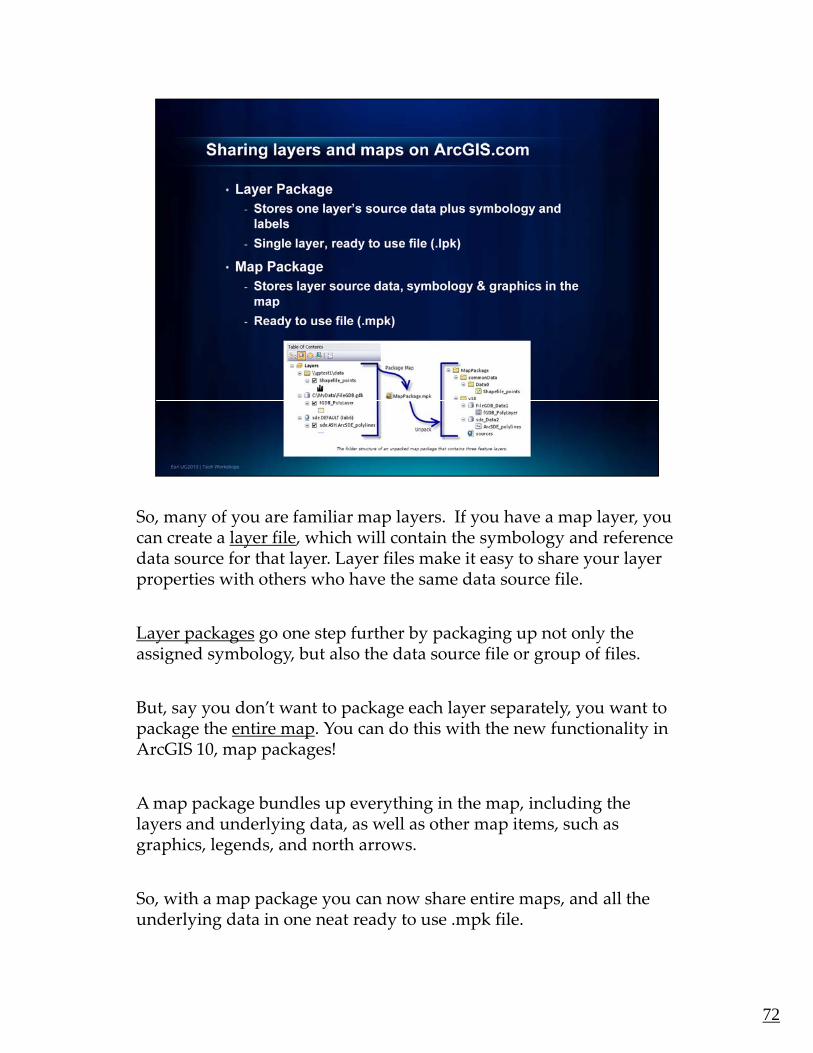
So, many of you are familiar map layers. If you have a map layer, you y y p y y p y ycan create a layer file, which will contain the symbology and reference data source for that layer. Layer files make it easy to share your layer properties with others who have the same data source file.
Layer packages go one step further by packaging up not only the assigned symbology but also the data source file or group of filesassigned symbology, but also the data source file or group of files.
But, say you don’t want to package each layer separately, you want to package the entire map. You can do this with the new functionality in ArcGIS 10, map packages!
A map package bundles up everything in the map, including the layers and underlying data, as well as other map items, such as graphics, legends, and north arrows.
So, with a map package you can now share entire maps, and all theSo, with a map package you can now share entire maps, and all the underlying data in one neat ready to use .mpk file.
72

If you remember, I started my presentation by talking about y , y p y gLayer Files and Layer Packages.
You can create these products by Right Clicking on your layer in the Table of Contents, and selecting either Save as Layer File, or Create Layer Package.y g
Creating Map Packages is just as easy. You simply expand the options under the File menu, and select Create Map Package.
73

In the Create a Map Package window you have the option to p g y peither upload your Map Package to your ArcGIS Online Account Or Save your package to a local file.
I am going to save my package to a file, and then click Validate to analyze the map for any errors or issues. My map is free of any y p y y p yproblems, but if an issue is discovered, a dialog will appear with suggested fixes for the problems.
After the information in the window is validated the Share button will become enabled. And after you click share, the map y ppackaging process will begin.
This process can take a bit of time depending on how complex your map is, so I already created a map package to show you.
74
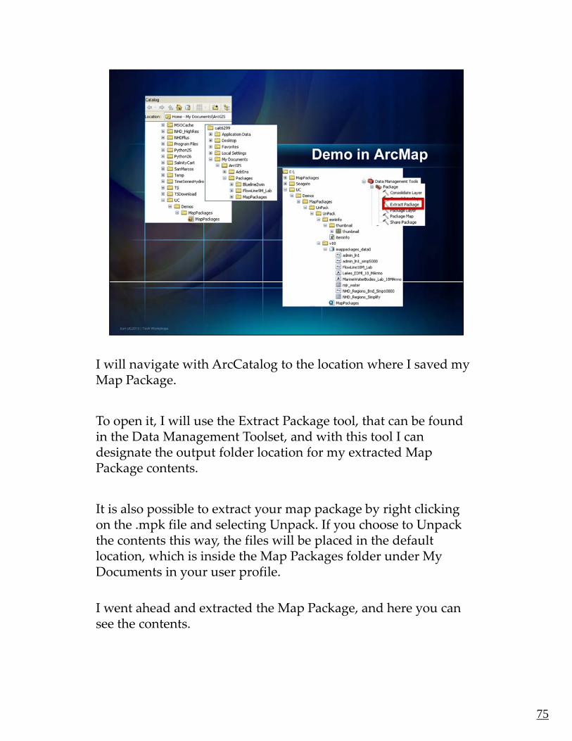
I will navigate with ArcCatalog to the location where I saved my g g yMap Package.
To open it, I will use the Extract Package tool, that can be found in the Data Management Toolset, and with this tool I can designate the output folder location for my extracted Map g p y pPackage contents.
It is also possible to extract your map package by right clicking on the .mpk file and selecting Unpack. If you choose to Unpack the contents this way, the files will be placed in the default y plocation, which is inside the Map Packages folder under My Documents in your user profile.
I went ahead and extracted the Map Package, and here you can see the contents.
75

If you want to share your Map Packages with others, you can y y p g , yshare them the way you share other digital files, through FTP sites or attached to emails. But you can also share your packages on ArcGIS.com, like Jim was showing us earlier.
So, taking a step back, in the Create Map Package window, you’ll g p p g yremember that one of the options was to upload your Map Package to your ArcGIS Online account. After you validate, and share you are asked to sign in to your ArcGIS Online account, and after you are in, you fill in the details of you package, such as the map name, description and Tags.
Then simply click Ok, and the packaging process begins. Again, depending on the complexity of your map, this process can take some time, so I already uploaded the package to my ArcGIS.com account. Here you can see that the package has been uploaded, and shared with members of my group and I can open up theand shared with members of my group, and I can open up the map package in ArcGIS from here, as well.
76

We are really excited about this new functionality, and we think y y,that it will be useful to our Users for a number of reasons.
The first is something that thought of from my time working for a consulting engineering firm. And this was to use map packages as deliverables to clients.
So, instead of just providing them with the paper maps in the reports, you can also provide them the data, cartography and graphics that reside in your map document.
So, they truly have a functional digital copy of the maps that they could recreate in ArcGIS if they so choose.
77

Map packages are also useful data collection tools when p p gcommunicating with subcontractors.
For instance, at my last job I worked on a number of Sewer Network projects, and the networks were always missing attribute information for the pipes and manholes. So, we would p phire a sub contractor go into the field, and collect the missing attribute information.
Instead of providing the sub with a spreadsheet of manhole ID numbers, which is what we often did, you could provide them y pwith a map package that you have symbolized to show the locations that require data collection. In addition, the subcontractor can enter the missing attributes directly into the correct database schema.
So, the subcontractor has immediate use of the map so they can quickly begin working and completing their tasks.
78

Map packages are also useful for archiving your maps.p p g g y p
In the same way that you can provide map packages as deliverables, you can create Map Packages to digitally archive your maps.
So, again, this new functionality creates one neat package with everything required to recreate your map.
79
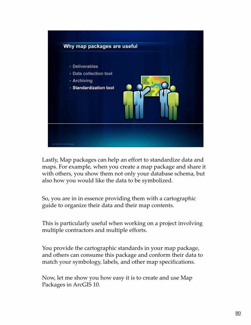
Lastly, Map packages can help an effort to standardize data and y, p p g pmaps. For example, when you create a map package and share it with others, you show them not only your database schema, but also how you would like the data to be symbolized.
So, you are in in essence providing them with a cartographic y p g g pguide to organize their data and their map contents.
This is particularly useful when working on a project involving multiple contractors and multiple efforts.
You provide the cartographic standards in your map package, and others can consume this package and conform their data to match your symbology, labels, and other map specifications.
Now let me show you how easy it is to create and use MapNow, let me show you how easy it is to create and use Map Packages in ArcGIS 10.
80

We hope you will find this new Map Package functionality p y p g yuseful:
• To provide deliverables
• As data collection tools
• For Archiving
A d f t d di ti• And for standardization
As I said earlier, we hope you’ve seen just how easy it is to create Map Packages and share them with others.
Now back to Aileen for a brief wrap up of our Lightening Talks session…
81

We’ve certainly covered a lot of ground in the past hour. We y g pstarted with data‐driven pages, time‐enabled GIS, and 3D mapping – all new in ArcGIS 10.
We also showed you ways to leverage content from ArcGIS Online to customize HTLM popups that are used in ArcMap and h k d h h A GIShow to make maps and share them on ArcGIS.com.
And Caitlin showed you how you can share your maps and data using map packages – something else that you might want to use with ArcGIS.com.
We hope we’ve been able to show you some tips and tricks that you’ll find useful when you’re making your maps and sharing them with others.
82

As we mentioned in the beginning, this presentation with all the g g, pbottom notes will be posted on the Mapping Center Web site on the Other Resources tab. Look for it there in a couple of weeks.
8383

We encourage you to fill out your surveys to let us know if you g y y y yfound this presentation helpful, and what we might be able to do better in the future to help you.
We thank you very much for your time and attention, and now, we’re happy to take any questions you may have.
84