my merrill account aggregation/net worth · pdf filelearning objectives & high level...
TRANSCRIPT

My Merrill | Account Aggregation/Net WorthQualitative Research FindingsJune 19‐22, 2012
Lisa R. Handalian Usability Engineer
Proprietary and Confidential – Do Not Distribute
y g

Introduction & methodology 2
The week of June 18‐22, a usability test was conducted to assess the quality of clients’ interactions with the Yodlee‐driven Account Aggregation tool on the My Merrill platform. The test took place remotely, over the telephone and Webex. The four, hour‐long sessions were conducted by Lisa Handalian.
These advised clients also had financial relationships with other firms
While on the telephone, participants took control of the mouse and navigated the high fidelity prototype through a set of tasks as if it were on their own screen.
Once issues were identified, they were assigned “severity” ratings based primarily on the impact and persistence of the issues. Frequency was not considered (n=4).
Severity 1 – High probability that users would abandon the task due to frustration or dissatisfaction, uncertainty/lack of confidence, or feeling “stupid.” Several users experiencing or reporting the same issue.
3
verall
Severity 2– Likely that the task would be completed – though often not in the most intuitive way ‐ but not without possible error or some delays or need to consult interactive help.
S it 3 P ibl i f i b t t ti t
2
Issues ov
Proprietary and Confidential – Do Not Distribute
Severity 3– Possibly causing confusion, but not preventing autonomous completion of the task at hand. 2
7

Participants 3
The current research was conducted with four client participants identified through their advisors and representative of the target user group (with extensive ML relationships as well as accounts held at other institutions).p )
Although five to seven participants would have been preferred, studies have shown that 75% of usability problems are typically identified with as few as four participants (Nielsen, 2000).p p ( , )
The goal of usability studies is not to represent the entire population, but rather to expose potential areas of confusion or difficulty, and common themes related to the usability of the experience. y p
Proprietary and Confidential – Do Not Distribute

Tasks 4
“Day 1”
Task 1: You have just logged in to your account on the MyMerrill site, arriving on the Accounts Overview screen. Imagine that you have have heard that the website offers newly enhanced functionality where you can view all of your financial accounts in one place, including the ones you have with other institutions. Where would you go to sign up?
W ld i d i t t t th Would you give your advisor access to see your accounts at other institutions besides ML? (All accounts? Or could you pick and choose?)
If you wanted to add (additional) external accounts, how would you?
“Day 2”Task 2: Let’s say you’re done with the site for the day and log out. If you wanted to see your ‘net worth’ the next time you log in, where would you go to do that?go to do that? How does the P&A My Accounts page compare to the MFP page? Once you’ve added external accounts (via MFP) would you expect that the data displayed in Activity and/or Performance would reflect the
Proprietary and Confidential – Do Not Distribute
p y y /non‐Merrill accounts?
Where would you go to view or change your advisor visibility settings?

Learning objectives & high level outcomes (slide 1 of 2) 5
1. Elicit user reaction to the new Account Aggregation/Net Worth functionality – both independent of, and including, the ability to view external accounts.
The tool was generally well‐received mainly for the purpose of viewing external accounts. Participants did not have a clear understanding that they had enrolled in a program that
had aggregation benefits even without adding external accounts.
2. Observe how easy the My Financial Picture section is to find on the site, and whether participants confused it with other pages (e g P&A Accounts)participants confused it with other pages (e.g., P&A Accounts).
All participants easily found/used the L2 MFP link both on initial search and “the next day” after enrolling. None used (or seemed to notice) ‘Learn more’ in the right module.
Participants didn’t express confusion as to whether they were on the Net Worth screen or P&A Accounts (i.e., they had a sense of their location at all times).
3. Identify any issues with enrolling, adding outside accounts, and viewing the results.
The enrollment process did contain a few problem areas, specifically around the lack of The enrollment process did contain a few problem areas, specifically around the lack of descriptive text on the Get Started splash (slide 9) and T&C modals (slide 10) in order to set more thorough user expectations. See recommendations for these screens, as well as the Add Accounts interaction (slides 11‐14).
Participants easily recognized when external accounts had been added and found their
Proprietary and Confidential – Do Not Distribute
Participants easily recognized when external accounts had been added and found their organization logical.
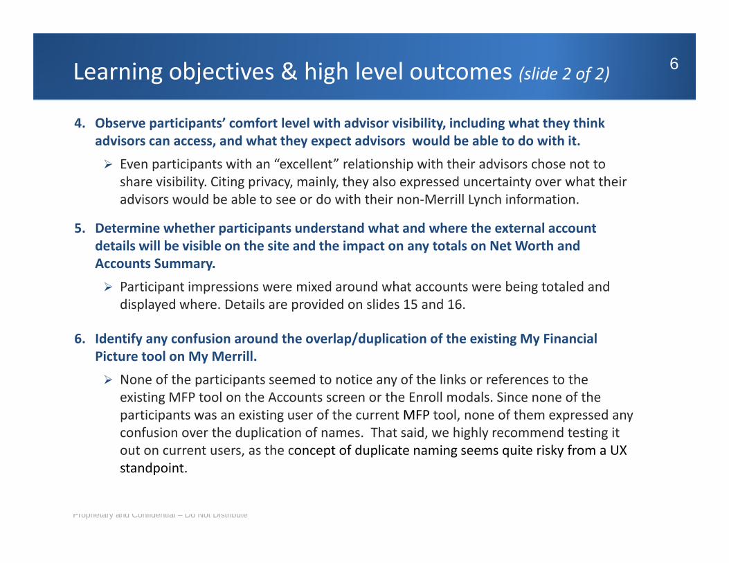
Learning objectives & high level outcomes (slide 2 of 2) 6
4. Observe participants’ comfort level with advisor visibility, including what they think advisors can access, and what they expect advisors would be able to do with it.
Even participants with an “excellent” relationship with their advisors chose not to share visibility. Citing privacy, mainly, they also expressed uncertainty over what their advisors would be able to see or do with their non‐Merrill Lynch information.
5. Determine whether participants understand what and where the external account details will be visible on the site and the impact on any totals on Net Worth anddetails will be visible on the site and the impact on any totals on Net Worth and Accounts Summary.
Participant impressions were mixed around what accounts were being totaled and displayed where. Details are provided on slides 15 and 16.
6. Identify any confusion around the overlap/duplication of the existing My Financial Picture tool on My Merrill.
None of the participants seemed to notice any of the links or references to the existing MFP tool on the Accounts screen or the Enroll modals. Since none of the participants was an existing user of the current MFP tool, none of them expressed any confusion over the duplication of names. That said, we highly recommend testing it out on current users, as the concept of duplicate naming seems quite risky from a UX
Proprietary and Confidential – Do Not Distribute
standpoint.

Detailed Findings & Recommendations
Proprietary and Confidential – Do Not Distribute

Task 1 | Navigation & homepage invitation 8
Task 1: Where would you go to learn more or sign up for a new tool that allows you to view all of your financial accounts in one place, including ones you have with other institutions?
Observations
All 4 clients went to the L2 My Financial Picture (“MFP”) link, not “Learn more.”
When it was pointed out, most said they thought it to be advertising.
One person did read it over quickly, but still opted for the MFP link.
The link was also easy to re‐find after leaving MFP section.
Proprietary and Confidential – Do Not Distribute
The link was also easy to re find after leaving MFP section.

Task 1 | My Financial Picture splash page 9
Issue 1: The content on the introductory splash screen did not set user expectations very effectively.Severity: 2 (Medium)
In general participants were unclear as to the purpose of this page. A couple of participants actually mentioned they weren’t sure if they were looking at an “ad” explaining MFP or not.
Likely due to the top‐heaviness of the graphics, users did ’t t d t d th i t t t t t th b tt
1 2
didn’t tend to read the important text at the bottom – which, when they finally looked at, it gave them only a partial sense of what MFP would do for them.
One participant (admittedly with browser issues) could not figure out the nature of this screen. He
R d icou d o gu e ou e a u e o s sc ee efinally saw the Get Started button only after being prompted to scroll down past the graphics.
Recommendations1. Consider re‐organizing the screen so the MFP
summary (#1) and Get Started (#2) information can be seen earlier, possibly above or beside the screen shots. In addition, strive to make it clearer that this
1,
is an intro/explanatory page.2. It may even be helpful to annotate the individual
images with the bullet points on #1. As it stands, this text is the most descriptive, preparatory text li ill d i h ll
1
Proprietary and Confidential – Do Not Distribute
clients will see during the enrollment process. Combining the text with visuals of the end result could be quite effective (see BBI gen 1 examples).

Task 1 | Terms & conditions 10
Issue 2: Participants were unsure what they were signing up for or granting access to.Severity: 1 (High)
Sub‐task: Would you give your advisor access to see your accounts at other institutions besides ML? (All accounts? Or could you pick and choose?)
A few mentioned that they would (atypically) read these Terms & Conditions because they had only a vague sense of what they were granting Merrill Lynch access to – and for something like this, they wanted complete claritywanted complete clarity.
Not fully understanding made some consider abandoning the enrollment until they had a clearer understanding of what they were agreeing to.
Not knowing what exactly they were granting their g y y g gadvisor access to seemed particularly disconcerting.
Recommendations1. Consider presenting the T&C section after users
have been shown a more concrete explanation of
I wouldn’t want to grant my advisor access because what if I changed my mind? That would be embarrassing.
Sure, he can have see it ‐‐ you [ML] already have access to everything I hold. Why not?
have been shown a more concrete explanation of what MFP entails – possibly supported by visuals.
2. The allowing advisor visibility section would benefit from clearer, explanatory, and up‐front language, possibly with an enlarged modal to afford some
Proprietary and Confidential – Do Not Distribute
I want to see something like ‘by clicking here, you’re giving ML permission to access your other accounts …’
separation between it and the T&Cs.

Task 1 | Getting started 11
Issue 3: Participants struggled with the content of this modal. Severity: 2 (Medium)
The “Getting started” header surprised those
1
2
who’d assumed the T&C modal was the starting point.
The reference to “linked Merrill accounts” accounts did not mean much to users.O ll it ’t l th t i ti ML
3 Overall, it wasn’t clear that existing ML accounts would be displayed in a different way, i.e. that even if they didn’t add outside accounts, they were enrolling in a new way of looking at their current accounts. Welcome…
A possible design direction
g
The only tangible benefit / new feature that users could relate to was adding external accounts.
The references to both Bank of America What viewing the net worth of your existing “linked ML
What viewing the net worth of your external accounts …” gets
To start setting up MFP to view your Net Worth… You will need external online account logins (without online access, you cannot take advantage of MFP).
1
accounts and the previous version of MFP were lost on all the participants.
Recommendation1. Consider using explicit, benefit‐oriented
accounts …” gets you.
View your accounts on the new Net Worth page>>
(you can always add external accounts later)
you.
Add external accounts to your net worth picture >>
3
Proprietary and Confidential – Do Not Distribute
language to explain both what customers will get whether they add an outside account or not – and what they’ll need to set it all up (e.g. online IDs for each account).
Note: If you used the previous version of MFP, … 2

Task 1 | Add accounts 12
Issue 4: The FI input interaction did not function as any of the participants expected.Severity: 1 (High)
After entering an FI name participants automaticallyAfter entering an FI name, participants automatically hit Search – interacting with it like a Submit or Go button (#1). It took a few tries to associate the (grayed out) Next button as the primary call‐to‐action for this page.
1
The dropdown auto‐fill (#2) was not particularly well received, either as a time saver or memory aid; participants found it unnecessary. Not only did they feel they’d know the name of their own FI, but they weren’t purpose it was serving as in to drill down on
2
weren t purpose it was serving, as in to drill down on specific detail ‐ such as what?
Recommendations1. Consider separating out the two input experiences:
3
What additional choices will the drop down give me –which branch I use, which state I live I, what type of account? It’s clearly
Search and entering your (known) FI.
2. Rather than suggesting FI names through auto‐fill, it might be better to present a list of results that can be sorted or filtered further.
yprompting me to pick only one E*Trade…
Instead of these pages, I would much rather see a scrollbar!
Proprietary and Confidential – Do Not Distribute
3. The interaction of clicking on a result name (#3) and having it populate the text box worked seamlessly.

Task 1 | Add accounts > Enter your credentials 13
Issue 5: Using the term “credentials” seemed to represent Bank rather than user vernacular.Severity: 3 (Low)
d i1
Recommendation1. Although it tripped no one up, and only one
participant mentioned finding the term “credentials” (#1) to represent “Bank jargon,” it might be worth considering other terminologymight be worth considering other terminology like “Login name or User ID and password.”
Observations
On the prior step of the Add Accounts process,
2
one participant had expressed some concern about hitting “Next” since he wasn’t sure if he’d be able to get back to that screen.
Upon seeing the Previous (#2) link here, he said he was glad to see it and suggested we mighthe was glad to see it and suggested we might want to give customers “a heads‐up” that they will be able to get back to a previous screen at any time.
One participant wondered just what was being
3
Proprietary and Confidential – Do Not Distribute
p p j gdownloaded (#3) but trusted in the process since he was “in [his] own account.”

Task 1 | Confirmation 14
While I’m logged in to Merrill Lynch I assume I will
Participant impressions of what they had just enrolled in
3
While I’m logged in to Merrill Lynch, I assume I will be able to log in to Fidelity and manage my accounts.
It will take me to all my institutions, like a doorway Very convenient!1
2
Observations
doorway. Very convenient!
I like the idea that my advisor will be able to see all my accounts and activity, so he can give me a diversified view that will tell me how I can do better in the future
All but one participant used the View Net Worth link (#1); they weren’t sure where Close (#2) would take them.
The fourth clicked Manage Sharing (#3) as his last step having wondered aloud when on the T&C
better in the future.
I will get a web[page] where it’ll give me a snapshot of what my portfolio would look like in the future… It’ll show all my external account totals – such as assets property credit and debitstep, having wondered aloud when on the T&C
modal whether he could make changes to his selection down the road.
A couple of participants opened the Real Estate and Other Property tabs, which met their expectations.
totals – such as assets, property, credit and debit cards…
Note that participants’ expectations revolved around having external accounts intermingled with
Proprietary and Confidential – Do Not Distribute
p y , p Their expectations of the Net Worth screen were varied. See right.
g gtheir Merrill accounts.

Task 2 | Post‐enrollment All Accounts > Summary 15
Issue 6: The contents of the post‐enrollment Accounts Summary screen did not match participants’ expectations.Severity: 1 (High)
Most participants did expect the My (Merrill) Accounts Total (#1) to
Task 2: If you wanted to see your ‘net worth’ the next time you log in, where would you go to do that?
1 include the external assets they had just added. One understood that not to be the case and suggested that both totals be listed on the top right because he “want[ed] to know [his] whole worth –isn’t that the point?”
N ld f h th th i ING d E*T d t No one could say for sure whether their ING and E*Trade accounts would be listed out on the Activity and Performance tabs.
More than one participant commented that the wording “Total Assets” (#2) was “confusing” and “inconsistent” since they were referred to as “assets” while living in the External Accounts section
<snip>
1 referred to as assets while living in the External Accounts section.
Recommendations1. You may want to revisit the heading “External Accounts” as it might also include real estate or possessions that do not come in account form. It’s hard to envision the structure of this section if such assets were also present.
2. Most assumed believed that their external account information would be updated nightly, although they weren’t sure where they t th t i f ti It ld b bl b f b fit t k
Proprietary and Confidential – Do Not Distribute
2
got that information. It would probably be of benefit to make a statement to that effect either on this screen or on MFP.

Task 2 | MFP > Net worth 16
1
3
Observations
For the most part, participants were satisfied with how the numbers added up alongside the
3
2Merrill accounts (#2).
Only one participant commented on the different organization of accounts on this page compared to Accounts Summary.
id h ld lik h h
2
4
Two said they would like to see the net worth number (#3) in the top right (as on Accounts Summary), rather than in the right module.
Participants hesitated when asked where the My Accounts dropdown (#1) would take them2 My Accounts dropdown (#1) would take them, and assumed that they were MFP‐based only.
No one “saw” the Import Accounts from MFP” module (#4). The references to “import accounts” or “re‐enroll” (in the set up modal) are quite subtle and potentially likely to cause confusion. Recommendation: It may be worth differentiating between the two different yet identically named versions of MFP and explaining the relationship between the two
Proprietary and Confidential – Do Not Distribute
3explaining the relationship between the two explicitly.

Task 2 | MFP > Manage sharing 17
Issue 7: The term “Manage” resonated with participants, despite taking them a while to find it. Severity: 3 (Low)
did ’ i di l i i h
Subtask: Where would you go to view or change your advisor visibility settings?
1 It didn’t immediately occur to participants that
the MFP Net Worth module (#1) was interactive. Like the invitation on Accounts Summary, they initially overlooked it as either static or promotional information based on its
2
plocation.
The Manage tab (#2) was somewhat easier to locate, although participants tended not to see the L4 tabs at first.
The Manage Sharing content did make sense to them.
Recommendations1. Consider giving the Manage button (#1) either
a different call‐to‐action element with stronger affordance, move it to a more central location on the MFP, or even remove it from this module. As is, it lacked the desired effect.
Proprietary and Confidential – Do Not Distribute

Any questions? 18
This report can be found on Discovery at http://discovery.bankofamerica.com/discovery/livelink?func=ll&objid=77234638&objAction=browse&sort=name638&objAction browse&sort name
Proprietary and Confidential – Do Not Distribute