my_portfolio_2013_1
TRANSCRIPT


2

3
Overview………………………………………………………………………………………………………….….…….4
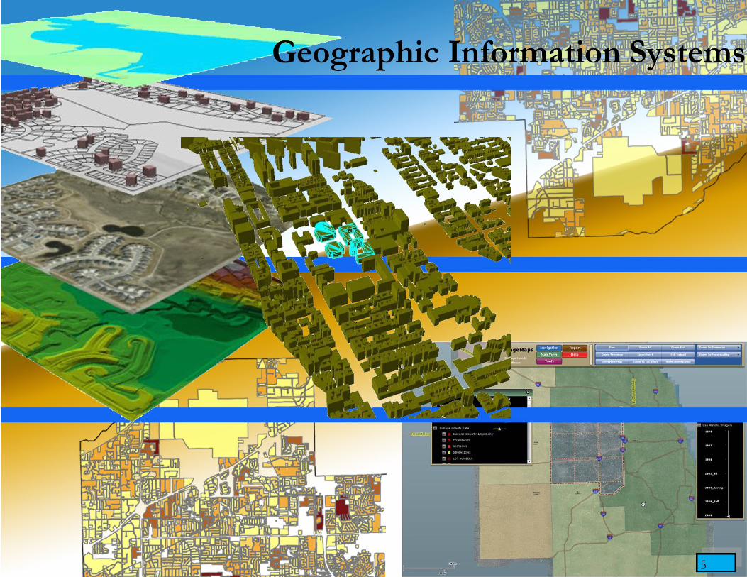
Geographic Information Systems……………………………………………………………………………….….…….5
Professional Work……………………………………………………………………………………….….….…6-22
School Work…………………………………………………………………………………………….....…….23-48
Landscape Architecture………………………………………………………………………………………..….……..49
Sketches and Hand Renderings……………………………………………………………………….…...……..50-52
2-Point Perspective……………………………………………………………………………………….….……....53
Space Chunk Axonometric…………………………………………………………………………………..…...….54
Monumental and Intimate Space Design……………………………………………………………………..…..55-56
University of Illinois Campus Courtyard……………………………………………………………………..….57-58
Urbana Park………………………………………………………………………………………………….….59-61
Design Exemplar………………………………………………………………………………………………...….62
Basic Engineering…………………………………………………………………………………………………….….63
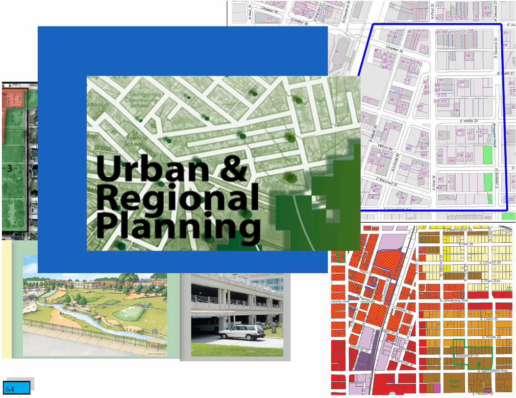
Urban & Regional Planning………………………………………………………………………………………….….64
Land-Use Planning: City of Champaign First Street Corridor……………………………………………...…….65-69
Site Design: North Mahomet Proposed Development……………………………………………………………....70
Real Estate Development………………………………………………………………………………………………..71
FEMA Briefing……………………………………………………………………………………………………..…….72
Certifications……………………………………………………………………………………………………….…….73

4
A portfolio to me does not just represent works from an individual’s education or career, but the journey they went
through to get there. Everyone experiences and grows from certain events that shape their life—a portfolio is similar in the
sense that is a great opportunity to reflect and move forward with acquired knowledge. It’s a collaboration of different
points in time with different levels of experience. When I look back at previous works from a portfolio, I feel that they
have allowed me to summarize what I have done, take out what I have learned, and help me approach problems differently
for the next time.
Sometimes it is not that easy to take everything you learned from a previous project and apply it to the next. There may
be growing number of factors you learn about during the course of the project, or even afterwards. This is also the reason
time is always against you on a project. There are new details and new findings you can always keep expanding on. But
from those curve balls thrown you begin to learn how to manage your time efficiently.
Overall, this is not just a reflection of my work, but stages of development, a timeline of interests, the impact I am going
toing to have on a variety of fields, and the stance I may take on future projects. Shaping your identity comes through a cu-
mulative array of past experiences and choices. This portfolio has helped me start to see some of these visions that were
not so apparent from the beginning.
5 5

6
Left: An analysis of the level of difficulty of receiving applications to HHF based on several weighted factors. December 2012.
Right: A foreclosure heat map based on county foreclosure rates showing the spatial distributions of funded borrowers of the
Illinois Hardest Hit Fund program. December 2012.
7
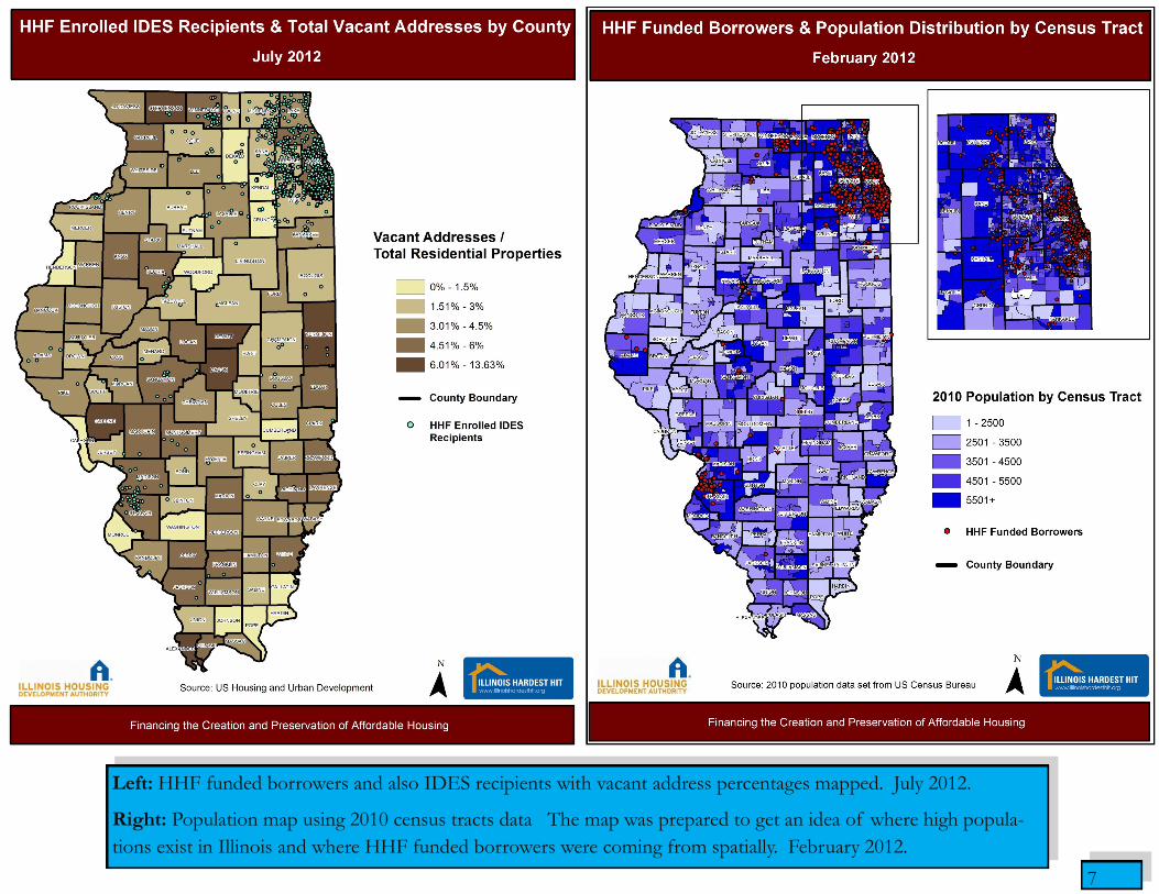
Left: HHF funded borrowers and also IDES recipients with vacant address percentages mapped. July 2012.
Right: Population map using 2010 census tracts data The map was prepared to get an idea of where high popula-
tions exist in Illinois and where HHF funded borrowers were coming from spatially. February 2012.
8
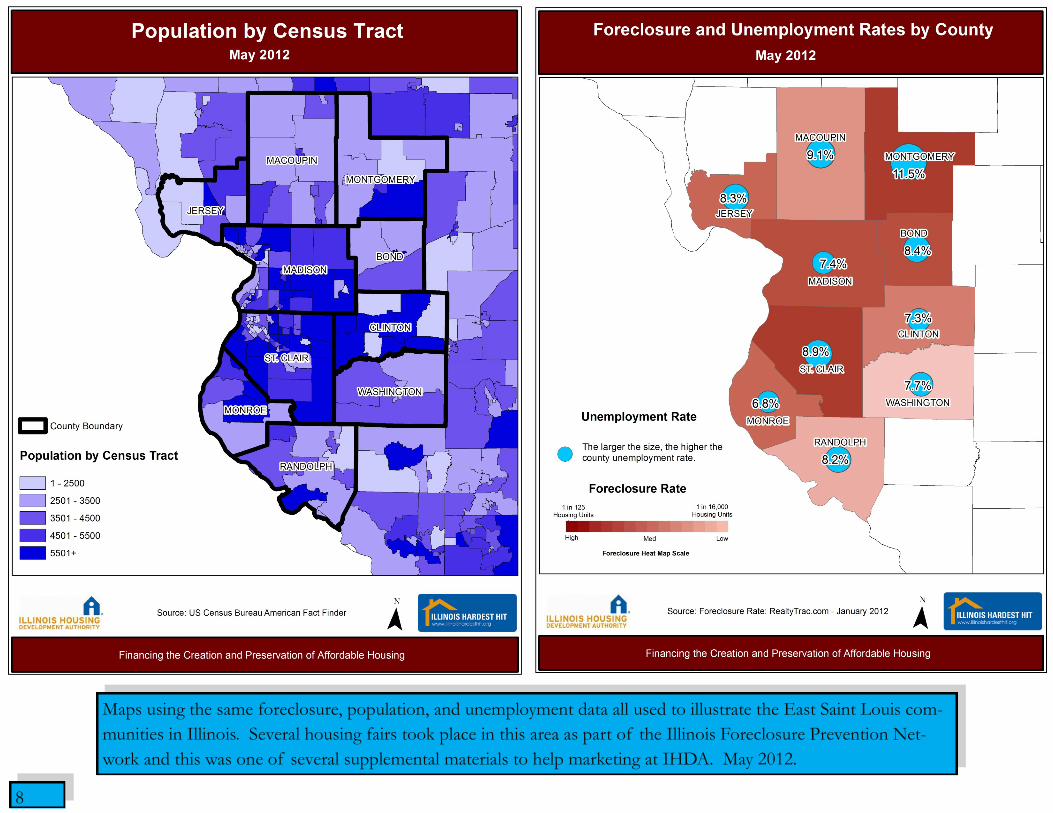
Maps using the same foreclosure, population, and unemployment data all used to illustrate the East Saint Louis com-
munities in Illinois. Several housing fairs took place in this area as part of the Illinois Foreclosure Prevention Net-
work and this was one of several supplemental materials to help marketing at IHDA. May 2012.

9
Maps used to visualize agency coverage for the Hardest Hit Fund Program.
Left: Downstate agency coverage. Right: Agency coverage in Illinois collar counties as well as agency coverage for
the City of Chicago. October 2011.

10
Above: Percent increase in applications by county
after the first media campaign was launched
(September 14, 2011). December 2011.
Right: Expected county share of applications cal-
culated by dividing the percent of applications re-
ceived by the percent of the county's population in
relation to the state. October 2012.
11
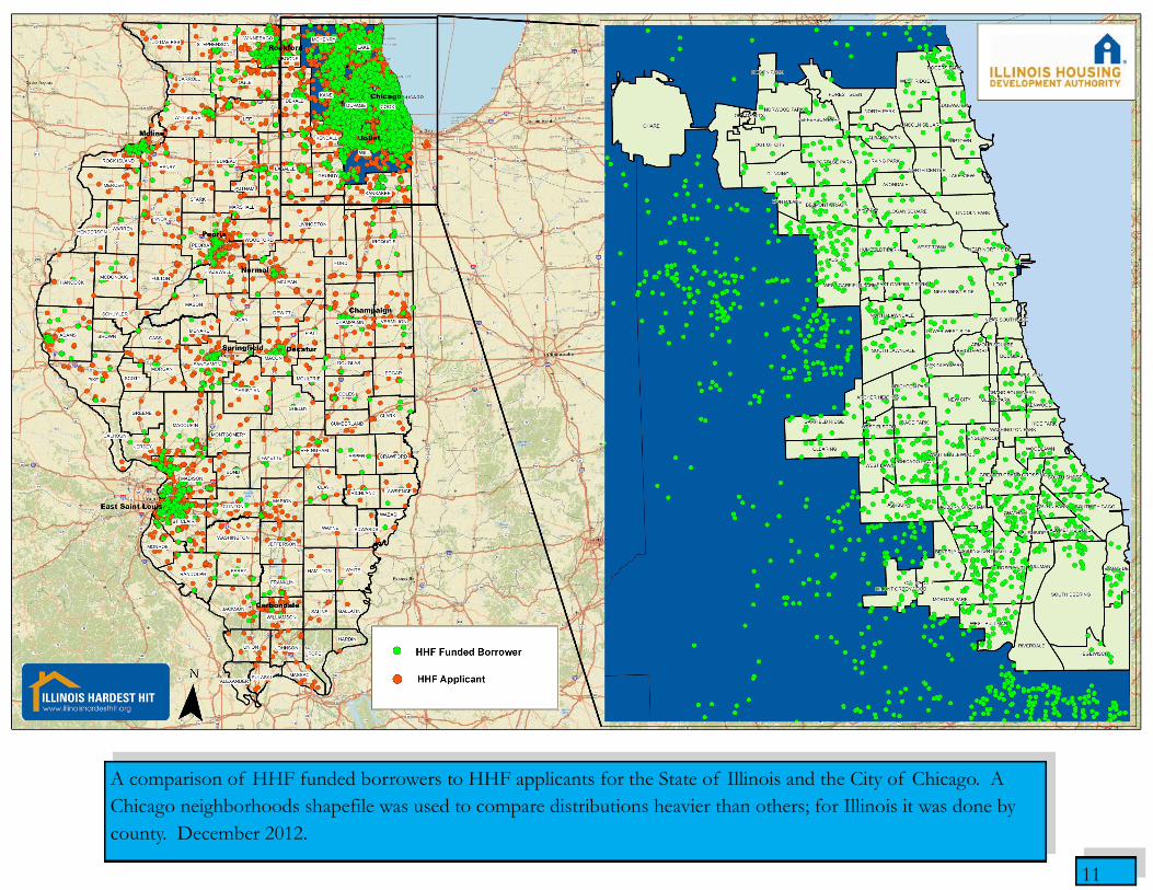
A comparison of HHF funded borrowers to HHF applicants for the State of Illinois and the City of Chicago. A
Chicago neighborhoods shapefile was used to compare distributions heavier than others; for Illinois it was done by
county. December 2012.
12
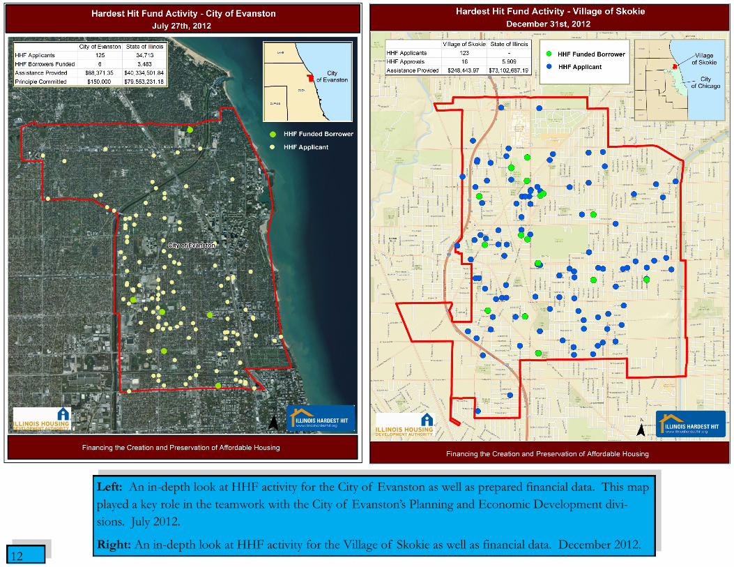
Left: An in-depth look at HHF activity for the City of Evanston as well as prepared financial data. This map
played a key role in the teamwork with the City of Evanston’s Planning and Economic Development divi-
sions. July 2012.
Right: An in-depth look at HHF activity for the Village of Skokie as well as financial data. December 2012.
13
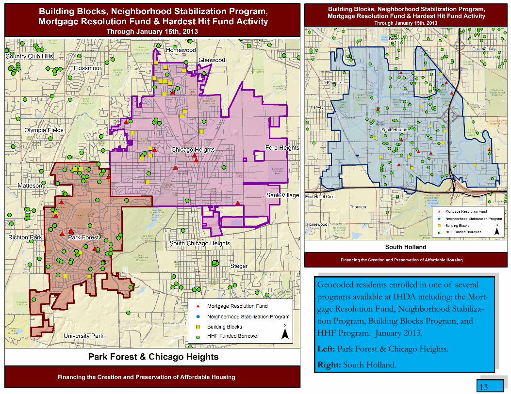
Geocoded residents enrolled in one of several
programs available at IHDA including: the Mort-
gage Resolution Fund, Neighborhood Stabiliza-
tion Program, Building Blocks Program, and
HHF Program. January 2013.
Left: Park Forest & Chicago Heights.
Right: South Holland.

14
Above: Funded borrowers by Congressional District
with tables representing total applications per district,
total funded borrowers per district, and total funds al-
located per district. December 2011.
Right: Illinois net job flow with a focus given to
counties holding no HHF funded borrowers on the
map. March 2011.
15
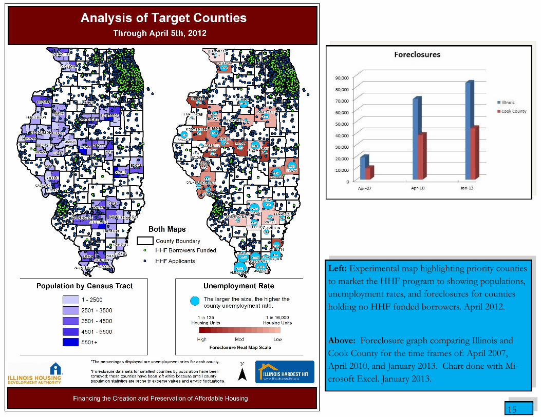
Left: Experimental map highlighting priority counties
to market the HHF program to showing populations,
unemployment rates, and foreclosures for counties
holding no HHF funded borrowers. April 2012.
Above: Foreclosure graph comparing Illinois and
Cook County for the time frames of: April 2007,
April 2010, and January 2013. Chart done with Mi-
crosoft Excel. January 2013.

16
Above: A look at Pope County to better understand
the land use and cities there utilizing spatial imagery.
This map helped determine why no applications were
received to the HHF program. April 2012.
Right: Illinois Radio Network Coverage to target pri-
ority counties to make advertising costs effective as
possible. This map was prepared for IHDA market-
ing. April 2012.
17
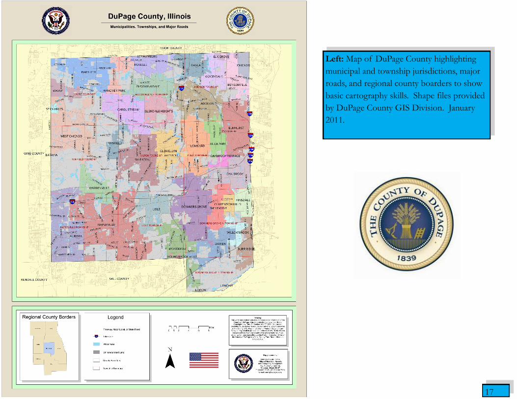
Left: Map of DuPage County highlighting
municipal and township jurisdictions, major
roads, and regional county boarders to show
basic cartography skills. Shape files provided
by DuPage County GIS Division. January
2011.
18
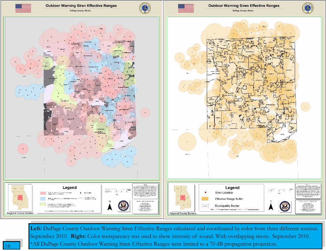
Left: DuPage County Outdoor Warning Siren Effective Ranges calculated and coordinated by color from three different sources.
September 2010. Right: Color transparency was used to show intensity of sound. With overlapping sirens. September 2010.
*All DuPage County Outdoor Warning Siren Effective Ranges were limited to a 70 dB propagation projection.
19
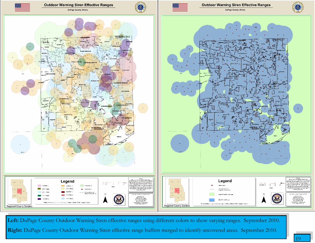
Left: DuPage County Outdoor Warning Siren effective ranges using different colors to show varying ranges. September 2010.
Right: DuPage County Outdoor Warning Siren effective range buffers merged to identify uncovered areas. September 2010.
20
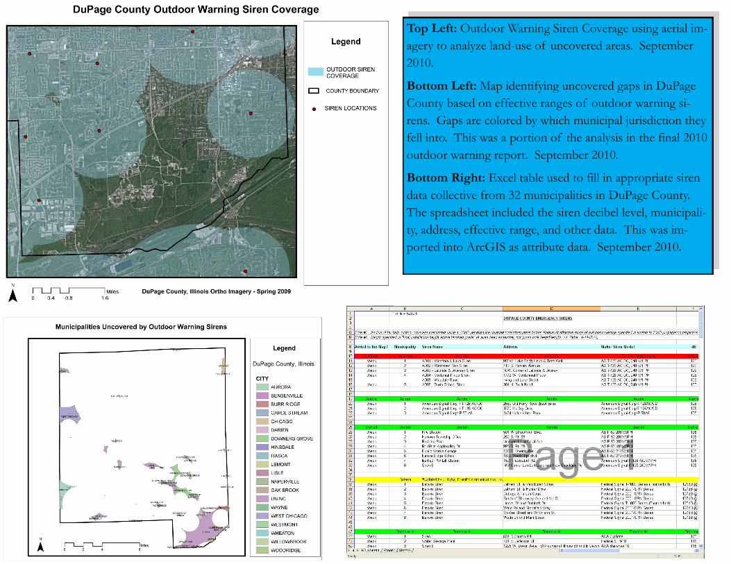
Top Left: Outdoor Warning Siren Coverage using aerial im-
agery to analyze land-use of uncovered areas. September
2010.
Bottom Left: Map identifying uncovered gaps in DuPage
County based on effective ranges of outdoor warning si-
rens. Gaps are colored by which municipal jurisdiction they
fell into. This was a portion of the analysis in the final 2010
outdoor warning report. September 2010.
Bottom Right: Excel table used to fill in appropriate siren
data collective from 32 municipalities in DuPage County.
The spreadsheet included the siren decibel level, municipali-
ty, address, effective range, and other data. This was im-
ported into ArcGIS as attribute data. September 2010.

21
Day time and night time population maps to gain an understanding of concentrated populations of employed residents during
the day and how they differ at night as they migrate back to their primary residences for homeland security purposes. June 2010.
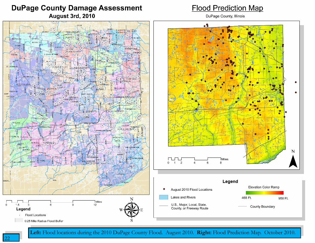
22 Left: Flood locations during the 2010 DuPage County Flood. August 2010. Right: Flood Prediction Map. October 2010.

23
Left: Median house values in Cook County in 2000. June 2011.
Right: Population density in Cook County in 2000. June 2011.

24
Left: Percent black population in 1990 in Cook County. June 2011.
Right: Percent black population in 2000 in Cook County. June 2011.

25
Left: Percent Caucasian population in 1990 in Cook County. June 2011.
Right: Percent Caucasian population in 2000 in Cook County. June 2011.
26
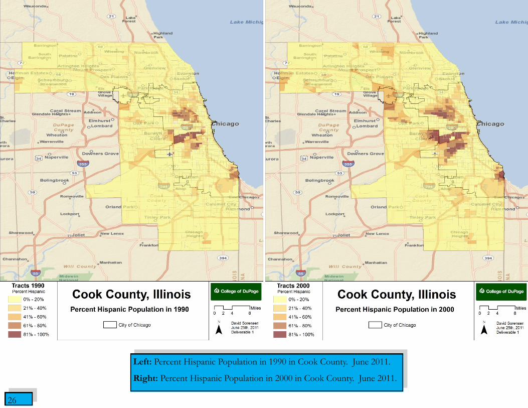
Left: Percent Hispanic Population in 1990 in Cook County. June 2011.
Right: Percent Hispanic Population in 2000 in Cook County. June 2011.
27
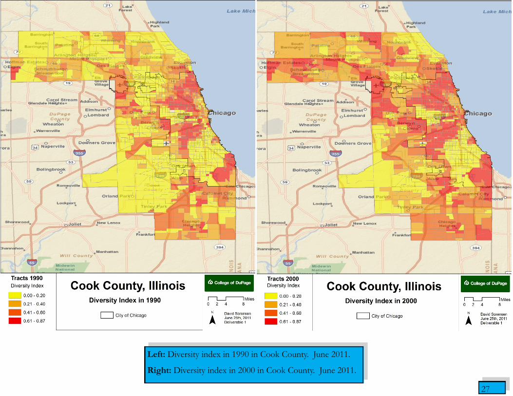
Left: Diversity index in 1990 in Cook County. June 2011.
Right: Diversity index in 2000 in Cook County. June 2011.

28
Above: A 3D representation of the Cook County
2000 diversity index. June 2011.

29
Above: A 3D representation of the Cook County
2000 diversity index in relation to medium hous-
ing values. June 2011.
30
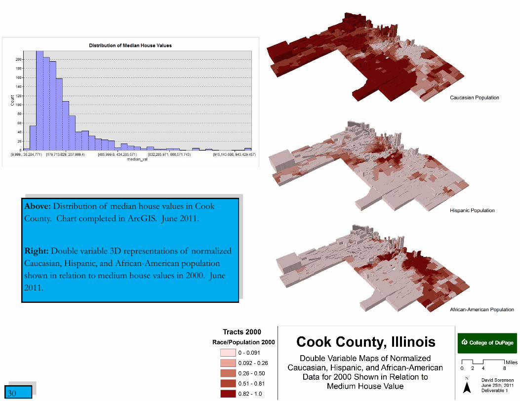
Above: Distribution of median house values in Cook
County. Chart completed in ArcGIS. June 2011.
Right: Double variable 3D representations of normalized
Caucasian, Hispanic, and African-American population
shown in relation to medium house values in 2000. June
2011.
31
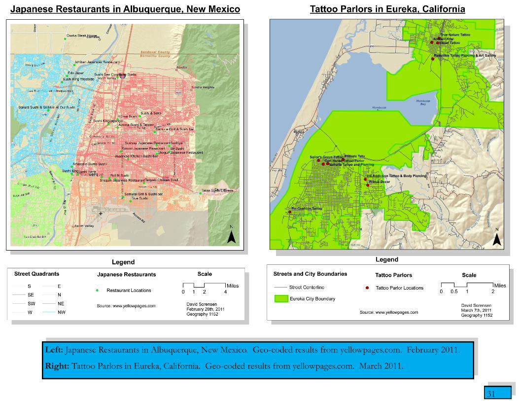
Left: Japanese Restaurants in Albuquerque, New Mexico. Geo-coded results from yellowpages.com. February 2011.
Right: Tattoo Parlors in Eureka, California. Geo-coded results from yellowpages.com. March 2011.
32
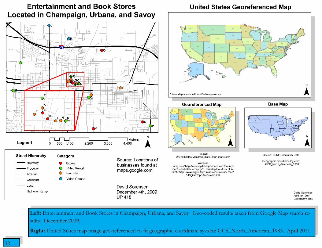
Left: Entertainment and Book Stores in Champaign, Urbana, and Savoy. Geo-coded results taken from Google Map search re-
sults. December 2009.
Right: United States map image geo-referenced to fit geographic coordinate system: GCS_North_American_1983. April 2011.

33
Left: A LIDAR spatial analysis of Four Lakes Ski and Snowboard Resort. April 2011. Right: 3D visual imported into
ArcScene of the land topography. April 2011.

34
Left: Various crime offenses committed in Houston, Texas during August 2006.
Right: Offenses committed in Houston in August 2006 with respect to Police station locations. Recommendations for
new police sub-stations sites included. October 2011.
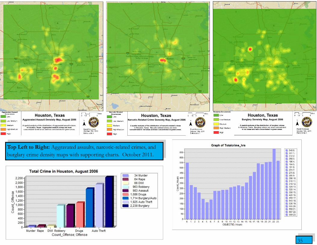
35
Top Left to Right: Aggravated assaults, narcotic-related crimes, and
burglary crime density maps with supporting charts. October 2011.
36
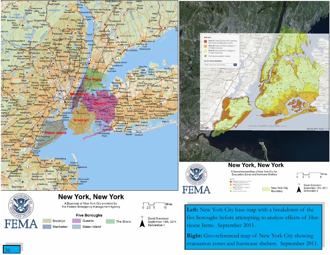
Left: New York City base map with a breakdown of the
five boroughs before attempting to analyze effects of Hur-
ricane Irene. September 2011.
Right: Geo-referenced map of New York City showing
evacuation zones and hurricane shelters. September 2011.

37
Left: East Coast inundation levels during Hurricane Irene. September 2011.
Right: New York inundation levels during Hurricane Irene. September 2011.

38
Left: A before and after map of the effects Hurricane Katrina had on New Orleans the day before it hit. December 2009.
Right: The extent of flooding from Hurricane Katrina between the dates of August 5th through September 1st, 2005. December 2009.

39
Bottom Left: Map of five levees that broke during Hurricane Katrina. December 2009.
Top Left: Median Household Income in dollars for parishes of Jefferson, St. Bernards, and New Orleans. December 2009.
Top Right: Four maps indicating the percent population of races alone in New Orleans. The values were calculated by di-
viding the race alone population by the total population. December 2009.
40
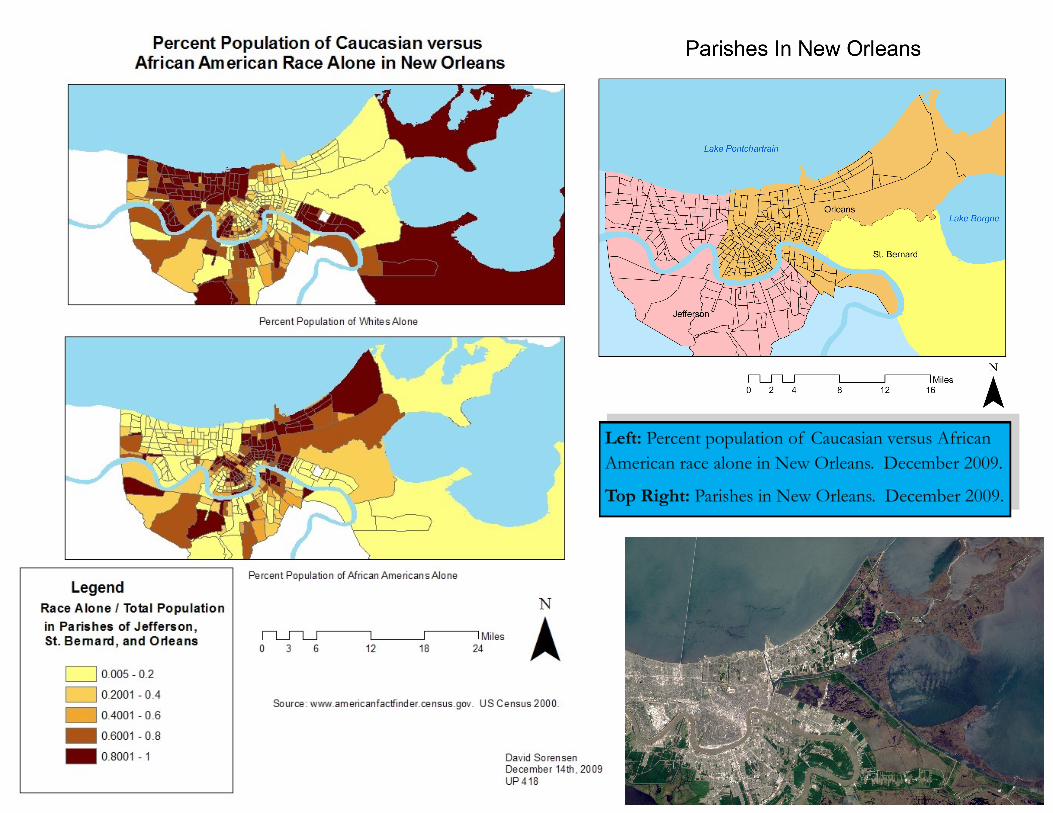
Left: Percent population of Caucasian versus African
American race alone in New Orleans. December 2009.
Top Right: Parishes in New Orleans. December 2009.
41
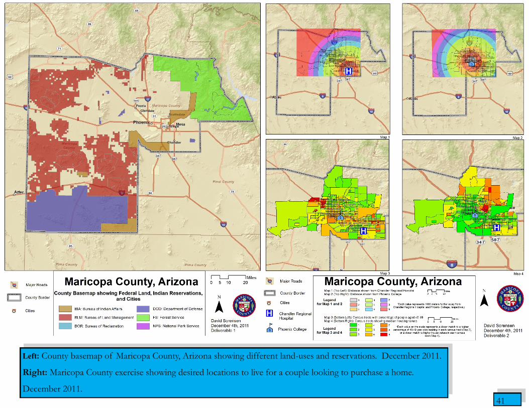
Left: County basemap of Maricopa County, Arizona showing different land-uses and reservations. December 2011.
Right: Maricopa County exercise showing desired locations to live for a couple looking to purchase a home.
December 2011.

42
Right: Weighted overlays of four separate
factors to consider for the best geographic
location to purchase the house. The follow-
ing factors were weighted on a 25% basis:
proximity from Chandler Regional Hospital,
proximity from Phoenix College, location
with highest percentage of 40-49 year olds,
and location with highest priced home val-
ues. December 2011.

43
Left: Aspect map of Athens, Georgia using the inverse distance weighted interpolation method. Right: Contour map of Ath-
ens, Georgia using the inverse distance weighted interpolation method. Contours increase at 20 meters. May 2011.

44
Left: Aspect map of Athens, Georgia using kriging as an interpolation method. Right: Contour map of Athens, Georgia
using kriging as an interpolation method. Contours increase at 10 meters. May 2011.
45
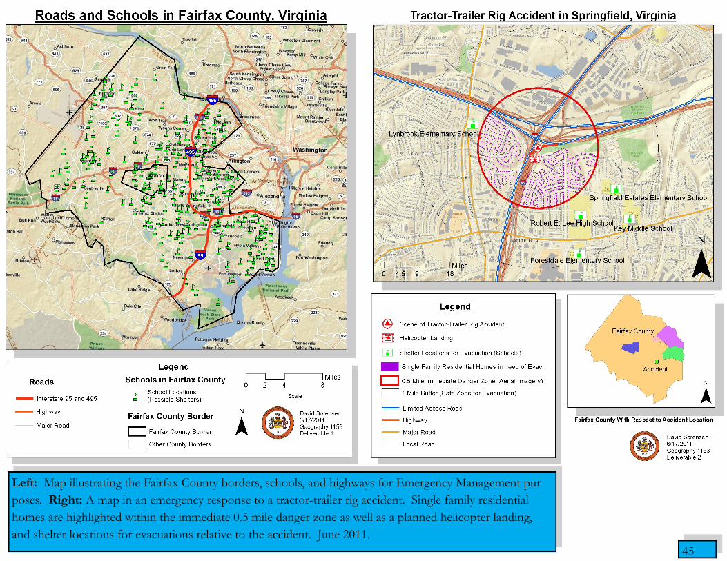
Left: Map illustrating the Fairfax County borders, schools, and highways for Emergency Management pur-
poses. Right: A map in an emergency response to a tractor-trailer rig accident. Single family residential
homes are highlighted within the immediate 0.5 mile danger zone as well as a planned helicopter landing,
and shelter locations for evacuations relative to the accident. June 2011.

46
Right Above: Map representing redirected traffic
patterns after the tractor-trailer rig incident utilizing
Network Analyst on ArcGIS 10.0 to perform routing
and detour options around the incident.
Right Below: Map representing redirected traffic
patterns after the tractor-trailer rig incident utilizing
Network Analyst in a similar manner to perform
routing options with specific locations in the proxim-
ity of the incident. June 2011.
47
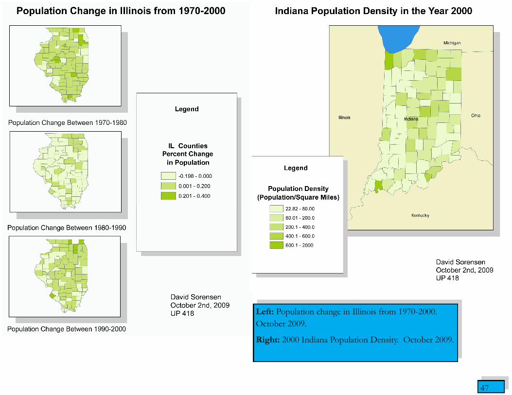
Left: Population change in Illinois from 1970-2000.
October 2009.
Right: 2000 Indiana Population Density. October 2009.
48
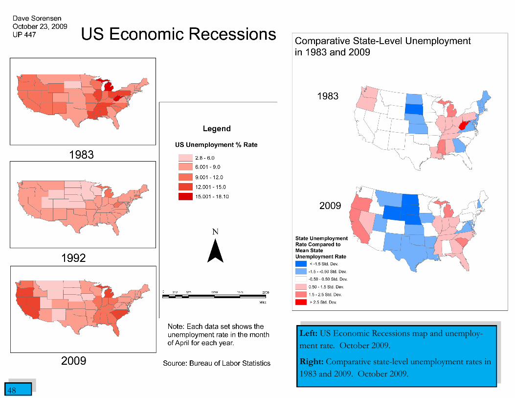
Left: US Economic Recessions map and unemploy-
ment rate. October 2009.
Right: Comparative state-level unemployment rates in
1983 and 2009. October 2009.

49 49

50
Hand drawn sketches in pencil.
March 2008.
Sketches
50

51
Two experimental drawings of different media.
Top: Watercolor front view of the Illini Tower.
Champaign, Illinois. August 2007.
Bottom: Church utilizing charcoal media. August
2007.
51
52
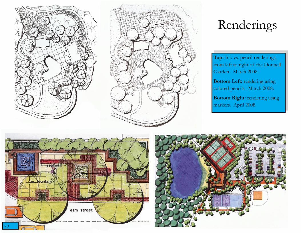
Top: Ink vs. pencil renderings,
from left to right of the Donnell
Garden. March 2008.
Bottom Left: rendering using
colored pencils. March 2008.
Bottom Right: rendering using
markers. April 2008.
Renderings
52

53
Two-point perspective of Illini Tower Entrance. The objective of the perspective was to capture a public space. October 2007.
53
54
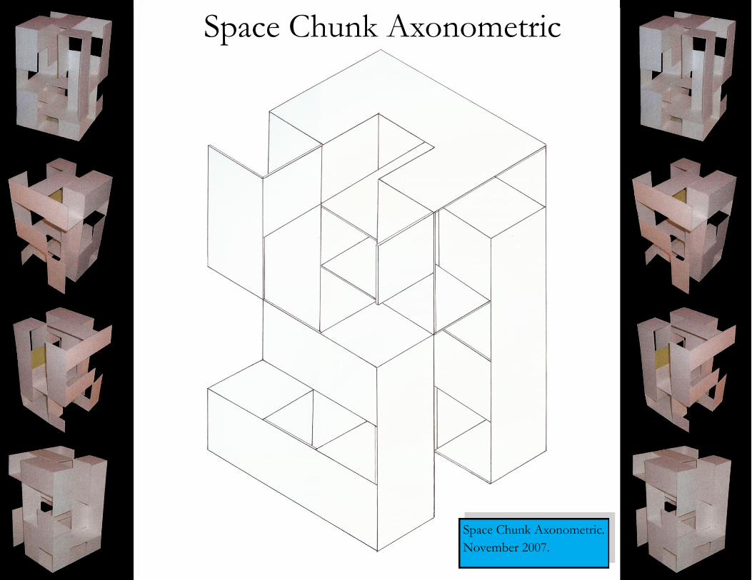
Space Chunk Axonometric.
November 2007.
Space Chunk Axonometric

55
Intimate Space design concept Plan view design
and model to aid visual representation.
March 2008.
Intim
ate
Sp
ace
55

56
Monumental Space design concept. Project plan
view and model to aid visual representation. March
2008.
Mo
num
enta
l
Sp
ace
56

57
Inventory and Analysis of the Campus Courtyard at the University
of Illinois. The preliminary steps in the design process describes the
focal point, addressed circulation issues, and document existing vege-
tation. March 2008.
Campus Courtyard
57

58
Final Design Concept of the Campus Courtyard. The concept took into account the
site issues and attempted to solve them with site goals derived from the programming
portion of the project. To the right are perspective sketches of the final design.
February 2008.
Campus Courtyard

59
Bottom: Site Inventory and Analysis of Urbana Park in Urbana, Illinois.
Right: Part of the analysis of the site was to integrate a map into the project to
show useful information about the City of Urbana. ArcGIS was utilized to show the
average family income of the site as well as the surrounding area in Urbana. This in-
formation was gathered to provide insights of what the final design might entail.
December 2007.
59

60
Top: Design Concept of Urbana Park.
December 2007.
Bottom: Engineered Landscapes digi-
tal presentation.
April 2008.
61
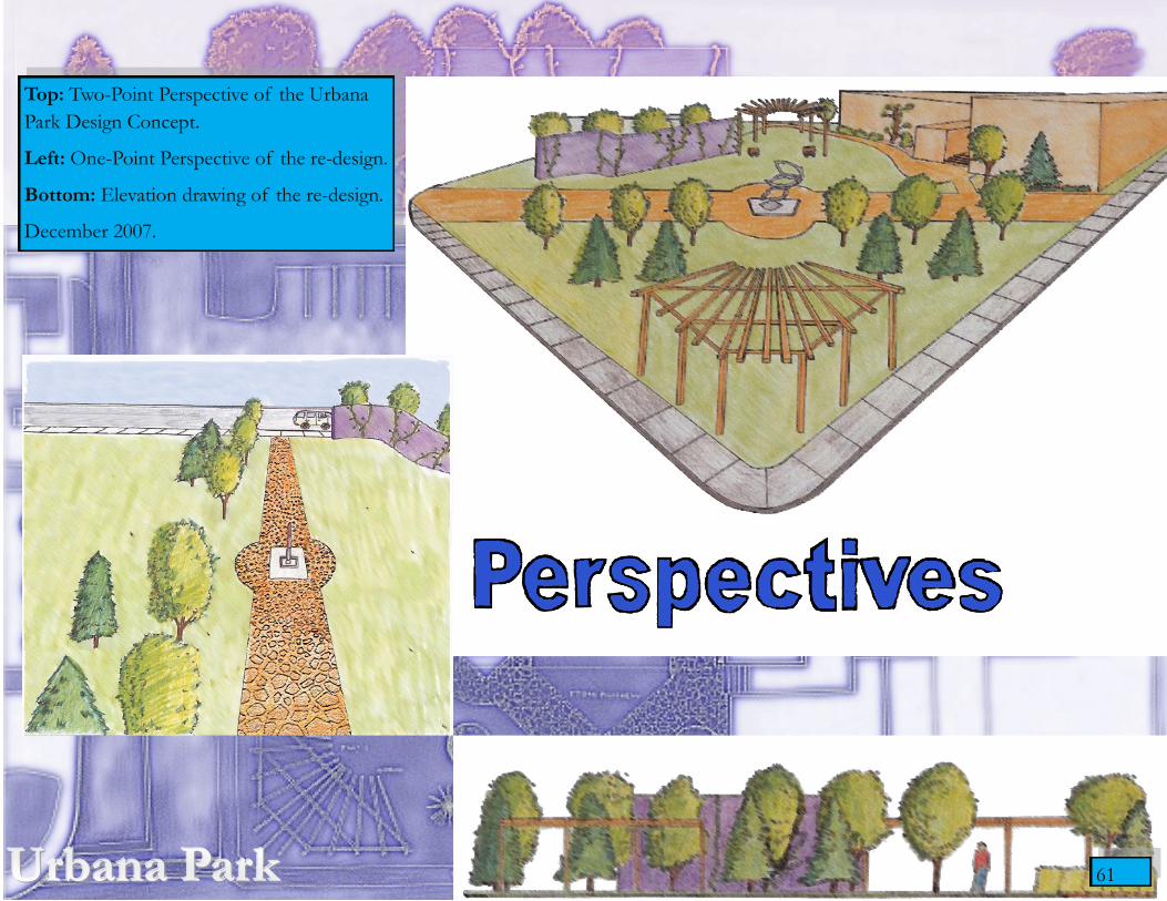
Top: Two-Point Perspective of the Urbana
Park Design Concept.
Left: One-Point Perspective of the re-design.
Bottom: Elevation drawing of the re-design.
December 2007.
61

62 Design exemplar Exploring Richard Haag and his work in Landscape Architecture. April 2008.
62

63
Top: Grading plan. Landform Design and Construc-
tion. March 2008.
Below: Engineered Landscapes digital presentation.
April 2008.
63
64 64
65
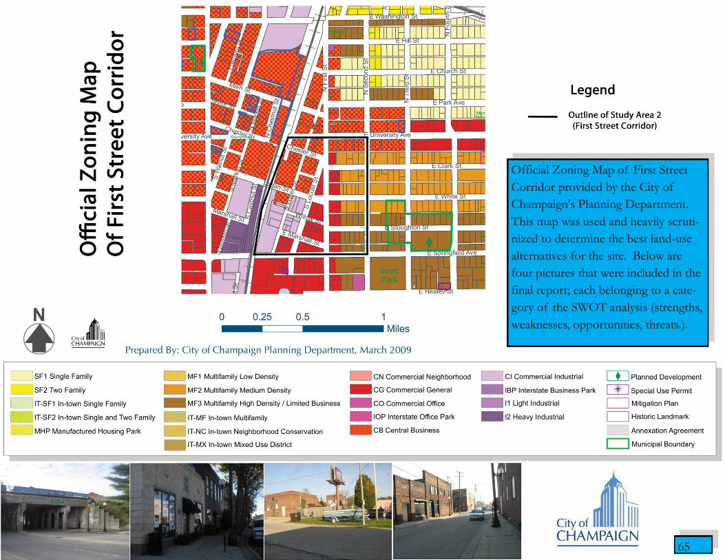
Official Zoning Map of First Street
Corridor provided by the City of
Champaign's Planning Department.
This map was used and heavily scruti-
nized to determine the best land-use
alternatives for the site. Below are
four pictures that were included in the
final report; each belonging to a cate-
gory of the SWOT analysis (strengths,
weaknesses, opportunities, threats.).
65

66
Top Left: Champaign Water Services Map high-lighting
the proposed expansion of the sewer lines to combat fre-
quent flooding reported at the site.
Top Right: The Boneyard Creek drainage basin final de-
sign provided by the City of Champaign’s Engineering
Department.
Bottom Right: Sketch-up model used in the final presen-
tation to show student housing concepts overlooking the
drainage basin.
November 2009.
67
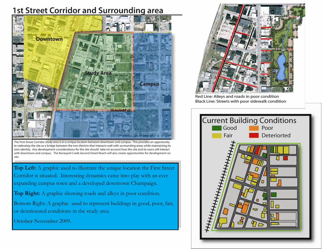
Top Left: A graphic used to illustrate the unique location the First Street
Corridor is situated. Interesting dynamics came into play with an ever
expanding campus town and a developed downtown Champaign.
Top Right: A graphic showing roads and alleys in poor condition.
Bottom Right: A graphic used to represent buildings in good, poor, fair,
or deteriorated conditions in the study area.
October-November 2009.
68
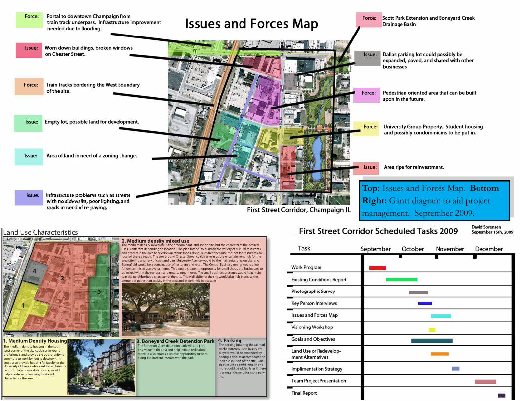
Top: Issues and Forces Map. Bottom
Right: Gantt diagram to aid project
management. September 2009.

69
Land-Use Alternative 1 and 2. The biggest difference between the land-use alternatives was to change zoning from central
business to entirely commercial general regarding the land bordering the new park space put in. December 2009.
Lan
d-U
se P
lan
nin
g

70
Site design for a proposed development in North Mahomet.
Bottom Left: concept plan for the development. Top and Bottom
Right: residential section and plan views of the street. Top Left:
final site design with implemented zoning changes. May 2009.
Site Design
70
71
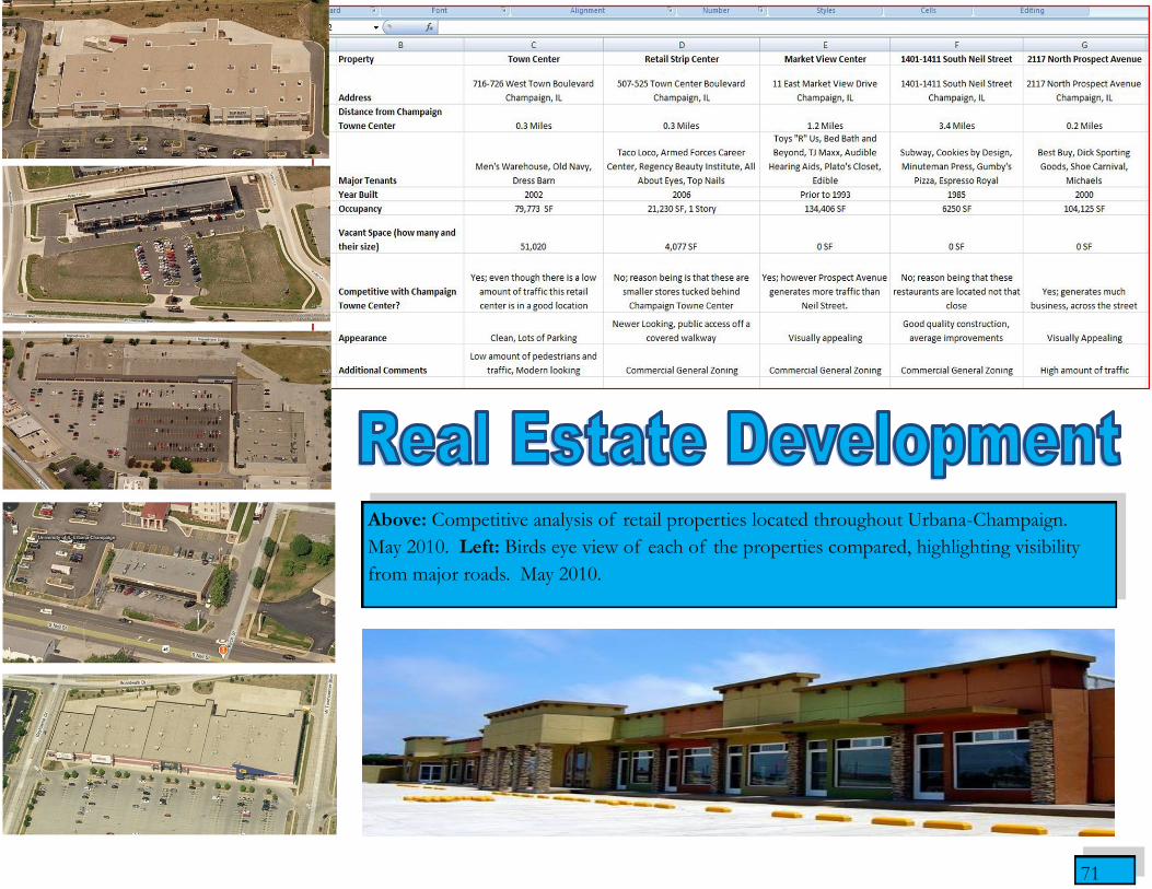
Above: Competitive analysis of retail properties located throughout Urbana-Champaign.
May 2010. Left: Birds eye view of each of the properties compared, highlighting visibility
from major roads. May 2010.
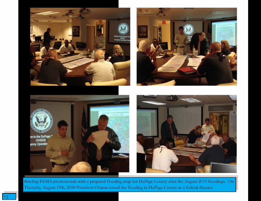
72
Briefing FEMA professionals with a prepared flooding map for DuPage County after the August 2010 floodings. On
Thursday, August 19th, 2010 President Obama issued the flooding in DuPage County as a federal disaster.
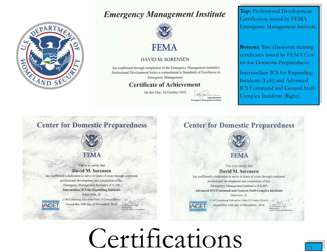
73
Top: Professional Development
Certification issued by FEMA
Emergency Management Institute.
Bottom: Two classroom training
certificates issued by FEMA Cen-
ter for Domestic Preparedness:
Intermediate ICS for Expanding
Incidents (Left) and Advanced
ICS Command and General Staff-
Complex Incidents (Right).
Certifications