namespace: $dyn - mbs.microsoft.com · dynamics ax webclient namespace: $dyn $dyn member of: no e...
TRANSCRIPT

Dynamics AX WebClient
namespace: $dyn$dynMember of: none
function: applyFunction$dyn.applyFunctionMember of: $dyn
applyFunction(func, thisArg, argsArray) → {anytype}Calls the specified function with the thisArg as the this context and the argsArray as the arguments.
Name & Type Default Value Description
func function|$dyn.observable
The function or observable wrapping the function.
thisArg object
The object to use as the this context when calling thefunction.
argsArray Array.<object>
Optional An optional array containing the arguments thatshould be provided when calling the function.
Returns:anytypeThe return of the function.
function: async$dyn.asyncMember of: $dyn
async(callback, timeout, message, thisArg) → {$dyn.asyncCall}Invoke a callback asynchronously, with an optional timeout. Invoke a callback asynchronously, with an optional timeout. This is functionally identical to window.setTimeout,except that it increments and internal counter when the callback is set and decrements it when the callback iscompleted or canceled. This is the preferred way to perform most asynchronous actions, especially those thataⴾect data or control state.
Name & Type Default Value Description
callback function
The callback to execute.

timeout number
The timeout in MS before executing the callback.
message string
The message to used by logging for the asynchronous call.
thisArg object
Non Null The this context to execute the callback with.
Returns:$dyn.asyncCallA plain object with a 'cancel' method.
class: asyncCall$dyn.asyncCallMember of: $dyn
Constructorclass: asyncCall$dyn.asyncCallMember of: $dyn
asyncCall()Represents a callback that will be invoked asynchronously.This should only ever be created using a {@link $dyn.async} call.
function: cancel$dyn.asyncCall.cancelMember of: $dyn.asyncCall
cancel()Cancel the asynchronous call if it is still pending. A≀弼er the callback has fired or been canceled, calling cancel() has no eⴾect.
namespace: bindingHandlers$dyn.bindingHandlersMember of: $dyn
The binding handlers connect the View provided by the HTML DOM Elements to the underlying Model containingthe data. See {@link $dyn.bindingHandlers.ExHandler} for an example on how to create a custom binding handler, and{@link https://ax.help.dynamics.com/en/wiki/extensible-control-programming-reference/#html-framework-attributes HTML: Framework attributes} on the AX Help Wiki for further understanding the binding handlers.

class: attr$dyn.bindingHandlers.attrMember of: $dyn.bindingHandlers
Wrapper for setAttribute() method. See {@link https://msdn.microso≀弼.com/library/hh772960.aspx HTML/XHTMLReference} for additional information.
Constructorclass: attr$dyn.bindingHandlers.attrMember of: $dyn.bindingHandlers
attr()
class: click$dyn.bindingHandlers.clickMember of: $dyn.bindingHandlers
Subscribes the supplied function to the click event on the element. For more information on subscribing to theclick event see {@link https://api.jquery.com/click/ jQuery - click()}.
Constructorclass: click$dyn.bindingHandlers.clickMember of: $dyn.bindingHandlers
click()
class: css$dyn.bindingHandlers.cssMember of: $dyn.bindingHandlers
Wrapper for jQuery addClass() and removeClass(). See {@link https://api.jquery.com/category/manipulation/jQuery - Manipulation} for additional information. The bound object should consist of the CSS class names andboolean values to indicate their addition/removal.
Constructorclass: css$dyn.bindingHandlers.cssMember of: $dyn.bindingHandlers
css()

class: event$dyn.bindingHandlers.eventMember of: $dyn.bindingHandlers
Wrapper for jQuery bind() and unbind(). See {@link https://api.jquery.com/category/events/ jQuery - Events} foradditional information. Used by the grid and hierarchical grid.
Constructorclass: event$dyn.bindingHandlers.eventMember of: $dyn.bindingHandlers
event()
class: foreach$dyn.bindingHandlers.foreachMember of: $dyn.bindingHandlers
Handles the rendering of controls with multiple children.
Constructorclass: foreach$dyn.bindingHandlers.foreachMember of: $dyn.bindingHandlers
foreach()
typedef: data$dyn.bindingHandlers.foreach.dataMember of: $dyn.bindingHandlers.foreach
The object containing the data the handler is bound to.
class: if$dyn.bindingHandlers.ifMember of: $dyn.bindingHandlers
Conditionally databind the children.
Constructorclass: if

class: if$dyn.bindingHandlers.ifMember of: $dyn.bindingHandlers
if()
class: sizing$dyn.bindingHandlers.sizingMember of: $dyn.bindingHandlers
Layout sizing binding handler
Constructorclass: sizing$dyn.bindingHandlers.sizingMember of: $dyn.bindingHandlers
sizing()
class: text$dyn.bindingHandlers.textMember of: $dyn.bindingHandlers
Wrapper for .textContent(). See {@link https://msdn.microso≀弼.com/library/hh772960.aspx HTML/XHTMLReference} for additional information.
Constructorclass: text$dyn.bindingHandlers.textMember of: $dyn.bindingHandlers
text()
typedef: data$dyn.bindingHandlers.text.dataMember of: $dyn.bindingHandlers.text
The object containing the data the handler is bound to. Either a {@link $dyn.observable} of just the text, or a simple object with a few more properties:
class: vars$dyn.bindingHandlers.vars

Member of: $dyn.bindingHandlers
Adds scope variables to the data context wrapper. Facilitates communication between a parent and child control.
Constructorclass: vars$dyn.bindingHandlers.varsMember of: $dyn.bindingHandlers
vars()
class: visible$dyn.bindingHandlers.visibleMember of: $dyn.bindingHandlers
Wrapper for {@link $dyn.util.setVisibility}. Is generally bound to {@link $dyn.ui.Control.Visible}.
Constructorclass: visible$dyn.bindingHandlers.visibleMember of: $dyn.bindingHandlers
visible()
function: bulkObserve$dyn.bulkObserveMember of: $dyn
bulkObserve(observing, observer, updatingFlag, thisArg, disposableObserver) →{$dyn.observe.subscription}Utility method that binds observer to changes in observing object properties. Utility method that binds observer to changes in observing object properties. Notification happens whenupdatingFlag becomes false. Observer receives changes map that contains names of the properties that werechanged. The observing object properties should be observables to meet the purpose of the usage of this utility
Name & Type Default Value Description
observing object
The object, observable properties of which to be observed.
observer function
The function to be called when the observable has changed andupdatingFlag is set to false. Receives changes map
updatingFlag
object
Nullable The updatingFlag (supposed to be observable) that
indicates when to notify observer about changes

thisArg object
Nullable The "this" to apply when the observer callback is fired.Provide this parameter if the callback requires "this" context.
disposableObserver object
Nullable Unsubscribes the supplied DisposableObserver. Anyobserver which it is currently observing and needs to bedisposed before creating a new observer.
Returns:$dyn.observe.subscriptionThe subscription.
member: clientBusy$dyn.clientBusyMember of: $dyn
Read Only
Observable flag that tracking whether the clinet is processing interactions.
class: computed$dyn.computedMember of: $dyn
Constructorclass: computed$dyn.computedMember of: $dyn
computed(getter, setter, thisVariable)A computed read-only observable, tracks dependency on any observable accessed through it.
Name & Type Default Value Description
getter function
Getter function that is invoked upon registration and will beinvoked when an observable accessed within its scope changes.
setter function
Nullable Setter function.
thisVariable object
Nullable The this variable for executing the getter.
function: context$dyn.context

Member of: $dyn
context(targetElement) → {object}Get the data context associated with the target element. Note: The data context is usually a {@link $dyn.ui.Control}.
Name & Type Default Value Description
targetElement element
The data bound element
Returns:objectThe data context (usually a {@link $dyn.ui.Control}
namespace: controls$dyn.controlsMember of: $dyn
class: AnchorButton$dyn.controls.AnchorButtonMember of: $dyn.controls
Constructorclass: AnchorButton$dyn.controls.AnchorButtonMember of: $dyn.controls
AnchorButton()$dyn.adapter for AnchorButton Controls, applies the Button control class with AnchorButton template.
class: Button$dyn.controls.ButtonMember of: $dyn.controls
Framework base class for Button controls
Constructorclass: Button$dyn.controls.ButtonMember of: $dyn.controls

Button(data)Constructor for $dyn.controls.Button class
Name & Type Default Value Description
data Object
Parameters to be applied to the control
member: AllowEdit$dyn.controls.Button#AllowEditMember of: $dyn.controls.Button
Inherits: $dyn.ui.Control#AllowEditDefault value: true
member: ButtonDisplay$dyn.controls.Button#ButtonDisplayMember of: $dyn.controls.Button
Defines whether the text, the image, or both should be displayed on the button.
Default value: Auto
member: buttonStyle$dyn.controls.Button#buttonStyleMember of: $dyn.controls.Button
Style of the button.
Default value: ''
function: Children$dyn.controls.Button#ChildrenMember of: $dyn.controls.Button
Children() → {Array.<$dyn.ui.Control>}
Returns:Array.<$dyn.ui.Control>The control's child controls.
Inherits: $dyn.ui.Control#ChildrenOverrides: $dyn.ui.Control#Children
member: Click$dyn.controls.Button#Click

Member of: $dyn.controls.Button
Click command defined on the button. This function will be called when the button is clicked.
Default value: null
member: DefaultButton$dyn.controls.Button#DefaultButtonMember of: $dyn.controls.Button
Determines whether the button should be the default button on the form.
Default value: false
member: Enabled$dyn.controls.Button#EnabledMember of: $dyn.controls.Button
Inherits: $dyn.ui.Control#EnabledDefault value: true
function: getPersonalizationElements$dyn.controls.Button#getPersonalizationElementsMember of: $dyn.controls.Button
getPersonalizationElements(options) → {$dyn.ax.TaskGuide.Options}Returns an array of Elements that make up the control. For example, tab pages will return both the header andcontent element.
Name & Type Default Value Description
options $dyn.ax.TaskGuide.Options
Returns:$dyn.ax.TaskGuide.Options
Inherits: $dyn.ui.Control#getPersonalizationElements
function: getTaskGuideParams$dyn.controls.Button#getTaskGuideParamsMember of: $dyn.controls.Button
getTaskGuideParams(options) → {$dyn.ax.TaskGuide.Options}Used by Task Recorder to position the QTip during rails mode.
Name & Type Default Value Description
options $dyn.ax.TaskGuide.Options
Returns:$dyn.ax.TaskGuide.Options
Inherits: $dyn.ui.Control#getTaskGuideParamsOverrides: $dyn.ui.Control#getTaskGuideParams
member: HelpText$dyn.controls.Button#HelpTextMember of: $dyn.controls.Button
Provides additional information about the button that is included in the tooltip.
Default value: ""
function: Id$dyn.controls.Button#IdMember of: $dyn.controls.Button
Id() → {String}
Returns:StringElement ID.
Inherits: $dyn.ui.Control#IdOverrides: $dyn.ui.Control#Id
member: ImageName$dyn.controls.Button#ImageNameMember of: $dyn.controls.Button
Name of image on the button.
Default value: ""
member: ImageType$dyn.controls.Button#ImageTypeMember of: $dyn.controls.Button
Type of image on the button.
Default value: Symbol
function: init

function: init$dyn.controls.Button#initMember of: $dyn.controls.Button
init(data, element)This is called upon creation of the control.
Name & Type Default Value Description
data Object
element Element
Inherits: $dyn.ui.Control#initOverrides: $dyn.ui.Control#init
function: IsDataBound$dyn.controls.Button#IsDataBoundMember of: $dyn.controls.Button
IsDataBound() → {Boolean}
Returns:BooleanIf the control is data bound.
Inherits: $dyn.ui.Control#IsDataBound
function: isInGrid$dyn.controls.Button#isInGridMember of: $dyn.controls.Button
isInGrid() → {Boolean}
Returns:Boolean
Inherits: $dyn.ui.Control#isInGrid
function: isInSelectedGridRow$dyn.controls.Button#isInSelectedGridRowMember of: $dyn.controls.Button
isInSelectedGridRow() → {Boolean}
Returns:Boolean
Inherits: $dyn.ui.Control#isInSelectedGridRow
member: Label$dyn.controls.Button#LabelMember of: $dyn.controls.Button
The label to be shown on the button. This is also used for the tooltip. Label serializes as the title attribute on the custom element's tag.
Default value: ''
function: LayoutHeight$dyn.controls.Button#LayoutHeightMember of: $dyn.controls.Button
LayoutHeight() → {$dyn.layout.Size}
Returns:$dyn.layout.SizeLayout height.
Inherits: $dyn.ui.Control#LayoutHeightOverrides: $dyn.ui.Control#LayoutHeight
function: LayoutWidth$dyn.controls.Button#LayoutWidthMember of: $dyn.controls.Button
LayoutWidth() → {$dyn.layout.Size}
Returns:$dyn.layout.SizeLayout width.
Inherits: $dyn.ui.Control#LayoutWidthOverrides: $dyn.ui.Control#LayoutWidth
function: Name$dyn.controls.Button#NameMember of: $dyn.controls.Button
Name() → {String}
Returns:StringControl name.
Inherits: $dyn.ui.Control#NameOverrides: $dyn.ui.Control#Name
function: observe

function: observe$dyn.controls.Button#observeMember of: $dyn.controls.Button
observe(prop, func) → {$dyn.ax.TaskGuide.Options}Wrapper for {@link $dyn.observe} when given a specific property.
Name & Type Default Value Description
prop Object
The property to observe
func function
Callback to fire when the property changes.
Returns:$dyn.ax.TaskGuide.Options
Inherits: $dyn.ui.Control#observe
function: setChildControlFocus$dyn.controls.Button#setChildControlFocusMember of: $dyn.controls.Button
setChildControlFocus() → (nullable) {HTMLElement}Sets focus to the first focusable control in the container.
Returns:HTMLElementThe control that was found to focus, if there is one.
Inherits: $dyn.ui.Control#setChildControlFocus
member: Skip$dyn.controls.Button#SkipMember of: $dyn.controls.Button
Skip this control in the tab sequence.
Inherits: $dyn.ui.Control#SkipDefault value: false
member: Toggled$dyn.controls.Button#ToggledMember of: $dyn.controls.Button
Determines whether a button is in the toggled state or not.
Default value: null

function: Updating$dyn.controls.Button#UpdatingMember of: $dyn.controls.Button
Updating() → {$dyn.observable}
Returns:$dyn.observableThe updating observable.
Inherits: $dyn.ui.Control#Updating
member: Visible$dyn.controls.Button#VisibleMember of: $dyn.controls.Button
Inherits: $dyn.ui.Control#VisibleDefault value: true
class: Card$dyn.controls.CardMember of: $dyn.controls
A container styled as a card.
Constructorclass: Card$dyn.controls.CardMember of: $dyn.controls
Card(data, element)
Name & Type Default Value Description
data Object
The arguments to initialize the control.
element Object
The element to initialize as the control.
member: AllowEdit$dyn.controls.Card#AllowEditMember of: $dyn.controls.Card
Inherits: $dyn.ui.Control#AllowEdit

Default value: true
member: ArrangeMethod$dyn.controls.Card#ArrangeMethodMember of: $dyn.controls.Card
Inherits: $dyn.ui.Container#ArrangeMethodDefault value: {@link $dyn.layout.ArrangeMethod}.vertical
function: Children$dyn.controls.Card#ChildrenMember of: $dyn.controls.Card
Children() → {Array.<$dyn.ui.Control>}
Returns:Array.<$dyn.ui.Control>The control's child controls.
Inherits: $dyn.ui.Control#Children
member: Columns$dyn.controls.Card#ColumnsMember of: $dyn.controls.Card
Inherits: $dyn.ui.Container#ColumnsDefault value: 1
member: Enabled$dyn.controls.Card#EnabledMember of: $dyn.controls.Card
Inherits: $dyn.ui.Control#EnabledDefault value: true
function: getPersonalizationElements$dyn.controls.Card#getPersonalizationElementsMember of: $dyn.controls.Card
getPersonalizationElements(options) → {$dyn.ax.TaskGuide.Options}Returns an array of Elements that make up the control. For example, tab pages will return both the header andcontent element.
Name & Type Default Value Description
options

$dyn.ax.TaskGuide.Options
Returns:$dyn.ax.TaskGuide.Options
Inherits: $dyn.ui.Control#getPersonalizationElements
function: getTaskGuideParams$dyn.controls.Card#getTaskGuideParamsMember of: $dyn.controls.Card
getTaskGuideParams(options) → {$dyn.ax.TaskGuide.Options}Used by Task Recorder to position the QTip during rails mode.
Name & Type Default Value Description
options $dyn.ax.TaskGuide.Options
Returns:$dyn.ax.TaskGuide.Options
Inherits: $dyn.ui.Control#getTaskGuideParams
member: HasActions$dyn.controls.Card#HasActionsMember of: $dyn.controls.Card
Read Only
member: HasCaption$dyn.controls.Card#HasCaptionMember of: $dyn.controls.Card
Read Only
member: HasFooter$dyn.controls.Card#HasFooterMember of: $dyn.controls.Card
Read Only
member: HasHeading$dyn.controls.Card#HasHeading

Member of: $dyn.controls.Card
Read Only
member: HasImage$dyn.controls.Card#HasImageMember of: $dyn.controls.Card
Read Only
member: HasNotes$dyn.controls.Card#HasNotesMember of: $dyn.controls.Card
Read Only
member: HasSymbol$dyn.controls.Card#HasSymbolMember of: $dyn.controls.Card
Read Only
function: Id$dyn.controls.Card#IdMember of: $dyn.controls.Card
Id() → {String}
Returns:StringElement ID.
Inherits: $dyn.ui.Control#Id
function: IsDataBound$dyn.controls.Card#IsDataBoundMember of: $dyn.controls.Card
IsDataBound() → {Boolean}
Returns:BooleanIf the control is data bound.
Inherits: $dyn.ui.Control#IsDataBound
function: isInGrid$dyn.controls.Card#isInGrid

Member of: $dyn.controls.Card
isInGrid() → {Boolean}
Returns:Boolean
Inherits: $dyn.ui.Control#isInGrid
function: isInSelectedGridRow$dyn.controls.Card#isInSelectedGridRowMember of: $dyn.controls.Card
isInSelectedGridRow() → {Boolean}
Returns:Boolean
Inherits: $dyn.ui.Control#isInSelectedGridRow
function: LayoutHeight$dyn.controls.Card#LayoutHeightMember of: $dyn.controls.Card
LayoutHeight() → {$dyn.layout.Size}
Returns:$dyn.layout.SizeLayout height.
Inherits: $dyn.ui.Control#LayoutHeight
function: LayoutWidth$dyn.controls.Card#LayoutWidthMember of: $dyn.controls.Card
LayoutWidth() → {$dyn.layout.Size}
Returns:$dyn.layout.SizeLayout width.
Inherits: $dyn.ui.Control#LayoutWidth
function: Name$dyn.controls.Card#NameMember of: $dyn.controls.Card
Name() → {String}
Returns:StringControl name.

Inherits: $dyn.ui.Control#Name
function: observe$dyn.controls.Card#observeMember of: $dyn.controls.Card
observe(prop, func) → {$dyn.ax.TaskGuide.Options}Wrapper for {@link $dyn.observe} when given a specific property.
Name & Type Default Value Description
prop Object
The property to observe
func function
Callback to fire when the property changes.
Returns:$dyn.ax.TaskGuide.Options
Inherits: $dyn.ui.Control#observe
function: setChildControlFocus$dyn.controls.Card#setChildControlFocusMember of: $dyn.controls.Card
setChildControlFocus() → (nullable) {HTMLElement}Sets focus to the first focusable control in the container.
Returns:HTMLElementThe control that was found to focus, if there is one.
Inherits: $dyn.ui.Control#setChildControlFocus
member: Skip$dyn.controls.Card#SkipMember of: $dyn.controls.Card
Skip this control in the tab sequence.
Inherits: $dyn.ui.Control#SkipDefault value: false
function: Updating$dyn.controls.Card#UpdatingMember of: $dyn.controls.Card

Updating() → {$dyn.observable}
Returns:$dyn.observableThe updating observable.
Inherits: $dyn.ui.Control#Updating
member: Visible$dyn.controls.Card#VisibleMember of: $dyn.controls.Card
Inherits: $dyn.ui.Control#VisibleDefault value: true
class: CheckBox$dyn.controls.CheckBoxMember of: $dyn.controls
Framework class for CheckBox controls
Constructorclass: CheckBox$dyn.controls.CheckBoxMember of: $dyn.controls
CheckBox(data, element)Constructor for $dyn.controls.CheckBox
Name & Type Default Value Description
data Object
Parameters to be applied to the control
element HTMLElement
The html representation of the control
member: AllowEdit$dyn.controls.CheckBox#AllowEditMember of: $dyn.controls.CheckBox
Inherits: $dyn.ui.Control#AllowEditDefault value: true
function: ApplyState

$dyn.controls.CheckBox#ApplyStateMember of: $dyn.controls.CheckBox
ApplyState(clientState) → {Boolean}Update the Control with ClientState
Name & Type Default Value Description
clientState Object
clientState object
Returns:Booleanresult - Returns if it can successfully set value of control
function: Children$dyn.controls.CheckBox#ChildrenMember of: $dyn.controls.CheckBox
Children() → {Array.<$dyn.ui.Control>}
Returns:Array.<$dyn.ui.Control>The control's child controls.
Inherits: $dyn.ui.Control#ChildrenOverrides: $dyn.ui.Control#Children
member: Enabled$dyn.controls.CheckBox#EnabledMember of: $dyn.controls.CheckBox
Inherits: $dyn.ui.Control#EnabledDefault value: true
member: formattedValue$dyn.controls.CheckBox#formattedValueMember of: $dyn.controls.CheckBox
The value being shown to the user
Default value: $dyn.observable(false)
function: getPersonalizationElements$dyn.controls.CheckBox#getPersonalizationElementsMember of: $dyn.controls.CheckBox
getPersonalizationElements(options) → {$dyn.ax.TaskGuide.Options}

Returns an array of Elements that make up the control. For example, tab pages will return both the header andcontent element.
Name & Type Default Value Description
options $dyn.ax.TaskGuide.Options
Returns:$dyn.ax.TaskGuide.Options
Inherits: $dyn.ui.Control#getPersonalizationElements
function: GetState$dyn.controls.CheckBox#GetStateMember of: $dyn.controls.CheckBox
GetState() → {Object}Gets the client state
Returns:ObjectclientState - clientState object
function: getTaskGuideParams$dyn.controls.CheckBox#getTaskGuideParamsMember of: $dyn.controls.CheckBox
getTaskGuideParams(options) → {$dyn.ax.TaskGuide.Options}Used by Task Recorder to position the QTip during rails mode.
Name & Type Default Value Description
options $dyn.ax.TaskGuide.Options
Returns:$dyn.ax.TaskGuide.Options
Inherits: $dyn.ui.Control#getTaskGuideParamsOverrides: $dyn.ui.Control#getTaskGuideParams
member: HelpText$dyn.controls.CheckBox#HelpTextMember of: $dyn.controls.CheckBox
The string that goes into the superTooltip qtip

Default value: ''
function: Id$dyn.controls.CheckBox#IdMember of: $dyn.controls.CheckBox
Id() → {String}
Returns:StringElement ID.
Inherits: $dyn.ui.Control#IdOverrides: $dyn.ui.Control#Id
function: init$dyn.controls.CheckBox#initMember of: $dyn.controls.CheckBox
init(data, element)This is called upon creation of the control.
Name & Type Default Value Description
data Object
element Element
Inherits: $dyn.ui.Control#initOverrides: $dyn.ui.Control#init
function: IsDataBound$dyn.controls.CheckBox#IsDataBoundMember of: $dyn.controls.CheckBox
IsDataBound() → {Boolean}
Returns:BooleanIf the control is data bound.
Inherits: $dyn.ui.Control#IsDataBound
member: IsFilterable$dyn.controls.CheckBox#IsFilterableMember of: $dyn.controls.CheckBox

Whether or not the field the control is bound to allows filtering
Default value: false
member: IsFiltered$dyn.controls.CheckBox#IsFilteredMember of: $dyn.controls.CheckBox
Whether or not a filter is currently applied to the bound field
Default value: false
function: isInGrid$dyn.controls.CheckBox#isInGridMember of: $dyn.controls.CheckBox
isInGrid() → {Boolean}
Returns:Boolean
Inherits: $dyn.ui.Control#isInGrid
function: isInSelectedGridRow$dyn.controls.CheckBox#isInSelectedGridRowMember of: $dyn.controls.CheckBox
isInSelectedGridRow() → {Boolean}
Returns:Boolean
Inherits: $dyn.ui.Control#isInSelectedGridRow
member: IsSorted$dyn.controls.CheckBox#IsSortedMember of: $dyn.controls.CheckBox
Whether or not a sort is currently applied to the bound field
Default value: false
member: IsStandard$dyn.controls.CheckBox#IsStandardMember of: $dyn.controls.CheckBox
Whether or not the checkbox is using the standard style

member: Label$dyn.controls.CheckBox#LabelMember of: $dyn.controls.CheckBox
The label to be shown with the control
Default value: ''
function: LayoutHeight$dyn.controls.CheckBox#LayoutHeightMember of: $dyn.controls.CheckBox
LayoutHeight() → {$dyn.layout.Size}
Returns:$dyn.layout.SizeLayout height.
Inherits: $dyn.ui.Control#LayoutHeightOverrides: $dyn.ui.Control#LayoutHeight
function: LayoutWidth$dyn.controls.CheckBox#LayoutWidthMember of: $dyn.controls.CheckBox
LayoutWidth() → {$dyn.layout.Size}
Returns:$dyn.layout.SizeLayout width.
Inherits: $dyn.ui.Control#LayoutWidthOverrides: $dyn.ui.Control#LayoutWidth
function: Name$dyn.controls.CheckBox#NameMember of: $dyn.controls.CheckBox
Name() → {String}
Returns:StringControl name.
Inherits: $dyn.ui.Control#NameOverrides: $dyn.ui.Control#Name
function: observe$dyn.controls.CheckBox#observeMember of: $dyn.controls.CheckBox

observe(prop, func) → {$dyn.ax.TaskGuide.Options}Wrapper for {@link $dyn.observe} when given a specific property.
Name & Type Default Value Description
prop Object
The property to observe
func function
Callback to fire when the property changes.
Returns:$dyn.ax.TaskGuide.Options
Inherits: $dyn.ui.Control#observe
function: setChildControlFocus$dyn.controls.CheckBox#setChildControlFocusMember of: $dyn.controls.CheckBox
setChildControlFocus() → (nullable) {HTMLElement}Sets focus to the first focusable control in the container.
Returns:HTMLElementThe control that was found to focus, if there is one.
Inherits: $dyn.ui.Control#setChildControlFocus
member: ShowLabel$dyn.controls.CheckBox#ShowLabelMember of: $dyn.controls.CheckBox
Whether or not the label for the control is visible
Default value: true
member: Skip$dyn.controls.CheckBox#SkipMember of: $dyn.controls.CheckBox
Skip this control in the tab sequence.
Inherits: $dyn.ui.Control#SkipDefault value: false
member: SortDirection$dyn.controls.CheckBox#SortDirection

Member of: $dyn.controls.CheckBox
The sort direction applied to the bound field
member: Style$dyn.controls.CheckBox#StyleMember of: $dyn.controls.CheckBox
The style being used on the checkbox
Overrides: $dyn.ui.Control#StyleDefault value: $dyn.observable({@link $dyn.ui.CheckBoxStyle}.auto)
member: SupportsDefaultAction$dyn.controls.CheckBox#SupportsDefaultActionMember of: $dyn.controls.CheckBox
Whether or not the control supports default action, for example the default action of the grid
Default value: false
function: Updating$dyn.controls.CheckBox#UpdatingMember of: $dyn.controls.CheckBox
Updating() → {$dyn.observable}
Returns:$dyn.observableThe updating observable.
Inherits: $dyn.ui.Control#Updating
member: Value$dyn.controls.CheckBox#ValueMember of: $dyn.controls.CheckBox
The backing value of the control
Default value: $dyn.observable(false)
member: Visible$dyn.controls.CheckBox#VisibleMember of: $dyn.controls.CheckBox
Inherits: $dyn.ui.Control#VisibleDefault value: true
member: YesNoText

member: YesNoText$dyn.controls.CheckBox#YesNoTextMember of: $dyn.controls.CheckBox
The yes/no string representation of the value
class: CheckBoxCell$dyn.controls.CheckBoxCellMember of: $dyn.controls
Framework class for CheckBox Cell controls (within inactive row)
Constructorclass: CheckBoxCell$dyn.controls.CheckBoxCellMember of: $dyn.controls
CheckBoxCell(data)Constructor for $dyn.controls.CheckBoxCell
Name & Type Default Value Description
data Object
Parameters to be applied to the control
member: AllowEdit$dyn.controls.CheckBoxCell#AllowEditMember of: $dyn.controls.CheckBoxCell
Inherits: $dyn.ui.Control#AllowEditOverrides: $dyn.controls.CheckBox#AllowEditDefault value: true
function: ApplyState$dyn.controls.CheckBoxCell#ApplyStateMember of: $dyn.controls.CheckBoxCell
ApplyState(clientState)Update the Control with ClientState
Name & Type Default Value Description
clientState
Object
clientState object

Overrides: $dyn.controls.CheckBox#ApplyState
member: checked$dyn.controls.CheckBoxCell#checkedMember of: $dyn.controls.CheckBoxCell
The value of the control element's aria-checked attribute
function: Children$dyn.controls.CheckBoxCell#ChildrenMember of: $dyn.controls.CheckBoxCell
Children() → {Array.<$dyn.ui.Control>}
Returns:Array.<$dyn.ui.Control>The control's child controls.
Inherits: $dyn.ui.Control#Children
member: Enabled$dyn.controls.CheckBoxCell#EnabledMember of: $dyn.controls.CheckBoxCell
Inherits: $dyn.ui.Control#EnabledDefault value: true
member: formattedValue$dyn.controls.CheckBoxCell#formattedValueMember of: $dyn.controls.CheckBoxCell
The value being shown to the user
Inherits: $dyn.controls.CheckBox#formattedValueDefault value: $dyn.observable(false)
function: getPersonalizationElements$dyn.controls.CheckBoxCell#getPersonalizationElementsMember of: $dyn.controls.CheckBoxCell
getPersonalizationElements(options) → {$dyn.ax.TaskGuide.Options}Returns an array of Elements that make up the control. For example, tab pages will return both the header andcontent element.
Name & Type Description

Default Value
options $dyn.ax.TaskGuide.Options
Returns:$dyn.ax.TaskGuide.Options
Inherits: $dyn.ui.Control#getPersonalizationElements
function: GetState$dyn.controls.CheckBoxCell#GetStateMember of: $dyn.controls.CheckBoxCell
GetState() → {Object}Gets the client state
Returns:ObjectclientState - clientState object
Overrides: $dyn.controls.CheckBox#GetState
function: getTaskGuideParams$dyn.controls.CheckBoxCell#getTaskGuideParamsMember of: $dyn.controls.CheckBoxCell
getTaskGuideParams(options) → {$dyn.ax.TaskGuide.Options}Used by Task Recorder to position the QTip during rails mode.
Name & Type Default Value Description
options $dyn.ax.TaskGuide.Options
Returns:$dyn.ax.TaskGuide.Options
Inherits: $dyn.ui.Control#getTaskGuideParams
member: HelpText$dyn.controls.CheckBoxCell#HelpTextMember of: $dyn.controls.CheckBoxCell
The string that goes into the superTooltip qtip
Inherits: $dyn.controls.CheckBox#HelpTextDefault value: ''

function: Id$dyn.controls.CheckBoxCell#IdMember of: $dyn.controls.CheckBoxCell
Id() → {String}
Returns:StringElement ID.
Inherits: $dyn.ui.Control#Id
function: init$dyn.controls.CheckBoxCell#initMember of: $dyn.controls.CheckBoxCell
init(data, element)This is called upon creation of the control.
Name & Type Default Value Description
data Object
element Element
Inherits: $dyn.ui.Control#init
function: IsDataBound$dyn.controls.CheckBoxCell#IsDataBoundMember of: $dyn.controls.CheckBoxCell
IsDataBound() → {Boolean}
Returns:BooleanIf the control is data bound.
Inherits: $dyn.ui.Control#IsDataBound
member: IsFilterable$dyn.controls.CheckBoxCell#IsFilterableMember of: $dyn.controls.CheckBoxCell
Whether or not the field the control is bound to allows filtering
Inherits: $dyn.controls.CheckBox#IsFilterableDefault value: false

member: IsFiltered$dyn.controls.CheckBoxCell#IsFilteredMember of: $dyn.controls.CheckBoxCell
Whether or not a filter is currently applied to the bound field
Inherits: $dyn.controls.CheckBox#IsFilteredDefault value: false
function: isInGrid$dyn.controls.CheckBoxCell#isInGridMember of: $dyn.controls.CheckBoxCell
isInGrid() → {Boolean}
Returns:Boolean
Inherits: $dyn.ui.Control#isInGrid
function: isInSelectedGridRow$dyn.controls.CheckBoxCell#isInSelectedGridRowMember of: $dyn.controls.CheckBoxCell
isInSelectedGridRow() → {Boolean}
Returns:Boolean
Inherits: $dyn.ui.Control#isInSelectedGridRow
member: IsSorted$dyn.controls.CheckBoxCell#IsSortedMember of: $dyn.controls.CheckBoxCell
Whether or not a sort is currently applied to the bound field
Inherits: $dyn.controls.CheckBox#IsSortedDefault value: false
member: IsStandard$dyn.controls.CheckBoxCell#IsStandardMember of: $dyn.controls.CheckBoxCell
Whether or not the checkbox is using the standard style
Inherits: $dyn.controls.CheckBox#IsStandard
member: Label$dyn.controls.CheckBoxCell#LabelMember of: $dyn.controls.CheckBoxCell
The label to be shown with the control
Inherits: $dyn.controls.CheckBox#LabelDefault value: ''
function: LayoutHeight$dyn.controls.CheckBoxCell#LayoutHeightMember of: $dyn.controls.CheckBoxCell
LayoutHeight() → {$dyn.layout.Size}
Returns:$dyn.layout.SizeLayout height.
Inherits: $dyn.ui.Control#LayoutHeight
function: LayoutWidth$dyn.controls.CheckBoxCell#LayoutWidthMember of: $dyn.controls.CheckBoxCell
LayoutWidth() → {$dyn.layout.Size}
Returns:$dyn.layout.SizeLayout width.
Inherits: $dyn.ui.Control#LayoutWidth
function: Name$dyn.controls.CheckBoxCell#NameMember of: $dyn.controls.CheckBoxCell
Name() → {String}
Returns:StringControl name.
Inherits: $dyn.ui.Control#Name
function: observe$dyn.controls.CheckBoxCell#observeMember of: $dyn.controls.CheckBoxCell
observe(prop, func) → {$dyn.ax.TaskGuide.Options}Wrapper for {@link $dyn.observe} when given a specific property.
Name & Type Default Value Description
prop Object
The property to observe
func function
Callback to fire when the property changes.
Returns:$dyn.ax.TaskGuide.Options
Inherits: $dyn.ui.Control#observe
function: setChildControlFocus$dyn.controls.CheckBoxCell#setChildControlFocusMember of: $dyn.controls.CheckBoxCell
setChildControlFocus() → (nullable) {HTMLElement}Sets focus to the first focusable control in the container.
Returns:HTMLElementThe control that was found to focus, if there is one.
Inherits: $dyn.ui.Control#setChildControlFocus
member: ShowLabel$dyn.controls.CheckBoxCell#ShowLabelMember of: $dyn.controls.CheckBoxCell
Whether or not the label for the control is visible
Inherits: $dyn.controls.CheckBox#ShowLabelDefault value: true
member: Skip$dyn.controls.CheckBoxCell#SkipMember of: $dyn.controls.CheckBoxCell
Skip this control in the tab sequence.
Inherits: $dyn.ui.Control#SkipDefault value: false
member: SortDirection$dyn.controls.CheckBoxCell#SortDirectionMember of: $dyn.controls.CheckBoxCell

The sort direction applied to the bound field
Inherits: $dyn.controls.CheckBox#SortDirection
member: Style$dyn.controls.CheckBoxCell#StyleMember of: $dyn.controls.CheckBoxCell
The style being used on the checkbox
Inherits: $dyn.controls.CheckBox#StyleDefault value: $dyn.observable({@link $dyn.ui.CheckBoxStyle}.auto)
member: SupportsDefaultAction$dyn.controls.CheckBoxCell#SupportsDefaultActionMember of: $dyn.controls.CheckBoxCell
Whether or not the control supports default action, for example the default action of the grid
Inherits: $dyn.controls.CheckBox#SupportsDefaultActionDefault value: false
function: toggleValueForCell$dyn.controls.CheckBoxCell#toggleValueForCellMember of: $dyn.controls.CheckBoxCell
toggleValueForCell()Toggle the value for the checkbox cell
function: Updating$dyn.controls.CheckBoxCell#UpdatingMember of: $dyn.controls.CheckBoxCell
Updating() → {$dyn.observable}
Returns:$dyn.observableThe updating observable.
Inherits: $dyn.ui.Control#Updating
member: Value$dyn.controls.CheckBoxCell#ValueMember of: $dyn.controls.CheckBoxCell
The backing value of the control
Inherits: $dyn.controls.CheckBox#Value

Default value: $dyn.observable(false)
member: Visible$dyn.controls.CheckBoxCell#VisibleMember of: $dyn.controls.CheckBoxCell
Inherits: $dyn.ui.Control#VisibleDefault value: true
member: YesNoText$dyn.controls.CheckBoxCell#YesNoTextMember of: $dyn.controls.CheckBoxCell
The yes/no string representation of the value
Inherits: $dyn.controls.CheckBox#YesNoText
class: ComboBox$dyn.controls.ComboBoxMember of: $dyn.controls
Framework class for ComboBox controls
Constructorclass: ComboBox$dyn.controls.ComboBoxMember of: $dyn.controls
ComboBox(data, element)Constructor for $dyn.controls.ComboBox
Name & Type Default Value Description
data Object
Parameters to be applied to the control
element HTMLElement
The html representation of the control
function: getItemLabelByIndex$dyn.controls.ComboBox#getItemLabelByIndexMember of: $dyn.controls.ComboBox
getItemLabelByIndex(virtualIndex) → {string}
Gets the label from the specified index
Name & Type Default Value Description
virtualIndex number
The index to get the label for
Returns:stringThe label for that index
Inherits: $dyn.controls.Enum#getItemLabelByIndex
function: GetState$dyn.controls.ComboBox#GetStateMember of: $dyn.controls.ComboBox
GetState() → {Object}Gets the client state
Returns:ObjectclientState - clientState object
member: isExpanded$dyn.controls.ComboBox#isExpandedMember of: $dyn.controls.ComboBox
Whether or not the control's flyout is exanded
Default value: $dyn.observable(false)
member: LookupButton$dyn.controls.ComboBox#LookupButtonMember of: $dyn.controls.ComboBox
Whether or not the control has a lookup button
Default value: true
function: selectedLabel$dyn.controls.ComboBox#selectedLabelMember of: $dyn.controls.ComboBox
selectedLabel() → {string}Gets the label from the shown item
Returns:stringThe selected label

Inherits: $dyn.controls.Enum#selectedLabel
class: ComboBoxCell$dyn.controls.ComboBoxCellMember of: $dyn.controls
Framework class for ComboBoxCell controls
Constructorclass: ComboBoxCell$dyn.controls.ComboBoxCellMember of: $dyn.controls
ComboBoxCell(data)Constructor for $dyn.controls.ComboBoxCell
Name & Type Default Value Description
data Object
Parameters to be applied to the control
function: ApplyState$dyn.controls.ComboBoxCell#ApplyStateMember of: $dyn.controls.ComboBoxCell
ApplyState(clientState)Update the Control with ClientState
Name & Type Default Value Description
clientState Object
clientState object
Overrides: $dyn.controls.ComboBox#ApplyState
function: getItemLabelByIndex$dyn.controls.ComboBoxCell#getItemLabelByIndexMember of: $dyn.controls.ComboBoxCell
getItemLabelByIndex(virtualIndex) → {string}Gets the label from the specified index
Name & Type Default ValueDescription

virtualIndex number
The index to get the label for
Returns:stringThe label for that index
Inherits: $dyn.controls.Enum#getItemLabelByIndex
function: GetState$dyn.controls.ComboBoxCell#GetStateMember of: $dyn.controls.ComboBoxCell
GetState() → {Object}Gets the client state
Returns:ObjectclientState - clientState object
Overrides: $dyn.controls.ComboBox#GetState
member: isExpanded$dyn.controls.ComboBoxCell#isExpandedMember of: $dyn.controls.ComboBoxCell
Whether or not the control's flyout is exanded
Inherits: $dyn.controls.ComboBox#isExpandedDefault value: $dyn.observable(false)
member: LookupButton$dyn.controls.ComboBoxCell#LookupButtonMember of: $dyn.controls.ComboBoxCell
Whether or not the control has a lookup button
Inherits: $dyn.controls.ComboBox#LookupButtonDefault value: true
function: selectedLabel$dyn.controls.ComboBoxCell#selectedLabelMember of: $dyn.controls.ComboBoxCell
selectedLabel() → {string}Gets the label from the shown item
Returns:stringThe selected label
Inherits: $dyn.controls.Enum#selectedLabel
class: CommandButton$dyn.controls.CommandButtonMember of: $dyn.controls
Constructorclass: CommandButton$dyn.controls.CommandButtonMember of: $dyn.controls
CommandButton()$dyn.adapter for CommandButton Controls, applies the Button control class with Button template.
class: CountTile$dyn.controls.CountTileMember of: $dyn.controls
Framework class for CountTile Controls. Extends the Tile control {@link $dyn.controls.Tile} and adds data cachequery capabilities. The count tile architecture expects the descriptor provide a definition for two functions: 1.getData - getter to fetch the current data cache values 2. ForceRefresh - getter to force a cache update and thenfetch the current data cache values
Constructorclass: CountTile$dyn.controls.CountTileMember of: $dyn.controls
CountTile(data)
Name & Type Default Value Description
data Object
Context provided when created the control.
class: Date$dyn.controls.DateMember of: $dyn.controls
Framework class for Date controls
Constructor

Constructorclass: Date$dyn.controls.DateMember of: $dyn.controls
Date(data, element)Constructor for $dyn.controls.Date
Name & Type Default Value Description
data Object
Parameters to be applied to the control
element HTMLElement
The html representation of the control
member: Alignment$dyn.controls.Date#AlignmentMember of: $dyn.controls.Date
The alignment of the text
Inherits: $dyn.controls.Input#AlignmentDefault value: 'Le≀弼'
member: AllowEdit$dyn.controls.Date#AllowEditMember of: $dyn.controls.Date
Inherits: $dyn.ui.Control#AllowEditDefault value: true
function: ApplyState$dyn.controls.Date#ApplyStateMember of: $dyn.controls.Date
ApplyState(clientState) → {Boolean}Update the Control with ClientState
Name & Type Default Value Description
clientState Object
clientState object
Returns:

Booleanresult - Returns if it can successfully set formatted value of control
Inherits: $dyn.controls.Input#ApplyState
member: BackgroundColor$dyn.controls.Date#BackgroundColorMember of: $dyn.controls.Date
An RGB value describing the background color
Inherits: $dyn.controls.Edit#BackgroundColorDefault value: ""
function: Children$dyn.controls.Date#ChildrenMember of: $dyn.controls.Date
Children() → {Array.<$dyn.ui.Control>}
Returns:Array.<$dyn.ui.Control>The control's child controls.
Inherits: $dyn.ui.Control#Children
member: DefaultActionEnabled$dyn.controls.Date#DefaultActionEnabledMember of: $dyn.controls.Date
Whether or not the default action is enabled
Inherits: $dyn.controls.Edit#DefaultActionEnabledDefault value: false
function: displayedValue$dyn.controls.Date#displayedValueMember of: $dyn.controls.Date
displayedValue() → {string}Gets the string representing the value in the input element on the control
Returns:stringThe current value in the input element
Inherits: $dyn.controls.Input#displayedValue
member: Enabled$dyn.controls.Date#Enabled

Member of: $dyn.controls.Date
Inherits: $dyn.ui.Control#EnabledDefault value: true
member: ForegroundColor$dyn.controls.Date#ForegroundColorMember of: $dyn.controls.Date
An RGB value describing the foreground (or font) color
Inherits: $dyn.controls.Edit#ForegroundColorDefault value: ""
member: formattedValue$dyn.controls.Date#formattedValueMember of: $dyn.controls.Date
The value being shown to user, if not currently editing
Inherits: $dyn.controls.Input#formattedValue
function: getLookupInteractionTarget$dyn.controls.Date#getLookupInteractionTargetMember of: $dyn.controls.Date
getLookupInteractionTarget() → {HTMLElement}This will attempt to get the lookup interaction target, which will be the grid at this point
Returns:HTMLElementReturns the grid in the lookup if applicable, otherwise undefined
Inherits: $dyn.controls.Edit#getLookupInteractionTarget
function: getPersonalizationElements$dyn.controls.Date#getPersonalizationElementsMember of: $dyn.controls.Date
getPersonalizationElements(options) → {$dyn.ax.TaskGuide.Options}Returns an array of Elements that make up the control. For example, tab pages will return both the header andcontent element.
Name & Type Default Value Description
options $dyn.ax.TaskGuide.Options
Returns:

Returns:$dyn.ax.TaskGuide.Options
Inherits: $dyn.ui.Control#getPersonalizationElements
function: GetState$dyn.controls.Date#GetStateMember of: $dyn.controls.Date
GetState() → {Object}Gets the client state
Returns:ObjectclientState - clientState object
Inherits: $dyn.controls.Input#GetState
function: getTaskGuideParams$dyn.controls.Date#getTaskGuideParamsMember of: $dyn.controls.Date
getTaskGuideParams(options) → {$dyn.ax.TaskGuide.Options}Used by Task Recorder to position the QTip during rails mode.
Name & Type Default Value Description
options $dyn.ax.TaskGuide.Options
Returns:$dyn.ax.TaskGuide.Options
Inherits: $dyn.ui.Control#getTaskGuideParamsOverrides: $dyn.controls.Input#getTaskGuideParams
member: HasMessages$dyn.controls.Date#HasMessagesMember of: $dyn.controls.Date
Whether or not the control currently has active messages associated with it
Inherits: $dyn.controls.Edit#HasMessagesDefault value: false
member: HelpText$dyn.controls.Date#HelpTextMember of: $dyn.controls.Date

The string that goes into the superTooltip qtip
Inherits: $dyn.controls.Edit#HelpTextDefault value: ''
member: highlyResponsivePopups$dyn.controls.Date#highlyResponsivePopupsMember of: $dyn.controls.Date
Whether or not we allow async requests for popups
Inherits: $dyn.controls.Edit#highlyResponsivePopupsDefault value: true
function: Id$dyn.controls.Date#IdMember of: $dyn.controls.Date
Id() → {String}
Returns:StringElement ID.
Inherits: $dyn.ui.Control#Id
function: init$dyn.controls.Date#initMember of: $dyn.controls.Date
init(data, element)This is called upon creation of the control.
Name & Type Default Value Description
data Object
element Element
Inherits: $dyn.ui.Control#initOverrides: $dyn.controls.Input#init
function: IsDataBound$dyn.controls.Date#IsDataBoundMember of: $dyn.controls.Date

IsDataBound() → {Boolean}
Returns:BooleanIf the control is data bound.
Inherits: $dyn.ui.Control#IsDataBound
function: isDisplayedValueDirty$dyn.controls.Date#isDisplayedValueDirtyMember of: $dyn.controls.Date
isDisplayedValueDirty() → {boolean}Determine if the control is dirty
Returns:booleanWhether or not the displayed value is diⴾerent than the backing value
Inherits: $dyn.controls.Input#isDisplayedValueDirty
member: IsEmptyPassword$dyn.controls.Date#IsEmptyPasswordMember of: $dyn.controls.Date
True if the control is in password mode and has an empty value, otherwise false
Inherits: $dyn.controls.Input#IsEmptyPasswordDefault value: true
member: IsFilterable$dyn.controls.Date#IsFilterableMember of: $dyn.controls.Date
Whether or not the field the control is bound to allows filtering
Inherits: $dyn.controls.Edit#IsFilterableDefault value: false
member: IsFiltered$dyn.controls.Date#IsFilteredMember of: $dyn.controls.Date
Whether or not a filter is currently applied to the bound field
Inherits: $dyn.controls.Edit#IsFilteredDefault value: false
member: isFocused

$dyn.controls.Date#isFocusedMember of: $dyn.controls.Date
Whether or not the control has focus
Inherits: $dyn.controls.Input#isFocusedDefault value: $dyn.observable(false)
member: IsHyperlink$dyn.controls.Date#IsHyperlinkMember of: $dyn.controls.Date
Whether or not to show the control is a hyperlink
Inherits: $dyn.controls.Input#IsHyperlinkDefault value: false
function: isInactiveCell$dyn.controls.Date#isInactiveCellMember of: $dyn.controls.Date
isInactiveCell() → {boolean}Tells whether or not the control is in the inactive row in the grid
Returns:booleanWhether or not the control is the inactive row control
Inherits: $dyn.controls.Edit#isInactiveCell
function: isInGrid$dyn.controls.Date#isInGridMember of: $dyn.controls.Date
isInGrid() → {Boolean}
Returns:Boolean
Inherits: $dyn.ui.Control#isInGrid
function: isInSelectedGridRow$dyn.controls.Date#isInSelectedGridRowMember of: $dyn.controls.Date
isInSelectedGridRow() → {Boolean}
Returns:Boolean
Inherits: $dyn.ui.Control#isInSelectedGridRow
function: isMandatoryMet$dyn.controls.Date#isMandatoryMetMember of: $dyn.controls.Date
isMandatoryMet() → {boolean}Determines if the mandatory condition has been met
Returns:booleanWhether or not the mandatory condition has been met
Inherits: $dyn.controls.Input#isMandatoryMet
member: IsShowingMandatoryIndicator$dyn.controls.Date#IsShowingMandatoryIndicatorMember of: $dyn.controls.Date
Whether or not the mandatory indicator is currently showing
Inherits: $dyn.controls.Edit#IsShowingMandatoryIndicator
member: IsShowingWarningIndicator$dyn.controls.Date#IsShowingWarningIndicatorMember of: $dyn.controls.Date
Whether or not the warning indicator is currently showing
Inherits: $dyn.controls.Edit#IsShowingWarningIndicator
member: IsSorted$dyn.controls.Date#IsSortedMember of: $dyn.controls.Date
Whether or not a sort is currently applied to the bound field
Inherits: $dyn.controls.Edit#IsSortedDefault value: false
member: IsValid$dyn.controls.Date#IsValidMember of: $dyn.controls.Date
Whether or not the control is currently valid
Inherits: $dyn.controls.Edit#IsValidDefault value: true

member: Label$dyn.controls.Date#LabelMember of: $dyn.controls.Date
The label to be shown with the control
Inherits: $dyn.controls.Edit#LabelDefault value: ''
function: LayoutHeight$dyn.controls.Date#LayoutHeightMember of: $dyn.controls.Date
LayoutHeight() → {$dyn.layout.Size}
Returns:$dyn.layout.SizeLayout height.
Inherits: $dyn.ui.Control#LayoutHeight
function: LayoutWidth$dyn.controls.Date#LayoutWidthMember of: $dyn.controls.Date
LayoutWidth() → {$dyn.layout.Size}
Returns:$dyn.layout.SizeLayout width.
Inherits: $dyn.ui.Control#LayoutWidth
member: LimitText$dyn.controls.Date#LimitTextMember of: $dyn.controls.Date
The number of characters allowed in the control
Inherits: $dyn.controls.Input#LimitTextDefault value: null
member: LookupButton$dyn.controls.Date#LookupButtonMember of: $dyn.controls.Date
Whether or not the control has a lookup button
Inherits: $dyn.controls.Input#LookupButtonOverrides: $dyn.controls.Input#LookupButton

Default value: false
member: LookupOnly$dyn.controls.Date#LookupOnlyMember of: $dyn.controls.Date
Whether or not the control is a lookup only and does not allow typing in the control
Inherits: $dyn.controls.Input#LookupOnlyDefault value: false
function: Name$dyn.controls.Date#NameMember of: $dyn.controls.Date
Name() → {String}
Returns:StringControl name.
Inherits: $dyn.ui.Control#Name
function: observe$dyn.controls.Date#observeMember of: $dyn.controls.Date
observe(prop, func) → {$dyn.ax.TaskGuide.Options}Wrapper for {@link $dyn.observe} when given a specific property.
Name & Type Default Value Description
prop Object
The property to observe
func function
Callback to fire when the property changes.
Returns:$dyn.ax.TaskGuide.Options
Inherits: $dyn.ui.Control#observe
member: PasswordMode$dyn.controls.Date#PasswordModeMember of: $dyn.controls.Date
Whether or not the control is in password mode
Inherits: $dyn.controls.Input#PasswordModeDefault value: false
member: PlaceHolder$dyn.controls.Date#PlaceHolderMember of: $dyn.controls.Date
The placeholder text to be shown in the control when it is empty
Inherits: $dyn.controls.Input#PlaceHolderDefault value: ''
member: Presence$dyn.controls.Date#PresenceMember of: $dyn.controls.Date
The Skype presence of the control, or null if the control isn't associated with Skype
Inherits: $dyn.controls.Input#PresenceDefault value: $dyn.observable(null)
member: Required$dyn.controls.Date#RequiredMember of: $dyn.controls.Date
Whether or not the control is mandatory
Inherits: $dyn.controls.Edit#RequiredDefault value: false
member: SendKeyToLookup$dyn.controls.Date#SendKeyToLookupMember of: $dyn.controls.Date
Whether or not the we send the key down event to the lookup
Inherits: $dyn.controls.Edit#SendKeyToLookupDefault value: true
function: setChildControlFocus$dyn.controls.Date#setChildControlFocusMember of: $dyn.controls.Date
setChildControlFocus() → (nullable) {HTMLElement}Sets focus to the first focusable control in the container.
Returns:
Returns:HTMLElementThe control that was found to focus, if there is one.
Inherits: $dyn.ui.Control#setChildControlFocus
function: shouldControlLogMessage$dyn.controls.Date#shouldControlLogMessageMember of: $dyn.controls.Date
shouldControlLogMessage(userValue) → {boolean}Returns if control can log message.
Name & Type Default Value Description
userValue userValue
new value entered by user
Returns:booleanfalse if control should not log message
Inherits: $dyn.controls.Input#shouldControlLogMessage
member: ShouldFlyoutTakeFocus$dyn.controls.Date#ShouldFlyoutTakeFocusMember of: $dyn.controls.Date
Whether or not the flyout should take focus when it opens
Inherits: $dyn.controls.Edit#ShouldFlyoutTakeFocusDefault value: false
member: ShowLabel$dyn.controls.Date#ShowLabelMember of: $dyn.controls.Date
Whether or not the label for the control is visible
Inherits: $dyn.controls.Edit#ShowLabelDefault value: true
member: showToolTip$dyn.controls.Date#showToolTipMember of: $dyn.controls.Date
Whether or not we should show a tooltip on the control
Inherits: $dyn.controls.Input#showToolTip

Default value: true
member: Skip$dyn.controls.Date#SkipMember of: $dyn.controls.Date
Skip this control in the tab sequence.
Inherits: $dyn.ui.Control#SkipDefault value: false
member: SortDirection$dyn.controls.Date#SortDirectionMember of: $dyn.controls.Date
The sort direction applied to the bound field
Inherits: $dyn.controls.Edit#SortDirection
member: StatusIndicator$dyn.controls.Date#StatusIndicatorMember of: $dyn.controls.Date
What indicator the control is showing
Inherits: $dyn.controls.Edit#StatusIndicatorDefault value: {@link $dyn.ui.StatusIndicator}.none
function: syncValues$dyn.controls.Date#syncValuesMember of: $dyn.controls.Date
syncValues()Sync the parsedValue and formattedValue to backing value
Inherits: $dyn.controls.Input#syncValues
function: updateFormattedValue$dyn.controls.Date#updateFormattedValueMember of: $dyn.controls.Date
updateFormattedValue(newValue)Update the formatted value to the new value
Name & Type Default Value Description
newValue The value to set the formattedValue to

newValue string
The value to set the formattedValue to
Inherits: $dyn.controls.Input#updateFormattedValue
function: UpdateStatusArea$dyn.controls.Date#UpdateStatusAreaMember of: $dyn.controls.Date
UpdateStatusArea()Recalculates and displays the indicator
Inherits: $dyn.controls.Edit#UpdateStatusArea
function: Updating$dyn.controls.Date#UpdatingMember of: $dyn.controls.Date
Updating() → {$dyn.observable}
Returns:$dyn.observableThe updating observable.
Inherits: $dyn.ui.Control#Updating
member: Value$dyn.controls.Date#ValueMember of: $dyn.controls.Date
The backing value of the control
Inherits: $dyn.controls.Input#ValueDefault value: $dyn.observable('')
member: Visible$dyn.controls.Date#VisibleMember of: $dyn.controls.Date
Inherits: $dyn.ui.Control#VisibleDefault value: true
function: warn$dyn.controls.Date#warnMember of: $dyn.controls.Date
warn(message, label)

Add a warning message for this control
Name & Type Default Value Description
message string
The text to be displayed in the message
label string
The Dynamics label used
Inherits: $dyn.controls.Edit#warn
class: DateTime$dyn.controls.DateTimeMember of: $dyn.controls
Framework class for DateTime controls
Constructorclass: DateTime$dyn.controls.DateTimeMember of: $dyn.controls
DateTime(data, element)Constructor for $dyn.controls.DateTime
Name & Type Default Value Description
data Object
Parameters to be applied to the control
element HTMLElement
The html representation of the control
member: Alignment$dyn.controls.DateTime#AlignmentMember of: $dyn.controls.DateTime
The alignment of the text
Inherits: $dyn.controls.Input#AlignmentDefault value: 'Le≀弼'
member: AllowEdit

$dyn.controls.DateTime#AllowEditMember of: $dyn.controls.DateTime
Inherits: $dyn.ui.Control#AllowEditDefault value: true
function: ApplyState$dyn.controls.DateTime#ApplyStateMember of: $dyn.controls.DateTime
ApplyState(clientState) → {Boolean}Update the Control with ClientState
Name & Type Default Value Description
clientState Object
clientState object
Returns:Booleanresult - Returns if it can successfully set formatted value of control
Inherits: $dyn.controls.Input#ApplyState
member: BackgroundColor$dyn.controls.DateTime#BackgroundColorMember of: $dyn.controls.DateTime
An RGB value describing the background color
Inherits: $dyn.controls.Edit#BackgroundColorDefault value: ""
function: Children$dyn.controls.DateTime#ChildrenMember of: $dyn.controls.DateTime
Children() → {Array.<$dyn.ui.Control>}
Returns:Array.<$dyn.ui.Control>The control's child controls.
Inherits: $dyn.ui.Control#Children
member: DefaultActionEnabled$dyn.controls.DateTime#DefaultActionEnabledMember of: $dyn.controls.DateTime

Whether or not the default action is enabled
Inherits: $dyn.controls.Edit#DefaultActionEnabledDefault value: false
function: displayedValue$dyn.controls.DateTime#displayedValueMember of: $dyn.controls.DateTime
displayedValue() → {string}Gets the string representing the value in the input element on the control
Returns:stringThe current value in the input element
Inherits: $dyn.controls.Input#displayedValue
member: Enabled$dyn.controls.DateTime#EnabledMember of: $dyn.controls.DateTime
Inherits: $dyn.ui.Control#EnabledDefault value: true
member: ForegroundColor$dyn.controls.DateTime#ForegroundColorMember of: $dyn.controls.DateTime
An RGB value describing the foreground (or font) color
Inherits: $dyn.controls.Edit#ForegroundColorDefault value: ""
member: formattedValue$dyn.controls.DateTime#formattedValueMember of: $dyn.controls.DateTime
The value being shown to user, if not currently editing
Inherits: $dyn.controls.Input#formattedValue
function: getLookupInteractionTarget$dyn.controls.DateTime#getLookupInteractionTargetMember of: $dyn.controls.DateTime
getLookupInteractionTarget() → {HTMLElement}

This will attempt to get the lookup interaction target, which will be the grid at this point
Returns:HTMLElementReturns the grid in the lookup if applicable, otherwise undefined
Inherits: $dyn.controls.Edit#getLookupInteractionTarget
function: getPersonalizationElements$dyn.controls.DateTime#getPersonalizationElementsMember of: $dyn.controls.DateTime
getPersonalizationElements(options) → {$dyn.ax.TaskGuide.Options}Returns an array of Elements that make up the control. For example, tab pages will return both the header andcontent element.
Name & Type Default Value Description
options $dyn.ax.TaskGuide.Options
Returns:$dyn.ax.TaskGuide.Options
Inherits: $dyn.ui.Control#getPersonalizationElements
function: GetState$dyn.controls.DateTime#GetStateMember of: $dyn.controls.DateTime
GetState() → {Object}Gets the client state
Returns:ObjectclientState - clientState object
Inherits: $dyn.controls.Input#GetState
function: getTaskGuideParams$dyn.controls.DateTime#getTaskGuideParamsMember of: $dyn.controls.DateTime
getTaskGuideParams(options) → {$dyn.ax.TaskGuide.Options}Used by Task Recorder to position the QTip during rails mode.
Name & Type Default Value Description
options
$dyn.ax.TaskGuide.Options

Returns:$dyn.ax.TaskGuide.Options
Inherits: $dyn.ui.Control#getTaskGuideParams
member: HasMessages$dyn.controls.DateTime#HasMessagesMember of: $dyn.controls.DateTime
Whether or not the control currently has active messages associated with it
Inherits: $dyn.controls.Edit#HasMessagesDefault value: false
member: HelpText$dyn.controls.DateTime#HelpTextMember of: $dyn.controls.DateTime
The string that goes into the superTooltip qtip
Inherits: $dyn.controls.Edit#HelpTextDefault value: ''
member: highlyResponsivePopups$dyn.controls.DateTime#highlyResponsivePopupsMember of: $dyn.controls.DateTime
Whether or not we allow async requests for popups
Inherits: $dyn.controls.Edit#highlyResponsivePopupsDefault value: true
function: Id$dyn.controls.DateTime#IdMember of: $dyn.controls.DateTime
Id() → {String}
Returns:StringElement ID.
Inherits: $dyn.ui.Control#Id
function: init$dyn.controls.DateTime#init

Member of: $dyn.controls.DateTime
init(data, element)This is called upon creation of the control.
Name & Type Default Value Description
data Object
element Element
Inherits: $dyn.ui.Control#initOverrides: $dyn.controls.Date#init
function: IsDataBound$dyn.controls.DateTime#IsDataBoundMember of: $dyn.controls.DateTime
IsDataBound() → {Boolean}
Returns:BooleanIf the control is data bound.
Inherits: $dyn.ui.Control#IsDataBound
function: isDisplayedValueDirty$dyn.controls.DateTime#isDisplayedValueDirtyMember of: $dyn.controls.DateTime
isDisplayedValueDirty() → {boolean}Determine if the control is dirty
Returns:booleanWhether or not the displayed value is diⴾerent than the backing value
Inherits: $dyn.controls.Input#isDisplayedValueDirty
member: IsEmptyPassword$dyn.controls.DateTime#IsEmptyPasswordMember of: $dyn.controls.DateTime
True if the control is in password mode and has an empty value, otherwise false
Inherits: $dyn.controls.Input#IsEmptyPasswordDefault value: true
member: IsFilterable

member: IsFilterable$dyn.controls.DateTime#IsFilterableMember of: $dyn.controls.DateTime
Whether or not the field the control is bound to allows filtering
Inherits: $dyn.controls.Edit#IsFilterableDefault value: false
member: IsFiltered$dyn.controls.DateTime#IsFilteredMember of: $dyn.controls.DateTime
Whether or not a filter is currently applied to the bound field
Inherits: $dyn.controls.Edit#IsFilteredDefault value: false
member: isFocused$dyn.controls.DateTime#isFocusedMember of: $dyn.controls.DateTime
Whether or not the control has focus
Inherits: $dyn.controls.Input#isFocusedDefault value: $dyn.observable(false)
member: IsHyperlink$dyn.controls.DateTime#IsHyperlinkMember of: $dyn.controls.DateTime
Whether or not to show the control is a hyperlink
Inherits: $dyn.controls.Input#IsHyperlinkDefault value: false
function: isInactiveCell$dyn.controls.DateTime#isInactiveCellMember of: $dyn.controls.DateTime
isInactiveCell() → {boolean}Tells whether or not the control is in the inactive row in the grid
Returns:booleanWhether or not the control is the inactive row control
Inherits: $dyn.controls.Edit#isInactiveCell
function: isInGrid

function: isInGrid$dyn.controls.DateTime#isInGridMember of: $dyn.controls.DateTime
isInGrid() → {Boolean}
Returns:Boolean
Inherits: $dyn.ui.Control#isInGrid
function: isInSelectedGridRow$dyn.controls.DateTime#isInSelectedGridRowMember of: $dyn.controls.DateTime
isInSelectedGridRow() → {Boolean}
Returns:Boolean
Inherits: $dyn.ui.Control#isInSelectedGridRow
function: isMandatoryMet$dyn.controls.DateTime#isMandatoryMetMember of: $dyn.controls.DateTime
isMandatoryMet() → {boolean}Determines if the mandatory condition has been met
Returns:booleanWhether or not the mandatory condition has been met
Inherits: $dyn.controls.Input#isMandatoryMet
member: IsShowingMandatoryIndicator$dyn.controls.DateTime#IsShowingMandatoryIndicatorMember of: $dyn.controls.DateTime
Whether or not the mandatory indicator is currently showing
Inherits: $dyn.controls.Edit#IsShowingMandatoryIndicator
member: IsShowingWarningIndicator$dyn.controls.DateTime#IsShowingWarningIndicatorMember of: $dyn.controls.DateTime
Whether or not the warning indicator is currently showing
Inherits: $dyn.controls.Edit#IsShowingWarningIndicator

member: IsSorted$dyn.controls.DateTime#IsSortedMember of: $dyn.controls.DateTime
Whether or not a sort is currently applied to the bound field
Inherits: $dyn.controls.Edit#IsSortedDefault value: false
member: IsValid$dyn.controls.DateTime#IsValidMember of: $dyn.controls.DateTime
Whether or not the control is currently valid
Inherits: $dyn.controls.Edit#IsValidDefault value: true
member: Label$dyn.controls.DateTime#LabelMember of: $dyn.controls.DateTime
The label to be shown with the control
Inherits: $dyn.controls.Edit#LabelDefault value: ''
function: LayoutHeight$dyn.controls.DateTime#LayoutHeightMember of: $dyn.controls.DateTime
LayoutHeight() → {$dyn.layout.Size}
Returns:$dyn.layout.SizeLayout height.
Inherits: $dyn.ui.Control#LayoutHeight
function: LayoutWidth$dyn.controls.DateTime#LayoutWidthMember of: $dyn.controls.DateTime
LayoutWidth() → {$dyn.layout.Size}
Returns:$dyn.layout.SizeLayout width.
Inherits: $dyn.ui.Control#LayoutWidth

member: LimitText$dyn.controls.DateTime#LimitTextMember of: $dyn.controls.DateTime
The number of characters allowed in the control
Inherits: $dyn.controls.Input#LimitTextDefault value: null
member: LookupButton$dyn.controls.DateTime#LookupButtonMember of: $dyn.controls.DateTime
Whether or not the control has a lookup button
Inherits: $dyn.controls.Input#LookupButtonDefault value: false
member: LookupOnly$dyn.controls.DateTime#LookupOnlyMember of: $dyn.controls.DateTime
Whether or not the control is a lookup only and does not allow typing in the control
Inherits: $dyn.controls.Input#LookupOnlyDefault value: false
function: Name$dyn.controls.DateTime#NameMember of: $dyn.controls.DateTime
Name() → {String}
Returns:StringControl name.
Inherits: $dyn.ui.Control#Name
function: observe$dyn.controls.DateTime#observeMember of: $dyn.controls.DateTime
observe(prop, func) → {$dyn.ax.TaskGuide.Options}Wrapper for {@link $dyn.observe} when given a specific property.
Description

Name & Type Default Value
prop Object
The property to observe
func function
Callback to fire when the property changes.
Returns:$dyn.ax.TaskGuide.Options
Inherits: $dyn.ui.Control#observe
member: PasswordMode$dyn.controls.DateTime#PasswordModeMember of: $dyn.controls.DateTime
Whether or not the control is in password mode
Inherits: $dyn.controls.Input#PasswordModeDefault value: false
member: PlaceHolder$dyn.controls.DateTime#PlaceHolderMember of: $dyn.controls.DateTime
The placeholder text to be shown in the control when it is empty
Inherits: $dyn.controls.Input#PlaceHolderDefault value: ''
member: Presence$dyn.controls.DateTime#PresenceMember of: $dyn.controls.DateTime
The Skype presence of the control, or null if the control isn't associated with Skype
Inherits: $dyn.controls.Input#PresenceDefault value: $dyn.observable(null)
member: Required$dyn.controls.DateTime#RequiredMember of: $dyn.controls.DateTime
Whether or not the control is mandatory
Inherits: $dyn.controls.Edit#Required

Default value: false
member: SendKeyToLookup$dyn.controls.DateTime#SendKeyToLookupMember of: $dyn.controls.DateTime
Whether or not the we send the key down event to the lookup
Inherits: $dyn.controls.Edit#SendKeyToLookupDefault value: true
function: setChildControlFocus$dyn.controls.DateTime#setChildControlFocusMember of: $dyn.controls.DateTime
setChildControlFocus() → (nullable) {HTMLElement}Sets focus to the first focusable control in the container.
Returns:HTMLElementThe control that was found to focus, if there is one.
Inherits: $dyn.ui.Control#setChildControlFocus
function: shouldControlLogMessage$dyn.controls.DateTime#shouldControlLogMessageMember of: $dyn.controls.DateTime
shouldControlLogMessage(userValue) → {boolean}Returns if control can log message.
Name & Type Default Value Description
userValue userValue
new value entered by user
Returns:booleanfalse if control should not log message
Inherits: $dyn.controls.Input#shouldControlLogMessage
member: ShouldFlyoutTakeFocus$dyn.controls.DateTime#ShouldFlyoutTakeFocusMember of: $dyn.controls.DateTime
Whether or not the flyout should take focus when it opens
Inherits: $dyn.controls.Edit#ShouldFlyoutTakeFocus

Default value: false
member: ShowLabel$dyn.controls.DateTime#ShowLabelMember of: $dyn.controls.DateTime
Whether or not the label for the control is visible
Inherits: $dyn.controls.Edit#ShowLabelDefault value: true
member: showToolTip$dyn.controls.DateTime#showToolTipMember of: $dyn.controls.DateTime
Whether or not we should show a tooltip on the control
Inherits: $dyn.controls.Input#showToolTipDefault value: true
member: Skip$dyn.controls.DateTime#SkipMember of: $dyn.controls.DateTime
Skip this control in the tab sequence.
Inherits: $dyn.ui.Control#SkipDefault value: false
member: SortDirection$dyn.controls.DateTime#SortDirectionMember of: $dyn.controls.DateTime
The sort direction applied to the bound field
Inherits: $dyn.controls.Edit#SortDirection
member: StatusIndicator$dyn.controls.DateTime#StatusIndicatorMember of: $dyn.controls.DateTime
What indicator the control is showing
Inherits: $dyn.controls.Edit#StatusIndicatorDefault value: {@link $dyn.ui.StatusIndicator}.none
function: syncValues

function: syncValues$dyn.controls.DateTime#syncValuesMember of: $dyn.controls.DateTime
syncValues()Sync the parsedValue and formattedValue to backing value
Inherits: $dyn.controls.Input#syncValues
function: updateFormattedValue$dyn.controls.DateTime#updateFormattedValueMember of: $dyn.controls.DateTime
updateFormattedValue(newValue)Update the formatted value to the new value
Name & Type Default Value Description
newValue string
The value to set the formattedValue to
Inherits: $dyn.controls.Input#updateFormattedValue
function: UpdateStatusArea$dyn.controls.DateTime#UpdateStatusAreaMember of: $dyn.controls.DateTime
UpdateStatusArea()Recalculates and displays the indicator
Inherits: $dyn.controls.Edit#UpdateStatusArea
function: Updating$dyn.controls.DateTime#UpdatingMember of: $dyn.controls.DateTime
Updating() → {$dyn.observable}
Returns:$dyn.observableThe updating observable.
Inherits: $dyn.ui.Control#Updating
member: Value$dyn.controls.DateTime#ValueMember of: $dyn.controls.DateTime

The backing value of the control
Inherits: $dyn.controls.Input#ValueDefault value: $dyn.observable('')
member: Visible$dyn.controls.DateTime#VisibleMember of: $dyn.controls.DateTime
Inherits: $dyn.ui.Control#VisibleDefault value: true
function: warn$dyn.controls.DateTime#warnMember of: $dyn.controls.DateTime
warn(message, label)Add a warning message for this control
Name & Type Default Value Description
message string
The text to be displayed in the message
label string
The Dynamics label used
Inherits: $dyn.controls.Edit#warn
class: DropDialogButton$dyn.controls.DropDialogButtonMember of: $dyn.controls
Framework class for DropDialogButton control
Constructorclass: DropDialogButton$dyn.controls.DropDialogButtonMember of: $dyn.controls
DropDialogButton(data)Constructor for $dyn.controls.DropDialogButton class
Name & Type Default ValueDescription

data Object
Parameters to be applied to the control
member: AllowEdit$dyn.controls.DropDialogButton#AllowEditMember of: $dyn.controls.DropDialogButton
Inherits: $dyn.ui.Control#AllowEditDefault value: true
member: ButtonDisplay$dyn.controls.DropDialogButton#ButtonDisplayMember of: $dyn.controls.DropDialogButton
Defines whether the text, the image, or both should be displayed on the button.
Inherits: $dyn.controls.Button#ButtonDisplayDefault value: Auto
member: buttonStyle$dyn.controls.DropDialogButton#buttonStyleMember of: $dyn.controls.DropDialogButton
Style of the button.
Inherits: $dyn.controls.Button#buttonStyleDefault value: ''
function: Children$dyn.controls.DropDialogButton#ChildrenMember of: $dyn.controls.DropDialogButton
Children() → {Array.<$dyn.ui.Control>}
Returns:Array.<$dyn.ui.Control>The control's child controls.
Inherits: $dyn.ui.Control#Children
member: Click$dyn.controls.DropDialogButton#ClickMember of: $dyn.controls.DropDialogButton
Click command defined on the button. This function will be called when the button is clicked.

Inherits: $dyn.controls.Button#ClickDefault value: null
member: DefaultButton$dyn.controls.DropDialogButton#DefaultButtonMember of: $dyn.controls.DropDialogButton
Determines whether the button should be the default button on the form.
Inherits: $dyn.controls.Button#DefaultButtonDefault value: false
member: Enabled$dyn.controls.DropDialogButton#EnabledMember of: $dyn.controls.DropDialogButton
Inherits: $dyn.ui.Control#EnabledDefault value: true
function: getPersonalizationElements$dyn.controls.DropDialogButton#getPersonalizationElementsMember of: $dyn.controls.DropDialogButton
getPersonalizationElements(options) → {$dyn.ax.TaskGuide.Options}Returns an array of Elements that make up the control. For example, tab pages will return both the header andcontent element.
Name & Type Default Value Description
options $dyn.ax.TaskGuide.Options
Returns:$dyn.ax.TaskGuide.Options
Inherits: $dyn.ui.Control#getPersonalizationElements
function: getTaskGuideParams$dyn.controls.DropDialogButton#getTaskGuideParamsMember of: $dyn.controls.DropDialogButton
getTaskGuideParams(options) → {$dyn.ax.TaskGuide.Options}Used by Task Recorder to position the QTip during rails mode.
Name & TypeDefault Value
Description

options $dyn.ax.TaskGuide.Options
Returns:$dyn.ax.TaskGuide.Options
Inherits: $dyn.ui.Control#getTaskGuideParams
member: HelpText$dyn.controls.DropDialogButton#HelpTextMember of: $dyn.controls.DropDialogButton
Provides additional information about the button that is included in the tooltip.
Inherits: $dyn.controls.Button#HelpTextDefault value: ""
function: Id$dyn.controls.DropDialogButton#IdMember of: $dyn.controls.DropDialogButton
Id() → {String}
Returns:StringElement ID.
Inherits: $dyn.ui.Control#Id
member: ImageName$dyn.controls.DropDialogButton#ImageNameMember of: $dyn.controls.DropDialogButton
Name of image on the button.
Inherits: $dyn.controls.Button#ImageNameDefault value: ""
member: ImageType$dyn.controls.DropDialogButton#ImageTypeMember of: $dyn.controls.DropDialogButton
Type of image on the button.
Inherits: $dyn.controls.Button#ImageTypeDefault value: Symbol
function: init
function: init$dyn.controls.DropDialogButton#initMember of: $dyn.controls.DropDialogButton
init(data, element)This is called upon creation of the control.
Name & Type Default Value Description
data Object
element Element
Inherits: $dyn.ui.Control#init
function: IsDataBound$dyn.controls.DropDialogButton#IsDataBoundMember of: $dyn.controls.DropDialogButton
IsDataBound() → {Boolean}
Returns:BooleanIf the control is data bound.
Inherits: $dyn.ui.Control#IsDataBound
function: isInGrid$dyn.controls.DropDialogButton#isInGridMember of: $dyn.controls.DropDialogButton
isInGrid() → {Boolean}
Returns:Boolean
Inherits: $dyn.ui.Control#isInGrid
function: isInSelectedGridRow$dyn.controls.DropDialogButton#isInSelectedGridRowMember of: $dyn.controls.DropDialogButton
isInSelectedGridRow() → {Boolean}
Returns:Boolean
Inherits: $dyn.ui.Control#isInSelectedGridRow

member: Label$dyn.controls.DropDialogButton#LabelMember of: $dyn.controls.DropDialogButton
The label to be shown on the button. This is also used for the tooltip. Label serializes as the title attribute on the custom element's tag.
Inherits: $dyn.controls.Button#LabelDefault value: ''
function: LayoutHeight$dyn.controls.DropDialogButton#LayoutHeightMember of: $dyn.controls.DropDialogButton
LayoutHeight() → {$dyn.layout.Size}
Returns:$dyn.layout.SizeLayout height.
Inherits: $dyn.ui.Control#LayoutHeight
function: LayoutWidth$dyn.controls.DropDialogButton#LayoutWidthMember of: $dyn.controls.DropDialogButton
LayoutWidth() → {$dyn.layout.Size}
Returns:$dyn.layout.SizeLayout width.
Inherits: $dyn.ui.Control#LayoutWidth
function: Name$dyn.controls.DropDialogButton#NameMember of: $dyn.controls.DropDialogButton
Name() → {String}
Returns:StringControl name.
Inherits: $dyn.ui.Control#Name
function: observe$dyn.controls.DropDialogButton#observeMember of: $dyn.controls.DropDialogButton
observe(prop, func) → {$dyn.ax.TaskGuide.Options}

Wrapper for {@link $dyn.observe} when given a specific property.
Name & Type Default Value Description
prop Object
The property to observe
func function
Callback to fire when the property changes.
Returns:$dyn.ax.TaskGuide.Options
Inherits: $dyn.ui.Control#observe
function: setChildControlFocus$dyn.controls.DropDialogButton#setChildControlFocusMember of: $dyn.controls.DropDialogButton
setChildControlFocus() → (nullable) {HTMLElement}Sets focus to the first focusable control in the container.
Returns:HTMLElementThe control that was found to focus, if there is one.
Inherits: $dyn.ui.Control#setChildControlFocus
member: Skip$dyn.controls.DropDialogButton#SkipMember of: $dyn.controls.DropDialogButton
Skip this control in the tab sequence.
Inherits: $dyn.ui.Control#SkipDefault value: false
member: Toggled$dyn.controls.DropDialogButton#ToggledMember of: $dyn.controls.DropDialogButton
Determines whether a button is in the toggled state or not.
Inherits: $dyn.controls.Button#ToggledDefault value: null
function: Updating$dyn.controls.DropDialogButton#Updating

Member of: $dyn.controls.DropDialogButton
Updating() → {$dyn.observable}
Returns:$dyn.observableThe updating observable.
Inherits: $dyn.ui.Control#Updating
member: Visible$dyn.controls.DropDialogButton#VisibleMember of: $dyn.controls.DropDialogButton
Inherits: $dyn.ui.Control#VisibleDefault value: true
class: DropList$dyn.controls.DropListMember of: $dyn.controls
See also: $dyn.controls.Pivot
Constructorclass: DropList$dyn.controls.DropListMember of: $dyn.controls
DropList(data, element)A type of pivot that uses a drop list for navigation instead of tabs.
Name & Type Default Value Description
data Object
The arguments to initialize the control.
element Object
The element to initialize as the control.
function: ActiveItem$dyn.controls.DropList#ActiveItemMember of: $dyn.controls.DropList
ActiveItem() → {Object}
Returns:ObjectThe active (currently visible) item in the pivot.

class: Edit$dyn.controls.EditMember of: $dyn.controls
Framework base class for Edit controls
Constructorclass: Edit$dyn.controls.EditMember of: $dyn.controls
Edit(data, element)Constructor for $dyn.controls.Edit class
Name & Type Default Value Description
data Object
Parameters to be applied to the control
element HTMLElement
The html representation of the control
member: AllowEdit$dyn.controls.Edit#AllowEditMember of: $dyn.controls.Edit
Inherits: $dyn.ui.Control#AllowEditDefault value: true
member: BackgroundColor$dyn.controls.Edit#BackgroundColorMember of: $dyn.controls.Edit
An RGB value describing the background color
Default value: ""
function: Children$dyn.controls.Edit#ChildrenMember of: $dyn.controls.Edit
Children() → {Array.<$dyn.ui.Control>}
Returns:

Array.<$dyn.ui.Control>The control's child controls.
Inherits: $dyn.ui.Control#ChildrenOverrides: $dyn.ui.Control#Children
member: DefaultActionEnabled$dyn.controls.Edit#DefaultActionEnabledMember of: $dyn.controls.Edit
Whether or not the default action is enabled
Default value: false
member: Enabled$dyn.controls.Edit#EnabledMember of: $dyn.controls.Edit
Inherits: $dyn.ui.Control#EnabledDefault value: true
member: ForegroundColor$dyn.controls.Edit#ForegroundColorMember of: $dyn.controls.Edit
An RGB value describing the foreground (or font) color
Default value: ""
function: getLookupInteractionTarget$dyn.controls.Edit#getLookupInteractionTargetMember of: $dyn.controls.Edit
getLookupInteractionTarget() → {HTMLElement}This will attempt to get the lookup interaction target, which will be the grid at this point
Returns:HTMLElementReturns the grid in the lookup if applicable, otherwise undefined
function: getPersonalizationElements$dyn.controls.Edit#getPersonalizationElementsMember of: $dyn.controls.Edit
getPersonalizationElements(options) → {$dyn.ax.TaskGuide.Options}Returns an array of Elements that make up the control. For example, tab pages will return both the header andcontent element.

Name & Type Default Value Description
options $dyn.ax.TaskGuide.Options
Returns:$dyn.ax.TaskGuide.Options
Inherits: $dyn.ui.Control#getPersonalizationElements
function: getTaskGuideParams$dyn.controls.Edit#getTaskGuideParamsMember of: $dyn.controls.Edit
getTaskGuideParams(options) → {$dyn.ax.TaskGuide.Options}Used by Task Recorder to position the QTip during rails mode.
Name & Type Default Value Description
options $dyn.ax.TaskGuide.Options
Returns:$dyn.ax.TaskGuide.Options
Inherits: $dyn.ui.Control#getTaskGuideParamsOverrides: $dyn.ui.Control#getTaskGuideParams
member: HasMessages$dyn.controls.Edit#HasMessagesMember of: $dyn.controls.Edit
Whether or not the control currently has active messages associated with it
Default value: false
member: HelpText$dyn.controls.Edit#HelpTextMember of: $dyn.controls.Edit
The string that goes into the superTooltip qtip
Default value: ''
member: highlyResponsivePopups$dyn.controls.Edit#highlyResponsivePopups

Member of: $dyn.controls.Edit
Whether or not we allow async requests for popups
Default value: true
function: Id$dyn.controls.Edit#IdMember of: $dyn.controls.Edit
Id() → {String}
Returns:StringElement ID.
Inherits: $dyn.ui.Control#IdOverrides: $dyn.ui.Control#Id
function: init$dyn.controls.Edit#initMember of: $dyn.controls.Edit
init(data, element)This is called upon creation of the control.
Name & Type Default Value Description
data Object
element Element
Inherits: $dyn.ui.Control#initOverrides: $dyn.ui.Control#init
function: IsDataBound$dyn.controls.Edit#IsDataBoundMember of: $dyn.controls.Edit
IsDataBound() → {Boolean}
Returns:BooleanIf the control is data bound.
Inherits: $dyn.ui.Control#IsDataBound
member: IsFilterable

member: IsFilterable$dyn.controls.Edit#IsFilterableMember of: $dyn.controls.Edit
Whether or not the field the control is bound to allows filtering
Default value: false
member: IsFiltered$dyn.controls.Edit#IsFilteredMember of: $dyn.controls.Edit
Whether or not a filter is currently applied to the bound field
Default value: false
function: isInactiveCell$dyn.controls.Edit#isInactiveCellMember of: $dyn.controls.Edit
isInactiveCell() → {boolean}Tells whether or not the control is in the inactive row in the grid
Returns:booleanWhether or not the control is the inactive row control
function: isInGrid$dyn.controls.Edit#isInGridMember of: $dyn.controls.Edit
isInGrid() → {Boolean}
Returns:Boolean
Inherits: $dyn.ui.Control#isInGrid
function: isInSelectedGridRow$dyn.controls.Edit#isInSelectedGridRowMember of: $dyn.controls.Edit
isInSelectedGridRow() → {Boolean}
Returns:Boolean
Inherits: $dyn.ui.Control#isInSelectedGridRow
member: IsShowingMandatoryIndicator

member: IsShowingMandatoryIndicator$dyn.controls.Edit#IsShowingMandatoryIndicatorMember of: $dyn.controls.Edit
Whether or not the mandatory indicator is currently showing
member: IsShowingWarningIndicator$dyn.controls.Edit#IsShowingWarningIndicatorMember of: $dyn.controls.Edit
Whether or not the warning indicator is currently showing
member: IsSorted$dyn.controls.Edit#IsSortedMember of: $dyn.controls.Edit
Whether or not a sort is currently applied to the bound field
Default value: false
member: IsValid$dyn.controls.Edit#IsValidMember of: $dyn.controls.Edit
Whether or not the control is currently valid
Default value: true
member: Label$dyn.controls.Edit#LabelMember of: $dyn.controls.Edit
The label to be shown with the control
Default value: ''
function: LayoutHeight$dyn.controls.Edit#LayoutHeightMember of: $dyn.controls.Edit
LayoutHeight() → {$dyn.layout.Size}
Returns:$dyn.layout.SizeLayout height.
Inherits: $dyn.ui.Control#LayoutHeightOverrides: $dyn.ui.Control#LayoutHeight
function: LayoutWidth$dyn.controls.Edit#LayoutWidthMember of: $dyn.controls.Edit
LayoutWidth() → {$dyn.layout.Size}
Returns:$dyn.layout.SizeLayout width.
Inherits: $dyn.ui.Control#LayoutWidthOverrides: $dyn.ui.Control#LayoutWidth
function: Name$dyn.controls.Edit#NameMember of: $dyn.controls.Edit
Name() → {String}
Returns:StringControl name.
Inherits: $dyn.ui.Control#NameOverrides: $dyn.ui.Control#Name
function: observe$dyn.controls.Edit#observeMember of: $dyn.controls.Edit
observe(prop, func) → {$dyn.ax.TaskGuide.Options}Wrapper for {@link $dyn.observe} when given a specific property.
Name & Type Default Value Description
prop Object
The property to observe
func function
Callback to fire when the property changes.
Returns:$dyn.ax.TaskGuide.Options
Inherits: $dyn.ui.Control#observe
member: Required$dyn.controls.Edit#RequiredMember of: $dyn.controls.Edit

Whether or not the control is mandatory
Default value: false
member: SendKeyToLookup$dyn.controls.Edit#SendKeyToLookupMember of: $dyn.controls.Edit
Whether or not the we send the key down event to the lookup
Default value: true
function: setChildControlFocus$dyn.controls.Edit#setChildControlFocusMember of: $dyn.controls.Edit
setChildControlFocus() → (nullable) {HTMLElement}Sets focus to the first focusable control in the container.
Returns:HTMLElementThe control that was found to focus, if there is one.
Inherits: $dyn.ui.Control#setChildControlFocus
member: ShouldFlyoutTakeFocus$dyn.controls.Edit#ShouldFlyoutTakeFocusMember of: $dyn.controls.Edit
Whether or not the flyout should take focus when it opens
Default value: false
member: ShowLabel$dyn.controls.Edit#ShowLabelMember of: $dyn.controls.Edit
Whether or not the label for the control is visible
Default value: true
member: Skip$dyn.controls.Edit#SkipMember of: $dyn.controls.Edit
Skip this control in the tab sequence.
Inherits: $dyn.ui.Control#Skip

Default value: false
member: SortDirection$dyn.controls.Edit#SortDirectionMember of: $dyn.controls.Edit
The sort direction applied to the bound field
member: StatusIndicator$dyn.controls.Edit#StatusIndicatorMember of: $dyn.controls.Edit
What indicator the control is showing
Default value: {@link $dyn.ui.StatusIndicator}.none
function: UpdateStatusArea$dyn.controls.Edit#UpdateStatusAreaMember of: $dyn.controls.Edit
UpdateStatusArea()Recalculates and displays the indicator
function: Updating$dyn.controls.Edit#UpdatingMember of: $dyn.controls.Edit
Updating() → {$dyn.observable}
Returns:$dyn.observableThe updating observable.
Inherits: $dyn.ui.Control#Updating
member: Visible$dyn.controls.Edit#VisibleMember of: $dyn.controls.Edit
Inherits: $dyn.ui.Control#VisibleDefault value: true
function: warn$dyn.controls.Edit#warnMember of: $dyn.controls.Edit

warn(message, label)Add a warning message for this control
Name & Type Default Value Description
message string
The text to be displayed in the message
label string
The Dynamics label used
class: EnumControl$dyn.controls.EnumControlMember of: $dyn.controls
Framework class for EnumControl controls
Constructorclass: EnumControl$dyn.controls.EnumControlMember of: $dyn.controls
EnumControl(data, element)Constructor for $dyn.controls.EnumControl
Name & Type Default Value Description
data Object
Parameters to be applied to the control
element HTMLElement
The html representation of the control
member: AllowEdit$dyn.controls.EnumControl#AllowEditMember of: $dyn.controls.EnumControl
Inherits: $dyn.ui.Control#AllowEditDefault value: true
member: BackgroundColor$dyn.controls.EnumControl#BackgroundColorMember of: $dyn.controls.EnumControl

An RGB value describing the background color
Inherits: $dyn.controls.Edit#BackgroundColorDefault value: ""
function: Children$dyn.controls.EnumControl#ChildrenMember of: $dyn.controls.EnumControl
Children() → {Array.<$dyn.ui.Control>}
Returns:Array.<$dyn.ui.Control>The control's child controls.
Inherits: $dyn.ui.Control#Children
member: DefaultActionEnabled$dyn.controls.EnumControl#DefaultActionEnabledMember of: $dyn.controls.EnumControl
Whether or not the default action is enabled
Inherits: $dyn.controls.Edit#DefaultActionEnabledDefault value: false
member: Enabled$dyn.controls.EnumControl#EnabledMember of: $dyn.controls.EnumControl
Inherits: $dyn.ui.Control#EnabledDefault value: true
member: ForegroundColor$dyn.controls.EnumControl#ForegroundColorMember of: $dyn.controls.EnumControl
An RGB value describing the foreground (or font) color
Inherits: $dyn.controls.Edit#ForegroundColorDefault value: ""
function: getLookupInteractionTarget$dyn.controls.EnumControl#getLookupInteractionTargetMember of: $dyn.controls.EnumControl
getLookupInteractionTarget() → {HTMLElement}

This will attempt to get the lookup interaction target, which will be the grid at this point
Returns:HTMLElementReturns the grid in the lookup if applicable, otherwise undefined
Inherits: $dyn.controls.Edit#getLookupInteractionTarget
function: getPersonalizationElements$dyn.controls.EnumControl#getPersonalizationElementsMember of: $dyn.controls.EnumControl
getPersonalizationElements(options) → {$dyn.ax.TaskGuide.Options}Returns an array of Elements that make up the control. For example, tab pages will return both the header andcontent element.
Name & Type Default Value Description
options $dyn.ax.TaskGuide.Options
Returns:$dyn.ax.TaskGuide.Options
Inherits: $dyn.ui.Control#getPersonalizationElements
function: getTaskGuideParams$dyn.controls.EnumControl#getTaskGuideParamsMember of: $dyn.controls.EnumControl
getTaskGuideParams(options) → {$dyn.ax.TaskGuide.Options}Used by Task Recorder to position the QTip during rails mode.
Name & Type Default Value Description
options $dyn.ax.TaskGuide.Options
Returns:$dyn.ax.TaskGuide.Options
Inherits: $dyn.ui.Control#getTaskGuideParams
member: HasMessages$dyn.controls.EnumControl#HasMessagesMember of: $dyn.controls.EnumControl
Whether or not the control currently has active messages associated with it

Inherits: $dyn.controls.Edit#HasMessagesDefault value: false
member: HelpText$dyn.controls.EnumControl#HelpTextMember of: $dyn.controls.EnumControl
The string that goes into the superTooltip qtip
Inherits: $dyn.controls.Edit#HelpTextDefault value: ''
member: highlyResponsivePopups$dyn.controls.EnumControl#highlyResponsivePopupsMember of: $dyn.controls.EnumControl
Whether or not we allow async requests for popups
Inherits: $dyn.controls.Edit#highlyResponsivePopupsDefault value: true
function: Id$dyn.controls.EnumControl#IdMember of: $dyn.controls.EnumControl
Id() → {String}
Returns:StringElement ID.
Inherits: $dyn.ui.Control#Id
function: init$dyn.controls.EnumControl#initMember of: $dyn.controls.EnumControl
init(data, element)This is called upon creation of the control.
Name & Type Default Value Description
data Object
element Element
Inherits: $dyn.ui.Control#initOverrides: $dyn.controls.Edit#init
function: IsDataBound$dyn.controls.EnumControl#IsDataBoundMember of: $dyn.controls.EnumControl
IsDataBound() → {Boolean}
Returns:BooleanIf the control is data bound.
Inherits: $dyn.ui.Control#IsDataBound
member: IsFilterable$dyn.controls.EnumControl#IsFilterableMember of: $dyn.controls.EnumControl
Whether or not the field the control is bound to allows filtering
Inherits: $dyn.controls.Edit#IsFilterableDefault value: false
member: IsFiltered$dyn.controls.EnumControl#IsFilteredMember of: $dyn.controls.EnumControl
Whether or not a filter is currently applied to the bound field
Inherits: $dyn.controls.Edit#IsFilteredDefault value: false
function: isInactiveCell$dyn.controls.EnumControl#isInactiveCellMember of: $dyn.controls.EnumControl
isInactiveCell() → {boolean}Tells whether or not the control is in the inactive row in the grid
Returns:booleanWhether or not the control is the inactive row control
Inherits: $dyn.controls.Edit#isInactiveCell
function: isInGrid$dyn.controls.EnumControl#isInGridMember of: $dyn.controls.EnumControl

isInGrid() → {Boolean}
Returns:Boolean
Inherits: $dyn.ui.Control#isInGrid
function: isInSelectedGridRow$dyn.controls.EnumControl#isInSelectedGridRowMember of: $dyn.controls.EnumControl
isInSelectedGridRow() → {Boolean}
Returns:Boolean
Inherits: $dyn.ui.Control#isInSelectedGridRow
function: isMandatoryMet$dyn.controls.EnumControl#isMandatoryMetMember of: $dyn.controls.EnumControl
isMandatoryMet() → {boolean}Determines if the mandatory condition has been met
Returns:booleanWhether or not the mandatory condition has been met
member: IsShowingMandatoryIndicator$dyn.controls.EnumControl#IsShowingMandatoryIndicatorMember of: $dyn.controls.EnumControl
Whether or not the mandatory indicator is currently showing
Inherits: $dyn.controls.Edit#IsShowingMandatoryIndicator
member: IsShowingWarningIndicator$dyn.controls.EnumControl#IsShowingWarningIndicatorMember of: $dyn.controls.EnumControl
Whether or not the warning indicator is currently showing
Inherits: $dyn.controls.Edit#IsShowingWarningIndicator
member: IsSorted$dyn.controls.EnumControl#IsSortedMember of: $dyn.controls.EnumControl

Whether or not a sort is currently applied to the bound field
Inherits: $dyn.controls.Edit#IsSortedDefault value: false
member: IsValid$dyn.controls.EnumControl#IsValidMember of: $dyn.controls.EnumControl
Whether or not the control is currently valid
Inherits: $dyn.controls.Edit#IsValidDefault value: true
member: Items$dyn.controls.EnumControl#ItemsMember of: $dyn.controls.EnumControl
The items to choose from on the control
Default value: null
member: Label$dyn.controls.EnumControl#LabelMember of: $dyn.controls.EnumControl
The label to be shown with the control
Inherits: $dyn.controls.Edit#LabelDefault value: ''
function: LayoutHeight$dyn.controls.EnumControl#LayoutHeightMember of: $dyn.controls.EnumControl
LayoutHeight() → {$dyn.layout.Size}
Returns:$dyn.layout.SizeLayout height.
Inherits: $dyn.ui.Control#LayoutHeight
function: LayoutWidth$dyn.controls.EnumControl#LayoutWidthMember of: $dyn.controls.EnumControl
LayoutWidth() → {$dyn.layout.Size}
Returns:

Returns:$dyn.layout.SizeLayout width.
Inherits: $dyn.ui.Control#LayoutWidth
function: Name$dyn.controls.EnumControl#NameMember of: $dyn.controls.EnumControl
Name() → {String}
Returns:StringControl name.
Inherits: $dyn.ui.Control#Name
function: observe$dyn.controls.EnumControl#observeMember of: $dyn.controls.EnumControl
observe(prop, func) → {$dyn.ax.TaskGuide.Options}Wrapper for {@link $dyn.observe} when given a specific property.
Name & Type Default Value Description
prop Object
The property to observe
func function
Callback to fire when the property changes.
Returns:$dyn.ax.TaskGuide.Options
Inherits: $dyn.ui.Control#observe
member: Required$dyn.controls.EnumControl#RequiredMember of: $dyn.controls.EnumControl
Whether or not the control is mandatory
Inherits: $dyn.controls.Edit#RequiredDefault value: false
member: SelectedItem$dyn.controls.EnumControl#SelectedItem

Member of: $dyn.controls.EnumControl
The value of the selected item
Default value: 0
member: SendKeyToLookup$dyn.controls.EnumControl#SendKeyToLookupMember of: $dyn.controls.EnumControl
Whether or not the we send the key down event to the lookup
Inherits: $dyn.controls.Edit#SendKeyToLookupDefault value: true
function: setChildControlFocus$dyn.controls.EnumControl#setChildControlFocusMember of: $dyn.controls.EnumControl
setChildControlFocus() → (nullable) {HTMLElement}Sets focus to the first focusable control in the container.
Returns:HTMLElementThe control that was found to focus, if there is one.
Inherits: $dyn.ui.Control#setChildControlFocus
member: ShouldFlyoutTakeFocus$dyn.controls.EnumControl#ShouldFlyoutTakeFocusMember of: $dyn.controls.EnumControl
Whether or not the flyout should take focus when it opens
Inherits: $dyn.controls.Edit#ShouldFlyoutTakeFocusDefault value: false
member: ShowLabel$dyn.controls.EnumControl#ShowLabelMember of: $dyn.controls.EnumControl
Whether or not the label for the control is visible
Inherits: $dyn.controls.Edit#ShowLabelDefault value: true
member: Skip$dyn.controls.EnumControl#Skip

Member of: $dyn.controls.EnumControl
Skip this control in the tab sequence.
Inherits: $dyn.ui.Control#SkipDefault value: false
member: SortDirection$dyn.controls.EnumControl#SortDirectionMember of: $dyn.controls.EnumControl
The sort direction applied to the bound field
Inherits: $dyn.controls.Edit#SortDirection
member: StatusIndicator$dyn.controls.EnumControl#StatusIndicatorMember of: $dyn.controls.EnumControl
What indicator the control is showing
Inherits: $dyn.controls.Edit#StatusIndicatorDefault value: {@link $dyn.ui.StatusIndicator}.none
function: UpdateStatusArea$dyn.controls.EnumControl#UpdateStatusAreaMember of: $dyn.controls.EnumControl
UpdateStatusArea()Recalculates and displays the indicator
Inherits: $dyn.controls.Edit#UpdateStatusArea
function: Updating$dyn.controls.EnumControl#UpdatingMember of: $dyn.controls.EnumControl
Updating() → {$dyn.observable}
Returns:$dyn.observableThe updating observable.
Inherits: $dyn.ui.Control#Updating
member: Visible$dyn.controls.EnumControl#VisibleMember of: $dyn.controls.EnumControl

Inherits: $dyn.ui.Control#VisibleDefault value: true
function: warn$dyn.controls.EnumControl#warnMember of: $dyn.controls.EnumControl
warn(message, label)Add a warning message for this control
Name & Type Default Value Description
message string
The text to be displayed in the message
label string
The Dynamics label used
Inherits: $dyn.controls.Edit#warn
class: Group$dyn.controls.GroupMember of: $dyn.controls
The Group control
Constructorclass: Group$dyn.controls.GroupMember of: $dyn.controls
Group(data, element)
Name & Type Default Value Description
data Object
The arguments to initialize the control.
element Object
The element to initialize as the control.
member: AllowEdit$dyn.controls.Group#AllowEdit

Member of: $dyn.controls.Group
Inherits: $dyn.ui.Control#AllowEditDefault value: true
member: ArrangeMethod$dyn.controls.Group#ArrangeMethodMember of: $dyn.controls.Group
Inherits: $dyn.ui.Container#ArrangeMethodDefault value: {@link $dyn.layout.ArrangeMethod}.vertical
member: bindUpdate$dyn.controls.Group#bindUpdateMember of: $dyn.controls.Group
Default value: true
function: ChangeFrameOptionValue$dyn.controls.Group#ChangeFrameOptionValueMember of: $dyn.controls.Group
ChangeFrameOptionValue(value)Sets the FrameOptionValue and fires oⴾ hooks listening for changes.
Name & Type Default Value Description
value number
function: Children$dyn.controls.Group#ChildrenMember of: $dyn.controls.Group
Children() → {Array.<$dyn.ui.Control>}
Returns:Array.<$dyn.ui.Control>The control's child controls.
Inherits: $dyn.ui.Control#Children
member: Columns$dyn.controls.Group#ColumnsMember of: $dyn.controls.Group

Inherits: $dyn.ui.Container#ColumnsDefault value: 1
member: Enabled$dyn.controls.Group#EnabledMember of: $dyn.controls.Group
Inherits: $dyn.ui.Control#EnabledDefault value: true
function: Expanded$dyn.controls.Group#ExpandedMember of: $dyn.controls.Group
Expanded() → {boolean}
Returns:booleanTrue if the group is currently expanded, false otherwise.
function: FrameOptionCSS$dyn.controls.Group#FrameOptionCSSMember of: $dyn.controls.Group
FrameOptionCSS() → {boolean}
Returns:boolean
member: FrameOptionValueChanged$dyn.controls.Group#FrameOptionValueChangedMember of: $dyn.controls.Group
function: getFrameOptionButton$dyn.controls.Group#getFrameOptionButtonMember of: $dyn.controls.Group
getFrameOptionButton() → {jQuery}Gets the element for the Frame Option Button as a jQuery
Returns:jQueryThe Frame Option Button for the group.
function: getHeader$dyn.controls.Group#getHeader
Member of: $dyn.controls.Group
getHeader() → {jQuery}Gets the header element for the container as a jQuery
Returns:jQueryThe header for the group.
function: getPersonalizationElements$dyn.controls.Group#getPersonalizationElementsMember of: $dyn.controls.Group
getPersonalizationElements(options) → {$dyn.ax.TaskGuide.Options}Returns an array of Elements that make up the control. For example, tab pages will return both the header andcontent element.
Name & Type Default Value Description
options $dyn.ax.TaskGuide.Options
Returns:$dyn.ax.TaskGuide.Options
Inherits: $dyn.ui.Control#getPersonalizationElements
function: hasNoCaptionCSS$dyn.controls.Group#hasNoCaptionCSSMember of: $dyn.controls.Group
hasNoCaptionCSS() → {boolean}
Returns:boolean
function: Id$dyn.controls.Group#IdMember of: $dyn.controls.Group
Id() → {String}
Returns:StringElement ID.
Inherits: $dyn.ui.Control#Id
function: IsBreakable
$dyn.controls.Group#IsBreakableMember of: $dyn.controls.Group
IsBreakable() → {boolean}Returns whether or not the group is allowed to split.
Returns:boolean
function: IsDataBound$dyn.controls.Group#IsDataBoundMember of: $dyn.controls.Group
IsDataBound() → {Boolean}
Returns:BooleanIf the control is data bound.
Inherits: $dyn.ui.Control#IsDataBound
function: isInGrid$dyn.controls.Group#isInGridMember of: $dyn.controls.Group
isInGrid() → {Boolean}
Returns:Boolean
Inherits: $dyn.ui.Control#isInGrid
function: isInSelectedGridRow$dyn.controls.Group#isInSelectedGridRowMember of: $dyn.controls.Group
isInSelectedGridRow() → {Boolean}
Returns:Boolean
Inherits: $dyn.ui.Control#isInSelectedGridRow
function: LayoutHeight$dyn.controls.Group#LayoutHeightMember of: $dyn.controls.Group
LayoutHeight() → {$dyn.layout.Size}
Returns:$dyn.layout.SizeLayout height.

Inherits: $dyn.ui.Control#LayoutHeight
function: LayoutWidth$dyn.controls.Group#LayoutWidthMember of: $dyn.controls.Group
LayoutWidth() → {$dyn.layout.Size}
Returns:$dyn.layout.SizeLayout width.
Inherits: $dyn.ui.Control#LayoutWidth
function: Name$dyn.controls.Group#NameMember of: $dyn.controls.Group
Name() → {String}
Returns:StringControl name.
Inherits: $dyn.ui.Control#Name
member: ObservableProperties$dyn.controls.Group#ObservablePropertiesMember of: $dyn.controls.Group
Contains the observables on the group
function: observe$dyn.controls.Group#observeMember of: $dyn.controls.Group
observe(prop, func) → {$dyn.ax.TaskGuide.Options}Wrapper for {@link $dyn.observe} when given a specific property.
Name & Type Default Value Description
prop Object
The property to observe
func function
Callback to fire when the property changes.
Returns:$dyn.ax.TaskGuide.Options
Inherits: $dyn.ui.Control#observe
member: properties$dyn.controls.Group#propertiesMember of: $dyn.controls.Group
Contains the layout properties for the Group.
Overrides: $dyn.ui.Container#properties
function: setChildControlFocus$dyn.controls.Group#setChildControlFocusMember of: $dyn.controls.Group
setChildControlFocus() → (nullable) {HTMLElement}Sets focus to the first focusable control in the container.
Returns:HTMLElementThe control that was found to focus, if there is one.
Inherits: $dyn.ui.Control#setChildControlFocus
member: Skip$dyn.controls.Group#SkipMember of: $dyn.controls.Group
Skip this control in the tab sequence.
Inherits: $dyn.ui.Control#SkipDefault value: false
function: Updating$dyn.controls.Group#UpdatingMember of: $dyn.controls.Group
Updating() → {$dyn.observable}
Returns:$dyn.observableThe updating observable.
Inherits: $dyn.ui.Control#Updating
member: Visible$dyn.controls.Group#VisibleMember of: $dyn.controls.Group
Inherits: $dyn.ui.Control#Visible
Default value: true
class: Guid$dyn.controls.GuidMember of: $dyn.controls
Framework class for Guid controls
Constructorclass: Guid$dyn.controls.GuidMember of: $dyn.controls
Guid()
member: Alignment$dyn.controls.Guid#AlignmentMember of: $dyn.controls.Guid
The alignment of the text
Inherits: $dyn.controls.Input#AlignmentDefault value: 'Le≀弼'
member: AllowEdit$dyn.controls.Guid#AllowEditMember of: $dyn.controls.Guid
Inherits: $dyn.ui.Control#AllowEditDefault value: true
function: ApplyState$dyn.controls.Guid#ApplyStateMember of: $dyn.controls.Guid
ApplyState(clientState) → {Boolean}Update the Control with ClientState
Name & Type Default Value Description
clientState Object
clientState object
Returns:

Booleanresult - Returns if it can successfully set formatted value of control
Inherits: $dyn.controls.Input#ApplyState
member: BackgroundColor$dyn.controls.Guid#BackgroundColorMember of: $dyn.controls.Guid
An RGB value describing the background color
Inherits: $dyn.controls.Edit#BackgroundColorDefault value: ""
function: Children$dyn.controls.Guid#ChildrenMember of: $dyn.controls.Guid
Children() → {Array.<$dyn.ui.Control>}
Returns:Array.<$dyn.ui.Control>The control's child controls.
Inherits: $dyn.ui.Control#Children
member: DefaultActionEnabled$dyn.controls.Guid#DefaultActionEnabledMember of: $dyn.controls.Guid
Whether or not the default action is enabled
Inherits: $dyn.controls.Edit#DefaultActionEnabledDefault value: false
function: displayedValue$dyn.controls.Guid#displayedValueMember of: $dyn.controls.Guid
displayedValue() → {string}Gets the string representing the value in the input element on the control
Returns:stringThe current value in the input element
Inherits: $dyn.controls.Input#displayedValue
member: Enabled$dyn.controls.Guid#Enabled

Member of: $dyn.controls.Guid
Inherits: $dyn.ui.Control#EnabledDefault value: true
member: ForegroundColor$dyn.controls.Guid#ForegroundColorMember of: $dyn.controls.Guid
An RGB value describing the foreground (or font) color
Inherits: $dyn.controls.Edit#ForegroundColorDefault value: ""
member: formattedValue$dyn.controls.Guid#formattedValueMember of: $dyn.controls.Guid
The value being shown to user, if not currently editing
Inherits: $dyn.controls.Input#formattedValue
function: getLookupInteractionTarget$dyn.controls.Guid#getLookupInteractionTargetMember of: $dyn.controls.Guid
getLookupInteractionTarget() → {HTMLElement}This will attempt to get the lookup interaction target, which will be the grid at this point
Returns:HTMLElementReturns the grid in the lookup if applicable, otherwise undefined
Inherits: $dyn.controls.Edit#getLookupInteractionTarget
function: getPersonalizationElements$dyn.controls.Guid#getPersonalizationElementsMember of: $dyn.controls.Guid
getPersonalizationElements(options) → {$dyn.ax.TaskGuide.Options}Returns an array of Elements that make up the control. For example, tab pages will return both the header andcontent element.
Name & Type Default Value Description
options $dyn.ax.TaskGuide.Options
Returns:

Returns:$dyn.ax.TaskGuide.Options
Inherits: $dyn.ui.Control#getPersonalizationElements
function: GetState$dyn.controls.Guid#GetStateMember of: $dyn.controls.Guid
GetState() → {Object}Gets the client state
Returns:ObjectclientState - clientState object
Inherits: $dyn.controls.Input#GetState
function: getTaskGuideParams$dyn.controls.Guid#getTaskGuideParamsMember of: $dyn.controls.Guid
getTaskGuideParams(options) → {$dyn.ax.TaskGuide.Options}Used by Task Recorder to position the QTip during rails mode.
Name & Type Default Value Description
options $dyn.ax.TaskGuide.Options
Returns:$dyn.ax.TaskGuide.Options
Inherits: $dyn.ui.Control#getTaskGuideParams
member: HasMessages$dyn.controls.Guid#HasMessagesMember of: $dyn.controls.Guid
Whether or not the control currently has active messages associated with it
Inherits: $dyn.controls.Edit#HasMessagesDefault value: false
member: HelpText$dyn.controls.Guid#HelpTextMember of: $dyn.controls.Guid

The string that goes into the superTooltip qtip
Inherits: $dyn.controls.Edit#HelpTextDefault value: ''
member: highlyResponsivePopups$dyn.controls.Guid#highlyResponsivePopupsMember of: $dyn.controls.Guid
Whether or not we allow async requests for popups
Inherits: $dyn.controls.Edit#highlyResponsivePopupsDefault value: true
function: Id$dyn.controls.Guid#IdMember of: $dyn.controls.Guid
Id() → {String}
Returns:StringElement ID.
Inherits: $dyn.ui.Control#Id
function: init$dyn.controls.Guid#initMember of: $dyn.controls.Guid
init(data, element)This is called upon creation of the control.
Name & Type Default Value Description
data Object
element Element
Inherits: $dyn.ui.Control#init
function: IsDataBound$dyn.controls.Guid#IsDataBoundMember of: $dyn.controls.Guid

IsDataBound() → {Boolean}
Returns:BooleanIf the control is data bound.
Inherits: $dyn.ui.Control#IsDataBound
function: isDisplayedValueDirty$dyn.controls.Guid#isDisplayedValueDirtyMember of: $dyn.controls.Guid
isDisplayedValueDirty() → {boolean}Determine if the control is dirty
Returns:booleanWhether or not the displayed value is diⴾerent than the backing value
Inherits: $dyn.controls.Input#isDisplayedValueDirty
member: IsEmptyPassword$dyn.controls.Guid#IsEmptyPasswordMember of: $dyn.controls.Guid
True if the control is in password mode and has an empty value, otherwise false
Inherits: $dyn.controls.Input#IsEmptyPasswordDefault value: true
member: IsFilterable$dyn.controls.Guid#IsFilterableMember of: $dyn.controls.Guid
Whether or not the field the control is bound to allows filtering
Inherits: $dyn.controls.Edit#IsFilterableDefault value: false
member: IsFiltered$dyn.controls.Guid#IsFilteredMember of: $dyn.controls.Guid
Whether or not a filter is currently applied to the bound field
Inherits: $dyn.controls.Edit#IsFilteredDefault value: false
member: isFocused

$dyn.controls.Guid#isFocusedMember of: $dyn.controls.Guid
Whether or not the control has focus
Inherits: $dyn.controls.Input#isFocusedDefault value: $dyn.observable(false)
member: IsHyperlink$dyn.controls.Guid#IsHyperlinkMember of: $dyn.controls.Guid
Whether or not to show the control is a hyperlink
Inherits: $dyn.controls.Input#IsHyperlinkDefault value: false
function: isInactiveCell$dyn.controls.Guid#isInactiveCellMember of: $dyn.controls.Guid
isInactiveCell() → {boolean}Tells whether or not the control is in the inactive row in the grid
Returns:booleanWhether or not the control is the inactive row control
Inherits: $dyn.controls.Edit#isInactiveCell
function: isInGrid$dyn.controls.Guid#isInGridMember of: $dyn.controls.Guid
isInGrid() → {Boolean}
Returns:Boolean
Inherits: $dyn.ui.Control#isInGrid
function: isInSelectedGridRow$dyn.controls.Guid#isInSelectedGridRowMember of: $dyn.controls.Guid
isInSelectedGridRow() → {Boolean}
Returns:Boolean

Inherits: $dyn.ui.Control#isInSelectedGridRow
function: isMandatoryMet$dyn.controls.Guid#isMandatoryMetMember of: $dyn.controls.Guid
isMandatoryMet() → {boolean}Determines if the mandatory condition has been met
Returns:booleanWhether or not the mandatory condition has been met
Inherits: $dyn.controls.Input#isMandatoryMet
member: IsShowingMandatoryIndicator$dyn.controls.Guid#IsShowingMandatoryIndicatorMember of: $dyn.controls.Guid
Whether or not the mandatory indicator is currently showing
Inherits: $dyn.controls.Edit#IsShowingMandatoryIndicator
member: IsShowingWarningIndicator$dyn.controls.Guid#IsShowingWarningIndicatorMember of: $dyn.controls.Guid
Whether or not the warning indicator is currently showing
Inherits: $dyn.controls.Edit#IsShowingWarningIndicator
member: IsSorted$dyn.controls.Guid#IsSortedMember of: $dyn.controls.Guid
Whether or not a sort is currently applied to the bound field
Inherits: $dyn.controls.Edit#IsSortedDefault value: false
member: IsValid$dyn.controls.Guid#IsValidMember of: $dyn.controls.Guid
Whether or not the control is currently valid
Inherits: $dyn.controls.Edit#IsValidDefault value: true

member: Label$dyn.controls.Guid#LabelMember of: $dyn.controls.Guid
The label to be shown with the control
Inherits: $dyn.controls.Edit#LabelDefault value: ''
function: LayoutHeight$dyn.controls.Guid#LayoutHeightMember of: $dyn.controls.Guid
LayoutHeight() → {$dyn.layout.Size}
Returns:$dyn.layout.SizeLayout height.
Inherits: $dyn.ui.Control#LayoutHeight
function: LayoutWidth$dyn.controls.Guid#LayoutWidthMember of: $dyn.controls.Guid
LayoutWidth() → {$dyn.layout.Size}
Returns:$dyn.layout.SizeLayout width.
Inherits: $dyn.ui.Control#LayoutWidth
member: LimitText$dyn.controls.Guid#LimitTextMember of: $dyn.controls.Guid
The number of characters allowed in the control
Inherits: $dyn.controls.Input#LimitTextDefault value: null
member: LookupButton$dyn.controls.Guid#LookupButtonMember of: $dyn.controls.Guid
Whether or not the control has a lookup button
Inherits: $dyn.controls.Input#LookupButtonDefault value: false
member: LookupOnly$dyn.controls.Guid#LookupOnlyMember of: $dyn.controls.Guid
Whether or not the control is a lookup only and does not allow typing in the control
Inherits: $dyn.controls.Input#LookupOnlyDefault value: false
function: Name$dyn.controls.Guid#NameMember of: $dyn.controls.Guid
Name() → {String}
Returns:StringControl name.
Inherits: $dyn.ui.Control#Name
function: observe$dyn.controls.Guid#observeMember of: $dyn.controls.Guid
observe(prop, func) → {$dyn.ax.TaskGuide.Options}Wrapper for {@link $dyn.observe} when given a specific property.
Name & Type Default Value Description
prop Object
The property to observe
func function
Callback to fire when the property changes.
Returns:$dyn.ax.TaskGuide.Options
Inherits: $dyn.ui.Control#observe
member: PasswordMode$dyn.controls.Guid#PasswordModeMember of: $dyn.controls.Guid
Whether or not the control is in password mode
Inherits: $dyn.controls.Input#PasswordMode

Default value: false
member: PlaceHolder$dyn.controls.Guid#PlaceHolderMember of: $dyn.controls.Guid
The placeholder text to be shown in the control when it is empty
Inherits: $dyn.controls.Input#PlaceHolderDefault value: ''
member: Presence$dyn.controls.Guid#PresenceMember of: $dyn.controls.Guid
The Skype presence of the control, or null if the control isn't associated with Skype
Inherits: $dyn.controls.Input#PresenceDefault value: $dyn.observable(null)
member: Required$dyn.controls.Guid#RequiredMember of: $dyn.controls.Guid
Whether or not the control is mandatory
Inherits: $dyn.controls.Edit#RequiredDefault value: false
member: SendKeyToLookup$dyn.controls.Guid#SendKeyToLookupMember of: $dyn.controls.Guid
Whether or not the we send the key down event to the lookup
Inherits: $dyn.controls.Edit#SendKeyToLookupDefault value: true
function: setChildControlFocus$dyn.controls.Guid#setChildControlFocusMember of: $dyn.controls.Guid
setChildControlFocus() → (nullable) {HTMLElement}Sets focus to the first focusable control in the container.
Returns:

HTMLElementThe control that was found to focus, if there is one.
Inherits: $dyn.ui.Control#setChildControlFocus
function: shouldControlLogMessage$dyn.controls.Guid#shouldControlLogMessageMember of: $dyn.controls.Guid
shouldControlLogMessage(userValue) → {boolean}Returns if control can log message.
Name & Type Default Value Description
userValue userValue
new value entered by user
Returns:booleanfalse if control should not log message
Inherits: $dyn.controls.Input#shouldControlLogMessage
member: ShouldFlyoutTakeFocus$dyn.controls.Guid#ShouldFlyoutTakeFocusMember of: $dyn.controls.Guid
Whether or not the flyout should take focus when it opens
Inherits: $dyn.controls.Edit#ShouldFlyoutTakeFocusDefault value: false
member: ShowLabel$dyn.controls.Guid#ShowLabelMember of: $dyn.controls.Guid
Whether or not the label for the control is visible
Inherits: $dyn.controls.Edit#ShowLabelDefault value: true
member: showToolTip$dyn.controls.Guid#showToolTipMember of: $dyn.controls.Guid
Whether or not we should show a tooltip on the control
Inherits: $dyn.controls.Input#showToolTipDefault value: true

member: Skip$dyn.controls.Guid#SkipMember of: $dyn.controls.Guid
Skip this control in the tab sequence.
Inherits: $dyn.ui.Control#SkipDefault value: false
member: SortDirection$dyn.controls.Guid#SortDirectionMember of: $dyn.controls.Guid
The sort direction applied to the bound field
Inherits: $dyn.controls.Edit#SortDirection
member: StatusIndicator$dyn.controls.Guid#StatusIndicatorMember of: $dyn.controls.Guid
What indicator the control is showing
Inherits: $dyn.controls.Edit#StatusIndicatorDefault value: {@link $dyn.ui.StatusIndicator}.none
function: syncValues$dyn.controls.Guid#syncValuesMember of: $dyn.controls.Guid
syncValues()Sync the parsedValue and formattedValue to backing value
Inherits: $dyn.controls.Input#syncValues
function: updateFormattedValue$dyn.controls.Guid#updateFormattedValueMember of: $dyn.controls.Guid
updateFormattedValue(newValue)Update the formatted value to the new value
Name & Type Default Value Description
newValue
string
The value to set the formattedValue to

Inherits: $dyn.controls.Input#updateFormattedValue
function: UpdateStatusArea$dyn.controls.Guid#UpdateStatusAreaMember of: $dyn.controls.Guid
UpdateStatusArea()Recalculates and displays the indicator
Inherits: $dyn.controls.Edit#UpdateStatusArea
function: Updating$dyn.controls.Guid#UpdatingMember of: $dyn.controls.Guid
Updating() → {$dyn.observable}
Returns:$dyn.observableThe updating observable.
Inherits: $dyn.ui.Control#Updating
member: Value$dyn.controls.Guid#ValueMember of: $dyn.controls.Guid
The backing value of the control
Inherits: $dyn.controls.Input#ValueDefault value: $dyn.observable('')
member: Visible$dyn.controls.Guid#VisibleMember of: $dyn.controls.Guid
Inherits: $dyn.ui.Control#VisibleDefault value: true
function: warn$dyn.controls.Guid#warnMember of: $dyn.controls.Guid
warn(message, label)Add a warning message for this control

Name & Type Default Value Description
message string
The text to be displayed in the message
label string
The Dynamics label used
Inherits: $dyn.controls.Edit#warn
class: HyperLink$dyn.controls.HyperLinkMember of: $dyn.controls
Framework class for HyperLink control
Constructorclass: HyperLink$dyn.controls.HyperLinkMember of: $dyn.controls
HyperLink(data)Constructor for $dyn.controls.HyperLink class
Name & Type Default Value Description
data Object
Parameters to be applied to the control
member: AllowEdit$dyn.controls.HyperLink#AllowEditMember of: $dyn.controls.HyperLink
Inherits: $dyn.ui.Control#AllowEditDefault value: true
function: Children$dyn.controls.HyperLink#ChildrenMember of: $dyn.controls.HyperLink
Children() → {Array.<$dyn.ui.Control>}
Returns:Array.<$dyn.ui.Control>The control's child controls.

Inherits: $dyn.ui.Control#ChildrenOverrides: $dyn.ui.Control#Children
member: Enabled$dyn.controls.HyperLink#EnabledMember of: $dyn.controls.HyperLink
Inherits: $dyn.ui.Control#EnabledDefault value: true
function: getPersonalizationElements$dyn.controls.HyperLink#getPersonalizationElementsMember of: $dyn.controls.HyperLink
getPersonalizationElements(options) → {$dyn.ax.TaskGuide.Options}Returns an array of Elements that make up the control. For example, tab pages will return both the header andcontent element.
Name & Type Default Value Description
options $dyn.ax.TaskGuide.Options
Returns:$dyn.ax.TaskGuide.Options
Inherits: $dyn.ui.Control#getPersonalizationElements
function: getTaskGuideParams$dyn.controls.HyperLink#getTaskGuideParamsMember of: $dyn.controls.HyperLink
getTaskGuideParams(options) → {$dyn.ax.TaskGuide.Options}Used by Task Recorder to position the QTip during rails mode.
Name & Type Default Value Description
options $dyn.ax.TaskGuide.Options
Returns:$dyn.ax.TaskGuide.Options
Inherits: $dyn.ui.Control#getTaskGuideParams
function: Id
function: Id$dyn.controls.HyperLink#IdMember of: $dyn.controls.HyperLink
Id() → {String}
Returns:StringElement ID.
Inherits: $dyn.ui.Control#IdOverrides: $dyn.ui.Control#Id
function: init$dyn.controls.HyperLink#initMember of: $dyn.controls.HyperLink
init(data, element)This is called upon creation of the control.
Name & Type Default Value Description
data Object
element Element
Inherits: $dyn.ui.Control#initOverrides: $dyn.ui.Control#init
function: IsDataBound$dyn.controls.HyperLink#IsDataBoundMember of: $dyn.controls.HyperLink
IsDataBound() → {Boolean}
Returns:BooleanIf the control is data bound.
Inherits: $dyn.ui.Control#IsDataBound
function: isInGrid$dyn.controls.HyperLink#isInGridMember of: $dyn.controls.HyperLink
isInGrid() → {Boolean}
Returns:

Boolean
Inherits: $dyn.ui.Control#isInGrid
function: isInSelectedGridRow$dyn.controls.HyperLink#isInSelectedGridRowMember of: $dyn.controls.HyperLink
isInSelectedGridRow() → {Boolean}
Returns:Boolean
Inherits: $dyn.ui.Control#isInSelectedGridRow
function: LayoutHeight$dyn.controls.HyperLink#LayoutHeightMember of: $dyn.controls.HyperLink
LayoutHeight() → {$dyn.layout.Size}
Returns:$dyn.layout.SizeLayout height.
Inherits: $dyn.ui.Control#LayoutHeightOverrides: $dyn.ui.Control#LayoutHeight
function: LayoutWidth$dyn.controls.HyperLink#LayoutWidthMember of: $dyn.controls.HyperLink
LayoutWidth() → {$dyn.layout.Size}
Returns:$dyn.layout.SizeLayout width.
Inherits: $dyn.ui.Control#LayoutWidthOverrides: $dyn.ui.Control#LayoutWidth
function: Name$dyn.controls.HyperLink#NameMember of: $dyn.controls.HyperLink
Name() → {String}
Returns:StringControl name.
Inherits: $dyn.ui.Control#NameOverrides: $dyn.ui.Control#Name

function: observe$dyn.controls.HyperLink#observeMember of: $dyn.controls.HyperLink
observe(prop, func) → {$dyn.ax.TaskGuide.Options}Wrapper for {@link $dyn.observe} when given a specific property.
Name & Type Default Value Description
prop Object
The property to observe
func function
Callback to fire when the property changes.
Returns:$dyn.ax.TaskGuide.Options
Inherits: $dyn.ui.Control#observe
function: setChildControlFocus$dyn.controls.HyperLink#setChildControlFocusMember of: $dyn.controls.HyperLink
setChildControlFocus() → (nullable) {HTMLElement}Sets focus to the first focusable control in the container.
Returns:HTMLElementThe control that was found to focus, if there is one.
Inherits: $dyn.ui.Control#setChildControlFocus
member: Skip$dyn.controls.HyperLink#SkipMember of: $dyn.controls.HyperLink
Skip this control in the tab sequence.
Inherits: $dyn.ui.Control#SkipDefault value: false
member: Text$dyn.controls.HyperLink#TextMember of: $dyn.controls.HyperLink
Text value that is included in the tooltip.

Default value: ''
function: Updating$dyn.controls.HyperLink#UpdatingMember of: $dyn.controls.HyperLink
Updating() → {$dyn.observable}
Returns:$dyn.observableThe updating observable.
Inherits: $dyn.ui.Control#Updating
member: Visible$dyn.controls.HyperLink#VisibleMember of: $dyn.controls.HyperLink
Inherits: $dyn.ui.Control#VisibleDefault value: true
class: Image$dyn.controls.ImageMember of: $dyn.controls
Framework base class for Image controls
Constructorclass: Image$dyn.controls.ImageMember of: $dyn.controls
Image(data, element)Constructor for $dyn.controls.Image
Name & Type Default Value Description
data Object
Parameters to be applied to the control
element HTMLElement
The html representation of the control
member: AllowEdit$dyn.controls.Image#AllowEdit

Member of: $dyn.controls.Image
Inherits: $dyn.ui.Control#AllowEditDefault value: true
function: Children$dyn.controls.Image#ChildrenMember of: $dyn.controls.Image
Children() → {Array.<$dyn.ui.Control>}
Returns:Array.<$dyn.ui.Control>The control's child controls.
Inherits: $dyn.ui.Control#ChildrenOverrides: $dyn.ui.Control#Children
member: Enabled$dyn.controls.Image#EnabledMember of: $dyn.controls.Image
Inherits: $dyn.ui.Control#EnabledDefault value: true
function: getPersonalizationElements$dyn.controls.Image#getPersonalizationElementsMember of: $dyn.controls.Image
getPersonalizationElements(options) → {$dyn.ax.TaskGuide.Options}Returns an array of Elements that make up the control. For example, tab pages will return both the header andcontent element.
Name & Type Default Value Description
options $dyn.ax.TaskGuide.Options
Returns:$dyn.ax.TaskGuide.Options
Inherits: $dyn.ui.Control#getPersonalizationElements
function: getTaskGuideParams$dyn.controls.Image#getTaskGuideParamsMember of: $dyn.controls.Image

getTaskGuideParams(options) → {$dyn.ax.TaskGuide.Options}Used by Task Recorder to position the QTip during rails mode.
Name & Type Default Value Description
options $dyn.ax.TaskGuide.Options
Returns:$dyn.ax.TaskGuide.Options
Inherits: $dyn.ui.Control#getTaskGuideParams
function: Id$dyn.controls.Image#IdMember of: $dyn.controls.Image
Id() → {String}
Returns:StringElement ID.
Inherits: $dyn.ui.Control#IdOverrides: $dyn.ui.Control#Id
member: ImageName$dyn.controls.Image#ImageNameMember of: $dyn.controls.Image
The source of the image
Default value: $dyn.observable('')
member: ImageType$dyn.controls.Image#ImageTypeMember of: $dyn.controls.Image
String describing how the image is gettings its value (i.e URL, AOTResource)
Default value: $dyn.observable('')
function: init$dyn.controls.Image#initMember of: $dyn.controls.Image
init(data, element)This is called upon creation of the control.

Name & Type Default Value Description
data Object
element Element
Inherits: $dyn.ui.Control#initOverrides: $dyn.ui.Control#init
function: IsDataBound$dyn.controls.Image#IsDataBoundMember of: $dyn.controls.Image
IsDataBound() → {Boolean}
Returns:BooleanIf the control is data bound.
Inherits: $dyn.ui.Control#IsDataBound
function: isInGrid$dyn.controls.Image#isInGridMember of: $dyn.controls.Image
isInGrid() → {Boolean}
Returns:Boolean
Inherits: $dyn.ui.Control#isInGrid
function: isInSelectedGridRow$dyn.controls.Image#isInSelectedGridRowMember of: $dyn.controls.Image
isInSelectedGridRow() → {Boolean}
Returns:Boolean
Inherits: $dyn.ui.Control#isInSelectedGridRow
member: Label$dyn.controls.Image#LabelMember of: $dyn.controls.Image
The label to be shown with the control
Default value: ''
function: LayoutHeight$dyn.controls.Image#LayoutHeightMember of: $dyn.controls.Image
LayoutHeight() → {$dyn.layout.Size}
Returns:$dyn.layout.SizeLayout height.
Inherits: $dyn.ui.Control#LayoutHeightOverrides: $dyn.ui.Control#LayoutHeight
function: LayoutWidth$dyn.controls.Image#LayoutWidthMember of: $dyn.controls.Image
LayoutWidth() → {$dyn.layout.Size}
Returns:$dyn.layout.SizeLayout width.
Inherits: $dyn.ui.Control#LayoutWidthOverrides: $dyn.ui.Control#LayoutWidth
function: Name$dyn.controls.Image#NameMember of: $dyn.controls.Image
Name() → {String}
Returns:StringControl name.
Inherits: $dyn.ui.Control#NameOverrides: $dyn.ui.Control#Name
function: observe$dyn.controls.Image#observeMember of: $dyn.controls.Image
observe(prop, func) → {$dyn.ax.TaskGuide.Options}Wrapper for {@link $dyn.observe} when given a specific property.
Name & Type Default ValueDescription

prop Object
The property to observe
func function
Callback to fire when the property changes.
Returns:$dyn.ax.TaskGuide.Options
Inherits: $dyn.ui.Control#observe
function: setChildControlFocus$dyn.controls.Image#setChildControlFocusMember of: $dyn.controls.Image
setChildControlFocus() → (nullable) {HTMLElement}Sets focus to the first focusable control in the container.
Returns:HTMLElementThe control that was found to focus, if there is one.
Inherits: $dyn.ui.Control#setChildControlFocus
member: ShowLabel$dyn.controls.Image#ShowLabelMember of: $dyn.controls.Image
Whether or not the label for the control is visible
Default value: true
member: Skip$dyn.controls.Image#SkipMember of: $dyn.controls.Image
Skip this control in the tab sequence.
Inherits: $dyn.ui.Control#SkipDefault value: false
member: SupportsDefaultAction$dyn.controls.Image#SupportsDefaultActionMember of: $dyn.controls.Image
Whether or not the control supports default action
Default value: false

member: Tooltip$dyn.controls.Image#TooltipMember of: $dyn.controls.Image
The tooltip for the image
Default value: $dyn.observable('')
function: Updating$dyn.controls.Image#UpdatingMember of: $dyn.controls.Image
Updating() → {$dyn.observable}
Returns:$dyn.observableThe updating observable.
Inherits: $dyn.ui.Control#Updating
member: Value$dyn.controls.Image#ValueMember of: $dyn.controls.Image
Object describing the value of the image
Default value: $dyn.observable(null)
member: Visible$dyn.controls.Image#VisibleMember of: $dyn.controls.Image
Inherits: $dyn.ui.Control#VisibleDefault value: true
class: Input$dyn.controls.InputMember of: $dyn.controls
Framework class for Input controls
Constructorclass: Input$dyn.controls.Input

Member of: $dyn.controls
Input(data, element)Constructor for $dyn.controls.Input class
Name & Type Default Value Description
data Object
Parameters to be applied to the control
element HTMLElement
The html representation of the control
member: Alignment$dyn.controls.Input#AlignmentMember of: $dyn.controls.Input
The alignment of the text
Default value: 'Le≀弼'
member: AllowEdit$dyn.controls.Input#AllowEditMember of: $dyn.controls.Input
Inherits: $dyn.ui.Control#AllowEditDefault value: true
function: ApplyState$dyn.controls.Input#ApplyStateMember of: $dyn.controls.Input
ApplyState(clientState) → {Boolean}Update the Control with ClientState
Name & Type Default Value Description
clientState Object
clientState object
Returns:Booleanresult - Returns if it can successfully set formatted value of control
member: BackgroundColor$dyn.controls.Input#BackgroundColor

Member of: $dyn.controls.Input
An RGB value describing the background color
Inherits: $dyn.controls.Edit#BackgroundColorDefault value: ""
function: Children$dyn.controls.Input#ChildrenMember of: $dyn.controls.Input
Children() → {Array.<$dyn.ui.Control>}
Returns:Array.<$dyn.ui.Control>The control's child controls.
Inherits: $dyn.ui.Control#Children
member: DefaultActionEnabled$dyn.controls.Input#DefaultActionEnabledMember of: $dyn.controls.Input
Whether or not the default action is enabled
Inherits: $dyn.controls.Edit#DefaultActionEnabledDefault value: false
function: displayedValue$dyn.controls.Input#displayedValueMember of: $dyn.controls.Input
displayedValue() → {string}Gets the string representing the value in the input element on the control
Returns:stringThe current value in the input element
member: Enabled$dyn.controls.Input#EnabledMember of: $dyn.controls.Input
Inherits: $dyn.ui.Control#EnabledDefault value: true
member: ForegroundColor$dyn.controls.Input#ForegroundColorMember of: $dyn.controls.Input
An RGB value describing the foreground (or font) color
Inherits: $dyn.controls.Edit#ForegroundColorDefault value: ""
member: formattedValue$dyn.controls.Input#formattedValueMember of: $dyn.controls.Input
The value being shown to user, if not currently editing
function: getLookupInteractionTarget$dyn.controls.Input#getLookupInteractionTargetMember of: $dyn.controls.Input
getLookupInteractionTarget() → {HTMLElement}This will attempt to get the lookup interaction target, which will be the grid at this point
Returns:HTMLElementReturns the grid in the lookup if applicable, otherwise undefined
Inherits: $dyn.controls.Edit#getLookupInteractionTarget
function: getPersonalizationElements$dyn.controls.Input#getPersonalizationElementsMember of: $dyn.controls.Input
getPersonalizationElements(options) → {$dyn.ax.TaskGuide.Options}Returns an array of Elements that make up the control. For example, tab pages will return both the header andcontent element.
Name & Type Default Value Description
options $dyn.ax.TaskGuide.Options
Returns:$dyn.ax.TaskGuide.Options
Inherits: $dyn.ui.Control#getPersonalizationElements
function: GetState$dyn.controls.Input#GetStateMember of: $dyn.controls.Input
GetState() → {Object}

Gets the client state
Returns:ObjectclientState - clientState object
function: getTaskGuideParams$dyn.controls.Input#getTaskGuideParamsMember of: $dyn.controls.Input
getTaskGuideParams(options) → {$dyn.ax.TaskGuide.Options}Used by Task Recorder to position the QTip during rails mode.
Name & Type Default Value Description
options $dyn.ax.TaskGuide.Options
Returns:$dyn.ax.TaskGuide.Options
Inherits: $dyn.ui.Control#getTaskGuideParams
member: HasMessages$dyn.controls.Input#HasMessagesMember of: $dyn.controls.Input
Whether or not the control currently has active messages associated with it
Inherits: $dyn.controls.Edit#HasMessagesDefault value: false
member: HelpText$dyn.controls.Input#HelpTextMember of: $dyn.controls.Input
The string that goes into the superTooltip qtip
Inherits: $dyn.controls.Edit#HelpTextDefault value: ''
member: highlyResponsivePopups$dyn.controls.Input#highlyResponsivePopupsMember of: $dyn.controls.Input
Whether or not we allow async requests for popups
Inherits: $dyn.controls.Edit#highlyResponsivePopups

Default value: true
function: Id$dyn.controls.Input#IdMember of: $dyn.controls.Input
Id() → {String}
Returns:StringElement ID.
Inherits: $dyn.ui.Control#Id
function: init$dyn.controls.Input#initMember of: $dyn.controls.Input
init(data, element)This is called upon creation of the control.
Name & Type Default Value Description
data Object
element Element
Inherits: $dyn.ui.Control#initOverrides: $dyn.controls.Edit#init
function: IsDataBound$dyn.controls.Input#IsDataBoundMember of: $dyn.controls.Input
IsDataBound() → {Boolean}
Returns:BooleanIf the control is data bound.
Inherits: $dyn.ui.Control#IsDataBound
function: isDisplayedValueDirty$dyn.controls.Input#isDisplayedValueDirtyMember of: $dyn.controls.Input
isDisplayedValueDirty() → {boolean}

Determine if the control is dirty
Returns:booleanWhether or not the displayed value is diⴾerent than the backing value
member: IsEmptyPassword$dyn.controls.Input#IsEmptyPasswordMember of: $dyn.controls.Input
True if the control is in password mode and has an empty value, otherwise false
Default value: true
member: IsFilterable$dyn.controls.Input#IsFilterableMember of: $dyn.controls.Input
Whether or not the field the control is bound to allows filtering
Inherits: $dyn.controls.Edit#IsFilterableDefault value: false
member: IsFiltered$dyn.controls.Input#IsFilteredMember of: $dyn.controls.Input
Whether or not a filter is currently applied to the bound field
Inherits: $dyn.controls.Edit#IsFilteredDefault value: false
member: isFocused$dyn.controls.Input#isFocusedMember of: $dyn.controls.Input
Whether or not the control has focus
Default value: $dyn.observable(false)
member: IsHyperlink$dyn.controls.Input#IsHyperlinkMember of: $dyn.controls.Input
Whether or not to show the control is a hyperlink
Default value: false
function: isInactiveCell

function: isInactiveCell$dyn.controls.Input#isInactiveCellMember of: $dyn.controls.Input
isInactiveCell() → {boolean}Tells whether or not the control is in the inactive row in the grid
Returns:booleanWhether or not the control is the inactive row control
Inherits: $dyn.controls.Edit#isInactiveCell
function: isInGrid$dyn.controls.Input#isInGridMember of: $dyn.controls.Input
isInGrid() → {Boolean}
Returns:Boolean
Inherits: $dyn.ui.Control#isInGrid
function: isInSelectedGridRow$dyn.controls.Input#isInSelectedGridRowMember of: $dyn.controls.Input
isInSelectedGridRow() → {Boolean}
Returns:Boolean
Inherits: $dyn.ui.Control#isInSelectedGridRow
function: isMandatoryMet$dyn.controls.Input#isMandatoryMetMember of: $dyn.controls.Input
isMandatoryMet() → {boolean}Determines if the mandatory condition has been met
Returns:booleanWhether or not the mandatory condition has been met
member: IsShowingMandatoryIndicator$dyn.controls.Input#IsShowingMandatoryIndicatorMember of: $dyn.controls.Input
Whether or not the mandatory indicator is currently showing

Inherits: $dyn.controls.Edit#IsShowingMandatoryIndicator
member: IsShowingWarningIndicator$dyn.controls.Input#IsShowingWarningIndicatorMember of: $dyn.controls.Input
Whether or not the warning indicator is currently showing
Inherits: $dyn.controls.Edit#IsShowingWarningIndicator
member: IsSorted$dyn.controls.Input#IsSortedMember of: $dyn.controls.Input
Whether or not a sort is currently applied to the bound field
Inherits: $dyn.controls.Edit#IsSortedDefault value: false
member: IsValid$dyn.controls.Input#IsValidMember of: $dyn.controls.Input
Whether or not the control is currently valid
Inherits: $dyn.controls.Edit#IsValidDefault value: true
member: Label$dyn.controls.Input#LabelMember of: $dyn.controls.Input
The label to be shown with the control
Inherits: $dyn.controls.Edit#LabelDefault value: ''
function: LayoutHeight$dyn.controls.Input#LayoutHeightMember of: $dyn.controls.Input
LayoutHeight() → {$dyn.layout.Size}
Returns:$dyn.layout.SizeLayout height.
Inherits: $dyn.ui.Control#LayoutHeight

function: LayoutWidth$dyn.controls.Input#LayoutWidthMember of: $dyn.controls.Input
LayoutWidth() → {$dyn.layout.Size}
Returns:$dyn.layout.SizeLayout width.
Inherits: $dyn.ui.Control#LayoutWidth
member: LimitText$dyn.controls.Input#LimitTextMember of: $dyn.controls.Input
The number of characters allowed in the control
Default value: null
member: LookupButton$dyn.controls.Input#LookupButtonMember of: $dyn.controls.Input
Whether or not the control has a lookup button
Default value: false
member: LookupOnly$dyn.controls.Input#LookupOnlyMember of: $dyn.controls.Input
Whether or not the control is a lookup only and does not allow typing in the control
Default value: false
function: Name$dyn.controls.Input#NameMember of: $dyn.controls.Input
Name() → {String}
Returns:StringControl name.
Inherits: $dyn.ui.Control#Name
function: observe

function: observe$dyn.controls.Input#observeMember of: $dyn.controls.Input
observe(prop, func) → {$dyn.ax.TaskGuide.Options}Wrapper for {@link $dyn.observe} when given a specific property.
Name & Type Default Value Description
prop Object
The property to observe
func function
Callback to fire when the property changes.
Returns:$dyn.ax.TaskGuide.Options
Inherits: $dyn.ui.Control#observe
member: PasswordMode$dyn.controls.Input#PasswordModeMember of: $dyn.controls.Input
Whether or not the control is in password mode
Default value: false
member: PlaceHolder$dyn.controls.Input#PlaceHolderMember of: $dyn.controls.Input
The placeholder text to be shown in the control when it is empty
Default value: ''
member: Presence$dyn.controls.Input#PresenceMember of: $dyn.controls.Input
The Skype presence of the control, or null if the control isn't associated with Skype
Default value: $dyn.observable(null)
member: Required$dyn.controls.Input#RequiredMember of: $dyn.controls.Input
Whether or not the control is mandatory
Inherits: $dyn.controls.Edit#RequiredDefault value: false
member: SendKeyToLookup$dyn.controls.Input#SendKeyToLookupMember of: $dyn.controls.Input
Whether or not the we send the key down event to the lookup
Inherits: $dyn.controls.Edit#SendKeyToLookupDefault value: true
function: setChildControlFocus$dyn.controls.Input#setChildControlFocusMember of: $dyn.controls.Input
setChildControlFocus() → (nullable) {HTMLElement}Sets focus to the first focusable control in the container.
Returns:HTMLElementThe control that was found to focus, if there is one.
Inherits: $dyn.ui.Control#setChildControlFocus
function: shouldControlLogMessage$dyn.controls.Input#shouldControlLogMessageMember of: $dyn.controls.Input
shouldControlLogMessage(userValue) → {boolean}Returns if control can log message.
Name & Type Default Value Description
userValue userValue
new value entered by user
Returns:booleanfalse if control should not log message
member: ShouldFlyoutTakeFocus$dyn.controls.Input#ShouldFlyoutTakeFocusMember of: $dyn.controls.Input
Whether or not the flyout should take focus when it opens

Inherits: $dyn.controls.Edit#ShouldFlyoutTakeFocusDefault value: false
member: ShowLabel$dyn.controls.Input#ShowLabelMember of: $dyn.controls.Input
Whether or not the label for the control is visible
Inherits: $dyn.controls.Edit#ShowLabelDefault value: true
member: showToolTip$dyn.controls.Input#showToolTipMember of: $dyn.controls.Input
Whether or not we should show a tooltip on the control
Default value: true
member: Skip$dyn.controls.Input#SkipMember of: $dyn.controls.Input
Skip this control in the tab sequence.
Inherits: $dyn.ui.Control#SkipDefault value: false
member: SortDirection$dyn.controls.Input#SortDirectionMember of: $dyn.controls.Input
The sort direction applied to the bound field
Inherits: $dyn.controls.Edit#SortDirection
member: StatusIndicator$dyn.controls.Input#StatusIndicatorMember of: $dyn.controls.Input
What indicator the control is showing
Inherits: $dyn.controls.Edit#StatusIndicatorDefault value: {@link $dyn.ui.StatusIndicator}.none
function: syncValues

function: syncValues$dyn.controls.Input#syncValuesMember of: $dyn.controls.Input
syncValues()Sync the parsedValue and formattedValue to backing value
function: updateFormattedValue$dyn.controls.Input#updateFormattedValueMember of: $dyn.controls.Input
updateFormattedValue(newValue)Update the formatted value to the new value
Name & Type Default Value Description
newValue string
The value to set the formattedValue to
function: UpdateStatusArea$dyn.controls.Input#UpdateStatusAreaMember of: $dyn.controls.Input
UpdateStatusArea()Recalculates and displays the indicator
Inherits: $dyn.controls.Edit#UpdateStatusArea
function: Updating$dyn.controls.Input#UpdatingMember of: $dyn.controls.Input
Updating() → {$dyn.observable}
Returns:$dyn.observableThe updating observable.
Inherits: $dyn.ui.Control#Updating
member: Value$dyn.controls.Input#ValueMember of: $dyn.controls.Input
The backing value of the control
Default value: $dyn.observable('')
member: Visible

member: Visible$dyn.controls.Input#VisibleMember of: $dyn.controls.Input
Inherits: $dyn.ui.Control#VisibleDefault value: true
function: warn$dyn.controls.Input#warnMember of: $dyn.controls.Input
warn(message, label)Add a warning message for this control
Name & Type Default Value Description
message string
The text to be displayed in the message
label string
The Dynamics label used
Inherits: $dyn.controls.Edit#warn
class: Int64$dyn.controls.Int64Member of: $dyn.controls
Framework class for Int64 controls
Constructorclass: Int64$dyn.controls.Int64Member of: $dyn.controls
Int64(data, element)Constructor for $dyn.controls.Int64
Name & Type Default Value Description
data Object
Parameters to be applied to the control
element
HTMLElement
The html representation of the control

member: AllowBlankValue$dyn.controls.Int64#AllowBlankValueMember of: $dyn.controls.Int64
Whether or not this control allows blank as a backing value
Inherits: $dyn.controls.Number#AllowBlankValueDefault value: false
member: AllowEdit$dyn.controls.Int64#AllowEditMember of: $dyn.controls.Int64
Inherits: $dyn.ui.Control#AllowEditDefault value: true
member: AllowNegative$dyn.controls.Int64#AllowNegativeMember of: $dyn.controls.Int64
Descibes if this control allows entering negative values
Inherits: $dyn.controls.Number#AllowNegativeDefault value: $dyn.observable('Auto')
function: ApplyState$dyn.controls.Int64#ApplyStateMember of: $dyn.controls.Int64
ApplyState(clientState) → {Boolean}Update the Control with ClientState
Name & Type Default Value Description
clientState Object
clientState object
Returns:Booleanresult - Returns if it can successfully set formatted value of control
Inherits: $dyn.controls.Input#ApplyState
member: BackgroundColor

$dyn.controls.Int64#BackgroundColorMember of: $dyn.controls.Int64
An RGB value describing the background color
Inherits: $dyn.controls.Edit#BackgroundColorDefault value: ""
function: Children$dyn.controls.Int64#ChildrenMember of: $dyn.controls.Int64
Children() → {Array.<$dyn.ui.Control>}
Returns:Array.<$dyn.ui.Control>The control's child controls.
Inherits: $dyn.ui.Control#Children
member: DefaultActionEnabled$dyn.controls.Int64#DefaultActionEnabledMember of: $dyn.controls.Int64
Whether or not the default action is enabled
Inherits: $dyn.controls.Edit#DefaultActionEnabledDefault value: false
member: DisplaceNegative$dyn.controls.Int64#DisplaceNegativeMember of: $dyn.controls.Int64
Describes the padding applied to negative numbers
Inherits: $dyn.controls.Number#DisplaceNegativeDefault value: 'Auto'
function: displayedValue$dyn.controls.Int64#displayedValueMember of: $dyn.controls.Int64
displayedValue() → {string}Gets the string representing the value in the input element on the control
Returns:stringThe current value in the input element
Inherits: $dyn.controls.Input#displayedValue

member: Enabled$dyn.controls.Int64#EnabledMember of: $dyn.controls.Int64
Inherits: $dyn.ui.Control#EnabledDefault value: true
member: ForegroundColor$dyn.controls.Int64#ForegroundColorMember of: $dyn.controls.Int64
An RGB value describing the foreground (or font) color
Inherits: $dyn.controls.Edit#ForegroundColorDefault value: ""
member: formattedValue$dyn.controls.Int64#formattedValueMember of: $dyn.controls.Int64
The value being shown to user, if not currently editing
Inherits: $dyn.controls.Input#formattedValue
function: getLookupInteractionTarget$dyn.controls.Int64#getLookupInteractionTargetMember of: $dyn.controls.Int64
getLookupInteractionTarget() → {HTMLElement}This will attempt to get the lookup interaction target, which will be the grid at this point
Returns:HTMLElementReturns the grid in the lookup if applicable, otherwise undefined
Inherits: $dyn.controls.Edit#getLookupInteractionTarget
function: getPersonalizationElements$dyn.controls.Int64#getPersonalizationElementsMember of: $dyn.controls.Int64
getPersonalizationElements(options) → {$dyn.ax.TaskGuide.Options}Returns an array of Elements that make up the control. For example, tab pages will return both the header andcontent element.
Name & Type Default Value Description
options

options $dyn.ax.TaskGuide.Options
Returns:$dyn.ax.TaskGuide.Options
Inherits: $dyn.ui.Control#getPersonalizationElements
function: GetState$dyn.controls.Int64#GetStateMember of: $dyn.controls.Int64
GetState() → {Object}Gets the client state
Returns:ObjectclientState - clientState object
Inherits: $dyn.controls.Input#GetState
function: getTaskGuideParams$dyn.controls.Int64#getTaskGuideParamsMember of: $dyn.controls.Int64
getTaskGuideParams(options) → {$dyn.ax.TaskGuide.Options}Used by Task Recorder to position the QTip during rails mode.
Name & Type Default Value Description
options $dyn.ax.TaskGuide.Options
Returns:$dyn.ax.TaskGuide.Options
Inherits: $dyn.ui.Control#getTaskGuideParams
member: HasMessages$dyn.controls.Int64#HasMessagesMember of: $dyn.controls.Int64
Whether or not the control currently has active messages associated with it
Inherits: $dyn.controls.Edit#HasMessagesDefault value: false
member: HelpText

$dyn.controls.Int64#HelpTextMember of: $dyn.controls.Int64
The string that goes into the superTooltip qtip
Inherits: $dyn.controls.Edit#HelpTextDefault value: ''
member: highlyResponsivePopups$dyn.controls.Int64#highlyResponsivePopupsMember of: $dyn.controls.Int64
Whether or not we allow async requests for popups
Inherits: $dyn.controls.Edit#highlyResponsivePopupsDefault value: true
function: Id$dyn.controls.Int64#IdMember of: $dyn.controls.Int64
Id() → {String}
Returns:StringElement ID.
Inherits: $dyn.ui.Control#Id
function: init$dyn.controls.Int64#initMember of: $dyn.controls.Int64
init(data, element)This is called upon creation of the control.
Name & Type Default Value Description
data Object
element Element
Inherits: $dyn.ui.Control#init
member: IsCorrection

$dyn.controls.Int64#IsCorrectionMember of: $dyn.controls.Int64
Whether or not this control has correction functionality turned on
Inherits: $dyn.controls.Number#IsCorrectionDefault value: false
function: IsDataBound$dyn.controls.Int64#IsDataBoundMember of: $dyn.controls.Int64
IsDataBound() → {Boolean}
Returns:BooleanIf the control is data bound.
Inherits: $dyn.ui.Control#IsDataBound
function: isDisplayedValueDirty$dyn.controls.Int64#isDisplayedValueDirtyMember of: $dyn.controls.Int64
isDisplayedValueDirty() → {boolean}Determine if the control is dirty
Returns:booleanWhether or not the displayed value is diⴾerent than the backing value
Inherits: $dyn.controls.Input#isDisplayedValueDirty
member: IsEmptyPassword$dyn.controls.Int64#IsEmptyPasswordMember of: $dyn.controls.Int64
True if the control is in password mode and has an empty value, otherwise false
Inherits: $dyn.controls.Input#IsEmptyPasswordDefault value: true
member: IsFilterable$dyn.controls.Int64#IsFilterableMember of: $dyn.controls.Int64
Whether or not the field the control is bound to allows filtering
Inherits: $dyn.controls.Edit#IsFilterableDefault value: false

member: IsFiltered$dyn.controls.Int64#IsFilteredMember of: $dyn.controls.Int64
Whether or not a filter is currently applied to the bound field
Inherits: $dyn.controls.Edit#IsFilteredDefault value: false
member: isFocused$dyn.controls.Int64#isFocusedMember of: $dyn.controls.Int64
Whether or not the control has focus
Inherits: $dyn.controls.Input#isFocusedDefault value: $dyn.observable(false)
member: IsHyperlink$dyn.controls.Int64#IsHyperlinkMember of: $dyn.controls.Int64
Whether or not to show the control is a hyperlink
Inherits: $dyn.controls.Input#IsHyperlinkDefault value: false
function: isInactiveCell$dyn.controls.Int64#isInactiveCellMember of: $dyn.controls.Int64
isInactiveCell() → {boolean}Tells whether or not the control is in the inactive row in the grid
Returns:booleanWhether or not the control is the inactive row control
Inherits: $dyn.controls.Edit#isInactiveCell
function: isInGrid$dyn.controls.Int64#isInGridMember of: $dyn.controls.Int64
isInGrid() → {Boolean}
Returns:Boolean

Inherits: $dyn.ui.Control#isInGrid
function: isInSelectedGridRow$dyn.controls.Int64#isInSelectedGridRowMember of: $dyn.controls.Int64
isInSelectedGridRow() → {Boolean}
Returns:Boolean
Inherits: $dyn.ui.Control#isInSelectedGridRow
function: isMandatoryMet$dyn.controls.Int64#isMandatoryMetMember of: $dyn.controls.Int64
isMandatoryMet() → {boolean}Determines if the mandatory condition has been met
Returns:booleanWhether or not the mandatory condition has been met
Inherits: $dyn.controls.Input#isMandatoryMet
member: IsShowingMandatoryIndicator$dyn.controls.Int64#IsShowingMandatoryIndicatorMember of: $dyn.controls.Int64
Whether or not the mandatory indicator is currently showing
Inherits: $dyn.controls.Edit#IsShowingMandatoryIndicator
member: IsShowingWarningIndicator$dyn.controls.Int64#IsShowingWarningIndicatorMember of: $dyn.controls.Int64
Whether or not the warning indicator is currently showing
Inherits: $dyn.controls.Edit#IsShowingWarningIndicator
member: IsSorted$dyn.controls.Int64#IsSortedMember of: $dyn.controls.Int64
Whether or not a sort is currently applied to the bound field
Inherits: $dyn.controls.Edit#IsSorted

Default value: false
member: IsValid$dyn.controls.Int64#IsValidMember of: $dyn.controls.Int64
Whether or not the control is currently valid
Inherits: $dyn.controls.Edit#IsValidDefault value: true
member: Label$dyn.controls.Int64#LabelMember of: $dyn.controls.Int64
The label to be shown with the control
Inherits: $dyn.controls.Edit#LabelDefault value: ''
function: LayoutHeight$dyn.controls.Int64#LayoutHeightMember of: $dyn.controls.Int64
LayoutHeight() → {$dyn.layout.Size}
Returns:$dyn.layout.SizeLayout height.
Inherits: $dyn.ui.Control#LayoutHeight
function: LayoutWidth$dyn.controls.Int64#LayoutWidthMember of: $dyn.controls.Int64
LayoutWidth() → {$dyn.layout.Size}
Returns:$dyn.layout.SizeLayout width.
Inherits: $dyn.ui.Control#LayoutWidth
member: LimitText$dyn.controls.Int64#LimitTextMember of: $dyn.controls.Int64
The number of characters allowed in the control
Inherits: $dyn.controls.Input#LimitTextDefault value: null
member: LookupButton$dyn.controls.Int64#LookupButtonMember of: $dyn.controls.Int64
Whether or not the control has a lookup button
Inherits: $dyn.controls.Input#LookupButtonDefault value: false
member: LookupOnly$dyn.controls.Int64#LookupOnlyMember of: $dyn.controls.Int64
Whether or not the control is a lookup only and does not allow typing in the control
Inherits: $dyn.controls.Input#LookupOnlyDefault value: false
member: MaxValueNumber$dyn.controls.Int64#MaxValueNumberMember of: $dyn.controls.Int64
Represents the max number allowed within the control
Inherits: $dyn.controls.Number#MaxValueNumberOverrides: $dyn.controls.Integer#MaxValueNumberDefault value: '1'
member: MinValueNumber$dyn.controls.Int64#MinValueNumberMember of: $dyn.controls.Int64
Represents the min number allowed within the control
Inherits: $dyn.controls.Number#MinValueNumberOverrides: $dyn.controls.Integer#MinValueNumberDefault value: '1'
function: Name$dyn.controls.Int64#NameMember of: $dyn.controls.Int64
Name() → {String}Returns:

Returns:StringControl name.
Inherits: $dyn.ui.Control#Name
function: observe$dyn.controls.Int64#observeMember of: $dyn.controls.Int64
observe(prop, func) → {$dyn.ax.TaskGuide.Options}Wrapper for {@link $dyn.observe} when given a specific property.
Name & Type Default Value Description
prop Object
The property to observe
func function
Callback to fire when the property changes.
Returns:$dyn.ax.TaskGuide.Options
Inherits: $dyn.ui.Control#observe
member: PasswordMode$dyn.controls.Int64#PasswordModeMember of: $dyn.controls.Int64
Whether or not the control is in password mode
Inherits: $dyn.controls.Input#PasswordModeDefault value: false
member: PlaceHolder$dyn.controls.Int64#PlaceHolderMember of: $dyn.controls.Int64
The placeholder text to be shown in the control when it is empty
Inherits: $dyn.controls.Input#PlaceHolderDefault value: ''
member: Presence$dyn.controls.Int64#PresenceMember of: $dyn.controls.Int64

The Skype presence of the control, or null if the control isn't associated with Skype
Inherits: $dyn.controls.Input#PresenceDefault value: $dyn.observable(null)
member: Required$dyn.controls.Int64#RequiredMember of: $dyn.controls.Int64
Whether or not the control is mandatory
Inherits: $dyn.controls.Edit#RequiredDefault value: false
member: RotateSign$dyn.controls.Int64#RotateSignMember of: $dyn.controls.Int64
Describes if we rotate the sign when displaying the value
Inherits: $dyn.controls.Number#RotateSignDefault value: $dyn.observable('Auto')
member: SendKeyToLookup$dyn.controls.Int64#SendKeyToLookupMember of: $dyn.controls.Int64
Whether or not the we send the key down event to the lookup
Inherits: $dyn.controls.Edit#SendKeyToLookupDefault value: true
function: setChildControlFocus$dyn.controls.Int64#setChildControlFocusMember of: $dyn.controls.Int64
setChildControlFocus() → (nullable) {HTMLElement}Sets focus to the first focusable control in the container.
Returns:HTMLElementThe control that was found to focus, if there is one.
Inherits: $dyn.ui.Control#setChildControlFocus
function: shouldControlLogMessage$dyn.controls.Int64#shouldControlLogMessage

Member of: $dyn.controls.Int64
shouldControlLogMessage(userValue) → {boolean}Returns if control can log message.
Name & Type Default Value Description
userValue userValue
new value entered by user
Returns:booleanfalse if control should not log message
Inherits: $dyn.controls.Input#shouldControlLogMessage
member: ShouldFlyoutTakeFocus$dyn.controls.Int64#ShouldFlyoutTakeFocusMember of: $dyn.controls.Int64
Whether or not the flyout should take focus when it opens
Inherits: $dyn.controls.Edit#ShouldFlyoutTakeFocusDefault value: false
member: ShowLabel$dyn.controls.Int64#ShowLabelMember of: $dyn.controls.Int64
Whether or not the label for the control is visible
Inherits: $dyn.controls.Edit#ShowLabelDefault value: true
member: showToolTip$dyn.controls.Int64#showToolTipMember of: $dyn.controls.Int64
Whether or not we should show a tooltip on the control
Inherits: $dyn.controls.Input#showToolTipDefault value: true
member: ShowZero$dyn.controls.Int64#ShowZeroMember of: $dyn.controls.Int64
Describes if we show zero and use blank instead

Inherits: $dyn.controls.Number#ShowZeroDefault value: $dyn.observable('Auto')
member: SignDisplay$dyn.controls.Int64#SignDisplayMember of: $dyn.controls.Int64
Describes how to display the negative sign
Inherits: $dyn.controls.Number#SignDisplayDefault value: 'Auto'
member: SignMultiplier$dyn.controls.Int64#SignMultiplierMember of: $dyn.controls.Int64
The value to multiply by to possibly toggle the sign
Inherits: $dyn.controls.Number#SignMultiplierDefault value: $dyn.observable(1)
member: Skip$dyn.controls.Int64#SkipMember of: $dyn.controls.Int64
Skip this control in the tab sequence.
Inherits: $dyn.ui.Control#SkipDefault value: false
member: SortDirection$dyn.controls.Int64#SortDirectionMember of: $dyn.controls.Int64
The sort direction applied to the bound field
Inherits: $dyn.controls.Edit#SortDirection
member: StatusIndicator$dyn.controls.Int64#StatusIndicatorMember of: $dyn.controls.Int64
What indicator the control is showing
Inherits: $dyn.controls.Edit#StatusIndicatorDefault value: {@link $dyn.ui.StatusIndicator}.none
member: SupportsCorrection$dyn.controls.Int64#SupportsCorrectionMember of: $dyn.controls.Int64
Whether or not this control supports correction (i.e. Storno accounting)
Inherits: $dyn.controls.Number#SupportsCorrectionDefault value: false
function: syncValues$dyn.controls.Int64#syncValuesMember of: $dyn.controls.Int64
syncValues()Sync the parsedValue and formattedValue to backing value
Inherits: $dyn.controls.Input#syncValues
function: updateFormattedValue$dyn.controls.Int64#updateFormattedValueMember of: $dyn.controls.Int64
updateFormattedValue(newValue)Update the formatted value to the new value
Name & Type Default Value Description
newValue string
The value to set the formattedValue to
Inherits: $dyn.controls.Input#updateFormattedValue
function: UpdateStatusArea$dyn.controls.Int64#UpdateStatusAreaMember of: $dyn.controls.Int64
UpdateStatusArea()Recalculates and displays the indicator
Inherits: $dyn.controls.Edit#UpdateStatusArea
function: Updating$dyn.controls.Int64#UpdatingMember of: $dyn.controls.Int64

Updating() → {$dyn.observable}
Returns:$dyn.observableThe updating observable.
Inherits: $dyn.ui.Control#Updating
member: Value$dyn.controls.Int64#ValueMember of: $dyn.controls.Int64
The backing value of the control
Inherits: $dyn.controls.Input#ValueDefault value: $dyn.observable('')
member: Visible$dyn.controls.Int64#VisibleMember of: $dyn.controls.Int64
Inherits: $dyn.ui.Control#VisibleDefault value: true
function: warn$dyn.controls.Int64#warnMember of: $dyn.controls.Int64
warn(message, label)Add a warning message for this control
Name & Type Default Value Description
message string
The text to be displayed in the message
label string
The Dynamics label used
Inherits: $dyn.controls.Edit#warn
class: Integer$dyn.controls.IntegerMember of: $dyn.controls
Framework class for Integer controls
Constructor

Constructorclass: Integer$dyn.controls.IntegerMember of: $dyn.controls
Integer(data, element)Constructor for $dyn.controls.Integer
Name & Type Default Value Description
data Object
Parameters to be applied to the control
element HTMLElement
The html representation of the control
member: AllowBlankValue$dyn.controls.Integer#AllowBlankValueMember of: $dyn.controls.Integer
Whether or not this control allows blank as a backing value
Inherits: $dyn.controls.Number#AllowBlankValueDefault value: false
member: AllowEdit$dyn.controls.Integer#AllowEditMember of: $dyn.controls.Integer
Inherits: $dyn.ui.Control#AllowEditDefault value: true
member: AllowNegative$dyn.controls.Integer#AllowNegativeMember of: $dyn.controls.Integer
Descibes if this control allows entering negative values
Inherits: $dyn.controls.Number#AllowNegativeDefault value: $dyn.observable('Auto')
function: ApplyState$dyn.controls.Integer#ApplyStateMember of: $dyn.controls.Integer

ApplyState(clientState) → {Boolean}Update the Control with ClientState
Name & Type Default Value Description
clientState Object
clientState object
Returns:Booleanresult - Returns if it can successfully set formatted value of control
Inherits: $dyn.controls.Input#ApplyState
member: BackgroundColor$dyn.controls.Integer#BackgroundColorMember of: $dyn.controls.Integer
An RGB value describing the background color
Inherits: $dyn.controls.Edit#BackgroundColorDefault value: ""
function: Children$dyn.controls.Integer#ChildrenMember of: $dyn.controls.Integer
Children() → {Array.<$dyn.ui.Control>}
Returns:Array.<$dyn.ui.Control>The control's child controls.
Inherits: $dyn.ui.Control#Children
member: DefaultActionEnabled$dyn.controls.Integer#DefaultActionEnabledMember of: $dyn.controls.Integer
Whether or not the default action is enabled
Inherits: $dyn.controls.Edit#DefaultActionEnabledDefault value: false
member: DisplaceNegative$dyn.controls.Integer#DisplaceNegativeMember of: $dyn.controls.Integer
Describes the padding applied to negative numbers

Inherits: $dyn.controls.Number#DisplaceNegativeDefault value: 'Auto'
function: displayedValue$dyn.controls.Integer#displayedValueMember of: $dyn.controls.Integer
displayedValue() → {string}Gets the string representing the value in the input element on the control
Returns:stringThe current value in the input element
Inherits: $dyn.controls.Input#displayedValue
member: Enabled$dyn.controls.Integer#EnabledMember of: $dyn.controls.Integer
Inherits: $dyn.ui.Control#EnabledDefault value: true
member: ForegroundColor$dyn.controls.Integer#ForegroundColorMember of: $dyn.controls.Integer
An RGB value describing the foreground (or font) color
Inherits: $dyn.controls.Edit#ForegroundColorDefault value: ""
member: formattedValue$dyn.controls.Integer#formattedValueMember of: $dyn.controls.Integer
The value being shown to user, if not currently editing
Inherits: $dyn.controls.Input#formattedValue
function: getLookupInteractionTarget$dyn.controls.Integer#getLookupInteractionTargetMember of: $dyn.controls.Integer
getLookupInteractionTarget() → {HTMLElement}This will attempt to get the lookup interaction target, which will be the grid at this point
Returns:

HTMLElementReturns the grid in the lookup if applicable, otherwise undefined
Inherits: $dyn.controls.Edit#getLookupInteractionTarget
function: getPersonalizationElements$dyn.controls.Integer#getPersonalizationElementsMember of: $dyn.controls.Integer
getPersonalizationElements(options) → {$dyn.ax.TaskGuide.Options}Returns an array of Elements that make up the control. For example, tab pages will return both the header andcontent element.
Name & Type Default Value Description
options $dyn.ax.TaskGuide.Options
Returns:$dyn.ax.TaskGuide.Options
Inherits: $dyn.ui.Control#getPersonalizationElements
function: GetState$dyn.controls.Integer#GetStateMember of: $dyn.controls.Integer
GetState() → {Object}Gets the client state
Returns:ObjectclientState - clientState object
Inherits: $dyn.controls.Input#GetState
function: getTaskGuideParams$dyn.controls.Integer#getTaskGuideParamsMember of: $dyn.controls.Integer
getTaskGuideParams(options) → {$dyn.ax.TaskGuide.Options}Used by Task Recorder to position the QTip during rails mode.
Name & Type Default Value Description
options $dyn.ax.TaskGuide.Options
Returns:
$dyn.ax.TaskGuide.Options
Inherits: $dyn.ui.Control#getTaskGuideParams
member: HasMessages$dyn.controls.Integer#HasMessagesMember of: $dyn.controls.Integer
Whether or not the control currently has active messages associated with it
Inherits: $dyn.controls.Edit#HasMessagesDefault value: false
member: HelpText$dyn.controls.Integer#HelpTextMember of: $dyn.controls.Integer
The string that goes into the superTooltip qtip
Inherits: $dyn.controls.Edit#HelpTextDefault value: ''
member: highlyResponsivePopups$dyn.controls.Integer#highlyResponsivePopupsMember of: $dyn.controls.Integer
Whether or not we allow async requests for popups
Inherits: $dyn.controls.Edit#highlyResponsivePopupsDefault value: true
function: Id$dyn.controls.Integer#IdMember of: $dyn.controls.Integer
Id() → {String}
Returns:StringElement ID.
Inherits: $dyn.ui.Control#Id
function: init$dyn.controls.Integer#initMember of: $dyn.controls.Integer
init(data, element)

This is called upon creation of the control.
Name & Type Default Value Description
data Object
element Element
Inherits: $dyn.ui.Control#initOverrides: $dyn.controls.Number#init
member: IsCorrection$dyn.controls.Integer#IsCorrectionMember of: $dyn.controls.Integer
Whether or not this control has correction functionality turned on
Inherits: $dyn.controls.Number#IsCorrectionDefault value: false
function: IsDataBound$dyn.controls.Integer#IsDataBoundMember of: $dyn.controls.Integer
IsDataBound() → {Boolean}
Returns:BooleanIf the control is data bound.
Inherits: $dyn.ui.Control#IsDataBound
function: isDisplayedValueDirty$dyn.controls.Integer#isDisplayedValueDirtyMember of: $dyn.controls.Integer
isDisplayedValueDirty() → {boolean}Determine if the control is dirty
Returns:booleanWhether or not the displayed value is diⴾerent than the backing value
Inherits: $dyn.controls.Input#isDisplayedValueDirty
member: IsEmptyPassword$dyn.controls.Integer#IsEmptyPassword

Member of: $dyn.controls.Integer
True if the control is in password mode and has an empty value, otherwise false
Inherits: $dyn.controls.Input#IsEmptyPasswordDefault value: true
member: IsFilterable$dyn.controls.Integer#IsFilterableMember of: $dyn.controls.Integer
Whether or not the field the control is bound to allows filtering
Inherits: $dyn.controls.Edit#IsFilterableDefault value: false
member: IsFiltered$dyn.controls.Integer#IsFilteredMember of: $dyn.controls.Integer
Whether or not a filter is currently applied to the bound field
Inherits: $dyn.controls.Edit#IsFilteredDefault value: false
member: isFocused$dyn.controls.Integer#isFocusedMember of: $dyn.controls.Integer
Whether or not the control has focus
Inherits: $dyn.controls.Input#isFocusedDefault value: $dyn.observable(false)
member: IsHyperlink$dyn.controls.Integer#IsHyperlinkMember of: $dyn.controls.Integer
Whether or not to show the control is a hyperlink
Inherits: $dyn.controls.Input#IsHyperlinkDefault value: false
function: isInactiveCell$dyn.controls.Integer#isInactiveCellMember of: $dyn.controls.Integer

isInactiveCell() → {boolean}Tells whether or not the control is in the inactive row in the grid
Returns:booleanWhether or not the control is the inactive row control
Inherits: $dyn.controls.Edit#isInactiveCell
function: isInGrid$dyn.controls.Integer#isInGridMember of: $dyn.controls.Integer
isInGrid() → {Boolean}
Returns:Boolean
Inherits: $dyn.ui.Control#isInGrid
function: isInSelectedGridRow$dyn.controls.Integer#isInSelectedGridRowMember of: $dyn.controls.Integer
isInSelectedGridRow() → {Boolean}
Returns:Boolean
Inherits: $dyn.ui.Control#isInSelectedGridRow
function: isMandatoryMet$dyn.controls.Integer#isMandatoryMetMember of: $dyn.controls.Integer
isMandatoryMet() → {boolean}Determines if the mandatory condition has been met
Returns:booleanWhether or not the mandatory condition has been met
Inherits: $dyn.controls.Input#isMandatoryMet
member: IsShowingMandatoryIndicator$dyn.controls.Integer#IsShowingMandatoryIndicatorMember of: $dyn.controls.Integer
Whether or not the mandatory indicator is currently showing
Inherits: $dyn.controls.Edit#IsShowingMandatoryIndicator
member: IsShowingWarningIndicator$dyn.controls.Integer#IsShowingWarningIndicatorMember of: $dyn.controls.Integer
Whether or not the warning indicator is currently showing
Inherits: $dyn.controls.Edit#IsShowingWarningIndicator
member: IsSorted$dyn.controls.Integer#IsSortedMember of: $dyn.controls.Integer
Whether or not a sort is currently applied to the bound field
Inherits: $dyn.controls.Edit#IsSortedDefault value: false
member: IsValid$dyn.controls.Integer#IsValidMember of: $dyn.controls.Integer
Whether or not the control is currently valid
Inherits: $dyn.controls.Edit#IsValidDefault value: true
member: Label$dyn.controls.Integer#LabelMember of: $dyn.controls.Integer
The label to be shown with the control
Inherits: $dyn.controls.Edit#LabelDefault value: ''
function: LayoutHeight$dyn.controls.Integer#LayoutHeightMember of: $dyn.controls.Integer
LayoutHeight() → {$dyn.layout.Size}
Returns:$dyn.layout.SizeLayout height.
Inherits: $dyn.ui.Control#LayoutHeight
function: LayoutWidth

function: LayoutWidth$dyn.controls.Integer#LayoutWidthMember of: $dyn.controls.Integer
LayoutWidth() → {$dyn.layout.Size}
Returns:$dyn.layout.SizeLayout width.
Inherits: $dyn.ui.Control#LayoutWidth
member: LimitText$dyn.controls.Integer#LimitTextMember of: $dyn.controls.Integer
The number of characters allowed in the control
Inherits: $dyn.controls.Input#LimitTextDefault value: null
member: LookupButton$dyn.controls.Integer#LookupButtonMember of: $dyn.controls.Integer
Whether or not the control has a lookup button
Inherits: $dyn.controls.Input#LookupButtonDefault value: false
member: LookupOnly$dyn.controls.Integer#LookupOnlyMember of: $dyn.controls.Integer
Whether or not the control is a lookup only and does not allow typing in the control
Inherits: $dyn.controls.Input#LookupOnlyDefault value: false
member: MaxValueNumber$dyn.controls.Integer#MaxValueNumberMember of: $dyn.controls.Integer
Represents the max number allowed within the control
Inherits: $dyn.controls.Number#MaxValueNumberOverrides: $dyn.controls.Number#MaxValueNumberDefault value: '1'
member: MinValueNumber

member: MinValueNumber$dyn.controls.Integer#MinValueNumberMember of: $dyn.controls.Integer
Represents the min number allowed within the control
Inherits: $dyn.controls.Number#MinValueNumberOverrides: $dyn.controls.Number#MinValueNumberDefault value: '1'
function: Name$dyn.controls.Integer#NameMember of: $dyn.controls.Integer
Name() → {String}
Returns:StringControl name.
Inherits: $dyn.ui.Control#Name
function: observe$dyn.controls.Integer#observeMember of: $dyn.controls.Integer
observe(prop, func) → {$dyn.ax.TaskGuide.Options}Wrapper for {@link $dyn.observe} when given a specific property.
Name & Type Default Value Description
prop Object
The property to observe
func function
Callback to fire when the property changes.
Returns:$dyn.ax.TaskGuide.Options
Inherits: $dyn.ui.Control#observe
member: PasswordMode$dyn.controls.Integer#PasswordModeMember of: $dyn.controls.Integer
Whether or not the control is in password mode
Inherits: $dyn.controls.Input#PasswordMode

Default value: false
member: PlaceHolder$dyn.controls.Integer#PlaceHolderMember of: $dyn.controls.Integer
The placeholder text to be shown in the control when it is empty
Inherits: $dyn.controls.Input#PlaceHolderDefault value: ''
member: Presence$dyn.controls.Integer#PresenceMember of: $dyn.controls.Integer
The Skype presence of the control, or null if the control isn't associated with Skype
Inherits: $dyn.controls.Input#PresenceDefault value: $dyn.observable(null)
member: Required$dyn.controls.Integer#RequiredMember of: $dyn.controls.Integer
Whether or not the control is mandatory
Inherits: $dyn.controls.Edit#RequiredDefault value: false
member: RotateSign$dyn.controls.Integer#RotateSignMember of: $dyn.controls.Integer
Describes if we rotate the sign when displaying the value
Inherits: $dyn.controls.Number#RotateSignDefault value: $dyn.observable('Auto')
member: SendKeyToLookup$dyn.controls.Integer#SendKeyToLookupMember of: $dyn.controls.Integer
Whether or not the we send the key down event to the lookup
Inherits: $dyn.controls.Edit#SendKeyToLookupDefault value: true

function: setChildControlFocus$dyn.controls.Integer#setChildControlFocusMember of: $dyn.controls.Integer
setChildControlFocus() → (nullable) {HTMLElement}Sets focus to the first focusable control in the container.
Returns:HTMLElementThe control that was found to focus, if there is one.
Inherits: $dyn.ui.Control#setChildControlFocus
function: shouldControlLogMessage$dyn.controls.Integer#shouldControlLogMessageMember of: $dyn.controls.Integer
shouldControlLogMessage(userValue) → {boolean}Returns if control can log message.
Name & Type Default Value Description
userValue userValue
new value entered by user
Returns:booleanfalse if control should not log message
Inherits: $dyn.controls.Input#shouldControlLogMessage
member: ShouldFlyoutTakeFocus$dyn.controls.Integer#ShouldFlyoutTakeFocusMember of: $dyn.controls.Integer
Whether or not the flyout should take focus when it opens
Inherits: $dyn.controls.Edit#ShouldFlyoutTakeFocusDefault value: false
member: ShowLabel$dyn.controls.Integer#ShowLabelMember of: $dyn.controls.Integer
Whether or not the label for the control is visible
Inherits: $dyn.controls.Edit#ShowLabelDefault value: true
member: showToolTip
member: showToolTip$dyn.controls.Integer#showToolTipMember of: $dyn.controls.Integer
Whether or not we should show a tooltip on the control
Inherits: $dyn.controls.Input#showToolTipDefault value: true
member: ShowZero$dyn.controls.Integer#ShowZeroMember of: $dyn.controls.Integer
Describes if we show zero and use blank instead
Inherits: $dyn.controls.Number#ShowZeroDefault value: $dyn.observable('Auto')
member: SignDisplay$dyn.controls.Integer#SignDisplayMember of: $dyn.controls.Integer
Describes how to display the negative sign
Inherits: $dyn.controls.Number#SignDisplayDefault value: 'Auto'
member: SignMultiplier$dyn.controls.Integer#SignMultiplierMember of: $dyn.controls.Integer
The value to multiply by to possibly toggle the sign
Inherits: $dyn.controls.Number#SignMultiplierDefault value: $dyn.observable(1)
member: Skip$dyn.controls.Integer#SkipMember of: $dyn.controls.Integer
Skip this control in the tab sequence.
Inherits: $dyn.ui.Control#SkipDefault value: false
member: SortDirection

$dyn.controls.Integer#SortDirectionMember of: $dyn.controls.Integer
The sort direction applied to the bound field
Inherits: $dyn.controls.Edit#SortDirection
member: StatusIndicator$dyn.controls.Integer#StatusIndicatorMember of: $dyn.controls.Integer
What indicator the control is showing
Inherits: $dyn.controls.Edit#StatusIndicatorDefault value: {@link $dyn.ui.StatusIndicator}.none
member: SupportsCorrection$dyn.controls.Integer#SupportsCorrectionMember of: $dyn.controls.Integer
Whether or not this control supports correction (i.e. Storno accounting)
Inherits: $dyn.controls.Number#SupportsCorrectionDefault value: false
function: syncValues$dyn.controls.Integer#syncValuesMember of: $dyn.controls.Integer
syncValues()Sync the parsedValue and formattedValue to backing value
Inherits: $dyn.controls.Input#syncValues
function: updateFormattedValue$dyn.controls.Integer#updateFormattedValueMember of: $dyn.controls.Integer
updateFormattedValue(newValue)Update the formatted value to the new value
Name & Type Default Value Description
newValue string
The value to set the formattedValue to

Inherits: $dyn.controls.Input#updateFormattedValue
function: UpdateStatusArea$dyn.controls.Integer#UpdateStatusAreaMember of: $dyn.controls.Integer
UpdateStatusArea()Recalculates and displays the indicator
Inherits: $dyn.controls.Edit#UpdateStatusArea
function: Updating$dyn.controls.Integer#UpdatingMember of: $dyn.controls.Integer
Updating() → {$dyn.observable}
Returns:$dyn.observableThe updating observable.
Inherits: $dyn.ui.Control#Updating
member: Value$dyn.controls.Integer#ValueMember of: $dyn.controls.Integer
The backing value of the control
Inherits: $dyn.controls.Input#ValueDefault value: $dyn.observable('')
member: Visible$dyn.controls.Integer#VisibleMember of: $dyn.controls.Integer
Inherits: $dyn.ui.Control#VisibleDefault value: true
function: warn$dyn.controls.Integer#warnMember of: $dyn.controls.Integer
warn(message, label)Add a warning message for this control
Name & Type Default Value Description

message string
The text to be displayed in the message
label string
The Dynamics label used
Inherits: $dyn.controls.Edit#warn
class: KPITile$dyn.controls.KPITileMember of: $dyn.controls
Framework class for KPITile Controls Extends the Tile control {@link $dyn.controls.Tile} to display aggregatemeasures.
Constructorclass: KPITile$dyn.controls.KPITileMember of: $dyn.controls
KPITile(data)
Name & Type Default Value Description
data Object
Context provided when created the control.
class: Label$dyn.controls.LabelMember of: $dyn.controls
Framework base class for Label controls
Constructorclass: Label$dyn.controls.LabelMember of: $dyn.controls
Label(data, element)Constructor for $dyn.controls.Label
Name & Type Default ValueDescription

data Object
Parameters to be applied to the control
element HTMLElement
The html representation of the control
member: AllowEdit$dyn.controls.Label#AllowEditMember of: $dyn.controls.Label
Inherits: $dyn.ui.Control#AllowEditDefault value: true
function: ApplyState$dyn.controls.Label#ApplyStateMember of: $dyn.controls.Label
ApplyState(clientState)Update the Control with ClientState
Name & Type Default Value Description
clientState Object
clientState object
function: Children$dyn.controls.Label#ChildrenMember of: $dyn.controls.Label
Children() → {Array.<$dyn.ui.Control>}
Returns:Array.<$dyn.ui.Control>The control's child controls.
Inherits: $dyn.ui.Control#ChildrenOverrides: $dyn.ui.Control#Children
member: Enabled$dyn.controls.Label#EnabledMember of: $dyn.controls.Label
Inherits: $dyn.ui.Control#EnabledDefault value: true
function: getPersonalizationElements

function: getPersonalizationElements$dyn.controls.Label#getPersonalizationElementsMember of: $dyn.controls.Label
getPersonalizationElements(options) → {$dyn.ax.TaskGuide.Options}Returns an array of Elements that make up the control. For example, tab pages will return both the header andcontent element.
Name & Type Default Value Description
options $dyn.ax.TaskGuide.Options
Returns:$dyn.ax.TaskGuide.Options
Inherits: $dyn.ui.Control#getPersonalizationElements
function: GetState$dyn.controls.Label#GetStateMember of: $dyn.controls.Label
GetState() → {Object}Gets the client state
Returns:ObjectclientState - clientState object
function: getTaskGuideParams$dyn.controls.Label#getTaskGuideParamsMember of: $dyn.controls.Label
getTaskGuideParams(options) → {$dyn.ax.TaskGuide.Options}Used by Task Recorder to position the QTip during rails mode.
Name & Type Default Value Description
options $dyn.ax.TaskGuide.Options
Returns:$dyn.ax.TaskGuide.Options
Inherits: $dyn.ui.Control#getTaskGuideParams
function: Id$dyn.controls.Label#Id
Member of: $dyn.controls.Label
Id() → {String}
Returns:StringElement ID.
Inherits: $dyn.ui.Control#IdOverrides: $dyn.ui.Control#Id
function: init$dyn.controls.Label#initMember of: $dyn.controls.Label
init(data, element)This is called upon creation of the control.
Name & Type Default Value Description
data Object
element Element
Inherits: $dyn.ui.Control#init
function: IsDataBound$dyn.controls.Label#IsDataBoundMember of: $dyn.controls.Label
IsDataBound() → {Boolean}
Returns:BooleanIf the control is data bound.
Inherits: $dyn.ui.Control#IsDataBound
function: isInGrid$dyn.controls.Label#isInGridMember of: $dyn.controls.Label
isInGrid() → {Boolean}
Returns:Boolean
Inherits: $dyn.ui.Control#isInGrid
function: isInSelectedGridRow

function: isInSelectedGridRow$dyn.controls.Label#isInSelectedGridRowMember of: $dyn.controls.Label
isInSelectedGridRow() → {Boolean}
Returns:Boolean
Inherits: $dyn.ui.Control#isInSelectedGridRow
function: LayoutHeight$dyn.controls.Label#LayoutHeightMember of: $dyn.controls.Label
LayoutHeight() → {$dyn.layout.Size}
Returns:$dyn.layout.SizeLayout height.
Inherits: $dyn.ui.Control#LayoutHeightOverrides: $dyn.ui.Control#LayoutHeight
function: LayoutWidth$dyn.controls.Label#LayoutWidthMember of: $dyn.controls.Label
LayoutWidth() → {$dyn.layout.Size}
Returns:$dyn.layout.SizeLayout width.
Inherits: $dyn.ui.Control#LayoutWidthOverrides: $dyn.ui.Control#LayoutWidth
function: Name$dyn.controls.Label#NameMember of: $dyn.controls.Label
Name() → {String}
Returns:StringControl name.
Inherits: $dyn.ui.Control#NameOverrides: $dyn.ui.Control#Name
function: observe$dyn.controls.Label#observe

Member of: $dyn.controls.Label
observe(prop, func) → {$dyn.ax.TaskGuide.Options}Wrapper for {@link $dyn.observe} when given a specific property.
Name & Type Default Value Description
prop Object
The property to observe
func function
Callback to fire when the property changes.
Returns:$dyn.ax.TaskGuide.Options
Inherits: $dyn.ui.Control#observe
function: setChildControlFocus$dyn.controls.Label#setChildControlFocusMember of: $dyn.controls.Label
setChildControlFocus() → (nullable) {HTMLElement}Sets focus to the first focusable control in the container.
Returns:HTMLElementThe control that was found to focus, if there is one.
Inherits: $dyn.ui.Control#setChildControlFocus
member: Skip$dyn.controls.Label#SkipMember of: $dyn.controls.Label
Skip this control in the tab sequence.
Inherits: $dyn.ui.Control#SkipDefault value: false
member: Style$dyn.controls.Label#StyleMember of: $dyn.controls.Label
The extended style to be applied to the label
Overrides: $dyn.ui.Control#StyleDefault value: ''
member: Text

member: Text$dyn.controls.Label#TextMember of: $dyn.controls.Label
The text to show in the label
Default value: ''
function: Updating$dyn.controls.Label#UpdatingMember of: $dyn.controls.Label
Updating() → {$dyn.observable}
Returns:$dyn.observableThe updating observable.
Inherits: $dyn.ui.Control#Updating
member: Visible$dyn.controls.Label#VisibleMember of: $dyn.controls.Label
Inherits: $dyn.ui.Control#VisibleDefault value: true
class: LinkTile$dyn.controls.LinkTileMember of: $dyn.controls
Constructorclass: LinkTile$dyn.controls.LinkTileMember of: $dyn.controls
LinkTile(data)$dyn.adapter for LinkTile Controls, applies the Tile control {@link $dyn.controls.Tile} class with LinkTile template.
Name & Type Default Value Description
data Object
Context provided when created the control.
class: List

class: List$dyn.controls.ListMember of: $dyn.controls
The List control.
Constructorclass: List$dyn.controls.ListMember of: $dyn.controls
List(data, element, parent)
Name & Type Default Value Description
data object
element HTMLElement
parent $dyn.ui.Container
function: findFieldByNameInServerSelectedRow$dyn.controls.List#findFieldByNameInServerSelectedRowMember of: $dyn.controls.List
findFieldByNameInServerSelectedRow(controlName) → {Object}gets server selected field in server selected elment
Name & Type Default Value Description
controlName controlName
name of the control
Returns:ObjectObject - server selected control
function: UpdateClientCacheStart$dyn.controls.List#UpdateClientCacheStartMember of: $dyn.controls.List
UpdateClientCacheStart(value, noOfBufferRows)updates client cache start
Name & Type Default Value Description

value value
value of start position
noOfBu矿�erRows noOfBufferRows
value of buⴾers rows if loading buⴾer div is visible
class: ListBox$dyn.controls.ListBoxMember of: $dyn.controls
Framework class for ListBox controls
Constructorclass: ListBox$dyn.controls.ListBoxMember of: $dyn.controls
ListBox()
function: getItemLabelByIndex$dyn.controls.ListBox#getItemLabelByIndexMember of: $dyn.controls.ListBox
getItemLabelByIndex(virtualIndex) → {string}Gets the label from the specified index
Name & Type Default Value Description
virtualIndex number
The index to get the label for
Returns:stringThe label for that index
Inherits: $dyn.controls.Enum#getItemLabelByIndex
function: selectedLabel$dyn.controls.ListBox#selectedLabelMember of: $dyn.controls.ListBox
selectedLabel() → {string}Gets the label from the shown item
Returns:

stringThe selected label
Inherits: $dyn.controls.Enum#selectedLabel
class: MenuButton$dyn.controls.MenuButtonMember of: $dyn.controls
Framework class for MenuButton control
Constructorclass: MenuButton$dyn.controls.MenuButtonMember of: $dyn.controls
MenuButton(data)Constructor for $dyn.controls.MenuButton class
Name & Type Default Value Description
data Object
Parameters to be applied to the control
member: AllowEdit$dyn.controls.MenuButton#AllowEditMember of: $dyn.controls.MenuButton
Inherits: $dyn.ui.Control#AllowEditDefault value: true
member: ButtonDisplay$dyn.controls.MenuButton#ButtonDisplayMember of: $dyn.controls.MenuButton
Defines whether the text, the image, or both should be displayed on the button.
Inherits: $dyn.controls.Button#ButtonDisplayDefault value: Auto
member: buttonStyle$dyn.controls.MenuButton#buttonStyleMember of: $dyn.controls.MenuButton
Style of the button.

Inherits: $dyn.controls.Button#buttonStyleDefault value: ''
function: Children$dyn.controls.MenuButton#ChildrenMember of: $dyn.controls.MenuButton
Children() → {Array.<$dyn.ui.Control>}
Returns:Array.<$dyn.ui.Control>The control's child controls.
Inherits: $dyn.ui.Control#Children
member: Click$dyn.controls.MenuButton#ClickMember of: $dyn.controls.MenuButton
Click command
Overrides: $dyn.controls.Button#ClickDefault value: -1
member: DefaultButton$dyn.controls.MenuButton#DefaultButtonMember of: $dyn.controls.MenuButton
Determines whether the button should be the default button on the form.
Inherits: $dyn.controls.Button#DefaultButtonDefault value: false
member: Enabled$dyn.controls.MenuButton#EnabledMember of: $dyn.controls.MenuButton
Inherits: $dyn.ui.Control#EnabledDefault value: true
function: getPersonalizationElements$dyn.controls.MenuButton#getPersonalizationElementsMember of: $dyn.controls.MenuButton
getPersonalizationElements(options) → {$dyn.ax.TaskGuide.Options}Returns an array of Elements that make up the control. For example, tab pages will return both the header andcontent element.

Name & Type Default Value Description
options $dyn.ax.TaskGuide.Options
Returns:$dyn.ax.TaskGuide.Options
Inherits: $dyn.ui.Control#getPersonalizationElements
function: getTaskGuideParams$dyn.controls.MenuButton#getTaskGuideParamsMember of: $dyn.controls.MenuButton
getTaskGuideParams(options) → {$dyn.ax.TaskGuide.Options}Used by Task Recorder to position the QTip during rails mode.
Name & Type Default Value Description
options $dyn.ax.TaskGuide.Options
Returns:$dyn.ax.TaskGuide.Options
Inherits: $dyn.ui.Control#getTaskGuideParams
member: HelpText$dyn.controls.MenuButton#HelpTextMember of: $dyn.controls.MenuButton
Provides additional information about the button that is included in the tooltip.
Inherits: $dyn.controls.Button#HelpTextDefault value: ""
function: Id$dyn.controls.MenuButton#IdMember of: $dyn.controls.MenuButton
Id() → {String}
Returns:StringElement ID.
Inherits: $dyn.ui.Control#Id
member: ImageName

member: ImageName$dyn.controls.MenuButton#ImageNameMember of: $dyn.controls.MenuButton
Name of image on the button.
Inherits: $dyn.controls.Button#ImageNameDefault value: ""
member: ImageType$dyn.controls.MenuButton#ImageTypeMember of: $dyn.controls.MenuButton
Type of image on the button.
Inherits: $dyn.controls.Button#ImageTypeDefault value: Symbol
function: init$dyn.controls.MenuButton#initMember of: $dyn.controls.MenuButton
init(data, element)This is called upon creation of the control.
Name & Type Default Value Description
data Object
element Element
Inherits: $dyn.ui.Control#initOverrides: $dyn.controls.Button#init
function: IsDataBound$dyn.controls.MenuButton#IsDataBoundMember of: $dyn.controls.MenuButton
IsDataBound() → {Boolean}
Returns:BooleanIf the control is data bound.
Inherits: $dyn.ui.Control#IsDataBound
function: isInGrid

function: isInGrid$dyn.controls.MenuButton#isInGridMember of: $dyn.controls.MenuButton
isInGrid() → {Boolean}
Returns:Boolean
Inherits: $dyn.ui.Control#isInGrid
function: isInSelectedGridRow$dyn.controls.MenuButton#isInSelectedGridRowMember of: $dyn.controls.MenuButton
isInSelectedGridRow() → {Boolean}
Returns:Boolean
Inherits: $dyn.ui.Control#isInSelectedGridRow
member: Label$dyn.controls.MenuButton#LabelMember of: $dyn.controls.MenuButton
The label to be shown on the button. This is also used for the tooltip. Label serializes as the title attribute on the custom element's tag.
Inherits: $dyn.controls.Button#LabelDefault value: ''
function: LayoutHeight$dyn.controls.MenuButton#LayoutHeightMember of: $dyn.controls.MenuButton
LayoutHeight() → {$dyn.layout.Size}
Returns:$dyn.layout.SizeLayout height.
Inherits: $dyn.ui.Control#LayoutHeight
function: LayoutWidth$dyn.controls.MenuButton#LayoutWidthMember of: $dyn.controls.MenuButton
LayoutWidth() → {$dyn.layout.Size}
Returns:

$dyn.layout.SizeLayout width.
Inherits: $dyn.ui.Control#LayoutWidth
function: Name$dyn.controls.MenuButton#NameMember of: $dyn.controls.MenuButton
Name() → {String}
Returns:StringControl name.
Inherits: $dyn.ui.Control#Name
function: observe$dyn.controls.MenuButton#observeMember of: $dyn.controls.MenuButton
observe(prop, func) → {$dyn.ax.TaskGuide.Options}Wrapper for {@link $dyn.observe} when given a specific property.
Name & Type Default Value Description
prop Object
The property to observe
func function
Callback to fire when the property changes.
Returns:$dyn.ax.TaskGuide.Options
Inherits: $dyn.ui.Control#observe
function: setChildControlFocus$dyn.controls.MenuButton#setChildControlFocusMember of: $dyn.controls.MenuButton
setChildControlFocus() → (nullable) {HTMLElement}Sets focus to the first focusable control in the container.
Returns:HTMLElementThe control that was found to focus, if there is one.
Inherits: $dyn.ui.Control#setChildControlFocus
member: Skip

member: Skip$dyn.controls.MenuButton#SkipMember of: $dyn.controls.MenuButton
Skip this control in the tab sequence.
Inherits: $dyn.ui.Control#SkipDefault value: false
member: Toggled$dyn.controls.MenuButton#ToggledMember of: $dyn.controls.MenuButton
Determines whether a button is in the toggled state or not.
Inherits: $dyn.controls.Button#ToggledDefault value: null
function: Updating$dyn.controls.MenuButton#UpdatingMember of: $dyn.controls.MenuButton
Updating() → {$dyn.observable}
Returns:$dyn.observableThe updating observable.
Inherits: $dyn.ui.Control#Updating
member: Visible$dyn.controls.MenuButton#VisibleMember of: $dyn.controls.MenuButton
Inherits: $dyn.ui.Control#VisibleDefault value: true
class: MenuItem$dyn.controls.MenuItemMember of: $dyn.controls
Framework class for MenuItem control
Constructorclass: MenuItem$dyn.controls.MenuItem

Member of: $dyn.controls
MenuItem(data)Constructor for $dyn.controls.MenuItem class
Name & Type Default Value Description
data Object
Parameters to be applied to the control
member: AllowEdit$dyn.controls.MenuItem#AllowEditMember of: $dyn.controls.MenuItem
Inherits: $dyn.ui.Control#AllowEditDefault value: true
member: ButtonDisplay$dyn.controls.MenuItem#ButtonDisplayMember of: $dyn.controls.MenuItem
Defines whether the text, the image, or both should be displayed on the button.
Inherits: $dyn.controls.Button#ButtonDisplayDefault value: Auto
member: buttonStyle$dyn.controls.MenuItem#buttonStyleMember of: $dyn.controls.MenuItem
Style of the button.
Inherits: $dyn.controls.Button#buttonStyleDefault value: ''
function: Children$dyn.controls.MenuItem#ChildrenMember of: $dyn.controls.MenuItem
Children() → {Array.<$dyn.ui.Control>}
Returns:Array.<$dyn.ui.Control>The control's child controls.
Inherits: $dyn.ui.Control#Children
member: Click

member: Click$dyn.controls.MenuItem#ClickMember of: $dyn.controls.MenuItem
Click command defined on the button. This function will be called when the button is clicked.
Inherits: $dyn.controls.Button#ClickDefault value: null
member: DefaultButton$dyn.controls.MenuItem#DefaultButtonMember of: $dyn.controls.MenuItem
Determines whether the button should be the default button on the form.
Inherits: $dyn.controls.Button#DefaultButtonDefault value: false
member: Enabled$dyn.controls.MenuItem#EnabledMember of: $dyn.controls.MenuItem
Inherits: $dyn.ui.Control#EnabledDefault value: true
function: getPersonalizationElements$dyn.controls.MenuItem#getPersonalizationElementsMember of: $dyn.controls.MenuItem
getPersonalizationElements(options) → {$dyn.ax.TaskGuide.Options}Returns an array of Elements that make up the control. For example, tab pages will return both the header andcontent element.
Name & Type Default Value Description
options $dyn.ax.TaskGuide.Options
Returns:$dyn.ax.TaskGuide.Options
Inherits: $dyn.ui.Control#getPersonalizationElements
function: getTaskGuideParams$dyn.controls.MenuItem#getTaskGuideParamsMember of: $dyn.controls.MenuItem

getTaskGuideParams(options) → {$dyn.ax.TaskGuide.Options}Used by Task Recorder to position the QTip during rails mode.
Name & Type Default Value Description
options $dyn.ax.TaskGuide.Options
Returns:$dyn.ax.TaskGuide.Options
Inherits: $dyn.ui.Control#getTaskGuideParamsOverrides: $dyn.controls.Button#getTaskGuideParams
member: HelpText$dyn.controls.MenuItem#HelpTextMember of: $dyn.controls.MenuItem
Provides additional information about the button that is included in the tooltip.
Inherits: $dyn.controls.Button#HelpTextDefault value: ""
function: Id$dyn.controls.MenuItem#IdMember of: $dyn.controls.MenuItem
Id() → {String}
Returns:StringElement ID.
Inherits: $dyn.ui.Control#Id
member: ImageName$dyn.controls.MenuItem#ImageNameMember of: $dyn.controls.MenuItem
Name of image on the button.
Inherits: $dyn.controls.Button#ImageNameDefault value: ""
member: ImageType$dyn.controls.MenuItem#ImageTypeMember of: $dyn.controls.MenuItem
Type of image on the button.
Inherits: $dyn.controls.Button#ImageTypeDefault value: Symbol
function: init$dyn.controls.MenuItem#initMember of: $dyn.controls.MenuItem
init(data, element)This is called upon creation of the control.
Name & Type Default Value Description
data Object
element Element
Inherits: $dyn.ui.Control#initOverrides: $dyn.controls.Button#init
function: IsDataBound$dyn.controls.MenuItem#IsDataBoundMember of: $dyn.controls.MenuItem
IsDataBound() → {Boolean}
Returns:BooleanIf the control is data bound.
Inherits: $dyn.ui.Control#IsDataBound
function: isInGrid$dyn.controls.MenuItem#isInGridMember of: $dyn.controls.MenuItem
isInGrid() → {Boolean}
Returns:Boolean
Inherits: $dyn.ui.Control#isInGrid
function: isInSelectedGridRow$dyn.controls.MenuItem#isInSelectedGridRow

Member of: $dyn.controls.MenuItem
isInSelectedGridRow() → {Boolean}
Returns:Boolean
Inherits: $dyn.ui.Control#isInSelectedGridRow
member: Label$dyn.controls.MenuItem#LabelMember of: $dyn.controls.MenuItem
The label to be shown on the button. This is also used for the tooltip. Label serializes as the title attribute on the custom element's tag.
Inherits: $dyn.controls.Button#LabelDefault value: ''
function: LayoutHeight$dyn.controls.MenuItem#LayoutHeightMember of: $dyn.controls.MenuItem
LayoutHeight() → {$dyn.layout.Size}
Returns:$dyn.layout.SizeLayout height.
Inherits: $dyn.ui.Control#LayoutHeight
function: LayoutWidth$dyn.controls.MenuItem#LayoutWidthMember of: $dyn.controls.MenuItem
LayoutWidth() → {$dyn.layout.Size}
Returns:$dyn.layout.SizeLayout width.
Inherits: $dyn.ui.Control#LayoutWidth
function: Name$dyn.controls.MenuItem#NameMember of: $dyn.controls.MenuItem
Name() → {String}
Returns:StringControl name.

Inherits: $dyn.ui.Control#Name
function: observe$dyn.controls.MenuItem#observeMember of: $dyn.controls.MenuItem
observe(prop, func) → {$dyn.ax.TaskGuide.Options}Wrapper for {@link $dyn.observe} when given a specific property.
Name & Type Default Value Description
prop Object
The property to observe
func function
Callback to fire when the property changes.
Returns:$dyn.ax.TaskGuide.Options
Inherits: $dyn.ui.Control#observe
member: Selected$dyn.controls.MenuItem#SelectedMember of: $dyn.controls.MenuItem
Whether the menu item is selected or not.
Default value: false
function: setChildControlFocus$dyn.controls.MenuItem#setChildControlFocusMember of: $dyn.controls.MenuItem
setChildControlFocus() → (nullable) {HTMLElement}Sets focus to the first focusable control in the container.
Returns:HTMLElementThe control that was found to focus, if there is one.
Inherits: $dyn.ui.Control#setChildControlFocus
member: Skip$dyn.controls.MenuItem#SkipMember of: $dyn.controls.MenuItem
Skip this control in the tab sequence.

Inherits: $dyn.ui.Control#SkipDefault value: false
member: Toggled$dyn.controls.MenuItem#ToggledMember of: $dyn.controls.MenuItem
Determines whether a button is in the toggled state or not.
Inherits: $dyn.controls.Button#ToggledDefault value: null
function: Updating$dyn.controls.MenuItem#UpdatingMember of: $dyn.controls.MenuItem
Updating() → {$dyn.observable}
Returns:$dyn.observableThe updating observable.
Inherits: $dyn.ui.Control#Updating
member: Visible$dyn.controls.MenuItem#VisibleMember of: $dyn.controls.MenuItem
Inherits: $dyn.ui.Control#VisibleDefault value: true
class: MenuItemButton$dyn.controls.MenuItemButtonMember of: $dyn.controls
Constructorclass: MenuItemButton$dyn.controls.MenuItemButtonMember of: $dyn.controls
MenuItemButton()$dyn.adapter for MenuItemButton Controls, applies the Button control class with Button template.
class: MenuItemSeparator

$dyn.controls.MenuItemSeparatorMember of: $dyn.controls
Framework class for MenuItemSeparator control
Constructorclass: MenuItemSeparator$dyn.controls.MenuItemSeparatorMember of: $dyn.controls
MenuItemSeparator(data)Constructor for $dyn.controls.MenuItemSeparator class
Name & Type Default Value Description
data Object
Parameters to be applied to the control
member: AllowEdit$dyn.controls.MenuItemSeparator#AllowEditMember of: $dyn.controls.MenuItemSeparator
Inherits: $dyn.ui.Control#AllowEditDefault value: true
function: Children$dyn.controls.MenuItemSeparator#ChildrenMember of: $dyn.controls.MenuItemSeparator
Children() → {Array.<$dyn.ui.Control>}
Returns:Array.<$dyn.ui.Control>The control's child controls.
Inherits: $dyn.ui.Control#ChildrenOverrides: $dyn.ui.Control#Children
member: Enabled$dyn.controls.MenuItemSeparator#EnabledMember of: $dyn.controls.MenuItemSeparator
Inherits: $dyn.ui.Control#EnabledDefault value: true
function: getPersonalizationElements

$dyn.controls.MenuItemSeparator#getPersonalizationElementsMember of: $dyn.controls.MenuItemSeparator
getPersonalizationElements(options) → {$dyn.ax.TaskGuide.Options}Returns an array of Elements that make up the control. For example, tab pages will return both the header andcontent element.
Name & Type Default Value Description
options $dyn.ax.TaskGuide.Options
Returns:$dyn.ax.TaskGuide.Options
Inherits: $dyn.ui.Control#getPersonalizationElements
function: getTaskGuideParams$dyn.controls.MenuItemSeparator#getTaskGuideParamsMember of: $dyn.controls.MenuItemSeparator
getTaskGuideParams(options) → {$dyn.ax.TaskGuide.Options}Used by Task Recorder to position the QTip during rails mode.
Name & Type Default Value Description
options $dyn.ax.TaskGuide.Options
Returns:$dyn.ax.TaskGuide.Options
Inherits: $dyn.ui.Control#getTaskGuideParams
function: Id$dyn.controls.MenuItemSeparator#IdMember of: $dyn.controls.MenuItemSeparator
Id() → {String}
Returns:StringElement ID.
Inherits: $dyn.ui.Control#IdOverrides: $dyn.ui.Control#Id
function: init

$dyn.controls.MenuItemSeparator#initMember of: $dyn.controls.MenuItemSeparator
init(data, element)This is called upon creation of the control.
Name & Type Default Value Description
data Object
element Element
Inherits: $dyn.ui.Control#init
function: IsDataBound$dyn.controls.MenuItemSeparator#IsDataBoundMember of: $dyn.controls.MenuItemSeparator
IsDataBound() → {Boolean}
Returns:BooleanIf the control is data bound.
Inherits: $dyn.ui.Control#IsDataBound
function: isInGrid$dyn.controls.MenuItemSeparator#isInGridMember of: $dyn.controls.MenuItemSeparator
isInGrid() → {Boolean}
Returns:Boolean
Inherits: $dyn.ui.Control#isInGrid
function: isInSelectedGridRow$dyn.controls.MenuItemSeparator#isInSelectedGridRowMember of: $dyn.controls.MenuItemSeparator
isInSelectedGridRow() → {Boolean}
Returns:Boolean
Inherits: $dyn.ui.Control#isInSelectedGridRow
member: Label

member: Label$dyn.controls.MenuItemSeparator#LabelMember of: $dyn.controls.MenuItemSeparator
The label to be shown on the control.
Default value: ''
function: LayoutHeight$dyn.controls.MenuItemSeparator#LayoutHeightMember of: $dyn.controls.MenuItemSeparator
LayoutHeight() → {$dyn.layout.Size}
Returns:$dyn.layout.SizeLayout height.
Inherits: $dyn.ui.Control#LayoutHeightOverrides: $dyn.ui.Control#LayoutHeight
function: LayoutWidth$dyn.controls.MenuItemSeparator#LayoutWidthMember of: $dyn.controls.MenuItemSeparator
LayoutWidth() → {$dyn.layout.Size}
Returns:$dyn.layout.SizeLayout width.
Inherits: $dyn.ui.Control#LayoutWidthOverrides: $dyn.ui.Control#LayoutWidth
function: Name$dyn.controls.MenuItemSeparator#NameMember of: $dyn.controls.MenuItemSeparator
Name() → {String}
Returns:StringControl name.
Inherits: $dyn.ui.Control#NameOverrides: $dyn.ui.Control#Name
function: observe$dyn.controls.MenuItemSeparator#observeMember of: $dyn.controls.MenuItemSeparator
observe(prop, func) → {$dyn.ax.TaskGuide.Options}

Wrapper for {@link $dyn.observe} when given a specific property.
Name & Type Default Value Description
prop Object
The property to observe
func function
Callback to fire when the property changes.
Returns:$dyn.ax.TaskGuide.Options
Inherits: $dyn.ui.Control#observe
function: setChildControlFocus$dyn.controls.MenuItemSeparator#setChildControlFocusMember of: $dyn.controls.MenuItemSeparator
setChildControlFocus() → (nullable) {HTMLElement}Sets focus to the first focusable control in the container.
Returns:HTMLElementThe control that was found to focus, if there is one.
Inherits: $dyn.ui.Control#setChildControlFocus
member: ShowLabel$dyn.controls.MenuItemSeparator#ShowLabelMember of: $dyn.controls.MenuItemSeparator
Whether label should be shown or not.
Default value: ''
member: Skip$dyn.controls.MenuItemSeparator#SkipMember of: $dyn.controls.MenuItemSeparator
Skip this control in the tab sequence.
Inherits: $dyn.ui.Control#SkipDefault value: false
function: Updating$dyn.controls.MenuItemSeparator#UpdatingMember of: $dyn.controls.MenuItemSeparator

Updating() → {$dyn.observable}
Returns:$dyn.observableThe updating observable.
Inherits: $dyn.ui.Control#Updating
member: Visible$dyn.controls.MenuItemSeparator#VisibleMember of: $dyn.controls.MenuItemSeparator
Inherits: $dyn.ui.Control#VisibleDefault value: true
class: MessageBar$dyn.controls.MessageBarMember of: $dyn.controls
Framework class for the forms MessageBar control
Constructorclass: MessageBar$dyn.controls.MessageBarMember of: $dyn.controls
MessageBar(data)
Name & Type Default Value Description
data object
The backing data for the MessageBar control.
class: MultilineInput$dyn.controls.MultilineInputMember of: $dyn.controls
Framework class for Multiline Input controls
Constructorclass: MultilineInput$dyn.controls.MultilineInputMember of: $dyn.controls
MultilineInput(data, element)

Constructor for $dyn.controls.MultilineInput
Name & Type Default Value Description
data Object
Parameters to be applied to the control
element HTMLElement
The html representation of the control
member: Alignment$dyn.controls.MultilineInput#AlignmentMember of: $dyn.controls.MultilineInput
The alignment of the text
Inherits: $dyn.controls.Input#AlignmentDefault value: 'Le≀弼'
member: AllowEdit$dyn.controls.MultilineInput#AllowEditMember of: $dyn.controls.MultilineInput
Inherits: $dyn.ui.Control#AllowEditDefault value: true
function: ApplyState$dyn.controls.MultilineInput#ApplyStateMember of: $dyn.controls.MultilineInput
ApplyState(clientState) → {Boolean}Update the Control with ClientState
Name & Type Default Value Description
clientState Object
clientState object
Returns:Booleanresult - Returns if it can successfully set formatted value of control
Inherits: $dyn.controls.Input#ApplyState
member: BackgroundColor$dyn.controls.MultilineInput#BackgroundColor

Member of: $dyn.controls.MultilineInput
An RGB value describing the background color
Inherits: $dyn.controls.Edit#BackgroundColorDefault value: ""
function: Children$dyn.controls.MultilineInput#ChildrenMember of: $dyn.controls.MultilineInput
Children() → {Array.<$dyn.ui.Control>}
Returns:Array.<$dyn.ui.Control>The control's child controls.
Inherits: $dyn.ui.Control#Children
member: DefaultActionEnabled$dyn.controls.MultilineInput#DefaultActionEnabledMember of: $dyn.controls.MultilineInput
Whether or not the default action is enabled
Inherits: $dyn.controls.Edit#DefaultActionEnabledDefault value: false
function: displayedValue$dyn.controls.MultilineInput#displayedValueMember of: $dyn.controls.MultilineInput
displayedValue() → {string}Gets the string representing the value in the input element on the control
Returns:stringThe current value in the input element
Inherits: $dyn.controls.Input#displayedValue
member: DisplayHeight$dyn.controls.MultilineInput#DisplayHeightMember of: $dyn.controls.MultilineInput
The number of rows in the textarea element
Default value: 0
member: Enabled

member: Enabled$dyn.controls.MultilineInput#EnabledMember of: $dyn.controls.MultilineInput
Inherits: $dyn.ui.Control#EnabledDefault value: true
member: ForegroundColor$dyn.controls.MultilineInput#ForegroundColorMember of: $dyn.controls.MultilineInput
An RGB value describing the foreground (or font) color
Inherits: $dyn.controls.Edit#ForegroundColorDefault value: ""
member: formattedValue$dyn.controls.MultilineInput#formattedValueMember of: $dyn.controls.MultilineInput
The value being shown to user, if not currently editing
Inherits: $dyn.controls.Input#formattedValue
function: getLookupInteractionTarget$dyn.controls.MultilineInput#getLookupInteractionTargetMember of: $dyn.controls.MultilineInput
getLookupInteractionTarget() → {HTMLElement}This will attempt to get the lookup interaction target, which will be the grid at this point
Returns:HTMLElementReturns the grid in the lookup if applicable, otherwise undefined
Inherits: $dyn.controls.Edit#getLookupInteractionTarget
function: getPersonalizationElements$dyn.controls.MultilineInput#getPersonalizationElementsMember of: $dyn.controls.MultilineInput
getPersonalizationElements(options) → {$dyn.ax.TaskGuide.Options}Returns an array of Elements that make up the control. For example, tab pages will return both the header andcontent element.
Name & Type Default Value Description
options
$dyn.ax.TaskGuide.Options

Returns:$dyn.ax.TaskGuide.Options
Inherits: $dyn.ui.Control#getPersonalizationElements
function: GetState$dyn.controls.MultilineInput#GetStateMember of: $dyn.controls.MultilineInput
GetState() → {Object}Gets the client state
Returns:ObjectclientState - clientState object
Inherits: $dyn.controls.Input#GetState
function: getTaskGuideParams$dyn.controls.MultilineInput#getTaskGuideParamsMember of: $dyn.controls.MultilineInput
getTaskGuideParams(options) → {$dyn.ax.TaskGuide.Options}Used by Task Recorder to position the QTip during rails mode.
Name & Type Default Value Description
options $dyn.ax.TaskGuide.Options
Returns:$dyn.ax.TaskGuide.Options
Inherits: $dyn.ui.Control#getTaskGuideParams
member: HasMessages$dyn.controls.MultilineInput#HasMessagesMember of: $dyn.controls.MultilineInput
Whether or not the control currently has active messages associated with it
Inherits: $dyn.controls.Edit#HasMessagesDefault value: false
member: HelpText$dyn.controls.MultilineInput#HelpText

Member of: $dyn.controls.MultilineInput
The string that goes into the superTooltip qtip
Inherits: $dyn.controls.Edit#HelpTextDefault value: ''
member: highlyResponsivePopups$dyn.controls.MultilineInput#highlyResponsivePopupsMember of: $dyn.controls.MultilineInput
Whether or not we allow async requests for popups
Inherits: $dyn.controls.Edit#highlyResponsivePopupsDefault value: true
function: Id$dyn.controls.MultilineInput#IdMember of: $dyn.controls.MultilineInput
Id() → {String}
Returns:StringElement ID.
Inherits: $dyn.ui.Control#Id
function: init$dyn.controls.MultilineInput#initMember of: $dyn.controls.MultilineInput
init(data, element)This is called upon creation of the control.
Name & Type Default Value Description
data Object
element Element
Inherits: $dyn.ui.Control#initOverrides: $dyn.controls.Input#init
function: IsDataBound

$dyn.controls.MultilineInput#IsDataBoundMember of: $dyn.controls.MultilineInput
IsDataBound() → {Boolean}
Returns:BooleanIf the control is data bound.
Inherits: $dyn.ui.Control#IsDataBound
function: isDisplayedValueDirty$dyn.controls.MultilineInput#isDisplayedValueDirtyMember of: $dyn.controls.MultilineInput
isDisplayedValueDirty() → {boolean}Determine if the control is dirty
Returns:booleanWhether or not the displayed value is diⴾerent than the backing value
Inherits: $dyn.controls.Input#isDisplayedValueDirty
member: IsEmptyPassword$dyn.controls.MultilineInput#IsEmptyPasswordMember of: $dyn.controls.MultilineInput
True if the control is in password mode and has an empty value, otherwise false
Inherits: $dyn.controls.Input#IsEmptyPasswordDefault value: true
member: IsFilterable$dyn.controls.MultilineInput#IsFilterableMember of: $dyn.controls.MultilineInput
Whether or not the field the control is bound to allows filtering
Inherits: $dyn.controls.Edit#IsFilterableDefault value: false
member: IsFiltered$dyn.controls.MultilineInput#IsFilteredMember of: $dyn.controls.MultilineInput
Whether or not a filter is currently applied to the bound field
Inherits: $dyn.controls.Edit#IsFilteredDefault value: false

member: isFocused$dyn.controls.MultilineInput#isFocusedMember of: $dyn.controls.MultilineInput
Whether or not the control has focus
Inherits: $dyn.controls.Input#isFocusedDefault value: $dyn.observable(false)
member: IsHyperlink$dyn.controls.MultilineInput#IsHyperlinkMember of: $dyn.controls.MultilineInput
Whether or not to show the control is a hyperlink
Inherits: $dyn.controls.Input#IsHyperlinkDefault value: false
function: isInactiveCell$dyn.controls.MultilineInput#isInactiveCellMember of: $dyn.controls.MultilineInput
isInactiveCell() → {boolean}Tells whether or not the control is in the inactive row in the grid
Returns:booleanWhether or not the control is the inactive row control
Inherits: $dyn.controls.Edit#isInactiveCell
function: isInGrid$dyn.controls.MultilineInput#isInGridMember of: $dyn.controls.MultilineInput
isInGrid() → {Boolean}
Returns:Boolean
Inherits: $dyn.ui.Control#isInGrid
function: isInSelectedGridRow$dyn.controls.MultilineInput#isInSelectedGridRowMember of: $dyn.controls.MultilineInput
isInSelectedGridRow() → {Boolean}
Returns:

Boolean
Inherits: $dyn.ui.Control#isInSelectedGridRow
function: isMandatoryMet$dyn.controls.MultilineInput#isMandatoryMetMember of: $dyn.controls.MultilineInput
isMandatoryMet() → {boolean}Determines if the mandatory condition has been met
Returns:booleanWhether or not the mandatory condition has been met
Inherits: $dyn.controls.Input#isMandatoryMet
member: IsShowingMandatoryIndicator$dyn.controls.MultilineInput#IsShowingMandatoryIndicatorMember of: $dyn.controls.MultilineInput
Whether or not the mandatory indicator is currently showing
Inherits: $dyn.controls.Edit#IsShowingMandatoryIndicator
member: IsShowingWarningIndicator$dyn.controls.MultilineInput#IsShowingWarningIndicatorMember of: $dyn.controls.MultilineInput
Whether or not the warning indicator is currently showing
Inherits: $dyn.controls.Edit#IsShowingWarningIndicator
member: IsSorted$dyn.controls.MultilineInput#IsSortedMember of: $dyn.controls.MultilineInput
Whether or not a sort is currently applied to the bound field
Inherits: $dyn.controls.Edit#IsSortedDefault value: false
member: IsValid$dyn.controls.MultilineInput#IsValidMember of: $dyn.controls.MultilineInput
Whether or not the control is currently valid

Inherits: $dyn.controls.Edit#IsValidDefault value: true
member: Label$dyn.controls.MultilineInput#LabelMember of: $dyn.controls.MultilineInput
The label to be shown with the control
Inherits: $dyn.controls.Edit#LabelDefault value: ''
function: LayoutHeight$dyn.controls.MultilineInput#LayoutHeightMember of: $dyn.controls.MultilineInput
LayoutHeight() → {$dyn.layout.Size}
Returns:$dyn.layout.SizeLayout height.
Inherits: $dyn.ui.Control#LayoutHeight
function: LayoutWidth$dyn.controls.MultilineInput#LayoutWidthMember of: $dyn.controls.MultilineInput
LayoutWidth() → {$dyn.layout.Size}
Returns:$dyn.layout.SizeLayout width.
Inherits: $dyn.ui.Control#LayoutWidth
member: LimitText$dyn.controls.MultilineInput#LimitTextMember of: $dyn.controls.MultilineInput
The number of characters allowed in the control
Inherits: $dyn.controls.Input#LimitTextDefault value: null
member: LookupButton$dyn.controls.MultilineInput#LookupButtonMember of: $dyn.controls.MultilineInput

Whether or not the control has a lookup button
Inherits: $dyn.controls.Input#LookupButtonDefault value: false
member: LookupOnly$dyn.controls.MultilineInput#LookupOnlyMember of: $dyn.controls.MultilineInput
Whether or not the control is a lookup only and does not allow typing in the control
Inherits: $dyn.controls.Input#LookupOnlyDefault value: false
function: Name$dyn.controls.MultilineInput#NameMember of: $dyn.controls.MultilineInput
Name() → {String}
Returns:StringControl name.
Inherits: $dyn.ui.Control#Name
function: observe$dyn.controls.MultilineInput#observeMember of: $dyn.controls.MultilineInput
observe(prop, func) → {$dyn.ax.TaskGuide.Options}Wrapper for {@link $dyn.observe} when given a specific property.
Name & Type Default Value Description
prop Object
The property to observe
func function
Callback to fire when the property changes.
Returns:$dyn.ax.TaskGuide.Options
Inherits: $dyn.ui.Control#observe
member: PasswordMode$dyn.controls.MultilineInput#PasswordMode

Member of: $dyn.controls.MultilineInput
Whether or not the control is in password mode
Inherits: $dyn.controls.Input#PasswordModeDefault value: false
member: PlaceHolder$dyn.controls.MultilineInput#PlaceHolderMember of: $dyn.controls.MultilineInput
The placeholder text to be shown in the control when it is empty
Inherits: $dyn.controls.Input#PlaceHolderDefault value: ''
member: Presence$dyn.controls.MultilineInput#PresenceMember of: $dyn.controls.MultilineInput
The Skype presence of the control, or null if the control isn't associated with Skype
Inherits: $dyn.controls.Input#PresenceDefault value: $dyn.observable(null)
member: Required$dyn.controls.MultilineInput#RequiredMember of: $dyn.controls.MultilineInput
Whether or not the control is mandatory
Inherits: $dyn.controls.Edit#RequiredDefault value: false
member: SendKeyToLookup$dyn.controls.MultilineInput#SendKeyToLookupMember of: $dyn.controls.MultilineInput
Whether or not the we send the key down event to the lookup
Inherits: $dyn.controls.Edit#SendKeyToLookupDefault value: true
function: setChildControlFocus$dyn.controls.MultilineInput#setChildControlFocusMember of: $dyn.controls.MultilineInput

setChildControlFocus() → (nullable) {HTMLElement}Sets focus to the first focusable control in the container.
Returns:HTMLElementThe control that was found to focus, if there is one.
Inherits: $dyn.ui.Control#setChildControlFocus
function: shouldControlLogMessage$dyn.controls.MultilineInput#shouldControlLogMessageMember of: $dyn.controls.MultilineInput
shouldControlLogMessage(userValue) → {boolean}Returns if control can log message.
Name & Type Default Value Description
userValue userValue
new value entered by user
Returns:booleanfalse if control should not log message
Inherits: $dyn.controls.Input#shouldControlLogMessage
member: ShouldFlyoutTakeFocus$dyn.controls.MultilineInput#ShouldFlyoutTakeFocusMember of: $dyn.controls.MultilineInput
Whether or not the flyout should take focus when it opens
Inherits: $dyn.controls.Edit#ShouldFlyoutTakeFocusDefault value: false
member: ShowLabel$dyn.controls.MultilineInput#ShowLabelMember of: $dyn.controls.MultilineInput
Whether or not the label for the control is visible
Inherits: $dyn.controls.Edit#ShowLabelDefault value: true
member: showToolTip$dyn.controls.MultilineInput#showToolTipMember of: $dyn.controls.MultilineInput

Whether or not we should show a tooltip on the control
Inherits: $dyn.controls.Input#showToolTipDefault value: true
member: Skip$dyn.controls.MultilineInput#SkipMember of: $dyn.controls.MultilineInput
Skip this control in the tab sequence.
Inherits: $dyn.ui.Control#SkipDefault value: false
member: SortDirection$dyn.controls.MultilineInput#SortDirectionMember of: $dyn.controls.MultilineInput
The sort direction applied to the bound field
Inherits: $dyn.controls.Edit#SortDirection
member: StatusIndicator$dyn.controls.MultilineInput#StatusIndicatorMember of: $dyn.controls.MultilineInput
What indicator the control is showing
Inherits: $dyn.controls.Edit#StatusIndicatorDefault value: {@link $dyn.ui.StatusIndicator}.none
function: syncValues$dyn.controls.MultilineInput#syncValuesMember of: $dyn.controls.MultilineInput
syncValues()Sync the parsedValue and formattedValue to backing value
Inherits: $dyn.controls.Input#syncValues
function: updateFormattedValue$dyn.controls.MultilineInput#updateFormattedValueMember of: $dyn.controls.MultilineInput
updateFormattedValue(newValue)Update the formatted value to the new value

Name & Type Default Value Description
newValue string
The value to set the formattedValue to
Inherits: $dyn.controls.Input#updateFormattedValue
function: UpdateStatusArea$dyn.controls.MultilineInput#UpdateStatusAreaMember of: $dyn.controls.MultilineInput
UpdateStatusArea()Recalculates and displays the indicator
Inherits: $dyn.controls.Edit#UpdateStatusArea
function: Updating$dyn.controls.MultilineInput#UpdatingMember of: $dyn.controls.MultilineInput
Updating() → {$dyn.observable}
Returns:$dyn.observableThe updating observable.
Inherits: $dyn.ui.Control#Updating
member: Value$dyn.controls.MultilineInput#ValueMember of: $dyn.controls.MultilineInput
The backing value of the control
Inherits: $dyn.controls.Input#ValueDefault value: $dyn.observable('')
member: Visible$dyn.controls.MultilineInput#VisibleMember of: $dyn.controls.MultilineInput
Inherits: $dyn.ui.Control#VisibleDefault value: true
function: warn$dyn.controls.MultilineInput#warn

Member of: $dyn.controls.MultilineInput
warn(message, label)Add a warning message for this control
Name & Type Default Value Description
message string
The text to be displayed in the message
label string
The Dynamics label used
Inherits: $dyn.controls.Edit#warn
class: Number$dyn.controls.NumberMember of: $dyn.controls
Framework class for Number controls
Constructorclass: Number$dyn.controls.NumberMember of: $dyn.controls
Number(data, element)Constructor for $dyn.controls.Number
Name & Type Default Value Description
data Object
Parameters to be applied to the control
element HTMLElement
The html representation of the control
member: AllowBlankValue$dyn.controls.Number#AllowBlankValueMember of: $dyn.controls.Number
Whether or not this control allows blank as a backing value
Default value: false
member: AllowEdit

member: AllowEdit$dyn.controls.Number#AllowEditMember of: $dyn.controls.Number
Inherits: $dyn.ui.Control#AllowEditDefault value: true
member: AllowNegative$dyn.controls.Number#AllowNegativeMember of: $dyn.controls.Number
Descibes if this control allows entering negative values
Default value: $dyn.observable('Auto')
function: ApplyState$dyn.controls.Number#ApplyStateMember of: $dyn.controls.Number
ApplyState(clientState) → {Boolean}Update the Control with ClientState
Name & Type Default Value Description
clientState Object
clientState object
Returns:Booleanresult - Returns if it can successfully set formatted value of control
Inherits: $dyn.controls.Input#ApplyState
member: BackgroundColor$dyn.controls.Number#BackgroundColorMember of: $dyn.controls.Number
An RGB value describing the background color
Inherits: $dyn.controls.Edit#BackgroundColorDefault value: ""
function: Children$dyn.controls.Number#ChildrenMember of: $dyn.controls.Number
Children() → {Array.<$dyn.ui.Control>}
Returns:
Returns:Array.<$dyn.ui.Control>The control's child controls.
Inherits: $dyn.ui.Control#Children
member: DefaultActionEnabled$dyn.controls.Number#DefaultActionEnabledMember of: $dyn.controls.Number
Whether or not the default action is enabled
Inherits: $dyn.controls.Edit#DefaultActionEnabledDefault value: false
member: DisplaceNegative$dyn.controls.Number#DisplaceNegativeMember of: $dyn.controls.Number
Describes the padding applied to negative numbers
Default value: 'Auto'
function: displayedValue$dyn.controls.Number#displayedValueMember of: $dyn.controls.Number
displayedValue() → {string}Gets the string representing the value in the input element on the control
Returns:stringThe current value in the input element
Inherits: $dyn.controls.Input#displayedValue
member: Enabled$dyn.controls.Number#EnabledMember of: $dyn.controls.Number
Inherits: $dyn.ui.Control#EnabledDefault value: true
member: ForegroundColor$dyn.controls.Number#ForegroundColorMember of: $dyn.controls.Number
An RGB value describing the foreground (or font) color

Inherits: $dyn.controls.Edit#ForegroundColorDefault value: ""
member: formattedValue$dyn.controls.Number#formattedValueMember of: $dyn.controls.Number
The value being shown to user, if not currently editing
Inherits: $dyn.controls.Input#formattedValue
function: getLookupInteractionTarget$dyn.controls.Number#getLookupInteractionTargetMember of: $dyn.controls.Number
getLookupInteractionTarget() → {HTMLElement}This will attempt to get the lookup interaction target, which will be the grid at this point
Returns:HTMLElementReturns the grid in the lookup if applicable, otherwise undefined
Inherits: $dyn.controls.Edit#getLookupInteractionTarget
function: getPersonalizationElements$dyn.controls.Number#getPersonalizationElementsMember of: $dyn.controls.Number
getPersonalizationElements(options) → {$dyn.ax.TaskGuide.Options}Returns an array of Elements that make up the control. For example, tab pages will return both the header andcontent element.
Name & Type Default Value Description
options $dyn.ax.TaskGuide.Options
Returns:$dyn.ax.TaskGuide.Options
Inherits: $dyn.ui.Control#getPersonalizationElements
function: GetState$dyn.controls.Number#GetStateMember of: $dyn.controls.Number
GetState() → {Object}

Gets the client state
Returns:ObjectclientState - clientState object
Inherits: $dyn.controls.Input#GetState
function: getTaskGuideParams$dyn.controls.Number#getTaskGuideParamsMember of: $dyn.controls.Number
getTaskGuideParams(options) → {$dyn.ax.TaskGuide.Options}Used by Task Recorder to position the QTip during rails mode.
Name & Type Default Value Description
options $dyn.ax.TaskGuide.Options
Returns:$dyn.ax.TaskGuide.Options
Inherits: $dyn.ui.Control#getTaskGuideParams
member: HasMessages$dyn.controls.Number#HasMessagesMember of: $dyn.controls.Number
Whether or not the control currently has active messages associated with it
Inherits: $dyn.controls.Edit#HasMessagesDefault value: false
member: HelpText$dyn.controls.Number#HelpTextMember of: $dyn.controls.Number
The string that goes into the superTooltip qtip
Inherits: $dyn.controls.Edit#HelpTextDefault value: ''
member: highlyResponsivePopups$dyn.controls.Number#highlyResponsivePopupsMember of: $dyn.controls.Number
Whether or not we allow async requests for popups

Inherits: $dyn.controls.Edit#highlyResponsivePopupsDefault value: true
function: Id$dyn.controls.Number#IdMember of: $dyn.controls.Number
Id() → {String}
Returns:StringElement ID.
Inherits: $dyn.ui.Control#Id
function: init$dyn.controls.Number#initMember of: $dyn.controls.Number
init(data, element)This is called upon creation of the control.
Name & Type Default Value Description
data Object
element Element
Inherits: $dyn.ui.Control#initOverrides: $dyn.controls.Input#init
member: IsCorrection$dyn.controls.Number#IsCorrectionMember of: $dyn.controls.Number
Whether or not this control has correction functionality turned on
Default value: false
function: IsDataBound$dyn.controls.Number#IsDataBoundMember of: $dyn.controls.Number
IsDataBound() → {Boolean}
Returns:

BooleanIf the control is data bound.
Inherits: $dyn.ui.Control#IsDataBound
function: isDisplayedValueDirty$dyn.controls.Number#isDisplayedValueDirtyMember of: $dyn.controls.Number
isDisplayedValueDirty() → {boolean}Determine if the control is dirty
Returns:booleanWhether or not the displayed value is diⴾerent than the backing value
Inherits: $dyn.controls.Input#isDisplayedValueDirty
member: IsEmptyPassword$dyn.controls.Number#IsEmptyPasswordMember of: $dyn.controls.Number
True if the control is in password mode and has an empty value, otherwise false
Inherits: $dyn.controls.Input#IsEmptyPasswordDefault value: true
member: IsFilterable$dyn.controls.Number#IsFilterableMember of: $dyn.controls.Number
Whether or not the field the control is bound to allows filtering
Inherits: $dyn.controls.Edit#IsFilterableDefault value: false
member: IsFiltered$dyn.controls.Number#IsFilteredMember of: $dyn.controls.Number
Whether or not a filter is currently applied to the bound field
Inherits: $dyn.controls.Edit#IsFilteredDefault value: false
member: isFocused$dyn.controls.Number#isFocusedMember of: $dyn.controls.Number

Whether or not the control has focus
Inherits: $dyn.controls.Input#isFocusedDefault value: $dyn.observable(false)
member: IsHyperlink$dyn.controls.Number#IsHyperlinkMember of: $dyn.controls.Number
Whether or not to show the control is a hyperlink
Inherits: $dyn.controls.Input#IsHyperlinkDefault value: false
function: isInactiveCell$dyn.controls.Number#isInactiveCellMember of: $dyn.controls.Number
isInactiveCell() → {boolean}Tells whether or not the control is in the inactive row in the grid
Returns:booleanWhether or not the control is the inactive row control
Inherits: $dyn.controls.Edit#isInactiveCell
function: isInGrid$dyn.controls.Number#isInGridMember of: $dyn.controls.Number
isInGrid() → {Boolean}
Returns:Boolean
Inherits: $dyn.ui.Control#isInGrid
function: isInSelectedGridRow$dyn.controls.Number#isInSelectedGridRowMember of: $dyn.controls.Number
isInSelectedGridRow() → {Boolean}
Returns:Boolean
Inherits: $dyn.ui.Control#isInSelectedGridRow
function: isMandatoryMet
function: isMandatoryMet$dyn.controls.Number#isMandatoryMetMember of: $dyn.controls.Number
isMandatoryMet() → {boolean}Determines if the mandatory condition has been met
Returns:booleanWhether or not the mandatory condition has been met
Inherits: $dyn.controls.Input#isMandatoryMetOverrides: $dyn.controls.Input#isMandatoryMet
member: IsShowingMandatoryIndicator$dyn.controls.Number#IsShowingMandatoryIndicatorMember of: $dyn.controls.Number
Whether or not the mandatory indicator is currently showing
Inherits: $dyn.controls.Edit#IsShowingMandatoryIndicator
member: IsShowingWarningIndicator$dyn.controls.Number#IsShowingWarningIndicatorMember of: $dyn.controls.Number
Whether or not the warning indicator is currently showing
Inherits: $dyn.controls.Edit#IsShowingWarningIndicator
member: IsSorted$dyn.controls.Number#IsSortedMember of: $dyn.controls.Number
Whether or not a sort is currently applied to the bound field
Inherits: $dyn.controls.Edit#IsSortedDefault value: false
member: IsValid$dyn.controls.Number#IsValidMember of: $dyn.controls.Number
Whether or not the control is currently valid
Inherits: $dyn.controls.Edit#IsValidDefault value: true
member: Label

member: Label$dyn.controls.Number#LabelMember of: $dyn.controls.Number
The label to be shown with the control
Inherits: $dyn.controls.Edit#LabelDefault value: ''
function: LayoutHeight$dyn.controls.Number#LayoutHeightMember of: $dyn.controls.Number
LayoutHeight() → {$dyn.layout.Size}
Returns:$dyn.layout.SizeLayout height.
Inherits: $dyn.ui.Control#LayoutHeight
function: LayoutWidth$dyn.controls.Number#LayoutWidthMember of: $dyn.controls.Number
LayoutWidth() → {$dyn.layout.Size}
Returns:$dyn.layout.SizeLayout width.
Inherits: $dyn.ui.Control#LayoutWidth
member: LimitText$dyn.controls.Number#LimitTextMember of: $dyn.controls.Number
The number of characters allowed in the control
Inherits: $dyn.controls.Input#LimitTextDefault value: null
member: LookupButton$dyn.controls.Number#LookupButtonMember of: $dyn.controls.Number
Whether or not the control has a lookup button
Inherits: $dyn.controls.Input#LookupButtonDefault value: false
member: LookupOnly

member: LookupOnly$dyn.controls.Number#LookupOnlyMember of: $dyn.controls.Number
Whether or not the control is a lookup only and does not allow typing in the control
Inherits: $dyn.controls.Input#LookupOnlyDefault value: false
member: MaxValueNumber$dyn.controls.Number#MaxValueNumberMember of: $dyn.controls.Number
Represents the max number allowed within the control
Default value: '1'
member: MinValueNumber$dyn.controls.Number#MinValueNumberMember of: $dyn.controls.Number
Represents the min number allowed within the control
Default value: '1'
function: Name$dyn.controls.Number#NameMember of: $dyn.controls.Number
Name() → {String}
Returns:StringControl name.
Inherits: $dyn.ui.Control#Name
function: observe$dyn.controls.Number#observeMember of: $dyn.controls.Number
observe(prop, func) → {$dyn.ax.TaskGuide.Options}Wrapper for {@link $dyn.observe} when given a specific property.
Name & Type Default Value Description
prop Object
The property to observe
func Callback to fire when the property changes.

func function
Callback to fire when the property changes.
Returns:$dyn.ax.TaskGuide.Options
Inherits: $dyn.ui.Control#observe
member: PasswordMode$dyn.controls.Number#PasswordModeMember of: $dyn.controls.Number
Whether or not the control is in password mode
Inherits: $dyn.controls.Input#PasswordModeDefault value: false
member: PlaceHolder$dyn.controls.Number#PlaceHolderMember of: $dyn.controls.Number
The placeholder text to be shown in the control when it is empty
Inherits: $dyn.controls.Input#PlaceHolderDefault value: ''
member: Presence$dyn.controls.Number#PresenceMember of: $dyn.controls.Number
The Skype presence of the control, or null if the control isn't associated with Skype
Inherits: $dyn.controls.Input#PresenceDefault value: $dyn.observable(null)
member: Required$dyn.controls.Number#RequiredMember of: $dyn.controls.Number
Whether or not the control is mandatory
Inherits: $dyn.controls.Edit#RequiredDefault value: false
member: RotateSign$dyn.controls.Number#RotateSign

Member of: $dyn.controls.Number
Describes if we rotate the sign when displaying the value
Default value: $dyn.observable('Auto')
member: SendKeyToLookup$dyn.controls.Number#SendKeyToLookupMember of: $dyn.controls.Number
Whether or not the we send the key down event to the lookup
Inherits: $dyn.controls.Edit#SendKeyToLookupDefault value: true
function: setChildControlFocus$dyn.controls.Number#setChildControlFocusMember of: $dyn.controls.Number
setChildControlFocus() → (nullable) {HTMLElement}Sets focus to the first focusable control in the container.
Returns:HTMLElementThe control that was found to focus, if there is one.
Inherits: $dyn.ui.Control#setChildControlFocus
function: shouldControlLogMessage$dyn.controls.Number#shouldControlLogMessageMember of: $dyn.controls.Number
shouldControlLogMessage(userValue) → {boolean}Returns if control can log message.
Name & Type Default Value Description
userValue userValue
new value entered by user
Returns:booleanfalse if control should not log message
Inherits: $dyn.controls.Input#shouldControlLogMessage
member: ShouldFlyoutTakeFocus$dyn.controls.Number#ShouldFlyoutTakeFocusMember of: $dyn.controls.Number

Whether or not the flyout should take focus when it opens
Inherits: $dyn.controls.Edit#ShouldFlyoutTakeFocusDefault value: false
member: ShowLabel$dyn.controls.Number#ShowLabelMember of: $dyn.controls.Number
Whether or not the label for the control is visible
Inherits: $dyn.controls.Edit#ShowLabelDefault value: true
member: showToolTip$dyn.controls.Number#showToolTipMember of: $dyn.controls.Number
Whether or not we should show a tooltip on the control
Inherits: $dyn.controls.Input#showToolTipDefault value: true
member: ShowZero$dyn.controls.Number#ShowZeroMember of: $dyn.controls.Number
Describes if we show zero and use blank instead
Default value: $dyn.observable('Auto')
member: SignDisplay$dyn.controls.Number#SignDisplayMember of: $dyn.controls.Number
Describes how to display the negative sign
Default value: 'Auto'
member: SignMultiplier$dyn.controls.Number#SignMultiplierMember of: $dyn.controls.Number
The value to multiply by to possibly toggle the sign
Default value: $dyn.observable(1)
member: Skip

member: Skip$dyn.controls.Number#SkipMember of: $dyn.controls.Number
Skip this control in the tab sequence.
Inherits: $dyn.ui.Control#SkipDefault value: false
member: SortDirection$dyn.controls.Number#SortDirectionMember of: $dyn.controls.Number
The sort direction applied to the bound field
Inherits: $dyn.controls.Edit#SortDirection
member: StatusIndicator$dyn.controls.Number#StatusIndicatorMember of: $dyn.controls.Number
What indicator the control is showing
Inherits: $dyn.controls.Edit#StatusIndicatorDefault value: {@link $dyn.ui.StatusIndicator}.none
member: SupportsCorrection$dyn.controls.Number#SupportsCorrectionMember of: $dyn.controls.Number
Whether or not this control supports correction (i.e. Storno accounting)
Default value: false
function: syncValues$dyn.controls.Number#syncValuesMember of: $dyn.controls.Number
syncValues()Sync the parsedValue and formattedValue to backing value
Inherits: $dyn.controls.Input#syncValues
function: updateFormattedValue$dyn.controls.Number#updateFormattedValueMember of: $dyn.controls.Number

updateFormattedValue(newValue)Update the formatted value to the new value
Name & Type Default Value Description
newValue string
The value to set the formattedValue to
Inherits: $dyn.controls.Input#updateFormattedValue
function: UpdateStatusArea$dyn.controls.Number#UpdateStatusAreaMember of: $dyn.controls.Number
UpdateStatusArea()Recalculates and displays the indicator
Inherits: $dyn.controls.Edit#UpdateStatusArea
function: Updating$dyn.controls.Number#UpdatingMember of: $dyn.controls.Number
Updating() → {$dyn.observable}
Returns:$dyn.observableThe updating observable.
Inherits: $dyn.ui.Control#Updating
member: Value$dyn.controls.Number#ValueMember of: $dyn.controls.Number
The backing value of the control
Inherits: $dyn.controls.Input#ValueDefault value: $dyn.observable('')
member: Visible$dyn.controls.Number#VisibleMember of: $dyn.controls.Number
Inherits: $dyn.ui.Control#VisibleDefault value: true
function: warn

function: warn$dyn.controls.Number#warnMember of: $dyn.controls.Number
warn(message, label)Add a warning message for this control
Name & Type Default Value Description
message string
The text to be displayed in the message
label string
The Dynamics label used
Inherits: $dyn.controls.Edit#warn
class: Panorama$dyn.controls.PanoramaMember of: $dyn.controls
Constructorclass: Panorama$dyn.controls.PanoramaMember of: $dyn.controls
Panorama(data, element)A scrolling container with horizontally arranged sub groups.
Name & Type Default Value Description
data Object
The arguments to initialize the control.
element Object
The element to initialize as the control.
member: AllowEdit$dyn.controls.Panorama#AllowEditMember of: $dyn.controls.Panorama
Inherits: $dyn.ui.Control#AllowEditDefault value: true
member: ArrangeMethod

member: ArrangeMethod$dyn.controls.Panorama#ArrangeMethodMember of: $dyn.controls.Panorama
Inherits: $dyn.ui.Container#ArrangeMethodDefault value: {@link $dyn.layout.ArrangeMethod}.vertical
function: Children$dyn.controls.Panorama#ChildrenMember of: $dyn.controls.Panorama
Children() → {Array.<$dyn.ui.Control>}
Returns:Array.<$dyn.ui.Control>The control's child controls.
Inherits: $dyn.ui.Control#Children
member: Columns$dyn.controls.Panorama#ColumnsMember of: $dyn.controls.Panorama
Inherits: $dyn.ui.Container#ColumnsDefault value: 1
member: Enabled$dyn.controls.Panorama#EnabledMember of: $dyn.controls.Panorama
Inherits: $dyn.ui.Control#EnabledDefault value: true
function: getPersonalizationElements$dyn.controls.Panorama#getPersonalizationElementsMember of: $dyn.controls.Panorama
getPersonalizationElements(options) → {$dyn.ax.TaskGuide.Options}Returns an array of Elements that make up the control. For example, tab pages will return both the header andcontent element.
Name & Type Default Value Description
options $dyn.ax.TaskGuide.Options
Returns:

$dyn.ax.TaskGuide.Options
Inherits: $dyn.ui.Control#getPersonalizationElements
function: getTaskGuideParams$dyn.controls.Panorama#getTaskGuideParamsMember of: $dyn.controls.Panorama
getTaskGuideParams(options) → {$dyn.ax.TaskGuide.Options}Used by Task Recorder to position the QTip during rails mode.
Name & Type Default Value Description
options $dyn.ax.TaskGuide.Options
Returns:$dyn.ax.TaskGuide.Options
Inherits: $dyn.ui.Control#getTaskGuideParams
member: Height$dyn.controls.Panorama#HeightMember of: $dyn.controls.Panorama
Overrides: $dyn.ui.Container#Height
function: Id$dyn.controls.Panorama#IdMember of: $dyn.controls.Panorama
Id() → {String}
Returns:StringElement ID.
Inherits: $dyn.ui.Control#Id
function: IsDataBound$dyn.controls.Panorama#IsDataBoundMember of: $dyn.controls.Panorama
IsDataBound() → {Boolean}
Returns:BooleanIf the control is data bound.
Inherits: $dyn.ui.Control#IsDataBound

function: isInGrid$dyn.controls.Panorama#isInGridMember of: $dyn.controls.Panorama
isInGrid() → {Boolean}
Returns:Boolean
Inherits: $dyn.ui.Control#isInGrid
function: isInSelectedGridRow$dyn.controls.Panorama#isInSelectedGridRowMember of: $dyn.controls.Panorama
isInSelectedGridRow() → {Boolean}
Returns:Boolean
Inherits: $dyn.ui.Control#isInSelectedGridRow
function: LayoutHeight$dyn.controls.Panorama#LayoutHeightMember of: $dyn.controls.Panorama
LayoutHeight() → {$dyn.layout.Size}
Returns:$dyn.layout.SizeLayout height.
Inherits: $dyn.ui.Control#LayoutHeightOverrides: $dyn.ui.Container#LayoutHeight
function: LayoutWidth$dyn.controls.Panorama#LayoutWidthMember of: $dyn.controls.Panorama
LayoutWidth() → {$dyn.layout.Size}
Returns:$dyn.layout.SizeLayout width.
Inherits: $dyn.ui.Control#LayoutWidthOverrides: $dyn.ui.Container#LayoutWidth
function: Name$dyn.controls.Panorama#Name
Member of: $dyn.controls.Panorama
Name() → {String}
Returns:StringControl name.
Inherits: $dyn.ui.Control#Name
function: observe$dyn.controls.Panorama#observeMember of: $dyn.controls.Panorama
observe(prop, func) → {$dyn.ax.TaskGuide.Options}Wrapper for {@link $dyn.observe} when given a specific property.
Name & Type Default Value Description
prop Object
The property to observe
func function
Callback to fire when the property changes.
Returns:$dyn.ax.TaskGuide.Options
Inherits: $dyn.ui.Control#observe
function: setChildControlFocus$dyn.controls.Panorama#setChildControlFocusMember of: $dyn.controls.Panorama
setChildControlFocus() → (nullable) {HTMLElement}Sets focus to the first focusable control in the container.
Returns:HTMLElementThe control that was found to focus, if there is one.
Inherits: $dyn.ui.Control#setChildControlFocus
member: ShowHeaders$dyn.controls.Panorama#ShowHeadersMember of: $dyn.controls.Panorama
Default value: true
member: Skip

member: Skip$dyn.controls.Panorama#SkipMember of: $dyn.controls.Panorama
Skip this control in the tab sequence.
Inherits: $dyn.ui.Control#SkipDefault value: false
function: Updating$dyn.controls.Panorama#UpdatingMember of: $dyn.controls.Panorama
Updating() → {$dyn.observable}
Returns:$dyn.observableThe updating observable.
Inherits: $dyn.ui.Control#Updating
member: Visible$dyn.controls.Panorama#VisibleMember of: $dyn.controls.Panorama
Inherits: $dyn.ui.Control#VisibleDefault value: true
member: Width$dyn.controls.Panorama#WidthMember of: $dyn.controls.Panorama
Overrides: $dyn.ui.Container#Width
class: PanoramaItem$dyn.controls.PanoramaItemMember of: $dyn.controls
A group for use in a Panorama.
Constructorclass: PanoramaItem$dyn.controls.PanoramaItemMember of: $dyn.controls
PanoramaItem(data, element)

Name & Type Default Value Description
data Object
The arguments to initialize the control.
element Object
The element to initialize as the control.
member: AllowEdit$dyn.controls.PanoramaItem#AllowEditMember of: $dyn.controls.PanoramaItem
Inherits: $dyn.ui.Control#AllowEditDefault value: true
member: ArrangeMethod$dyn.controls.PanoramaItem#ArrangeMethodMember of: $dyn.controls.PanoramaItem
Inherits: $dyn.ui.Container#ArrangeMethodDefault value: {@link $dyn.layout.ArrangeMethod}.vertical
function: Children$dyn.controls.PanoramaItem#ChildrenMember of: $dyn.controls.PanoramaItem
Children() → {Array.<$dyn.ui.Control>}
Returns:Array.<$dyn.ui.Control>The control's child controls.
Inherits: $dyn.ui.Control#Children
member: Columns$dyn.controls.PanoramaItem#ColumnsMember of: $dyn.controls.PanoramaItem
Inherits: $dyn.ui.Container#ColumnsDefault value: 1
member: Enabled$dyn.controls.PanoramaItem#EnabledMember of: $dyn.controls.PanoramaItem
Inherits: $dyn.ui.Control#Enabled

Default value: true
function: getHeader$dyn.controls.PanoramaItem#getHeaderMember of: $dyn.controls.PanoramaItem
getHeader() → {$dyn.controls.SectionPageHeader}
Returns:$dyn.controls.SectionPageHeaderThe page header for this Panorama Item.
function: getPersonalizationElements$dyn.controls.PanoramaItem#getPersonalizationElementsMember of: $dyn.controls.PanoramaItem
getPersonalizationElements(options) → {$dyn.ax.TaskGuide.Options}Returns an array of Elements that make up the control. For example, tab pages will return both the header andcontent element.
Name & Type Default Value Description
options $dyn.ax.TaskGuide.Options
Returns:$dyn.ax.TaskGuide.Options
Inherits: $dyn.ui.Control#getPersonalizationElements
function: getTaskGuideParams$dyn.controls.PanoramaItem#getTaskGuideParamsMember of: $dyn.controls.PanoramaItem
getTaskGuideParams(options) → {$dyn.ax.TaskGuide.Options}Used by Task Recorder to position the QTip during rails mode.
Name & Type Default Value Description
options $dyn.ax.TaskGuide.Options
Returns:$dyn.ax.TaskGuide.Options
Inherits: $dyn.ui.Control#getTaskGuideParams
function: Id

function: Id$dyn.controls.PanoramaItem#IdMember of: $dyn.controls.PanoramaItem
Id() → {String}
Returns:StringElement ID.
Inherits: $dyn.ui.Control#Id
function: IsDataBound$dyn.controls.PanoramaItem#IsDataBoundMember of: $dyn.controls.PanoramaItem
IsDataBound() → {Boolean}
Returns:BooleanIf the control is data bound.
Inherits: $dyn.ui.Control#IsDataBound
function: isInGrid$dyn.controls.PanoramaItem#isInGridMember of: $dyn.controls.PanoramaItem
isInGrid() → {Boolean}
Returns:Boolean
Inherits: $dyn.ui.Control#isInGrid
function: isInSelectedGridRow$dyn.controls.PanoramaItem#isInSelectedGridRowMember of: $dyn.controls.PanoramaItem
isInSelectedGridRow() → {Boolean}
Returns:Boolean
Inherits: $dyn.ui.Control#isInSelectedGridRow
member: Label$dyn.controls.PanoramaItem#LabelMember of: $dyn.controls.PanoramaItem
function: LayoutHeight

function: LayoutHeight$dyn.controls.PanoramaItem#LayoutHeightMember of: $dyn.controls.PanoramaItem
LayoutHeight() → {$dyn.layout.Size}
Returns:$dyn.layout.SizeLayout height.
Inherits: $dyn.ui.Control#LayoutHeight
function: LayoutWidth$dyn.controls.PanoramaItem#LayoutWidthMember of: $dyn.controls.PanoramaItem
LayoutWidth() → {$dyn.layout.Size}
Returns:$dyn.layout.SizeLayout width.
Inherits: $dyn.ui.Control#LayoutWidth
function: Name$dyn.controls.PanoramaItem#NameMember of: $dyn.controls.PanoramaItem
Name() → {String}
Returns:StringControl name.
Inherits: $dyn.ui.Control#Name
member: ObservableProperties$dyn.controls.PanoramaItem#ObservablePropertiesMember of: $dyn.controls.PanoramaItem
function: observe$dyn.controls.PanoramaItem#observeMember of: $dyn.controls.PanoramaItem
observe(prop, func) → {$dyn.ax.TaskGuide.Options}Wrapper for {@link $dyn.observe} when given a specific property.
Name & Type Default Value Description
prop
Object
The property to observe

func function
Callback to fire when the property changes.
Returns:$dyn.ax.TaskGuide.Options
Inherits: $dyn.ui.Control#observe
function: setChildControlFocus$dyn.controls.PanoramaItem#setChildControlFocusMember of: $dyn.controls.PanoramaItem
setChildControlFocus() → (nullable) {HTMLElement}Sets focus to the first focusable control in the container.
Returns:HTMLElementThe control that was found to focus, if there is one.
Inherits: $dyn.ui.Control#setChildControlFocus
member: Skip$dyn.controls.PanoramaItem#SkipMember of: $dyn.controls.PanoramaItem
Skip this control in the tab sequence.
Inherits: $dyn.ui.Control#SkipDefault value: false
function: Updating$dyn.controls.PanoramaItem#UpdatingMember of: $dyn.controls.PanoramaItem
Updating() → {$dyn.observable}
Returns:$dyn.observableThe updating observable.
Inherits: $dyn.ui.Control#Updating
member: Visible$dyn.controls.PanoramaItem#VisibleMember of: $dyn.controls.PanoramaItem
Inherits: $dyn.ui.Control#VisibleDefault value: true
class: Pivot
class: Pivot$dyn.controls.PivotMember of: $dyn.controls
Constructorclass: Pivot$dyn.controls.PivotMember of: $dyn.controls
Pivot(data, element)Concrete implementation of the Pivot.
Name & Type Default Value Description
data Object
The arguments to initialize the control.
element Object
The element to initialize as the control.
member: ActiveItemName$dyn.controls.Pivot#ActiveItemNameMember of: $dyn.controls.Pivot
The controlname of the active pivot item.
Inherits: $dyn.controls.PivotBase#ActiveItemName
member: AllowEdit$dyn.controls.Pivot#AllowEditMember of: $dyn.controls.Pivot
Inherits: $dyn.ui.Control#AllowEditDefault value: true
member: ArrangeMethod$dyn.controls.Pivot#ArrangeMethodMember of: $dyn.controls.Pivot
Inherits: $dyn.ui.Container#ArrangeMethodDefault value: {@link $dyn.layout.ArrangeMethod}.vertical
function: Children

$dyn.controls.Pivot#ChildrenMember of: $dyn.controls.Pivot
Children() → {Array.<$dyn.ui.Control>}
Returns:Array.<$dyn.ui.Control>The control's child controls.
Inherits: $dyn.ui.Control#Children
member: Columns$dyn.controls.Pivot#ColumnsMember of: $dyn.controls.Pivot
Inherits: $dyn.ui.Container#ColumnsDefault value: 1
function: dispose$dyn.controls.Pivot#disposeMember of: $dyn.controls.Pivot
dispose()
Inherits: $dyn.controls.PivotBase#dispose
member: Enabled$dyn.controls.Pivot#EnabledMember of: $dyn.controls.Pivot
Inherits: $dyn.ui.Control#EnabledDefault value: true
function: getPersonalizationElements$dyn.controls.Pivot#getPersonalizationElementsMember of: $dyn.controls.Pivot
getPersonalizationElements(options) → {$dyn.ax.TaskGuide.Options}Returns an array of Elements that make up the control. For example, tab pages will return both the header andcontent element.
Name & Type Default Value Description
options $dyn.ax.TaskGuide.Options
Returns:

$dyn.ax.TaskGuide.Options
Inherits: $dyn.ui.Control#getPersonalizationElements
function: getTaskGuideParams$dyn.controls.Pivot#getTaskGuideParamsMember of: $dyn.controls.Pivot
getTaskGuideParams(options) → {$dyn.ax.TaskGuide.Options}Used by Task Recorder to position the QTip during rails mode.
Name & Type Default Value Description
options $dyn.ax.TaskGuide.Options
Returns:$dyn.ax.TaskGuide.Options
Inherits: $dyn.ui.Control#getTaskGuideParams
member: Height$dyn.controls.Pivot#HeightMember of: $dyn.controls.Pivot
The layout property controling the pivot's height (not the actual height).
Inherits: $dyn.controls.PivotBase#Height
function: Id$dyn.controls.Pivot#IdMember of: $dyn.controls.Pivot
Id() → {String}
Returns:StringElement ID.
Inherits: $dyn.ui.Control#Id
function: IsDataBound$dyn.controls.Pivot#IsDataBoundMember of: $dyn.controls.Pivot
IsDataBound() → {Boolean}
Returns:BooleanIf the control is data bound.

Inherits: $dyn.ui.Control#IsDataBound
function: isInGrid$dyn.controls.Pivot#isInGridMember of: $dyn.controls.Pivot
isInGrid() → {Boolean}
Returns:Boolean
Inherits: $dyn.ui.Control#isInGrid
function: isInSelectedGridRow$dyn.controls.Pivot#isInSelectedGridRowMember of: $dyn.controls.Pivot
isInSelectedGridRow() → {Boolean}
Returns:Boolean
Inherits: $dyn.ui.Control#isInSelectedGridRow
member: IsPageView$dyn.controls.Pivot#IsPageViewMember of: $dyn.controls.Pivot
Inherits: $dyn.controls.PivotBase#IsPageView
function: LayoutHeight$dyn.controls.Pivot#LayoutHeightMember of: $dyn.controls.Pivot
LayoutHeight() → {$dyn.layout.Size}
Returns:$dyn.layout.SizeLayout height.
Inherits: $dyn.ui.Control#LayoutHeight
function: LayoutWidth$dyn.controls.Pivot#LayoutWidthMember of: $dyn.controls.Pivot
LayoutWidth() → {$dyn.layout.Size}
Returns:

$dyn.layout.SizeLayout width.
Inherits: $dyn.ui.Control#LayoutWidth
function: MoveLe夾ࠀ$dyn.controls.Pivot#MoveLeftMember of: $dyn.controls.Pivot
MoveLeft(element)Scrolls the Pivot's tab le≀弼 when there is overflow.
Name & Type Default Value Description
element Object
function: MoveLe夾ࠀContinue$dyn.controls.Pivot#MoveLeftContinueMember of: $dyn.controls.Pivot
MoveLeftContinue(element)Triggers the Pivot to scroll its tabs continuously to the le≀弼.
Name & Type Default Value Description
element Object
function: MoveRight$dyn.controls.Pivot#MoveRightMember of: $dyn.controls.Pivot
MoveRight(element)Scrolls the Pivot's tab right when there is overflow.
Name & Type Default Value Description
element Object
function: MoveRightContinue$dyn.controls.Pivot#MoveRightContinueMember of: $dyn.controls.Pivot

MoveRightContinue(element)Triggers the Pivot to scroll its tabs continuously to the right.
Name & Type Default Value Description
element Object
function: Name$dyn.controls.Pivot#NameMember of: $dyn.controls.Pivot
Name() → {String}
Returns:StringControl name.
Inherits: $dyn.ui.Control#Name
function: observe$dyn.controls.Pivot#observeMember of: $dyn.controls.Pivot
observe(prop, func) → {$dyn.ax.TaskGuide.Options}Wrapper for {@link $dyn.observe} when given a specific property.
Name & Type Default Value Description
prop Object
The property to observe
func function
Callback to fire when the property changes.
Returns:$dyn.ax.TaskGuide.Options
Inherits: $dyn.ui.Control#observe
function: setChildControlFocus$dyn.controls.Pivot#setChildControlFocusMember of: $dyn.controls.Pivot
setChildControlFocus() → (nullable) {HTMLElement}Sets focus to the first focusable control in the container.
Returns:

HTMLElementThe control that was found to focus, if there is one.
Inherits: $dyn.ui.Control#setChildControlFocus
member: ShowHeaders$dyn.controls.Pivot#ShowHeadersMember of: $dyn.controls.Pivot
Inherits: $dyn.controls.PivotBase#ShowHeadersDefault value: true
member: Skip$dyn.controls.Pivot#SkipMember of: $dyn.controls.Pivot
Skip this control in the tab sequence.
Inherits: $dyn.ui.Control#SkipDefault value: false
function: Updating$dyn.controls.Pivot#UpdatingMember of: $dyn.controls.Pivot
Updating() → {$dyn.observable}
Returns:$dyn.observableThe updating observable.
Inherits: $dyn.ui.Control#Updating
member: Visible$dyn.controls.Pivot#VisibleMember of: $dyn.controls.Pivot
Inherits: $dyn.controls.PivotBase#VisibleDefault value: true
member: Width$dyn.controls.Pivot#WidthMember of: $dyn.controls.Pivot
The layout property controling the pivot's width (not the actual width).
Inherits: $dyn.controls.PivotBase#Width
class: PivotBase

class: PivotBase$dyn.controls.PivotBaseMember of: $dyn.controls
The base container for Pivots.
Constructorclass: PivotBase$dyn.controls.PivotBaseMember of: $dyn.controls
PivotBase(data, element)
Name & Type Default Value Description
data Object
The arguments to initialize the control.
element Object
The element to initialize as the control.
member: ActiveItemName$dyn.controls.PivotBase#ActiveItemNameMember of: $dyn.controls.PivotBase
The controlname of the active pivot item.
member: AllowEdit$dyn.controls.PivotBase#AllowEditMember of: $dyn.controls.PivotBase
Inherits: $dyn.ui.Control#AllowEditDefault value: true
member: ArrangeMethod$dyn.controls.PivotBase#ArrangeMethodMember of: $dyn.controls.PivotBase
Inherits: $dyn.ui.Container#ArrangeMethodDefault value: {@link $dyn.layout.ArrangeMethod}.vertical
function: Children$dyn.controls.PivotBase#Children

Member of: $dyn.controls.PivotBase
Children() → {Array.<$dyn.ui.Control>}
Returns:Array.<$dyn.ui.Control>The control's child controls.
Inherits: $dyn.ui.Control#Children
member: Columns$dyn.controls.PivotBase#ColumnsMember of: $dyn.controls.PivotBase
Inherits: $dyn.ui.Container#ColumnsDefault value: 1
function: dispose$dyn.controls.PivotBase#disposeMember of: $dyn.controls.PivotBase
dispose()
Overrides: $dyn.ui.Container#dispose
member: Enabled$dyn.controls.PivotBase#EnabledMember of: $dyn.controls.PivotBase
Inherits: $dyn.ui.Control#EnabledDefault value: true
function: getPersonalizationElements$dyn.controls.PivotBase#getPersonalizationElementsMember of: $dyn.controls.PivotBase
getPersonalizationElements(options) → {$dyn.ax.TaskGuide.Options}Returns an array of Elements that make up the control. For example, tab pages will return both the header andcontent element.
Name & Type Default Value Description
options $dyn.ax.TaskGuide.Options
Returns:$dyn.ax.TaskGuide.Options

Inherits: $dyn.ui.Control#getPersonalizationElements
function: getTaskGuideParams$dyn.controls.PivotBase#getTaskGuideParamsMember of: $dyn.controls.PivotBase
getTaskGuideParams(options) → {$dyn.ax.TaskGuide.Options}Used by Task Recorder to position the QTip during rails mode.
Name & Type Default Value Description
options $dyn.ax.TaskGuide.Options
Returns:$dyn.ax.TaskGuide.Options
Inherits: $dyn.ui.Control#getTaskGuideParams
member: Height$dyn.controls.PivotBase#HeightMember of: $dyn.controls.PivotBase
The layout property controling the pivot's height (not the actual height).
Overrides: $dyn.ui.Container#Height
function: Id$dyn.controls.PivotBase#IdMember of: $dyn.controls.PivotBase
Id() → {String}
Returns:StringElement ID.
Inherits: $dyn.ui.Control#Id
function: IsDataBound$dyn.controls.PivotBase#IsDataBoundMember of: $dyn.controls.PivotBase
IsDataBound() → {Boolean}
Returns:BooleanIf the control is data bound.
Inherits: $dyn.ui.Control#IsDataBound

function: isInGrid$dyn.controls.PivotBase#isInGridMember of: $dyn.controls.PivotBase
isInGrid() → {Boolean}
Returns:Boolean
Inherits: $dyn.ui.Control#isInGrid
function: isInSelectedGridRow$dyn.controls.PivotBase#isInSelectedGridRowMember of: $dyn.controls.PivotBase
isInSelectedGridRow() → {Boolean}
Returns:Boolean
Inherits: $dyn.ui.Control#isInSelectedGridRow
member: IsPageView$dyn.controls.PivotBase#IsPageViewMember of: $dyn.controls.PivotBase
function: LayoutHeight$dyn.controls.PivotBase#LayoutHeightMember of: $dyn.controls.PivotBase
LayoutHeight() → {$dyn.layout.Size}
Returns:$dyn.layout.SizeLayout height.
Inherits: $dyn.ui.Control#LayoutHeightOverrides: $dyn.ui.Container#LayoutHeight
function: LayoutWidth$dyn.controls.PivotBase#LayoutWidthMember of: $dyn.controls.PivotBase
LayoutWidth() → {$dyn.layout.Size}
Returns:$dyn.layout.SizeLayout width.
Inherits: $dyn.ui.Control#LayoutWidth
Overrides: $dyn.ui.Container#LayoutWidth
function: Name$dyn.controls.PivotBase#NameMember of: $dyn.controls.PivotBase
Name() → {String}
Returns:StringControl name.
Inherits: $dyn.ui.Control#Name
function: observe$dyn.controls.PivotBase#observeMember of: $dyn.controls.PivotBase
observe(prop, func) → {$dyn.ax.TaskGuide.Options}Wrapper for {@link $dyn.observe} when given a specific property.
Name & Type Default Value Description
prop Object
The property to observe
func function
Callback to fire when the property changes.
Returns:$dyn.ax.TaskGuide.Options
Inherits: $dyn.ui.Control#observe
function: setChildControlFocus$dyn.controls.PivotBase#setChildControlFocusMember of: $dyn.controls.PivotBase
setChildControlFocus() → (nullable) {HTMLElement}Sets focus to the first focusable control in the container.
Returns:HTMLElementThe control that was found to focus, if there is one.
Inherits: $dyn.ui.Control#setChildControlFocus
member: ShowHeaders$dyn.controls.PivotBase#ShowHeaders

Member of: $dyn.controls.PivotBase
Default value: true
member: Skip$dyn.controls.PivotBase#SkipMember of: $dyn.controls.PivotBase
Skip this control in the tab sequence.
Inherits: $dyn.ui.Control#SkipDefault value: false
function: Updating$dyn.controls.PivotBase#UpdatingMember of: $dyn.controls.PivotBase
Updating() → {$dyn.observable}
Returns:$dyn.observableThe updating observable.
Inherits: $dyn.ui.Control#Updating
member: Visible$dyn.controls.PivotBase#VisibleMember of: $dyn.controls.PivotBase
Overrides: $dyn.ui.Container#VisibleDefault value: true
member: Width$dyn.controls.PivotBase#WidthMember of: $dyn.controls.PivotBase
The layout property controling the pivot's width (not the actual width).
Overrides: $dyn.ui.Container#Width
class: PivotItem$dyn.controls.PivotItemMember of: $dyn.controls
Constructor
class: PivotItem

class: PivotItem$dyn.controls.PivotItemMember of: $dyn.controls
PivotItem(data, element)A container to use within a {@link $dyn.controls.Pivot}.
Name & Type Default Value Description
data Object
The arguments to initialize the control.
element Object
The element to initialize as the control.
member: AllowEdit$dyn.controls.PivotItem#AllowEditMember of: $dyn.controls.PivotItem
Inherits: $dyn.ui.Control#AllowEditDefault value: true
member: ArrangeMethod$dyn.controls.PivotItem#ArrangeMethodMember of: $dyn.controls.PivotItem
Inherits: $dyn.ui.Container#ArrangeMethodDefault value: {@link $dyn.layout.ArrangeMethod}.vertical
function: Children$dyn.controls.PivotItem#ChildrenMember of: $dyn.controls.PivotItem
Children() → {Array.<$dyn.ui.Control>}
Returns:Array.<$dyn.ui.Control>The control's child controls.
Inherits: $dyn.ui.Control#Children
member: Columns$dyn.controls.PivotItem#ColumnsMember of: $dyn.controls.PivotItem
Inherits: $dyn.ui.Container#ColumnsDefault value: 1

member: Enabled$dyn.controls.PivotItem#EnabledMember of: $dyn.controls.PivotItem
Inherits: $dyn.ui.Control#EnabledDefault value: true
function: getHeader$dyn.controls.PivotItem#getHeaderMember of: $dyn.controls.PivotItem
getHeader() → {$dyn.controls.SectionPageHeader}
Returns:$dyn.controls.SectionPageHeaderThe page header for this Pivot Item.
function: getParent$dyn.controls.PivotItem#getParentMember of: $dyn.controls.PivotItem
getParent() → {Object}
Returns:ObjectThe PivotItem's parent.
function: getPersonalizationElements$dyn.controls.PivotItem#getPersonalizationElementsMember of: $dyn.controls.PivotItem
getPersonalizationElements(options) → {Object}
Name & Type Default Value Description
options Object
Returns:Object- The personalization elements for this PivotItem
Overrides: $dyn.ui.Container#getPersonalizationElements
function: Id$dyn.controls.PivotItem#IdMember of: $dyn.controls.PivotItem
Id() → {String}Returns:

Returns:StringElement ID.
Inherits: $dyn.ui.Control#Id
function: IsDataBound$dyn.controls.PivotItem#IsDataBoundMember of: $dyn.controls.PivotItem
IsDataBound() → {Boolean}
Returns:BooleanIf the control is data bound.
Inherits: $dyn.ui.Control#IsDataBound
function: isInGrid$dyn.controls.PivotItem#isInGridMember of: $dyn.controls.PivotItem
isInGrid() → {Boolean}
Returns:Boolean
Inherits: $dyn.ui.Control#isInGrid
function: isInSelectedGridRow$dyn.controls.PivotItem#isInSelectedGridRowMember of: $dyn.controls.PivotItem
isInSelectedGridRow() → {Boolean}
Returns:Boolean
Inherits: $dyn.ui.Control#isInSelectedGridRow
function: LayoutHeight$dyn.controls.PivotItem#LayoutHeightMember of: $dyn.controls.PivotItem
LayoutHeight() → {$dyn.layout.Size}
Returns:$dyn.layout.SizeLayout height.
Inherits: $dyn.ui.Control#LayoutHeight
function: LayoutWidth

function: LayoutWidth$dyn.controls.PivotItem#LayoutWidthMember of: $dyn.controls.PivotItem
LayoutWidth() → {$dyn.layout.Size}
Returns:$dyn.layout.SizeLayout width.
Inherits: $dyn.ui.Control#LayoutWidth
function: Name$dyn.controls.PivotItem#NameMember of: $dyn.controls.PivotItem
Name() → {String}
Returns:StringControl name.
Inherits: $dyn.ui.Control#Name
function: observe$dyn.controls.PivotItem#observeMember of: $dyn.controls.PivotItem
observe(prop, func) → {$dyn.ax.TaskGuide.Options}Wrapper for {@link $dyn.observe} when given a specific property.
Name & Type Default Value Description
prop Object
The property to observe
func function
Callback to fire when the property changes.
Returns:$dyn.ax.TaskGuide.Options
Inherits: $dyn.ui.Control#observe
function: setChildControlFocus$dyn.controls.PivotItem#setChildControlFocusMember of: $dyn.controls.PivotItem
setChildControlFocus() → (nullable) {HTMLElement}Sets focus to the first focusable control in the container.
Returns:

Returns:HTMLElementThe control that was found to focus, if there is one.
Inherits: $dyn.ui.Control#setChildControlFocus
member: Skip$dyn.controls.PivotItem#SkipMember of: $dyn.controls.PivotItem
Skip this control in the tab sequence.
Inherits: $dyn.ui.Control#SkipDefault value: false
function: Updating$dyn.controls.PivotItem#UpdatingMember of: $dyn.controls.PivotItem
Updating() → {$dyn.observable}
Returns:$dyn.observableThe updating observable.
Inherits: $dyn.ui.Control#Updating
member: Visible$dyn.controls.PivotItem#VisibleMember of: $dyn.controls.PivotItem
Inherits: $dyn.ui.Control#VisibleDefault value: true
class: ProgressBar$dyn.controls.ProgressBarMember of: $dyn.controls
Class represent the ProgressBar
Constructorclass: ProgressBar$dyn.controls.ProgressBarMember of: $dyn.controls
ProgressBar(data)
Description

Name & Type Default Value
data object
the backing data for the control.
member: AllowEdit$dyn.controls.ProgressBar#AllowEditMember of: $dyn.controls.ProgressBar
Inherits: $dyn.ui.Control#AllowEditDefault value: true
function: Children$dyn.controls.ProgressBar#ChildrenMember of: $dyn.controls.ProgressBar
Children() → {Array.<$dyn.ui.Control>}
Returns:Array.<$dyn.ui.Control>The control's child controls.
Inherits: $dyn.ui.Control#ChildrenOverrides: $dyn.ui.Control#Children
member: Enabled$dyn.controls.ProgressBar#EnabledMember of: $dyn.controls.ProgressBar
Inherits: $dyn.ui.Control#EnabledDefault value: true
function: getPersonalizationElements$dyn.controls.ProgressBar#getPersonalizationElementsMember of: $dyn.controls.ProgressBar
getPersonalizationElements(options) → {$dyn.ax.TaskGuide.Options}Returns an array of Elements that make up the control. For example, tab pages will return both the header andcontent element.
Name & Type Default Value Description
options $dyn.ax.TaskGuide.Options
Returns:

$dyn.ax.TaskGuide.Options
Inherits: $dyn.ui.Control#getPersonalizationElements
function: getTaskGuideParams$dyn.controls.ProgressBar#getTaskGuideParamsMember of: $dyn.controls.ProgressBar
getTaskGuideParams(options) → {$dyn.ax.TaskGuide.Options}Used by Task Recorder to position the QTip during rails mode.
Name & Type Default Value Description
options $dyn.ax.TaskGuide.Options
Returns:$dyn.ax.TaskGuide.Options
Inherits: $dyn.ui.Control#getTaskGuideParams
function: Id$dyn.controls.ProgressBar#IdMember of: $dyn.controls.ProgressBar
Id() → {String}
Returns:StringElement ID.
Inherits: $dyn.ui.Control#IdOverrides: $dyn.ui.Control#Id
function: init$dyn.controls.ProgressBar#initMember of: $dyn.controls.ProgressBar
init(data, element)This is called upon creation of the control.
Name & Type Default Value Description
data Object
element
Element

Inherits: $dyn.ui.Control#init
function: IsDataBound$dyn.controls.ProgressBar#IsDataBoundMember of: $dyn.controls.ProgressBar
IsDataBound() → {Boolean}
Returns:BooleanIf the control is data bound.
Inherits: $dyn.ui.Control#IsDataBound
function: isInGrid$dyn.controls.ProgressBar#isInGridMember of: $dyn.controls.ProgressBar
isInGrid() → {Boolean}
Returns:Boolean
Inherits: $dyn.ui.Control#isInGrid
function: isInSelectedGridRow$dyn.controls.ProgressBar#isInSelectedGridRowMember of: $dyn.controls.ProgressBar
isInSelectedGridRow() → {Boolean}
Returns:Boolean
Inherits: $dyn.ui.Control#isInSelectedGridRow
function: LayoutHeight$dyn.controls.ProgressBar#LayoutHeightMember of: $dyn.controls.ProgressBar
LayoutHeight() → {$dyn.layout.Size}
Returns:$dyn.layout.SizeLayout height.
Inherits: $dyn.ui.Control#LayoutHeightOverrides: $dyn.ui.Control#LayoutHeight
function: LayoutWidth

function: LayoutWidth$dyn.controls.ProgressBar#LayoutWidthMember of: $dyn.controls.ProgressBar
LayoutWidth() → {$dyn.layout.Size}
Returns:$dyn.layout.SizeLayout width.
Inherits: $dyn.ui.Control#LayoutWidthOverrides: $dyn.ui.Control#LayoutWidth
function: Name$dyn.controls.ProgressBar#NameMember of: $dyn.controls.ProgressBar
Name() → {String}
Returns:StringControl name.
Inherits: $dyn.ui.Control#NameOverrides: $dyn.ui.Control#Name
function: observe$dyn.controls.ProgressBar#observeMember of: $dyn.controls.ProgressBar
observe(prop, func) → {$dyn.ax.TaskGuide.Options}Wrapper for {@link $dyn.observe} when given a specific property.
Name & Type Default Value Description
prop Object
The property to observe
func function
Callback to fire when the property changes.
Returns:$dyn.ax.TaskGuide.Options
Inherits: $dyn.ui.Control#observe
function: setChildControlFocus$dyn.controls.ProgressBar#setChildControlFocusMember of: $dyn.controls.ProgressBar

setChildControlFocus() → (nullable) {HTMLElement}Sets focus to the first focusable control in the container.
Returns:HTMLElementThe control that was found to focus, if there is one.
Inherits: $dyn.ui.Control#setChildControlFocus
member: Skip$dyn.controls.ProgressBar#SkipMember of: $dyn.controls.ProgressBar
Skip this control in the tab sequence.
Inherits: $dyn.ui.Control#SkipDefault value: false
function: Updating$dyn.controls.ProgressBar#UpdatingMember of: $dyn.controls.ProgressBar
Updating() → {$dyn.observable}
Returns:$dyn.observableThe updating observable.
Inherits: $dyn.ui.Control#Updating
member: Visible$dyn.controls.ProgressBar#VisibleMember of: $dyn.controls.ProgressBar
Inherits: $dyn.ui.Control#VisibleDefault value: true
class: QuickFilter$dyn.controls.QuickFilterMember of: $dyn.controls
Constructorclass: QuickFilter$dyn.controls.QuickFilterMember of: $dyn.controls
QuickFilter(data, element, parent)

Framework class used to provide easy filtering of a datasource. Allows a user to type in a filter value and select a field to filter on from a dropdown list of fields.
Name & Type Default Value Description
data object
the backing data.
element element
the element.
parent $dyn.ui.Control
the parent control.
member: AllowEdit$dyn.controls.QuickFilter#AllowEditMember of: $dyn.controls.QuickFilter
Inherits: $dyn.ui.Control#AllowEditDefault value: true
function: ApplyFilter$dyn.controls.QuickFilter#ApplyFilterMember of: $dyn.controls.QuickFilter
ApplyFilter()The command that will apply the value specified by the Value property as a filter on the field specified by the Fieldproperty. This command should be overridden if the control is instantiated.
member: ArrangeMethod$dyn.controls.QuickFilter#ArrangeMethodMember of: $dyn.controls.QuickFilter
Inherits: $dyn.ui.Container#ArrangeMethodDefault value: {@link $dyn.layout.ArrangeMethod}.vertical
function: Children$dyn.controls.QuickFilter#ChildrenMember of: $dyn.controls.QuickFilter
Children() → {Array.<$dyn.ui.Control>}
Returns:Array.<$dyn.ui.Control>The control's child controls.

Inherits: $dyn.ui.Control#Children
member: Columns$dyn.controls.QuickFilter#ColumnsMember of: $dyn.controls.QuickFilter
Inherits: $dyn.ui.Container#ColumnsDefault value: 1
member: Enabled$dyn.controls.QuickFilter#EnabledMember of: $dyn.controls.QuickFilter
Inherits: $dyn.ui.Control#EnabledDefault value: true
member: Field$dyn.controls.QuickFilter#FieldMember of: $dyn.controls.QuickFilter
The field to filter on. For grid fields this typically means the name of the column control.
member: FieldLabels$dyn.controls.QuickFilter#FieldLabelsMember of: $dyn.controls.QuickFilter
The label to show for each field that can be filtered on. If non-empty, should map 1:1 with FieldList.
member: FieldList$dyn.controls.QuickFilter#FieldListMember of: $dyn.controls.QuickFilter
The list of fields that can be filtered on.
member: FieldType$dyn.controls.QuickFilter#FieldTypeMember of: $dyn.controls.QuickFilter
The data type of each field that can be filtered on. Should map 1:1 with FieldList. If empty the fieldtype willdefault to String.
function: getPersonalizationElements

$dyn.controls.QuickFilter#getPersonalizationElementsMember of: $dyn.controls.QuickFilter
getPersonalizationElements(options) → {$dyn.ax.TaskGuide.Options}Returns an array of Elements that make up the control. For example, tab pages will return both the header andcontent element.
Name & Type Default Value Description
options $dyn.ax.TaskGuide.Options
Returns:$dyn.ax.TaskGuide.Options
Inherits: $dyn.ui.Control#getPersonalizationElements
function: getTaskGuideParams$dyn.controls.QuickFilter#getTaskGuideParamsMember of: $dyn.controls.QuickFilter
getTaskGuideParams(options) → {$dyn.ax.TaskGuide.Options}Used by Task Recorder to position the QTip during rails mode.
Name & Type Default Value Description
options $dyn.ax.TaskGuide.Options
Returns:$dyn.ax.TaskGuide.Options
Inherits: $dyn.ui.Control#getTaskGuideParams
function: Id$dyn.controls.QuickFilter#IdMember of: $dyn.controls.QuickFilter
Id() → {String}
Returns:StringElement ID.
Inherits: $dyn.ui.Control#Id
function: init$dyn.controls.QuickFilter#init

Member of: $dyn.controls.QuickFilter
init(data, element)This is called upon creation of the control.
Name & Type Default Value Description
data Object
element Element
Inherits: $dyn.ui.Control#init
function: IsDataBound$dyn.controls.QuickFilter#IsDataBoundMember of: $dyn.controls.QuickFilter
IsDataBound() → {Boolean}
Returns:BooleanIf the control is data bound.
Inherits: $dyn.ui.Control#IsDataBound
function: isInGrid$dyn.controls.QuickFilter#isInGridMember of: $dyn.controls.QuickFilter
isInGrid() → {Boolean}
Returns:Boolean
Inherits: $dyn.ui.Control#isInGrid
function: isInSelectedGridRow$dyn.controls.QuickFilter#isInSelectedGridRowMember of: $dyn.controls.QuickFilter
isInSelectedGridRow() → {Boolean}
Returns:Boolean
Inherits: $dyn.ui.Control#isInSelectedGridRow
function: LayoutHeight

function: LayoutHeight$dyn.controls.QuickFilter#LayoutHeightMember of: $dyn.controls.QuickFilter
LayoutHeight() → {$dyn.layout.Size}
Returns:$dyn.layout.SizeLayout height.
Inherits: $dyn.ui.Control#LayoutHeight
function: LayoutWidth$dyn.controls.QuickFilter#LayoutWidthMember of: $dyn.controls.QuickFilter
LayoutWidth() → {$dyn.layout.Size}
Returns:$dyn.layout.SizeLayout width.
Inherits: $dyn.ui.Control#LayoutWidthOverrides: $dyn.ui.Container#LayoutWidth
function: Name$dyn.controls.QuickFilter#NameMember of: $dyn.controls.QuickFilter
Name() → {String}
Returns:StringControl name.
Inherits: $dyn.ui.Control#Name
function: observe$dyn.controls.QuickFilter#observeMember of: $dyn.controls.QuickFilter
observe(prop, func) → {$dyn.ax.TaskGuide.Options}Wrapper for {@link $dyn.observe} when given a specific property.
Name & Type Default Value Description
prop Object
The property to observe
func function
Callback to fire when the property changes.
Returns:

Returns:$dyn.ax.TaskGuide.Options
Inherits: $dyn.ui.Control#observe
member: PlaceholderText$dyn.controls.QuickFilter#PlaceholderTextMember of: $dyn.controls.QuickFilter
The placeholder text to show when no filter value is supplied.
function: setChildControlFocus$dyn.controls.QuickFilter#setChildControlFocusMember of: $dyn.controls.QuickFilter
setChildControlFocus() → (nullable) {HTMLElement}Sets focus to the first focusable control in the container.
Returns:HTMLElementThe control that was found to focus, if there is one.
Inherits: $dyn.ui.Control#setChildControlFocus
member: Skip$dyn.controls.QuickFilter#SkipMember of: $dyn.controls.QuickFilter
Skip this control in the tab sequence.
Inherits: $dyn.ui.Control#SkipDefault value: false
function: Updating$dyn.controls.QuickFilter#UpdatingMember of: $dyn.controls.QuickFilter
Updating() → {$dyn.observable}
Returns:$dyn.observableThe updating observable.
Inherits: $dyn.ui.Control#Updating
member: Value$dyn.controls.QuickFilter#ValueMember of: $dyn.controls.QuickFilter

The filter value.
member: Visible$dyn.controls.QuickFilter#VisibleMember of: $dyn.controls.QuickFilter
Inherits: $dyn.ui.Control#VisibleDefault value: true
class: RadioButton$dyn.controls.RadioButtonMember of: $dyn.controls
Framework class for RadioButton controls
Constructorclass: RadioButton$dyn.controls.RadioButtonMember of: $dyn.controls
RadioButton(data, element)Constructor for $dyn.controls.RadioButton
Name & Type Default Value Description
data Object
Parameters to be applied to the control
element HTMLElement
The html representation of the control
member: Columns$dyn.controls.RadioButton#ColumnsMember of: $dyn.controls.RadioButton
The number of columns to show the radio options in
Default value: '1'
function: getItemLabelByIndex$dyn.controls.RadioButton#getItemLabelByIndexMember of: $dyn.controls.RadioButton
getItemLabelByIndex(virtualIndex) → {string}

Gets the label from the specified index
Name & Type Default Value Description
virtualIndex number
The index to get the label for
Returns:stringThe label for that index
Inherits: $dyn.controls.Enum#getItemLabelByIndex
function: selectedLabel$dyn.controls.RadioButton#selectedLabelMember of: $dyn.controls.RadioButton
selectedLabel() → {string}Gets the label from the shown item
Returns:stringThe selected label
Inherits: $dyn.controls.Enum#selectedLabel
class: Real$dyn.controls.RealMember of: $dyn.controls
Framework class for Real controls
Constructorclass: Real$dyn.controls.RealMember of: $dyn.controls
Real(data, element)
Name & Type Default Value Description
data Object
Parameters to be applied to the control
element HTMLElement
The html representation of the control
member: AllowBlankValue

member: AllowBlankValue$dyn.controls.Real#AllowBlankValueMember of: $dyn.controls.Real
Whether or not this control allows blank as a backing value
Inherits: $dyn.controls.Number#AllowBlankValueDefault value: false
member: AllowEdit$dyn.controls.Real#AllowEditMember of: $dyn.controls.Real
Inherits: $dyn.ui.Control#AllowEditDefault value: true
member: AllowNegative$dyn.controls.Real#AllowNegativeMember of: $dyn.controls.Real
Descibes if this control allows entering negative values
Inherits: $dyn.controls.Number#AllowNegativeDefault value: $dyn.observable('Auto')
function: ApplyState$dyn.controls.Real#ApplyStateMember of: $dyn.controls.Real
ApplyState(clientState) → {Boolean}Update the Control with ClientState
Name & Type Default Value Description
clientState Object
clientState object
Returns:Booleanresult - Returns if it can successfully set formatted value of control
Inherits: $dyn.controls.Input#ApplyState
member: AutoInsSeparator$dyn.controls.Real#AutoInsSeparatorMember of: $dyn.controls.Real

Describes whether or not we auto insert a decimal separator
Default value: 'Auto'
member: BackgroundColor$dyn.controls.Real#BackgroundColorMember of: $dyn.controls.Real
An RGB value describing the background color
Inherits: $dyn.controls.Edit#BackgroundColorDefault value: ""
function: Children$dyn.controls.Real#ChildrenMember of: $dyn.controls.Real
Children() → {Array.<$dyn.ui.Control>}
Returns:Array.<$dyn.ui.Control>The control's child controls.
Inherits: $dyn.ui.Control#Children
member: DecimalSeparator$dyn.controls.Real#DecimalSeparatorMember of: $dyn.controls.Real
Describes the decimal separator used
Default value: 'Auto'
member: DefaultActionEnabled$dyn.controls.Real#DefaultActionEnabledMember of: $dyn.controls.Real
Whether or not the default action is enabled
Inherits: $dyn.controls.Edit#DefaultActionEnabledDefault value: false
member: DisplaceNegative$dyn.controls.Real#DisplaceNegativeMember of: $dyn.controls.Real
Describes the padding applied to negative numbers

Inherits: $dyn.controls.Number#DisplaceNegativeDefault value: 'Auto'
function: displayedValue$dyn.controls.Real#displayedValueMember of: $dyn.controls.Real
displayedValue() → {string}Gets the string representing the value in the input element on the control
Returns:stringThe current value in the input element
Inherits: $dyn.controls.Input#displayedValue
member: Enabled$dyn.controls.Real#EnabledMember of: $dyn.controls.Real
Inherits: $dyn.ui.Control#EnabledDefault value: true
member: ForegroundColor$dyn.controls.Real#ForegroundColorMember of: $dyn.controls.Real
An RGB value describing the foreground (or font) color
Inherits: $dyn.controls.Edit#ForegroundColorDefault value: ""
member: formattedValue$dyn.controls.Real#formattedValueMember of: $dyn.controls.Real
The value being shown to user, if not currently editing
Inherits: $dyn.controls.Input#formattedValue
function: getLookupInteractionTarget$dyn.controls.Real#getLookupInteractionTargetMember of: $dyn.controls.Real
getLookupInteractionTarget() → {HTMLElement}This will attempt to get the lookup interaction target, which will be the grid at this point
Returns:

HTMLElementReturns the grid in the lookup if applicable, otherwise undefined
Inherits: $dyn.controls.Edit#getLookupInteractionTarget
function: getPersonalizationElements$dyn.controls.Real#getPersonalizationElementsMember of: $dyn.controls.Real
getPersonalizationElements(options) → {$dyn.ax.TaskGuide.Options}Returns an array of Elements that make up the control. For example, tab pages will return both the header andcontent element.
Name & Type Default Value Description
options $dyn.ax.TaskGuide.Options
Returns:$dyn.ax.TaskGuide.Options
Inherits: $dyn.ui.Control#getPersonalizationElements
function: GetState$dyn.controls.Real#GetStateMember of: $dyn.controls.Real
GetState() → {Object}Gets the client state
Returns:ObjectclientState - clientState object
Inherits: $dyn.controls.Input#GetState
function: getTaskGuideParams$dyn.controls.Real#getTaskGuideParamsMember of: $dyn.controls.Real
getTaskGuideParams(options) → {$dyn.ax.TaskGuide.Options}Used by Task Recorder to position the QTip during rails mode.
Name & Type Default Value Description
options $dyn.ax.TaskGuide.Options
Returns:

$dyn.ax.TaskGuide.Options
Inherits: $dyn.ui.Control#getTaskGuideParams
member: HasMessages$dyn.controls.Real#HasMessagesMember of: $dyn.controls.Real
Whether or not the control currently has active messages associated with it
Inherits: $dyn.controls.Edit#HasMessagesDefault value: false
member: HelpText$dyn.controls.Real#HelpTextMember of: $dyn.controls.Real
The string that goes into the superTooltip qtip
Inherits: $dyn.controls.Edit#HelpTextDefault value: ''
member: highlyResponsivePopups$dyn.controls.Real#highlyResponsivePopupsMember of: $dyn.controls.Real
Whether or not we allow async requests for popups
Inherits: $dyn.controls.Edit#highlyResponsivePopupsDefault value: true
function: Id$dyn.controls.Real#IdMember of: $dyn.controls.Real
Id() → {String}
Returns:StringElement ID.
Inherits: $dyn.ui.Control#Id
function: init$dyn.controls.Real#initMember of: $dyn.controls.Real
init(data, element)

This is called upon creation of the control.
Name & Type Default Value Description
data Object
element Element
Inherits: $dyn.ui.Control#initOverrides: $dyn.controls.Number#init
member: IsCorrection$dyn.controls.Real#IsCorrectionMember of: $dyn.controls.Real
Whether or not this control has correction functionality turned on
Inherits: $dyn.controls.Number#IsCorrectionDefault value: false
function: IsDataBound$dyn.controls.Real#IsDataBoundMember of: $dyn.controls.Real
IsDataBound() → {Boolean}
Returns:BooleanIf the control is data bound.
Inherits: $dyn.ui.Control#IsDataBound
function: isDisplayedValueDirty$dyn.controls.Real#isDisplayedValueDirtyMember of: $dyn.controls.Real
isDisplayedValueDirty() → {boolean}Determine if the control is dirty
Returns:booleanWhether or not the displayed value is diⴾerent than the backing value
Inherits: $dyn.controls.Input#isDisplayedValueDirty
member: IsEmptyPassword$dyn.controls.Real#IsEmptyPassword

Member of: $dyn.controls.Real
True if the control is in password mode and has an empty value, otherwise false
Inherits: $dyn.controls.Input#IsEmptyPasswordDefault value: true
member: IsFilterable$dyn.controls.Real#IsFilterableMember of: $dyn.controls.Real
Whether or not the field the control is bound to allows filtering
Inherits: $dyn.controls.Edit#IsFilterableDefault value: false
member: IsFiltered$dyn.controls.Real#IsFilteredMember of: $dyn.controls.Real
Whether or not a filter is currently applied to the bound field
Inherits: $dyn.controls.Edit#IsFilteredDefault value: false
member: isFocused$dyn.controls.Real#isFocusedMember of: $dyn.controls.Real
Whether or not the control has focus
Inherits: $dyn.controls.Input#isFocusedDefault value: $dyn.observable(false)
member: IsHyperlink$dyn.controls.Real#IsHyperlinkMember of: $dyn.controls.Real
Whether or not to show the control is a hyperlink
Inherits: $dyn.controls.Input#IsHyperlinkDefault value: false
function: isInactiveCell$dyn.controls.Real#isInactiveCellMember of: $dyn.controls.Real

isInactiveCell() → {boolean}Tells whether or not the control is in the inactive row in the grid
Returns:booleanWhether or not the control is the inactive row control
Inherits: $dyn.controls.Edit#isInactiveCell
function: isInGrid$dyn.controls.Real#isInGridMember of: $dyn.controls.Real
isInGrid() → {Boolean}
Returns:Boolean
Inherits: $dyn.ui.Control#isInGrid
function: isInSelectedGridRow$dyn.controls.Real#isInSelectedGridRowMember of: $dyn.controls.Real
isInSelectedGridRow() → {Boolean}
Returns:Boolean
Inherits: $dyn.ui.Control#isInSelectedGridRow
function: isMandatoryMet$dyn.controls.Real#isMandatoryMetMember of: $dyn.controls.Real
isMandatoryMet() → {boolean}Determines if the mandatory condition has been met
Returns:booleanWhether or not the mandatory condition has been met
Inherits: $dyn.controls.Input#isMandatoryMet
member: IsShowingMandatoryIndicator$dyn.controls.Real#IsShowingMandatoryIndicatorMember of: $dyn.controls.Real
Whether or not the mandatory indicator is currently showing
Inherits: $dyn.controls.Edit#IsShowingMandatoryIndicator

member: IsShowingWarningIndicator$dyn.controls.Real#IsShowingWarningIndicatorMember of: $dyn.controls.Real
Whether or not the warning indicator is currently showing
Inherits: $dyn.controls.Edit#IsShowingWarningIndicator
member: IsSorted$dyn.controls.Real#IsSortedMember of: $dyn.controls.Real
Whether or not a sort is currently applied to the bound field
Inherits: $dyn.controls.Edit#IsSortedDefault value: false
member: IsValid$dyn.controls.Real#IsValidMember of: $dyn.controls.Real
Whether or not the control is currently valid
Inherits: $dyn.controls.Edit#IsValidDefault value: true
member: Label$dyn.controls.Real#LabelMember of: $dyn.controls.Real
The label to be shown with the control
Inherits: $dyn.controls.Edit#LabelDefault value: ''
function: LayoutHeight$dyn.controls.Real#LayoutHeightMember of: $dyn.controls.Real
LayoutHeight() → {$dyn.layout.Size}
Returns:$dyn.layout.SizeLayout height.
Inherits: $dyn.ui.Control#LayoutHeight
function: LayoutWidth

function: LayoutWidth$dyn.controls.Real#LayoutWidthMember of: $dyn.controls.Real
LayoutWidth() → {$dyn.layout.Size}
Returns:$dyn.layout.SizeLayout width.
Inherits: $dyn.ui.Control#LayoutWidth
member: LimitText$dyn.controls.Real#LimitTextMember of: $dyn.controls.Real
The number of characters allowed in the control
Inherits: $dyn.controls.Input#LimitTextDefault value: null
member: LookupButton$dyn.controls.Real#LookupButtonMember of: $dyn.controls.Real
Whether or not the control has a lookup button
Inherits: $dyn.controls.Input#LookupButtonDefault value: false
member: LookupOnly$dyn.controls.Real#LookupOnlyMember of: $dyn.controls.Real
Whether or not the control is a lookup only and does not allow typing in the control
Inherits: $dyn.controls.Input#LookupOnlyDefault value: false
member: MaxValueNumber$dyn.controls.Real#MaxValueNumberMember of: $dyn.controls.Real
Represents the max number allowed within the control
Inherits: $dyn.controls.Number#MaxValueNumberOverrides: $dyn.controls.Number#MaxValueNumberDefault value: '1'
member: MinNoOfDecimals

member: MinNoOfDecimals$dyn.controls.Real#MinNoOfDecimalsMember of: $dyn.controls.Real
Describes the minimum number of decimal places
Default value: 'Auto'
member: MinValueNumber$dyn.controls.Real#MinValueNumberMember of: $dyn.controls.Real
Represents the min number allowed within the control
Inherits: $dyn.controls.Number#MinValueNumberOverrides: $dyn.controls.Number#MinValueNumberDefault value: '1'
function: Name$dyn.controls.Real#NameMember of: $dyn.controls.Real
Name() → {String}
Returns:StringControl name.
Inherits: $dyn.ui.Control#Name
member: NoOfDecimals$dyn.controls.Real#NoOfDecimalsMember of: $dyn.controls.Real
Describes the number of decimals used
Default value: 'Auto'
function: observe$dyn.controls.Real#observeMember of: $dyn.controls.Real
observe(prop, func) → {$dyn.ax.TaskGuide.Options}Wrapper for {@link $dyn.observe} when given a specific property.
Name & Type Default Value Description
prop Object
The property to observe

func function
Callback to fire when the property changes.
Returns:$dyn.ax.TaskGuide.Options
Inherits: $dyn.ui.Control#observe
member: PasswordMode$dyn.controls.Real#PasswordModeMember of: $dyn.controls.Real
Whether or not the control is in password mode
Inherits: $dyn.controls.Input#PasswordModeDefault value: false
member: PlaceHolder$dyn.controls.Real#PlaceHolderMember of: $dyn.controls.Real
The placeholder text to be shown in the control when it is empty
Inherits: $dyn.controls.Input#PlaceHolderDefault value: ''
member: Presence$dyn.controls.Real#PresenceMember of: $dyn.controls.Real
The Skype presence of the control, or null if the control isn't associated with Skype
Inherits: $dyn.controls.Input#PresenceDefault value: $dyn.observable(null)
member: Required$dyn.controls.Real#RequiredMember of: $dyn.controls.Real
Whether or not the control is mandatory
Inherits: $dyn.controls.Edit#RequiredDefault value: false
member: RotateSign

$dyn.controls.Real#RotateSignMember of: $dyn.controls.Real
Describes if we rotate the sign when displaying the value
Inherits: $dyn.controls.Number#RotateSignDefault value: $dyn.observable('Auto')
member: SendKeyToLookup$dyn.controls.Real#SendKeyToLookupMember of: $dyn.controls.Real
Whether or not the we send the key down event to the lookup
Inherits: $dyn.controls.Edit#SendKeyToLookupDefault value: true
function: setChildControlFocus$dyn.controls.Real#setChildControlFocusMember of: $dyn.controls.Real
setChildControlFocus() → (nullable) {HTMLElement}Sets focus to the first focusable control in the container.
Returns:HTMLElementThe control that was found to focus, if there is one.
Inherits: $dyn.ui.Control#setChildControlFocus
function: shouldControlLogMessage$dyn.controls.Real#shouldControlLogMessageMember of: $dyn.controls.Real
shouldControlLogMessage(userValue) → {boolean}Returns if control can log message.
Name & Type Default Value Description
userValue userValue
new value entered by user
Returns:booleanfalse if control should not log message
Inherits: $dyn.controls.Input#shouldControlLogMessage
member: ShouldFlyoutTakeFocus

$dyn.controls.Real#ShouldFlyoutTakeFocusMember of: $dyn.controls.Real
Whether or not the flyout should take focus when it opens
Inherits: $dyn.controls.Edit#ShouldFlyoutTakeFocusDefault value: false
member: ShowLabel$dyn.controls.Real#ShowLabelMember of: $dyn.controls.Real
Whether or not the label for the control is visible
Inherits: $dyn.controls.Edit#ShowLabelDefault value: true
member: showToolTip$dyn.controls.Real#showToolTipMember of: $dyn.controls.Real
Whether or not we should show a tooltip on the control
Inherits: $dyn.controls.Input#showToolTipDefault value: true
member: ShowZero$dyn.controls.Real#ShowZeroMember of: $dyn.controls.Real
Describes if we show zero and use blank instead
Inherits: $dyn.controls.Number#ShowZeroDefault value: $dyn.observable('Auto')
member: SignDisplay$dyn.controls.Real#SignDisplayMember of: $dyn.controls.Real
Describes how to display the negative sign
Inherits: $dyn.controls.Number#SignDisplayDefault value: 'Auto'
member: SignMultiplier$dyn.controls.Real#SignMultiplier

Member of: $dyn.controls.Real
The value to multiply by to possibly toggle the sign
Inherits: $dyn.controls.Number#SignMultiplierDefault value: $dyn.observable(1)
member: Skip$dyn.controls.Real#SkipMember of: $dyn.controls.Real
Skip this control in the tab sequence.
Inherits: $dyn.ui.Control#SkipDefault value: false
member: SortDirection$dyn.controls.Real#SortDirectionMember of: $dyn.controls.Real
The sort direction applied to the bound field
Inherits: $dyn.controls.Edit#SortDirection
member: StatusIndicator$dyn.controls.Real#StatusIndicatorMember of: $dyn.controls.Real
What indicator the control is showing
Inherits: $dyn.controls.Edit#StatusIndicatorDefault value: {@link $dyn.ui.StatusIndicator}.none
member: SupportsCorrection$dyn.controls.Real#SupportsCorrectionMember of: $dyn.controls.Real
Whether or not this control supports correction (i.e. Storno accounting)
Inherits: $dyn.controls.Number#SupportsCorrectionDefault value: false
function: syncValues$dyn.controls.Real#syncValuesMember of: $dyn.controls.Real
syncValues()

Sync the parsedValue and formattedValue to backing value
Inherits: $dyn.controls.Input#syncValues
member: ThousandSeparator$dyn.controls.Real#ThousandSeparatorMember of: $dyn.controls.Real
Describes the thousand separator used
Default value: 'Auto'
function: updateFormattedValue$dyn.controls.Real#updateFormattedValueMember of: $dyn.controls.Real
updateFormattedValue(newValue)Update the formatted value to the new value
Name & Type Default Value Description
newValue string
The value to set the formattedValue to
Inherits: $dyn.controls.Input#updateFormattedValue
function: UpdateStatusArea$dyn.controls.Real#UpdateStatusAreaMember of: $dyn.controls.Real
UpdateStatusArea()Recalculates and displays the indicator
Inherits: $dyn.controls.Edit#UpdateStatusArea
function: Updating$dyn.controls.Real#UpdatingMember of: $dyn.controls.Real
Updating() → {$dyn.observable}
Returns:$dyn.observableThe updating observable.
Inherits: $dyn.ui.Control#Updating
member: Value

member: Value$dyn.controls.Real#ValueMember of: $dyn.controls.Real
The backing value of the control
Inherits: $dyn.controls.Input#ValueDefault value: $dyn.observable('')
member: Visible$dyn.controls.Real#VisibleMember of: $dyn.controls.Real
Inherits: $dyn.ui.Control#VisibleDefault value: true
function: warn$dyn.controls.Real#warnMember of: $dyn.controls.Real
warn(message, label)Add a warning message for this control
Name & Type Default Value Description
message string
The text to be displayed in the message
label string
The Dynamics label used
Inherits: $dyn.controls.Edit#warn
class: ReferenceGroup$dyn.controls.ReferenceGroupMember of: $dyn.controls
Framework class for ReferenceGroup controls
Constructorclass: ReferenceGroup$dyn.controls.ReferenceGroupMember of: $dyn.controls
ReferenceGroup(data, element)

Constructor for $dyn.controls.ReferenceGroup
Name & Type Default Value Description
data Object
Parameters to be applied to the control
element HTMLElement
The html representation of the control
member: AllowEdit$dyn.controls.ReferenceGroup#AllowEditMember of: $dyn.controls.ReferenceGroup
Whether or not the control and all of its children are editable
Overrides: $dyn.controls.Edit#AllowEdit
function: ApplyState$dyn.controls.ReferenceGroup#ApplyStateMember of: $dyn.controls.ReferenceGroup
ApplyState(state) → {Boolean}Update the Control with ClientState
Name & Type Default Value Description
state Object
state object
Returns:Booleanresult - Returns if it can successfully set values of controls
member: BackgroundColor$dyn.controls.ReferenceGroup#BackgroundColorMember of: $dyn.controls.ReferenceGroup
An RGB value describing the background color
Inherits: $dyn.controls.Edit#BackgroundColorDefault value: ""
function: Children$dyn.controls.ReferenceGroup#ChildrenMember of: $dyn.controls.ReferenceGroup

Children() → {Array.<$dyn.ui.Control>}
Returns:Array.<$dyn.ui.Control>The control's child controls.
Inherits: $dyn.ui.Control#Children
member: DefaultActionEnabled$dyn.controls.ReferenceGroup#DefaultActionEnabledMember of: $dyn.controls.ReferenceGroup
Whether or not the default action is enabled
Inherits: $dyn.controls.Edit#DefaultActionEnabledDefault value: false
member: Enabled$dyn.controls.ReferenceGroup#EnabledMember of: $dyn.controls.ReferenceGroup
Whether or not the control has focus
Overrides: $dyn.controls.Edit#EnabledDefault value: $dyn.observable(false)
function: focusFirstChild$dyn.controls.ReferenceGroup#focusFirstChildMember of: $dyn.controls.ReferenceGroup
focusFirstChild()Focus the first child control
member: ForegroundColor$dyn.controls.ReferenceGroup#ForegroundColorMember of: $dyn.controls.ReferenceGroup
An RGB value describing the foreground (or font) color
Inherits: $dyn.controls.Edit#ForegroundColorDefault value: ""
function: getLookupInteractionTarget$dyn.controls.ReferenceGroup#getLookupInteractionTargetMember of: $dyn.controls.ReferenceGroup
getLookupInteractionTarget() → {HTMLElement}

This will attempt to get the lookup interaction target, which will be the grid at this point
Returns:HTMLElementReturns the grid in the lookup if applicable, otherwise undefined
Inherits: $dyn.controls.Edit#getLookupInteractionTarget
function: getPersonalizationElements$dyn.controls.ReferenceGroup#getPersonalizationElementsMember of: $dyn.controls.ReferenceGroup
getPersonalizationElements(options) → {$dyn.ax.TaskGuide.Options}Returns an array of Elements that make up the control. For example, tab pages will return both the header andcontent element.
Name & Type Default Value Description
options $dyn.ax.TaskGuide.Options
Returns:$dyn.ax.TaskGuide.Options
Inherits: $dyn.ui.Control#getPersonalizationElements
function: GetState$dyn.controls.ReferenceGroup#GetStateMember of: $dyn.controls.ReferenceGroup
GetState() → {Object}Gets the client state
Returns:Objectstate - state object
function: getTaskGuideParams$dyn.controls.ReferenceGroup#getTaskGuideParamsMember of: $dyn.controls.ReferenceGroup
getTaskGuideParams(options) → {$dyn.ax.TaskGuide.Options}Used by Task Recorder to position the QTip during rails mode.
Name & Type Default Value Description
options $dyn.ax.TaskGuide.Options
Returns:

Returns:$dyn.ax.TaskGuide.Options
Inherits: $dyn.ui.Control#getTaskGuideParams
member: HasMessages$dyn.controls.ReferenceGroup#HasMessagesMember of: $dyn.controls.ReferenceGroup
Whether or not the control currently has active messages associated with it
Inherits: $dyn.controls.Edit#HasMessagesDefault value: false
member: HelpText$dyn.controls.ReferenceGroup#HelpTextMember of: $dyn.controls.ReferenceGroup
The string that goes into the superTooltip qtip
Inherits: $dyn.controls.Edit#HelpTextDefault value: ''
member: highlyResponsivePopups$dyn.controls.ReferenceGroup#highlyResponsivePopupsMember of: $dyn.controls.ReferenceGroup
Whether or not we allow async requests for popups
Inherits: $dyn.controls.Edit#highlyResponsivePopupsDefault value: true
function: Id$dyn.controls.ReferenceGroup#IdMember of: $dyn.controls.ReferenceGroup
Id() → {String}
Returns:StringElement ID.
Inherits: $dyn.ui.Control#Id
function: init$dyn.controls.ReferenceGroup#initMember of: $dyn.controls.ReferenceGroup

init(data, element)This is called upon creation of the control.
Name & Type Default Value Description
data Object
element Element
Inherits: $dyn.ui.Control#initOverrides: $dyn.controls.Edit#init
function: IsDataBound$dyn.controls.ReferenceGroup#IsDataBoundMember of: $dyn.controls.ReferenceGroup
IsDataBound() → {Boolean}
Returns:BooleanIf the control is data bound.
Inherits: $dyn.ui.Control#IsDataBound
member: IsFilterable$dyn.controls.ReferenceGroup#IsFilterableMember of: $dyn.controls.ReferenceGroup
Whether or not the field the control is bound to allows filtering
Inherits: $dyn.controls.Edit#IsFilterableDefault value: false
member: IsFiltered$dyn.controls.ReferenceGroup#IsFilteredMember of: $dyn.controls.ReferenceGroup
Whether or not a filter is currently applied to the bound field
Inherits: $dyn.controls.Edit#IsFilteredDefault value: false
member: isFocused$dyn.controls.ReferenceGroup#isFocusedMember of: $dyn.controls.ReferenceGroup

Whether or not the control has focus
Default value: $dyn.observable(false)
member: IsHyperlink$dyn.controls.ReferenceGroup#IsHyperlinkMember of: $dyn.controls.ReferenceGroup
Whether or not the control is enabled
Default value: $dyn.observable(true)
function: isInactiveCell$dyn.controls.ReferenceGroup#isInactiveCellMember of: $dyn.controls.ReferenceGroup
isInactiveCell() → {boolean}Tells whether or not the control is in the inactive row in the grid
Returns:booleanWhether or not the control is the inactive row control
Inherits: $dyn.controls.Edit#isInactiveCell
function: isInGrid$dyn.controls.ReferenceGroup#isInGridMember of: $dyn.controls.ReferenceGroup
isInGrid() → {Boolean}
Returns:Boolean
Inherits: $dyn.ui.Control#isInGrid
function: isInSelectedGridRow$dyn.controls.ReferenceGroup#isInSelectedGridRowMember of: $dyn.controls.ReferenceGroup
isInSelectedGridRow() → {Boolean}
Returns:Boolean
Inherits: $dyn.ui.Control#isInSelectedGridRow
function: isMandatoryMet$dyn.controls.ReferenceGroup#isMandatoryMet

Member of: $dyn.controls.ReferenceGroup
isMandatoryMet() → {boolean}Determines if the mandatory condition has been met
Returns:booleanTrue any of the contained controls have their mandatory condition met, otherwise false
member: IsShowingMandatoryIndicator$dyn.controls.ReferenceGroup#IsShowingMandatoryIndicatorMember of: $dyn.controls.ReferenceGroup
Whether or not the mandatory indicator is currently showing
Inherits: $dyn.controls.Edit#IsShowingMandatoryIndicator
member: IsShowingWarningIndicator$dyn.controls.ReferenceGroup#IsShowingWarningIndicatorMember of: $dyn.controls.ReferenceGroup
Whether or not the warning indicator is currently showing
Inherits: $dyn.controls.Edit#IsShowingWarningIndicator
member: IsSorted$dyn.controls.ReferenceGroup#IsSortedMember of: $dyn.controls.ReferenceGroup
Whether or not a sort is currently applied to the bound field
Inherits: $dyn.controls.Edit#IsSortedDefault value: false
member: IsValid$dyn.controls.ReferenceGroup#IsValidMember of: $dyn.controls.ReferenceGroup
Whether or not the control is currently valid
Inherits: $dyn.controls.Edit#IsValidDefault value: true
member: IsViewMode$dyn.controls.ReferenceGroup#IsViewModeMember of: $dyn.controls.ReferenceGroup
Whether or not the control and all of its children are in view mode

Overrides: $dyn.controls.Edit#IsViewMode
member: Label$dyn.controls.ReferenceGroup#LabelMember of: $dyn.controls.ReferenceGroup
The label to be shown with the control
Inherits: $dyn.controls.Edit#LabelDefault value: ''
function: LayoutHeight$dyn.controls.ReferenceGroup#LayoutHeightMember of: $dyn.controls.ReferenceGroup
LayoutHeight() → {$dyn.layout.Size}
Returns:$dyn.layout.SizeLayout height.
Inherits: $dyn.ui.Control#LayoutHeight
function: LayoutWidth$dyn.controls.ReferenceGroup#LayoutWidthMember of: $dyn.controls.ReferenceGroup
LayoutWidth() → {$dyn.layout.Size}
Returns:$dyn.layout.SizeLayout width.
Inherits: $dyn.ui.Control#LayoutWidth
member: LookupButton$dyn.controls.ReferenceGroup#LookupButtonMember of: $dyn.controls.ReferenceGroup
Whether or not the control has a lookup button
Default value: true
function: Name$dyn.controls.ReferenceGroup#NameMember of: $dyn.controls.ReferenceGroup
Name() → {String}
Returns:

StringControl name.
Inherits: $dyn.ui.Control#Name
function: observe$dyn.controls.ReferenceGroup#observeMember of: $dyn.controls.ReferenceGroup
observe(prop, func) → {$dyn.ax.TaskGuide.Options}Wrapper for {@link $dyn.observe} when given a specific property.
Name & Type Default Value Description
prop Object
The property to observe
func function
Callback to fire when the property changes.
Returns:$dyn.ax.TaskGuide.Options
Inherits: $dyn.ui.Control#observe
member: Required$dyn.controls.ReferenceGroup#RequiredMember of: $dyn.controls.ReferenceGroup
Whether or not the control is mandatory
Inherits: $dyn.controls.Edit#RequiredDefault value: false
function: resolveChanges$dyn.controls.ReferenceGroup#resolveChangesMember of: $dyn.controls.ReferenceGroup
resolveChanges() → {object}Call setValue on child controls and call resolve changes if the control is dirty
Returns:objectA promise that gets resolved when the resolve changes process is completed
member: SendKeyToLookup$dyn.controls.ReferenceGroup#SendKeyToLookupMember of: $dyn.controls.ReferenceGroup

Whether or not the we send the key down event to the lookup
Inherits: $dyn.controls.Edit#SendKeyToLookupDefault value: true
function: setChildControlFocus$dyn.controls.ReferenceGroup#setChildControlFocusMember of: $dyn.controls.ReferenceGroup
setChildControlFocus() → (nullable) {HTMLElement}Sets focus to the first focusable control in the container.
Returns:HTMLElementThe control that was found to focus, if there is one.
Inherits: $dyn.ui.Control#setChildControlFocus
member: ShouldFlyoutTakeFocus$dyn.controls.ReferenceGroup#ShouldFlyoutTakeFocusMember of: $dyn.controls.ReferenceGroup
Whether or not the flyout should take focus when it opens
Inherits: $dyn.controls.Edit#ShouldFlyoutTakeFocusDefault value: false
member: ShowLabel$dyn.controls.ReferenceGroup#ShowLabelMember of: $dyn.controls.ReferenceGroup
Whether or not the label for the control is visible
Inherits: $dyn.controls.Edit#ShowLabelDefault value: true
member: Skip$dyn.controls.ReferenceGroup#SkipMember of: $dyn.controls.ReferenceGroup
Skip this control in the tab sequence.
Inherits: $dyn.ui.Control#SkipDefault value: false
member: SortDirection$dyn.controls.ReferenceGroup#SortDirection

Member of: $dyn.controls.ReferenceGroup
The sort direction applied to the bound field
Inherits: $dyn.controls.Edit#SortDirection
member: StatusIndicator$dyn.controls.ReferenceGroup#StatusIndicatorMember of: $dyn.controls.ReferenceGroup
What indicator the control is showing
Inherits: $dyn.controls.Edit#StatusIndicatorDefault value: {@link $dyn.ui.StatusIndicator}.none
function: syncValues$dyn.controls.ReferenceGroup#syncValuesMember of: $dyn.controls.ReferenceGroup
syncValues()Sync the values of the children with their backing value
function: UpdateStatusArea$dyn.controls.ReferenceGroup#UpdateStatusAreaMember of: $dyn.controls.ReferenceGroup
UpdateStatusArea()Recalculates and displays the indicator
Inherits: $dyn.controls.Edit#UpdateStatusArea
function: Updating$dyn.controls.ReferenceGroup#UpdatingMember of: $dyn.controls.ReferenceGroup
Updating() → {$dyn.observable}
Returns:$dyn.observableThe updating observable.
Inherits: $dyn.ui.Control#Updating
member: Visible$dyn.controls.ReferenceGroup#VisibleMember of: $dyn.controls.ReferenceGroup
Inherits: $dyn.ui.Control#Visible

Default value: true
function: warn$dyn.controls.ReferenceGroup#warnMember of: $dyn.controls.ReferenceGroup
warn(message, label)Add a warning message for this control
Name & Type Default Value Description
message string
The text to be displayed in the message
label string
The Dynamics label used
Inherits: $dyn.controls.Edit#warn
class: ReferenceGroupCell$dyn.controls.ReferenceGroupCellMember of: $dyn.controls
Framework class for ReferenceGroupCell controls
Constructorclass: ReferenceGroupCell$dyn.controls.ReferenceGroupCellMember of: $dyn.controls
ReferenceGroupCell()Constructor for $dyn.controls.ReferenceGroupCell
member: AllowEdit$dyn.controls.ReferenceGroupCell#AllowEditMember of: $dyn.controls.ReferenceGroupCell
Whether or not the control and all of its children are editable
Inherits: $dyn.controls.ReferenceGroup#AllowEdit
function: ApplyState$dyn.controls.ReferenceGroupCell#ApplyState

Member of: $dyn.controls.ReferenceGroupCell
ApplyState(state) → {Boolean}Update the Control with ClientState
Name & Type Default Value Description
state Object
state object
Returns:Booleanresult - Returns if it can successfully set values of controls
Inherits: $dyn.controls.ReferenceGroup#ApplyState
member: BackgroundColor$dyn.controls.ReferenceGroupCell#BackgroundColorMember of: $dyn.controls.ReferenceGroupCell
An RGB value describing the background color
Inherits: $dyn.controls.Edit#BackgroundColorDefault value: ""
function: Children$dyn.controls.ReferenceGroupCell#ChildrenMember of: $dyn.controls.ReferenceGroupCell
Children() → {Array.<$dyn.ui.Control>}
Returns:Array.<$dyn.ui.Control>The control's child controls.
Inherits: $dyn.ui.Control#Children
member: DefaultActionEnabled$dyn.controls.ReferenceGroupCell#DefaultActionEnabledMember of: $dyn.controls.ReferenceGroupCell
Whether or not the default action is enabled
Inherits: $dyn.controls.Edit#DefaultActionEnabledDefault value: false
member: Enabled$dyn.controls.ReferenceGroupCell#EnabledMember of: $dyn.controls.ReferenceGroupCell

Whether or not the control has focus
Inherits: $dyn.controls.ReferenceGroup#EnabledDefault value: $dyn.observable(false)
function: focusFirstChild$dyn.controls.ReferenceGroupCell#focusFirstChildMember of: $dyn.controls.ReferenceGroupCell
focusFirstChild()Focus the first child control
Inherits: $dyn.controls.ReferenceGroup#focusFirstChild
member: ForegroundColor$dyn.controls.ReferenceGroupCell#ForegroundColorMember of: $dyn.controls.ReferenceGroupCell
An RGB value describing the foreground (or font) color
Inherits: $dyn.controls.Edit#ForegroundColorDefault value: ""
function: getLookupInteractionTarget$dyn.controls.ReferenceGroupCell#getLookupInteractionTargetMember of: $dyn.controls.ReferenceGroupCell
getLookupInteractionTarget() → {HTMLElement}This will attempt to get the lookup interaction target, which will be the grid at this point
Returns:HTMLElementReturns the grid in the lookup if applicable, otherwise undefined
Inherits: $dyn.controls.Edit#getLookupInteractionTarget
function: getPersonalizationElements$dyn.controls.ReferenceGroupCell#getPersonalizationElementsMember of: $dyn.controls.ReferenceGroupCell
getPersonalizationElements(options) → {$dyn.ax.TaskGuide.Options}Returns an array of Elements that make up the control. For example, tab pages will return both the header andcontent element.
Name & Type Default Value Description
options
$dyn.ax.TaskGuide.Options

Returns:$dyn.ax.TaskGuide.Options
Inherits: $dyn.ui.Control#getPersonalizationElements
function: GetState$dyn.controls.ReferenceGroupCell#GetStateMember of: $dyn.controls.ReferenceGroupCell
GetState() → {Object}Gets the client state
Returns:Objectstate - state object
Inherits: $dyn.controls.ReferenceGroup#GetState
function: getTaskGuideParams$dyn.controls.ReferenceGroupCell#getTaskGuideParamsMember of: $dyn.controls.ReferenceGroupCell
getTaskGuideParams(options) → {$dyn.ax.TaskGuide.Options}Used by Task Recorder to position the QTip during rails mode.
Name & Type Default Value Description
options $dyn.ax.TaskGuide.Options
Returns:$dyn.ax.TaskGuide.Options
Inherits: $dyn.ui.Control#getTaskGuideParams
member: HasMessages$dyn.controls.ReferenceGroupCell#HasMessagesMember of: $dyn.controls.ReferenceGroupCell
Whether or not the control currently has active messages associated with it
Inherits: $dyn.controls.Edit#HasMessagesDefault value: false
member: HelpText$dyn.controls.ReferenceGroupCell#HelpText

Member of: $dyn.controls.ReferenceGroupCell
The string that goes into the superTooltip qtip
Inherits: $dyn.controls.Edit#HelpTextDefault value: ''
member: highlyResponsivePopups$dyn.controls.ReferenceGroupCell#highlyResponsivePopupsMember of: $dyn.controls.ReferenceGroupCell
Whether or not we allow async requests for popups
Inherits: $dyn.controls.Edit#highlyResponsivePopupsDefault value: true
function: Id$dyn.controls.ReferenceGroupCell#IdMember of: $dyn.controls.ReferenceGroupCell
Id() → {String}
Returns:StringElement ID.
Inherits: $dyn.ui.Control#Id
function: init$dyn.controls.ReferenceGroupCell#initMember of: $dyn.controls.ReferenceGroupCell
init(data, element)This is called upon creation of the control.
Name & Type Default Value Description
data Object
element Element
Inherits: $dyn.ui.Control#init
function: IsDataBound$dyn.controls.ReferenceGroupCell#IsDataBound

Member of: $dyn.controls.ReferenceGroupCell
IsDataBound() → {Boolean}
Returns:BooleanIf the control is data bound.
Inherits: $dyn.ui.Control#IsDataBound
member: IsFilterable$dyn.controls.ReferenceGroupCell#IsFilterableMember of: $dyn.controls.ReferenceGroupCell
Whether or not the field the control is bound to allows filtering
Inherits: $dyn.controls.Edit#IsFilterableDefault value: false
member: IsFiltered$dyn.controls.ReferenceGroupCell#IsFilteredMember of: $dyn.controls.ReferenceGroupCell
Whether or not a filter is currently applied to the bound field
Inherits: $dyn.controls.Edit#IsFilteredDefault value: false
member: isFocused$dyn.controls.ReferenceGroupCell#isFocusedMember of: $dyn.controls.ReferenceGroupCell
Whether or not the control has focus
Inherits: $dyn.controls.ReferenceGroup#isFocusedDefault value: $dyn.observable(false)
member: IsHyperlink$dyn.controls.ReferenceGroupCell#IsHyperlinkMember of: $dyn.controls.ReferenceGroupCell
Whether or not the control is enabled
Inherits: $dyn.controls.ReferenceGroup#IsHyperlinkDefault value: $dyn.observable(true)
function: isInactiveCell$dyn.controls.ReferenceGroupCell#isInactiveCell

Member of: $dyn.controls.ReferenceGroupCell
isInactiveCell() → {boolean}Tells whether or not the control is in the inactive row in the grid
Returns:booleanWhether or not the control is the inactive row control
Inherits: $dyn.controls.Edit#isInactiveCell
function: isInGrid$dyn.controls.ReferenceGroupCell#isInGridMember of: $dyn.controls.ReferenceGroupCell
isInGrid() → {Boolean}
Returns:Boolean
Inherits: $dyn.ui.Control#isInGrid
function: isInSelectedGridRow$dyn.controls.ReferenceGroupCell#isInSelectedGridRowMember of: $dyn.controls.ReferenceGroupCell
isInSelectedGridRow() → {Boolean}
Returns:Boolean
Inherits: $dyn.ui.Control#isInSelectedGridRow
function: isMandatoryMet$dyn.controls.ReferenceGroupCell#isMandatoryMetMember of: $dyn.controls.ReferenceGroupCell
isMandatoryMet() → {boolean}Determines if the mandatory condition has been met
Returns:booleanTrue any of the contained controls have their mandatory condition met, otherwise false
Inherits: $dyn.controls.ReferenceGroup#isMandatoryMet
member: IsShowingMandatoryIndicator$dyn.controls.ReferenceGroupCell#IsShowingMandatoryIndicatorMember of: $dyn.controls.ReferenceGroupCell
Whether or not the mandatory indicator is currently showing

Inherits: $dyn.controls.Edit#IsShowingMandatoryIndicator
member: IsShowingWarningIndicator$dyn.controls.ReferenceGroupCell#IsShowingWarningIndicatorMember of: $dyn.controls.ReferenceGroupCell
Whether or not the warning indicator is currently showing
Inherits: $dyn.controls.Edit#IsShowingWarningIndicator
member: IsSorted$dyn.controls.ReferenceGroupCell#IsSortedMember of: $dyn.controls.ReferenceGroupCell
Whether or not a sort is currently applied to the bound field
Inherits: $dyn.controls.Edit#IsSortedDefault value: false
member: IsValid$dyn.controls.ReferenceGroupCell#IsValidMember of: $dyn.controls.ReferenceGroupCell
Whether or not the control is currently valid
Inherits: $dyn.controls.Edit#IsValidDefault value: true
member: IsViewMode$dyn.controls.ReferenceGroupCell#IsViewModeMember of: $dyn.controls.ReferenceGroupCell
Whether or not the control and all of its children are in view mode
Inherits: $dyn.controls.ReferenceGroup#IsViewMode
member: Label$dyn.controls.ReferenceGroupCell#LabelMember of: $dyn.controls.ReferenceGroupCell
The label to be shown with the control
Inherits: $dyn.controls.Edit#LabelDefault value: ''
function: LayoutHeight

function: LayoutHeight$dyn.controls.ReferenceGroupCell#LayoutHeightMember of: $dyn.controls.ReferenceGroupCell
LayoutHeight() → {$dyn.layout.Size}
Returns:$dyn.layout.SizeLayout height.
Inherits: $dyn.ui.Control#LayoutHeight
function: LayoutWidth$dyn.controls.ReferenceGroupCell#LayoutWidthMember of: $dyn.controls.ReferenceGroupCell
LayoutWidth() → {$dyn.layout.Size}
Returns:$dyn.layout.SizeLayout width.
Inherits: $dyn.ui.Control#LayoutWidth
member: LookupButton$dyn.controls.ReferenceGroupCell#LookupButtonMember of: $dyn.controls.ReferenceGroupCell
Whether or not the control has a lookup button
Inherits: $dyn.controls.ReferenceGroup#LookupButtonDefault value: true
function: Name$dyn.controls.ReferenceGroupCell#NameMember of: $dyn.controls.ReferenceGroupCell
Name() → {String}
Returns:StringControl name.
Inherits: $dyn.ui.Control#Name
function: observe$dyn.controls.ReferenceGroupCell#observeMember of: $dyn.controls.ReferenceGroupCell
observe(prop, func) → {$dyn.ax.TaskGuide.Options}Wrapper for {@link $dyn.observe} when given a specific property.

Name & Type Default Value Description
prop Object
The property to observe
func function
Callback to fire when the property changes.
Returns:$dyn.ax.TaskGuide.Options
Inherits: $dyn.ui.Control#observe
member: Required$dyn.controls.ReferenceGroupCell#RequiredMember of: $dyn.controls.ReferenceGroupCell
Whether or not the control is mandatory
Inherits: $dyn.controls.Edit#RequiredDefault value: false
function: resolveChanges$dyn.controls.ReferenceGroupCell#resolveChangesMember of: $dyn.controls.ReferenceGroupCell
resolveChanges() → {object}Call setValue on child controls and call resolve changes if the control is dirty
Returns:objectA promise that gets resolved when the resolve changes process is completed
Inherits: $dyn.controls.ReferenceGroup#resolveChanges
member: SendKeyToLookup$dyn.controls.ReferenceGroupCell#SendKeyToLookupMember of: $dyn.controls.ReferenceGroupCell
Whether or not the we send the key down event to the lookup
Inherits: $dyn.controls.Edit#SendKeyToLookupDefault value: true
function: setChildControlFocus$dyn.controls.ReferenceGroupCell#setChildControlFocusMember of: $dyn.controls.ReferenceGroupCell
setChildControlFocus() → (nullable) {HTMLElement}Sets focus to the first focusable control in the container.
Returns:HTMLElementThe control that was found to focus, if there is one.
Inherits: $dyn.ui.Control#setChildControlFocus
member: ShouldFlyoutTakeFocus$dyn.controls.ReferenceGroupCell#ShouldFlyoutTakeFocusMember of: $dyn.controls.ReferenceGroupCell
Whether or not the flyout should take focus when it opens
Inherits: $dyn.controls.Edit#ShouldFlyoutTakeFocusDefault value: false
member: ShowLabel$dyn.controls.ReferenceGroupCell#ShowLabelMember of: $dyn.controls.ReferenceGroupCell
Whether or not the label for the control is visible
Inherits: $dyn.controls.Edit#ShowLabelDefault value: true
member: Skip$dyn.controls.ReferenceGroupCell#SkipMember of: $dyn.controls.ReferenceGroupCell
Skip this control in the tab sequence.
Inherits: $dyn.ui.Control#SkipDefault value: false
member: SortDirection$dyn.controls.ReferenceGroupCell#SortDirectionMember of: $dyn.controls.ReferenceGroupCell
The sort direction applied to the bound field
Inherits: $dyn.controls.Edit#SortDirection
member: StatusIndicator$dyn.controls.ReferenceGroupCell#StatusIndicatorMember of: $dyn.controls.ReferenceGroupCell

What indicator the control is showing
Inherits: $dyn.controls.Edit#StatusIndicatorDefault value: {@link $dyn.ui.StatusIndicator}.none
function: syncValues$dyn.controls.ReferenceGroupCell#syncValuesMember of: $dyn.controls.ReferenceGroupCell
syncValues()Sync the values of the children with their backing value
Inherits: $dyn.controls.ReferenceGroup#syncValues
function: UpdateStatusArea$dyn.controls.ReferenceGroupCell#UpdateStatusAreaMember of: $dyn.controls.ReferenceGroupCell
UpdateStatusArea()Recalculates and displays the indicator
Inherits: $dyn.controls.Edit#UpdateStatusArea
function: Updating$dyn.controls.ReferenceGroupCell#UpdatingMember of: $dyn.controls.ReferenceGroupCell
Updating() → {$dyn.observable}
Returns:$dyn.observableThe updating observable.
Inherits: $dyn.ui.Control#Updating
member: Visible$dyn.controls.ReferenceGroupCell#VisibleMember of: $dyn.controls.ReferenceGroupCell
Inherits: $dyn.ui.Control#VisibleDefault value: true
function: warn$dyn.controls.ReferenceGroupCell#warnMember of: $dyn.controls.ReferenceGroupCell
warn(message, label)

Add a warning message for this control
Name & Type Default Value Description
message string
The text to be displayed in the message
label string
The Dynamics label used
Inherits: $dyn.controls.Edit#warn
class: Section$dyn.controls.SectionMember of: $dyn.controls
Constructorclass: Section$dyn.controls.SectionMember of: $dyn.controls
Section(data, element)Container for vertically arranged pages.
Name & Type Default Value Description
data Object
The arguments to initialize the control.
element Object
The element to initialize as the control.
function: Activate_nth_TabPage$dyn.controls.Section#Activate_nth_TabPageMember of: $dyn.controls.Section
Activate_nth_TabPage(tabPageIndex) → {boolean}Navigate to a tab page relatve to the given tab page.
Name & Type Default Value Description
tabPageIndex number
Positive integer (or 0) indicating the index to navigate to.
Returns:

Returns:booleanTrue if we navigated, false otherwise.
member: AllowEdit$dyn.controls.Section#AllowEditMember of: $dyn.controls.Section
Inherits: $dyn.ui.Control#AllowEditDefault value: true
member: ArrangeMethod$dyn.controls.Section#ArrangeMethodMember of: $dyn.controls.Section
Inherits: $dyn.ui.Container#ArrangeMethodDefault value: {@link $dyn.layout.ArrangeMethod}.vertical
member: CanCollapseAll$dyn.controls.Section#CanCollapseAllMember of: $dyn.controls.Section
Allows for programmatic control of the CollapseAll context menu item
member: CanExpandAll$dyn.controls.Section#CanExpandAllMember of: $dyn.controls.Section
function: Children$dyn.controls.Section#ChildrenMember of: $dyn.controls.Section
Children() → {Array.<$dyn.ui.Control>}
Returns:Array.<$dyn.ui.Control>The control's child controls.
Inherits: $dyn.ui.Control#Children
function: CollapseAll$dyn.controls.Section#CollapseAllMember of: $dyn.controls.Section
CollapseAll()Collapses all Section Pages within the Section.

member: Columns$dyn.controls.Section#ColumnsMember of: $dyn.controls.Section
Inherits: $dyn.ui.Container#ColumnsDefault value: 1
member: Enabled$dyn.controls.Section#EnabledMember of: $dyn.controls.Section
Inherits: $dyn.ui.Control#EnabledDefault value: true
function: ExpandAll$dyn.controls.Section#ExpandAllMember of: $dyn.controls.Section
ExpandAll()Expands all Section Pages within the Section.
function: getPersonalizationElements$dyn.controls.Section#getPersonalizationElementsMember of: $dyn.controls.Section
getPersonalizationElements(options) → {$dyn.ax.TaskGuide.Options}Returns an array of Elements that make up the control. For example, tab pages will return both the header andcontent element.
Name & Type Default Value Description
options $dyn.ax.TaskGuide.Options
Returns:$dyn.ax.TaskGuide.Options
Inherits: $dyn.ui.Control#getPersonalizationElements
function: getTaskGuideParams$dyn.controls.Section#getTaskGuideParamsMember of: $dyn.controls.Section
getTaskGuideParams(options) → {$dyn.ax.TaskGuide.Options}

Used by Task Recorder to position the QTip during rails mode.
Name & Type Default Value Description
options $dyn.ax.TaskGuide.Options
Returns:$dyn.ax.TaskGuide.Options
Inherits: $dyn.ui.Control#getTaskGuideParams
member: Height$dyn.controls.Section#HeightMember of: $dyn.controls.Section
Overrides: $dyn.ui.Container#Height
function: Id$dyn.controls.Section#IdMember of: $dyn.controls.Section
Id() → {String}
Returns:StringElement ID.
Inherits: $dyn.ui.Control#Id
function: IsDataBound$dyn.controls.Section#IsDataBoundMember of: $dyn.controls.Section
IsDataBound() → {Boolean}
Returns:BooleanIf the control is data bound.
Inherits: $dyn.ui.Control#IsDataBound
function: isInGrid$dyn.controls.Section#isInGridMember of: $dyn.controls.Section
isInGrid() → {Boolean}
Returns:Boolean

Inherits: $dyn.ui.Control#isInGrid
function: isInSelectedGridRow$dyn.controls.Section#isInSelectedGridRowMember of: $dyn.controls.Section
isInSelectedGridRow() → {Boolean}
Returns:Boolean
Inherits: $dyn.ui.Control#isInSelectedGridRow
function: LayoutHeight$dyn.controls.Section#LayoutHeightMember of: $dyn.controls.Section
LayoutHeight() → {$dyn.layout.Size}
Returns:$dyn.layout.SizeLayout height.
Inherits: $dyn.ui.Control#LayoutHeightOverrides: $dyn.ui.Container#LayoutHeight
function: LayoutWidth$dyn.controls.Section#LayoutWidthMember of: $dyn.controls.Section
LayoutWidth() → {$dyn.layout.Size}
Returns:$dyn.layout.SizeLayout width.
Inherits: $dyn.ui.Control#LayoutWidthOverrides: $dyn.ui.Container#LayoutWidth
function: Name$dyn.controls.Section#NameMember of: $dyn.controls.Section
Name() → {String}
Returns:StringControl name.
Inherits: $dyn.ui.Control#Name
function: NavigateTab

function: NavigateTab$dyn.controls.Section#NavigateTabMember of: $dyn.controls.Section
NavigateTab(direction, fromTabPage)Navigate to a tab page relatve to the given tab page.
Name & Type Default Value Description
direction number
Integer indicating the relative position to navigate to (eg,-1 = previous tab, +1 = next tab).
fromTabPage $dyn.controls.SectionPage
The page to navigate from. [NOT USED]
function: observe$dyn.controls.Section#observeMember of: $dyn.controls.Section
observe(prop, func) → {$dyn.ax.TaskGuide.Options}Wrapper for {@link $dyn.observe} when given a specific property.
Name & Type Default Value Description
prop Object
The property to observe
func function
Callback to fire when the property changes.
Returns:$dyn.ax.TaskGuide.Options
Inherits: $dyn.ui.Control#observe
function: RegisterSectionPage$dyn.controls.Section#RegisterSectionPageMember of: $dyn.controls.Section
RegisterSectionPage(page)Registers a new section page in section control
Name & Type Default Value Description
page Object
The section page which is added as a child of this sectioncontainer.

function: setAllExpandedState$dyn.controls.Section#setAllExpandedStateMember of: $dyn.controls.Section
setAllExpandedState(newState)Sets the Expanded state for all child pages.
Name & Type Default Value Description
newState boolean
True to set expanded, false to set collapsed.
function: setChildControlFocus$dyn.controls.Section#setChildControlFocusMember of: $dyn.controls.Section
setChildControlFocus() → (nullable) {HTMLElement}Sets focus to the first focusable control in the container.
Returns:HTMLElementThe control that was found to focus, if there is one.
Inherits: $dyn.ui.Control#setChildControlFocus
member: Skip$dyn.controls.Section#SkipMember of: $dyn.controls.Section
Skip this control in the tab sequence.
Inherits: $dyn.ui.Control#SkipDefault value: false
function: Updating$dyn.controls.Section#UpdatingMember of: $dyn.controls.Section
Updating() → {$dyn.observable}
Returns:$dyn.observableThe updating observable.
Inherits: $dyn.ui.Control#Updating
member: Visible$dyn.controls.Section#Visible

Member of: $dyn.controls.Section
Inherits: $dyn.ui.Control#VisibleDefault value: true
member: Width$dyn.controls.Section#WidthMember of: $dyn.controls.Section
Overrides: $dyn.ui.Container#Width
class: SectionPage$dyn.controls.SectionPageMember of: $dyn.controls
Constructorclass: SectionPage$dyn.controls.SectionPageMember of: $dyn.controls
SectionPage(data, element)A container to use within a {@link $dyn.controls.Section}.
Name & Type Default Value Description
data Object
The arguments to initialize the control.
element Object
The element to initialize as the control.
member: AllowEdit$dyn.controls.SectionPage#AllowEditMember of: $dyn.controls.SectionPage
Inherits: $dyn.ui.Control#AllowEditDefault value: true
member: ArrangeMethod$dyn.controls.SectionPage#ArrangeMethodMember of: $dyn.controls.SectionPage
Inherits: $dyn.ui.Container#ArrangeMethod

Default value: {@link $dyn.layout.ArrangeMethod}.vertical
function: Children$dyn.controls.SectionPage#ChildrenMember of: $dyn.controls.SectionPage
Children() → {Array.<$dyn.ui.Control>}
Returns:Array.<$dyn.ui.Control>The control's child controls.
Inherits: $dyn.ui.Control#Children
function: Clicked$dyn.controls.SectionPage#ClickedMember of: $dyn.controls.SectionPage
Clicked()
member: Columns$dyn.controls.SectionPage#ColumnsMember of: $dyn.controls.SectionPage
Inherits: $dyn.ui.Container#ColumnsDefault value: 1
member: Enabled$dyn.controls.SectionPage#EnabledMember of: $dyn.controls.SectionPage
Inherits: $dyn.ui.Control#EnabledDefault value: true
function: ExpandedChanged$dyn.controls.SectionPage#ExpandedChangedMember of: $dyn.controls.SectionPage
ExpandedChanged()Toggles the Expanded/Collapsed state for the page.
member: FastTabExpanded$dyn.controls.SectionPage#FastTabExpandedMember of: $dyn.controls.SectionPage
function: getHeader

function: getHeader$dyn.controls.SectionPage#getHeaderMember of: $dyn.controls.SectionPage
getHeader() → {HtmlElement}
Returns:HtmlElementThe page header.
function: getParent$dyn.controls.SectionPage#getParentMember of: $dyn.controls.SectionPage
getParent() → {$dyn.context}
Returns:$dyn.contextThe context of the partent.
function: getPersonalizationElements$dyn.controls.SectionPage#getPersonalizationElementsMember of: $dyn.controls.SectionPage
getPersonalizationElements(options) → {$dyn.ax.TaskGuide.Options}Returns an array of Elements that make up the control. For example, tab pages will return both the header andcontent element.
Name & Type Default Value Description
options $dyn.ax.TaskGuide.Options
Returns:$dyn.ax.TaskGuide.Options
Inherits: $dyn.ui.Control#getPersonalizationElements
function: Id$dyn.controls.SectionPage#IdMember of: $dyn.controls.SectionPage
Id() → {String}
Returns:StringElement ID.
Inherits: $dyn.ui.Control#Id
function: IsDataBound

function: IsDataBound$dyn.controls.SectionPage#IsDataBoundMember of: $dyn.controls.SectionPage
IsDataBound() → {Boolean}
Returns:BooleanIf the control is data bound.
Inherits: $dyn.ui.Control#IsDataBound
function: isInGrid$dyn.controls.SectionPage#isInGridMember of: $dyn.controls.SectionPage
isInGrid() → {Boolean}
Returns:Boolean
Inherits: $dyn.ui.Control#isInGrid
function: isInSelectedGridRow$dyn.controls.SectionPage#isInSelectedGridRowMember of: $dyn.controls.SectionPage
isInSelectedGridRow() → {Boolean}
Returns:Boolean
Inherits: $dyn.ui.Control#isInSelectedGridRow
member: Label$dyn.controls.SectionPage#LabelMember of: $dyn.controls.SectionPage
function: LayoutHeight$dyn.controls.SectionPage#LayoutHeightMember of: $dyn.controls.SectionPage
LayoutHeight() → {$dyn.layout.Size}
Returns:$dyn.layout.SizeLayout height.
Inherits: $dyn.ui.Control#LayoutHeight
function: LayoutWidth

function: LayoutWidth$dyn.controls.SectionPage#LayoutWidthMember of: $dyn.controls.SectionPage
LayoutWidth() → {$dyn.layout.Size}
Returns:$dyn.layout.SizeLayout width.
Inherits: $dyn.ui.Control#LayoutWidth
function: Name$dyn.controls.SectionPage#NameMember of: $dyn.controls.SectionPage
Name() → {String}
Returns:StringControl name.
Inherits: $dyn.ui.Control#Name
member: ObservableProperties$dyn.controls.SectionPage#ObservablePropertiesMember of: $dyn.controls.SectionPage
function: observe$dyn.controls.SectionPage#observeMember of: $dyn.controls.SectionPage
observe(prop, func) → {$dyn.ax.TaskGuide.Options}Wrapper for {@link $dyn.observe} when given a specific property.
Name & Type Default Value Description
prop Object
The property to observe
func function
Callback to fire when the property changes.
Returns:$dyn.ax.TaskGuide.Options
Inherits: $dyn.ui.Control#observe
function: setChildControlFocus

$dyn.controls.SectionPage#setChildControlFocusMember of: $dyn.controls.SectionPage
setChildControlFocus() → (nullable) {HTMLElement}Sets focus to the first focusable control in the container.
Returns:HTMLElementThe control that was found to focus, if there is one.
Inherits: $dyn.ui.Control#setChildControlFocus
member: Skip$dyn.controls.SectionPage#SkipMember of: $dyn.controls.SectionPage
Skip this control in the tab sequence.
Inherits: $dyn.ui.Control#SkipDefault value: false
function: Updating$dyn.controls.SectionPage#UpdatingMember of: $dyn.controls.SectionPage
Updating() → {$dyn.observable}
Returns:$dyn.observableThe updating observable.
Inherits: $dyn.ui.Control#Updating
member: Visible$dyn.controls.SectionPage#VisibleMember of: $dyn.controls.SectionPage
Inherits: $dyn.ui.Control#VisibleDefault value: true
class: SectionPageHeader$dyn.controls.SectionPageHeaderMember of: $dyn.controls
Constructorclass: SectionPageHeader$dyn.controls.SectionPageHeaderMember of: $dyn.controls

SectionPageHeader(data, element)The header (title) element for a {@link $dyn.controls.SectionPage}.
Name & Type Default Value Description
data Object
The arguments to initialize the control.
element Object
The element to initialize as the control.
member: AllowEdit$dyn.controls.SectionPageHeader#AllowEditMember of: $dyn.controls.SectionPageHeader
Inherits: $dyn.ui.Control#AllowEditDefault value: true
member: ArrangeMethod$dyn.controls.SectionPageHeader#ArrangeMethodMember of: $dyn.controls.SectionPageHeader
Inherits: $dyn.ui.Container#ArrangeMethodDefault value: {@link $dyn.layout.ArrangeMethod}.vertical
function: Children$dyn.controls.SectionPageHeader#ChildrenMember of: $dyn.controls.SectionPageHeader
Children() → {Array.<$dyn.ui.Control>}
Returns:Array.<$dyn.ui.Control>The control's child controls.
Inherits: $dyn.ui.Control#Children
member: Columns$dyn.controls.SectionPageHeader#ColumnsMember of: $dyn.controls.SectionPageHeader
Inherits: $dyn.ui.Container#ColumnsDefault value: 1
member: Enabled

$dyn.controls.SectionPageHeader#EnabledMember of: $dyn.controls.SectionPageHeader
Inherits: $dyn.ui.Control#EnabledDefault value: true
function: getPersonalizationElements$dyn.controls.SectionPageHeader#getPersonalizationElementsMember of: $dyn.controls.SectionPageHeader
getPersonalizationElements(options) → {$dyn.ax.TaskGuide.Options}Returns an array of Elements that make up the control. For example, tab pages will return both the header andcontent element.
Name & Type Default Value Description
options $dyn.ax.TaskGuide.Options
Returns:$dyn.ax.TaskGuide.Options
Inherits: $dyn.ui.Control#getPersonalizationElements
function: GetSectionPage$dyn.controls.SectionPageHeader#GetSectionPageMember of: $dyn.controls.SectionPageHeader
GetSectionPage() → {$dyn.controls.SectionPage}
Returns:$dyn.controls.SectionPageThe section page containing this header.
function: getTaskGuideParams$dyn.controls.SectionPageHeader#getTaskGuideParamsMember of: $dyn.controls.SectionPageHeader
getTaskGuideParams(options) → {$dyn.ax.TaskGuide.Options}Used by Task Recorder to position the QTip during rails mode.
Name & Type Default Value Description
options $dyn.ax.TaskGuide.Options
Returns:$dyn.ax.TaskGuide.Options

Inherits: $dyn.ui.Control#getTaskGuideParams
function: Id$dyn.controls.SectionPageHeader#IdMember of: $dyn.controls.SectionPageHeader
Id() → {String}
Returns:StringElement ID.
Inherits: $dyn.ui.Control#Id
function: init$dyn.controls.SectionPageHeader#initMember of: $dyn.controls.SectionPageHeader
init(data, element)This is called upon creation of the control.
Name & Type Default Value Description
data Object
element Element
Inherits: $dyn.ui.Control#init
function: IsDataBound$dyn.controls.SectionPageHeader#IsDataBoundMember of: $dyn.controls.SectionPageHeader
IsDataBound() → {Boolean}
Returns:BooleanIf the control is data bound.
Inherits: $dyn.ui.Control#IsDataBound
function: isInGrid$dyn.controls.SectionPageHeader#isInGridMember of: $dyn.controls.SectionPageHeader
isInGrid() → {Boolean}
Returns:

Returns:Boolean
Inherits: $dyn.ui.Control#isInGrid
function: isInSelectedGridRow$dyn.controls.SectionPageHeader#isInSelectedGridRowMember of: $dyn.controls.SectionPageHeader
isInSelectedGridRow() → {Boolean}
Returns:Boolean
Inherits: $dyn.ui.Control#isInSelectedGridRow
function: LayoutHeight$dyn.controls.SectionPageHeader#LayoutHeightMember of: $dyn.controls.SectionPageHeader
LayoutHeight() → {$dyn.layout.Size}
Returns:$dyn.layout.SizeLayout height.
Inherits: $dyn.ui.Control#LayoutHeight
function: LayoutWidth$dyn.controls.SectionPageHeader#LayoutWidthMember of: $dyn.controls.SectionPageHeader
LayoutWidth() → {$dyn.layout.Size}
Returns:$dyn.layout.SizeLayout width.
Inherits: $dyn.ui.Control#LayoutWidth
function: Name$dyn.controls.SectionPageHeader#NameMember of: $dyn.controls.SectionPageHeader
Name() → {String}
Returns:StringControl name.
Inherits: $dyn.ui.Control#Name
function: observe

function: observe$dyn.controls.SectionPageHeader#observeMember of: $dyn.controls.SectionPageHeader
observe(prop, func) → {$dyn.ax.TaskGuide.Options}Wrapper for {@link $dyn.observe} when given a specific property.
Name & Type Default Value Description
prop Object
The property to observe
func function
Callback to fire when the property changes.
Returns:$dyn.ax.TaskGuide.Options
Inherits: $dyn.ui.Control#observe
member: Skip$dyn.controls.SectionPageHeader#SkipMember of: $dyn.controls.SectionPageHeader
Skip this control in the tab sequence.
Inherits: $dyn.ui.Control#SkipDefault value: false
function: Updating$dyn.controls.SectionPageHeader#UpdatingMember of: $dyn.controls.SectionPageHeader
Updating() → {$dyn.observable}
Returns:$dyn.observableThe updating observable.
Inherits: $dyn.ui.Control#Updating
member: Visible$dyn.controls.SectionPageHeader#VisibleMember of: $dyn.controls.SectionPageHeader
Inherits: $dyn.ui.Control#VisibleDefault value: true
class: StateMachine

class: StateMachine$dyn.controls.StateMachineMember of: $dyn.controls
Class represent the StateMachine
Constructorclass: StateMachine$dyn.controls.StateMachineMember of: $dyn.controls
StateMachine(parameters)StateMachine constructor
Name & Type Default Value Description
parameters object
the backing data for the control.
class: SymbolButton$dyn.controls.SymbolButtonMember of: $dyn.controls
Constructorclass: SymbolButton$dyn.controls.SymbolButtonMember of: $dyn.controls
SymbolButton()$dyn.adapter for SymbolButton Controls, applies the Button control class with SymbolButton template.
class: Tile$dyn.controls.TileMember of: $dyn.controls
Framework class for Tile Controls
Constructorclass: Tile$dyn.controls.TileMember of: $dyn.controls

Tile(data)
Name & Type Default Value Description
data Object
Context provided when created the control.
function: Clicked$dyn.controls.Tile#ClickedMember of: $dyn.controls.Tile
Clicked(event)Clicking a tile will navigate to the modeled destination. The base case is to execute the provided Click function. Special cases include: 1. URL destinations will stoppropagation on the event. 2. KPI are confirmed to be Valid before executing Click. 3. Tiles on the default form(typically the Dashboard) will request to update the URL query parameters.
Name & Type Default Value Description
event Event
the event triggering the function call.
member: TileTitle$dyn.controls.Tile#TileTitleMember of: $dyn.controls.Tile
class: Time$dyn.controls.TimeMember of: $dyn.controls
Framework class for Time controls
Constructorclass: Time$dyn.controls.TimeMember of: $dyn.controls
Time(data, element)Constructor for $dyn.controls.Time
Name & Type Default Value Description
data Parameters to be applied to the control

Object
element HTMLElement
The html representation of the control
member: Alignment$dyn.controls.Time#AlignmentMember of: $dyn.controls.Time
The alignment of the text
Inherits: $dyn.controls.Input#AlignmentDefault value: 'Le≀弼'
member: AllowEdit$dyn.controls.Time#AllowEditMember of: $dyn.controls.Time
Inherits: $dyn.ui.Control#AllowEditDefault value: true
function: ApplyState$dyn.controls.Time#ApplyStateMember of: $dyn.controls.Time
ApplyState(clientState) → {Boolean}Update the Control with ClientState
Name & Type Default Value Description
clientState Object
clientState object
Returns:Booleanresult - Returns if it can successfully set formatted value of control
Inherits: $dyn.controls.Input#ApplyState
member: BackgroundColor$dyn.controls.Time#BackgroundColorMember of: $dyn.controls.Time
An RGB value describing the background color
Inherits: $dyn.controls.Edit#BackgroundColor

Default value: ""
function: Children$dyn.controls.Time#ChildrenMember of: $dyn.controls.Time
Children() → {Array.<$dyn.ui.Control>}
Returns:Array.<$dyn.ui.Control>The control's child controls.
Inherits: $dyn.ui.Control#Children
member: DefaultActionEnabled$dyn.controls.Time#DefaultActionEnabledMember of: $dyn.controls.Time
Whether or not the default action is enabled
Inherits: $dyn.controls.Edit#DefaultActionEnabledDefault value: false
function: displayedValue$dyn.controls.Time#displayedValueMember of: $dyn.controls.Time
displayedValue() → {string}Gets the string representing the value in the input element on the control
Returns:stringThe current value in the input element
Inherits: $dyn.controls.Input#displayedValue
member: Enabled$dyn.controls.Time#EnabledMember of: $dyn.controls.Time
Inherits: $dyn.ui.Control#EnabledDefault value: true
member: ForegroundColor$dyn.controls.Time#ForegroundColorMember of: $dyn.controls.Time
An RGB value describing the foreground (or font) color

Inherits: $dyn.controls.Edit#ForegroundColorDefault value: ""
member: formattedValue$dyn.controls.Time#formattedValueMember of: $dyn.controls.Time
The value being shown to user, if not currently editing
Inherits: $dyn.controls.Input#formattedValue
function: getLookupInteractionTarget$dyn.controls.Time#getLookupInteractionTargetMember of: $dyn.controls.Time
getLookupInteractionTarget() → {HTMLElement}This will attempt to get the lookup interaction target, which will be the grid at this point
Returns:HTMLElementReturns the grid in the lookup if applicable, otherwise undefined
Inherits: $dyn.controls.Edit#getLookupInteractionTarget
function: getPersonalizationElements$dyn.controls.Time#getPersonalizationElementsMember of: $dyn.controls.Time
getPersonalizationElements(options) → {$dyn.ax.TaskGuide.Options}Returns an array of Elements that make up the control. For example, tab pages will return both the header andcontent element.
Name & Type Default Value Description
options $dyn.ax.TaskGuide.Options
Returns:$dyn.ax.TaskGuide.Options
Inherits: $dyn.ui.Control#getPersonalizationElements
function: GetState$dyn.controls.Time#GetStateMember of: $dyn.controls.Time
GetState() → {Object}

Gets the client state
Returns:ObjectclientState - clientState object
Inherits: $dyn.controls.Input#GetState
function: getTaskGuideParams$dyn.controls.Time#getTaskGuideParamsMember of: $dyn.controls.Time
getTaskGuideParams(options) → {$dyn.ax.TaskGuide.Options}Used by Task Recorder to position the QTip during rails mode.
Name & Type Default Value Description
options $dyn.ax.TaskGuide.Options
Returns:$dyn.ax.TaskGuide.Options
Inherits: $dyn.ui.Control#getTaskGuideParams
member: HasMessages$dyn.controls.Time#HasMessagesMember of: $dyn.controls.Time
Whether or not the control currently has active messages associated with it
Inherits: $dyn.controls.Edit#HasMessagesDefault value: false
member: HelpText$dyn.controls.Time#HelpTextMember of: $dyn.controls.Time
The string that goes into the superTooltip qtip
Inherits: $dyn.controls.Edit#HelpTextDefault value: ''
member: highlyResponsivePopups$dyn.controls.Time#highlyResponsivePopupsMember of: $dyn.controls.Time
Whether or not we allow async requests for popups

Inherits: $dyn.controls.Edit#highlyResponsivePopupsDefault value: true
function: Id$dyn.controls.Time#IdMember of: $dyn.controls.Time
Id() → {String}
Returns:StringElement ID.
Inherits: $dyn.ui.Control#Id
function: init$dyn.controls.Time#initMember of: $dyn.controls.Time
init(data, element)This is called upon creation of the control.
Name & Type Default Value Description
data Object
element Element
Inherits: $dyn.ui.Control#initOverrides: $dyn.controls.Input#init
function: IsDataBound$dyn.controls.Time#IsDataBoundMember of: $dyn.controls.Time
IsDataBound() → {Boolean}
Returns:BooleanIf the control is data bound.
Inherits: $dyn.ui.Control#IsDataBound
function: isDisplayedValueDirty$dyn.controls.Time#isDisplayedValueDirtyMember of: $dyn.controls.Time

isDisplayedValueDirty() → {boolean}Determine if the control is dirty
Returns:booleanWhether or not the displayed value is diⴾerent than the backing value
Inherits: $dyn.controls.Input#isDisplayedValueDirty
member: IsEmptyPassword$dyn.controls.Time#IsEmptyPasswordMember of: $dyn.controls.Time
True if the control is in password mode and has an empty value, otherwise false
Inherits: $dyn.controls.Input#IsEmptyPasswordDefault value: true
member: IsFilterable$dyn.controls.Time#IsFilterableMember of: $dyn.controls.Time
Whether or not the field the control is bound to allows filtering
Inherits: $dyn.controls.Edit#IsFilterableDefault value: false
member: IsFiltered$dyn.controls.Time#IsFilteredMember of: $dyn.controls.Time
Whether or not a filter is currently applied to the bound field
Inherits: $dyn.controls.Edit#IsFilteredDefault value: false
member: isFocused$dyn.controls.Time#isFocusedMember of: $dyn.controls.Time
Whether or not the control has focus
Inherits: $dyn.controls.Input#isFocusedDefault value: $dyn.observable(false)
member: IsHyperlink$dyn.controls.Time#IsHyperlink

Member of: $dyn.controls.Time
Whether or not to show the control is a hyperlink
Inherits: $dyn.controls.Input#IsHyperlinkDefault value: false
function: isInactiveCell$dyn.controls.Time#isInactiveCellMember of: $dyn.controls.Time
isInactiveCell() → {boolean}Tells whether or not the control is in the inactive row in the grid
Returns:booleanWhether or not the control is the inactive row control
Inherits: $dyn.controls.Edit#isInactiveCell
function: isInGrid$dyn.controls.Time#isInGridMember of: $dyn.controls.Time
isInGrid() → {Boolean}
Returns:Boolean
Inherits: $dyn.ui.Control#isInGrid
function: isInSelectedGridRow$dyn.controls.Time#isInSelectedGridRowMember of: $dyn.controls.Time
isInSelectedGridRow() → {Boolean}
Returns:Boolean
Inherits: $dyn.ui.Control#isInSelectedGridRow
function: isMandatoryMet$dyn.controls.Time#isMandatoryMetMember of: $dyn.controls.Time
isMandatoryMet() → {boolean}Determines if the mandatory condition has been met
Returns:booleanWhether or not the mandatory condition has been met

Inherits: $dyn.controls.Input#isMandatoryMetOverrides: $dyn.controls.Input#isMandatoryMet
member: IsShowingMandatoryIndicator$dyn.controls.Time#IsShowingMandatoryIndicatorMember of: $dyn.controls.Time
Whether or not the mandatory indicator is currently showing
Inherits: $dyn.controls.Edit#IsShowingMandatoryIndicator
member: IsShowingWarningIndicator$dyn.controls.Time#IsShowingWarningIndicatorMember of: $dyn.controls.Time
Whether or not the warning indicator is currently showing
Inherits: $dyn.controls.Edit#IsShowingWarningIndicator
member: IsSorted$dyn.controls.Time#IsSortedMember of: $dyn.controls.Time
Whether or not a sort is currently applied to the bound field
Inherits: $dyn.controls.Edit#IsSortedDefault value: false
member: IsValid$dyn.controls.Time#IsValidMember of: $dyn.controls.Time
Whether or not the control is currently valid
Inherits: $dyn.controls.Edit#IsValidDefault value: true
member: Label$dyn.controls.Time#LabelMember of: $dyn.controls.Time
The label to be shown with the control
Inherits: $dyn.controls.Edit#LabelDefault value: ''
function: LayoutHeight

function: LayoutHeight$dyn.controls.Time#LayoutHeightMember of: $dyn.controls.Time
LayoutHeight() → {$dyn.layout.Size}
Returns:$dyn.layout.SizeLayout height.
Inherits: $dyn.ui.Control#LayoutHeight
function: LayoutWidth$dyn.controls.Time#LayoutWidthMember of: $dyn.controls.Time
LayoutWidth() → {$dyn.layout.Size}
Returns:$dyn.layout.SizeLayout width.
Inherits: $dyn.ui.Control#LayoutWidth
member: LimitText$dyn.controls.Time#LimitTextMember of: $dyn.controls.Time
The number of characters allowed in the control
Inherits: $dyn.controls.Input#LimitTextDefault value: null
member: LookupButton$dyn.controls.Time#LookupButtonMember of: $dyn.controls.Time
Whether or not the control has a lookup button
Inherits: $dyn.controls.Input#LookupButtonDefault value: false
member: LookupOnly$dyn.controls.Time#LookupOnlyMember of: $dyn.controls.Time
Whether or not the control is a lookup only and does not allow typing in the control
Inherits: $dyn.controls.Input#LookupOnlyDefault value: false
function: Name

function: Name$dyn.controls.Time#NameMember of: $dyn.controls.Time
Name() → {String}
Returns:StringControl name.
Inherits: $dyn.ui.Control#Name
function: observe$dyn.controls.Time#observeMember of: $dyn.controls.Time
observe(prop, func) → {$dyn.ax.TaskGuide.Options}Wrapper for {@link $dyn.observe} when given a specific property.
Name & Type Default Value Description
prop Object
The property to observe
func function
Callback to fire when the property changes.
Returns:$dyn.ax.TaskGuide.Options
Inherits: $dyn.ui.Control#observe
member: PasswordMode$dyn.controls.Time#PasswordModeMember of: $dyn.controls.Time
Whether or not the control is in password mode
Inherits: $dyn.controls.Input#PasswordModeDefault value: false
member: PlaceHolder$dyn.controls.Time#PlaceHolderMember of: $dyn.controls.Time
The placeholder text to be shown in the control when it is empty
Inherits: $dyn.controls.Input#PlaceHolderDefault value: ''

member: Presence$dyn.controls.Time#PresenceMember of: $dyn.controls.Time
The Skype presence of the control, or null if the control isn't associated with Skype
Inherits: $dyn.controls.Input#PresenceDefault value: $dyn.observable(null)
member: Required$dyn.controls.Time#RequiredMember of: $dyn.controls.Time
Whether or not the control is mandatory
Inherits: $dyn.controls.Edit#RequiredDefault value: false
member: SendKeyToLookup$dyn.controls.Time#SendKeyToLookupMember of: $dyn.controls.Time
Whether or not the we send the key down event to the lookup
Inherits: $dyn.controls.Edit#SendKeyToLookupDefault value: true
function: setChildControlFocus$dyn.controls.Time#setChildControlFocusMember of: $dyn.controls.Time
setChildControlFocus() → (nullable) {HTMLElement}Sets focus to the first focusable control in the container.
Returns:HTMLElementThe control that was found to focus, if there is one.
Inherits: $dyn.ui.Control#setChildControlFocus
function: shouldControlLogMessage$dyn.controls.Time#shouldControlLogMessageMember of: $dyn.controls.Time
shouldControlLogMessage(userValue) → {boolean}Returns if control can log message.

Name & Type Default Value Description
userValue userValue
new value entered by user
Returns:booleanfalse if control should not log message
Inherits: $dyn.controls.Input#shouldControlLogMessage
member: ShouldFlyoutTakeFocus$dyn.controls.Time#ShouldFlyoutTakeFocusMember of: $dyn.controls.Time
Whether or not the flyout should take focus when it opens
Inherits: $dyn.controls.Edit#ShouldFlyoutTakeFocusDefault value: false
member: ShowLabel$dyn.controls.Time#ShowLabelMember of: $dyn.controls.Time
Whether or not the label for the control is visible
Inherits: $dyn.controls.Edit#ShowLabelDefault value: true
member: showToolTip$dyn.controls.Time#showToolTipMember of: $dyn.controls.Time
Whether or not we should show a tooltip on the control
Inherits: $dyn.controls.Input#showToolTipDefault value: true
member: Skip$dyn.controls.Time#SkipMember of: $dyn.controls.Time
Skip this control in the tab sequence.
Inherits: $dyn.ui.Control#SkipDefault value: false
member: SortDirection

member: SortDirection$dyn.controls.Time#SortDirectionMember of: $dyn.controls.Time
The sort direction applied to the bound field
Inherits: $dyn.controls.Edit#SortDirection
member: StatusIndicator$dyn.controls.Time#StatusIndicatorMember of: $dyn.controls.Time
What indicator the control is showing
Inherits: $dyn.controls.Edit#StatusIndicatorDefault value: {@link $dyn.ui.StatusIndicator}.none
function: syncValues$dyn.controls.Time#syncValuesMember of: $dyn.controls.Time
syncValues()Sync the parsedValue and formattedValue to backing value
Inherits: $dyn.controls.Input#syncValues
function: updateFormattedValue$dyn.controls.Time#updateFormattedValueMember of: $dyn.controls.Time
updateFormattedValue(newValue)Update the formatted value to the new value
Name & Type Default Value Description
newValue string
The value to set the formattedValue to
Inherits: $dyn.controls.Input#updateFormattedValue
function: UpdateStatusArea$dyn.controls.Time#UpdateStatusAreaMember of: $dyn.controls.Time
UpdateStatusArea()Recalculates and displays the indicator

Inherits: $dyn.controls.Edit#UpdateStatusArea
function: Updating$dyn.controls.Time#UpdatingMember of: $dyn.controls.Time
Updating() → {$dyn.observable}
Returns:$dyn.observableThe updating observable.
Inherits: $dyn.ui.Control#Updating
member: Value$dyn.controls.Time#ValueMember of: $dyn.controls.Time
The backing value of the control
Inherits: $dyn.controls.Input#ValueDefault value: $dyn.observable('')
member: Visible$dyn.controls.Time#VisibleMember of: $dyn.controls.Time
Inherits: $dyn.ui.Control#VisibleDefault value: true
function: warn$dyn.controls.Time#warnMember of: $dyn.controls.Time
warn(message, label)Add a warning message for this control
Name & Type Default Value Description
message string
The text to be displayed in the message
label string
The Dynamics label used
Inherits: $dyn.controls.Edit#warn
class: ToggleButton

class: ToggleButton$dyn.controls.ToggleButtonMember of: $dyn.controls
Framework class for ToggleButton control
Constructorclass: ToggleButton$dyn.controls.ToggleButtonMember of: $dyn.controls
ToggleButton(data)Constructor for $dyn.controls.ToggleButton class
Name & Type Default Value Description
data Object
Parameters to be applied to the control
member: AllowEdit$dyn.controls.ToggleButton#AllowEditMember of: $dyn.controls.ToggleButton
Inherits: $dyn.ui.Control#AllowEditDefault value: true
member: ButtonDisplay$dyn.controls.ToggleButton#ButtonDisplayMember of: $dyn.controls.ToggleButton
Defines whether the text, the image, or both should be displayed on the button.
Inherits: $dyn.controls.Button#ButtonDisplayDefault value: Auto
member: buttonStyle$dyn.controls.ToggleButton#buttonStyleMember of: $dyn.controls.ToggleButton
Style of the button.
Inherits: $dyn.controls.Button#buttonStyleDefault value: ''
function: Children
function: Children$dyn.controls.ToggleButton#ChildrenMember of: $dyn.controls.ToggleButton
Children() → {Array.<$dyn.ui.Control>}
Returns:Array.<$dyn.ui.Control>The control's child controls.
Inherits: $dyn.ui.Control#Children
member: Click$dyn.controls.ToggleButton#ClickMember of: $dyn.controls.ToggleButton
Click command defined on the button. This function will be called when the button is clicked.
Inherits: $dyn.controls.Button#ClickDefault value: null
member: Command$dyn.controls.ToggleButton#CommandMember of: $dyn.controls.ToggleButton
Command associated with the button.
Overrides: $dyn.controls.Button#CommandDefault value: ''
member: DefaultButton$dyn.controls.ToggleButton#DefaultButtonMember of: $dyn.controls.ToggleButton
Determines whether the button should be the default button on the form.
Inherits: $dyn.controls.Button#DefaultButtonDefault value: false
member: Enabled$dyn.controls.ToggleButton#EnabledMember of: $dyn.controls.ToggleButton
Inherits: $dyn.ui.Control#EnabledDefault value: true
function: getPersonalizationElements

$dyn.controls.ToggleButton#getPersonalizationElementsMember of: $dyn.controls.ToggleButton
getPersonalizationElements(options) → {$dyn.ax.TaskGuide.Options}Returns an array of Elements that make up the control. For example, tab pages will return both the header andcontent element.
Name & Type Default Value Description
options $dyn.ax.TaskGuide.Options
Returns:$dyn.ax.TaskGuide.Options
Inherits: $dyn.ui.Control#getPersonalizationElements
function: getTaskGuideParams$dyn.controls.ToggleButton#getTaskGuideParamsMember of: $dyn.controls.ToggleButton
getTaskGuideParams(options) → {$dyn.ax.TaskGuide.Options}Used by Task Recorder to position the QTip during rails mode.
Name & Type Default Value Description
options $dyn.ax.TaskGuide.Options
Returns:$dyn.ax.TaskGuide.Options
Inherits: $dyn.ui.Control#getTaskGuideParams
member: HelpText$dyn.controls.ToggleButton#HelpTextMember of: $dyn.controls.ToggleButton
Provides additional information about the button that is included in the tooltip.
Inherits: $dyn.controls.Button#HelpTextDefault value: ""
function: Id$dyn.controls.ToggleButton#IdMember of: $dyn.controls.ToggleButton

Id() → {String}
Returns:StringElement ID.
Inherits: $dyn.ui.Control#Id
member: ImageName$dyn.controls.ToggleButton#ImageNameMember of: $dyn.controls.ToggleButton
Name of image on the button.
Inherits: $dyn.controls.Button#ImageNameDefault value: ""
member: ImageType$dyn.controls.ToggleButton#ImageTypeMember of: $dyn.controls.ToggleButton
Type of image on the button.
Inherits: $dyn.controls.Button#ImageTypeDefault value: Symbol
function: init$dyn.controls.ToggleButton#initMember of: $dyn.controls.ToggleButton
init(data, element)This is called upon creation of the control.
Name & Type Default Value Description
data Object
element Element
Inherits: $dyn.ui.Control#init
function: IsDataBound$dyn.controls.ToggleButton#IsDataBoundMember of: $dyn.controls.ToggleButton

IsDataBound() → {Boolean}
Returns:BooleanIf the control is data bound.
Inherits: $dyn.ui.Control#IsDataBound
function: isInGrid$dyn.controls.ToggleButton#isInGridMember of: $dyn.controls.ToggleButton
isInGrid() → {Boolean}
Returns:Boolean
Inherits: $dyn.ui.Control#isInGrid
function: isInSelectedGridRow$dyn.controls.ToggleButton#isInSelectedGridRowMember of: $dyn.controls.ToggleButton
isInSelectedGridRow() → {Boolean}
Returns:Boolean
Inherits: $dyn.ui.Control#isInSelectedGridRow
member: Label$dyn.controls.ToggleButton#LabelMember of: $dyn.controls.ToggleButton
The label to be shown on the button. This is also used for the tooltip. Label serializes as the title attribute on the custom element's tag.
Inherits: $dyn.controls.Button#LabelDefault value: ''
function: LayoutHeight$dyn.controls.ToggleButton#LayoutHeightMember of: $dyn.controls.ToggleButton
LayoutHeight() → {$dyn.layout.Size}
Returns:$dyn.layout.SizeLayout height.
Inherits: $dyn.ui.Control#LayoutHeight

function: LayoutWidth$dyn.controls.ToggleButton#LayoutWidthMember of: $dyn.controls.ToggleButton
LayoutWidth() → {$dyn.layout.Size}
Returns:$dyn.layout.SizeLayout width.
Inherits: $dyn.ui.Control#LayoutWidth
function: Name$dyn.controls.ToggleButton#NameMember of: $dyn.controls.ToggleButton
Name() → {String}
Returns:StringControl name.
Inherits: $dyn.ui.Control#Name
function: observe$dyn.controls.ToggleButton#observeMember of: $dyn.controls.ToggleButton
observe(prop, func) → {$dyn.ax.TaskGuide.Options}Wrapper for {@link $dyn.observe} when given a specific property.
Name & Type Default Value Description
prop Object
The property to observe
func function
Callback to fire when the property changes.
Returns:$dyn.ax.TaskGuide.Options
Inherits: $dyn.ui.Control#observe
function: setChildControlFocus$dyn.controls.ToggleButton#setChildControlFocusMember of: $dyn.controls.ToggleButton
setChildControlFocus() → (nullable) {HTMLElement}
Sets focus to the first focusable control in the container.
Returns:HTMLElementThe control that was found to focus, if there is one.
Inherits: $dyn.ui.Control#setChildControlFocus
member: SetToggled$dyn.controls.ToggleButton#SetToggledMember of: $dyn.controls.ToggleButton
SetToggled command defined on the button.
member: Skip$dyn.controls.ToggleButton#SkipMember of: $dyn.controls.ToggleButton
Skip this control in the tab sequence.
Inherits: $dyn.ui.Control#SkipDefault value: false
member: Toggled$dyn.controls.ToggleButton#ToggledMember of: $dyn.controls.ToggleButton
Determines whether a button is in toggled state or not.
Overrides: $dyn.controls.Button#ToggledDefault value: false
function: Updating$dyn.controls.ToggleButton#UpdatingMember of: $dyn.controls.ToggleButton
Updating() → {$dyn.observable}
Returns:$dyn.observableThe updating observable.
Inherits: $dyn.ui.Control#Updating
member: Visible$dyn.controls.ToggleButton#VisibleMember of: $dyn.controls.ToggleButton
Inherits: $dyn.ui.Control#Visible

Default value: true
class: Tree$dyn.controls.TreeMember of: $dyn.controls
Class represent the tree control
Constructorclass: Tree$dyn.controls.TreeMember of: $dyn.controls
Tree(data, element)
Name & Type Default Value Description
data object
the backing data for the control.
element HtmlElement
target - the tree element.
function: addNode$dyn.controls.Tree#addNodeMember of: $dyn.controls.Tree
addNode(node) → {Boolean}Function to add a node to the parent's Nodes array
Name & Type Default Value Description
node $dyn.ui.Tree.TreeNode
node to be deleted
Returns:Booleantrue if no further commit is needed, false otherwise
function: AddSelection$dyn.controls.Tree#AddSelectionMember of: $dyn.controls.Tree
AddSelection(treeNode)Add the specified node into the selection list

Name & Type Default Value Description
treeNode $dyn.React.UI.TreeNode
current react tree node
member: AllowEdit$dyn.controls.Tree#AllowEditMember of: $dyn.controls.Tree
Inherits: $dyn.ui.Control#AllowEditDefault value: true
member: Border$dyn.controls.Tree#BorderMember of: $dyn.controls.Tree
Whether the tree should have border
function: ButtonClick$dyn.controls.Tree#ButtonClickMember of: $dyn.controls.Tree
ButtonClick(treeNode, evt)Tree node expand/collapse button click handler
Name & Type Default Value Description
treeNode $dyn.React.UI.TreeNode
current react tree node
evt JQuery.Event
JQuery event Object
member: CascadeSelect$dyn.controls.Tree#CascadeSelectMember of: $dyn.controls.Tree
Collection of root nodes
member: CheckBox$dyn.controls.Tree#CheckBoxMember of: $dyn.controls.Tree
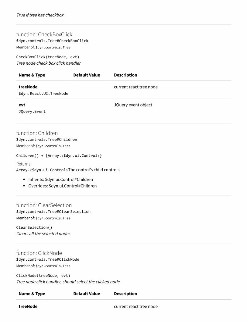
True if tree has checkbox
function: CheckBoxClick$dyn.controls.Tree#CheckBoxClickMember of: $dyn.controls.Tree
CheckBoxClick(treeNode, evt)Tree node check box click handler
Name & Type Default Value Description
treeNode $dyn.React.UI.TreeNode
current react tree node
evt JQuery.Event
JQuery event object
function: Children$dyn.controls.Tree#ChildrenMember of: $dyn.controls.Tree
Children() → {Array.<$dyn.ui.Control>}
Returns:Array.<$dyn.ui.Control>The control's child controls.
Inherits: $dyn.ui.Control#ChildrenOverrides: $dyn.ui.Control#Children
function: ClearSelection$dyn.controls.Tree#ClearSelectionMember of: $dyn.controls.Tree
ClearSelection()Clears all the selected nodes
function: ClickNode$dyn.controls.Tree#ClickNodeMember of: $dyn.controls.Tree
ClickNode(treeNode, evt)Tree node click handler, should select the clicked node
Name & Type Default Value Description
treeNode current react tree node

$dyn.React.UI.TreeNode
evt JQuery.Event
JQuery event Object
function: CollapseSelectedNode$dyn.controls.Tree#CollapseSelectedNodeMember of: $dyn.controls.Tree
CollapseSelectedNode()Collapse the selected node
function: deleteAll$dyn.controls.Tree#deleteAllMember of: $dyn.controls.Tree
deleteAll()Delete all tree nodes
function: deleteNode$dyn.controls.Tree#deleteNodeMember of: $dyn.controls.Tree
deleteNode(node, deleteImmediate) → {Boolean}Function to delete a node from parent's Nodes array
Name & Type Default Value Description
node $dyn.ui.Tree.TreeNode
node to be deleted
deleteImmediate Boolean
false if the parent deletion is considered already, no need torerender the child
Returns:Booleantrue if no further commit is needed, false otherwise
member: EditLabels$dyn.controls.Tree#EditLabelsMember of: $dyn.controls.Tree
Tre if the tree node label is editable
member: Enabled

member: Enabled$dyn.controls.Tree#EnabledMember of: $dyn.controls.Tree
Inherits: $dyn.ui.Control#EnabledDefault value: true
function: ExpandCollapse$dyn.controls.Tree#ExpandCollapseMember of: $dyn.controls.Tree
ExpandCollapse(treeNode, value)Expand or collapse a tree node
Name & Type Default Value Description
treeNode $dyn.React.UI.TreeNode
current react tree node
value Boolean
target expand/collapse state
function: ExpandSelectedNode$dyn.controls.Tree#ExpandSelectedNodeMember of: $dyn.controls.Tree
ExpandSelectedNode() → {boolean|undefined}Expand the selected node
Returns:boolean|undefined
function: FirstSelectedNode$dyn.controls.Tree#FirstSelectedNodeMember of: $dyn.controls.Tree
FirstSelectedNode() → {$dyn.React.UI.TreeNode}Get the first selected node
Returns:$dyn.React.UI.TreeNodeFirst selected react node
function: GetNextVisible$dyn.controls.Tree#GetNextVisibleMember of: $dyn.controls.Tree

GetNextVisible(startNode) → {$dyn.React.UI.TreeNode}Get the next visible node
Name & Type Default Value Description
startNode $dyn.React.UI.TreeNode
current react node
Returns:$dyn.React.UI.TreeNodeGext visible react node
function: GetParentNode$dyn.controls.Tree#GetParentNodeMember of: $dyn.controls.Tree
GetParentNode(treeNode) → {$dyn.React.UI.TreeNode}Get the parent node
Name & Type Default Value Description
treeNode $dyn.React.UI.TreeNode
current react tree node
Returns:$dyn.React.UI.TreeNodeParent react node
function: getPersonalizationElements$dyn.controls.Tree#getPersonalizationElementsMember of: $dyn.controls.Tree
getPersonalizationElements(options) → {$dyn.ax.TaskGuide.Options}Returns an array of Elements that make up the control. For example, tab pages will return both the header andcontent element.
Name & Type Default Value Description
options $dyn.ax.TaskGuide.Options
Returns:$dyn.ax.TaskGuide.Options
Inherits: $dyn.ui.Control#getPersonalizationElements
function: GetPrevVisible

$dyn.controls.Tree#GetPrevVisibleMember of: $dyn.controls.Tree
GetPrevVisible(startNode) → {$dyn.React.UI.TreeNode}Get the previous visible node
Name & Type Default Value Description
startNode $dyn.React.UI.TreeNode
current react node
Returns:$dyn.React.UI.TreeNodePrevious visible react node
function: GetRoot$dyn.controls.Tree#GetRootMember of: $dyn.controls.Tree
GetRoot() → {$dyn.React.UI.TreeNode}Get root node
Returns:$dyn.React.UI.TreeNodeRoot react node
function: GetSiblingNode$dyn.controls.Tree#GetSiblingNodeMember of: $dyn.controls.Tree
GetSiblingNode(treeNode, forward) → {$dyn.React.UI.TreeNode}Get the sibling node of a given node
Name & Type Default Value Description
treeNode $dyn.React.UI.TreeNode
current tree node react object
forward Boolean
direction, next if true
Returns:$dyn.React.UI.TreeNodeSibling react node
function: getTaskGuideParams$dyn.controls.Tree#getTaskGuideParamsMember of: $dyn.controls.Tree

getTaskGuideParams(options) → {$dyn.ax.TaskGuide.Options}Used by Task Recorder to position the QTip during rails mode.
Name & Type Default Value Description
options $dyn.ax.TaskGuide.Options
Returns:$dyn.ax.TaskGuide.Options
Inherits: $dyn.ui.Control#getTaskGuideParams
member: HasButtons$dyn.controls.Tree#HasButtonsMember of: $dyn.controls.Tree
True if the tree node has button
function: Id$dyn.controls.Tree#IdMember of: $dyn.controls.Tree
Id() → {String}
Returns:StringElement ID.
Inherits: $dyn.ui.Control#IdOverrides: $dyn.ui.Control#Id
function: init$dyn.controls.Tree#initMember of: $dyn.controls.Tree
init(data, element)This is called upon creation of the control.
Name & Type Default Value Description
data Object
element Element
Inherits: $dyn.ui.Control#init
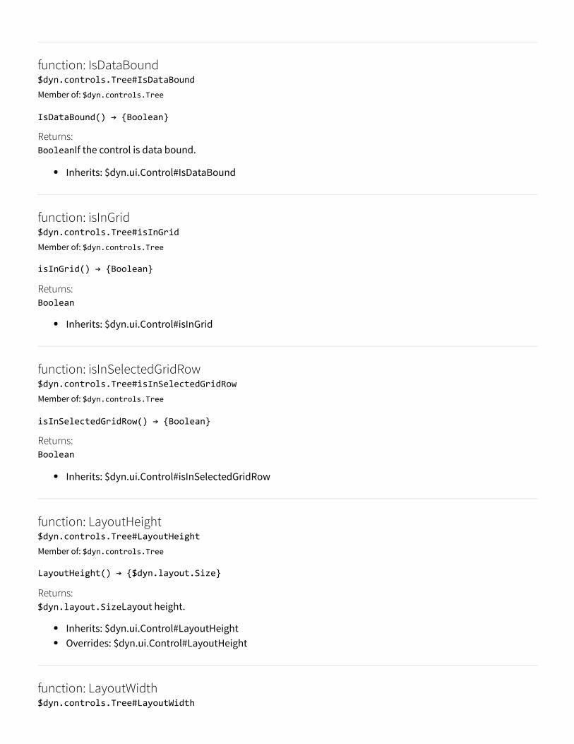
function: IsDataBound$dyn.controls.Tree#IsDataBoundMember of: $dyn.controls.Tree
IsDataBound() → {Boolean}
Returns:BooleanIf the control is data bound.
Inherits: $dyn.ui.Control#IsDataBound
function: isInGrid$dyn.controls.Tree#isInGridMember of: $dyn.controls.Tree
isInGrid() → {Boolean}
Returns:Boolean
Inherits: $dyn.ui.Control#isInGrid
function: isInSelectedGridRow$dyn.controls.Tree#isInSelectedGridRowMember of: $dyn.controls.Tree
isInSelectedGridRow() → {Boolean}
Returns:Boolean
Inherits: $dyn.ui.Control#isInSelectedGridRow
function: LayoutHeight$dyn.controls.Tree#LayoutHeightMember of: $dyn.controls.Tree
LayoutHeight() → {$dyn.layout.Size}
Returns:$dyn.layout.SizeLayout height.
Inherits: $dyn.ui.Control#LayoutHeightOverrides: $dyn.ui.Control#LayoutHeight
function: LayoutWidth$dyn.controls.Tree#LayoutWidth
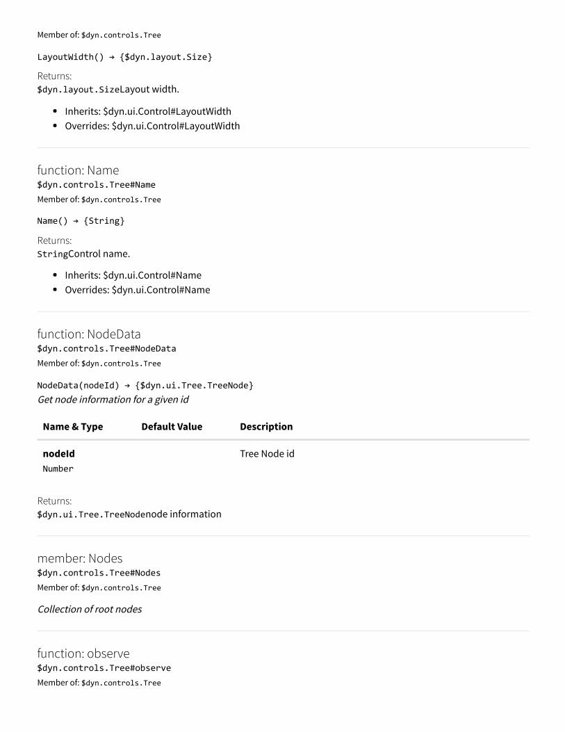
Member of: $dyn.controls.Tree
LayoutWidth() → {$dyn.layout.Size}
Returns:$dyn.layout.SizeLayout width.
Inherits: $dyn.ui.Control#LayoutWidthOverrides: $dyn.ui.Control#LayoutWidth
function: Name$dyn.controls.Tree#NameMember of: $dyn.controls.Tree
Name() → {String}
Returns:StringControl name.
Inherits: $dyn.ui.Control#NameOverrides: $dyn.ui.Control#Name
function: NodeData$dyn.controls.Tree#NodeDataMember of: $dyn.controls.Tree
NodeData(nodeId) → {$dyn.ui.Tree.TreeNode}Get node information for a given id
Name & Type Default Value Description
nodeId Number
Tree Node id
Returns:$dyn.ui.Tree.TreeNodenode information
member: Nodes$dyn.controls.Tree#NodesMember of: $dyn.controls.Tree
Collection of root nodes
function: observe$dyn.controls.Tree#observeMember of: $dyn.controls.Tree

observe(prop, func) → {$dyn.ax.TaskGuide.Options}Wrapper for {@link $dyn.observe} when given a specific property.
Name & Type Default Value Description
prop Object
The property to observe
func function
Callback to fire when the property changes.
Returns:$dyn.ax.TaskGuide.Options
Inherits: $dyn.ui.Control#observe
function: RemoveSelection$dyn.controls.Tree#RemoveSelectionMember of: $dyn.controls.Tree
RemoveSelection(treeNode)Remove the specified node from the selection list
Name & Type Default Value Description
treeNode $dyn.React.UI.TreeNode
current react tree node
function: RenameNode$dyn.controls.Tree#RenameNodeMember of: $dyn.controls.Tree
RenameNode()Start a node label editing
function: renderTree$dyn.controls.Tree#renderTreeMember of: $dyn.controls.Tree
renderTree()Function to render the tree
function: SelectedNode$dyn.controls.Tree#SelectedNode

Member of: $dyn.controls.Tree
SelectedNode() → {$dyn.React.UI.TreeNode}Get the latest selected node
Returns:$dyn.React.UI.TreeNodeSelected react node
function: SelectNextVisible$dyn.controls.Tree#SelectNextVisibleMember of: $dyn.controls.Tree
SelectNextVisible(evt, isNext) → {boolean|undefined}Select the next visible node
Name & Type Default Value Description
evt JQueryEvent
JQuery event
isNext Boolean
selection direction, forward if true
Returns:boolean|undefined
function: SelectNode$dyn.controls.Tree#SelectNodeMember of: $dyn.controls.Tree
SelectNode(treeNode, howSelected, selectionAction)Select the provided node
Name & Type Default Value Description
treeNode $dyn.React.UI.TreeNode
current react tree node
howSelected $dyn.ui.Tree.HowSelected
medium of tree node selection
selectionAction $dyn.ui.Tree.SelectionAction
tree node selection action
function: SelectRoot$dyn.controls.Tree#SelectRoot

Member of: $dyn.controls.Tree
SelectRoot()Select the first root
function: setChildControlFocus$dyn.controls.Tree#setChildControlFocusMember of: $dyn.controls.Tree
setChildControlFocus() → (nullable) {HTMLElement}Sets focus to the first focusable control in the container.
Returns:HTMLElementThe control that was found to focus, if there is one.
Inherits: $dyn.ui.Control#setChildControlFocus
function: SetNodeCheckBox$dyn.controls.Tree#SetNodeCheckBoxMember of: $dyn.controls.Tree
SetNodeCheckBox(treeNodeData, state, sendInteraction)Set checked state of a treenode
Name & Type Default Value Description
treeNodeData $dyn.ui.Tree.TreeNode
current tree node information
state $dyn.ui.Tree.CheckedState
target checked state
sendInteraction Boolean
should send the interaction
function: SetNodeData$dyn.controls.Tree#SetNodeDataMember of: $dyn.controls.Tree
SetNodeData(nodeId, nodeData)Set node information for a given id
Name & Type Default Value Description
nodeId Number
Tree Node id
nodeData Node information

nodeData $dyn.ui.Tree.TreeNode
Node information
member: SingleSelect$dyn.controls.Tree#SingleSelectMember of: $dyn.controls.Tree
True if only one node can be selected
member: Skip$dyn.controls.Tree#SkipMember of: $dyn.controls.Tree
Skip this control in the tab sequence.
Inherits: $dyn.ui.Control#SkipDefault value: false
function: ToggleSelectedNodeCheck$dyn.controls.Tree#ToggleSelectedNodeCheckMember of: $dyn.controls.Tree
ToggleSelectedNodeCheck(evt)Toggle the checked state of the selected node
Name & Type Default Value Description
evt JQuery.Event
JQuery event
member: TreeNodes$dyn.controls.Tree#TreeNodesMember of: $dyn.controls.Tree
Collection of interaction nodes (tree nodes with action)
member: TreeNodes$dyn.controls.Tree#TreeNodesMember of: $dyn.controls.Tree
Collection of interaction nodes (tree nodes with action)
function: updateNode

$dyn.controls.Tree#updateNodeMember of: $dyn.controls.Tree
updateNode(node)Function to update a node data and take immediate action if possible
Name & Type Default Value Description
node $dyn.ui.Tree.TreeNode
node to be updated
function: updateScrollIntoView$dyn.controls.Tree#updateScrollIntoViewMember of: $dyn.controls.Tree
updateScrollIntoView(treeNode)update the scroll position if the selected node is not in the view
Name & Type Default Value Description
treeNode $dyn.React.UI.TreeNode
selected react tree node
function: updateScrollOnNavigation$dyn.controls.Tree#updateScrollOnNavigationMember of: $dyn.controls.Tree
updateScrollOnNavigation()Update the scroll position for the selected node
function: Updating$dyn.controls.Tree#UpdatingMember of: $dyn.controls.Tree
Updating() → {$dyn.observable}
Returns:$dyn.observableThe updating observable.
Inherits: $dyn.ui.Control#Updating
member: Visible$dyn.controls.Tree#VisibleMember of: $dyn.controls.Tree
Inherits: $dyn.ui.Control#Visible

Default value: true
function: dataBind$dyn.dataBindMember of: $dyn
dataBind(targetElement, dataContext, onDataBindComplete)Binds an element to a given {@link $dyn.DataContext}.
Name & Type Default Value Description
targetElement element
The element to bind
dataContext $dyn.DataContext
The data context to bind to the element.
onDataBindComplete function
The callback for when the binding is complete.
class: DataContext$dyn.DataContextMember of: $dyn
Constructorclass: DataContext$dyn.DataContextMember of: $dyn
DataContext(data, parentContext)The data-context wrapper for a control. Creates a data-context wrapper given a new object to be used as the $data, and an optional parent data contextwrapper
Name & Type Default Value Description
data object
The data (usually the {@link $dyn.ui.Control})
parentContext $dyn.DataContext
Nullable The parent data context wrapper.
function: error

$dyn.errorMember of: $dyn
error(options, source) → {number}Surfaces an error message to the user via the UI. The message will be routed to the message bar on the control's root form if possible, otherwise to the messagecenter.
Name & Type Default Value Description
options $dyn.MessageOptions
The message to display.
source $dyn.ui.Control
Nullable The control context associated with the message. Themessage will be routed to the message bar on the control's rootform if possible, otherwise to the message center.
Returns:numberReturns the logged message Id.
function: extendPrototype$dyn.extendPrototypeMember of: $dyn
extendPrototype(basePrototype, childPrototype) → {object}Creates a prototype using prototypical inheritance. Does classical JavaScript prototype chaining (prototypical inheritance). The childPrototype's prototype will bethe base prototype.
Name & Type Default Value Description
basePrototype object
The base prototype object whose properties will be extended bythe child.
childPrototype object
The child prototype.
Returns:object
namespace: flyout$dyn.flyoutMember of: $dyn
Namespace that contains all the flyout related functions, classes, and objects

class: flyoutManager$dyn.flyout.flyoutManagerMember of: $dyn.flyout
The flyoutManager itself. This is a sigleton which should not be instantiated.
Constructorclass: flyoutManager$dyn.flyout.flyoutManagerMember of: $dyn.flyout
flyoutManager()
function: addFlyout$dyn.flyout.flyoutManager#addFlyoutMember of: $dyn.flyout.flyoutManager
addFlyout(flyout)Adds a flyout to the flyout stack. Registers event listeners if this is the first flyout to be added.
Name & Type Default Value Description
flyout Object
The flyout registration object.
function: areAnyFlyoutsOpen$dyn.flyout.flyoutManager#areAnyFlyoutsOpenMember of: $dyn.flyout.flyoutManager
areAnyFlyoutsOpen() → {boolean}Checks if there are any flyouts on the stack.
Returns:booleanFlag indicating if there are any open flyouts.
See also: $dyn.flyout.flyoutManager.getFlyoutCount
function: findFlyoutContainer$dyn.flyout.flyoutManager#findFlyoutContainerMember of: $dyn.flyout.flyoutManager
findFlyoutContainer(candidateElement) → {Object}Attempts to find the flyout container of the provided element.

Name & Type Default Value Description
candidateElement Object
The element for which to find the containing flyout, if any.
Returns:ObjectA jQuery object representing the found flyout.
function: getAllFlyoutElementsByFormId$dyn.flyout.flyoutManager#getAllFlyoutElementsByFormIdMember of: $dyn.flyout.flyoutManager
getAllFlyoutElementsByFormId(formId) → {Array}Gets the flyout elements for all flyouts for the given form id.
Name & Type Default Value Description
formId string
The id of the form to find.
Returns:ArrayArray of flyout elements.
function: getAllFlyoutElementsByParentFormId$dyn.flyout.flyoutManager#getAllFlyoutElementsByParentFormIdMember of: $dyn.flyout.flyoutManager
getAllFlyoutElementsByParentFormId(parentFormId) → {Array}Gets the flyout elements for all flyouts given the parent form id.
Name & Type Default Value Description
parentFormId string
The id of the form to find.
Returns:ArrayArray of flyout elements.
function: getFlyoutContextByFormId$dyn.flyout.flyoutManager#getFlyoutContextByFormIdMember of: $dyn.flyout.flyoutManager
getFlyoutContextByFormId(formId) → {Object}Gets the flyout context of the top most flyout a given form Id.

Name & Type Default Value Description
formId string
The id of the form to find.
Returns:ObjectFlyout context. Returns null if no flyout found.
function: getFlyoutCount$dyn.flyout.flyoutManager#getFlyoutCountMember of: $dyn.flyout.flyoutManager
getFlyoutCount() → {number}Gets the number of flyouts in the stack.
Returns:numberThe number of flyouts.
function: getTopFlyout$dyn.flyout.flyoutManager#getTopFlyoutMember of: $dyn.flyout.flyoutManager
getTopFlyout() → {Object}Gets the flyout registration object for the top most flyout.
Returns:ObjectFlyout registration object.
function: isContainedByFlyoutHierarchy$dyn.flyout.flyoutManager#isContainedByFlyoutHierarchyMember of: $dyn.flyout.flyoutManager
isContainedByFlyoutHierarchy(flyoutElement, candidateChildElement) → {boolean}Determines whether or not the provided candidateChildElement is contained by the flyout hierarchy beginningwith the provided flyoutElement.
Name & Type Default Value Description
flyoutElement Object
Flyout representing the root of the flyout hierarchy.
candidateChildElement Object
The element that may belong to the hierarchy.
Returns:booleantrue if the candidateChildElement is contained by the flyoutElement hierarchy; otherwise, false.

function: removeAllFlyoutsAsync$dyn.flyout.flyoutManager#removeAllFlyoutsAsyncMember of: $dyn.flyout.flyoutManager
removeAllFlyoutsAsync(mouseClickEvent) → {Object}Removes all the flyouts from the stack in order.
Name & Type Default Value Description
mouseClickEvent Object
Optional The event object for the mouse click.
Returns:ObjectjQuery promise.
function: removeFlyout$dyn.flyout.flyoutManager#removeFlyoutMember of: $dyn.flyout.flyoutManager
removeFlyout(flyout)Removes a specific flyout from the stack.
Name & Type Default Value Description
flyout Object
The flyout registration object of the flyout to remove.
function: removeFlyoutByElementId$dyn.flyout.flyoutManager#removeFlyoutByElementIdMember of: $dyn.flyout.flyoutManager
removeFlyoutByElementId(targetElementId)Removes a specific flyout from the stack by its ID.
Name & Type Default Value Description
targetElementId string
The flyout element id of the flyout to remove.
function: removeTopFlyoutAsync$dyn.flyout.flyoutManager#removeTopFlyoutAsyncMember of: $dyn.flyout.flyoutManager
removeTopFlyoutAsync(mouseClickEvent, isClickInTopLevelFlyout) → {Object}

Removes the top most flyout from the stack.
Name & Type Default Value Description
mouseClickEvent Object
Optional The event object for the mouse click
isClickInTopLevelFlyout boolean
false Optional A flag indicating if the click was within the flyout atthe top of the stack.
Returns:ObjectjQuery promise.
function: repositionAllFlyouts$dyn.flyout.flyoutManager#repositionAllFlyoutsMember of: $dyn.flyout.flyoutManager
repositionAllFlyouts()Repositions all flyouts.
function: format$dyn.formatMember of: $dyn
format(format, …values) → {string}Builds a string using the supplied values according to the supplied format.
Name & Type Default Value Description
format string
The format in which to build the string. Use bracket notation forplaceholders.
values string
Repeatable The values to use in the format.
Returns:stringThe formatted string.
namespace: forms$dyn.formsMember of: $dyn
function: function

$dyn.functionMember of: $dyn
function(func) → {function}Returns the unwrapped function. Takes a function or an observable wrapping a function and returns the function. Includes safeguards to return anempty function if the supplied parameter is either null or not a function.
Name & Type Default Value Description
func function|$dyn.observable
The function or observable wrapping a function.
Returns:functionThe unwrapped function.
function: info$dyn.infoMember of: $dyn
info(options, source) → {number}Surfaces an informational message to the user via the UI. The message will be routed to the message bar on the control's root form if possible, otherwise to the messagecenter.
Name & Type Default Value Description
options $dyn.MessageOptions
The message to display.
source $dyn.ui.Control
Nullable The control context associated with the message. Themessage will be routed to the message bar on the control's rootform if possible, otherwise to the message center.
Returns:numberReturns the logged message Id.
function: isObservable$dyn.isObservableMember of: $dyn
isObservable(value) → {boolean}Utility to check whether a value is a $dyn observable or not.
Name & Type Default Value Description
value

value anytype
Returns:boolean
function: isObservableArray$dyn.isObservableArrayMember of: $dyn
isObservableArray(value) → {boolean}Utility to check whether a value is a $dyn observable array or not.
Name & Type Default Value Description
value anytype
Returns:boolean
function: label$dyn.labelMember of: $dyn
label(label) → {string}Returns the localized label text for a given label name.
Name & Type Default Value Description
label string
The label to fetch the text for.
Returns:stringThe localized label text.
namespace: layout$dyn.layoutMember of: $dyn
Framework base class for layout The layout namespace.
member: Alignment

$dyn.layout.AlignmentMember of: $dyn.layout
Read Only
Enum for layout alignment
member: ArrangeMethod$dyn.layout.ArrangeMethodMember of: $dyn.layout
Read Only
Enum for layout arrange methods
function: breakableGroupsOptions$dyn.layout.breakableGroupsOptionsMember of: $dyn.layout
breakableGroupsOptions($data) → {Object}Get the options for the given breakable groups binding handler. These are the properties that the broken groups will be dependent on the original group for.
Name & Type Default Value Description
$data Object
The binding handler for the group.
Returns:Object- An object containing the values for the visible, extended, and extendedStyle properties on the handler.
Remarks:Add a property to this list its binding handler can/should be called on the broken group elements.
member: Columns$dyn.layout.ColumnsMember of: $dyn.layout
Read Only
Enum for layout columns.
function: containerBinding$dyn.layout.containerBindingMember of: $dyn.layout
containerBinding($data) → {$dyn.options}
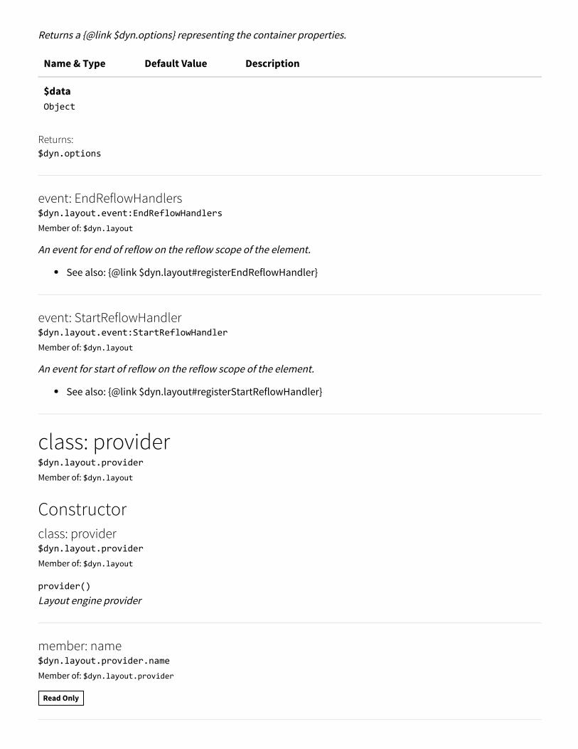
Returns a {@link $dyn.options} representing the container properties.
Name & Type Default Value Description
$data Object
Returns:$dyn.options
event: EndReflowHandlers$dyn.layout.event:EndReflowHandlersMember of: $dyn.layout
An event for end of reflow on the reflow scope of the element.
See also: {@link $dyn.layout#registerEndReflowHandler}
event: StartReflowHandler$dyn.layout.event:StartReflowHandlerMember of: $dyn.layout
An event for start of reflow on the reflow scope of the element.
See also: {@link $dyn.layout#registerStartReflowHandler}
class: provider$dyn.layout.providerMember of: $dyn.layout
Constructorclass: provider$dyn.layout.providerMember of: $dyn.layout
provider()Layout engine provider
member: name$dyn.layout.provider.nameMember of: $dyn.layout.provider
Read Only
function: isFillHeight

function: isFillHeight$dyn.layout.provider#isFillHeightMember of: $dyn.layout.provider
isFillHeight(target) → {boolean}Indicates if an element is set to use a fill-height.
Name & Type Default Value Description
target HtmlElement
Returns:boolean
function: isFillWidth$dyn.layout.provider#isFillWidthMember of: $dyn.layout.provider
isFillWidth(target) → {boolean}Indicates if an element is set to use a fill-width.
Name & Type Default Value Description
target HtmlElement
Returns:boolean
function: isFixedHeight$dyn.layout.provider#isFixedHeightMember of: $dyn.layout.provider
isFixedHeight(target) → {boolean}Indicates if an element is set to use a fixed height.
Name & Type Default Value Description
target HtmlElement
Returns:boolean
function: isFixedIncreasingHeight

function: isFixedIncreasingHeight$dyn.layout.provider#isFixedIncreasingHeightMember of: $dyn.layout.provider
isFixedIncreasingHeight(target) → {boolean}Indicates if an element is set to use a fixed increasing height.
Name & Type Default Value Description
target HtmlElement
Returns:boolean
function: isFixedIncreasingWidth$dyn.layout.provider#isFixedIncreasingWidthMember of: $dyn.layout.provider
isFixedIncreasingWidth(target) → {boolean}Indicates if an element is set to have a fixed increasing width.
Name & Type Default Value Description
target HtmlElement
Returns:boolean
function: isFixedWidth$dyn.layout.provider#isFixedWidthMember of: $dyn.layout.provider
isFixedWidth(target) → {boolean}Indicates if an element is set to have a fixed width.
Name & Type Default Value Description
target HtmlElement
Returns:boolean
function: isHorizontal

function: isHorizontal$dyn.layout.provider#isHorizontalMember of: $dyn.layout.provider
isHorizontal(target) → {boolean}Indicates if the provided element is a horizontal layout container.
Name & Type Default Value Description
target HtmlElement
Returns:boolean
function: isVertical$dyn.layout.provider#isVerticalMember of: $dyn.layout.provider
isVertical(target) → {boolean}Indicates if the provided element is a vertical layout container.
Name & Type Default Value Description
target HtmlElement
Returns:boolean
function: removeFillHeight$dyn.layout.provider#removeFillHeightMember of: $dyn.layout.provider
removeFillHeight(target)Removes the fill-height mode for a child element.
Name & Type Default Value Description
target HtmlElement
function: removeFillWidth$dyn.layout.provider#removeFillWidthMember of: $dyn.layout.provider

removeFillWidth(target)Removes the fill-width mode for a child element.
Name & Type Default Value Description
target HtmlElement
function: removeFixedHeight$dyn.layout.provider#removeFixedHeightMember of: $dyn.layout.provider
removeFixedHeight(target)Removes the fixed height status for a child element.
Name & Type Default Value Description
target HtmlElement
function: removeFixedIncreasingHeight$dyn.layout.provider#removeFixedIncreasingHeightMember of: $dyn.layout.provider
removeFixedIncreasingHeight(target)Removes the fixed-increasing-height status for a child element.
Name & Type Default Value Description
target HtmlElement
function: removeFixedIncreasingWidth$dyn.layout.provider#removeFixedIncreasingWidthMember of: $dyn.layout.provider
removeFixedIncreasingWidth(target)Removes the fixed-increasing-width status of an element.
Name & Type Default Value Description
target HtmlElement
function: removeFixedWidth

function: removeFixedWidth$dyn.layout.provider#removeFixedWidthMember of: $dyn.layout.provider
removeFixedWidth(target)Removes the fixed width status of an element.
Name & Type Default Value Description
target HtmlElement
function: removeLayoutContainer$dyn.layout.provider#removeLayoutContainerMember of: $dyn.layout.provider
removeLayoutContainer(target)Removes the layout container state of an element.
Name & Type Default Value Description
target HtmlElement
function: setFillHeight$dyn.layout.provider#setFillHeightMember of: $dyn.layout.provider
setFillHeight(target)Sets the fill-height mode for a child element.
Name & Type Default Value Description
target HtmlElement
function: setFillWidth$dyn.layout.provider#setFillWidthMember of: $dyn.layout.provider
setFillWidth(target)Sets the fill-width mode for a child element.
Name & Type Default Value Description
target

target HtmlElement
function: setFixedHeight$dyn.layout.provider#setFixedHeightMember of: $dyn.layout.provider
setFixedHeight(target)Sets an element to indicate it has a fixed height.
Name & Type Default Value Description
target HtmlElement
function: setFixedIncreasingHeight$dyn.layout.provider#setFixedIncreasingHeightMember of: $dyn.layout.provider
setFixedIncreasingHeight(target)Sets an element to indicate it has a fixed increasing height.
Name & Type Default Value Description
target HtmlElement
function: setFixedIncreasingWidth$dyn.layout.provider#setFixedIncreasingWidthMember of: $dyn.layout.provider
setFixedIncreasingWidth(target)Removes the fixed width status of an element.
Name & Type Default Value Description
target HtmlElement
function: setFixedWidth$dyn.layout.provider#setFixedWidthMember of: $dyn.layout.provider
setFixedWidth(target)
Sets an element to indicate it has a fixed width.
Name & Type Default Value Description
target HtmlElement
function: setHorizontalLe夾ࠀContainer$dyn.layout.provider#setHorizontalLeftContainerMember of: $dyn.layout.provider
setHorizontalLeftContainer(target)Sets an element to be bottom-aligned
Name & Type Default Value Description
target HtmlElement
function: setHorizontalLe夾ࠀContainer$dyn.layout.provider#setHorizontalLeftContainerMember of: $dyn.layout.provider
setHorizontalLeftContainer(target)Sets an element to be a container of children that will laid out horizontally.
Name & Type Default Value Description
target HtmlElement
function: setHorizontalRightContainer$dyn.layout.provider#setHorizontalRightContainerMember of: $dyn.layout.provider
setHorizontalRightContainer(target)Sets an element to be a container of children that will laid out horizontally.
Name & Type Default Value Description
target HtmlElement
function: setHorizontalTopAlign
function: setHorizontalTopAlign$dyn.layout.provider#setHorizontalTopAlignMember of: $dyn.layout.provider
setHorizontalTopAlign(target)Sets an element to be a container of children that will will layed out vertically.
Name & Type Default Value Description
target HtmlElement
function: setHorizontalTopAlign$dyn.layout.provider#setHorizontalTopAlignMember of: $dyn.layout.provider
setHorizontalTopAlign(target)Sets an element to be top-aligned
Name & Type Default Value Description
target HtmlElement
member: Size$dyn.layout.SizeMember of: $dyn.layout
Read Only
Enum for layout size. Size
typedef: sizingObject$dyn.layout.sizingObjectMember of: $dyn.layout
Provides sizing information for a control
function: arrange$dyn.layout#arrangeMember of: $dyn.layout
arrange(target, directArrange, removeFocus)Applies layout CSS attributes and columns to the immediate children of this container.

Name & Type Default Value Description
target HtmlElement
The element to be arranged.
directArrange boolean
Indicates that the element was called from outside of the layoutcode. We need to do extra work to ensure that the element is stillreflowed when necessary.
removeFocus boolean
Whether or not to call to $dyn.ui.removeFocus when there is anArrangeMethod
function: layoutContainer$dyn.layout#layoutContainerMember of: $dyn.layout
layoutContainer(targetElement) → {object}Return container element assiged to target element
Name & Type Default Value Description
targetElement object
Target element
Returns:objectcontainer element assiged to target element
function: queueArrange$dyn.layout#queueArrangeMember of: $dyn.layout
queueArrange(layoutCandidate)Add an element to layout arrange queue
Name & Type Default Value Description
layoutCandidate HtmlElement
The element to be arranged.
function: registerEndReflowHandler$dyn.layout#registerEndReflowHandlerMember of: $dyn.layout
registerEndReflowHandler(targetElement, handler) → {object}
Registers layout reflow handler on a given element. The handler is going to be invoked at the end of reflow operation for one of the reflow parents of a given element.
Name & Type Default Value Description
targetElement HtmlElement
The element that we are subscribing to
handler function
The handler of end reflow event
Returns:objectReturn an object with dispose method to dispose the handler.
function: registerStartReflowHandler$dyn.layout#registerStartReflowHandlerMember of: $dyn.layout
registerStartReflowHandler(targetElement, handler) → {object}Registers layout reflow handler on a given element. The handler is going to be invoked at the start of reflow operation for one of the reflow parents of a given element
Name & Type Default Value Description
targetElement HtmlElement
The element that we are subscribing to
handler function
The handler of end reflow event
Returns:objectReturn an object with dispose method to dispose the handler.
function: removeArrange$dyn.layout#removeArrangeMember of: $dyn.layout
removeArrange(target, fromContentHandler)Removes any columns created for layout, leaving the children intact.
Name & Type Default Value Description
target HtmlElement
Container of the layout columns to remove.
fromContentHandler True if this is being called from the content handler; otherwise,

boolean false (called from arrange).
function: sizing$dyn.layout#sizingMember of: $dyn.layout
sizing(control, minFlexWidth, minFlexHeight, heightOverride, widthOverride) →{$dyn.layout.sizingObject}Based on Width and Height properties of the control.
Name & Type Default Value Description
control object
Control data context
minFlexWidth number
Optional
minFlexHeight number
Optional
heightOverride $dyn.observable
Optional Observable that get toggled when the height of thecontrol gets overridden in the arrange, elements can handle thisbehavior and resize their internal contents accordingly.
widthOverride $dyn.observable
Optional Observable that get toggled when the width of thecontrol gets overridden in the arrange, elements can handle thisbehavior and resize their internal contents accordingly.
Returns:$dyn.layout.sizingObjectReturns sizing object
function: subscribeArrangeToLayout$dyn.layout#subscribeArrangeToLayoutMember of: $dyn.layout
subscribeArrangeToLayout() → {number}Subscribes the arrangeTopLevelElement function to when the $dyn.ui.layout flag flips.
Returns:numberReturns subscription ID
function: length$dyn.lengthMember of: $dyn

length(obj) → (nullable) {number}Fetch the length of an object, unwrapping it if it is observable. If the object is an array/observable array, returns the number of elements in the array.
Name & Type Default Value Description
obj object
The object to retrieve the length of.
Returns:numberlength
typedef: MessageOptions$dyn.MessageOptionsMember of: $dyn
Defines a message to display in the UI.
class: observable$dyn.observableMember of: $dyn
Constructorclass: observable$dyn.observableMember of: $dyn
observable(value)Creates an observable variable.
Name & Type Default Value Description
value anytype
The initial value to initialize the observable to.
class: observableArray$dyn.observableArrayMember of: $dyn
Constructorclass: observableArray

$dyn.observableArrayMember of: $dyn
observableArray(value)Creates an observable variable that can track changes to an array object.
Name & Type Default Value Description
value array
The initial value to initialize the observable to.
function: clear$dyn.observableArray.clearMember of: $dyn.observableArray
clear()Remove all elements from the array.
member: len$dyn.observableArray.lenMember of: $dyn.observableArray
Read Only
The number of elements in the array.
function: pop$dyn.observableArray.popMember of: $dyn.observableArray
pop()Implements the equivalent function for a standard javascript array. See {@link https://msdn.microso≀弼.com/library/k4h76zbx.aspx Array Object} for additional information.
function: push$dyn.observableArray.pushMember of: $dyn.observableArray
push()Implements the equivalent function for a standard javascript array. See {@link https://msdn.microso≀弼.com/library/k4h76zbx.aspx Array Object} for additional information.
function: reverse$dyn.observableArray.reverse

Member of: $dyn.observableArray
reverse()Implements the equivalent function for a standard javascript array. See {@link https://msdn.microso≀弼.com/library/k4h76zbx.aspx Array Object} for additional information.
function: setAt$dyn.observableArray.setAtMember of: $dyn.observableArray
setAt(index, value) → {anytype}Update a single element in the observable array.
Name & Type Default Value Description
index number
The 0 based index of the element to update.
value anytype
The new value of the element.
Returns:anytypeThe new value of the element.
function: shi夾ࠀ$dyn.observableArray.shiftMember of: $dyn.observableArray
shift()Implements the equivalent function for a standard javascript array. See {@link https://msdn.microso≀弼.com/library/k4h76zbx.aspx Array Object} for additional information.
function: sort$dyn.observableArray.sortMember of: $dyn.observableArray
sort()Implements the equivalent function for a standard javascript array. See {@link https://msdn.microso≀弼.com/library/k4h76zbx.aspx Array Object} for additional information.
function: splice$dyn.observableArray.spliceMember of: $dyn.observableArray
splice()

Implements the equivalent function for a standard javascript array. See {@link https://msdn.microso≀弼.com/library/k4h76zbx.aspx Array Object} for additional information.
function: unshi夾ࠀ$dyn.observableArray.unshiftMember of: $dyn.observableArray
unshift()Implements the equivalent function for a standard javascript array. See {@link https://msdn.microso≀弼.com/library/k4h76zbx.aspx Array Object} for additional information.
function: observe$dyn.observeMember of: $dyn
observe(observing, observer, thisArg, disposableObserver, skipFirstTimeFire) →{$dyn.observe.subscription}Subscribes a function to changes of an observable. Utility method that binds an observer logic to an observing logic. Observing logic is evaluated in an observablewrapper and the resulting value is passed as the first argument to the observer logic. Observer is executed firsttime and then any time subsequently when the observing value changes. If the observer returns false, theobservation is stopped and the subscription is disposed.
Name & Type Default Value Description
observing object
The observable to be observed.
observer function
The function to invoke upon registration and also later when theobservable is updated. Function is invoked with one argument,the value of the observable. If Observer returns false, then weun-subscribed automatically.
thisArg object
Nullable Context to pass to the Observer. The Context becomesthe this variable inside of the observer.
disposableObserver object
Nullable Unsubscribes the supplied DisposableObserver. Anyobserver which it is currently observing and needs to bedisposed before creating a new observer.
skipFirstTimeFire boolean
Nullable Do not fire when this function is first called.
Returns:$dyn.observe.subscriptionThe subscription.
member: _subscriptionId
member: _subscriptionId$dyn.observe._subscriptionIdMember of: $dyn.observe
Defines the subscription to an observable.
function: peek$dyn.peekMember of: $dyn
peek(observable) → {object}Accesses the value of an observable variable, without creating a dependency. For more information about dependency, see the {@link $dyn.value} function.
Name & Type Default Value Description
observable object
The observable whose value to access.
Returns:objectThe current value in the observable property
namespace: React$dyn.ReactMember of: $dyn
namespace: UI$dyn.React.UIMember of: $dyn.React
member: SkypeContactCard$dyn.React.UI.SkypeContactCardMember of: $dyn.React.UI
A React class representing a Skype contact card with a picture, presence, name, title, and contact buttons
class: TreeNode$dyn.React.UI.TreeNodeMember of: $dyn.React.UI
Tree node React class
Constructor
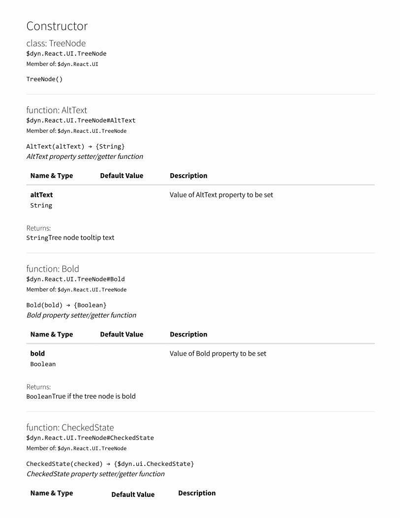
Constructorclass: TreeNode$dyn.React.UI.TreeNodeMember of: $dyn.React.UI
TreeNode()
function: AltText$dyn.React.UI.TreeNode#AltTextMember of: $dyn.React.UI.TreeNode
AltText(altText) → {String}AltText property setter/getter function
Name & Type Default Value Description
altText String
Value of AltText property to be set
Returns:StringTree node tooltip text
function: Bold$dyn.React.UI.TreeNode#BoldMember of: $dyn.React.UI.TreeNode
Bold(bold) → {Boolean}Bold property setter/getter function
Name & Type Default Value Description
bold Boolean
Value of Bold property to be set
Returns:BooleanTrue if the tree node is bold
function: CheckedState$dyn.React.UI.TreeNode#CheckedStateMember of: $dyn.React.UI.TreeNode
CheckedState(checked) → {$dyn.ui.CheckedState}CheckedState property setter/getter function
Name & Type Default Value Description

checked $dyn.ui.CheckedState
Value of ChekcedState property to be set
Returns:$dyn.ui.CheckedStateChecked state of the tree node
function: CheckedString$dyn.React.UI.TreeNode#CheckedStringMember of: $dyn.React.UI.TreeNode
CheckedString() → {String}return checked state as string
Returns:StringThe checked state description
function: ChildCount$dyn.React.UI.TreeNode#ChildCountMember of: $dyn.React.UI.TreeNode
ChildCount() → {Number}Children Count
Returns:NumberReturns total number of children
function: Expanded$dyn.React.UI.TreeNode#ExpandedMember of: $dyn.React.UI.TreeNode
Expanded(expanded) → {Boolean}Expanded property setter/getter function
Name & Type Default Value Description
expanded Boolean
Value of Expanded property to be set
Returns:BooleanTrue if the tree node is expanded
function: GetChild$dyn.React.UI.TreeNode#GetChildMember of: $dyn.React.UI.TreeNode

GetChild(index) → {$dyn.React.UI.TreeNode}Get a specific Child
Name & Type Default Value Description
index Number
index of the child that needs to be returned
Returns:$dyn.React.UI.TreeNodeReturns the specific child
function: GetChildren$dyn.React.UI.TreeNode#GetChildrenMember of: $dyn.React.UI.TreeNode
GetChildren() → {Array.<$dyn.ui.Tree.TreeNode>}Returns all children
Returns:Array.<$dyn.ui.Tree.TreeNode>All children as array
function: HasChildren$dyn.React.UI.TreeNode#HasChildrenMember of: $dyn.React.UI.TreeNode
HasChildren(has) → {Boolean}HasChildren property setter/getter function
Name & Type Default Value Description
has Boolean
Value of HasChildren property to be set
Returns:BooleanTrue if the tree node has children
function: ImageName$dyn.React.UI.TreeNode#ImageNameMember of: $dyn.React.UI.TreeNode
ImageName(imageName) → {String}ImageName property setter/getter function
Name & Type Default Value Description
imageName Value of ImageName property to be set

String
Returns:StringTree node image name
function: ImageType$dyn.React.UI.TreeNode#ImageTypeMember of: $dyn.React.UI.TreeNode
ImageType(imageType) → {String}ImageType property setter/getter function
Name & Type Default Value Description
imageType String
Value of ImageType property to be set
Returns:StringTree node image type
function: name$dyn.React.UI.TreeNode#nameMember of: $dyn.React.UI.TreeNode
name(_name) → {String}name property setter/getter function
Name & Type Default Value Description
_name String
Value of name property to be set
Returns:StringTree node label
function: NodeData$dyn.React.UI.TreeNode#NodeDataMember of: $dyn.React.UI.TreeNode
NodeData() → {$dyn.ui.Tree.TreeNode}Return the current node data
Returns:$dyn.ui.Tree.TreeNodeCurrent tree node data
function: NodeId

function: NodeId$dyn.React.UI.TreeNode#NodeIdMember of: $dyn.React.UI.TreeNode
NodeId() → {Number}Return the current node id
Returns:NumberCurrent tree node id
function: ParentId$dyn.React.UI.TreeNode#ParentIdMember of: $dyn.React.UI.TreeNode
ParentId() → {Number}Return the current parent id
Returns:NumberCurrent tree node parent id
function: Readonly$dyn.React.UI.TreeNode#ReadonlyMember of: $dyn.React.UI.TreeNode
Readonly(readonly) → {Boolean}Readonly property setter/getter function
Name & Type Default Value Description
readonly Boolean
Value of Readonly property to be set
Returns:BooleanTrue if the tree node is readonly
function: Selected$dyn.React.UI.TreeNode#SelectedMember of: $dyn.React.UI.TreeNode
Selected(selected, keepInArray) → {Boolean}Selected property setter/getter function
Name & Type Default Value Description
selected Boolean
Value of Selected property to be set
keepInArray Flag indicates if the node should be kept in the tree selection list

keepInArray Boolean
Flag indicates if the node should be kept in the tree selection list
Returns:BooleanTrue if the tree node is selected
namespace: resources$dyn.resourcesMember of: $dyn
namespace: shell$dyn.shellMember of: $dyn
Manages navigation between forms and provides higher level management of and information about theapplication.
function: getActiveForm$dyn.shell#getActiveFormMember of: $dyn.shell
getActiveForm() → {element}Provides the active form. Note: This form could be a primary or dialog form type.
Returns:element
function: getCurrentDialog$dyn.shell#getCurrentDialogMember of: $dyn.shell
getCurrentDialog() → {element}Provides the active dialog
Returns:element
function: getCurrentRootForm$dyn.shell#getCurrentRootFormMember of: $dyn.shell
getCurrentRootForm() → {element}

Provides the visible primary form. Note: It is not required to be the active form.
Returns:elementThe top primary form.
function: joinArrayWithChevron$dyn.shell#joinArrayWithChevronMember of: $dyn.shell
joinArrayWithChevron(arr) → {String}Returns a string that that joins the provided elements with a chevron. Supports RTL by reversing the order and chevron depending on current display. Note: Only use when CSS can notbe used to allow correct LTR/RTL display switches.
Name & Type Default Value Description
arr Array.<String>
Strings to be joined.
Returns:Stringarray elements joined with ` < ' or ' > ' depending on rtl setting.
member: QueryStringKeys$dyn.shell#QueryStringKeysMember of: $dyn.shell
Read Only
Query string keys used by the framework. Keys are reserved for internal use.
member: ViewportSize$dyn.shell#ViewportSizeMember of: $dyn.shell
Read Only
Available viewport sizes to show the main form content ViewportSize
namespace: skypeInteraction$dyn.skypeInteractionMember of: $dyn
Contains types and functions to interact with Skype for Business Online

namespace: ui$dyn.uiMember of: $dyn
function: autoProperty$dyn.ui.autoPropertyMember of: $dyn.ui
autoProperty(autoValue, control, backingProperty) → {$dyn.computed}Returns a computed that will return the specified autoValue instead of 'Auto'.
Name & Type Default Value Description
autoValue string
The value {@link $dyn.ui.autoValue} should resolve to
control $dyn.ui.Control
backingProperty string
The name of the property
Returns:$dyn.computed
member: autoValue$dyn.ui.autoValueMember of: $dyn.ui
Default value: 'Auto'
member: ButtonDisplay$dyn.ui.ButtonDisplayMember of: $dyn.ui
Read Only
Defines whether the text, the image, or both should be displayed on the button.
member: ButtonStyle$dyn.ui.ButtonStyleMember of: $dyn.ui

Read Only
Diⴾerent button styles.
member: CheckBoxStyle$dyn.ui.CheckBoxStyleMember of: $dyn.ui
Read Only
Enum for the diⴾerent CheckBox styles
member: CheckedState$dyn.ui.CheckedStateMember of: $dyn.ui
Enum type for tri-state check CheckedState
class: Container$dyn.ui.ContainerMember of: $dyn.ui
The base container control.
Constructorclass: Container$dyn.ui.ContainerMember of: $dyn.ui
Container(data, element)All other control types should extend this.
Name & Type Default Value Description
data Object
element Element
member: AllowEdit$dyn.ui.Container#AllowEditMember of: $dyn.ui.Container

Inherits: $dyn.ui.Control#AllowEditDefault value: true
member: ArrangeMethod$dyn.ui.Container#ArrangeMethodMember of: $dyn.ui.Container
Default value: {@link $dyn.layout.ArrangeMethod}.vertical
function: Children$dyn.ui.Container#ChildrenMember of: $dyn.ui.Container
Children() → {Array.<$dyn.ui.Control>}
Returns:Array.<$dyn.ui.Control>The control's child controls.
Inherits: $dyn.ui.Control#ChildrenOverrides: $dyn.ui.Control#Children
member: Columns$dyn.ui.Container#ColumnsMember of: $dyn.ui.Container
Default value: 1
member: Enabled$dyn.ui.Container#EnabledMember of: $dyn.ui.Container
Inherits: $dyn.ui.Control#EnabledDefault value: true
function: getPersonalizationElements$dyn.ui.Container#getPersonalizationElementsMember of: $dyn.ui.Container
getPersonalizationElements(options) → {$dyn.ax.TaskGuide.Options}Returns an array of Elements that make up the control. For example, tab pages will return both the header andcontent element.
Name & Type Default Value Description
options

$dyn.ax.TaskGuide.Options
Returns:$dyn.ax.TaskGuide.Options
Inherits: $dyn.ui.Control#getPersonalizationElements
function: getTaskGuideParams$dyn.ui.Container#getTaskGuideParamsMember of: $dyn.ui.Container
getTaskGuideParams(options) → {$dyn.ax.TaskGuide.Options}Used by Task Recorder to position the QTip during rails mode.
Name & Type Default Value Description
options $dyn.ax.TaskGuide.Options
Returns:$dyn.ax.TaskGuide.Options
Inherits: $dyn.ui.Control#getTaskGuideParams
function: Id$dyn.ui.Container#IdMember of: $dyn.ui.Container
Id() → {String}
Returns:StringElement ID.
Inherits: $dyn.ui.Control#IdOverrides: $dyn.ui.Control#Id
function: init$dyn.ui.Container#initMember of: $dyn.ui.Container
init(data, element)This is called upon creation of the control.
Name & Type Default Value Description
data
Object
element Element
Inherits: $dyn.ui.Control#initOverrides: $dyn.ui.Control#init
function: IsDataBound$dyn.ui.Container#IsDataBoundMember of: $dyn.ui.Container
IsDataBound() → {Boolean}
Returns:BooleanIf the control is data bound.
Inherits: $dyn.ui.Control#IsDataBound
function: isInGrid$dyn.ui.Container#isInGridMember of: $dyn.ui.Container
isInGrid() → {Boolean}
Returns:Boolean
Inherits: $dyn.ui.Control#isInGrid
function: isInSelectedGridRow$dyn.ui.Container#isInSelectedGridRowMember of: $dyn.ui.Container
isInSelectedGridRow() → {Boolean}
Returns:Boolean
Inherits: $dyn.ui.Control#isInSelectedGridRow
function: LayoutHeight$dyn.ui.Container#LayoutHeightMember of: $dyn.ui.Container
LayoutHeight() → {$dyn.layout.Size}
Returns:$dyn.layout.SizeLayout height.

Inherits: $dyn.ui.Control#LayoutHeightOverrides: $dyn.ui.Control#LayoutHeight
function: LayoutWidth$dyn.ui.Container#LayoutWidthMember of: $dyn.ui.Container
LayoutWidth() → {$dyn.layout.Size}
Returns:$dyn.layout.SizeLayout width.
Inherits: $dyn.ui.Control#LayoutWidthOverrides: $dyn.ui.Control#LayoutWidth
function: Name$dyn.ui.Container#NameMember of: $dyn.ui.Container
Name() → {String}
Returns:StringControl name.
Inherits: $dyn.ui.Control#NameOverrides: $dyn.ui.Control#Name
function: observe$dyn.ui.Container#observeMember of: $dyn.ui.Container
observe(prop, func) → {$dyn.ax.TaskGuide.Options}Wrapper for {@link $dyn.observe} when given a specific property.
Name & Type Default Value Description
prop Object
The property to observe
func function
Callback to fire when the property changes.
Returns:$dyn.ax.TaskGuide.Options
Inherits: $dyn.ui.Control#observe
function: setChildControlFocus

function: setChildControlFocus$dyn.ui.Container#setChildControlFocusMember of: $dyn.ui.Container
setChildControlFocus() → (nullable) {HTMLElement}Sets focus to the first focusable control in the container.
Returns:HTMLElementThe control that was found to focus, if there is one.
Inherits: $dyn.ui.Control#setChildControlFocus
member: Skip$dyn.ui.Container#SkipMember of: $dyn.ui.Container
Skip this control in the tab sequence.
Inherits: $dyn.ui.Control#SkipDefault value: false
function: Updating$dyn.ui.Container#UpdatingMember of: $dyn.ui.Container
Updating() → {$dyn.observable}
Returns:$dyn.observableThe updating observable.
Inherits: $dyn.ui.Control#Updating
member: Visible$dyn.ui.Container#VisibleMember of: $dyn.ui.Container
Inherits: $dyn.ui.Control#VisibleDefault value: true
class: Control$dyn.ui.ControlMember of: $dyn.ui
The base parent control.Remarks:
For performance, we need to emphasize the clonability of controls. Add any code that would varyacross clones (such as Value-dependent code) within the init function on the prototype. Statically

declared functions should be placed directly in the prototype object. Also, do not reference anythingoutside of "this" within the init to avoid creating a closure that isn't clonable.Note on keyDown behavior for the Enter key ({@link $dyn.ui.KeyCodes}.enter) for controls: If yourcontrol needs to handle the keyDown event on the Enter key for a specific purpose, such as keyingdown in a multiline text area, or typing Enter to close the quickfilter flyout, you will need to handlethe Enter key to prevent propagation to the form level. Letting the Enter keyDown event propagateto the form will execute the form level Enter shortcut when the control is inside of a dialog. In certaincases, we do not want this shortcut to be executed, so we need to stopPropagation on the event sothat it will not propagate to the form level. An example of this is in {@link$dyn.controls.Button.keyDown}.
Constructorclass: Control$dyn.ui.ControlMember of: $dyn.ui
Control(data, element, parent, role)All other control types should extend this.
Name & Type Default Value Description
data Object
element Element
parent $dyn.ui.Container
role $dyn.roleHandlers.Control
member: AllowEdit$dyn.ui.Control#AllowEditMember of: $dyn.ui.Control
Default value: true
function: Children$dyn.ui.Control#ChildrenMember of: $dyn.ui.Control
Children() → {Array.<$dyn.ui.Control>}
Returns:

Array.<$dyn.ui.Control>The control's child controls.
member: Enabled$dyn.ui.Control#EnabledMember of: $dyn.ui.Control
Default value: true
function: getPersonalizationElements$dyn.ui.Control#getPersonalizationElementsMember of: $dyn.ui.Control
getPersonalizationElements(options) → {$dyn.ax.TaskGuide.Options}Returns an array of Elements that make up the control. For example, tab pages will return both the header andcontent element.
Name & Type Default Value Description
options $dyn.ax.TaskGuide.Options
Returns:$dyn.ax.TaskGuide.Options
function: getTaskGuideParams$dyn.ui.Control#getTaskGuideParamsMember of: $dyn.ui.Control
getTaskGuideParams(options) → {$dyn.ax.TaskGuide.Options}Used by Task Recorder to position the QTip during rails mode.
Name & Type Default Value Description
options $dyn.ax.TaskGuide.Options
Returns:$dyn.ax.TaskGuide.Options
function: Id$dyn.ui.Control#IdMember of: $dyn.ui.Control
Id() → {String}
Returns:

Returns:StringElement ID.
function: init$dyn.ui.Control#initMember of: $dyn.ui.Control
init(data, element)This is called upon creation of the control.
Name & Type Default Value Description
data Object
element Element
function: IsDataBound$dyn.ui.Control#IsDataBoundMember of: $dyn.ui.Control
IsDataBound() → {Boolean}
Returns:BooleanIf the control is data bound.
function: isInGrid$dyn.ui.Control#isInGridMember of: $dyn.ui.Control
isInGrid() → {Boolean}
Returns:Boolean
function: isInSelectedGridRow$dyn.ui.Control#isInSelectedGridRowMember of: $dyn.ui.Control
isInSelectedGridRow() → {Boolean}
Returns:Boolean
function: LayoutHeight

$dyn.ui.Control#LayoutHeightMember of: $dyn.ui.Control
LayoutHeight() → {$dyn.layout.Size}
Returns:$dyn.layout.SizeLayout height.
function: LayoutWidth$dyn.ui.Control#LayoutWidthMember of: $dyn.ui.Control
LayoutWidth() → {$dyn.layout.Size}
Returns:$dyn.layout.SizeLayout width.
function: Name$dyn.ui.Control#NameMember of: $dyn.ui.Control
Name() → {String}
Returns:StringControl name.
function: observe$dyn.ui.Control#observeMember of: $dyn.ui.Control
observe(prop, func) → {$dyn.ax.TaskGuide.Options}Wrapper for {@link $dyn.observe} when given a specific property.
Name & Type Default Value Description
prop Object
The property to observe
func function
Callback to fire when the property changes.
Returns:$dyn.ax.TaskGuide.Options
function: setChildControlFocus$dyn.ui.Control#setChildControlFocusMember of: $dyn.ui.Control

setChildControlFocus() → (nullable) {HTMLElement}Sets focus to the first focusable control in the container.
Returns:HTMLElementThe control that was found to focus, if there is one.
member: Skip$dyn.ui.Control#SkipMember of: $dyn.ui.Control
Skip this control in the tab sequence.
Default value: false
function: Updating$dyn.ui.Control#UpdatingMember of: $dyn.ui.Control
Updating() → {$dyn.observable}
Returns:$dyn.observableThe updating observable.
member: Visible$dyn.ui.Control#VisibleMember of: $dyn.ui.Control
Default value: true
member: ControlTypes$dyn.ui.ControlTypesMember of: $dyn.ui
member: DialogSize$dyn.ui.DialogSizeMember of: $dyn.ui
function: extend$dyn.ui.extendMember of: $dyn.ui
extend(basePrototype, childPrototype) → {Object}Creates a control prototype using prototypical inheritance. Supports ObservableProperties property which is adictionary of property name/default value pairs.
Name & Type Default Value Description
basePrototype Object
The base prototype object whose properties will be extended bythe child.
childPrototype Object
The child prototype.
Properties
Name & TypeDefaultValue Description
properties $dyn.ui.PrototypeProperties
Optional Thechild prototype'sproperties.
Returns:ObjectThe new prototype.
Remarks:See also to {@link $dyn.extendPrototype}. Adds support for easy adding of properties that must beobservable for the control to function correctly. The $dyn.ui.Control constructor must be called tohandle the actual creation of the observable properties.Even though controls are not required to have observable properties, controls are recommended touse {@link $dyn.ui.extendPrototype} instead of {@link $dyn.extendPrototype}.
function: extendPrototype$dyn.ui.extendPrototypeMember of: $dyn.ui
extendPrototype()See {@link $dyn.ui.extend}
function: findControl$dyn.ui.findControlMember of: $dyn.ui
findControl(controlName, rootOrRootType) → {$dyn.ui.Control}Find the control with the specified control name wihtin the specified root type
Name & Type Default Value Description
controlName string
rootOrRootType

$dyn.ui.RootType
Returns:$dyn.ui.ControlThe found control
function: findControlElement$dyn.ui.findControlElementMember of: $dyn.ui
findControlElement(controlName, rootOrRootType) → {HTMLElement}Find the element with the specified control name wihtin the specified root type
Name & Type Default Value Description
controlName string
rootOrRootType $dyn.ui.RootType
Returns:HTMLElementThe found control element
function: findRootControl$dyn.ui.findRootControlMember of: $dyn.ui
findRootControl(rootOrRootType) → {$dyn.controls.Form}Find the context of the top most root of the specified root type
Name & Type Default Value Description
rootOrRootType $dyn.ui.RootType
Returns:$dyn.controls.FormThe root context
function: findRootElement$dyn.ui.findRootElementMember of: $dyn.ui
findRootElement(rootOrRootType) → {HTMLElement}Find the element of the top most root of the specified root type

Name & Type Default Value Description
rootOrRootType $dyn.ui.RootType
Returns:HTMLElementThe root element
member: FrameOptionButton$dyn.ui.FrameOptionButtonMember of: $dyn.ui
function: getObservableProperty$dyn.ui.getObservablePropertyMember of: $dyn.ui
getObservableProperty(control, propertyName) → {$dyn.observable}Gets an observable for a property that uses an observable as the storage for the value.
Name & Type Default Value Description
control $dyn.ui.Control
propertyName String
Returns:$dyn.observableThe backing observable.
function: getSelection$dyn.ui.getSelectionMember of: $dyn.ui
getSelection() → {Selection}Polyfill for document.selection, window.getSelection, document.getSelection.
Returns:SelectionAn object representing the range of text selected by the user or the current position of the caret.
Remarks:Sometimes Edge will throw an exception when getting the document.selection. Ignore thisexception.
member: ImageType
$dyn.ui.ImageTypeMember of: $dyn.ui
Indicates the kind of image. ImageType
member: InputType$dyn.ui.InputTypeMember of: $dyn.ui
function: isChangeableKeyCombo$dyn.ui.isChangeableKeyComboMember of: $dyn.ui
isChangeableKeyCombo(event) → {Boolean}Checks if the key combination could modify the value of an input.
Name & Type Default Value Description
event Event
Returns:Boolean
function: isPrintableKeyCode$dyn.ui.isPrintableKeyCodeMember of: $dyn.ui
isPrintableKeyCode(keycode) → {Boolean}Checks if the key combination can be printed. Does not check the modifier keys. This is by design so that ctrl+v or alt+130 return as true, but this will allowsomething like ctrl+spacebar to return true even if it does nothing.
Name & Type Default Value Description
keycode $dyn.ui.KeyCodes
Returns:Boolean
member: KeyCodes$dyn.ui.KeyCodes

Member of: $dyn.ui
member: layout$dyn.ui.layoutMember of: $dyn.ui
Default value: false
function: makeRoot$dyn.ui.makeRootMember of: $dyn.ui
makeRoot(control)Forms need to explicitly call makeRoot so they are registered as $root in the data context
Name & Type Default Value Description
control $dyn.ui.Control
member: motionTiming$dyn.ui.motionTimingMember of: $dyn.ui
Timings available for motion controlled by javascript. Parallel constants are also available for motion controlled by CSS in constants.less.
member: basic$dyn.ui.motionTiming.basicMember of: $dyn.ui.motionTiming
Default animation duration used for most movement and resize animations.
Default value: 267
member: quick$dyn.ui.motionTiming.quickMember of: $dyn.ui.motionTiming
Small to medium sized objects. Typically used for fades and exits.
Default value: 167
member: quicker

member: quicker$dyn.ui.motionTiming.quickerMember of: $dyn.ui.motionTiming
Used when a small object needs to both change opacity and position.
Default value: 100
member: quickest$dyn.ui.motionTiming.quickestMember of: $dyn.ui.motionTiming
Used for fast fade animations with no position change to hide or show content. Purpose is to so≀弼en theexperience not draw attention
Default value: 50
member: slow$dyn.ui.motionTiming.slowMember of: $dyn.ui.motionTiming
Only used in select hero scenarios that involve movement aⴾecting the entire screen
Default value: 750
member: MouseButtonCodes$dyn.ui.MouseButtonCodesMember of: $dyn.ui
Corresponds to Event.which codes.
member: MouseEventButtonCodes$dyn.ui.MouseEventButtonCodesMember of: $dyn.ui
Corresponds to Event.button codes.
typedef: PrototypeProperties$dyn.ui.PrototypePropertiesMember of: $dyn.ui
Properties represents the public properties of the control (custom element).
function: removeFocus$dyn.ui.removeFocus
Member of: $dyn.ui
removeFocus(options)Restore active element if it is changed. Callers of this function are responsible for storing the element that isreturned from $dyn.ui.removeFocus, and passing it into this function as the argument.
Name & Type Default Value Description
options object|HTMLElement
The original document.activeElement or an object containingthe original active element and its selection properties
function: removeFocus$dyn.ui.removeFocusMember of: $dyn.ui
removeFocus(containers) → {object}Remove focus from active element if it is contained by container or containers that are passed in. Should be used before actions that would re-append the activeElement elsewhere, because IE does not handlethe active element being reappended elsewhere gracefully. Without removing focus first, the document's activeelement will return the correct element, and $(':focus') will return the correct element, but no characters typedinto that element will show up. Setting focus to that element also would do nothing because the element believesit already has focus.
Name & Type Default Value Description
containers jQuery
The jQuery list of containers that will be layed out (One or morecontainers)
Returns:objectObject containing the element that lost focus and its selection information
member: RootType$dyn.ui.RootTypeMember of: $dyn.ui
function: setAttribute$dyn.ui.setAttributeMember of: $dyn.ui
setAttribute(element, newValue, oldValue, attribute)Helper to set/clear an element's attribute.
Name & Type Default Value Description
element

Element
newValue String
Nullable
oldValue String
Nullable
attribute String
member: StatusIndicator$dyn.ui.StatusIndicatorMember of: $dyn.ui
Read Only
Enum for which status indicator to show
function: summaryFieldLink$dyn.ui.summaryFieldLinkMember of: $dyn.ui
summaryFieldLink(control) → {Object}
Name & Type Default Value Description
control $dyn.ui.Control
Returns:Object
member: TabStyle$dyn.ui.TabStyleMember of: $dyn.ui
The diⴾerent styles tab pages can be.
namespace: theme$dyn.ui.themeMember of: $dyn.ui
function: get

function: get$dyn.ui.theme.getMember of: $dyn.ui.theme
get() → {Object}Collect AX7 theme information on request, use cache if possible.
Returns:ObjectAn object containing the theme info (CSS properties) of the current theme.
function: getCssId$dyn.ui.theme.getCssIdMember of: $dyn.ui.theme
getCssId(type) → {string}get the CSS link ID
Name & Type Default Value Description
type string
the css you want (Core, App, FND)
Returns:stringThe CSS link ID.
member: ThousandSeparator$dyn.ui.ThousandSeparatorMember of: $dyn.ui
Read Only
Enum for the diⴾerent thousand separators
typedef: TileType$dyn.ui.TileTypeMember of: $dyn.ui
namespace: Tree$dyn.ui.TreeMember of: $dyn.ui
member: AccessibilityAction$dyn.ui.Tree.AccessibilityAction
Member of: $dyn.ui.Tree
Enum type for accessibility action performed on a tree node AccessibilityAction
member: ExpandAction$dyn.ui.Tree.ExpandActionMember of: $dyn.ui.Tree
Tree node actiohn type ExpandAction
member: HowSelected$dyn.ui.Tree.HowSelectedMember of: $dyn.ui.Tree
Enum type for tree node selection method HowSelected
member: NavigationDirection$dyn.ui.Tree.NavigationDirectionMember of: $dyn.ui.Tree
Enum type for tree navigation direction NavigationDirection
member: SelectionAction$dyn.ui.Tree.SelectionActionMember of: $dyn.ui.Tree
Enum type for tree node selection action SelectionAction
typedef: TreeNode$dyn.ui.Tree.TreeNodeMember of: $dyn.ui.Tree
Tree node type
member: TreeCommands$dyn.ui.TreeCommandsMember of: $dyn.ui
Enum type for tree node action TreeCommands
function: updateBlock$dyn.ui.updateBlockMember of: $dyn.ui
updateBlock(parentElement, updateFunc, thisArg)Update a block while setting the appropriate observables to pause layout.
Name & Type Default Value Description
parentElement Element
Element containing the block to update.
updateFunc function
Callback containing the logic to perform the block update.
thisArg Object
this conext for updateFunc.
function: getQueryStringParameter$dyn.ui#getQueryStringParameterMember of: $dyn.ui
getQueryStringParameter(key) → {string}Retrieve the browser query parameter value for a particular key.
Name & Type Default Value Description
key string
URL parameter to be retrieved
Returns:stringValue for the parameter.
function: updateQueryStringParameter$dyn.ui#updateQueryStringParameterMember of: $dyn.ui
updateQueryStringParameter(key, value)Update the browser query string. Do not use the reserved keys {@link $dyn.shell.QueryStringKeys}.
Name & Type Default ValueDescription
key string
URL parameter to be added or updated.
value string
New value for the parameter. Provide null or undefined to deletean existing parameter.
function: unbind$dyn.unbindMember of: $dyn
unbind(targetElement)Unbinds an element if it has been previously bound.
Name & Type Default Value Description
targetElement element
The element to unbind.
namespace: url$dyn.urlMember of: $dyn
namespace: util$dyn.utilMember of: $dyn
function: elementHorizontalVisibilityInParentContainer$dyn.util.elementHorizontalVisibilityInParentContainerMember of: $dyn.util
elementHorizontalVisibilityInParentContainer(elementRect, parentRect) →{$dyn.util.HorizontalElementVisibility}Retrieve the horizontal element visibility relative to the container element.
Name & Type Default Value Description
elementRect $dyn.util.ElementRectangle
The element
parentRect
$dyn.util.ElementRectangle
The container element

Returns:$dyn.util.HorizontalElementVisibility
typedef: ElementRectangle$dyn.util.ElementRectangleMember of: $dyn.util
Defines the bounding rectangle of an DOM object.
function: elementRectangle$dyn.util.elementRectangleMember of: $dyn.util
elementRectangle($element) → {$dyn.util.ElementRectangle}Converts a jQuery object to a simpler object.
Name & Type Default Value Description
$element Object
A jQuery object referencing the targeted DOM object.
Returns:$dyn.util.ElementRectangle
function: elementVerticalVisibilityInParentContainer$dyn.util.elementVerticalVisibilityInParentContainerMember of: $dyn.util
elementVerticalVisibilityInParentContainer(elementRect, parentRect) →{$dyn.util.VerticalElementVisibility}Retrieve the vertical element visibility relative to the container element.
Name & Type Default Value Description
elementRect $dyn.util.ElementRectangle
The element
parentRect $dyn.util.ElementRectangle
The container element
Returns:$dyn.util.VerticalElementVisibility
function: findFirstTabbableControl
function: findFirstTabbableControl$dyn.util.findFirstTabbableControlMember of: $dyn.util
findFirstTabbableControl(containerElement) → {HTMLElement}Get the first tabbable element within a container element
Name & Type Default Value Description
containerElement HTMLElement
Returns:HTMLElementThe first tabbable element
function: findLastTabbableControl$dyn.util.findLastTabbableControlMember of: $dyn.util
findLastTabbableControl(containerElement) → {HTMLElement}Get the last tabbable element within a container element
Name & Type Default Value Description
containerElement HTMLElement
Returns:HTMLElementThe last tabbable element
function: handleShortcuts$dyn.util.handleShortcutsMember of: $dyn.util
handleShortcuts(control, event)Handles the keydown event for a control's defined shortcuts
Name & Type Default Value Description
control $dyn.ui.Control
event Event
member: HorizontalElementVisibility

member: HorizontalElementVisibility$dyn.util.HorizontalElementVisibilityMember of: $dyn.util
Describes horizontal element visibility relative to some container element. Values of enum can be used as values of qtip position.my and position.at (Instead of 'partial')
function: includeJavaScript$dyn.util.includeJavaScriptMember of: $dyn.util
includeJavaScript(scriptPath, callback)Function to load a java script file
Name & TypeDefaultValue Description
scriptPath String
file path.
callback $dyn.util.includeJavaScript~FileUploadFinished
callback function when loading isdone.
function: includeJavaScripts$dyn.util.includeJavaScriptsMember of: $dyn.util
includeJavaScripts(scriptPathArray, index, notifier)Function to load a java script file
Name & Type Default Value Description
scriptPathArray Array.<String>
is the list of scripts file path to be loaded.
index Number
recursive index
notifier $dyn.observable
observable to be set to true when all the scripts are loaded
function: isChild$dyn.util.isChildMember of: $dyn.util

isChild(parentElement, childElement) → {boolean}Check if the childElement is a child of the parentElement
Name & Type Default Value Description
parentElement HTMLElement
childElement HTMLElement
Returns:booleanTrue if childElement is a child of the parentElement; otherwise, false
function: isControlFocused$dyn.util.isControlFocusedMember of: $dyn.util
isControlFocused(childElement, root) → {boolean}Check if the childElement has focus
Name & Type Default Value Description
childElement HTMLElement
root $dyn.controls.Form
Returns:booleanIf the control is focused, return true; otherwise false.
function: isElementVisableInParentContainer$dyn.util.isElementVisableInParentContainerMember of: $dyn.util
isElementVisableInParentContainer(currentElementRect, parentElementRect) → {boolean}Retrieve the element visibility relative to the container element.
Name & Type Default Value Description
currentElementRect $dyn.util.ElementRectangle
The element
parentElementRect
$dyn.util.ElementRectangle
The container element

Returns:boolean
function: isForm$dyn.util.isFormMember of: $dyn.util
isForm(element) → {boolean}Check if the element has a data-dyn-formid attribute
Name & Type Default Value Description
element HTMLElement
Returns:booleanTrue if childElement is a form; otherwise, false
function: isRTLMode$dyn.util.isRTLModeMember of: $dyn.util
isRTLMode() → {boolean}Determines if page is in RTL mode. Checks if document body has dir element set to RTL
Returns:booleantrue if in RTL mode
namespace: Lookup$dyn.util.LookupMember of: $dyn.util
The Lookup helper namespace.
member: KeysToSendToLookup$dyn.util.Lookup#KeysToSendToLookupMember of: $dyn.util.Lookup
Read Only
The array of keycodes that we forward to the lookup from the control
function: mergeAttributes

function: mergeAttributes$dyn.util.mergeAttributesMember of: $dyn.util
mergeAttributes(from, to)Merger the attributes from one Element to another.
Name & Type Default Value Description
from Element
The source element to copy attributes from.
to Element
The destination element to copy attritbutes to.
namespace: Numbers$dyn.util.NumbersMember of: $dyn.util
The Numbers helper namespace.
class: DynNumber$dyn.util.Numbers.DynNumberMember of: $dyn.util.Numbers
Used by {@link $dyn.controls.Number} to represent their _parsedValue
Constructorclass: DynNumber$dyn.util.Numbers.DynNumberMember of: $dyn.util.Numbers
DynNumber(ignoreDecimal, numberFormat)Constructor for $dyn.util.Numbers.DynNubmer
Name & Type Default Value Description
ignoreDecimal boolean
Whether or not to ignore the decimal portion
numberFormat string
The number format used
function: CompareToDynNumber

function: CompareToDynNumber$dyn.util.Numbers.DynNumber#CompareToDynNumberMember of: $dyn.util.Numbers.DynNumber
CompareToDynNumber(dynValue) → {number}Comapares itself to the specified {@link $dyn.util.Numbers.DynNumber}
Name & Type Default Value Description
dynValue $dyn.util.Numbers.DynNumber
The DynNumber to comapre to itself
Returns:numberif this > numberStr: 1, if this < numberStr: -1 , if this == numberStr: 0, if either isNaN: -1
function: CompareToStr$dyn.util.Numbers.DynNumber#CompareToStrMember of: $dyn.util.Numbers.DynNumber
CompareToStr(numberStr) → {number}Comapares itself to the specified number string
Name & Type Default Value Description
numberStr string
The number string to compare to itself
Returns:numberif this > numberStr: 1, if this < numberStr: -1 , if this == numberStr: 0, if either isNaN: -1
function: GetNumber$dyn.util.Numbers.DynNumber#GetNumberMember of: $dyn.util.Numbers.DynNumber
GetNumber() → {number}Gets the value as a number
Returns:numberThe value
function: GetValue$dyn.util.Numbers.DynNumber#GetValueMember of: $dyn.util.Numbers.DynNumber
GetValue() → {string}Gets the formatted value
Returns:
Returns:stringThe formatted value
function: IsBlank$dyn.util.Numbers.DynNumber#IsBlankMember of: $dyn.util.Numbers.DynNumber
IsBlank() → {boolean}Gets whether or not the current value is a blank string
Returns:booleanReturn true if current value is blank, otherwise false
function: IsNaN$dyn.util.Numbers.DynNumber#IsNaNMember of: $dyn.util.Numbers.DynNumber
IsNaN() → {boolean}Gets whether or not the current value is NaN
Returns:booleanReturn true if current value is NaN, otherwise false
function: IsNegative$dyn.util.Numbers.DynNumber#IsNegativeMember of: $dyn.util.Numbers.DynNumber
IsNegative() → {boolean}Gets whether or not the current value is negative
Returns:booleanReturn true if current value is negative, otherwise false
function: IsZero$dyn.util.Numbers.DynNumber#IsZeroMember of: $dyn.util.Numbers.DynNumber
IsZero() → {boolean}Gets whether or not the current value is zero
Returns:booleanReturn true if current value is zero, otherwise false
function: SetNumberFormat$dyn.util.Numbers.DynNumber#SetNumberFormatMember of: $dyn.util.Numbers.DynNumber

SetNumberFormat(numberFormat)Sets the internal number format
Name & Type Default Value Description
numberFormat string
The number format to be used
function: SetValue$dyn.util.Numbers.DynNumber#SetValueMember of: $dyn.util.Numbers.DynNumber
SetValue(value)Parses a value string and stores the result on the internal number struct
Name & Type Default Value Description
value string
The value to set on the DynNumber
function: ShowPositive$dyn.util.Numbers.DynNumber#ShowPositiveMember of: $dyn.util.Numbers.DynNumber
ShowPositive(value)Sets the show positive flag on the internal number struct
Name & Type Default Value Description
value boolean
Whether or not to show the positive sign on the formatted value
function: SignMultiplier$dyn.util.Numbers.DynNumber#SignMultiplierMember of: $dyn.util.Numbers.DynNumber
SignMultiplier(value)Sets the sign multiplier on the internal number struct
Name & Type Default Value Description
value number
The number to multiply the number by to possibly toggle the sign
function: stringHasDoubleByte

function: stringHasDoubleByte$dyn.util.stringHasDoubleByteMember of: $dyn.util
stringHasDoubleByte(stringVal) → {boolean}checks if string has a doublebyte character
Name & Type Default Value Description
stringVal string
string to look at
Returns:booleantrue if has doublebyte
function: swap$dyn.util.swapMember of: $dyn.util
swap(element, swapElement)Swaps two DOM elements.
Name & Type Default Value Description
element Element
The first element.
swapElement Element
The second element.
Remarks:The DOM elements do not need to share the same parent.
function: tabbingContainer$dyn.util.tabbingContainerMember of: $dyn.util
tabbingContainer(containerElement) → {function}Setup tabbing container behavior on a container
Name & Type Default Value Description
containerElement HTMLElement
Returns:

functionThe dispose function needed to clean up the jquery event handlers
namespace: time$dyn.util.timeMember of: $dyn.util
The time helper namespace.
member: maxDate$dyn.util.time.maxDateMember of: $dyn.util.time
Read Only
The max date for our system
member: minDate$dyn.util.time.minDateMember of: $dyn.util.time
Read Only
The min date for our system
member: timeSeparators$dyn.util.timeSeparatorsMember of: $dyn.util
Read Only
Enum for the diⴾerent time separators
member: VerticalElementVisibility$dyn.util.VerticalElementVisibilityMember of: $dyn.util
Describes vertical element visibility relative to some container element. Values of enum can be used as values of qtip position.my and position.at (Instead of 'partial')
function: value$dyn.valueMember of: $dyn
value(object) → {object}

Unwraps if the given object is observable, or otherwise returns the object as value. When {@link $dyn.value} is called from inside of an observer function (such as an observer passed to {@link$dyn.observe} or {@link $dyn.computed}, as well as the binding expression passed to a binding handler) adependency on the observable is created. This will cause the binding handler or callback to re-execute wheneverthe value of the observable changes. Because this dependency is created automatically when using {@link$dyn.value}, it is important to only use {@link $dyn.value} when you intentionally wish to create such adependency. If you wish to access the value of an observable without creating a dependency, you should use{@link $dyn.peek}
Name & Type Default Value Description
object object
The object to unwrap.
Returns:objectThe current value in the observable property
function: warn$dyn.warnMember of: $dyn
warn(options, source) → {number}Surfaces a warning message to the user via the UI. The message will be routed to the message bar on the control's root form if possible, otherwise to the messagecenter.
Name & Type Default Value Description
options $dyn.MessageOptions
The message to display.
source $dyn.ui.Control
Nullable The control context associated with the message. Themessage will be routed to the message bar on the control's rootform if possible, otherwise to the message center.
Returns:numberReturns the logged message Id.
namespace: floatingTableHeaderfloatingTableHeaderMember of: none
Private
namespace: jQuery
Copyright © Microso≀弼 Corporation. Documentation generated by JSDoc (http://usejsdoc.org/) on 2016-07-12T16:10:30.282Z. Theme
by Thomas Park (https://bootswatch.com/). Syntax highlighting by Prismjs (http://prismjs.com/).
namespace: jQueryjQueryMember of: none
jQuery extensions for the AX WebClient
function: layoutFloatingTableHeaderjQuery.layoutFloatingTableHeaderMember of: jQuery
layoutFloatingTableHeader(associatedDataTableObject, dataTableMeasurementRoot) → {function}Applies layout to a floating Table header. A Table header is considered floating if it is external to the maintain data table and therefore independent fromvertical data scrolling.
Name & Type Default Value Description
associatedDataTableObject Object
The Table element acting as the data table.
dataTableMeasurementRoot Object
Optional The element containing theassociatedDataTableObject to be moved formeasurement. Provide this when moving the moving theassociatedDataTableObject causes important selectors tobe missed.
Returns:functionThe jQuery extension for the Floating Table Header.