nanodegree program syllabus data analysis and
TRANSCRIPT

Need Help? Speak with an Advisor: www.udacity.com/advisor
Data Analysis and Visualization with Power BI
N A N O D E G R E E P R O G R A M S Y L L A B U S

Data Analysis and Visualization with Power BI | 2Need Help? Speak with an Advisor: www.udacity.com/advisor
OverviewThe Data Analysis and Visualization with Power BI program will equip any learner who wants to develop in-demand skills in data pre-processing, visualization and analysis using Power BI as the primary tool. Students in this program will learn to connect Power BI to multiple data sources, process and transform data to prepare it for reporting and visualization, build compelling data visualizations that tell a story and employ best design practices, and draw insights from data dashboards and visualizations that can allow for insights and help a business make critical decisions.
Flexible Learning: Self-paced, so you can learn on the schedule that works best for you.
Need Help? udacity.com/advisor Discuss this program with an enrollment advisor.
Prerequisites:Microsoft Excel
Estimated Time: 3 Months
*The length of this program is an estimation of the total hours the average student may take to complete all required coursework, including lecture and project time. If you spend about 5 hours per week working through the program, you should finish within the time provided. Actual hours may vary.
Data Analysis and Visualization with Power BI | 3Need Help? Speak with an Advisor: www.udacity.com/advisor
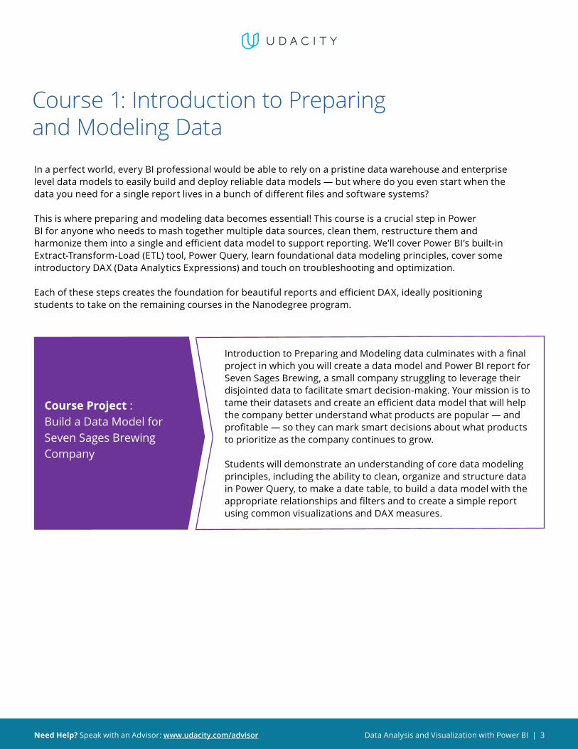
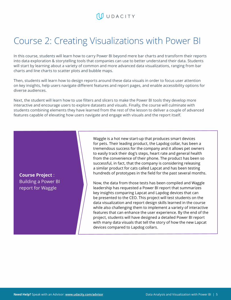
Course 1: Introduction to Preparing and Modeling Data
In a perfect world, every BI professional would be able to rely on a pristine data warehouse and enterprise level data models to easily build and deploy reliable data models — but where do you even start when the data you need for a single report lives in a bunch of different files and software systems?
This is where preparing and modeling data becomes essential! This course is a crucial step in Power BI for anyone who needs to mash together multiple data sources, clean them, restructure them and harmonize them into a single and efficient data model to support reporting. We’ll cover Power BI’s built-in Extract-Transform-Load (ETL) tool, Power Query, learn foundational data modeling principles, cover some introductory DAX (Data Analytics Expressions) and touch on troubleshooting and optimization.
Each of these steps creates the foundation for beautiful reports and efficient DAX, ideally positioning students to take on the remaining courses in the Nanodegree program.
Course Project : Build a Data Model for Seven Sages Brewing Company
Introduction to Preparing and Modeling data culminates with a final project in which you will create a data model and Power BI report for Seven Sages Brewing, a small company struggling to leverage their disjointed data to facilitate smart decision-making. Your mission is to tame their datasets and create an efficient data model that will help the company better understand what products are popular — and profitable — so they can mark smart decisions about what products to prioritize as the company continues to grow.
Students will demonstrate an understanding of core data modeling principles, including the ability to clean, organize and structure data in Power Query, to make a date table, to build a data model with the appropriate relationships and filters and to create a simple report using common visualizations and DAX measures.
Data Analysis and Visualization with Power BI | 4Need Help? Speak with an Advisor: www.udacity.com/advisor
LEARNING OUTCOMES
LESSON ONEIntroduction to Preparing and Modeling Data
• Describe the Power BI data Pipeline
• Recognize the range of stakeholders a data modeler should collaborate with
• Become familiar with the role of Power Query, data modeling and reporting to meet business needs
LESSON TWO Key Concepts in Data Modeling
• Conceptualize data modeling, including fact tables, dimension tables, key columns, and relationships
• Define the role each component plays in reporting
LESSON THREEGetting Your Data & Initial Transformations
• Access a range of data sources using Get Data
• Leverage Power Query to perform initial transformations to make your queries user friendly
• Develop a familiarity with Data Types and their role in Power BI
LESSON FOURBigger Transformations & Date Tables
• Correct — errors know when to correct — errors and gaps
• Make more complex column changes within queries
• Morph data across queries to align with reporting needs
• Choose and build the right data table for your purposes
LESSON FIVERelationships and Relationship-Related DAX
• Select the correct relationships for your data model
• Create Implicit and Quick Measures
• Leverage relationships and filters in common DAX functions
LESSON SIXReports and DAX for Common Reporting Needs
• Choose between a Measure and Calculated Column
• Create basic report visualizations such as Matrixes and Cards
• Make DAX functions that leverage Conditional Logic
• Troubleshoot and Organize your Power BI file
Data Analysis and Visualization with Power BI | 5Need Help? Speak with an Advisor: www.udacity.com/advisor
Course 2: Creating Visualizations with Power BIIn this course, students will learn how to carry Power BI beyond mere bar charts and transform their reports into data exploration & storytelling tools that companies can use to better understand their data. Students will start by learning about a variety of common and more advanced data visualizations, ranging from bar charts and line charts to scatter plots and bubble maps.
Then, students will learn how to design reports around these data visuals in order to focus user attention on key insights, help users navigate different features and report pages, and enable accessibility options for diverse audiences.
Next, the student will learn how to use filters and slicers to make the Power BI tools they develop more interactive and encourage users to explore datasets and visuals. Finally, the course will culminate with students combining elements they have learned from the rest of the lesson to deliver a couple of advanced features capable of elevating how users navigate and engage with visuals and the report itself.
Course Project : Building a Power BI report for Waggle
Waggle is a hot new start-up that produces smart devices for pets. Their leading product, the Lapdog collar, has been a tremendous success for the company and it allows pet owners to easily track their dog’s steps, heart rate and general health from the convenience of their phone. The product has been so successful, in fact, that the company is considering releasing a similar product for cats called Lapcat and has been testing hundreds of prototypes in the field for the past several months.
Now, the data from those tests has been compiled and Waggle leadership has requested a Power BI report that summarizes key insights comparing Lapcat and Lapdog devices that can be presented to the CEO. This project will test students on the data visualization and report design skills learned in the course while also challenging them to implement a variety of interactive features that can enhance the user experience. By the end of the project, students will have designed a detailed Power BI report with many data visuals that tell the story of how the new Lapcat devices compared to Lapdog collars.
Data Analysis and Visualization with Power BI | 6Need Help? Speak with an Advisor: www.udacity.com/advisor
LEARNING OUTCOMES
LESSON ONE
Welcome to Creating Visualizations with Power BI
• Describe the learning objective of the course
• Explain why data visualization is important for business intelligence
• Identify the main stakeholders that BI analysts interact with
• Identify when data visualization is useful and when it is not
LESSON TWOBuilding Compelling Data Visualizations
• Identify important business metrics and pair them with appropriate data visuals
• Build common data visuals, including bar charts & line charts
• Design complementary visuals, including cards, donut charts & tables
• Build more complex data visuals, including scatter plots & bubble maps
• Recognize standard formatting options for Power BI visuals and navigate the unique formatting features that vary between visuals
LESSON THREEDesigning User-Friendly Reports
• Customize Power BI themes with unique color palettes
• Insert elements like images, shapes and buttons to create compelling and versatile layouts for their reports
• Apply design principles that reduce noise & highlight data stories
• Maximize accessibility for diverse user groups
LESSON FOUR
Creating Interactive Reports for Data Exploration
• Design visuals that interact with one another and help users explore data by filtering and drilling for insights
• Identify the differences between filters and slicers in a Power BI report, including when to use each and differences in functionality
• Apply filters to data visuals, pages and reports
• Customize the Filter Pane for reporting needs
• Help users explore the data with different types of slicers
LESSON FIVEElevating Reports with Advanced Report Features
• Customize Power BI reports in ways that foster interactivity and help users tell compelling data stories
• Build custom data stories with Power BI bookmarks
• Empower users with navigation buttons
• Design drill-through pages for deep-dive analysis

Data Analysis and Visualization with Power BI | 7Need Help? Speak with an Advisor: www.udacity.com/advisor
Course 3: Advanced Data AnalysisIn this course, students will focus on the techniques and skills needed for data analysis in Power BI. The course is centered around building a strong foundation and intuition of analytics so that students can take their skills beyond simply aggregating data in Power BI and into the realm of statistics, forecasting and strategy. We first start with an introduction to data analysis looking at different terms and techniques such as descriptive and inferential statistics, histograms, linear regression and an introduction to the concepts of correlation and probability.
After taking the introductory lessons on data analytics, the course then moves to M, the language of Power Query, and learning to build custom formulas as part of the data transformation process. In this section, the syntax of the language is explored and students are challenged with different exercises to build their familiarity and skills. After Power Query, the course then moves to DAX. In a similar approach, the syntax of the language is reviewed along with common functions and exercises to build an intuition for analyzing data with DAX. The final lesson of the course goes through a number of visualizations in Power BI and explores how those visuals may be used, edited or enhanced to effectively relay information to an audience.
The overarching goal of the course is to help students become effective at the process of retrieving, analyzing and visualizing data in order to answer questions and draw conclusions.
Course Project : Market Analysis Report for National Clothing Chain
An online national clothing chain needs your help creating a targeted marketing campaign. Sales have been flat and they want to lure lost customers back. They want to advertise specific products to specific customers in specific locations, but they don’t know who to target. They need you to conduct an analysis to determine the best product to advertise to each customer.
In this project, you will use population statistics from the US Census Bureau to determine where the greatest income exists around the country and whether there is a correlation between sales and income. We don’t know the incomes of our customers, but we should be able to predict it by looking at their purchase history and locations and comparing that against the census data. Additionally, we want to analyze our inventory, specifically customer ratings and return rate and see if there’s a correlation between the two.
Through this project, you will demonstrate the ability to use custom M code to import, clean, format and organize data in Power Query and use custom DAX code to analyze data in Power BI. You will also conduct statistical analysis to understand relationships and probabilities of the data sources, including linear regression, histogram and standard deviation, and create advanced visualizations to present conclusions and recommendations that are driven by the statistical analysis.

Data Analysis and Visualization with Power BI | 8Need Help? Speak with an Advisor: www.udacity.com/advisor
LEARNING OUTCOMES
LESSON ONE
Welcome to Advanced Data Analysis in Power BI
• Describe the learning objectives of the course
• Explain what data analysis is and why it’s important
• Identify the main stakeholders that data analysts interact with
• Identify when data analysis is useful and when it is not
LESSON TWO Advanced Data Analytics
• Define, investigate and analyze data in order to draw conclusions
• Use historical analysis to investigate, aggregate and describe data
• Use predictive analysis to understand relationships between data and forecast the probabilities of future outcomes
LESSON THREE Power Query Transformations
• Compare and contrast Power Query and DAX
• Use M in Power Query to manually edit table columns
• Write custom formulas using the advanced editor in order to effectively clean and format imported data
LESSON FOUR DAX Functions
• Write custom DAX formulas to perform calculations or format data
• Use DAX to create calculated tables
• Troubleshoot common DAX errors and fix the underlying issues with their code
LESSON FIVE Advanced Visualizations
• Use advanced visualizations in order to analyze data and draw conclusions
• Distinguish between advanced and standard visualizations
• Customize advanced visualizations with filters, formatting and trend analysis
Data Analysis and Visualization with Power BI | 9Need Help? Speak with an Advisor: www.udacity.com/advisor
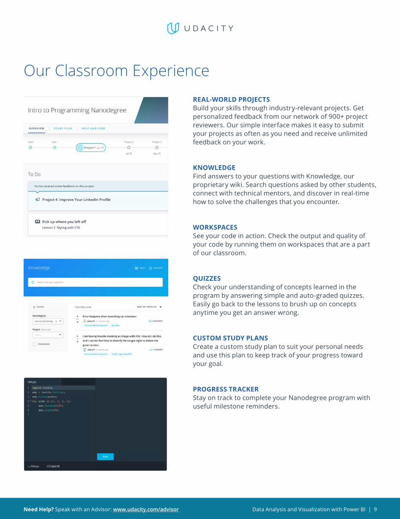
Our Classroom ExperienceREAL-WORLD PROJECTSBuild your skills through industry-relevant projects. Get personalized feedback from our network of 900+ project reviewers. Our simple interface makes it easy to submit your projects as often as you need and receive unlimited feedback on your work.
KNOWLEDGEFind answers to your questions with Knowledge, ourproprietary wiki. Search questions asked by other students,connect with technical mentors, and discover in real-timehow to solve the challenges that you encounter.
WORKSPACESSee your code in action. Check the output and quality of your code by running them on workspaces that are a part of our classroom.
QUIZZESCheck your understanding of concepts learned in the program by answering simple and auto-graded quizzes. Easily go back to the lessons to brush up on concepts anytime you get an answer wrong.
CUSTOM STUDY PLANSCreate a custom study plan to suit your personal needs and use this plan to keep track of your progress toward your goal.
PROGRESS TRACKERStay on track to complete your Nanodegree program with useful milestone reminders.

Data Analysis and Visualization with Power BI | 10Need Help? Speak with an Advisor: www.udacity.com/advisor
Learn with the Best
Lenore R FlowerSENIOR BUSINESS
INTELLIGENCE SPECIALIS T
Lenore is a Senior Business Intelligence Specialist with a background in finance and a passion for empowering her colleagues to make data-driven decisions — even if
the information they have to work with is a little rough around the edges.
Joseph LozadaBUSINESS INTELLIGENCE
AND OPER ATIONS PROFESSIONAL
Joseph works as a client services team leader at Morneau Shepell, where
he manages a team of analysts and oversees the data management and systems functionality for his clients.
He also works as an adjunct instructor of Excel and Power BI analytics at the Community College of Rhode Island.
Sean ChandlerSENIOR BUSINESS INTELLIGENCE
ENGINEER AT HUMANA
Sean is a Senior Business Intelligence Engineer at Humana, where he
oversees an enterprise community of thousands of users & developers. His Power BI work has been featured
recently at the Microsoft Business Applications Summit and on
Microsoft Mechanics.
Data Analysis and Visualization with Power BI | 11Need Help? Speak with an Advisor: www.udacity.com/advisor
All Our Nanodegree Programs Include:
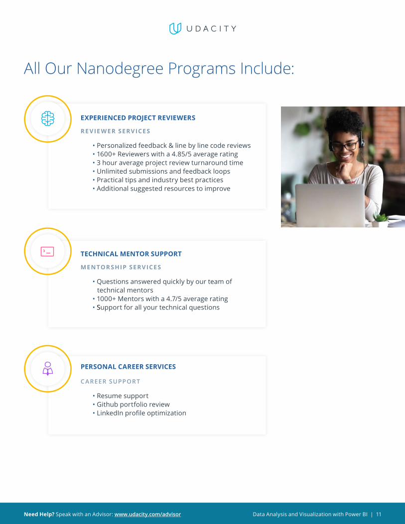
EXPERIENCED PROJECT REVIEWERS
RE VIE WER SERVICES
• Personalized feedback & line by line code reviews • 1600+ Reviewers with a 4.85/5 average rating • 3 hour average project review turnaround time • Unlimited submissions and feedback loops • Practical tips and industry best practices • Additional suggested resources to improve
TECHNICAL MENTOR SUPPORT
MENTOR SHIP SERVICES
• Questions answered quickly by our team of technical mentors • 1000+ Mentors with a 4.7/5 average rating • Support for all your technical questions
PERSONAL CAREER SERVICES
C AREER SUPPORT
• Resume support • Github portfolio review • LinkedIn profile optimization
Data Analysis and Visualization with Power BI | 12Need Help? Speak with an Advisor: www.udacity.com/advisor
Frequently Asked QuestionsPROGR AM OVERVIE W
WHY SHOULD I ENROLL? The data analysis and visualization market is on the rise — Power BI helps enterprises make informed, data-driven decisions, and therefore is extremely valuable to more and more top companies.
WHAT JOBS WILL THIS PROGRAM PREPARE ME FOR? The need for a better data visualization in an enterprise organization is greater than ever. The skills you will gain from this Nanodegree program will qualify you for roles like business intelligence analyst, business analyst or data analysts.
HOW DO I KNOW IF THIS PROGRAM IS RIGHT FOR ME? The course is for individuals who are looking to advance their data analysis careers with the cutting-edge skills of interacting with data and turning it into insights more easily.
ENROLLMENT AND ADMISSION
DO I NEED TO APPLY? WHAT ARE THE ADMISSION CRITERIA? No. This Nanodegree program accepts all applicants regardless of experience and specific background.
WHAT ARE THE PREREQUISITES FOR ENROLLMENT? A well-prepared learner is comfortable:• Using Microsoft Excel to organize and analyze data, including the use of
basic functions (SUM, DIVIDE, AVERAGE, etc.) and creating basic formulae (a + b = c, for example)
• Creating a table in Microsoft Excel, including filtering using column headers
• (Optional but beneficial) Creating and using basic pivot tables in Microsoft Excel for data analysis
IF I DO NOT MEET THE REQUIREMENTS TO ENROLL, WHAT SHOULD I DO? If you aren’t comfortable with the prerequisites above, we recommend taking our beginner Marketing Analyst Nanodegree program first.

Data Analysis and Visualization with Power BI | 13Need Help? Speak with an Advisor: www.udacity.com/advisor
FAQs ContinuedTUITION AND TERM OF PROGR AM
HOW IS THIS NANODEGREE PROGRAM STRUCTURED? The Data Analysis and Visualization with Power BI is comprised of content and curriculum to support 3 projects. We estimate that students can complete the program in 3 months working 5 hours per week.
Each project will be reviewed by the Udacity reviewer network. Feedback will be provided and if you do not pass the project, you will be asked to resubmit the project until it passes.
HOW LONG IS THIS NANODEGREE PROGRAM? Access to this Nanodegree program runs for the length of time specified above. If you do not graduate within that time period, you will continue learning with month to month payments. See the Terms of Use and FAQs for other policies regarding the terms of access to our Nanodegree programs.
CAN I SWITCH MY START DATE? CAN I GET A REFUND? Please see the Udacity Nanodegree program FAQs for policies on enrollment in our programs.
SOF T WARE AND HARDWARE
WHAT SOFTWARE AND VERSIONS WILL I NEED IN THIS PROGRAM? There are no software and version requirements to complete this Nanodegree program. All coursework and projects can be completed via Student Workspaces in the Udacity online classroom.