new york state common core 8 mathematics · pdf filenew york state common core ... investigate...
TRANSCRIPT
8
G R A D E
New York State Common Core
Mathematics Curriculum GRADE 8 • MODULE 6
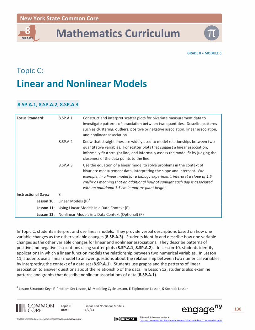
Topic C:
Linear and Nonlinear Models
8.SP.A.1, 8.SP.A.2, 8.SP.A.3
Focus Standard: 8.SP.A.1 Construct and interpret scatter plots for bivariate measurement data to investigate patterns of association between two quantities. Describe patterns such as clustering, outliers, positive or negative association, linear association, and nonlinear association.
8.SP.A.2 Know that straight lines are widely used to model relationships between two quantitative variables. For scatter plots that suggest a linear association, informally fit a straight line, and informally assess the model fit by judging the closeness of the data points to the line.
8.SP.A.3 Use the equation of a linear model to solve problems in the context of bivariate measurement data, interpreting the slope and intercept. For example, in a linear model for a biology experiment, interpret a slope of 1.5 cm/hr as meaning that an additional hour of sunlight each day is associated with an additional 1.5 cm in mature plant height.
Instructional Days: 3
Lesson 10: Linear Models (P)1
Lesson 11: Using Linear Models in a Data Context (P)
Lesson 12: Nonlinear Models in a Data Context (Optional) (P)
In Topic C, students interpret and use linear models. They provide verbal descriptions based on how one variable changes as the other variable changes (8.SP.A.3). Students identify and describe how one variable changes as the other variable changes for linear and nonlinear associations. They describe patterns of positive and negative associations using scatter plots (8.SP.A.1, 8.SP.A.2). In Lesson 10, students identify applications in which a linear function models the relationship between two numerical variables. In Lesson 11, students use a linear model to answer questions about the relationship between two numerical variables by interpreting the context of a data set (8.SP.A.1). Students use graphs and the patterns of linear association to answer questions about the relationship of the data. In Lesson 12, students also examine patterns and graphs that describe nonlinear associations of data (8.SP.A.1).
1 Lesson Structure Key: P-Problem Set Lesson, M-Modeling Cycle Lesson, E-Exploration Lesson, S-Socratic Lesson
Topic C: Linear and Nonlinear Models Date: 1/7/14
130
© 2013 Common Core, Inc. Some rights reserved. commoncore.org This work is licensed under a Creative Commons Attribution-NonCommercial-ShareAlike 3.0 Unported License.

Lesson 10: Linear Models Date: 1/7/14
131
© 2013 Common Core, Inc. Some rights reserved. commoncore.org This work is licensed under a Creative Commons Attribution-NonCommercial-ShareAlike 3.0 Unported License.
NYS COMMON CORE MATHEMATICS CURRICULUM 8•6 Lesson 10
Lesson 10: Linear Models
Student Outcomes
Students identify situations where it is reasonable to use a linear function to model the relationship between two numerical variables.
Students interpret slope and the initial value in a data context.
Lesson Notes In previous lessons, students were given a set of bivariate data on variables that were linearly related. Students constructed a scatter plot of the data, informally fit a line to the data, and found the equation of their prediction line. Criteria that could be used to determine what might be considered the best fitting prediction line for a given set of data were also discussed. A more formal discussion of this topic occurs in Algebra I.
In this lesson, a formal statistical terminology is introduced for the two variables that define a bivariate data set. In a prediction context, the 𝑥-variable is referred to as the independent variable, explanatory variable, or predictor variable. The 𝑦-variable is referred to as the dependent variable, response variable, or predicted variable. Students should become equally comfortable with using the pairings (independent, dependent), (explanatory, response), and (predictor, predicted). Statistics builds on data, and in this lesson, students investigate bivariate data that are linearly related. Students examine how the dependent variable is related to the independent variable or how the predicted variable is related to the predictor variable. Students also need to connect the linear function in words to a symbolic form that represents a linear function. In most cases, the independent variable is denoted by 𝑥, and the dependent variable by 𝑦.
Similar to lessons at the beginning of this module, this lesson works with “exact” linear relationships. This is done to build conceptual understanding of how structural elements of the modeling equation are explained in context. Students will apply this thinking to more authentic data contexts in the next lesson.
Classwork
In previous lessons, you used data that follow a linear trend either in the positive direction or the negative direction and informally fitted a line through the data. You determined the equation of an informal fitted line and used it to make predictions.
In this lesson, you will use a function to model a linear relationship between two numerical variables and interpret the slope and intercept of the linear model in the context of the data. Recall that a function is a rule that relates a dependent variable to an independent variable.
In statistics, a dependent variable is also called a response variable or a predicted variable. An independent variable is also called an explanatory variable or a predictor variable.
Scaffolding: A dependent variable is
also called a response or predicted variable.
An independent variable is also called an explanatory or predictor variable.
Making the interchangeability of these terms clear to ELL students is key.
For each of the pairings, students should have the chance to read, write, speak, and hear them on multiple occasions.

Lesson 10: Linear Models Date: 1/7/14
132
© 2013 Common Core, Inc. Some rights reserved. commoncore.org This work is licensed under a Creative Commons Attribution-NonCommercial-ShareAlike 3.0 Unported License.
NYS COMMON CORE MATHEMATICS CURRICULUM 8•6 Lesson 10
Example 1 (5 minutes)
The lesson begins by challenging students’ understanding of the terminology. Read through the opening text and explain the difference between dependent and independent variables. Pose the question to the class at the end of the example and allow for multiple responses.
What are some other possible numerical independent variables that could relate to how well you are going to do on the quiz?
How many hours of sleep I got the night before.
Example 1
Predicting the value of a numerical dependent (response) variable based on the value of a given numerical independent variable has many applications in statistics. The first step in the process is to be able to identify the dependent variable (predicted variable) and the independent variable (predictor).
There may be several independent variables that might be used to predict a given dependent variable. For example, suppose you want to predict how well you are going to do on an upcoming statistics quiz. One of the possible independent variables is how much time you put into studying for the quiz. What are some other possible numerical independent variables that could relate to how well you are going to do on the quiz?
Exercise 1 (5 minutes)
Exercise 1 requires students to write two possible explanatory variables that might be used for each of several given response variables. Give students a moment to think about each response variable, and then discuss the answers as a class, allowing for multiple student responses.
Exercise 1
1. For each of the following dependent (response) variables, identify two possible numerical independent (explanatory) variables that might be used to predict the value of the dependent variable.
Answers will vary. Here again, make sure that students are defining their explanatory variables (predictors) correctly and that they are numerical.
Response variable Possible explanatory variables
Height of a son 1. Height of the boy’s father 2. Height of the boy’s mother
Number of points scored in a game by a basketball player
1. Number of shots taken in the game 2. Number of minutes played in the game
Number of hamburgers to make for a family picnic
1. Number of people in the family 2. Price of hamburger meat
Time it takes a person to run a mile 1. The height of above sea level of track field 2. The number of practice days
Amount of money won by a contestant on Jeopardy (television game show)
1. The IQ of the contestant 2. The number of questions correctly answered
Fuel efficiency (in miles per gallon) for a car 1. The weight of the car 2. The size of the car’s engine
Number of honey bees in a beehive at a particular time
1. The size of a queen bee 2. The amount of honey harvested from the hive
Number of blooms on a dahlia plant 1. Amount of fertilizer applied to the plant 2. Amount of water applied to the plant
Number of forest fires in a state during a particular year 1. Number of acres of forest in the state 2. Amount of rain in the state that year
Lesson 10: Linear Models Date: 1/7/14
133
© 2013 Common Core, Inc. Some rights reserved. commoncore.org This work is licensed under a Creative Commons Attribution-NonCommercial-ShareAlike 3.0 Unported License.
NYS COMMON CORE MATHEMATICS CURRICULUM 8•6 Lesson 10
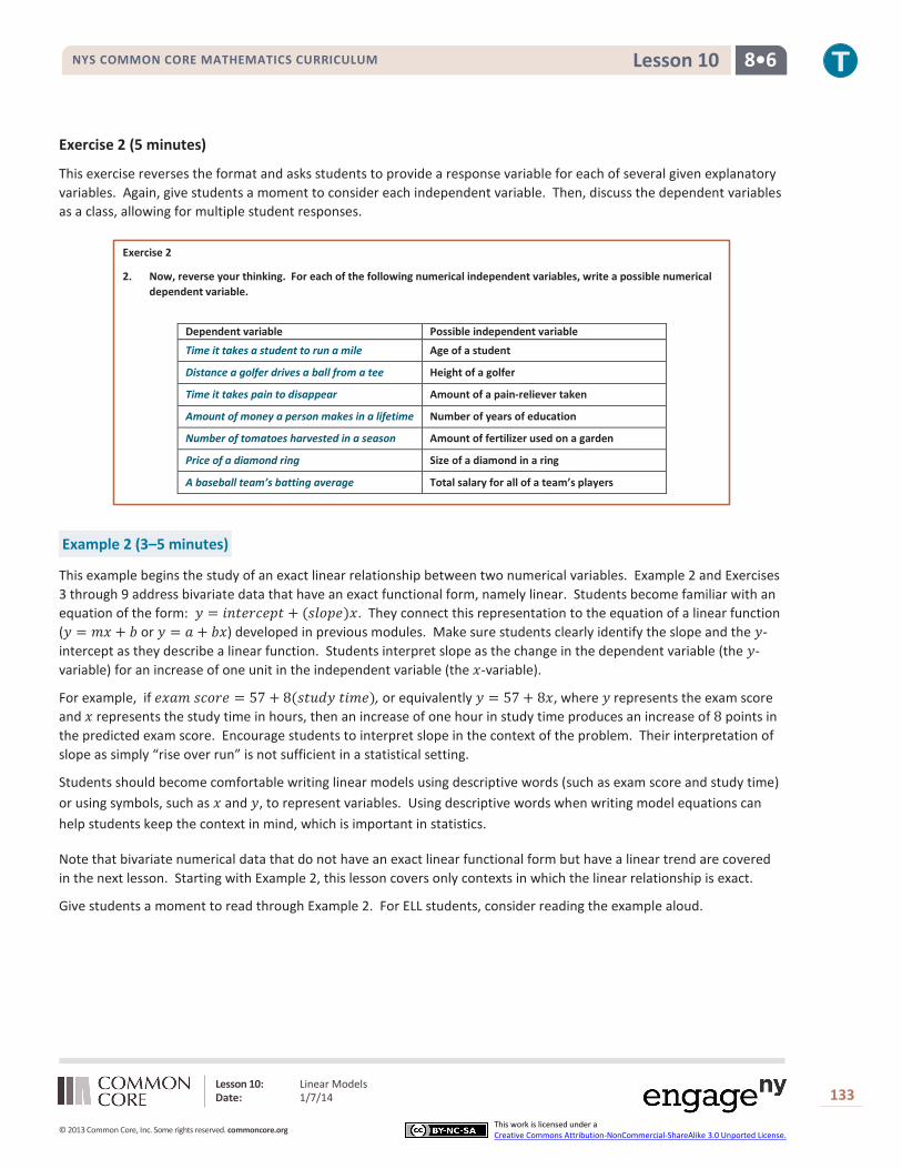
Exercise 2 (5 minutes)
This exercise reverses the format and asks students to provide a response variable for each of several given explanatory variables. Again, give students a moment to consider each independent variable. Then, discuss the dependent variables as a class, allowing for multiple student responses.
Exercise 2
2. Now, reverse your thinking. For each of the following numerical independent variables, write a possible numerical dependent variable.
Dependent variable Possible independent variable
Time it takes a student to run a mile Age of a student
Distance a golfer drives a ball from a tee Height of a golfer
Time it takes pain to disappear Amount of a pain-reliever taken
Amount of money a person makes in a lifetime Number of years of education
Number of tomatoes harvested in a season Amount of fertilizer used on a garden
Price of a diamond ring Size of a diamond in a ring
A baseball team’s batting average Total salary for all of a team’s players
Example 2 (3–5 minutes)
This example begins the study of an exact linear relationship between two numerical variables. Example 2 and Exercises 3 through 9 address bivariate data that have an exact functional form, namely linear. Students become familiar with an equation of the form: 𝑦 = 𝑖𝑛𝑡𝑒𝑟𝑐𝑒𝑝𝑡 + (𝑠𝑙𝑜𝑝𝑒)𝑥. They connect this representation to the equation of a linear function (𝑦 = 𝑚𝑥 + 𝑏 or 𝑦 = 𝑎 + 𝑏𝑥) developed in previous modules. Make sure students clearly identify the slope and the 𝑦-intercept as they describe a linear function. Students interpret slope as the change in the dependent variable (the 𝑦-variable) for an increase of one unit in the independent variable (the 𝑥-variable).
For example, if 𝑒𝑥𝑎𝑚 𝑠𝑐𝑜𝑟𝑒 = 57 + 8(𝑠𝑡𝑢𝑑𝑦 𝑡𝑖𝑚𝑒), or equivalently 𝑦 = 57 + 8𝑥, where 𝑦 represents the exam score and 𝑥 represents the study time in hours, then an increase of one hour in study time produces an increase of 8 points in the predicted exam score. Encourage students to interpret slope in the context of the problem. Their interpretation of slope as simply “rise over run” is not sufficient in a statistical setting.
Students should become comfortable writing linear models using descriptive words (such as exam score and study time) or using symbols, such as 𝑥 and 𝑦, to represent variables. Using descriptive words when writing model equations can help students keep the context in mind, which is important in statistics.
Note that bivariate numerical data that do not have an exact linear functional form but have a linear trend are covered in the next lesson. Starting with Example 2, this lesson covers only contexts in which the linear relationship is exact.
Give students a moment to read through Example 2. For ELL students, consider reading the example aloud.

Lesson 10: Linear Models Date: 1/7/14
134
© 2013 Common Core, Inc. Some rights reserved. commoncore.org This work is licensed under a Creative Commons Attribution-NonCommercial-ShareAlike 3.0 Unported License.
NYS COMMON CORE MATHEMATICS CURRICULUM 8•6 Lesson 10
Example 2
A cell phone company is offering the following basic cell phone plan to its customers: A customer pays a monthly fee of $𝟒𝟎.𝟎𝟎. In addition, the customer pays $𝟎.𝟏𝟓 per text message sent from the cell phone. There is no limit to the number of text messages per month, and there is no charge for receiving text messages.
Exercises 3–9 (10–15 minutes)
These exercises build on earlier lessons in Module 6. Provide time for students to develop answers to the exercises. Then, confirm their answers as a class.
Exercises 3–9
3. Determine the following:
a. Justin never sends a text message. What would be his total monthly cost?
Justin’s monthly cost would be $𝟒𝟎.𝟎𝟎.
b. During a typical month, Abbey sends 𝟐𝟓 text messages. What is her total cost for a typical month?
Abbey’s monthly cost would be $𝟒𝟎.𝟎𝟎 + $𝟎.𝟏𝟓(𝟐𝟓), or $𝟒𝟑.𝟕𝟓.
c. Robert sends at least 𝟐𝟓𝟎 text messages a month. What would be an estimate of the least his total monthly cost is likely to be?
Robert’s monthly cost would be $𝟒𝟎.𝟎𝟎 + $𝟎.𝟏𝟓(𝟐𝟓𝟎), or $𝟕𝟕.𝟓𝟎.
4. Write a linear model describing the relationship between the number of text messages sent and the total monthly cost using descriptive words.
𝑻𝒐𝒕𝒂𝒍 𝒎𝒐𝒏𝒕𝒉𝒍𝒚 𝒄𝒐𝒔𝒕 = $𝟒𝟎.𝟎𝟎 + (𝒏𝒖𝒎𝒃𝒆𝒓 𝒐𝒇 𝒕𝒆𝒙𝒕 𝒎𝒆𝒔𝒔𝒂𝒈𝒆𝒔) ⋅ $𝟎.𝟏𝟓.
5. Is the relationship between the number of text messages sent and the total monthly cost linear? Explain your answer.
Yes; for each text message, the total monthly cost goes up by $𝟎.𝟏𝟓. From our previous work with linear functions, this would indicate a linear relationship.
6. Let 𝒙 represent the independent variable and 𝒚 represent the dependent variable. Write the function representing the relationship you indicated in Exercise 4 using the variables 𝒙 and 𝒚.
Students show the process in developing a model of the relationship between the two variables. 𝒚 = 𝟎.𝟏𝟓𝒙 + 𝟒𝟎 or 𝒚 = 𝟒𝟎 + 𝟎.𝟏𝟓𝒙
7. Explain what $ 𝟎.𝟏𝟓 represents in this relationship.
$𝟎.𝟏𝟓 represents the slope of the linear relationship or the change in the total monthly cost is $𝟎.𝟏𝟓 for an increase of one text message. (Students need to clearly explain that slope is the change in the dependent variable for a 𝟏-unit increase in the independent variable.)
8. Explain what $𝟒𝟎.𝟎𝟎 represents in this relationship.
$𝟒𝟎.𝟎𝟎 represents the fixed monthly fee or the intercept of this relationship. This is the value of the total monthly cost when the number of text messages is 𝟎.
Scaffolding: Using a table may help students
better understand the relationship between the number of text messages () and total monthly cost ().
MP.4

Lesson 10: Linear Models Date: 1/7/14
135
© 2013 Common Core, Inc. Some rights reserved. commoncore.org This work is licensed under a Creative Commons Attribution-NonCommercial-ShareAlike 3.0 Unported License.
NYS COMMON CORE MATHEMATICS CURRICULUM 8•6 Lesson 10
9. Sketch a graph of this relationship on the following coordinate grid. Clearly label the axes and include units in the labels.
Anticipated response: Students label the 𝒙-axis as the number of text messages. They label the 𝒚-axis as the total monthly cost. Students use any two points they derived in Exercise 3. The following graph uses the points of (𝟎,𝟒𝟎) for Justin and the points (𝟐𝟓𝟎,𝟕𝟕.𝟓) for Robert. Highlight the intercept of (𝟎,𝟒𝟎), along with the slope of the line they sketched. Also, point out that the line the student drew should be a dotted line (and not a solid line). The number of text messages can only be whole numbers, and, as a result, the line representing this relationship should indicate that values in between the whole numbers representing the text messages are not part of the data.
Number of Text Messages Sent
Mon
thly
Fee
(do
llars
)
2752502252001751501251007550250
90
80
70
60
50
40
30
20
10
0
Exercise 10 (5 minutes)
If time is running short, teachers may want to choose either Exercise 10 or 11 to develop in class and assign the other to the Problem Set. Let students continue to work with a partner and confirm answers as a class.
Exercise 10
10. LaMoyne needs four more pieces of lumber for his scout project. The pieces can be cut from one large piece of lumber according to the following pattern.
The lumberyard will make the cuts for LaMoyne at a fixed cost of $𝟐.𝟐𝟓 plus an additional cost of 𝟐𝟓 cents per cut. One cut is free.
a. What is the functional relationship between the total cost of cutting a piece of lumber and the number of cuts required? What is the equation of this function? Be sure to define the variables in the context of this problem.
As students uncover the information in this problem, they should realize that the functional relationship between the total cost and number of cuts is linear. Noting that one cut is free, the equation could be written in one of the following ways:
Total cost for cutting = 𝟐.𝟐𝟓 + (𝟎.𝟐𝟓)(𝒏𝒖𝒎𝒃𝒆𝒓 𝒐𝒇 𝒄𝒖𝒕𝒔 − 𝟏) 𝒚 = 𝟐.𝟐𝟓 + (𝟎.𝟐𝟓)(𝒙 − 𝟏), where 𝒙 = number of cuts.
Total cost for cutting = 𝟐+ (𝟎.𝟐𝟓)(𝒏𝒖𝒎𝒃𝒆𝒓 𝒐𝒇 𝒄𝒖𝒕𝒔) 𝒚 = 𝟐+ 𝟎.𝟐𝟓𝒙, where 𝒙 = number of cuts.
Total cost for cutting = 𝟐.𝟐𝟓 + (𝟎.𝟐𝟓)(𝒏𝒖𝒎𝒃𝒆𝒓 𝒐𝒇 𝒑𝒂𝒊𝒅 𝒄𝒖𝒕𝒔) 𝒚 = 𝟐.𝟐𝟓 + 𝟎.𝟐𝟓𝒙, where 𝒙 = number of paid cuts.

Lesson 10: Linear Models Date: 1/7/14
136
© 2013 Common Core, Inc. Some rights reserved. commoncore.org This work is licensed under a Creative Commons Attribution-NonCommercial-ShareAlike 3.0 Unported License.
NYS COMMON CORE MATHEMATICS CURRICULUM 8•6 Lesson 10
b. Use the equation to determine LaMoyne’s total cost for cutting.
LaMoyne requires three cuts, one of which is free. Using any of the three forms given in part (a) yields a total cost for cutting of $𝟐.𝟕𝟓.
c. Interpret the slope of the equation in words in the context of this problem.
Using any of the three forms, each additional cut beyond the free one adds $𝟎.𝟐𝟓 to the total cost for cutting.
d. Interpret the intercept of your equation in words in the context of this problem. Does interpreting the intercept make sense in this problem? Explain.
If no cuts are required, then there is no fixed cost for cutting. So, it does not make sense to interpret the intercept in the context of this problem.
Exercise 11 (5–7 minutes)
Let students work with a partner. Then, confirm answers as a class.
Exercise 11
11. Omar and Olivia were curious about the size of coins. They measured the diameter and circumference of several coins and found the following data.
US Coin Diameter (mm) Circumference (mm) Penny 𝟏𝟗.𝟎 𝟓𝟗.𝟕 Nickel 𝟐𝟏.𝟐 𝟔𝟔.𝟔 Dime 𝟏𝟕.𝟗 𝟓𝟔.𝟐 Quarter 𝟐𝟒.𝟑 𝟕𝟔.𝟑 Half Dollar 𝟑𝟎.𝟔 𝟗𝟔.𝟏
a. Wondering if there was any relationship between diameter and circumference, they thought about drawing a picture. Draw a scatter plot that displays circumference in terms of diameter.
Students may need some help in deciding which is the independent variable and which is the dependent variable. Hopefully, they have seen from previous problems that whenever one variable, say variable A, is to be expressed in terms of some variable B, then variable A is the dependent variable and variable B is the independent variable. So, circumference is being taken as the dependent variable in this problem, and diameter is being taken as the independent variable.
Diameter (mm)
Circ
umfe
renc
e (m
m)
32302826242220180
100
90
80
70
60
50
0

Lesson 10: Linear Models Date: 1/7/14
137
© 2013 Common Core, Inc. Some rights reserved. commoncore.org This work is licensed under a Creative Commons Attribution-NonCommercial-ShareAlike 3.0 Unported License.
NYS COMMON CORE MATHEMATICS CURRICULUM 8•6 Lesson 10
b. Do you think that circumference and diameter are related? Explain.
You may need to point out to students that because the data are rounded to one decimal place, the points on the scatter plot may not fall exactly on a line; however, they should. Circumference and diameter are linearly related.
c. Find the equation of the function relating circumference to the diameter of a coin.
Again, because of rounding error, equations that students find may be slightly different depending on which points they choose to do their calculations. Hopefully, they all arrive at something close to a circumference equal to 𝟑.𝟏𝟒 (pi) multiplied by diameter.
For example, the slope between (𝟏𝟗,𝟓𝟗.𝟕) and (𝟑𝟎.𝟔,𝟗𝟔.𝟏) is 𝟗𝟔.𝟏−𝟓𝟗.𝟕𝟑𝟎.𝟔−𝟏𝟗
= 𝟑. 𝟏𝟑𝟕𝟗, which rounds to
𝟑.𝟏𝟒.
The intercept may be found using 𝟓𝟗.𝟕 = 𝒂 + (𝟑.𝟏𝟒)(𝟏𝟗.𝟎), which yields 𝒂 = 𝟎.𝟎𝟒, which rounds to 𝟎.
Therefore, 𝑪 = 𝟑.𝟏𝟒𝒅+ 𝟎 = 𝟑.𝟏𝟒𝒅.
d. The value of the slope is approximately equal to the value of 𝝅. Explain why this makes sense.
The slope is identified as pi. (Note: Most students have previously studied the relationship between circumference and diameter of a circle. However, if students have not yet seen this result, you can discuss the interesting result that if the circumference of a circle is divided by its diameter, the result is a constant, namely 𝟑.𝟏𝟒 rounded to two decimal places, no matter what circle is being considered.)
e. What is the value of the intercept? Explain why this makes sense.
If the diameter of a circle is 𝟎 (a point), then according to the equation, its circumference is 𝟎. That is true, so interpreting the intercept of 𝟎 makes sense in this problem.
Closing (2–3 minutes)
Think back to Exercise 10. What are the dependent and independent variables if the equation that models LaMoyne’s total cost of cutting is given by 𝑦 = 2.25 + 0.25𝑥?
Independent variable is the number of paid cuts. Dependent variable is the total cost for cutting.
What are the meanings of the intercept and slope in context?
The intercept is the fee for the first cut; however, if no cuts are required then there is no fixed cost for cutting. The slope is the cost per cut after the first.
How are these examples different from the data we have been studying before this lesson?
These examples are exact linear relationships.
Exit Ticket (5–7 minutes)
Lesson Summary
A linear functional relationship between a dependent and independent numerical variable has the form 𝒚 = 𝒎𝒙 + 𝒃 or 𝒚 = 𝒂 + 𝒃𝒙
In statistics, a dependent variable is one that is predicted and an independent variable is the one that is used to make the prediction.
The graph of a linear function describing the relationship between two variables is a line.

Lesson 10: Linear Models Date: 1/7/14
138
© 2013 Common Core, Inc. Some rights reserved. commoncore.org This work is licensed under a Creative Commons Attribution-NonCommercial-ShareAlike 3.0 Unported License.
NYS COMMON CORE MATHEMATICS CURRICULUM 8•6 Lesson 10
Name ___________________________________________________ Date____________________
Lesson 10: Linear Models
Exit Ticket Suppose that a cell phone monthly rate plan costs the user 5 cents per minute beyond a fixed monthly fee of $20. This implies that the relationship between monthly cost and monthly number of minutes is linear.
1. Write an equation in words that relates total monthly cost to monthly minutes used. Explain how you found your answer.
2. Write an equation in symbols that relates the total month cost (𝑦) to monthly minutes used (𝑥).
3. What would be the cost for a month in which 182 minutes were used? Express your answer in words in the context of this problem.

Lesson 10: Linear Models Date: 1/7/14
139
© 2013 Common Core, Inc. Some rights reserved. commoncore.org This work is licensed under a Creative Commons Attribution-NonCommercial-ShareAlike 3.0 Unported License.
NYS COMMON CORE MATHEMATICS CURRICULUM 8•6 Lesson 10
Exit Ticket Sample Solutions
Suppose that a cell phone monthly rate plan costs the user 𝟓 cents per minute beyond a fixed monthly fee of $𝟐𝟎. This implies that the relationship between monthly cost and monthly number of minutes is linear.
1. Write an equation in words that relates total monthly cost to monthly minutes used. Explain how you arrived at your answer.
The equation is given by total monthly cost = 𝟐𝟎+ 𝟎 .𝟎𝟓 (number of minutes used for a month).
The intercept in the equation is the fixed monthly cost, $𝟐𝟎.
The slope is the amount paid per minute of cell phone usage, or $𝟎.𝟎𝟓 per minute.
The linear form is total monthly cost = fixed cost + cost per minute (number of minutes over the month).
2. Write an equation in symbols that relates the total month cost (𝒚) to monthly minutes used (𝒙).
The equation is 𝒚 = 𝟐𝟎+ 𝟎 .𝟎𝟓𝒙, where 𝒚 is the total cost for a month in dollars and 𝒙 is cell phone usage for the month in minutes.
3. What would be the cost for a month in which 𝟏𝟖𝟐 minutes were used? Express your answer in words in the context of this problem.
The total monthly cost in a month using 𝟏𝟖𝟐 minutes would be 𝟐𝟎 dollars + (𝟎.𝟎𝟓 dollars per minute)(𝟏𝟖𝟐 minutes) = $𝟐𝟗.𝟏𝟎.
Be sure students pay attention to the meanings of the units, noting that units on one side of the equation must be the same as units on the other side.
Problem Set Sample Solutions
1. The Mathematics Club at your school is having a meeting. The advisor decides to bring bagels and his award-winning strawberry cream cheese. To determine his cost, from past experience he figures 𝟏.𝟓 bagels per student. A bagel costs 𝟔𝟓 cents, and the special cream cheese costs $𝟑.𝟖𝟓 and will be able to serve all of the anticipated students attending the meeting
a. Find an equation that relates his total cost to the number of students he thinks will attend the meeting.
Students should be encouraged to write a problem in words in its context. For example, the advisor’s total cost = cream cheese fixed cost + cost of bagels. The cost of bagels depends on the unit cost of a bagel times the number of bagels per student times the number of students. So, with symbols, if 𝒄 denotes the total cost and 𝒏 denotes the number of students, then 𝒄 = 𝟑.𝟖𝟓+ (𝟎.𝟔𝟓)(𝟏.𝟓)(𝒏), or 𝒄 = 𝟑.𝟖𝟓+ 𝟎.𝟗𝟕𝟓𝒏.
b. Interpret the slope of the equation in words in the context of the problem.
For each additional student, the cost goes up by 𝟎.𝟗𝟕𝟓 dollars, or 𝟗𝟕.𝟓 cents.
c. Interpret the intercept of the equation in words in the context of the problem. Does interpreting the intercept make sense? Explain.
If there are no students, the total cost is $𝟑.𝟖𝟓. Students could interpret this by saying that the meeting was called off before any bagels were bought, but the advisor had already made his award-winning cream cheese, so the cost is $𝟑.𝟖𝟓. The intercept makes sense. Other students might argue otherwise.
Lesson 10: Linear Models Date: 1/7/14
140
© 2013 Common Core, Inc. Some rights reserved. commoncore.org This work is licensed under a Creative Commons Attribution-NonCommercial-ShareAlike 3.0 Unported License.
NYS COMMON CORE MATHEMATICS CURRICULUM 8•6 Lesson 10
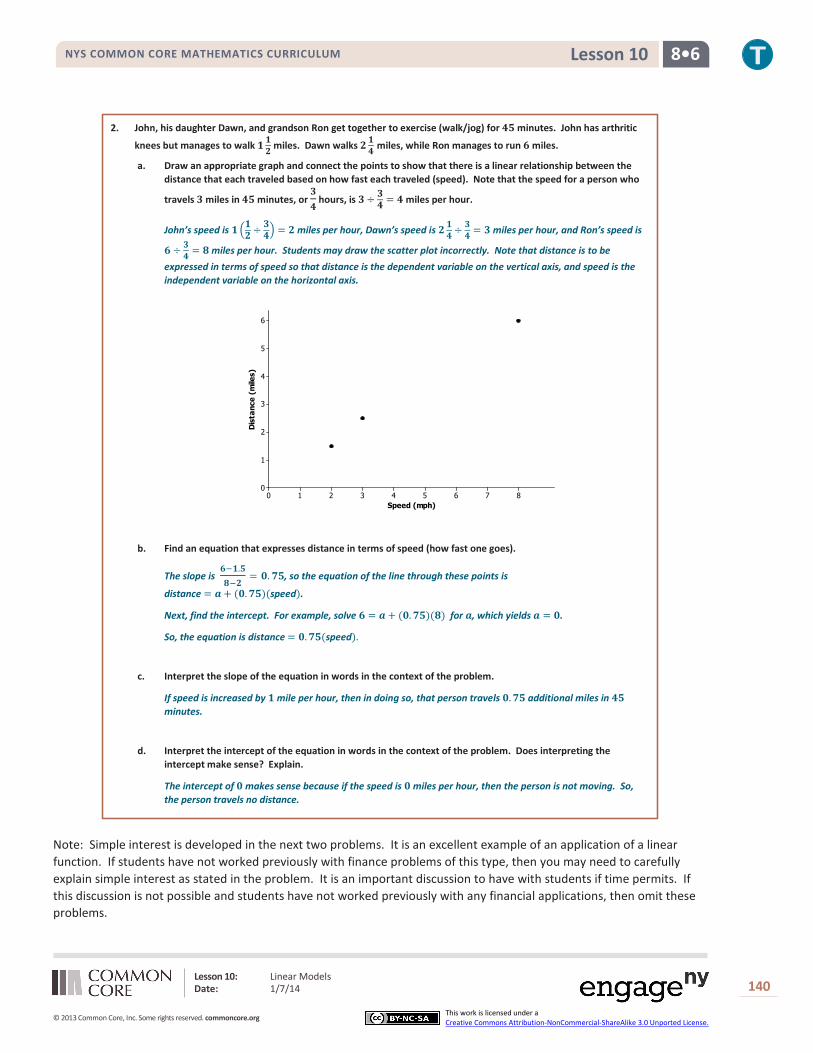
2. John, his daughter Dawn, and grandson Ron get together to exercise (walk/jog) for 𝟒𝟓 minutes. John has arthritic
knees but manages to walk 𝟏𝟏𝟐 miles. Dawn walks 𝟐𝟏𝟒 miles, while Ron manages to run 𝟔 miles. a. Draw an appropriate graph and connect the points to show that there is a linear relationship between the
distance that each traveled based on how fast each traveled (speed). Note that the speed for a person who
travels 𝟑 miles in 𝟒𝟓 minutes, or 𝟑𝟒
hours, is 𝟑÷ 𝟑𝟒 = 𝟒 miles per hour.
John’s speed is 𝟏�𝟏𝟐 ÷ 𝟑𝟒� = 𝟐 miles per hour, Dawn’s speed is 𝟐𝟏𝟒 ÷ 𝟑
𝟒 = 𝟑 miles per hour, and Ron’s speed is
𝟔 ÷ 𝟑𝟒 = 𝟖 miles per hour. Students may draw the scatter plot incorrectly. Note that distance is to be
expressed in terms of speed so that distance is the dependent variable on the vertical axis, and speed is the independent variable on the horizontal axis.
b. Find an equation that expresses distance in terms of speed (how fast one goes).
The slope is 𝟔−𝟏.𝟓𝟖−𝟐
= 𝟎. 𝟕𝟓, so the equation of the line through these points is
distance = 𝒂 + (𝟎.𝟕𝟓)(speed).
Next, find the intercept. For example, solve 𝟔 = 𝒂 + (𝟎.𝟕𝟓)(𝟖) for 𝒂, which yields 𝒂 = 𝟎.
So, the equation is distance = 𝟎.𝟕𝟓(speed).
c. Interpret the slope of the equation in words in the context of the problem.
If speed is increased by 𝟏 mile per hour, then in doing so, that person travels 𝟎.𝟕𝟓 additional miles in 𝟒𝟓 minutes.
d. Interpret the intercept of the equation in words in the context of the problem. Does interpreting the intercept make sense? Explain.
The intercept of 𝟎 makes sense because if the speed is 𝟎 miles per hour, then the person is not moving. So, the person travels no distance.
Note: Simple interest is developed in the next two problems. It is an excellent example of an application of a linear function. If students have not worked previously with finance problems of this type, then you may need to carefully explain simple interest as stated in the problem. It is an important discussion to have with students if time permits. If this discussion is not possible and students have not worked previously with any financial applications, then omit these problems.
Speed (mph)
Dis
tanc
e (m
iles)
876543210
6
5
4
3
2
1
0

Lesson 10: Linear Models Date: 1/7/14
141
© 2013 Common Core, Inc. Some rights reserved. commoncore.org This work is licensed under a Creative Commons Attribution-NonCommercial-ShareAlike 3.0 Unported License.
NYS COMMON CORE MATHEMATICS CURRICULUM 8•6 Lesson 10
3. Simple interest is money that is paid on a loan. Simple interest is calculated by taking the amount of the loan and multiplying it by the rate of interest per year and the number of years the loan is outstanding. For college, Jodie’s older brother has taken out a student loan for $𝟒,𝟓𝟎𝟎 at an interest rate of 𝟓.𝟔%, or 𝟎.𝟎𝟓𝟔. When he graduates in four years, he will have to pay back the loan amount plus interest for four years. Jodie is curious as to how much her brother will have to pay.
a. Jodie claims that his brother will have to pay her a total of $𝟓,𝟓𝟎𝟖. Do you agree? Explain. As an example, 𝟖% simple interest on $𝟏,𝟐𝟎𝟎 for one year is (𝟎.𝟎𝟖)(𝟏,𝟐𝟎𝟎) = $𝟗𝟔. The interest for two years would be 𝟐 × $𝟗𝟔 or $𝟏𝟗𝟐.
The total cost to repay = amount of loan + interest on the loan.
Interest on the loan is the amount of simple interest for one year times the number of years the loan is outstanding.
The annual simple interest amount is (𝟎.𝟎𝟓𝟔)(𝟒,𝟓𝟎𝟎) = $𝟐𝟓𝟐 per year.
For four years, the interest amount is 𝟒(𝟐𝟓𝟐) = $𝟏,𝟎𝟎𝟖.
So, the total cost to repay the loan is 𝟒,𝟓𝟎𝟎+ 𝟏,𝟎𝟎𝟖 = $𝟓,𝟓𝟎𝟖. Jodie is right.
b. Write an equation for the total cost to repay a loan of $𝑷 if the rate of interest for a year is 𝒓 (expressed as a decimal) for a time span of 𝒕 years.
Note: Work with students in identifying variables to represent the values discussed in this exercise. For example, the total cost to repay a loan is 𝑷 + the amount of interest on 𝑷 for 𝒕 years, or 𝑷 + 𝑰, where 𝑰 = interest.
The amount of interest per year is 𝑷 times the annual interest. Let 𝒓 represent the interest rate per year as a decimal.
The total amount of simple interest for 𝒕 years is 𝒓𝒕, where 𝒓 is the annual rate as a decimal (e.g., 𝟓% is 𝟎.𝟎𝟓).
So, if 𝒄 denotes the total cost to repay the loan, then 𝒄 = 𝑷 + (𝒓𝒕)𝑷.
c. If 𝑷 and 𝒓 are known, is the equation a linear equation?
If 𝑷 and 𝒓 are known, then the equation should be written as 𝒄 = 𝑷 + (𝒓𝑷)𝒕, which is the linear form where 𝒄 is the dependent variable and 𝒕 is the independent variable.
d. Interpret the slope of the equation in words in the context of this problem.
For each additional year that the loan is outstanding, the total cost to repay the loan is increased by $𝒓𝑷.
As an example, consider Jodie’s brother’s equation for 𝒕 years: 𝒄 = 𝟒,𝟓𝟎𝟎 + (𝟎.𝟎𝟓𝟔)(𝟒,𝟓𝟎𝟎)𝒕, or 𝒄 = 𝟒,𝟓𝟎𝟎+ 𝟐𝟓𝟐𝒕. For each additional year that the loan is not paid off, the total cost increases by $𝟐𝟓𝟐.
e. Interpret the intercept of the equation in words in the context of this problem. Does interpreting the intercept make sense? Explain.
The 𝟎 value of time 𝒕 means at the time the loan was taken out. At that time, no interest has been accumulated, so the intercept of $𝟒,𝟓𝟎𝟎 as the cost to repay the loan after 𝟎 years makes sense.

Lesson 11: Using Linear Models in a Data Context Date: 1/7/14
142
© 2013 Common Core, Inc. Some rights reserved. commoncore.org This work is licensed under a Creative Commons Attribution-NonCommercial-ShareAlike 3.0 Unported License.
NYS COMMON CORE MATHEMATICS CURRICULUM 8•6 Lesson 11
Lesson 11: Using Linear Models in a Data Context
Student Outcomes
Students recognize and justify that a linear model can be used to fit data. Students interpret the slope of a linear model to answer questions or to solve a problem.
Lesson Notes In a previous lesson, students were given bivariate numerical data where there was an exact linear relationship between two variables. Students identified which variable was the predictor variable (i.e., independent variable) and which was the predicted variable (i.e., dependent variable). They found the equation of the line that fit the data and interpreted the intercept and slope in words in the context of the problem. Students also calculated a prediction for a given value of the predictor variable. This lesson introduces students to data that are not exactly linear but that have a linear trend. Students informally fit a line and use it to make predictions and answer questions in context.
Although students may want to rely on using symbolic representations for lines, it is important to challenge them to express their equations in words in the context of the problem. Keep emphasizing the meaning of slope in context and avoid the use of “rise over run.” Slope is the impact that increasing the value of the predictor variable by one unit has on the predicted value.
Classwork
Exercise 1 (10–12 minutes)
Introduce the data in the exercise. Using a short video may help students (especially English learners) to better understand the context of the data. Then, work through each part of the exercise as a class. Ask students the following:
Looking at the table, what trend appears in the data?
There is a positive trend. As one variable increases in value, so does the other.
Looking at the scatter plots, is there an exact linear relationship between the variables?
No, the four points cannot be connected by a straight line.
Exercise 1
Old Faithful is a geyser in Yellowstone National Park. The following table offers some rough estimates of the length of an eruption (in minutes) and the amount of water (in gallons) in that eruption.
Length (min.) 𝟏.𝟓 𝟐 𝟑 𝟒.𝟓
Amount of water (gal.) 𝟑,𝟕𝟎𝟎 𝟒,𝟏𝟎𝟎 𝟔,𝟒𝟓𝟎 𝟖,𝟒𝟎𝟎
a. Chang wants to predict the amount of water in an eruption based on the length of the eruption. What should he use as the dependent variable? Why?
Since Chang wants to predict the amount of water in an eruption, the time length (in minutes) is the predictor, and the amount of water is the dependent variable.
Lesson 11: Using Linear Models in a Data Context Date: 1/7/14
143
© 2013 Common Core, Inc. Some rights reserved. commoncore.org This work is licensed under a Creative Commons Attribution-NonCommercial-ShareAlike 3.0 Unported License.
NYS COMMON CORE MATHEMATICS CURRICULUM 8•6 Lesson 11
Length (minutes)
Am
ount
of
Wat
er (
gallo
ns)
4.543.532.521.50
9000
8000
7000
6000
5000
4000
0
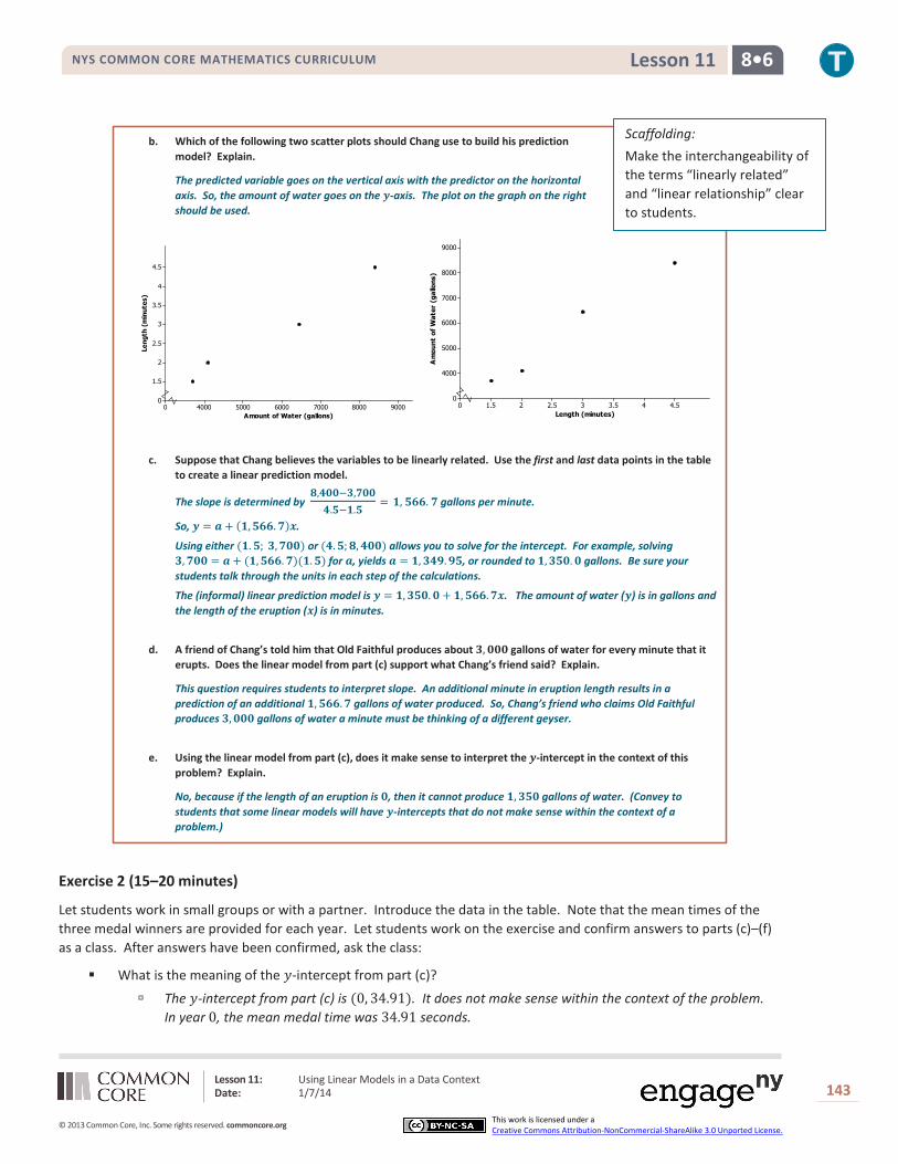
b. Which of the following two scatter plots should Chang use to build his prediction model? Explain.
The predicted variable goes on the vertical axis with the predictor on the horizontal axis. So, the amount of water goes on the 𝒚-axis. The plot on the graph on the right should be used.
Amount of Water (gallons)
Leng
th (
min
utes
)
9000800070006000500040000
4.5
4
3.5
3
2.5
2
1.5
0
c. Suppose that Chang believes the variables to be linearly related. Use the first and last data points in the table to create a linear prediction model.
The slope is determined by 𝟖,𝟒𝟎𝟎−𝟑,𝟕𝟎𝟎𝟒.𝟓−𝟏.𝟓
= 𝟏, 𝟓𝟔𝟔. 𝟕 gallons per minute.
So, 𝒚 = 𝒂 + (𝟏,𝟓𝟔𝟔.𝟕)𝒙.
Using either (𝟏.𝟓; 𝟑,𝟕𝟎𝟎) or (𝟒.𝟓;𝟖,𝟒𝟎𝟎) allows you to solve for the intercept. For example, solving 𝟑,𝟕𝟎𝟎 = 𝒂 + (𝟏,𝟓𝟔𝟔.𝟕)(𝟏.𝟓) for 𝒂, yields 𝒂 = 𝟏,𝟑𝟒𝟗.𝟗𝟓, or rounded to 𝟏,𝟑𝟓𝟎.𝟎 gallons. Be sure your students talk through the units in each step of the calculations.
The (informal) linear prediction model is 𝒚 = 𝟏,𝟑𝟓𝟎.𝟎 + 𝟏,𝟓𝟔𝟔.𝟕𝒙. The amount of water (𝒚) is in gallons and the length of the eruption (𝒙) is in minutes.
d. A friend of Chang’s told him that Old Faithful produces about 𝟑,𝟎𝟎𝟎 gallons of water for every minute that it erupts. Does the linear model from part (c) support what Chang’s friend said? Explain.
This question requires students to interpret slope. An additional minute in eruption length results in a prediction of an additional 𝟏,𝟓𝟔𝟔.𝟕 gallons of water produced. So, Chang’s friend who claims Old Faithful produces 𝟑,𝟎𝟎𝟎 gallons of water a minute must be thinking of a different geyser.
e. Using the linear model from part (c), does it make sense to interpret the 𝒚-intercept in the context of this problem? Explain.
No, because if the length of an eruption is 𝟎, then it cannot produce 𝟏,𝟑𝟓𝟎 gallons of water. (Convey to students that some linear models will have 𝒚-intercepts that do not make sense within the context of a problem.)
Exercise 2 (15–20 minutes)
Let students work in small groups or with a partner. Introduce the data in the table. Note that the mean times of the three medal winners are provided for each year. Let students work on the exercise and confirm answers to parts (c)–(f) as a class. After answers have been confirmed, ask the class:
What is the meaning of the 𝑦-intercept from part (c)?
The 𝑦-intercept from part (c) is (0, 34.91). It does not make sense within the context of the problem. In year 0, the mean medal time was 34.91 seconds.
Scaffolding: Make the interchangeability of the terms “linearly related” and “linear relationship” clear to students.

Lesson 11: Using Linear Models in a Data Context Date: 1/7/14
144
© 2013 Common Core, Inc. Some rights reserved. commoncore.org This work is licensed under a Creative Commons Attribution-NonCommercial-ShareAlike 3.0 Unported License.
NYS COMMON CORE MATHEMATICS CURRICULUM 8•6 Lesson 11
Exercise 2
The following table gives the times of the gold, silver, and bronze medal winners for the men’s 𝟏𝟎𝟎 meter race (in seconds) for the past 𝟏𝟎 Olympic Games.
Year 2012 2008 2004 2000 1996 1992 1988 1984 1980 1976 Gold 𝟗.𝟔𝟑 𝟗.𝟔𝟗 𝟗.𝟖𝟓 𝟗.𝟖𝟕 𝟗.𝟖𝟒 𝟗.𝟗𝟔 𝟗.𝟗𝟐 𝟗.𝟗𝟗 𝟏𝟎.𝟐𝟓 𝟏𝟎.𝟎𝟔 Silver 𝟗.𝟕𝟓 𝟗.𝟖𝟗 𝟗.𝟖𝟔 𝟗.𝟗𝟗 𝟗.𝟖𝟗 𝟏𝟎.𝟎𝟐 𝟗.𝟗𝟕 𝟏𝟎.𝟏𝟗 𝟏𝟎.𝟐𝟓 𝟏𝟎.𝟎𝟕 Bronze 𝟗.𝟕𝟗 𝟗.𝟗𝟏 𝟗.𝟖𝟕 𝟏𝟎.𝟎𝟒 𝟗.𝟗𝟎 𝟏𝟎.𝟎𝟒 𝟗.𝟗𝟗 𝟏𝟎.𝟐𝟐 𝟏𝟎.𝟑𝟗 𝟏𝟎.𝟏𝟒 Mean time 𝟗.𝟕𝟐 𝟗.𝟖𝟑 𝟗.𝟖𝟔 𝟗.𝟗𝟕 𝟗.𝟖𝟖 𝟏𝟎.𝟎𝟏 𝟗.𝟗𝟔 𝟏𝟎.𝟏𝟑 𝟏𝟎.𝟑𝟎 𝟏𝟎.𝟎𝟗
a. If you wanted to describe how mean times change over the years, which variable would you use as the independent variable, and which would you use as the dependent variable?
Mean medal time (dependent variable) is being predicted based on year (independent variable).
b. Draw a scatter plot to determine if the relationship between mean time and year appears to be linear. Comment on any trend or pattern that you see in the scatter plot.
The scatter plot indicates a negative trend, meaning that, in general, the mean race times have been decreasing over the years even though there is not a perfect linear pattern.
Year
Mea
n Ti
me
(sec
onds
)
20122008200420001996199219881984198019760
10.3
10.2
10.1
10
9.9
9.8
9.7
0
c. One reasonable line goes through the 1992 and 2004 data. Find the equation of that line.
The slope of the line through (𝟏𝟗𝟗𝟐,𝟏𝟎.𝟎𝟏) and (𝟐𝟎𝟎𝟒,𝟗.𝟖𝟔) is 𝟏𝟎.𝟎𝟏−𝟗.𝟖𝟔𝟏𝟗𝟗𝟐−𝟐𝟎𝟎𝟒
= −𝟎. 𝟎𝟏𝟐𝟓.
To find the intercept using (𝟏𝟗𝟗𝟐,𝟏𝟎.𝟎𝟏), solve 𝟏𝟎.𝟎𝟏 = 𝒂 + (−𝟎.𝟎𝟏𝟐𝟓)(𝟏𝟗𝟗𝟐) for 𝒂, which yields 𝒂 = 𝟑𝟒.𝟗𝟏.
The equation that predicts mean medal race time for an Olympic year is: 𝒚 = 𝟑𝟒.𝟗𝟏+ (−𝟎.𝟎𝟏𝟐𝟓)𝒙. The mean medal race time (𝒚) is in seconds and the time (𝒙) is in years.
As an aside: In high school, students will learn a formal method called least squares for determining a “best” fitting-line. For comparison, the least squares prediction line is: 𝒚 = 𝟑𝟒.𝟑𝟓𝟔𝟐+ (−𝟎.𝟎𝟏𝟐𝟐)𝒙.
d. Before he saw these data, Chang guessed that the mean time of the three Olympic medal winners decreased by about 𝟎.𝟎𝟓 seconds from one Olympic Games to the next. Does the prediction model you found in part (c) support his guess? Explain.
The slope −𝟎.𝟎𝟏𝟐𝟓 means that from one calendar year to the next, the predicted mean race time for the top three medals decrease by 𝟎.𝟎𝟏𝟐𝟓 seconds. So, between successive Olympic Games (which occur every four years), the predicted mean race time is reduced by 𝟒(𝟎.𝟎𝟏𝟐𝟓) = 𝟎.𝟎𝟓 sec.
MP.7
MP.2
Lesson 11: Using Linear Models in a Data Context Date: 1/7/14
145
© 2013 Common Core, Inc. Some rights reserved. commoncore.org This work is licensed under a Creative Commons Attribution-NonCommercial-ShareAlike 3.0 Unported License.
NYS COMMON CORE MATHEMATICS CURRICULUM 8•6 Lesson 11
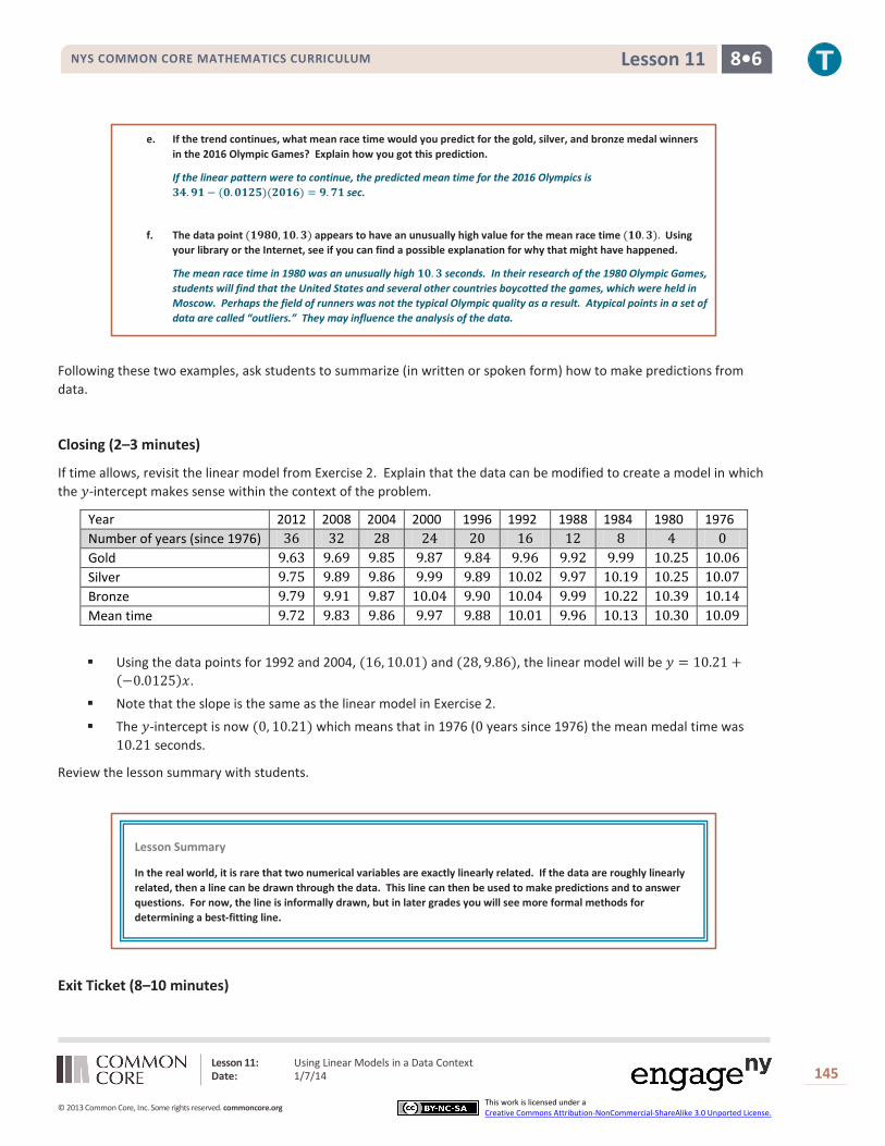
e. If the trend continues, what mean race time would you predict for the gold, silver, and bronze medal winners in the 2016 Olympic Games? Explain how you got this prediction.
If the linear pattern were to continue, the predicted mean time for the 2016 Olympics is 𝟑𝟒.𝟗𝟏 − (𝟎.𝟎𝟏𝟐𝟓)(𝟐𝟎𝟏𝟔) = 𝟗.𝟕𝟏 sec.
f. The data point (𝟏𝟗𝟖𝟎,𝟏𝟎.𝟑) appears to have an unusually high value for the mean race time (𝟏𝟎.𝟑). Using your library or the Internet, see if you can find a possible explanation for why that might have happened.
The mean race time in 1980 was an unusually high 𝟏𝟎.𝟑 seconds. In their research of the 1980 Olympic Games, students will find that the United States and several other countries boycotted the games, which were held in Moscow. Perhaps the field of runners was not the typical Olympic quality as a result. Atypical points in a set of data are called “outliers.” They may influence the analysis of the data.
Following these two examples, ask students to summarize (in written or spoken form) how to make predictions from data.
Closing (2–3 minutes)
If time allows, revisit the linear model from Exercise 2. Explain that the data can be modified to create a model in which the 𝑦-intercept makes sense within the context of the problem.
Year 2012 2008 2004 2000 1996 1992 1988 1984 1980 1976 Number of years (since 1976) 36 32 28 24 20 16 12 8 4 0 Gold 9.63 9.69 9.85 9.87 9.84 9.96 9.92 9.99 10.25 10.06 Silver 9.75 9.89 9.86 9.99 9.89 10.02 9.97 10.19 10.25 10.07 Bronze 9.79 9.91 9.87 10.04 9.90 10.04 9.99 10.22 10.39 10.14 Mean time 9.72 9.83 9.86 9.97 9.88 10.01 9.96 10.13 10.30 10.09
Using the data points for 1992 and 2004, (16, 10.01) and (28, 9.86), the linear model will be 𝑦 = 10.21 +(−0.0125)𝑥.
Note that the slope is the same as the linear model in Exercise 2.
The 𝑦-intercept is now (0, 10.21) which means that in 1976 (0 years since 1976) the mean medal time was 10.21 seconds.
Review the lesson summary with students.
Exit Ticket (8–10 minutes)
Lesson Summary
In the real world, it is rare that two numerical variables are exactly linearly related. If the data are roughly linearly related, then a line can be drawn through the data. This line can then be used to make predictions and to answer questions. For now, the line is informally drawn, but in later grades you will see more formal methods for determining a best-fitting line.

Lesson 11: Using Linear Models in a Data Context Date: 1/7/14
146
© 2013 Common Core, Inc. Some rights reserved. commoncore.org This work is licensed under a Creative Commons Attribution-NonCommercial-ShareAlike 3.0 Unported License.
NYS COMMON CORE MATHEMATICS CURRICULUM 8•6 Lesson 11
Name ___________________________________________________ Date____________________
Lesson 11: Using Linear Models in a Data Context
Exit Ticket 1. According to the Bureau of Vital Statistics for the New York City Department of Health and Mental Hygiene, the life
expectancy at birth (in years) for New York City babies is as follows.
Year of birth 2001 2002 2003 2004 2005 2006 2007 2008 2009 Life expectancy 77.9 78.2 78.5 79.0 79.2 79.7 80.1 80.2 80.6
Data Source: http://www.nyc.gov/html/om/pdf/2012/pr465-12_charts.pdf
a. If you are interested in predicting life expectancy for babies born in a given year, which variable is the independent variable and which is the dependent variable?
b. Draw a scatter plot to determine if there appears to be a linear relationship between year of birth and life expectancy.

Lesson 11: Using Linear Models in a Data Context Date: 1/7/14
147
© 2013 Common Core, Inc. Some rights reserved. commoncore.org This work is licensed under a Creative Commons Attribution-NonCommercial-ShareAlike 3.0 Unported License.
NYS COMMON CORE MATHEMATICS CURRICULUM 8•6 Lesson 11
c. Fit a line to the data. Show your work.
d. Based on the context of the problem, interpret in words the intercept and slope of the line you found in part (c).
e. Use your line to predict life expectancy for babies born in New York City in 2010.
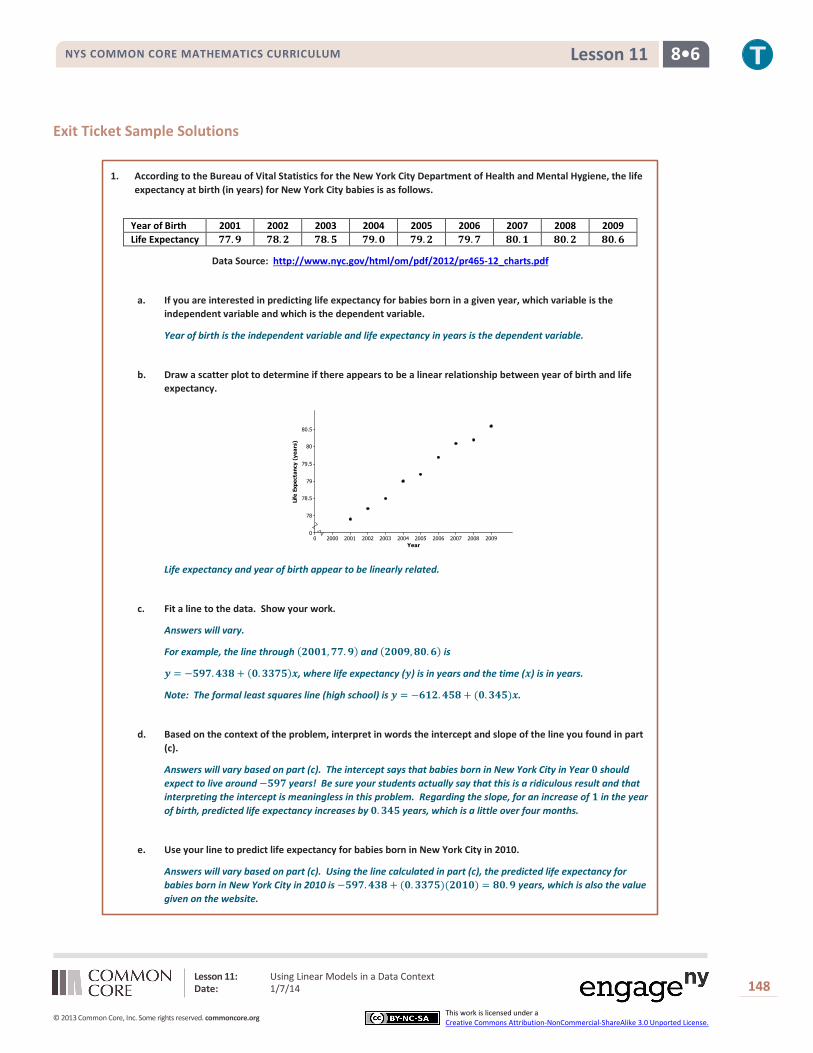
Lesson 11: Using Linear Models in a Data Context Date: 1/7/14
148
© 2013 Common Core, Inc. Some rights reserved. commoncore.org This work is licensed under a Creative Commons Attribution-NonCommercial-ShareAlike 3.0 Unported License.
NYS COMMON CORE MATHEMATICS CURRICULUM 8•6 Lesson 11
Exit Ticket Sample Solutions
1. According to the Bureau of Vital Statistics for the New York City Department of Health and Mental Hygiene, the life expectancy at birth (in years) for New York City babies is as follows.
Year of Birth 2001 2002 2003 2004 2005 2006 2007 2008 2009 Life Expectancy 𝟕𝟕.𝟗 𝟕𝟖.𝟐 𝟕𝟖.𝟓 𝟕𝟗.𝟎 𝟕𝟗.𝟐 𝟕𝟗.𝟕 𝟖𝟎.𝟏 𝟖𝟎.𝟐 𝟖𝟎.𝟔
Data Source: http://www.nyc.gov/html/om/pdf/2012/pr465-12_charts.pdf
a. If you are interested in predicting life expectancy for babies born in a given year, which variable is the independent variable and which is the dependent variable.
Year of birth is the independent variable and life expectancy in years is the dependent variable.
b. Draw a scatter plot to determine if there appears to be a linear relationship between year of birth and life expectancy.
Year
Life
Exp
ecta
ncy
(yea
rs)
20092008200720062005200420032002200120000
80.5
80
79.5
79
78.5
78
0
Life expectancy and year of birth appear to be linearly related.
c. Fit a line to the data. Show your work.
Answers will vary.
For example, the line through (𝟐𝟎𝟎𝟏,𝟕𝟕.𝟗) and (𝟐𝟎𝟎𝟗,𝟖𝟎.𝟔) is
𝒚 = −𝟓𝟗𝟕.𝟒𝟑𝟖+ (𝟎.𝟑𝟑𝟕𝟓)𝒙, where life expectancy (𝒚) is in years and the time (𝒙) is in years.
Note: The formal least squares line (high school) is 𝒚 = −𝟔𝟏𝟐.𝟒𝟓𝟖+ (𝟎.𝟑𝟒𝟓)𝒙.
d. Based on the context of the problem, interpret in words the intercept and slope of the line you found in part (c).
Answers will vary based on part (c). The intercept says that babies born in New York City in Year 𝟎 should expect to live around −𝟓𝟗𝟕 years! Be sure your students actually say that this is a ridiculous result and that interpreting the intercept is meaningless in this problem. Regarding the slope, for an increase of 𝟏 in the year of birth, predicted life expectancy increases by 𝟎.𝟑𝟒𝟓 years, which is a little over four months.
e. Use your line to predict life expectancy for babies born in New York City in 2010.
Answers will vary based on part (c). Using the line calculated in part (c), the predicted life expectancy for babies born in New York City in 2010 is −𝟓𝟗𝟕.𝟒𝟑𝟖 + (𝟎.𝟑𝟑𝟕𝟓)(𝟐𝟎𝟏𝟎) = 𝟖𝟎.𝟗 years, which is also the value given on the website.

Lesson 11: Using Linear Models in a Data Context Date: 1/7/14
149
© 2013 Common Core, Inc. Some rights reserved. commoncore.org This work is licensed under a Creative Commons Attribution-NonCommercial-ShareAlike 3.0 Unported License.
NYS COMMON CORE MATHEMATICS CURRICULUM 8•6 Lesson 11
Problem Set Sample Solutions
1. From the United States Bureau of Census website, the population sizes (in millions of people) in the United States for census years 1790–2010 are as follows.
Year 1790 1800 1810 1820 1830 1840 1850 1860 1870 1880 1890 Population size 𝟑.𝟗 𝟓.𝟑 𝟕.𝟐 𝟗.𝟔 𝟏𝟐.𝟗 𝟏𝟕.𝟏 𝟐𝟑.𝟐 𝟑𝟏.𝟒 𝟑𝟖.𝟔 𝟓𝟎.𝟐 𝟔𝟑.𝟎
Year 1900 1910 1920 1930 1940 1950 1960 1970 1980 1990 2000 2010 Population size 𝟕𝟔.𝟐 𝟗𝟐.𝟐 𝟏𝟎𝟔.𝟎 𝟏𝟐𝟑.𝟐 𝟏𝟑𝟐.𝟐 𝟏𝟓𝟏.𝟑 𝟏𝟕𝟗.𝟑 𝟐𝟎𝟑.𝟑 𝟐𝟐𝟔.𝟓 𝟐𝟒𝟖.𝟕 𝟐𝟖𝟏.𝟒 𝟑𝟎𝟖.𝟕
a. If you wanted to be able to predict population size in a given year, which variable would be the independent variable and which would be the dependent variable?
Population size (dependent variable) is being predicted based on year (independent variable).
b. Draw a scatter plot. Does the relationship between year and population size appear to be linear?
The relationship between population size and year of birth is definitely non-linear. Note that investigating nonlinear relationships is the topic of the next two lessons.
Year
Popu
lati
on S
ize
(mill
ions
)
2010
2000
1990
1980
1970
1960
1950
1940
1930
1920
1910
1900
1890
1880
1870
1860
1850
1840
1830
1820
1810
1800
17900
350
300
250
200
150
100
50
0
c. Consider the data only from 1950 to 2010. Does the relationship between year and population size for these years appear to be linear?
Drawing a scatter plot using the 1950–2010 data indicates that the relationship between population size and year of birth is approximately linear although some students may say that there is a very slight curvature to the data.
Year
Popu
lati
on S
ize
(mill
ions
)
20102000199019801970196019500
325
300
275
250
225
200
175
150
0

Lesson 11: Using Linear Models in a Data Context Date: 1/7/14
150
© 2013 Common Core, Inc. Some rights reserved. commoncore.org This work is licensed under a Creative Commons Attribution-NonCommercial-ShareAlike 3.0 Unported License.
NYS COMMON CORE MATHEMATICS CURRICULUM 8•6 Lesson 11
d. One line that could be used to model the relationship between year and population size for the data from 1950 to 2010 is 𝒚 = −𝟒,𝟖𝟕𝟓.𝟎𝟐𝟏+ 𝟐.𝟓𝟕𝟖𝒙. Suppose that a sociologist believes that there will be negative
consequences if population size in the United States increases by more than 𝟐𝟑𝟒 million people annually. Should she be concerned? Explain your reasoning.
This problem is asking students to interpret the slope. Some students will no doubt say that the sociologist need not be concerned since the slope of 𝟐.𝟓𝟕𝟖 million births per year is smaller than her threshold value of 𝟐.𝟕𝟓 million births per year. Other students may say that the sociologist should be concerned since the difference between 𝟐.𝟓𝟕𝟖 and 𝟐.𝟕𝟓 is only 𝟏𝟕𝟐,𝟎𝟎𝟎 births a year.
e. Assuming that the linear pattern continues, use the line given in part (d) to predict the size of the population in the United States in the next census.
The next census year is 2020. The given line predicts that the population then will be −𝟒𝟖𝟕𝟓.𝟎𝟐𝟏+ (𝟐.𝟓𝟕𝟖)(𝟐𝟎𝟐𝟎) = 𝟑𝟑𝟐.𝟓𝟑𝟗 million people.
2. In search of a topic for his science class project, Bill saw an interesting YouTube video in which dropping mint candies into bottles of a soda pop caused the pop to spurt immediately from the bottle. He wondered if the height of the spurt was linearly related to the number of mint candies that were used. He collected data using 𝟏, 𝟑, 𝟓, and 𝟏𝟎 mint candies. Then he used two-liter bottles of a diet soda and measured the height of the spurt in centimeters. He tried each quantity of mint candies three times. His data are in the following table.
Number of mint candies 𝟏 𝟏 𝟏 𝟑 𝟑 𝟑 𝟓 𝟓 𝟓 𝟏𝟎 𝟏𝟎 𝟏𝟎
Height of spurt (cm) 𝟒𝟎 𝟑𝟓 𝟑𝟎 𝟏𝟏𝟎 𝟏𝟎𝟓 𝟗𝟎 𝟏𝟕𝟎 𝟏𝟔𝟎 𝟏𝟖𝟎 𝟒𝟎𝟎 𝟑𝟗𝟎 𝟒𝟐𝟎
a. Identify which variable is the independent variable and which is the dependent variable.
Height of spurt is the dependent variable and number of mint candies is the independent variable because height of spurt is being predicted based on number of mint candies used.
b. Draw a scatter plot that could be used to determine if the relationship between height of spurt and number of mint candies appears to be linear.
1086420
400
300
200
100
0
Number of Mint Candies
Hei
gh o
f Sp
urt
(cm
)
Scaffolding: The word “spurt” may
need to be defined for ELL students.
A spurt is a sudden stream of liquid or gas, forced out under pressure. Showing a visual aid to accompany this exercise may help student comprehension.
Lesson 11: Using Linear Models in a Data Context Date: 1/7/14
151
© 2013 Common Core, Inc. Some rights reserved. commoncore.org This work is licensed under a Creative Commons Attribution-NonCommercial-ShareAlike 3.0 Unported License.
NYS COMMON CORE MATHEMATICS CURRICULUM 8•6 Lesson 11
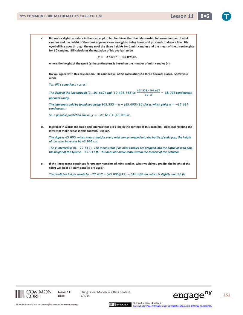
c. Bill sees a slight curvature in the scatter plot, but he thinks that the relationship between number of mint candies and the height of the spurt appears close enough to being linear and proceeds to draw a line. His eye-ball line goes through the mean of the three heights for 𝟑 mint candies and the mean of the three heights for 𝟏𝟎 candies. Bill calculates the equation of his eye-ball to be
𝒚 = −𝟐𝟕.𝟔𝟏𝟕+ (𝟒𝟑.𝟎𝟗𝟓)𝒙,
where the height of the spurt (𝒚) in centimeters is based on the number of mint candies (𝒙).
Do you agree with this calculation? He rounded all of his calculations to three decimal places. Show your work.
Yes, Bill’s equation is correct.
The slope of the line through (𝟑,𝟏𝟎𝟏.𝟔𝟔𝟕) and (𝟏𝟎,𝟒𝟎𝟑.𝟑𝟑𝟑) is 𝟒𝟎𝟑.𝟑𝟑𝟑−𝟏𝟎𝟏.𝟔𝟔𝟕
𝟏𝟎−𝟑= 𝟒𝟑. 𝟎𝟗𝟓 centimeters
per mint candy.
The intercept could be found by solving 𝟒𝟎𝟑.𝟑𝟑𝟑 = 𝒂 + (𝟒𝟑.𝟎𝟗𝟓)(𝟏𝟎) for 𝒂, which yields 𝒂 = −𝟐𝟕.𝟔𝟏𝟕 centimeters.
So, a possible prediction line is: 𝒚 = −𝟐𝟕.𝟔𝟏𝟕 + (𝟒𝟑.𝟎𝟗𝟓)𝒙.
d. Interpret in words the slope and intercept for Bill’s line in the context of this problem. Does interpreting the intercept make sense in this context? Explain.
The slope is 𝟒𝟑.𝟎𝟗𝟓, which means that for every mint candy dropped into the bottle of soda pop, the height of the spurt increases by 𝟒𝟑.𝟎𝟗𝟓 cm.
The 𝒚-intercept is (𝟎,−𝟐𝟕.𝟔𝟏𝟕). This means that if no mint candies are dropped into the bottle of soda pop, the height of the spurt is −𝟐𝟕.𝟔𝟏𝟕 ft. This does not make sense within the context of the problem.
e. If the linear trend continues for greater numbers of mint candies, what would you predict the height of the spurt will be if 𝟏𝟓 mint candies are used?
The predicted height would be −𝟐𝟕.𝟔𝟏𝟕 + (𝟒𝟑.𝟎𝟗𝟓)(𝟏𝟓) = 𝟔𝟏𝟖.𝟖𝟎𝟖 cm, which is slightly over 𝟐𝟎 ft!

Lesson 12: Nonlinear Models in a Data Context (Optional) Date: 1/7/14
152
© 2013 Common Core, Inc. Some rights reserved. commoncore.org This work is licensed under a Creative Commons Attribution-NonCommercial-ShareAlike 3.0 Unported License.
NYS COMMON CORE MATHEMATICS CURRICULUM 8•6 Lesson 12
Lesson 12: Nonlinear Models in a Data Context (Optional)
Student Outcomes
Students give verbal descriptions of how 𝑦 changes as 𝑥 changes given the graph of a nonlinear function. Students draw nonlinear functions that are consistent with a verbal description of a nonlinear relationship.
Lesson Notes The Common Core Standards do not require that eighth-grade students fit curves to nonlinear data. This lesson is included as an optional extension to provide a deeper understanding of the key features of linear relationships in contrast to nonlinear ones.
Previous lessons focused on finding the equation of a line and interpreting the slope and intercept for data that followed a linear pattern. In the next two lessons, the focus shifts to data that does not follow a linear pattern. Instead of drawing lines through data, we will use a curve to describe the relationship observed in a scatter plot.
In this lesson, students will calculate the change in height of plants grown in beds with and without compost. The change in growth in the non-compost beds approximately follows a linear pattern. The change in growth in the compost beds follows a curved pattern, rather than a linear pattern. Students are asked to compare the growth changes and recognize that the change in growth for a linear pattern shows a constant change, while non-linear patterns show a rate of growth that is not constant.
Classwork
Example 1 (3–5 minutes): Growing Dahlias
Present the experiment for the two methods of growing dahlias. One method was to plant eight dahlias in a bed of soil that has no compost. The other was to plant eight dahlias in a bed of soil that has been enriched with compost. Explain that the students measured the height of each plant at the end of each week and recorded the median height of the eight dahlias.
Before students begin Example 1, ask the following:
Is there a pattern in the median height of the plants?
The median height is increasing every week by about 3.5 inches.
Scaffolding: An image of a growth
experiment may be useful to help ELL students understand the context of the example.
The words “compost” and “bed” may be unfamiliar to students in this context.
Compost is a mixture of decayed plants and other organic matter used by gardeners to enrich soil.
“Bed” has multiple meanings. In this context, bed refers to a section of ground planted with flowers.
Showing visuals of these terms to accompany the exercises will aid in student comprehension.

Lesson 12: Nonlinear Models in a Data Context (Optional) Date: 1/7/14
153
© 2013 Common Core, Inc. Some rights reserved. commoncore.org This work is licensed under a Creative Commons Attribution-NonCommercial-ShareAlike 3.0 Unported License.
NYS COMMON CORE MATHEMATICS CURRICULUM 8•6 Lesson 12
Example 1: Growing Dahlias
A group of students wanted to determine whether or not compost is beneficial in plant growth. The students used the dahlia flower to study the effect of composting. They planted eight dahlias in a bed with no compost and another eight plants in a bed with compost. They measured the height of each plant over a 𝟗-week period. They found the median growth height for each group of eight plants. The table below shows the results of the experiment for the dahlias grown in non-compost beds.
Exercises 1–7 (15 minutes)
The problems in this exercise set are designed as a review of the previous lesson on fitting a line to data.
The scatter plot shows that a line will fit the data reasonably well. In Exercise 3, the students are asked to find only the slope of the line. You may want to ask the students to write the equation of the line. They could then use this equation to help answer Exercise 7.
As students complete the table in Exercise 4, emphasize how the values of the change in height are all approximately equal and that they center around the value of the slope of the line that they have drawn.
Allow students to work in small groups to complete the exercises. Discuss the answers as a class.
Exercises 1–7
1. On the grid below, construct a scatter plot of non-compost height versus week.
Week Median Height in Non-Compost Bed (inches)
𝟏 𝟗.𝟎𝟎 𝟐 𝟏𝟐.𝟕𝟓 𝟑 𝟏𝟔.𝟐𝟓 𝟒 𝟏𝟗.𝟓𝟎 𝟓 𝟐𝟑.𝟎𝟎 𝟔 𝟐𝟔.𝟕𝟓 𝟕 𝟑𝟎.𝟎𝟎 𝟖 𝟑𝟑.𝟕𝟓 𝟗 𝟑𝟕.𝟐𝟓
Scaffolding: Median is developed in
Grades 6 and 7 as a measure of center that is used to identify a typical value for a skewed data distribution.

Lesson 12: Nonlinear Models in a Data Context (Optional) Date: 1/7/14
154
© 2013 Common Core, Inc. Some rights reserved. commoncore.org This work is licensed under a Creative Commons Attribution-NonCommercial-ShareAlike 3.0 Unported License.
NYS COMMON CORE MATHEMATICS CURRICULUM 8•6 Lesson 12
2. Draw a line that you think fits the data reasonably well.
3. Find the rate of change of your line. Interpret the rate of change in terms of growth (in height) over time.
Most students should have a rate of change of approximately 𝟑.𝟓 inches per week. A rate of change of 𝟑.𝟓 means that the median height of the eight dahlias increased by about 𝟑.𝟓 inches each week.
4. Describe the growth (change in height) from week to week by subtracting the previous week’s height from the current height. Record the growth in the third column in the table below. The median growth for the dahlias from Week 𝟏 to Week 𝟐 was 𝟑.𝟕𝟓 inches (i.e., 𝟏𝟐.𝟕𝟓 − 𝟗.𝟎𝟎 = 𝟑.𝟕𝟓).
Week Median Height in Non-Compost Bed
(inches) Growth (inches)
𝟏 𝟗.𝟎𝟎 −−−−− 𝟐 𝟏𝟐.𝟕𝟓 𝟑.𝟕𝟓 𝟑 𝟏𝟔.𝟐𝟓 𝟑.𝟓 𝟒 𝟏𝟗.𝟓𝟎 𝟑.𝟐𝟓 𝟓 𝟐𝟑.𝟎𝟎 𝟑.𝟓 𝟔 𝟐𝟔.𝟕𝟓 𝟑.𝟕𝟓 𝟕 𝟑𝟎.𝟎𝟎 𝟑.𝟐𝟓 𝟖 𝟑𝟑.𝟕𝟓 𝟑.𝟕𝟓 𝟗 𝟑𝟕.𝟐𝟓 𝟑.𝟓
5. As the number of weeks increases, describe how the weekly growth is changing.
The growth each week remains about the same—approximately 𝟑.𝟓 inches.
6. How does the growth each week compare to the slope of the line that you drew?
The amount of growth varies from 𝟑.𝟐𝟓 to 𝟑.𝟕𝟓 but centers around 𝟑.𝟓, which is the slope of the line.
7. Estimate the median height of the dahlias at 𝟖𝟏𝟐 weeks. Explain how you made your estimate.
An estimate is 𝟑𝟓.𝟓 inches. Students can use the graph, the table, or the equation of their line.

Lesson 12: Nonlinear Models in a Data Context (Optional) Date: 1/7/14
155
© 2013 Common Core, Inc. Some rights reserved. commoncore.org This work is licensed under a Creative Commons Attribution-NonCommercial-ShareAlike 3.0 Unported License.
NYS COMMON CORE MATHEMATICS CURRICULUM 8•6 Lesson 12
Exercises 8–14 (15 minutes)
This exercise is designed to present a set of data that does not follow a linear pattern. Students are asked to draw a curve through the data that they think fits the data reasonably well. Students will want to connect the ordered pairs, but encourage them to draw a smooth curve. A piece of thread or string can be used be demonstrate the smooth curve rather than connecting the ordered pairs. In this lesson, it is not expected that students will find a function (nor are they given a function) that would fit the data. The main focus is that the rate of growth is not a constant when the data does not follow a linear pattern.
Allow students to work in small groups to complete the exercises. Then discuss answers as a class.
Exercises 8–14
The table below shows the results of the experiment for the dahlias grown in compost beds.
Week Median Height in Compost
Bed (inches) 𝟏 𝟏𝟎.𝟎𝟎 𝟐 𝟏𝟑.𝟓𝟎 𝟑 𝟏𝟕.𝟕𝟓 𝟒 𝟐𝟏.𝟓𝟎 𝟓 𝟑𝟎.𝟓𝟎 𝟔 𝟒𝟎.𝟓𝟎 𝟕 𝟔𝟓.𝟎𝟎 𝟖 𝟖𝟎.𝟓𝟎 𝟗 𝟗𝟏.𝟓𝟎
8. Construct a scatter plot of height versus week on the grid below.
Week
Hei
ght
(inc
hes)
9876543210
90
80
70
60
50
40
30
20
10
0
Scatterplot of Compost Data
9. Do the data appear to form a linear pattern?
No, the pattern in the scatter plot is curved.
MP.7

Lesson 12: Nonlinear Models in a Data Context (Optional) Date: 1/7/14
156
© 2013 Common Core, Inc. Some rights reserved. commoncore.org This work is licensed under a Creative Commons Attribution-NonCommercial-ShareAlike 3.0 Unported License.
NYS COMMON CORE MATHEMATICS CURRICULUM 8•6 Lesson 12
10. Describe the growth from week to week by subtracting the height from the previous week from the current height. Record the growth in the third column in the table below. The median growth for the dahlias from Week 𝟏 to Week 𝟐 is 𝟑.𝟓 in. (i.e., 𝟏𝟑.𝟓 − 𝟏𝟎 = 𝟑.𝟓).
Week Compost Height
(inches) Growth (inches)
𝟏 𝟏𝟎.𝟎𝟎 −−−−− 𝟐 𝟏𝟑.𝟓𝟎 𝟑.𝟓𝟎 𝟑 𝟏𝟕.𝟕𝟓 𝟒.𝟐𝟓 𝟒 𝟐𝟏.𝟓𝟎 𝟑.𝟕𝟓 𝟓 𝟑𝟎.𝟓𝟎 𝟗.𝟎 𝟔 𝟒𝟎.𝟓𝟎 𝟏𝟎.𝟎 𝟕 𝟔𝟓.𝟎𝟎 𝟐𝟒.𝟓 𝟖 𝟖𝟎.𝟓𝟎 𝟏𝟓.𝟓𝟎 𝟗 𝟗𝟏.𝟓𝟎 𝟏𝟏.𝟎
11. As the number of weeks increases, describe how the growth is changing.
The amount of growth changes from week to week. In Weeks 𝟏 through 𝟒, the growth is around 𝟒 in. each week. From Weeks 𝟓 to 𝟕 the amount of growth increases, and then the growth slows down for Weeks 𝟖 and 𝟗.
12. Sketch a curve through the data. When sketching a curve do not connect the ordered pairs, but draw a smooth curve that you think reasonably describes the data.
Week
Hei
ght
(inc
hes)
9876543210
100
80
60
40
20
0
Scatterplot of Compost Data
13. Use the curve to estimate the median height of the dahlias at 𝟖𝟏𝟐 weeks. Explain how you made your estimate.
Answers will vary. A reasonable estimate of the median height at 𝟖𝟏𝟐 weeks is approximately 𝟖𝟓. Starting at 𝟖𝟏𝟐 on the 𝒙-axis, move up to the curve, and then over to the 𝒚-axis for the estimate of the height.
14. How does the growth of the dahlias in the compost beds compare to the growth of the dahlias in the non-compost beds?
The growth in the non-compost is about the same each week. The growth in the compost starts the same as the non-compost, but after four weeks begins to grow at a faster rate.
Lesson 12: Nonlinear Models in a Data Context (Optional) Date: 1/7/14
157
© 2013 Common Core, Inc. Some rights reserved. commoncore.org This work is licensed under a Creative Commons Attribution-NonCommercial-ShareAlike 3.0 Unported License.
NYS COMMON CORE MATHEMATICS CURRICULUM 8•6 Lesson 12
Exercise 15 (7–10 minutes) Exercise 15
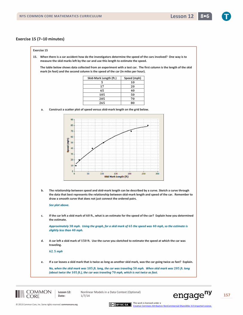
15. When there is a car accident how do the investigators determine the speed of the cars involved? One way is to measure the skid marks left by the car and use this length to estimate the speed.
The table below shows data collected from an experiment with a test car. The first column is the length of the skid mark (in feet) and the second column is the speed of the car (in miles per hour).
Skid-Mark Length (ft.) Speed (mph) 𝟓 𝟏𝟎 𝟏𝟕 𝟐𝟎 𝟔𝟓 𝟒𝟎 𝟏𝟎𝟓 𝟓𝟎 𝟐𝟎𝟓 𝟕𝟎 𝟐𝟔𝟓 𝟖𝟎
a. Construct a scatter plot of speed versus skid-mark length on the grid below.
b. The relationship between speed and skid-mark length can be described by a curve. Sketch a curve through the data that best represents the relationship between skid-mark length and speed of the car. Remember to draw a smooth curve that does not just connect the ordered pairs.
See plot above.
c. If the car left a skid mark of 𝟔𝟎 ft., what is an estimate for the speed of the car? Explain how you determined the estimate.
Approximately 𝟑𝟖 mph. Using the graph, for a skid mark of 𝟔𝟓 the speed was 𝟒𝟎 mph, so the estimate is slightly less than 𝟒𝟎 mph.
d. A car left a skid mark of 𝟏𝟓𝟎 ft. Use the curve you sketched to estimate the speed at which the car was traveling.
𝟔𝟐.𝟓 mph
e. If a car leaves a skid mark that is twice as long as another skid mark, was the car going twice as fast? Explain.
No, when the skid mark was 𝟏𝟎𝟓 ft. long, the car was traveling 𝟓𝟎 mph. When skid mark was 𝟐𝟎𝟓 ft. long (about twice the 𝟏𝟎𝟓 ft.), the car was traveling 𝟕𝟎 mph, which is not twice as fast.

Lesson 12: Nonlinear Models in a Data Context (Optional) Date: 1/7/14
158
© 2013 Common Core, Inc. Some rights reserved. commoncore.org This work is licensed under a Creative Commons Attribution-NonCommercial-ShareAlike 3.0 Unported License.
NYS COMMON CORE MATHEMATICS CURRICULUM 8•6 Lesson 12
Closing (2 minutes)
Review the lesson summary with students.
Exit Ticket (10 minutes)
Lesson Summary
When data follow a linear pattern, the rate of change is a constant. When data follow a non-linear pattern, the rate of change is not constant.
Lesson 12: Nonlinear Models in a Data Context (Optional) Date: 1/7/14
159
© 2013 Common Core, Inc. Some rights reserved. commoncore.org This work is licensed under a Creative Commons Attribution-NonCommercial-ShareAlike 3.0 Unported License.
NYS COMMON CORE MATHEMATICS CURRICULUM 8•6 Lesson 12
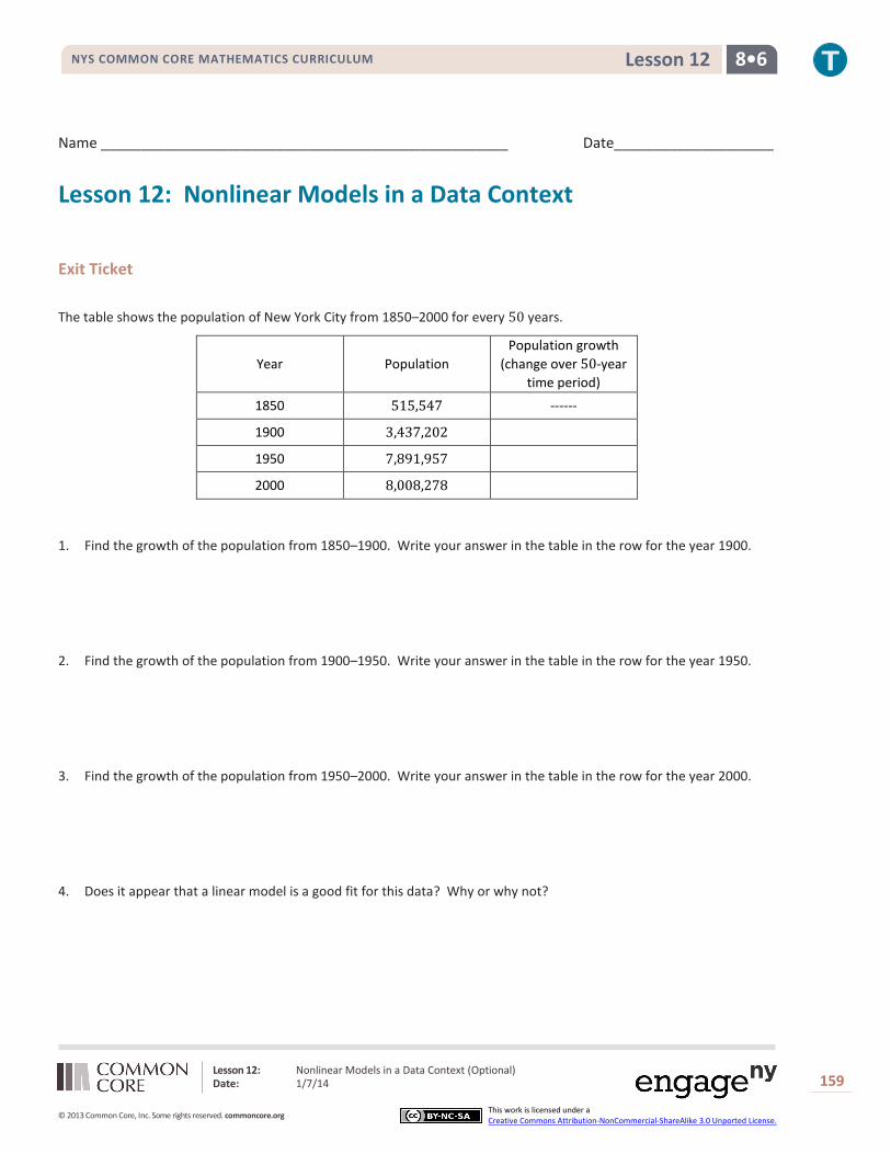
Name ___________________________________________________ Date____________________
Lesson 12: Nonlinear Models in a Data Context
Exit Ticket The table shows the population of New York City from 1850–2000 for every 50 years.
Year Population Population growth
(change over 50-year time period)
1850 515,547 ------
1900 3,437,202
1950 7,891,957
2000 8,008,278
1. Find the growth of the population from 1850–1900. Write your answer in the table in the row for the year 1900.
2. Find the growth of the population from 1900–1950. Write your answer in the table in the row for the year 1950.
3. Find the growth of the population from 1950–2000. Write your answer in the table in the row for the year 2000.
4. Does it appear that a linear model is a good fit for this data? Why or why not?

Lesson 12: Nonlinear Models in a Data Context (Optional) Date: 1/7/14
160
© 2013 Common Core, Inc. Some rights reserved. commoncore.org This work is licensed under a Creative Commons Attribution-NonCommercial-ShareAlike 3.0 Unported License.
NYS COMMON CORE MATHEMATICS CURRICULUM 8•6 Lesson 12
5. Describe how the population changes as the number of years increases.
6. Construct a scatter plot of time versus population on the grid below. Draw a line or curve that you feel reasonably describes the data.
7. Estimate the population of New York City in 1975. Explain how you found your estimate.

Lesson 12: Nonlinear Models in a Data Context (Optional) Date: 1/7/14
161
© 2013 Common Core, Inc. Some rights reserved. commoncore.org This work is licensed under a Creative Commons Attribution-NonCommercial-ShareAlike 3.0 Unported License.
NYS COMMON CORE MATHEMATICS CURRICULUM 8•6 Lesson 12
Exit Ticket Sample Solutions
The table shows the population of New York City from 1850 to 2000 for every 𝟓𝟎 years.
Year Population Population growth
(change over 𝟓𝟎 year time period)
1850 𝟓𝟏𝟓,𝟓𝟒𝟕 −−−−−−
1900 𝟑,𝟒𝟑𝟕,𝟐𝟎𝟐 𝟐,𝟗𝟐𝟏,𝟔𝟓𝟓
1950 𝟕,𝟖𝟗𝟏,𝟗𝟓𝟕 𝟒,𝟒𝟓𝟒,𝟕𝟓𝟓
2000 𝟖,𝟎𝟎𝟖,𝟐𝟕𝟖 𝟏𝟏𝟔,𝟑𝟐𝟏
1. Find the growth of the population from 1850–1900. Write your answer in the table in the row for the year 1900.
2. Find the growth of the population from 1900–1950. Write your answer in the table in the row for the year 1950.
3. Find the growth of the population from 1950–2000. Write your answer in the table in the row for the year 2000.
4. Does it appear that a linear model is a good fit for this data? Why or why not?
No, the rate of population growth is not constant; the values in the change in population column are all different. A linear model will not be a good fit for this data.
5. Describe how the population changes as the years increase.
As the years increase, the change in population is increasing.
6. Construct a scatter plot of time versus population on the grid below. Draw a line or curve that you feel reasonably describes the data.
Students should sketch a curve. If students use a straight line, point out that the line will not reasonably describe the data as some of the data points will be far away from the line.
7. Estimate the population of New York City in 1975. Explain how you found your estimate.
Approximately 𝟖,𝟎𝟎𝟎,𝟎𝟎𝟎. An estimate can be found by recognizing that the growth of the city did not change very much from 1950–2000. You could also find the mean of the 1950 population and the 2000 population.

Lesson 12: Nonlinear Models in a Data Context (Optional) Date: 1/7/14
162
© 2013 Common Core, Inc. Some rights reserved. commoncore.org This work is licensed under a Creative Commons Attribution-NonCommercial-ShareAlike 3.0 Unported License.
NYS COMMON CORE MATHEMATICS CURRICULUM 8•6 Lesson 12
Problem Set Sample Solutions
1. Once the brakes of the car have been applied, the car doesn’t stop immediately. The distance that the car travels after the brakes have been applied is called the braking distance. The table below shows braking distance (how far the car travels once the brakes have been applied) and the speed of the car.
Speed (mph) Distance until car stops (ft.) 𝟏𝟎 𝟓 𝟐𝟎 𝟏𝟕 𝟑𝟎 𝟑𝟕 𝟒𝟎 𝟔𝟓 𝟓𝟎 𝟏𝟎𝟓 𝟔𝟎 𝟏𝟓𝟎 𝟕𝟎 𝟐𝟎𝟓 𝟖𝟎 𝟐𝟔𝟓
a. Construct a scatterplot of distance versus speed on the grid below.
b. Find the amount of additional distance a car would travel after braking for each speed increase of 𝟏𝟎 mph. Record your answers in the table below.
Speed (mph) Distance until car stops (feet) Amount of Distance increase 𝟏𝟎 𝟓 −−−− 𝟐𝟎 𝟏𝟕 𝟏𝟐 𝟑𝟎 𝟑𝟕 𝟐𝟎 𝟒𝟎 𝟔𝟓 𝟐𝟖 𝟓𝟎 𝟏𝟎𝟓 𝟒𝟎 𝟔𝟎 𝟏𝟓𝟎 𝟒𝟓 𝟕𝟎 𝟐𝟎𝟓 𝟓𝟓 𝟖𝟎 𝟐𝟔𝟓 𝟔𝟎
c. Based on the table, do you think the data follow a linear pattern? Explain your answer.
No, if the relationship is linear the values in the Amount of Distance Increase column would be approximately equal.
d. Describe how the distance it takes a car to stop changes as the speed of the car increases.
As the speed increases the amount of change is increasing.

Lesson 12: Nonlinear Models in a Data Context (Optional) Date: 1/7/14
163
© 2013 Common Core, Inc. Some rights reserved. commoncore.org This work is licensed under a Creative Commons Attribution-NonCommercial-ShareAlike 3.0 Unported License.
NYS COMMON CORE MATHEMATICS CURRICULUM 8•6 Lesson 12
e. Sketch a smooth curve that you think describes the relationship between braking distance and speed.
f. Estimate braking distance for a car traveling at 𝟓𝟐 mph. Estimate braking distance for a car traveling at 𝟕𝟓 mph. Explain how you made your estimates.
For 𝟓𝟐 mph―distance is about 𝟏𝟏𝟓 ft.
For 𝟕𝟓 mph―distance is about 𝟐𝟑𝟎 ft.
Both estimates can be made by starting on the 𝒙-axis, moving up to the curve, and then over to the 𝒚-axis for the estimate of distance.
2. The scatter plot below shows the relationship between cost (in dollars) and radius length (in meters) of fertilizing different sized circular fields. The curve shown was drawn to describe the relationship between cost and radius.
a. Is the curve a good fit for the data? Explain.
Yes, the curve fits the data very well. The data points lie close to the curve.
b. Use the curve to estimate the cost for fertilizing a circular field of radius 𝟑𝟎 m. Explain how you made your estimate.
Using the curve drawn on the graph, the cost is approximately $𝟐𝟎𝟎–𝟐𝟓𝟎.
c. Estimate the radius of the field if the fertilizing cost were $𝟐,𝟓𝟎𝟎. Explain how you made your estimate.
Using the curve, an estimate for the radius is approximately 𝟗𝟒 m. Locate the approximate cost of $𝟐,𝟓𝟎𝟎. The approximate radius for that point is 𝟗𝟒 m.

Lesson 12: Nonlinear Models in a Data Context (Optional) Date: 1/7/14
164
© 2013 Common Core, Inc. Some rights reserved. commoncore.org This work is licensed under a Creative Commons Attribution-NonCommercial-ShareAlike 3.0 Unported License.
NYS COMMON CORE MATHEMATICS CURRICULUM 8•6 Lesson 12
3. A dolphin is fitted with a GPS system that monitors its position in relationship to a research ship. The table below contains the time (in seconds) after the dolphin is released from the ship and the distance (in feet) the dolphin is from the research ship.
Time (sec.) Distance from Ship (ft.) Increase in Distance from the Ship
𝟎 𝟎 −−−−−
𝟓𝟎 𝟖𝟓 𝟖𝟓
𝟏𝟎𝟎 𝟏𝟗𝟎 𝟏𝟎𝟓
𝟏𝟓𝟎 𝟑𝟗𝟖 𝟐𝟎𝟖
𝟐𝟎𝟎 𝟓𝟕𝟕 𝟏𝟕𝟗
𝟐𝟓𝟎 𝟖𝟓𝟑 𝟐𝟕𝟔
𝟑𝟎𝟎 𝟏,𝟏𝟐𝟐 𝟐𝟔𝟗
a. Construct a scatter plot of distance versus time on the grid below.
300250200150100500
1200
1000
800
600
400
200
0
Time (seconds)
Dis
tanc
e fr
om S
hip
(fee
t)
b. Find the additional distance the dolphin traveled for each increase of 𝟓𝟎 seconds. Record your answers in the table above.
See table above.
c. Based on the table, do you think that the data follow a linear pattern? Explain your answer.
No, the change in distance from the ship is not a constant.
d. Describe how the distance that the dolphin is from the ship changes as the time increases.
As the time away from the ship increases, the distance the dolphin is from the ship is also increasing. The farther the dolphin is from the ship, the faster it is swimming.

Lesson 12: Nonlinear Models in a Data Context (Optional) Date: 1/7/14
165
© 2013 Common Core, Inc. Some rights reserved. commoncore.org This work is licensed under a Creative Commons Attribution-NonCommercial-ShareAlike 3.0 Unported License.
NYS COMMON CORE MATHEMATICS CURRICULUM 8•6 Lesson 12
e. Sketch a smooth curve that you think fits the data reasonably well.
f. Estimate how far the dolphin will be from the ship after 𝟏𝟖𝟎 seconds? Explain how you made your estimate.
About 𝟓𝟎𝟎 ft. Starting on the 𝒙-axis at approximately 𝟏𝟖𝟎 seconds, move up to the curve, and then over to the 𝒚-axis to find an estimate of the distance.