non-intrusive load monitoring: disaggregation of energy by
TRANSCRIPT

Non-Intrusive Load Monitoring: Disaggregation of Energy
by Unsupervised Power Consumption Clustering
Submitted in partial fulfillment of the requirements for
the degree of
Doctor of Philosophy
in
Electrical and Computer Engineering
Kyle D. Anderson
B.S., Electrical & Computer Engineering, Carnegie Mellon UniversityM.S., Electrical & Computer Engineering, Carnegie Mellon University
Carnegie Mellon UniversityPittsburgh, PA
December 2014


Dedicated to my parents, John and Glenda,
to my wife, Maggie,
and to our two boys, John Henry and Robert Ignatius.


Acknowledgments
To begin with, I would like to thank my parents, John and Glenda. You both worked hard to
give me opportunities in life, and not a day goes by when I am not grateful for all that you have
done and continue to do. To my wife, Maggie, I am forever grateful for your love and support,
particularly throughout this past year of finishing things up. I love you, and I could not have done
this without you by my side. We have seen our family grow with our son John Henry and, at the
end of writing this thesis, I am grateful for the safe and healthy birth of our second son, Robert
Ignatius. To my siblings, Hailey and Cole, I treasure you guys and thank you both for being there
at times when I needed you. To my parents-in-law, Bob and Carol, thank you for your love and
support, and thank you especially for everything that you did to take care of our family during
the final stages of writing this thesis. To the godparents of our children, Leland Thorpe, Jennifer
Prins, and Terry and Rachel Lanham: thank you for your friendship and for all of your prayers.
To my close friends and groomsmen, Robert Bovey, Jacob Dorsey, and Franco Fabiilli: thank you
guys for all of the good times we have shared and your support and encouragement over the past
few years. The fathers and brothers of the Pittsburgh Oratory deserve a special mention as well:
thank you to all of you for your guidance, formation, and help in remaining focused on what is
most important in life.
I would like to extend my heartfelt thanks to my advisor, Professor Jose Moura. His patience,
encouragement, and support have been invaluable, particularly within the last year. I would also
like to thank Professor Mario Berges for his guidance and friendship. Thank you to Professor
Lucio Soibelman for providing me the opportunity to begin working on this project. Thank you
also to my other committee members, Professor Richard Stern and Professor Gabriela Hug. I am
iii

iv
particularly grateful to Diego Benitez for mentoring me during an internship at the Bosch Research
and Technology Center in Pittsburgh and for his expertise in data collection. I would like to thank
everyone else who has been involved in this work: Professor H. Scott Matthews, Professor Anthony
Rowe, Professor Zico Kolter, Suman Giri, Adrian Ocneanu, Derrick Carlson, Farrokh Jazizadeh,
Khatereh Khodaverdi, and Felix Maus. I am also grateful to all of the ECE staff members who
have helped me in various ways over the years: Janet Peters, Susan Farrington, Carol Patterson,
Claire Bauerle, Tara Moe, Elaine Lawrence, Samantha Goldstein, and Alan Grupe. The many
officemates who have become my friends and put up with my jokes: Marek Telgarsky, Soummya
Kar, Divyanshu Vats, Aurora Schmidt, June Zhang, Subhro Das, Stephen Kruzick, and Liangyan
Gui. For all of my other fellow students and friends in the ECE department, I owe thanks: Joey
Fernandez, Nicholas O’Donoughue, Joel Harley, Joya Deri, Frederic de Mesmay, Nicole Saulnier,
Vas Chellappa, Theta Maxino, and everyone else who has contributed to my time at CMU.
Finally, I would like to thank those who have supported the work done in this thesis: the Robert
Bosch LLC Research and Technology Center North America and the National Science Foundation
(NSF) grant #09-30868.
Abstract
There is a growing trend in monitoring residential infrastructures to provide inhabitants with more
information about their energy consumption and help them to reduce usage and cost. Device-level
power consumption information, while a functionality in newer smart appliances, is not generally
available to consumers.
In electricity consumption disaggregation, Non-Intrusive Load Monitoring (NILM) refers to
methods that provide consumers estimates of device-level energy consumption based on aggregate
measurements usually taken at the main circuit panel or electric meter. The traditional NILM
approach characterizes changes in the power signal when devices turn on or off, and it infers the
consumption of different devices present in the home based on these changes. Generally, these
NILM methods require training and models of the devices present in the home in order to function
properly. Because of these challenges, much of the NILM literature does not address the actual
energy disaggregation problem but focuses on detecting events and classifying changes in power.
In this dissertation, we propose a relaxation to the traditional NILM problem and provide
an unsupervised, data-driven algorithm to solve it. Specifically, we propose Power Consumption
Clustered Non-Intrusive Load Monitoring (PCC-NILM), a relaxation that reports on the energy
usage of devices grouped together by power consumption levels. In order to solve the PCC-NILM
problem, we provide the Approximate Power Trace Decomposition Algorithm (APTDA). Unlike
other methods, APTDA does not require training and it provides estimated energy consumption
for different classes of devices.
v

Contents
Acknowledgments . . . . . . . . . . . . . . . . . . . . . . . . . . . . . . . . . . . . . . . . . iii
Abstract . . . . . . . . . . . . . . . . . . . . . . . . . . . . . . . . . . . . . . . . . . . . . . v
1 Introduction 1
1.1 Motivation . . . . . . . . . . . . . . . . . . . . . . . . . . . . . . . . . . . . . . . . . 1
1.2 Literature Review . . . . . . . . . . . . . . . . . . . . . . . . . . . . . . . . . . . . . 2
1.2.1 NILM Datasets . . . . . . . . . . . . . . . . . . . . . . . . . . . . . . . . . . . 4
1.2.2 Energy Disaggregation and Performance Metrics . . . . . . . . . . . . . . . . 5
1.2.3 Supervised vs. Unsupervised Methods . . . . . . . . . . . . . . . . . . . . . . 7
1.3 Research Contributions . . . . . . . . . . . . . . . . . . . . . . . . . . . . . . . . . . 7
1.4 Use Cases . . . . . . . . . . . . . . . . . . . . . . . . . . . . . . . . . . . . . . . . . . 10
1.5 Dissertation Outline . . . . . . . . . . . . . . . . . . . . . . . . . . . . . . . . . . . . 11
2 Data Collection 12
2.1 AC Power Primer . . . . . . . . . . . . . . . . . . . . . . . . . . . . . . . . . . . . . . 13
2.2 Methods for Monitoring Device-Level Ground Truth . . . . . . . . . . . . . . . . . . 14
2.3 BLUED Dataset . . . . . . . . . . . . . . . . . . . . . . . . . . . . . . . . . . . . . . 17
2.3.1 Measurement and Monitoring . . . . . . . . . . . . . . . . . . . . . . . . . . . 17
2.3.2 Labeling Task . . . . . . . . . . . . . . . . . . . . . . . . . . . . . . . . . . . . 24
2.4 Conclusion . . . . . . . . . . . . . . . . . . . . . . . . . . . . . . . . . . . . . . . . . 27
3 Event Detection 28
3.1 Log-Likelihood Ratio Detector . . . . . . . . . . . . . . . . . . . . . . . . . . . . . . 29
vii

CONTENTS viii
3.2 Likelihood Ratio Detector Parameter Sweep on BLUED . . . . . . . . . . . . . . . . 34
3.2.1 Experimental Setup . . . . . . . . . . . . . . . . . . . . . . . . . . . . . . . . 34
3.2.2 Discussion of LLR Detector Parameters . . . . . . . . . . . . . . . . . . . . . 36
3.3 Event Detection on BLUED . . . . . . . . . . . . . . . . . . . . . . . . . . . . . . . . 40
3.3.1 Detection Tolerance . . . . . . . . . . . . . . . . . . . . . . . . . . . . . . . . 47
3.4 Conclusion . . . . . . . . . . . . . . . . . . . . . . . . . . . . . . . . . . . . . . . . . 49
4 Approximate Power Trace Decomposition Algorithm 52
4.1 Motivation . . . . . . . . . . . . . . . . . . . . . . . . . . . . . . . . . . . . . . . . . 53
4.2 APTDA Overview . . . . . . . . . . . . . . . . . . . . . . . . . . . . . . . . . . . . . 58
4.3 Power Trace Approximation . . . . . . . . . . . . . . . . . . . . . . . . . . . . . . . . 63
4.4 Background Power Estimation . . . . . . . . . . . . . . . . . . . . . . . . . . . . . . 65
4.5 Active and Background Segment Labeling . . . . . . . . . . . . . . . . . . . . . . . . 67
4.6 Power Consumption Bin Clustering . . . . . . . . . . . . . . . . . . . . . . . . . . . . 69
4.7 Component Decomposition . . . . . . . . . . . . . . . . . . . . . . . . . . . . . . . . 71
4.8 Component Balancing . . . . . . . . . . . . . . . . . . . . . . . . . . . . . . . . . . . 75
4.9 Conclusion . . . . . . . . . . . . . . . . . . . . . . . . . . . . . . . . . . . . . . . . . 80
5 Experiments and Results 82
5.1 APTDA Walkthrough . . . . . . . . . . . . . . . . . . . . . . . . . . . . . . . . . . . 83
5.2 Robustness of APTDA to Event Locations . . . . . . . . . . . . . . . . . . . . . . . . 87
5.3 Crowdsourcing Event Detectors . . . . . . . . . . . . . . . . . . . . . . . . . . . . . . 96
5.4 Conclusion . . . . . . . . . . . . . . . . . . . . . . . . . . . . . . . . . . . . . . . . . 103
6 Conclusion and Future Work 105
6.1 Chapter Summaries . . . . . . . . . . . . . . . . . . . . . . . . . . . . . . . . . . . . 105
6.2 Contributions . . . . . . . . . . . . . . . . . . . . . . . . . . . . . . . . . . . . . . . . 107
6.2.1 Power Consumption Clustered Non-Intrusive Load Monitoring . . . . . . . . 107
6.2.2 Event Detection . . . . . . . . . . . . . . . . . . . . . . . . . . . . . . . . . . 107
6.2.3 Unsupervised PCC-NILM: Approximate Power Trace Decomposition Algorithm107
CONTENTS ix
6.2.4 Validation of PCC-NILM . . . . . . . . . . . . . . . . . . . . . . . . . . . . . 108
6.3 Use Case . . . . . . . . . . . . . . . . . . . . . . . . . . . . . . . . . . . . . . . . . . 108
6.4 Future Work . . . . . . . . . . . . . . . . . . . . . . . . . . . . . . . . . . . . . . . . 108
6.4.1 Further Development of APTDA . . . . . . . . . . . . . . . . . . . . . . . . . 109
6.4.2 Practical Implementation and Use of APTDA . . . . . . . . . . . . . . . . . . 111
6.4.3 Broader NILM Challenges . . . . . . . . . . . . . . . . . . . . . . . . . . . . . 111
A BLUED 113
Bibliography 117
List of Figures
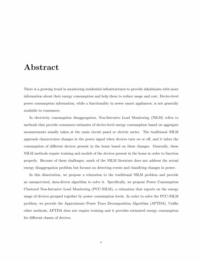
2.1 The three voltage signals vA(t), vB(t), and vAB(t) commonly found in American
residential buildings. vA and vB have peak to peak voltages of 170 V corresponding
to 120 V RMS and vAB has a peak to peak voltage of 340 V corresponding to
240 V RMS. . . . . . . . . . . . . . . . . . . . . . . . . . . . . . . . . . . . . . . . . . 13
2.2 System architecture for data and ground truth collection for the BLUED dataset. . . 18
2.3 Left: The panel-level computer setup. Right: The circuit panel in the house where
BLUED was collected. The red arrows point out the two current clamps monitoring
the current on phases A and B. The white neutral wire is visible to the right of the
red N. . . . . . . . . . . . . . . . . . . . . . . . . . . . . . . . . . . . . . . . . . . . . 20
2.4 Left: FireFly Plug Meter and Control Board. Right: Firefly Environmental Sensor.
28 plug meters and 12 environmental sensors were used in the ground truth monitoring. 21
2.5 Top: Power consumption of a refrigerator as reported by a FireFly plug sensor.
Bottom: Aggregate power consumption over the same time period on phase A. . . . 22
2.6 This figure shows two different light sensors operating over the full week that the
BLUED dataset was collected. Note the effect of daylight on each sensor. The scaling
on the sensors goes from 0 to 1023 where 0 is the darkest and 1023 is brightest. . . . 22
2.7 Top: RMS current for one of the subcircuits, perhaps monitoring the dishwasher.
Bottom: Corresponding aggregate power from phase B. . . . . . . . . . . . . . . . . 23
x

LIST OF FIGURES xi
2.8 Top: One compressor cycle of the refrigerator as monitored by a FireFly plug meter.
The red circles were manually labeled to mark the start and end of the cycle. Bottom:
The same cycle as captured by the aggregate power of phase A at the circuit panel.
The green squares were manually labeled to adjust for the time difference between
the two systems. Both markers are overlaid on the plots to show the gap in the
timestamps clearly. . . . . . . . . . . . . . . . . . . . . . . . . . . . . . . . . . . . . . 26
2.9 Time drift of the FireFly plug meter monitoring the refrigerator with respect to the
aggregate power measurements. The FireFly sensors all lagged behind the time-
stamps of the aggregate collection system and increased at a rate of approximately
8 seconds per day. . . . . . . . . . . . . . . . . . . . . . . . . . . . . . . . . . . . . . 26
2.10 Time drift of one of the subcircuits’ RMS current with respect to the aggregate
power measurements. Like the FireFly sensors, the RMS current also experienced
a lag behind the aggregate power that increased at the same rate of approximately
8 seconds per day. . . . . . . . . . . . . . . . . . . . . . . . . . . . . . . . . . . . . . 27
3.1 Example of an ‘on’ event. . . . . . . . . . . . . . . . . . . . . . . . . . . . . . . . . . 30
3.2 Top: Power signal for a refrigerator ’on’ event. Bottom: corresponding S[n] com-
puted with the pre- and post-window lengths both equal to 6 samples. . . . . . . . . 32
3.3 Top: Power signal for a refrigerator ‘on’ event. Middle: Corresponding |l[n]| com-
puted with the pre- and post-window lengths both equal to 6 samples. Bottom: The
number of votes received by each point with a voting window length of 10 samples.
The voting window is shown on the middle plot to indicate that it is over |l[n]| that
the votes are accumulated. . . . . . . . . . . . . . . . . . . . . . . . . . . . . . . . . . 33
3.4 Number of events detected by each of the 1,456 event detectors on phase A of the
BLUED dataset. The detectors are ordered from least to most sensitive. The dashed
line shows the number of ground truth events in the dataset, 867. . . . . . . . . . . . 35
3.5 The number of detectors with each of the given parameters. . . . . . . . . . . . . . . 36

LIST OF FIGURES xii
3.6 Among the 1,456 detectors tested on phase A of the BLUED dataset, the maximum,
mean, minimum, and median number of events detected when fixing the pre- and
post-window lengths and allowing the other parameters to vary. The black dotted
line indicates the number of ground truth events: 867. . . . . . . . . . . . . . . . . . 37
3.7 Among the 1,456 detectors tested on phase A of the BLUED dataset, the maximum,
mean, minimum, and median number of events detected when fixing the voting
window length and allowing the other parameters to vary. The black dotted line
indicates the number of ground truth events: 867. . . . . . . . . . . . . . . . . . . . 38
3.8 Among the 1,456 detectors tested on phase A of the BLUED dataset, the maximum,
mean, minimum, and median number of events detected when fixing the voting
threshold and allowing the other parameters to vary. The black dotted line indicates
the number of ground truth events: 867. . . . . . . . . . . . . . . . . . . . . . . . . . 39
3.9 In order of detector sensitivity, the number of true positives, false positives, and
misses returned by each of the 1,456 detectors tested with a detection tolerance of 1
sample allowed. The dotted black line indicates the number of ground truth events:
867. . . . . . . . . . . . . . . . . . . . . . . . . . . . . . . . . . . . . . . . . . . . . . 42
3.10 Receiver operating characteristics (ROC) for each of the 1,456 event detectors tested,
marked with blue x’s. Points on the Pareto front are shown in yellow circles. A
detection tolerance of 1 sample was used for counting the true and false positives. . . 43
3.11 This figure is the same as figure 3.10 with the addition of a star highlighting the
detector dRate with optimal performance according to the criteria of (3.7). . . . . . 44
3.12 Performance under the percentage metric for each of the 1,456 event detectors tested
using a detection tolerance of 1 sample. The circles show the Pareto front and the
star shows the optimal detector, dPerc obtained using this metric. . . . . . . . . . . . 45
3.13 Receiver operating characteristics for each of the 1,456 detectors tested with a detec-
tion tolerance of 1 sample. Lines overlaid on the figure show the performance trends
for detectors with different voting thresholds, θV . . . . . . . . . . . . . . . . . . . . . 46

LIST OF FIGURES xiii
3.14 Receiver operating characteristics for each of the 1,456 detectors tested with a de-
tection tolerance of 1 sample. Lines overlaid on the figure show the performance
trends for detectors with different pre- and post-window lengths, w0 and w1. The
shorthand notation w0,1 shown on the figure is used to indicate that w0 and w1 are
constrained to have the same value, i.e., w0 = w1. . . . . . . . . . . . . . . . . . . . . 47
3.15 Receiver operating characteristics (ROC) for each of the 1,456 event detectors tested,
marked with blue x’s. Points on the Pareto front are shown in yellow circles. A
detection tolerance of 3 samples was used for counting the true and false positives.
Note the shift of the Pareto front up and to the left compared with figure 3.11 that
used a detection tolerance of 1 sample. . . . . . . . . . . . . . . . . . . . . . . . . . . 50
3.16 Performance under the percentage metric for each of the 1,456 event detectors tested
using a detection tolerance of 3 samples. The circles show the Pareto front and the
star shows the optimal detector, dPerc obtained using this metric. . . . . . . . . . . . 50
4.1 The power trace of phase A in the BLUED dataset with the locations of the ground
truth events provided with the data. . . . . . . . . . . . . . . . . . . . . . . . . . . . 55
4.2 These plots show the final decomposition of the APTDA algorithm on phase A of
the BLUED dataset. The plots, from top to bottom, are as follows:
P 0: Background power.
P 1: Devices consuming between 0 and 105 Watts.
P 2: Devices consuming between 105 and 720 Watts.
P 3: Devices consuming greater than 720 Watts. . . . . . . . . . . . . . . . . . . . . 56
4.3 Energy in kWh consumed by each component per day in phase A of the BLUED
dataset. . . . . . . . . . . . . . . . . . . . . . . . . . . . . . . . . . . . . . . . . . . . 57
4.4 Block diagram for the APTDA algorithm with the main quantities labeled. In the
first stage of the algorithm, the piecewise-constant approximation, P , is created from
the original power trace, P , and a set of event locations e (Figure 4.5 shows a sample
of the approximation). The final outputs of the algorithm are the K+1 components,
P k, that are distinguished according to power consumption ranges. . . . . . . . . . . 58

LIST OF FIGURES xiv
4.5 Top: The original power signal P with event locations e. Bottom: The piecewise-
constant approximation P that forms the basis for the APTDA algorithm. . . . . . . 59
4.6 Zoomed in view of phase A of the BLUED dataset shows that the background power
level is approximately 40 Watts. . . . . . . . . . . . . . . . . . . . . . . . . . . . . . 60
4.7 Zoomed-in portion of P from phase A of the BLUED dataset shows active segments
as solid blue lines and background segments as a dashed green line. Note that there is
no active consumption during the background segments and that the active segments
may contain one or more events. . . . . . . . . . . . . . . . . . . . . . . . . . . . . . 61
4.8 The decomposition of the segment of P shown in figure 4.7. Note that the active
components are zero during all of the background segments. We also recall from
above that P 1, P 2, and P 3, are estimates of the power consumed by appliances
operating in each of the 3 ranges from table 4.1: 0-105 Watts, 105-720 Watts, and
greater than 720 Watts. . . . . . . . . . . . . . . . . . . . . . . . . . . . . . . . . . . 61
4.9 Histogram of the positive changes in P from phase A of the BLUED dataset. The red
triangles denote the cluster centroids, µk, found by applying the k-means algorithm
to all of the ∆P > 0 for k = 3. . . . . . . . . . . . . . . . . . . . . . . . . . . . . . . 62
4.10 Empirical cumulative distribution function (CDF) for phase A of the BLUED dataset
with a zoom in in the bottom figure. . . . . . . . . . . . . . . . . . . . . . . . . . . . 66
4.11 Zoomed-in portion of P from phase A of the BLUED dataset shows active segments
as solid blue lines and background segments as a dashed green line. Note that there is
no active consumption during the background segments and that the active segments
may contain one or more events. . . . . . . . . . . . . . . . . . . . . . . . . . . . . . 69
4.12 Histogram of ∆P for all of the on events in phase A of the BLUED dataset. . . . . . 70
4.13 Zoom on the histogram from the above figure . . . . . . . . . . . . . . . . . . . . . . 70
4.14 The histogram from figure 4.12 with the cluster centroids found from performing
k-means with k = 3. . . . . . . . . . . . . . . . . . . . . . . . . . . . . . . . . . . . . 71
4.15 An example of an active interval with three active segments surrounded on each side
by background segments. . . . . . . . . . . . . . . . . . . . . . . . . . . . . . . . . . 72

LIST OF FIGURES xv
4.16 The active interval from figure 4.15 with each segment annotated. Segment ma is
the first segment in the active interval. The πm show the level of the power for each
segment and the δm denote the change in power from one segment to the next. The
number of active segments in this interval, usually denoted as S, is 3. . . . . . . . . 73
4.17 Example of an active interval that has net negative energy consumption in the first
active component. . . . . . . . . . . . . . . . . . . . . . . . . . . . . . . . . . . . . . 76
4.18 The decomposition obtained for the active interval in figure 4.17. Note that P 1 is
negative starting just before 3 AM. . . . . . . . . . . . . . . . . . . . . . . . . . . . . 77
5.1 Top: The original power signal P with event locations e. Bottom: The piecewise-
constant approximation P . . . . . . . . . . . . . . . . . . . . . . . . . . . . . . . . . 84
5.2 Example . . . . . . . . . . . . . . . . . . . . . . . . . . . . . . . . . . . . . . . . . . . 85
5.3 Comparison of zoomed-in portions of histograms of all ‘on’ events. Top shows the
histogram obtained by using the ground truth events. Middle shows the histogram
obtained by using the example event detector. Bottom shows the difference of the
two histograms. The bins are 10 Watts wide. . . . . . . . . . . . . . . . . . . . . . . 86
5.4 Cluster centroids found using k-means with k = 3 for each event detector ordered
from least to most sensitive. The dashed lines show the location of the µk when the
ground truth events are used. . . . . . . . . . . . . . . . . . . . . . . . . . . . . . . . 88
5.5 Similar in shape to figure 5.4, this figure shows the power consumption ranges for
each of the active components. The cutoff between ranges is simply the midpoint
between the adjacent µk from figure 5.4. The dashed lines indicate the cutoff levels
when the ground truth events were used and are simply color coded for better visibility. 89
5.6 Estimate of energy consumed by each component across the different event detector
parameter combinations tested. The large variation in the values, particularly among
the more sensitive detectors, occurs because the power ranges obtained by each
detector are not the same. The stability on the left portion of the plot is due to the
stability of the power ranges as shown in figures 5.5. . . . . . . . . . . . . . . . . . . 90

LIST OF FIGURES xvi
5.7 Out of the 1456 parameter combinations tested for the LLR detector, the number of
detectors that give power ranges within different percentages of tolerance from the
cutoff values found by the ground truth events. . . . . . . . . . . . . . . . . . . . . . 91
5.8 The RMS energy percentage error, εRMS,d, for each of the 1,456 detector parameter
combinations tested. . . . . . . . . . . . . . . . . . . . . . . . . . . . . . . . . . . . . 92
5.9 For all of the detectors at each power cutoff tolerance percentage the mean (top) and
standard deviation (bottom) of RMS energy percentage error, εRMS,Dp from (5.6). . . 93
5.10 Top: Estimated energy per component with ≤ 30% power cutoff tolerance, i.e.,
d ∈ D30. Bottom: Estimated energy per component for detectors with > 30% power
cutoff tolerance, i.e., d ∈ Dc30. The dashed lines in both plots show the ground truth
energy for each component for comparison. . . . . . . . . . . . . . . . . . . . . . . . 95
5.11 Percentage of detectors with the given parameters that occur in Dp. The proper
way to read this plot, using the pre/post-window length as an example, is: “Of all
the detectors with a pre/post-window length of 2, about 75% of them fall within the
30% power cutoff tolerance range.” . . . . . . . . . . . . . . . . . . . . . . . . . . . . 96
5.12 Histogram of the power consumption cluster centroids, µk, found by the APTDA
algorithm across the 1,456 detectors tested on phase A of the BLUED dataset with
k=3. The x-axis has bins that are each 1 Watt wide. . . . . . . . . . . . . . . . . . . 98
5.13 Estimate of energy consumed by each component when the crowdsourced µk are used
across all of the different event detector parameter combinations tested. Compare
with figure 5.6 to see the stabilizing effect that using the same power consumption
bins has on the reported energy consumption. . . . . . . . . . . . . . . . . . . . . . . 99
5.14 Sorted versions of Ek are helpful for seeing the more stable (i.e., flatter) intervals of
the energy estimates across the 1,456 detectors tested. . . . . . . . . . . . . . . . . . 100
5.15 Close up of E2, the middle plot from figure 5.14. The largest 0.1-stable set of
detectors, D0.1,2 is shown in red. The top and bottom of the box indicate the upper
and lower bounds of the acceptable range 0.1 ·∆E2. There are 665 detectors within
this set. . . . . . . . . . . . . . . . . . . . . . . . . . . . . . . . . . . . . . . . . . . . 102

LIST OF FIGURES xvii
5.16 Top: Estimated energy per component for the p = 0.1-stable set of detectors, i.e.,
d ∈ D0.1. Bottom: Estimated energy per component for all remaining detectors not
contained in D0.1. . . . . . . . . . . . . . . . . . . . . . . . . . . . . . . . . . . . . . 103
6.1 The block diagram for the APTDA algorithm, as also seen in figure 4.4, is presented
here for reference as future work is discussed. . . . . . . . . . . . . . . . . . . . . . . 109
List of Tables
2.1 Summary of the different types of data collected during the week of the BLUED
dataset. There are 54 data streams collected with three different sampling frequencies. 24
3.1 LLR event detector parameter ranges used for testing the APTDA algorithm across
a spectrum of event locations. . . . . . . . . . . . . . . . . . . . . . . . . . . . . . . . 34
3.2 Event detector parameters for the most and least sensitive event detectors used. . . 35
3.3 Tunable parameters for the log-likelihood ratio detector. A short description for each
parameter is given for reference along with its units in parentheses. . . . . . . . . . . 36
3.4 Table comparing the number of true positives, false positives, and misses found
by optimal detectors dRate and dPerc under detection tolerances ranging from 1 to
6 samples. . . . . . . . . . . . . . . . . . . . . . . . . . . . . . . . . . . . . . . . . . . 48
3.5 Table comparing the parameters of the optimal detectors dRate and dPerc as detection
tolerance changes. . . . . . . . . . . . . . . . . . . . . . . . . . . . . . . . . . . . . . 49
4.1 Potential power consumption ranges for a power consumption-based decomposition. 54
4.2 The energy estimate of each component for the entire week of phase A of the BLUED
dataset. . . . . . . . . . . . . . . . . . . . . . . . . . . . . . . . . . . . . . . . . . . . 57
5.1 Comparison of the centroids found by using the ground truth events and the example
event detector presented here. . . . . . . . . . . . . . . . . . . . . . . . . . . . . . . . 85
5.2 Comparison of the power ranges found by using the ground truth events and the
example event detector presented here. . . . . . . . . . . . . . . . . . . . . . . . . . . 85
xviii

LIST OF TABLES xix
5.3 The energy in kilowatt-hours estimated by the APTDA algorithm for both the
ground truth events and the example event detector. . . . . . . . . . . . . . . . . . . 87
5.4 Example of allowable range of cutoff power values, ηk,between active components
with tolerance levels of 10% and 25%. . . . . . . . . . . . . . . . . . . . . . . . . . . 91
5.5 Sampling of properties of detectors of difference cutoff tolerance percentages, p. |Dp|
is the number of detectors in Dp. εRMS,Dp and σ(εRMS,Dp
)are the mean and standard
deviation of the energy percentage error across all the detectors in each Dp. . . . . . 94
5.6 For each of the active components, across the 1,456 event detectors, the first two
columns show the minimum and maximum energy estimates returned, and the third
column gives the difference between these two. . . . . . . . . . . . . . . . . . . . . . 101
A.1 Devices in the BLUED dataset with their average power consumption when on, the
number of events present in the dataset, and which phase of the data the device was
on. These devices were monitored using FireFly plug sensors. . . . . . . . . . . . . . 114
A.2 Devices in the BLUED dataset with their average power consumption when on, the
number of events present in the dataset, and which phase of the data the device was
on. These devices were monitored using FireFly plug sensors. . . . . . . . . . . . . . 115
A.3 Lights in the BLUED dataset with their average power consumption when on, the
number of events present in the dataset, and which phase of the data the device was
on. These lights were monitored using FireFly environmental sensors. . . . . . . . . 115
A.4 Devices in the BLUED dataset with their average power consumption when on, the
number of events present in the dataset, and which phase of the data the device was
on. These devices were monitored at the subcircuit level. . . . . . . . . . . . . . . . 116

Chapter 1
Introduction
1.1 Motivation
Reducing energy consumption and cutting costs is an important issue today that affects everyone.
In residential environments, saving on electricity can be difficult because the user does not often
have an easily accessible frame of reference for how much power devices in their home consume,
or even what their overall power consumption is. The only power consumption feedback most
residential consumers receive is an aggregate power bill at the end of each month. Studies have
shown, however, that providing consumers with real-time power consumption information, at the
aggregate level, helps them to change their behavior and save 10-15% on power costs [1], [2], [3].
Others suggest that even more power could be saved if accurate, real-time, disaggregated power
information were available to consumers [4].
Recently, there has been increased popular interest in home automation systems and monitoring.
For example, Nest Labs, creator of the Nest Learning Thermostat, was acquired by Google in
January 2014. There is a growing awareness about renewable energy and ecological reasons for
reducing power consumption. There is also a growing number of companies interested in providing
consumers with more detailed electricity consumption feedback and commercial electricity monitors:
The Energy Detective (TED), PlotWatt, Bidgely, and Opower, to list a few.
Non-intrusive load monitoring (NILM) is a term used to describe a set of techniques for obtaining
1
CHAPTER 1. INTRODUCTION 2
estimates of the electrical power consumption of devices in a building based on measurements of
current and/or voltage taken at a limited number of locations of the power distribution system
in a building. It is a tool that can potentially provide real-time power consumption feedback to
consumers, thus enabling them to make changes in their behavior that will conserve resources and
save them money. The information can also be leveraged by power companies, automated building
controllers, and other parties to increase efficiency of electricity usage and to better study how
electricity is used.
The idea behind NILM is simple: help people to know how much power they are consuming
and where that power is going. Today, many cars have real-time gas mileage feedback, but there
is no analog for power consumption in the home. Before this feedback for cars was available, the
only indication of gas consumption was how frequently one had to refill the tank. Increased fuel
prices have spurred advancements in internal combustion engines that have not only improved their
efficiency, but have also sought to instruct the user on how to drive more efficiently. This is the
type of impact that NILM systems could potentially have in the home. Instead of paying the vague
monthly power bill, consumers can take control of the situation and be more sure of where their
money is going and exactly what they are paying for.
We now turn to a review of NILM literature and provide some historical context for the problem.
Following the literature review we briefly discuss the main contributions of this thesis, then we
present some ways in which the work in this thesis may be used in practical settings, and we close
the introduction by providing an overview of the structure of the thesis.
1.2 Literature Review
We present here a brief and by no means exhaustive history of non-intrusive load monitoring
research1. After this history, we focus on how the NILM literature touches on the availability of
public datasets for conducting research (section 1.2.1), metrics for evaluating performance (1.2.2),
and a discussion of supervised and unsupervised methods (section 1.2.3).
1It is worth noting that NILM is variously referred to in the literature as NIALM or NALM (both acronyms for
Non-Intrusive Appliance Load Monitoring).

CHAPTER 1. INTRODUCTION 3
Non-Intrusive Load Monitoring has been an active research area since the mid 1980’s. George
Hart [5] is widely recognized as the founder of NILM with his research at MIT conducted for the
Electric Power Research Institute (EPRI). His work focused on distinguishing appliances based on
the changes in their steady-state real and reactive power consumption levels.
The standard approach proposed by Hart for NILM follows a four-step time-domain method:
event detection, feature extraction, classification, and energy disaggregation. This last stage of
energy disaggregation requires some sort of appliance modeling to be able to track the operation
of different devices. We refer to NILM algorithms that follow this general scheme as event-based
methods.
Building on Hart’s work, during the 1990s, other researchers at MIT began to develop event-
based systems that distinguished appliances based on their transient characteristics [6]. In [7]
and [8] a hybrid system for using both the steady-state and transient characteristics is proposed
and developed. The work in [7] also proposes a method for distinguishing overlapping transients,
a problem that is still challenging for event-based systems.
More sophisticated classification methods were also explored, including neural networks in [9]
and [10], a rule-based pattern recognition approach [11], and Support Vector Machines [12].
Apart from the standard power-based NILM approaches described above, there has also been
work that seeks to disaggregate appliances based on the spectrum of electrical noise on the voltage
signal [13]. An advantage of this method is that overlapping transients in the time domain may be
separated in the frequency domain. However, this requires sampling in the MHz range which can
require expensive hardware that may be cost prohibitive as a commercial solution.
For a more thorough overview of many of the methods described above, see [14].
More recently, especially within the past three years, there has been a growth in model-based
methods that move away from the standard event-based framework. In particular, Hidden Markov
Models (HMMs) have been applied to the problem with some success in both supervised and
unsupervised settings. The first work that we are aware of that uses HMMs is Kim et al. in [15]
where they apply a Factorial HMM (FHMM) to the energy disaggregation task. Kolter et al. also
explore FHMMs in 2011 [16], and in [17] they apply Additive Factorial HMMs using an unsupervised
CHAPTER 1. INTRODUCTION 4
method for extracting signal portions where individual devices are isolated. Parson et al. have also
applied HMM-based methods in [18] and [19] where they combine prior models of general appliance
types (e.g., refrigerators, clothes dryers, etc.) with HMMs and Difference HMMs.
1.2.1 NILM Datasets
Many research areas concerned with classification and other machine learning tasks have publicly
available datasets on which researchers can compare performance results. This has not been the
case, however, for NILM research, until very recently. Prior to 2011 there were no publicly available
datasets that were appropriate for NILM research. Researchers interested in the problem were
tasked with collecting or creating data on which to develop and test their methods. This lack of
common data also meant that results could not be directly compared among different approaches.
A related problem of determining metrics to use in comparing results is discussed in section 1.2.2.
Here, we are concerned with discussing a few of the datasets for NILM research that have been
made available recently.
The Reference Energy Disaggregation Dataset (REDD) [16], released in 2011, was the first
public dataset released specifically for NILM research. It contains data from six houses in the
Boston, Massachusetts area with aggregate power consumption and power on the subcircuits in the
house reported at 1 Hz; higher frequency aggregate current and voltage are also available.
Another important dataset is the Tracebase repository [20]. It does not provide any aggregate
measurements, but it has over 1,000 power traces sampled at 1 Hz across more than 100 individual
devices. Instead of being used directly for disaggregation, since it does not contain any aggregate
data, it is meant to aid in recognizing different devices. Parson uses Tracebase in [21] to train
generalized appliance models and applies these to the REDD dataset.
The Building-Level fUlly labeled Energy Disaggregation dataset (BLUED) [22] was released in
2012 and contains current and voltage sampled at 12 kHz for one house for a week along with
approximately 2,400 ground truth timestamped events indicating device activity. The BLUED
dataset was collected by our group at Carnegie Mellon University in Pittsburgh, Pennsylvania,
and it is discussed extensively in chapter 2. It differs from the REDD dataset in that BLUED
CHAPTER 1. INTRODUCTION 5
contains extensive timestamped and labeled events on the device level. These labels were obtained
by extensive ground truth monitoring of individual devices and circuits.
These three datasets encompass three different philosophies for approaching data collection for
the NILM problem. Other datasets exist, and they vary in number of houses collected, length of
collection, extent of submetering for ground truth, and sampling rates. A short summary of most
of the existing datasets is available in [23].
1.2.2 Energy Disaggregation and Performance Metrics
We stress that in electricity usage and monitoring, the most important quantity to estimate is energy
consumption, not power consumption. Although the two are related, energy consumption is what
determines how much the consumer pays. Energy is usually reported in terms of kilowatt-hours
(kWh) consumed over a given amount of time. For monthly electricity bills this is the kWH per
month. Power, reported in Watts, is the rate of energy consumption. In disaggregating electricity
consumption by different devices, it is important to remember that we ultimately want to know
how many kWh they consume over a given period of time, be it in an hour, a day, a week, a month,
or a year.
We emphasize this because the generic NILM energy disaggregation problem is notoriously
challenging. For two-state devices, those with only ‘on’ and ‘off’ states, the energy tracking problem
was approached very early on in the earliest technical report from George Hart in 1985 [24]. The
challenge of “multi-state” devices is mentioned frequently in the report as a subject of active work.
The primary difficulty associated with multi-state devices is in learning their operational structure.
Hart provides a “method which can follow the activities of each appliance, if their structure is
known.” However, “the more difficult aspects of the multi-state algorithm involve learning the
structure of each appliance.” Seven years later, he writes in [5], “Our prototype NALMs have used
only the ON/OFF model so far, and therefore have not been able to properly account for multistate
appliances. When an FSM device is analyzed with the NALM algorithms designed for ON/OFF
devices, field tests show that a number of different errors can result.”
The Electric Power Research Institute (EPRI), writing in their 1997 report [25], says, “NIALMS

CHAPTER 1. INTRODUCTION 6
has proven to be a reliable technology for monitoring two-state appliances. NIALMS technology
does not, however, accurately monitor multi-state appliances such as variable speed HVACs, dish-
washers or clothes washers.” Today, nearly thirty years since Hart’s technical report in 1985, there
is still no method for learning generic multi-state device power consumption models in event-based
NILM systems.
The problem of which metrics to use to measure performance is also well documented. In a
2011 review paper of the state of the art of NILM research, Zeifman observes, “A direct comparison
of the approach performances based on the literature data is not possible because of the ambiguity
in the performance measures used. . . ” [14]. In the review paper, metrics mentioned include “frac-
tion of total energy explained,” “difference in estimated and true power draw of an appliance,”
“classification accuracy,” and “fraction of explained energy of each appliance.” He concludes, “The
diversity of accuracy metrics makes meaningful comparisons between different NIALM algorithms
difficult.”
It is notable that much of the event-based NILM literature focuses on detection and classification
accuracy and frequently does not even give estimates of actual energy disaggregation. This, in part,
reflects the lack (until recently) of common datasets available for testing. But it also reflects the
difficulty of modeling devices and tracking their energy consumption even with good detection and
classification results.
The review paper by Zeifman was published before any of the model-based HMM approaches
were created. The model-based approaches we are referring to were tested on the REDD dataset,
and they do report on energy disaggregation for at least a subset of devices present in the data.
In the private commercial sector, companies such as Opower2, PlotWatt3, and Bidgely4 claim to
report device-level disaggregation, but to our knowledge their claims have not been independently
verified, nor do they report on how accurate their methods are.
2http://www.opower.com3http://www.plotwatt.com4http://www.bidgely.com

CHAPTER 1. INTRODUCTION 7
1.2.3 Supervised vs. Unsupervised Methods
Another widely recognized difficulty in NILM research is that of training. Both event-based and
model-based methods require some level of training in order to report to the user on the actual
devices in the home. This may be as simple as the user specifying types of devices present in the
home, or as complicated as requiring a user to turn on and off devices in isolation so that the
system can learn each one.
Systems that require significant user interaction are not practical for wide use. Consumers desire
technology that can be installed and left alone. The model used by the Nest Learning Thermostat5,
that of automatically learning without requiring users to change their habits, helps to explain the
popularity of their system. In some sense, the “Non-Intrusive” aspect of NILM should not refer
only to the physical method of measuring data, but, in a successful system, it should also refer to
how much user interaction it requires.
To address this problem, research has been carried out on a few different fronts. There seems
to be a growing consensus that a semi-supervised approach is a reasonable path to take. In this
approach, unsupervised clustering is performed on aggregate data to isolate potential devices. The
user is only asked to provide labels after this clustering and disaggregation has taken place so that
the disaggregated energy can be linked to particular devices. Such a method is discussed in [26].
Parson et al. propose circumventing the training process by using generalized appliance models
for a small set of common devices in [23].
1.3 Research Contributions
Our primary contribution is presenting a meaningful relaxation to the NILM problem and providing
an unsupervised algorithm for solving it. Specifically, we propose the Power Consumption Clus-
tered Non-Intrusive Load Monitoring (PCC-NILM) problem in which the goal is to determine the
energy consumed by devices operating in different power consumption ranges, instead of trying to
disaggregate each individual device. Our solution to this problem is the Approximate Power Trace
Decomposition Algorithm (APTDA). It is an unsupervised, data-driven approach that separates
5http://www.nest.com

CHAPTER 1. INTRODUCTION 8
device activity according to different power consumption levels. These power consumption levels
are learned from the data.
As seen in the literature review, previous NILM work, until recently, has largely not provided
results concerning the actual disaggregation of energy consumed by devices. Much of the work
has focused on the ability to correctly detect and classify activity from different devices. Our
relaxation of NILM, PCC-NILM, while moving the problem away from per-device disaggregation,
creates meaningful classes of devices and is able to follow the problem to the end to make a
statement about the energy consumption of each class. For the end user, the energy consumed is
of ultimate importance; other metrics are useful only in as much as they provide information about
the energy consumption of different devices. Frequently in the literature, metrics of detection and
classification accuracy are not linked with energy consumption.
The Approximate Power Trace Decomposition Algorithm (APTDA), our solution to the relaxed
problem of PCC-NILM, is an unsupervised solution. The literature review shows the challenges
associated with supervised NILM methods, both technical challenges and logistical challenges.
Supervised methods are inherently less scalable than unsupervised methods; the need to train for
each environment is prohibitive and unrealistic in the context of NILM. While supervised methods
are in theory capable of providing more information, there is a tradeoff between the difficulty of
implementing them versus the amount of information that can be obtained using an unsupervised
method. Of course, in order to provide users with information about their consumption, it is
necessary to have some information about which devices are in their home. The supervised versus
unsupervised question hinges on what information is needed and at which stage that information
becomes necessary. For example, in our solution, we report the energy consumption of devices
grouped together by power consumption. We envisage the user being presented with a list of
devices that typically consume power in these ranges. Were the user to then select particular
devices actually present, the information would be more specific. Asking the user to label or report
when specific devices are operating is not necessary in our scenario.
In order to motivate the appeal of PCC-NILM, we provide a comprehensive analysis of a
likelihood-ratio based event detector on the BLUED dataset. The analysis characterizes the ef-

CHAPTER 1. INTRODUCTION 9
fects of different parameters on detection, and it highlights the difficulty of achieving detection
rates that would enable event-based NILM methods to be reasonable and scalable. This analysis
does not lead us to dispense with the event detector, but instead we use it as a source of starting
points for the APTDA algorithm. The final energy disaggregation is obtained by crowdsourcing
a large number of event detectors. This eliminates the dependence on finding the optimal event
detector.
The literature review discussed the problem of the lack of publicly available NILM datasets.
The collecting of the Building Level fUlly Labeled dataset for Energy Disaggregation (BLUED) is
not our contribution, but we were responsible for the post-processing and labeling of the data. It
remains, to our knowledge, the only publicly available dataset with timestamped events for nearly
all of the devices in the home. The APTDA algorithm was conceived of and developed because of
the difficulties faced in working with the BLUED dataset. Synthetic data, laboratory data, and
other data created under highly supervised conditions do not exhibit the intricacies that real data
contain.
In summary, we claim the following as our primary contributions to NILM:
• Power Consumption Clustered Non-Intrusive Load Monitoring (PCC-NILM): Relaxation of
the NILM problem. Moves focus away from challenging per-device disaggregation towards
classes of devices based on power consumption.
• Event Detection: Crowdsourcing detectors based on a parameter sweep of a likelihood ratio
detector and moving away from problem of finding one optimal detector. Fast algorithm for
implementing the detector makes the parameter sweep efficient.
• Unsupervised Approach: Power consumption classes learned from crowdsourced event detec-
tors. Decomposition of power signal based on power classes learned from data.
• Energy Disaggregation: The Approximate Power Trace Decomposition Algorithm (APTDA)
combines all of the above to provide meaningful feedback of energy consumption for the power
classes learned from the data.
• BLUED Dataset: Development and validation of APTDA on real data.
CHAPTER 1. INTRODUCTION 10
1.4 Use Cases
With the research contributions we claim in this thesis in mind, we now present a discussion of
potential use cases for utilizing PCC-NILM via its solution, the APTDA algorithm.
PCC-NILM provides feedback about energy consumption to consumers so that they can make
more informed decisions about how they use devices in their home. A potential implementation for
a PCC-NILM system would have sensing equipment installed at the main circuit panel in the home
and some sort of in-home display (IHD) for presenting the users with information and allowing
them to interact with the system. In addition to the IHD, the user may also interface with a smart
phone or tablet app.
The user can choose to specify what types of devices they have in their home. The more devices
specified, the more tailored the feedback can be for a particular home. For example, a user who has
a gas stove and an electric dryer may specify this so that the system knows not to include an electric
stove as a potential device consuming power. However, if a user is not interested in specifying what
devices they have, useful information can still be provided regarding energy consumption.
Regardless of how much information the user provides about which devices are present in the
home, the energy consumed by background devices, those that are always on and consuming some
amount of power, will be reported. This represents all electronics that are plugged in and have
standby modes, electronic displays, or clocks; it also includes any device that is always left on in a
state of constant power consumption, perhaps a light or a fan. It is not possible for the system to
detect exactly what devices are contributing to the background power, but this quantity will tell
the user how much they are paying for electricity even when they are not doing anything.
At the end of a billing cycle, the user may input the dates of meter readings from the bill, so
that the system can provide a breakdown of electricity usage for the time period lining up with
the bill received. The user may also be interested in comparing consumption from month to month
to see how they are doing with respect to energy consumption in different power classes or the
background class.
The system could be configured to alert the user to abnormal power consumption. For example,
if a device is accidentally left on, resulting in an increased background power consumption level, the

CHAPTER 1. INTRODUCTION 11
user could be notified of the change. If the user is away from home, abnormal power consumption
patterns indicating a potential intruder, could be reported as well.
We have presented here a brief summary of ways in which the information that is provided by
PCC-NILM could be used by consumers, but there are many other ways in which this information
could be leveraged.
1.5 Dissertation Outline
In chapter 2, we discuss data collection for developing NILM algorithms, and in particular we
present a detailed account of how the publicly available BLUED (Building-Level fUlly-labeled
Energy Disaggregation) dataset was collected and labeled.
In chapter 3, we present a detailed description of a modified likelihood ratio event detector. We
perform a parameter sweep of the detector over the BLUED dataset and study how each parameter
affects detection. The paramter sweep encompasses 1,456 unique parameter combinations. We
consider the performance of the detector in terms of traditional event detection metrics on the
BLUED dataset; the large number of false positives and misses, even by the best detector tested,
motivates us to look for NILM solutions that are robust to poor event detector performance.
In chapter 4, we formulate Power Consumption Clustered Non-Intrusive Load Monitoring (PCC-
NILM), a relaxation of the NILM problem, and we propose the Approximate Power Trace Decom-
position Algorithm (APTDA) as a means of solving the relaxed problem in an unsupervised way.
Chapter 5 presents detailed experiments and results carried out by applying the APTDA al-
gorithm to the BLUED dataset. We show how the 1,456 event detectors tested in chapter 3 are
used as starting points for the APTDA algorithm. These detectors are crowdsourced to learn,
in a completely unsupervised way, the power consumption classes specified by the PCC-NILM
relaxation.
In chapter 6, we offer conclusions and summarize the contributions of this thesis as well as draw
attention to areas in which future work may be pursued.
Chapter 2
Data Collection
In the literature review, in section 1.2.1, we discussed the importance of publicly available data for
NILM research. Data is necessary for testing algorithms and comparing performance results against
other research. In this chapter, we describe the Building-Level fUlly labeled dataset for Energy
Disaggregation (BLUED), a dataset collected specifically for event-based NILM research. The
collection encompassed monitoring aggregate power as well as approximately 50 separate devices
or subcircuits for tracking ground truth operation.
The chapter is structured as follows. First, we present a primer on AC power to familiarize
the reader with the basic concepts for understanding how power consumption is monitored. Then,
we move on to a discussion of how ground truth for NILM datasets can be obtained. This is
an important stage because the evaluation of NILM algorithms depends on knowing the actual
operation of the devices being monitored. After this, we describe in detail the BLUED dataset,
both how it was collected and how the many ground truth data streams were leveraged to label
the event locations on the aggregate power signal. Appendix A contains a table listing all of the
devices monitored along with information about their power consumption and number of events
for each one.
12
CHAPTER 2. DATA COLLECTION 13
0 0.0042 0.0083 0.0125 0.0167 0.0208 0.025 0.0292 0.0333−400
−200
0
200
400
t (sec)
v(t)(V
olts)
vA(t)vB(t)vAB (t)
Figure 2.1: The three voltage signals vA(t), vB(t), and vAB(t) commonly found in American res-
idential buildings. vA and vB have peak to peak voltages of 170 V corresponding to 120 V RMS
and vAB has a peak to peak voltage of 340 V corresponding to 240 V RMS.
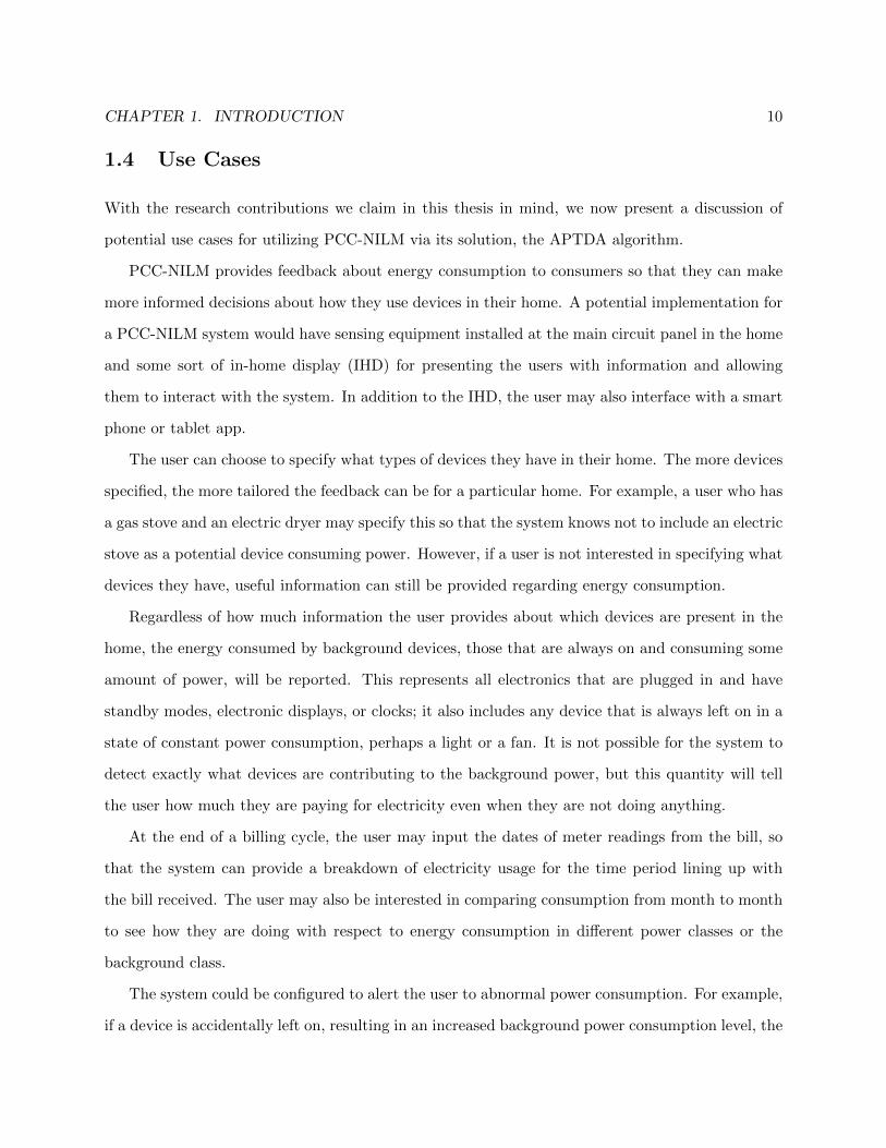
2.1 AC Power Primer
In the United States, residential buildings typically have an AC power distribution system that
is supplied by three wires: two live wires and one neutral/ground wire. The live wires each have
voltage signals, with reference to the neutral wire, at 60 Hz and 120 V RMS (approximately 170 V
peak to peak). There is a phase difference between the two voltages of 180 degrees and the two
phases are commonly referred to as phase A and phase B. Equations (2.1) and (2.2) describe these
two voltage signals, vA(t) and vB(t). Standard 120 V outlets are supplied by either of these phases.
Larger appliances that require 240 V are supplied by both phases simultaneously by taking the two
phases in reference to each other instead of to the neutral. The voltage in this scenario is described
by vAB(t) in equation (2.3). Figure 2.1 shows what each of these signals looks like.
vA(t) =√
2 · 120 · sin(2π · 60 · t) (2.1)
vB(t) =√
2 · 120 · sin(2π · 60 · t− π) = −vA(t) (2.2)
vAB(t) = vA(t)− vB(t) =√
2 · 240 · sin(2π · 60 · t) (2.3)
When a device is connected and turned on, the voltage induces a current, i(t). In devices that
contain only linear circuit elements (resistors, capacitors, and inductors), i(t) will be sinusoidal
with the same fundamental frequency as the voltage signal, though its amplitude and phase may

CHAPTER 2. DATA COLLECTION 14
differ. In general, for devices with non-linear elements, the induced current will be periodic but will
include additional harmonic content that precludes it from being modeled by a simple sinusoid. The
current on a particular phase of the power distribution system is the superposition of the current
drawn by all of the devices on that phase. For example, on phase A this is expressed as:
iA(t) =∑d∈DA
id(t) (2.4)
where DA represents the set of all devices connected to phase A.
The power consumed by a device over some period of time is calculated as the average of the
product of the current and voltage:
Pavg =1
t2 − t1
∫ t2
t1
v(t)i(t) dt (2.5)
Chapter 2 of [8] provides an excellent treatment on how this power may be computed robustly using
a DFT-based approach based on the assumption that the voltage signal is accurately modeled by
a sinusoid, as in (2.1).
2.2 Methods for Monitoring Device-Level Ground Truth
In this section, we consider the tasks of collecting power data and of monitoring all of the electrical
devices in a home. For our purposes, we are interested in tracking when each device turns on or
off, not necessarily capturing the device’s power consumption.
First, it is not trivial to exhaustively catalog all of the electrical devices that are present in
a home. A more exhaustive cataloging would also include tracing each of the outlets and light
switches to determine which circuit from the panel they belonged to and also what phase that
circuit is on. This is a procedure that takes time and is highly intrusive.
Second, it must be determined for each device how to track its operation so that its contribution
to the aggregate power can be labeled. Different devices must be monitored in different ways. We
can broadly differentiate the devices according to how they connect to the power of the home
and thus how they can be monitored. We differentiate between simply monitoring activity and
monitoring power consumption. Monitoring activity refers to being able to distinguish when a

CHAPTER 2. DATA COLLECTION 15
device changes operating states (for two-state devices this would be either turning on or off).
Monitoring power consumption means measuring the actual consumption of the device at all times.
We distinguish 4 classes into which most devices in a home can be placed. They are as follows:
• Plug devices
• Split-phase devices (240 V)
• Hardwired devices (single phase)
• Lights on switches
Here, for each of these four classes, we describe what they are and also how they can be
monitored both for activity and power consumption. Where informative, we include a few examples
of each type of device, but these example devices are by no means exhaustive.
We begin with plug devices. These generally make up the majority of devices in a home:
everything that plugs into an outlet. We can further break them down into stationary and movable
devices. Stationary devices are those that are plugged into one outlet and are never relocated.
Movable devices encompass those that do not have a permanent home but may be relocated and
plugged as needed and where needed. Some examples of movable plug devices include cell phone
chargers, laptops, vacuum cleaners, and irons.
The activity of plug devices is most accurately monitored with some sort of plug meter that
reports the power consumption of the device plugged into it. Movable plug devices present a special
challenge because care must be taken to ensure that the plug meter is always kept with the same
device.
Next, we consider split-phase devices, appliances that require 240 V and are wired on a dedicated
circuit across both phases of the home’s power distribution panel. Examples include HVAC systems,
large window air conditioner units, stoves, ovens, dryers, water heaters, and heat pumps. Many of
these appliances may also have natural gas powered versions in which case they may then consume
much less electricity and perhaps be only a plug-in or hardwired single phase device.
It is common for these devices to be placed on dedicated circuits where no other devices are
present. In this case, their activity may be monitored by monitoring the current on each of the

CHAPTER 2. DATA COLLECTION 16
circuits at the panel using current clamps. Monitoring the voltage for each of the circuits would
allow for their power consumption to be monitored as well.
Some split-phase devices (typically dryers and large window air conditioners but some others
as well) use special 240 V plugs and are not hardwired to the circuit panel, but monitoring them
at the panel is preferable for uniformity. The shapes of 240 V plugs also vary according to the
amperage that the device requires, so 240 V plug meters would need to take this additional detail
into account.
We now consider hardwired single-phase devices. These are devices that are hardwired to a
single phase of the distribution panel; they do not have plugs. They may be located on a dedicated
circuit, but this may depend on the particular device, local building code standards, and the
electrician that wired it. There are usually not more than a few of these per home, and some
homes may not contain any such devices. Typical examples of these include garage door openers,
dishwashers, and garbage disposals.
These are more difficult to isolate unless they have a dedicated circuit that is not shared with
other devices. In this case, their activity can be monitored much like the split-phase devices, by
monitoring their voltage and current at the panel. For situations where they are not on dedicated
circuits, their activity must be monitored at the device. This can be done by using sensors that
monitor other externals that would indicate that the device is in operation (such as sound or
vibration). Such sensing would not monitor power consumption but only whether the device is
operating or not. The difficulty of monitoring power consumption for these devices varies depending
on how accessible the wires connecting the device are. Dishwashers, for example, are particularly
challenging in this regard.
The final category of devices that we consider are lights on switches. In this category, we do
not include lamps that plug in but only those lights that are controlled by light switches. These are
in some sense a special case of single-phase hardwired devices because they don’t have plugs, but
because they are typically present in most rooms and have certain distinguishing characteristics, we
treat them as a separate category. The lights may be of any type: fluorescent (tube and compact),
incandescent, or LED, to name a few. Some lights may be actuated by motion sensors, and these

CHAPTER 2. DATA COLLECTION 17
would be included in this category as well.
It is not typical for light switches to be on dedicated circuits. They are normally present on
circuits that also provide power to outlets as well. For this reason monitoring the circuit may not
be sufficient for isolating the lights. Light intensity sensors are a reasonable solution for monitoring
the activity of these types of lights, but this will not monitor the power consumed by the lights.
We now proceed to describe the system we used for measuring the aggregate power consumption
for the BLUED dataset and monitoring the ground truth activity of devices in the house.
2.3 BLUED Dataset
The BLUED dataset (Building-Level fUlly labeled dataset for Electricity Disaggregation) was col-
lected during October 2011 at a single family house in Pittsburgh, Pennsylvania. There were
approximately 50 electrical devices monitored in the home. The goal of the data collection was to
collect the aggregate power for each phase of the house and label it with timestamps of when each
device turned on or off.
When we first set out to collect this data, we did not consider fully submetering the house in
order to have ground truth power consumption for each of the devices or subcircuits. Our primary
concern was to monitor the devices in the home in such a way as to be able to label the aggregate
signal with the locations of events.
In this section, we provide a detailed description of the process used to collect and label the
data. It is important to understand that two independent data collection tasks were happening
simultaneously, one for making aggregate measurements and the other for monitoring the ground
truth activity of devices. We will refer to these two processes as aggregate measurement and ground
truth monitoring.
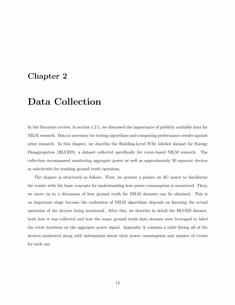
2.3.1 Measurement and Monitoring
Figure 2.2 shows the overall system architecture for the BLUED data collection. Two computers
were used to collect data. At the top of the figure is the panel-level computer; this was used for
monitoring all of the measurements made directly at the circuit panel. These include the aggregate
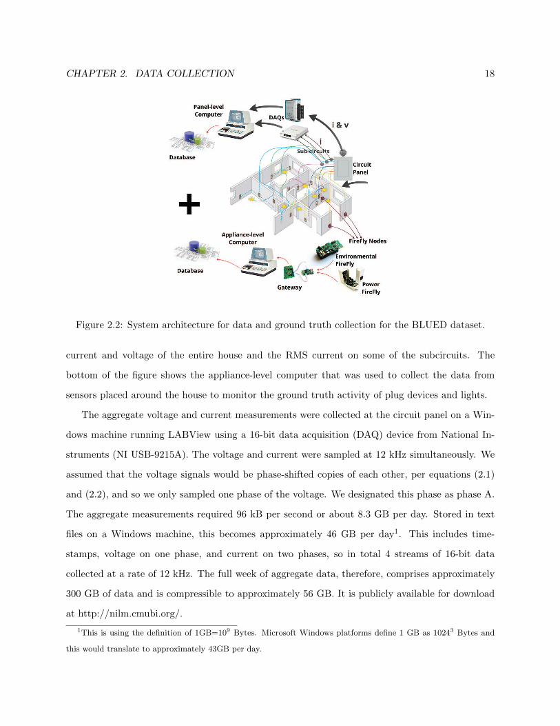
CHAPTER 2. DATA COLLECTION 18
Figure 2.2: System architecture for data and ground truth collection for the BLUED dataset.
current and voltage of the entire house and the RMS current on some of the subcircuits. The
bottom of the figure shows the appliance-level computer that was used to collect the data from
sensors placed around the house to monitor the ground truth activity of plug devices and lights.
The aggregate voltage and current measurements were collected at the circuit panel on a Win-
dows machine running LABView using a 16-bit data acquisition (DAQ) device from National In-
struments (NI USB-9215A). The voltage and current were sampled at 12 kHz simultaneously. We
assumed that the voltage signals would be phase-shifted copies of each other, per equations (2.1)
and (2.2), and so we only sampled one phase of the voltage. We designated this phase as phase A.
The aggregate measurements required 96 kB per second or about 8.3 GB per day. Stored in text
files on a Windows machine, this becomes approximately 46 GB per day1. This includes time-
stamps, voltage on one phase, and current on two phases, so in total 4 streams of 16-bit data
collected at a rate of 12 kHz. The full week of aggregate data, therefore, comprises approximately
300 GB of data and is compressible to approximately 56 GB. It is publicly available for download
at http://nilm.cmubi.org/.
1This is using the definition of 1GB=109 Bytes. Microsoft Windows platforms define 1 GB as 10243 Bytes and
this would translate to approximately 43GB per day.
CHAPTER 2. DATA COLLECTION 19
To measure the aggregate current, we used two QX 201-CT split-core current transformers
from The Energy Detective2. The current clamps were placed around the two incoming power
mains and connected to the DAQ. For voltage measurements, a voltage transformer from Pico
Technology3 (PICO PROBE TA041) was used to step down the 120V AC voltage to ±7V AC. The
voltage was monitored at an outlet close to the circuit panel. After completing the data collection,
we discovered that the current sensors used for measuring the electrical current in the mains had a
cutoff frequency of approximately 300 Hz, which meant that the current signals, although sampled
at 12 kHz, would only provide useful information for up to the 5th harmonic of the current.
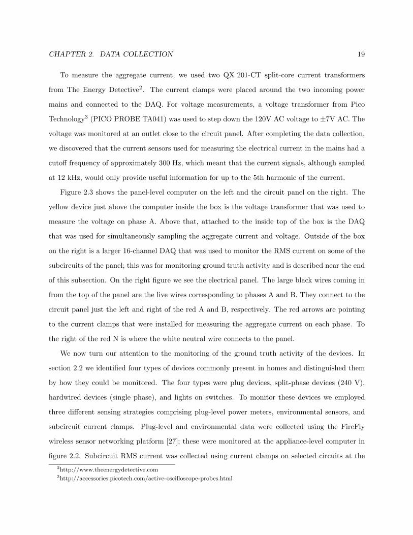
Figure 2.3 shows the panel-level computer on the left and the circuit panel on the right. The
yellow device just above the computer inside the box is the voltage transformer that was used to
measure the voltage on phase A. Above that, attached to the inside top of the box is the DAQ
that was used for simultaneously sampling the aggregate current and voltage. Outside of the box
on the right is a larger 16-channel DAQ that was used to monitor the RMS current on some of the
subcircuits of the panel; this was for monitoring ground truth activity and is described near the end
of this subsection. On the right figure we see the electrical panel. The large black wires coming in
from the top of the panel are the live wires corresponding to phases A and B. They connect to the
circuit panel just the left and right of the red A and B, respectively. The red arrows are pointing
to the current clamps that were installed for measuring the aggregate current on each phase. To
the right of the red N is where the white neutral wire connects to the panel.
We now turn our attention to the monitoring of the ground truth activity of the devices. In
section 2.2 we identified four types of devices commonly present in homes and distinguished them
by how they could be monitored. The four types were plug devices, split-phase devices (240 V),
hardwired devices (single phase), and lights on switches. To monitor these devices we employed
three different sensing strategies comprising plug-level power meters, environmental sensors, and
subcircuit current clamps. Plug-level and environmental data were collected using the FireFly
wireless sensor networking platform [27]; these were monitored at the appliance-level computer in
figure 2.2. Subcircuit RMS current was collected using current clamps on selected circuits at the
2http://www.theenergydetective.com3http://accessories.picotech.com/active-oscilloscope-probes.html

CHAPTER 2. DATA COLLECTION 20
A B
N
Figure 2.3: Left: The panel-level computer setup. Right: The circuit panel in the house where
BLUED was collected. The red arrows point out the two current clamps monitoring the current
on phases A and B. The white neutral wire is visible to the right of the red N.
panel and stored by the panel-level computer. We will first describe the collection scheme for the
FireFly devices and then the subcircuit monitoring.
Figure 2.4 shows what the FireFly sensors look like. On the left is the plug sensor. It plugs
into an outlet and the device to be monitored is plugged into it. The environmental sensor is
battery powered and operates on AA batteries. While they are capable of measuring a variety
of characteristics, we only used them to monitor light intensity for lights that were not able to
be monitored by plug meters. We used 28 FireFly plug meters and 12 FireFly environmental
sensors in the ground truth monitoring. Each of the FireFly devices reported values every 640 ms
(approximately 1.5 Hz). A central gateway connected to the appliance-level computer timestamped
each incoming message and locally stored the data.
The plug meters measured voltage and current internally at a rate of 1 kHz and locally computed
real power averaged over one second. The devices also reported other quantities such as voltage
frequency, RMS voltage, RMS current, and energy accumulation, but for our purposes we were
only interested in the real power consumption. Figure 2.5 shows a 9-hour sample of data taken
from phase A of the BLUED dataset. The top plot shows the output of the FireFly plug meter
that monitored the refrigerator and the bottom plot shows the aggregate power on phase A for the
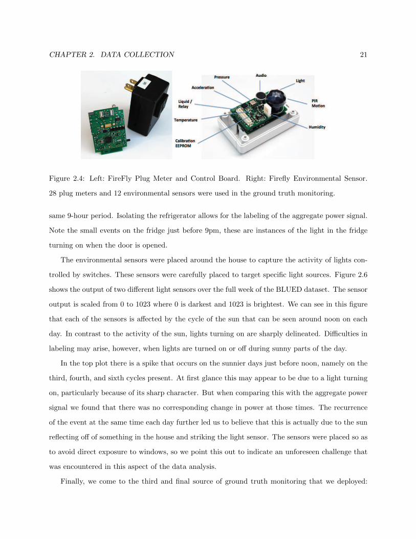
CHAPTER 2. DATA COLLECTION 21
Figure 2.4: Left: FireFly Plug Meter and Control Board. Right: Firefly Environmental Sensor.
28 plug meters and 12 environmental sensors were used in the ground truth monitoring.
same 9-hour period. Isolating the refrigerator allows for the labeling of the aggregate power signal.
Note the small events on the fridge just before 9pm, these are instances of the light in the fridge
turning on when the door is opened.
The environmental sensors were placed around the house to capture the activity of lights con-
trolled by switches. These sensors were carefully placed to target specific light sources. Figure 2.6
shows the output of two different light sensors over the full week of the BLUED dataset. The sensor
output is scaled from 0 to 1023 where 0 is darkest and 1023 is brightest. We can see in this figure
that each of the sensors is affected by the cycle of the sun that can be seen around noon on each
day. In contrast to the activity of the sun, lights turning on are sharply delineated. Difficulties in
labeling may arise, however, when lights are turned on or off during sunny parts of the day.
In the top plot there is a spike that occurs on the sunnier days just before noon, namely on the
third, fourth, and sixth cycles present. At first glance this may appear to be due to a light turning
on, particularly because of its sharp character. But when comparing this with the aggregate power
signal we found that there was no corresponding change in power at those times. The recurrence
of the event at the same time each day further led us to believe that this is actually due to the sun
reflecting off of something in the house and striking the light sensor. The sensors were placed so as
to avoid direct exposure to windows, so we point this out to indicate an unforeseen challenge that
was encountered in this aspect of the data analysis.
Finally, we come to the third and final source of ground truth monitoring that we deployed:

CHAPTER 2. DATA COLLECTION 22
18:00 19:30 21:00 22:30 00:00 01:30 03:000
200
400
600
800P
(Watts)
18:00 19:30 21:00 22:30 00:00 01:30 03:000
500
1000
1500
t
PA(W
atts)
Figure 2.5: Top: Power consumption of a refrigerator as reported by a FireFly plug sensor.
Bottom: Aggregate power consumption over the same time period on phase A.
12:00 12:00 12:00 12:00 12:00 12:00 12:00 12:000
200
400
600
Light
12:00 12:00 12:00 12:00 12:00 12:00 12:00 12:000
200
400
600
t
Light
Figure 2.6: This figure shows two different light sensors operating over the full week that the
BLUED dataset was collected. Note the effect of daylight on each sensor. The scaling on the
sensors goes from 0 to 1023 where 0 is the darkest and 1023 is brightest.
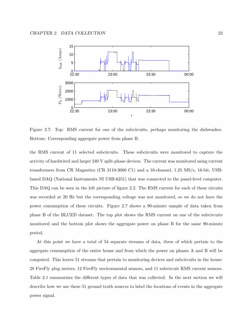
CHAPTER 2. DATA COLLECTION 23
22:30 23:00 23:30 00:000
5
10
15
IRMS(A
mps)
22:30 23:00 23:30 00:000
1000
2000
3000
t
PB(W
atts)
Figure 2.7: Top: RMS current for one of the subcircuits, perhaps monitoring the dishwasher.
Bottom: Corresponding aggregate power from phase B.
the RMS current of 11 selected subcircuits. These subcircuits were monitored to capture the
activity of hardwired and larger 240 V split-phase devices. The current was monitored using current
transformers from CR Magnetics (CR 3110-3000 C1) and a 16-channel, 1.25 MS/s, 16-bit, USB-
based DAQ (National Instruments NI USB-6251) that was connected to the panel-level computer.
This DAQ can be seen in the left picture of figure 2.2. The RMS current for each of these circuits
was recorded at 20 Hz but the corresponding voltage was not monitored, so we do not have the
power consumption of these circuits. Figure 2.7 shows a 90-minute sample of data taken from
phase B of the BLUED dataset. The top plot shows the RMS current on one of the subcircuits
monitored and the bottom plot shows the aggregate power on phase B for the same 90-minute
period.
At this point we have a total of 54 separate streams of data, three of which pertain to the
aggregate consumption of the entire house and from which the power on phases A and B will be
computed. This leaves 51 streams that pertain to monitoring devices and subcircuits in the house:
28 FireFly plug meters, 12 FireFly environmental sensors, and 11 subcircuit RMS current sensors.
Table 2.1 summarizes the different types of data that was collected. In the next section we will
describe how we use these 51 ground truth sources to label the locations of events in the aggregate
power signal.
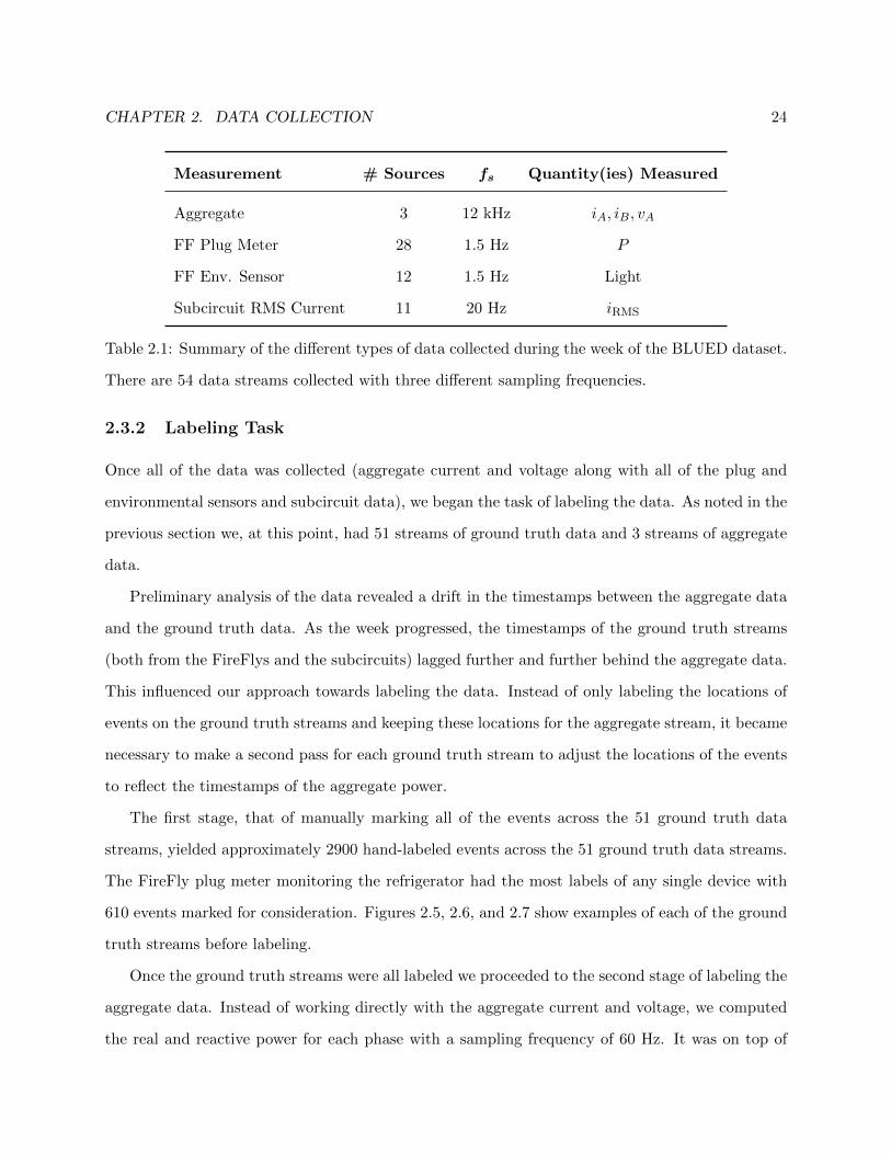
CHAPTER 2. DATA COLLECTION 24
Measurement # Sources fs Quantity(ies) Measured
Aggregate 3 12 kHz iA, iB, vA
FF Plug Meter 28 1.5 Hz P
FF Env. Sensor 12 1.5 Hz Light
Subcircuit RMS Current 11 20 Hz iRMS
Table 2.1: Summary of the different types of data collected during the week of the BLUED dataset.
There are 54 data streams collected with three different sampling frequencies.
2.3.2 Labeling Task
Once all of the data was collected (aggregate current and voltage along with all of the plug and
environmental sensors and subcircuit data), we began the task of labeling the data. As noted in the
previous section we, at this point, had 51 streams of ground truth data and 3 streams of aggregate
data.
Preliminary analysis of the data revealed a drift in the timestamps between the aggregate data
and the ground truth data. As the week progressed, the timestamps of the ground truth streams
(both from the FireFlys and the subcircuits) lagged further and further behind the aggregate data.
This influenced our approach towards labeling the data. Instead of only labeling the locations of
events on the ground truth streams and keeping these locations for the aggregate stream, it became
necessary to make a second pass for each ground truth stream to adjust the locations of the events
to reflect the timestamps of the aggregate power.
The first stage, that of manually marking all of the events across the 51 ground truth data
streams, yielded approximately 2900 hand-labeled events across the 51 ground truth data streams.
The FireFly plug meter monitoring the refrigerator had the most labels of any single device with
610 events marked for consideration. Figures 2.5, 2.6, and 2.7 show examples of each of the ground
truth streams before labeling.
Once the ground truth streams were all labeled we proceeded to the second stage of labeling the
aggregate data. Instead of working directly with the aggregate current and voltage, we computed
the real and reactive power for each phase with a sampling frequency of 60 Hz. It was on top of

CHAPTER 2. DATA COLLECTION 25
this 60 Hz power data that we overlaid the locations of the events that had been labeled on each
of the 51 ground truth streams.
Because of the time delay between the aggregate monitoring system and the ground truth data
the locations of the overlaid events did not line up with the observed changes in the aggregate
power signal. It was therefore necessary to manually adjust the locations of every event so that it
would correspond to the proper location in the aggregate power. Unfortunately the offset was not
constant so it was necessary to handle each event individually.
Figure 2.8 shows a close-up of one of the refrigerator compressor cycles and highlights where
the FireFly events and aggregate events are with respect to each other. The top plot shows the
cycle of the refrigerator as measured by the FireFly plug meter and the bottom plot shows the
corresponding aggregate power consumption on phase A. The red circles indicate where the ground
truth event locations were placed during the first stage of labeling and the green squares represent
the adjusted locations of the events on the aggregate power. In this example the gap between the
two timestamps is approximately 19 seconds but it would grow to nearly 50 seconds before the data
collection was over.
Figure 2.9 shows, for each of the refrigerator’s events, the difference in seconds between the
timestamp in the aggregate power and the timestamp in the FireFly plug meter ground truth. With
reference to figure 2.8 above this is the difference between the green square and the corresponding
red circle. We fit a linear model to the drift and discovered that the timestamps drift apart at a
rate of approximately 8 seconds per day. Early in the morning of the 6th day of data collection the
aggregate collection system went down for approximately 70 seconds. When it came back online
we see that the time gap went from 46 seconds to 7 seconds, but it promptly continued increasing
at the same rate.
Figure 2.10 shows that the problem was not isolated to the FireFly sensors but that the RMS
current captured on the subcircuits of the panel also experienced the same drift of 8 seconds per
day with respect to the aggregate timestamps. This was surprising because the same computer was
simultaneously capturing the aggregate current and voltage on each phase as well as the subcircuits,
though with two different data acquisition devices.
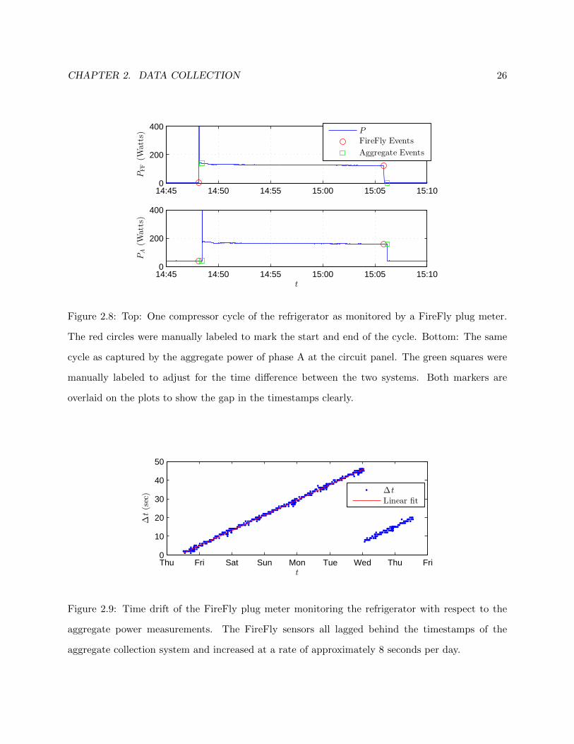
CHAPTER 2. DATA COLLECTION 26
14:45 14:50 14:55 15:00 15:05 15:100
200
400
PFF(W
atts)
14:45 14:50 14:55 15:00 15:05 15:100
200
400
t
PA(W
atts)
P
FireFly Events
Aggregate Events
Figure 2.8: Top: One compressor cycle of the refrigerator as monitored by a FireFly plug meter.
The red circles were manually labeled to mark the start and end of the cycle. Bottom: The same
cycle as captured by the aggregate power of phase A at the circuit panel. The green squares were
manually labeled to adjust for the time difference between the two systems. Both markers are
overlaid on the plots to show the gap in the timestamps clearly.
Thu Fri Sat Sun Mon Tue Wed Thu Fri0
10
20
30
40
50
t
∆t(sec) ∆t
Linear fit
Figure 2.9: Time drift of the FireFly plug meter monitoring the refrigerator with respect to the
aggregate power measurements. The FireFly sensors all lagged behind the timestamps of the
aggregate collection system and increased at a rate of approximately 8 seconds per day.
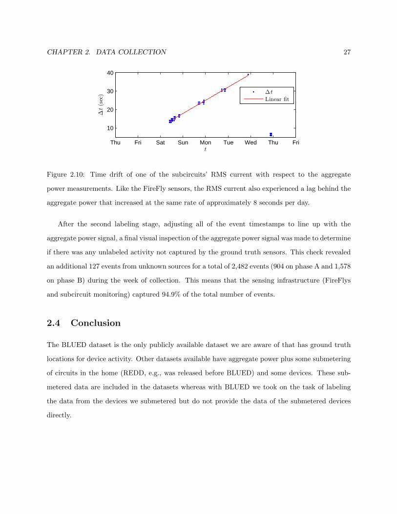
CHAPTER 2. DATA COLLECTION 27
Thu Fri Sat Sun Mon Tue Wed Thu Fri
10
20
30
40
t
∆t(sec) ∆t
Linear fit
Figure 2.10: Time drift of one of the subcircuits’ RMS current with respect to the aggregate
power measurements. Like the FireFly sensors, the RMS current also experienced a lag behind the
aggregate power that increased at the same rate of approximately 8 seconds per day.
After the second labeling stage, adjusting all of the event timestamps to line up with the
aggregate power signal, a final visual inspection of the aggregate power signal was made to determine
if there was any unlabeled activity not captured by the ground truth sensors. This check revealed
an additional 127 events from unknown sources for a total of 2,482 events (904 on phase A and 1,578
on phase B) during the week of collection. This means that the sensing infrastructure (FireFlys
and subcircuit monitoring) captured 94.9% of the total number of events.
2.4 Conclusion
The BLUED dataset is the only publicly available dataset we are aware of that has ground truth
locations for device activity. Other datasets available have aggregate power plus some submetering
of circuits in the home (REDD, e.g., was released before BLUED) and some devices. These sub-
metered data are included in the datasets whereas with BLUED we took on the task of labeling
the data from the devices we submetered but do not provide the data of the submetered devices
directly.
Chapter 3
Event Detection
In this chapter, we turn our attention to the problem of event detection for the Non-Intrusive
Load Monitoring (NILM) problem. In the literature review, in section 1.2, we mentioned the
standard event-based approach to NILM that contains four distinct stages: event detection, feature
extraction, classification, and energy disaggregation. Because each stage builds on the previous
ones, event detection is extremely important. Errors in detection propagate to each of the other
stages.
We begin this chapter with a detailed treatment of a log-likelihood ratio detector. In this
treatment, we define the detector and its parameters and walk through an example of how it
works. After the initial presentation of the detector, we do a parameter sweep on phase A of the
BLUED dataset. The parameter sweep generates 1,456 unique detectors and will provide more
insight into how the various parameters affect detection. Then, using the results of the parameter
sweep, we present performance results in terms of traditional detection metrics, i.e., false positive
and false negative rates. This discussion of performance will then lead us to consider the challenges
that the traditional event-based NILM approach faces. It will also help to motivate the desire for
a NILM solution that is robust to errors in event detection.
The chapter is organized as follows. Section 3.1 defines the log-likelihood ratio detector and
illustrates how each of its parameters affect its output. Section 3.2 describes a parameter sweep
of the log-likelihood ratio detector conducted on phase A BLUED dataset. It contains a more in-
28

CHAPTER 3. EVENT DETECTION 29
depth discussion of how the detector parameters affect detection in practice. Section 3.3 continues
analysis of the results from the parameter sweep but in the context of traditional detection metrics
relating to true positives, false positives, and misses. We conclude the chapter in section 3.4 and
motivate the need to develop techniques that are robust to errors in event detection.
3.1 Log-Likelihood Ratio Detector
In this section, we present a modified version of the log-likelihood ratio event detector. A version
of this detector first appeared in [28] with the modified version that we are using appearing in [29].
In much of the NILM detection literature, the focus has been on developing detection algo-
rithms that perform well under traditional detection metrics. For reasons that will be discussed
during the course of this chapter, this is a difficult approach because power signals in different
environments will require different event detectors and without some sort of ground truth (which
can be difficult, expensive, and time consuming to obtain) training these parameters may not be
possible. Changes in power consumption patterns will also change the best parameters to use when
good event detection metrics are the goal.
The event detection algorithm takes as input a power signal, P , and outputs an events vector,
e = [e1, . . . , eM ], that contains indices of locations of “events.” For the non-intrusive load monitor-
ing problem, these events correspond to abrupt changes in the power signal that indicate a device
turning on or off. Figure 3.1 shows a zoomed-in view of a 1 Hz power signal with a device, in this
case a refrigerator, turning on. We see in the figure that the power level is fairly constant at around
40 Watts for the first 18 samples and then power consumption increases starting at sample 19.
There is transient activity during samples 19 and 20, before the power levels out again beginning at
sample 21. An event detector should recognize the abrupt change in behavior and flag the presence
of an event. In this case, we would consider the detection a success if the event is returned at
sample 18, 19, 20, or 21.
We now proceed with a walk through example of how the detector works. We present the
algorithm in an offline version in which all of the datapoints of the power signal are stored in
memory and are available to us. The algorithm can also be run on streaming data with the

CHAPTER 3. EVENT DETECTION 30
0 5 10 15 20 25 30 35 400
100
200
300
400
500
n
P
Figure 3.1: Example of an ‘on’ event.
necessary modifications.
We begin with a power signal P [n], n = 1, . . . , N , with sampling rate fs. For each point of the
power signal, P [n], we want to determine whether P [n] is more likely to belong to the w0 points
preceding P [n] or the w1 points following P [n]. We first recognize that electrical noise on the power
signal, due to the law of large numbers, can be approximated as a normal distribution. When we
ask, then, whether P [n] is more likely to belong to either a window of events before or after P [n], we
can evaluate the likelihood that P [n] belongs to a Gaussian distribution with mean and variance
of the sample mean and variance of the pre- and post-windows, respectively. This allows us to
formulate the test statistic S[n], n = w0 + 1, . . . , N − w1, as the log of the ratio of the likelihood
that P [n] belongs to the post-window to the likelihood that it belongs to the pre-window:
S[n] = ln
(N (P [n]|µ1,n, σ1,n)
N (P [n]|µ0,n, σ0,n)
)= ln
(σ0,nσ1,n
)+
(P [n]− µ0,n)2
2 · σ20,n− (P [n]− µ1,n)2
2 · σ21,n(3.1)
where N indicates the normal distribution and µ0,n, σ20,n, µ1,n, and σ20,n are the sample mean and

CHAPTER 3. EVENT DETECTION 31
variance of the pre- and post-windows, respectively:
µ0,n =1
w0
n−1∑k=n−w0
P [k]
µ1,n =1
w1
n+w1∑k=n+1
P [k]
σ20,n =1
w0 − 1
k−1∑k=n−w0
(P [k]− µ0,n)2
σ21,n =1
w1 − 1
n+w1∑k=n+1
(P [k]− µ1,n)2
Note that S[n] is not defined for n ≤ w0 or for n > N −w1 because these samples are necessary
for computing the mean and variance of the pre- and post-windows at the ends of the power signal.
By convention, we will assign these values to 0 so that the lengths of S and P are identical. This
gives the full definition of S[n] then, as:
S[n] =
0 , n < w0 + 1
ln(σ0,nσ1,n
)+
(P [n]−µ0,n)2
2·σ20,n
− (P [n]−µ1,n)2
2·σ21,n
, w0 + 1 ≤ n ≤ N − w1
0 , n > N − w1
(3.2)
Figure 3.2 shows the same event as figure 3.1 in the top plot but the bottom plot shows the
corresponding S[n] when the pre- and post-event window lengths are both 6 samples, that is,
w0 = w1 = 6. The x’s at the beginning and end of S[n] show where S is forced to be zero because
the head and tail must be reserved for computing the pre- and post-window mean and variance.
From the test statistic, S[n], we create a modified log-likelihood ratio l[n] by forcing it to be
zero when the difference between the pre- and post-window means is below a threshold θP . In the
remainder of the discussion when we refer to the log-likelihood ratio, we mean this signal l[n]:
l[n] =
S[n] |µ1,n − µ0,n| ≥ θP
0 else
(3.3)
Traditionally in likelihood ratio tests, the likelihood ratio is compared to a desired threshold
value and an event is indicated when that threshold is exceeded. Instead of attempting to find a
threshold for the likelihood ratio we, following the method used in [29], employ a voting scheme on

CHAPTER 3. EVENT DETECTION 32
0 5 10 15 20 25 30 35 400
200
400
600
P
0 5 10 15 20 25 30 35 40−40
−20
0
20
40
n
S
Figure 3.2: Top: Power signal for a refrigerator ’on’ event. Bottom: corresponding S[n] computed
with the pre- and post-window lengths both equal to 6 samples.
the likelihood ratio. Specifically, we slide a voting window of length wV across the log-likelihood
l[n] and assign a vote in each shift of the window to the point with the largest magnitude (in
absolute value). These votes are accumulated in a signal V such that the value V [n] contains the
number of votes that the nth sample has registered. If there is no maximum in a particular shift of
the voting window, i.e., all of the l[n] for that window are 0, then no vote is assigned.
Figure 3.3 shows the same ‘on’ event from figures 3.1 and 3.2, but here in the middle we show
the absolute value of the modified log-likelihood ratio, l[n], and on the bottom we show the number
of votes that each point receives, V [n]. The pre- and post-window lengths are both 6 samples,
and the voting window length is 10 samples. The middle figure also has superimposed on it the
voting window to indicate that it is over |l[n]| that the votes are counted. In the bottom figure
there are wV -1 indices that have x’s at the beginning and end of the plot. This indicates that the
voting window will not fully traverse these points, so they are omitted from the voting results. This
example is shown for illustrative purposes. In practice the length of the power signal, N , is much
larger than the voting window so the ignored points are negligible.
In this figure, we see that sample 19 has the largest magnitude likelihood and therefore receives
the maximum 10 votes. Sample 26, though visually no event is present, receives 6 votes and
sample 15 receives 3 votes. We can see here that, while we avoided thresholding the value of l[n]

CHAPTER 3. EVENT DETECTION 33
0 5 10 15 20 25 30 35 400
500
P
0 5 10 15 20 25 30 35 400
20
40
|l|
0 5 10 15 20 25 30 35 400
5
10
V
n
Figure 3.3: Top: Power signal for a refrigerator ‘on’ event. Middle: Corresponding |l[n]| computed
with the pre- and post-window lengths both equal to 6 samples. Bottom: The number of votes
received by each point with a voting window length of 10 samples. The voting window is shown on
the middle plot to indicate that it is over |l[n]| that the votes are accumulated.
as is typically done in likelihood ratio testing, the voting threshold, θV , can be a very influential
parameter.
With all of this in place, the final step of the detector is to tally up the votes and assign events.
The final list of events, e, is determined by taking all of the indices that received a number of votes
greater than or equal to the voting threshold, θV :
e = {n ∈ {1, . . . , N} : V [n] ≥ θV } (3.4)
Note that the voting threshold θV must be less than or equal to the length of the voting window, wV ,
because each point can receive at most one vote per shift of the voting window. We turn our
attention now to a discussion of each of the parameters in the LLR detector in the context of a
parameter sweep on the BLUED dataset.
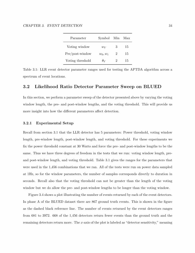
CHAPTER 3. EVENT DETECTION 34
Parameter Symbol Min Max
Voting window wV 3 15
Pre/post-window w0, w1 2 15
Voting threshold θV 2 15
Table 3.1: LLR event detector parameter ranges used for testing the APTDA algorithm across a
spectrum of event locations.
3.2 Likelihood Ratio Detector Parameter Sweep on BLUED
In this section, we perform a parameter sweep of the detector presented above by varying the voting
window length, the pre- and post-window lengths, and the voting threshold. This will provide us
more insight into how the different parameters affect detection.
3.2.1 Experimental Setup
Recall from section 3.1 that the LLR detector has 5 parameters: Power threshold, voting window
length, pre-window length, post-window length, and voting threshold. For these experiments we
fix the power threshold constant at 30 Watts and force the pre- and post-window lengths to be the
same. Thus we have three degrees of freedom in the tests that we run: voting window length, pre-
and post-window length, and voting threshold. Table 3.1 gives the ranges for the parameters that
were used in the 1,456 combinations that we ran. All of the tests were run on power data sampled
at 1Hz, so for the window parameters, the number of samples corresponds directly to duration in
seconds. Recall also that the voting threshold can not be greater than the length of the voting
window but we do allow the pre- and post-window lengths to be longer than the voting window.
Figure 3.4 shows a plot illustrating the number of events returned by each of the event detectors.
In phase A of the BLUED dataset there are 867 ground truth events. This is shown in the figure
as the dashed black reference line. The number of events returned by the event detectors ranges
from 681 to 3972. 668 of the 1,456 detectors return fewer events than the ground truth and the
remaining detectors return more. The x-axis of the plot is labeled as “detector sensitivity,” meaning
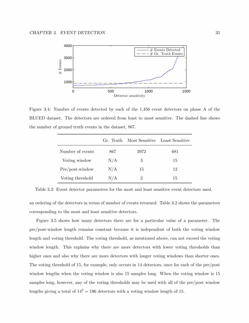
CHAPTER 3. EVENT DETECTION 35
0 500 1000 1500
1000
2000
3000
4000
Detector sensitivity
#Events
# Events Detected# Gr. Truth Events
Figure 3.4: Number of events detected by each of the 1,456 event detectors on phase A of the
BLUED dataset. The detectors are ordered from least to most sensitive. The dashed line shows
the number of ground truth events in the dataset, 867.
Gr. Truth Most Sensitive Least Sensitive
Number of events 867 3972 681
Voting window N/A 3 15
Pre/post-window N/A 15 12
Voting threshold N/A 2 15
Table 3.2: Event detector parameters for the most and least sensitive event detectors used.
an ordering of the detectors in terms of number of events returned. Table 3.2 shows the parameters
corresponding to the most and least sensitive detectors.
Figure 3.5 shows how many detectors there are for a particular value of a parameter. The
pre/post-window length remains constant because it is independent of both the voting window
length and voting threshold. The voting threshold, as mentioned above, can not exceed the voting
window length. This explains why there are more detectors with lower voting thresholds than
higher ones and also why there are more detectors with longer voting windows than shorter ones.
The voting threshold of 15, for example, only occurs in 14 detectors, once for each of the pre/post
window lengths when the voting window is also 15 samples long. When the voting window is 15
samples long, however, any of the voting thresholds may be used with all of the pre/post window
lengths giving a total of 142 = 196 detectors with a voting window length of 15.
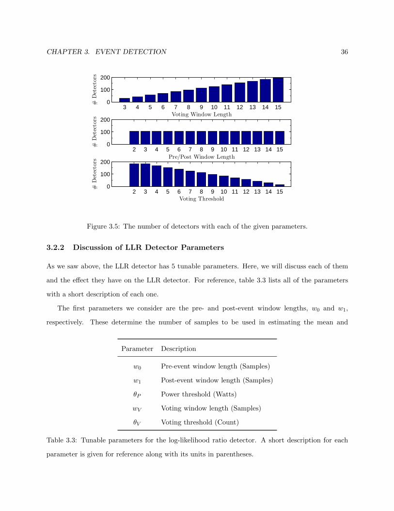
CHAPTER 3. EVENT DETECTION 36
3 4 5 6 7 8 9 10 11 12 13 14 150
100
200
Voting Window Length
#Detectors
2 3 4 5 6 7 8 9 10 11 12 13 14 150
100
200
Pre/Post Window Length
#Detectors
2 3 4 5 6 7 8 9 10 11 12 13 14 150
100
200
Voting Threshold
#Detectors
Figure 3.5: The number of detectors with each of the given parameters.
3.2.2 Discussion of LLR Detector Parameters
As we saw above, the LLR detector has 5 tunable parameters. Here, we will discuss each of them
and the effect they have on the LLR detector. For reference, table 3.3 lists all of the parameters
with a short description of each one.
The first parameters we consider are the pre- and post-event window lengths, w0 and w1,
respectively. These determine the number of samples to be used in estimating the mean and
Parameter Description
w0 Pre-event window length (Samples)
w1 Post-event window length (Samples)
θP Power threshold (Watts)
wV Voting window length (Samples)
θV Voting threshold (Count)
Table 3.3: Tunable parameters for the log-likelihood ratio detector. A short description for each
parameter is given for reference along with its units in parentheses.
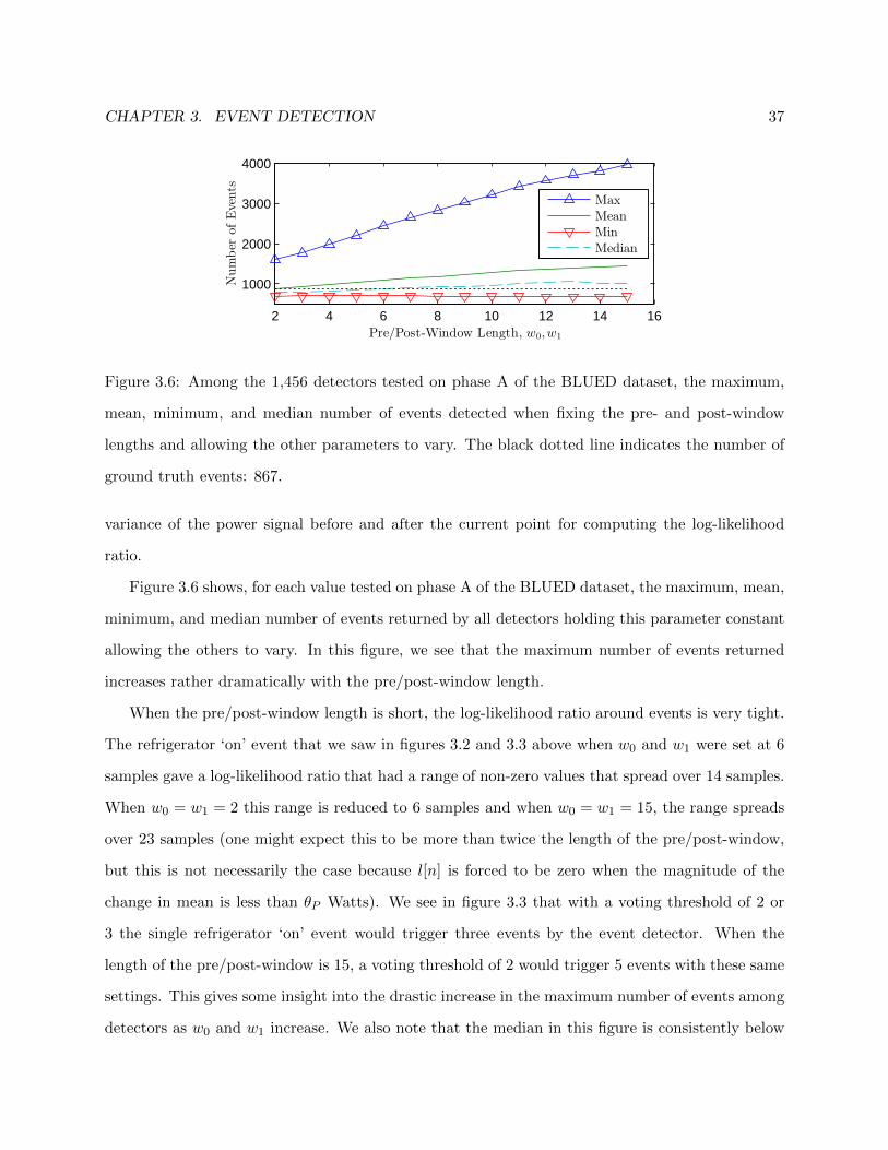
CHAPTER 3. EVENT DETECTION 37
2 4 6 8 10 12 14 16
1000
2000
3000
4000
Number
ofEvents
Pre/Post-Window Length, w0,w1
Max
Mean
Min
Median
Figure 3.6: Among the 1,456 detectors tested on phase A of the BLUED dataset, the maximum,
mean, minimum, and median number of events detected when fixing the pre- and post-window
lengths and allowing the other parameters to vary. The black dotted line indicates the number of
ground truth events: 867.
variance of the power signal before and after the current point for computing the log-likelihood
ratio.
Figure 3.6 shows, for each value tested on phase A of the BLUED dataset, the maximum, mean,
minimum, and median number of events returned by all detectors holding this parameter constant
allowing the others to vary. In this figure, we see that the maximum number of events returned
increases rather dramatically with the pre/post-window length.
When the pre/post-window length is short, the log-likelihood ratio around events is very tight.
The refrigerator ‘on’ event that we saw in figures 3.2 and 3.3 above when w0 and w1 were set at 6
samples gave a log-likelihood ratio that had a range of non-zero values that spread over 14 samples.
When w0 = w1 = 2 this range is reduced to 6 samples and when w0 = w1 = 15, the range spreads
over 23 samples (one might expect this to be more than twice the length of the pre/post-window,
but this is not necessarily the case because l[n] is forced to be zero when the magnitude of the
change in mean is less than θP Watts). We see in figure 3.3 that with a voting threshold of 2 or
3 the single refrigerator ‘on’ event would trigger three events by the event detector. When the
length of the pre/post-window is 15, a voting threshold of 2 would trigger 5 events with these same
settings. This gives some insight into the drastic increase in the maximum number of events among
detectors as w0 and w1 increase. We also note that the median in this figure is consistently below

CHAPTER 3. EVENT DETECTION 38
2 4 6 8 10 12 14 16
1000
2000
3000
4000
Number
ofEvents
Voting Window Length, wV
Max
Mean
Min
Median
Figure 3.7: Among the 1,456 detectors tested on phase A of the BLUED dataset, the maximum,
mean, minimum, and median number of events detected when fixing the voting window length and
allowing the other parameters to vary. The black dotted line indicates the number of ground truth
events: 867.
the mean number of events. This indicates the presence of outliers whose number of detected events
is significantly higher than most of the other detectors with a given pre/post-window length.
Next we consider the length of the voting window, wV . This is the length of a sliding window that
traverses the likelihood ratio for accumulating votes on samples that may be an event. Figure 3.7
shows, for each value tested on phase A of the BLUED dataset, the maximum, mean, minimum, and
median number of events returned by all detectors holding this parameter constant and allowing
the others to vary. The figure shows that neither the maximum nor minimum number of events
detected is explicitly affected by the voting window length.
A longer voting window prevents events that are too close (within the distance of the voting
window) from each getting the maximum number of votes. The event with a higher likelihood
will always obtain the maximum number of votes. This may be undesirable when trying to detect
events in rapid succession. Shortening the window in this type of scenario will cause both events
to obtain the maximum number of votes. Shorter voting windows, however, particularly paired
with longer pre- and post-windows with sprawling likelihood ratios, can lead to a high number of
false positives. In figure 3.3, for example, if the voting window length were 6 instead of 10, then
both points 19 and 26 would receive the maximum 6 votes when only point 19 should be flagged as
an event. We note also in this parameter that the mean consistently exceeds the median number
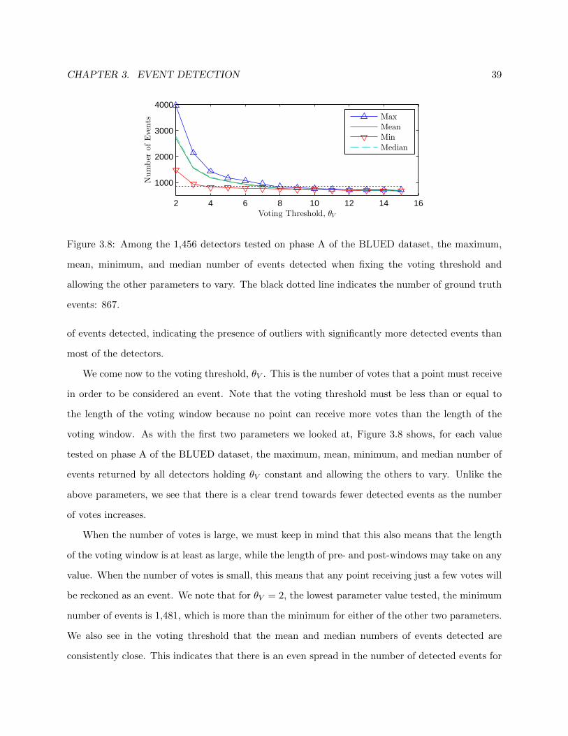
CHAPTER 3. EVENT DETECTION 39
2 4 6 8 10 12 14 16
1000
2000
3000
4000
Voting Threshold, θV
Number
ofEvents
Max
Mean
Min
Median
Figure 3.8: Among the 1,456 detectors tested on phase A of the BLUED dataset, the maximum,
mean, minimum, and median number of events detected when fixing the voting threshold and
allowing the other parameters to vary. The black dotted line indicates the number of ground truth
events: 867.
of events detected, indicating the presence of outliers with significantly more detected events than
most of the detectors.
We come now to the voting threshold, θV . This is the number of votes that a point must receive
in order to be considered an event. Note that the voting threshold must be less than or equal to
the length of the voting window because no point can receive more votes than the length of the
voting window. As with the first two parameters we looked at, Figure 3.8 shows, for each value
tested on phase A of the BLUED dataset, the maximum, mean, minimum, and median number of
events returned by all detectors holding θV constant and allowing the others to vary. Unlike the
above parameters, we see that there is a clear trend towards fewer detected events as the number
of votes increases.
When the number of votes is large, we must keep in mind that this also means that the length
of the voting window is at least as large, while the length of pre- and post-windows may take on any
value. When the number of votes is small, this means that any point receiving just a few votes will
be reckoned as an event. We note that for θV = 2, the lowest parameter value tested, the minimum
number of events is 1,481, which is more than the minimum for either of the other two parameters.
We also see in the voting threshold that the mean and median numbers of events detected are
consistently close. This indicates that there is an even spread in the number of detected events for

CHAPTER 3. EVENT DETECTION 40
each value of the voting threshold. At the extreme right of the figure, when θV = 15, the maximum
and minimum number of events detected differ by only 25. From all of this, we can see that among
the parameters we have considered the voting threshold is the best indicator as to the number of
events that will be detected regardless of the parameter selection for the window lengths. At the
end of section 5.2, we will also see results that show the voting threshold to be the best indicator
for performance of the Approximate Power Trace Decomposition Algorithm.
The final parameter that we have not spoken much about is the power threshold, θP ≥ 0. Any
changes in power less than this threshold, as measured by the change in pre- and post-window
means, are ignored. Setting the threshold too low can allow noise on the power signal to trigger
an event, while setting it too high can cause events to be missed. For the detectors that we tested,
we kept this parameter fixed at 30 Watts. Unlike the other parameters, it has a clear physical
interpretation that is immediately apparent in the power signal, and thus we did not include it in
our parameter sweep.
In this section we have defined the log-likelihood ratio (LLR) detector and provided a discussion
of its parameters in order to build some intuition for how each of the parameters affects the
sensitivity of the detector. We now move on to analyzing the performance of the detectors on
phase A of the BLUED dataset.
3.3 Event Detection on BLUED
The previous section attempted to provide some intuition about how the different parameters of
the LLR event detector affect the sensitivity of the detector. In this section, we give results for
how the different detectors perform with respect to more traditional detection metrics on phase A
of the BLUED dataset. Specifically, we are interested in the tradeoffs among the detectors of true
positives, false positives, and misses. Earlier work in which we proposed some of the metrics we
use in this chapter can be found in [30].
Before we can begin a discussion on event detection results, we first need to comment on how we
count true positives, false positives, and misses. One could require that the event detector detect
exactly the point that is labeled as an event in order for it to be considered a successful detection.

CHAPTER 3. EVENT DETECTION 41
In this case, missing by just one sample would be considered as a false positive and the event would
be missed. For some applications, this may be a reasonable approach. For our purposes, though, we
introduce a detection tolerance and allow any event that falls within an allowed number of samples
from the ground truth event to be considered as a successful detection. In this scenario, an event
would be missed if there were no detections occurring within the specified tolerance.1
In the BLUED dataset, we are using a sampling frequency of 1 Hz, so increasing the tolerance
allowed for detecting events by a few samples does not significantly impact any calculation done
concerning energy. For example, an error of 4 seconds in placing an event from a device that
operates at 1,000 Watts would create an energy error of only 0.001 kWh. Another reason to allow
a tolerance in work with NILM power data is that there is a certain ambiguity in defining exactly
where an event occurs.
In the following discussion we assume a tolerance of 1 sample and will compare how larger
tolerances affect the results afterward in section 3.3.1.
Figure 3.9 shows, in order of detector sensitivity, the true positives, false positives, and misses
for each detector tested on phase A of the BLUED dataset with a detection tolerance of 1 sample
allowed. The dotted black line indicates the number of ground truth events: 867. We see in this
figure that there is a general trend for the number of true positives to increase as the sensitivity
of the detector increases. Recall that the detector sensitivity is simply an ordering of the 1,456
detectors tested in terms of how many detected events they return.
A standard method for evaluating an event detector is to compare its true positive rate (TPR) to
its false positive rate (FPR) and visualizing this by using the standard receiver operating character-
istic (ROC) curve. True positive and false positive rate are defined in (3.5) and (3.6), respectively,
where TP is the number of true positives, FP is the number of false positives, TN is the number of
1This is a slightly oversimplified view of the process. For those interested in reproducing our results a few comments
are necessary. Situations arise where a detection is made within the tolerance range of two different events. In such a
case there are two principles at play that govern which event to assign a detection to. First, a detection may only be
assigned to the ground truth event to which it is closest. Second, if a detection occurs equidistant between two events
and both are within the specified tolerance, the earlier event is chosen by convention and the latter event would be
considered a miss unless there is another detection close to it.

CHAPTER 3. EVENT DETECTION 42
0 500 1000 15000
500
1000
1500
2000
2500
3000
3500
Detector Sensitivity
Count
TP
FP
Misses
Figure 3.9: In order of detector sensitivity, the number of true positives, false positives, and misses
returned by each of the 1,456 detectors tested with a detection tolerance of 1 sample allowed. The
dotted black line indicates the number of ground truth events: 867.
true negatives, and M is the number of misses or false negatives.
TPR =TP
TP + M∈ [0, 1] (3.5)
FPR =FP
FP + TN∈ [0, 1] (3.6)
Figure 3.10 shows, for each of the 1,456 detectors tested, where they perform in the ROC space.
There is a visible tradeoff between having a high true positive rate while keeping the false positive
rate low. The yellow circles show the Pareto front. We can see in this figure that the most sensitive
detectors, i.e., those that return the most number of detected events, have relatively poor true
positive rates on this dataset. The points lying on the Pareto front represent detectors for which
there are no other detectors that have simultaneously a higher true positive rate and lower false
positive rate.
This brings up the question of how to decide which detector among those on the Pareto front
to choose. The perfect detector would have a true positive rate of 1 and a false positive rate of 0,
so the best detector, in terms of a rate metric among all detectors tested, can be found by choosing
the detector with performance closest to the optimal point:
dRate = argmind∈D
∥∥∥(0, 1)−(
FPR(d),TPR(d))∥∥∥2
2
= argmind∈D
FPR(d)2 + TPR(d)2 − 2 · TPR(d) + 1 (3.7)

CHAPTER 3. EVENT DETECTION 43
0 1 2 3 4 5 6
x 10−3
0.65
0.7
0.75
0.8
0.85
0.9
0.95
1
FPR
TPR
Pareto Front
Figure 3.10: Receiver operating characteristics (ROC) for each of the 1,456 event detectors tested,
marked with blue x’s. Points on the Pareto front are shown in yellow circles. A detection tolerance
of 1 sample was used for counting the true and false positives.
Here, the argmin is computed over the set of all detectors tested, D. Note that in (3.7) there is a
tradeoff between the false positive and true positive rates. In residential power data, however, the
events are sparsely distributed leading to a large number of true negatives. For an event detector
with reasonable performance, the sparsity of actual events means that the number of true negatives
will be much greater than the number of false positives, i.e., TN � FP. When this is the case we
can see that the false positive rate in (3.6) tends to 0:
FPR =FP
FP + TN
TN�FP−−−−−→ 0 (3.8)
The minimization in (3.7) thus becomes only a function of the true positive rate:
dRate = argmind∈D
f(TPR)
f(TPR) = TPR2 − 2 · TPR + 1 (3.9)
On the interval [0, 1] this is a monotonically decreasing function. Therefore the best event detector,
dRate will be the one with the highest true positive rate, regardless of how many false positives
it has (provided that the assumption TN � FP holds). We can see in figure 3.10 that the false
positive rate varies between 1.08× 10⁻⁴ and 5.3× 10⁻³ while the true positive rate varies between
0.64 and 0.98.
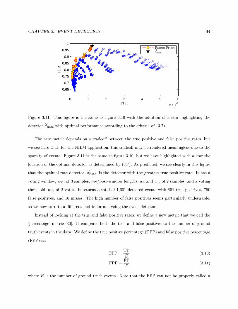
CHAPTER 3. EVENT DETECTION 44
0 1 2 3 4 5 6
x 10−3
0.65
0.7
0.75
0.8
0.85
0.9
0.95
1
FPR
TPR
Pareto FrontdRate
Figure 3.11: This figure is the same as figure 3.10 with the addition of a star highlighting the
detector dRate with optimal performance according to the criteria of (3.7).
The rate metric depends on a tradeoff between the true positive and false positive rates, but
we see here that, for the NILM application, this tradeoff may be rendered meaningless due to the
sparsity of events. Figure 3.11 is the same as figure 3.10, but we have highlighted with a star the
location of the optimal detector as determined by (3.7). As predicted, we see clearly in this figure
that the optimal rate detector, dRate, is the detector with the greatest true positive rate. It has a
voting window, wV , of 3 samples, pre/post-window lengths, w0 and w1, of 2 samples, and a voting
threshold, θV , of 2 votes. It returns a total of 1,601 detected events with 851 true positives, 750
false positives, and 16 misses. The high number of false positives seems particularly undesirable,
so we now turn to a different metric for analyzing the event detectors.
Instead of looking at the true and false positive rates, we define a new metric that we call the
‘percentage’ metric [30]. It compares both the true and false positives to the number of ground
truth events in the data. We define the true positive percentage (TPP) and false positive percentage
(FPP) as:
TPP =TP
E(3.10)
FPP =FP
E(3.11)
where E is the number of ground truth events. Note that the FPP can not be properly called a

CHAPTER 3. EVENT DETECTION 45
0 0.5 1 1.5 2 2.5 3 3.5 4
0.65
0.7
0.75
0.8
0.85
0.9
0.95
1
FPP
TPP
Pareto FrontdPerc
Figure 3.12: Performance under the percentage metric for each of the 1,456 event detectors tested
using a detection tolerance of 1 sample. The circles show the Pareto front and the star shows the
optimal detector, dPerc obtained using this metric.
percentage because the number of false positives can be larger than the number of ground truth
events. Note also that the TPR and TPP are identical, so this metric amounts essentially to a
change in the scale of how the false positives are counted.
Similar to the rate metric above, the perfect detector would have a TPP of 1 and a FPP of 0.
Therefore the optimal detector, dPerc, can be expressed as:
dPerc = argmind∈D
∥∥∥(0, 1)−(
FPP(d),TPP(d))∥∥∥2
2
= argmind∈D
FPP(d)2 + TPP(d)2 − 2 · TPP(d) + 1 (3.12)
Unlike the rate metric, the optimal detector according to this metric does not degenerate into the
detector with the most true positives. Figure 3.12 plots the performance for each of the 1,456 event
detectors tested under the percentage metric using a detection tolerance of 1 sample. The false
positive percentage varies between 0.076 and 3.75 while the true positive percentage varies between
0.64 and 0.98. The optimal detector, dPerc, has a voting window, wV , of 11 samples, pre/post-
window lengths, w0 and w1, of 2 samples, and a voting threshold, θV , of 4 votes. It returns 826
detected events with 716 true positives, 110 false positives, and 151 misses.
Before moving on to a discussion of how increasing detection tolerance affects these results,
we make some remarks on the structure observed in the ROC plots. Figures 3.13 and 3.14 show

CHAPTER 3. EVENT DETECTION 46
0 1 2 3 4 5 6
x 10−3
0.65
0.7
0.75
0.8
0.85
0.9
0.95
1
FPR
TPR
θV = 2θV = 3
θV = 4θV = 5
θV = 15
Figure 3.13: Receiver operating characteristics for each of the 1,456 detectors tested with a detection
tolerance of 1 sample. Lines overlaid on the figure show the performance trends for detectors with
different voting thresholds, θV .
the same points as figure 3.11 with lines overlaid indicating performance trends for detectors with
different voting thresholds and pre- and post-window lengths, respectively.
In figure 3.13 we see, particularly with the lower values of the voting threshold, how the perfor-
mance falls nicely into bands. As the voting threshold increases, the performance of the detectors
moves down and to the left, denoting a decrease in both true and false positive rates. This is
consistent with the discussion of the parameters in section 3.2.2 where we saw that larger voting
thresholds indicate less sensitive detectors.
In figure 3.14, we see how the performance moves down and to the right as w0 and w1 increase
from 2 to 15. The green curve indicating the performance of w0,1 = 2 captures many of the points
on the Pareto curve of figures 3.10 and 3.11.
Returning to figure 3.13, and interpreting it in light of figure 3.14, we observe, in the band
corresponding to θV = 2, 14 distinct smaller bands, each one corresponding to a different pre- and
post-window length. Within these subbands, there are 13 detectors that correspond to the voting
window length wV ranging from 3 to 15 samples. This trend is present for each of the bands in the
figures, but it is most pronounced among the detectors with the voting threshold of 2 votes.
Having developed some intuition for how these parameters affect detector sensitivity, we now
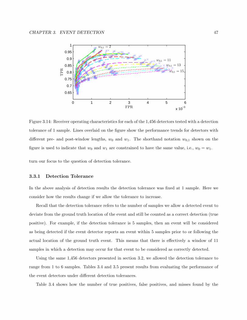
CHAPTER 3. EVENT DETECTION 47
0 1 2 3 4 5 6
x 10−3
0.65
0.7
0.75
0.8
0.85
0.9
0.95
1
FPR
TPR
w0,1 = 15
w0,1 = 13
w0,1 = 11
w0,1 = 2
Figure 3.14: Receiver operating characteristics for each of the 1,456 detectors tested with a detection
tolerance of 1 sample. Lines overlaid on the figure show the performance trends for detectors with
different pre- and post-window lengths, w0 and w1. The shorthand notation w0,1 shown on the
figure is used to indicate that w0 and w1 are constrained to have the same value, i.e., w0 = w1.
turn our focus to the question of detection tolerance.
3.3.1 Detection Tolerance
In the above analysis of detection results the detection tolerance was fixed at 1 sample. Here we
consider how the results change if we allow the tolerance to increase.
Recall that the detection tolerance refers to the number of samples we allow a detected event to
deviate from the ground truth location of the event and still be counted as a correct detection (true
positive). For example, if the detection tolerance is 5 samples, then an event will be considered
as being detected if the event detector reports an event within 5 samples prior to or following the
actual location of the ground truth event. This means that there is effectively a window of 11
samples in which a detection may occur for that event to be considered as correctly detected.
Using the same 1,456 detectors presented in section 3.2, we allowed the detection tolerance to
range from 1 to 6 samples. Tables 3.4 and 3.5 present results from evaluating the performance of
the event detectors under different detection tolerances.
Table 3.4 shows how the number of true positives, false positives, and misses found by the
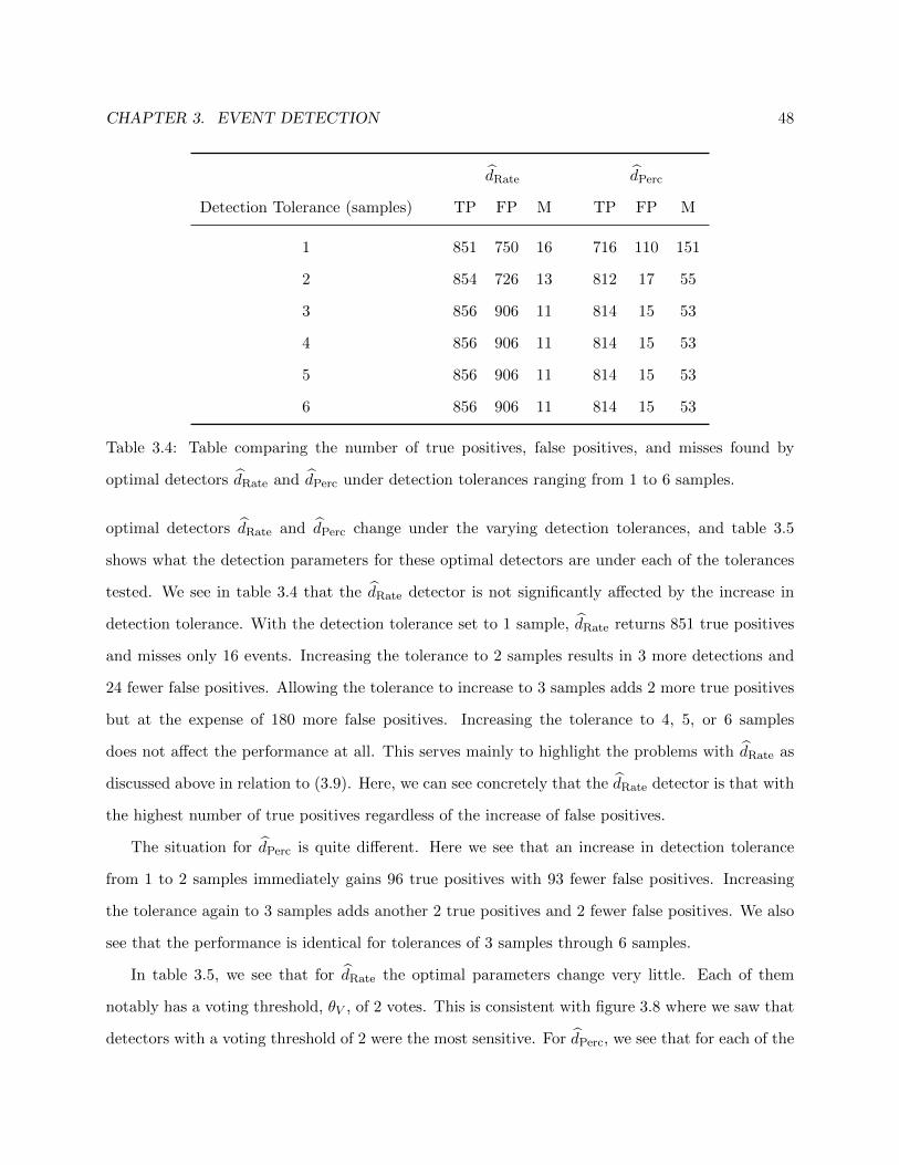
CHAPTER 3. EVENT DETECTION 48
dRate dPerc
Detection Tolerance (samples) TP FP M TP FP M
1 851 750 16 716 110 151
2 854 726 13 812 17 55
3 856 906 11 814 15 53
4 856 906 11 814 15 53
5 856 906 11 814 15 53
6 856 906 11 814 15 53
Table 3.4: Table comparing the number of true positives, false positives, and misses found by
optimal detectors dRate and dPerc under detection tolerances ranging from 1 to 6 samples.
optimal detectors dRate and dPerc change under the varying detection tolerances, and table 3.5
shows what the detection parameters for these optimal detectors are under each of the tolerances
tested. We see in table 3.4 that the dRate detector is not significantly affected by the increase in
detection tolerance. With the detection tolerance set to 1 sample, dRate returns 851 true positives
and misses only 16 events. Increasing the tolerance to 2 samples results in 3 more detections and
24 fewer false positives. Allowing the tolerance to increase to 3 samples adds 2 more true positives
but at the expense of 180 more false positives. Increasing the tolerance to 4, 5, or 6 samples
does not affect the performance at all. This serves mainly to highlight the problems with dRate as
discussed above in relation to (3.9). Here, we can see concretely that the dRate detector is that with
the highest number of true positives regardless of the increase of false positives.
The situation for dPerc is quite different. Here we see that an increase in detection tolerance
from 1 to 2 samples immediately gains 96 true positives with 93 fewer false positives. Increasing
the tolerance again to 3 samples adds another 2 true positives and 2 fewer false positives. We also
see that the performance is identical for tolerances of 3 samples through 6 samples.
In table 3.5, we see that for dRate the optimal parameters change very little. Each of them
notably has a voting threshold, θV , of 2 votes. This is consistent with figure 3.8 where we saw that
detectors with a voting threshold of 2 were the most sensitive. For dPerc, we see that for each of the

CHAPTER 3. EVENT DETECTION 49
dRate dPerc
Detection Tolerance (samples) wV w0,1 θV wV w0,1 θV
1 3 2 2 11 2 4
2 4 2 2 (4,5,6,7) 2 4
3 4 3 2 (4,5,6,7) 2 4
4 4 3 2 (4,5,6,7) 2 4
5 4 3 2 (4,5,6,7) 2 4
6 4 3 2 (4,5,6,7) 2 4
Table 3.5: Table comparing the parameters of the optimal detectors dRate and dPerc as detection
tolerance changes.
detection tolerances the pre- and post- windows are always 2 and the voting threshold is always
4. With these two parameters held constant, the optimal dPerc detector can have a voting window
length, wV , of either 4, 5, 6, or 7 samples with identical performance.
We can also look at the receiver operating characteristics under the additional tolerances. Here,
we show, in figures 3.15 and 3.16, the performance of the detectors with a detection tolerance of
3 samples under the rate and percentage metrics, respectively. Note that, in each figure, the Pareto
front has shifted up and to the left in comparison with figures 3.11 and 3.12, where a tolerance of
1 sample was used. In figure 3.15, dRate indeed is the detector with the greatest true positive rate
despite the larger false positive rate.
3.4 Conclusion
In this chapter, we have given an in-depth description and analysis of the log-likelihood ratio
event detector for non-intrusive load monitoring. We began by defining the detector and then
provided intuition about how its parameters affect its sensitivity by performing a parameter sweep
on phase A of the BLUED dataset. We then continued the discussion of results on the BLUED
dataset by looking into more traditional detection metrics. We specifically considered the tradeoffs

CHAPTER 3. EVENT DETECTION 50
0 1 2 3 4 5 6
x 10−3
0.65
0.7
0.75
0.8
0.85
0.9
0.95
1
FPR
TPR
Pareto FrontdRate
Figure 3.15: Receiver operating characteristics (ROC) for each of the 1,456 event detectors tested,
marked with blue x’s. Points on the Pareto front are shown in yellow circles. A detection tolerance
of 3 samples was used for counting the true and false positives. Note the shift of the Pareto front
up and to the left compared with figure 3.11 that used a detection tolerance of 1 sample.
0 0.5 1 1.5 2 2.5 3 3.5 40.65
0.7
0.75
0.8
0.85
0.9
0.95
1
FPP
TPP
Pareto FrontdPerc
Figure 3.16: Performance under the percentage metric for each of the 1,456 event detectors tested
using a detection tolerance of 3 samples. The circles show the Pareto front and the star shows the
optimal detector, dPerc obtained using this metric.

CHAPTER 3. EVENT DETECTION 51
between the standard true positive rate (TPR) and false positive rate (FPR) visualized in the
receiver operating characteristics (ROC). The large number of true negatives in the dataset led to
a detector that had a very high number of false positives, so we turned to a different metric for
choosing a detector. This led us to define the notion of false positive percentage (FPP) and avoid
the problems caused by the large number of true negatives.
Among the 1,456 detectors tested on phase A of the BLUED dataset, the best detector that
was found under our ‘percentage’ metric had 814 true positives, 15 false positives, and 53 missed
events.
In the non-intrusive load monitoring problem, we are primarily concerned not with event de-
tection for its own sake but only insofar as it leads to good estimates of energy consumption for
different devices. In the traditionally formulated NILM algorithm, the event detector is used as a
starting point to capture transients of devices so that they can be classified. This classification is
then used as the starting point for tracking the power consumption of the devices. We can see,
then, how fundamental correct detection of transients is to this type of NILM algorithm. A missed
detection or a false positive can potentially cause significant challenges in both classification and
energy tracking. In the next chapter, we pursue a NILM technique that will be more robust to
errors in event detection by relaxing the problem of trying to track the energy of individual devices.

Chapter 4
Approximate Power Trace
Decomposition Algorithm
In this chapter, we begin by motivating a relaxation of the non-intrusive load monitoring problem
that moves away from per-device energy disaggregation in favor of grouping devices into classes
based on their power consumption levels and disaggregating the overall energy consumed by each
of these classes. We call this relaxation Power Consumption Clustered Non-Intrusive Load Mon-
itoring (PCC-NILM). We then describe the Approximate Power Trace Decomposition Algorithm
(APTDA), our solution to the PCC-NILM problem that decomposes the power signal according to
power consumption classes.
The chapter is organized as follows. Section 4.1 discusses the motivation for PCC-NILM and the
APTDA algorithm. Next, section 4.2 contains an overview of the entire algorithm. The remaining
sections of the chapter describe each of the stages of the algorithm in detail. Section 4.3 describes
the approximation of the power trace; section 4.4 describes how the background power consumption
is estimated; section 4.5 describes the separation of active and background segments in the power
trace; section 4.6 explains how the power consumption classes are learned; section 4.7 describes how
the power trace is initially decomposed according to the power consumption classes; and finally,
section 4.8 describes a method to correct errors in the component decomposition.
To aid the explanation of the algorithm presented in this chapter, we use examples drawn from
52

CHAPTER 4. APTDA ALGORITHM 53
phase A of the BLUED dataset.
4.1 Motivation
In general, the non-intrusive load monitoring problem is to decompose the aggregate energy con-
sumed over a time period of interest into energy consumed by relevant components during that
time. The overall energy consumed by electrical devices in a home is a superposition of their
individual energy consumptions. So, we consider a disaggregation model that is additive, namely:
E[1,T ] =
K∑k=1
E[1,T ]k (4.1)
This equation decomposes the total energy consumed during the time period [1, T ], E[1,T ], into
K components, E[1,T ]k . What these components are and how many to choose depends on the
application and the end goal. In the remainder of the discussion, we simplify notation by dropping
the time interval [1, T ] with the understanding that when energy is mentioned it must refer to
energy consumed over a fixed period of time.
There are many potentially interesting decompositions, and we discuss a few here. In the full
appliance disaggregation problem, K is equal to the number of electrical devices in the installation
and each Ek represents the energy consumed by each individual device. A second possibility is
an activity-based decomposition where each Ek represents the energy consumed by a different
activity such as cooking, watching television, heating/cooling the home, etc. Next, we could have a
room-based decomposition where K is the number of rooms in the home, and each Ek represents the
power consumption of an individual room. Another potential decomposition is an appliance-type
grouping, where appliances of similar functionality (e.g., lighting, cooking, entertainment, laundry,
etc.) are grouped together. One last example we mention is a person-based grouping, where each
Ek represents the energy consumed by a particular individual in the home. We note that not all of
the scenarios presented here fit perfectly into the model in (4.1), given that they are not all strictly
additive, but the main point of potential alternative decompositions is still valid.
Apart from these examples, there are certainly many other conceivable decompositions that
may be of interest to consumers, some more feasible to achieve than others. We are particularly
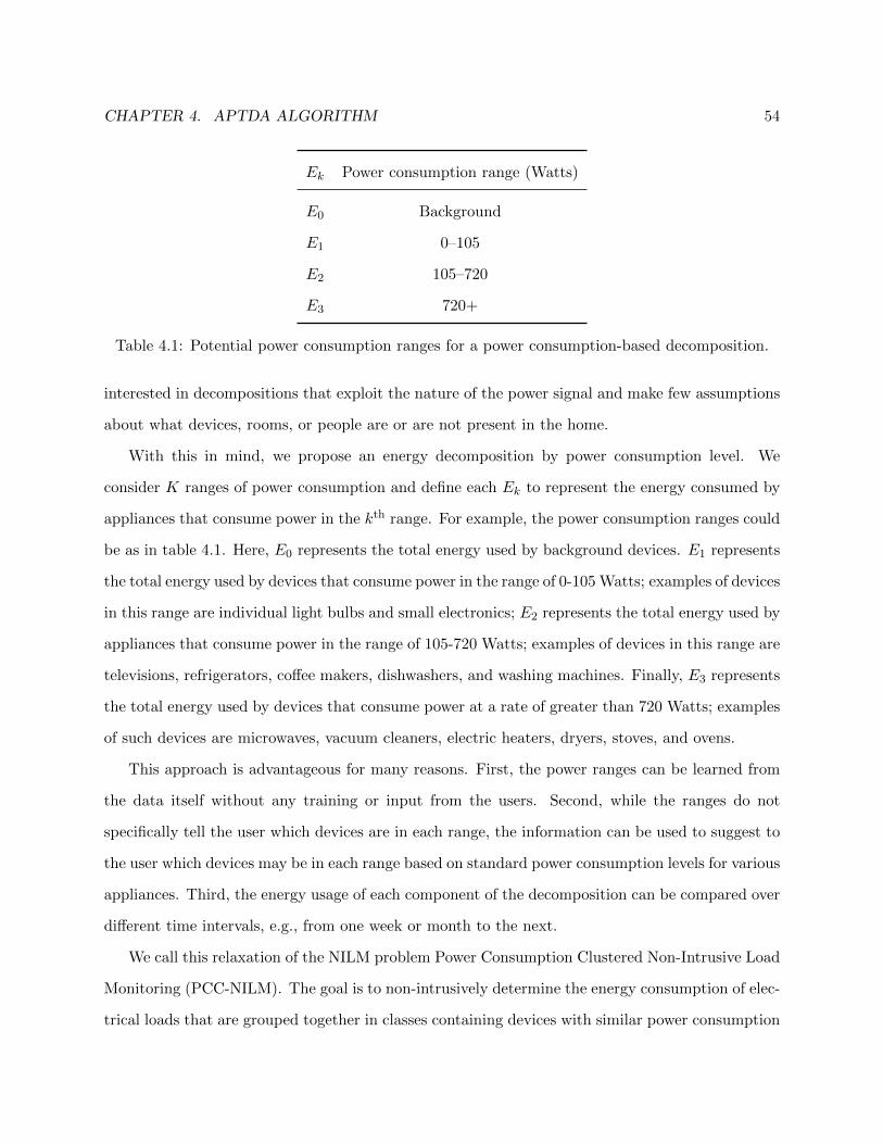
CHAPTER 4. APTDA ALGORITHM 54
Ek Power consumption range (Watts)
E0 Background
E1 0–105
E2 105–720
E3 720+
Table 4.1: Potential power consumption ranges for a power consumption-based decomposition.
interested in decompositions that exploit the nature of the power signal and make few assumptions
about what devices, rooms, or people are or are not present in the home.
With this in mind, we propose an energy decomposition by power consumption level. We
consider K ranges of power consumption and define each Ek to represent the energy consumed by
appliances that consume power in the kth range. For example, the power consumption ranges could
be as in table 4.1. Here, E0 represents the total energy used by background devices. E1 represents
the total energy used by devices that consume power in the range of 0-105 Watts; examples of devices
in this range are individual light bulbs and small electronics; E2 represents the total energy used by
appliances that consume power in the range of 105-720 Watts; examples of devices in this range are
televisions, refrigerators, coffee makers, dishwashers, and washing machines. Finally, E3 represents
the total energy used by devices that consume power at a rate of greater than 720 Watts; examples
of such devices are microwaves, vacuum cleaners, electric heaters, dryers, stoves, and ovens.
This approach is advantageous for many reasons. First, the power ranges can be learned from
the data itself without any training or input from the users. Second, while the ranges do not
specifically tell the user which devices are in each range, the information can be used to suggest to
the user which devices may be in each range based on standard power consumption levels for various
appliances. Third, the energy usage of each component of the decomposition can be compared over
different time intervals, e.g., from one week or month to the next.
We call this relaxation of the NILM problem Power Consumption Clustered Non-Intrusive Load
Monitoring (PCC-NILM). The goal is to non-intrusively determine the energy consumption of elec-
trical loads that are grouped together in classes containing devices with similar power consumption

CHAPTER 4. APTDA ALGORITHM 55
T F S S M T W T F0
200
400
600
800
1000
1200
1400
1600
1800
2000
t
P (
Wat
ts)
Figure 4.1: The power trace of phase A in the BLUED dataset with the locations of the ground
truth events provided with the data.
levels. In order to solve the PCC-NILM problem, we propose the Approximate Power Trace De-
composition Algorithm (APTDA), an unsupervised, data-driven approach to learning the power
consumption clusters and determining their energy consumption.
We see in figures 4.1 and 4.2 what the APTDA algorithm takes as input and produces as its
output, respectively. Figure 4.1 shows the power signal, P , from phase A of the BLUED dataset
along with the ground truth event locations provided with the dataset (we use the ground truth
edges for simplicity here, but later show how the algorithm is robust to errors in the event locations).
A piecewise-constant approximation, P , is made of the power signal and this P is decomposed by
the APDTA algorithm into the four signals shown in figure 4.2. The top signal, P 0 is the estimate
of background power consumed in the building during the week. The following signals, P 1, P 2,
and P 3, are estimates of the power consumed by appliances operating in each of the 3 ranges
from table 4.1: 0-105 Watts, 105-720 Watts, and greater than 720 Watts. The sum of the K + 1
decomposed signals (in our example K = 3), as shown in (4.2), is equal to the approximation,
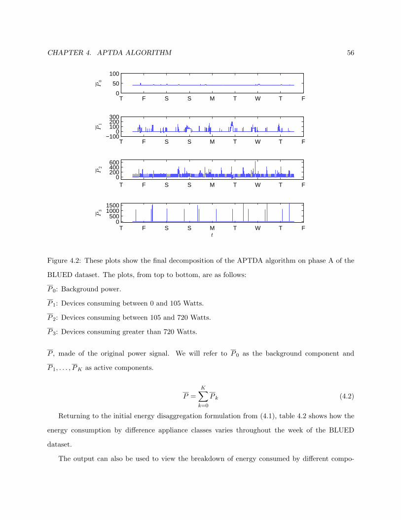
CHAPTER 4. APTDA ALGORITHM 56
T F S S M T W T F0
50
100
P0
T F S S M T W T F−100
0100200300
P1
T F S S M T W T F0
200400600
P2
T F S S M T W T F0
50010001500
P3
t
Figure 4.2: These plots show the final decomposition of the APTDA algorithm on phase A of the
BLUED dataset. The plots, from top to bottom, are as follows:
P 0: Background power.
P 1: Devices consuming between 0 and 105 Watts.
P 2: Devices consuming between 105 and 720 Watts.
P 3: Devices consuming greater than 720 Watts.
P , made of the original power signal. We will refer to P 0 as the background component and
P 1, . . . , PK as active components.
P =K∑k=0
P k (4.2)
Returning to the initial energy disaggregation formulation from (4.1), table 4.2 shows how the
energy consumption by difference appliance classes varies throughout the week of the BLUED
dataset.
The output can also be used to view the breakdown of energy consumed by different compo-

CHAPTER 4. APTDA ALGORITHM 57
k Ek (kWh)
0 6.87
1 0.98
2 7.57
3 0.44
Table 4.2: The energy estimate of each component for the entire week of phase A of the BLUED
dataset.
1 2 3 4 5 6 70
0.51
E0
1 2 3 4 5 6 70
0.20.4
E1
1 2 3 4 5 6 7012
E2
1 2 3 4 5 6 70
0.10.2
E3
Day #
Figure 4.3: Energy in kWh consumed by each component per day in phase A of the BLUED
dataset.
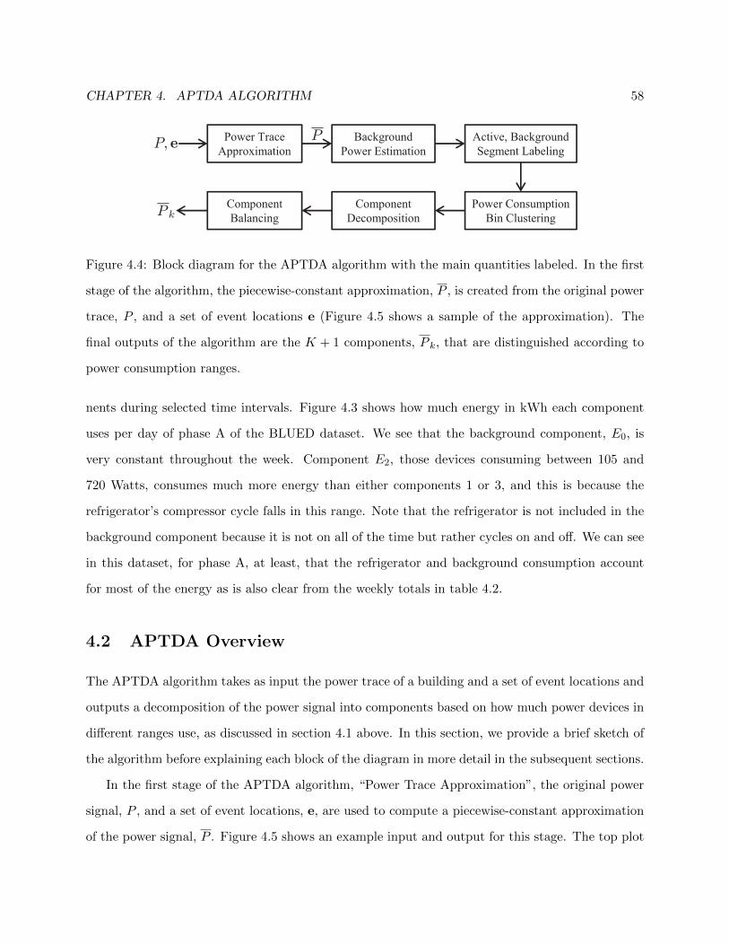
CHAPTER 4. APTDA ALGORITHM 58
PPower Trace
Approximation
Background
Power Estimation
Power Consumption
Bin Clustering
Component
Decomposition
Active, Background
Segment LabelingP, e
P kComponent
Balancing
Figure 4.4: Block diagram for the APTDA algorithm with the main quantities labeled. In the first
stage of the algorithm, the piecewise-constant approximation, P , is created from the original power
trace, P , and a set of event locations e (Figure 4.5 shows a sample of the approximation). The
final outputs of the algorithm are the K + 1 components, P k, that are distinguished according to
power consumption ranges.
nents during selected time intervals. Figure 4.3 shows how much energy in kWh each component
uses per day of phase A of the BLUED dataset. We see that the background component, E0, is
very constant throughout the week. Component E2, those devices consuming between 105 and
720 Watts, consumes much more energy than either components 1 or 3, and this is because the
refrigerator’s compressor cycle falls in this range. Note that the refrigerator is not included in the
background component because it is not on all of the time but rather cycles on and off. We can see
in this dataset, for phase A, at least, that the refrigerator and background consumption account
for most of the energy as is also clear from the weekly totals in table 4.2.
4.2 APTDA Overview
The APTDA algorithm takes as input the power trace of a building and a set of event locations and
outputs a decomposition of the power signal into components based on how much power devices in
different ranges use, as discussed in section 4.1 above. In this section, we provide a brief sketch of
the algorithm before explaining each block of the diagram in more detail in the subsequent sections.
In the first stage of the APTDA algorithm, “Power Trace Approximation”, the original power
signal, P , and a set of event locations, e, are used to compute a piecewise-constant approximation
of the power signal, P . Figure 4.5 shows an example input and output for this stage. The top plot

CHAPTER 4. APTDA ALGORITHM 59
21:00:00 21:30:00 22:00:000
200
400
600
P
21:00:00 21:30:00 22:00:000
200
400
600
t
P
Pe
Figure 4.5: Top: The original power signal P with event locations e. Bottom: The piecewise-
constant approximation P that forms the basis for the APTDA algorithm.
shows the original power signal for a small portion of phase A of the BLUED dataset with the ground
truth events marked with circles. The bottom plot shows the piecewise constant approximation,
P , that is computed from the original power signal and event locations. The event locations serve
as starting points to create the endpoints of the piecewise-constant segments in P . Furthermore, P
is computed such that it preserves the energy content of the original power signal, P . Section 4.3
below details how P is computed from P and e. This stage can be viewed as a pre-processing step
in the algorithm as P is the signal that serves as the basis for most of the rest of the algorithm.
An important concept that figures prominently in the APTDA algorithm is the separation of
background and active power consumption by devices. The next two stages in the algorithm,
“Background Power Estimation” and “Active, Background Segment Labeling,” deal with this and
are explained in sections 4.4 and 4.5, respectively. The background power level in a building is
the amount of power consumed by any devices that are always left on or in a standby mode. This
includes any devices with digital displays, most electronics, any lights always left on, etc. By “active
power,” we mean the power consumed by appliances whose turning on and off is observable in the
power signal.
The background power level is easily identified visually as the lowest level to which the power
signal always returns. It can be seen in figure 4.6 that for phase A of the BLUED dataset the
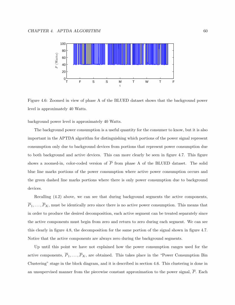
CHAPTER 4. APTDA ALGORITHM 60
T F S S M T W T F0
20
40
60
80
100
t
P(W
atts)
Figure 4.6: Zoomed in view of phase A of the BLUED dataset shows that the background power
level is approximately 40 Watts.
background power level is approximately 40 Watts.
The background power consumption is a useful quantity for the consumer to know, but it is also
important in the APTDA algorithm for distinguishing which portions of the power signal represent
consumption only due to background devices from portions that represent power consumption due
to both background and active devices. This can more clearly be seen in figure 4.7. This figure
shows a zoomed-in, color-coded version of P from phase A of the BLUED dataset. The solid
blue line marks portions of the power consumption where active power consumption occurs and
the green dashed line marks portions where there is only power consumption due to background
devices.
Recalling (4.2) above, we can see that during background segments the active components,
P 1, . . . , PK , must be identically zero since there is no active power consumption. This means that
in order to produce the desired decomposition, each active segment can be treated separately since
the active components must begin from zero and return to zero during each segment. We can see
this clearly in figure 4.8, the decomposition for the same portion of the signal shown in figure 4.7.
Notice that the active components are always zero during the background segments.
Up until this point we have not explained how the power consumption ranges used for the
active components, P 1, . . . , PK , are obtained. This takes place in the “Power Consumption Bin
Clustering” stage in the block diagram, and it is described in section 4.6. This clustering is done in
an unsupervised manner from the piecewise constant approximation to the power signal, P . Each
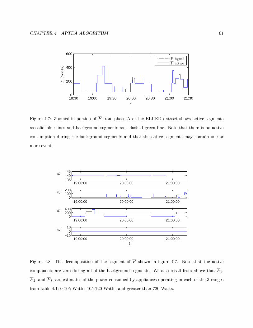
CHAPTER 4. APTDA ALGORITHM 61
18:30 19:00 19:30 20:00 20:30 21:00 21:300
200
400
600
t
P(W
atts)
P bgrnd
P active
Figure 4.7: Zoomed-in portion of P from phase A of the BLUED dataset shows active segments
as solid blue lines and background segments as a dashed green line. Note that there is no active
consumption during the background segments and that the active segments may contain one or
more events.
19:00:00 20:00:00 21:00:00354045
P0
19:00:00 20:00:00 21:00:000
100200
P1
19:00:00 20:00:00 21:00:000
200400
P2
19:00:00 20:00:00 21:00:00−10
010
P3
t
Figure 4.8: The decomposition of the segment of P shown in figure 4.7. Note that the active
components are zero during all of the background segments. We also recall from above that P 1,
P 2, and P 3, are estimates of the power consumed by appliances operating in each of the 3 ranges
from table 4.1: 0-105 Watts, 105-720 Watts, and greater than 720 Watts.
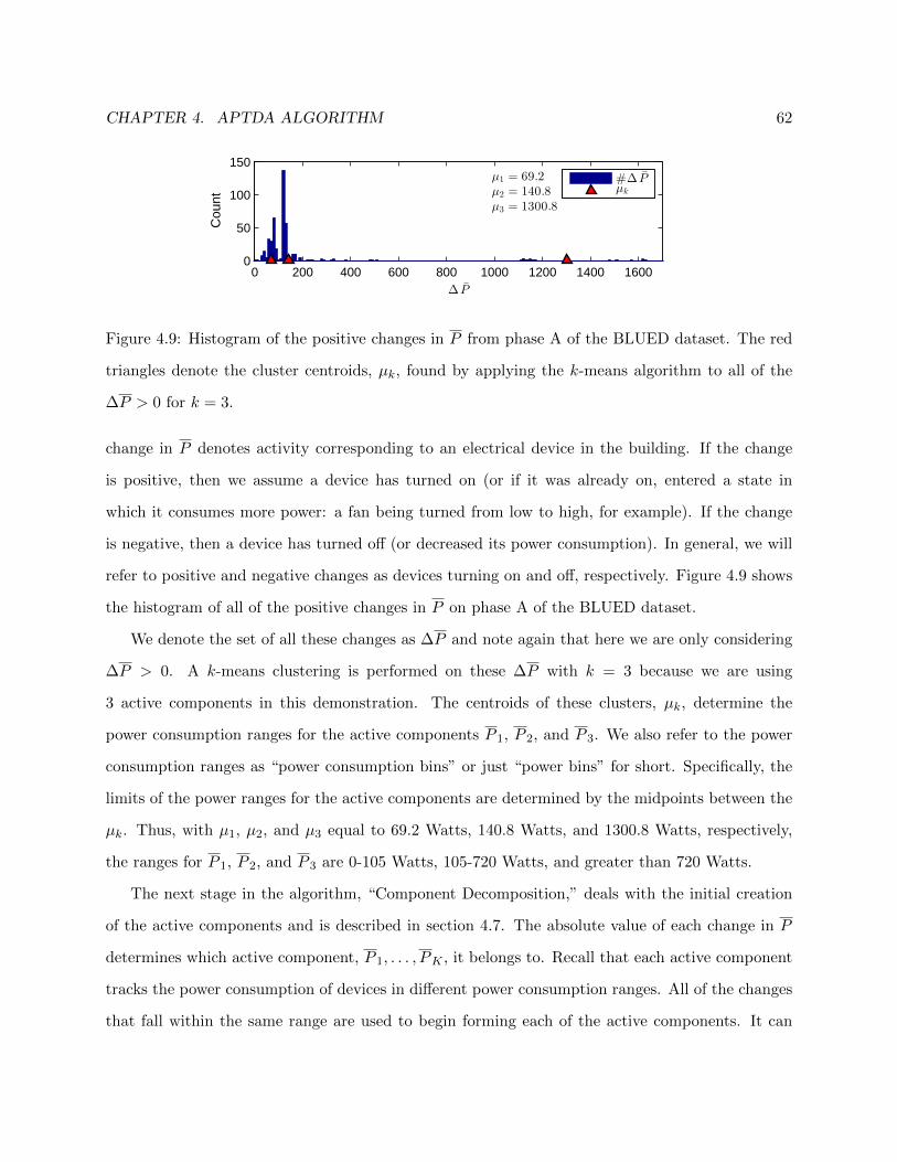
CHAPTER 4. APTDA ALGORITHM 62
0 200 400 600 800 1000 1200 1400 16000
50
100
150
∆ P
Cou
nt
µ1 = 69.2
µ2 = 140.8
µ3 = 1300.8
#∆ Pµk
Figure 4.9: Histogram of the positive changes in P from phase A of the BLUED dataset. The red
triangles denote the cluster centroids, µk, found by applying the k-means algorithm to all of the
∆P > 0 for k = 3.
change in P denotes activity corresponding to an electrical device in the building. If the change
is positive, then we assume a device has turned on (or if it was already on, entered a state in
which it consumes more power: a fan being turned from low to high, for example). If the change
is negative, then a device has turned off (or decreased its power consumption). In general, we will
refer to positive and negative changes as devices turning on and off, respectively. Figure 4.9 shows
the histogram of all of the positive changes in P on phase A of the BLUED dataset.
We denote the set of all these changes as ∆P and note again that here we are only considering
∆P > 0. A k-means clustering is performed on these ∆P with k = 3 because we are using
3 active components in this demonstration. The centroids of these clusters, µk, determine the
power consumption ranges for the active components P 1, P 2, and P 3. We also refer to the power
consumption ranges as “power consumption bins” or just “power bins” for short. Specifically, the
limits of the power ranges for the active components are determined by the midpoints between the
µk. Thus, with µ1, µ2, and µ3 equal to 69.2 Watts, 140.8 Watts, and 1300.8 Watts, respectively,
the ranges for P 1, P 2, and P 3 are 0-105 Watts, 105-720 Watts, and greater than 720 Watts.
The next stage in the algorithm, “Component Decomposition,” deals with the initial creation
of the active components and is described in section 4.7. The absolute value of each change in P
determines which active component, P 1, . . . , PK , it belongs to. Recall that each active component
tracks the power consumption of devices in different power consumption ranges. All of the changes
that fall within the same range are used to begin forming each of the active components. It can

CHAPTER 4. APTDA ALGORITHM 63
be seen in figure 4.8 that the smallest power changes have been classified into P 1 and the larger
changes into P 2 while P 3, during the segment shown, is empty.
The final stage of the algorithm, “Component Balancing,” is concerned with correcting the
decomposition performed in the previous stage so that each active component satisfies certain
criteria that must be imposed in order to ensure that a reasonable decomposition is obtained.
Examples of these criteria include, among others, non-negativity in each active component and net
positive energy consumption of each component during each active segment. This is treated in
depth in section 4.8.
We have attempted to provide a brief overview of the entire APTDA algorithm, so that the
reader may understand how the different parts fit together while entering into the details of each
stage in the following sections. To recap, the APTDA algorithm begins by forming a piecewise
constant estimate, P , of the original power trace, P , and a given set of events, e. After estimating
the background power consumption of the building, P is split into segments of either active or
background power consumption. Next, the distribution of all the changes in P is analyzed in order
to establish relevant power consumption ranges. Finally, these ranges are used to process each of
the active segments and decompose P into relevant components useful for tracking the total energy
consumed by devices operating in each power range.
4.3 Power Trace Approximation
In this section, we describe the first stage of the APTDA algorithm, the construction of a piecewise-
constant approximation of the observed power signal. This stage can be seen as a pre-processing step
used to transform the original power signal, P , into a form that captures the relevant information
we are interested in and is easier to work with.
As seen in the block diagram of figure 4.4, this stage of the algorithm takes as input a power
signal, P , and set of events, e, and outputs P , a piecewise constant approximation of P . Before
describing how P is constructed, we begin with some definitions and notational clarifications:
We assume a fixed-size power signal throughout the explanation of the algorithm. The notation
P used in the overview above is shorthand for the discrete power signal P [n], n ∈ [1, . . . , N ] with

CHAPTER 4. APTDA ALGORITHM 64
sampling rate fs and sampling period Ts. Likewise, P is shorthand for P [n], n ∈ [1, . . . , N ]. When
useful, we will denote the corresponding timestamps of the power signal as t[n], n ∈ [1, . . . , N ].
The number of events in e is M . Due to the fact that a fixed-length signal is being used in this
analysis, we define the first and last events as sample numbers 1 and N , respectively. Thus, the M
events may be gathered into a vector according to:
e = [1, e2, . . . , eM−1, N ]T (4.3)
Before proceeding to the construction of P , we recall that P must be an energy-preserving approx-
imation of P . That is:
EP = Ts ·N−1∑n=1
P [n] = Ts ·N−1∑n=1
P [n] = EP (4.4)
Note that we define the sums in (4.4) to be from 1 to N − 1 and not to N . This is because the
end point, the N th sample, has no duration and thus has no contribution to the overall energy
consumption.
We can now define how P is constructed. The M events in e split the power signal, P , into
M − 1 intervals of various lengths determined by the spacing between consecutive events. The
value of P during the mth interval, given in (4.5), is πm, where πm is the mean power consumption
during said interval, as shown in (4.6):
P [n] = πm, em ≤ n ≤ em+1 − 1, m ∈ [1, . . . ,M − 1] (4.5)
πm =1
(em+1 − em)·em+1−1∑n=em
P [n], m ∈ [1, . . . ,M − 1] (4.6)
Note that, in (4.5), the mth interval is defined as beginning with the index of event em and ending
with the sample before the index of the next event, em+1. Thus, the segments are disjoint, and the
length of the mth interval is em+1− em samples. This is precisely the divisor in the computation of
the mean πm in (4.6). P constructed in this way preserves the energy of the original power signal,

CHAPTER 4. APTDA ALGORITHM 65
P , since:
EP = Ts ·N−1∑n=1
P [n]
= Ts ·M−1∑m=1
(em+1 − em) · πm
= Ts ·M−1∑m=1
(em+1 − em) · 1
(em+1 − em)·em+1−1∑n=em
P [n] (4.7)
= Ts
N−1∑n=1
P [n]
= EP
The second and fourth equalities, with the changes in summation variable, arise because the M −1
segments are disjoint.
It will be useful later to gather all of the πm into a single vector, Π. Thus we define:
Π = [π1, π2, . . . , πM−1] (4.8)
All of the changes in P occur only at the locations of the edges in e and can be obtained by looking
at the discrete difference of Π. That is:
∆P = [δ1, δ2, . . . , δM−2] (4.9)
δm = πm+1 − πm, m = 1, . . . ,M − 2 (4.10)
∆P is used for clustering in section 4.6 to obtain reasonable power consumption ranges for devices
present in the building.
4.4 Background Power Estimation
An important category of power consumption homes is the amount of energy consumed by devices
that are always left on or consume power continuously though in a standby mode. While the NILM
algorithm is unable to characterize these background loads because they are never observed turning
on or off, it can still be beneficial to the consumer to know what their background load is.

CHAPTER 4. APTDA ALGORITHM 66
0 500 1000 1500 2000 25000
0.5
1
P
F(P
)
0 50 100 150 2000
0.2
0.4
0.6
0.8
1
P
F(P
)
Figure 4.10: Empirical cumulative distribution function (CDF) for phase A of the BLUED dataset
with a zoom in in the bottom figure.
In the formulation of the disaggregation problem in (4.2), copied here:
P =
K−1∑k=0
P k (4.11)
P 0 is the background component that represents the estimate of the background power consumption
of the building.
By visual inspection, it is easy to describe what the background power level of a home is. In
figure 4.6, we saw the zoomed-in version of the aggregate power of phase A in the BLUED dataset
and noted that the background power consumption was about 40 Watts and remained the same
throughout the week. Figure 4.10 shows the empirical cumulative distribution function (CDF) of
the power values in phase A of the BLUED dataset. Here, we can see more clearly that on phase A
just over 60% of the measured power values are less than 42 Watts.
In [31] Pattem describes what he calls the “always-on component” and says about it: “It is
observed that the aggregate power consumption almost always stays above a certain threshold,

CHAPTER 4. APTDA ALGORITHM 67
specific to the corresponding household/mains. In some cases, this threshold is close to the mode
statistic for the aggregate time series waveform.” He uses the median to determine the value of the
“always-on component.” For phase A of the BLUED dataset the median, i.e., the 50th percentile
in figure 4.10, works well for estimating the background power level.
Note that event locations are not used to determine the background power consumption level,
it is only a function of the aggregate data over some period of time. We combine the segmentation
achieved above with background power consumption estimation in the next section as we label each
segment as either ‘active’ or ‘background’.
4.5 Active and Background Segment Labeling
In this section, we use the background power consumption level to distinguish between active and
background segments in the power signal. The main idea behind this is to segment the approxi-
mated power trace, P , into parts containing active appliance activity and parts that represent only
background consumption.
We define a background segment as a segment where the only contribution in the aggregate
power signal is that of the home’s background power consumption level. We can think of this as
the house being at rest: everything that is consuming power is presumably in a stand-by mode or
is a device that is always left on (e.g., computer, light, etc.).
If a background segment is characterized by a lack of activity, then we define an active segment
to be segments that contain a level of power consumption higher than the background power
consumption level.
As mentioned above in section 4.1, this segmentation is important for the relaxed disaggregation
problem because it allows each segment to be handled independently. For the background segments
this means that the only contribution to the final disaggregation lies in the background component,
P 0, and the active components P 1, . . . , PK are all equal to 0. During the active segments, P 0
remains constant at the background power level, but the active components now reflect the device
activity present. At the end of the active segment, that is when the aggregate power has returned
to the background power level, all of the active components must return to 0 power consumption.

CHAPTER 4. APTDA ALGORITHM 68
To label each segment we introduce a binary background indication vector, b, of size M − 1:
b = [b1, b2, . . . , bM−1], bm ∈ {0, 1}, m = 1, ...,M − 1 (4.12)
When bm = 1, this means that the segment m, that is the portion of the signal lying between
events em and em+1, is a background segment. bm = 0 indicates that the mth segment is an active
segment, that is, there is likely some device currently on during the segment.
A simple test is used on each segment to determine whether it is an active or background
segment:
bm =
1 if µm − sm < 1.1 · Pback and µm < 1.5 · Pback
0 else
(4.13)
where Pback is the background power level found in section 4.4 and µm and s2m, given below, are
the sample mean and variance, respectively, of the mth segment of the original power signal. We
note that µm is exactly the value of πm from (4.6).
µm = πm =1
em+1 − em·em+1−1∑n=em
Pn, m = 1, . . . ,M − 1 (4.14)
s2m =1
em+1 − em − 1·em+1−1∑n=em
(Pn − µm)2 , m = 1, . . . ,M − 1 (4.15)
The parameters 1.1 and 1.5 from the background test in (4.13) were hand-tuned for phase A of the
BLUED dataset. Further work and more data is needed to create a test that is suitable for any
given dataset.
We will refer to the set of background segments as B and the set of active segments as A. That
is:
B = {m : bm = 1} (4.16)
A = {m : bm = 0} (4.17)
Figure 4.11 shows a color-coded version of P to illustrate the portions of the signal that represent
background and active segments.

CHAPTER 4. APTDA ALGORITHM 69
18:30 19:00 19:30 20:00 20:30 21:00 21:300
200
400
600
t
P(W
atts)
P bgrnd
P active
Figure 4.11: Zoomed-in portion of P from phase A of the BLUED dataset shows active segments
as solid blue lines and background segments as a dashed green line. Note that there is no active
consumption during the background segments and that the active segments may contain one or
more events.
4.6 Power Consumption Bin Clustering
In this section we describe how changes observed in the piecewise constant power signal P are used
as the basis for establishing categories of devices based on similar power consumption properties.
Since we are working in an unsupervised framework, we are unable to identify the individual devices,
but by using clustering techniques on the changes observed we can group together changes of similar
magnitudes. These groups represent different levels of power consumption and instead of trying
to determine how much each energy individual device consumes, we estimate how much power is
consumed by devices operating in each power consumption bin.
This system could be made even more useful with a small amount of user interaction to help
determine which devices belong to each class. For example, if the user were able to view the
real-time aggregate power consumption of the home and see how much it changed upon turning
a particular device on or off, they could interact with the system to specify this amount. Upon
viewing the disaggregated energy consumption of the different bins, then, possible devices falling
in each bin as specified by the user’s interaction could be presented as a means of helping the user
to determine more precisely where power consumption can be reduced. With this scenario in mind,
we proceed with the discussion of how these bins are obtained. The following section will discuss
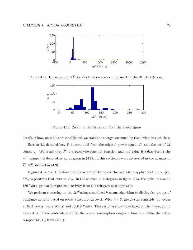
CHAPTER 4. APTDA ALGORITHM 70
−500 0 500 1000 1500 2000 25000
50
100
150
Cou
nt
∆P (Watts)
Figure 4.12: Histogram of ∆P for all of the on events in phase A of the BLUED dataset.
0 50 100 150 200 250 3000
50
100
150
Cou
nt
∆P (Watts)
Figure 4.13: Zoom on the histogram from the above figure
details of how, once bins are established, we track the energy consumed by the devices in each class.
Section 4.3 detailed how P is computed from the original power signal, P , and the set of M
edges, e. We recall that P is a piecewise-constant function and the value it takes during the
mth segment is denoted as πm as given in (4.6). In this section, we are interested in the changes in
P , ∆P , defined in (4.9).
Figures 4.12 and 4.13 show the histogram of the power changes where appliances turn on (i.e.
δPm is positive) that exist in Pm. In the zoomed-in histogram in figure 4.13, the spike at around
130 Watts primarily represents activity from the refrigerator compressor.
We perform clustering on the ∆P using a modified k-means algorithm to distinguish groups of
appliance activity based on power consumption level. With k = 3, the cluster centroids, µk, occur
at 69.2 Watts, 140.8 Watts, and 1300.8 Watts. This result is shown overlayed on the histogram in
figure 4.14. These centroids establish the power consumption ranges or bins that define the active
components P k from (4.11).

CHAPTER 4. APTDA ALGORITHM 71
0 200 400 600 800 1000 1200 1400 16000
50
100
150
∆ P
Cou
nt
µ1 = 69.2
µ2 = 140.8
µ3 = 1300.8
#∆ Pµk
Figure 4.14: The histogram from figure 4.12 with the cluster centroids found from performing
k-means with k = 3.
4.7 Component Decomposition
At this stage of the algorithm, all that remains is the construction of the background and active
components, P k. Before we begin this process, some more notational definitions are required.
First, recall from section 4.3 that P is a piecewise constant signal with M − 1 segments defined
by the M event locations in e. In the construction of P , the mth segment has a value of πm.
In the formulation of the disaggregation problem, copied here again in (4.18), the P k must sum
to equal P at every point. Therefore, we take the P k to also be piecewise constant with the same
structure as P , that is, all of the M − 1 segments are in the same locations determined by the M
events in e.
P [n] =K∑k=0
P k[n] (4.18)
The problem can now be stated as needing to determine the values of the M − 1 segments for each
of the K + 1 components. Consider the matrix Π:
Π =
π0
π1
...
πK
=
π0,1 π0,2 . . . π0,M−1
π1,1 π1,2 . . . π1,M−1
......
......
πK,1 πK,2 . . . πK,M−1
(4.19)
Here, πk,m is the value that the kth component takes during the mth segment. We refer to the
entries of Π simply as component values and Π itself as the component matrix. Furthermore, (4.18)
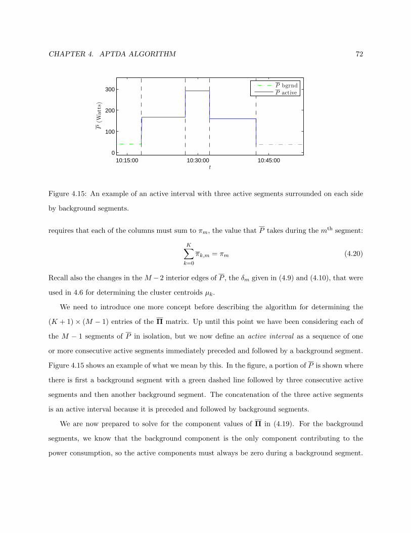
CHAPTER 4. APTDA ALGORITHM 72
10:15:00 10:30:00 10:45:000
100
200
300
t
P(W
atts)
P bgrnd
P active
Figure 4.15: An example of an active interval with three active segments surrounded on each side
by background segments.
requires that each of the columns must sum to πm, the value that P takes during the mth segment:
K∑k=0
πk,m = πm (4.20)
Recall also the changes in the M −2 interior edges of P , the δm given in (4.9) and (4.10), that were
used in 4.6 for determining the cluster centroids µk.
We need to introduce one more concept before describing the algorithm for determining the
(K + 1)× (M − 1) entries of the Π matrix. Up until this point we have been considering each of
the M − 1 segments of P in isolation, but we now define an active interval as a sequence of one
or more consecutive active segments immediately preceded and followed by a background segment.
Figure 4.15 shows an example of what we mean by this. In the figure, a portion of P is shown where
there is first a background segment with a green dashed line followed by three consecutive active
segments and then another background segment. The concatenation of the three active segments
is an active interval because it is preceded and followed by background segments.
We are now prepared to solve for the component values of Π in (4.19). For the background
segments, we know that the background component is the only component contributing to the
power consumption, so the active components must always be zero during a background segment.
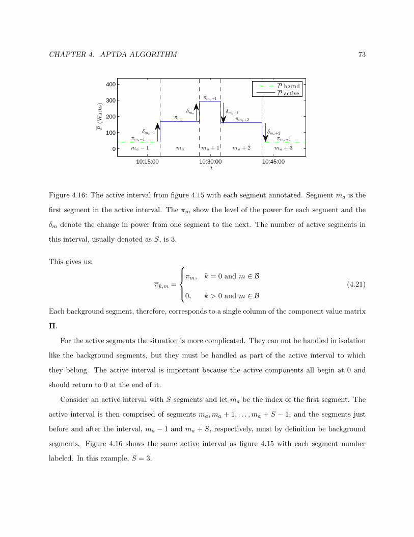
CHAPTER 4. APTDA ALGORITHM 73
10:15:00 10:30:00 10:45:00
0
100
200
300
400
t
P(W
atts)
ma − 1 ma ma + 1 ma + 2 ma + 3
δma−1
δmaδma+1
δma+2
πma−1
πma
πma+1
πma+2
πma+3
P bgrnd
P active
Figure 4.16: The active interval from figure 4.15 with each segment annotated. Segment ma is the
first segment in the active interval. The πm show the level of the power for each segment and the
δm denote the change in power from one segment to the next. The number of active segments in
this interval, usually denoted as S, is 3.
This gives us:
πk,m =
πm, k = 0 and m ∈ B
0, k > 0 and m ∈ B(4.21)
Each background segment, therefore, corresponds to a single column of the component value matrix
Π.
For the active segments the situation is more complicated. They can not be handled in isolation
like the background segments, but they must be handled as part of the active interval to which
they belong. The active interval is important because the active components all begin at 0 and
should return to 0 at the end of it.
Consider an active interval with S segments and let ma be the index of the first segment. The
active interval is then comprised of segments ma,ma + 1, . . . ,ma + S − 1, and the segments just
before and after the interval, ma − 1 and ma + S, respectively, must by definition be background
segments. Figure 4.16 shows the same active interval as figure 4.15 with each segment number
labeled. In this example, S = 3.

CHAPTER 4. APTDA ALGORITHM 74
The submatrix of Π that corresponds to this interval is:
Πma+2ma =
π0,ma π0,ma+1 π0,ma+2
π1,ma π1,ma+1 π1,ma+2
π2,ma π2,ma+1 π2,ma+2
π3,ma π3,ma+1 π3,ma+2
(4.22)
To solve for the S background components of this interval, the π0,m, we assume that the background
power of the house does not change during the active interval. Thus it remains constant at the
value, πma−1, of the preceding background segment.
At this point there remain S segments for each of the K active components to solve for. The
main idea in solving for them is to use the power changes δm to determine which active component
a particular change belongs to. We express this using a matrix B, the balancing matrix:
B = {βk,m} =
β1,1 . . . β1,S+1
......
...
βK,1 . . . βK,S+1
(4.23)
Using the notation from figure 4.16, the first column of B corresponds to the edge with power
change δma−1. This is the first turning on of a device that goes from the background power level
and begins the active interval. The balancing matrix for figure 4.16 is as follows:
B =
0 0 0 0
125.9 125.6 −131.9 −121.4
0 0 0 0
(4.24)
The values in the second row of B are the values of the δma−1, . . . , δma+2 in the figure. They are
placed in the second row because they all occur in the range of active component 2, that is, 105-720
Watts. Note that there is only one non-zero entry per column of B. Accumulating the values across

CHAPTER 4. APTDA ALGORITHM 75
each row of B gives the desired entries of the active components in Π:
Πma+2ma =
41.6 41.6 41.6
0 0 0
125.9 251.5 119.6
0 0 0
(4.25)
This process is repeated for each active interval in order to solve for all of the K + 1 ×M − 1
segments in the entire signal.
4.8 Component Balancing
For most active intervals, the algorithm in the previous section is sufficient for decomposing P into
components that behave well. By behaving well, we mean that each of the active components, dur-
ing an active interval, each begin and end at zero and do not have negative power consumption. For
most active intervals, the process of grouping power changes into their appropriate active compo-
nents suffices to produce such a decomposition. Situations arise, however, where the decomposition
does not display the desired characteristics.
In this section we begin with an example showing an active segment where the algorithm from
the previous section breaks down, how it may be recognized, and how it may be fixed. We then
present a greedy algorithm aimed at repairing decompositions that contain a component with a net
negative energy consumption during an active interval. We conclude by discussing the necessity
of using a greedy algorithm and some of the factors that cause the undesirable decompositions to
arise.
Figure 4.17 shows an example of an active interval with S = 2 active segments. In this interval
the component decomposition algorithm described in section 4.7 creates a decomposition where P 1
has an overall negative energy contribution during the interval. This can be seen by analyzing the
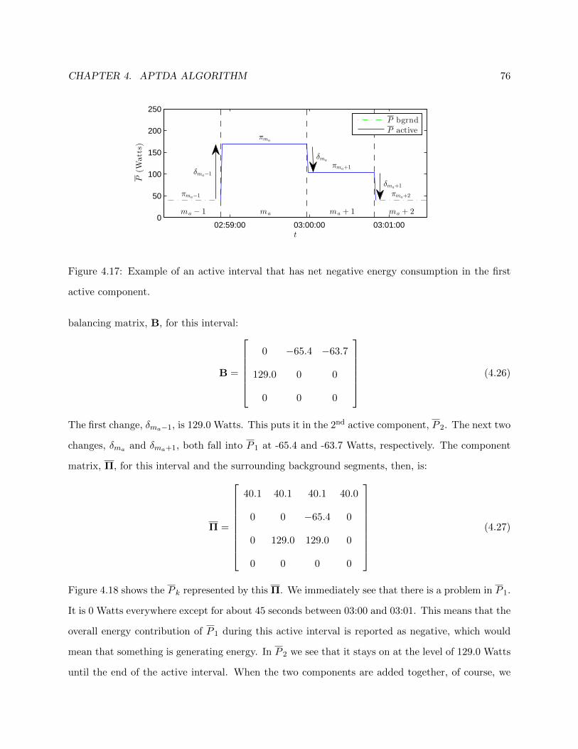
CHAPTER 4. APTDA ALGORITHM 76
02:59:00 03:00:00 03:01:000
50
100
150
200
250
t
P(W
atts)
δma−1
δma
δma+1
ma − 1 ma + 1 ma + 2ma
πma−1
πma
πma+1
πma+2
P bgrnd
P active
Figure 4.17: Example of an active interval that has net negative energy consumption in the first
active component.
balancing matrix, B, for this interval:
B =
0 −65.4 −63.7
129.0 0 0
0 0 0
(4.26)
The first change, δma−1, is 129.0 Watts. This puts it in the 2nd active component, P 2. The next two
changes, δma and δma+1, both fall into P 1 at -65.4 and -63.7 Watts, respectively. The component
matrix, Π, for this interval and the surrounding background segments, then, is:
Π =
40.1 40.1 40.1 40.0
0 0 −65.4 0
0 129.0 129.0 0
0 0 0 0
(4.27)
Figure 4.18 shows the P k represented by this Π. We immediately see that there is a problem in P 1.
It is 0 Watts everywhere except for about 45 seconds between 03:00 and 03:01. This means that the
overall energy contribution of P 1 during this active interval is reported as negative, which would
mean that something is generating energy. In P 2 we see that it stays on at the level of 129.0 Watts
until the end of the active interval. When the two components are added together, of course, we

CHAPTER 4. APTDA ALGORITHM 77
02:59:00 03:00:00 03:01:00−100
0100200
P0
02:59:00 03:00:00 03:01:00−100
0100200
P1
02:59:00 03:00:00 03:01:00−100
0100200
P2
02:59:00 03:00:00 03:01:00−100
0100200
P3
t
Figure 4.18: The decomposition obtained for the active interval in figure 4.17. Note that P 1 is
negative starting just before 3 AM.
see that there is no net negative energy during this interval, but for our method to be meaningful
each of the components should remain positive because we are only dealing with passive devices,
i.e., devices that consume and do not generate power.
In order to better understand what is happening during this interval, it is helpful to know
what the devices causing this behavior are. At the beginning of the active interval, the device
that turns on just before 02:59 with the 129 Watt consumption is actually two devices turning on
simultaneously: the light and fan in a bathroom. They both stay on for about 1 minute, then the
fan is turned off, and about 45 seconds later the light is also turned off. If both had been turned
off simultaneously then the off power change would also have been 129 Watts and only P 2 would
have displayed activity. In this case, there would be no problem with reporting negative power and
energy values.
However, because each device operates in the range of P1 (between 0 and 105 Watts) when
they turn off separately they are placed appropriately into P1 and not P 2. The solution that would
make the most sense, given the knowledge of what the devices actually are, would be to move the
129 Watt transition into the first active component, P 1, because it is actually due to two devices

CHAPTER 4. APTDA ALGORITHM 78
that both operate in that range turning on simultaneously. Let us call this solution B?:
B? =
129.0 −65.4 −63.7
0 0 0
0 0 0
(4.28)
This gives a component matrix Π?
of
Π?
=
40.1 40.1 40.1 40.0
0 129.0 63.6 0
0 0 0 0
0 0 0 0
(4.29)
Of course, this information is not actually available to solve the problem, so we must resort to
another way to rectify the negative energy situation. The only option to correct this is to reas-
sign power changes in the balancing matrix B in such a way that the active components behave
appropriately. We call this component balancing and use a greedy algorithm to achieve it.
There are two factors that must be weighed against each other in considering how to balance
the values in B to achieve the desired decomposition. The first consideration, as we have seen in
the example above, is that each component should have a net positive energy consumption when
taken over the entire active interval. The second consideration, which we have mentioned but not
considered in the implementation of the algorithm thus far, is that the power of each component
should return to 0 at the end of each active interval. Each active interval, however, is followed
by a background segment which forces each of the active components to have 0 power regardless
of what their value at the end of the last active segment was. Thus, we can see in the example
above in figure 4.18 that, at the end of the active segment, P 1 actually has to increase in power
to return to 0, while B in (4.26) indicates that it should have a negative power change at the end
of the interval. To remedy this, we introduce the concept of the natural final power value of each
component.
For each component, the natural final power value is the sum of all the changes occurring in
that component during an active interval. The hard reset of each component to 0 during the

CHAPTER 4. APTDA ALGORITHM 79
background segments means that this power level is not reflected in the final decomposition, but
it is useful to us for balancing the components in a reasonable way. We denote this final power
value of component k during an active interval as ωk. We choose ω because it is the last letter of
the Greek alphabet and hence makes it easier to remember that this is the last power value of the
active interval. We gather the ωk into a vector, ω. Using the notation from (4.23), then:
ω = [ω1, . . . , ωK ]T (4.30)
ωk =S+1∑m=1
βk,m (4.31)
Because each active component should return to 0, each ωk should be small. This in turn means
that ||ω||2 should also be small.
For the above example, the B from (4.26) gives:
ω =
−129.1
129
0
, with ||ω||2 = 182.6 (4.32)
whereas B? gives:
ω? =
−.1
0
0
, with ||ω?||2 = 0.1 (4.33)
The low norm of ω? is a clear indication that B? gives a decomposition that is superior to B because
each of the active components returns to 0 at the end of the active interval. The reason that it does
not return exactly to 0 is because there is a slight change in the background power level between
the background segments before and after the active interval. This can be seen in (4.29) where the
background power level is 40.1 Watts during the first background segment but only 40 Watts after
the active interval. It is normal for the background power level to have small fluctuations and so
the active components will never naturally return to exactly 0. The hard reset is used to enforce
this and eliminate the jitter that would result otherwise.
At this point, we have described what the desired solution looks like, we now give the Greedy
Component Balancing Algorithm (GCBA) that we use in each active interval that contains a

CHAPTER 4. APTDA ALGORITHM 80
component with a negative energy balance to achieve this. We use the notation B and Π to denote
the solution found by the GCBA.
1. Construct B according to the procedure in section 4.7. Initialize B = B.
2. Compute ω = ω according to (4.31).
3. Let B = GreedySwap(B)
. This is a greedy swap: For each component with net negative
energy consumption, find the βk,m in B most likely to have been misplaced, i.e., closest to
the power range boundary, and move it to the appropriate component.
4. Compute ω from B.
5. If ||ω||2 > ||ω||2 stop and keep B as the solution.
6. If ||ω||2 ≤ ||ω||2 let ω = ωt+1 and repeat steps 2-5.
At this point, the APTDA algorithm is complete and the energy of each component, Ek, can
be obtained by integrating the corresponding P k.
4.9 Conclusion
In this chapter, we began by taking a fresh look at the NILM disaggregation problem and recognized
that the additive disaggregation scheme could be viewed in ways other than a strict device-by-
device disaggregation. We presented some ideas for different disaggregation schemes and then
formulated the Power Consumption Clustered NILM (PCC-NILM) problem because of its potential
for unsupervised, data-driven solutions.
We described how the PCC-NILM decomposition could be beneficial to consumers in terms
of comparing energy consumption for different power ranges over time and for determining what
devices potentially belonged to each range. One of the most important benefits of such a relaxation
is that the need for training is eliminated because the power ranges can be learned from the power
consumption of the building in a completely unsupervised fashion. In section 4.2, we gave an
overview of our solution, the Approximate Power Trace Decomposition Algorithm (APTDA), for

CHAPTER 4. APTDA ALGORITHM 81
generating such a decomposition according to power consumption ranges. We then went on, in
sections 4.3 through 4.8, to describe the algorithm in detail. In chapter 5, we go on to analyze the
output of experiments using the APTDA algorithm on phase A of the BLUED dataset.
Chapter 5
Experiments and Results
In chapter 4, we described the Approximate Power Trace Decomposition Algorithm (APTDA) as a
solution to the Power Consumption Clustered NILM (PCC-NILM) problem. The chapter described
how the algorithm takes only two inputs, the power signal P [n] and a set of M events, e, and esti-
mates the energy consumed by devices operating in different ranges of power consumption. While
describing the algorithm, we assumed the presence of the events e without concerning ourselves
with where they came from.
In this chapter, however, we turn our focus to the performance of the APTDA algorithm under
different sets of event locations. We present experiments applying the APTDA algorithm to phase A
of the BLUED dataset using the 1,456 sets of event locations obtained by doing a parameter sweep
of the log-likelihood ratio (LLR) event detector. The parameter sweep was described in detail in
chapter 3. The parameter sweep ultimately becomes the vehicle for crowdsourcing the output of
the APTDA algorithm and providing completely unsupervised energy estimates for the devices in
each power consumption class.
We begin the chapter in section 5.1 with an in-depth walkthrough of the APTDA algorithm
focusing on the events obtained by one combination of event detector parameters. While the
algorithm was described in detail in chapter 4, this walkthrough is intended to show a concrete
example of what the output of each stage is so that the reader is better prepared to understand
the results that follow when we compare the performance of the algorithm across a broad sweep of
82

CHAPTER 5. EXPERIMENTS AND RESULTS 83
the event detector parameters.
Following the walkthrough, we present, in section 5.2, results encompassing the 1,456 log-
likelihood ratio event detectors obtained by varying the voting window length, pre- and post-window
lengths, and voting threshold. In this section, we will compare the results of the APTDA algorithm
when run on the events generated by each of these detectors. We also analyze the parameter space
of the event detectors to see exactly how different parameters of the LLR detectors affect the output
of the APTDA algorithm and show that the parameter of number of votes has the most significant
impact. Most previous work on event detection in NILM work has focused on traditional detection
metrics such as false positives and false alarms. Here, we are not concerned with these metrics
but rather with how the detectors correspond to giving consistent power ranges for the active
components defined by the APTDA algorithm and consistent estimates of energy consumption for
these power ranges.
Finally, in section 5.3, we present a method for crowdsourcing the output of the APTDA
algorithm across all of the event detectors from the parameter sweep. In particular, we use crowd-
sourcing to determine the power ranges of the power consumption classes in PCC-NILM and then
to obtain the energy consumption for those classes.
5.1 APTDA Walkthrough
We begin by walking step-by-step through the APTDA algorithm to show exactly how it is carried
out using a particular event detector, and then we will present results comparing all of the event
detectors. The detector we will use for our example has the following parameters: the voting
window, wvote = 7, the pre and post windows, wpre = wpost = 3, and the voting threshold vthr = 7.
The number of events returned by this detector is M = 771.
The first step in the APTDA algorithm is to compute the approximate power trace P [n] from
the original signal P [n] and e. This is described in detail in section 4.3. P [n] is a piecewise-
constant, energy-preserving approximation of P [n] with M−1 disjoint segments determined by the
M event locations. We refer to the power level of the mth segment of P as πm. Figure 5.1 shows
a representative example of what P and P look like. The next step is to compute the background
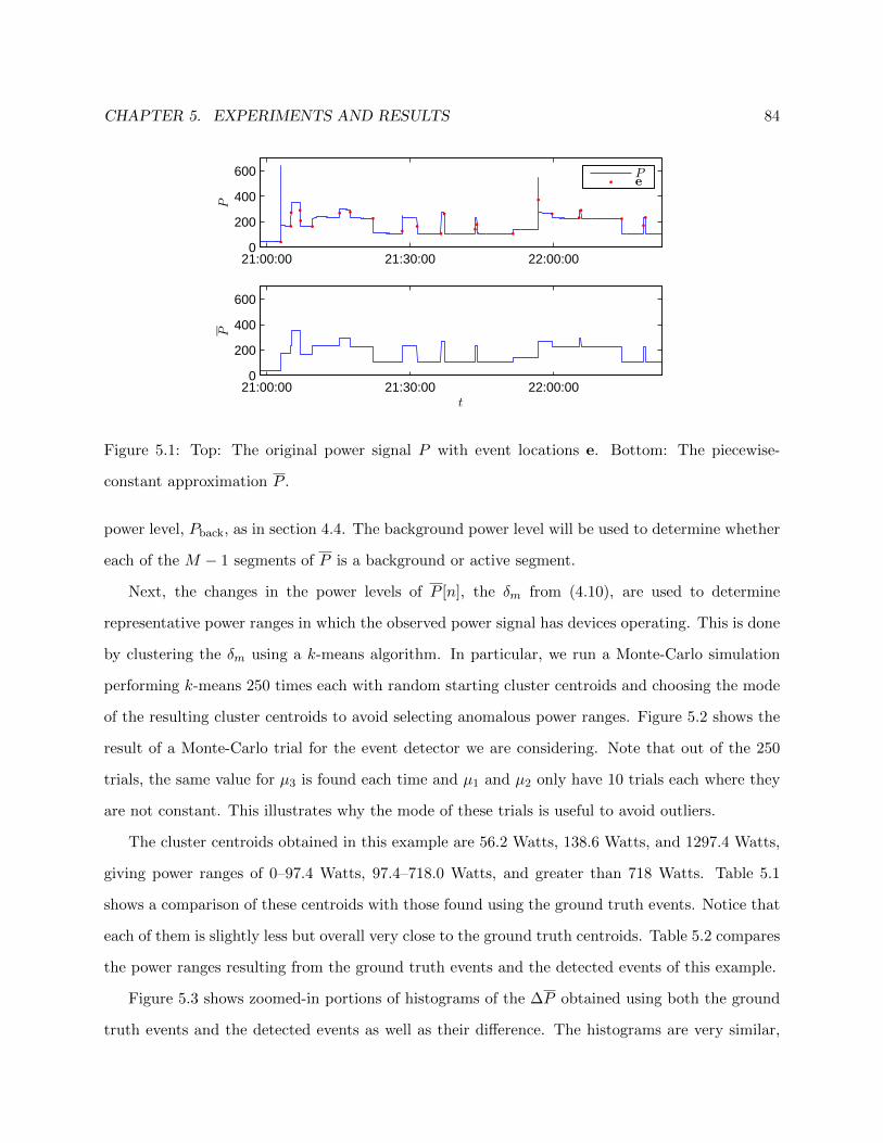
CHAPTER 5. EXPERIMENTS AND RESULTS 84
21:00:00 21:30:00 22:00:000
200
400
600
P
21:00:00 21:30:00 22:00:000
200
400
600
t
P
Pe
Figure 5.1: Top: The original power signal P with event locations e. Bottom: The piecewise-
constant approximation P .
power level, Pback, as in section 4.4. The background power level will be used to determine whether
each of the M − 1 segments of P is a background or active segment.
Next, the changes in the power levels of P [n], the δm from (4.10), are used to determine
representative power ranges in which the observed power signal has devices operating. This is done
by clustering the δm using a k-means algorithm. In particular, we run a Monte-Carlo simulation
performing k-means 250 times each with random starting cluster centroids and choosing the mode
of the resulting cluster centroids to avoid selecting anomalous power ranges. Figure 5.2 shows the
result of a Monte-Carlo trial for the event detector we are considering. Note that out of the 250
trials, the same value for µ3 is found each time and µ1 and µ2 only have 10 trials each where they
are not constant. This illustrates why the mode of these trials is useful to avoid outliers.
The cluster centroids obtained in this example are 56.2 Watts, 138.6 Watts, and 1297.4 Watts,
giving power ranges of 0–97.4 Watts, 97.4–718.0 Watts, and greater than 718 Watts. Table 5.1
shows a comparison of these centroids with those found using the ground truth events. Notice that
each of them is slightly less but overall very close to the ground truth centroids. Table 5.2 compares
the power ranges resulting from the ground truth events and the detected events of this example.
Figure 5.3 shows zoomed-in portions of histograms of the ∆P obtained using both the ground
truth events and the detected events as well as their difference. The histograms are very similar,
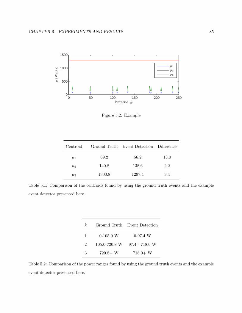
CHAPTER 5. EXPERIMENTS AND RESULTS 85
0 50 100 150 200 2500
500
1000
1500
Iteration #
µ(W
atts)
µ1
µ2
µ3
Figure 5.2: Example
Centroid Ground Truth Event Detection Difference
µ1 69.2 56.2 13.0
µ2 140.8 138.6 2.2
µ3 1300.8 1297.4 3.4
Table 5.1: Comparison of the centroids found by using the ground truth events and the example
event detector presented here.
k Ground Truth Event Detection
1 0-105.0 W 0-97.4 W
2 105.0-720.8 W 97.4 - 718.0 W
3 720.8+ W 718.0+ W
Table 5.2: Comparison of the power ranges found by using the ground truth events and the example
event detector presented here.

CHAPTER 5. EXPERIMENTS AND RESULTS 86
0 50 100 150 200 250
0
50
100
150
GT
Count
0 50 100 150 200 250
0
50
100
150
ED
Count
0 50 100 150 200 250
0
50
100
150
GT-E
D
∆P
Figure 5.3: Comparison of zoomed-in portions of histograms of all ‘on’ events. Top shows the
histogram obtained by using the ground truth events. Middle shows the histogram obtained by
using the example event detector. Bottom shows the difference of the two histograms. The bins
are 10 Watts wide.
which is expected since the µk found by the k-means algorithm differ only by a small amount (see
table 5.1).
Once the power ranges are determined, the APTDA algorithm can complete the final stages of
Component Decomposition and Component Balancing in which the active and background compo-
nents P k[n] are created. Recall that each P k represents the power consumption of devices falling
within the kth power consumption range. The P k are then used to calculate the energy consumed
by devices in each range, Ek, over a desired period of time. Table 5.3 shows the estimate given
by the APTDA algorithm of the amount of energy consumed by each component on phase A of
the BLUED dataset when the ground truth events are used as well as the event detector of this
example.
At this point, the APTDA algorithm has been completed, that is, the orignal power signal P [n]
has been approximated by P [n] in a piece-wise constant fashion with the events in e determining
the segment sizes and locations. The changes in P , ∆P , determined the power ranges of the

CHAPTER 5. EXPERIMENTS AND RESULTS 87
Ek Ground Truth Event Detection Error % Error
E0 6.87 kWh 6.88 kWh 0.01 kWh 0.12%
E1 0.89 kWh 0.73 kWh -0.16 kWh -18.00%
E2 7.66 kWh 7.82 kWh 0.16 kWh 2.12%
E3 0.44 kWh 0.43 kWh -.01 kWh -1.33%
Table 5.3: The energy in kilowatt-hours estimated by the APTDA algorithm for both the ground
truth events and the example event detector.
active components P k. And the construction of the P k allowed us to compute the energy of each
component. In this example the energy was reported over 1 week of data, but it could be broken
down into any desirable time period.
Notice that the energy reported in table 5.3 for each of the components is almost identical
between the ground truth events and the detected events. This is expected in this case because the
power consumption ranges returned in both cases were very similar (see table 5.2). It is important
to remember in these results that the energy reported depends on the particular power range of
the component in question and the power range in turn depends depend on the events, e, used to
compute P . This means in general, then, for a fixed K, the components obtained by different event
detectors are not directly comparable because the underlying power ranges for the components are
not guaranteed to be identical.
5.2 Robustness of APTDA to Event Locations
In the previous section, we gave a detailed account of exactly how the APTDA algorithm starts
from the original power signal and a set of event locations, computes appropriate power ranges,
and estimates energy consumption for all of the devices occurring in those ranges. In this section,
we present the results of the APTDA algorithm when run on different sets of event locations
obtained by doing a parameter sweep of the log likelihood ratio (LLR) event detector (presented
in chapter 3). In total, 1,456 parameter combinations were run by varying the voting window,

CHAPTER 5. EXPERIMENTS AND RESULTS 88
0 500 1000 15000
500
1000
1500
Detector sensitivity
µk(W
atts)
µ1
µ2
µ3
Figure 5.4: Cluster centroids found using k-means with k = 3 for each event detector ordered from
least to most sensitive. The dashed lines show the location of the µk when the ground truth events
are used.
pre- and post-window, and voting threshold parameters. We first describe the setup for the tests
performed and then present results showing the robustness of the APTDA algorithm to different
event detectors.
The next series of figures focuses on comparing the performance of the APTDA algorithm
among the 1,456 event detector parameter combinations that we tested. The results are ordered
on the x-axis by detector sensitivity according to the number of events returned by each detector
(see figure 3.4 for reference).
The first two figures, 5.4 and 5.5, show how the centroid clusters, and thus the power ranges
for each of the active components, are affected by each of the event detectors. Figure 5.4 shows, in
the solid lines, the location of the cluster centroids, µk, for each of the event detectors tested. The
dashed lines show the corresponding µk for the ground truth event locations.
The power level of the cutoff between two adjacent components P k and P k+1 is defined as ηk:
ηk =µk+1 − µk
2, k = 1, . . . ,K − 1 (5.1)
This cutoff value, ηk is simply the midpoint between µk and µk+1. The region between the cutoff
values determines the power range of each component P k. These ranges are shown explicitly in
figure 5.5. The dashed lines overlayed on this figure, η∗k, show the cutoff power levels for when the
ground truth events are used.

CHAPTER 5. EXPERIMENTS AND RESULTS 89
200 400 600 800 1000 1200 14000
200
400
600
800
1000
Detector sensitivity
Power
range(W
atts)
P 1
P 2
P 3
η∗
1
η∗
2
Figure 5.5: Similar in shape to figure 5.4, this figure shows the power consumption ranges for each
of the active components. The cutoff between ranges is simply the midpoint between the adjacent
µk from figure 5.4. The dashed lines indicate the cutoff levels when the ground truth events were
used and are simply color coded for better visibility.
The next figure, figure 5.6, shows the estimated energy for each of the components across the
different event detectors. It is important to understand in this figure that, because the power
ranges found by each of the different detectors are not the same, as seen in figure 5.5, we do not
expect the energy consumed by each component to be the same either. Note, however, that there
is stability in the estimated energy consumed by each component for those detectors that returned
power ranges similar to those of the ground truth events.
It is also notable that the background energy consumption is almost unchanged across all of
the different detectors. This is expected and occurs for two reasons. First, the estimation of the
background power level, explained in section 4.4, is independent of the events used in the algorithm.
It is simply a function of the original power signal. The second reason this happens is because of
how the active and background segments are labeled as explained in section 4.5. During an active
segment, the background power level is assumed to remain constant at the level of the immediately
preceding background segment. Changes in event locations, then, only change the positions of the
active and background segments, but have almost no bearing on the estimate of energy consumed

CHAPTER 5. EXPERIMENTS AND RESULTS 90
0 500 1000 15000
2
4
6
8
Detector sensitivity
Ek(kWh) E0
E1
E2
E3
Figure 5.6: Estimate of energy consumed by each component across the different event detector
parameter combinations tested. The large variation in the values, particularly among the more
sensitive detectors, occurs because the power ranges obtained by each detector are not the same.
The stability on the left portion of the plot is due to the stability of the power ranges as shown in
figures 5.5.
by the background component.
Immediately noticeable in the previous three figures (5.4, 5.5, and 5.6) is that there is a large
region of stable behavior. To quantize this let us focus on how the power ranges shown in figure 5.5
found by detectors compare with those of the ground truth. In particular, we will focus on how
closely the cutoff value between components compares with the ground truth cutoff values. To do
this we introduce the notion of power cutoff tolerance.
A detector, d, is considered as falling in the pth percentage of power cutoff tolerance if the all of
the power cutoffs, ηk,d, found using that detector fall within p percent of the ground truth power
cutoffs, η∗k. Let D be the set of all 1,456 detectors and Dp ⊂ D be the set of all detectors with
power cutoffs occuring within p percent of the the ground truth cutoffs:
Dp ={d ∈ D :
(1− p
100
)· η∗k ≤ ηk,d ≤
(1 +
p
100
)· η∗k, p ≥ 0, ∀k ∈ 1, . . . ,K − 1
}(5.2)
Note that in this definition p is not restricted to be between 0 and 100 because it is possible for
some ηk,d to differ from η∗k by greater than 100%. Table 5.4 shows, for phase A of the BLUED
dataset, what the ground truth η∗k are and the resulting 10% and 25% ranges for those η∗k.
With the idea of power cutoff tolerance now defined, we are interested in how many detectors
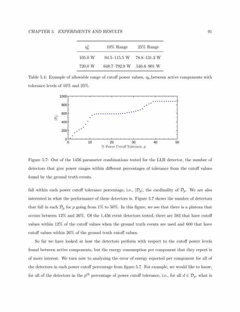
CHAPTER 5. EXPERIMENTS AND RESULTS 91
η∗k 10% Range 25% Range
105.0 W 94.5–115.5 W 78.8–131.3 W
720.0 W 648.7–792.9 W 540.6–901 W
Table 5.4: Example of allowable range of cutoff power values, ηk,between active components with
tolerance levels of 10% and 25%.
0 10 20 30 40 500
200
400
600
800
1000
% Power Cutoff Tolerance, p
|Dp|
Figure 5.7: Out of the 1456 parameter combinations tested for the LLR detector, the number of
detectors that give power ranges within different percentages of tolerance from the cutoff values
found by the ground truth events.
fall within each power cutoff tolerance percentage, i.e., |Dp|, the cardinality of Dp. We are also
interested in what the performance of these detectors is. Figure 5.7 shows the number of detectors
that fall in each Dp for p going from 1% to 50%. In this figure, we see that there is a plateau that
occurs between 12% and 26%. Of the 1,456 event detectors tested, there are 583 that have cutoff
values within 12% of the cutoff values when the ground truth events are used and 600 that have
cutoff values within 26% of the ground truth cutoff values.
So far we have looked at how the detectors perform with respect to the cutoff power levels
found between active components, but the energy consumption per component that they report is
of more interest. We turn now to analyzing the error of energy reported per component for all of
the detectors in each power cutoff percentage from figure 5.7. For example, we would like to know,
for all of the detectors in the pth percentage of power cutoff tolerance, i.e., for all d ∈ Dp, what is
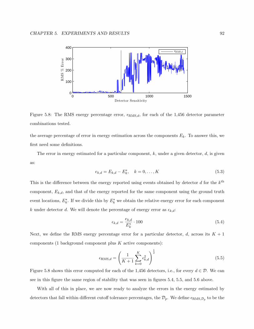
CHAPTER 5. EXPERIMENTS AND RESULTS 92
0 500 1000 15000
100
200
300
400
Detector Sensitivity
RMS%
Error
ǫRMS,d
Figure 5.8: The RMS energy percentage error, εRMS,d, for each of the 1,456 detector parameter
combinations tested.
the average percentage of error in energy estimation across the components Ek. To answer this, we
first need some definitions.
The error in energy estimated for a particular component, k, under a given detector, d, is given
as:
ek,d = Ek,d − E∗k , k = 0, . . . ,K (5.3)
This is the difference between the energy reported using events obtained by detector d for the kth
component, Ek,d, and that of the energy reported for the same component using the ground truth
event locations, E∗k . If we divide this by E∗k we obtain the relative energy error for each component
k under detector d. We will denote the percentage of energy error as εk,d:
εk,d =ek,dE∗k· 100 (5.4)
Next, we define the RMS energy percentage error for a particular detector, d, across its K + 1
components (1 background component plus K active components):
εRMS,d =
(1
K + 1
K∑k=0
ε2k,d
) 12
(5.5)
Figure 5.8 shows this error computed for each of the 1,456 detectors, i.e., for every d ∈ D. We can
see in this figure the same region of stability that was seen in figures 5.4, 5.5, and 5.6 above.
With all of this in place, we are now ready to analyze the errors in the energy estimated by
detectors that fall within different cutoff tolerance percentages, the Dp. We define εRMS,Dp to be the

CHAPTER 5. EXPERIMENTS AND RESULTS 93
0 10 20 30 40 500
20
40
60
ǫRMS,D
p(%
)
0 10 20 30 40 500
20
40
60
80
% Power Cutoff Tolerance, p
σ(ǫ
RMS,D
p)(%
)
Figure 5.9: For all of the detectors at each power cutoff tolerance percentage the mean (top) and
standard deviation (bottom) of RMS energy percentage error, εRMS,Dp from (5.6).
collection of RMS energy percentage error for all of the detectors that fall within the pth percentage
of cutoff power tolerance, i.e., all d ∈ Dp :
εRMS,Dp = {εRMS,d : d ∈ Dp} (5.6)
Figure 5.9 shows, for power cutoff tolerances from 1%–50%, both the mean and standard deviation
of the RMS energy percentage error εRMS,Dp from (5.6). In this figure, we see that the average error
remains below 6% for all p ≤ 30 and that the standard deviation remains below 5% in this same
range. Both quickly rise after this point, however, reflecting the instability of the performance of
the more sensitive detectors seen in the earlier plots as well.
Table 5.5 shows a sampling of the mean and standard deviation of εRMS,Dp for power cutoff
tolerances, p, ranging from 1% to 50%. We see in this table that there is an appreciable jump in
the average error from p = 30 to p = 35. We also see that D100 contains 1,337 detectors which
means that there are 119 detectors for which at least one of the cutoffs differs from the ground
truth cutoffs by more than 100%.
In order to see the stability of the energy estimates found by the detectors in D30, i.e., those

CHAPTER 5. EXPERIMENTS AND RESULTS 94
p |Dp| εRMS,Dp σ(εRMS,Dp
)5 217 5.11% 3.49%
10 501 5.67% 3.86%
15 589 5.49% 3.71%
20 590 5.51% 3.74%
25 600 5.61% 3.81%
30 640 5.85% 4.35%
35 763 28.30% 63.58%
40 880 45.71% 75.73%
100 1337 115.61% 117.02%
Table 5.5: Sampling of properties of detectors of difference cutoff tolerance percentages, p. |Dp| is
the number of detectors in Dp. εRMS,Dp and σ(εRMS,Dp
)are the mean and standard deviation of
the energy percentage error across all the detectors in each Dp.
with an average error of 5.85% across all components, we have split the plot shown in figure 5.6 into
two plots. In the top plot we see the energy per component estimated by all of the 640 detectors in
D30, that is, all of the detectors with power cutoff values within 30% of the ground truth cutoffs.
The bottom plot shows the energy per component estimated by the remaining 816 detectors, those
that have power cutoff values that differ from the ground truth cutoffs by greater than 30%, i.e.,
the members of Dc30. The average RMS energy error percentage for D30 is 5.85% with a standard
deviation of 4.35% while for Dc30 it is 230.09% and 75.26%, respectively.
Alongside the error analysis, we can also look at the parameters of the event detectors falling in
different Dp. We want to see if there are any patterns in the detection parameters to determine if
there are any parameters of particular significance. Figure 5.11 shows, for all of the detectors in D30,
a breakdown of the occurrences of each parameter. Recall, from the discussion in section 3.2.1,
that there were three parameters of the LLR detector varied in our testing of 1,456 parameter
combinations: voting window length (top), pre/post-window length (middle) , and voting thresh-
old (bottom). The figure shows, for each parameter, what percentage of detectors with a particular

CHAPTER 5. EXPERIMENTS AND RESULTS 95
0 100 200 300 400 500 600 7000
2
4
6
8
Ek(kWh) E0
E1
E2
E3
0 100 200 300 400 500 600 700 800 9000
2
4
6
8
Detector Sensitivity
Ek(kWh)
Figure 5.10: Top: Estimated energy per component with ≤ 30% power cutoff tolerance, i.e., d ∈
D30. Bottom: Estimated energy per component for detectors with > 30% power cutoff tolerance,
i.e., d ∈ Dc30. The dashed lines in both plots show the ground truth energy for each component for
comparison.

CHAPTER 5. EXPERIMENTS AND RESULTS 96
3 4 5 6 7 8 9 10 11 12 13 14 150
50
100
Voting Window Length
%in
D30
2 3 4 5 6 7 8 9 10 11 12 13 14 150
50
100
Pre/Post Window Length
%in
D30
2 3 4 5 6 7 8 9 10 11 12 13 14 150
50
100
Voting Threshold
%in
D30
Figure 5.11: Percentage of detectors with the given parameters that occur in Dp. The proper way
to read this plot, using the pre/post-window length as an example, is: “Of all the detectors with a
pre/post-window length of 2, about 75% of them fall within the 30% power cutoff tolerance range.”
parameter setting occurs in D30. For example, there are 196 detectors that have a voting window
length of 15 (see figure 3.5 for a breakdown of the number of detectors with each parameter value).
Of these 196, there are 124 or 63.27% that occur in D30.
We see in figure 5.11, then, that 100% of the detectors that have voting thresholds of 9 or
greater all belong to D30. These represent 392 of the 640 detectors in D30. This also indicates
that the voting threshold is the parameter that has the most impact on whether a detector will
exhibit desirable performance under the APTDA algorithm for phase A of the BLUED dataset.
Specifically, this means that any detector having a voting threshold of 9 or more reports, on average,
energy consumption for which the RMS error across the 4 components differs from the ground truth
by only 5.85%.
5.3 Crowdsourcing Event Detectors
In section 5.2, we showed how the APTDA algorithm on the 1,456 event detectors compared to using
the ground truth event locations in phase A of the BLUED dataset, and we saw regions of stability
CHAPTER 5. EXPERIMENTS AND RESULTS 97
in both solving for the µk and the Ek across all 1,456 event detectors. These results are interesting,
but there are two difficulties that we solve in this section. First, the sets of event detectors with
acceptable performance, the Dp from equation (5.2), explicitly require using the ground truth
events. While interesting for analyzing the problem, it is unacceptable for an algorithm in practice
because the ground truth is generally unknown.
The second difficulty that we address here is the problem of the power consumption cluster
centroids, the µk, differing for each event detector. The µk found by each of the detectors are not
necessarily the same. This means that for a fixed k, the Ek,d, the energy consumption of component
k reported by detector d, are not strictly commensurate because they are not reporting energy on
devices in the same consumption classes. Again, the use of the Dp from equation (5.2), reveals the
nature of this problem in practice. Dp contains by definition detectors that report similar power
ranges, but these ranges are not identical.
In this section, we provide solutions for both of these problems based on crowdsourcing the
output of the APTDA algorithm across all of the detectors tested. This essentially means that
we use an unsupervised method to find the regions of stable performance across all of the event
detectors tested. Specifically, we want to find µk and Ek, where µk is an unsupervised estimate
of the power consumption clusters that define the active components, and Ek is an unsupervised
estimate of the energy consumed by devices contained in each of these active components.
Figure 5.12 shows, for each of the three active components, a histogram of the µk across the
1,456 detectors tested on phase A of the BLUED dataset. These µk can be seen in figure 5.4. The
bins in these histograms have a width of 1 Watt. For each active component, we choose µk to be
the most frequently occurring value across all of the event detectors tested, i.e., the highest point
in each of the histograms.
In order to generate energy estimates that are over the same power consumption classes, we can
force the APTDA algorithm to use the crowdsourced µk instead of the µk learned by each detector.
This is done by skipping the Power Consumption Bin Clustering stage in APTDA and using the
crowdsourced µk in the Component Decomposition stage. In this way, the energy consumption
reported by each detector will be an estimate of energy consumed by the same power consumption

CHAPTER 5. EXPERIMENTS AND RESULTS 98
10 20 30 40 50 60 70 80 90 100 1100
50
100
µ1Cou
nt
100 150 200 250 300 350 400 450 5000
50
100
150
µ2Cou
nt
600 700 800 900 1000 1100 1200 1300 14000
100
200
300
µ3Cou
nt
∆P (Watts)
Figure 5.12: Histogram of the power consumption cluster centroids, µk, found by the APTDA
algorithm across the 1,456 detectors tested on phase A of the BLUED dataset with k=3. The
x-axis has bins that are each 1 Watt wide.
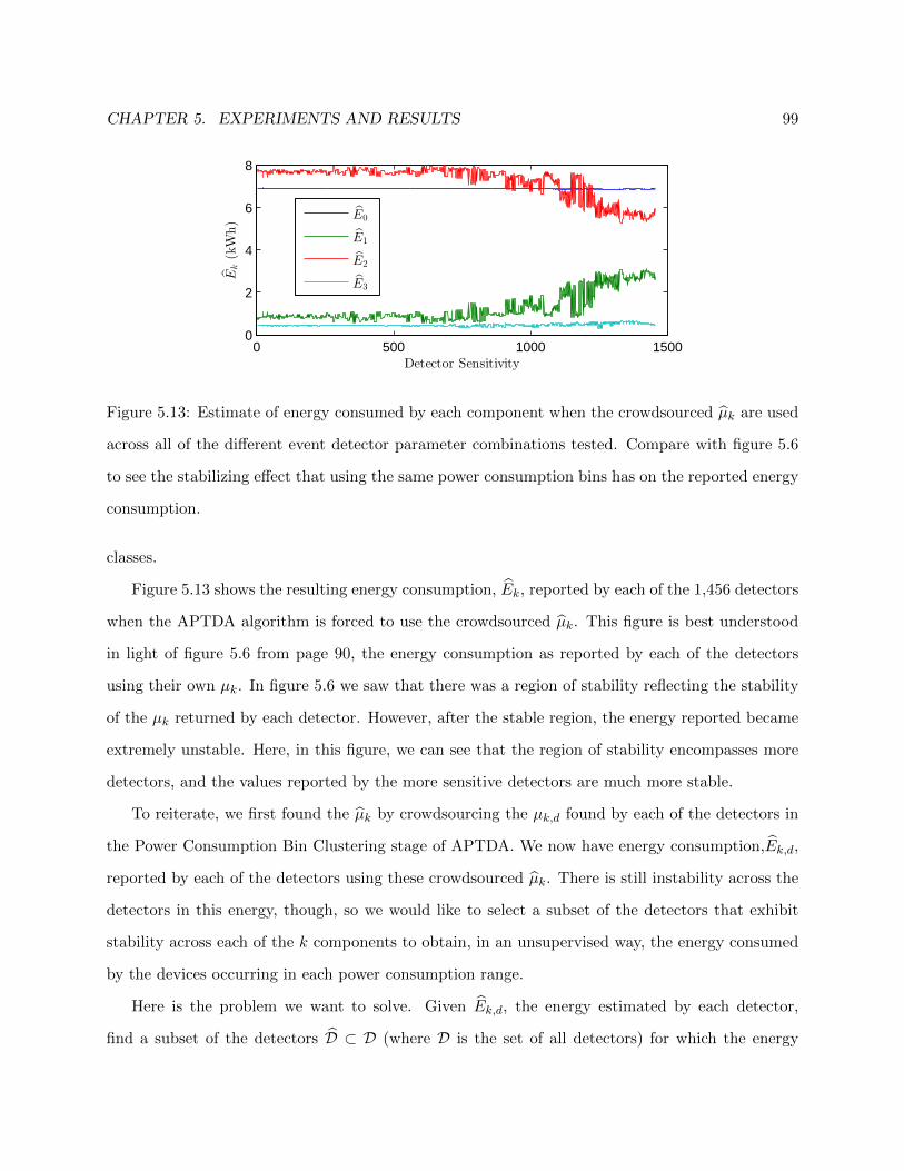
CHAPTER 5. EXPERIMENTS AND RESULTS 99
0 500 1000 15000
2
4
6
8
Detector Sensitivity
Ek(kWh)
E0
E1
E2
E3
Figure 5.13: Estimate of energy consumed by each component when the crowdsourced µk are used
across all of the different event detector parameter combinations tested. Compare with figure 5.6
to see the stabilizing effect that using the same power consumption bins has on the reported energy
consumption.
classes.
Figure 5.13 shows the resulting energy consumption, Ek, reported by each of the 1,456 detectors
when the APTDA algorithm is forced to use the crowdsourced µk. This figure is best understood
in light of figure 5.6 from page 90, the energy consumption as reported by each of the detectors
using their own µk. In figure 5.6 we saw that there was a region of stability reflecting the stability
of the µk returned by each detector. However, after the stable region, the energy reported became
extremely unstable. Here, in this figure, we can see that the region of stability encompasses more
detectors, and the values reported by the more sensitive detectors are much more stable.
To reiterate, we first found the µk by crowdsourcing the µk,d found by each of the detectors in
the Power Consumption Bin Clustering stage of APTDA. We now have energy consumption,Ek,d,
reported by each of the detectors using these crowdsourced µk. There is still instability across the
detectors in this energy, though, so we would like to select a subset of the detectors that exhibit
stability across each of the k components to obtain, in an unsupervised way, the energy consumed
by the devices occurring in each power consumption range.
Here is the problem we want to solve. Given Ek,d, the energy estimated by each detector,
find a subset of the detectors D ⊂ D (where D is the set of all detectors) for which the energy

CHAPTER 5. EXPERIMENTS AND RESULTS 100
0 500 1000 15000
2
4
E1(kWh)
E1
0 500 1000 15005
6
7
8
E2(kWh)
E2
0 500 1000 15000
0.5
1
Detectors Sorted by Ek
E3(kWh)
E3
Figure 5.14: Sorted versions of Ek are helpful for seeing the more stable (i.e., flatter) intervals of
the energy estimates across the 1,456 detectors tested.
consumption across each of the k active components exhibits stability. To help understand this,
consider figure 5.14. In this figure, each subplot shows a sorted version of Ek for each of the active
components. These are simply the curves from figure 5.13 separated and sorted. We emphasize
that the ordering for each of the curves is different. We want to find the interval in each of these
plots that is in some sense the most stable. This stable interval will correspond to a different set
of detectors for each of the components. In order to find the detectors that are stable across all
components, we take the intersection of the sets stable detectors for each component.
To quantize the stability of the energy estimates, we first consider the range that each of the
Ek takes. Table 5.6 gives, for each estimate, the minimum, maximum, and the overall range of
these values. The values in the table can be seen clearly in figure 5.14. E1 and E2 both have a
total range of about 2.5 kWh over which estimates occur while E3 has a smaller range of 0.34 kWh.
∆Ek is defined as:
∆Ek = maxd∈D
(Ek,d
)−min
d∈D
(Ek,d
)(5.7)
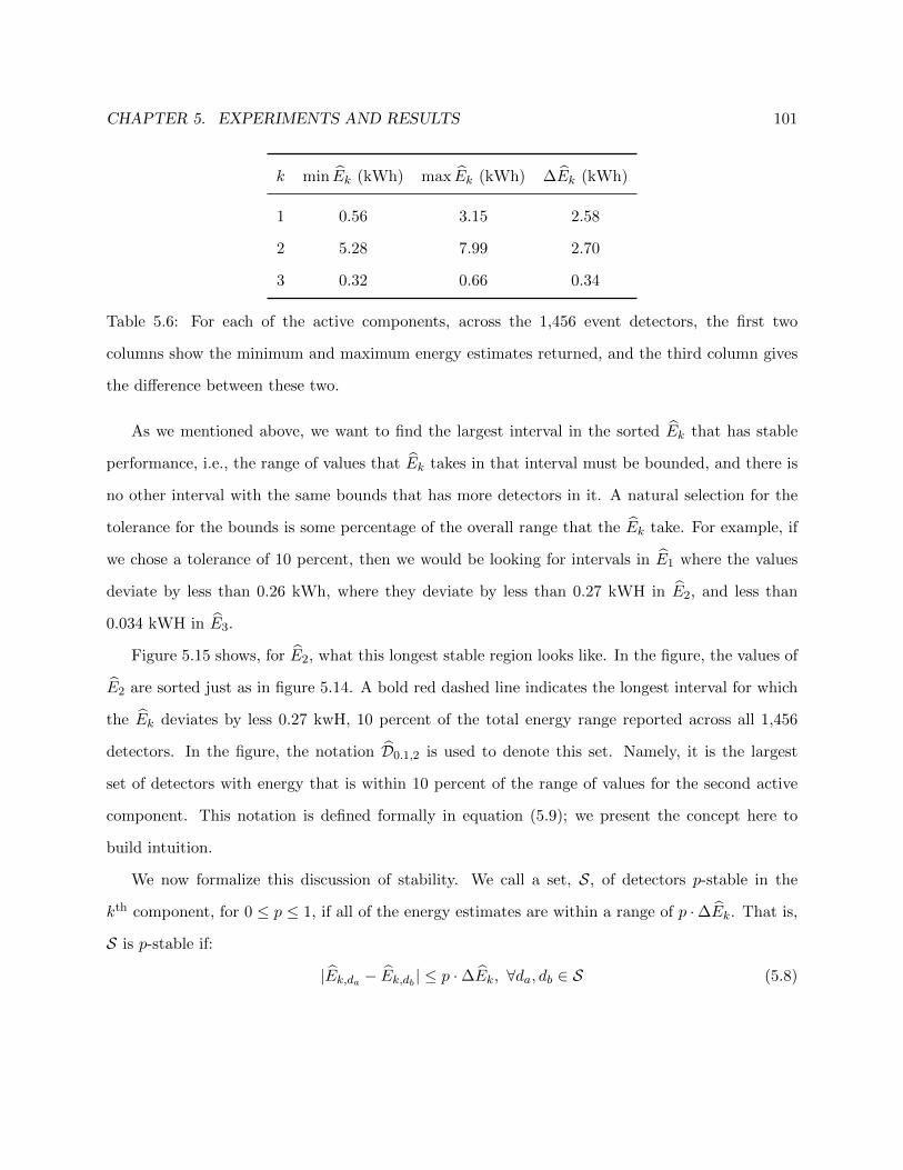
CHAPTER 5. EXPERIMENTS AND RESULTS 101
k min Ek (kWh) max Ek (kWh) ∆Ek (kWh)
1 0.56 3.15 2.58
2 5.28 7.99 2.70
3 0.32 0.66 0.34
Table 5.6: For each of the active components, across the 1,456 event detectors, the first two
columns show the minimum and maximum energy estimates returned, and the third column gives
the difference between these two.
As we mentioned above, we want to find the largest interval in the sorted Ek that has stable
performance, i.e., the range of values that Ek takes in that interval must be bounded, and there is
no other interval with the same bounds that has more detectors in it. A natural selection for the
tolerance for the bounds is some percentage of the overall range that the Ek take. For example, if
we chose a tolerance of 10 percent, then we would be looking for intervals in E1 where the values
deviate by less than 0.26 kWh, where they deviate by less than 0.27 kWH in E2, and less than
0.034 kWH in E3.
Figure 5.15 shows, for E2, what this longest stable region looks like. In the figure, the values of
E2 are sorted just as in figure 5.14. A bold red dashed line indicates the longest interval for which
the Ek deviates by less 0.27 kwH, 10 percent of the total energy range reported across all 1,456
detectors. In the figure, the notation D0.1,2 is used to denote this set. Namely, it is the largest
set of detectors with energy that is within 10 percent of the range of values for the second active
component. This notation is defined formally in equation (5.9); we present the concept here to
build intuition.
We now formalize this discussion of stability. We call a set, S, of detectors p-stable in the
kth component, for 0 ≤ p ≤ 1, if all of the energy estimates are within a range of p ·∆Ek. That is,
S is p-stable if:
|Ek,da − Ek,db | ≤ p ·∆Ek, ∀da, db ∈ S (5.8)

CHAPTER 5. EXPERIMENTS AND RESULTS 102
0 500 1000 15005
6
7
8
Detectors Sorted by E2
E2(kWh)
E2
D0.10,2
Figure 5.15: Close up of E2, the middle plot from figure 5.14. The largest 0.1-stable set of detectors,
D0.1,2 is shown in red. The top and bottom of the box indicate the upper and lower bounds of the
acceptable range 0.1 ·∆E2. There are 665 detectors within this set.
We define the largest set of p-stable detectors for component k as:
Dp,k = arg maxDp,δ,k
∣∣∣Dp,δ,k
∣∣∣ (5.9)
where
Dp,δ,k ={d ∈ D : Ek,δ − 0.5 · p ·∆Ek ≤ Ek,d ≤ Ek,δ + 0.5 · p ·∆Ek
}(5.10)
That is, Dp,δ,k is by construction a p-stable set of detectors in the kth component centered on the
energy consumption, Ek,δ, of a particular detector, δ ∈ D. In our setup, Dp,δ,k can be explicitly
computed for each of the 1,456 detectors according to (5.10). Thus, equation (5.9) selects among
these the set that has the most members. When the detectors are ordered according to energy
consumption as in figures 5.14 and 5.15, this set will necessarily correspond to an interval in that
ordering.
The final set that we are interested,in, Dp, must capture all of the detectors that are in common
across the k components. It is obtained by taking the intersection:
Dp =
K⋂k=1
Dp,k (5.11)
By construction it is p-stable in each of the components, so we refer to Dp as the maximum p-stable
set of detectors.
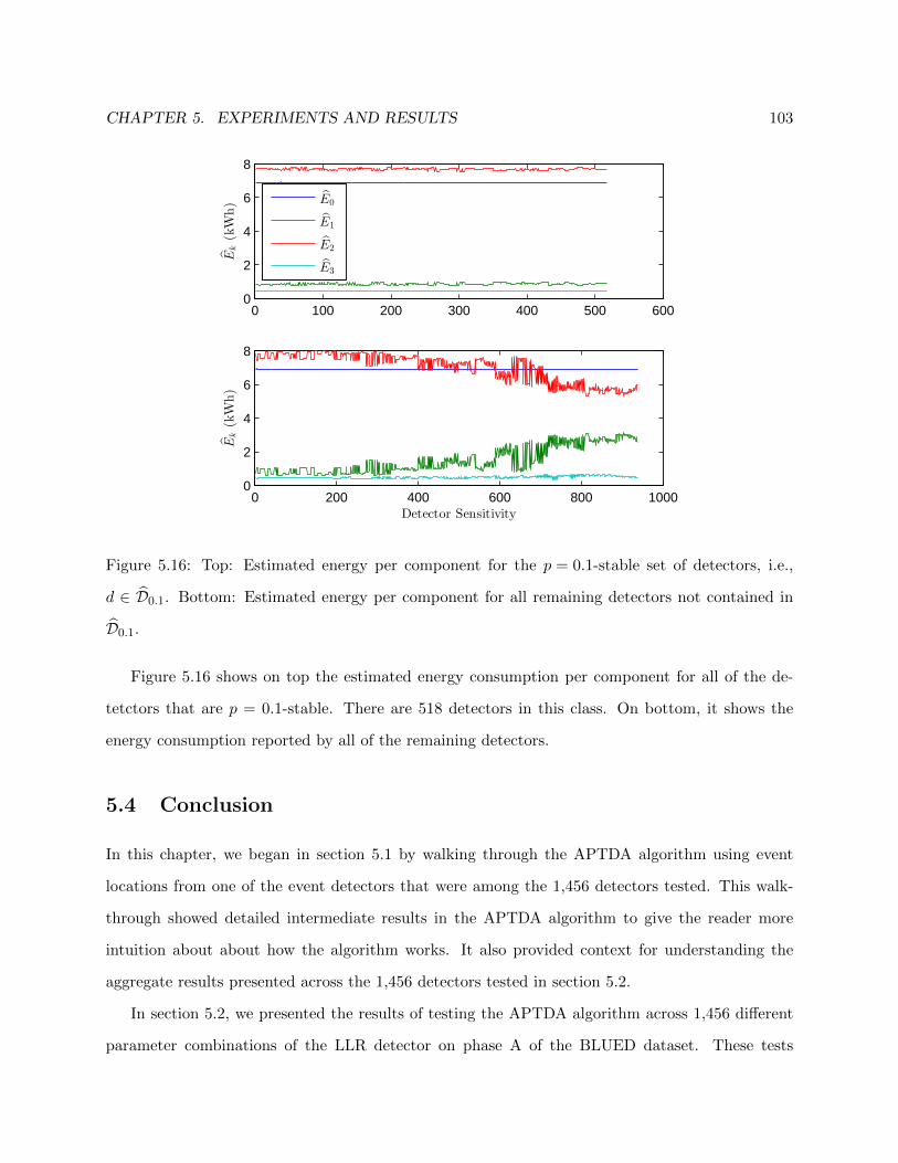
CHAPTER 5. EXPERIMENTS AND RESULTS 103
0 100 200 300 400 500 6000
2
4
6
8
Ek(kWh)
0 200 400 600 800 10000
2
4
6
8
Detector Sensitivity
Ek(kWh)
E0
E1
E2
E3
Figure 5.16: Top: Estimated energy per component for the p = 0.1-stable set of detectors, i.e.,
d ∈ D0.1. Bottom: Estimated energy per component for all remaining detectors not contained in
D0.1.
Figure 5.16 shows on top the estimated energy consumption per component for all of the de-
tetctors that are p = 0.1-stable. There are 518 detectors in this class. On bottom, it shows the
energy consumption reported by all of the remaining detectors.
5.4 Conclusion
In this chapter, we began in section 5.1 by walking through the APTDA algorithm using event
locations from one of the event detectors that were among the 1,456 detectors tested. This walk-
through showed detailed intermediate results in the APTDA algorithm to give the reader more
intuition about about how the algorithm works. It also provided context for understanding the
aggregate results presented across the 1,456 detectors tested in section 5.2.
In section 5.2, we presented the results of testing the APTDA algorithm across 1,456 different
parameter combinations of the LLR detector on phase A of the BLUED dataset. These tests

CHAPTER 5. EXPERIMENTS AND RESULTS 104
showed the APTDA algorithm to be robust to the event locations in its estimation of the power
consumption clusters and energy consumed by each cluster.
In section 5.3, we showed how estimates of the power consumption ranges and the energy
consumed by each of these ranges may be obtained in an unsupervised way by crowdsourcing all
of the event detectors from the parameter sweep. We defined a notion of sets of detectors that
exhibit stability as a percentage of the range of values reported across all of the detectors tested.
This result is valuable because it eliminates the dependency on finding parameters for a particular
detector to use while still providing stable estimates of energy consumption..
These results are important because in much of the event-based NILM literature there is little
to no reporting of actual energy disaggregation. The relaxation of the problem from attempting to
disaggregate the consumption of every device present to estimating consumption for power ranges
learned from the data allows us to bypass the difficult energy tracking problem and obtain estimates
that are very consistent.

Chapter 6
Conclusion and Future Work
We now summarize the content of this thesis, highlight our primary contributions, and discuss
avenues of future work for the PCC-NILM problem and the APTDA algorithm.
6.1 Chapter Summaries
In chapter 2, we presented considerations for collecting data for use in event-based NILM systems.
In particular, we presented the one week long BLUED dataset, which served as the basis for
the development of our algorithm in the remainder of the thesis. We described in detail the
infrastructure used for collecting the data and the methodology employed in labeling it. The data
contains timestamped labels indicating device activity rather than power streams for individual
devices, though this was collected for plug-level devices. At a sampling rate of 1 Hz, phase A of
the BLUED dataset contains 867 events, while phase B contains 1,529 events. Phase A has a total
energy consumption of 15.9 kWh and phase B has a consumption of 78.9 kWh.
In chapter 3, we presented a detailed description and analysis of a modified likelihood ratio
detector for use on power data. The detector has five parameters, and we performed a parameter
sweep generating 1,456 detectors that were each tested on the BLUED dataset. This parameter
sweep showed the difficulty of the event detection problem for event-based NILM systems. In
particular, the number of false positives and misses that even the best detectors allow is prohibitive
for event-based NILM algorithms. The problem is two-fold: not only must the optimal parameters
105

CHAPTER 6. CONCLUSION AND FUTURE WORK 106
be learned for a particular environment, but even the best detector exhibits performance that makes
traditional event-based NILM algorithms challenging to achieve. The broad parameter sweep that
we carried out motivated the move away from the traditional approach towards finding a different
solution to the problem.
In chapter 4, we began by motivating the relaxation of Power Consumption Clustered Non-
Intrusive Load Monitoring (PCC-NILM) as a reasonable alternative to the full device disaggregation
problem. This relaxation proposes to report energy consumption to the user based on grouping
devices of similar power consumption together. The chapter then described the Approximate
Power Trace Decomposition Algorithm (APTDA) as an unsupervised, data-driven solution to the
PCC-NILM problem. The algorithm starts from a set of events and constructs a piecewise-constant
approximation of the power signal; the changes in this approximation are used to find naturally
occurring clusters of power changes. The power trace approximation is then decomposed based
on these power change clusters, and the energy consumed by each component is then obtained by
integrating each of the decomposed power signals separately.
Chapter 5 presented experiments and results pertaining to the APTDA algorithm on phase A
of the BLUED dataset. The chapter began by walking through the entire APTDA algorithm using
the events from a randomly selected event detector from the 1,456 detectors that were tested in
chapter 3. This walkthrough provided context for analyzing the robustness of APTDA to event
locations provided by event detectors. This analysis was carried out by comparing the results of the
APTDA algorithm using event detectors against using the ground truth events labeled in phase A
of the BLUED dataset. We then provided an unsupervised method for determining the power
consumption classes and estimating their energy consumption. This was based on crowdsourcing
the output of the APTDA algorithm across all of the detectors that were used. It is a particularly
attractive approach because it provides stable estimates of energy consumption and eliminates the
need for finding event detector parameters that are optimal.

CHAPTER 6. CONCLUSION AND FUTURE WORK 107
6.2 Contributions
Our major achievement is to develop an unsupervised method for energy disaggregation in the home
that is validated with a real dataset. We summarize, in bullet form, our research contributions to
the Non-Intrusive Load Monitoring problem:
6.2.1 Power Consumption Clustered Non-Intrusive Load Monitoring
• Proposed PCC-NILM that relaxes the traditional device-based disaggregation model to dis-
aggregating energy by grouping together devices that consume power at similar levels.
6.2.2 Event Detection
• In-depth analysis of the likelihood ratio detector and its parameters on phase A of the BLUED
dataset. Demonstrated the difficulty of finding a detector with reasonable performance with
respect to traditional detection metrics.
• Crowd sourcing of event detectors for use in the APTDA algorithm. Generates more confi-
dence in power consumption class ranges and in estimates of per class energy consumption.
6.2.3 Unsupervised PCC-NILM: Approximate Power Trace Decomposition Al-
gorithm
• Method for decomposing a power signal into distinct power traces that track the power
consumption of devices grouped according to the power consumption classes proposed by the
PCC-NILM relaxation.
• Robustness of APTDA to event detection algorithms that makes it possible to crowd source
results based on running the algorithm across many detectors.
• Elimination of the need for training and for finding an optimal detector.
• Estimation of energy consumption and not stopping at analyzing detection and classification
performance.
CHAPTER 6. CONCLUSION AND FUTURE WORK 108
6.2.4 Validation of PCC-NILM
• Testing of APTDA on real data, not synthetic or contrived datasets.
6.3 Use Case
In section 1.4, we discussed some ways in which PCC-NILM could be used by consumers to learn
more about their power consumption. In that discussion, we highlighted the usefulness of learning
about the energy consumed by background devices, that is, those that are always on and consuming
some amount of power.
In phase A of the BLUED dataset, the background power level for the entire week is approxi-
mately 40 Watts, and this accounts for 40% of the total energy consumed.
Providing consumers with the actual percentage of their electricity bill that is composed of
devices in the background that are always drawing power may drive them to implement long-term
changes for reducing this amount. Televisions and digital video recorders (DVRs) are well-known
for having high power consumption in standby modes, and in homes that have multiple TVs and
DVRs, reporting the actual percentage of background energy may be surprising.
6.4 Future Work
In this thesis, we have presented Power Consumption Clustering Non-Intrusive Load Monitoring
(PCC-NILM) and the Approximate Power Trace Decomposition Algorithm (APTDA) as a way of
solving it. The block diagram of the APTDA algorithm is shown here, in figure 6.1, as a reference
point for discussing future work directions.
This thesis has focused on the creation of an end-to-end system, starting from the aggregate
power signal and ending with disaggregated energy for each class of devices, for solving the PCC-
NILM problem. This was accomplished with the APTDA algorithm. If we step back, now, and
consider the framework of the APTDA algorithm, as represented by the block diagram of figure 6.1,
we can see that future work consists in further analysis and development of improved algorithms
in each of the blocks.

CHAPTER 6. CONCLUSION AND FUTURE WORK 109
PPower Trace
Approximation
Background
Power Estimation
Power Consumption
Bin Clustering
Component
Decomposition
Active, Background
Segment LabelingP, e
P kComponent
Balancing
Figure 6.1: The block diagram for the APTDA algorithm, as also seen in figure 4.4, is presented
here for reference as future work is discussed.
Broad categories for future work can be broken into three groups: further development of the
APTDA algorithm (section 6.4.1), practical implementation and use of the APTDA algorithm
(section 6.4.2), and more general perennial NILM challenges (section 6.4.3).
6.4.1 Further Development of APTDA
In this section, we discuss future work specifically related to further development of the APTDA
algorithm.
Testing on Additional Datasets
The development and testing of the APTDA algorithm on the BLUED dataset, in particular on
phase A, validated it as a proof of concept. We expect that other datasets will have features that
were not present on phase A of the BLUED dataset, and that these features may be useful for
extending functionality of the APTDA algorithm.
Phase B of the BLUED dataset, for example, differs from phase A in that it returns much less
frequently to the background power level. It also has a segment lasting approximately four days in
which a 40 Watt device is left on, effectively changing the background power level for those days.
Additional datasets are also necessary for comparing the effectiveness of different implementa-
tions of the APTDA algorithm against each other. The following sections deal with future work
pertaining to different parts of APTDA. We envision a framework in which these different imple-
mentations of particular stages of the APTDA algorithm could be easily swapped out and tested
against each other. For these comparisons to be meaningful, a large number of datasets for testing

CHAPTER 6. CONCLUSION AND FUTURE WORK 110
would be necessary.
Background Power Estimation
Estimating the background power level of a home is of critical importance for the APTDA algorithm.
Further work is necessary for handling changes in the background power level. The related problem
of handling power traces where the background power level is not returned to frequently is also
important future work.
Power Consumption Bin Clustering
Within this stage of the APTDA algorithm, work could be done to study the effectiveness of
different types of clustering algorithms and how to choose the number of active components, K. In
particular, hierarchical clustering and Gaussian mixture models may be of interest.
In addition to the use of different clustering algorithms, it would be interesting to conduct
further analysis of the devices that fall within each of the active components P k. For example, it
could be possible to estimate the number of devices in each component. In the case of a component
with a few well-separated clusters, it may be possible to isolate each of the devices. This could be
particularly useful for higher power-consuming devices where the separation in power consumption
is more pronounced.
Component Balancing
In this thesis, we presented a greedy algorithm for balancing components in order to avoid the
problem of having negative power consumption reported in each component. Further study is
necessary for formalizing this task and treating it as optimization problem that works not in a
greedy fashion but by minimizing some cost function.
Incorporating Other Features
In the APTDA algorithm presented, only real power is taken into account. Further work could
explore the use of additional features such as reactive power or higher-order harmonics of the power
CHAPTER 6. CONCLUSION AND FUTURE WORK 111
signal. Each of these features could be useful in determining what types of devices make up each of
the active components. For example, purely resistive devices such as incandescent lights or electric
heaters have negligible reactive power consumption, whereas motors and other devices that are
not purely resistive have a more significant consumption of reactive power. Additionally, devices
containing only linear circuit elements may be distinguished from other types of electronics based
on the use of higher order harmonics that are induced by non-linear circuit elements.
Sampling Period Analysis
In this thesis, all of our work was done on power signals sampled at 1 Hz. The APTDA algorithm
relies on a sampling period short enough so that events usually correspond to activity from one
device. When the sampling period is lengthened, power values are averaged over longer periods
of time and multiple changes may be averaged together. Further work may be done to determine
acceptable ranges for the sampling period.
6.4.2 Practical Implementation and Use of APTDA
In order for PCC-NILM and APTDA to be an effective technology in residential environments,
there are human computer interaction issues that must be studied. The APTDA algorithm has
the potential to provide rich information to consumers; determining what information is most
actionable, and how to best present it, is another area of research to be explored.
6.4.3 Broader NILM Challenges
In this section, we discuss the problem of variable load devices as well as the potential for incorpo-
rating usage data from smart appliances into NILM solutions.
Variable Load Devices
Non-intrusive load monitoring solutions have recognized, since the earliest work done by George
Hart [5], the difficulty of handling devices with variable power consumption. In residential en-
vironments, this most commonly refers to HVAC systems with variable speed fans. These types

CHAPTER 6. CONCLUSION AND FUTURE WORK 112
of devices pose a problem to event-based NILM systems because they are not modeled well by
a step function. They may have slow ramping times that are difficult to detect and, while they
may have intervals of constant power consumption, their power consumption could potentially vary
continuously.
Very little research has been conducted regarding the isolation of these devices or how their
presence affects the operation of a NILM system on other devices present.
Hybrid NILM Systems
By hybrid NILM systems, we mean systems that combine an aggregate NILM system with indi-
vidual monitoring of some devices in the home. As more appliances become smart and capable of
reporting their own usage data, this information should be incorporated into NILM solutions.

Appendix A
BLUED
In this appendix, we provide tables for each of the devices monitored in the BLUED dataset. The
tables provide the name of each device, the average power that the device consumes when on, the
number of events observed, and the phase that the device is on. Tables A.1 and A.2 contain devices
that were monitored using FireFly plug sensors. Table A.3 contains lights monitored using the
FireFly environmental sensors. Table A.4 contains devices that were at the subcircuit level.
Many of the devices were not operated during the week that BLUED was collected, but we
include them here for completeness.
113

APPENDIX A. BLUED 114
Index Device Name Average Power (Watts) Number of events Phase
1 Desktop Lamp 30 25 B
2 Tall Desk Lamp 30 25 B
3 Garage Door 530 24 B
4 Washing Machine – 0 –
5 Kitchen Music – 0 –
6 Kitchen Aid Chopper 1500 16 A
7 Tea Kettle – 0 –
8 Toaster Oven – 0 –
9 Fridge 120 616 A
10 A/V Living Room 45 8 B
11 Subwoofer Living Room – 0 –
12 Computer 1 60 45 B
13 Laptop 2 40 14 B
14 Dehumidifier – 0 –
15 Vacuum Cleaner – 0 –
16 DVR, A/V, Blueray Basement 55 34 B
17 Subwoofer Basement – 0 –
18 Apple TV – 0 –
19 Air Compressor 1130 20 A
20 LCD Monitor 1 35 77 B
Table A.1: Devices in the BLUED dataset with their average power consumption when on, the
number of events present in the dataset, and which phase of the data the device was on. These
devices were monitored using FireFly plug sensors.

APPENDIX A. BLUED 115
Index Device Name Average Power (Watts) Number of events Phase
21 TV Basement 190 54 B
22 Hard Drive 2 – 0 –
23 Printer 930 150 B
24 Hair Dryer 1600 8 A
25 Iron 1400 40 B
26 Empty Living Room Socket 1 60 2 B
27 Empty Living Room Socket 2 – 0 –
28 Monitor 2 40 150 B
Table A.2: Devices in the BLUED dataset with their average power consumption when on, the
number of events present in the dataset, and which phase of the data the device was on. These
devices were monitored using FireFly plug sensors.
Index Device Name Average Power (Watts) Number of events Phase
29 Backyard Lights 60 16 A
30 Washroom Lights 110 6 A
31 Office Lights 30 54 B
32 Closet Lights 20 22 B
33 Upstairs Hallway Light 25 17 B
34 Kitchen Hallway Light 15 6 B
35 Kitchen Light 65 56 B
36 Bathroom Light 65 98 A
37 Dining Room Light 65 32 B
38 Bedroom Lights 190 19 A
39 Basement Light 35 39 B
Table A.3: Lights in the BLUED dataset with their average power consumption when on, the
number of events present in the dataset, and which phase of the data the device was on. These
lights were monitored using FireFly environmental sensors.
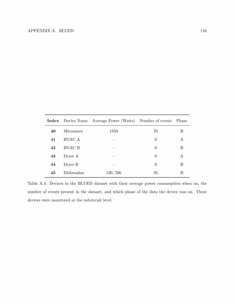
APPENDIX A. BLUED 116
Index Device Name Average Power (Watts) Number of events Phase
40 Microwave 1550 70 B
41 HVAC A - 0 A
42 HVAC B - 0 B
43 Dryer A - 0 A
44 Dryer B - 0 B
45 Dishwasher 130, 700 95 B
Table A.4: Devices in the BLUED dataset with their average power consumption when on, the
number of events present in the dataset, and which phase of the data the device was on. These
devices were monitored at the subcircuit level.

Bibliography
[1] S. Darby, “The effectiveness of feedback on energy consumption,” Environmental Change
Institute, University of Oxford, Oxford, UK, Tech. Rep., 2006.
[2] C. Fischer, “Feedback on household electricity consumption: a tool for saving
energy?” Energy Efficiency, vol. 1, no. 1, pp. 79–104, Feb. 2008. [Online]. Available:
http://dx.doi.org/10.1007/s12053-008-9009-7
[3] D. Parker, D. Hoak, A. Meier, and R. Brown, “How much energy are we using? potential of
residential energy demand feedback devices,” in Proceedings of the 2006 Summer Study on En-
ergy Efficiency in Buildings, American Council for an Energy Efficiency Economy, Asilomar,
CA, Aug. 2006.
[4] M. Berges, E. Goldman, H. S. Matthews, and L. Soibelman, “Enhancing electricity audits
in residential buildings with Non-Intrusive load monitoring,” Journal of Industrial Ecology:
Special Issue on Environmental Applications of Information and Communication Technologies
(ICT), 2010.
[5] G. Hart, “Nonintrusive appliance load monitoring,” Proceedings of the IEEE, vol. 80, no. 12,
pp. 1870–1891, 1992.
[6] S. Leeb and J. Kirtley, “Transient event detector for use in nonintrusive load
monitoring systems,” U.S. Patent 5 483 153, Jan. 9, 1996. [Online]. Available: http:
//www.google.com/patents/US5483153
117
BIBLIOGRAPHY 118
[7] L. K. Norford and S. B. Leeb, “Non-intrusive electrical load monitoring in commercial
buildings based on steady-state and transient load-detection algorithms,” Energy and
Buildings, vol. 24, no. 1, pp. 51–64, 1996. [Online]. Available: http://www.sciencedirect.com/
science/article/B6V2V-3WCT00V-6/2/4e27e85222b23c7341fd3b9201e4a378
[8] K. D. Lee, “Electric load information system based on non-intrusive power monitoring,”
Ph.D. Thesis, Massachusetts Institute of Technology, 2003. [Online]. Available: http:
//dspace.mit.edu/handle/1721.1/29633
[9] J. Roos, I. Lane, E. Botha, and G. Hancke, “Using neural networks for non-intrusive monitoring
of industrial electrical loads,” in Instrumentation and Measurement Technology Conference,
1994. IMTC/94. Conference Proceedings. 10th Anniversary. Advanced Technologies in I &
M., 1994 IEEE, 1994, pp. 1115–1118 vol.3.
[10] A. Prudenzi, “A neuron nets based procedure for identifying domestic appliances pattern-of-
use from energy recordings at meter panel,” in Power Engineering Society Winter Meeting,
2002. IEEE, vol. 2, 2002, pp. 941–946 vol.2.
[11] L. Farinaccio and R. Zmeureanu, “Using a pattern recognition approach to disaggregate the
total electricity consumption in a house into the major end-uses,” Energy and Buildings, vol. 30,
no. 3, pp. 245–259, Aug. 1999.
[12] T. Onoda, H. Murata, G. Ratsch, and K. Muller, “Experimental analysis of support vector
machines with different kernels based on non-intrusive monitoring data,” in Neural Networks,
2002. IJCNN ’02. Proceedings of the 2002 International Joint Conference on, vol. 3, 2002, pp.
2186–2191.
[13] S. Patel, T. Robertson, J. Kientz, M. Reynolds, and G. Abowd, “At the flick of a switch:
Detecting and classifying unique electrical events on the residential power line,” in UbiComp
2007: Ubiquitous Computing, ser. Lecture Notes in Computer Science, J. Krumm, G. Abowd,
A. Seneviratne, and T. Strang, Eds. Springer Berlin Heidelberg, 2007, vol. 4717, pp.
271–288. [Online]. Available: http://dx.doi.org/10.1007/978-3-540-74853-3 16

BIBLIOGRAPHY 119
[14] M. Zeifman and K. Roth, “Nonintrusive appliance load monitoring: Review and outlook,”
IEEE Transactions on Consumer Electronics, vol. 57, no. 1, pp. 76 –84, Feb. 2011.
[15] H. Kim, M. Marwah, M. Arlitt, G. Lyon, and J. Han, “Unsupervised disaggregation of low
frequency power measurements,” in Proceedings of the 2011 SIAM International Conference
on Data Mining, 2011, pp. 747–758. [Online]. Available: http://epubs.siam.org/doi/abs/10.
1137/1.9781611972818.64
[16] J. Z. Kolter and M. J. Johnson, “Redd: A public data set for energy disaggregation research,”
in Workshop on Data Mining Applications in Sustainability (SIGKDD), San Diego, CA, 2011.
[17] J. Z. Kolter and T. Jaakkola, “Approximate inference in additive factorial hmms with ap-
plication to energy disaggregation,” in International Conference on Artificial Intelligence and
Statistics, 2012, pp. 1472–1482.
[18] O. Parson, S. Ghosh, M. Weal, and A. Rogers, “Using hidden markov models for
iterative non-intrusive appliance monitoring,” in Neural Information Processing Systems
workshop on Machine Learning for Sustainability, December 2011. [Online]. Available:
http://eprints.soton.ac.uk/272990/
[19] ——, “Non-intrusive load monitoring using prior models of general appliance types,” in
Proceedings of theTwenty-Sixth Conference on Artificial Intelligence (AAAI-12), July 2012,
pp. 356–362. [Online]. Available: http://eprints.soton.ac.uk/336812/
[20] A. Reinhardt, P. Baumann, D. Burgstahler, M. Hollick, H. Chonov, M. Werner, and R. Stein-
metz, “On the Accuracy of Appliance Identification Based on Distributed Load Metering
Data,” in Proceedings of the 2nd IFIP Conference on Sustainable Internet and ICT for Sus-
tainability (SustainIT), 2012, pp. 1–9.
[21] O. Parson, S. Ghosh, M. Weal, and A. Rogers, “An unsupervised training method for non-
intrusive appliance load monitoring,” Artificial Intelligence, vol. 217, no. 0, pp. 1 – 19, 2014.
[Online]. Available: http://www.sciencedirect.com/science/article/pii/S0004370214001003
BIBLIOGRAPHY 120
[22] K. Anderson, A. Ocneanu, D. Benitez, D. Carlson, A. Rowe, and M. Berges, “BLUED: a fully
labeled public dataset for Event-Based Non-Intrusive load monitoring research,” in Proceedings
of the 2nd KDD Workshop on Data Mining Applications in Sustainability (SustKDD), Beijing,
China, Aug. 2012.
[23] O. Parson, “Unsupervised training methods for non-intrusive appliance load monitoring from
smart meter data,” Ph.D. dissertation, University of Southampton, April 2014. [Online].
Available: http://eprints.soton.ac.uk/364263/
[24] G. Hart, “Prototype nonintrusive appliance load monitor,” MIT Energy Laboratory, Concord,
Massachusetts, Tech. Rep., 1985.
[25] Electric Power Research Institute, “Low-Cost NIALMS technology: Market issues & product
assessment,” Electric Power Research Institute, Palo Alto, California, Tech. Rep. TR-108918-
V1, Sep. 1997. [Online]. Available: http://mydocs.epri.com/docs/public/TR-108918-V1.pdf
[26] F. Jazizadeh, B. Becerik-Gerber, M. Berges, and L. Soibelman, “An unsupervised hierarchical
clustering based heuristic algorithm for facilitated training of electricity consumption
disaggregation systems,” Advanced Engineering Informatics, vol. 28, no. 4, pp. 311 – 326, 2014.
[Online]. Available: http://www.sciencedirect.com/science/article/pii/S1474034614000913
[27] M. Buevich, A. Rowe, and R. Rajkumar, “Saga: Tracking and visualization of building energy,”
in IEEE 17th International Conference on Embedded and Real-Time Computing Systems and
Applications (RTCSA), vol. 2, Aug 2011, pp. 31–36.
[28] D. Luo, L. Norford, S. Shaw, and S. Leeb, “Monitoring HVAC equipment electrical loads from
a centralized location - methods and field test results,” ASHRAE Transactions, vol. 108, no. 1,
pp. 841–857, 2002.
[29] M. Berges, “A framework for enabling energy-aware facilities through minimally-intrusive
approaches,” Ph.D. Thesis, Carnegie Mellon University, 2010. [Online]. Available:
http://gradworks.umi.com/34/38/3438459.html

BIBLIOGRAPHY 121
[30] K. Anderson, M. Berges, A. Ocneanu, D. Benitez, and J. M. F. Moura, “Event detection
for non intrusive load monitoring,” in Proceedings of the 38th Annual Conference on IEEE
Industrial Electronics Society (IECON). Montreal, Canada: IEEE, Nov. 2012.
[31] S. Pattem, “Unsupervised disaggregation for non-intrusive load monitoring,” in 11th Inter-
national Conference on Machine Learning and Applications (ICMLA), vol. 2, Dec 2012, pp.
515–520.
[32] L. Atzori, A. Iera, and G. Morabito, “The internet of things: A survey,”
Computer Networks, vol. 54, no. 15, pp. 2787 – 2805, 2010. [Online]. Available:
http://www.sciencedirect.com/science/article/pii/S1389128610001568