notes and code for small area nyc pedestrian injury
TRANSCRIPT

Notes and Code for Small Area NYC Pedestrian Injury
Spatiotemporal Analyses With INLA
Charles DiMaggioColumbia University
Center for Injury Epidemiology and Prevention
July 22, 2014
Contents
1 Set Up and Data Preparation 21.1 Create the Adjacency Matrix Graph . . . . . . . . . . . . . . . . . . . . . . 61.2 Quick Plot of Time Trend . . . . . . . . . . . . . . . . . . . . . . . . . . . . 9
2 Cross-Sectional Models 102.1 Frailty Model . . . . . . . . . . . . . . . . . . . . . . . . . . . . . . . . . . . 102.2 Convolution Models . . . . . . . . . . . . . . . . . . . . . . . . . . . . . . . . 142.3 Covariate Models . . . . . . . . . . . . . . . . . . . . . . . . . . . . . . . . . 232.4 Exploring the Final Covariate Model . . . . . . . . . . . . . . . . . . . . . . 29
3 Space-Time Interaction Models 39
4 Appendix: Brief Introduction to Spatiotemporal Modeling in R and INLA 514.1 Spatial Models . . . . . . . . . . . . . . . . . . . . . . . . . . . . . . . . . . 524.2 Space-Time Models . . . . . . . . . . . . . . . . . . . . . . . . . . . . . . . . 53
4.2.1 Simple (Separable) Models . . . . . . . . . . . . . . . . . . . . . . . . 544.2.2 Interaction Models . . . . . . . . . . . . . . . . . . . . . . . . . . . . 55
4.3 About INLA . . . . . . . . . . . . . . . . . . . . . . . . . . . . . . . . . . . . 554.3.1 The INLA Formula Statement . . . . . . . . . . . . . . . . . . . . . . 564.3.2 The INLA Model Statment . . . . . . . . . . . . . . . . . . . . . . . 57
4.4 Example: Poisson Model of Suicides in London Boroughs . . . . . . . . . . . 584.4.1 Uncorrelated Heterogeneity (Frailty) Model . . . . . . . . . . . . . . 604.4.2 Conditional Autoregression (Convolution) Model with Covariates . . 62
4.5 Example: Logit Model of Cumbria Foot and Mouth Disease . . . . . . . . . 654.6 Space-Time Models With INLA . . . . . . . . . . . . . . . . . . . . . . . . . 66
4.6.1 Example: Spatiotemporal Model of Respiratory Cancer in Ohio Counties 66
1

These notes describe the process of creating the data sets and conducting the analyses forthe paper ”Small-Area Spatiotemporal Analysis of Pedestrian and Bicyclist Injuries in NewYork City 2001-2010”. In order to reproduce the analyses, you may contact the author torequest access to the data files. Refer to the appendices for an introduction to the theoryand application of space-time modeling in R with INLA.
1 Set Up and Data Preparation
You will need R and the following R packages.
> library(maptools)> library(sp)> library(spdep)> library(INLA)> library(ggplot2)
First, load the data file of New York City pedestrian injury counts at the census tract levelspanning the years 2001 to 2010. The data consists of observed and expected counts, andwas created as part of a research project evaluating a Safe Routes to School program inNew York City.1 Each row represents a census tract. 2 The first 20 columns are yearlycensus tract population numbers based on linear extrapolations from the 2000 to the 2010US census. The remaining columns consist of observed and expected pedestrian injury countsfor di↵erent age groups at di↵erent hours of the day. 3 There are also indicator variables forwhether there was an SRTS program in the census tract.
Next, use subset() to extract the census tract FIPS and the columns for the observed andexpected all-age, all-hour pedestrian injury crash counts. Create an indicator variable foreach of the 5 boroughs from the first 5 characters in the FIPS code contained in the variable”tract”. Sum the columns for observed and expected counts for an initial cross-sectionalanalysis. Add a small number to the total population variable to avoid division by zero.
> load("~/tract.injuries.RData")> pedDat<-subset(tract.injuries, select=c(tract,+ allAges.allHrs.2001:allAges.allHrs.2010,+ expected.allAges.allHrs.2001:expected.allAges.allHrs.2010,+ allAge.pop.2001:allAge.pop.2010))> pedDat$boro<-pedDat$tract> pedDat$boro[substr(pedDat$tract,1,5)=="36005"]<-"BX"> pedDat$boro[substr(pedDat$tract,1,5)=="36047"]<-"BK"
1See: DiMaggio C, Li G. E↵ectiveness of a safe routes to school program in preventing school-agedpedestrian injury. Pediatrics. 2013; 131(2):290-296.
2The 1,929 census tracts have been restricted to those that were present in both the 2000 and 2010 USCensus.
3There are, for example, counts for all ages during all hours, adults during school hours, and school-age children during school hours. For the sparser data, e.g. school-age during school-hours, the data wereaggregated by two-year increments.
2

> pedDat$boro[substr(pedDat$tract,1,5)=="36061"]<-"NY"> pedDat$boro[substr(pedDat$tract,1,5)=="36081"]<-"QN"> pedDat$boro[substr(pedDat$tract,1,5)=="36085"]<-"SI"> pedDat$allAges.allHrs.tot<-rowSums(pedDat[,2:11])> pedDat$expected.allAges.allHrs.tot<-rowSums(pedDat[,12:21])> pedDat$pop.tot<-rowMeans(pedDat[,22:31])+.01> # pedDat$pop.tot<-round(rowMeans(pedDat[,22:31]))+1
Read in the spatial file of New York City census tracts, and plot it. (fig 1)
> nyc <- readShapePoly("~/nycTracts10.shp")> plot(nyc)
Figure 1: All NYC census tracts present in 2000 and 2010.
Index the map file to the census tract data file to restrict to tracts with valid populationdata entries. This removes some census tracts assigned to objects like empty islands andcostal areas by matching only to areas with valid population numbers as determined by theUS Census.
> valid<-nyc$GEOID10 %in% pedDat$tract> nyc<-nyc[valid,]> plot(nyc)
Analyses will continue to be unstable and distorted by outlier census tracts that have verysmall populations. The CAR smoothing term will account for some of this instability, but it
3

Figure 2: NYC census tracts present in 2000 and 2010 with invalid entries removed.
is necessary to identify census tracts that are so unlike the rest of the surrounding area thatthey are truly outliers because they are geographies like cemeteries, beaches, and train yardsthat artifactually inherited some small number of population when carved up into censustract maps. Since some of these tracts had pedestrian injuries, it causes rates to explode ina way that cannot be accounted for by spatial smoothing.
Address this by identifying and exploring tracts that have more injuries than population (i.e.greater than 100% raw injury rate). I used the policy map web site to lok up the outliercensus tracts.
> pedDat$rate<-pedDat$allAges.allHrs.tot/pedDat$pop.tot*100> summary(pedDat$rate[!pedDat$rate>100])> nrow(pedDat)> length(pedDat$tract[pedDat$rate>100])> # 24 outliers (out of total 1929 tracts)>> # map and list> outliers<-pedDat$tract[pedDat$rate>100]> nyc.outliers<-nyc$GEOID10 %in% outliers> nyc.out<-nyc[nyc.outliers,]> outliers> plot(nyc.out)
4

The following 19 tracts represent parks and cemeteries: 4 ”36005002400” (Sound ViewPark, Bronx), ”36005017100” (Claremont Park, Bronx), ”36005043500” (Van Cortlandt Park,Bronx), ”36047008600” (Sunset Park, Brooklyn), ”36047015400” (Dyker Beach Golf Course,Brooklyn), ”36047017500” (Greenwood Cemetery, Brooklyn), ”36047017700” (Prospect Park,Brooklyn), ”36047066600” (Floyd Bennett Field, Brooklyn), ”36047085200” (Holy CrossCemetary, Brooklyn), ”36047096000” ((Conrail) Railroad Tracks, Brooklyn), ”36047118000”(Cypress Hills/Mt. Hope Cemetery, Highland Park, Brooklyn), ”36061014300” (CentralPark, Manhattan), ”36061031100”(Highbridge Park, Manhattan), ”36081017100”(SunnysideRailroad Yards, Queens), ”36081022900” (Calvery Cemetery, Queens), ”36081033100” (La-Guardia Airport), ”36081056100” (Mt. Carmel/Mt. Lebanon/Evergreen Cemetery, Queens),”36081121100”(Kissena Park, Queens), ”36081024600”(LIRR yards near York College, Queens),”36081107202”(Marsh surrounding Broad Channel, Queens), ”36085015400”(Oakwood Beach,Staten Island).
Remove parks, cemeteries and rail yards from the map file.
> dele <- c("36005002400", "36005017100", "36005043500", "36047008600",+ "36047015400", "36047017500", "36047017700", "36047066600",+ "36047085200", "36047096000", "36047118000", "36061014300",+ "36061031100", "36081022900", "36081017100", "36081033100",+ "36081056100", "36081121100", "36081024600", "36081107202",+ "36085015400")> pedDat.out<-pedDat[pedDat$tract %in% dele,]> sum(pedDat$allAges.allHrs.tot)> sum(pedDat.out$allAges.allHrs.tot) # 1000 of 140835 injuries> sum(pedDat.out$allAges.allHrs.tot)/sum(pedDat$allAges.allHrs.tot)*100> # 0.71% of all injuries>> pedDat<-pedDat[!pedDat$tract %in% dele,]> # re-adjust the map object> nrow(pedDat) # 1908 census tracts> valid<-nyc$GEOID10 %in% pedDat$tract> nyc<-nyc[valid,]> plot(nyc)
There are three census tracts that represent highly tra�cked transient/tourist areas with verysmall underlying populations: ”36061009400” (Grand Central Area), ”36061010900” (PennStation Area), ”36061011300” (Times Square, Manhattan).
These areas represent an appreciable number of pedestrian injuries and need to be addressedin a way that other than simply removing them. There area a number of possible approaches,e.g. median substitution based on Manhattan census tracts. I chose instead what seems amore informed approach based on hotel capacity in the area. There were approximately
4In some cases, the tract boundaries include roads, e.g. a block or two of the southern or eastbound lanesof Queens Boulevard are included in the census tact for Calvary Cemetery in Queens. The most preciseway of dealing with this is to re-geocode any injury on those lanes, but this is technically unfeasible for thisanalysis.
5
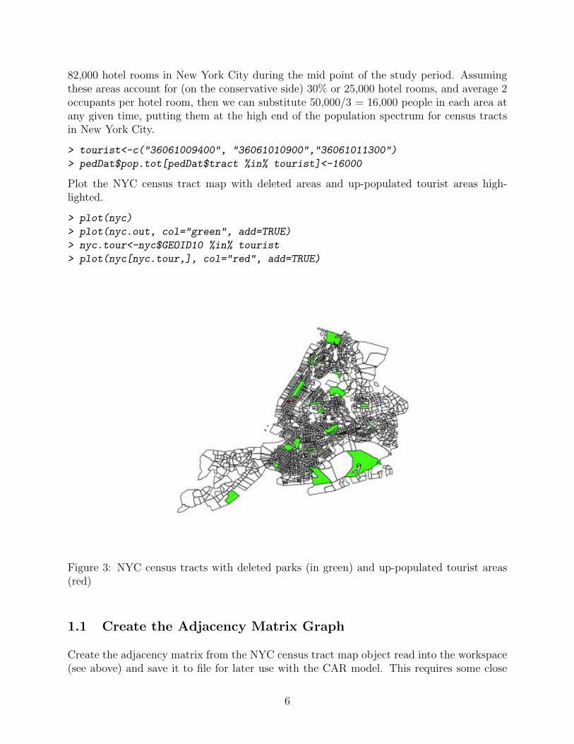
82,000 hotel rooms in New York City during the mid point of the study period. Assumingthese areas account for (on the conservative side) 30% or 25,000 hotel rooms, and average 2occupants per hotel room, then we can substitute 50,000/3 = 16,000 people in each area atany given time, putting them at the high end of the population spectrum for census tractsin New York City.
> tourist<-c("36061009400", "36061010900","36061011300")> pedDat$pop.tot[pedDat$tract %in% tourist]<-16000
Plot the NYC census tract map with deleted areas and up-populated tourist areas high-lighted.
> plot(nyc)> plot(nyc.out, col="green", add=TRUE)> nyc.tour<-nyc$GEOID10 %in% tourist> plot(nyc[nyc.tour,], col="red", add=TRUE)
Figure 3: NYC census tracts with deleted parks (in green) and up-populated tourist areas(red)
1.1 Create the Adjacency Matrix Graph
Create the adjacency matrix from the NYC census tract map object read into the workspace(see above) and save it to file for later use with the CAR model. This requires some close
6

attention to detail. Initial attempts to use an adjacency matrix created with default filesand setting returned INLA warnings about disconnected subgraphs and INLA would notcompute a DIC measure because isolated geographic areas with 0 neighbors returned NaNresults. 5
First, create the adjacency matrix ”nb” object from the map file using spdep::poly2nb().Looking at this object reveals that there are 2 regions with no links that were causingproblems. The spdep::edit.nb() utility can be used to manually edit the nb object. It didnot, though, save changes. This is recognized behavior, and online advice recommendedmanually editing the object using info from the edit.nb() session. This worked.
> zzz <- poly2nb(nyc)> zzz # 3 regions no links: 452 1852 1862> # (numbers refer to the map, not the nb list object)> which(card(zzz)==0)> # get ids for areas with no links indexed to nb object: 380 1625 1635> nnb1<-edit.nb(zzz, polys=nyc) # interactive edit nb object> nnb1 # not corrected> # manually edit>> zzz[[1623]]<-as.integer(sort(c(zzz[[1623]], 1626)))> zzz[[1626]]<-as.integer(sort(c(zzz[[1626]], 1623)))> zzz[[1354]]<-as.integer(sort(c(zzz[[1354]], 1382)))> zzz[[1382]]<-as.integer(sort(c(zzz[[1382]], 1354)))> zzz[[1355]]<-as.integer(sort(c(zzz[[1355]], 1382)))> zzz[[1382]]<-as.integer(sort(c(zzz[[1382]], 1355)))> zzz[[1349]]<-as.integer(sort(c(zzz[[1349]], 1351)))> zzz[[1351]]<-as.integer(sort(c(zzz[[1351]], 1349)))> zzz[[1223]]<-as.integer(sort(c(zzz[[1223]], 1635)))> zzz[[1635]]<-as.integer(1223)> zzz[[1353]]<-as.integer(sort(c(zzz[[1353]], 1635)))> zzz[[1635]]<-as.integer(sort(c(zzz[[1635]], 1353)))> zzz[[19]]<-as.integer(sort(c(zzz[[19]], 1625)))> zzz[[1625]]<-as.integer(19)
5The model would run with the warning ”The graph for the model besag has 5 connected components!!!Model is revised accordingly.” I ran the debug utility for graphs in INLA (inla.debug.graph(nyc.adj)) whichdid not return any immediate errors. There was some useful information about the issue in the help fileinla.doc(”besag”), and Havard Rue posted a helpful reply to a similar question here In summary, ”connectedcomponents” refers to disconnected subgraphs (odd terminology...), and there were five such disconnectedgraphs in the NYC map file object. I (mistakenly) assumed these were were the 5 boros of NYC and so logicaland acceptable. But, it turns out the number 5 was simply a misleading coincidence. The default setting forINLA is to ”interpret this as a sum-to-zero constraint for each subgraph, instead of a sum-to-zero constraintfor the union of the graphs” . You can over-ride that behavior with the option f(..., adjust.for.con.comp =
FALSE) which I (again mistakenly) did in initial runs of these analyses thinking it was appropriate for the5 separate but related boros of NYC. The results though did not seem make sense. Also, the problem ofnot being able to generate a valid overall model DIC concerned me. Addressing the issues in the adjacencymatrix ”nb” object as described in the text solved both these problems.
7

> zzz[[1624]]<-as.integer(sort(c(zzz[[1624]], 1625)))> zzz[[1625]]<-as.integer(sort(c(zzz[[1625]], 1624)))> zzz[[162]]<-as.integer(sort(c(zzz[[162]], 217)))> zzz[[217]]<-as.integer(sort(c(zzz[[217]], 162)))> zzz[[365]]<-as.integer(sort(c(zzz[[365]], 380)))> zzz[[380]]<-as.integer(365)> zzz[[380]]<-as.integer(sort(c(zzz[[380]], 602)))> zzz[[602]]<-as.integer(sort(c(zzz[[602]], 380)))> zzz # no unlinked regions
Here is a plot of the adjusted adjacency matrix.
Figure 4: NYC census tracts adjacency graph
After correcting the nb object, use inla::nb2INLA() to get the nb object into the correctformat for INLA, and save the resulting object for later use in models. (Note, I manuallymoved the object ”nyc.graph”) into the srts inla directory I’ve been working from, and setup a path to it saved as an object named ”nyc.adj”
> nb2INLA("nyc.graph", zzz)> nyc.adj <- paste("~/srtsINLA","/nyc.graph",sep="")> file.show(nyc.adj)
Here’s what the file looks like:
Order the data to match the spatial dataframe, and add a sequential area ID variable for
8

Figure 5: NYC census tracts adjacency file
the model statement.
> nycDat <- attr(nyc, "data")> order <- match(nycDat$GEOID10,pedDat[,1])> pedDat<- pedDat[order,]> pedDat$ID.area<-seq(1,nrow(pedDat))
1.2 Quick Plot of Time Trend
These initial descriptive stats were taken from some of the initial analyses for the SafeRoutes to School project and are not reproducible here, but simply presented for the sake ofcompleteness.
Here is a plot for all-age pedestrian injury decline over the study period.(Figure 6) Injuryrates declined 16.2% over the study period, from 23.7 per 10,000 to 16.2 per 10,000
> Year <- c("2001", "2002", "2003", "2004", "2005", "2006", "2007",+ "2008", "2009", "2010")> Count <- c(18961, 18983, 18666, 16558, 16839, 15318, 15560, 15735,+ 15214, 16226)> Population <- seq(from=8008278, to=8175133, length.out=10)> df1<-data.frame(c(Year, Count,as.character(Population)))
9

> p<-qplot(Year, Count/Population*10000, data=df1, geom="point",+ ylab="Pedestrian Injury Rate per 10,000 Population",ylim=c(0,30))> p<-p+geom_smooth(aes(group=1))> p<-p+ opts(panel.background = theme_rect(colour = NA))> print(p)> rate<-Count/Population*10000> (rate[1]-rate[10])/rate[1]*100>
Figure 6: Number of Pedestrian Injuries, All Ages, New York City, 2001 to 2010.
2 Cross-Sectional Models
2.1 Frailty Model
As a baseline against which to measure more informative models, run a simple random e↵ects(spatially unstructured heterogeneity) model.
yi
= ↵ + �
i
10

> formulaUH <- allAges.allHrs.tot~ f(ID.area, model = "iid") # specify model> resultUH <- inla(formulaUH,family="poisson", # run inla+ data=pedDat, control.compute=list(dic=TRUE,cpo=TRUE),E=pop.tot)
Review the results.
> summary(resultUH)> exp(resultUH$summary.fixed)> (exp(resultUH$summary.fixed)*10000)/10> (((sum(pedDat$allAges.allHrs.tot))/8300000))/10*10000
The DIC for this baseline model is 14293.30 with 1822.78 e↵ective parameters. The fixede↵ects for this model consist only of the intercept, which has a mean of -4.3627 with a sd of0.0241 (95% CrI -4.4101, -4.3154). This exponentiates to a mean of 0.01274377, s.d. 1.024422(95% CI 0.01215364, 0.01336109), and translates to a yearly rate of 12.7 pedestrian injuriesper 10,0000 population (95% CI, 12.2, 13.4). 6 The DIC for this model was 14446.97, with1859.61 e↵ective number of parameters.
In this first model, we are interested in the random e↵ect term. Those results are stored inthe ”region” part of ”summary.random” in the named list object created from the INLA run.We can extract and examine the mean random e↵ect term for each county. Recall, this isthe random variation, on the log scale, around the mean or intercept value of the number ofpedestrian injuries in a New York City census tract. A plot of the density distribution forthe random e↵ect term appears reasonably normally distributed and symmetric about zero.(Fig ??)
To map the random e↵ect results, we first add the random e↵ect results to the pedDatdataframe and create cuts based on 20% quantiles to plot categories of outcomes.
> re1<-resultUH$summary.random$ID.area[,2]> plot(density(re1)) # plot density random effects> # add random effects results to dataframe> pedDat$UH<-re1> # create cuts> quantile(pedDat$UH,probs = seq(0, 1, by = 0.20))> cuts <- c(-3.7551580, -0.7665932, -0.2441329, 0.1858292, 0.7827655,+ 4.3013500)> pedDat$UH.cut<-cut(pedDat$UH,breaks=cuts,include.lowest=TRUE)
To use spplot() to map the results, we use the census tract FIPS codes to merge the dataframe to the nycDat data frame that was extracted from the map object and replace the
6This is an underestimate compared to the raw numbers. If you simply calculate the yearly rate using arecent online estimate of the NYC population you get a rate of 16.8. This is due to editing out some of theinjuries in low population census tracts. Also, some of the ”information” in these numbers is being shiftedto the random e↵ect term.
11

Figure 7: frailty model random e↵ects term density
data slot of the map object with the merged datafame. It results, though, in an image thatdistorts the axes and makes it di�cult to discern patterns. (Fig 8)
> #merge dataframes, save to data slot of map> attr(nyc,"data") <- merge(nycDat,pedDat,by="tract")> # map> spplot(nyc, "UH.cut", col.regions= grey.colors(5),main="")
Instead use ggplot2. First use the fortify() method to turn the map into a data frame thatcan be plotted with ggplot. 7 Then merge the pedestrian injury data frame to the map dataframe, and order the census tracts so they will map correctly. We then build up a map layerby layer, using RColorBrewer for the fill.
> # library(ggplot2)> # gpclibPermit()> nyc.df <- fortify(nyc, region=GEOID10)> nyc.df <- merge(nyc.df, pedDat, by.x="id", by.y="tract", all=FALSE)> nyc.df <- nyc.df[order(nyc.df$group, nyc.df$order), ]> library(RColorBrewer)
7Fortify is (to me at least) one of the more mysterious functions, but according to Hadley Wickham, inthe context of shape files and ggplot, it ”melts the polygons into points, tags each point with the id valueof the corresponding attribute row, and tags each point with values from the polygon from which the pointwas derived.” Note that it is no longer necessary to enable gpclibPermit() to use fortify()
12

Figure 8: frailty model unstructured heterogeneity (random e↵ects term)
> p1<-ggplot(nyc.df, aes(x=long, y=lat))> p2<-p1+geom_polygon(aes(group=group, fill=UH.cut))> p3<- p2 + scale_fill_brewer(palette="Blues", name="Random\nEffects")> p4<- p3+ theme(axis.text.x = element_blank(), axis.text.y = element_blank(),+ axis.ticks = element_blank()) ++ theme(panel.background = element_rect(colour = NA)) ++ xlab("")+ylab("")++ ggtitle("Unstructured Heterogeneity, \n Pedestrian Injuries,+ New York City Census Tracts, 2001-2010")> print(p4)> p1<-ggplot(nyc.df[nyc.df$boro=="QN",], aes(x=long, y=lat))> p2<-p1+geom_polygon(aes(group=group, fill=UH.cut))> p3<- p2 + scale_fill_brewer(palette="Blues")
The map is not perfect. By design, it doesn’t include census tracts that were not present inboth the 2000 and 2010 census enumerations, or that do not have a population denominator(e.g. industrial sites, parks) so it is inherently incomplete. Census tracts themselves do notbehave nicely sometimes, bleeding into adjacent areas (that large blob in south east Queensis in the area of JFK Airport). But it is better than the spplot() e↵ort, and adequatelyillustrates the expected random pattern of the spatially unstructured heterogeneity results.(Fig 2.1)
13

We can index to restrict the map to a particular borough. Here, for example is Queens (Fig2.1)
> p1<-ggplot(nyc.df[nyc.df$boro=="QN",], aes(x=long, y=lat))> p2<-p1+geom_polygon(aes(group=group, fill=UH.cut))> p2 + scale_fill_brewer(palette="Blues")++ ggtitle("Unstructured Heterogeneity, \n Pedestrian Injuries,+ Queens, NY Census Tracts, 2001-2010")
2.2 Convolution Models
The convolution models add a spatially-structured conditional autoregression term (⌫) tothe spatially-unstructured heterogeneity random e↵ect term (�) of the frailty model.
y
i
= ↵ + �
i
+ ⌫
i
Add the CAR term to the INLA model statement by specifying f(..., model=”bym”)
> formulaCAR <- allAges.allHrs.tot~ f(ID.area, model="bym", graph=nyc.adj)> resultCAR <- inla(formulaCAR,family="poisson", # run inla+ data=pedDat, control.compute=list(dic=TRUE,cpo=TRUE),E=pop.tot)> summary(resultCAR)> resultCAR$dic
14

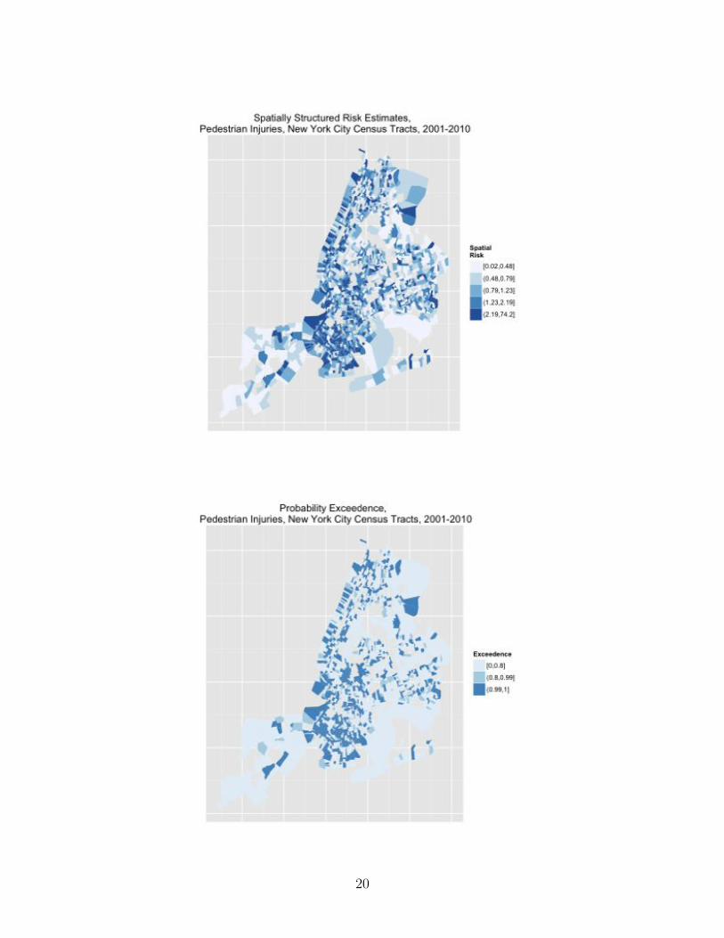
The DIC on the convolution model is 14256.57 with 1761.49 e↵ective parameters, which isan improvement on the baseline UH model. There is only one fixed e↵ect in this model, theintercept, or average risk across all boroughs, which is 12.6 pedestrian injuries per 10,000census tract population per year (95% CI 12.3, 12.9). The density plot of the UH term looksmuch like that of the simpler model. (Fig 9) The density plot for the CAR heterogeneityhas a bump in the right tail that suggests a possible bimodal or multivariate distributionthat might reflect di↵ering patterns across geographic areas, with low and high risk censustracts. (Fig 10) In mapping the CAR results, we can appreciate this spatial structuring ofrisk, with nearby census tracts demonstrating similar risk. (Fig 2.2)
> (exp(resultCAR$summary.fixed))*10000/10> re<-resultCAR$summary.random$ID.area[1:1908,2]> plot(density(re)) # plot density random effects> car<-resultCAR$summary.random$ID.area[1909:3816,2]> plot(density(car)) # plot density random effects> # add car results to dataframe> pedDat$car<-car> # create cuts> quantile(pedDat$car,probs = seq(0, 1, by = 0.20))> cuts <- c(-3.7452966, -0.6086899, -0.2123627, 0.1002341,+ 0.6466806, 3.1982722)> pedDat$car.cut<-cut(pedDat$car,breaks=cuts,+ include.lowest=TRUE, include.highest=TRUE)> # library(ggplot2)
15

> # gpclibPermit()> nyc.df1 <- fortify(nyc, region=GEOID10)> nyc.df <- merge(nyc.df1, pedDat, by.x="id", by.y="tract", all=FALSE)> nyc.df <- nyc.df[order(nyc.df$group, nyc.df$order), ]> # library(RColorBrewer)> p1<-ggplot(nyc.df, aes(x=long, y=lat))> p2<-p1+geom_polygon(aes(group=group, fill=car.cut))> p3<- p2 + scale_fill_brewer(palette="Blues", name="Spatial\nEffects")> p4<- p3+ theme(axis.text.x = element_blank(), axis.text.y = element_blank(),+ axis.ticks = element_blank()) ++ theme(panel.background = element_rect(colour = NA)) ++ xlab("")+ylab("")++ ggtitle("Spatially Structured (CAR) Heterogeneity, \n Pedestrian Injuries,+ New York City Census Tracts, 2001-2010")> print(p4)
Figure 9: convolution model random e↵ects term density
Calculate fitted values (✓ = ↵ + � + ⌫), spatial risk (⇣ = � + ⌫) and spatial exceedence(Pr[⇣
i
> 1]).
> #risk (theta = alpha + upsilon + nu)> CARfit <- resultCAR$summary.fitted.values[,1]> #spatial risk (zeta = upsilon + nu)> CARmarginals <- resultCAR$marginals.random$ID.area[1:1908]
16

Figure 10: convolution model CAR term density
17

> CARzeta <- lapply(CARmarginals,function(x)inla.emarginal(exp,x)) # exponentiate> # exceedence probability> a=0> CARexceed<-lapply(resultCAR$marginals.random$ID.area[1:1908], function(X){+ 1-inla.pmarginal(a, X)+ })
Map these results.
> pedDat$fit<-CARfit> quantile(pedDat$fit,probs = seq(0, 1, by = 0.20))> cut.fit<-round(c(0.0002154018, 0.0060402579, 0.0099928608,+ 0.0154458155, 0.0276508520, 0.9359724944 ),4)> pedDat$fit.cut<-cut(pedDat$fit,breaks=cut.fit,include.lowest=TRUE)> summary(pedDat$fit.cut)> pedDat$risk<-unlist(CARzeta)> quantile(pedDat$risk, probs = seq(0, 1, by = 0.20))> cut.risk<-round(c(0.01708582, 0.47922798, 0.79279746,+ 1.22545213, 2.19368312, 74.25152478),2)> pedDat$risk.cut<-cut(pedDat$risk,breaks=cut.risk,include.lowest=TRUE)> summary(pedDat$risk.cut)> pedDat$exceed<-unlist(CARexceed)> quantile(pedDat$exceed,probs = seq(0, 1, by = 0.20))> cut.exceed<-c(0, .8, .99, 1)> pedDat$exceed.cut<-cut(pedDat$exceed, breaks=cut.exceed, include.lowest=TRUE)> summary(pedDat$exceed.cut)> # nyc.df1 <- fortify(nyc, region=GEOID10)> nyc.df <- merge(nyc.df1, pedDat, by.x="id", by.y="tract", all=FALSE)> nyc.df <- nyc.df[order(nyc.df$group, nyc.df$order), ]> p1<-ggplot(nyc.df, aes(x=long, y=lat))> p2<-p1+geom_polygon(aes(group=group, fill=fit.cut))> p3<- p2 + scale_fill_brewer(palette="Blues", name="Fitted Values")> p4<- p3+ theme(axis.text.x = element_blank(), axis.text.y = element_blank(),+ axis.ticks = element_blank()) ++ theme(panel.background = element_rect(colour = NA)) ++ xlab("")+ylab("")++ ggtitle("Fitted Model Values, \n Pedestrian Injuries,+ New York City Census Tracts, 2001-2010")> print(p4)> p1<-ggplot(nyc.df, aes(x=long, y=lat))> p2<-p1+geom_polygon(aes(group=group, fill=risk.cut))> p3<- p2 + scale_fill_brewer(palette="Blues", name="Spatial\nRisk")> p4<- p3+ theme(axis.text.x = element_blank(), axis.text.y = element_blank(),+ axis.ticks = element_blank()) ++ theme(panel.background = element_rect(colour = NA)) ++ xlab("")+ylab("")+
18

+ ggtitle("Spatially Structured Risk Estimates, \n Pedestrian Injuries,+ New York City Census Tracts, 2001-2010")> print(p4)> p1<-ggplot(nyc.df, aes(x=long, y=lat))> p2<-p1+geom_polygon(aes(group=group, fill=exceed.cut))> p3<- p2 + scale_fill_brewer(palette="Blues", name="Exceedence")> p4<- p3+ theme(axis.text.x = element_blank(), axis.text.y = element_blank(),+ axis.ticks = element_blank()) ++ theme(panel.background = element_rect(colour = NA)) ++ xlab("")+ylab("")++ ggtitle("Probability Exceedence, \n Pedestrian Injuries,+ New York City Census Tracts, 2001-2010")> print(p4)
Increase the risk threshold to look at the probability of exceeding a relative risk of 2 (Fig2.2)
> a=0.6931472 # on unexponentiated scale, log(2)> CARexceed2<-lapply(resultCAR$marginals.random$ID.area[1:1908], function(X){+ 1-inla.pmarginal(a, X)+ })> pedDat$exceed2<-unlist(CARexceed2)> quantile(pedDat$exceed2,probs = seq(0, 1, by = 0.20))> cut.exceed2<-c(0, .8, .99, 1)> pedDat$exceed2.cut<-cut(pedDat$exceed2, breaks=cut.exceed2, include.lowest=TRUE)
19
20

> summary(pedDat$exceed2.cut)> # nyc.df1 <- fortify(nyc, region=GEOID10)> nyc.df <- merge(nyc.df1, pedDat, by.x="id", by.y="tract", all=FALSE)> nyc.df <- nyc.df[order(nyc.df$group, nyc.df$order), ]> p1<-ggplot(nyc.df, aes(x=long, y=lat))> p2<-p1+geom_polygon(aes(group=group, fill=exceed2.cut))> p3<- p2 + scale_fill_brewer(palette="Blues", name="Exceedence")> p4<- p3+ theme(axis.text.x = element_blank(), axis.text.y = element_blank(),+ axis.ticks = element_blank()) ++ theme(panel.background = element_rect(colour = NA)) ++ xlab("")+ylab("")++ ggtitle("Probability Exceedence RR 2, \n Pedestrian Injuries,+ New York City Census Tracts, 2001-2010")> print(p4)
Or exceeding relative risks of 3... (Fig 2.2)
> a=1.098612 # on unexponentiated scale, log(3)> CARexceed3<-lapply(resultCAR$marginals.random$ID.area[1:1908], function(X){+ 1-inla.pmarginal(a, X)+ })> pedDat$exceed3<-unlist(CARexceed3)> quantile(pedDat$exceed3,probs = seq(0, 1, by = 0.20))> cut.exceed3<-c(0, .8, .99, 1)> pedDat$exceed3.cut<-cut(pedDat$exceed3, breaks=cut.exceed3, include.lowest=TRUE)
21

> summary(pedDat$exceed3.cut)> # nyc.df1 <- fortify(nyc, region=GEOID10)> nyc.df <- merge(nyc.df1, pedDat, by.x="id", by.y="tract", all=FALSE)> nyc.df <- nyc.df[order(nyc.df$group, nyc.df$order), ]> p1<-ggplot(nyc.df, aes(x=long, y=lat))> p2<-p1+geom_polygon(aes(group=group, fill=exceed3.cut))> p3<- p2 + scale_fill_brewer(palette="Blues", name="Exceedence")> p4<- p3+ theme(axis.text.x = element_blank(), axis.text.y = element_blank(),+ axis.ticks = element_blank()) ++ theme(panel.background = element_rect(colour = NA)) ++ xlab("")+ylab("")++ ggtitle("Probability Exceedence RR 3, \n Pedestrian Injuries,+ New York City Census Tracts, 2001-2010")> print(p4)
Calculate the proportion of variance explained by the spatially structured CAR component(⌫) of ⇣ 8
The calculation involves creating an empty matrix, with rows equal to number of regions,with 1000 columns into which we extract 1000 observations from the marginal distribution ofthe CAR term (⌫), and from which we calculate the empirical variance. Then extract values
8NB. In conversation, Andrew Lawson cautioned against measures like this because CAR and UH areincompletely identified. Even Blangiardo, from whom this code is adapted, says the UH and CAR variancesare not directly comparable. But, the result can give an indication of the relative contribution of eachcomponent of the total spatial heterogeneity.
22

for random e↵ects (UH) term and calculate the proportion of total heterogeneity accountedfor by the spatially structured heterogeneity. We see in the result that place accounts for forabout 76.5% of the total heterogeneity.
> mat.marg <- matrix(NA, nrow=1908, ncol=1000)> m<-resultCAR$marginals.random$ID.area> for (i in 1:1908){+ u<-m[[1908+i]]+ s<-inla.rmarginal(1000, u)+ mat.marg[i,]<-s}> var.RRspatial<-mean(apply(mat.marg, 2, sd))^2> var.RRhet<-inla.emarginal(function(x) 1/x,+ resultCAR$marginals.hyper$"Precision for ID.area (iid component)")> var.RRspatial/(var.RRspatial+var.RRhet)
2.3 Covariate Models
Add three types of covariates: social, economic, and tra�c-related. the social variable isan index based on Peter Congdon’s social fragmentation index 9 It combines 4 variablesextracted from US census variables: the proportion of total housing units in a census tractthat are not owner occupied, the proportion of vacant housing units in a census tract, theproportion of individuals in a census tract living alone, and the proportion of housing units ina census tract into which someone recently moved. Based on Census definitions, a ”recent”move is defined as anytime in the previous 9 years (since the last decennial census). Asper the Congdon paper, the variables are standardized, and added with equal weight. Theresulting variable is normally distributed with mean zero and 95% quantiles -2.463311 and2.205669. The economic measure is simply the census tract median household income forthe past 12 months (in 2012 inflation-adjusted dollars). The tra�c-related variables comefrom Zev Ross as part of this work with the New York City Department of Health andMental Hygeine. They are road density (road length (KM) per square kilometer), tra�cdensity (vehicle kilometers traveled per day per square kilometer), average speed (in milesper hour), and signal tra�c density (tra�c signals per square kilometer).
> # covariates:> # from R US census> # H0010001 Total Housing units> # H0180002 Owner occupied> # H0180019 Living alone> # H0210001 Vacant housing units> #> # Downloaded from US census
9see: Peter Congdon. Suicide and Parasuicide in London: A Small-area Study. Urban Studies, Vol.33, No. 1, 137-158, 1996 and Roman Pabayo, Beth E. Molnar, Nancy Street, and Ichiro Kawachi. Therelationship between social fragmentation and sleep among adolescents living in Boston, Massachusetts.Journal of Public Health pp 1-12 J Public Health (2014) doi: 10.1093/pubmed/fdu001
23

> # HC01_VC72 Estimate; YEAR HOUSEHOLDER MOVED INTO UNIT> #- Moved in 2010 or later> # HD01_VD01 Estimate; Median household income in the> #past 12 months (in 2012 inflation-adjusted dollars)> #> # from Zev Rosss files> # rddenFULL Road Density (road length (KM) per square kilometer), all roads> # trafDenFUL Traffic Density (vehicle kilometers traveled> # per day per square kilometer), all roads> # avgSpd Average Speed (miles per hour)> # sigDen Traffic Signal Density (traffic signals per sqaure kilometer)>>>> # library(UScensus2010) # helper functions, like install.tract()> # help(package=UScensus2010)> # install.tract("osx") # one time only> library(UScensus2010tract)> data(new_york.tract10)> # help(package=UScensus2010tract)> # names(new_york.tract10)>> # extract housing variables for social fragmentation index from> #UScensus2010tract spatial polygon file> housing<-attr(new_york.tract10, "data")> # nrow(housing) # 4919 census tracts in NYS> housing<-subset(housing, select=c(fips,H0010001,H0180002,H0180019,H0210001))> names(housing)<-c("tract", "totHousing", "ownerHousing",+ "aloneHousing", "vacantHousing")> housing<-housing[housing$tract %in% pedDat$tract,]> nrow(housing)> # extract recent movers from downloaded US census file> recent<-read.csv("~/housingNYStracts.csv",header=T, stringsAsFactors=F)> recent<-subset(recent, select=c(GEO.id2, HC01_VC72))> names(recent)<-c("tract", "recentMove")> # merge housing and recent movers files> housing<-merge(housing, recent, by="tract", all.x=T)> nrow(housing)> head(housing)> names(housing)> housing$recentMove<-as.numeric(housing$recentMove)> # look at observation for missing recent move data> housing[is.na(housing$recentMove),]> # set missing housing data to zero> housing$recentMove[is.na(housing$recentMove)]<-0
24

> # calculate proportions based on total housing units> # avoid division by zero> housing$owner<-housing$ownerHousing/(housing$totHousing+.1)> housing$alone<-housing$aloneHousing/(housing$totHousing+.1)> housing$vacant<-housing$vacantHousing/(housing$totHousing+.1)> housing$notOwner<-1-housing$owner> housing$recent<-housing$recentMove/(housing$totHousing+.1)> # standardize proportions> housing$aloneST<-+ (housing$alone-mean(housing$alone, na.rm=T))/sd(housing$alone, na.rm=T)> summary(housing$aloneST)> housing$vacantST<-+ (housing$vacant-mean(housing$vacant, na.rm=T))/sd(housing$vacant, na.rm=T)> summary(housing$vacantST)> housing$notOwnerST<-+ (housing$notOwner-mean(housing$notOwner, na.rm=T))/sd(housing$notOwner, na.rm=T)> summary(housing$notOwnerST)> housing$recentST<-+ (housing$recent-mean(housing$recent, na.rm=T))/sd(housing$recent, na.rm=T)> summary(housing$recentST)> # add standardized measures into single index> housing$index<-housing$aloneST+housing$vacantST> +housing$notOwnerST+housing$recentST> summary(housing$index)> # check and adjust for unstable outliers> housing[housing$index>12,]> # median substitute 3 unstable outliers> housing$index[housing$index>12]<-median(housing$index)> plot(density(housing$index))> quantile(housing$index, probs=c(0.05,0.95))> # 95% of values between -2.463311 and 2.205669>> # add the index to the pedestrian data file> index<-subset(housing, select=c(tract, index))> nrow(pedDat)> pedDat<-merge(pedDat, index, by="tract")> # get median household income data> inc<-read.csv("~/mhiNYStracts_with_ann.csv",header=T, stringsAsFactors=F)> inc<-subset(inc, select=c(GEO.id2,HD01_VD01))> names(inc)<-c("tract", "mhi")> inc$mhi<-as.numeric(inc$mhi)> summary(inc$mhi) # 111 NAs by coercion> pedDat<-merge(pedDat, inc, by="tract", all.x=TRUE)> nrow(pedDat)> head(pedDat)
25

> summary(pedDat$mhi) # 26 NAs (~1.5% of 1908 NYC tracts)> pedDat$mhi[is.na(pedDat$mhi)]<-median(pedDat$mhi, na.rm=T)> # get roadway and speed data from Zev files> zev<-read.csv("~/tract_varsFIN.csv",header=T, stringsAsFactors=F)> str(zev)> zev<-subset(zev,select=c(tract10, rddenFULL, trafDenFUL, avgSpd, sigDen))> names(zev)<-c("tract", "roadDensity", "trafficDensity",+ "avgSpeed", "signalDensity")> zev$tract<-as.character(zev$tract)> pedDat<-merge(pedDat, zev, by="tract", all.x=TRUE)>
Before moving on, look at tra�c-related variables. Address missing values in average speedwith median substitution. Transform tra�c density to standardized units. Create variablefor median household income in increments of 1000 dollars, and variable for average speedin increments of 10 miles per hour. (In preliminary analyses these increments are easier tointerpret in the models.) Variables were added to and saved as part of the ”pedDat” datafile.
> names(pedDat)> summary(pedDat$avgSpeed)> pedDat$avgSpeed[pedDat$avgSpeed==-99999]<-NA # set 37 missing values to NA> pedDat$avgSpeed[is.na(pedDat$avgSpeed)]<-median(pedDat$avgSpeed, na.rm=T)> summary(pedDat$trafficDensity)> plot(density(log(pedDat$trafficDensity)))> plot(density(log(pedDat$trafficDensity)))> trafficDensityST<-(pedDat$trafficDensity+ -mean(pedDat$trafficDensity))/sd(pedDat$trafficDensity)> summary(trafficDensityST)> plot(density(trafficDensityST))> summary(pedDat$signalDensity)> plot(density(pedDat$signalDensity))> summary(pedDat$roadDensity)> plot(density(pedDat$roadDensity))> pedDat$mhi2<-pedDat$mhi/1000> pedDat$avgSpeed2<-pedDat$avgSpeed/10>
The first model adds the social fragmentation index to the previous convolution model.The model DIC (14257.68) is about the same as the convolution model, though with fewere↵ective parameters (1753.68) We see that a single unit increase in social fragmentation isassociated with a IDR of 1.19 (95% CrI 1.15, 1.23). Note that the spatial risk (⇣) is nowinterpreted as the residual relative risk for each area (compared to the whole of New YorkCity) after social fragmentation is taken into account.
> formulaCOV1 <- allAges.allHrs.tot~ f(ID.area, model="bym", graph=nyc.adj)+index> resultCOV1 <- inla(formulaCOV1,family="poisson", # run inla
26

+ data=pedDat, control.compute=list(dic=TRUE,cpo=TRUE),E=pop.tot)> summary(resultCOV1)> # resultCOV1$dic>> exp(resultCOV1$summary.fixed)
We next look at a model that adds median household income for a census tract as anexplanatory variable. Note that MHI is entered in units of thousands of dollars (it is otherwisedi�cult to see any e↵ect for single dollar changes...) We see a marked improvement in DIC,which is now 14254.13 on 1753.55 e↵ective parameters. This is the single best improvementon model fit seen yet. The e↵ect of social fragmentation remains unchanged at 1.19 (95%CI 1.16, 1.23). There is essentially no e↵ect for an increase of $1000 in median householdincome (IDR=0.99, 95% CI 0.99, 1.00)
> formulaCOV2 <- allAges.allHrs.tot~ f(ID.area, model="bym",+ graph=nyc.adj)+index+mhi2> resultCOV2 <- inla(formulaCOV2,family="poisson", # run inla+ data=pedDat, control.compute=list(dic=TRUE,cpo=TRUE),E=pop.tot)> summary(resultCOV2)> # resultCOV2$dic>> exp(resultCOV2$summary.fixed)
Look at average speed (here in increments of 10 miles per hour). There is an improvementin DIC (14255.69, 1753.53 e↵ par), but average speed does not add very much explanatorypower to the model. Appears that increased speed is associated with a decreased risk ofpedestrian injury occurring. (IDR = 0.92, 95% CrI 0.84, 1.00)
> formulaCOV3 <- allAges.allHrs.tot~ f(ID.area, model="bym",+ graph=nyc.adj)+index+mhi2+avgSpeed2> resultCOV3 <- inla(formulaCOV3,family="poisson", # run inla+ data=pedDat, control.compute=list(dic=TRUE,cpo=TRUE),E=pop.tot)> summary(resultCOV3)> # resultCOV3$dic>> exp(resultCOV3$summary.fixed)
Omit average speed, and look instead at tra�c density. The tra�c density variable is enteredinto the model in standardized units. The model had the best DIC of all the models lookedat so far. (14252.44, with 1750.27 e↵ective parameters). Tra�c density is an importantpredictor of pedestrian injury risk (IDR = 1.14, 95% CrI 1.10, 1.18).
This is, I think, the model I will go with for the spatial-temporal analyses.
> formulaCOV4 <- allAges.allHrs.tot~ f(ID.area, model="bym",+ graph=nyc.adj)+index+mhi2+trafficDensityST> resultCOV4 <- inla(formulaCOV4,family="poisson", # run inla+ data=pedDat, control.compute=list(dic=TRUE,cpo=TRUE),E=pop.tot)
27

> summary(resultCOV4)> # resultCOV3$dic>> exp(resultCOV4$summary.fixed)
Putting average speed back into the model with social fragmentation, median householdincome and tra�c density does not improve the DIC and predictive accuracy (DIC=14257.48,E↵ Param = 1748.24), but the exponentiated coe�cients more clearly illustrate the relativee↵ects of each of the variables:
mean sd 0.025quant 0.975quant
(Intercept) 0.02609339 1.122834 0.02078013 0.03274672
index 1.18796549 1.015812 1.15192887 1.22509942
mhi2 0.99704061 1.000958 0.99516755 0.99891441
trafficDensityST 1.19540308 1.021069 1.14744872 1.24531625
avgSpeed2 0.77184253 1.048879 0.70285195 0.84765271
> formulaCOV5 <- allAges.allHrs.tot~ f(ID.area, model="bym",+ graph=nyc.adj)+index+mhi2+trafficDensityST+avgSpeed2> resultCOV5 <- inla(formulaCOV5,family="poisson", # run inla+ data=pedDat, control.compute=list(dic=TRUE,cpo=TRUE),E=pop.tot)> summary(resultCOV5)> exp(resultCOV5$summary.fixed)
Holding all the other covariates to zero (which doesn’t make a lot of predictive sense, but doesillustrate causal associations) for every one unit increase in the social deprivation index thereis a 19% increase in pedestrian injury risk (95% CrI 1.16, 1.23), for every one standardizedunit increase in tra�c density, there is a 20% increase in pedestrian injury risk (95% CrI1.15, 1.25), and for every 10 mile per hour increase in average tra�c speed in a census tract,there is a 33% decrease in pedestrian injury risk (95% CrI 0.70, 0.85). Median householdincome has a small e↵ect, with a 1% decrease in injury risk for every $1,000 increase inmedian household income (95% CrI 1.00, 0.99).
The decreased injury risk associated with increased average speed makes sense if you thinkin terms exposure (higher speeds means fewer cars) and pedestrian behavior (pedestrian maybe less likely to venture out into tra�c if cars are going very quickly). Again, note that thespatial risk (⇣) is now interpreted as the residual relative risk for each area (compared tothe whole of New York City) after social fragmentation, economics, average speed and tra�cdensity are taken into account.
For completeness sake, look at signal density and road density. Adding signal density to themodel decreases DIC (14261.03), but is associated with a slight increase in pedestrian injuryrisk (IDR = 1.01, 95% CrI 1.00, 1.01) which is likely due to its association with road density.
> formulaCOV6 <- allAges.allHrs.tot~ f(ID.area, model="bym",+ graph=nyc.adj)+index+mhi2+signalDensity> resultCOV6 <- inla(formulaCOV6,family="poisson", # run inla
28

+ data=pedDat, control.compute=list(dic=TRUE,cpo=TRUE),E=pop.tot)> summary(resultCOV6)> exp(resultCOV6$summary.fixed)
The results for road density look a lot like tra�c signal density (as, I suppose, they should)
> formulaCOV7 <- allAges.allHrs.tot~ f(ID.area, model="bym",+ graph=nyc.adj)+index+mhi2+roadDensity> resultCOV7 <- inla(formulaCOV6,family="poisson", # run inla+ data=pedDat, control.compute=list(dic=TRUE,cpo=TRUE),E=pop.tot)> summary(resultCOV7)> exp(resultCOV7$summary.fixed)>
Compare the best Poisson model so far to a zero-inflated Poisson model 10 See that there isa worse DIC
> formulaCOVzip <- allAges.allHrs.tot~ f(ID.area, model="bym",+ graph=nyc.adj)+index+mhi2+trafficDensityST+avgSpeed2> pedDat<-pedDat[,-50] # getting inla error message about NA> #in the car.cut variable, so drop it for now>> resultCOVzip <- inla(formulaCOVzip,family="zeroinflatedpoisson0", # run inla+ data=pedDat, control.compute=list(dic=TRUE,cpo=TRUE),+ control.predictor=list(compute=TRUE),E=pop.tot)> summary(resultCOVzip) # DIC 14345.12, eff par 1742.35> exp(resultCOVzip$summary.fixed) # no change at all in sd
2.4 Exploring the Final Covariate Model
The final or ”winning” covariate model based on DIC and informativeness of variables isthe convolution model with both unstructured (random e↵ect) and structured (conditionalautoregression) spatial terms, and explanatory covariates for social fragmentation (Congdonindex), economics (in $1,000 increments of median household income), average speed (in 10mile per hour increments), and tra�c density (in standardized units).
> formulaCOV5 <- allAges.allHrs.tot~ f(ID.area, model="bym",+ graph=nyc.adj)+index+mhi2+trafficDensityST+avgSpeed2> resultCOV5 <- inla(formulaCOV5,family="poisson", # run inla+ data=pedDat, control.compute=list(dic=TRUE,cpo=TRUE),+ control.predictor=list(compute=TRUE),E=pop.tot)
10Note, would normally also look at a negative binomial or a zero-inflated negative binomial. Negativebinomial models include an extra parameter to account for overdispersion, but the frailty model specificationalready accounts for overdispersion. One can still fit an negative binomial model in INLA if interested incharacterizing the over dispersion.
29

> summary(resultCOV5)> exp(resultCOV5$summary.fixed)
mean sd 0.025quant 0.975quant
(Intercept) 0.02609339 1.122834 0.02078013 0.03274672
index 1.18796549 1.015812 1.15192887 1.22509942
mhi2 0.99704061 1.000958 0.99516755 0.99891441
trafficDensityST 1.19540308 1.021069 1.14744872 1.24531625
avgSpeed2 0.77184253 1.048879 0.70285195 0.84765271
As a recap, holding all the other covariates to zero, for every one unit increase in the socialdeprivations index there is a 19% increase in pedestrian injury risk (95% CrI 1.16, 1.23), forevery one standardized unit increase in tra�c density, there is a 20% increase in pedestrianinjury risk (95% CrI 1.15, 1.25), and for every 10 mile per hour increase in average tra�cspeed in a census tract, there is a 33% decrease in pedestrian injury risk (95% CrI 0.70,0.85). Median household income has a very small e↵ect of a 1% decrease in injury risk forevery $1,000 increase in median household income (95% CrI 1.00, 0.99). Again, the DIC forthis model was 14257.48 with 1748.24 e↵ective parameters.
Now explore and map the spatial risk in the model. Again, note that the spatial risk (⇣) isinterpreted as the residual relative risk for each area (compared to the whole of New YorkCity) after social fragmentation, economics, average speed and tra�c density are taken intoaccount. The random e↵ect term is as specified and expected normally distributed (Fig ??)and spatially random (Fig ) Plotting the CAR term results displays more spatial structure.(Fig 2.4)
> # UH results> re<-resultCOV5$summary.random$ID.area[1:1908,2]> plot(density(re)) # plot density random effects> # add re term to dataframe> pedDat$re<-re> # create cuts> quantile(pedDat$re,probs = seq(0, 1, by = 0.20))> re.cuts <- c(-3.7807038, -0.6539410, -0.1932530,+ 0.1476478, 0.6881801, 4.4672516)> pedDat$re.cut<-cut(pedDat$re,breaks=re.cuts,+ include.lowest=TRUE, include.highest=TRUE)> # map re term> nyc.df1 <- fortify(nyc, region=GEOID10)> nyc.df <- merge(nyc.df1, pedDat, by.x="id", by.y="tract",+ all=FALSE)> nyc.df <- nyc.df[order(nyc.df$group, nyc.df$order), ]> p1<-ggplot(nyc.df, aes(x=long, y=lat))> p2<-p1+geom_polygon(aes(group=group, fill=re.cut))> p3<- p2 + scale_fill_brewer(palette="Blues",+ name="Unstructured\nSpatial Effects")
30

> p4<- p3+ theme(axis.text.x = element_blank(), axis.text.y = element_blank(),+ axis.ticks = element_blank()) ++ theme(panel.background = element_rect(colour = NA)) ++ xlab("")+ylab("")++ ggtitle("Spatially Unstructured (Random) Heterogeneity, \n Pedestrian+ Injuries, New York City Census Tracts, 2001-2010")> print(p4)> # CAR results> car<-resultCOV5$summary.random$ID.area[1909:3816,2]> plot(density(car)) # plot density random effects> # add car results to dataframe> pedDat$car<-car> # create cuts> quantile(pedDat$car,probs = seq(0, 1, by = 0.20))> car.cuts <- c(-3.23283927, -0.44094906, -0.16440648,+ 0.09486667, 0.46995525, 2.69746658)> pedDat$car.cut<-cut(pedDat$car,breaks=car.cuts,+ include.lowest=TRUE, include.highest=TRUE)> # library(ggplot2)> # gpclibPermit()> # nyc.df1 <- fortify(nyc, region=GEOID10)> nyc.df <- merge(nyc.df1, pedDat, by.x="id",+ by.y="tract", all=FALSE)> nyc.df <- nyc.df[order(nyc.df$group, nyc.df$order), ]> # library(RColorBrewer)> p1<-ggplot(nyc.df, aes(x=long, y=lat))> p2<-p1+geom_polygon(aes(group=group, fill=car.cut))> p3<- p2 + scale_fill_brewer(palette="Blues",+ name="Spatial\nEffects")> p4<- p3+ theme(axis.text.x = element_blank(),+ axis.text.y = element_blank(),+ axis.ticks = element_blank()) ++ theme(panel.background = element_rect(colour = NA)) ++ xlab("")+ylab("")++ ggtitle("Spatially Structured (CAR) Heterogeneity, \n Pedestrian+ Injuries, New York City Census Tracts, 2001-2010")> print(p4)
We next, calculate and map the fitted values (✓ = ↵+�+⌫) (Fig 2.4), spatial risk (⇣ = �+⌫)(Fig 2.4) and spatial exceedance for a relative risk of 1 (Pr[⇣
i
> 1]) (Fig 2.4).
> #risk (theta = alpha + upsilon + nu)> COVfit <- resultCOV5$summary.fitted.values[,1]> #spatial risk (zeta = upsilon + nu)> COVmarginals <- resultCOV5$marginals.random$ID.area[1:1908]> COVzeta <- lapply(COVmarginals,function(x)inla.emarginal(exp,x)) # exponentiate
31

Figure 11: Density Plot Unstructured Spatial Heterogeneity
32

> # exceedence probability (RR > 1)> a=0> COVexceed<-lapply(resultCOV5$marginals.random$ID.area[1:1908], function(X){+ 1-inla.pmarginal(a, X)+ })
Map these results.
> pedDat$fit<-COVfit> quantile(pedDat$fit,probs = seq(0, 1, by = 0.20))> cut.fit<-round(c(0.0002386368, 0.0060769212, 0.0099230836,+ 0.0154344092, 0.0275053642, 0.9440013730),4)> pedDat$fit.cut<-cut(pedDat$fit,breaks=cut.fit,+ include.lowest=TRUE)> summary(pedDat$fit.cut)> pedDat$risk<-unlist(COVzeta)> quantile(pedDat$risk, probs = seq(0, 1, by = 0.20))> cut.risk<-round(c(0.02642057, 0.53239957, 0.84189629,+ 1.18365006, 2.00949877, 87.96635625),2)> pedDat$risk.cut<-cut(pedDat$risk,breaks=cut.risk,+ include.lowest=TRUE)> summary(pedDat$risk.cut)> pedDat$exceed<-unlist(COVexceed)> quantile(pedDat$exceed,probs = seq(0, 1, by = 0.20))
33

> cut.exceed<-c(0, .8, .99, 1)> pedDat$exceed.cut<-cut(pedDat$exceed, breaks=cut.exceed,+ include.lowest=TRUE)> summary(pedDat$exceed.cut)> # nyc.df1 <- fortify(nyc, region=GEOID10)> nyc.df <- merge(nyc.df1, pedDat, by.x="id",+ by.y="tract", all=FALSE)> nyc.df <- nyc.df[order(nyc.df$group, nyc.df$order), ]> p1<-ggplot(nyc.df, aes(x=long, y=lat))> p2<-p1+geom_polygon(aes(group=group, fill=fit.cut))> p3<- p2 + scale_fill_brewer(palette="Blues",+ name="Fitted Values")> p4<- p3+ theme(axis.text.x = element_blank(),+ axis.text.y = element_blank(),+ axis.ticks = element_blank()) ++ theme(panel.background = element_rect(colour = NA)) ++ xlab("")+ylab("")++ ggtitle("Fitted Model Values, \n Pedestrian Injuries,+ New York City Census Tracts, 2001-2010")> print(p4)> p1<-ggplot(nyc.df, aes(x=long, y=lat))> p2<-p1+geom_polygon(aes(group=group, fill=risk.cut))> p3<- p2 + scale_fill_brewer(palette="Blues", name="Spatial\nRisk")> p4<- p3+ theme(axis.text.x = element_blank(),+ axis.text.y = element_blank(),+ axis.ticks = element_blank()) ++ theme(panel.background = element_rect(colour = NA)) ++ xlab("")+ylab("")++ ggtitle("Spatially Structured Risk Estimates, \n Pedestrian+ Injuries, New York City Census Tracts, 2001-2010")> print(p4)> p1<-ggplot(nyc.df, aes(x=long, y=lat))> p2<-p1+geom_polygon(aes(group=group, fill=exceed.cut))> p3<- p2 + scale_fill_brewer(palette="Blues", name="Exceedence")> p4<- p3+ theme(axis.text.x = element_blank(),+ axis.text.y = element_blank(),+ axis.ticks = element_blank()) ++ theme(panel.background = element_rect(colour = NA)) ++ xlab("")+ylab("")++ ggtitle("Probability Exceedence RR > 1, \n Pedestrian Injuries,+ New York City Census Tracts, 2001-2010")> print(p4)
We increase the risk threshold and look at the probability of exceeding a relative risk of 2(Fig 2.4)
34

35

> a=0.6931472 # on unexponentiated scale, log(2)> COVexceed2<-lapply(resultCOV5$marginals.random$ID.area[1:1908],+ function(X){+ 1-inla.pmarginal(a, X)+ })> pedDat$exceed2<-unlist(COVexceed2)> quantile(pedDat$exceed2,probs = seq(0, 1, by = 0.20))> cut.exceed2<-c(0, .8, .99, 1)> pedDat$exceed2.cut<-cut(pedDat$exceed2,+ breaks=cut.exceed2, include.lowest=TRUE)> summary(pedDat$exceed2.cut)> # nyc.df1 <- fortify(nyc, region=GEOID10)> nyc.df <- merge(nyc.df1, pedDat, by.x="id", by.y="tract", all=FALSE)> nyc.df <- nyc.df[order(nyc.df$group, nyc.df$order), ]> p1<-ggplot(nyc.df, aes(x=long, y=lat))> p2<-p1+geom_polygon(aes(group=group, fill=exceed2.cut))> p3<- p2 + scale_fill_brewer(palette="Blues",+ name="Exceedence")> p4<- p3+ theme(axis.text.x = element_blank(),+ axis.text.y = element_blank(),+ axis.ticks = element_blank()) ++ theme(panel.background = element_rect(colour = NA)) ++ xlab("")+ylab("")+
36

+ ggtitle("Probability Exceedence RR > 2, \n Pedestrian+ Injuries, New York City Census Tracts, 2001-2010")> print(p4)
Or exceedng relative risks of 3... (Fig 2.4)
> a=1.098612 # on unexponentiated scale, log(3)> COVexceed3<-lapply(resultCOV5$marginals.random$ID.area[1:1908],+ function(X){+ 1-inla.pmarginal(a, X)+ })> pedDat$exceed3<-unlist(COVexceed3)> quantile(pedDat$exceed3,probs = seq(0, 1, by = 0.20))> cut.exceed3<-c(0, .8, .99, 1)> pedDat$exceed3.cut<-cut(pedDat$exceed3, breaks=cut.exceed3,+ include.lowest=TRUE)> summary(pedDat$exceed3.cut)> # nyc.df1 <- fortify(nyc, region=GEOID10)> nyc.df <- merge(nyc.df1, pedDat, by.x="id", by.y="tract",+ all=FALSE)> nyc.df <- nyc.df[order(nyc.df$group, nyc.df$order), ]> p1<-ggplot(nyc.df, aes(x=long, y=lat))> p2<-p1+geom_polygon(aes(group=group, fill=exceed3.cut))> p3<- p2 + scale_fill_brewer(palette="Blues", name="Exceedence")> p4<- p3+ theme(axis.text.x = element_blank(),
37

+ axis.text.y = element_blank(),+ axis.ticks = element_blank()) ++ theme(panel.background = element_rect(colour = NA)) ++ xlab("")+ylab("")++ ggtitle("Probability Exceedence RR > 3, \n Pedestrian Injuries,+ New York City Census Tracts, 2001-2010")> print(p4)
Lastly, calculate proportion of variance explained by spatially structured component (CAR).Crete an empty matrix, with rows equal to number of regions, with 1000 columns into whichwe extract 1000 observations from the marginal distribution of the CAR term (⌫), from whichwe calculate the empirical variance. Then extract values for random e↵ects (UH) term andcalculate the proportion of total heterogeneity accounted for by the spatially structuredheterogeneity. See that structured spatial heterogeneity or place accounts for for about 70%of the total spatial heterogeneity.
> mat.marg <- matrix(NA, nrow=1908, ncol=1000)> m<-resultCOV5$marginals.random$ID.area> for (i in 1:1908){+ u<-m[[1908+i]]+ s<-inla.rmarginal(1000, u)+ mat.marg[i,]<-s}> var.RRspatial<-mean(apply(mat.marg, 2, sd))^2> var.RRhet<-inla.emarginal(function(x) 1/x,
38

+ resultCOV5$marginals.hyper$"Precision for ID.area (iid component)")> var.RRspatial/(var.RRspatial+var.RRhet)
3 Space-Time Interaction Models
Prepare the data for space-time interaction modeling. Begin by subsetting the pedestriandata set, then converting it from ”wide” to ”long” format. There are a total of 19080 (1908census tracts x 10 years) rows of observations. The covariate data now loop over 10 (1 foreach year of data) iterations of the census tract identifying variables (idvar=”tract”), theyearly injury counts and population figures increment over the 10 years of repeated censustracts.
> # subset the pedestrian injury data set> drops<-c("expected.allAges.allHrs.2001","expected.allAges.allHrs.2002",+ "expected.allAges.allHrs.2003","expected.allAges.allHrs.2004",+ "expected.allAges.allHrs.2005","expected.allAges.allHrs.2006",+ "expected.allAges.allHrs.2007","expected.allAges.allHrs.2008",+ "expected.allAges.allHrs.2009", "expected.allAges.allHrs.2010",+ "allAges.allHrs.tot", "expected.allAges.allHrs.tot", "pop.tot",+ "rate", "mhi", "raodDensity", "trafficDensity", "avgSpeed",+ "signalDensity")> pedDat2<-pedDat[,!(names(pedDat)%in% drops)]> # reshape wide to long> pedDatL<-reshape(pedDat2,direction="long",idvar="tract",+ varying=list(c("allAges.allHrs.2001", "allAges.allHrs.2002",+ "allAges.allHrs.2003", "allAges.allHrs.2004", "allAges.allHrs.2005",+ "allAges.allHrs.2006", "allAges.allHrs.2007", "allAges.allHrs.2008",+ "allAges.allHrs.2009", "allAges.allHrs.2010"),c("allAge.pop.2001",+ "allAge.pop.2002", "allAge.pop.2003", "allAge.pop.2004",+ "allAge.pop.2005", "allAge.pop.2006", "allAge.pop.2007",+ "allAge.pop.2008", "allAge.pop.2009", "allAge.pop.2010")),+ v.names=c("inj", "pop"),times=c(2001, 2002, 2003, 2004, 2005,+ 2006, 2007, 2008, 2009, 2010))> str(pedDatL)> # check variables looped correctly> pedDatL$ID.area[c(2,(2+1908),(2+2*1908))]> pedDatL$mhi2[c(2,(2+1908),(2+8*1908))]> pedDatL$trafficDensityST[c(55,(55+1908),(55+8*1908))]> pedDatL$intx<-1:nrow(pedDatL)
Look at 5 possible space-time models based on the final convolution covariate model thatincluded social fragmentation, median household income, tra�c density and average speed.Compare them on DIC and informativeness.
39

> # "winning" 10-year cross-sectionalcovariate model from above> #> # formulaCOV5 <- allAges.allHrs.tot~ f(ID.area, model="bym",> # graph=nyc.adj)+index+mhi2+trafficDensityST+avgSpeed2> # resultCOV5 <- inla(formulaCOV5,family="poisson", # run inla> # data=pedDat, control.compute=list(dic=TRUE,cpo=TRUE),E=pop.tot)> #> # summary(resultCOV5)> #> # exp(resultCOV5$summary.fixed)>>> ### convolution + uncorrelated time (time IID)> STform1<-inj~1+f(ID.area, model="bym", graph=nyc.adj)++ f(time,model="iid")+index+mhi2+trafficDensityST+avgSpeed2> STresult1<-inla(STform1, family="poisson", data=pedDatL, E=pop,+ control.compute=list(dic=TRUE,cpo=TRUE),control.predictor=list(compute=TRUE))> ### convolution + 1st order random walk correlated time (time RW1)> STform2<-inj~1+f(ID.area, model="bym", graph=nyc.adj)++ f(time,model="rw1")+index+mhi2+trafficDensityST+avgSpeed2> STresult2<-inla(STform2, family="poisson", data=pedDatL, E=pop,+ control.compute=list(dic=TRUE,cpo=TRUE),control.predictor=list(compute=TRUE))> ### convolution + 1st order random walk correlated time (time RW1)> # + uncorrelated time (time IID)> pedDatL$time2<-pedDatL$time> STform3<-inj~1+f(ID.area, model="bym", graph=nyc.adj)++ f(time,model="rw1")+f(time2,model="iid")+index+mhi2++ trafficDensityST+avgSpeed2> STresult3<-inla(STform3, family="poisson", data=pedDatL,+ E=pop, control.compute=list(dic=TRUE,cpo=TRUE),+ control.predictor=list(compute=TRUE))> ### convolution + 1st order random walk correlated time (time RW1)> # + space-time interaction term> STform4<-inj~1+f(ID.area, model="bym", graph=nyc.adj)++ f(time,model="rw1")+f(intx,model="iid")++ index+mhi2+trafficDensityST+avgSpeed2> lcs<-inla.make.lincombs(time=diag(10)) # need to create linear combinations> # based on number of years for temporal results> #and feed to inla call (see http://www.r-inla.org/faq for how inla.make.lincombs is used)> STresult4<-inla(STform4, family="poisson", data=pedDatL, E=pop,+ control.compute=list(dic=TRUE,cpo=TRUE),+ control.predictor=list(compute=TRUE), lincomb=lcs)> ### convolution + 1st order random walk correlated time (time RW1) +> # uncorrelated time (time IID) + space-time interaction term> STform5<-inj~1+f(ID.area, model="bym", graph=nyc.adj)+f(time,model="rw1")+
40

+ f(time2,model="iid")+f(intx,model="iid")++ index+mhi2+trafficDensityST+avgSpeed2> lcs<-inla.make.lincombs(time=diag(10), time2=diag(10)) # need to create linear> # combinations based on number of years for temporal results> # and feed to inla call> STresult5<-inla(STform5, family="poisson", data=pedDatL, E=pop,+ control.compute=list(dic=TRUE,cpo=TRUE),+ control.predictor=list(compute=TRUE), lincomb=lcs)> summary(STresult1) # DIC 99772.78, eff par 1761.78> summary(STresult2) # DIC 99772.88, eff par 1761.19> summary(STresult3) # DIC 99773.26, eff par 1760.92> summary(STresult4) # DIC 87047.09, eff par 8884.79> summary(STresult5) # DIC 87061.75, eff par 8802.30
Model DIC E↵ective Parametersuncorrelated time (time IID) 99772.78 1761.781st order random walk correlated time (time RW1) 99772.88 1761.19(time RW1) and (time IID) 99773.26 1760.92(time RW1) and space-time interaction term (time intx) 87047.09 8884.79(time RW1) and (time IID) and (time intx) 87061.75 8802.30
The ”winning” model is the convolution (UH plus CAR) with covariates for social fragmen-tation, household income, tra�c density and average speed with a first-order random walkcorrelated time variable and an interaction term for time and place.
> exp(STresult4$summary.fixed)
The exponentiated results for the fixed e↵ects are:
> exp(STresult4$summary.fixed)
mean sd 0.025quant 0.5quant 0.975quant mode kld
(Intercept) 0.002468534 1.126014 0.001955026 0.002468672 0.003115289 0.002468975 1
index 1.193281605 1.016160 1.156308704 1.193279791 1.231411155 1.193277818 1
mhi2 0.997454295 1.000981 0.995534207 0.997454564 0.999374804 0.997455186 1
trafficDensityST 1.204740311 1.021540 1.155363404 1.204740265 1.256178951 1.204742386 1
avgSpeed2 0.757719271 1.050069 0.688452915 0.757700712 0.833993340 0.757666440 1
>
The results for the fixed e↵ects look very much like they did for the non-temporal, 10-yearcross-sectional model. Holding all the other covariates to zero, for every one unit increasein the social deprivations index there is a 19% increase in pedestrian injury risk (95% CrI1.16, 1.23), for every one standardized unit increase in tra�c density, there is a 20% increasein pedestrian injury risk (95% CrI 1.15, 1.26), and for every 10 mile per hour increase inaverage tra�c speed in a census tract, there is a 24% decrease in pedestrian injury risk (95%CrI 0.69, 0.83). Median household income has a very small e↵ect of a 1% decrease in injuryrisk for every $1,000 increase in median household income (95% CrI 0.99, 0.99). Again,the decreased injury for risk associated with increased average speed may make sense if youthink of in terms of pedestrian behavior (pedestrian may be less likely to venture out into
41

tra�c if cars are going very quickly), and that more cars (increased exposure) is probablyinversely correlated with speed. Also note that the tra�c density and speed variables includehighways, bridges and tunnels. There are version of those variables that don’t, and the e↵ectsmay be modified.
We now explore and map the spatial risk in the model. Again, the spatial risk (⇣) is inter-preted as the residual relative risk for each area (compared to the whole of New York City)after social fragmentation, economics, average speed tra�c density, and time trend are takeninto account. The random e↵ect term is normally distributed as specified and expected(Fig 12) and spatially random (Fig 3) Plotting the CAR term results displays more spatialstructure. (Fig 3)
> # random effect (UH) term> re<-STresult4$summary.random$ID.area[1:1908,2]> plot(density(re), main="Density Plot Random Effect Term")> # map uh> pedDat2<-pedDat> pedDat2$re<-re> quantile(pedDat2$re,probs = seq(0, 1, by = 0.20))> re.cuts <- c(-3.8122793, -0.6484124, -0.1878910,+ 0.1426332, 0.6631574, 4.7990249)> pedDat2$re.cut<-cut(pedDat2$re,breaks=re.cuts,+ include.lowest=TRUE, include.highest=TRUE)> # map re term> nyc.df1 <- fortify(nyc, region=GEOID10)> nyc.df <- merge(nyc.df1, pedDat2, by.x="id",+ by.y="tract", all=FALSE)> nyc.df <- nyc.df[order(nyc.df$group, nyc.df$order), ]> p1<-ggplot(nyc.df, aes(x=long, y=lat))> p2<-p1+geom_polygon(aes(group=group, fill=re.cut))> p3<- p2 + scale_fill_brewer(palette="Blues",+ name="Unstructured\nSpatial Effects")> # edit labels on legend based on result above> # p3<- p2 + scale_fill_brewer(palette="Blues", name="Unstructured\nSpatial Effects",labels=c("-3.8 to -0.64", "-0.64 to -0.19", "-0.19 to 0.14", "0.14 to 0.66","0.66 to 4.8"))> p4<- p3+ theme(axis.text.x = element_blank(), axis.text.y = element_blank(),+ axis.ticks = element_blank()) ++ theme(panel.background = element_rect(colour = NA)) ++ xlab("")+ylab("")++ ggtitle("Spatially Unstructured (Random) Heterogeneity, \n Pedestrian Injuries, New York City Census Tracts, 2001-2010")> print(p4)> # CAR results> car<-STresult4$summary.random$ID.area[1909:3816,2]> plot(density(car))> # map the CAR term> pedDat2$car<-car> quantile(pedDat2$car,probs = seq(0, 1, by = 0.20))
42
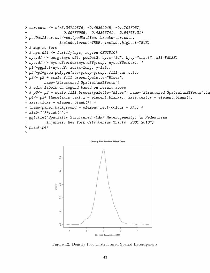
> car.cuts <- c(-3.34729876, -0.45362945, -0.17017057,+ 0.09776985, 0.48366741, 2.94768131)> pedDat2$car.cut<-cut(pedDat2$car,breaks=car.cuts,+ include.lowest=TRUE, include.highest=TRUE)> # map re term> # nyc.df1 <- fortify(nyc, region=GEOID10)> nyc.df <- merge(nyc.df1, pedDat2, by.x="id", by.y="tract", all=FALSE)> nyc.df <- nyc.df[order(nyc.df$group, nyc.df$order), ]> p1<-ggplot(nyc.df, aes(x=long, y=lat))> p2<-p1+geom_polygon(aes(group=group, fill=car.cut))> p3<- p2 + scale_fill_brewer(palette="Blues",+ name="Structured Spatial\nEffects")> # edit labels on legend based on result above> # p3<- p2 + scale_fill_brewer(palette="Blues", name="Structured Spatial\nEffects",labels=c("-3.35 to -0.45", "-0.45 to -0.17", "-0.17 to 0.10", "0.10 to 0.48","0.48 to 2.95"))> p4<- p3+ theme(axis.text.x = element_blank(), axis.text.y = element_blank(),+ axis.ticks = element_blank()) ++ theme(panel.background = element_rect(colour = NA)) ++ xlab("")+ylab("")++ ggtitle("Spatially Structured (CAR) Heterogeneity, \n Pedestrian+ Injuries, New York City Census Tracts, 2001-2010")> print(p4)>
Figure 12: Density Plot Unstructured Spatial Heterogeneity
43

44

The fitted values (✓ = ↵ + � + ⌫) for the space-time model stored in summary.fitted.valuesloop over the 10 years of data, so are not easily calculated and are here omitted. Spatial risk(⇣ = �+ ⌫) (Fig 2.4) and spatial exceedance for a relative risk of 2 (Pr[⇣
i
> 1]) (Fig 2.4) aremore readily accessible.
Extract the results for incidence density ratio (risk) and posterior probability exceedence foran IDR of 2.
> #risk (theta = alpha + upsilon + nu)> # COVfit <- STresult4$summary.fitted.values[,1]> # str(STresult4$summary.fitted.values)>> #str(STresult4$marginals.random)>> #spatial risk (zeta = upsilon + nu)> STmarginals <- STresult4$marginals.random$ID.area[1:1908]> STzeta <- lapply(STmarginals,function(x)inla.emarginal(exp,x)) # exponentiate> # exceedence probability (RR > 2)> a=log(2)> STexceed2<-lapply(STresult4$marginals.random$ID.area[1:1908],+ function(X){+ 1-inla.pmarginal(a, X)+ })
Categorize and map these results.
> pedDat2$risk<-unlist(STzeta)> quantile(pedDat2$risk, probs = seq(0, 1, by = 0.20))> cut.risk<-round(c(0.02599555, 0.54279971, 0.85085326,+ 1.18297656, 1.98622577, 123.71994602),2)> pedDat2$risk.cut<-cut(pedDat2$risk,breaks=cut.risk,include.lowest=TRUE)> summary(pedDat2$risk.cut)> pedDat2$exceed2<-unlist(STexceed2)> # quantile(pedDat2$exceed2,probs = seq(0, 1, by = 0.20))> cut.exceed<-c(0, .8, .99, 1)> pedDat2$exceed2.cut<-cut(pedDat2$exceed2, breaks=cut.exceed,+ include.lowest=TRUE)> summary(pedDat2$exceed2.cut)> # nyc.df1 <- fortify(nyc, region=GEOID10)> nyc.df <- merge(nyc.df1, pedDat2, by.x="id",+ by.y="tract", all=FALSE)> nyc.df <- nyc.df[order(nyc.df$group, nyc.df$order), ]> p1<-ggplot(nyc.df, aes(x=long, y=lat))> p2<-p1+geom_polygon(aes(group=group, fill=risk.cut))> c("0.03,0.54", "0.54,0.85", "0.85,1.18", "1.18,1.99", "1.99,124")> p3<- p2 + scale_fill_brewer(palette="Blues",+ name="Spatial\nRisk")
45

> # edit labels on legend based on result above> p3<- p2 + scale_fill_brewer(palette="Blues", name="Spatial\nRisk",+ labels=c("Less than 0.5", "0.5 to 0.8", "0.8 to 1.2", "1.2 to 2",+ "Greater than 2"))> p4<- p3+ theme(axis.text.x = element_blank(), axis.text.y = element_blank(),+ axis.ticks = element_blank()) ++ theme(panel.background = element_rect(colour = NA)) ++ xlab("")+ylab("")++ ggtitle("Spatial Risk Estimates, \n Pedestrian Injuries,+ New York City Census Tracts, 2001-2010")> print(p4)> p1<-ggplot(nyc.df, aes(x=long, y=lat))> p2<-p1+geom_polygon(aes(group=group, fill=exceed2.cut))> p3<- p2 + scale_fill_brewer(palette="Blues", name="Exceedence")> p3<- p2 + scale_fill_brewer(palette="Blues", name="Probability Exceedence",+ labels=c("Less than 0.8","0.8 to 0.9","Grater than 0.9"))> p4<- p3+ theme(axis.text.x = element_blank(), axis.text.y = element_blank(),+ axis.ticks = element_blank()) ++ theme(panel.background = element_rect(colour = NA)) ++ xlab("")+ylab("")++ ggtitle("Probability for Risk Greater Than 2, \n Pedestrian Injuries,+ New York City Census Tracts, 2001-2010")> print(p4)
46

Calculate the proportion of variance explained by the spatially structured component (CAR)11 See that structured spatial heterogeneity or place accounts for for about 73.2% of the totalspatial heterogeneity.
> mat.marg <- matrix(NA, nrow=1908, ncol=1000)> m<-STresult4$marginals.random$ID.area> for (i in 1:1908){+ u<-m[[1908+i]]+ s<-inla.rmarginal(1000, u)+ mat.marg[i,]<-s}> var.RRspatial<-mean(apply(mat.marg, 2, sd))^2> var.RRhet<-inla.emarginal(function(x) 1/x,+ STresult4$marginals.hyper$"Precision for ID.area (iid component)")> var.RRspatial/(var.RRspatial+var.RRhet)
Next, extract and plot the temporal e↵ects. This is the trend over the 10-year period holdingthe covariates and spatial risk constant. (Fig 13)
> #Put the temporal effect on the natural scale> temporal<-lapply(STresult4$marginals.lincomb.derived, function(X){+ # marg <- inla.marginal.transform(function(x) exp(x), X)+ # note, inla.marginal.transform() changed to inla.tmarginal() in recent versions
11Note. Andrew Lawson cautioned against measures like this because CAR and UH are incompletelyidentified. Even Blangiardo, from whom this code is adapted, says the UH and CAR variances are notdirectly comparable, but the result can give an indication of the relative contribution of each.
47

+ marg <- inla.tmarginal(function(x) exp(x), X)+ inla.emarginal(mean, marg)+ })> #Plot the citywide temporal trend>>> plot(seq(1,10),seq(0.8,1.2,length=10),type="n",xlab="year",ylab="temporal trend")> lines(unlist(temporal))> abline(h=1,lty=2)
Figure 13: Temporal trend pedestrian injury risk, New York City, 2001-2010
Lastly, plot the space-time interaction for 2001, 2004, 2007 and 2010, of the posterior prob-ability exceedance of a relative risk of 2. The space-time interaction is a random-e↵ect termthat can be viewed as a kind of residual e↵ect after the unstructured, spatially structuredand time e↵ects are modeled. It is the additional e↵ect beyond that which is already pickedup with the other space and time terms. In this case, the areas with elevated values representsporadic outbreaks, like short-term clusters. There do not appear to be census tracts thatconsistently display additional elevated risk of pedestrian injury.
> #Space-Time Interaction> delta <- data.frame(delta=STresult4$summary.random$intx[,2],+ year=pedDatL$time,ID.area=pedDatL$ID.area)> delta.matrix <- matrix(delta[,1], 1908,10,byrow=FALSE)> rownames(delta.matrix)<- delta[1:1908,3]
48

> #Space time probability > 2>> # note lapply() code differs subtly from that for the STresult5 marginals.random list object> # extract third ([[3]]) list object, not fourth ([[4]])> # STresult5 has additional year variable (time2)>> a=log(2)> inlaprob.delta<-lapply(STresult4$marginals.random[[3]],+ function(X){+ 1-inla.pmarginal(a, X)+ })> pp.delta<-unlist(inlaprob.delta)> pp.cutoff.interaction <- c(0,0.6,0.8,1)> pp.delta.matrix <- matrix(pp.delta, 1908,10,byrow=FALSE)> nyc.dat<-attr(nyc,"data")> pp.delta.factor <- data.frame(tract=nyc.dat$tract)> for(i in 1:10){+ pp.delta.factor.temp <- cut(pp.delta.matrix[,i],+ breaks=pp.cutoff.interaction,include.lowest=TRUE)+ pp.delta.factor <- cbind(pp.delta.factor,pp.delta.factor.temp)+ }> colnames(pp.delta.factor)<- c("tract","YR2001", "YR2002", "YR2003",+ "YR2004", "YR2005", "YR2006", "YR2007", "YR2008", "YR2009", "YR2010")> nyc.df1 <- fortify(nyc, region=GEOID10)> nyc.df <- merge(nyc.df1, pp.delta.factor, by.x="id",+ by.y="tract", all=FALSE)> nyc.df <- nyc.df[order(nyc.df$group, nyc.df$order), ]> #plot 2001> p1<-ggplot(nyc.df, aes(x=long, y=lat))> p1<-p1+geom_polygon(aes(group=group, fill=YR2001))> p1<- p1 + scale_fill_brewer(palette="Blues",+ name="Exceedence")> p1<- p1+ theme(axis.text.x = element_blank(), axis.text.y = element_blank(),+ axis.ticks = element_blank()) ++ theme(panel.background = element_rect(colour = NA)) ++ xlab("")+ylab("")++ ggtitle("Probability Exceedence RR > 2, \n Pedestrian Injuries,+ New York City Census Tracts, 2001")> print(p1)> #plot 2004> p4<-ggplot(nyc.df, aes(x=long, y=lat))> p4<-p4+geom_polygon(aes(group=group, fill=YR2004))> p4<- p4 + scale_fill_brewer(palette="Blues",+ name="Exceedence")> p4<- p4+ theme(axis.text.x = element_blank(), axis.text.y = element_blank(),
49

+ axis.ticks = element_blank()) ++ theme(panel.background = element_rect(colour = NA)) ++ xlab("")+ylab("")++ ggtitle("Probability Exceedence RR > 2, \n Pedestrian Injuries,+ New York City Census Tracts, 2004")> print(p4)> #plot 2007> p7<-ggplot(nyc.df, aes(x=long, y=lat))> p7<-p7+geom_polygon(aes(group=group, fill=YR2007))> p7<- p7 + scale_fill_brewer(palette="Blues",+ name="Exceedence")> p7<- p7+ theme(axis.text.x = element_blank(), axis.text.y = element_blank(),+ axis.ticks = element_blank()) ++ theme(panel.background = element_rect(colour = NA)) ++ xlab("")+ylab("")++ ggtitle("Probability Exceedence RR > 2, \n Pedestrian Injuries,+ New York City Census Tracts, 2007")> print(p7)> #plot 2010> p10<-ggplot(nyc.df, aes(x=long, y=lat))> p10<-p10+geom_polygon(aes(group=group, fill=YR2010))> p10<- p10 + scale_fill_brewer(palette="Blues",+ name="Exceedence")> p10<- p10+ theme(axis.text.x = element_blank(), axis.text.y = element_blank(),+ axis.ticks = element_blank()) ++ theme(panel.background = element_rect(colour = NA)) ++ xlab("")+ylab("")++ ggtitle("Probability Exceedence RR > 2, \n Pedestrian Injuries,+ New York City Census Tracts, 2010")> print(p10)> # Multiple plot function for ggplot2,> # from http://www.cookbook-r.com/Graphs/Multiple_graphs_on_one_page_(ggplot2)/> # ggplot objects can be passed in ..., or to plotlist (as a list of ggplot objects)> # - cols: Number of columns in layout> # - layout: A matrix specifying the layout. If present, cols is ignored.> #> # If the layout is something like matrix(c(1,2,3,3), nrow=2, byrow=TRUE),> # then plot 1 will go in the upper left, 2 will go in the upper right, and> # 3 will go all the way across the bottom.> #> multiplot <- function(..., plotlist=NULL, file, cols=1, layout=NULL) {+ require(grid)++ # Make a list from the ... arguments and plotlist+ plots <- c(list(...), plotlist)
50

++ numPlots = length(plots)++ # If layout is NULL, then use cols to determine layout+ if (is.null(layout)) {+ # Make the panel+ # ncol: Number of columns of plots+ # nrow: Number of rows needed, calculated from # of cols+ layout <- matrix(seq(1, cols * ceiling(numPlots/cols)),+ ncol = cols, nrow = ceiling(numPlots/cols))+ }++ if (numPlots==1) {+ print(plots[[1]])++ } else {+ # Set up the page+ grid.newpage()+ pushViewport(viewport(layout =+ grid.layout(nrow(layout), ncol(layout))))++ # Make each plot, in the correct location+ for (i in 1:numPlots) {+ # Get the i,j matrix positions of the regions that contain this subplot+ matchidx <- as.data.frame(which(layout == i,+ arr.ind = TRUE))++ print(plots[[i]], vp = viewport(layout.pos.row = matchidx$row,+ layout.pos.col = matchidx$col))+ }+ }+ }> multiplot(p1, p4, p7, p10, cols=2)
4 Appendix: Brief Introduction to Spatiotemporal Mod-eling in R and INLA
This brief introduction and overview is intended to supplement the material on creating thedata sets and conducting the analyses for the paper ”Small-Area Spatiotemporal Analysisof Pedestrian and Bicyclist Injuries in New York City 2001-2010”. It is based primarily ontextbooks and workshops by Andrew Lawson of the Medical University of South Carolina,articles and analyses by Marta Blangiardo of Imperial Medical College in London and andcolleagues, papers by Birgit Schroedle and Leonhard Held of the University of Zurich, and
51

documents by Havard Rue of the Norwegian University of Science and Technology, who isthe author of INLA. If you are interested in a fuller introduction to spatial epidemiology inR (similarly stolen from folks smarter than I), please see this document.
4.1 Spatial Models
The standard Besag-York-Mollie12 (BYM) spatial analystic model is
y
i
⇠ Pois(�i
= e
i
✓
i
)
log(✓i
) = �
n
+ �
i
+ ⌫
i
� ⇠ nl(0, ⌧�
)
⌫ ⇠ nl(⌫̄�
, ⌧
⌫
/n
�
)
where,
(1) the y
i
counts in area i, are independently identically Poisson distributed and have anexpectation in area i of e
i
, the expected count, times ✓i
, the risk for area i :
y
i
, iid ⇠ Pois(ei
✓
i
)
(2) a logarithmic transformation (log(�i
)) allows a linear, additive model of regression terms(�
n
), along with
(3) a spatially unstructured random e↵ects component (�i
) that is i.i.d normally distributedwith mean zero (⇠ nl(0, ⌧
⌫
)), and
(4) a conditional autoregressive spatially structured component (⌫ ⇠ nl(⌫̄�
, ⌧
⌫
/n
�
)) In theusual formulation, each ”neghborhood” consists of adjacent spatial shapes that share a com-mon border. The mean ✓
j
in neighborhood j is normally distributed with its parametersdefined as µ
j
the average of the µ
ij
’s in the neighborhood and �
j
equal to the �’s of theneighborhood µ
ij
’s divided by the number (�j
) of spatial shapes in the neighborhood. 13
The spatially unstructured random e↵ects component (�i
) is a random e↵ects term thatcaptures normally-distributed or Gaussian random variation around the mean or intercept↵
✓
. This unstructured heterogeneity represents, essentially, ”noise” that arises from thedata that we can’t capture with our covariates. It is important, and it contributes to the
12J. Besag, J. York, A. Mollie (1991). Bayesian image restoration, with two applications in spatial statistics(with discussion). Annals of the Institute of Statistical Mathematics 43(1), 1-59
13The spatially structured component CAR is sometimes described as a Gaussian process � ⇠ Nl(W, ⌧�)where W represents the matrix of neighbors that defines the neighborhood structure, and the conditionaldistribution of each �i , given all the other �i is normal with µ = the average � of it’s neighbors and aprecision (⌧�). See Banerjee, 2004
52

risk estimate, but it is essentially random and varies normally around zero. A model thatconsists solely of a random e↵ects term is sometimes referred to as a ”frailty”or susceptibilitymodel, because it can be thought of as describing the individual (or area) level susceptibilityor frailty to disease given some overall or global susceptibility. It doesn’t take covariates,space or geography into account. The addition of a spatially-structured term, ⌫ to a randome↵ect model is sometimes referred to as a convolution model.
A useful and commonly used prior distribution for ✓ in the setting of spatial analyses is thegamma (�) distribution:
✓ ⇠ �(↵, �)
where, µ = ↵/� , and var = ↵/�
2
The Gamma distribution consists of a very flexible class of probability distributions. Forexample, �(1, b) is exponential with µ = 1/b, �(v2 ,
12) is chi square distributed with v degrees
of freedom. Gamma distributions are constrained to be positive, which is necessary whendealing with count data, and setting the two parameters equal to each other ↵ = � returns anull value of 1, which is useful for modeling risk estimates. Finally, the Gamma distributionis conjugate to the Poisson distribution, making our prior and our likelihood of the samefamily which not only allows for simplified statistics in one parameter problems, but carrieswith it additional advantages in terms of a valid choice of prior in more complicated analyses.
Since a basic Bayesian assumption is that any parameter in a problem has a prior distributionof its own, the ↵ and � parameters in the gamma also have prior distributions. The usualapproach is to put exponential distributions on ↵ and �, so that: 14
y
i
⇠ Pois(ei
✓
i
)
✓ ⇠ �(↵, �)
↵ ⇠ exp(v),
� ⇠ exp(⇢)
4.2 Space-Time Models
We are often interested in both the spatial and temporal aspects of disease data, e.g. diseaselocation and date of diagnosis, or (perhaps more commonly) disease counts in small areas ina fixed time period. A frequently used approach to spatial disease modeling in small areasdates to work by Besag (1991) which was extended by Bernardinelli (1995) to include alinear term for space-time interaction, and by Knorr-Held (2000) to include a non-parametricspatio-temporal time trend.15
14At this point we begin to see the inherently hierarchical nature of the Bayesian approach15See ”A primer on disease mapping and ecological regression using INLA” by Birgit Schroedle and Leon-
hard Held for a nice description of the evolution of spatiotemporal disease modeling.
53
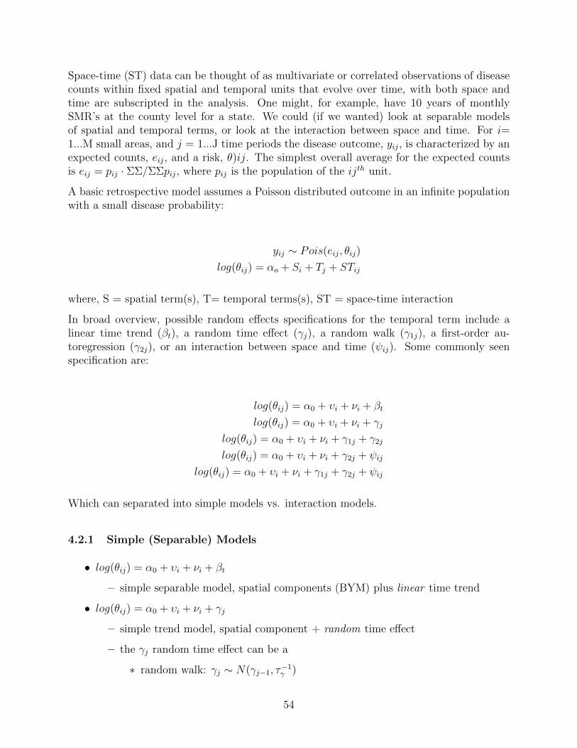
Space-time (ST) data can be thought of as multivariate or correlated observations of diseasecounts within fixed spatial and temporal units that evolve over time, with both space andtime are subscripted in the analysis. One might, for example, have 10 years of monthlySMR’s at the county level for a state. We could (if we wanted) look at separable modelsof spatial and temporal terms, or look at the interaction between space and time. For i=1...M small areas, and j = 1...J time periods the disease outcome, y
ij
, is characterized by anexpected counts, e
ij
, and a risk, ✓)ij. The simplest overall average for the expected countsis e
ij
= p
ij
· ⌃⌃/⌃⌃pij
, where p
ij
is the population of the ij
th unit.
A basic retrospective model assumes a Poisson distributed outcome in an infinite populationwith a small disease probability:
y
ij
⇠ Pois(eij
, ✓
ij
)
log(✓ij
) = ↵
o
+ S
i
+ T
j
+ ST
ij
where, S = spatial term(s), T= temporal terms(s), ST = space-time interaction
In broad overview, possible random e↵ects specifications for the temporal term include alinear time trend (�
t
), a random time e↵ect (�j
), a random walk (�1j), a first-order au-toregression (�2j), or an interaction between space and time (
ij
). Some commonly seenspecification are:
log(✓ij
) = ↵0 + �
i
+ ⌫
i
+ �
t
log(✓ij
) = ↵0 + �
i
+ ⌫
i
+ �
j
log(✓ij
) = ↵0 + �
i
+ ⌫
i
+ �1j + �2j
log(✓ij
) = ↵0 + �
i
+ ⌫
i
+ �2j +
ij
log(✓ij
) = ↵0 + �
i
+ ⌫
i
+ �1j + �2j +
ij
Which can separated into simple models vs. interaction models.
4.2.1 Simple (Separable) Models
• log(✓ij
) = ↵0 + �
i
+ ⌫
i
+ �
t
– simple separable model, spatial components (BYM) plus linear time trend
• log(✓ij
) = ↵0 + �
i
+ ⌫
i
+ �
j
– simple trend model, spatial component + random time e↵ect
– the �j
random time e↵ect can be a
⇤ random walk: �j
⇠ N(�j�1, ⌧
�1�
)
54

⇤ or an AR1 : �j
⇠ N(��j�1, tau
�1�
)
• log(✓ij
) = ↵0 + �
i
+ ⌫
i
+ �1j + �2j
– simple model with two random time e↵ects
4.2.2 Interaction Models
• log(✓ij
) = ↵0 + �
i
+ ⌫
i
+ �
j
+
ij
– interaction with single random time e↵ect
– Knorr-Held (2000) suggested dependent priors, but, two simple possible priorsare:
⇤ uncorrelated prior for interaction term: ij
⇠ N(0, ⌧
)
⇤ random walk prior for interaction term: psiij
⇠ N( i,j�1, ⌧ )
• log(✓ij
) = ↵0 + �
i
+ ⌫
i
+ �1j + �2j +
ij
– interaction with two random time e↵ects
In general, the best fitting DICs are seen with the interaction models. The space-timeinteraction term is essentially a random-e↵ect added to the linear model in the way theunstructured heterogeneity term and spatially-structured conditional autoregression (CAR)heterogeneity terms are added to spatial convolution models. It can be viewed as a kind ofresidual e↵ect after the unstructured, spatially structured and time e↵ects are modeled. Theinteraction then is the heterogeneity you didn’t ”pick up” with the other terms, or (perhapsmore accurately) the additional e↵ect beyond that which is already picked up with the otherspace and time terms. In infectious disease models, space-time interaction may representsporadic outbreaks, like short-term clusters.
4.3 About INLA
Integrated Nested Laplace Approximations (INLA) are a less computationally expensivealternative to MCMC to estimate the integral of a posterior distribution.16 Commonlyused MCMC software like BUGS and JAGS use a computational approach to sample fromthe posterior distribution of parameters. The INLA approach returns similarly accurateapproximations to posterior marginals in significantly less time. Laplace approximationshave been known for some time, but only recently developed su�ciently to be accurateenough for inclusion in statistical software and practical application. 17
16Most of this material on the application of INLA to spatial epidemiology comes from Dr. AndrewLawson’s workshop and textbook on the topic.
17See Rue, 2009 Approximate Bayesian inference for latent Gaussian models by using integrated nestedLaplace approximations
55

Rasmus Baath has a wonderfully succinct and clear explanation of Laplace approximations.In a nutshell, Laplace approximations ”work” because most posterior distributions have thelargest proportion of their probability ”heaped up” in the center and ”trail o↵” symmetricallyon either side, i.e. they ”look” normal. The Laplace approximation uses the mode as themean, and calculates the derivative in the area of the mode to approximate the variance.18
As you might expect, the closer the posterior is to Gaussian, the better the approximation.Fortunately, this is usually the case. When it is not log and logit transformations can behelpful.
Because it doesn’t rely on sampling and computations, INLA returns results very quickly,often much faster than MCMC in BUGS or JAGS.19 It is also useful for large and highdimensional datasets that can stall or freeze up up in BUGS or JAGS, for random e↵ectsmodels, and for complex spatial and spatiotemporal modeling. Also, INLA was written to beseamlessly integrated into R code, and this ease of use has made it an increasingly popularalternative to MCMC for Bayesian spatial modelin.
INLA documentation lags somewhat behind its popularity, but r-inla.org is very helpfulwebsite, with numerous examples and useful links, such as lists of likelihoods that can bespecified in INLA. 20 Because there is no sampling in INLA, deviance is determined usingthe likelihood. 21
You will need to install INLA from from source as described on the r-inla site
source("http://www.math.ntnu.no/inla/givemeINLA.R")
Once installed, INLA is accessed through an R session. A call to INLA consists of two parts:a formula statement, followed by a model fitting statement.
4.3.1 The INLA Formula Statement
A formula statement for a spatial model looks like this:
form1<-obs ~ 1 +f(region, model="iid")
where ,
• obs is the disease count or outcome from your dataset
18Recall from calculus that the derivative is the instantaneous rate of change. The Laplace approximationmakes use of the inverse of the Hessian matrix for the curve to arrive at the result for the variance. TheHessian matrix is a square matrix of partial derivatives for a multivariate function that can be used todescribe a local curvature.
19INLA is not the only game in town. See for example, Ho↵man and Gelman. The no-U-turn sampler:Adaptively setting path lengths in Hamiltonian Monte Carlo. INLA, though, is currently the most maturepackage in terms of spatial analytic capabilities.
20For spatial models, you may notice many of the precisions specified as gamma distributed. This hasfallen out of favor in BUGS and JAGS because of computational di�culties, but that is not an issue in INLA.
21Recall the deviance information criterion (DIC) is a relative measure. Smaller is better, and results canbe negative. As opposed to the number of e↵ective parameters (pD), where smaller is also better, but resultscan’t be negative.
56

• 1 forces an intercept onto the model
• and, f() is a function to specify the spatial region, and how it should be modeled
– In this statement, spatial region is modeled as ”iid”which is Gaussian zero uncor-related heterogeneity or a random e↵ects term
The f() function is a powerful feature of INLA, and is quite flexible. It can be used to invokemost any spatial model, such as geographically weighted regressions (di↵erent explanatoryassociations for outcomes in di↵erent regions), or local conditional autoregression models.You can add f() functions to each other to build up models. So, for example, you can adda conditional autoregression to a model by adding an f() statement with model = ”besag” toa ”iid” uncorrelated heterogeneity f(), to create a convolution model. The same model canbe specified in more than one way. For example, you can also specify a convolution modeldirectly with a single f(model=”bym”) statement. The approaches di↵er only in how someelements of the INLA output are displayed.
4.3.2 The INLA Model Statment
An INLA model-fitting statement looks like this:
results1<-inla(form1, family="poisson",
data=myDat, control.compute=list(dic=T, cpo=T, graph=T),
E=exp)
where,
• form1 refers to and invokes the previously defined formula
• family= specifies the likelihood
• data= specifies the data
• control.compute = specifies options like DIC and CPO.
– You can request a DIC for each spatial area with local dic, where lighter colorsindicate smaller, better fits.
– CPO is the conditional predictive ordinate, a cross validation tool, that predictsan area value using all the data except that area, and compares that value to theactual value. Values range from 0 (poor) to 1 (perfect)
• and, E = specifies the o↵set variable (required for a Poisson likelihood)
You will need some additional tools and utilities to set up a neighborhood adjacency ma-trix for use with conditional autoregression models and to map results. The R tools map-tools::readShapePoly() will read shapefiles into R, and spdep::poly2nb() followed by INLA::nb2INLA()are used to create the adjacency matrix neighbor structures for use with a CAR model. Tomap results, you can use sp::spplot() or ggplot2 (with some tweaks...)
57

As an alternative for uncomplicated map and data structures, a function written by AndrewLawson’s colleague, Bo Cai, called ”fillmap”can be used to create simple thematic maps. Thefunction is available in Appendix C of Dr. Lawson’s textbook on Bayesian Disease ModelingThe fillmap() function is sourced, and can then be used with any polygon object to fill athematic map. The basic arguments are:
source("~/fillmap.R")
fillmap(obj, "title", varToPlot, n.col=)
As a quick example of the use of fillmap(), first source the fillmap() function, read in a mapfile (here using spdep::readSplus to read a map exported from geobugs) and plot a normallysimulated set of data.
> #source fillmap function> source("/Users/charlie/Dropbox/charleston14/charleston14Files/BDMIfiles/BDMI\ participant\ files/fillmap.R")> # quick demo use of fillmap> geobugsSC<-readSplus("/Users/charlie/Dropbox/charleston14/charleston14Files/ABDMfiles/participant_files_ABDM_MAR2014/INLA\ files/SC_geobugsSPlus.txt")> plot(geobugsSC)> x<-rnorm(46,1,1)> fillmap(geobugsSC,"normal simulation",x,n.col=6)
4.4 Example: Poisson Model of Suicides in London Boroughs
Blangiardo, et al present an INLA tutorial using suicides counts in the 32 boroughs of Londonfrom 1989 to 1983. 22 The data consist of observed suicide counts at the borough level, theexpected counts (the result of standardizing the borough rates, by applying London-widerates to borough populations), a measure of economic deprivation, and a social fragmentationindex.
The first basic model is based on a Poisson-distributed variable of counts for each boroughy
i
⇠ Pois(�i
) , where the rate in a borough, �i
, is a risk, ✓i
, times the expected count, Ei
,for that borough, and the linear predictor for risk on the log scale, log(✓
i
) = ↵+�, is a linearadditive combination of the intercept or average city-wide risk on the log scale (↵) and aterm for spatially unstructured heterogeneity, �.
In WinBUGS or JAGS a model with only unstructured heterogeneity looks like this:
model{
for (i in 1: 32){
y[i]~dpois(lambda[i])
log(lambda[i])<-log(expected[i])+log(theta[i])
log(theta[i])<-a0+u[i]
u[i]~dnorm(0,tau.u)}
22See also Marta Blangiardo, Michela Cameletti, Gianluca Baio, Havard Rue. Spatial and spatio-temporalmodels with R-INLA. Spatial and Spatio-temporal Epidemiology. 4 (2013): 33–49, and Congdon P. Bayesianstatistical modelling. John Wiley and Sons Ltd; 2007.
58

a0~dnorm(0,tau.0)
sd0~dunif(0,100)
sdu~dunif(0,100)
tau.0<-1/(sd0*sd0)
tau.u<-1/(sdv*sdv)
}
We will fit this in INLA.
Load the necessary packages, download the London borough map shapefile, and read it intoR.
> library(INLA)> library(maptools)> library(spdep)> london<-readShapePoly("~/LDNSuicides.shp")> str(london)> plot(london)> names(london)> london$NAME
The next two chunks of code involve data manipulations. First, read in vectors of datafor observed suicide counts (y), expected counts (E), economic deprivation (x1), and socialfragmentation (x2). These data vectors are arranged by an alphabetically sorted list ofLondon borough names. Sort the names of the boroughs in the London map object to matchthe data order and combine the data with this list of alphabetically sorted borough namesinto a data frame.
> y=c(75,145,99,168,152,173,152,169,130,117,124,119,134,90,+ 98,89,128,145,130,69,246,166,95,135,98,97,202,75,100,+ 100,153,194)> E=c(80.7,169.8,123.2,139.5,169.1,107.2,179.8,160.4,147.5,+ 116.8,102.8,91.8,119.6,114.8,131.1,136.1,116.6,98.5,+ 88.8,79.8,144.9,134.7,98.9,118.6,130.6,96.1,127.1,97.7,+ 88.5,121.4,156.8,114)> x1=c(0.87,-0.96,-0.84,0.13,-1.19,0.35,-0.84,-0.18,-0.39,0.74,+ 1.93,0.24,0.59,-1.15,-0.8,-0.59,-0.12,1.43,-0.04,-1.24,1,+ 0.53,-0.75,1.36,-0.93,-1.24,1.68,-1.04,2.38,0.03,-0.2,0.14)> x2=c(-1.02,-0.33,-1.43,-0.1,-0.98,1.77,-0.73,-0.2,-0.96,-0.58,+ 0.36,1.48,0.46,-0.93,-1.62,-0.96,-0.48,0.81,2.41,-0.4,+ 0.71,-0.05,-0.33,-0.47,-0.92,0.06,0.22,-0.73,0.1,-0.59,+ 0.7,2.28)> names<- sort(london$NAME) # sort vector of borough names> suicideDat <- data.frame(NAME=names, y=y, E=E, x1=x1, x2=x2) # create dataframe
Get the data back into the same order as the map so they line up for plotting. Copy the map
59

to an object called ”boroughs”, extract the data slot from this map object to a dataframecalled ”boroughsDat” using the attr() function. Create an index called ”lineUp” and use itto reorder the suicide data. Then add a sequential ID number to the suicide data set.
> boroughs <- london # copy map object> boroughsDat <- attr(boroughs, "data") # extract data from map> lineUp <- match(boroughsDat$NAME,suicideDat$NAME) # index map data to dataframe on borough name> suicideDat <- suicideDat[lineUp,] # sort dataframe by index names from map> ID<-seq(1,32) # create region ID variable for modeling> suicideDat <- cbind(ID,suicideDat)
4.4.1 Uncorrelated Heterogeneity (Frailty) Model
Run the model in INLA. 23
> formulaUH <- y ~ f(ID, model = "iid") # specify model> resultUH <- inla(formulaUH,family="poisson", # run inla+ data=suicideDat, control.compute=list(dic=TRUE,cpo=TRUE),E=E)
A summary of the results returns some general information about the run, along with theresults for the fixed e↵ects part of the model (↵), as well as the DIC. More precise estimatesof the fixed e↵ects results are stored in the ”summary.fixed” list object in the results object,resultUH. Exponentiate the fixed e↵ects to see that based on these data there is on average a4.6% suicide rate across all London boroughs, with a 95% probability interval ranging from-5.5% to 14.5%.24
In this first model, we are interested in the random e↵ect term. Those results are storedin the ”region” part of ”summary.random” in the named list object created from the INLArun. Extract and examine the mean random e↵ect term for each county. Recall, this is therandom variation, on the log scale, around the mean or intercept value of the number ofdeaths due to congenital birth defects in a county. A plot of the density distribution for therandom e↵ect term appears reasonably (for such a small number of observations) normallydistributed.
> summary(resultUH)> exp(resultUH$summary.fixed)> names(resultUH) # want "summary.random" for UH effects> resultUH$summary.random # want the mean, which is 2nd column> RE1<-resultUH$summary.random$ID[,2]> plot(density(RE1)) # plot density random effects
23You may want to compare the speed of this run with WinBUGS or JAGS and consider the implicationsfor data much larger than 32 observations...
24If this strikes you a high, it did me too. And it is. In fact, the most recent population-based rates forthe high-risk middle-age male group across all London is about 0.3%. Clearly , this spatial model is mostuseful for relative rather than absolute di↵erences.
60

Next, map the UH results. It takes a bit of care to make sure the results are matched to thecorrect geographic regions. The fillmap() function is a quick and easy approach to simple,consecutive data, but in this case the default approach returns the wrong results. Ratherthan adjust the results to fit fillmap(), I find the attr() function to be the most reliable toolto manipulate modeling results into the correct order and format for mapping.
First, add the random e↵ect results to the suicideDat dataframe and create cuts to plot cat-egories of outcomes. Then use the unique names to merge the data frame to the boroughsDatdata frame that was extracted from the map object and replace the data slot of the mapobject with the merged datafame.
> source("/Users/charlie/Dropbox/charleston14/charleston14Files/ABDMfiles/participant_files_ABDM_MAR2014/fillmap.R")> fillmap(london, "UH effect", RE1*100, n.col=6) # map> # add random effects results to dataframe> suicideDat$UH<-RE1> #categorize the random effects results> summary(suicideDat$UH)> cuts <- c(-0.396100, -0.184800, -0.035180, 0.131400, 0.450200)> suicideDat$UH.cut<-cut(suicideDat$UH,breaks=cuts,include.lowest=TRUE)> #merge suicide and map dataframes and save into data slot of map> attr(london,"data") <- merge(boroughsDat,suicideDat,by="NAME")> # map> spplot(london, "UH.cut", col.regions=gray(3.5:0.5/4),main="")>>
Looking at the uncorrelated heterogeneity is useful from a purely spatial perspective, butas epidemiologists we will invariably be most interested in extracting and characterizing therisk estimates from the INLA results. The result list object ”summary.fitted.values” is theexponentiated risk ✓
i
= ↵
i
+ �
i
. A more nuanced result is the exponentiated �
i
outputwhich is the risk represented by the uncorrelated heterogeneity, which can be interpreted asthe normally distributed geographic risk. This is obtained by applying the INLA functioninla.emarginal() on the marginal results for the random e↵ect. 25 In a convolution model witha CAR term, this process will return the spatially correlated or structured risk, ⇣ = �
i
+ ⌫
i
.
Exceedance probabilities for an area are the posterior probabilities that the spatial risk isgreater than 1 (Pr[⇣
i
> 1|y]). They are obtained by applying the INLA function inla.pmarginal()to the marginals for the random e↵ect. 26
The exceedance probability of spatial risk � + ⌫ greater than 1 is more readily accessiblefrom the model results on the un-exponentiated scale, so we set the threshold to 0 (”a=0”).
25For this simple frailty or random e↵ects model of uncorrelated hetergeneity, if you exponentiate therandom e↵ects result from the previous section you should get the same result as that from inla.marginal()
(exp(RE1) vs. unlist(UHzeta)). And you do. Basically. There are some slight di↵erences. I am not surewhy.
26Exceedance probabilities have been proposed as a Bayesian approach to hotspot identification. Theycan be very useful, though they can be sensitive to model specification. See this commentary
61

To obtain exceedance of a greater threshold, change that value, e.g. risk of 2 on the un-exponentiated scale is 0.6931472.27
> #risk (theta = alpha + upsilon)> UHrisk <- resultUH$summary.fitted.values[,1]> UHrisk> #spatial risk (zeta = upsilon only)> UHmarginals <- resultUH$marginals.random$ID[1:32] # extract UH term (1 to number of areas)> UHzeta <- lapply(UHmarginals,function(x)inla.emarginal(exp,x)) # exponentiate> # exceedence probability> a=0> UHexceedence<-lapply(resultUH$marginals.random$ID[1:32], function(X){+ 1-inla.pmarginal(a, X)+ })
Add these results to the dataframe, categorize, save the dataframe to the map data slot andmap.
> spatResults <- data.frame(NAME=suicideDat$NAME, risk=UHrisk, geoRisk=unlist(UHzeta),+ exceed=unlist(UHexceedence))> RR.cut<-c(0.6, 0.9, 1.0, 1.1, 1.8)> geoRisk.cut<- c(0.6, 0.9, 1.0, 1.1, 1.8)> exceed.cut<- c(0,0.2,0.5,0.8,1)> spatResults$risk.cut<-cut(spatResults$risk,breaks=RR.cut,include.lowest=TRUE)> spatResults$geoRisk.cut<-cut(spatResults$geoRisk,breaks=geoRisk.cut,include.lowest=TRUE)> spatResults$exceed.cut<-cut(spatResults$exceed,breaks=exceed.cut,include.lowest=TRUE)> attr(london,"data")<-merge(boroughsDat,spatResults,by="NAME")> spplot(london, c("risk.cut","geoRisk.cut"), col.regions=gray(3.5:0.5/4),main="")> spplot(london, c("exceed.cut"), col.regions=gray(3.5:0.5/4),main="")
We see that the patterns are fairly similar across all three outcomes.
4.4.2 Conditional Autoregression (Convolution) Model with Covariates
As mentioned above, there are two ways to specify a convolution model in INLA. You canadd a CAR term to a random e↵ect component:28
f(region, model = "iid") + f(region2,model="besag",graph="adj_matrix.txt")
or, you can specify a convolution model with a single f() function:29
27There is a function unrelated to INLA that automates exceedance probability calculations. It is calledexcProb, is available in the ”geostatsp” package, and requires the package ”pracma”. To use it, extract thelist of two-column matrices with columns named x and y containing the posterior distributions of randome↵ects, as produced by INLA (e.g. inlaMargs<-resultCAR$marginals.random$ID.area[1:1000]) and set thethreshold to what you want, e.g. excProb(inlaMargs, threshold=2)
28”besag” refers to Julian Besag, who developed the CAR model of spatially correlated heterogeneity in1974.
29”bym” refers to Besag, York and Mollie. To whom this model formulation is attributed.
62

f(region,model="bym",graph="adj_matrix.txt")
The only di↵erence in the results is how the output is structured and hence extracted forevaluation and display. In the formulation with two f() statements, there is a separatesummary result for each part of the model, one stored in summary.random$region the otherin summary.random$region2. (We need to create a second, identical geographic indexingvariable called region2.) In the single f(model=”bym”) statement formulation, the results foreach component of the model are concatenated in a single summary.random$region result,with the UH terms listed first, followed by the CAR terms. We extract the terms we want byindexing. In either case we must provide an adjacency matrix, which we create by first usingthe spdep:::poly2nb tool to create the matrix, and then the INLA:nb2INLA tool to formatthe matrix for INLA.
> temp <- poly2nb(london)> nb2INLA("LDN.graph", temp)> LDN.adj <- paste(getwd(),"/LDN.graph",sep="")
In this example we’ll run a convolution model and include the covariates for economic de-privation and social fragmentation. The model is
yi
= ↵ + �1x1i + �2x2i + �
i
+ ⌫
i
Run the model with a single f(model=”bym”) statement.
> formulaCONVcov <- y ~ 1+ f(ID, model="bym", graph=LDN.adj) + x1 + x2> resultCONVcov <- inla(formulaCONVcov,family="poisson",+ data=suicideDat, control.compute=list(dic=TRUE,cpo=TRUE),E=E)
Review the results. Looking at the fixed e↵ects, the intercept, or average risk across allboroughs, is about 6%. The exponentiated risks for economic deprivation and social frag-mentation are interpreted as incidence density ratios or risks. For each 1 unit increase ineconomic deprivation, there is an approximate 9.5% risk in suicide. Each 1 unit increase insocial deprivation is associated with an approximate 19.7% increase in suicide risk.
> summary(resultCONVcov) #DIC 259 vs 270 for UH alone> exp(resultCONVcov$summary.fixed) # mean 6%, econ 9.5%, social 19.7%> names(resultCONVcov) # "summary.random" stores UH and CAR effects> resultCONVcov$summary.random # want the mean, which is 2nd column> re2<-resultCONVcov$summary.random$ID[1:32,2]# random effects> plot(density(re2)) # plot density random effects> car1<-resultCONVcov$summary.random$ID[33:64,2] # correlated spatial (car)> plot(density(car1))
63

Calculate overall risk (✓ = ↵+�+⌫), spatial risk (⇣ = �+⌫) and spatial exceedance (Pr[⇣i
>
1]). Note that the spatial risk (⇣) is now interpreted as the residual relative risk for eacharea (compared to the whole of London) after economic deprivation and social fragmentationare taken into account.
> #risk (theta = alpha + upsilon + nu)> CONVcovrisk <- resultCONVcov$summary.fitted.values[,1]> CONVcovrisk> #spatial risk (zeta = upsilon + nu)> CONVcovmarginals <- resultCONVcov$marginals.random$ID[1:32]> CONVcovzeta <- lapply(CONVcovmarginals,function(x)inla.emarginal(exp,x)) # exponentiate> # exceedence probability> a=0> CONVcovexceedence<-lapply(resultCONVcov$marginals.random$ID[1:32], function(X){+ 1-inla.pmarginal(a, X)+ })>
Mapping these results demonstrates the spatial character of suicide risk more clearly thanwith the simple UH model.
> spatResults2 <- data.frame(NAME=suicideDat$NAME, risk=CONVcovrisk, geoRisk=unlist(CONVcovzeta),+ exceed=unlist(CONVcovexceedence))> RR.cut<-c(0.6, 0.9, 1.0, 1.1, 1.8)> geoRisk.cut<- c(0.6, 0.9, 1.0, 1.1, 1.8)> exceed.cut<- c(0,0.2,0.5,0.8,1)> spatResults2$risk.cut<-cut(spatResults2$risk,breaks=RR.cut,include.lowest=TRUE)> spatResults2$geoRisk.cut<-cut(spatResults2$geoRisk,breaks=geoRisk.cut,include.lowest=TRUE)> spatResults2$exceed.cut<-cut(spatResults2$exceed,breaks=exceed.cut,include.lowest=TRUE)> attr(london,"data")<-merge(boroughsDat,spatResults2,by="NAME")> spplot(london, c("risk.cut","geoRisk.cut"), col.regions=gray(3.5:0.5/4),main="")> spplot(london, c("exceed.cut"), col.regions=gray(3.5:0.5/4),main="")>
From these results, you can calculate the proportion of variance explained by spatially struc-tured (CAR) component 30 The process involves creating an empty matrix with rows equalto the number of regions, and 1000 columns into which we extract 1000 observations fromthe marginal distribution of the CAR term (⌫), which is used to calculate the empiricalvariance. Similarly, values are extracted for the random e↵ects (UH) term and the variancecalculated. Finally, sum the two variances, and calculate the proportion of total heterogene-ity accounted for by the spatially structured heterogeneity. In this case, spatially structuredvariance accounts for about 74% of the total variance.
30Note. Andrew Lawson cautions against measures like this because CAR and UH are incompletelyidentified. Even Blangiardo, from whom this code is adapted, says the UH and CAR variances are notdirectly comparable, though the result can give an indication of the relative contribution of each.
64

> mat.marg <- matrix(NA, nrow=32, ncol=1000)> m<-resultCONVcov$marginals.random$ID> for (i in 1:32){+ u<-m[[32+i]]+ s<-inla.rmarginal(1000, u)+ mat.marg[i,]<-s}> var.RRspatial<-mean(apply(mat.marg, 2, sd))^2> var.RRhet<-inla.emarginal(function(x) 1/x,+ resultCONVcov$marginals.hyper$"Precision for ID (iid component)")> var.RRspatial/(var.RRspatial+var.RRhet)
4.5 Example: Logit Model of Cumbria Foot and Mouth Disease
INLA can be used for other model specifications. Here we look at counts of foot and mouthdisease in 138 Cumbrian parishes in northwest England in 2001. The data are disease countsand an estimate of the population over a single time period. We will use the following model:
y
i
⇠ bin(ni
, p
i
)
logit(pi
) = ↵0 + v
i
↵0 ⇠ N(0, ⌧�10 )
v
i
⇠ N(0, ⌧�1v
)
In the following code, we set up the data as a list object, read in a map file and use fillmap()to quickly map the crude rates. We then set up and run a binomial model in INLA.
> # set up FMD data>> FMDframe<-list(n=138,+ count=c(1,0,1,0,2,3,1,0,1,0,3,2,0,3,1,6,1,10,2,1,8,4,4,1,1,+ 3,9,0,0,0,0,0,0,0,0,0,0,0,0,0,0,0,0,0,0,0,0,0,0,0,0,0,0,0,0,+ 0,0,0,0,0,0,0,0,0,0,0,0,0,0,0,0,0,0,0,0,0,0,0,0,0,0,1,0,0,0,+ 0,0,0,1,1,1,0,0,0,0,0,0,2,0,0,2,0,0,0,0,0,0,0,0,0,0,0,0,0,0,+ 0,0,0,0,0,0,0,0,0,0,0,0,0,0,0,0,0,0,0,0,4,0,0),pop=c( 26,19,28,42,55,30,45,20,35,73,35,5,24,30,17,13,12,61,13,19,30,10,7,29,31,23,54,42,21,34,13,6,5,15,33,15,4,4,15,15,12,24,9,17,4,6,28,14,50,17,4,8,28,9,12,20,33,5,3,12,11,11,24,6,9,10,4,8,19,16,14,3,8,8,13,28,21,18,12,19,19,12,24,12,15,6,10,35,7,8,11,7,8,9,13,59,5,2,26,2,3,6,3,7,12,5,25,6,15,7,7,22,68,5,13,30,35,17,9,120,8,17,22,33,20,7,18,84,38,6,20,25,13,31,14,60,18,7 ))> FMDmap<-readSplus("~/FMD_splusMAP.txt")> plot(FMDmap)> ### map of crude rates with fillmap>> rate<-FMDframe$count/FMDframe$pop> fillmap(FMDmap,"crude rate map",rate,n.col=6)> # set up area indicators for map (NB need to be indexed to map units...)> ind<-seq(1:138)> # set up and call inla
65

> formula1<-count~1+f(ind,model="iid")> res1<-inla(formula1,family="binomial",data=FMDframe,Ntrials=FMDframe$pop,+ control.compute=list(dic=TRUE))>
Assess the results by first looking first at a summary, then at the UH or unstructured spatialrandom e↵ects and then at a map of residuals. The unstructured random e↵ect term picksup some spatial structure since it is the only spatial term on the right side of the equation.Map a measure of the local DIC, as well as the probability of infection based on the linearpredictor results in the logistic formula:
e
�0+�1x1...�ixi
1 + e
�0+�1x1...�ixi
> summary(res1)> # look at uncorrelated heterogeneity> UH<-res1$summary.random$ind[,2]> fillmap(FMDmap,"posterior mean UH component",UH,n.col=4)> # calculate and map residuals> fit<-res1$summary.fitted.values$mean> resid<-FMDframe$count-fit> fillmap(FMDmap,"estimated crude residuals",resid,n.col=4)> # map local dic> LOCdic<-res1$dic$local.dic> fillmap(FMDmap,"local DIC",LOCdic,n.col=5)> # calculate and map risk estimates> # grab the linear predictors, then calculate inverse logit to> # get probability vector> linPred<-res1$summary.linear.predictor$mean> prob<-exp(linPred)/(1+exp(linPred))> fillmap(FMDmap,"posterior mean infection probability",prob,n.col=4)>
4.6 Space-Time Models With INLA
4.6.1 Example: Spatiotemporal Model of Respiratory Cancer in Ohio Counties
As an example of spatiotemporal modeling in INLA we look at respiratory cancer in Ohiocounties. 21 years of data are available. We will analyze 10 years of data, from 1979 ti 1988.
The first task is setting up the data. The data are in a list object called ohioDat and consistof observed (y) and expected (e) respiratory cancers over 10 years for 88 counties in Ohio.The variable m stores the number of counties (88); the variable T is the number of years(10), the variable t is the sequence of years from 1 to 10.
66

Next manipulate the data object to get it from the ”wide” format into the ”long” format ofone space-time observation per row required for analysis in INLA. 31
> load("/Users/charlie/Dropbox/srtsAnalysis/srtsNotes/srtsINLA/ohioDat.RData")> # convert data to long form> yL<-rep(0,880)> eL<-rep(0,880)> T <- 10> for (i in 1:88){+ for (j in 1:10){+ k<-j+T*(i-1)+ yL[k]<-ohioDat$y[i,j]+ eL[k]<-ohioDat$e[i,j]+ }}> # set up variables for year (simple trend 1-10 repeated), region, then copy repeat region> # (for use in second f() function), then set up space-time interaction term (ind2) seq 1-880> # (incrementing over each observation)> year<-rep(1:10,len=880)> region<-rep(1:88,each=10)> region2<-region> ind2<-rep(1:880) # this is the space-time interaction term> # inla requires a data frame> ohioDatL<-data.frame(year,region,yL,eL,region2,ind2)
The next step is to read in the map file and create the adjacency matrix.32
> library(maptools)> polyOHIO<-readSplus("~/Ohio_splusMAP.txt")> plot(polyOHIO)> source("~/fillmap.R")> x<-rnorm(88,1,1)> fillmap(polyOHIO, "Ohio Cancer", x, 6)> library(spdep)> library(INLA)> adjpoly<-poly2nb(polyOHIO)> nb2INLA("OHIO_map",adjpoly)> # OHIO.adj <- paste(getwd(),"OHIO.adj",sep="")
In the following code we run and save a number of potential models. These models arevarious combinations of unstructured heterogeneity or spatial random e↵ect (UH), spatiallystructured heterogeneity (SH) or CAR models, linear time trend (just adding the sequentialtime variable), unstructured time (iid distributed time variable), autoregressive time (randomwalk) and space time interactions. We compare them on DIC.
31There are a number of ways to do this, e.g with base::reshape or reshape2::melt. Here we use an approachdescribed by Dr. Lawson.
32Note that though I am not doing it here, a good place to start any time-space analysis is to simply lookat a series of maps for each year...
67

> #### spatial only UH, poisson likelihood> formula1<-yL~1+f(region,model="iid")> result1<-inla(formula1,family="poisson",data=ohioDatL,+ E=eL,control.compute=list(dic=TRUE,cpo=TRUE))> summary(result1)> result1$dic$dic # 6823> # random effect (UH)> result1$summary.random$region[,2]> #risk (theta = alpha + upsilon) value for each space-time observation> result1$summary.fitted.values[,1]> #exponentiated fixed effect> exp(result1$summary.fixed) # avg -3%> #### add random effect (UH) and correlated spatial (CH or CAR), i.e. convolution model> formula2<-yL~1+f(region,model="iid")+f(region2,model="besag",graph="OHIO_map")> result2<-inla(formula2,family="poisson",data=ohioDatL,+ E=eL,control.compute=list(dic=TRUE,cpo=TRUE))> result2$dic$dic # 6824 (no improvement)> ### spatial (u and v) + time trend (simply add year as covariate)> formula3<-yL~1+f(region,model="iid")+f(region2,model="besag",graph="OHIO_map")+year> result3<-inla(formula3,family="poisson",data=ohioDatL,+ E=eL,control.compute=list(dic=TRUE,cpo=TRUE))> result3$dic$dic # 6777 (improved over UH only)> exp(result3$summary.fixed) # avg 3.7% (intercept) ~1.3% decrease each year> result1$summary.fitted.values[,1]> result3$summary.random$region[,2] # UH result> result3$summary.random$region2[,2] # CAR result> ### uncorrelated (UH or random effect) + correlated (CH or CAR) spatial + uncorrelated time (year IID)> formula4<-yL~1+f(region,model="iid")+f(region2,model="besag",graph="OHIO_map")+f(year,model="iid")> result4<-inla(formula4,family="poisson",data=ohioDatL,+ E=eL,control.compute=list(dic=TRUE,cpo=TRUE))> result4$dic$dic # 6598 (random effect time better than linear time)> ### uncorrelated (UH or random effect) + correlated (CH or CAR) spatial + random walk time effect (year RW1) i.e. correlated time effect> formula5<-yL~1+f(region,model="iid")+f(region2,model="besag",graph="OHIO_map")+f(year,model="rw1")> result5<-inla(formula5,family="poisson",data=ohioDatL,+ E=eL,control.compute=list(dic=TRUE,cpo=TRUE))> result5$dic$dic # 6598 (correlated time same as random effect time)> result5$summary.random$region[,2] # UH> result5$summary.random$region2[,2] # CAR> result5$summary.random$year[,2] # time effect> ### uncorrelated (UH or random effect) + correlated (CH or CAR) spatial + random walk time effect (year RW1) i.e. correlated time effect + uncorrelated time (year IID)> year2<-year # need second time variable for model> formula6<-yL~1+f(region,model="iid")+f(region2,model="besag",graph="OHIO_map")+f(year,model="rw1")+f(year2,model="iid")> result6<-inla(formula6,family="poisson",data=ohioDatL,+ E=eL,control.compute=list(dic=TRUE,cpo=TRUE))> result6$dic$dic # 6598 (having random plus correlated time effects same as having one or the other)
68

> ### now adding an interaction term to the UH random effect model with random walk time term: UH + year RW1 + INT (IID)> formula7<-yL~1+f(region,model="iid")+f(year,model="rw1")+f(ind2,model="iid")> result7<-inla(formula7,family="poisson",data=ohioDatL,+ E=eL,control.compute=list(dic=TRUE,cpo=TRUE))> result7$dic$dic # 6033 (adding interaction meaningfully improves the model)> ### convolution model with interaction term: UH +CH + year RW1 + INT IID> formula8<-yL~1+f(region,model="iid")+f(region2,model="besag",graph="OHIO_map")+f(year,model="rw1")+f(ind2,model="iid")> result8<-inla(formula8,family="poisson",data=ohioDatL,+ E=eL,control.compute=list(dic=TRUE,cpo=TRUE))> result8$dic$dic # 6033 (no improvement over previous random effect)
Model 7 appears to have the best combination of DIC and parsimony. This model consistedof a spatial random e↵ect or unstructured heterogeneity term, an autoregressive temporalterm and a space-time interaction term.
Explore some results. Save the spatial random e↵ect, autoregressive temporal term and theinteraction results to objects. Map the unstructured heterogeneity term and plot it’s density.It appears random and centered around zero. Then plot the temporal heterogeneity termsby year. There appears to be an overall negative trend with the final year perhaps somethingof an outlier. A plot omitting year 10 with a line for the simple linear regression of temporalheterogeneity on time perhaps illustrates the trend more clearly.
Finally, set up a matrix of 88 rows counties and 10 columns for time and populate it withthe interaction e↵ect results. Plot the first two years of results.
As noted above, the space-time interaction is a random-e↵ect term can be viewed as a kindof residual e↵ect after the unstructured, spatially structured and time e↵ects are modeled.It is the additional e↵ect beyond that which is already picked up with the other space andtime terms. In this case, the areas with elevated values represent sporadic outbreaks, likeshort-term clusters, in years one and two.
> UH<-result7$summary.random$region[,2]> yearR<-result7$summary.random$year[,2]> STint<-result7$summary.random$ind2[,2]> fillmap(polyOHIO,"UH",UH*100,n.col=6)> plot(density(UH))> time<-seq(1:10)> plot(time,yearR)> lines(time,yearR)> yearR[-10]> plot(time[-10],yearR[-10])> abline(lm(yearR[-10]~time[-10]))> STest<-matrix(0,nrow=88,ncol=10)> for(k in 1:880){+ i=ceiling(k/10)+ j=k-10*(i-1)+ STest[i,j]<-STint[k]}
69

> ST1<-STest[,1]> ST2<-STest[,2]> fillmap(polyOHIO,"ST interaction yr 1",ST1,n.col=6)> x11()> fillmap(polyOHIO,"ST interaction yr 2",ST2,n.col=6)
70