obi 11g data visualization best practices slides houg...
TRANSCRIPT

OBI 11g Data Visualization Best
Practices
Heartland Oracle User Group 2012
Tim VlamisVlamis Software Solutions
816-781-2880http://www.vlamis.com
Copyright © 2012, Vlamis Software Solutions, Inc.
Vlamis Software Solutions
• Founded 20 years ago by Dan Vlamis• Headquartered in Liberty (Kansas City), MO• Focused on Oracle Business Intelligence and Analytics• Completed more than 200 Oracle BI implementations • OBIEE 11g beta program participant• Expert presenter at major Oracle conferences• www.vlamis.com (blog, papers, newsletters, services)

Tim Vlamis’ Bio
Copyright © 2010, Vlamis Software Solutions, Inc.
• 20+ years experience in business modeling and valuation, forecasting, and scenario analyses
• Expert in principles and elements of design• Expert in curriculum development and pedagogical theory• Professional Certified Marketer (PCM) from AMA• Active Member of NICO (Northwestern Institute on
Complex Systems)• Adjunct Professor of Business Benedictine College• MBA Kellogg School of Management (Northwestern)• BA Economics Yale University
[email protected] 816-781-2880

Highlights from Gartner’s BI Magic Quadrant Report 2012
• BI and Analytics named as “Top Priority” for 2012• “Organizations continue to turn to BI as a vital tool for
smarter, more agile, and efficient business.”• OBI has highest aggregate “Ability to Execute” score.• Broadest global deployment score• Average user population nearly 3000• Average data volumes nearly 5 Terabytes• Below average complexity scores (mostly used for
static reporting)• Below average ease of use scores• OBI has low “data discovery” score

Data Visualization Usefulness
• Relies on accurate presentations of facts and comparisons
• Demands attention to principles of human cognition• Should be designed for effectiveness• Should transparently reveal data selection• Should be designed around user roles and needs

Many BI Systems Can Create Beautiful Results

OBI Operates at a Different Scale

Performance vs. Position
• Business performance refers to change over time.• What happened or is likely to happen?• Focuses on results and outcomes over a period of time.• Implies a narrative (like a movie)• Income Statement or Profit and Loss view
• Business position refers to evaluation at a point in time.• What is the state of something• Focuses on judgment at a specific moment. • Implies a still representation (like a picture)• Balance Sheet view

Main Uses of BI Reports & Dashboards
Exploration Explanation
xkcd.com

Visualization Fundamentals
Copyright © 2010, Vlamis Software Solutions, Inc.
• BI reports and dashboards should be viewed primarily as communication devices.
• Both the principles of human cognition and the needs of the individual user should help guide their proper use.
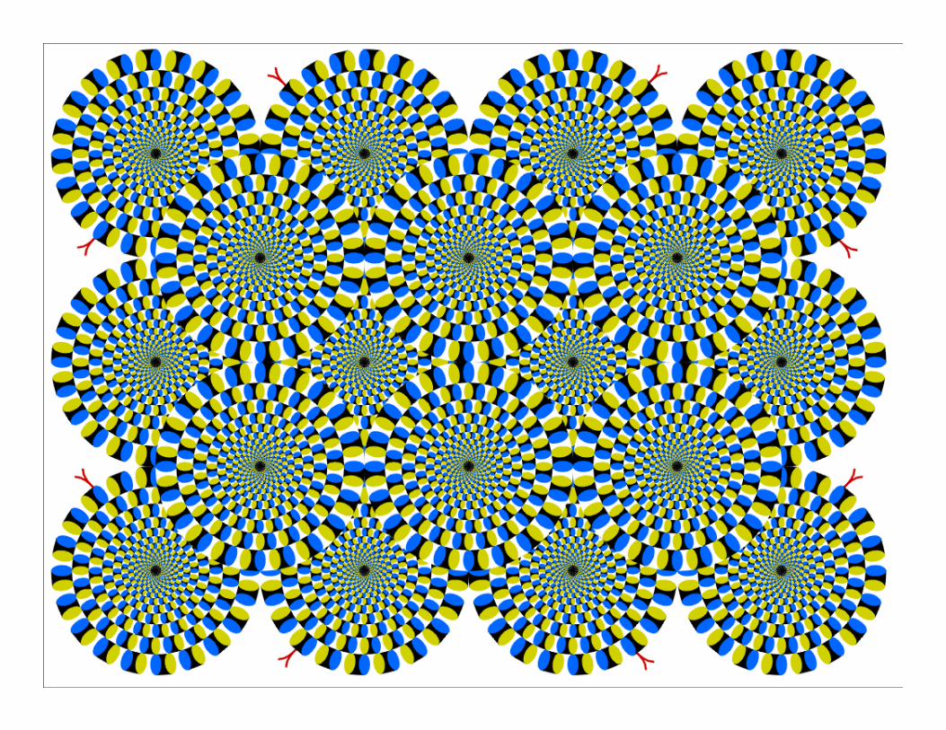
• Humans are pattern seeking creatures.
• All perception is relative.

Classic Optical Illusions
Copyright © 2010, Vlamis Software Solutions, Inc.
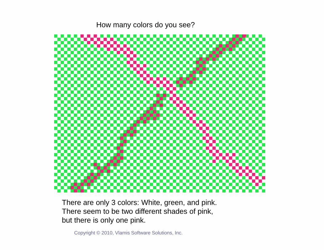
How many colors do you see?
There are only 3 colors: White, green, and pink.There seem to be two different shades of pink,but there is only one pink.
Copyright © 2010, Vlamis Software Solutions, Inc.
Copyright © 2010, Vlamis Software Solutions, Inc.

Which Soldier is tallest?
Copyright © 2010, Vlamis Software Solutions, Inc.
What Attracts Attention
Copyright © 2010, Vlamis Software Solutions, Inc.
1. Motion
2. Color
3. Size

Strong Foundations
Copyright © 2010, Vlamis Software Solutions, Inc.
• It’s much easier to misuse BI tools than to use them well.
• Do a few things well and build from there.
• Think through your BI visualizations (don’t automatically assume that default settings are fine.)

OBIEE Intro Demo

Tufte’s 5 Principles
Copyright © 2010, Vlamis Software Solutions, Inc.
• Above all else show the data.• Maximize the data to ink ratio.• Erase non-data ink.• Erase redundant data ink.• Revise and edit.

Vlamis’ 5 Principles
Copyright © 2010, Vlamis Software Solutions, Inc.
• Maximize data to ink ratio.• Match data format with viewer needs, explain or explore.
• Match data precision with data scale.• Don’t misrepresent data.• Use color carefully.

Graphs and Tables
Copyright © 2010, Vlamis Software Solutions, Inc.
• Graphs and Charts depict visual representations and relationships.
• Tables show data organized for lookup of specific, precise values or items.
0102030405060708090
100
0.1 6 12 18
Month Number
New Product Market Penetration
Keys to Effective Tables
Copyright © 2010, Vlamis Software Solutions, Inc.
• Provide a search interface.• Avoid scrolling if possible.• Lock headers and titles if use scrolling.• Display significant figures.
• Don’t imply precision that doesn’t exist.• Judiciously use conditional formatting for data
exploration. • Avoid putting text in color.• Alignment, proximity, contrast.

Bad Table
Copyright © 2010, Vlamis Software Solutions, Inc.
WIDGETS TO GADGETS RATIO CALCULATED USING CHECK LEVEL DETAIL
ELECTROMECHANICAL PNEUMATIC
PERIOD IN-STORE WEBSITE DISTRIBUTOR IN-STORE WEBSITE DISTRIBUTOR
INCLUDES ONLY DATES
FROM JANUARY THRU
OCT 2007
PERIOD 1 22.36% 11.37% 83.00% 85.34% 20.90% 46.80%
PERIOD 2 21.22% 15.25% 81.00% 81.31% 18.01% 35.39%
PERIOD 3 21.64% 13.22% 82.00% 78.29% 29.94% 41.28%
PERIOD 4 20.89% 13.44% 82.00% 47.82% 16.30% 39.46%
PERIOD 5 21.90% 13.24% 81.00% 84.58% 17.19% 20.52%
PERIOD 6 25.09% 14.78% 80.00% 59.93% 31.08% 35.14%
PERIOD 7 26.23% 14.98% 79.00% 36.35% 32.85% 22.52%
PERIOD 8 26.83% 13.08% 80.00% 82.10% 30.41% 36.10%
PERIOD 9 23.79% 14.27% 81.00% 43.40% 25.17% 23.81%
PERIOD 10 24.39% 12.61% 82.00% 38.21% 17.70% 40.30%
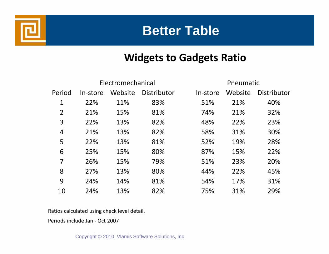
Better Table
Copyright © 2010, Vlamis Software Solutions, Inc.
Widgets to Gadgets Ratio
Electromechanical Pneumatic
Period In-store Website Distributor In-store Website Distributor
1 22% 11% 83% 51% 21% 40%
2 21% 15% 81% 74% 21% 32%
3 22% 13% 82% 48% 22% 23%
4 21% 13% 82% 58% 31% 30%
5 22% 13% 81% 52% 19% 28%
6 25% 15% 80% 87% 15% 22%
7 26% 15% 79% 51% 23% 20%
8 27% 13% 80% 44% 22% 45%
9 24% 14% 81% 54% 17% 31%
10 24% 13% 82% 75% 31% 29%
Ratios calculated using check level detail.
Periods include Jan - Oct 2007


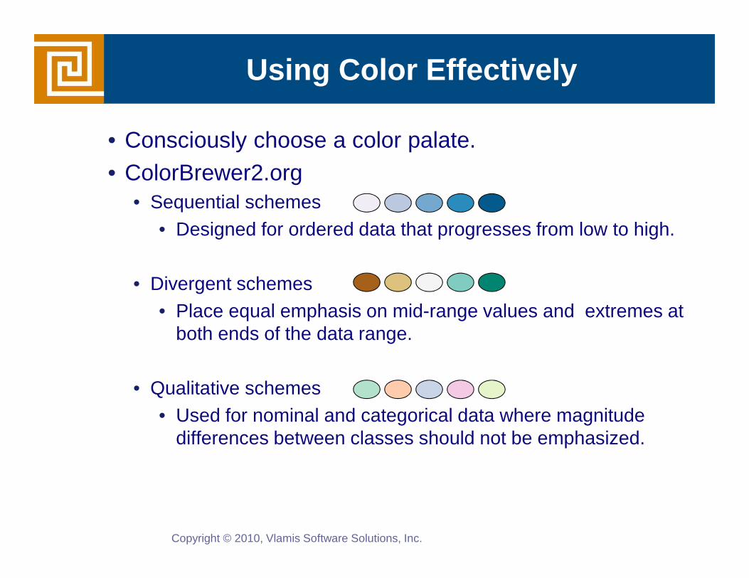
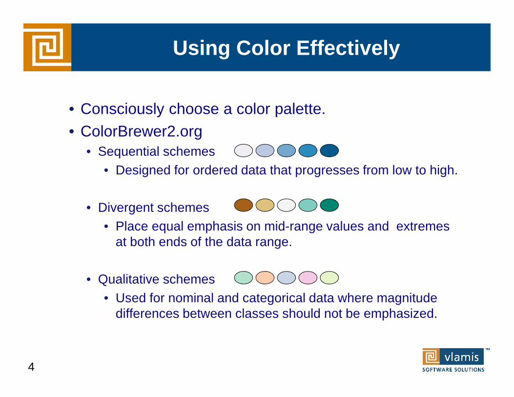
Using Color Effectively
Copyright © 2010, Vlamis Software Solutions, Inc.
• Consciously choose a color palate.• ColorBrewer2.org
• Sequential schemes • Designed for ordered data that progresses from low to high.
• Divergent schemes• Place equal emphasis on mid-range values and extremes at
both ends of the data range.
• Qualitative schemes • Used for nominal and categorical data where magnitude
differences between classes should not be emphasized.

Dashboards Defined
“A dashboard is a visual display of the most important information needed to achieve one or more objectives, consolidated or arranged on a single screen so that the information can be monitored at a glance.”
• Stephen Few, Intelligent Enterprise
Copyright © 2010, Vlamis Software Solutions, Inc.

Dashboards Defined
A Dashboard is a visual presentation of current summary information needed to manage and guide an organization or activity.
• Dashboards should be customized to the needs of individual users and groups.
• Dashboards should maintain and reflect organizational standards so that they can be properly understood by others in the organization.
• Dashboards should reveal their selection and transformation of data in a transparent manner.
• Dashboards should be purposefully designed and optimized for effectiveness.
Copyright © 2010, Vlamis Software Solutions, Inc.
OBIEE Dashboard Best Practices
• Dashboards should be customized to the needs of individual users and groups.
• Dashboards should maintain and reflect organizational standards so that they can be properly understood by others in the organization.
• Dashboards should reveal their selection and transformation of data in a transparent manner.
• Dashboards should be purposefully designed and optimized for effectiveness.

Dashboard Standards
• Before starting it is a good idea to establish some Guidelines and Standards
• For example, what colors are used for which products, or what is the typical screen size so a standard number of section columns can be determined
• Standards help with:• Providing professional look and feel, which instill user
confidence• Standards help reduce development time and improve
productivity and consistency.
Copyright © 2010, Vlamis Software Solutions, Inc.
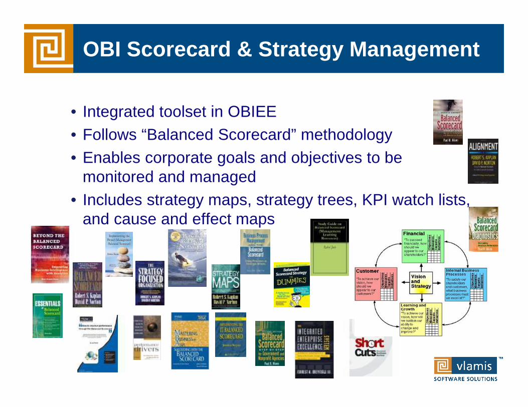
• Integrated toolset in OBIEE• Follows “Balanced Scorecard” methodology• Enables corporate goals and objectives to be
monitored and managed• Includes strategy maps, strategy trees, KPI watch lists,
and cause and effect maps
OBI Scorecard & Strategy Management

OBIEE Demo

Humans Think Spatially
Copyright © 2011, Vlamis Software Solutions, Inc.

Why Maps are Powerful
Copyright © 2011, Vlamis Software Solutions, Inc.
Maps convey dense, multi-dimensional relationships in data faster and more intuitively than any other graphical display methodology.

What is Spatial Data?
Copyright © 2010, Vlamis Software Solutions, Inc.
• Business data that contains or describes location• Street and postal address (customers, stores, factory, etc.)• Sales data (sales territory, customer registration, etc.)• Assets (cell towers, pipe lines, electrical transformers, etc.)• Geographic features (roads, rivers, parks, etc.)
• Anything connected to a physical location

Quick Demo of Oracle BI 11g Maps
3
Tufte Quote
Copyright © 2010, Vlamis Software Solutions, Inc.
“Clutter is not an attribute of information, clutter is a failure of design… fix the design rather than stripping all the detail out of the map.” Edward Tufte
The Visualization of Quantitative Information

When Are Map Views Useful?
Copyright © 2010, Vlamis Software Solutions, Inc.
• Visualizing data related to geographic locations.• Showing or detecting spatial relationships and patterns.• Showing lots of data in a relatively small area.• Drilling down from a (map) overview to a detailed report,
chart, or graph.• When is location important? Can the dimension be
plotted on a map?

Map View Tips
Copyright © 2010, Vlamis Software Solutions, Inc.
• Think about what scale to use. Different map scales will reveal different patterns and insights.
• Use Variable marker to display two measures on a map at a point – size and color.
• Avoid overlapping shapes too much.• Be aware of spatial distortions E.g. Texas is larger than
Connecticut.• Look at color palette. www.colorbrewer2.org
Using Color Effectively
• Consciously choose a color palette.• ColorBrewer2.org
• Sequential schemes • Designed for ordered data that progresses from low to high.
• Divergent schemes• Place equal emphasis on mid-range values and extremes
at both ends of the data range.
• Qualitative schemes • Used for nominal and categorical data where magnitude
differences between classes should not be emphasized.
4

OBIEEMapViewer
Oracle Database
OGC WMS
NSDP*
Other Oracle/non-Oracle databases, data warehouses …
* NSDP (Non-Spatial Data Provider) key MapViewer integration feature
Oracle Fusion Middleware
Integration FrameworkOBI EE and MapViewer

Map Definitions
• FEATURE• Provide a spatial context: cities, highways, rivers, etc… • Features of Interest: store location, postal boundaries, pipelines, etc…
• STYLE• Define rendering properties for features• Can control fill color, border color, line thickness, line style and more
• THEME• Collection of features• Typically associated with a spatial geometry layer• County/state boundaries, major highways, etc…
• BASEMAP• A grouping of themes to create a map• Maps can share themes• When associating a theme with a map, can specify min scale and max
scale (sometimes known as zoom control)• MAP
• Basemap with additional themes overlain

Map Interactivity in OBIEE 11g
• Display BI data on top of maps• Color fill• FOI point display
• Interact with other Dashboard Elements• Drive map content with dashboard prompts• Drive map content through drilling and navigation• Drive other dashboard elements through map
interactions• Reveal additional information on maps through
mouseovers• Drill to map detail

Oracle Locator and Oracle Spatial
• Oracle Locator is a feature of both Oracle Standard and Enterprise Database Editions.
• Oracle Locator provides basic location functionality.• Point, line, and polygon spatial locations (SDO_GEOMETRY)• Spatial indexing• Spatial operators that use the spatial index for performing
spatial inquiries.
• Oracle Spatial is an option for Oracle Database Enterprise Edition• Provides extensive support for advanced spatial processing
and analytics including routing, vector and raster data, topology and network models, and more.
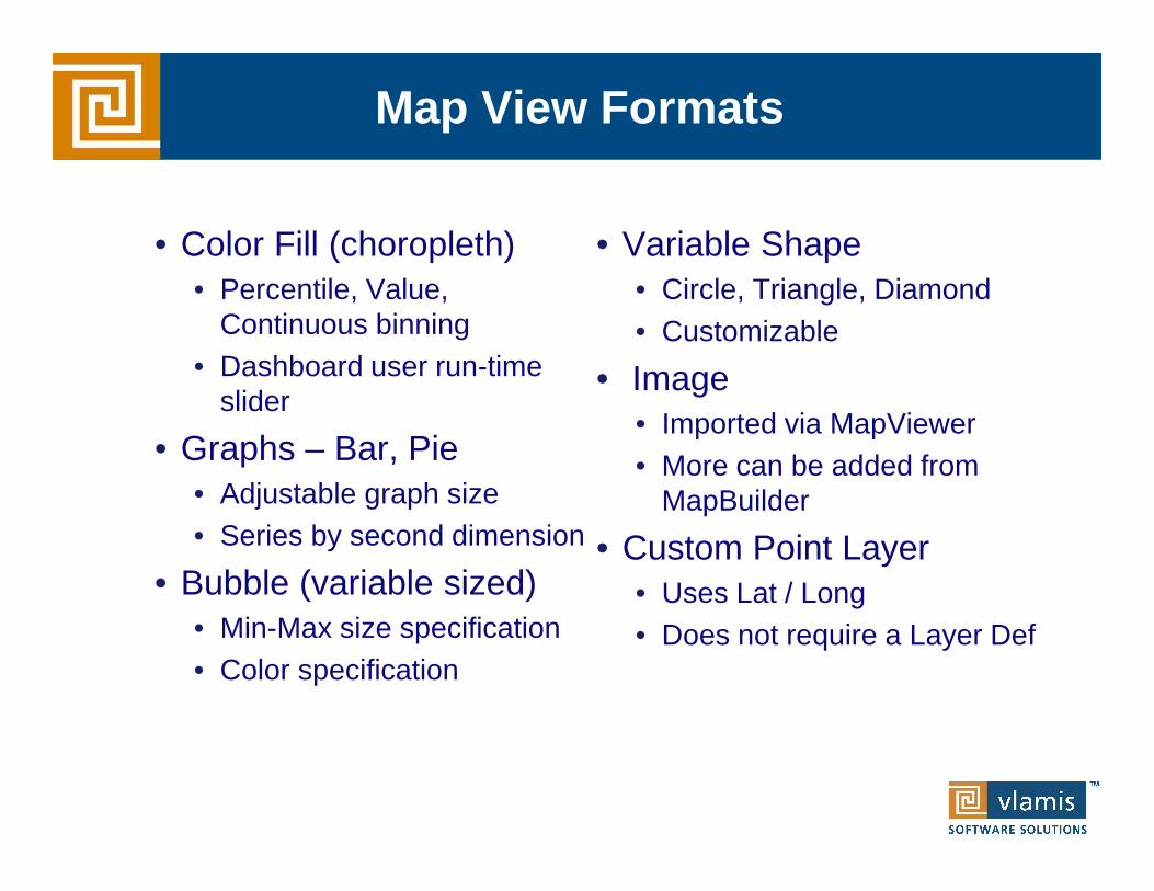
Map View Formats
• Color Fill (choropleth)• Percentile, Value,
Continuous binning• Dashboard user run-time
slider
• Graphs – Bar, Pie• Adjustable graph size• Series by second dimension
• Bubble (variable sized)• Min-Max size specification• Color specification
• Variable Shape• Circle, Triangle, Diamond• Customizable
• Image• Imported via MapViewer• More can be added from
MapBuilder
• Custom Point Layer• Uses Lat / Long• Does not require a Layer Def

NAVTEQ Data
• NAVTEQ is the leading global provider of digital map, traffic and location data that enables navigation and location-based platforms around the world.
• NAVTEQ data is licensed direct or through a reseller.• Licenses are use specific.• NAVTEQ data resides inside your own Oracle
Database.• NAVTEQ publishes an ODF (Oracle Data Format)
version of its data designed specifically for use in an Oracle Database instance.

NAVTEQ Content for OBI
• Geocoding• Points of Interest

NAVTEQ Content for OBI
• Postal Codes • Census Boundaries

NAVTEQ Content for OBI
• Routing data for drive time/drive distance polygons

Demo of Oracle BI 11g Maps
5

• Show nominal data values in comparison to one another.
• Start with zero.• If use a logarithmic scale, clearly notate.
Bar Charts
0
1
2
3
4
5
6
Prod 1 Prod 2 Prod 3 Prod 4
Copyright © 2010, Vlamis Software Solutions, Inc.

• Somewhat confusing, not great for representing change.
• Total is most clearly represented number.• Typically stack with largest values on the bottom.• Single scale can make for interesting intra-bar
comparisons.
Stacked Bar Chart
0
5
10
15
20
25
Prod A Prod B Prod C Prod D
Copyright © 2010, Vlamis Software Solutions, Inc.
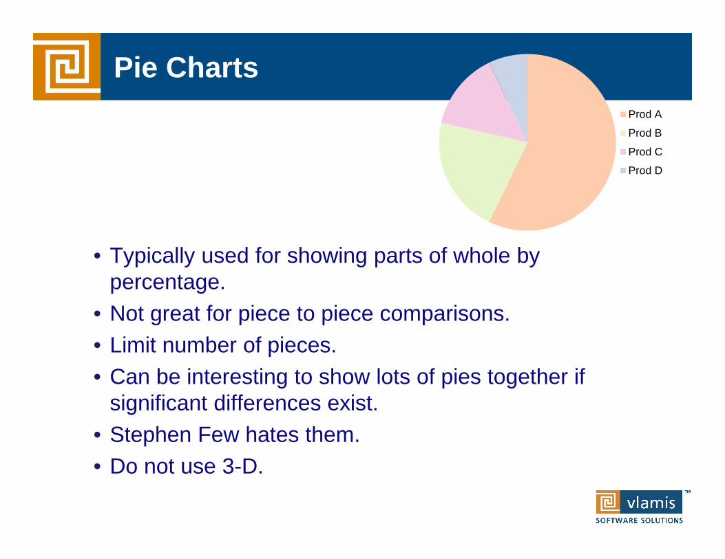
• Typically used for showing parts of whole by percentage.
• Not great for piece to piece comparisons.• Limit number of pieces.• Can be interesting to show lots of pies together if
significant differences exist.• Stephen Few hates them.• Do not use 3-D.
Pie ChartsProd A
Prod B
Prod C
Prod D
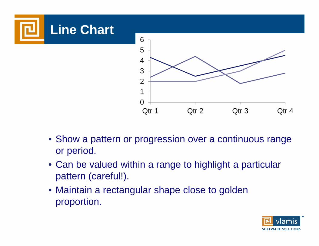
• Show a pattern or progression over a continuous range or period.
• Can be valued within a range to highlight a particular pattern (careful!).
• Maintain a rectangular shape close to golden proportion.
Line Chart
0123456
Qtr 1 Qtr 2 Qtr 3 Qtr 4
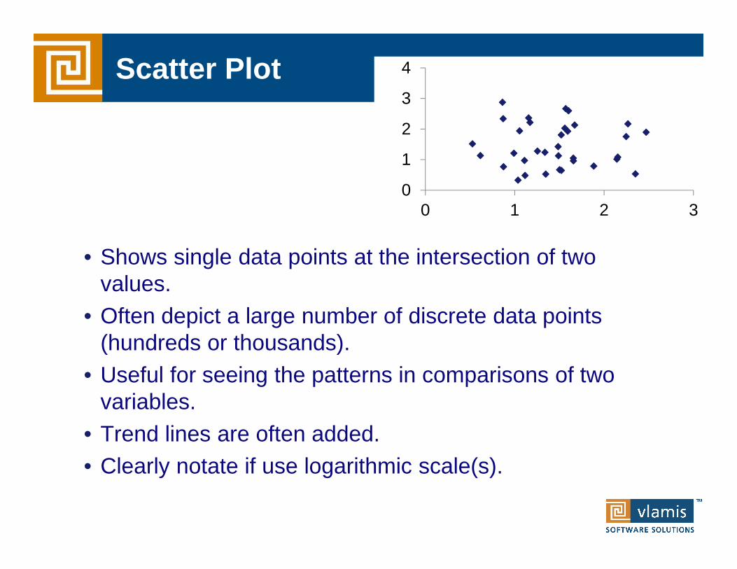
• Shows single data points at the intersection of two values.
• Often depict a large number of discrete data points (hundreds or thousands).
• Useful for seeing the patterns in comparisons of two variables.
• Trend lines are often added.• Clearly notate if use logarithmic scale(s).
Scatter Plot
0
1
2
3
4
0 1 2 3

• Special type of scatter plot.• Size of bubble is related to a third variable.• Greatly reduces number of points that can be
depicted.• Best for depicting approximate values and
comparisons.
Bubble Chart
0
1
2
3
4
0 2 4
Data Mashups are important
• Heterogeneous data sources are expanding• Systems need to handle massive amounts of data• Need a single “launching pad” for analytical info• Believability, usability, and Calvin Mooers

Can Bring New Data Sources into OBI

Can Publish OBI Dashboards

Publish Other Information in OBI
• Creates a single “landing page” for analytic info.• OBI can publish anything in HTML.• OBI can interact with other websites either in frame or
in new window.

Questions and Observations
Copyright © 2010, Vlamis Software Solutions, Inc.
816-781-2880

Maps, Movement, and Mashups
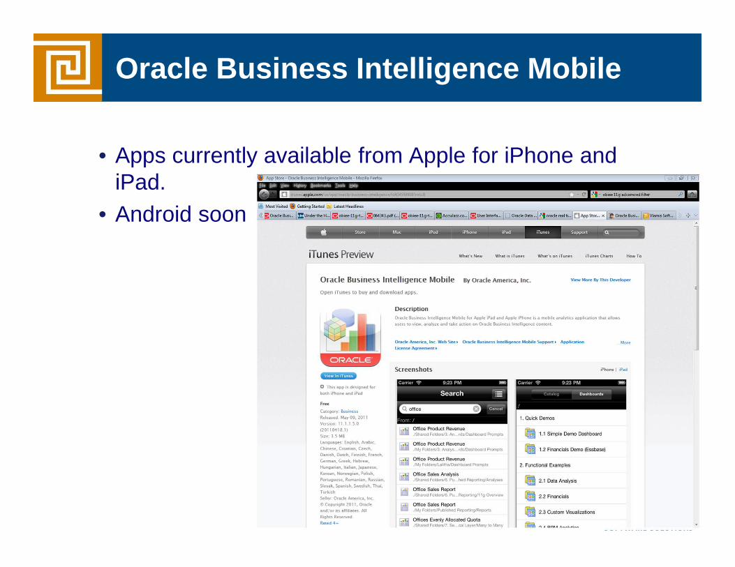
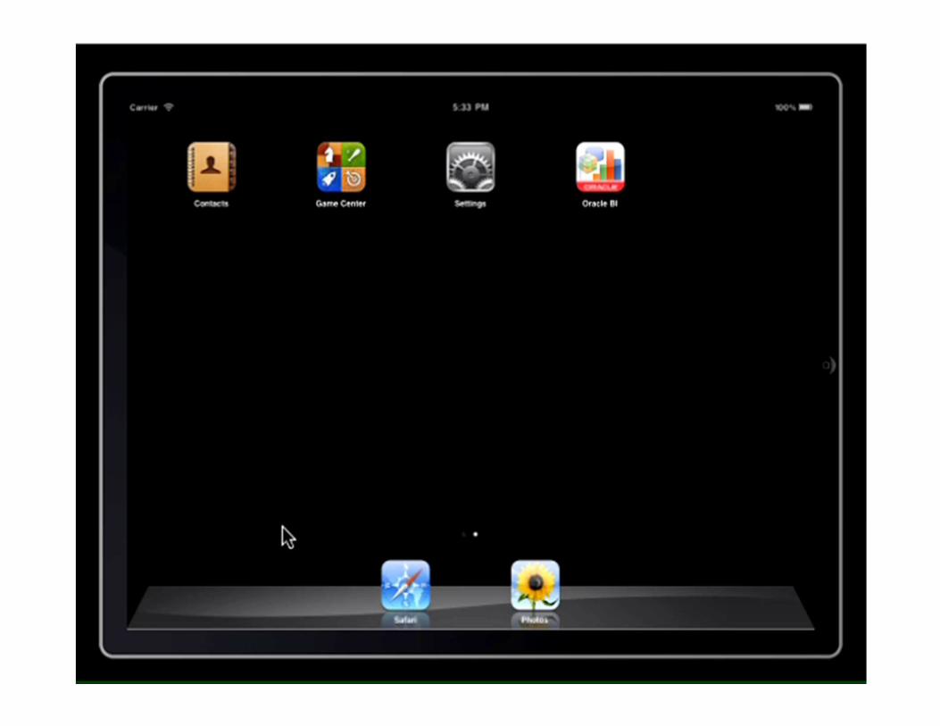
Oracle Business Intelligence Mobile
• Apps currently available from Apple for iPhone and iPad.
• Android soon

Oracle BI Publisher
• Tool for creating and editing “pixel perfect” reports.• Excellent for generating configurable report “blasts”• Full integration with OBIEE 11g,
• Publisher can use the same data model.• Publisher uses the same catalog as OBIEE.• Publisher files can be used on OBI Dashboards
• Publishers reports in the following formats:• MS Word• MS PowerPoint• MS Excel• Adobe Acrobat• Adobe Flexbuilder• HTML, RTF, XSL, eText (EDI or EFT)• Flash

Oracle BI Publisher

Oracle BI Publisher
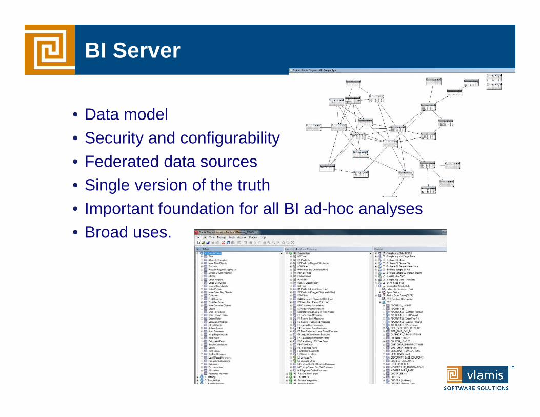
BI Server
• Data model• Security and configurability• Federated data sources• Single version of the truth• Important foundation for all BI ad-hoc analyses• Broad uses.

Competitive Advantage of BI & Analytics
Degree of Intelligence
Source: Competing on Analytics, by T. Davenport & J. Harris
Optimization
Predictive Modeling
Forecasting/Extrapolation
Statistical Analysis
Alerts
Query/drill down
Ad hoc reports
Standard Reports
Co
mp
etit
ive
Ad
van
tag
e
What’s the best that can happen?
What will happen next?
What if these trends continue?
Why is this happening?
What actions are needed?
Where exactly is the problem?
How many, how often, where?
What happened?
$$Analytic$
Access & Reporting

Spectrum of Oracle DB BI & Analytics
Copyright © 2012, Vlamis Software Solutions, Inc.
Knowledge discovery of hidden patterns
Who is likely toanswer the phone at certain times of day and why?
Spatial relationships between data
Where were stores with the highest answer ratesin the last 3 years?
Summaries, trends and forecasts
What is theaverage duration of phone calls, by region, by year?
OLAP Data Mining Spatial
“Insight & Prediction” “Location”“Analysis”
Copyright © 2012, Vlamis Software Solutions, Inc.
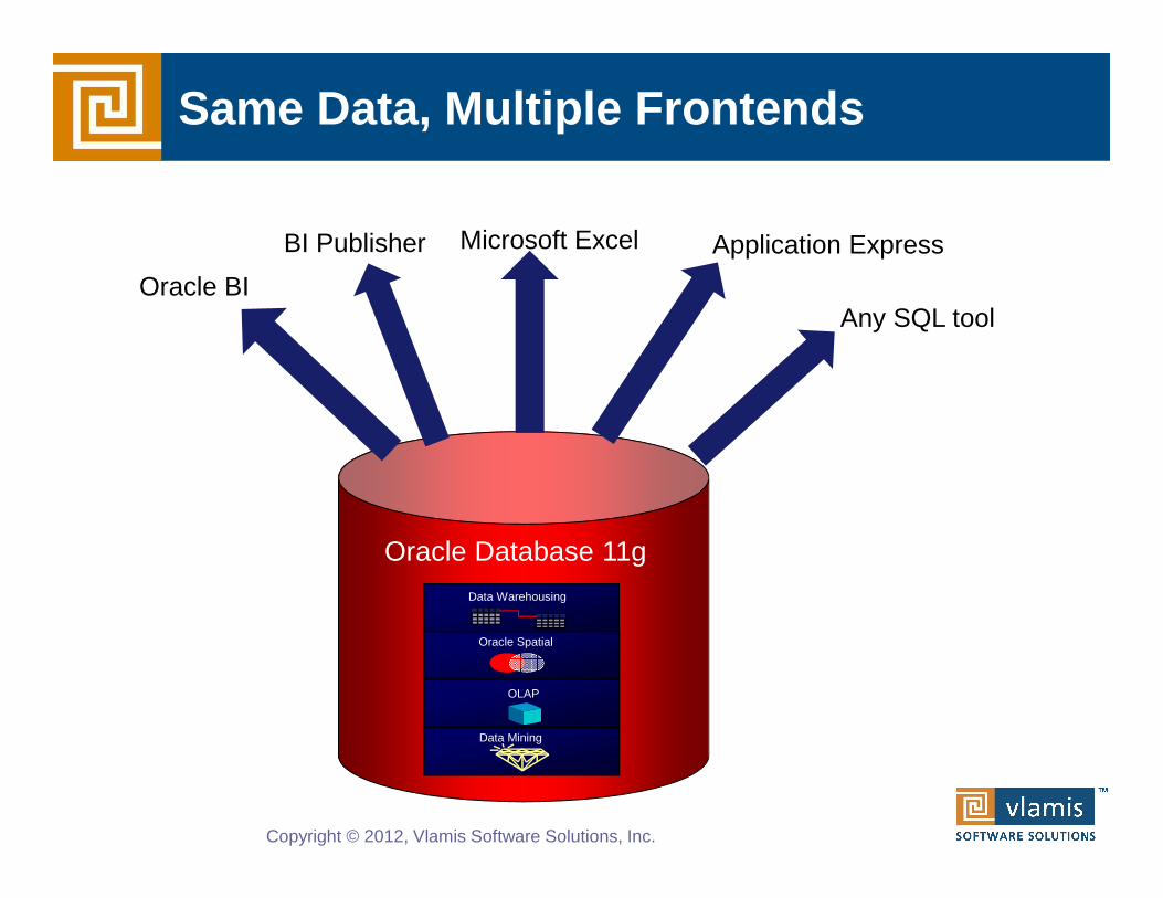
Same Data, Multiple Frontends
Oracle Database 11gData Warehousing
Oracle Spatial
OLAP
Data Mining
Oracle BI
BI Publisher Microsoft Excel Application Express
Any SQL tool
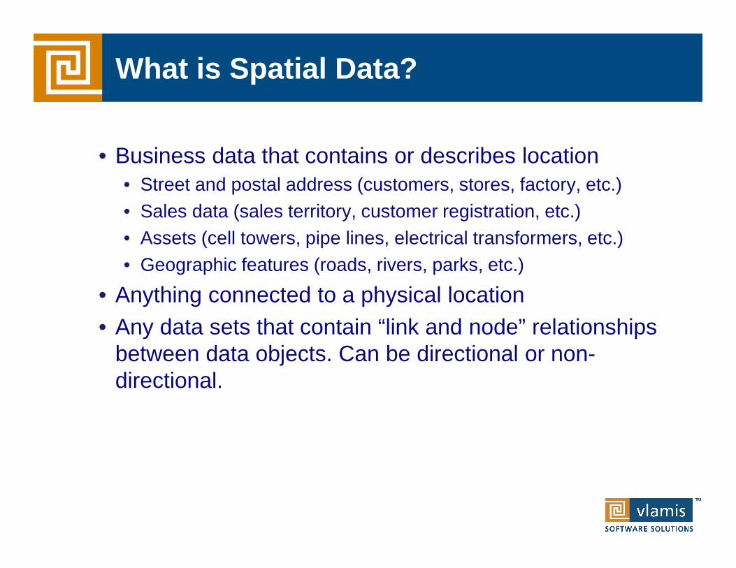
What is Spatial Data?
• Business data that contains or describes location• Street and postal address (customers, stores, factory, etc.)• Sales data (sales territory, customer registration, etc.)• Assets (cell towers, pipe lines, electrical transformers, etc.)• Geographic features (roads, rivers, parks, etc.)
• Anything connected to a physical location • Any data sets that contain “link and node” relationships
between data objects. Can be directional or non-directional.

Natively Manage All Geospatial Data
Copyright © 2012, Vlamis Software Solutions, Inc.
Data
“Points”“Lines”
“Polygons”
Rasters
Topologies
3D
Oracle database
f1
f2n1
n2
e1
e2e3
e4
Networks
Web Services(OGC)
GeocodingRouting
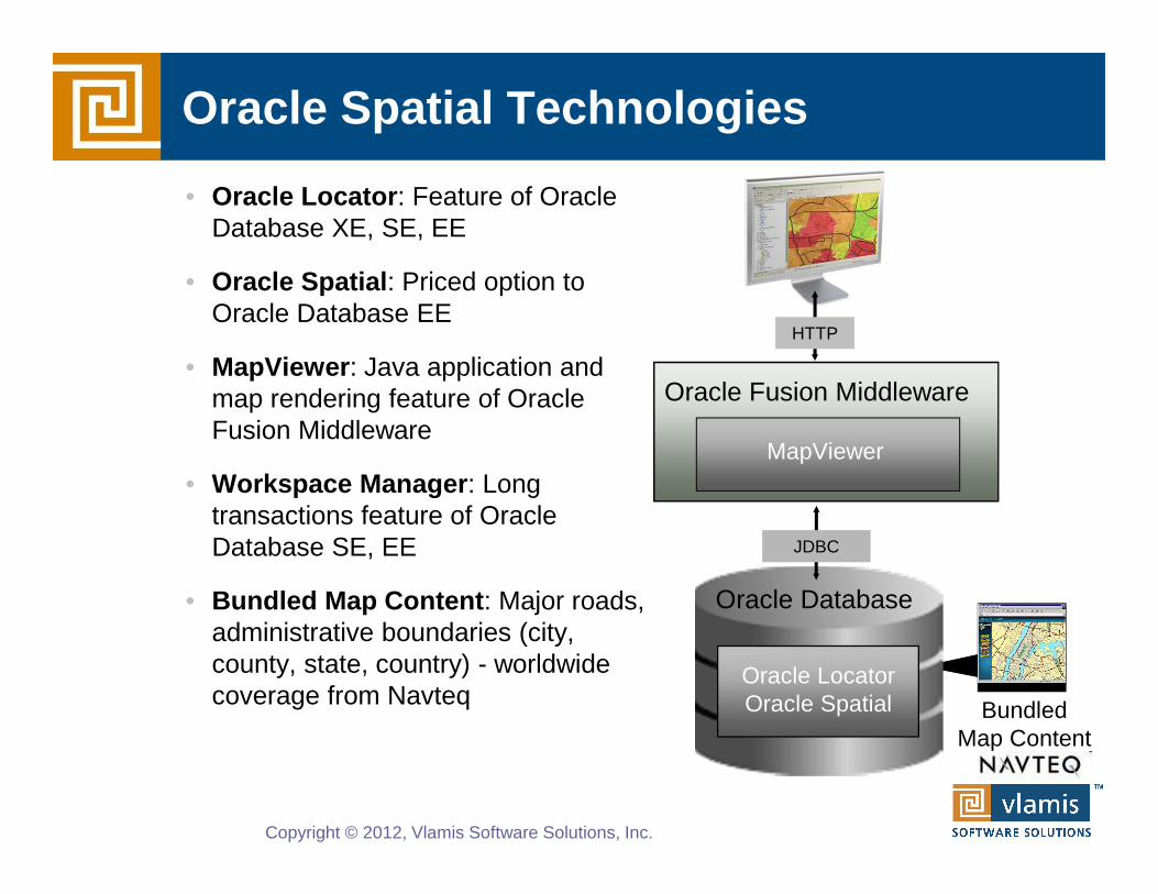
Oracle Spatial Technologies
Copyright © 2012, Vlamis Software Solutions, Inc.
• Oracle Locator : Feature of Oracle Database XE, SE, EE
• Oracle Spatial : Priced option to Oracle Database EE
• MapViewer : Java application and map rendering feature of Oracle Fusion Middleware
• Workspace Manager : Long transactions feature of Oracle Database SE, EE
• Bundled Map Content : Major roads, administrative boundaries (city, county, state, country) - worldwide coverage from Navteq
JDBC
Oracle Fusion Middleware
HTTP
MapViewer
BundledMap Content
Oracle LocatorOracle Spatial
Oracle Database
Why Maps are Powerful
Copyright © 2012, Vlamis Software Solutions, Inc.
Maps convey dense, multi-dimensional relationships in data faster and more intuitively than any other graphical display methodology.
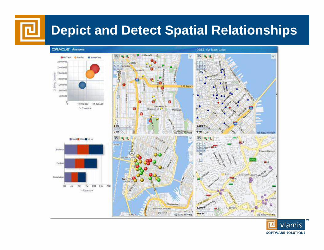
Depict and Detect Spatial Relationships

Combination of Data Mining and Spatial
Copyright © 2012, Vlamis Software Solutions, Inc.
• In-database data mining builds predictive models that predict customer behavior
• OBIEE’s integrated spatial mapping shows where