oceano identity manual
DESCRIPTION
Identity Manual for the Oceano Boutique HotelTRANSCRIPT

1

2
At the Oceano Hotel, luxury is the beginning in offering our guests not only a worry free vacation but a place that gives one-of-a-kind experiences. The Oceano Hotel, provides guests an exceptional environment and the personalized attention that creates a singular experience each time.
Brand Promise
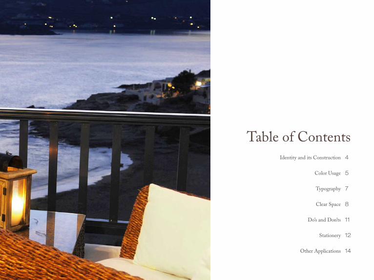
Table of ContentsIdentity and its Construction
Color Usage
Typography
Clear Space
Do’s and Don’ts
Stationery
Other Applications
4
5
7
8
11
12
14

4
Identity and its ConstructionThe logo shown is the Oceano’s identity. It’s size, positioning, and color treatment are directed by the rules in this guide. This is the only graphic to be used to signify oceano. The logo shown is the foundation of the Oceano graphic identity system. The logo is a unique design and cannot be reproduced with any typeface. It must not be hand drawn, scanned or modified in any way. It should be reproduced only from electronic files. The colors and proportions of the identity must not be altered. This consistency of the mark builds recognition.
The Oceano logo is made up of two components. The Hotel name and the describer. These two are always shown together and shouldn’t be modified or altered in any way.
When using this logo only use the artwork supplied by these guide-lines. The logo must appear clearly and in the correct colors.(See color usage on page 5).
5
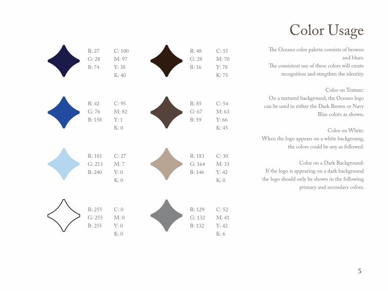
Color UsageThe Oceano color palette consists of browns
and blues. The consistent use of these colors will create
recognition and stregthen the identity.
Color on Texture:On a textured background, the Oceano logo
can be used in either the Dark Brown or Navy Blue colors as shown.
Color on White:When the logo appears on a white backgroung,
the colors could be any as followed.
Color on a Dark Background:If the logo is appearing on a dark background
the logo should only be shown in the following primary and secondary colors.
R: 27G: 28B: 74
R: 42G: 76B: 158
R: 181G: 213B: 240
R: 255G: 255B: 255
R: 48G: 28B: 16
R: 85G: 67B: 59
R: 183G: 164B: 146
R: 129G: 132B: 132
C: 100M: 97Y: 38K: 40
C: 95M: 82Y: 1K: 0
C: 27M: 7Y: 0K: 0
C: 0M: 0Y: 0K: 0
C: 55 M: 70Y: 78K: 75
C: 54M: 63Y: 66K: 45
C: 30M: 33Y: 42K: 0
C: 52M: 41Y: 42K: 6

6

11
Don’t use the unapproved colors
Don’t stack the text next to the logo.
Don’t use two colors in the logo.
Don’t distort the logo from its original shape.
Don’t overlay the text on top of the logo.
Don’t use the logo in a shape.
Do’s and Don’tsTo ensure visibility the Oceano logo should always be kept clear of
competing text, images, and graphics. The logo must be surrounded on all sides by an adequate clearspace, like the example shown on the left.

12
StationeryFormat8.5 x 11 in.Shown at 45% of actual size.
Oceano LogoSee pages 4-13 for specificationsColor: Brown
Return Address:Typeface: Caslon Pro RegularSize: 8 ptColor: Brown

13
StationeryCorporate Envelope
The Logo on the envelope must be the same size as the letterhead logo and business card logos to keep a unified
look.
Envelope #10 shown at 45% of actual size.
Corporate Business CardsThe Oceano Business cards are critical to the identity
system.
Cards are shown to actual size.3.5 x 2 in
Oceano LogoSee pages 4-11 for specifications
Color: Brown
Return Address:Typeface: Caslon Pro Regular
Size: 8 ptColor: Brown

10