office of inspector general audit report atc towers... · efficiency of faa’s air traffic control...
TRANSCRIPT

Office of Inspector General Audit Report
EFFICIENCY OF FAA’S AIR TRAFFIC CONTROL TOWERS RANGES WIDELY
Federal Aviation Administration
Report Number: ST-2015-080 Date Issued: August 20, 2015

Memorandum U.S. Department of Transportation Office of the Secretary of Transportation Office of Inspector General
Subject: ACTION: Efficiency of FAA’s Air Traffic Control Towers Ranges Widely Federal Aviation Administration Report Number ST-2015-080
Date: August 20, 2015
From: Mitchell Behm Assistant Inspector General for Surface Transportation Audits1
Reply to Attn. of: JA-30
To: Federal Aviation Administrator
Over fiscal years 2004 through 2013, total air traffic operations handled by Federal Aviation Administration (FAA) facilities declined by 19 percent, yet FAA’s operations budget increased by 0.6 percent.2 During this period, air traffic controller costs decreased by only 6.0 percent, while overtime hours grew by 12 percent. Citing concerns about controller productivity in light of declining aviation activity, the House Committee on Transportation and Infrastructure and its Aviation Subcommittee requested that we assess FAA’s plans to enhance controller productivity, the factors that need to be addressed to achieve the expected benefits, and the estimated cost savings that could be achieved with improved controller productivity.
Our prior audit of FAA’s controller productivity initiatives found that they did not achieve expected benefits or cost savings, with some actually increasing Agency costs.3 We also found that FAA does not regularly analyze the substantial operational and cost data generated by its numerous databases to determine if it could reduce costs or improve productivity. For this audit, we used FAA data to determine which air traffic control (ATC) towers operate relatively more or less efficiently based on comparisons with each other. Knowledge of which towers are operating relatively more or less efficiently can then be used to facilitate
1 The Economics Group, which conducts analyses across all modes and produced this audit, is situated in the Surface Transportation Group. 2 All cost estimates in this document are calculated in 2013 dollars. 3 FAA Lacks the Metrics and Data Needed To Accurately Measure the Outcomes of its Controller Productivity Initiatives (OIG Report No. AV-2014-062), July 9, 2014. OIG reports are available on our website: https://www.oig.dot.gov/.

2
identification of the factors driving efficient performance. Consequently, our objective was to assess the relative efficiency of FAA ATC towers. Specifically, we (1) determined the extent to which efficiency varies across FAA ATC towers and (2) assessed the cost impacts of relative inefficiencies in FAA ATC tower operations.
We conducted our audit work from March 2014 through June 2015 in accordance with generally accepted Government auditing standards. We assessed the relative efficiency of FAA’s stand-alone ATC towers, or type 7 facilities,4 in each fiscal year from 2008 through 2013. To accomplish this, we used Data Envelopment Analysis (DEA), which allows for assessment of efficiency in the use of multiple inputs to produce multiple outputs across a number of entities. The inputs in our analyses were labor hours and equipment value. The outputs were numbers of air traffic operations and controller trainees.5 We corrected for factors affecting the difficulty of the ATC environment, such as crossing runways, by gauging a tower’s relative efficiency only in comparison with others facing at least the same degree of environmental difficulty.6 We separated our analysis into two parts: one comparing hub airport towers against each other, and the other comparing non-hub airport towers, which include General Aviation (GA), airports against each other. To group towers, we used FAA’s definitions, which identify airports as hub or non-hub based purely on number of passenger enplanements. For additional information on our scope and methodology, see exhibit A. Exhibit B provides a detailed scope and methodology on our data, methods, and analysis.
4 We did not look at combined tower and TRACON facilities, TRACON units, or en-route centers. The number of stand-alone ATC towers was 126 in fiscal year 2008 and rose to 130 in fiscal year 2013. Altogether, FAA operated 315 ATC facilities in fiscal year 2013. Stand-alone towers employed 18 percent of FAA’s controller workforce in that year. 5 We did not include safety measures in our calculations. The reported numbers of safety violations were too small to affect our results. 6 We followed a three-stage DEA methodology developed to account for factors affecting environmental difficulty. Consistent with that methodology, we ranked the towers in terms of environmental difficulty based on a regression analysis. Our regression accounted for factors such as percentage of local traffic, runway configuration, and number of runways.
3
UNDERSTANDING OUR ANALYSIS DEA is a recognized technique for assessing efficiency that has been applied to a wide range of industries, including European ATC.7 Using DEA allowed us to determine relative efficiency based on data comparing actual FAA tower operations and not on comparison with a theoretical ideal. Under this method, a tower was determined to be relatively efficient when no other tower or group of towers handled comparable levels of outputs using smaller amounts of the inputs. Towers that were not relatively efficient were considered inefficient. Further, within the group of inefficient towers, some performed worse than others. We applied the label “least efficient” to the 10 worst performing towers among the hub airports and the 10 worst performers among the non-hub airports.
Since we have more than one input and one output, determination of what constitutes relatively efficient performance is not straightforward. For example, a tower may use fewer labor hours but more equipment per air traffic operation than other towers. Then again, it may use less of both inputs to handle each controller trainee than other towers, but more to manage each air traffic operation. The methodology we chose to compare each tower’s performance with the performance of others allowed for there being multiple ways to excel.
Our approach combines information on each tower’s activities into a single value. It starts by assigning a weight to each input and each output, and computing a weighted sum, like a weighted average, of the inputs and a separate weighted sum of the outputs. This allows for calculating the ratio of the weighted sum of the outputs to the weighted sum of the inputs. DEA uses a variant of this ratio method that puts each tower in the best possible light in comparison with others, thereby enhancing each tower’s opportunity to be determined relatively efficient.
Comparing towers using this method allows them to achieve relative efficiency in many different ways. In addition, our method of accounting for environmental factors—only comparing a tower to others facing at least the same degree of difficulty—greatly increases the likelihood of a tower being considered relatively efficient. For example, a hub tower can be inefficient when compared with all other hub towers, but can be relatively efficient when compared to just the smaller group of hub towers facing at least as difficult an environment. In these ways, our methodology is conservative with respect to designating a tower inefficient and estimating the associated costs. 7 The industries to which DEA has been applied include health care, energy, finance, hospitality, and public services. DEA studies of ATC include: Kenneth Button and Rui Neiva (2014) Economic Efficiency of European Air Traffic Control Systems, Journal of Transport Economics and Policy, 48, 65-80; Michel Mouchart and Leopold Simar (2003) Efficiency Analysis of Air Navigation Services Provision (II): Further Insights, Institut de Statistique, Universite Catholique de Louvain, Consulting Report 03-02 for Eurocontrol; and Michel Mouchart and Leopold Simar (2002) Efficiency Analysis of Air Controlers: First Insights, Institut de Statistique, Universite Catholique de Louvain, white paper.

4
As with any modeling methodology, our approach has limitations. For example, potential efficiency gains may not be achievable due to factors not included in our analysis, such as implementation costs. In addition, DEA does not identify the drivers of the efficiency differences it identifies.
RESULTS IN BRIEF FAA’s stand-alone ATC towers at both hub and non-hub airports function at considerably different levels of efficiency relative to each other. While we found a large share of relatively efficient towers—exceeding 50 percent in some years we examined—there is a wide gap between their performance and that of the least efficient ATC towers. The least efficient towers used from 42 to 98 percent more resources than those of comparable relatively efficient towers (depending on the year and whether they were hub or non-hub airports). In addition, certain towers were consistently relatively efficient, while certain other towers frequently ranked among the least efficient.8
We estimated the additional costs from all relatively inefficient towers to average $142 million annually from fiscal years 2008 through 2013, for a total of $853 million. The inefficiencies associated with the 10 least efficient hub ATC towers alone were estimated to account for 57 percent, on average, of this amount. We found that these costs were not necessarily a consequence of inefficient towers using less productive combinations of inputs. Instead, they resulted at least in part from the least efficient towers using more of both labor hours and equipment to handle each operation and prepare each trainee than the relatively efficient towers.
We are recommending that FAA identify the factors contributing to greater resource use by the least efficient towers as compared with the relatively efficient towers and develop a plan for addressing them.
EFFICIENCY VARIES NOTABLY ACROSS FAA’S ATC TOWERS FAA’s ATC towers function at considerably different levels of efficiency relative to each other. While we found a large share of towers to be relatively efficient in each year that we examined, the gap between their performance and that of the least efficient towers was substantial. In addition, several towers that performed relatively well tended to do so consistently over time, while other towers frequently ranked among the least efficient.
8 Both groups notably included towers operating at all size airports and in environments characterized by all degrees of difficulty.

5
FAA’s ATC Towers Range Considerably in Relative Efficiency We determined that large percentages of towers were relatively efficient in each year that we examined. Between 49 and 60 percent of the hub towers were determined to be relatively efficient, depending on the year examined. The comparable figures for the non-hub group were 44 and 64 percent.
However, the performance gap between the relatively efficient towers and the least efficient towers was substantial. The least efficient hub airport towers were estimated to use as much as 42 to 66 percent more resources, depending on the year examined, than comparable relatively efficient towers to handle their air traffic operations and controller trainees. Likewise, the least efficient non-hub airport towers used 53 to 98 percent more resources than the comparable relatively efficient towers.
Some ATC Towers Consistently Perform Relatively Efficiently or Inefficiently We found that certain towers were consistently relatively efficient, while other towers frequently ranked among the least efficient. Table 1 lists all the ATC towers at large hub airports that were consistently relatively efficient (in at least 5 years of the 6 years examined) and frequently least efficient (in the bottom 10 of all hub airports for at least 3 years of the years examined). Both groups include towers facing a range of degrees of difficulty,9 so environmental difficulty is not the primary determinant of whether a tower is relatively efficient or inefficient.10
Tables 2 and 3 display the same information for medium and small hub airport towers. (Exhibit D provides comparable information for non-hub airport towers. In exhibit B, tables B1 and B2 show results for all towers analyzed.)
9 For reporting purposes only, we grouped the ranked towers into four categories: high difficulty, for those in the top one-fourth of the difficulty ranking; medium high difficulty, for those in the next one-fourth of the ranking; medium low difficulty, for those in the next one-fourth; and low difficulty, for towers in the bottom one-fourth of the ranking. 10 The likelihood that a high difficulty airport tower will appear in the relatively efficient group was increased by the fact that it was compared with fewer others—only those facing at least as harsh an environment—than a tower in an easier environment. For example, the tower facing the most difficult environment would be considered relatively efficient, as there would be no other towers having at least as difficult an environment to compare it against. Given this, it is notable that high difficulty airport towers appear still among the least efficient and low difficulty towers appear among the relatively efficient.

6
Table 1. Large Hub Airport Control Tower Results Consistently Relatively Efficient
Airport Name Environmental Difficulty Hartsfield-Jackson Atlanta International Airport (ATL) Medium Low Denver International Airport (DEN) Medium High Dallas/Fort Worth International Airport (DFW) Medium Low Newark Liberty International Airport (EWR) High Houston George Bush Intercontinental Airport (IAH) High McCarran International Airport (LAS) Medium High LaGuardia Airport (LGA) High Chicago O’Hare International Airport (ORD) Medium Low San Diego International Airport (SAN) High
Frequently Least Efficient Airport Name Environmental Difficulty General Edward Lawrence Logan International Airport (BOS) Medium High Ronald Reagan Washington National Airport (DCA) High Washington Dulles International Airport (IAD) High Orlando International Airport (MCO) Medium Low Chicago Midway International Airport (MDW) Medium High Seattle-Tacoma International Airport (SEA) Medium High Salt Lake City International Airport (SLC) Medium Low
Source: OIG analysis
Table 2. Medium Hub Airport Control Tower Results Consistently Relatively Efficient
Airport Name Environmental Difficulty Bradley International Airport (BDL) Medium High Bob Hope Airport (BUR) Medium High Dallas Love Field Airport (DAL) Medium High Eppley Airfield (OMA) Medium Low Luis Muñoz Marín International Airport (SJU) Medium High Sacramento International Airport (SMF) Medium Low
Frequently Least Efficient Airport Name Environmental Difficulty
John Wayne Airport – Orange County (SNA) Low
Source: OIG analysis

7
Table 3. Small Hub Airport Control Tower Results Consistently Relatively Efficient
Airport Name Environmental Difficulty Westchester County Airport (HPN) Medium Low Long Beach/Daugherty Field Airport (LGB) Low Manchester-Boston Regional Airport (MHT) Medium High Richmond International Airport (RIC) Medium Low Orlando Sanford International Airport (SFB) Low Cyril E. King Airport (STT) Low
Frequently Least Efficient Airport Name Environmental Difficulty Long Island MacArthur Airport (ISP) Low
Source: OIG analysis
INEFFICIENT ATC TOWERS INCREASE FAA’S COSTS We estimated the additional costs from all relatively inefficient towers to average $142 million annually over fiscal years 2008 through 2013. The inefficiencies associated with the 10 least efficient hub ATC towers alone were estimated to account for 57 percent, on average, of this amount. The additional costs can be explained in part by the fact that the least efficient hub towers on average used both more controller hours and more equipment to handle their operations and trainees than the relatively efficient hub towers.
Inefficiencies in ATC Tower Resource Usage Increased FAA Costs Through comparisons with relatively efficient towers we estimated that inefficiencies in ATC tower operations added $142 million on average to FAA’s annual costs during fiscal years 2008 through 2013, for a total of $853 million. Hub airport tower inefficiencies accounted for the bulk of these amounts, contributing an additional $118 million in average annual costs. Notably, the 10 least efficient hub towers alone accounted for 57 percent of total additional costs on average, or between $60 million and $108 million depending on the year examined. By comparison, the 10 least efficient non-hub towers contributed between $10 million to $20 million in annual additional costs through inefficiencies, or 11 percent on average of the total for all towers.
Tower inefficiencies were determined to cause an increase in costs by increasing the amount of labor hours and equipment used. Specifically, the cost of a tower’s inefficiency was calculated as the cost of the inputs it used that were in excess of those used by a comparable relatively efficient tower or combination of towers.11 11 We used tower-specific labor costs in these calculations.

8
The total additional costs represent the sum of these additional input costs for all inefficient towers.
Relatively Efficient Hub Towers Used Less of Both Inputs on Average Than the Least Efficient Hub Towers Relatively efficient hub airport towers used less of each input (labor hours and equipment) per each output (numbers of air traffic operations and controller trainees) than the 10 least efficient hub airport towers on average for each year that we examined, as shown in figures 1 through 4.12 This is a striking result, given the many ways a tower can be determined relatively efficient. It means that the difference between the relatively efficient and inefficient hub airport towers is not necessarily a consequence of the inefficient towers using less productive combinations of labor hours and equipment to do their work. Instead, the difference results at least in part from the fact that the inefficient towers are actually using more of each input to handle their operations and prepare trainees.
Figure 1. Average Labor Hours per Operation
12 Similar results for the non-hub airport towers are not consistent across all the years examined.
0.00
0.05
0.10
0.15
0.20
0.25
0.30
0.35
2008 2009 2010 2011 2012 2013
Fiscal Year
Hour
s/O
pera
tion
Relatively Efficient Hub
10 Least Efficient Hub

9
Figure 2. Average Capital Cost per Operation
Figure 3. Average Labor Hours per Trainee
0.00
20.00
40.00
60.00
80.00
100.00
120.00
140.00
2008 2009 2010 2011 2012 2013
Fiscal Year
$/O
pera
tion
Relatively Efficient Hub
10 Least Efficient Hub
0.0
5.0
10.0
15.0
20.0
25.0
30.0
2008 2009 2010 2011 2012 2013
Fiscal Year
Hour
s (1,
000)
/Tra
inee
Relatively Efficient Hub
10 Least Efficient Hub

10
Figure 4. Average Capital Cost per Trainee
CONCLUSION FAA, like other Federal agencies, is being asked to do more with less, and this can only be accomplished by identifying how to use resources efficiently. In the case of ATC towers, where FAA devotes major resources, our identification of the relatively efficient and least efficient towers indicates that differences in resource use can drive efficiency. While there may be factors not captured in our analysis, identifying the relatively efficient and least efficient towers provides a starting point for FAA to investigate the factors driving relative efficiency and therefore begin reducing the additional costs incurred annually through inefficient towers.
RECOMMENDATION We recommend that FAA identify the factors contributing to greater resource use by the least efficient towers as compared with the relatively efficient towers that we identified, and develop a plan for addressing them.
AGENCY COMMENTS AND OFFICE OF INSPECTOR GENERAL RESPONSE We provided our draft report to FAA on June 24, 2015, and received its response on July 17, 2015, which is included as an appendix to this report. FAA partially concurred with our recommendation, agreeing that efficiency can be enhanced. However, FAA stated that it considers our methodology to be flawed and that it looks forward to identifying the “least efficient” towers as a part of an agreed upon methodology. We contend that our analysis provides a well-researched, data-
0.0
1.0
2.0
3.0
4.0
5.0
6.0
7.0
8.0
9.0
2008 2009 2010 2011 2012 2013
Fiscal Year
($) M
illio
ns/T
rain
ee
Relatively Efficient Hub
10 Least Efficient Hub

11
driven starting point for identifying the drivers of ATC tower efficiency, which FAA should use to determine how it can improve its towers’ performance.
We based our analyses on a widely accepted methodology that has been applied to facilities in industries such as health care, education, banking, and transportation—including ATC. In addition, we used a conservative variant of the methodology when identifying towers as inefficient. Specifically, by capturing environmental factors, we roughly tripled the number of relatively efficient towers compared with the standard approach. Overall, we found that roughly half of all stand-alone ATC towers were relatively efficient. Those labeled “frequently least efficient” ranked among the 10 least efficient towers for at least 3 of the years examined.
FAA states that efficiency comparisons between ATC facilities can be misleading because of substantial differences in factors such as air traffic volume, airspace complexity, and facility size. FAA’s position is that any meaningful comparisons should address more facility-specific factors, including the shifting of night-time traffic responsibilities between towers and contractor resources. FAA also took issue with our use of equipment net book value as an input in the analysis.
However, FAA’s preferred approach would require assessing facilities against an absolute standard for efficient ATC tower operation. We are not aware of such an established standard. When deciding which factors to include in our analysis, we interviewed FAA ATC tower managers and requested interim feedback from FAA modelers of ATC facility processes on several occasions. The information obtained through these efforts determined the basic model components and led us to take additional steps to account for differences in ATC environments. For example, our analysis incorporated factors including air traffic volume and composition, and number and configuration of runways. Further, our methodological choices allowed for differences in scale of operations between towers.
While we recognize that there are considerations not incorporated in our analysis, we note that models focus by necessity on the most important factors. If they attempt to incorporate too many elements, they become too detailed to allow for meaningful comparisons. The value of accounting for other factors depends upon their importance relative to the factors already incorporated. If FAA believes that certain omitted factors, such as the shifting of night-time traffic responsibilities between towers, are particularly important, FAA will want to consider them when it determines reasons for specific towers’ relative inefficiency.
Regarding the issue of contractor resources, FAA has not yet established that it has the data for effectively factoring these resources into an efficiency analysis. Air Traffic Control Optimum Training Solution (ATCOTS) contractors provide

12
classroom and simulator instruction, course and curriculum development, and administrative and program support services. FAA controllers retain responsibility for on-the-job training. This division of responsibilities has broken down when controllers have been called upon to pick up classroom and simulator instruction duties. However, the data do not yet exist to determine the extent to which this has occurred during the period we analyzed. In fact, a 2013 OIG recommendation13 that FAA implement a procedure to track the use of controllers for such training remains open.
Finally, net book value is a standard measure of equipment value. The assumption implicit in our use of this measure is that new equipment allows for greater efficiency than older equipment. We therefore disagree with FAA’s statement that the use of net book equipment value to gauge equipment input is an analytical flaw.
ACTIONS REQUIRED We consider our recommendation open and unresolved. We request that FAA reconsider its position and provide us with its revised response within 30 days of the date of this report in accordance with DOT Order 8000.1C.
We appreciate the courtesies and cooperation of Federal Aviation Administration representatives during this audit. If you have any questions concerning this report, please call me at (202) 366-5630 or Betty Krier, Program Director, at (202) 366-1422.
#
cc: DOT Audit Liaison, M-1 FAA Audit Liaison, AAE-100
13 FAA Needs To Improve ATCOTS Contract Management To Achieve Its Air Traffic Controller Training Goals, (OIG Report Number ZA-2014-018), December 18, 2013.

13
Exhibit A. Scope and Methodology
EXHIBIT A. SCOPE AND METHODOLOGY We conducted our work from March 2014 through June 2015 in accordance with generally accepted Government auditing standards. Those standards require that we plan and perform the audit to obtain sufficient, appropriate evidence to provide a reasonable basis for our findings and conclusions based on our audit objectives. We believe that the evidence obtained provides a reasonable basis for our findings and conclusions based on our audit objectives.
The House Committee on Transportation and Infrastructure and its Aviation Subcommittee requested that we assess FAA’s plans to enhance controller productivity, the factors that need to be addressed to achieve the expected benefits, and the estimated cost savings that could be achieved with improved controller productivity. Our July 2014 report on FAA’s controller productivity initiatives found that they did not achieve expected benefits or cost savings.
For this audit, we used FAA data to determine which ATC facilities operate relatively more or less efficiently as a preliminary step towards identifying the factors needed to achieve greater overall ATC facility productivity. Consequently, our objective was to assess the relative efficiency of FAA ATC towers. Specifically, we (1) determined the extent to which efficiency varies across FAA ATC towers and (2) assessed the cost impacts of relative inefficiencies in FAA ATC tower operations. To assess the quality of the data, we reviewed it and conducted a series of tests. Data quality concerns did lead us to exclude several towers from the analysis. Overall, however, we determined that the data were sufficiently reliable for our purposes.
To inform our efforts, we interviewed managers at six stand-alone tower facilities of varying size and complexity in Southern California about their approach to tower management, determinants of controller workload, and factors affecting the difficulty of tower operations. We also consulted frequently with FAA personnel and OIG aviation specialists. While conducting the assessment, we benefitted from considerable guidance provided by an expert in DEA, Dr. Panagiotis Tziogkidis of the Plymouth University School of Management, UK.
To conduct our assessment, we used DEA, a linear programming technique.14 DEA assigns a weight to each input and to each output, and effectively calculates the ratio of weighted outputs to weighted inputs for each tower. When determining the relative efficiency of a particular tower, it finds the set of weights, subject to certain constraints, that makes that tower look best relative to all other towers when those weights are applied to all towers. When there is no set of allowable
14 Specifically, we used an input-oriented DEA approach that allowed for variable returns to scale.
14
Exhibit A. Scope and Methodology
weights that result in a tower having a ratio higher than or equal to the highest ratio among all towers, the tower is determined to be inefficient. Otherwise, it is determined to be relatively efficient. The highest ratio associated with a tower considering all allowable weights is its efficiency score.
To account for environmental factors, such as runway configuration, we used a three-stage DEA methodology.15 In the first stage, we carried out the DEA technique outlined above. However, the first stage efficiency score is affected by the difficulty of the ATC environment as well as tower efficiency. In the second stage, we regressed the first stage scores on environmental factors to tease out the factors’ effects on the scores. Factors that increased (reduced) the level of difficulty were related negatively (positively) to the efficiency score. We then ranked towers according to the predicted value for the score from the regression—which represented their level of environmental difficulty.16 In the third stage, the relative efficiency of each tower was again determined using DEA, but this time in comparison with only those towers ranked as having the same or greater level of difficulty.
All relatively efficient towers have the highest efficiency score possible under the technique’s constraints, which is one. A tower with this score is considered unable to reduce its inputs without reducing its outputs. The score of an inefficient tower, on the other hand, indicates the fraction of its current inputs needed to handle its current outputs, based on comparisons with relatively efficient towers. Consequently, we used their efficiency scores to determine the extent to which inefficient towers’ resource usage exceeded that of relatively efficient towers, and to calculate the costs associated with their relative inefficiency.
All steps were carried out separately for towers at hub versus non-hub airports. We ran the second-stage regressions using data for fiscal years 2008 through 2013, but conducted the DEA analyses separately for each fiscal year. All analyses were limited to stand-alone ATC towers, which FAA categorizes as level seven facilities. While the number of operational stand-alone towers ranged from 126 in 2008 to 130 in 2013, the number of towers in our analysis ranged from 120 to 127, primarily due to data issues with respect to certain facilities.
15 Specifically, we followed the methodology detailed in: Ruggiero, J. (1998) Non-discretionary Inputs in Data Envelopment Analysis, European Journal of Operational Research, 111, 461-469; and Estelle, S.M., A.L Johnson, and J. Ruggiero (2010) Three-Stage DEA Models for Incorporating Exogenous Inputs, Computers & Operations Research, 37, 1087-1090. 16 We considered using FAA’s complexity formula, but found that the ranking it generated was driven almost exclusively by operations--it correlated 0.98 with a ranking by number of operations. Using a regression analysis was consistent with the methodology we implemented and allowed other factors to have an effect, with the data determining their relative weights.

15
Exhibit B. Detailed Scope and Methodology
EXHIBIT B. DETAILED SCOPE AND METHODOLOGY This exhibit provides detailed information on our scope and methodology. Specifically, it discusses the data used, model specifications, estimation approaches, results, and sensitivity analyses. Data: Overview All the data used to develop our audit findings came from FAA. Some of it is publicly available, but much of it is not. FAA provided us with annual data on all of its type 7 facilities for fiscal years 2008 through 2013.17 A type 7 facility is called a stand-alone tower, or a tower with radar.18 We separated the towers into two groups—hub and non-hub—according to FAA airport classifications. The hub group includes towers at airports defined as primary large hub, primary medium hub, and primary small hub airports.19 The non-hub group consists of primary non-hub airports, non-primary non-hub airports, general aviation airports, and cargo service airports.20 FAA categorized 126 to 130 facilities as type 7 between 2008 and 2013. Two of these towers directed military aircraft exclusively. Data quality issues caused us to exclude a few others. Ultimately, the number of towers analyzed in any given year ranged from 120 to 127, with 50 to 55 in the hub airport group, and 70 to 72 in the non-hub group. For estimation purposes, this meant we had an unbalanced panel, with data on 50 hub airports and 68 non-hub airports for the entire 6-year period and fewer years of data on the remaining facilities. Data: Inputs and Outputs DEA requires the identification of inputs and outputs for the production process under examination. We selected two of each. For inputs we used labor hours and equipment. For outputs, we used the number of ATC operations handled and number of trainees assigned to each tower. 17 FAA’s fiscal year runs from October 1 through September 30. 18 A type 7 facility is defined by FAA as an air traffic control terminal that provides traffic advisories, spacing, sequencing and separation services to visual flight rule and instrument flight rule aircraft operating in the vicinity of the airport, using a combination of radar and direct observations. 19 FAA categorizes hub airports according to the percentage of system-wide passenger boardings they handle annually. A large hub airport handles at least 1 percent, a medium hub airport between 0.25 and 1 percent, and a small hub airport between 0.05 and 0.25 percent. All hub airports are primary airports. FAA designates an airport as primary if it handles over 10,000 passenger boardings annually. 20 FAA definitions for non-hub airports are as follows. A primary non-hub airport has less than 0.05 percent of system-wide passenger boardings annually. A non-primary, non-hub airport is a commercial airport having at least 2,500 and no more than 10,000 passengers annually. Cargo service airports, in addition to potentially handling other air transportation services, handle aircraft carrying cargo exclusively, with a total annual landed weight over 100 million pounds. Finally, general aviation airports are those that do not belong to any other FAA airport categories. This airport type comprises the largest group of airports in the FAA system.

16
Exhibit B. Detailed Scope and Methodology
Inputs We calculated the labor input in terms of labor hours, and for most tower staff we used total labor hours. This includes all productive and "non-productive" time. Total productive hours include time “on position” (available to handle air traffic), in training or meetings, and on other job-related functions. Non-productive time includes sick and annual leave. We considered it important to incorporate the latter into the analysis because these hours represent paid time and are part of a tower’s costs. We used total labor hours for the following staff: front-line managers, staff support and traffic management coordinators, air traffic managers, and certified professional controllers (CPC). Total labor hours were calculated as the number of full-time equivalents multiplied by 2,080 hours. For trainees, specifically anyone categorized as a certified professional controller in training (CPCIT) or a developmental controller, we used time on position because in those hours trainees can contribute to tower function by handling air traffic, although they must do so in the presence of a CPC. The best equipment data available to us at the tower level was purchase cost and depreciation information. It would have been preferable to have equipment maintenance costs, but those data were not available. We calculated the net book value—purchase cost minus accumulated depreciation—of each piece of tower equipment, and then summed the results across all the equipment types within a tower to construct that tower’s equipment input. Outputs We included all operation types in our count of the number of operations handled. For example, a flight training school aircraft may repeatedly land and immediately take off again over a short span of time. Each such landing and take-off would add to the number of operations included in our count.
The number of trainees was calculated as the number of CPCIT and developmental controller full-time equivalents. We treated trainee headcounts as an output for two reasons. First, developing trainees requires CPCs to take time away from handling operations. Indeed, some towers effectively serve as training centers and spend significant resources on training. Second, trainees who succeed can become important assets to a tower.

17
Exhibit B. Detailed Scope and Methodology
Three-Stage Data Envelopment Analysis Model
To evaluate tower efficiency, we used the three-stage DEA model described in Ruggiero (1998) and Estelle, Johnson, and Ruggiero (2010). The motivation for applying a three-stage approach instead of simply generating the Farrell efficiency scores was to account for the level of environmental difficulty. In the first stage, we used a standard Banker, Chang, and Cooper (BCC) DEA model to calculate the Farrell efficiency scores. In the second stage, we regressed the first stage efficiency scores on determinants of the level of environmental difficulty facing ATC controllers. The second stage regression results were then used to produce a ranking by level of difficulty, or an environmental harshness index, for the towers in the sample. Specifically, the towers were ranked according to their fitted values from the second stage regression. The ranking was then used in the third stage to determine which towers would be in each tower’s comparison group, when the BCC DEA model was run again.
First Stage
In the first stage, the standard BCC Model is applied using operations and trainee headcounts as outputs and labor hours and equipment value as inputs. The environmental difficulty factors do not enter into this stage. The linear programming problem solved to obtain each tower’s efficiency score, 𝜃𝜃∗, in each year is shown below, where 𝑥𝑥𝑖𝑖𝑖𝑖 represents input i to tower j, 𝑦𝑦𝑟𝑟𝑖𝑖 represents output r from tower j, and j = o for the tower being evaluated. 𝜃𝜃∗= min θ subject to
� 𝑥𝑥𝑖𝑖𝑖𝑖
𝑛𝑛
𝑖𝑖=1
𝜆𝜆𝑖𝑖 ≤ 𝜃𝜃∗𝑥𝑥𝑖𝑖𝑖𝑖 𝑖𝑖 = 1,2, … , 𝑚𝑚;
� 𝑦𝑦𝑟𝑟𝑖𝑖
𝑛𝑛
𝑖𝑖=1
𝜆𝜆𝑖𝑖 ≥ 𝑦𝑦𝑟𝑟𝑖𝑖 𝑟𝑟 = 1,2, … , 𝑠𝑠;
� 𝜆𝜆𝑖𝑖 = 1𝑛𝑛
𝑖𝑖=1
𝜆𝜆𝑖𝑖 ≥ 0 𝑗𝑗 = 1,2, … , 𝑛𝑛.

18
Exhibit B. Detailed Scope and Methodology
This specification allows for variable returns to scale (VRS), as indicated by the requirement that the lambdas sum to one.21 This seems appropriate because U.S. ATC towers exhibit heterogeneous technology—towers facing heavy traffic are equipped with different technologies than much smaller towers. To check on whether this assumption is supported by the data, we used a commonly applied test of returns to scale (RTS), introduced by Banker, Chang, and Cooper (1996), based on the sum of the lambdas. Many subsequent papers developing DEA RTS tests, such as Seiford and Zhu (1999), employ similar approaches. The RTS test finds that the majority of towers in both groups exhibit increasing returns to scale, with a minority exhibiting constant returns to scale, and so support use of a VRS assumption. Second Stage In the second stage, the first stage efficiency scores were regressed against the environmental difficulty factors. Our second stage regression model is
𝐹𝐹𝑖𝑖𝑗𝑗 = 𝛼𝛼 + 𝛽𝛽1𝑧𝑧𝑖𝑖𝑗𝑗 + 𝛽𝛽2′ 𝑍𝑍𝑖𝑖 + 𝜀𝜀𝑖𝑖𝑗𝑗
where j indexes tower and t indexes fiscal year. The dependent variable, Fjt, is the first stage efficiency score for tower j in year t. The scalar zjt represents the time varying non-discretionary difficulty factor for tower j in year t. The vector Zj contains the time invariant difficulty factors for tower j. 𝜀𝜀𝑖𝑖𝑗𝑗 represents the idiosyncratic error. We estimated the equation above for the hub and non-hub groups separately using Tobit regression.22 The factors that can increase the difficulty of ATC at a tower were expected to have negative coefficients, as they might increase resource use (controller time, for example), which would reduce the first stage efficiency score. Factors that can make it relatively easier to handle tower outputs, on the other hand, were expected to have positive coefficients. Ultimately, the estimated coefficients were used to generate the fitted value 𝐹𝐹�𝑖𝑖𝑗𝑗 for each tower j in each year t in our analysis. For each year, we generated two separate environmental difficulty rankings, one each for the hub and the non-hub groups. The tower with the smallest 𝐹𝐹�𝑖𝑖𝑗𝑗 in each group was designated as facing the most difficult environment in that group in year t. In general, a tower with a smaller 𝐹𝐹�𝑖𝑖𝑗𝑗 was considered to face a more difficult environment than one with a larger fitted value.
21 The alternative would have been to impose an assumption of constant returns to scale. 22 Tobit regression is widely used to estimate the second stage regression in DEA (Hoff, 2007). We considered using fixed effects to control for tower heterogeneity but did not because most of the difficulty factors in our regression are time-invariant.

19
Exhibit B. Detailed Scope and Methodology
Second Stage Environmental Difficulty Factors The only time-varying environmental difficulty factor included in our analysis was the percentage of local traffic operations out of total tower operations.23 Local traffic usually presents fewer challenges to air traffic controllers than itinerant traffic.24 If the typical operations handled by a tower are primarily associated with local traffic, then we expect that tower to more likely achieve a higher efficiency score than a tower whose workload is comprised primarily of handling itinerant traffic.
The first time-invariant environmental difficulty factor is an indicator variable for runway configuration. Generally, ATC becomes more difficult in the presence of crossing runways. There are three types of runway configurations at the airports in our analysis: parallel, crossing, and single. Forty-two of the 55 hub group tower airports have crossing runways, 8 have a single runway, and 5 have parallel runways. For the 73 tower airports in the non-hub group, 51 have crossing runways, 21 have a single runway, and 1 has parallel runways. Because only 6 out of the 128 tower airports have parallel runways, and single and parallel runways configurations represent easier environments, we grouped single and parallel runways together. Consequently, the indicator variable equals one when an airport has crossing runways and zero if it has a single runway or parallel runways.
The next two time-invariant difficulty factors address available runway capacity. This is a function of both the number of runways and the scale of airport operations. We cannot, however, directly include the number of operations in the regression because operations are used to derive the first-stage efficiency scores; including it would introduce endogeneity problems. Instead, we use a combination of a measure of the number of runways and an adjustment for certain combinations of scale of operations and runways.
For the first factor in this combination, we use the natural logarithm of the number of runways. All else equal, the environment is generally less challenging for controllers if there are more runways available to direct aircraft to use. Further, we expect that as the number of runways increases ATC will become relatively easier at a declining rate. We expect this variable to have a positive coefficient.
We expect that the availability of additional runways will be less of a constraint, and so have less of an impact on the difficulty of ATC, at airports with smaller scale operations. So we introduce a corrective factor in the hub group regression that equals one if a tower has less than three runways and is not a large hub and 23 Local operations are those that fit any of the following criteria: operations performed by aircraft that remain in the local traffic pattern; aircraft executing simulated instrument approaches or low passes at an airport; and operations to or from the same airport within a designated practice area inside a 20-miles radius of the tower. 24 Itinerant operations are operations performed by aircraft arriving at an airport from outside the airport area or departing from an airport and leaving the airport area.

20
Exhibit B. Detailed Scope and Methodology
equals zero otherwise. The differences in scale of operations within the non-hub group are not as pronounced as within the hub group, making it unnecessary to add a similar adjustment to the non-hub group regression. We expect the adjustment factor to have a positive coefficient.
In addition to the factors listed above, we considered several other measures of environmental difficulty which we did not use in the regression. One of them for example–variability over time in the number of operations–would also have introduced endogeneity into the regression. Another was the development of a measure to capture variability in the type and size of aircraft handled which would have required that we make substantial assumptions about aircraft types for local traffic, which can comprise sizeable percentages of total traffic.
Third Stage In the third stage, the efficiency of tower "o" in each year is given by 𝜃𝜃∗= min θ subject to
� 𝑥𝑥𝑖𝑖𝑖𝑖
𝑛𝑛
𝑖𝑖=1
𝜆𝜆𝑖𝑖 ≤ 𝜃𝜃∗𝑥𝑥𝑖𝑖𝑖𝑖 𝑖𝑖 = 1,2, … , 𝑚𝑚;
� 𝑦𝑦𝑟𝑟𝑖𝑖
𝑛𝑛
𝑖𝑖=1
𝜆𝜆𝑖𝑖 ≥ 𝑦𝑦𝑟𝑟𝑖𝑖 𝑟𝑟 = 1,2, … , 𝑠𝑠;
� 𝜆𝜆𝑖𝑖 = 1, 𝜆𝜆𝑖𝑖 = 0 𝑖𝑖𝑖𝑖 𝐹𝐹�𝑗𝑗 > 𝐹𝐹�𝑜𝑜
𝑛𝑛
𝑖𝑖=1
𝜆𝜆𝑖𝑖 ≥ 0 𝑗𝑗 = 1,2, … , 𝑛𝑛. The extra condition of 𝜆𝜆𝑖𝑖 = 0 𝑖𝑖𝑖𝑖 𝐹𝐹�𝑖𝑖 > 𝐹𝐹�𝑖𝑖 distinguishes the third stage BCC model from the first stage model. By setting lambda equal to zero whenever the environmental ranking measure for tower j is greater than the index for tower o, every tower with a less complex operating environment, represented by a higher ranking, is excluded from the calculation.

21
Exhibit B. Detailed Scope and Methodology
Results Tables B1 and B2 below display the fiscal year 2013 and analysis period average third stage efficiency scores for all hub and non-hub towers in our analysis. They also provide each tower’s third stage efficiency score for 2013. All towers with a score equal to one are relatively efficient; one is the highest score possible under the technique’s constraints. A tower with this score is considered unable to reduce its inputs without reducing its outputs. The score of an inefficient tower, on the other hand, indicates the fraction of its current inputs needed to handle its current outputs, based on comparisons with relatively efficient towers. It should be noted that accounting for environmental difficulty resulted in there being 2.8 times on average as many hub towers found to be relatively efficient in the third stage than in the first stage. The comparable figure for the non-hub group was three times as many. Since the final results received extensive discussion in the report, the remainder of this section discusses the second stage regression results. All the estimated coefficients on the environmental factors in the second stage regression for the hub group have the expected signs and are statistically significant, as shown in table B3. The crossing runway indicator is negative and significant, indicating that configuration is indeed more difficult to handle. The estimated coefficient on the percent of local traffic is positive and significant, suggesting that ATC at a tower handling a relatively large percentage of local traffic is less difficult than at a tower with a relatively small percentage. The positive coefficient on the natural logarithm of the number of runways indicates that on average more runways allow for an easier ATC environment. The adjustment factor designed to correct for the difference in impact of the number of runways on ease of ATC due to discrepancy in the scale of operations is positive and significant. Similar to the hub group, the estimated coefficient in the non-hub group is positive for local traffic and negative for crossing runways. However, the coefficient on the number of runways is negative and not statistically significant.
Sensitivity Analyses We tested alternative estimation methods for our second stage regression model. The methods we tried included ordinary least squares, truncated regression, a generalized linear model,25 and fractional probit as described in Wooldridge (2008). Apart from the fractional probit, the results change very little across the various methods. In the fractional probit, the signs of the coefficients remain the same but the standard errors increase significantly. We suspect this increase occurs because the fractional probit assumes a binomial distribution,
25 We use the generalized linear model with the default link function (canonical link function) and distribution assumption (Gaussian) in Stata.
22
Exhibit B. Detailed Scope and Methodology
which does not capture the continuous values in our first stage efficiency very well.
References Banker R.D., Chang H., Cooper W.W. (1996) Equivalence and Implementation of Alternative Methods for Determining Returns to Scale in Data Envelopment Analysis, European Journal of Operational Research, 89, 473-81. Estelle, S.M., Johnson, A.L., and J. Ruggiero (2010) Three-Stage DEA Models for Incorporating Exogenous Inputs, Computers & Operations Research, 37, 1087-1090. Hoff, A. (2007) Second Stage DEA: Comparison of Approaches for Modelling the DEA Score, European Journal of Operational Research, 181, 425-435. Papke, L. E. and J. M. Wooldridge (2008) Panel Data Methods for Fractional Response Variables with an Application to Test Pass Rates, Journal of Econometrics, 145, 121-33. Ruggiero, J. (1998) Non-discretionary Inputs in Data Envelopment Analysis, European Journal of Operational Research, 111, 461-469. Seiford, L.M. and J. Zhu (1999) An Investigation of Returns to Scale in Data Envelopment Analysis, Omega, 27, 1-11.

23
Exhibit B. Detailed Scope and Methodology
Table B1. Hub Airport Control Tower Efficiency Scores: Fiscal Year 2013 and Average for Fiscal Year 2008 – Fiscal Year 2013*
Airport Name FY 2013 Score Average Score
Baltimore-Washington International Thurgood Marshall Airport (BWI) 0.94 0.85 Bob Hope Airport (BUR) 1.00 1.00 Bradley International Airport (BDL) 1.00 1.00 Chicago Midway International Airport (MDW) 0.81 0.77 Chicago O'Hare International Airport (ORD) 1.00 1.00 Cyril E. King Airport (STT) 1.00 1.00 Dallas Love Field Airport (DAL) 1.00 1.00 Dallas-Fort Worth International Airport (DFW) 1.00 1.00 Denver International Airport (DEN) 1.00 1.00 Detroit Metropolitan Wayne County Airport (DTW) 0.70 0.87 Eppley Airfield Airport (OMA) 1.00 1.00 Fort Lauderdale-Hollywood International Airport (FLL) 0.94 0.87 General Edward Lawrence Logan International Airport (BOS) 0.77 0.73 George Bush Intercontinental-Houston Airport (IAH) 0.71 0.95 Hartsfield - Jackson Atlanta International Airport (ATL) 1.00 1.00 James M Cox Dayton International Airport (DAY) 0.96 0.88 John F. Kennedy International Airport (JFK) 1.00 1.00 John Wayne Airport-Orange County Airport (SNA) 0.70 0.82 Kahului Airport (OGG) 1.00 0.96 LaGuardia Airport (LGA) 1.00 1.00 Lambert-St. Louis International Airport (STL) 1.00 0.84 Long Beach -Daugherty Field- Airport (LGB) 1.00 1.00 Long Island MacArthur Airport (ISP) 0.80 0.83 Los Angeles International Airport (LAX) 1.00 0.97 Luis Munoz Marin International Airport (SJU) 1.00 0.98 Manchester-Boston Regional Airport (MHT) 1.00 1.00 McCarran International Airport (LAS) 1.00 1.00 Memphis International Airport (MEM) 0.83 0.83 Metropolitan Oakland International Airport (OAK) 0.89 0.84 Minneapolis-St Paul International-Wold-Chamberlain Airport (MSP) 0.95 0.97 Newark Liberty International Airport (EWR) 1.00 1.00 Newport News-Williamsburg International Airport (PHF) 1.00 0.88 Norman Y. Mineta San Jose International Airport (SJC) 1.00 0.96 Ontario International Airport (ONT) 0.83 0.83 Orlando International Airport (MCO) 0.70 0.73 Orlando Sanford International Airport (SFB) 1.00 1.00

24
Exhibit B. Detailed Scope and Methodology
Airport Name FY 2013 Score Average Score
Palm Springs International Airport (PSP) 1.00 0.96 Pensacola International Airport (PNS) 0.94 0.98 Phoenix Sky Harbor International Airport (PHX) 0.81 0.90 Portland International Airport (PDX) 0.99 0.95 Reno-Tahoe International Airport (RNO) 0.78 0.85 Richmond International Airport (RIC) 1.00 0.99 Ronald Reagan Washington National Airport (DCA) 1.00 0.88 Sacramento International Airport (SMF) 1.00 1.00 Salt Lake City International Airport (SLC) 0.78 0.79 San Diego International Airport (SAN) 1.00 1.00 San Francisco International Airport (SFO) 1.00 0.97 Sarasota-Bradenton International Airport (SRQ) 0.92 0.89 Seattle-Tacoma International Airport (SEA) 0.81 0.81 St. Pete-Clearwater International Airport (PIE) 1.00 0.90 Ted Stevens Anchorage International Airport (ANC) 0.92 0.90 Tucson International Airport (TUS) 0.97 0.98 Washington Dulles International Airport (IAD) 1.00 0.87 Westchester County Airport (HPN) 1.00 1.00 William P. Hobby Airport (HOU) 0.97 0.89 * The highest possible efficiency score is one, and all towers with that score are considered relatively efficient. The efficiency score represents the fraction of current inputs needed to handle current outputs, based on comparison with relatively efficient towers.
25
Exhibit B. Detailed Scope and Methodology
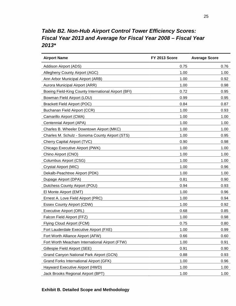
Table B2. Non-Hub Airport Control Tower Efficiency Scores: Fiscal Year 2013 and Average for Fiscal Year 2008 – Fiscal Year 2013*
Airport Name FY 2013 Score Average Score
Addison Airport (ADS) 0.75 0.76 Allegheny County Airport (AGC) 1.00 1.00 Ann Arbor Municipal Airport (ARB) 1.00 0.92 Aurora Municipal Airport (ARR) 1.00 0.98 Boeing Field-King County International Airport (BFI) 0.72 0.95 Bowman Field Airport (LOU) 0.99 0.95 Brackett Field Airport (POC) 0.84 0.87 Buchanan Field Airport (CCR) 1.00 0.93 Camarillo Airport (CMA) 1.00 1.00 Centennial Airport (APA) 1.00 1.00 Charles B. Wheeler Downtown Airport (MKC) 1.00 1.00 Charles M. Schulz - Sonoma County Airport (STS) 1.00 0.95 Cherry Capital Airport (TVC) 0.90 0.98 Chicago Executive Airport (PWK) 1.00 1.00 Chino Airport (CNO) 1.00 1.00 Columbus Airport (CSG) 1.00 1.00 Crystal Airport (MIC) 1.00 0.96 Dekalb-Peachtree Airport (PDK) 1.00 1.00 Dupage Airport (DPA) 0.81 0.90 Dutchess County Airport (POU) 0.94 0.93 El Monte Airport (EMT) 1.00 0.96 Ernest A. Love Field Airport (PRC) 1.00 0.94 Essex County Airport (CDW) 1.00 0.92 Executive Airport (ORL) 0.68 0.85 Falcon Field Airport (FFZ) 1.00 0.98 Flying Cloud Airport (FCM) 0.75 0.80 Fort Lauderdale Executive Airport (FXE) 1.00 0.99 Fort Worth Alliance Airport (AFW) 0.66 0.60 Fort Worth Meacham International Airport (FTW) 1.00 0.91 Gillespie Field Airport (SEE) 0.91 0.90 Grand Canyon National Park Airport (GCN) 0.88 0.93 Grand Forks International Airport (GFK) 1.00 0.96 Hayward Executive Airport (HWD) 1.00 1.00 Jack Brooks Regional Airport (BPT) 1.00 1.00

26
Exhibit B. Detailed Scope and Methodology
Airport Name FY 2013 Score Average Score
Kendall-Tamiami Executive Airport (TMB) 1.00 0.88 Lakefront Airport (NEW) 0.85 0.93 Laurence G. Hanscom Field Airport (BED) 1.00 1.00 Lincoln Airport (LNK) 1.00 0.97 Livermore Municipal Airport (LVK) 0.97 0.96 Manassas Regional-Harry P. Davis Field Airport (HEF) 0.73 0.88 McClellan-Palomar Airport (CRQ) 0.71 0.75 Merrill Field Airport (MRI) 0.90 0.89 Monterey Regional Airport (MRY) 1.00 1.00 Montgomery Field Airport (MYF) 0.93 0.97 Morristown Municipal Airport (MMU) 1.00 1.00 Nantucket Memorial Airport (ACK) 1.00 0.94 Napa County Airport (APC) 0.83 0.87 New Castle Airport (ILG) 0.98 0.94 North Las Vegas Airport (VGT) 0.98 0.81 Northeast Philadelphia Airport (PNE) 1.00 0.98 Oakland County International Airport (PTK) 0.89 0.88 Palo Alto Airport of Santa Clara County (PAO) 1.00 1.00 Phoenix Deer Valley Airport (DVT) 1.00 1.00 Portland-Hillsboro Airport (HIO) 0.87 0.90 Pueblo Memorial Airport (PUB) 0.77 0.79 Reid-Hillview of Santa Clara County Airport (RHV) 1.00 0.99 Republic Airport (FRG) 0.98 0.91 Richard Lloyd Jones Jr Airport (RVS) 0.85 0.96 Rocky Mountain Metropolitan Airport (BJC) 0.72 0.87 Santa Monica Municipal Airport (SMO) 1.00 0.95 Scottsdale Airport (SDL) 0.89 0.76 Snohomish County (Paine Field) Airport (PAE) 0.79 0.80 Spirit of St. Louis Airport (SUS) 0.84 0.72 St. Louis Downtown Airport (CPS) 1.00 0.84 St. Lucie County International Airport (FPR) 0.83 0.97 St. Paul Downtown Holman Field Airport (STP) 1.00 0.92 St. Pete-Clearwater International Airport (PIE)**
1.00
Stockton Metropolitan Airport (SCK) 0.88 0.81 Teterboro Airport (TEB) 1.00 1.00 Van Nuys Airport (VNY) 1.00 1.00 Vero Beach Municipal Airport (VRB) 0.94 0.97 Willow Run Airport (YIP) 1.00 1.00 Zamperini Field Airport (TOA) 0.82 0.97

27
Exhibit B. Detailed Scope and Methodology
* The highest possible efficiency score is one, and all towers with that score are considered relatively efficient. The efficiency score represents the fraction of current inputs needed to handle current outputs, based on comparison with relatively efficient towers.
** FAA classified St. Pete-Clearwater International Airport (PIE) as non-hub in 2008; however from 2009 onward it was classified as small hub.

28
Exhibit B. Detailed Scope and Methodology
Table B3: Second Stage Tobit Regression Results
Dependent Variable: First Stage Farrell Efficiency Score
Hub Group
Non-Hub Group
Crossing Runway -0.098*** -0.077***
(0.025) (0.022) Percentage of Local Operations 0.344*** 0.448***
(0.046) (0.054) Log of Total Runway Numbers 0.101*** -0.015
(0.031) (0.026) Runway Adjustment Dummy 0.055** (0.027)
Observations
318
429
Likelihood Ratio Chi-Square Test 69.89 85.33 Standard errors are in parentheses. ***Coefficient is significant at the 1% level; ** at the 5% level; * at the 10% level.

29
Exhibit C. Entities Visited or Contacted
EXHIBIT C. ENTITIES VISITED OR CONTACTED FAA Divisions:
• Air Traffic Organization (ATO) • Finance Labor Analysis (ALA)
FAA Airport Towers: • Los Angeles International Airport (LAX) • Long Beach Airport (LBG) • Ontario International Airport (ONT) • San Diego International Airport (SAN) • Santa Barbara Municipal Airport (SBA) • John Wayne Airport (SNA)
Data Envelopment Analysis Expert: • Dr. Panagiotis Tziogkidis, Lecturer in Economics, Plymouth University
School of Management, United Kingdom
30
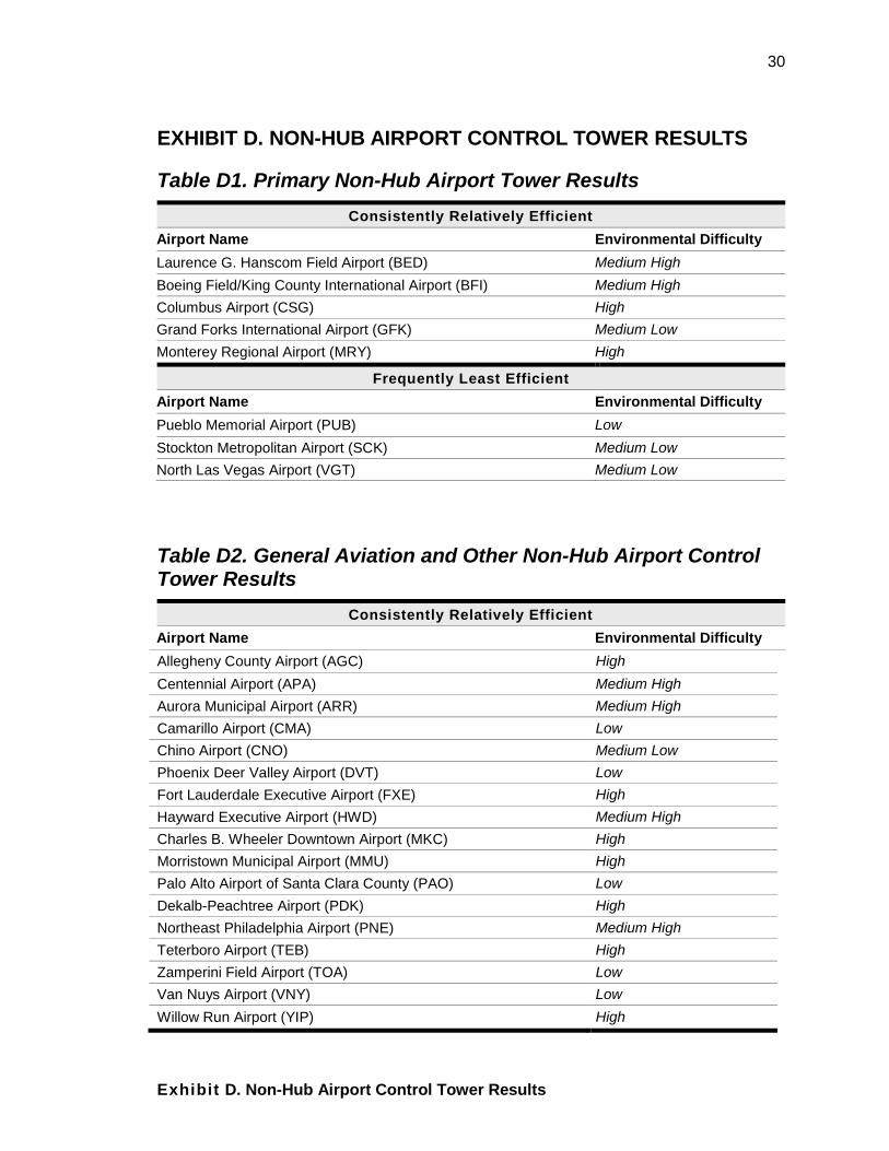
Exhibit D. Non-Hub Airport Control Tower Results
EXHIBIT D. NON-HUB AIRPORT CONTROL TOWER RESULTS
Table D1. Primary Non-Hub Airport Tower Results Consistently Relatively Efficient
Airport Name Environmental Difficulty Laurence G. Hanscom Field Airport (BED) Medium High Boeing Field/King County International Airport (BFI) Medium High Columbus Airport (CSG) High Grand Forks International Airport (GFK) Medium Low Monterey Regional Airport (MRY) High
Frequently Least Efficient Airport Name Environmental Difficulty Pueblo Memorial Airport (PUB) Low Stockton Metropolitan Airport (SCK) Medium Low North Las Vegas Airport (VGT) Medium Low
Table D2. General Aviation and Other Non-Hub Airport Control Tower Results
Consistently Relatively Efficient Airport Name Environmental Difficulty Allegheny County Airport (AGC) High Centennial Airport (APA) Medium High Aurora Municipal Airport (ARR) Medium High Camarillo Airport (CMA) Low Chino Airport (CNO) Medium Low Phoenix Deer Valley Airport (DVT) Low Fort Lauderdale Executive Airport (FXE) High Hayward Executive Airport (HWD) Medium High Charles B. Wheeler Downtown Airport (MKC) High Morristown Municipal Airport (MMU) High Palo Alto Airport of Santa Clara County (PAO) Low Dekalb-Peachtree Airport (PDK) High Northeast Philadelphia Airport (PNE) Medium High Teterboro Airport (TEB) High Zamperini Field Airport (TOA) Low Van Nuys Airport (VNY) Low Willow Run Airport (YIP) High

31
Exhibit D. Non-Hub Airport Control Tower Results
Frequently Least Efficient Airport Name Environmental Difficulty
Addison Airport (ADS) Medium High Fort Worth Alliance Airport (AFW) Medium Low St. Louis Downtown Airport (CPS) Medium High McClellan-Palomar Airport (CRQ) Medium Low Flying Cloud Airport (FCM) Medium High Snohomish County (Paine Field.) Airport (PAE) Medium Low Scottsdale Airport (SDL) Medium Low Spirit of St. Louis Airport (SUS) Medium Low

32
Exhibit E. Major Contributors to This Report
EXHIBIT E. MAJOR CONTRIBUTORS TO THIS REPORT Name Title
Betty Krier Program Director, Economics
Chia-Mei Liu Senior Economist (Lead)
Kang Hua Cao Senior Economist
Jerrod Sharpe Senior Economist
Brian McNamara Senior Economist
Andrea Nossaman Writer/Editor
Tom Denomme Audit Expert

APPENDIX. AGENCY COMMENTS 33
Appendix. Agency Comments
Federal Aviation Administration
Memorandum Date: July 17, 2015
To: Mitchell Behm, Assistant Inspector General for Surface Transportation Audits
From: H. Clayton Foushee, Director, Office of Audit and Evaluation, AAE-1
Subject: Federal Aviation Administration’s Response to Office of Inspector General Draft Report: Air Traffic Control Towers Efficiency
The Federal Aviation Administration (FAA) is committed to maintaining the safest airspace system in the world. In addition, the Air Traffic Organization (ATO) continually pursues strategies to improve the productivity and efficiency of air traffic operations at all types of facilities. The formula for increasing efficiency may vary by facility; therefore direct efficiency comparisons between air traffic towers can be very misleading due to substantial differences in factors such as air traffic volume, airspace complexity, and facility size, etc. Upon receiving this draft audit report, the FAA better understands the OIG’s approach, and asserts that OIG’s comparative analyses and ranking methodology is flawed for several reasons, including, but not limited to:
• The FAA closes some air traffic control towers at night to achieve cost-effective handling of aircraft. Consequently, this shifts costs from one facility to another.
• Contractor resources were not considered in the OIG’s methodology. As a result, towers that use a larger-than-average mix of contractor resources will appear more cost-effective.
• The OIG uses the accounting “book value” of equipment as an input, making towers with newer equipment look relatively more expensive than those with more fully-depreciated equipment.
More objective efficiency analyses would be a more accurate measure of efficiency than the comparative review presented in the draft report. The Agency’s position is that any meaningful facility-to-facility comparison should reflect the variables noted above, as well as other relevant facility-specific variables. The FAA partially-concurs with the recommendation, and the Agency agrees that efficiency can be enhanced. However, the FAA does not agree that enhancements made at one tower will necessarily benefit all towers. The FAA looks forward to identifying ‘least efficient” as a part of

Appendix. Agency Comments
34
an agreed upon methodology. The Agency will provide a detailed response to the recommendation within 30 days after the publication of the final report. The Agency would appreciate a careful re-consideration of some of the OIG’s conclusions in light of the methodological limitations identified. Please contact H. Clayton Foushee at (202) 267-9000 if you have any questions or required additional information about these comments.