page 1 ccm6 & ccm6+ unit 13 statistics and data 2016...
TRANSCRIPT

Page 1 CCM6 & CCM6+ UNIT 13 Statistics and Data 2016-2017
1
CCM6/CCM6+ Unit 13
Collect, Analyze, and Display Data
2016 – 2017
Name: ____________________________________
Math Teacher: _____________________________
Projected Quiz Date: __________________________
Projected Test Date: __________________________
Main Idea Page(s)
Unit 13 Vocabulary 2 - 3
Statistical Questions 4 - 5
Find and Compare Statistical Measures 6 - 9
More with Mean, Median, Mode, Range 10 - 18
Histograms 19 - 27
Mean and Measures of Center 28 - 30
Box Plots 31 - 35
Mean Absolute Deviation (MAD) 36 - 38
MAD and IQR as Measures of Variability 39 - 49
More Practice with Histograms and Box Plots 50 - 56
Unit 13 Study Guide 57 - 59

Page 2 CCM6 & CCM6+ UNIT 13 Statistics and Data 2016-2017
2
CCM6/CCM6+ Unit 13: Collect, Analyze, Display Data
Vocabulary
Statistics The practice of collecting and analyzing data in large quantities
Data Values such as counts, ratings, measurements, or opinions that are gathered to answer
questions.
Mean A value that represents the "evening out" of the values in a set of data
Median The number that is the midpoint of a set of data
Mode The data value that occurs the most
Range The difference between the least value and the greatest value in a data set
Line Plot A quick, simple way to organize data along a number line where the X's (or other symbols)
above a number represent how often each value is mentioned
Measures of
Center
Establish a central location in the data set
Measures of
Variability
Establish the degree of variability (or scatter) of the individual data values and their deviations
from the measures of center
Histogram A display that shows the distribution of numeric data. The range of data values, divided into
intervals, is displayed on the horizontal axis. The vertical axis shows frequency.
Frequency Table A list of items or intervals that shows the number of times, or frequency, with which they
occur.
Interval is a set of real numbers with the property that any number that lies between two numbers in the
set is also included in the set
Distribution The arrangement of values in a data set
Gap a break or opening
Cluster a group of things or persons close together
Peak being at the point of maximum frequency, intensity, use, etc.
Box Plot a method of visually displaying a distribution of data values by using the median, quartiles,
and extremes of the data set. A box shows the middle 50% of the data
Quartiles one of the values of a variable that divides the distribution of the variable into four groups
having equal frequencies
Lower Quartile for a data set with median m, the first quartile is the median of the data values less than m
Example: for the data set {1, 3, 6, 7, 10, 12, 14, 15, 22,120}, the first quartile is 6.
Upper Quartile
for a data set with median m, the third quartile is the median of the data values greater than m
Example: for the data set {2, 3, 6, 7, 10, 12, 14,15, 22, 120}, the third quartile is 15.
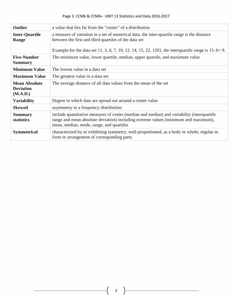
Page 3 CCM6 & CCM6+ UNIT 13 Statistics and Data 2016-2017
3
Outlier a value that lies far from the "center" of a distribution
Inter-Quartile
Range
a measure of variation in a set of numerical data, the inter-quartile range is the distance
between the first and third quartiles of the data set
Example:for the data set {1, 3, 6, 7, 10, 12, 14, 15, 22, 120}, the interquartile range is 15–6= 9.
Five-Number
Summary
The minimum value, lower quartile, median, upper quartile, and maximum value
Minimum Value The lowest value in a data set
Maximum Value The greatest value in a data set
Mean Absolute
Deviation
(M.A.D.)
The average distance of all data values from the mean of the set
Variability Degree to which data are spread out around a center value
Skewed asymmetry in a frequency distribution
Summary
statistics
include quantitative measures of center (median and median) and variability (interquartile
range and mean absolute deviation) including extreme values (minimum and maximum),
mean, median, mode, range, and quartiles
Symmetrical characterized by or exhibiting symmetry; well-proportioned, as a body or whole; regular in
form or arrangement of corresponding parts

Page 4 CCM6 & CCM6+ UNIT 13 Statistics and Data 2016-2017
4
Intro to Statistics
What is Statistics? ________________________________________________________________________________
________________________________________________________________________________
Why is it important? ________________________________________________________________________________
What are statistical questions? ________________________________________________________________________________
________________________________________________________________________________
The teacher will show you a variety of questions. Determine whether the question is statistical or
non-statistical and write the questions under the correct heading.
Statistical Non-Statistical
Chose one of the statistical questions from the list above and determine how you might find
the answer to this question.
What are ways in which you can collect data?
1.
2.
3.
4.
5.
6.

Page 5 CCM6 & CCM6+ UNIT 13 Statistics and Data 2016-2017
5

Page 6 CCM6 & CCM6+ UNIT 13 Statistics and Data 2016-2017
6
The mean, the median, the mode, and the range are measures that
describe a set of data. This picture will help you learn about each measure.
MEAN (average)
Add all the values, then divide by the total
number of values.
MEDIAN (middle)
The middle value, when the values are
arranged in order.
MODE (most)
The value that occurs most often
in a set of data. There can be one mode,
more than one mode, or no mode.
RANGE
The difference between the
greatest number and the
least number in a set of data.
Tim’s bowling scores for the past 5 games are listed below:
89 98 110 98 105 Write mean, median, mode, or range to answer the following questions about Tim’s scores.
1. The number 98 indicates which measure? ___________________________
2. Tim added up all his scores and divided by 5. Which measure did he find?________________
3. Tim found that the difference between his highest and lowest score was 21 points.
That measure is called the ______________________
4. Tim noticed that he got a score of 98 twice. Which measure is Tim focusing on? ___________
Terry’s test scores for the past 5 assessments are listed below. Calculate the range, mean,
median, and mode.
Range: ___________ Mean: _________ Median: _____________ Mode: ___________
Terry’s Test Scores
76
81
94
81
78
Measures that
Describe a Set of Data

Page 7 CCM6 & CCM6+ UNIT 13 Statistics and Data 2016-2017
7

Page 8 CCM6 & CCM6+ UNIT 13 Statistics and Data 2016-2017
8

Page 9 CCM6 & CCM6+ UNIT 13 Statistics and Data 2016-2017
9

Page 10 CCM6 & CCM6+ UNIT 13 Statistics and Data 2016-2017
10
Finding Statistical Measures and Comparing them to Understand Data
BIG IDEAS….
Shape of a set of data o Symmetrical data…mean and median are close to the same
o Skewed data…leans left or right…mean and median are different…mean is pulled
left or right
Outliers o When there is an outlier, it pulls the mean up or down
o Outliers barely affect the median
o If there is an outlier, the median will be more typical for that set of data than the
mean
Names:
Maxi Swanson
(11)
Thomas Petes
(11)
Michelle Hughes
(14)
Shoshana White
(13)
Deborah Black
(12)
Tonya Stewart
(12)
Tony Tung
(8)
Richard Mudd
(11)
Janice Wong
(10)
Bobby King
(9)
Charlene Greene
(14)
What part of the data above is most important?
Create a dot plot (line plot) of the data.
Can you make any conclusions about this data? ________________________________________
Describe the SHAPE of the data… Symmetrical? Skewed? Random?
Write a statistical question about the data above. _________________________________________

Page 11 CCM6 & CCM6+ UNIT 13 Statistics and Data 2016-2017
11
Investigating Statistics…What numbers affect the MEDIAN?
1. Using the names provided, place them in order from least to greatest. What is the middle
number? How many numbers are to the left of the middle number? How many numbers are
to the right of the middle number?
Middle Number: ______
# of numbers to the left: ______
# of numbers to the right: ______
2. The median is the number that is the midpoint of a set of data. The same number of data
values occur before and after the median. What is the median for these data?
3. Remove two names from your data set so that:
The median stays the same: _______ when you remove ___________________________
The median increases: _______ when you remove ____________________________
The median decreases: _______ when you remove ____________________________
4. Maxi Swanson is moving. When she leaves, what will be the new median for the data set?
5. What would happen to the median of the data set if you add a name with 16 letters?
6. What would happen to the median of the data set if you add a name with 89 letters?
**What do you call a data point far away from all others? ____________________________
7. What would be the length of two names that you could add to the data set so that
The median stays the same:
The median increases:
The median decreases:
Page 12 CCM6 & CCM6+ UNIT 13 Statistics and Data 2016-2017
12
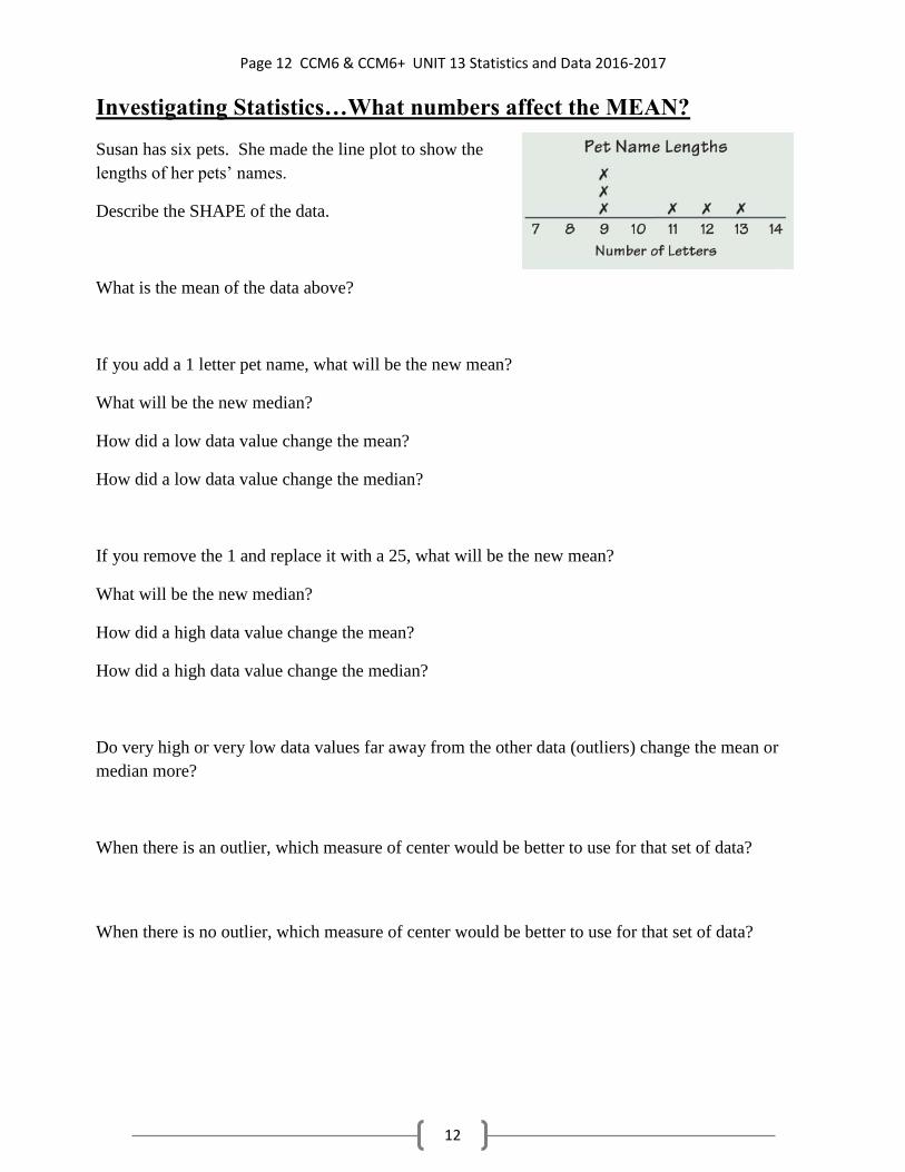
Investigating Statistics…What numbers affect the MEAN?
Susan has six pets. She made the line plot to show the
lengths of her pets’ names.
Describe the SHAPE of the data.
What is the mean of the data above?
If you add a 1 letter pet name, what will be the new mean?
What will be the new median?
How did a low data value change the mean?
How did a low data value change the median?
If you remove the 1 and replace it with a 25, what will be the new mean?
What will be the new median?
How did a high data value change the mean?
How did a high data value change the median?
Do very high or very low data values far away from the other data (outliers) change the mean or
median more?
When there is an outlier, which measure of center would be better to use for that set of data?
When there is no outlier, which measure of center would be better to use for that set of data?

Page 13 CCM6 & CCM6+ UNIT 13 Statistics and Data 2016-2017
13
Investigating Statistics:How does the SHAPE of the data affect the center?
PEAK … CLUSTER … SKEWED … SYMMETRICAL … GAP
Describe the shape of the data in the line plot
to the right.
Mean = ______________
Median = _____________
Mode = ____________
Range = ____________
~~~~~~~~~~~~~~~~~~~~~~~~~~~~~~~~~~~~~~~~~~~~~~~~~~~~~~~~~~~~~~~~~~~~~~~~~~
Describe the shape of the data in the
line plot to the right.
Mean = ______________
Median = _____________
Mode = ____________
Range = ____________
~~~~~~~~~~~~~~~~~~~~~~~~~~~~~~~~~~~~~~~~~~~~~~~~~~~~~~~~~~~~~~~~~~~~~~~~~~
Describe the shape of the data in the line plot
to the right.
Mean = ______________
Median = _____________
Mode = ____________
Range = ____________
Describe the shape of the data in the line plot
to the right.
Mean = _________ Median = _________
Mode = __________ Range = ________
Which measures are affected most by the outlier? ___________________________________

Page 14 CCM6 & CCM6+ UNIT 13 Statistics and Data 2016-2017
14
PRACTICE
1.
Range: ________________________________________
Mean: _________________________________________
Median: ________________________________________
Mode: _________________________________________
Which measure of center is best for Jessica—mean or median? Explain.
2. On an exam, three students scored 75, four students scored 82, three students scored 88, four
students scored 93, and one student scored 99. If the answer is 88, what is the question? Hint:
Write the scores out!
3. Find the mean, median, mode, and range of the dot plot.
Mean: ___________
Median: ___________
Mode: ___________
Range: __________
For the line plot, is mean or median a better measure of center? Explain.
Jessica’s History Test Scores
81
97
99
89
91
50

Page 15 CCM6 & CCM6+ UNIT 13 Statistics and Data 2016-2017
15
The two graphs below show students’ name lengths in two classes.
Ms. Campo’s class:
7
6
5
4
3
2
1
0
9 10 11 12 13 14 15 16 17 18 19
Mr. Young’s class:
X
X X X
X X X X
X X X X X X X X
8 9 10 11 12 13 14 15 16 17 18 19 20
1. What is the typical name length for:
a) Ms. Campo’s class. b) Mr. Young’s class.
2. Find the mean, median, mode, and range for both classes in the boxes above.
3. How does the data distribution (SHAPE) compare between these two classes?
3. Since Mr. Young’s class data has an outlier, which measure best represents his data?
Mean = _____
Median = _____
Mode = _____
Range = _____
Mean = _____
Median = _____
Mode = _____
Range = _____

Page 16 CCM6 & CCM6+ UNIT 13 Statistics and Data 2016-2017
16
1. The line plot below represents the number of letters written to overseas pen pals by the students at
Waverly Middle School. Each "x" represents 10 students. How many students wrote 18 or more
letters?
A) 250 B) 8 C) 30 D) 80
2. The line plot below represents the number of letters written to overseas pen pals by the students at
Waverly Middle School. Each "x" represents 10 students. How many students wrote more than 6
and fewer than 12 letters?
A) 110 B) 120 C) 100 D) 90
3. Thirteen bowlers were asked what their score was on their last game. The scores are shown
below.
183, 152, 155, 181, 176, 193, 171, 170, 186, 170, 187, 159, 183
Find the range of the bowlers' scores.
A) 20 B) 41 C) 53 D) 31
4. A group of friends tested themselves to see how many times each person could hit a tennis ball
against the wall without missing. The results are below:
7 15 28 8 21 30 30 10
22 4 17 7 17 22 10 8
Find the range of the data set.
A) 26 B) 16 C) 36 D) 23
5. Thirteen bowlers were asked what their score was on their last game. The scores are shown
below.
190, 150, 154, 194, 182, 190, 170, 151, 190, 170, 178, 161, 180
Find the range of the bowlers' scores.
A) 56 B) 44 C) 34 D) 23

Page 17 CCM6 & CCM6+ UNIT 13 Statistics and Data 2016-2017
17
6. The line plot below represents the number of letters written to overseas pen pals by the students at
Waverly Middle School. Each "x" represents 10 students. How many students wrote 14 or more
letters?
A) 140 B) 160 C) 0 D) 14
7. The line plot below represents the number of letters written to overseas pen pals by the students at
Waverly Middle School. Each "x" represents 10 students. How many students wrote more than 6
and fewer than 20 letters?
A) 250 B) 240 C) 230 D) 220
8. A group of friends tested themselves to see how many times each person could hit a tennis ball
against the wall without missing. The results are below:
8 13 22 8 18 28 28 12
25 6 15 8 15 25 12 8
Find the range of the data set.
A) 19 B) 22 C) 32 D) 12
9. A group of friends tested themselves to see how many times each person could hit a tennis ball
against the wall without missing. The results are below:
7 11 25 7 25 23 23 15
21 7 12 7 12 21 15 7
Find the range of the data set.
A) 28 B) 8 C) 18 D) 15

Page 18 CCM6 & CCM6+ UNIT 13 Statistics and Data 2016-2017
18
10. Thirteen bowlers were asked what their score was on their last game. The scores are shown
below.
192, 158, 154, 195, 180, 183, 188, 151, 180, 185, 184, 166, 184
Find the range of the bowlers' scores.
A) 56 B) 34 C) 23 D) 44
11. Which measure is affected MOST by an outlier?
A) mean B) median C) mode
Why? ________________________________________________________________
12. Which measure is affected LEAST by an outlier?
A) mean B) median C) mode
Why? _________________________________________________________________
13. How is a bar graph like a line plot (dot plot)?
14. What kind of data is best for the mode? the median? the mean?

Page 19 CCM6 & CCM6+ UNIT 13 Statistics and Data 2016-2017
19
Histograms
Histogram:
____________________________________________________________________
____________________________________________________________________
Constructing a Histogram
Mrs. Pittman gave her class a history test. The class of 16 students had the following
scores: 75, 80, 65, 80, 95, 85, 65, 80, 90, 80, 70, 85, 90, 70, 85, 70
Construct a histogram to represent this data.
Frequency Chart
Interval Tally Frequency

Page 20 CCM6 & CCM6+ UNIT 13 Statistics and Data 2016-2017
20
1. Listed below are the daily high temperatures (◦F) for the first 20 days of
April. Choose appropriate intervals to group the data, make a frequency table
for the data, and construct a histogram for the data.
55 62 68 75 69 78 82 79 85 88
65 60 58 75 80 82 74 78 78 72 Frequency Chart
Interval Tally Frequency

Page 21 CCM6 & CCM6+ UNIT 13 Statistics and Data 2016-2017
21
2. Thirty people in Max’s neighborhood participated in a Walk-A-Thon fundraiser.
The ages of the walkers were as follows:
12 8 32 35 15 47 9 15 52 55 70 18 36 29 12
11 16 45 44 19 62 60 8 23 27 10 34 74 13 59
a. Make a histogram for the set of data.
Frequency Chart
Interval Tally Frequency
b. Determine the mean and median for this data set.
c. Explain how the median for this data relates to the graph of the data.
d. If the seven youngest participants did not walk and seven members of the Golden Oldies Club
(over 70 years of age) took their place, how would this change the graph of the data?
Determine the mean and median for this new data set.

Page 22 CCM6 & CCM6+ UNIT 13 Statistics and Data 2016-2017
22

Page 23 CCM6 & CCM6+ UNIT 13 Statistics and Data 2016-2017
23
More Practice with Histograms
MIGRAINES: HISTOGRAMS
Below are data collected from patients who suffer from migraine headaches.
The patients were instructed to take their assigned drugs as soon as their headaches began and to
record how much time passed before the drugs gave relief.
Drug A is a traditional drug, and Drug B is an experimental drug.
Each value is the number of minutes (rounded to the nearest two minutes) that elapsed before a
patient got relief.
Drug A (100 patients)
16, 18, 18, 20, 22, 22, 24, 24, 26, 26, 28, 28, 30, 30, 32, 32, 34, 36, 38, 38,
40, 42, 44, 44, 46, 46, 48, 50, 54, 56, 56, 58, 58, 62, 62, 64, 64, 66, 68, 68,
70, 70, 70, 72, 72, 74, 76, 76, 76, 78, 78, 80, 80, 80, 82, 82, 84, 84, 86, 88,
88, 88, 88, 90, 90, 90, 90, 90, 92, 92, 92, 92, 94, 94, 94, 96, 96, 98, 98, 98,
98, 100, 100, 100, 102, 102, 102, 104, 104, 106, 106, 108, 108, 108, 110,
110, 112, 114, 118, 120
Drug B (50 patients)
18, 20, 20, 22, 24, 24, 24, 26, 26, 30, 30, 30, 34, 34, 34, 36, 36, 36, 38, 38,
40, 40, 44, 44, 46, 50, 52, 52, 56, 56, 58, 62, 62, 66, 74, 74, 78, 88, 94, 98,
98, 100, 104, 106, 110, 116, 120, 120, 121, 121
1. From examining these data, which drug do you think gave faster relief from headache pain?____
Explain______________________________________________________________________
On the next page you will create a frequency table for each drug. Draw dividing lines in the
data above (for each drug) to separate into these intervals:
10-19, 20-29, 30-39, 40-49, 50-59, 60-69, 70-79, 80-89, 90-99, 100-109, 110-119, 120-129
Then, fill out the frequency table on the next page according to the amount per interval.

Page 24 CCM6 & CCM6+ UNIT 13 Statistics and Data 2016-2017
24
More Practice with Histograms
Migraines: Histograms
Time to Effect of Drug A (100 patients)
Time (minutes) Frequency Percentage of
Total (100)
10 - 19
20 – 29
30 – 39
40 – 49
50 – 59
60 – 69
70 – 79
80 – 89
90 – 99
100 – 109
110 – 119
120 – 129
Time to Effect of Drug B (50 patients)
Time
(minutes)
Frequency Percentage of
Total (50)
10 - 19
20 – 29
30 – 39
40 – 49
50 – 59
60 – 69
70 – 79
80 – 89
90 – 99
100 – 109
110 – 119
120 – 129
**To calculate the percent: # in the interval
# 𝑝𝑎𝑡𝑖𝑒𝑛𝑡𝑠 𝑓𝑜𝑟 𝑡ℎ𝑎𝑡 𝑑𝑟𝑢𝑔 • 100 = ______%
Page 25 CCM6 & CCM6+ UNIT 13 Statistics and Data 2016-2017
25
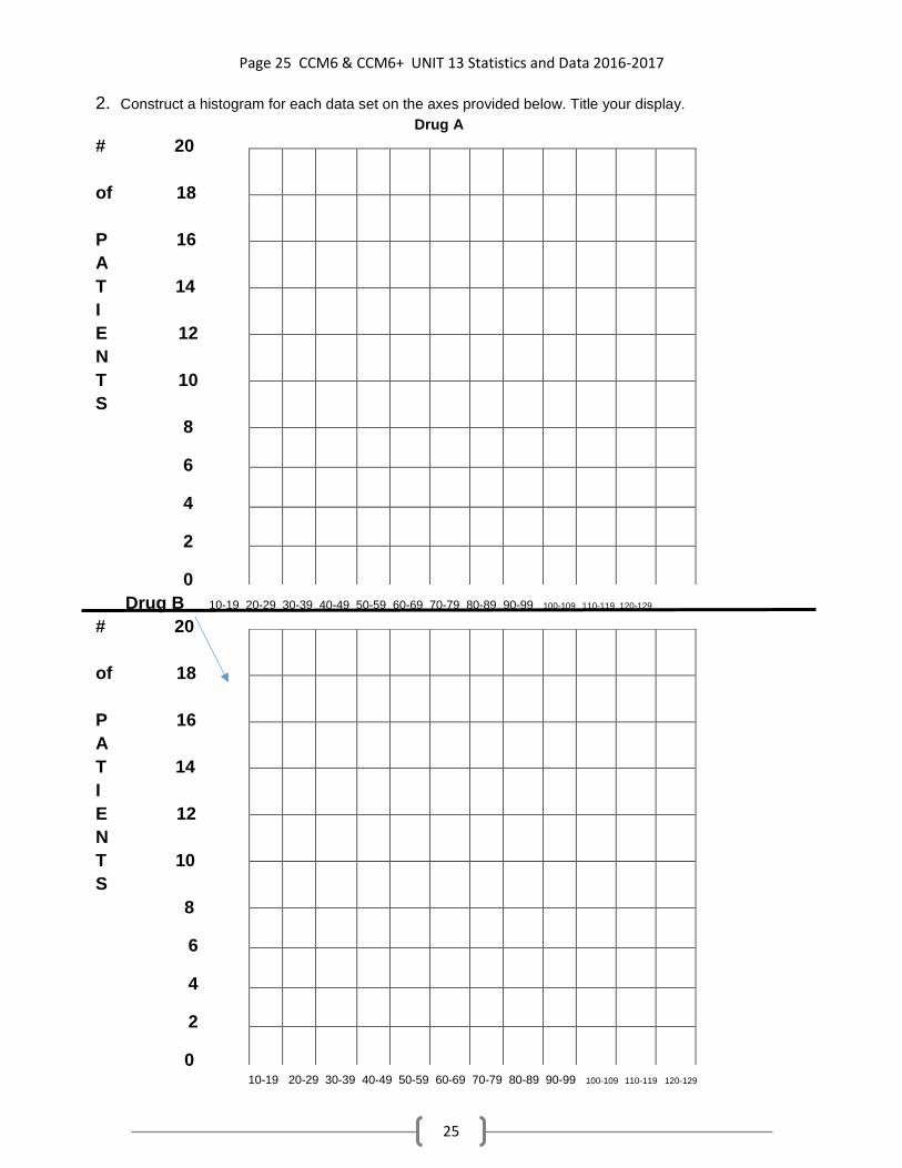
2. Construct a histogram for each data set on the axes provided below. Title your display.
Drug A
# 20
of 18
P 16
A
T 14
I
E 12
N
T 10
S
8
6
4
2
0
Drug B 10-19 20-29 30-39 40-49 50-59 60-69 70-79 80-89 90-99 100-109 110-119 120-129
# 20
of 18
P 16
A
T 14
I
E 12
N
T 10
S
8
6
4
2
0 10-19 20-29 30-39 40-49 50-59 60-69 70-79 80-89 90-99 100-109 110-119 120-129

Page 26 CCM6 & CCM6+ UNIT 13 Statistics and Data 2016-2017
26
3. From examining the histograms, which drug do you think gave the most relief from headache
pain? ________________ Explain._________________________________
___________________________________________________________________
___________________________________________________________________
4. A relative-frequency histogram uses the % in each interval rather than the frequency.
Why is this useful for our data sets? What is the advantage of a relative-frequency histogram for
our data sets?
Construct two relative-frequency histograms below (one for each Drug).
Drug A
% 25
of 20
P
A 15
T
I 10
E
N 5
T
S 0 10-19 20-29 30-39 40-49 50-59 60-69 70-79 80-89 90-99 100-109 110-119 120-129
Time in Minutes To Effect
Drug B
% 25
of 20
P
A 15
T
I 10
E
N 5
T
S 0 10-19 20-29 30-39 40-49 50-59 60-69 70-79 80-89 90-99 100-109 110-119 120-129

Page 27 CCM6 & CCM6+ UNIT 13 Statistics and Data 2016-2017
27
Time in Minutes To Effect
5. On the basis of your examination of the relative-frequency histograms, which drug do you think
gave faster relief from headache pain? _____________ Explain.
6. Some students get different answers for questions 3 on the previous page and 5 on this page.
Why do you think that happens?
7. How does changing the display (frequency histogram or relative-frequency histogram) change
the information you can read from the graph?
8. What advantage does the histogram have over the relative-frequency histogram?
9. What advantage does the relative-frequency histogram have over the histogram?
10. What have you learned from this activity?

Page 28 CCM6 & CCM6+ UNIT 13 Statistics and Data 2016-2017
28
A group of students made the table below.
A. Make stacks of cubes to show the size of each household.
1. How many people are in the six households altogether? Explain
2. What is the mean number of people per household? Explain.
3. How does the mean here compare to the mean for the data on p. 30?
B. What are other ways to determine the mean of a set of data other than using cubes?
C. Make a set of 6 data values that have a mean of 8.
D. Make a set of 5 data values that have a median of 8.
E. Make a set of 5 data with a range of 6, a mean of 6, and a median of 6.
Household Size
NAME # of People
Reggie 6
Tara 4
Brendan 3
Felix 4
Hector 3
Tonisha 4

Page 29 CCM6 & CCM6+ UNIT 13 Statistics and Data 2016-2017
29
For questions 1 and 2, use the line plot below.
Number of Children in a Household
0 1 2 3 4 5 6 7 8 9 10 11 12
1. a. What is the median number of children for the 16 households? Explain how to find
the median. What does the median tell you?
b. Do any of the 16 households have the median number of children? Explain.
2. a. What is the mean number of children per household for the 16 households? Explain
how to find the mean. What does the mean tell you?
b. Do any of the 16 households have the mean number of children? Explain.
For exercises 3&4, the mean number of people per household for eight households is 6 people.
3. What is the total number of people in the eight households?
a) 11 b) 16 c) 48 d) 64
4. a. Make a line plot showing one possible arrangement for the numbers of people in the
eight households. (Remember, the MEAN is 6.)
Page 30 CCM6 & CCM6+ UNIT 13 Statistics and Data 2016-2017
30
b. Make a line plot showing a different possible arrangement for the numbers of people
in the eight households. (Remember, the MEAN is 6.)
c. Are the medians the same for the two arrangements you made?
5. The students in Mr.Wilson’s study hall spent the following amounts of time on their HW.
3
4 ℎ𝑜𝑢𝑟
1
2 ℎ𝑜𝑢𝑟 1
1
4 ℎ𝑜𝑢𝑟𝑠
3
4 ℎ𝑜𝑢𝑟
1
2 ℎ𝑜𝑢𝑟
What is the mean time his students spent on HW?
6. Use the data from question 5. What is the median time Mr. Wilson’s students spent on
HW?
a) 1
2 ℎ𝑜𝑢𝑟 b)
3
4 ℎ𝑜𝑢𝑟 c) 1 hour d) 1
1
4 ℎ𝑜𝑢𝑟𝑠
7. Six students each had a different number of pens. They put them all together and then
distributed them so that each student had the same number of pens.
a. Choose any of the following that could be the number of pens they had
altogether. Explain your reasoning.
A. 12 B. 18 C. 46 D. 48
b. Use your response from part a. How many pens did each person have after the
pens were distributed evenly?
c. Your classmate says that finding the mean number of pens per person is the
same as finding the number of pens each person had after the pens were
distributed evenly. Do you agree or disagree? Explain.

Page 31 CCM6 & CCM6+ UNIT 13 Statistics and Data 2016-2017
31
Box Plots (aka Box-and-Whisker Plots)
WARMUP:
1. Create a set of data with 5 data values that have a median of 4.
2. Create another set of data with 5 data values that have a median of 4.
3. Do you use any “tricks” to help with these questions?
4. Create a set of data with 6 data values that have a mean of 5.
5. Create another set of data with 6 data values that have a mean of 5.
6. A trick in creating a set of data with the same mean is:

Page 32 CCM6 & CCM6+ UNIT 13 Statistics and Data 2016-2017
32
Box Plots (aka Box-and-Whisker Plots)
FIVE MAGIC NUMBERS
1. The ______________ _______________ is the smallest data value.
This starts the first “whisker.”
2. The ______________ _______________ is the middle of the lower half of the data.
_______% of the data values are below this number and ________% are above.
This ends the first “whisker” and starts the “box.”
3. The ______________ is the middle of all of the data.
_______% of the data values are below this number and ________% are above.
This is a vertical line inside the “box.”
4. The ______________ _______________ is the middle of the upper half of the data.
_______% of the data values are below this number and ________% are above.
This ends the “box” and starts the last “whisker.”
5. The ______________ _______________ is the largest data value.
This is the end of the last “whisker.”
**The INTER-QUARTILE RANGE is the __________ of the ___________. This is the
middle half (50%) of the data.
~~~~~~~~~~~~~~~~~~~~~~~~~~~~~~~~~~~~~~~~~~~~~~~~~~~~~~~~~~~~~~~~~~~~
NOW, here’s a set of data….you have to ______________ it to find the 5 magic numbers!
8, 20, 12, 16, 18, 22, 24, 14, 25, 20, 21
Rewrite the numbers:
Circle the five magic numbers in the list you made! Now, put each point above the number line below. Make your box and whiskers!

Page 33 CCM6 & CCM6+ UNIT 13 Statistics and Data 2016-2017
33
Here’s another set of data….do it again!
16, 18, 12, 10, 14, 10, 8, 12
Rewrite in order from least to greatest:
What do I do for the five magic numbers if they are “between” data values?
Find the five magic numbers from the data set above.Then make your box-and-whisker plot.
Analysis: 25% of the data is below _________.
50% of the data is above _________.
75% of the data is below _________.
50% of the data is between ___________ and _________.
50% of the data is in the ___________________.
50% of the data is in the ___________________.
How can a box-and-whisker plot help you to understand a set of data? _________________
What is the Inter-Quartile Range (IQR)?
If there are 12 numbers in a set of data, how many numbers are in each part of the box-and-
whisker plot?

Page 34 CCM6 & CCM6+ UNIT 13 Statistics and Data 2016-2017
34
16. Create 2 box plots above the number line below (one for each set of data).Label them!
Midwestern States (area in 1,000 mi2): 45, 36, 58, 97, 56, 65, 87, 82, 77
Southern States (area in 1,000 mi2): 52, 59, 48, 52, 42, 32, 54, 43, 70, 53, 66
What conclusions can you make by looking at the plots above?

Page 35 CCM6 & CCM6+ UNIT 13 Statistics and Data 2016-2017
35
Warmup:
For the following types of data, which measure of central tendency is BEST—mean, median, or
mode? Explain.
1. most popular movie in the last month
2. favorite hobby
3. class sizes in a school
4. ages of members in a club
****CHALLENGE****
Each person has taken four tests and has one more test to take. Find the score that each person must
make to change the mean or median as shown.
5. Barry has scores of 93, 84, 86, and 75. He wants to raise the mean to 86.
Hint: When you find the mean, first you add, then divide…now undo (first multiply then subtract).
6. Liz has scores of 87, 75, 82, and 93. She wants to raise the median to 87.
Hint: 87 will be the MIDDLE point (like the fulcrum on a balanced scale).
7. Li’s bowling scores are: 129, 136, 201, 146, 154.
Make a box plot (find those 5 magic numbers and graph them). What is the IQR?

Page 36 CCM6 & CCM6+ UNIT 13 Statistics and Data 2016-2017
36
Mean Absolute Deviation (MAD)
MAD NOTES: Describing Data through Measures of Center & Spread
There are two ways to describe a set of data:__________________ & ____________________
Today we will focus on the numerical descriptions.
MEASURES OF CENTER
Mean: A numerical measure of center that is the arithmetic average of the data. Affected by
outliers.
Mean: �̅� = 𝑡ℎ𝑒 𝑠𝑢𝑚 𝑜𝑓 𝑣𝑎𝑙𝑢𝑒𝑠
𝑛𝑢𝑚𝑏𝑒𝑟 𝑜𝑓 𝑑𝑎𝑡𝑎=
∑𝑥
∑𝑛
Median: A numerical measure of center that describes the middle value of a data set. The median is
not affected by outliers. Note that the median does not have to be one of the values in the data set, but a
value that divides the data set in half so that 50% of the data values lie above the median and 50% of the data
set lie below the median.
MEASURES OF SPREAD describe________________________________________________
______________________:
______________________:
MEAN ABSOLUTE DEVIATION EXAMPLE
STEP 1:
STEP 2:
STEP 3:
STEP 4:
DATA DIFFERENCE
Data minus Mean
ABSOLUTE
VALUE
MEAN:
Symbols to represent the mean. The large “E”
type symbol indicates a “sum”. So the top is the
sum of the data numbers and the bottom is the
sum of how many pieces of data there are.
STEP 3 STEP 2 STEP 1
STEP 4

Page 37 CCM6 & CCM6+ UNIT 13 Statistics and Data 2016-2017
37
_________________________________: A numerical measure of spread that shows how much data
values vary from the mean. A low mean absolute deviation indicates that the data points tend to be very
close to the mean and not spread out very far so the mean is an accurate description of “typical”, and a
high mean absolute deviation indicates that the data points are spread out over a large range of values.
BACK TO PPT SLIDE 9…..
Who do you think is it BEST STUDENT? Explain.
Data Set: 30, 38, 40, 42, 48 Find the mean: �̅� = _________
SUM of Values: Mean Absolute Deviation (MAD) =
DATA DIFFERENCE
Data minus Mean
ABSOLUTE VALUE
Li
MEAN:
DATA DIFFERENCE
Data minus Mean
ABSOLUTE
VALUE
MAD:
Bessie
MEAN:
DATA DIFFERENCE
Data minus Mean
ABSOLUTE
VALUE
MAD:
Jamal
MEAN:
DATA DIFFERENCE
Data minus Mean
ABSOLUTE
VALUE
MAD:

Page 38 CCM6 & CCM6+ UNIT 13 Statistics and Data 2016-2017
38
Mean Absolute Deviation Homework
Find the mean absolute deviation for each set of data.
1. 80, 82, 82, 88, 90, 94, 102, 104, 106
5. 160, 166, 170, 172, 178, 180, 190, 204, 260
More MAD and measures of variability
The following data set represents the size of 9 families.
3, 2, 4, 2, 9, 8, 2, 11, 4
What is a mean? ________________________________________________________________
What is the mean for this set of data? __________
What is mean absolute deviation?
the ____________ _____________of each data value from the _____________
What is the MAD for this data set? Make a chart and figure it out! MAD = _________
MEAN: MAD:
DATA DIFFERENCE
Data minus Mean
ABSOLUTE VALUE
Sum = Sum =
MEAN: MAD:
DATA DIFFERENCE
Data minus Mean
ABSOLUTE VALUE

Page 39 CCM6 & CCM6+ UNIT 13 Statistics and Data 2016-2017
39
3 4 5 6 7 8 9
Based on the picture above, what are the “FIVE MAGIC NUMBERS” and what do they mean?
1.
2.
3.
4.
5.
Looking at the boxplot below, name and give the value of the FIVE MAGIC NUMBERS.
1.
2.
3.
4.
5.

Page 40 CCM6 & CCM6+ UNIT 13 Statistics and Data 2016-2017
40
Variability
To find a RANGE you need which two “MAGIC NUMBERS?”
To find the InterQuartile Range (IQR), you need which two “MAGIC NUMBERS?”
Use the data displayed in the box plots below to answer the questions.
Amount Spent by Each Customer (in dollars) at Casual Café
Amount Spent by Each Customer (in dollars) at Bountiful Bistro
1) Find the following for each set of data.
a. median
b. range
c. interquartile range
2) Use the medians of the data to compare the amounts spent by customers at each restaurant.
3) Use the ranges and interquartile ranges of the data to compare how amounts spent by customers
at each restaurant vary. Which restaurant would you rather eat at based on this data? Explain.
4) Is there symmetry or lack of symmetry in each box plot?

Page 41 CCM6 & CCM6+ UNIT 13 Statistics and Data 2016-2017
41
Measures of Variability: MAD and IQR
Variability means ______________________________________________________________
Why is MAD a measure of variability?
Why is IQR a measure of variability?
Math Exam Grade
Review Class
No Review
Grade as a Percent
1) What conclusions can you draw from looking at the plot about how effective the math
exam review class was?
2) What is the difference in the medians between the sets of data?
3) The mean absolute deviation for both groups of students is 6.2. Compare that value to
the difference in medians. What does that tell you about the data?
4) What is the interquartile range for each set of data? What does that tell you about the
data?
CHALLENGE: Determine which 2 sets of data will overlap more.
Set A has a mean of 12 and a mean absolute deviation of 5.1.
Set B has a mean of 23 and a mean absolute deviation of 4.9.
Set C has a mean of 10 and a mean absolute deviation of 4.8. Day 9 HW (MAD and IQR = Measures of Variability)
Amount
of
Review
Before
the
Exam

Page 42 CCM6 & CCM6+ UNIT 13 Statistics and Data 2016-2017
42
Directions: Solve the following problems by finding the median, interquartile range (IQR), or
range. You may use a calculator, but you must show your work!
1. {13, 15, 9, 35, 25}
Median = ________
Q1 = ________
Q3 = ________
IQR = ________
2. {6, 1, 3, 8, 5, 11, 1, 5}
Median = ________
Q1 = ________
Q3 = ________
IQR = ________
3. Jason and Jill are two students in Mr. White’s math class. On the last five quizzes, Jason
scored an 80, 90, 95, 85, and 70. Jill scored a 70, 75, 90, 100, and 95. Find the median and
IQR for each student.
Jason’s Median :______ Jill’s Median = _______
Jason’s IQR = ______ Jill’s IQR = ________ Whose quiz grades are more consistent? _______
Page 43 CCM6 & CCM6+ UNIT 13 Statistics and Data 2016-2017
43
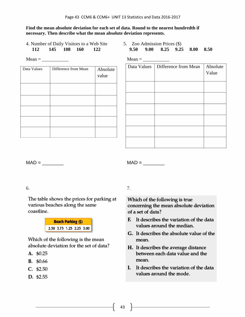
Find the mean absolute deviation for each set of data. Round to the nearest hundredth if
necessary. Then describe what the mean absolute deviation represents.
4. Number of Daily Visitors to a Web Site 5. Zoo Admission Prices ($)
112 145 108 160 122 9.50 9.00 8.25 9.25 8.00 8.50
Mean = ___________ Mean = ___________
MAD = ________ MAD = ________
6. 7.
Data Values Difference from Mean Absolute
Value
Data Values Difference from Mean Absolute
value

Page 44 CCM6 & CCM6+ UNIT 13 Statistics and Data 2016-2017
44

Page 45 CCM6 & CCM6+ UNIT 13 Statistics and Data 2016-2017
45

Page 46 CCM6 & CCM6+ UNIT 13 Statistics and Data 2016-2017
46

Page 47 CCM6 & CCM6+ UNIT 13 Statistics and Data 2016-2017
47

Page 48 CCM6 & CCM6+ UNIT 13 Statistics and Data 2016-2017
48

Page 49 CCM6 & CCM6+ UNIT 13 Statistics and Data 2016-2017
49

Page 50 CCM6 & CCM6+ UNIT 13 Statistics and Data 2016-2017
50
More practice with Histograms and Box Plots Multiple Choice. Identify the choice that best completes the statement or answers the question.
____ 1. The number of pieces of candy in randomly selected jars are 20, 1, 29, 21, 40, 52, 41, 44, 60, 67.
Display the data using a histogram.
a. Pieces of Candy in Jars c. Pieces of Candy in Jars
b. Pieces of Candy in Jars d. Pieces of Candy in Jars
____ 2. Display the data using a histogram.
The numbers of students in different classes at a community college:
25, 15, 28, 52, 22, 38, 42, 44, 24, 32, 19, 28, 29, 20, 31
a.
c.
1–20 21–40 41–60 61–80Pieces of candy
Fre
qu
ency
1
2
3
4
5
6
7
8
9
10
1–20 21–40 41–60 61–80Pieces of candy
Fre
qu
ency
1
2
3
4
5
6
7
8
9
10
1–20 21–40 41–60 61–80Pieces of candy
Fre
qu
ency
1
2
3
4
5
6
7
8
9
10
1–20 21–40 4–-60 61–80Pieces of candy
Fre
qu
ency
1
2
3
4
5
6
7
8
9
10
15-19 20-29 30-39 40-54
Fre
qu
ency
S tudents
Community College Class Sizes
1
2
3
4
5
6
7
15-24 25-34 35-44 45-54
Fre
qu
ency
S tudents
Community College Class Sizes
1
2
3
4
5
6
7

Page 51 CCM6 & CCM6+ UNIT 13 Statistics and Data 2016-2017
51
b.
d.
____ 3. The number of laps around a track for five runners are 14, 8, 7, 4, 11.
Display the data using a box-and-whisker plot.
a.
b.
c.
d.
____ 4. Make a histogram for the numbers of students in different classes at a community college.
25, 15, 28, 52, 22, 38, 42, 44, 24, 32, 19, 28, 29, 20, 31
a.
c.
15-24 25-34 35-44 45-54
Fre
qu
ency
S tudents
Community College Class Sizes
1
2
3
4
5
6
7
15-24 25-34 35-44 45-54
Fre
qu
ency
S tudents
Community College Class Sizes
1
2
3
4
5
6
7
0 2 4 6 8 10 12 14 16 18 20 22 240
0 2 4 6 8 10 12 14 16 18 20 22 240
0 2 4 6 8 10 12 14 16 18 20 22 240
0 2 4 6 8 10 12 14 16 18 20 22 240
15-24 25-34 35-44 45-54
Fre
qu
ency
S tudents
Community College Class Sizes
1
2
3
4
5
6
7
15-24 25-34 35-44 45-54
Fre
qu
ency
S tudents
Community College Class Sizes
1
2
3
4
5
6
7

Page 52 CCM6 & CCM6+ UNIT 13 Statistics and Data 2016-2017
52
b.
d.
____ 5. The number of calls answered by a paramedic team over an 8-day period are given. Use the data to
make a box-and-whisker plot.
12, 6, 8, 15, 14, 6, 14, 10
a.
b.
c.
d.
____ 6. Average prices for 35 different models (types) of car from the 3 most popular automobile brands in
the United States are shown.
Make a dot plot of the data and explain what the distribution means.
Average Suggested Retail Prices, 2011 Automobile Models (in thousands of dollars) Price Range 10- 14.9 15- 19.9 20- 24.9 25- 29.9 30- 34.9 35- 39.9 40- 44.9 45- 49.9
# of Models 1 3 5 6 9 2 2 3
Price Range 50- 54.9 55- 59.9 60- 64.9 65- 69.9 70- 74.9 75- 79.9 80- 84.9
# of Models 2 0 0 1 0 0 1
a.
This data distribution is skewed to the left. Most car models cost less than the mean.
15-19 20-29 30-39 40-54
Fre
qu
ency
S tudents
Community College Class Sizes
1
2
3
4
5
6
7
15-24 25-34 35-44 45-54
Fre
qu
ency
S tudents
Community College Class Sizes
1
2
3
4
5
6
7
0 1 2 3 4 5 6 7 8 9 10 11 12 13 14 15 16 170
0 1 2 3 4 5 6 7 8 9 10 11 12 13 14 15 16 170
0 1 2 3 4 5 6 7 8 9 10 11 12 13 14 15 16 170
0 1 2 3 4 5 6 7 8 9 10 11 12 13 14 15 16 170

Page 53 CCM6 & CCM6+ UNIT 13 Statistics and Data 2016-2017
53
b.
The data distribution is skewed to the right. Most car models cost more than the mean.
c.
The data distribution is skewed to the right. Most car models cost more than the mean.
d.
This data distribution is skewed to the left. Most car models cost less than the mean.
____ 7. The high temperatures in Concord, CA, for October 1–15, 2005, are given below.
Look at the histogram of these data below. What is the error in this histogram?
a. The bar for 74–77 is too short. c. The bar for 82–85 is too tall.
b. The bar for 78–81 is too tall. d. The bar for 86–89 is too short.

Page 54 CCM6 & CCM6+ UNIT 13 Statistics and Data 2016-2017
54
____ 8. The high temperatures for Concord, CA, for October 1–15, 2005, are given below.
Look at the box-and-whisker plot of these data below. What, if anything, is wrong with this box-and-whisker
plot?
a. The value of Q1 is incorrect. c. The value of Q3 is incorrect.
b. The median is incorrect. d. The box-and-whisker plot is correct.
____ 9. The ages of the U.S. Presidents that were inaugurated during the 1900s are given below.
Look at the box-and-whisker plot of these data below. What, if anything, is wrong with this box-and-whisker
plot?
a. The value of Q1 is incorrect. c. The value of Q3 is incorrect.
b. The median is incorrect. d. The box-and-whisker plot is correct.
____ 10. Which data set could be used to create the box-and-whisker plot shown below?
a. {4, 4, 4, 4, 6, 6, 8, 9, 11, 11, 11} c. {2, 3, 4, 4, 5, 7, 8, 9, 11, 13, 14}
b. {3, 4, 4, 4, 5, 7, 8, 10, 11, 12, 13} d. {3, 3, 3, 4, 7, 7, 11, 11, 13, 13, 13}
66 68 70 72 74 76 78 80 82 84 86 88 90

Page 55 CCM6 & CCM6+ UNIT 13 Statistics and Data 2016-2017
55
____ 11. A weatherperson records how much rain, in inches, falls each day in the first week of a month. She
makes a box-and-whisker plot of the data, shown below.
Which could be the data the weatherperson recorded?
a. {0, 1, 1, 2, 4, 4, 6} b. {0, 0, 1, 2, 2, 4, 6}
____ 12. An oceanographer is measuring high tide against a mark he’s made on a post. The results of several
days of measurements are shown below.
Which data set shows the heights of high tide over this period?
a. { , , 0, 0, 0, 0, 1, 1, 3.5} c. { , , , , 0, 0, 0.9, 1.1, 3.5}
b. { , , , 0, 0, 1, 1, 2, 3.5} d. { , , , , 0, 1.5, 2, 2.5, 3.5}
____ 13. Make a box-and-whisker plot of the data. Find the interquartile range.
a.
Interquartile range: 5.5
b.
Interquartile range: 5
c.
Interquartile range: 5.5
d.
Interquartile range: 5
6 7 8 9 10 11 12 13 14 15 16 17 18 19
6 7 8 9 10 11 12 13 14 15 16 17 18 19
6 7 8 9 10 11 12 13 14 15 16 17 18 19
6 7 8 9 10 11 12 13 14 15 16 17 18 19

Page 56 CCM6 & CCM6+ UNIT 13 Statistics and Data 2016-2017
56
____ 14. Marisa recorded the heights, in inches, of the 17 students in her homeroom. The data set she gathered
was 66, 63, 60, 55, 73, 59, 59, 63, 71, 61, 65, 64, 64, 69, 65, 66, 64. She created a histogram to display the
data. Which of the following are possible intervals she could use in her histogram?
a. 60-64, 65-69, 70-74
b. 55-59, 60-66, 67-69, 70-74
c. 55-59, 60-64, 65-69, 70-74
d. 60-69, 70-79
____ 15. Seung used box-and-whisker plots to show the points he scored in his basketball games this season.
He used different plots for the home and away game data, and produced the graph below.
Unfortunately, Seung cannot remember which plot represents the home game data and which represents the
away game data. Which fact can he use to determine which set of data was used to create each box-and-
whisker plot?
a. Seung scored at least 5 points in every home game.
b. The mode of the set of away game scores was 14.
c. Seung scored 23 points in an away game last week.
d. Seung played more home games than away games.
____ 16. Shawn collected the heights, in inches, of his classmates. He rounded the measurements to the
nearest inch and used those values to create a dot plot.
The next day, Shawn revisited the data he gathered about his classmates’ heights, rounded each measurement
to the nearest multiple of 5 inches, and used this set of rounded data to create a second dot plot.
Which characteristic of the two dot plots must be the same for both sets of data?
a. the highest data value
b. the number of data points plotted
c. the lowest data value
d. the range of the data
0 2 4 6 8 10 12 14 16 18 20 22 24 260
Page 57 CCM6 & CCM6+ UNIT 13 Statistics and Data 2016-2017
57
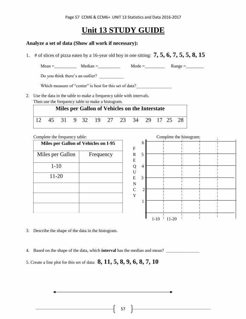
Unit 13 STUDY GUIDE
Analyze a set of data (Show all work if necessary):
1. # of slices of pizza eaten by a 16-year old boy in one sitting: 7, 5, 6, 7, 5, 5, 8, 15
Mean =__________ Median =__________ Mode =_________ Range =________
Do you think there’s an outlier? ___________
Which measure of “center” is best for this set of data?________________
2. Use the data in the table to make a frequency table with intervals.
Then use the frequency table to make a histogram.
Miles per Gallon of Vehicles on the Interstate
12 45 31 9 32 19 27 23 34 29 17 25 28
Complete the frequency table: Complete the histogram:
6
F
R 5
E
Q 4
U
E 3
N
C 2
Y
1
1-10 11-20
3. Describe the shape of the data in the histogram.
4. Based on the shape of the data, which interval has the median and mean? _______________
5. Create a line plot for this set of data: 8, 11, 5, 8, 9, 6, 8, 7, 10
Miles per Gallon of Vehicles on I-95
Miles per Gallon Frequency
1-10
11-20

Page 58 CCM6 & CCM6+ UNIT 13 Statistics and Data 2016-2017
58
6. From the $ Spent on Snacks line plot above: 7. From the Shoe Sizes line plot above:
a) Find the range: _________ a) Find the mean: ________
b) Find the median: _________ b) Find the mode: ________
Answer questions 8-10 using the box-and-whisker plots below.
The top box plot shows # of
pencils in students’ backpacks.
The bottom box plot shows the # of
pens in students’ backpacks.
8. What percent of students had more than 7 pencils in their backpacks?
9. What percent of students had less than 10 pens in their backpacks?
10. What do the box-and-whisker plots tell you about students carrying around pens and pencils in
their backpacks? Interpret the data on the graphs.
11. Create a box-and-whisker plot from the following set of data: 8, 2, 9, 4, 6, 8, 5
Minimum=_______ Q1=________ Median=________ Q3=________ Maximum=_______
0 1 2 3 4 5 6 7 8 9
12. What is the interquartile range (IQR) of this set of data? ____________

Page 59 CCM6 & CCM6+ UNIT 13 Statistics and Data 2016-2017
59
13. Student heights in inches: 65, 62, 59, 60, 64, 70
Find the mean absolute deviation of student heights.
Fill in the table below to find it: Mean height = _______ M. A. D. = _______
(Round to the nearest hundredth
if necessary)
If a data set has an outlier,
the MAD will be
____________ than a
data set with data values
that are all very close
together.
DATA DIFFERENCE from MEAN Absolute Value
65
62
59
60
64
70