part 1 defi ning usability - elsevier · 2013-12-20 · important, still depend on a solid...
TRANSCRIPT

PART 1PART 1
Defi ning Usability
04-Ch01-P375114.indd 104-Ch01-P375114.indd 1 9/4/09 11:02:00 PM9/4/09 11:02:00 PM

04-Ch01-P375114.indd 204-Ch01-P375114.indd 2 9/4/09 11:02:01 PM9/4/09 11:02:01 PM

3
CHAPTERCHAPTER 1 1
What Is Usability?
Jakob Nielsen
Copyright © 2010 Elsevier, Inc. All rights Reserved.
EDITOR’S COMMENTS Jakob Nielsen has been a leading fi gure in the usability fi eld since the 1980s and this
chapter from his classic book, Usability Engineering (Nielsen, 1993), highlights the mul-
tidimensional nature of usability. To be usable, a product or service must consider, at a
minimum, these fi ve basic dimensions:
Learnability ■
Effi ciency ■
Memorability ■
Error tolerance and prevention ■
Satisfaction ■
An important point made by Nielsen and other usability experts is that the importance
of these dimensions will differ depending on the particular context and target users. For
something like a bank automated teller machine (ATM) or information kiosk in a museum,
learnability might be the major focus of usability practitioners. For complex systems such
as jet planes, railway systems, and nuclear power plants, the critical dimensions might
be error tolerance and error prevention, followed by memorability and effi ciency. If you
can’t remember the proper code to use when an alarm goes off in a nuclear power plant, a
catastrophic event affecting many people over several generations might occur.
In the years since this chapter was published, the phrase “user experience” has emerged
as the successor to “usability.” User experience practitioners consider additional dimen-
sions such as aesthetics, pleasure, and consistency with moral values, as important for
the success of many products and services. These user experience dimensions, while
important, still depend on a solid usability foundation. You can design an attractive product
04-Ch01-P375114.indd 304-Ch01-P375114.indd 3 9/4/09 11:02:01 PM9/4/09 11:02:01 PM

User Experience Re-Mastered: Your Guide to Getting the Right Design 4
Back when computer vendors fi rst started viewing users as more than an incon-venience, the term of choice was “user friendly” systems. This term is not really appropriate, however, for several reasons. First, it is unnecessarily anthropomor-phic – users don’t need machines to be friendly to them, they just need machines that will not stand in their way when they try to get their work done. Second, it implies that users’ needs can be described along a single dimension by systems that are more or less friendly. In reality, different users have different needs, and a system that is “friendly” to one may feel very tedious to another.
Because of these problems with the term user friendly , user interface pro-fessionals have tended to use other terms in recent years. The fi eld itself is known under names like computer–human interaction (CHI), human– computer interaction (HCI), which is preferred by some who like “putting the human fi rst” even if only done symbolically, user-centered design (UCD), man-machine interface (MMI), human-machine interface (HMI), operator-machine interface (OMI), user interface design (UID), human factors (HF), and ergonomics, 1 etc.
I tend to use the term usability to denote the considerations that can be addressed by the methods covered in this book. As shown in the following section, there are also broader issues to consider within the overall framework of traditional “user friendliness.”
USABILITY AND OTHER CONSIDERATIONS To some extent, usability is a narrow concern compared with the larger issue of system acceptability, which basically is the question of whether the sys-tem is good enough to satisfy all the needs and requirements of the users and other potential stakeholders, such as the users’ clients and managers. The overall acceptability of a computer system is again a combination of its social acceptability and its practical acceptability. As an example of social accept-ability, consider a system to investigate whether people applying for unem-ployment benefi ts are currently gainfully employed and thus have submitted fraudulent applications. The system might do this by asking applicants a number of questions and searching their answers for inconsistencies or pro-fi les that are often indicative of cheaters. Some people may consider such a fraud-preventing system highly socially desirable, but others may fi nd it
that is consistent with your moral values, but sales of that attractive product may suffer if it
is hard to learn, not very effi cient, and error prone.
Jakob’s chapter describes what is needed to establish a solid foundation for usability –
a timeless topic. You can read essays by Jakob on topics related to many aspects of
usability and user experience at http://www.useit.com .
04-Ch01-P375114.indd 404-Ch01-P375114.indd 4 9/4/09 11:02:01 PM9/4/09 11:02:01 PM
What Is Usability? CHAPTER 1 5
offensive to subject applicants to this kind of quizzing and socially undesirable to delay benefi ts for people fi tting certain profi les. Notice that people in the latter category may not fi nd the system acceptable even if it got high scores on practical acceptability in terms of identifying many cheaters and were easy to use for the applicants.
EDITOR’S NOTE: SOCIAL NETWORKING AND SOCIAL RESPONSIBILITY In the years since the publication of this chapter, social networking and other collaboration
technologies, such as Facebook, Twitter, and blogs, have become popular with millions of
users. These new technologies have great promise for bringing people together but also
pose new issues around social acceptability. Take Twitter as an example. Messages about
conditions at work or how bad one’s managers are might be considered socially accept-
able whining by the originator, but the person’s managers might view the same whining on
Twitter as detrimental to the company. Comments on social networking sites can persist
for years and a single photo or comment could harm someone’s chances for a new job
or affect revenue for a company. Human resource personnel can Google much personal
information when they screen candidates, but is that socially acceptable? Social network-
ing can be a boon or a disaster for individuals and organizations.
Given that a system is socially acceptable, we can further analyze its practical acceptability within various categories, including traditional categories such as cost, support, reliability, compatibility with existing systems, as well as the cat-egory of usefulness. Usefulness is the issue of whether the system can be used to achieve some desired goal. It can again be broken down into the two categories, utility and usability (Grudin, 1992), where utility is the question of whether the functionality of the system in principle can do what is needed and usabil-ity is the question of how well users can use that functionality. Note that the concept of “utility” does not necessarily have to be restricted to the domain of hard work. Educational software (courseware) has high utility if students learn from using it, and an entertainment product has high utility if it is fun to use. Figure 1.1 shows the simple model of system acceptability outlined here. It is clear from the fi gure that system acceptability has many components and that usability must trade-off against many other considerations in a development project.
Usability applies to all aspects of a system with which a human might interact, including installation and maintenance procedures. It is very rare to fi nd a computer feature that truly has no user interface components. Even a facility to transfer data between two computers will normally include an interface to trouble-shoot the link when something goes wrong (Mulligan, Altom, & Simkin, 1991). As another example, I recently established two electronic mail addresses for a committee I was managing. The two addresses were ic93-papers- administrator and ic93-papers-committee (for e-mail to
04-Ch01-P375114.indd 504-Ch01-P375114.indd 5 9/4/09 11:02:01 PM9/4/09 11:02:01 PM

User Experience Re-Mastered: Your Guide to Getting the Right Design 6
my assistant and to the entire membership, respectively). It turned out that sev-eral people sent e-mail to the wrong address, not realizing where their mail would go. My mistake was twofold: fi rst in not realizing that even a pair of e-mail addresses constituted a user interface of sorts and second in breaking the well-known usability principle of avoiding easily confused names. A user who was taking a quick look at the “To:” fi eld of an e-mail message might be excused for thinking that the message was going to one address even though it was in fact going to the other.
DEFINITION OF USABILITY It is important to realize that usability is not a single, one-dimensional property of a user interface. Usability has multiple components and is traditionally asso-ciated with these fi ve usability attributes:
Learnability: The system should be easy to learn so that the user can ■
rapidly start getting some work done with the system. Effi ciency: The system should be effi cient to use so that once the user has ■
learned the system, a high level of productivity is possible. Memorability: The system should be easy to remember so that the casual ■
user is able to return to the system after some period of not having used it without having to learn everything all over again. Errors: The system should have a low error rate so that users make few ■
errors during the use of the system, and so that if they do make errors they can easily recover from them. Further, catastrophic errors must not occur. Satisfaction: The system should be pleasant to use so that users are sub- ■
jectively satisfi ed when using it; they like it.
FIGURE 1.1 A model of the attributes of system acceptability.
Socialacceptability
Usefulness
Utility
Usability Easy to learn
Efficient to use
Easy to remember
Few errors
Subjectivelypleasing
Cost
Compatibility
Reliability
Etc.
Practicalacceptability
Sys
tem
acc
epta
bilit
y
04-Ch01-P375114.indd 604-Ch01-P375114.indd 6 9/4/09 11:02:01 PM9/4/09 11:02:01 PM

What Is Usability? CHAPTER 1 7
Each of these usability attributes will be discussed further in the following sec-tions. Only by defi ning the abstract concept of “usability” in terms of these more precise and measurable components can we arrive at an engineering disci-pline where usability is not just argued about but is systematically approached, improved, and evaluated (possibly measured). Even if you do not intend to run formal measurement studies of the usability attributes of your system, it is an illuminating exercise to consider how its usability could be made measurable. Clarifying the measurable aspects of usability is much better than aiming at a warm, fuzzy feeling of “user friendliness” (Shackel, 1991).
Usability is typically measured by having a number of test users (selected to be as representative as possible of the intended users) use the system to perform a prespecifi ed set of tasks, though it can also be measured by having real users in the fi eld perform whatever tasks they are doing anyway. In either case, an important point is that usability is measured relative to certain users and certain tasks. It could well be the case that the same system would be measured as having different usability characteristics if used by different users for different tasks. For example, a user wishing to write a letter may prefer a different word processor than a user wishing to maintain several hundred thousands of pages of technical documenta-tion. Usability measurement, therefore, starts with the defi nition of a represen-tative set of test tasks, relative to which the different usability attributes can be measured.
To determine a system’s overall usability on the basis of a set of usability mea-sures, one normally takes the mean value of each of the attributes that have been measured and checks whether these means are better than some previously speci-fi ed minimum. Because users are known to be very different, it is probably better to consider the entire distribution of usability measures and not just the mean value. For example, a criterion for subjective satisfaction might be that the mean value should be at least 4 on a 1–5 scale; that at least 50 percent of the users should have given the system the top rating, 5; and that no more than five percent of the users gave the system the bottom rating, 1.
Learnability Learnability is in some sense the most fundamental usability attribute, because most systems need to be easy to learn and because the fi rst experience most people have with a new system is that of learning to use it. Certainly, there are some systems for which one can afford to train users extensively to overcome a hard-to-learn interface, but in most cases, systems need to be easy to learn.
Ease of learning refers to the novice user’s experience on the initial part of the learning curve, as shown in Fig. 1.2 . Highly learnable systems have a steep incline for the fi rst part of the learning curve and allow users to reach a reason-able level of usage profi ciency within a short time. Practically all user interfaces have learning curves that start out with the user being able to do nothing (have zero effi ciency) at time zero (when they fi rst start using it). Exceptions include the so-called walk-up-and-use systems, such as museum information systems,
04-Ch01-P375114.indd 704-Ch01-P375114.indd 7 9/4/09 11:02:03 PM9/4/09 11:02:03 PM

User Experience Re-Mastered: Your Guide to Getting the Right Design 8
that are only intended to be used once and there-fore need to have essentially zero learning time, allowing users to be successful from their very fi rst attempt at using them.
The standard learning curve also does not apply to cases where the users are transferring skills from previous systems, such as when they upgrade from a previous release of a word processor to the new release (Telles, 1990). Assuming that the new system is reasonably consistent with the old, users should be able to start a fair bit up on the
learning curve for the new system (Polson, Muncher, & Engelbeck, 1986).
Initial ease of learning is probably the easiest of the usability attributes to mea-sure, with the possible exception of subjective satisfaction. One simply picks some users who have not used the system before and measures the time it takes them to reach a specifi ed level of profi ciency in using it. Of course, the test users should be representative of the intended users of the system, and there might be a need to collect separate measurements from complete novices without any prior com-puter experience and from users with some typical computer experience. In ear-lier years, learnability studies focused exclusively on users without any computer experience, but because many people now have used computers, it is becoming more important to include such users in studies of system learnability.
The most common way to express the specifi ed level of profi ciency is simply to state that the users have to be able to complete a certain task successfully. Alterna-tively, one can specify that users need to be able to complete a set of tasks in a cer-tain, minimum time before one will consider them as having “learned” the system. Of course, as shown in Fig. 1.2 , the learning curve actually represents a continu-ous series of improved user performance and not a dichotomous “learned”/“not learned” distinction. It is still common, however, to defi ne a certain level of per-formance as indicating that the user has passed the learning stage and is able to use the system and to measure the time it takes the user to reach that stage.
When analyzing learnability, one should keep in mind that users normally do not take the time to learn a complete interface fully before starting to use it. On the contrary, users often start using a system as soon as they have learned a part of the interface. For example, a survey of business professionals who were experienced personal computer users (Nielsen, 1989a) found that four of the six highest-rated usability characteristics (out of 21 characteristics in the survey) related to exploratory learning: easy-to-understand error messages, possible to do useful work with program before having learned all of it, availability of undo, and confi rming questions before execution of risky commands. Because of users’ tendency to jump right in and start using a system, one should not just measure how long it takes users to achieve complete mastery of a system but also how long it takes to achieve a suffi cient level of profi ciency to do useful work.
FIGURE 1.2 Learning curves for a hypothetical system that focuses on the novice user, being easy to learn but less effi cient to use, as well as one that is hard to learn but highly effi cient for expert users.
Time
Usa
ge P
rofic
ienc
y an
d E
ffici
ency
Focus onexpert user
Focus on
novice user
04-Ch01-P375114.indd 804-Ch01-P375114.indd 8 9/4/09 11:02:03 PM9/4/09 11:02:03 PM

What Is Usability? CHAPTER 1 9
Effi ciency of Use Effi ciency refers to the expert user’s steady-state level of performance at the time when the learning curve fl attens out ( Fig. 1.2 ). Of course, users may not neces-sarily reach that fi nal level of performance any time soon. For example, some operating systems are so complex that it takes several years to reach expert-level performance and the ability to use certain composition operators to combine commands (Doane, McNamara, Kintsch, Polson, & Clawson, 1992; Doane, Pellegrino, & Klatzky, 1990). Also, some users will probably continue to learn indefi nitely, though most users seem to plateau once they have learned “enough” (Carroll & Rosson, 1987; Rosson, 1984). Unfortunately, this steady-state level of performance may not be optimal for the users who, by learning a few additional advanced features, sometimes would save more time over the course of their use of the system than the time it took to learn them.
To measure effi ciency of use for experienced users, one obviously needs access to experienced users. For systems that have been in use for some time, “experi-ence” is often defi ned somewhat informally, and users are considered experienced either if they say so themselves or if they have been users for more than a certain amount of time, such as a year. Experience can also be defi ned more formally in terms of number of hours spent using the system, and that defi nition is often used in experiments with new systems without an established user base: test users are brought in and asked to use the system for a certain number of hours, after which their effi ciency is measured. Finally, it is possible to defi ne test users as experi-enced in terms of the learning curve itself: a user’s performance is continuously measured (e.g., in terms of number of seconds to do a specifi c task), and when the performance has not increased for some time, the user is assumed to have reached the steady-state level of performance for that user (Nielsen & Phillips, 1993).
A typical way to measure effi ciency of use is thus to decide on some defi nition of expertise, to get a representative sample of users with that expertise, and to measure the time it takes these users to perform some typical test tasks.
Memorability Casual users are the third major category of users besides novice and expert users. Casual users are people who are using a system intermittently rather than having the fairly frequent use assumed for expert users. However, in contrast to novice users, casual users have used a system before, so they do not need to learn it from scratch, they just need to remember how to use it based on their previ-ous learning. Casual use is typically seen for utility programs that are only used under exceptional circumstances, for supplementary applications that do not form part of a user’s primary work but are useful every now and then, as well as for programs that are inherently only used at long intervals, such as a program for making a quarterly report.
Having an interface that is easy to remember is also important for users who return after having been on vacation or who for some other reason have tempo-rarily stopped using a program. To a great extent, improvements in learnability
04-Ch01-P375114.indd 904-Ch01-P375114.indd 9 9/4/09 11:02:04 PM9/4/09 11:02:04 PM

User Experience Re-Mastered: Your Guide to Getting the Right Design 10
often also make an interface easy to remember, but in principle, the usability of returning to a system is different from that of facing it for the fi rst time. For example, consider the sign “Kiss and Ride” seen outside some, Washington, DC, Metro stations. Initially, the meaning of this sign may not be obvious (it has poor learnability without outside assistance), but once you realize that it indi-cates a drop-off zone for commuters arriving in a car driven by somebody else, the sign becomes suffi ciently memorable to allow you to fi nd such zones at other stations (it is easy to remember). 2
Interface memorability is rarely tested as thoroughly as the other usability attri-butes, but there are in principle two main ways of measuring it. One is to per-form a standard user test with casual users who have been away from the system for a specifi ed amount of time and measure the time they need to perform some typical test tasks. Alternatively, it is possible to conduct a memory test with users after they fi nish a test session with the system and ask them to explain the effect of various commands or to name the command (or draw the icon) that does a certain thing. The interface’s score for memorability is then the number of cor-rect answers given by the users.
The performance test with casual users is most representative of the reason we want to measure memorability in the fi rst way. The memory test may be easier to carry out but does have the problem that many modern user interfaces are built on the principle of making as much as possible visible to the users. Users of such systems do not need to be actively able to remember what is available, since the system will remind them when necessary. In fact, a study of one such graphical interface showed that users were unable to remember the contents of the menus when they were away from the system, even though they could use the same menus with no problems when they were sitting at the computer (Mayes, Draper, McGregor & Oatley, 1988).
Few and Noncatastrophic Errors Users should make as few errors as possible when using a computer system. Typically, an error is defi ned as any action that does not accomplish the desired goal, and the system’s error rate is measured by counting the number of such actions made by users while performing some specifi ed task. Error rates can thus be measured as part of an experiment to measure other usability attributes.
Simply defi ning errors as being any incorrect user action does not take the highly varying impact of different errors into account. Some errors are corrected immediately by the user and have no other effect than to slow down the user’s transaction rate somewhat. Such errors need not really be counted separately, as their effect is included in the effi ciency of use if it is measured the normal way in terms of the user’s transaction time.
Other errors are more catastrophic in nature, either because they are not dis-covered by the user, leading to a faulty work product, or because they destroy the user’s work, making them diffi cult to recover from. Such catastrophic errors
04-Ch01-P375114.indd 1004-Ch01-P375114.indd 10 9/4/09 11:02:04 PM9/4/09 11:02:04 PM

What Is Usability? CHAPTER 1 11
should be counted separately from minor errors, and special efforts should be made to minimize their frequency.
Subjective Satisfaction The fi nal usability attribute, subjective satisfaction, refers to how pleasant it is to use the system. Subjective satisfaction can be an especially important usabil-ity attribute for systems that are used on a discretionary basis in a nonwork environment, such as home computing, games, interactive fi ction, or creative painting (Virzi, 1991). For some such systems, their entertainment value is more important than the speed with which things get done, because one might want to spend a long time having fun (Carroll & Thomas, 1988). Users should have an entertaining and/or moving and/or enriching experience when using such systems because they have no other goal.
Note that the notion of subjective satisfaction as an attribute of usability is dif-ferent from the issue of the public’s general attitudes toward computers. Even though it is likely that a person’s feelings toward computers as a general phe-nomenon will impact the extent to which that person likes interacting with a particular system, peoples’ attitudes toward computers in general should prob-ably be seen as a component of the social acceptability of computers rather than their usability. See (LaLomia & Sidowski, 1991) for a survey of such computer attitude studies. Computer enthusiasts may hope that steady improvements in computer usability will result in more positive attitudes toward computers. Little is currently known about the relation between attributes of individual computer systems and users’ general attitudes, though users who perceive that they have a high degree of control over the computer have been found also to have positive attitudes toward computers (Kay, 1989).
In principle, certain objective measures might be used instead of asking the users’ subjective preference to assess the pleasing nature of an interface. In a few cases, psychophysiological measures such as electroencephalograms (EEGs), pupil dilation, heart rate, skin conductivity, blood pressure, and level of adrena-line in the blood have been used to estimate the users’ stress and comfort levels (Mullins & Treu 1991; Schleifer, 1990; Wastell, 1990). Unfortunately, such mea-sures require intimidating experimental conditions such as wiring the user to an EEG machine or taking blood samples. Because test users are normally nervous enough as it is and because a relaxed atmosphere is an important condition for much user testing, the psychophysiological approach will often be inappropri-ate for usability engineering studies.
Alternatively, subjective satisfaction may be measured by simply asking the users for their subjective opinion. From the perspective of any single user, the replies to such a question are subjective, but when replies from multiple users are aver-aged together, the result is an objective measure of the system’s pleasantness. Because the entire purpose of having a subjective satisfaction usability attribute is to assess whether users like the system, it seems highly appropriate to mea-sure it by asking the users, and this is indeed what is done in the overwhelming number of usability studies.
04-Ch01-P375114.indd 1104-Ch01-P375114.indd 11 9/4/09 11:02:04 PM9/4/09 11:02:04 PM

User Experience Re-Mastered: Your Guide to Getting the Right Design 12
To ensure consistent measurements, subjective satisfaction is normally mea-sured by a short questionnaire that is given to users as part of the debriefi ng session after a user test. Of course, questionnaires can also be given to users of installed systems in the fi eld without the need to have them go through a special test procedure fi rst. For new systems, however, it is important not to ask the users for their subjective opinions until after they have had a chance to try using the system for a real task. The answers users give to questions before and after having used a system are unfortunately not very highly correlated (Root & Draper, 1983).
Users have been known to refuse to use a program because the manual was too big (Nielsen, Mack, Bergendorff & Grischkowsky, 1986), without even trying to read it to see whether it was in fact as diffi cult as they thought. Therefore, it is certainly reasonable to study the approachability of a system (this is especially important from a marketing perspective) (Angiolillo & Roberts, 1991). To do so, one can show the system to users and ask them, “How diffi cult do you think it would be to learn to use this?” – just don’t expect the answers to have much relation to the actual learnability of the system.
Even when users do have experience using a system, their subjective ratings of its diffi culty are much more closely related to the peak diffi culty they experi-enced than to mean diffi culty; the most diffi cult episode a user experienced is the most memorable for that user. In one experiment, the peak experienced diffi culty while performing a task accounted for 31 percent of the users’ subjec-tive rating of the system’s diffi culty, whereas the task time only accounted for 7 percent (Cordes, 1993). One conclusion is that one cannot rely solely on user ratings if the goal is to improve overall system performance. On the other hand, sales considerations imply a need to have users believe that the system is easy to generate positive word-of-mouth, and such impressions might be improved more by a bland interface with no extreme peak in diffi culty than by a system that is mostly excellent but has one really hard part for users to overcome.
Subjective satisfaction questionnaires are typically very short, though some longer versions have been developed for more detailed studies (Chin, Diehl & Norman, 1988). Typically, users are asked to rate the system on 1–5 or 1–7 rating scales that are normally either Likert scales or semantic differential scales (LaLomia & Sidowski, 1990). For a Likert scale , the questionnaire postulates some statement (e.g., “I found this system very pleasant to use”) and asks the users to rate their degree of agreement with the statement. When using a 1–5 rating scale, the reply options are typically 1 = strongly disagree, 2 = partly dis-agree, 3 = neither agree nor disagree, 4 = partly agree, and 5 = strongly agree.
A semantic differential scale lists two opposite terms along some dimension (e.g., very easy to learn vs. very hard to learn) and asks the user to place the system on the most appropriate rating along the dimension. Table 1.1 and Table 1.2 list some sample questions that are often asked to measure subjective satisfaction. One could add a few questions addressing issues of special inter-est, such as “the quick reference card was very helpful,” but it is normally best
04-Ch01-P375114.indd 1204-Ch01-P375114.indd 12 9/4/09 11:02:04 PM9/4/09 11:02:04 PM

What Is Usability? CHAPTER 1 13
to keep the questionnaire short to maximize the response rate. A fi nal rating for subjective satisfaction is often calculated simply as the mean of the ratings for the individual answers (after compensating for any use of reverse polarity), but it is also possible to use more sophisticated methods, drawing upon rating scale theory from sociology and psychometrics.
No matter what rating scales are used, they should be subjected to pilot test-ing to make sure that the questions are interpreted properly by the users. For example, a satisfaction questionnaire for a point-of-sales system used a dimen-sion labeled “human contact versus cold technology” to assess whether users felt that it was impersonal to be served by a machine. However, because no humans were present besides the user, many users felt that it was logically impossible to talk about “human contact” and did not answer the question in the intended manner.
Table 1.1 Questions Users Might Be Asked to Measure Subjective Satisfaction Using a Likert Scale
Please Indicate the Degree to Which You Agree or Disagree with the Following Statements About the System:
“It was very easy to learn how to use this system.”
“Using this system was a very frustrating experience.”
“I feel that this system allows me to achieve very high productivity.”
“I worry that many of the things I did with this system may have been wrong.”
“This system can do all the things I think I would need.”
“This system is very pleasant to work with.”
Users would typically indicate their degree of agreement on a 1–5 scale for each statement. One would normally refer to the system by its name rather than as “this system.”
Table 1.2 Some Semantic Differential Scales to Measure Subjective Satisfaction with Computers
Please Mark the Positions That Best Refl ect Your Impressions of This System:
Pleasing Irritating
Complete Incomplete
Cooperative Uncooperative
Simple Complicated
Fast to use Slow to use
Safe Unsafe
See Coleman, Williges, and Wixon (1985) for a list of 17 such scales.
04-Ch01-P375114.indd 1304-Ch01-P375114.indd 13 9/4/09 11:02:04 PM9/4/09 11:02:04 PM

User Experience Re-Mastered: Your Guide to Getting the Right Design 14
When rating scales are used, one needs an anchor or baseline to calibrate the scale before it is possible to assess the results. If subjective satisfaction ratings are available for several different systems or several different versions of the same system, it is possible to consider the ratings in relation to the others and thus to determine which system is the most pleasant to use. If only a single user inter-face has been measured, one should take care in interpreting the ratings, because people are often too polite in their replies. Users normally know that the people who are asking for the ratings have a vested interest in the system being mea-sured, and they will tend to be positive unless they have had a really unpleas-ant experience. This phenomenon can be partly counteracted by using reverse polarity on some of the questions, that is, having some questions to which an agreement would be a negative rating of the system.
Nielsen and Levy (1994) found that the median rating of subjective satisfaction for 127 user interfaces for which such ratings had been published was 3.6 on a 1–5 scale with 1 being the worst rating and 5 the best. Ostensibly, the rating 3 is the “neutral” point on a 1–5 rating scale, but because the median is the value where half of the systems were better and half were poorer, the value 3.6 seems to be a better estimate of “neutral” or “average” subjective satisfaction.
If multiple systems are tested, subjective satisfaction can be measured by asking users which system they would prefer or how strongly they prefer various sys-tems over others. Finally, for systems that are in use, one can measure the extent that users choose to use them over any available alternatives. Data showing vol-untary usage is really the ultimate subjective satisfaction rating.
EXAMPLE: MEASURING THE USABILITY OF ICONS To clarify the slightly abstract defi nition of usability in the previous section, this section gives several examples of how to measure the usability of a concrete user interface element: icons. Icons have become very popular elements in graphical user interfaces, but not all icons have equally good usability characteristics.
A systematic approach to icon usability would defi ne measurable criteria for each of the usability attributes of interest to the system being developed. It is impossible to talk about the usability of an icon without knowing the context in which it will be shown and the circumstances under which it will be used. This section presents a few of the approaches to icon usability that have been published in the user interface literature. For some other examples, see (Green & Barnard, 1990; Hakiel & Easterby, 1987; Magyar, 1990; Nolan, 1989; Salasoo, 1990; Stammers & Hoffman, 1991; Zwaga, 1989).
A classic study of icon usability was described by Bewley, Roberts, Schroit, and Verplank (1983). Four different sets of icons were designed for a graphical user interface with 17 icons. All the icons were tested for ease of learning, effi ciency of use, and subjective satisfaction. Ease of learning was assessed by several means: First, the intuitiveness 3 of the individual icons was tested by showing them to the users, one at a time, asking the user to describe “what you think it
04-Ch01-P375114.indd 1404-Ch01-P375114.indd 14 9/4/09 11:02:05 PM9/4/09 11:02:05 PM

What Is Usability? CHAPTER 1 15
is.” Second, because icons are normally not seen in isolation, the understand-ability of sets of icons was tested by showing the users entire sets of icons (one of the four sets that had been designed). Users were then given the name of an icon and a short description of what it was supposed to do and asked to point to the icon that best matched the description. Users were also given the complete set of names and asked to match up all the icons with their names. The score for all these learning tests was the proportion of the icons that were correctly described or named.
EDITOR’S NOTE: USING BRAINDRAWING TO GENERATE IDEAS FOR ICONS Braindrawing is a method of visual brainstorming and problem-solving where participants
create and modify rough sketches quickly to generate ideas or solve visual layout prob-
lems. For example, braindrawing could be used to come up with ideas for icons that will
represent abstract functions in toolbars, menus, or ribbons. You can also use braindrawing
to explore layouts for dialogue boxes or Web pages.
The basic procedure for braindrawing involves the following steps:
Each member of a group is invited to explore solutions to a visual problem state-1.
ment by sketching ideas for a designated period of time.
Each sketch is passed to another person who then enhances or adds something 2.
to the sketch or creates a new sketch. After a designated time, each person
passes the sketches on to yet another person.
The sketch-then-pass process is repeated for three to six iterations. 3.
At the end of a braindrawing session, all the sketches created by the group are 4.
posted in an “art gallery,” where colleagues and participants can review the
sketches and discuss which ideas should be considered further.
(Optional) The group votes on the best ideas and then prioritizes them further at 5.
the end of the session or at a separate session.
Two effi ciency tests were conducted. In the fi rst test, users who had already learned the meaning of the icons through participation in the learning tests were given the name of an icon and told that it might appear on the computer display. A random icon then appeared, and the users pressed a “yes” button if it was one they were looking for and a “no” button if it was some other icon. In the second test, users were shown a randomized display of icons and asked to click on a specifi c icon. Both these tests were timed, and the score for an icon was the users’ reaction time in seconds.
Subjective satisfaction was measured in two ways. First, users were asked to rate each icon one at a time for how easy it was to pick out. Second, for each of the 17 concepts, the users were shown the four possible icons and asked to choose the one they preferred. The subjective score for an icon was the user rating for the fi rst test and the proportion of users who preferred it for the second test.
04-Ch01-P375114.indd 1504-Ch01-P375114.indd 15 9/4/09 11:02:05 PM9/4/09 11:02:05 PM

User Experience Re-Mastered: Your Guide to Getting the Right Design 16
Given the results from all these tests, it was possible to compare the four icon sets. One set that included the names of the commands as part of the icon got consistently high scores on the test where users had to describe what the icon represented. This result may not be all that surprising and has indeed been con-fi rmed by later research on other interfaces (Egido & Patterson, 1988; Kacmar & Carey, 1991). Unfortunately, this set of icons was not very graphically distinct, and many of the icons were hard to fi nd on a screen with many similar icons. For the fi nal system, a fi fth set of icons was designed, mostly being based on one of the four original sets, but with some variations based on lessons from the tests as well as the aesthetic sensibilities of the graphic designers.
Icons are probably easier to design for objects than for operations since many objects can be depicted representationally. Rogers (1986) studied the usability of icon sets for operations by testing gradually more complex icons with more and more elements. The only usability parameter measured was comprehensi-bility, which was assessed by a matching test. For each level of icon complexity (e.g., icons with few elements), an entire set of icons was designed to represent the commands in the system. For each such set, 10 users were shown all the icons as they went through a list of textual descriptions of the command func-tions. 4 For each textual description, the users picked the one icon they believed matched it best, and the total comprehension score for an icon set was then calculated as the number of correct matches.
The best icons showed both the concrete object being operated upon (e.g., a sheet of paper) and an abstract representation of the operation (e.g., an arrow). Icons with only one of these elements were harder to understand as were icons with even more information (such as replacing the arrow with a pointing fi nger with little cartoon-like lines denoting movement). So, a medium level of com-plexity was best for comprehension. Also, icons for commands with a visual outcome (such as the movement of text in a word processor) were much easier to comprehend than were icons for commands with a nonvisual outcome (such as “save a fi le”).
Icons that are intended for critical or widely used applications may need to sat-isfy more stringent quality criteria than other icons. International standards is certainly one area where one would want a high level of usability. Lindgaard, Chessari, and Ihsen (1987) report on a case where the International Standards Organization (ISO) required that icons should be correctly interpreted by at least 66 percent of the subjects in a test for the icon to be considered for adoption as an international standard. Only half of the proposed icons actually passed this criterion when they were tested with technically knowledgeable users, and for naive subjects, only one of 12 icons was good enough. Iterative design resulted in improved icons, but the important lesson from this study is the benefi t of deciding on a reasonable criterion for measurable usability and then testing to see whether the goal has been met before releasing a product.
The examples in this section have shown that icon usability can be defi ned and measured in many different ways. The main conclusion from the examples is
04-Ch01-P375114.indd 1604-Ch01-P375114.indd 16 9/4/09 11:02:05 PM9/4/09 11:02:05 PM

What Is Usability? CHAPTER 1 17
the need to refi ne the basic usability criteria listed in Section 1.2 with respect to the circumstances of each concrete project. There are many different ways of measuring usability, and no single measure will be optimal for all projects.
EDITOR’S NOTE: ISO STANDARD FOR TESTING GRAPHIC SYMBOLS ISO 9186-2:2008, Procedures for the Development and Testing of Public Information
Symbols, defi nes testing methods and criteria for adopting symbols as an international
standard. If you haven’t done icon testing before, this standard is a good resource.
USABILITY TRADE-OFFS The learning curves in Fig. 1.2 may give the impression that one can have either a system that is easy to learn or one that is eventually effi cient, though initially hard to learn. In fact, often a system that will give good novice learning will also be good for the experts. Also, it is often possible to ride the best parts of both learning curves by providing a user interface with multiple interaction styles such that the user starts by learning one interaction style that is easy to learn and later changes to another that is more effi cient for frequently used operations.
The typical way to achieve this “best-of-both-worlds” effect is to include accelera-tors in the user interface. Accelerators are user interface elements that allow the user to perform frequent tasks quickly, even though the same tasks can also be performed in a more general, and possibly slower, way. Typical examples of accel-erators include function keys, pop-up menus in the work area, command name abbreviations, and the use of double-clicking to activate an object. Users of such a dual interface who are on the part of the learning curve where they are changing to expert mode may suffer a small dip in performance, so the learning curve will not necessarily be continuously increasing. Also, one should keep in mind that the increased interface complexity inherent in having both novice and expert modes can be a problem in itself. It is, therefore, important to design the interface in such a way that the novice users can use it without being confronted with the expert mode and the accelerators. For example, a command language system that allows abbreviations should always spell out the full name of the commands in any help and error messages. Also, any operation that is activated by double-clicking should also be made available as a menu choice or in some other visible fashion.
The trade-off between learnability for novice users and effi ciency of use for expert users can sometimes be resolved to the benefi t of both user groups without employing dual interaction styles. For example, unless the application involves a very large number of fi elds, one might as well use descriptive fi eld labels in a dia-logue box, even though they would make it a little larger than if cryptic abbrevia-tions were used. The expert users would not be hurt by such a concession to the novices. 5 Similarly, both user groups would benefi t from appropriate choice of default values – experts because they would need to change the value less often
04-Ch01-P375114.indd 1704-Ch01-P375114.indd 17 9/4/09 11:02:05 PM9/4/09 11:02:05 PM

User Experience Re-Mastered: Your Guide to Getting the Right Design 18
and novices because the system would conform to their typical needs without the need for them to learn about the nondefault options.
Even so, it is not always possible to achieve optimal scores for all usability attri-butes simultaneously. Trade-offs are inherent in any design process and apply no less to user interface design. For example, the desire to avoid catastrophic errors may lead to the decision to design a user interface that is less effi cient to use than otherwise possible: typically because extra questions are asked to assure that the user is certain about wanting a particular action.
In cases where a usability trade-off seems necessary, attempts should fi rst be made at fi nding a win-win solution that can satisfy both requirements. If that is not possible, the dilemma should be resolved under the directions set out by the project’s usability goals, which should defi ne which usability attributes are the most important given the specifi c circumstances of the project.
Furthermore, considerations other than usability may lead to designs violating some usability principles. For example, security considerations often require access controls that are decidedly nonuser friendly, such as not providing con-structive error messages in case of an erroneously entered password. As another example, museum information systems and other publicly used systems may have hidden options, such as a command to reboot the system in case of trou-ble, in cases where the options are not intended to be used by the regular users.
CATEGORIES OF USERS AND INDIVIDUAL USER DIFFERENCES The two most important issues for usability are the users’ tasks and their individual characteristics and differences. An analysis of 92 published compari-sons of usability of hypertext systems found that four of the 10 largest effects (including all the top three effects) in the studies were due to individual differ-ences between users and that two were due to task differences (Nielsen, 1989b). It is therefore an important aspect of usability engineering to know the user. Understanding the major ways of classifying users may also help (Potosnak, Hayes, Rosson, Schneider & Whiteside, 1986), though often the same system design will be good for many categories of users.
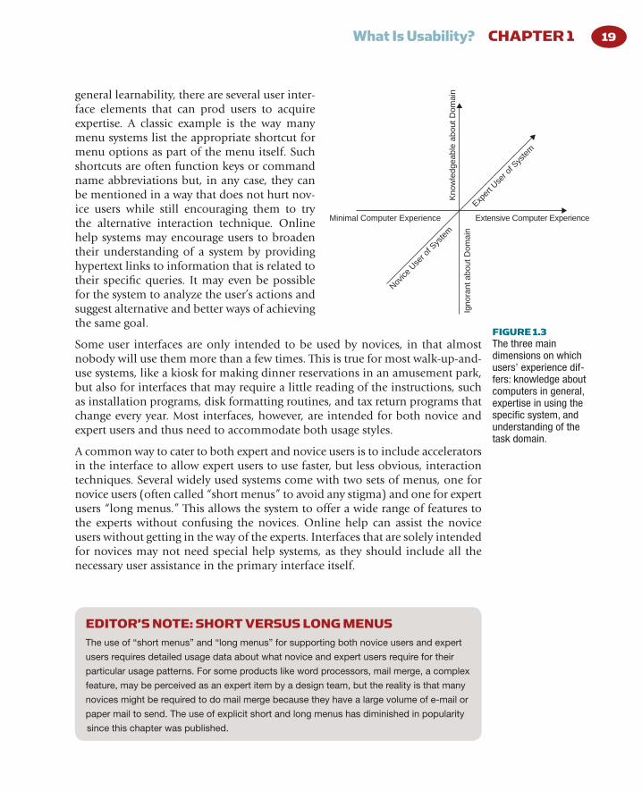
Figure 1.3 shows the “user cube” of the three main dimensions 6 along which users’ experience differs: experience with the system, with computers in general, and with the task domain.
The users’ experience with the specifi c user interface under consideration is the dimension that is normally referred to when discussing user expertise, and users are normally considered to be either novices or experts or somewhere in between. The transition from novice to expert user of a system often follows a learning curve somewhat like those shown in Fig. 1.2 .
Most of the usability principles discussed in this book will help make systems easier to learn, and thus allow users to reach expert status faster. In addition to
04-Ch01-P375114.indd 1804-Ch01-P375114.indd 18 9/4/09 11:02:05 PM9/4/09 11:02:05 PM
What Is Usability? CHAPTER 1 19
general learnability, there are several user inter-face elements that can prod users to acquire expertise. A classic example is the way many menu systems list the appropriate shortcut for menu options as part of the menu itself. Such shortcuts are often function keys or command name abbreviations but, in any case, they can be mentioned in a way that does not hurt nov-ice users while still encouraging them to try the alternative interaction technique. Online help systems may encourage users to broaden their understanding of a system by providing hypertext links to information that is related to their specifi c queries. It may even be possible for the system to analyze the user’s actions and suggest alternative and better ways of achieving the same goal.
Some user interfaces are only intended to be used by novices, in that almost nobody will use them more than a few times. This is true for most walk-up-and-use systems, like a kiosk for making dinner reservations in an amusement park, but also for interfaces that may require a little reading of the instructions, such as installation programs, disk formatting routines, and tax return programs that change every year. Most interfaces, however, are intended for both novice and expert users and thus need to accommodate both usage styles.
A common way to cater to both expert and novice users is to include accelerators in the interface to allow expert users to use faster, but less obvious, interaction techniques. Several widely used systems come with two sets of menus, one for novice users (often called “short menus” to avoid any stigma) and one for expert users “long menus.” This allows the system to offer a wide range of features to the experts without confusing the novices. Online help can assist the novice users without getting in the way of the experts. Interfaces that are solely intended for novices may not need special help systems, as they should include all the necessary user assistance in the primary interface itself.
FIGURE 1.3 The three main dimensions on which users’ experience dif-fers: knowledge about computers in general, expertise in using the specifi c system, and understanding of the task domain.
Minimal Computer Experience Extensive Computer Experience
Igno
rant
abo
ut D
omai
n
Kno
wle
dgea
ble
abou
t Dom
ain
Exper
t Use
r of S
yste
m
Novice
Use
r of S
yste
m
EDITOR’S NOTE: SHORT VERSUS LONG MENUS The use of “short menus” and “long menus” for supporting both novice users and expert
users requires detailed usage data about what novice and expert users require for their
particular usage patterns. For some products like word processors, mail merge, a complex
feature, may be perceived as an expert item by a design team, but the reality is that many
novices might be required to do mail merge because they have a large volume of e-mail or
paper mail to send. The use of explicit short and long menus has diminished in popularity
since this chapter was published.
04-Ch01-P375114.indd 1904-Ch01-P375114.indd 19 9/4/09 11:02:05 PM9/4/09 11:02:05 PM

User Experience Re-Mastered: Your Guide to Getting the Right Design 20
In spite of the common simplistic distinction between expert and novice users, the reality is that most people do not acquire comprehensive expertise in all parts of a system, no matter how much they use it. Almost all systems of some complexity have so many features and so many uses that any given user only makes extensive use of a small subset (Draper, 1984). Thus, even an “expert” user may be quite novice with respect to many parts of the system not normally used by that user. As a consequence, expert users still need access to help systems for those parts of the interface that they do not use as often, and they will benefi t from increased learnability of these features.
The users’ general experience with computers also has an impact on user inter-face design. As a simple example, consider a utility program distributed to systems administrators as compared with one that is to be used by home com-puter owners. Even though the two utilities may be intended for somewhat the same purpose, such as disk defragmentation, the interfaces should be very different. Even with more application-oriented interfaces, users with extensive experience from many other applications will normally be better off than users who have only used a single system, because experienced users will have some idea of what features to look for and how a computer normally deals with various situations. For example, a user with experience of a spreadsheet and a database program might try to look for a “sort” command in a new word processor. Furthermore, a user’s programming experience will to a large degree determine the extent to which that user can use macro languages and other complex means of combining commands and whether the resulting structures will be easily maintainable and modifi able when the user’s needs change at a later date.
The fi nal important dimension is the user’s knowledge of the task domain addressed by the system. Interfaces for users with extensive domain knowledge can use specialized terminology and a higher density of information in the screen designs. Users with little domain knowledge will need to have the system explain what it is doing and what the different options mean, and the termi-nology used should not be as abbreviated and dense as for domain specialists. Consider, for example, the design of a fi nancial planning system. The interface obviously needs to be very different depending on whether the intended users are fi nance professionals or whether the system is intended to help professionals from other fi elds invest and keep track of their money.
Users also differ in other ways than experience. Some differentiating factors are easy to observe, such as age (Czaja, 1988) and gender (Fowler & Murray, 1987; Teasley, Leventhal, Blumenthal, Instone & Stone, 1994). Other factors are less immediately obvious, such as differences in spatial memory and reasoning abilities (Gomez, Egan & Bowers, 1986) and preferred learning style (Sein & Bostrom, 1989), where some people learn better from abstract descriptions and others learn better from concrete examples. The important lesson from studies of these and other differences is that one needs to consider the entire spectrum of
04-Ch01-P375114.indd 2004-Ch01-P375114.indd 20 9/4/09 11:02:06 PM9/4/09 11:02:06 PM

What Is Usability? CHAPTER 1 21
intended users and make sure that the interface is usable for as many as possible and not just for those who happen to have the same characteristics as the devel-opers themselves. For example, the developers may fi nd it easy to remember where everything is located in a hierarchical fi le system, but users with lower spatial memory abilities may fi nd the user interface signifi cantly easier to use if it included an overview map (Vincente & Williges, 1988).
In addition to differences between groups of users, there are also important dif-ferences between individual users (Egan, 1988). The most extreme example may be in programming, where the difference in productivity between the best and the worst programmers typically is a factor of 20 (Curtis, 1981). That is, the pro-gram that one person can write in two weeks will take another person a year – and the two-week program will often be of better quality. A practical implication of this result that has been found in several studies is that the most important aspect of improving software projects is to employ fewer, but better program-mers. Even for nonprogramming tasks, the ratio between the best and the worst users’ performance is typically a factor of between four and 10.
Attitude differences can also impact how people use computers. For whatever reason, some people simply love using computers and will go to extreme efforts to learn all about their system. I once interviewed a business professional who said that she liked to learn a new software package every month just to stay in shape, and many other “super-users” spend as much time as many hackers learn-ing about obscure details in their computers, even though they are business pro-fessionals and not programmers (Nielsen, et al., 1986). Such super-users (also known as “power users” or “gurus”) often serve an important function as liaisons between the regular users and new computer developments as introduced by an information management department or outside software vendors. The super-users’ role as technology champions not only helps introduce new systems but also provides the regular users with a local means of fi nding sympathetic and task-specifi c help (Gantt & Nardi, 1992; Nardi & Miller, 1991). Because they often like to talk, super-users can also serve as a way for software developers to get feedback about changing user needs before the majority of users have reached a stage where these new needs have become apparent. Just remember that most users will be different from the super-users, so do not design the user interface purely on the basis of their desires.
Given the many differences between groups of users and between individual users, it might be tempting to give up and just allow the users to customize their interfaces to suit their individual preferences. However, it is not a good idea to go too far in that direction either, since users are not designers. Most often, it is possible to design user interfaces to accommodate several kinds of users as long as attention is paid to all the relevant groups during the design process. It is rare that an interface change that is necessary to help one group will be a major problem for another or that it is at least not possible to work around the second group’s diffi culties.
04-Ch01-P375114.indd 2104-Ch01-P375114.indd 21 9/4/09 11:02:06 PM9/4/09 11:02:06 PM

User Experience Re-Mastered: Your Guide to Getting the Right Design 22
END NOTES
5. Actually, Fitts’ Law implies that it would be a little slower to move the mouse between fi elds in the larger version of the dialogue box, because the time to point at an object is proportional to the logarithm of the distance to the object (Card, English, & Burr, 1978). However, expert users would be likely to move between the fi elds in the dialogue box with the Tab key (another accelerator) if speed was of the essence, and they would therefore not be subject to Fitts’ Law.
6. Note that the classifi cation dimensions used here are different from those used in the “user cube” of Cotterman and Kumar (1989). Their dimensions concerned the degree to which the user was the producer or consumer of information, whether the user had any part in developing the system, and the user’s degree of decision-making authority over the system. These dimensions are certainly also of interest.
4. Users were shown the command descriptions one at a time, thus preventing them from matching icons to descriptions by exclusion. If the users had been able to see all the command descriptions at the same time as they were seeing all the icons, they could have assigned the last (and probably most diffi cult) icon to the remaining, unmatched command description.
3. An early activity aimed at getting intuitive icons is to ask some users to draw icons they would like for each of the concepts that need to be depicted. The results will probably not look very good, but they can serve as a pool of ideas for the graphic designer.
2. “Kiss and Ride” is an analogy with “Park and Ride” areas where people can leave their cars. The sign refers to commuters who are driven by their spouses and will kiss them before getting out of the car to take the train.
1. Human factors (HF) and ergonomics have a broader scope than just HCI. In fact, many usability methods apply equally well to the design of other complex systems and even to simple ones that are not simple enough.
04-Ch01-P375114.indd 2204-Ch01-P375114.indd 22 9/4/09 11:02:06 PM9/4/09 11:02:06 PM