path analysis instructions
TRANSCRIPT
7/27/2019 Path Analysis Instructions
http://slidepdf.com/reader/full/path-analysis-instructions 1/16
1
Instructions for Conducting Path Analysis in AMOS (V. 19)
Path analysis is used to determine causal relationships between exogenous and endogenous
variables. Endogenous variables must be measured on an interval or ratio level, with continuous data.
Exogenous variables are typically measured on an interval or ratio level as well. The following
provides detailed instructions for conducting path analysis in AMOS (Version 19). The data come
from a random sample of 1500 cases selected from the NELS: 88 dataset with no missing
observations in any of the variables. Socio-economic status (BYSES), self concept (BYCNCPT1),
and time spent on English homework each week (BYS79C) at time 1 are modeled as exogenous
variables predicting time 1 standardized reading scores (BY2XRSTD); time 1 standardized reading
scores (BY2XRSTD) is modeled as an endogenous variable predicting time 2 standardized reading
scores (F12XRSTD).
AMOS analyses are conducted with data imported into AMOS from SPSS. Copies of the
SPSS data set imported into AMOS are available on the companion website. This data set file is
entitled, “PATH ANALYSIS.sav”. AMOS produces nine output components. A copy of this output
is also available on the companion website. The file is named, “Path Analysis Output.pdf ”.
The instructions are divided into five sets of steps, as follows:
1. Specify the path diagram
a. Open AMOS graphics
b. Import SPSS data file
c. Draw the exogenous, endogenous, and residual variables
d. Define the variables
e. Draw the single edge arrow paths connecting the exogenous, endogenous, and
residual variables
IMPORTANT
Two requirements for using the SPSS data file in AMOS are 1) variable names can not be
more than 8 characters, and 2) names assigned to the variables in the SPSS data file must be
identical to those used in AMOS.

7/27/2019 Path Analysis Instructions
http://slidepdf.com/reader/full/path-analysis-instructions 2/16
2
f. Draw the double-edge arrow paths connecting the exogenous variables
2. Define the scales of the residual variables
3. Perform the analysis
4. View output components in text and graphic formats
5. Examine the standardized regression estimates
Components of the Path Diagram
Before we begin, it is useful to describe the components of the path diagram to be tested in
AMOS, relative to this hypothetical research study. Suppose that our research hypothesis is that 1988
socio-economic status (BYSES), 1988 self concept (BYCNCPT1), and 1988 weekly time spent on
English homework (BYS79C) affect 1988 standardized scores reading (BY2XRSTD) and 1988
standardized scores reading (BY2XRSTD) in turn predicts 1990 standardized scores reading
(F12XRSTD). These relationships can be represented in the following path diagram:
BYSES, BYCNCPT1, and BYS79C are exogenous variables. In this path analysis we assume
that the exogenous variables are correlated with one another, although this will not be tested in our
analyses. This relationship is indicated by adding double-headed arrows to the diagram, connecting
each pair of exogenous variables. These double-headed arrows are referred to as covariances.
BY2XRSTD and F12XRSTD are endogenous variables. Each endogenous variable includes a
residual or disturbance term. Residuals represent unmeasured effects (i.e., influential variables that
are not in the model). The residual variable for BY2XRSTD is B and the residual variable for

7/27/2019 Path Analysis Instructions
http://slidepdf.com/reader/full/path-analysis-instructions 3/16
3
F12XRSTD is V. We will explain the purpose of “1” by each residual path in the “Constraining
Parameter” section.
This sketch shows what the path diagram will look like (without the colors) in AMOS. We describe
how to create this diagram and run a path analysis in the following section.
STEP 1: Specify the Path Diagram in AMOS
(a) Open Amos Graphics
Click IBM SPSS Statistics, then IBM AMOS 19 and then Amos Graphics to open AMOS.
NOTE that if you are using an older version of AMOS, the path for accessing AMOS Graphics may
be different.

7/27/2019 Path Analysis Instructions
http://slidepdf.com/reader/full/path-analysis-instructions 4/16
4
Amos Graphics
The section highlighted in black is the tool bar window. The tool bar provides several icons which
are shortcuts for drawing operations. The section highlighted in green is the drawing area where you
will draw the path diagram.
(b) Import the SPSS Data File into AMOS
Before we begin drawing the path diagram, we must import the SPSS data file into AMOS.
Click File. A drop down menu will appear. Move your cursor to Data Files and click to open the
Data Files dialog box. Click File Name. Locate the SPSS data file, click on it and click open. This
will bring you back to the Data Files dialog box. The data file should be file should be listed under
“File”. Click OK .

7/27/2019 Path Analysis Instructions
http://slidepdf.com/reader/full/path-analysis-instructions 5/16
5
(c) Draw the Exogenous, Endogenous, and Residual Variables
The next step is to draw a diagram that looks like the diagram on p. 2 in the AMOS drawing
area. This includes five rectangles to represent the five observed variables (three exogenous and two
endogenous variables) in the model, two ovals to represent the two residual variables, and the single-
headed and double-headed arrow paths connecting the variables. NOTE that the diagram must be
drawn in a way that all of its components are within the drawing area (the green section shown on p.
3). To draw the first rectangle (e.g., BYSES), click Diagram and then click Draw Observed.
Move the mouse to the location for the BYSES rectangle in the drawing area. Once you have
picked a spot for the BYSES rectangle, press the left mouse button and hold it down while making
some trial movements to figure out its shape. When you are satisfied with the rectangle’s shape and
location, release the mouse button. Use the same method to draw the rectangles for the other four
variables. Once you are finished drawing the rectangles, click the rectangle icon to deactivate it. I f
you are not satisf ied with your rectangle (or any other diagram component) and want to delete it,
cli ck on the on the toolbar then cli ck on the rectangle you want to delete. As an aside, other
drawing operation icons available in the tool bar (highlighted in black on p. 3) are useful in drawing
the diagram. For instance, the red moving truck icon allows you to move components. The copy
machine icon allows you to copy and paste components.
The procedure for drawing the ovals representing the residual variables is the same as
drawing the rectangles except that we use the oval Draw Unobserved icon. Click Diagram, and
then click Draw Unobserved. Move the mouse to the location for the first residual variable in the
drawing area. Press the left mouse button and hold it down while making some trial movements of

7/27/2019 Path Analysis Instructions
http://slidepdf.com/reader/full/path-analysis-instructions 6/16
6
the mouse. When you are satisfied with its shape and location, release the mouse button. Once you
are finished drawing the ovals, click the oval icon to deactivate it.
The following is what your path diagram should look like at this point.
(d) Define the Variables
To define the five observed variables and the two residual variables, double click on one of
the objects in the path diagram. It does not matter which one you start with. For this example, we
start by double clicking on the first rectangle that represents BYSES (socio-economic status). The
Object Properties dialog box appears. Click the Text tab and type BYSES in the Variable name
field. Note that as you type in the field, the word BYSES appears in the rectangle. Close the Object
Property box by clicking X at the top right corner .

7/27/2019 Path Analysis Instructions
http://slidepdf.com/reader/full/path-analysis-instructions 7/16
7
Repeat this with the other rectangles and the ovals. Remember that the names you give to the
observed vari ables (the rectangles) must match the variable names in the SPSS data fi le.
(e) Draw the Single-Headed Arrow Paths Connecting the Exogenous, Endogenous,
and Residual Variables
To draw a single-headed arrow, click on the Draw Paths icon from the toolbar. We first draw
the single-headed arrow path from BYSES to BY2XRSTD. Click and hold down your left mouse
button from the right edge of BYSES to the left edge of BY2XRSTD rectangle. NOTE that when we
click on the BYSES rectangle, its edges illuminate in red.
Release the mouse button when the BY2XRSTD rectangle edge is illuminated in green. Repeat this
procedure for the remaining paths with single-headed arrows.
When all of the single-headed arrow paths have been drawn, click the Draw Paths icon to deactivate
it.

7/27/2019 Path Analysis Instructions
http://slidepdf.com/reader/full/path-analysis-instructions 8/16
8
(f) Draw the Double-Headed Arrow Paths Connecting Exogenous Variables
Drawing double-headed arrow paths is similar to drawing single-headed arrow paths except
that we use the Draw Covariances icon (double-headed arrow icon) on the tool bar.
To draw a double-headed arrow path between BYSES and BYCNPT1, click on the Draw
Covariances icon. Begin this process by clicking and holding down the left mouse button from the
left edge of the BYCNCPT1 rectangle to the left edge of the BYSES rectangle. NOTE that we start
the double-headed arrow path at the lower variable (e.g., BYS79C to BYSES) because the initial
curvature of a two-headed arrow path follows an arc in a clockwise direction. Once the double-
headed arrow path is in place, release the mouse button. To draw a double-headed arrow between
BYSES and BYS79C, click and hold down the left mouse button from the left edge of the BYS79C
rectangle to the left edge of the BYSES rectangle, and then release the mouse button. To draw a
double-headed arrow between BYCNPT1 and BYS79C, click and hold down the left mouse button
from the left edge of the BYS79C rectangle to the left edge of the BYCNPT1 rectangle and then
release the mouse button. After drawing the double-headed arrow paths, click the double-headed
arrow icon on the tool bar to deactivate it.
This is what your path diagram should look like at this point.
STEP 2: Define the Scales of the Residual Variables

7/27/2019 Path Analysis Instructions
http://slidepdf.com/reader/full/path-analysis-instructions 9/16
9
To identify the path model, the scale of the residual variables (V) and (B) must be defined.
This can be done by fixing either the variance of V and B or the path coefficient from V to
F12XRSTD and B to BY2XRSTD at some positive value. In this example, we will fix the path
coefficients to 1. Double click on the path between V and F12XRSTD to open the Object
Properties dialog box. Click on the Parameters tab and enter 1 in the Regression weight box. Click
the X on the upper right hand corner of the dialog box to close it. Double click on the path between
B and BY2XRSTD to open the Object Properties dialog box. Click on the Parameters tab and
enter 1 in the Regression weight field. Click the X on the upper right hand corner of the dialog box to
close it.
This completes our path diagram. The structure looks like the sketch we made earlier.
STEP 3: Perform the Analyses

7/27/2019 Path Analysis Instructions
http://slidepdf.com/reader/full/path-analysis-instructions 10/16
10
To perform the analyses, click View and then click Analysis Properties.
Keep the defaults on the Estimation Tab. Click the Output tab and check Minimization history,
Standardized estimates, and Squared multiple correlations. Close the Analysis Properties
window by clicking the X in the top right corner.
Click Analyze and then click Calculate Estimates.
The Save As dialog box will appear. Select the location where you want to save it, name the file,
and click Save. The saved file for this example is available on the companion website. The name of
the file is, “Path Analysis Tutorial”.

7/27/2019 Path Analysis Instructions
http://slidepdf.com/reader/full/path-analysis-instructions 11/16
11
Once you click Save, AMOS calculates the model estimates. The calculations happen VERY
quickly. This completes the analyses.
STEP 4: View the Output in Text and Graphic Formats
AMOS offers three options for viewing various aspects of the output: text, table, and
graphics. We explain how to access and examine output available in the text and graphics formats.
The text output provides detailed information about the model, including parameter estimates, and
model fit; the graphics output provides a diagram of the path model that includes the parameter
estimates, in either standardized or un-standardized formats.
To access output components in text format, click View and then click Text Output.
A list of nine components appears in the left pane, illustrated in the following screen. Click on a
component in the left pane. Its related output will appear in the right pane.

7/27/2019 Path Analysis Instructions
http://slidepdf.com/reader/full/path-analysis-instructions 12/16
12
Click Estimates to display the regression parameter estimates (i.e., the path coefficients [* * * means
that the p-value is smaller than .0001] ).
The unstandardized regression estimates are provided in the first table.
The standardized regression estimates are provided in the next table.

7/27/2019 Path Analysis Instructions
http://slidepdf.com/reader/full/path-analysis-instructions 13/16
13
AMOS also provides several model fit summary statistics. You can view them by clicking
Model Fit in the left pane of the text output box. The following FIT indices are commonly reported
in journal articles.
Absolute Fit Indices
Absolute fit indices compare the observed variances and covariances to expected variances
and covariances, or what Kenny refers to as “the perfect model” (Kenny, 2011). The larger the value
of the index, the further the observed model is from the perfect or expected fit. Thus, we seek
absolute fit indices with relatively small values. Common absolute fit indices are the Chi Square test,
the Goodness of Fit Index (GFI), the Standardized Root Mean Square Residual (SRMR), and the
Root Mean Square Error of Approximation (RMSEA). We review two fit indices in the next
sections.
CMIN
Model NPAR CMIN DF P CMIN/DF
Default model 12 47.828 3 .000 15.943
Saturated model 15 .000 0
Independence model 5 2001.442 10 .000 200.144
The CMIN is the likelihood ratio Chi Square. In this case, its value of 47.838 with df = 3 and
p<.0001 means that the model does not fit the data well. NOTE that we seek a model in which the
Chi Square test is not significant, as indicated by a p-value above .05.
RMSEA

7/27/2019 Path Analysis Instructions
http://slidepdf.com/reader/full/path-analysis-instructions 14/16
14
Model RMSEA LO 90 HI 90 PCLOSE
Default model .100 .076 .126 .000
Independence model .364 .351 .378 .000
Guidelines for interpreting the RMSEA as an assessment of model fit are: RMSEA ≤ .05 = good fit,
.05 < RMSEA < .08 = reasonable fit, and RMSEA ≥ .08 = poor fit. As shown, the RMSEA value of
.100, with 90% confidence intervals of .076-.126, indicates that our model does not fit the data well.
Comparative Fit Indices
Several other fit indices are used to evaluate the improved fit of the estimated model relative
to the baseline or null model. The Normed Fit Index (NFI) indicates the proportion of improvement
of the overall fit of the model relative to the baseline (i.e., independence) model. The Comparative
Fit Index (CFI) is interpreted in the same way as the NFI, but it less dependent on the sample size.
For these indices, values close to 1 are generally considered to indicate a good fit, so, in this case, the
values for NFI (0.976) and CFI (0.977) suggest that our model is a good fit.
Model
NFI
Delta1
RFI
rho1
IFI
Delta2
TLI
rho2
CFI
Default model .976 .920 .978 .925 .977
Saturated model 1.000 1.000 1.000
Independence model .000 .000 .000 .000 .000
The AIC and BIC indices are used to compare the fit of two or more models. Models with
lower AIC and BIC values are preferred. In our case the saturated model has lower BIC and AIC
compared to our fitted model (Default).
AIC
7/27/2019 Path Analysis Instructions
http://slidepdf.com/reader/full/path-analysis-instructions 15/16
15
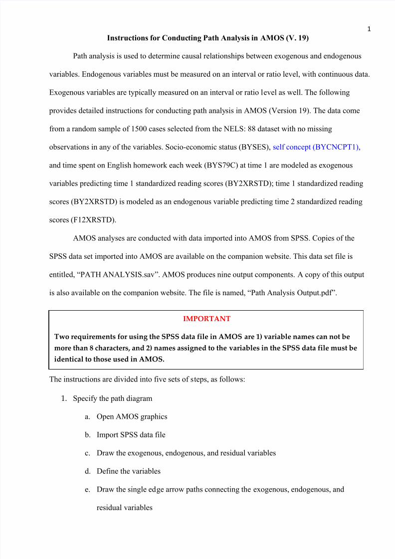
Model AIC BCC BIC CAIC
Default model 71.828 71.924 135.586 147.586
Saturated model 30.000 30.121 109.698 124.698
Independence model 2011.442 2011.482 2038.008 2043.008
To access output components in graphics format, click the View Output icon next to
the drawing area.
The estimated path diagram with the unstandardized regression estimates will be displayed.
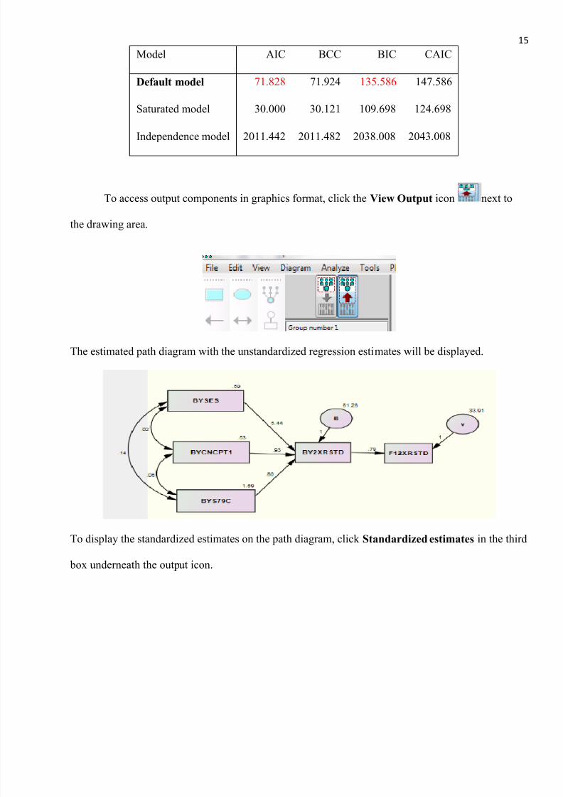
To display the standardized estimates on the path diagram, click Standardized estimates in the third
box underneath the output icon.
7/27/2019 Path Analysis Instructions
http://slidepdf.com/reader/full/path-analysis-instructions 16/16
16
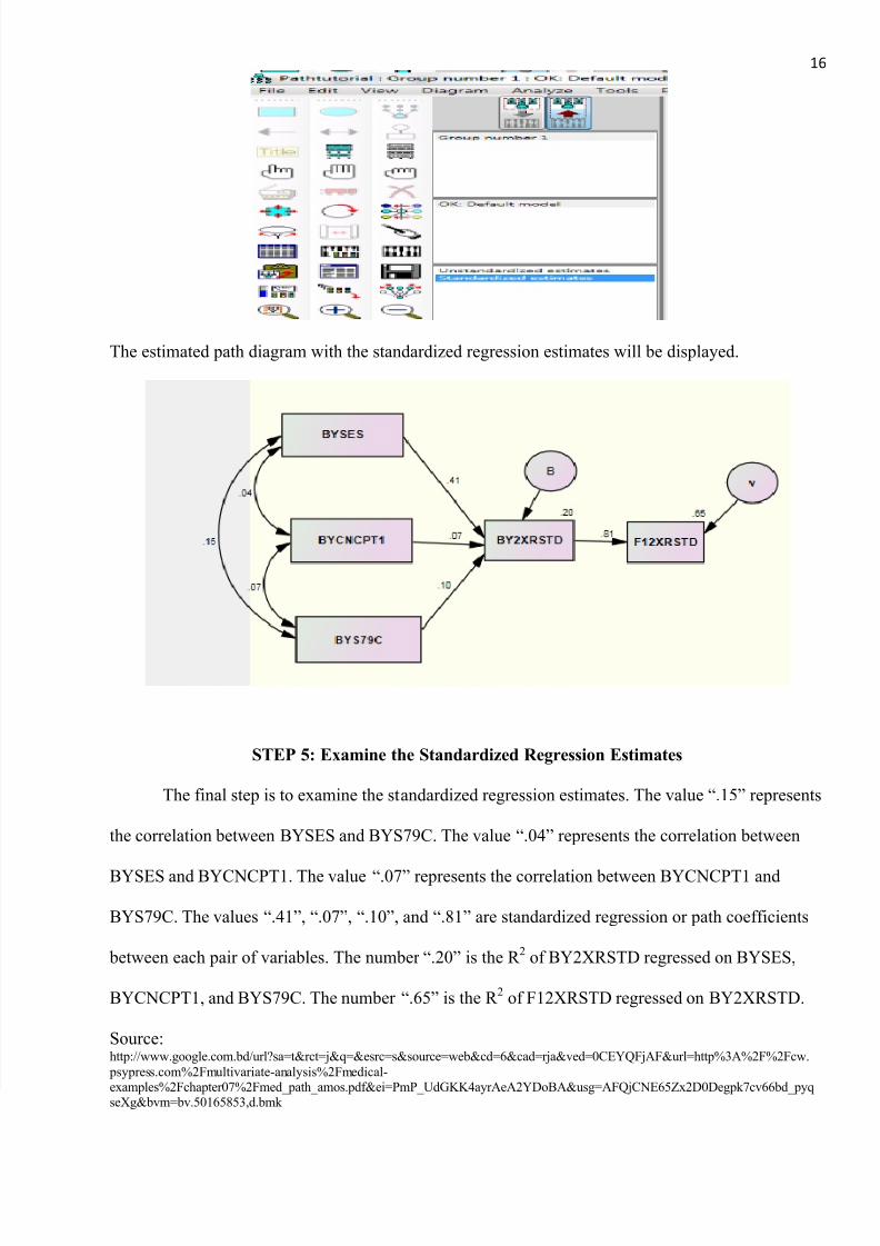
The estimated path diagram with the standardized regression estimates will be displayed.
STEP 5: Examine the Standardized Regression Estimates
The final step is to examine the standardized regression estimates. The value “.15” represents
the correlation between BYSES and BYS79C. The value “.04” represents the correlation between
BYSES and BYCNCPT1. The value “.07” represents the correlation between BYCNCPT1 and
BYS79C. The values “.41”, “.07”, “.10”, and “.81” are standardized regression or path coefficients
between each pair of variables. The number “.20” is the R 2 of BY2XRSTD regressed on BYSES,
BYCNCPT1, and BYS79C. The number “.65” is the R 2 of F12XRSTD regressed on BY2XRSTD.
Source:http://www.google.com.bd/url?sa=t&rct=j&q=&esrc=s&source=web&cd=6&cad=rja&ved=0CEYQFjAF&url=http%3A%2F%2Fcw.
psypress.com%2Fmultivariate-analysis%2Fmedical-
examples%2Fchapter07%2Fmed_path_amos.pdf&ei=PmP_UdGKK4ayrAeA2YDoBA&usg=AFQjCNE65Zx2D0Degpk7cv66bd_pyqseXg&bvm=bv.50165853,d.bmk