performance based learning and assessment taskradford.edu/rumath-smpdc/performance/src/amy...
TRANSCRIPT

Performance Based Learning and Assessment Task Connecting Scatter Plots and Correlation Coefficients Activity
I. ASSESSSMENT TASK OVERVIEW & PURPOSE: The students are instructed to collect data to create 6 linear scatter plots.(2 positive trends, 2 negative trends, and 2 no trends) The students will plot the scatter plots using the graphing calculator and/or Microsoft Excel, find the correlation coefficient, and make connections.
II. UNIT AUTHOR: Amy Corns, Patrick County High School, Patrick County Public Schools.
III. COURSE: Algebra I
IV. CONTENT STRAND: Statistics
V. OBJECTIVES: The student will be able to:
• Organize and collect data about the research topic • Sketch the graphs of the data • Plot the data using the graphing calculator in order to find the correlation
coefficient and/or Microsoft Excel. • Analyze the data to successfully express results and conclusions.
VI. REFERENCE/RESOURCE MATERIALS: Calculator, Laptop Cart, and/or Graph Paper
VII. PRIMARY ASSESSMENT STRATEGIES: Students will be graded on the accuracy of their conclusions and predictions connecting the correlation coefficient to the scatterplots. Students will also be assessed on the quality and neatness of their work. There will also be a self-assessment that will provide the student with a checklist and a rubric for the teacher.
VIII. EVALUATION CRITERIA: The self-assessment and teacher assessment will count 24 points each for a total of 48% of the overall score. The following rubric gives a detailed breakdown of the scoring for the assessment. The remaining 52% will be in the form of a benchmark assignment. The benchmark gives the point value for each question.
IX. INSTRUCTIONAL TIME: This activity is estimated to take 1 week from the date assigned, but only use 2 class blocks. (1 block to plan and organize the project. Students will be given 4 -5 days to collect the data outside of the instructional time. Then, 1 block to analyze and complete the project.)

2
Connecting Scatter Plots and Correlation Coefficient Activity
Strand Algebra I: Statistics Mathematical Objective(s) The goal of this activity is to review trends of scatter plots with students. This will also allow students to use higher level thinking skills to create their own examples of positive, negative, and no trends within the scatter plots. Furthermore, students will learn how to graph the data and find the correlation coefficient using the graphing calculator and/or Microsoft Excel. Finally, the student will be able to analyze their results and draw conclusions based on those results.
Related SOL
A.11 The student will collect and analyze data, determine the equation of the curve of best fit in order to make predictions, and solve real-world problems, using mathematical models. Mathematical models will include linear and quadratic functions.
8.13 The student will a) make comparisons, predictions, and inferences, using information displayed in graphs; and b) construct and analyze scatterplots.
NCTM Standards
• relate and compare different forms of representation for a relationship;
• interpret representations of functions of two variables
• draw reasonable conclusions about a situation being modeled.
Materials/Resources
• See attached data collection spreadsheet • See attached results benchmark • See attached TI Graphing Calculator Instructions • See attached Microsoft Excel Instructions • Graph Paper • Graphing Calculator
Assumption of Prior Knowledge • Students have basic knowledge of trends in Scatter Plots in 7th or 8th grade. • Students should be able to gather data and correctly plot the data on a coordinate grid. • Students may have difficulty entering the data into the graphing calculator and finding the
correlation coefficient. The teacher may need to have a written guide for students to follow with the keystroke entry process or the teacher may want to model the process prior to the assignment. Students may also have difficulty thinking of real world variables to compare

3
to create the scatter plots. The teacher will need to guide the groups by giving helpful hints and/or suggestions.
• The relevant contexts the student will encounter with this activity are: the trends connecting two real world variables and how to use the correlation coefficient to determine the line of best fit.
Introduction: Setting Up the Mathematical Task In this activity, you will investigate the relationship between the trends of scatter plots and the correlation coefficient. Each group will collect data from at least 10 different sources in order to create 6 different scatter plots. (2 positive trends, 2 negative trends, 2 no trends). The reason for creating two scatter plots for each trend is in case the data doesn’t conform to a specific trend or to support your hypothesis. Students will be divided into groups of 2 or 3 persons in each group. Groups will be chosen by the teacher based on student’s strengths and weaknesses. Below, you will find a detailed outline of what is specifically required.
Connecting Scatter Plots and Correlation Coefficient Activity:
1) Create 6 Real World Scatter Plots to depict 2 positive trends, 2 negative trends, and 2 no trends. You have 1 class day to discuss and plan your data collection. Positive Trend ________________________ vs ________________________ Positive Trend ________________________ vs ________________________ Negative Trend _______________________ vs ________________________ Negative Trend _______________________ vs ________________________ No Trend ____________________________ vs ________________________ No Trend ____________________________ vs ________________________
2) Gather the data – You have 4 days outside of class to collect this data or research the data. Each group will have to decide how to split up the workload of collecting the data outside of class. This can be done individually and the results can be returned to the group. See attached Data Collection Worksheet.
3) Complete results benchmark and self-assessment. See attached Benchmark. You have 1 class day to complete this task before turning in your final draft of your project. Do not forget to label and title your graphs.
Student Exploration Students will be working together in groups of 2-3 students in each group through-out this project. The teacher will be circulating and offering guidance when necessary. The teacher should listen for positive, negative and no trends being compared to a correlation coefficients of 1, -1, and/or 0. After the projects have been turned in for grading, the class will have a discussion about their findings and the conclusions that were drawn. The class will discuss the positive and negatives aspects from this assignment. Student/Teacher Actions:

4
• On day 1, students should be discussing which Real World examples will create positive, negative, and no trends. Teachers will listen carefully and make appropriate and encouraging suggestions and comments.
• On days 2-5, students should be gathering their data. Teachers should give daily timeline reminders to the students and answer questions.
• On day 6, students should be plotting their data, calculating the correlation coefficients and completing the attached benchmark. Teachers will troubleshoot any problems that occur and make suggestions to help guide students in the right direction.
• On day 7, all work should be turned in and class discussion should be held regarding the results of the project.
Monitoring Student Responses o Students are to communicate their thinking by asking questions to group members,
making suggestions, and being active listeners to others in the group. o Students are to communicate with each other in a supportive manner; o Teachers are to carefully clarify questions and provide possible problem-solving
strategies to overcome difficulties without giving the direct solutions to the students.
Assessment List and Benchmarks
• Students will complete each of the following:
1. Data Collection Worksheet for each of the 6 scatter plots. (6 Total Pages)
2. Benchmark
3. Self-Assessment

5
Connecting Scatter Plots and Correlation Coefficients Self/Teacher Assessment
Name:__________________________________
Date:_________________________Block______
NUM Element Point Value Self Teacher
1 Has the data been correctly entered into the
table?
3
2 Is the data organized and clear to understand? 3
3 Are there 6 Scatter Plots Completed? 3
4 Do the Scatter Plots reflect 2 positive trends, 2
negative trends, and 2 no trends?
3
5 Are the Scatter Plots labeled, titled, and
plotted correctly?
3
6 Are the Scatter Plots neat and organized? 3
7 Are the Correlation Coefficients calculated
accurately?
3
8 Were all elements of the benchmark
complete?
3
TOTAL 24

6
3 Points 2 Points 1 Point 0 Points Has the data been
correctly entered into
the table?
All data was entered
correctly into the table.
Almost all data was entered
correctly into the table.
Few data was entered
correctly into the table
No data was entered
correctly into the table.
Is the data organized
and clear to understand?
All data is organized and
clear to understand.
Most of the data is organized and
clear to understand.
Few of the data is organized and
clear to understand
The data is not organized nor
clear to understand.
Are there 6 Scatter Plots
Completed?
All 6 Scatter Plots are
completed
At least 4 of the scatter plots are
completed.
At least 2 of the scatter plots are
completed.
Less than 2 of the scatter plots are completed.
Do the Scatter Plots
reflect 2 positive trends,
2 negative trends, and 2
no trends?
In the 6 scatter plots, 2 reflect positive trends,
2 reflect negative
trends, and 2 reflect no
trends.
In the 6 scatter plots, most of the
scatter plots reflect the 3
different types of trends.
In the 6 scatter plots, few of the
scatter plots reflect the 3
different types of trends.
The 3 different types of trends
are not reflected in the 6 scatter plots.
Are the Scatter Plots
labeled, titled, and
plotted correctly?
All the scatter plots are
labeled, titled, and plotted correctly.
Most of the scatter plots are labeled, titled,
and plotted correctly.
Few of the scatter plots are labeled, titled,
and plotted correctly.
None of the scatter plots are labeled, titled,
and plotted correctly.
Are the Scatter Plots
neat and organized?
All of the scatter plots are neat and organized.
Most of the scatter plots are
neat and organized.
Few of the scatter plots are
neat and organized.
None of the scatter plots are
near nor organized.
Are the Correlation
Coefficients calculated
accurately?
All of the correlation
coefficients are calculated accurately.
Most of the correlation
coefficients are calculated accurately.
Few of the correlation
coefficients are calculated accurately.
None of the correlation
coefficients are calculated accurately.
Were all elements of the
benchmark complete?
All the elements of the
benchmark were complete.
Most of the elements of the benchmark were
complete.
Few of the elements of the
benchmark were complete.
None of the elements of the
benchmark were complete.
TOTAL
7
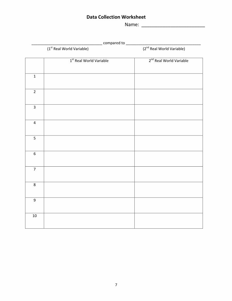
Data Collection Worksheet Name: ________________________
__________________________________ compared to ____________________________________ (1st Real World Variable) (2nd Real World Variable)
1st Real World Variable 2nd Real World Variable
1
2
3
4
5
6
7
8
9
10

8
Data Collection Worksheet
Name: _____________Example___________
___________Hours of Study Time__________ compared to _____________Course Grades__________ (1st Real World Variable) (2nd Real World Variable)
1st Real World Variable
Hours of Study Time(per week)
2nd Real World Variable
Course Grades 1 0 55
2 10 90
3 2 74
4 7 82
5 12 96
6 4 81
7 15 98
8 3 77
9 1 71
10 9 92

9
Connecting Scatter Plots to Correlation Coefficients Name: ___________________________ Algebra I Date:__________________Block_____ 1) Plot the first positive trend Scatter Plot below: (4 points)
2) What is the correlation coefficient for the data? ______________________________(2 points) 3) Plot the second positive trend scatter plot below: (4 points)

10
4) What is the correlation coefficient for the data? _______________________________ (2 points)
5) What connection do you notice between the positive trend scatter plots and the correlation coefficient? __________________________________________________________________________________________________________________________________________________________________________________________________________________________________( 2 points)
6) Which set of positive trend data has the line of best fit and why? __________________________ ____________________________________________________________________________________________________________________________________________________ (2 points)
7) Plot the first negative trend scatter plot below: (4 points)
8) What is the correlation coefficient for this data? _______________________________ (2 points)

11
9) Plot the second negative trend scatter plot below: (4 points)
10) What is the correlation coefficient for this data? ______________________________ (2 points)
11) What connection do you notice between the negative trend scatter plots and the correlation coefficient? ___________________________________________________________________ ____________________________________________________________________________________________________________________________________________________ (2 points)
12) Which set of negative trend data has the line of best fit and why? ________________________ ____________________________________________________________________________________________________________________________________________________ (2 points)

12
13) Plot the first no trend scatter plot below: (4 points)
14) What is the correlation coefficient for this data? ______________________________ (2 points) 15) Plot the second no trend scatter plot below: (4 points)

13
16) What is the correlation coefficient for this data? ______________________________ (2 points)
17) What connection do you notice between the scatter plot and the correlation coefficient? __________________________________________________________________________________________________________________________________________________________________________________________________________________________________ (2 points)
18) Is there a line of best fit from the no trend data and why? __________________________________________________________________________________________________________________________________________________________________________________________________________________________________ (2 points)
19) Summarize the conclusions you have drawn connecting the scatter plots to the correlation coefficients. Be specific. ________________________________________________________________________________________________________________________________________________________________________________________________________________________________________________________________________________________________________________ (2 points)
20) Based on what you learned from this activity, how can you use the correlation coefficients to determine the line of best fit? __________________________________________________________________________________________________________________________________________________________________________________________________________________________________ (2 points)
14
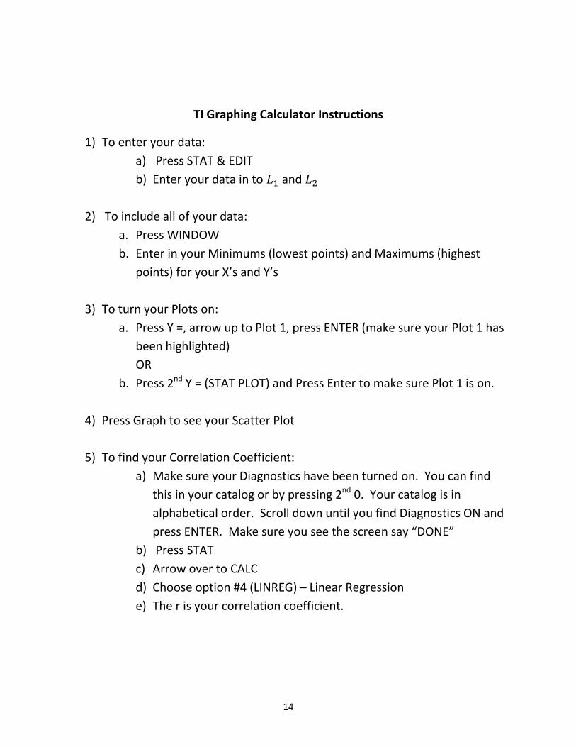
TI Graphing Calculator Instructions
1) To enter your data: a) Press STAT & EDIT b) Enter your data in to 𝐿1 and 𝐿2
2) To include all of your data:
a. Press WINDOW b. Enter in your Minimums (lowest points) and Maximums (highest
points) for your X’s and Y’s
3) To turn your Plots on: a. Press Y =, arrow up to Plot 1, press ENTER (make sure your Plot 1 has
been highlighted) OR
b. Press 2nd Y = (STAT PLOT) and Press Enter to make sure Plot 1 is on.
4) Press Graph to see your Scatter Plot
5) To find your Correlation Coefficient: a) Make sure your Diagnostics have been turned on. You can find
this in your catalog or by pressing 2nd 0. Your catalog is in alphabetical order. Scroll down until you find Diagnostics ON and press ENTER. Make sure you see the screen say “DONE”
b) Press STAT c) Arrow over to CALC d) Choose option #4 (LINREG) – Linear Regression e) The r is your correlation coefficient.
15
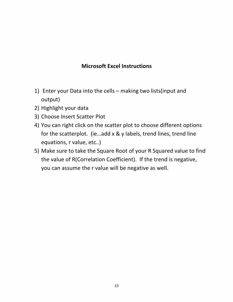
Microsoft Excel Instructions
1) Enter your Data into the cells – making two lists(input and output)
2) Highlight your data 3) Choose Insert Scatter Plot 4) You can right click on the scatter plot to choose different options
for the scatterplot. (ie…add x & y labels, trend lines, trend line equations, r value, etc..)
5) Make sure to take the Square Root of your R Squared value to find the value of R(Correlation Coefficient). If the trend is negative, you can assume the r value will be negative as well.

16

17

18

19

20

21

22
Connecting Scatter Plots to Correlation Coefficients
1) Plot the first positive trend Scatter Plot. 2) Make Hours of Study Time Course Gradessure to label and title your Scatter Plot and to find 0 55the R Squared Value. 10 90
2 747 82
12 964 81
15 983 771 719 92
3) Plot the second positive trend Scatter Plot. # of time one eats Outside Temp4) What is the correlation coefficient for this data? ice cream(per week)
3 553 704 504 855 605 908 959 100
5) What connection do you notice between thepositive trend scatter plots and the correlationcoefficient? Both of the positive trend scatter plotshave correlation coefficients close to 1.
6) Which set of positive trend data has the line ofbest fit? I believe the first set has a better line of best fit. The points would be closer to the line and correlation coefficient is closer to 1.
7) Plot the first negative trend Scatter Plot. # of Layers of ClothingOutside Temp8) What is the Correlation Coefficient? 1 100
2 952 853 933 904 755 805 696 558 459 359 30
10 20
9) Plot the second negative trend Scatter Plot. Hours Watching TV Grade Point Average10) What is the Correlation Coefficient? 1 4.3
2 4.54 45 3.7
11) What connection do you notice between the 6 4negative trend Scatter Plots and the correlation 8 3.7coefficient? Both negative trend scatter plots have 8 3correlation coefficients close to -1. 10 3.3
10 2.612) What set of negative trend data has the line of 12 2.5best fit and why? Although both seem to have good 12 2lines of fit, I believe the first one is better because 16 1.5correlation coefficient is closer to -1.
R² = 0.8606
0
20
40
60
80
100
120
0 2 4 6 8 1 0 1 2 1 4 1 6
HO
URS
OF
STU
DY
TIM
E(PE
R W
EEK)
COURSE GRADES
STUDY TI ME VS COURSE GRADES
R² = 0.5506
0
20
40
60
80
100
120
0 2 4 6 8 1 0O
UTS
IDE
TEM
PERA
TURE
ICE CREAM INTAKE (PER WEEK)
I CE CREAM I NTAKE VS OUTSI DE TEMPERATURE
R² = 0.9575
0
20
40
60
80
100
120
0 2 4 6 8 1 0
OU
TSID
E TE
MPE
RATU
RE
# OF LAYERS OF CLOTHING
LAYERS OF CLOTHI NG VS OUTSI DE TEMPERATURE
R² = 0.8965
00.5
11.5
22.5
33.5
44.5
5
0 2 4 6 8 1 0 1 2 1 4 1 6
GRA
DE
POIN
T AV
ERAG
E (G
PA)
HOURS WATCHING TV
HOURS WATCHI NG TV VS GPA

23
13) Plot the first no trend Scatter Plot. Ladies Shoe Size Hours Watching TV14) What is the Correlation Coefficient? 5 3
5 66 97 7
7.5 6.58 7
8.5 7.58.5 2.510 510 0
15) Plot the second no trend Scatter Plot16) What is the Correlation Coefficient? # of times Dining Out GPA
1 12 2.52 44 3.5
17) What connection do you notice between the 5 4.5Scatter Plot and the correlation coefficient? Both no 6 1.5trend scatter plots have correlation cofficients close 7 3to 0. 8 4.5
9 3.518) Is there are line of best fit and why? There is 10 5no line of best fit because neither variables are related to each other. The scatter plots support thiswith the data being scattered all across the graph.
19) Summarize the conclusions you have drawn connecting the Scatter Plots to the correlation coefficients. Be specific. Positive Trend correlation coefficients are close to 1. The closer it is to 1, thebetter and stronger the line of best fit. Negative trend coefficients are close to -1. The closer it is to -1, the stronger the correlation. No trend scatter plots correlation coefficients are close to 0.
20) Based on what you learned from this activity, how can you use the correlation coefficients to determine the line of best fit? The closer the correlation coefficient is to 1 or -1, the strongerthe line of best fit. The closer it is to 0, the weakerthe line is.
R² = 0.1303
0123456789
10
0 2 4 6 8 1 0 1 2
HO
URS
WAT
CHIN
G T
V
LADIES SHOE SIZE
LADI ES SHOE SI ZE VS HOURS WATCHI NG TV
R² = 0.2843
0
1
2
3
4
5
6
0 2 4 6 8 10 12
Grad
e Po
int A
vera
ge (G
PA)
# of times Dining Out
Dining Out vs Grade Point Average