photography project 1
DESCRIPTION
photography projectTRANSCRIPT
Photography – Project 1Aminat Sosanya
The Design BriefSlave magazine is a new international online photography, art, culture and fashion magazine that stands out from the crowd; every issue is eclectic, authentic and full of diversity. Several fashion stories are presented within each issue of the magazine. They are looking for a fresh new fashion story to run in the next issue. The editor will be particularly interested in the overall visual qualities of your 3 final outcomes as submissions for publication in the magazine.
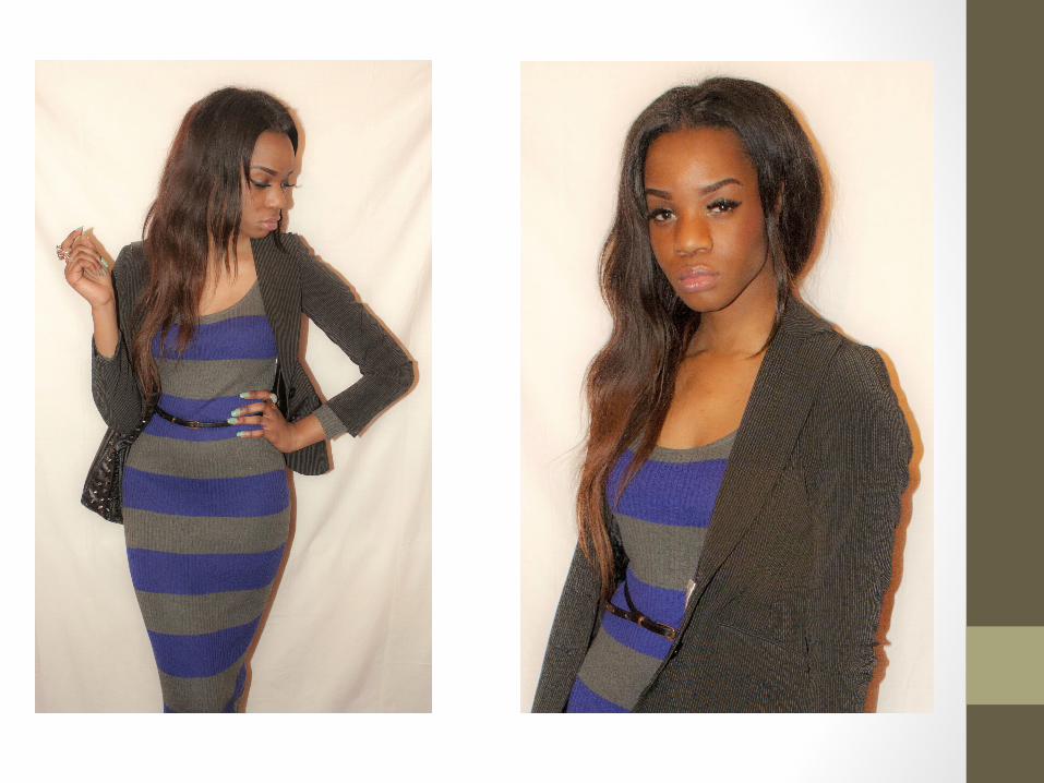
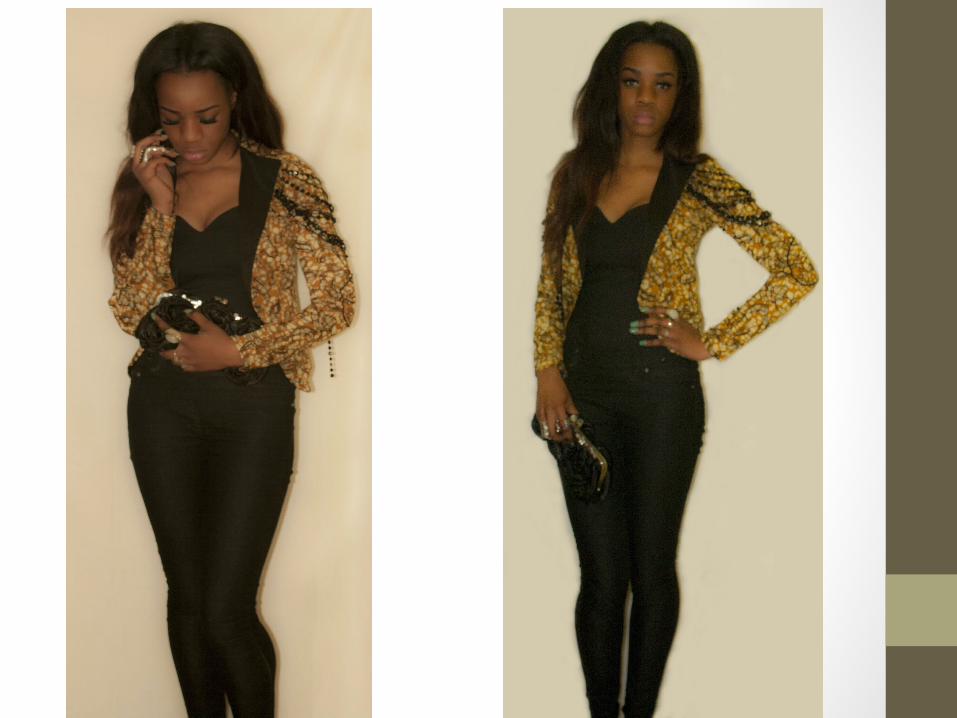
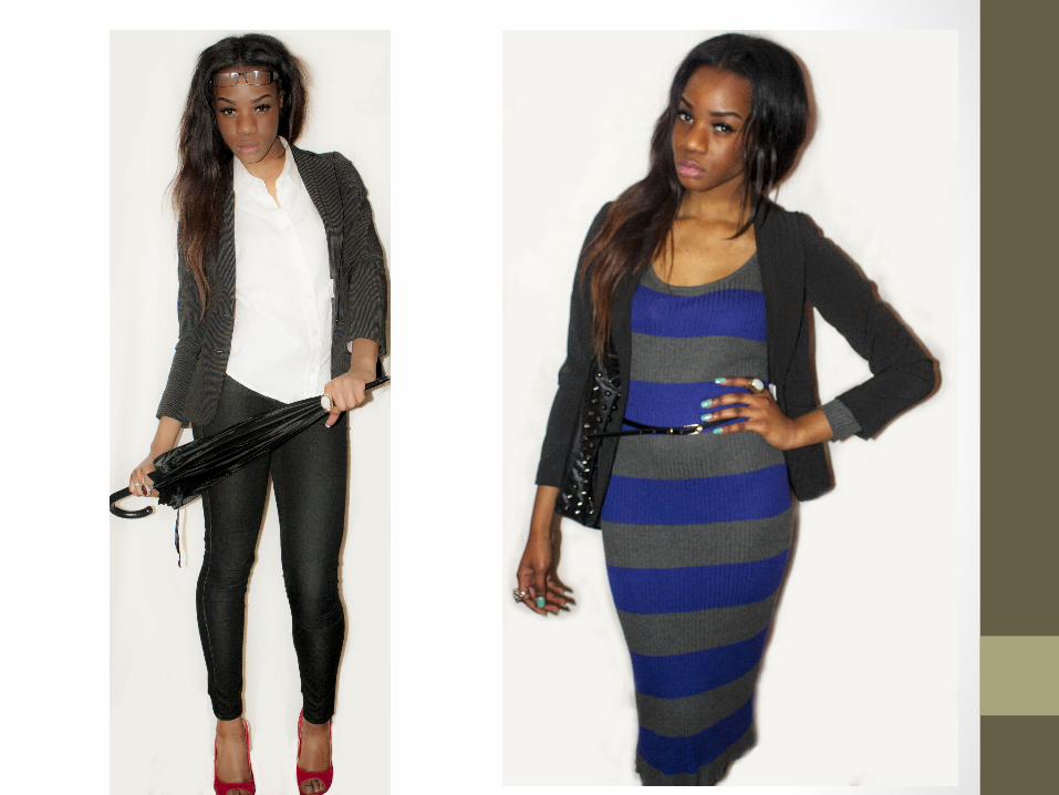
Plan for first Photographic shootMy idea was based around businesswomen. But I didn’t want it to be typical businesswomen photo shoot; I chose to incorporate fashion into it. So I made my model a fashionable businesswoman. I took inspiration from a celebrity ‘Olivia Palermo’, a popular businesswoman. So I concluded that my theme would ‘Power and Fashion’. My initial idea was to photography my model outside and in a car to make it look like to was off to work looking fashionable but unfortunately bad weather occurred at the time I wanted to go forward with the photo shoot therefore I had to produce my photo shoot in another location. I had all the props ready and outfits also. I decided to do the shoot inside my house because it was one of my only options. I made my own back white drop to keep the background clear and I used and empty corridor because it alternatively fit in with the theme. My cameral will be set on manual therefore I can change the aperture and ISO to what I want. And this also gives me a chance to learn more about the camera.
Artist Analysis
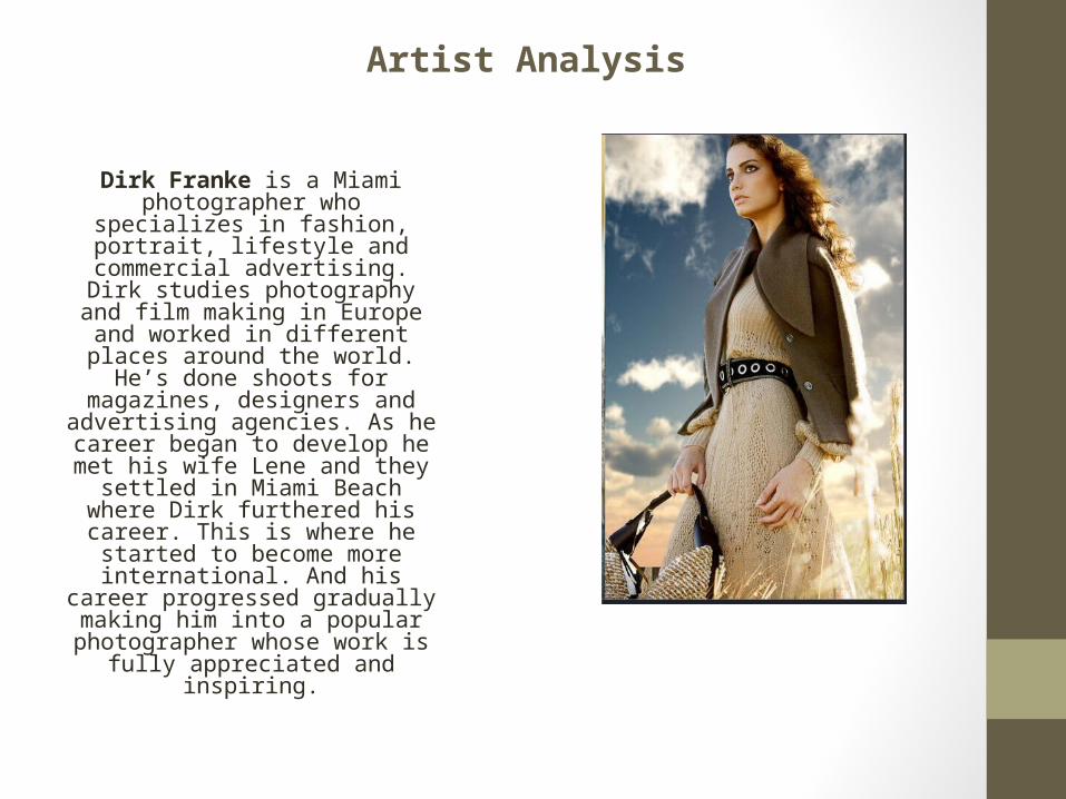
Dirk Franke is a Miami photographer who specializes in fashion, portrait, lifestyle and commercial advertising. Dirk studies photography and
film making in Europe and worked in different places
around the world. He’s done shoots for magazines,
designers and advertising agencies. As he career began
to develop he met his wife Lene and they settled in Miami Beach where Dirk
furthered his career. This is where he started to become more international. And his career progressed gradually making him into a popular
photographer whose work is fully appreciated and
inspiring.
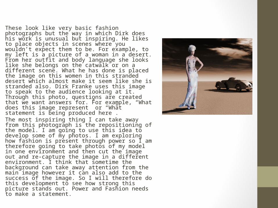
These look like very basic fashion photographs but the way in which Dirk does his work is unusual but inspiring. He likes to place objects in scenes where you wouldn’t expect them to be. For example, to my left is a picture of a woman in a desert. From her outfit and body language she looks like she belongs on the catwalk or on a different scene. What he has done is placed the image on this women in this stranded desert which almost make it seem like she is stranded also. Dirk Franke uses this image to speak to the audience looking at it. Through this photo, questions are created that we want answers for. For example, “What does this image represent” or “What statement is being produced here”. The most inspiring thing I can take away from this photograph is the repositioning of the model. I am going to use this idea to develop some of my photos. I am exploring how fashion is present through power so I am therefore going to take photos of my model in one environment and then cut the image out and re-capture the image in a different environment. I think that sometime the background can take away attention from the main image however it can also add to the success of the image. So I will therefore do this development to see how strong this picture stands out. Power and Fashion needs to make a statement.
Artist Analysis 2
Mario Testino is one of the world’s leading photographers. His
cultural and commercial photography has made him extremely successful in the creative fashion and beauty
department of photography. His work has been featured worldwide in magazine from Vogue to Vanity
Fair. His photography really contributes to the success of all
these magazines too.
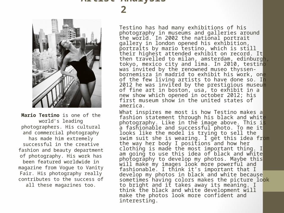
Testino has had many exhibitions of his photography in museums and galleries around the world. In 2002 the national portrait gallery in london opened his exhibition, portraits by mario testino, which is still their highest attended exhibit on record. It then travelled to milan, amsterdam, edinburgh, tokyo, mexico city and lima. In 2010, testino was invited by the renowned museo thyssen-bornemisza in madrid to exhibit his work, one of the few living artists to have done so. In 2012 he was invited by the prestigious museum of fine art in boston, usa, to exhibit in a new show which opened in october 2012; his first museum show in the united states of america. What inspires me most is how Testino makes a fashion statement through his black and white photography. Like in the image above. This is a fashionable and successful photo. To me it looks like the model is trying to sell the swim suit she is wearing. I get this idea from the way her body I positions and how her clothing is made the most important thing. I am going to use this idea of black and white photography to develop my photos. Maybe this will make my images look more powerful and fashionable. I think it’s important that I develop my photos in black and white because sometimes having colors makes the picture look to bright and it takes away its meaning. I think the black and white development will make the photos look more confident and interesting.
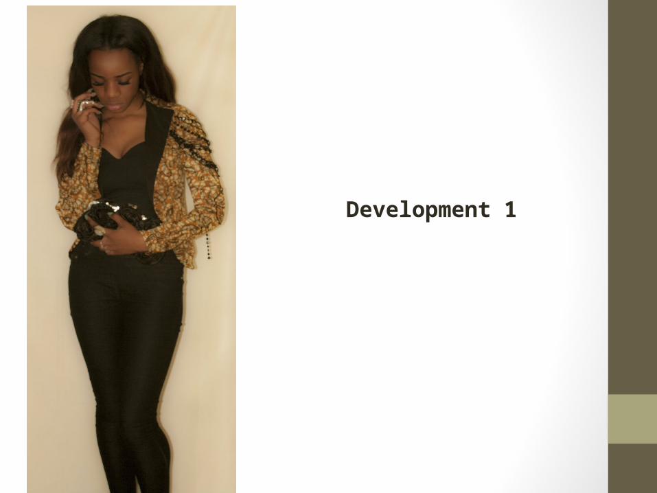
Development 1
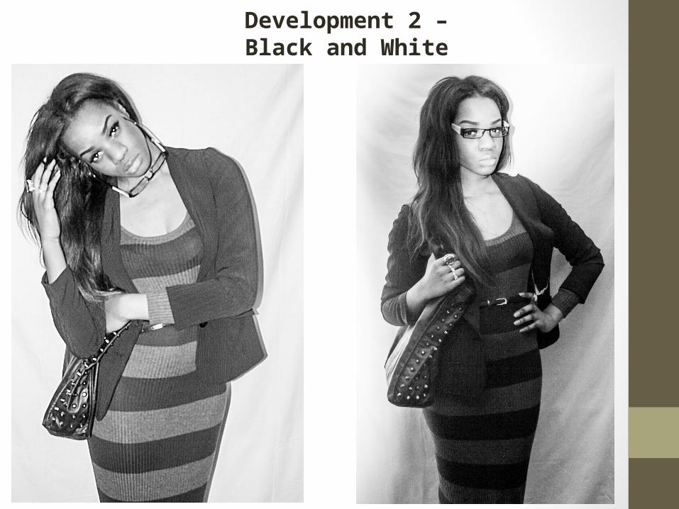
Development 2 – Black and White
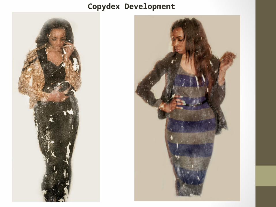
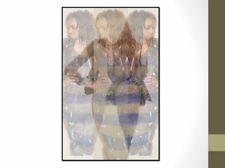
Copydex Development
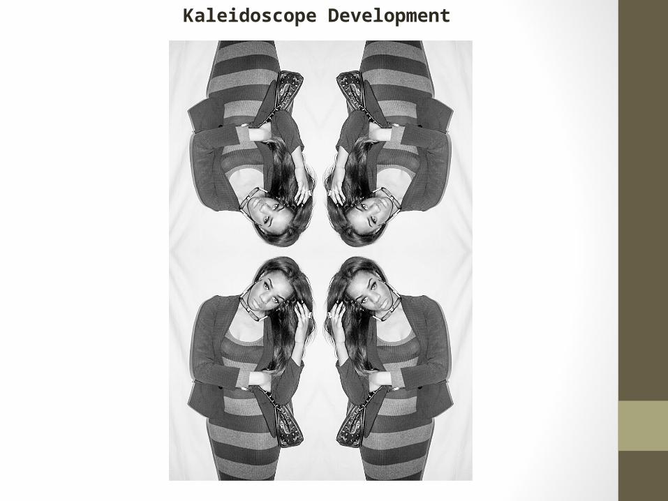
Kaleidoscope Development
Further Development
Evaluation
Evaluation of initial Photographs for Design Brief
My ideas to base my photo shoot on the theme of ‘Power and Fashion’ was simply to prove that businesswomen don’t live under a limited fashion lifestyle. I wanted to show that businesswomen can still be high-fashioned even though they work in the business industry. I wanted to be able to show that your style can represent how dedicated you are in what you do. It is important that my ideas fit in with the brief. I am not 100% happy with the technical qualities of my photographs though I think they look rather good. When I took the photographs I made sure that I controlled the ISO and the aperture. My decision to photograph my model on a blank background came from the idea that I wanted to her to be center of attention so I made sure not to have any distractions in the background. I took a variety of images. Some were of my model from head-to-toes and others were from her waist and above. Sometimes I wanted her facial expressions to do the talking and other times I allowed her outfit to do the talking. What was impressive was the way my model sometimes looked as if she was selling the outfit. Her facial expressions and body language really added to the success of the photo shoot/photographs. I tried my best to consider how I use positive and negative space and how I positioned my model at all times. Myself and model both worked together to produce successful images. However I am not too impressed with my second photographic shoot. I feel like I held back and didn’t allow my ideas to shine through. Meaning my development ideas need to be on point to bring a statement to my images. I would say that I am pleased with the work I have improved so far though there is room for improvement. The editing process did take a while though it really helped with the development of my images; I definitely think I have made my photos more interesting. The qualities of my photos are decent. I have identified what I did wrong and I know what I need to improve on for next time.
Evaluation of Development Photographs for Design Brief
I am impressed with the results of my copy-dex development however I kind of think it takes away the meaning of the images to a certain extent. I made the photos look distressed and gave them a vintage look. This relates to some of the opinions people have of hardworking businesswomen. Often people think that these hardworking women age quickly and a stressed a lot; therefore using copy-dex on these images shows what could happen to hardworking businesswomen. It’s like emotions are shown through the images. What amused me was the way the outfit were really visible after making the images look distressed. I think my idea to do this turned out effectively well. The copy-dex worked well with the point I was trying to make. Also, through developing another 2images, making them black and white linked to the vintage aspect of the vintage look I wanted to create. This development highlighted parts of the photographs making them have more significance. The images like they have an old edge to it. I am pleased with the way they still look powerful and fashionable at the same time. I feel as if these developments actually make the theme more successful. I also made one of my images into a kaleidoscope…I would say that I am happy with how my developments turned out and the quality of them. They will help efficiently with the development of my final piece. And this would look good with the magazine content.