photoshop tests
TRANSCRIPT
Photoshop Tests
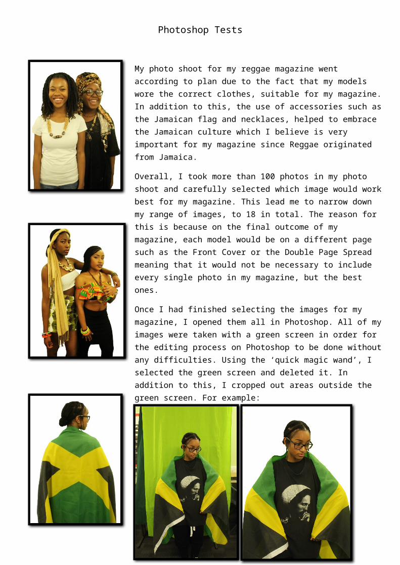
My photo shoot for my reggae magazine went according to plan due to the fact that my models wore the correct clothes, suitable for my magazine. In addition to this, the use of accessories such as the Jamaican flag and necklaces, helped to embrace the Jamaican culture which I believe is very important for my magazine since Reggae originated from Jamaica.
Overall, I took more than 100 photos in my photo shoot and carefully selected which image would work best for my magazine. This lead me to narrow down my range of images, to 18 in total. The reason for this is because on the final outcome of my magazine, each model would be on a different page such as the Front Cover or the Double Page Spread meaning that it would not be necessary to include every single photo in my magazine, but the best ones.
Once I had finished selecting the images for my magazine, I opened them all in Photoshop. All of my images were taken with a green screen in order for the editing process on Photoshop to be done without any difficulties. Using the ‘quick magic wand’, I selected the green screen and deleted it. In addition to this, I cropped out areas outside the green screen. For example:
In this image, you can see parts of the classroom outside the green screen, such as the floor and tables. This overall lead me to crop them out in order to simplify the editing process by simply removing the green screen. The same applied to the rest of the 17 images which I selected.
To conclude, the removal of the green screen for all 18 images was successful because during the photo shoot, I made sure that my models were compositioned in the middle of the frame in order to avoid being outside the green screen. Once this was completed, I focused on my front cover.
Photoshop TestsFront Cover
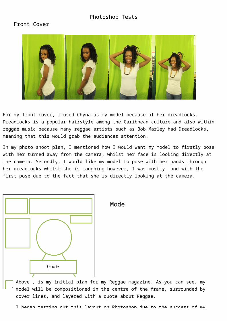
For my front cover, I used Chyna as my model because of her dreadlocks. Dreadlocks is a popular hairstyle among the Caribbean culture and also within reggae music because many reggae artists such as Bob Marley had Dreadlocks, meaning that this would grab the audiences attention.
In my photo shoot plan, I mentioned how I would want my model to firstly pose with her turned away from the camera, whilst her face is looking directly at the camera. Secondly, I would like my model to pose with her hands through her dreadlocks whilst she is laughing however, I was mostly fond with the first pose due to the fact that she is directly looking at the camera.
Quote
Date and Price
Bar Code Plugs
Model
Above , is my initial plan for my Reggae magazine. As you can see, my model will be compositioned in the centre of the frame, surrounded by cover lines, and layered with a quote about Reggae.
I began testing out this layout on Photoshop due to the success of my images that were taken for my photo shoot.

Photoshop Tests
The masthead ‘One Love’ is layered beneath the model whereas the quote is underneath the model. During the editing process of my magazine, I decided to not make my model fit the entire frame of magazine, like my initial plan, or else the cover lines would overlay her, which is not what I want. In addition to this, I cropped half of my model’s body in order for her face to stand out more on the front cover however, because the quotes is layered underneath my model, I applied the rubber tool on my models arm, and rubbed out her half of her arm. I changed the softness of the rubber in order for the mark of the rubber to not be visibly clear. Overall this turned out successful due to the fact that the quote hides the faded lines on my models body, causing the audience to be unaware that I rubbed out a small area of my models body. In addition to this, despite the fact that I did not want my model to fit the entire frame of the magazine, she still stands out of on the front cover due to the fact that she is compositioned in the centre of the frame and is looking directly at
Secondly, on Photoshop, I was contemplating on the type of background I should use. I decided to go with a gradient background however I tested this out with Rasta colours. The Rasta colours are Green, Yellow and Red. For my first test, I used Green and Yellow whereas for my second test, I used the colour Red and Yellow. Overall, I was more satisfied with the red background since it is a more bold colour. In addition to this, I made sure that the yellow was in the centre of the frame due to the fact that it would therefore surround my model,
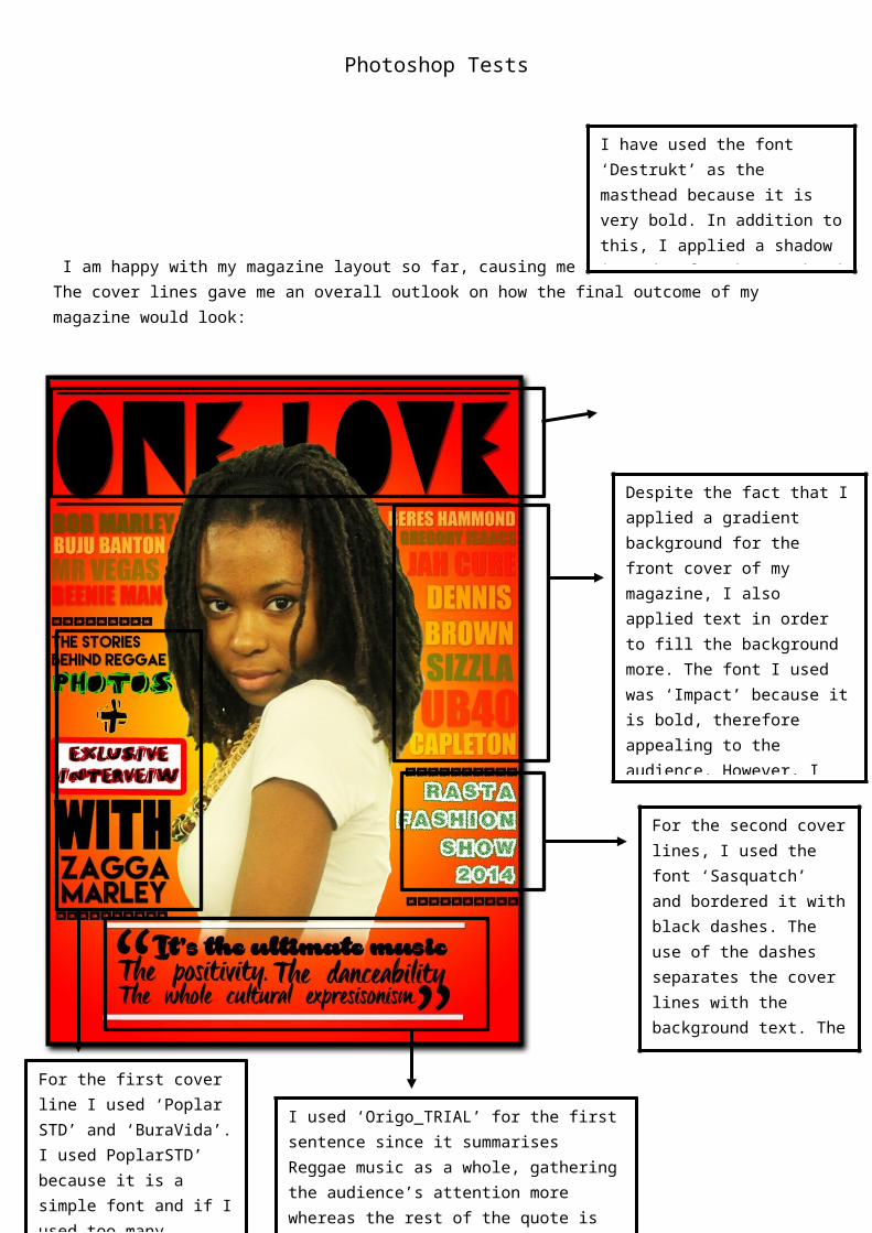
Photoshop Tests I am happy with my magazine layout so far, causing me to add the cover lines. The cover lines gave me an overall outlook on how the final outcome of my magazine would look:
Despite the fact that I applied a gradient background for the front cover of my magazine, I also applied text in order to fill the background more. The font I used was ‘Impact’ because it is bold, therefore appealing to the audience. However, I changed the opacity of the text to avoid too much attention from the audience, due to the fact that it’s important for the audience to focus on the content of the magazine.
For the second cover lines, I used the font ‘Sasquatch’ and bordered it with black dashes. The use of the dashes separates the cover lines with the background text. The dashes also highlight towards the audience how the cover line is an important feature towards the magazine.
I used ‘Origo_TRIAL’ for the first sentence since it summarises Reggae music as a whole, gathering the audience’s attention more whereas the rest of the quote is in ‘Rakoon Personal Use’. I added a white border around the text in order for the quote to stand out more to the audience.
I have used the font ‘Destrukt’ as the masthead because it is very bold. In addition to this, I applied a shadow in order for the masthead to have more depth, gaining the audience’s attention.
For the first cover line I used ‘Poplar STD’ and ‘BuraVida’. I used PoplarSTD’ because it is a simple font and if I used too many different fonts, it might be too distracting for the audience. On the other hand, I used ‘BuraVida’ to emphasize the special features on the magazine. The use of the white text box, bordered with red, highlights it’s importance. This links to why Zagga Marley’s names is in a large size on the front