planning and statistics advizor training planning and statistics v.1 1 advizor tips
Post on 19-Dec-2015
216 views
TRANSCRIPT

V.1 1
Planning and StatisticsPlanning and StatisticsADVIZOR TRAININGADVIZOR TRAININGPLANNING AND STATISTICS
ADVIZOR Tips

V.1 2
Planning and StatisticsPlanning and StatisticsADVIZOR TRAININGADVIZOR TRAININGPLANNING AND STATISTICS
Visuals > Perspectives > Dashboards
ADVIZORVisuals
ADVIZORPerspectives
ADVIZORDashboards
12 visual
components
solve any
data display
need
Combinations ofVisuals
that addressspecific
businessissues
Combinations of
Perspectives
that address the
performance needs
of a business unit

V.1 3
Planning and StatisticsPlanning and StatisticsADVIZOR TRAININGADVIZOR TRAININGPLANNING AND STATISTICS
The DashboardPerspectives (pages)
Tools and Tool Bar
Visuals

V.1 4
Planning and StatisticsPlanning and StatisticsADVIZOR TRAININGADVIZOR TRAININGPLANNING AND STATISTICS
Tools and Tool Bar
Allows you to reset the project
Allows you to export the project as an Adobe PDF file
Allows you to export the project to Microsoft Word
Allows you to share the project as a web archive
Allows you to select all
Allows you to Unselect all
Allows you to Toggle the selection
Excludes the Selected
Excludes Unselected
Restores the excluded
Shows where you are
Shows colour legend
Help!

V.1 5
Planning and StatisticsPlanning and StatisticsADVIZOR TRAININGADVIZOR TRAININGPLANNING AND STATISTICS
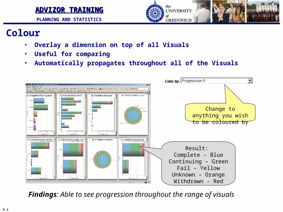
Colour• Overlay a dimension on top of all Visuals• Useful for comparing• Automatically propagates throughout all of the Visuals
Findings: Able to see progression throughout the range of visuals
Change to anything you wish to be coloured by
Result: Complete – Blue
Continuing – GreenFail – Yellow
Unknown – OrangeWithdrawn - Red

V.1 6
Planning and StatisticsPlanning and StatisticsADVIZOR TRAININGADVIZOR TRAININGPLANNING AND STATISTICS
PAGES
View different results throughout the different pages
All filtering and colouring continue throughout the pages. With the different pages you are able to see different trends and
patterns. It allows you to see a range of different visuals on the population you have selected.

V.1 7
Planning and StatisticsPlanning and StatisticsADVIZOR TRAININGADVIZOR TRAININGPLANNING AND STATISTICS
Visuals
Bar Chart
Count
DataConstellation
ParaboxMultiscape
Scatterplot
Line Chart
Histogram
Data SheetPie Chart
Time Table
Map
• 12 Available Visuals

V.1 8
Planning and StatisticsPlanning and StatisticsADVIZOR TRAININGADVIZOR TRAININGPLANNING AND STATISTICS
Bar Chart• Aggregates one or more metrics across
the discrete values of a field and displays entities as bars
• Typically used for filtering, correlation, trending across subpopulations
• Commonly used features– Weighting
• By another field’s values• By the average of another field’s values• By the ratio of two other fields
– Stacked colors– Bar ordering– Zoom and pan– Orientation– Goal lines– Normalization– Animation– Change Fonts and Titles

V.1 9
Planning and StatisticsPlanning and StatisticsADVIZOR TRAININGADVIZOR TRAININGPLANNING AND STATISTICS
Spine Plot• Allows you to see things as a %• The Height of the bar giving you the size of the
population• The length of the bar giving you the % of the
selected.

V.1 10
Planning and StatisticsPlanning and StatisticsADVIZOR TRAININGADVIZOR TRAININGPLANNING AND STATISTICS
Pie Chart• Aggregates one or more metrics across the
discrete values of a field and displays entities as wedges in a pie
• Typically used to see relative proportions of values in a field– For example, proportion of sales from
the USA• Commonly used features
– Weighting• By another field’s values• By the average of another field’s values• By the ratio of two other fields
– Stacked colors– Wedge ordering– Rotation– Explosion– Animation control– Change Fonts and Titles– 3-D rendering

V.1 11
Planning and StatisticsPlanning and StatisticsADVIZOR TRAININGADVIZOR TRAININGPLANNING AND STATISTICS
Map
• Displays data values plotted on a map• Typically used to highlight a geographical
dimension in the data– Often used to show relationships
between geographical elements (e.g., air traffic between cities)
• Commonly used features– Images in bitmap and/or vector
form– Display as Globe– Map node size, node height, link
thickness to a metric– Map color, node style, link style to
a dimension– Directional links– Zooming– Rotation– Customize labels
V.1 12
Planning and StatisticsPlanning and StatisticsADVIZOR TRAININGADVIZOR TRAININGPLANNING AND STATISTICS
Colour• Overlay a dimension on top of all Visuals• Useful for comparing• Automatically propagates throughout all of the Visuals
Findings: Able to see progression throughout the range of visuals
Change to anything you wish to be coloured by
Result: Complete – Blue
Continuing – GreenFail – Yellow
Unknown – OrangeWithdrawn - Red

V.1 13
Planning and StatisticsPlanning and StatisticsADVIZOR TRAININGADVIZOR TRAININGPLANNING AND STATISTICS
Colour• Changing colour gives you a different view of the data
Finding: All students studying at PCET Centers are from the School of Education and Training
Colour by SchoolAll visuals broken up into the
school colours
Colour by HESA LevelAll visuals broken up into the
school to show either Full-time students and Part-time students
Finding: School of Humanities has very few PT students

V.1 14
Planning and StatisticsPlanning and StatisticsADVIZOR TRAININGADVIZOR TRAININGPLANNING AND STATISTICS
ADVIZOR DashboardsLinked Perspectives
Product Perspective
Product Trends Perspective
…Linked by Color
V.1 15
Planning and StatisticsPlanning and StatisticsADVIZOR TRAININGADVIZOR TRAININGPLANNING AND STATISTICS
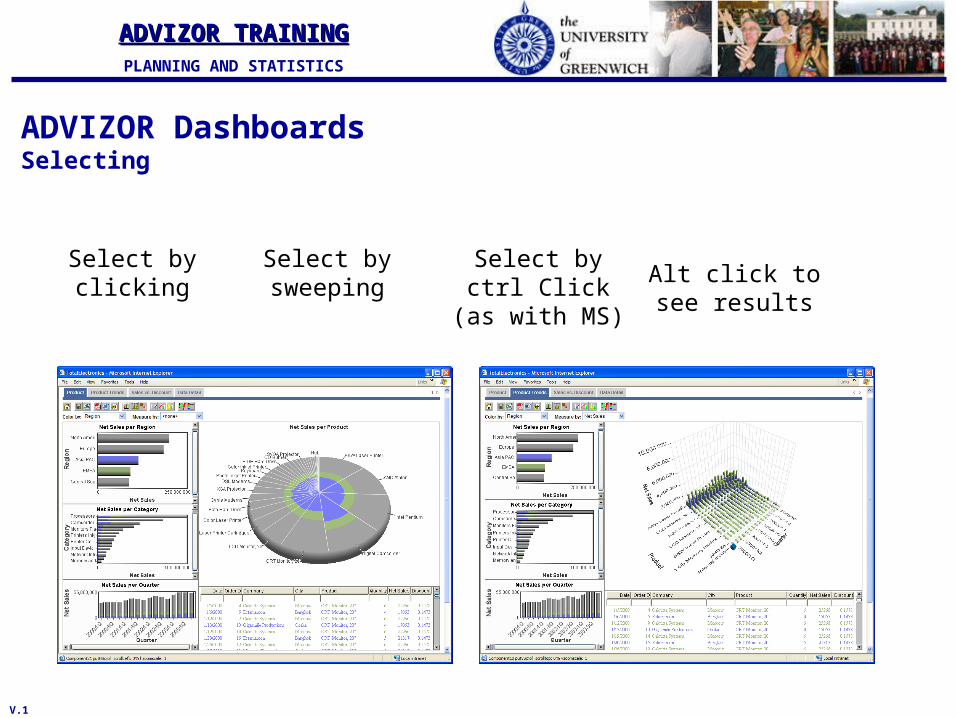
ADVIZOR DashboardsSelecting
Select by clicking
Select by sweeping
Select by ctrl Click (as with
MS)
Alt click to see results

V.1 16
Planning and StatisticsPlanning and StatisticsADVIZOR TRAININGADVIZOR TRAININGPLANNING AND STATISTICS
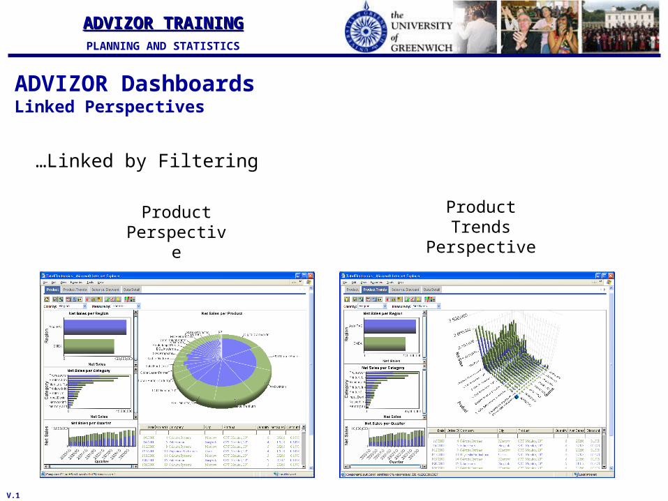
ADVIZOR DashboardsLinked Perspectives
Product Perspective
Product Trends Perspective
…Linked by Selection
V.1 17
Planning and StatisticsPlanning and StatisticsADVIZOR TRAININGADVIZOR TRAININGPLANNING AND STATISTICS
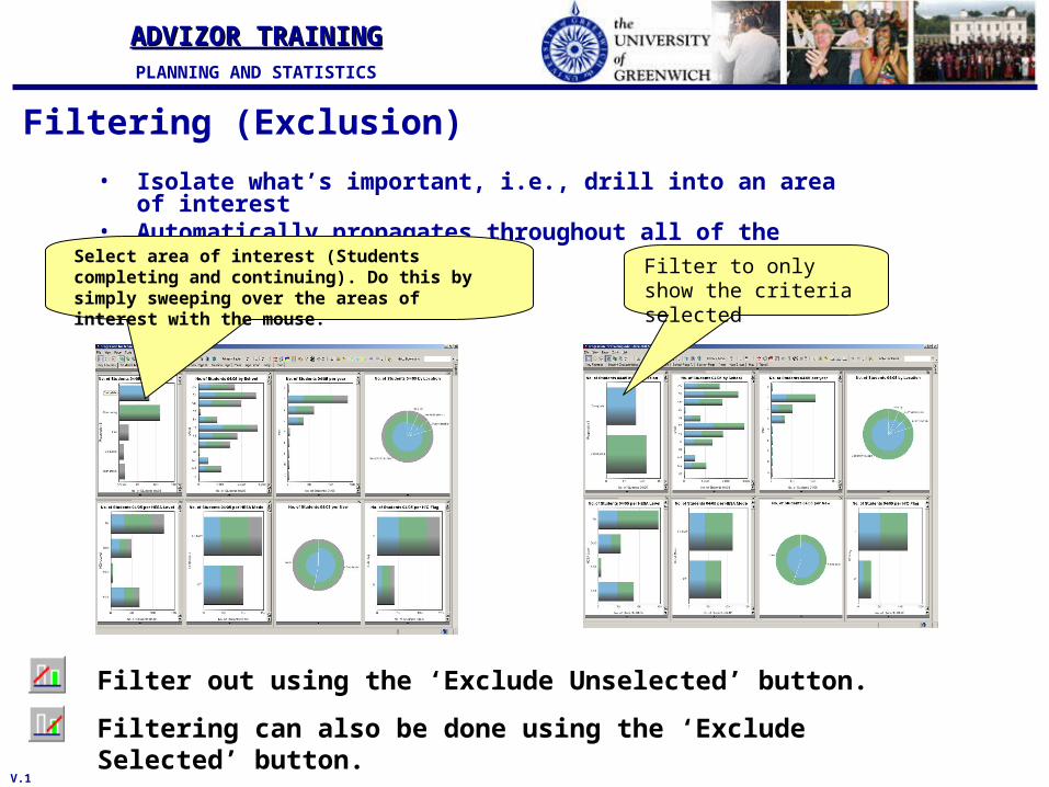
Filtering (Exclusion)
• Isolate what’s important, i.e., drill into an area of interest
• Automatically propagates throughout all of the VisualsSelect area of interest (Students completing and continuing). Do this by simply sweeping over the areas of interest with the mouse.
Filter to only show the criteria selected
Filter out using the ‘Exclude Unselected’ button.
Filtering can also be done using the ‘Exclude Selected’ button.
V.1 18
Planning and StatisticsPlanning and StatisticsADVIZOR TRAININGADVIZOR TRAININGPLANNING AND STATISTICS
ADVIZOR DashboardsLinked Perspectives
Product Perspective
Product Trends Perspective
…Linked by Filtering

V.1 19
Planning and StatisticsPlanning and StatisticsADVIZOR TRAININGADVIZOR TRAININGPLANNING AND STATISTICS
Drilling
• Drill down to see finer detail of the results
Once a school is selected, and the others filtered out
You can then drill down to see department level, then again to programme and again to programme number if you wish

V.1 20
Planning and StatisticsPlanning and StatisticsADVIZOR TRAININGADVIZOR TRAININGPLANNING AND STATISTICS
Resetting• You can reset the project by either:
1. Restoring excluded 2. Selecting all

V.1 21
Planning and StatisticsPlanning and StatisticsADVIZOR TRAININGADVIZOR TRAININGPLANNING AND STATISTICS
Results Sharing and ExportExport these transactions (our “result set”) to text file, Excel,
Business Objects Reporting, etc. for Action
Save/publish images to clipboard, PowerPoint, etc. for
results sharing
Capture images, save result set of your analysis

V.1 22
Planning and StatisticsPlanning and StatisticsADVIZOR TRAININGADVIZOR TRAININGPLANNING AND STATISTICS
Good Practice
• In order to maximise your productivity using Advizor it is important to know what you are going to query. Therefore before starting a series of analysis ensure you:– Know what analysis you want to complete
• Where you are going to start• What results you expect to see• What steps you are going to take to get your result
– Write down your selection criteria i.e. What population you wan to use e.g.• Undergraduate students only• Full-Time Undergraduates• New Students….