plotting and graphics options in...
TRANSCRIPT
PLOTTING AND GRAPHICS
OPTIONS IN MATHEMATICAIn addition to being a powerful programming tool, Mathematica allows a wide array of plottingand graphing options. We will look at a variety of these, starting with the Plot command.
The examples shown below merely scratch the surface of what you can do with Mathematica. Iurge you to use the online Documentation Center (Doc Center as I refer to it throughout thewrite up) to see the range of possibilities with some very nice examples. This is intended to getyou started; the best way to learn is through trial and error.
The Plot Command
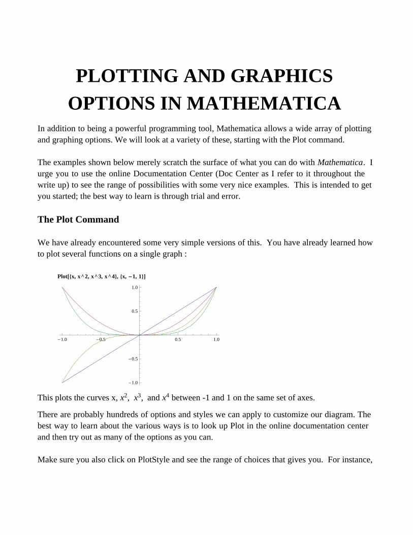
We have already encountered some very simple versions of this. You have already learned howto plot several functions on a single graph :
Plotx, x^2, x^3, x^4, x, -1, 1
-1.0 -0.5 0.5 1.0
-1.0
-0.5
0.5
1.0
This plots the curves x, x2, x3, and x4 between -1 and 1 on the same set of axes.
There are probably hundreds of options and styles we can apply to customize our diagram. Thebest way to learn about the various ways is to look up Plot in the online documentation centerand then try out as many of the options as you can.
Make sure you also click on PlotStyle and see the range of choices that gives you. For instance,
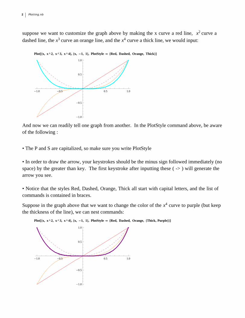
suppose we want to customize the graph above by making the x curve a red line, x2 curve a
dashed line, the x3 curve an orange line, and the x4 curve a thick line, we would input:
Plotx, x^2, x^3, x^4, x, -1, 1, PlotStyle Æ Red, Dashed, Orange, Thick
-1.0 -0.5 0.5 1.0
-1.0
-0.5
0.5
1.0
And now we can readily tell one graph from another. In the PlotStyle command above, be awareof the following :
• The P and S are capitalized, so make sure you write PlotStyle
• In order to draw the arrow, your keystrokes should be the minus sign followed immediately (nospace) by the greater than key. The first keystroke after inputting these ( -> ) will generate thearrow you see.
• Notice that the styles Red, Dashed, Orange, Thick all start with capital letters, and the list ofcommands is contained in braces.
Suppose in the graph above that we want to change the color of the x4 curve to purple (but keepthe thickness of the line), we can nest commands:
Plotx, x^2, x^3, x^4, x, -1, 1, PlotStyle Æ Red, Dashed, Orange, Thick, Purple
-1.0 -0.5 0.5 1.0
-1.0
-0.5
0.5
1.0
2 Plotting.nb
So the fourth command is nested; if we want a thick, dashed, purple line, we can :
Plotx, x^2, x^3, x^4, x, -1, 1, PlotStyle Æ Red, Dashed, Orange, Thick, Dashed, Purple
-1.0 -0.5 0.5 1.0
-1.0
-0.5
0.5
1.0
and you get the idea.
AspectRatio
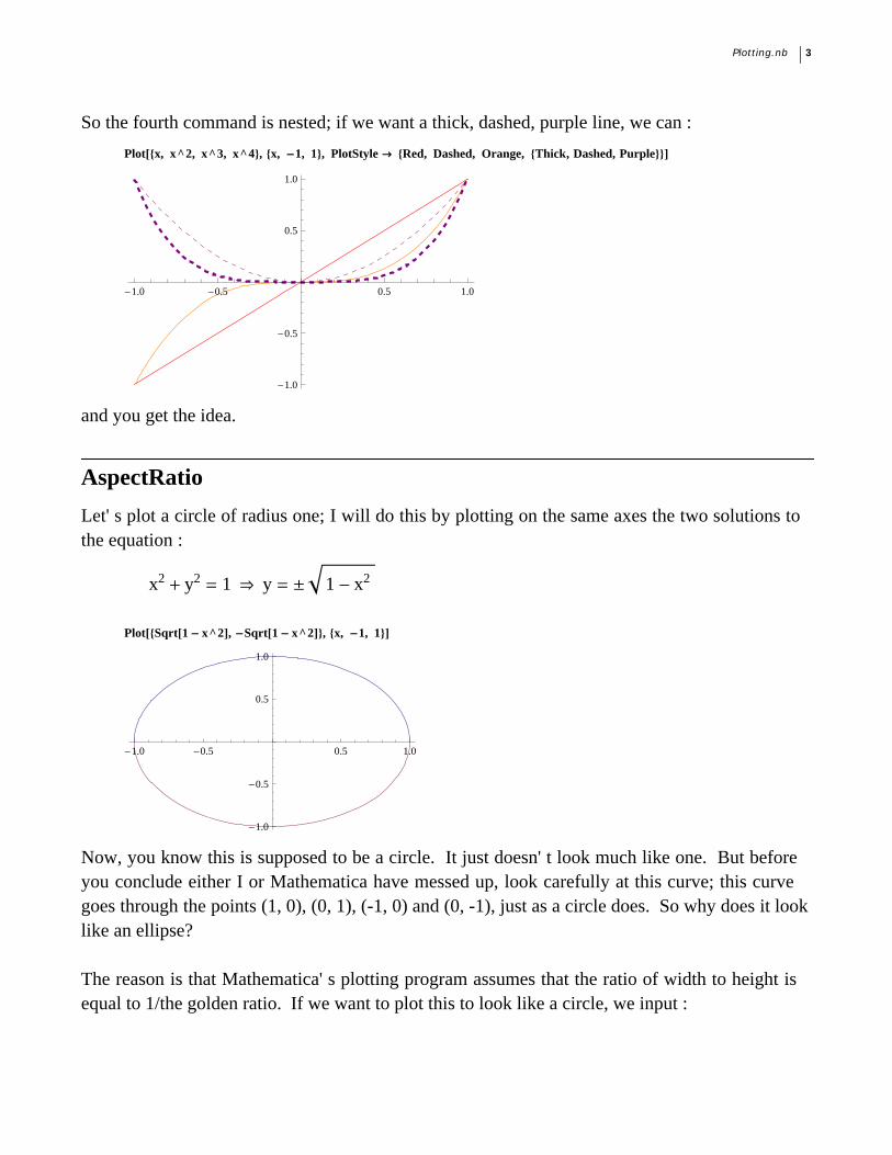
Let' s plot a circle of radius one; I will do this by plotting on the same axes the two solutions tothe equation :
x2 + y2 = 1 fl y = ≤ 1 - x2
PlotSqrt1 - x^2, -Sqrt1 - x^2, x, -1, 1
-1.0 -0.5 0.5 1.0
-1.0
-0.5
0.5
1.0
Now, you know this is supposed to be a circle. It just doesn' t look much like one. But beforeyou conclude either I or Mathematica have messed up, look carefully at this curve; this curvegoes through the points (1, 0), (0, 1), (-1, 0) and (0, -1), just as a circle does. So why does it looklike an ellipse? The reason is that Mathematica' s plotting program assumes that the ratio of width to height isequal to 1/the golden ratio. If we want to plot this to look like a circle, we input :
Plotting.nb 3
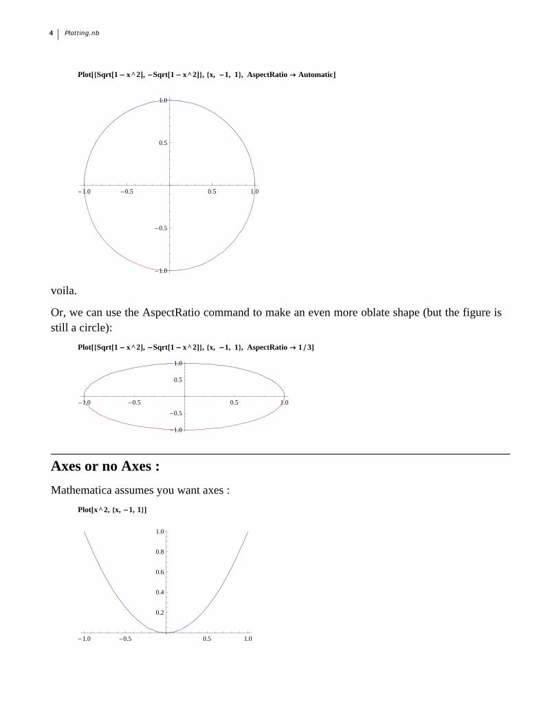
PlotSqrt1 - x^2, -Sqrt1 - x^2, x, -1, 1, AspectRatio Æ Automatic
-1.0 -0.5 0.5 1.0
-1.0
-0.5
0.5
1.0
voila.
Or, we can use the AspectRatio command to make an even more oblate shape (but the figure isstill a circle):
PlotSqrt1 - x^2, -Sqrt1 - x^2, x, -1, 1, AspectRatio Æ 1 3
-1.0 -0.5 0.5 1.0
-1.0
-0.5
0.5
1.0
Axes or no Axes :
Mathematica assumes you want axes :
Plotx^2, x, -1, 1
-1.0 -0.5 0.5 1.0
0.2
0.4
0.6
0.8
1.0
4 Plotting.nb
But if you don' t :
Plotx^2, x, -1, 1, Axes Æ False
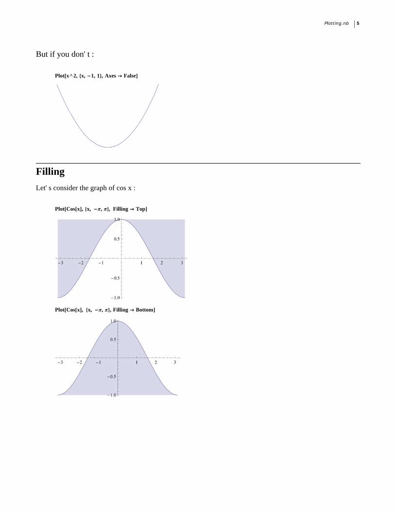
Filling
Let' s consider the graph of cos x :
PlotCosx, x, -p, p, Filling Æ Top
PlotCosx, x, -p, p, Filling Æ Bottom
Plotting.nb 5
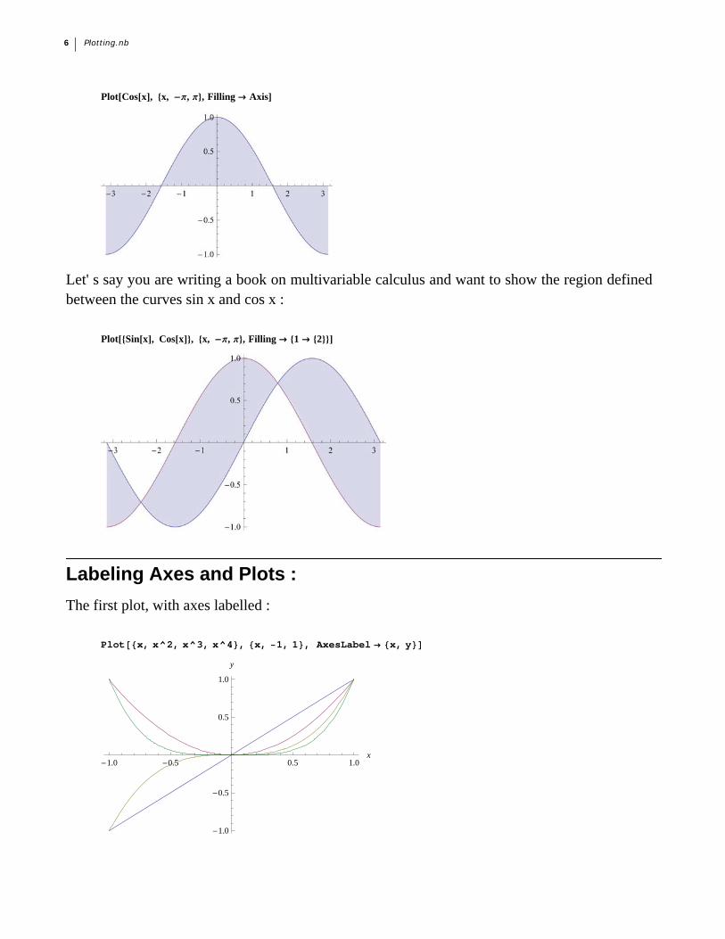
PlotCosx, x, -p, p, Filling Æ Axis
Let' s say you are writing a book on multivariable calculus and want to show the region definedbetween the curves sin x and cos x :
PlotSinx, Cosx, x, -p, p, Filling Æ 1 Æ 2
Labeling Axes and Plots :
The first plot, with axes labelled :
Plotx, x^2, x^3, x^4, x, 1, 1, AxesLabel x, y
-1.0 -0.5 0.5 1.0x
-1.0
-0.5
0.5
1.0
y
6 Plotting.nb
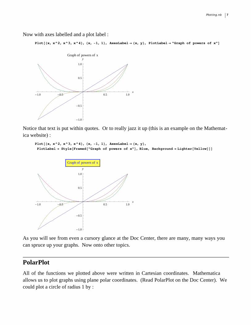
Now with axes labelled and a plot label :
Plotx, x^2, x^3, x^4, x, 1, 1, AxesLabel x, y, PlotLabel "Graph of powers of x"
-1.0 -0.5 0.5 1.0x
-1.0
-0.5
0.5
1.0
yGraph of powers of x
Notice that text is put within quotes. Or to really jazz it up (this is an example on the Mathemat-ica website) :
Plotx, x^2, x^3, x^4, x, 1, 1, AxesLabel x, y,
PlotLabel StyleFramed"Graph of powers of x", Blue, Background LighterYellow
-1.0 -0.5 0.5 1.0x
-1.0
-0.5
0.5
1.0
y
Graph of powers of x
As you will see from even a cursory glance at the Doc Center, there are many, many ways youcan spruce up your graphs. Now onto other topics.
PolarPlot
All of the functions we plotted above were written in Cartesian coordinates. Mathematicaallows us to plot graphs using plane polar coordinates. (Read PolarPlot on the Doc Center). Wecould plot a circle of radius 1 by :
Plotting.nb 7
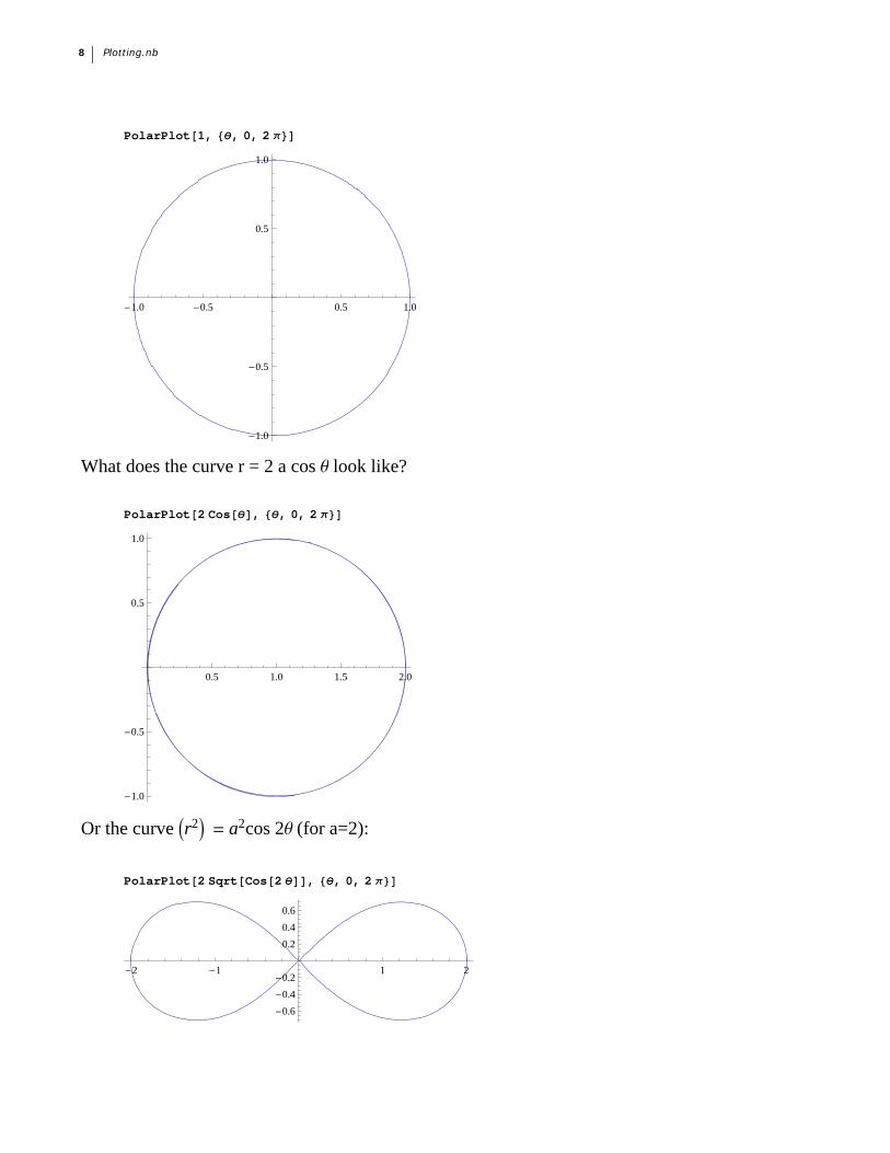
PolarPlot1, , 0, 2
-1.0 -0.5 0.5 1.0
-1.0
-0.5
0.5
1.0
What does the curve r = 2 a cos q look like?
PolarPlot2 Cos, , 0, 2
0.5 1.0 1.5 2.0
-1.0
-0.5
0.5
1.0
Or the curve r2 = a2cos 2q (for a=2):
PolarPlot2 SqrtCos2, , 0, 2
-2 -1 1 2
-0.6
-0.4
-0.2
0.2
0.4
0.6
8 Plotting.nb
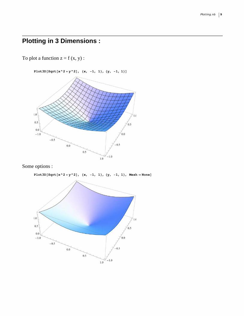
Plotting in 3 Dimensions :
To plot a function z = f (x, y) :
Plot3DSqrtx^2 y^2, x, 1, 1, y, 1, 1
Some options :
Plot3DSqrtx^2 y^2, x, 1, 1, y, 1, 1, Mesh None
Plotting.nb 9
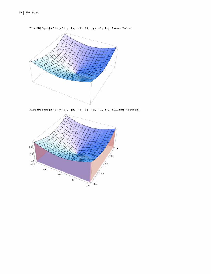
Plot3DSqrtx^2 y^2, x, 1, 1, y, 1, 1, Axes False
Plot3DSqrtx^2 y^2, x, 1, 1, y, 1, 1, Filling Bottom
10 Plotting.nb
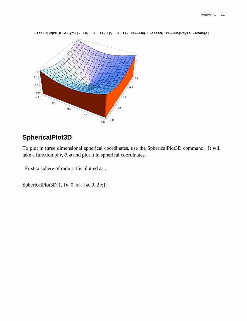
Plot3DSqrtx^2 y^2, x, 1, 1, y, 1, 1, Filling Bottom, FillingStyle Orange
SphericalPlot3D
To plot in three dimensional spherical coordinates, use the SphericalPlot3D command. It willtake a function of r, q, f and plot it in spherical coordinates. First, a sphere of radius 1 is plotted as :
SphericalPlot3D[1, {q, 0, p}, {f, 0, 2 p}]
Plotting.nb 11
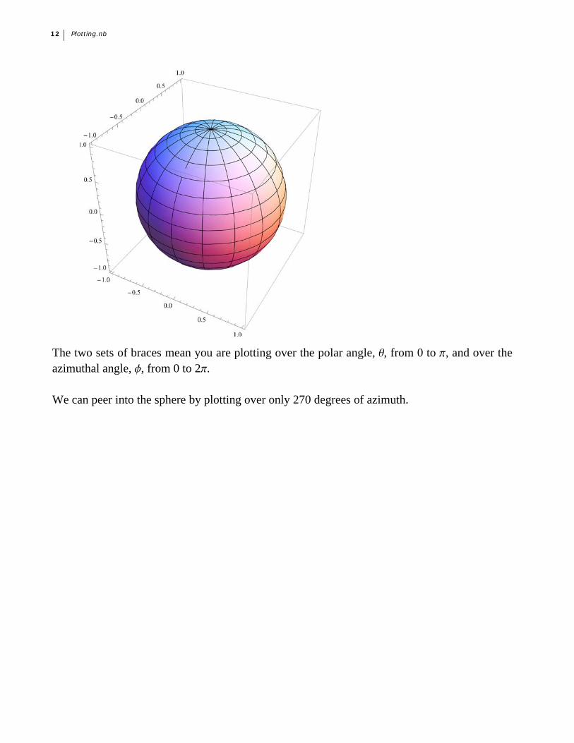
The two sets of braces mean you are plotting over the polar angle, q, from 0 to p, and over theazimuthal angle, f, from 0 to 2p.
We can peer into the sphere by plotting over only 270 degrees of azimuth.
12 Plotting.nb
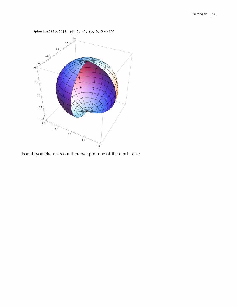
SphericalPlot3D1, , 0, , , 0, 3 2
For all you chemists out there:we plot one of the d orbitals :
Plotting.nb 13
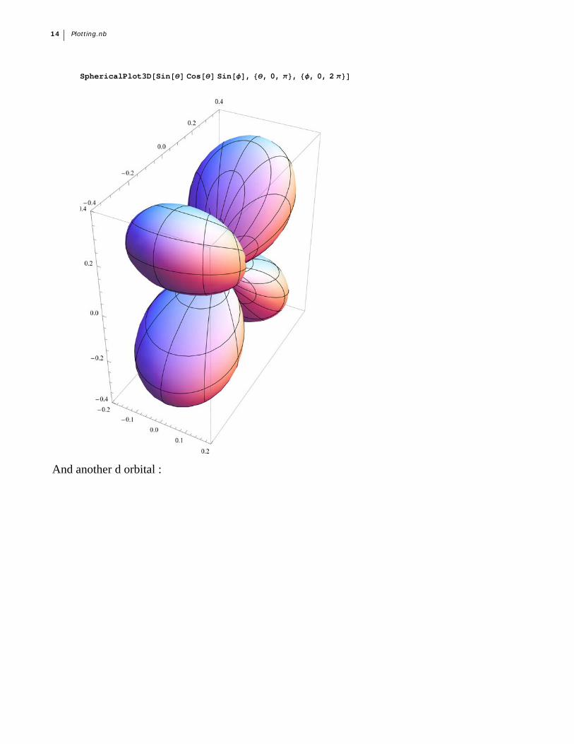
SphericalPlot3DSinCos Sin, , 0, , , 0, 2
And another d orbital :
14 Plotting.nb
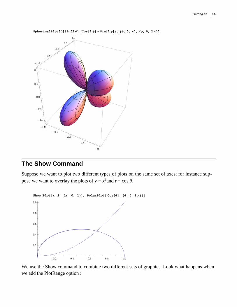
SphericalPlot3DSin2Cos2 Sin2, , 0, , , 0, 2
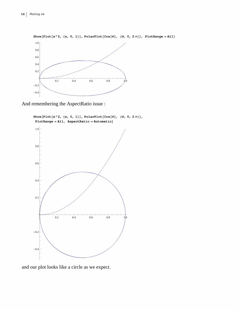
The Show Command
Suppose we want to plot two different types of plots on the same set of axes; for instance sup-
pose we want to overlay the plots of y = x2and r = cos q.
ShowPlotx^2, x, 0, 1, PolarPlot Cos, , 0, 2
0.2 0.4 0.6 0.8 1.0
0.2
0.4
0.6
0.8
1.0
We use the Show command to combine two different sets of graphics. Look what happens whenwe add the PlotRange option :
Plotting.nb 15
ShowPlotx^2, x, 0, 1, PolarPlotCos, , 0, 2, PlotRange All
0.2 0.4 0.6 0.8 1.0
-0.4
-0.2
0.2
0.4
0.6
0.8
1.0
And remembering the AspectRatio issue :
ShowPlotx^2, x, 0, 1, PolarPlotCos, , 0, 2,
PlotRange All, AspectRatio Automatic
0.2 0.4 0.6 0.8 1.0
-0.4
-0.2
0.2
0.4
0.6
0.8
1.0
and our plot looks like a circle as we expect.
16 Plotting.nb
Graphics
Just as the Plot and PlotStyle commands give you incredible sets of options for processing plots,the Graphics command allows you to draw almost any figure you wish. Almost any figure, nowmatter how complicated, can be constructed by combining different primitives.
A primitive is a basic geometric form, like circle, line, point, and so on (look up Graphics on theDoc Center for much, much more).
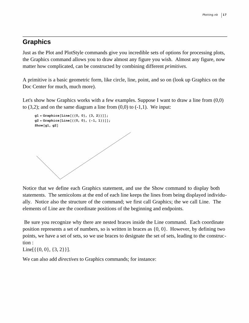
Let's show how Graphics works with a few examples. Suppose I want to draw a line from (0,0)to (3,2); and on the same diagram a line from (0,0) to (-1,1). We input:
g1 GraphicsLine0, 0, 3, 2;
g2 GraphicsLine0, 0, 1, 1;
Showg1, g2
Notice that we define each Graphics statement, and use the Show command to display bothstatements. The semicolons at the end of each line keeps the lines from being displayed individu-ally. Notice also the structure of the command; we first call Graphics; the we call Line. Theelements of Line are the coordinate positions of the beginning and endpoints. Be sure you recognize why there are nested braces inside the Line command. Each coordinateposition represents a set of numbers, so is written in braces as {0, 0}. However, by defining twopoints, we have a set of sets, so we use braces to designate the set of sets, leading to the construc-tion :Line[{{0, 0}, {3, 2}}].
We can also add directives to Graphics commands; for instance:
Plotting.nb 17
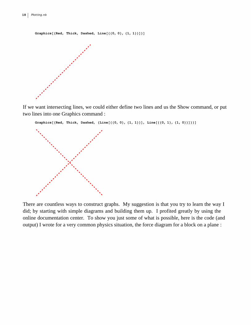
GraphicsRed, Thick, Dashed, Line0, 0, 1, 1
If we want intersecting lines, we could either define two lines and us the Show command, or puttwo lines into one Graphics command :
GraphicsRed, Thick, Dashed, Line0, 0, 1, 1, Line0, 1, 1, 0
There are countless ways to construct graphs. My suggestion is that you try to learn the way Idid; by starting with simple diagrams and building them up. I profited greatly by using theonline documentation center. To show you just some of what is possible, here is the code (andoutput) I wrote for a very common physics situation, the force diagram for a block on a plane :
18 Plotting.nb
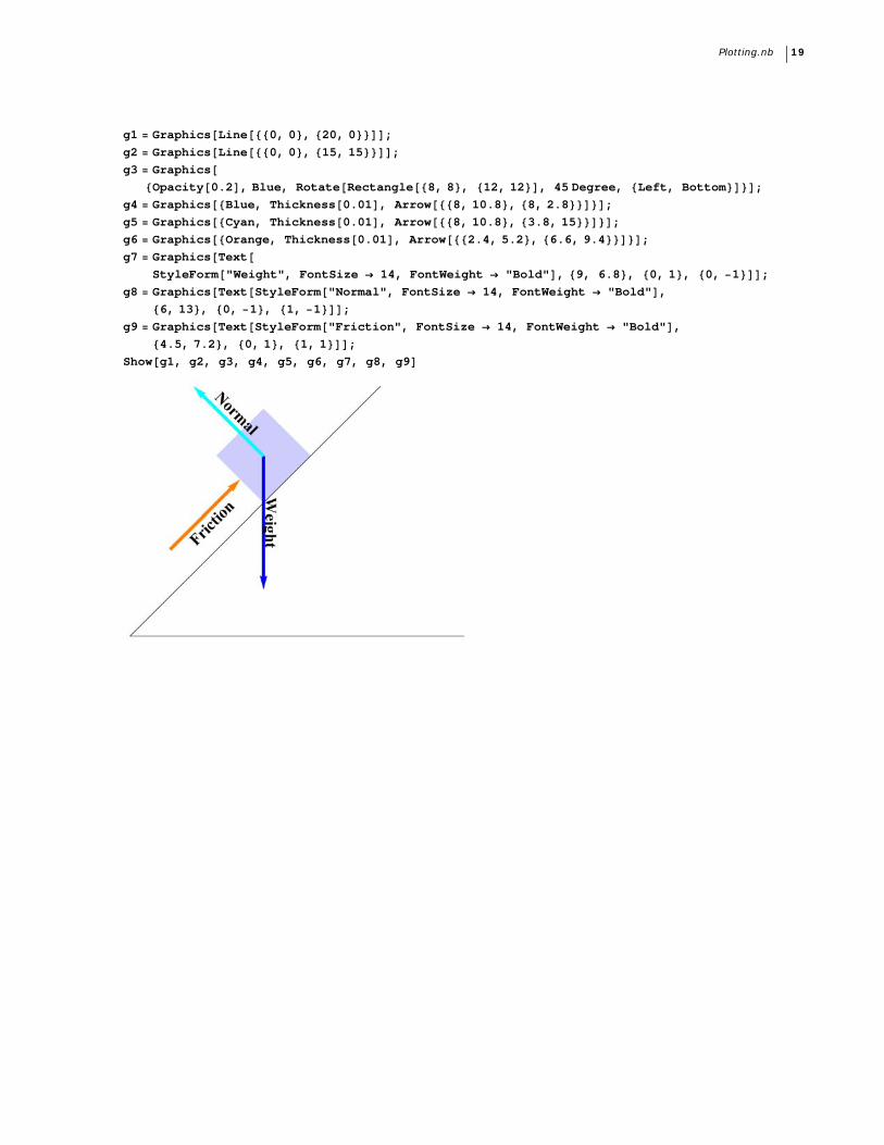
g1 GraphicsLine0, 0, 20, 0;
g2 GraphicsLine0, 0, 15, 15;
g3 GraphicsOpacity0.2, Blue, RotateRectangle8, 8, 12, 12, 45 Degree, Left, Bottom;
g4 GraphicsBlue, Thickness0.01, Arrow8, 10.8, 8, 2.8;
g5 GraphicsCyan, Thickness0.01, Arrow8, 10.8, 3.8, 15;
g6 GraphicsOrange, Thickness0.01, Arrow2.4, 5.2, 6.6, 9.4;
g7 GraphicsTextStyleForm"Weight", FontSize 14, FontWeight "Bold", 9, 6.8, 0, 1, 0, 1;
g8 GraphicsTextStyleForm"Normal", FontSize 14, FontWeight "Bold",
6, 13, 0, 1, 1, 1;
g9 GraphicsTextStyleForm"Friction", FontSize 14, FontWeight "Bold",
4.5, 7.2, 0, 1, 1, 1;
Showg1, g2, g3, g4, g5, g6, g7, g8, g9
Plotting.nb 19