pods: interpreting spatial and temporal environmental information
DESCRIPTION
PODS: Interpreting Spatial and Temporal Environmental Information. Edoardo (Edo) Biagioni University of Hawai’i at M ā noa. The Challenge. Endangered plants grow in few locations Hawai'i has steep weather gradients: the weather is different in nearby locations - PowerPoint PPT PresentationTRANSCRIPT
PODS:Interpreting Spatial and Temporal
Environmental Information
Edoardo (Edo) BiagioniUniversity of Hawai’i at Mānoa
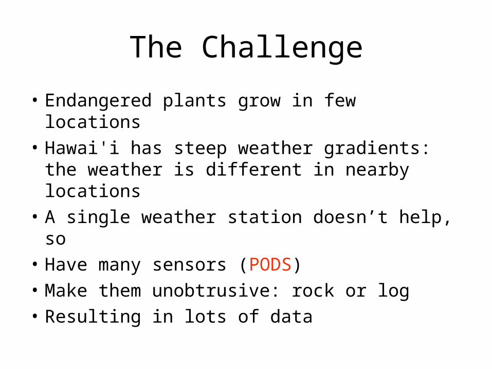
The Challenge
• Endangered plants grow in few locations• Hawai'i has steep weather gradients: the
weather is different in nearby locations• A single weather station doesn’t help, so• Have many sensors (PODS)• Make them unobtrusive: rock or log• Resulting in lots of data

Sample Terrain
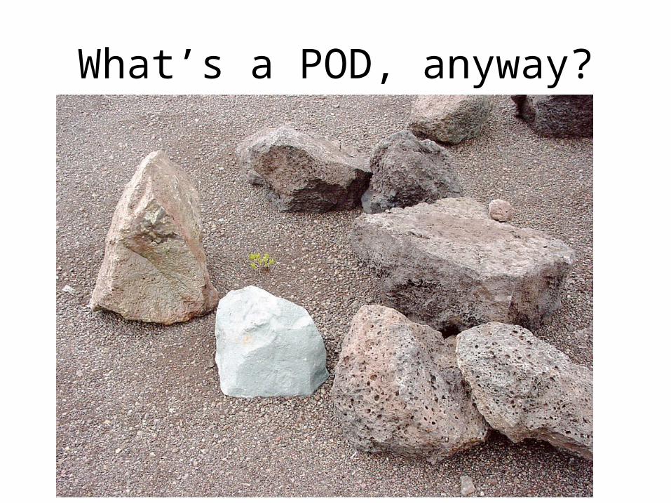
What’s a POD, anyway?

Inside a “Rock”
temperature
humidity
light
wind (bend)
Computer& Radio
Batteries
Internal: voltage
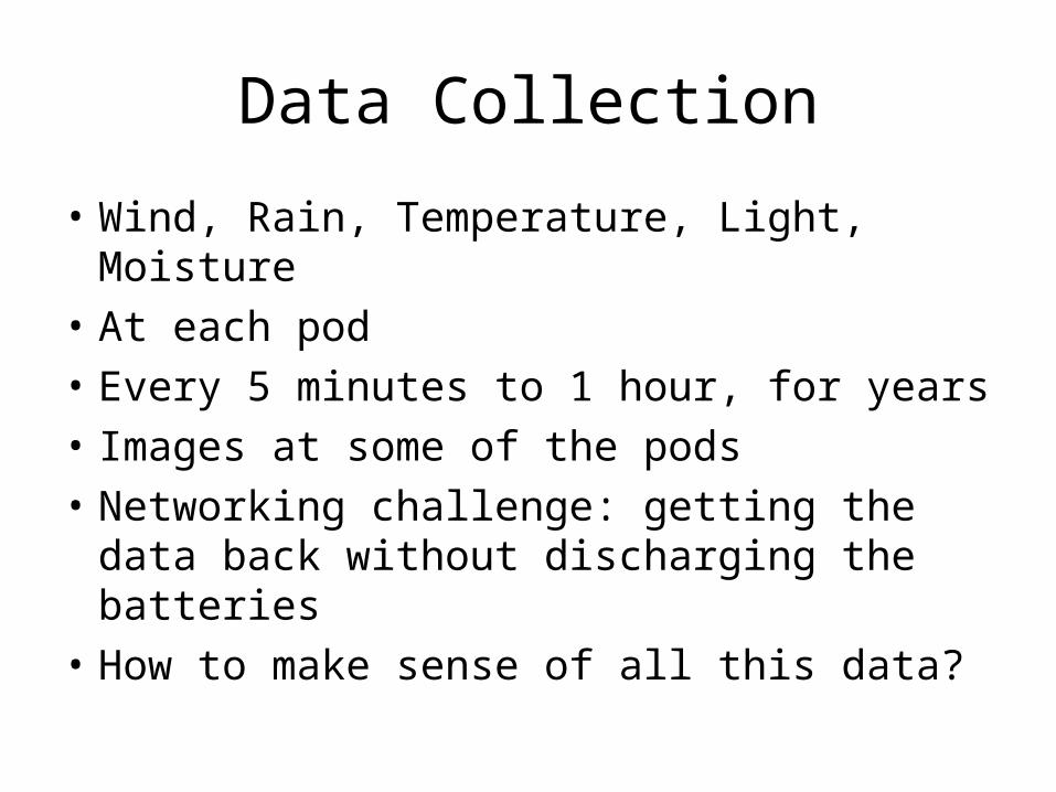
Data Collection
• Wind, Rain, Temperature, Light, Moisture• At each pod• Every 5 minutes to 1 hour, for years• Images at some of the pods• Networking challenge: getting the data
back without discharging the batteries• How to make sense of all this data?
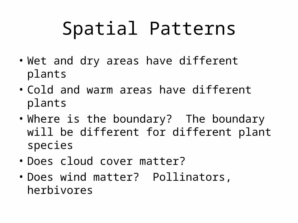
Spatial Patterns
• Wet and dry areas have different plants• Cold and warm areas have different plants• Where is the boundary? The boundary
will be different for different plant species• Does cloud cover matter?• Does wind matter? Pollinators, herbivores
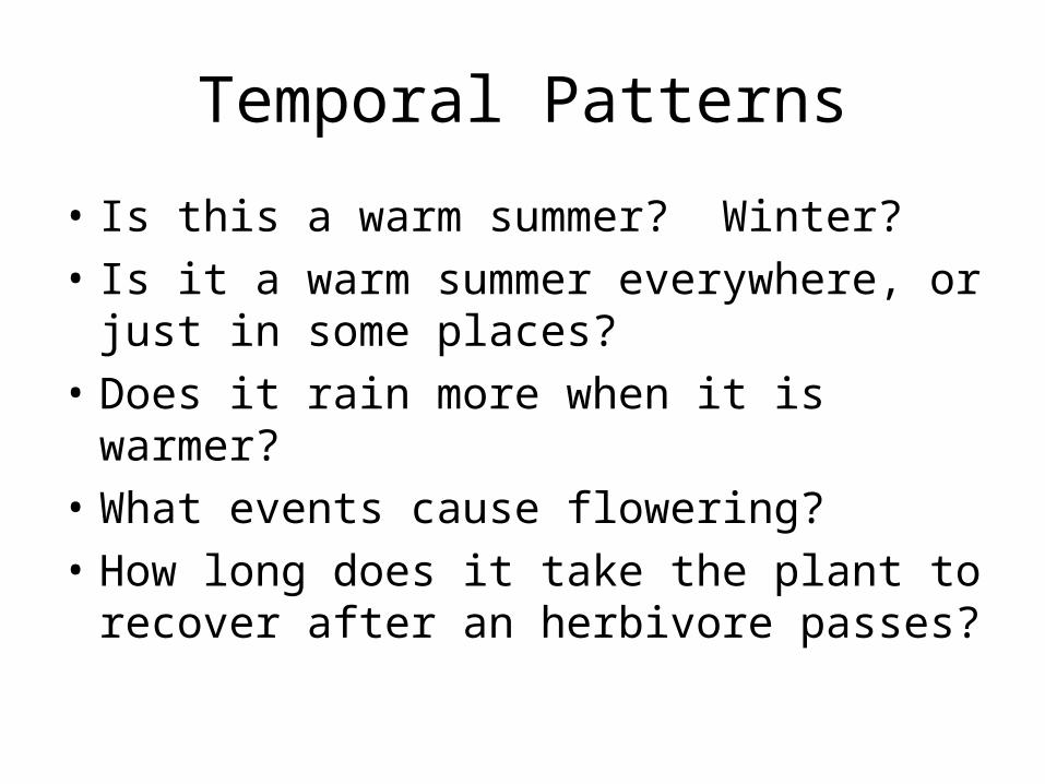
Temporal Patterns
• Is this a warm summer? Winter?• Is it a warm summer everywhere, or just in
some places?• Does it rain more when it is warmer?• What events cause flowering?• How long does it take the plant to recover
after an herbivore passes?
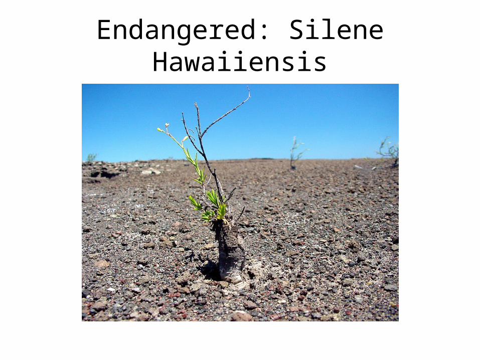
Endangered: Silene Hawaiiensis

Who needs the Information?
• Scientists (botanists)• High-School Students• Virtual Tourists

What use is the Information?
• Study the plants, prevent decline• Determine what is essential for the plant’s
survival: e.g., how will global warming affect it?
• Locate alternative areas• Watch what happens, instead of trying to
reconstruct what happened• Capture rare phenomena

How is the data communicated?
• Graphs, maps, tables• Tables unwieldy for large numbers of
PODS• Graphs need many different scales• Maps can help intuitive understanding
• Ultimately, need to find useful patterns
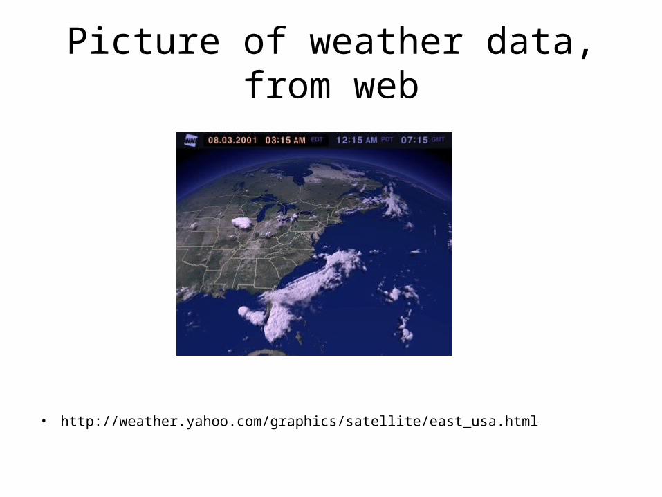
Picture of weather data, from web
• http://weather.yahoo.com/graphics/satellite/east_usa.html
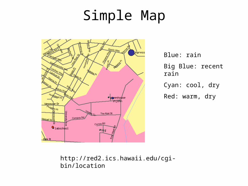
Simple Map
http://red2.ics.hawaii.edu/cgi-bin/location
Blue: rain
Big Blue: recent rain
Cyan: cool, dry
Red: warm, dry
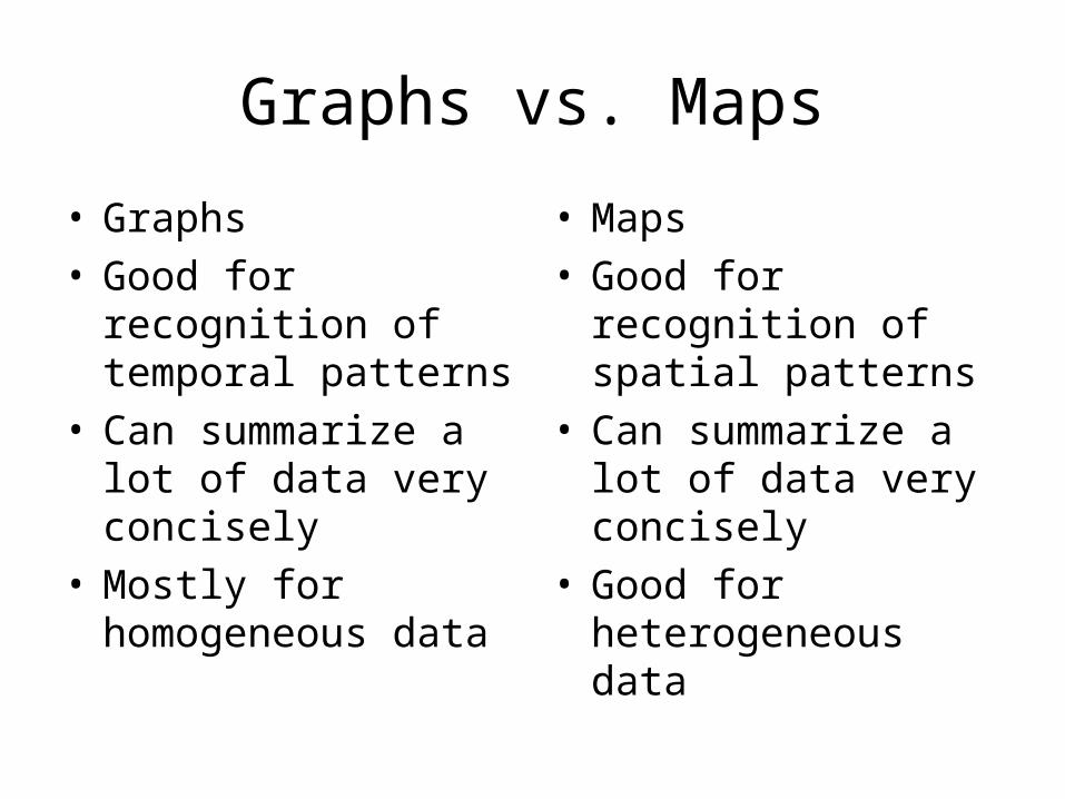
Graphs vs. Maps
• Graphs• Good for recognition
of temporal patterns• Can summarize a lot
of data very concisely• Mostly for
homogeneous data
• Maps• Good for recognition
of spatial patterns• Can summarize a lot
of data very concisely• Good for
heterogeneous data

Strategies
• Data Mining: search data for patterns, try to match to plant distribution
• Machine Learning: try to predict new data. If prediction is wrong, something unpredicted (unpredictable!) is happening
• Better maps, incorporating lots of data including images, but in a way that supports intuitive analysis
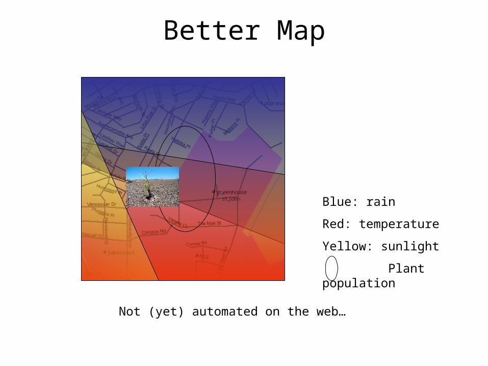
Better Map
Not (yet) automated on the web…
Blue: rain
Red: temperature
Yellow: sunlight
Plant population

Where to go from here
• Plant “surveillance”: being there, remotely• Data Collection is only the essential first
step• Data Analysis must be supported by
appropriate tools• Find out what really matters in the life of
an endangered plant

Acknowledgements and Links
• Co-Principal Investigators: Kim Bridges, Brian Chee
• Students: Shu Chen, Michael Lurvey, Dan Morton, Bryan Norman, and many more
• http://www.botany.hawaii.edu/pods/ pictures, data
• http://www.ics.hawaii.edu/~esb/pods/ these slides, the paper