possibilities and limits in visualizing large amounts of
TRANSCRIPT
- 1 -
Possibilities and Limits in Visualizing Large
Amounts of Multidimensional Data
Daniel A. Keim, Hans-Peter Kriegel
Institute for Computer Science, University of MunichLeopoldstr. 11B, D-80802 Munich, Germany{keim, kriegel}@informatik.uni-muenchen.de
Abstract
In this paper, we describe our concepts to visualize very large amountsof multidimensional data. Our visualization technique which has beendeveloped to support querying of large scientific databases is designedto visualize as many data items as possible on current display devices.Even if we are able to use each pixel of the display device to visualizeone data item, the number of data items that can be visualized is quitelimited. Therefore, in our system we introduce reference points (or re-gions) in multidimensional space and consider only those data itemswhich are ‘close’ to the reference point. The data items are arrangedaccording to their distance from the reference point. Multiple win-dows are used for the different dimensions of the data with the dis-tance of each of the dimensions from the reference point (or region)being represented by color. In exploring the database, the referencepoint (or region) may be changed interactively, allowing different por-tions of the database to be visualized. To visualize larger portions ofthe database, sequences of visualizations may be generated automati-cally by moving the reference point along some path in multidimen-sional space. Besides describing our visualization technique andseveral alternatives, we discuss some of the perceptual issues thatarise in connection with our visualization technique.
to appear in:‘Perceptual Issues in Visualization’, Springer, 1994.
- 2 -
1 Introduction
The progress made in hardware technology allows today’s computer
systems to store very large amounts of data. The available storage space
is easily filled with data that is often automatically recorded via sensors
and monitoring systems. Today, even simple transactions of every day
life, such as paying by credit card or using the telephone, are typically
recorded by using computers. Even larger amounts of data are generated
by automated test series in physics, chemistry or medicine and satellite
observation systems are expected to collect one terabyte of data every
day in the near future [FPM91]. Usually, many parameters are recorded
resulting in multidimensional data with a high dimensionality. The data
of all areas mentioned so far is collected because people believe that it
is a potential source of valuable information providing a competitive
advantage (at some point). Finding the valuable information hidden in
them, however, is a difficult task. With today’s database systems and its
query tools, it is only possible to view quite small portions of the data.
If the data is presented textually, the amount of data that can be dis-
played is in the range of some one hundred data items, but this is like a
drop in the ocean when dealing with data sets containing millions of
data items. Having no possibility to adequately query and view the large
amounts of data that have been collected because of their potential use-
fulness, the data becomes useless and the database becomes a data
‘dump’.
For the exploration of very large amounts of multidimensional data
to be successful in the near future, we believe that it is essential to make
the human being an integral part of the data analysis process. It will be
important to combine the best features of humans and computers. The
intelligence, creativity and perceptual abilities of humans which are un-
matchable need to be supported by computers which are best suited to
do searching and number crunching. Some five years ago, a broader
community of researchers recognized the potentials of visualization
techniques to analyze and explore large amounts of data. With visual-

- 3 -
ization techniques, larger amounts of data can be presented on thescreen at the same time, colors allow the users to instantly recognizesimilarities or differences of thousands of data items, the data items maybe arranged to express some relationship and so on. Over the last years,many techniques for the visualization of multidimensional data havebeen developed. It seems, however, that many of the techniques do notprovide adequate support for the flood of data we are facing today.Since, on the other hand, the technology for generating, collecting andstoring data is available, the gap between the amount of multidimen-sional data that should be visualized and the amount of data that can bevisualized is growing. Additionally, in most systems the perceptualabilities of humans are only used to a very limited extend; only few sys-tems use e.g. motion and sound to help the user in data analysis. There-fore, a major research challenge is to find human-oriented ways to helpthe user in exploring large amounts of multidimensional data.
In this paper, we focus on our visualization technique that uses colorand dense displays to visualize multidimensional data. Our visualiza-tion technique (see section 2 for a brief description) has originally beendeveloped in the context of querying large databases, but it has provento be more generally useful for visualizing large amounts of data withan arbitrary dimensionality. In section 3, some extensions, display alter-natives and other ideas will be presented. In section 4, we then provideexamples that show the possibilities and limits of our visualization tech-nique.
2 The Basic Idea of our Visualization Technique
Visualization of data which have some inherent two- or three-di-mensional semantics has been done even before computers could beused for visualization, and since using computers for this purpose, a lotof interesting visualization techniques have been developed by re-searchers working in the graphics field. Visualization of large amountsof arbitrary multidimensional data, however, is a relatively new re-search area. Researchers in the graphics/visualization area are currently

- 4 -
exploring techniques in different application domains. Examples areshape coding [Bed90], worlds within worlds [FB90], parallel coordi-nates [ID90], iconic displays [PG88, BMS92], dimensional stacking[LWW 90], hierarchical plotting [MGTS90] or dynamic methods aspresented in [MZ92]. In most of the approaches proposed so far, thenumber of data items that can be visualized on the screen at the sametime is quite limited (in the range of 100 to 1000 data items), but it is adeclared goal to push this limit [Tre92]. In dealing with databases con-sisting of millions or even billions of data items, our goal is to visualizeas many data items as possible at the same time to give the user somekind of overview of the data. The obvious limit for any kind of visualrepresentation is the resolution of current displays which is in the orderof one to three million pixels, e.g. in case of our 19 inch displays with aresolution of 1024 x 1280 pixels there are about 1.3 million pixels. Ouridea is to use each pixel of the screen to give the users visual feedbackabout the data, allowing them to easily focus on the desired data and tounderstand the influence of multiple parameters.
The basic idea of our visualization technique for large data sets isdescribed in [KKS93]. In dealing with databases consisting of billionsof data items with multiple dimensions (often ten and more parameters),we had to find an adequate way of restricting the amount of data to bevisualized to a number that can be displayed on the screen. In our ap-proach, for this purpose reference points (or regions) in multidimen-sional space are introduced and only the data items that are ‘closest’ tothe reference point are visualized. The ‘closeness’ is determined usingdistance functions for each of the dimensions. The distance functionsare datatype and application dependant and must be provided by the ap-plication. Examples for distance functions are the numerical difference(for metric types), distance matrices (for ordinal and nominal types),lexicographical, character-wise, substring, phonetic or semantic differ-ence (for strings) and so on. In the specification of the reference region,not all of the dimensions have to be used. If m of the n dimensions areused in the specification of the reference point, then the reference region

- 5 -
itself is an (n-m)-dimensional space with some extension into the other
m dimensions. Dimensions that are not used in the specification of the
reference region have basically no impact on the visualization since the
distance for such dimensions is zero for all data items.
Having calculated the distances for each of the dimensions which
are part of the reference point specification, the distances are combined
into the closeness factor. Important aspects such as normalizing and
weighting the distances of the different dimensions, the formulas used
to calculate the closeness factors and the heuristics used to reduce the
number of displayed data items are described in [KKS 93]. The close-
ness factors are then sorted resulting in a one-dimensional distribution
ranking the data items according to their closeness. The basic idea for
visualizing the data items is to map the value ranges of the different di-
mensions to color and represent each data item by multiple pixels being
colored according to the distance values for each of its dimensions. To
maximize the number of just noticeable differences, we use a colormap
with constant saturation, an increasing value (intensity) and a hue (col-
or) ranging from yellow over green, blue and red to almost black. The
colormap is continuous except for a discontinuity between yellow and
green which is used to distinguish the data items inside the reference re-
gion from those outside the reference region. The colored pixels are
then displayed on the screen with data items fitting into the reference re-
gion centered in the middle of the window and the other data items are
arranged rectangular spiral shaped around this region (c.f. figure 1) ac-
cording to the overall closeness factor. A separate window is provided
for each of the dimensions. In these separate windows, the pixels for
each data item are placed at the same relative position, allowing the user
to relate the visualization of the different dimensions. In figures 5-10,
several visualizations of four- and six-dimensional data are provided.
The data sets used to generate the visualizations are artificially generat-
ed data sets with explicitly inserted multidimensional clusters. A de-
tailed description of the examples will be given in section 4.

- 6 -
After getting the visual feedback, the user may interactively changethe reference point (or region). Using highlighting of correspondingpixels in different windows or a projection of the visual representationto specific color ranges, the users may further explore the data helpingthem to relate the distances for the different dimensions. By having thepossibility to get the attribute values corresponding to some specificcolor, the users may better understand and interpret the visualizations.According to the discoveries made during this process, the user maythen incrementally change the reference point (or region) using slidersprovided for each of the dimensions. For details about the interactive in-terface see [KKS 93].
3 Alternative Visualization Techniques
In this section we describe some extensions, alternative visualiza-tion techniques and additional ideas, all being related to our main ideafor visualizing large amounts of multidimensional data that has been de-scribed in section 2.
Alternative 1: Mapping two Dimensions to the Axes
An idea for an alternative screen layout is to display the data in 2Dwith selected attributes assigned to the axis. The problem with conven-tional 2D or 3D representations is that on the one hand many data itemsmay be concentrated in some area of the screen while other areas arevirtually empty, and on the other hand many data items are superposedand therefore not visible. Although conventional 2D or 3D visualiza-tions may be very helpful, e.g. in cases where the data have some inher-
Figure 1: Spiral Shaped Arrangement of the Data Items

- 7 -
ent two- or three-dimensional semantics, we did not pursue this idea for
several reasons: One reason is that in most cases the number of data
items and dimensions that can be represented on the screen at the same
time is quite limited. This was in contrast to one of our goals, namely to
visualize as many data items as possible on the screen. A second reason
is that in most cases where a 2D or 3D arrangement of the data is
straightforward, systems using such arrangements have already been
built.
Stimulated by the conventional 2D or 3D data representations, we
got the idea for a second kind of visualization which includes some
feedback on the direction of the distance for distance functions that pro-
vide positive and negative distance values. The basic idea is to assign
two attributes to the axis and to arrange the distances according to the
direction of the distance; for one attribute negative distances are ar-
ranged to the left, positive ones to the right and for the other attribute
negative distances are arranged to the bottom, positive ones to the top.
Inside the regions, the data items with the closeness factors sorted in an
descending order are arranged from the middle (yellow region) to the
edges of the window (see figure 2). With this kind of representation, we
do not represent the distance of data items directly by its locations, but
we denote the absolute value of the distance by its color and the direc-
tion with respect to the dimensions assigned to the axes by its location
relative to the correct answers. An advantage is that each data item is
assigned to one pixel and that data items with the same distance are not
superposed. A problem may occur in some special cases if e.g. no data
Figure 2: 2D-arrangement of the Data Items

- 8 -
items exist that have a negative distance for both attributes but many
data items that have a negative distance for one of them and a positive
one for the other one. In this case, the bottom left corner of the window
would be completely empty. In the worst case, two diagonally opposite
corners of the window may be completely empty (c.f. figure 8) and, as
a result, only half as many data items as possible are presented to the
user. Even in this case, the user gets valuable information on how to
change the reference point (or region) in order to get the desired results.
In general, we found that maximizing the number of visualized data
items conflicts with arrangements that directly visualize distances by
different locations on the screen.
An open questions is which of the dimensions should be assigned to
the axes. Since not only the dimensions that are used in the specification
of the reference region, but all dimensions may be used as axes dimen-
sions, the number of choices may be quite high. If we deal with n-di-
mensional data and all of the dimensions have positive and negative
distances, we have possibilities to choose two of
them to be assigned to the axes. This means that for 5-dimensional data,
there are already 10 possibilities and for 15-dimensional data there are
105 possibilities. For data sets with a high dimensionality, it is not prac-
ticable to try all combinations. If the user has no preferences for the axes
dimensions, the system needs to support the user in selecting them. One
possibility would be to automatically generate a sequence of visualiza-
tions, presenting the data set with all possible assignments of dimen-
sions to the axes. According to the visual impression from the sequence,
the user may then decide which of the assignments are interesting and
useful for data exploration. Further research will be necessary to exam-
ine the impact of assigning different dimensions to the axes and to find
criterions for choosing the right combination of dimensions to be as-
signed to the axes. In figures6-8, we provide some example visualiza-
tions, comparing different assignments of dimensions to the axes. We
ii 1=
n 1–
∑ n n 1–( )×2
----------------------------=
- 9 -
also compare the original and the 2D-visualization technique, showingsome of their advantages and disadvantages. The details about the ex-ample visualizations are described in section 4.
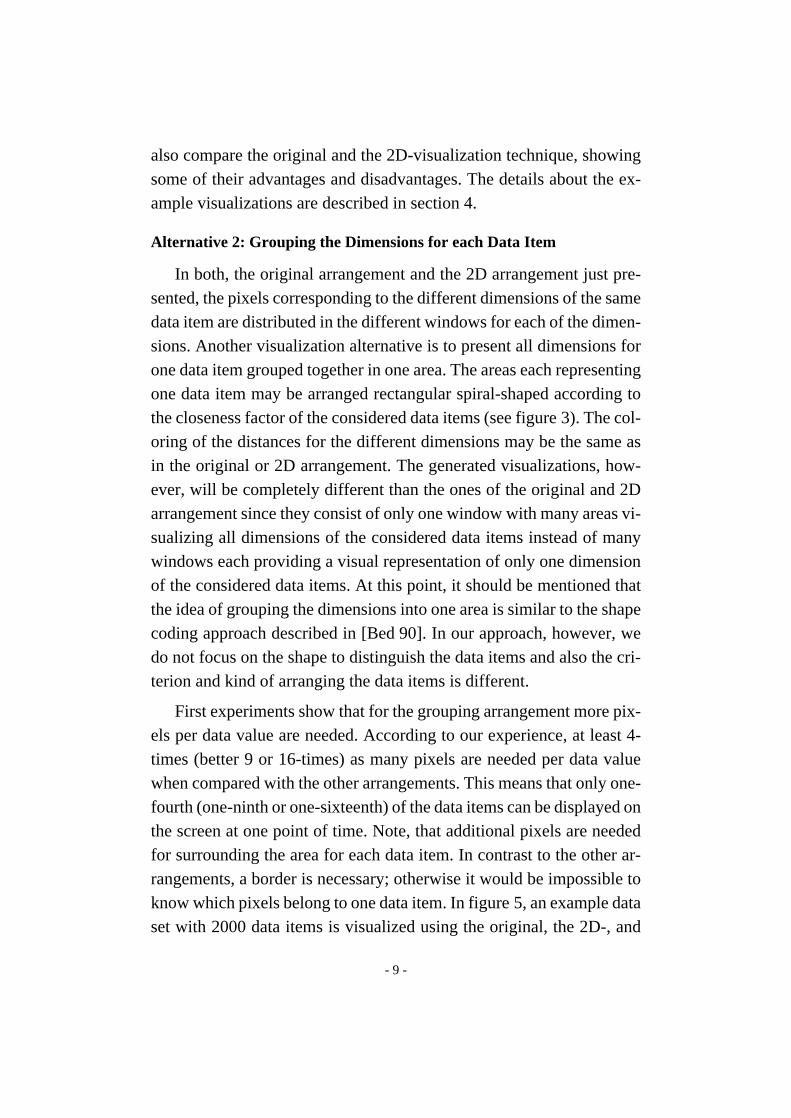
Alternative 2: Grouping the Dimensions for each Data Item
In both, the original arrangement and the 2D arrangement just pre-sented, the pixels corresponding to the different dimensions of the samedata item are distributed in the different windows for each of the dimen-sions. Another visualization alternative is to present all dimensions forone data item grouped together in one area. The areas each representingone data item may be arranged rectangular spiral-shaped according tothe closeness factor of the considered data items (see figure 3). The col-oring of the distances for the different dimensions may be the same asin the original or 2D arrangement. The generated visualizations, how-ever, will be completely different than the ones of the original and 2Darrangement since they consist of only one window with many areas vi-sualizing all dimensions of the considered data items instead of manywindows each providing a visual representation of only one dimensionof the considered data items. At this point, it should be mentioned thatthe idea of grouping the dimensions into one area is similar to the shapecoding approach described in [Bed 90]. In our approach, however, wedo not focus on the shape to distinguish the data items and also the cri-terion and kind of arranging the data items is different.
First experiments show that for the grouping arrangement more pix-els per data value are needed. According to our experience, at least 4-times (better 9 or 16-times) as many pixels are needed per data valuewhen compared with the other arrangements. This means that only one-fourth (one-ninth or one-sixteenth) of the data items can be displayed onthe screen at one point of time. Note, that additional pixels are neededfor surrounding the area for each data item. In contrast to the other ar-rangements, a border is necessary; otherwise it would be impossible toknow which pixels belong to one data item. In figure 5, an example dataset with 2000 data items is visualized using the original, the 2D-, and

- 10 -
the grouping technique. The original and the 2D-arrangement are en-
larged by 100%, whereas the visualization of the grouping arrangement
is reduced to about 70% of its original size.
Despite the fact that only fewer data items may be visualized, we ex-
pect the grouping arrangement to provide more useful visualizations for
data sets with larger dimensionality. In the original and 2D arrange-
ment, the pixels for each dimension of the data items are only related by
their position. For relatively small dimensionality (e.g. less than 8 di-
mensions), it seems to be quite easy for humans to relate the different
portions of the screen. The larger the dimensionality gets, however, the
more difficult is it to relate the different parts of the visualization and to
perceive correlations across them. In case of the grouping arrangement
it is not necessary for the user to relate different portions of the screen
and therefore, for larger dimensionality the arrangement may be advan-
tageous.
Alternative 3: Time Series of Visualizations
In trying to visualize larger amounts of data than possible with the
techniques described so far, an important potential is to consider time as
an additional dimension. For many applications it is natural to consider
time sequences of visualizations describing some features which are
changing over time. In the terminology of our system, this could be de-
scribed as moving the reference point (or region) along the time dimen-
sion. Most traditional systems for visualizing time series consider in
Figure 3: Grouping the Dimensions
- 11 -
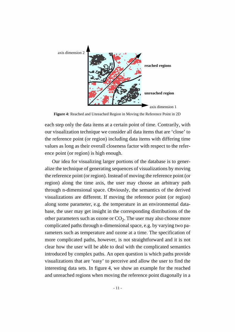
each step only the data items at a certain point of time. Contrarily, withour visualization technique we consider all data items that are ‘close’ tothe reference point (or region) including data items with differing timevalues as long as their overall closeness factor with respect to the refer-ence point (or region) is high enough.
Our idea for visualizing larger portions of the database is to gener-alize the technique of generating sequences of visualizations by movingthe reference point (or region). Instead of moving the reference point (orregion) along the time axis, the user may choose an arbitrary paththrough n-dimensional space. Obviously, the semantics of the derivedvisualizations are different. If moving the reference point (or region)along some parameter, e.g. the temperature in an environmental data-base, the user may get insight in the corresponding distributions of theother parameters such as ozone or CO2. The user may also choose morecomplicated paths through n-dimensional space, e.g. by varying two pa-rameters such as temperature and ozone at a time. The specification ofmore complicated paths, however, is not straightforward and it is notclear how the user will be able to deal with the complicated semanticsintroduced by complex paths. An open question is which paths providevisualizations that are ‘easy’ to perceive and allow the user to find theinteresting data sets. In figure4, we show an example for the reachedand unreached regions when moving the reference point diagonally in a
unreached region
reached regions
Figure 4: Reached and Unreached Region in Moving the Reference Point in 2D
axis dimension 1
axis dimension 2

- 12 -
two-dimensional data set. Since the percentage of data items that is dis-
played at one point of time is constant, the portion of two-dimensional
space that is reached is not a regular section parallel to the diagonal. An
interesting question is how it may be guaranteed that the whole database
(or a given portion of it) is covered. Future work is necessary to answer
this question and to find intuitive ways in dealing with path specifica-
tion and the semantics of the resulting visualizations.
Despite the unsolved problems, in searching a very large database of
multidimensional data for interesting correlations, clusters or hot spots,
our technique seems to be a promising approach since neither the num-
ber of data items that can be visualized nor their dimensionality is lim-
ited and the visualizations may help the user to get important,
previously unknown information out of the automatically generated vi-
sualization sequences.
4 Evaluating the Usefulness of our Visualization Technique
In this section, we describe our first experiences in evaluating our
visualization techniques. We will give some examples for visualiza-
tions of multidimensional data and we will discuss some open questions
which we believe to be important for future research. Most of the pre-
sented issues do not only apply to our technique but also to visualization
techniques developed by other researchers. Our goal in presenting the
questions is to stimulate the discussion about current visualization tech-
niques for large amounts of multidimensional data. The data used to
produce the presented visualizations are artificial data sets with specific
characteristics. In evaluating different visualization techniques, the pos-
sibility to precisely control the characteristics of the test data (e.g. the
correlation coefficient of two dimensions, the distribution function of
some of the dimensions, the location, size and shape of clusters, etc.) is
crucial. The details of the program used to generate the test data sets are
beyond the scope of this paper. A general discussion of test data sets for
evaluating data visualization techniques can be found in [BKP 94].

- 13 -
In the following, we provide some examples that illustrate the pos-
sibilities and limitations of our visualization techniques. In figure 5, we
present a generated data set with 2000 six-dimensional data items using
all three visualization techniques. The original and 2D-arrangement are
enlarged, whereas the grouping arrangement is reduced in size. While
some clustering is visible in all three visualizations, the clustering is
most obvious in the 2D arrangement. In comparing the three visualiza-
tion techniques, we found that the grouping arrangement provides use-
ful visualizations for rather small data sets (100 - 1000 data items),
while the original and 2D-technique work for much larger data sets (up
to 100.000 data items and more).
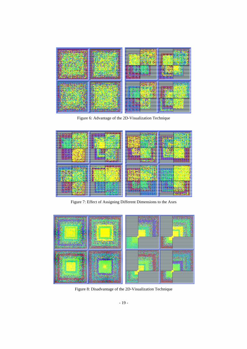
In figures 6-8, we compare the original and the 2D technique. One
first observation is that in many cases the 2D-visualizations will show
more of the structure than the visualizations generated using the original
technique. In figure 6 for example, no structure is visible in the original
arrangement (left part of figure 6) while the corresponding 2D-arrange-
ments (right part of figure 6 and both parts of figure 7) clearly show
multiple clusters. The 2D-visualizations in figures 6 and 7 only differ in
the choice of the axes dimensions. Note, that different clusters are not
visualized equally well with different axes assignments; in some cases,
clusters may even not be visible at all. In comparing the original and the
2D-visualization technique, we found that each of them has some ad-
vantages and disadvantages. A clear advantage of the 2D-technique is
that it provides more information than the original arrangement (c.f. fig-
ure 6). A disadvantage, however, is that the number of data items that
can be visualized is lower. Figure 8 shows an example for a 2D-visual-
ization which has two opposite quadrants that are completely empty.
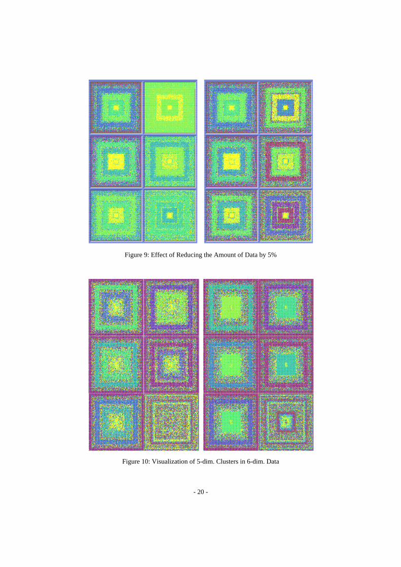
Figure 9 presents two visualizations of the same data set that only
slightly differ in the percentage of data items that are presented. In the
left part, 100% of the 10.000 data items are presented while in the right
part only 95% of the data items are displayed. The data set used to gen-
erate the visualizations of figure 9 contains a few data items for each di-

- 14 -
mension that have a much higher value than the remaining data items.
Since the data values are normalized after reducing the number of data
items to the desired percentage, the coloring of the visualizations in the
right part is much better than in the left part. Note, that the factor by
which the high values are higher than the remaining data items is differ-
ent for each of the dimensions. For dimension one the factor is 1, for di-
mension three the factor is 2, for dimensions four, five and six the factor
is 4, and for dimension two the factor is 6.
In figure 10, we present two visualizations showing 5-dimensional
clusters in 6-dimensional data. The data used to generate the visualiza-
tions consists of 17000 data items. Two-third of the data is generated
randomly (in the range [0, 100] for each of the dimensions) and the re-
maining one-third of the data defines three five-dimensional clusters.
The three clusters have been inserted at well-defined locations of the 6-
dimensional space. The only difference between the left and right visu-
alization in figure 10 is that the clusters are at different locations. As ref-
erence region, in both cases we used the 6-dimensional rectangle with
[0, 10] for each of the dimensions. Interesting is that in the windows for
the sixth dimension some additional clustering appears. We also exper-
imented with four-dimensional clusters in six-dimensional space. We
found that they are not perceivable at all. Although we expected lower
dimensional clusters to be less perceivable, it was surprising that the
perception was diminishing that fast with a smaller dimensionality of
the cluster. By adapting the weighting factors, however, we found a way
to make the 4-dimensional clusters perceivable. If the weighting factors
on the cluster dimensions are significantly higher than on the other di-
mensions, then a cluster with lower dimensionality will be perceivable.
Changing the weighting factors implies a change of the shape of the
multidimensional region around the reference point (or region) which
contains the data items that will be visualized. It also induces a change
in the ordering of the data items and will therefore result in completely
different visualizations.

- 15 -
We further found that, in most cases, the extension of the cluster inmultidimensional space has only a minor effect on the visualization.More important is the percentage of data items that form the cluster.Small clusters are only perceivable if they are close to the referencepoint and have distinctly different characteristics than the remainingdata items. The percentage of data items that need to be part of the clus-ter for the cluster to be perceivable depends on the distinctness betweenbase data and cluster, on the dimensionality of the data, and on the clus-ter’s distance to the reference point. The latter problem can be resolved,for example, by inverting the ordering of data items in the visualizationswhich causes data items with larger distances to be closer to the centerand therefore to be more visible.
Interesting topics for future research are an examination of the typeof information (type of clusters, type of correlations, etc.) that is per-ceivable with our visualization techniques, an examination of the im-pact of different weighting and distance functions, and a comparison ofthe different visualization techniques for multidimensional data thathave been proposed so far. One important step towards an in-depth ex-amination of current visualization techniques for multidimensional datawill be an integrated test data generation and evaluation tool which iscurrently being implemented at our institute. The tool will allow to gen-erate artificial data sets with given characteristics. The test data setsmay be described by the distribution functions for each of the dimen-sions, the correlations or functional dependencies between the dimen-sions, and the clusters which again may have arbitrary characteristics.The tool may be used to evaluate one single visualization technique tofind its strength and weaknesses but it will also be helpful to comparedifferent visualization techniques to find out which technique is mostsuitable for which types of data.
5 Summary and Conclusions
Visualizing very large amounts of arbitrary multidimensional data isone of the big challenges that researchers in the graphics/visualization

- 16 -
area are currently facing. The task is to efficiently find interesting data
sets, i.e. hot spots, clusters of similar data or correlations between dif-
ferent parameters. In this paper, we briefly presented our approach for
visualizing large amounts of multidimensional data. It allows to visual-
ly represent the largest amount of data that can be displayed at one point
of time on current display technology. Alternative visualization tech-
niques and additional features have been described. Many questions
that arise in connection with the perception of our visualization tech-
niques have been brought up focussing on some of the possibilities and
limitations of visualizing large amounts of multidimensional data. In
trying to find the answers for these questions, the goal of our future re-
search is improve the perception of our visualization techniques and to
find new ways of pushing their limits to be able to visualize even larger
amounts of data with an even higher dimensionality.
References
[Bed90] Beddow J.:‘Shape Coding of Multidimensional Data on a Microcom-puter Display’, Visualization ‘90, San Francisco, CA, 1990,pp.238-246.
[BKP 94] Bergeron R. D., Keim D. A., Pickett R.:‘Test Data Sets For EvaluatingData Visualization Techniques’,in: Perceptual Issues in Visualization,Springer, 1994.
[BMS 92] Bergeron R. D., Meeker L. D., Sparr T. M.:‘A Visualization-BasedModel for a Scientific Database System’,in: Focus on Scientific Visual-ization, eds: Hagen H., Müller M., Nielson G., Springer, 1992,pp.103-121.
[FB 90] Feiner S., Beshers C.:‘Visualizing n-Dimensional Virtual Worlds withn-Vision’, Computer Graphics, Vol.24, No.2, 1990, pp.37-38.
[FPM 91] Frawley W. J., Piatetsky-Shapiro G., Matheus C. J.:‘Knowledge Dis-covery in Databases: An Overview’,in: Knowledge Discovery in Data-bases, AAAI Press, Menlo Park, CA, 1991.
[ID 90] Inselberg A., Dimsdale B.:‘Parallel Coordinates: A Tool for Visualiz-ing Multi-Dimensional Geometry’, Visualization ‘90, San Francisco,CA, 1990, pp.361-370.
[KKS 93] Keim D. A., Kriegel H.-P., Seidl T.:‘Visual Feedback in QueryingLarge Databases’,Visualization ‘93, San Jose, CA, 1993, pp.158-165.

- 17 -
[LWW 90] LeBlanc J., Ward M. O., Wittels N.:‘Exploring N-Dimensional Data-bases’, Visualization ‘90, San Francisco, CA, 1990, pp.230-239.
[MGTS 90] Mihalisin T., Gawlinski E., Timlin J., Schwendler J.:‘Visualizing Sca-lar Field on an N-dimensional Lattice’, Visualization ‘90, San Fran-cisco, CA, 1990, pp.255-262.
[MZ 92] Marchak F., Zulager D.: ‘The Effectiveness of Dynamic Graphics in Re-vealing Structure in Multivariate Data’, Behavior, Research Methods,Instruments and Computers, Vol.24, No.2, 1992, pp.253-257.
[PG88] Pickett R.M., Grinstein G.G.:‘Iconographic Displays for VisualizingMultidimensional Data’, Proc. IEEE Conf. on Systems, Man and Cyber-netics, Beijing and Shenyang, China, 1988.
[Tre 92] Treinish L. A., Butler D. M., Senay H., Grinstein G. G., Bryson S. T.:‘Grand Challenge Problems in Visualization Software’,Visualization‘92, Boston, Mass., 1992, pp.366-371.

- 18 -
Figure 5: Example Visualizations generated using our three Visualization Techniques
- 19 -
Figure 8: Disadvantage of the 2D-Visualization Technique
Figure 7: Effect of Assigning Different Dimensions to the Axes
Figure 6: Advantage of the 2D-Visualization Technique
- 20 -
Figure 10: Visualization of 5-dim. Clusters in 6-dim. Data
Figure 9: Effect of Reducing the Amount of Data by 5%