poster creation
TRANSCRIPT

This is the image we choose for our poster:
We first edited the image by saturating the colour our of the image. We then
slightly increase the contrast to make the contrast of the black and white back
ground more brighter.

We then cut around the original image in Photoshop on a different tab, created a new layer and then pasted the image on top, so that the actor is in colour compared to the background making them more noticeable. Next we blurred the edges of the actor to make the image look more flattened and the edges softer.

We next blurred the whole of the neck area and slightly blurred it to reduce the colour of the skin. This was so that the neck was no visible and that there was no clear line between the mask and the neck.

We next burned parts of the face to emphasise on the facial features and to make the mask look more menacing and scarier. The areas that were burned were around the eyes, the eyes, the bridge of the nose and the snout.
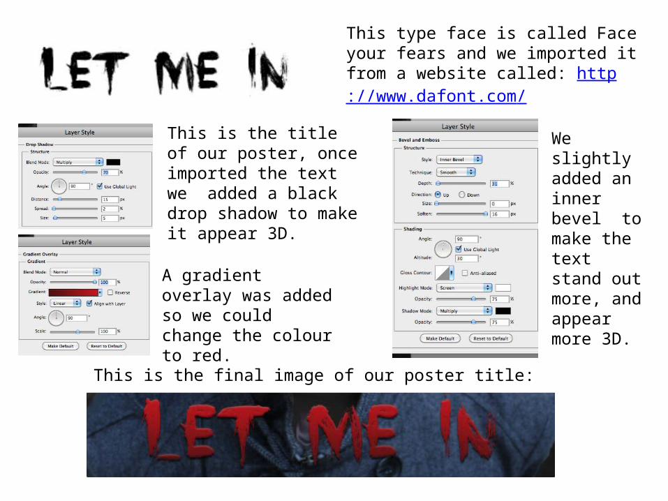
This type face is called Face your fears and we imported it from a website called: http://www.dafont.com/
This is the title of our poster, once imported the text we added a black drop shadow to make it appear 3D.
This is the final image of our poster title:
A gradient overlay was added so we could change the colour to red.
We slightly added an inner bevel to make the text stand out more, and appear more 3D.

For this text we added a red outer glow, this was to match the text to the colour scheme of the poster, but it also matches the main actors names at the top of the poster.
“Reel Media Production” is the name of the production company of the teaser trailer, therefore it is located in relation to the title of the film, but also to advertise the company.“Truly Terrifying –Empire Magazine” is quoted because this the magazine that features our teaser trailer, but also because they rated the film with stars and this is what attracts audiences.

This is the Reel Media production company logo of our teaser trailer and featuring products.
This is our created logo for our age range, it is age 15 because it is targeted at people over this age, but also because it is unsuitable and inappropriate to children under this age.
Dolby is a globally recognized innovator of sound, video, and voice technologies for cinemas, and is recognized on the poster as the producer of the sound.
All of these features are stereotypical of posters and these features have been symbolic to posters since the early 1900’s. These are all black and white to show contrast from the background but also make the eye catching and different from the rest of the text on the page.These features were all placed at the bottom corners of the screen as they are the border for when we create the bill board.

The main three actors names are added, an outer glow of red was added an outer glow around the names to make them more noticeable and relatable to the colour scheme of the poster. This font is..
This is the tag line of our film, to make it stand out from the rest of the text on the page we did not added a red outer
glow, this is to make it more eye catching from the rest of the text. The font is also a different font not used anywhere else on the page, this was used so that the audience can clearly
see that it is not part of the rest of the text.

These are the stars that we were rated from empire magazine, they were place in the lower central region of the poster, because Empire magazine is the magazine that is featuring our magazine cover.
This is the billboard we made and includes all of the relevant information of the teaser trailer/film. We choose the text colour white to make it stand out from the background and also to make it link with the white text colour scheme of all of the other text.
This type face is called tall films and we imported it from a website called: http://www.dafont.com/

This is our final poster cover.