preliminary task analysising
TRANSCRIPT

Analysing Preliminary task.
By Eddie Cameron
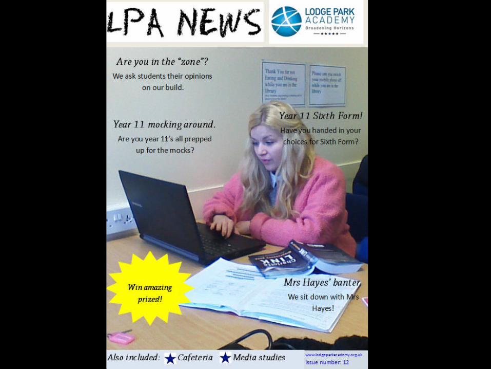
Front cover.The overall style of my front cover was inspired by the standard layout for most magazines. I like the simplicity of the design and how everything is easily identifiable, so I chose to carry this over to my production. I went for the overall house style of white and blue as it was in relation to my school logo, that being blue and white. I thought that doing this would help the magazine and logo blend together. The main image I chose is a picture of a sixth form student. I chose this because one of the main articles within the magazine is regarding Year 11’s applying for sixth form. This gives the image relevance and context for the magazine. I chose to use straplines at the bottom of the page because it is a useful technique to use for importance on certain points. Strapline aren’t usually found on all magazines apart from music magazines, I thought I would mix this up by adding this feature to my front cover. The blue stars represent the importance of the points mentioned at the bottom and they also are in relation to the house style. The font of my masthead is extremely important as it is a chalk style. This again is in relation to the school theme and connotes the idea of school and education. I have chosen the common feature of including an issue number as well as the website. Because the internet is used globally, the feature of using the website is useful and can benefit readers of the magazine. The various subheadings around the main image give insight to what is featured later into the magazine, also with these subheadings, some of them are rhetorical questions. This engages with the readers of the magazine and entices them to read further (this was also a common feature that I had seen on the front cover of various magazines). I have inserted a bright yellow star on the front cover to create an eye-catching feature. The star states about winning prizes so the readers can instantly identify the star and be informed. The star is used to entice readers to look further into the magazine for the competition. I inserted my school logo purely for the fact that my magazine is for the school, as well as it inspires the house style of my front cover and contents page. With the subheadings, I chose the topics I did because they are all important and relevant topics to feature in a magazine so I thought of topics that I knew would encourage the readers to look at the articles.

Contents page.Again, like the front cover, I chose the house style of blue and white so it is in relation to the school logo. I chose to use both the blue stars and the chalk font again because I was pleased with the way they looked on the front cover and I knew I wanted to carry this further into my magazine. In terms of the actual contents section of this page, I chose to split it up so that the different year groups reading could easily access the articles specifically designed for them. I chose the highlighting system of the blue stars because I thought it looked and worked well on the front cover and wanted to carry it on. The editor’s note is something I was quite reluctant to add in to my contents page but when I had finally put it in, I was happy with the result and the way it looked. An editor’s note is something that is found in most magazines and almost certainly it is found on the contents page. I chose to put this in as it gave authenticity to my magazine and it worked well with the rest of the page. I linked the front cover and contents page together by giving more information on the competition that was mentioned on the front cover and I highlighted it again with the use of the yellow star. In this description for the competition I again used a rhetorical question to interact with the reader. I chose to include the Lodge Park Academy’s Twitter as again with the internet being used globally, this can be accessed easily. I also included this as I thought about the target audience for this magazine being 12-18. I thought within this target audience Twitter is going to be used frequently so therefore if I did include something to Twitter, then the audience would look at this and perhaps use the account for help. The main image I used on this page shows three Lodge Park students eating in the hall. I chose this picture as it represents everyday life around the academy and is in relation to the different years reading the magazine. Also with the contents section of the contents page I have chosen articles that are in relation to the year groups, for example, with year 11 I have chosen to feature articles regarding Sixth form, so all articles are in context for that particular year group.