presentation3 b q1
TRANSCRIPT

IN WHAT WAY DOES YOUR MEDIA PRODUCT USE, DEVELOP OR CHALLENGE FORMS AND CONVENTIONS OF REAL MEDIA PRODUCTS?BY CAMERON HILL-WHATMORE
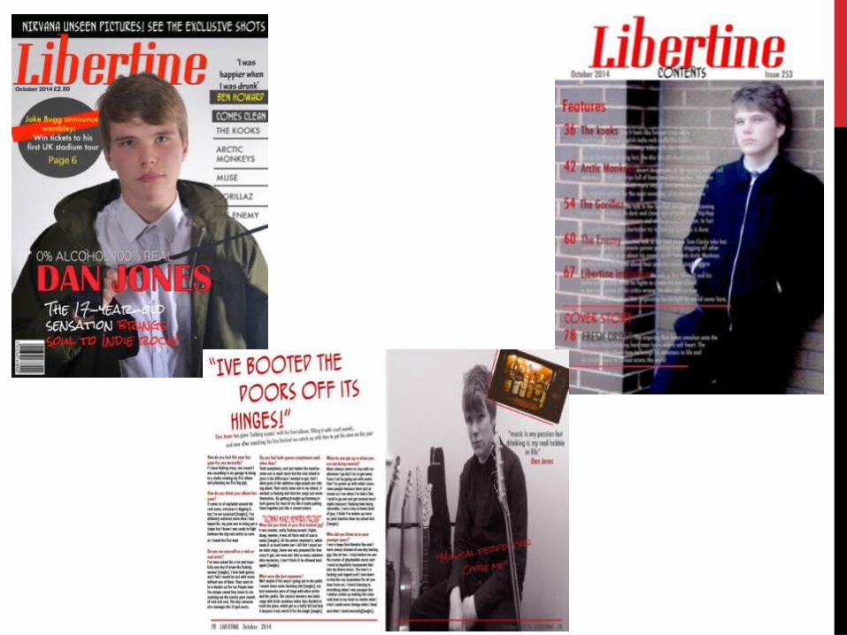

COVER PAGE

FRONT COVER ANALYSIS
Masthead-
My masthead supports the theme of my magazine which is indie rock, the word ‘Libertine’ means to be someone who acts without morals and is a free thinker. The name itself suits the theme of my magazine but also professional rock genre magazines. The color and font of the masthead give a edgy feel to the front cover which would further fit and develop the theme to the reader which is done by all professional music magazines.
Headline-
My headline support the house style I have in my magazine with the large text and main pieces of text in red. The text has a rock and roll feel to it which fits to the theme of my magazine which you see in all professional music magazines. The text above my artists name adds to the depth of the magazine and adds personality to the name. Having it in white and smaller sized means the name stands out.

THE MAIN IMAGE In the main image of my cover page I have the main artist (Dan Jones) dressed to link to both genres he mixes together in his music which is explained in the interview. The shirt and tie are to represent the soul genre which he involves in his music, however the large jacket and having the artist with the tie clenched between his fists represents the rock lifestyle he is described to have. This is done in all professional magazines with the clothes they wear representing them as a person or their music . It also fits with the indie rock theme of my magazine. The color of his clothing makes the text stand out around it especially the main pieces of text in red.
By having the artist keeping eye contact it makes the front cover stand out to the reader, it also gives the tough man personality of my artist. In most music magazines this is something the main image will always have as it gives the reader the fell that the magazine image is looking at you rather than in a random direction which further catches the readers eye and draws them in.
For me having the artist in a kind of action shot like this is very apparent in a lot of magazines as it makes them more interesting if the artist is doing something at the time, it allows you to portrait the artists personality which in my case I wanted to bring out the edgy nature of my artist as again it linked to my magazines rock theme and style.

Cover line and sub heading
Cover line-
Sub heading-
The cover lines link to the rock theme of my magazine with the placement over the image which gives it a messy imperfect feel giving it a rock style. The color and layout of the text links to the conventions of a professional magazine as in all music magazines the text color and
layout link to the magazines style. The quote at the top of the cover lines can also link to the type of artists that are in the magazine and also gives little away but does
enough to make you want to read more
The sub heading links to the age of my artist and the personality he has. The graphite text implies his age and tough personality. This is done in most music magazines as the sub heading can give the reader extra information on the artist they are going to read about.
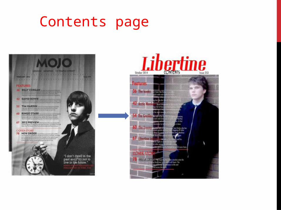
Contents page
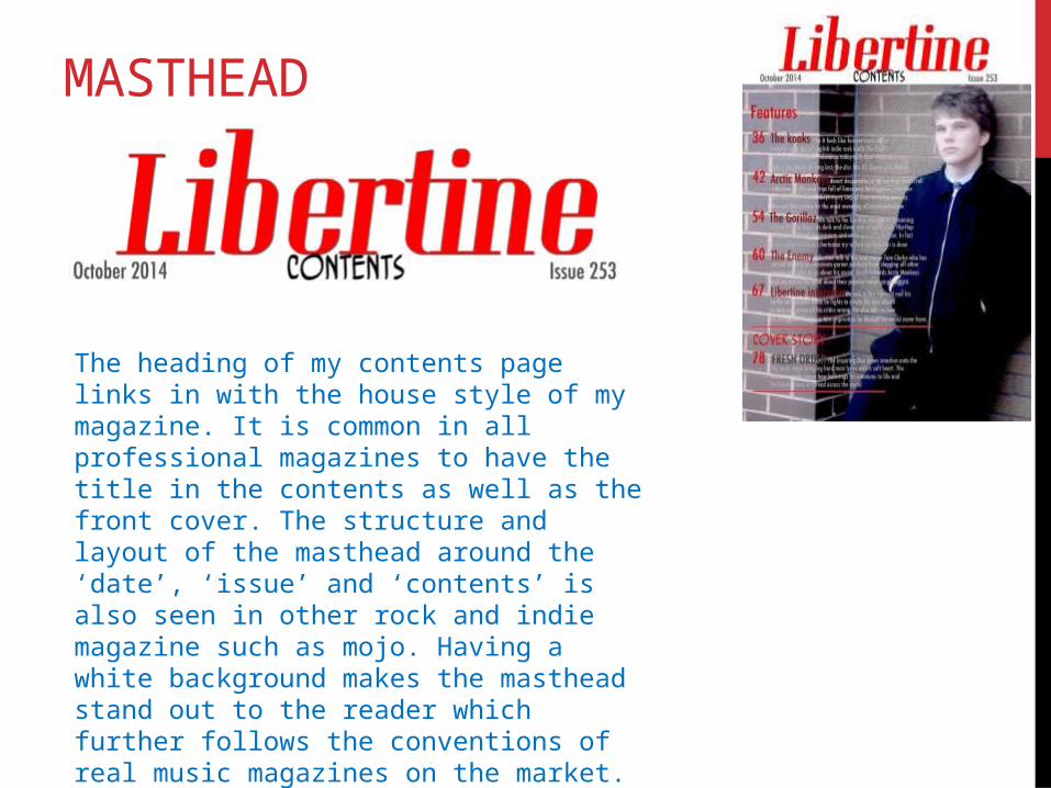
MASTHEAD
The heading of my contents page links in with the house style of my magazine. It is common in all professional magazines to have the title in the contents as well as the front cover. The structure and layout of the masthead around the ‘date’, ‘issue’ and ‘contents’ is also seen in other rock and indie magazine such as mojo. Having a white background makes the masthead stand out to the reader which further follows the conventions of real music magazines on the market.

TEXT(THE CONTENT)
The text in my contents page fits with the theme and style of my magazine as the structure and colour gives and rock vibe. The colour red and light grey fits to the house theme as these are the colours shown throughout my cover, contents and article. This is a convention in all music magazines. My text is informal to the reader allowing me to get through to them a lot easier and giving a friendly and appealing feel, nearly all music magazines aim to be informal to the reader.

IMAGERY The image of my artist in the magazine fits to the theme of my magazine due to the rock clothing such as the jackets. Professional magazines commonly dress the artist to the style of their magazine and also the personality which I have done. My artist also fits the conventions of imagery as he keeps eye contact to the camera. My artist is lent back on the wall with his leg up further linking to the cool and rock vibe of the magazine.

The Article

Heading and text
Heading- My heading fits with the regular conventions of music magazine articles as many include a quote with an explanation of what the article is about underneath. The quote also links with the style of my artist and also the style of the rock theme. The aggression of the quote shows the type of person he is. This is done in other music magazines as they often include quotes to get a certain characteristic of the artist across.
Text- The text of the article also links to real music magazines conventions as a Q&A style of writing, also the questions have a informal style and includes both the artists life musically but also their life outside of music further making it informal to the reader.

Quotations
The quotations in my article page links to the type of person my artist is, I tried to get through the vain and easy living characteristics of my artist. This is done by real music magazines as a convention in order to give across the artist or bands personality.

IMAGERY The imagery in my article further follow the conventions of the artist I have portrayed throughout the three pages. In the background of my artist there is a rack of guitars which allows the reader to get a better idea of the personality and the artists type of music. This is a convention found in most music magazines with the background adding a lot of depth to the image but also linking to music genre and the artist or band itself. Also the image of the spirits supports the theme of a rock and roll lifestyle and also the lifestyle of my artist. Music magazines include multiple images to create a more visually appealing page for the reader.