principles of visual design 2720 here’s a little design story... principles of visual design lcc...
TRANSCRIPT

Principles of Visual Design 2720
Here’s a little design story...
Principles of Visual Design LCC 2720Instructor: Brian Schrank

Principles of Visual Design 2720
Last summer I was in Israel looking for work and decided to apply to Haaretz.com, the website of the largest newspaper in Israel...

Principles of Visual Design 2720
I cold e-mailed the editor stating:
1) How I can benefit Haaretz.com
2) Who I am and my background
3) What my overall career interests are
Principles of Visual Design 2720
...I included in the e-mail the following images and critique of Haaretz.com:

Principles of Visual Design 2720
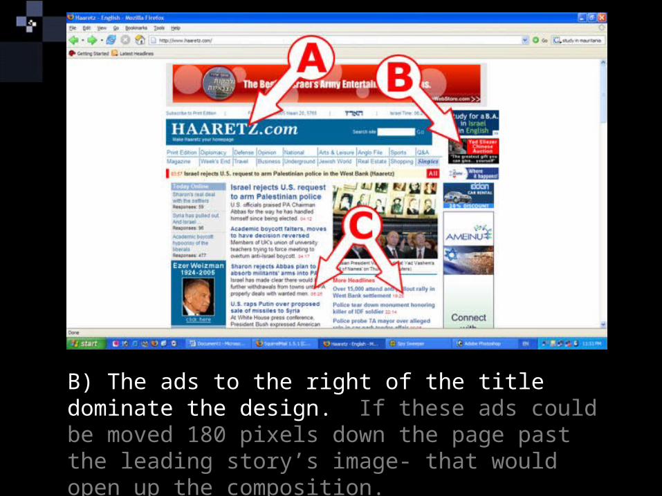
A) The title “HAARETZ.com” should stand out more- it looks confined or buried in the blue rectangle. One possibility would be to change it to blue text on white background.
Principles of Visual Design 2720
B) The ads to the right of the title dominate the design. If these ads could be moved 180 pixels down the page past the leading story’s image- that would open up the composition.

Principles of Visual Design 2720
C) The title and body text of the top 7 or 8 stories are dense and straining to read. The top 2-3 stories could be presented more strongly and each be augmented with an image.

Principles of Visual Design 2720
D) The links here are also hard to read for several reasons. First, there are distracting lines between the links. These are trying to associate a framework, but it doesn’t work because of the different lengths of the links. This makes the negative spacing irregular.

Principles of Visual Design 2720
D) If they each were unified, in simple blue buttons with white font, for example that would facilitate faster scanning. Also, they are randomly stacked, making them cluttered to glance through, possibly a slanted stack or, menu column would work better for so many links.

Principles of Visual Design 2720
E) This “ticker tape” is an interesting idea. I would recommend pushing it further. For starters the moving text could be expanded to use an entire paragraph box that would switch the story inside as well as an image of the story every 5 seconds or so.

Principles of Visual Design 2720
E) This would be cool and I’ve never seen it before except as a special effect in the Movie “Minority Report.”

Principles of Visual Design 2720
E) (If you saw the movie it’s the part when the police identify Tom Cruise as the killer. A train passenger’s newspaper automatically updates with the new headline of Tom’s wanted photo/video and accompanying article.)

Principles of Visual Design 2720
E) If this is to intensive of a change at least speeding up the ticker tape would enhance the feeling of reading “up to the minute news”. I’d take a look at Fox News or CNN and actually time how fast the ticker tape is moving.

Principles of Visual Design 2720
F) There are several places on the front page where stories are repeated. These could be somehow consolidated. If there is a discussion board about one of the articles, the link should be right below the article.

Principles of Visual Design 2720
G) Looking at Ynet.co.il as an example, they have more space in the top most section of their paper –this makes it feels “more expensive” because space is a luxury. Also, a single strong image (about a news story) dominates the top, not the top ad banner.

Principles of Visual Design 2720
H) More white space is being used at Ynet. They push the different areas apart making them easier to scan and locate stories of interest.

Principles of Visual Design 2720
I) Ynet chooses to pick 2 top stories to concentrate on and really shows them off near the top of their page.

Principles of Visual Design 2720
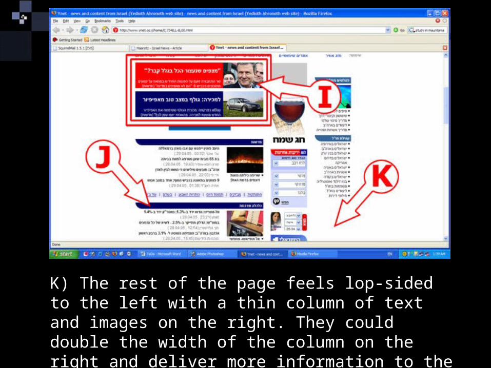
J) The way they chose to break up their space is with dark blue category bars. There are many ways we could break up the front page of Haaretz, this is only one way.

Principles of Visual Design 2720
K) A mistake they make is near the top of their front page they have a column of text that ends after several inches (they’ve slightly improved this in the last several weeks).
Principles of Visual Design 2720
K) The rest of the page feels lop-sided to the left with a thin column of text and images on the right. They could double the width of the column on the right and deliver more information to the reader more quickly.

Principles of Visual Design 2720
K) If Haaretz did something like this, and some of the other changes listed above, I think we’d have a stronger website with much faster scan times to locate stories (and ads) of interest.

Principles of Visual Design 2720
The editor returned my e-mail and we set up a meeting...

Principles of Visual Design 2720
The editor returned my e-mail and we set up a meeting...
...We meet for an hour and a half brainstorming on the website...

Principles of Visual Design 2720
The editor returned my e-mail and we set up a meeting...
...We meet for an hour and a half brainstorming on the website...
...then he told me his budget was basically his and his assistant’s salaries...

Principles of Visual Design 2720
The editor returned my e-mail and we set up a meeting...
...We meet for an hour and a half brainstorming on the website...
...then he told me his budget was basically his and his assistant’s salaries...
...and I didn’t get the job.

Principles of Visual Design 2720
The editor returned my e-mail and we set up a meeting...
...We meet for an hour and a half brainstorming on the website...
...then he told me his budget was basically his and his assistant’s salaries...
...and I didn’t get the job... But...