profile manual - axess
TRANSCRIPT
drillinG contractors
enerGYcompanies
fpSo contractors
mmocompanies
Surfcompanies
World-class integrity solutionsfor
WE: createWE: careWE: challenGeWE: communicateWE: contributeWE: createWE: deliverWE: execute
WE: focuSWE: improveWE: innovateWE: involveWE: liStenWE: reSpondWE: Solve
WE: SOLVE
DRILLING Contractors
ENERGYCompanies
FPSO Contractors
MMOCompanies
SURFCompanies
World class integrity solutionsfor
DRILLING Contractors
ENERGYCompanies
FPSO Contractors
MMOCompanies
SURFCompanies
World class integrity solutions
for
Molde
Bergen
Huston
Rio de Janeiro
Kristiansund
Trondheim
Orkanger
Singapore
You can achieve anything in the world when your heart lies in Molde
WE: SOLVE
WE: CHALLANGE
www.axess.no www.axess.no
WE: INNOVATE
WE: CREATE
Pudaecto bera vero incimiSum sin estTentorrovit del idem Doluptati que num aute Dis osam, id ulpa velibus Dandiassum eost, incia dis Molorro maion poreici mi
2/3
1/3
Postboks 2197, Oscar Hanssens vei 5, N–6415 MOLDE | Org.nr. 980 123 537 | Tel. +47 982 43 600 | [email protected] | www.axess.no
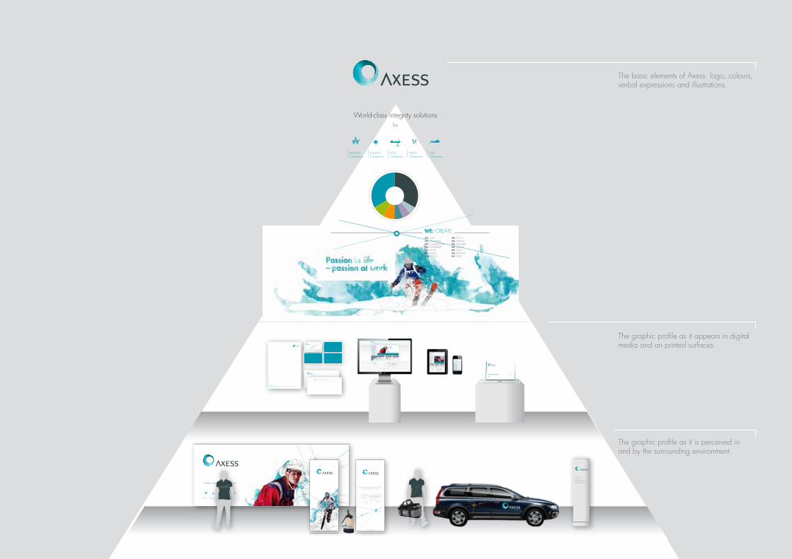
the basic elements of axess: logo, colours, verbal expressions and illustrations.
the graphic profile as it appears in digital media and on printed surfaces.
the graphic profile as it is perceived in and by the surrounding environment.
9
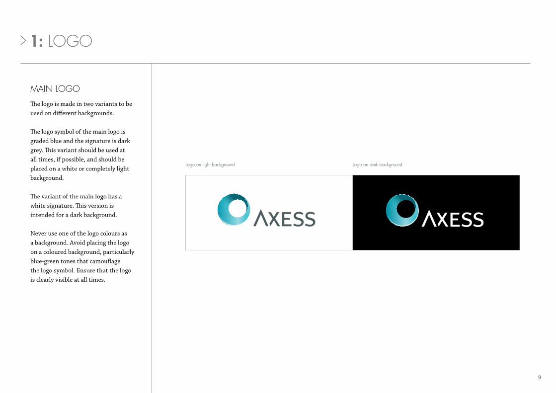
main loGo
The logo is made in two variants to be used on different backgrounds.
The logo symbol of the main logo is graded blue and the signature is dark grey. This variant should be used at all times, if possible, and should be placed on a white or completely light background.
The variant of the main logo has a white signature. This version is intended for a dark background.
Never use one of the logo colours as a background. Avoid placing the logo on a coloured background, particularly blue-green tones that camouflage the logo symbol. Ensure that the logo is clearly visible at all times.
logo on light background logo on dark background
1: loGo
10
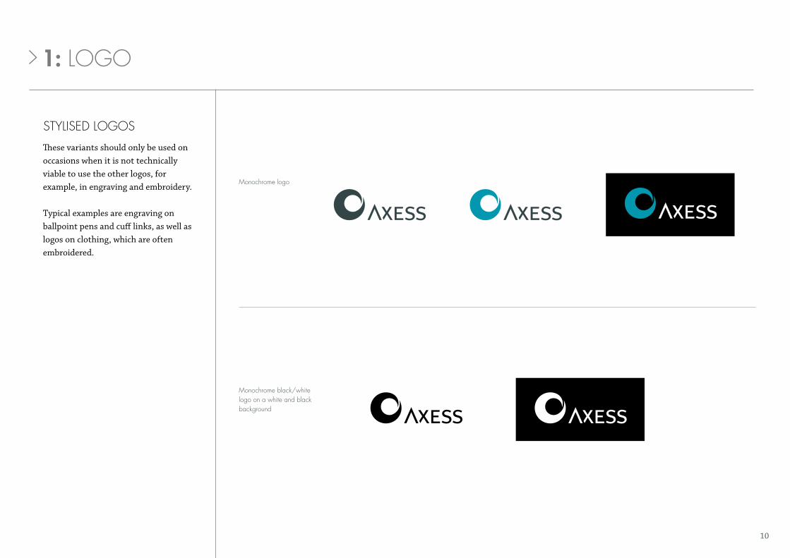
StYliSed loGoS
monochrome black/white logo on a white and black background
These variants should only be used on occasions when it is not technically viable to use the other logos, for example, in engraving and embroidery.
Typical examples are engraving on ballpoint pens and cuff links, as well as logos on clothing, which are often embroidered.
monochrome logo
1: loGo

11
logo on a picture background
loGo on a picture backGround
When the logo is placed on a picture, ensure that it is clearly visible.
Avoid placing the logo on untidy picture backgrounds.
variants not permitted
1: loGo
12
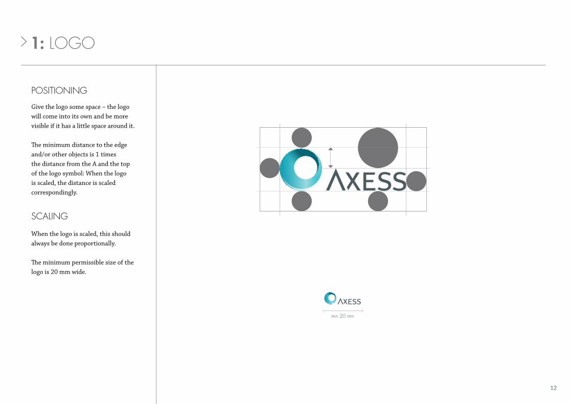
poSitioninG
Give the logo some space – the logo will come into its own and be more visible if it has a little space around it.
The minimum distance to the edge and/or other objects is 1 times the distance from the A and the top of the logo symbol: When the logo is scaled, the distance is scaled correspondingly.
min 20 mm
ScalinG
When the logo is scaled, this should always be done proportionally.
The minimum permissible size of the logo is 20 mm wide.
1: loGo
15
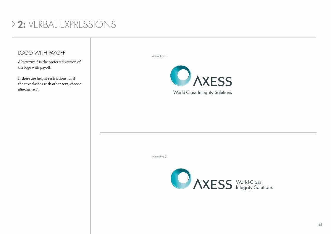
loGo With paYoff
Alternative 1 is the preferred version of the logo with payoff.
If there are height restrictions, or if the text clashes with other text, choose alternative 2.
2: verbal expreSSionS
World-Class Integrity Solutions
alternative 1
alternative 2

16
loGo With paYoff
2: verbal expreSSionS
logo with payoff on a light background logo with payoff on a dark background
17
x
x
min 20 mm
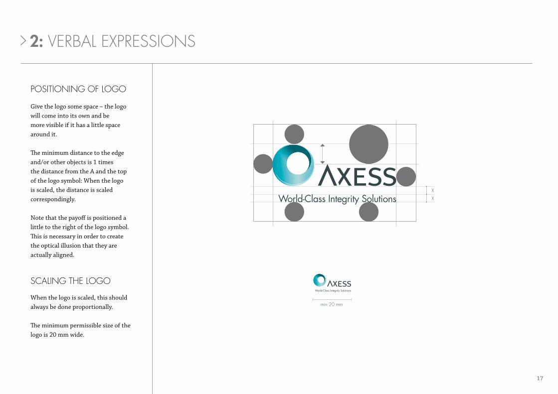
poSitioninG of loGo
Give the logo some space – the logo will come into its own and be more visible if it has a little space around it.
The minimum distance to the edge and/or other objects is 1 times the distance from the A and the top of the logo symbol: When the logo is scaled, the distance is scaled correspondingly.
Note that the payoff is positioned a little to the right of the logo symbol. This is necessary in order to create the optical illusion that they are actually aligned.
ScalinG the loGo
When the logo is scaled, this should always be done proportionally.
The minimum permissible size of the logo is 20 mm wide.
2: verbal expreSSionS
23
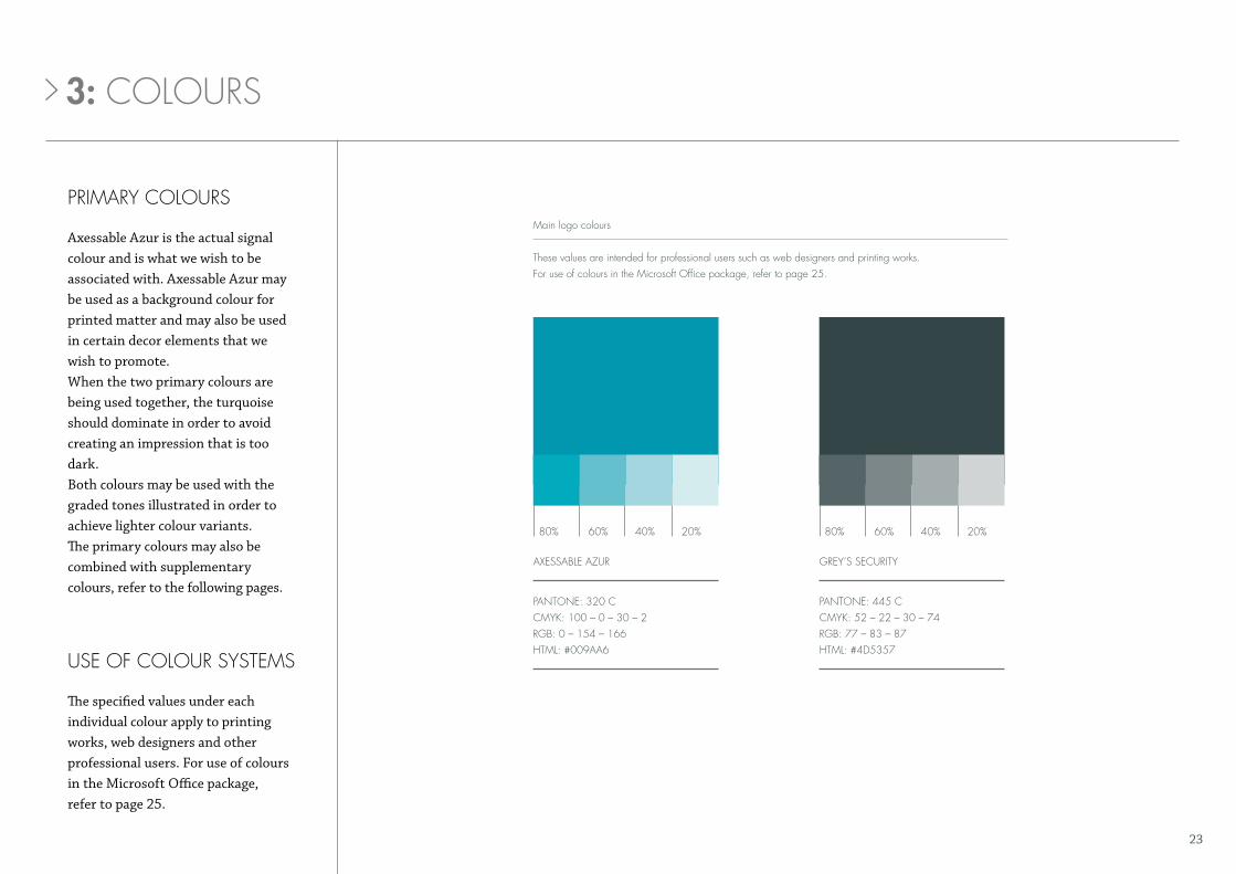
primarY colourS
uSe of colour SYStemS
Axessable Azur is the actual signal colour and is what we wish to be associated with. Axessable Azur may be used as a background colour for printed matter and may also be used in certain decor elements that we wish to promote.When the two primary colours are being used together, the turquoise should dominate in order to avoid creating an impression that is too dark. Both colours may be used with the graded tones illustrated in order to achieve lighter colour variants.The primary colours may also be combined with supplementary colours, refer to the following pages.
The specified values under each individual colour apply to printing works, web designers and other professional users. For use of colours in the Microsoft Office package, refer to page 25.
pantone: 320 ccmYk: 100 – 0 – 30 – 2rGb: 0 – 154 – 166 html: #009aa6
axeSSable azur
80% 80%60% 60%40% 40%20% 20%
GreY’S SecuritY
pantone: 445 ccmYk: 52 – 22 – 30 – 74rGb: 77 – 83 – 87html: #4d5357
main logo colours
these values are intended for professional users such as web designers and printing works. for use of colours in the microsoft office package, refer to page 25.
3: colourS
24
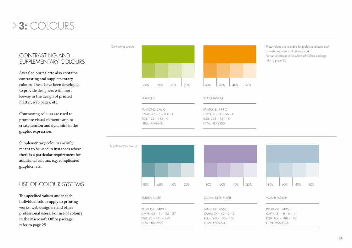
contraStinG and SupplementarY colourS
Supplementary colours
contrasting colours
pantone: 376 ccmYk: 47 – 5 – 100 – 0rGb: 122 – 184 – 0html: #7ab800
pantone: 5483 ccmYk: 65 – 11 – 25 – 27rGb: 88 – 145 – 153 html: #589199
SeaWeed
SubSea, u See
80%
80%
80%
80% 80%
60%
60%
60%
60% 60%
40%
40%
40%
40% 40%
20%
20%
20%
20% 20%
Sea o’ranGer
ocean deep, purple WaShY WaShY
pantone: 144 ccmYk: 0 – 50 – 99 – 0rGb: 233 – 131 – 0html: #e98300
pantone: 666 ccmYk: 37 – 42 – 2 – 5rGb: 160 – 146 – 180 html: #a092b4
pantone: 5435 ccmYk: 31 – 8 – 6 – 11rGb: 166 – 188 – 198html: #a6bcc6
Axess' colour palette also contains contrasting and supplementary colours. These have been developed to provide designers with more leeway in the design of printed matter, web pages, etc.
Contrasting colours are used to promote visual elements and to create tension and dynamics in the graphic expression.
Supplementary colours are only meant to be used in instances where there is a particular requirement for additional colours, e.g. complicated graphics, etc.
3: colourS
uSe of colour SYStemS
The specified values under each individual colour apply to printing works, web designers and other professional users. For use of colours in the Microsoft Office package, refer to page 25.
these values are intended for professional users such as web designers and printing works. for use of colours in the microsoft office package, refer to page 25.
25
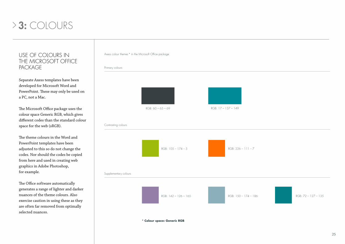
axess colour themes * in the microsoft office package
primary colours
uSe of colourS in the microSoft office packaGe
Separate Axess templates have been developed for Microsoft Word and PowerPoint. These may only be used on a PC, not a Mac.
The Microsoft Office package uses the colour space Generic RGB, which gives different codes than the standard colour space for the web (sRGB).
The theme colours in the Word and PowerPoint templates have been adjusted to this so do not change the codes. Nor should the codes be copied from here and used in creating web graphics in Adobe Photoshop, for example.
The Office software automatically generates a range of lighter and darker nuances of the theme colours. Also exercise caution in using these as they are often far removed from optimally selected nuances.
3: colourS
rGb: 72 – 127 – 135rGb: 142 – 126 – 165 rGb: 150 – 174 – 186
rGb: 60 – 65 – 69 rGb: 17 – 137 – 149
* Colour space: Generic RGB
rGb: 105 – 174 – 5 rGb: 226 – 111 – 7
contrasting colours
Supplementary colours
28
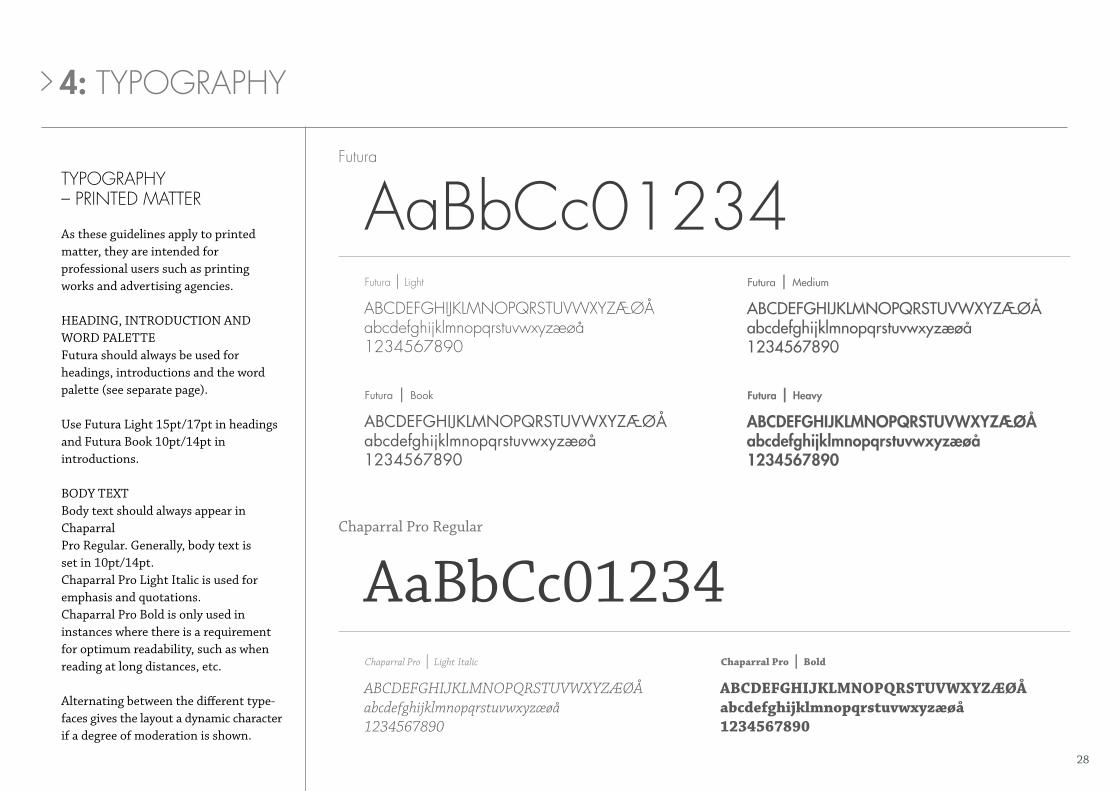
tYpoGraphY – printed matter
As these guidelines apply to printed matter, they are intended for professional users such as printing works and advertising agencies.
HEADING, INTRODUCTION AND WORD PALETTEFutura should always be used for headings, introductions and the word palette (see separate page).
Use Futura Light 15pt/17pt in headings and Futura Book 10pt/14pt in introductions.
BODy TExTBody text should always appear in ChaparralPro Regular. Generally, body text isset in 10pt/14pt.Chaparral Pro Light Italic is used foremphasis and quotations.Chaparral Pro Bold is only used ininstances where there is a requirement for optimum readability, such as when reading at long distances, etc.
Alternating between the different type-faces gives the layout a dynamic character if a degree of moderation is shown.
abcdefGhijklmnopqrstuvwxyzæøåabcdefghijklmnopqrstuvwxyzæøå1234567890
futura | medium
abcdEfghijklmnopqrstuvWxyzæøåabcdefghijklmnopqrstuvwxyzæøå1234567890
futura | heavy
abcdefGhiJklmnopqrStuvWxYzæøåabcdefghijklmnopqrstuvwxyzæøå1234567890
aabbcc01234futura | light
futura
abCdefghIjklmnopqrStuvWxyzæøåabcdefghijklmnopqrstuvwxyzæøå1234567890
futura | book
abCdefghIjklmnopqrStuvWxyzæøåabcdefghijklmnopqrstuvwxyzæøå1234567890
abcdefghijklmnopqrstuvWxyzæøåabcdefghijklmnopqrstuvwxyzæøå1234567890
AaBbCc01234Chaparral pro | light Italic chaparral pro | bold
Chaparral Pro Regular
4: tYpoGraphY

30
tYpoGraphY – Word, poWerpoint, etc.
Text written by employees in prefabricated templates in Word, for example.
HEADING AND INTRODUCTIONCentury Gothic Regular is used for headings and introductions. Bold and Italic may be used for emphasising words, quotations and short sentences.
BODy TExTBody text should always appear in Arial Regular. Arial Bold may be used for emphasising short words and sentences. In addition to Bold, Arial Italic may be used, if required.
AaBbCc01234
AaBbCc01234
Century Gothic
Arial
ABCdefGhijklmnopqrstabcdefghijklmnopqrstuvw1234567890
abcdefghijklmnopqrst abcdefghijklmnopqrstuvw1234567890
abcdefghijklmnopqrstabcdefghijklmnopqrstuvw1234567890
ABCdefghijklmnopqrstabcdefghijklmnopqrstuvwx1234567890
abcdefghijklmnopqrstabcdefghijklmnopqrstuvwx1234567890
abcdefghijklmnopqrstabcdefghijklmnopqrstuvw1234567890
Century gothic | regular Century Gothic | Italic century gothic | bold
Arial | regular arial | italic arial | bold
4: tYpoGraphY

32
tYpoGraphY – Web
Headings, introductions and the word palette (see separate page) should always appear in the Futura font.
Body text should always appear in Arial Regular. Arial Bold may be used for emphasising short words and sentences. In addition to Bold, Arial Italic may be used, if required.
aabbCc01234
AaBbCc01234
futura
Arial
futura | book Futura | Book Oblique futura | heavy
ABCdefghijklmnopqrstabcdefghijklmnopqrstuvwx1234567890
abcdefghijklmnopqrstabcdefghijklmnopqrstuvwx1234567890
abcdefghijklmnopqrstabcdefghijklmnopqrstuvw1234567890
Arial | regular arial | italic arial | bold
abCdefghIjklmnopqrStabcdefghijklmnopqrstuvw1234567890
ABCDEFGHIJKLMNOPQRST abcdefghijklmnopqrstuvw1234567890
abcdEfghijklmnopqrstabcdefghijklmnopqrstuvw1234567890
4: tYpoGraphY
35
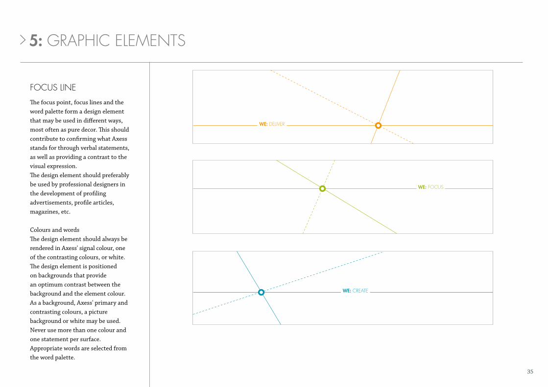
focuS line
The focus point, focus lines and the word palette form a design element that may be used in different ways, most often as pure decor. This should contribute to confirming what Axess stands for through verbal statements, as well as providing a contrast to the visual expression.The design element should preferably be used by professional designers in the development of profiling advertisements, profile articles, magazines, etc.
Colours and wordsThe design element should always be rendered in Axess' signal colour, one of the contrasting colours, or white. The design element is positioned on backgrounds that provide an optimum contrast between the back ground and the element colour. As a background, Axess' primary and contrasting colours, a picture background or white may be used.Never use more than one colour and one statement per surface.Appropriate words are selected from the word palette.
WE: deliver
WE: focuS
WE: create
5: Graphic elementS

36
WE: deliver
WE: focuS
WE: create
Focus lines positioned on a coloured background.
5: Graphic elementS
37
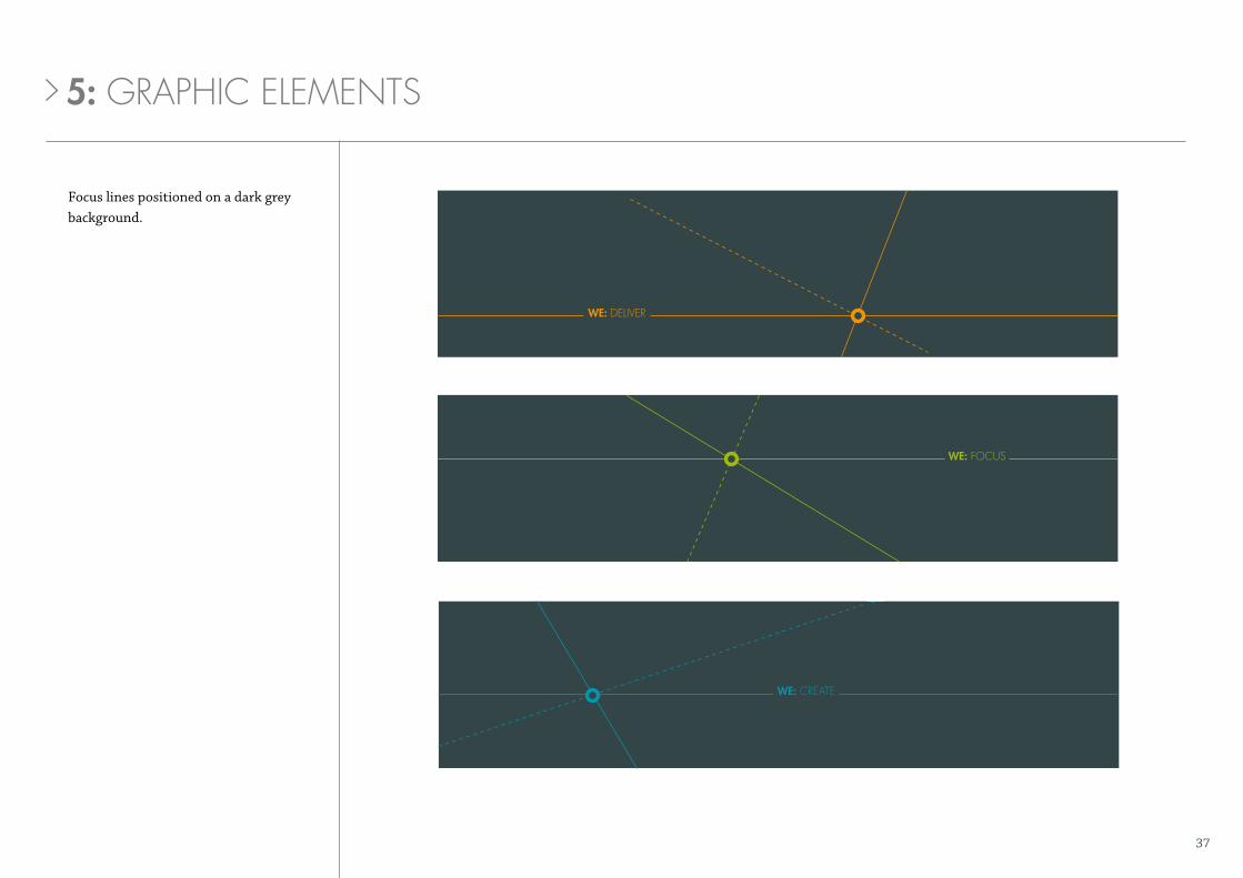
Focus lines positioned on a dark grey background.
WE: deliver
WE: focuS
WE: create
5: Graphic elementS

38
WE: deliver
a a
thickness: a/5
thickness: a/5
positioning of baseline
text is aligned with the lower part of the line.
optimum positioninga
min. a
x x
a2a
4a
>5°
conStruction GuidelineS
Text size and line thickness will vary when the design element is scaled up and down. The minimum permissible font size is 6 point. The minimum line thickness is 0.5 point.These guidelines are intended to achieve the most optimum result. Professional designers may adapt according to their own requirements, where necessary.
Ensure that the lines run through the centre of the circle. As far as is possible, the lines should extend beyond the circle's edge.The thickness of the circle is set to A. This may also be made thinner, up to 1/2A. This gives the ratio 4A = 1/2A + 3A + 1/2A.
5: Graphic elementS

39
drillinG contractors
enerGYcompanies
fpSo contractors
mmocompanies
Surfcompanies
iconS
The icons are used to create an immediate visual impression of the specialised spheres we approach and work within: Drilling Contractors, Energy Companies, FPSO Contractors, MMO Companies and SURF Companies. The icons may be used in all instances where Axess presents its core operations. The explanatory text should be present where possible. The icons may be used in both primary colours, and in white.
5: Graphic elementS