published by golden artist colors, inc. / issue 26oldsite.justpaint.org/archive/jp26.pdfpublished by...
TRANSCRIPT
JUST PAINTPublished by Golden Artist Colors, Inc. / Issue 26
Issue 26 page 1 ©2012 Golden Artist Colors, Inc.
From Mark Golden Twenty-six issues of this technical newsletter and I am delighted to share we are still continuing the dialogue on color! After the success of Sarah Sands’ article on the ‘Subtleties of Color’ (JP 21), we recognized the value of continuing to provide more color resources for artists. The Tint & Glaze Poster was the first significant new tool for artists to come from this research. Following up on this work to create a printed color chart trying to represent real paint colors, Chris Farrell, our Creative Director and person in charge of putting together this chart, is our principle advocate that printing, no matter how carefully it’s done, cannot be a substitute for paint. In this issue, Chris shares the significant differences in ranges possible with commercial printing processes and real paint. Our Director of the GOLDEN Certified Working Artist Program and author, Patti Brady, shares her painterly insights into a new Modern Theory Color Mixing Set for artists, which takes just the opposite tact from Chris, in working with a limited set of colors to produce an enormous range of mixing colors. Continuing the color theme, Amy McKinnon, from our Technical Support team, uncovers the 18 new colors being added to the Williamsburg Handmade Oils line. It’s exciting to be able to share that the legacy of Carl’s paints are being expanded to even more options for artists working with the materials. Ulysses Jackson, from our Technical Support and Research & Development groups describes the new experimental acrylic products which have always been an exciting jumping off point for artists to test and play. Finally, we get to meet yet another colleague from our Technical Support team, Lori Wilson. Lori is a home grown talent who has taken her skills to artists around the world. There are few people who meet Lori who don’t find themselves wishing they could spend more time with her. As we greet yet another new year, we welcome you to our “Just Paint 26”. Thank you for your support and we look forward to your comments.
By Patti Brady IhadbeengivenwhattomeseemedlikethedauntingtaskofwritinganarticleoncolormixingandtointroducethenewModernTheoryColorMixingSet.IwasmorethanslightlyastonishedthatIwasthedesignatedwriter!WehaveanamazingnumberofwonderfulpaintersworkingforGoldenArtistColors,manyinhighlytechnicalcapacities,andseveralwhotaughtcoloratprestigiousUniversities.Coupledwiththat,theseartistsworkwithpigmentsusingscales(forprecisionmixingratios),spectrophotometers(formeasuringcolor),speciallighting,lightboxes,andsometrulyamazingcomputerprograms!Myapproachtocolorasanartisthasalwaysbeentojustplayandyou’lldiscover.Notheorysubstitutesforactuallyusingthepaint,butI’vetaughtlongenoughtoknowthatknowledge,evenatabasiclevel,willreversealotofwastedeffortandagooddealofwastedpaint! Thereareprobablyasmanytheoriesofthecorrectcolormixingpaletteforartistsasthereareartiststhat
promotethem.However,eachoftheseconcepts,whetherhistorical,contemporaryorgenrespecific,createastartingpointthatisextremelyhelpfulfortheartistbeginningtoassembletheirownaestheticapproachtopainting.TheconceptaroundthenewModernTheoryColorMixingSetistoprovidejustoneofthosevantagepoints.Thissingularpositionistocreatewithinareasonablysmallselectionofcolors,thepotentialtomixthewidestrangeofuniquecolors.Amoreclassicalapproachwouldattempttocreateapalettewithhistoricallysignificantcolors.Whilethiswillproduceacolorgamutquitecomfortabletomanyartists,therangeofhuesandchroma(colorintensity)issignificantlyreduced.Themodernmixofpigmentsinthisnewsetwillcreateveryhighchroma,brightmixturesthatahistoricalpalettecannotachieve. TheModernTheoryColorMixingSetincludesjustsevencolorsplusTitaniumWhite.Notonlydoesthisallowtheartisttoproducethewidestcolorrangewiththefewestnumberofcolors,italsoprovidesmixturesof
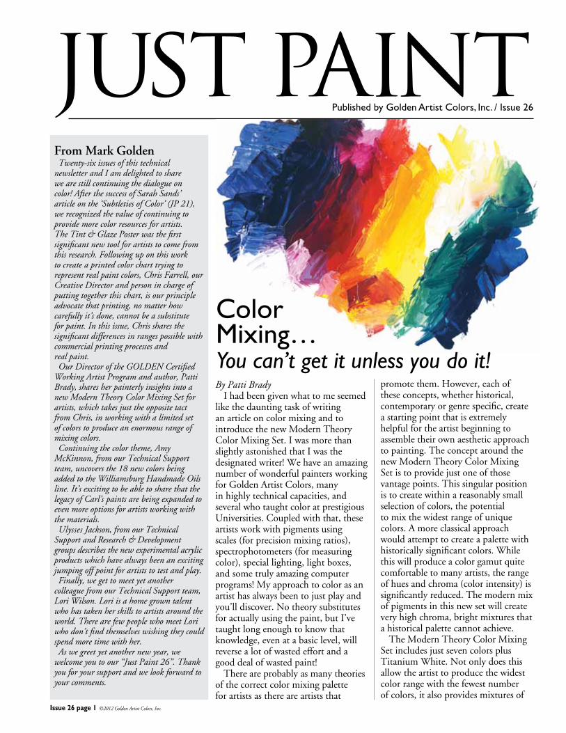
Color Mixing…You can’t get it unless you do it!
Issue 26 page 2 ©2012 Golden Artist Colors, Inc.
remarkablyclean,intensecolorblendsthatretaintheirbrillianceeveninthethinnestwashorglaze.Forthissetwechoseonlyorganiccolors(plusTitaniumWhite),providingawarmandcoolselectionofpigmentsforeachhuespaceotherthangreen.
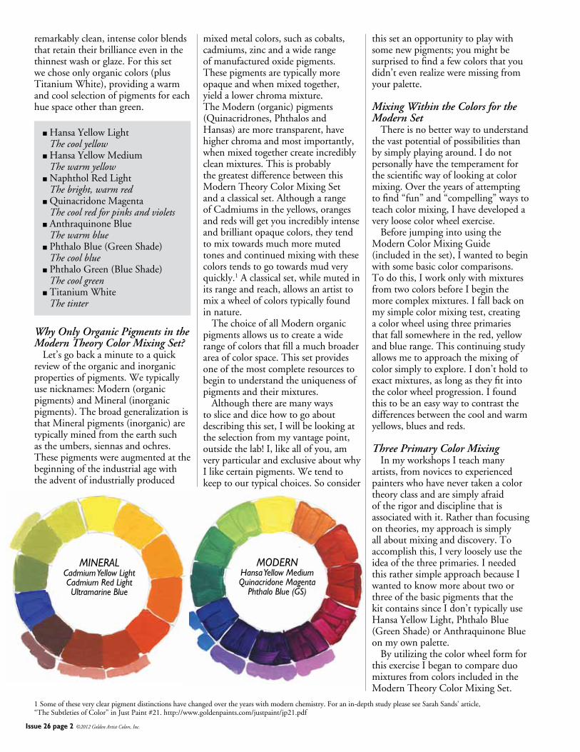
nHansaYellowLight The cool yellownHansaYellowMedium The warm yellownNaphtholRedLight The bright, warm rednQuinacridoneMagenta The cool red for pinks and violetsnAnthraquinoneBlue The warm bluenPhthaloBlue(GreenShade) The cool bluenPhthaloGreen(BlueShade) The cool greennTitaniumWhite The tinter
Why Only Organic Pigments in the Modern Theory Color Mixing Set? Let’sgobackaminutetoaquickreviewoftheorganicandinorganicpropertiesofpigments.Wetypicallyusenicknames:Modern(organicpigments)andMineral(inorganicpigments).ThebroadgeneralizationisthatMineralpigments(inorganic)aretypicallyminedfromtheearthsuchastheumbers,siennasandochres.Thesepigmentswereaugmentedatthebeginningoftheindustrialagewiththeadventofindustriallyproduced
mixedmetalcolors,suchascobalts,cadmiums,zincandawiderangeofmanufacturedoxidepigments.Thesepigmentsaretypicallymoreopaqueandwhenmixedtogether,yieldalowerchromamixture.TheModern(organic)pigments(Quinacridrones,PhthalosandHansas)aremoretransparent,havehigherchromaandmostimportantly,whenmixedtogethercreateincrediblycleanmixtures.ThisisprobablythegreatestdifferencebetweenthisModernTheoryColorMixingSetandaclassicalset.AlthougharangeofCadmiumsintheyellows,orangesandredswillgetyouincrediblyintenseandbrilliantopaquecolors,theytendtomixtowardsmuchmoremutedtonesandcontinuedmixingwiththesecolorstendstogotowardsmudveryquickly.1Aclassicalset,whilemutedinitsrangeandreach,allowsanartisttomixawheelofcolorstypicallyfoundinnature. ThechoiceofallModernorganicpigmentsallowsustocreateawiderangeofcolorsthatfillamuchbroaderareaofcolorspace.Thissetprovidesoneofthemostcompleteresourcestobegintounderstandtheuniquenessofpigmentsandtheirmixtures. Althoughtherearemanywaystosliceanddicehowtogoaboutdescribingthisset,Iwillbelookingattheselectionfrommyvantagepoint,outsidethelab!I,likeallofyou,amveryparticularandexclusiveaboutwhyIlikecertainpigments.Wetendtokeeptoourtypicalchoices.Soconsider
1Someoftheseveryclearpigmentdistinctionshavechangedovertheyearswithmodernchemistry.Foranin-depthstudypleaseseeSarahSands’article,“TheSubtletiesofColor”inJustPaint#21.http://www.goldenpaints.com/justpaint/jp21.pdf
MODERNHansa Yellow MediumQuinacridone Magenta
Phthalo Blue (GS)
MINERALCadmium Yellow LightCadmium Red LightUltramarine Blue
thissetanopportunitytoplaywithsomenewpigments;youmightbesurprisedtofindafewcolorsthatyoudidn’tevenrealizeweremissingfromyourpalette.
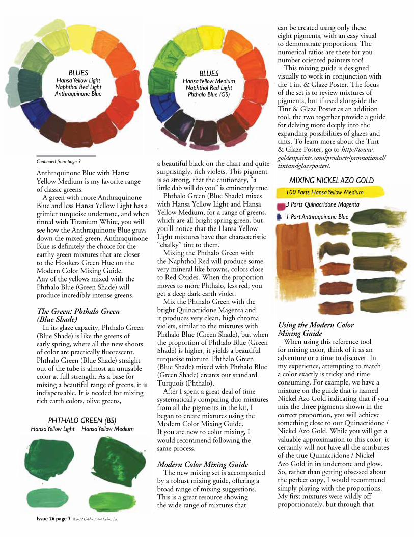
Mixing Within the Colors for the Modern Set Thereisnobetterwaytounderstandthevastpotentialofpossibilitiesthanbysimplyplayingaround.Idonotpersonallyhavethetemperamentforthescientificwayoflookingatcolormixing.Overtheyearsofattemptingtofind“fun”and“compelling”waystoteachcolormixing,Ihavedevelopedaveryloosecolorwheelexercise. BeforejumpingintousingtheModernColorMixingGuide(includedintheset),Iwantedtobeginwithsomebasiccolorcomparisons.Todothis,IworkonlywithmixturesfromtwocolorsbeforeIbeginthemorecomplexmixtures.Ifallbackonmysimplecolormixingtest,creatingacolorwheelusingthreeprimariesthatfallsomewhereinthered,yellowandbluerange.Thiscontinuingstudyallowsmetoapproachthemixingofcolorsimplytoexplore.Idon’tholdtoexactmixtures,aslongastheyfitintothecolorwheelprogression.Ifoundthistobeaneasywaytocontrastthedifferencesbetweenthecoolandwarmyellows,bluesandreds.
Three Primary Color Mixing InmyworkshopsIteachmanyartists,fromnovicestoexperiencedpainterswhohavenevertakenacolortheoryclassandaresimplyafraidoftherigoranddisciplinethatisassociatedwithit.Ratherthanfocusingontheories,myapproachissimplyallaboutmixinganddiscovery.Toaccomplishthis,Iverylooselyusetheideaofthethreeprimaries.IneededthisrathersimpleapproachbecauseIwantedtoknowmoreabouttwoorthreeofthebasicpigmentsthatthekitcontainssinceIdon’ttypicallyuseHansaYellowLight,PhthaloBlue(GreenShade)orAnthraquinoneBlueonmyownpalette. ByutilizingthecolorwheelformforthisexerciseIbegantocompareduomixturesfromcolorsincludedintheModernTheoryColorMixingSet.
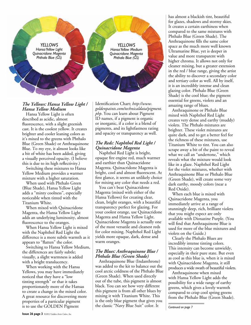
YELLOWSHansa Yellow Light
Quinacridone MagentaPhthalo Blue (GS)
YELLOWSHansa Yellow MediumQuinacridone Magenta
Phthalo Blue (GS)
Issue 26 page 3 ©2012 Golden Artist Colors, Inc.
The Yellows: Hansa Yellow Light / Hansa Yellow Medium HansaYellowLightisoftendescribedasacidic,almostfluorescence,withaslightgreenishcast.Itisthecoolestyellow.Itcreatesbrighterandcoolerleaningcolorsasit’smixedtothegreenswithPhthaloBlue(GreenShade)orAnthraquinoneBlue.Tomyeye,italmostlookslikeabitofwhitehasbeenadded,givingavisuallyperceivedopacity.(Ibelievethisisduetoitshighreflectivity.) SwitchingthesemixturestoHansaYellowMediumprovidesawarmermixturewithahighersaturation. WhenusedwithPhthaloGreen(BlueShade),HansaYellowLightaddsa“mintycoolness”,especiallynoticeablewhentintedwiththeTitaniumWhite. WhenmixedwithQuinacridoneMagenta,theHansaYellowLightaddsanunderlyingluminosity,almostfluorescencetotheoranges. WhenHansaYellowLightismixedwiththeNaphtholRedLightthedifferenceisamoresubtlewarmthasitappearsto“flatten”thecolor. SwitchingtoHansaYellowMedium,thedifferencesarefairlysubtle;visually,aslightwarmnessisaddedwithabrighttranslucency. WhenworkingwiththeHansaYellows,youmayhaveimmediatelynoticedthattheyhavea“lowtintingstrength”orthatittakesproportionatelymoreoftheHansastocreateachangeinthemixedcolor.AgreatresourcefordiscoveringmorepropertiesofaparticularpigmentistousetheGOLDENPigment
IdentificationChart;http://www.goldenpaints.com/technicaldata/pigment.php.YoucanlearnaboutPigmentIDnames,ifapigmentisorganicorinorganic,ifacolorisablendofpigments,anditslightfastnessratingandopacityortransparencyaswell.
The Reds: Naphthol Red Light / Quinacridone Magenta NaphtholRedLightisbright,opaquefireenginered,muchwarmerandearthierthanQuinacridoneMagenta.QuinacridoneMagentaisbright,coolandalmostfluorescent.Atfirstglance,itseemsanunlikelychoiceformixinganycolorthatneedsared. Youcan’tbeatQuinacridoneMagenta(mixedwitheitheroftheHansaYellows)forcreatingclear,clean,brightoranges,withabeautifultransparencyperfectforglazing.Foryourcoolestorange,useQuinacridoneMagentaandHansaYellowLight.QuinacridoneMagentaisactuallyoneofthemostversatileandcleanestredsforcolormixing.NaphtholRedLightyieldsmoreopaque,dark,denseandwarmoranges.
The Blues: Anthraquinone Blue / Phthalo Blue (Green Shade) AnthraquinoneBlue(Indanthrone)wasaddedtothekittobalanceoutthecoolarcticcoldnessofthePhthaloBlue(GreenShade).Whenuseddirectlyoutofthetube,thispigmentisalmostblack.YoucanseehowverydifferentthispigmentisfromallotherbluesbymixingitwithTitaniumWhite.Thisistheonlybluepigmentthatgivesyoutheclassic“NavyBlueSuit”color.It
hasalmostablackishtint,beautifulforglazes,shadowsandstormyskies.ItcreatesacertainearthinesswhencomparedtothesamemixtureswithPhthaloBlue(GreenShade).TheAnthraquinonefillsthesamecolorspaceasthemuchmorewellknownUltramarineBlue,yetisdeeperinvalueandmoretransparentwithhigherchroma.Itallowsnotonlyforcleanermixing,butagreaterextensioninthered/bluerange,givingtheartisttheabilitytodiscoverasecondarycolorandtertiarycoloraswell.Allbyitself,itisanincrediblyintenseandcleanglazingcolor.PhthaloBlue(GreenShade)isthecoolblue;thepigmentessentialforgreens,violetsandanamazingrangeofblues. AnthraquinoneorPhthaloBluemixedwithNaphtholRedLightcreatesverydenseandearthy(muddy)violets.ThePhthalomixturesarebrighter.Thesevioletmixturesarequitedark,andtogetabetterfeelfortherichnessofthesemixtures,useTitaniumWhitetotint.Youcanalsoscrapeawayabitofthepainttorevealwhatwecallan“undertone,”whichrevealswhatthemixturewouldlooklikeinaglaze.NaphtholRedLightforthevioletmixtures,whetherwithAnthraquinoneBlueorPhthaloBlue(GreenShade),willcreatesomeverydarkearthy,moodycolors(nearaRedOxide). WheneachblueismixedwithQuinacridoneMagenta,youimmediatelyarriveatarangeofstunninglydeep,rich,brilliantvioletsthatyoumightexpectareonlyavailablewithDioxazinePurple.(YouwillfindthatAnthraquinoneBlueisusedformoreofthebluemixturesandvioletsontheGuide.) ClearlythePhthaloBluesareincrediblyintensetintingcolors.Thisintensitycanbecomeunwieldy,especiallyintheirpurestate.Butevenascoolasthisblueis,whenitismixedwithQuinacridoneMagenta,itstillproducesawideswathofbeautifulviolets. AnthraquinonewhenmixedwithHansaYellowLightaddsthepossibilityforawiderangeofearthygreens,whichgivesalovelywarmthcomparedtocrispcoolspringgreensfromthePhthaloBlue(GreenShade).
Continued on page 7
Issue 26 page 4 ©2012 Golden Artist Colors, Inc.
By Christopher Farrell Althoughitwillbemyintentiontopresentastand-aloneessayrelatingtotheperception,useandtechnologyofcolorandcolorreproduction,itisinevitablethatreferenceswillbemadetotheJustPaint22article“TheSubtletiesofColor”asitservesasnotonlytheconceptualstartingpointforthisarticle,butasthecatalystforanodysseyofcolorexplorationthatcontinuestothisday.ItshouldnotberequiredreadingforthecomprehensionofwhatIamabouttoshare,butIbelieveitwillbehelpfultoreadthisarticleaswell.
SarahSands’articlesetoffaseriesofeventsthatledtotheprintingoftheTint&GlazePosterthatwasfirstmadeavailabletoGOLDENcustomersinFebruaryof2010.Thesecondeditionofthisposterbeganappearinginstoreslateinthesummerof2010.BeyondtheTint&GlazePoster,otherideasandapplicationsofthecolorexplorationthatstartedwiththisarticlehavebeenintheworks.
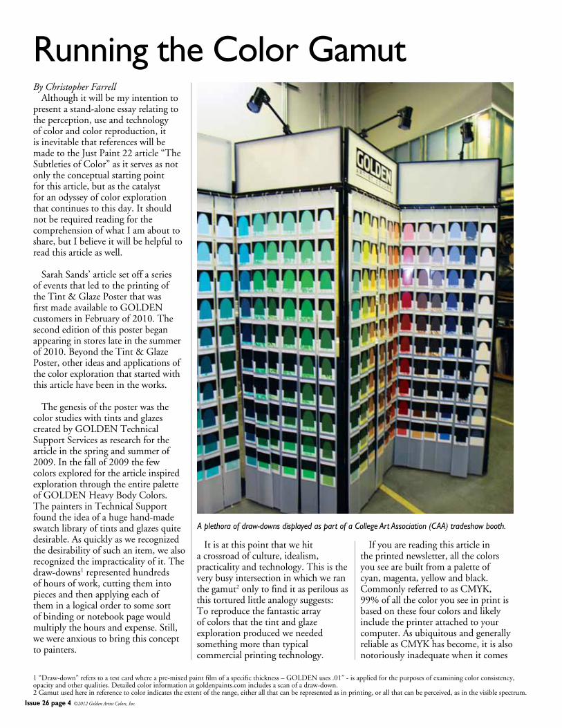
ThegenesisoftheposterwasthecolorstudieswithtintsandglazescreatedbyGOLDENTechnicalSupportServicesasresearchforthearticleinthespringandsummerof2009.Inthefallof2009thefewcolorsexploredforthearticleinspiredexplorationthroughtheentirepaletteofGOLDENHeavyBodyColors.ThepaintersinTechnicalSupportfoundtheideaofahugehand-madeswatchlibraryoftintsandglazesquitedesirable.Asquicklyaswerecognizedthedesirabilityofsuchanitem,wealsorecognizedtheimpracticalityofit.Thedraw-downs1representedhundredsofhoursofwork,cuttingthemintopiecesandthenapplyingeachoftheminalogicalordertosomesortofbindingornotebookpagewouldmultiplythehoursandexpense.Still,wewereanxioustobringthisconcepttopainters.
Itisatthispointthatwehitacrossroadofculture,idealism,practicalityandtechnology.Thisistheverybusyintersectioninwhichweranthegamut2onlytofinditasperilousasthistorturedlittleanalogysuggests:Toreproducethefantasticarrayofcolorsthatthetintandglazeexplorationproducedweneededsomethingmorethantypicalcommercialprintingtechnology.
Ifyouarereadingthisarticleintheprintednewsletter,allthecolorsyouseearebuiltfromapaletteofcyan,magenta,yellowandblack.CommonlyreferredtoasCMYK,99%ofallthecoloryouseeinprintisbasedonthesefourcolorsandlikelyincludetheprinterattachedtoyourcomputer.AsubiquitousandgenerallyreliableasCMYKhasbecome,itisalsonotoriouslyinadequatewhenitcomes
Running the Color Gamut
1“Draw-down”referstoatestcardwhereapre-mixedpaintfilmofaspecificthickness–GOLDENuses.01”-isappliedforthepurposesofexaminingcolorconsistency,opacityandotherqualities.Detailedcolorinformationatgoldenpaints.comincludesascanofadraw-down.2Gamutusedhereinreferencetocolorindicatestheextentoftherange,eitherallthatcanberepresentedasinprinting,orallthatcanbeperceived,asinthevisiblespectrum.
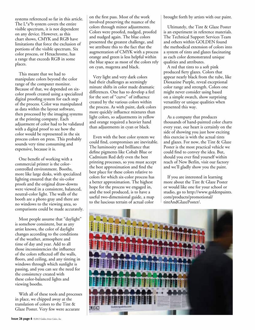
A plethora of draw-downs displayed as part of a College Art Association (CAA) tradeshow booth.
Issue 26 page 5 ©2012 Golden Artist Colors, Inc.
torepresentingthefullspectrumofcolorsavailabletoartists.
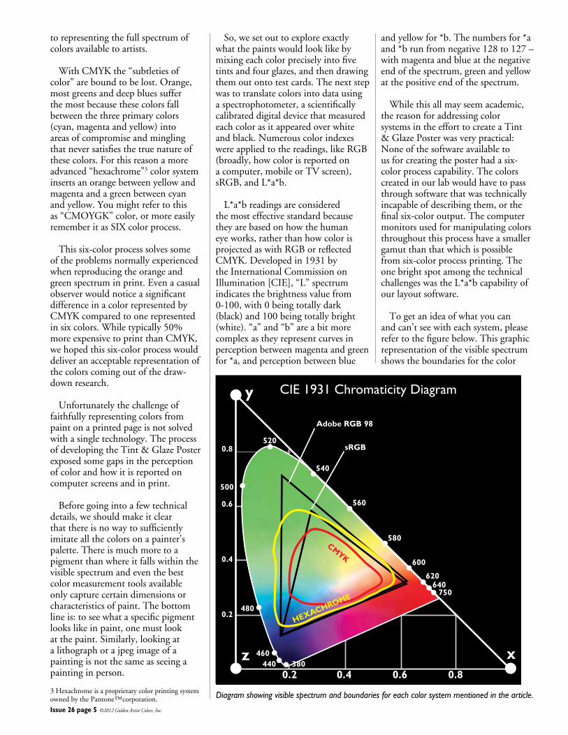
WithCMYKthe“subtletiesofcolor”areboundtobelost.Orange,mostgreensanddeepbluessufferthemostbecausethesecolorsfallbetweenthethreeprimarycolors(cyan,magentaandyellow)intoareasofcompromiseandminglingthatneversatisfiesthetruenatureofthesecolors.Forthisreasonamoreadvanced“hexachrome”3colorsysteminsertsanorangebetweenyellowandmagentaandagreenbetweencyanandyellow.Youmightrefertothisas“CMOYGK”color,ormoreeasilyrememberitasSIXcolorprocess.
Thissix-colorprocesssolvessomeoftheproblemsnormallyexperiencedwhenreproducingtheorangeandgreenspectruminprint.EvenacasualobserverwouldnoticeasignificantdifferenceinacolorrepresentedbyCMYKcomparedtoonerepresentedinsixcolors.Whiletypically50%moreexpensivetoprintthanCMYK,wehopedthissix-colorprocesswoulddeliveranacceptablerepresentationofthecolorscomingoutofthedraw-downresearch.
Unfortunatelythechallengeoffaithfullyrepresentingcolorsfrompaintonaprintedpageisnotsolvedwithasingletechnology.TheprocessofdevelopingtheTint&GlazePosterexposedsomegapsintheperceptionofcolorandhowitisreportedoncomputerscreensandinprint.
Beforegoingintoafewtechnicaldetails,weshouldmakeitclearthatthereisnowaytosufficientlyimitateallthecolorsonapainter’spalette.Thereismuchmoretoapigmentthanwhereitfallswithinthevisiblespectrumandeventhebestcolormeasurementtoolsavailableonlycapturecertaindimensionsorcharacteristicsofpaint.Thebottomlineis:toseewhataspecificpigmentlookslikeinpaint,onemustlookatthepaint.Similarly,lookingatalithographorajpegimageofapaintingisnotthesameasseeingapaintinginperson.
So,wesetouttoexploreexactlywhatthepaintswouldlooklikebymixingeachcolorpreciselyintofivetintsandfourglazes,andthendrawingthemoutontotestcards.Thenextstepwastotranslatecolorsintodatausingaspectrophotometer,ascientificallycalibrateddigitaldevicethatmeasuredeachcolorasitappearedoverwhiteandblack.Numerouscolorindexeswereappliedtothereadings,likeRGB(broadly,howcolorisreportedonacomputer,mobileorTVscreen),sRGB,andL*a*b.
L*a*breadingsareconsideredthemosteffectivestandardbecausetheyarebasedonhowthehumaneyeworks,ratherthanhowcolorisprojectedaswithRGBorreflectedCMYK.Developedin1931bytheInternationalCommissiononIllumination[CIE],“L”spectrumindicatesthebrightnessvaluefrom0-100,with0beingtotallydark(black)and100beingtotallybright(white).“a”and“b”areabitmorecomplexastheyrepresentcurvesinperceptionbetweenmagentaandgreenfor*a,andperceptionbetweenblue
andyellowfor*b.Thenumbersfor*aand*brunfromnegative128to127–withmagentaandblueatthenegativeendofthespectrum,greenandyellowatthepositiveendofthespectrum.
Whilethisallmayseemacademic,thereasonforaddressingcolorsystemsintheefforttocreateaTint&GlazePosterwasverypractical:Noneofthesoftwareavailabletousforcreatingtheposterhadasix-colorprocesscapability.Thecolorscreatedinourlabwouldhavetopassthroughsoftwarethatwastechnicallyincapableofdescribingthem,orthefinalsix-coloroutput.Thecomputermonitorsusedformanipulatingcolorsthroughoutthisprocesshaveasmallergamutthanthatwhichispossiblefromsix-colorprocessprinting.TheonebrightspotamongthetechnicalchallengeswastheL*a*bcapabilityofourlayoutsoftware.
Togetanideaofwhatyoucanandcan’tseewitheachsystem,pleaserefertothefigurebelow.Thisgraphicrepresentationofthevisiblespectrumshowstheboundariesforthecolor
CIE 1931 Chromaticity Diagramy
xz0.2 0.4
Adobe RGB 98
sRGB0.8
0.6
0.4
0.2
0.6 0.8
500
520
540
560
580
600
620640
750
480
460440 380
CMYK
HEXACHROME
3HexachromeisaproprietarycolorprintingsystemownedbythePantone™corporation. Diagram showing visible spectrum and boundaries for each color system mentioned in the article.
Issue 26 page 6 ©2012 Golden Artist Colors, Inc.
systemsreferencedsofarinthisarticle.TheL*a*bsystemcoverstheentirevisiblespectrum,itisnotdependentonanydevice.However,asthischartshows,CMYKandRGBhavelimitationsthatforcetheexclusionofportionsofthevisiblespectrum.Sixcolorprocess,orHexachrome,hasarangethatexceedsRGBinsomeplaces.
Thismeantthatwehadtomanipulatecolorsbeyondthecolorrangeofthecomputermonitor.Becauseofthat,wedependedonsix-colorproofscreatedusingaspecializeddigitalproofingsystemforeachstepoftheprocess.Colorwasmanipulatedasdatawithinthelayoutsoftware,thenprocessedbytheimagingsystemsattheprintingcompany.Eachadjustmentofcolorhadtobevalidatedwithadigitalprooftoseehowthecolorwouldberepresentedinthesixprocesscolorsonpress.Thisprobablysoundsverytimeconsumingandexpensive,becauseitis.
Onebenefitofworkingwithacommercialprinteristhecolor-controlledenvironment.Booths,morelikelargedesks,withspecializedlightingensuredthatthesix-colorproofsandtheoriginaldraw-downswereviewedinaconsistent,balanced,neutral-colorlight.Thewallsoftheboothareaphotograyandtherearenowindowstotheviewingarea,socomparisonscouldbemadeaccurately.
Mostpeopleassumethat“daylight”issomehowconsistent,butasanyartistknows,thecolorofdaylightchangesaccordingtotheconditionsoftheweather,atmosphereandtimeofdayandyear.Addtoallthoseinconsistenciestheinfluenceofthecolorsreflectedoffthewalls,floors,andceiling,andanytintinginwindowsthroughwhichsunlightispassing,andyoucanseetheneedfortheconsistencycreatedwiththesecolor-balancedlightsandviewingbooths.
Withallofthesetoolsandprocessesinplace,wechippedawayatthetranslationofcolorstotheTint&GlazePoster.Veryfewwereaccurate
onthefirstpass.Mostoftheworkinvolvedpreservingthenuanceofthecolorsthroughminoradjustments.Colorswereproofed,nudged,proofedandnudgedagain.Thebluecolorspresentedthegreatestchallenge,andweattributethistothefactthattheaugmentationofCMYKwithaprocessorangeandgreenislesshelpfulwithinthebluespaceasmostofthecolorsrelyoncyan,magentaandblack.
Verylightandverydarkcolorshadtheirchallengesasseeminglyminuteshiftsincolormadedramaticdifferences.Onehastodevelopafeelforthesortof“curve”ofinfluencecreatedbythevariouscolorswithintheprocess.Aswithpaint,darkcolorsmorequicklyinfluencemixturesthanlightcolors,soadjustmentsinyellowandorangerequiredaheavierhandthanadjustmentsincyanorblack.
Evenwiththebestcolorsystemwecouldfind,compromisesareinevitable.TheluminosityandbrilliancethatdefinepigmentslikeCobaltBlueorCadmiumReddefyeventhebestprintingprocesses,soyoumustacceptthebestapproximationandfindthebestplaceforthesecolorsrelativetocolorsforwhichsix-colorprocesshasabetterapproximation.Thehighesthopefortheprocessweengagedin,andthetoolproduced,istohaveausefultwo-dimensionalguide,amaptothelusciousterrainofactualcolor
broughtforthbyartistswithourpaint.
Ultimately,theTint&GlazePosterisanexperimentinreferencematerials.TheTechnicalSupportServicesTeamandotherswithinGOLDENfoundthemethodicalextensionofcolorsintoasystemoftintsandglazesfascinatingaseachcolordemonstrateduniquequalitiesandattributes. Aredthattintstoasoftpinkproducedfieryglazes.Colorsthatappearnearlyblackfromthetube,likeDioxazinePurple,revealexceptionalcolorrangeandstrength.Colorsonemightneverconsiderusingbasedonasimpleswatch,showsurprisingversatilityoruniquequalitieswhenpresentedthisway.
Asacompanythatproducesthousandsofhand-paintedcolorchartseveryyear,ourheartiscertainlyonthesideofshowingyoujusthowexcitingthisexerciseiswiththeactualtintsandglazes.Fornow,theTint&GlazePosteristhemostpracticalvehiclewecouldfindtoconveytheidea.But,shouldyoueverfindyourselfwithinreachofNewBerlin,visitourfactoryandwe’llgladlyshowyouthepaint.
IfyouareinterestedinlearningmoreabouttheTint&GlazePosterorwouldlikeoneforyourschoolorstudio,gotohttp://www.goldenpaints.com/products/promotional/tintAndGlazePoster/.
Issue 26 page 7 ©2012 Golden Artist Colors, Inc.
Continued from page 3
AnthraquinoneBluewithHansaYellowMediumismyfavoriterangeofclassicgreens. AgreenwithmoreAnthraquinoneBlueandlessHansaYellowLighthasagrimierturquoiseundertone,andwhentintedwithTitaniumWhite,youwillseehowtheAnthraquinoneBluegraysdownthemixedgreen.AnthraquinoneBlueisdefinitelythechoicefortheearthygreenmixturesthatareclosertotheHookersGreenHueontheModernColorMixingGuide.AnyoftheyellowsmixedwiththePhthaloBlue(GreenShade)willproduceincrediblyintensegreens.
The Green: Phthalo Green (Blue Shade) Initsglazecapacity,PhthaloGreen(BlueShade)islikethegreensofearlyspring,whereallthenewshootsofcolorarepracticallyfluorescent.PhthaloGreen(BlueShade)straightoutofthetubeisalmostanunusablecoloratfullstrength.Asabaseformixingabeautifulrangeofgreens,itisindispensable.Itisneededformixingrichearthcolors,olivegreens,
abeautifulblackonthechartandquitesurprisingly,richviolets.Thispigmentissostrong,thatthecautionary,“alittledabwilldoyou”iseminentlytrue. PhthaloGreen(BlueShade)mixeswithHansaYellowLightandHansaYellowMedium,forarangeofgreens,whichareallbrightspringgreen,butyou’llnoticethattheHansaYellowLightmixtureshavethatcharacteristic“chalky”tinttothem. MixingthePhthaloGreenwiththeNaphtholRedwillproducesomeveryminerallikebrowns,colorsclosetoRedOxides.WhentheproportionmovestomorePhthalo,lessred,yougetadeepdarkearthviolet. MixthePhthaloGreenwiththebrightQuinacridoneMagentaanditproducesveryclean,highchromaviolets,similartothemixtureswithPhthaloBlue(GreenShade),butwhentheproportionofPhthaloBlue(GreenShade)ishigher,ityieldsabeautifulturquoisemixture.PhthaloGreen(BlueShade)mixedwithPhthaloBlue(GreenShade)createsourstandardTurquois(Phthalo). AfterIspentagreatdealoftimesystematicallycomparingduomixturesfromallthepigmentsinthekit,IbegantocreatemixturesusingtheModernColorMixingGuide.Ifyouarenewtocolormixing,Iwouldrecommendfollowingthesameprocess.
Modern Color Mixing Guide Thenewmixingsetisaccompaniedbyarobustmixingguide,offeringabroadrangeofmixingsuggestions.Thisisagreatresourceshowingthewiderangeofmixturesthat
canbecreatedusingonlytheseeightpigments,withaneasyvisualtodemonstrateproportions.Thenumericalratiosarethereforyounumberorientedpainterstoo! ThismixingguideisdesignedvisuallytoworkinconjunctionwiththeTint&GlazePoster.Thefocusofthesetistoreviewmixturesofpigments,butifusedalongsidetheTint&GlazePosterasanadditiontool,thetwotogetherprovideaguidefordelvingmoredeeplyintotheexpandingpossibilitiesofglazesandtints.TolearnmoreabouttheTint&GlazePoster,gotohttp://www.goldenpaints.com/products/promotional/tintandglazeposter/.
Using the Modern Color Mixing Guide Whenusingthisreferencetoolformixingcolor,thinkofitasanadventureoratimetodiscover.Inmyexperience,attemptingtomatchacolorexactlyistrickyandtimeconsuming.Forexample,wehaveamixtureontheguidethatisnamedNickelAzoGoldindicatingthatifyoumixthethreepigmentsshowninthecorrectproportion,youwillachievesomethingclosetoourQuinacridone/NickelAzoGold.Whileyouwillgetavaluableapproximationtothiscolor,itcertainlywillnothavealltheattributesofthetrueQuinacridone/NickelAzoGoldinitsundertoneandglow.So,ratherthangettingobsessedabouttheperfectcopy,Iwouldrecommendsimplyplayingwiththeproportions.Myfirstmixtureswerewildlyoffproportionately,butthroughthat
BLUESHansa Yellow LightNaphthol Red LightAnthraquinone Blue
BLUESHansa Yellow MediumNaphthol Red LightPhthalo Blue (GS)
PHTHALO GREEN (BS) Hansa Yellow Light Hansa Yellow Medium
MIXING NICKEL AZO GOLD100 Parts Hansa Yellow Medium
3 Parts Quinacridone Magenta
1 Part Anthraquinone Blue
Alizarin CrimsonHue
Naples YellowHue
Yellow Ochre
Van Dyke Brown Hue
Cadmium Red Medium Hue
Ultramarine Blue
Cobalt Blue
Issue 26 page 8 ©2012 Golden Artist Colors, Inc.
effort,Idiscoveredarangeofbeautifulolivehues.(I’mkeepingmyslightly“off”formulaforthefuturewithtoomuchAnthraquinoneBlueandtoomuchHansaYellowMedium.) Whenmixingfromthisguide,Iactuallydispensedthepaintinlonghorizontalstrips,makingiteasiertoseetheratios.Oneothertip:foranyPhthalo,startwithasmallerportionthanyouthinkyousee!Youcanalwaysaddmore,butonceyouhaveamixtureobliteratedbyapowerfulPhthalo,yougenerallyneedtostartover! AnotherinterestingexperimentistomixthecolordesignatedasQuinacridoneRedLight(oneofmyfavoritepigments)byusingHansaYellowLightandQuinacridoneMagenta.WhenplacednexttotheoriginalQuinacridoneRedLight,youcandefinitelyseeadifference.TheHansaYellowLightaddsaslightsalmonundertonetothemixture.ItestedthemixedQuinacridoneRedLightagainstthe“real”QuinacridoneRedLight(PR207),bymixingbothwithTitaniumWhite.ThemixedQuinacridoneRedLightdoesnothavetheabilitytomixtotheincrediblybrightpinkthatthesinglepigmentwillgiveyou.Thisexampledoesn’tdetractfromtheguide,buthelpsustoappreciateallthenuancesofapurepigment,andtherangeofcolorthatcanbeachievedbysubtlemixturesofnumerouspigments.Manypainterscometoknowintimatelyhowthese
uniquesinglepigmentswillbehave,andhaveneedforthat. Modern Color Mixing Guide Mixes WhileIwasexploringseveralothermixturesontheguide,morediscoveriesevolved.Takealookatthesecondyellow-orangeontheguide(nexttoIndianYellowHue).Itcontains30partsHansaYellowMediumand3partsNaphtholRedLight.Findthenextyellow-orange,whichismadeofHansaYellowLightand1partQuinacridoneMagenta.WheneachofthesemixturesistintedwithTitaniumWhite,youcanseeobviouswarmthinthemixturethatcomesfromtheHansaYellowMedium.YoucanalsodetectthatcoolsalmontintfromtheHansaYellowLight.Observingthesamecomparisoninaglazeorundertonerevealsthatabrighter,richertonecomeswiththeHansaYellowMedium.
Range of Skin Tones ThenewModernTheoryColorMixingSetwasdevelopedasastartingpointforcreatingarangeofcolorforalltypesofpainters,includingmoretraditionalpaintingstyles,suchasportraitureandlandscape.Portraitureinparticulardemandsawiderangeofcolortocreatethegamutneededtoachieveaninternationalrangeoffleshtonesandshadows.Ifyouresearch“achievingfleshtones,”youwillfindaplethoraofideas,butgenerallyartistsworkwithapaletteofyellow,blue,red,umberandwhite.
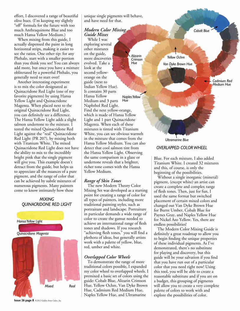
Overlapped Color Wheels Todemonstratetherangeofmoretraditionalcolorspossible,Iexpandedmycolorwheeltooverlappedwheels.Ipremixedabasicsetofcolorsusingtheguide:CobaltBlue,AlizarinCrimsonHue,YellowOchre,VanDykeBrownHue,CadmiumRedMediumHue,NaplesYellowHue,andUltramarine
Blue.Foreachmixture,IalsoaddedTitaniumWhite.Icreated32mixturesandthis,ofcourse,isonlythebeginningofthepossibilities. Withoutasingleinorganic(mineral)pigment,(exceptwhite)anartistcancreateacompleteandcomplexrangeoffleshtones.Then,justforfun,IusedthesameformatbutswitchedplacementofcertainmixedcolorsandchangedoutVanDykeBrownHueforBurntUmber,CobaltBlueforPaynesGray,andNaplesYellowHueforNickelAzoYellow.Yes,thereareendlesspossibilities! TheModernColorMixingGuideisdefinitelyagreatroadmaptoallowyoutobeginfindingtheuniquepropertiesoftheseindividualpigments.AsI’vedemonstrated,there’snosubstituteforplayinganddiscovery,butthisguidewillbeyoursalvationifyoufindthatyouhaverunoutofaparticularcolorthatyouneedrightnow!Usingthistool,youwillbeabletocreateareasonablesubstituteandifyouareonabudget,thisgroupingofpigmentswillallowyoutocreateaverycompletepaletteofcolorstoworkwithandexplorethepossibilitiesofcolor.
MIXING QUINACRIDONE RED LIGHT
Mixed Real
Hansa Yellow Light
Quinacrdione Magenta
OVERLAPPED COLOR WHEEL
Issue 26 page 9 ©2012 Golden Artist Colors, Inc.
By Amy McKinnon CarlPlansky’sexcitementaroundthediscoveryofuniquecolorshadexpresseditselfintheincrediblywiderangeofpigmentswithintheWilliamsburgHandmadeOilColorsline.Includedaremanyofthestandardcolors,interestinganduniqueblendsandfamiliesofpigmentslikeCadmiumandCobaltthatexcelfarbeyondmostmanufacturer’sranges.TheWilliamsburgOilsalsoincludesignificanthistoricalcolorsthatarebecomingmorescarceandrare,iridescents,interferencecolors,andsomeofthemostexcitingandinterestingearthcolorsthatournaturalgeologyacrossourplanetcouldproduce.Forus,oncethatpigmentorcolorspacehasbeenselected,ourdedicationliesinachievinganexpressionofthatpaintthatisuniquetoeachcolor.Whilefirstformulatingtoobtainthehighestpigmentload,andaconsistencythattunestheworkingpropertyofthecolor,ourattentionisgiventoachievingthespecificgrindforeachpigment.Pigmentgrindhasmuchmoretodowiththresholdsandundertonesthantextureandgrit.Textureandgritmayatfirstseemlikequirkytraitsthatgivethebrandamuchmorehandmadequalitybutoncethepaintisbrushedoutandmorespecificallymixedandglazedwith,thesecolorsrevealthatthetextureandgritarethebearersofthepaint’sindividualityandeloquence.Pigmentgrindinformsundertones,whatliesbeneath,itiswhatdrawsyoucloserandimpartsaveilofcolorremovedfromtheopacitythatcomesoutofthetubeandontoyourpalette.Everypigmentexcelsatitsowncertaingrindandeachpigmenthasitsownlimitorsweetspot.Gotoofar,grindtoohardortoofineandonegetsaplainandgoodpigmentbutthatisall.Itcanevenexhibititselfasdullwhentheparticlesaretoosmallandtooclosetogether.Grindthepigmentstotheirownindividualthresholdandoneintroducesitssecretandallowsittorevealitstruenatureinthespacesinbetweentheparticles. Ithasbeenanexcitingjourney
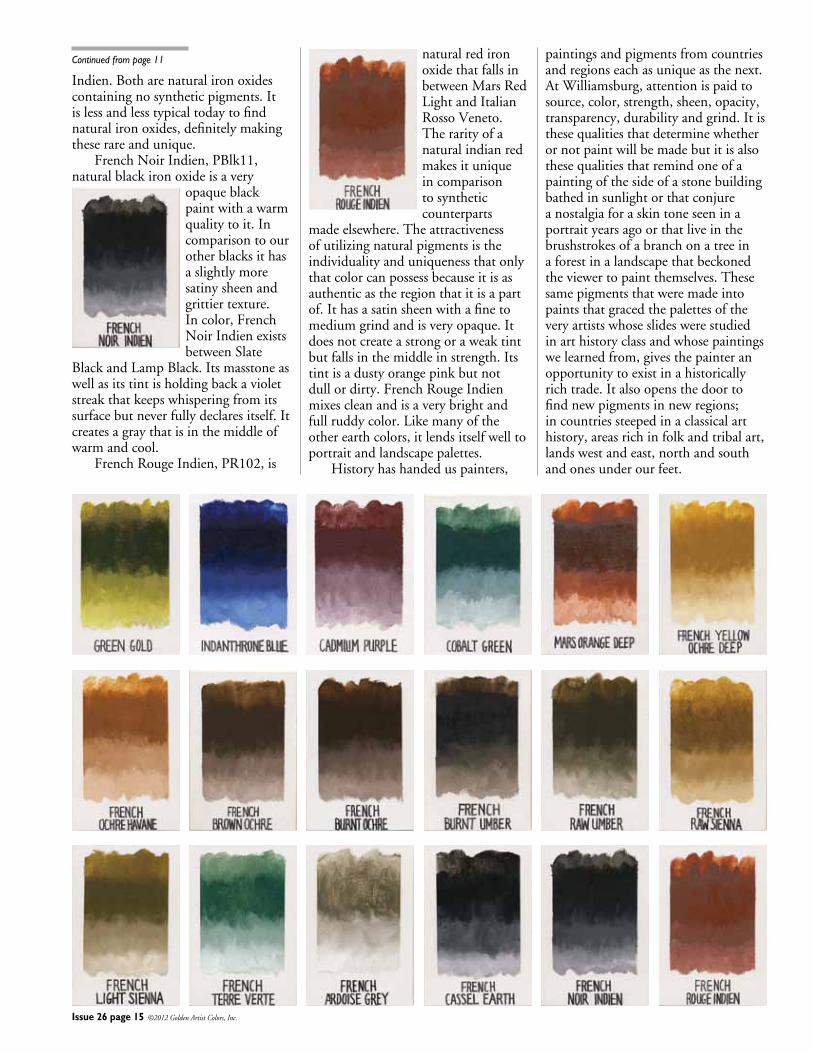
18NewWilliamsburgOilColorstobothmaintainthehighstandardsofqualityoftheWilliamsburgbrandaswellastocontinueitstraditionofactivelysearchingfornewanduniquepigments.ThemissionofWilliamsburgistoprovidepainterswiththebestqualitypigmentsthatserveasaconnectiontothepastwhilecontinuallyexpandingthedepthandscopeofthecolorspaintersdependon.Inkeepingwiththattraditionweareveryproudtointroduce18newcolors.Twoofthe18areoldfavoritesthathadbeendiscontinuedinthepast,3areadditionstofamiliesofpigmentsthathelproundouttheirspectrumofhuesandtheremaining13areearthcolorsfromtheoldestoperatingmineandpigmentsupplierinFrance.
A Homecoming ThetwocolorswewanttoreintroducebacktoWilliamsburgareGreenGoldandIndanthroneBlue.Thesearegreatcolorsthathelptoexpandthecolorchoices,offerpropertiesthatareunique,areusefulinglazingandmixingandweregreatlymissedasawesomecolors. GreenGold,PY129,isasemi-transparentCopperAzomethineGreenpigment.Thecolorofthisgreenout
ofthetubeisthatofapicholineolive.Itisadarkyellow-greencolorthatweassociatewiththefruitbutislesspalethanmostolives.GreenGoldretainsasatinysheenwhichhelpsitretainadark
masstone.ThebeautyofGreenGoldisinitsundertoneandtint.Atfirsttheundertoneappearsasaverytransparentvirginoliveoilcolorbutthenitimpartsanamberglowwithinthatalmostcontradictsitsmasstoneandstunstheviewer.ThetintofGreenGoldiscleanandsuchadeparturefromitsparentcolorthatitishardtobelieveitisfromthesamepaintandifpressedtocompare,thetintcolorissimilartoNickelYellow.
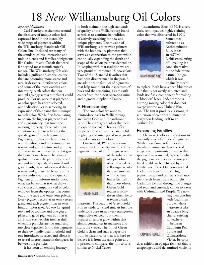
IndanthroneBlue,PB60,isaverydark,semi-opaque,highlystainingcolorthatwasdiscoveredin1901.
SometimesreferredtoasAnthraquinoneBlue,ithasanASTMLighfastnessratingofI,makingitagoodalternativetothefadepronenaturalIndigowhichitwasoriginallymeant
toreplace.Bothhaveadeepblueviolethuethatisnotoverly-saturatedandlendsitselfasacomponentformakinga‘blackless’black.IndanthroneisastrongmixingcolorthatdoesnotoverpowerthewayPhthaloBluecan.Thetintitproducesisstronginsaturationofcolorbutismutedinbrightnesslendingitselftoanearthierfeel.
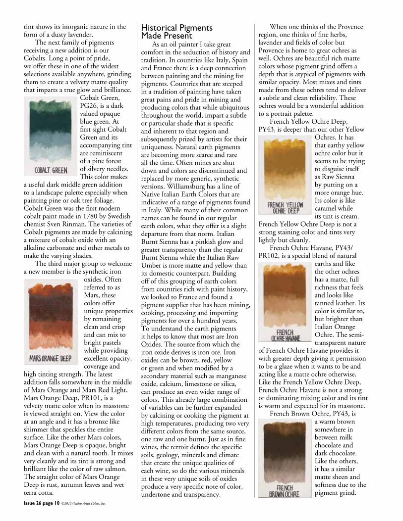
Expanding Families Thenext3colorsareadditionstocurrentlystrongfamiliesofpigments.Whilethesefamiliarfamiliesarealreadyexpansiveintheirspectralrange,theopportunitytowidenthatspaceisalwaysinvited,especiallywhenthepigmentoccupiesavoidnotyetfilledorabletobeachievedbyitsfamilialmembers.OurconcentratedCadmiumshaveextremelyhighpigmentloadsandpossessabrilliancethattravelsfromapalebutbrightCadmiumLemonthroughtheorangesandreds,andcurrentlycomestoarestwithCadmiumRedPurple.Wenow
lengthenthatlinewithCadmiumPurple,whosemasstoneislikeanopaquebingcherry,existingsomewhereinbetweenCadmiumRedPurpleandQuinacridoneViolet.Itscolor
doesexhibitanopaquerichnessthatisunapologeticanddeterminedwhileits
Issue 26 page 10 ©2012 Golden Artist Colors, Inc.
tintshowsitsinorganicnatureintheformofadustylavender. ThenextfamilyofpigmentsreceivinganewadditionisourCobalts.Longapointofpride,weoffertheseinoneofthewidestselectionsavailableanywhere,grindingthemtocreateavelvetymattequalitythatimpartsatrueglowandbrilliance.
CobaltGreen,PG26,isadarkvaluedopaquebluegreen.AtfirstsightCobaltGreenanditsaccompanyingtintarereminiscentofapineforestofsilveryneedles.Thiscolormakes
ausefuldarkmiddlegreenadditiontoalandscapepaletteespeciallywhenpaintingpineoroaktreefoliage.CobaltGreenwasthefirstmoderncobaltpaintmadein1780bySwedishchemistSvenRinman.ThevarietiesofCobaltpigmentsaremadebycalciningamixtureofcobaltoxidewithanalkalinecarbonateandothermetalstomakethevaryingshades. Thethirdmajorgrouptowelcomeanewmemberisthesyntheticiron
oxides.OftenreferredtoasMars,thesecolorsofferuniquepropertiesbyremainingcleanandcrispandcanmixtobrightpastelswhileprovidingexcellentopacity,coverageand
hightintingstrength.ThelatestadditionfallssomewhereinthemiddleofMarsOrangeandMarsRedLight.MarsOrangeDeep,PR101,isavelvetymattecolorwhenitsmasstoneisviewedstraighton.Viewthecoloratanangleandithasabronzelikeshimmerthatspecklestheentiresurface.LiketheotherMarscolors,MarsOrangeDeepisopaque,brightandcleanwithanaturaltooth.Itmixesverycleanlyanditstintisstrongandbrilliantlikethecolorofrawsalmon.ThestraightcolorofMarsOrangeDeepisrust,autumnleavesandwetterracotta.
Historical Pigments Made Present AsanoilpainterItakegreatcomfortintheseductionofhistoryandtradition.IncountrieslikeItaly,SpainandFrancethereisadeepconnectionbetweenpaintingandtheminingforpigments.Countriesthataresteepedinatraditionofpaintinghavetakengreatpainsandprideinminingandproducingcolorsthatwhileubiquitousthroughouttheworld,impartasubtleorparticularshadethatisspecificandinherenttothatregionandsubsequentlyprizedbyartistsfortheiruniqueness.Naturalearthpigmentsarebecomingmorescarceandrareallthetime.Oftenminesareshutdownandcolorsarediscontinuedandreplacedbymoregeneric,syntheticversions.WilliamsburghasalineofNativeItalianEarthColorsthatareindicativeofarangeofpigmentsfoundinItaly.Whilemanyoftheircommonnamescanbefoundinourregularearthcolors,whattheyofferisaslightdeparturefromthatnorm.ItalianBurntSiennahasapinkishglowandgreatertransparencythantheregularBurntSiennawhiletheItalianRawUmberismorematteandyellowthanitsdomesticcounterpart.Buildingoffofthisgroupingofearthcolorsfromcountriesrichwithpainthistory,welookedtoFranceandfoundapigmentsupplierthathasbeenmining,cooking,processingandimportingpigmentsforoverahundredyears.TounderstandtheearthpigmentsithelpstoknowthatmostareIronOxides.Thesourcefromwhichtheironoxidederivesisironore.Ironoxidescanbebrown,red,yelloworgreenandwhenmodifiedbyasecondarymaterialsuchasmanganeseoxide,calcium,limestoneorsilica,canproduceanevenwiderrangeofcolors.Thisalreadylargecombinationofvariablescanbefurtherexpandedbycalciningorcookingthepigmentathightemperatures,producingtwoverydifferentcolorsfromthesamesource,onerawandoneburnt.Justasinfinewines,theterroirdefinesthespecificsoils,geology,mineralsandclimatethatcreatetheuniquequalitiesofeachwine,sodothevariousmineralsintheseveryuniquesoilsofoxidesproduceaveryspecificnoteofcolor,undertoneandtransparency.
WhenonethinksoftheProvenceregion,onethinksoffineherbs,lavenderandfieldsofcolorbutProvenceishometogreatochresaswell.Ochresarebeautifulrichmattecolorswhosepigmentgrindoffersadepththatisatypicalofpigmentswithsimilaropacity.Mostmixesandtintsmadefromtheseochrestendtodeliverasubtleandcleanreliability.Theseochreswouldbeawonderfuladditiontoaportraitpalette. FrenchYellowOchreDeep,PY43,isdeeperthanourotherYellow
Ochres.IthasthatearthyyellowochrecolorbutitseemstobetryingtodisguiseitselfasRawSiennabyputtingonamoreorangehue.Itscolorislikecaramelwhileitstintiscream.
FrenchYellowOchreDeepisnotastrongstainingcolorandtintsverylightlybutcleanly. FrenchOchreHavane,PY43/PR102,isaspecialblendofnatural
earthsandliketheotherochreshasamatte,fullrichnessthatfeelsandlooksliketannedleather.Itscolorissimilarto,butbrighterthanItalianOrangeOchre.Thesemi-transparentnature
ofFrenchOchreHavaneprovidesitwithgreaterdepthgivingitpermissiontobeaglazewhenitwantstobeandactinglikeamatteochreotherwise.LiketheFrenchYellowOchreDeep,FrenchOchreHavaneisnotastrongordominatingmixingcoloranditstintiswarmandexpectedforitsmasstone. FrenchBrownOchre,PY43,is
awarmbrownsomewhereinbetweenmilkchocolateanddarkchocolate.Liketheothers,ithasasimilarmattesheenandsoftnessduetothepigmentgrind.
RawSiennaandinmasstoneissimilartoItalianRawSiennabutwithaslightlylesswarmandslightlymoregold/greencharacteristic.Itstintispalebutwarmandexhibitsmuchofthesame
goldyellowqualityfoundinthemasstone. FrenchLightSienna,PY43,naturalhydratedironoxide,isasatiny
greenishsienna.IncomparingFrenchLightSiennatotheWilliamsburgpaletteofearthcolorsitshowsitselfasveryunique.Itfitsnicelyinbetweentheearthygreensandthewarmer
earthcolorsthathaveagreenishtintalthoughitisafardeparturefromthecolorsmostsimilartoit.ItappearstooccupyaspacesomewherebetweenBohemianGreenEarthandBrownOchre.Itsburntolivecolorisstraightoutofthegarmentracksofasecondhandarmynavysurplusstoreanditstintisthecolorofcoolsanduntouchedbythelightofthesun. FrenchTerreVerte,PG23,naturalferroussilicatecontainingmagnesium
andaluminumpotassiumsilicatesisatransparentbluishgreenthatexhibitsaslatelikegrit.WhencomparingtheFrenchTerreVertetotheItalianTerreVerte,thefirstdifferenceis
thattheItalianversionismuchmoreyellowandoverallwarmer.Inlocatingacomparablecolor,FrenchTerreVertehasanunexpectedsimilaritytoCobaltGreen.Itstransparency,mattequalityandsubduedstrengthisaguaranteethatthiscomparisononlybemadeinhue.Theybothhavesimilarpinetreecolorqualities.ThetransparencyofTerreVerteingeneraliswhatmakesthiscolorsovaluable
Issue 26 page 11 ©2012 Golden Artist Colors, Inc.
Itstintisamushroomcolorandliketheotherochres,mixeswellwithoutoverpowering. FrenchBurntOchre,PBr7,isthecolorofdarkchocolateandunlike
theotherochres,hasanextremelydrymattefinish.Whilethetextureofthesepaintsisusuallydescribedasvelvety,FrenchBurntOchreissuede;dryandsoft.Itisdifficulttonottouch
itorstrokethedriedpaint,asitssurfacebeckonsfingers.FrenchBurntOchrehassimilarmixingandtintingstrengthstotheotherochres. ThelatestumbersthatweareintroducingareFrenchBurntUmber
andFrenchRawUmber.WhilethesearebeingintroducedalongsidetheotherFrenchEarthColors,theyalsoservetoextendagrowingandinterestingfamilyofumbers. FrenchBurntUmber,PBr7,isaslightlydarker,warmerandlessmatteversionofourregularBurntUmber.Itmixeswellandlikeitsmasstone,impartsawarmer/reddertonethantheregularBurntUmber.Ithasastrongtintandliketheochreswouldfarewellinaportraitpalette. FrenchRawUmber,PBr7,seemstocontainalittlemoredepththanourregularrawumber.TheFrenchversionhasagreentonetoitthatgivesalittlekicktoitscolor.Itscoloristhatofdiscardedtealeaves,mostlybrownbutoncegreen.Moderateinmixingstrengthitproducesasubtletintmuchlikethecolorofparchment. FrenchRawSienna,PY43,naturalhydratedironoxidehasthesamedryandsoftsuedelikequalityofFrenchBurntOchre.Incoloritisadeeperandrichertonethanourregular
indifferentpalettes.Itdoeslenditselftoalandscapepalettebutmoreimportantly,duetoitstransparentnatureisveryusefulinimpartingsubtletonestoaportraitpalette. FrenchArdoiseGrey,PBlk19,powderedslateisanotherbeautifully
transparentpigment.Itstintisextremelylightandmanagestogivethewhitejustaslightlycoolerandgreenertone.IncomparingFrenchArdoiseGreytoourotherslategraywith
thesamepigmentdesignation,Davy’sGreyDeep,theFrenchvarietyismuchlighter,muchmoretransparentandhasasatinysheenwhichisuniquenexttotheverymattequalityofDavy’sGreyDeep.BoththeFrenchArdoiseGreyandDavy’sGreyarewarmgraysandofferuniquepropertiesusefulinglazingandalsoofferasmoothqualitythatisdifficulttoachievewhendilutingblackpigmentstosimilartransparency. FrenchCasselEarth,NB8,bituminousearthalsogoesbythe
namesCologneEarthorVanDykeBrown.IncomparisontoourVanDykeBrown,ourFrenchCasselEarthismuchlessavioletwarmbrownandhasauniquecoolqualitythat
bringsitclosertoblackthanbrown.Itdoesappearsimilartoasphaltumorbitumeninthatitappearsblackwithbrownundertones.ThetextureandsheenofFrenchCasselEarthisbothdryandtarlikeatthesametime.CasselEarthisanaturallyslowdrierandtintstoawarmandsubtlegray.Itisnotastrongmixerbutdoesimpartawarmglowwhenusedinplaceofblack.Onlymoderateinlightfastness,werecommendafinal,UVprotectivevarnishformaximumdurability. ThelasttwocolorsweareintroducingtotheFrenchEarthsareFrenchRougeIndienandFrenchNoir
Continued on page 15
Issue 26 page 12 ©2012 Golden Artist Colors, Inc.
Mark Golden:Lori,whendidyouknowyouwantedtobeanartist?
Lori Wilson:Iwas4.Iwasathomewatchingmybrother.Hewashelpingmeinacoloringbook,andIknewIwantedtocolorasgoodashedid.
Mark:Howwasthatnurturedinschool?You’vegrownuprighthereintheNewBerlinarea,right?
Lori:Yes.Fromseventhgradeforward,Igotsomespecialattentionandalotofencouragement.Myhighschoolartteacher,CarlHoughton,wenttoSyracuseUniversityandstartedteachingmeaboutcompositionandcolortheoryineighthgrade.Heintroducedmetoencaustics,oilpaintandthenofcoursewehadacrylicasGoldenArtistColorswasjustuptheroadandsowewouldgetSecondspaint!TheonlyacrylicI’veeverpaintedwithisGOLDEN.
Mark:WhenIseeyourworkandhowverysophisticateditis,itreallyshowsyou’vehadgreatmentors.Iknowyourprimarymediumformanyyearshasbeenglass.Whatwasyourattraction?
Lori:IwasajuniorincollegeandmybestfriendneededaglassblowingpartnersoIagreedtotaketheclass.Ididn’tenjoyitthefirstcoupleofweeksbecauseallwetriedtodo,wasblowabubbleandturnthatintoacup.Itwassofrustrating.Soonavisiting
glassartistcameandstartedsculptingwithglassonapuntyrod.Insteadofblowingair,it’sanadditiveprocess,whichreallygotmeexcited.
Mark:Aftercollegeyoucontinuedartstudies.
Lori:Yes.WhileIwasworking,IgotacceptedtotheUniversityofManchesterforamaster’sdegreeinthehistoryofart,focusingonglass,butIneededtoworkforalittlebitandwonaRotaryAmbassadorialScholarship,thencompletedmyone-yearmaster’sprogram.
Mark:YourcareeratGOLDENstartedprettyearly.Couldyoudescribehowitbegan?
Lori:Iwashiredpart-timein1994topaintcolorchartsandfillcontainers.Icouldn’tbelievethatitwassomuchfunworkinginafactory,thoughIreallywasterribleatpaintingcolorcharts.Icouldn’tgetintotheswingfastenough,soIwasleftinfilling,whichwasfine.Inthefallof’95,Iwashiredfull-time.Ileftthefollowingsummertocompletemymaster’sandwhenIcameback,severalmanagersgavemethechoiceofworkingintheirdepartments.
Mark:WhileyouwereworkingatGOLDENinvariouscapacities,wereyouabletomaintainyourartcareerand/orstudies?
Lori:Atthebeginning,yes,Iwasonlypart-timehereandworkingtwootherpart-timejobssoIhadtimeintheglassstudiothatyear.AfterIgothiredfull-timeIdidn’tmaintainitaswellas
Iwouldhaveliked,butI’vebalancedthatoutnow.
Mark:Whenyoufinishedschool,youmovedbacktoNewBerlin.Livinginasmallcommunity,howeasywasittofindacommunityofartistsaftergraduation?
Lori:Itwasimpossibleatfirst.AsGOLDENhasgrown,we’veemployedmoreartistswhichhasaddedvaluetomylife.Inmyjob,Igettomeetveryinteresting,engagingpaintersandthatisalsopersonallyfulfilling.
Mark:Yourcareerchangeddramaticallyin2000–fromtheAssistantforOperationstosomethingmorecloselyconnectedtoyourartsbackgroundandsupportingourapplicationsgroup.Tellmeaboutthatchangeandhowmeaningfulthatwasforyou.
Lori:In‘94whenIfirststarted,IwasintheGallerywhileDianeRichwasreviewingsomepainttechniques.Isatdowntolookattheapplicationswithherandtoldhershehadthecoolestjob.
Atthattime,Ihadnoideathatthedecorativepaintingindustryexisted.Morecollegestudents,particularlypaintingstudents,shouldbeawareofprivatelyownedpaintingbusinessesandscenicshopsasplacestheycouldbecreativelyemployedandmaintaintheirownstudiopractices.TherearemanymoreoptionsthangettingyourMFAandteaching.I’veinterviewedpaintersfromtheheadsofmajorscenicshops,toathirdgenerationEuropeandecorativecraftsmen,toexhibitingfineartistsmakingtheirlivingsindecorativepaintinginNYC—it’sallthesamecreativechallenge.It’sproblemsolvingwithmaterialsorlighting(aroom)tocreatesomeformofexpression.
AsanApplicationsSpecialist,I’vegainedtheopportunitytoworkwiththetechnicalgrouphere.SomeofmyfavoritetimeeachweekisspentatourweeklyTechnicalForummeeting.It’sinspiringtoparticipateandwatchinamazement,thebrainpoweraroundthetableandhowmuchenergyweputintolookingatpaintonalevelthatIthinkprobablymostoftheworlddoesn’tevenrealize.
Lori Wilson Up Close
Issue 26 page 13 ©2012 Golden Artist Colors, Inc.
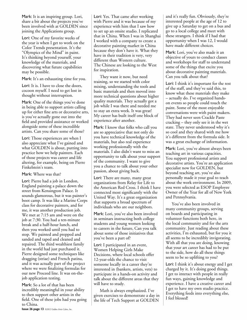
Mark:Itisaninspiringgroup.Lori,shareabitabouttheprojectsyou’vebeeninvolvedwithatGOLDENsincejoiningtheApplicationsgroup.
Lori:OneofmyfavoriteweeksoftheyeariswhenIgettoworkontheColorTrendspresentation.It’sthe“OlympicsoftheMind”inpaint.It’sthinkingbeyondyourself,yourknowledgeofthematerials,anddiscoveringwhatfuturecapabilitiesmaybepossible.
Mark:It’sanexhaustingtimeforyou.
Lori:Itis.Ihavetoclosethedoors,cocoonmyself.Ineedtogetlostinthoughtwithoutinterruption.
Mark:Oneofthethingsyou’vedoneinbeingabletosupportartistscallingupforeitherfineartsordecorativearts,isyou’veactuallygoneoutintothefieldandprovidedassistanceorworkedalongsidesomeoftheseincredibleartists.Canyousharesomeofthose?
Lori:ThoseexperiencesarewhenIalsoappreciatewhatI’vegainedandwhatGOLDENisabout,puttingintopracticehowwehelppainters.Eachofthoseprojectswascareerandlifealtering,forexample,beingonPierreFinkelstein’steam.
Mark:Wherewasthat?
Lori:PierrehadajobinLondon,EnglandpaintingapalacedownthestreetfromKensingtonPalace.Itsoundsglamorous,butitwaspainter’sbootcamp.ItwaslikeaMarineCorpsclassfordecorativepainters,andforme,itwasanotherproductionjob.Wemetat7:15amandwereonthejobat7:30.Youhadaten-minutebreakandahalf-hourlunch,andthenyouworkeduntilyouhadtostop.Wepaintedandpreppedandsandedandtapedandcleanedandrepaired.Thethirdwealthiestfamilyintheworldhadjustpurchasedit.Pierredesignedsometechniqueslikedragging(striae)andFrenchpatina,anditwasactuallypartoftheprojectwherewewerefinalizingformulasforournewProceedline.Itwason-the-jobapplicationtesting.
Mark:Soalotofthathasbeenincrediblymeaningfulinyourabilitytothensupportotherartistsinthefield.OneofthesejobshadyougoingtoChina.
Lori:Yes.ThatcameafterworkingwithPierreanditwasbecauseofmyexperiencewithhimthatIsawhowtosetupanonsitestudio.IreplicatedthatinChina.WhenIwasinShanghaiIworkedwithacompanytocreateadecorativepaintingmarketinChinabecausetheydon’thaveit.Whattheyhaveintheirtraditionisvery,verydifferentthanWesternculture.TheChinesearelookingtotheWestforinspiration.
Theywantitnow,butneedtraining,sowestartedwithcolormixing,understandingthetoolsandbasicmaterialsandthenmovedintomoretechnicalquestionsabouthigherqualitymaterials.TheyactuallygotajobwhileIwasthereandneededmetostayanextraweek.Itwasgreat!Mycareerhasbuiltitselfoneblockofexperienceafteranother.
Mark:Iknowthatfolkswhocallyouaresoappreciativethatnotonlydoyouhavetechnicalknowledgeofthematerials,butalsorealexperienceworkingprofessionallywiththematerials.Ialsodidn’twanttomissanopportunitytotalkaboutyoursupportofthecommunity.Iwanttogiveyouachancetotalkaboutyourotherpassion,aboutgivingback.
Lori:Therearemany,manygreatorganizationsfromRelayforLifetotheAmericanRedCross.IthinkIhaveconnectedmostsignificantlywiththeUnitedWay.It’sagreatorganizationthatsupportsabroadspectrumofindividualswhoareourneighbors.
Mark:Lori,you’vealsobeeninvolvedinseminarsinstructingbothcollegestudentsandyoungwomenlookingtocareersinthefuture,Canyoutalkaboutsomeofthoseinitiativesthatyou’vebeenapartof?
Lori:Iparticipatedinanevent,WomenHelpingGirlsMakeDecisions,wherelocalschoolsoffer12-year-oldsthechancetovisitsomeonelocallyinacareerthey’reinterestedin(bankers,artists,vets)toparticipateinahands-onactivityandtalkaboutthedifferentareasthattheywillhavetostudy.
Mathisalwaysemphasized.I’vegivenexercisestodemonstrateadayinthelifeofTechSupportatGOLDEN
andit’sreallyfun.Obviously,they’reinterestedpeopleattheageof12togiveupaSaturdaytogetonabusandgotoalocalcollegeandmeetwiththesestrangers.IthinkifIhadthatopportunitywhenIwas12,Iwouldhavemadedifferentchoices.
Mark:Lori,you’vealsomadeitanobjectiveofyourstoconductclassesandworkshopsforstafftounderstandsomeofthethingsthatexciteyouaboutdecorativepaintingmaterials.Canyoutalkaboutthat?
Lori:Ithinkit’simportantfortherestofthestaff,andthey’vesaidthis,toknowwhatthesematerialstheymake–actuallydo.I’veorganizedhands-oneventssopeoplecouldtouchthepaint.Someofthemostenjoyableconversationswerewithpaintmakers.TheyhadneverseenCracklePastecracking–theyonlyseeitinthewetstate.Theyneverunderstoodwhyit’ssocoolandtheysharedwithmehowit’sdifferentfromtheformulaside.Itwasagreatexchangeofinformation.
Mark:Lori,you’vealmostalwaysbeenteachingartinvariouscapacities.Yousupportprofessionalartistsanddecorativeartists.You’reanapplicationspecialistnowforGOLDEN,butbeyondteachingart,you’vealsopersonallymadeityourgoaltoteachabouttheworkenvironment.In2009,youwereselectedasESOPEmployeeOwneroftheYearforallofNewYorkandPennsylvania.
You’vealsobeeninvolvedinmanycommunitygroups,servingonboardsandparticipatinginvolunteerfunctionsbothhere,inthelocalcommunityandfortheartscommunity.Justreadingabouttheseactivities,I’mexhausted,butforyouitallseemstobeincrediblyinvigorating.Withallthatyouaredoing,knowingthatyourartcareerhashadtobeputtotheside,howdoallthesethingsseemtobesoupliftingtoyou?
Lori:Ithinkit’saboutenergyandIgetchargedbyit.It’sdoinggoodthings.Igettointeractwithpeopleinreallyfunways,gainingknowledgeandexperience.IhaveacreativecareerandIgettohavemyownstudiopractice.Everythingfeedsintoeverythingelse,Ifeelblessed!
Issue 26 page 14 ©2012 Golden Artist Colors, Inc.
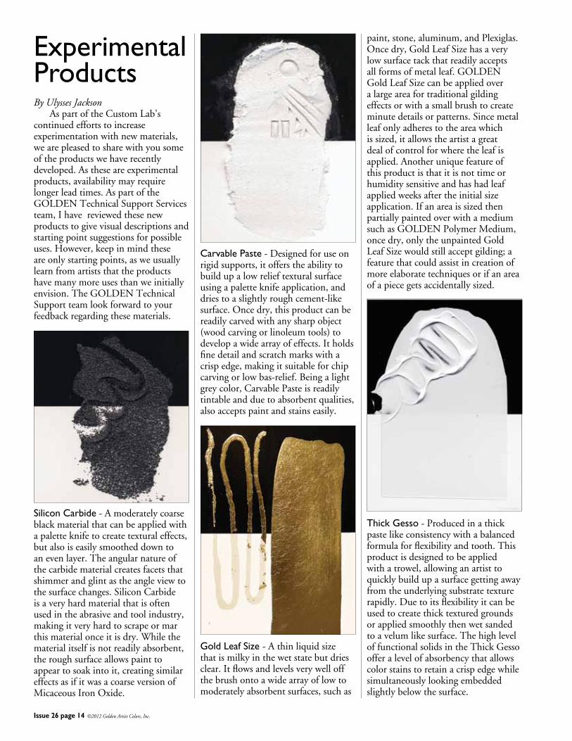
Experimental Products By Ulysses Jackson AspartoftheCustomLab’scontinuedeffortstoincreaseexperimentationwithnewmaterials,wearepleasedtosharewithyousomeoftheproductswehaverecentlydeveloped.Astheseareexperimentalproducts,availabilitymayrequirelongerleadtimes.AspartoftheGOLDENTechnicalSupportServicesteam,Ihavereviewedthesenewproductstogivevisualdescriptionsandstartingpointsuggestionsforpossibleuses.However,keepinmindtheseareonlystartingpoints,asweusuallylearnfromartiststhattheproductshavemanymoreusesthanweinitiallyenvision.TheGOLDENTechnicalSupportteamlookforwardtoyourfeedbackregardingthesematerials.
Silicon Carbide-Amoderatelycoarseblackmaterialthatcanbeappliedwithapaletteknifetocreatetexturaleffects,butalsoiseasilysmootheddowntoanevenlayer.Theangularnatureofthecarbidematerialcreatesfacetsthatshimmerandglintastheangleviewtothesurfacechanges.SiliconCarbideisaveryhardmaterialthatisoftenusedintheabrasiveandtoolindustry,makingitveryhardtoscrapeormarthismaterialonceitisdry.Whilethematerialitselfisnotreadilyabsorbent,theroughsurfaceallowspainttoappeartosoakintoit,creatingsimilareffectsasifitwasacoarseversionofMicaceousIronOxide.
Carvable Paste-Designedforuseonrigidsupports,itofferstheabilitytobuildupalowrelieftexturalsurfaceusingapaletteknifeapplication,anddriestoaslightlyroughcement-likesurface.Oncedry,thisproductcanbereadilycarvedwithanysharpobject(woodcarvingorlinoleumtools)todevelopawidearrayofeffects.Itholdsfinedetailandscratchmarkswithacrispedge,makingitsuitableforchipcarvingorlowbas-relief.Beingalightgreycolor,CarvablePasteisreadilytintableandduetoabsorbentqualities,alsoacceptspaintandstainseasily.
Gold Leaf Size -Athinliquidsizethatismilkyinthewetstatebutdriesclear.Itflowsandlevelsverywelloffthebrushontoawidearrayoflowtomoderatelyabsorbentsurfaces,suchas
paint,stone,aluminum,andPlexiglas.Oncedry,GoldLeafSizehasaverylowsurfacetackthatreadilyacceptsallformsofmetalleaf.GOLDENGoldLeafSizecanbeappliedoveralargeareafortraditionalgildingeffectsorwithasmallbrushtocreateminutedetailsorpatterns.Sincemetalleafonlyadherestotheareawhichissized,itallowstheartistagreatdealofcontrolforwheretheleafisapplied.Anotheruniquefeatureofthisproductisthatitisnottimeorhumiditysensitiveandhashadleafappliedweeksaftertheinitialsizeapplication.IfanareaissizedthenpartiallypaintedoverwithamediumsuchasGOLDENPolymerMedium,oncedry,onlytheunpaintedGoldLeafSizewouldstillacceptgilding;afeaturethatcouldassistincreationofmoreelaboratetechniquesorifanareaofapiecegetsaccidentallysized.
Thick Gesso-Producedinathickpastelikeconsistencywithabalancedformulaforflexibilityandtooth.Thisproductisdesignedtobeappliedwithatrowel,allowinganartisttoquicklybuildupasurfacegettingawayfromtheunderlyingsubstratetexturerapidly.Duetoitsflexibilityitcanbeusedtocreatethicktexturedgroundsorappliedsmoothlythenwetsandedtoavelumlikesurface.ThehighleveloffunctionalsolidsintheThickGessoofferalevelofabsorbencythatallowscolorstainstoretainacrispedgewhilesimultaneouslylookingembeddedslightlybelowthesurface.
Issue 26 page 15 ©2012 Golden Artist Colors, Inc.
Indien.Botharenaturalironoxidescontainingnosyntheticpigments.Itislessandlesstypicaltodaytofindnaturalironoxides,definitelymakingtheserareandunique. FrenchNoirIndien,PBlk11,naturalblackironoxideisavery
opaqueblackpaintwithawarmqualitytoit.Incomparisontoourotherblacksithasaslightlymoresatinysheenandgrittiertexture.Incolor,FrenchNoirIndienexistsbetweenSlate
BlackandLampBlack.Itsmasstoneaswellasitstintisholdingbackavioletstreakthatkeepswhisperingfromitssurfacebutneverfullydeclaresitself.Itcreatesagraythatisinthemiddleofwarmandcool. FrenchRougeIndien,PR102,is
naturalredironoxidethatfallsinbetweenMarsRedLightandItalianRossoVeneto.Therarityofanaturalindianredmakesituniqueincomparisontosyntheticcounterparts
madeelsewhere.Theattractivenessofutilizingnaturalpigmentsistheindividualityanduniquenessthatonlythatcolorcanpossessbecauseitisasauthenticastheregionthatitisapartof.Ithasasatinsheenwithafinetomediumgrindandisveryopaque.Itdoesnotcreateastrongoraweaktintbutfallsinthemiddleinstrength.Itstintisadustyorangepinkbutnotdullordirty.FrenchRougeIndienmixescleanandisaverybrightandfullruddycolor.Likemanyoftheotherearthcolors,itlendsitselfwelltoportraitandlandscapepalettes. Historyhashandeduspainters,
paintingsandpigmentsfromcountriesandregionseachasuniqueasthenext.AtWilliamsburg,attentionispaidtosource,color,strength,sheen,opacity,transparency,durabilityandgrind.Itisthesequalitiesthatdeterminewhetherornotpaintwillbemadebutitisalsothesequalitiesthatremindoneofapaintingofthesideofastonebuildingbathedinsunlightorthatconjureanostalgiaforaskintoneseeninaportraityearsagoorthatliveinthebrushstrokesofabranchonatreeinaforestinalandscapethatbeckonedtheviewertopaintthemselves.Thesesamepigmentsthatweremadeintopaintsthatgracedthepalettesoftheveryartistswhoseslideswerestudiedinarthistoryclassandwhosepaintingswelearnedfrom,givesthepainteranopportunitytoexistinahistoricallyrichtrade.Italsoopensthedoortofindnewpigmentsinnewregions;incountriessteepedinaclassicalarthistory,areasrichinfolkandtribalart,landswestandeast,northandsouthandonesunderourfeet.
Continued from page 11
JUST PAINTGolden Artist Colors, Inc.188 Bell RoadNew Berlin, NY 13411-3616 USA
PRSRT STDU.S. Postage
PAIDIthaca, NY
Permit #780
Return service requested
Issue 26 January 2012
Articles: Mark Golden, Patti Brady, Christopher Farrell, Amy McKinnon,
Ulysses Jackson, Sarah Sands, Jodi O’Dell
Editor: Jodi O’Dell
Publisher: Golden Artist Colors, Inc.
188 Bell Road, New Berlin, NY 13411-3616
607-847-6154 800-959-6543
Fax: 607-847-6767
Email: [email protected]
Web: goldenpaints.com
WilliamsburgOils.com
© 2012 Golden Artist Colors, Inc. All rights reserved. The contents of this publication may not be reproduced either in whole, or in part, without the consent of Golden Artist Colors, Inc. Golden Artist Colors is an Employee Owned Company.13626
By Sarah Sands FromthebeginningWilliamsburgwasalwaysknownasa‘painter’spaint.’Partlyitwasbecausethefounderofthecompany,CarlPlansky,wasfirstandforemostapainterbybothtemperamentandtraining.Everythinghemadewasinfusedwithapainter’ssenseoftouchandpassionforcolor.Thehoursspentoveramillormixerwereinconstantdialogwiththehoursspentinthestudio.Asanypainterknows,attheendofthedaythepaintalwayshasto‘work’,thecolorhastobebeautiful,theoverallsense.....well,sensuous.Andthosecriterianevercamefromcoldconceptsorrigidrecipes,butfromthelivedexperienceofthepaintbeingpushedandattendedtointhestudio.Asthecompanygrew,thedialogcontinuedtoexpandfarbeyondCarl’sownpaintingsandpracticetoincludetheconstantconversationsandfeedbackpaintersprovidedwhencallingorvisitingthe
TheLaunchingofwww.WilliamsburgOils.com/blog
factoryandeventuallytothethousandsofemailsandothercontactswithartiststhatWilliamsburghashadovertheyears. Thelaunchingofthisblogisanotherstepinthatongoingtradition-aninvitationtoadialoganddiscussionaboutthedeeptraditionsandnewdiscoveriesthatinformourcraftandunderlieoursharedloveforthematerialsofpainting.Letusknowwhatyouthinkandwhatyouarethinkingabout.AndifyouareeverinupstateNewYork,pleasevisitourfactorywherethesamemillsandmixersthatmadeCarl’spaintsmanydecadesagoarestillinoperation.Wearealwayseagertohearyourthoughtsoveracupofcoffeeor,betteryet,whilepushingaroundsomepaintinourapplicationsarea.Inthemeantime,however,wewanttoinviteyouintothisnewspaceaswellandtoletthoseconversationsbegintotakeshape.
GOLDEN Introduces Uncommon BluesAvailableforthiswinterseasononly,thissetofthreefantasticbluesissuretopiqueyourcuriosity,especiallyifyou’relookingforthefundamentalsofblue,withaslighttwist.Includedintheset:• AnthraquinoneBlue• SmaltHue• CeruleanBlueDeepAvailableatyourfavoriteartsupplyretailer.FormoreinformationabouttheUncommonBluesinthisset,goto:
www.goldenpaints.com/trycolor