q magazine
DESCRIPTION
Q MagazineTRANSCRIPT

The skyline /cover line, is advertising an exclusive, for the band, Manic Street Preachers because they are celebrating 25 years in the music business. There is also a plot synopsis underneath the masthead, to give an insight to the reader, what the article is going to be about. The font again is in white which is one of Q’s trademark colours. Another way of advertising the article is by using puffs to attract the reader even more to buy the magazine, e.g. 17 page special. There is a by-line featured below to indicate who wrote the article. The font of the article is a bold, serif font in the colour black which makes the title for the cover line stand out. There is an image showing the special with the Manic Street Preachers with them appearing on the front of it. There is a blue banner behind the cover line which compliments the dark background by making the front cover lighter.
Masthead: All the Q magazines have the same design for their masthead, so the audience will always know the title of the magazine. So when they are buying the magazine next, they know exactly what the magazine is called. This is called Brand Identity. The masthead is also the magazine’s logo since the letter Q is also used as the logo for the magazine. The reason why they have used this is because it’s an easy and short logo to remember, this is also called brand identity. The Masthead of Q magazine is always in the top left 3rd of the magazine. The Q masthead does not overlap the main image on the front cover; this makes the audience (reader) look more closely at the main image (artist) on the front cover. The red and white of the masthead are also their signature colours. The colour red connotes to passion and love which is why they chose the colour red as their background because it’s showing the target audience that the magazine is passionate about music. The colour white is used to connote to goodness and purity. The reason why the magazine has used this colour is to convey to the target audience that indie rock (which is the genre of the Artic Monkeys) or any genre of music is holy to people and that we should honour and respect this. The Q that is featured on the masthead is using a serif font which is big and bold. The target audience can tell that‘s is the masthead for the magazine and are able to tell the difference between the a cover line and the masthead. With using the codes and conventions of the masthead anyone would recognise the masthead and to know what to expect inside the magazine.
The Main Image on the front cover of Q magazine is the Arctic Monkeys posing, this is because it fits in with the main cover line in the magazine which is going to be
about the band; ‘how broken
hands, competing haircuts and a strange voyeurism helped make their best record yet’, so the picture is showing how the Arctic Monkeys became how they are through the image, the magazine wants to make the reader think the Arctic Monkeys are successful, this is showed through the clothing they are wearing. They are not wearing every day clothing, they are dressed up, which is showing the reader the success they have had in the music industry so they can afford to buy nice clothing. The reason why the band is wearing black clothing because it’s connotes to power and elegance which the image is trying to convey. The main image sticks to and challenges the convention of the front cover. It challenges the convention because only one of the members of the band is looking directly into the lens and the other members of the band are looking elsewhere. This is effective because the reader will be wondering what they are looking at. The reason it sticks to the convention of a main image is because one of the band members is looking directly at the reader which draws them in. The main image is a medium close up of the band filling 70-80% of the room. The main image also serves as a background for the front cover. The grey background behind the main image also is used as an important feature on the cover since some of the cover lines are in the same colour as the background. The colour of the cover line matches one of the band member’s shirts and it also matches the font colour of the masthead. The image is a mixture of light and dark compared to the background. There is a contrast of light and dark in the main image, which compliments each other to make an effective front cover overall with the colours (black and white) of the fonts.
The barcode always appears on the right hand side of the front cover. The bar code is a black and white serial number which can be read by a computer or app. This also tells the demographic of this magazine, what the date and issue number of the magazine is, so the audience know exactly what issue this is and they can also judge when the next issue of the magazine is coming out!
Cover Price: This is the priced that the readers buy the magazine for. The cover price is shown on the front cover. The social classification of the target audience that would buy this magazine would range from class B to D because they would be able to afford to buy Q magazine weekly. The people who are grouped in these social classes would listen to the same kind of music because they are using similar media consumption.

The cover lines are in the bottom right hand 3rd of the front cover. Underneath the cover lines there are synopsis of the article that will be featured in the magazine The Cover line titles use a bold serif font while the cover line synopsis uses a normal san serif font. The letters in the cover lines and synopsis underneath are all in capital letters, this is to emphasise to the reader that they are just as important in the magazine as the main cover line. The colour of the font white and the font is the same for the synopsis of the cover lines and are the same to show the difference between them and the cover lines. The colours of the cover line are different because the cover lines are referring to different things. The ‘White Lies’, cover line is white because it’s an emphasis of a point on the cover line. The other cover line ‘Richard Branson’ is in a grey font colour because they are referring to his wealth because the colour grey connotes to elegance and classic which the magazine is conveying about Richard Branson. There are red lines which separate the cover lines from one another so the layout is clear to the reader. Then there are short cover lines of bands that will feature inside the magazine. These are in a small bold san serif font in the colours of grey and white.
There is a puff on the front cover which is advertising an interview inside. The puff is also brand identity / logo featured in the title of the puff. There is a mixture of san serif and serif font in the puff. There are three colours used in the puff, the colours black and white are used to make a statement because an interview connotes black and white because its straight forwarded questions with straight forwarded responses. The Q is red because of the trademark colours.
The main cover line: Is in a big, bold serif font, its uses the same font as the masthead but a smaller font size for reasons, because to clarify it’s the main cover line and not the masthead. The font colour is white, which is the trademark colour of the magazine. The band name is in capital letters to emphasise the importance of the band to the reader. Underneath the cover line, is a short synopsis on the main points of the article but its gives just enough about the article, to make reader buy the magazine and read on. The synopsis of the article is in a serif font and the font colour is white. The font is smaller than the cover to identify that’s it’s less important than the cover line on the front cover and also for the reader to tell the difference between the cover line and synopsis.
Colour scheme: There are four main colours used on the front cover of the magazine; black, white, red and grey. Each of the colours used compliments each other, they are simple and elegant which make the magazine stand out more to the target audience. If different colours were used on the cover it would not work. The other colours used are bright like the colour blue, red and white but there are also dark colours like grey and black which even the contrast of the bright colours out on the magazine, these colours are seen on music albums that connotes to the genre of music that is featured in Q magazine.
Brand Identity: Again the use of Q is being represented as the Brand Identity for the magazine Q, in the content title. The font and colour that is used is the same as the masthead. At the bottom of the page there is a smaller Q but in red, another of the trademark colours of Q magazine.
The main title is in a large san serif font, in capital letters which emphasises to the readers that it is the title. The reason why the content is in a black font is because the colour black and white compliments each other. The reason why the word content is in the colour black is because it separates it from the brand identity
The reason why there is folio on the contents page is to tell the reader what page the article is on so the reader can go directly to that page. The font of the folio numbers is in a bold san serif font which is in a larger font than the featured articles because it has to stand out to direct people to that article. The reason why the font colour is black is because it complements the cream background and the colour black also makes a statement of being important which is why the magazine is using the colour for the folio numbers.

The main cover line: Is in a big, bold serif font, its uses the same font as the masthead but a smaller font size for reasons, because to clarify it’s the main cover line and not the masthead. The font colour is white, which is the trademark colour of the magazine. The band name is in capital letters to emphasise the importance of the band to the reader. Underneath the cover line, is a short synopsis on the main points of the article but its gives just enough about the article, to make reader buy the magazine and read on. The synopsis of the article is in a serif font and the font colour is white. The font is smaller than the cover to identify that’s it’s less important than the cover line on the front cover and also for the reader to tell the difference between the cover line and synopsis.
The main title is in a large san serif font, in capital letters which emphasises to the readers that it is the title. The reason why the content is in a black font is because the colour black and white compliments each other. The reason why the word content is in the colour black is because it separates it from the brand identity
Images are featured on the contents because they relate to your feature and regular articles. They also give the reader something else to look at besides the writing in the contents so it will be less boring for the reader to look at. The pictures are bright to look at so it makes the reader feel the contents page is livelier. The reader will be more excited to see images of their favourite bands / artist, so this will make them want to buy the magazine more, instead of seeing lists of artist / bands. The images are in the centre of the contents page which grabs the reader’s immediate attention once on this page, which makes them want to read on to find out about the images.
There are boxes on two of the images; this is telling the reader that these two images are connected to the two most important articles in the magazine that is why the magazine has labelled them. They both use san serif font.
Featured article titles are in a red serif font, which conveys to the reader that it’s the main title for the feature articles inside the magazine. There is a synopsis underneath the main title explaining to the reader what the articles are going to be about. The font is in a black, smaller san serif font. On the’ Haim’ article there is a pull quote rather than a synopsis of the article, which is giving something different to the reader, its giving the opinion of the band rather than what the article is going to be about, so this intrigues the reader to go to that page and find out more.
There is a clear view, there are 4 columns used on this contents page. The column here is used to promote music to the reader that is inside the magazine which makes the reader want to go and buy the magazine. There is brand identity in the title of Q magazine by labelling the title ‘The Q review’. This is in a bold serif font with black and white font colour. There is a slogan underneath the title of the column ‘the world’s finest music guide, in a white serif font. The reason why it’s in capitals letters is to emphasise the point of the slogan that they are best for music, that’s the message they are conveying here. There are sub –heading like ‘Live and New Albums, in a white san serif font to separate the articles up. They use bright colours as the backgrounds for the fonts which attracts the readers eye to read the sub-headings and the articles underneath. Underneath the titles of featured articles there is a synopsis of the article. In a black normal san serif font. The featured articles are in a bold, black
san serif font.
The editor’s note is, an introduction to the magazine from the editor. The feather pen is connoting writing which has been around a long time. The start of the letter is in a black, bold san serif font. It’s showing the reader it’s the start. The letter is in a standard black san serif font. To make it personal to the reader, the editor has actually signed so it feels like the letter is coming directly for you. There is also his twitter so if you want you can follow him online and also his title at Q magazine.
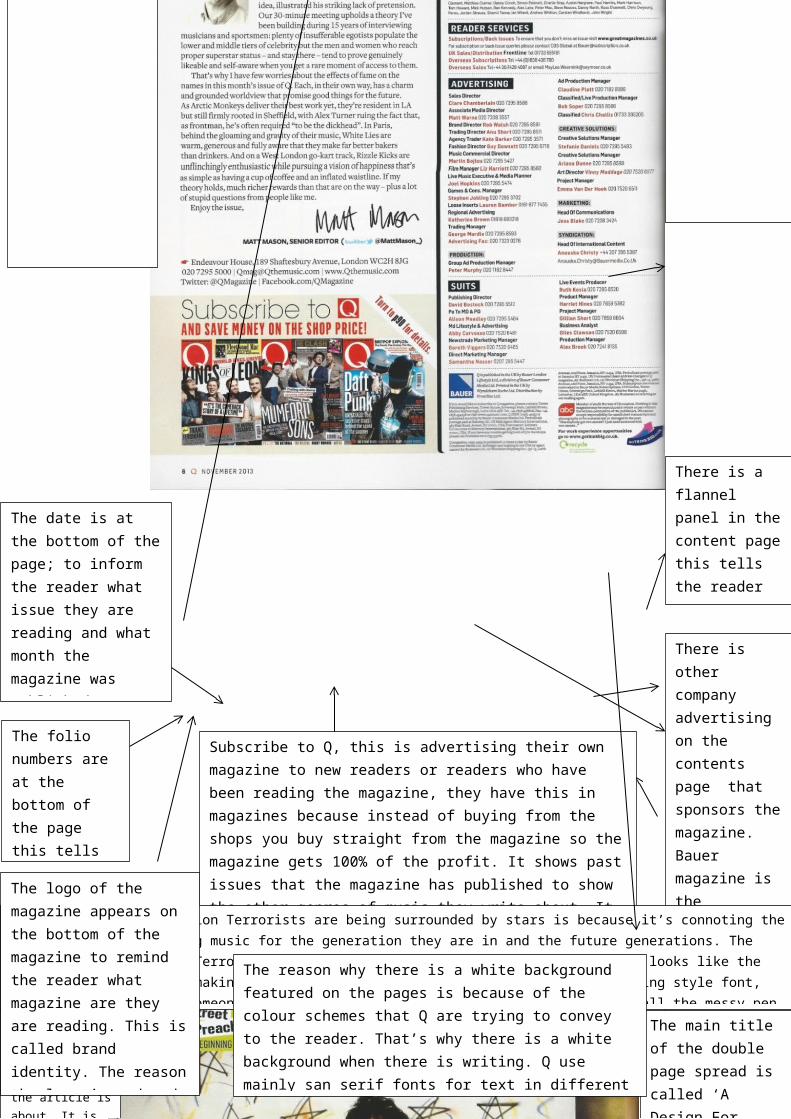
Subscribe to Q, this is advertising their own magazine to new readers or readers who have been reading the magazine, they have this in magazines because instead of buying from the shops you buy straight from the magazine so the magazine gets 100% of the profit. It shows past issues that the magazine has published to show the other genres of music they write about. It also shows the target audience where they can find out details about subscribing to the magazine. The Ad also states that it can save the target audience money if they subscribe from them and not buy the magazine at the shop.
There is a flannel panel in the content page this tells the reader the credits on who created the magazine.
There is other company advertising on the contents page that sponsors the magazine. Bauer magazine is the publisher of Q magazine. There is also the advertising part on this page, giving the reader the credits of the people at Q if they wanted to advertise something in the magazine.
There is a clear view, there are 4 columns used on this contents page. The column here is used to promote music to the reader that is inside the magazine which makes the reader want to go and buy the magazine. There is brand identity in the title of Q magazine by labelling the title ‘The Q review’. This is in a bold serif font with black and white font colour. There is a slogan underneath the title of the column ‘the world’s finest music guide, in a white serif font. The reason why it’s in capitals letters is to emphasise the point of the slogan that they are best for music, that’s the message they are conveying here. There are sub –heading like ‘Live and New Albums, in a white san serif font to separate the articles up. They use bright colours as the backgrounds for the fonts which attracts the readers eye to read the sub-headings and the articles underneath. Underneath the titles of featured articles there is a synopsis of the article. In a black normal san serif font. The featured articles are in a bold, black
san serif font.
The logo of the magazine appears on the bottom of the magazine to remind the reader what magazine are they are reading. This is called brand identity. The reason the logo is red and in a serif font is because they are trademarks of Q magazine. They have used the logo of Q again in
The date is at the bottom of the page; to inform the reader what issue they are reading and what month the magazine was published, so they will know when they can buy the magazine next.
This is referring to the special that is inside the magazine, reminding the reader where the band comes from. The editorial is just telling the reader who did what in the magazine. The reader services is telling the reader about Q magazine distribution and subscription.
The reason why there is a white background featured on the pages is because of the colour schemes that Q are trying to convey to the reader. That’s why there is a white background when there is writing. Q use mainly san serif fonts for text in different font colours red and black.
The folio numbers are at the bottom of the page this tells the reader what page they are on in the magazine.

The logo of the magazine appears on the bottom of the magazine to remind the reader on what magazine are they are reading. This is called brand identity. The reason the logo is red and in a serif font because they are trademarks of Q magazine.
The date is at the bottom of the page; to inform the reader on what issue they are reading and what month the magazine was published, so they will know when they can buy the magazine next.
The reason why ‘Generation Terrorists are being surrounded by stars is because it’s connoting the band’s dream of changing music for the generation they are in and the future generations. The reason why ‘Generation Terrorist’, is above the image of the band is because it looks like the band is thinking about making their dreams come true. The font is in a handwriting style font, because it looks like someone has written it down on a piece paper, because of all the messy pen marks and drawing in the background, the reason why the text is at the top because they are reminding themselves about what they have written, like a title on a piece of paper.
This box at the top is informing the reader what the article is about. It is also acting like a caption for the picture, because it’s showing the band in the beginning. On the same page, there is part of an image overlapping in this image, which will show the reader, how the band looks now, so they are showing the band in the past and present. The box is overlapping the picture which is telling the target audience that the box with the title of the band is more important than the image. The font that is used for the Manic Street Preachers is in a bold, san serif font. ‘In The Beginning’, is in a normal san serif font, black font. . The colour of the caption box, green / yellow is a signature colour for this band since it was used on the other page, I think its connotes the band comes from Wales where there is green countryside, they are using the colour to represent them.
The main title of the double page spread is called ‘A Design For Life’, I think they are referring to the music they playing and the lifestyle that the band is living, its conveying to the reader the band had a plan for life and they are following it. The font that is used here is retro font because the band is from the 70’s or 80’s.The font is bold because its making a statement as the main title. The font is black because the colour black is associated with the rock genre of music, the Manic Street Preachers are a punk rock band.
The main image on this page is showing the band, in the beginning. Most of the members of the band are looking into the lens, which is effective because they are staring directly at the reader, which makes a connection with them. One of the members is looking directly to right of the lens, so the reader will be intrigued by what they are looking at. The background of this image makes the band looks like they are in the middle of a drawing, which connotes to how young they must have been when they started playing in the band and it could have been their dream of how the band would be. The colours that are used on the image are mixtures of bright and dark colours, which connote a mixture of things to the audience. That the band had ups and downs throughout their career.
reading and what month the magazine was published, so they will know when they can buy the magazine next.
The logo of the magazine appears on the bottom of the magazine to remind the reader what magazine are they are reading. This is called brand identity. The reason the logo is red and in a serif font is because they are trademarks of Q magazine. They have used the logo of Q again in
The reason why there is a white background featured on the pages is because of the colour schemes that Q are trying to convey to the reader. That’s why there is a white background when there is writing. Q use mainly san serif fonts for text in different font colours red and black.
The folio numbers are at the bottom of the page this tells the reader what page they are on in the magazine.

The main image on this page is showing the band, in the beginning. Most of the members of the band are looking into the lens, which is effective because they are staring directly at the reader, which makes a connection with them. One of the members is looking directly to right of the lens, so the reader will be intrigued by what they are looking at. The background of this image makes the band looks like they are in the middle of a drawing, which connotes to how young they must have been when they started playing in the band and it could have been their dream of how the band would be. The colours that are used on the image are mixtures of bright and dark colours, which connote a mixture of things to the audience. That the band had ups and downs throughout their career.
The logo of the magazine appears on the bottom of the magazine to remind the reader what magazine are they are reading. This is called brand identity. The reason the logo is red and in a serif font is because they are trademarks of Q magazine. The logo of Q magazine appears at the end of the article, it’s the same symbol as the masthead.
reading and what month the magazine was published, so they will know when they can buy the magazine next.
This is a caption for the image below. The caption is telling the readers who is who in the photograph below and is also explaining what venue the band were playing when the image was taken. The caption is also telling the reader, what album they are promoting at that time. The font is in a black san serif font. The colour of the caption box, green / yellow is a signature colour for this band since it was used on the other page.
There is a sub-heading being used to introduce the reader to the topic of the article. The font colour is green, which connotes to the colour of the grass in Wales. It’s a bold font, but it’s a rhetorical question, so the writer is making you think about sub –heading before you read the article. The text is on a black background which connotes to the genre of rock. There is a by-line in the sub – heading telling the reader who wrote the article.
In the subheading the writer refers to the band members as ‘punks’, before becoming an important band. The images here are conveying this message to the reader. The image here is connoting that the band has gotten into trouble and is at somewhere like a police station, so they’re showing you that punks get in trouble a lot. The image above shows one of members when they were young.
The picture of the face is bruised and battered to reflect the punk image.
There is a different bold font type at the start of the article which is showing the reader, that this is the start of the article. The font is a black, san serif font, bold. They have used a green background for the font style, the same as the caption box. The article is a special on the Manic Street Preachers explaining why they are the most important rock band in Britain. The font that is used is just a standard san serif font..
The folio numbers are at the bottom of the page this tells the reader what page they are on in the magazine.