documentq2
TRANSCRIPT

HOW EFFECTIVE IS THE COMBINATION OF YOUR
MAIN PRODUCT AND ANCILLARY TEXTS?
Charlotte Lewington – Evaluation Question 2

Final Products.
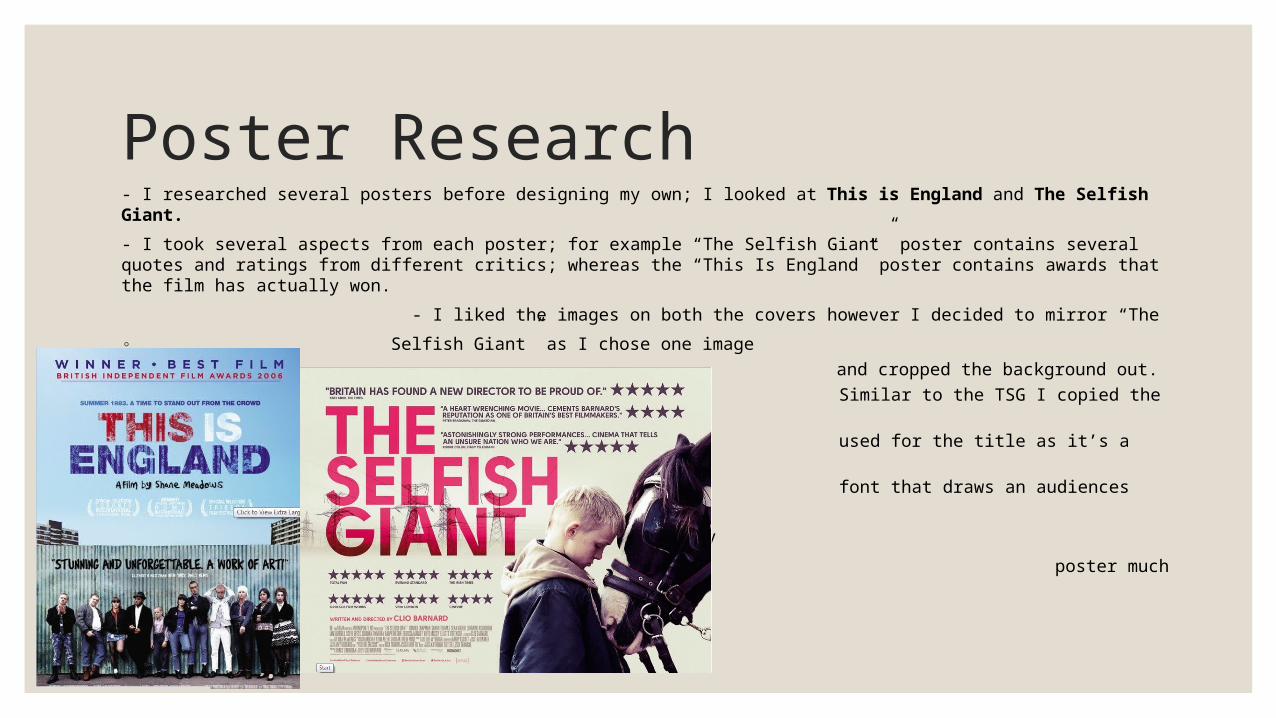
Poster Research- I researched several posters before designing my own; I looked at This is England and The Selfish Giant.
- I took several aspects from each poster; for example “The Selfish Giant” poster contains several quotes and ratings from different critics; whereas the “This Is England” poster contains awards that the film has actually won.
- I liked the images on both the covers however I decided to mirror “The
◦ Selfish Giant” as I chose one image◦ and cropped the background out. ◦ Similar to the TSG I copied the text ◦ used for the title as it’s a plain bold ◦ font that draws an audiences attention.
I opted to include a tag line on my
poster much like the TIE one.

Final Poster. The credits I used in my poster are consistent with the ones that feature in my trailer. For example;“Anna James” and “Connor O’Neil” as wellas “Charlotte Lewington Productions”. Including the small credits at the bottom of the poster add to the professional lookand thus make it moreappealing to an audience.
The photo I have selectedfor both my media products; magazine and poster coincide with each other well. This is due to the positioning of my actress as she is in dominating stance staring directly at the camera breaking down the fourth wall. Not only is this evident in both texts but it makes it clear who my protagonist is.

Magazine Research. - I again looked at several magazine covers before designing my final one. (Little White Lies and Sight and Sound)
- I liked the artistic feel of Little White Lies with the illustrated image; I wanted to achieve something similar with my magazine. However whilst looking at Sight and Sound I saw that it was important to include additional details
about what is inside the magazine to entice an audience. - I have followed conventions by keeping my model
looking directly at the audience as I didn’t want to promote and image of her (vulnerable) that didn’t coincide with the genre of my trailer. Unlike S+S I didn’t include a tagline on my cover as I wanted to follow as many artistic conventions like in LWL.

Final Magazine Cover.My final magazine includes additional selling lines at the bottom that I discovered are relevant to my genre after conducting my research. I opted to do this instead of featuring “Hollywood” information as it is not inline with my film. Furthermore I mirrored the convention of LWL by using a large title that is spread across the magazine; thus making sure the name of the film is the first thing the audience sees.
I have kept the colour scheme consistent throughout all three products by using the colours red and black (and blue). This was important as it was vital the audience could recognise all three products were linked. I have done this with the fonts used as-well; I have used no more than three font for each product and kept them consistent in both my magazine cover and film poster. I have opted for a square shaped magazine as a Ltd Edition which follows conventions of LWL.

How does the combination of all three products reach my target audience? Target Audience; Both male and females from all ethnicities aged from 15-25.I opted to target a younger audience as after my research I felt the themes displayed in my trailer (film) were more suitable for a younger audience. This is because issues like underage abuse are more prominent in a younger society. My trailer features both a male and female lead so I can’t target specifically one over the other. However my feedback will highlight if they receive the films differently. I have targeted this audience through my trailer; Through my covering of topics relevant to youth culture I have targeted the correct audience. Furthermore through my use of unknown actors I have targeted the audience because they are easier to relate to opposed to ‘Hollywood’ actors. I have targeted this audience through my poster; I made my protagonist the central focus of the poster which allowed me to target the correct audience as they were immediately able to relate to her (through the breaking of the fourth wall). Additionally the mis-en-scene is mirrored through the image so the audience learn more about the film. I have targeted this audience through my magazine cover; As social realism is generally accepted as a niche genre which my target audience has been proved to enjoy. Hence I created a Ltd edition cover which converts normally stereotypes of a magazine.

What function do my products have in marketing my film?
◦ Poster; It was vital for my poster to attract attention from the first look as this may be the first time my target audience has heard about my film. As I have included a tagline on my poster along with critical acclaim the genre and success of the film can be easily established. For this reason I would release the poster first and I would be able to promote through billboards (in towns/cities and the cinema.) I could also post my poster online as it could reach a large audience.
◦ Trailer; My trailer would be released after my poster after enough attention has been aroused. Due to the genre of my trailer it could be displayed at ArtHouse Cinemas, Channel/Film 4 and online sites such as WARPX. The most effective form of advertising would be for me to show along with similar trailers of social realism.
◦Magazine; This would be the last product to be released with a prime function to again promote my film but also to gain revenue. This would provide extra information on the film, genre and actor/ress. As my magazine targets a niche audience it would more than likely be stocked in small independent stores or I could even place it online.
Feedback on the success of the combination of all three products.
“The genre is easily recognisable due to the mis-en-scene (meaning the way I have dressed my protagonist) which is kept consistent across all three products. Noticeably the same style hoody is worn in the trailer aswell as the poster.” – Emma Thorn Lees
“I could clearly establish what audience you were targeting through the obvious use of issues relevant to those of our age. This is most noticeable within the trailer” – Samantha Taylor
“The colour scheme was kept consistent throughout and therefore I was easily able to tell that these three products were part of one production.” - Jimmy Scurr