quantum gis (qgis) basics: india - tufts university · quantum gis (qgis) basics: india ... this...
TRANSCRIPT

Tufts Data Lab
1
Quantum GIS (QGIS) Basics: India
Written by Barbara Parmenter and Irina Rasputnis, updated by Carolyn Talmadge, Aishwarya Venkat, and Kyle M. on March 6, 2017
INTRODUCTION .......................................................................................................................................................................... 1 STARTING QGIS AND ADDING DATA LAYERS ................................................................................................................................ 1 GETTING AROUND THE MAP ...................................................................................................................................................... 3 RENAMING AND GROUPING LAYERS ........................................................................................................................................... 4 SETTING A COORDINATE SYSTEM ................................................................................................................................................ 5 DEFINING LAYER STYLES ............................................................................................................................................................. 6 STYLING LINES ........................................................................................................................................................................... 6 STYLING POLYGONS BY ATTRIBUTE VALUE (SEX RATIO & LITERACY) ............................................................................................. 9 STYLING POINTS BY ATTRIBUTE VALUE (POPULATION) ............................................................................................................... 12 SELECT FEATURE USING EXPRESSION ........................................................................................................................................ 13 SELECTING BY LOCATION (CITIES NEAR RIVERS) ......................................................................................................................... 16 ADDING BASEMAPS FROM OPENLAYERS ................................................................................................................................... 19 MEASURING DISTANCE AND AREA ............................................................................................................................................ 20 DRAWING A MAP AT A SET SCALE .............................................................................................................................................. 22 COMPOSING A MAP ................................................................................................................................................................. 22 LABELING FEATURES ................................................................................................................................................................ 27 ADDING AN INSET MAP ............................................................................................................................................................ 28 PRINTING OR EXPORTING YOUR MAP ....................................................................................................................................... 30 RESOURCES ............................................................................................................................................................................. 31
Introduction
This tutorial shows you how to use Quantum GIS (QGIS) to create simple maps and complete basic spatial analysis tasks. QGIS is an open-source alternative to ArcMap, and can be used to create maps, analyze spatial data, and execute vector and raster GIS operations. We will use QGIS and geospatial data on India to explore principles of spatial analysis, layer styles, and map design. You will learn to add vector layers to your QGIS document, set the coordinate system, define layer styles, select by expression, compose a map layout, and export/publish your map. This tutorial may take 2-3 hours to complete.
NOTE: If you are working in the Tufts Data Lab, the GIS data that you need for this tutorial is stored in the S Drive. It can be found at S:\Tutorials & Tip Sheets\Tufts\Tutorial Data\QGIS Basics. Copy the QGIS Basics folder into your H Drive before starting this tutorial.
Starting QGIS and adding data layers
To start QGIS, choose Start All Programs GIS Applications QGIS Pisa QGIS Desktop 2.16.1
1. A blank map opens up automatically. Before adding layers to your map, save this project to your H drive. Click on
the icon, save the project as QGIS_Basics, and click OK.

Tufts Data Lab
2
2. Double click on the Project “QGIS_Basics” if it doesn’t open automatically. On the left side of the screen, you should see your Browser (A). This space shows all the default folder connections in QGIS. You can use your browser window to navigate your folders and bring files into your main map window.
A. B. C.
3. Below the Browser window, you will see the Layers (B) window. This window allows you to toggle layers on and off, and adjust them within your map. There are no layers in your map currently, so this window should be empty for now. We will explore how to use this window throughout this tutorial.
4. On the leftmost side of your screen, you will see the Manage Layers (C) vertical menu. This allows you to add
various kinds of spatial data into your map. Click on the icon in the Manage Layers menu to add vector layers into your map. Alternatively, you can use the keyboard shortcut Control + Shift + V, or click on the Layer menu Add Layer Add Vector Layer.
5. Click on Browse, and navigate to your QGIS_Basics folder. Click on the All files drop down menu, and select ESRI Shapefiles (*.shp, *.SHP).

Tufts Data Lab
3
6. Select all the SHP files in your folder, and click Open.
Getting Around the Map
1. You will notice that four items are added to your Layers window. These items are each called layers. You can rearrange the layers by clicking and dragging one layer on top of the other. Rearrange your layers so that it

Tufts Data Lab
4
matches the images below. Note: If you have two IND_Rivers, you can right click on the layer and go to Remove.
2. Use the Zoom In, Zoom Out, and Pan tools to move around the map ( , , ). When using the zoom tools, you can click and drag a box around the area that you would like to zoom in/out to.
3. You can also right-click a layer and click Zoom to Layer zoom into the extent of only that layer.
4. Click on the Identify icon ( ) and then click on your map. The Identify tool brings up information from the “attribute table” for each feature you click on. Your results are shown in the Identify Results window, as shown below. The Identify tool can help us identify some of the features on our map.
Renaming and Grouping Layers
1. Let’s rename our layers to better understand what they represent. Renaming layers does not affect the name of the file—it only changes how the layer is named on your screen. Right-click a layer, and select Rename. You can also click on a layer and press F2. Then, give it a more appropriate name.

Tufts Data Lab
5
2. Turn off the layers you do not want to see on your screen by clicking the button. You can also click on the Manage Layer Visibility icon to turn all layers on and off.
3. You can group layers which are similar in content. For example, our cities and states layers can be grouped into a category called “Administrative Units”. Select both these layers by holding down the Control button. Now right-click on the selection, and select Group Layers. Grouped layers allow you to toggle layers on and off with one click. Uncheck the Administrative Boundaries group, and see what happens on your map.
4. Ungroup the layers by selecting each layer within the group and dragging it outside of the group in the Layers window. When the Administrative Units group has no layers left, you can right click the group name and select Remove.
REMINDER: Save your map frequently and always save it at the end of a session!
Setting a Coordinate System
The rest of this tutorial focuses on India, so we are going to set a coordinate system that better maps India. This will also ensure that any spatial queries you do will perform correctly.
1. Click on the Current CRS button ( ) at the bottom right corner of your QGIS window. Based on the layers we have open, it should read EPSG: 4326, which indicates the WGS 1984 coordinate system.

Tufts Data Lab
6
2. In the Project Properties dialogue box, be sure Enable ‘on the fly’ CRS transformation is checked.
3. In the Coordinate Systems of the World list below, search for WGS 84/ UTM Zone 44N. Alternatively, you can type the EPSG number of our coordinate system of interest, 32644, into the Filter box. Both results will provide you the WGS 1984 UTM Zone 44N projection. Select this projection, and click OK. This projection severely distorts the rest of the world. But it’s a great way to map India!
Defining Layer Styles
In this section, you will learn how to organize your data layers' properties to start bringing some coherence to the map. You will also learn how to style the data layers to start making a more interesting and readable map.
Styling Lines
Let’s start by changing the way our roads and rivers layers look.
1. Right-click on the Major Rivers layer and select Properties. 2. Click on the Style tab from the list on the left.

Tufts Data Lab
7
3. To change the color of the line, click on the Colors dropdown menu and select a blue color. In the line Width box, type in 1.00, and click OK when you are finished. Note: QGIS also provides pre-specified styles for point and line features. You can also select any of the pre-specified styles in the Symbols box, such as Cycle, Dam, or Motorway, to symbolize your line.
4. Observe how your map changes.
5. For the Roads layer, we repeat the above process. However, instead of selecting a pre-specified color, select “Choose Color” in the Colors dropdown menu. Note: The Select Color window will also appear after single clicking on the Color swatch.

Tufts Data Lab
8
6. Use the sliders and to select colors for the Fill. Since we are working with streets, select a dark grey color for this layer. These colors are totally up to you, so pick colors that you think represent the layers well. Once you have your color picked out, select OK.

Tufts Data Lab
9
7. When finished, choose Project Save again. Now your map document will remember all the colors and names you assigned. It’s already starting to look better!
Styling Polygons by Attribute Value (Sex Ratio & Literacy)
The power of GIS lies to a large degree in being able to symbolize various data. For example, our Census 2011 layer contains information about the sex ratio of each state in India according to the 2011 Census. The sex ratio is defined as the number of females per 1000 males in the population, and can be indicative of systematic gender imbalances due to various sociopolitical factors. To show this data on a map, we can define the layer style using colors to represent various groups of data.
1. Begin by right-clicking the Census 2011 layer, and click Rename. Now type in “Sex Ratio”.
2. Right-click the Sex Ratio layer, and select Properties. On the left panel, select Style.
3. By default, the Single Symbol option is selected. However, we are interested in a Graduated style. Graduated symbology type allows you to break down the data in a column into a steadily increasing/decreasing group of ‘classes’ and choose a different style for each of the classes. To do this, select Graduated from the drop-down menu.
For more information on vector data styling, check out a Basic Vector Styling tutorial by Ujaval Gandhi.
4. The Graduated style allows you to select several options to symbolize your data. The Column dropdown allows you to choose which field you want to symbolize on your map. The Color Ramp option allows you to select various color ramps to display your data. The Classes tab allows you to choose modes, or methods of classifying numeric data. There are 5 modes available in QGIS1:
a. Equal Interval: This method will create classes which are at the same size. If our data ranges from 0-100 and we want 10 classes, this method would create a class from 0-10, 10-20, 20-30 and so on - keeping each class the same size of 10 units.
1 Source: QGIS Tutorials and Tips by Ujaval Gandhi

Tufts Data Lab
10
b. Quantile: This method will decide the classes such that number of values in each class are the same. If there are 100 values and we want 4 classes, quantile method will decide the classes such that each class will have 25 values.
c. Natural Breaks (Jenks): This algorithm finds natural groupings for the data classes. The resulting classes have maximum variance between individual classes and least variance within each class.
d. Standard Deviation: This method will calculate the mean of the data, and create classes based on standard deviation from the mean.
e. Pretty Breaks: This is based on the statistical package R’s pretty algorithm. It is a bit complex, but the ‘pretty’ in the name means it creates class boundaries that are round numbers.
For the purposes of this tutorial, fill out the Graduated menu as shown below. Under Mode, select Quantile with five data classes, and click Classify. The numerical ranges will populate automatically. Select the YlOrRed (Yellow Orange Red) color ramp, and check Invert to make sure the color meanings are consistent (Red = low sex ratio, Yellow = high sex ratio). When everything matches the image, click OK. You may need to click “Add class” to get the values to show up.
Note: some menu items may shift due to the size of your window, but the titles will stay the same.
5. Turn off the Cities, Major Rivers, and Roads layers. Your map should look similar to the one below. Note that if you changed the classification methods, number of classes, or color settings, your map may look different. We can begin seeing interesting spatial patterns—northern states tend to have lower sex ratios within the country.

Tufts Data Lab
11
6. Right-click the Sex Ratio layer, and click Duplicate. This will create a new layer, exactly the same as the previous layer, titled Sex Ratio copy. Let’s rename this layer to Literacy.
7. We will symbolize the literacy rates of the states. Follow the same steps as before—right-click the Literacy layer, and select Properties. Click on Graduated, and select a quantile method with five classes. However, we want to display these results qualitatively, by mapping more tangible categories such as “High” and “Low” instead of numbers. We can do this by changing the labels of each of the classes.
8. In the Legend section, double-click the entries under the Legend column. You will see that the numbers become highlighted in blue, and you can rename them. Enter the text shown in the image below. Select the Red-Yellow-Green (RdYlGn) color ramp and click OK.

Tufts Data Lab
12
9. Your map should look like the image below. From this map, you can clearly see that the red and orange states have low literacy rates, and the green states have high literacy rates.
Styling Points by Attribute Value (Population)
1. Turn on only the Cities layer, and right-click it to select Open Attribute Table. Take a look at all the fields that are available. You will see that there are three population fields: pop_max, pop_min, and pop_other. According to the NaturalEarth website, “pop_max has been throttled down to the UN estimated metro population for the ~500 largest urban areas in the world”. Therefore, we will use this field to visualize population in each of our

Tufts Data Lab
13
cities. Close the attribute table.
2. Right-click Cities Properties Style. Since we are working with point data, showing changing colors for each point is not very effective. We can change the Method from Color to Size. This way, the radius of each point will display each point’s characteristics; the higher the population, the larger the radius. Fill out the box as shown below, and click Apply. See how your map changes. Experiment with the different modes to see how the radii of each point change with each mode.
3. Use the Zoom button (or scroll) and the Identify Features button ( ) to figure out the names of the most populated cities. You can also turn on and off individual categories from your Layers window.
Select Feature Using Expression
1. Open the attribute table of the Cities layer, and take a look at all the fields that are available.
2. We are interested in creating a new layer from all the megacities within this layer. The megacity column in this attribute table has two values—0 for no, and 1 for yes. Click on the megacity column name once. You will see an arrow pointing upward, indicating that the values are sorted in ascending order. We are only interested in the 1 values, so click on the column heading again. Now the arrow is pointing downwards, indicating descending order, and the 1s are pushed up.

Tufts Data Lab
14
3. Select a few rows by clicking and dragging on the row numbers(e.g. ).
4. Now you can click on the Zoom Map to Selected Rows button ( ) to see where these cities lie on the map.
Once you are done exploring, click on the Deselect All Features button ( ).
5. There are a lot of 1s in the megacity column, and it can be difficult to scroll down the attribute table to make sure you select every single value. So we will use an expression to get QGIS to make this selection for us. Begin
by clicking the Select Features Using an Expression button ( ).
6. Now, you have to build an expression to tell QGIS what to select, and how to select it. First, expand the Fields and Values option in the Functions list, and double-click megacity. The expression “megacity” will pop up in the Expression box on the left. Now, click on the All Unique button in the Load Values menu. This loads all the unique values in the attribute table for the selected field. The only unique values for the megacities field are 0 (false) and 1 (true), which appear in Values box. Now click on the equal button on the top left of the Expression box, and double-click 1 in the Values menu. When your expression box looks like the image below, click Select, and then Close.

Tufts Data Lab
15
7. Go back to your Cities attribute table, and scroll through the megacity column values. You should see all rows where the megacity column is 1 selected, as shown below.
8. To export, or create a layer from, the points you just selected, right-click the Cities layer Save As. Check the Save only selected features option. Fill out this box as shown below, and click OK.
Tufts Data Lab
16
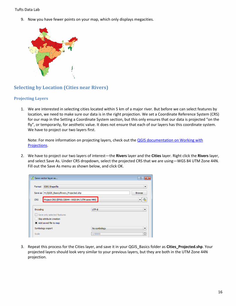
9. Now you have fewer points on your map, which only displays megacities.
Selecting by Location (Cities near Rivers)
Projecting Layers
1. We are interested in selecting cities located within 5 km of a major river. But before we can select features by location, we need to make sure our data is in the right projection. We set a Coordinate Reference System (CRS) for our map in the Setting a Coordinate System section, but this only ensures that our data is projected “on the fly”, or temporarily, for aesthetic value. It does not ensure that each of our layers has this coordinate system. We have to project our two layers first. Note: For more information on projecting layers, check out the QGIS documentation on Working with Projections.
2. We have to project our two layers of interest—the Rivers layer and the Cities layer. Right click the Rivers layer, and select Save As. Under CRS dropdown, select the projected CRS that we are using—WGS 84 UTM Zone 44N. Fill out the Save As menu as shown below, and click OK.
3. Repeat this process for the Cities layer, and save it in your QGIS_Basics folder as Cities_Projected.shp. Your projected layers should look very similar to your previous layers, but they are both in the UTM Zone 44N projection.

Tufts Data Lab
17
Buffer Layer
4. We are interested in a buffer distance of 5 km, but we do not know which units our projection is in. Verify your
units by clicking on the Projection Properties button at the bottom of your screen ( ). Click on the General tab, and look at the Canvas Units section. It should look like the image below.
5. From the main menu, select Vector Geoprocessing Tools Fixed distance Buffer(s).
6. Fill out the Buffer menu as shown below. Note that our projection is in Meters, and we are interested in a buffer distance of 5 kilometers, so we enter a buffer distance of 5000. Once your Buffer menu matches the image below, click OK.

Tufts Data Lab
18
7. The river lines on your map should look a bit wider than before. Drag the Rivers_Projected layer on top, and zoom into a river line. You should see a visual similar to the image below. The blue line indicates our Rivers_Projected layer, and the orange blobs around it indicate our 5 km buffer. The green dot represents a city. Since it does not fall within the orange area, we can tell that it is NOT located within 5 km of a major river.
Selecting by Location
8. From the main menu, select Vector Research Tools Select by Location.
9. Fill out the menu as shown below. We are only interested in Cities that fall completely within our buffered region, so we indicate that preference in the menu. Once your menu matches the image below, click OK. If you cannot see the entire layer, right-click Cities_Projected, and select Zoom to Layer.

Tufts Data Lab
19
10. Some cities are selected, and are highlighted in yellow. Right-click the Cities_Projected layer Save As. Check Save Only Selected Features, and save it as Cities_Near_Rivers.shp.
Adding basemaps from OpenLayers
QGIS provides optional features called Plugins that allow you to execute a variety of tools. Plugins are user-developed tools designed to supplement the tools offered natively within QGIS. We will install the OpenLayers plugin for our analysis. The OpenLayers plugin provides various background maps (basemaps) to display satellite imagery, topography, transportation routes, and place names.
1. To install OpenLayers, select Plugins from the main menu, and then select Manage and Install Plugins.
2. A list of plugins will pop up. Select “All” from the left panel, scroll to OpenLayers, and click on Install Plugin. Note that you shouldn’t add a space (e.g. Open Layers), otherwise it won’t find the plugin! Once the installation is finished, click Close.

Tufts Data Lab
20
3.
4. Once you have installed the plugin, from the main menu, click Web OpenLayers plugin.
5. You will see a variety of options of basemaps that you can add. Click on OpenStreetMap OpenStreetMap. OpenStreetMap (OSM) is an open-source, editable map of the world, and is extremely useful for identifying features. You will see that a layer called OpenStreetMap is added to your Layers window. You might need to turn off all layers except the OpenStreetMap layer to see it. To turn off all layers, click on the Manage Layer Visibility icon in your Layers window, and select Hide All Layers.
6. Try some of the other basemaps available from the OpenLayers plugin menu, such as OpenCycleMap and Bing Aerial. See which maps display which features. Now display some of your data layers, rearrange their order in the Layers window, and modify their styles so you can better display all the information on the same map.
Measuring Distance and Area
1. Turn off all layers except the Rivers_Projected and Cities_Projected layers on your map. Zoom into a region with a city and a river. Then, click on the Measure tool dropdown in the Attributes toolbox. Of the options, select the Measure Line tool. You can also press Control + Shift + M.
2. Click on a city, and drag your mouse around the map. You will see an orange line appear on the map from your start point to wherever you move your mouse. In the Measure menu, a distance appears in the Segments box. Click the nearest river on the map, and observe your Measure menu. The length of one segment is added, and an orange dot appears on the river. These start and end point define the line segment whose distance was added to the Segments box. Click again on another city or river. You just created another segment, and another measurement is added in the

Tufts Data Lab
21
Segments box. The number in the Total menu indicates the total distance of your line – i.e. all the segments combined. Add more points, and see how the Total box changes. Right-click to stop adding points. Once you are done measuring, click Close. Note: If you want to measure in a different unit, click on the meters icon, and select a different unit of measurement.
3. From the Measure dropdown, select Measure Area. Turn on the Literacy layer, and drag it to the top of your Layers list.
4. Select any state whose area you want to measure, and begin clicking on its boundaries. You will see an orange shape beginning to form, whose vertices you can control by clicking and adding more points. Once you are done outlining the state, right-click to stop adding points. You will see that the Measure box now has an area in it. The more points you add, the more accurate your area.

Tufts Data Lab
22
Drawing a map at a set scale
Many professional map users expect printed maps to be at a standardized scale. USGS topographic maps are printed at 1:100,000 scale (1 inch on the map equals 100,000 inches in the real world or about 1.58 miles) and at 1:24,000 scale for example (1 inch on the map equals 24,000 inches in the real world, or 2000 feet or about 0.38 miles). In QGIS you can scale your map to any scale, but you are also offered standard scales to choose from.
1. Zoom to the extent of the Literacy layer. At the bottom of your map, you will see the Scale bar (
). Select the dropdown, and set the scale to 1:1,000,000.
This zooms into a smaller portion of a state, so it may work well for a map at the State level. However, we probably need a higher scale to zoom into one city.
2. Turn off all layers, then add the OpenStreetMap basemap from Web OpenLayers plugin OpenStreetMap. Now locate and zoom into the city of Kolkata on your map, on the East coast of India. Experiment with various map scales in the Scales menu. Which scale would be good for a map of downtown Kolkata? You can also type in a scale yourself, in the format 1:[specified scale].
These are unitless scales. 1:24,000 means that one unit on the map (or your computer screen) equals 24,000 of those same units in the real world. The scales provided are standard paper map scales used around the world. 1:24,000 is the map scale of the USGS topographic quadrangle maps (sometimes known as 7.5 minute maps because they cover 7.5 minutes of latitude and longitude).
3. Try typing in 1:150,000 in the scale box, and use the Pan tool to center your map on the city of Kolkata. This creates a map at 1:150,000 scale (1 inch on the map equals 150,000 inches in the real world).
Composing a Map
You can use QGIS to compose a layout when you want to create a map for printing or inclusion in another document. It is a view of your data, much like viewing the page layout when you are working in a word processing software. In QGIS,

Tufts Data Lab
23
we use Print Composer to create a map for publishing—i.e., when all the preliminary work and analysis is done (where you have been up to now in this tutorial).
In this tutorial, you can create a map of all or any part of India you like – we provide the graphic of southern India as an example.
When you create a map, it is good practice to include:
The map itself
A Descriptive Title
A legend
A scale bar (in km for international data)
A North Arrow
Name of the cartographer (you)
The Date
Acknowledgements of data sources.
It is important in a map not to include too much information. You would not want a map that includes all the data layers from this tutorial. It would be much better to do several maps.
You may also include other elements on your map – for example, more explanatory text, labels, charts, tables, photos, or other images.
Note that you can also have more than one map on a layout – for example, you can have a small locational reference map (as in the map above) or an inset map to show an area in more detail. See the Adding an Inset Map section for instructions about how to do this.
Pre-processing
1. Display the following layers to the top of your list: Megacities, Cities_Projected, Rivers_Projected, Roads. Add the OSM Humanitarian Data Model basemap from the OpenLayers plugin to your map. Style and label these layers so they display cleanly on your map.
2. Add the Census2011 layer from your QGIS Basics folder to your map again. Rename it “States”, and style it to display a single symbol, with a transparent fill and a thick black outline.
3. Rename the Cities_Projected layer to “Population”, rename the Rivers_Projected layer to “Rivers”, and edit the legend of the Population layer to display populations in millions.
4. Center your map on the southern Indian states, specifically Tamil Nadu, Kerala, Karnataka, and Andhra Pradesh
Setting up Print Composer
1. Before you start a map layout, it is important to think through what you want to do and how you want your map to look. What do you want to show? How large do you want your final map to be? Portrait or landscape orientation? Do you need space for additional text or graphics? This tutorial example will assume a printer paper size (8x11 inch) map but often you are making map for publications where they must be smaller, or for Powerpoint where they need to be a certain size (e.g., 7.5x10 inches), or for posters where they may be much larger than 8x11.

Tufts Data Lab
24
2. In the Main Menu, choose Project New Print Composer. Name this window “South India”. The new window is your Print Composer window, which you will use to compose your map for publication.
3. The first thing you should do is to set up your Page properties. On the right, you will see the Composition Tab, which contains the Paper and Quality menu. Make sure that the preset is set to A4. Also select either Portrait or Landscape for the page orientation. Which would be better for the map you want to create? The example map is in Portrait orientation.
4. QGIS allows users a lot of freedom in deciding where things go on a page. You can place all elements freeform on the page if you wish. However, a page grid can help you decide margins less arbitrarily. Select View Show Grid. You can toggle this view off and on to see what your final page will look like.
5. Go to Settings Composer Options. Under the Composer tab, set up the defaults: Grid Style = Dots, Grid color = grey, Grid spacing = 2.00 mm, Grid offset = 0.00 for both x and y, Snap tolerance = 1 px.
Adding Map Elements, Resizing, and Focusing
1. In the Print Composer window, select Layout Add Map. Now click and drag to create a square on your page, aligning with the guides as best as possible. As soon as you stop dragging, you will see that the square populates with your map as it appears in your map window.
2. We want to leave some sort of margin between the map and the edge of the page so it prints cleanly. First, click
on the Select/Move Item icon ( ). Now, click on the map, and resize it using the squares that appear on the edges of the image. Leave a one-square space along the edge of the paper. Your document should look like the image below, depending on which layers you have turned on.

Tufts Data Lab
25
3. The map on the page may not display the geographic extent you are interested in by default. We can use the
Move Item Content button ( ) in the left vertical toolbar to pan and zoom around the map in composer view. Use this tool to zoom into the Eastern coastal states of India. TIP: hold down the Control button and scroll into your map with the Move Item Content selected. This will allow you to zoom into the map in smaller increments.
Inserting a Title, North Arrow, Scale Bar and Legend
These are all usually required elements on all maps. For more tips on cartography, check out this tipsheet! Note: the suggestions in this tipsheet apply to ArcGIS, but the principles are still relevant for QGIS maps.
1. Click on Layout Add Label, and draw a square anywhere on your map. In the Item Properties > Main Properties menu, delete the default “QGIS”, and type in “Southern India”.
This is your
map
Use these
squares to
resize items
on the map
This is the
edge of the
page

Tufts Data Lab
26
2. Expand the Appearance menu, Click on Font and modify the font to 28 point Arial.
3. Click on Layout Add Image, and draw a rectangle on your map. In the Item Properties tab on your right, expand the Search directories menu. From the options, select a North Arrow of your choosing. The box immediately fills with the image you chose. Resize the box, and place the North Arrow at a prominent place on your map.
4. Click on Layout Add Scalebar, and draw a rectangle on your map. Under the Item Properties window, expand the Main Properties menu. The Style option controls the type of scalebar you get. For now, select the Single Box scalebar.
5. Next, expand the Segments menu. We want our scale to start at 0, so we specify left 0 and right 3. The Fixed width and Height boxes control the dimensions of the scalebar. Specify 100,000 units in th`e Fixed Width box, and a height of 2 mms. A scalebar such as this one below should appear.
6. Click on Layout Add Legend, and draw a rectangle on your map. A legend automatically appears.
7. This legend includes all the layers in our original map, not just the active ones. To fix this, expand the Legend Items menu under Item Properties. Uncheck Auto update. Then, select the layers that you want to remove, and click the minus sign. Let’s also remove the OpenStreetMap layer from the legend, since it is only a basemap.

Tufts Data Lab
27
8. Expand the Fonts menu, and increase the size of the elements in your legend. You may also change or delete the legend title if you wish.
9. Expand the Background menu, and select a light grey background for the legend box on your map.
10. Your finished legend should look like the image below.
Labeling Features
1. Right-click the States layer Properties. Select the Labels tab.

Tufts Data Lab
28
2. Check Label this layer with, and select the NAME_1 field in the dropdown menu. This field is where the names of each state is stored.
3. You will see a variety of options to style your labels. First, click Text. Set the Font to Arial, and the Size to 11.00 Points.
4. Next, click on Buffer. Check Draw text buffer, and specify a size of 1.50 mm.
5. Click on Placement, and select Offset from centroid. In the Quadrant option, click on one of the squares, and select OK. How do the labels look? Now try another quadrant. You might have to experiment with different label placement options depending on the label placement of your basemap, which you cannot change.
6. Click Apply and OK. Your map should have now have labels for each state, similar to the image on the right.
7. Repeat this process for the Megacities layer. Open the attribute table of the Megacities layer to determine which field contains the city name. Edit the font size and placement so that the Cities labels are smaller than the state labels. Drag the States layer to the top of your Layers list, so the larger labels don’t get crowded out by the smaller ones. Your final image should look like the image below.
Adding an Inset Map
You can add a second (or more) maps to your Print Composer to display regional context of your data, as shown in the image below. Inset maps are great for showing the general outline of the country or continent within which your map is located.

Tufts Data Lab
29
1. Before we can add a new map to our composer page, we have to lock our map extent and style options. Select your map, and in the Item Properties window, check Lock layers for map item, and Lock layer styles for map item. This will preserve the styles and extent that we have set for our map.
2. Go back to your map window, right-click the States layer, and select Zoom to layer. Hide all layers except for the States and the OpenStreetMap layers.
3. In your Print Composer, select Layout Add Map. Draw a small square on your document, ideally below your main map. Resize the square if necessary, and use the map and the Extents Set to Map Canvas button in the Item Properties window to center the inset map on the country of India.
This is your
main map
This is your
inset map
The red box indicates
the overview—the
geographic extent of
your main map
within the extent of
the inset map
This is the
edge of the
page

Tufts Data Lab
30
4. Expand the Frame menu in Item Properties, and select a black frame with a width of 0.25 mm.
5. Expand the Overview menu in Item Properties. Click on the green + button to add a new overview. A Draw “Overview 1” overview menu will pop up. In the Map Frame menu, select Map 0, which indicates the main map which is part of the newly created inset map. Your Overviews menu and inset map should look like the images below.
Printing or Exporting your Map
You can print directly from QGIS or you can export to a digital graphic format like .pdf or .png. The ability to export to a digital format is very useful. If exporting to an image, remember to set your page size to the appropriate dimensions, which may mean custom dimensions. When creating a layout for digital export, you should think ahead about what size you want your final image and lay out the map accordingly, and be sure to use font sizes that are readable at the final map size.

Tufts Data Lab
31
1. When your Print Composer page looks exactly how you want to present your map, select your main map. Under Item Properties, expand the Main properties menu. From the dropdown, select Render, and click Update Preview. Now repeat this process for your inset map.
2. Now from the main menu, select Composer Export as PDF. You may also save as an image file—JPEG, PNG, etc. However, be warned: image file formats do not export OpenLayers plugin layers very well.
3. The process will take a minute. Your composer window will go blank, and will reappear when the export is finished.
4. Check your results by navigating to the folder outside of QGIS and opening the file. If some map sections are missing or your map looks crowded, render your map again, and then export your map again. You may also want to use SnagIt software, installed on all Data Lab computers, to take a high-resolution screenshot of your composed map.
That's the basics. Now practice what you have learned by creating several maps of India, a region within India, or states such as Tamil Nadu or West Bengal.
Resources
For more information about QGIS and to download the software, visit the Quantum GIS website. The QGIS User Guide and QGIS training manual include training topics such as plugins, vector and raster data,
and map creation. Ujaval Gandhi’s QGIS Tutorials and Tip Sheets web page provides an excellent range of tutorials for beginners
through advanced QGIS users How do I do that in QGIS? The Free Quantum GIS Training Manual by Tim Sutton QGIS Workshop – Harvard University GIS Practicum – Introduction to GIS Using Open Source Software by Frank Donnelly, Baruch College CUNY