r simple linear regression 2018 - umass simple linear regression … · …\r\2017-18\r simple...
TRANSCRIPT

R Handouts – Spring 2018 Simple Linear Regression
…\R\2017-18\R simple linear regression 2018.docx February 2018 Page 1 of 20
Introduction to R & R-Studio Spring 2018
Simple Linear Regression
Start Your R Session …………………………………………………….. 1. Preliminaries ………………………………..………………………. 2. Install Packages (one time) …………………………………………. I- Simple Linear Regression ………….………….…………………….. 1. Introduction to Example …………………..………………………. 2. Preliminaries: Descriptives ………………….……………………. 3. Assess Normality of Y ……….…………………………………… 4. Fit Model …………………………………………………………… 5. Post Fit Model Examination ……………………….……………….. 6. Some Graphical Diagnostics ………………………………………. 7. Simple Linear Regression Diagnostics ……………………….…….
2 2 2
3 3 4 7 9
11 13 18

R Handouts – Spring 2018 Simple Linear Regression
…\R\2017-18\R simple linear regression 2018.docx February 2018 Page 2 of 20
Start Your R Session
1. Preliminaries Consider having a core set of preliminary commands that you always execute. These may vary depending on your preferences. The following are mine.
setwd("/Users/cbigelow/Desktop/") # Set the working directory to desktop rm(list=ls()) # Clear current workspace options(scipen=1000) # Turn off scientific notation options(show.signif.stars=FALSE) # Turn off display of significance stars 2. Install Packages (One time) Often, in your R work you will want to use commands that are only available in packages which you must download from the internet. Tip #1 – Always do your package installation at the console, NEVER within an R Markdown file. Tip #2 – To execute any of the installations below, simply delete the leading “#”. # install.packages("ggplot2") # install.packages("mosaic") # install.packages("gridExtra") # install.packages("car")

R Handouts – Spring 2018 Simple Linear Regression
…\R\2017-18\R simple linear regression 2018.docx February 2018 Page 3 of 20
I – Simple Linear Regression
1. Introduction to Example and Load Data Source: Chatterjee, S; Handcock MS and Simonoff JS A Casebook for a First Course in Statistics and Data Analysis. New York, John Wiley, 1995, pp 145-152. Setting: Calls to the New York Auto Club are possibly related to the weather, with more calls occurring during bad weather. This example illustrates descriptive analyses and simple linear regression to explore this hypothesis in a data set containing information on calendar day, weather, and numbers of calls. R Data Set: ers.Rdata In this illustration, the data set ers.Rdata is accessed from the PubHlth 640 website directly. It is then saved to your current working directory. Simple Linear Regression Variables: Outcome Y = calls Predictor X = low.

R Handouts – Spring 2018 Simple Linear Regression
…\R\2017-18\R simple linear regression 2018.docx February 2018 Page 4 of 20
Launch R and load R data = ers.Rdata #2. Load data. View structure setwd("/Users/cbigelow/Desktop/") load(file="ers.Rdata") str(ersdata)
## 'data.frame': 28 obs. of 12 variables: ## $ day : int 12069 12070 12071 12072 12073 12074 12075 12076 12077 12078 ... ## $ calls : int 2298 1709 2395 2486 1849 1842 2100 1752 1776 1812 ... ## $ fhigh : int 38 41 33 29 40 44 46 47 53 38 ... ## $ flow : int 31 27 26 19 19 30 40 35 34 32 ... ## $ high : int 39 41 38 36 43 43 53 46 55 43 ... ## $ low : int 31 30 24 21 27 29 41 40 38 31 ... ## $ rain : int 0 0 0 0 0 0 1 0 1 0 ... ## $ snow : int 0 0 0 0 0 0 0 0 0 0 ... ## $ weekday: int 0 0 0 1 1 1 1 0 0 1 ... ## $ year : int 0 0 0 0 0 0 0 0 0 0 ... ## $ sunday : int 0 1 0 0 0 0 0 0 1 0 ... ## $ subzero: int 0 0 0 0 0 0 0 0 0 0 ... ## - attr(*, "datalabel")= chr "" ## - attr(*, "time.stamp")= chr "" ## - attr(*, "formats")= chr "%8.0g" "%8.0g" "%8.0g" "%8.0g" ... ## - attr(*, "types")= int 252 252 251 251 251 251 251 251 251 251 ... ## - attr(*, "val.labels")= chr "" "" "" "" ... ## - attr(*, "var.labels")= chr "" "" "" "" ... ## - attr(*, "version")= int 8
We see that this data set has n=28 observations on several variables. For this illustration of simple linear regression, we will consider just two variables: calls and low. These are highlighted in red.
2. Preliminaries – Descriptives # summary(DATATFRAME$VARIABLE) summary(ersdata$low)
## Min. 1st Qu. Median Mean 3rd Qu. Max. ## -2.00 10.50 26.00 21.75 31.00 41.00
summary(ersdata$calls)
## Min. 1st Qu. Median Mean 3rd Qu. Max. ## 1674 1842 3062 4319 6498 8947

R Handouts – Spring 2018 Simple Linear Regression
…\R\2017-18\R simple linear regression 2018.docx February 2018 Page 5 of 20
# To get summary statistics for EVERY variable in the dataframe # summary(DATATFRAME) summary(ersdata)
## day calls fhigh flow ## Min. :12069 Min. :1674 Min. :10.00 Min. : 4.00 ## 1st Qu.:12076 1st Qu.:1842 1st Qu.:29.75 1st Qu.:18.75 ## Median :12258 Median :3062 Median :35.00 Median :27.00 ## Mean :12258 Mean :4319 Mean :34.96 Mean :24.46 ## 3rd Qu.:12440 3rd Qu.:6498 3rd Qu.:41.75 3rd Qu.:32.00 ## Max. :12447 Max. :8947 Max. :53.00 Max. :40.00 ## high low rain snow ## Min. :10.00 Min. :-2.00 Min. :0.0000 Min. :0.0000 ## 1st Qu.:32.00 1st Qu.:10.50 1st Qu.:0.0000 1st Qu.:0.0000 ## Median :39.50 Median :26.00 Median :0.0000 Median :0.0000 ## Mean :37.46 Mean :21.75 Mean :0.3214 Mean :0.2143 ## 3rd Qu.:43.25 3rd Qu.:31.00 3rd Qu.:1.0000 3rd Qu.:0.0000 ## Max. :55.00 Max. :41.00 Max. :1.0000 Max. :1.0000 ## weekday year sunday subzero ## Min. :0.0000 Min. :0.0 Min. :0.0000 Min. :0.0000 ## 1st Qu.:0.0000 1st Qu.:0.0 1st Qu.:0.0000 1st Qu.:0.0000 ## Median :1.0000 Median :0.5 Median :0.0000 Median :0.0000 ## Mean :0.6429 Mean :0.5 Mean :0.1429 Mean :0.1786 ## 3rd Qu.:1.0000 3rd Qu.:1.0 3rd Qu.:0.0000 3rd Qu.:0.0000 ## Max. :1.0000 Max. :1.0 Max. :1.0000 Max. :1.0000
Scatterplots library(ggplot2) SCATTERPLOT: Y=calls v X=low with least squares fit # Tip - request line first, then overlay the points on top gg <- ggplot(data=ersdata, aes(x=low, y=calls)) + geom_smooth(method="lm") + geom_point() gg <- gg + xlab("Lowest Temperature Previous Day") + ylab("Number of Calls") plotxy_linear <- gg + ggtitle("Calls to NY Auto Club 1993-1994 - Linear Fit") + theme_bw() plotxy_linear

R Handouts – Spring 2018 Simple Linear Regression
…\R\2017-18\R simple linear regression 2018.docx February 2018 Page 6 of 20
The scatterplot on the previous page suggests, as we might expect, that lower temperatures are associated with more calls to the NY Auto Club. We also see that the data are a bit messy. Below, for illustration, is a scatterplot with an overlay lowess smoother. Unfamiliar with LOWESS regression? LOWESS regression stands for “locally weighted scatterplot smoother”. It is a technique for drawing a smooth line through the scatter plot to obtain a sense for the nature of the functional form that relates X to Y, not necessarily linear. The method involves the following: At each observation (x,y), the observed data point is fit to a line using some “adjacent” points. It’s handy for seeing where in the data linearity holds and where it no longer holds. Handy!
SCATTERPLOT Y=calls v X=low with lowess smoother # Tip - request loess smoother first, then overlay the points on top # Key - span=0 is very wiggly while span=1 is less wiggly gg <- ggplot(data=ersdata, aes(x=low, y=calls)) + geom_smooth(method="loess", span=1) + geom_point() gg <- gg + xlab("Lowest Temperature Previous Day") + ylab("Number of Calls") plotxy_loess <- gg + ggtitle("Calls to NY Auto Club 1993-1994 - LOESS Smoothed") + theme_bw() plotxy_loess
The lowess smoothed fit suggests that perhaps the linear relationship stops being linear as the temperature increases above 20-25 degrees. For now, we’re going to just do linear regression.
R Handouts – Spring 2018 Simple Linear Regression
…\R\2017-18\R simple linear regression 2018.docx February 2018 Page 7 of 20
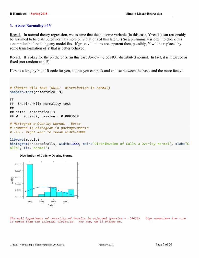
3. Assess Normality of Y Recall. In normal theory regression, we assume that the outcome variable (in this case, Y=calls) can reasonably be assumed to be distributed normal (more on violations of this later…) So a preliminary is often to check this assumption before doing any model fits. If gross violations are apparent then, possibly, Y will be replaced by some transformation of Y that is better behaved. Recall. It’s okay for the predictor X (in this case X=low) to be NOT distributed normal. In fact, it is regarded as fixed (not random at all!) Here is a lengthy bit of R code for you, so that you can pick and choose between the basic and the more fancy! # Shapiro Wilk Test (Null: distribution is normal) shapiro.test(ersdata$calls)
## ## Shapiro-Wilk normality test ## ## data: ersdata$calls ## W = 0.82902, p-value = 0.0003628
# Histogram w Overlay Normal - Basic # Command is histogram in package=mosaic # Tip - Might want to tweak width=1000
library(mosaic) histogram(ersdata$calls, width=1000, main="Distribution of Calls w Overlay Normal", xlab="Calls", fit="normal")
The null hypothesis of normality of Y=calls is rejected (p-value = .00036). Tip- sometimes the cure is worse than the original violation. For now, we’ll charge on.

R Handouts – Spring 2018 Simple Linear Regression
…\R\2017-18\R simple linear regression 2018.docx February 2018 Page 8 of 20
For ggplot2 fans library(ggplot2) Histogram w Overlay Normal - w Aesthetics # Tip- Might want to tweak binwidth=1000 # ggplot(DATAFRAME, aes(x=VARIABLENAME)) + stuff below gg <- ggplot(ersdata, aes(x=calls)) gg <- gg + geom_histogram(binwidth=1000, colour="blue", aes(y=..density..)) gg <- gg + stat_function(fun=dnorm, color="red", args=list(mean=mean(ersdata$calls), sd=sd(ersdata$calls))) gg <- gg + ggtitle("Distribution of Calls w Overlay Normal") gg <- gg + xlab("Calls") + ylab("Density") plot_histogramcalls <- gg + theme_bw() plot_histogramcalls
A bit fancier. The conclusion is the same. The null hypothesis of normality of Y=calls is rejected (p-value = .00036). But for now, we’ll charge on.

R Handouts – Spring 2018 Simple Linear Regression
…\R\2017-18\R simple linear regression 2018.docx February 2018 Page 9 of 20
4. Fit Model
Simple Linear Regression- Fit, Coefficients Table, ANOVA Table and R-squared library(mosaic) # FIT # MODELNAME <- lm(YVARIABLE ~ XVARIABLE, data=DATAFRAME) model_simple <- lm(calls ~ low, data=ersdata)
# Basic report of fit # summary(MODELNAME) summary(model_simple)
## ## Call: ## lm(formula = calls ~ low, data = ersdata) ## ## Residuals: ## Min 1Q Median 3Q Max ## -3112 -1468 -214 1144 3588 ## ## Coefficients: ## Estimate Std. Error t value Pr(>|t|) ## (Intercept) 7475.85 704.63 10.610 0.000000000061 ## low -145.15 27.79 -5.223 0.000018649091 ## ## Residual standard error: 1917 on 26 degrees of freedom ## Multiple R-squared: 0.5121, Adjusted R-squared: 0.4933 ## F-statistic: 27.28 on 1 and 26 DF, p-value: 0.00001865
# 95% CI for the regression coefficients (betas) # confit(MODELNAME) confint(model_simple)
## 2.5 % 97.5 % ## (Intercept) 6027.4605 8924.23745 ## low -202.2744 -88.03352
R Handouts – Spring 2018 Simple Linear Regression
…\R\2017-18\R simple linear regression 2018.docx February 2018 Page 10 of 20
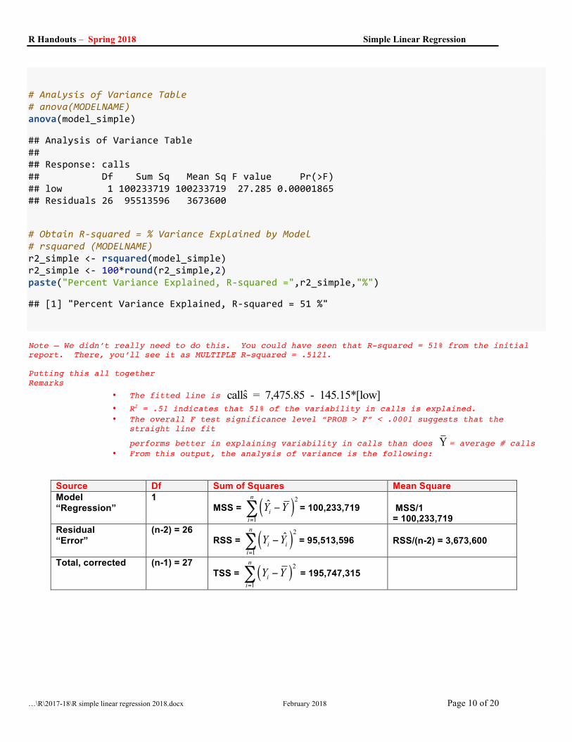
# Analysis of Variance Table # anova(MODELNAME) anova(model_simple)
## Analysis of Variance Table ## ## Response: calls ## Df Sum Sq Mean Sq F value Pr(>F) ## low 1 100233719 100233719 27.285 0.00001865 ## Residuals 26 95513596 3673600
# Obtain R-squared = % Variance Explained by Model # rsquared (MODELNAME) r2_simple <- rsquared(model_simple) r2_simple <- 100*round(r2_simple,2) paste("Percent Variance Explained, R-squared =",r2_simple,"%")
## [1] "Percent Variance Explained, R-squared = 51 %"
Note – We didn’t really need to do this. You could have seen that R-squared = 51% from the initial report. There, you’ll see it as MULTIPLE R-squared = .5121. Putting this all together Remarks
• The fitted line is ˆcalls = 7,475.85 - 145.15*[low] • R2 = .51 indicates that 51% of the variability in calls is explained. • The overall F test significance level “PROB > F” < .0001 suggests that the
straight line fit
performs better in explaining variability in calls than does Y = average # calls • From this output, the analysis of variance is the following:
Source Df Sum of Squares Mean Square Model “Regression”
1 MSS = ( )2
1
ˆn
iiY Y
=
−∑ = 100,233,719 MSS/1 = 100,233,719
Residual “Error”
(n-2) = 26 RSS = ( )2
1
ˆn
i iiY Y
=
−∑ = 95,513,596 RSS/(n-2) = 3,673,600
Total, corrected (n-1) = 27 TSS = ( )2
1
n
iiY Y
=
−∑ = 195,747,315

R Handouts – Spring 2018 Simple Linear Regression
…\R\2017-18\R simple linear regression 2018.docx February 2018 Page 11 of 20
5. Post Fit Model Examination
Three plots in ggplot2 are shown: a) plot of 95% CI of the mean; b) plot of 95% CI of the individual predictions and c) combined plot showing both 95% CI of mean and 95% CI of individual predictions.
library(ggplot2) ##### a) 95% CI of mean w overlay scatter gg <- ggplot(ersdata, aes(x=low, y=calls))+ geom_smooth(method=lm, level=.95, se=TRUE) gg <- gg + geom_point() gg <- gg + xlab("Lowest Temperature Previous Day") + ylab("Number of Calls") gg <- gg + ggtitle("Simple Linear Fit w 95% CI of Means") plot_CImean <- gg + theme_bw() plot_CImean
##### b) 95% CI of individual prediction w overlay scatter yhat <- predict(model_simple, interval="prediction")
## Warning in predict.lm(model_simple, interval = "prediction"): predictions on current data refer to _future_ responses
temp_df <- cbind(ersdata, yhat) gg <- ggplot(temp_df, aes(x=low, y=calls)) gg <- gg + geom_line(aes(y=lwr), color = "red", linetype = "dashed") gg <- gg + geom_line(aes(y=upr), color = "red", linetype = "dashed") gg <- gg + geom_point() gg <- gg + xlab("Lowest Temperature Previous Day") + ylab("Number of Calls") gg <- gg + ggtitle("Simple Linear Fit w 95% CI of Predictions") plot_CIpredict <- gg + theme_bw() plot_CIpredict

R Handouts – Spring 2018 Simple Linear Regression
…\R\2017-18\R simple linear regression 2018.docx February 2018 Page 12 of 20
##### c) COMBINED: 95% CI of mean, 95% CI of prediction + overlay scatter yhat <- predict(model_simple, interval="prediction")
## Warning in predict.lm(model_simple, interval = "prediction"): predictions on current data refer to _future_ responses
temp_df <- cbind(ersdata, yhat) gg <- ggplot(temp_df, aes(x=low, y=calls)) gg <- gg + geom_line(aes(y=lwr), color = "red", linetype = "dashed") gg <- gg + geom_line(aes(y=upr), color = "red", linetype = "dashed") gg <- gg + geom_smooth(method=lm, level=.95, se=TRUE) gg <- gg + geom_point() gg <- gg + xlab("Lowest Temperature Previous Day") + ylab("Number of Calls") gg <- gg + ggtitle("Simple Linear Fit w 95% CI's of Mean and Individual Predictions") plot_CIboth <- gg + theme_bw() plot_CIboth
Remarks
• The overlay of the straight line fit is reasonable but substantial variability is seen, too.
• There is a lot we still don’t know, including but not limited to the following --- • Case influence, omitted variables, variance heterogeneity, incorrect functional
form, etc.

R Handouts – Spring 2018 Simple Linear Regression
…\R\2017-18\R simple linear regression 2018.docx February 2018 Page 13 of 20
6. Some Graphical Diagnostics library(mosaic) library(ggplot2) library(gridExtra) # BASIC - Produces 4 plots in a single panel # Key: par(mfrow=c(2,2)) says arrange the 4 plots in a 2x2 array par(mfrow=c(2,2)) plot(model_simple)
A little hard to see what’s going on here. I think I’ll look at these plots one at a time.

R Handouts – Spring 2018 Simple Linear Regression
…\R\2017-18\R simple linear regression 2018.docx February 2018 Page 14 of 20
Mosaic has 6 nice diagnostic plots. Here I obtain each of them. Note - the plotting requires ggplot2 # FANCY - Produces 6 plots, separately or in one combined panel # Following uses commands in packages = mosaic, ggplot2, gridExtra ##### a) Y=residual v X =predicted (Good if: Even band at Y=0) mplot (model_simple, which=1)
##### b) Normal Quantile Plot (Good if: X=Y 45 degree line) mplot (model_simple, which=2)
Not bad!

R Handouts – Spring 2018 Simple Linear Regression
…\R\2017-18\R simple linear regression 2018.docx February 2018 Page 15 of 20
##### c) Y=standardized residual v X=predicted (Good if: Constant variance) mplot (model_simple, which=3)
Also not bad. Note that the square root of the standardized residuals are the absolute values.
##### d) Y=Cook's Distance v X=Observation number (Good if: all are below .5) mplot (model_simple, which=4)
In simple linear regression, the rule of thumb is to notice a Cook’s distance > 1. Clearly we have noproblem here. The largest Cook distance is less than 0.15!

R Handouts – Spring 2018 Simple Linear Regression
…\R\2017-18\R simple linear regression 2018.docx February 2018 Page 16 of 20
##### e) Y=residuals v X=leverage (Good if: Nice even band centered at Y=0) mplot (model_simple, which=5)
Looks okay
##### f) Y=Cook Distance v X=leverage (Good if: no trend of any sort) mplot (model_simple, which=6)
Also looks okay.

R Handouts – Spring 2018 Simple Linear Regression
…\R\2017-18\R simple linear regression 2018.docx February 2018 Page 17 of 20
##### The 6 mplots( ) above in a single panel p1 <- mplot(model_simple, which=1) p2 <- mplot(model_simple, which=2) p3 <- mplot(model_simple, which=3) p4 <- mplot(model_simple, which=4) p5 <- mplot(model_simple, which=5) p6 <- mplot(model_simple, which=6) grid.arrange(p1, p2, p3, p4, p5, p6, ncol=3)
Hmmmm - I think I need to find a way to make the text in each of these 6 plots a lot SMALLER, so as to make more room for the plot itself!

R Handouts – Spring 2018 Simple Linear Regression
…\R\2017-18\R simple linear regression 2018.docx February 2018 Page 18 of 20
7. Simple Linear Regression Diagnostics – A Suggested Approach library(car) library(mosaic) library(ggplot2) library(gridExtra) # Retrieve some post estimation variables – residual <- resid(model_simple) # Simple residuals sresidual <- rstudent(model_simple) # Studentized residuals ##### a) NORMALITY (Good if: residuals are distributed normal) # Test - - Shapiro Wilk Test of residuals (Null: distribution is normal) shapiro.test(residual)
## ## Shapiro-Wilk normality test ## ## data: residual ## W = 0.94073, p-value = 0.1154
# Plots - - p1<- histogram(~residuals(model_simple), density=TRUE) p2 <- mplot(model_simple, which=2)
grid.arrange(p1, p2, ncol=2)

R Handouts – Spring 2018 Simple Linear Regression
…\R\2017-18\R simple linear regression 2018.docx February 2018 Page 19 of 20
##### b) Outlier Detection (Good if: no outliers) # Test - - Test of Outliers (Null: no misspecification) outlierTest(model_simple)
## ## No Studentized residuals with Bonferonni p < 0.05 ## Largest |rstudent|: ## rstudent unadjusted p-value Bonferonni p ## 27 2.037655 0.052299 NA
##### c) Influential Observations Detection (Good if: no observation is influential) cook <- cooks.distance(model_simple) # identify cook distance values > 4/(n-p-1) cutoff <- 4/((nrow(ersdata)-length(model_simple$coefficients)-2)) # Plot mplot(model_simple, which=4)
# List observations with cook distance values > cutoff (Note: if all is well, you'll get no output) ersdata[cook>cutoff,]
## [1] day calls fhigh flow high low rain snow ## [9] weekday year sunday subzero ## <0 rows> (or 0-length row.names)
#### d) Non-Constant Variance (Good if: variance is constant) # Test: Homogeneity of variance (Null: Variance is constant) ncvTest(model_simple)
## Non-constant Variance Score Test ## Variance formula: ~ fitted.values ## Chisquare = 0.3071705 Df = 1 p = 0.5794217

R Handouts – Spring 2018 Simple Linear Regression
…\R\2017-18\R simple linear regression 2018.docx February 2018 Page 20 of 20
# Plots - - par(mfrow = c(1, 2)) # Set Plotting Arrangment to 1 row x 2 columns spreadLevelPlot(model_simple,ylab="Absolute Studentized Residual", xlab="Fitted Value", main="")
## ## Suggested power transformation: 0.9333337
plot(ersdata$low, sresidual,xlab="Lowest Temperature",ylab="Studentized Residual"); abline(0,0)
# TIP!!! Restore plotting arrangement to default setting of 1x1 single panel par(mfrow = c(1, 1))