re-defining data visuals for an efficient and sustainable...
TRANSCRIPT

Master thesis in Sustainable Development 2017/30
Examensarbete i Hållbar utveckling
Re-defining data visuals for an
efficient and sustainable food waste
management
Suhas Singh
DEPARTMENT OF
EARTH SCIENCES
I N S T I T U T I O N E N F Ö R
G E O V E T E N S K A P E R

Master thesis in Sustainable Development 2017/30
Examensarbete i Hållbar utveckling
Re-defining data visuals for an efficient and
sustainable food waste
management
Suhas Singh
Supervisors: Mattias Eriksson
Evaluator: Cecilia Mark-Herbert

Copyright © Suhas Singh and the Department of Earth Sciences, Uppsala University Published at
Department of Earth Sciences, Uppsala University (www.geo.uu.se), Uppsala, 2017

viii
Re-defining data visuals for an efficient and sustainable food waste management
SUHAS SINGH
Singh, S., 2017: Re-defining data visuals for an efficient and sustainable food waste management. Master thesis
Abstract
The use of visual data representation is increasing the possibilities to exchange information and communicate in
different contexts all over the world. Communicating food wastage visually to influence consuming patterns is
one of these possibilities. Food wastage is currently a much-prioritized topic in Sweden as well as globally due to
its negative impacts on society, environment and the economy, and therefore there is much need to bring
innovative solutions supporting reduction of food waste. This thesis presents a qualitative research based on a case
study of food waste management at Sala municipality in Sweden while exploring the current visual data
representation techniques and its further potential to make food waste management more sustainable. The research
framework used in this thesis is based on visual rhetoric and the innovation theories. The thesis analyzes food
wastage from an international perspective, its connection to sustainable development goals and how Matomatic
AB uses a visual data representation tool to address food wastage.
The thesis further explains how the users associated with Sala municipality interpret the existing tool, the
challenges they face and review their expectations to build a new visual data representation model. The results of
questionnaires filled by user’s, state that 50% of the respondents understand the current tool to its full capacity
and only 50% of the respondents are satisfied with the overall tool. When it comes to the choice of data
presentation 67% of the users showed interest in use of infographics instead of the conventional bar graphs, and
therefore some parameters like, making the tool more interesting using infographics, user friendly by limiting the
data displayed and interactive by giving user options to explore further as per their liking, were thought while
designing the new visual data representation model.
Keywords: Food wastage, Food waste management, Human behavior, Infographics, Sustainable Development,
Visual data representation
Suhas Singh, Department of Earth Sciences, Uppsala University, Villavägen 16, SE- 752 36 Uppsala, Sweden
in Sustainable Development at Uppsala University, No. 2017/30, 34 pp,15 ECTS/hp

ix
food waste management
SUHAS SINGH
Singh, S., 2017: Re-defining data visuals for an efficient and sustainable food waste management. Master thesis
Summary
The use of visual data representation to explore complex data is undoubtedly a crucial method to enhance
understanding of a specific problem area. One of the problem areas stated here is food wastage; food wastage has
been identified as one of the key focus areas and there are much expected efforts required to overcome the current
challenge of generated food wastage in Sweden as well as in the international context.
The purpose of this project is to develop visual data representation for an already existing online tool that uses
one combination of visualization techniques to communicate the multidimensional challenges related to food
wastage. In the pre-development process, already existing visual data representation tools were analyzed in
relation to their ability to communicate and learning outcomes were taken into consideration before developing
the new visualization tool. In addition, the pre-development process included literature review to understand
human perception of visual data representation and elements of behavioral change, as well as implementation of
basic design principles and knowledge gained from the outcome of questionnaire responded by kitchen staff and
management at Sala Municipality.
The results of questionnaire show that only 50% of the respondents understand the current tool to its full capacity
and only 50% of the respondents are satisfied with the overall tool. When it comes to the choice of data
presentation 67% of the users showed interest in use of infographics instead of the conventional bar graphs, and
therefore the finalized tool was developed to overcome the said challenges while exploring innovative ways to
present the data.
Keywords: Food wastage, Food waste management, Human behavior, Infographics, Sustainable Development,
Visual data representation
Suhas Singh, Department of Earth Sciences, Uppsala University, Villavägen 16, SE- 752 36 Uppsala, Sweden
in Sustainable Development at Uppsala University, No. 2017/30, 34 pp,15 ECTS/hp
Re-defining data visuals for an efficient and sustainable

x
Content
1. Introduction ................................................................................................................................... 1
1.1. Background .................................................................................................................................. 1
1.2. Food wastage and its impacts ....................................................................................................... 1
1.3. Food wastage and Sustainable Development goals (SDG’s) ....................................................... 2
1.4. Communication to alter consumer behavior................................................................................. 3
1.5. Research setting ............................................................................................................................ 4
1.6. Aim and research questions .......................................................................................................... 5
1.7. Outline .......................................................................................................................................... 5
2. Method............................................................................................................................................ 7
2.1. Literature review .......................................................................................................................... 7
2.2. Questionnaires .............................................................................................................................. 7
2.3. Data Authenticity ......................................................................................................................... 8
2.4. Visual data representation tool ..................................................................................................... 9
2.5. Limitations ................................................................................................................................... 9
2.6. Ethical consideration .................................................................................................................... 9
3. Theory .......................................................................................................................................... 10
3.1. Visual Rhetoric ........................................................................................................................... 10
3.2. Data visualization theory ............................................................................................................ 11
4. Empirics ....................................................................................................................................... 13
4.1. Waste overview of catering services in Sweden ........................................................................ 13
4.1.1. Sala Municipality ................................................................................................................ 13
4.2. Matomatic AB approach on food wastage analysis ................................................................... 14
4.2.1. Food wastage categorization ............................................................................................... 14
4.2.2. Data Authentication ............................................................................................................. 14
4.3. Analysis of Visual data representation tools .............................................................................. 15
4.4. Analysis of the questionnaire ..................................................................................................... 16
5. Results ........................................................................................................................................... 19
5.1. The visual data representation tool development process .......................................................... 19
5.2. Narrative visualization ............................................................................................................... 20
6. Discussion ...................................................................................................................................... 24
6.1. Data Visualization and Human Perception................................................................................. 24
6.2. The Psychology of sustainable behavior .................................................................................... 25
6.3. Further study .............................................................................................................................. 25
6.4. Delimitations .............................................................................................................................. 25

xi
7. Conclusion .................................................................................................................................... 27
References ............................................................................................................................................. 29
Appendix………………………………………………………………………………………..……..31
1
1. Introduction The content of the introduction chapter explains background of the researched topic, it identifies the
research setting, Aim and research questions as well structure of the thesis.
1.1. Background
In 2050, the global population is projected to exceed 9 billion people with increasing resource needs and
demands (UN, 2013, p. 1). An effective food waste management is seen as a necessity to secure food and
feedstock for a growing population. Food wastage during the last decade has gained enormous attention on
both academic and societal levels mainly because of its negative impacts on society, environment and
economy. Looking at the consumption patterns in a developed country it is seen that both consumers and
consumer facing businesses contribute as biggest sources of food wastage and therefore reducing food
wastage is marked as one of the necessary actions for more sustainable food security (Amani et al. 2015,
p. 6457).
This thesis examines the possibility of altering consumption patterns using technology, i.e. by creating
visual data representation for food wastage reduction. Visual data representation is one of the important
communication tools gaining importance largely in last few years, however there are several examples
available when studying design and persuasive technologies. The presence of these successful examples
changes the study approach as well as benefit the development process. We no longer have to invent
something completely from the scratch. Instead, we can focus on getting references or rebuilding the
existing persuasive visual data representation tools and techniques (Fogg, 2009, p. 1).
1.2. Food wastage and its impacts
To reduce this food wastage, we need to first understand the need to reduce it, if not eliminating it. The
main reasons to have an efficient food waste management system is as mentioned below:
• Food wastage of the cooked meal or the wastage during the process costs money, reducing waste food
or lowering food wastage during cooking can save money by reducing not only cost of disposal but
also over-purchasing, labor, and energy costs (FAO, 2015, p.2).
• Food wastage has many environmental impacts, the damaging environmental effects of food wastage
starts with unnecessary food production, which results in higher consumption of natural resources like
water, oil etc. and secondly the impact of food rotting in landfills, which releases methane, a greenhouse
gas (GHG) that is approximately twenty-one times more damaging compared to carbon dioxide (FAO,
2015, p.2). The total carbon footprint of food wastage globally, including land use change, is
approximately 4.4 GtCO2 eq per year that is nearly 8% of total anthropogenic GHG emissions as shown
in Figure 1 (EPA, 2017, p.1).

2
Figure 1: GHG emission of food wastage in relation to the top GHG emissions in the top 20 countries,
(FAO, 2015, p.1)
In Sweden, the landfill ban on sorted combustible waste came in to action in 2002 and the landfill ban on
organic waste in 2005, this acted as a catalyst in diversion of waste from landfills (EPA, 2013, p.4). There
are certain initiatives taken in Sweden to process the collected food wastage, the method used to process
the food wastage is biological treatment or composting system to convert the waste into fertile soil,
alternatively, the energy recovery process which takes the waste and creates energy from it (Horning, 2014).
It is very important to understand the stages where these food wastages occur the most, as shown in Figure
2. The highest carbon footprint of wastage occurs at the consumption phase (37% of total), whereas
consumption only accounts for 22% of total food wastage. This is because one kilogram of food that is
wasted further along the supply chain will have a higher carbon intensity than at earlier stages (FAO, 2017,
p.2).
Figure 2: Contribution of each phase of the food supply chain to carbon footprint and food wastage, (FAO,
2017, p.2).
1.3. Food wastage and Sustainable Development goals (SDG’s)
Food wastage not only consumes resources and money, but also negatively influences the environment
(Godfray et al. 2010; Garnett, 2011). Globally, about 1.3 billion tons of food is wasted every year (FAO,
2011). To put this number into perspective, FAO (2013) estimates that every year, food wastage generates
3.3 Gt CO2 eq Greenhouse gases and costs $750 billion. The food wastage problem therefore demands
closer attention to the ways in which food wastage can be avoided at every stage of the supply chain, in

3
order to fulfill UN Sustainable Development Goal 12, which includes an objective to reduce the global food
waste per capita by half , both at retail as well as consumer level (Europa, 2017) They also aim at reducing
the food loss at the production and supply chain levels (Ågren et al. 2016).
One of the priority areas in Sweden´s nation waste plan is to reduce food wastage and at the same time
improving source efficiency in the food supply chain (Naturvårdsverket, 2012, p.6). In the year 2012, the
food waste generated in Sweden was estimated to be around 1,210,000 tonnes, that equals to 127 kg/ person
(Figure 3) (Naturvårdsverket, 2012, p.6). The food waste comprises of waste generated in different parts of
supply chain, these are mainly categorized as producers, distributors and consumers. The category
producers comprise of primary production (Agriculture and Fishing) and Manufacturing (Naturvårdsverket,
2012, p.6). Whereas the categories distributors (Super markets and wholesalers) and consumers
(restaurants, catering facilities and households) are classified as a whole i.e. without further division.
Figure 3: Food wastage volume generate in Sweden 2012 (Naturvårdsverket, 2012, p.6)
To make food wastage more efficient, it is important to segregate already generated food wastage and treat
it biologically (Naturvårdsverket, 2012, p.6). To control the food wastages, one of the suggestions made by
Swedish environmental protection agency is use of communication. Long-term communication activities
are essential if consumers are to be able to change their behaviors and reduce food wastage in their own
homes.
1.4. Communication to alter consumer behavior
Communication can play a crucial role in promoting development of conscious behavior in today’s world.
As the world moves towards greater democracy, decentralization and the market economy, conditions are
becoming more promising for people to start their own course of change, however it is vital to stimulate
their awareness, participation and capabilities (Ajelere et al. 2015). Communication channels and use of
technology are both central to this drive, but at present they are greatly underutilized. Behavior change
4
communication (BCC) is one of the interactive processes used to develop communication strategies
however it is mainly used to promote positive health outcomes. BCC is based on proven theories and models
of behavior change and involves a well-thought process beginning with research and analysis of behavior,
which is then followed by planning the communication, implementing , monitoring and later evaluating it
(UNFPA, 2002). There have been several success stories about persuasion through communication,
however in this research we focus more on the visual communication and explore possibilities to persuade
human behavior.
Visual data representation is one of the areas which is gaining immense importance in today’s world, firstly
because of the large data available to us and secondly because it is proved to have certain qualities which
support persuasion, these qualities are mainly lower information processing burden, attention receiving,
and reinforcing message arguments (Mesarris, 1997). However, if we look at history, the existence of data
visualization has been evident even in past centuries. In 1700´s data visuals were used in the form of maps
or basic graphs, later in 1800´s these were transformed into more analytical bar charts, today we use much
complex variants of these charts and graphs (Panday et al. 2014).
Introduction to computers has made it much faster and easier to process large data. Today, Visual data
representation is constantly progressing and builds a connection between science and art, which is certain
to change the way we look at data currently. The visual data representation is currently used to comprehend
information quickly, identify relationships and patterns, analyze emerging trends, and communicate stories
to the audience and to alter human behavior. Few examples of visual data representation tools are from the
much known and respected venues like The New York times and the Guardian using visualization to convey
a powerful message to the readers, Gapminder using visual fact-based worldview to educate people globally
and several others. In the recent times the interest for visual data representation has been quite evident with
scientists, journalists, activists and businesses to communicate effectively. However, it is necessary to
understand how visual data impacts or influences people and if visual data representation can be used to
alter consumer behavior? (Panday et al. 2014).
1.5. Research setting
Food wastage currently is an emphasized topic in Sweden as well as globally and there has been a major
focus on food wastage in the last few years (Ågren et al. 2016). The Swedish National Food Agency,
Environmental protection agency and the Swedish Board of Agriculture, have a three-year government
mandate to reduce food wastage (Ågren et al. 2016). One example of which is the national goal to reduce
food wastage: “By 2018 at least 50 percent of food wastage from households, institutional kitchens, shops
and restaurants must be sorted and treated biologically so that plant nutrients are utilized, with at least 40
percent being treated so that the energy is also utilized” (Ågren et al. 2016; Naturvårdsverket, 2012).
At a global level, food wastage is included in the new Sustainable Development Goals formed by the United
Nations (UN, 2016). In goal twelve “Ensure sustainable consumption and production patterns” the one
target is for food wastage: By 2030, that is to reduce the global food waste per capita by half , both at retail
as well as consumer level (Europa, 2017) They also aim at reducing the food loss at the production and
supply chain levels ( Ågren et al. 2016). Many actions to control food wastage have already been discussed
and even implemented globally, including European commission’s plans to stimulate Europe's transition
towards a circular economy through preventing food wastages, and devising a common method to measure
food wastage consistently with the member states and relevant stakeholders, also by creating a new platform
for food loss and food wastage to include both Member States and actors in the food chain in order to help
define actions required to meet the sustainable development goals for food wastage (EC,2017).

5
1.6. Aim and research questions
The aim of the project is to explain how creative visual data representation can alter consumption behavior.
This aim is met in a research design in three parts. First, a review of the literature for both food wastage
and visual data representation techniques is to be conducted. Secondly, developing an explanatory visual
narrative for giving the user insight into the problem domain in conjunction with the data provided by
Matomatic AB. Matomatic AB is a startup working on measuring and analyzing food waste with public
canteens associated with municipalities in Sweden. Thirdly, the resulting tool should be user tested in order
to confirm the learnability and usability of the solution. Research questions of particular interest relate to
how data is visualized and how consumers experience the representation of data:
• How can a visual data representation tool be designed and implemented for an improvised food waste
management and sustainable behavioral change for consumers?
• How do consumers experience and perceive different factors that motivate or discourage them to adopt
a sustainable behavior?
1.7. Outline
Figure 4 illustrates the structure of this thesis, the thesis is structured in a way that it meets the thesis
guideline and as well ensure smooth transition between the chapters
Figure 4: Outline of the thesis report
Chapter 1 The content of the introduction chapter explains background of the researched topic, it identifies
the research setting, aim and research questions as well structure of the thesis
Chapter 2 aims at understanding the conditions of research, and examining the best possible method to
obtain data required for the research. The chapter also highlights ethical considerations and limitations
during research.
Chapter 3 aims to offer understanding on different theories existing with respect to the subject of research
and since the subject matter corresponds to visual data representation tool to alter consumption patterns,
the theories we used in the process were Visual rhetoric theory which was combined with the innovation
process and data visualization theory to structure the development process.
Chapter 4 consists of a background description of waste overview of catering services in Sweden, how
Matomatic AB analyses the food wastage data, the analyzing parameters, comparative study of visual data
representation tools and the results from the questionnaire
Chapter 5 presents the results. It explains the steps of developing the visual data representation tool,
Introduction to the new tool and its comparison to the old tool.
Chapter 6 addresses the research questions raised in chapter one and also offers a discussion about the
delimitations and further scope of study.
Chapter 1
• Introduction
Chapter 2
•Methods
Chapter 3
•Theory
Chapter 4
•Empirics
Chapter 5
•Results
Chapter 6
•Discussion
Chapter 7
•Conclusion

6
Chapter 7 brings answers to the research questions. Explains briefly the results and empirical findings as
well explains how the data visual representation tool was developed considering the user inputs, the chapter
is followed by references.

7
2. Method
Chapter 2 aims at understanding the conditions of research, and examining the best possible method to
obtain data required for the research. The chapter also highlights ethical considerations, the visual tool
development and limitations during research. This study aimed at analyzing qualitative information and
therefore information was collected through primary data such as questionnaires and conversations and
through secondary data like literature review.
2.1. Literature review
In order to gain understanding on the researched topic, the first step was to make a literature review. In the
process of literature review the material relevant to the study, i.e. articles, books, Journals, research papers
and other research reports are searched, reviewed and analyzed (Robson, 2011). This literature review was
partly done with the intention to identify a theoretical framework for which mostly academic articles and
research papers were used as a source of information. Different key words were used to find relevant data
and studies specific to the thesis topic; the search terms used are summarized in table 1.
Table 1: Used search terms to find academic articles
Persuasion Food Waste management
Data visualization Visual data representation tools
Data understanding Sustainable development goals
Data interpretation Data representation rules
Global food wastage Data Components
The thesis focuses on literature review through scientific articles, journals to understand the first part of the
research that is food wastage in local and global scenario, existing initiatives and analysis of food waste
management system in Sweden and more specifically in Sala municipality, then the thesis develops further
by analyzing articles on Persuasion though visual data representation and how consumer interprets data. In
the later part thesis includes comparative studies of existing visual tools, their success and failure stories
and lastly before redesigning the actual tool. The thesis focuses on analyzing the basic rules of visual data
representation, meaning associated with lines, figures, typography etc. using the visual rhetoric approach.
2.2. Questionnaires
The use of questionnaire was one of the methods used to identify gaps in the current tool and also to
understand user expectation from it (Figure 5).
Figure 5: The development process of the visual data representation tool.
Questionnaire ( Existing Model)
Designing new model
User tests
Improvisation
New Model Finalisation

8
The questionnaire was sent to the management and kitchen staff to understand the user understanding of
the already developed system, the challenges they face, the time consumed to use the software, and also to
check if the software is actually beneficial for day to day waste management. The questionnaire was sent
to the management as well as the Kitchen staff.
Most of the questions are with choices and description since it is faster for respondent to answer and because
it eliminates the possibility of misinterpretation. The last two questions are descriptive where the
expectations from the user are asked and their perception of the visual data representation tool. These
questions were asked to make it easier for developing the new tool keeping the answers as supporting
guidelines. The questions asked in the questionnaire are shown in figure 6.
Figure 6: The questions that were asked from the kitchen staff
2.3. Data Authenticity
The biggest challenge concerning the reliability of the questionnaire is to make sure that the questions are
understood the same way by every respondent (Artino et al. 2014). When designing the questions, it is
important to bear in mind this challenge to have trustful results. To be able to reach valid results questions
were restricted to the user experience of the tool carefully formulated after discussing with one of the dietary
economist at Sala municipality managing all the kitchens associated with the municipality. The criteria of
choosing the respondents were, to find somebody who handles the food waste data in their kitchens and has
access to computer and internet. As per the criteria we were able to identify that kitchen heads of each
kitchen would be best suitable for answering the questionnaire, which is also as suggested by the dietary
economist at Sala municipality. The questionnaire was distributed to 6 respondents through an online link
with a mutually agreed timeline of ten days; once the results were received the data was analyzed through
statistics of each question.
Do you think the language used in the
online software is easy to understand?
(YES/NO)
Please rate the satisfaction level in
terms of text vs graph ratio in the online tool (1-5), Where 1 is least
and 5 is highest
How much time does it take to fill data in the
software? (1-5), Where 1 is least and 5 is highest
Do you find this online tool difficult to
understand? (1-5), Where 1 is low
difficulty and 5 is high difficulty
Are you satisfied with the data analysis? does it
help you in everyday process (Food wastage saving, planning etc) (
YES/NO)
Does the tool help you in setting targets for
food wastage reduction? (YES/NO)
How frequently do you use the online tool? (
MULTIPLE CHOICE)
What do you prefer data graph or infographics? ( MULTIPLE CHOICE)
Please mention any data you wish to add in the
existing platform ( TEXT)
Please mention your comments on the visual data interface ( TEXT)

9
2.4. Visual data representation tool
There was no specific visual tool development methodology used in the process, however the principles of
design and concept of visual rhetoric were used as a starting point, which was later coupled with analysis
of questionnaire results. The tool was not made functional due to the limited knowledge of software
development and shorter timeline, however the outlook of how tool should look like was made using Adobe
Photoshop and later presented through Power point.
2.5. Limitations
The method used for the project is qualitative. The number of questionnaires will be less and therefore limit
the analysis results; also, the scope of questionnaire is restricted to 6 working staff of Sala municipality so
there would be less variation in results as well.
2.6. Ethical consideration
Since the visual data representation tool is used to convey food wastage data to Kitchens, it is very important
to maintain confidentiality of data, maintain anonymity of the questionnaire respondents and avoid careless
errors while collecting and analyzing data.
The questionnaire prepared was interview structured in a survey format. The questionnaire was restricted
to the scope of research only and was channelized through the management at Sala municipality. The results
were collected online through individual users, through a survey website and were kept anonymous.

10
3. Theory This chapter aims to offer understanding on different theories existing with respect to the subject of research
and since the subject matter corresponds to Visual data representation tool to alter consumption patterns,
the theories we used in the process were Visual rhetoric theory which was combined with the innovation
process and data visualization theory to structure the development process.
3.1. Visual Rhetoric
The term ‘visual rhetoric’ is used to define the visual imagery within the discipline of rhetoric. It is difficult
to track the exact history of visual rhetoric since ‘visual rhetoric’ has been studied and practiced since the
beginning of image use. The term originated as a mechanism to separate a certain area of study and to
concentrate attention on the specific rhetorical traits of visual channels, however not all visuals can be
termed as visual rhetoric, to be called so it has to include three specific components, it has to be symbolic,
it should involve human interaction and be presented to strategic audiences to communicate with them
(Foss, 2005, p.144). Visual rhetoric represents itself as a part of communication process where the data or
context is interpreted in order to make meaning of the world around us. In other words, visual rhetoric is a
space where communication takes place, a space that is affected by complex variables. Aristotle once said
that rhetoric is “observing, in any case, the available means of persuasion.” In other words, if you want to
persuade someone to alter their behavior, you should choose appropriate words, organization, style, framing
etc. to convince them. With visual rhetoric, you choose visual means to persuade. If you design a mobile
application, for example, you choose the layout, colors, Typography and style of the application and people
will interpret it as being user friendly, boring, useful, credible, or a waste of their time. They make an
impression or decision based on what they see, and they are persuaded to feel a certain way about it (Fogg,
2009, p.1). It can be explained more with the below Figure 7.
Figure 7: The process of visual rhetoric (Foss, 2005, p.141-153)
In the above figure, visual rhetoric starts with what audience observes through their eyes and ends with how
the meaning is interpreted out of what user sees. The most interesting part is what happens between the eye
and the brain.
Interpretation of visual rhetoric is influenced by many factors. You can see in the visual rhetoric graphic
above that there is a “contextual filter” that changes meaning. In other words, context plays an important
role in what and how people interpret information. The key to successful visual rhetoric is putting focus on
meaning attached with the image rather than focusing only on its aesthetics; an aesthetic response consists
of viewer’s direct perception of the observed visual, working with aesthetic approach could only lead to a
pleasant experience but it lacks in influencing viewer experience. In visual rhetoric, meaning is assigned to
an image, color, lines, space and other components in an image provide basis for a viewer to conclude the
existence of images, emotions and ideas (Foss, 2005, p.141-153).
Eye( Consumer )
Visual Input
( Shape, color,
tpography
etc)
Contextual fiber
( Media, Culture,
language, education
etc)
Persuasion ( Reason, emotion,
credibility)
Meaning ( Brain)

11
3.2. Data visualization theory
All the examples of visual data representation tools currently available are either author driven, reader-
driven approaches or combination of both. Even though many possible combinations already exist, a few
models have become more common and are used often. The most common schemes are Martini glass
structure , Drill down story and Interactive slide show (Segel et al. 2010). These models are explained
below:
• Martini Glass Structure
The Martini glass structure follows an author driven approach, where the author decides what user should
see. It is one of the most common model currently used to represent data visualization. The martini glass
structure is generally introduced by using questions, observations or articles. In this model, the use of text
is minimised. The structure resembles a martini glass (Figure 8), where the stem of the glass represents
author driven view of visualisation, and mouth represents the reader view, once the reader enters the mouth
(Reader view), they can explore the visualization further as per their need (Segel et al. 2010).
Figure 8: Martini glass structure (Segel et al. 2010)
• Interactive Slideshow
Interactive slide show (Figure 9) goes step by step using slides, it contains user interaction components on
each slide, that means the user can interact with the data tool and then move forward to the next slide when
required. This tool is a balanced mix of author driven and reader driven approaches (Segel et al, 2010).
Figure 9: Interactive slide show (Segel et al. 2010)
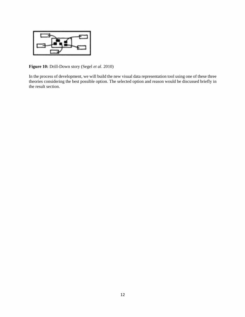
• Drill-Down Story
The Drill-Down Story (Figure 10) works on a general visual layout, where the reader can decide how to
move forward in the data. This is a reader driven model where the complete data is shown at the same time
and reader is given option to choose what data they want to look at. The model still requires choosing the
most relevant data to create options for the user, i.e. what data should be visible to the user upon selection
(Segel et al, 2010).
12
Figure 10: Drill-Down story (Segel et al. 2010)
In the process of development, we will build the new visual data representation tool using one of these three
theories considering the best possible option. The selected option and reason would be discussed briefly in
the result section.

13
4. Empirics This chapter consists of a background description of waste overview of catering services in Sweden and
how Matomatic AB analyses the food wastage data. This chapter also explains the analyzing parameters,
comparative study of visual data representation tools and the results from the questionnaire.
Matomatic AB is a startup located at Green innovation park, SLU. The startup includes three full time staff
members with expertise in food waste management and software development. Their vision is to reduce
food wastages in Sweden by providing methods and tools to the public sectors and restaurants. The startup
collects data from the public canteens and sends back the analysis to these canteens in the form of excel
files and graphs. However, excel sheets alienates a large portion of the audiences from the start, since excel
is not a favorite tool for people who don’t like working with numbers or rather appreciate a visual approach
on understanding the facts, the main problem with excel is that important data is hidden or difficult to
explore, the viewer is seeing all the raw data at once, it’s difficult to interpret what’s important and what’s
not. Secondly excel sheets and graphs are difficult to analyze. To the worse, the volume of data presented
can lead to misinterpretation, and viewer could make poor choices or take wrong actions based on that
misinterpretation (Marr, 2016). Similarly, the graphs used in the existing tool also hold a lot of data, since
these graphs are direct representation of the excel chart. In addition, the current tool gives the same data
analysis to the kitchen staff as well to the people in management. This problem can be resolved by
identifying the most relevant data required for the person in a specific position, for example a person on a
managerial role at municipality would need a holistic view of the food waste across different kitchens
associated with the municipality, however a person working specific to a kitchen will only need data
relevant to his/her work. Secondly how visual data should be presented, to engage the user and give them
a better experience is also an important parameter to study. Matomatic AB could elevate impact on these
canteens and reduce food wastage by using an even better visual data representation technique which is
readily accepted by the staff members, especially the ones working in the kitchen.
4.1. Waste overview of catering services in Sweden
As per the data compiled by Naturvårdsverket in 2012, approximately 58,000 tonnes of food wastage i.e. 6
kg per person, was generated from all the catering facilities in Sweden, of which school canteens were
accountable for almost 43,000 tonnes. The catering facilities mentioned include school canteens, kitchens
in prisons, elderly care homes and health service institutions (Stare et al. 2013). The data for school canteens
also includes preschools. Of the food wastage thrown away, about 52% (30,000 tonnes) constitutes of
unnecessary food wastage and about 48 % (28,000 tonnes) is unavoidable food wastage (Stare et al. 2013).
Fruit and vegetables itself constitutes of 72 % of the generated food wastage volumes followed by pasta,
rice and potatoes (11 %) and then meat (9 %). The proportions of bread and dairy products amounted to 5
and 2 % respectively (Stare et al. 2013).
4.1.1. Sala Municipality The waste analysis tool developed by Matomatic AB is primarily used at Sala Municipality, Sala
municipality is an average-sized municipality in Sweden, it has a total number of 30 kitchens (located in
27 physical kitchen facilities). These kitchens include 4 elderly care homes, 14 schools and 12 pre-schools.
Some of the preschools share facilities with a school or restaurant of an elderly care home for eating for
which the quantifications are kept separate mainly due to different eating times or locations. These kitchens
represent all restaurants managed by the public catering department at Sala municipality (Eriksson et al.
2016).
14
4.2. Matomatic AB approach on food wastage analysis
4.2.1. Food wastage categorization The food wastage quantified is categorized into three main categories and several sub-categories (Eriksson
et al. 2016).
1) Plate waste includes scrapings of service user plates and unavoidable food wastage such as peels, bones
and edible leftovers.
2) Serving waste includes leftovers from the buffet after the lunch serving and from the kitchen provided
they were not stored for later consumption. The serving waste category is divided into the following
sub-categories
a. Main warm component (Lunch 1)
b. Main warm component (Lunch 2)
c. Vegetarian main warm component (Lunch 3)
d. Carbohydrate-rich component (typically pasta, potatoes or rice)
e. Sauce
f. Vegetables
g. Special diets (for religious, allergies and other reasons)
h. Dessert
3) The category ‘other’ is used to record waste that does not fit into any other category.
Normally, these schools serve three lunch options, elderly care homes serve two and preschools serve only
one. However, the actual dishes are often different, i.e. Lunch 1 of an elderly care home and that of school
on the same day is not necessarily the same. Also, for practical reasons schools generally follow the same
meal menu, but with scope for local adjustments (Eriksson et al. 2016).
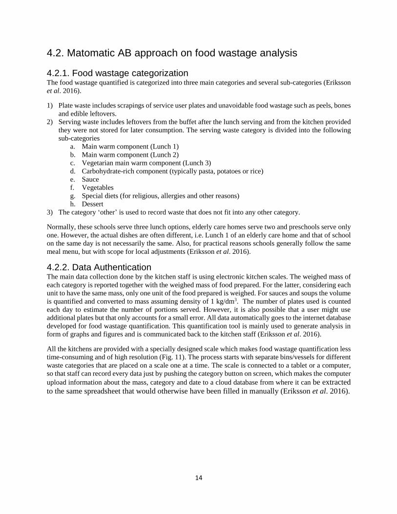
4.2.2. Data Authentication The main data collection done by the kitchen staff is using electronic kitchen scales. The weighed mass of
each category is reported together with the weighed mass of food prepared. For the latter, considering each
unit to have the same mass, only one unit of the food prepared is weighed. For sauces and soups the volume
is quantified and converted to mass assuming density of 1 kg/dm3. The number of plates used is counted
each day to estimate the number of portions served. However, it is also possible that a user might use
additional plates but that only accounts for a small error. All data automatically goes to the internet database
developed for food wastage quantification. This quantification tool is mainly used to generate analysis in
form of graphs and figures and is communicated back to the kitchen staff (Eriksson et al. 2016).
All the kitchens are provided with a specially designed scale which makes food wastage quantification less
time-consuming and of high resolution (Fig. 11). The process starts with separate bins/vessels for different
waste categories that are placed on a scale one at a time. The scale is connected to a tablet or a computer,
so that staff can record every data just by pushing the category button on screen, which makes the computer
upload information about the mass, category and date to a cloud database from where it can be extracted
to the same spreadsheet that would otherwise have been filled in manually (Eriksson et al. 2016).

15
Fig. 11: Simplified schematic diagram for waste measurement using the Matomatic Scale in kitchen
(Eriksson et al. 2016).
Figure 10 explains the process of calculating and recording food waste data, the figure shows how food
becomes waste and then weighed on an electronic weighing scale, which is connected to a tablet and uploads
data to the cloud. Once the data is uploaded, it is analyzed by the system and presented to the users in the
graphical and table form, as shown in Figure 12.
Figure 12- Snap shot of the current Matomatic AB tool (Matsvinn, 2017)
4.3. Analysis of Visual data representation tools
In this part of thesis, we will look at some of the tools existing for visual data representation, Identify and
categorize their design features. Below (Figure 13) is a brief comparison of the few examples analyzed,
these examples are gathered from sources such as online journalism, blogs, visualization books, research
thesis and software packages.
These examples are shown to understand the tools with reference to the theories they are attached with.
These tools will not be used directly, however understanding different components in relation to the visual
model and user interaction can be used to bring maximum output from the new visual data model.

16
Figure 13: Comparison between three visual data representation tools (Segel et al. 2010)
4.4. Analysis of the questionnaire
The questionnaire was made to understand the challenges or effectiveness of the current system developed
by Matomatic AB (Appendix 1). The questionnaire was sent to the Sala municipality and associated
kitchens for the review. It was understood from the questionnaire results that the current system is valuable
to the users in understanding the food wastage data, however there are a few shortcomings when it comes
to visual interface, text vs graph ratio, and data interpretation for some. The questionnaire consists of
Yes/No, Rating, multiple choice and descriptive questions (optional), The results of the questionnaire
received from 6 respondents are shown below (Figure 14, 15, 16).
020406080
100120
Do you think thelanguage used in
the onlinesoftware is easy to
understand?
Does the tool helpin setting targets
for food wastereduction?
Results: Questionnaire Q 1 and Q 6
Yes No

17
Figure 14- The results of Yes/No questions
Figure 15: The results of rating (1-5) questions.
Figure 16: the results of multiple choice questions
The results of the questionnaire explain the user involvement, their preferences and challenges faced while
working on the tool. As per the results, 33% of the users work on the analysis tool daily, 33% use it
Quarterly, 16% Monthly and 16% use it Weekly. These differences in usage pattern are mainly because the
tool does not meet its full potential in engaging users and making it more user friendly. This can also be
seen through the results of questionnaire, which highlights that 67% of the users feel infographics are better
0%0%
50%50%
0%
Q 2 Please rate the satisfaction level
interms of text vs graph ratio in the
tool? (1 is least and 5 is highest)
1 2 3 4 5
0%16%
17%
50%
17%
Q 3 How much time does it take
to fill data in the software? (1 is
least and 5 is highest)
1 2 3 4 5
0%16%
17%
50%
17%
Q 4 Do you find this online tool
difficult to understand? (1 is least
and 5 is highest)
1 2 3 4 5
0%0%
50%50%
0%
Q 5 Are you satisfied with the data
analysis, does it help you in
everydays process? (1 is least and 5
is highest)
1 2 3 4 5
0
20
40
60
80
Infographics Graphs
Q 8 What do you prefer inforgaphic or
graphs
0
10
20
30
40
Daily Quarterly Monthly Weekly
Q 7 How frequently do you use the
online tool?

18
compared to the conventional graphs, 50% of the users are unsatisfied with the tool, 50% of users feel the
tool is difficult to understand as well as time consuming and therefore 50% feel the tool doesn’t help them
in reducing the wastages.

19
5. Results This chapter presents the results. It explains the steps of developing the visual data representation tool,
Introduction to the new tool and its comparison to the old tool.
5.1. The visual data representation tool development process
The questionnaire results helped in building the new Visual data representation tool, while incorporating
the expectations or feedbacks received from the test kitchens. However, in addition to the feedbacks basic
coloring, typography and data representation principles were followed before coming up with new tool.
The whole process of visual data representation tool development was divided into different steps; these
steps of development process are illustrated in Figure 17, which is followed by interpreting text.
Figure 17: Visual data representation tool development process (Fogg, 2009, p.2-6)
• Choosing the target behavior
In order to develop a successful visualization tool that could persuade human behavior, it is firstly required
to select an appropriate behavior of the said tool and target it for change. It is required to select the smallest,
simplest behavior that matters (Fogg, 2009, p. 2-6). As a result of the questionnaire some of the parameters
identified are making the tool user friendly and interactive. Making the tool user friendly results in bringing
motivation to the user, which enables them to use the tool with interest and by making it interactive, the
user can explore different data at their own convenience.
• Choosing the receptive audience
The second step is to choose the receptive audience, which in this case are the kitchen staff, and the
management. The management however looks at the data holistically, whereas kitchen staff looks data
relevant to their own kitchens, the results derived from the questionnaire gives the perspective of
expectation both from the management and staff preview.
• Finding what is preventing the current behavior
The third step is to look for opportunities in the existing tool (Figure 16). As per the questionnaire results,
the users are more interested in infographics than the excel graphs and in addition the tool is difficult to
understand according to 50% users, because of which the end results of the tool, i.e. to help people reduce
food wastage is not meeting its full potential. As per the questionnaire results, only 50% of the staff working
with this tool are benefited with the analysis.
Choosing the target behavior
Choosing the
receptive audience
Finding what is
preventing the current behavior
Choosing appropriat
e visual theory
Designing new visual interface

20
• Choosing appropriate visual theory
The fourth step, which is also very important, is to choose the relevant theories. Does it need to be user
driven, author driven or a mix of both? so in this case while planning the new design, the Martini glass
structure is prioritized. The Martini Glass visualization structure begins with an author-driven
approach. It uses questions, observations, or written articles to introduce the visualization. The
structure limits the use of text and instead relies on an interesting default view or annotations. The user
is free to proceed further, explore and choose the data of their own liking. Thus, the structure becomes
more reader-driven at this stage. As the name suggests the structure resembles a martini glass, where
the single-path author driven narrative is the stem of the glass and available paths resembles the
widening mouth of the glass. This structure is the most common across the interactive visualizations
(Segel et al. 2010). The purpose of using the Martini glass structure concept of visualization is mainly
because we want to limit the information seen on the first slide while giving tools to the user to explore
it further. This structure helps in only looking at relevant information and eliminating the unnecessary
ones, however also providing filters or more options to the user for combining different data sets.
• Designing new visual interface
The Fifth and the final step is to develop the tool in a way that user experience improves. By user
experience it means to improve the involvement and encouragement for user to work on this tool. The
main concepts thought while designing the new visuals were looking at the most relevant and strategic
color, typography, format etc. as shown in the figure below (Figure 18):
Figure 18: The design components of a visual tool (Designschool, 2017)
To visualize data effectively, it’s required to follow design principles that are derived from an
understanding of human perception. Therefore, all these components mentioned in the figure were
studied, chosen and considered while designing the interface.
5.2. Narrative visualization
The developed visual data representation tool gives the user an overall introduction to food wastage
generated at the respective kitchens and the technique applied to the visual narrative can be categorized
as a Martini glass structure (Segel et al. 2010). This part of thesis introduces the new visual
representation tool and explains the functionality of its components (Drop down, slider etc.). The
figures 19-23 gives the snapshot of how the tool functions.
For the new visual data representation tool, a total of two pages were created, giving the user a step-
by-step walkthrough of food wastage related data. The general structure of the tool is limited to the
Line color Repetition Scale Negative
space Symmetry
Transparency Texture Balance Hierarchy Contrast Framing
Grid Randomness Direction Rules Movement Depth
Typography Composition

21
first page only, however the user can go to the second page (Figure 23) once they click the analysis
report (Figure 22).
✓ The first page displays total waste produced in the current month, with options to move sideways and
compare it to figures of the previous months (Figure 19).
✓ The top of the page has a sliding bar with years mentioned, this enables user to easily move from one
year to another and review the statistics (Figure 19).
✓ The lower part of the page reflects the trend for the current week which can also be changed into
months and weeks, through the setting button on the right bottom (Figure 19).
Figure 19: The first and main page of the visual data representation tool
✓ The user is also given option to choose data for their specific kitchen and for management the selection
could also be done by selecting multiple kitchens at once (Figure 20)

22
Figure 20: 1st page showing the selection options for kitchen.
✓ The red and green dots show the trends as positive or negative, i.e. the days where the food wastage
increases turn into red (Figure 21)
✓ Once the user mouses over to the red in green dots, they can see the breakup of data into plate waste,
serving waste and extra (Figure 21)
Figure 21: 1st page showing the data specific results for plate waste, serving waste
and extra waste
✓ The comparison button appears while selecting term in the setting section and takes user to the second
page where they can see the detailed analysis of the food wastage data divided into different categories
and in addition lets the user download the analysis file or simply go back to the main menu (Figure 22,
23).
Figure 22: 1st page showing option to change settings and click on analysis tab

23
Figure 23: 2nd page of the visual data representation tool showing analysis results
Although this visual data representation is made using user feedbacks from the questionnaire and applying
the basic design principles, the key outcome or success of the tool can only be analyzed once the visual
interface is adopted by the exiting Matomatic tool and used by the users at Sala municipality and associated
kitchens.

24
6. Discussion This chapter addresses the research questions raised in chapter one. This chapter also offers a discussion about the delimitations and further scope of study.
The findings of the present study concurred with those in relevant literature to identify the factors that
influence human behavior and how key principles of design, i.e. basic attributes such as differences in
length, size, hue, color intensity, angle, texture, shape, and so on, can be used efficiently while designing a
tool. The other important factor is to define the information which is required to communicate while taking
special consideration of factors influencing the user journey and interaction with the system. The details
study of visual data representation as a tool to alter human behavior and psychology of sustainable
consumption is discussed below in this chapter.
6.1. Data Visualization and Human Perception
Data visualization is considered successful if it is able to translate information in a way that our eyes can
distinguish and our brains can understand. Getting the data visual right is much more a science than an art,
achieved only by studying human perception. The goal is to translate abstract data into visual
representations that is easy, efficient, accurate, and meaningful to decode. Data visualization is effective
because it takes full advantage of the brain's abilities to understand and interpret data because visual
perception is handled by the visual cortex located in the rear of the brain, and is extremely fast and efficient.
Thinking or cognition, on the other hand is handled primarily by cerebral cortex in the front of the brain,
which is much slower and less efficient. Traditional data interpretation and presentation methods requires
user to think consciously. Data visualization takes advantage of our powerful eyes whenever possible to
make greater use of visual perception (Stephen, 2017). One of the initial contributions in the field of visual
perception was made by the Gestalt School of Psychology in 1912. The original intent of the study was to
identify how patterns, forms, and organizations in what we see, are perceived. It was observed that we
organize what we see to make sense of it. The result of this effort was development of Gestalt perception
principles, which are still respected as accurate descriptions of visual behavior (Ghaoui, 2006).
One of the great strengths of data visualization relies in our ability to process visual information much more
rapidly than textual or verbal information. Retentive visual processing automatically occurs in the brain
prior to conscious awareness. Retentive visual processing consists of several stages handled by specialized
neurons which detect various attributes of the object we see. These attributes such as length, size, hue, color
intensity, angle, texture, shape etc., are the building blocks of visual data representation. When put in a
visual form considering the right attributes, we shift the balance of decoding the information from the
slower conscious, energy intensive parts of the brain to the faster, energy efficient parts for a better
cognition (Ghaoui, 2006).
The ability to retain multiple objects in consciousness is surprisingly limited which can be augmented using
external forms of information storage. One of the most successful ways to do this is to present information
visually, which allows it to be chunked together into the limited slots available in our working memory.
Alternately several views of information can be placed in front of our eyes simultaneously, allowing us to
have a multidimensional view and make comparisons and see connections to a greater degree. Good visual
data representation techniques and technologies if properly used, extend our thinking into new realms of
data analysis, and we are still beginning to tap its full potential (Ghaoui, 2006).

25
6.2. The Psychology of sustainable behavior
Increasing awareness of environmental and social sustainability impacts in the past few decades has led us
to realize alarming concerns about increased consumption. Depletion of resources and the pollution caused
by manufacturing and distribution are the two main environmental concerns caused by the increased
consumption (Abeliotis et al. 2010). Thus, sustainable consumption is an important and crucial issue to be
considered. As per Low and Davenport (2006: 324) ethical consumers have “a role to play in changing the
world”. Existing research is focused more on defining ethical consumption rather than understanding it
(Newholm and Shaw, 2007). Several studies investigate why consumers often do not adapt sustainable
behaviors, even when they have expressed desire to do so (Carrington et al. 2010; Eckhardt et al. 2010;
Hiller Connell, 2010) (Goworek et al. 2015).
The theory of behavior change helps us to understand options to bridge the value action gap and turn
knowledge into a long-term behavior change. Both the theory of Reasoned Action and Theory of Planned
Behavior contribute ideas that are important in helping us explain, why an individual might change and
develop a sustainable behavior (Kollmuss & Agyeman, 2002). In order to understand the constraints that
impact individual adoption of sustainable behaviors, these theories provide us three main constructs namely
attitude, subjective norms and perceive behavioral control (Ajzen, 1985; Ajzen & Fishbein, 1980; Kollmuss
& Agyeman, 2002). Attitudes are composed of two main beliefs. First, the individual’s belief that a certain
outcome comes from a specific behavior and secondly that the individual will evaluate those outcomes as
either positive or negative (Ajzen, 1985; Ajzen & Fishbein, 1980). Therefor attitude plays an important role
in influencing the current behavior and turning it to a more sustainable one (Barr, 2004). Moreover, other
parameters influencing sustainable behavior, like subjective norms, personal motivations, and self-
efficiency should also be considered (Honabarger, 2011, p.1-10). Together, these ideas are important to
understand psychological reasons of adopting a sustainable behavior and how to ensure a stronger link
between the behavioral change and use of visual media in influencing it (Honabarger, 2011, p.1-10).
6.3. Further study
In the process of developing the new model for visual data representation, the key theories existing for
understanding human interaction to data visualization, the innovation process and how data visuals can be
used to persuade the decision-making process, were studied and used while considering feedbacks received
from the questionnaires. However, the main shortcoming of this project is the lack of testing in the real
world. Therefore, it lacked the test results and the possible outcomes. The visual data representation created
will further require creation of an online tool with respect to the idea generated, implementation at kitchens
associated with Sala municipality, user tests and finally receiving feedbacks from the end users.
6.4. Delimitations
The theories discussed in this thesis relate to individual behavioral change and how visual data
representation can support to adopt a sustainable behavior. The research however limits itself in exploring
the bigger picture associated with social practice theory (SPT), i.e. looking at the broader view of factors
that influence social change, these factors are namely human themselves, material infrastructures, and social
agreements enmeshed with histories, imaginaries, geographical, cultural and political situations (Gill et al.
2015).

26
Since the study was limited to individuals, the theories visual rhetoric, innovation and theory of planned
behavior were looked. This is also the reason why; qualitative method was opted for the primary data
collection and the results were used to develop the new data visual representation tool.

27
7. Conclusion
This chapter brings answers to the research questions. Explains briefly the results and empirical findings as
well explains how the data visual representation tool was developed considering the user inputs.
In conclusion, the research has presented an overall view on the use of visual data representation to persuade
human behavior, based on the study case at Sala municipality and associated kitchens where the initial tool
created by Matomatic AB was tested and feedbacks on understanding and overall experience were received
in the form of questionnaire results.
The information gathered from questionnaires, discussion and literature reviews have been combined with
the communication and innovation theories. The goals are to understand how a visual data representation
tool can be designed and implemented for an improvised food waste management and sustainable
behavioral change for consumers, and how do consumers experience and perceive different factors that
motivate or encourage them to adopt a sustainable behavior?
The empirical findings support that the tool currently used at Sala municipality and associated kitchens
shows positive results in analyzing food waste, however the empirical results also describe the key areas
where the kitchens see scope of improvement to accept this tool in their day to day processes, for examples
the results show that only 50% of the respondents understand the currently tool fully and only 50% of the
respondents are satisfied with the overall tool. When it comes to the choice of data presentation 67% of the
users showed interested in use of infographics instead of the conventional bar graphs. This gave starting
point in developing the visual data representation; however, the tool is also developed in combination with
the design principles and data visualization theories to gain better results.
The tool further focused on giving the user only the specific required information in the form of more
interactive graphics with opportunities to explore further, aiming at eventually helping the user adapt to the
new system. This tool is backed up with the theory of behavioral change that focuses on turning knowledge
into long-term behavior change, so initially the focus remains in sharing knowledge about the food wastage
generated at the kitchens for the staff and management to set targets or look at alternative methods to reduce
the waste being currently generated.

28
Acknowledgement
Research generally involves a considerable number people, without whom mere academic thinking - or the
desire to have it – would not exist.
First, my deepest gratitude to Mattias Eriksson and Cecilia Mark-Herbert for the guidance during this
project for the encouragement, suggestions and freedom to work during the project. Your supervision and
feedbacks were essential for this dissertation.
To Matomatic AB, especially Jesper and Christopher, for taking the time to answer the countless questions,
and without whom this work would have not been possible and finally Malin Vinberg, Sala Municipality
for helping me get my questionnaire answered from the kitchens associated with Sala municipality.

29
References
Abeliotis, K., Koniari, C. and Sardianou, E. (2010), “The profile of the green consumer in Greece”.
International Journal of Consumer Studies, 34 (2), 153-160
Ågren.S, Jensen.C, Johansson.M, Jonsson.C, Sörme.L, Stenmarck.Å (2016). Innovative data on food
wastage in Sweden, [Online] Available at:
http://www.scb.se/Upload/NSM2016/theme2/F3_Sorme_Johansson%20et%20al.pdf. [Accessed 10 Mar.
2017]
Ajzen, I. (1985). From intentions to actions: A theory of planned behavior. In J. Kuhl & J.
Bechmann (Eds.), Action control: From cognition to behavior (pp. 11–39). New York: Springer-Verlag.
Ajzen, I., & Fishbein, M. (1980). Understanding attitudes and predicting social behavior. Englewood
Cliffs, NJ: Prentice-Hall.
Artino, A., La Rochelle, J., Dezee, K. and Gehlbach, H. (2017). Developing questionnaires for
educational research: AMEE Guide No. 87. [online] NCBI. Available at:
https://www.ncbi.nlm.nih.gov/pmc/articles/PMC4059192/ [Accessed 21 May 2017].
Barr, S. (2004). Are we all environmentalists now? Rhetoric and reality in environmental action.
Geoforum, 35, 231 – 249.
Brown, J., VanDam, A., Earnshaw, R., Encarnação, J., Guedj, R., Preece, J., Scheiderman, B. and Vince,
J. (1999). Human-centered computing, online communities and virtual environments. special report on
the First Join European Commission/National Science Foundation, nr.33, vol.3. Chateau de Bonas,
France: Computer Graphics, pp.42- 62.
Carrington, M.J., Neville, B.A. and Whitwell, G.J. (2010), “Why ethical consumers don’t walk their talk:
Towards a framework for understanding the gap between the ethical purchase intentions and actual
buying behavior of ethically minded consumers”, Journal of Business Ethics, 97, 139-158.
Designschool. (2017). Design Elements and Principles - Tips and Inspiration By Canva. [online]
Available at: https://designschool.canva.com/design-elements-principles/ [Accessed 18 May 2017].
Eckhardt, G.M., Belk, R. and Devinney, T.M. (2010), “Why don’t consumers consume ethically?”,
Journal of Consumer Behavior, 9, 426-436.
EPA, (2017). A guide to conducting and analyzing food wastage assessment. [Online] Available at:
https://www.epa.gov/sites/production/files/2015-8/documents/r5_fd_wste_guidebk_020615.pdf.
[Accessed 10 Mar.2017].
Europa (2017).EU actions against food wastage - Food Safety - European Commission. [online]
Available at: https://ec.europa.eu/food/safety/food_waste/eu_actions_en [Accessed 10 Mar. 2017].
FAO (2015). Food wastage footprint & Climate Change. [Online] Available at: http://www.fao.org/3/a-
bb144e.pdf. (Accessed 10 Mar 2017)

30
Flanagan, J., Huang, T., Jones, P. and Kasif, S. (1997). National Science Foundation Workshop on
Human Centered Systems: Information, Interactivity, and Intelligence. [online] Available at:
http://Available: www.ifp.uiuc.edu/nsfhcs/final_report/toc.html [Accessed 9 Mar. 2017].
Fogg, B. (2009). Creating persuasive technologies. Proceedings of the 4th International Conference on
Persuasive Technology - Persuasive '09. [online] Available at:
https://pdfs.semanticscholar.org/02e1/7d1bdb99dc90e2ec332794562b6fb301a8e9.pdf [Accessed 18 May
2017].
Foss, Sonja K. (2005) “Theory of Visual Rhetoric.” In Handbook of Visual Communication: Theory,
Methods, and Media. Ed. Ken Smith, Sandra Moriarty, Gretchen Barbatsis, and Keith Kenney. Mahwah,
New Jersey: Lawrence Erlbaum, pp. 141-52.
Garnett, T. (2011) Where are the best opportunities for reducing greenhouse gas emissions in the food
system (including the food chain)? Food Policy, 36, pp. S23–S32.
Gill, A. and Lopes, A. (2015). Design and Social practice theory: A promising dialogue for sustainable
living. J.Design Research, 13(3), p.237.
Ghaoui, C. (2006). Encyclopedia of human computer interaction. 1st ed. Hershey PA: Idea Group
Reference. Pp. 2292-2300.
Godfray, H.C.J.; Beddington, J.R.; Crute, I.R.; Haddad, L.; Lawrence, D.; Muir, J.F.; Pretty, J.; Robinson,
S.; Thomas, S.M.; Toulmin, C.; et al. (2010) Food Security: The Challenge of Feeding 9 Billion People.
Science, 327, pp. 812–818
Goworek, H., Hiller, A., Fisher, T., Cooper, T. and Woodward, S., (2015). Key factors influencing the
sustainability impacts of purchase and post-purchase consumer decision-making. In: EAERCD 2015, the
18th International Conference on Research in the Distributive Trades of the European Association for
Education and Research in Commercial Distribution (EAERCD), University of Rennes, France, 1-3 July
2015. European Association for Education and Research in Commercial Distribution (EAERCD).
Hiller Connell, K. (2010), “Internal and external barriers to eco-conscious apparel acquisition”,
International Journal of Consumer Studies, 34, 279-286.
Honabarger, D., (2011). Bridging the Gap: The Connection Between Environmental Awareness, Past
Environmental Behavior, and Green Purchasing. [online] Available at:
https://pdfs.semanticscholar.org/7293/d6d59796a57217c2a279d98a0a537640a1e6.pdf [Accessed 9 Mar.
2017].
Horning, L. (2014). Sweden: A Global Leader in Reducing “Matavfall” (Food wastage). [Blog] Lean
Path. Available at: http://blog.leanpath.com/blog/sweden-a-global-leader-inreducing- matavfall-food-
waste [Accessed 14 Mar. 2017].
Kollmuss, A. & Agyeman, J. (2002). Mind the Gap: Why do people act environmentally and what are the
barriers to pro-environmental behavior, Environmental Education Research, 8: 3, 239 – 260.
Marr, B. (2016). Excel Reporting: 5 Reasons Why It Is Bad For Business. Forbes. [online] Available at:
https://www.forbes.com/sites/bernardmarr/2016/06/16/spreadsheetreporting-5-reasons-why-it-is-bad-for-
business/#22fef46165e3 [Accessed 10 Mar. 2017].
Matsvinn. (2017). Matomatic | Mat- och Mätteknik. [online] Available at: http://matsvinn.se [Accessed 14
Mar. 2017].

31
Naturvårdsverket. (2012). Food waste volumes in Sweden.[online] Available at:
http://www.naturvardsverket.se/Documents/publikationer6400/978-91-620-8695-4.pdf [Accessed 21 May
2017].
Newholm, T. and Shaw, D. (2007), “Studying the ethical consumer: A review of research”, Journal of
Consumer Behavior, 6, 253-270.
Pandey, A., Manivannan, A., Nov, O., Satterthwaite, M. and Bertini, E. (2014). The Persuasive Power of
Data Visualization. IEEE Transactions on Visualization and Computer Graphics, 20(12), pp.2211-2220.
Segel, E. and Heer, J. (2010). Narrative Visualization: Telling Stories with Data. IEEE Transactions on
Visualization and Computer Graphics, 16(6), pp.1139-1148.
Stephen, F. (2017). Data Visualization for Human Perception: The Encyclopedia of Human-Computer
Interaction, 2nd Ed. [online] Available at: https://www.interaction-design.org/literature/book/the-
encyclopedia-of-human-computer-interaction-2nd-ed/data-visualization-for-human-perception [Accessed
18 May 2017].
UN, (2013). World Population Prospects: The 2012 Revision, Key Findings and Advance Tables.
Working Thesis No. ESA/P/WP.227. p.54

32
Appendix 1: Questionnaire

33

34