readme for the jquerymobile tagset - sas support · data_role=”default” ‐generates a basic...
TRANSCRIPT
Readme for the JQueryMobile Tagset
The readme file describes the options and the usage of the sample jQueryMobile tagset. The jQueryMobile tagset is an HTML5 tagset which emulates the HTML needed to create a page using the jQuery Mobile framework. The jQuery Mobile Framework allows you to build web pages that are designed for mobile devices as it has touch events designed specifically for the mobile devices. The output is compatible across all of the major phones and tablets such as the iPhone, kindle, Nook, Android, major tables and more. Most of the output also displays well across all devices. It also has accessibility features which allows such things as voice over for the iPad and the iPhone. With limited scripting and markup, can design some very productive pages with the combination of the tagset and the framework.
JQuery Mobile Tagset
The jQueryMobile tagset allows you to generate a web page using the jQuery Mobile framework. Options of the tagset allow you to drive the jQuery Mobile framework. This allows you to specify various layouts, themes, icons, headers and footers, transitions and more. The jQuery Mobile framework is included by adding a link to the hosted CDN library for the CSS and JavaScript files so all you have to do is compile the tagset. You can also download the library and point to it by modifying the doc_head event in the tagset replacing the hosted links with the path to the saved library.
Installing the jQuery Mobile tagset
To install the jQuery Mobile tagset, simply include the tagset into the program editor and compile it or %INCLUDE the file and it will compile into the SASUSER location by default. You can change the location that the tagset is installed by default by adding the ODS PATH statement with the location where the tagset should be installed. The below example adds the compiled tagset to the WORK location.
Ods path(prepend) work.templat(update);
%include “c:\jQueryMobile.tpl”;
JQueryMobile Tagset Option‐Layouts
The tagset options are divided into the various functionalities of jQuery Mobile. The see a list of all of the tagset options, add the option DOC=”help”. The first option that we will look at is the DATA_ROLE= option. This option allows you to drive the layout of the output generated with the JQueryMobile tagset.
DATA_ROLE=”DEFAULT|COLLAPSIBLE|PAGE|LISTVIEW
When the value default is specified, the output is generated using the default page format specified by jQuery Mobile. The output is compatible across all major browser s and is accessible from devices such as iPad voice over technology. If no options are specified, it defaults to the layout of default.
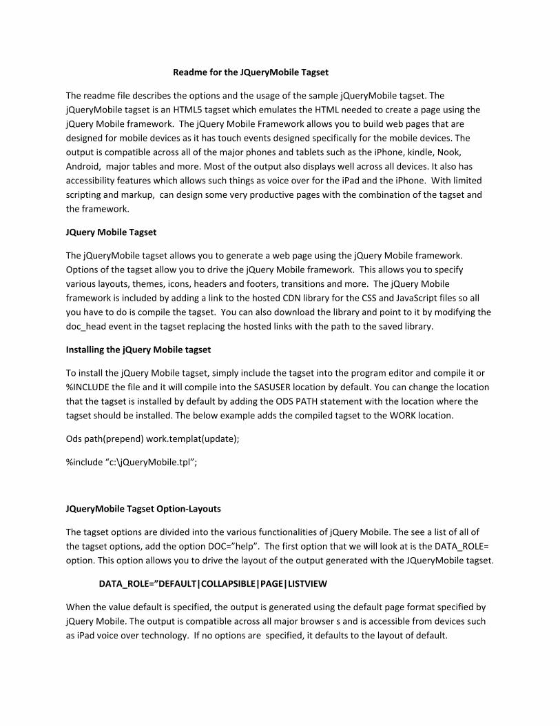
DATA_ROLE=”default”
‐Generates a basic single view page in the jQuery Mobile format. If no options specified the default layout is specified
Sample.
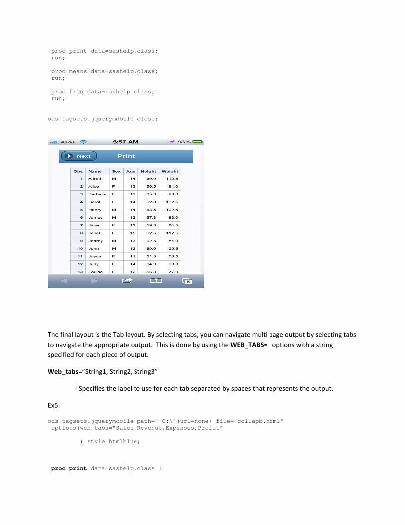
ods tagsets.jquerymobile path="C:\"(url=none) file="ex1.html" options(data_role="default" header="Report Output" Header_theme="b" footer="Summary Report" footer_theme="e" ) style=htmlblue; proc report data=sashelp.class nowd; title "Output using the default layout"; run; ods tagsets.jquerymobile close;
To generate collapsible output, use the options DATA_ROLE=”Collapsible”. This is best when there is multi‐page output as this generates a content header which allows you to expand and collapse the output to display.. There are other options that are applied to this layout such as:
Data_role=”collapsible”
‐Adds a content header that can be used to expand or collapse procedure or data step output which is touch enabled on the mobile devices
Data_collapsed=”yes|no”

‐ Collapses or expands output when displayed initially . The default is that output is collapsed by default.
Data_expanded_icon=” home | delete | plus | arrow‐u | arrow‐d | check | gear | grid | star | custom | arrow‐r | arrow‐l | minus | refresh | forward | back | alert | info | search
Data_collasped_icon= “home | delete | plus | arrow‐u | arrow‐d | check | gear | grid | star | custom | arrow‐r | arrow‐l | minus | refresh | forward | back | alert | info | search”
‐Set s the icon for the initial collapsed content header when the collapsible layout is added. The default is arrow‐r.
Data_iconpos=”left|center|right”
‐ Position of icon to display the expanded or collapsed output. The default is left justified
Data_corners=”yes|no”
– Specifies whether the contents headers are roundedt when displayed. The default is no.
Data_mini=”yes|no”
‐Specifies if the content headers are displayed in a compact version when displayed.
Data_content_theme=”A‐E”
‐Specifies the theme of the content headers of procedure and data step output. The default is A.
Data_inset=”yes|no”
‐Forces the appearance to be more like a collapsible list. The default is no.
Sample.
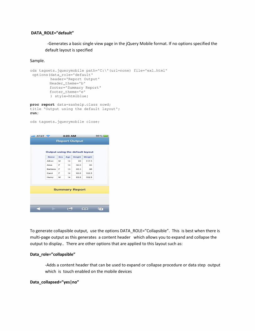
ods tagsets.jquerymobile path="C:\"(url=none) file="ex2.html" options(data_role="collapsible" header="Report Output" Header_theme="b" footer="Summary Report" Footer_theme="b" data_expanded_icon="arrow-l" data_collapsed_icon="arrow-r" data_iconpos="right" data_corners="no" data_mini="yes" ) style=htmlblue; ods proclabel "Detail Report Of Earnings"; proc report data=sashelp.class nowd; title "Output using the default layout"; run;
ods proclabel "Q1 Report Of Earnings"; proc print data=sashelp.class; run; ods proclabel "Analysis of Earnings"; proc means data=sashelp.class; run; ods proclabel "Q2 Report of Earnings"; proc freq data=sashelp.class; run; ods tagsets.jquerymobile close;
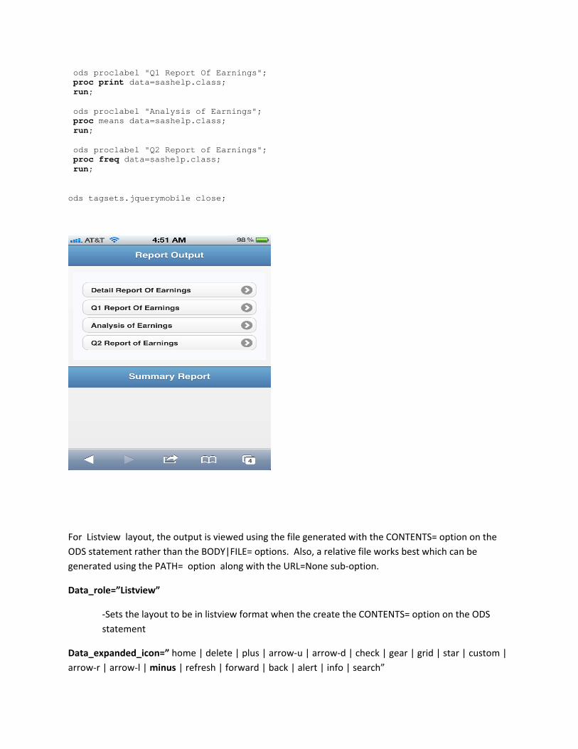
For Listview layout, the output is viewed using the file generated with the CONTENTS= option on the ODS statement rather than the BODY|FILE= options. Also, a relative file works best which can be generated using the PATH= option along with the URL=None sub‐option.
Data_role=”Listview”
‐Sets the layout to be in listview format when the create the CONTENTS= option on the ODS statement
Data_expanded_icon=” home | delete | plus | arrow‐u | arrow‐d | check | gear | grid | star | custom | arrow‐r | arrow‐l | minus | refresh | forward | back | alert | info | search”

‐Sets the icon when the output is expanded for layouts such as collapsible and lyout.
Data_collasped_icon= “home | delete | plus | arrow‐u | arrow‐d | check | gear | grid | star | custom | arrow‐r | arrow‐l | minus | refresh | forward | back | alert | info | search”
‐Set s the icon for the initial collapsed content header when the collapsible layout is added. The default is arrow‐r.
Data_transition=”Slide|Slideup|slidedown|pop|fade|flip”
‐Sets CSS‐based transition effects to the output when navigating to a new page or reversing pages
Data_divder_theme=”A‐E”
‐Sets the theme for the dividers in the listview layout. The default is B.
Sample
ods tagsets.jquerymobile path="C:\"(url=none) file="ex3.html" contents="contents.html" newfile=output options(data_role="listview" contents_header="Report Output" data_mini="yes" ) style=htmlblue; ods proclabel "Detail Report Of Earnings"; proc print data=sashelp.class ; title "Output using the default layout"; run; ods proclabel "Q1 Report Of Earnings"; proc print data=sashelp.class; run; ods proclabel "Analysis of Earnings"; proc means data=sashelp.class; run; ods proclabel "Q2 Report of Earnings"; proc freq data=sashelp.class; run; ods tagsets.jquerymobile close;
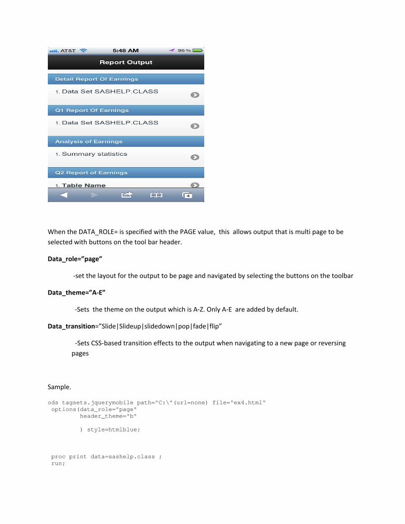
When the DATA_ROLE= is specified with the PAGE value, this allows output that is multi page to be selected with buttons on the tool bar header.
Data_role=”page”
‐set the layout for the output to be page and navigated by selecting the buttons on the toolbar
Data_theme=”A‐E”
‐Sets the theme on the output which is A‐Z. Only A‐E are added by default.
Data_transition=”Slide|Slideup|slidedown|pop|fade|flip”
‐Sets CSS‐based transition effects to the output when navigating to a new page or reversing pages
Sample.
ods tagsets.jquerymobile path="C:\"(url=none) file="ex4.html" options(data_role="page" header_theme="b" ) style=htmlblue; proc print data=sashelp.class ; run;
proc print data=sashelp.class; run; proc means data=sashelp.class; run; proc freq data=sashelp.class; run; ods tagsets.jquerymobile close;
The final layout is the Tab layout. By selecting tabs, you can navigate multi page output by selecting tabs to navigate the appropriate output. This is done by using the WEB_TABS= options with a string specified for each piece of output.
Web_tabs=”String1, String2, String3”
‐ Specifies the label to use for each tab separated by spaces that represents the output.
Ex5.
ods tagsets.jquerymobile path=" C:\"(url=none) file="collapb.html" options(web_tabs="Sales,Revenue,Expenses,Profit" ) style=htmlblue; proc print data=sashelp.class ;

run; proc print data=sashelp.class; run; proc means data=sashelp.class; run; proc freq data=sashelp.class; run; ods tagsets.jquerymobile close;
JQueryMobile Tagset Option‐Toolbar
There are various toolbar options that can be added which modify themes and add text for the header and footer tool bars. The layout where these options will not work will be the TABS.
Header=”String”
‐Provides text which is the header of the toolbar. This can be added for the Page, Collapsible and default layouts.
Contents_header=”String”

‐Specifies the header to use with Listview output when the CONTENTS= option has been specified.
Header_fixed=”yes|no”
‐specifies if the headers are fixed on the page when scrolled.
Header_icon=”URL”
‐Specifies a URL to display in the header of the tool bar. The icon is left justified.
Header_theme=”A‐E”
‐Adds themes to the header only and can be used in conjunction with the other theming options
Footer=”String”
‐Specifies text for the footer of the layout that allow footers
Footer_fixed=”yes|no”
‐Specifies that the footers are fixed on the page and fullscreen.
Header_theme=”A‐E”
‐Adds themes to the header only and can be used in conjunction with the other theming options. The default is A.
Footer_theme=”A‐E”
‐Adds themes to the footer only and can be used in conjunction with the other theming options. The default is A.
Footer_icon=”Icon‐list”
Example
ods tagsets.jquerymobile path=" C:\"(url=none) file="ex6.html" options(data_role="default" header="Summary" header_fixed="yes" header_logo="sas_logo.gif" footer="Summary Footer" footer_theme="a" footer_fixed="yes" ) style=htmlblue; proc means data=sashelp.class;

run; ods tagsets.jquerymobile close;
JQueryMobile Tagset Option‐Themes
The jQuery Mobile framework is rich in the ability to generate themes with the included CSS which comes with themes A‐E which we can add with the various options that I mention below. Themes can also be easily created and added. The below are short steps for creating your own theme. There are options to add themes to the various parts of the output.
The steps to create a new theme: 1. Copy CSS for any theme from jQuery Mobile CSS file and paste it into your own CSS file. 2. Give your theme a name and rename the CSS selectors appropriately. Your theme name can be
any alphabet character (a to z). So for example, if you copied Theme C, and you want to call your theme Theme Z, rename .ui‐btn‐up‐c to .ui‐btn‐up‐z, .ui‐body‐c to .ui‐body‐z and so on.
3. Change colors and styles of your custom theme 4. To apply your custom theme z to any element, just set the data‐theme attribute to z. For example: Data‐theme=”A‐E” ‐Sets overall theme for the layout and works in conjunction with the other themes. Data_content_theme=”A‐E”
‐Specifies the theme of the content headers of procedure and data step output. The default theme used is A.
Header_theme=”A‐E”

‐Adds themes to the header only and can be used in conjunction with the other theming options. The default theme for the header is A.
Footer_theme=”A‐E”
‐Adds themes to the footer only and can be used in conjunction with the other theming options. The default theme for the footer is A.
Transparent_background=”yes|no”
‐Makes the SAS background transparent resolved CSS conflicts with jQuery Mobile.
Sample
ods tagsets.jquerymobile path="C:\"(url=none) file="ex7.html" options(data_role="collapsible" data_theme="a" header="Summary" header_fixe d="yes" footer="Summary Footer" footer_fixed="no" ) style=sasweb; proc print data=sashelp.class; run; proc print data=sashelp.class; run; proc means data=sashelp.class; run; proc univariate data=sashelp.class; run; proc freq data=sashelp.class; run; ods tagsets.jquerymobile close;

Theme A Theme B
Theme C Theme D
Theme E.

Sample
ods tagsets.jquerymobile path="C:\"(url=none) file="ex8.html" options(data_role="collapsible" data_theme="a" header="Summary" header_fixe d="yes" footer="Summary Footer" footer_fixed="no" ) style=sasweb; ods tagsets.jquerymobile options(data_role=”a”); proc print data=sashelp.class; run; ods tagsets.jquerymobile options(data_role=”b”); proc print data=sashelp.class; run; ods tagsets.jquerymobile options(data_role=”c”); proc means data=sashelp.class; run; ods tagsets.jquerymobile options(data_role=”d”); proc univariate data=sashelp.class; run; ods tagsets.jquerymobile options(data_role=”e”); proc freq data=sashelp.class; run; ods tagsets.jquerymobile close;
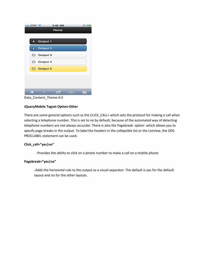
Data_Content_Theme A‐E JQueryMobile Tagset Option‐Other
There are some general options such as the CLICK_CALL= which sets the protocol for making a call when selecting a telephone number. This is set to no by default, because of the automated way of detecting telephone numbers are not always accurate. There is also the Pagebreak option which allows you to specify page breaks in the output. To label the headers in the collapsible list or the Listview, the ODS PROCLABEL statement can be used.
Click_call=”yes|no”
‐Provides the ability to click on a phone number to make a call on a mobile phone
Pagebreak=”yes|no”
‐Adds the horizontal rule to the output as a visual separator. The default is yes for the default layout and no for the other layouts.