representations of kerrang
TRANSCRIPT

REPRESENTA
TIONS
J OE
CL A
RK

The font for the kerrang magazine is very representational to the audience of which they are trying to convey to, the lines going through the font symbolises loudness, the colour of the font is white which is one of the key colour(red, black and white). The exclamation mark also adds the feeling of loudness to the title as it emphasises the title. The colour also stands out a lot from the back ground.
The Cover Story for the magazine is representational because of the colour of it, keeping with the three colour key the black goes well with the background blending into it, also the subtitle to the cover story is yellow which makes it stand out and shows a different scheme to the colours which show abit of rebellion. For both of these parts of the kerrang front cover they both have different objectives
to achieve but both have to represent the audience, rocky, loud and generally laid back people. Both font styles resemble loudness and show good knowledge of what they are trying to convey.

The main image of the front cover is a mid range shot and is level with the readers eyes, not at an angle, which shows that he is equal to all of us, if the shot was lower down then it would show that he was higher than us.The black clothing that he is wearing shows and aggressive and violent nature because they are dark and colourless colour. The makeup shows a rebel attitude towards him and the dark long hair furthers the aggressive. The main image for this cover image is where he is wearing a mask, the expression in which he is wearing shows a no attitude and non caring pose. It shows aggression and violence. The close up shot for the image shows that they want you to be intimidated by him as well.
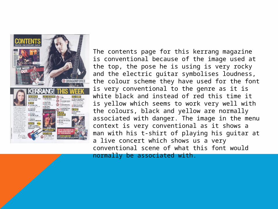
The contents page for this kerrang magazine is conventional because of the image used at the top, the pose he is using is very rocky and the electric guitar symbolises loudness, the colour scheme they have used for the font is very conventional to the genre as it is white black and instead of red this time it is yellow which seems to work very well with the colours, black and yellow are normally associated with danger. The image in the menu context is very conventional as it shows a man with his t-shirt of playing his guitar at a live concert which shows us a very conventional scene of what this font would normally be associated with.

This is the double page spread from kerrnags magazine, this is conventional because of a number of key points, first of the colour scheme that I keep going on about is once used again showing a good understanding from the editor about what the conventional style for the page is, the white black and red colour scheme is used a lot for this magazine, the photo, he is standing in a very chilled and mellowed out way, this is conventional showing that he doesn't really care, the outside patterns show a sense of Hollywood from my personal opinion, the guy in the image is a big star so I guess that this is ok, The font style and colour is very conventional because the colour is opposite to the background making it stand out and also the font style is simple, bold and effective.