research on sas original products
TRANSCRIPT

Task 3- Existing Product Research.
Jonah Adshead
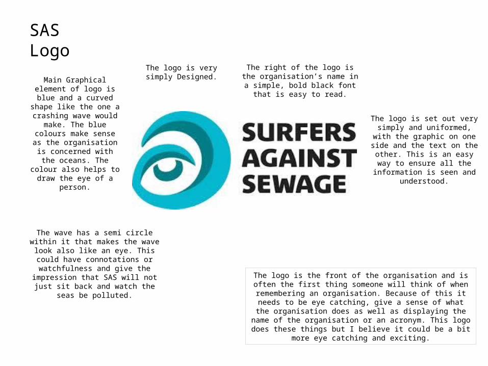
SAS LogoThe logo is very simply
Designed.Main Graphical element of logo is blue and a curved
shape like the one a crashing wave would make. The blue colours make sense as the organisation is concerned
with the oceans. The colour also helps to draw the eye of
a person.
The wave has a semi circle within it that makes the wave look also like an eye. This could have connotations or watchfulness and give the impression that SAS will not
just sit back and watch the seas be polluted.
The right of the logo is the organisation’s name in a simple, bold
black font that is easy to read.
The logo is the front of the organisation and is often the first thing someone will think of when remembering an organisation. Because of this it needs to be eye catching, give a sense of what the organisation
does as well as displaying the name of the organisation or an acronym. This logo does these things but I believe it could be a bit more eye
catching and exciting.
The logo is set out very simply and uniformed, with the graphic on one
side and the text on the other. This is an easy way to ensure all the
information is seen and understood.
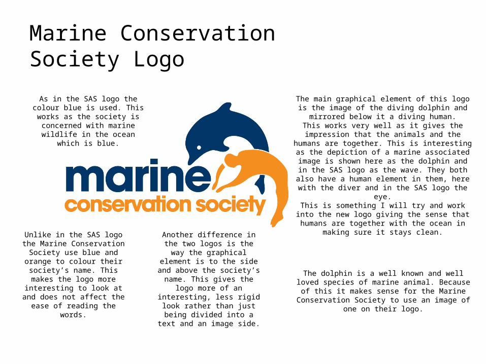
Marine Conservation Society Logo
The main graphical element of this logo is the image of the diving dolphin and mirrored below it a diving human.
This works very well as it gives the impression that the animals and the humans are together. This is interesting as the depiction of a marine associated image is shown here as the dolphin and in the SAS logo as the wave. They both also have a human element in them, here with the diver
and in the SAS logo the eye.This is something I will try and work into the new logo
giving the sense that humans are together with the ocean in making sure it stays clean.
As in the SAS logo the colour blue is used. This works as the society is
concerned with marine wildlife in the ocean which is blue.
Unlike in the SAS logo the Marine Conservation Society use blue and
orange to colour their society’s name. This makes the logo more
interesting to look at and does not affect the ease of reading the words.
Another difference in the two logos is the way the graphical
element is to the side and above the society’s name. This gives the logo more of an interesting, less rigid look rather than just being divided into a text and an image
side.
The dolphin is a well known and well loved species of marine animal. Because of this it makes sense for the
Marine Conservation Society to use an image of one on their logo.
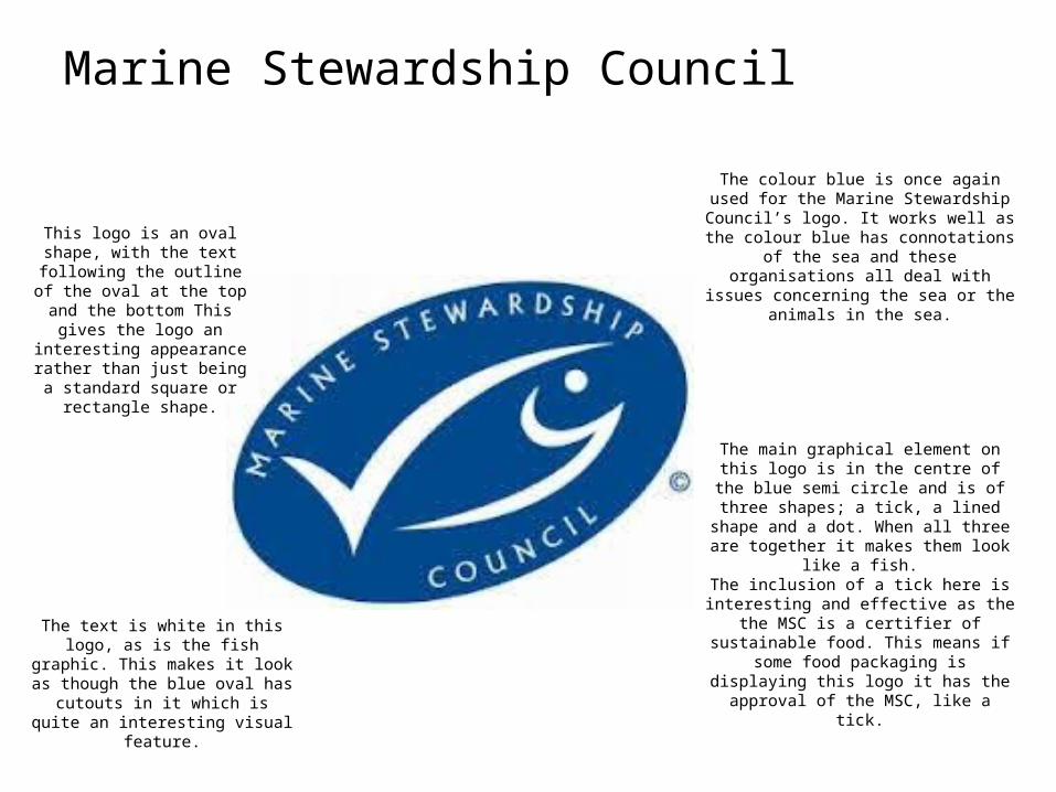
Marine Stewardship Council
The colour blue is once again used for the Marine Stewardship Council’s logo. It works
well as the colour blue has connotations of the sea and these organisations all deal with issues
concerning the sea or the animals in the sea.
The main graphical element on this logo is in the centre of the blue semi circle and is of
three shapes; a tick, a lined shape and a dot. When all three are together it makes them
look like a fish.The inclusion of a tick here is interesting and
effective as the the MSC is a certifier of sustainable food. This means if some food packaging is displaying this logo it has the
approval of the MSC, like a tick.
This logo is an oval shape, with the text following the outline of
the oval at the top and the bottom This gives the logo an interesting appearance rather
than just being a standard square or rectangle shape.
The text is white in this logo, as is the fish graphic. This makes it look as though
the blue oval has cutouts in it which is quite an interesting visual feature.
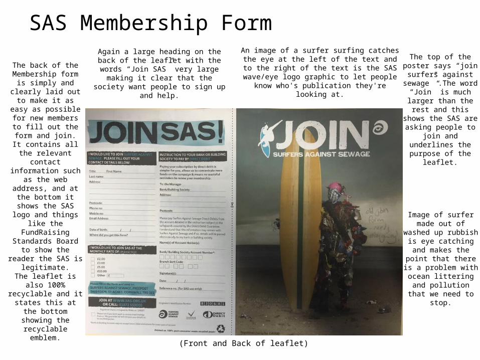
SAS Membership Form
(Front and Back of leaflet)
Image of surfer made out of washed up
rubbish is eye catching and makes the point that there is a problem with
ocean littering and pollution that we need
to stop.
The top of the poster says “join surfers against
sewage” .The word “Join” is much larger than the rest and this
shows the SAS are asking people to join and
underlines the purpose of the leaflet.
An image of a surfer surfing catches the eye at the left of the text and to the right of the text is the SAS wave/eye logo graphic to let people know who's
publication they're looking at.
Again a large heading on the back of the leaflet with the words “Join SAS” very large making it clear that the society want people
to sign up and help.
The back of the Membership form is
simply and clearly laid out to make it as easy as
possible for new members to fill out the
form and join.It contains all the relevant contact
information such as the web address, and at the bottom it shows the SAS logo and things like the FundRaising Standards
Board to show the reader the SAS is
legitimate.The leaflet is also 100% recyclable and it states
this at the bottom showing the recyclable
emblem.
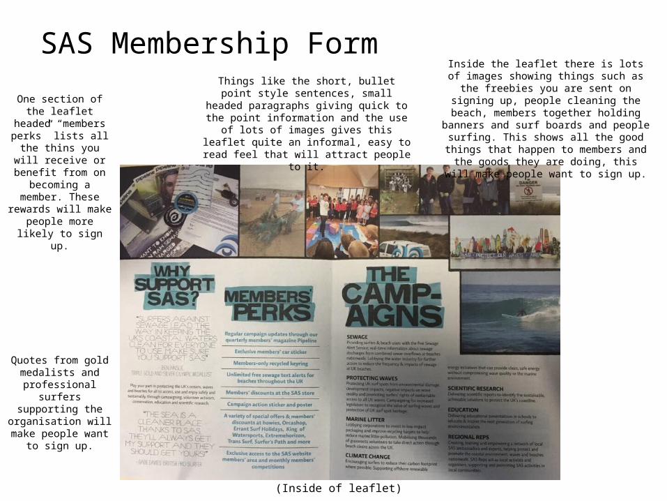
SAS Membership Form
(Inside of leaflet)
Inside the leaflet there is lots of images showing things such as the freebies you are sent on signing up, people cleaning the beach, members together
holding banners and surf boards and people surfing. This shows all the good things that
happen to members and the goods they are doing, this will make people want to sign up.
Quotes from gold medalists and
professional surfers supporting the
organisation will make people want to sign up.
One section of the leaflet headed “members perks” lists all the thins you will receive or benefit from on becoming a member. These rewards will make
people more likely to sign up.
Things like the short, bullet point style sentences, small headed paragraphs giving quick to the point
information and the use of lots of images gives this leaflet quite an informal, easy to read feel that will
attract people to it.
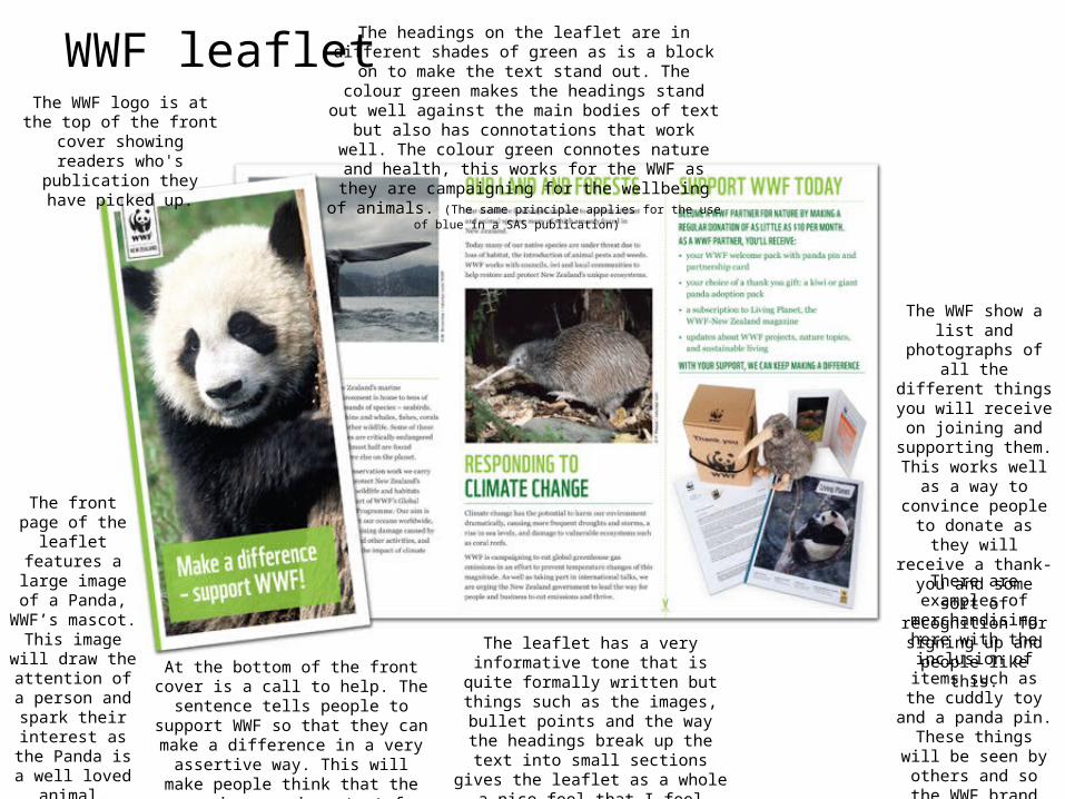
WWF leaflet
The front page of the leaflet features a large image of a
Panda, WWF’s mascot. This image
will draw the attention of a
person and spark their interest as the
Panda is a well loved animal.
The WWF logo is at the top of the front cover showing readers who's publication
they have picked up.
At the bottom of the front cover is a call to help. The sentence tells people to
support WWF so that they can make a difference in a very assertive way. This
will make people think that the cause is very important for someone to be almost
commanding them to support it.
The headings on the leaflet are in different shades of green as is a block on to make the text stand out. The colour green makes the headings stand out well against the main bodies of text but also has connotations that work well. The colour green connotes nature and health, this works for the WWF as they are campaigning for the wellbeing of animals. (The
same principle applies for the use of blue in a SAS publication)
The WWF show a list and photographs of all the different things you will receive on joining and supporting them.
This works well as a way to convince people to
donate as they will receive a thank-you and
some sort of recognition for signing up and people like this.
There are examples of merchandising here with the inclusion of
items such as the cuddly toy and a panda pin. These things will be seen by others and so the WWF brand will be
promoted further.
The leaflet has a very informative tone that is quite formally written but things
such as the images, bullet points and the way the headings break up the text into
small sections gives the leaflet as a whole a nice feel that I feel invites you to read it.
Too much text in a large block often pts people off reading something.
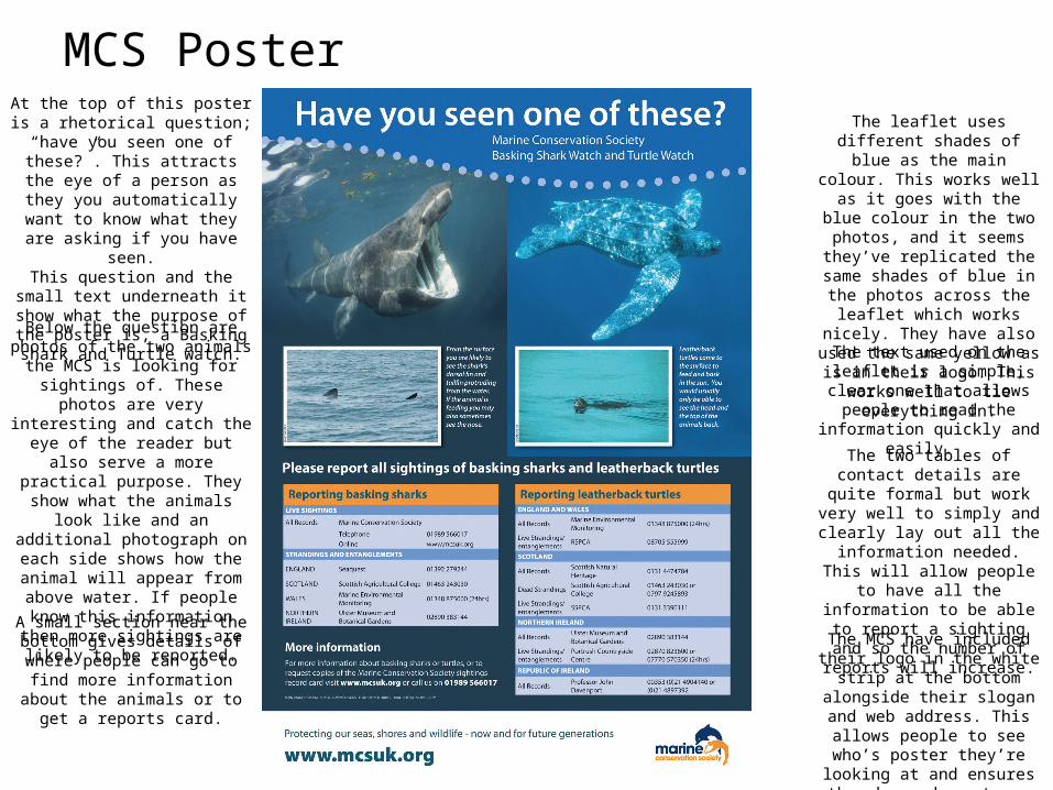
At the top of this poster is a rhetorical question; “have you seen one of these?”. This attracts the eye
of a person as they you automatically want to know what they are asking if you have seen.This question and the small text
underneath it show what the purpose of the poster is, a Basking
shark and Turtle watch.
Below the question are photos of the two animals the MCS is looking for sightings of. These photos are
very interesting and catch the eye of the reader but also serve a more
practical purpose. They show what the animals look like and an
additional photograph on each side shows how the animal will appear from above water. If people know
this information then more sightings are likely to be reported.
The two tables of contact details are quite formal but work very
well to simply and clearly lay out all the information needed. This will allow people to have all the
information to be able to report a sighting and so the number of
reports will increase.
The leaflet uses different shades of blue as the main colour. This
works well as it goes with the blue colour in the two photos, and it
seems they’ve replicated the same shades of blue in the photos
across the leaflet which works nicely. They have also used the same yellow as is in their logo.
This works well to tie everything in.
The MCS have included their logo in the white strip at the bottom alongside their slogan and web
address. This allows people to see who’s poster they’re looking at
and ensures they know where to go if they want to find more
information.
A small section near the bottom gives details of where people can go to find more information about the
animals or to get a reports card.
The text used on the leaflet is a simple, clear one that allows
people to read the information quickly and easily.
MCS Poster
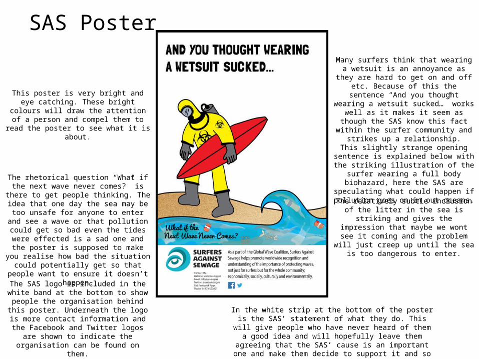
SAS Poster
This poster is very bright and eye catching. These bright colours will draw the attention of a person and compel them to read the poster to
see what it is about.
Many surfers think that wearing a wetsuit is an annoyance as they are hard to get on and off
etc. Because of this the sentence “And you thought wearing a wetsuit sucked…” works well as it makes it seem as though the SAS know this fact within the surfer community
and strikes up a relationship.This slightly strange opening sentence is
explained below with the striking illustration of the surfer wearing a full body biohazard, here the SAS are speculating what could happen if
pollution goes on in out oceans.
The relatively subtle inclusion of the litter in the sea is striking and gives the impression that maybe we wont see it coming and the problem will just creep up until the sea is too dangerous
to enter.
The rhetorical question “What if the next wave never comes?” is there to get people thinking.
The idea that one day the sea may be too unsafe for anyone to enter and see a wave or that
pollution could get so bad even the tides were effected is a sad one and the poster is supposed to make you realise how bad the situation could potentially get so that people want to ensure it
doesn’t happen.
The SAS logo is included in the white band at the bottom to show people the organisation behind this poster. Underneath the logo is more contact information and the Facebook and Twitter logos
are shown to indicate the organisation can be found on them.
In the white strip at the bottom of the poster is the SAS’ statement of what they do. This will give people who have never heard of
them a good idea and will hopefully leave them agreeing that the SAS’ cause is an important one and make them decide to support it
and so signing up and donating.
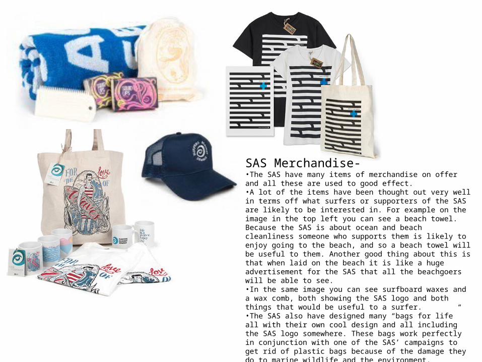
SAS Merchandise-•The SAS have many items of merchandise on offer and all these are used to good effect. •A lot of the items have been thought out very well in terms off what surfers or supporters of the SAS are likely to be interested in. For example on the image in the top left you can see a beach towel. Because the SAS is about ocean and beach cleanliness someone who supports them is likely to enjoy going to the beach, and so a beach towel will be useful to them. Another good thing about this is that when laid on the beach it is like a huge advertisement for the SAS that all the beachgoers will be able to see.•In the same image you can see surfboard waxes and a wax comb, both showing the SAS logo and both things that would be useful to a surfer.•The SAS also have designed many “bags for life” all with their own cool design and all including the SAS logo somewhere. These bags work perfectly in conjunction with one of the SAS’ campaigns to get rid of plastic bags because of the damage they do to marine wildlife and the environment.•Other merchandise just includes t-shirts, caps, mugs, car stickers and posters that just show the SAS logo so that the owner can show their support. It again also works as free advertisement for the organisation and will spread the word of them quickly.