responsive and fast
TRANSCRIPT

RESPONSIVE AND FAST ( )Sven Wo�fermann @maddesigns
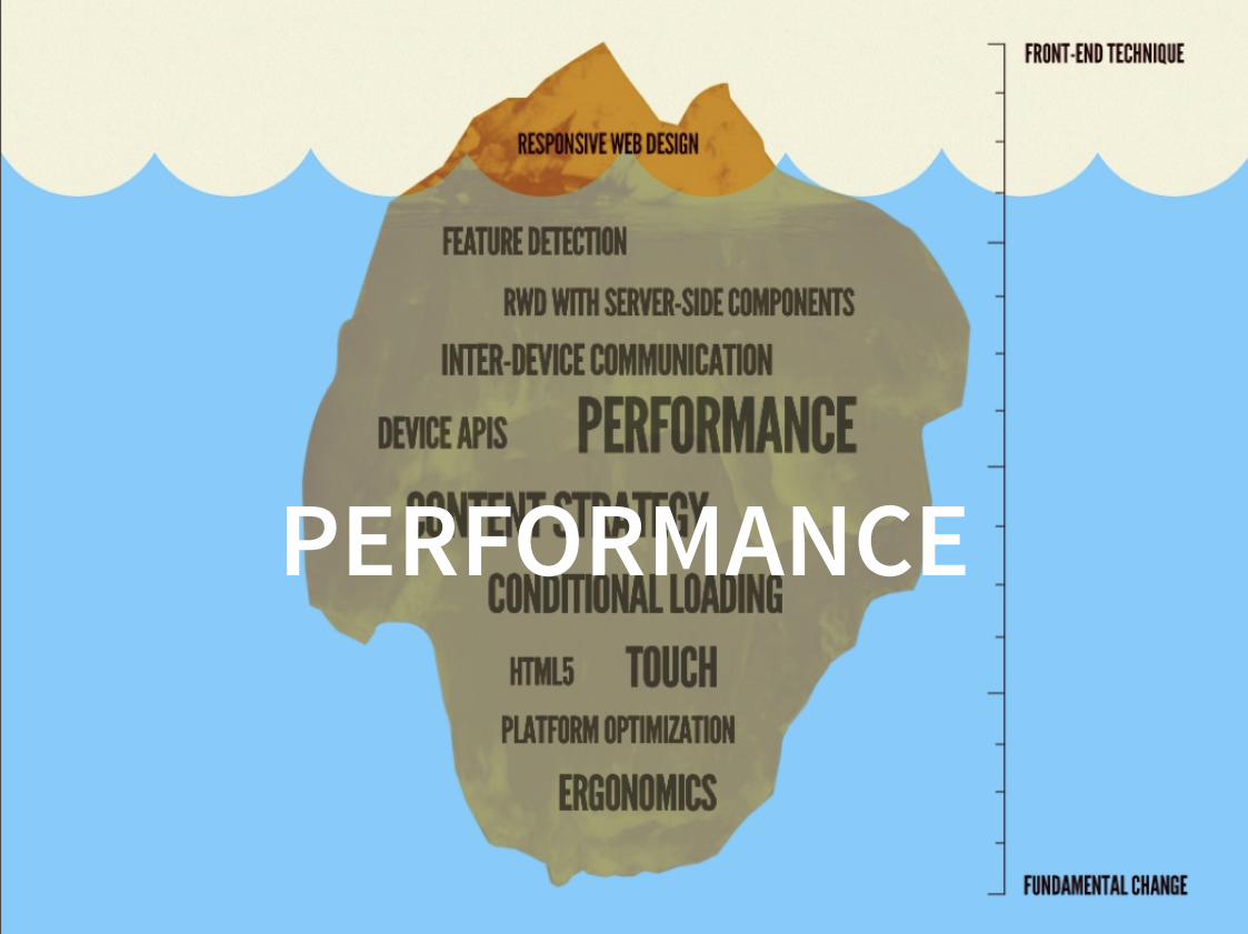
PERFORMANCE

MOTO.OAKLEY.COM
85.4MB page weight471 HTTP requests2 minutes 45 seconds until loading screen replaced with content4 minutes 10 seconds until onLoad event
http://hawksworx.com/blog/oakleys-monster-page-of-baubles/

85.4 MB,471 REQUESTS!
THIS IS NOT RWD!

MOTO.OAKLEY.COM FAILok, ok, Oak�ey does it better now:
JUST 14.2MB, 291 request (more than 70MB �ess)

with mobi�e user-agent?6.7MB, 114 requests :/
http://hawksworx.com/b�og/oak�eys-moto-diet/


This particu�ar page weighs in at 8-9 megabytes inc�uding a�� of itsassets and advertising […] starts rendering a�er about 10.5s
http://www.fi�amentgroup.com/�ab/weight-wait.htm�

” RWD may make your pages �ook better on a variety of devices,but it doesn’t automatica��y make your pages �oad better on a
variety of devices.
It’s a�� about imp�ementation. “


M dot or RWD. Which is faster?
In conc�usion, these findings show that RWD sites can indeedcompete with m dot sites in terms of �oad time!
http://bigqueri.es/t/m-dot-or-rwd-which-is-faster/296

”B�ame the imp�ementation, not the technique“
Tim Kad�ec
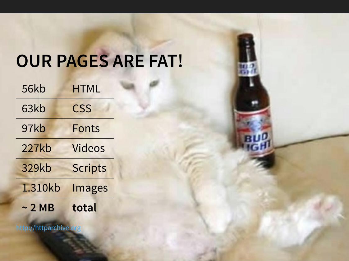
OUR PAGES ARE FAT!56kb HTML
63kb CSS
97kb Fonts
227kb Videos
329kb Scripts
1.310kb Images
~ 2 MB totalhttp://httparchive.org


DAVE RUPERT RWD-TESTSMedia queries are responsib�e for ~12% (2.8kb) of my CSS weight.
For every 8 �ines of CSS I write, one more is needed to make itresponsive.
In Conc�usion: Expect RWD to add ~10%It appears that RWD has added 4.8kb (~2%) to my tota� page
weight. — http://daverupert.com/2014/07/rwd-b�oat/

85% of mobi�e users expect pages to �oad as fast or faster thanthey �oad on the desktop.
Kiss Metrics

WHEN DO YOU THINK ABOUTPERFORMANCE IN YOUR PROJECT?


PERFORMANCE CULTUREPerformance optimization is a process NOT an event.
Performance is a cu�tura� thing - and starts with design.

If you want to “se��” performance, discuss in sa�es, not deve�opment.

Amazon's ca�cu�ated that a page �oad s�ow-down of just onesecond cou�d cost it $1.6 bi��ion in sa�es each year.
A 2009 A/B Study
Goog�e has ca�cu�ated that by s�owing its search resu�ts by justfour tenths of a second
they cou�d �ose 8 mi��ion searches per day.FastCompany

WHAT IS FAST?

TIME & USER PERCEPTIONDelay User perception
0–100 ms Instant
100–300 ms Small perceptible delay
300–1000 ms Machine is working
1,000+ ms Likely mental context switch
10,000+ ms Task is abandonedI�ya Grigorik – High-Performance Browser Networking

1000MS

BREAKING NEWS AT 1000MSby Patrick Hamann (about )
http://www.theguardian.com
https://speakerdeck.com/patrickhamann/breaking-news-at-1000ms-ve�ocity-eu-2014

DESIGNING FOR PERFORMANCE!Book by Lara Hogan

PERFORMANCE BUDGET

PERFORMANCE BUDGET METRICS
http://timkad�ec.com/2014/11/performance-budget-metrics/

PERFORMANCE BUDGET GOALSThere are a coup�e of factors for which acertain metric or KPI can be e�aborated:
page load timepage weightPSI (page speed index) Scoreload timefirst paintspeed indexvisually completenumber of requestsor “time to first tweet”

PERFORMANCE BUDGET EXAMPLE€500 month�y budget
€300 rent€100 groceries€100 clothes

PERFORMANCE BUDGET EXAMPLE€400 month�y budget
€300 rent€50 groceries€50 clothes

PERFORMANCE BUDGET EXAMPLE400kb performance budget
50kb fonts50kb css300kb images

PERFORMANCE BUDGET EXAMPLE400kb performance budget
100kb fonts50kb css200kb images50kb javascript

YOU CAN’T SPENDWHAT YOU DON’T HAVE!

GOOD PERF BUDGETS600KB total page weight20 requests1000 speed index1s start render timeLess than 3 seconds to see something on 3G.

MAINTAINING A PERFORMANCE GOAL3 options:
1. Optimize existing feature2. Remove existing feature3. Don’t add


THE NETWORK WATERFALL

WHY IS MY SITE SLOW ON MOBILE?“We’re on rea� LTE now?!“

BANDWIDTH VS. LATENCY
BandwidthMaximum throughput of a �ogica� or physica� communication path
LatencyThe time from the source sending a packetto the destination receiving it

LATENCY
http://chimera.�abs.orei��y.com/books/1230000000545/ch01.htm�

LATENCY ON MOBILE NETWORKS
http://www.aosabook.org/en/posa/mobi�e-perf-images/figure1.png

BANDWIDTH VS. LATENCY
http://chimera.�abs.orei��y.com/books/1230000000545/ch01.htm�

IT DOESN'T MATTER HOWSMART YOUR PHONE IS,
IF YOUR NETWORK IS DUMB
— Bruce Lawson (@bruce�)

LATENCY1. Latency defines the speed of the how the web loads.2. Mobile’s growth means average latency is going up.3. Optimizing for latency means optimizing for request count.

PREPARE YOUR SITE FOR THE FIRST 14KB
TCP s�ow starthttp://chimera.�abs.orei��y.com/books/1230000000545/ch02.htm�#SLOW_START

PERFORMANCE TIPS

CONCATENATEconcatenate useful chunks of CSS & JavaScriptOn 3G, a new 10k request equals ~100kb of concatenatedcontent.But only concatenate styles and scripts, that are used onthat page

MINIFY, COMPRESSION AND SHRINKINGMinify CSS & JavaScriptAnd GZIP!Compress Images! (Strip Image Metadata)

RESPONSIVE IMAGES


BASIC IMAGE PERFORMANCE TIPS:CSS Sprites (pixel image sprites)SVG spritesoptimize images (JPEGmini, PNGmini, …)
more advanced WebP, MozJpegdo not deliver larger files than needed

IMAGEOPTIM

SVGO GUI


to remember – average size of a�� images ~1.3 MB!

WRAP BACKGROUND-IMAGE IN MEDIA QUERIES/* load only on smaller screens */@media (max-width: 600px) { .module { background-image: url('images/image-max600.png'); }}
/* load on screens larger than 600px */@media (min-width: 600px) { .module { background-image: url('images/image-min600.png'); }}
Browsers �oad on�y matched background-image -› wrap them in @media query if they change between different viewports

RESPONSIVE IMAGES

RESPONSIVE <IMG> WITH SRCSET + SIZES<img src="https://unsplash.it/16/9" srcset="https://unsplash.it/960/540 960w, https://unsplash.it/640/360 640w, https://unsplash.it/480/270 480w, https://unsplash.it/320/180 320w" sizes="(min-width: 1280px) 480px, (min-width: 1024px) 444px, (min-width: 640px) 325px, 100vw" alt="dummy image">
hint for debugging: c�ear cache!for srcset, when a �arger image resource is in cache,
a sma��er image down�oad is not triggered

srcset/sizes provides information to browsers<picture> provides instructions to browsers.

<PICTURE>art direction images and type switching

<PICTURE><picture> <source media="(min-width: 650px)" srcset="kitten-large.png"> <source media="(min-width: 465px)" srcset="kitten-medium.png">
<!-- img tag for browsers that don't support picture element --> <img src="kitten-small.png" alt="a cute kitten"></picture>
use or for cross browser-supportrespimage picturefi��

LAZY LOAD RESPONSIVE IMAGES - lazysizes is a […] lazyloader for images (including
responsive images picture/srcset), iframes, scripts/widgetsand much more.
- my blog about CSS for lazyloading images (german)
- Responsive Images as a Service
lazysizes
Responsive Images – lazy loading
WURFL Image Tailor (WIT)

WEB FONTS


FONT LOADING 101IE Firefox WebKit Blink
Blocking ✗ ✔ ✔ ✔
Timeout - 3s - 3s
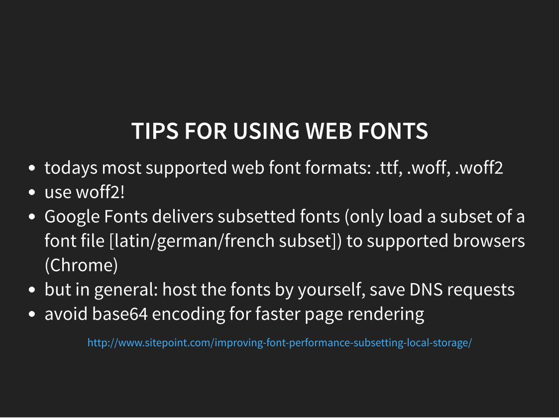
TIPS FOR USING WEB FONTStodays most supported web font formats: .ttf, .woff, .woff2use woff2!Google Fonts delivers subsetted fonts (only load a subset of afont file [latin/german/french subset]) to supported browsers(Chrome)but in general: host the fonts by yourself, save DNS requestsavoid base64 encoding for faster page rendering
http://www.sitepoint.com/improving-font-performance-subsetting-�oca�-storage/


ICON FONTS - CHOSE CAREFULLY!Font Awesome is a fu�� suite of 519 pictographic icons
https://github.com/FortAwesome/Font-Awesome

NOT SO AWESOME!

FONT AWESOME ON ICOMOON.IOIf you on�y use a bunch of icons, strip down the fi�es with
icomoon.io

ICOMOON
pick your icons

ICOMOON
save as font (or SVG) and save Kb!

SVG ICONS (SPRITES)
SVG Sprites vs. Icon Fonts

using web fonts on�y on �arger disp�ays (“faster connections”)?@media screen and (min-width: 48em) { body { font-family: 'WebFont', Fallback, sans-serif; }}

PERFORMANCE BUDGET“Is the extra 135kb worth the aesthetic change?”
“Does the heavier font kit better represent the brand?”

THE CRITICALRENDERING PATH
The intermediate steps between receiving the HTML, CSS, andJavaScript bytes and the required processing to turn them into
rendered pixe�s

INLINING CRITICAL CSSin�ine the most critica� CSS & JS to render in this specific
viewport (difficu�t with RWD - different viewports)<head> <style> /* inline critical CSS */ </style></head>
async who�e CSS (with ), maybe use cookies to checkif user has cached version of CSS
�oadCSS.js

DON'T TRY TO OUTSMART THEBROWSER!
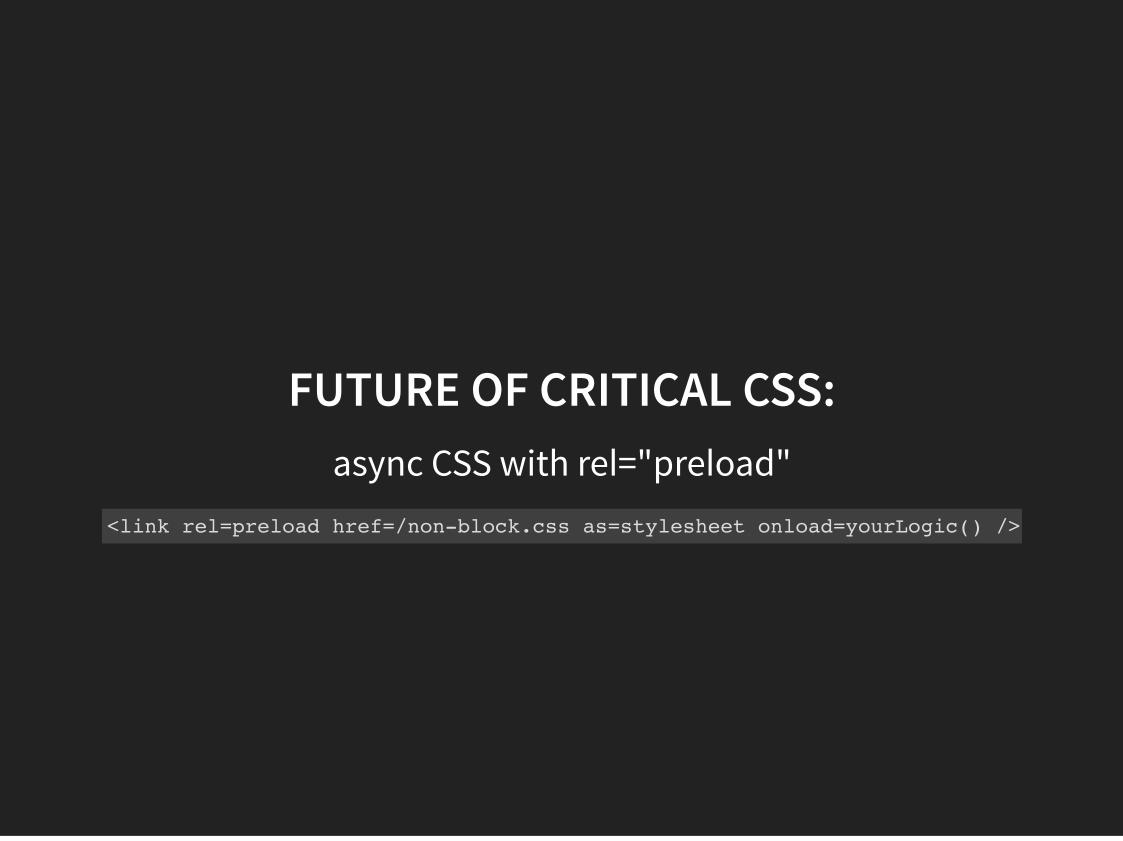
FUTURE OF CRITICAL CSS:async CSS with re�="pre�oad"
<link rel=preload href=/non-block.css as=stylesheet onload=yourLogic() />


More Weight Doesn't Mean More Wait
Scott Jeh� removed ~8s in �oading without removing content

HTTP/2todays performance tips can be wrong with HTTP/2

PERFORMANCE IS A REQUIREMENT NOT AN EXTRA FEATURE

THANKS FOR YOURATTENTION!Sven Wo�fermann | maddesigns
Twitter: @maddesigns
Web: maddesigns.de