responsive email design
TRANSCRIPT
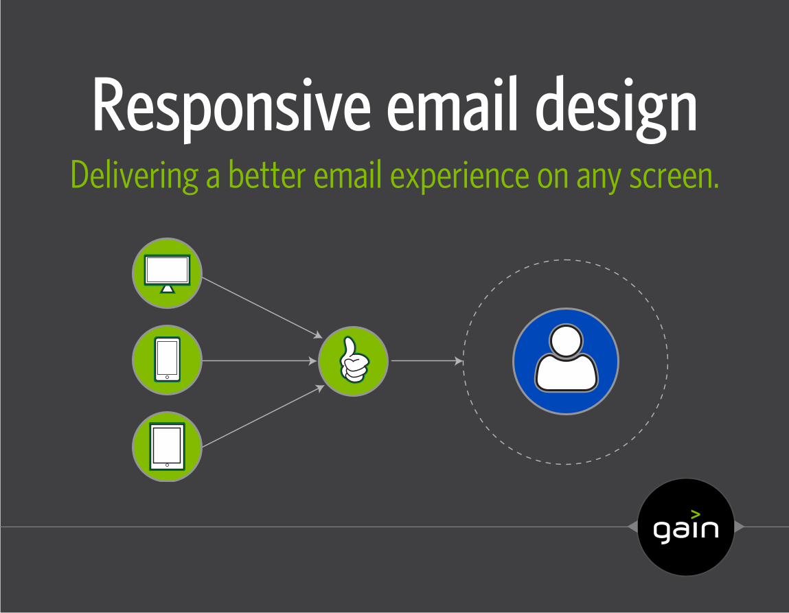
Responsive email designDelivering a better email experience on any screen.
2
hellogain.com | © 2014 Gain
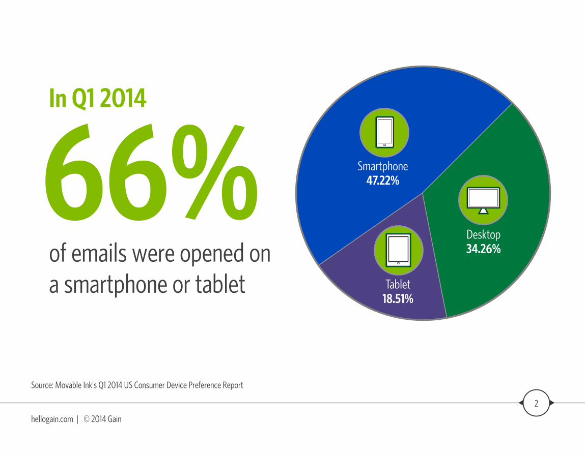
Source: Movable Ink’s Q1 2014 US Consumer Device Preference Report
of emails were opened on a smartphone or tablet
66% Smartphone47.22%
Desktop34.26%
Tablet18.51%
In Q1 2014
3
hellogain.com | © 2014 Gain
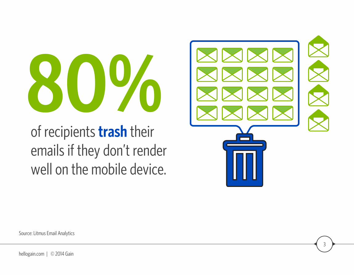
Source: Litmus Email Analytics
of recipients trash their emails if they don’t render well on the mobile device.
80%
4
hellogain.com | © 2014 Gain
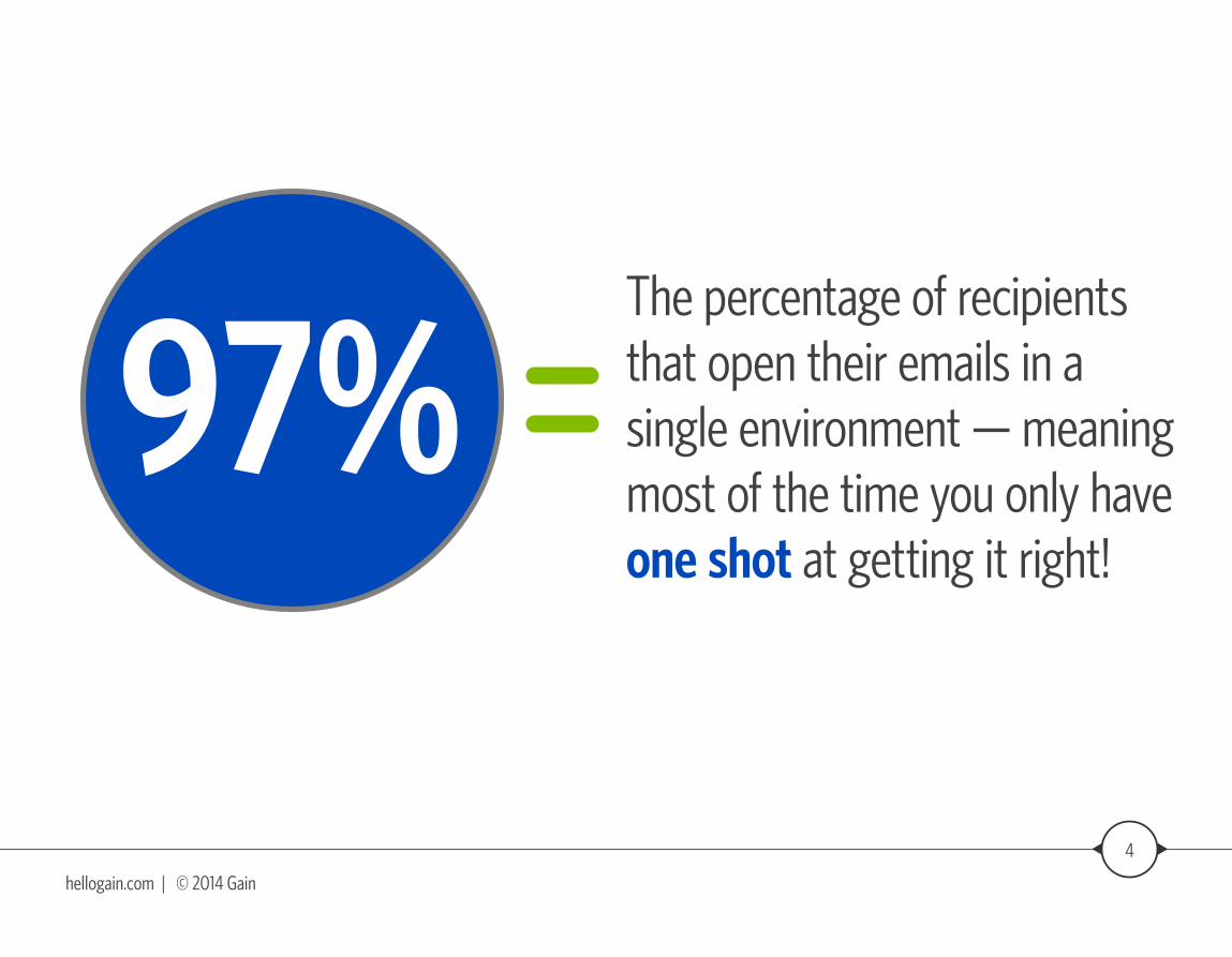
Source: Litmus Email Analytics
The percentage of recipients that open their emails in a single environment — meaning most of the time you only have one shot at getting it right!
97%
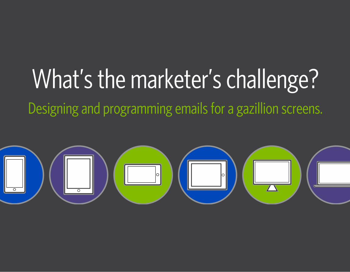
What’s the marketer’s challenge?Designing and programming emails for a gazillion screens.
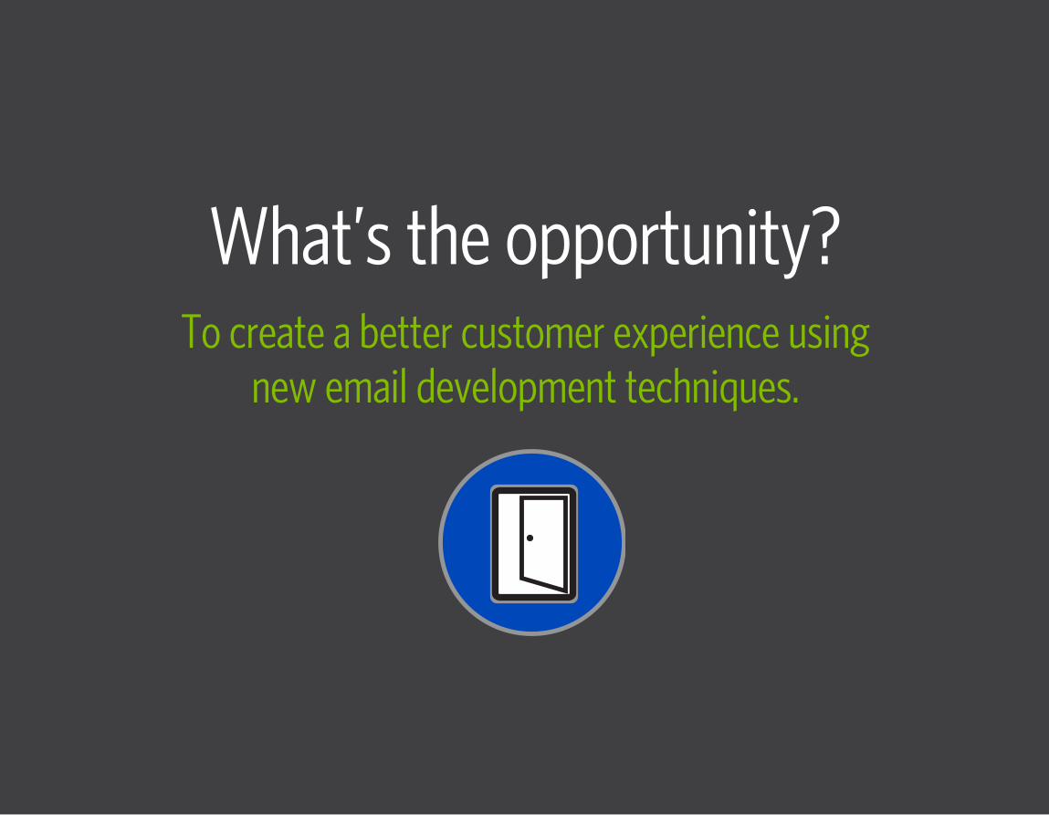
What’s the opportunity?To create a better customer experience using
new email development techniques.
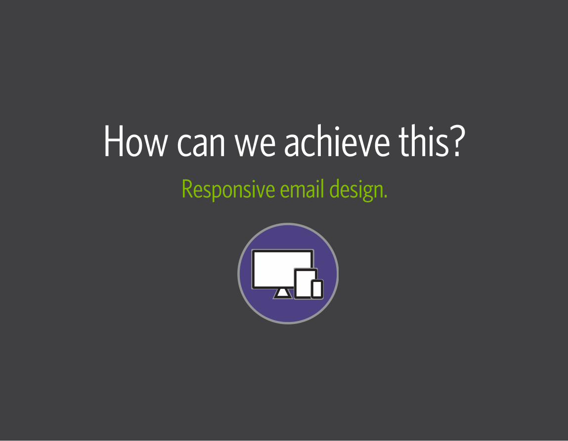
How can we achieve this?Responsive email design.
8
hellogain.com | © 2014 Gain
Responsive designA technique used to create emails, landing pages, and websites so that they “respond” to the user’s screen size.
9
hellogain.com | © 2014 Gain
How it worksResponsive design is based on the use of CSS media queries, fluid media and fluid grids.
10
hellogain.com | © 2014 Gain
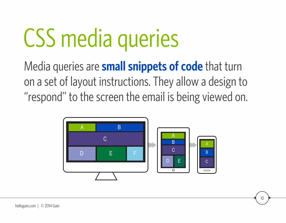
CSS media queriesMedia queries are small snippets of code that turn on a set of layout instructions. They allow a design to “respond” to the screen the email is being viewed on.
A
B
C
A B
C
D E F
AB
C
D E
11
hellogain.com | © 2014 Gain
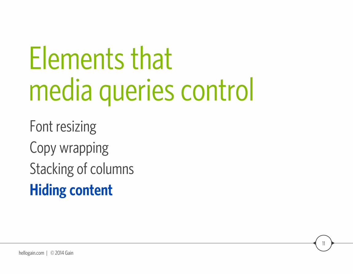
Elements that media queries controlFont resizingCopy wrappingStacking of columnsHiding content
12
hellogain.com | © 2014 Gain
Support for media queriesIt doesn’t matter the device — what matters is the email application that’s being used on that device.
So if an email application does not support media queries, it will not render the responsive design.**For example: Microsoft® Outlook® versions 2010 and earlier do not support media queries.
Source: Litmus Email AnalyticsMicrosoft® Outlook® is a registered trademark of Microsoft Corporation.
13
hellogain.com | © 2014 Gain
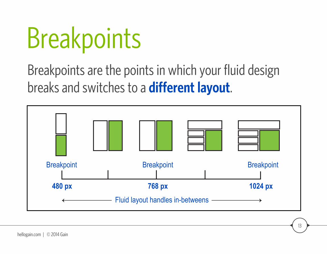
BreakpointsBreakpoints are the points in which your fluid design breaks and switches to a different layout.
Fluid layout handles in-betweens
Breakpoint
480 px
Breakpoint
768 px
Breakpoint
1024 px
14
hellogain.com | © 2014 Gain
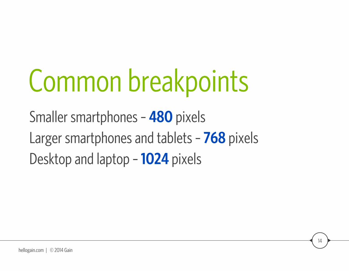
Common breakpointsSmaller smartphones – 480 pixelsLarger smartphones and tablets – 768 pixelsDesktop and laptop – 1024 pixels
15
hellogain.com | © 2014 Gain
Best practicesDesign for mobile first
Use larger font sizes (min. of 13 pixels)
Use larger links and buttons (min. of 44 x 44 pixels)
One column layouts work well
Keep content clean, simple and concise
Hide any unnecessary elements
Responsive vs. Non-responsiveEmail examples
17
hellogain.com | © 2014 Gain
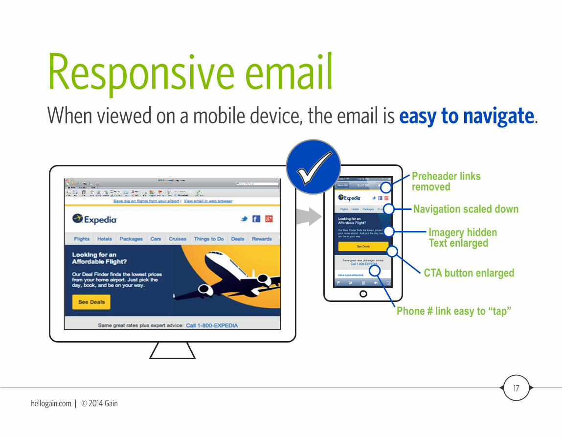
Responsive emailWhen viewed on a mobile device, the email is easy to navigate.
Preheader links removed
Navigation scaled down
Imagery hiddenText enlarged
CTA button enlarged
Phone # link easy to “tap”
18
hellogain.com | © 2014 Gain
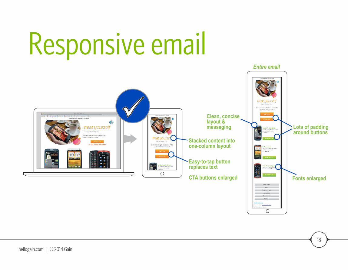
Responsive email
Easy-to-tap button replaces text
CTA buttons enlarged
Stacked content into one-column layout
Clean, concise layout & messaging
Entire email
Lots of padding around buttons
Fonts enlarged
19
hellogain.com | © 2014 Gain
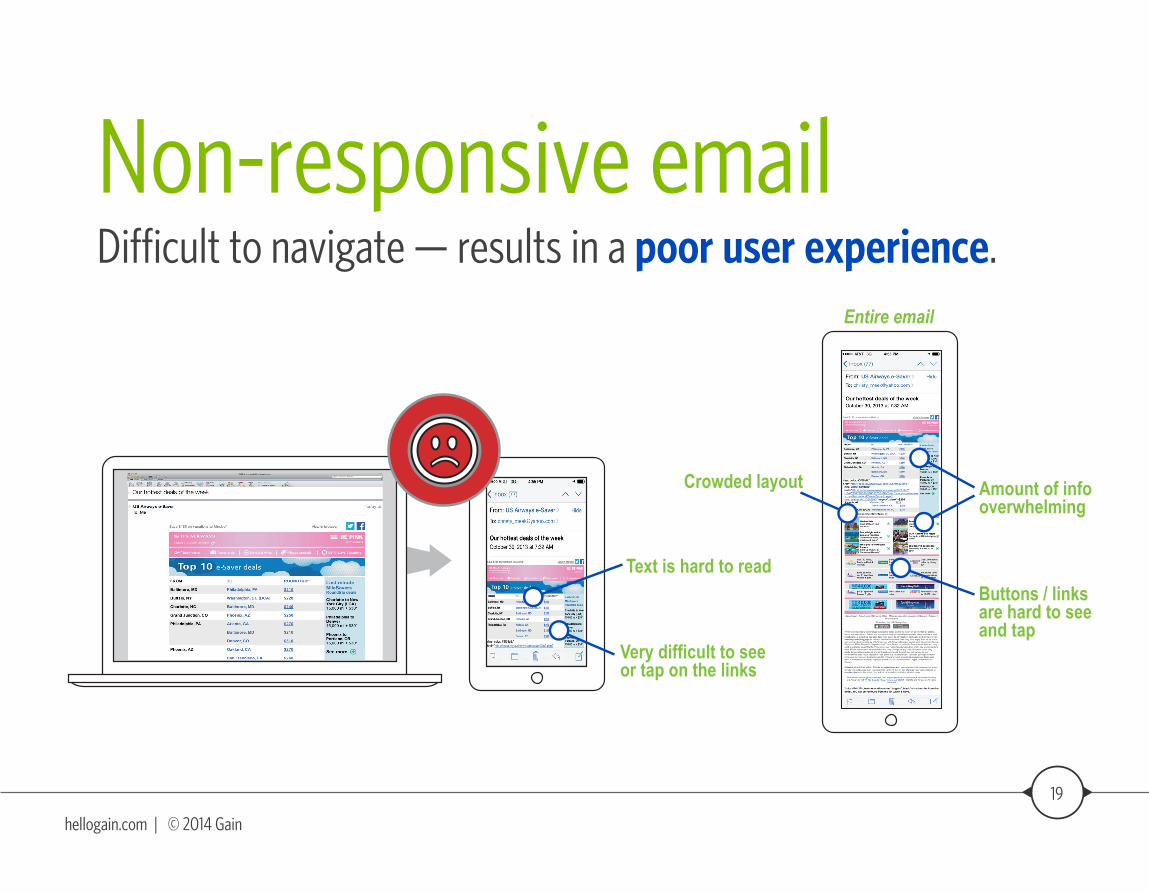
Non-responsive emailDifficult to navigate — results in a poor user experience.
Very difficult to see or tap on the links
Text is hard to read
Crowded layout
Entire email
Amount of info overwhelming
Buttons / links are hard to see and tap
20
hellogain.com | © 2014 Gain
Here’s how you benefit:Staying ahead of the curve with new technology
Providing a better way to communicate with customers, on their terms
Improving the customer experience leading to increased conversion rates
21
hellogain.com | © 2014 Gain
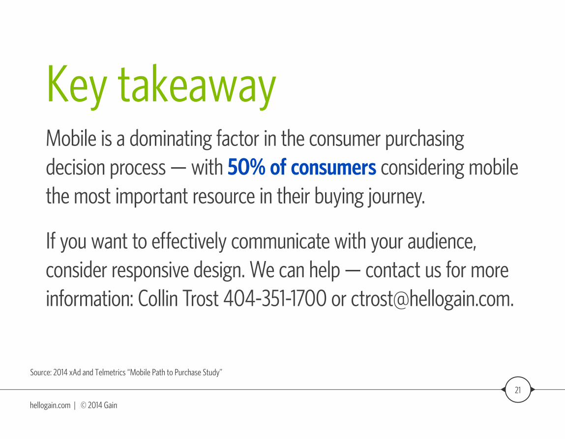
Key takeawayMobile is a dominating factor in the consumer purchasing decision process — with 50% of consumers considering mobile the most important resource in their buying journey.
If you want to effectively communicate with your audience, consider responsive design. We can help — contact us for more information: Collin Trost 404-351-1700 or [email protected].
Source: 2014 xAd and Telmetrics “Mobile Path to Purchase Study”
About Gain:Gain is a group of modern marketers challenging the way mid-market businesses approach and participate in the B2B consumer decision-making journey.
Interested in learning more? Contact Collin Trost at 404-351-1700 or [email protected].