responsive web design1
TRANSCRIPT
1
Fleton Fleet - Responsive design and small screen optimisation Author: Patrick Hamann Date: 1st November 2010
Confidential 01/11/2010
2
Today, the way people are using and accessing websites is changing. This is due to users having more diverse browsing experiences on a multitude of devices, including desktop browsers, smartphones, tablets and more. This creates challenges for web producers regard-ing how we should design for different screen sizes, resolutions and types of interaction (e.g. touch). More than that, it calls into question what it really means to design for the web today.
With new devices available, the one-size-fits-all approach to web design that we’ve stuck with for so long is no longer relevant. It’s now essential that the designs that we create are responsive to the different ways that users access our content. This document is intended to outline a process called 'responsive design and enhancement' that can be used to optimise your website’s content and adapt to different screen sizes and devices.
Introduction
Confidential 01/11/2010
3
A responsive design is composed of three distinct parts:
A flexible grid.
Flexible images. Or more specifically, images that work in a flexible context (whether fluid themselves, or perhaps controlled via overflow).
Media queries. The final layer of a responsive design, media queries optimize the design for different viewing contexts, and that spot-fix bugs that occur at different resolution ranges.
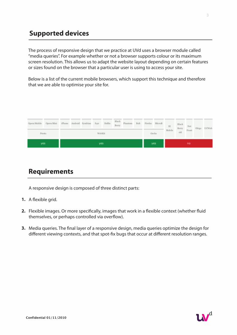
Supported devices
The process of responsive design that we practice at UVd uses a browser module called “media queries”. For example whether or not a browser supports colour or its maximum screen resolution. This allows us to adapt the website layout depending on certain features or sizes found on the browser that a particular user is using to access your site.
Below is a list of the current mobile browsers, which support this technique and therefore that we are able to optimise your site for.
Requirements
1.
2.
3.
Confidential 01/11/2010
4
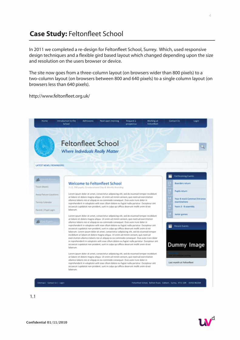
In 2011 we completed a re-design for Feltonfleet School, Surrey. Which, used responsive design techniques and a flexible gird based layout which changed depending upon the size and resolution on the users browser or device.
The site now goes from a three-column layout (on browsers wider than 800 pixels) to a two-column layout (on browsers between 800 and 640 pixels) to a single column layout (on browsers less than 640 pixels).
http://www.feltonfleet.org.uk/
Case Study: Feltonfleet School
1.1
Confidential 01/11/2010
5
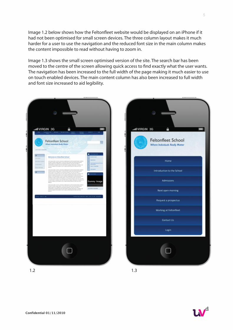
Image 1.2 below shows how the Feltonfleet website would be displayed on an iPhone if it had not been optimised for small screen devices. The three column layout makes it much harder for a user to use the navigation and the reduced font size in the main column makes the content impossible to read without having to zoom in.
Image 1.3 shows the small screen optimised version of the site. The search bar has beenmoved to the centre of the screen allowing quick access to find exactly what the user wants.The navigation has been increased to the full width of the page making it much easier to useon touch enabled devices. The main content column has also been increased to full widthand font size increased to aid legibility.
1.2 1.3
Confidential 01/11/2010
6
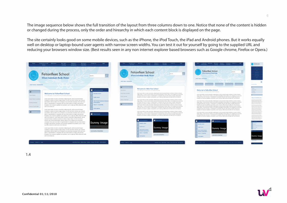
The image sequence below shows the full transition of the layout from three columns down to one. Notice that none of the content is hiddenor changed during the process, only the order and hirearchy in which each content block is displayed on the page.
The site certainly looks good on some mobile devices, such as the iPhone, the iPod Touch, the iPad and Android phones. But it works equallywell on desktop or laptop-bound user-agents with narrow screen widths. You can test it out for yourself by going to the supplied URL andreducing your browsers window size. (Best results seen in any non internet explorer based browsers such as Google chrome, Firefox or Opera.)
1.4
Confidential 01/11/2010
7
Other reponsive design examples:
http://huffduffer.com/
http://2010.dconstruct.org/
http://hicksdesign.co.uk/
http://colly.com/
Articles on responsive webdesign:
http://www.alistapart.com/articles/responsive-web-design/
http://dev.opera.com/articles/view/the-mobile-web-optimization-guide/#strategy-3
http://blog.ultravioletdesign.co.uk/going-mobile-with-css3-media-queries/
Further reading and links
Confidential 01/11/2010