scalable data analysis (cis 602-02)
TRANSCRIPT

D. Koop, CIS 602-02, Fall 2015
Scalable Data Analysis (CIS 602-02)
Statistics
Dr. David Koop

Visualization
2D. Koop, CIS 602-02, Fall 2015
I II III IV
x y x y x y x y
10.0 8.04 10.0 9.14 10.0 7.46 8.0 6.58
8.0 6.95 8.0 8.14 8.0 6.77 8.0 5.76
13.0 7.58 13.0 8.74 13.0 12.74 8.0 7.71
9.0 8.81 9.0 8.77 9.0 7.11 8.0 8.84
11.0 8.33 11.0 9.26 11.0 7.81 8.0 8.47
14.0 9.96 14.0 8.10 14.0 8.84 8.0 7.04
6.0 7.24 6.0 6.13 6.0 6.08 8.0 5.25
4.0 4.26 4.0 3.10 4.0 5.39 19.0 12.50
12.0 10.84 12.0 9.13 12.0 8.15 8.0 5.56
7.0 4.82 7.0 7.26 7.0 6.42 8.0 7.91
5.0 5.68 5.0 4.74 5.0 5.73 8.0 6.89
[F. J. Anscombe]

Visualization
2D. Koop, CIS 602-02, Fall 2015
I II III IV
x y x y x y x y
10.0 8.04 10.0 9.14 10.0 7.46 8.0 6.58
8.0 6.95 8.0 8.14 8.0 6.77 8.0 5.76
13.0 7.58 13.0 8.74 13.0 12.74 8.0 7.71
9.0 8.81 9.0 8.77 9.0 7.11 8.0 8.84
11.0 8.33 11.0 9.26 11.0 7.81 8.0 8.47
14.0 9.96 14.0 8.10 14.0 8.84 8.0 7.04
6.0 7.24 6.0 6.13 6.0 6.08 8.0 5.25
4.0 4.26 4.0 3.10 4.0 5.39 19.0 12.50
12.0 10.84 12.0 9.13 12.0 8.15 8.0 5.56
7.0 4.82 7.0 7.26 7.0 6.42 8.0 7.91
5.0 5.68 5.0 4.74 5.0 5.73 8.0 6.89
Mean of x 9Variance of x 11Mean of y 7.50Variance of y 4.122Correlation 0.816
[F. J. Anscombe]

●
●●
●●
●
●
●
●
●●
4 6 8 10 12 14 16 18
4
6
8
10
12
x1
y 1
●●
●●●
●
●
●
●
●
●
4 6 8 10 12 14 16 18
4
6
8
10
12
x2
y 2●
●
●
●●
●
●●
●
●●
4 6 8 10 12 14 16 18
4
6
8
10
12
x3
y 3
●●
●
●●
●
●
●
●
●
●
4 6 8 10 12 14 16 18
4
6
8
10
12
x4
y 4
Visualization
3D. Koop, CIS 602-02, Fall 2015
[F. J. Anscombe]

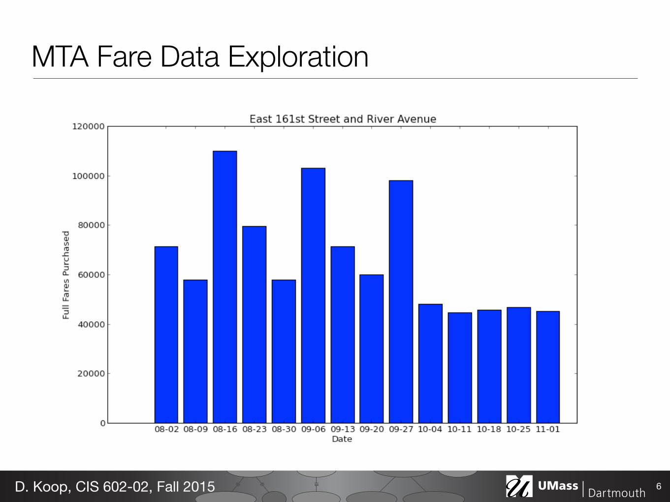
MTA Fare Data Exploration
4D. Koop, CIS 602-02, Fall 2015

MTA Fare Data Exploration
5D. Koop, CIS 602-02, Fall 2015

MTA Fare Data Exploration
5D. Koop, CIS 602-02, Fall 2015
MTA Fare Data Exploration
6D. Koop, CIS 602-02, Fall 2015

MTA Fare Data Exploration
6D. Koop, CIS 602-02, Fall 2015
A U G U S TS U N M O N T U E W E D T H U F R I S A T
2 3
10
17
24
31
9
16
23
30
SD SDHOU DETDETT OR DET
DET DETCHW COLCHWSD CHW
BOS BOSLAA LAALAADET LAA
TB TBTOR TORTORBOS TOR
BAL BALTOR TORTORTB TOR
1
8
15
22
29
1
7
14
21
28
3
6
13
20
27
2
5
12
19
26
1
4
11
18
25
1:10 1:10 10:10 8:40
8:104:10 8:10 8:10 1:10 7:05 1:05
7:05TBA 7:05
7:071:40 7:07 7:077:07 7:05 1:05
7:05 1:05 7:10 4:05
1:10TBA 7:05 7:05 1:05 7:10 7:10
YES YES YES
YES YES MY9 YES YES YES YES
TBA YES YES YES YES MY9 FOX
TBA YES MY9 YES YES MY9 YES
YES YES YES YES YES YES YES
S E P T E M B E RS U N M O N T U E W E D T H U F R I S A T
6 7
14
21
28
30
13
20
27
29
BOS BOSCHW BOSCHWBAL CHW
BOS BOSBAL BALBALBOS BAL
SF SFTORTOR TOR TORBOS
HOU HOUTB TBTBSF TB
T OR T ORCHW CHWHOUHOU HOU
5
12
19
26
28
4
11
18
25
27
3
10
17
24
30
2
9
16
23
30
1
8
15
22
29ALL GAMES ARE EASTERN TIME.
1:051:05 7:05 7:05 7:05 7:05 1:05
7:05TBA 7:05 7:05 7:05 7:10 1:05
1:10TBA 7:07
1:102:10 1:10
7:07 7:07 7:05 TBA
1:101:05 7:05 7:05 7:05 8:10 TBA
TBA YES MY9 YES YES MY9 FOX
YES YES YES YES YES YES FOX
TBA YES MY9 YES YES YES TBA
YES YES
YES YES
MY9 YES YES YES TBA
2 013 R E G U L A R S E A S O N S C H E D U L E

Visual Pop-out
7D. Koop, CIS 602-02, Fall 2015
[C. G. Healey, http://www.csc.ncsu.edu/faculty/healey/PP/]

Magnitude Channels: Ordered Attributes Identity Channels: Categorical Attributes
Spatial region
Color hue
Motion
Shape
Position on common scale
Position on unaligned scale
Length (1D size)
Tilt/angle
Area (2D size)
Depth (3D position)
Color luminance
Color saturation
Curvature
Volume (3D size)
Channels: Expressiveness Types and Effectiveness Ranks
Ranking Channels by Effectiveness
8D. Koop, CIS 602-02, Fall 2015
[Munzner (ill. Maguire), 2014]

Voyager: Exploratory Analysis via Faceted Browsing ofVisualization Recommendations
Kanit Wongsuphasawat, Dominik Moritz, Anushka Anand, Jock Mackinlay, Bill Howe, and Jeffrey Heer
Fig. 1. Voyager: a recommendation-powered visualization browser. The schema panel (left) lists data variables selectable by users.The main gallery (right) presents suggested visualizations of different variable subsets and transformations.
Abstract—General visualization tools typically require manual specification of views: analysts must select data variables and thenchoose which transformations and visual encodings to apply. These decisions often involve both domain and visualization designexpertise, and may impose a tedious specification process that impedes exploration. In this paper, we seek to complement manual chartconstruction with interactive navigation of a gallery of automatically-generated visualizations. We contribute Voyager, a mixed-initiativesystem that supports faceted browsing of recommended charts chosen according to statistical and perceptual measures. We describeVoyager’s architecture, motivating design principles, and methods for generating and interacting with visualization recommendations. Ina study comparing Voyager to a manual visualization specification tool, we find that Voyager facilitates exploration of previously unseendata and leads to increased data variable coverage. We then distill design implications for visualization tools, in particular the need tobalance rapid exploration and targeted question-answering.
Index Terms—User interfaces, information visualization, exploratory analysis, visualization recommendation, mixed-initiative systems
1 INTRODUCTION
Exploratory visual analysis is highly iterative, involving both open-ended exploration and targeted question answering [16, 37]. Yet makingvisual encoding decisions while exploring unfamiliar data is non-trivial.Analysts may lack exposure to the shape and structure of their data, orbegin with vague analysis goals. While analysts should typically exam-
• Kanit Wongsuphasawat, Dominik Moritz, Bill Howe, and Jeffrey Heer arewith University of Washington. E-mail:{kanitw,domoritz,billhowe,jheer}@cs.washington.edu.
• Anushka Anand and Jock Mackinlay are with Tableau Research. E-mail:{aanand, jmackinlay}@tableau.com.
Manuscript received 31 Mar. 2015; accepted 1 Aug. 2015; date of publicationxx Aug. 2015; date of current version 25 Oct. 2015.For information on obtaining reprints of this article, please sende-mail to: [email protected].
ine each variable before investigating relationships between them [28],in practice they may fail to do so due to premature fixation on specificquestions or the tedium of manual specification.
The primary interaction model of many popular visualization tools(e.g., [35, 44, 45]) is manual view specification. First, an analystmust select variables to examine. The analyst then may apply datatransformations, for example binning or aggregation to summarizethe data. Finally, she must design visual encodings for each resultingvariable set. These actions may be expressed via code in a high-levellanguage [44] or a graphical interface [35]. While existing tools arewell suited to depth-first exploration strategies, the design of tools forbreadth-oriented exploration remains an open problem. Here we focuson tools to assist breadth-oriented exploration, with the specific goal ofpromoting increased coverage of a data set.
To encourage broad exploration, visualization tools might automati-cally generate a diverse set of visualizations and have the user select
Voyager
9D. Koop, CIS 602-02, Fall 2015
[Wongsuphasawat et al., 2015]
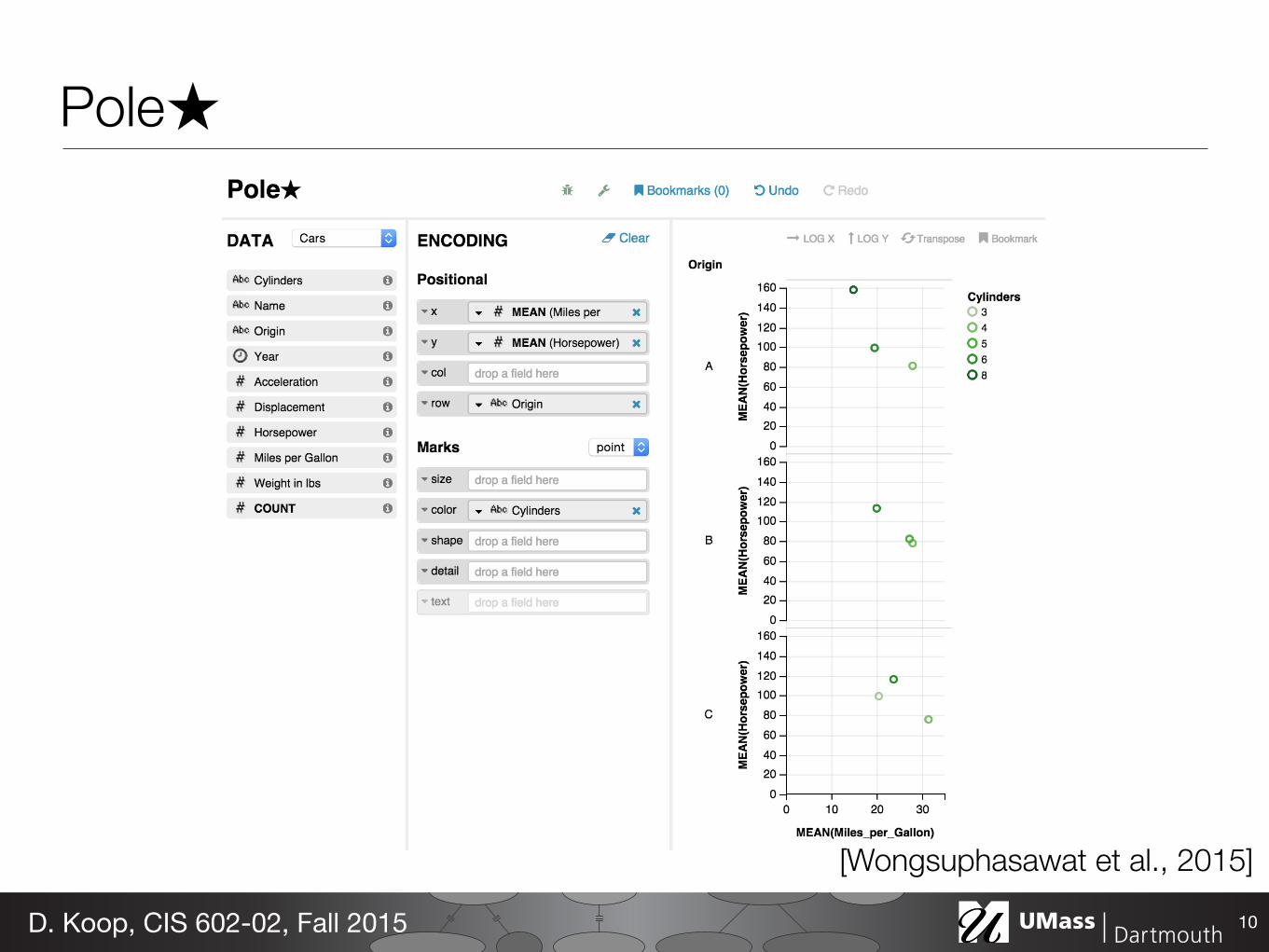
Fig. 10. PoleStar, a visualization specification tool inspired by Tableau.Listing 1 shows the generated Vega-lite specification.
We removed some variables from the birdstrikes data to enforce parityamong datasets. We chose these datasets because they are of real-worldinterest, are of similar complexity, and concern phenomena accessibleto a general audience.
Participants. We recruited 16 participants (6 female, 10 male), allstudents (14 graduate, 2 undergraduate) with prior data analysis ex-perience. All subjects had used visualization tools including Tableau,Python/matplotlib, R/ggplot, or Excel.1 No subject had analyzed thestudy datasets before, nor had they used Voyager or PoleStar (thoughmany found PoleStar familiar due to its similarity to Tableau). Eachstudy session lasted approximately 2 hours. We compensated partici-pants with a $15 gift certificate.
Study Protocol. Each analysis session began with a 10-minute tuto-rial, using a dataset distinct from those used for actual analysis. We thenbriefly introduced subjects to the test dataset. We asked participants toexplore the data, and specifically to “get a comprehensive sense of whatthe dataset contains and use the bookmark features to collect interestingpatterns, trends or other insights worth sharing with colleagues.” Toencourage participants to take the analysis task seriously, we askedthem to verbally summarize their findings after each session usingthe visualizations they bookmarked. During the session, participantsverbalized their thought process in a think-aloud protocol. We did notask them to formulate any questions before the session, as doing somight bias them toward premature fixation on those questions. We gavesubjects 30 minutes to explore the dataset. Subjects were allowed toend the session early if they were satisfied with their exploration.
All sessions were held in a lab setting, using Google Chrome ona Macbook Pro with a 15-inch retina display set at 2,880 by 1,980pixels. After completing two analysis sessions, participants completedan exit questionnaire and short interview in which we reviewed subjects’choice of bookmarks as an elicitation prompt.
Collected Data. An experimenter (either the first or second author)observed each analysis session and took notes. Audio was recorded tocapture subjects’ verbalizations for later review. Each visualization toolrecorded interaction logs, capturing all input device and applicationevents. Finally, we collected data from the exit survey and interview,including Likert scale ratings and participant quotes.
6.2 Analysis & ResultsWe now present a selected subset of the study results, focusing ondata variable coverage, bookmarking activity, user survey responses,
1All participants had used Excel. Among other tools, 9 had used Tableau, 13had used Python/matplotlib and 9 had used R/ggplot.
and qualitative feedback. To perform hypothesis testing over userperformance data, we fit linear mixed-effects models [2]. We includevisualization tool and session order as fixed effects, and dataset andparticipant as random effects. These models allow us to estimate theeffect of visualization tool while taking into account variance due toboth the choice of dataset and individual performance. We includean intercept term for each random effect (representing per-dataset andper-participant bias), and additionally include a per-participant slopeterm for visualization tool (representing varying sensitivities to thetool used). Following common practice, we assess significance usinglikelihood-ratio tests that compare a full model to a reduced model inwhich the fixed effect in question has been removed.
6.2.1 Voyager Promotes Increased Data Variable CoverageTo assess the degree to which Voyager promotes broader data explo-ration, we analyze the number of unique variable sets (ignoring datatransformations and visual encodings) that users are exposed to. Whileusers may view a large number of visualizations with either tool, thesemight be minor encoding variations of a data subset. Focusing onunique variable sets provides a measure of overall dataset coverage.
While Voyager automatically displays a number of visualizations,this does not ensure that participants are attending to each of theseviews. Though we lack eye-tracking data, prior work indicates that themouse cursor is often a valuable proxy [12, 20]. As a result, we analyzeboth the number of variable sets shown on the screen and the numberof variable sets a user interacts with. We include interactions such asbookmarking, view expansion, and mouse-hover of a half-second ormore (the same duration required to activate view scrolling). Analyzinginteractions provides a conservative estimate, as viewers may examineviews without manipulating them. For PoleStar, in both cases wesimply include all visualizations constructed by the user.
We find significant effects of visualization tool in terms of both thenumber of unique variable sets shown (c2(1,N = 32) = 38.056, p <0.001) and interacted with (c2(1,N = 32) = 19.968, p < 0.001). WithVoyager, subjects were on average exposed to 69.0 additional variablesets (over a baseline of 30.6) and interacted with 13.4 more variablesets (over a baseline of 27.2). In other words, participants were exposedto over 3 times more variable sets and interacted with 1.5 times morewhen using Voyager.
In the case of interaction, we also find an effect due to the presen-tation order of the tools (c2(1,N = 32) = 5.811, p < 0.05). Subjectsengaged with an average of 6.8 more variable sets (over the 27.2 base-line) in their second session.
6.2.2 Bookmark Rate Unaffected by Visualization ToolWe next analyze the effect of visualization tool on the number ofbookmarked views. Here we find no effect due to tool (c2(1,N = 32) =0.060, p = 0.807), suggesting that both tools enable users to uncoverinteresting views at a similar rate. We do observe a significant effect dueto the presentation order of the tools (c2(1,N = 32) = 9.306, p < 0.01).On average, participants bookmarked 2.8 additional views (over abaseline of 9.7 per session) during their second session. This suggeststhat participants learned to perform the task better in the latter session.
6.2.3 Most Bookmarks in Voyager include Added VariablesOf the 179 total visualizations bookmarked in Voyager, 124 (69%)include a data variable automatically added by the recommendation en-gine. Drilling down, such views constituted the majority of bookmarksfor 12/16 (75%) subjects. This result suggests that the recommendationengine played a useful role in surfacing visualizations of interest.
6.2.4 User Tool Preferences Depend on TaskIn the exit survey we asked subjects to reflect on their experienceswith both tools. When asked to rate their confidence in the compre-hensiveness of their analysis on a 7-point scale, subjects respondedsimilarly for both tools (Voyager: µ = 4.88,s = 1.36; PoleStar:µ = 4.56,s = 1.63; W = 136.5, p = 0.754). Subjects rated both toolscomparably with respect to ease of use (Voyager: µ = 5.50,s = 1.41;PoleStar: µ = 5.69,s = 0.95; W = 126, p = 0.952).
Pole★
10D. Koop, CIS 602-02, Fall 2015
[Wongsuphasawat et al., 2015]
Voyager• Show breadth-first data variation
- Contrast with visualization where a user deals with fixed data and wants to examine it specifically
- We often don't have a specific question: "Get a comprehensive sense of what the dataset contains and use the bookmark features to collect interesting patterns, trends, or other insights worth sharing with colleagues"
• Univariate plots and suggested paired plots (potentially with transformations)
• Ranking of Recommendations • Hybrid of PoleStar and Voyager? • Scalability?
11D. Koop, CIS 602-02, Fall 2015

Reading Presentation Schedule
12D. Koop, CIS 602-02, Fall 2015
Date Topic Student (Pos.) Student (Neg.)9/29 Visualization Chaitanya Chandurkar Ramya Reddy Mara10/1 Statistics Pragnya Srinivasan Shakti Bhattarai10/6 Machine Learning Sumukhi Kappa Vishnu Vardhan Kumar Pallati10/8 Clustering Akeim Findlay Richard de Groof10/15 Databases Gursharanpreet Singh Kalesha Nagineni10/20 Databases Priya Vishnudas Shanbhag Shree Lekha Kakkerla10/22 Data Cubes Nilesh Bhadane Tanmay Thakar11/3 Natural Language Processing Jayeshkumar Vijayaraghavalu Sanjana Bhardwaj11/5 Cloud Computing Arsalan Aqeel Hafiz Zennia Sandhu11/10 Map Reduce Arpit Parikh Rutvi Dave11/12 General Cluster Computing Harshada Gorhe Mehmet Duman11/17 Streaming Data Anurag Dhirendra Singh Rishu Vaid11/19 Out of Core Algorithms Rameshta Reddy Kotha11/24 Graph Algorithms Dhvani Patel Hari Bharti12/1 Reproducibility Xiaochun Chen
If you need to switch, coordinate with another student and email me to approve

Projects• Options:
- Data analysis on some existing data: think about the questions you want to try to answer
- Improve some technique for data analysis • Data Sources:
- Search the web for topics you're interested in - https://github.com/caesar0301/awesome-public-datasets - Local data
• If you are doing a research project in a particular area, let's try to work something out so that the course project relates
13D. Koop, CIS 602-02, Fall 2015
Statistics• "Lies, D**ned lies, and statistics", Benjamin Disraeli (& Mark Twain) • Example of Problematic Statistics:
- Mean, Median, and Mode - Mean food truck rankings - Flipping a coin four times
14D. Koop, CIS 602-02, Fall 2015

Population and Sample• Population: All humpback whales • Sample: 50 Humpback whales found within 500 miles of Cape Cod
between June 15 and September 15, 2013
15D. Koop, CIS 602-02, Fall 2015

Descriptive and Inferential• Descriptive: summarizing and describing data • Inferential: using samples to make an inference about the
population • Die Rolls:
- 1234623524524111342354613 - Can do descriptive statistics about the rolls (frequencies) - Is it a biased die? Use inferential statistics
16D. Koop, CIS 602-02, Fall 2015

Descriptive Statistics• Mean, median, mode, range • Standard deviation (variance) measures how far-flung data is
(difference from mean)
• Interquartile Range: Inner 25% to 75% of values (by positions)
17D. Koop, CIS 602-02, Fall 2015
34
0.05 0.10 0.15 0.20 0.25
Price ($/oz)
Figure 9: Boxplot for the prices of hotdogs
5.3 Standard deviation
The sample standard deviation is the most frequently used measure of vari-ability, although it is not as easily understood as ranges. It can be consideredas a kind of average of the absolute deviations of observed values from themean of the variable in question.
Definition 5.6 (Standard deviation). For a variable x, the sample standarddeviation, denoted by sx (or when no confusion arise, simply by s), is
sx =
√
∑ni=1(xi − x̄)2
n− 1.
Since the standard deviation is defined using the sample mean x̄ of the vari-able x, it is preferred measure of variation when the mean is used as themeasure of center (i.e. in case of symmetric distribution). Note that thestardard deviation is always positive number, i.e., sx ≥ 0.
In a formula of the standard deviation, the sum of the squared deviations

1 2 3 4 5
700
800
900
1000
Experiment No.
Spe
ed o
f lig
ht (k
m/s
min
us 2
99,0
00)
true speed
Boxplot
18D. Koop, CIS 602-02, Fall 2015
Random Variable• A variable whose value is subject to chance • Examples: coin flips to be performed, outcomes of an experiment • Random variables have expected values and variances which are
not the same as sample means of sample standard deviations
19D. Koop, CIS 602-02, Fall 2015

Law of Large Numbers• With enough trials, the sample mean should be close to the
expected value • Means that there is stability with enough observations
20D. Koop, CIS 602-02, Fall 2015
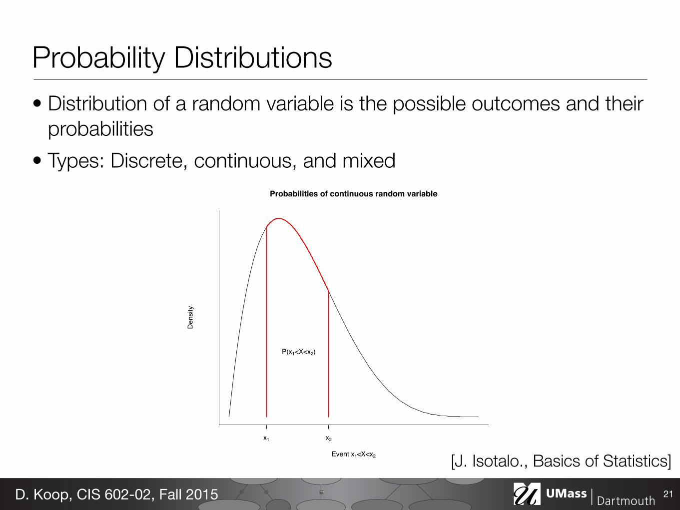
Probability Distributions• Distribution of a random variable is the possible outcomes and their
probabilities • Types: Discrete, continuous, and mixed
21D. Koop, CIS 602-02, Fall 2015
41
2. P (a ≤ X ≤ b) = 1.
The probability model for a continuous random variable assign probabilitiesto intervals of outcomes rather than to individual outcomes. In fact, allcontinuous probability distributions assign probability 0 to every individualoutcome.
The probability distribution of a continuous random variable is pictured bya density curve. A density curve is smooth continuous curve having areaexactly 1 underneath it such like curves representing the population distri-bution in section 3.3. In fact, the population distribution of a variable is,equivalently, the probability distribution for the value of that variable for asubject selected randomly from the population.
Example 6.2.
Probabilities of continuous random variable
Event x1<X<x2
Den
sity
x1 x2
P(x1<X<x2)
Figure 10: The probability distribution of a continous random variable assignprobabilities as areas under a density curve.
[J. Isotalo., Basics of Statistics]
44
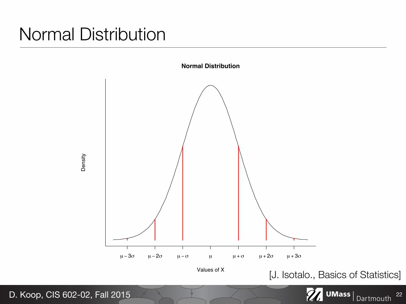
hold. A random variable X following normal distribution with a mean of µand a standard deviation of σ is denoted by X ∼ N(µ, σ).
There are other symmetric bell-shaped density curves that are not normal.The normal density curves are specified by a particular equation. The heightof the density curve at any point x is given by the density function
f(x) =1
σ√2π
e−1
2(x−µ
σ)2
. (7)
We will not make direct use of this fact, although it is the basis of math-ematical work with normal distribution. Note that the density function iscompletely determined by µ and σ.
Example 6.4.
Normal Distribution
Values of X
Den
sity
µ − 3σ µ − 2σ µ − σ µ µ + σ µ + 2σ µ + 3σ
Figure 11: Normal distribution.
Definition 6.8 (Standard normal distribution). A continuous random vari-able Z is said to have a standard normal distribution if Z is normally dis-tributed with mean µ = 0 and standard deviation σ = 1, i.e., Z ∼ N(0, 1).
Normal Distribution
22D. Koop, CIS 602-02, Fall 2015
[J. Isotalo., Basics of Statistics]

Poisson Distribution
23D. Koop, CIS 602-02, Fall 2015

D. Koop, CIS 602-02, Fall 2015
Introduction to Bayesian Methods
Cam Davidson-Pilon
Presented by: Pragnya Srinivasan and Shakti Bhattarai
Bayesian Methods• Inferential statistics • Difference between Frequentist and Bayesian perspectives: both
are useful • Law of large numbers • Prior and posterior • Distributions • Statistical models
25D. Koop, CIS 602-02, Fall 2015

Next Week• Machine Learning
- General approaches - Clustering
• Reading Responses • Assignment 2 • Project Proposal
26D. Koop, CIS 602-02, Fall 2015